The importance of a photo-worthy space in today’s popular dining culture is undeniable. It’s a crucial aspect that stands alongside the functionality of the kitchen. This dessert shop has provided us with some valuable insights since it opened. While we’re pleased to have met our customers’ need for a visually captivating space, it raises questions about how much of our lives are taken up by documenting and browsing these records. Does this restaurant design, in some ways, encourage this lifestyle?
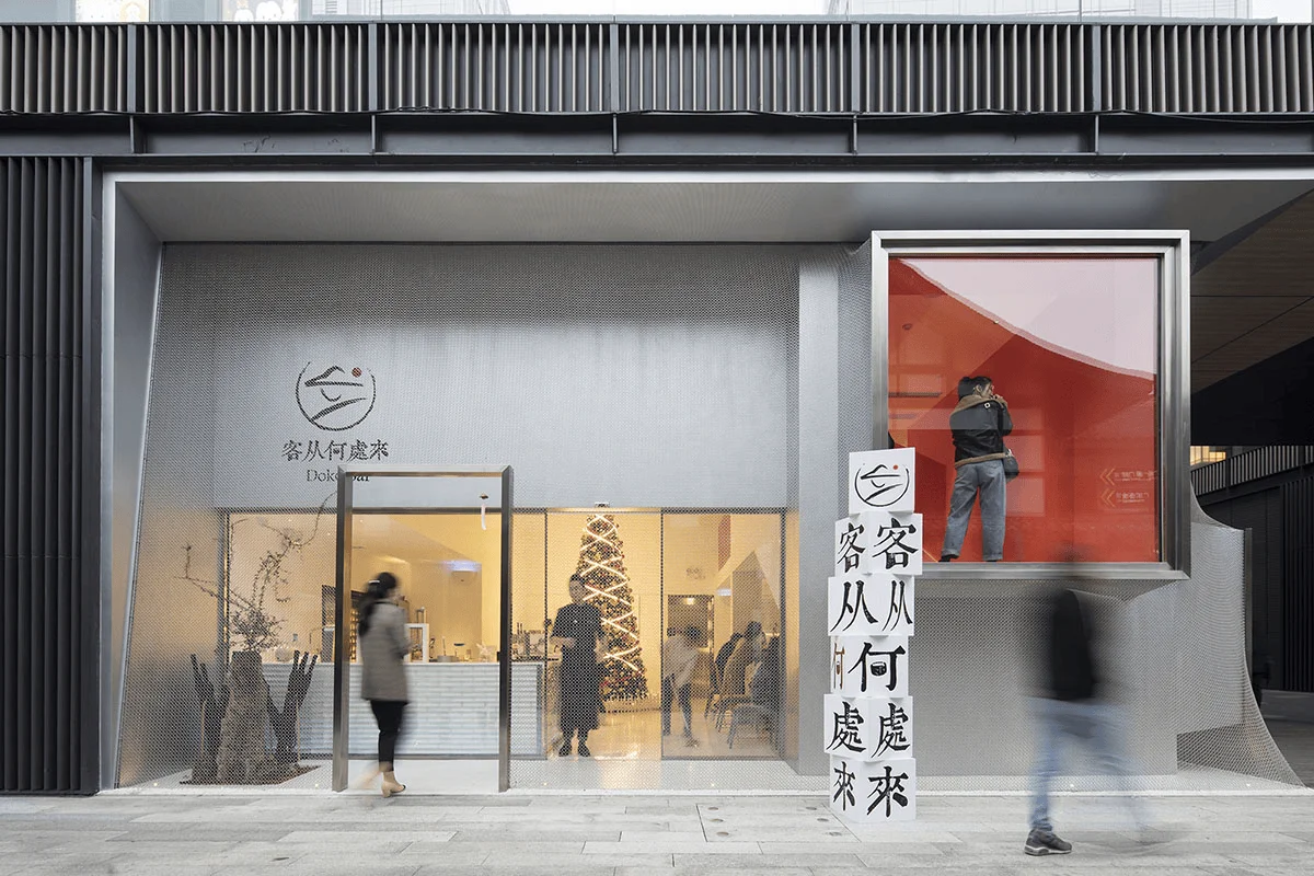
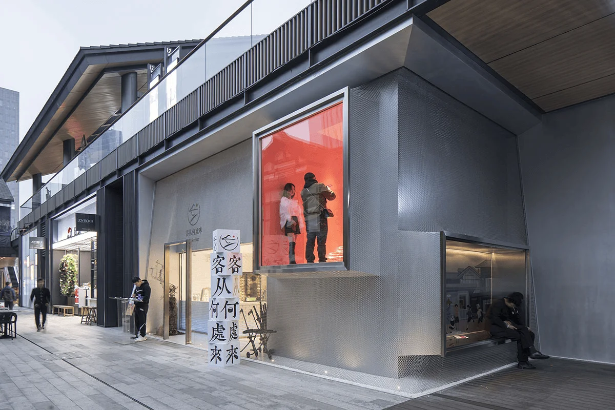
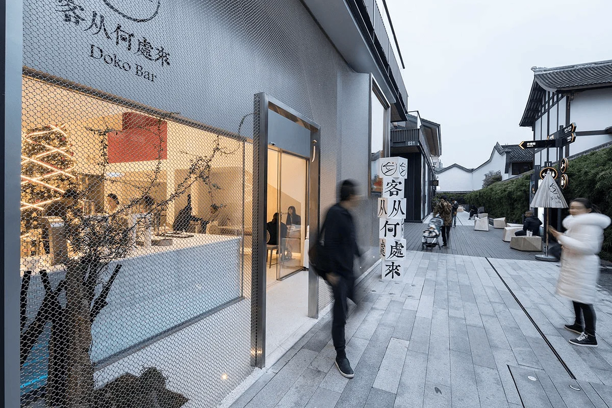
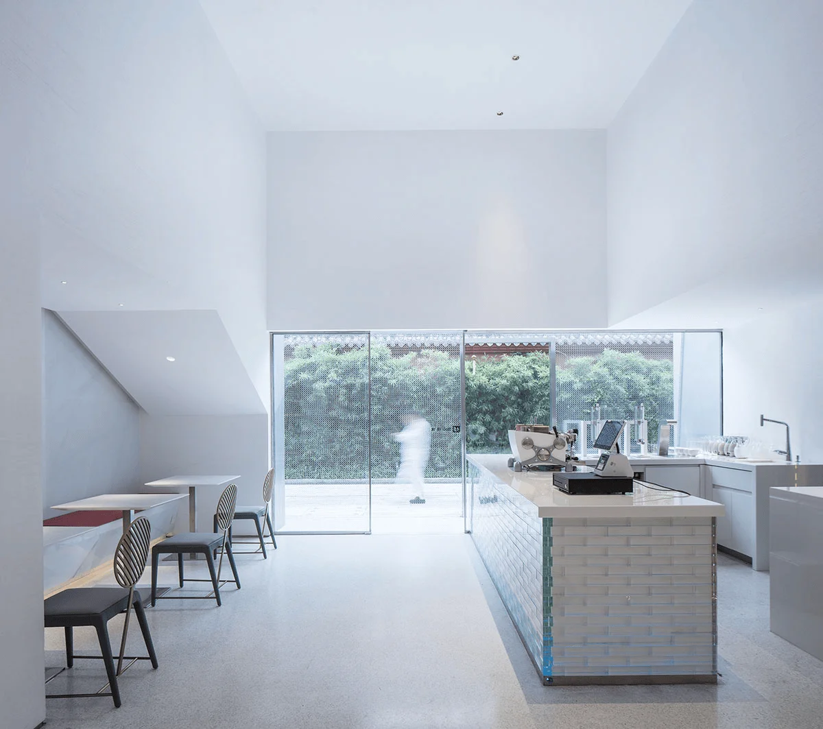
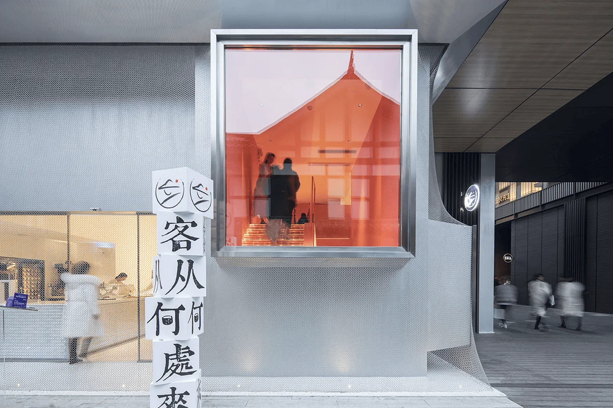
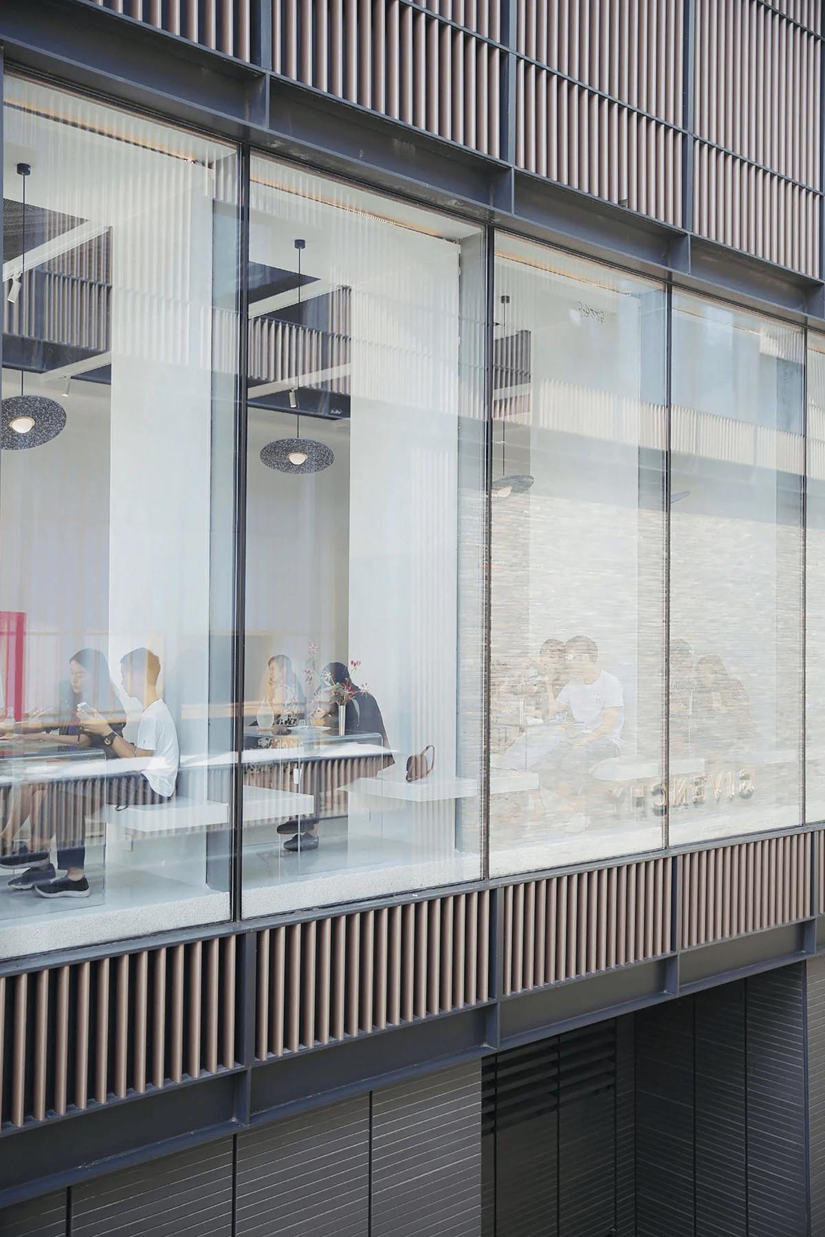
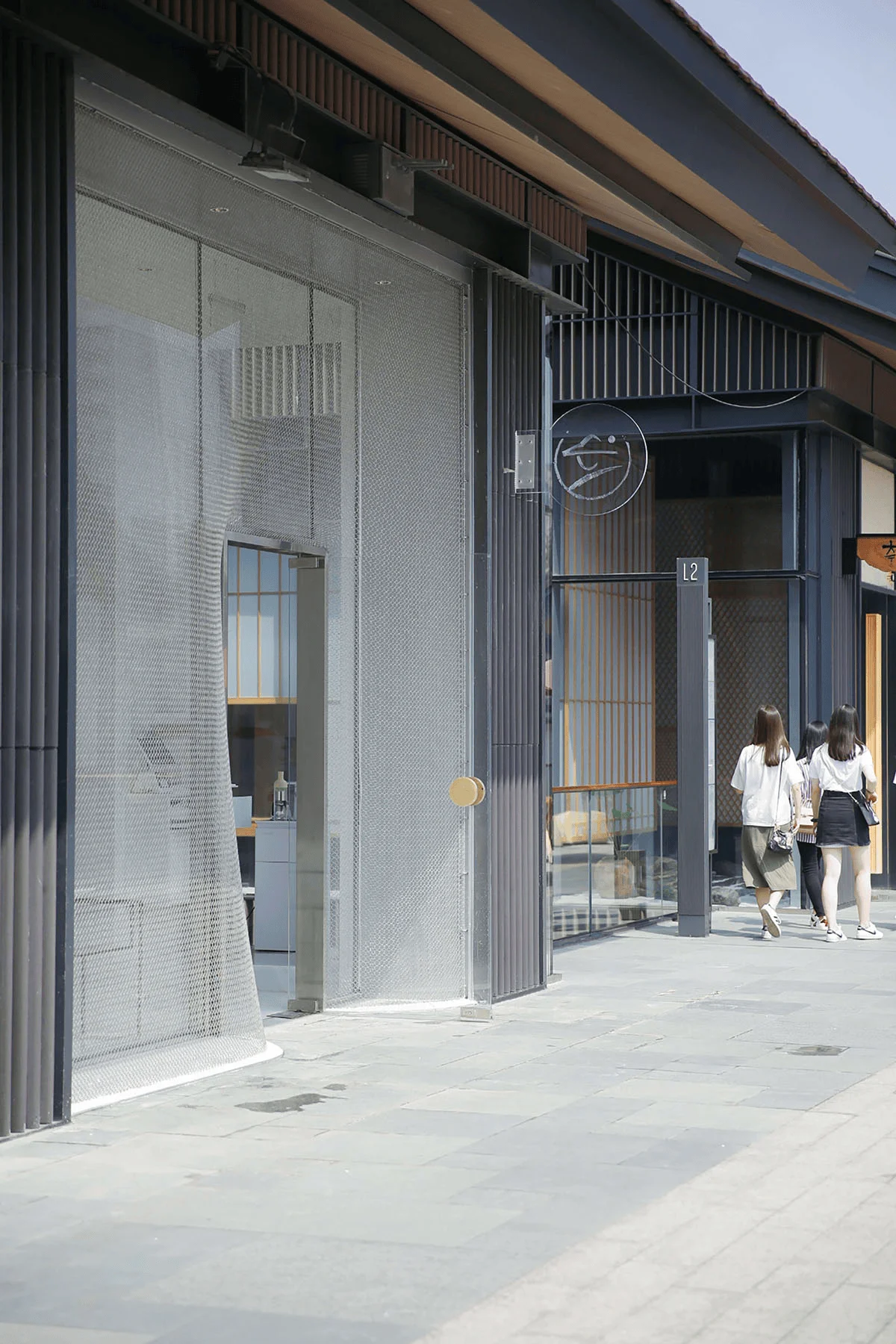
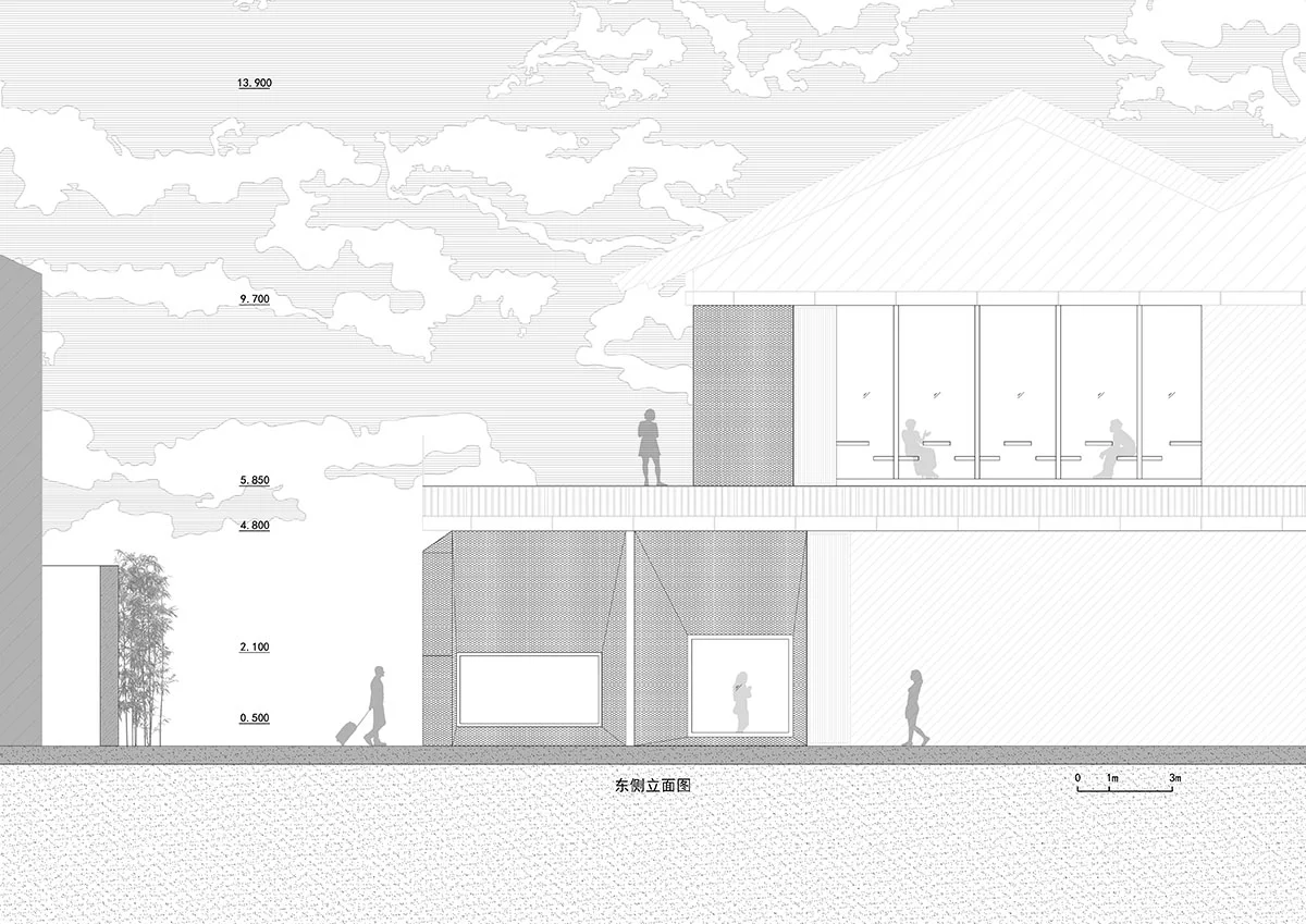
The restaurant is located in Chengdu’s Taikoo Li, northwest of the ancient Daci Temple, which dates back to the Tang Dynasty. The shop’s main facade faces the red walls of the temple, with bamboo swaying gently and the sound of temple bells floating in the air. The dialogue between the restaurant and the red wall became the starting point for the design. The building’s exterior wall is covered in a special matte silver-white textured paint, offset by a rippling metal mesh, creating a fresh texture and memorable aesthetic.
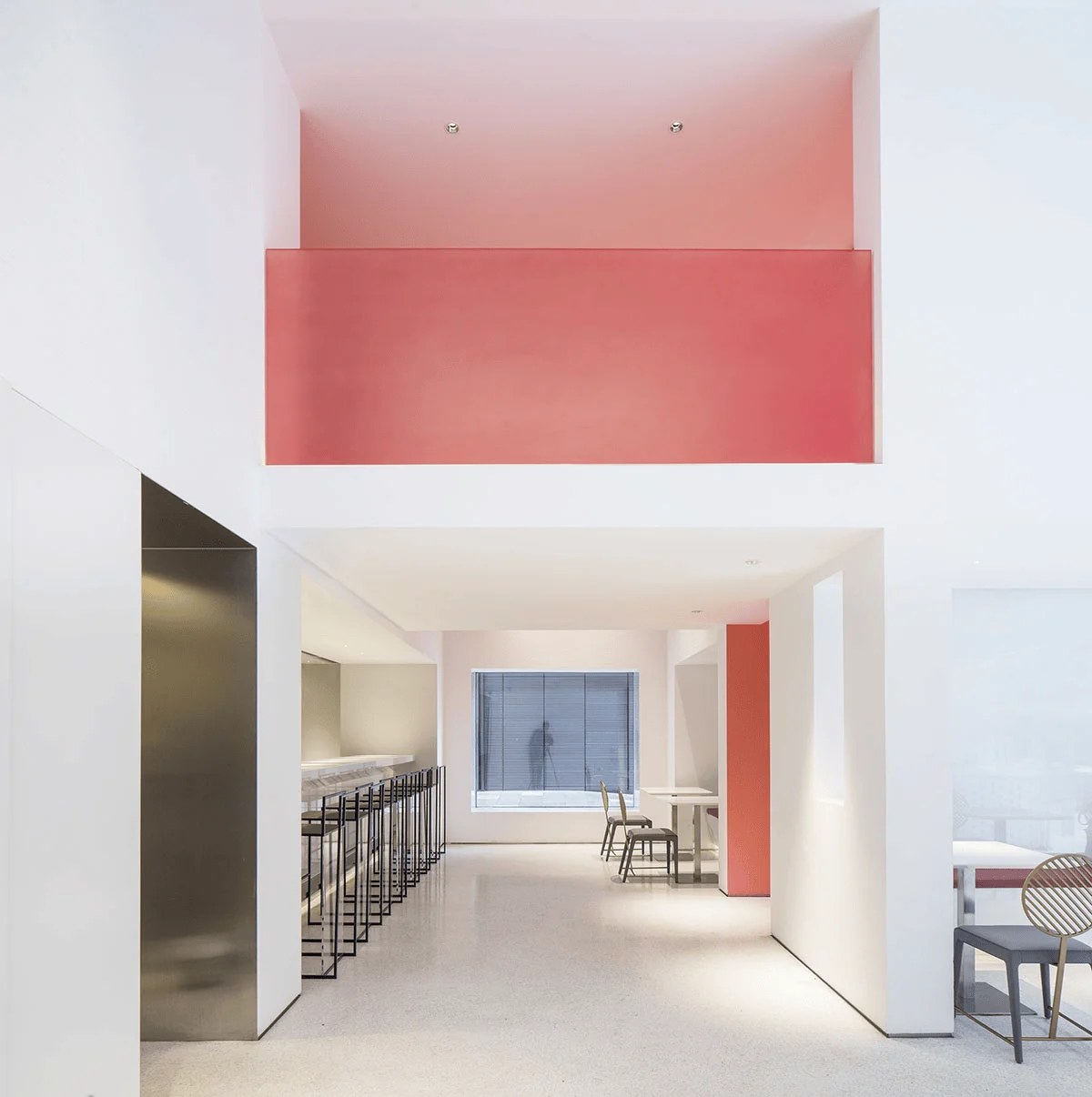
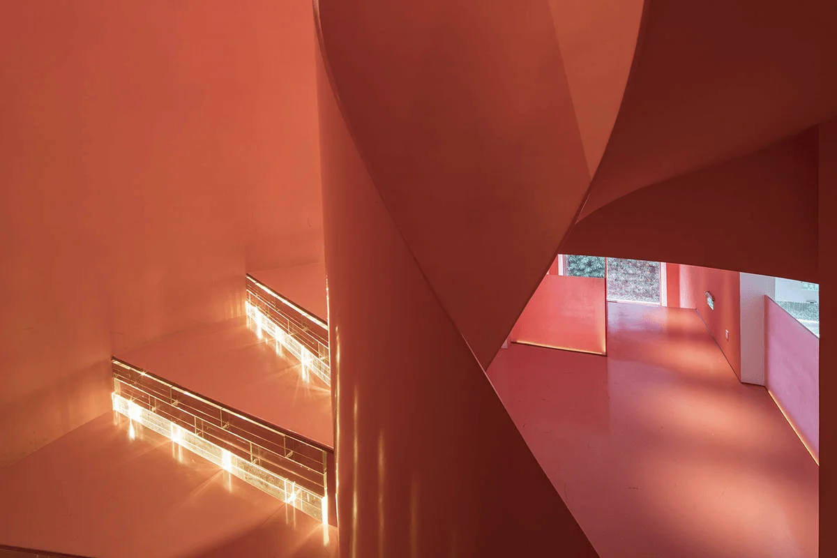
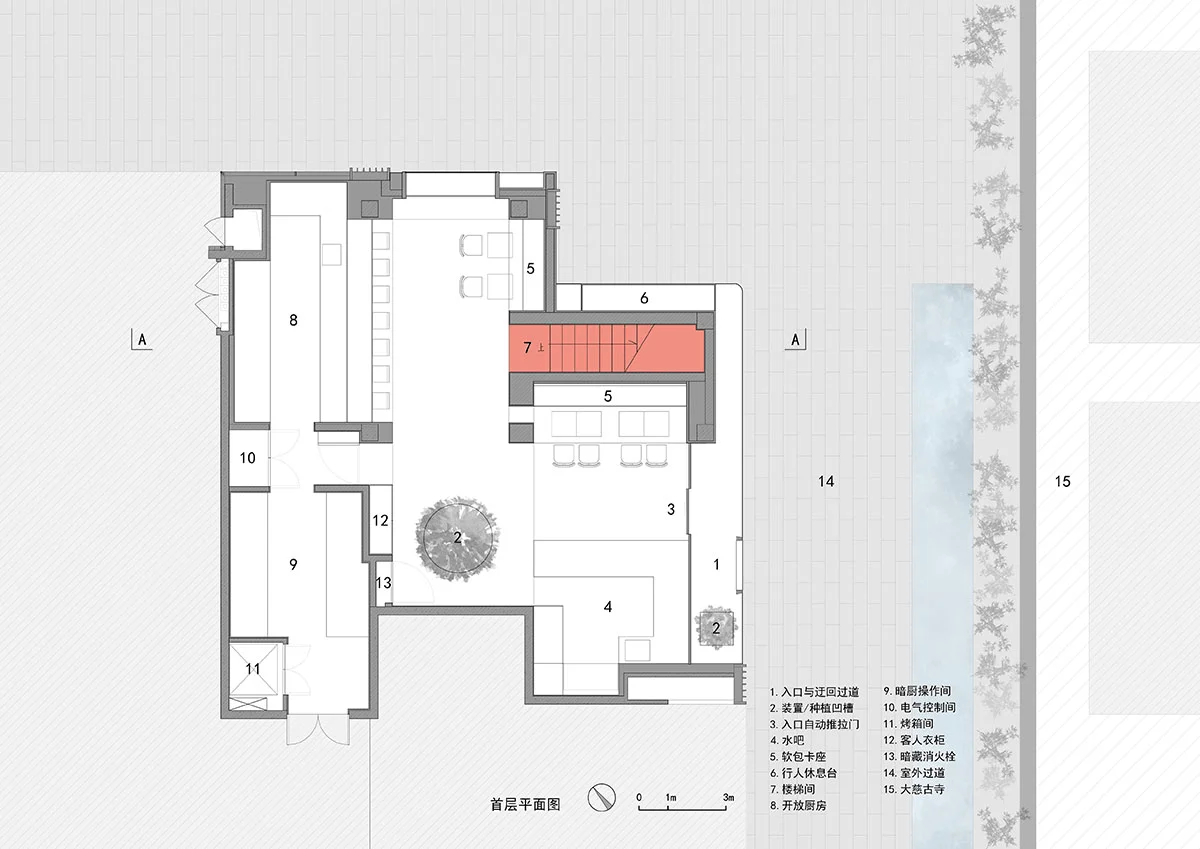
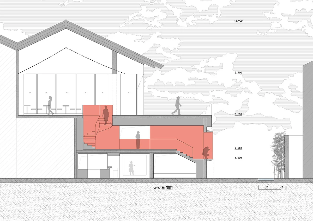
The interior space design: We chose a low-saturation red, “Coral Bead,” from the color palette of the Taisho and Showa eras, to run throughout the two floors. This color creates a dialogue with the red walls of the temple across the street. The interior space spans two levels, each with a high ceiling, and there was no stair connection between the two floors in the original building. These existing conditions offered greater space and flexibility for design and layout, making the design of the traffic space a key focus of this renovation.
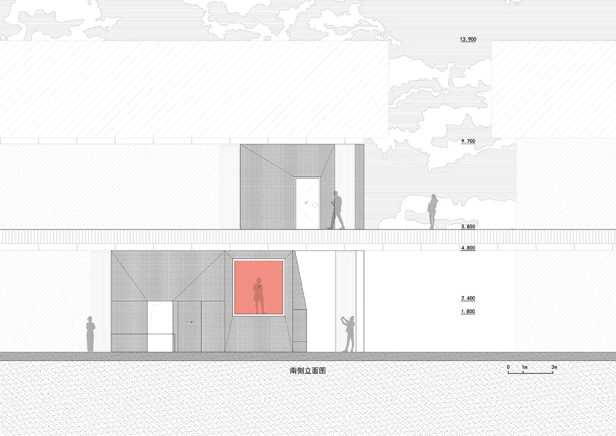
The entrance facade renovation: The original glass curtain wall of the building was pulled back by the width of a passage, creating a path that allowed visitors to approach the storefront. The double-layered facade, composed of metal mesh and glass curtain wall, softens the boundary between the interior and the Buddhist temple. The push-pull relationship between the two elements creates a sense of static dynamism, adding a touch of martial arts to the restaurant, aptly named “Where Do Guests Come From.”
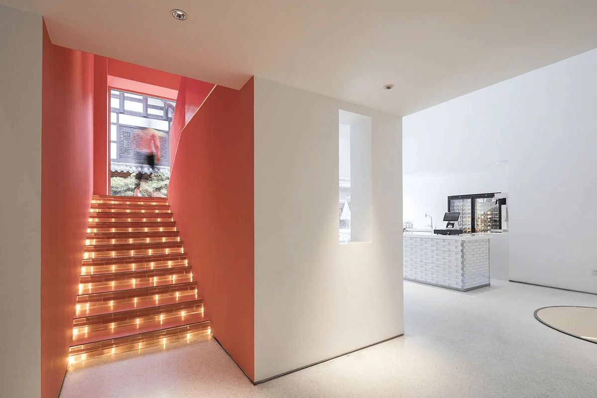
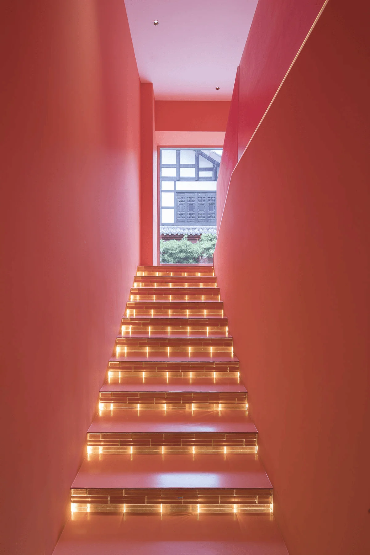
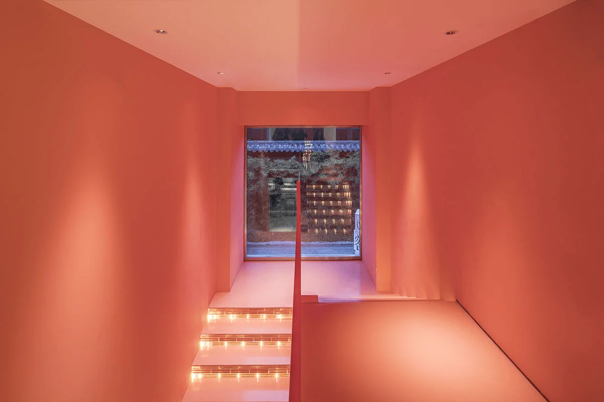
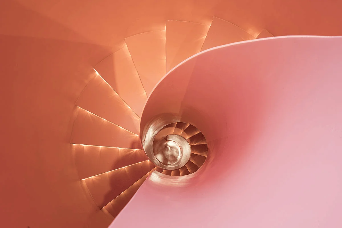
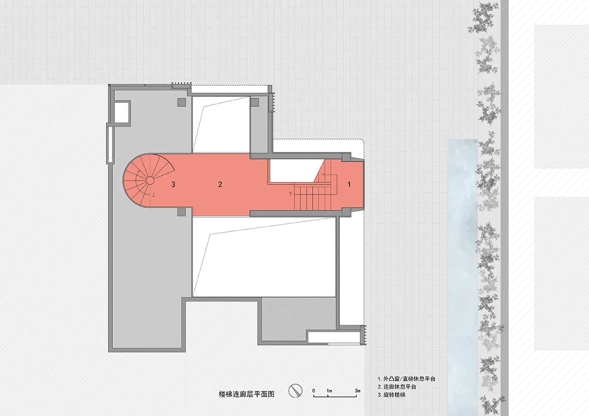
The passage consists of a scissor staircase, a mezzanine platform, and a pillar-less rotating staircase. The traffic space, made of glass bricks and coral bead-colored steel plates, connects several stop-and-go areas, slowing down the passage and mitigating the daunting number of steps created by the high ceiling. It also enriches the overall experience.
The three-act structure, a typical storytelling technique used in Hollywood films, stems from Aristotle’s definition of the basic elements of a story: beginning, middle, and end. The “three-act play” concept originates in stage plays, derived from the French playwright Eugene Scribe in the 19th century. The three acts typically occupy 1/4, 1/2, and 1/4 of the time, respectively. A “turning point” occurs at the end of the first and second acts, altering the course of the story. We have borrowed this concept for this project.
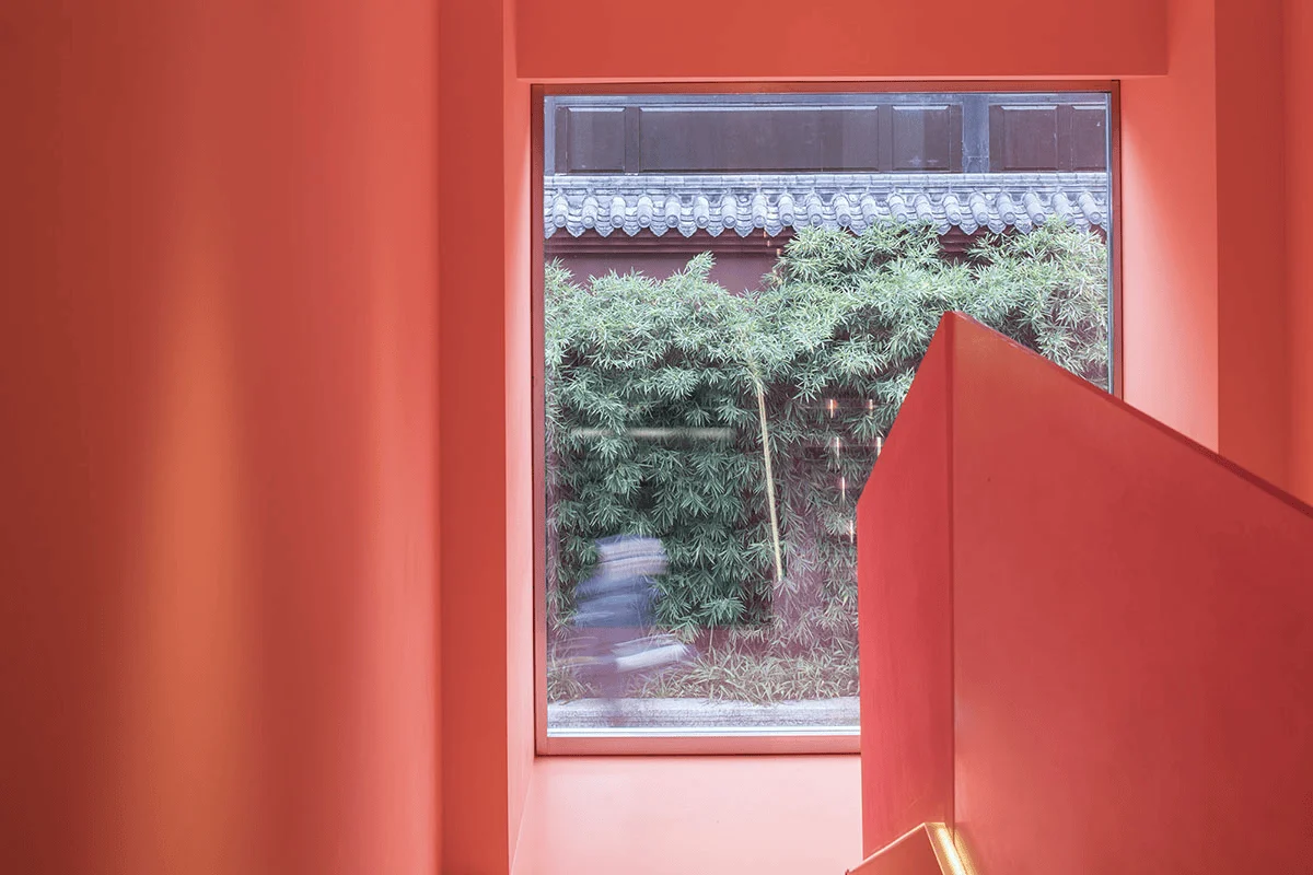
The first act is designed to lay the groundwork. As you enter the stairwell, a large-scale outward-facing window directly opposite the temple leads your gaze to the building within the temple. The coral bead red of the stairwell walls, ceiling, and floor continues the temple wall, creating a dialogue with the temple. The viewing window actually looks both inwards and outwards: it frames a section of the wall for the interior while for the exterior, the visitors walking up the stairs become part of the scenery.
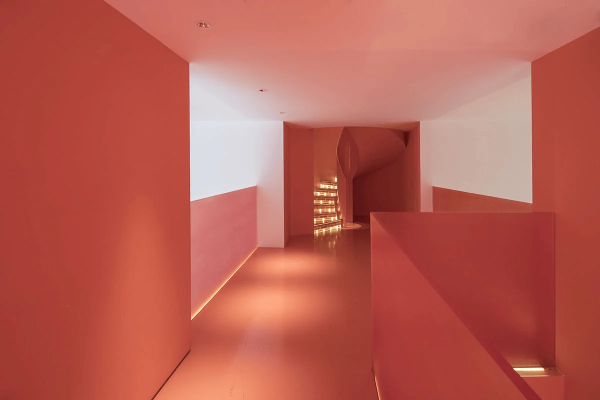
The second act aims to create a contrast. Walking through the mezzanine corridor, you are surrounded by 4.2-meter high spaces on both sides, offering a space for buffering and relaxation while also allowing you to overlook the activity on the first floor and admire the installation specifically designed for this double-height space.
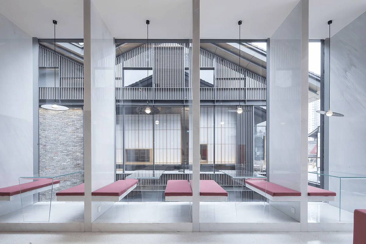
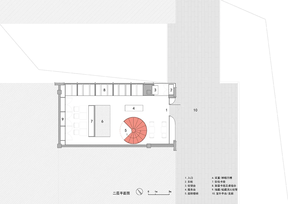
The third act aims to conclude the story, reveal the plot twists, and answer all the unresolved mysteries. The conventional double-helix pillar-less rotating staircase requires a foundation to support it. To build a pillar-less rotating staircase on the steel structure mezzanine, a central column was first erected, and the force was transferred through the mezzanine floor structure before removing part of the central column. The remaining portion serves as the handrail. The rotating staircase is the final climax of the entire ascent, a short journey comes to an end, and stepping out of the relatively narrow spiral staircase, you reach the second floor, a 9-meter-high double-slope roof space.
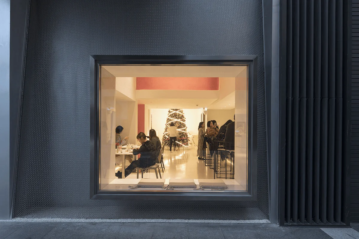
The seating arrangement by the window on the second floor offers a different dining experience, and it also makes this space, when viewed from the outdoor corridor on the second floor of the shopping mall, a four-grid window. The metal mesh covering the glass curtain wall pushes outwards from the window and door frames on the first floor, while on the second floor, it pulls inwards from the door frame. This spatial experience, which begins with the dynamic facade from the moment you enter the restaurant, culminates in a dynamic facade in the opposite direction on the second floor, ending with an ambiguous boundary to the space experience.
A dessert restaurant is like a stage in everyday life, where various activities unfold within a limited time and space. Dating, afternoon tea, taking photos, the constant stream of visitors are temporary performers, as well as moving visual landscapes.
Project Information:


