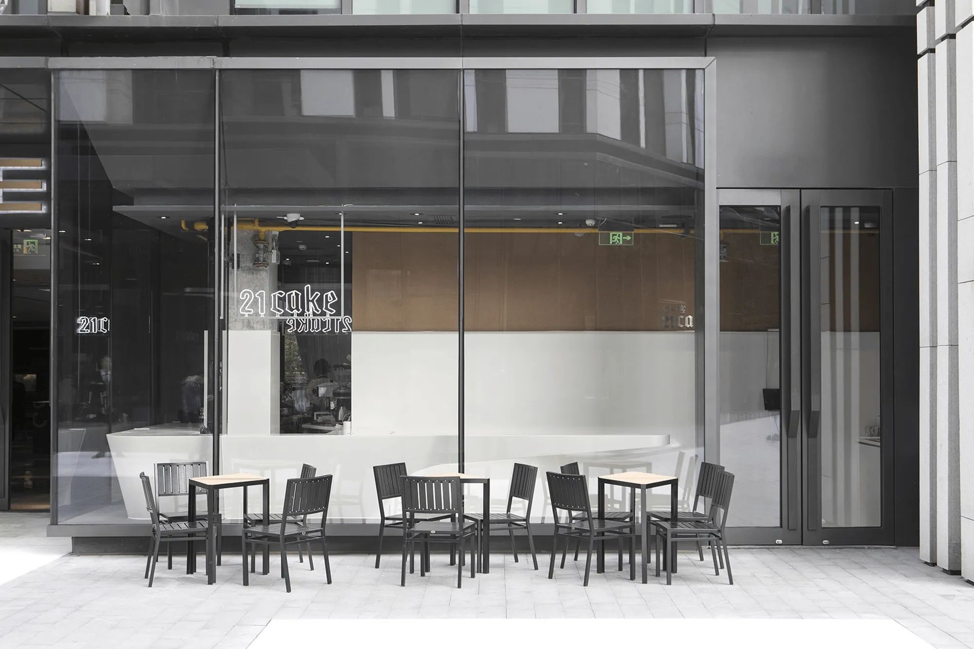
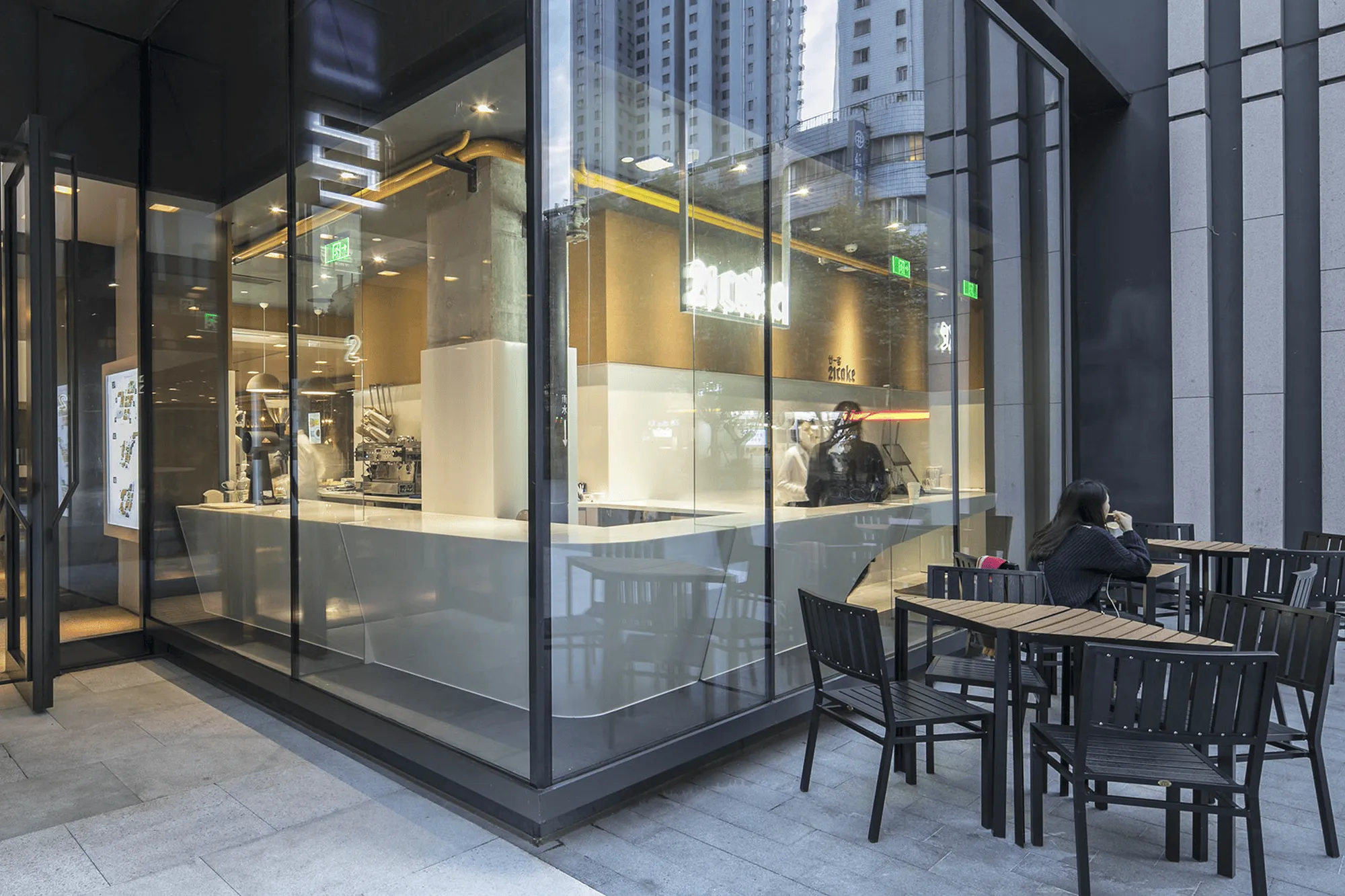
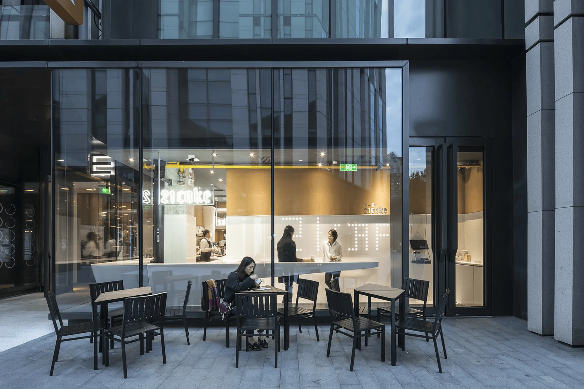
21Cake, a renowned online boutique cake brand, opened its first offline experience store in Shanghai’s SOHO district in 2016, expanding its business to include coffee making. Very Architecture designed the store, incorporating a minimalist style that aligns with 21Cake’s brand identity, utilizing a limited number of building materials and maximizing their versatility. The store features a striking contrast between white artificial stone and warm cork, echoing the brand’s signature colors.
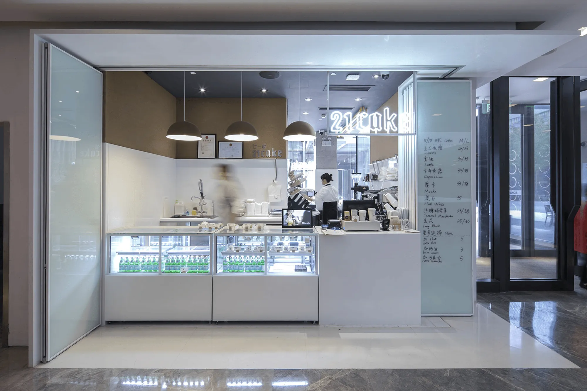
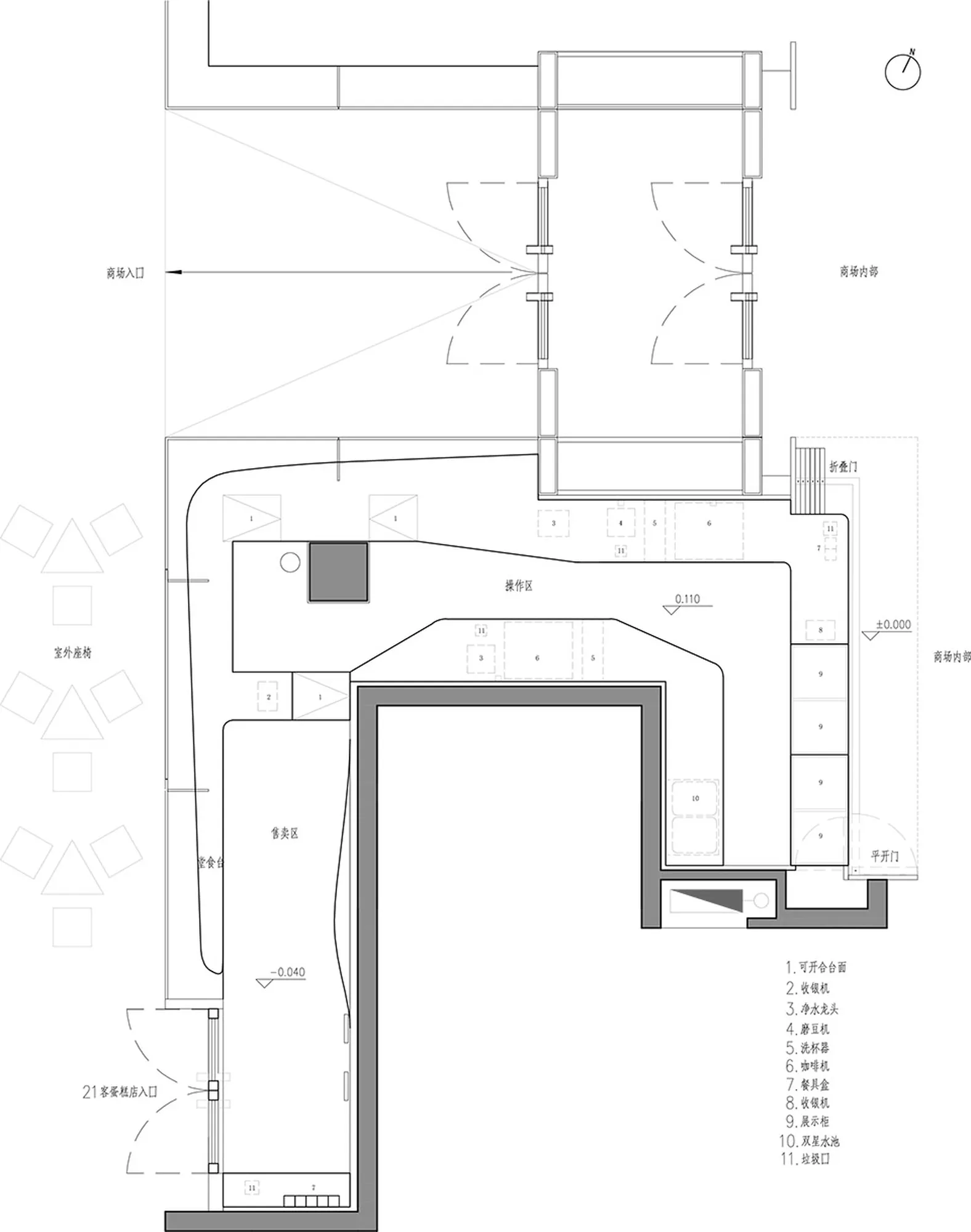
21Cake, a well-known online boutique cake brand, opened its first offline experience store in Shanghai’s SOHO district in 2016, expanding its business to include coffee making. The store’s floor plan is narrow and irregular, but Very Architecture, the design firm behind the project, has expertly used this space to create a minimalist and inviting atmosphere. The design seamlessly blends 21Cake’s signature style with the functionality of a retail and coffee shop, utilizing a limited palette of materials and maximizing their versatility.
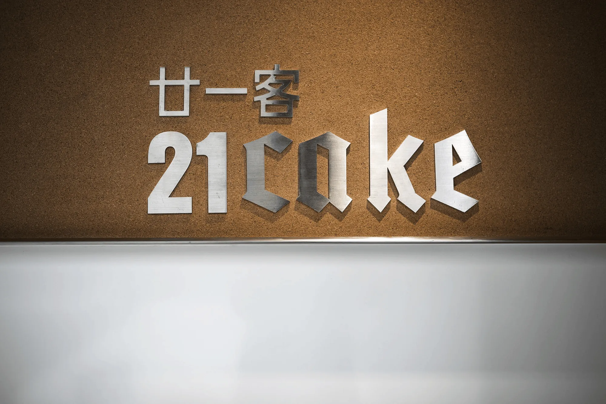
The store’s interior design is a visual feast, showcasing a captivating contrast between two primary materials: white artificial stone and warm cork. This striking combination not only creates a visually captivating space but also subtly reflects 21Cake’s brand identity. The white artificial stone embodies the brand’s clean and sophisticated aesthetic, while the cork adds a touch of warmth and classic elegance. The color palette of these materials echoes the color scheme of 21Cake’s product packaging, instantly reminding customers of the brand’s identity.
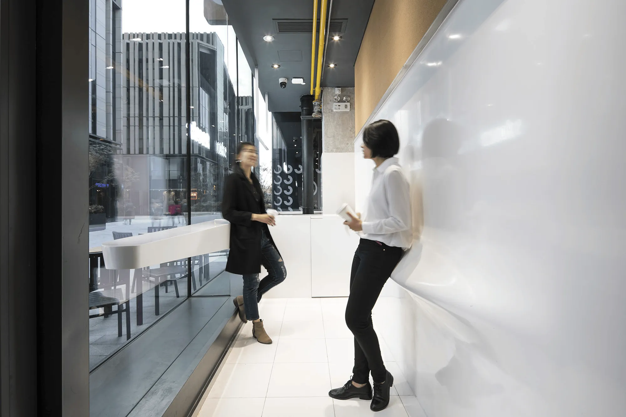
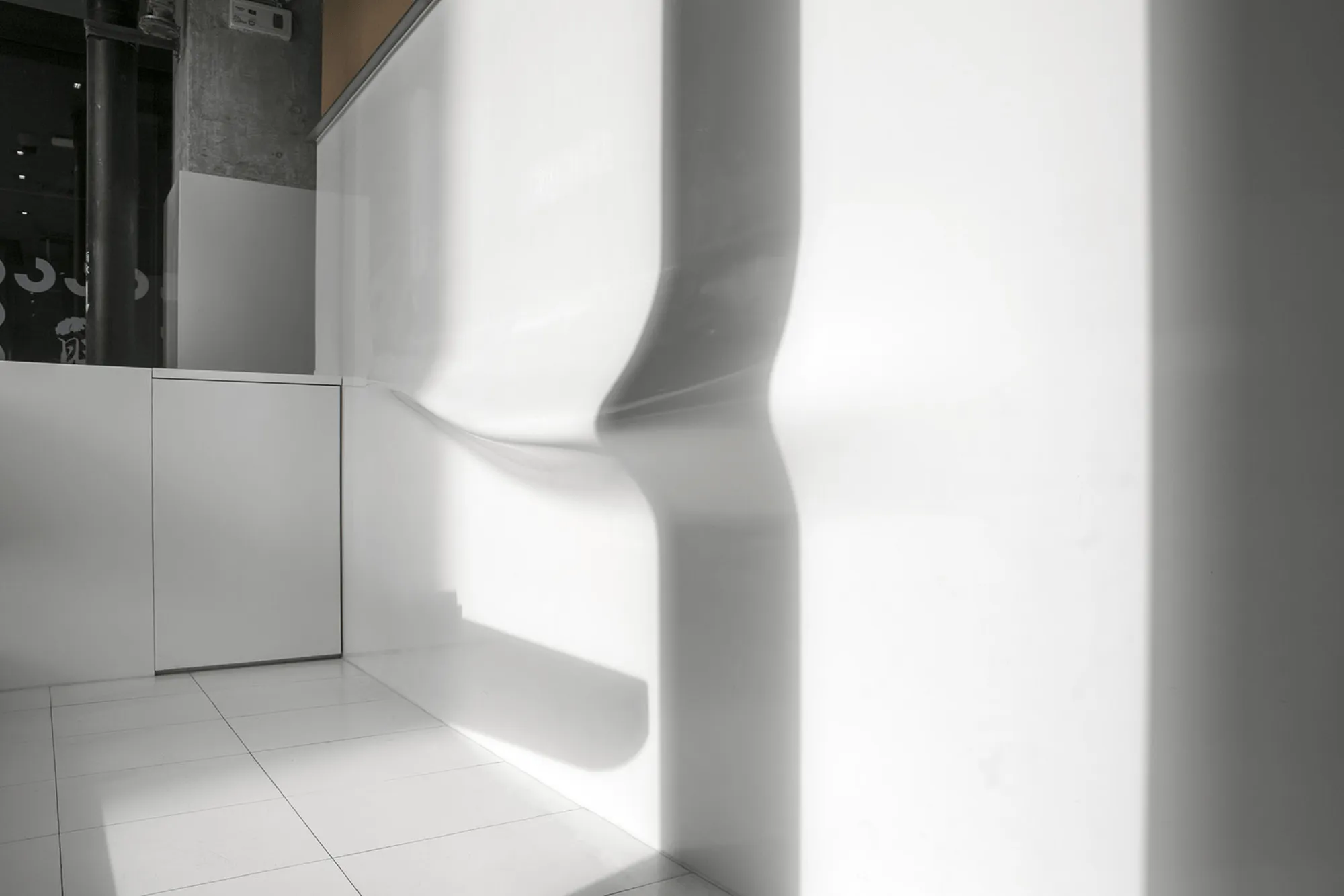
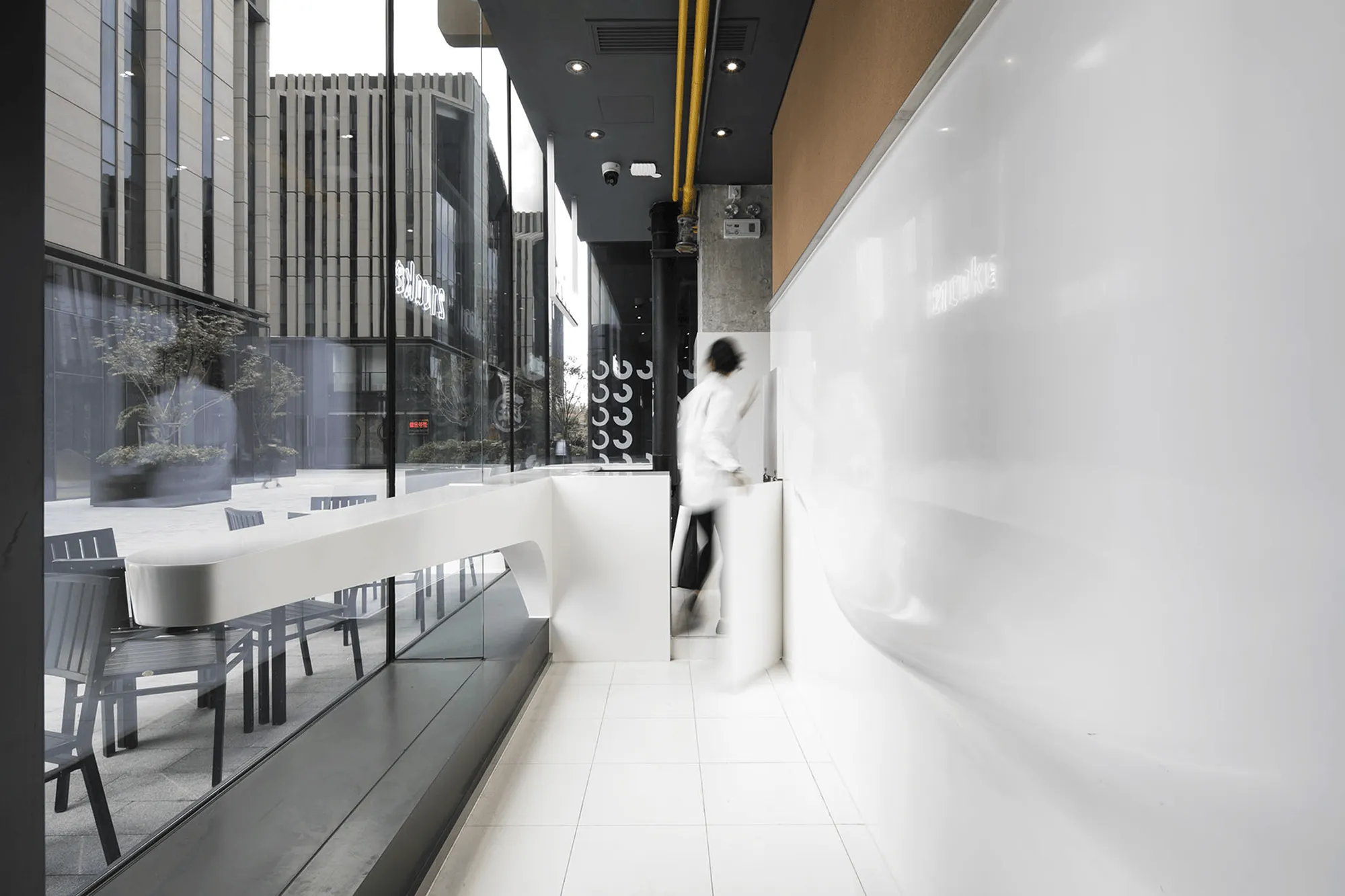
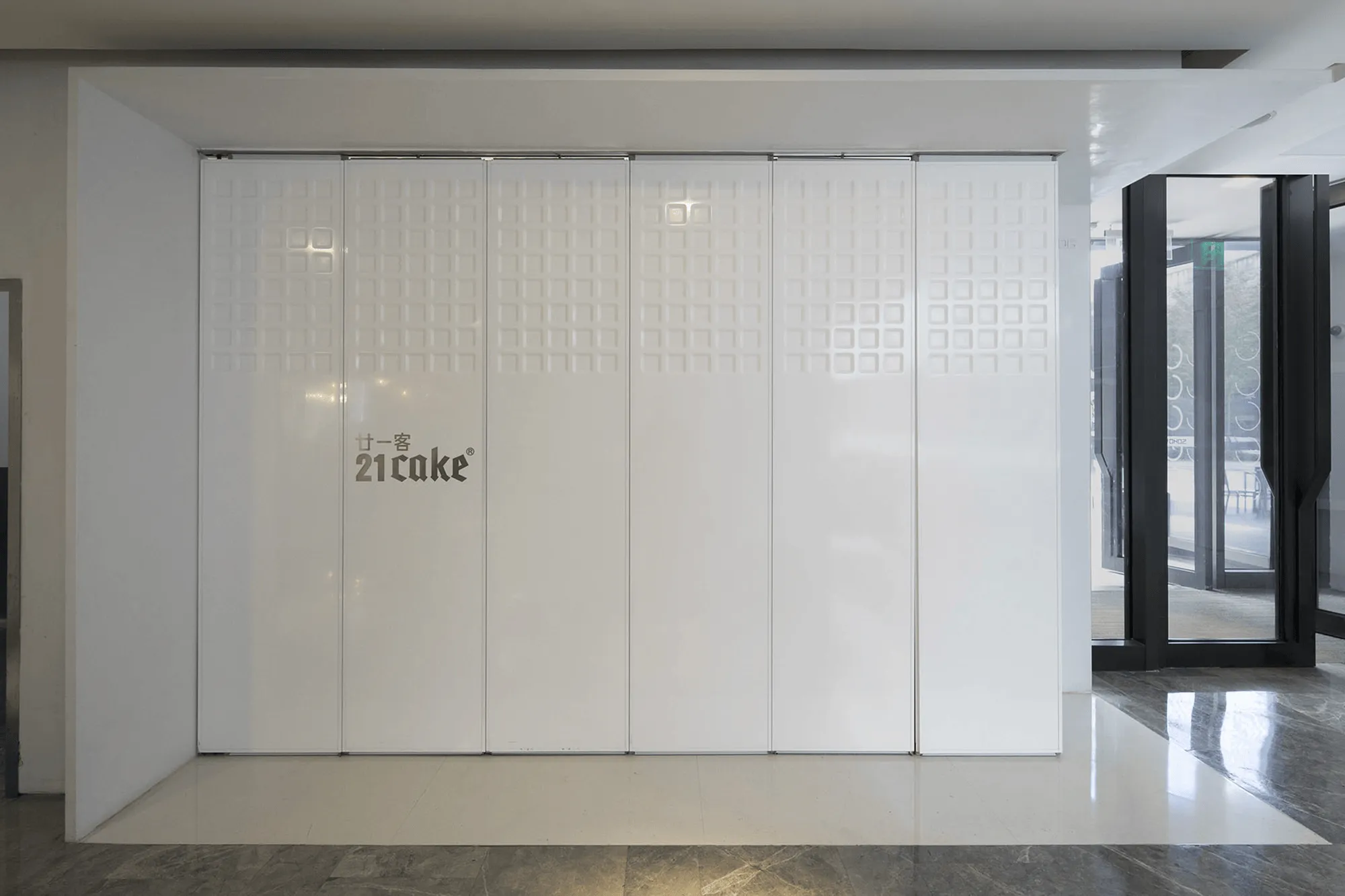
The white artificial stone serves as the dominant element, adorning the walls and serving as the material for the countertop. Very Architecture has ingeniously employed various techniques to create intriguing design features within the store. The entrance door features a delicate embossed pattern, while a wall integrated with LED lights creates a luminous backdrop. In the customer area, the artificial stone is cleverly used to create comfortable seating and functional elements.
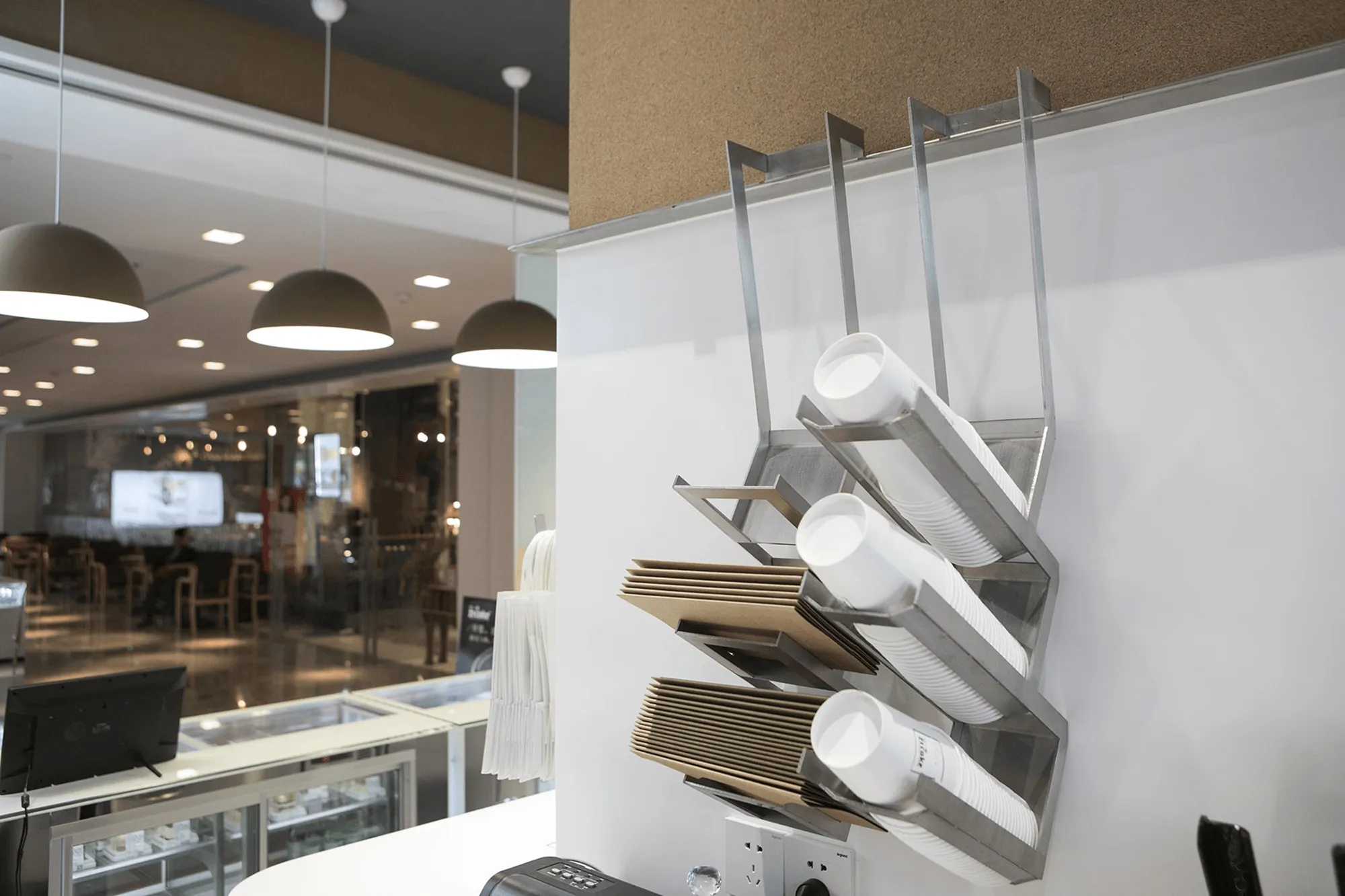
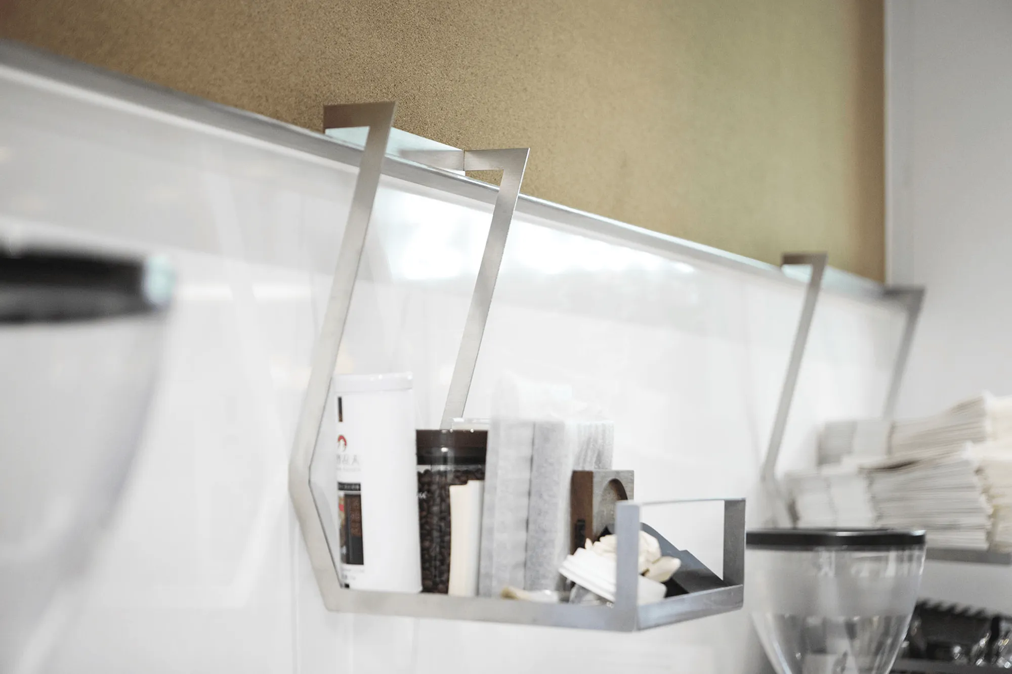
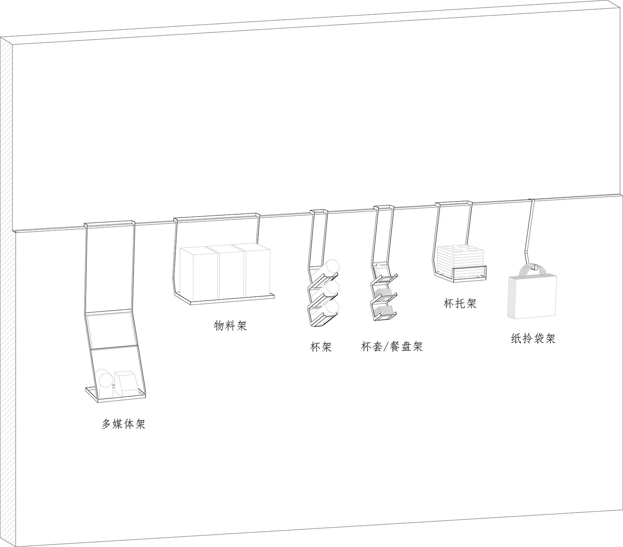
The design team has considered ergonomics in every detail. The streamlined design of the artificial stone backrests caters to customers of varying heights, while the acrylic base allows for a seamless integration with the wall. The cantilevered countertop extends from the main countertop, seamlessly connecting the L-shaped space and serving as a display area. The countertop’s cantilevered design utilizes a steel structure, minimizing structural constraints and maximizing the store’s transparency, further emphasizing the minimalist design philosophy. To maintain the clean aesthetic of the countertop, the design team has incorporated a custom-made stainless steel hanging system for storage. This system seamlessly integrates with the walls, offering flexible storage solutions that can be easily adapted to changing needs.
Project Information:
Architect: Very Architecture
Location: Shanghai, China
Photography: Tian Fangfang
Year: 2016


