Minimalist apartment design with medieval style elements in China, creating a unique and functional living space.
Contents
Project Background and Concept
The design concept for this 40㎡ apartment stems from the philosophy that “Half of space depends on design, the other half is derived from presence and spirit.” by Tadao Ando. The project aimed to craft a multi-dimensional ideal living space by merging undefined minimalism with a medieval aesthetic. The integration of the medieval style strikes a perfect balance between visual appeal and spatial efficiency, creating a space that feels both nostalgic and trendy. It’s a testament to how minimalist interior design can incorporate retro elements to enhance the living experience. This design emphasizes the fusion of minimalist aesthetics with medieval style elements, creating a harmonious blend of contemporary and vintage elements. It is an example of how to create a comfortable and stylish living environment in a small space, using light colors and natural materials to maximize the sense of spaciousness. This project also underscores the importance of spatial utilization in residential design, specifically in smaller spaces where functionality and aesthetics need to be balanced. The tag, #minimalist_apartment_design_with_medieval_style, is reflected in the design through the incorporation of various architectural and decorative features, creating a uniquely tailored living space.
Spatial Planning and Layout
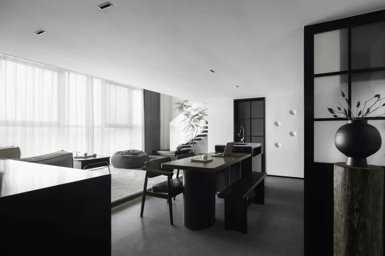
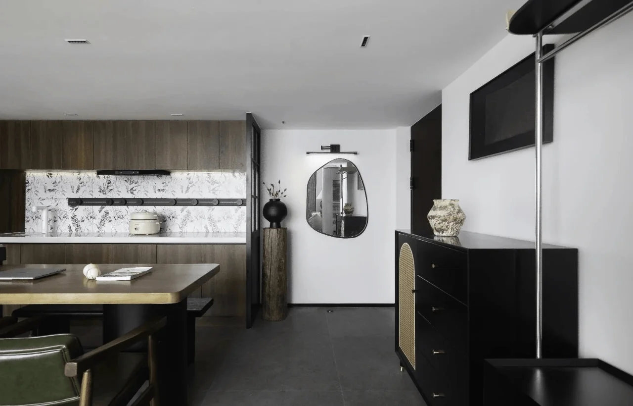
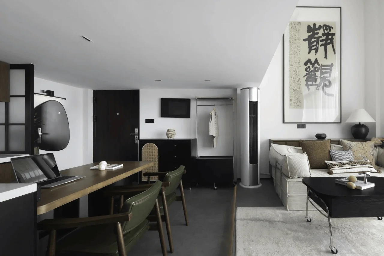
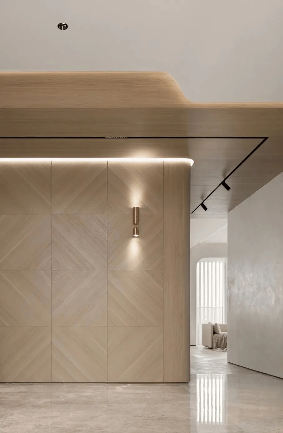
Given the relatively narrow entrance area and the immediate presence of the kitchen and dining room upon entry, the designers prioritized a unified color palette to avoid visual clutter. A clean and orderly approach, characterized by ‘visual subtraction’, contributes to the perception of spaciousness in the entrance. A frosted glass partition delicately introduces a sense of privacy, while a multifunctional clothes rack stretching from floor to ceiling showcases the owner’s refined taste by displaying books and decorative items. The introduction of gypsum lamps on the bathroom’s exterior walls acts as a captivating visual focal point, adding a touch of playfulness to the space. The tag, #spatial_utilization_in_small_spaces, is highlighted in the efficient and functional use of the entrance area. The designers cleverly integrate storage elements within the entrance space, making it both visually appealing and practical, maximizing space and creating a welcoming atmosphere for residents and guests. By using simple, clean lines and light colors, the designers have made the entrance appear larger and brighter. The incorporation of glass partitions and multifunctional furniture further enhances the sense of spaciousness and functionality, a testament to the design’s focus on providing a seamless user experience.
Kitchen and Dining Area Design
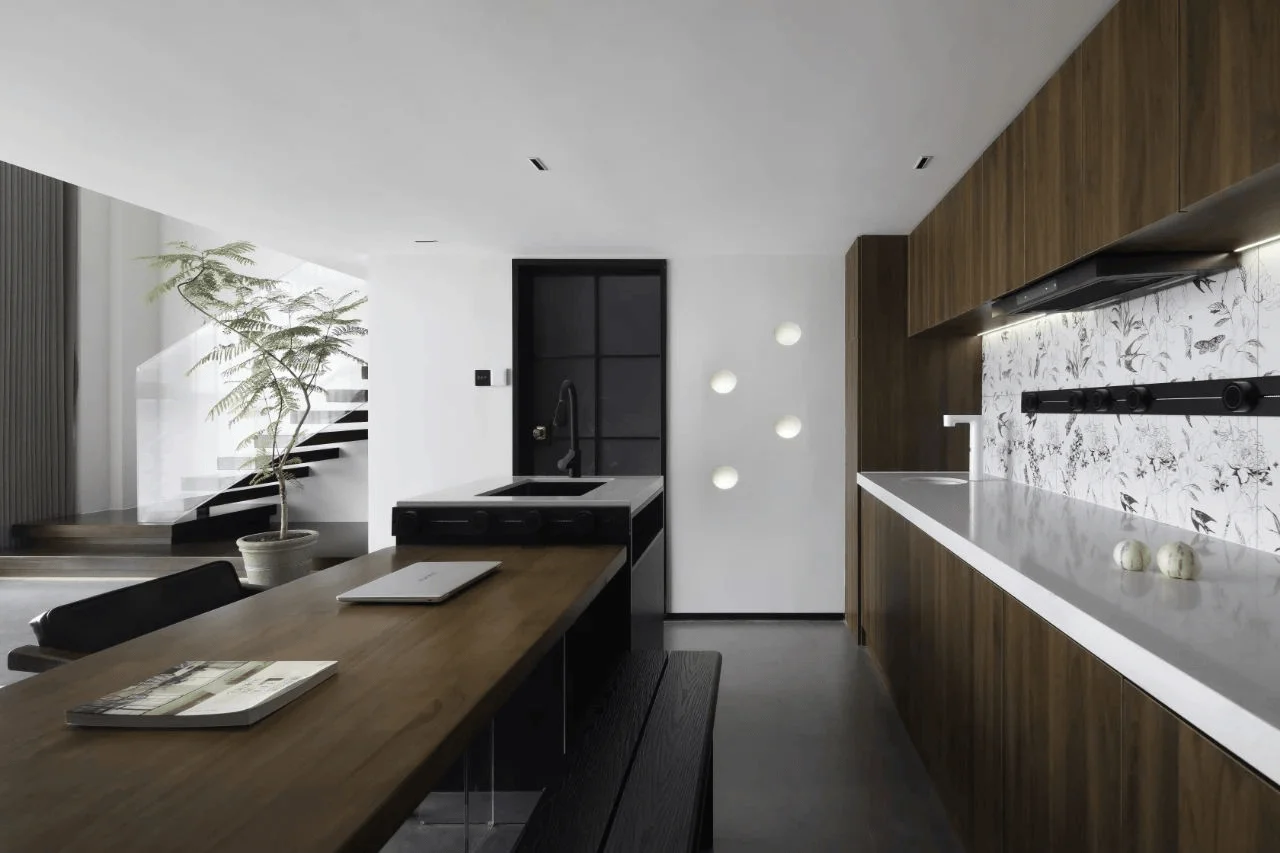
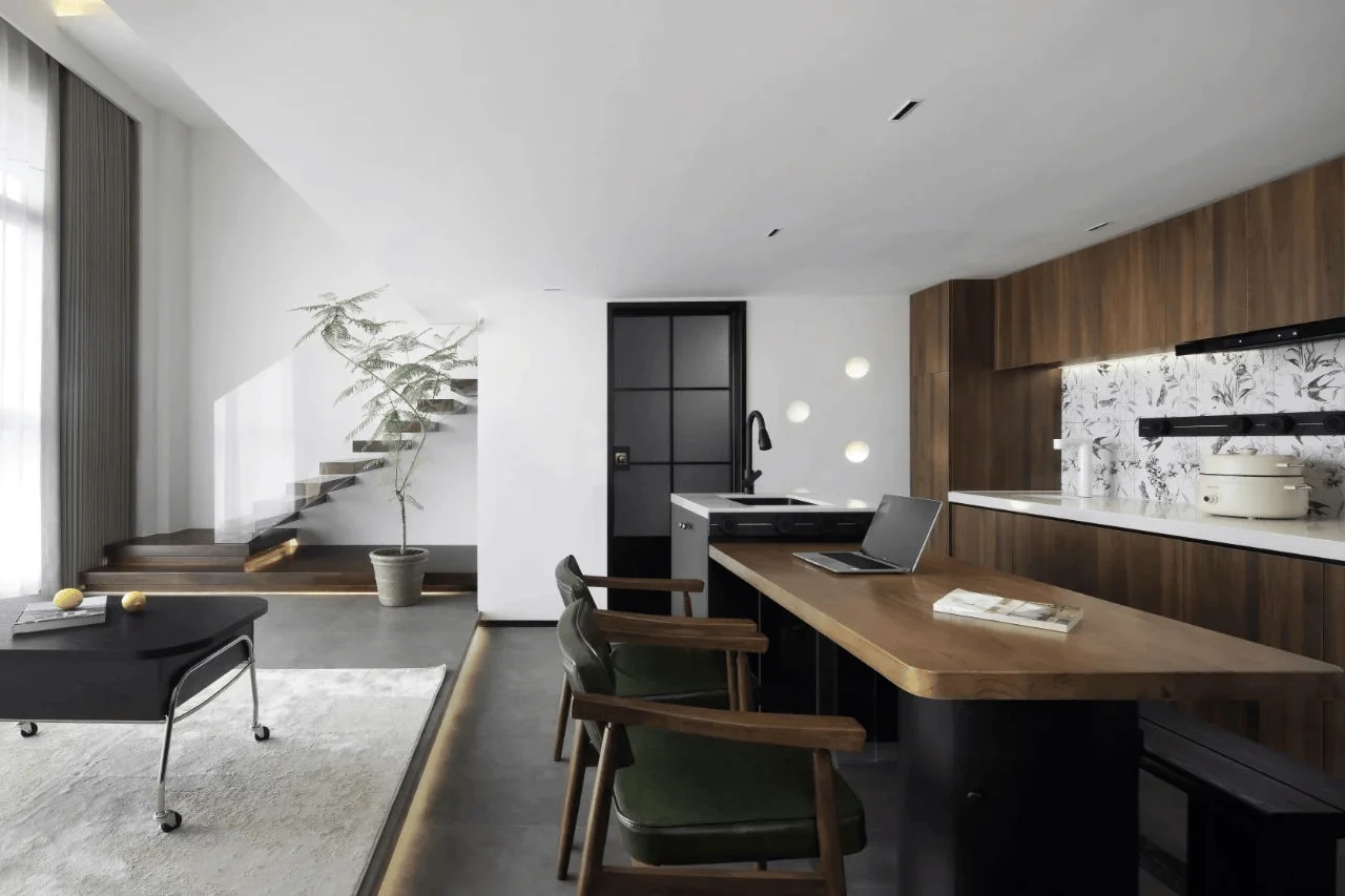
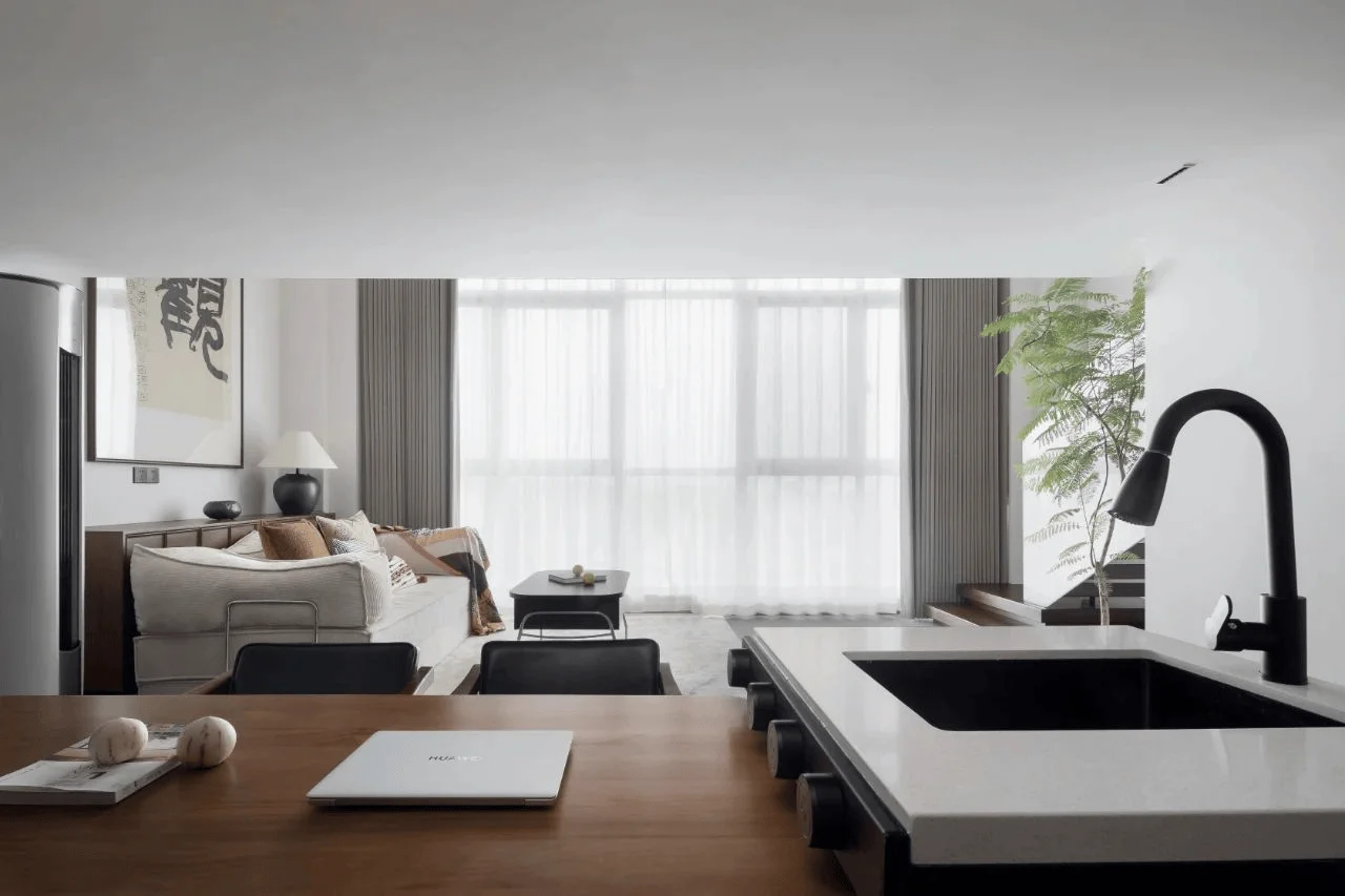
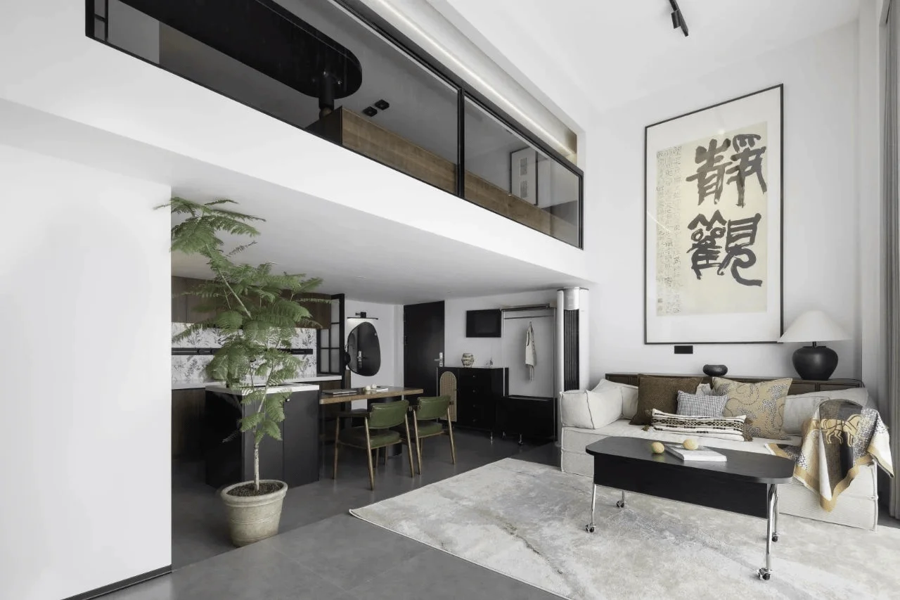
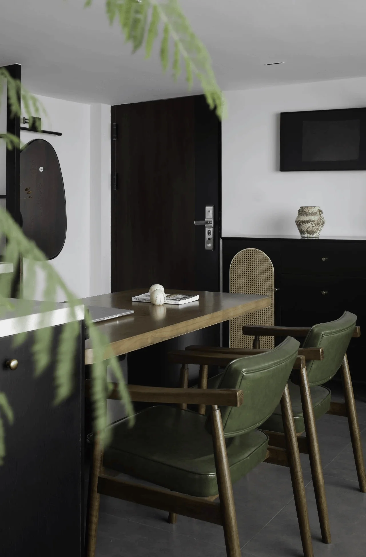
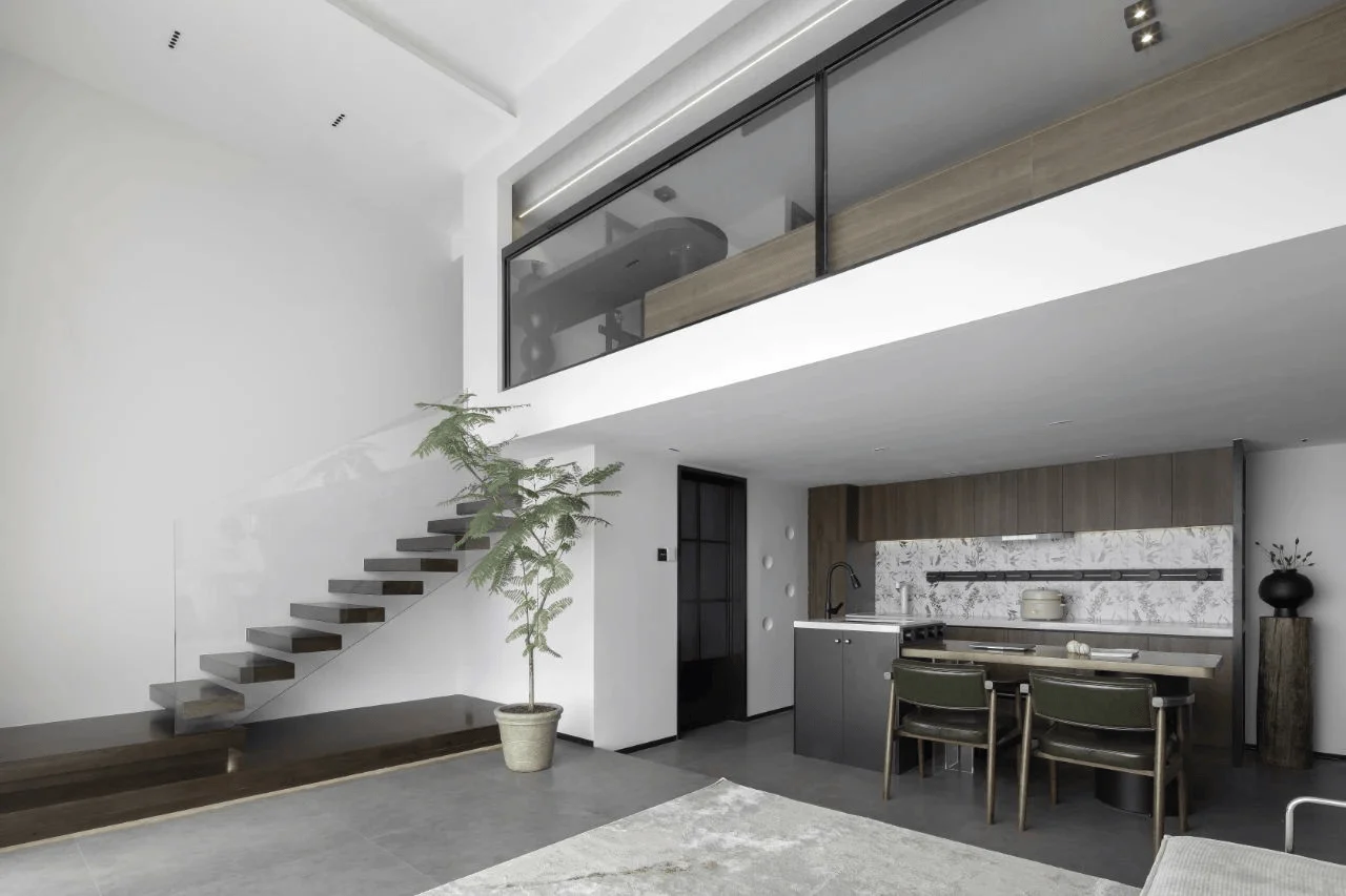
The kitchen’s aesthetic is defined by walnut wood cabinets, complemented by white terrazzo countertops and retro floral wall tiles, which creates a warm-cool color contrast. This design satisfies storage needs while simultaneously enhancing the spatial blocks’ feel. The kitchen and dining area feature an open design to foster a sense of openness and promote natural light and ventilation. The integration of the Nakajima Terrace and the dining table forms the visual centerpiece of the space. The natural marble countertop and the thoughtfully crafted dining table evoke a strong mid-20th-century vintage aesthetic. The medieval style dining chairs beautifully complement the natural wood color scheme of the dining area, creating a visually harmonious and comfortable atmosphere. The tag, #retro_kitchen_design, is evident in the warm color palettes, natural materials, and vintage elements incorporated within the kitchen and dining area. The integration of medieval style elements into the kitchen and dining room design contributes to the unique character of the space. The designers sought to create an ambiance that is both modern and comfortable, using a mix of old and new elements to create a space that is both functional and visually stimulating. The choice of materials and the design of the space contribute to the overall aesthetic and functionality of the kitchen and dining area.
Living Room and Loft Design
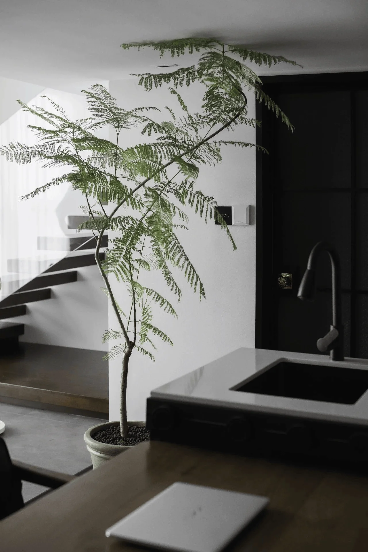
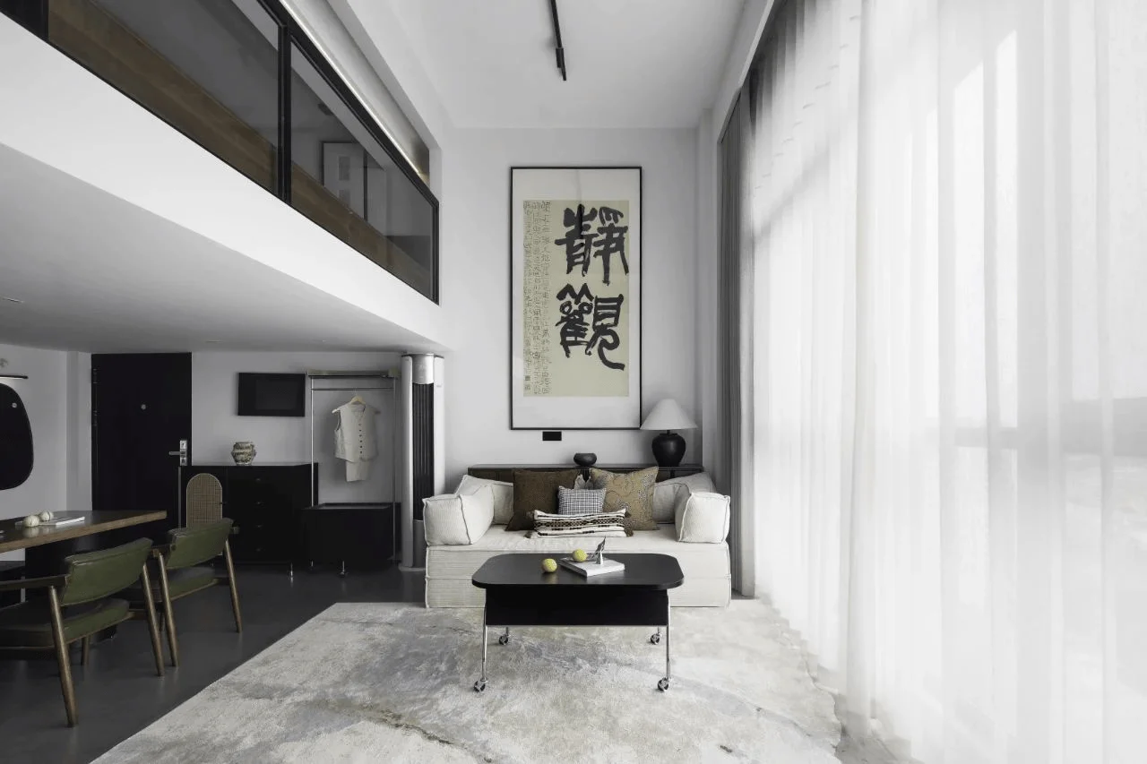
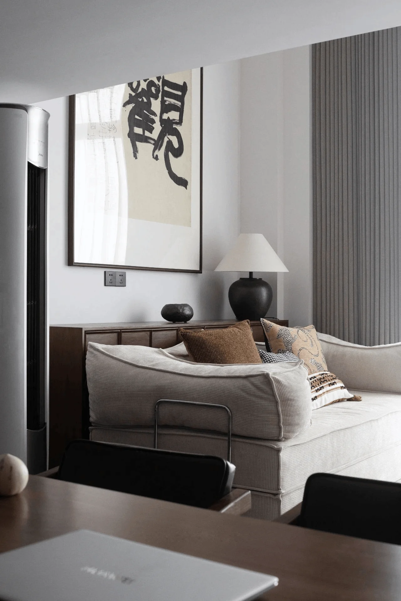
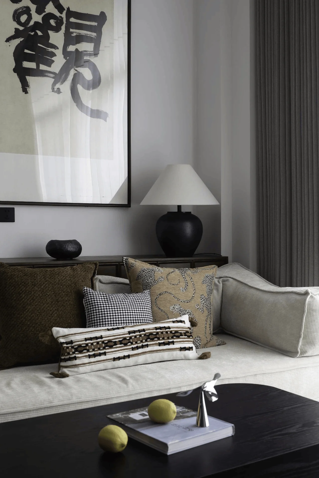
The living room area is elevated on a platform to introduce a sense of ceremony. A double-height design maximizes the utilization of natural light, enhancing the brightness and transparency of the space, thereby improving comfort and quality of life. A large calligraphy piece positioned behind the sofa instills a sense of grandeur in the relatively small living room. The design of the floating staircase promotes a feeling of lightness and openness, while the deep-toned wood accents integral to the medieval style, create a cohesive color gradient with the floors and walls while enhancing the retro aesthetic. The tag, #loft_apartment_design, is evident in the double-height design that utilizes the vertical space of the apartment. This creates a feeling of spaciousness and openness in the living room area. The combination of the floating staircase and the loft space provides a unique and modern aesthetic, and highlights the seamless integration of the living and sleeping areas. The designers have strategically used light and space to create a sense of balance and harmony within the apartment, further enhanced by the contrasting dark and light colors and textures used throughout the apartment.
Bedroom and Study Area Design
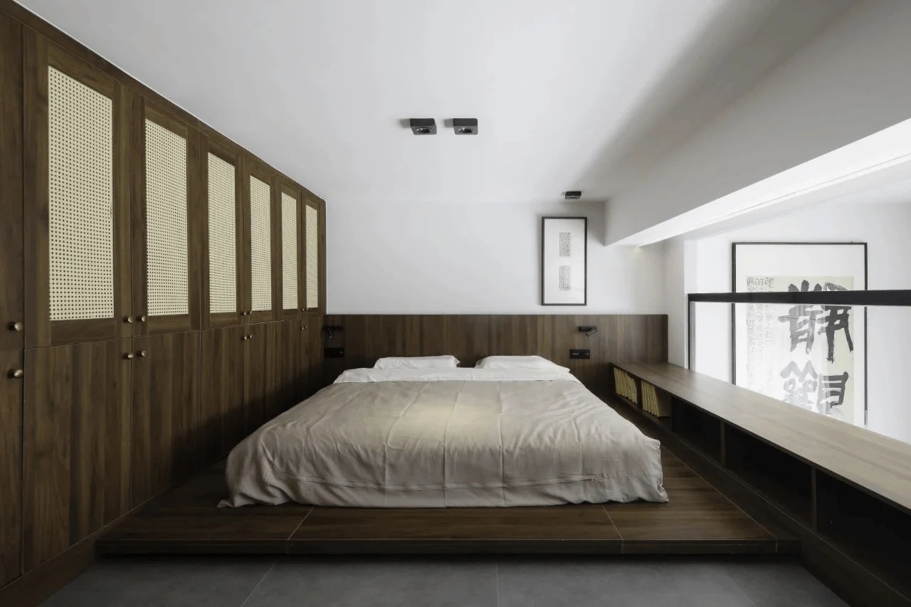
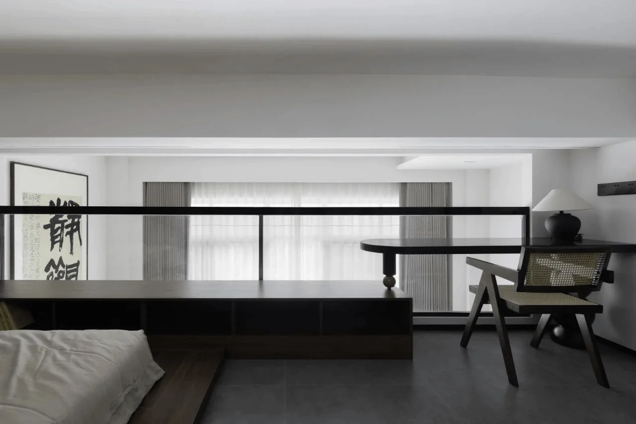
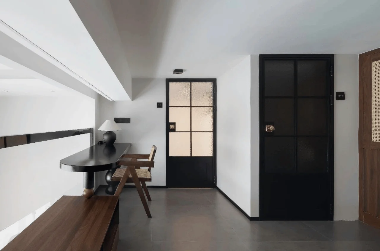
The second floor serves as a private space combining the functionalities of a bedroom and a study. A customized black desk strategically placed on a bookshelf provides a dedicated workspace. The desk’s minimalistic design contrasts with the low, heavy bookshelf. A cleverly integrated line light embedded within the beam above the desk effectively reduces the beam’s perceived bulkiness. A vintage desk lamp complements the workspace, fostering a tranquil and independent atmosphere for studying and working. In a nod to the minimalist philosophy of medieval style, which is an extension of modernism, a simple mattress placed on the platform replaces a traditional bed, reinforcing the elegance of the design aesthetic. The tag, #contemporary_bedroom_design, is reflected in the minimalist design of the bedroom area. The integration of study functions into the bedroom space enhances its practicality and functionality. The designers have maintained a consistent color palette and style throughout the apartment, including the bedroom, creating a unified aesthetic. The use of natural materials, such as wood and textiles, complements the minimalistic style, enhancing the overall sense of peace and serenity in the space. This approach also reinforces the connection between the interior space and the natural world.
Conclusion
The designers aimed to create a space that enables residents to rediscover the simple joys and beauty of life, to help them find a sense of calm and to encourage a renewed appreciation for the little things. They successfully built a small space with a sense of spaciousness and a unique visual style. This design underscores how the mindful integration of design elements can enhance the quality of living, even in a relatively small space. The tag, #interior_design_ideas_for_small_spaces, is evident throughout the project, inspiring homeowners to embrace simple and efficient design concepts and achieve a balanced and aesthetically pleasing living environment. The design process for this project is an excellent example of how effective design can create a space that is both functional and visually appealing. By merging contrasting elements, including minimalism and medieval style, the designers created a space that is both unique and inviting, contributing to the homeowners’ sense of peace and well-being.
Project Information:
Residential Space Interiors Design
Yi Zeng
40㎡
2023
China
Walnut Wood, Terrazzo, Marble, Frosted Glass
Not Provided


