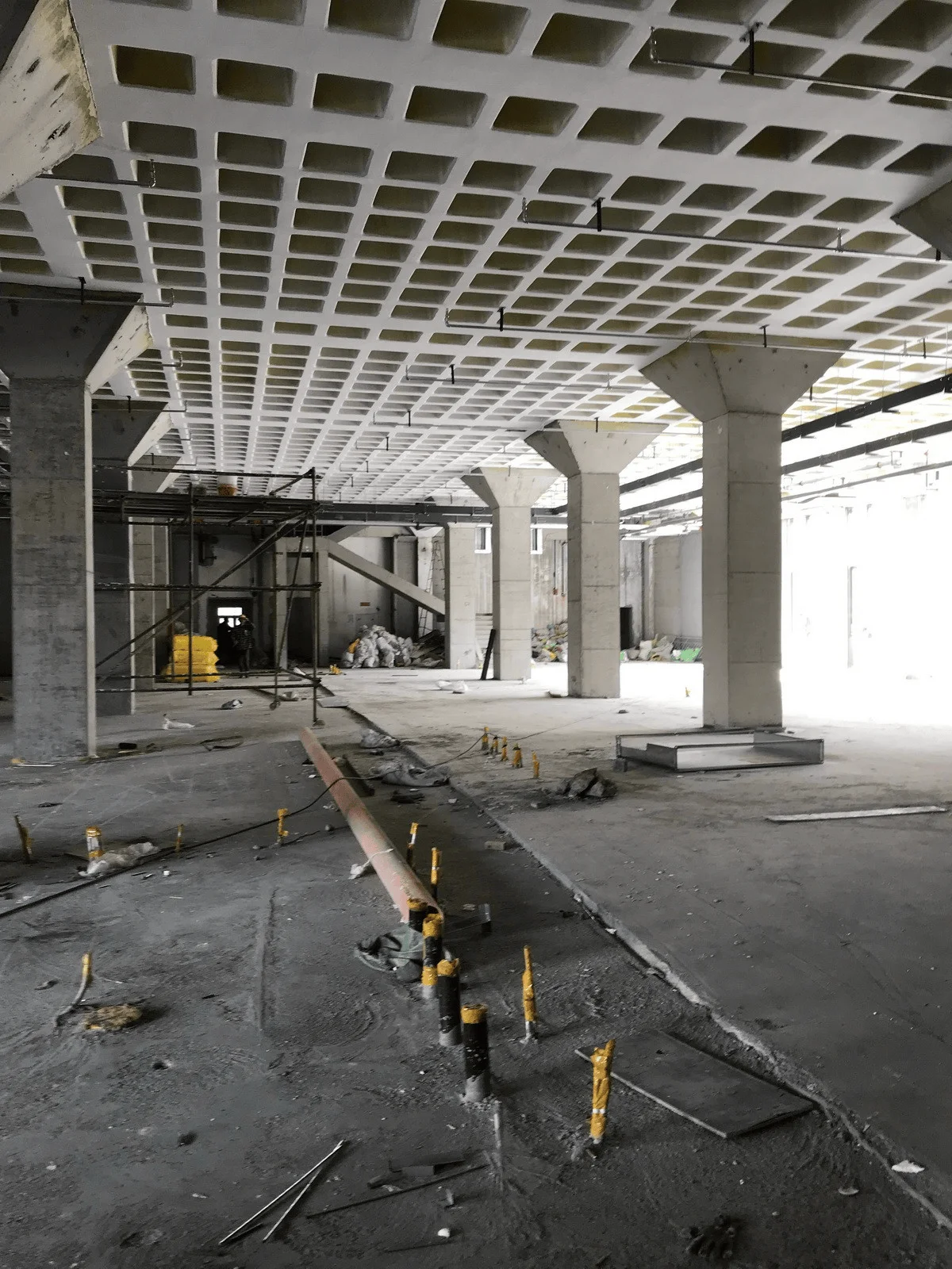
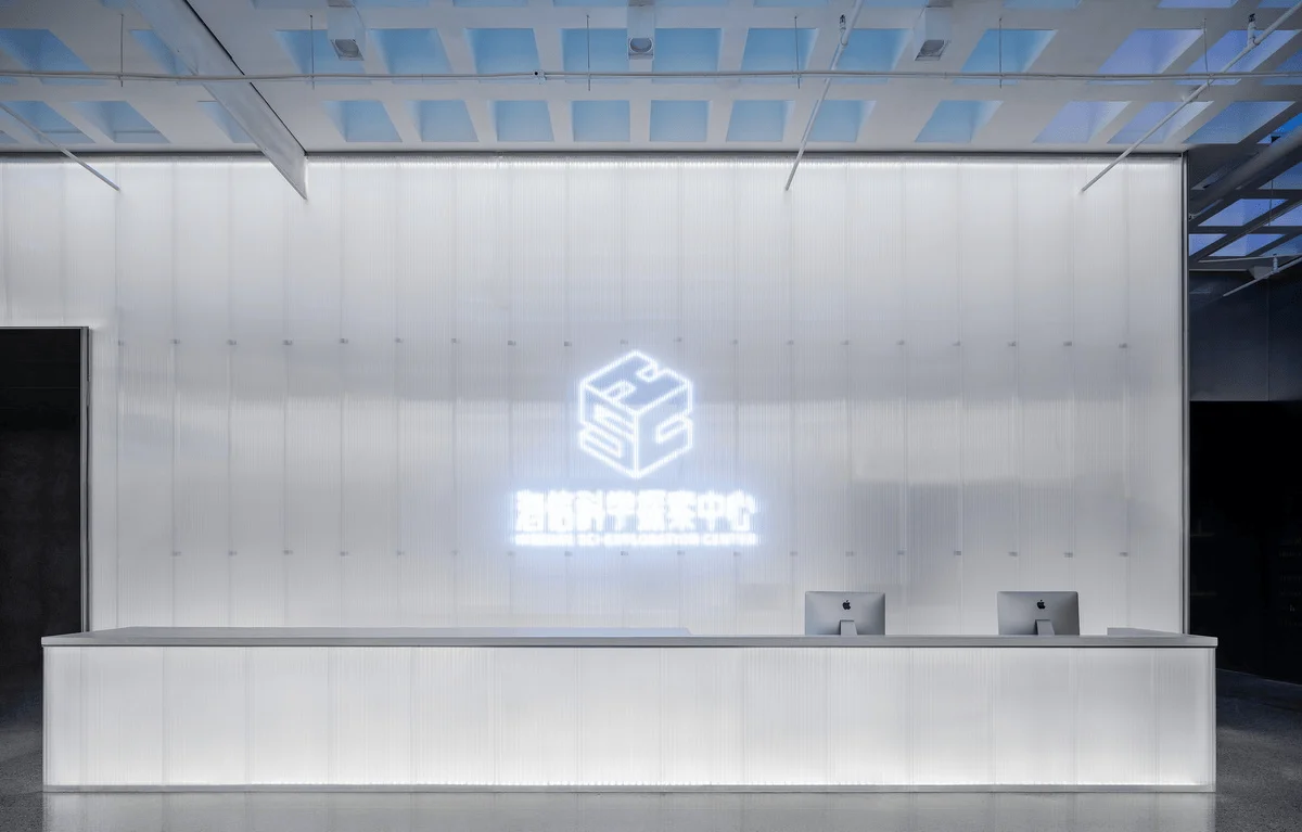
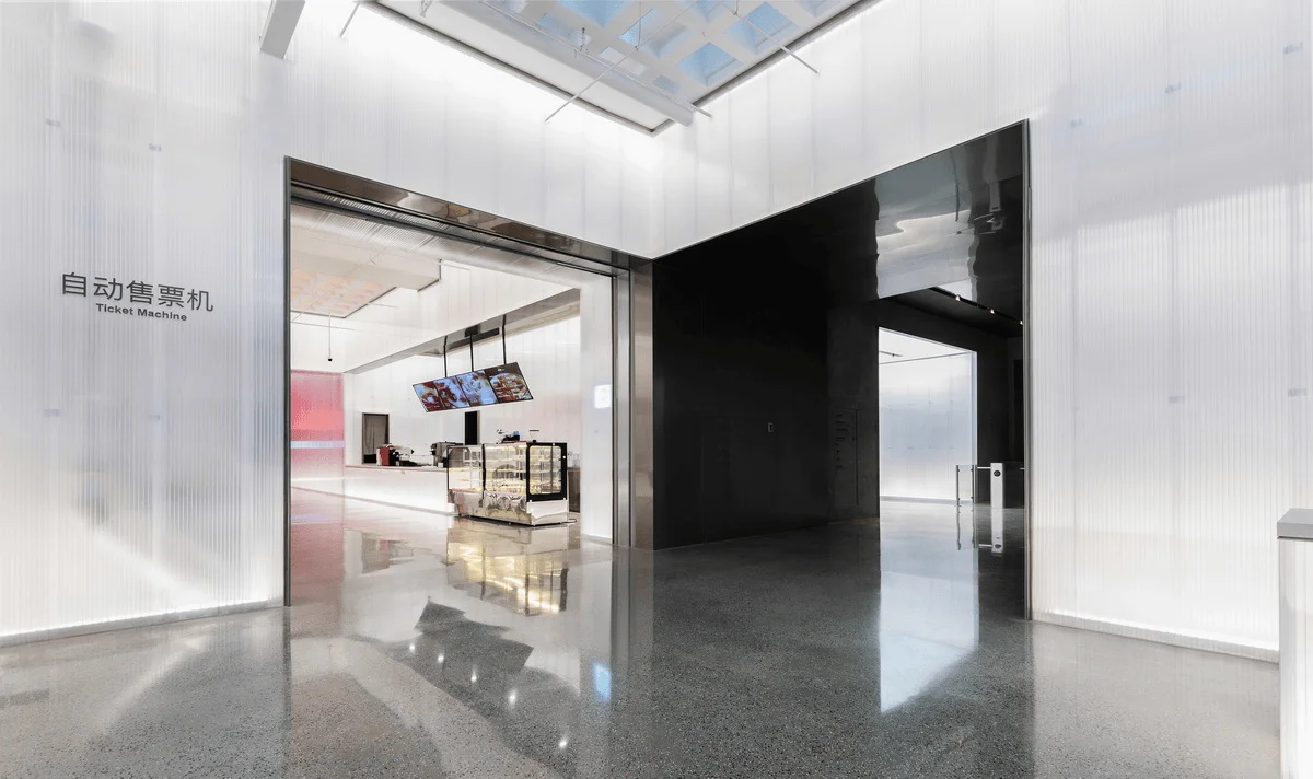
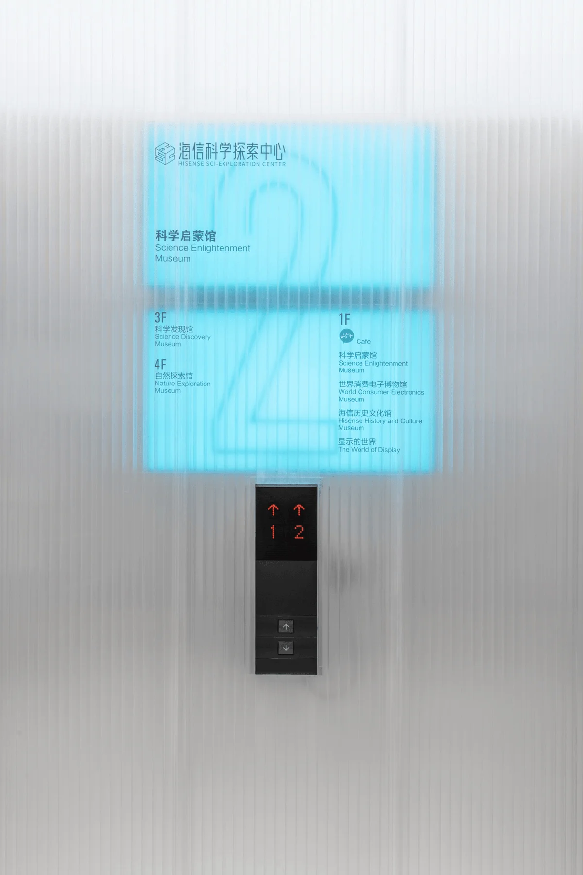
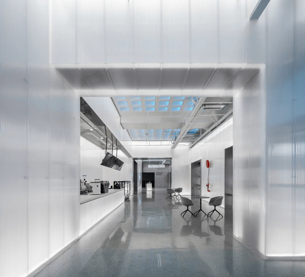
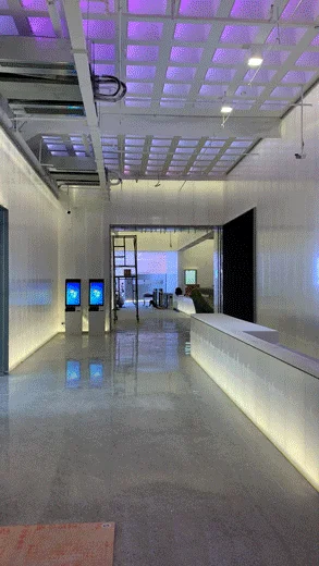
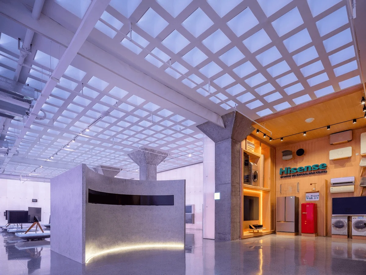
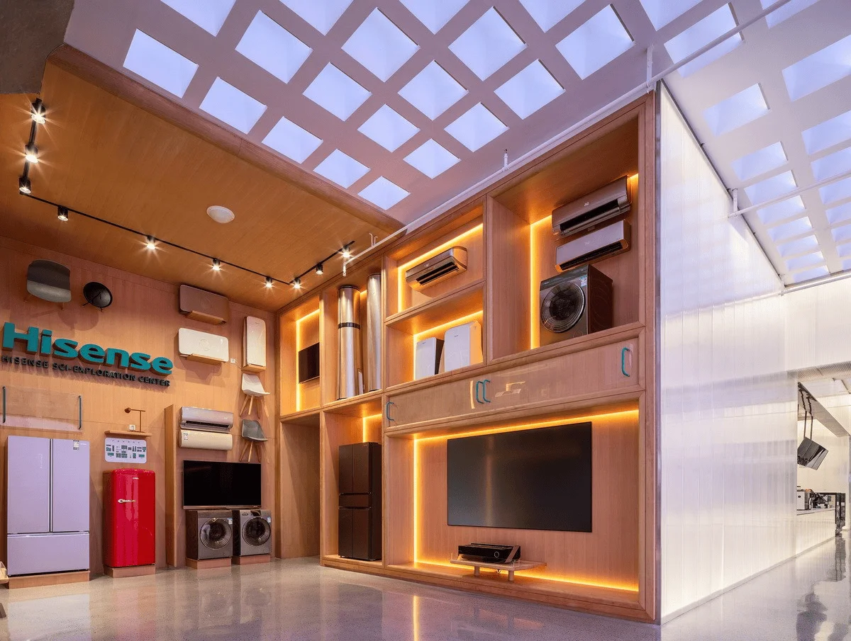
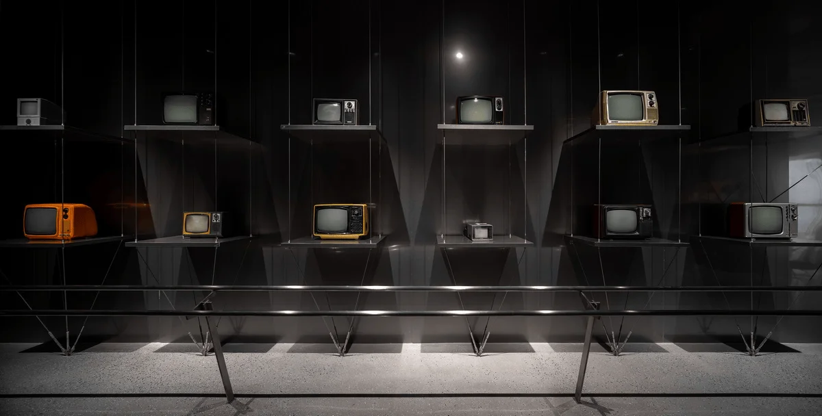
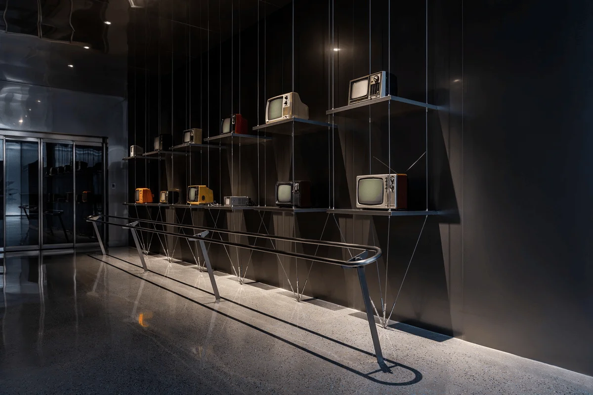
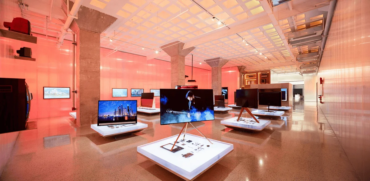
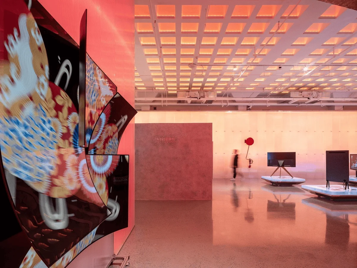
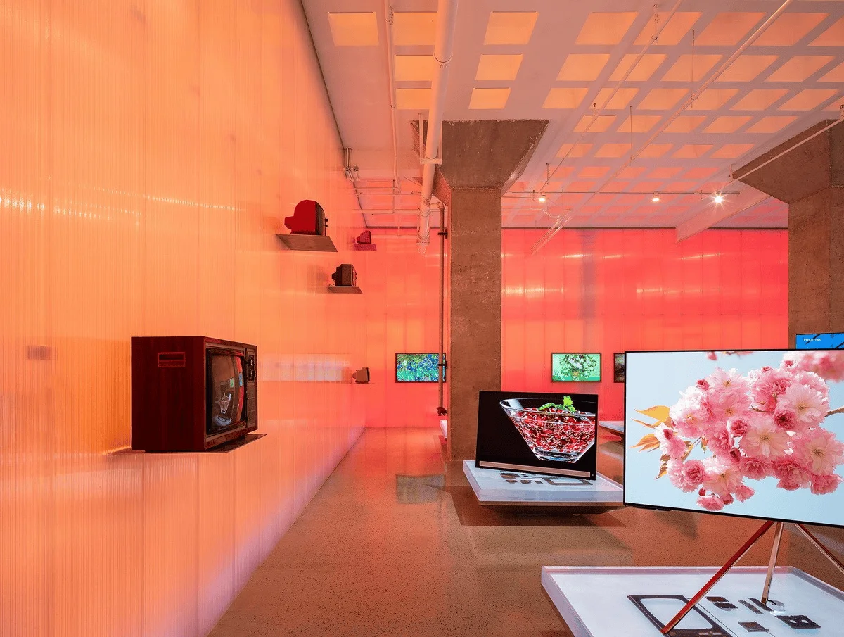
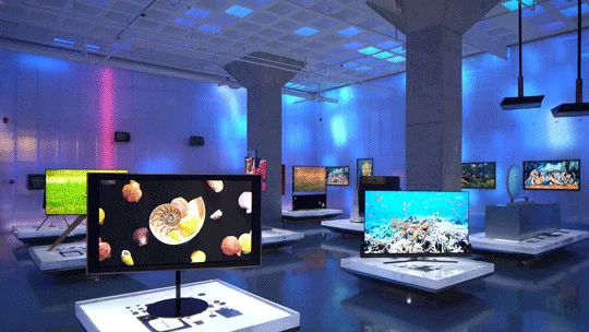
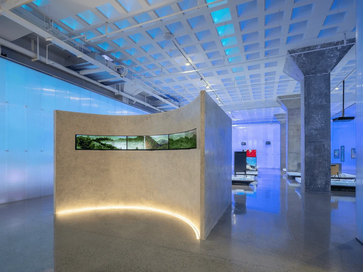
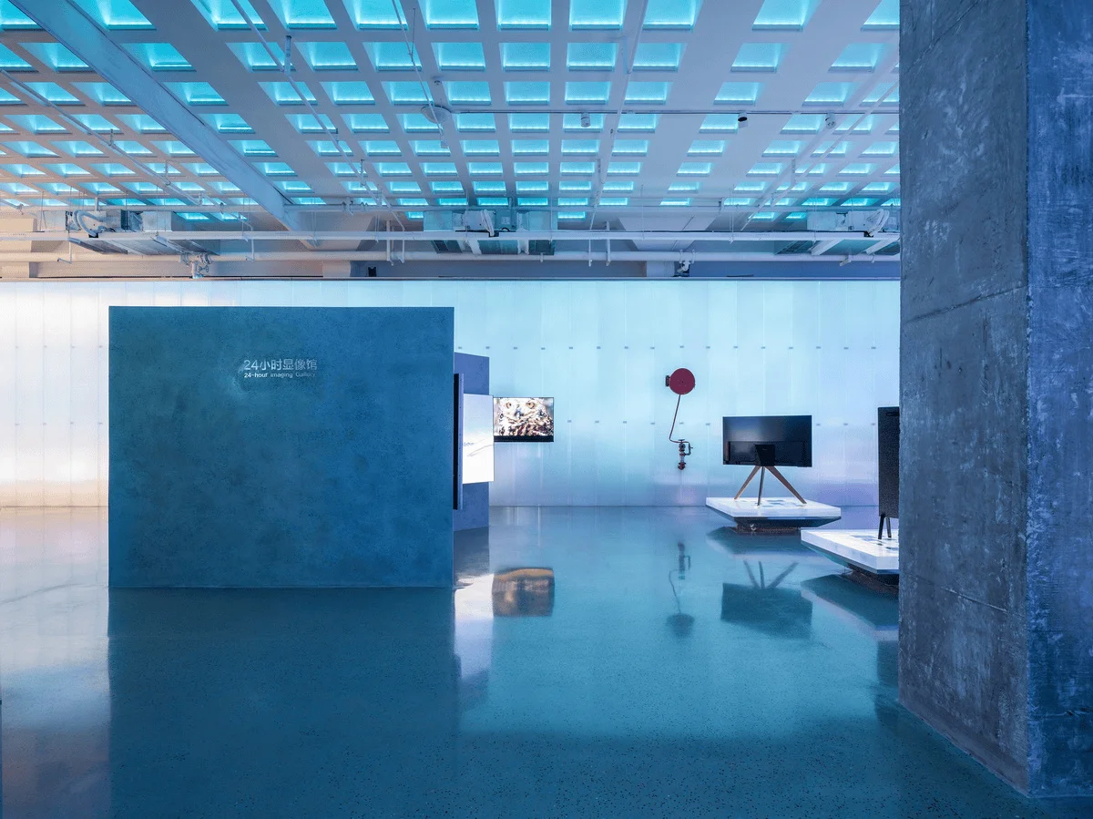
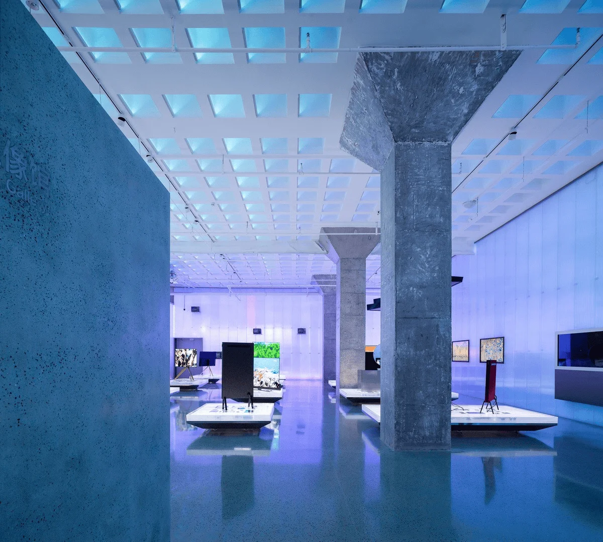
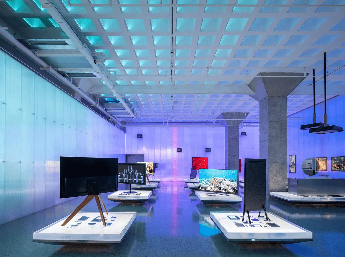
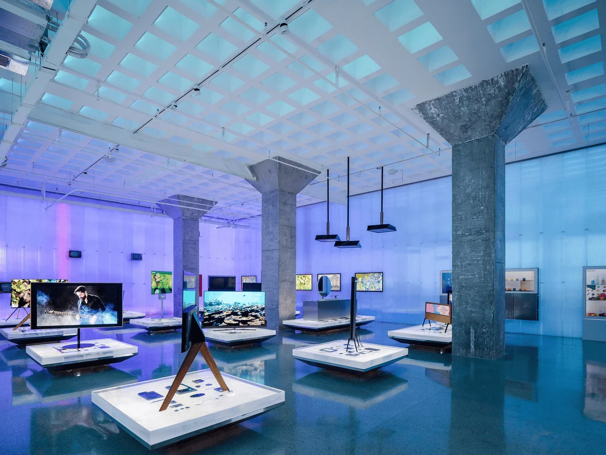
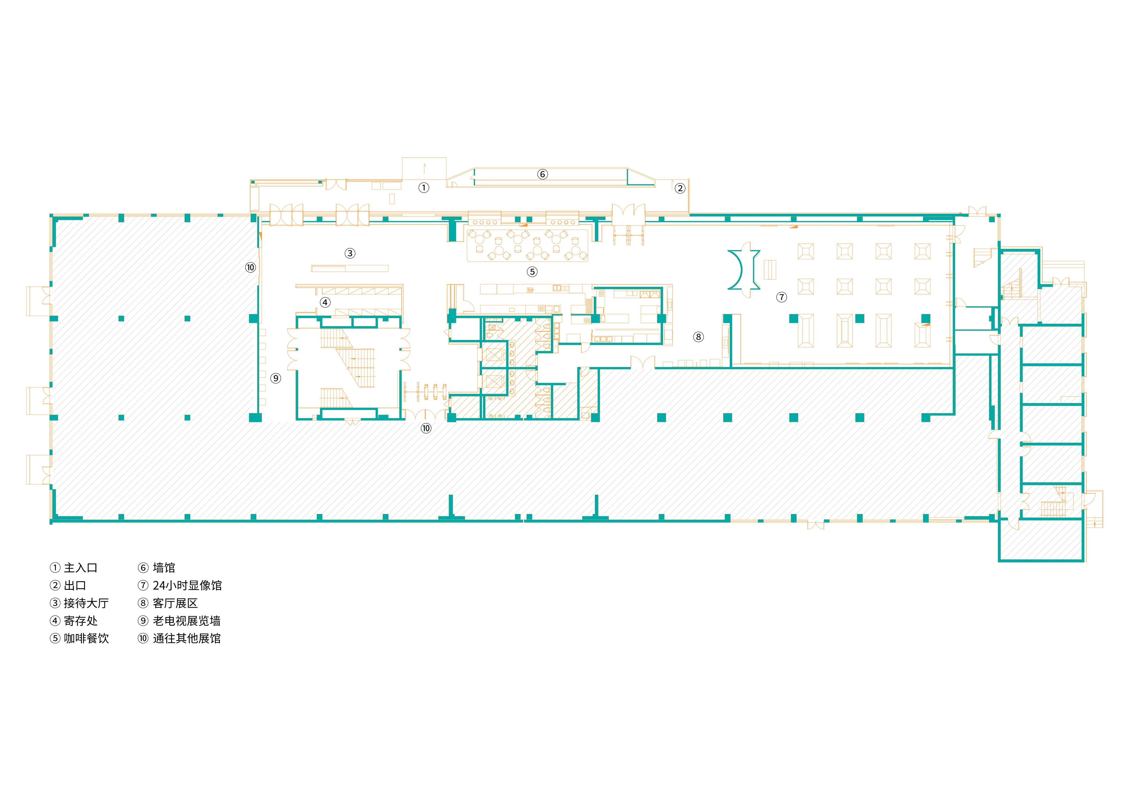
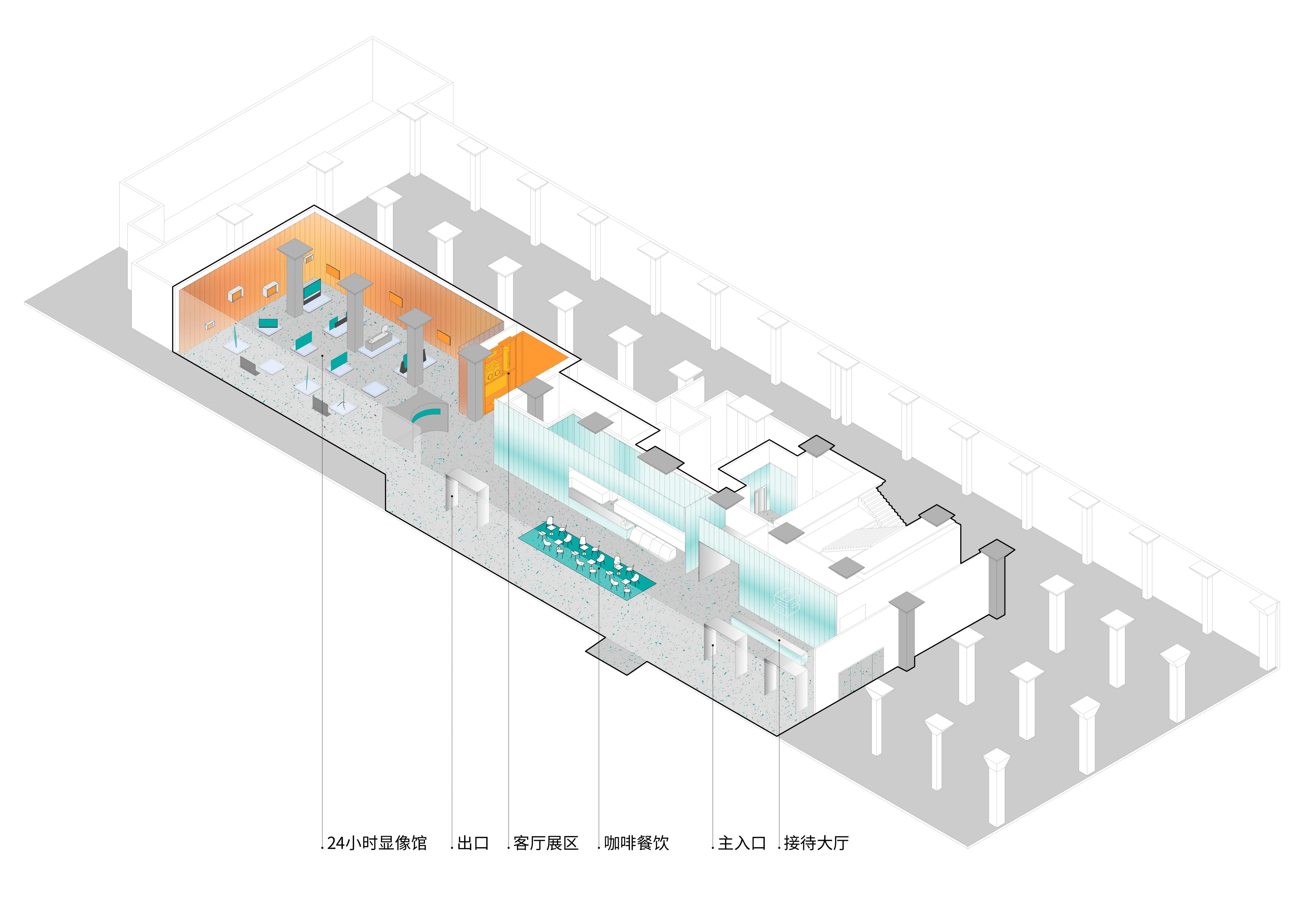
The project received a commission to create a composite commercial space for the national television brand Hisense, located in Qingdao, China. This space includes a future television showroom, a commercial entrance space, a coffee area, and an old television exhibition area. The space was previously a Hisense television factory and has undergone several renovations, with the building facade now a stark contrast to its past. However, the internal structure of the space still retains the beam-free floor slabs and umbrella-shaped columns of the television factory era. These two spatial features should be completely preserved.
This is a question that roarc.cn asks itself when taking on each space. We believe that each space has its own voice, character, and form. Just like our previous project, the Nanjing Taihe Xi Spa, we insisted on using the inherent Thai attributes of red brick to speak. This time, the attributes of Hisense are our entry point for the design.
After visiting the Hisense TV Development History Museum, we discovered an important piece of information that had been overlooked: the development of television over a century has actually been a process of its screen transitioning from blurry to clear. This process of “from blurry to clear” is a process of human civilization development, and it is also a process in which history reveals the essence and dregs of civilization. We hope to preserve this “experience.”
Therefore, from blurry to clear is the production history of television, the development history of Hisense, and the result of its continuous improvement. Moreover, the core construction of modern LCD televisions is made up of a “spectral screen” combined with a “color screen.” The spectral screen is responsible for brightness, and the “color screen” is responsible for saturation. From the division of labor and combination of the spectral screen and the color screen, it is not difficult to see the construction of modern televisions, which are “from blurry to clear”: each one plays its role, and the logic is becoming increasingly clear. This is roarc.cn’s understanding of interior space, pursuing the essence and narrating with the essence.
The space is like a carrier of display, a metaphor for spatial narrative. We want to create two kinds of images in the space:
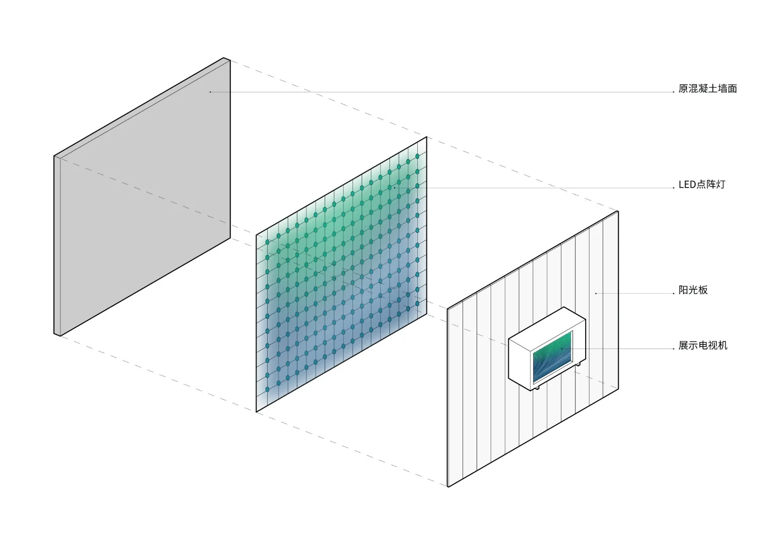
1. **Polychromatic:** The process from blurry to clear, that is, from the blurry and chaotic state of the wall to the clear state of the LCD screen of the TV. We invited multimedia consultants to achieve the same frequency transmission of digital signals, that is, the images on the TV screen are consistent with the spatial imaging, and the conflict of the same images expresses this essential characteristic of “from blurry to clear.”
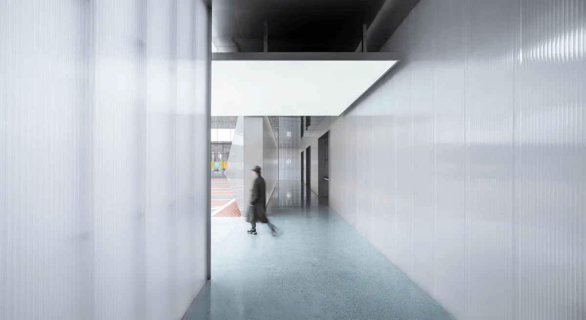
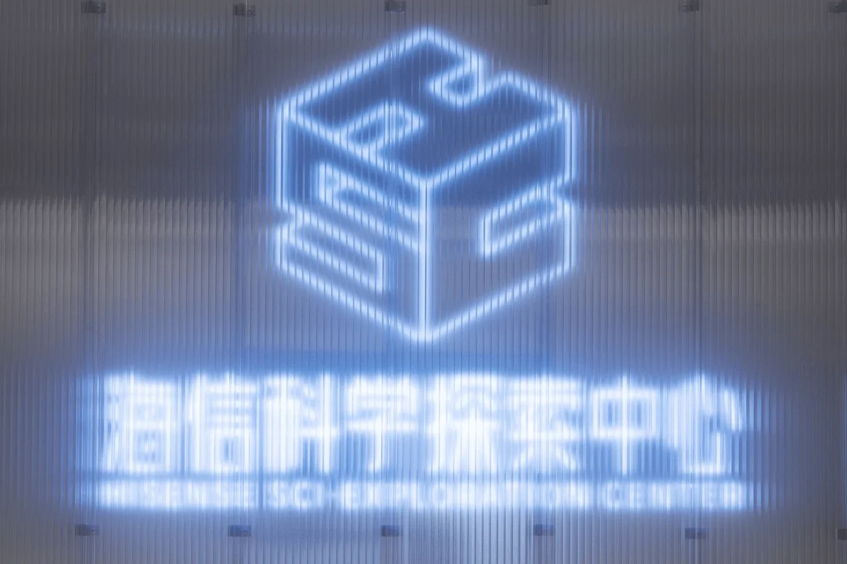
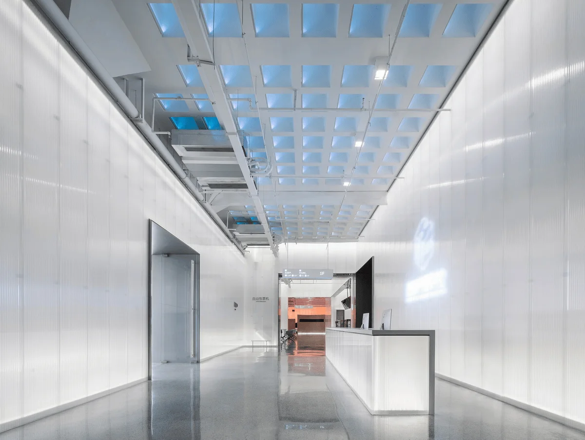
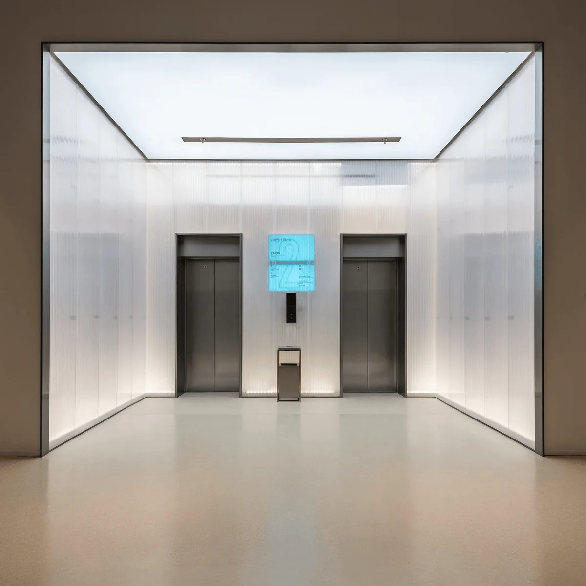
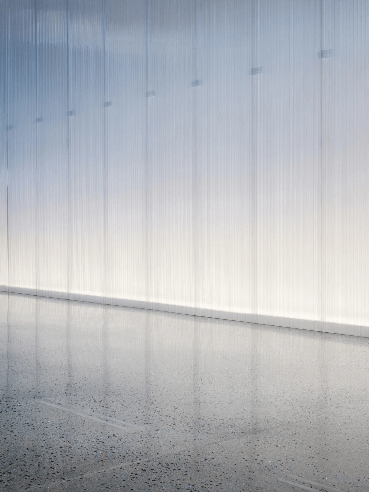
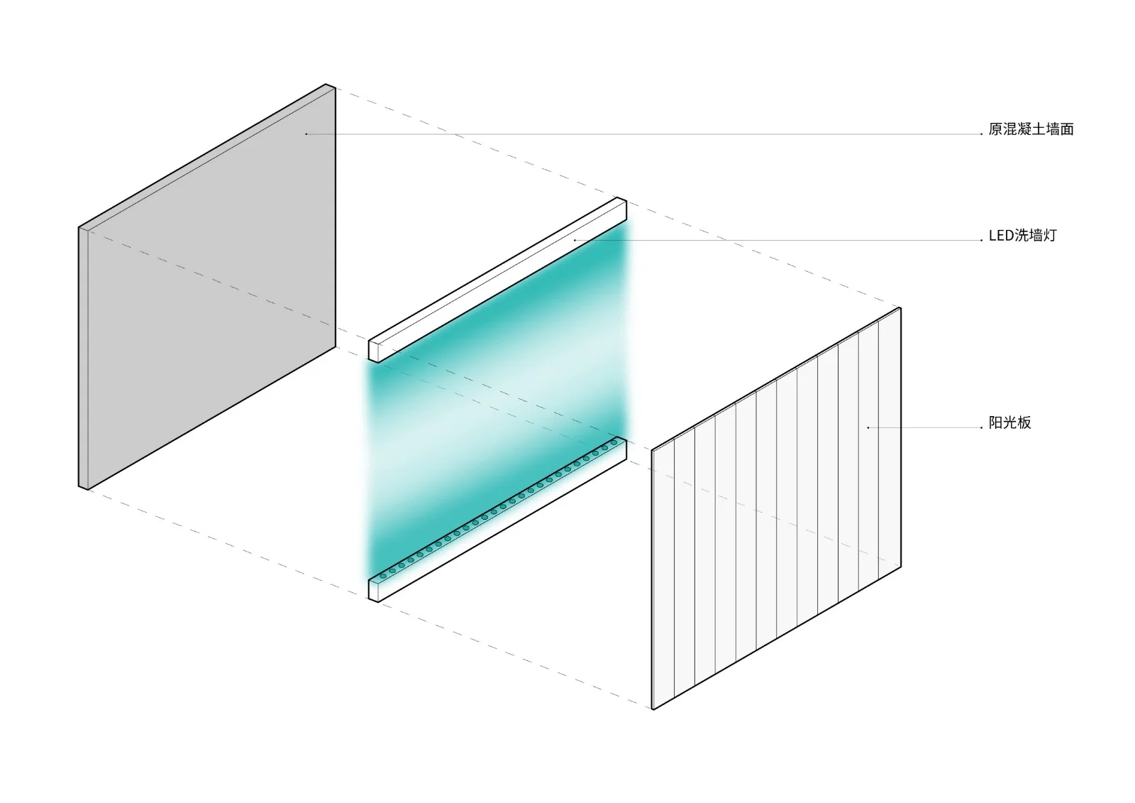
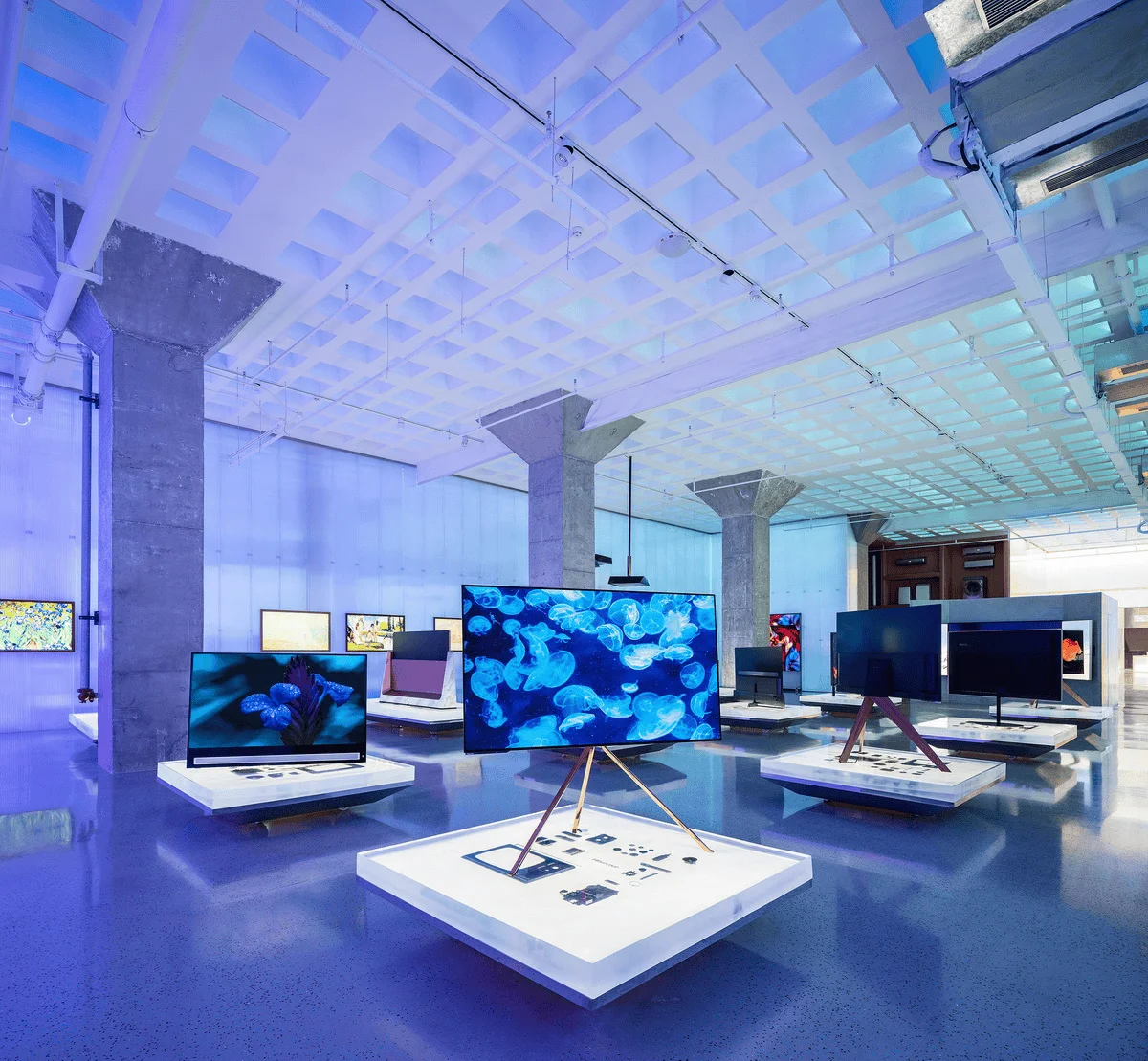
2. **Monochromatic:** It reflects the essential characteristics of the core “spectral screen” in modern LCD televisions. By filtering light through the sunshade, the characteristics of the core spectral screen are magnified to the scale of the entire space. The space itself is a kind of viewpoint creation, and this viewpoint can be imbued with commercial value and meaning.
Roarc.cn has proposed that beauty comes from a glimpse of order in chaos. This is the consensus and judgment made by people’s eyes and brains after being educated. This is the aesthetic value orientation of the majority, it is skillful, and it is consensual. We have practiced this methodology in almost all of our previous projects. The discipline of ritual and vault, the eye that rotates with light in the end, the structural order of Taihe Xi’s red brick… all have become guarantees of “output.” Whenever a methodology is formed, we hope to be able to find its opposite, try, repeat, and thus innovate one step further. In this project, we hope to resist the physical order through the disorder of electronics. In a way, this is also a resonance between the “form” of the industrial design of past televisions and the “formless” of present-day LCD televisions. The light shining through the 5mm sunshade presents a kind of chaos and disorder, breathing, heartbeat, and resonance. We hope that this deliberate attempt will bring the space to the “good” side, make the space alive, like a person, living faintly, not showing off, nor concealing.
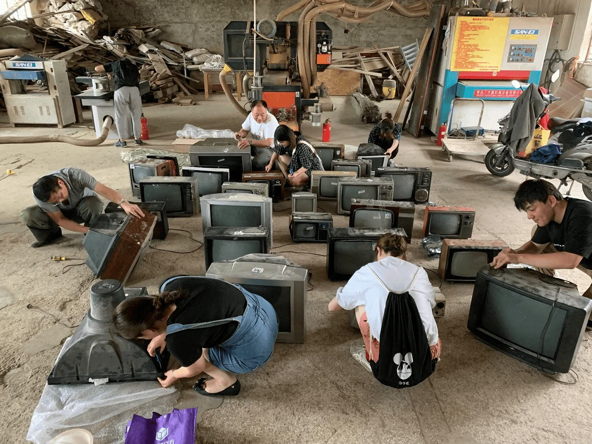
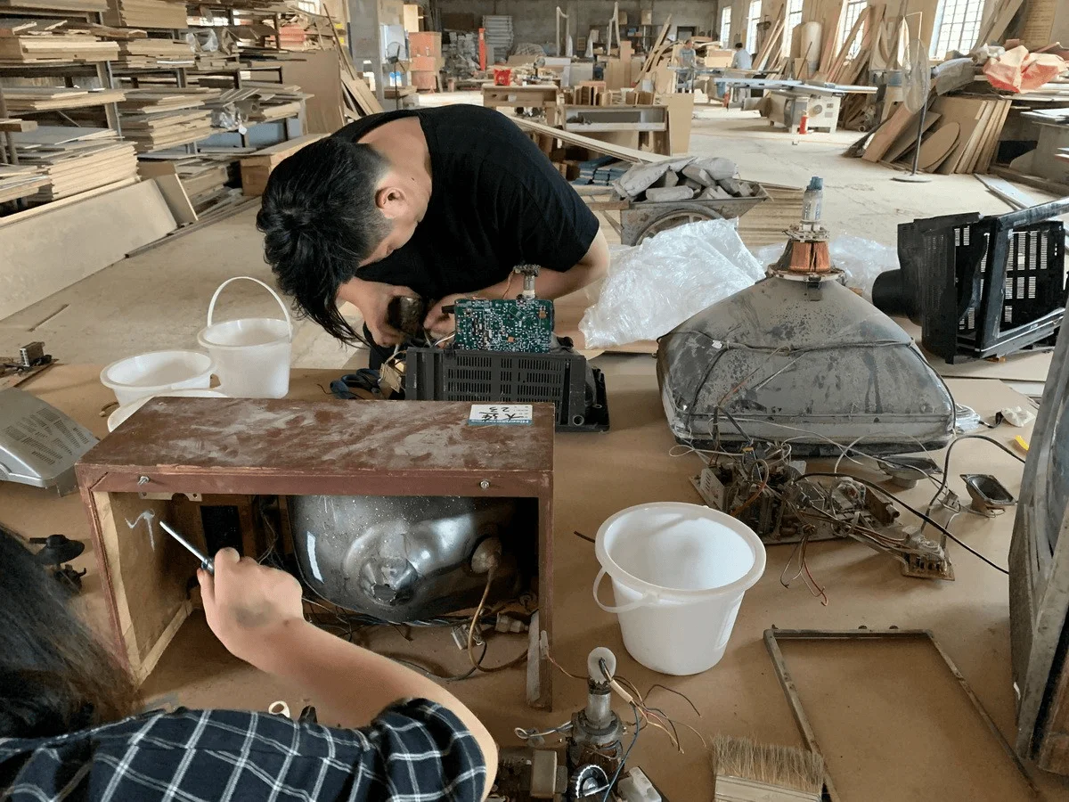
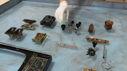
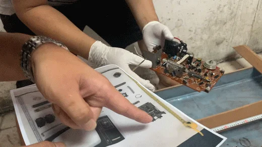
As a major television manufacturer, Hisense’s warehouse contains 30 discarded old televisions. They share a common characteristic: their shells are broken beyond repair, and their cores have been sealed for a long time. “They will never appear in the sight of human beings again, will they?” “It’s such a pity.” So, we had a grand scene of mobilizing the entire office to “dismantle the core,” and I would like to thank Ben from Jie Lu for helping out with the whole family.
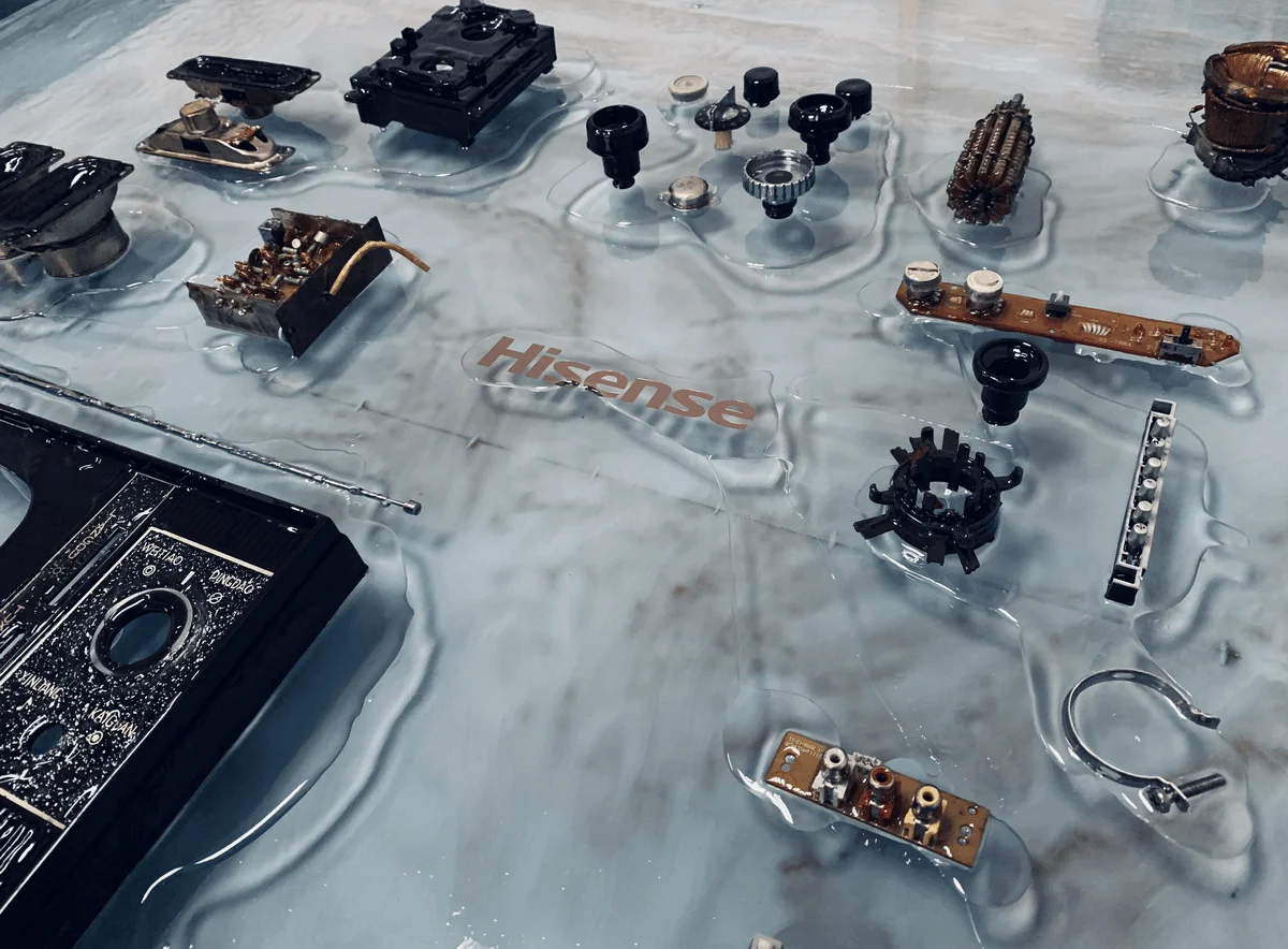
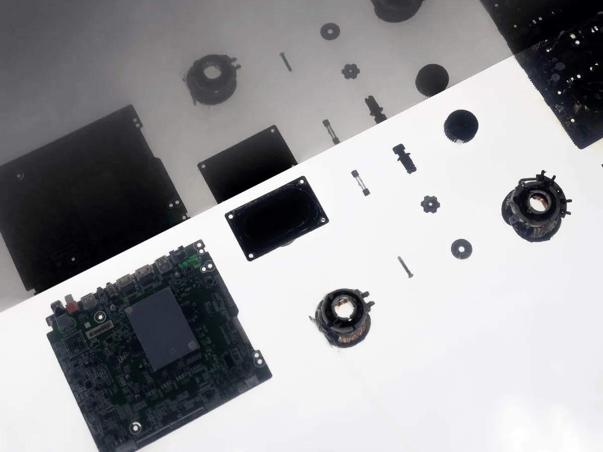
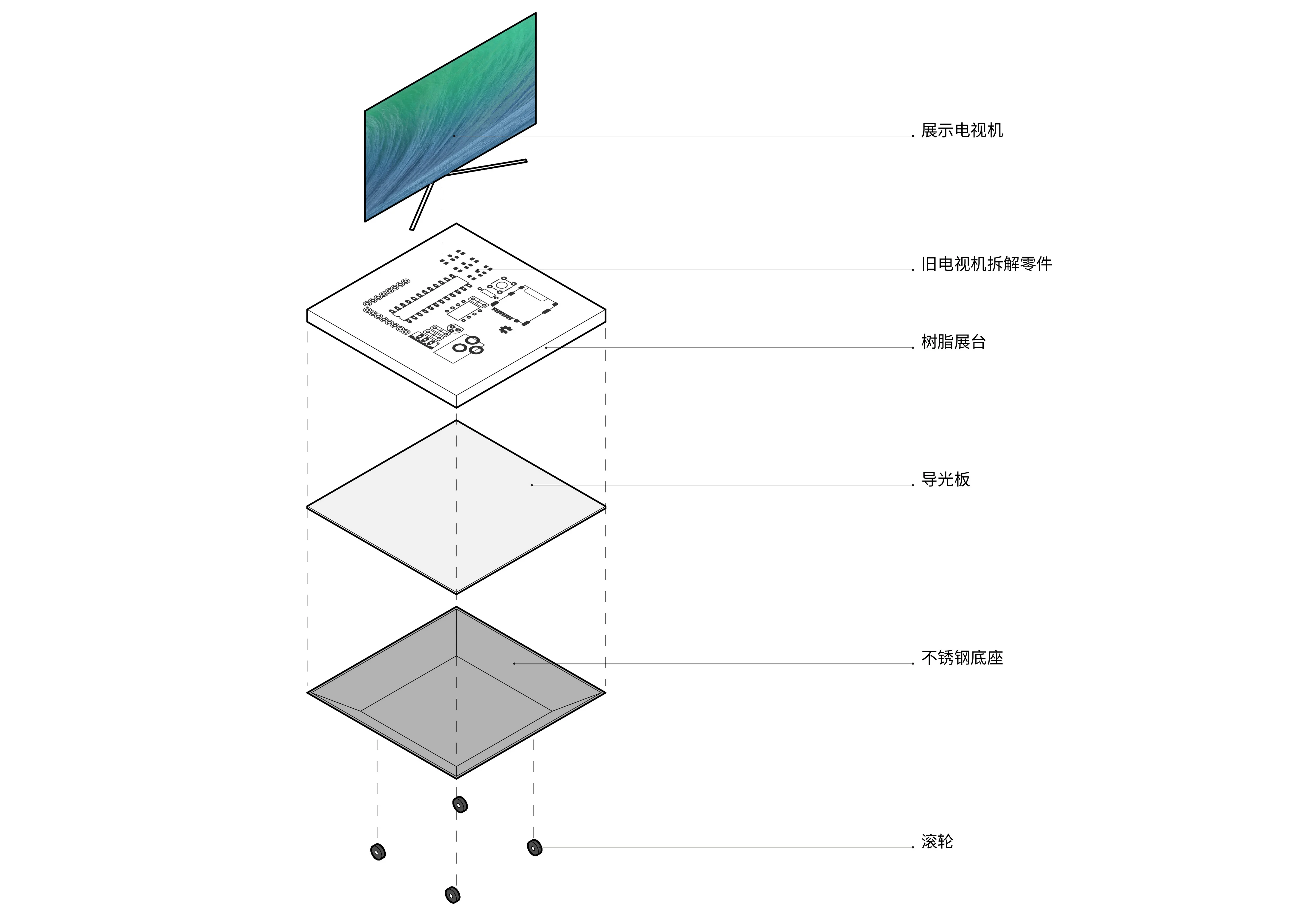
Each era has its own imprints and characteristics, and these are the most precious and essential things of that era. As the younger generation, let’s not kill them on the beach. A fair world will let fate cycle. Therefore, we disassembled every part one by one, cleaned the dust, rinsed them, packed them one by one, and sent them to a resin casting factory in Huizhou, Guangdong, where we displayed these parts using a new aesthetic composition.
Now, the future television showroom of this project is supported by these twelve groups of old television resin display stands. The light-conducting properties of resin make the old parts inside shine brightly.
The characteristics of the space itself:
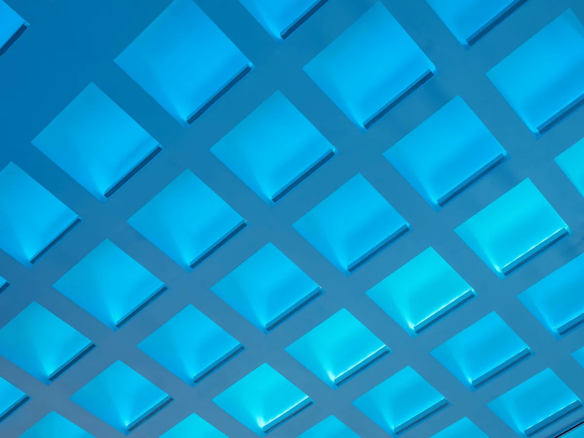
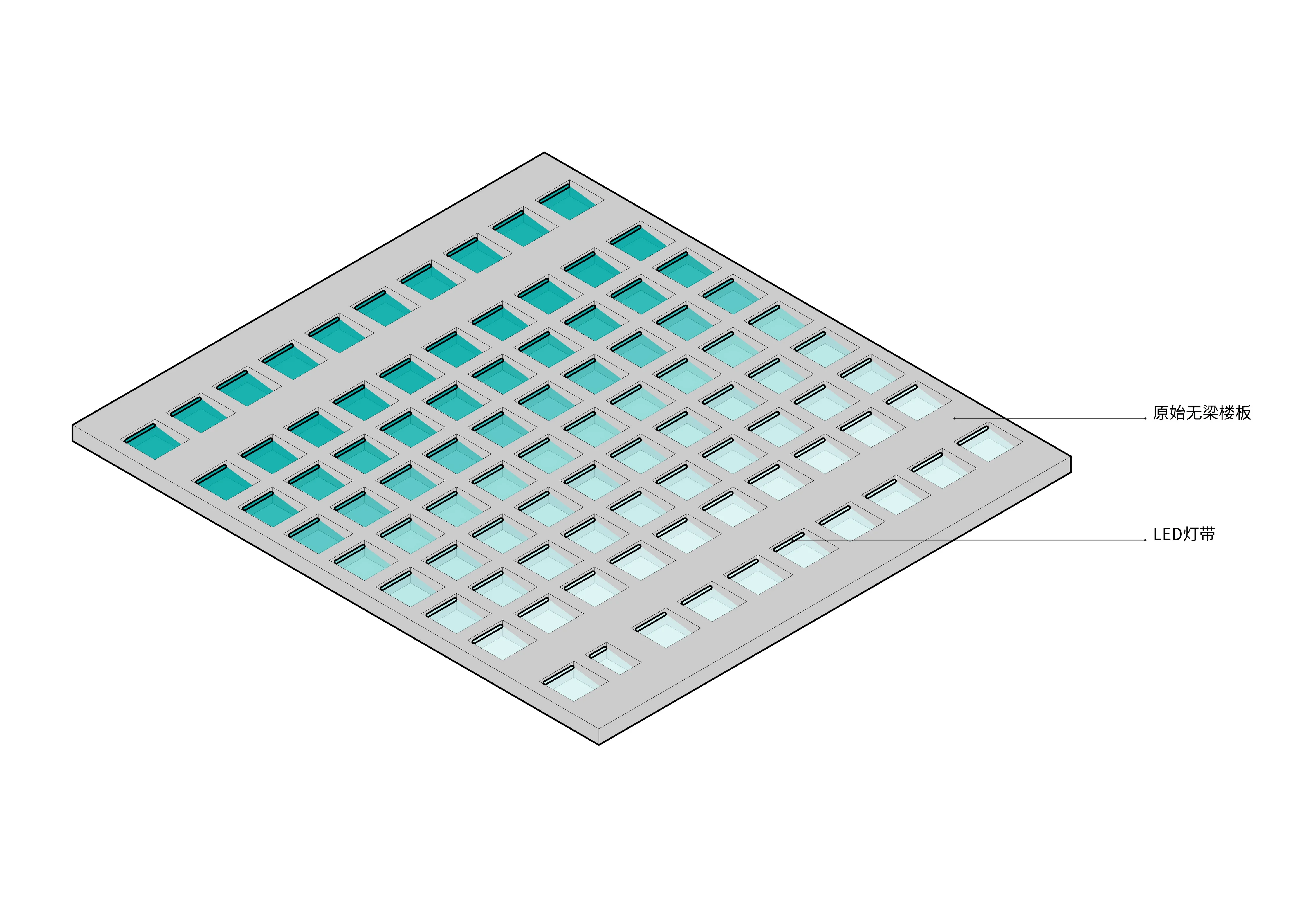
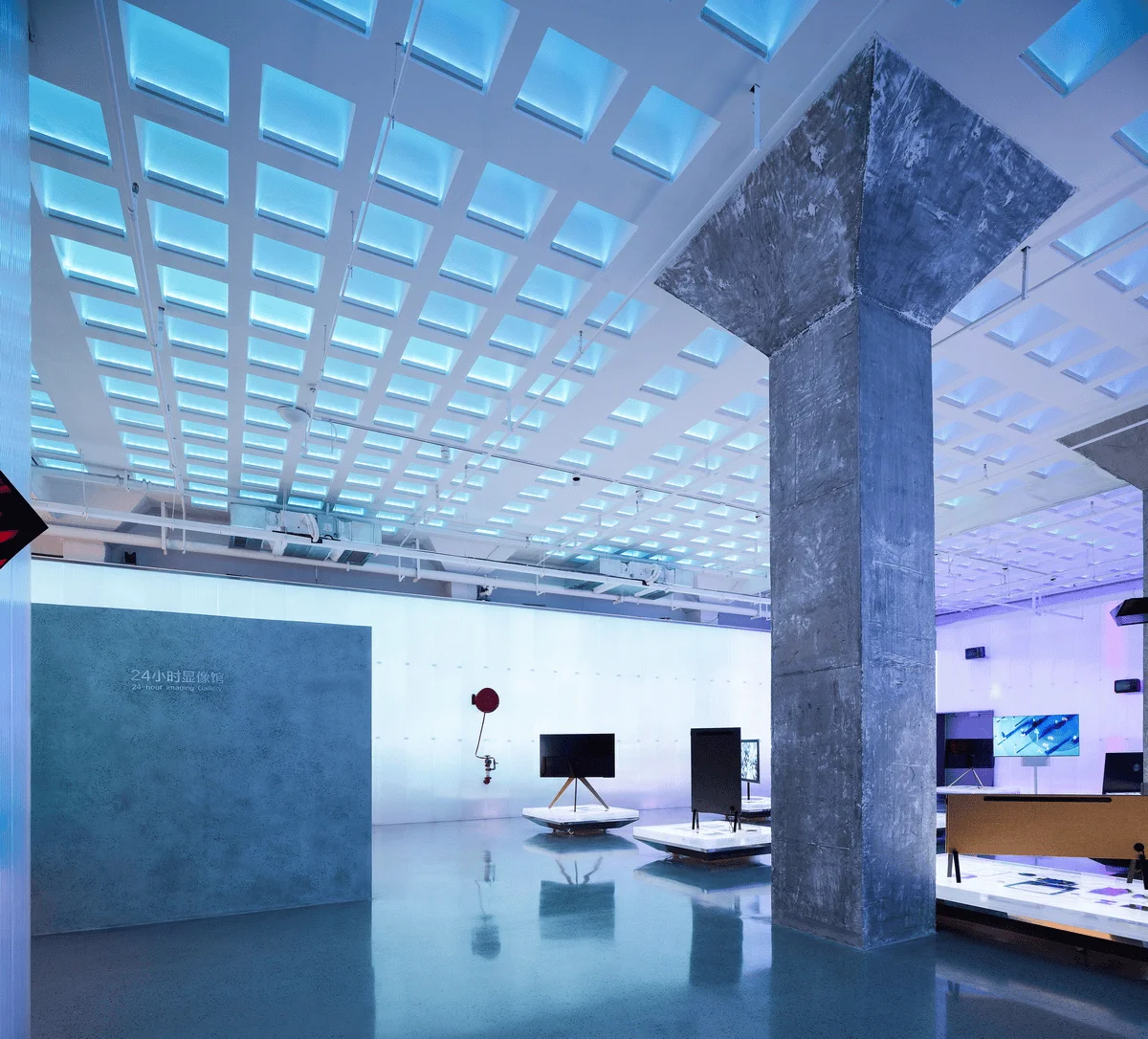
1. The grid formed by the beam-free floor slab creates a sense of “order” that is inherently spectacular. Advanced design is always about going with the flow and taking advantage of the situation. Therefore, each grid is fitted with a color-changing light strip that illuminates the cavity of the grid. It is worth mentioning that each cavity is designed with a backlight to create a sense of space in the cavity. The overall top surface is a surface of order. The light in each cavity is controlled by a set of low-voltage control, which is consistent with the brightness, darkness, chaos, and bloodline of the spectral light on the wall.
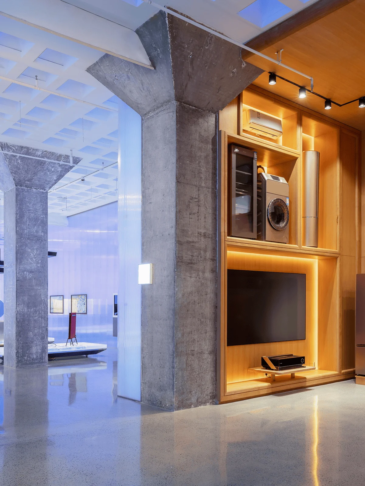
2. Umbrella-shaped columns. In the delicate and chaotic space, there is a trace of memory of the old building, which is also a tribute to these umbrella-shaped columns. We have spent a lot of effort in peeling off the rough texture of the concrete itself and polishing it.
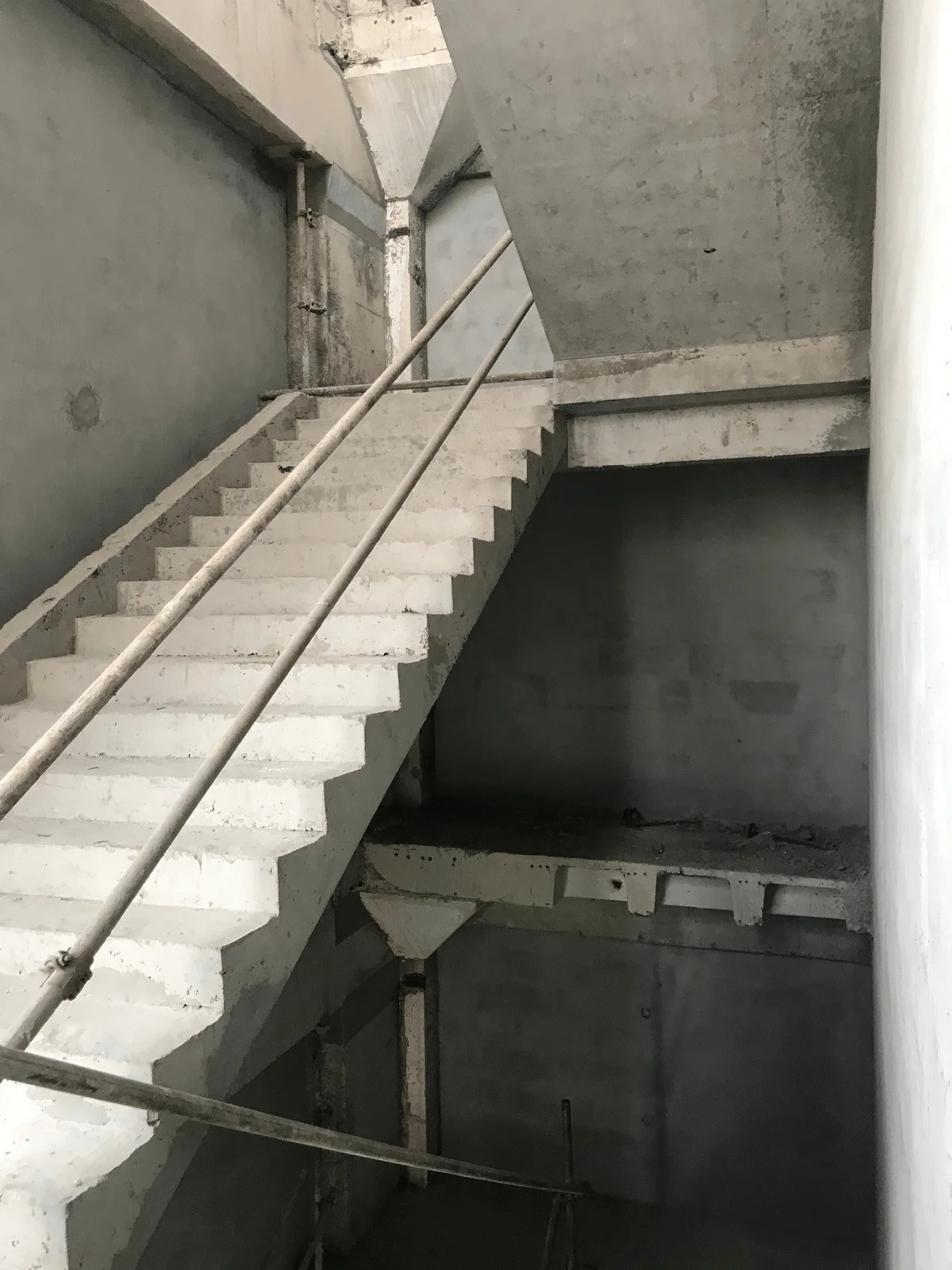
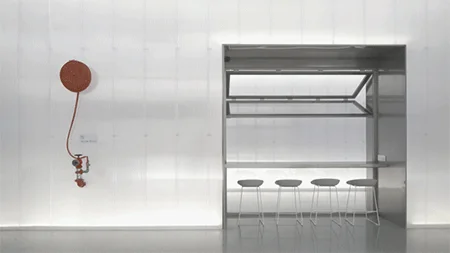
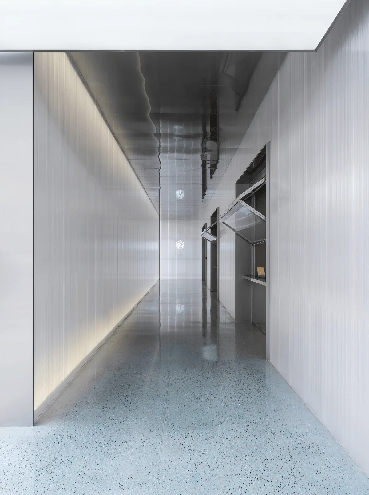
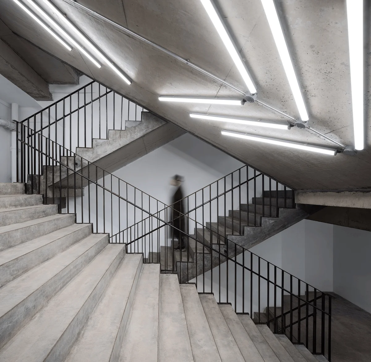
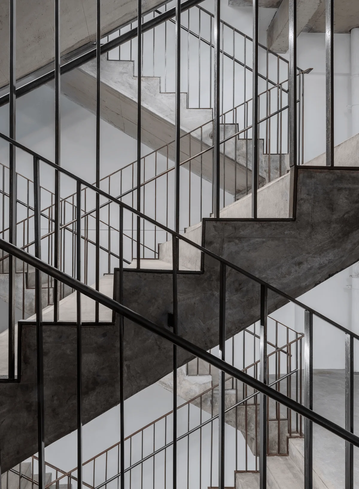
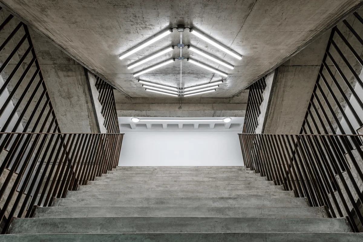
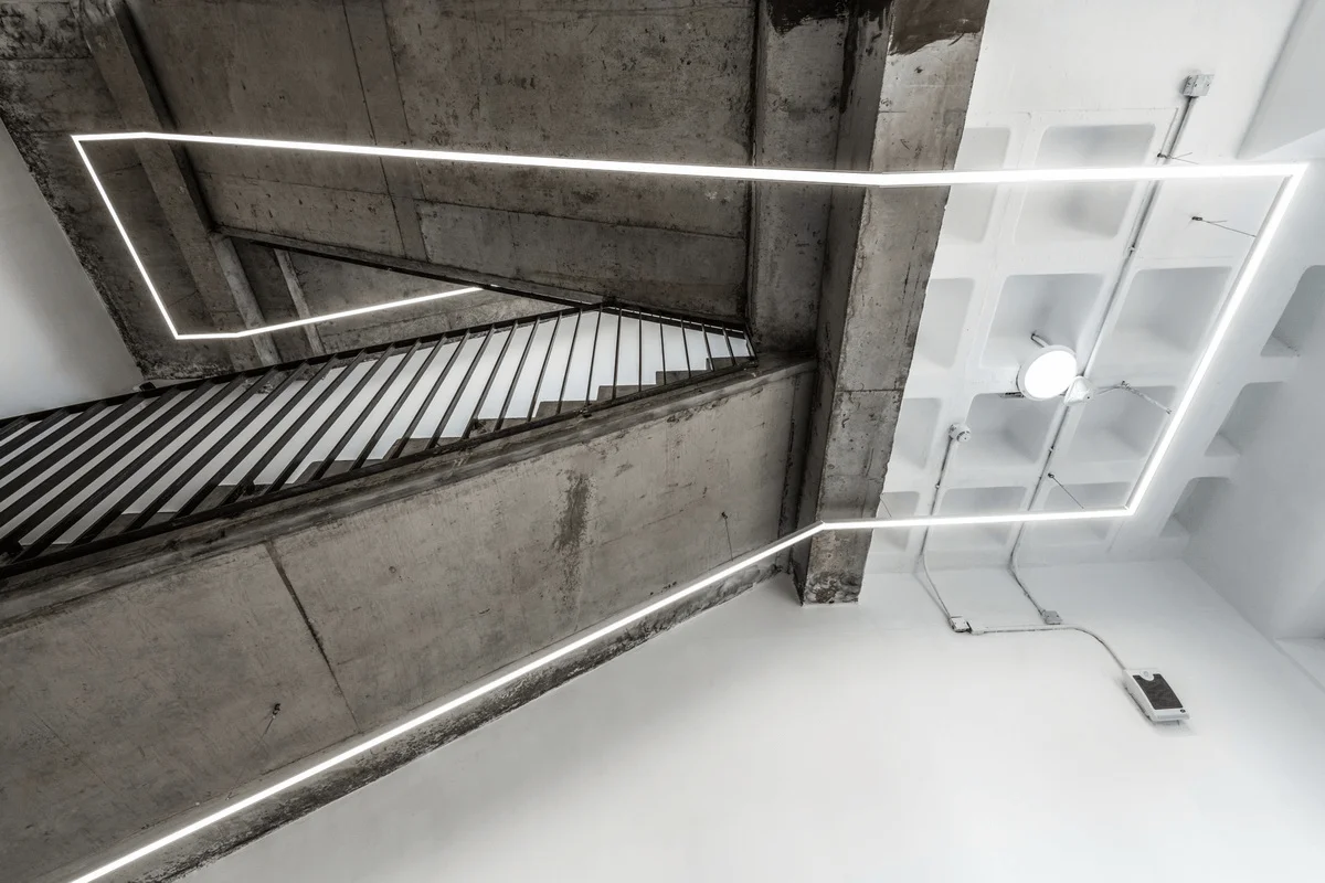
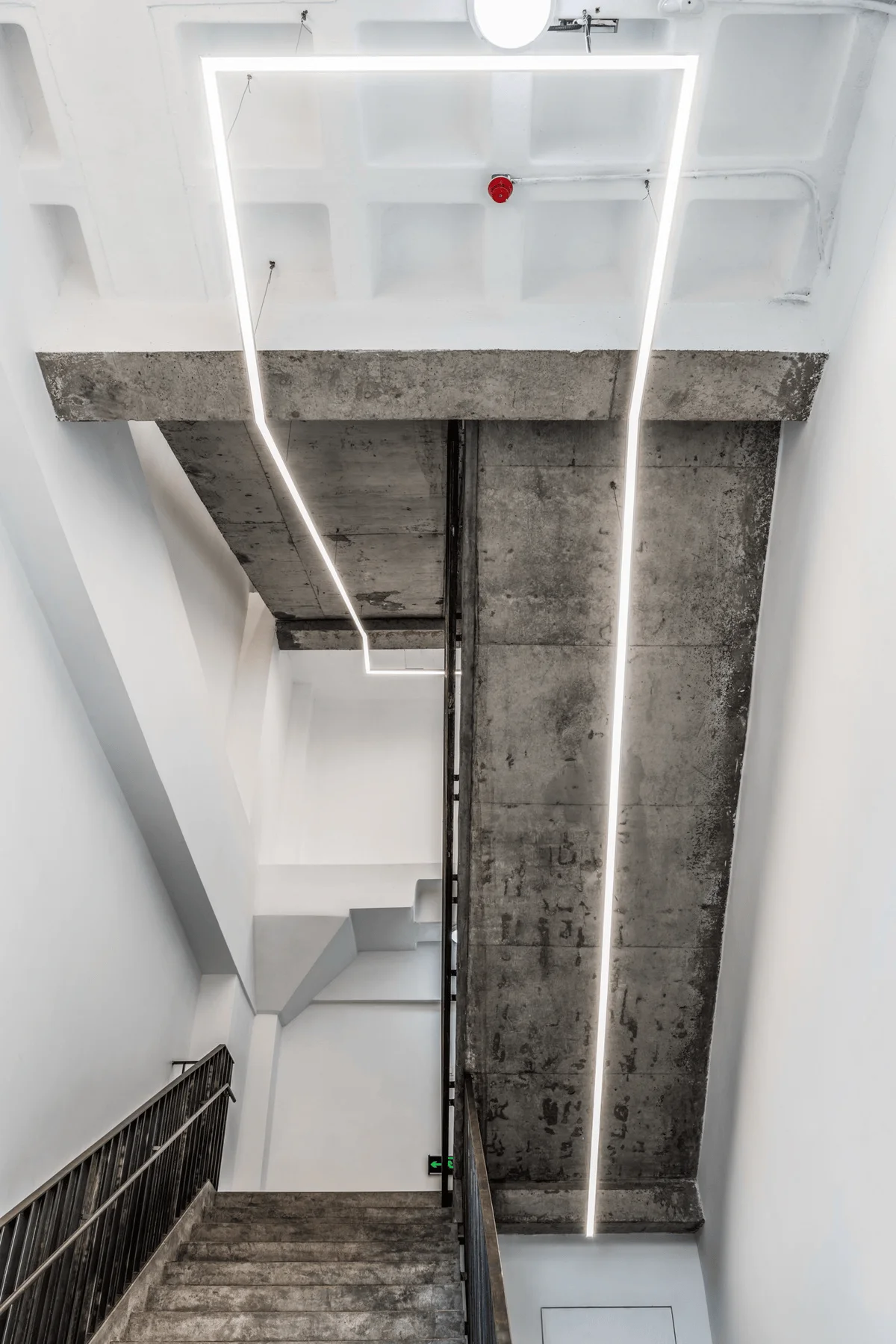
3. The fire escape is treated in a similar way, creating a conflict between delicacy and roughness, and the order of the steel handrail adds fullness to the space. The arrangement and direction of the lights become the most essential existence in the passage space.
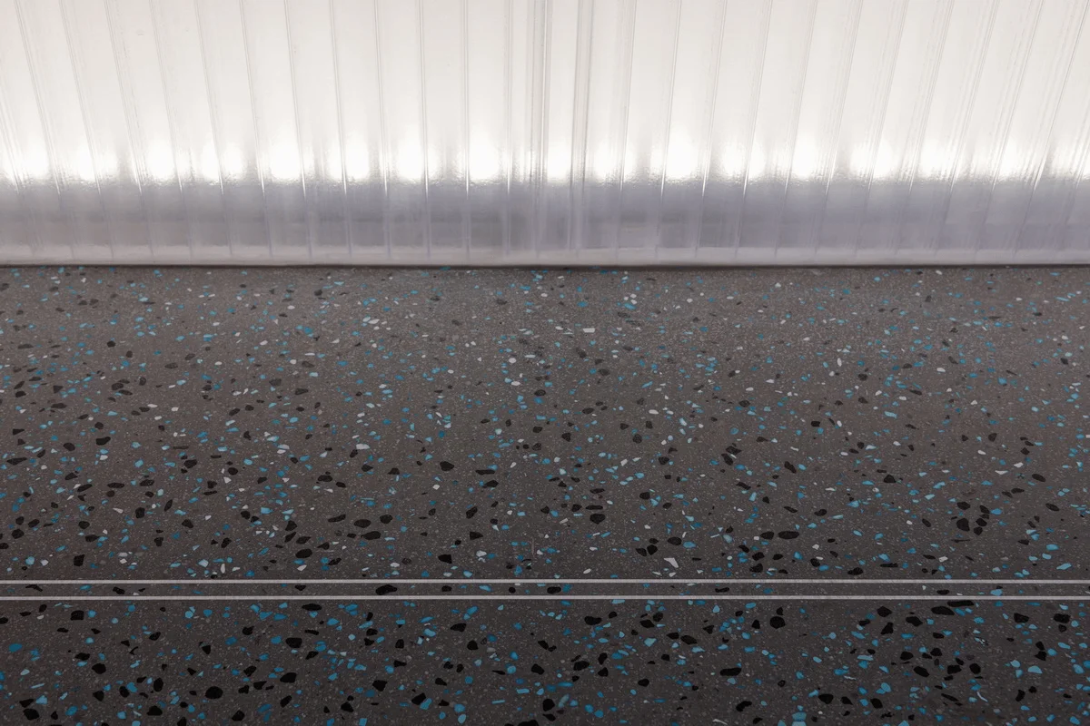
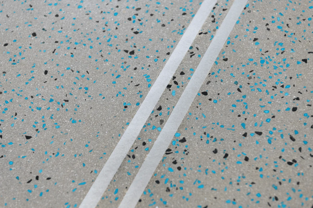
4. Grinding stones. After all, this is a commercial project. The commercial exposure itself is our respect for the client. There is a green color in the world called Hisense green, which is the pride of Hisense people and a representative of Qingdao green. We found a type of aggregate that is close to Hisense green. It is formed into a flat shape through countless grinding and washing of the grinding stones, and it also reveals a grain of Hisense green. We hope to display the metaphorical value more in the commercial exposure, not showing off, nor concealing.
Finally, roarc.cn’s pursuit of the essence of design is unwavering. It is also our stance towards every project. Space creation is a branch of architecture. We hope to approach this concrete and direct world with more abstract thinking through logic, essence, and meaning.
Project Information:


