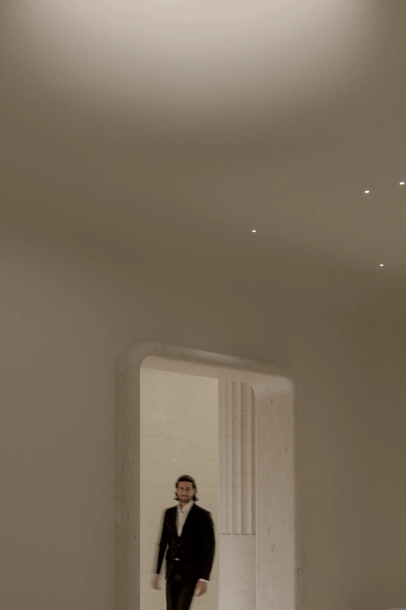
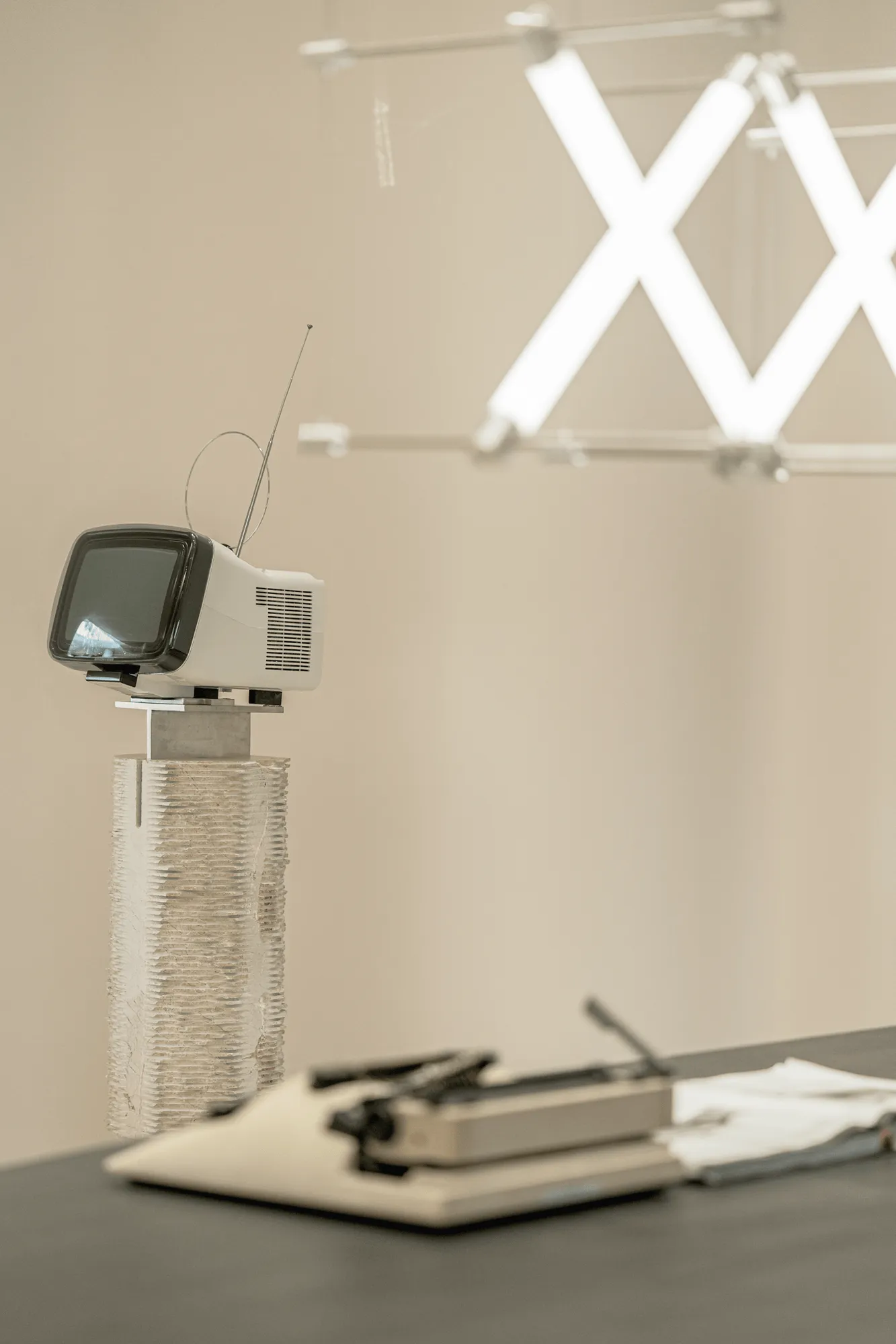
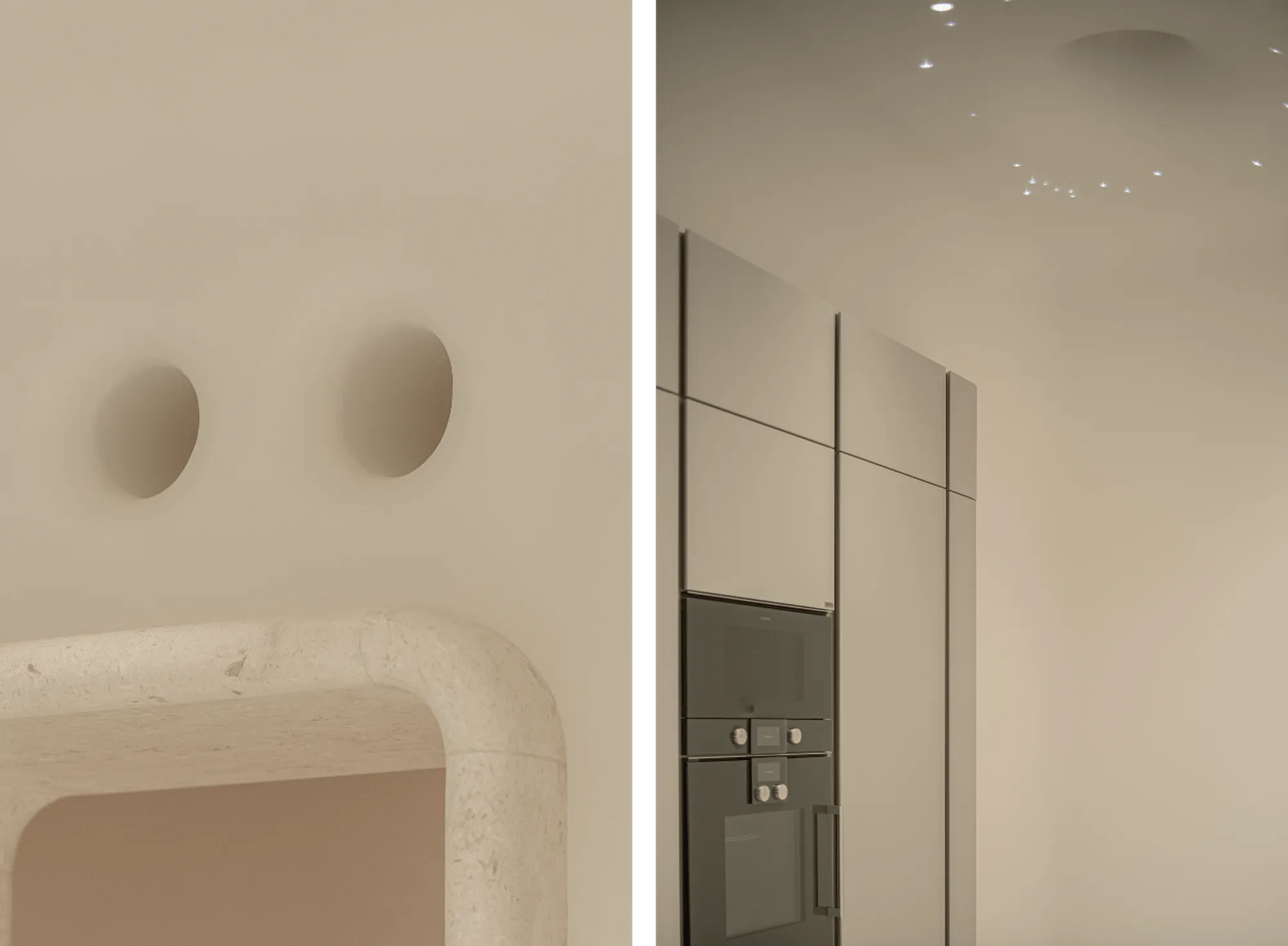
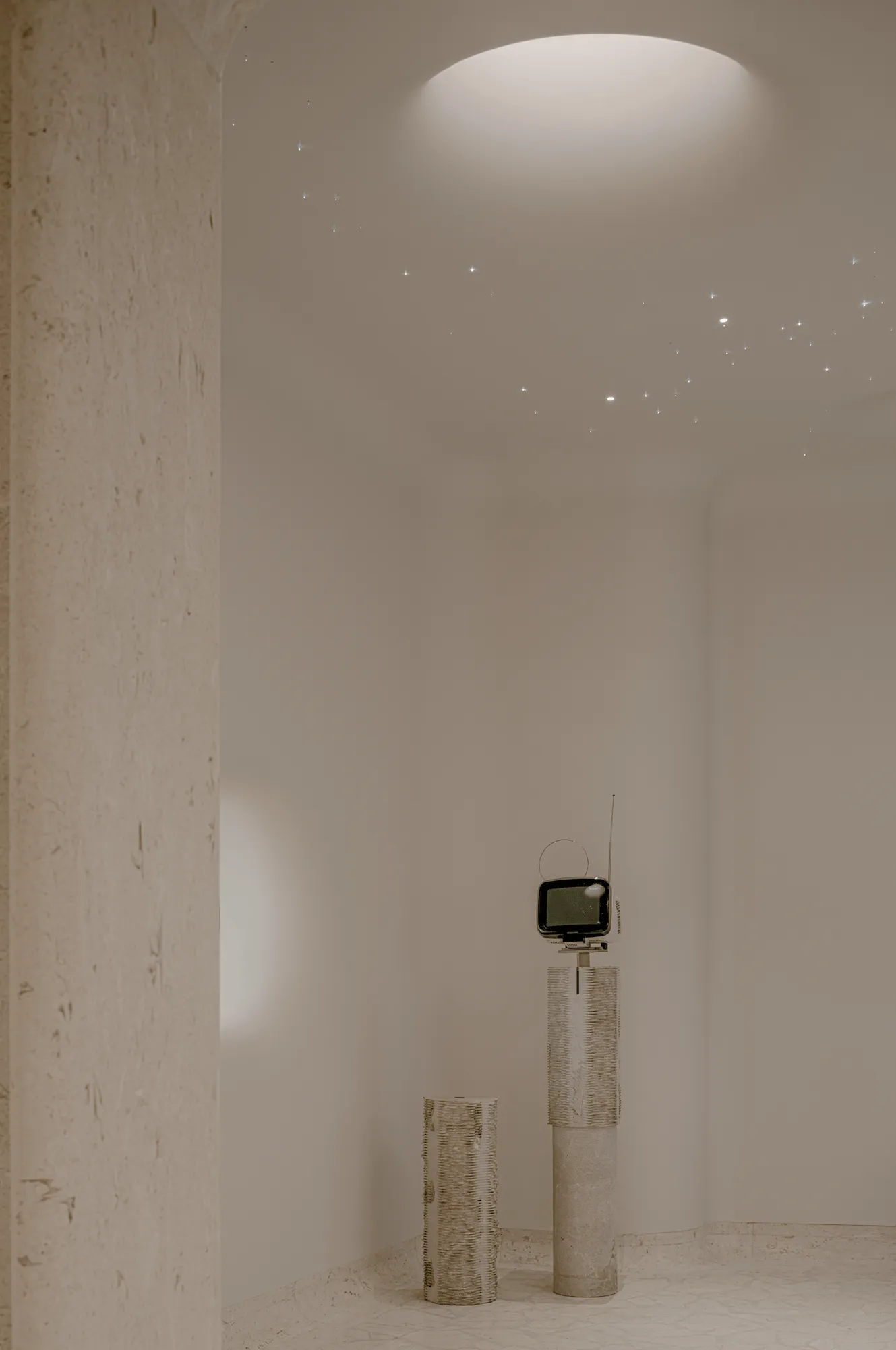
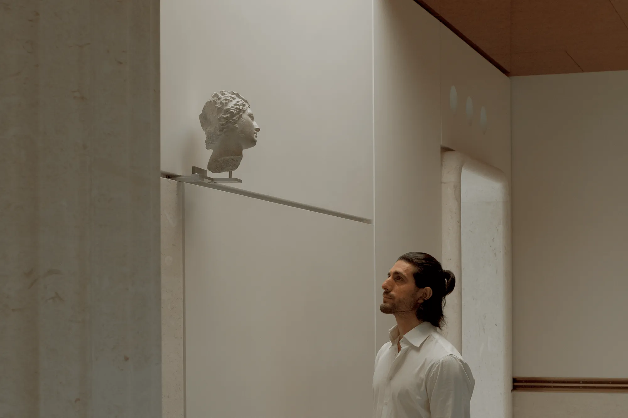
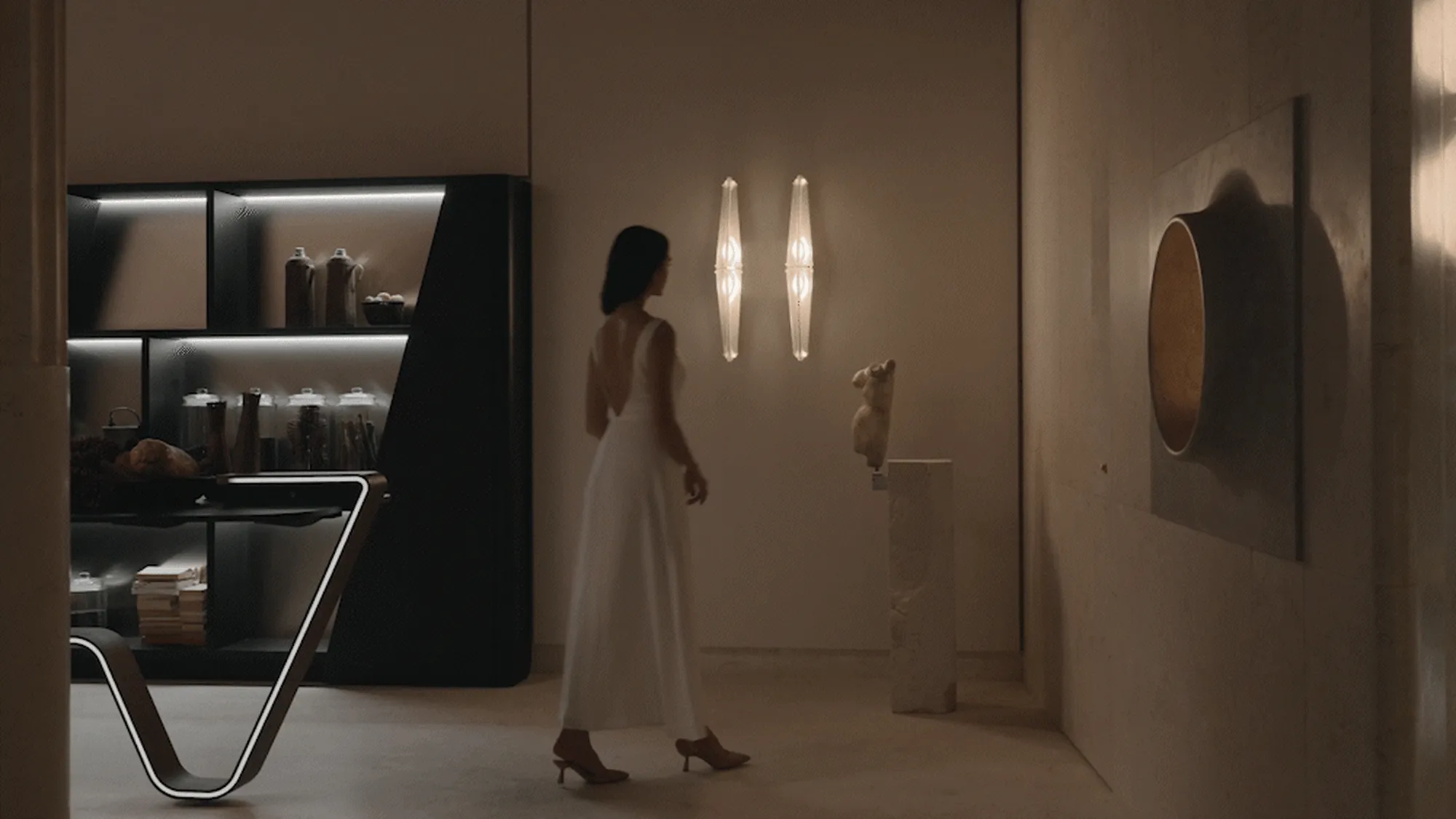
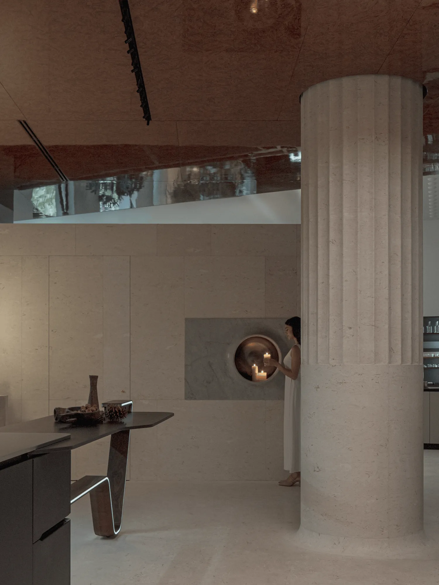
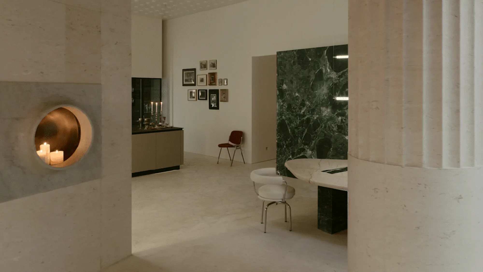
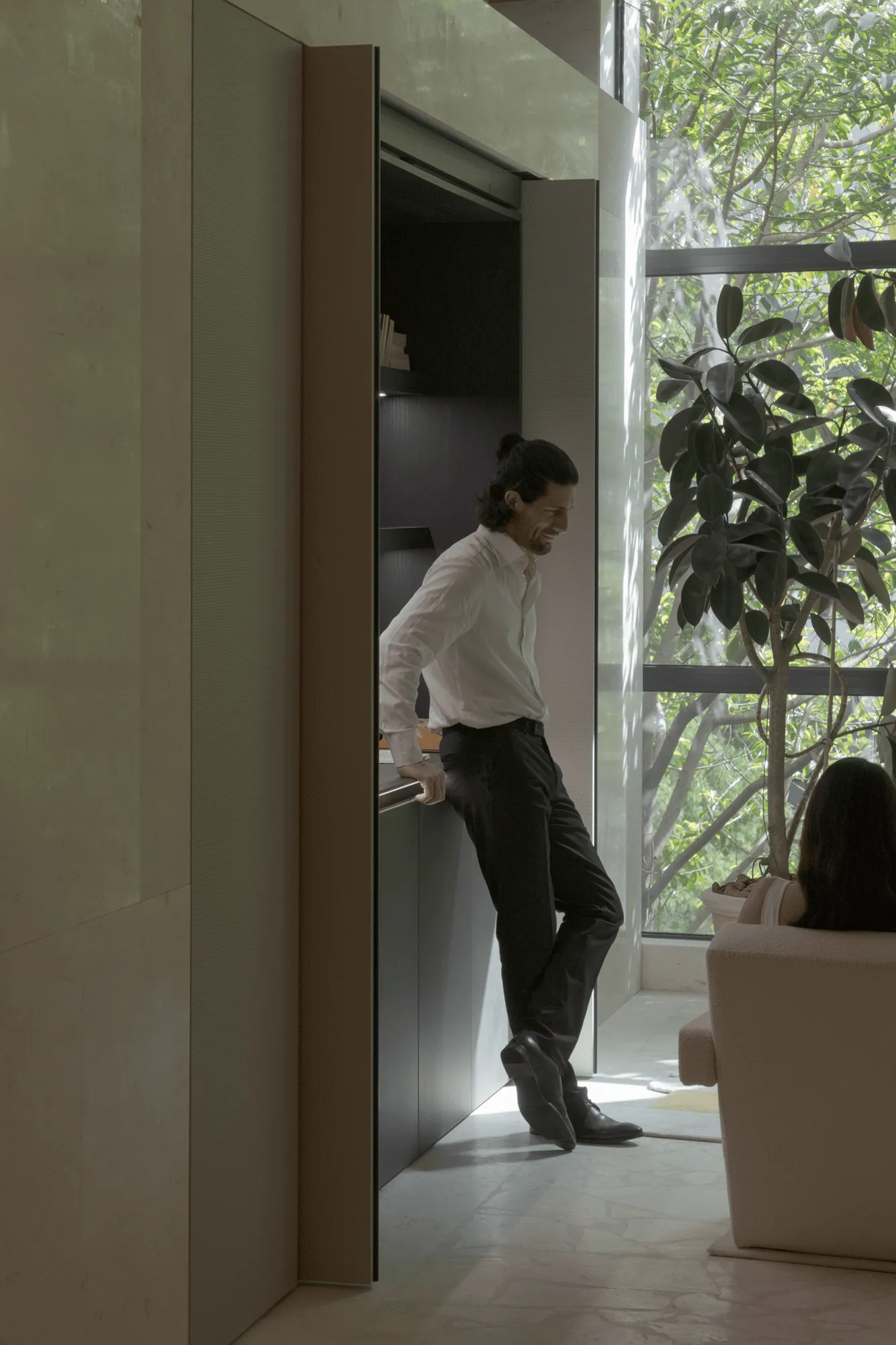
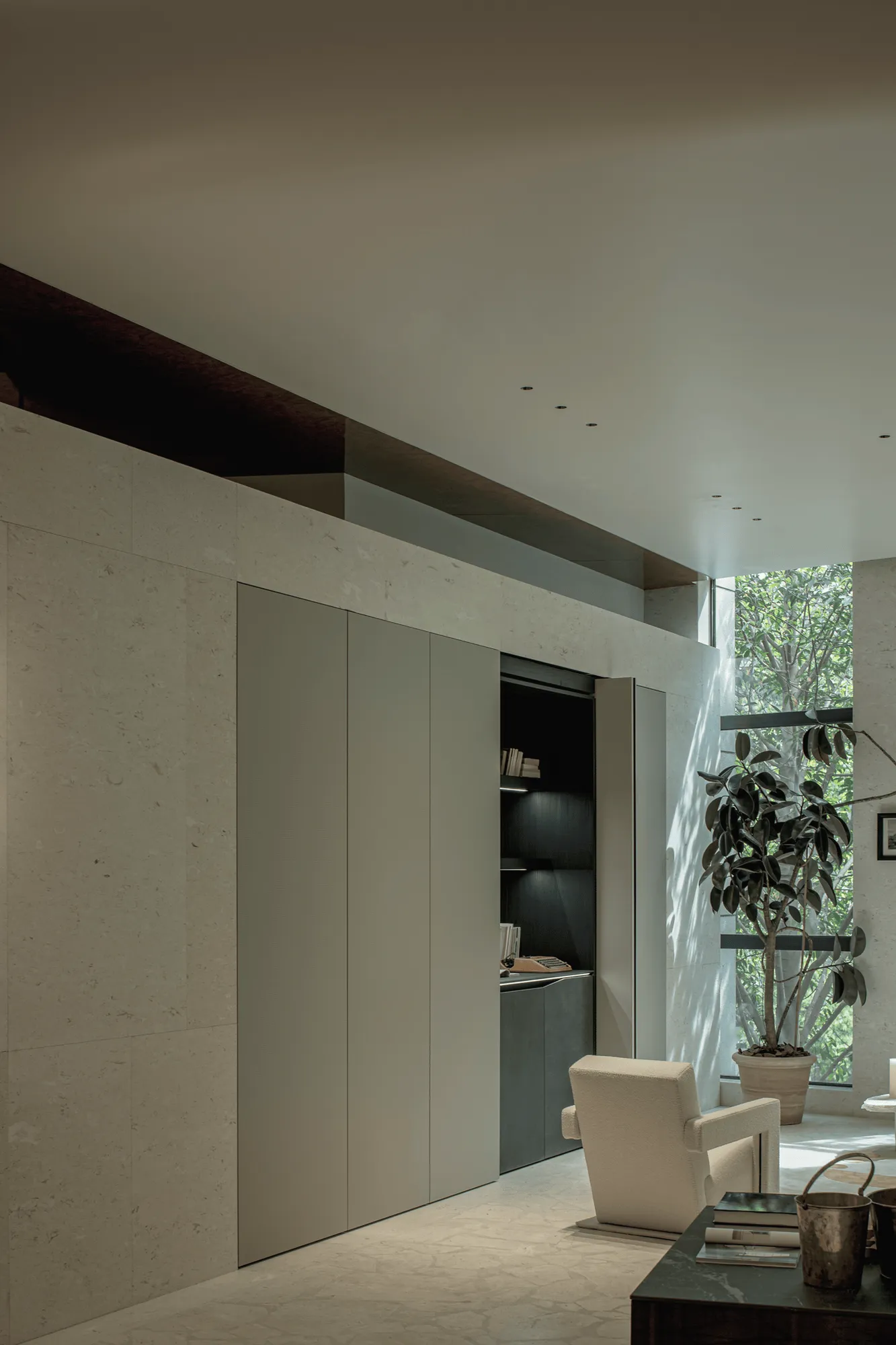
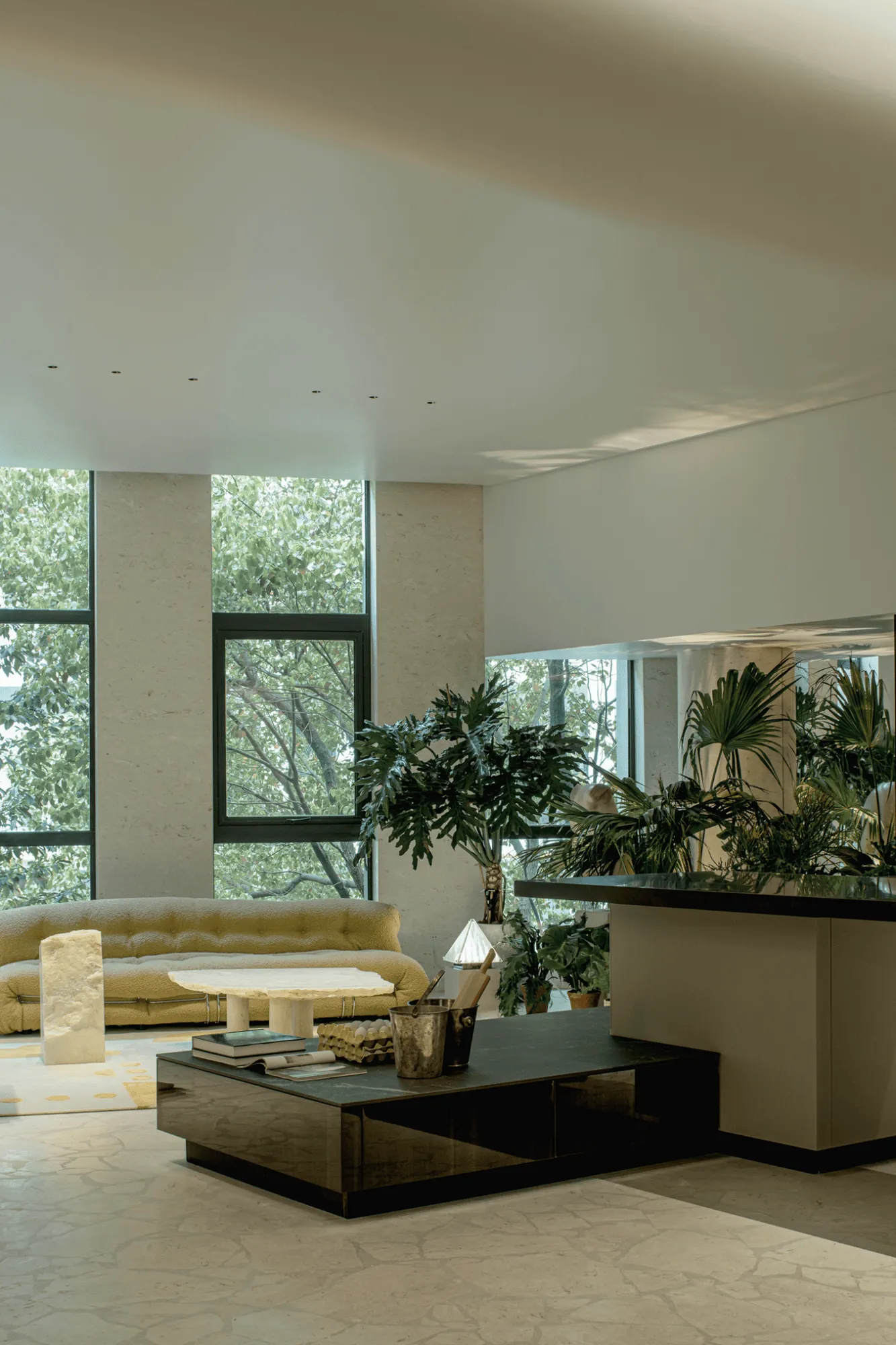
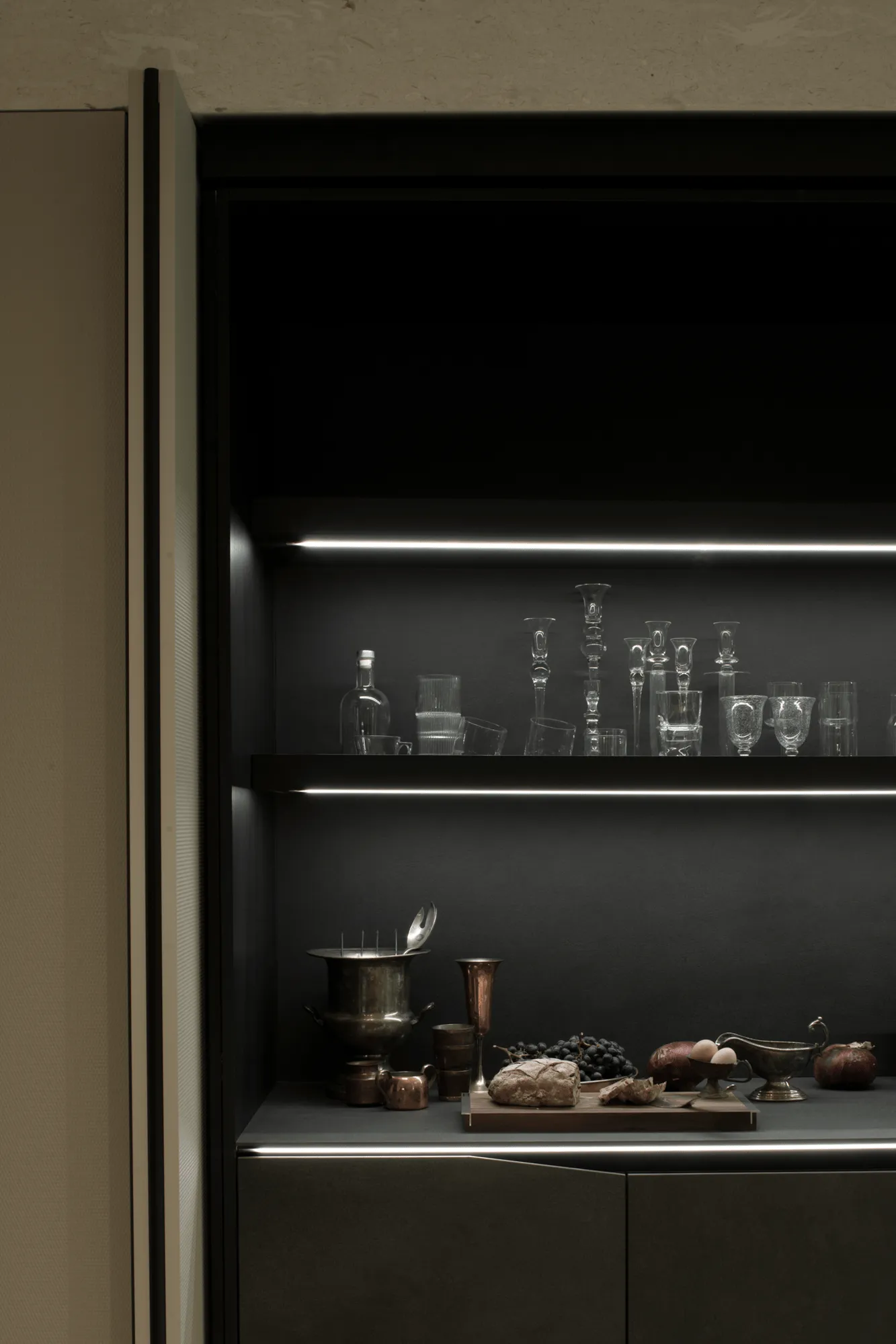
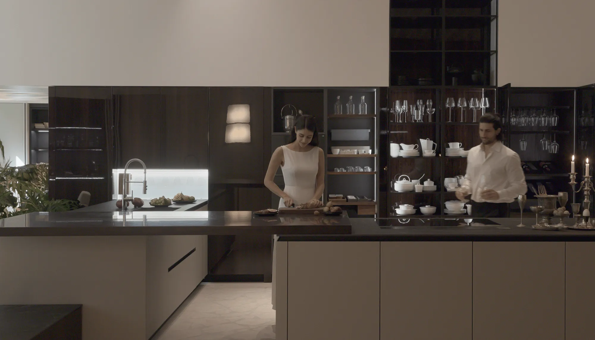
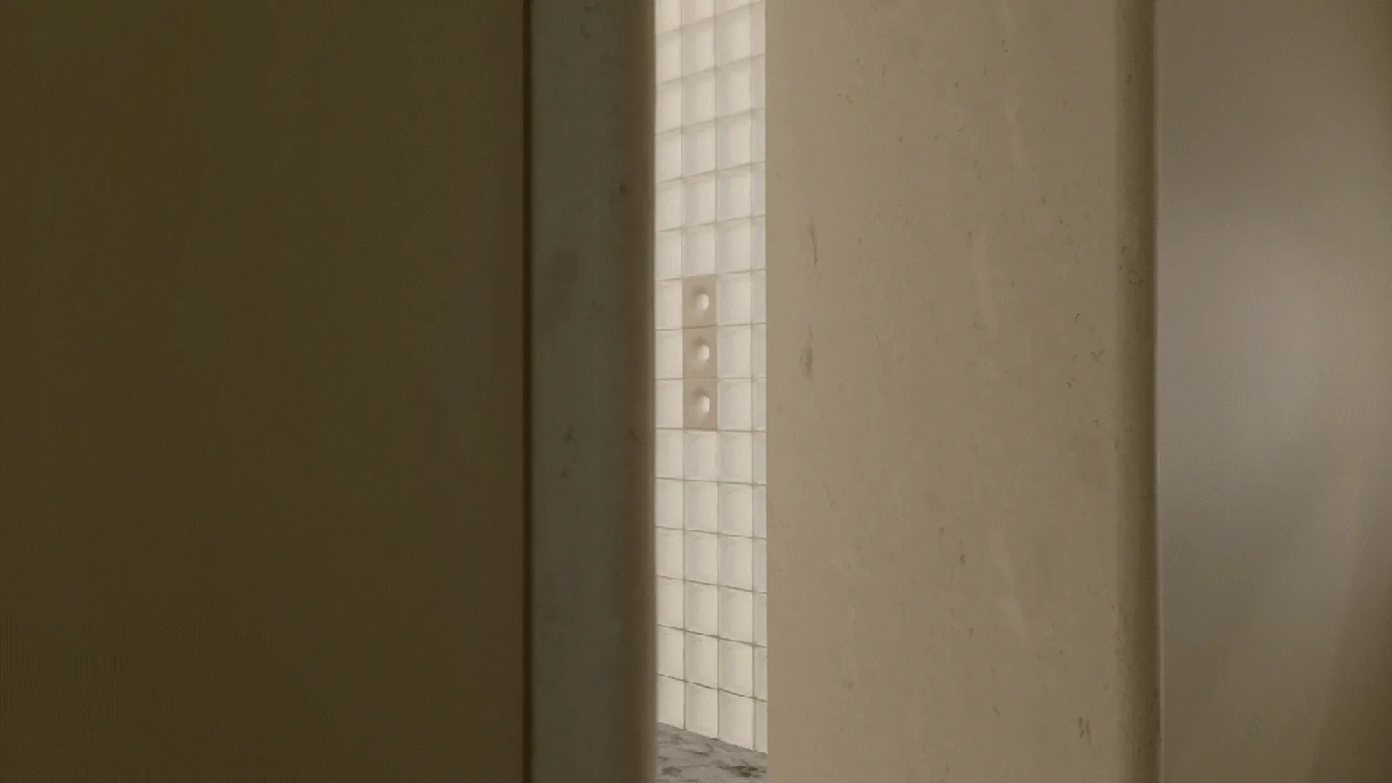
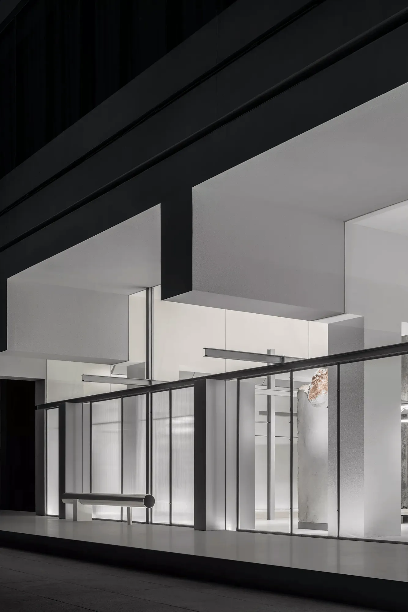
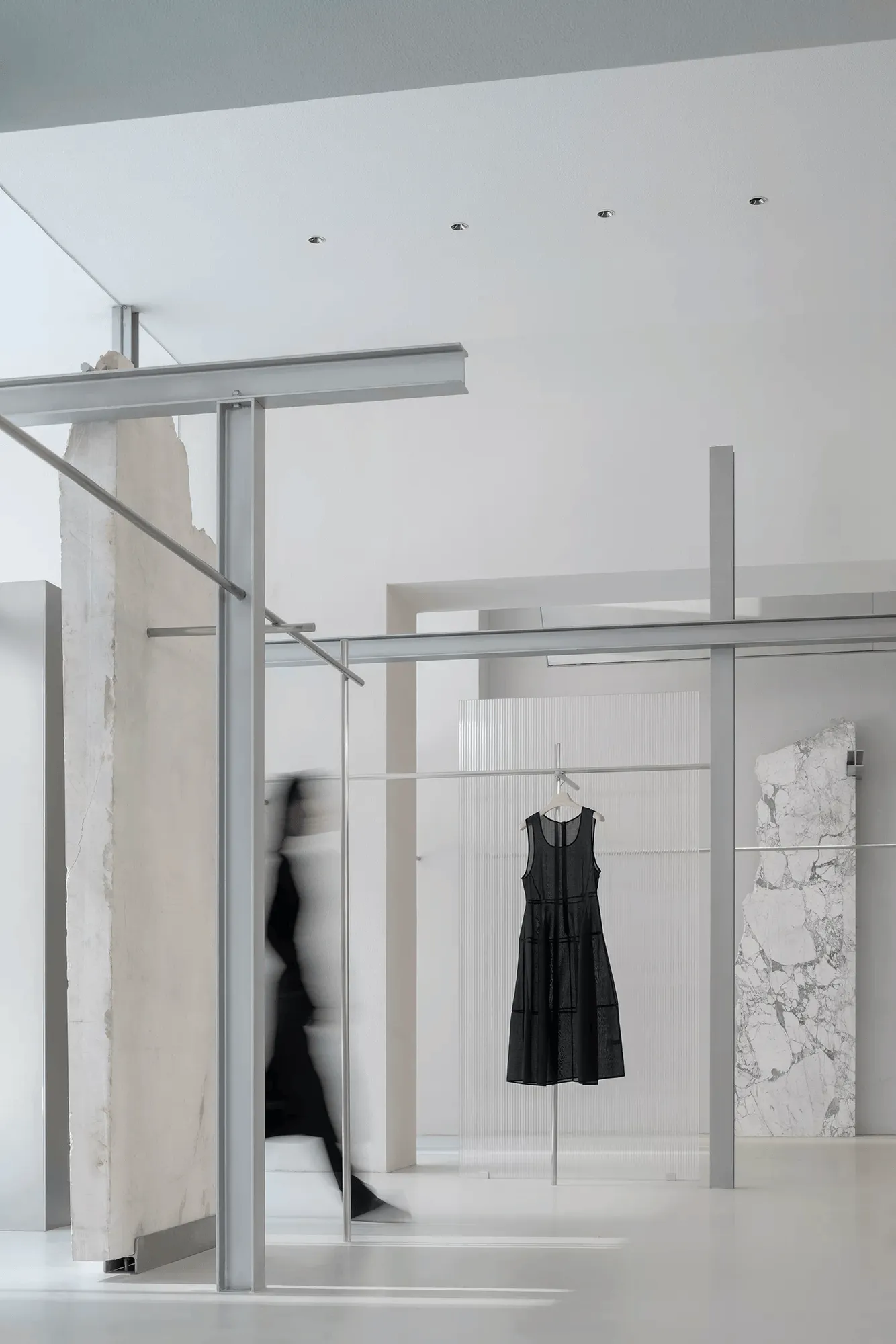
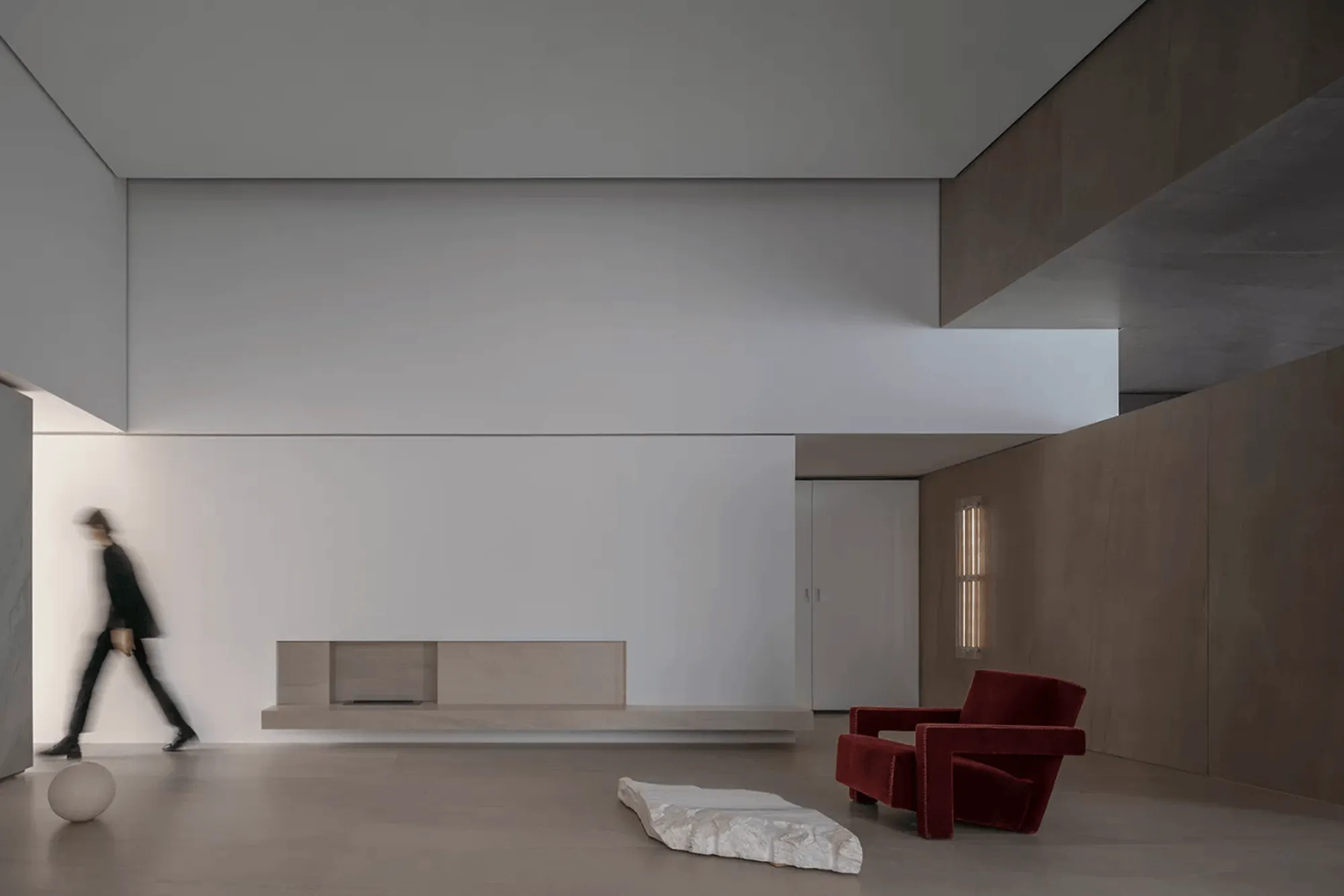
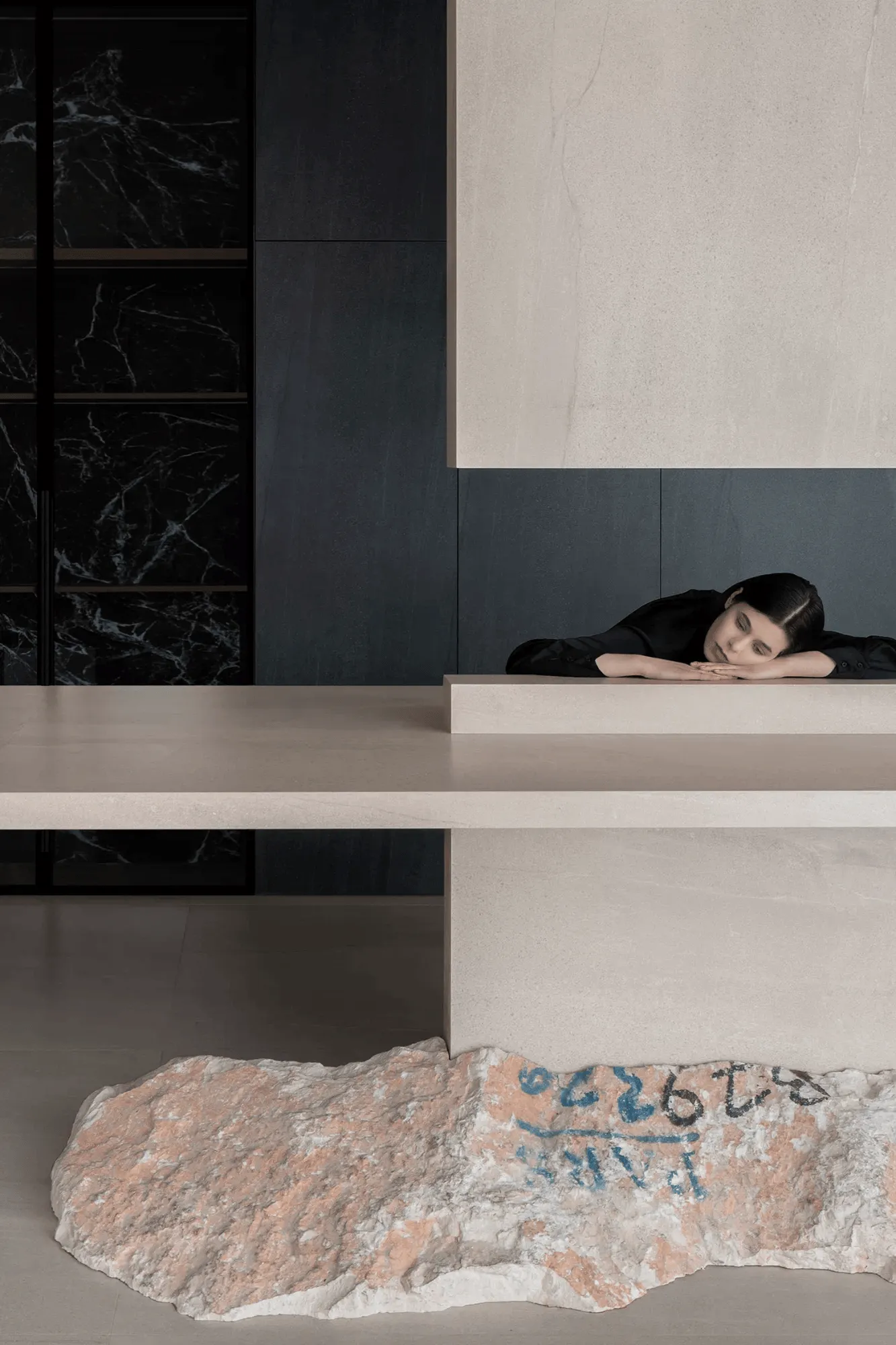
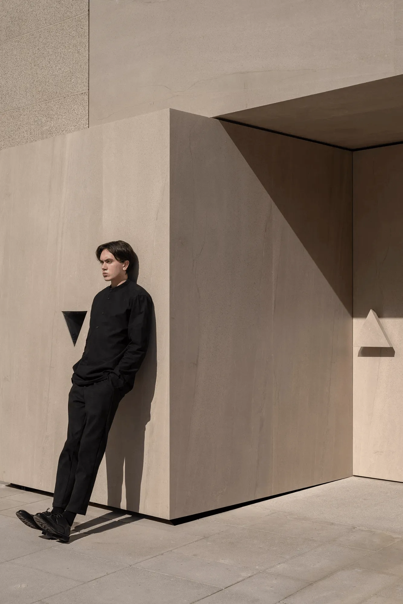
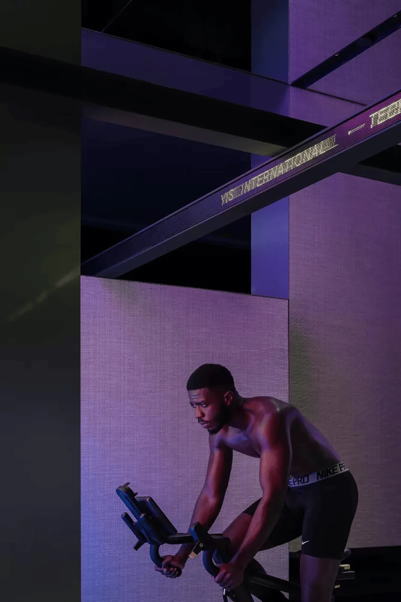
Snaidero’s new Shanghai showroom seamlessly integrates Italian kitchen design with architectural elements, creating a captivating brand experience.
Contents
Embracing the Legacy: A Historical and Architectural Perspective
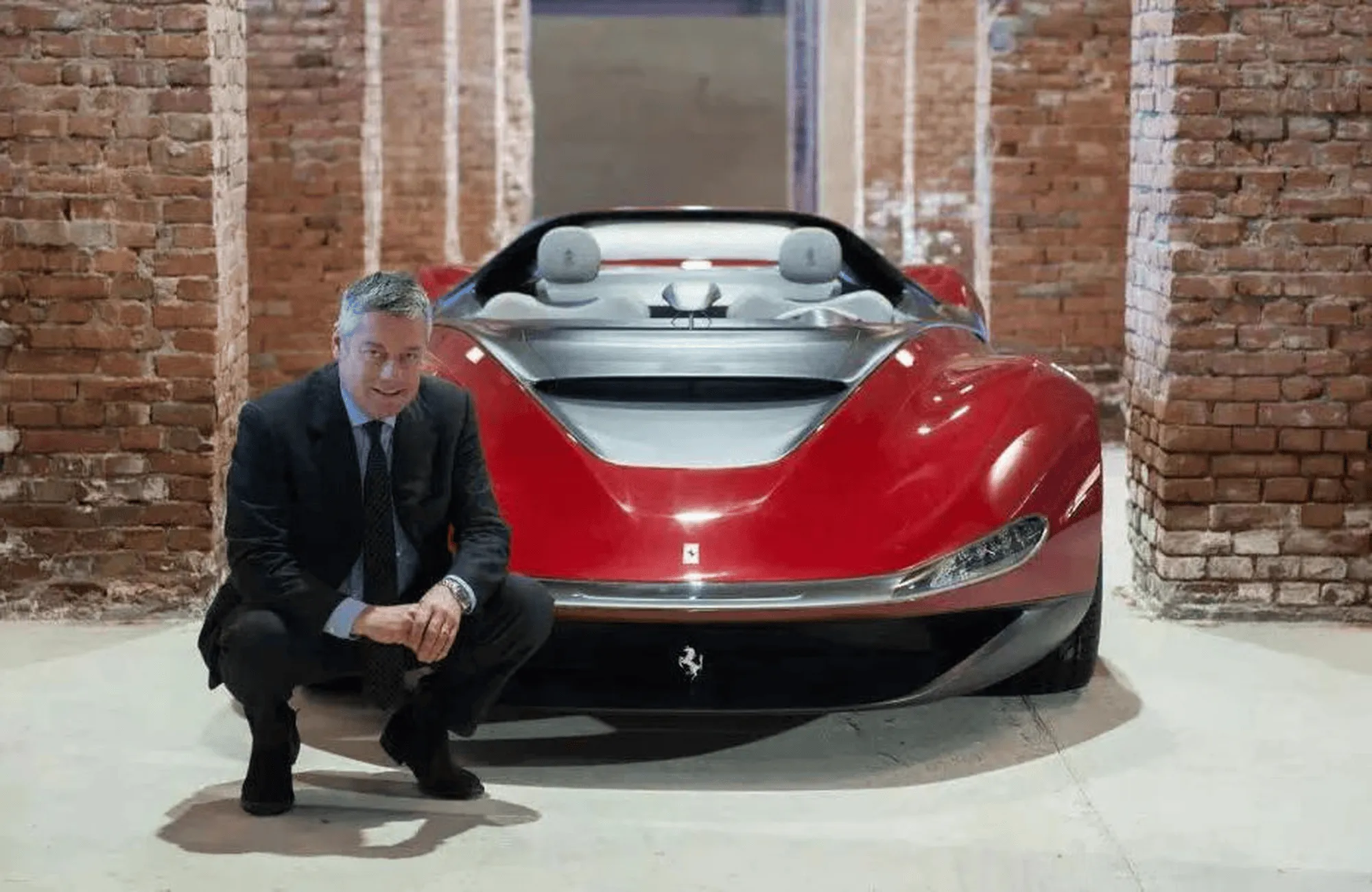
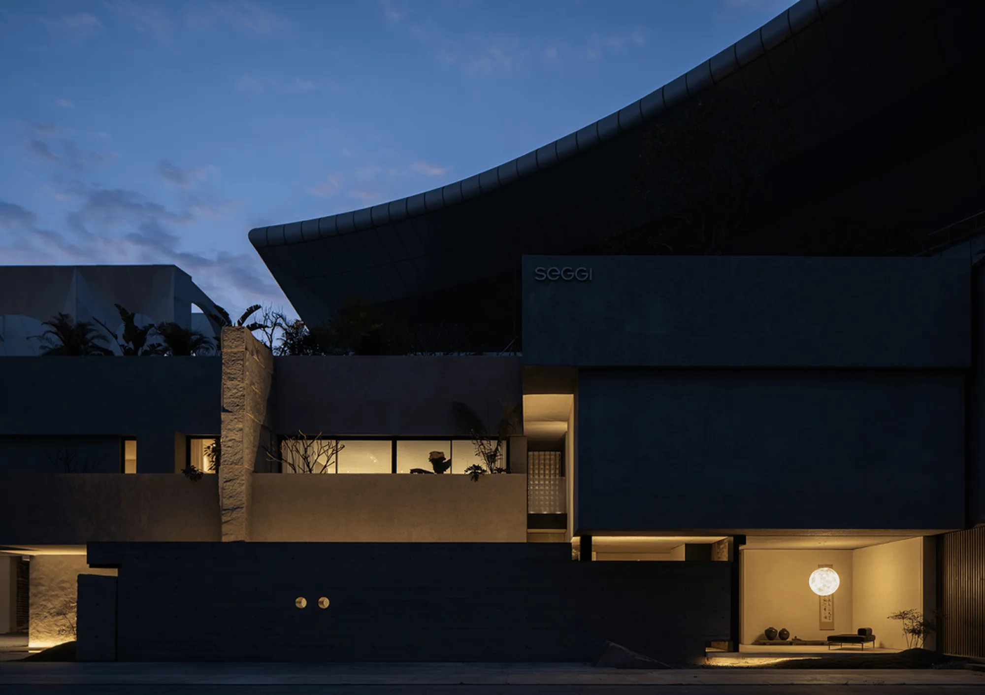
Snaidero, a pioneer in Italian modern kitchen design, boasts a rich history spanning nearly 80 years. This legacy is deeply intertwined with Italian design principles, encompassing elegance, innovation, and a commitment to quality craftsmanship. The brand’s headquarters, designed by renowned Italian architect and artist Angelo Mangiarotti in 1978, stands as a testament to this enduring spirit. The building’s sculptural, organic form prefigured the brand’s future-forward approach, a theme that resonates throughout the new Shanghai showroom. The showroom’s design takes inspiration from Mangiarotti’s architectural language, incorporating elements that echo the headquarters’ futuristic aesthetic.
A Tale of Two Chapters: Futurist and Milanese Modernism
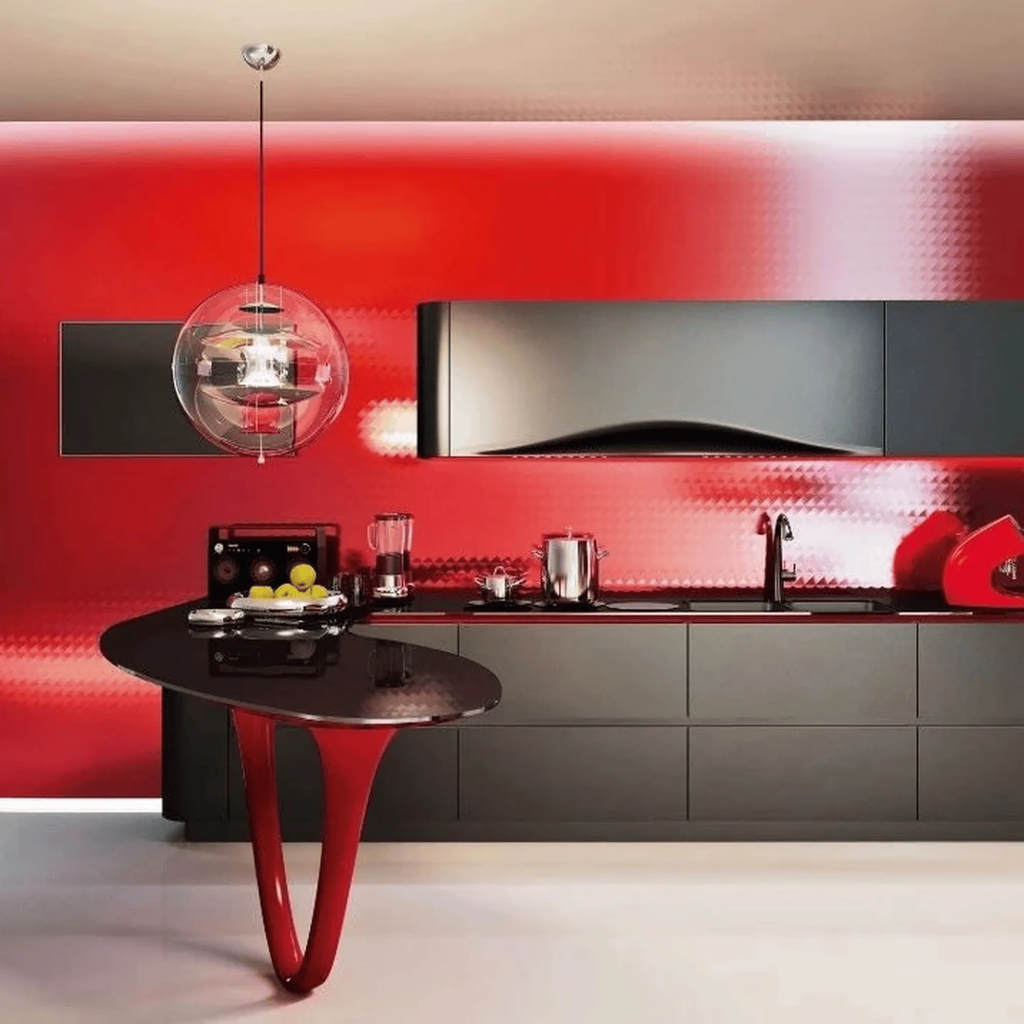
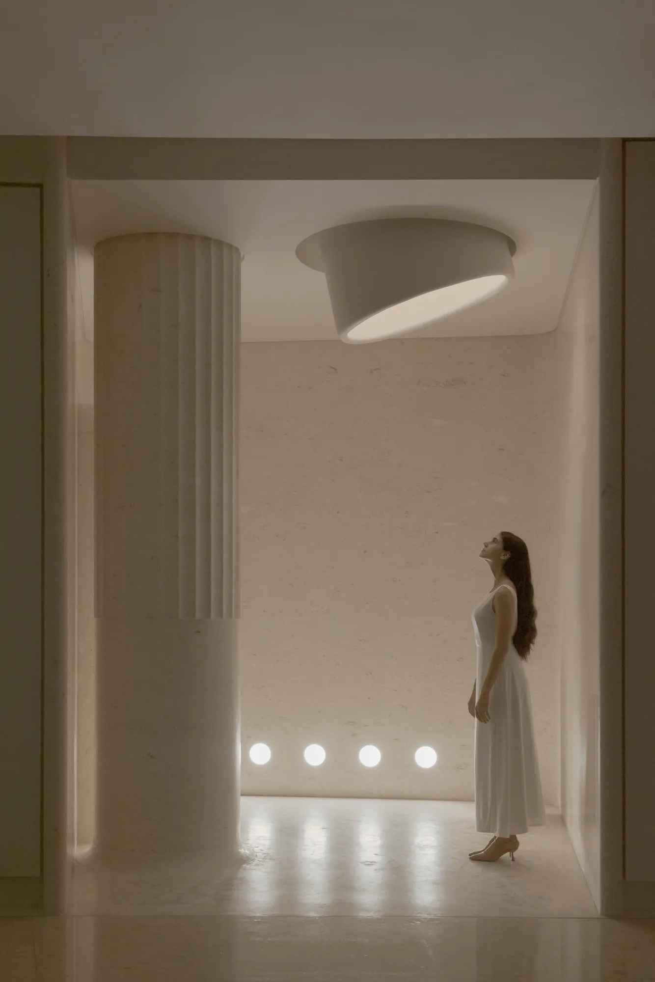
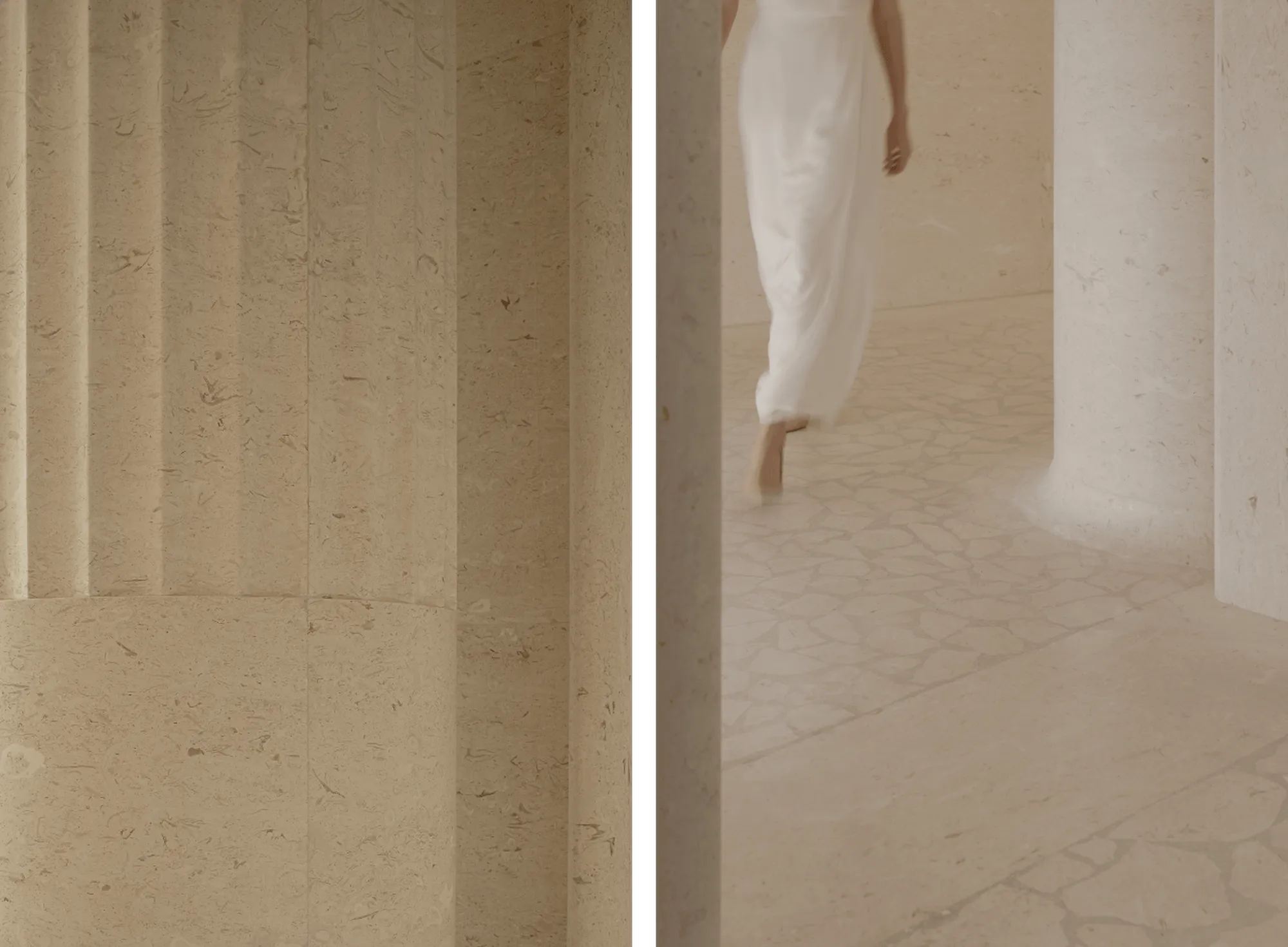
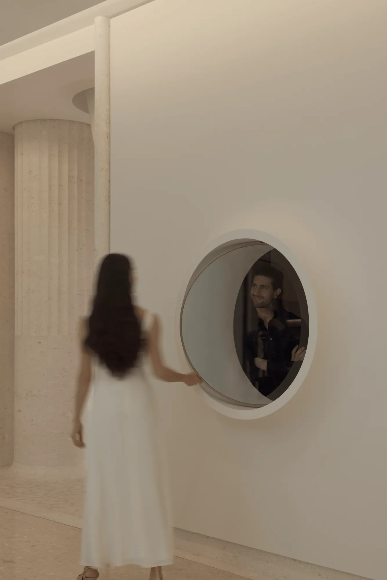
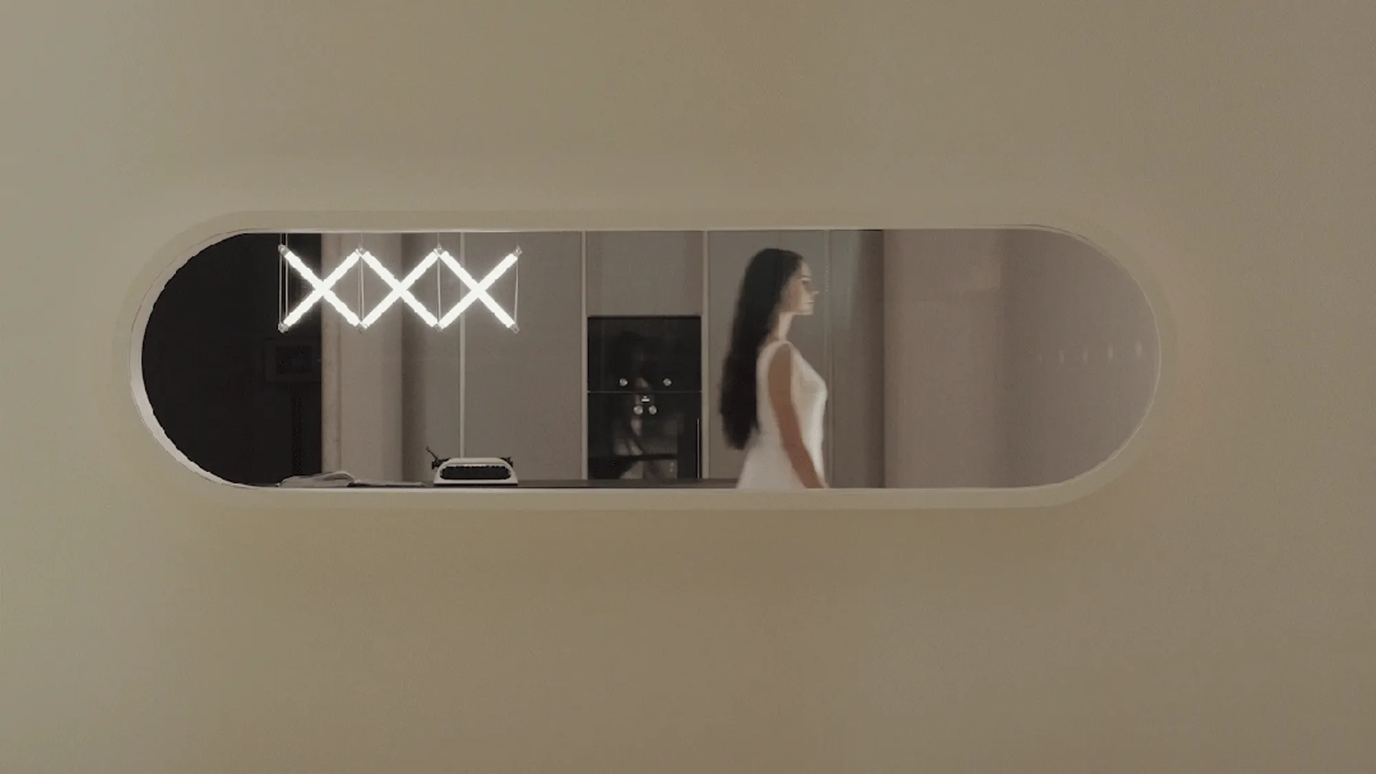
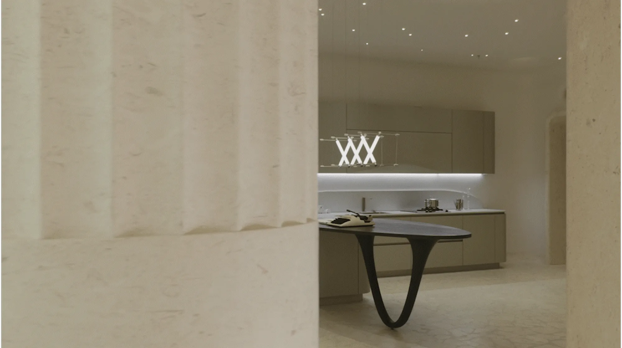
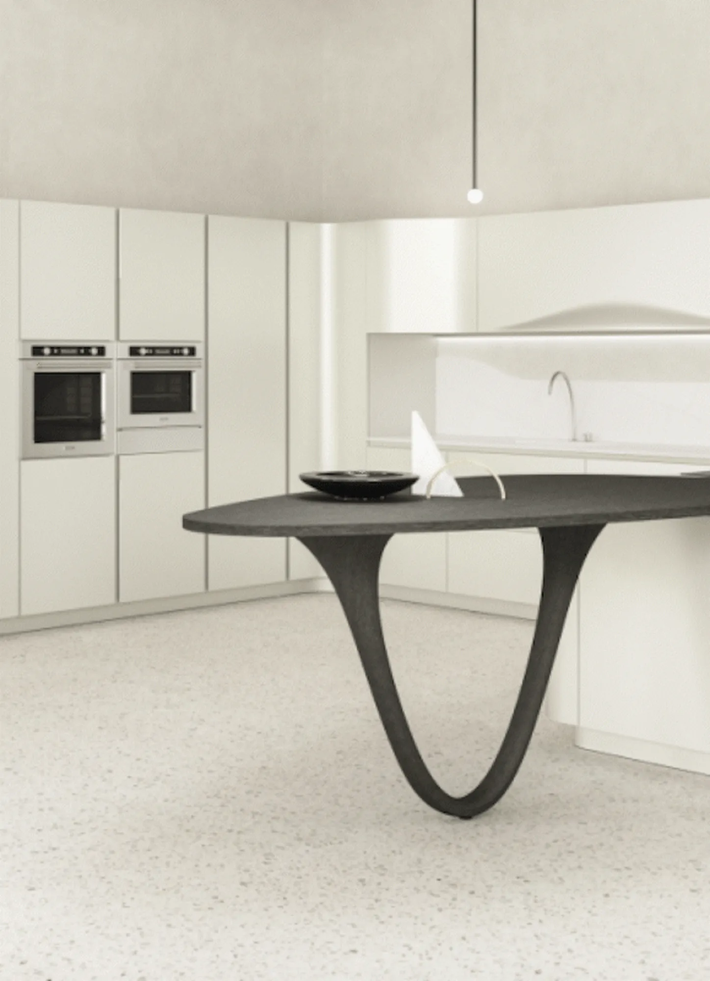
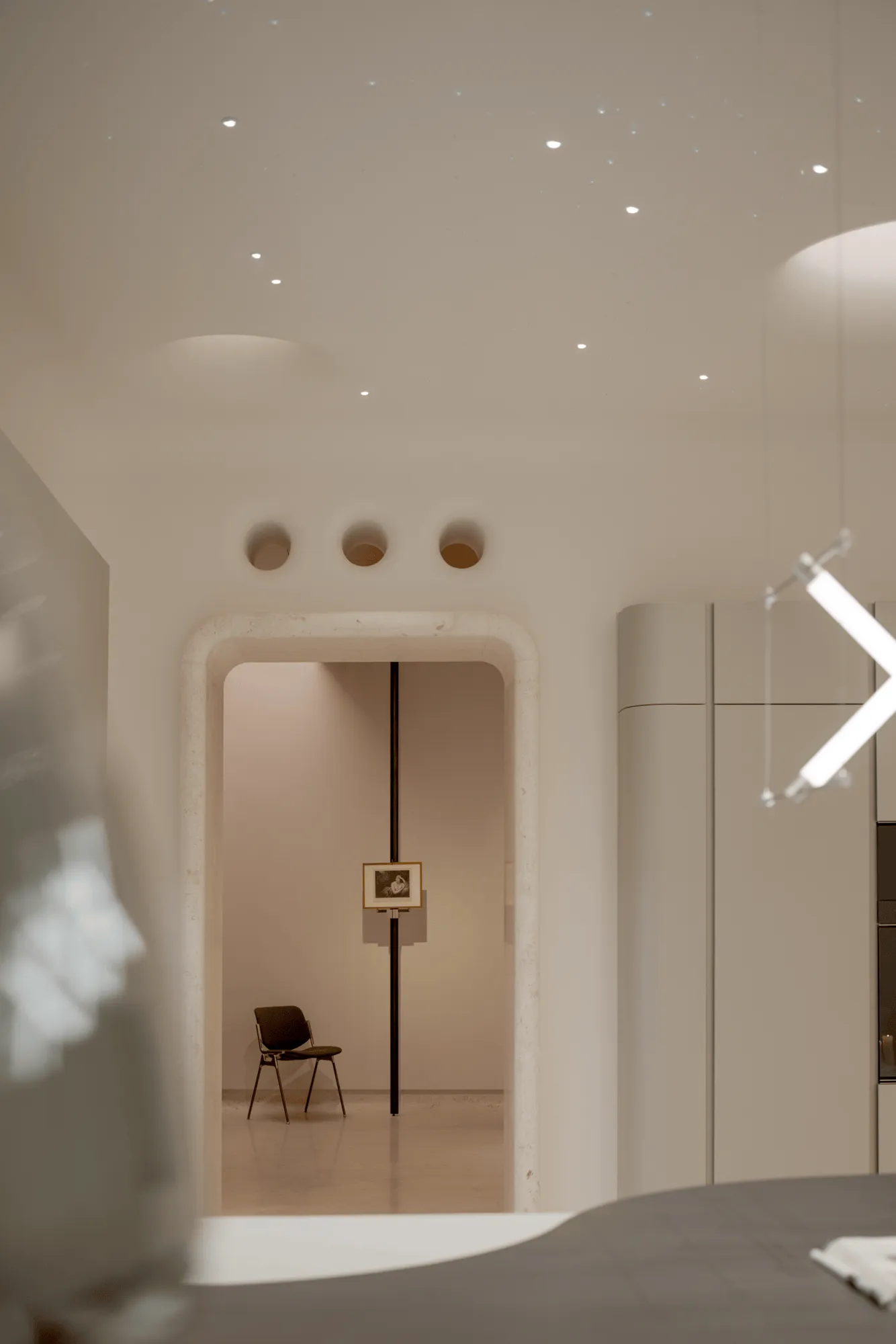
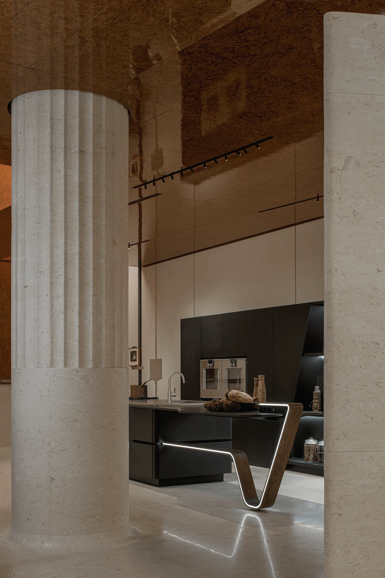
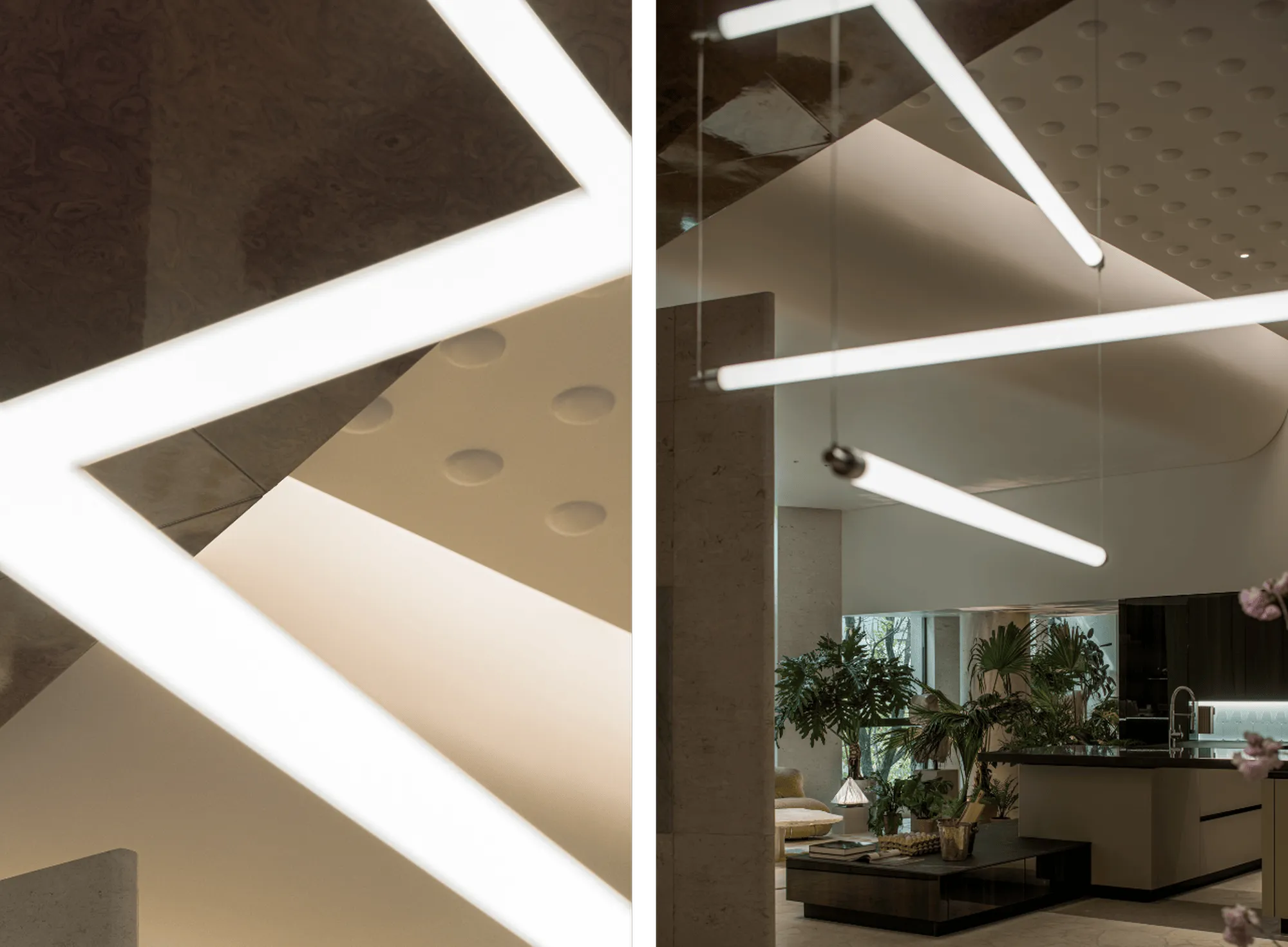
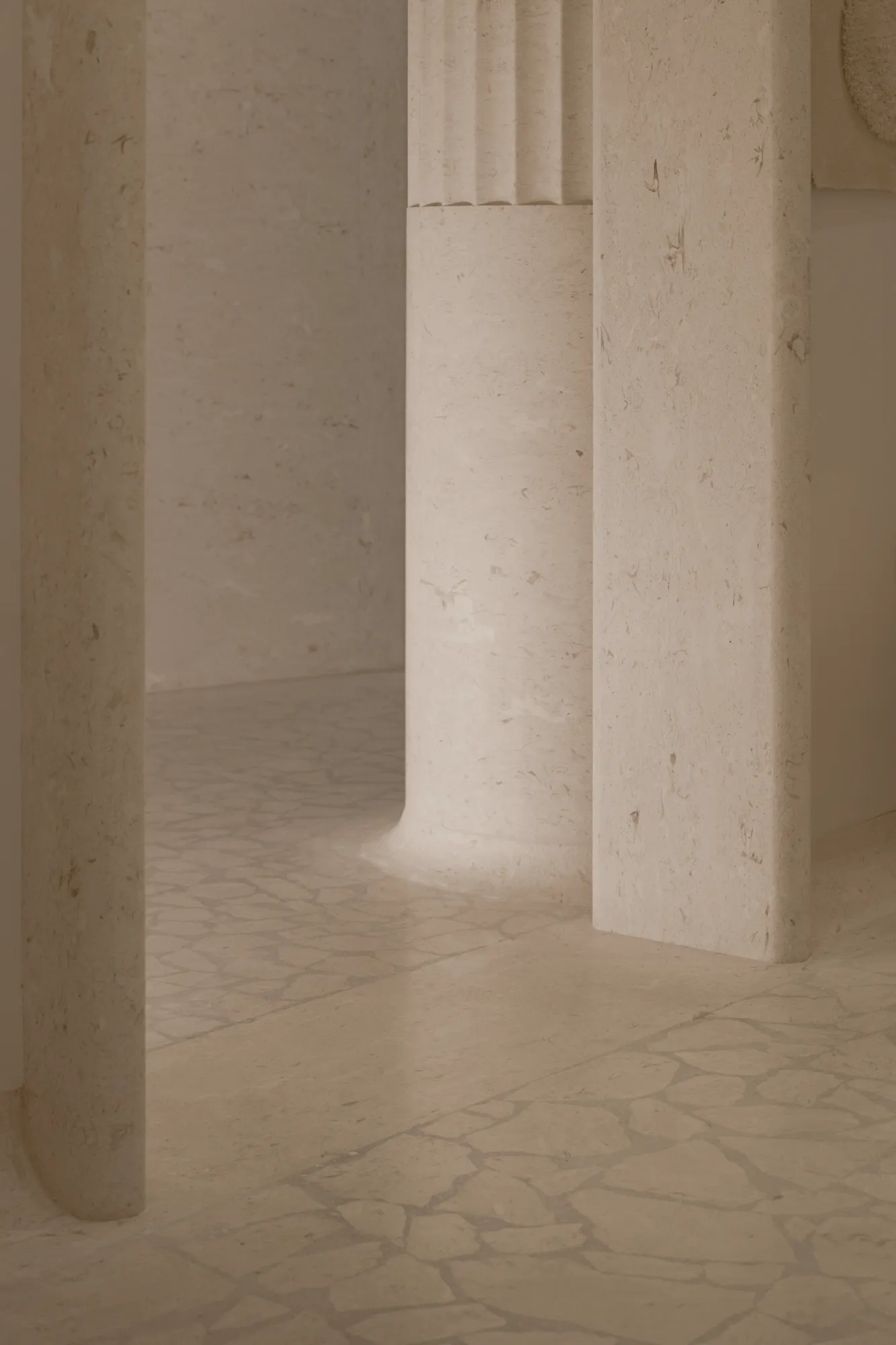
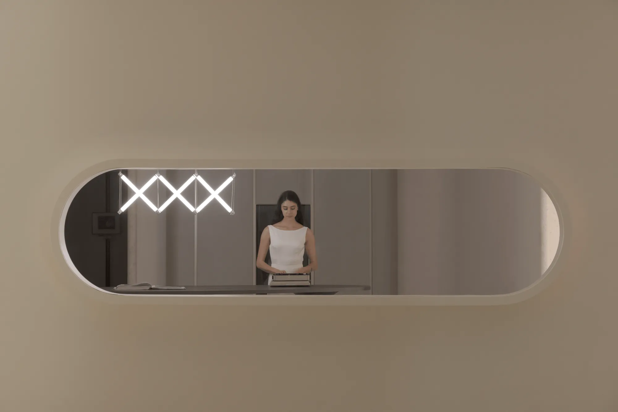
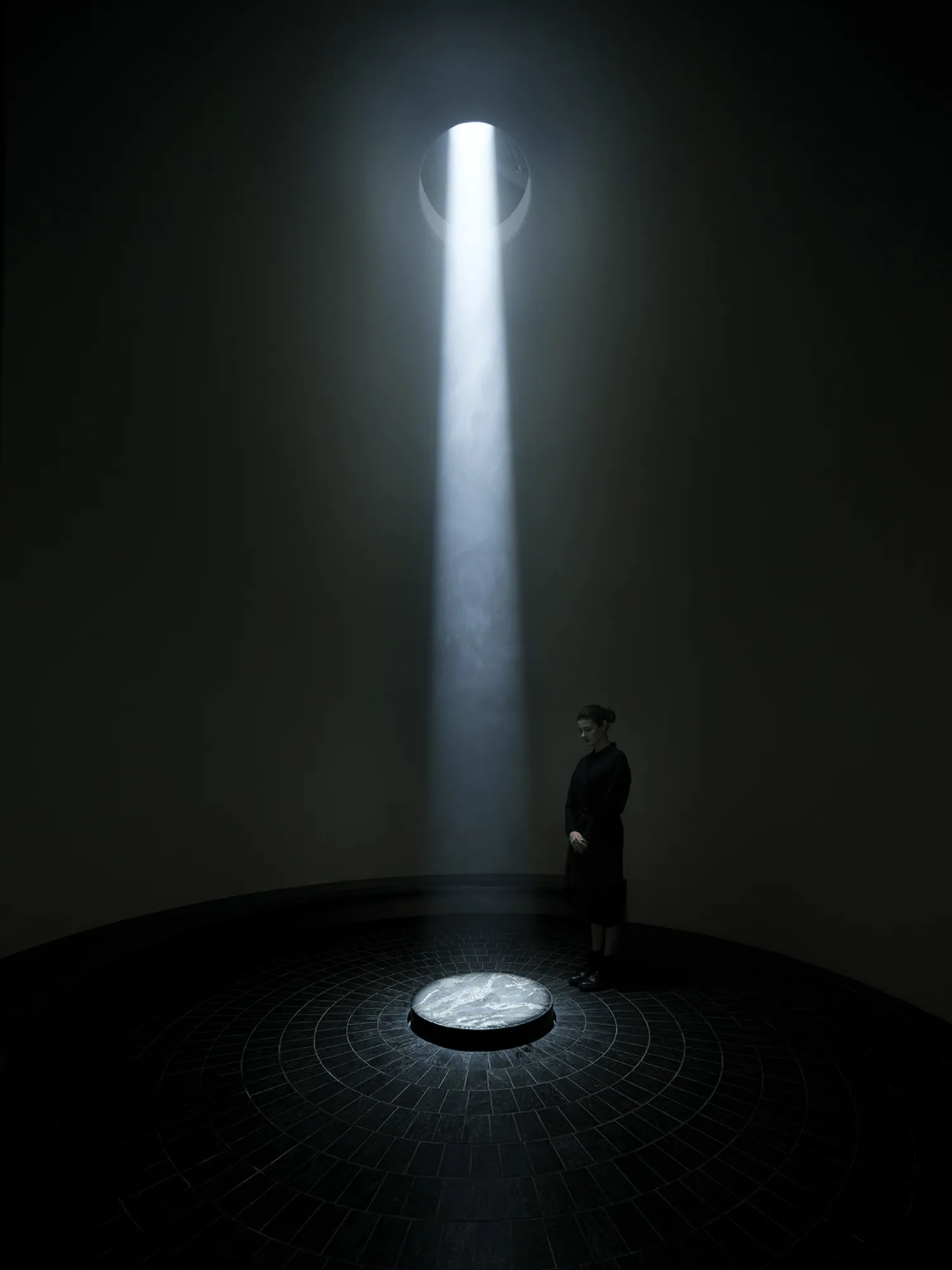
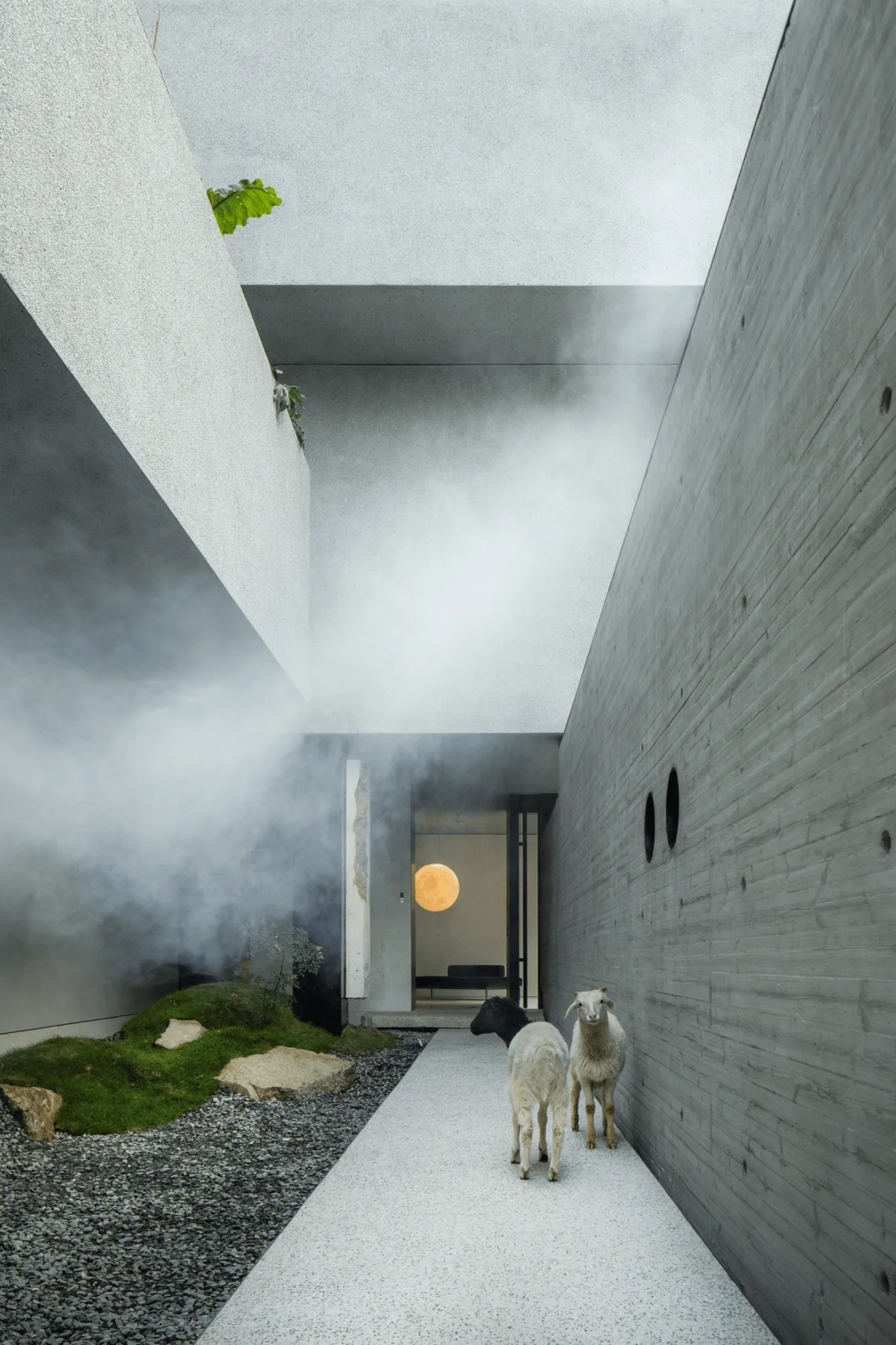
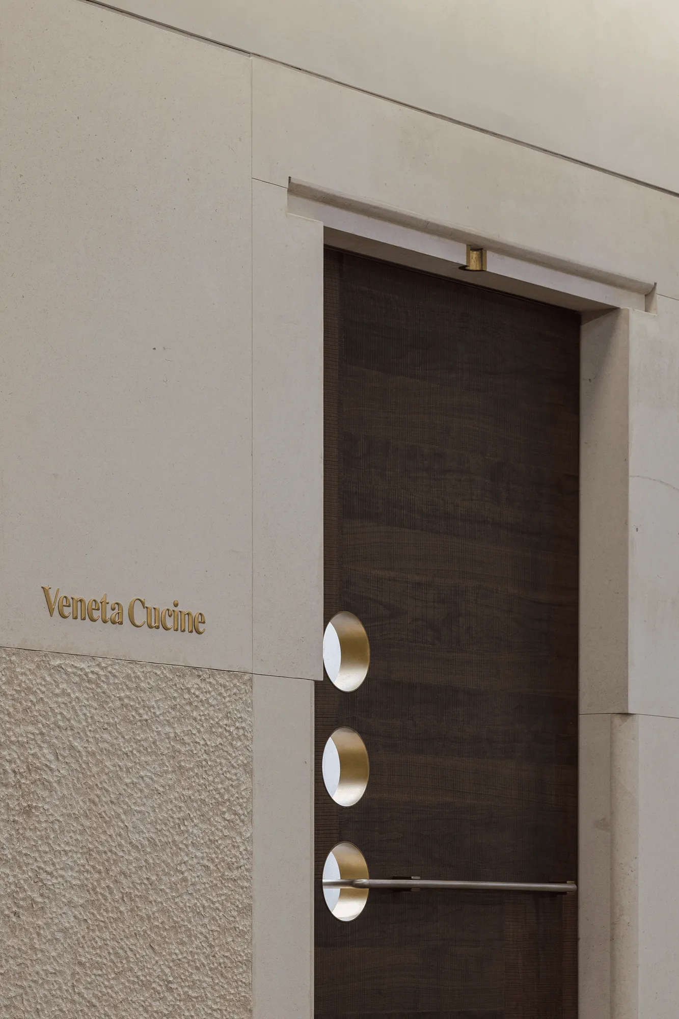
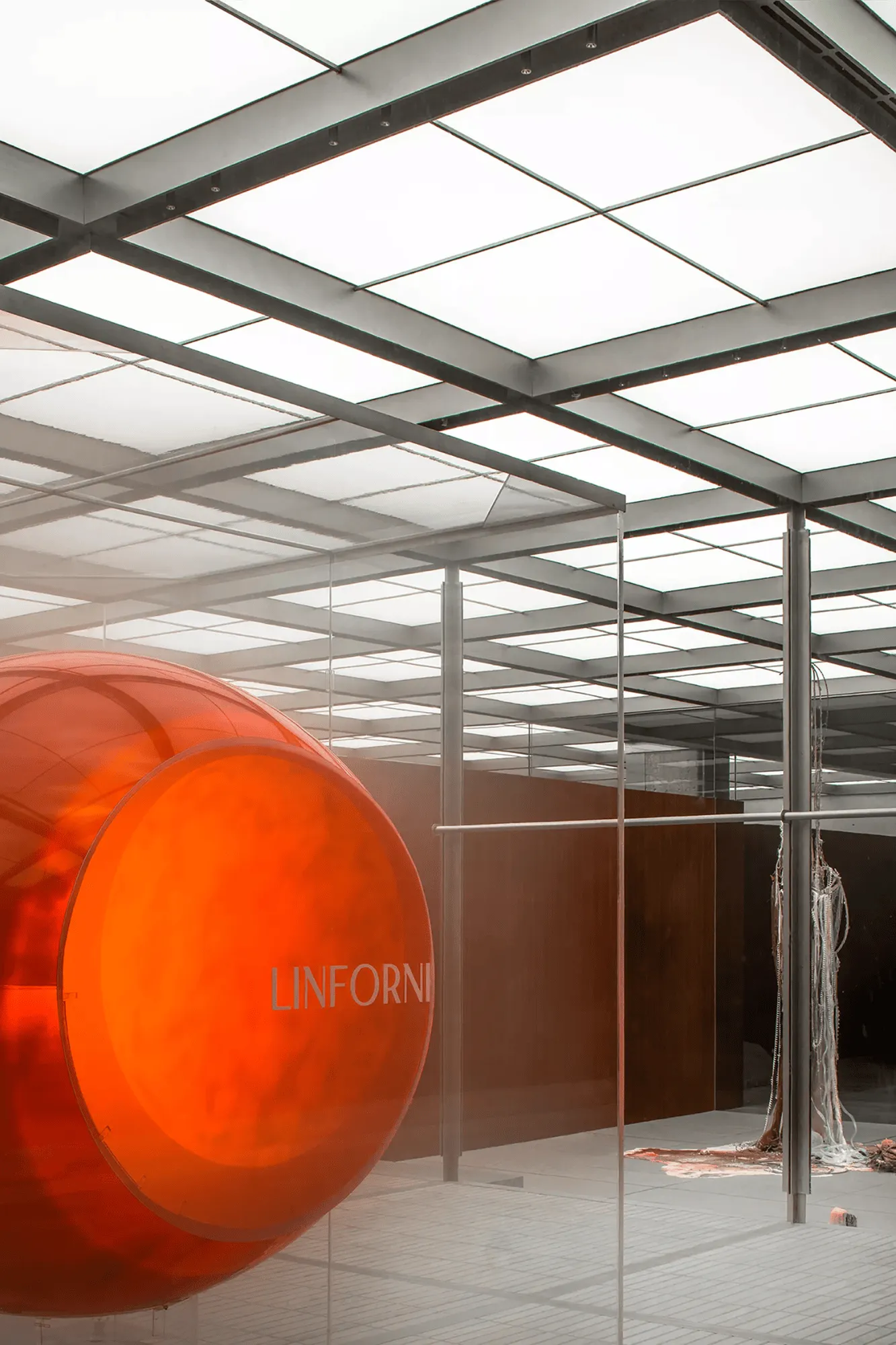
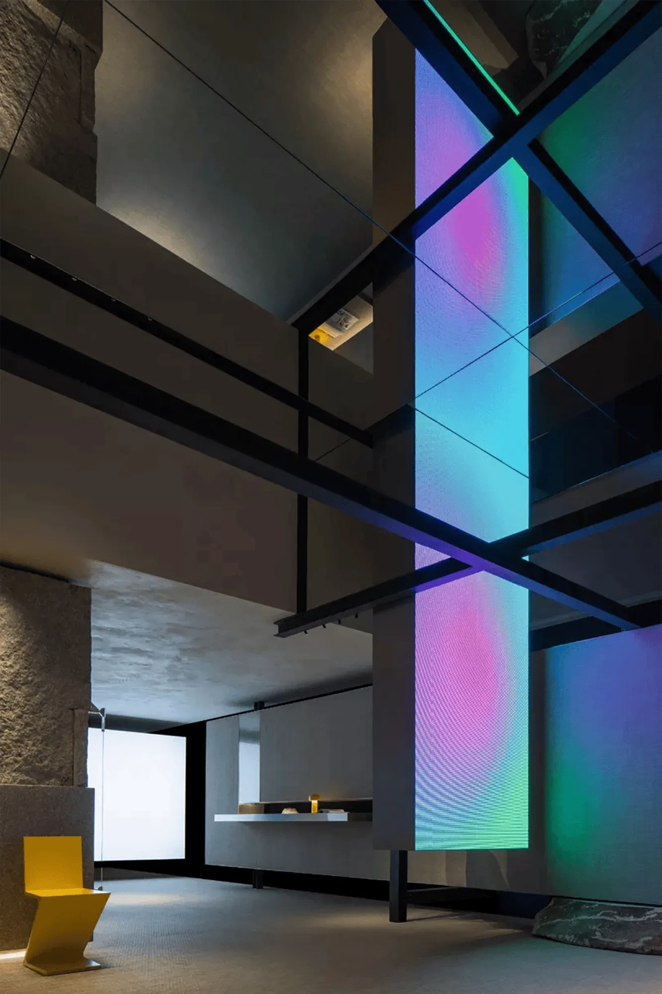
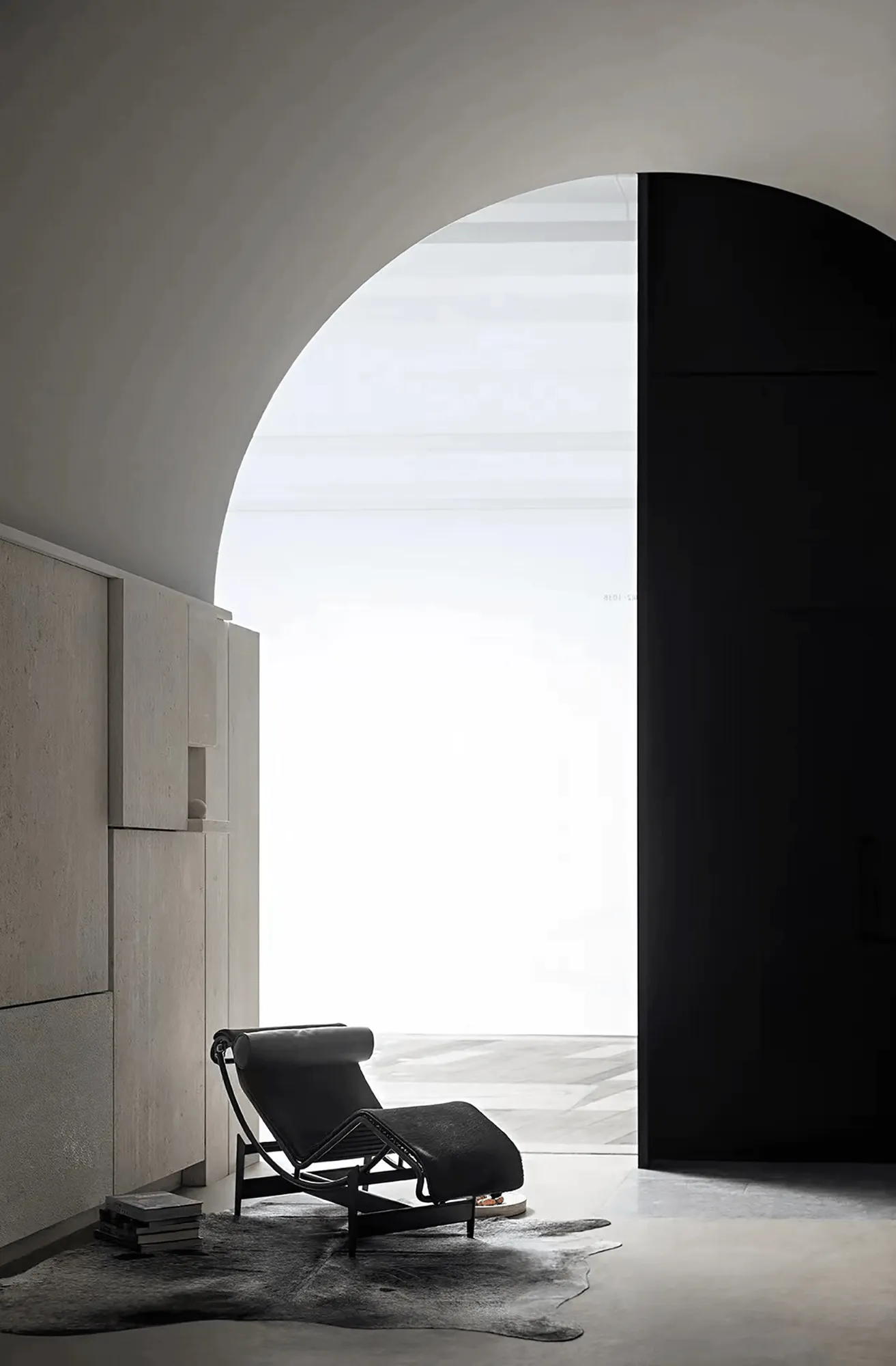
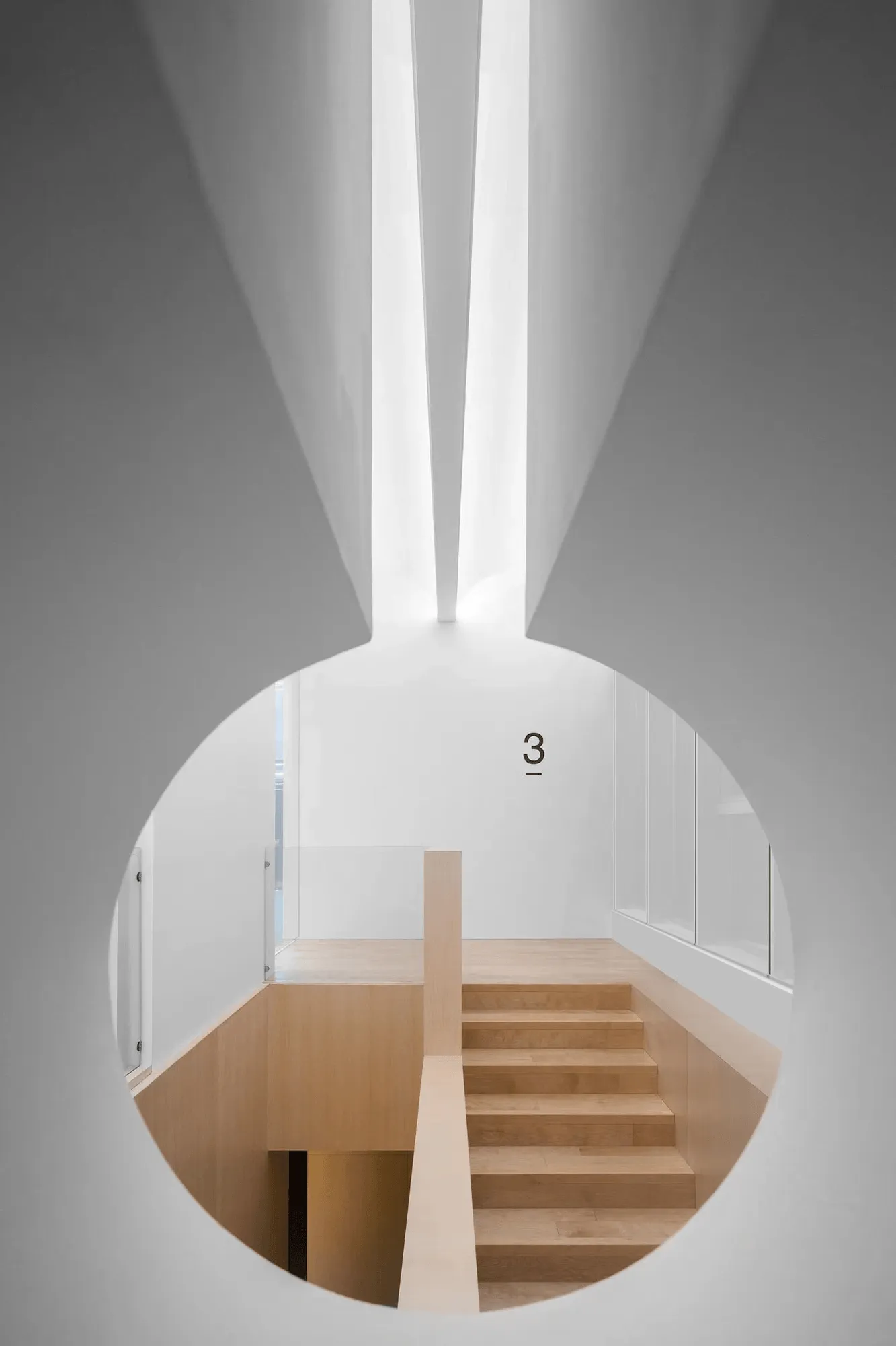
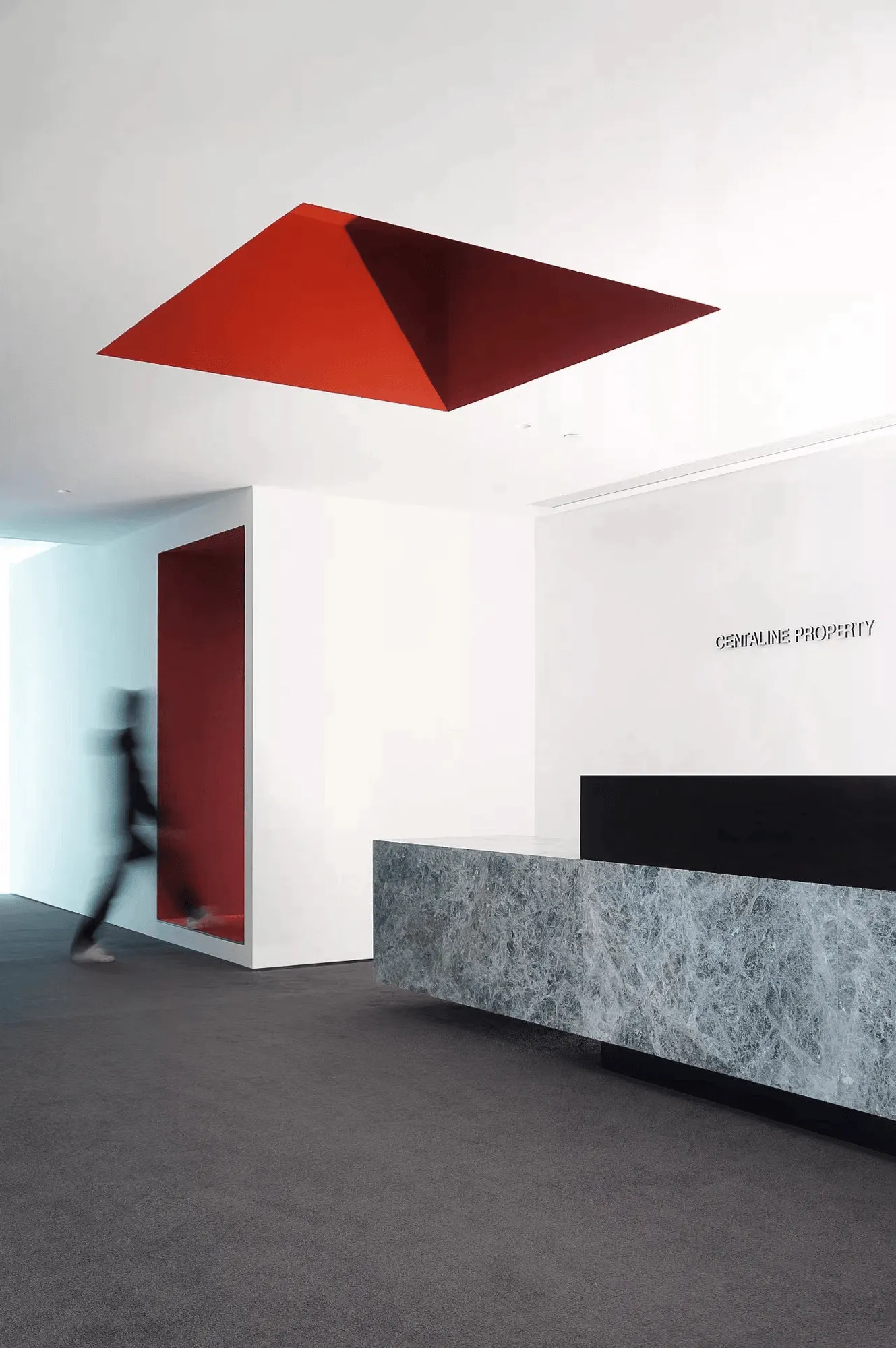
The Shanghai showroom’s design narrative unfolds in two distinct chapters: “Futurist” and “Milanese Modernism.” The “Futurist” section embodies a forward-thinking approach, drawing inspiration from aerospace design and Le Corbusier’s vision of modernity. Circular openings reminiscent of spacecraft doors invite visitors into a dynamic space where smooth stone surfaces create a sense of boundless expanse, echoing the vastness of the cosmos. The OLA kitchen series, a 1990 collaboration with Pininfarina, the design team behind Ferrari, epitomizes this futuristic aesthetic with its flowing curves and innovative materials.
Milanese Modernism: An Ode to Post-War Design Principles
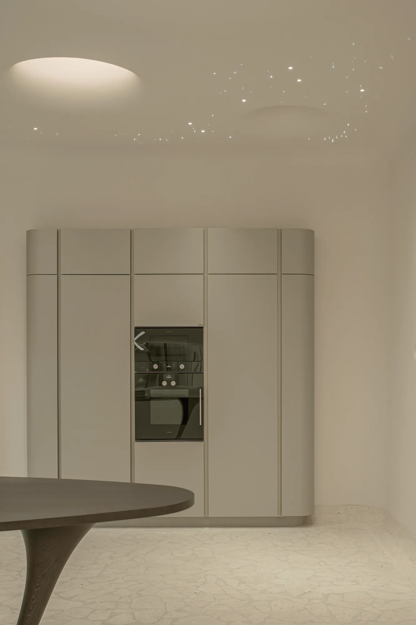
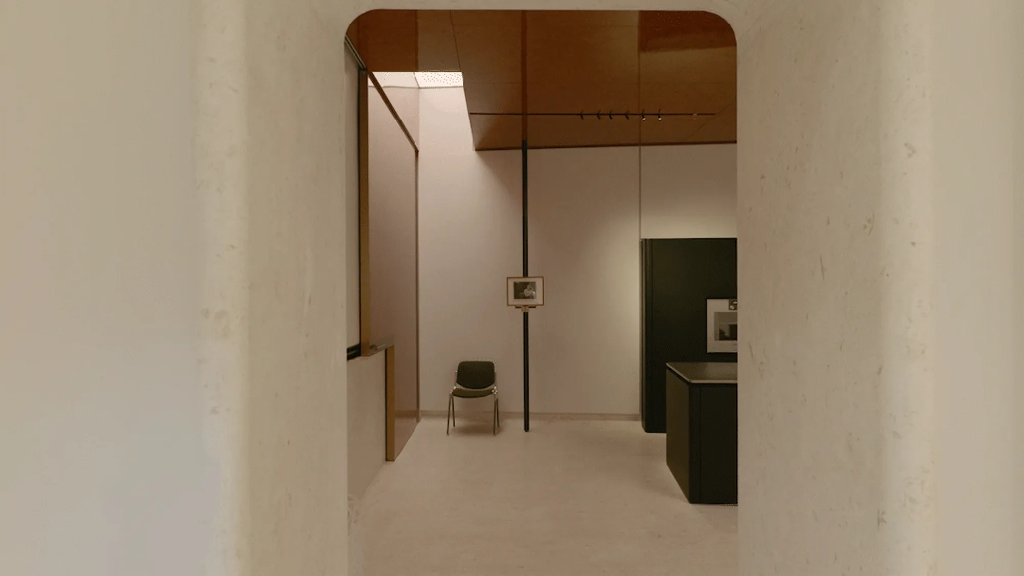
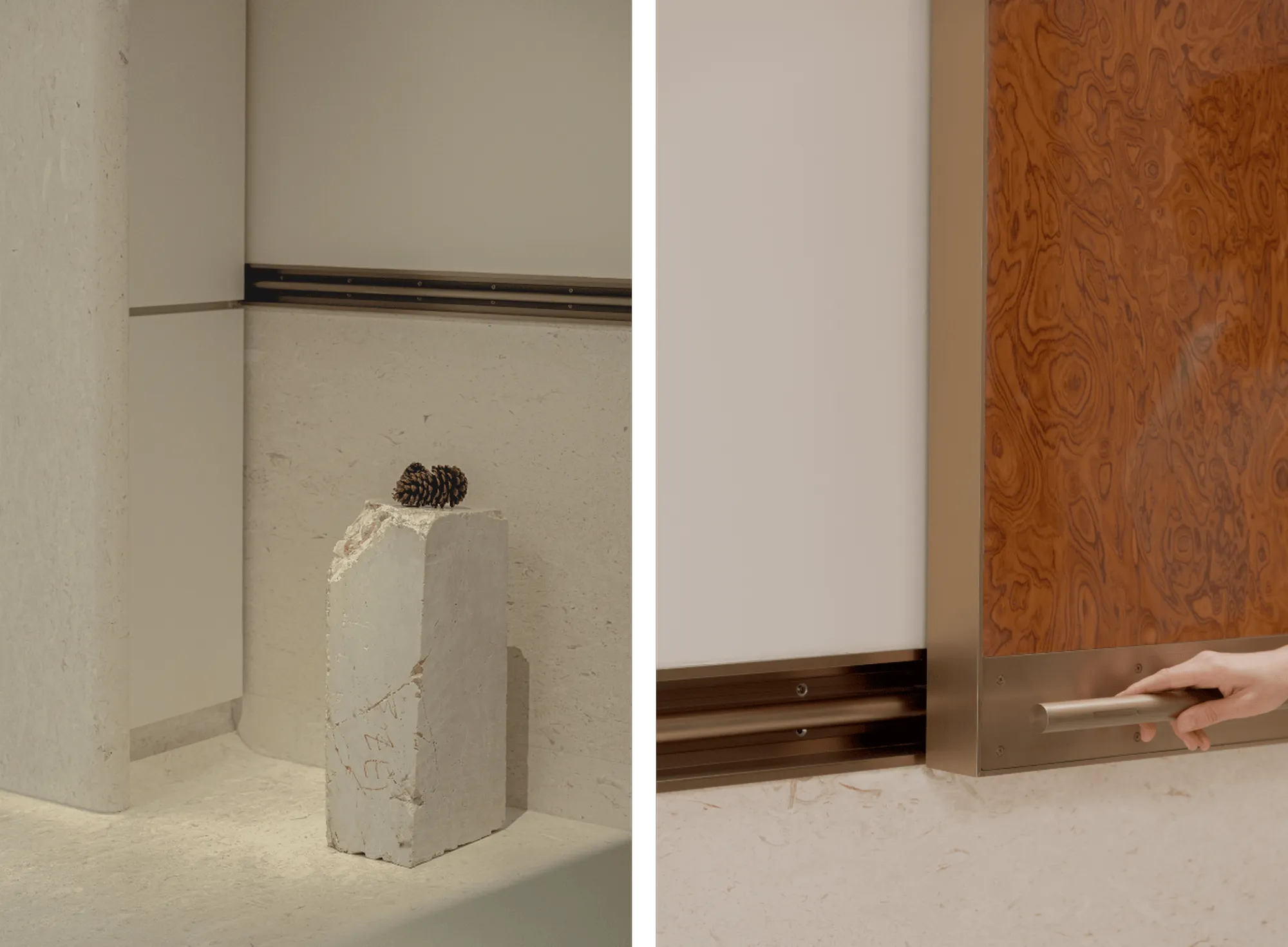
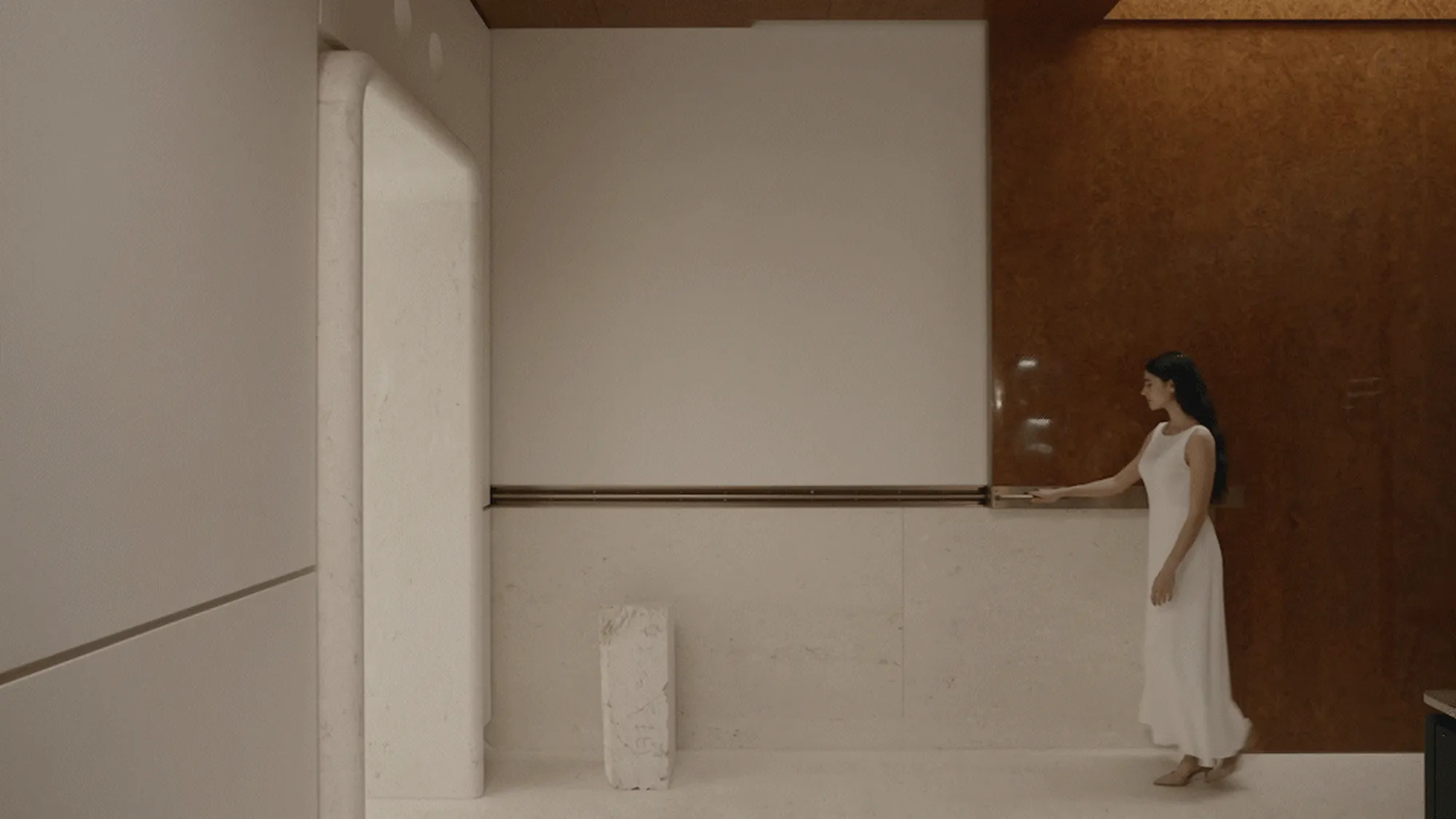
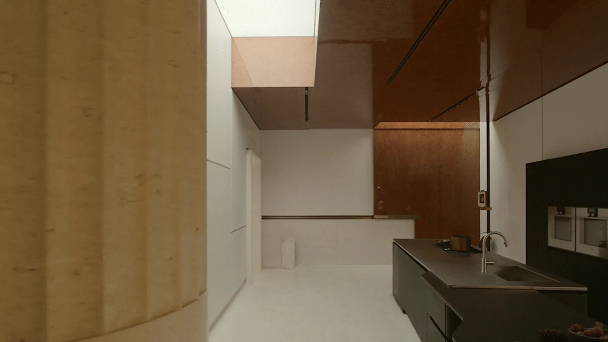
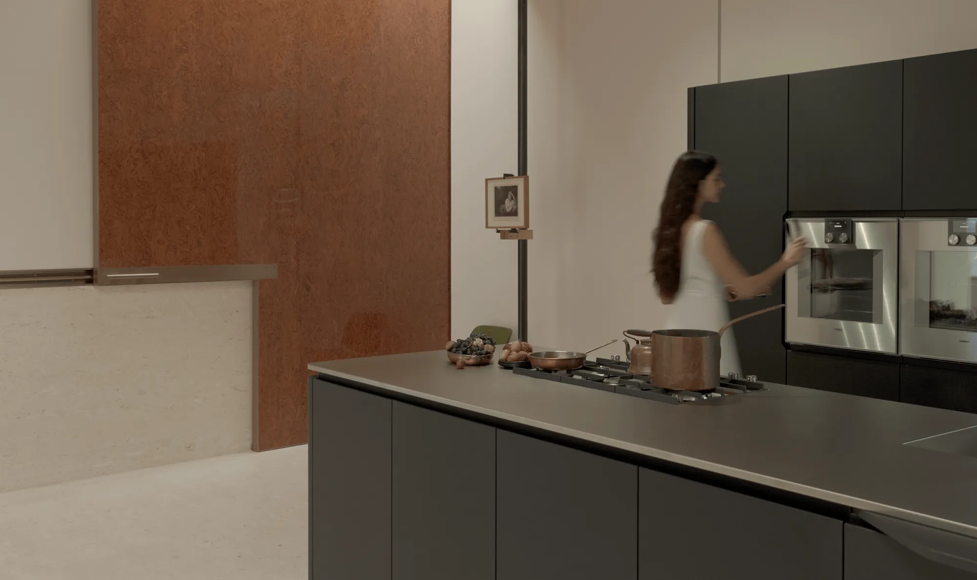
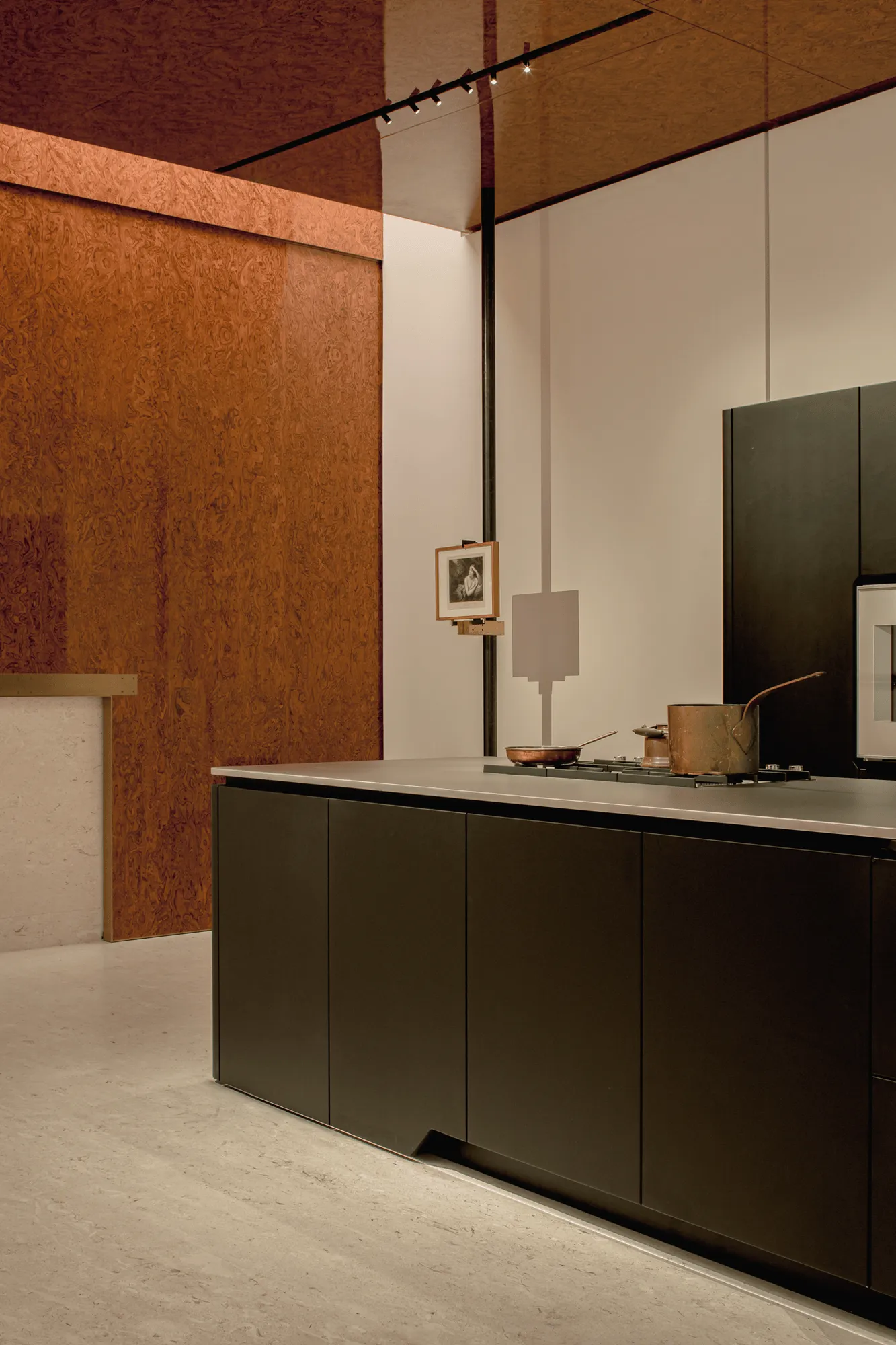
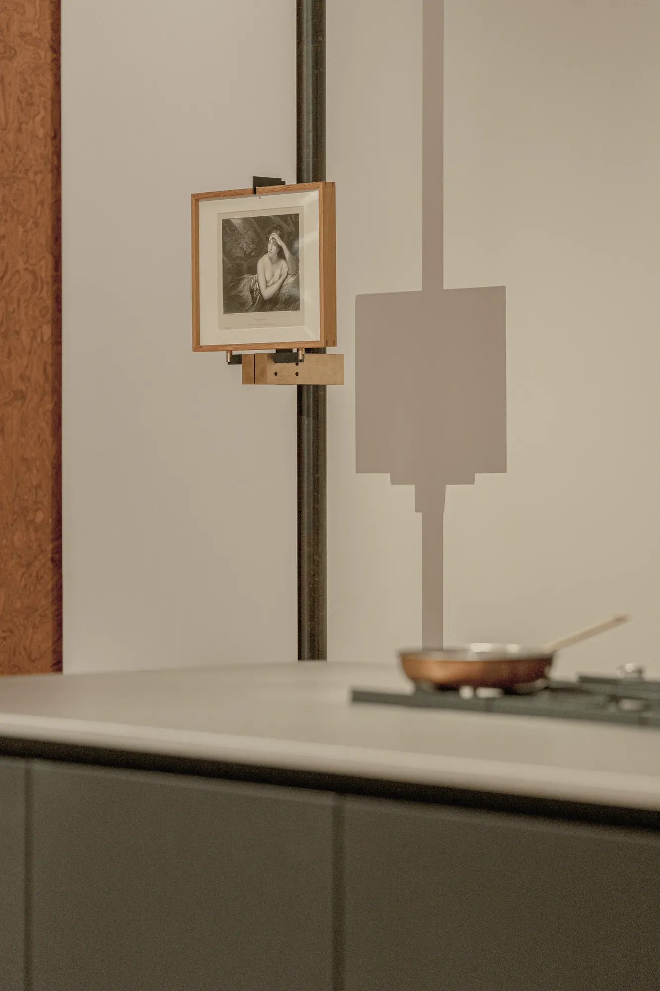
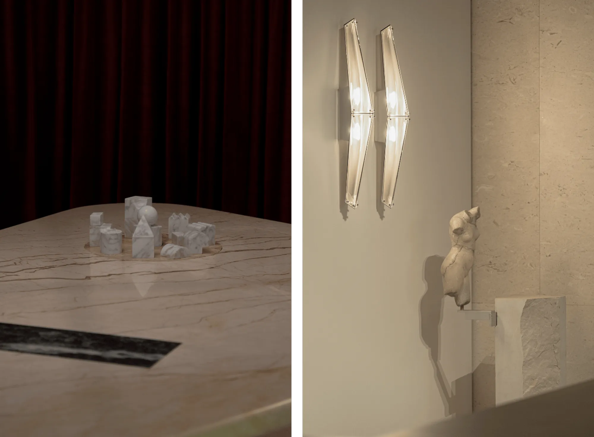
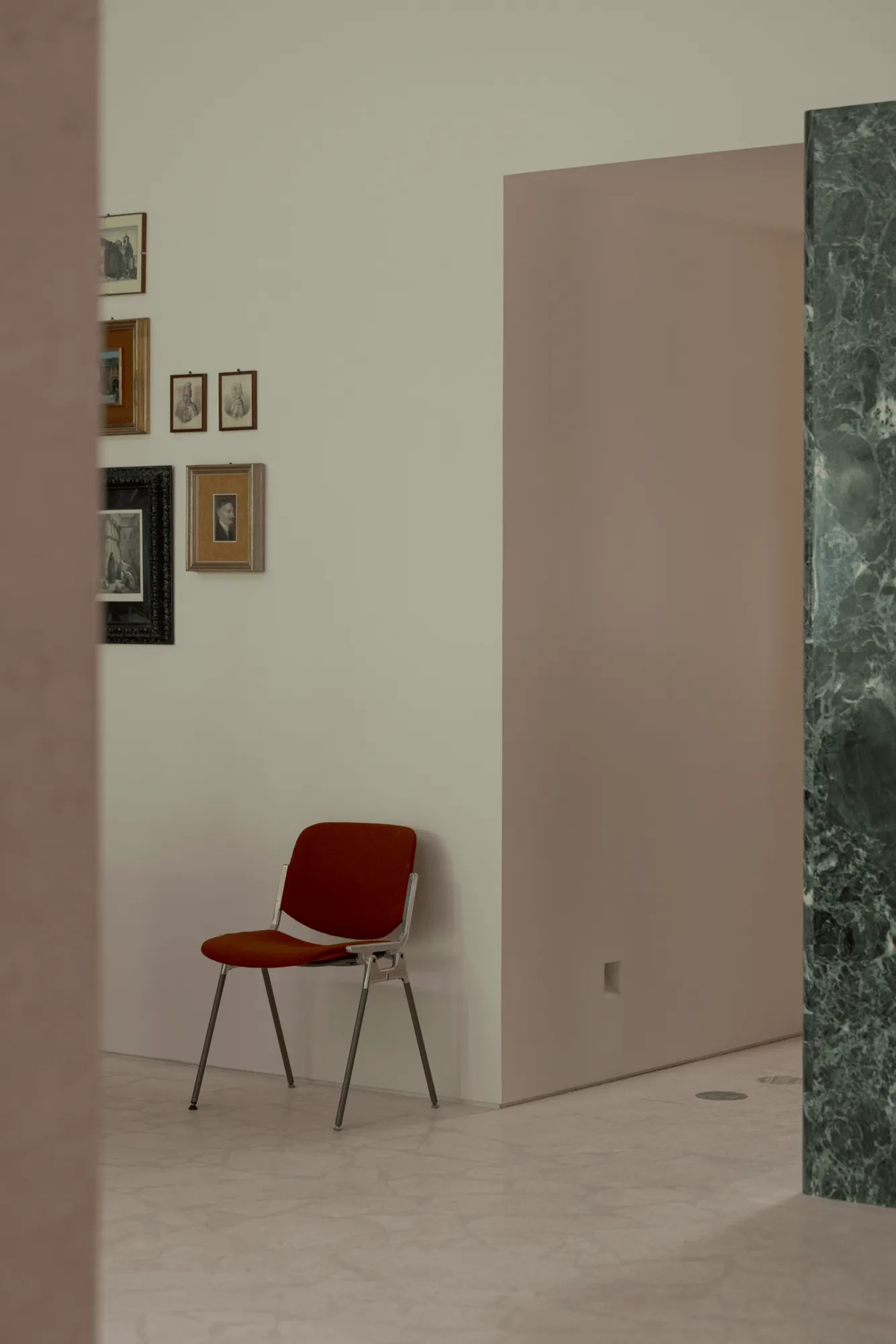
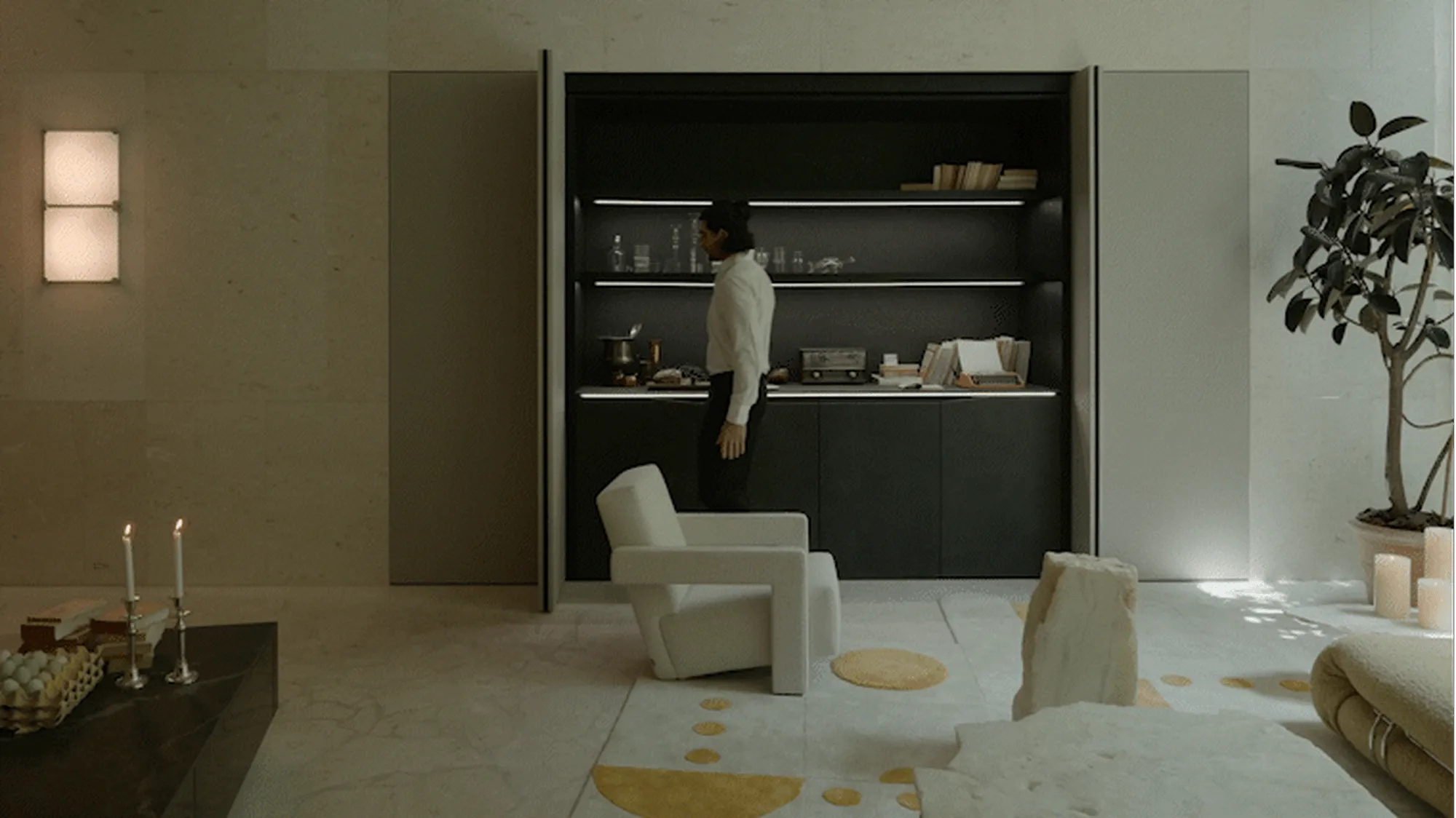
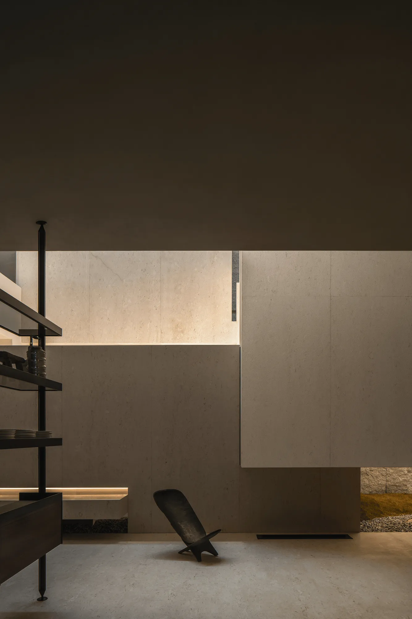
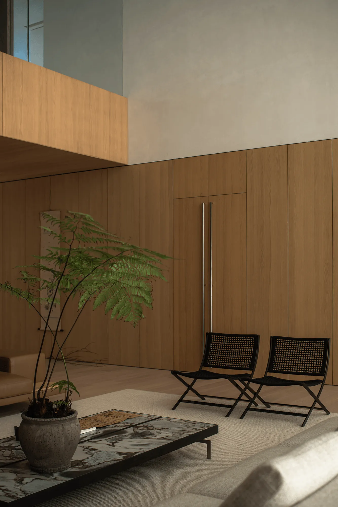
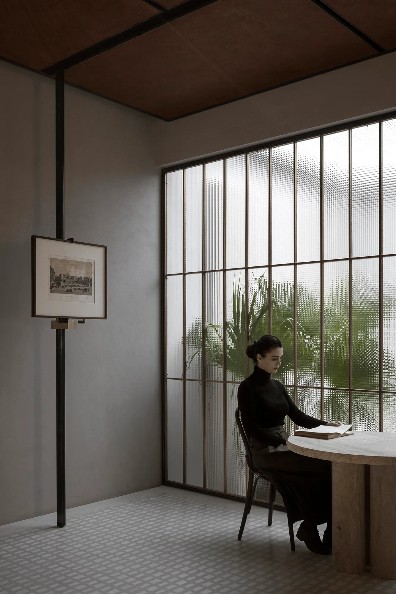
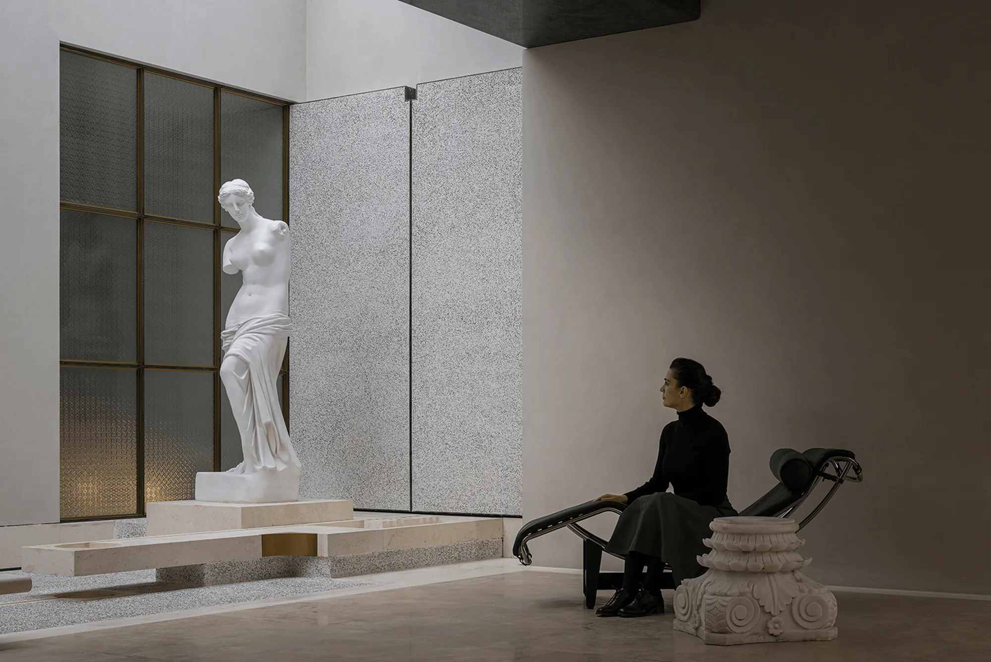
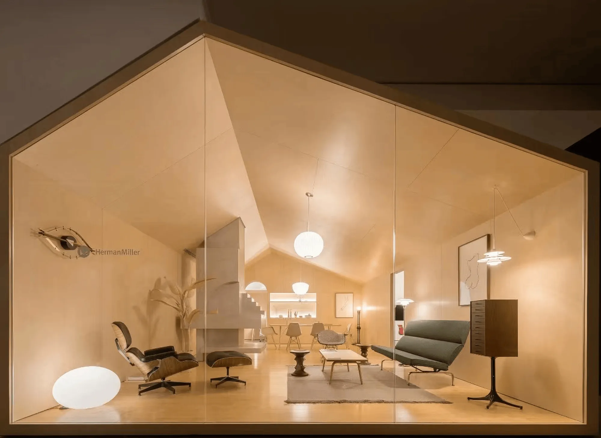
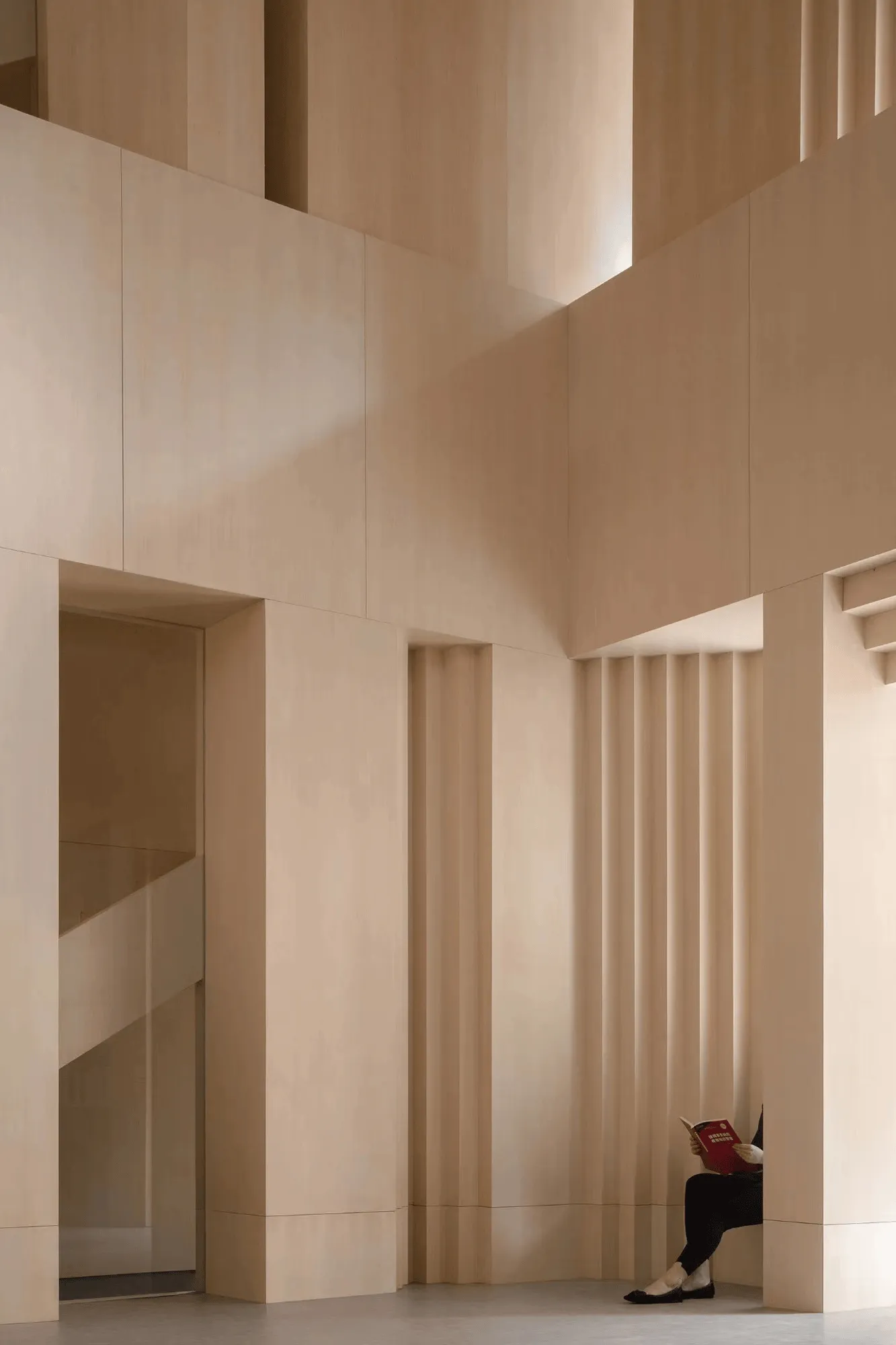
The “Milanese Modernism” section pays homage to the democratic design principles that emerged in post-war Milan. This design philosophy, as articulated in “A Modernist Guide to Milan,” emphasizes the importance of creating a harmonious environment through meticulous attention to detail. The showroom’s design reflects this ethos, with a focus on honest material expression, geometric forms, and a restrained yet precise aesthetic. The VISION kitchen series, another Pininfarina creation, exemplifies this approach with its minimalist lines, ergonomic design, and seamless integration of function and form. The purity of the design is enhanced by the use of diverse materials, including wood, metal, and stone, which are carefully orchestrated to create a sense of order and balance.
Light as a Unifying Element: Illuminating the Narrative
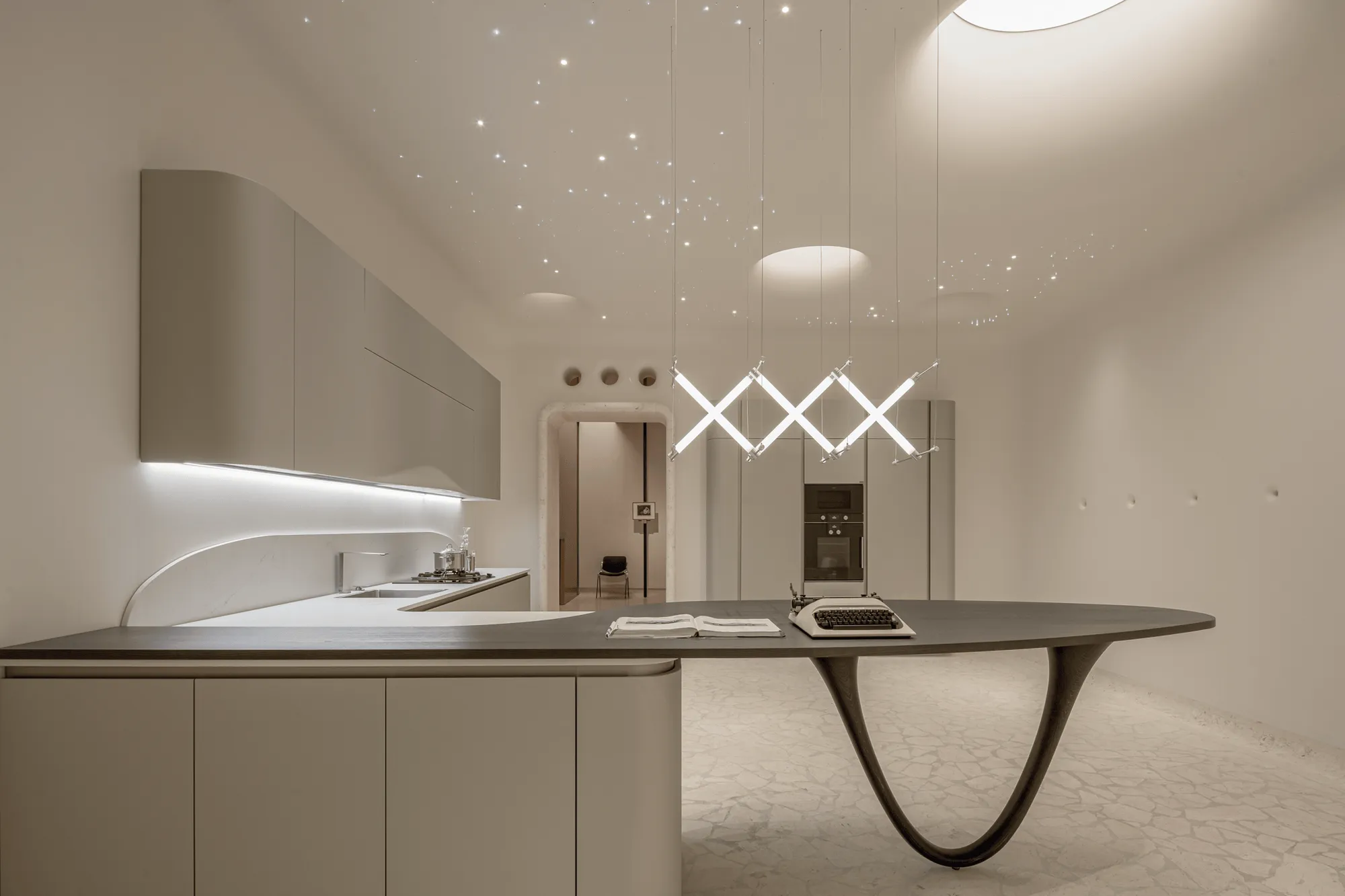
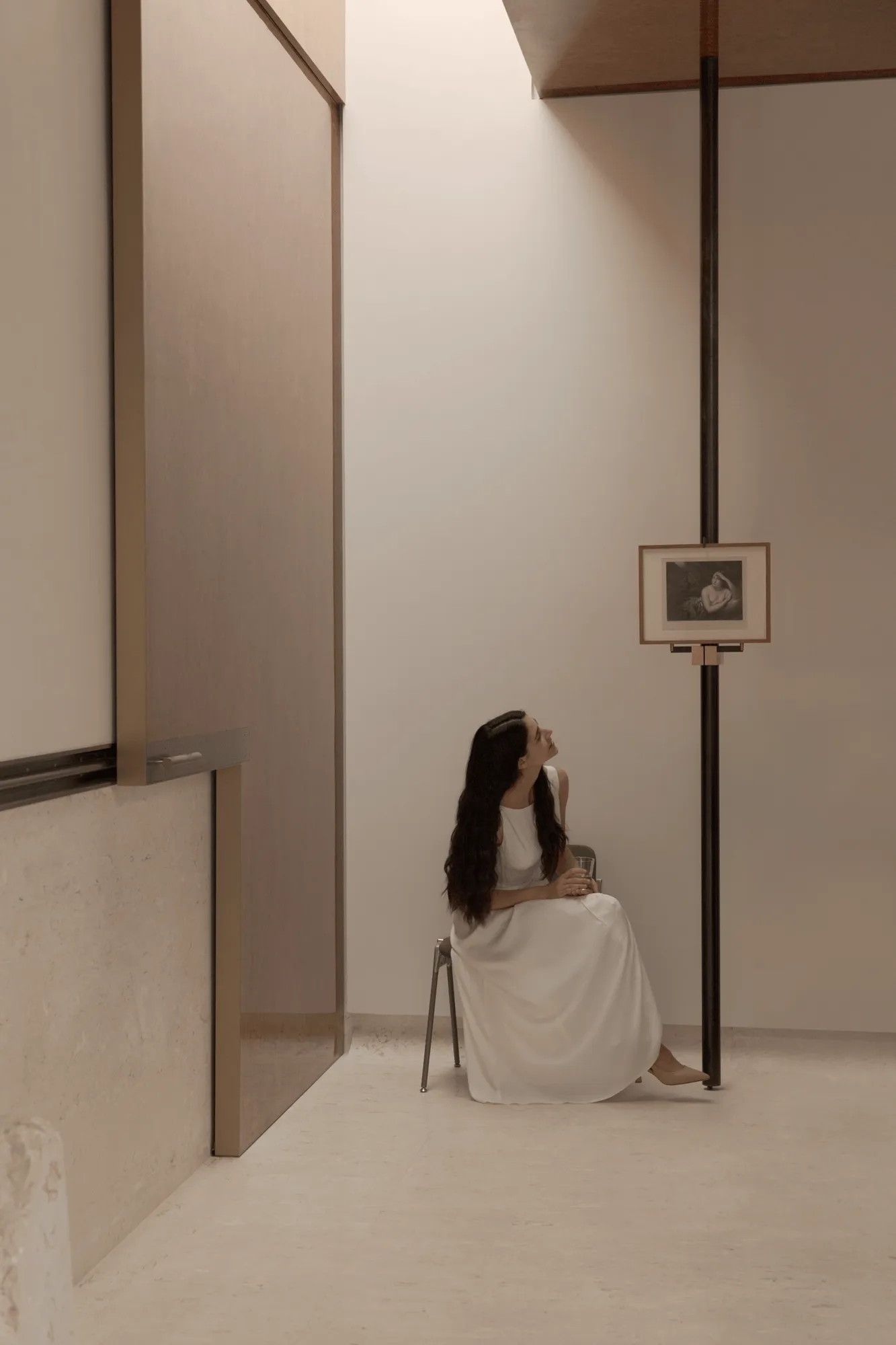
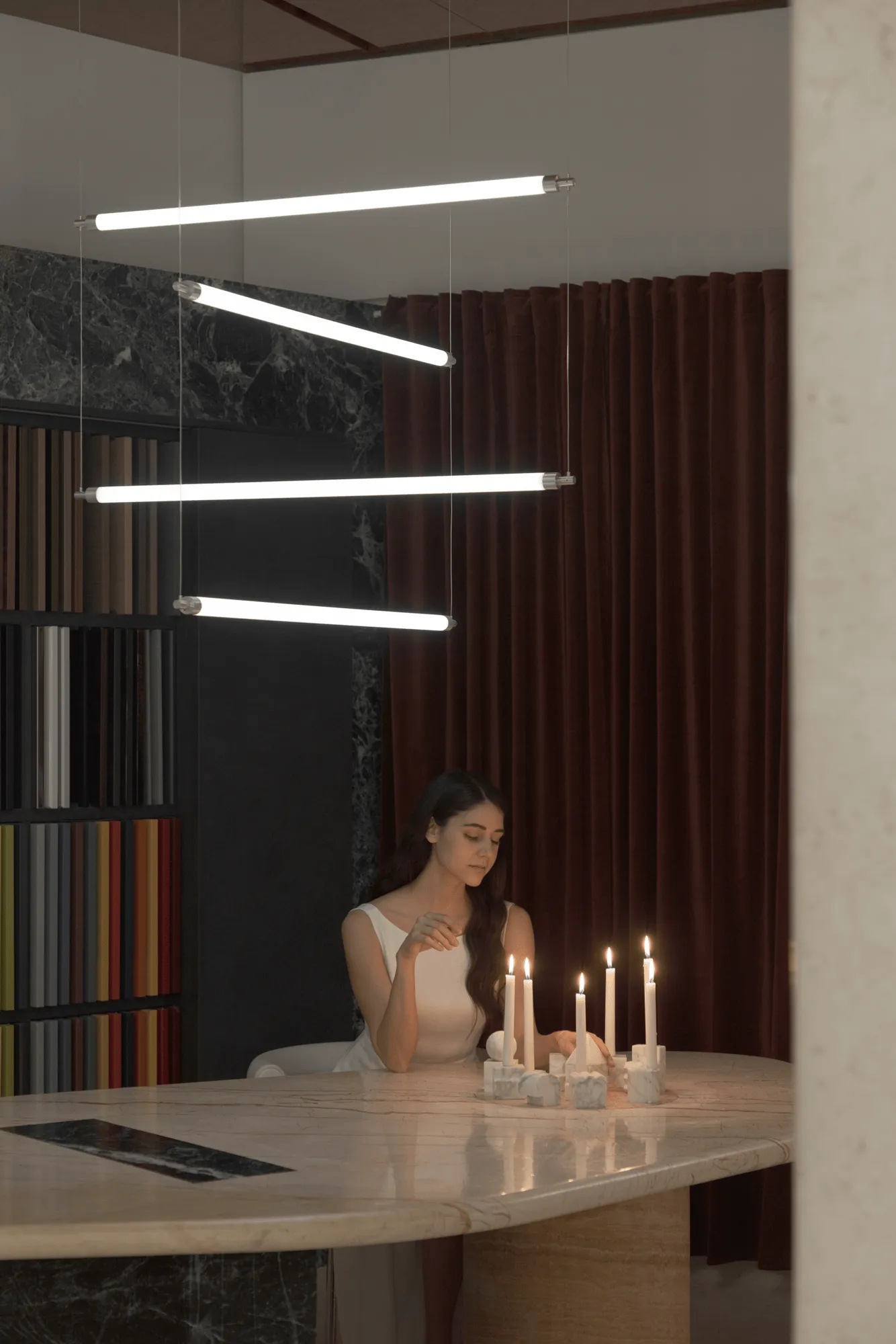
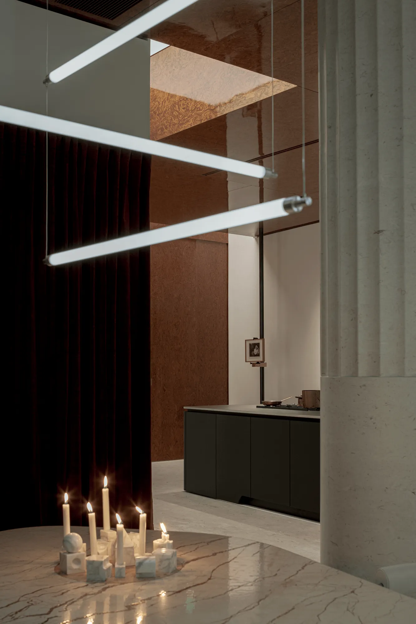
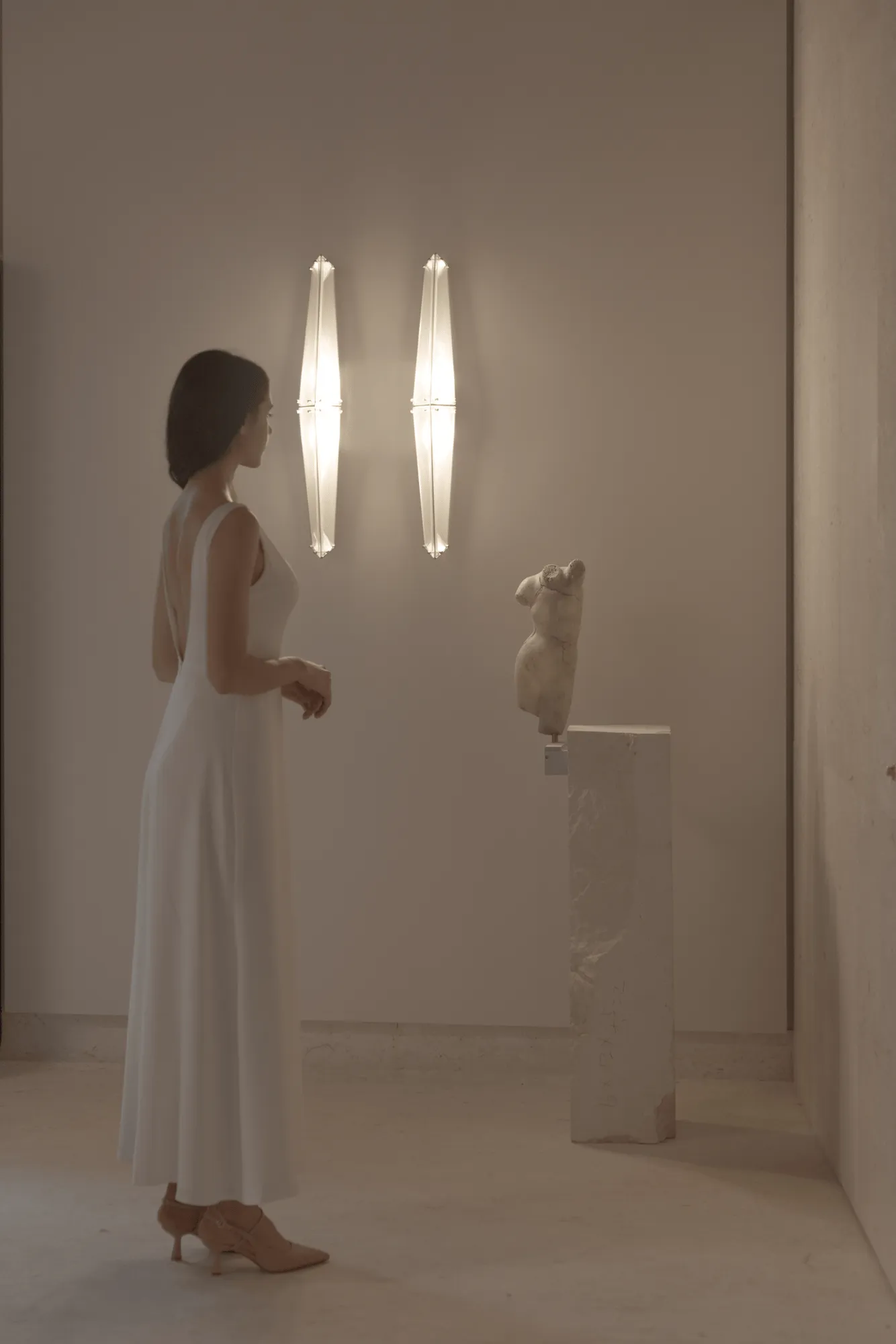
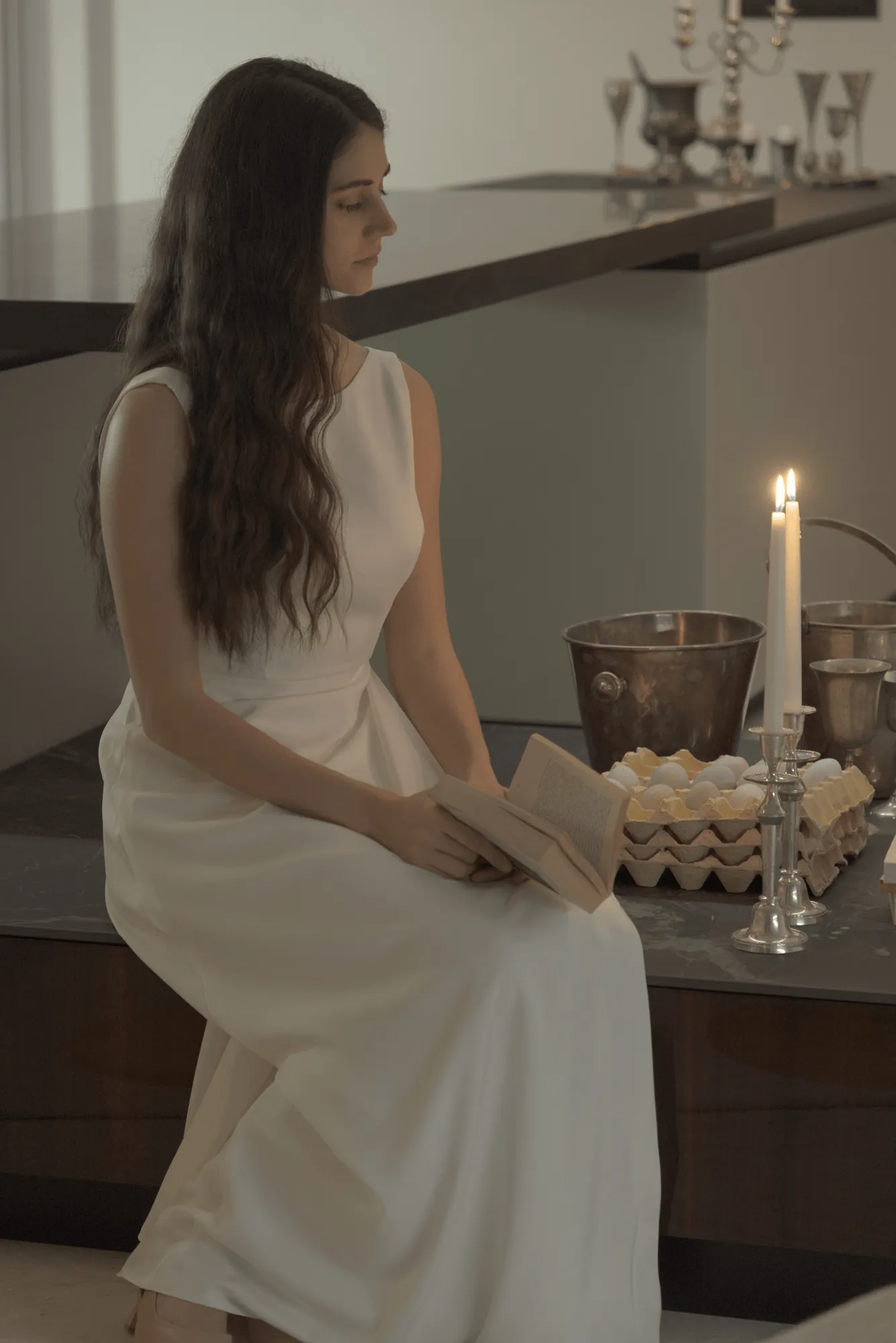
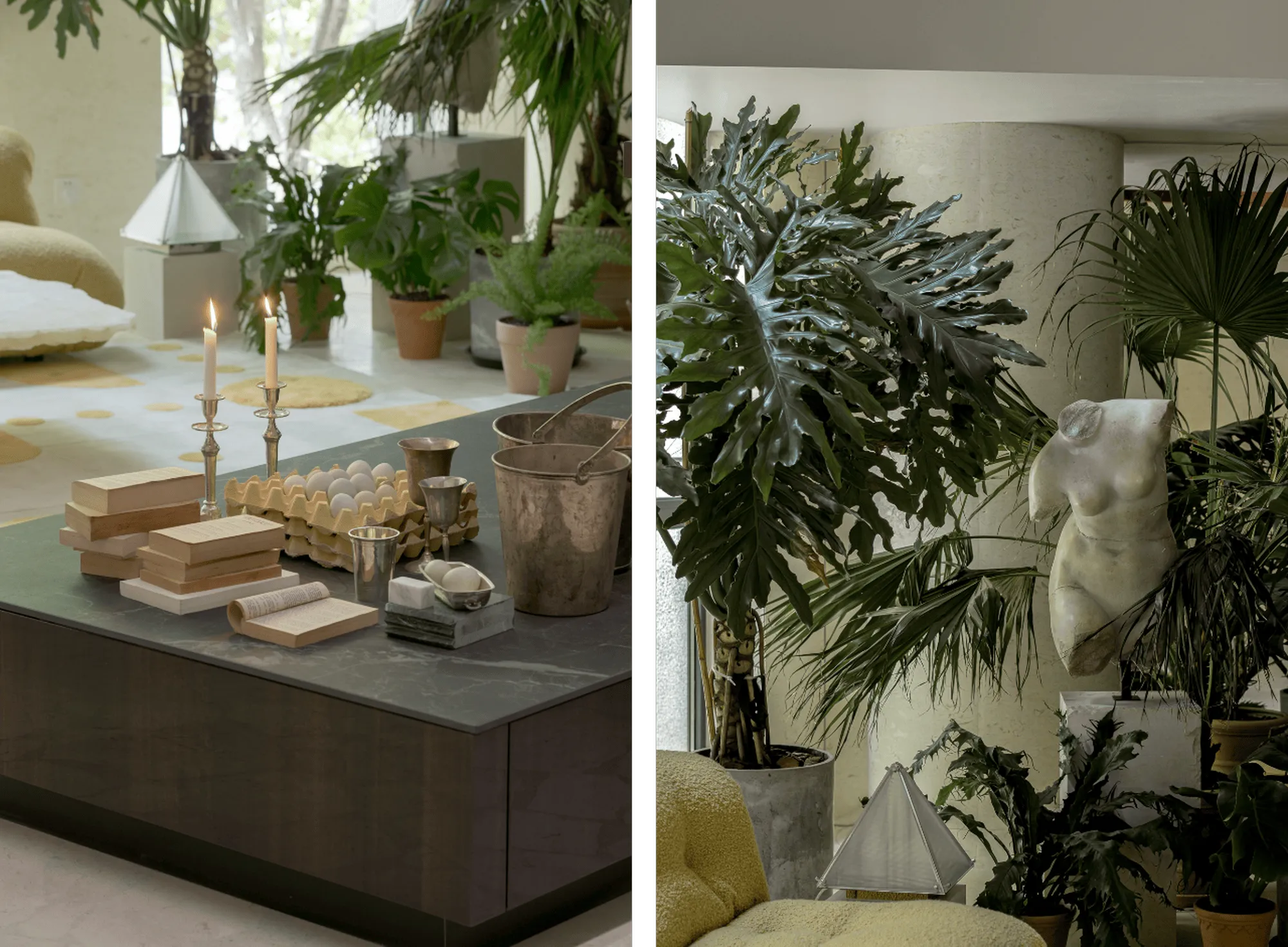
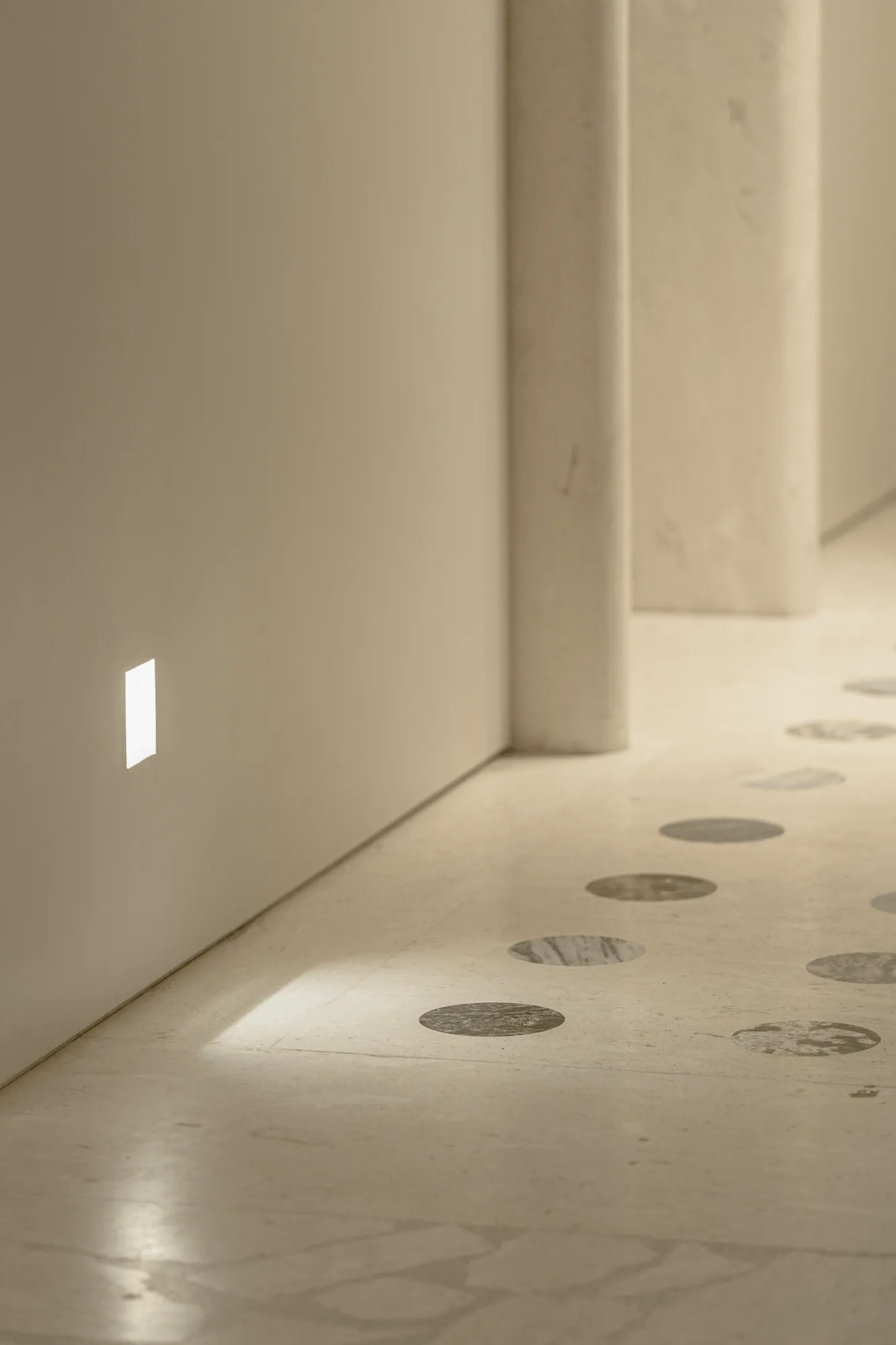
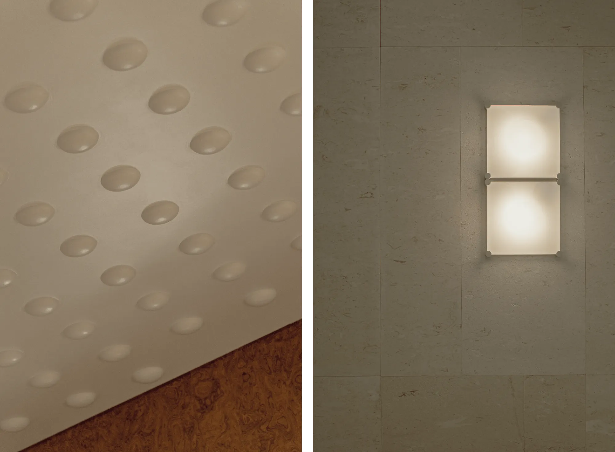
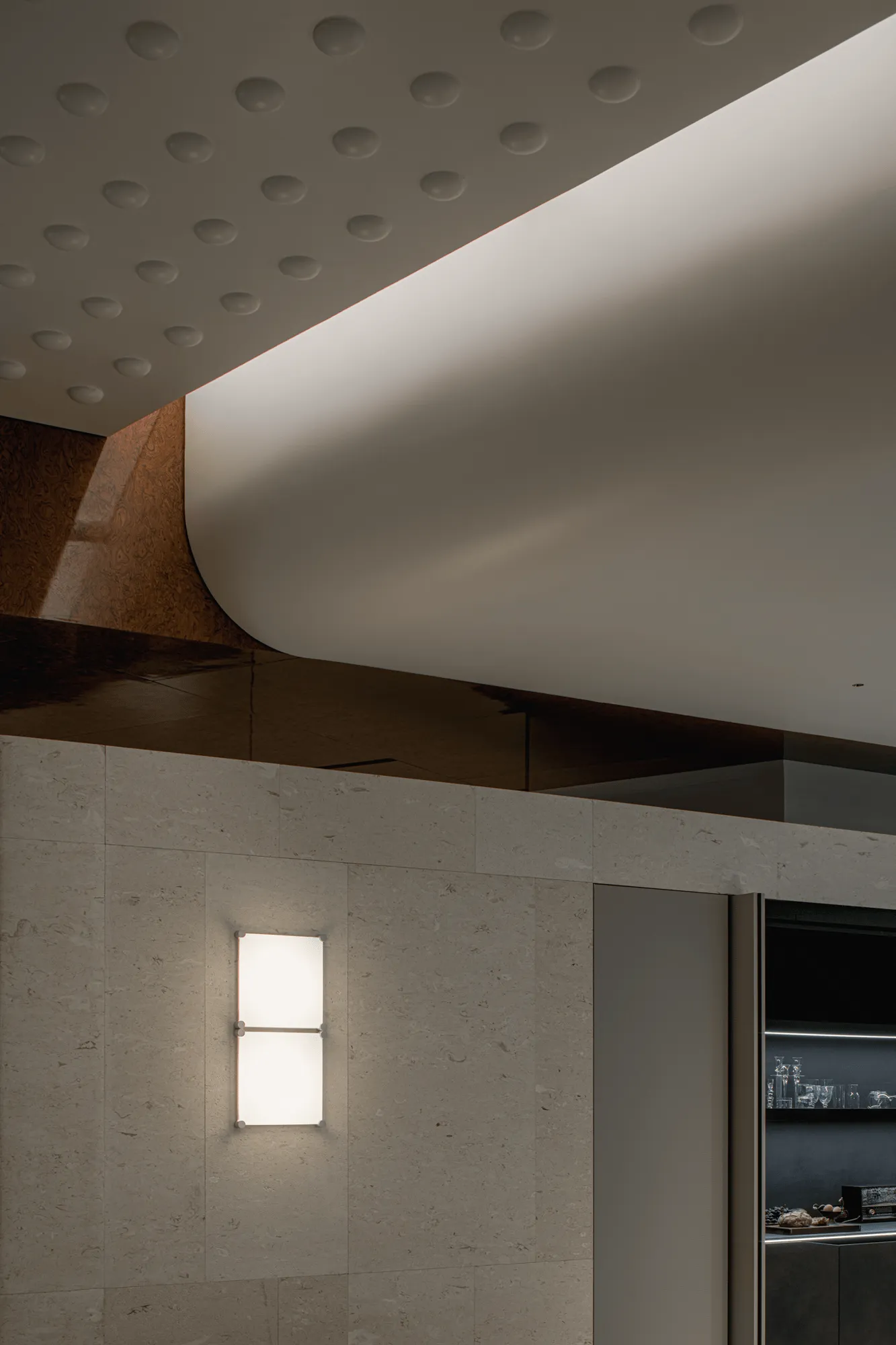
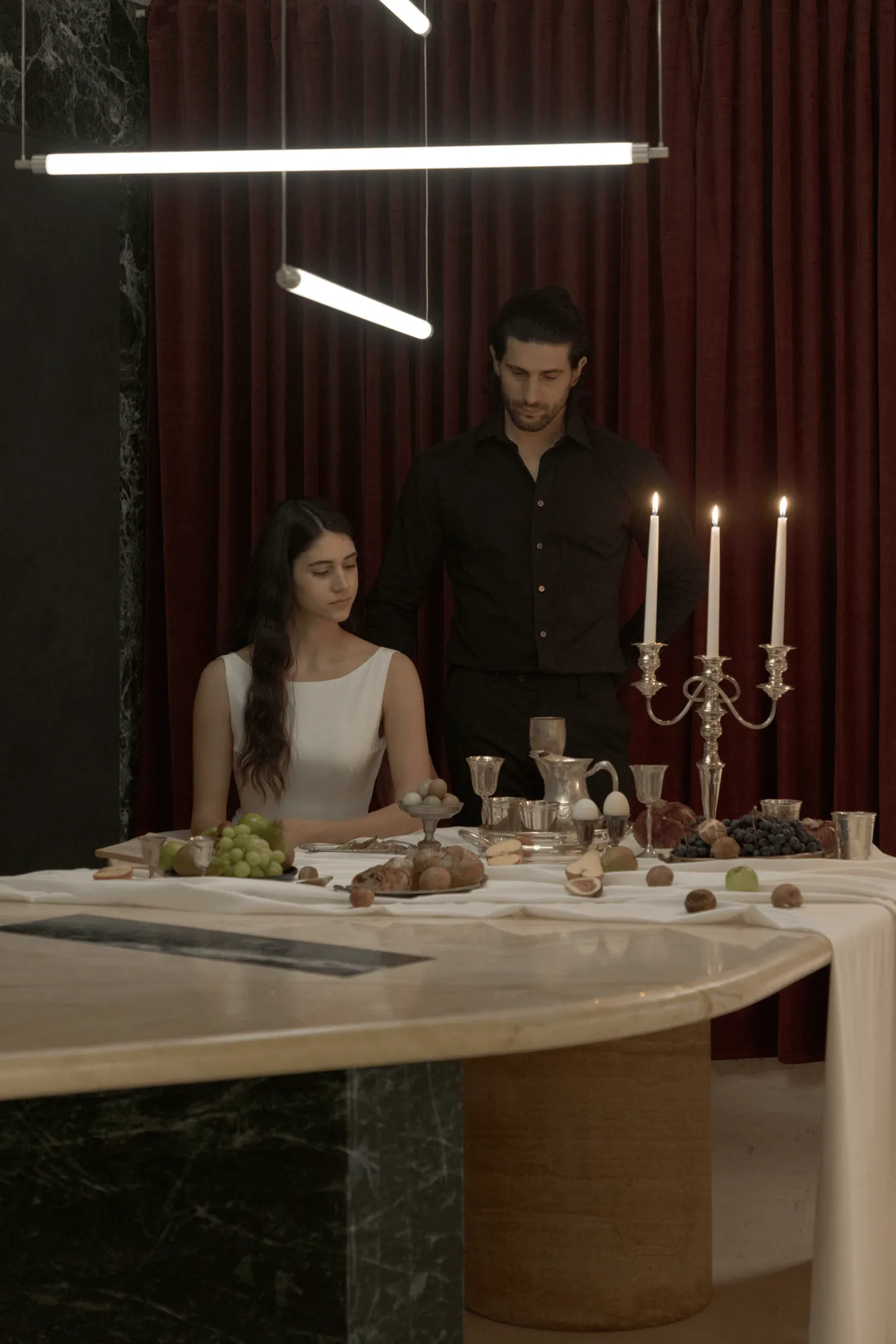
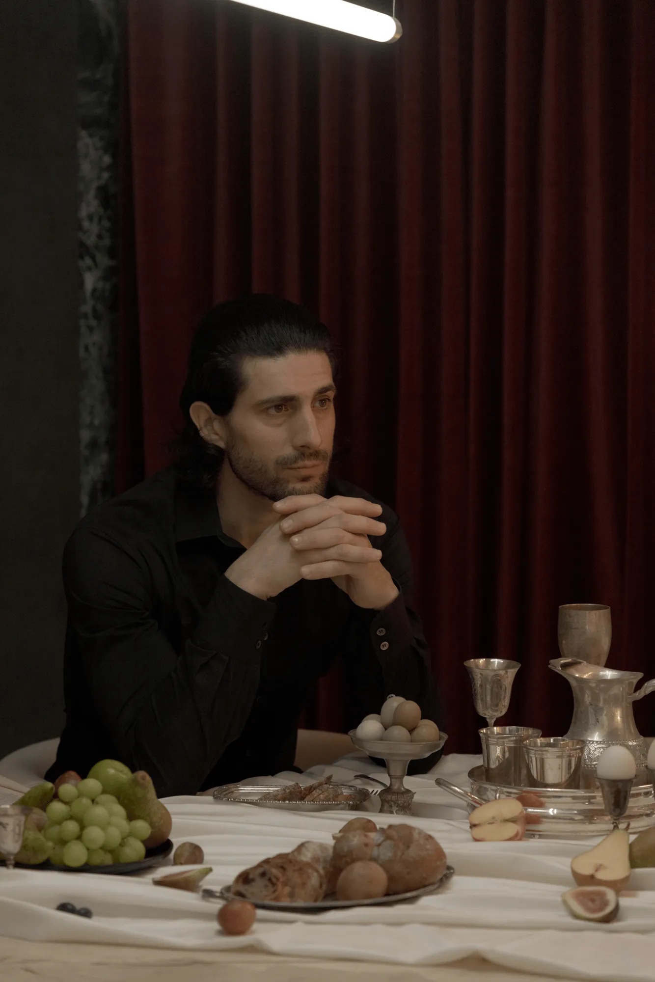
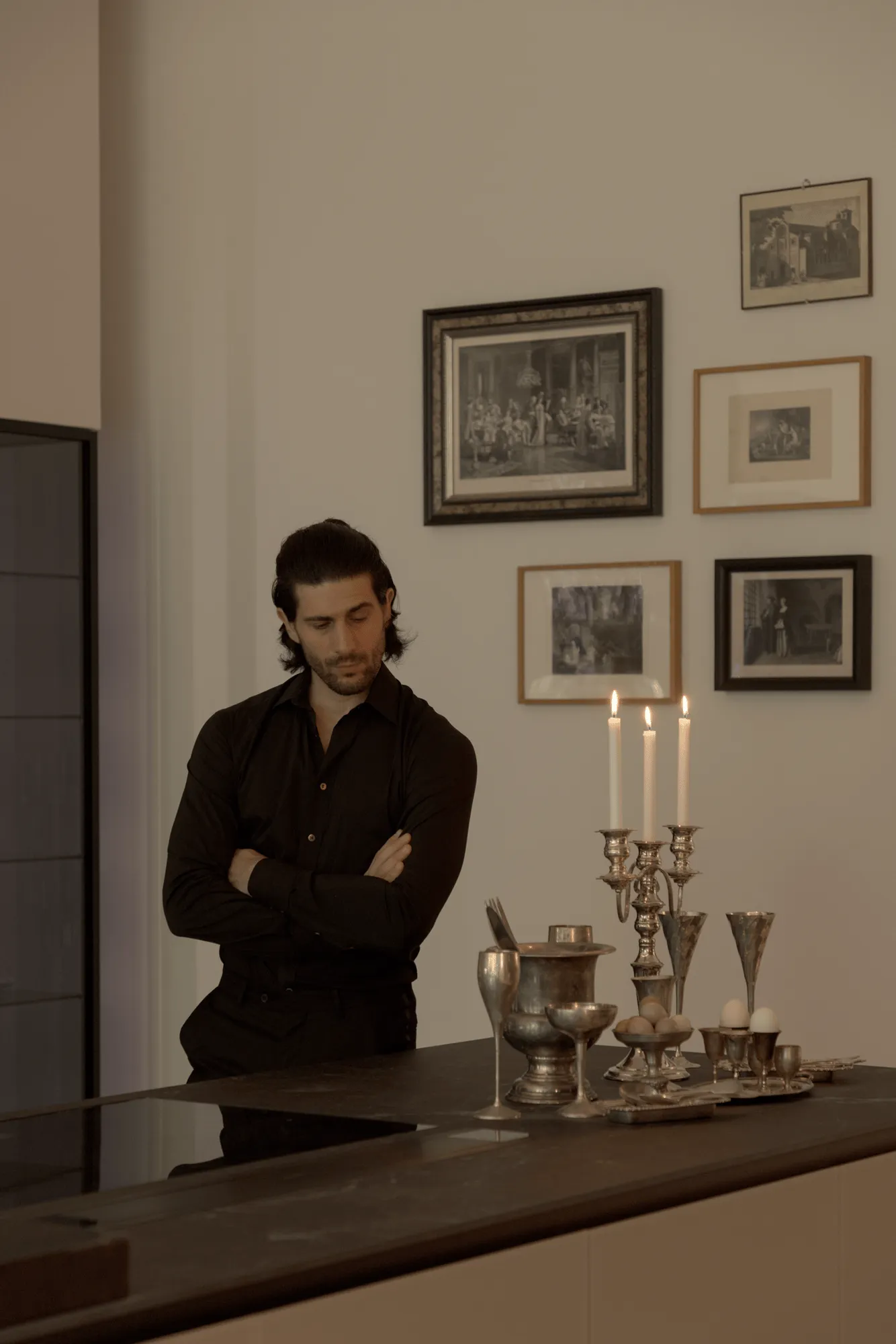
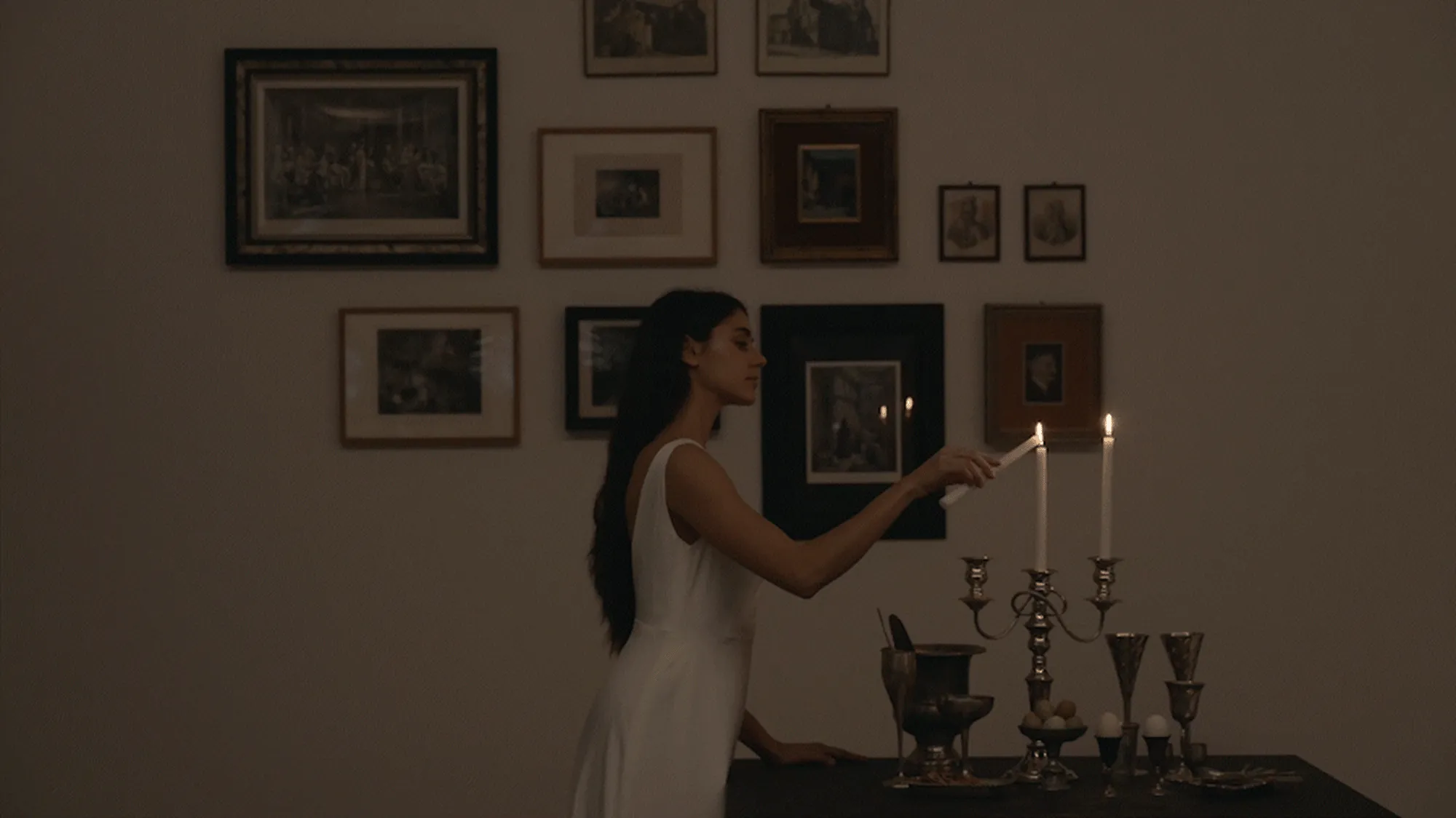
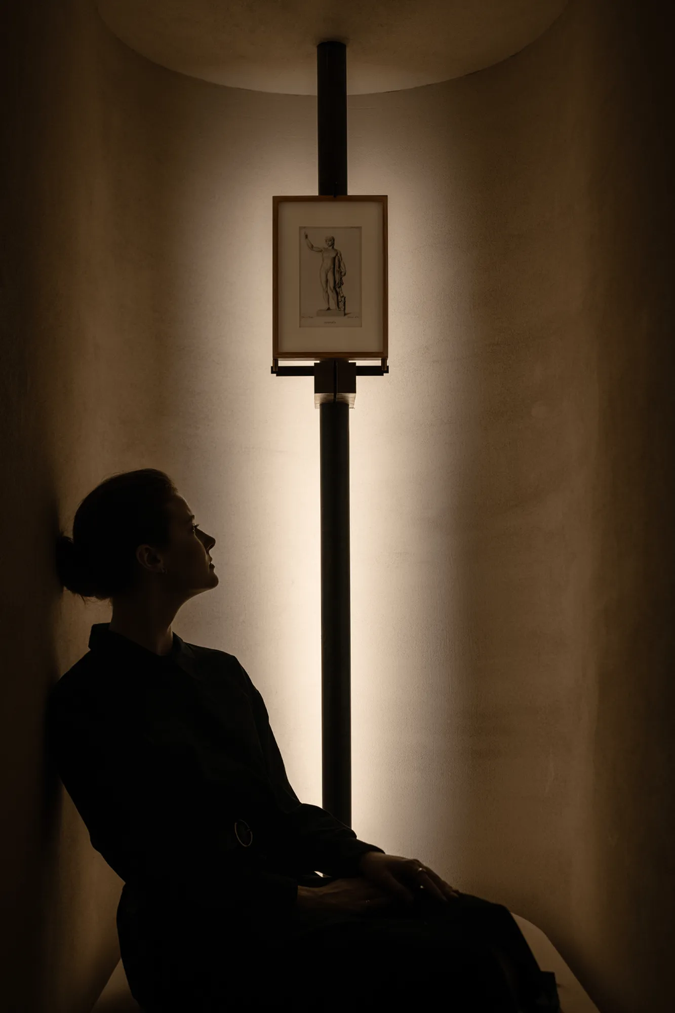
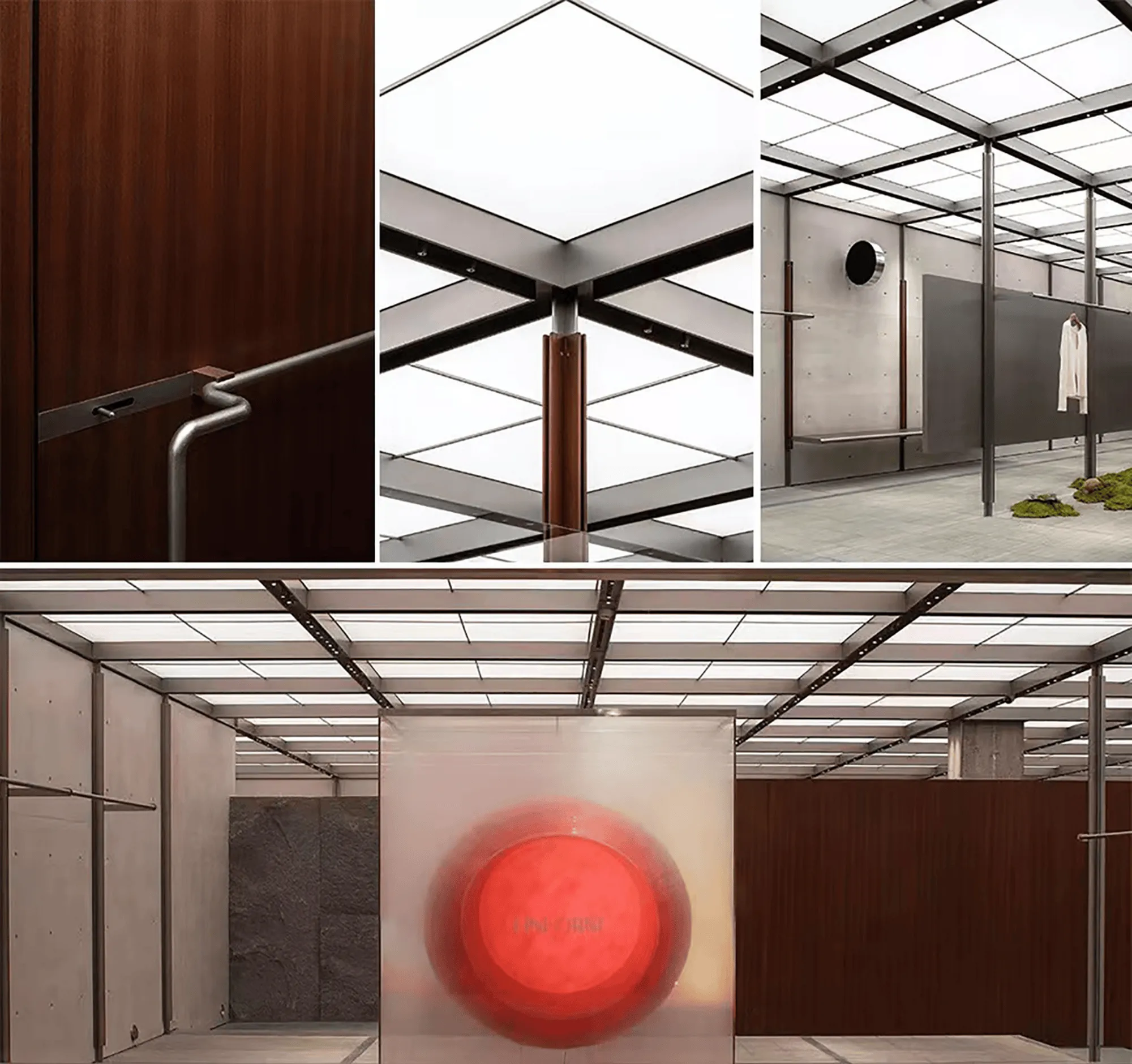
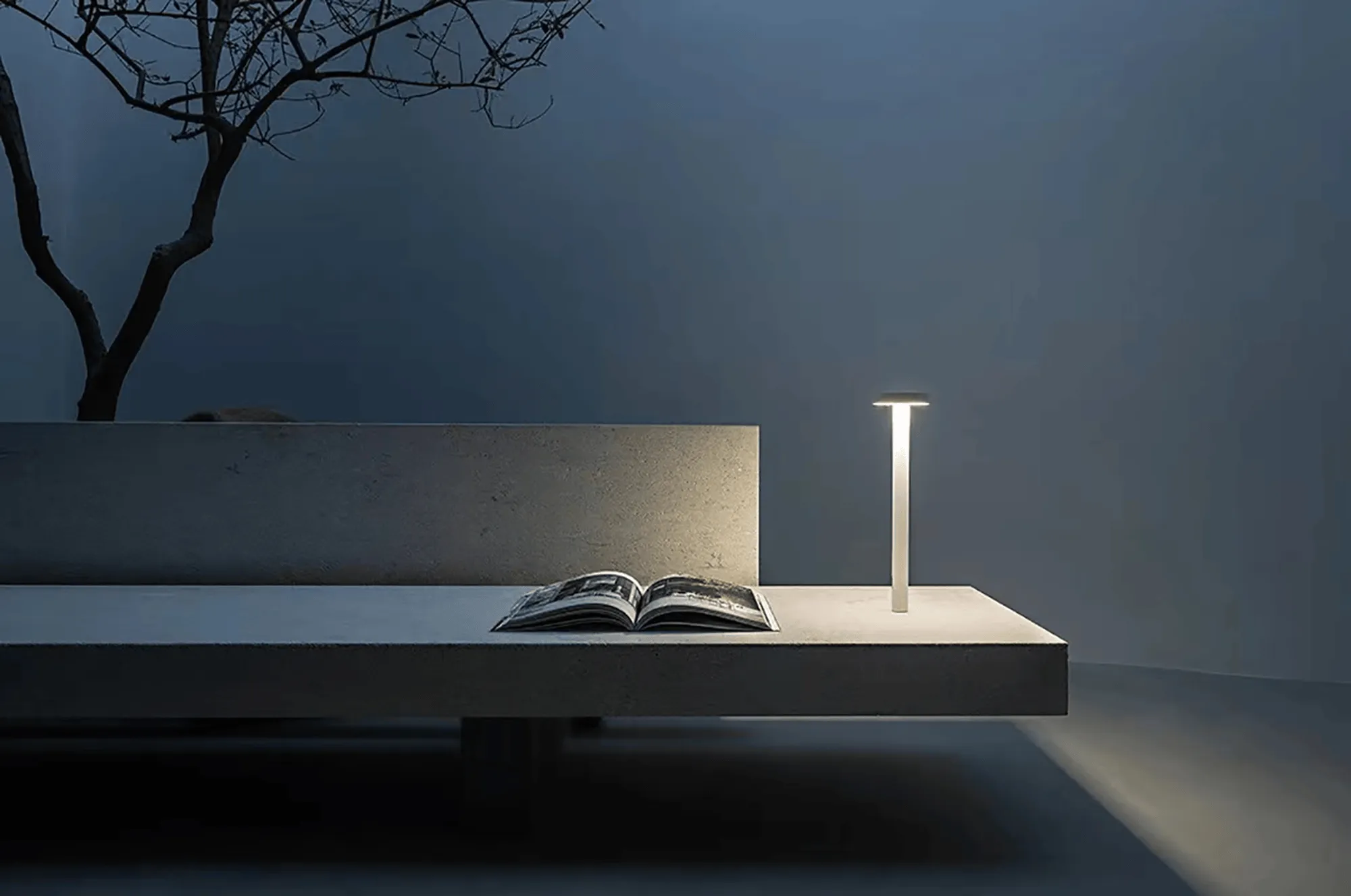
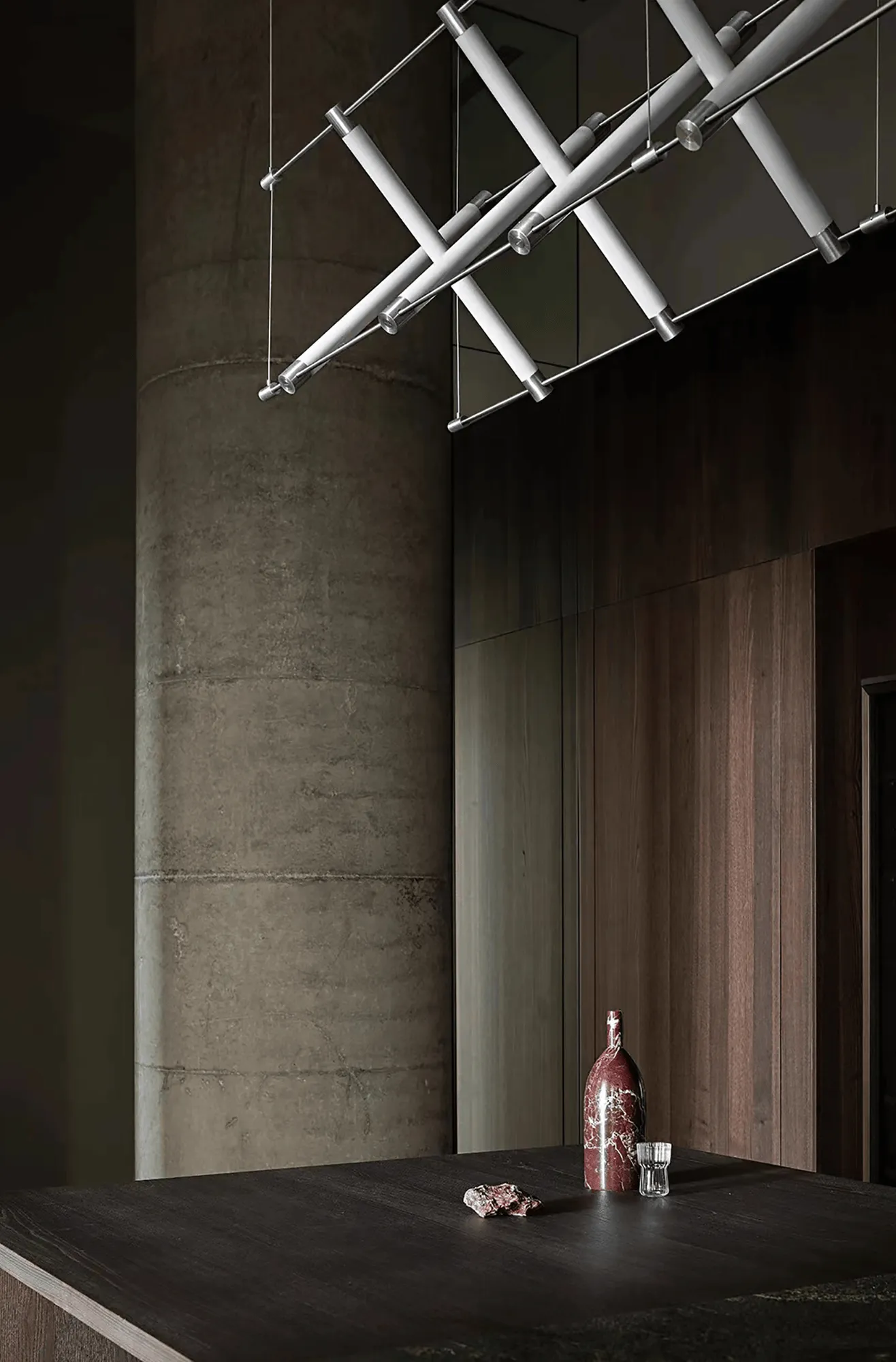
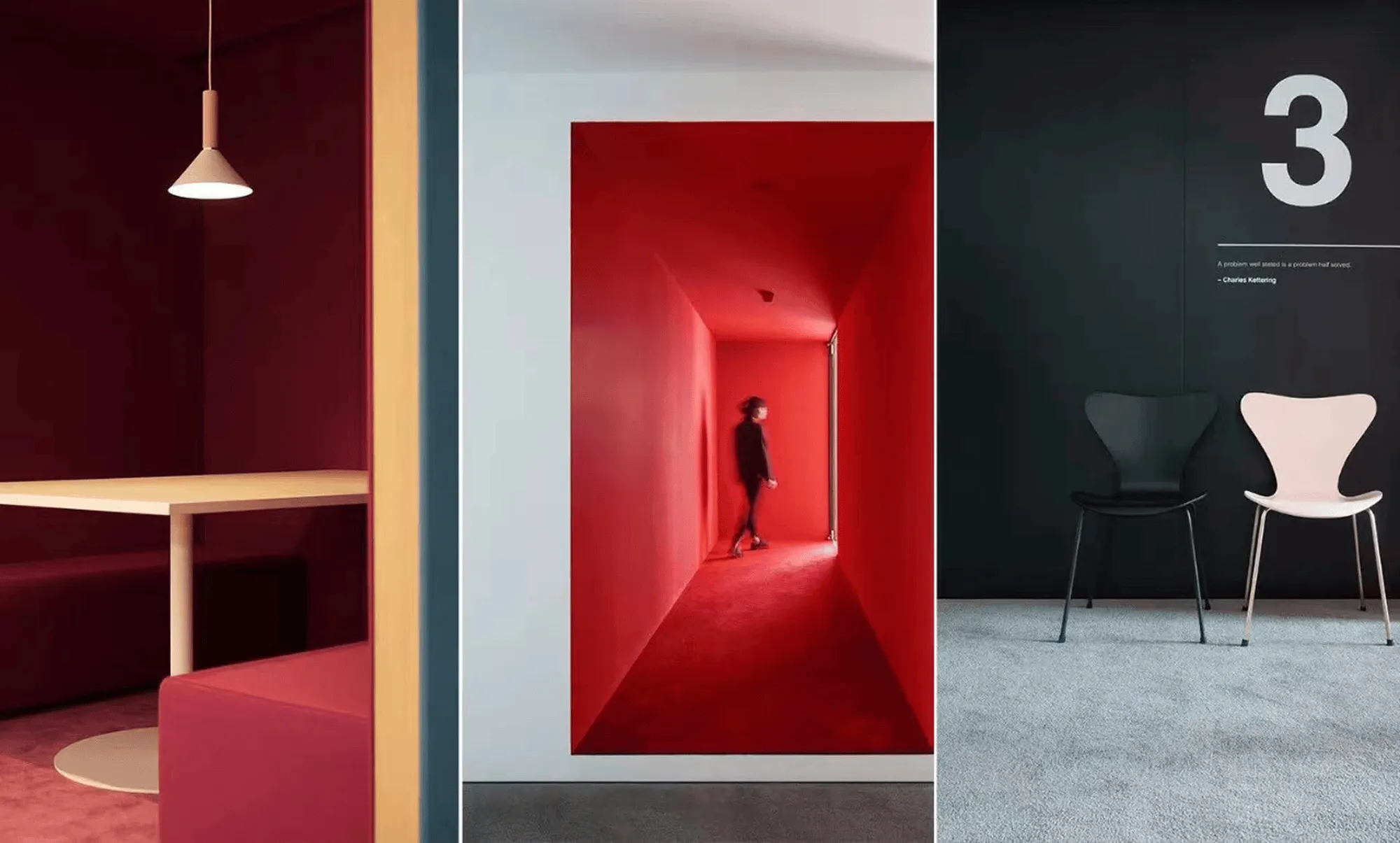
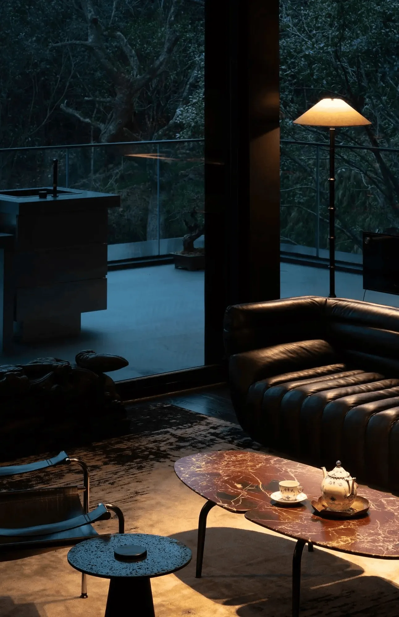
Light plays a pivotal role in unifying the showroom’s diverse design elements. Linear lighting fixtures in the “Futurist” section complement the structural lighting in the “Milanese Modernism” area, while the soft glow of candlelight adds warmth and a touch of the timeless. This interplay of light sources harmonizes the contrasting aesthetics of the two sections, creating a dynamic balance between rigidity and softness, coolness and warmth, and rationality and emotionality.
Materiality and Form: Exploring the Language of Design
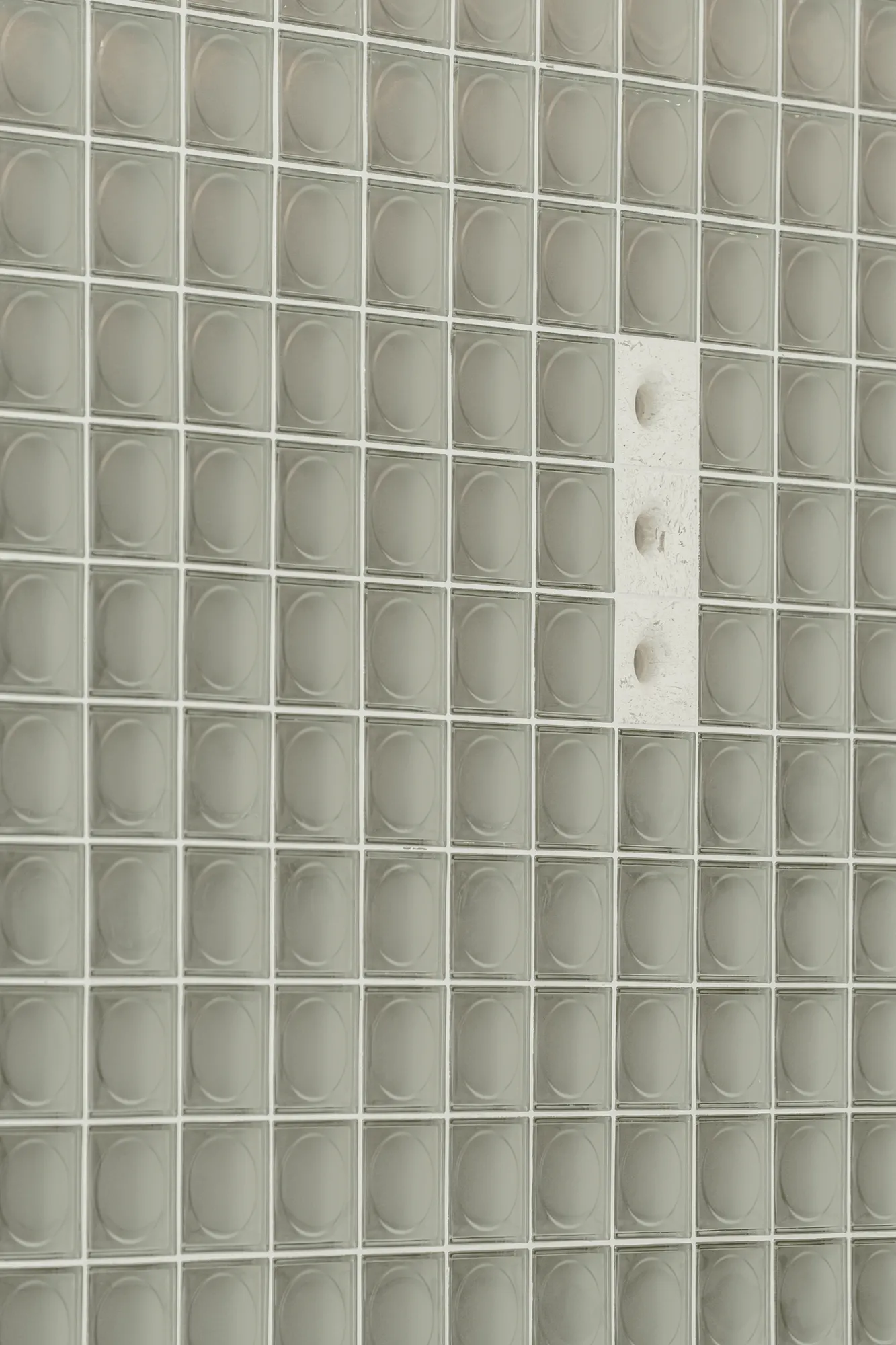
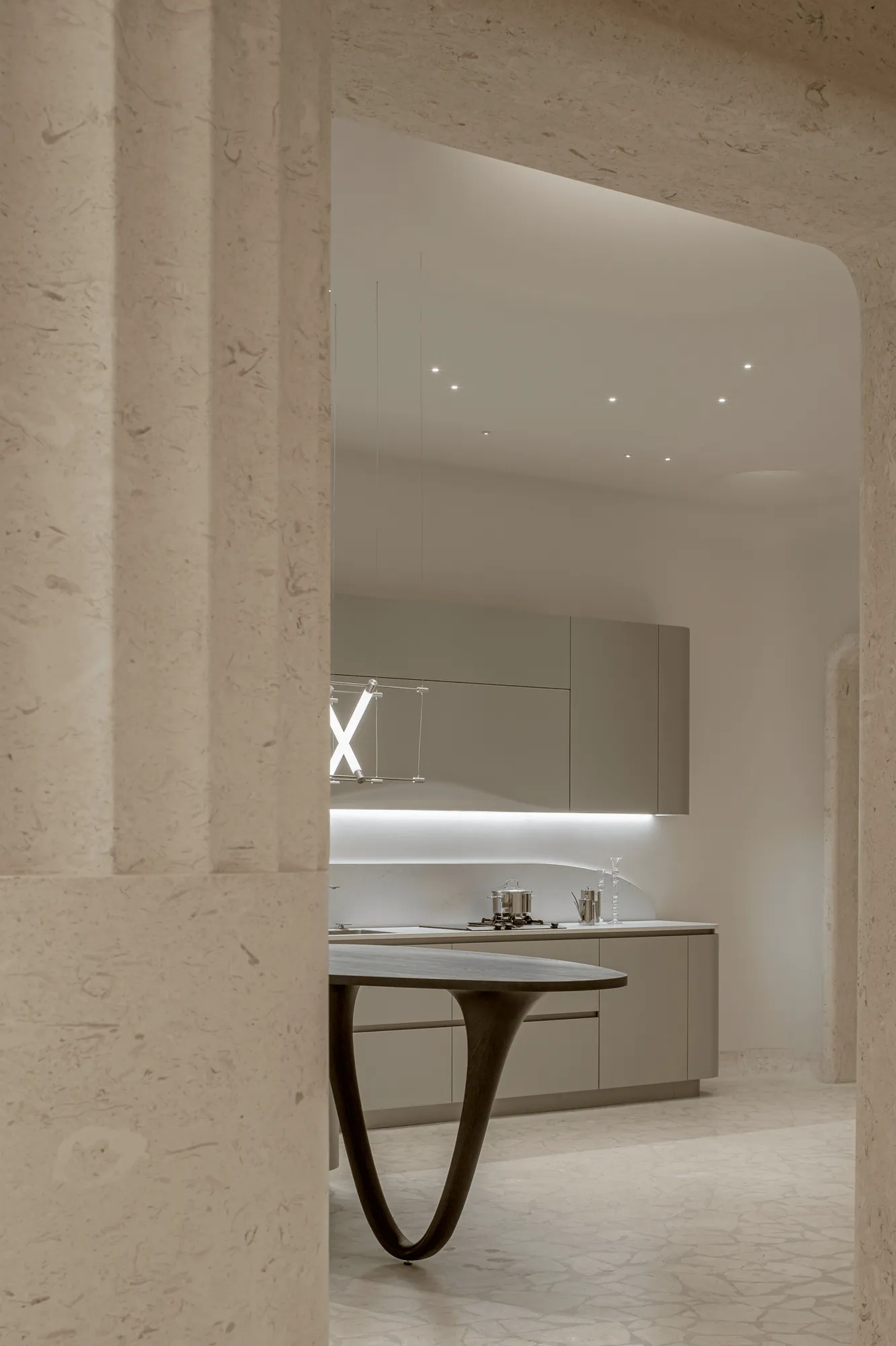
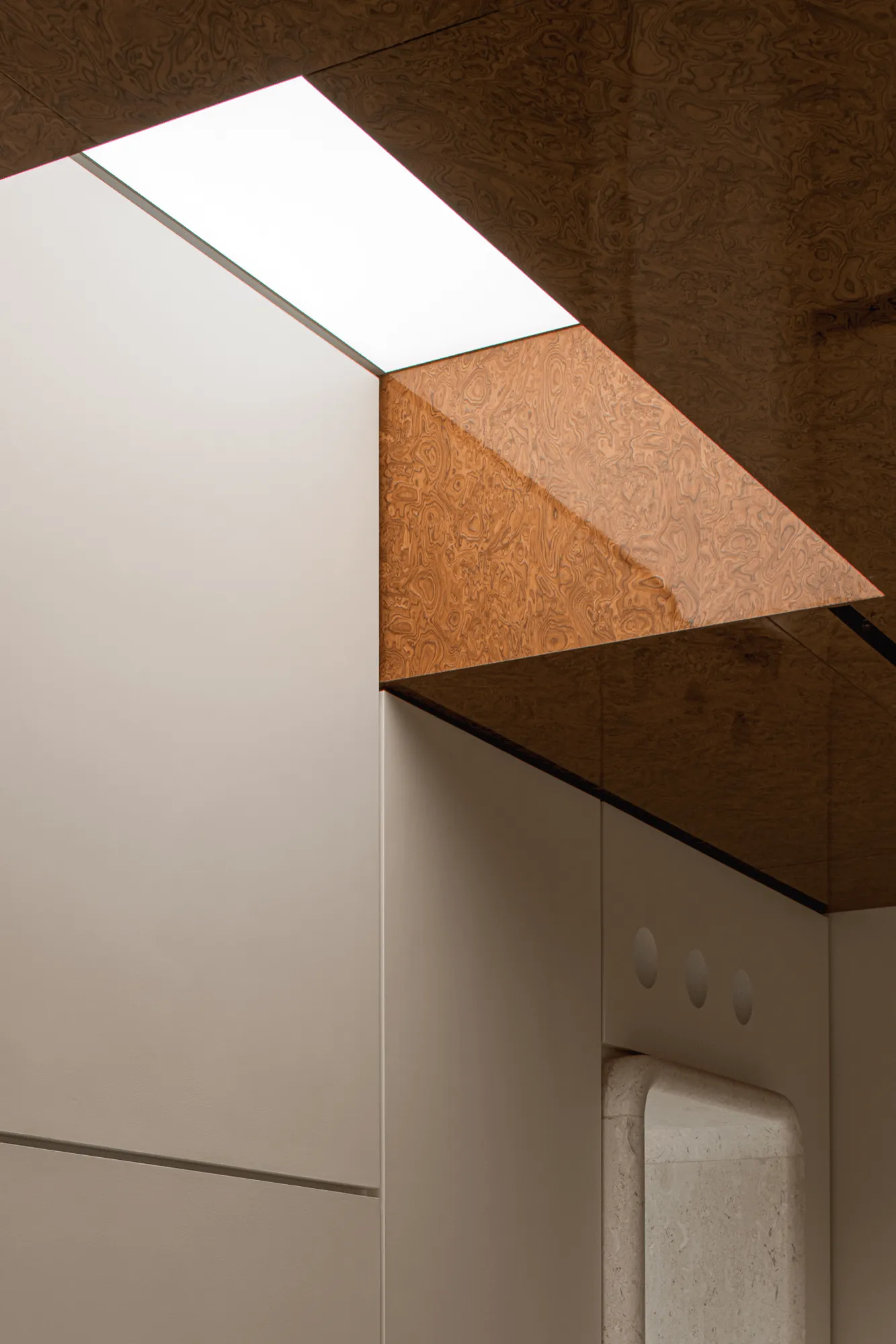
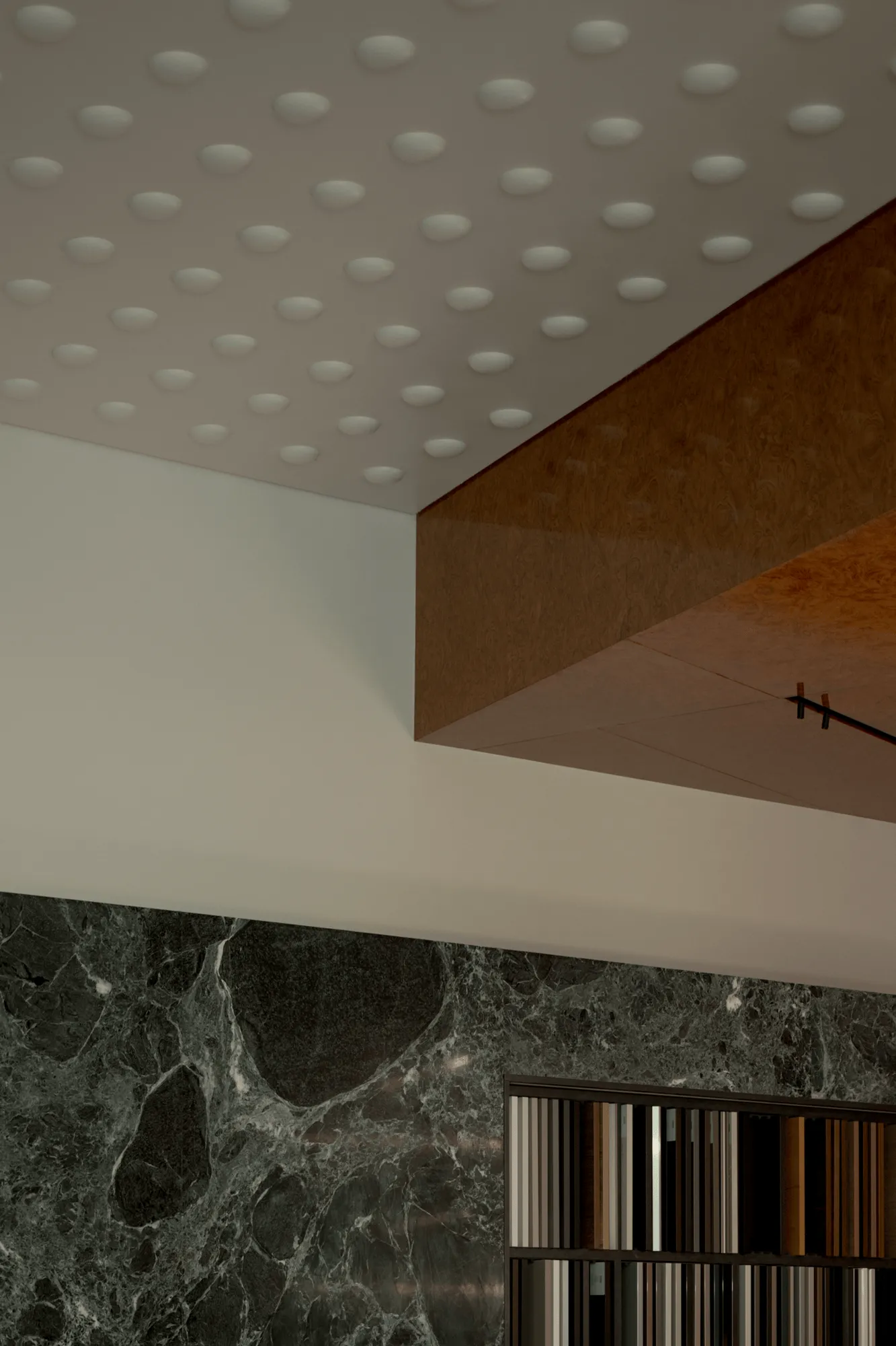
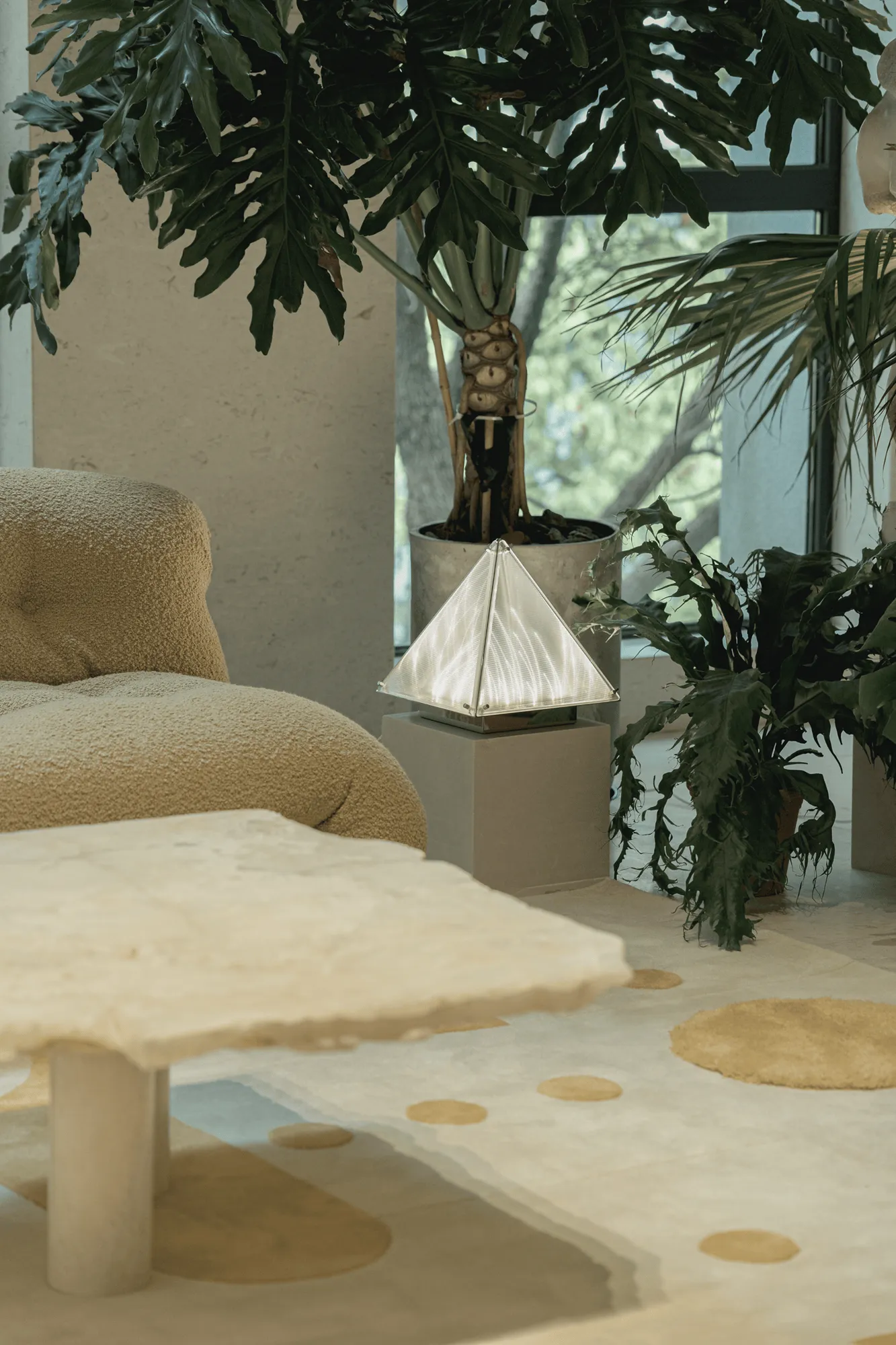
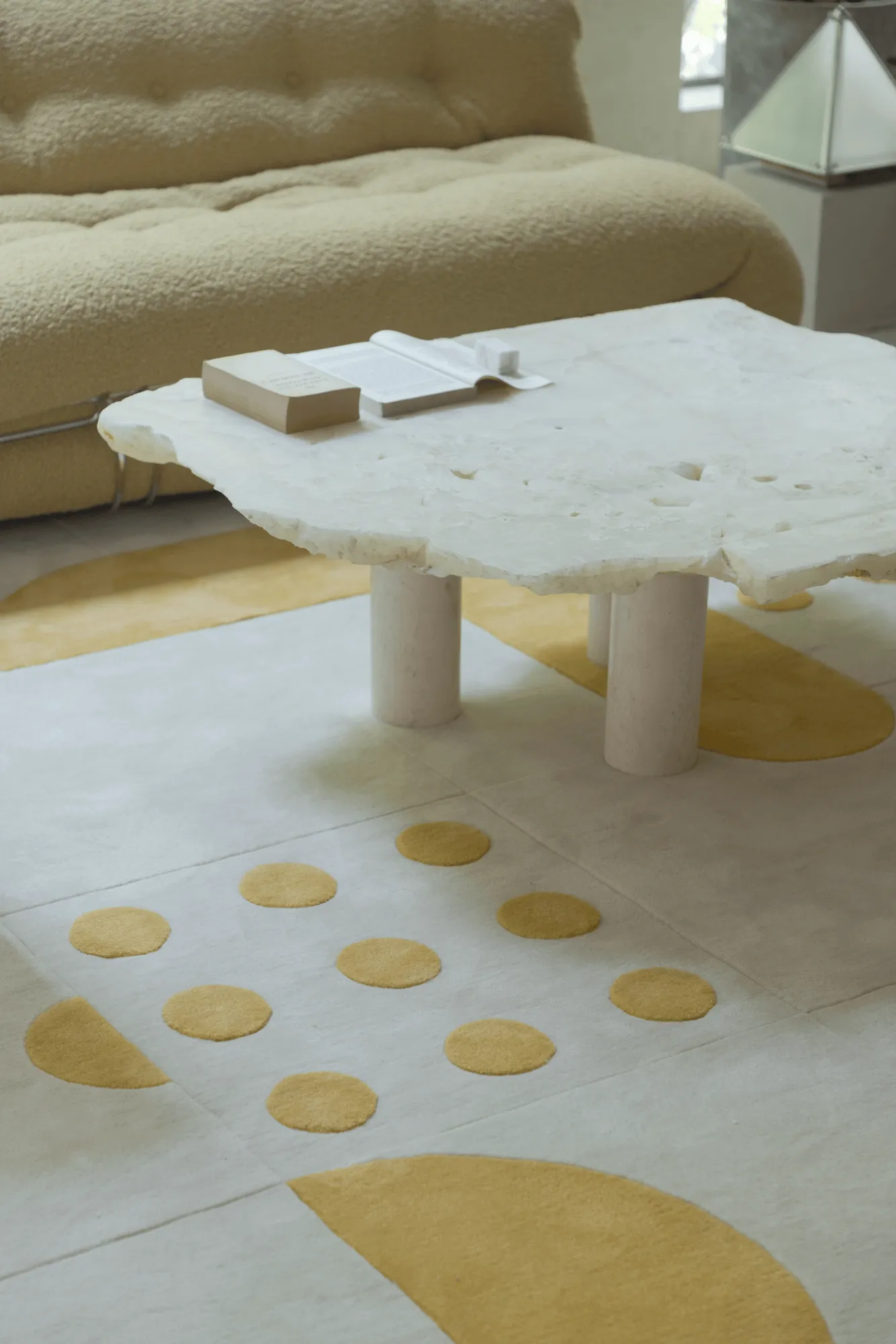
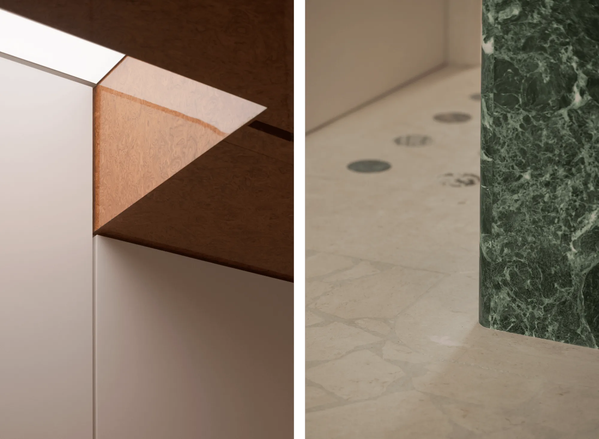
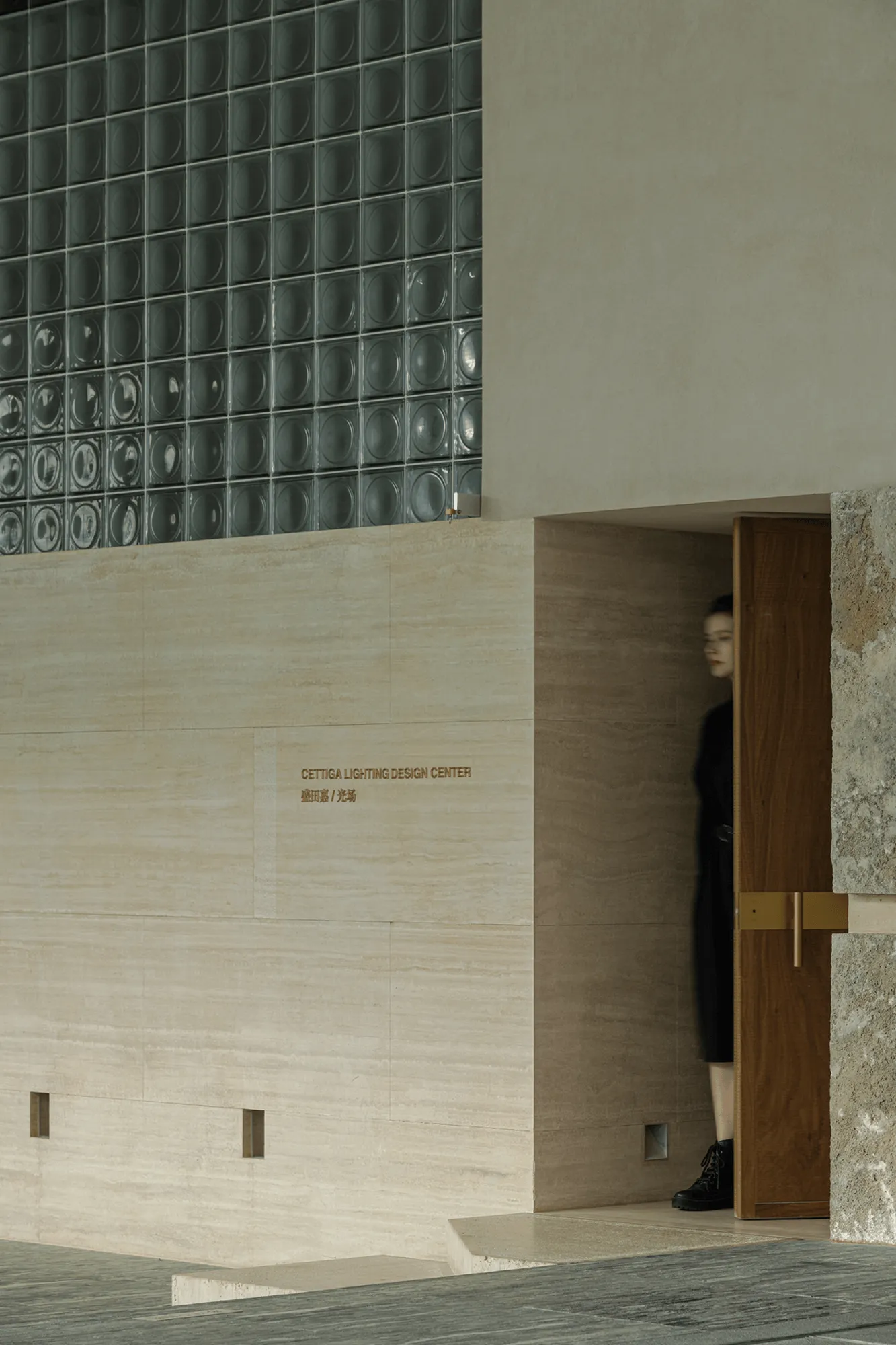
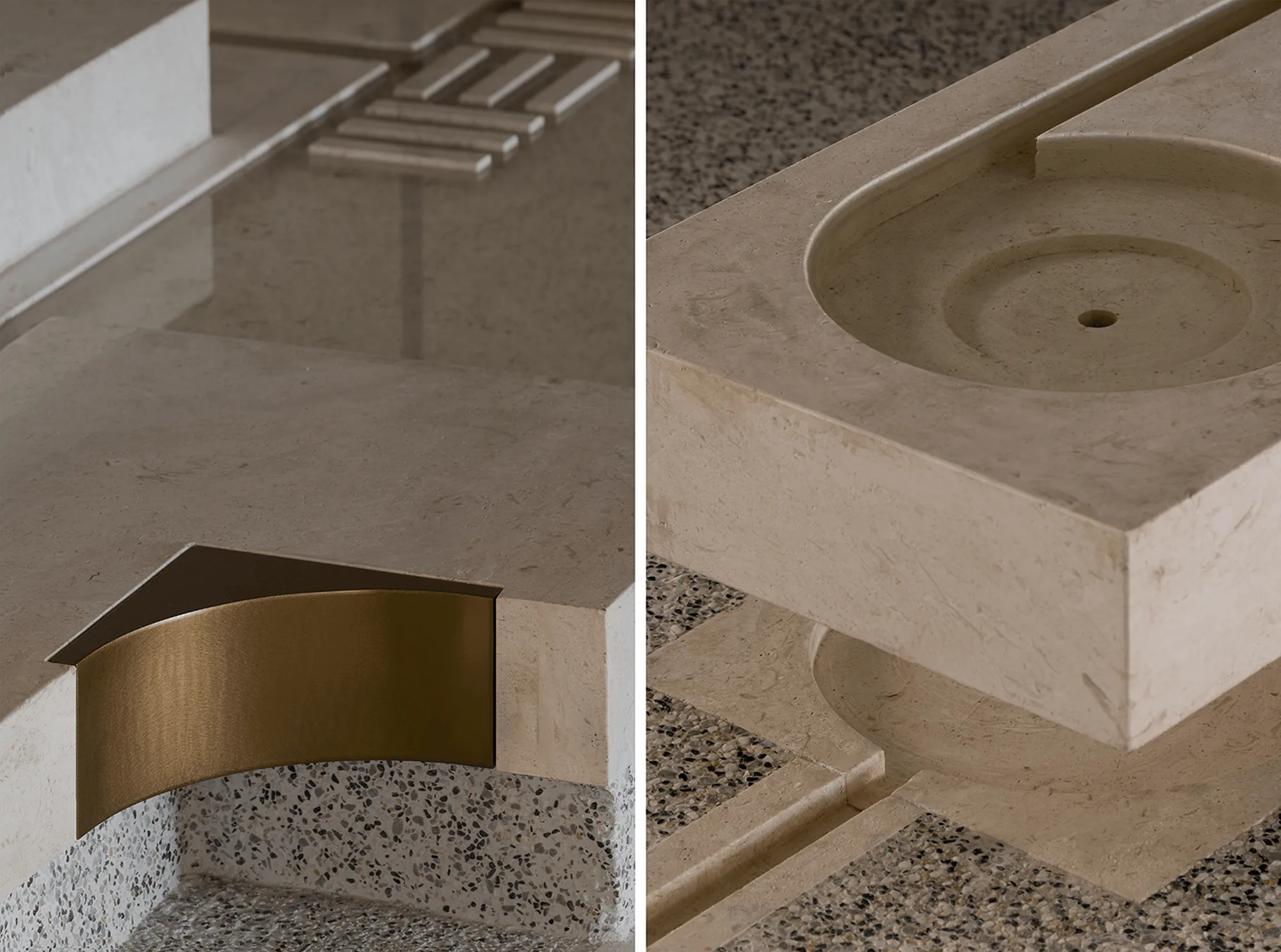
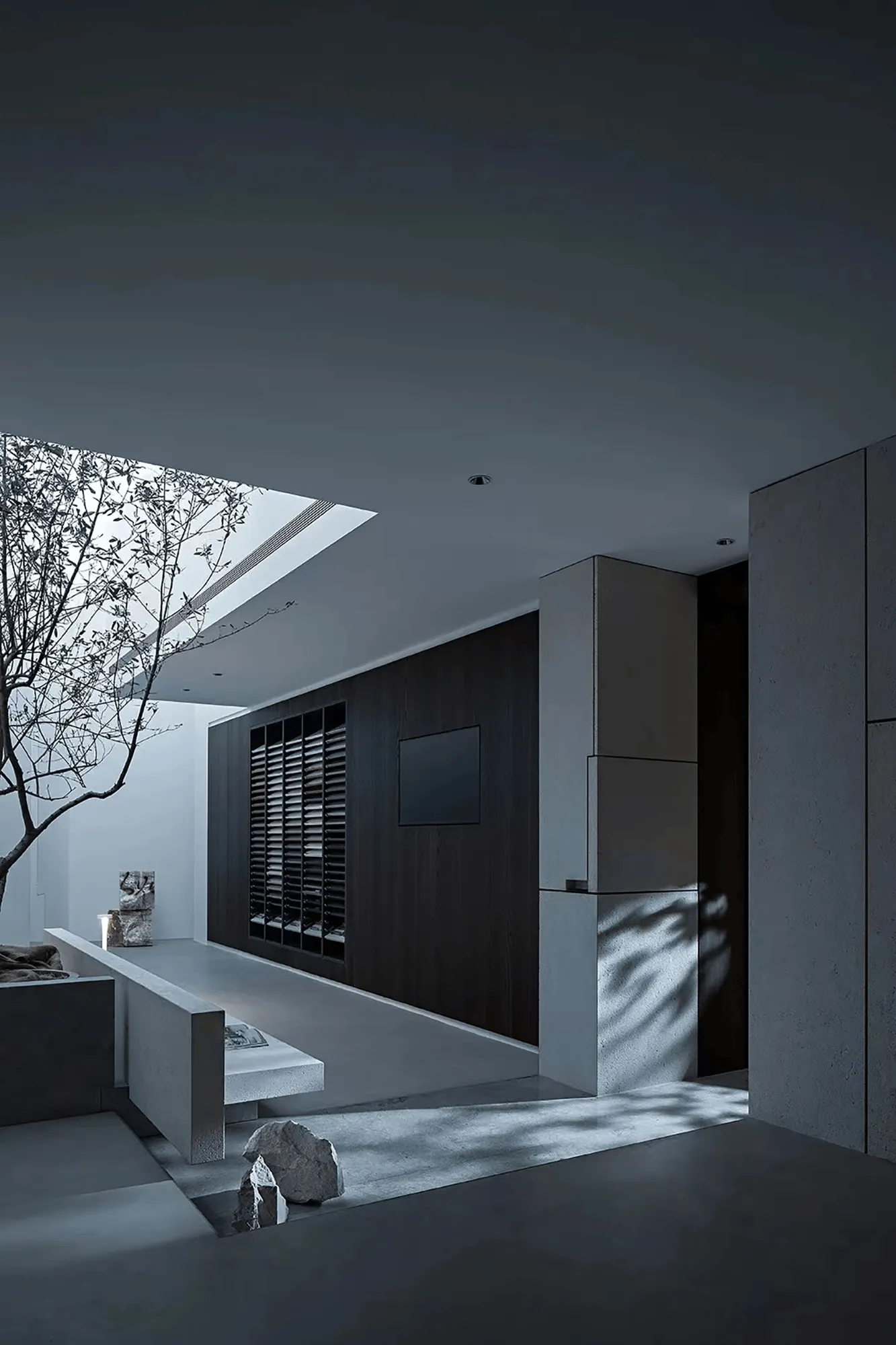
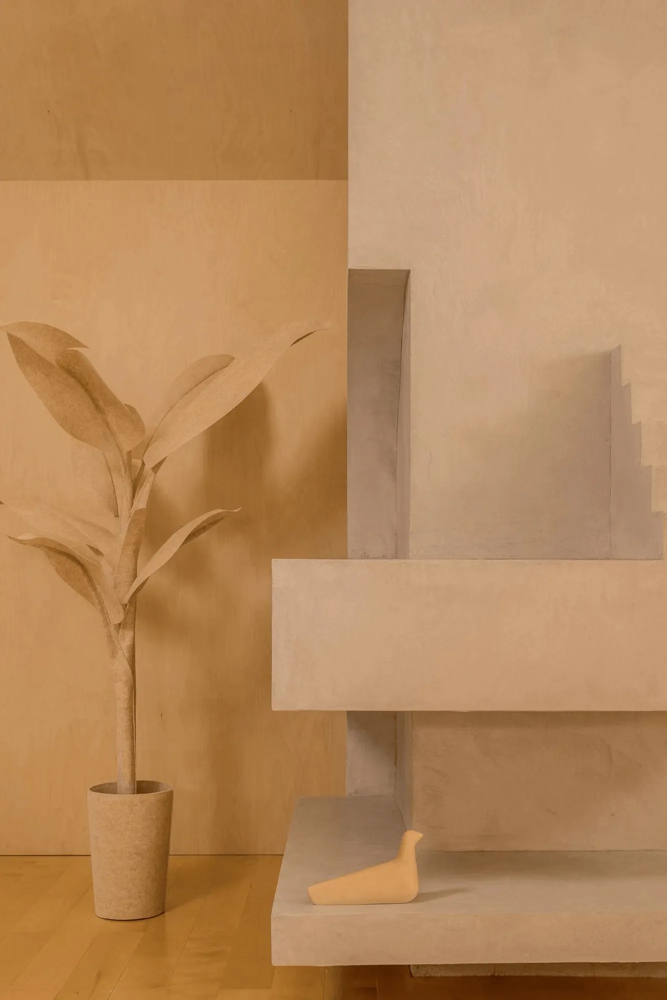
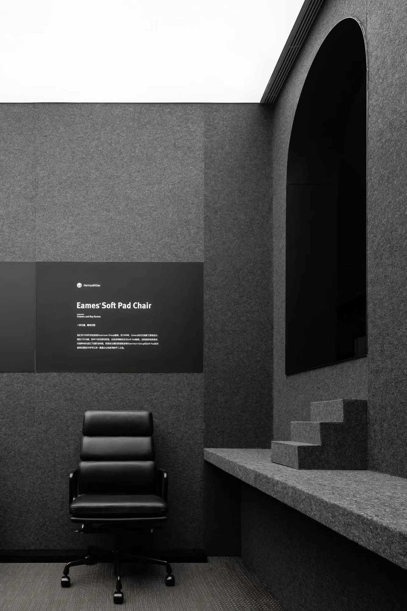
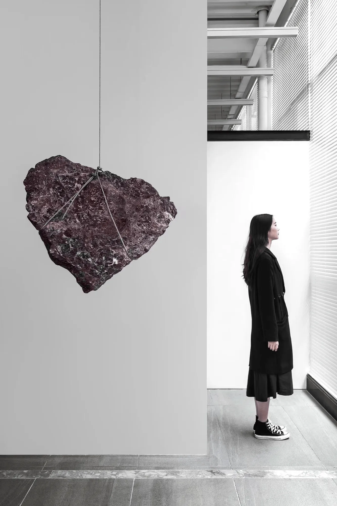
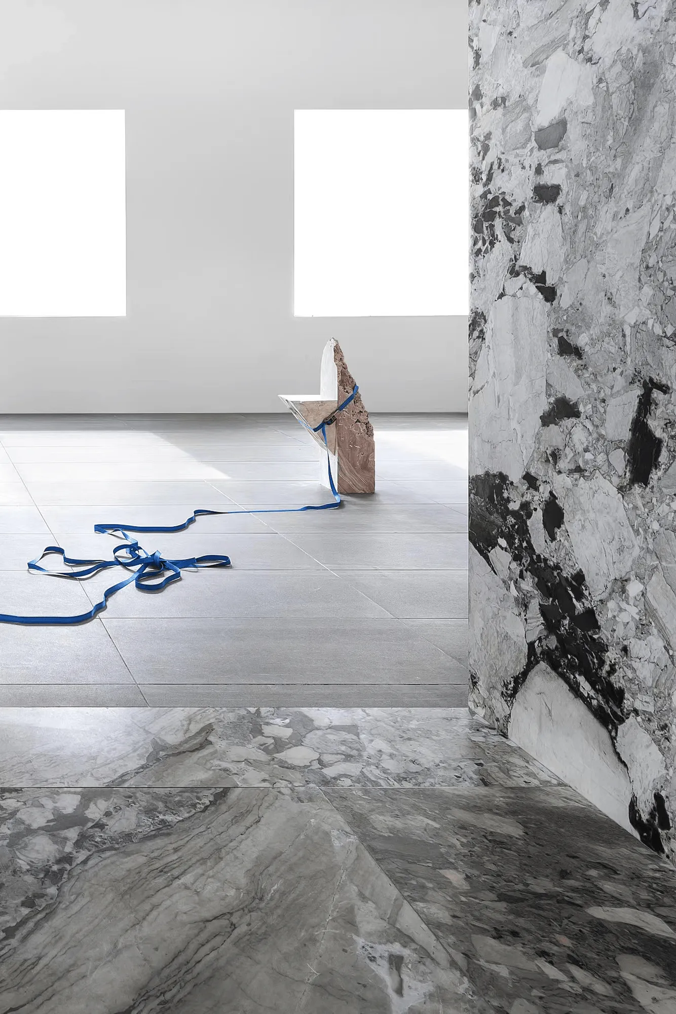
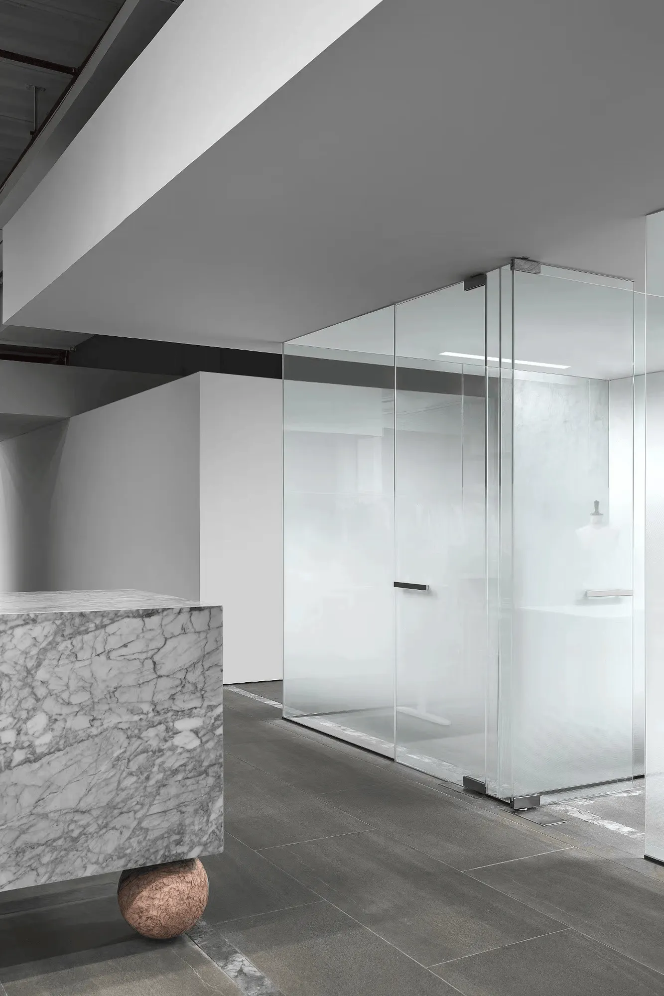
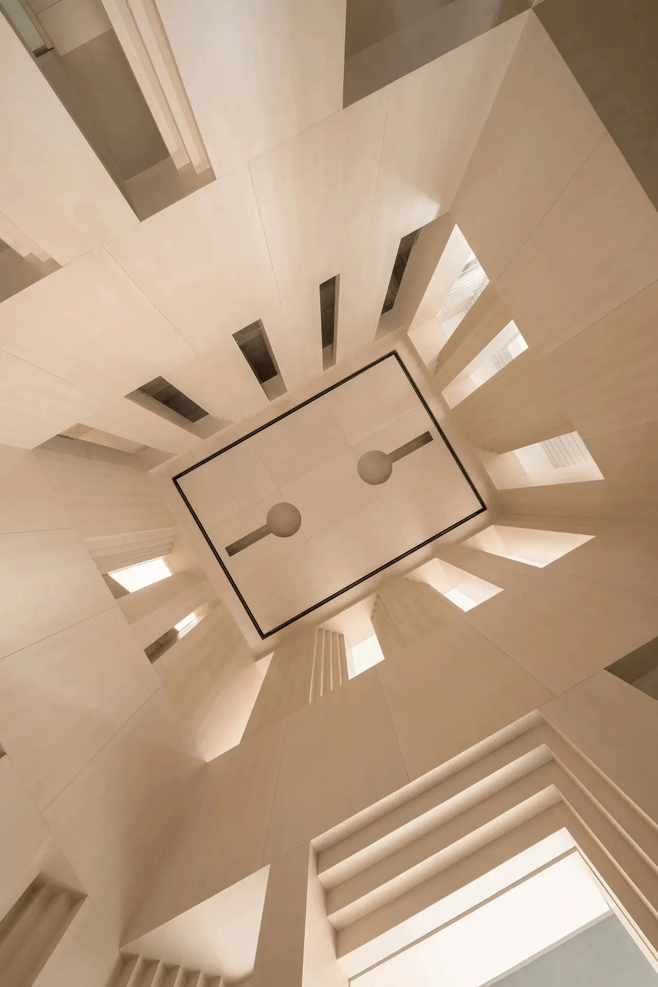
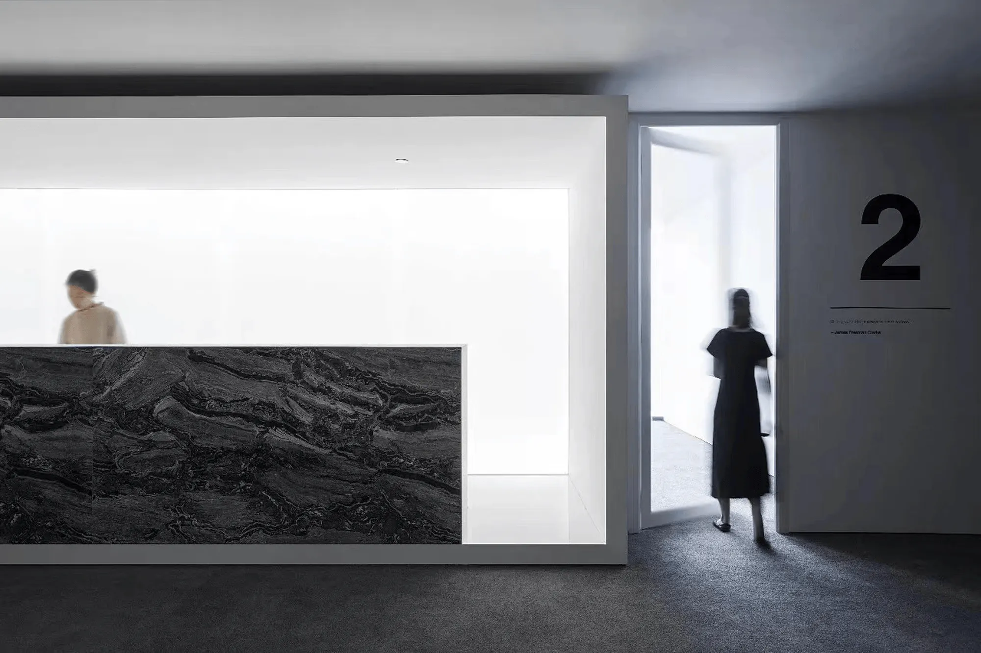
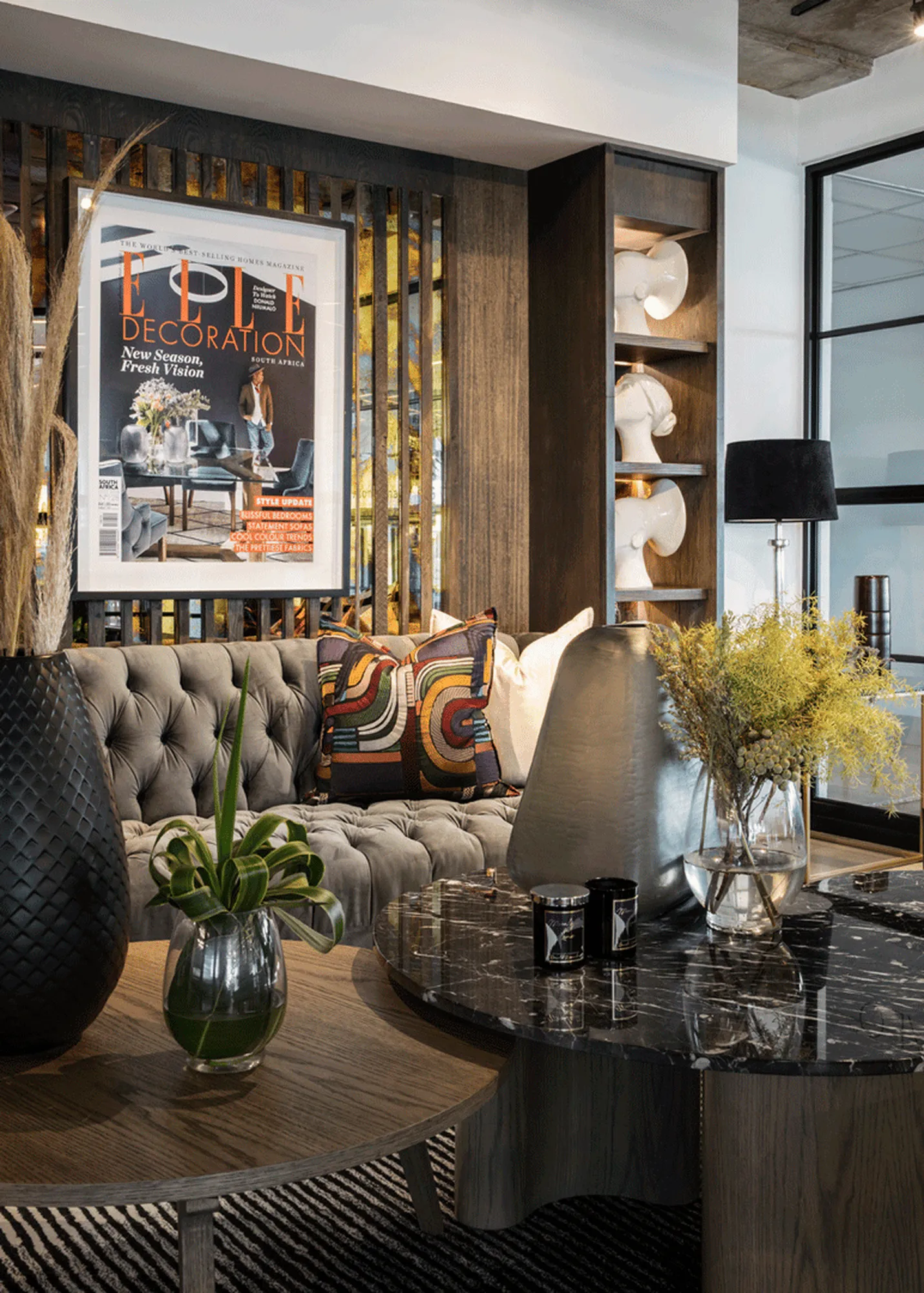
The showroom’s design demonstrates a deep understanding of materiality and form. A diverse range of materials, including marble, metal, and wood, are employed in various configurations, creating a rich interplay of textures and visual experiences. The circular motif, a recurring element throughout the space, adds a sense of continuity and rhythm. The interplay of curved and straight lines, smooth and rough surfaces, and light and shadow creates a dynamic environment that encourages exploration and engagement.
Functionality and Versatility: Meeting the Demands of Modern Living
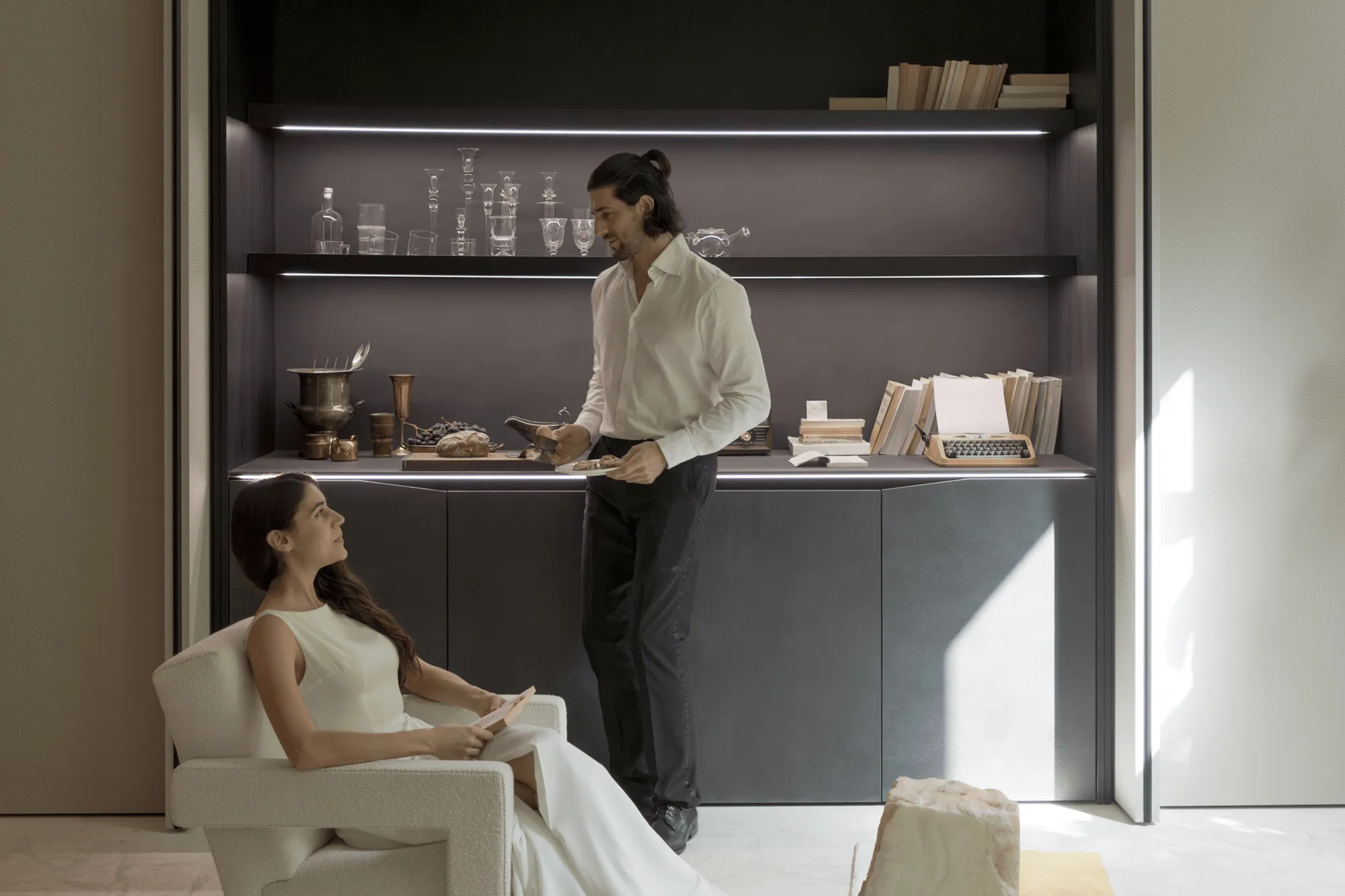
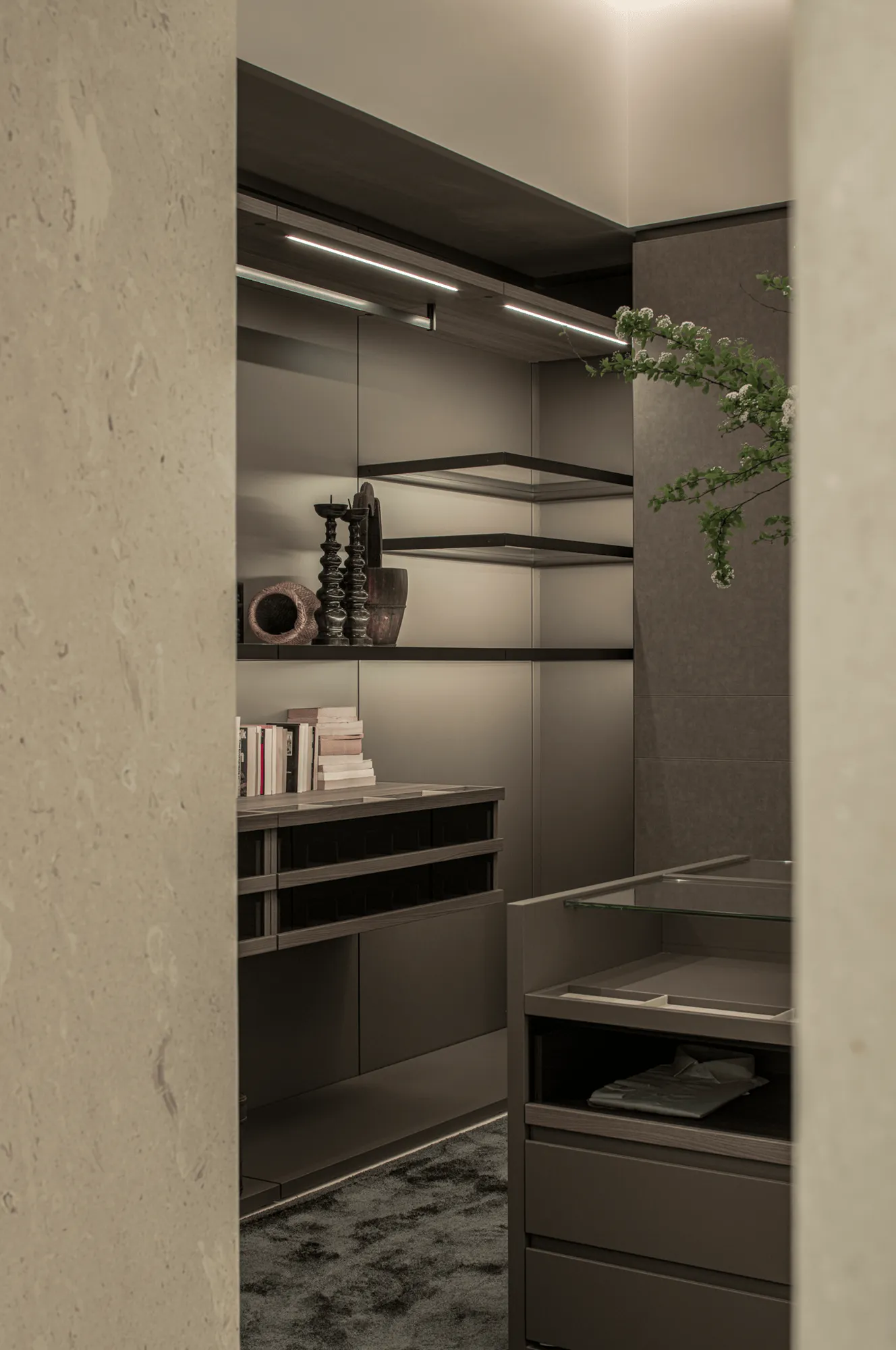
The showroom’s design is not only aesthetically compelling but also highly functional. The LOOK kitchen series, designed by Michele Marcon, prioritizes practicality and user-friendliness, offering a versatile space that caters to the needs of modern living. The kitchen island, a central feature of the space, doubles as a dining table, workspace, and a hub for social interaction. The adjacent cabinets seamlessly integrate with the living area, creating a fluid and adaptable environment. This emphasis on functionality extends to the showroom’s dressing room area, where a mix of textures and materials underscores the brand’s commitment to creating spaces that are both stylish and practical.
Architectural Echoes: Recalling the Headquarters’ Design Language
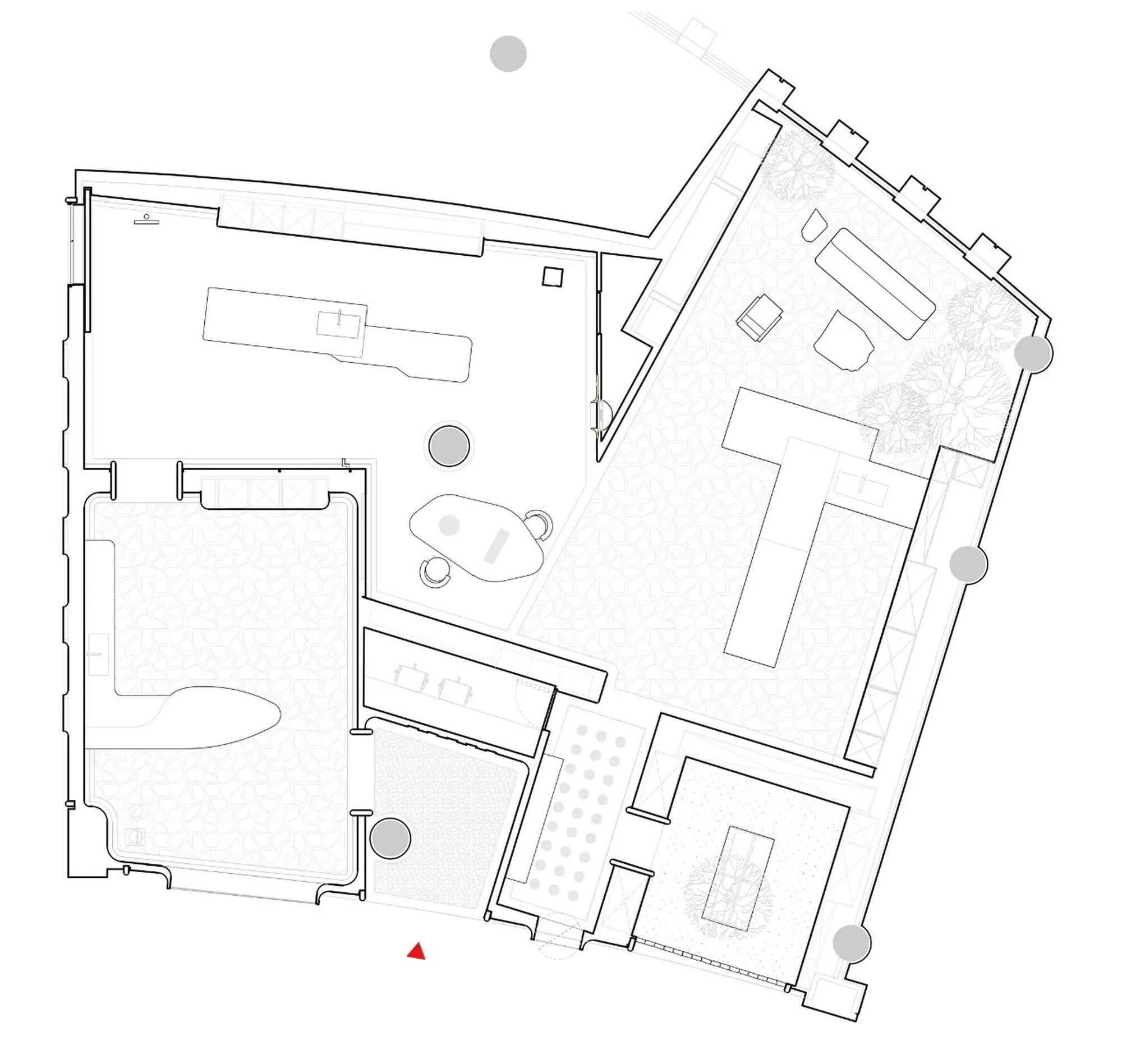
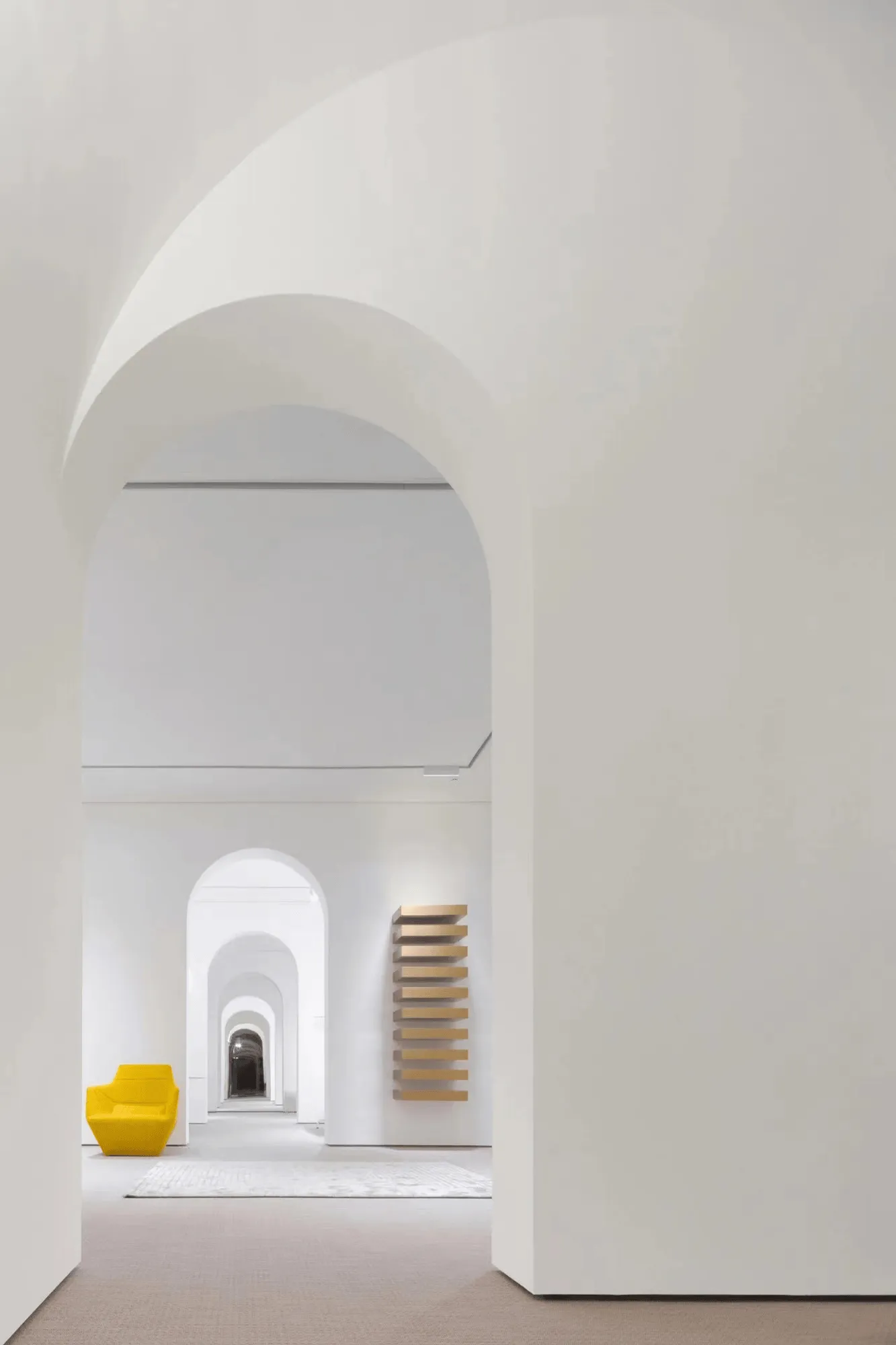
The showroom’s design subtly recalls the architectural language of Snaidero’s headquarters, particularly in its spatial organization and circulation patterns. The interplay of solid and void, open and enclosed spaces, and the use of varied materials create a sense of discovery and intrigue. Visitors are invited to navigate a series of interconnected spaces, experiencing a dynamic interplay of perspectives and visual encounters. This architectural approach reinforces the brand’s identity and creates a cohesive narrative that links the past, present, and future.
Project Information:
Architects: PENG – PARTNERS / 鹏和朋友们设计事务所
Area: 240 m²
Project Year: 2024
Project Location: Shanghai, China
Principal Materials: Marble, Metal, Wood
Project Type: Showroom
Photographer: 形在空间摄影 Here Space / 贺川, WM STUDIO
Lead Architect: Wang Peng
Project Leader: Li Yuan
Art Director: Lü Qing
Soft Decoration Art Consultant: P Projects/ P 计划
Construction Company: TEX Shanghai Tengxin Building Decoration
Collaborating Brands: Junmei Stone Industry, Cettiga Lighting, Italian Alpi, Cassina, EGE Carpet
Acknowledgments: Snaidero China Team


