Grid Coffee Chengdu store utilizes grid system design and local culture elements to enhance brand identity and drive business.
Contents
Project Background and Brand Identity
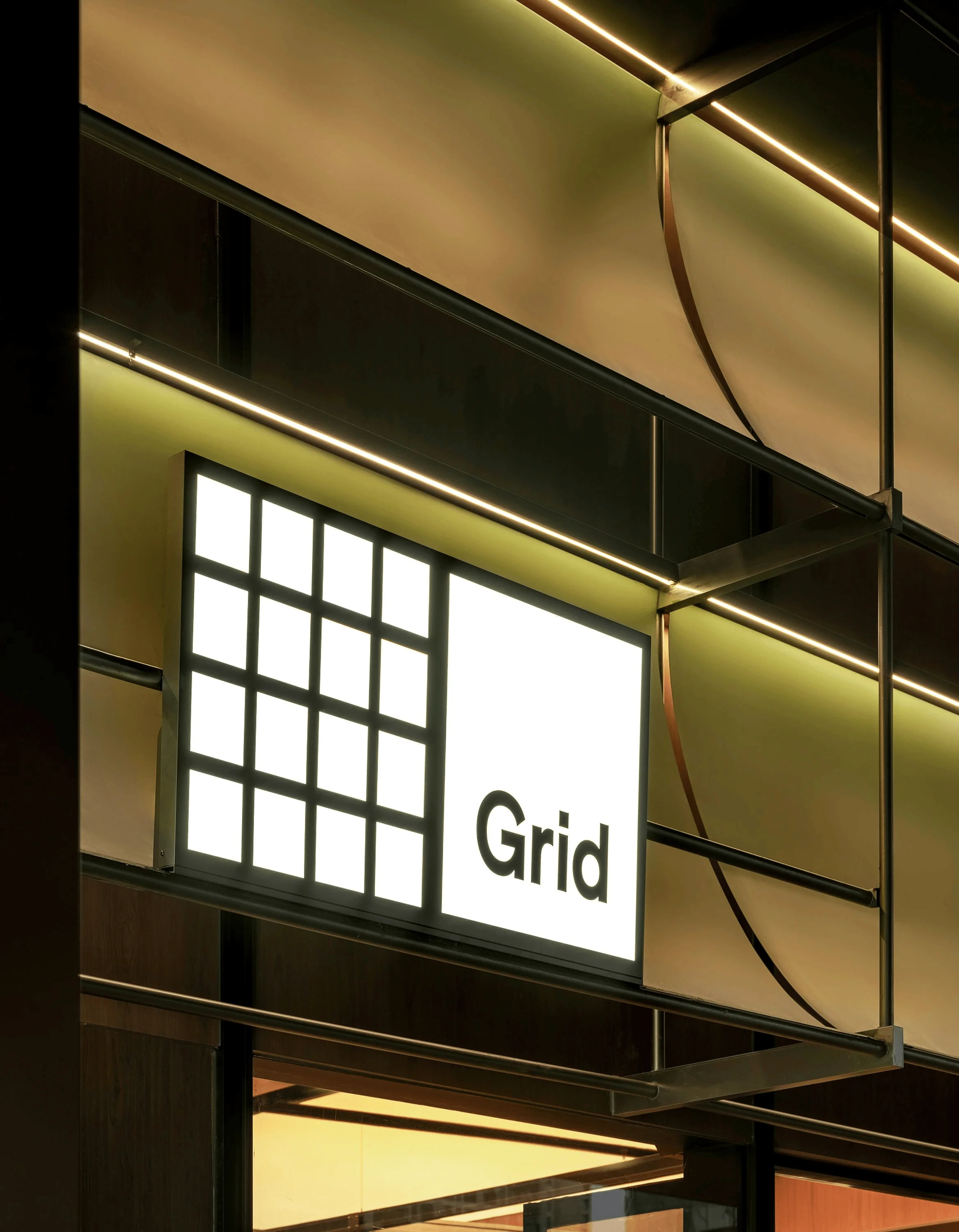
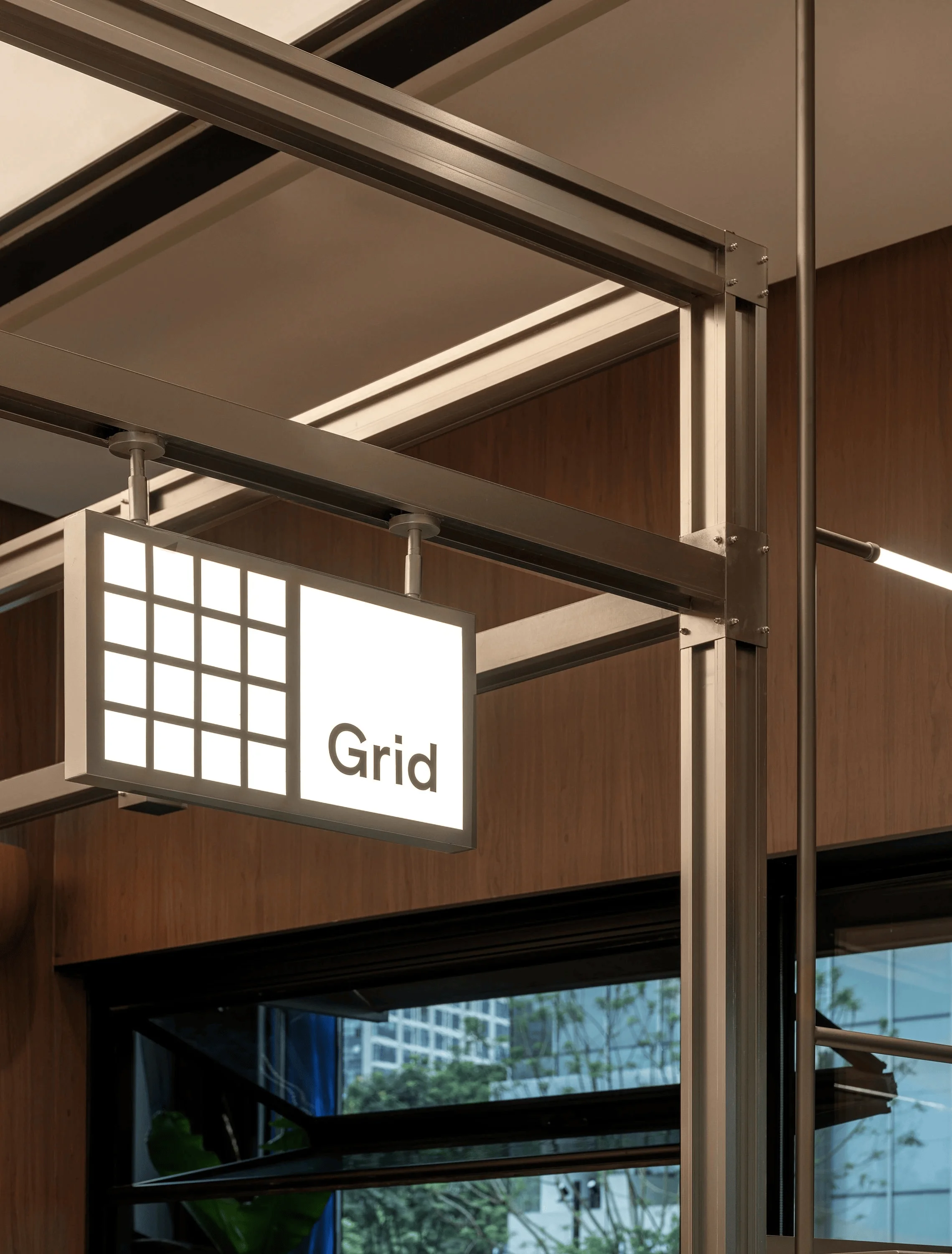
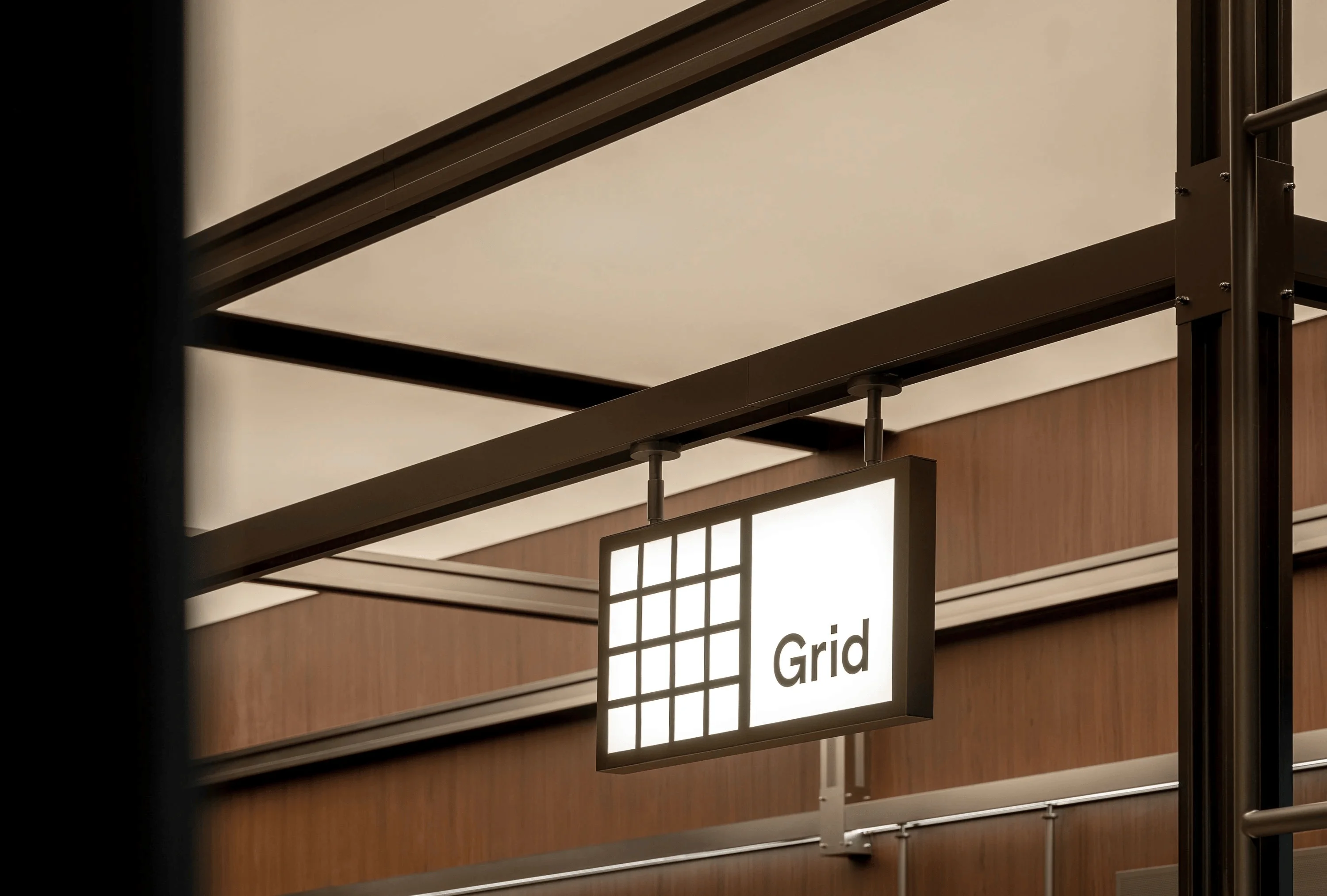
The Grid Coffee Chengdu Guanghuan Shopping Mall Store is a testament to the power of design to enhance brand image and drive business. Inspired by the “Grid System” prevalent in Bauhaus and Swiss graphic design, Grid Coffee’s brand identity is built upon a structured approach to coffee, focusing on single-origin beans. The brand prioritizes using high-quality ingredients, including premium milk, and preparing coffee in its simplest form, highlighting the natural beauty of the bean. This aligns with the brand’s core values of using exceptional ingredients and emphasizing the importance of basic, well-crafted coffee. The design of the Grid Coffee store was a direct extension of these brand principles, integrating the grid concept into both the exterior and interior spaces. grid system design and local culture elements are the core of this project.
Store Design and Location
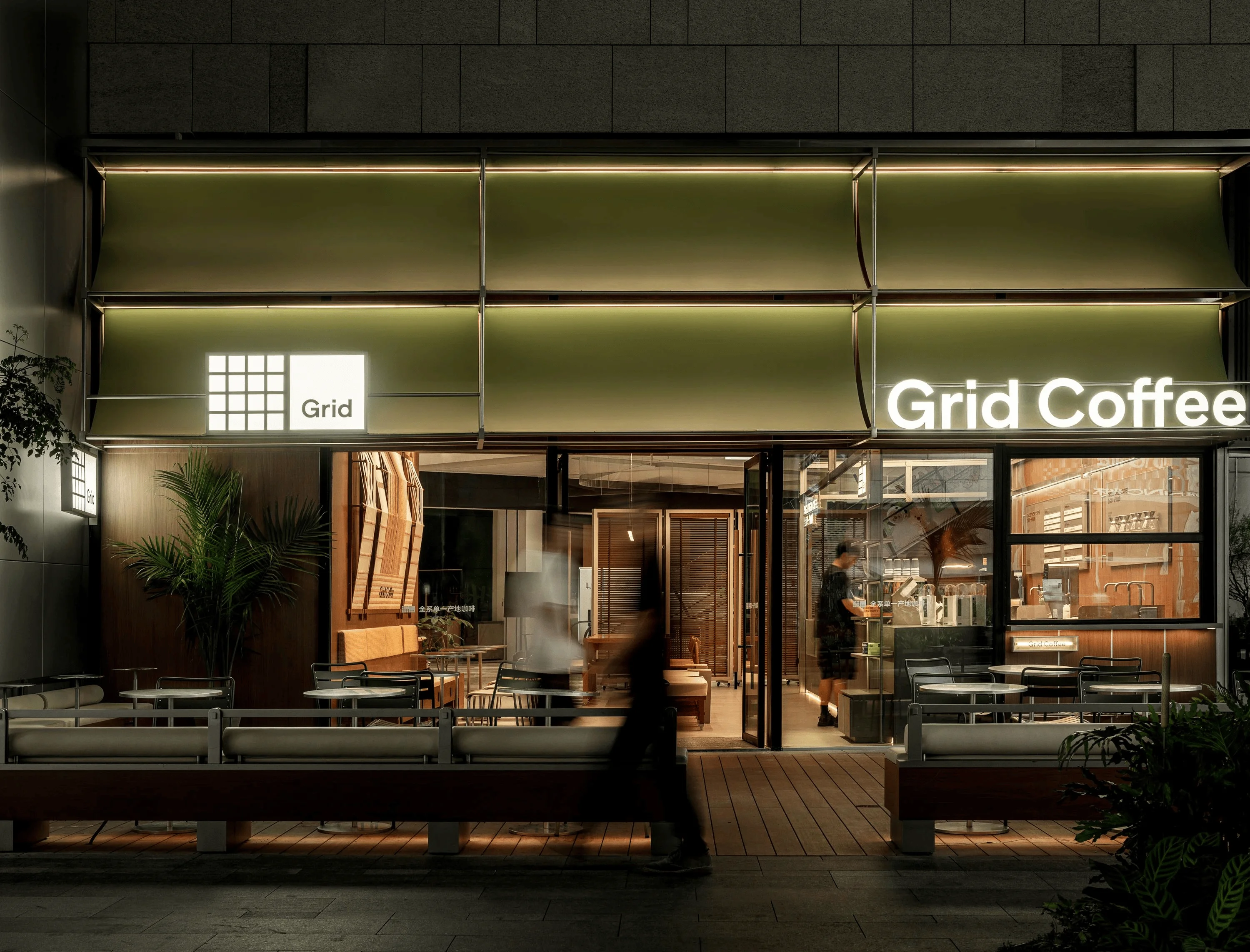
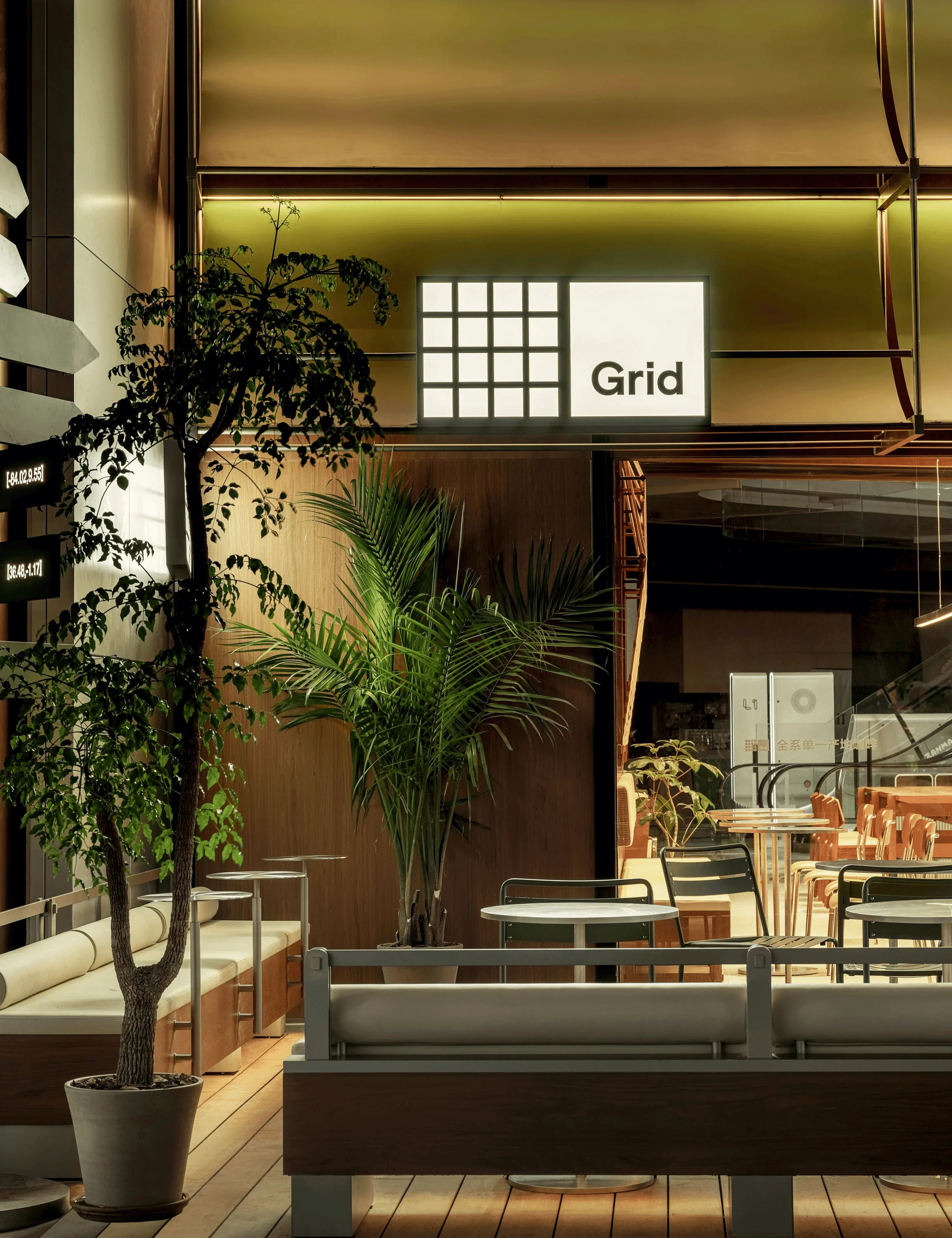
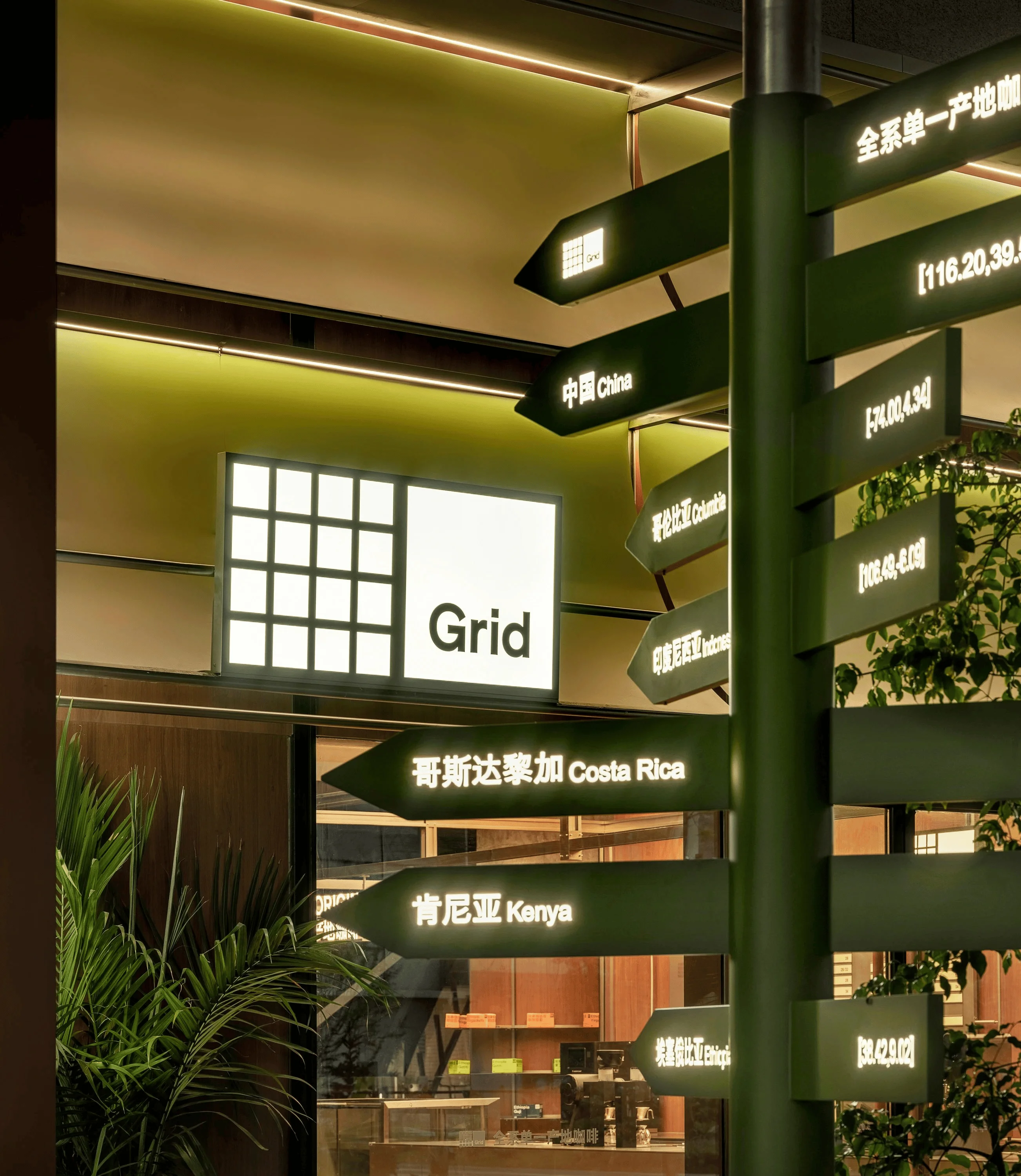
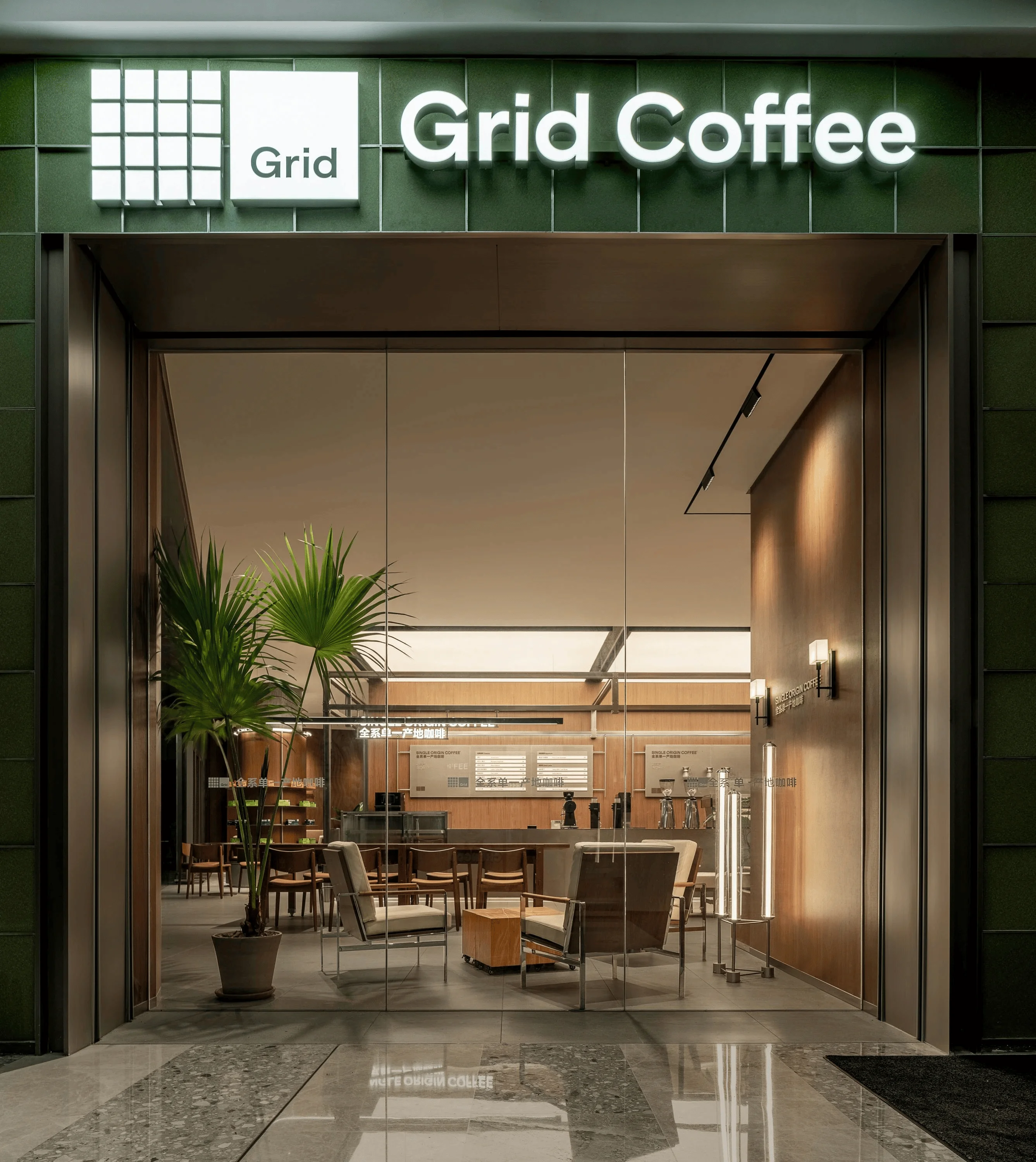
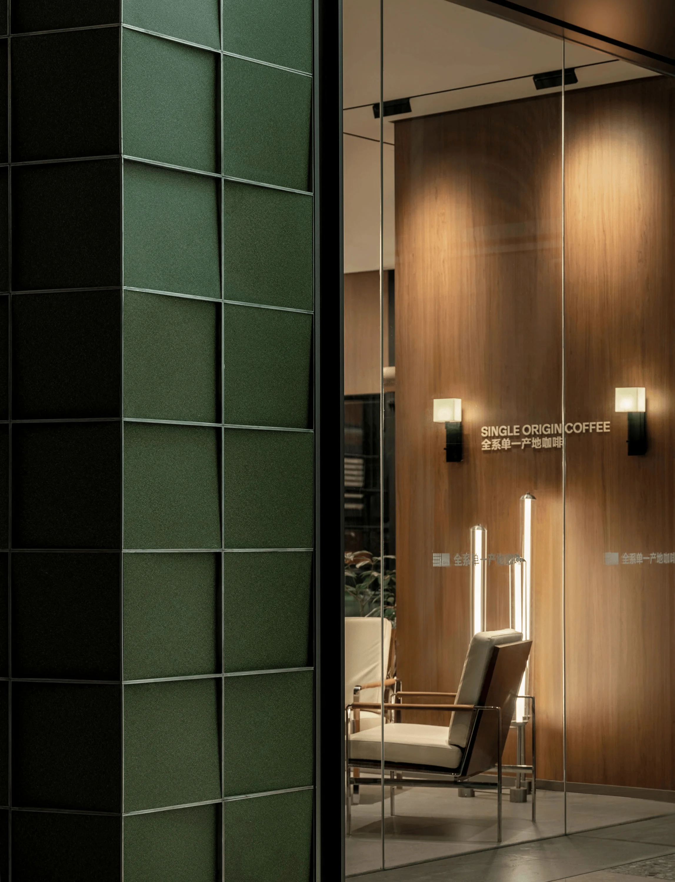
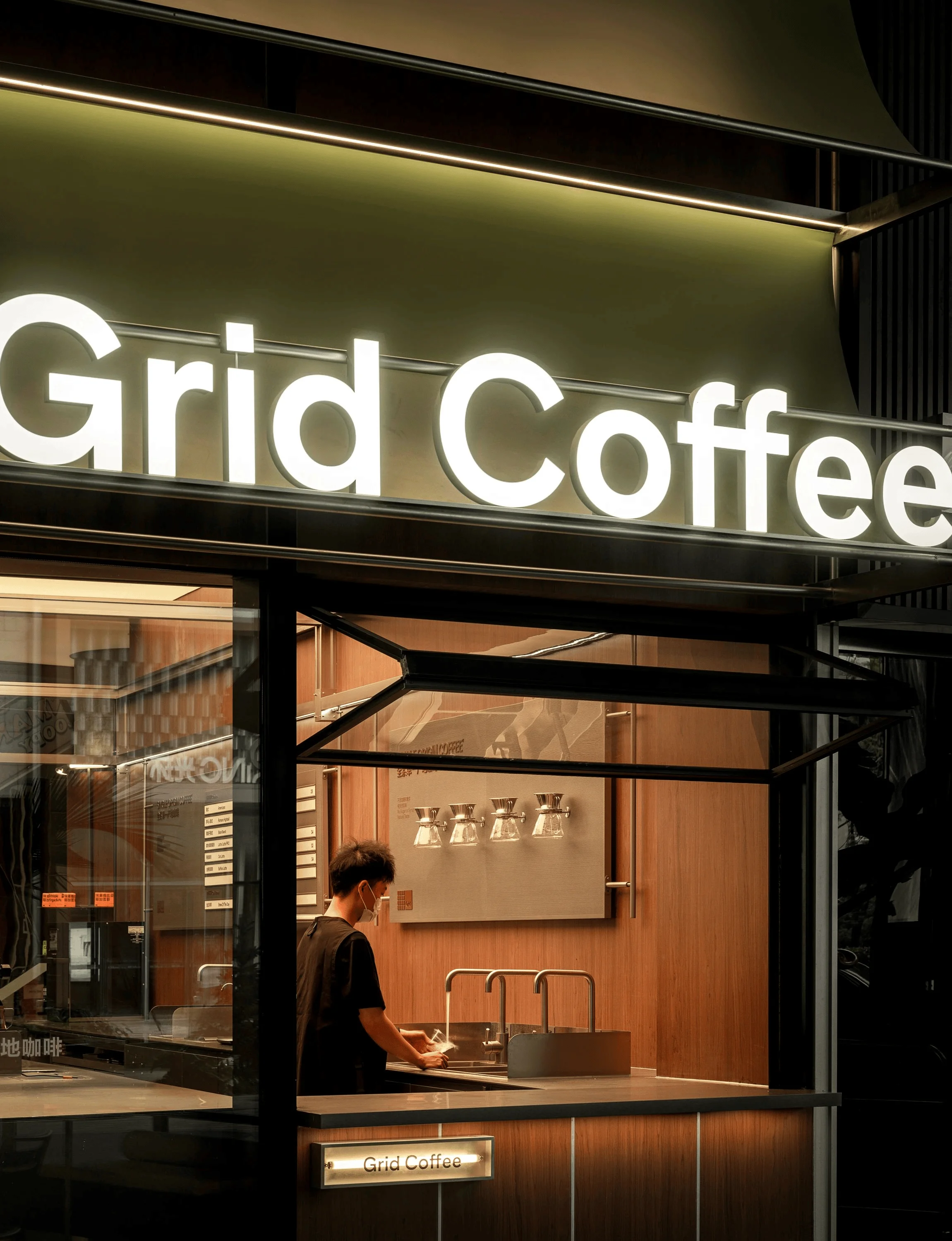
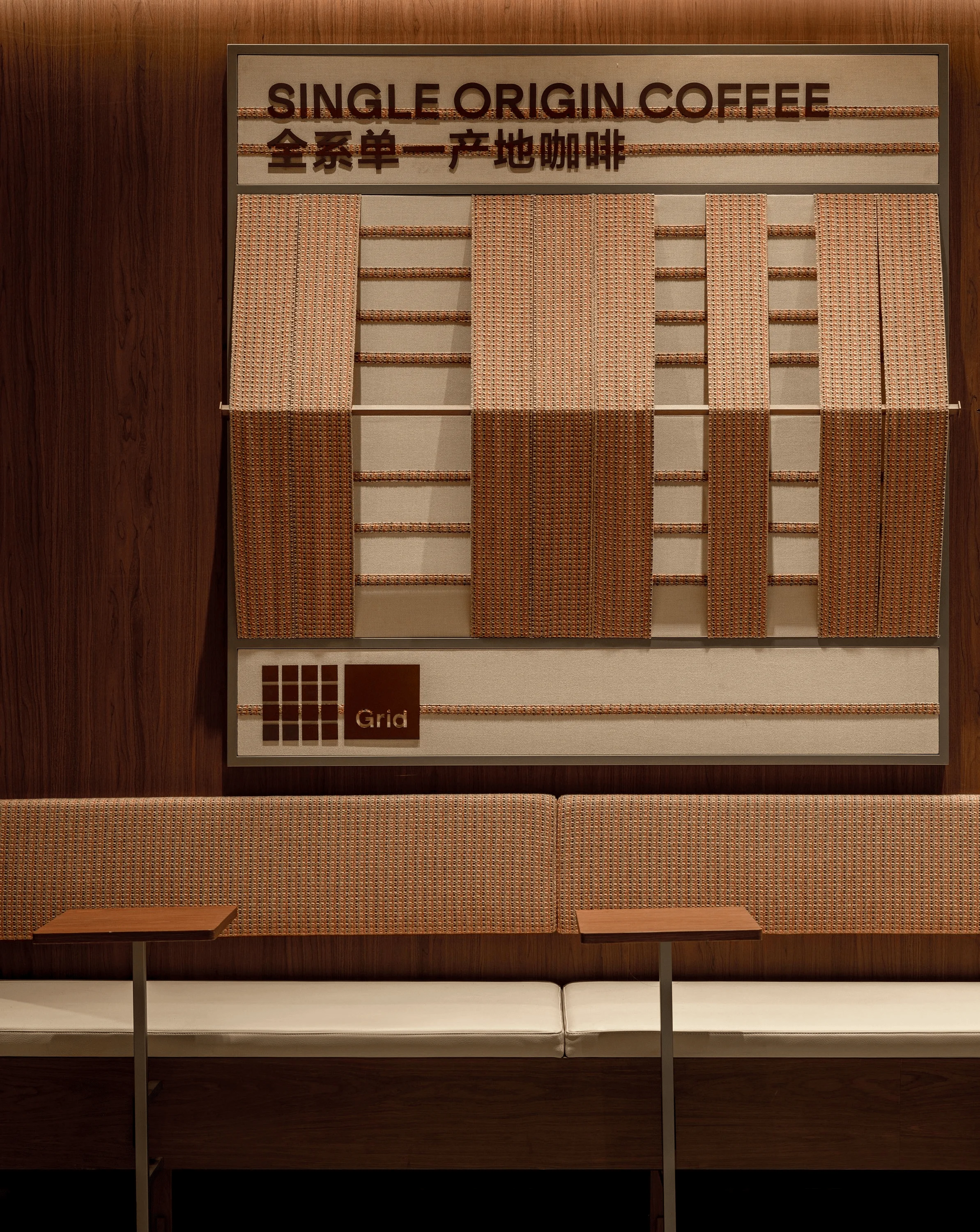
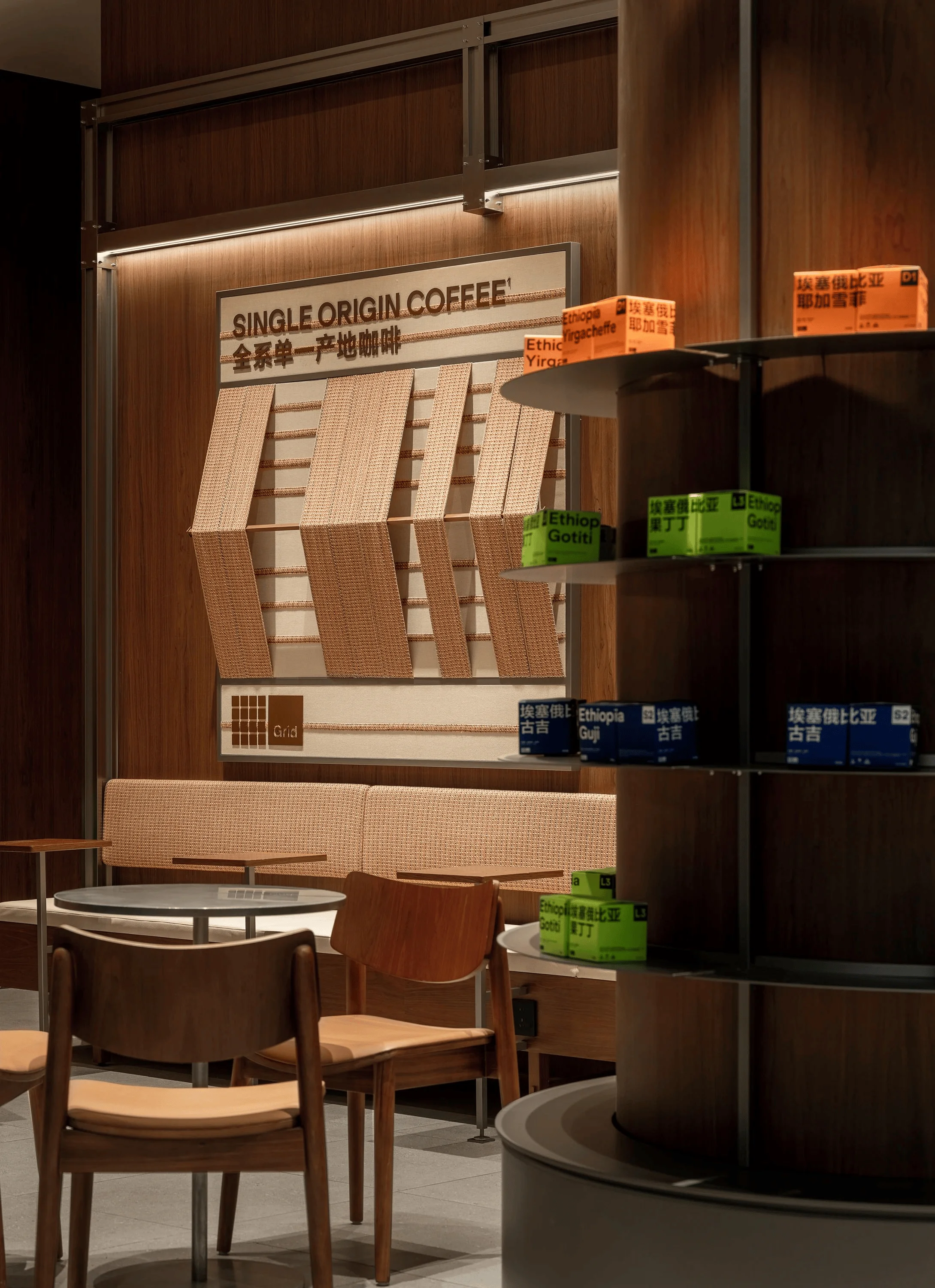
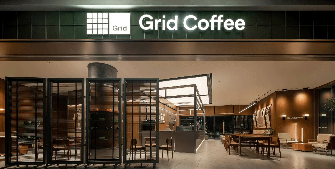
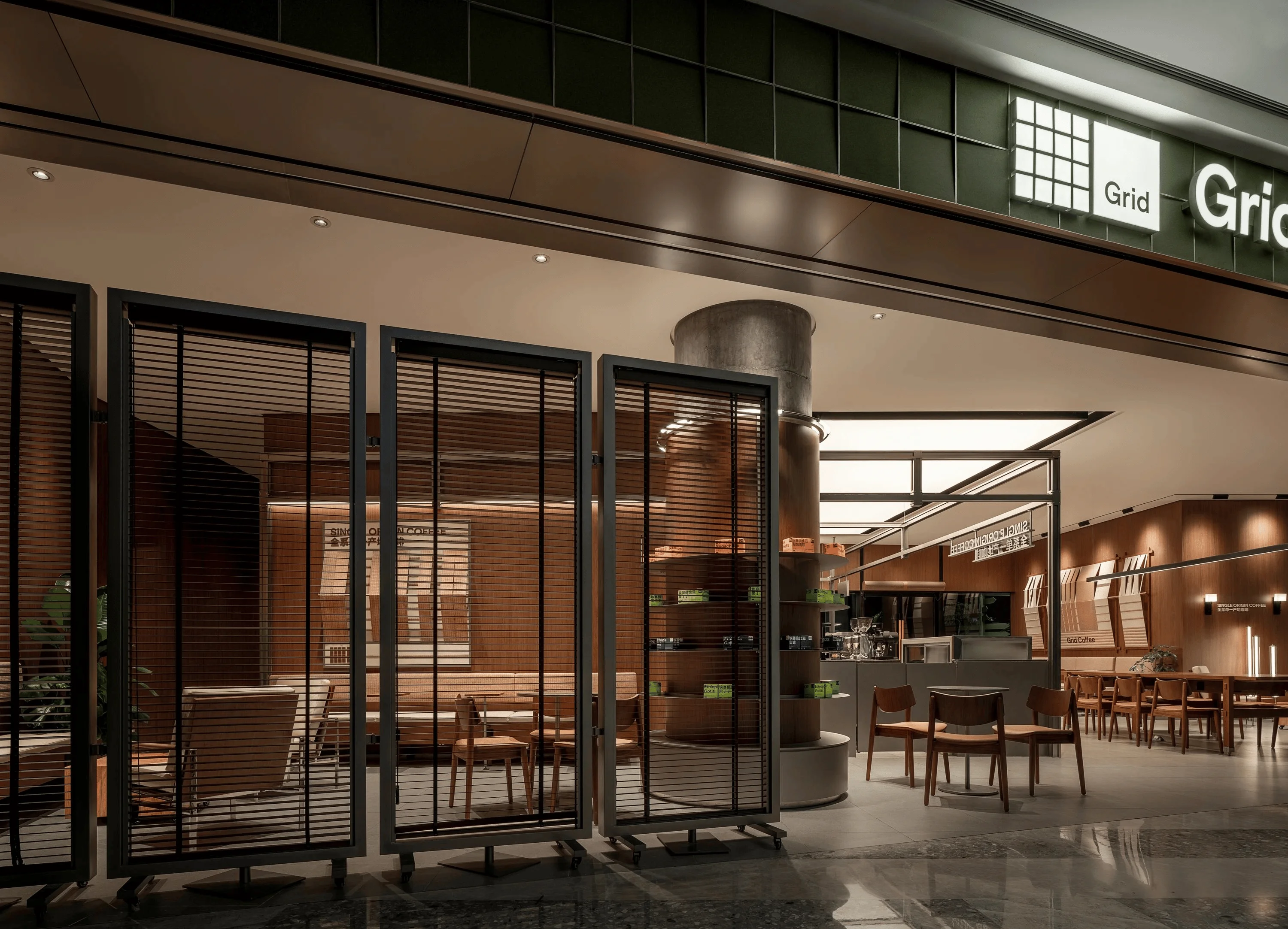
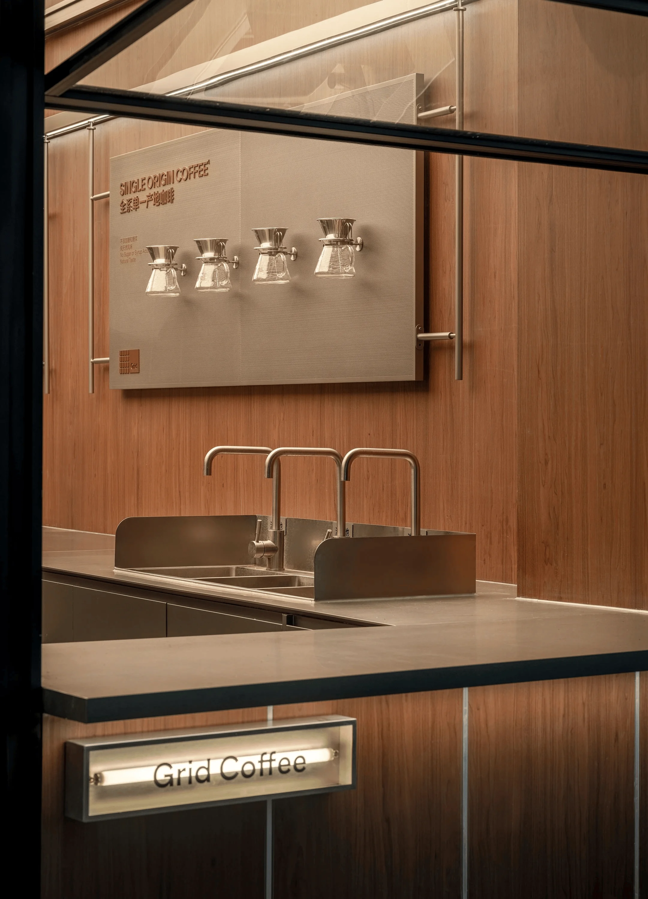
Located in the Chengdu Guanghuan Shopping Park, a vibrant commercial space designed as a park-like environment, the Grid Coffee store occupies a prime location between two commercial buildings, offering optimal visibility and foot traffic. The exterior facade incorporates the brand’s signature green, enhancing brand recognition and creating a visually appealing entry point. Constructed from ultra-thin steel plates, the facade’s curved design evokes a relaxed camping atmosphere, offering a sense of tranquility amidst the bustling urban environment. grid system design and local culture elements are the core of this project. Furthermore, unique single-origin coffee bean indicator devices are installed on the facade, adding a playful touch while emphasizing the brand’s commitment to single-origin coffee. These indicators guide customers through an exploration of each coffee bean’s unique terroir story, showcasing Grid Coffee’s unwavering dedication to coffee quality and rich heritage. grid system design and local culture elements are the core of this project.
Interior Design and Spatial Experience
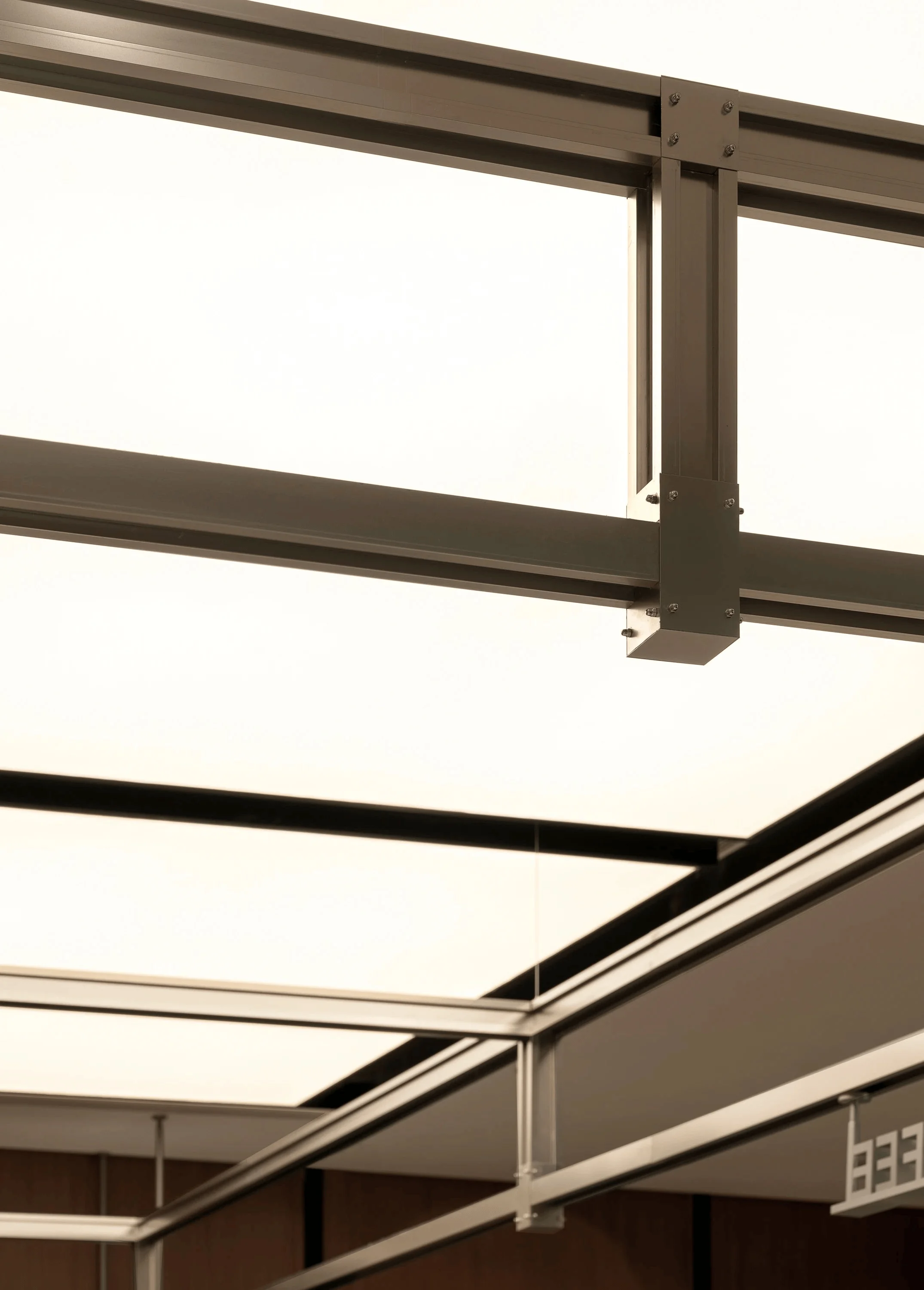
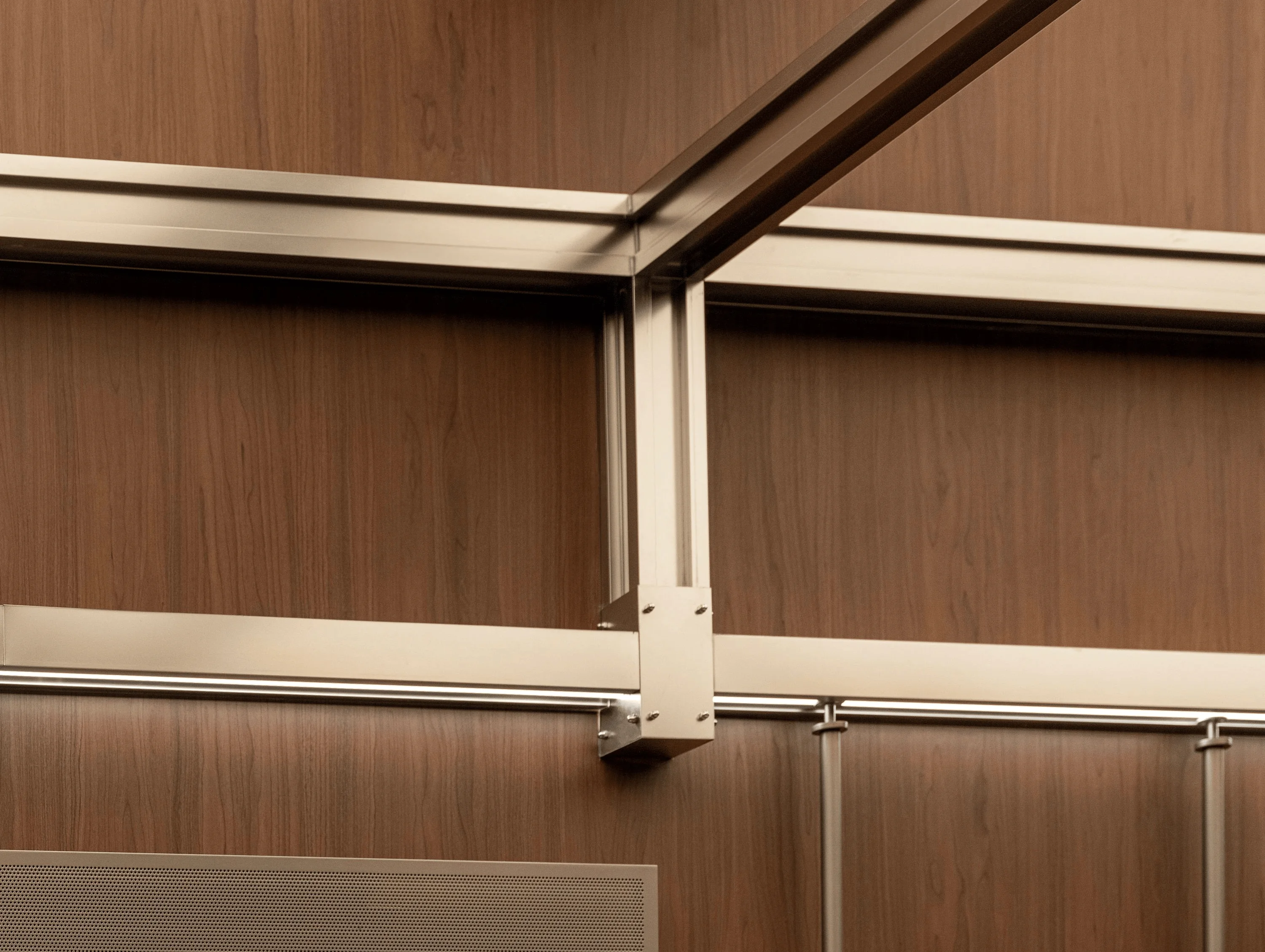
Spider Creative, the design firm behind the project, ingeniously integrates the Grid concept into the interior and exterior facades. The design incorporates a series of high and low grid patterns that evoke the rolling mountains of coffee-growing regions. Each grid unit boasts a distinctive texture, with green as the dominant color, creating a unique aesthetic experience. This design reinforces the brand’s green identity while seamlessly introducing a natural element into the urban setting. The undulating grids resemble the Earth’s breath, while the diverse textures narrate the tales of each coffee bean. This design not only elevates the visual experience but also fosters a deeper appreciation for Grid Coffee’s dedication to quality and natural beauty. The interior design elements, particularly the bar, serve as a hub for coffee preparation and a stage where art and functionality converge. grid system design and local culture elements are the core of this project.
Bar Design and Lighting
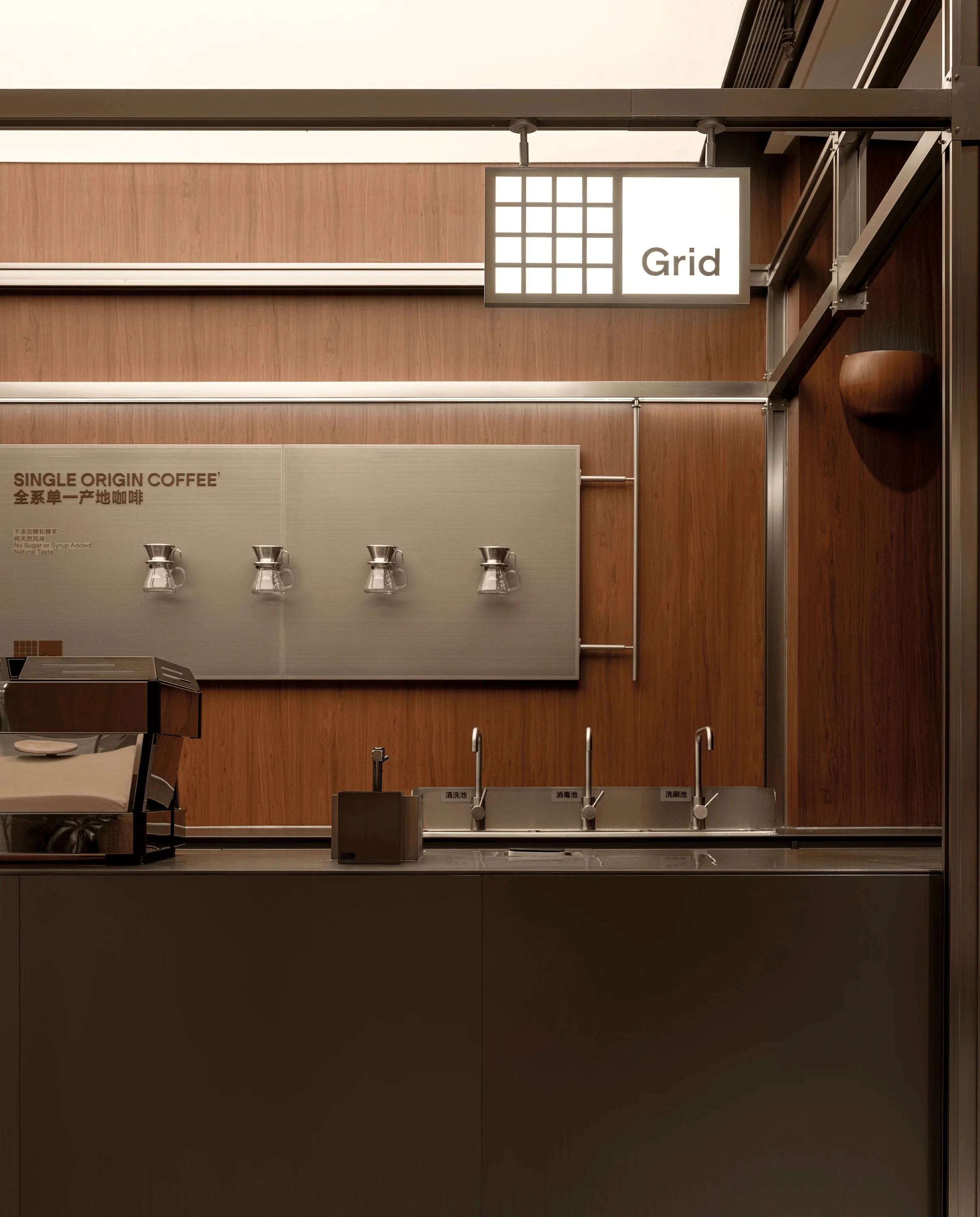
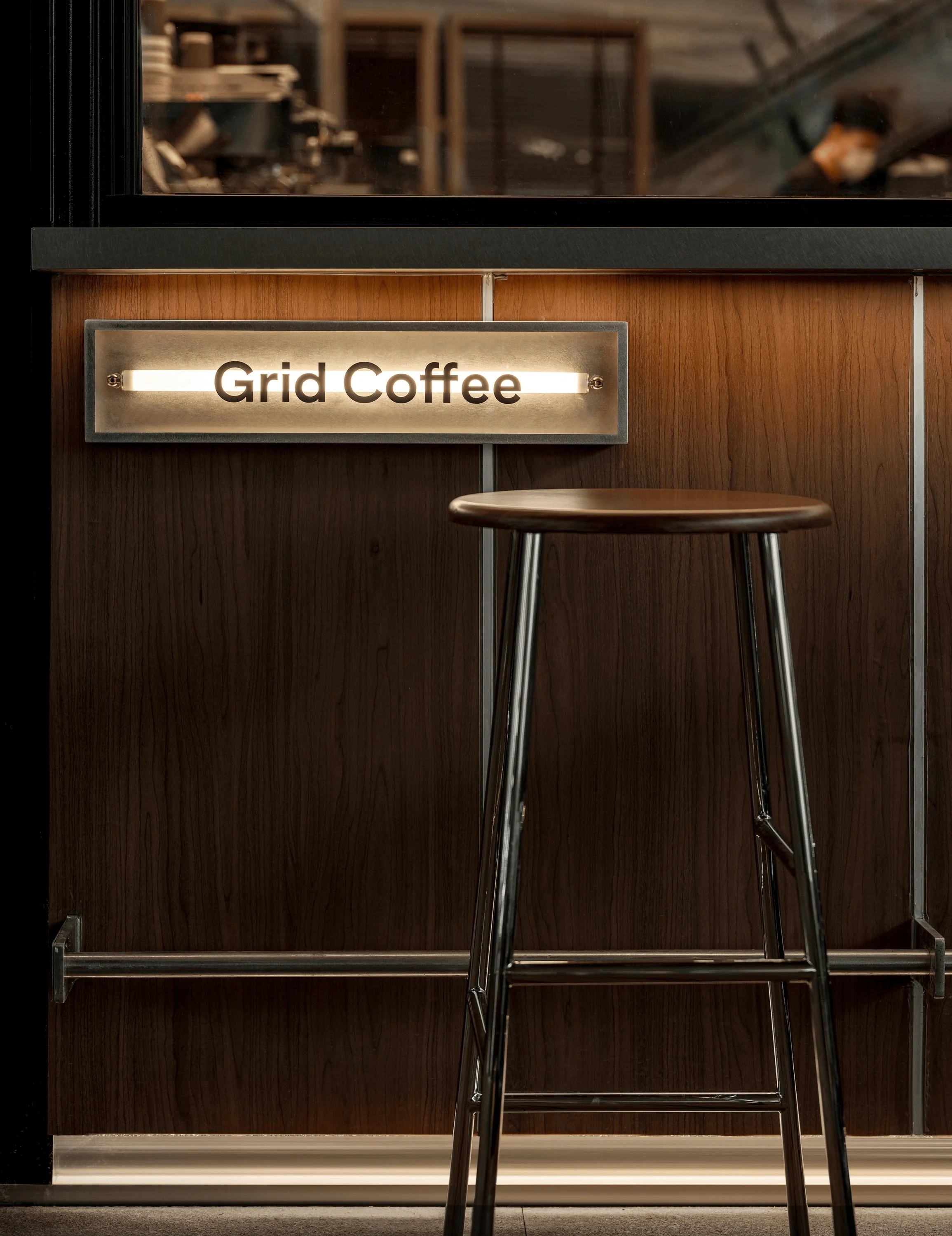
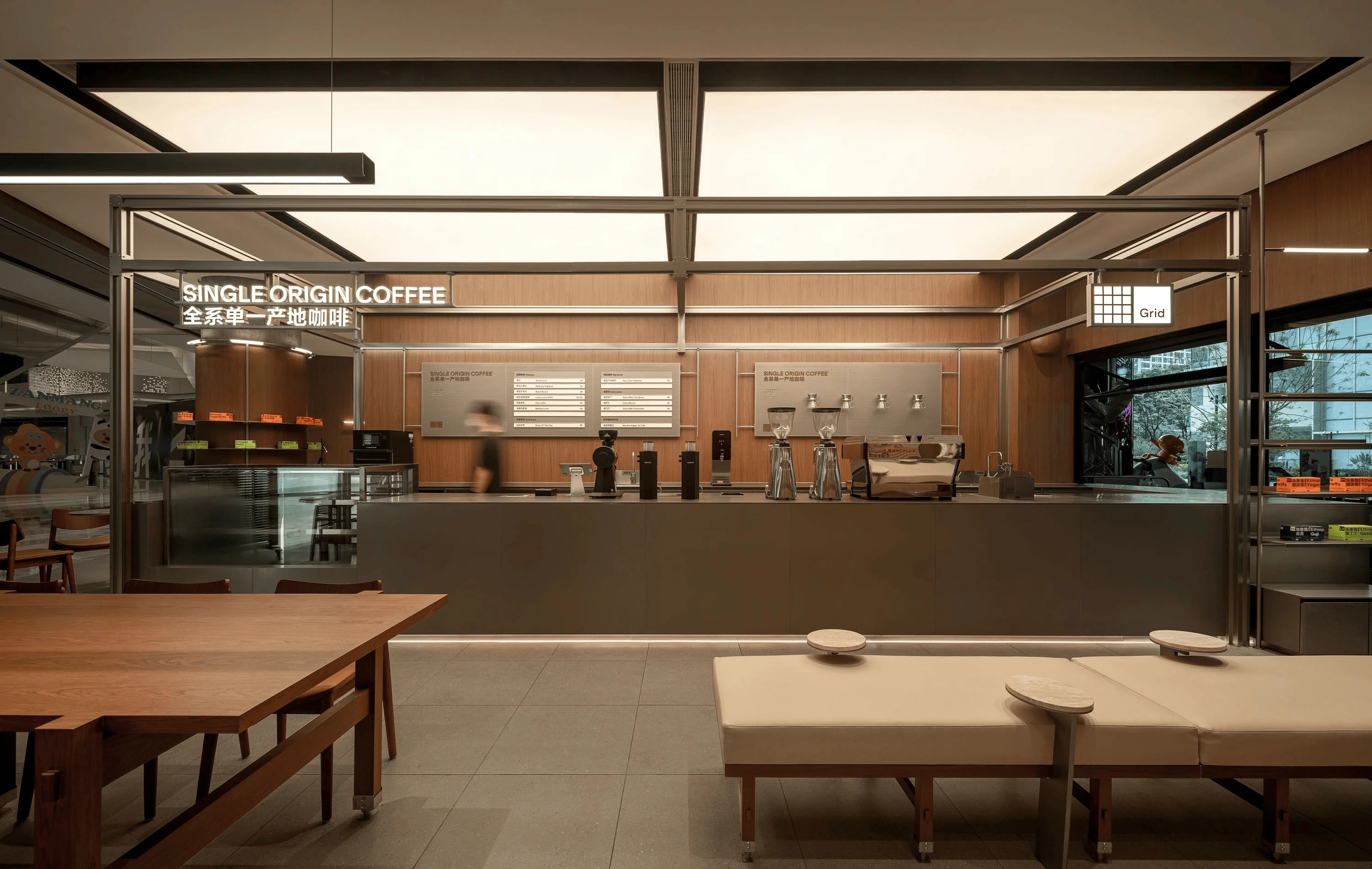
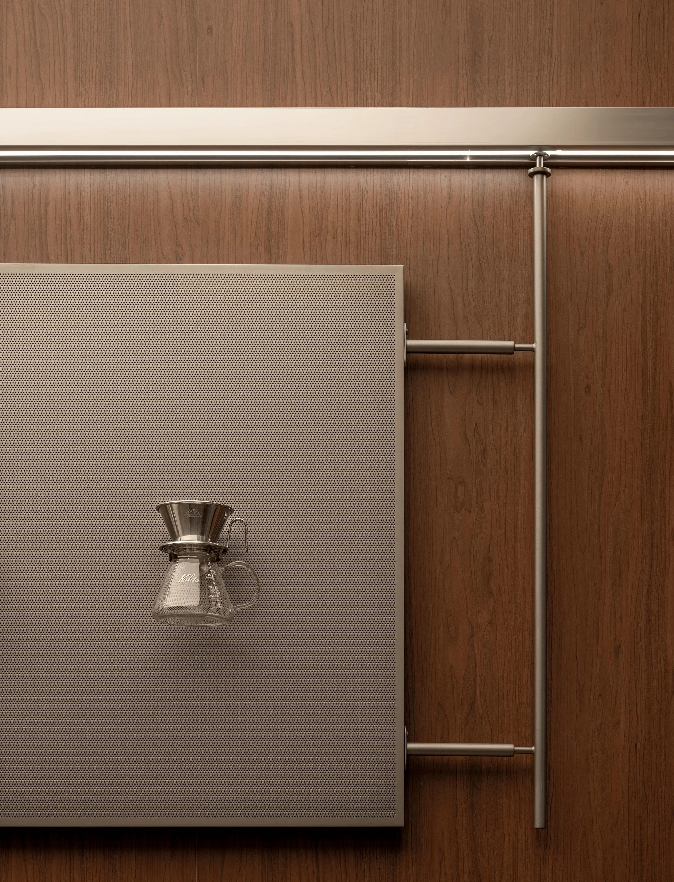
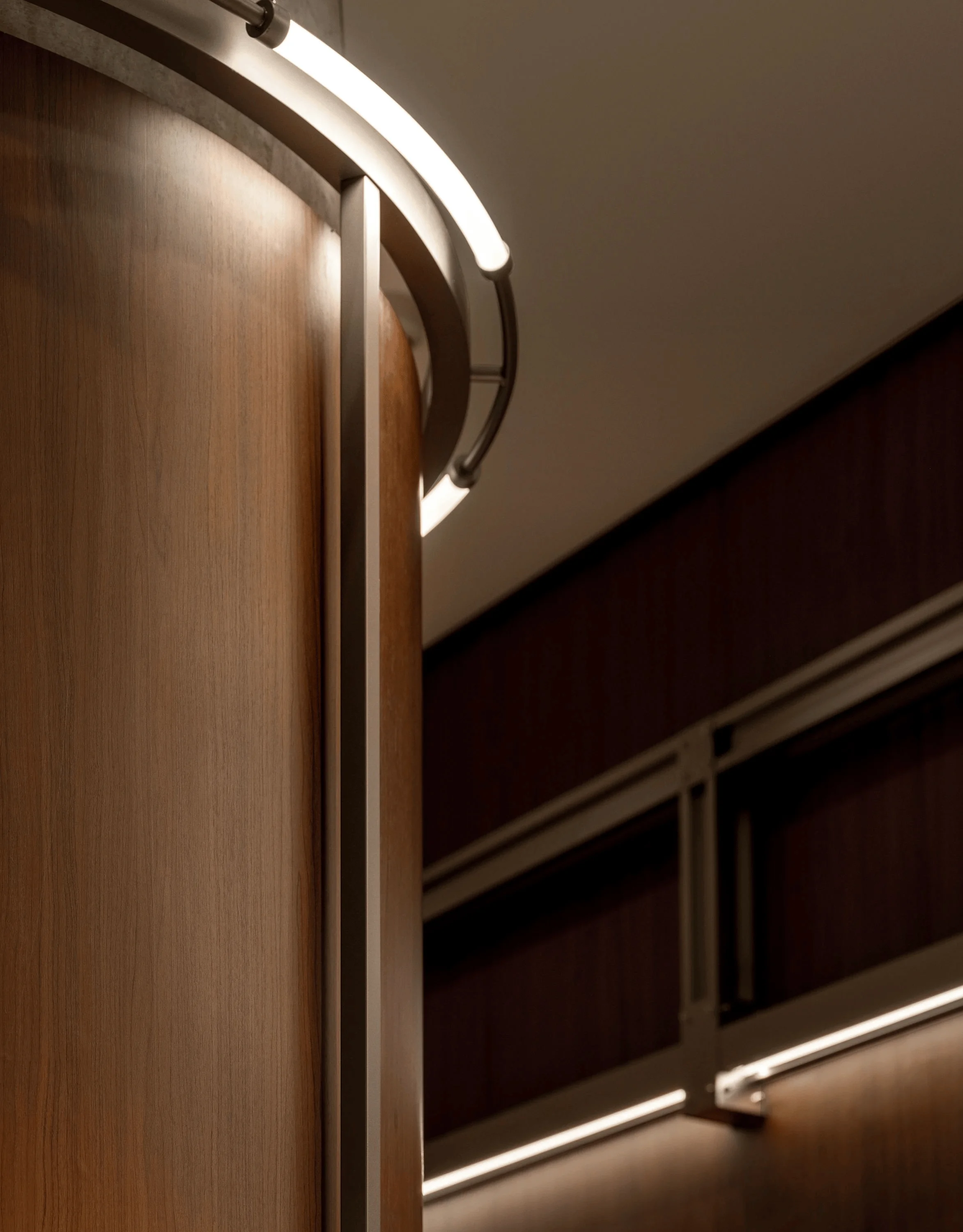
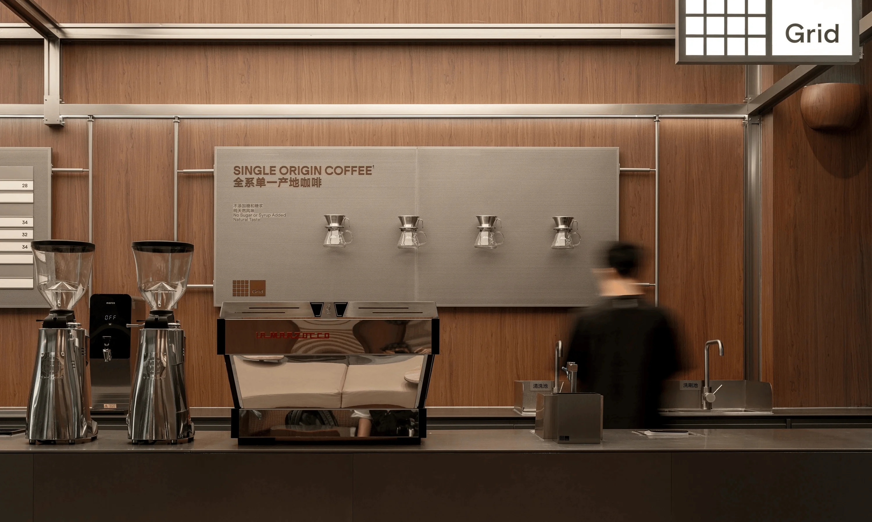
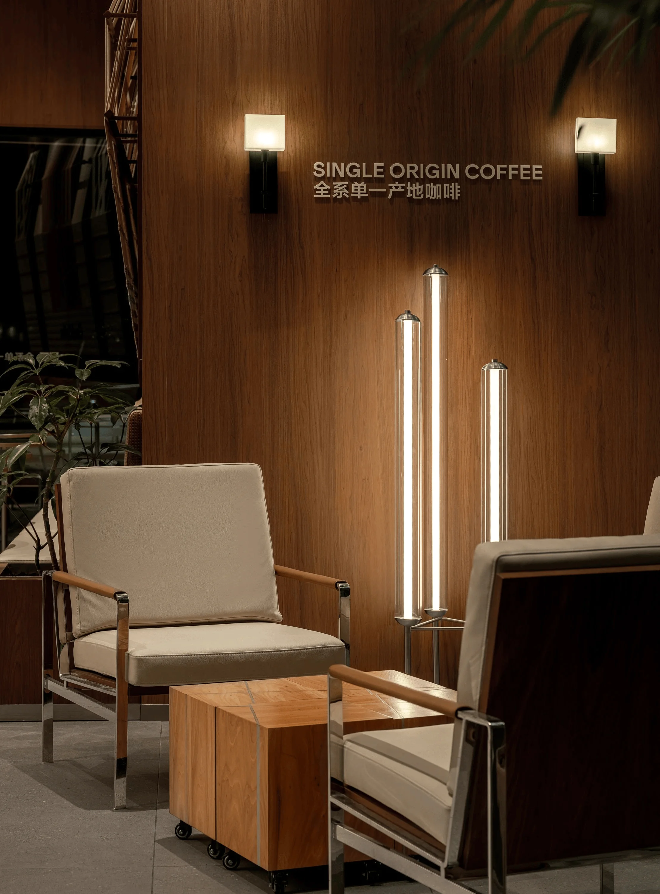
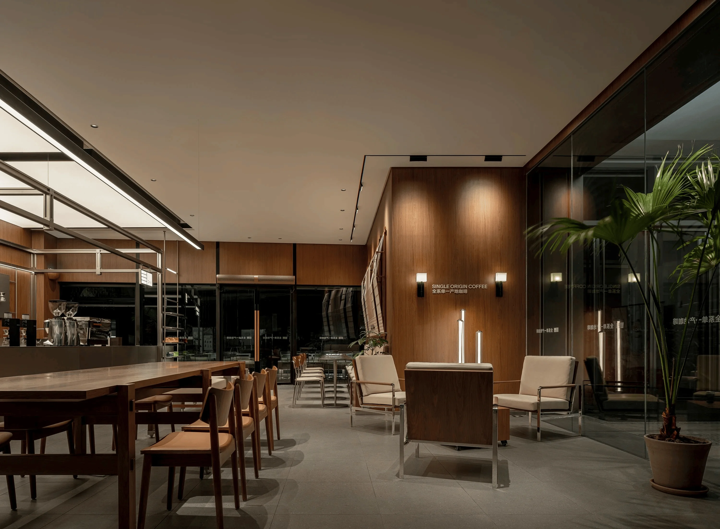
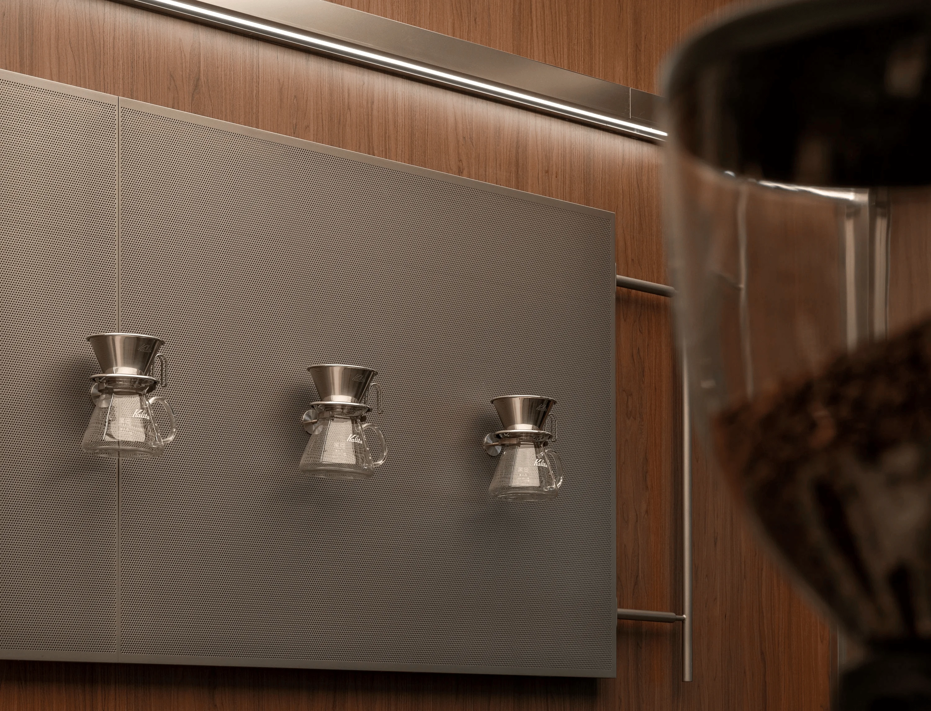
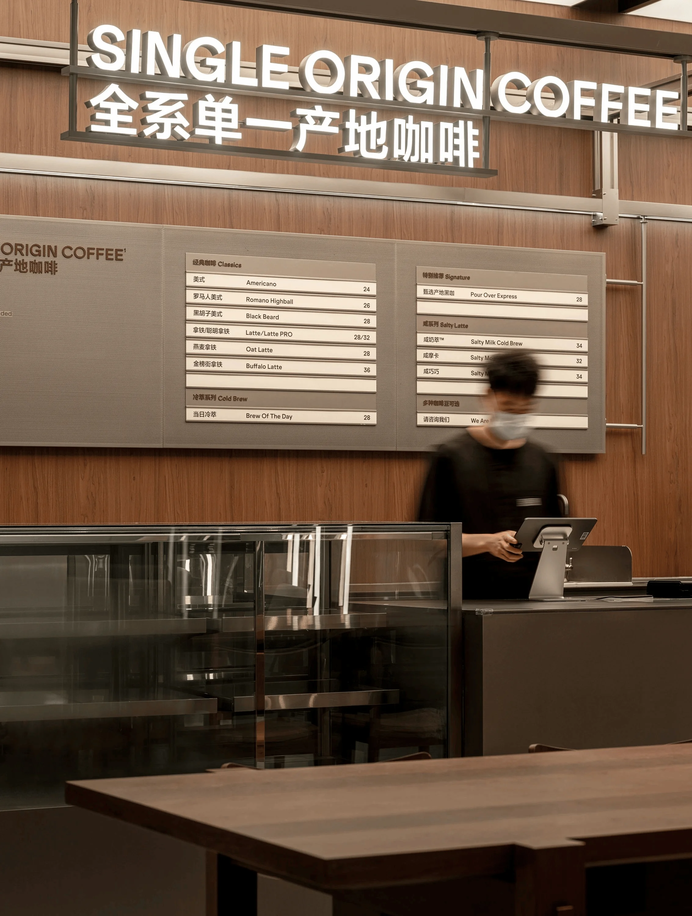
The bar, a focal point of the coffee space, is meticulously crafted to be both professional and inspiring. A key feature of the bar design is the implementation of adjustable lighting, allowing for mood and atmosphere changes depending on time of day, special occasions, or events. This creates a dynamic space that enhances the customer experience and transforms the bar area into a versatile space for social gatherings and events. The design maintains consistency with the brand’s core spatial DNA through material selection, color palettes, and overall layout, emphasizing a meticulous attention to detail and a relentless pursuit of quality. The bar’s design also incorporates future flexibility, with adjustable lighting, adaptable layouts, and reserved interfaces and spaces to facilitate future events. The bar design makes it easier to communicate and showcase this enthusiasm. grid system design and local culture elements are the core of this project.
Furniture Design and Local Cultural Integration
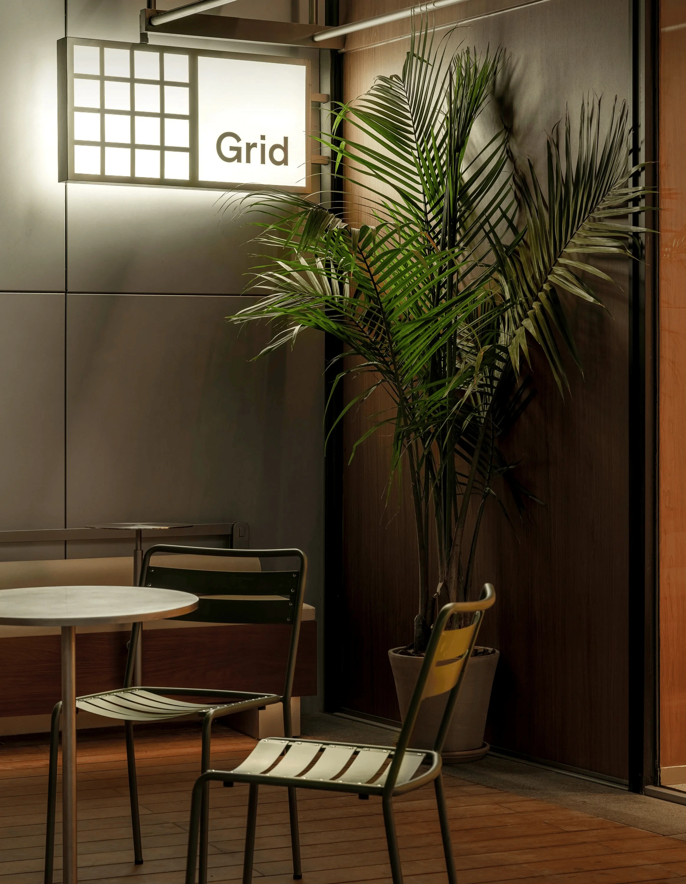
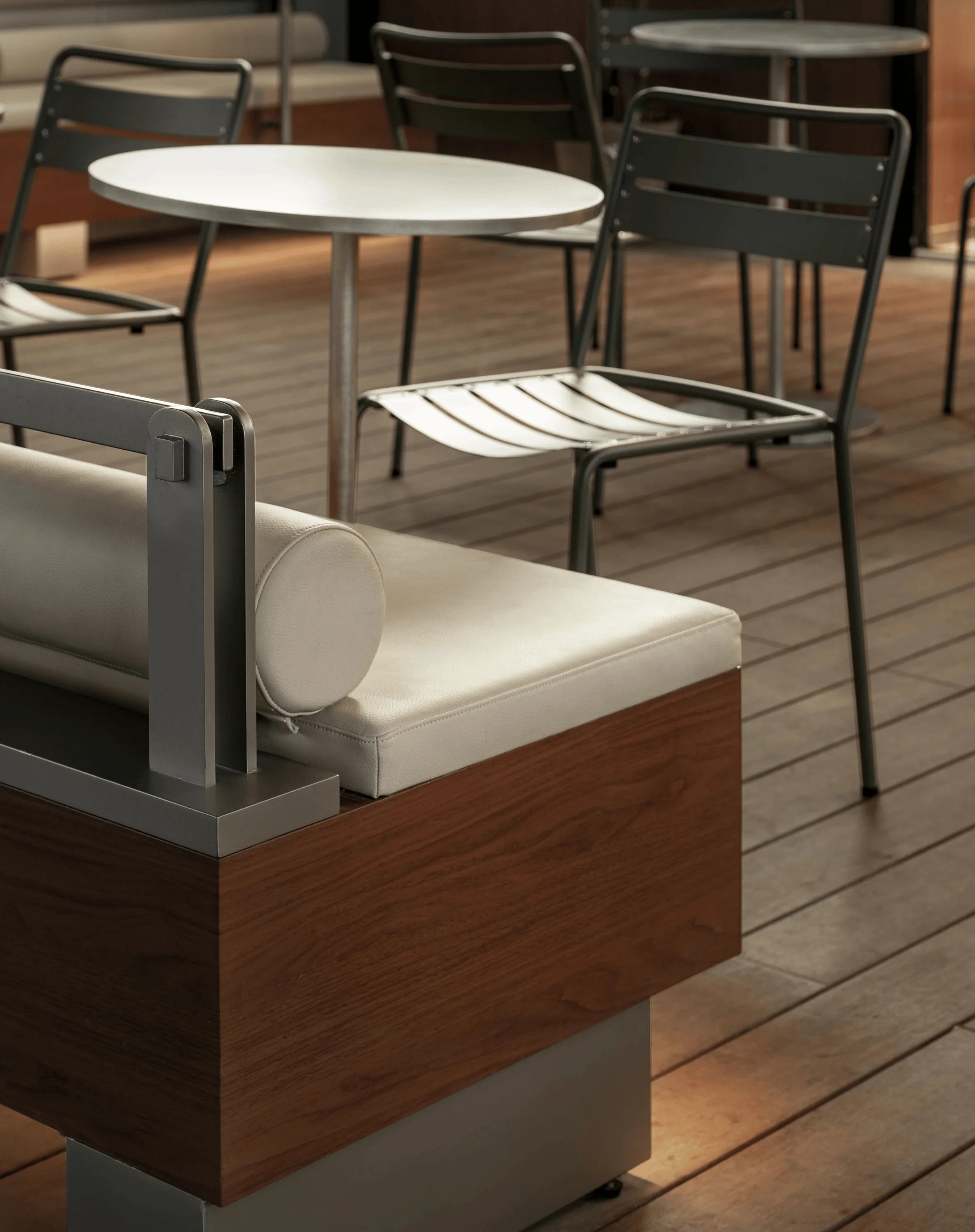
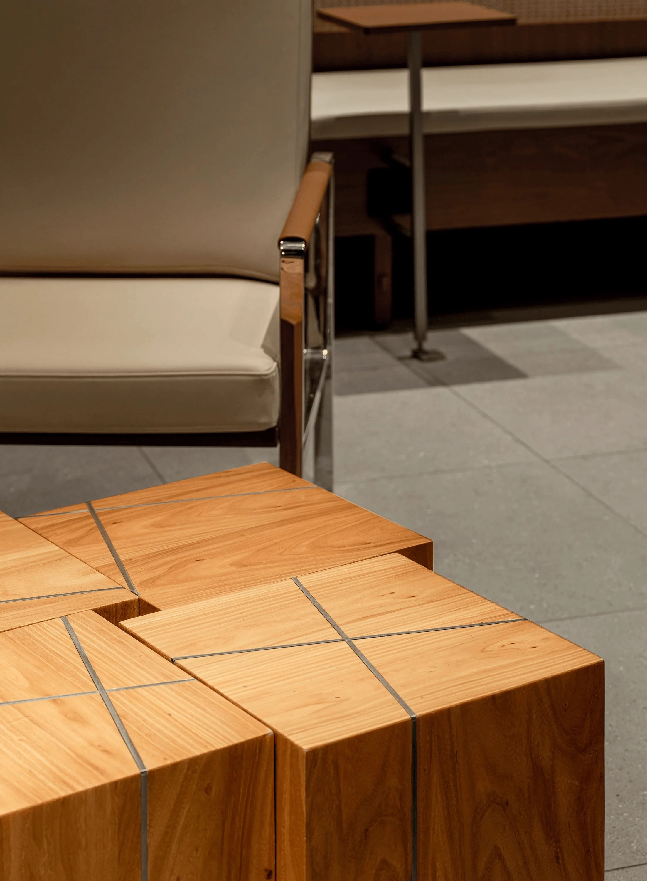
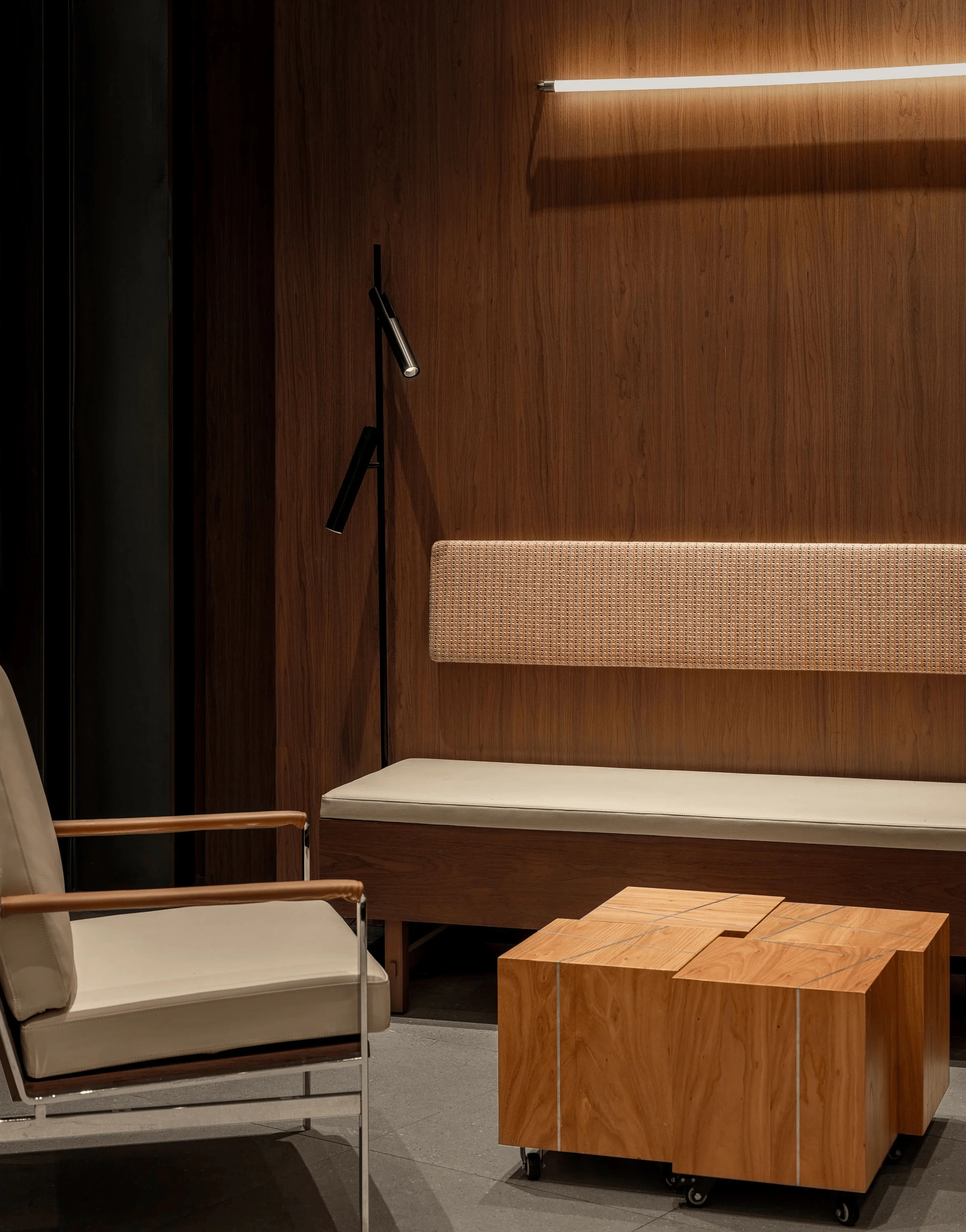
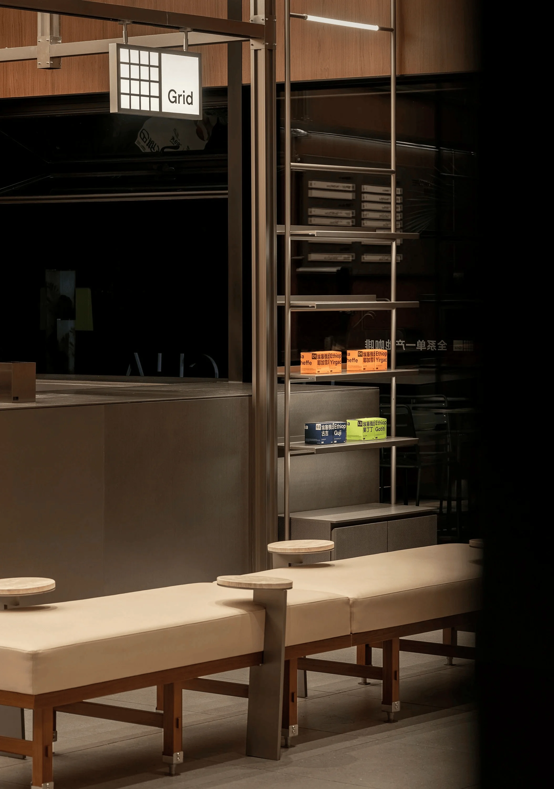
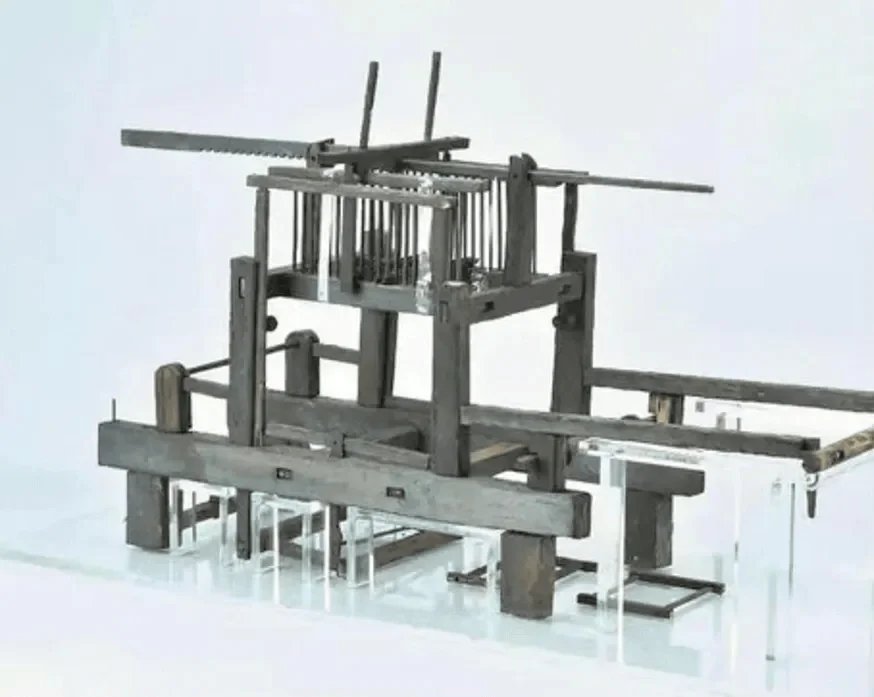
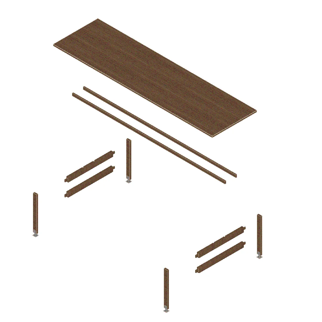
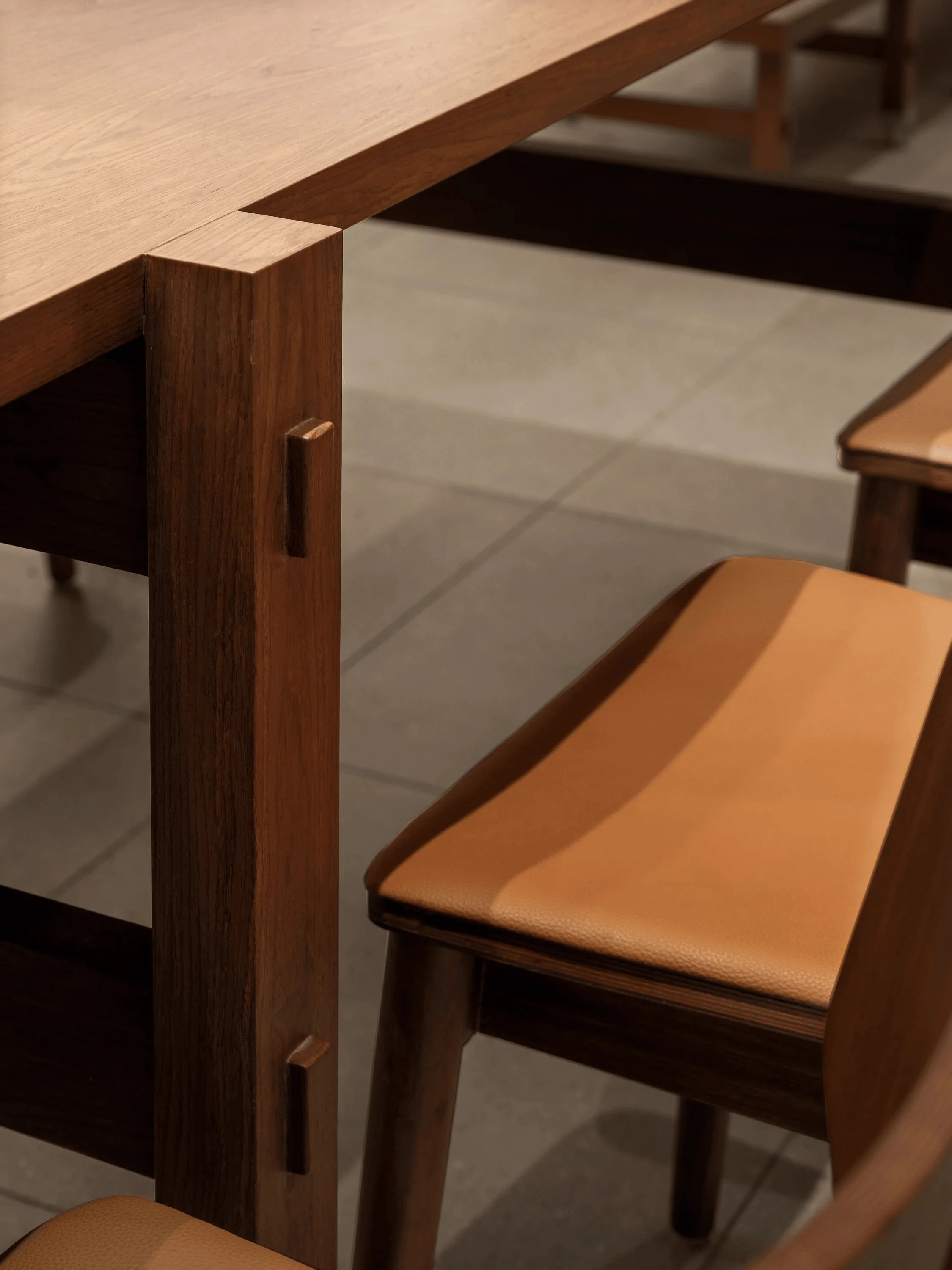
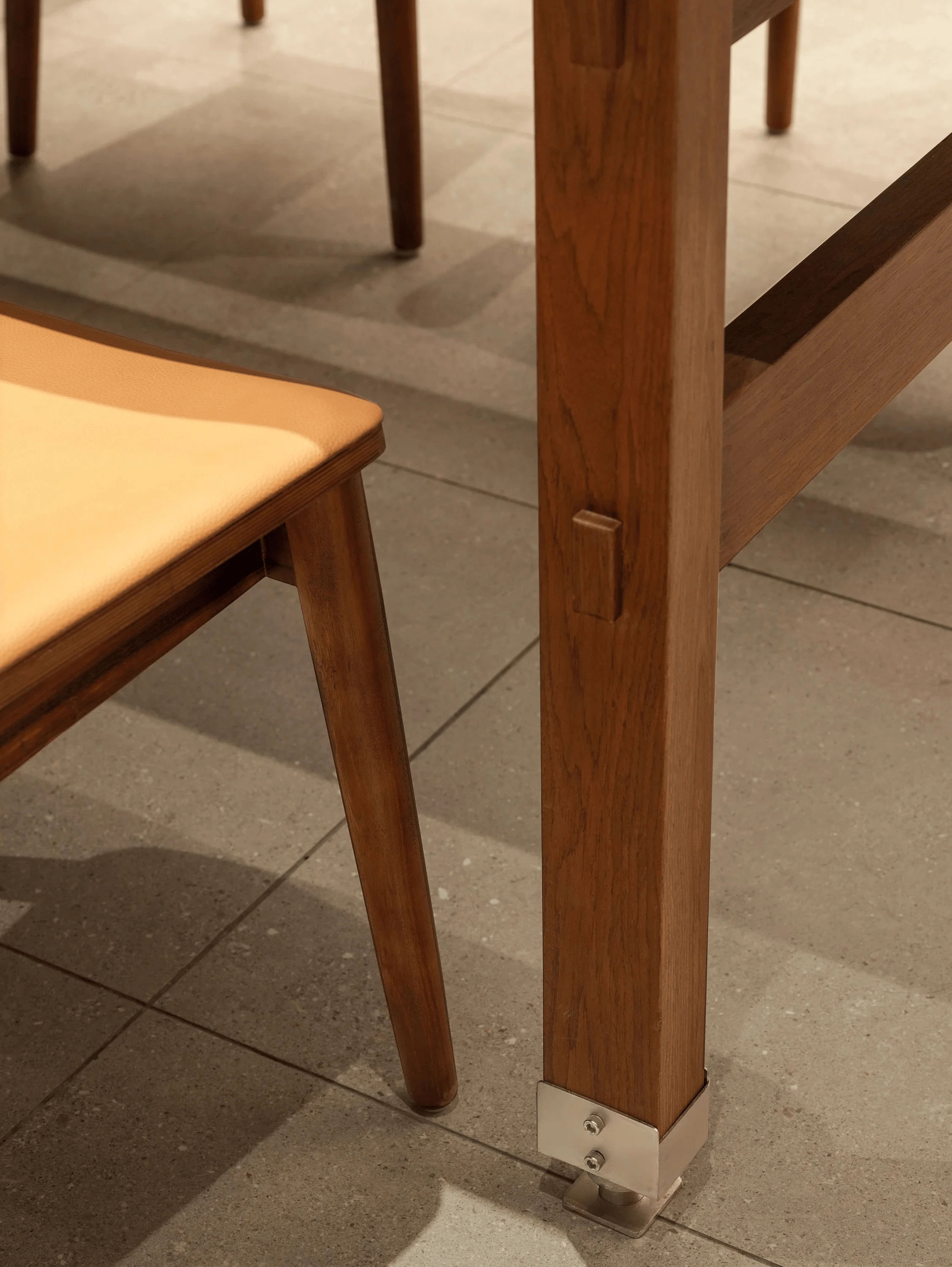
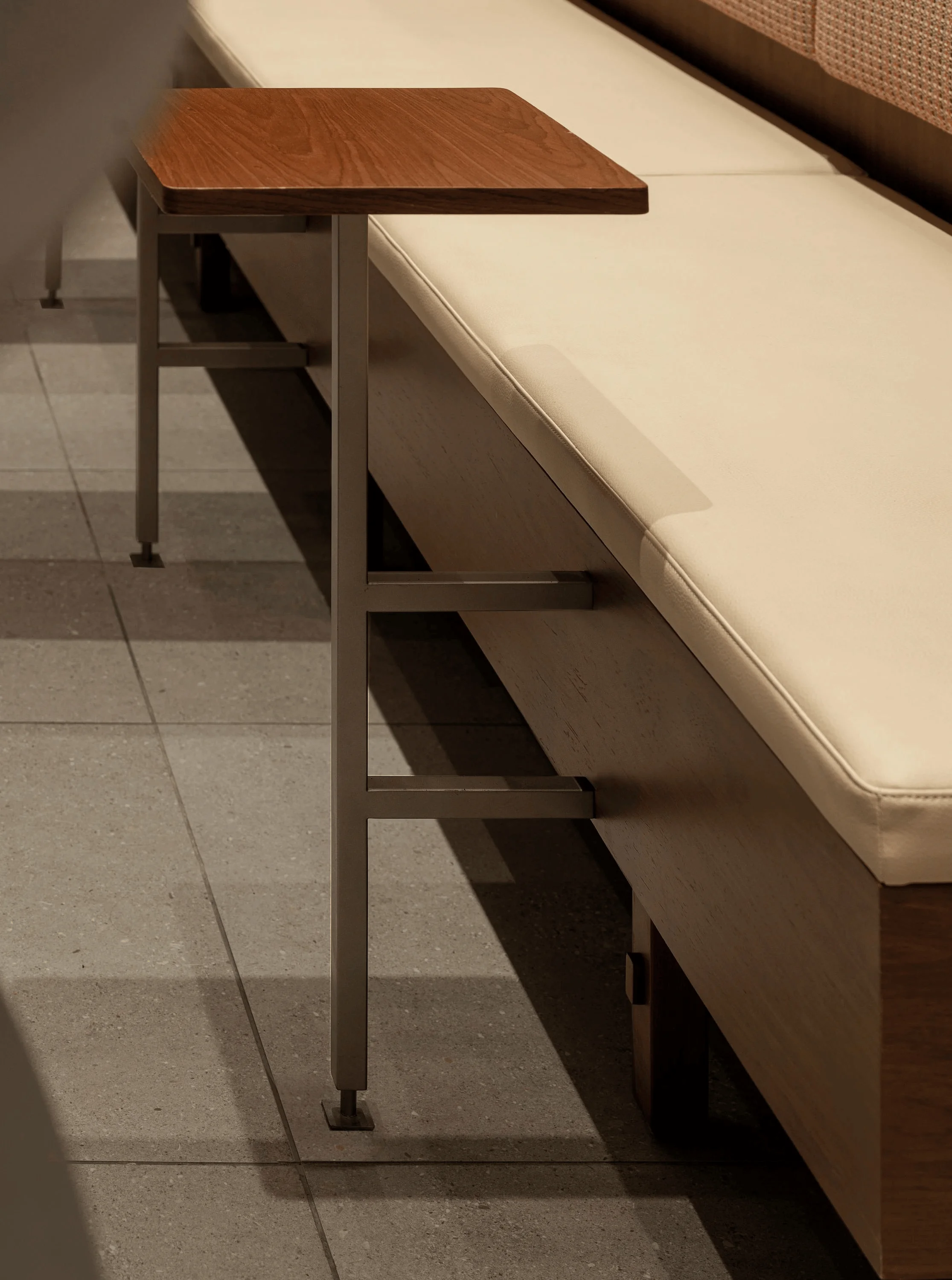
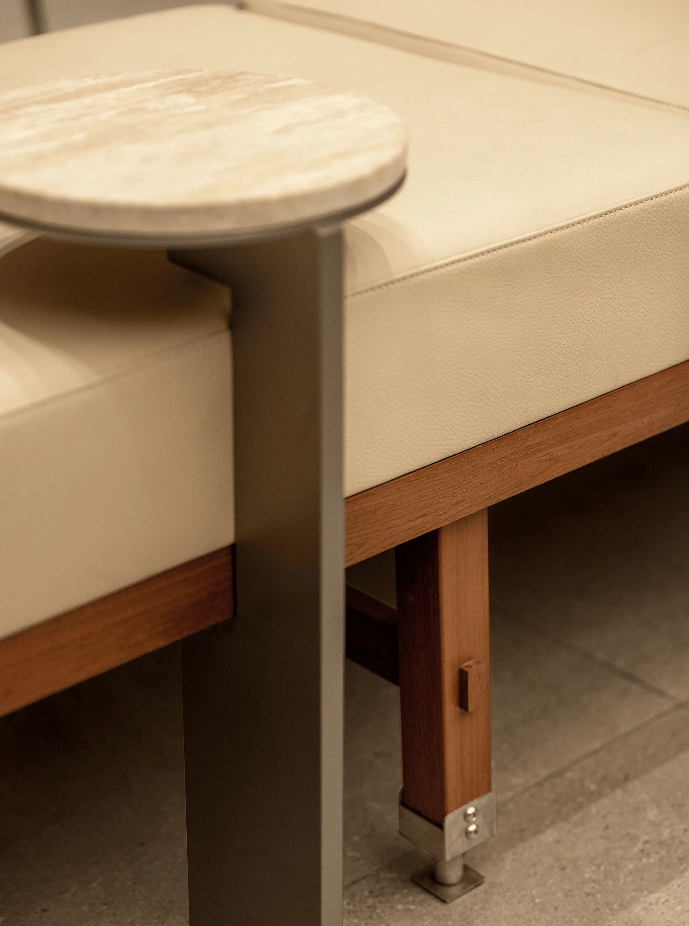
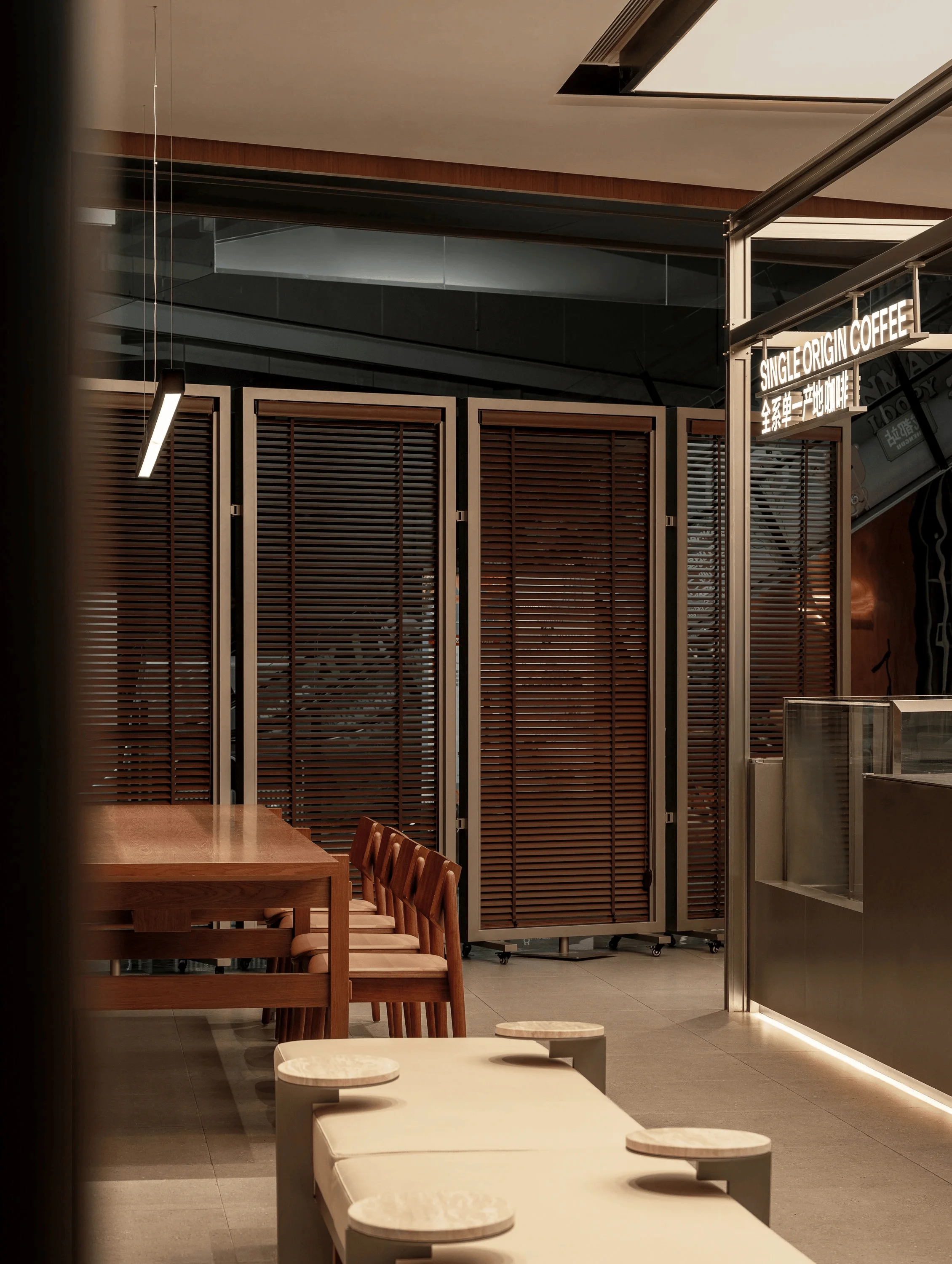
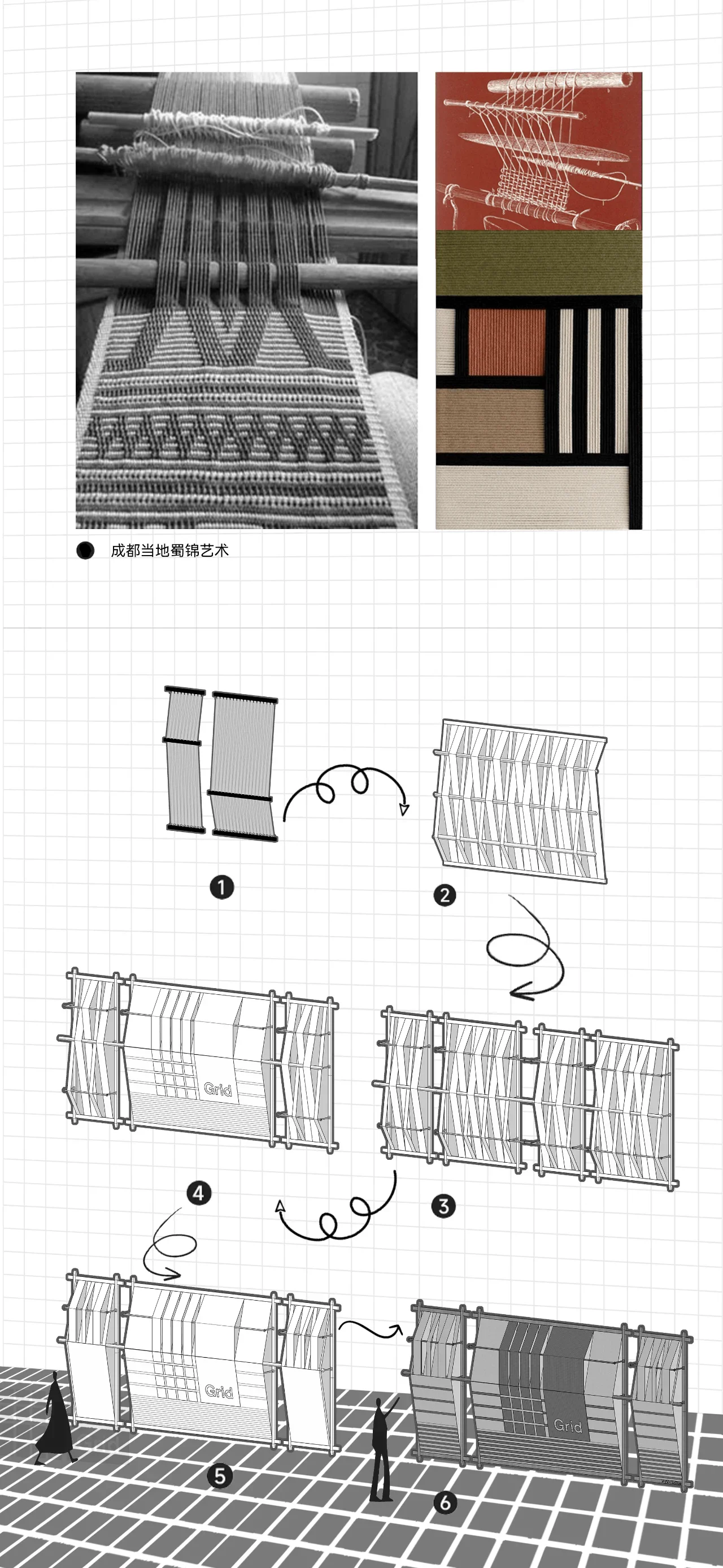
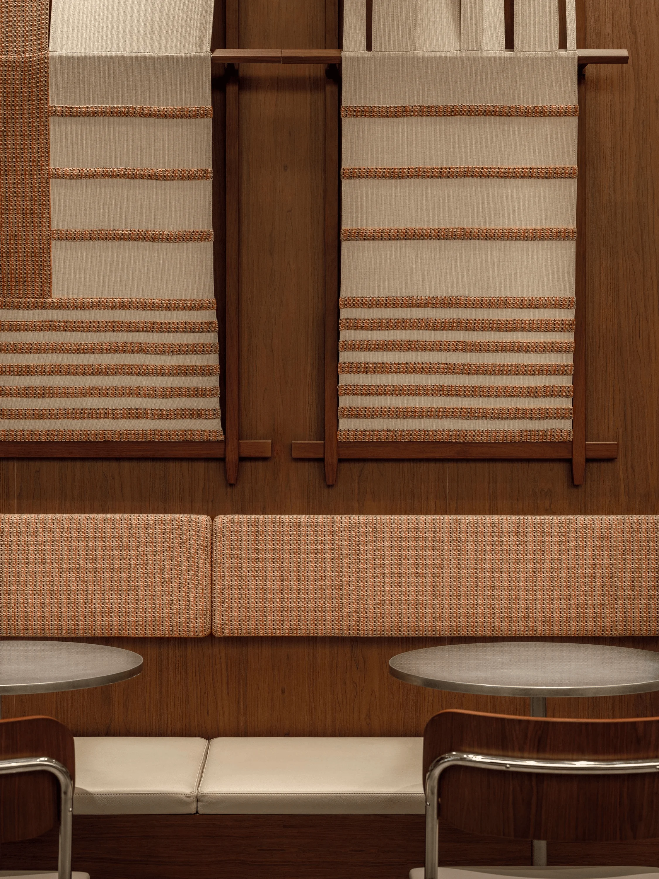
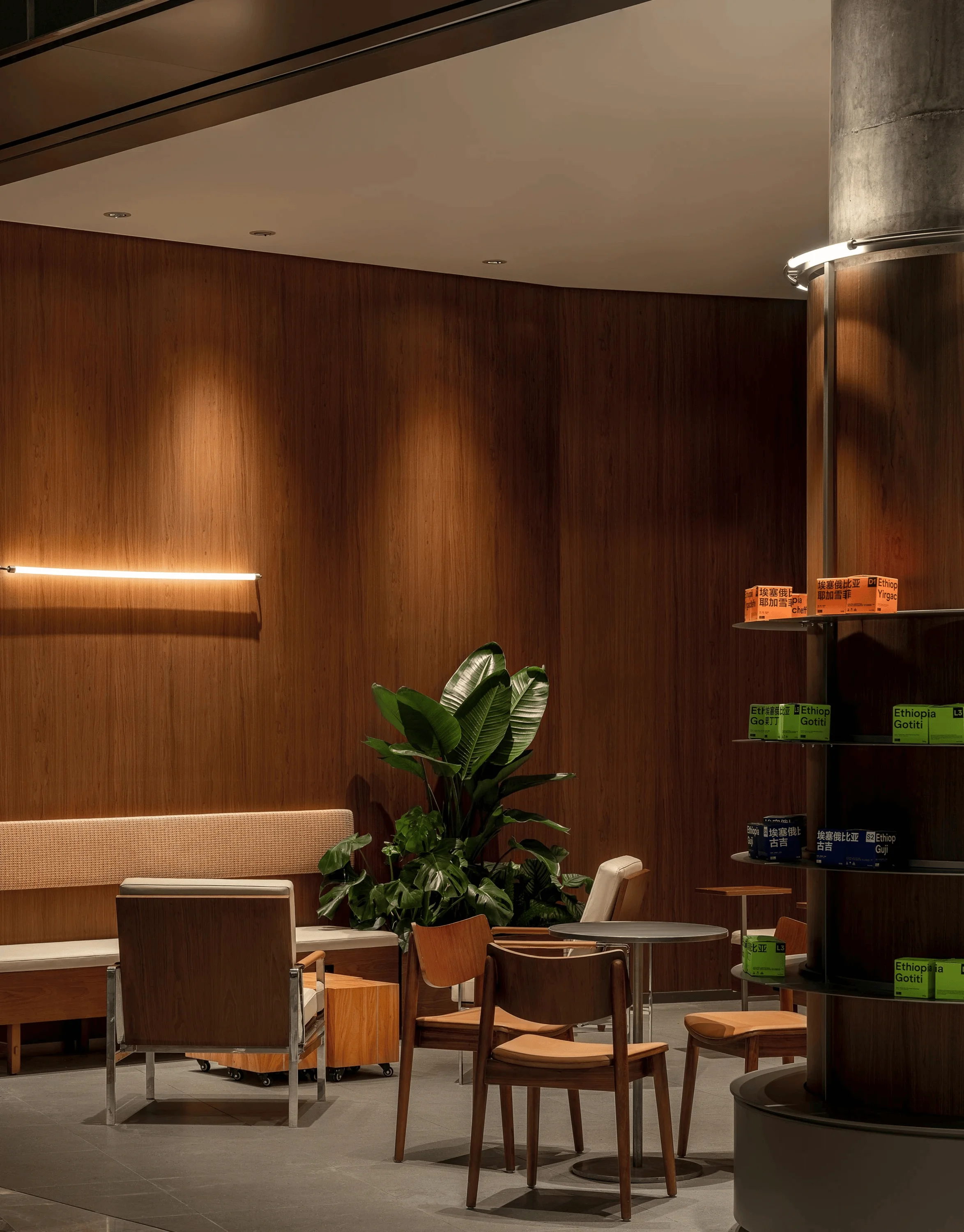
Grid Coffee’s furniture design thoughtfully incorporates local cultural elements, seamlessly blending modern design with traditional craftsmanship. Inspired by the Shu brocade loom, a significant part of Chengdu’s cultural heritage, elements of the loom are integrated into the furniture design. The design of the booth’s single table leg and the communal table’s overall structure incorporates and reflects the elements of the Shu brocade loom, linking it to traditional Chinese mortise and tenon structures. This showcases respect for local craftsmanship and reinforces the brand’s connection to its cultural context. This strategy aims to integrate the essence of this traditional craft into the contemporary space, creating an artistic environment that honors the past while embracing the present. grid system design and local culture elements are the core of this project.
Shu Brocade Art Installation and Layout Design
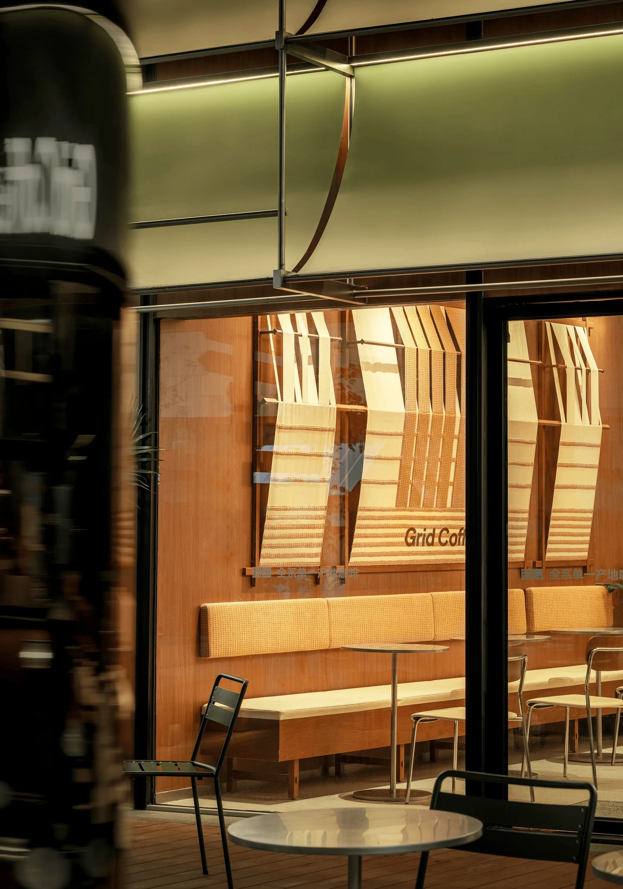
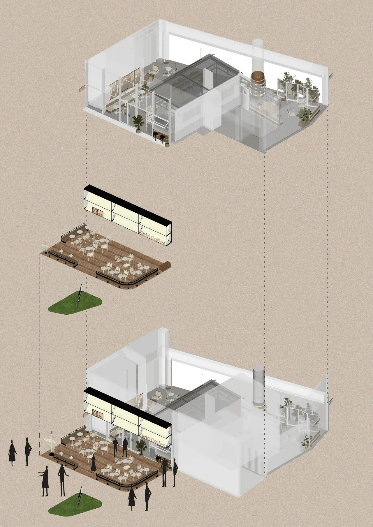
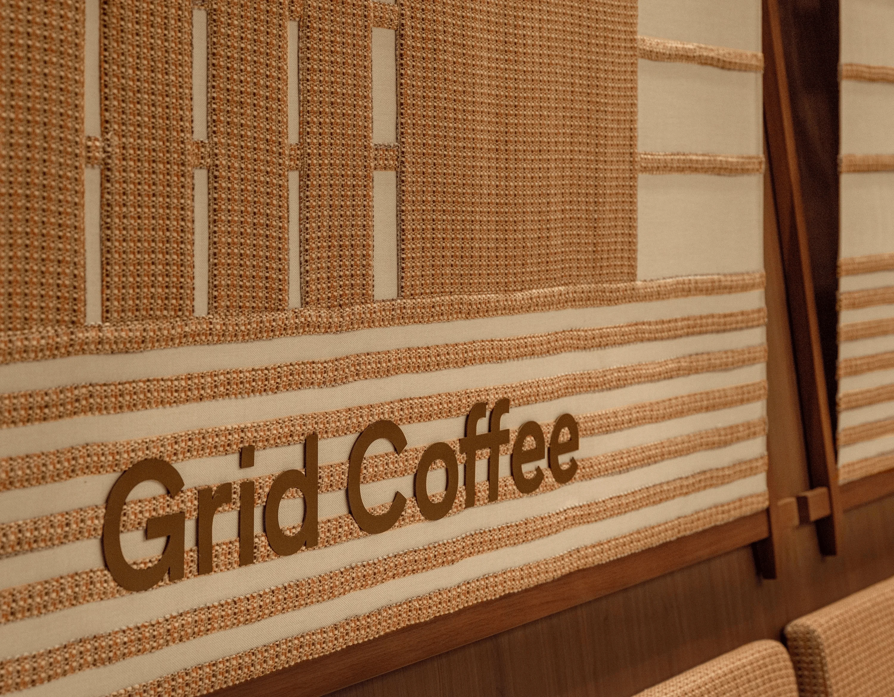
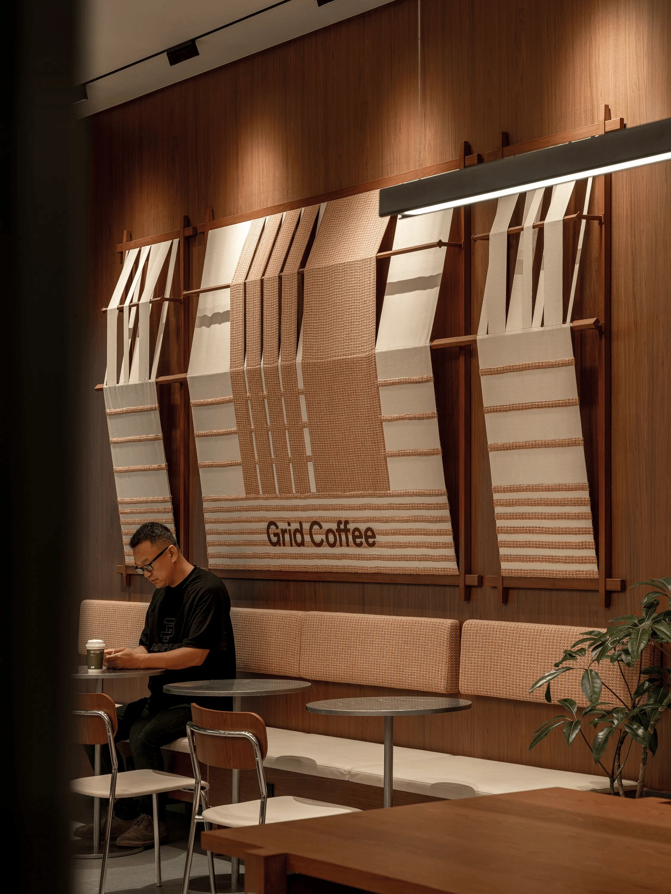
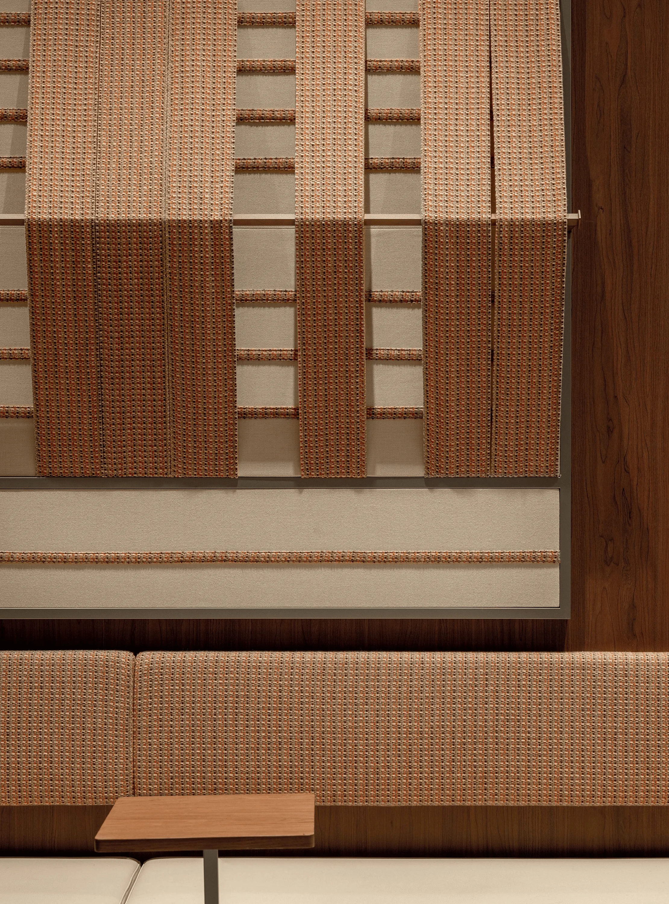
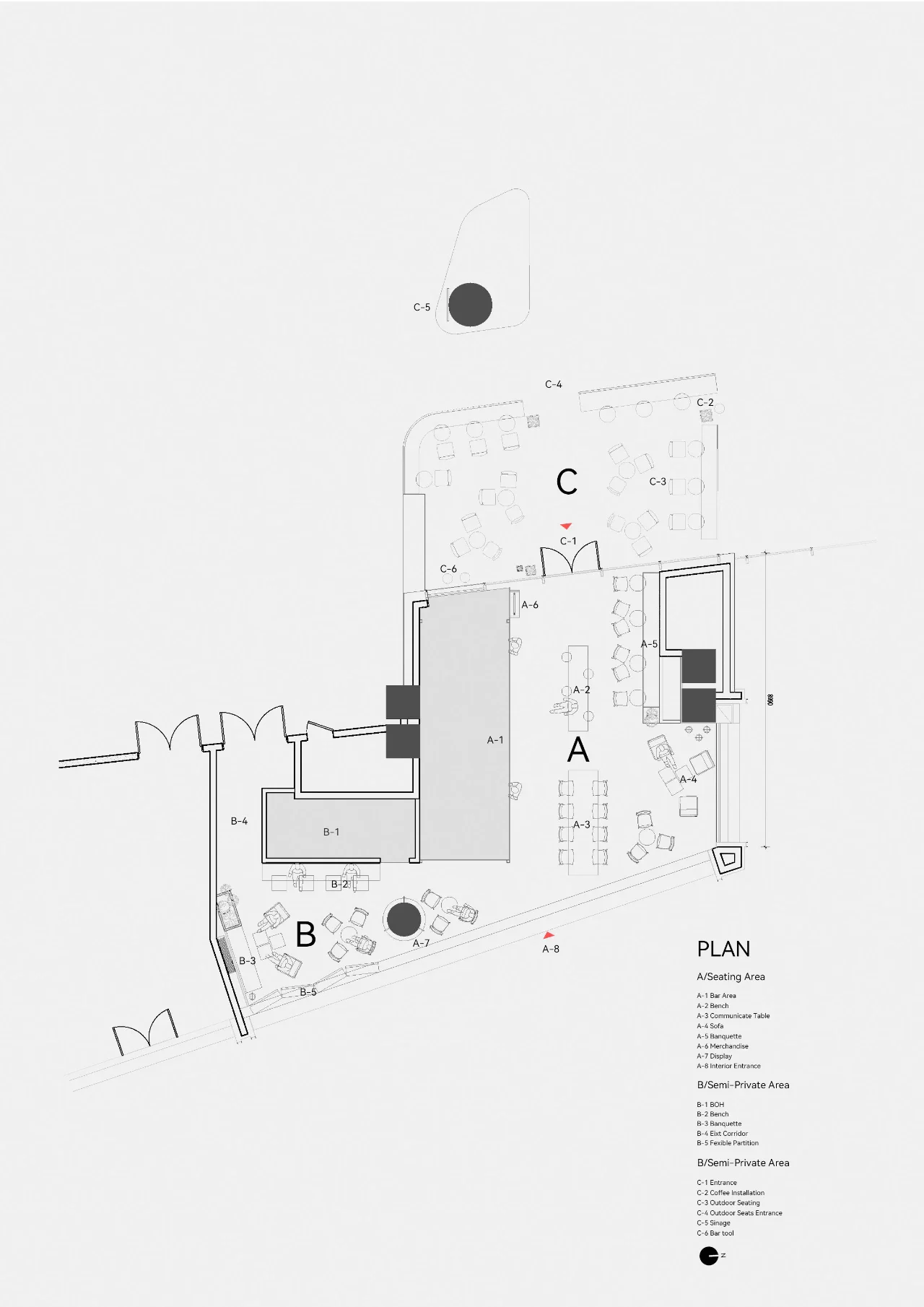
The Shu brocade art installation further reinforces the integration of local culture into the design. By drawing inspiration from the rich patterns and vibrant colors of Shu brocade, the installation aims to celebrate the beauty of this traditional craft in a modern context. The design emphasizes both heritage and innovation. Traditional Shu brocade patterns like auspicious clouds, mythical beasts, and floral motifs are deconstructed and restructured into abstract or figurative forms, appearing on surfaces like walls, floors, ceilings, and furniture. This creates a visual continuity and surprise throughout the space. The space’s layout is a testament to thoughtful design choices. The entrance facade spans nearly 16 meters, featuring double fire shutters and a direct view of the mall’s busiest escalator area. Normally, such a long facade would be enclosed for comfort and design purposes. However, after analyzing the surrounding environment and foot traffic, the designers opted for an open design. This decision provides flexibility for future events and foot traffic control, actively attracting customers to the interior, and driving sales conversion. grid system design and local culture elements are the core of this project.
Atmosphere and Experience
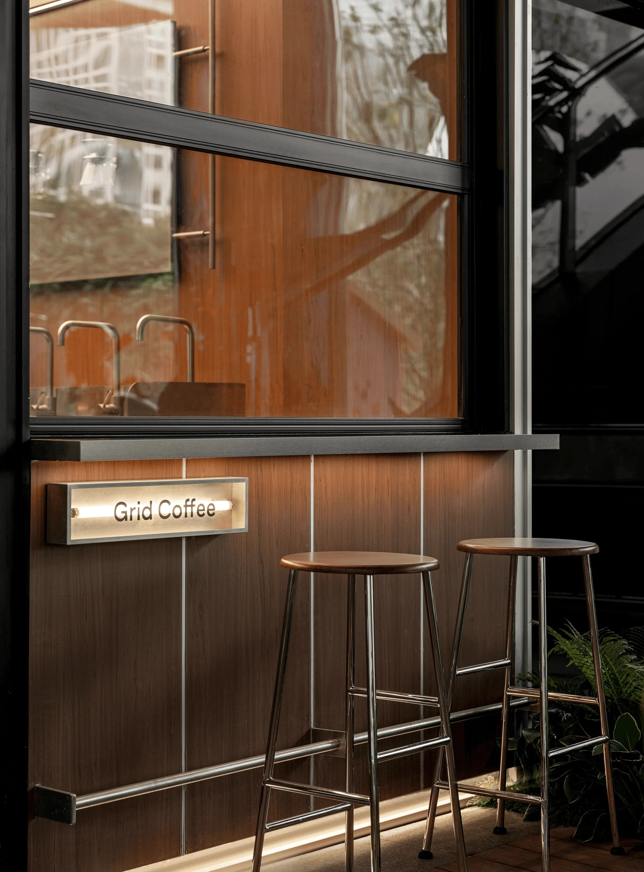
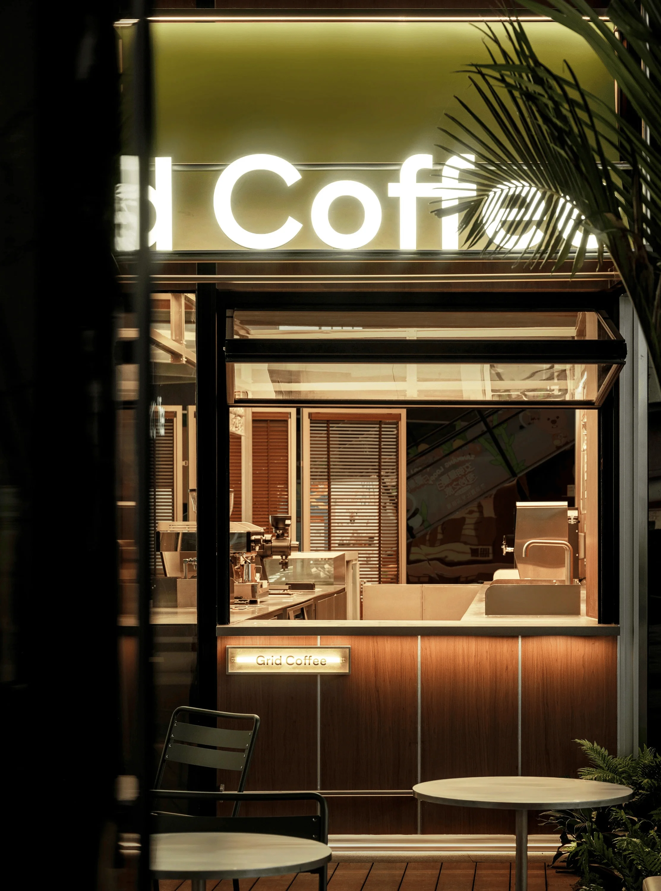
The placement of the bar seamlessly connects with the exterior facade windows, making it a focal point for customers to capture photos and creating a visual connection between the interior coffee-making process and the exterior environment. This subtly encourages engagement with the brand, influencing people to associate positive experiences with Grid Coffee each time they pass by the store. The thoughtful design choices, the integration of grid system design and local cultural elements, and the brand’s focus on single-origin coffee, all contribute to a unique and memorable experience for customers. grid system design and local culture elements are the core of this project.
Project Information:
Project Type: Commercial Space Interiors Design
Architect: Spider Creative
Area: Not specified
Year: Not specified
Country: China
Materials: Ultra-thin steel plates, Shu brocade elements
Photographer: Tupai Visual


