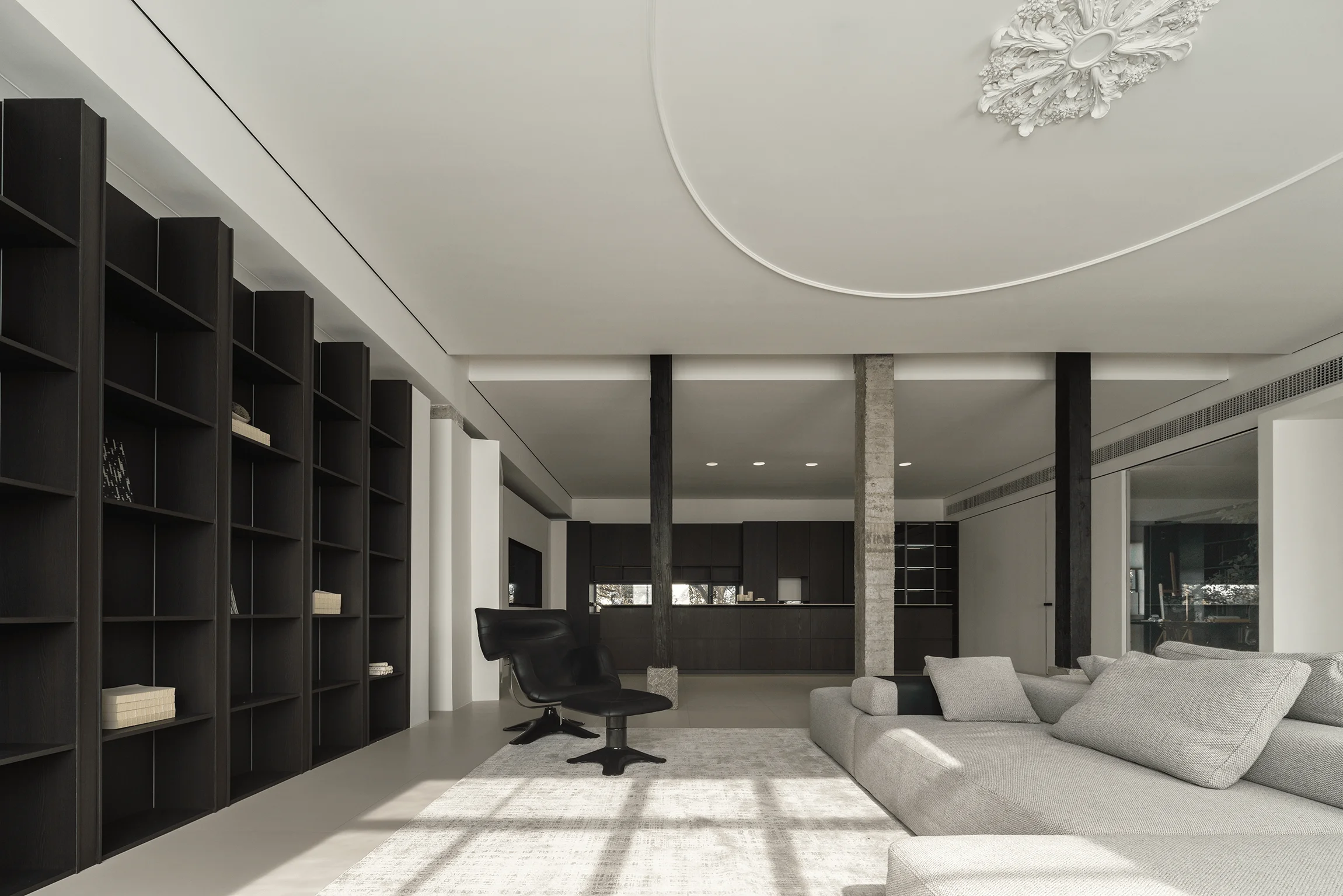
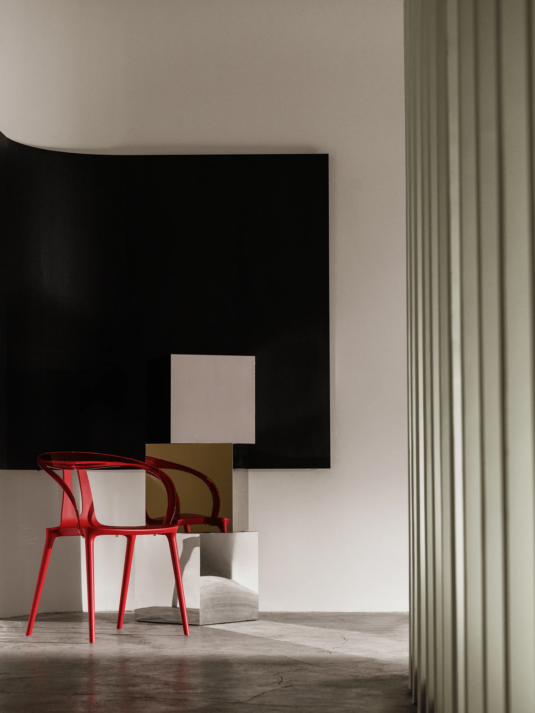
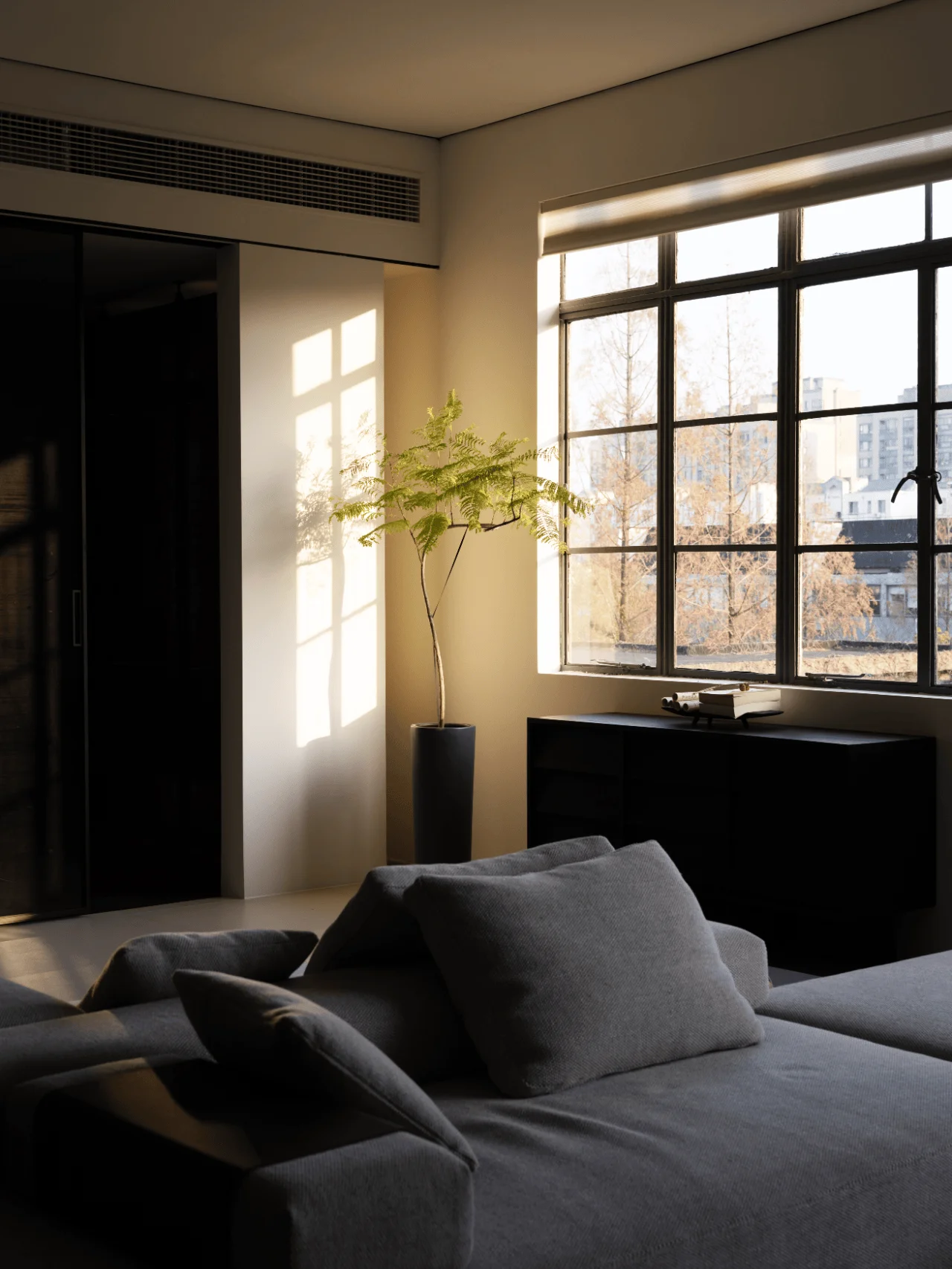
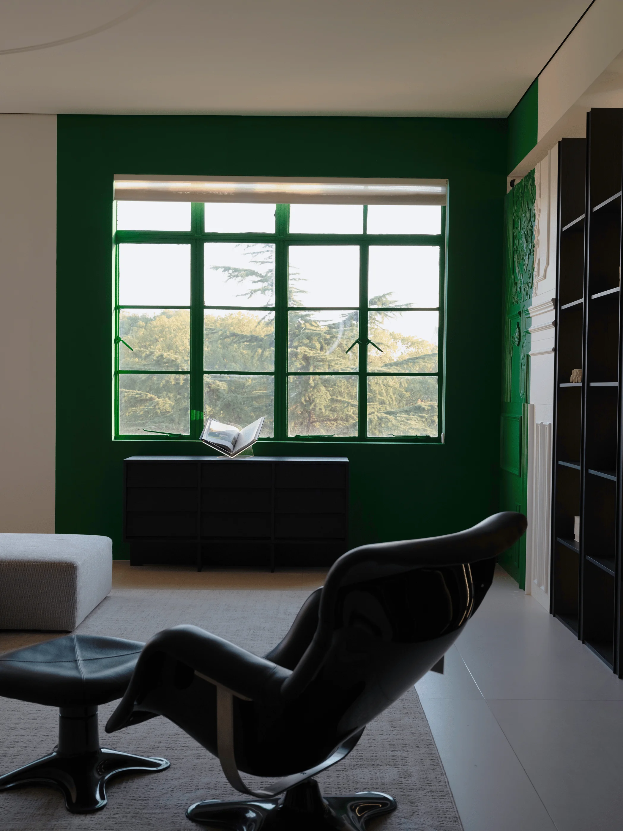
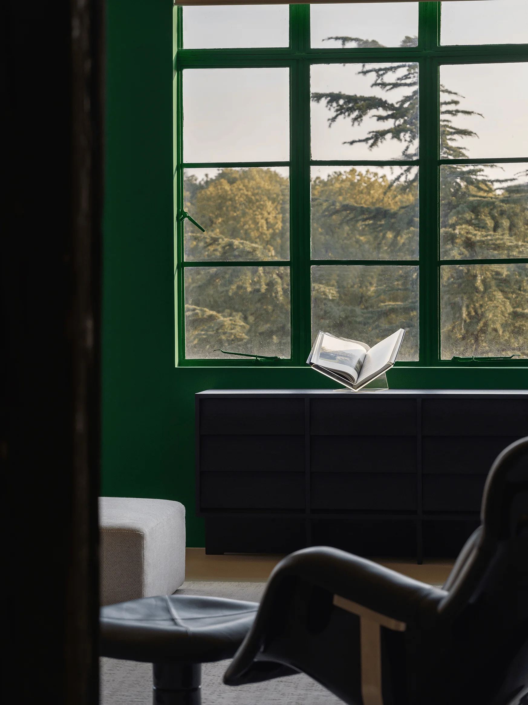
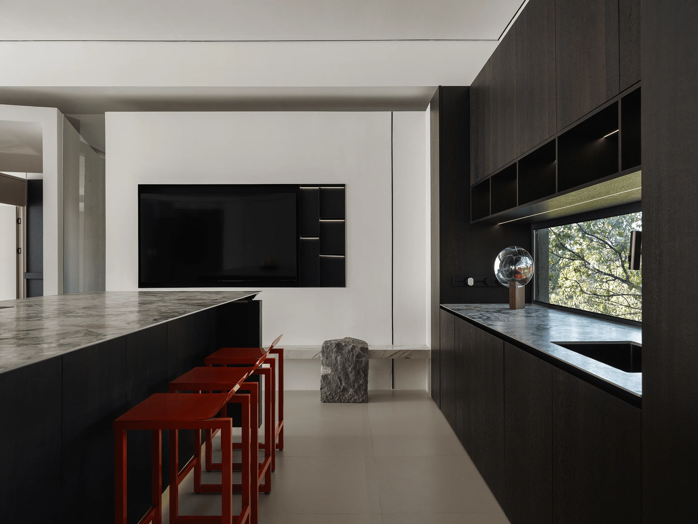
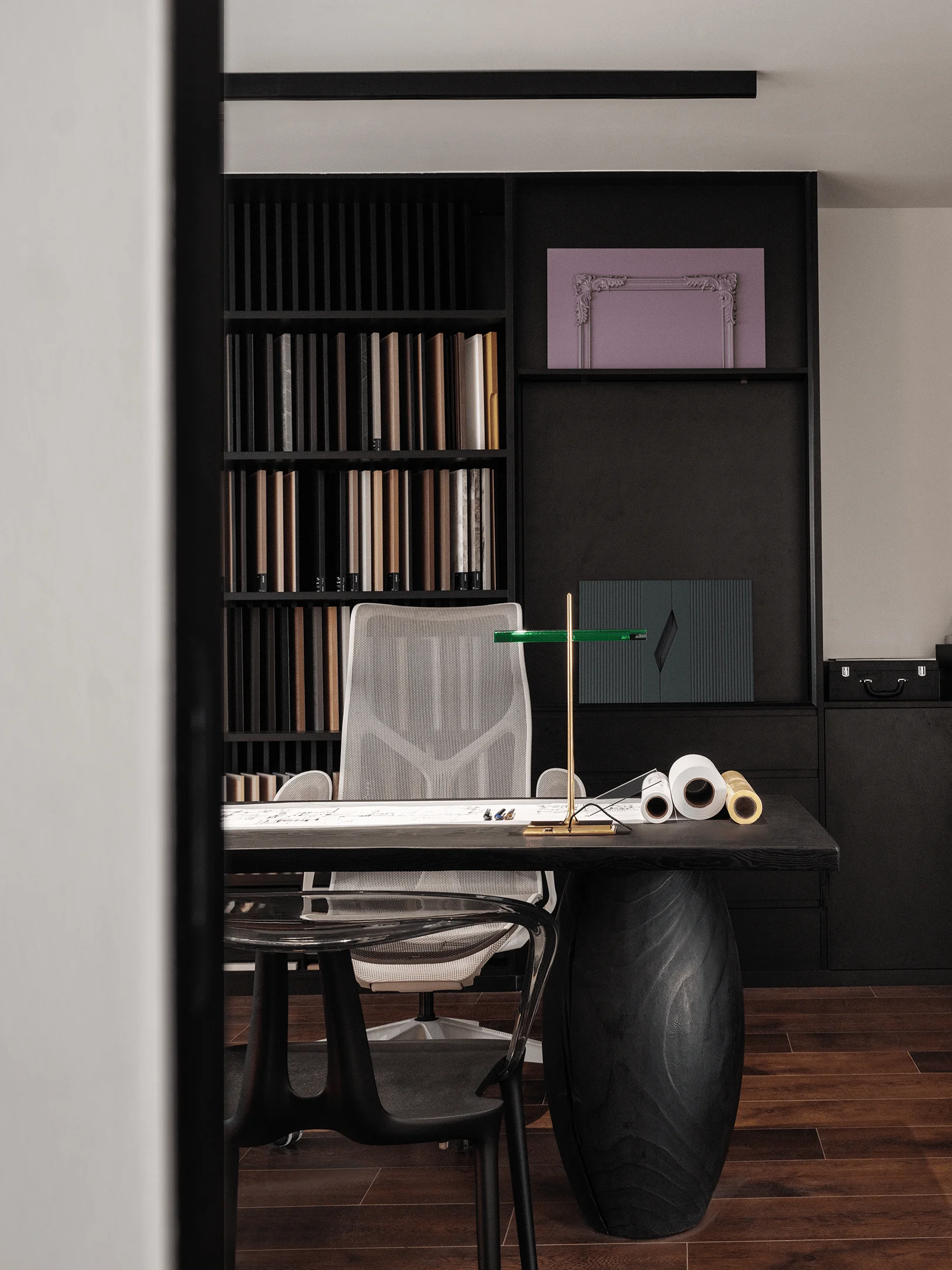
XMIND HOME showroom in Suzhou integrates traditional ‘ting’ design with modern aesthetics.
Contents
Project Background and Brand Philosophy
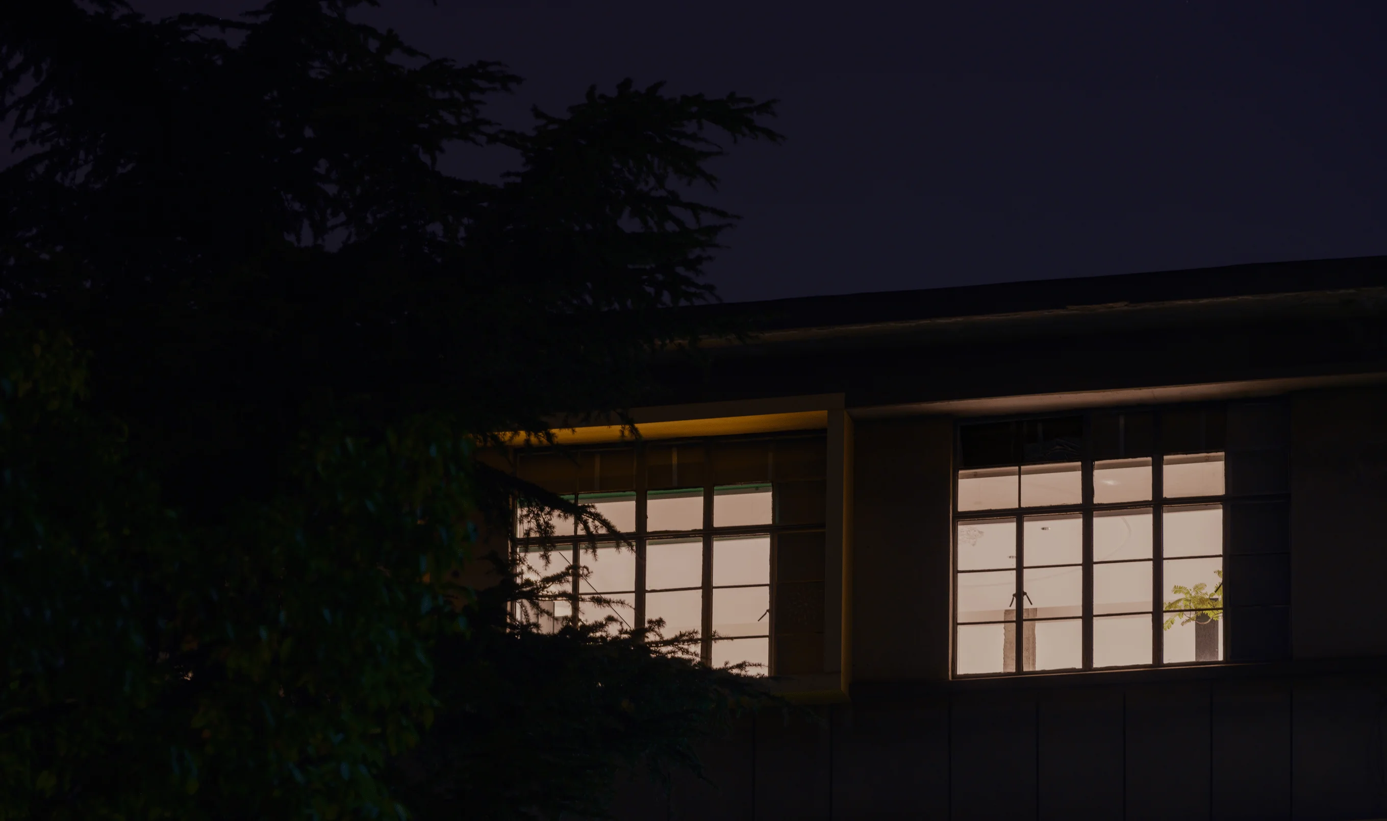
XMIND HOME, a wood products brand established by two young entrepreneurs, draws inspiration from the Chinese traditional 24 solar terms, specifically ‘Xiao Man’. This concept signifies the gradual maturation of nature, representing the potential for growth and perfection. The ‘Xiao Man’ philosophy seamlessly integrates with the showroom design, embracing the brand’s commitment to detail and quality while showcasing the beauty of wood craftsmanship through modern design. The showroom is located within a former library building in Suzhou University’s North Campus, a 1980s structure that has retained its unique architectural elements, becoming a canvas for the brand’s contemporary interpretation.
Design Inspiration: ‘Yue Ting’ (Soaring Pavilion)
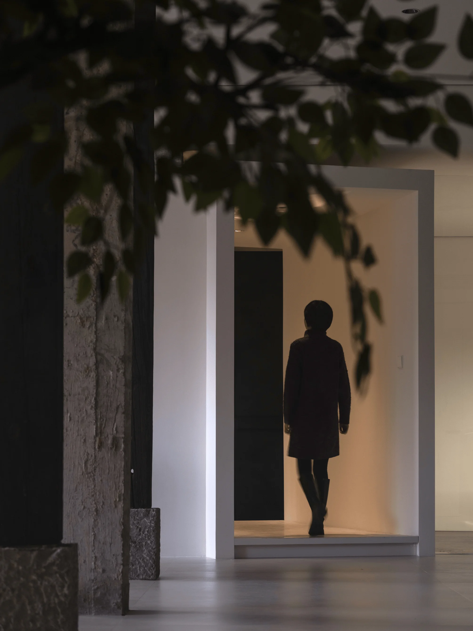
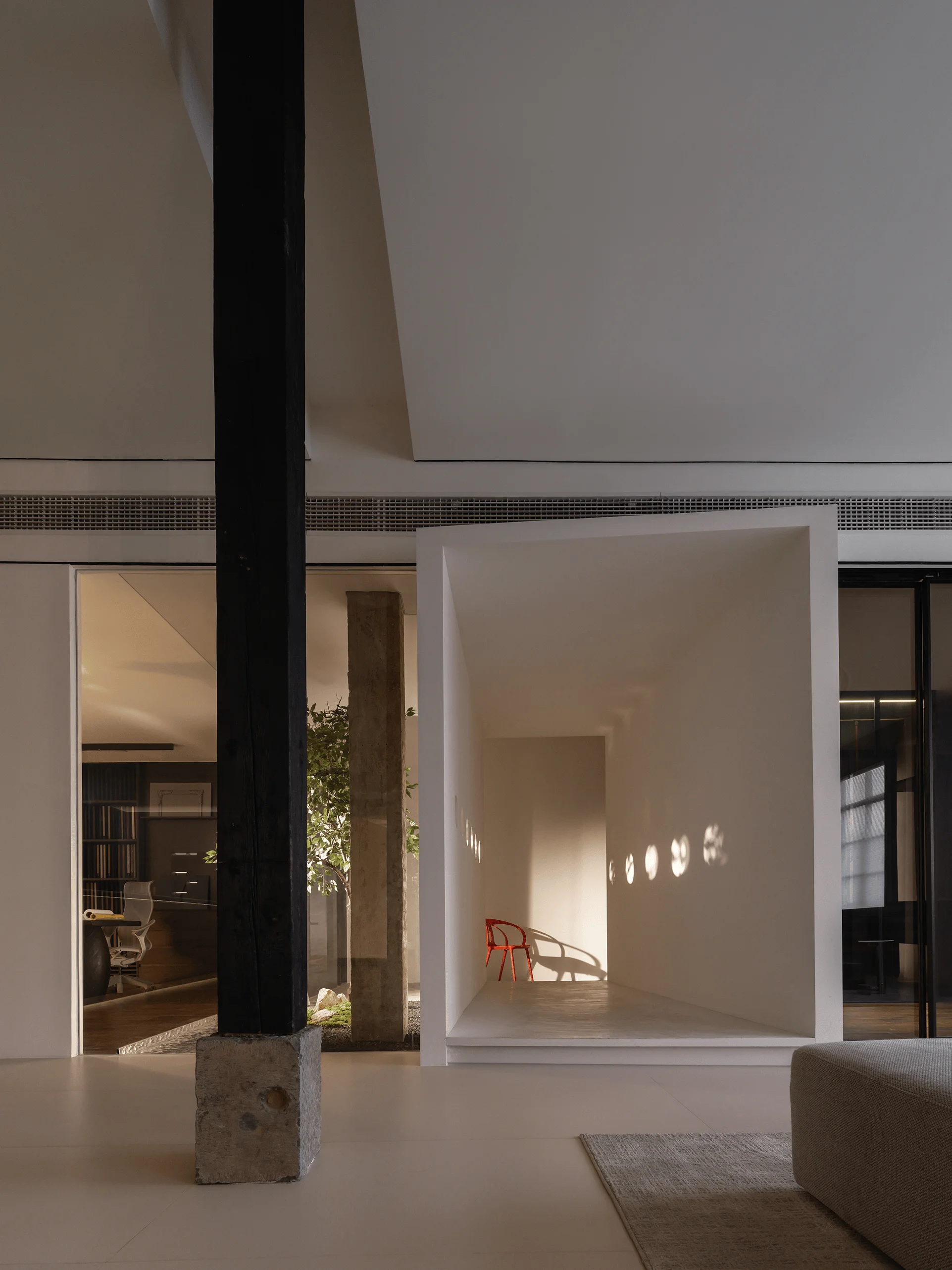
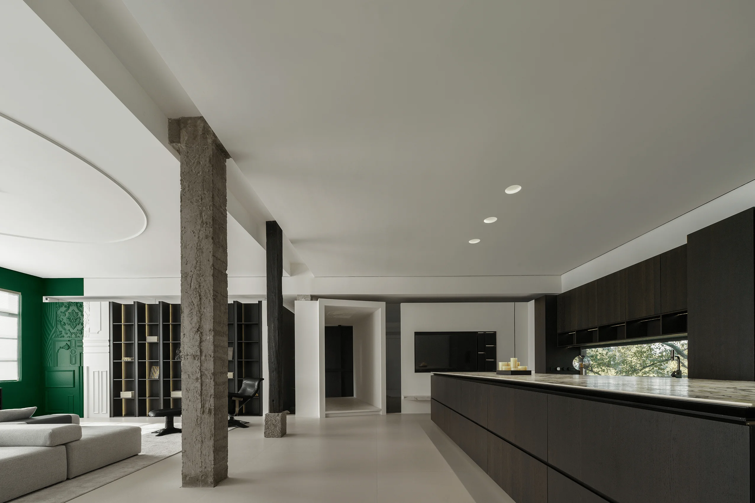
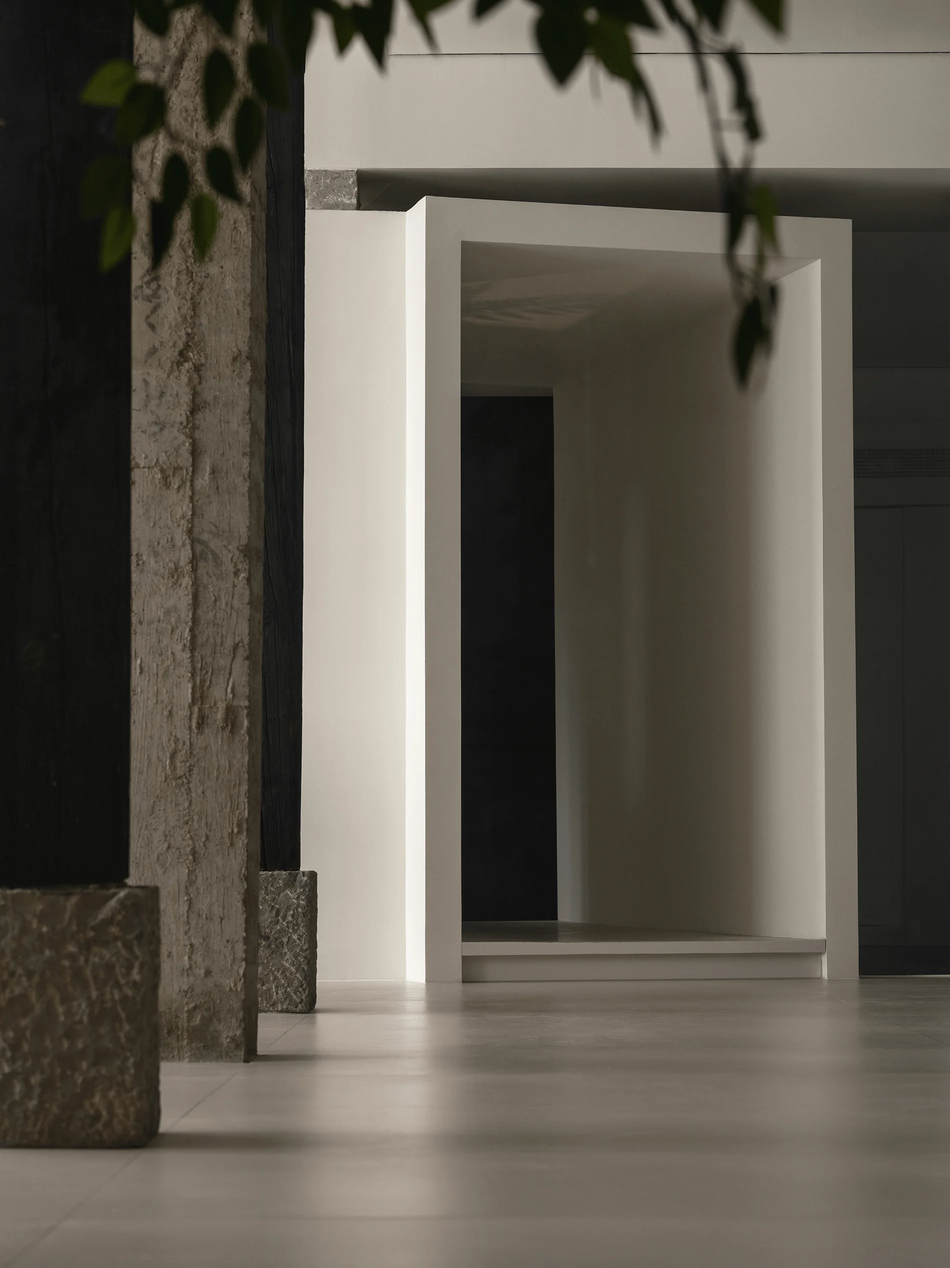
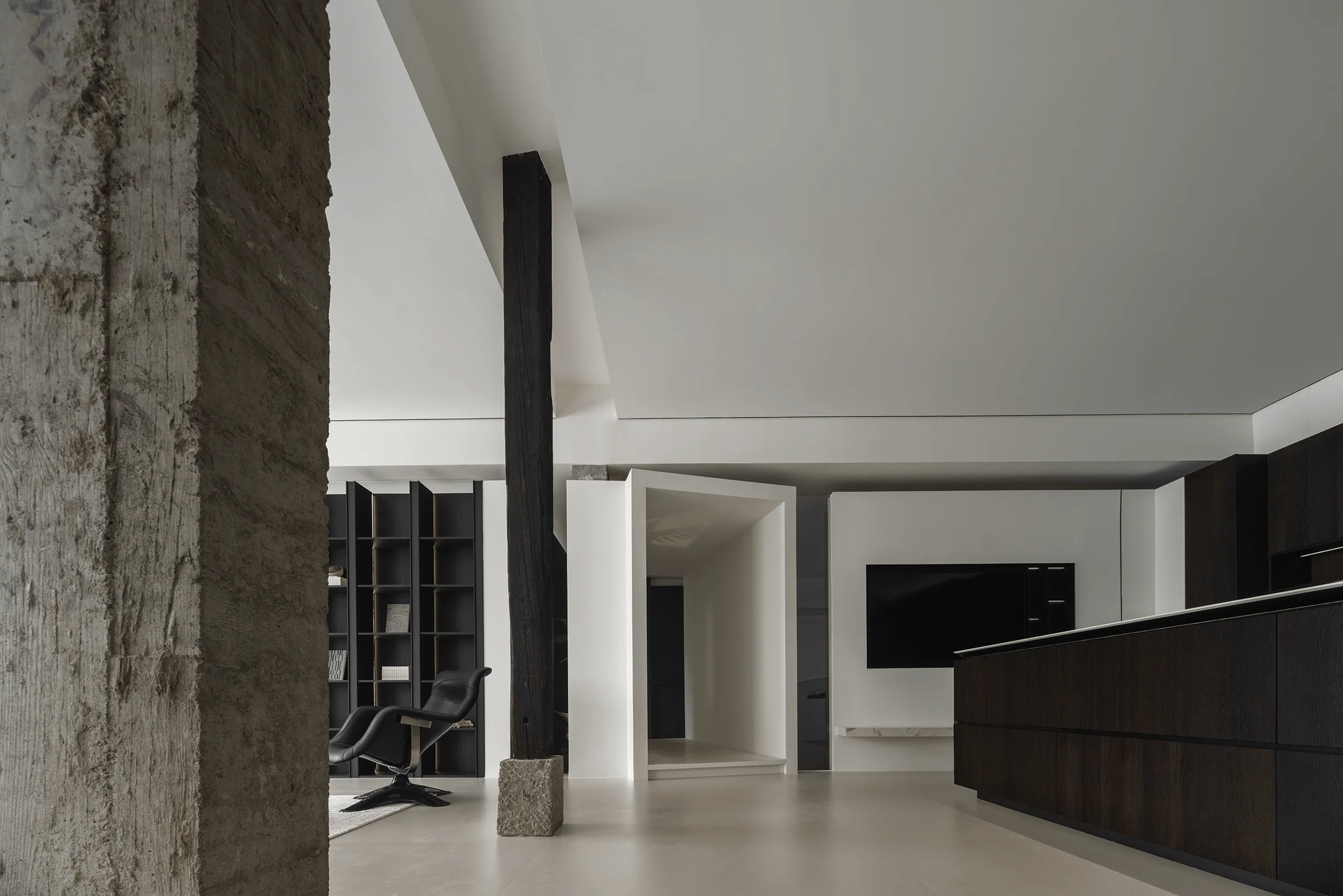
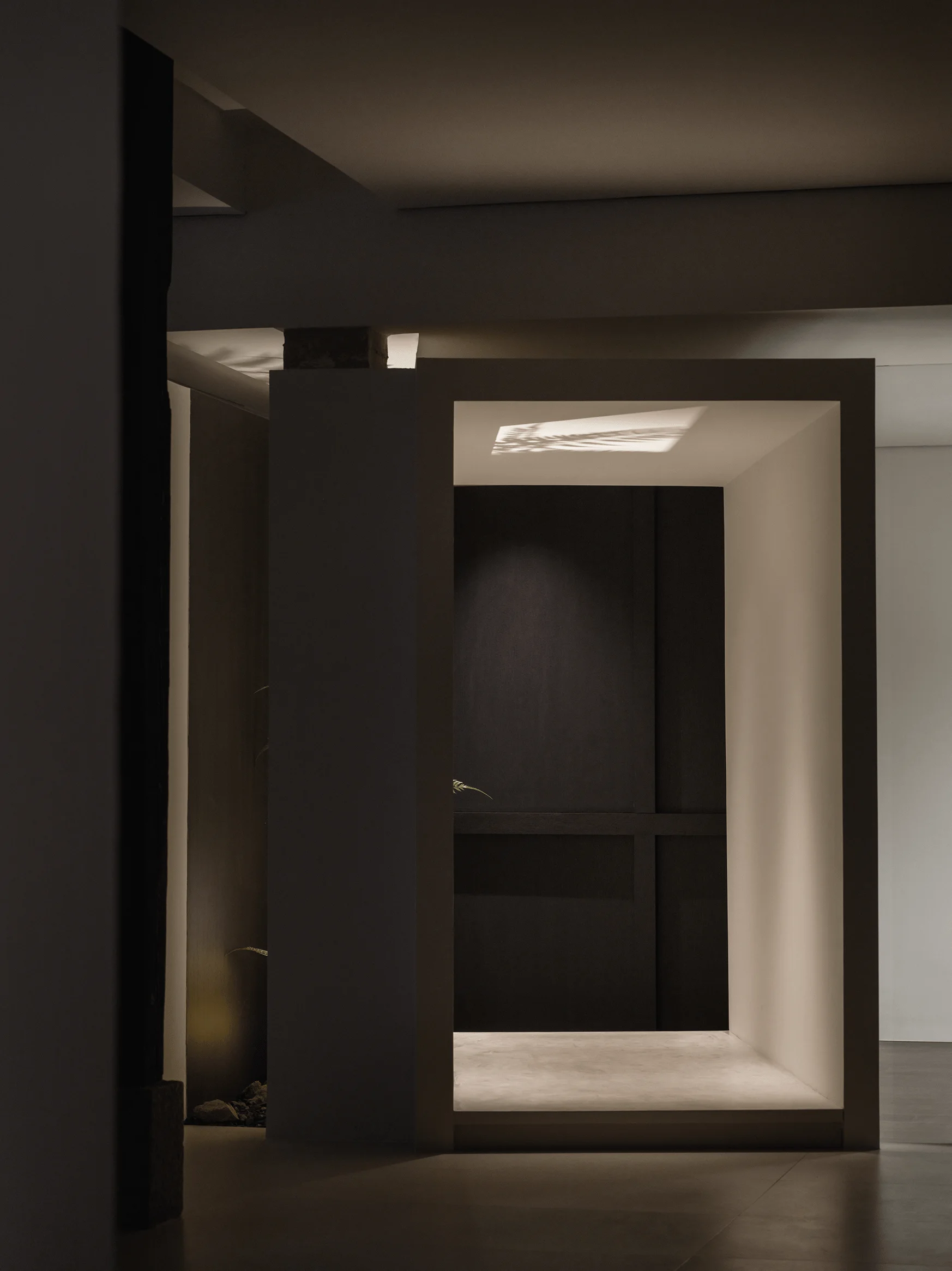
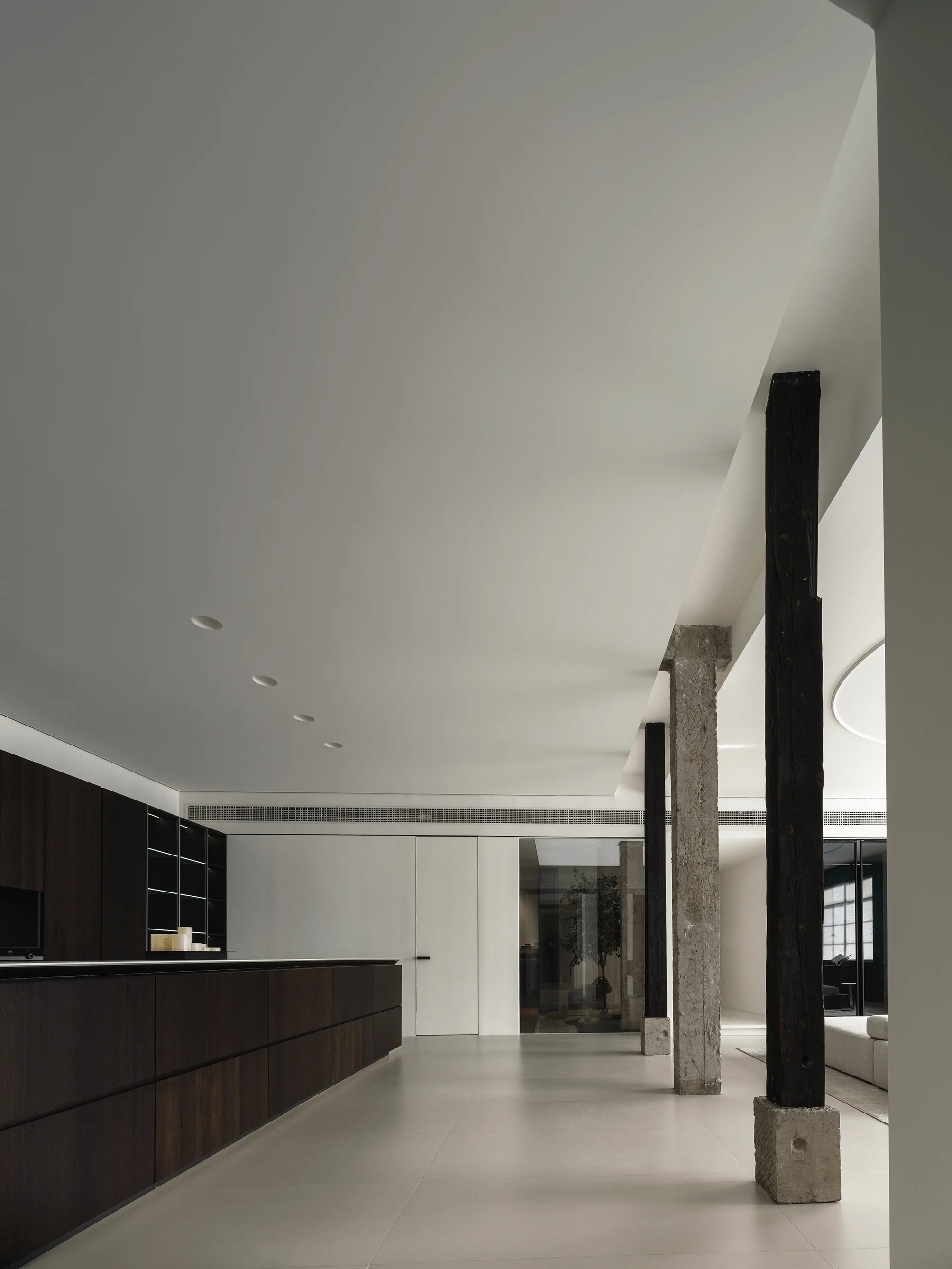
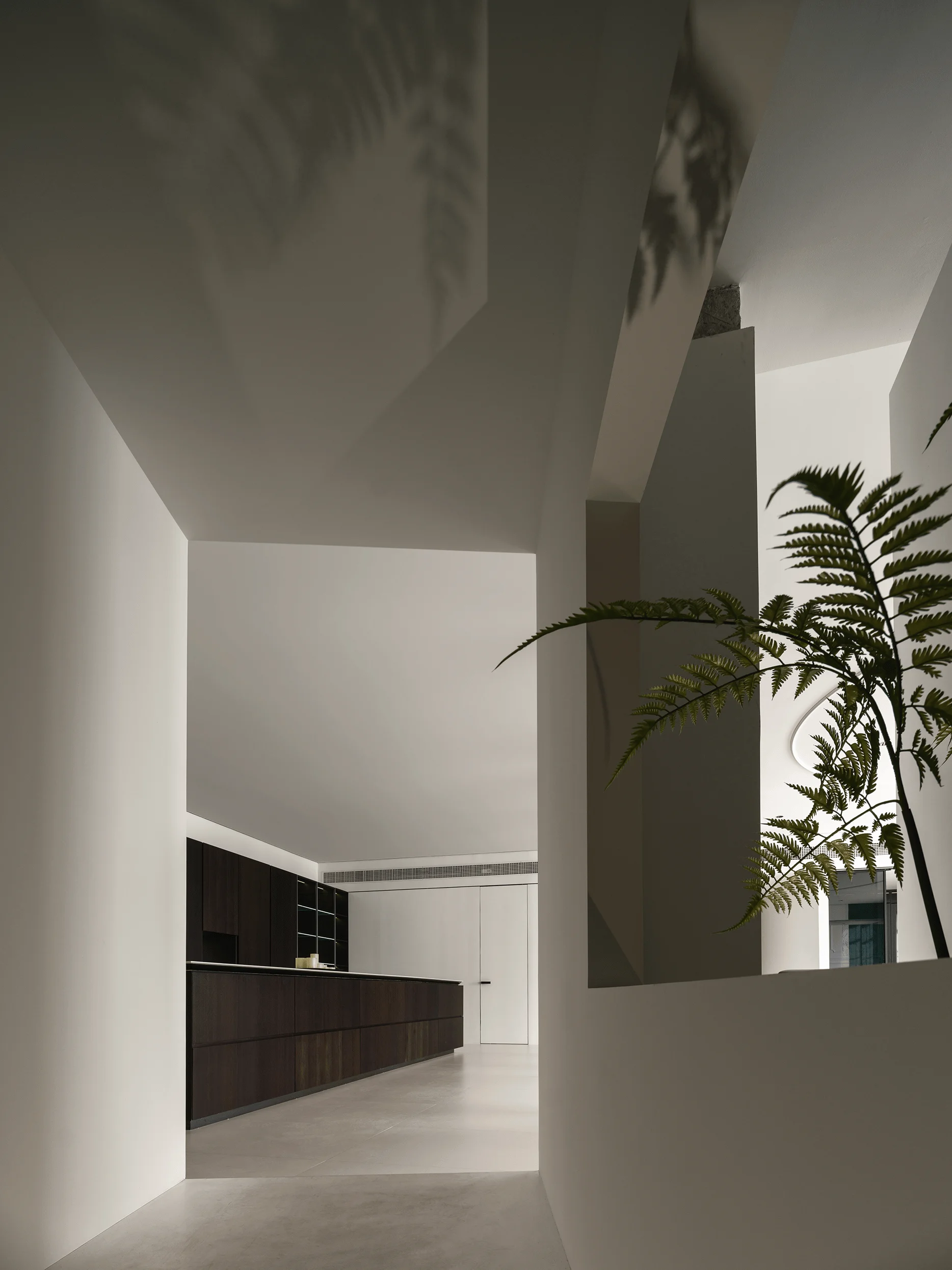
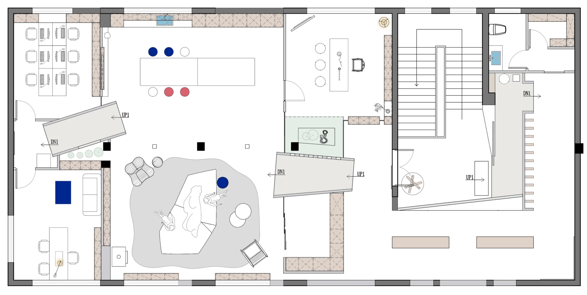
UGG Design sought inspiration from the traditional Chinese ‘ting’ (pavilion), developing the spatial concept of ‘Yue Ting’ (soaring pavilion). Historically, ‘ting’ structures served as a respite for people, offering a space for observation and refuge. This concept carries a rich history and literary associations. UGG Design utilized two rectangular ‘ting’ shapes as functional boundaries, forming the core of the space layout. The first rectangular box smoothly transitions from the entry buffer zone to the main exhibition space, while the second guides visitors from the exhibition into the internal office and reception areas. This transition across ‘ting’ structures grants each functional zone a unique spatial experience, highlighting the significance of the pavilion as a space-defining element. The design is also rooted in a unique Chinese architectural design style that is rarely seen in modern commercial and residential spaces.
‘Xiao Man’ and ‘Yue Ting’ in Harmony
The ‘Xiao Man’ and ‘Yue Ting’ concepts intertwine seamlessly in the showroom’s spatial design, crafting an environment that embraces both traditional cultural nuances and contemporary design sensibilities. The first ‘ting’ acts as a transition from the external world into the brand’s identity, gradually revealing its essence and product details. This process, akin to the ‘Xiao Man’ season, unfolds incrementally, showcasing the brand’s unique charm and highlighting the unique architectural design styles. The second ‘ting’ bridges the gap between the exhibition area and the operational and reception areas, symbolizing a leap from showcasing to actual application, emphasizing that the brand is not just a display but an integrated part of daily life. This transition fosters a deeper understanding of the brand’s philosophy and product use, creating a sense of gradual completeness and maturity, like the ‘Xiao Man’ season.
Material Palette and Spatial Ambiance
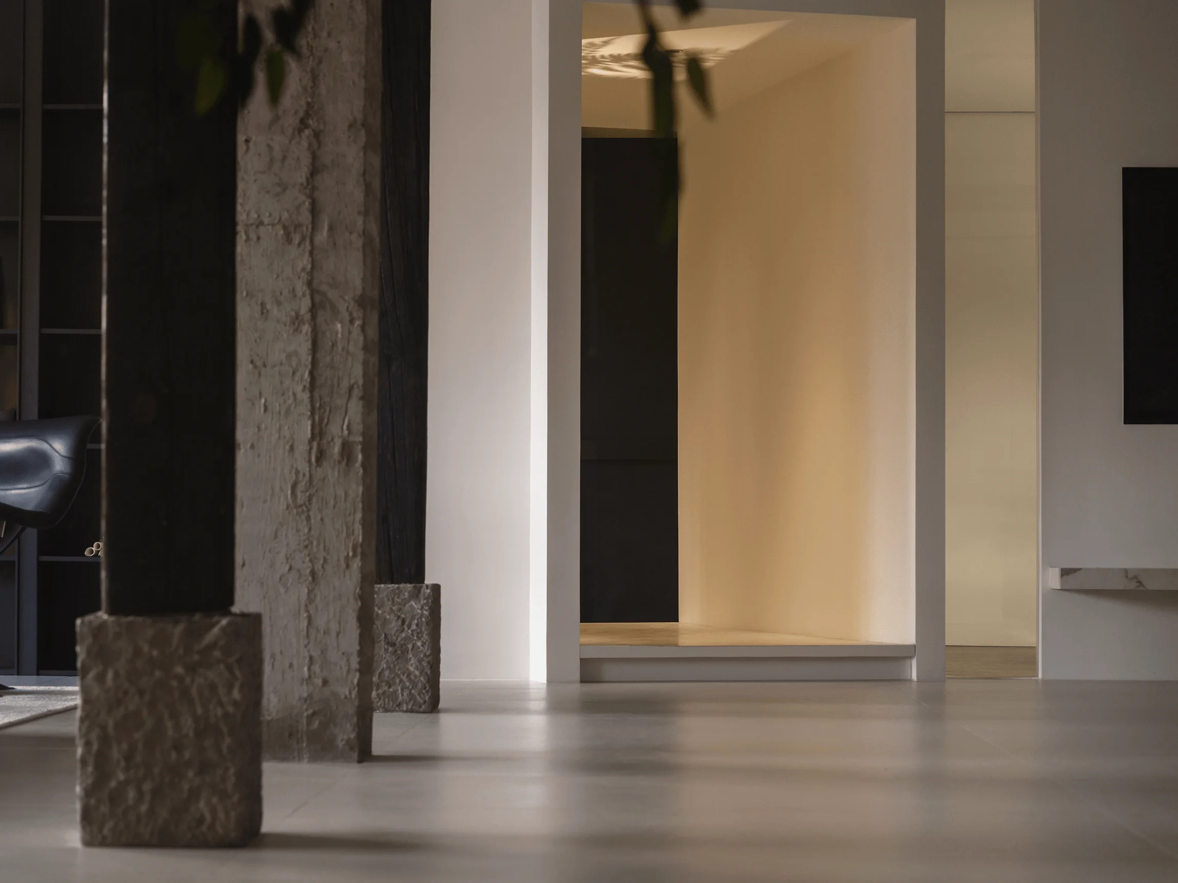
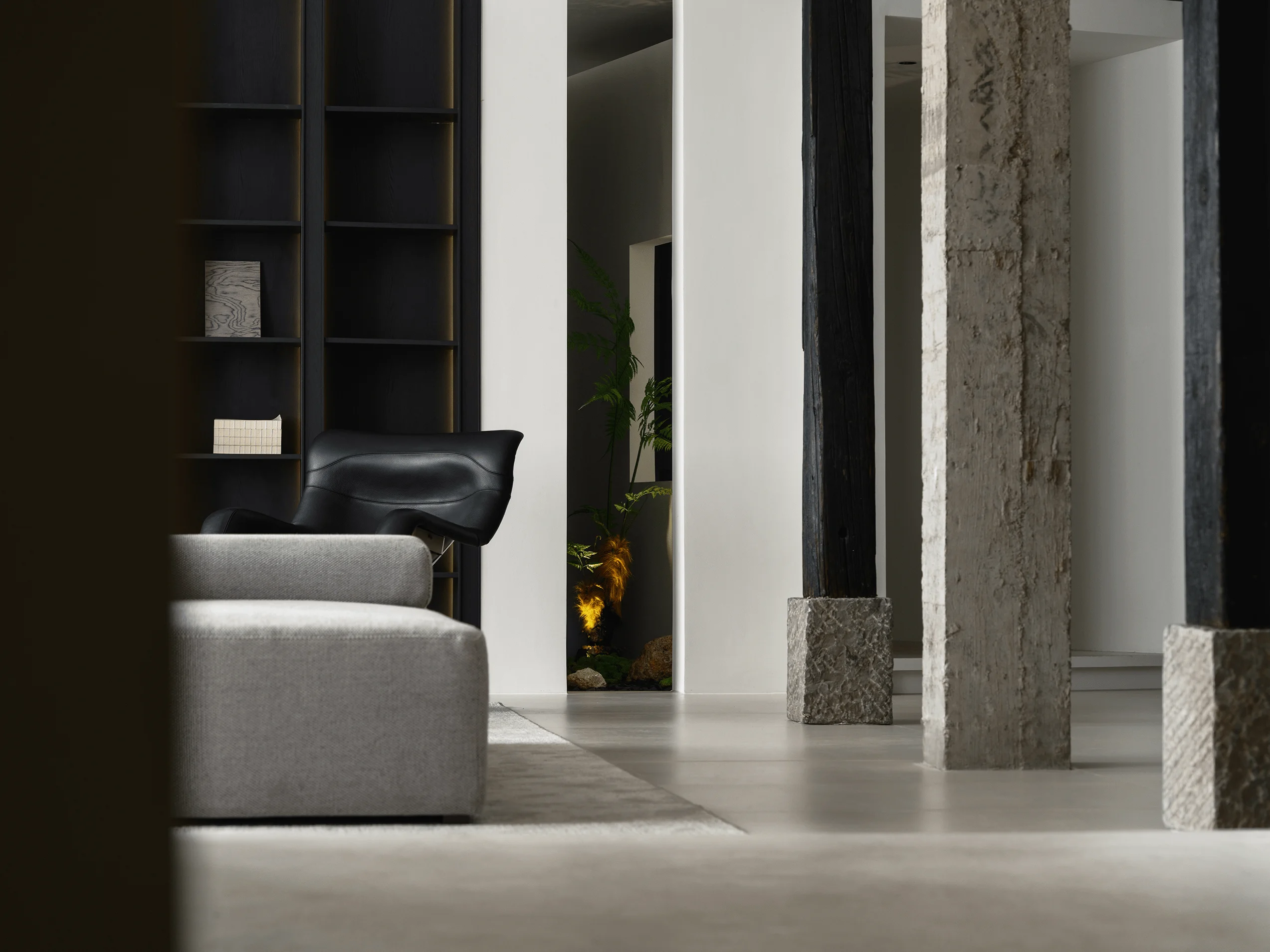
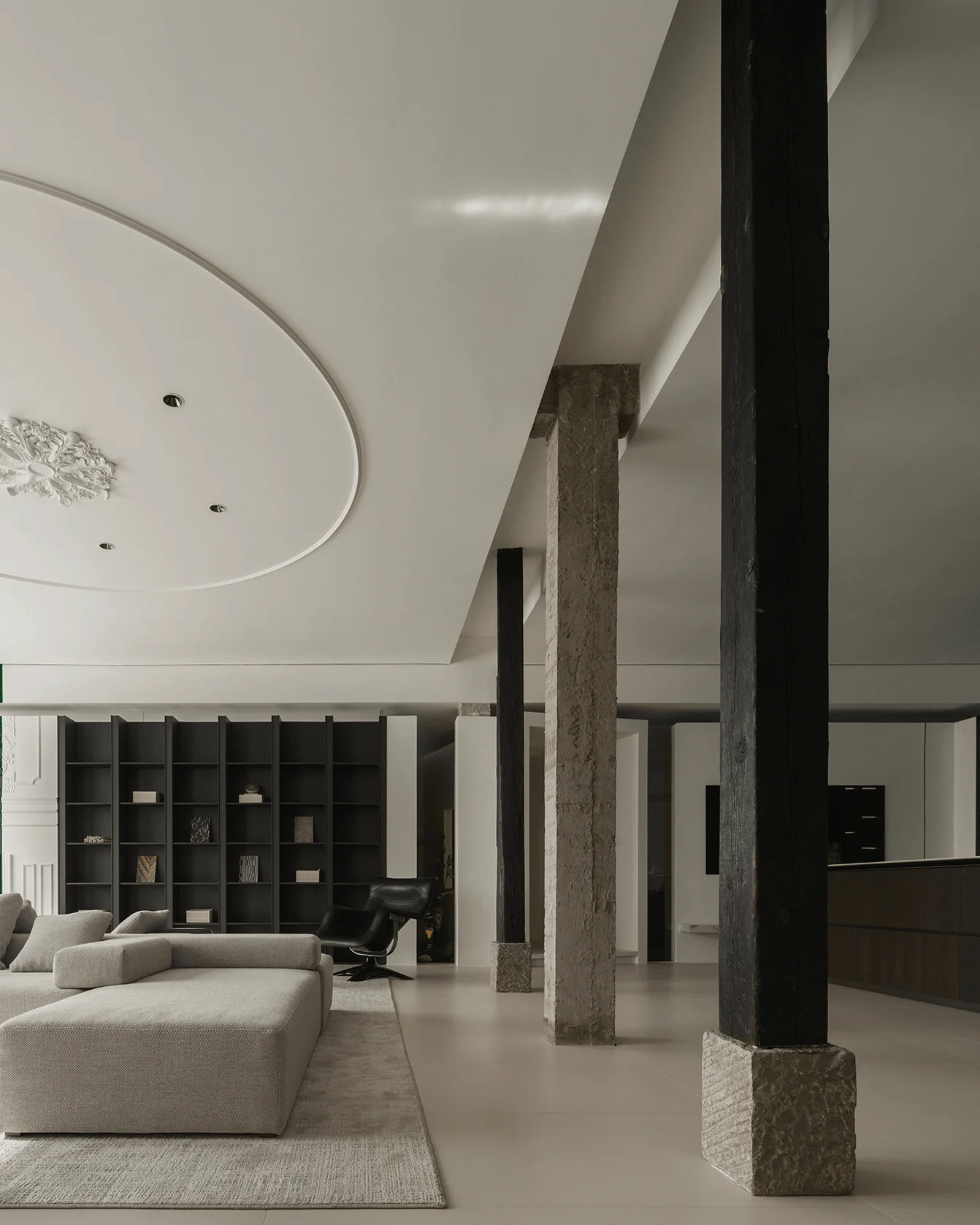
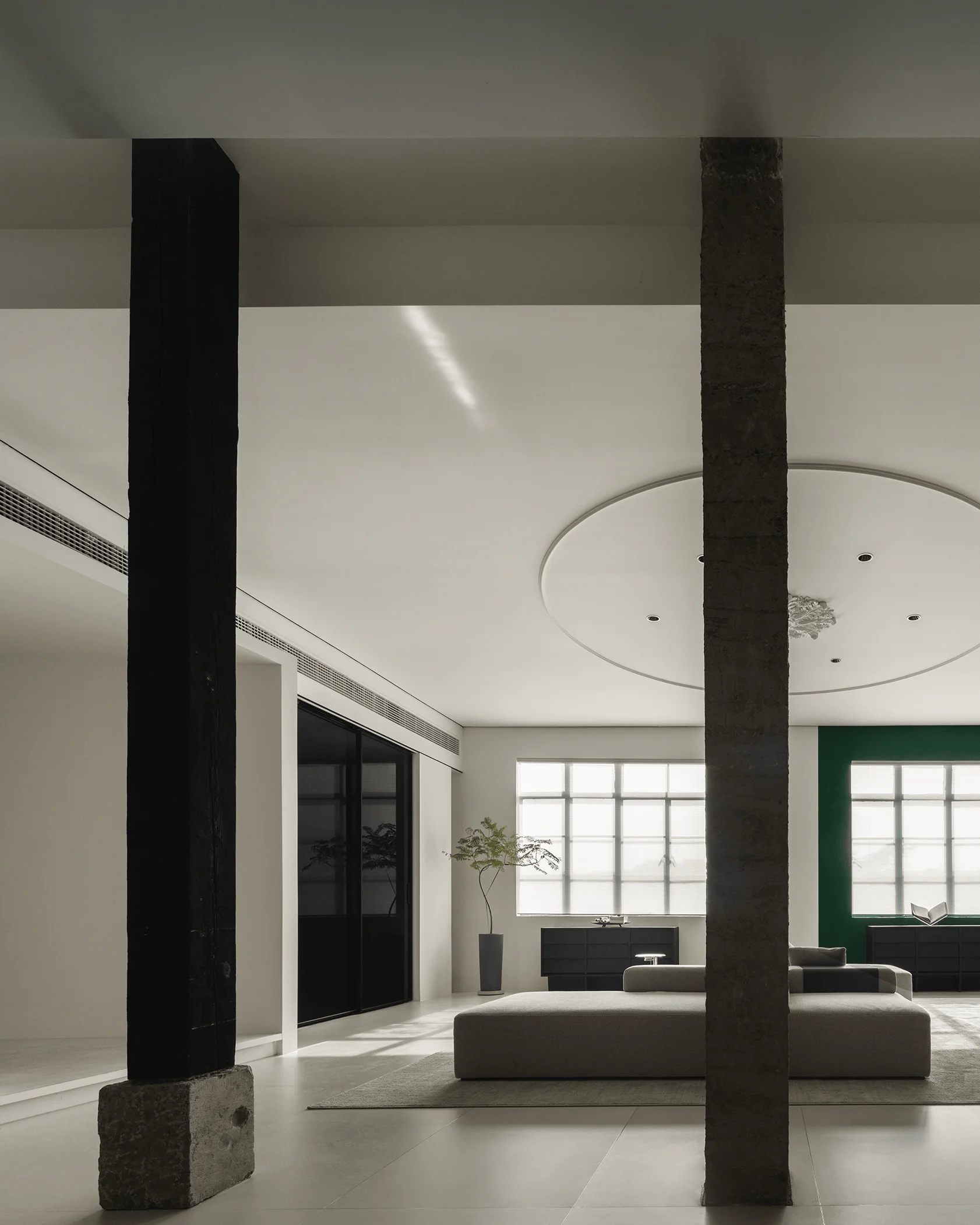
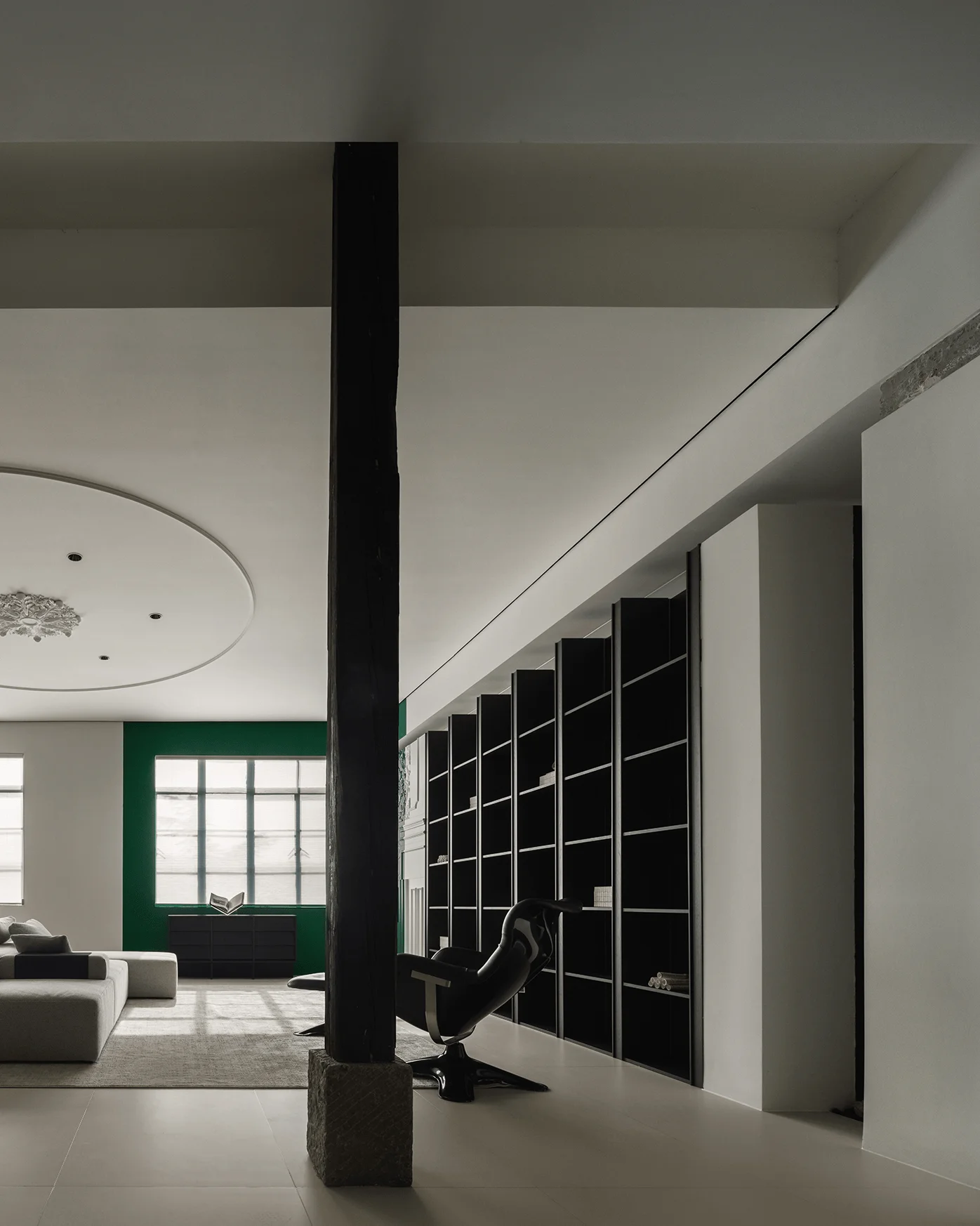
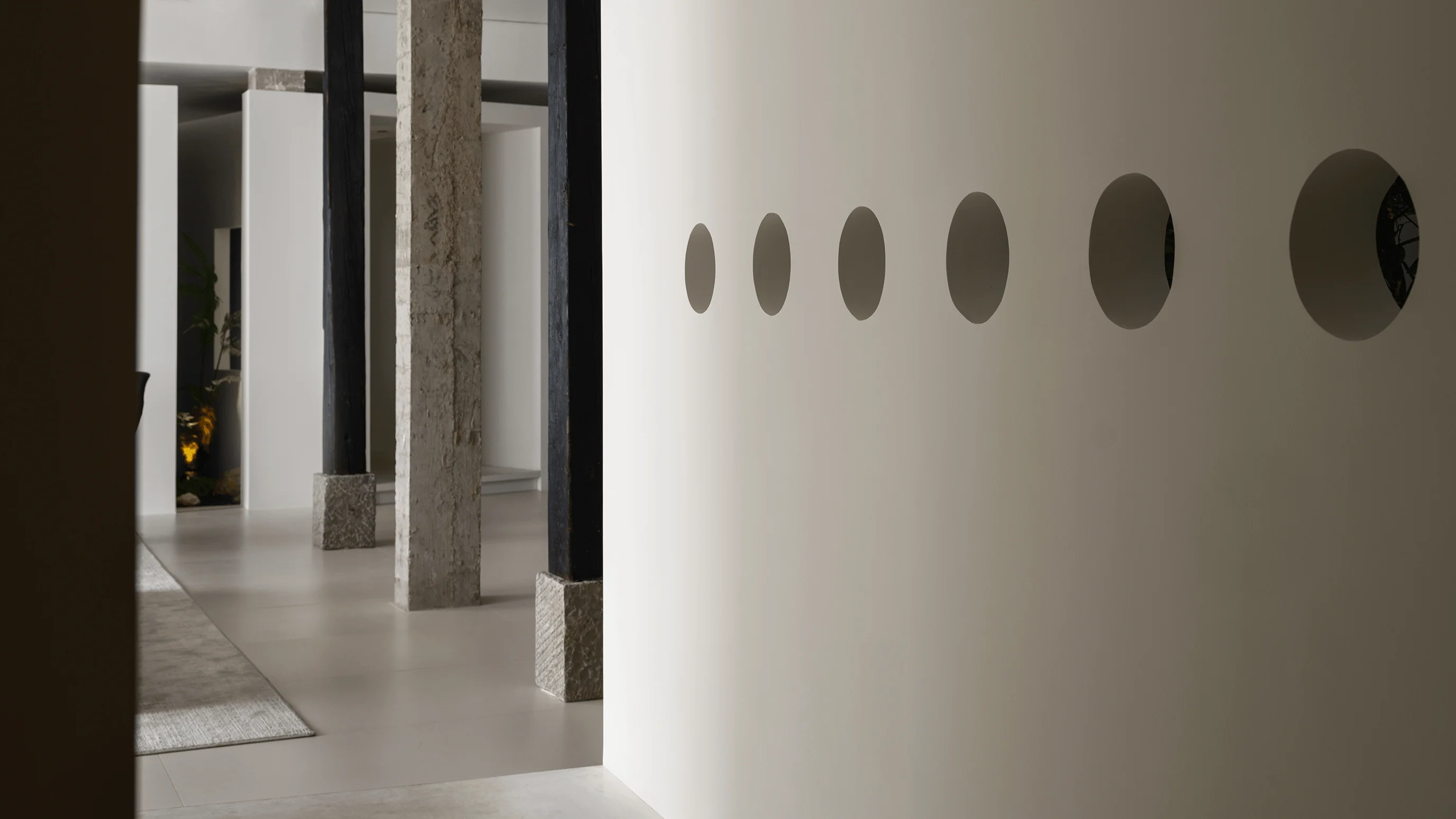
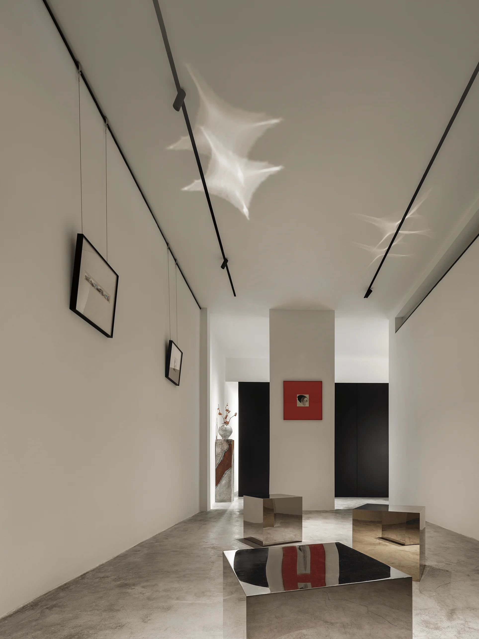
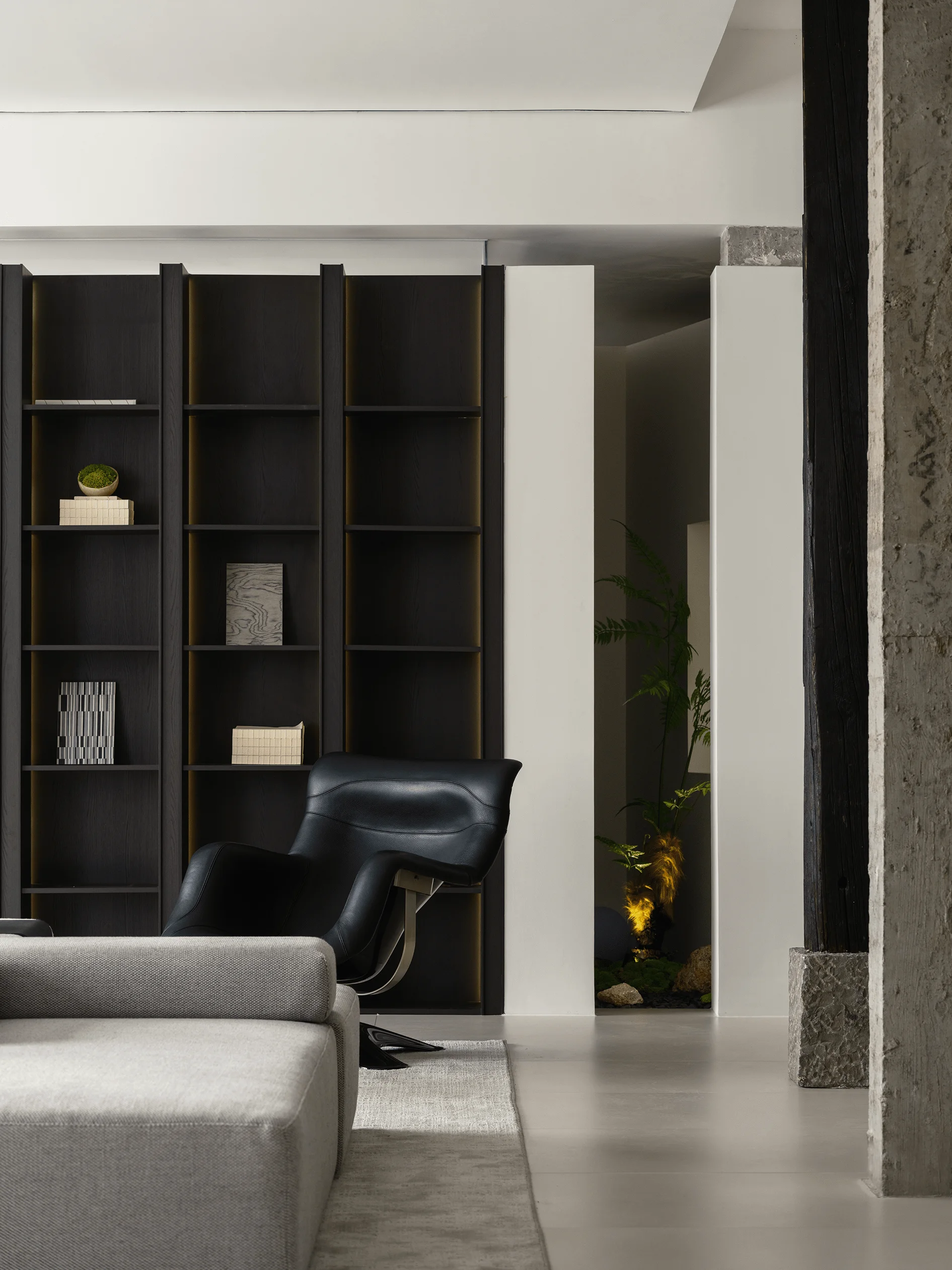
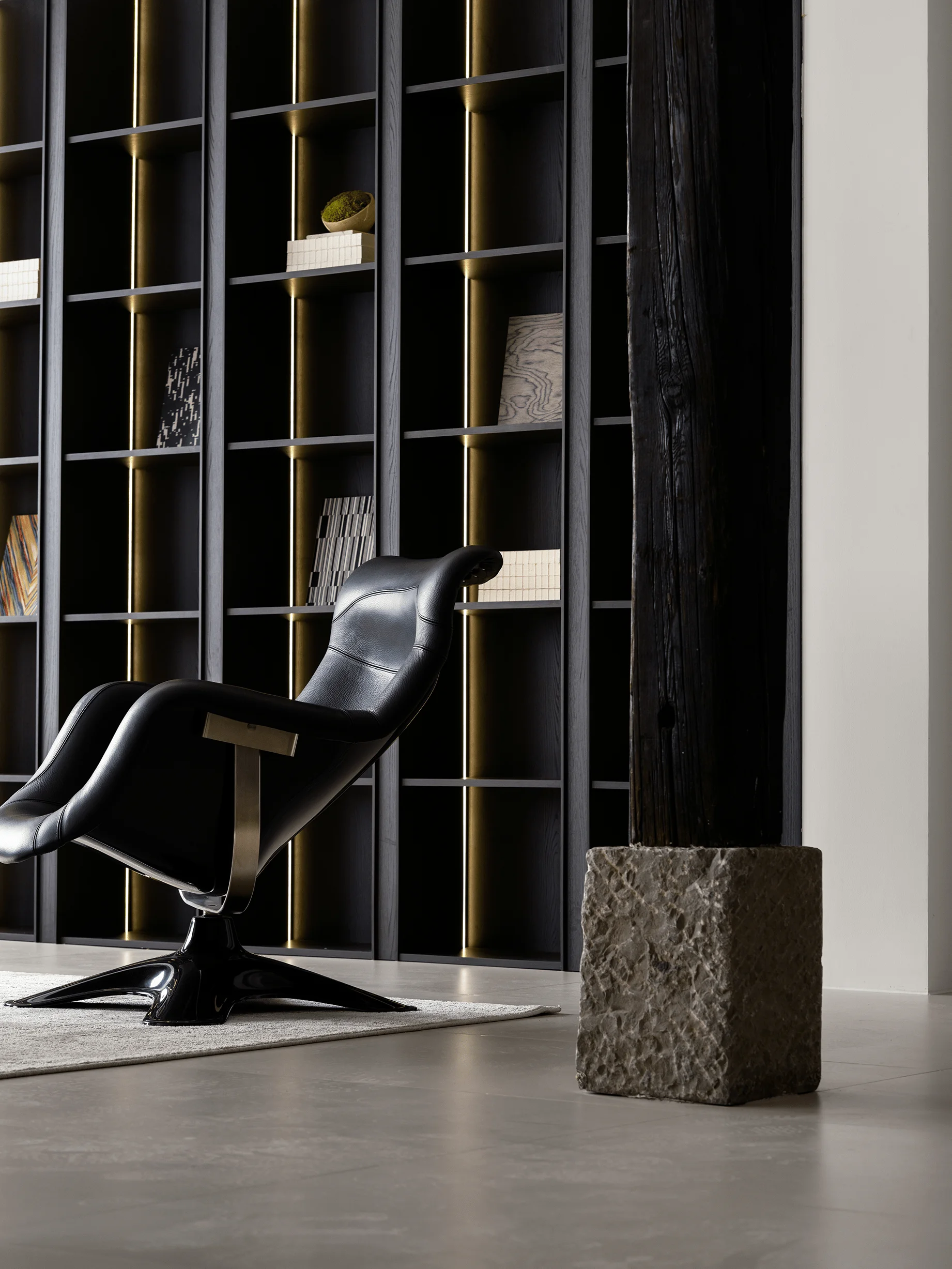
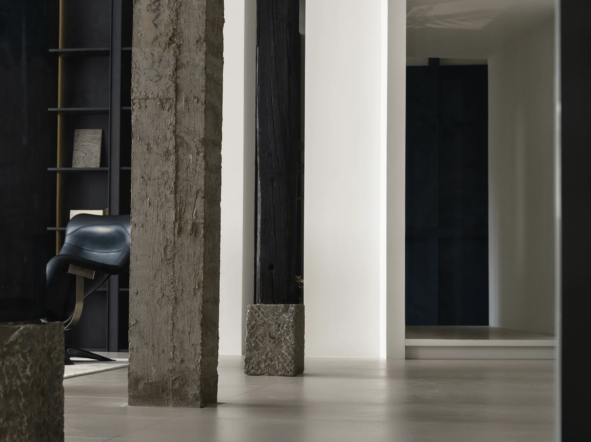
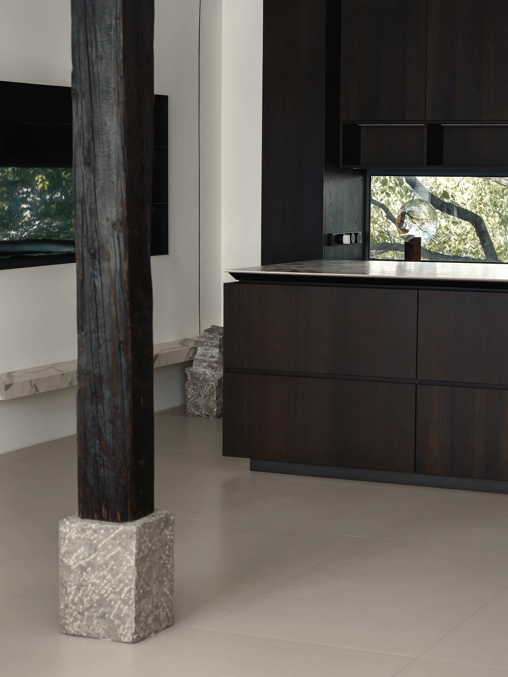
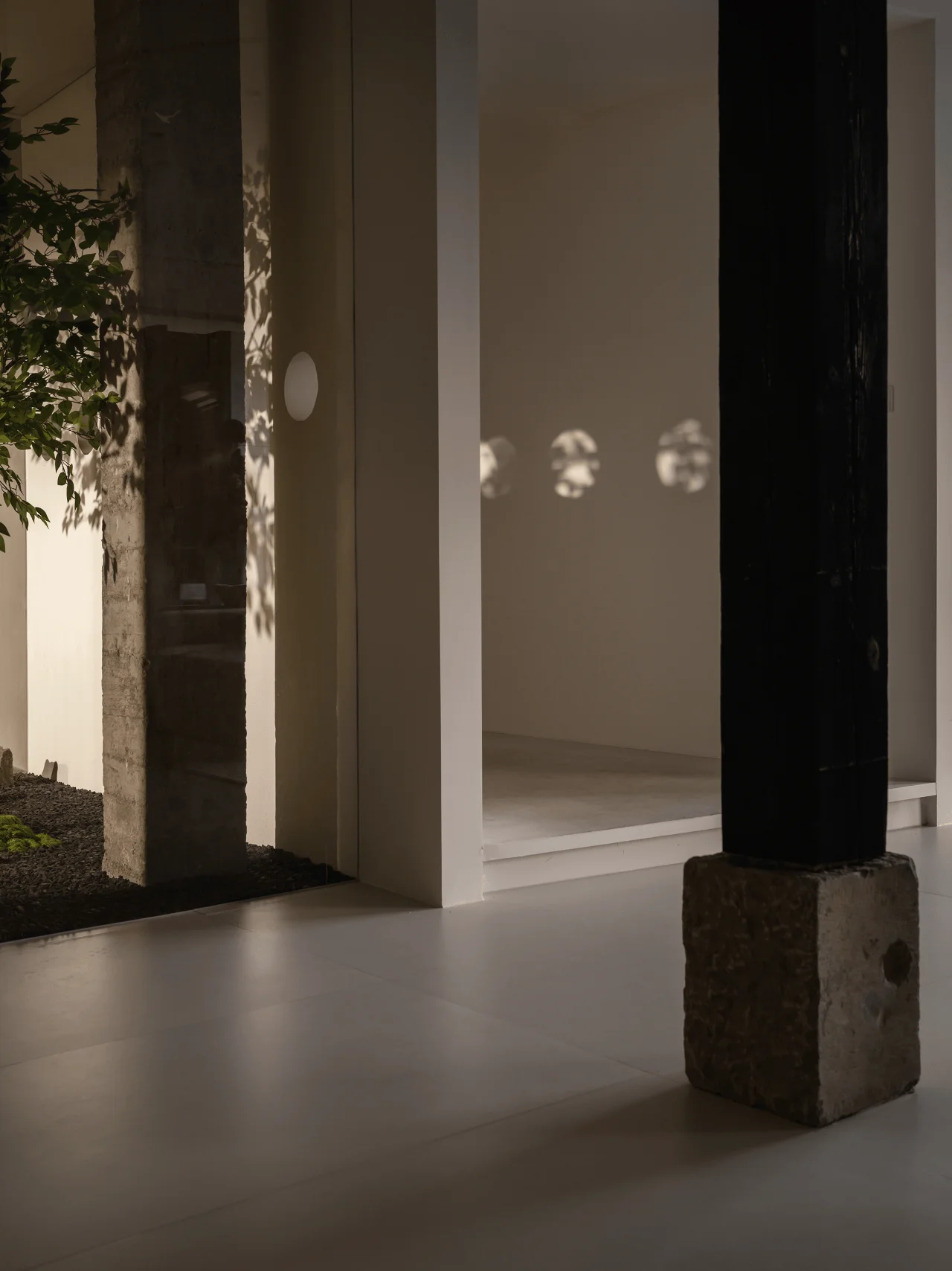
The core exhibition area’s central focus is an original structural column. UGG Design strategically introduced two matching decorative columns on either side, transforming the single element into a trio that forms the basis for visual displays. The new columns, constructed using charred pine wood and natural stone bases, showcase the distinctive textures and modern craftsmanship of new materials, while the original structural column remains in its raw concrete state, preserving its authentic material skin. This juxtaposition embodies the inherent strength and rawness of the original building structure. The design highlights an interesting collision of modern and industrial design styles.
‘Ting’ Details and Ambiance
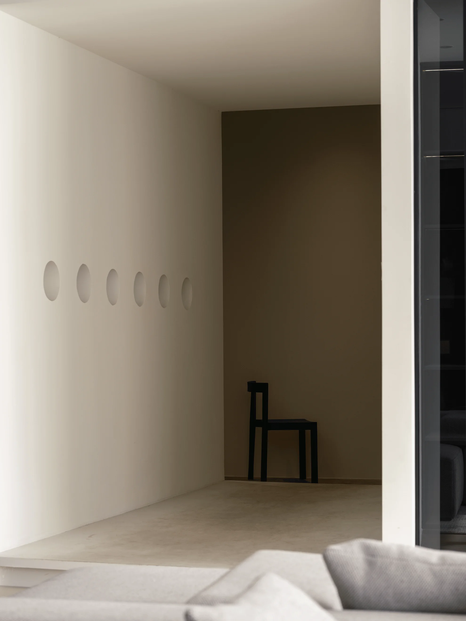
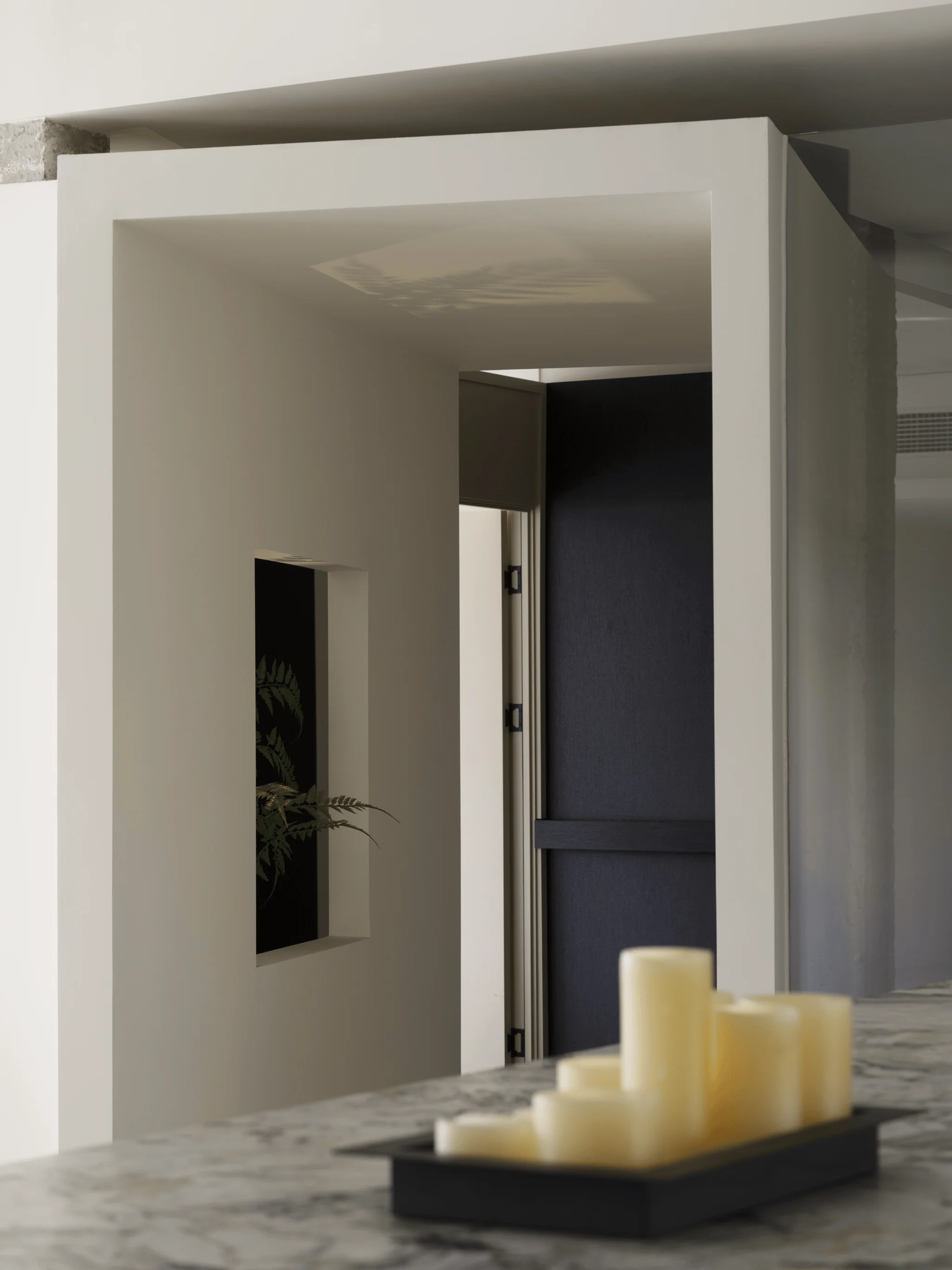
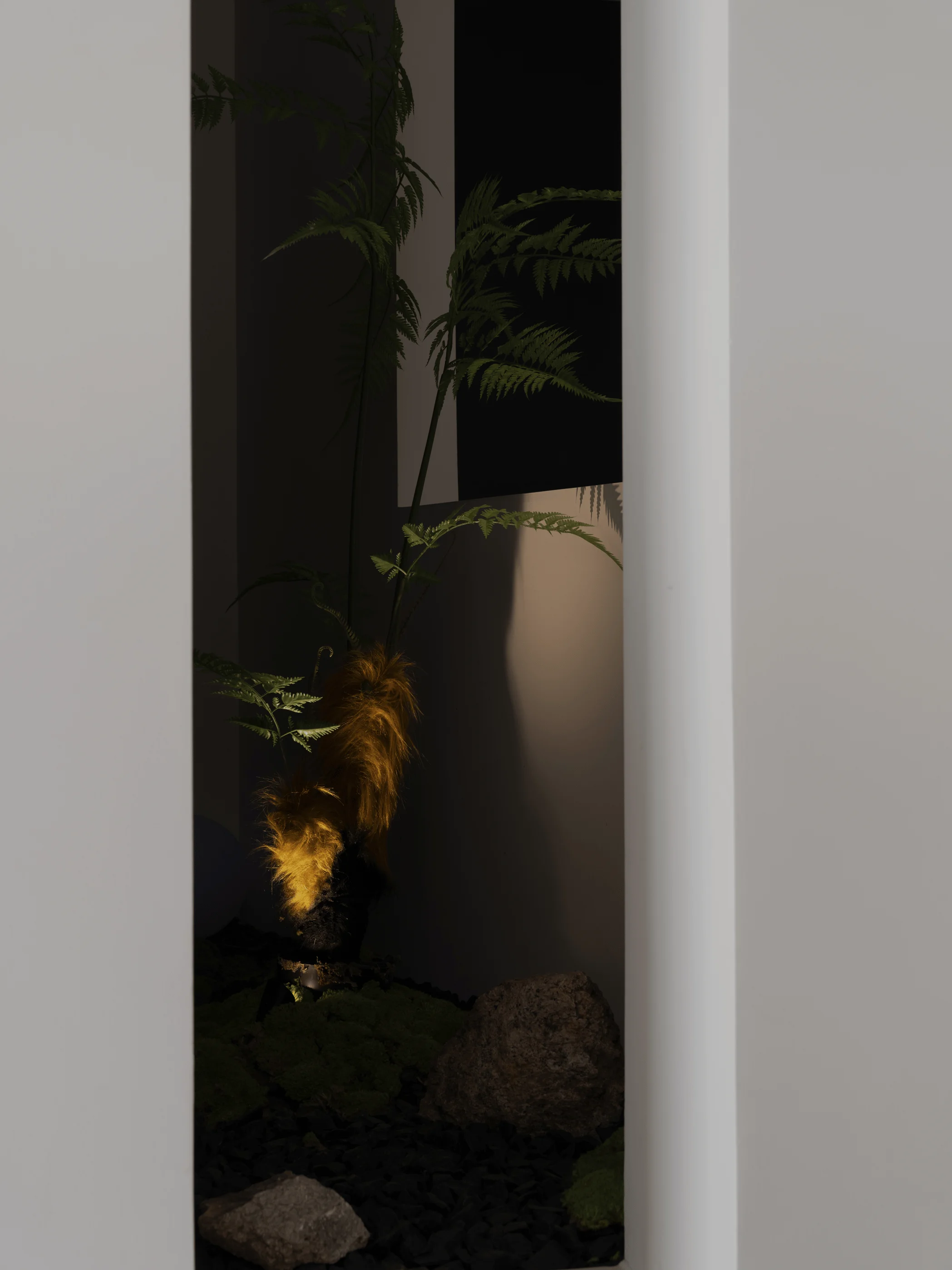
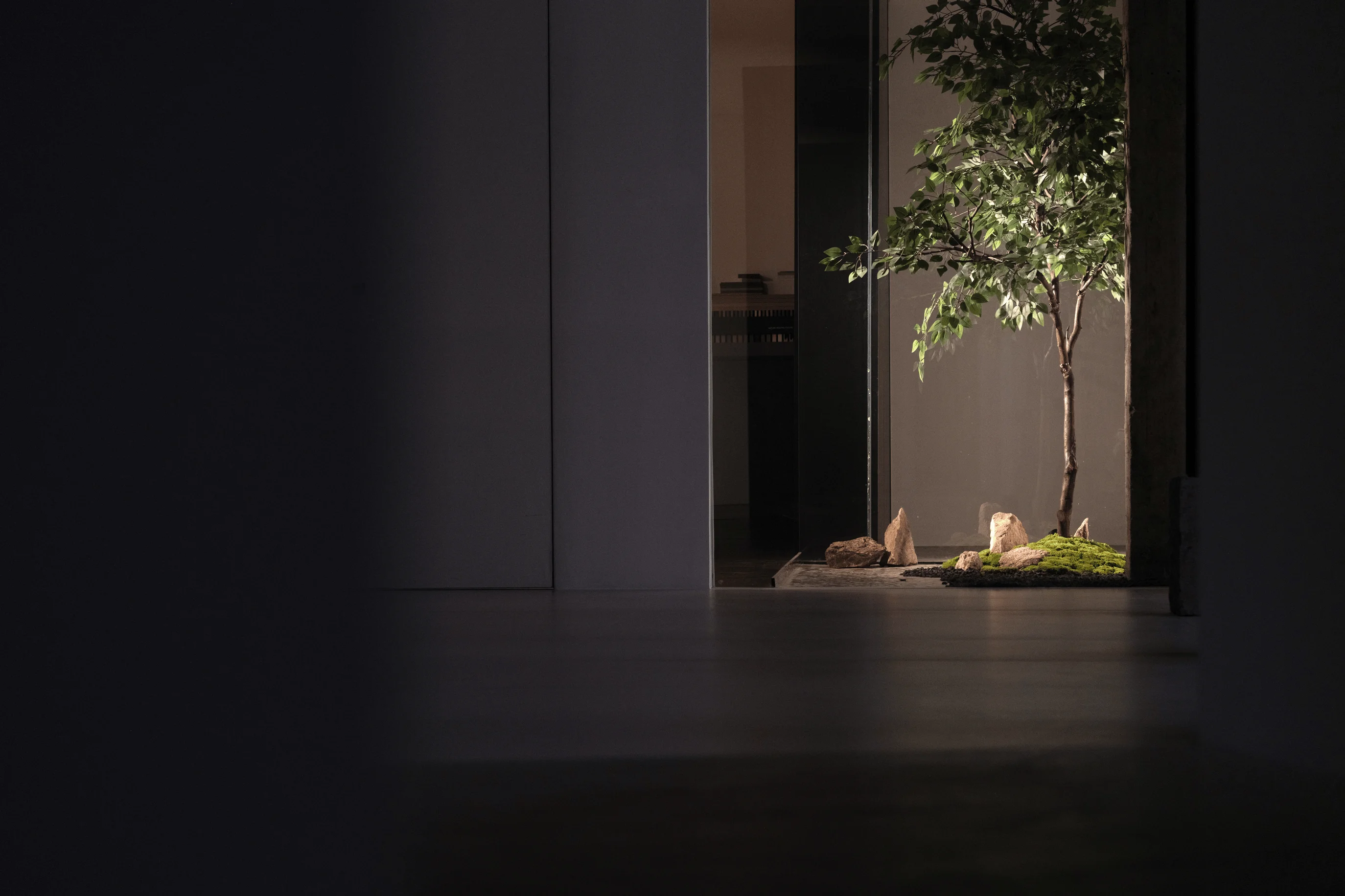
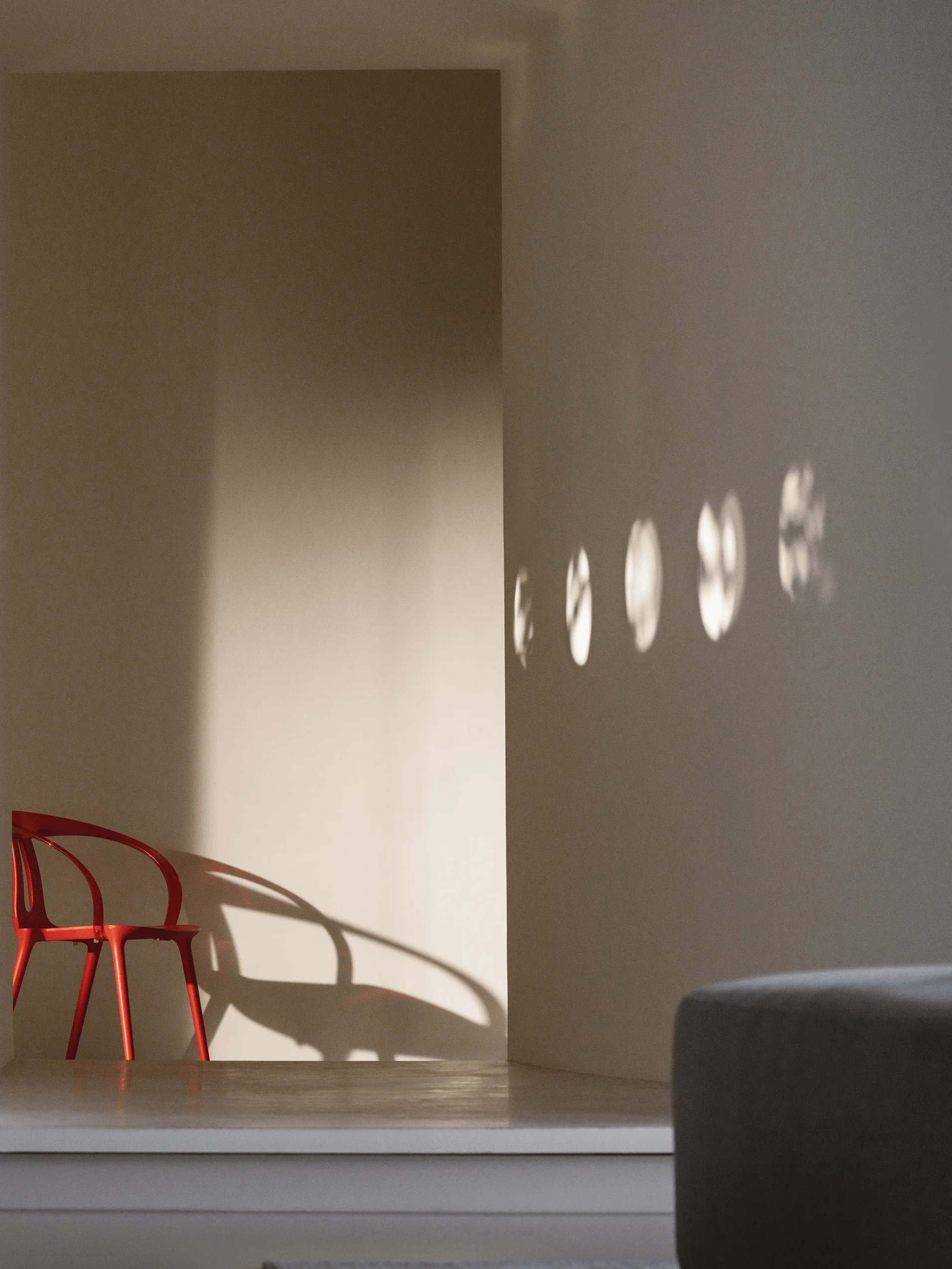
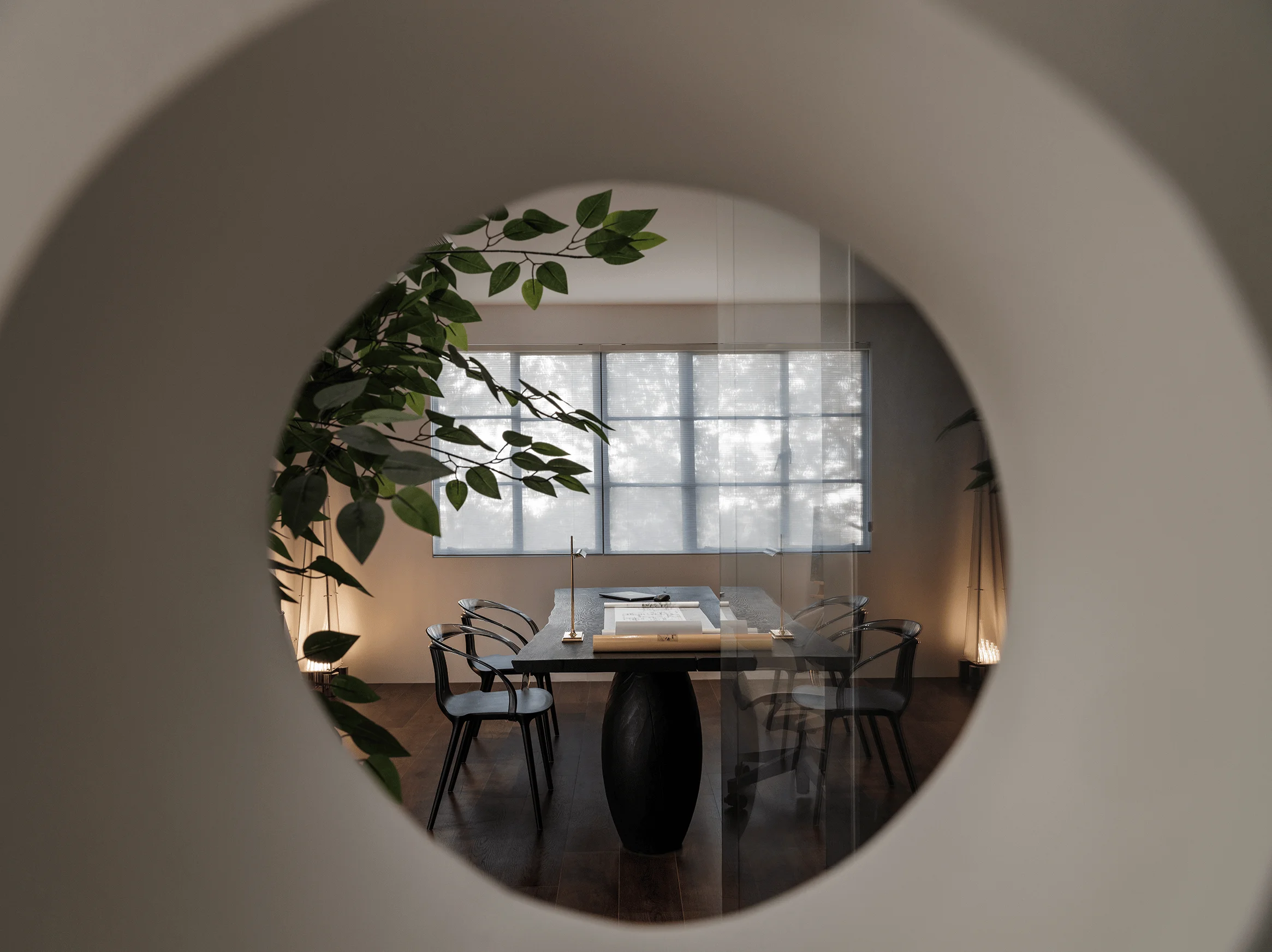
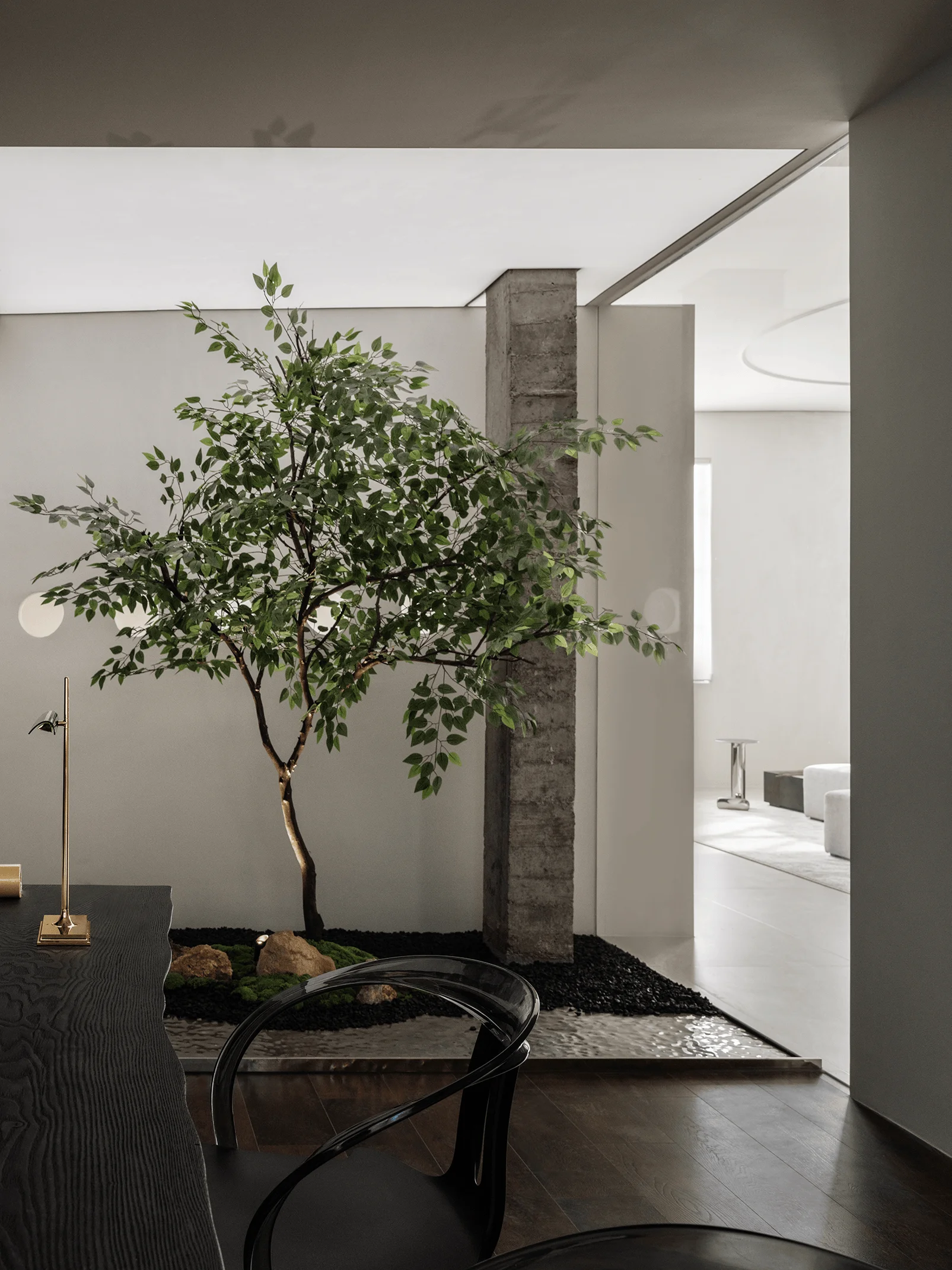
In keeping with the ‘ting’ concept, UGG Design integrated landscaping elements into the internal space. The ‘ting’ structures incorporate strategically placed circular and square openings of varying sizes. These apertures serve to enrich the ‘ting’ structures and establish a relationship between ‘inner’ and ‘outer’ spaces, fostering an interplay of perspectives and subtle visual landscapes. The ‘ting’ acts as both a spatial transition and a physical medium for observation and perspective. These carefully designed openings, whether experienced while traversing the ‘ting’ or relaxing in other areas, provide dynamic light and shadow interplay, offering an engaging experience for users. They function as framing devices, similar to picture frames and camera lenses, which enhance the space with unlimited possibilities and a rich layering of visual depth. The use of natural materials and greenery also helps to create a sense of tranquility and connection to nature.
Circulation and Spatial Innovation
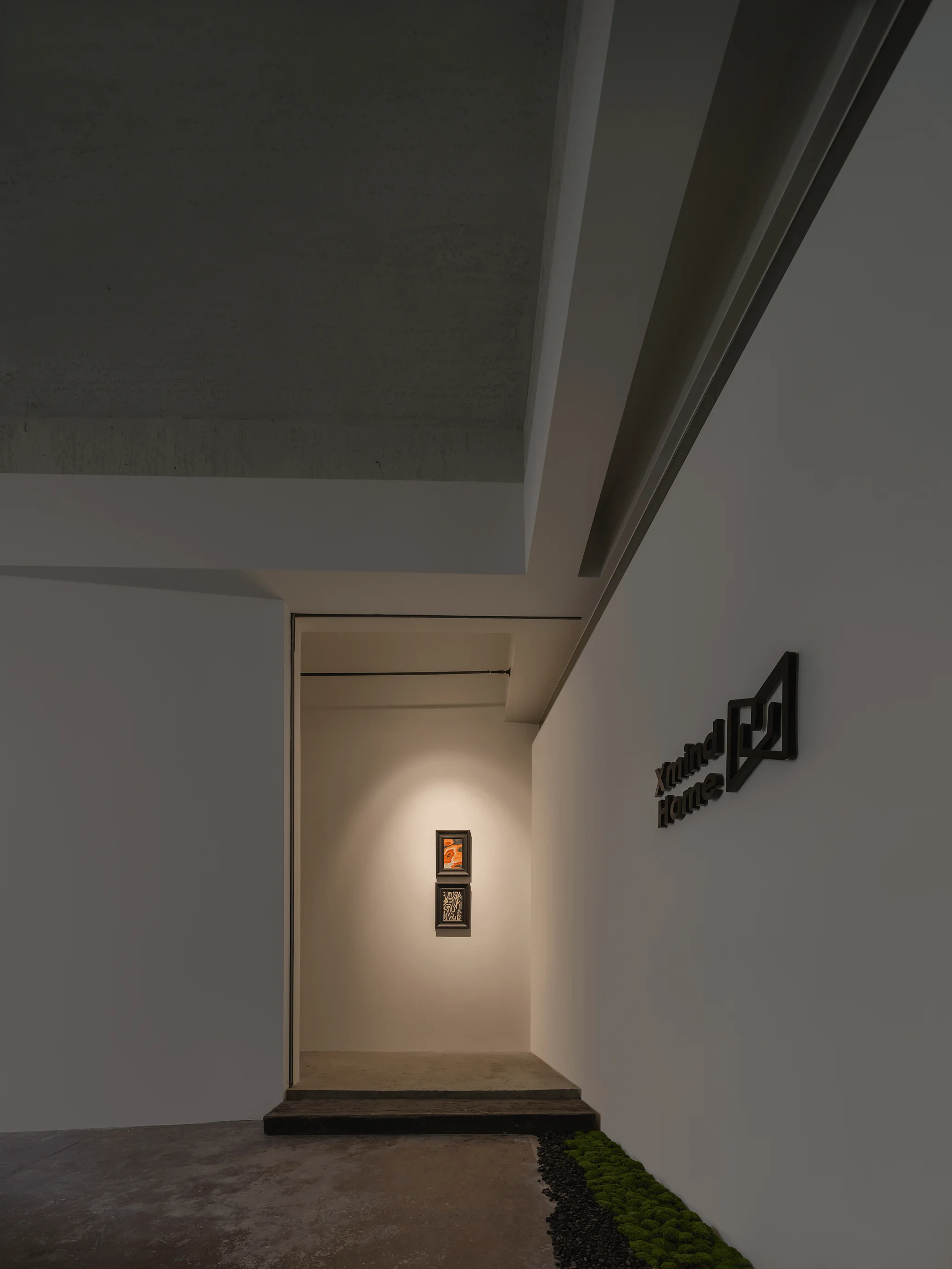
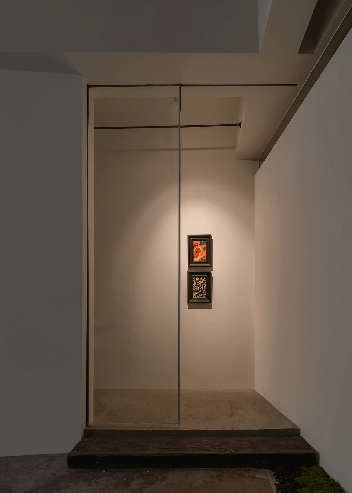
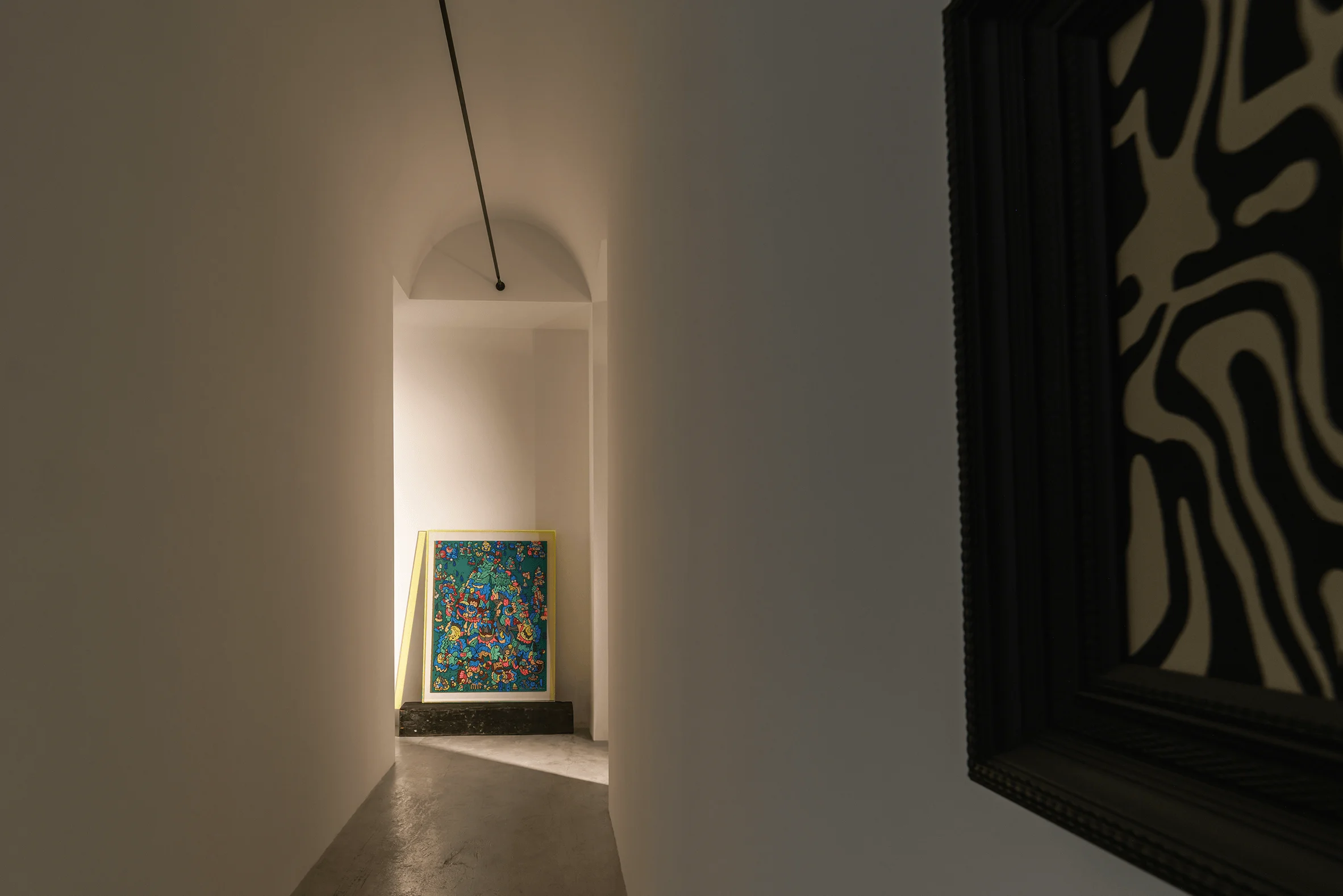
The original building’s stairwell occupies a prime position within the floor plan, naturally dividing the interior into two distinct sections—one large and one smaller. The smaller area presented a challenge in terms of scale and functional presentation within the context of a traditional wood-focused exhibition space. To overcome this, the design team adopted a non-conventional approach, reversing the entry point and incorporating a subtle elevation at the entrance, guiding visitor’s visual flow. The naturally narrow corridor was reimagined as a ‘creative gallery’, serving as a transition zone from the building’s public areas into the interior. It offers a buffer space and provides a blank canvas for future activities by brand designers. UGG Design has seamlessly integrated the building’s original architectural features with a modern, functional, and aesthetically pleasing design style.
Material Contrast and Spatial Harmony
The core exhibition area’s aesthetic is defined by a harmonious interplay of symmetry and material contrast. The integration of the original structural column and the new decorative columns narrates a story of time’s passage and the evolution of craftsmanship. This interplay provides a profound cultural experience, fostering a deeper appreciation for the design of the space. By using a contrast of materials and architectural styles, UGG Design has created a space that is both timeless and modern. The seamless integration of each area creates a cohesive spatial narrative, enhancing the visitor experience. The interplay of old and new building materials and architectural styles also provides a unique spatial experience.
Detail and Cultural Context
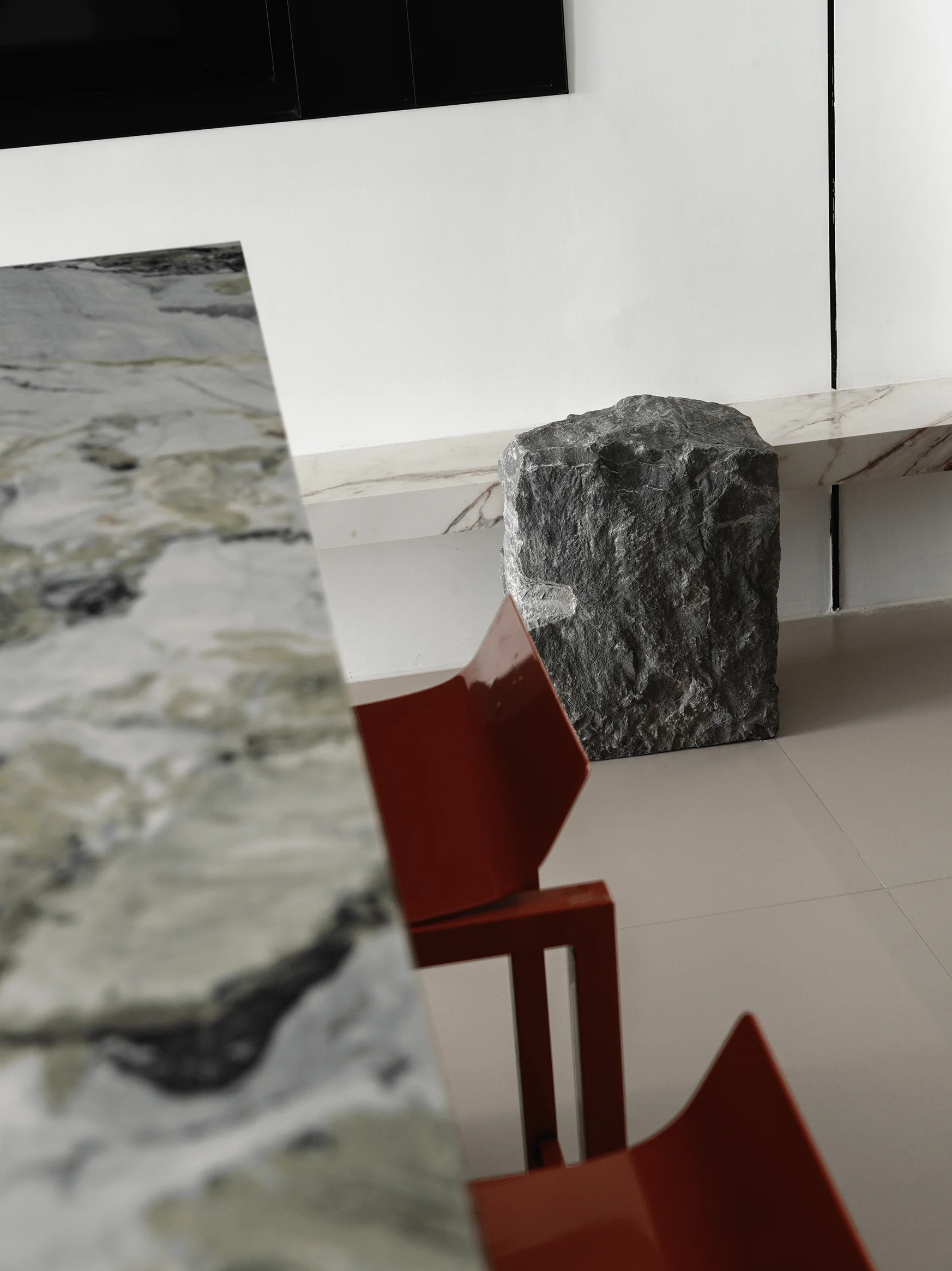
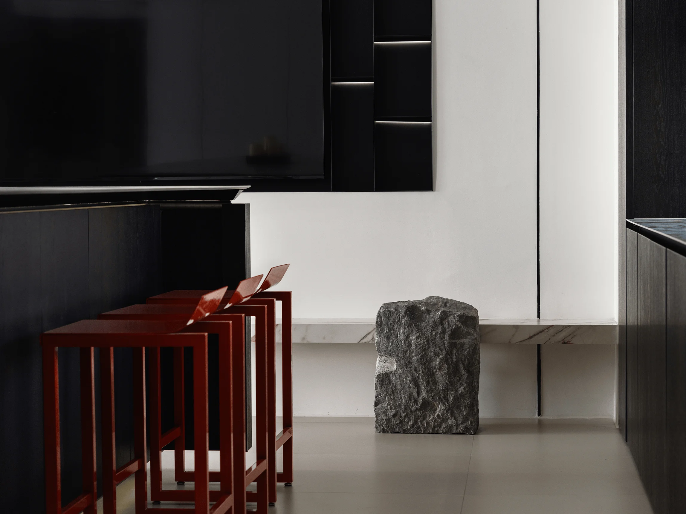
The showroom’s attention to detail extends beyond visual aesthetics; it represents a fusion of cultural preservation and innovation. The core exhibition area’s original columns bear witness to historical change, while the new columns of charred pine and natural stone base represent a testament to modern craftsmanship. The four circular openings, reminiscent of traditional Chinese window patterns (Lou Chuang), add depth and allow the interior and exterior landscapes to blend seamlessly, creating a poetic atmosphere. This interplay of materials generates a compelling visual impact within the entire space. The fusion of the old and new not only heightens the space’s depth and playfulness but also showcases the designer’s mastery of balancing tradition and innovation. Every subtle detail, every seemingly accidental or deliberate element, reflects the designer’s deep contemplation of culture and creative experiments within the framework of contemporary design.
Project Information:
Residential Space Interiors Design
UGG Design
China
326 m²
2023
Charred Pine, Concrete, Stone
Chunchun Deng


