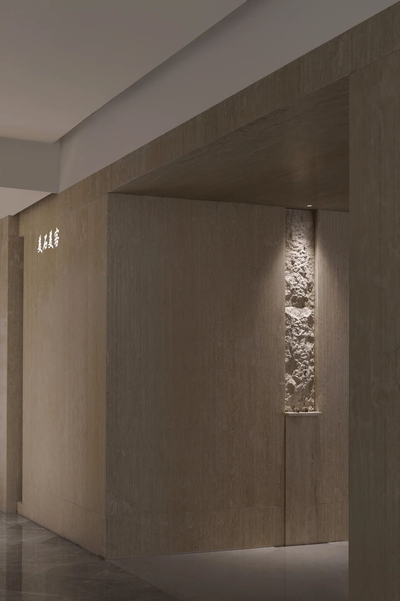
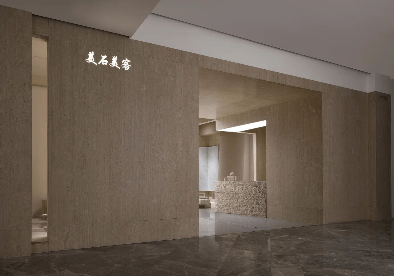
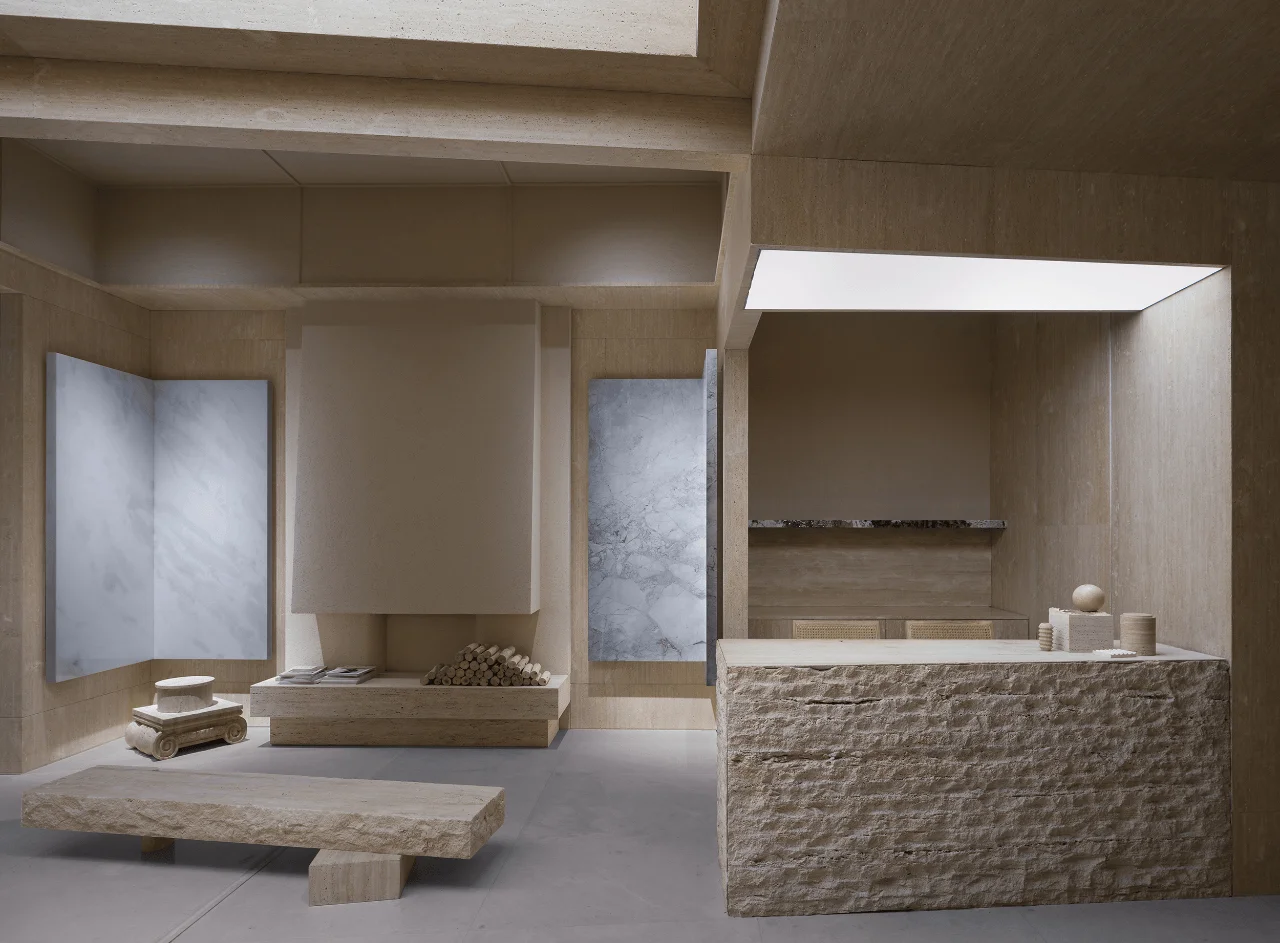
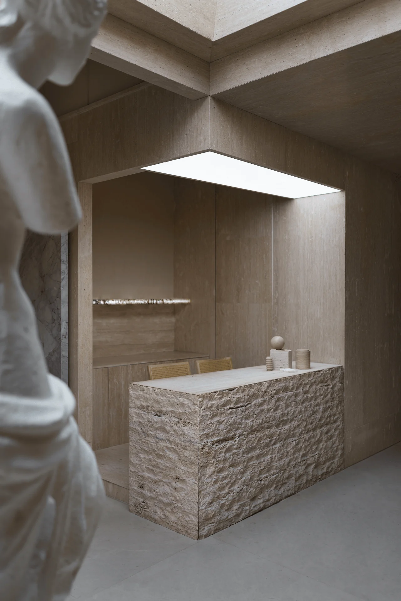
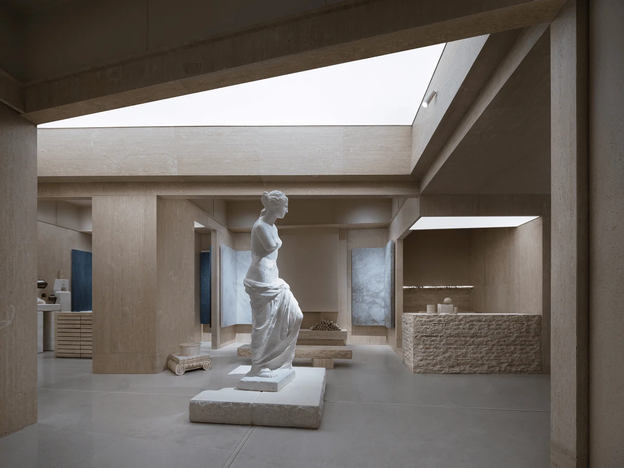
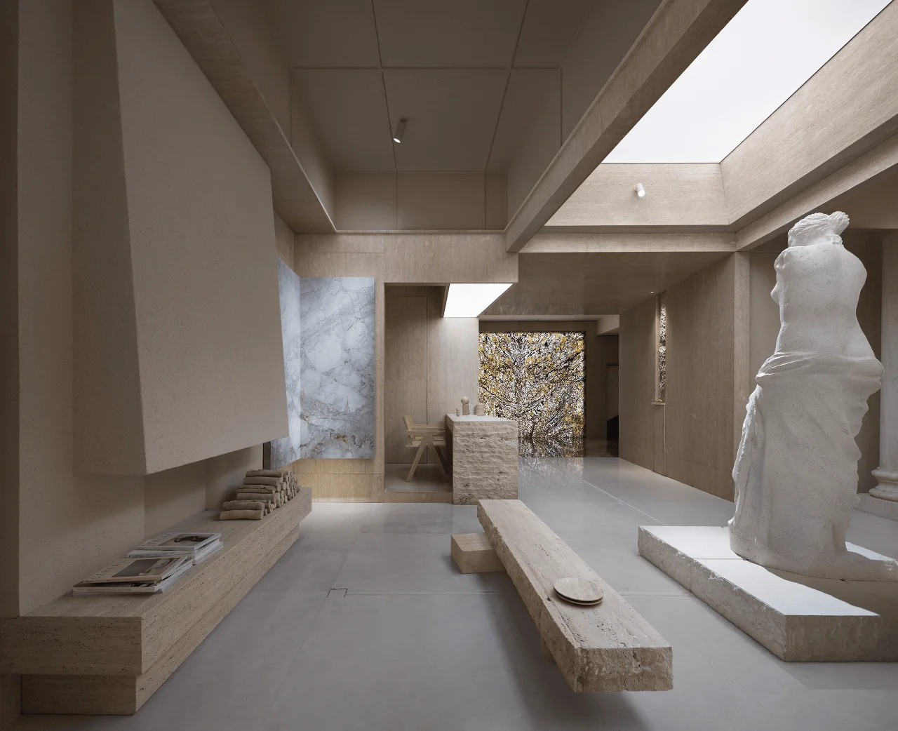
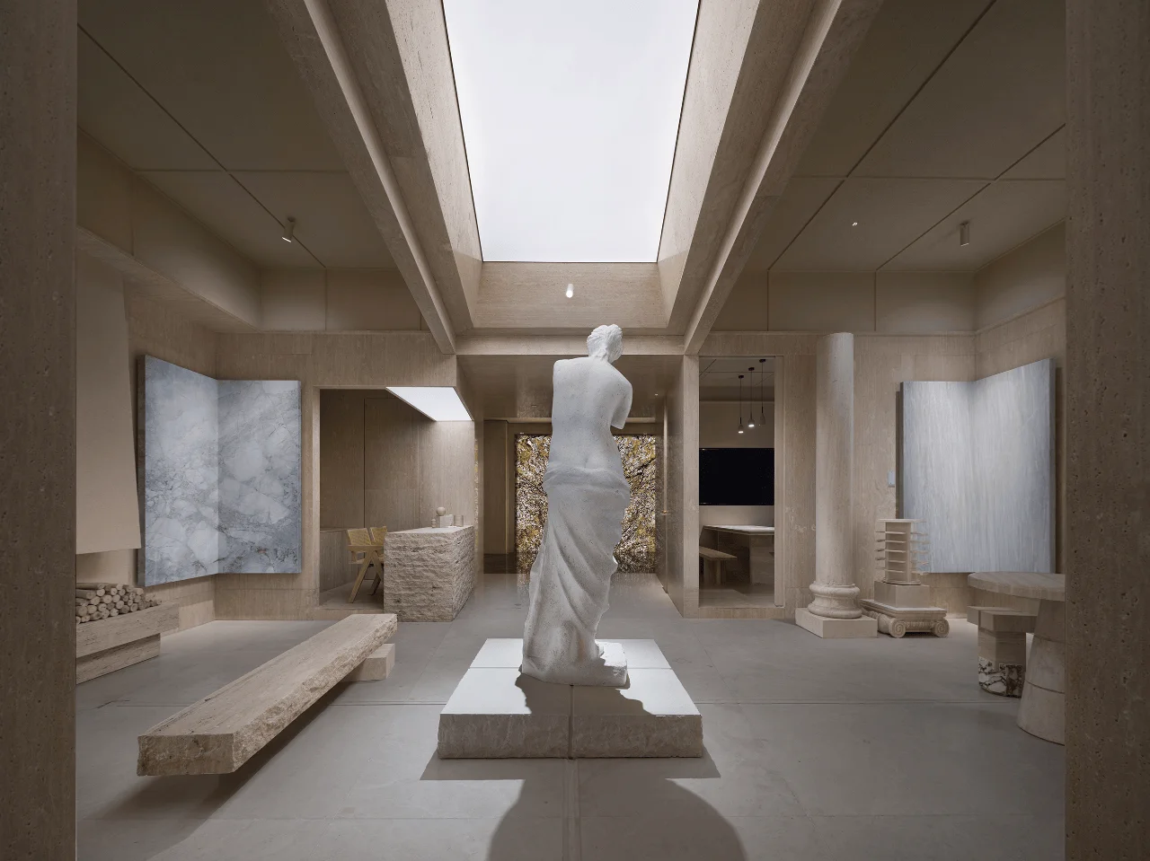
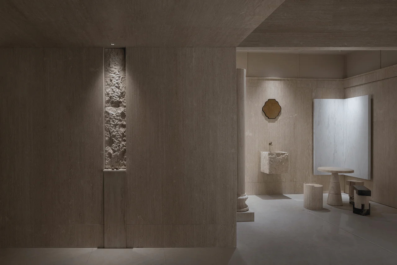
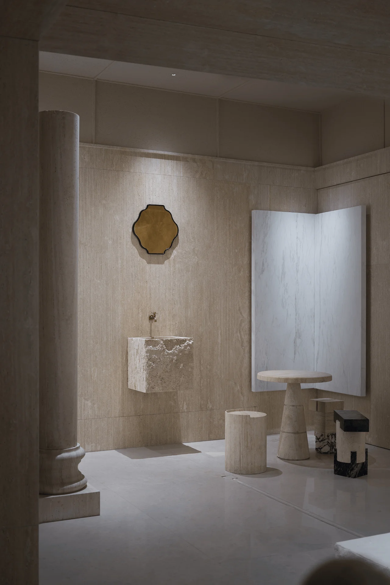
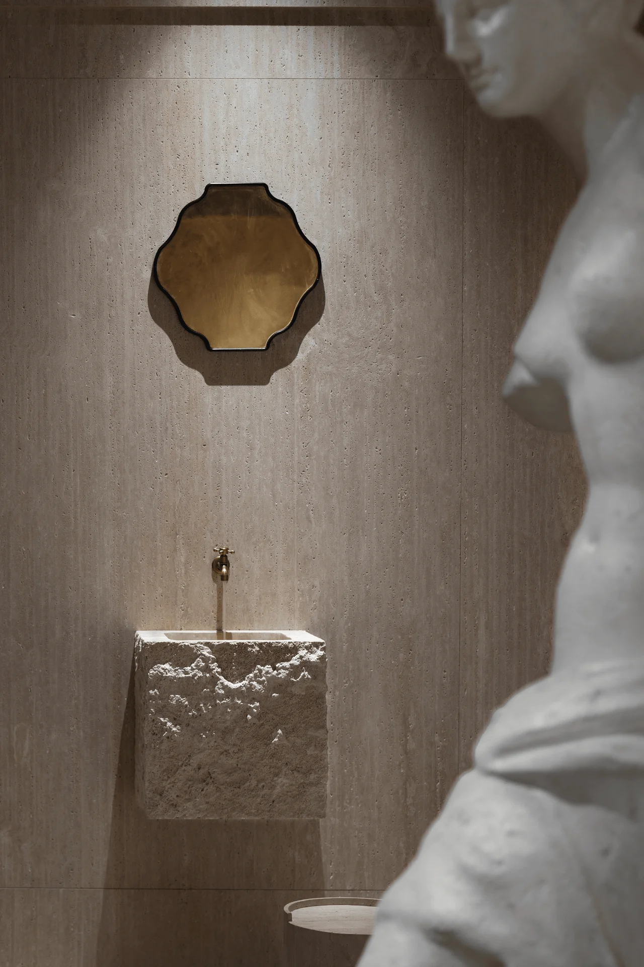
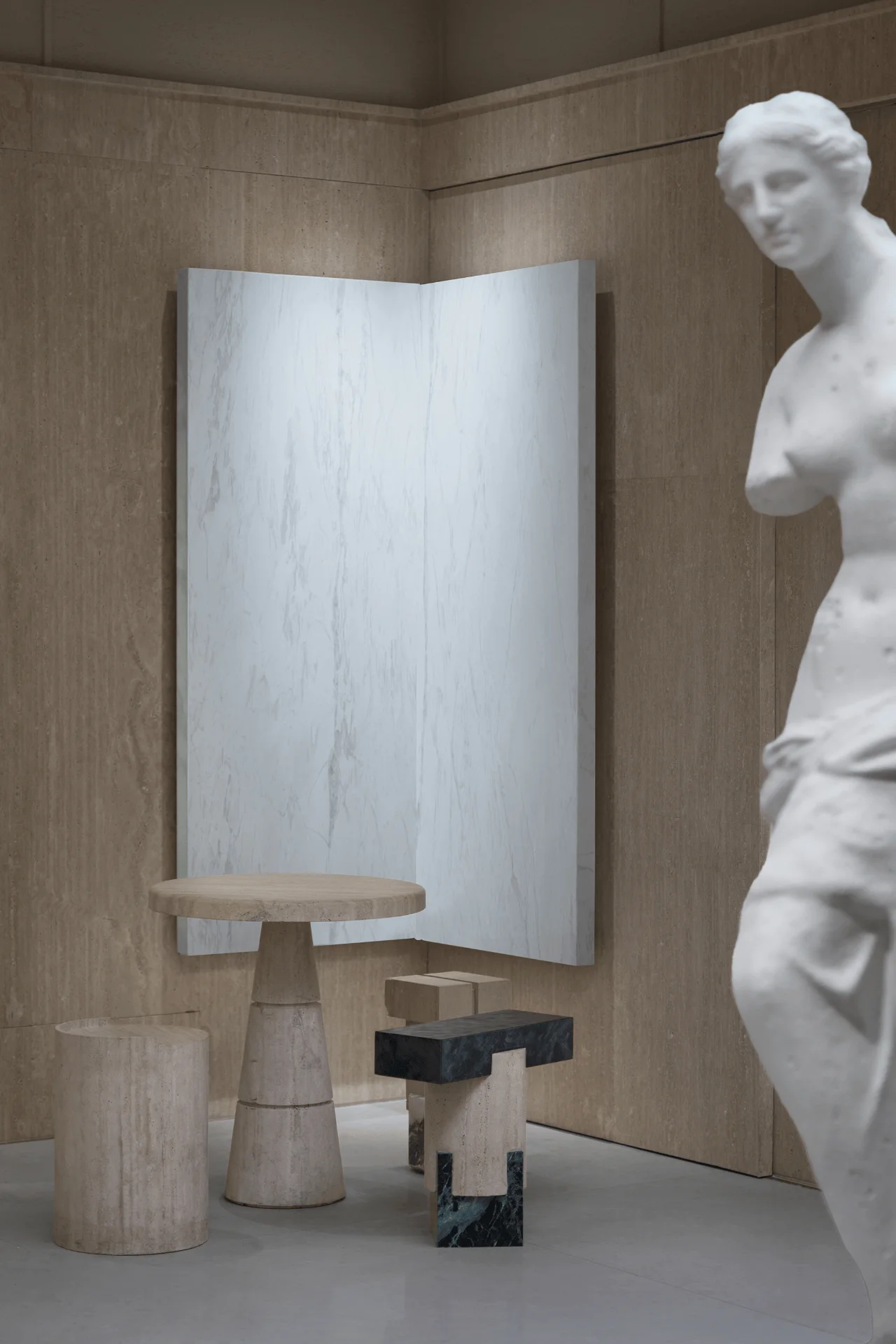
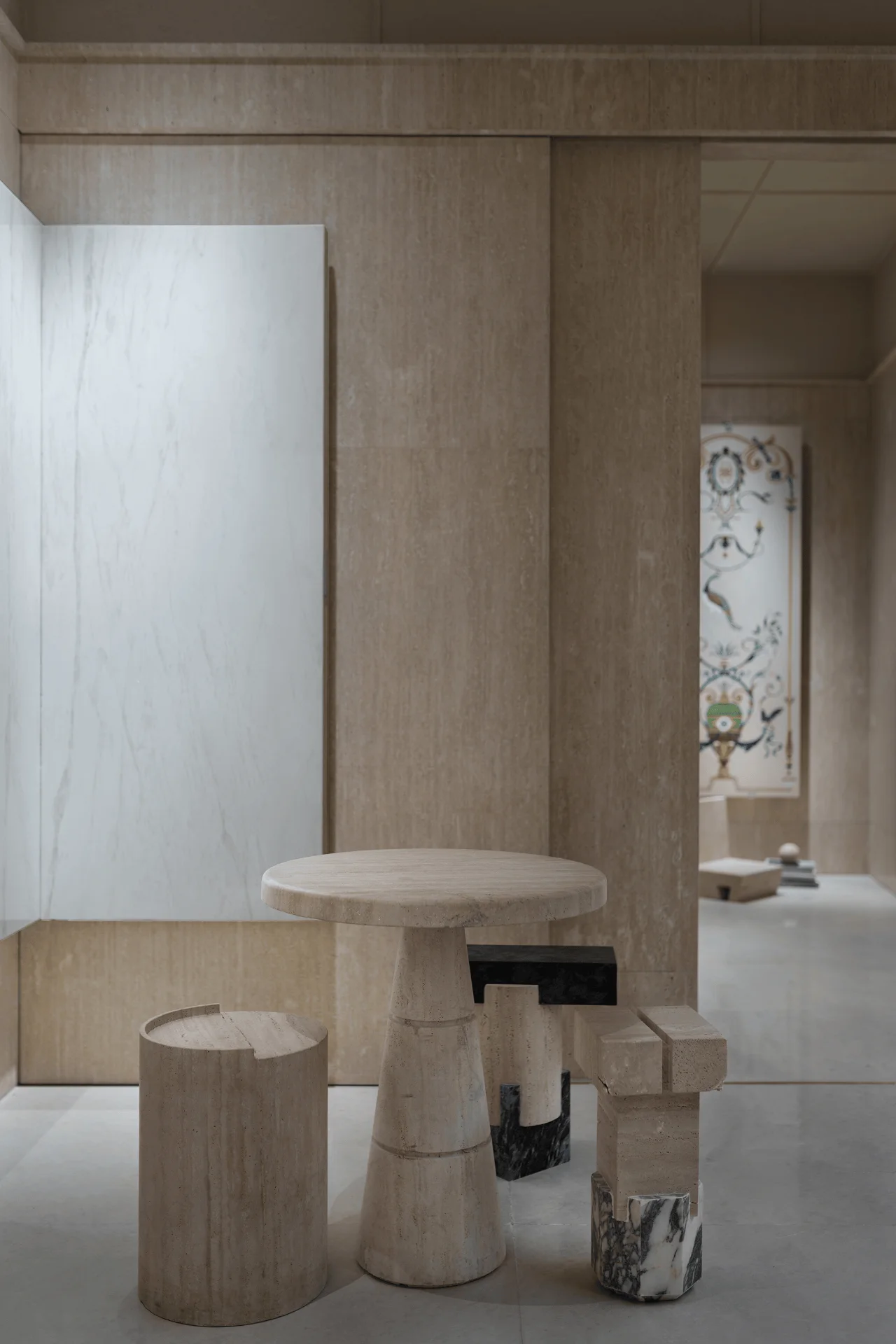
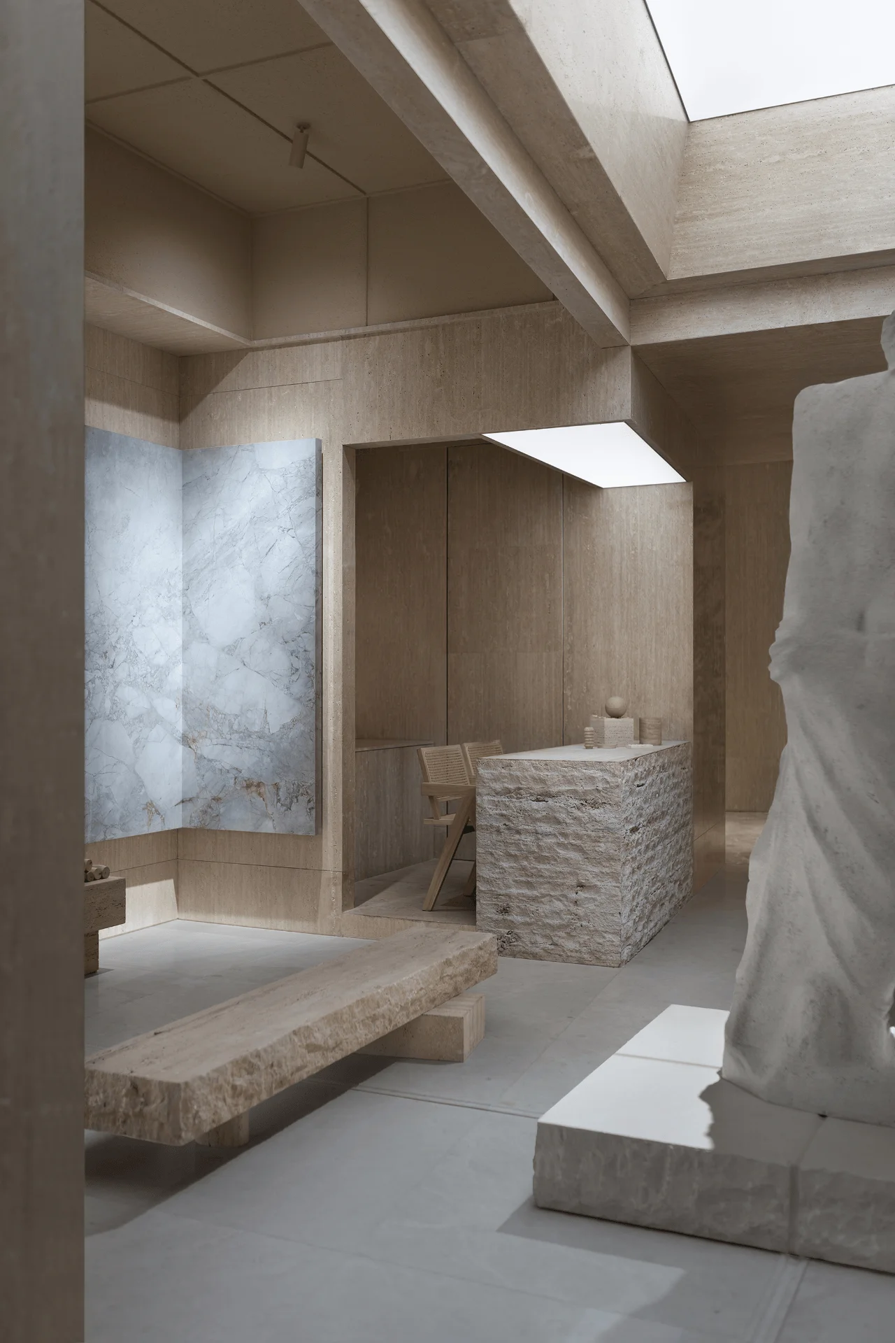
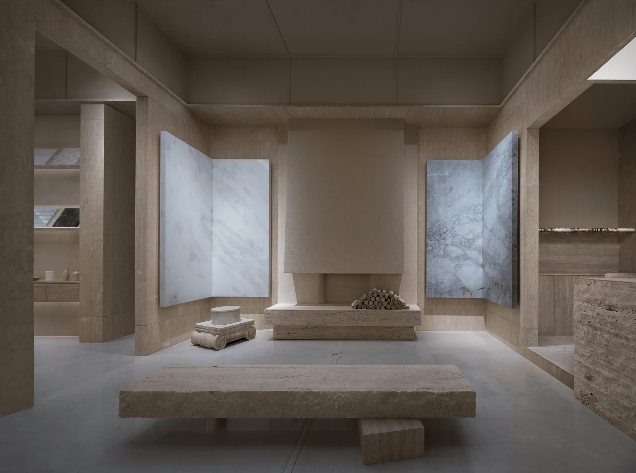
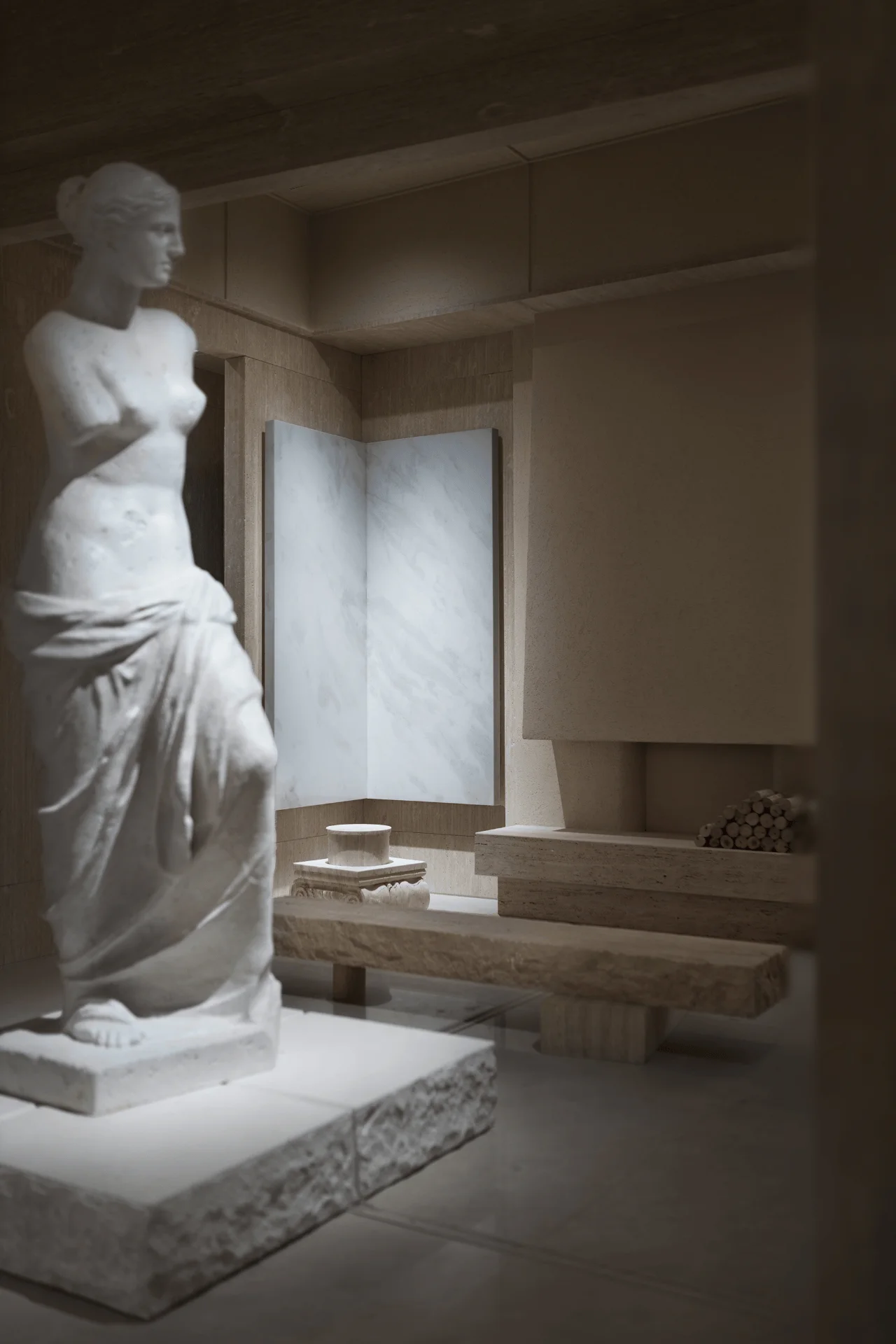
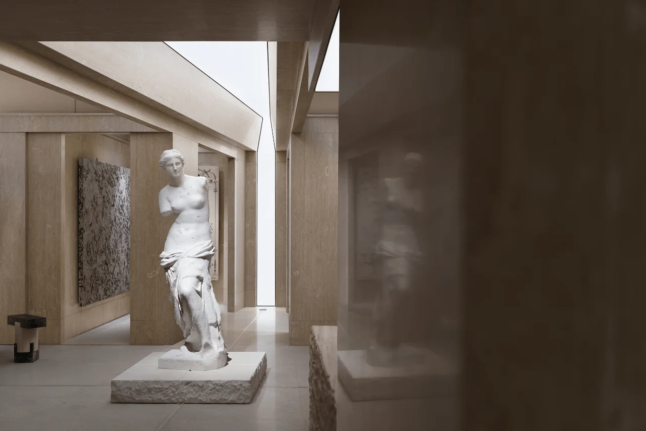
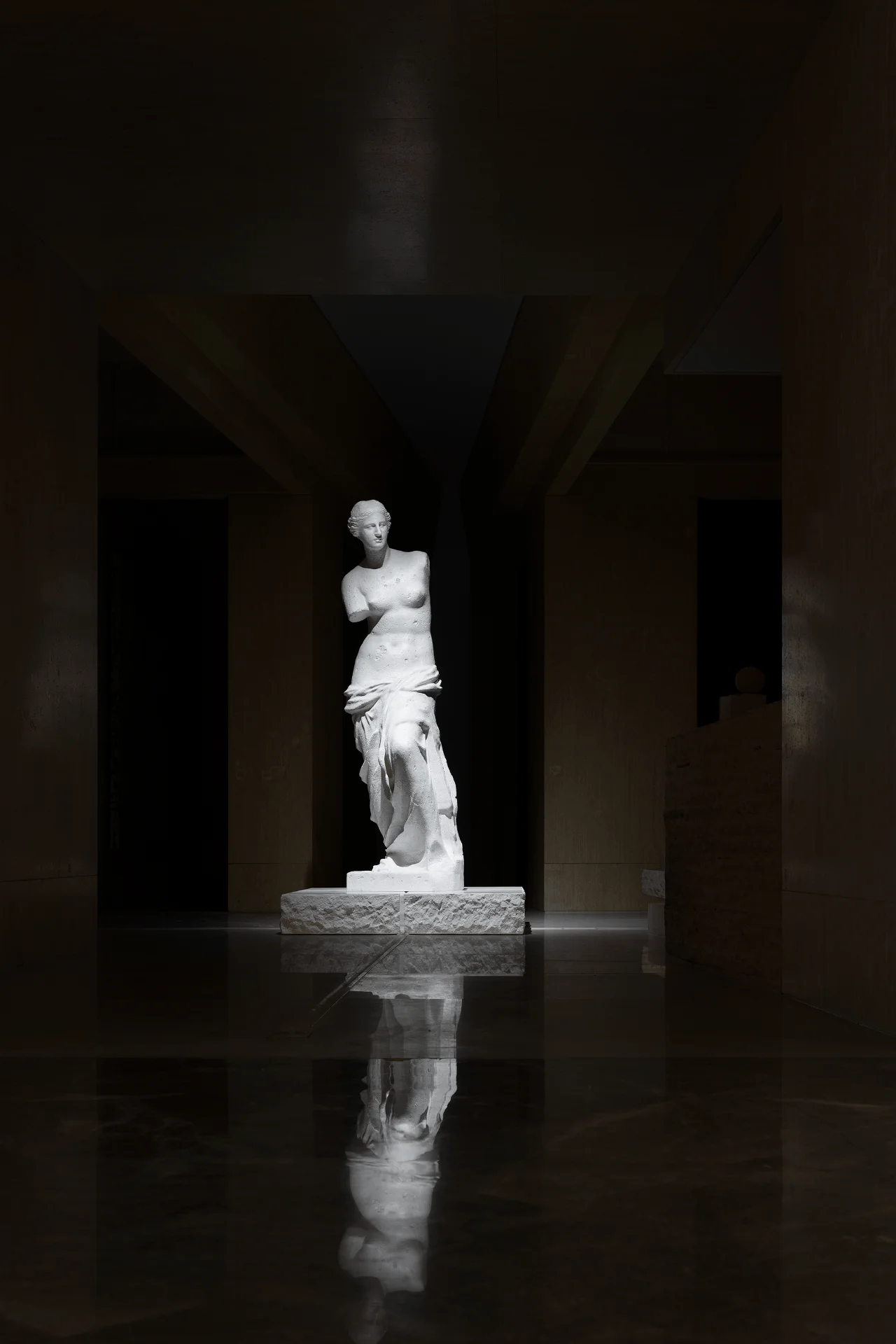
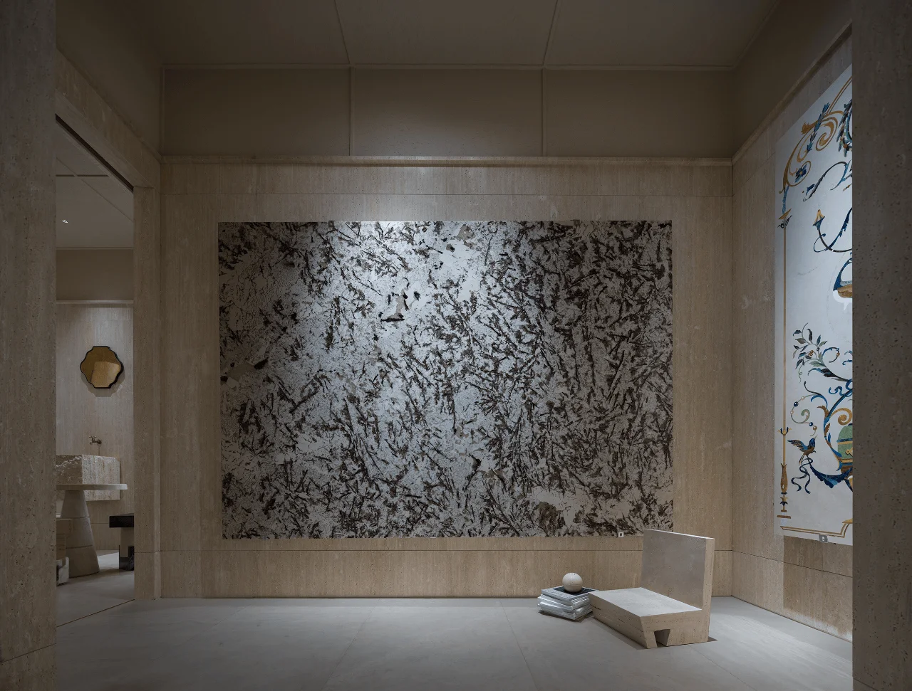
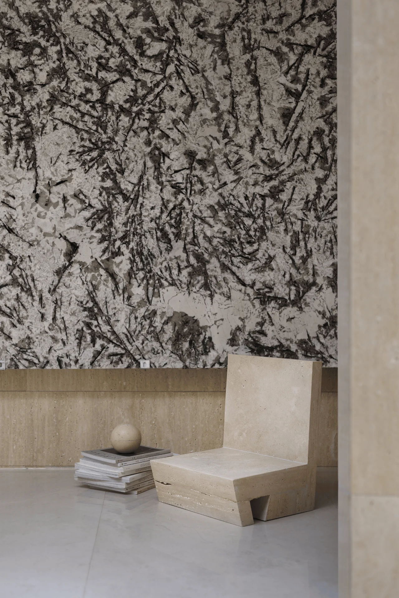
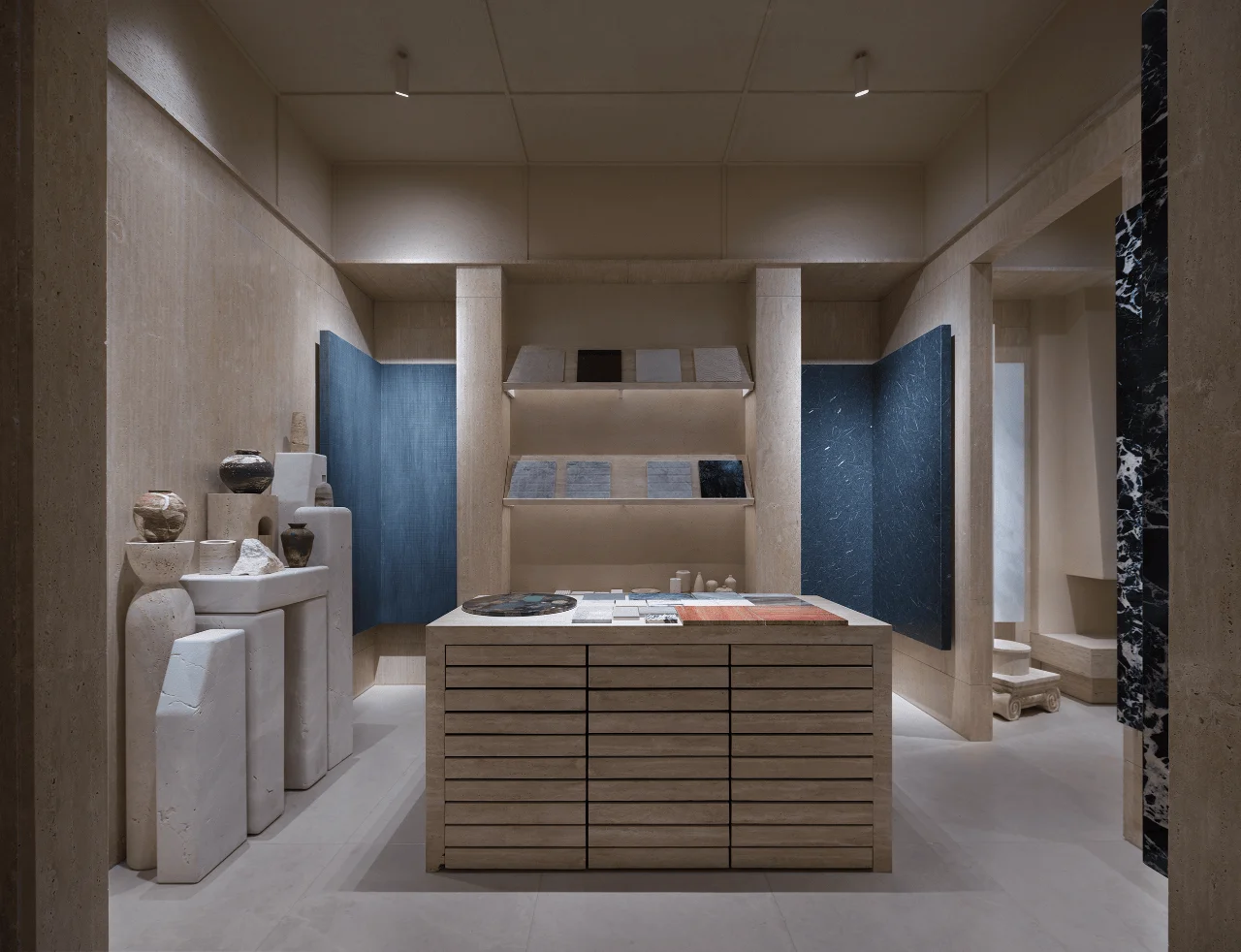
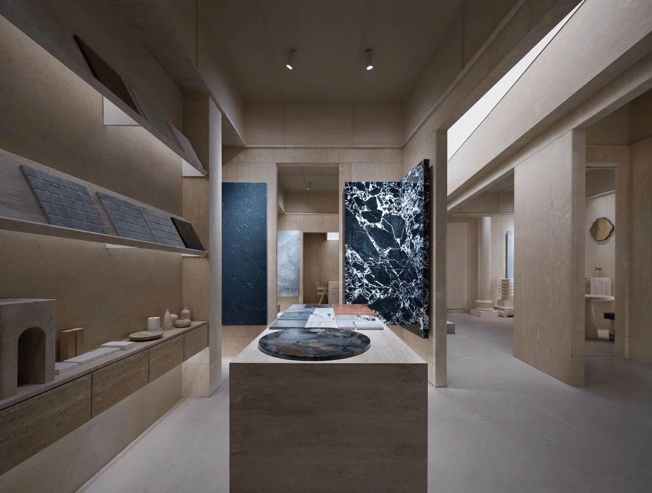
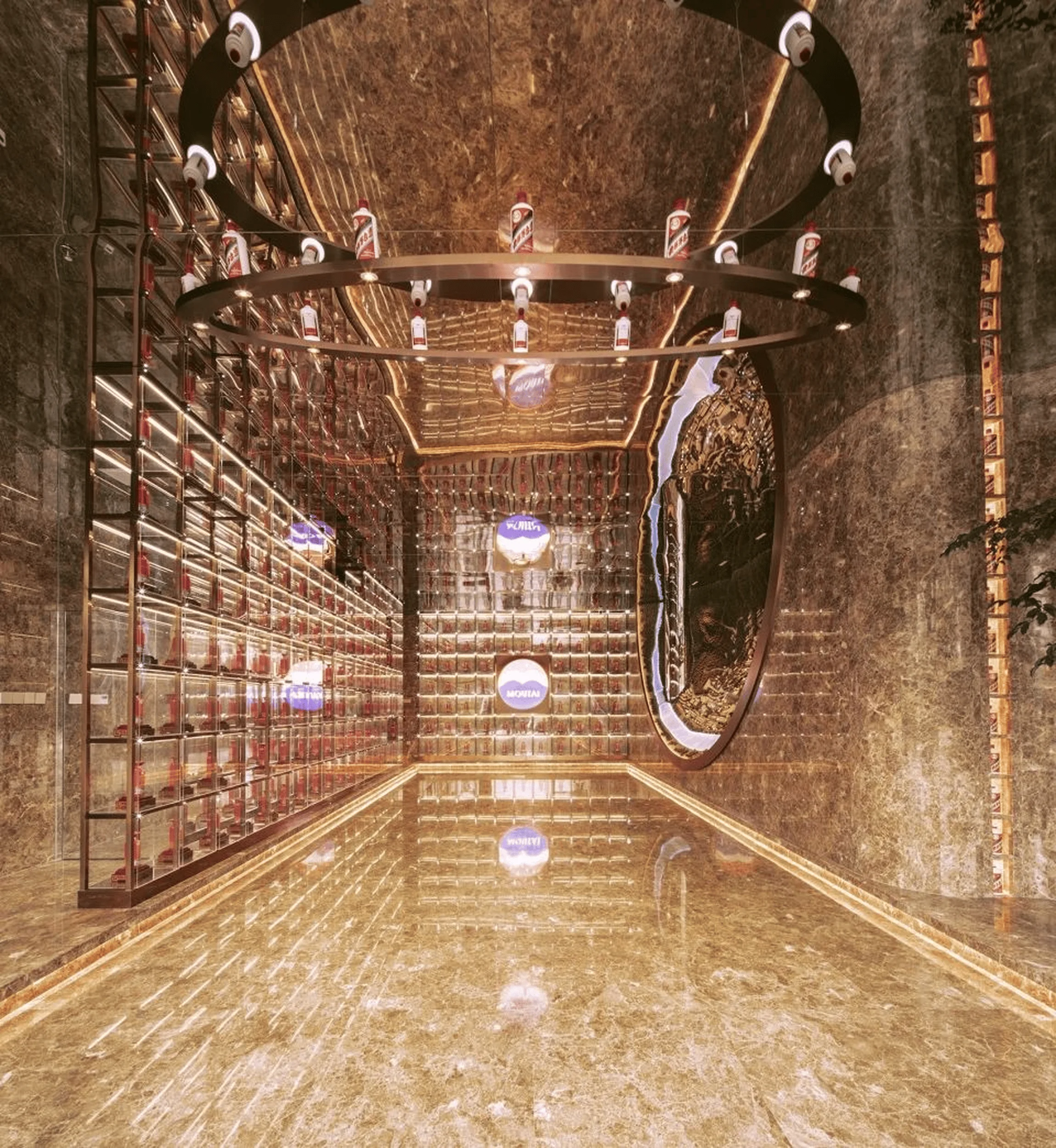
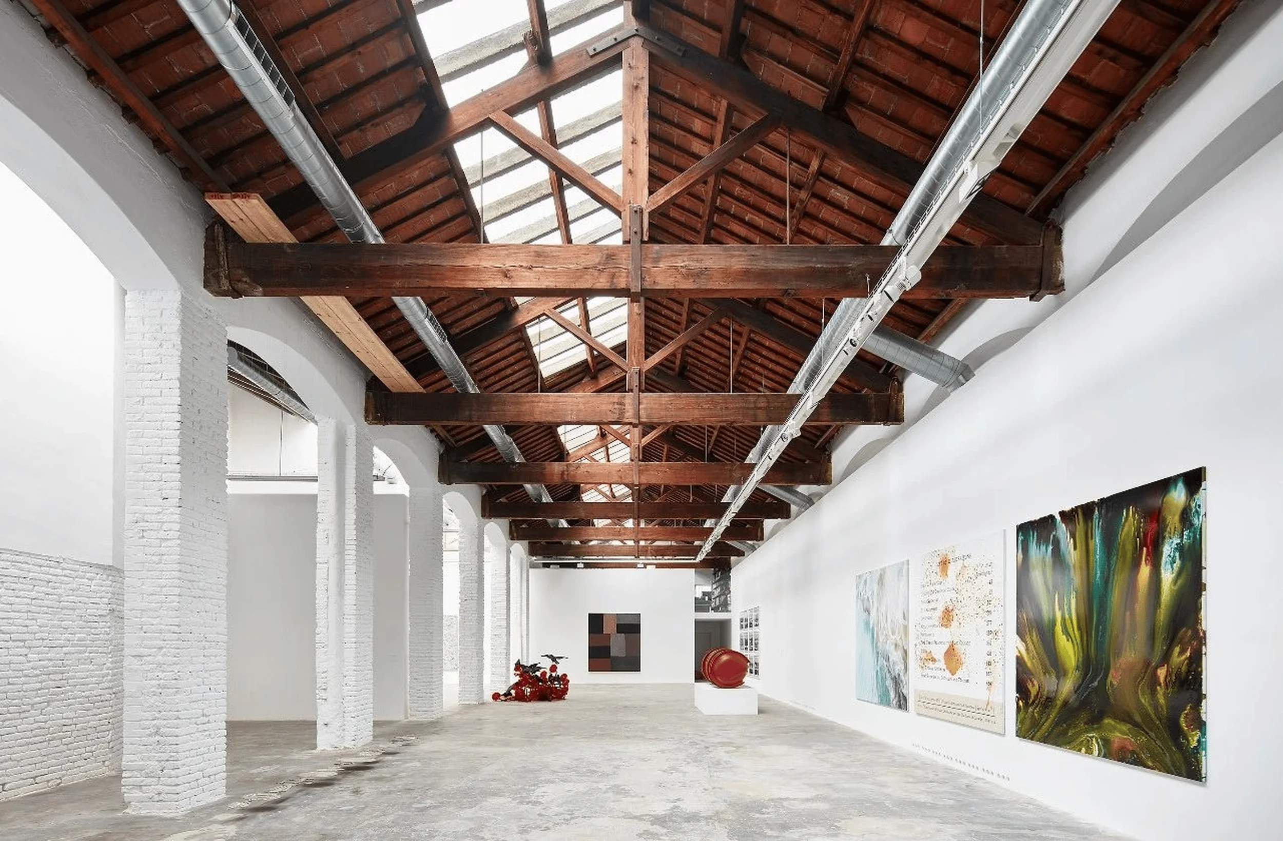
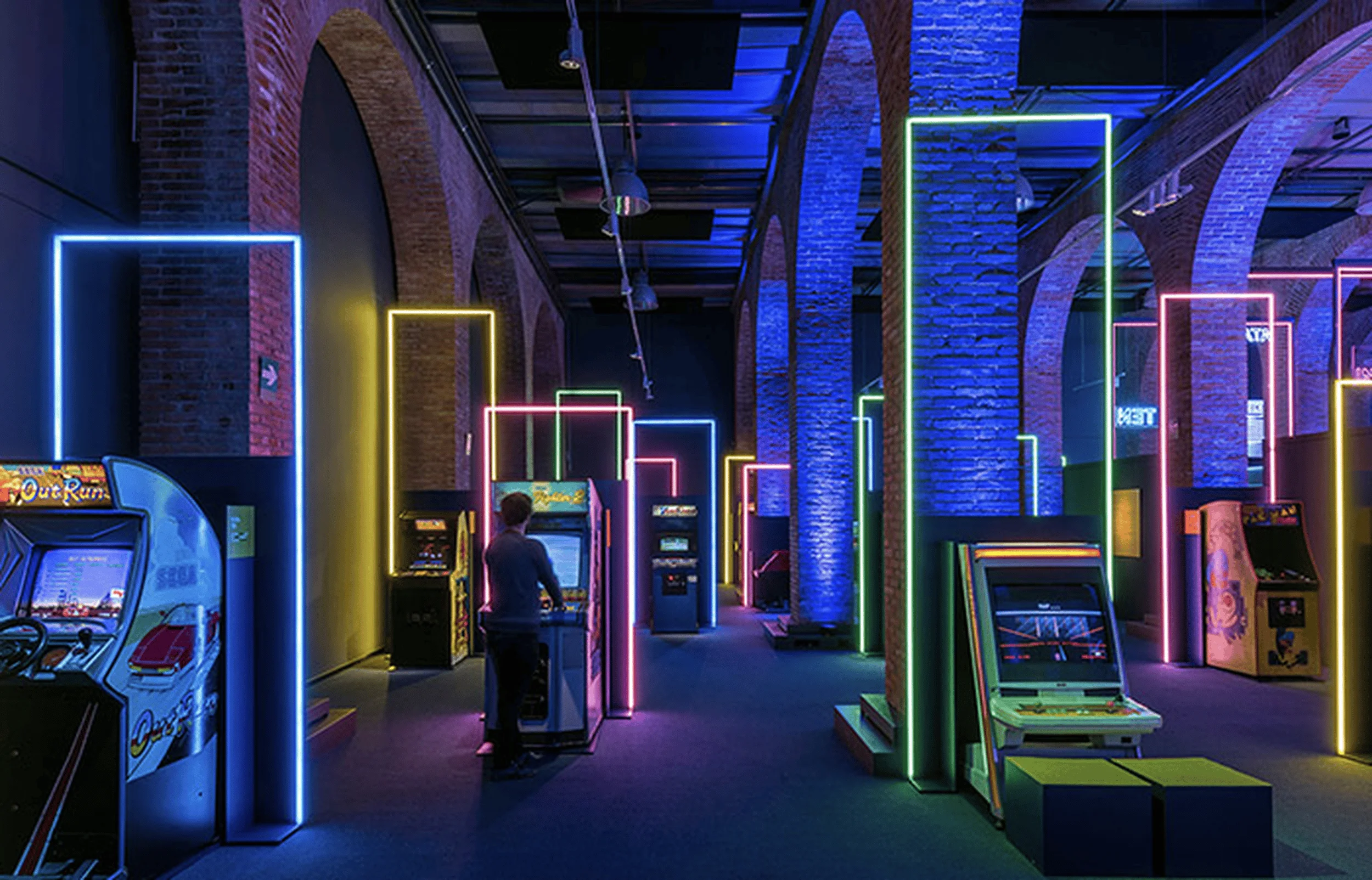
Minimalist interior design of Meishi Meike Marble Exhibition Hall embraces natural stone.
Contents
Embracing the Essence of Stone: Design Concept and Objectives
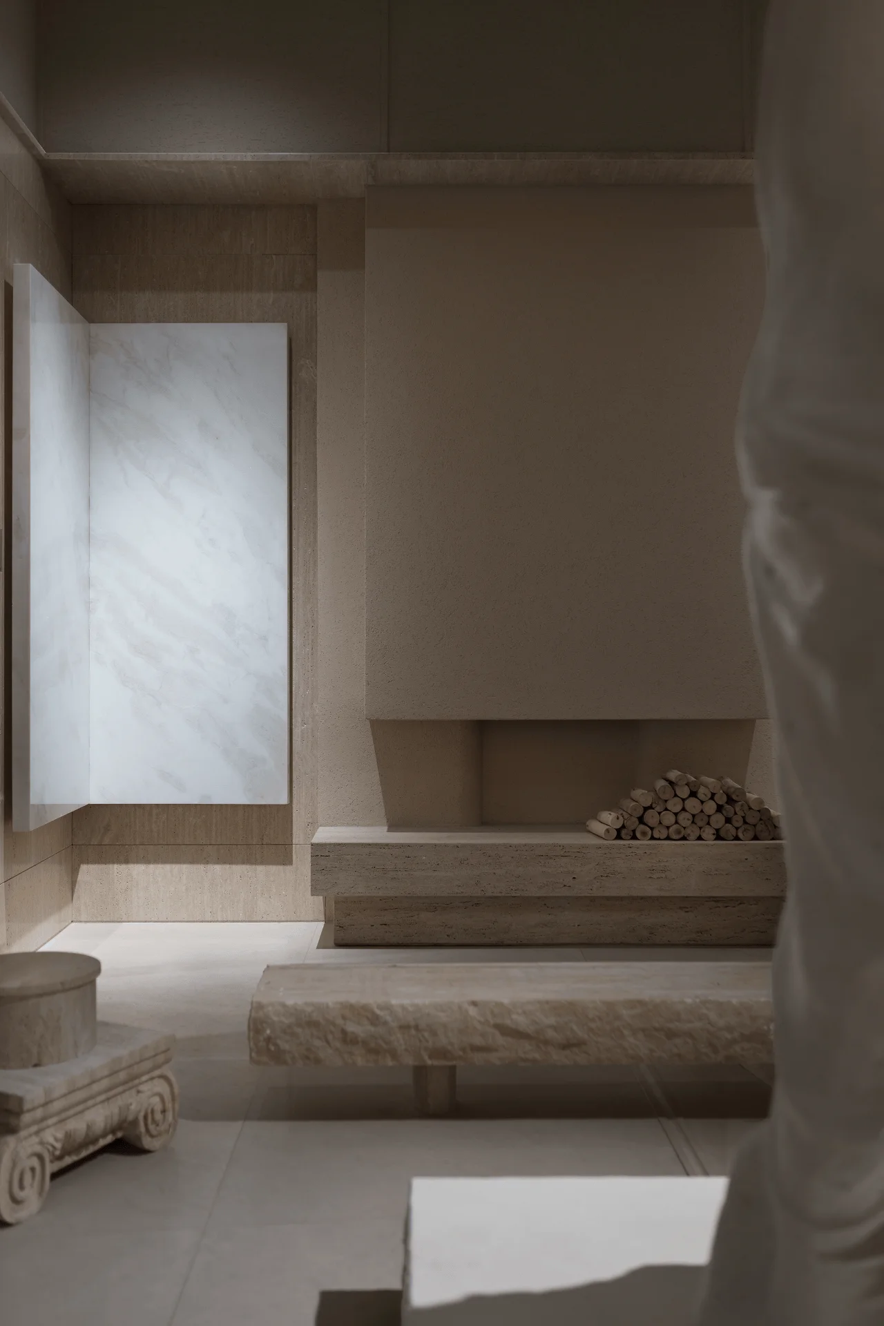
The Meishi Meike Marble Exhibition Hall is more than just a showroom; it’s a sanctuary dedicated to the inherent beauty of natural stone. The design concept, inspired by the ancient Chinese philosophy of turning clay into a vessel, revolves around showcasing the raw material in its purest form. The goal was to create a minimalist space that allows the inherent textures and colors of the stone to take center stage, emphasizing its tactile and aesthetic qualities through an exploration of inward experience. This minimalist interior design approach celebrates the authenticity of the materials, creating a space that is both visually striking and emotionally resonant. The use of natural light, clean lines, and a neutral color palette creates a sense of harmony and balance, allowing visitors to appreciate the subtle nuances of each stone.
A Journey Through Stone: Layout, Circulation, and Spatial Organization
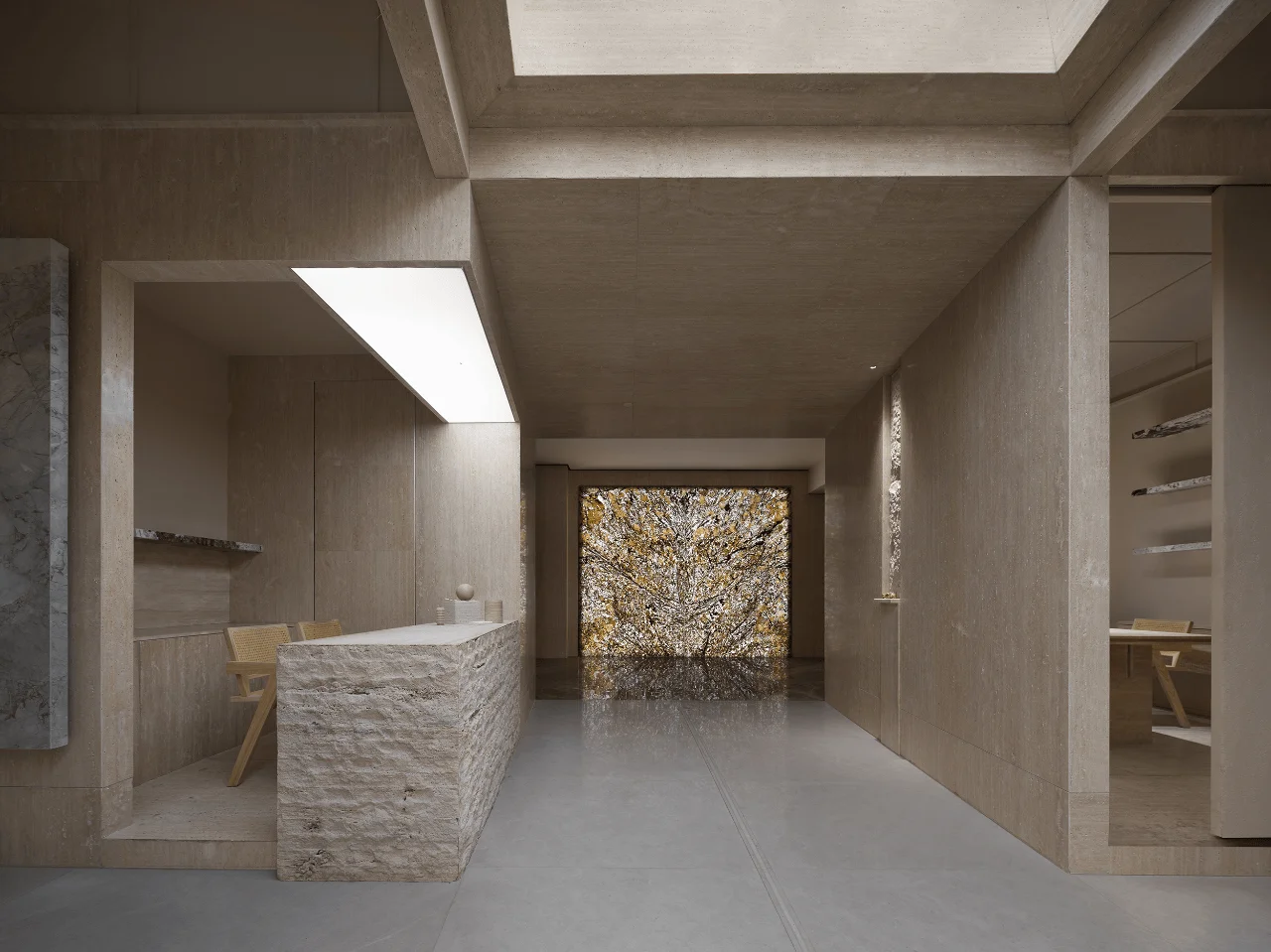
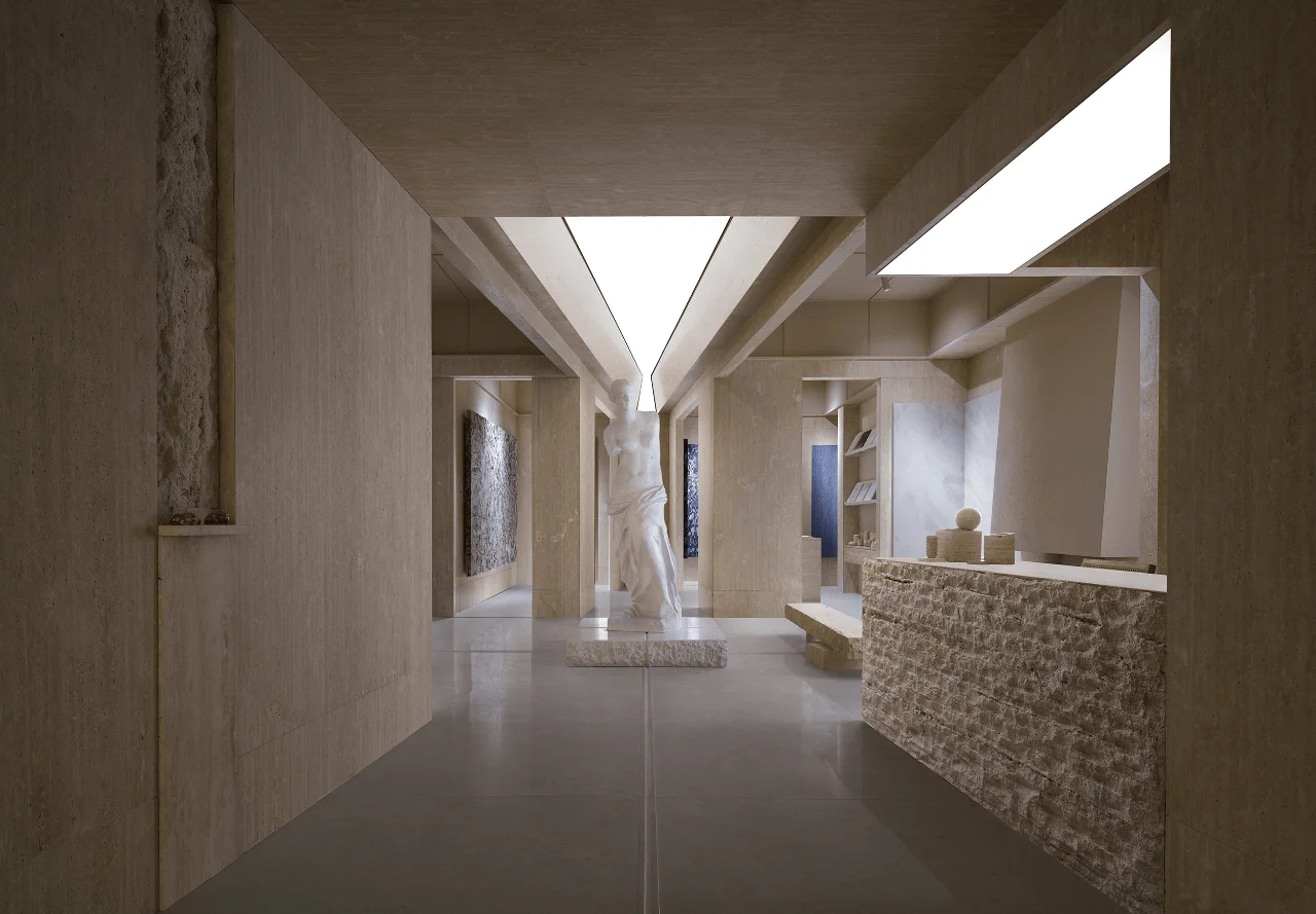
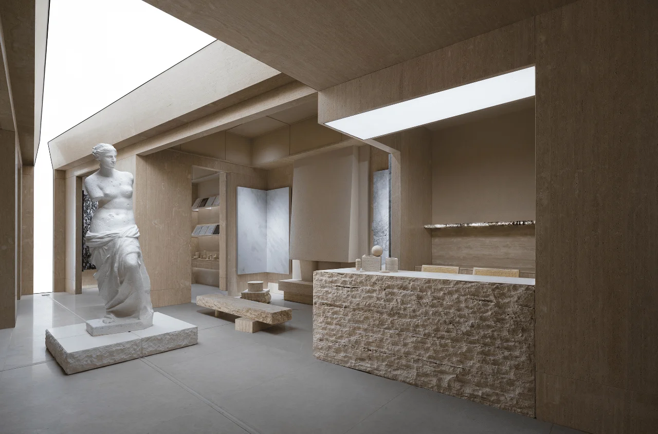
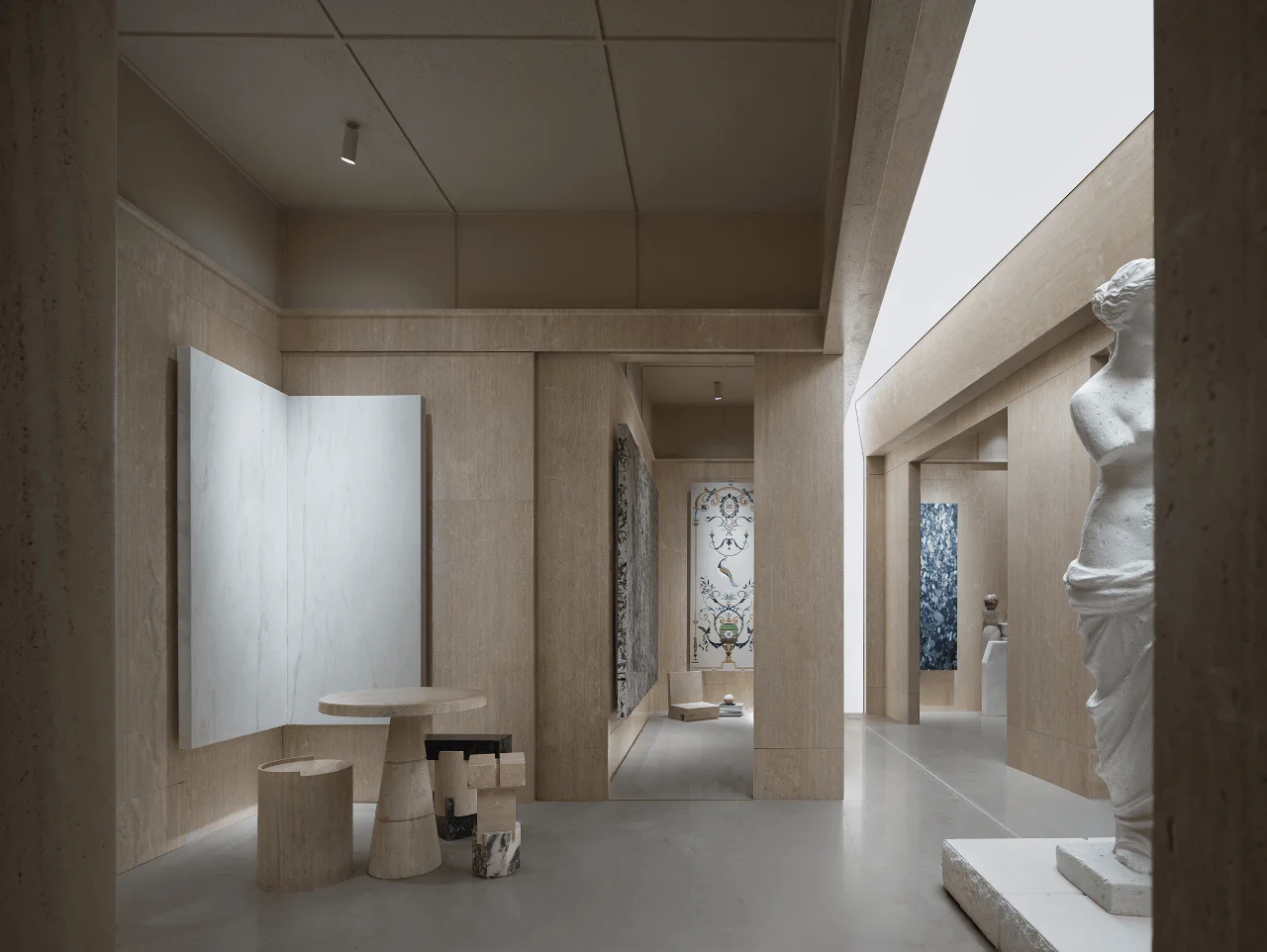
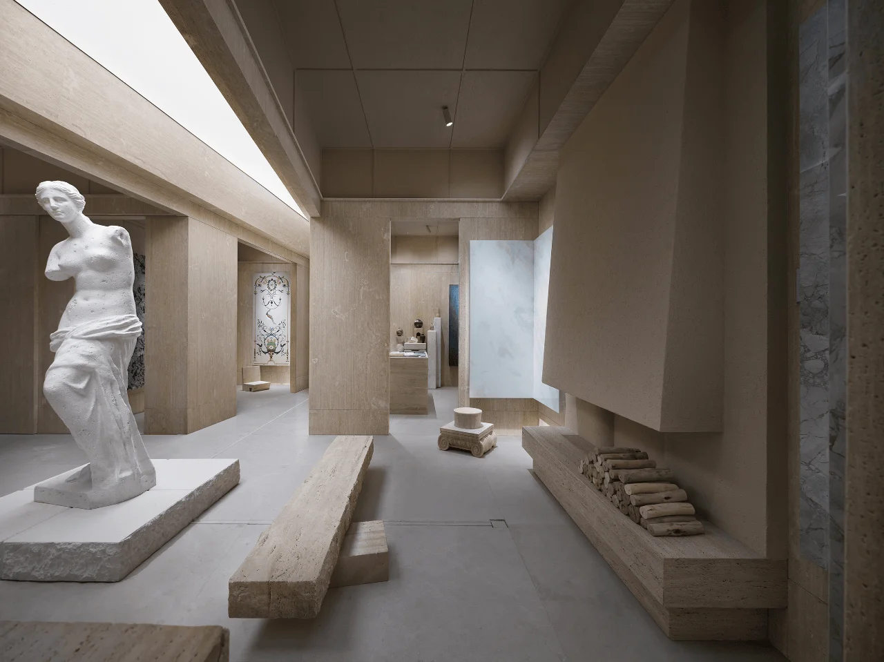
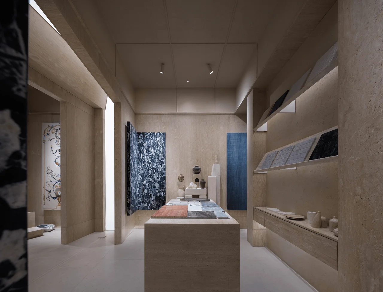
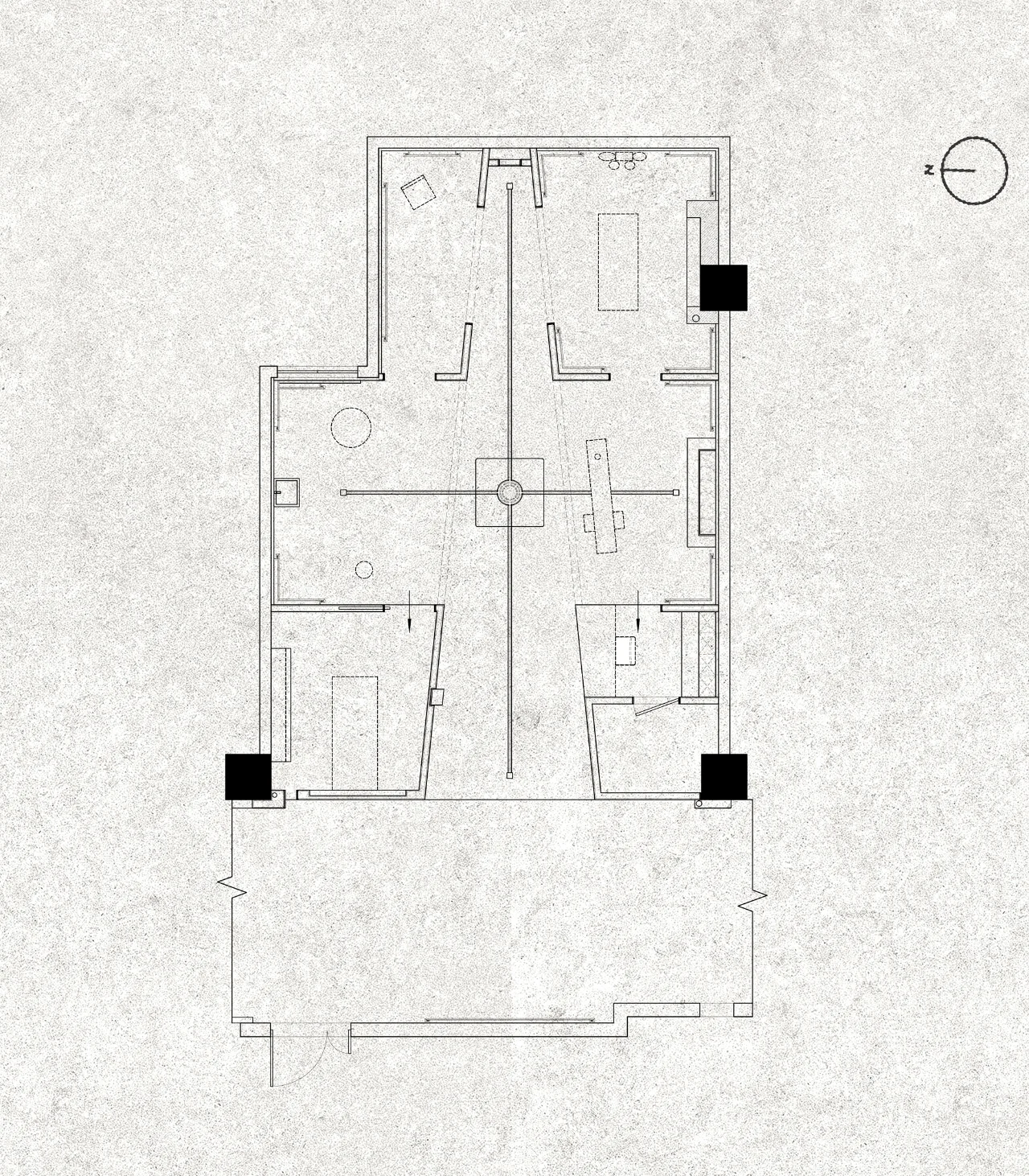
Upon entering the Meishi Meike Marble Exhibition Hall, visitors are guided through a carefully choreographed spatial journey. The layout, inspired by the concept of ritual and ceremony, is divided into three distinct sections: reception, display, and exploration. Each zone seamlessly transitions into the next, creating a fluid and engaging experience. This minimalist interior design principle is applied to create a sense of openness and flow, encouraging visitors to explore the space at their own pace. The spatial organization is further enhanced by the strategic use of light and shadow, highlighting the unique characteristics of each stone. The play of light and shadow also adds a dynamic element to the space, creating a sense of movement and discovery.
Framing the Narrative: Visual Perspectives and Aesthetics
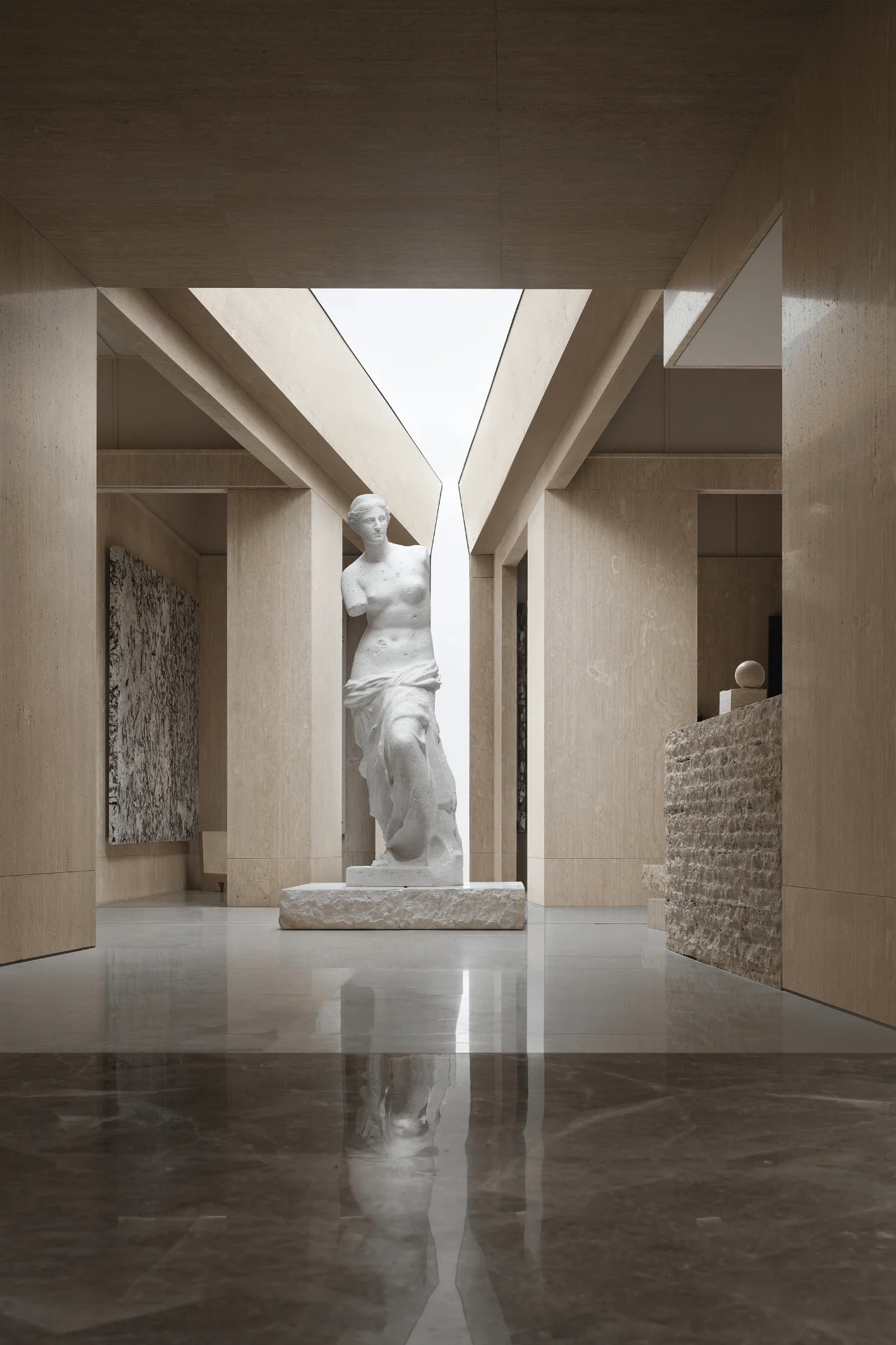
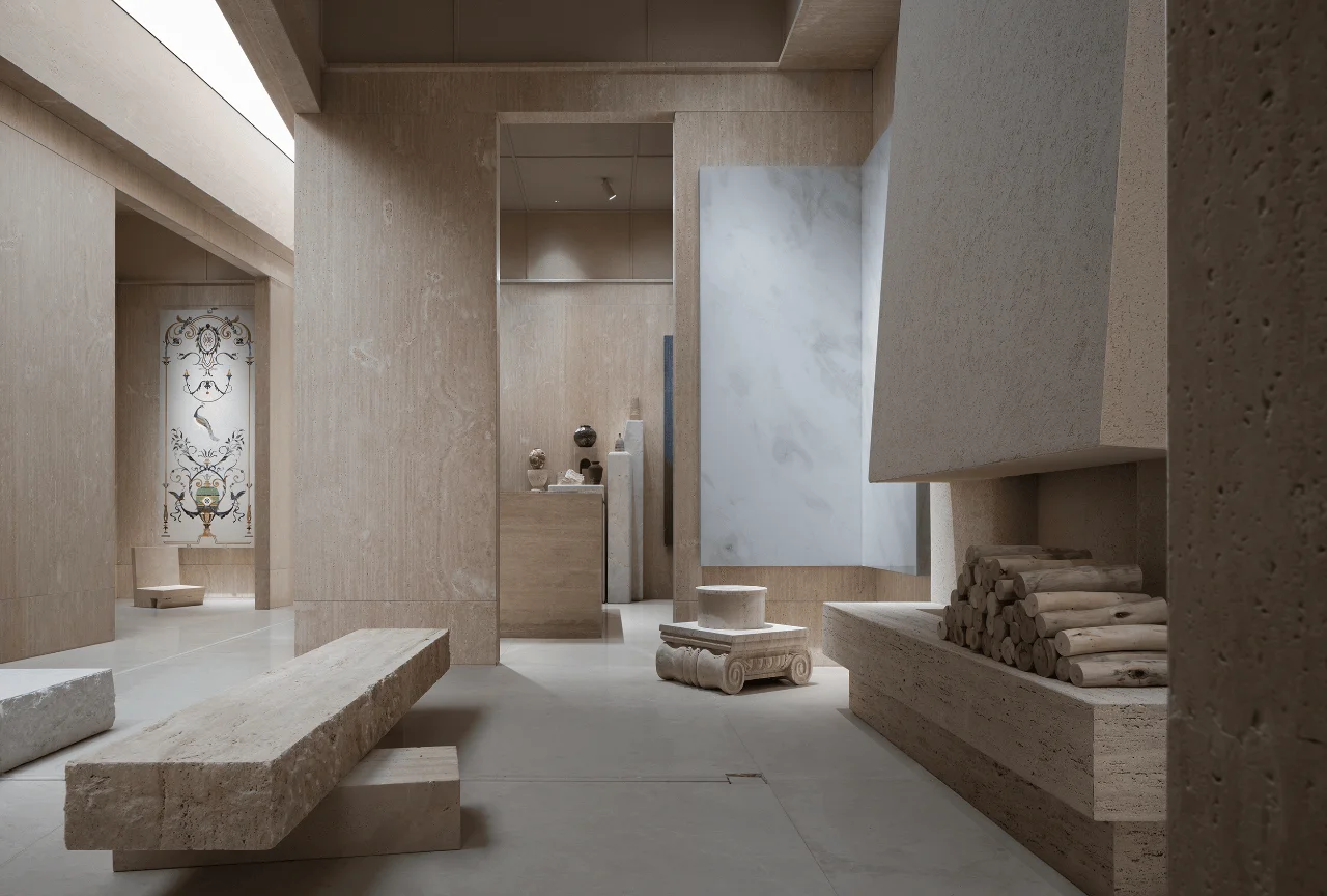
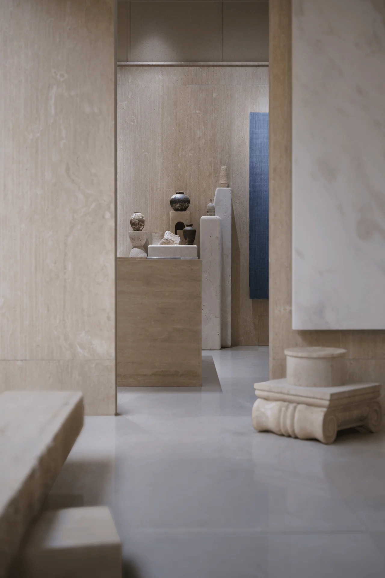
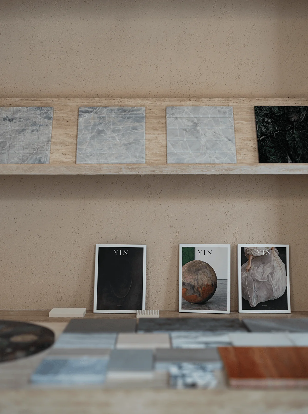
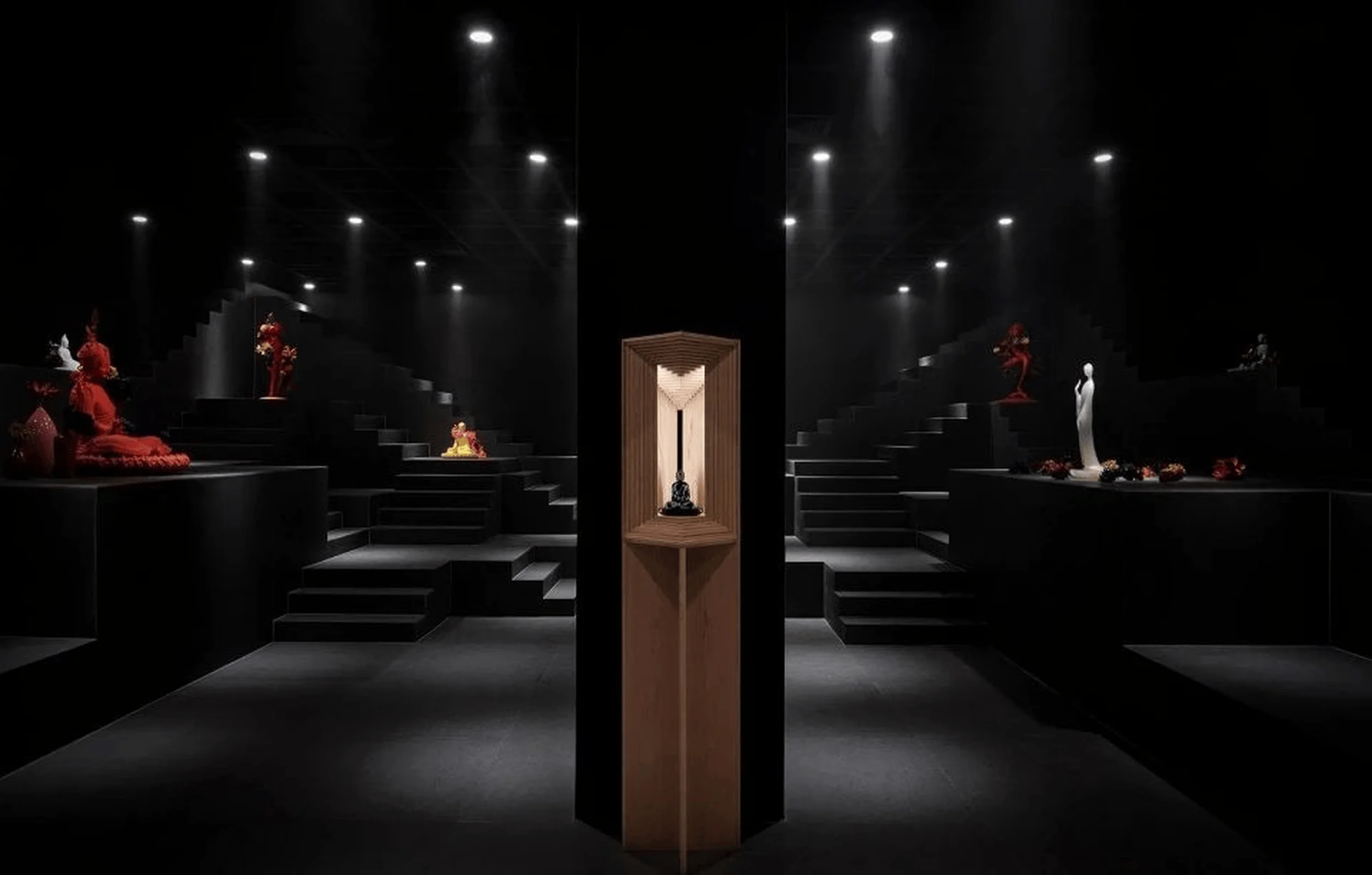
The design of the Meishi Meike Marble Exhibition Hall cleverly employs the principles of perspective to enhance the visual experience. Inspired by the concept of pictorial space in painting, the use of one-point perspective creates a sense of depth and draws the viewer’s eye to specific focal points within the space. This minimalist interior design technique creates a sense of drama and intrigue, guiding the visitor’s gaze through the space. The use of light and shadow further enhances this effect, creating a dynamic interplay that highlights the textures and colors of the stone. The overall aesthetic is one of understated elegance, allowing the natural beauty of the stone to shine through.
Illuminating the Beauty: Natural Light and Lighting Design
Natural light plays a crucial role in the design of the Meishi Meike Marble Exhibition Hall. Large skylights and strategically placed openings allow soft, diffused daylight to flood the space, enhancing the natural textures and colors of the stone. This minimalist interior design principle of utilizing natural light creates a warm and inviting atmosphere, while also minimizing the need for artificial lighting. Artificial lighting is used sparingly and strategically, highlighting specific areas and creating a sense of drama and focus. The interplay of natural and artificial light creates a dynamic and engaging environment, showcasing the beauty of the marble in its best light.
A Symphony of Textures: Material Palette and Tactile Experiences
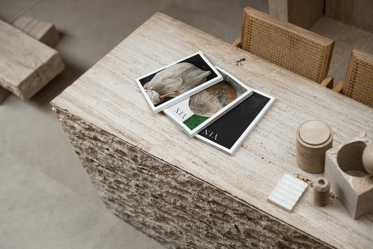
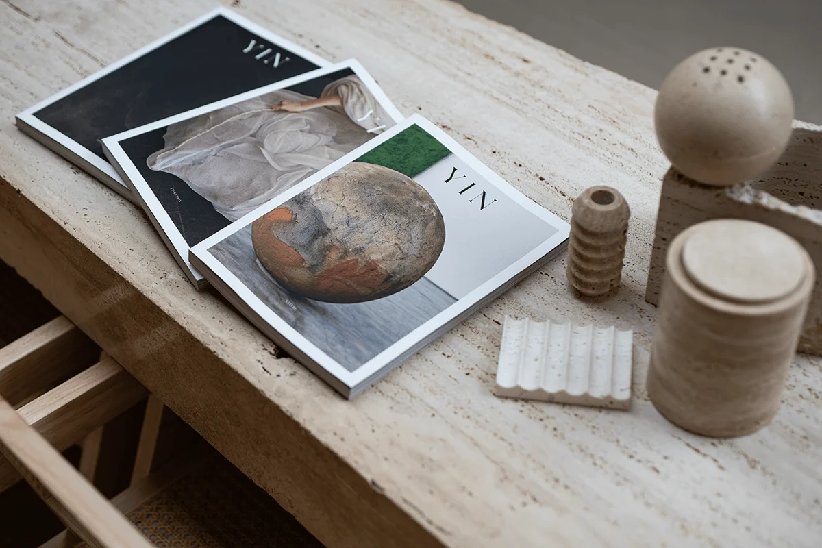
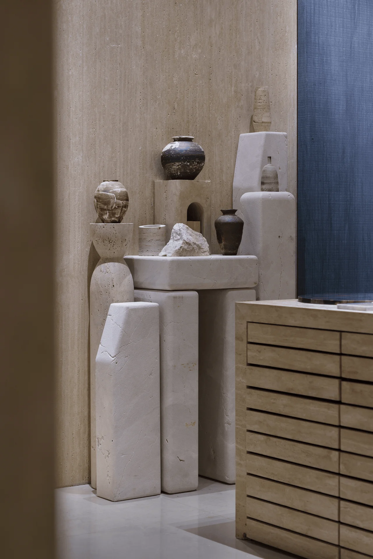
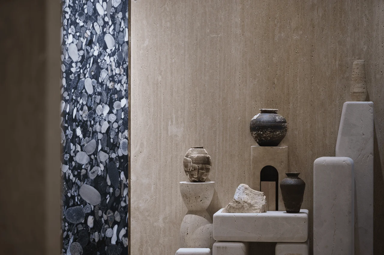
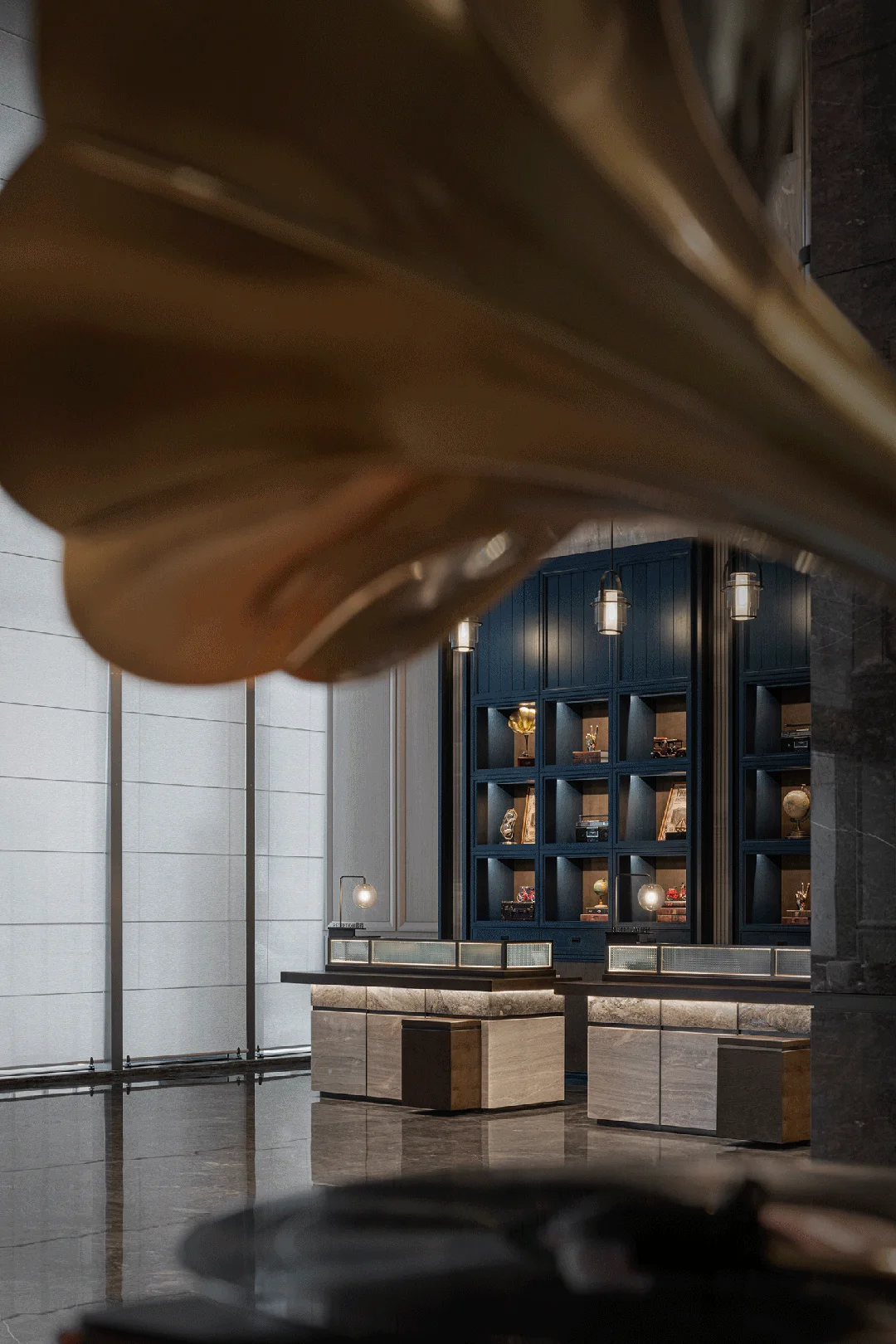
The material palette of the Meishi Meike Marble Exhibition Hall is dominated by natural stone, with a focus on showcasing the variety and versatility of this material. From the smooth, polished surfaces of the floors and walls to the rough-hewn textures of the display pedestals, the space is a symphony of tactile experiences. The use of natural stone in minimalist interior design creates a sense of harmony and connection with nature. The neutral color palette of the stone allows other elements, such as the furniture and lighting, to stand out. The interplay of textures and colors creates a visually stimulating environment that encourages visitors to explore and engage with the space.
Project Information:
Project Type: Exhibition Hall
Architect: CITÉ Mind Kind Design
Area: 86㎡
Project Year: 2023
Country: China
Main Materials: Marble, Stone
Photographer: Aoxiang


