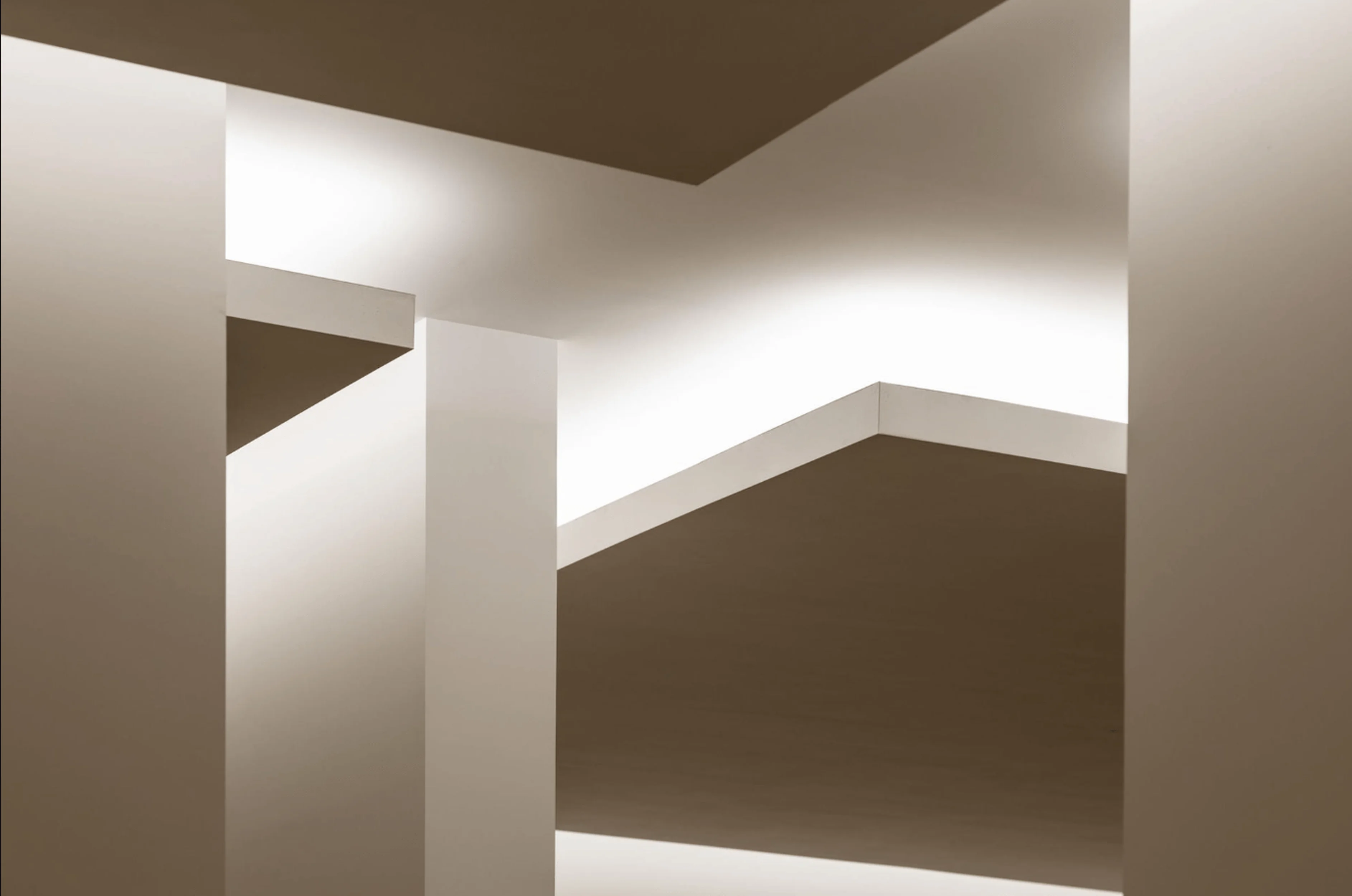
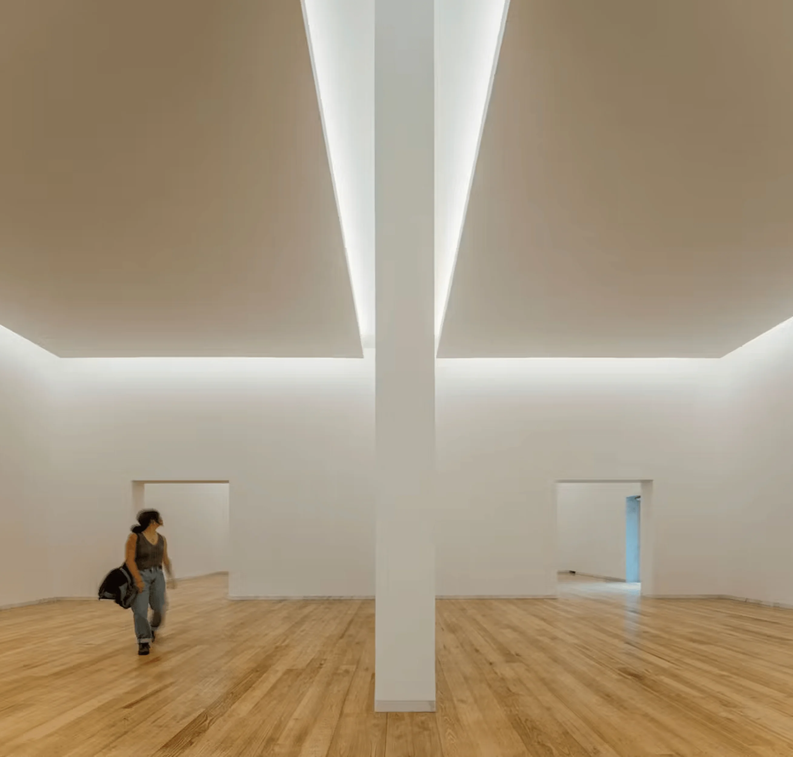
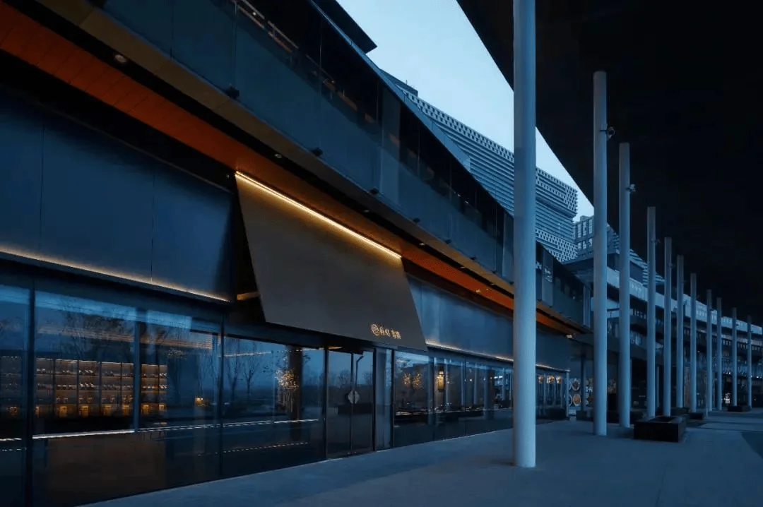
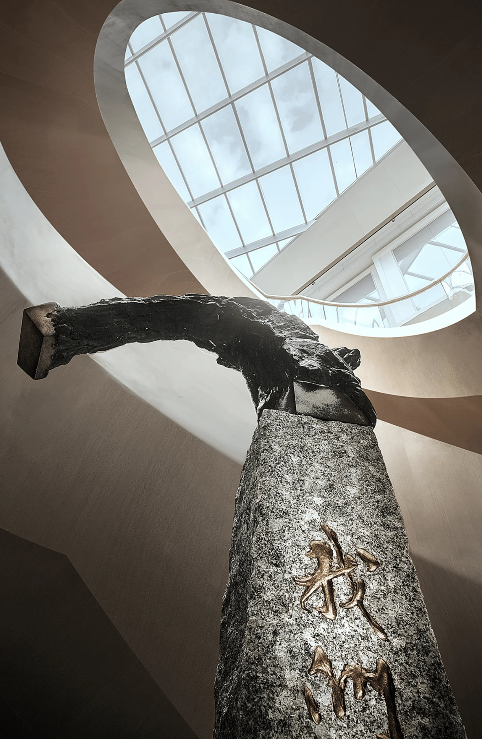
Álvaro Siza’s Siza Wing seamlessly integrates with Portugal’s Serralves Park, expanding the Serralves Museum with modern architectural design principles.
Contents
Project Background
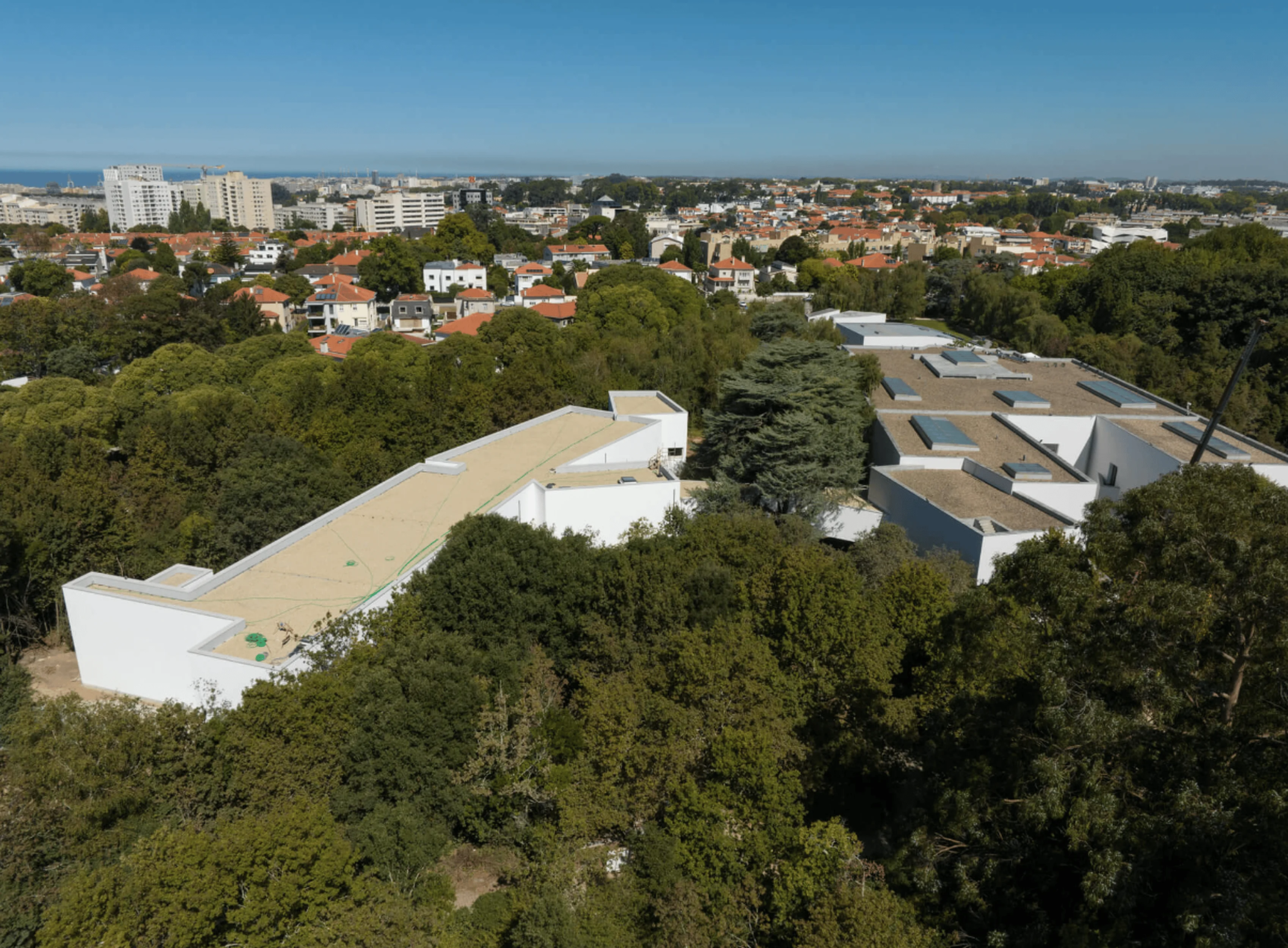
The Serralves Museum, a prominent contemporary art museum in Portugal, recently inaugurated the Siza Wing, a significant expansion designed by the renowned architect Álvaro Siza. The new wing, a three-story structure, adds 4,180 square meters of space to the museum, significantly enhancing its exhibition capabilities and archive storage. The Siza Wing represents a harmonious blend of modern museum design with the natural landscape of Serralves Park, echoing Siza’s signature architectural style.
Design Concept and Objectives
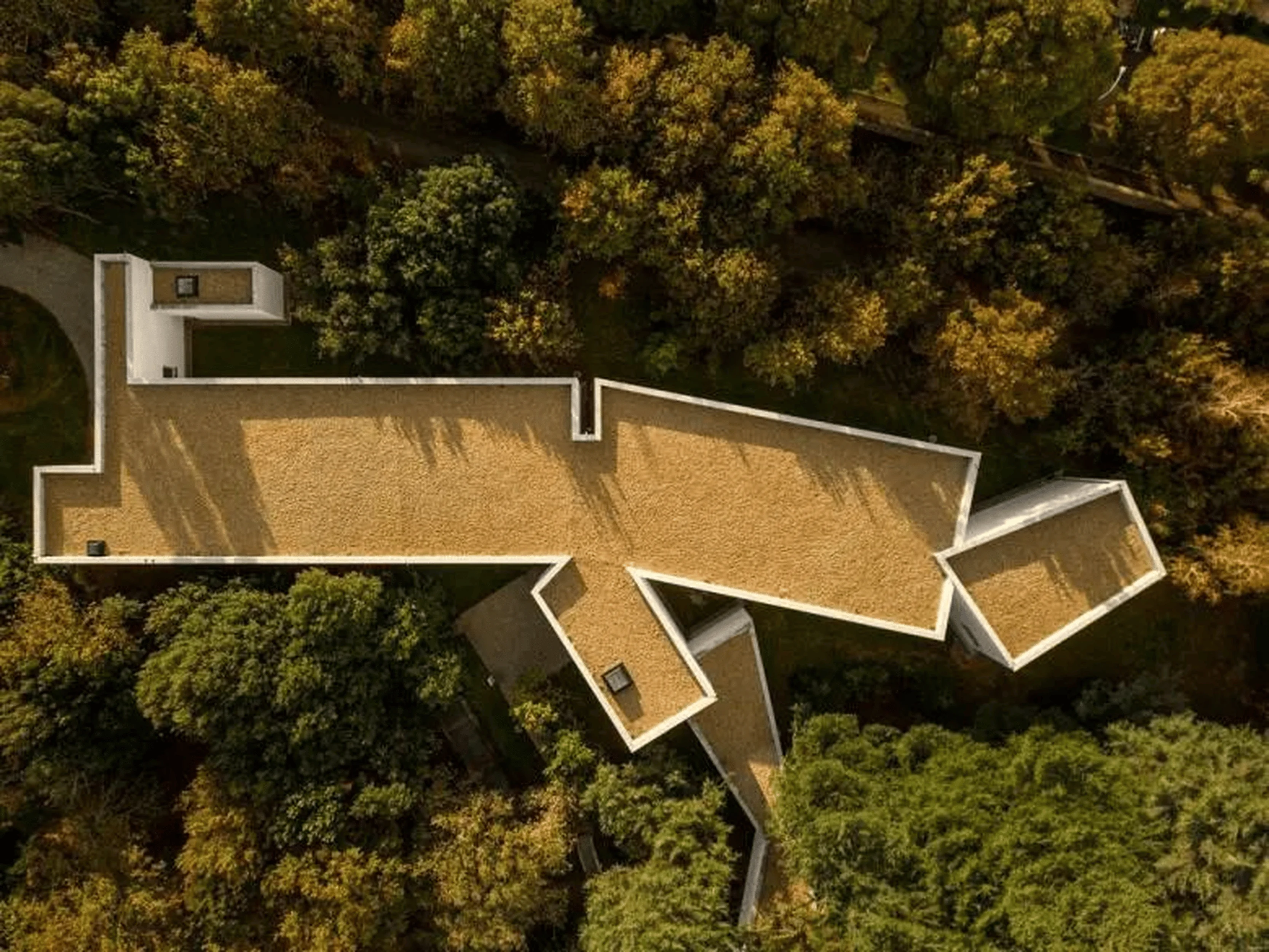
Álvaro Siza’s design for the Siza Wing focuses on integrating the new structure with the existing museum and the surrounding parkland. The wing’s form and material palette echo the original Serralves Museum, which Siza also designed, while also introducing distinctive elements, such as triangular windows. The design aimed to expand the museum’s exhibition space, create a dedicated area for the Siza archives, and enhance the visitor experience by fostering a connection with the natural environment. The architectural concept reflects a modern museum design that prioritizes functionality and aesthetic integration with its surroundings.
Exterior Design and Aesthetics
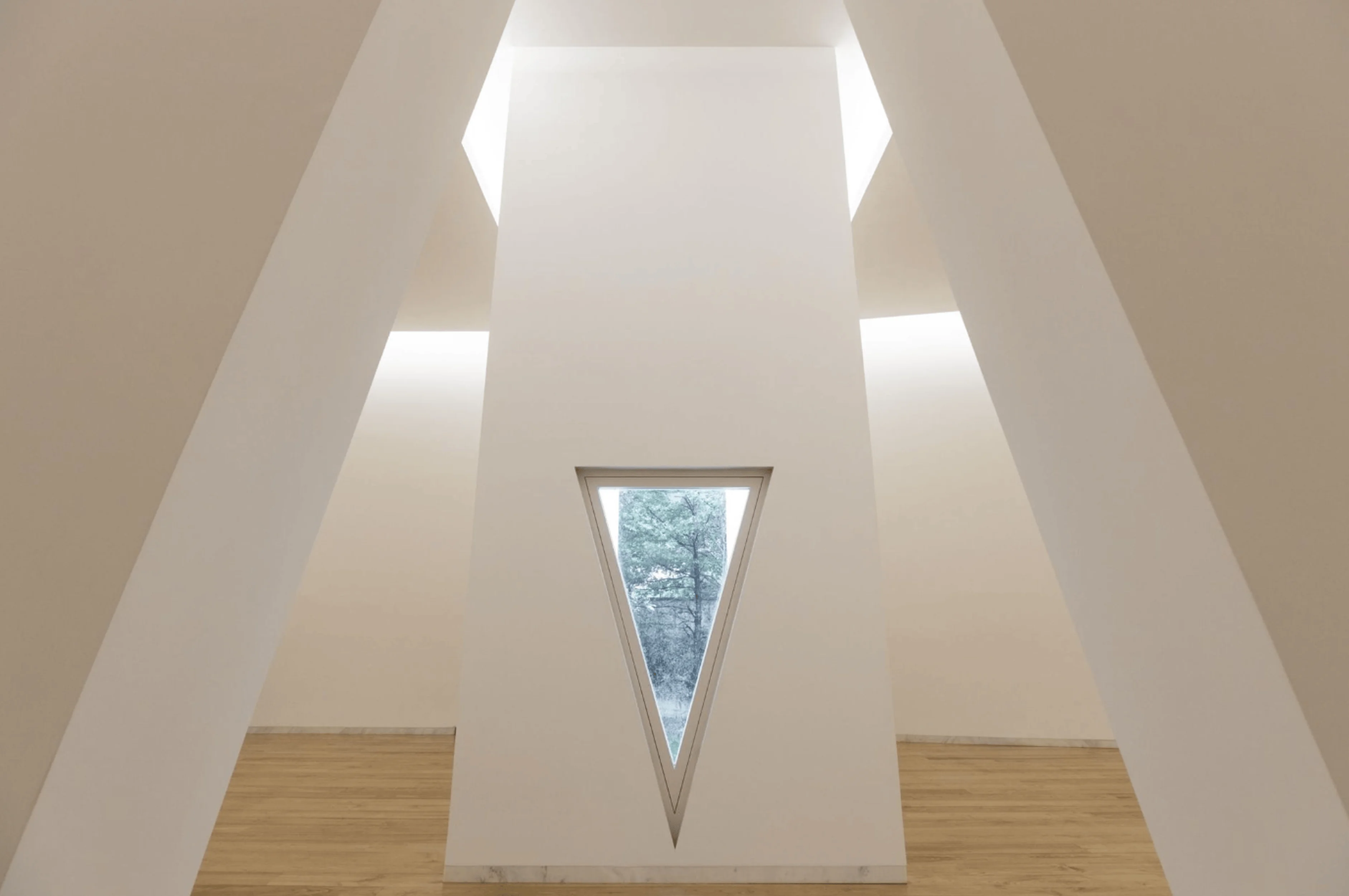
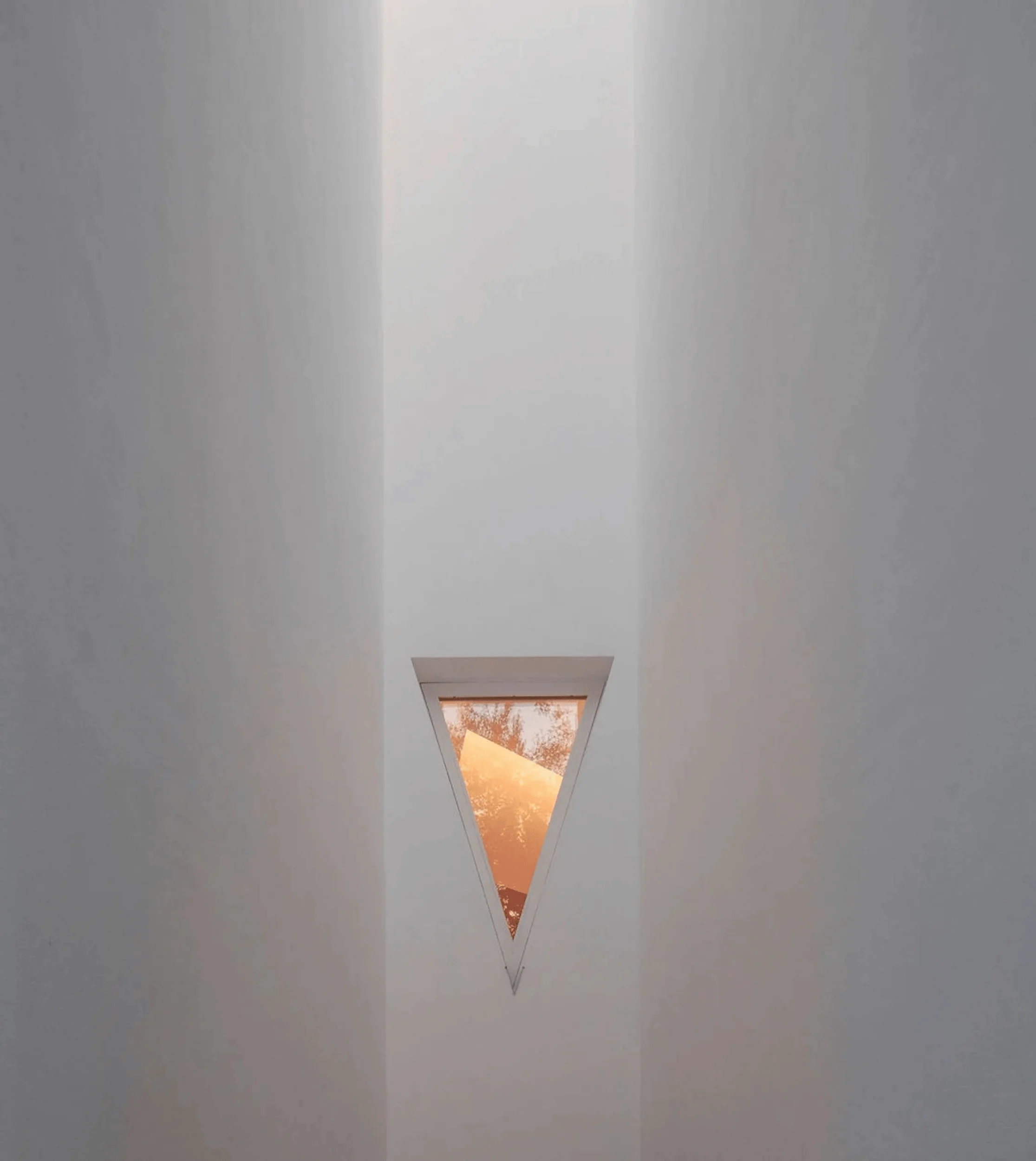
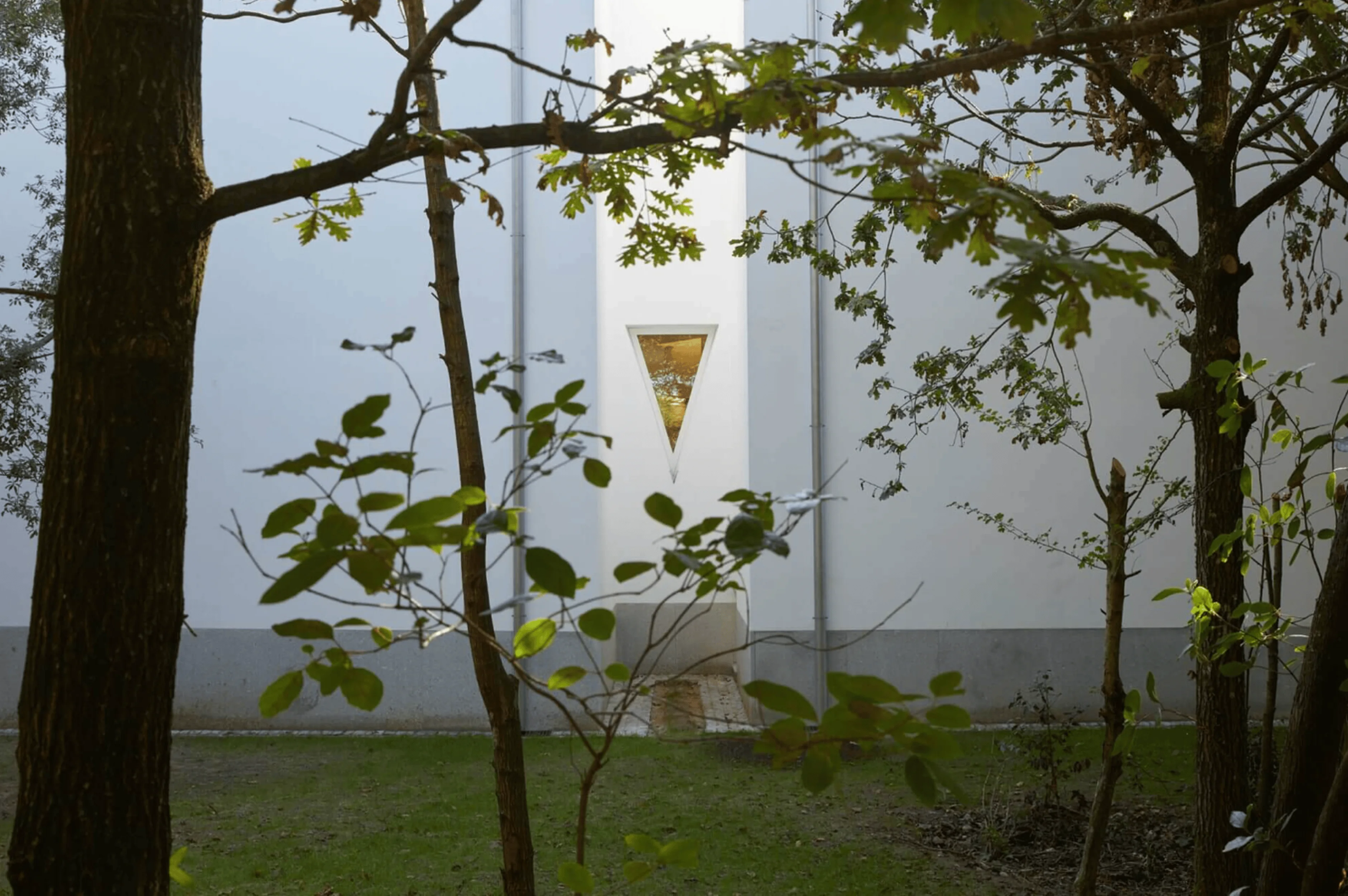
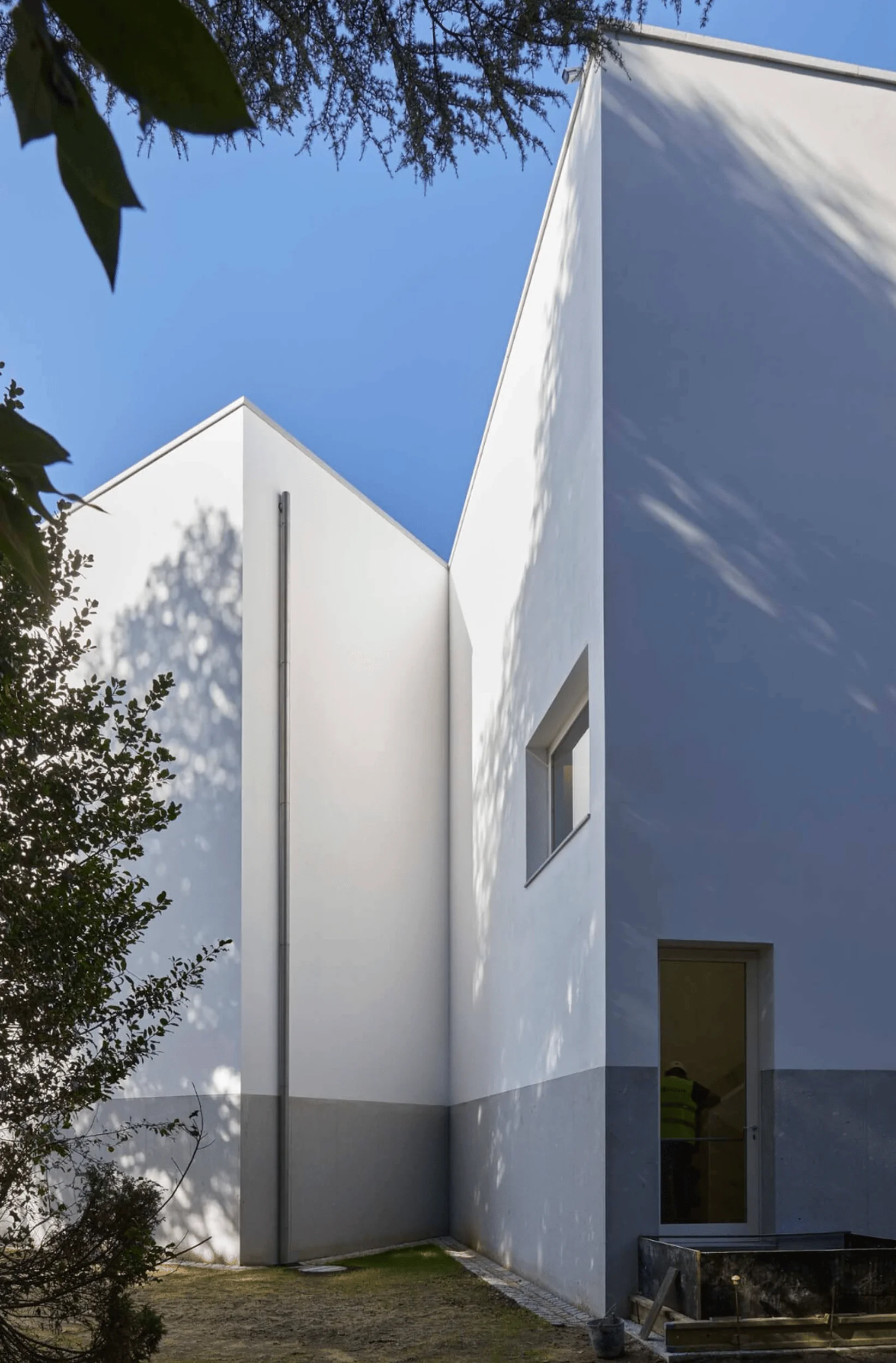
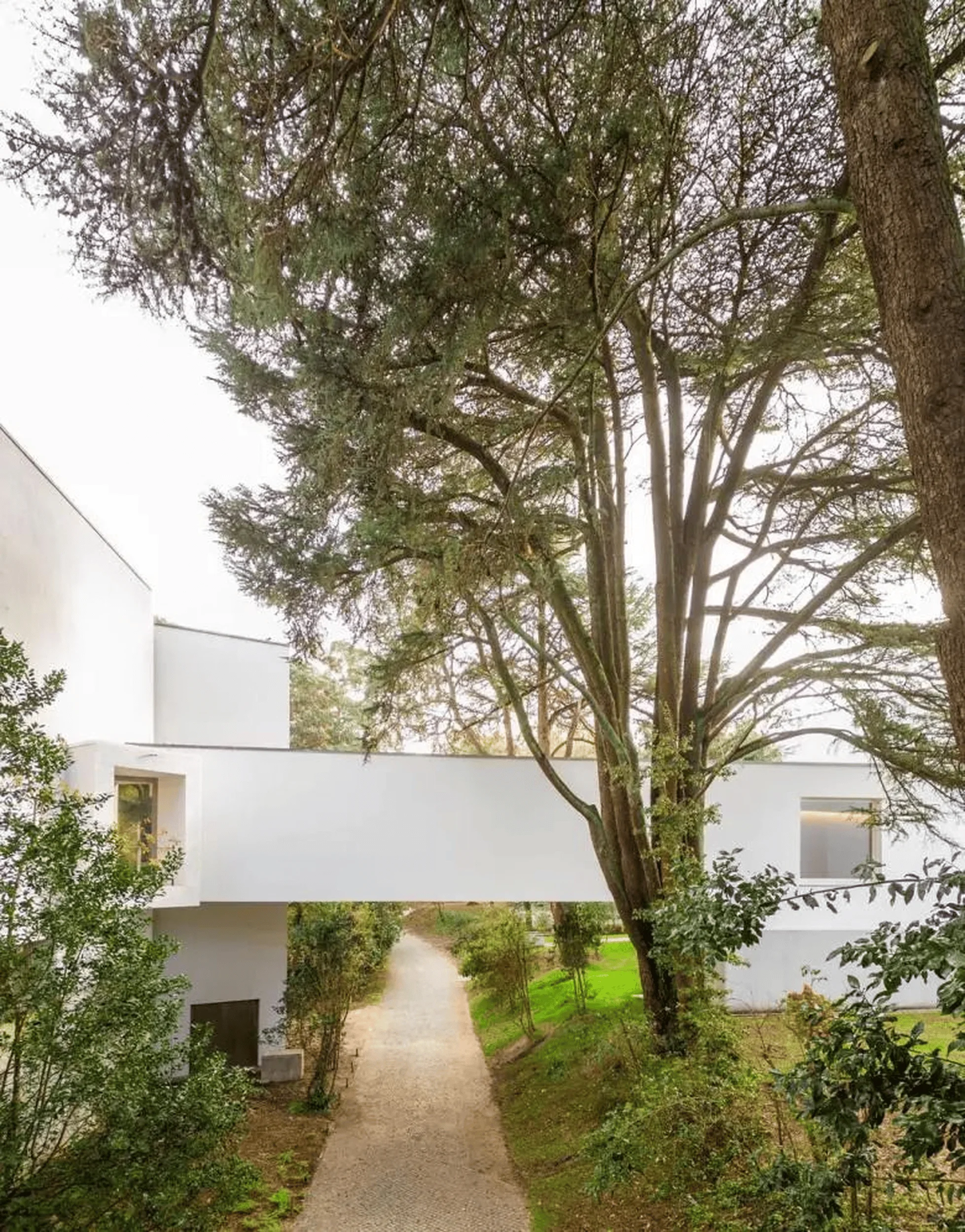
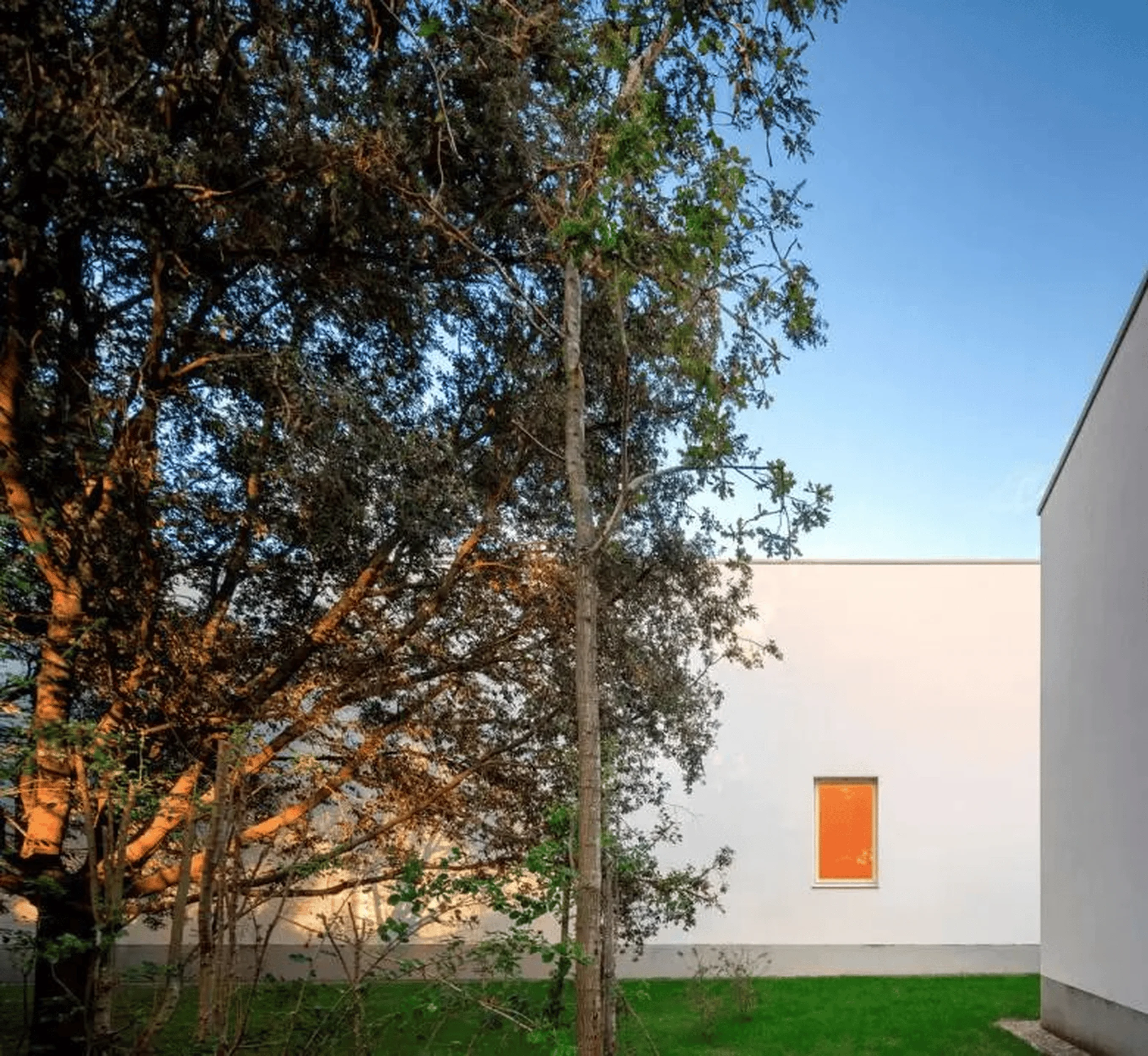
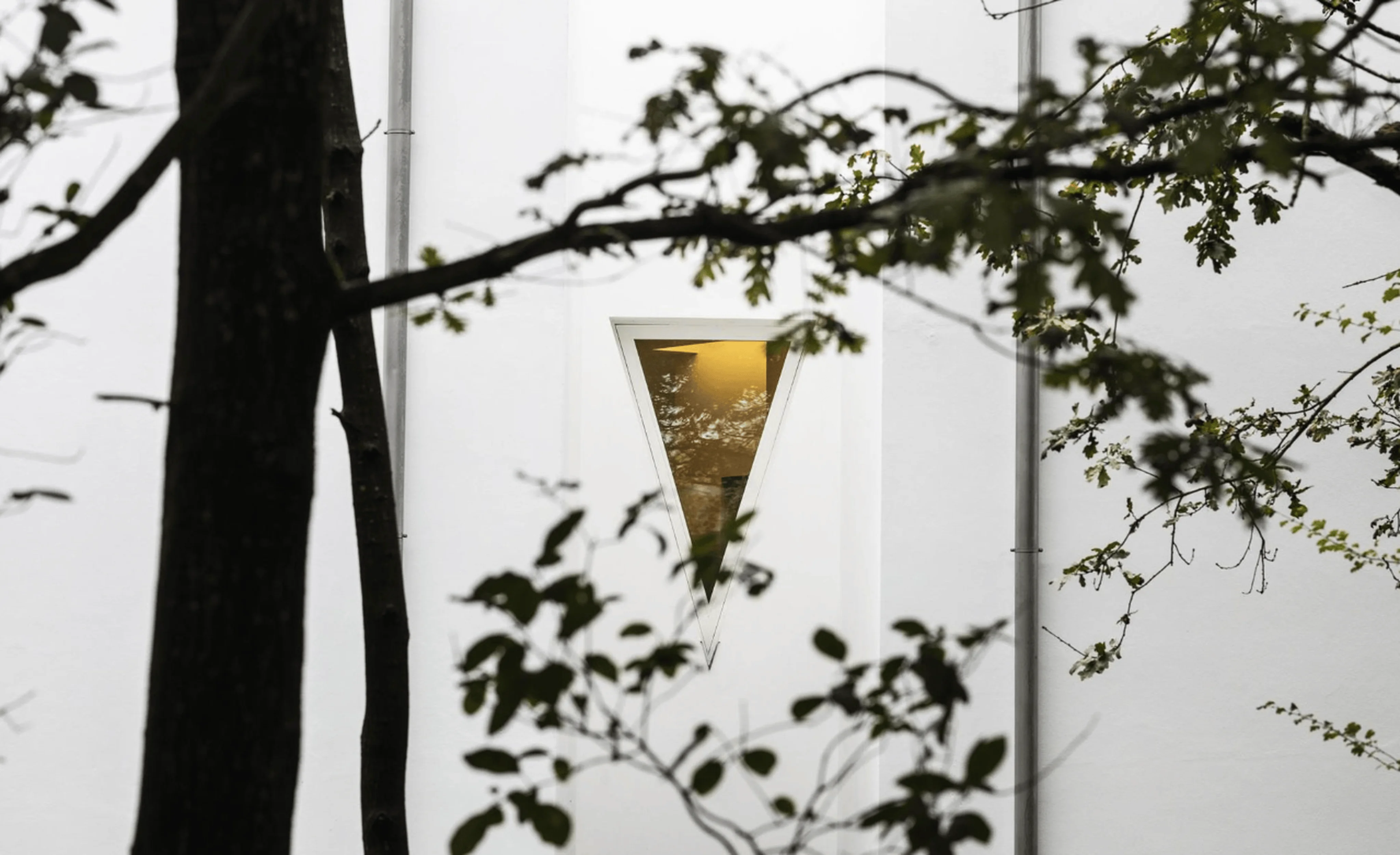
The exterior of the Siza Wing features a minimalist aesthetic, characterized by clean lines, sharp angles, and a muted color palette. The reinforced concrete walls are finished with painted stucco that aligns with granite cladding, creating a visual continuity with the existing museum building. A notable feature is the triangular window that punctuates the facade, offering a glimpse of the interior and creating a sense of intrigue. The bridge connecting the new wing to the main museum spans an existing walkway in Serralves Park, further emphasizing the integration of architecture and landscape in modern museum design.
Functionality and Spatial Planning
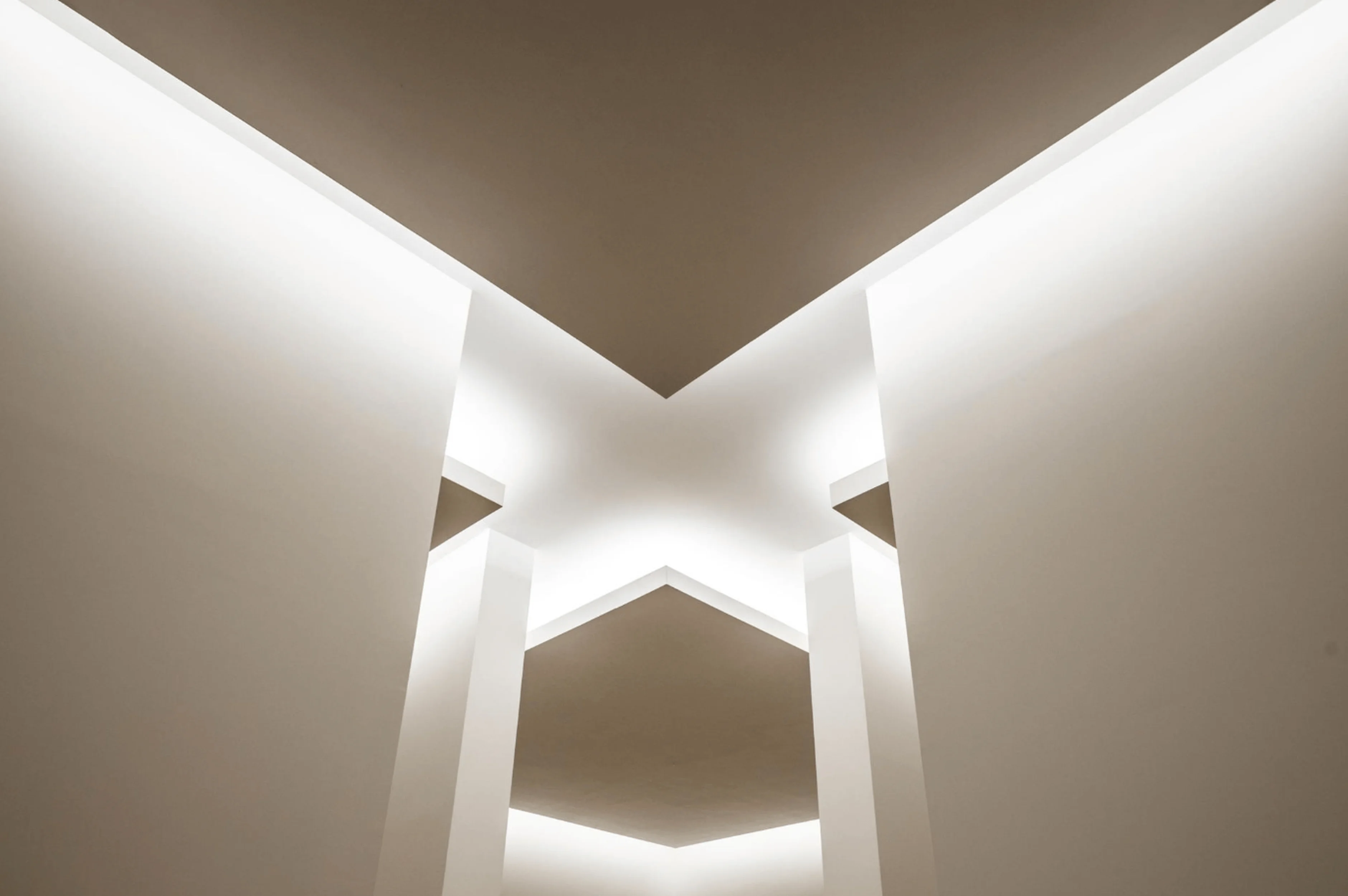
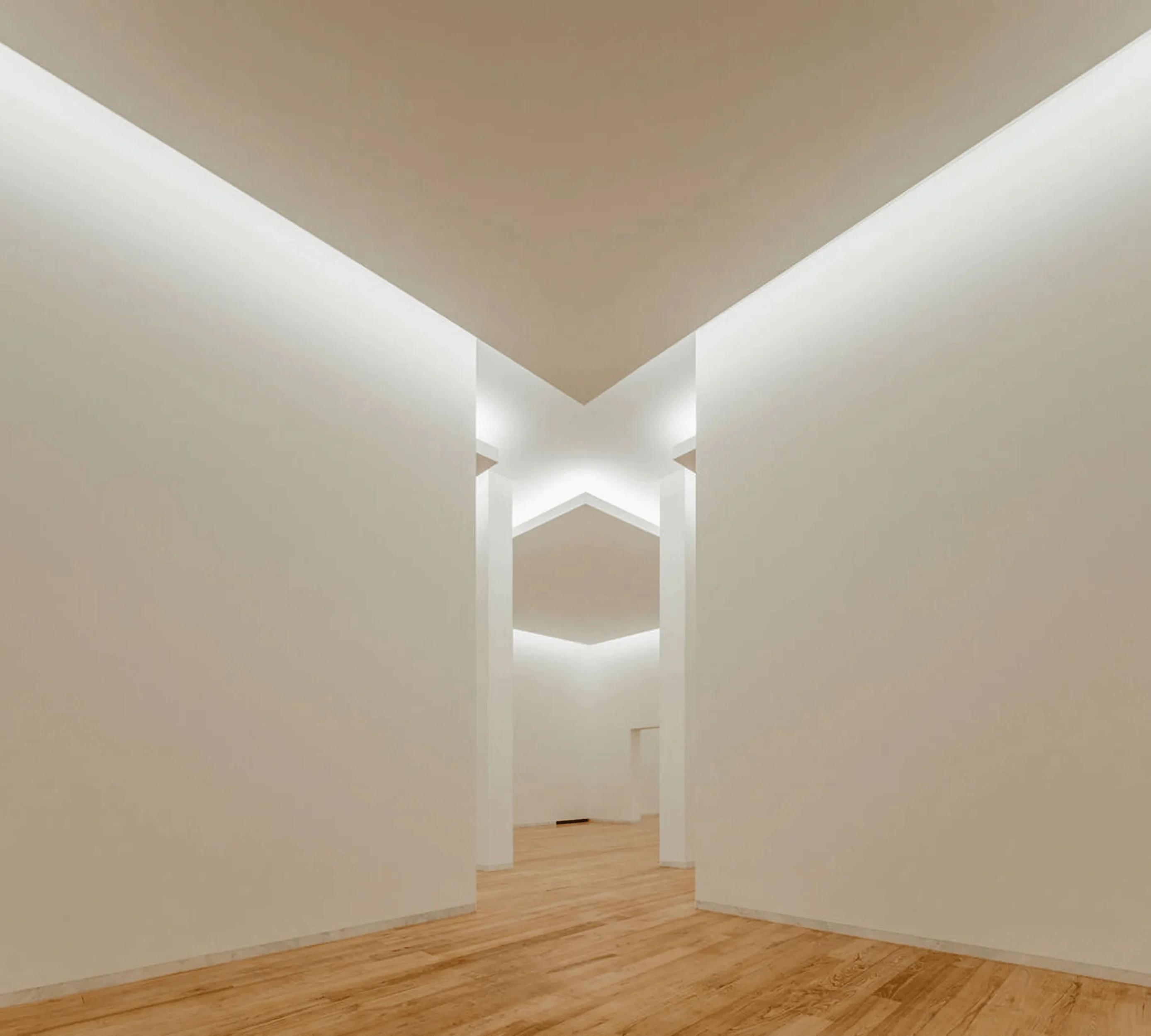
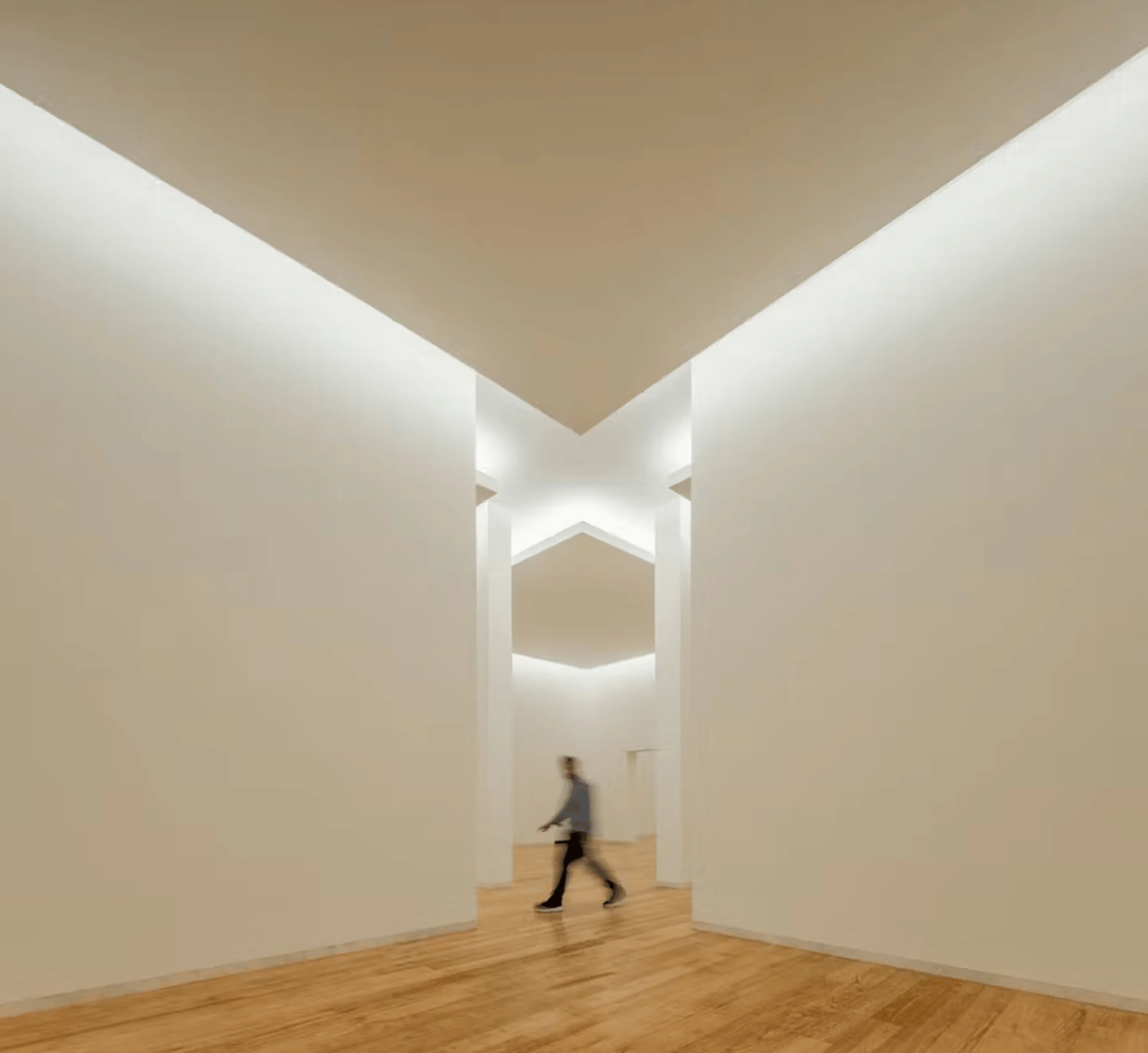
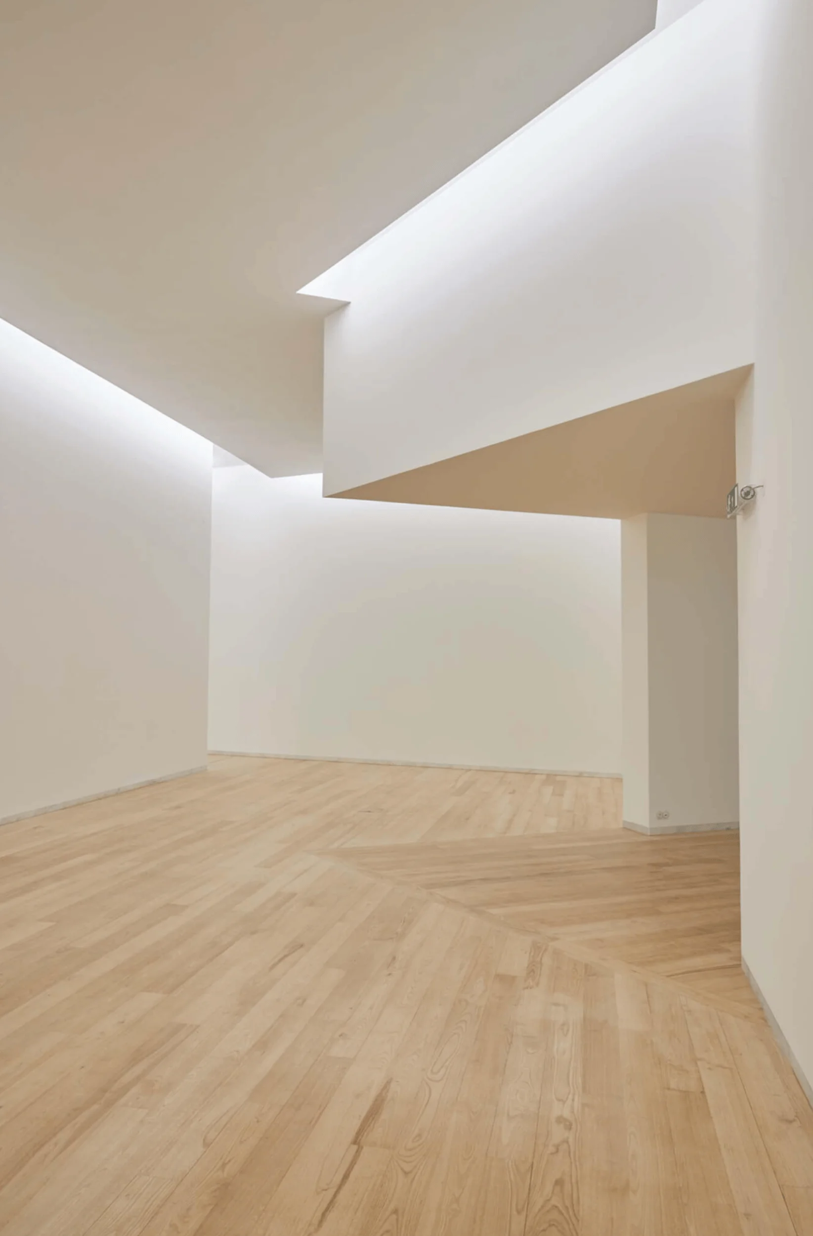
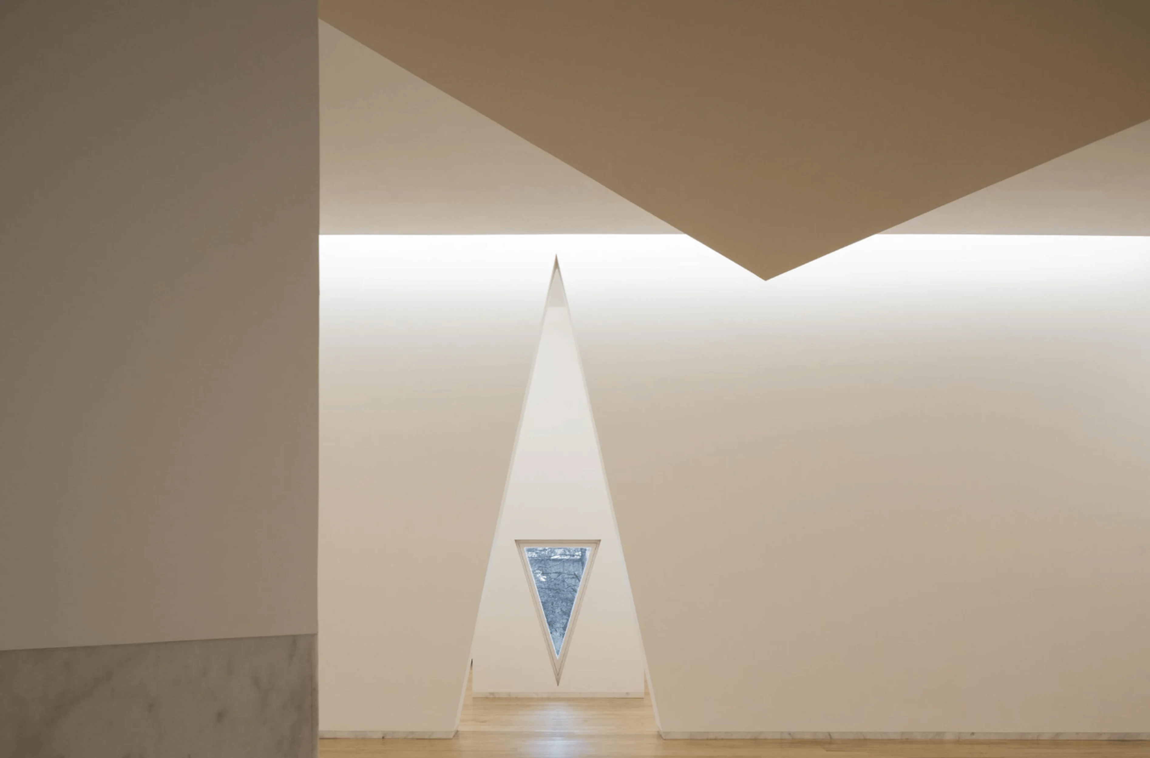
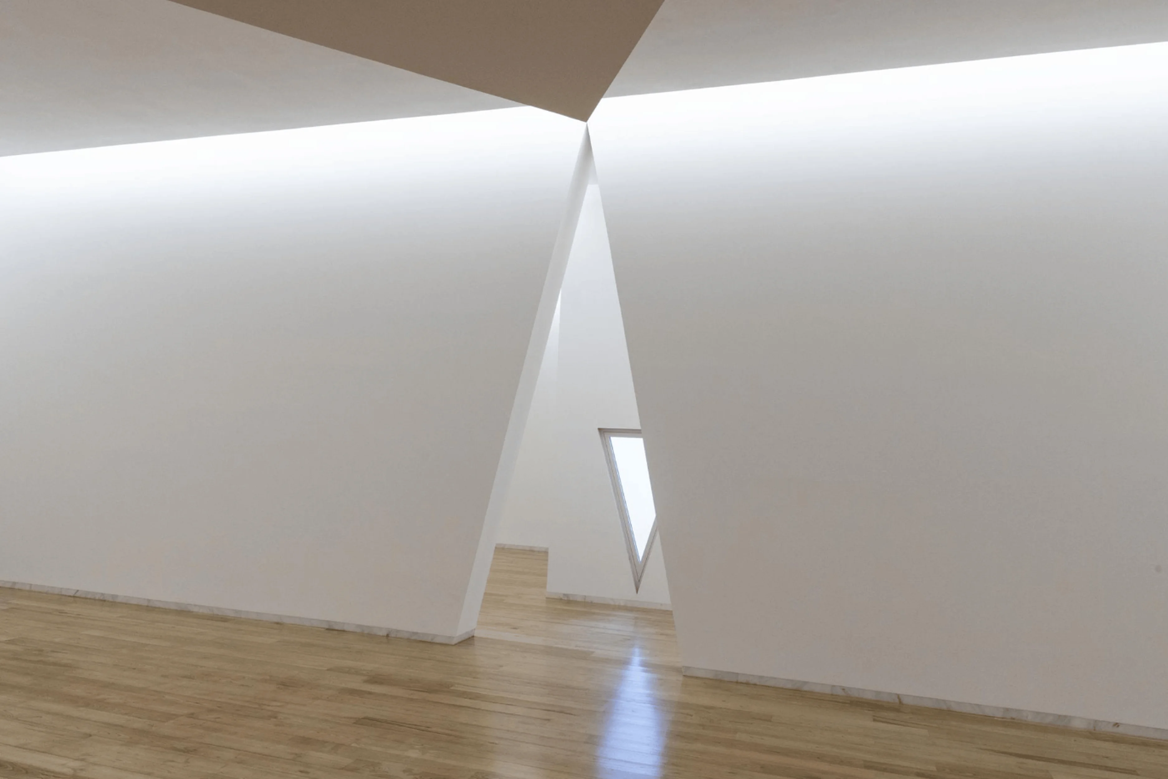
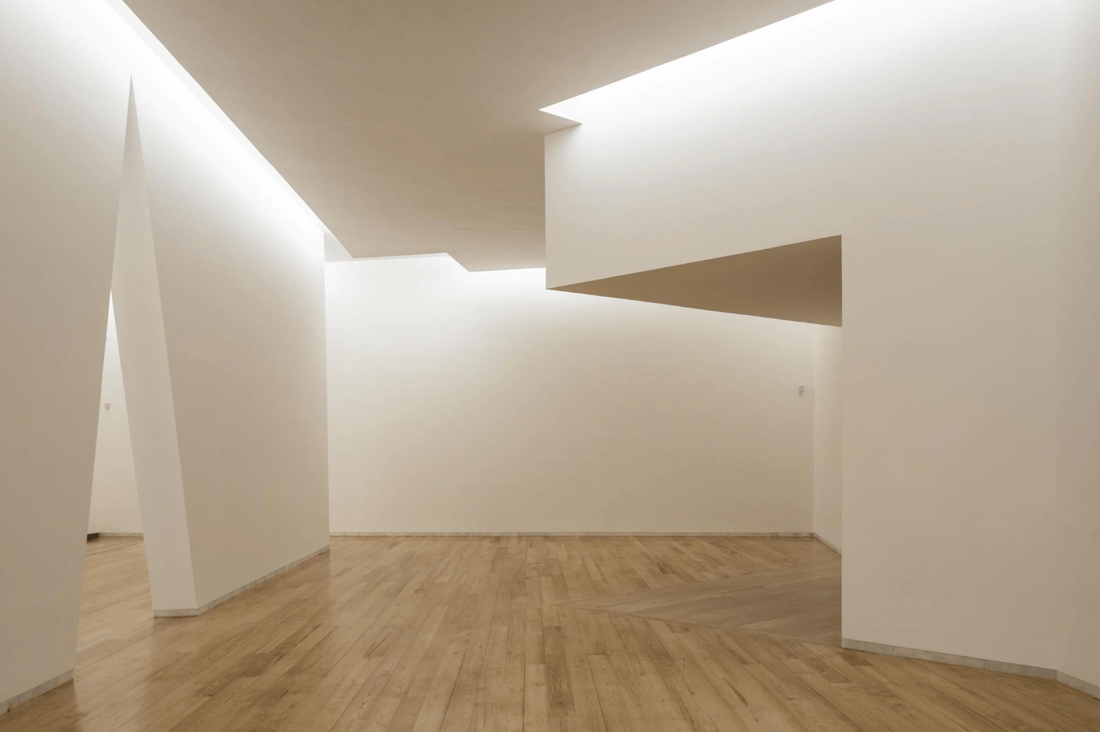
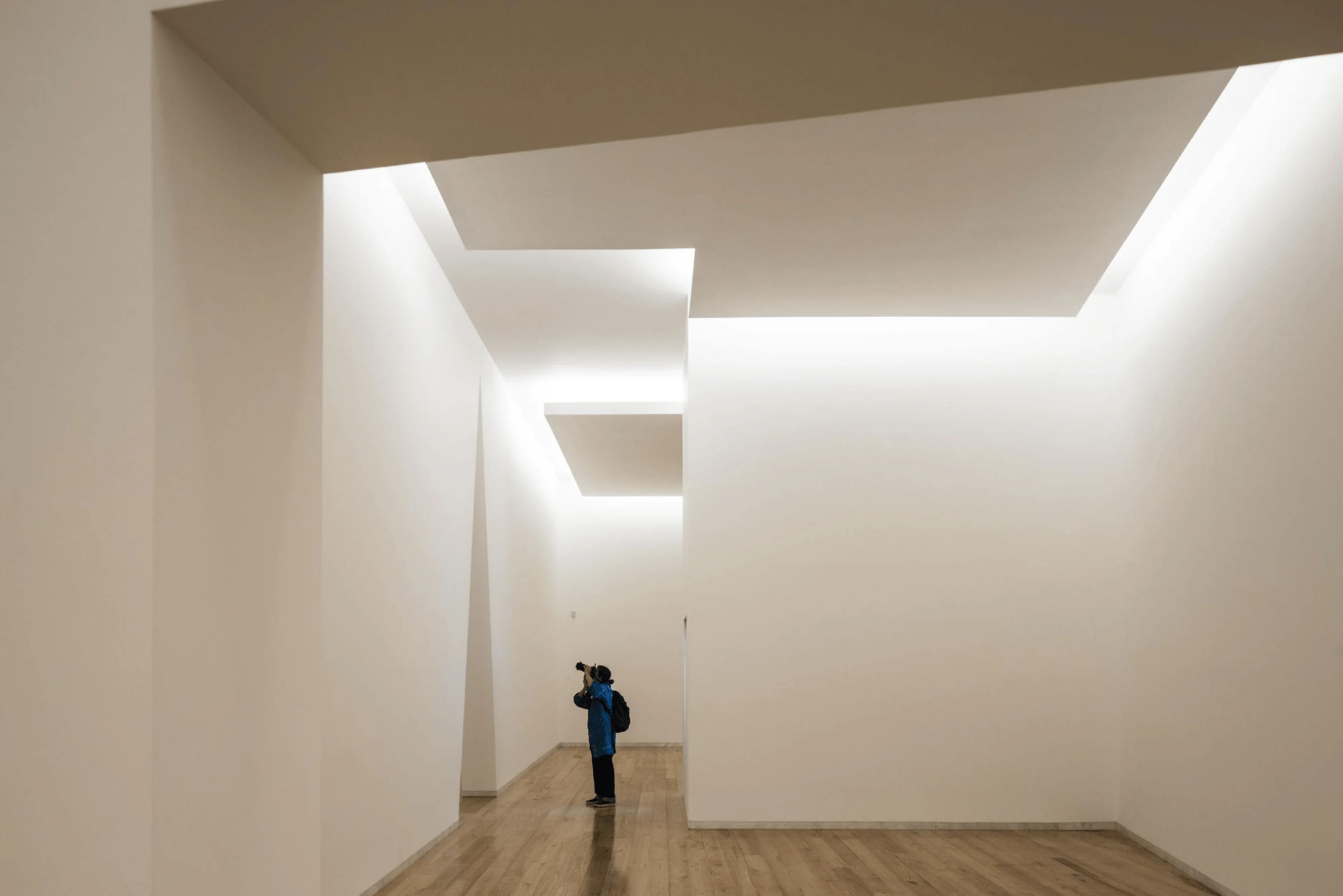
The Siza Wing’s interior is organized to accommodate both exhibition and archival functions. Two of the three floors are dedicated to exhibition spaces, increasing the museum’s exhibition capacity by 50%. These spaces are designed to be flexible and adaptable, catering to a variety of exhibition formats. The remaining floor houses the Siza archives, which were donated to the museum in 2015. The interior design continues the minimalist aesthetic of the exterior, with white stucco-covered walls and a focus on natural light, complementing the modern museum design principles.
Integration with the Landscape
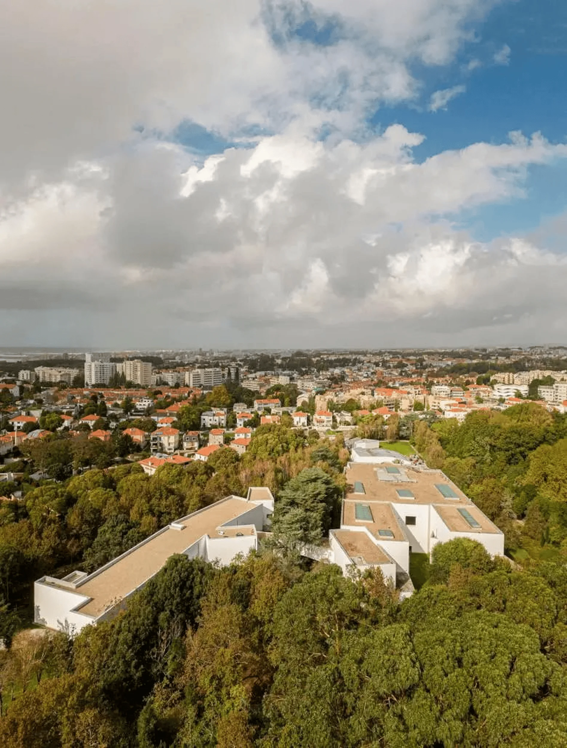
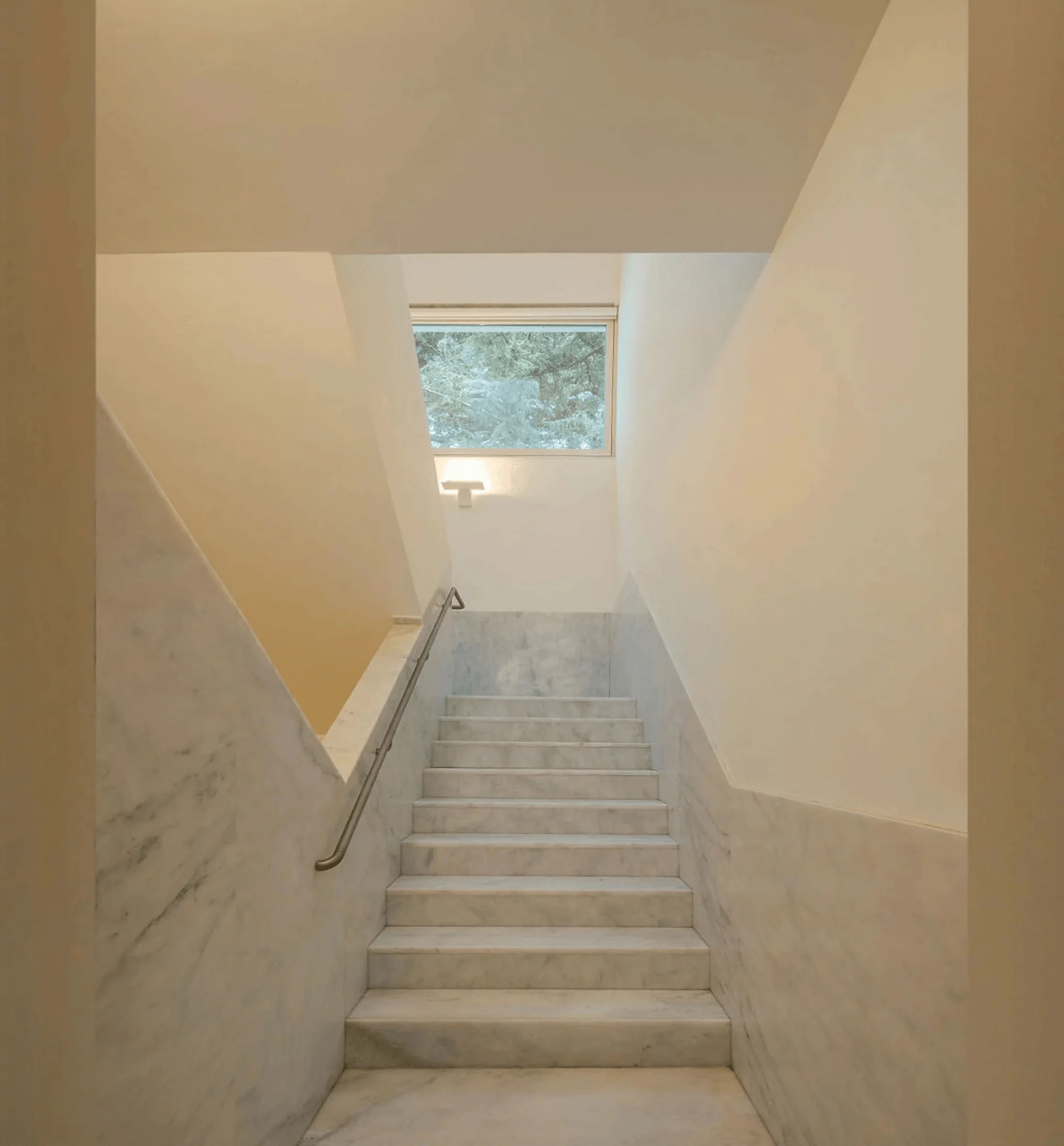
One of the most striking aspects of the Siza Wing is its seamless integration with the landscape of Serralves Park. The building’s low profile and understated design allow it to blend into the surroundings, rather than dominating them. The bridge connecting the wing to the main museum acts as a physical and visual link between the built environment and the natural world, enhancing the visitor experience. The triangular windows offer framed views of the park, further blurring the boundaries between inside and outside. This integration with nature is a hallmark of modern museum design, promoting a sense of harmony between architecture and the environment.
Project Information:
Project type: Museum Extension
Architect: Álvaro Siza
Area: 4,180 sqm
Project Year: 2023
Country: Portugal
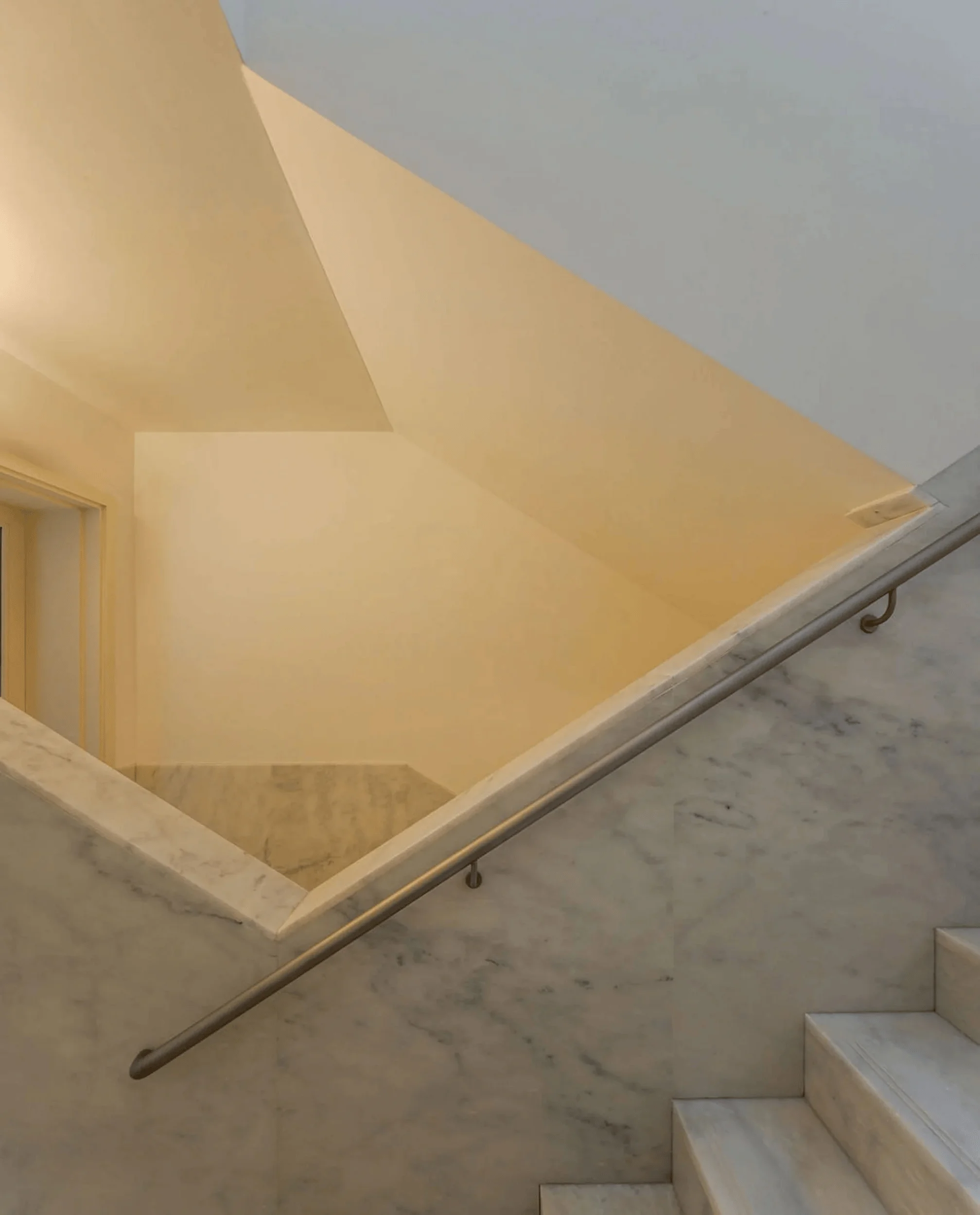
Main materials: Reinforced concrete, granite, stucco
Photographer: Fernando Guerra | FG+SG


