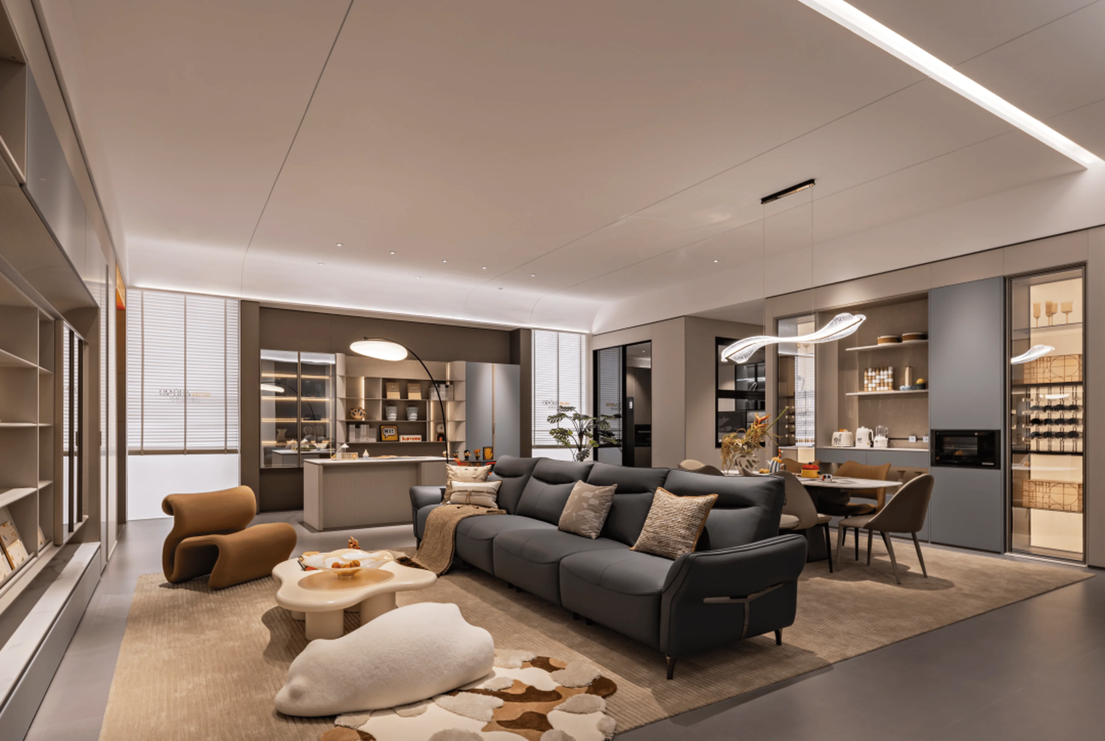
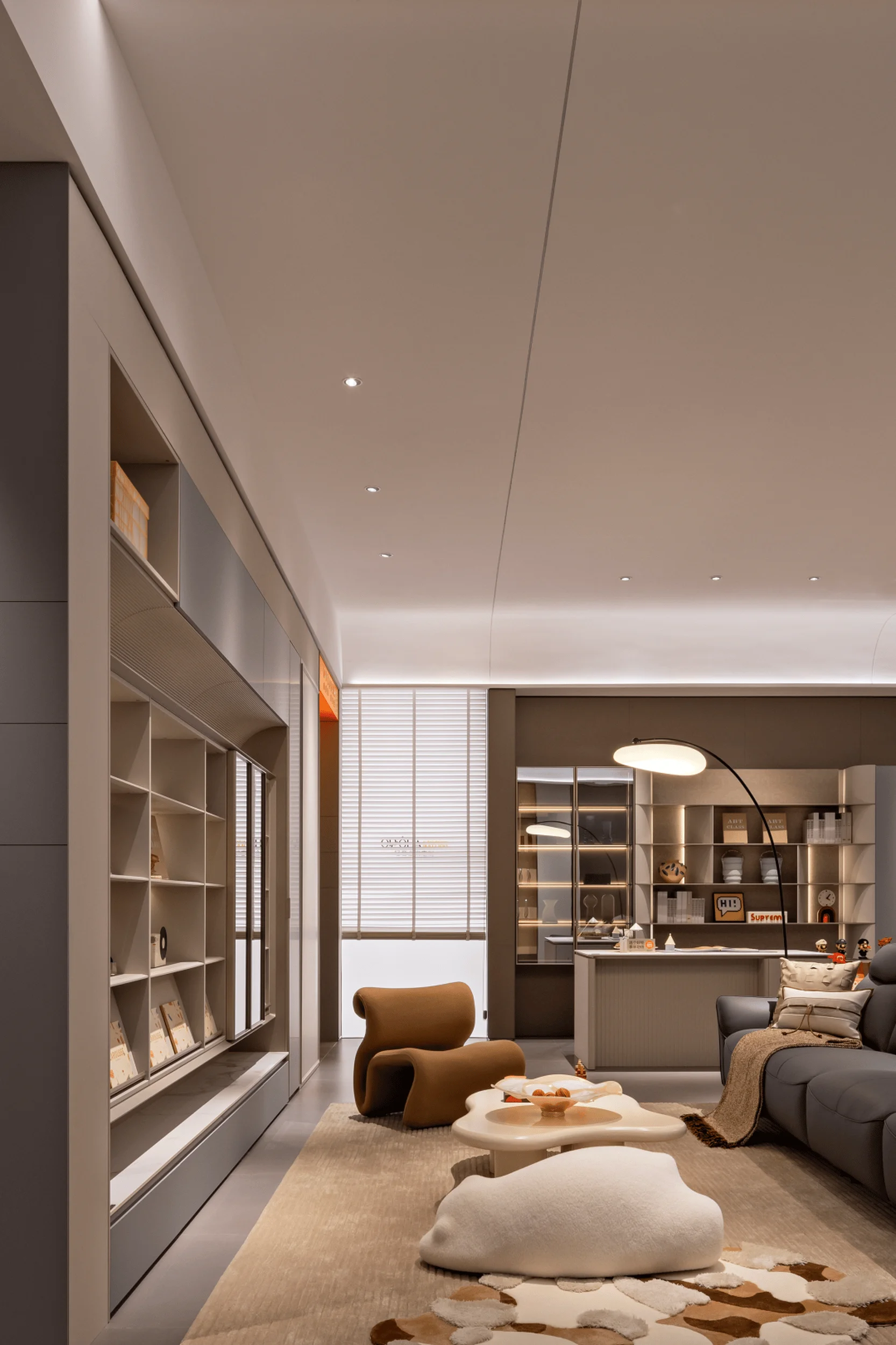
Oppolia showroom design caters to youthful, elegant aesthetics in China.
Contents
Project Background and Target Audience
Oppolia, a brand dedicated to youthful and elegant home furnishings, aimed to redefine the concept of “young” within the home design industry. While many brands strive for a youthful image, Oppolia recognized that the definition of youthfulness extends beyond a specific age demographic. Their target audience includes young individuals, as well as older consumers who desire to embrace a youthful and modern lifestyle. This target audience includes individuals who have a strong affinity for contemporary design, social interaction, and personalized living experiences. The showroom concept had to appeal to a diverse spectrum of age groups with varying tastes and preferences while being aligned with the brand’s core values and target audience.
Design Concept and Core Values
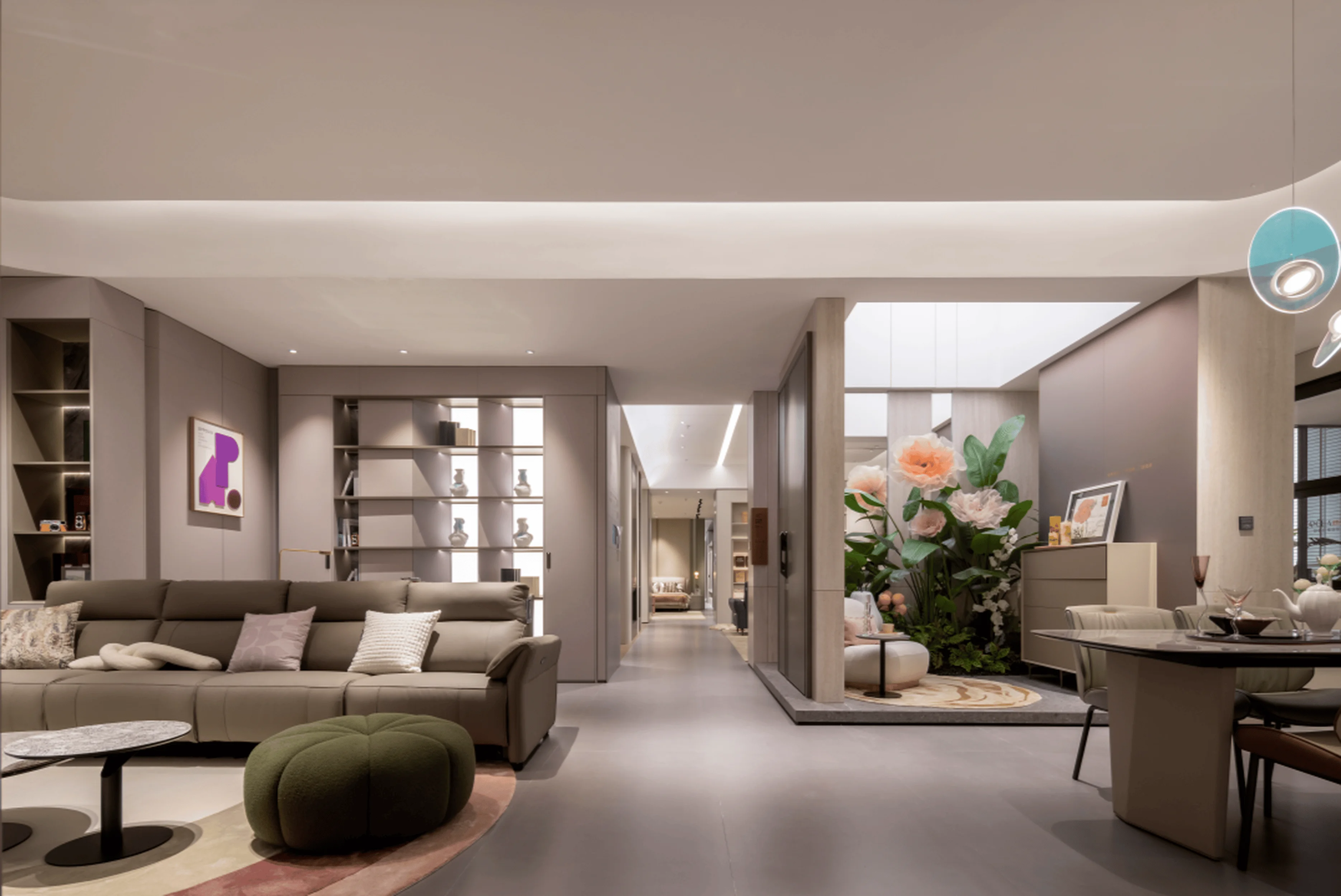
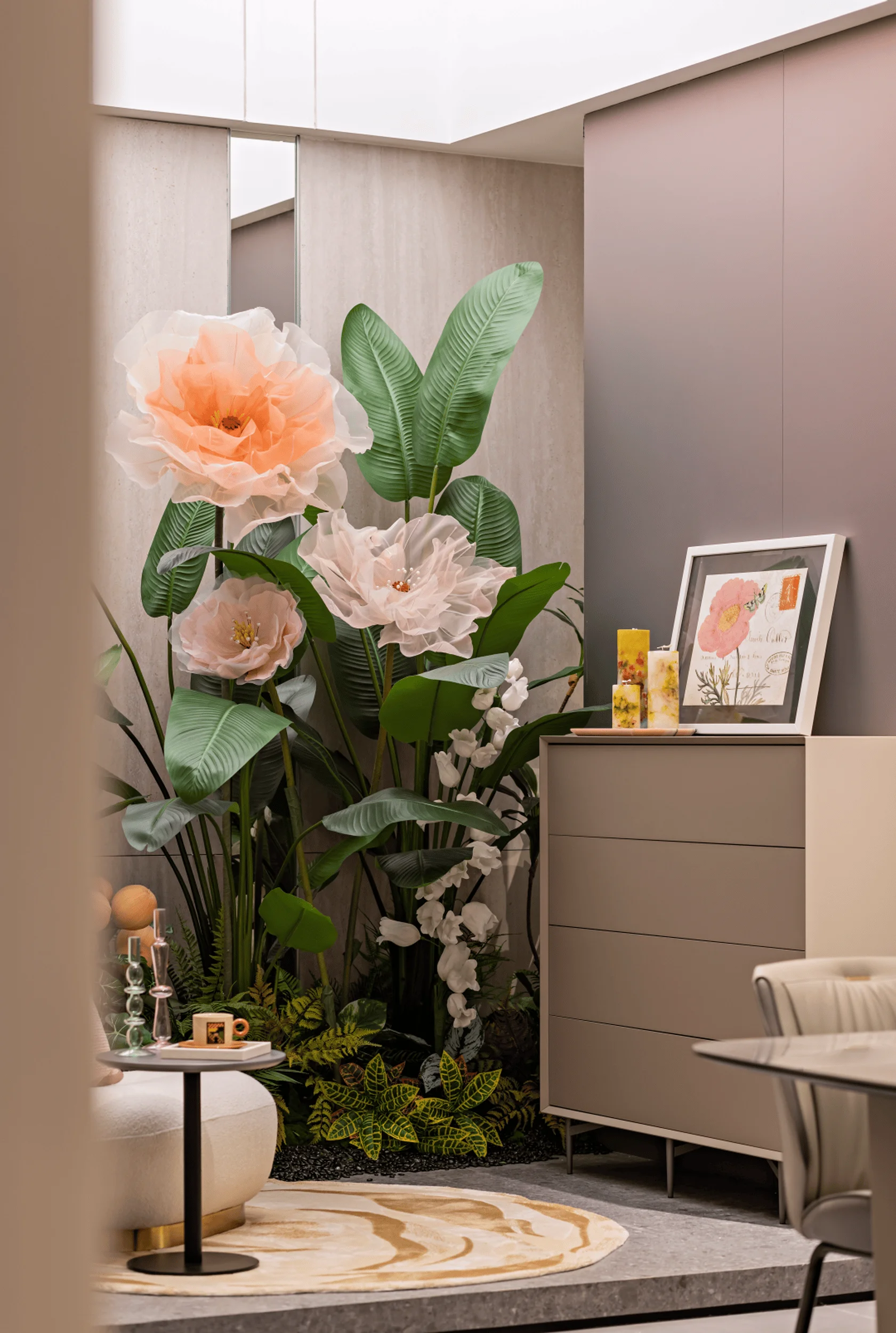
The core design concepts for the Oppolia showroom are built around creating a dynamic and immersive environment that promotes the concept of youthfulness in a comfortable and relaxed manner. Central to this design is the inclusion of elements that foster social interaction, highlight artistic and cultural expressions, and emphasize the integration of nature into the home environment. The design concept includes elements such as non-standard housing layouts to create social and individual spaces, the integration of artistic and cultural elements into the interior space, and the focus on natural components to create an environment of healing and relaxation. The overarching concept was to create a space where individuals can curate their own personal style and express themselves in a manner that aligns with their individual preferences, making their home a unique and inspiring place.
Functional Layout and Space Planning
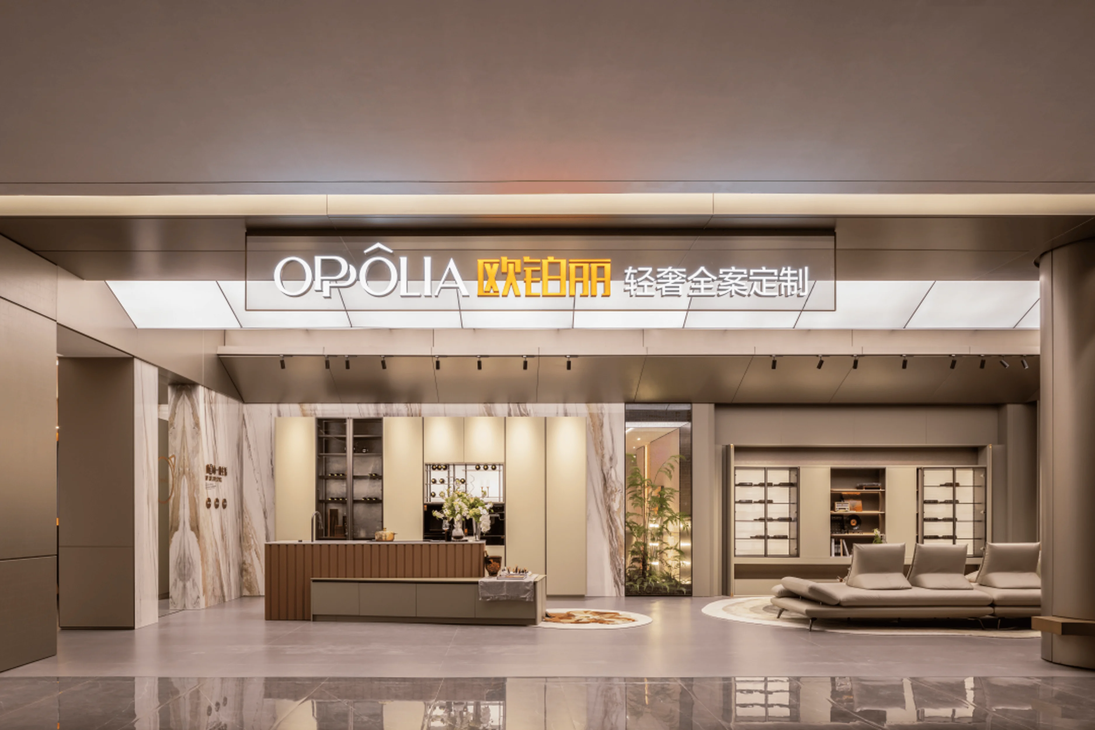
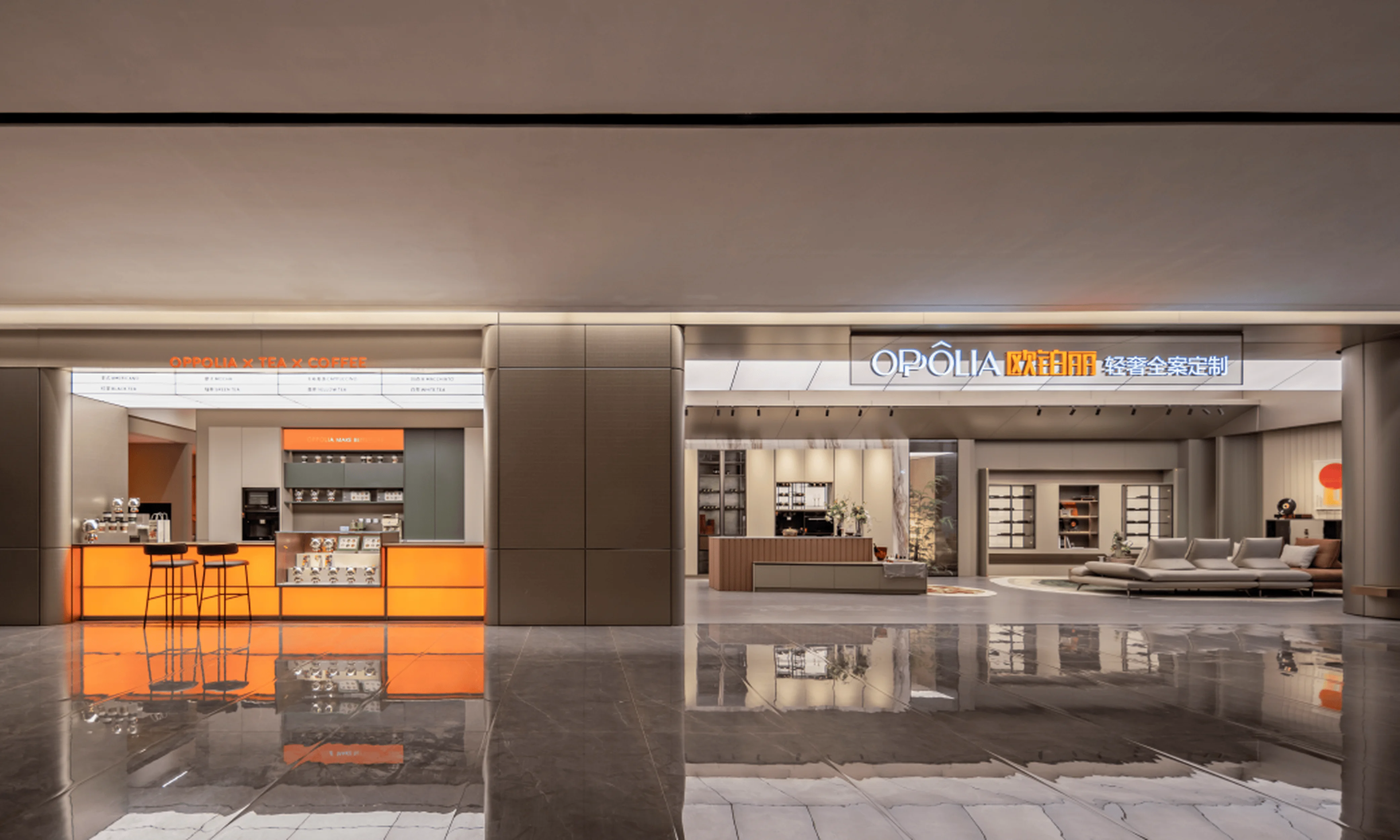
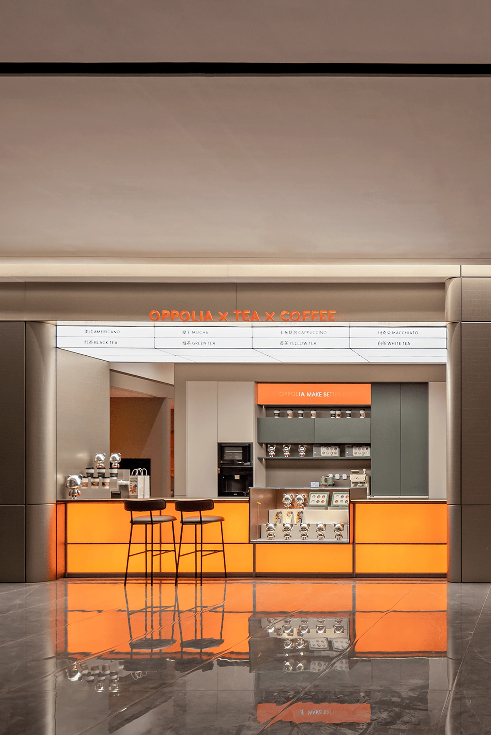
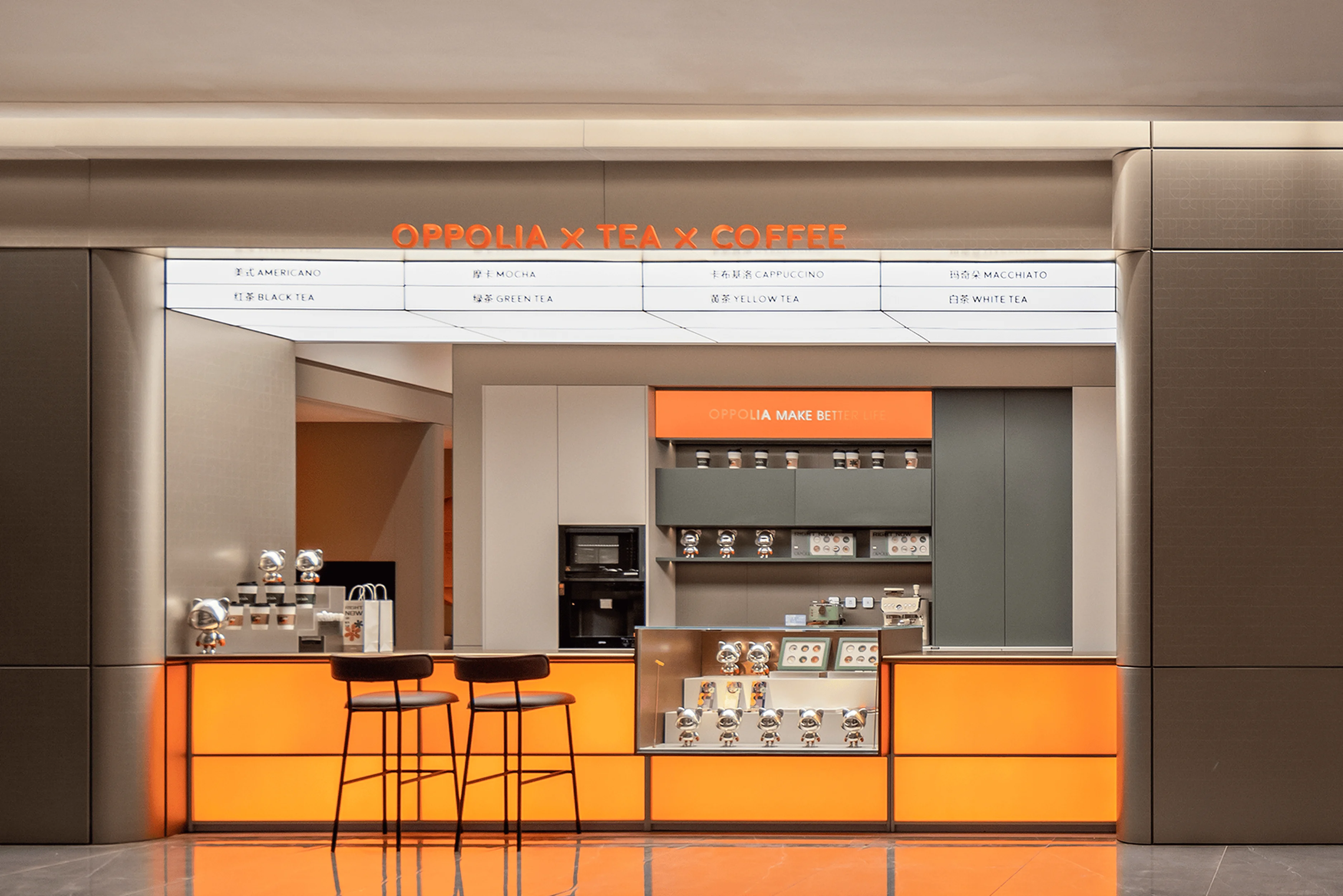
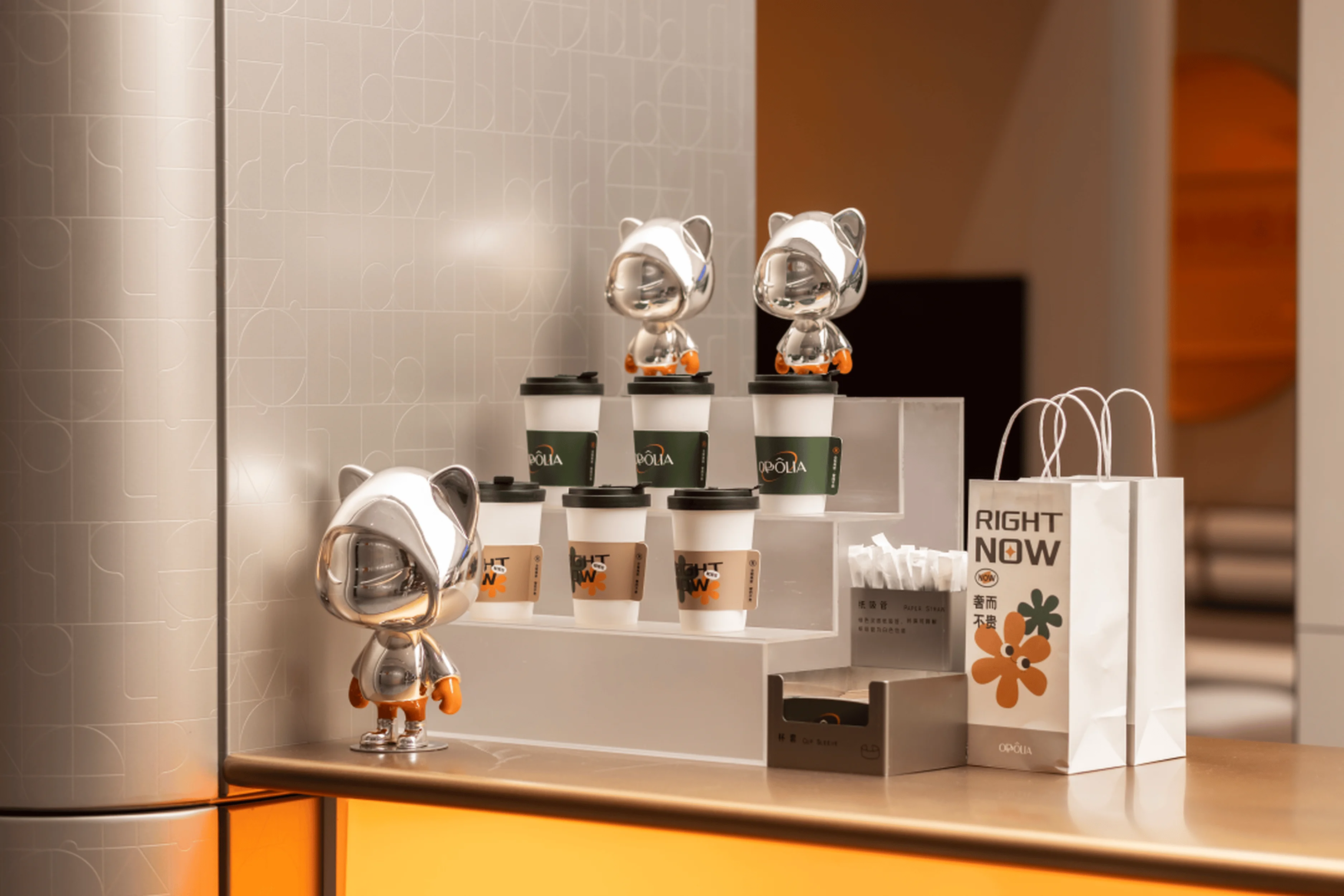
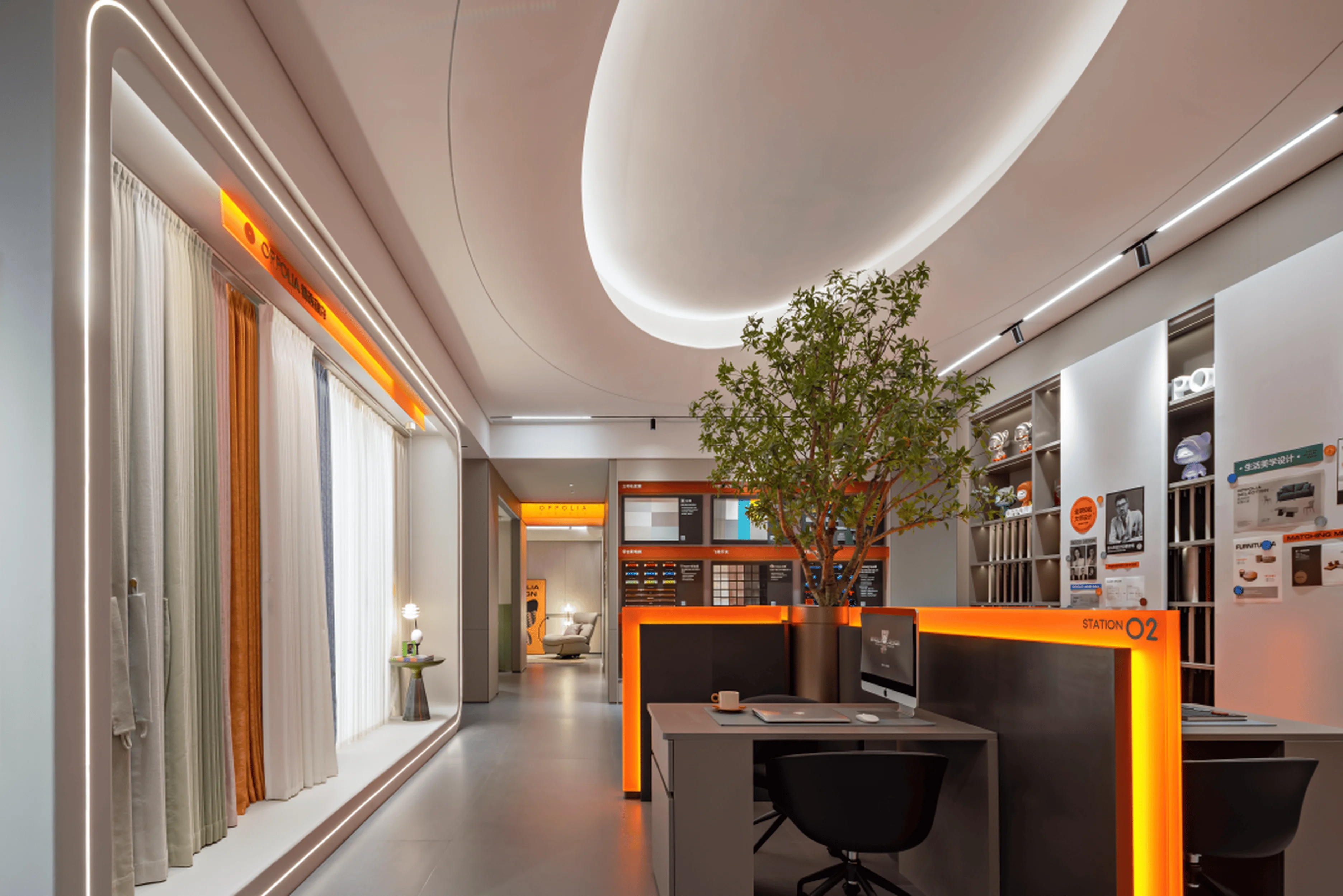
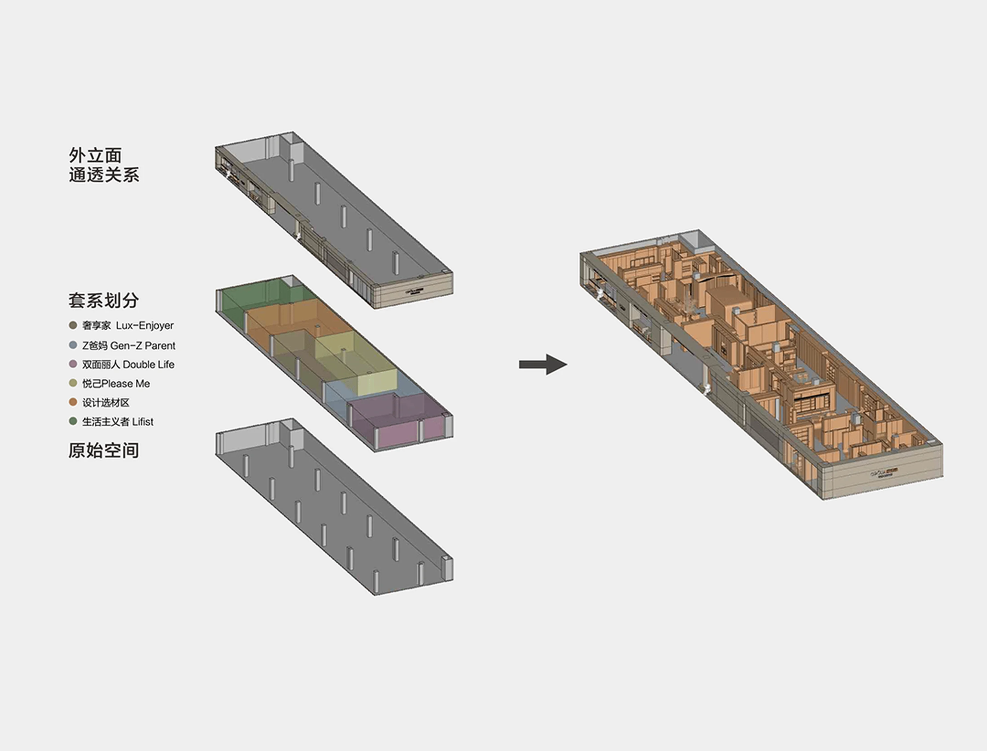
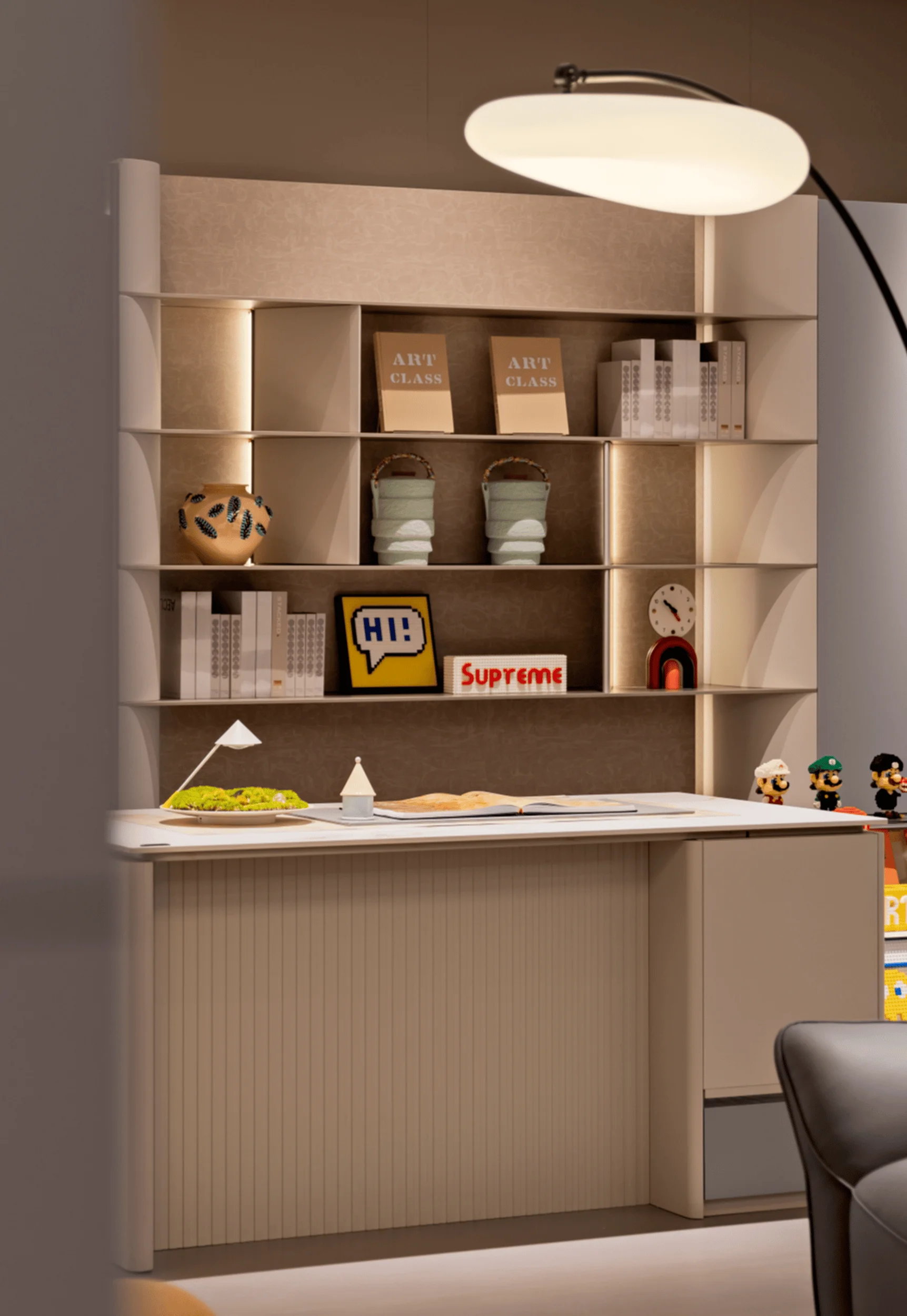
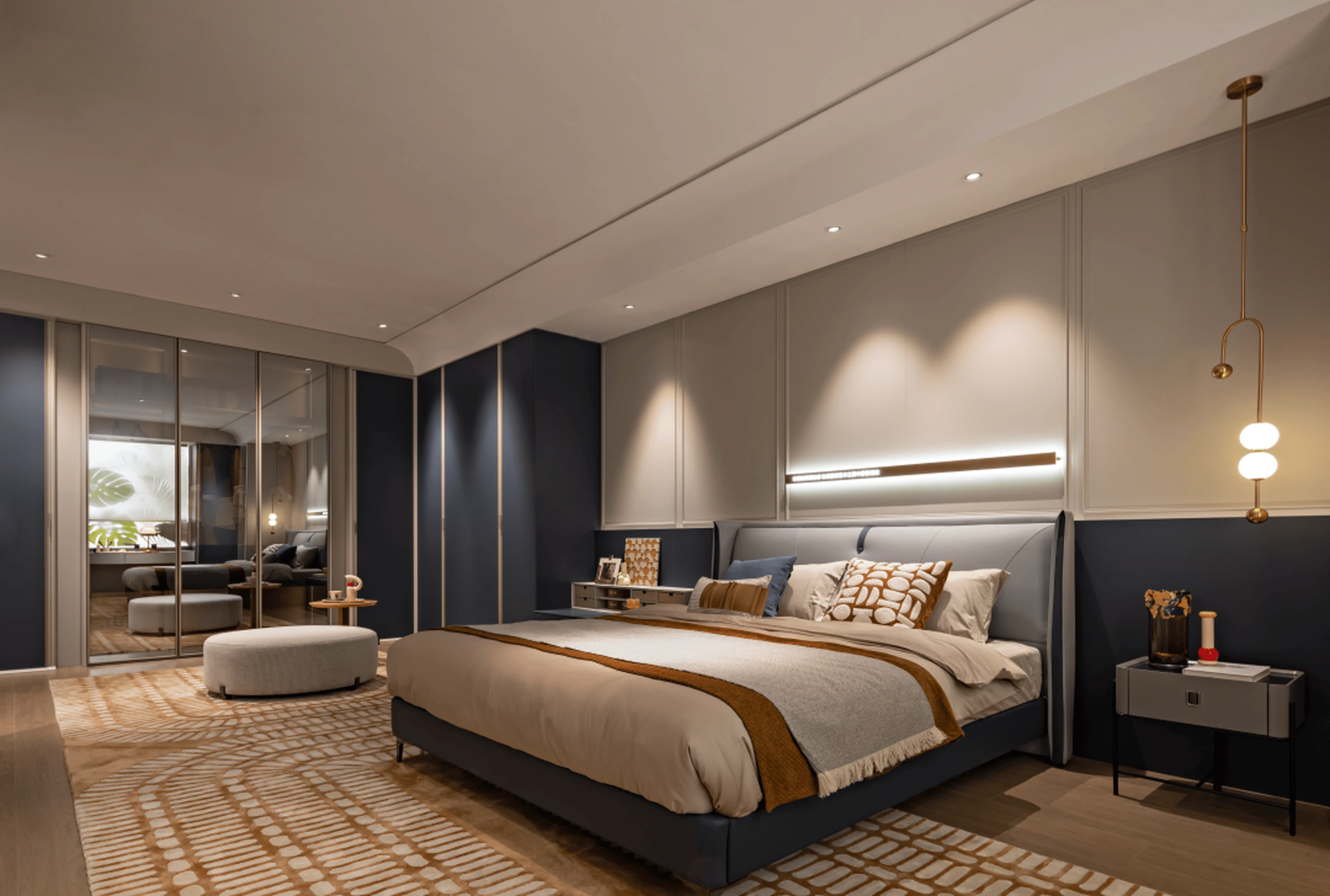
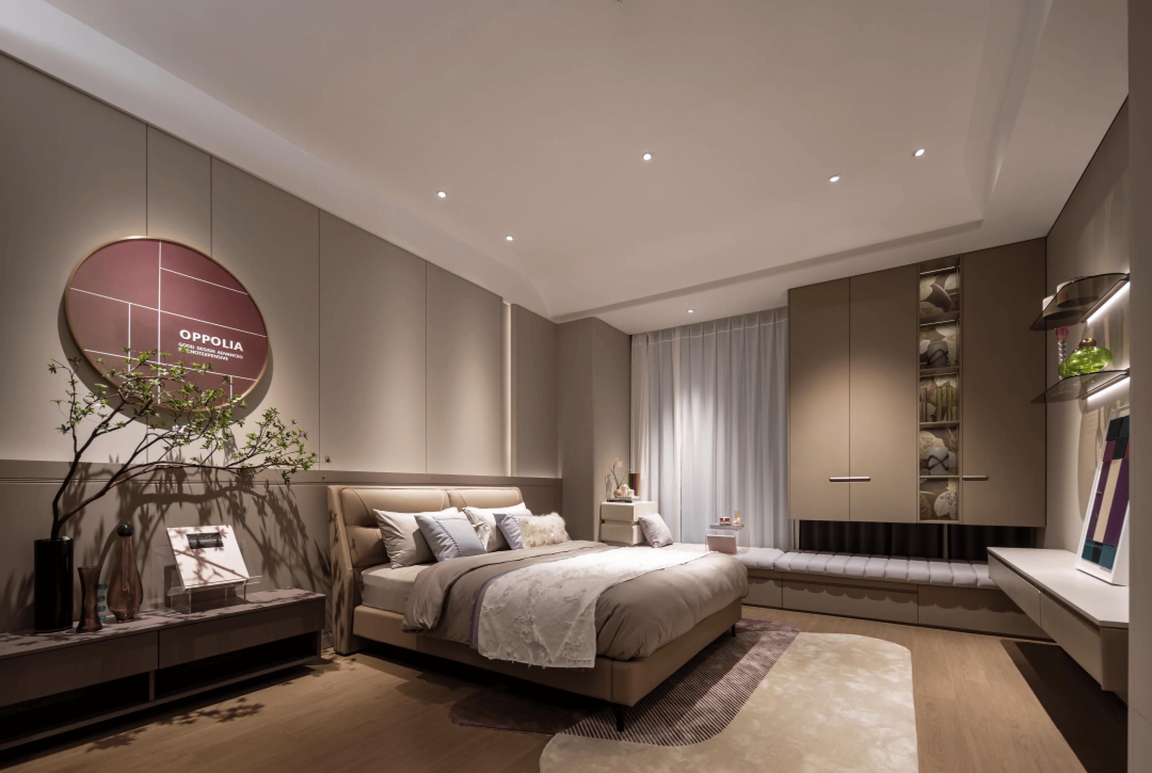
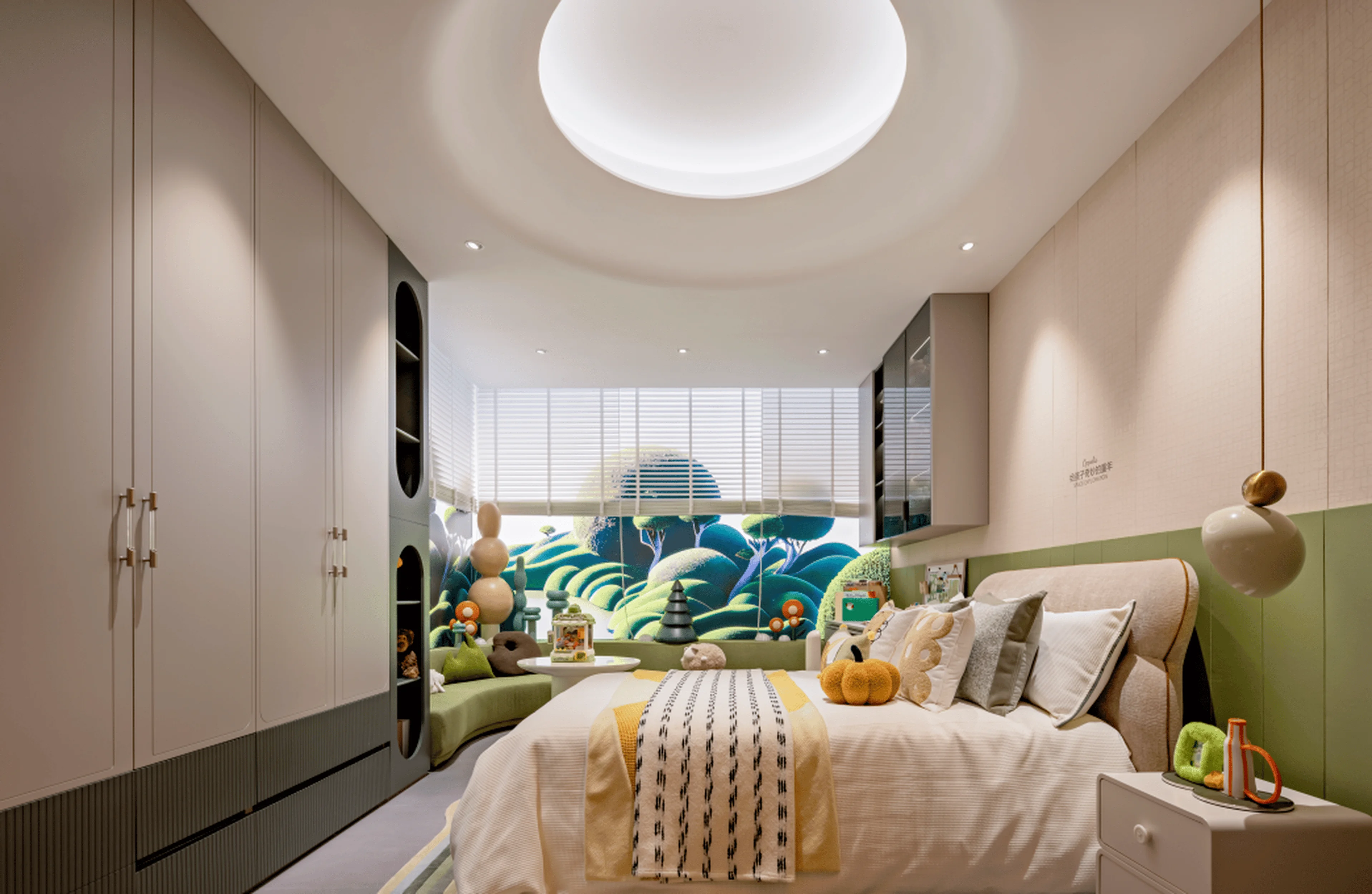
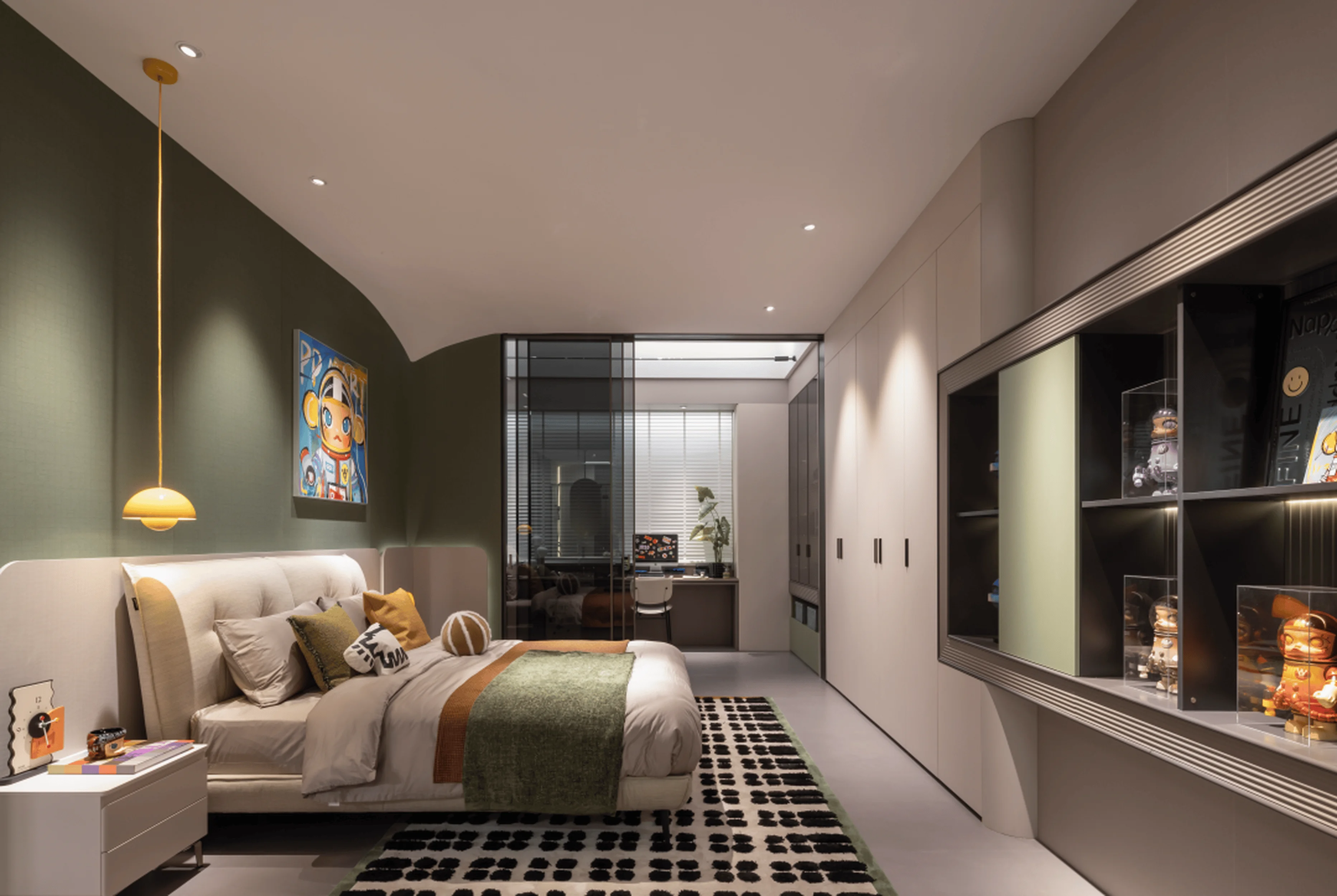
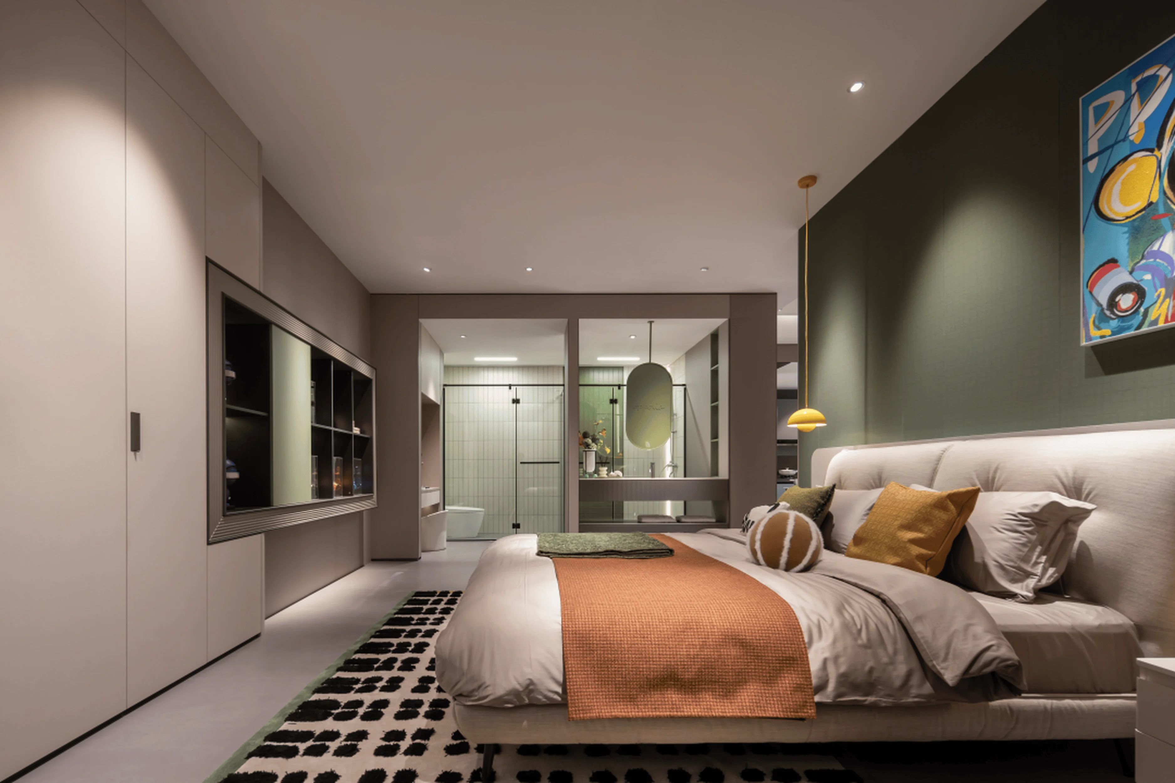
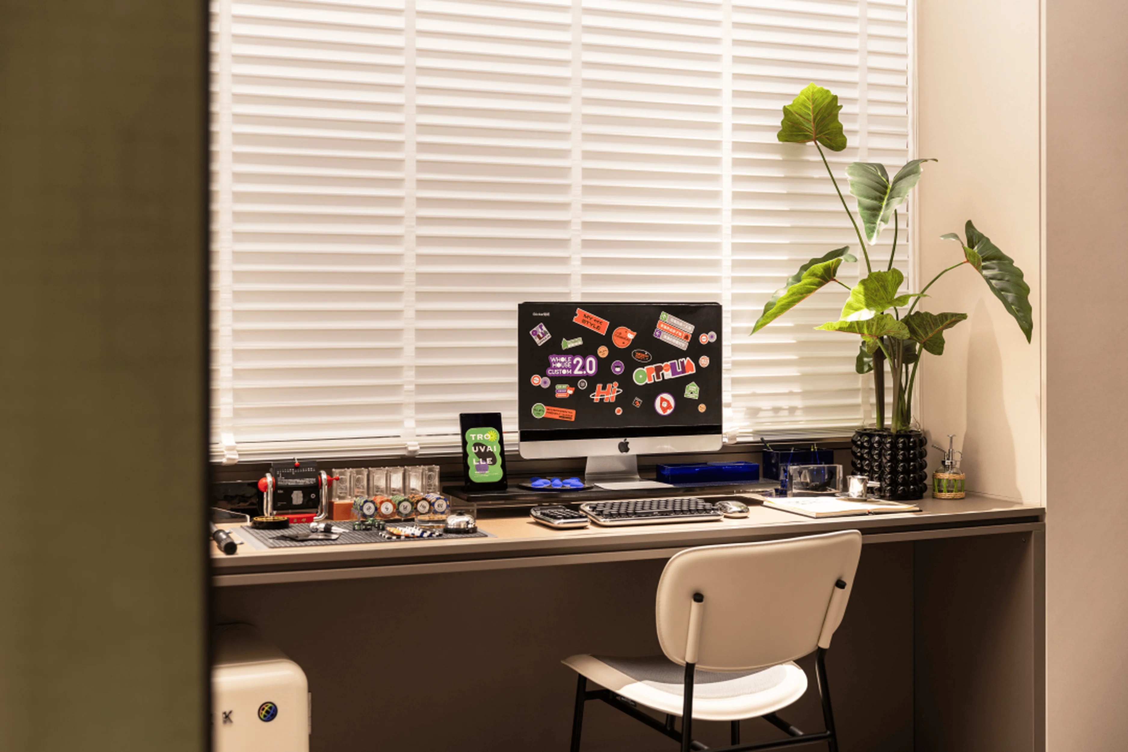
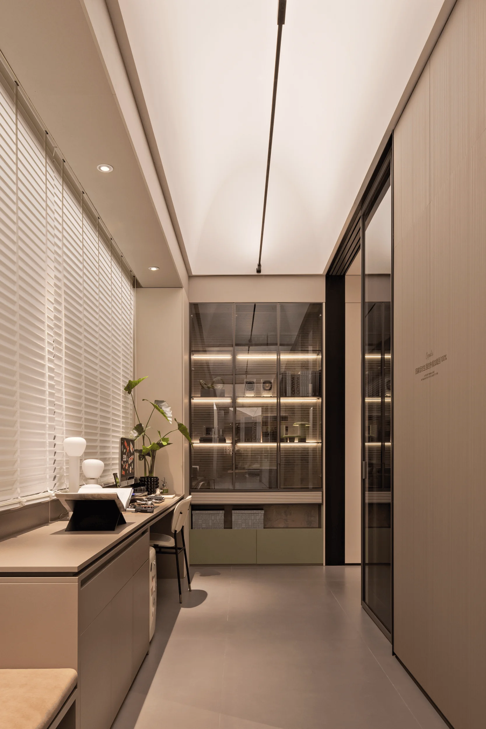
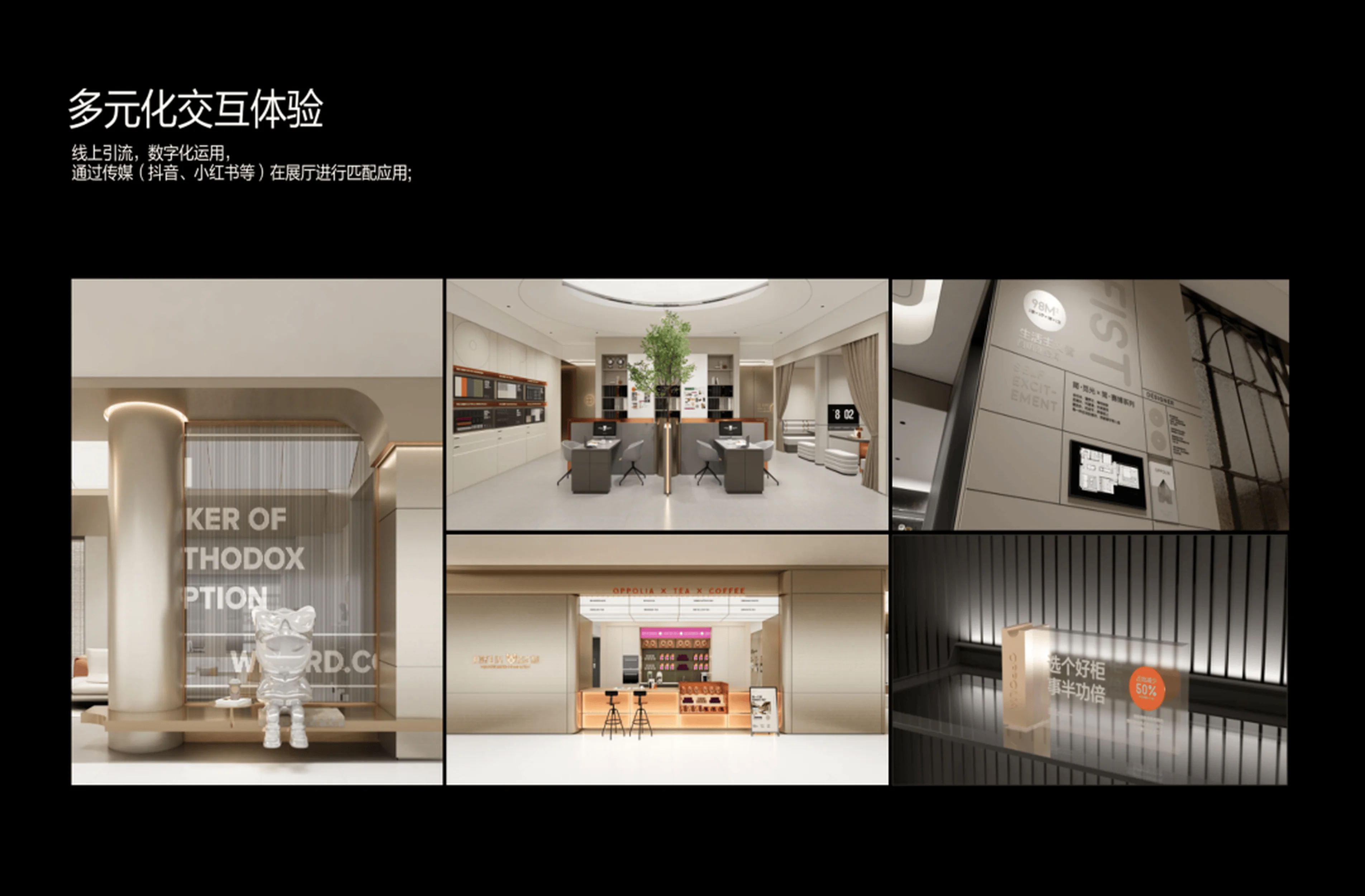
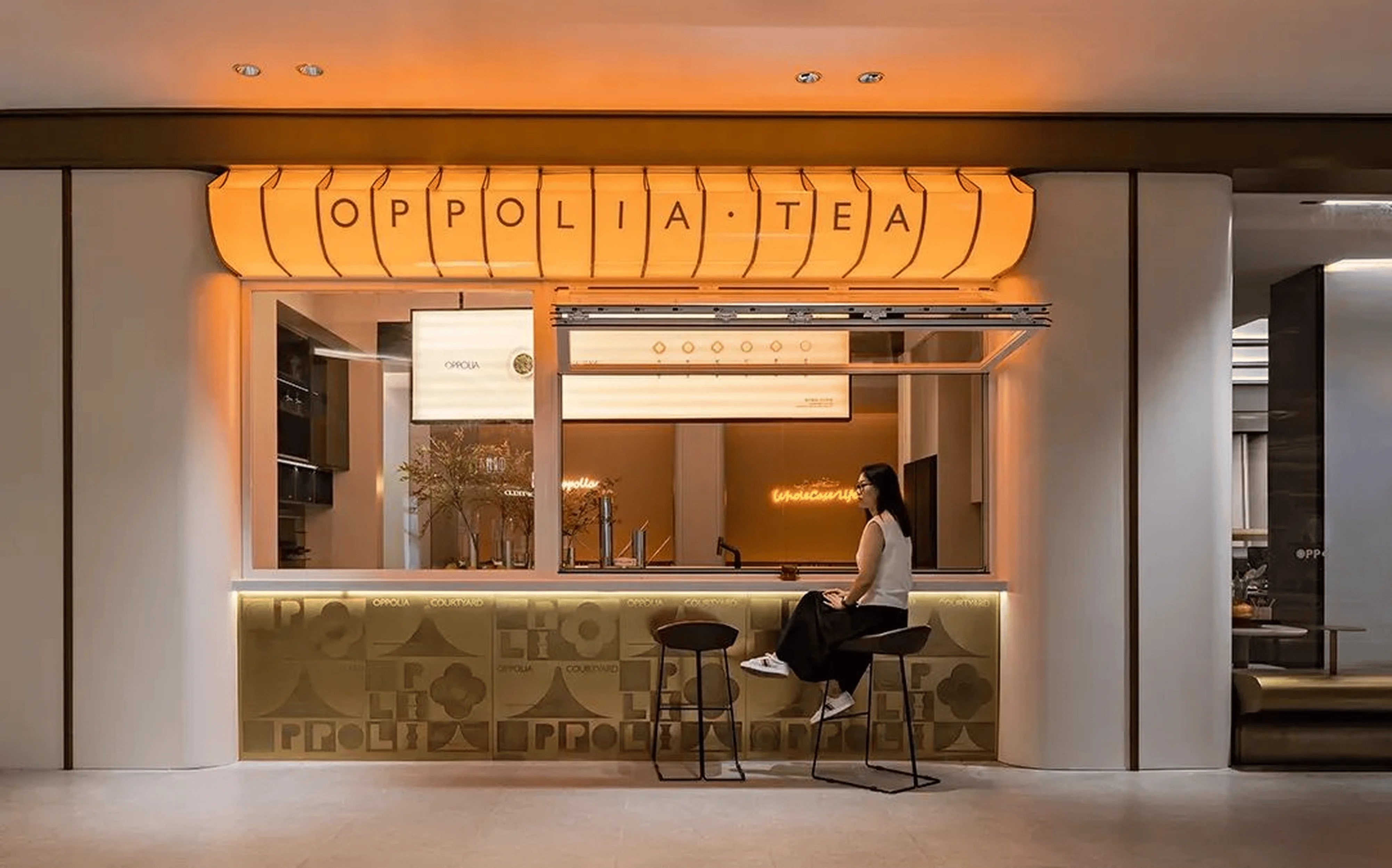
The showroom is meticulously organized into functional zones that reflect the Oppolia brand’s approach to home design. A variety of zones include an exterior area with interactive elements, a cafe, a designer workspace and model suites designed for various lifestyle needs. The concept includes a cafe area (Oppolia Tea & Coffee) which serves as a social gathering space. The cafe provides a visually engaging and refreshing experience. The exterior of the showroom was designed with interactive elements that provide a welcoming space for visitors and acts as a first impression of the brand. In addition to these public spaces, the showroom also features a designer workspace that is intended to provide a comfortable environment for clients to discuss their design needs. There are five model suites, each designed for a specific lifestyle, including Lux-Enjoyer, Gen-Z Parent, Double Life, Please Me, and Lifist. These suites allow customers to experience various interior design concepts and features that are relevant to their own lives, thereby reinforcing the brand’s identity and value proposition.
Exterior Design and Aesthetics
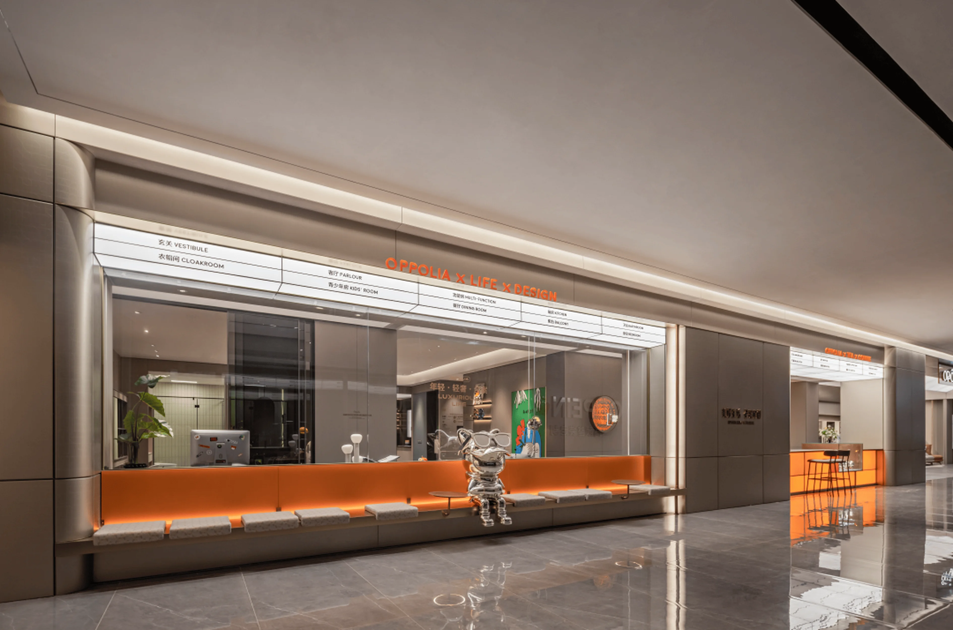
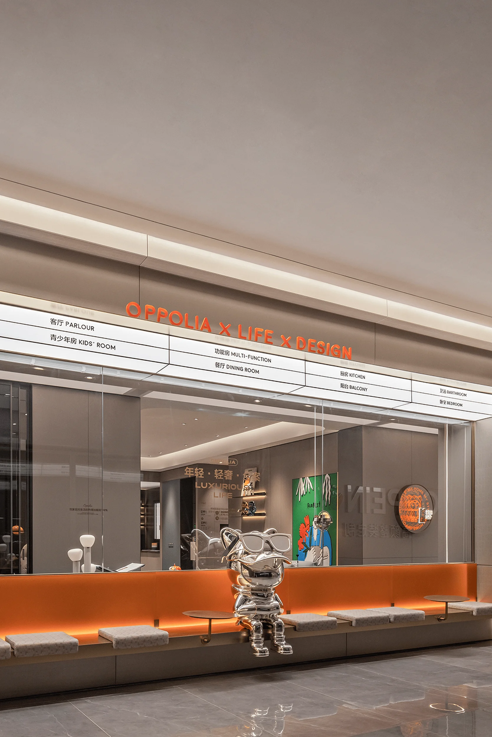
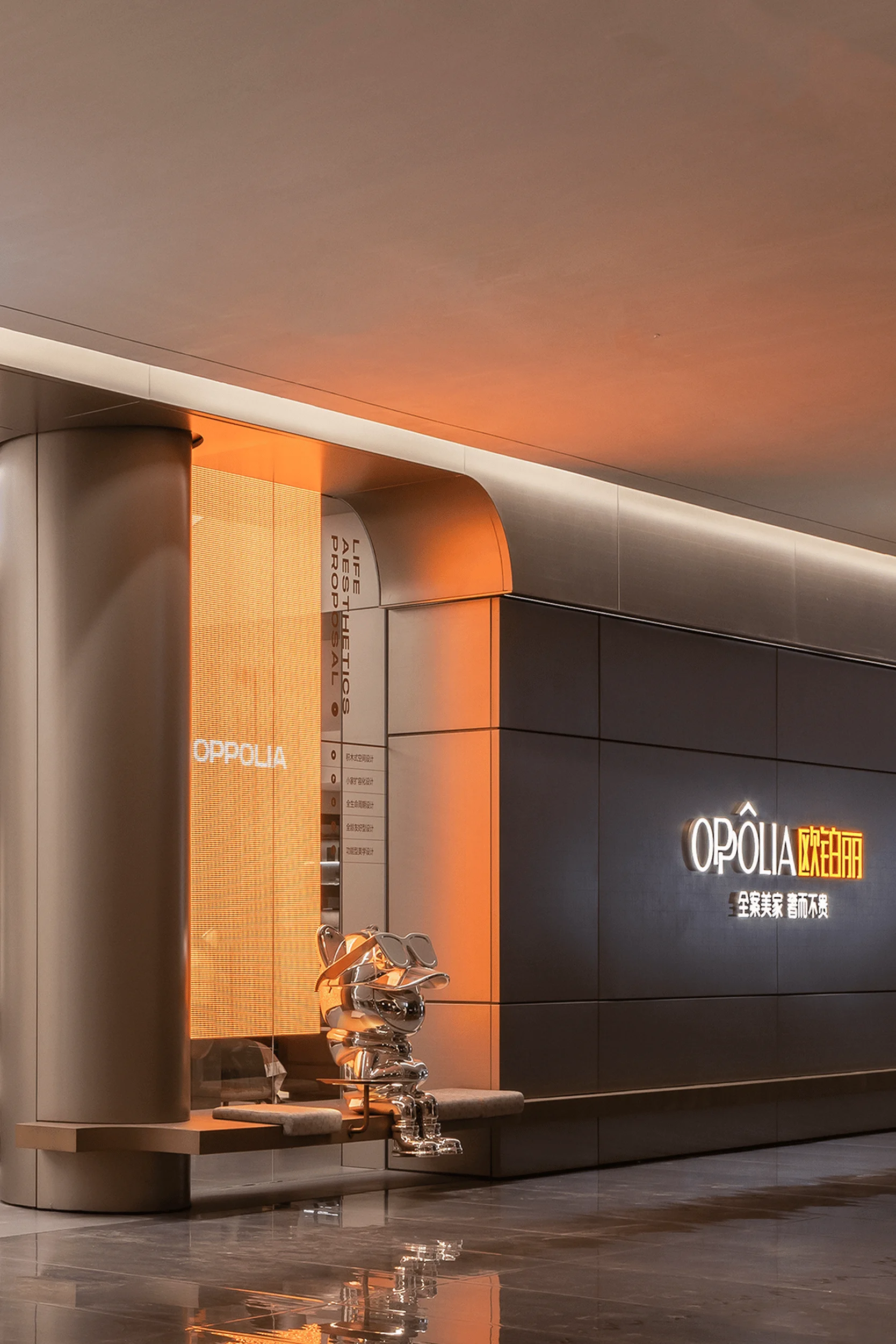
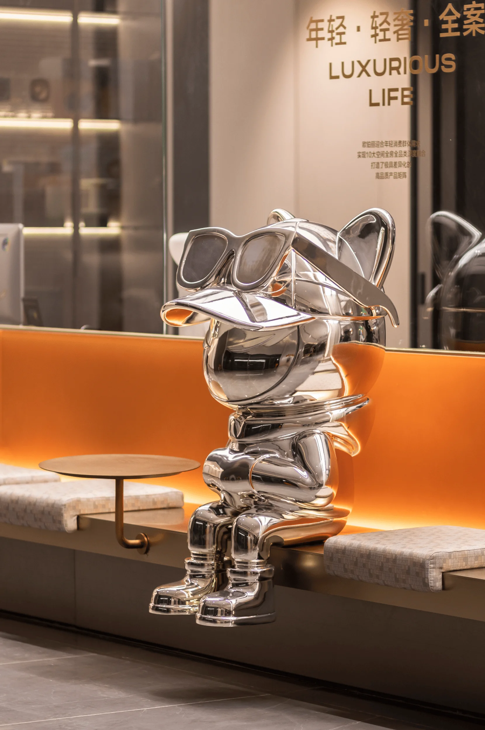
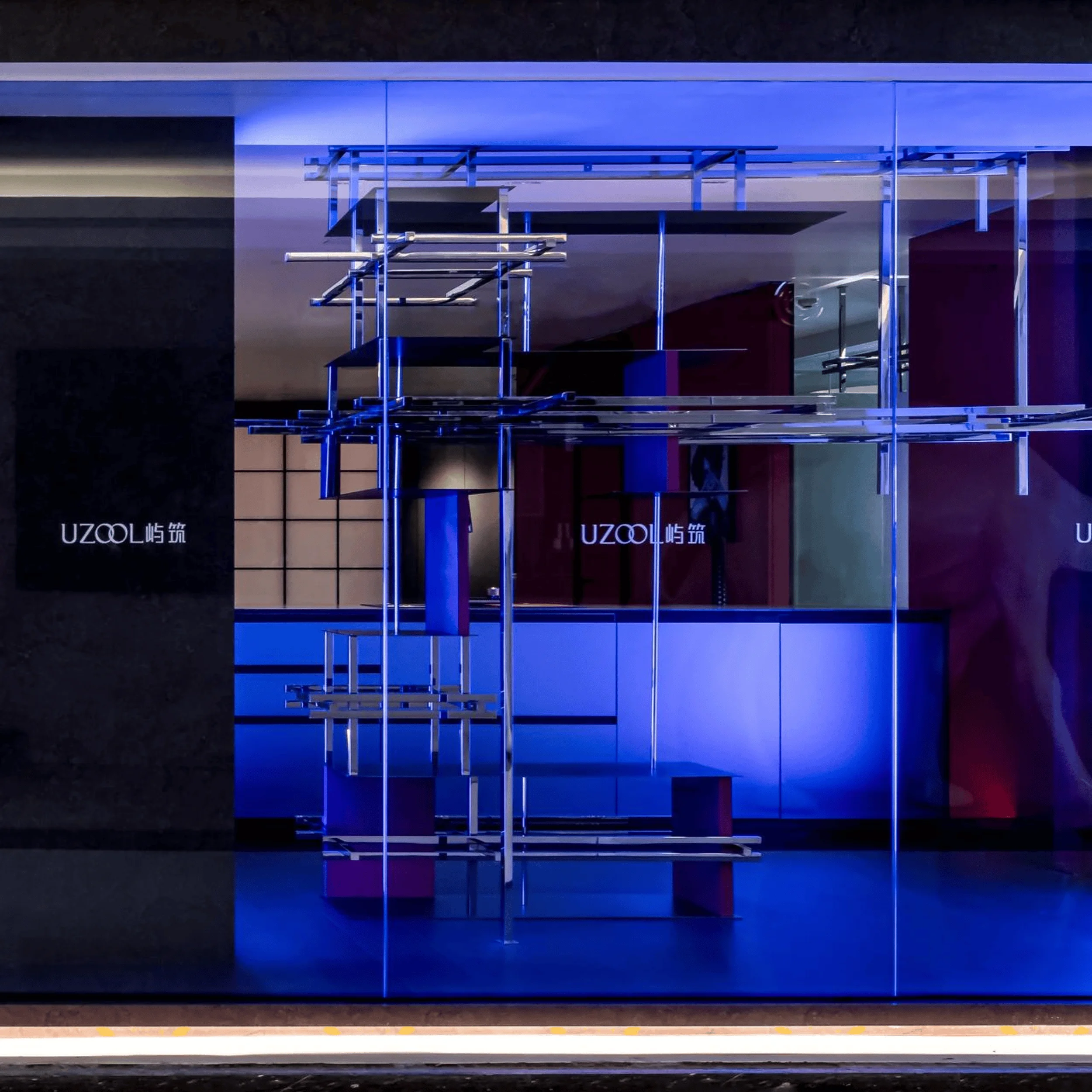
The exterior façade of the showroom cleverly integrates a youthful aesthetic and interactive elements with public and communal spaces. The exterior design was developed as a welcoming invitation to the visitor, seamlessly blending with the brand’s aesthetics. The integration of a communal coffee bar and an exterior seating area enhance the user experience by providing a space for visitors to relax and engage in conversation. The outdoor seating area not only efficiently utilizes the available space but also creates a relaxing and welcoming atmosphere for visitors, allowing them to connect and interact with one another in a casual, open setting. The showroom’s façade was designed to be inviting and reflect the brand’s youthful and elegant identity. These interactive and social aspects of the building create a more memorable experience for those visiting the showroom.
Interior Design and Aesthetics
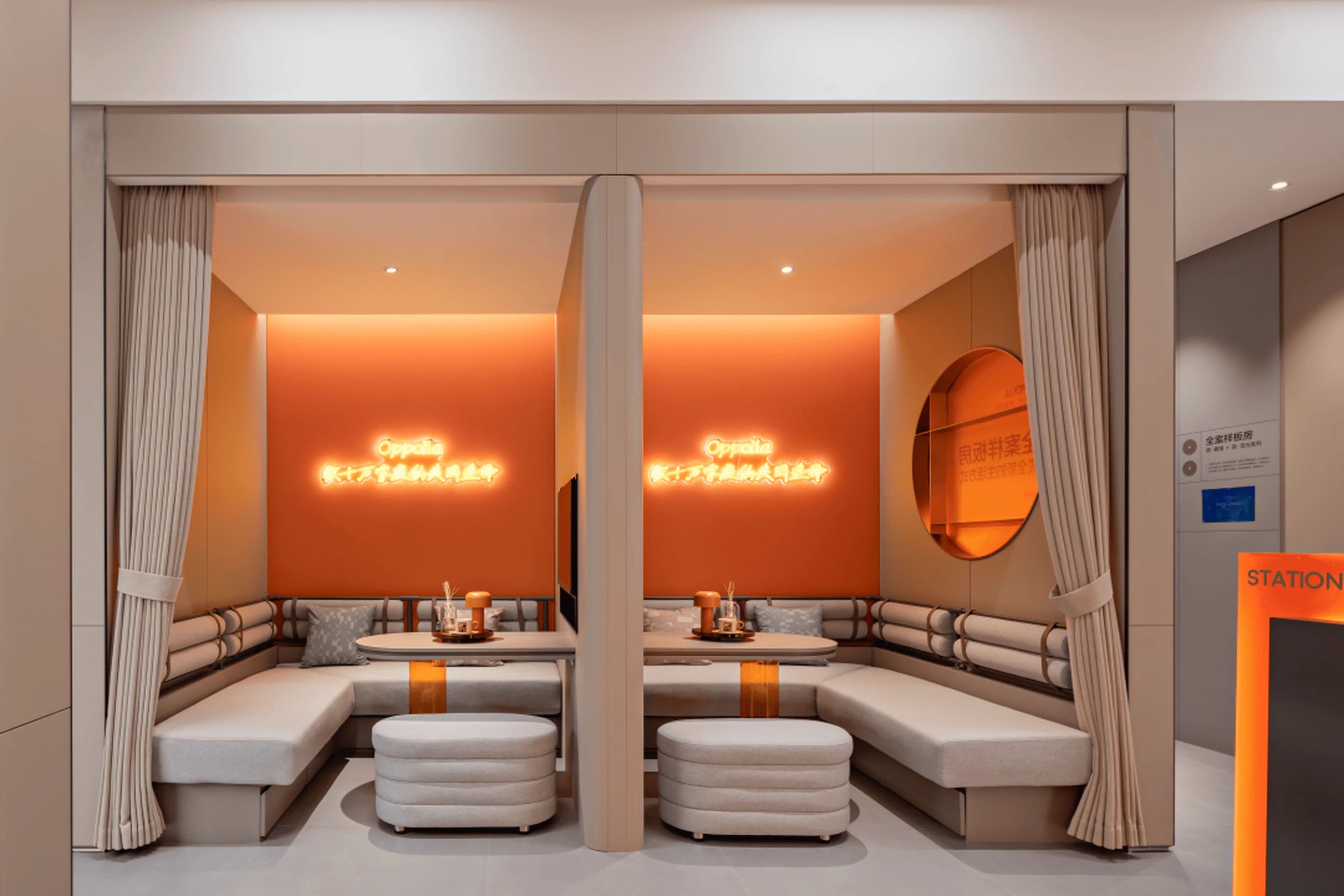
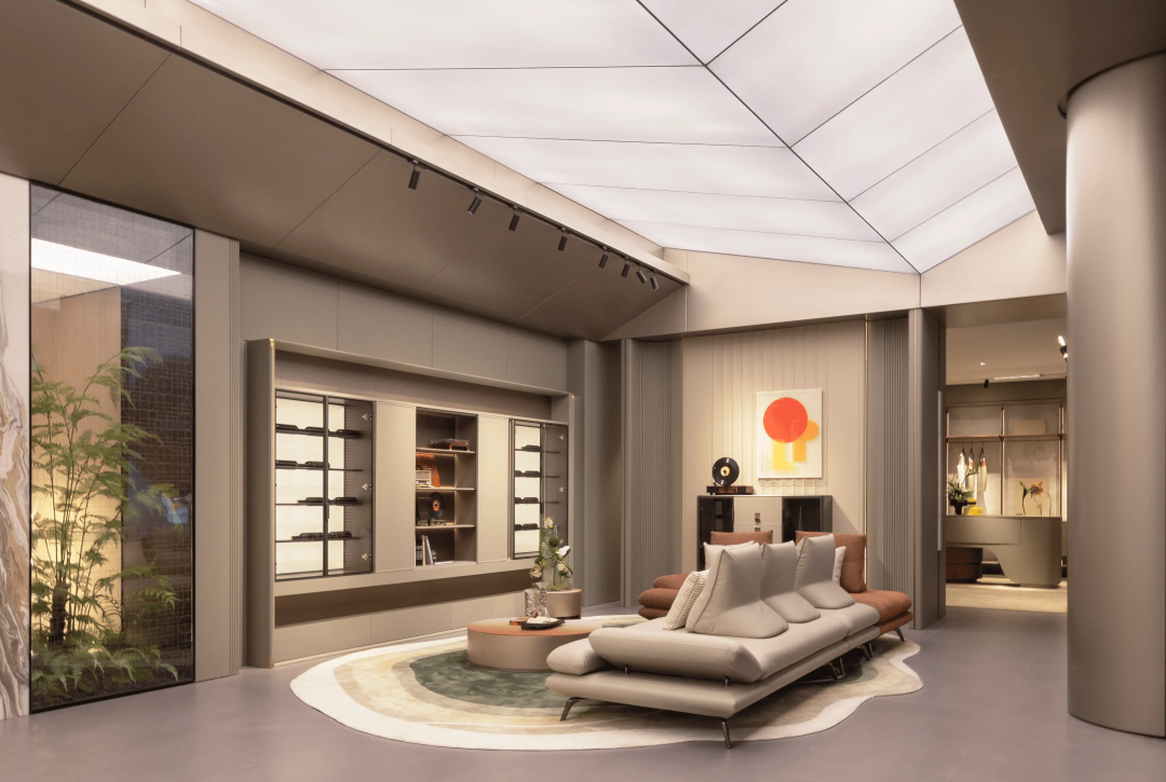
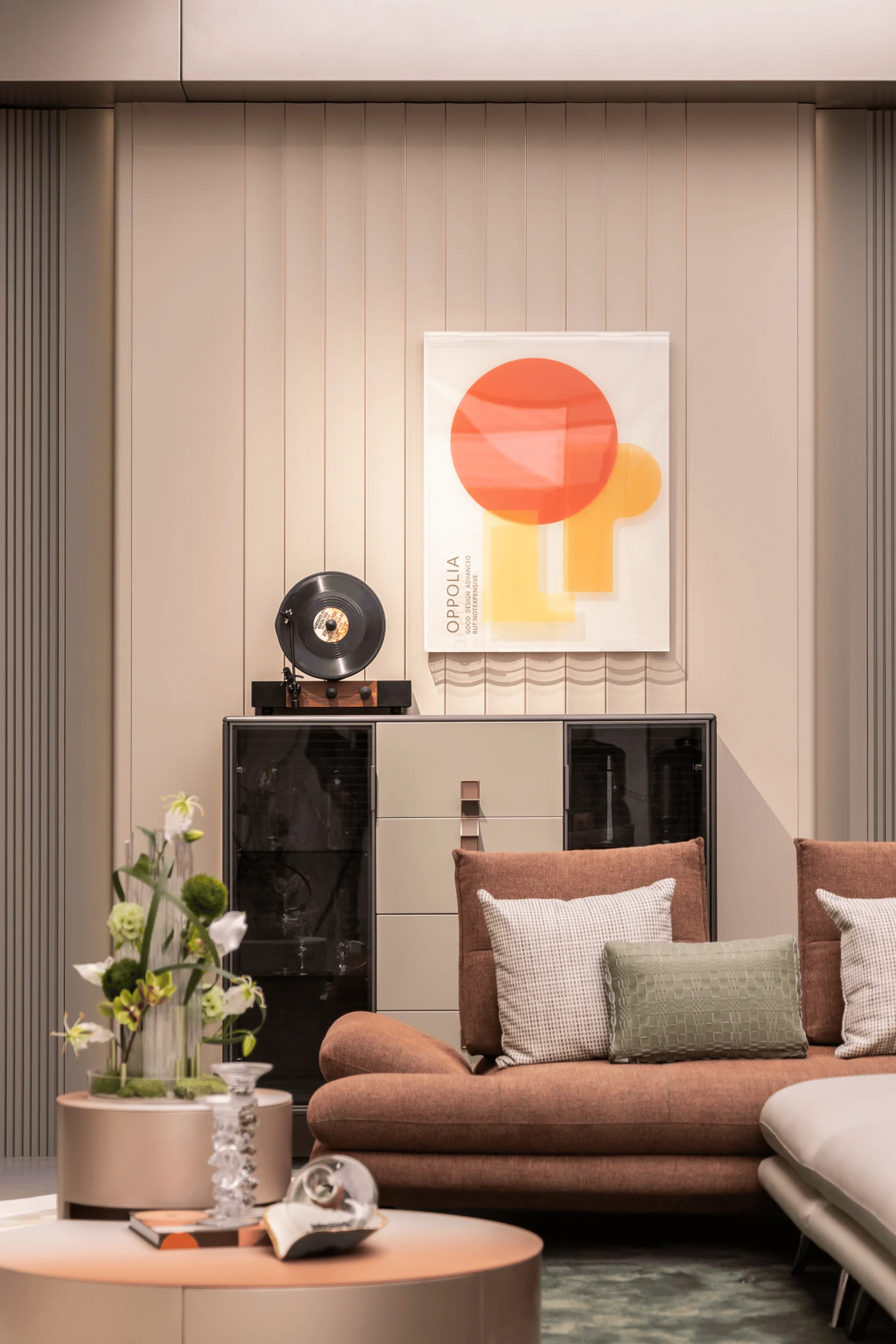
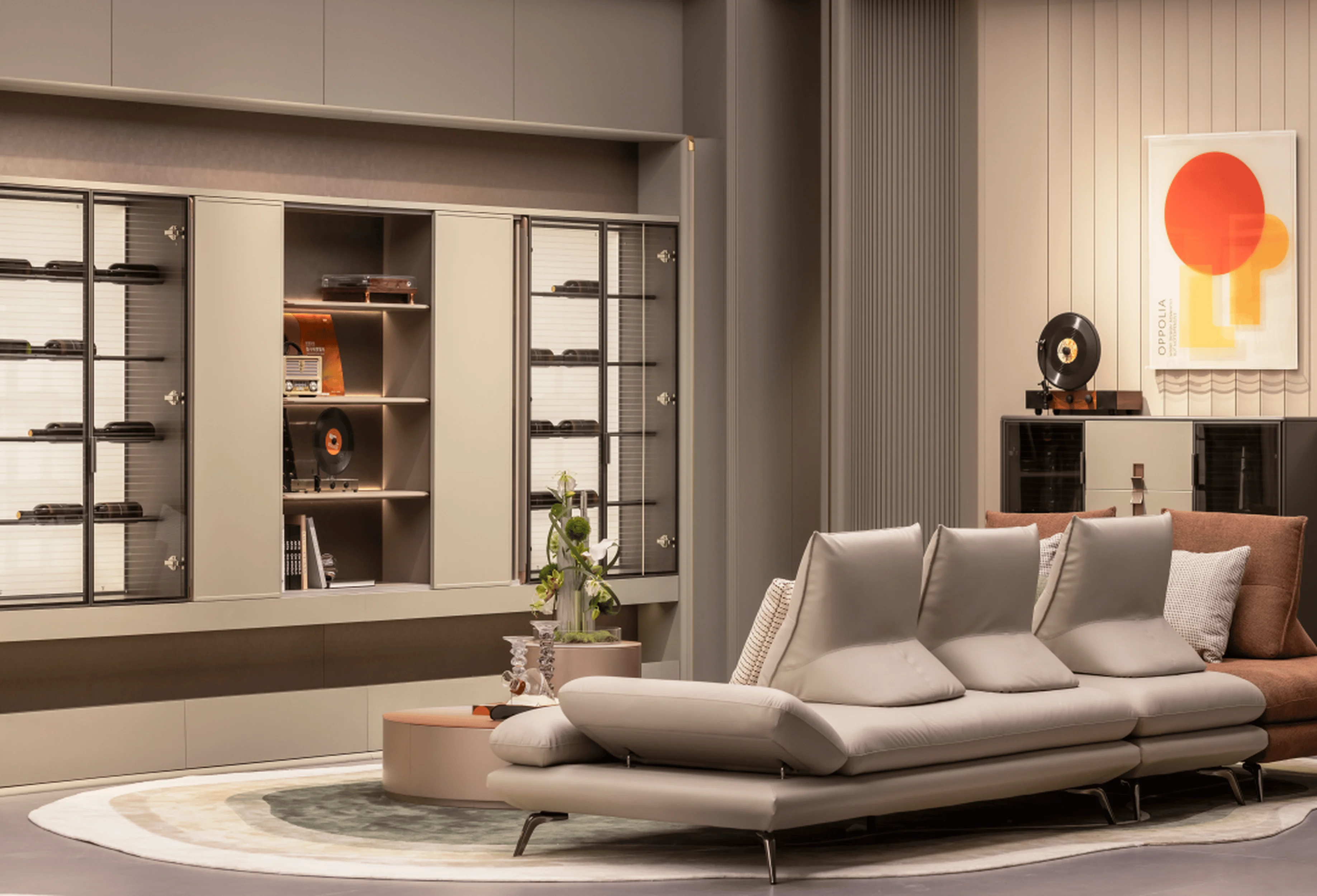
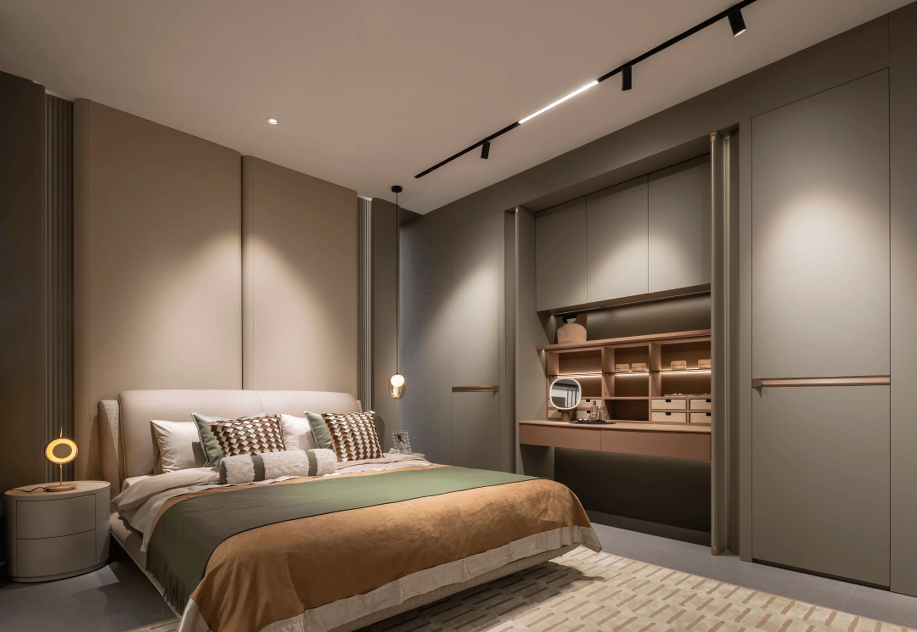
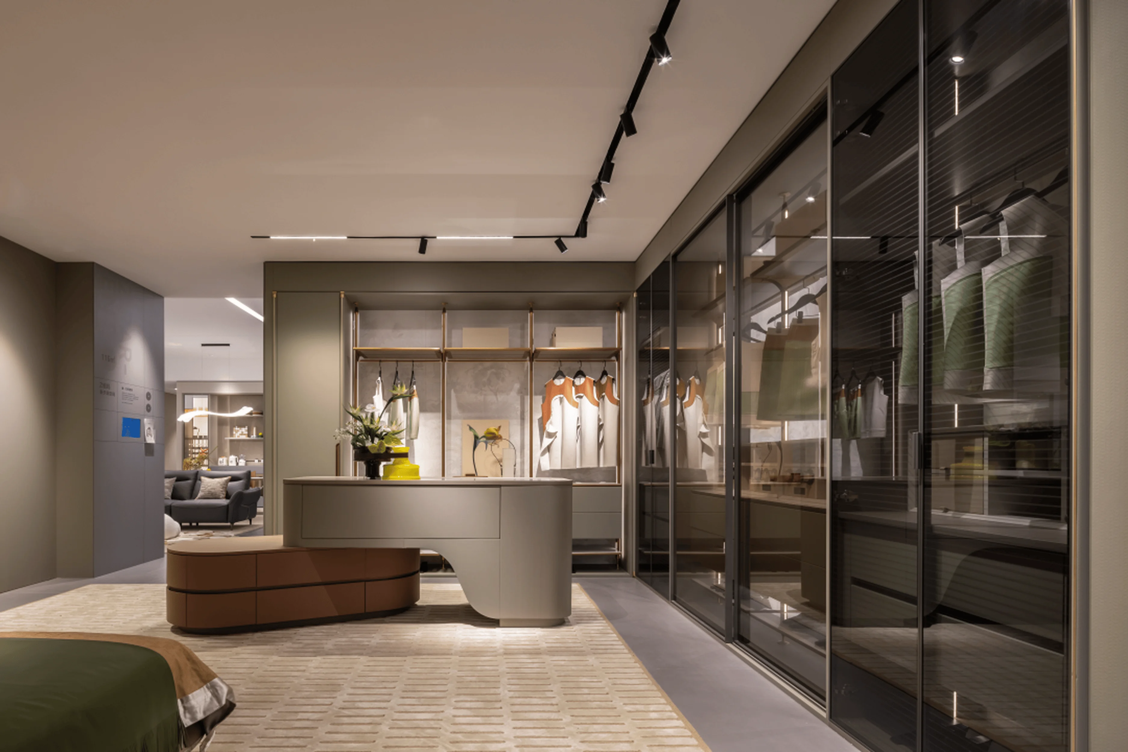
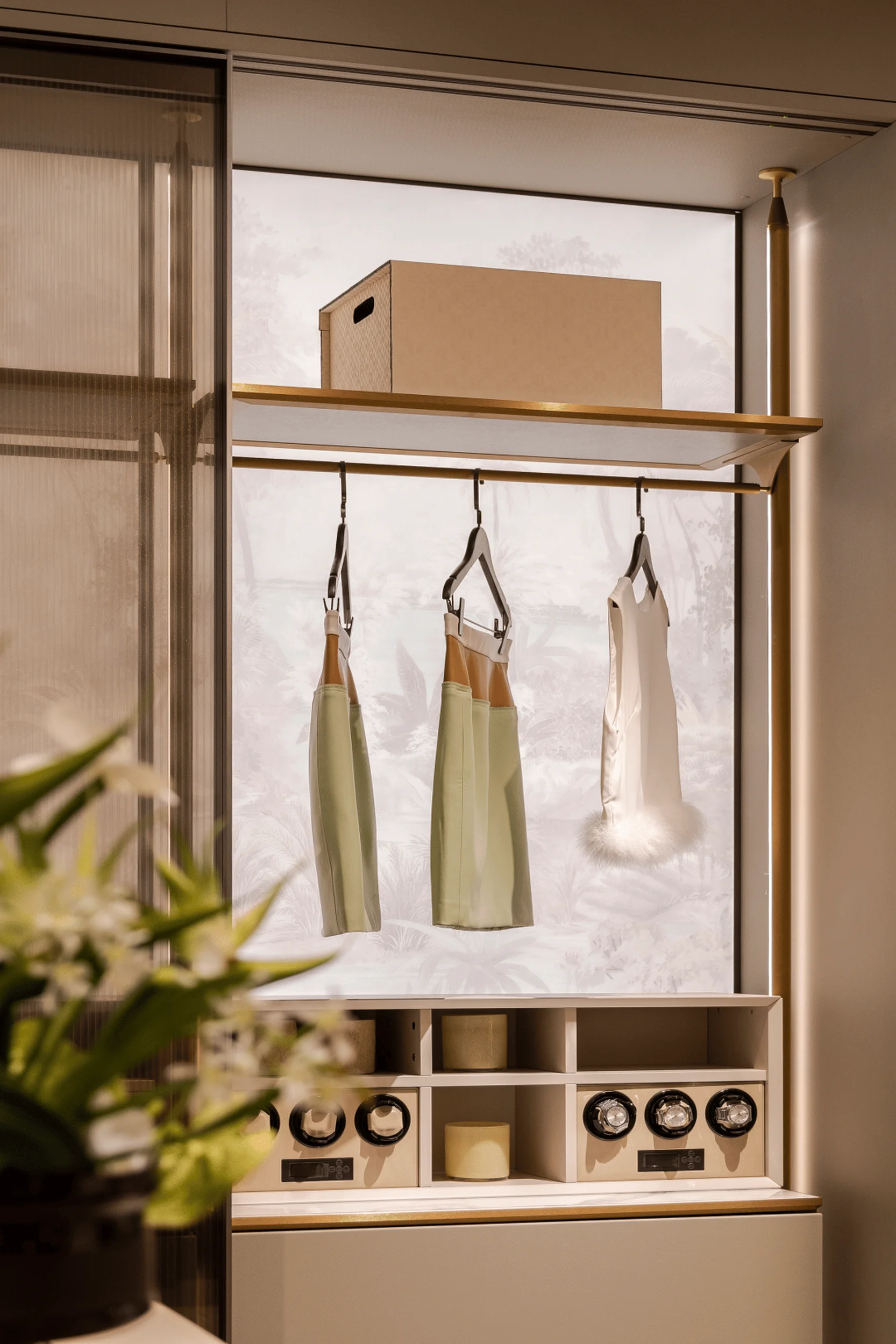
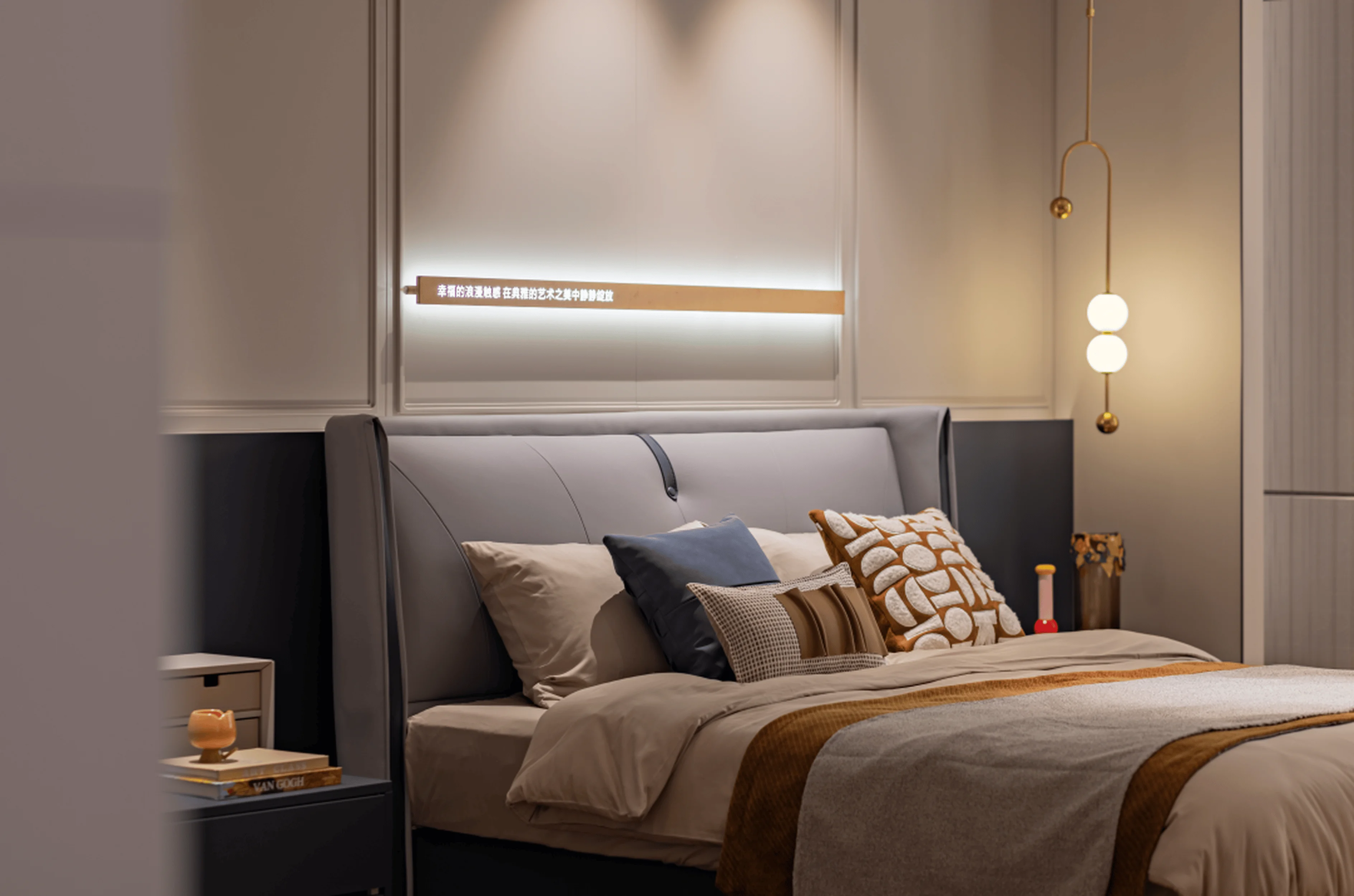
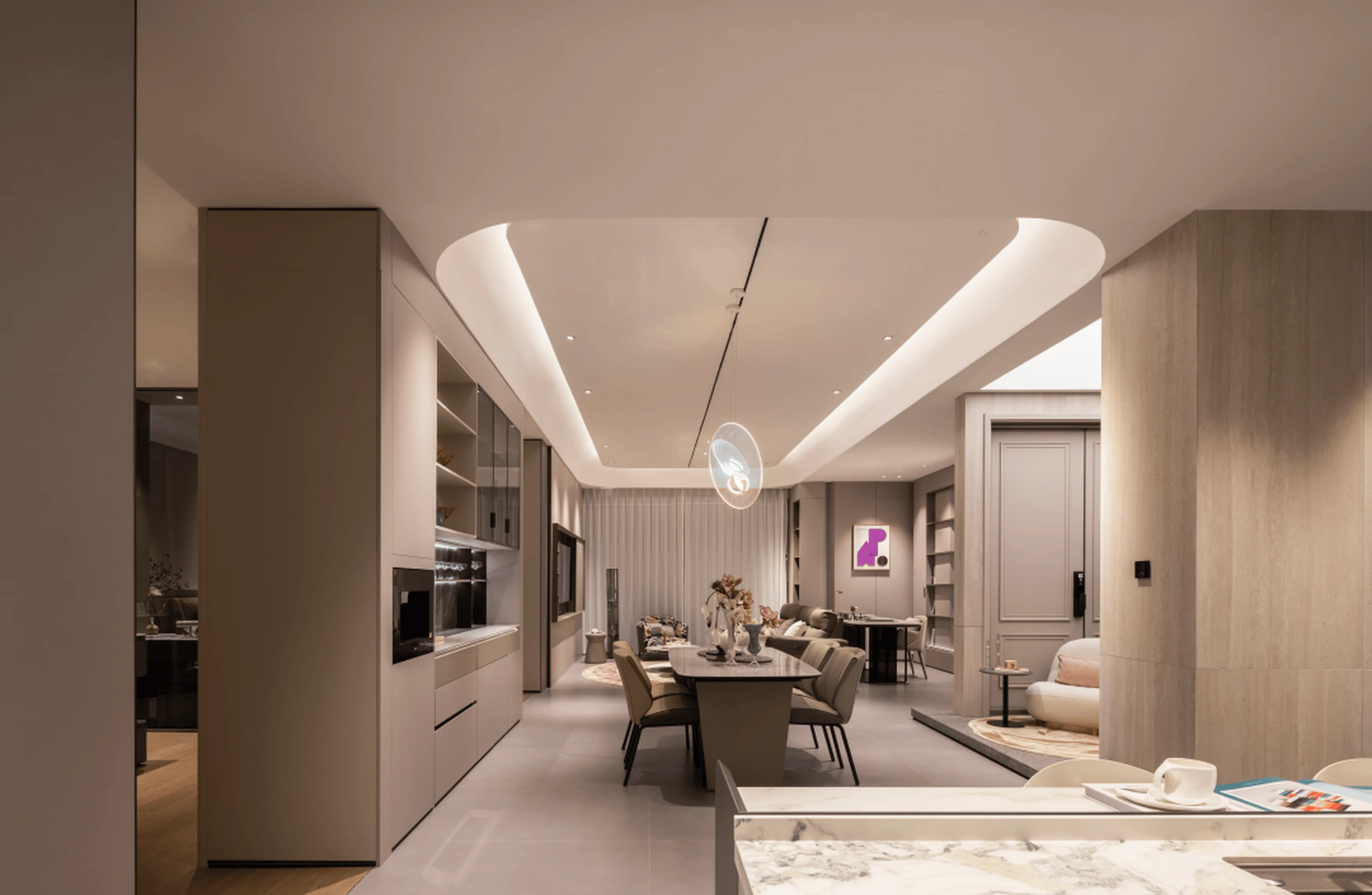
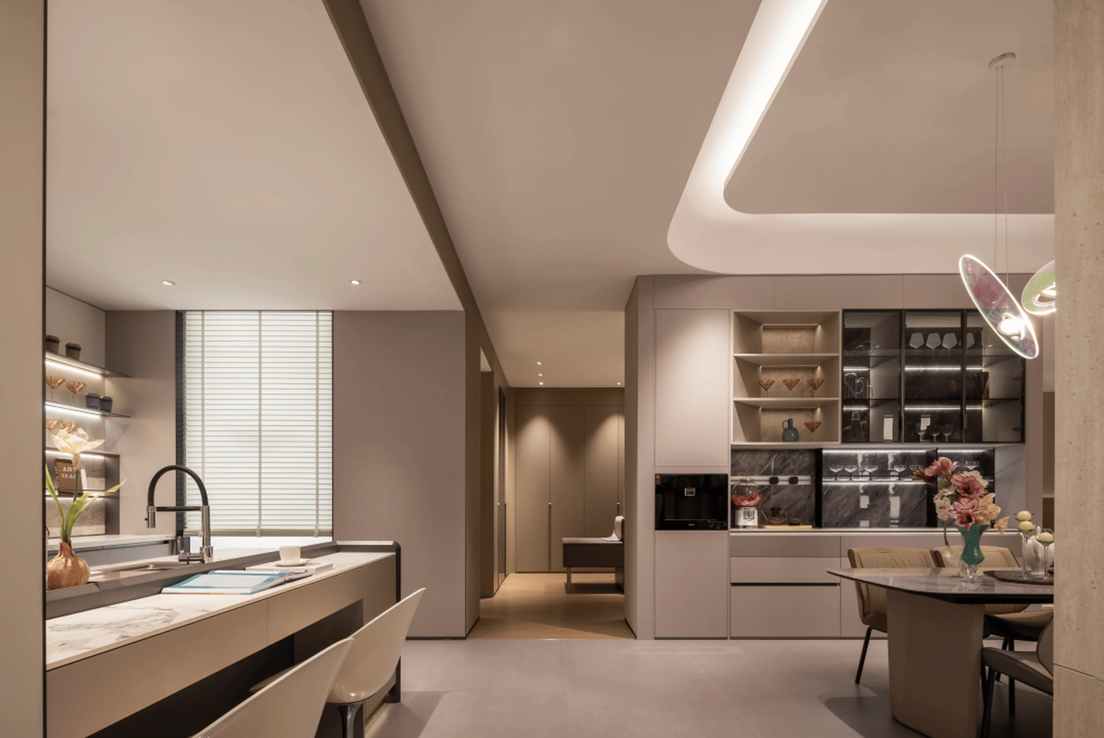
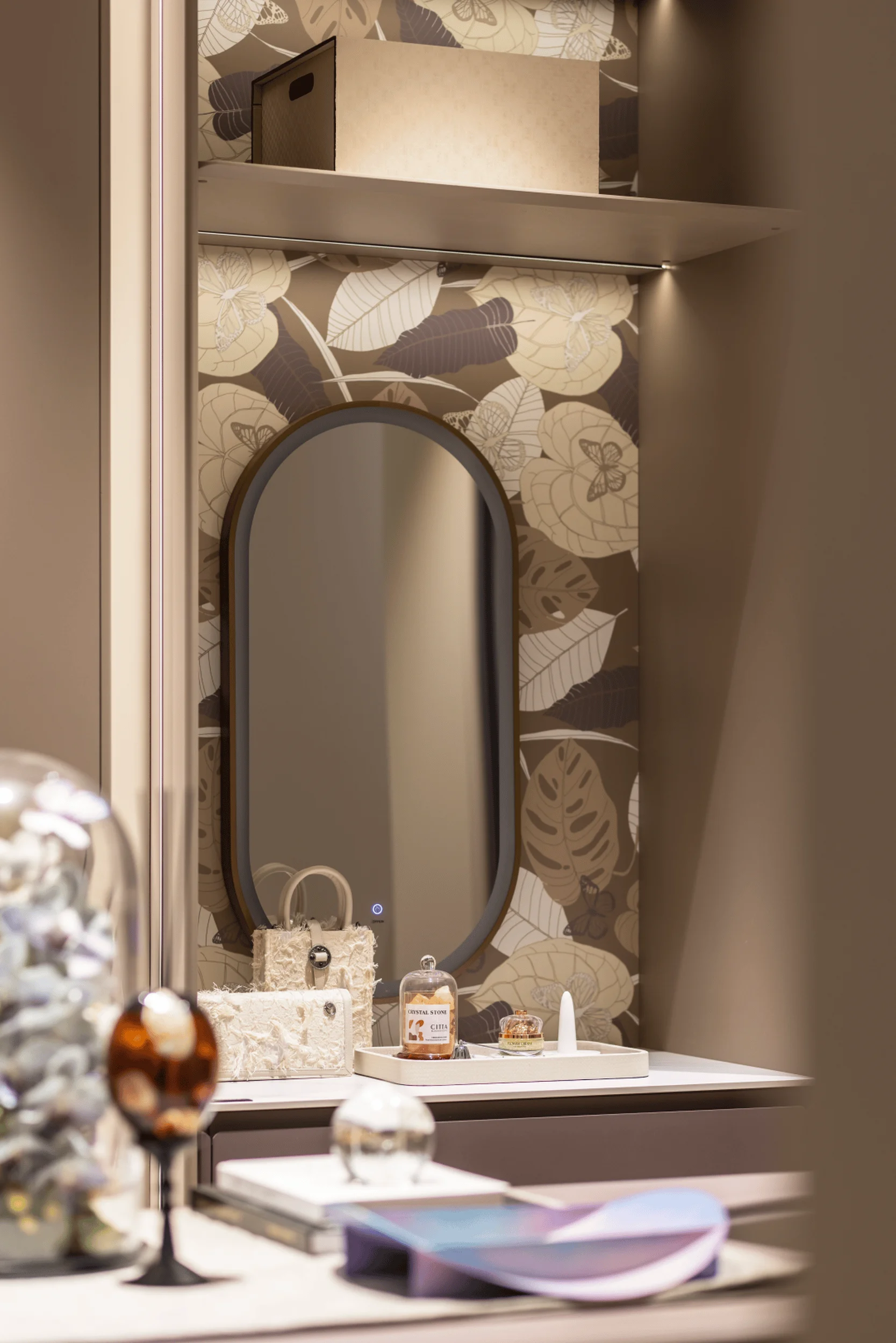
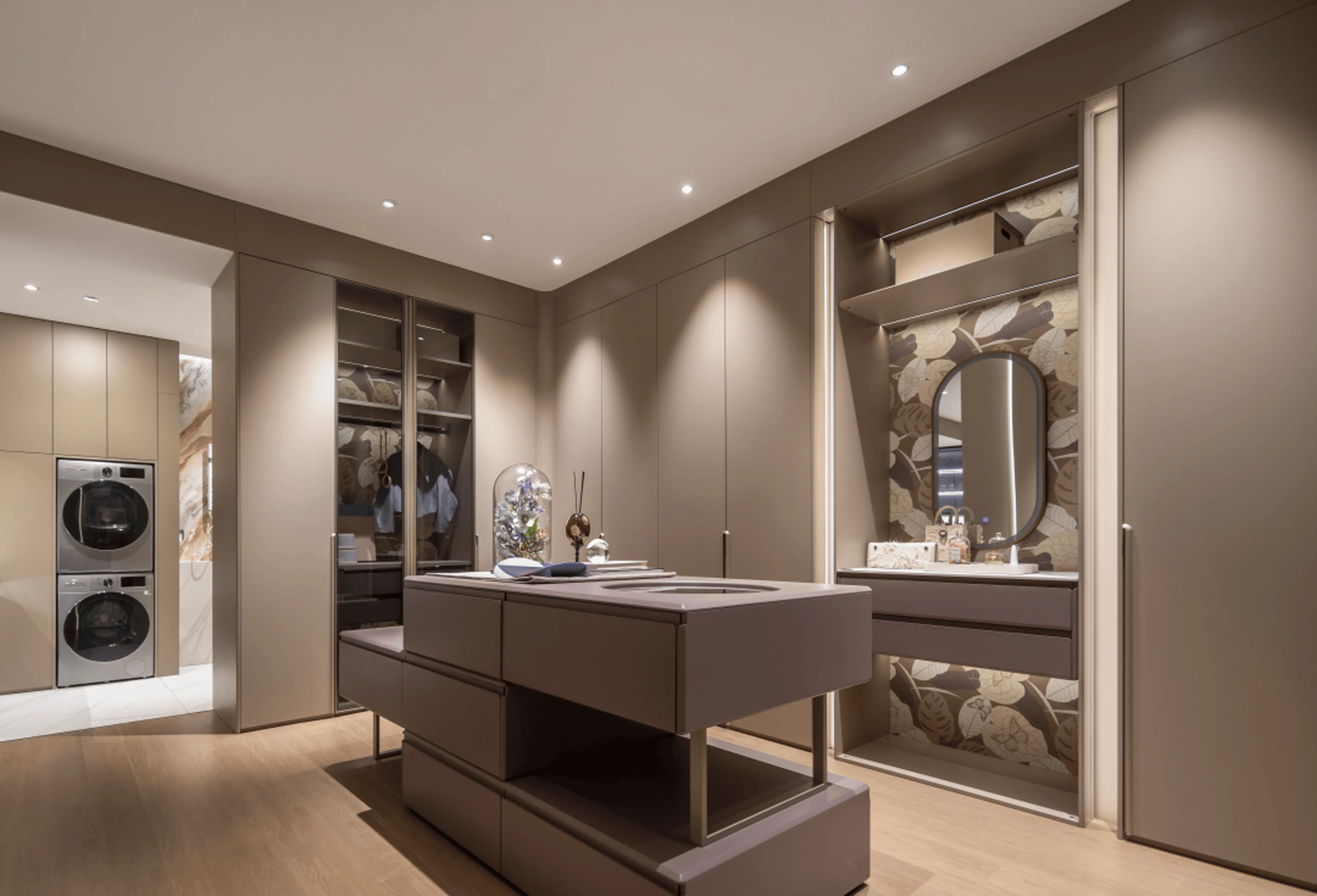
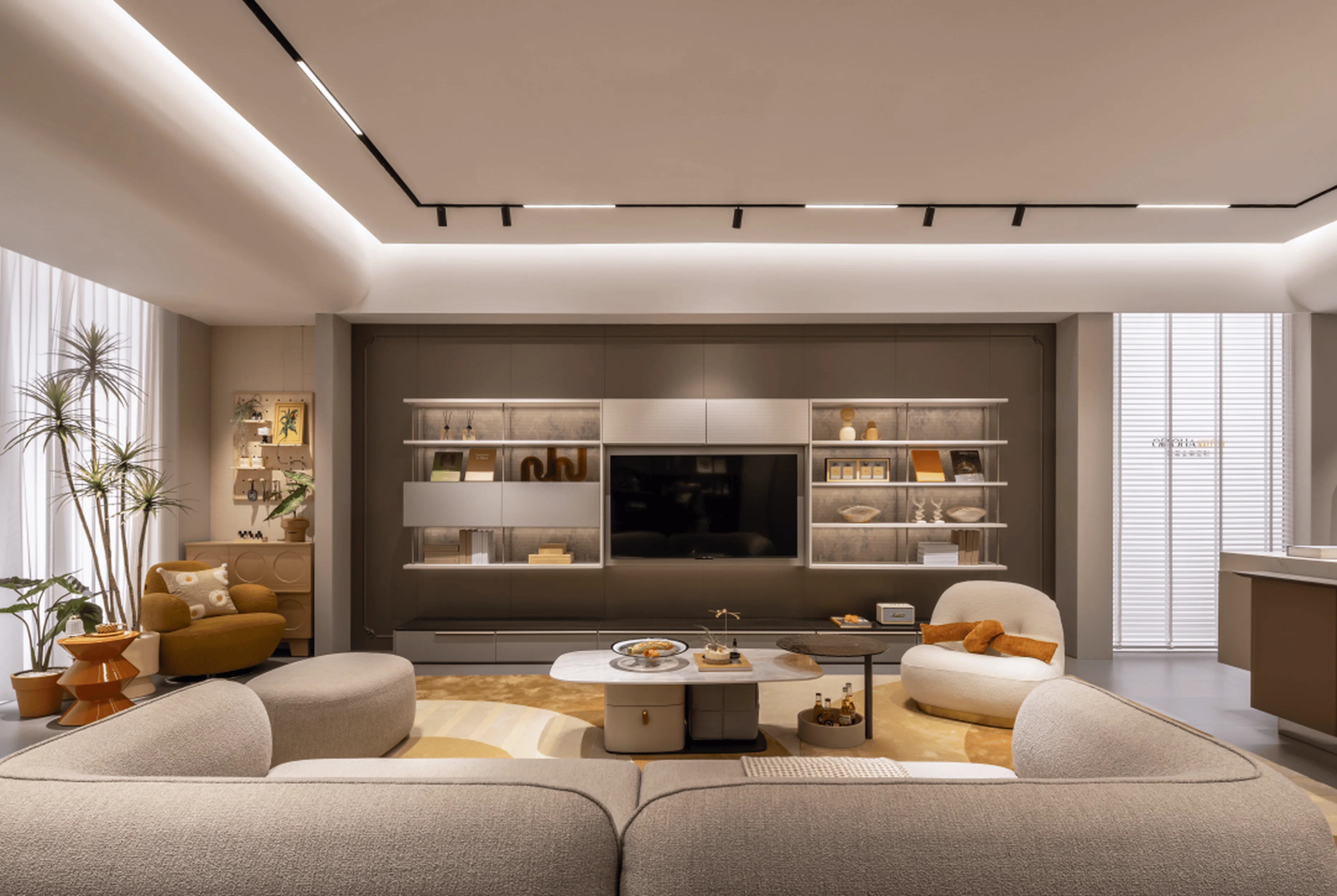
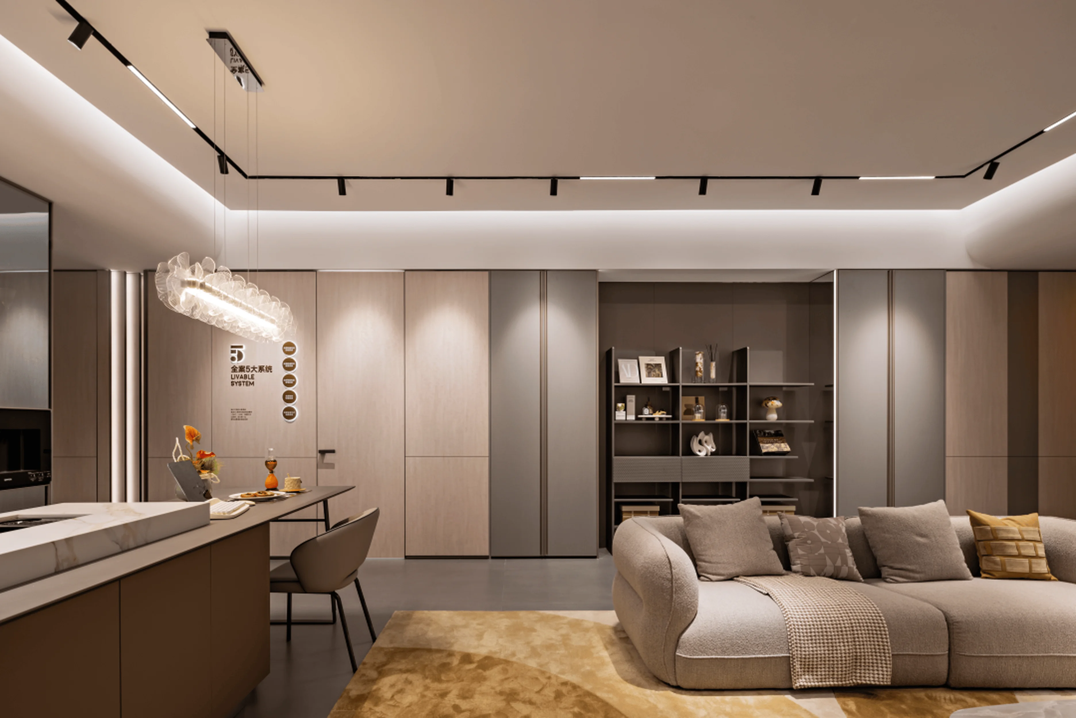
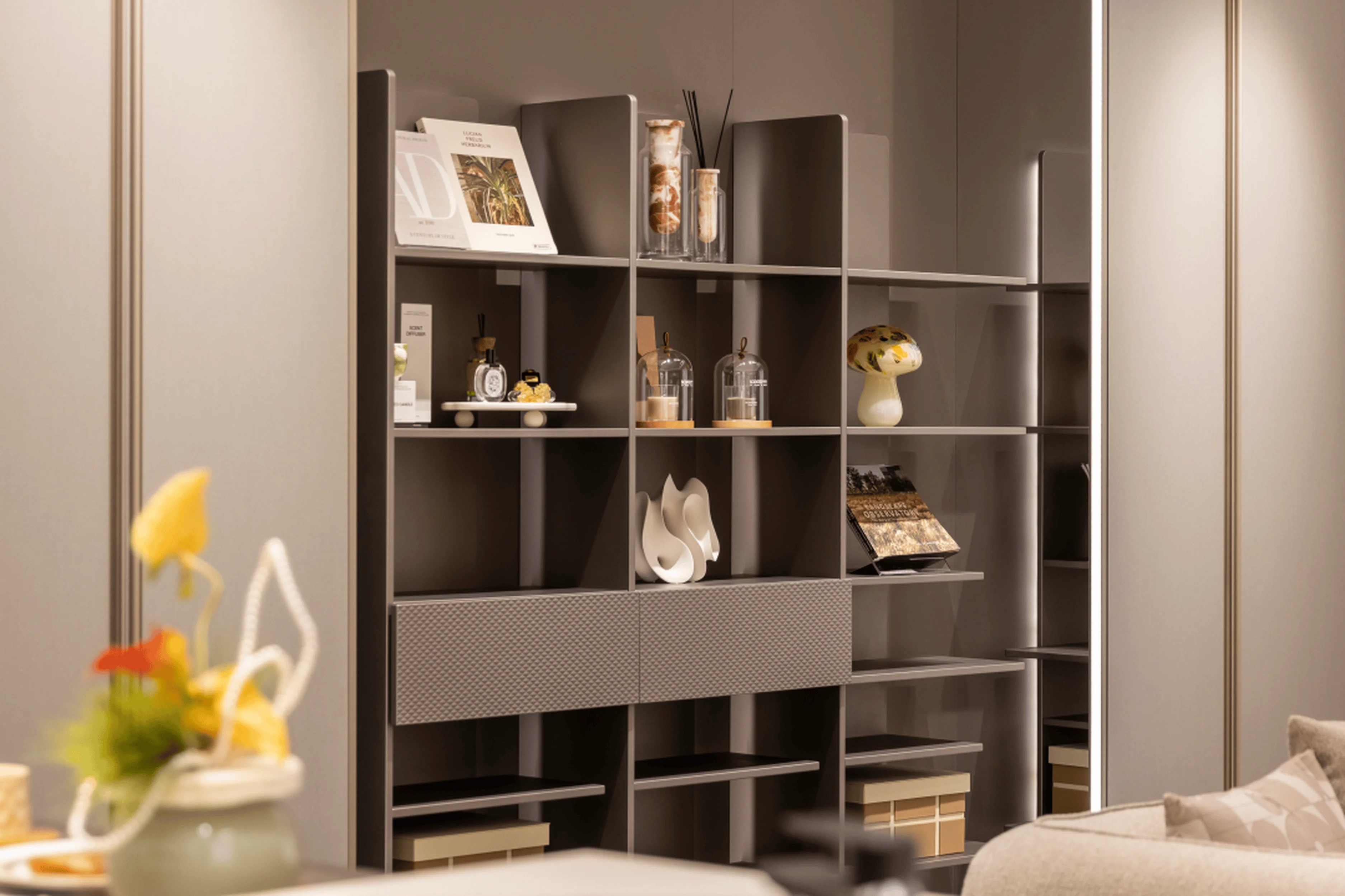
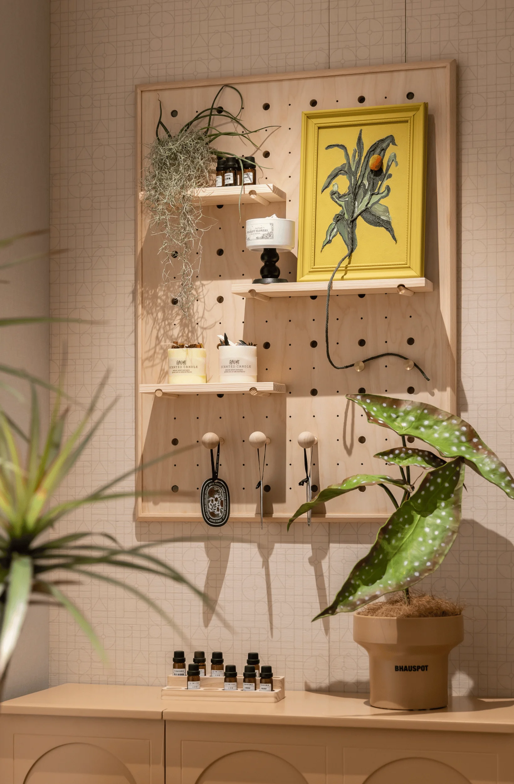
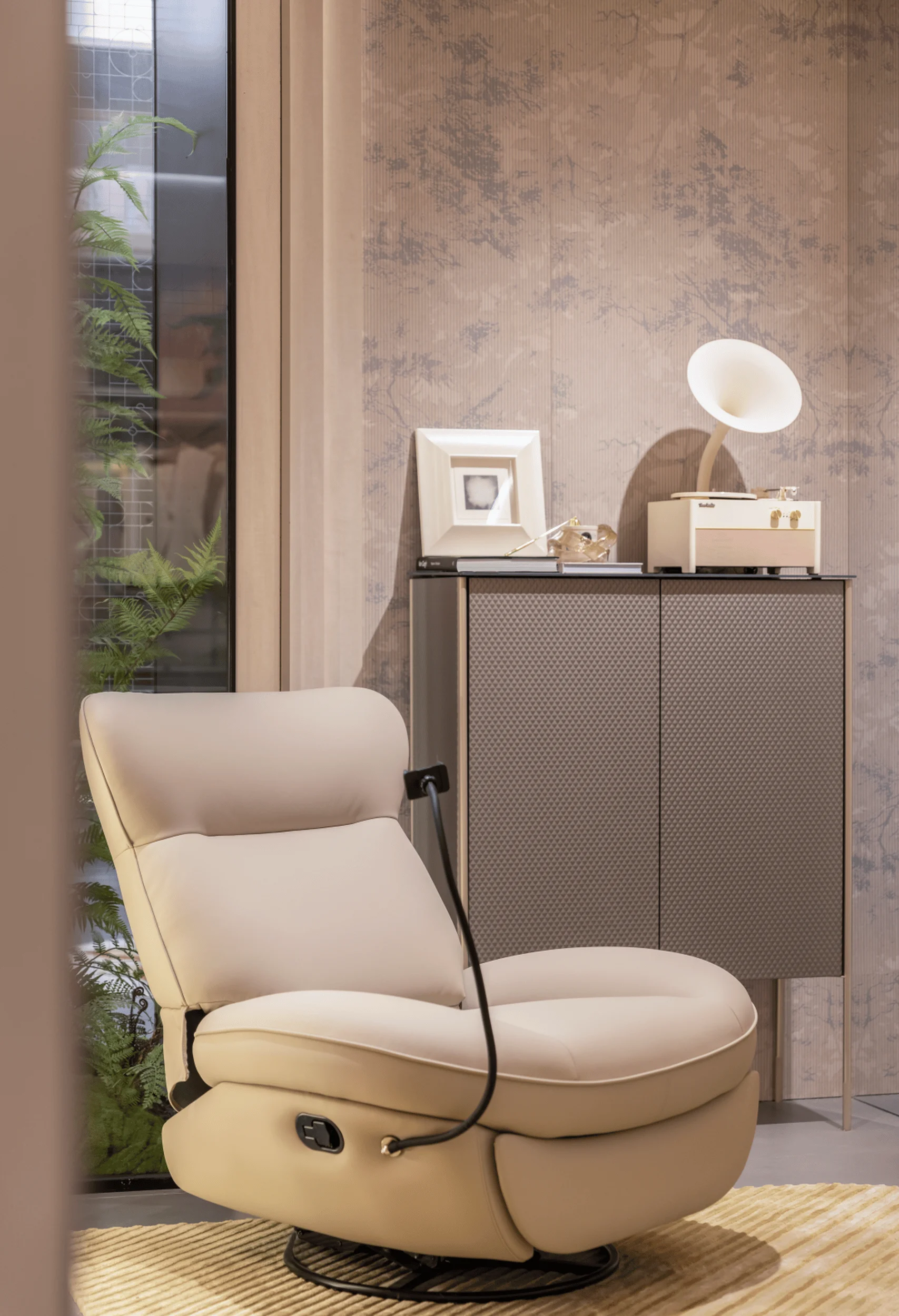
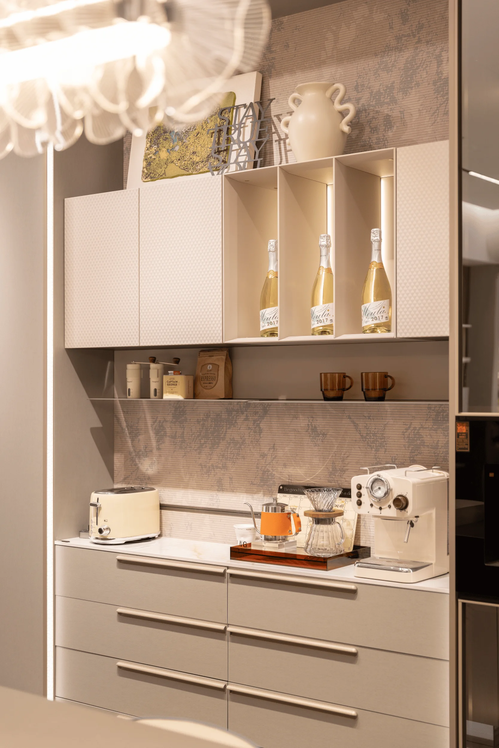
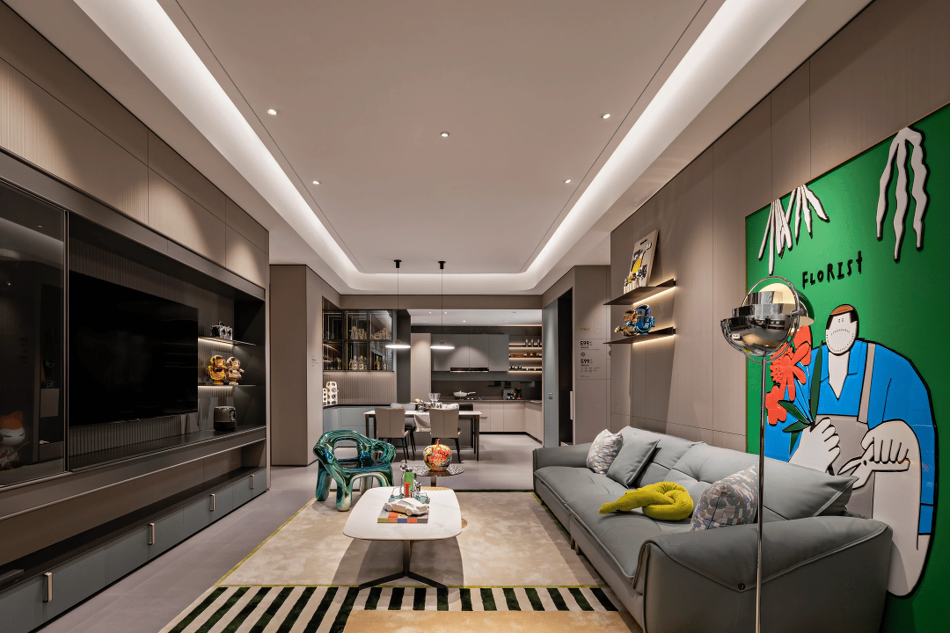
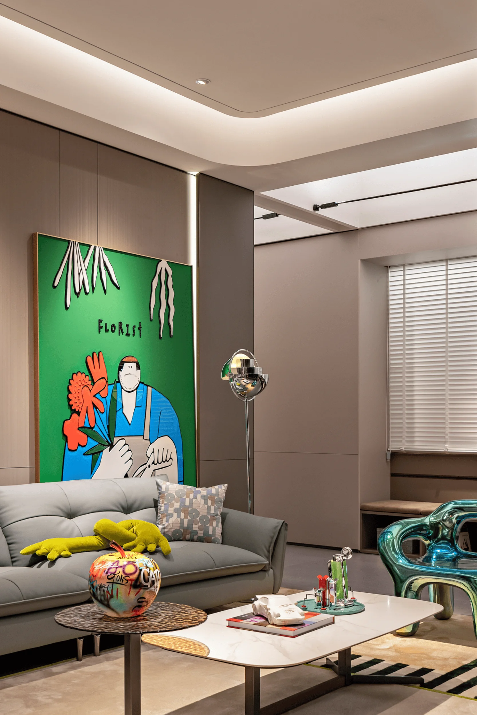
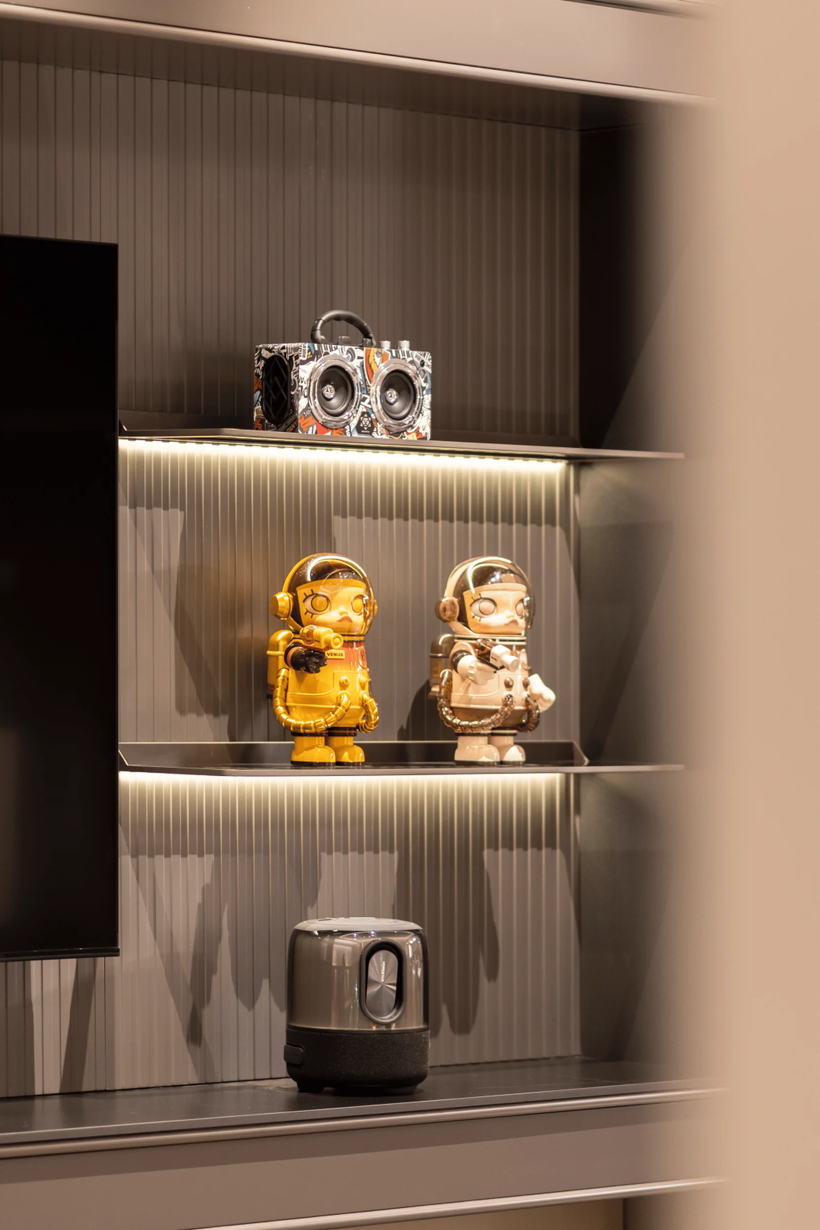
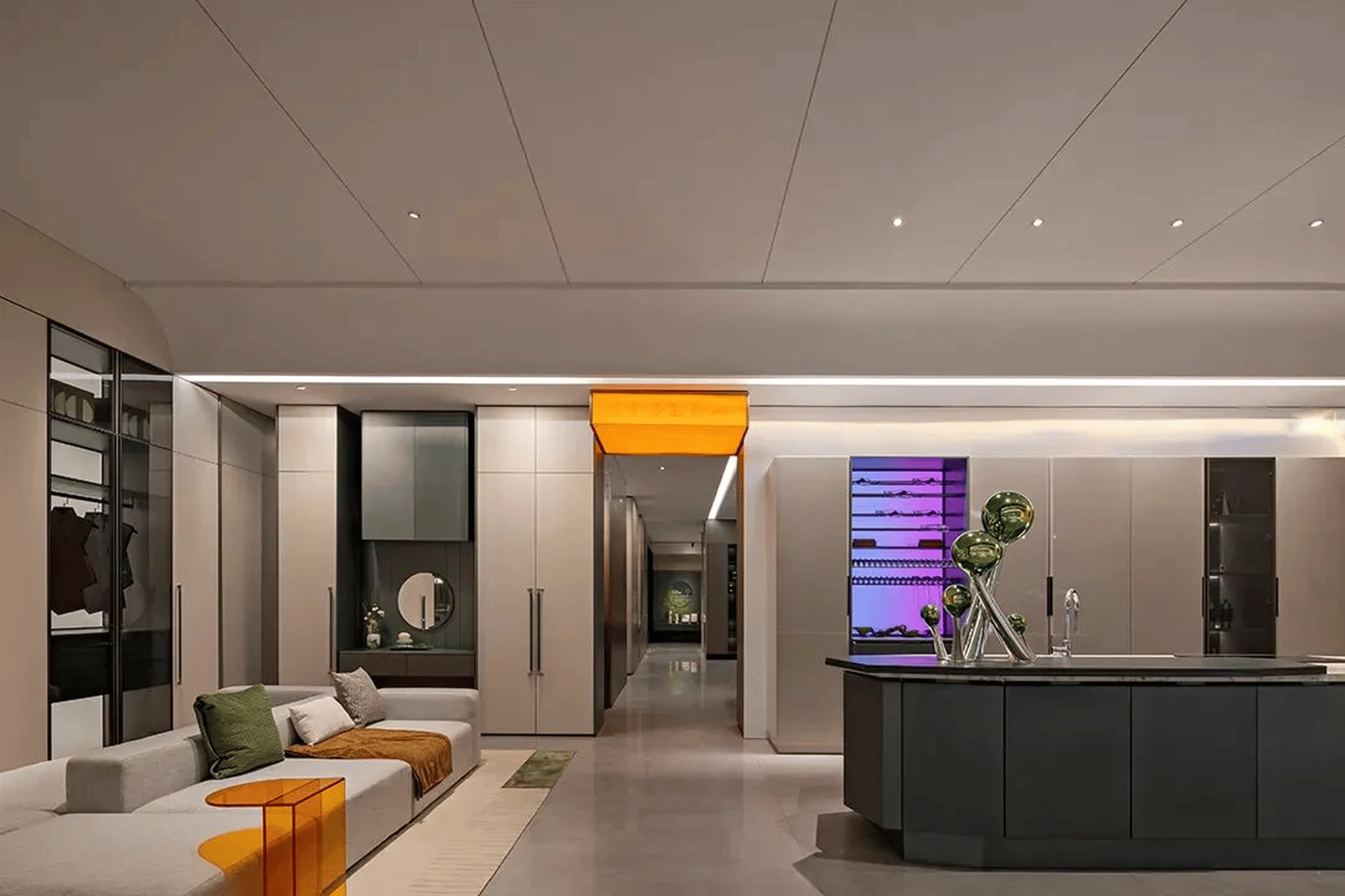
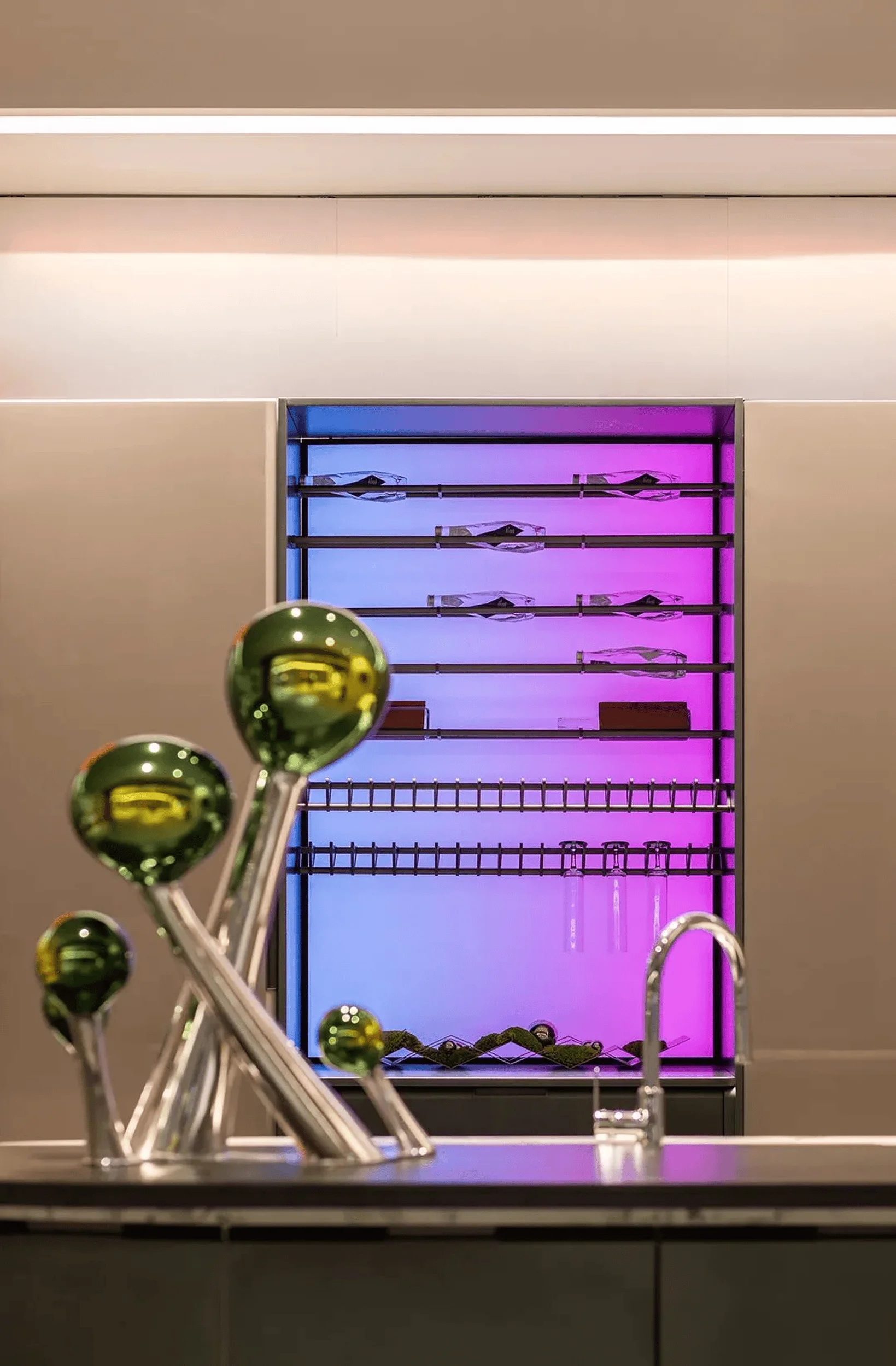
The interior design and aesthetics incorporate a youthful and elegant style in Oppolia’s aesthetic language. They create an environment that is both comfortable and visually stimulating. The interior design is highlighted by a blend of materials and textures, including leather, wood, and glass. Neutral tones serve as a backdrop for vibrant accents of color and material choices to create a dynamic and aesthetically pleasing space. The showroom’s interior is characterized by its use of natural light and an emphasis on materials with a contemporary, sophisticated style. A cohesive brand identity is seen in color and material choices throughout the project. These elements help to create a sense of coherence and unity, and they also help to reinforce the brand’s youthful and elegant identity. The inclusion of elements from the Oppolia brand identity further enhances the atmosphere, giving the showroom a more personal touch and emphasizing the brand’s commitment to its target market. The goal is to cultivate a welcoming environment that makes visitors feel comfortable and engaged with the brand.
Product Matrix and Showroom Functionality
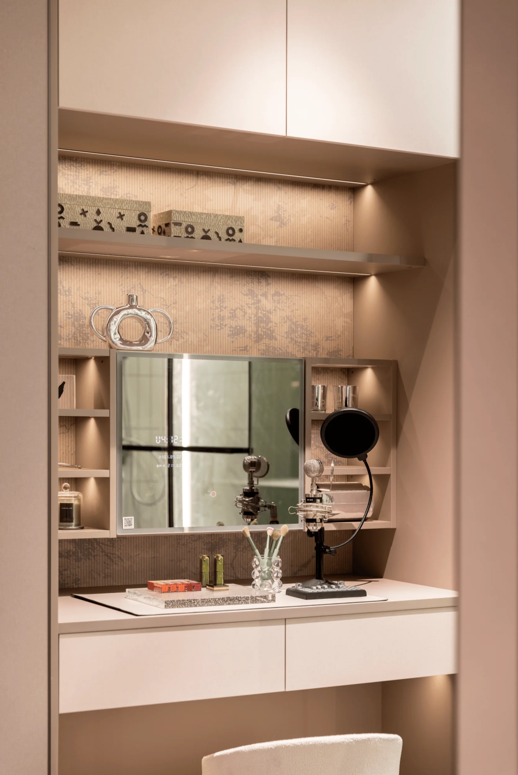
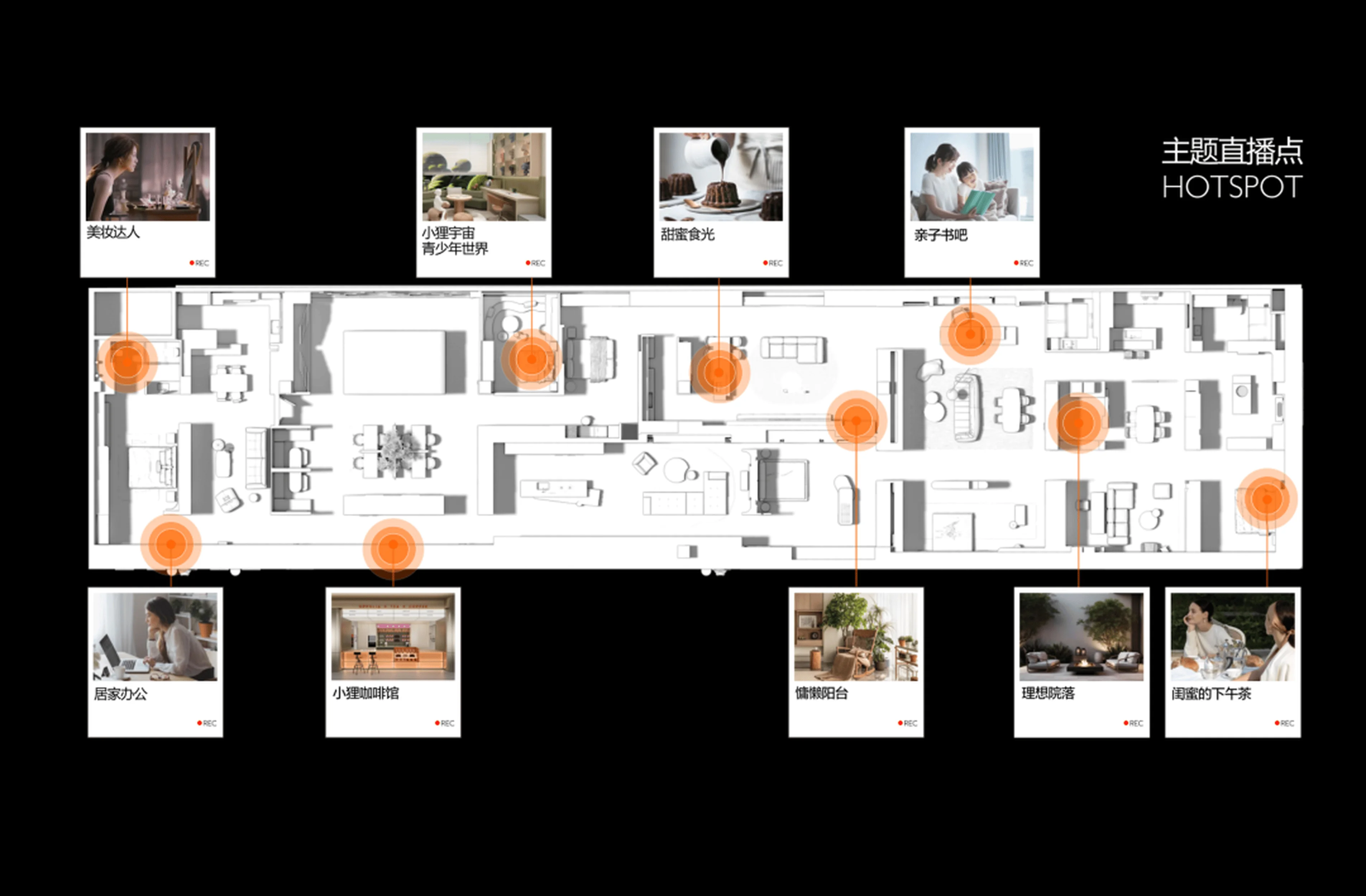
The showroom’s design incorporates a diverse product matrix and multiple lifestyle-driven suites that integrate the “human-centric design” concept. In alignment with the brand’s dedication to a holistic and personalized experience, the interior space is divided into five model suites, each dedicated to a unique lifestyle concept. The showroom features three different product matrices—luxury, elegance, and simplicity— which help to create a cohesive brand identity and showcase a range of options for consumers. In addition to the five model suites, the showroom also includes spaces that promote various aspects of life at home. These spaces include interactive and social elements such as a makeup area, a teen-focused living area, a dining area, a coffee bar, and a relaxing lounge area, promoting a seamless integration of design and lifestyle that enhances the overall customer experience. The overall design and functionality of the space allow customers to get a clear understanding of the various home design concepts that Oppolia offers, allowing them to visualize their desired lifestyle within the context of a beautifully designed space.
Integrating Human-Centric Design
The Oppolia showroom’s design successfully integrates the principles of human-centric design to enhance the user experience and create a more engaging and meaningful experience. The showroom’s layout and design prioritize the needs of the user and make them feel valued. The showroom’s interior design promotes social interaction and personalized experiences. The inclusion of various lifestyle suites caters to the individual needs of the target audience. The showroom also features a designer workspace that is designed to facilitate communication and collaboration. The integration of human-centric design principles makes the showroom a much more engaging experience for visitors. It demonstrates that the brand is committed to creating a space that is not only aesthetically pleasing but also functional and user-friendly.
Enhancing Showroom Value
Beyond its function as a showcase for Oppolia’s products and services, the showroom is meticulously designed to foster engagement and offer a variety of experiences. The multiple lifestyle-driven suites function as hotspots for various lifestyle narratives. This strategic design increases the engagement and visual appeal of the space and allows Oppolia to promote a variety of lifestyle scenarios that highlight the brand’s value proposition. The integration of various lifestyle-themed areas into the showroom also helps to increase the showroom’s appeal and make it more engaging for visitors. The design also incorporates numerous interactive design elements, including digital media displays and spaces for socializing and relaxing, to promote an interactive atmosphere within the showroom. The integrated design elements, in addition to enhancing the showroom’s aesthetic appeal, also create a more dynamic and engaging experience for visitors, maximizing visitor engagement and creating a positive impact on the brand.
Brand Identity and Visual Language
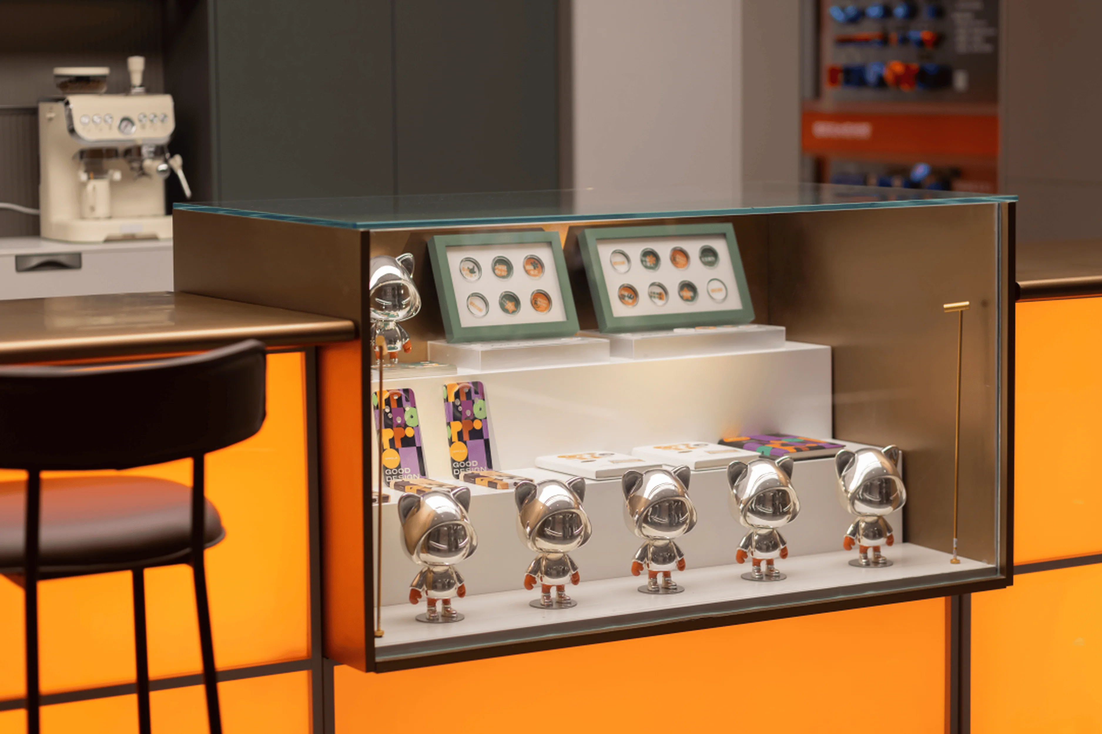
Oppolia has a very unique brand identity that is incorporated throughout the design of the showroom. The brand identity, which is designed to embody youthfulness and elegance, is visible throughout the space. The design features neutral tones, high-quality materials, and textures to create a sophisticated and timeless atmosphere. The brand’s logo and colors are featured prominently in the showroom’s design, and the brand’s visual language is reflected in the choice of furniture and décor. The use of brand elements such as the brand’s logo, colors, and imagery helps to create a sense of continuity and consistency throughout the space. It also reinforces the brand’s identity and makes it more memorable for visitors. The incorporation of visual cues and elements from Oppolia’s brand identity further underscores the brand’s dedication to quality, design and its dedication to its target audience.
Project Information:
Project Type: Showroom Design
Architect: Re-Shine Design
Area: 750㎡
Year: 2023
Country: China
Photographer: Not provided


