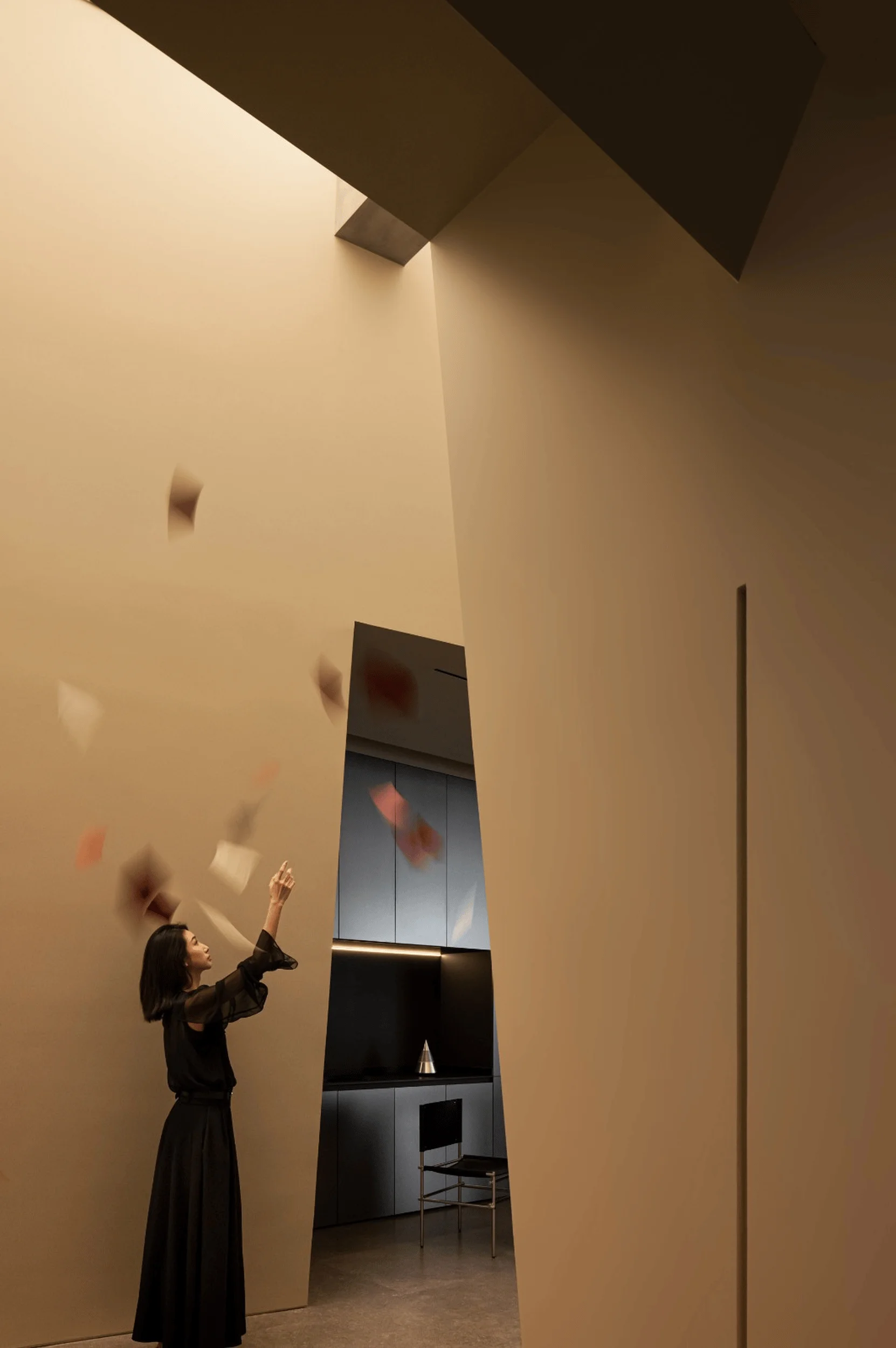
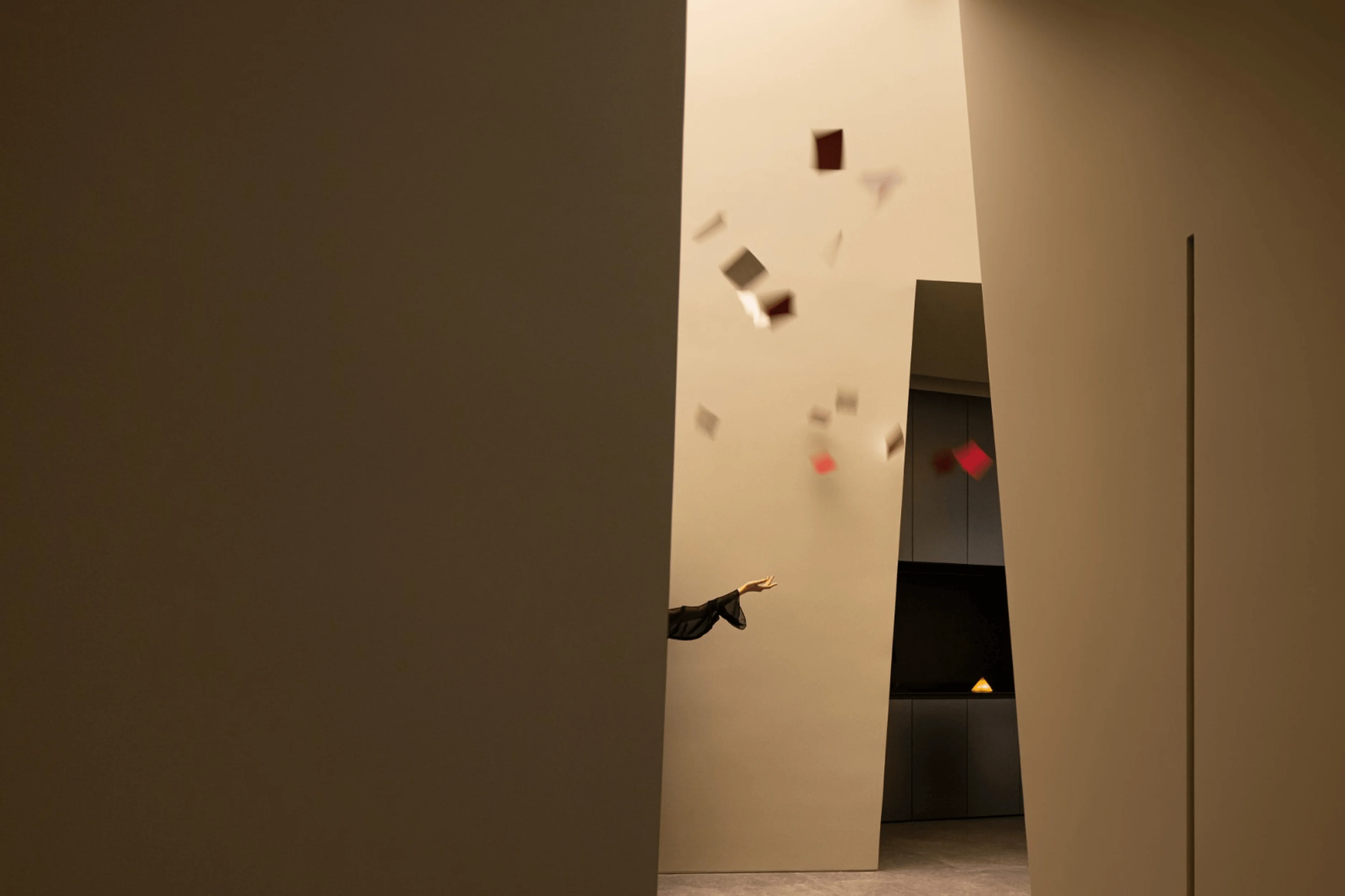
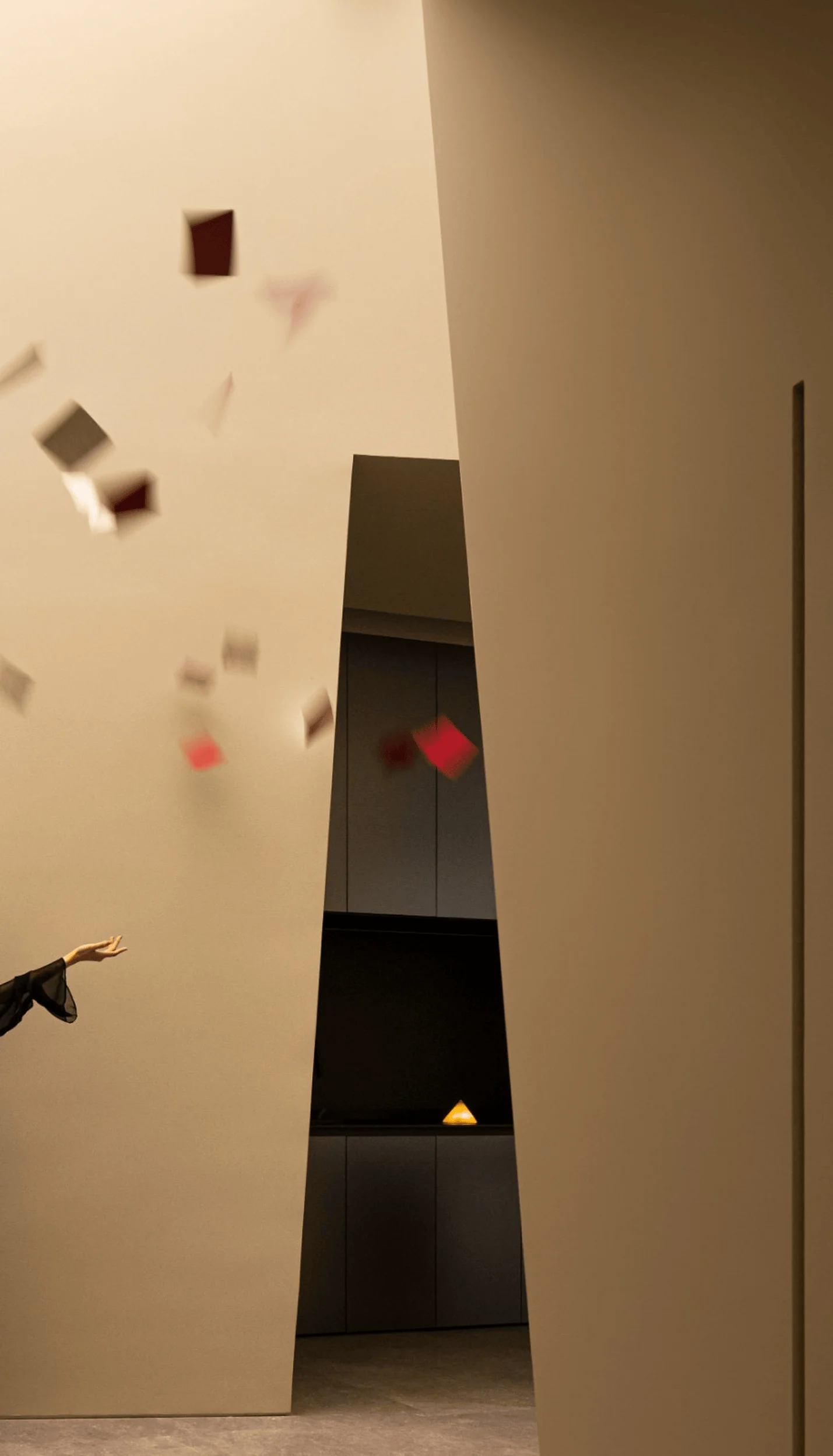
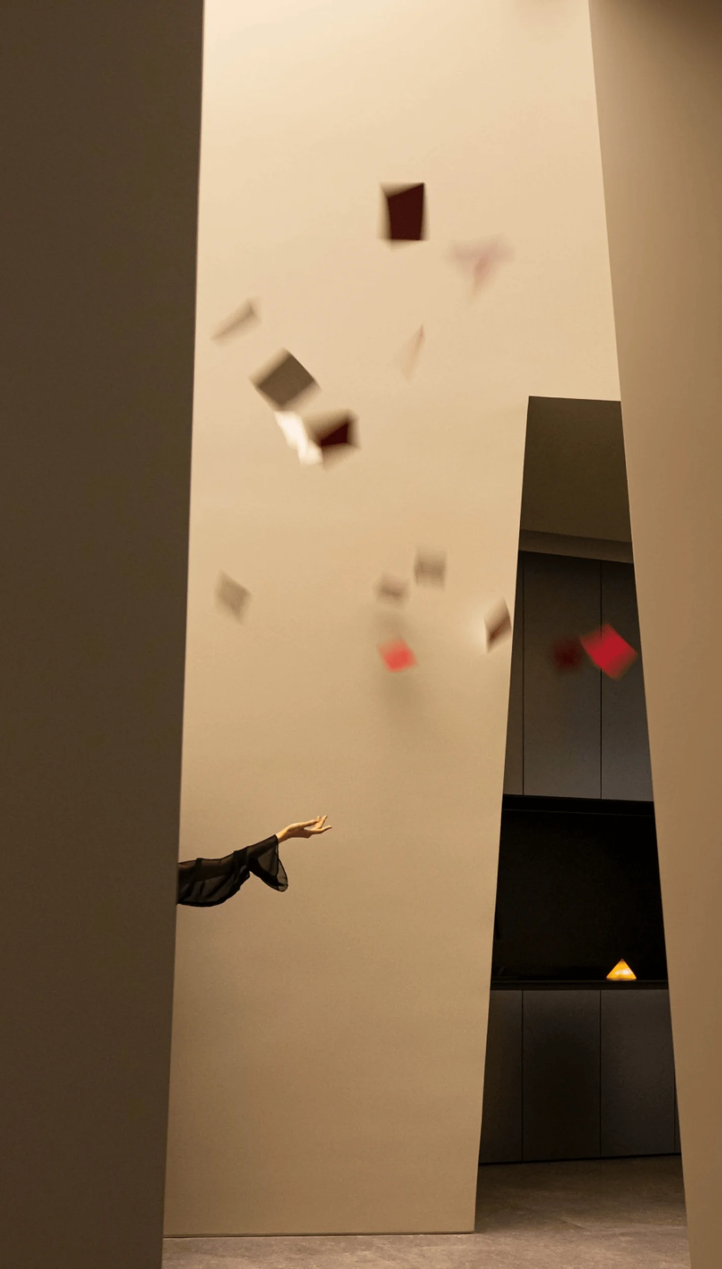
Benjamin Moore Paint Showroom design in China utilizes “Canyon of Light” concept with natural materials and artistic elements.
Contents
Project Background and Brand Identity
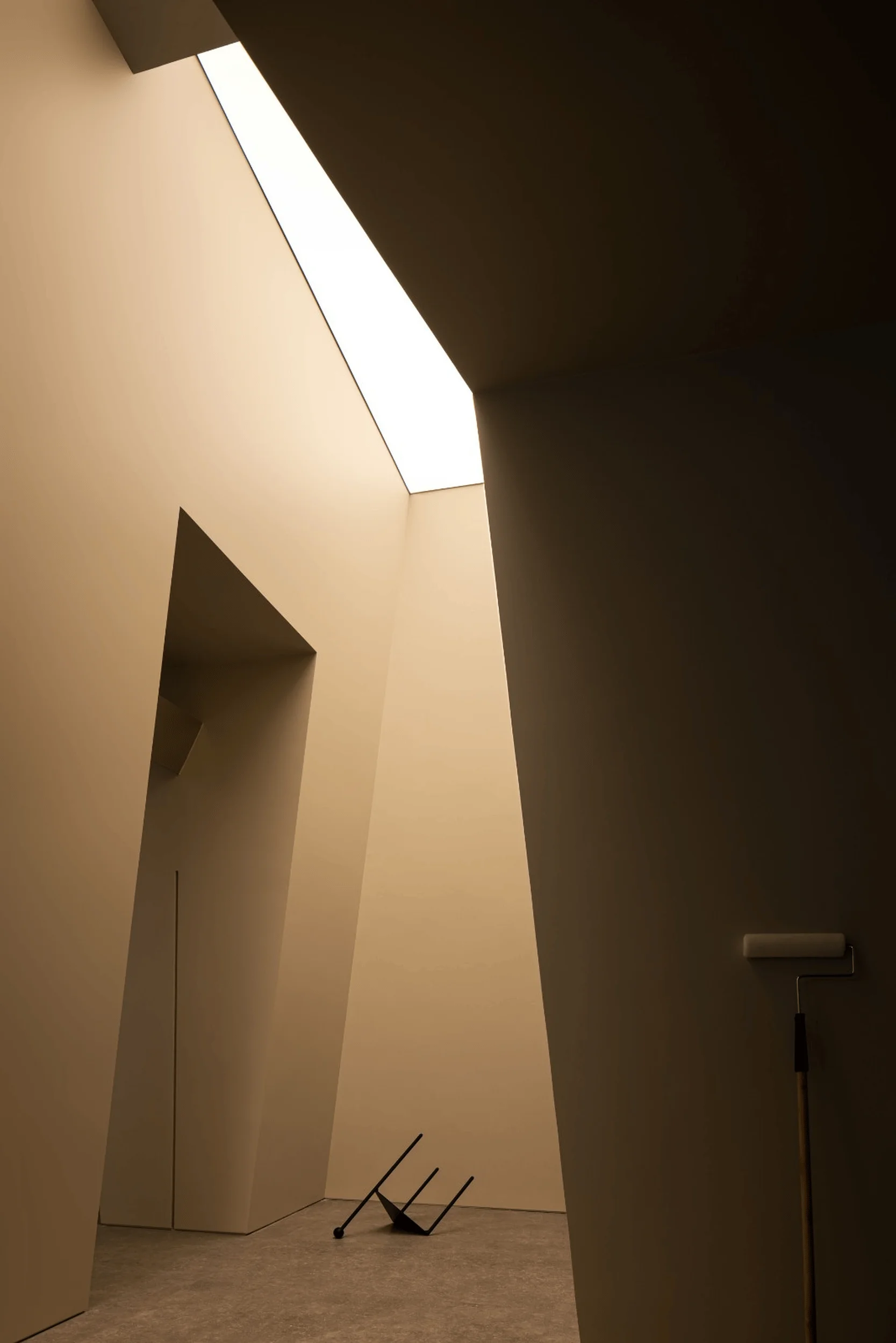
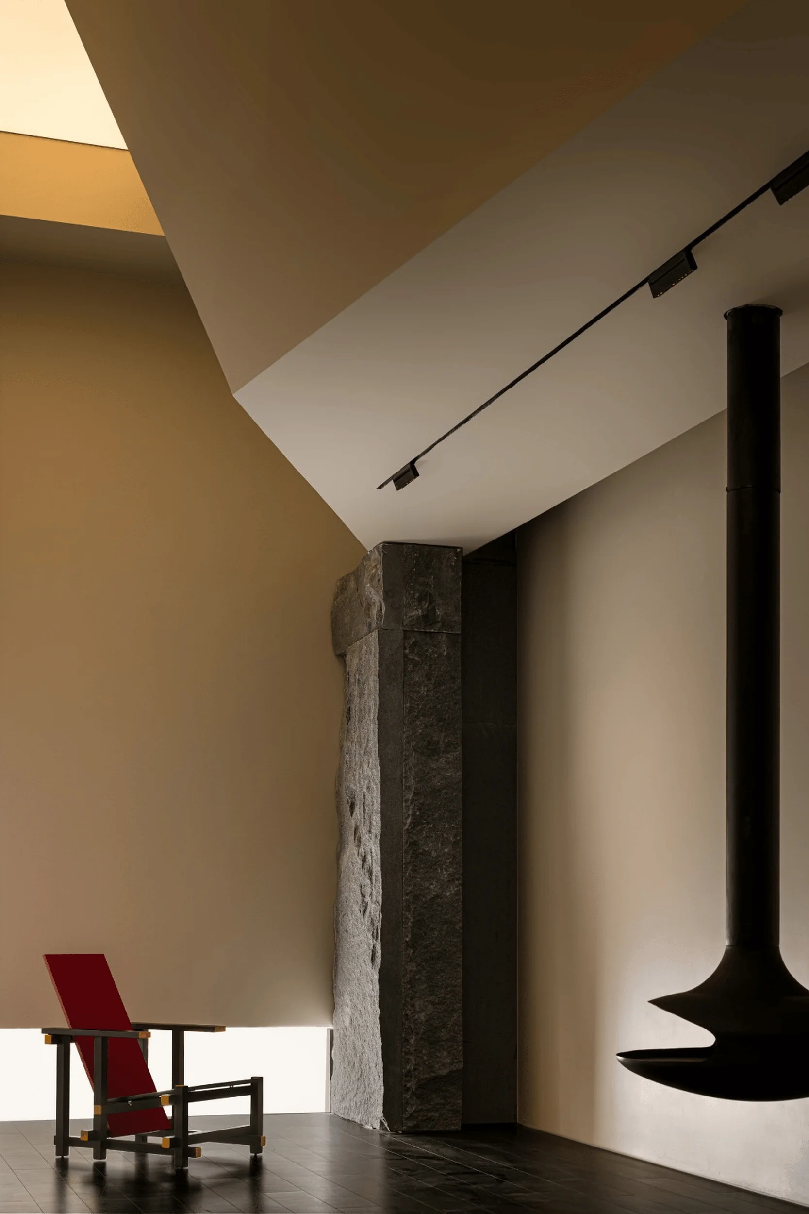
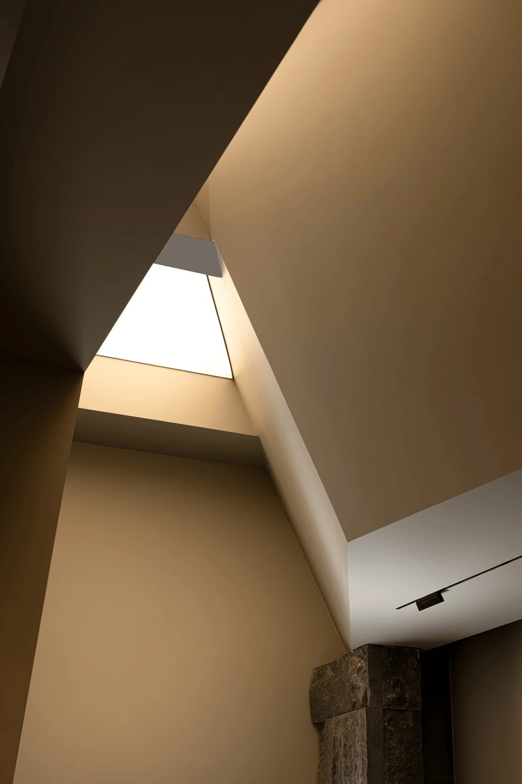
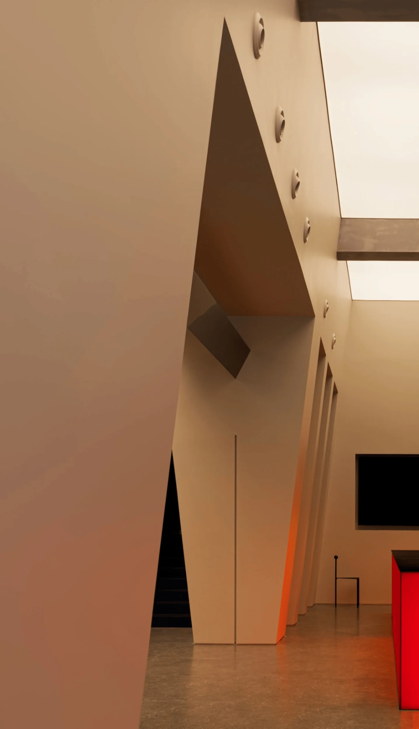
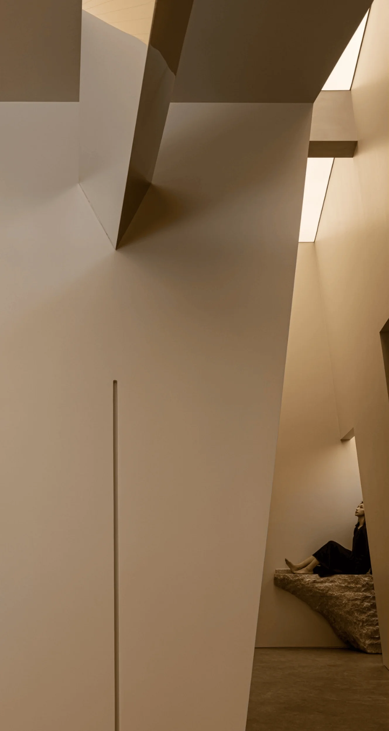
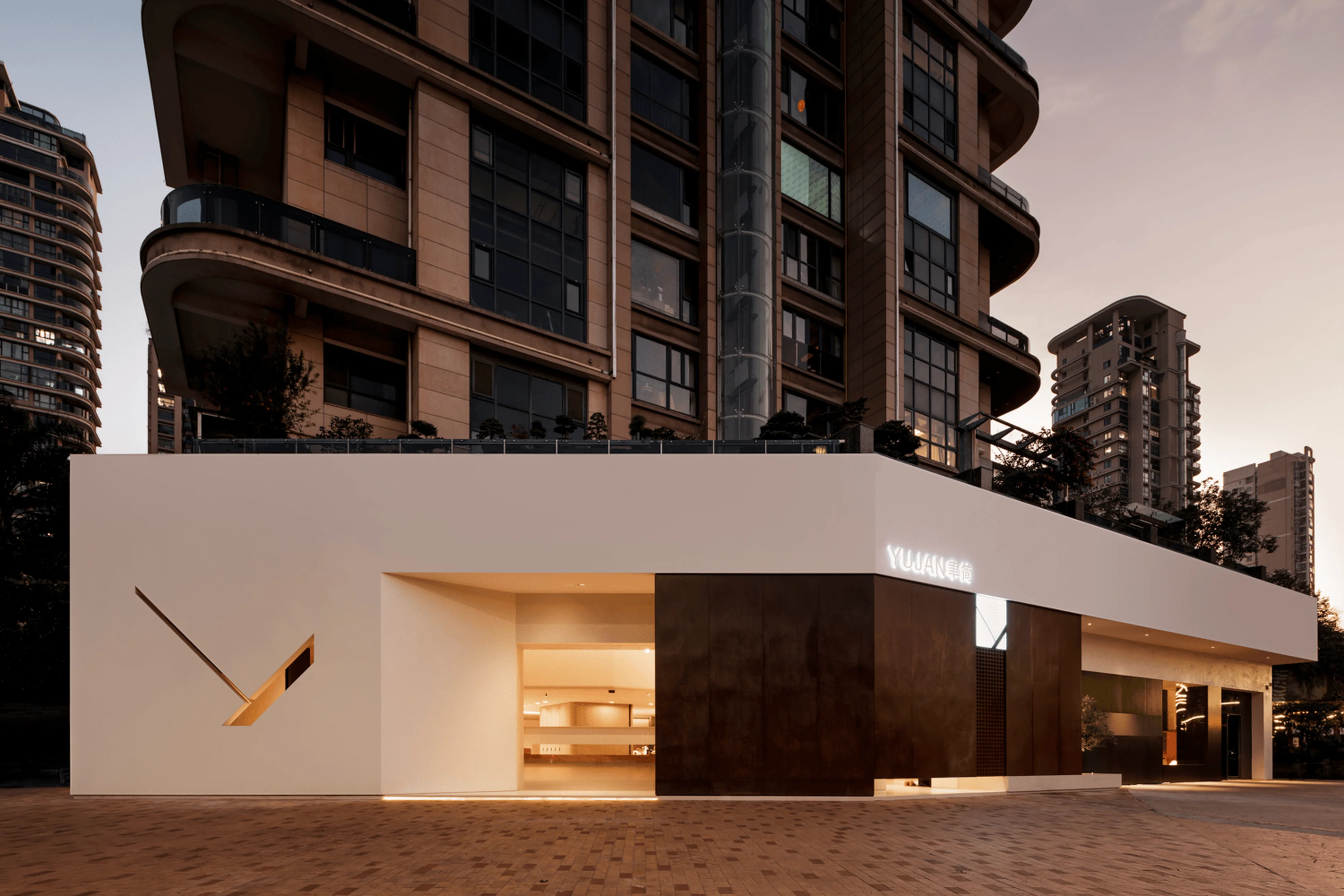
The Benjamin Moore Paint Showroom project is situated on a street-facing storefront. The design team sought to elevate the brand image by adopting the “Canyon of Light” design concept, mimicking the exterior features of a natural canyon. This approach aimed to establish a serene atmosphere reminiscent of being bathed in sunlight, while seamlessly incorporating iconic symbols and classic elements that would cultivate a memorable and explorative journey for visitors. The project, driven by the goal to establish a unique and recognizable brand presence, sought to connect natural light and spaces to create a cohesive spatial experience. This is reflected in the choice of materials and the overall design aesthetic, which strives for a harmonious balance between elegance and nature. This is a classic example of how a brand can leverage its unique visual identity and translate it into a spatial experience that attracts customers and drives engagement. In essence, the architectural design of this showroom is a form of brand storytelling that invites visitors into the brand’s universe.
Creating a Sense of Atmosphere with Geometry and Color
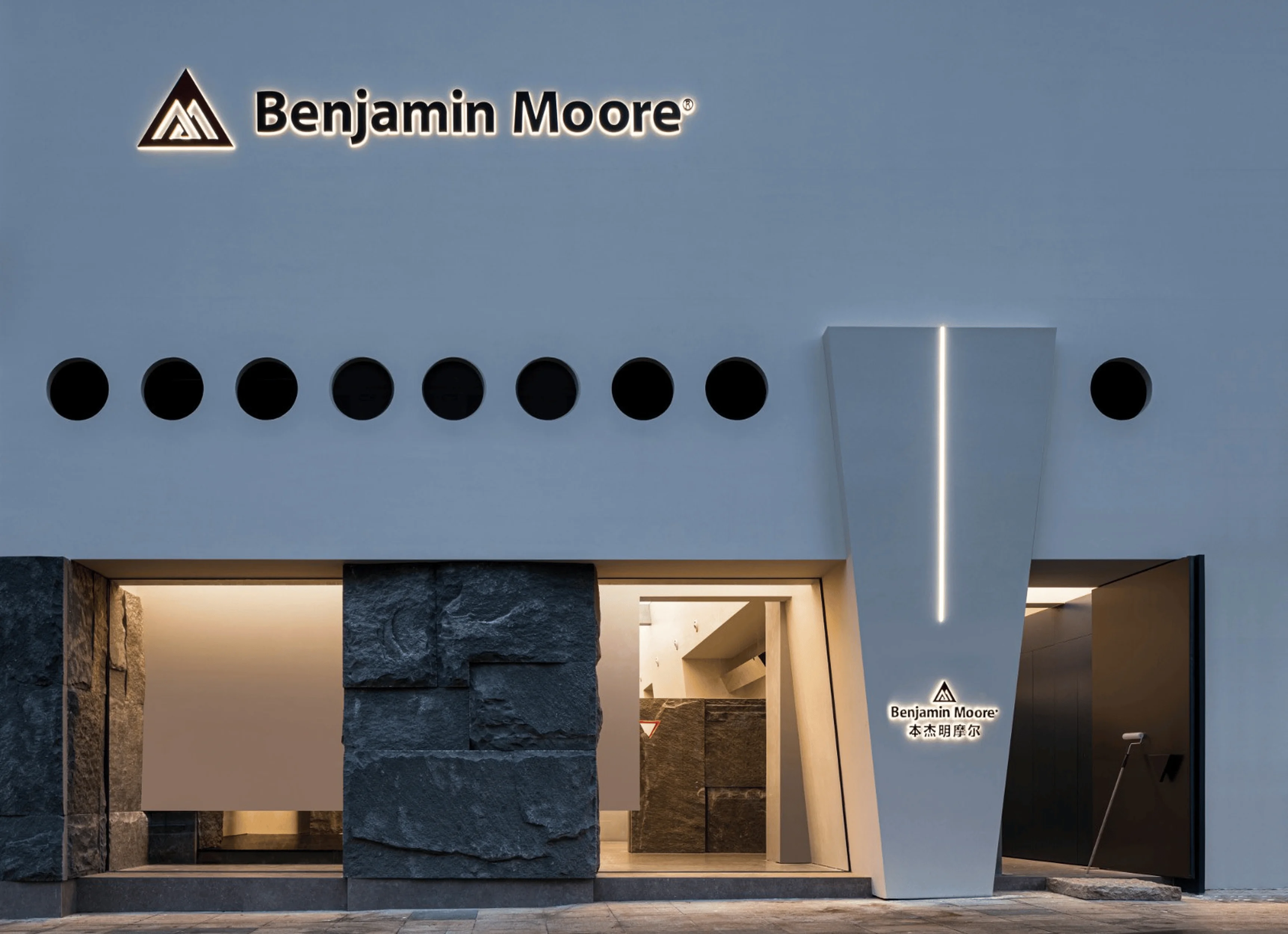
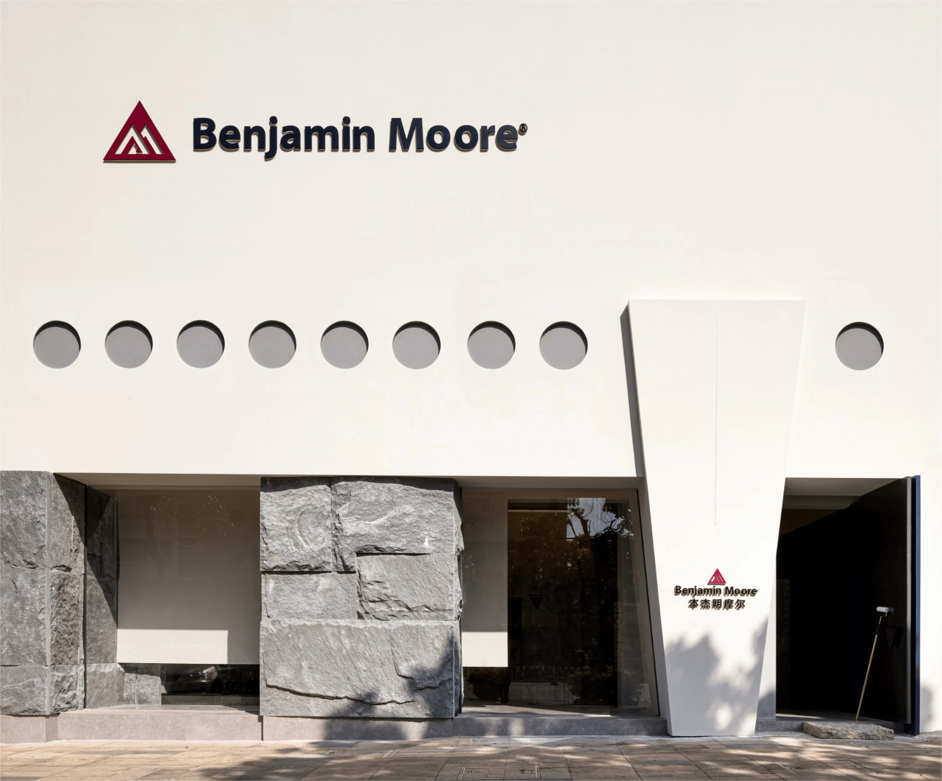
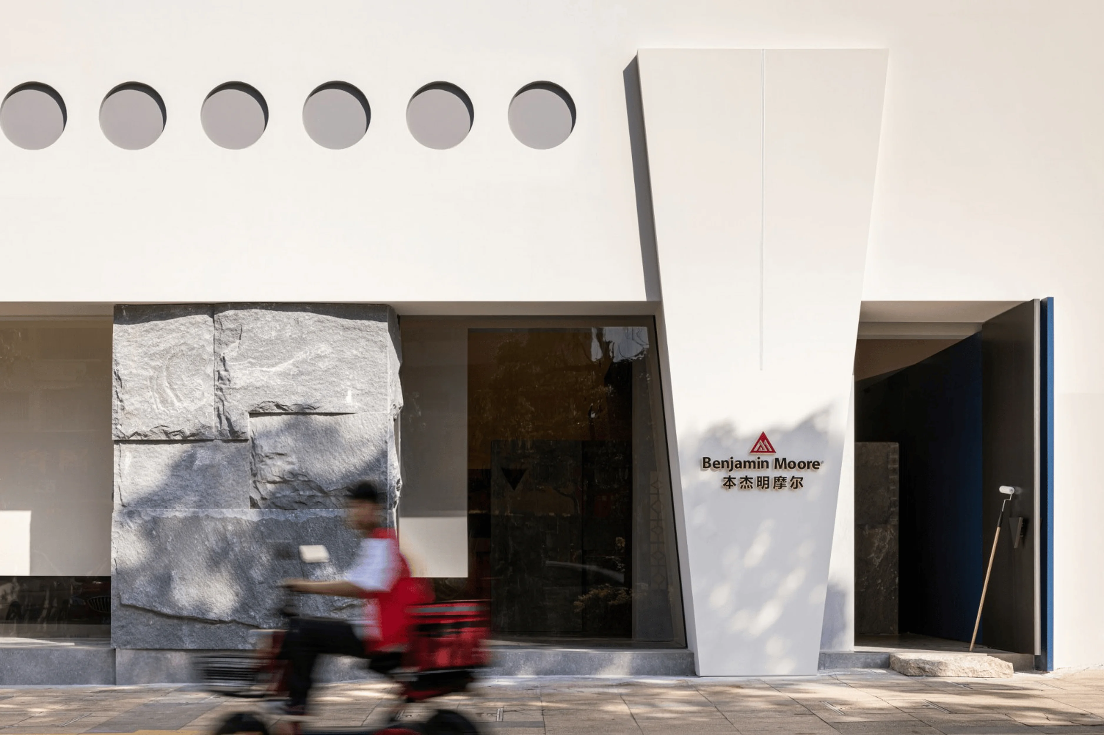
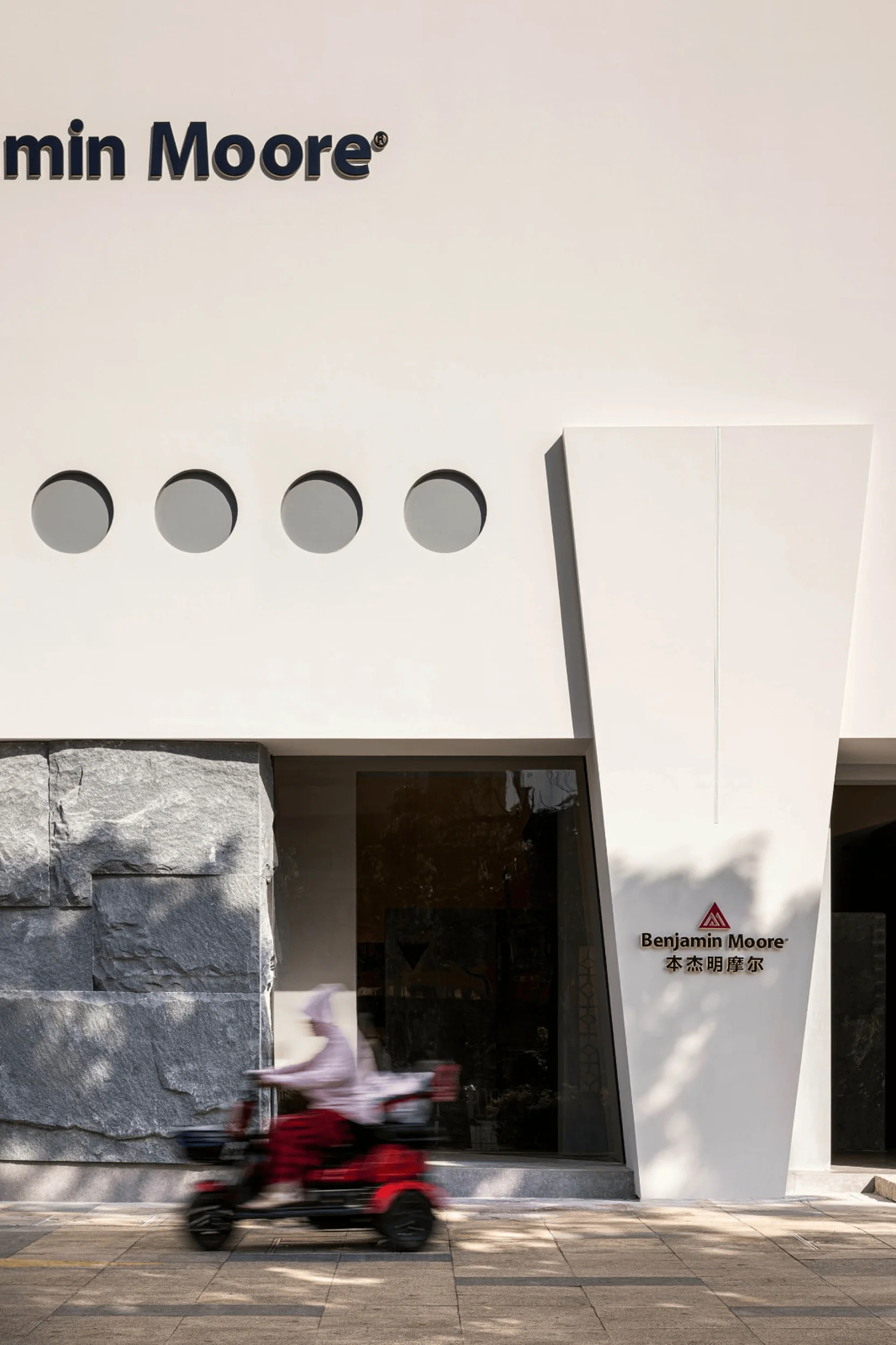
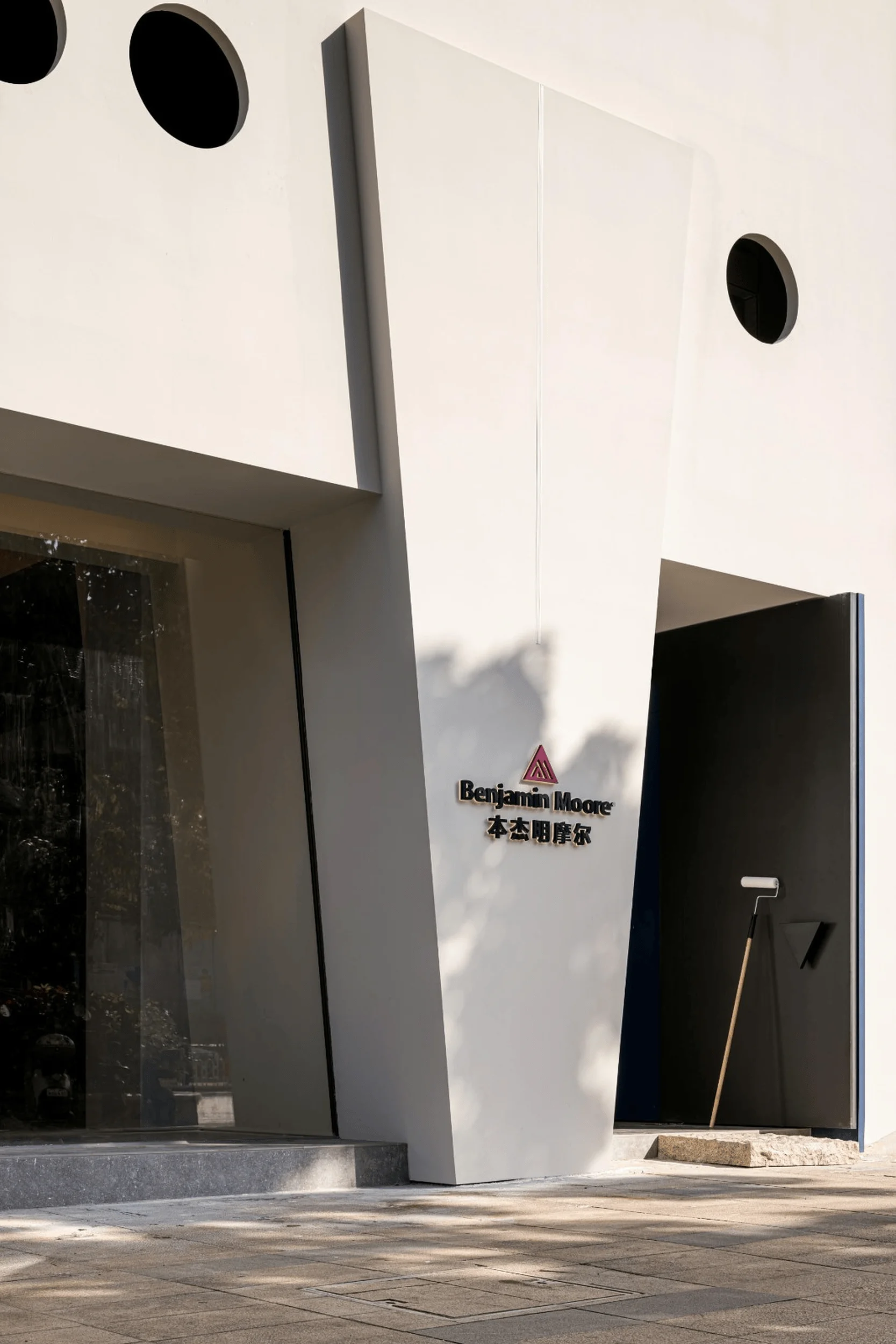
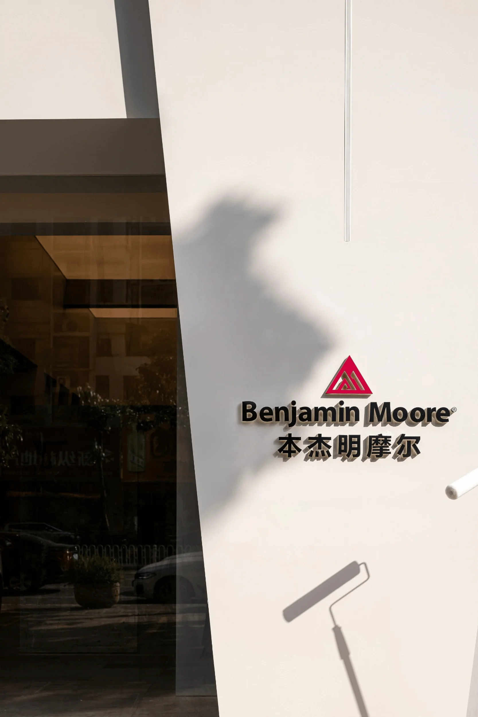
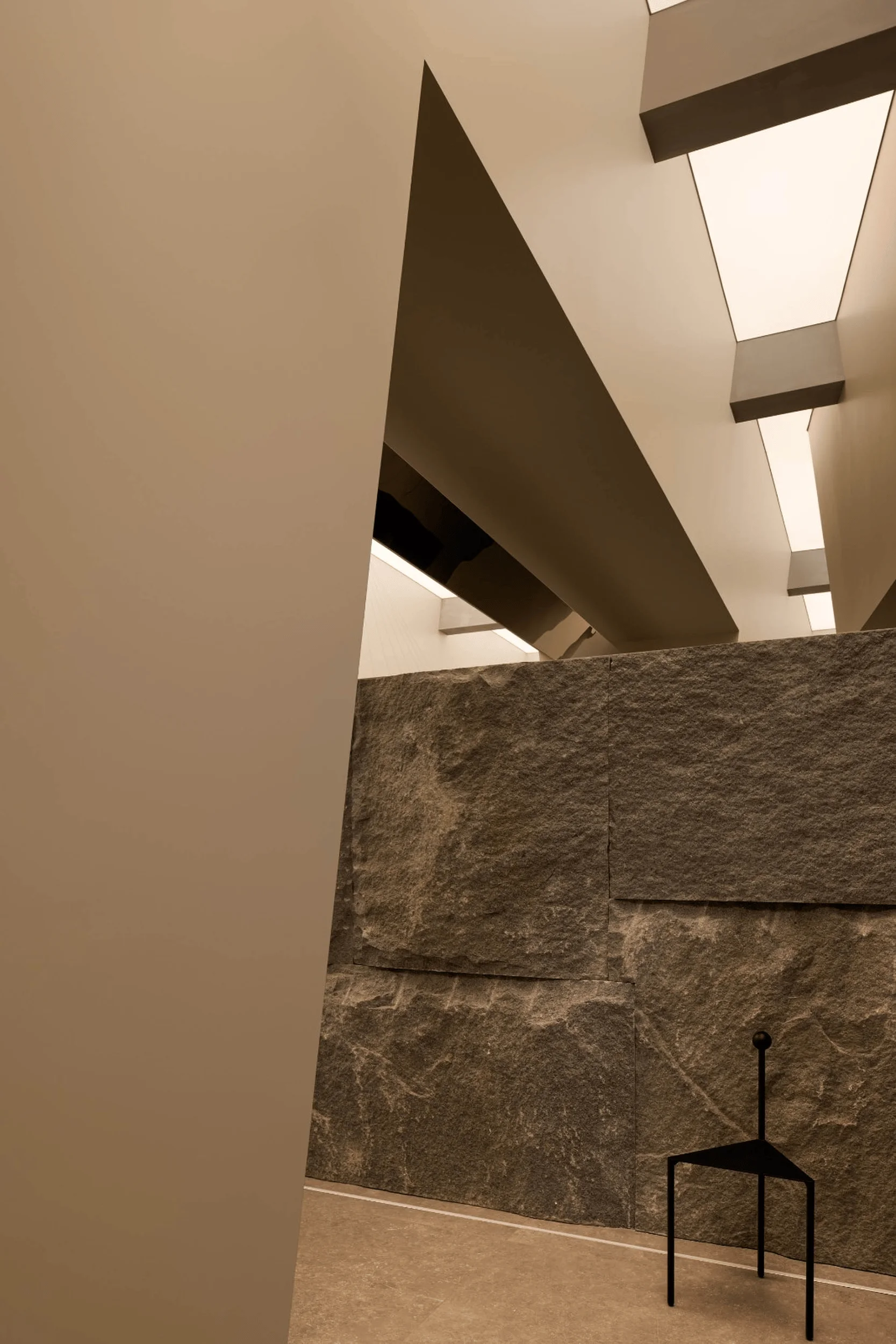
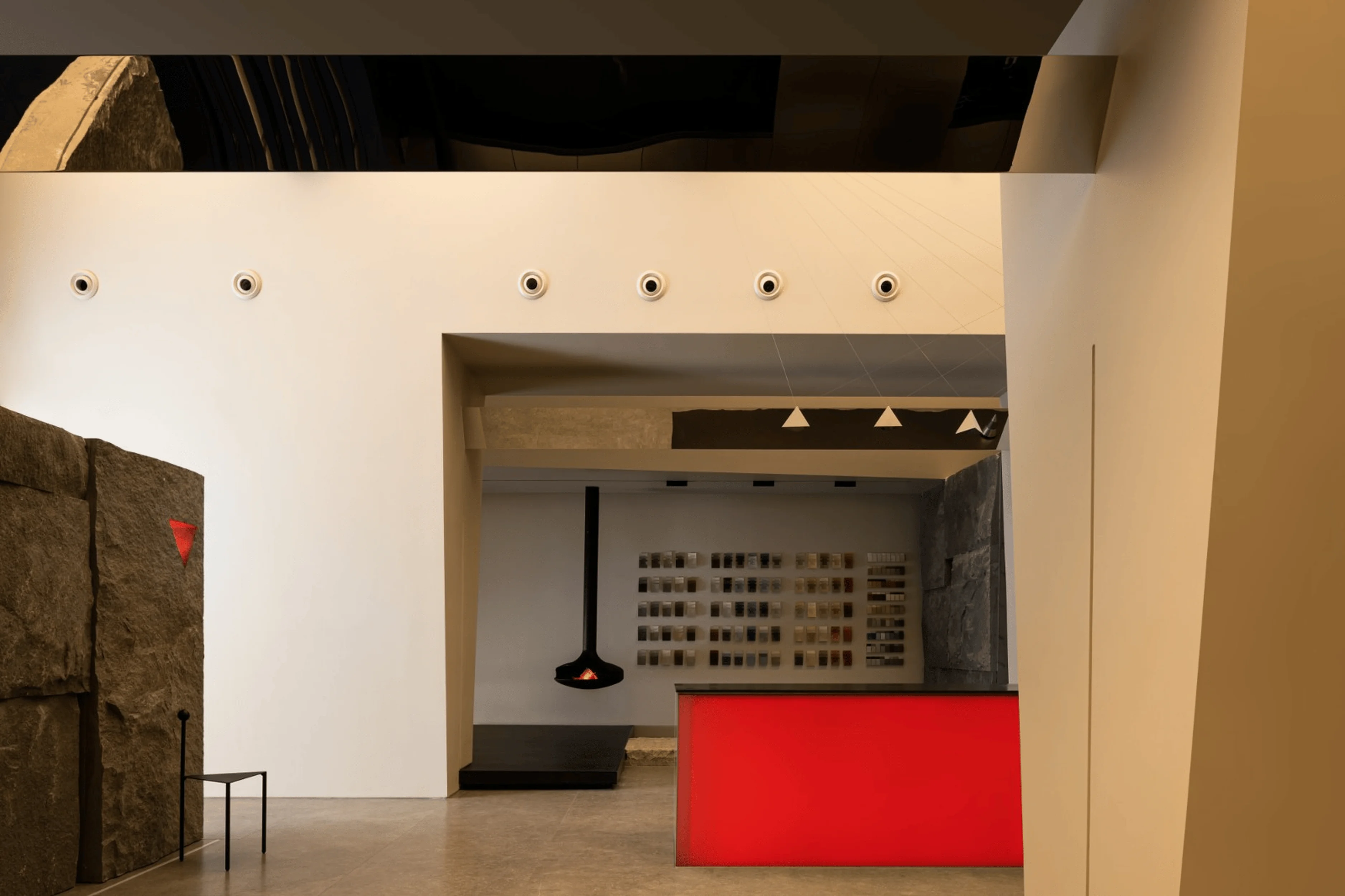
The design team meticulously studied the surrounding architecture and its color palette, seeking to differentiate the Benjamin Moore showroom. The storefront’s facade was painted in a muted white, setting the stage for a minimalist aesthetic. A row of circular openings were strategically placed along the horizontal axis above the storefront, creating a rhythm and inviting the eye towards the entrance. Through framing views and establishing visual connections, the design guides visitors to the entrance. It’s almost as if the design team has incorporated the elements of landscape architecture into the building design. The facade is a canvas that changes in response to the shifts in light throughout the day, creating a dynamic interplay between natural elements and the built environment. In addition, the elongated, inverted trapezoid form accentuates the entrance, while subtle branding elements, strategically integrated into the design, reinforce the Benjamin Moore identity. This design strategy helps to maintain a sense of continuity between exterior and interior aesthetics. The combination of natural stone and clean, white finishes evokes a sense of calm and sophistication, emphasizing a connection with nature. This is a clear demonstration of how design can use visual cues and materials to build a brand presence and communicate its essence.
Interior Design: Blending Art and Functionality
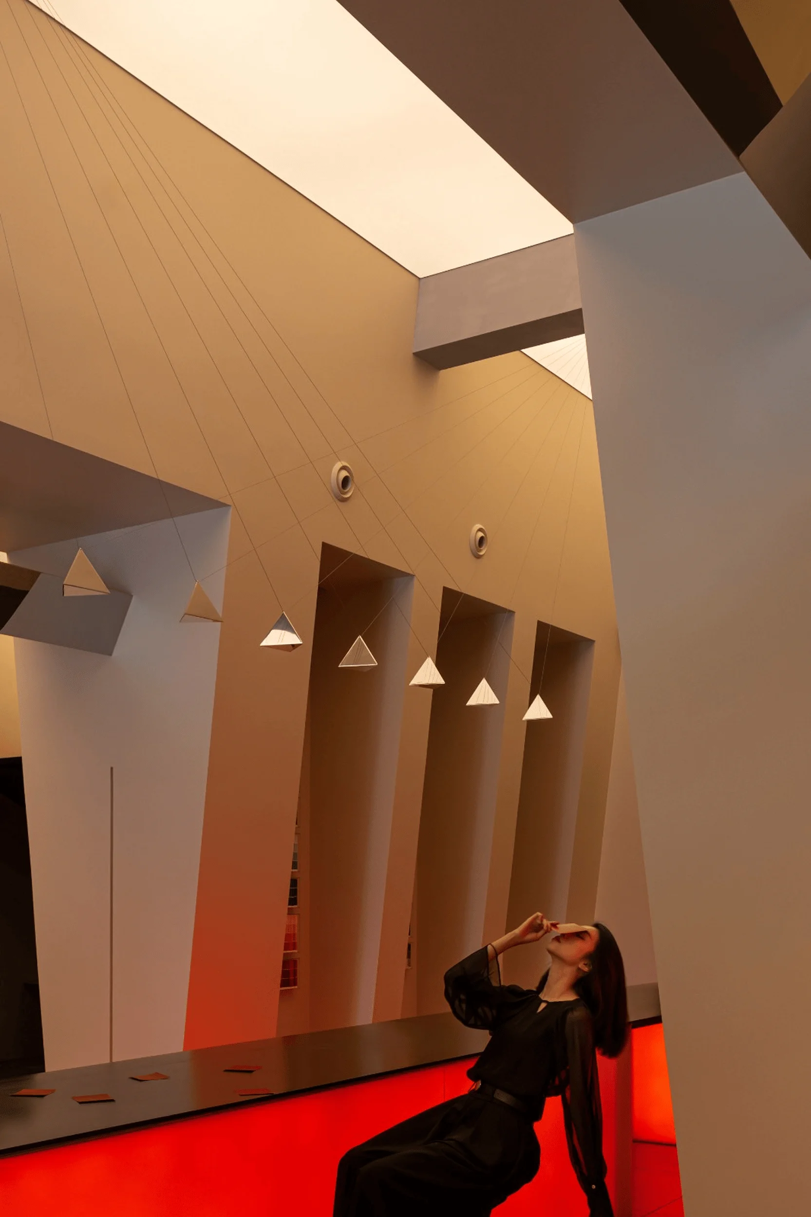
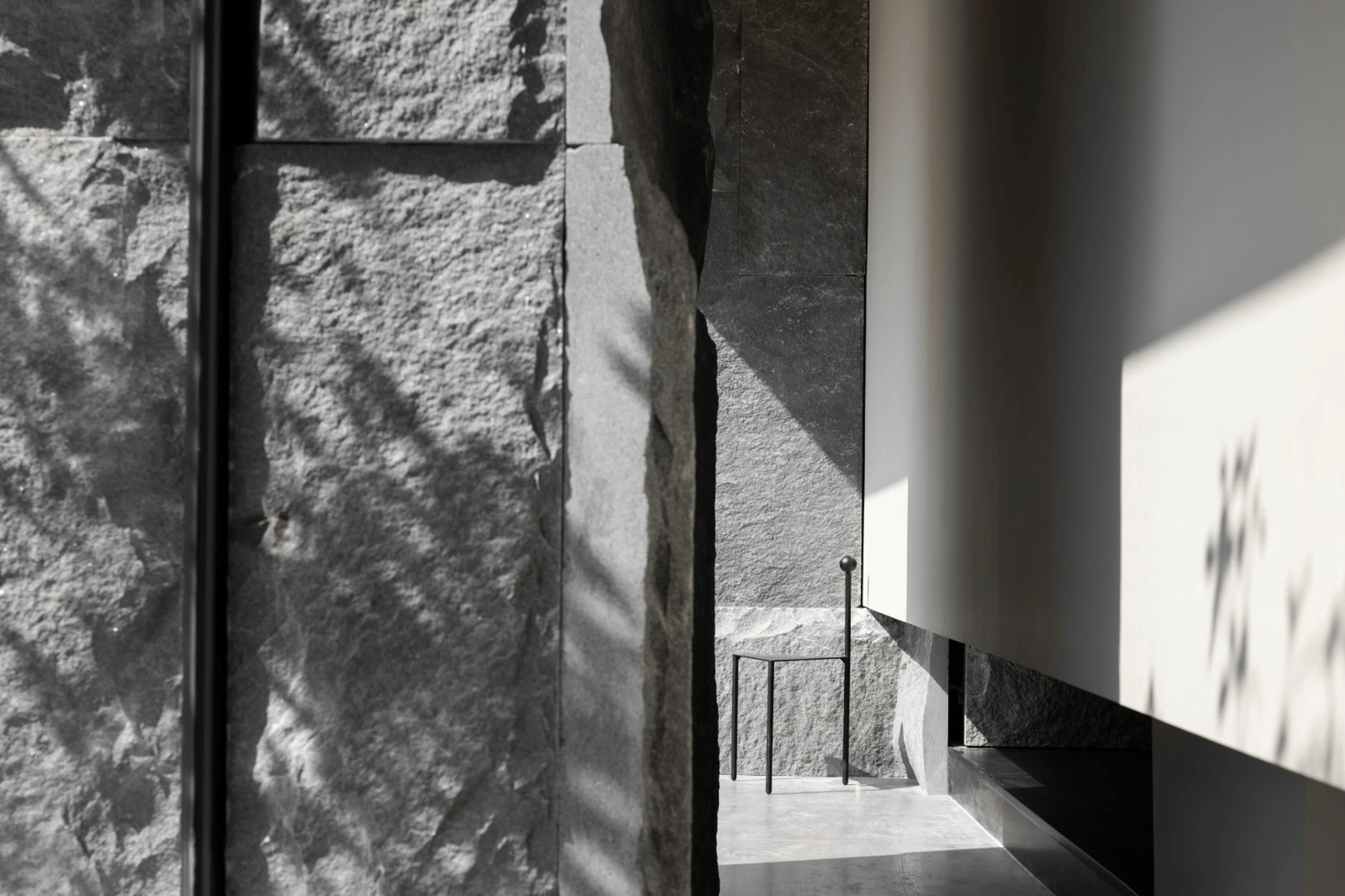
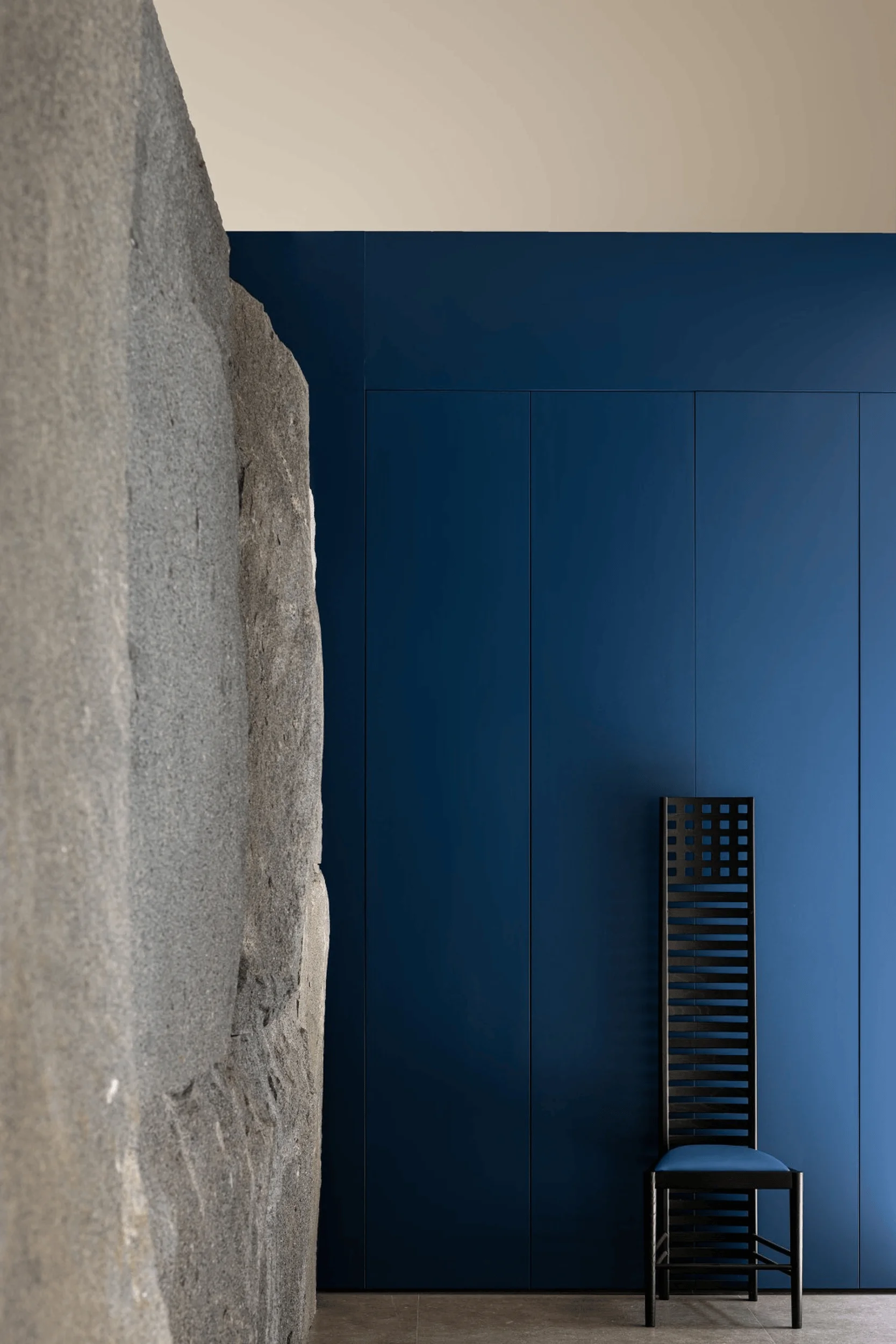
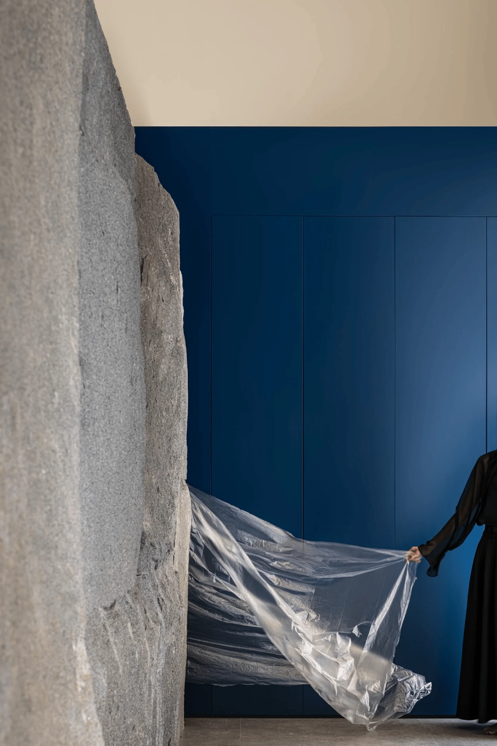
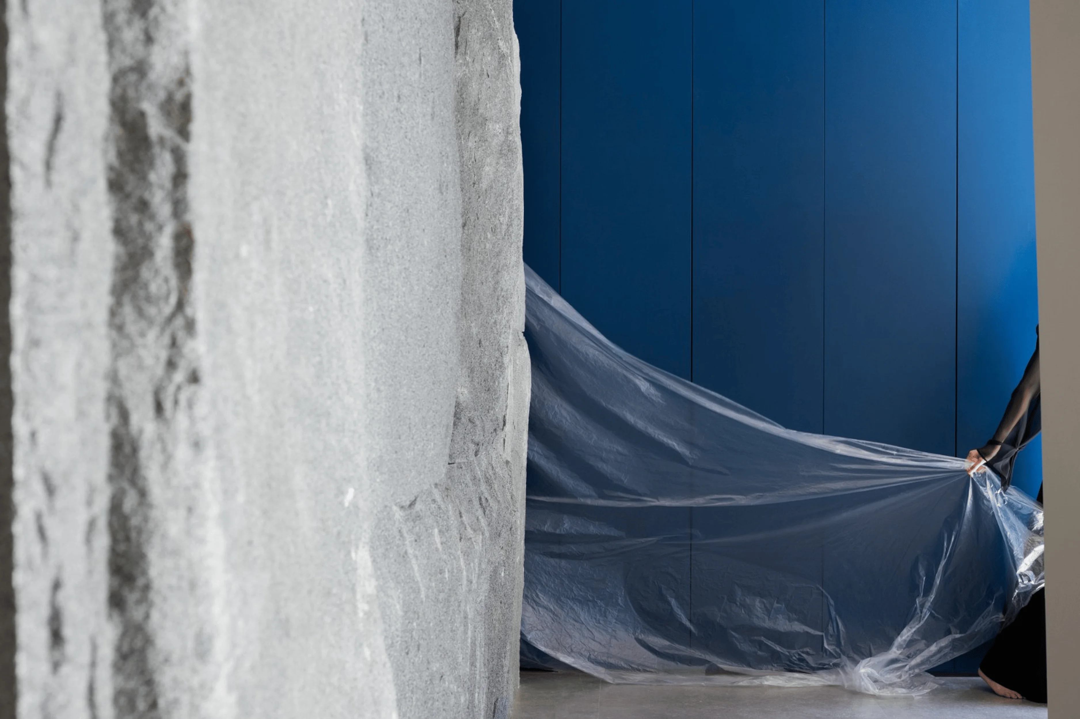
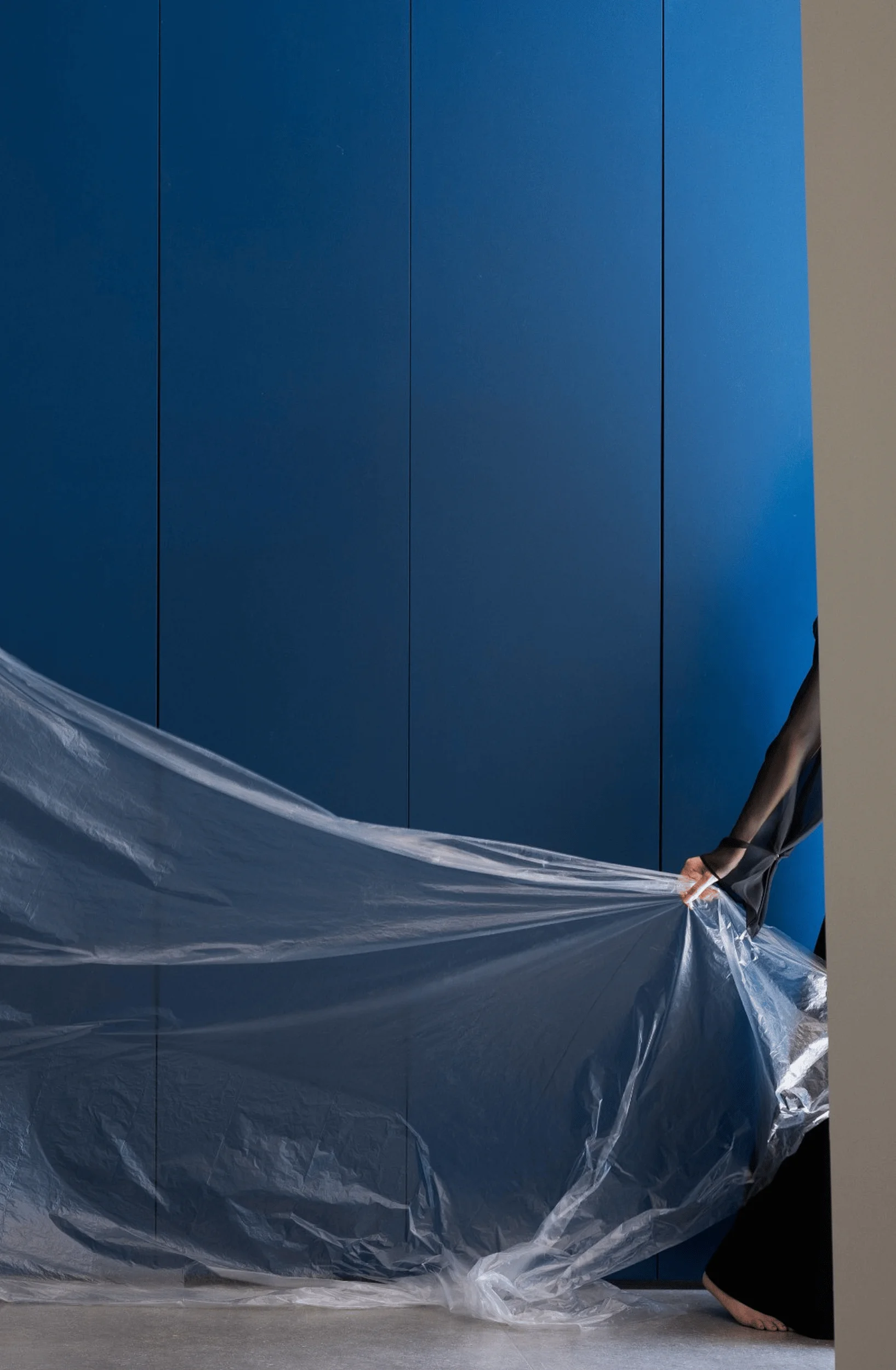
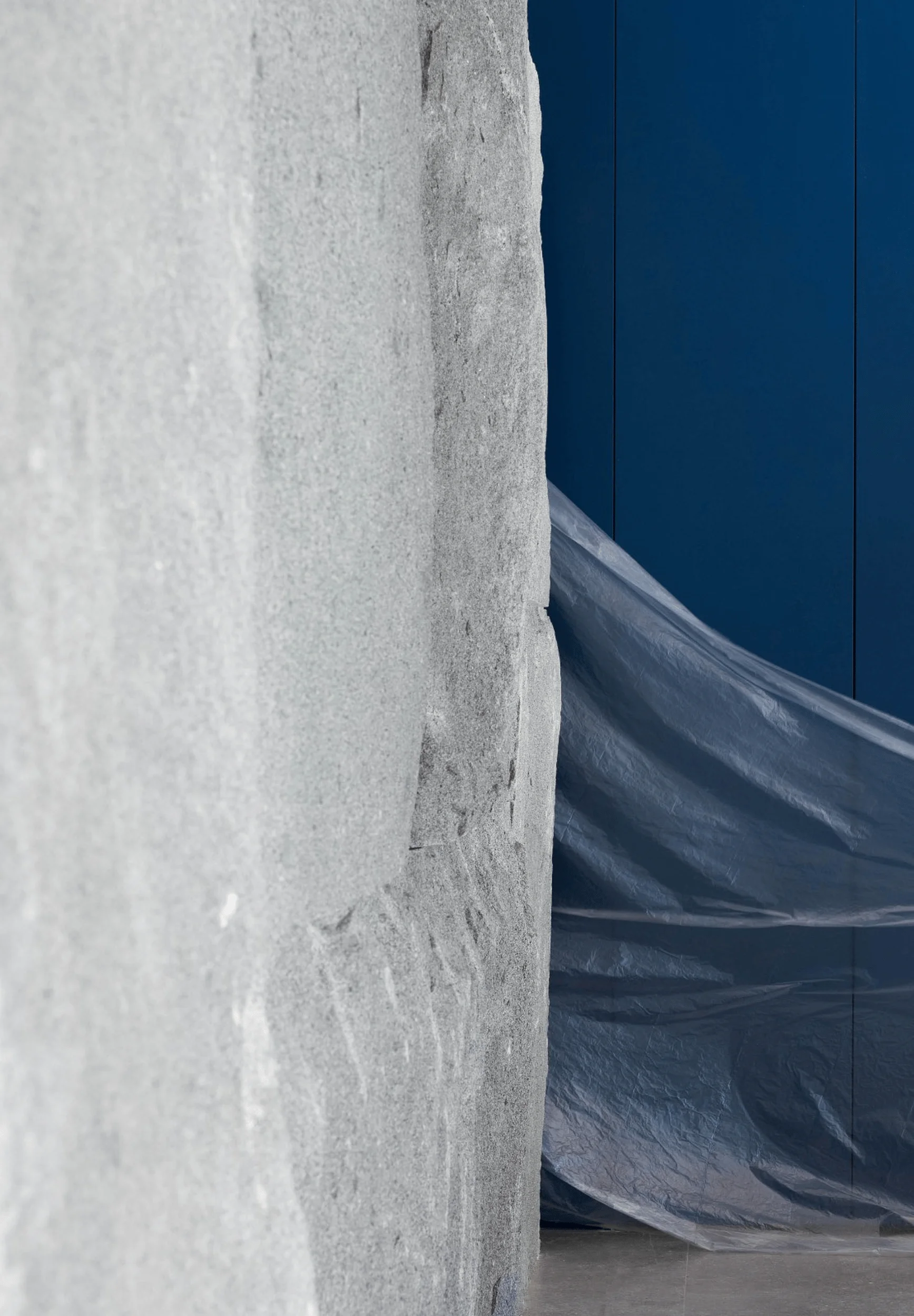
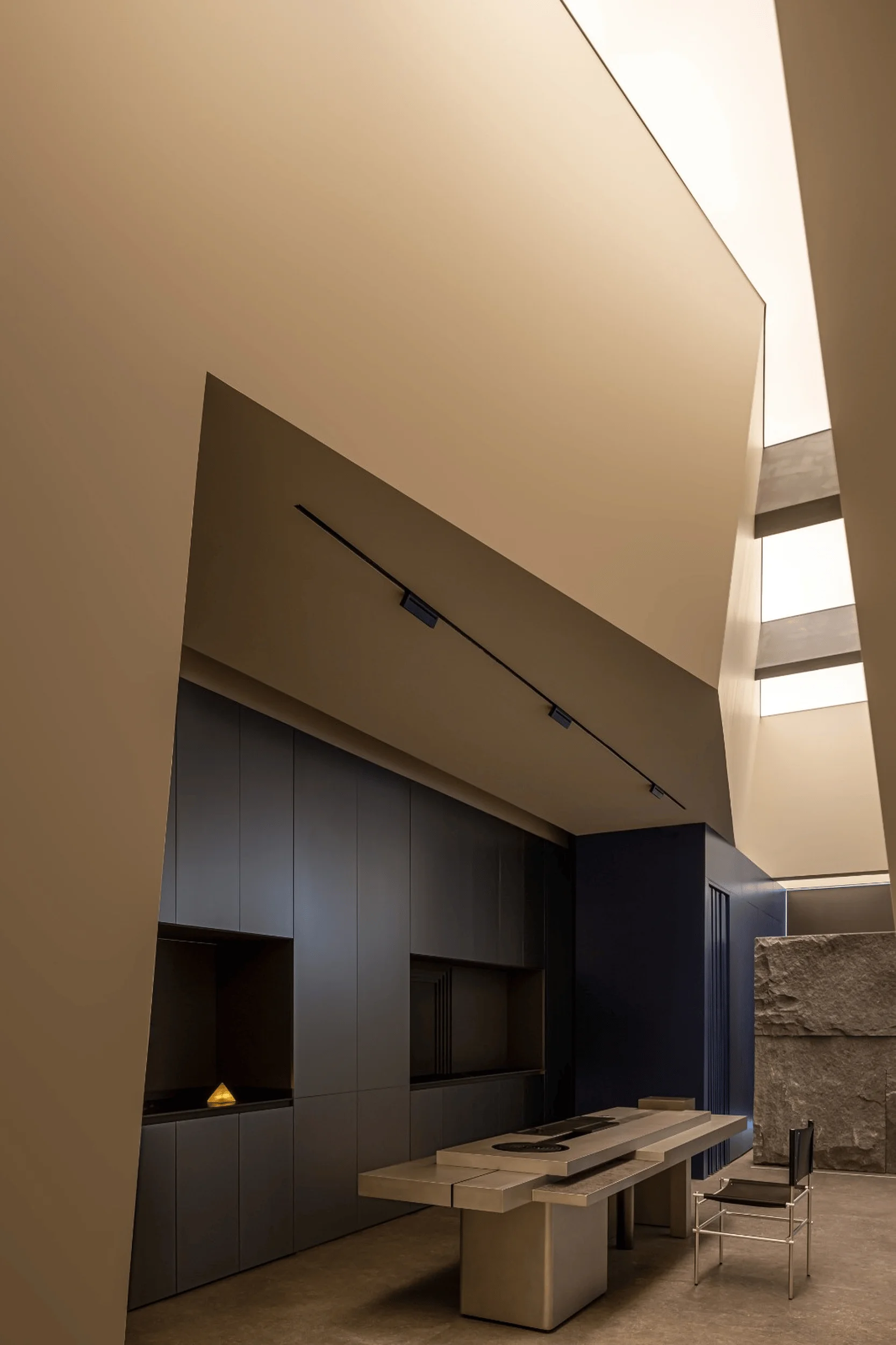
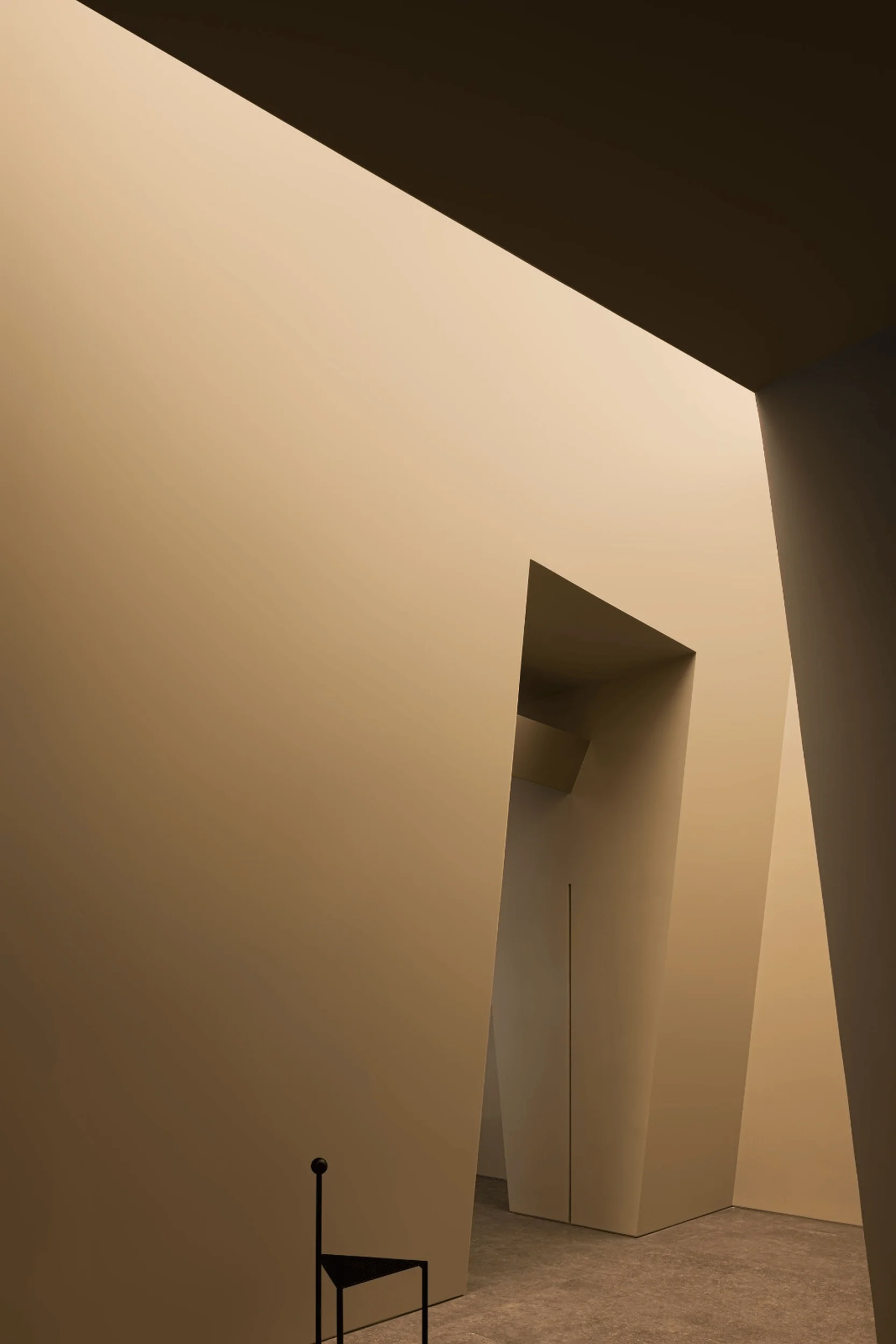
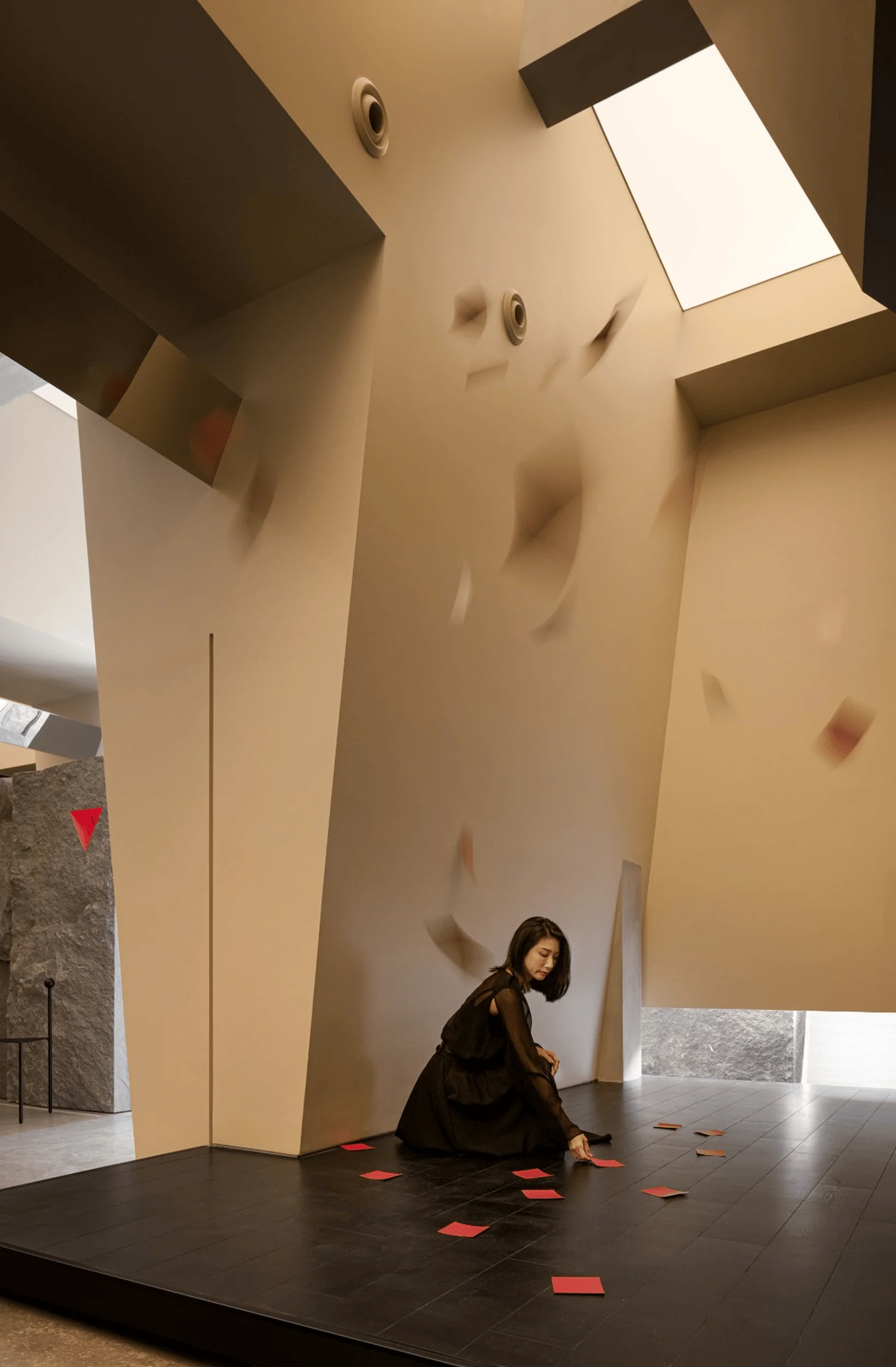
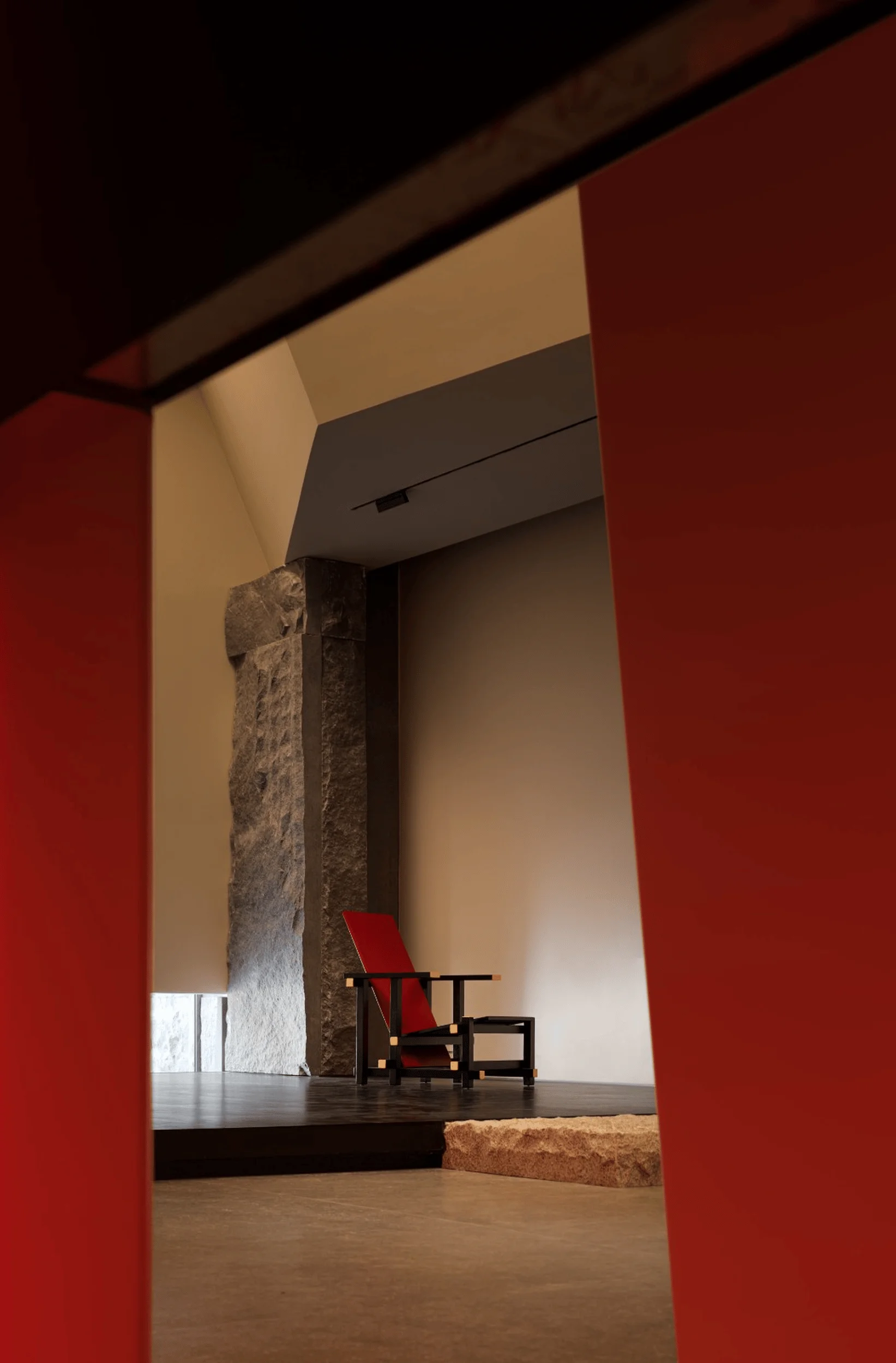
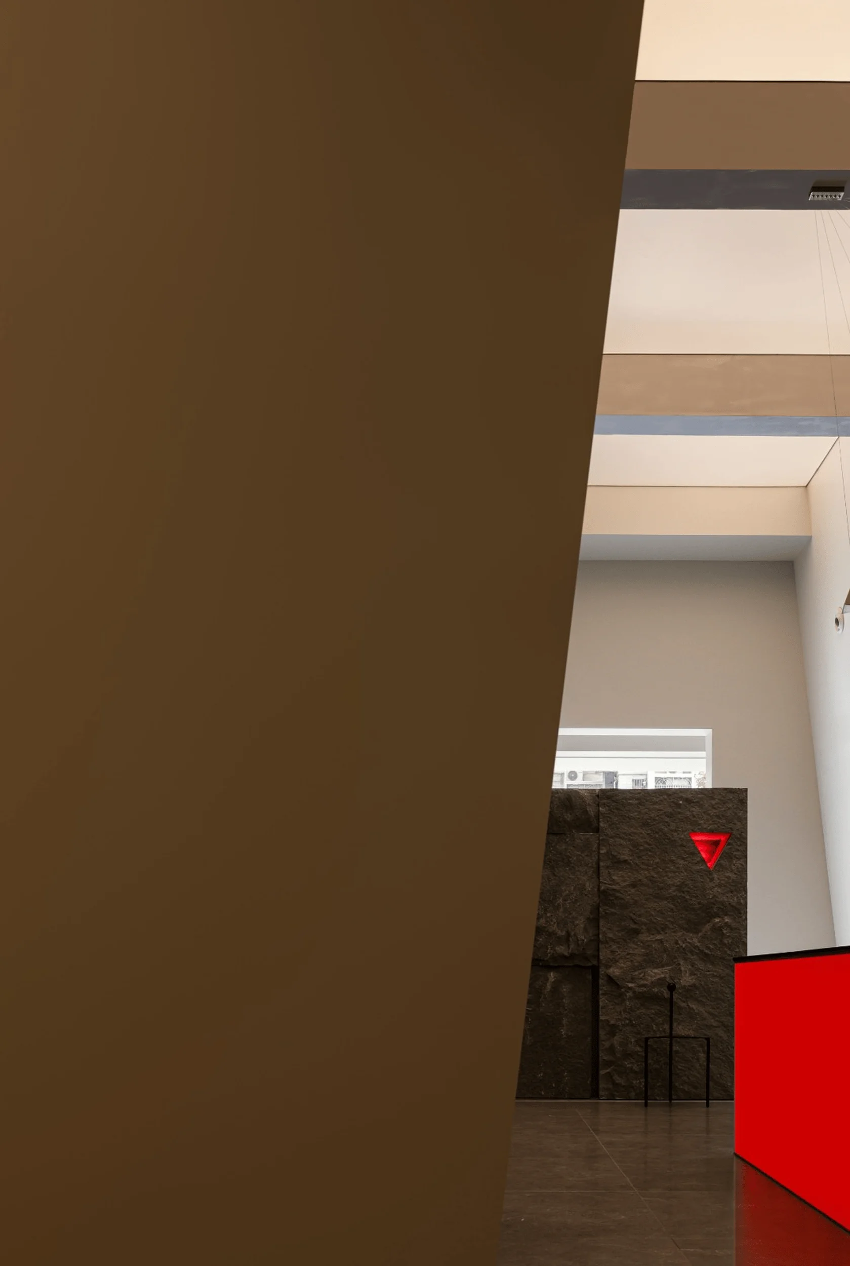
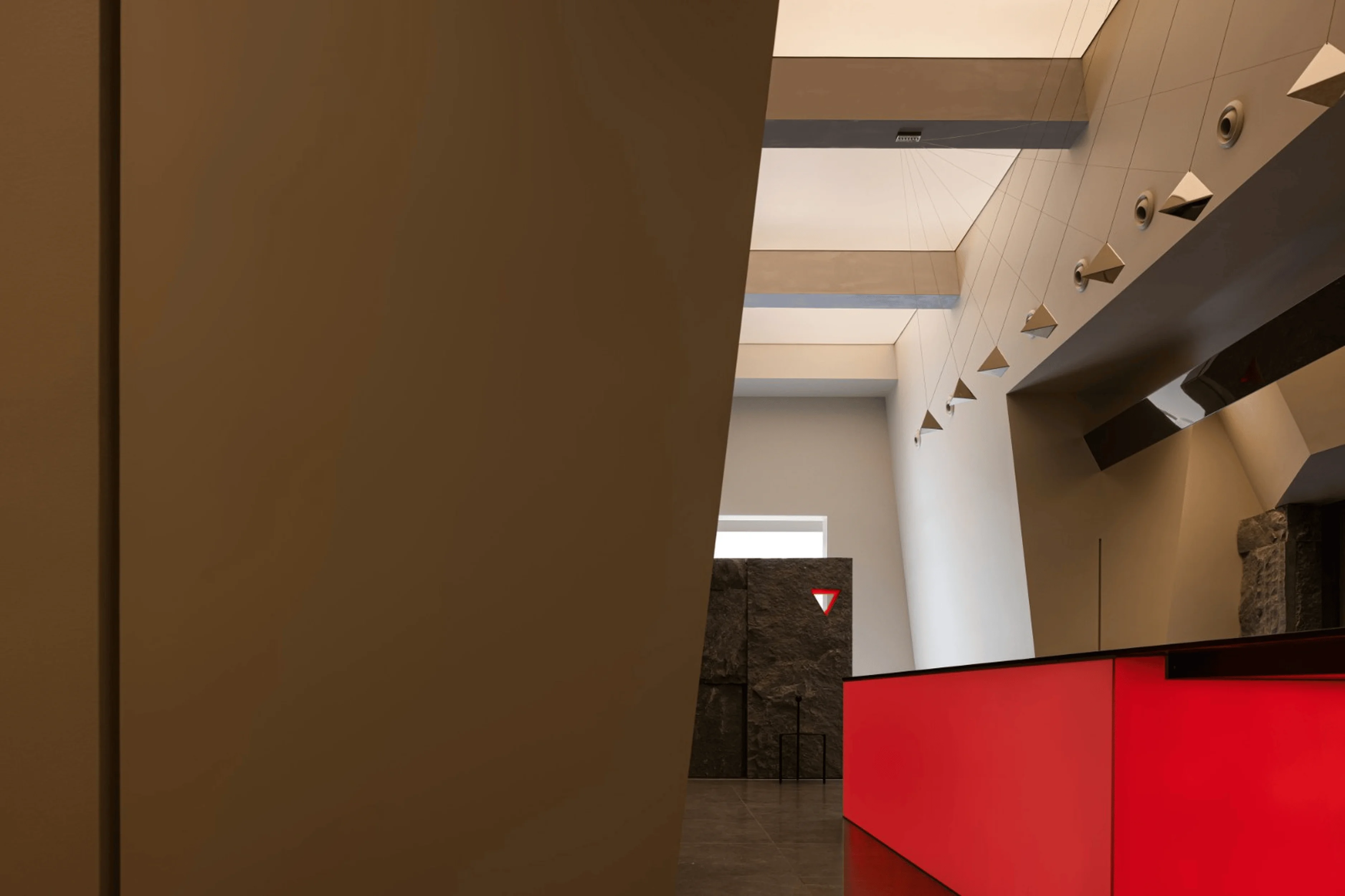
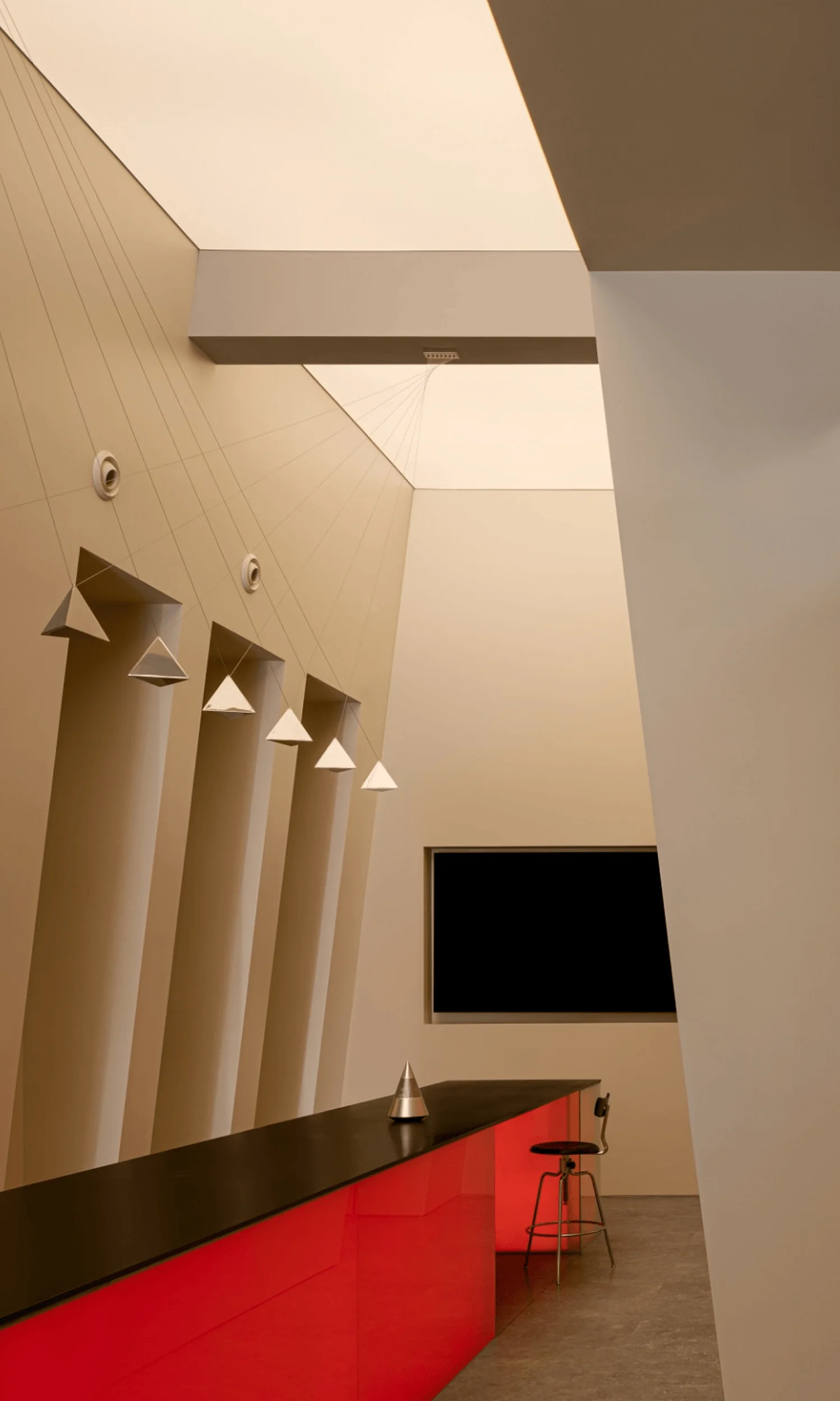
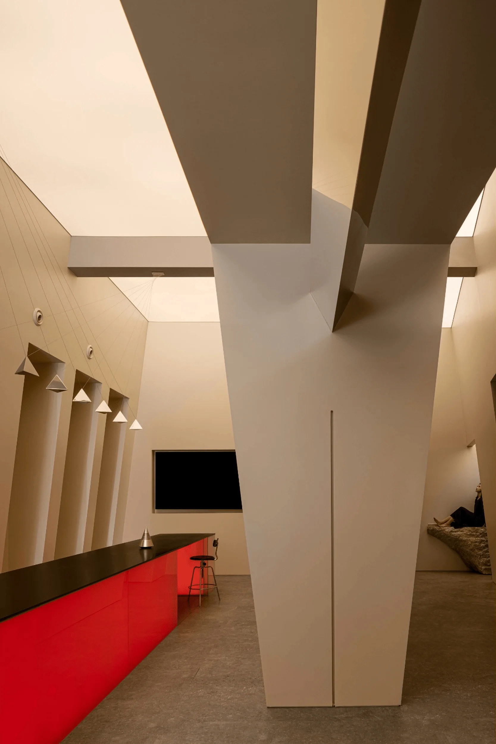
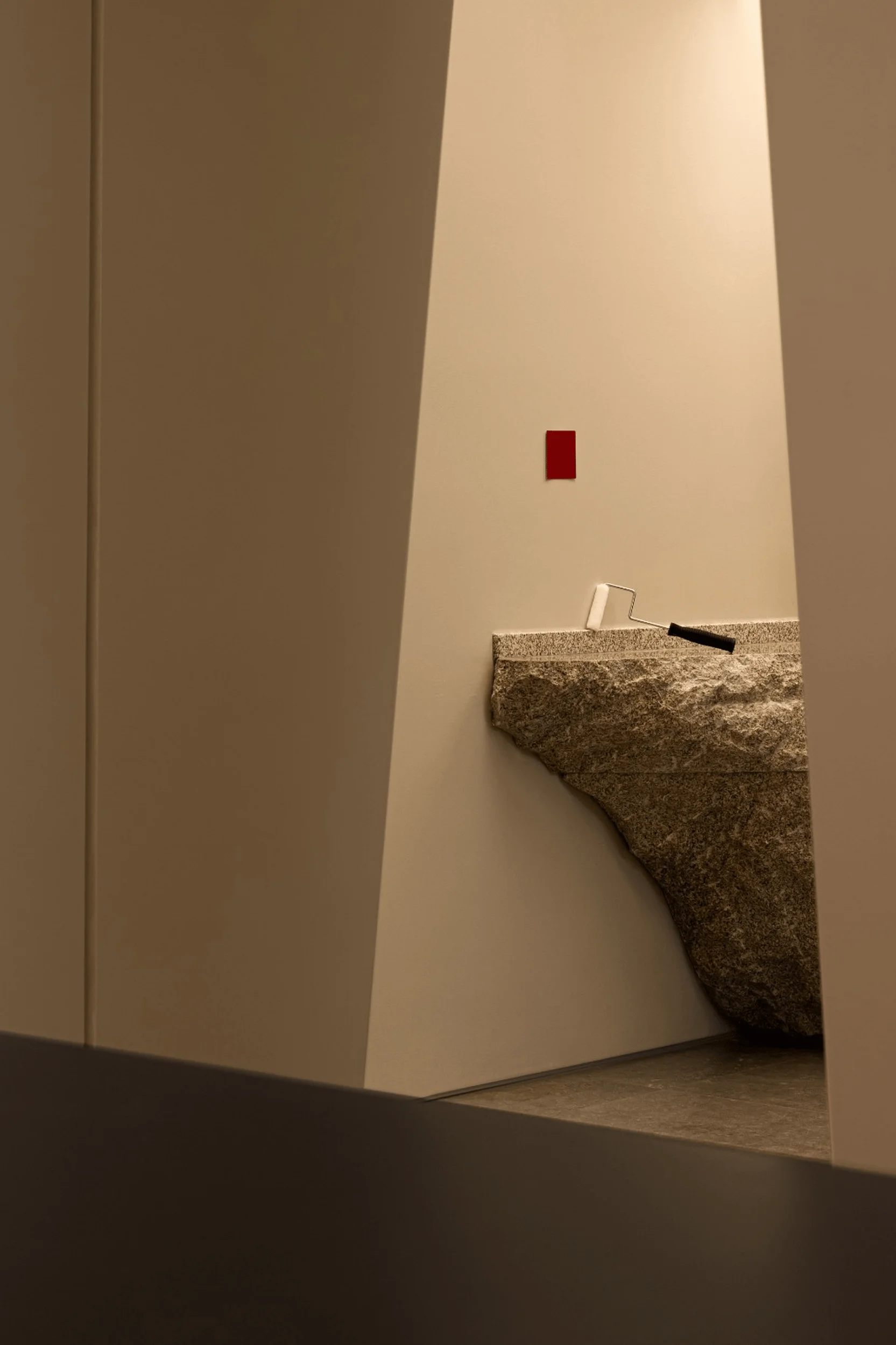
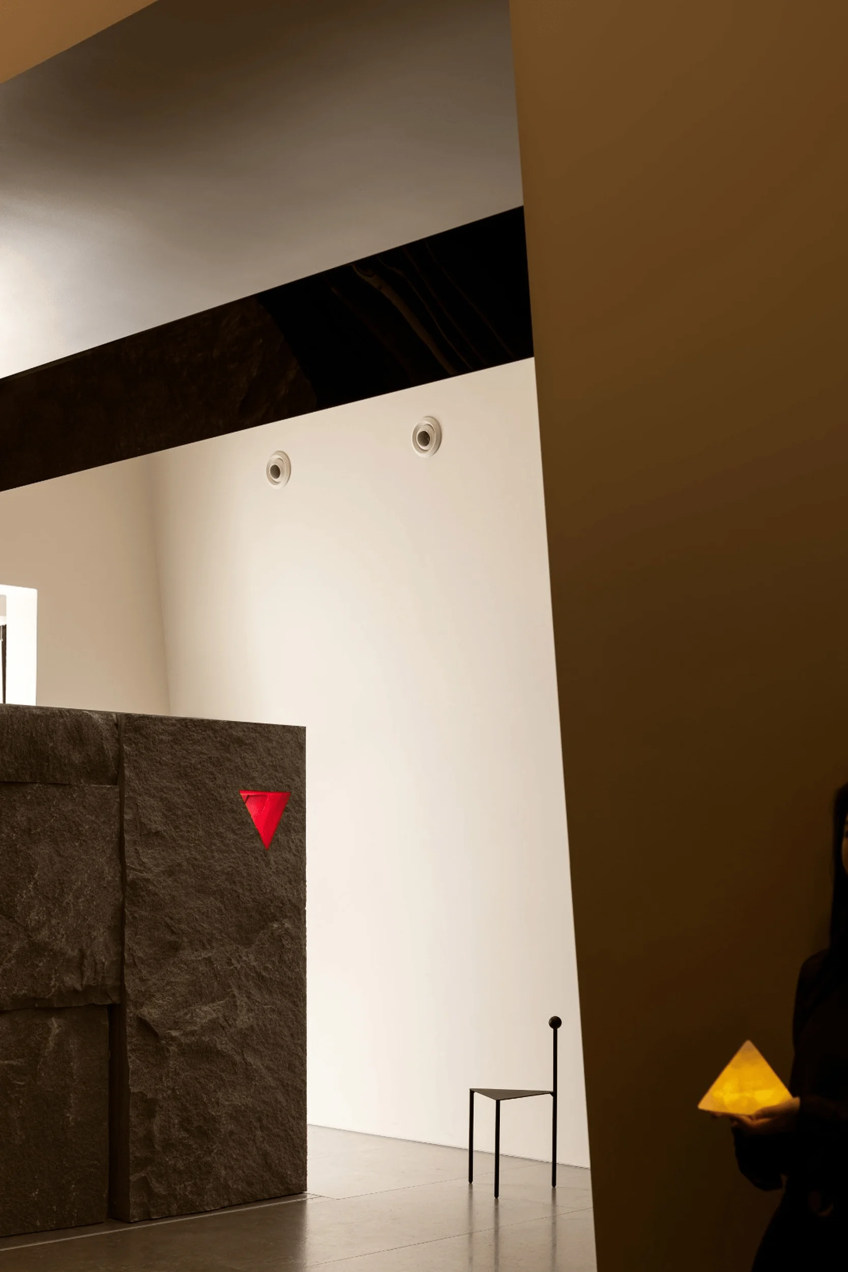
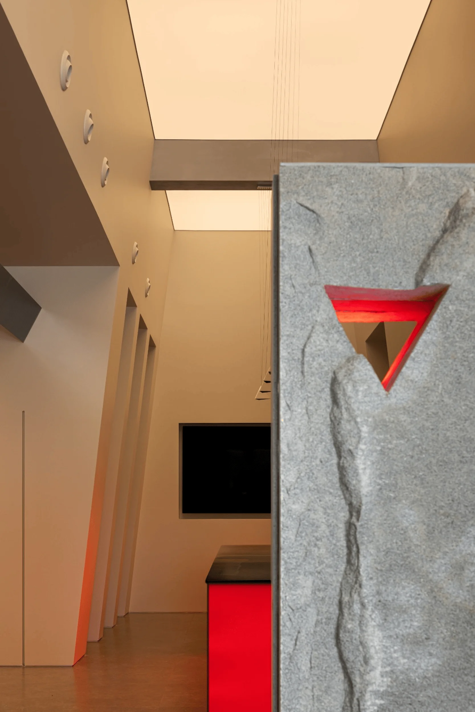
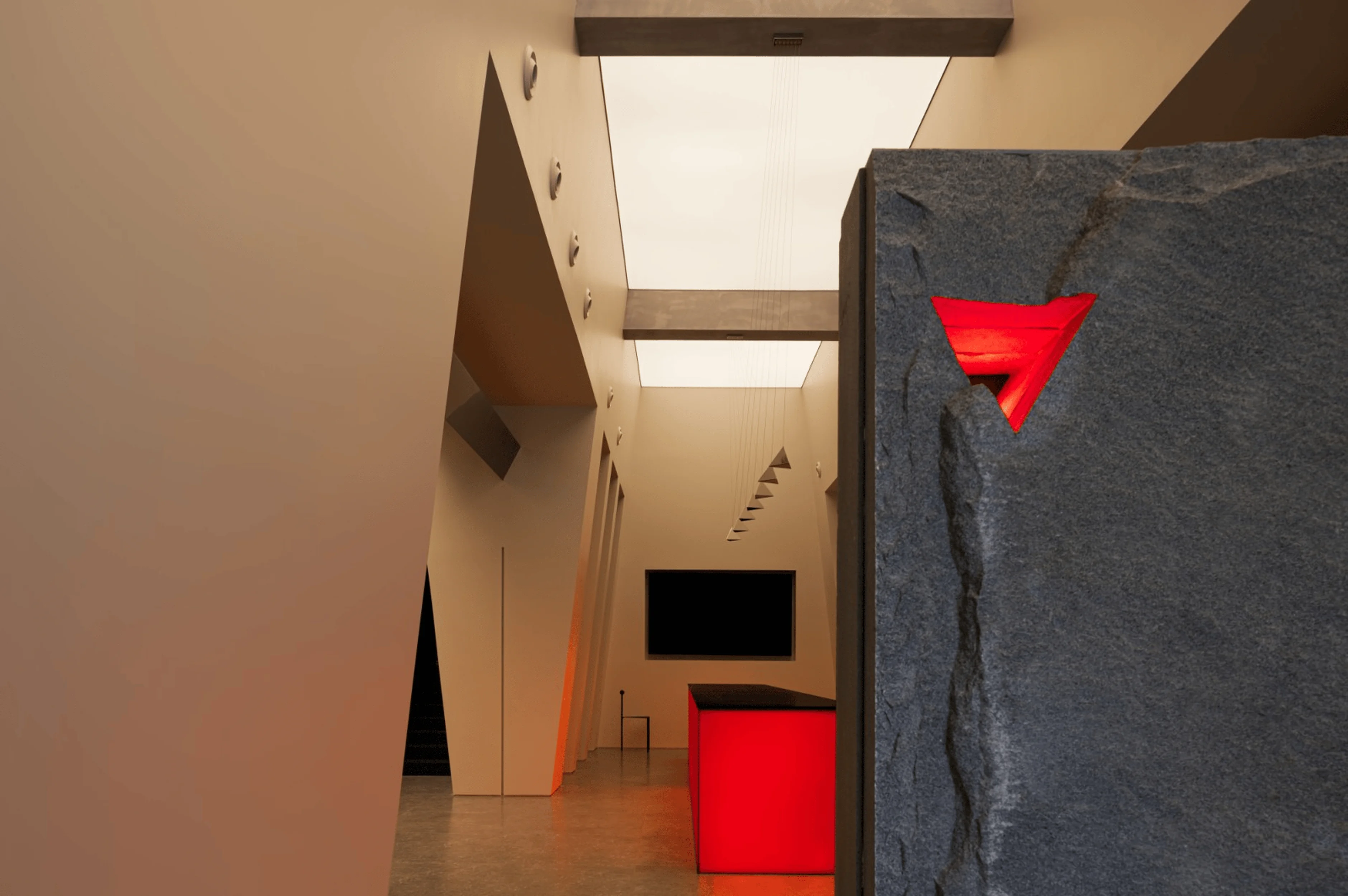
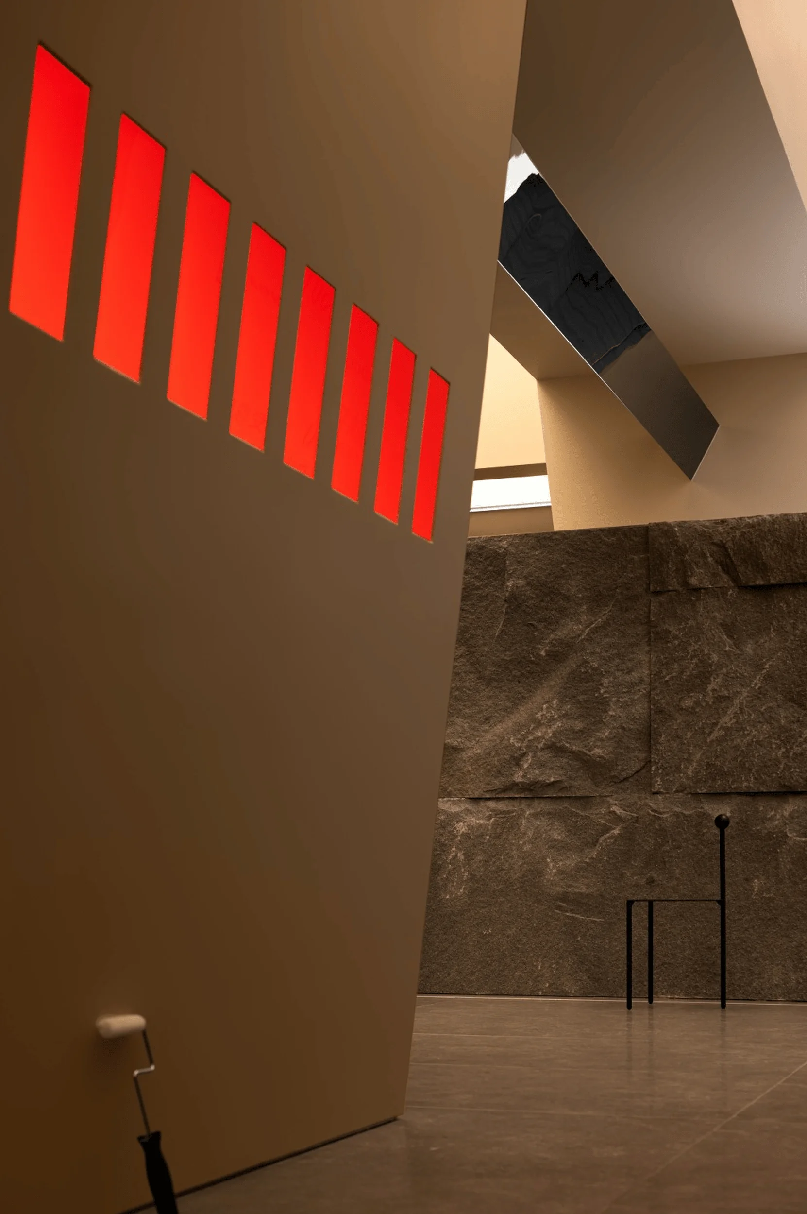
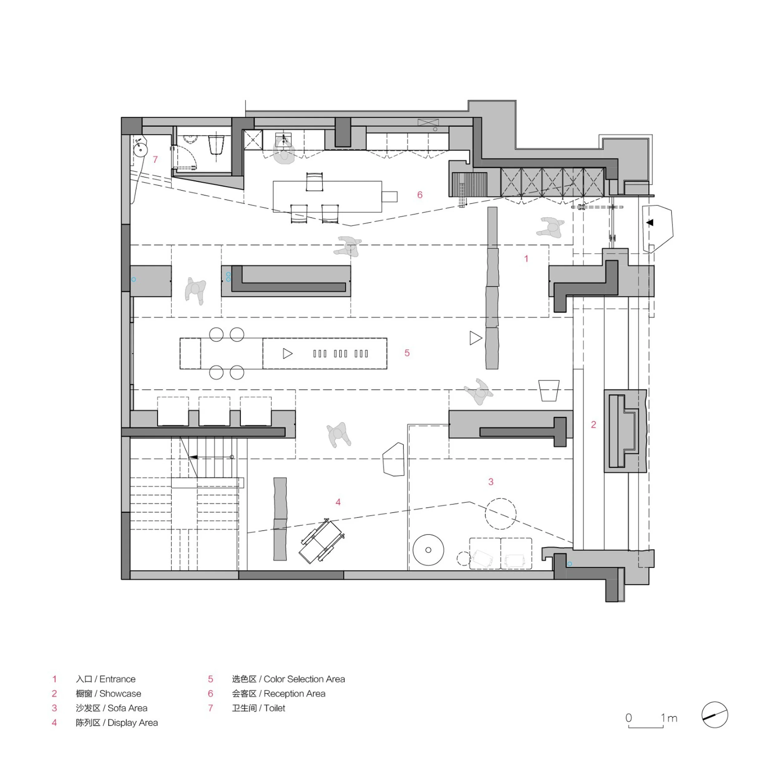
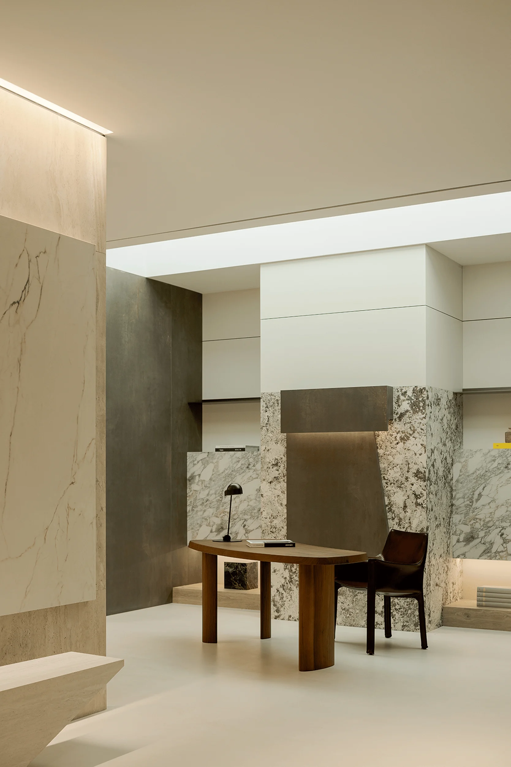
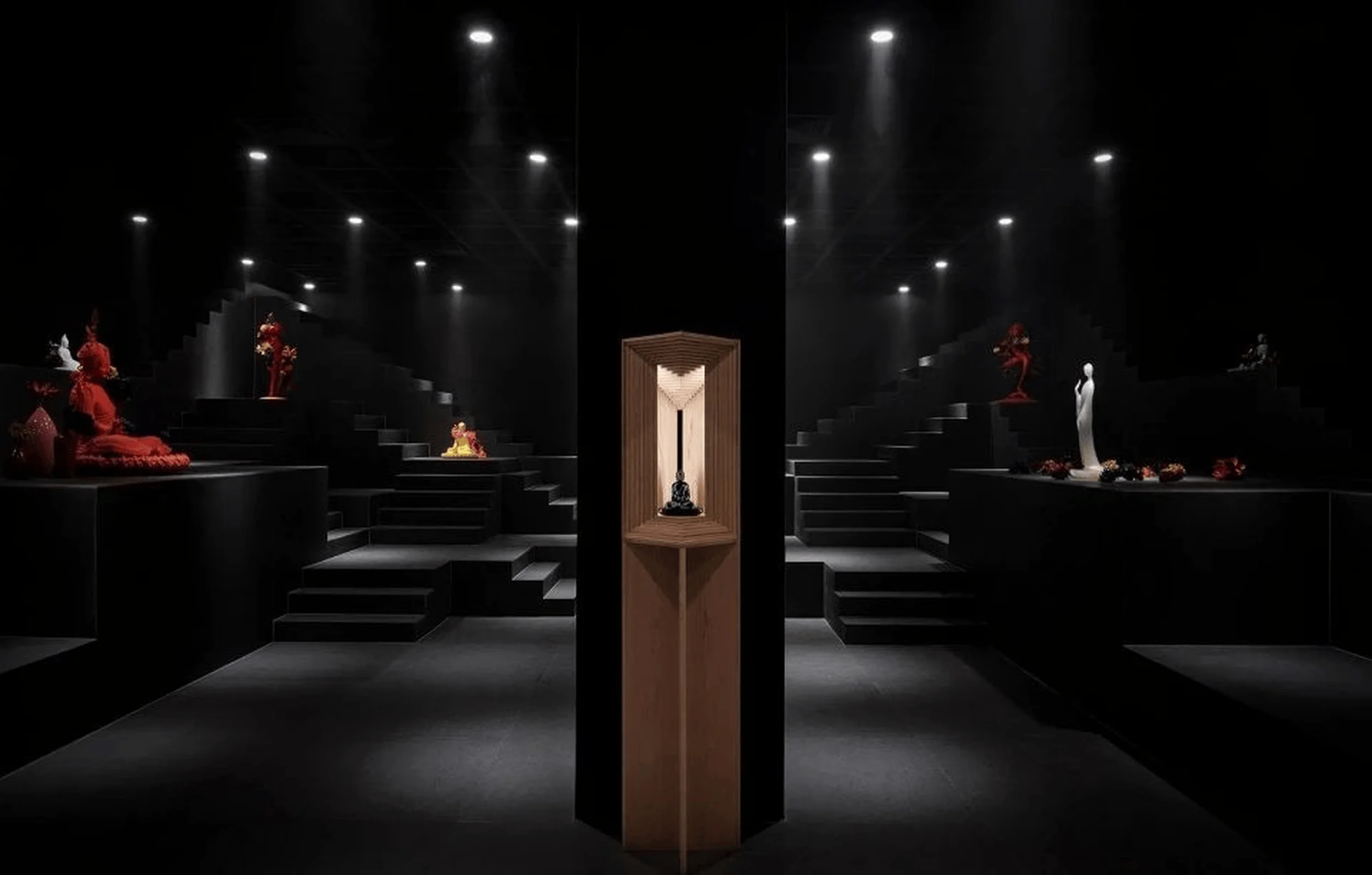
The showroom’s interior is characterized by a sophisticated aesthetic achieved through the careful use of materials and spatial organization. The designers utilized a series of geometric compositions, including sharp lines and well-defined boundaries to shape the space and create a unique visual narrative. This is apparent in the use of contrasting color palettes, such as the deep blue and muted grays found in the design. The use of blues represents a deep and rich mood and helps to create a sense of tranquility in the space, a core component of the “Canyon of Light” aesthetic. The inclusion of transparent elements injects lightness and a sense of motion into the environment, contributing to the impression of natural ventilation and a sense of spaciousness. The use of light and shadow is skillfully manipulated to reproduce the visual cues of a natural canyon, seamlessly integrating the structure, the fragmented planes, and the graduated lighting effects. The interior space unfolds in a way that enhances the overall visual experience and allows for the user to explore the space in a unique way. The designers used a mixture of materials such as stone and concrete to create a space that is both luxurious and inviting. Furthermore, the incorporation of a red accent wall within the interior enhances the visual drama and creates a powerful mood that is in accordance with the overall design scheme. The application of warm light and darker tones creates a deep and relaxing atmosphere. This carefully thought-out choice of color brings depth and richness to the environment. The project demonstrates a strong integration of art and functionality into a showroom interior design.
Symbolism and Spatial Guidance
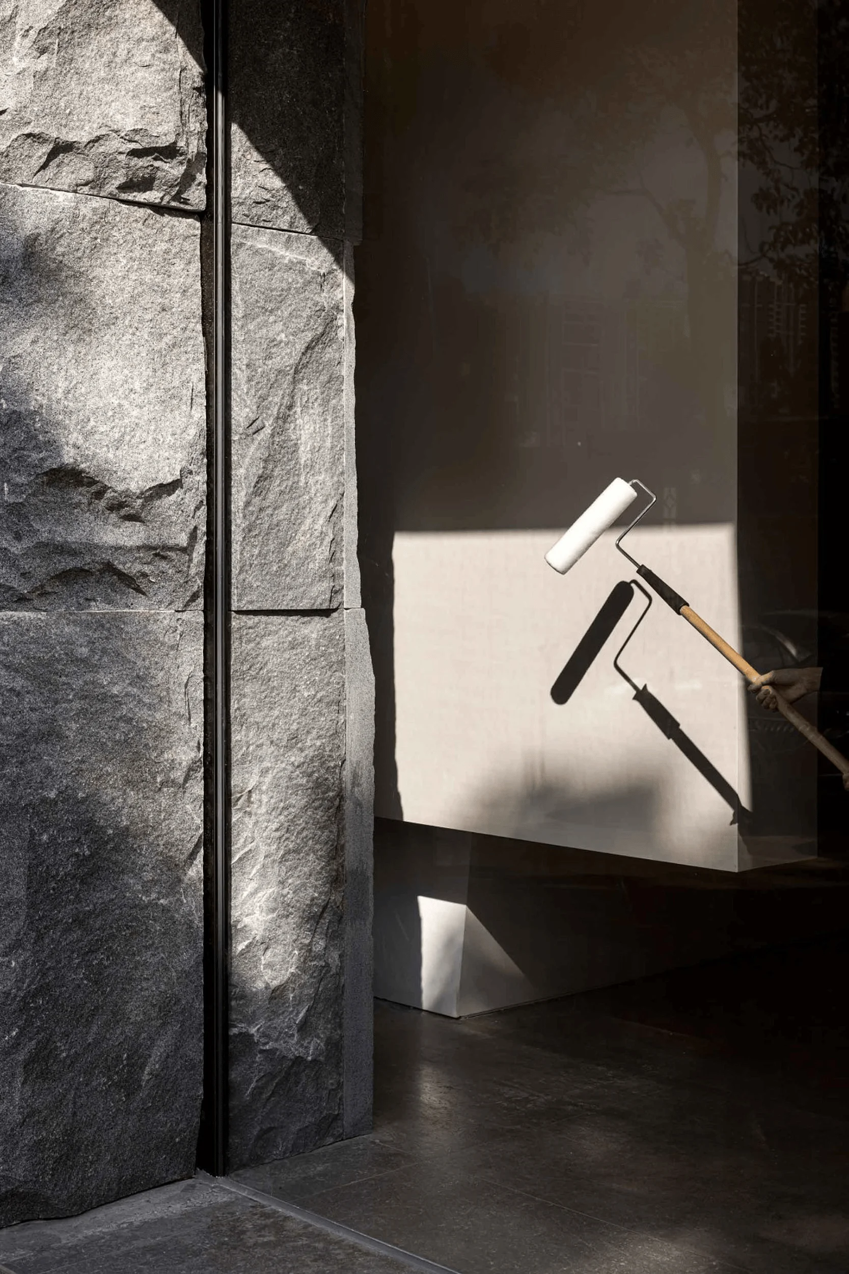
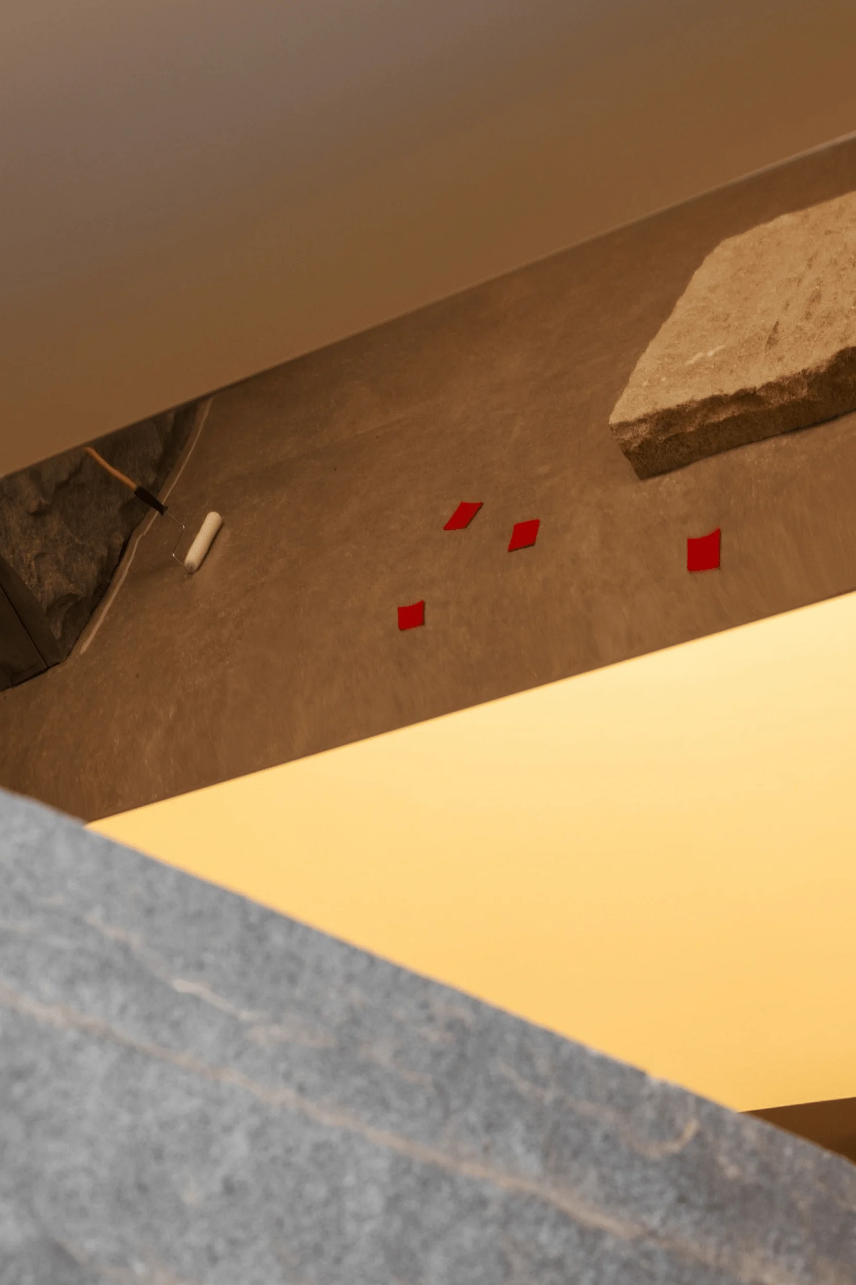
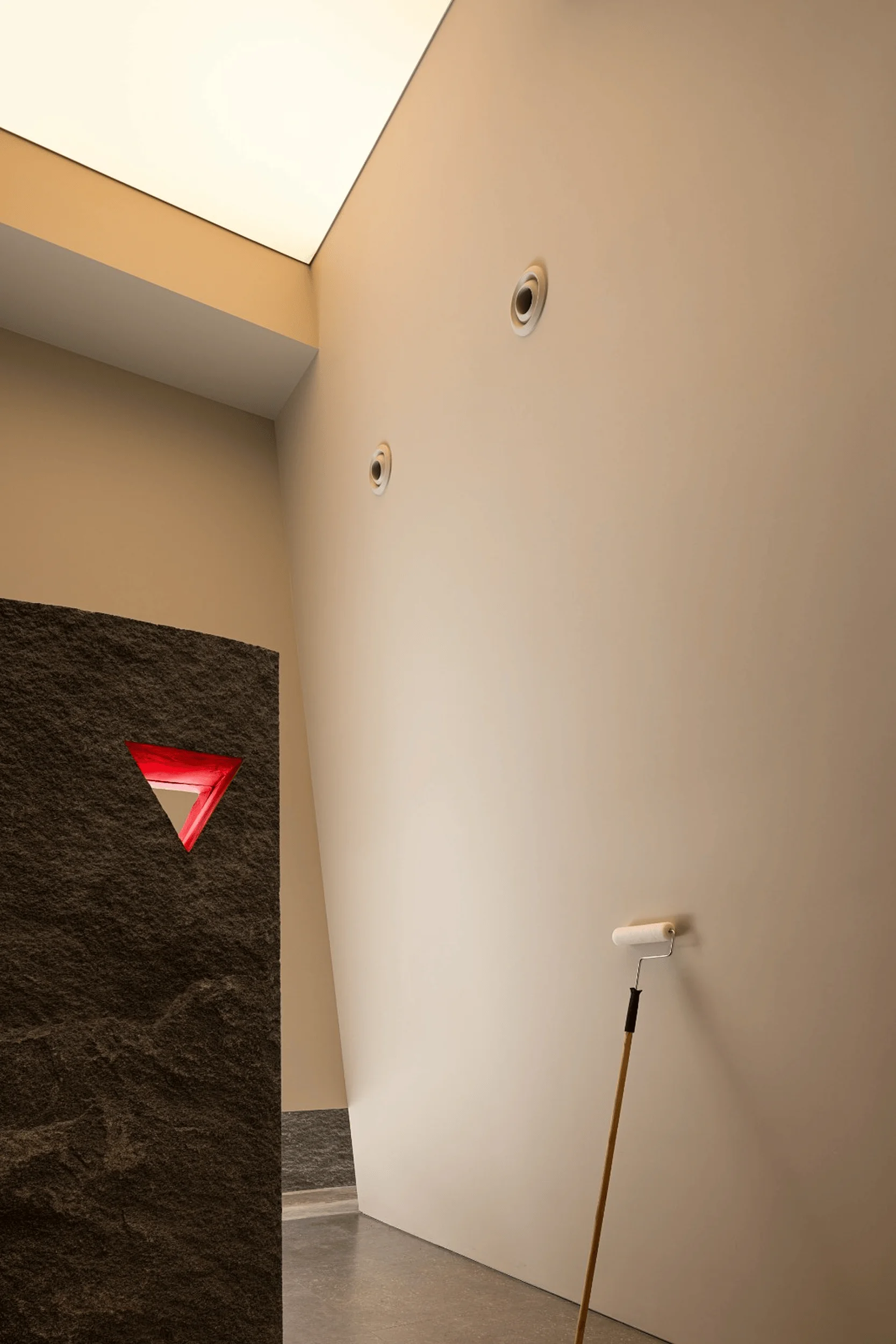
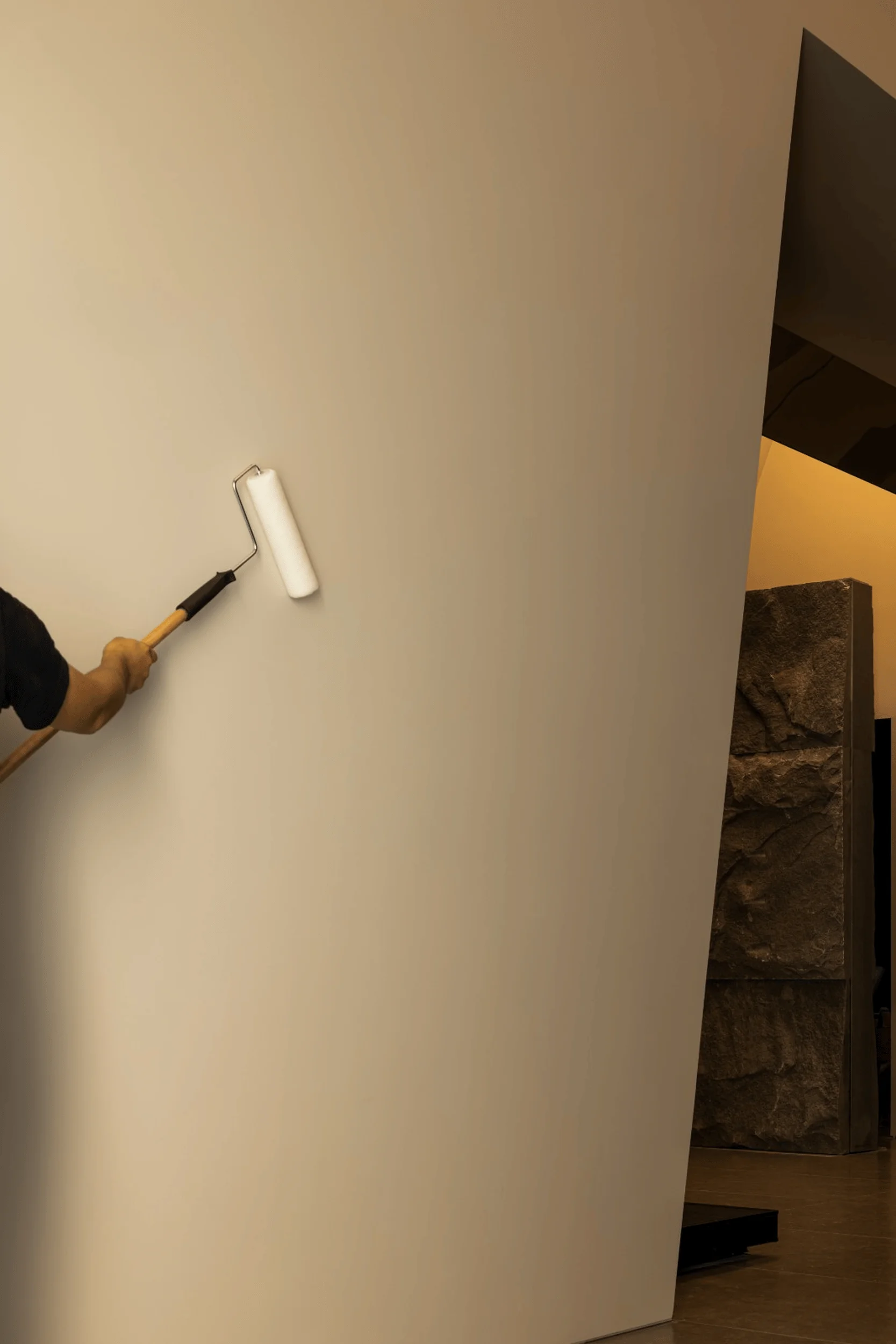
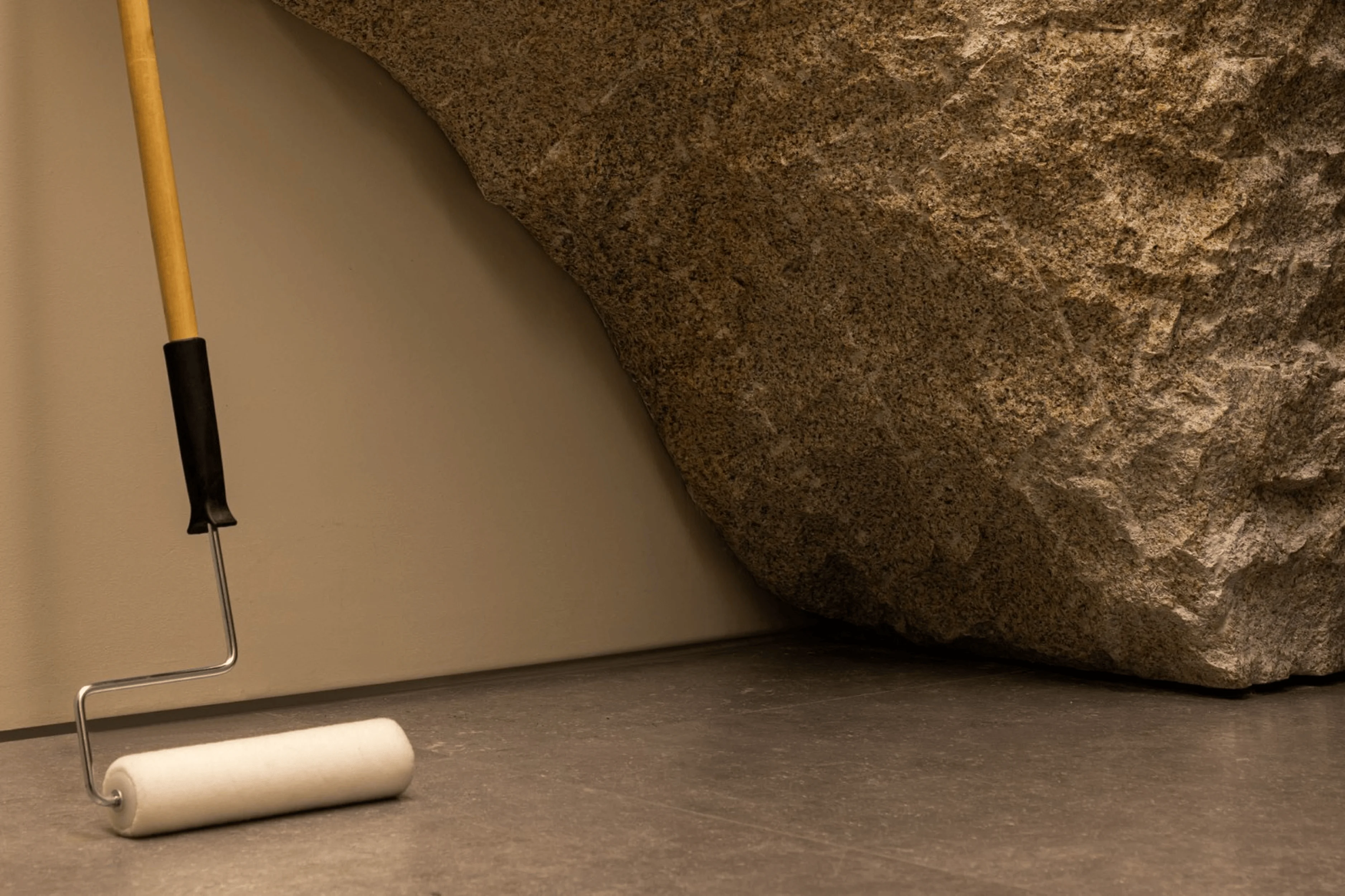
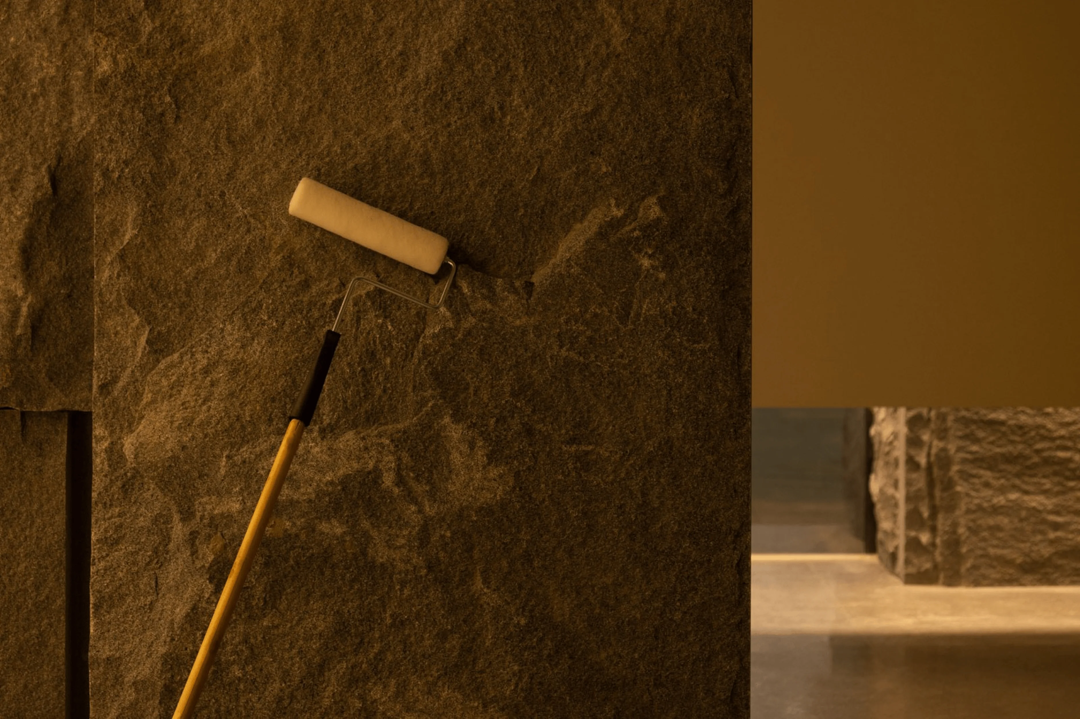
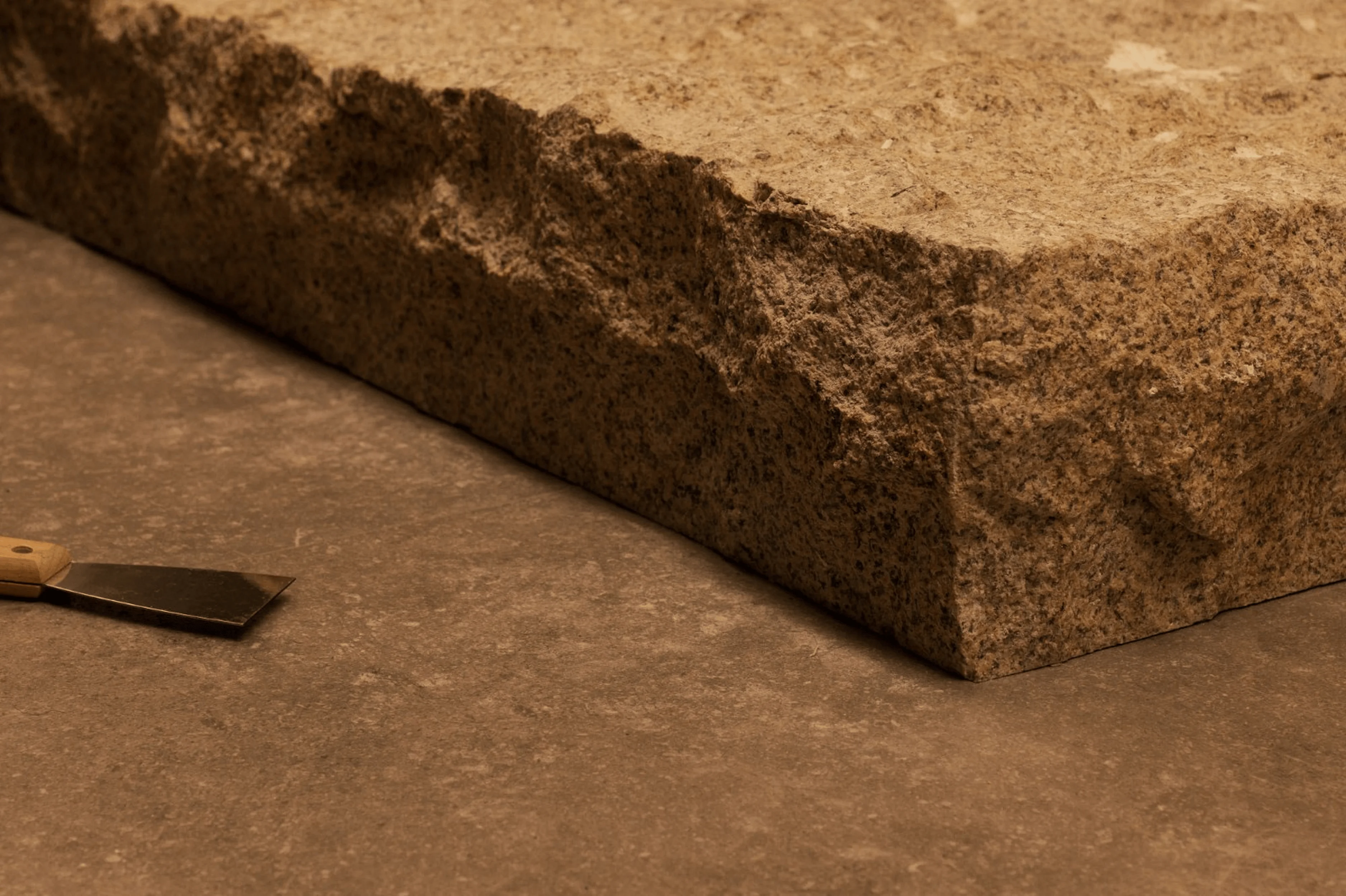
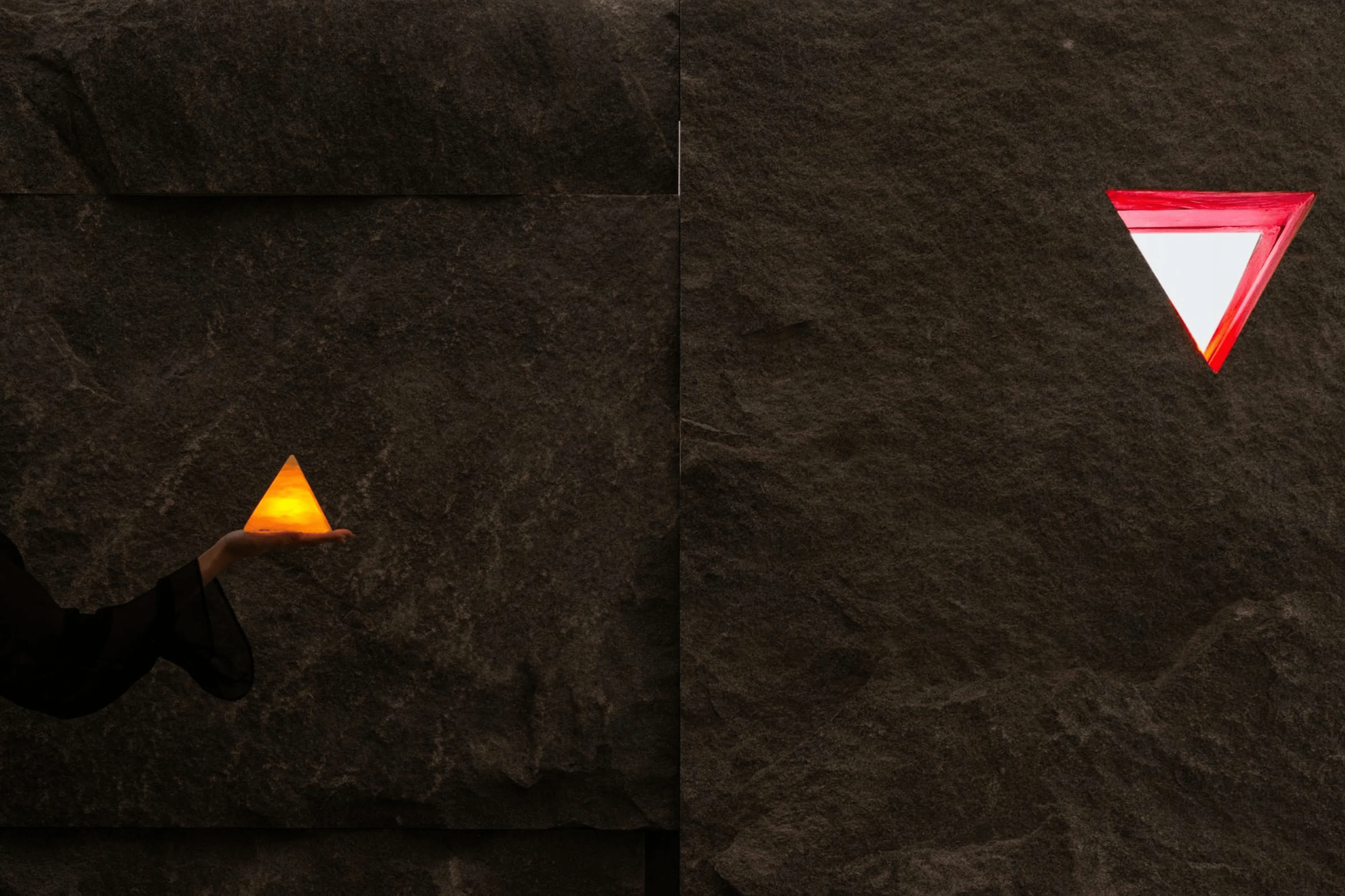
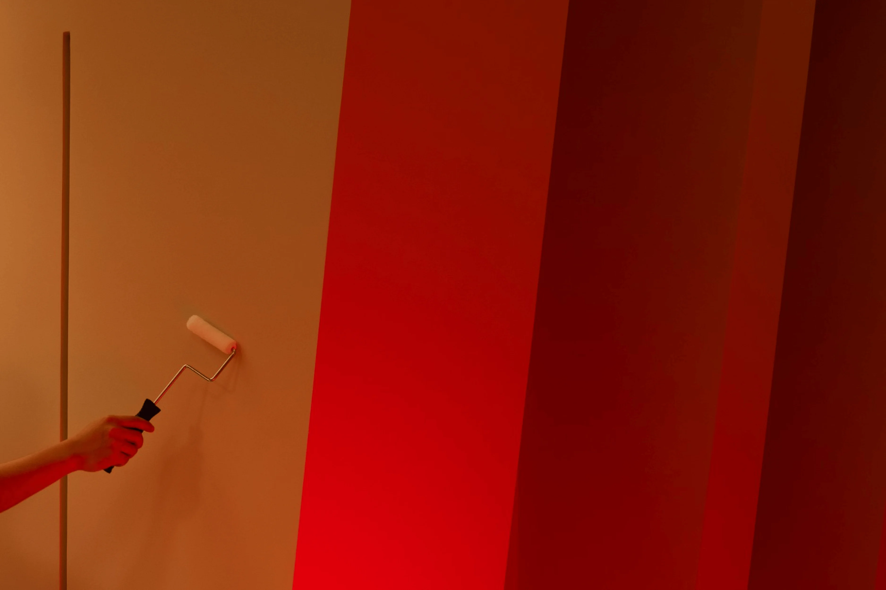
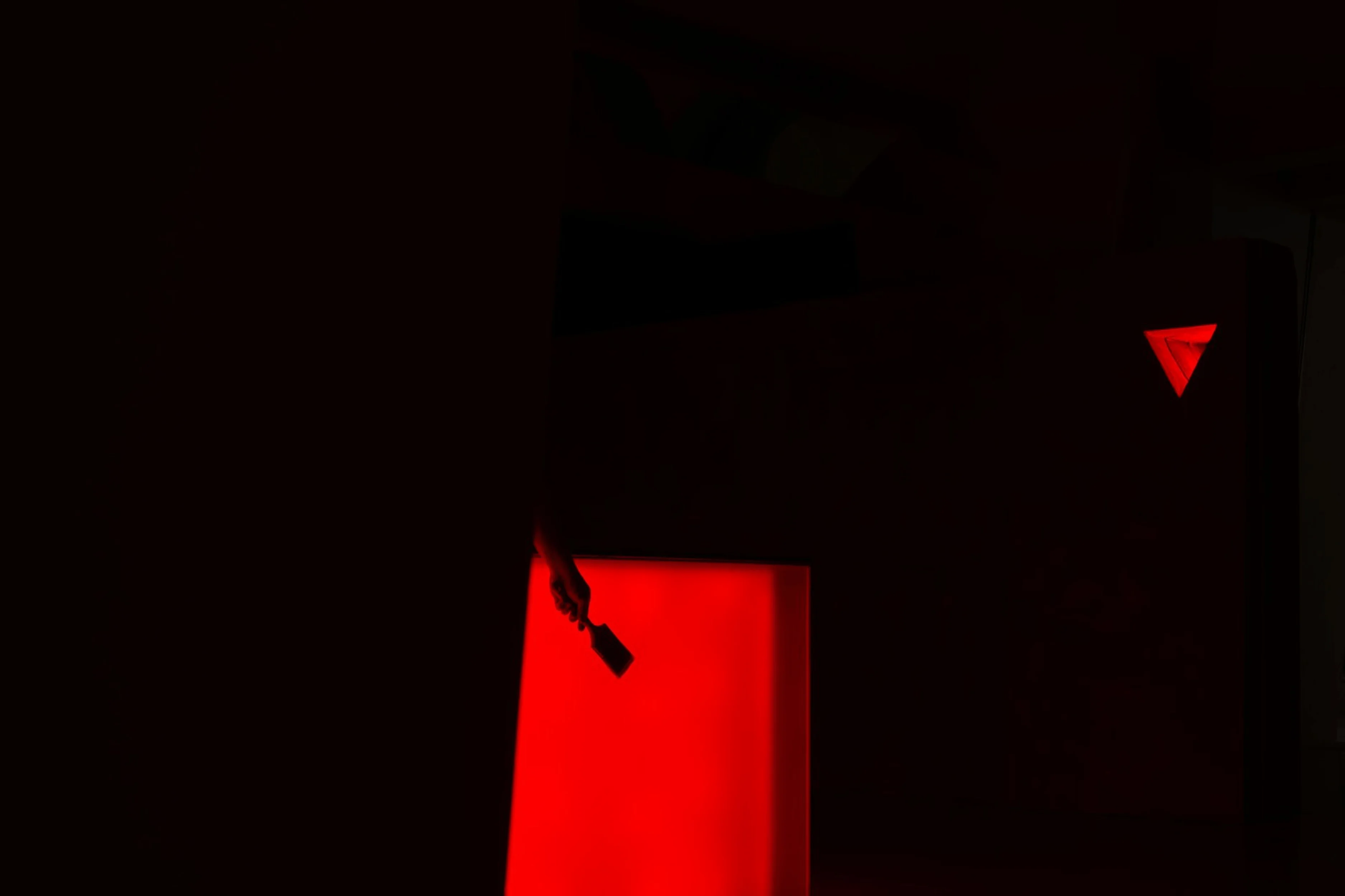
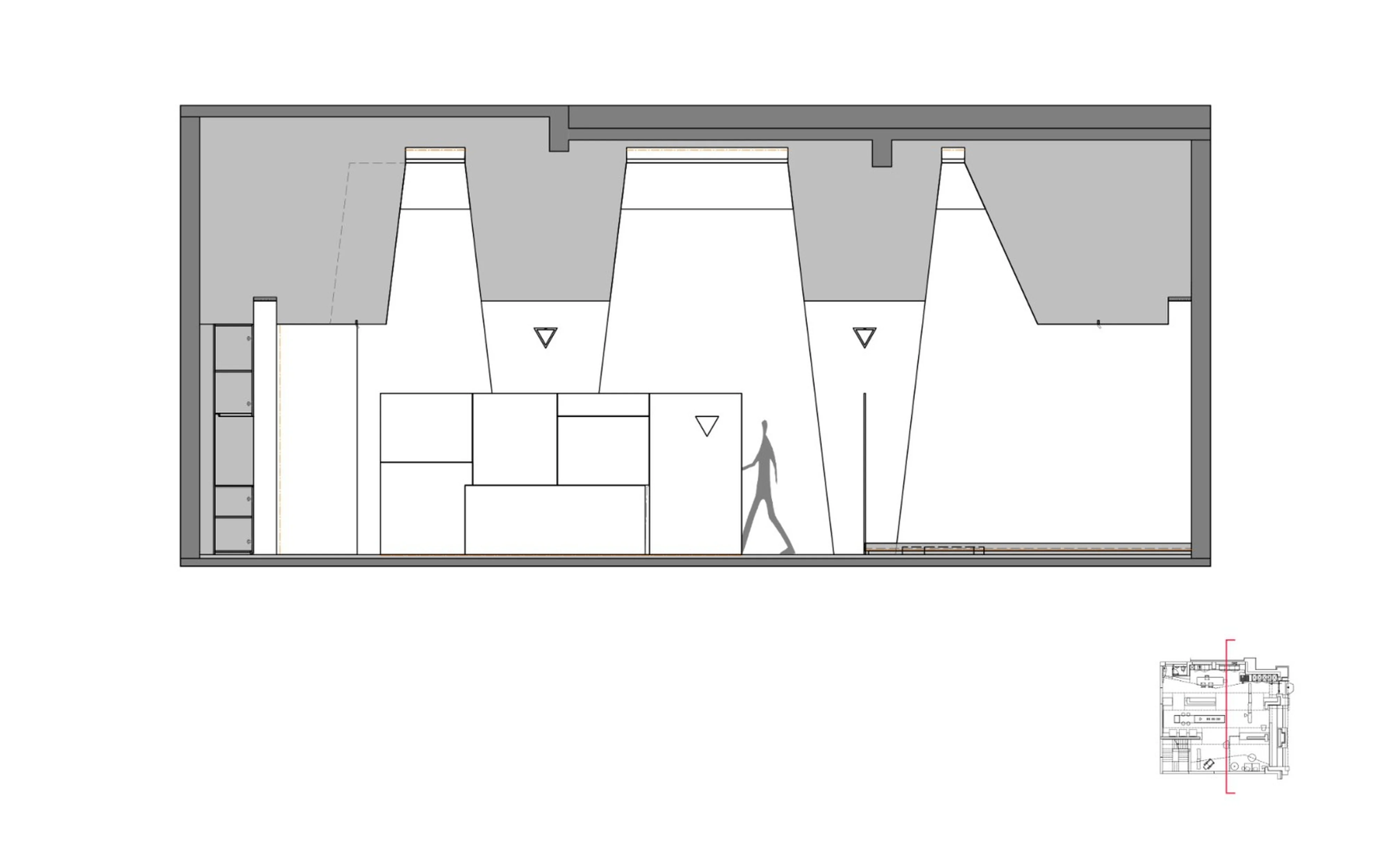
The showroom design incorporates numerous symbolic elements that reinforce the Benjamin Moore brand identity and guide visitors through the space. The use of a light source that seems to flow across the walls allows for an expansive display of the various paint colors, showcasing their richness and texture in a refined and elegant manner. The natural stone walls accentuate the visual appeal of the paint swatches and enhance the showroom’s inherent quality. The design also incorporates transparent elements that allow light to filter through the space, visually enhancing the space and giving it a sense of transparency and airiness. Paint rollers, used for demonstrations, create a connection between the material and its application, creating a direct visual link to the user experience. To create a connection between the interior and exterior spaces, semi-high partitions with cut-out equilateral triangles were utilized as design elements. These triangles mirror the brand’s logo and create a sense of visual continuity between the interior and exterior spaces. This is a successful demonstration of how design can use symbolism to reinforce the brand identity and attract the user’s interest. The use of a reddish light effect is used to highlight the flexibility of the color palettes. Through these design choices, the designers also highlight the brand’s essence. These design choices serve to create a visual storytelling element that is both aesthetically pleasing and informative. The interior design of the Benjamin Moore showroom embodies a spatial philosophy that focuses on the creation of a serene atmosphere that encourages visitors to embrace the essence of the Benjamin Moore brand.
Conclusion
The Benjamin Moore Paint Showroom embodies the fusion of aesthetics, functionality, and brand identity in its design. It provides an immersive spatial experience that showcases the beauty and diversity of Benjamin Moore paints. Through its thoughtful incorporation of natural elements, artistic references, and precise spatial organization, the design successfully establishes a unique atmosphere that aligns with the brand’s vision and values. The showroom design stands as a testament to the creative potential of interior design to translate brand identity into a powerful and memorable experience. This project’s success is a testament to the importance of designing a space that reflects a brand’s identity, its connection with nature, and its ability to use aesthetics to attract customers. The showroom successfully achieved the architectural goal of establishing a unique brand presence and a calming space where visitors can explore the beauty and versatility of Benjamin Moore’s paint finishes. This project will likely inspire future showroom designs and provide a valuable case study for designers and architects interested in learning how to create high-impact spaces that resonate with users and build strong brand identity.
Project Information:
Project Type: Showroom
Architect: Z Design
Area: Not specified
Year: Not specified
Country: China
Main Materials: Natural Stone, Concrete, Paint
Photographer: Not specified


