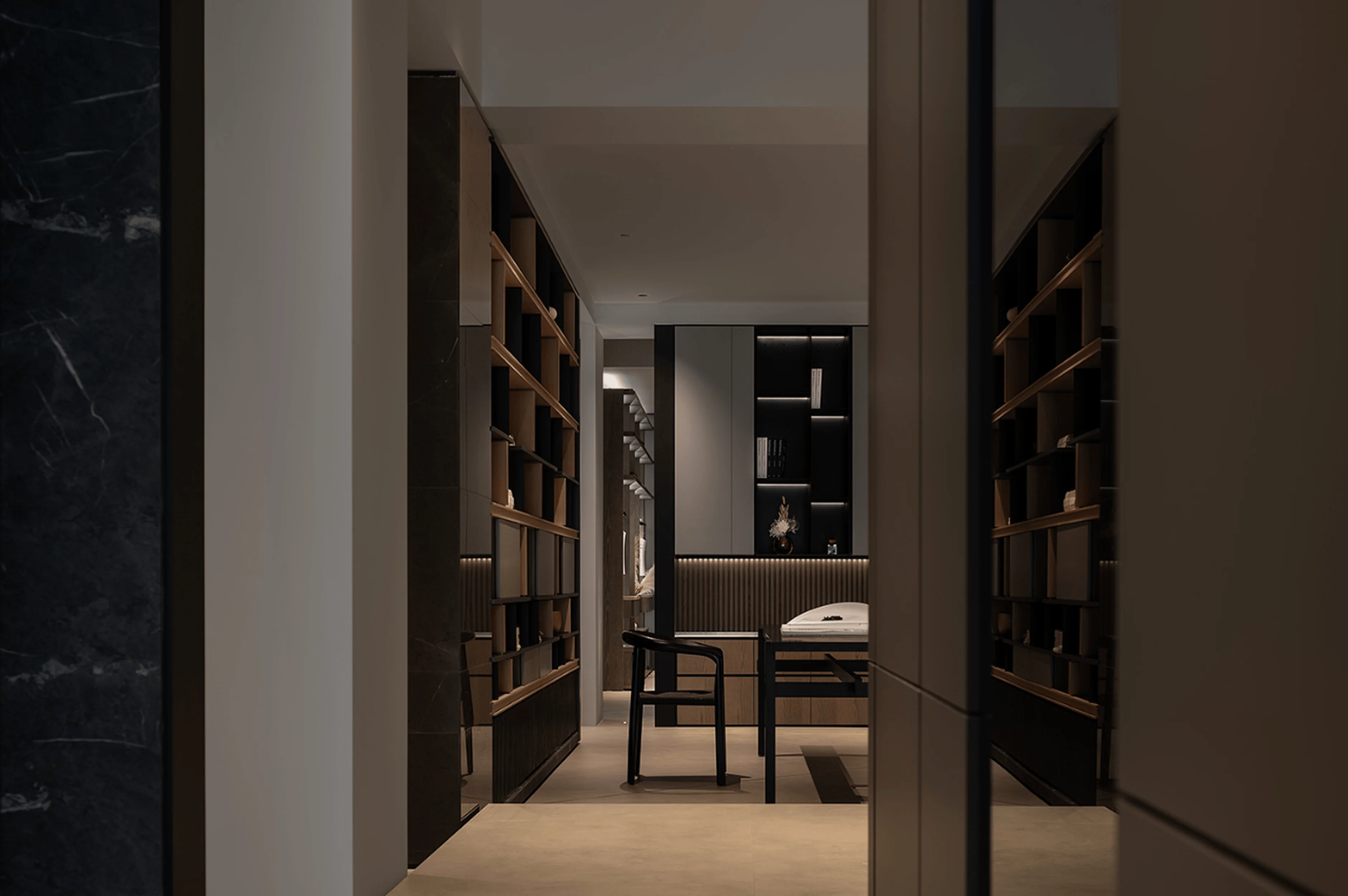
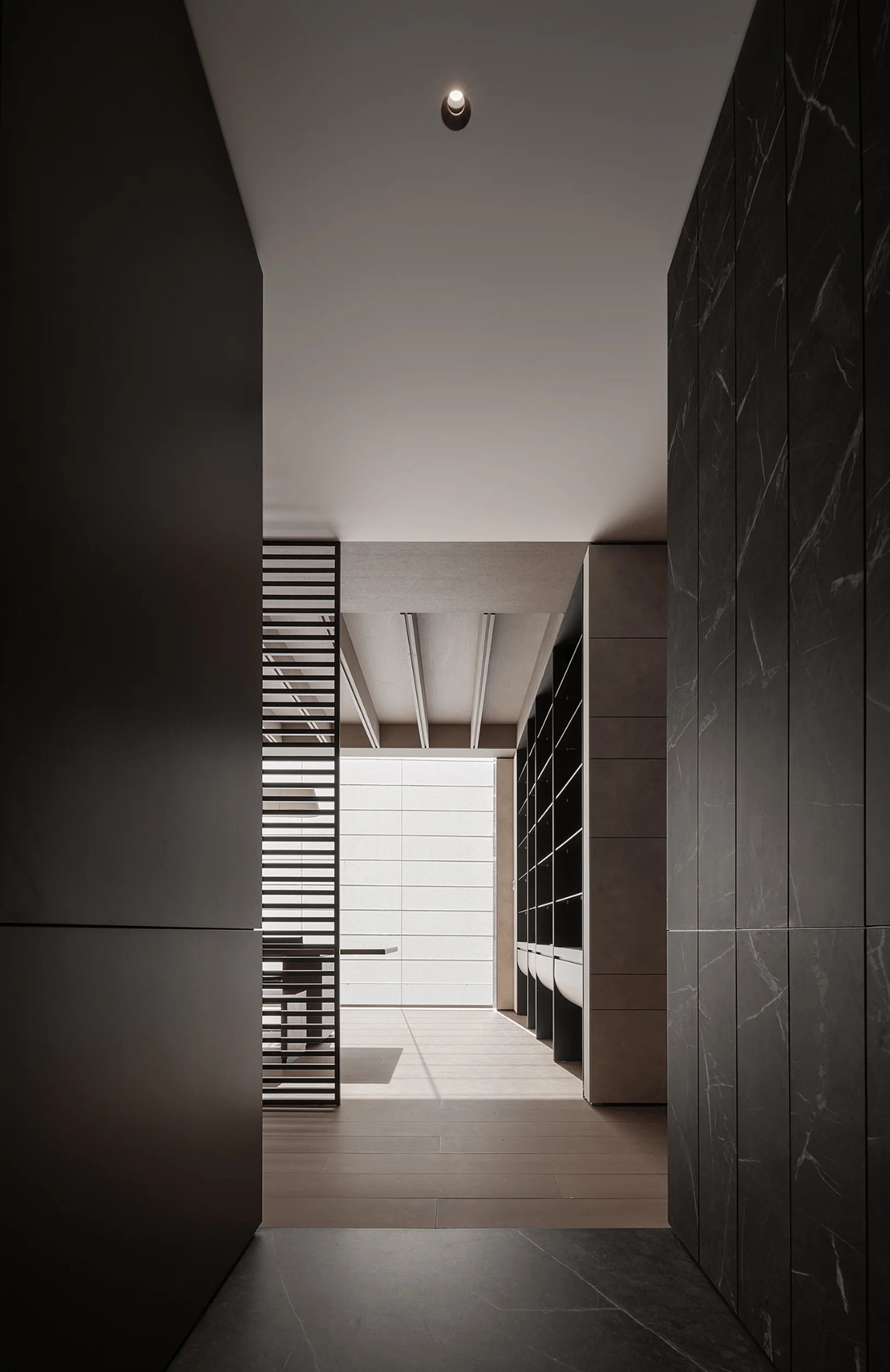
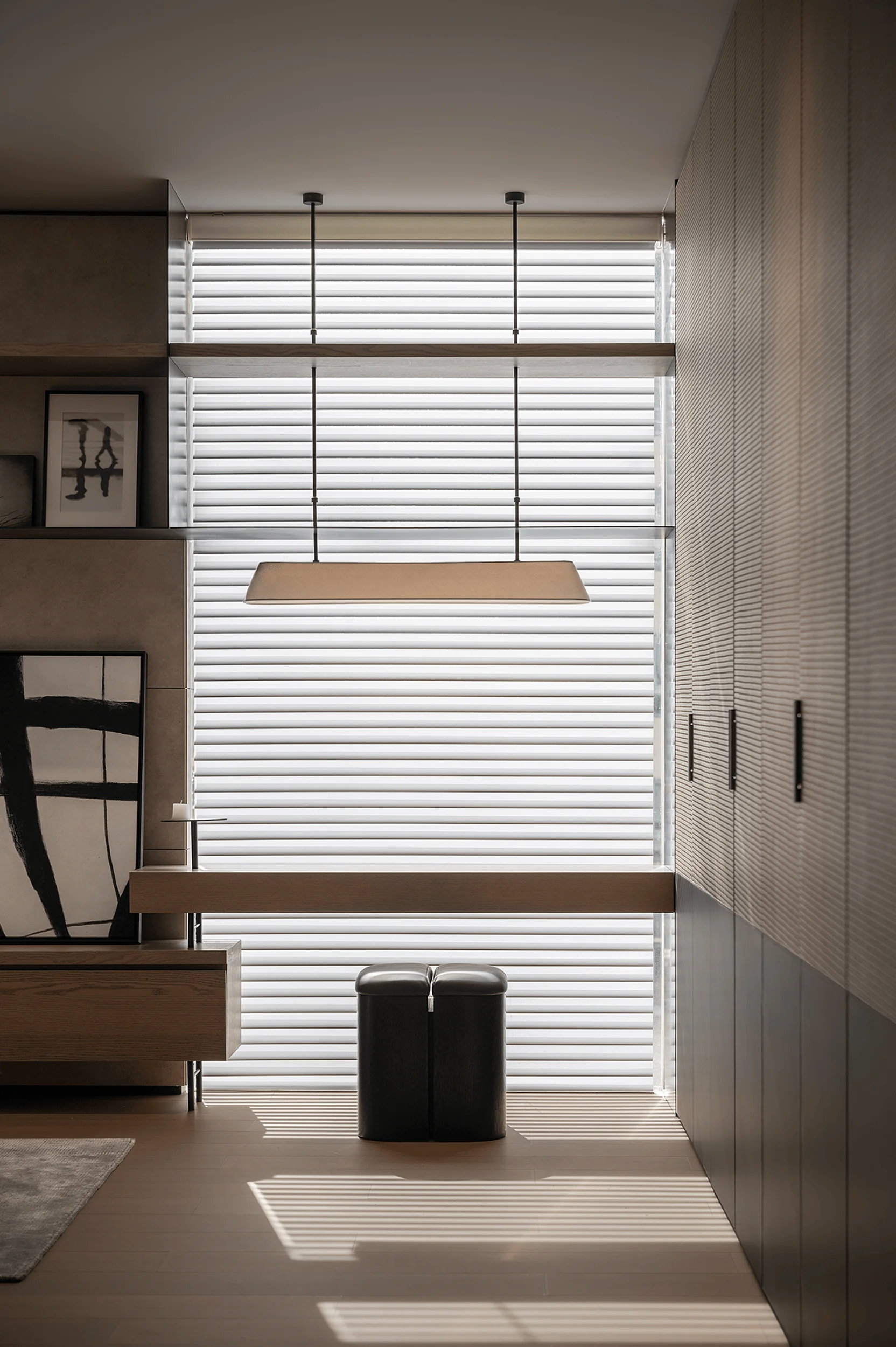
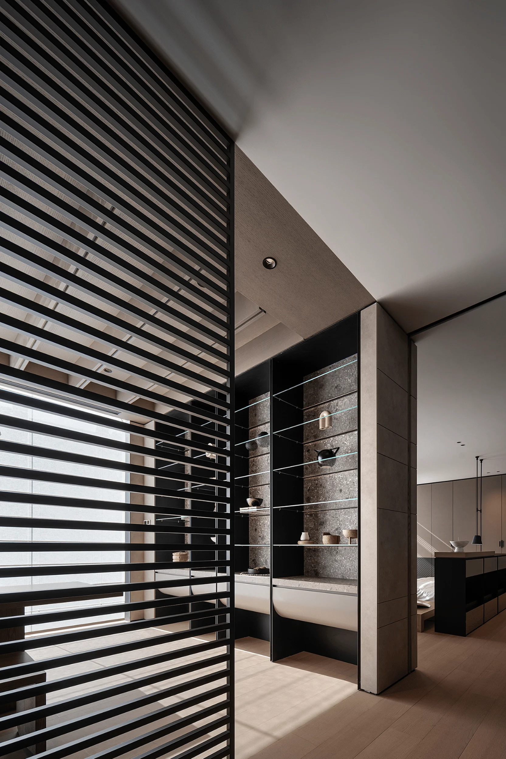
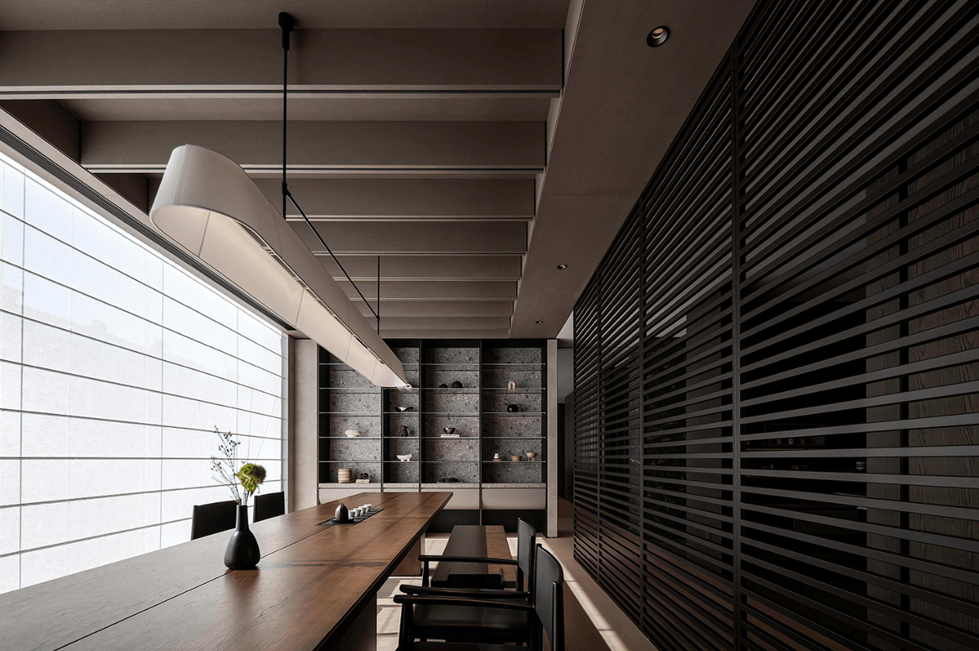
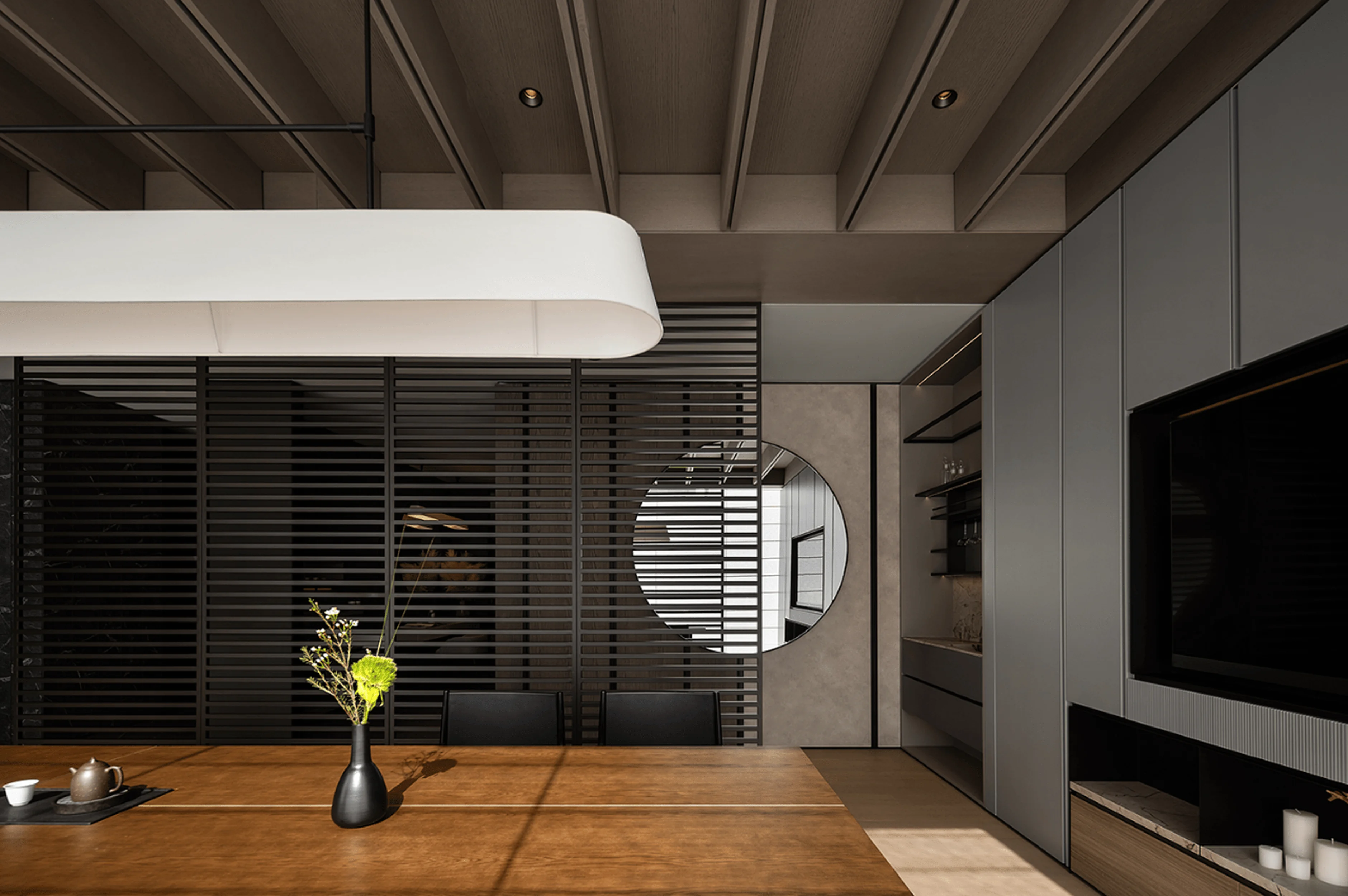
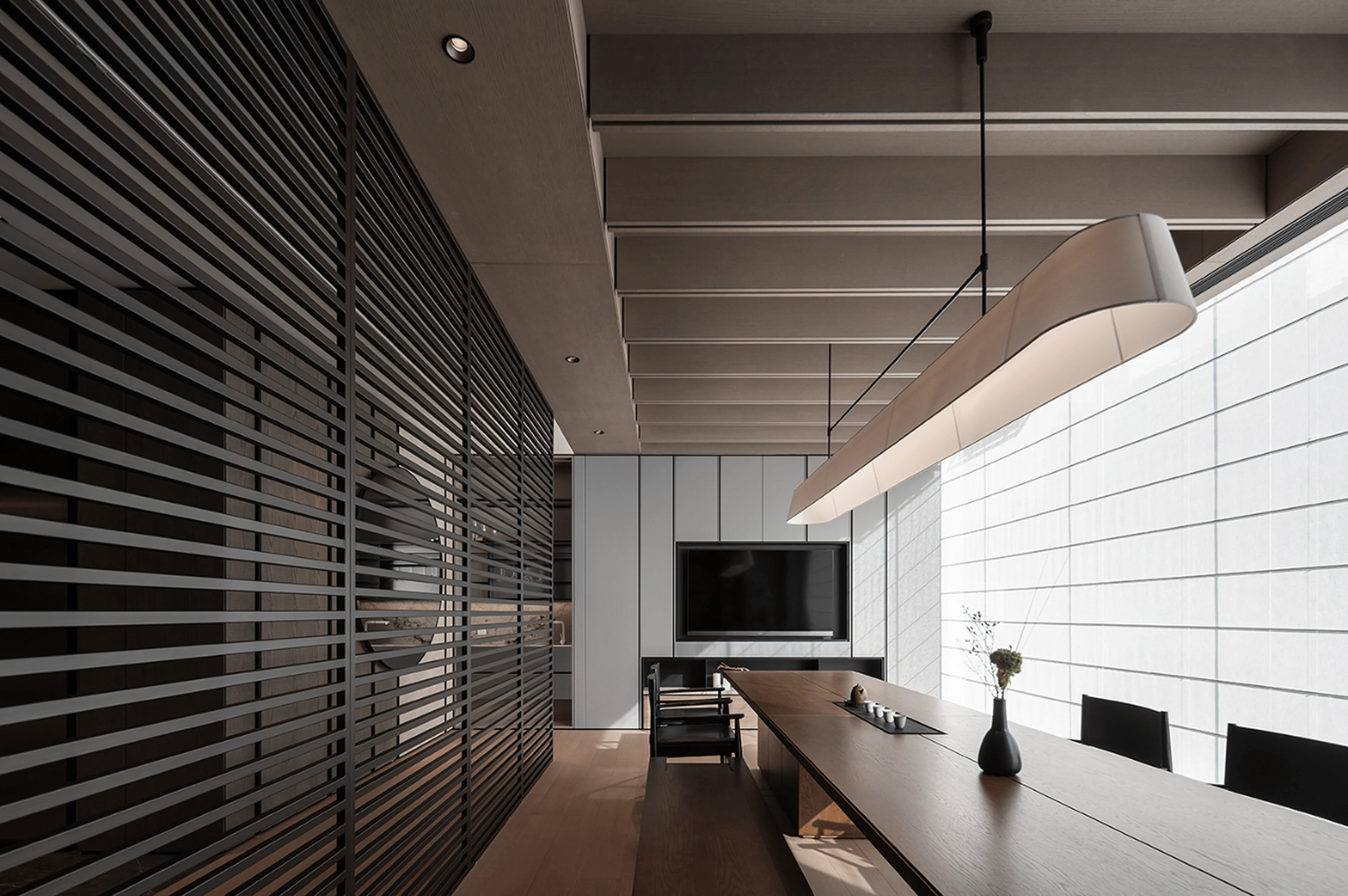
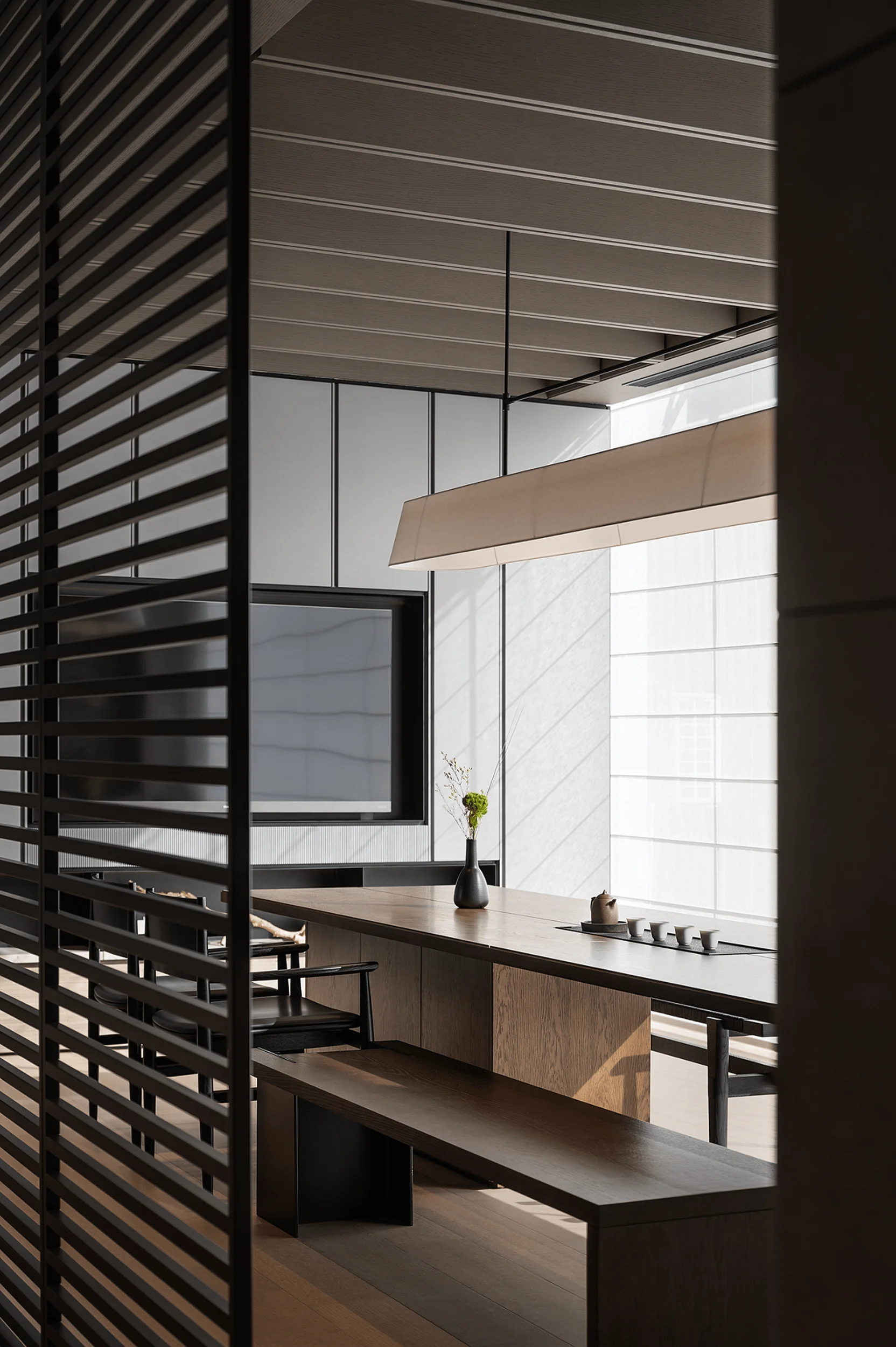
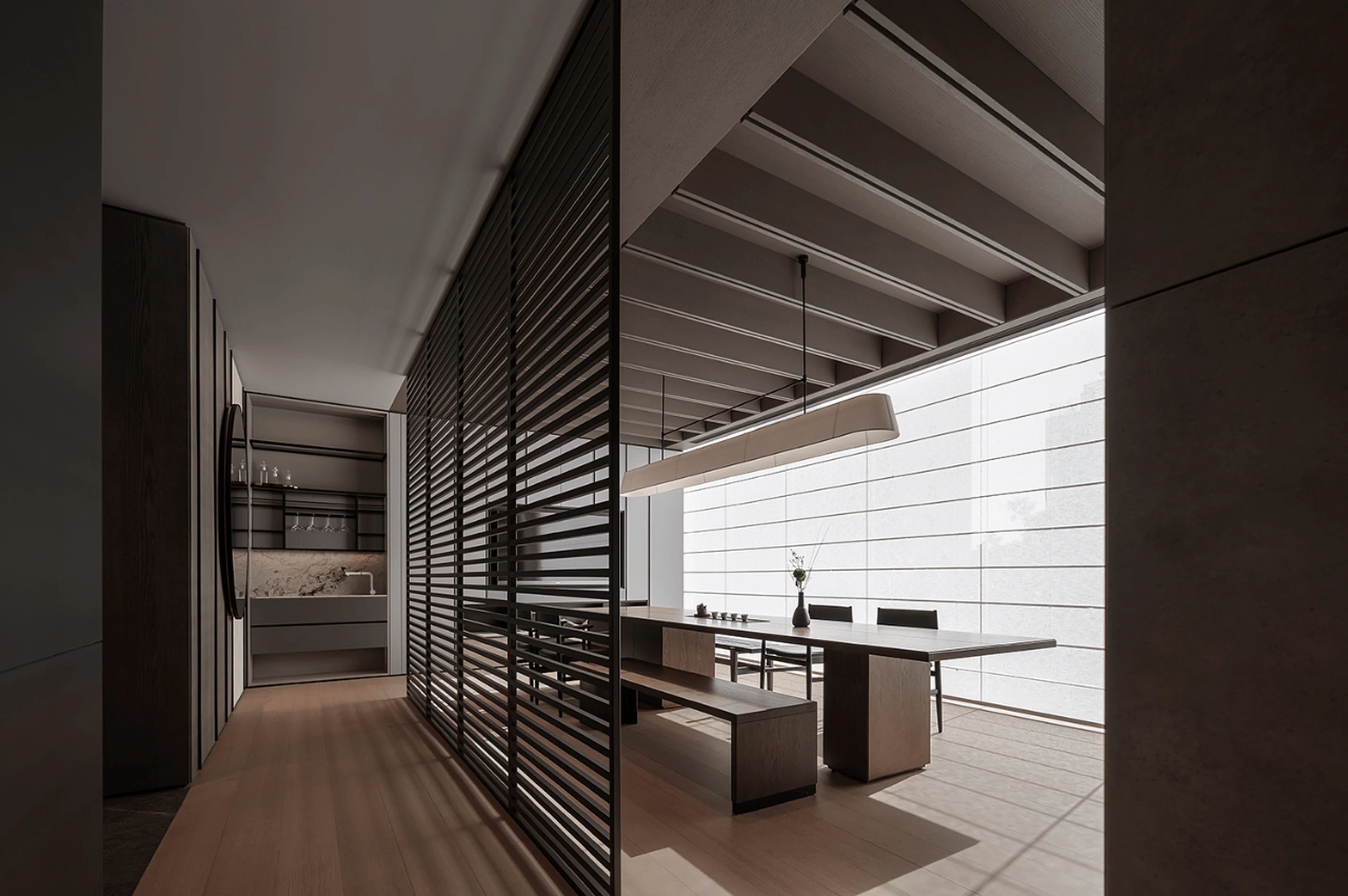
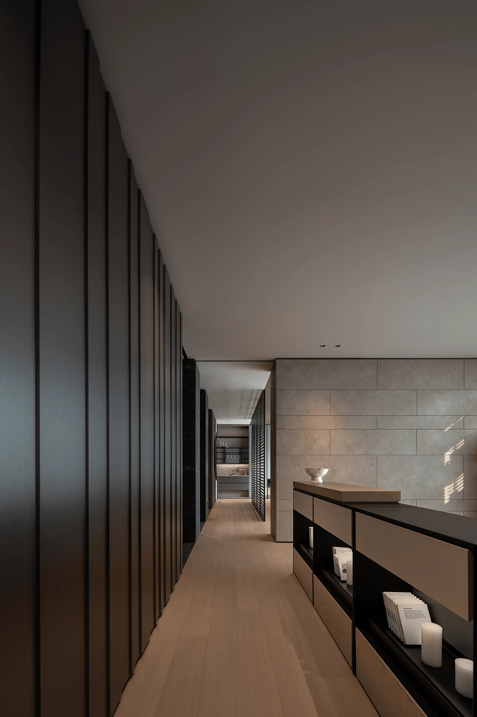
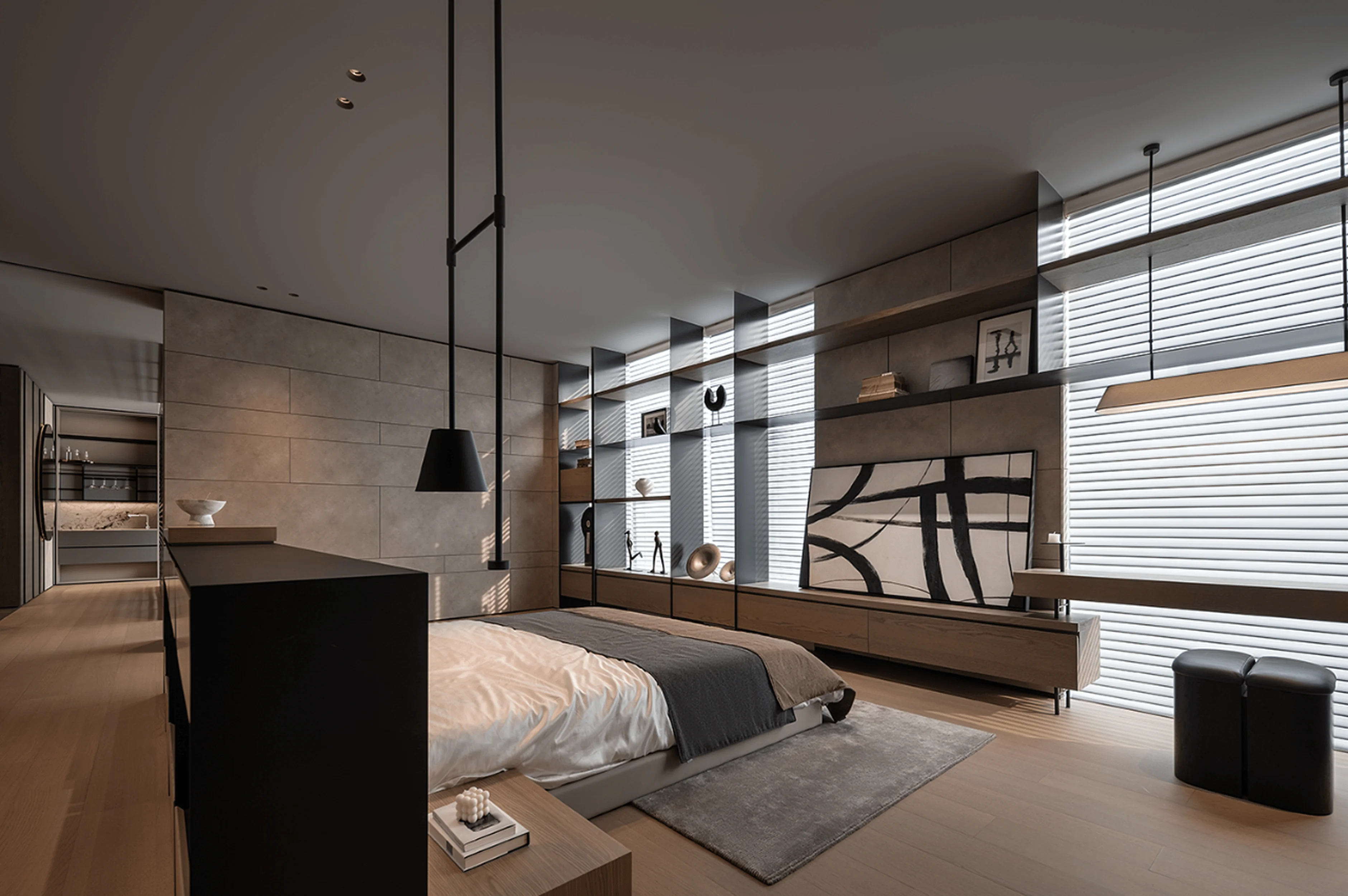
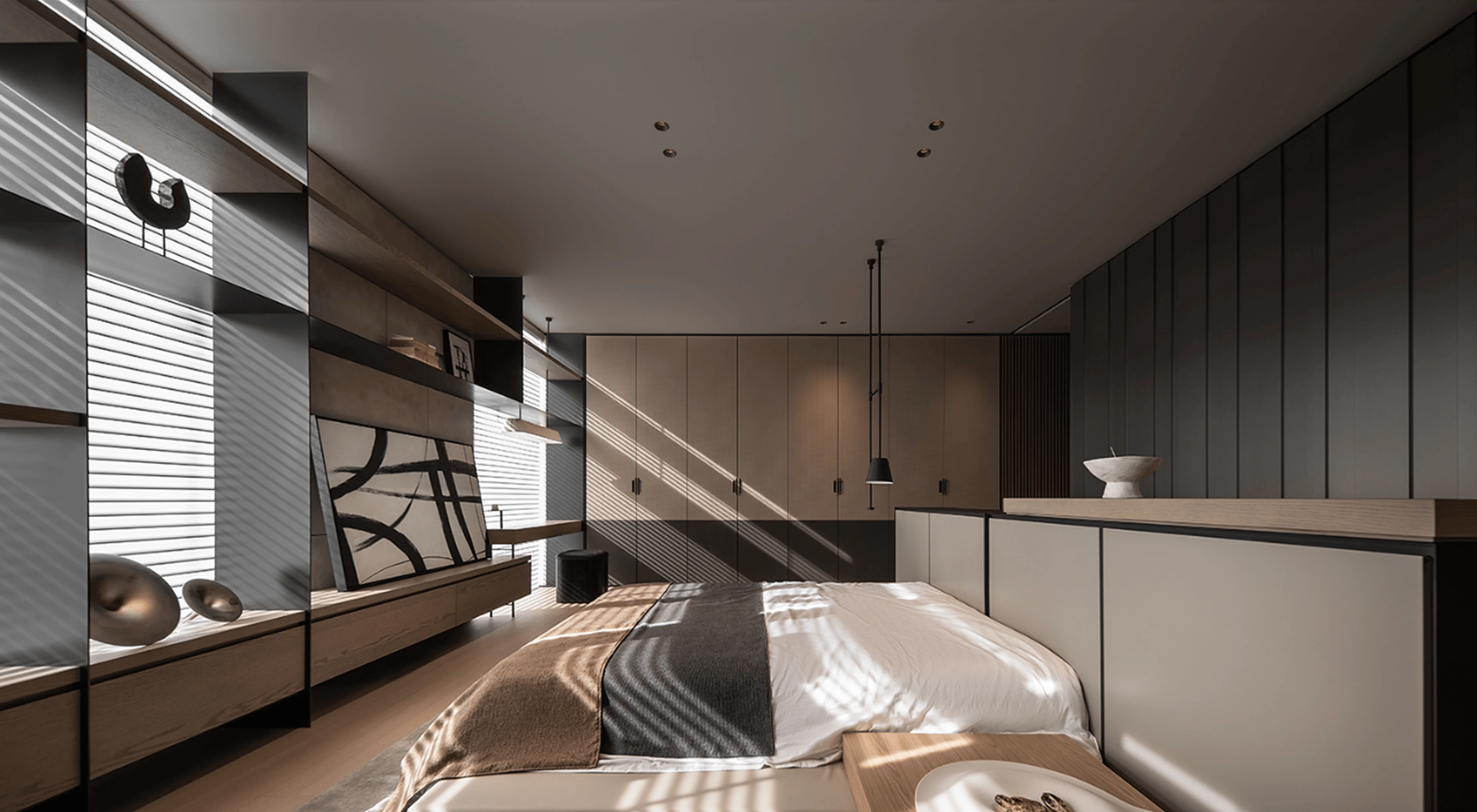
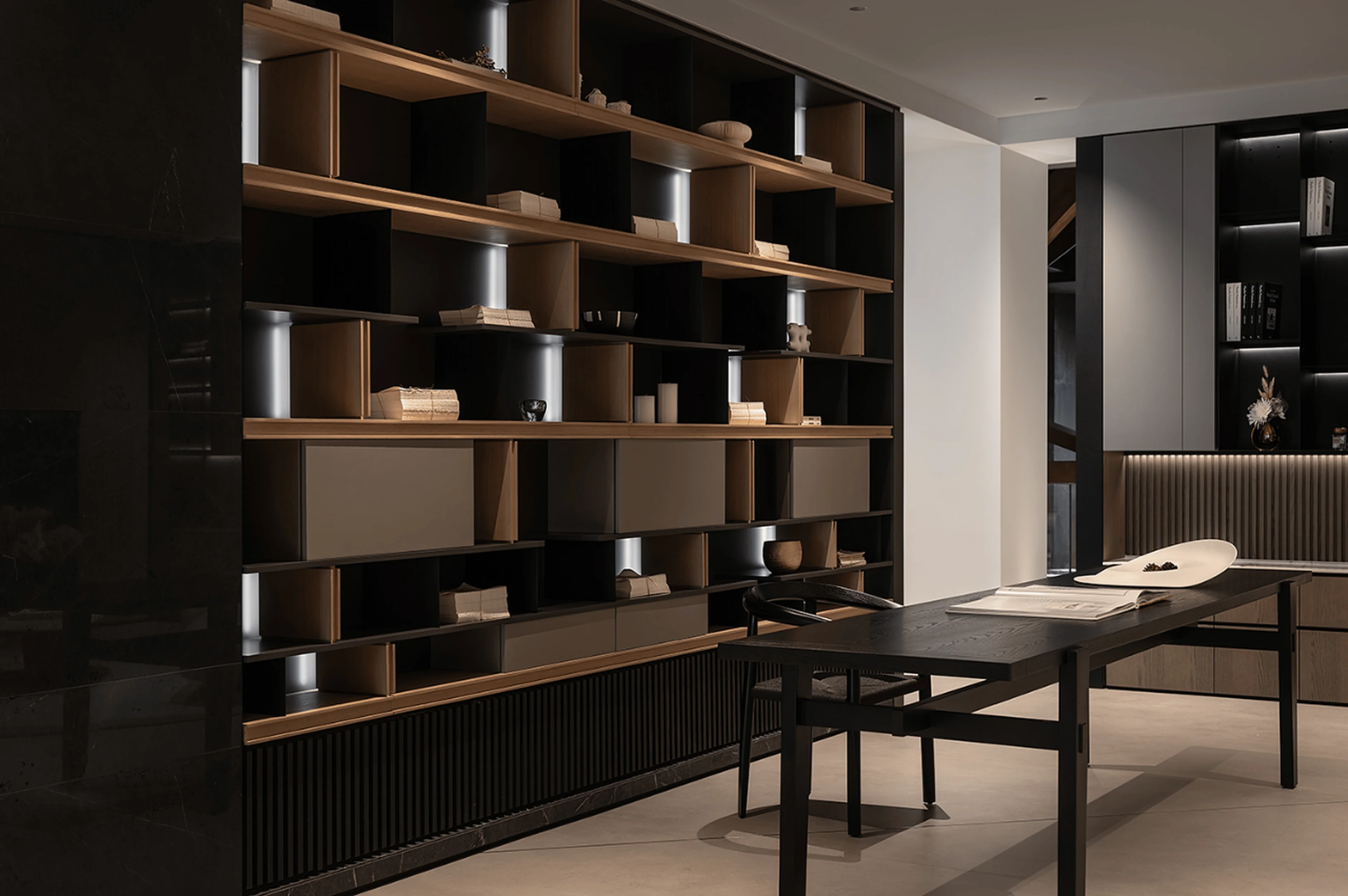
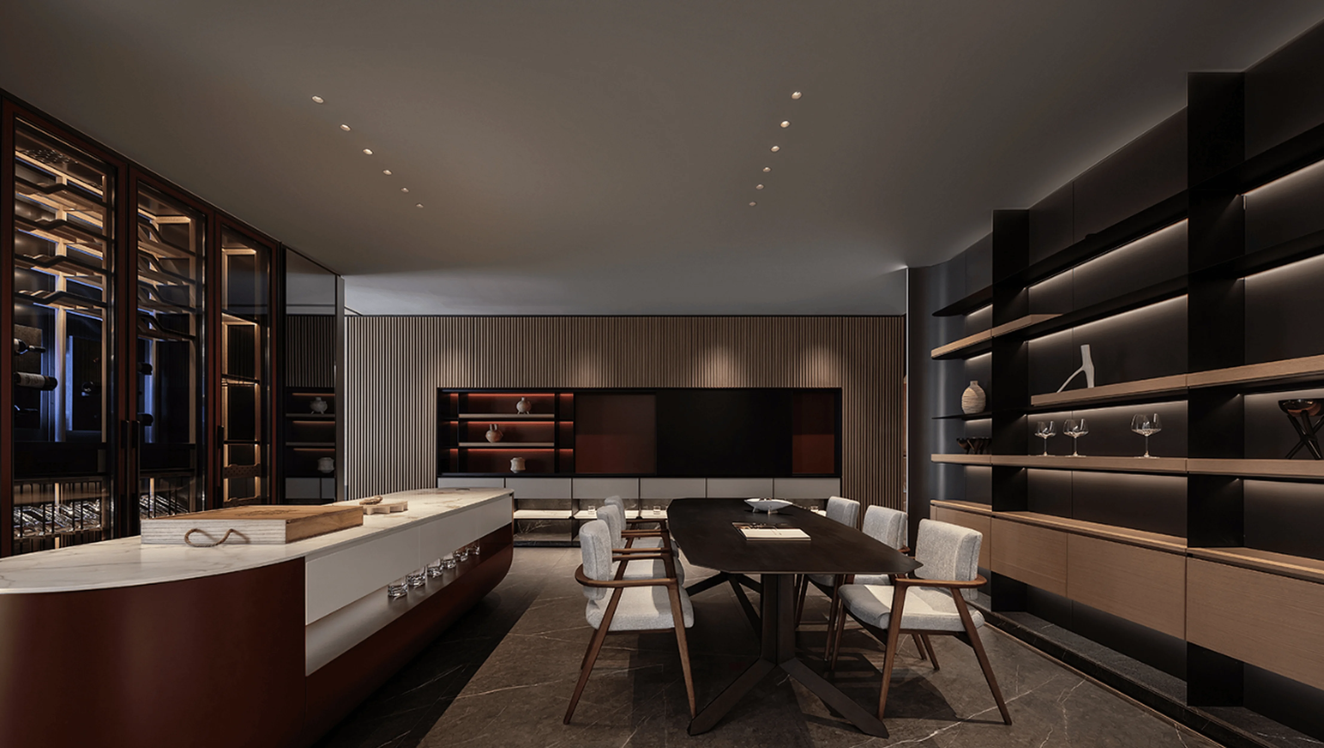
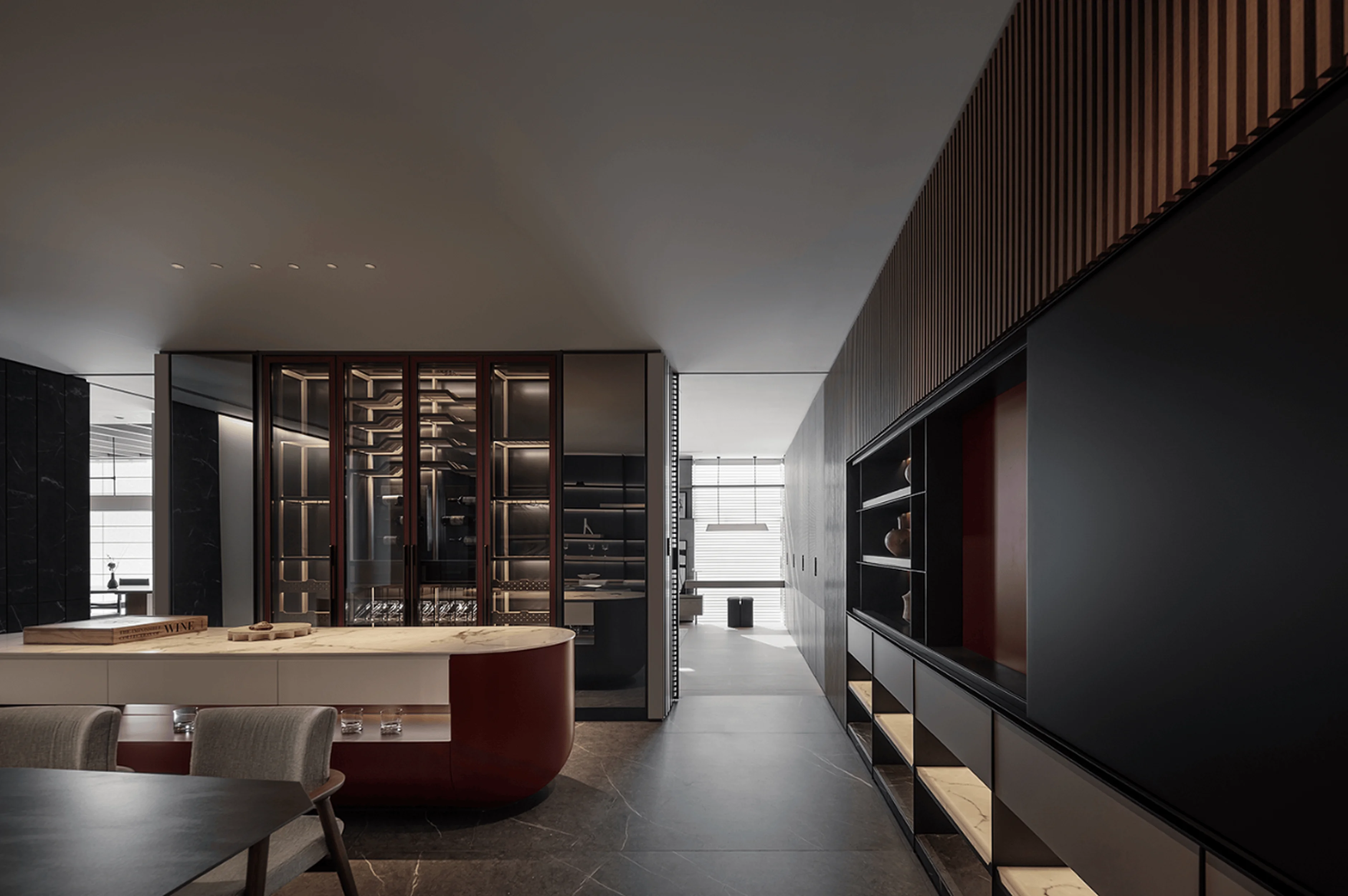
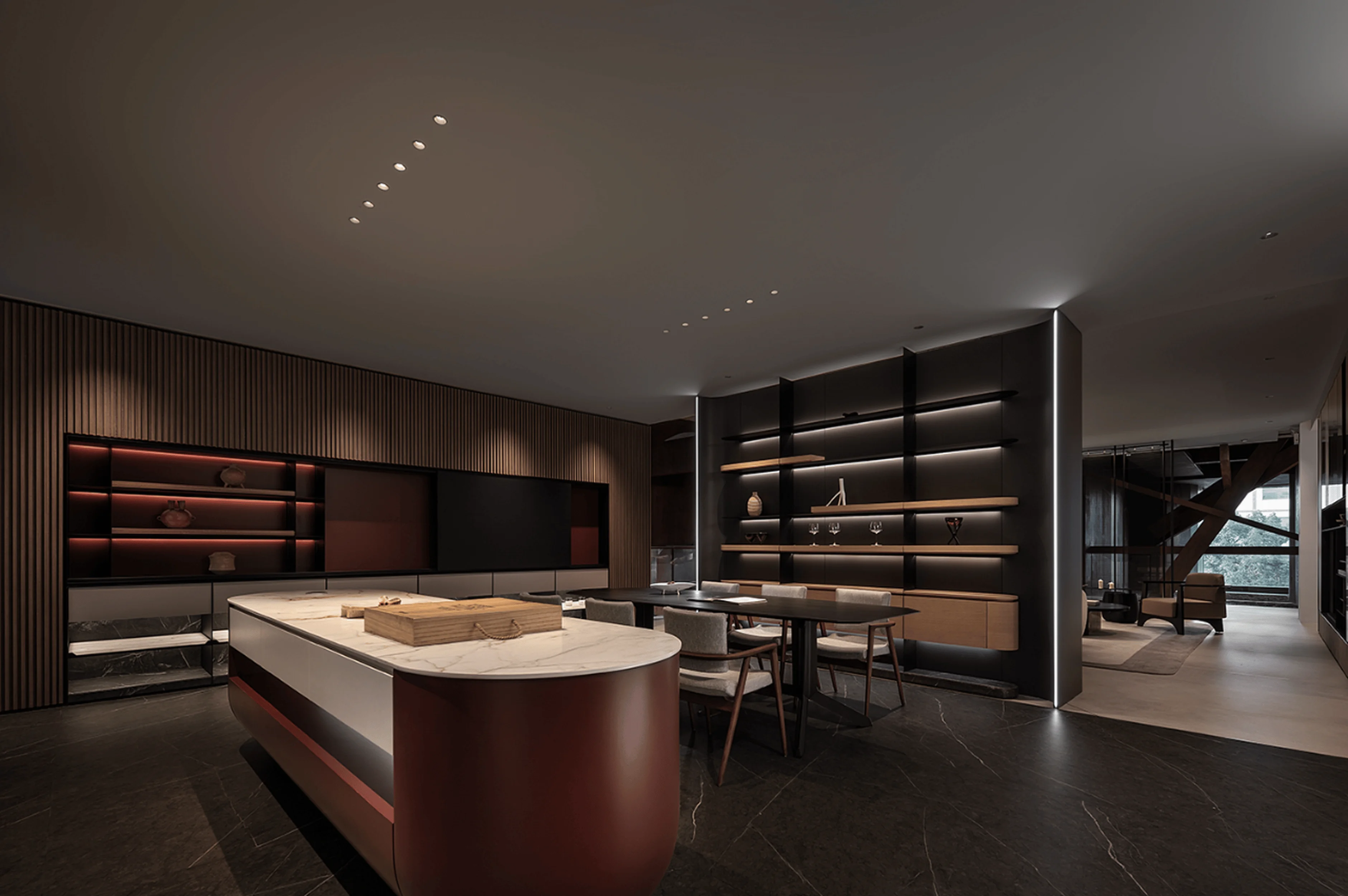
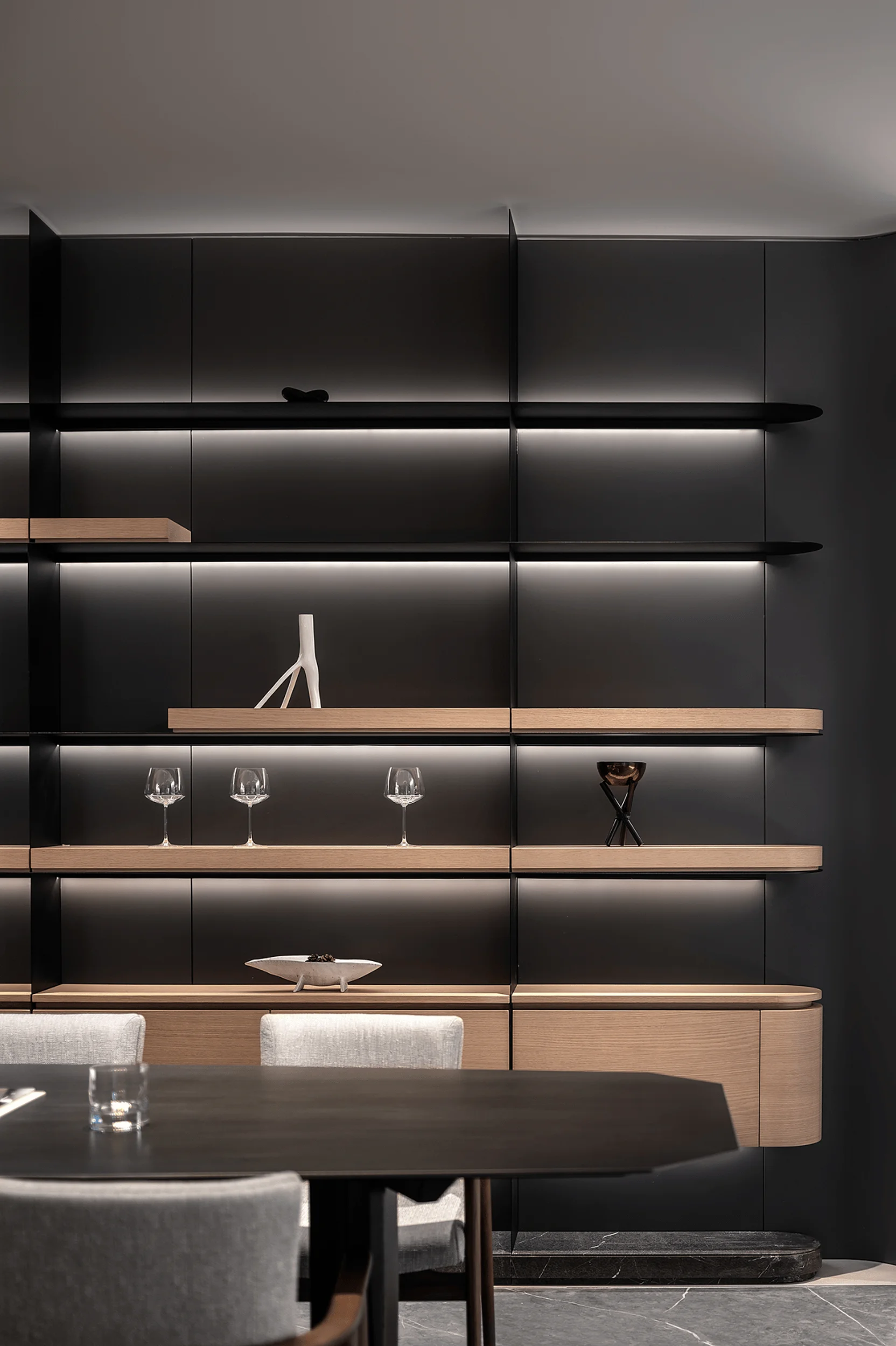
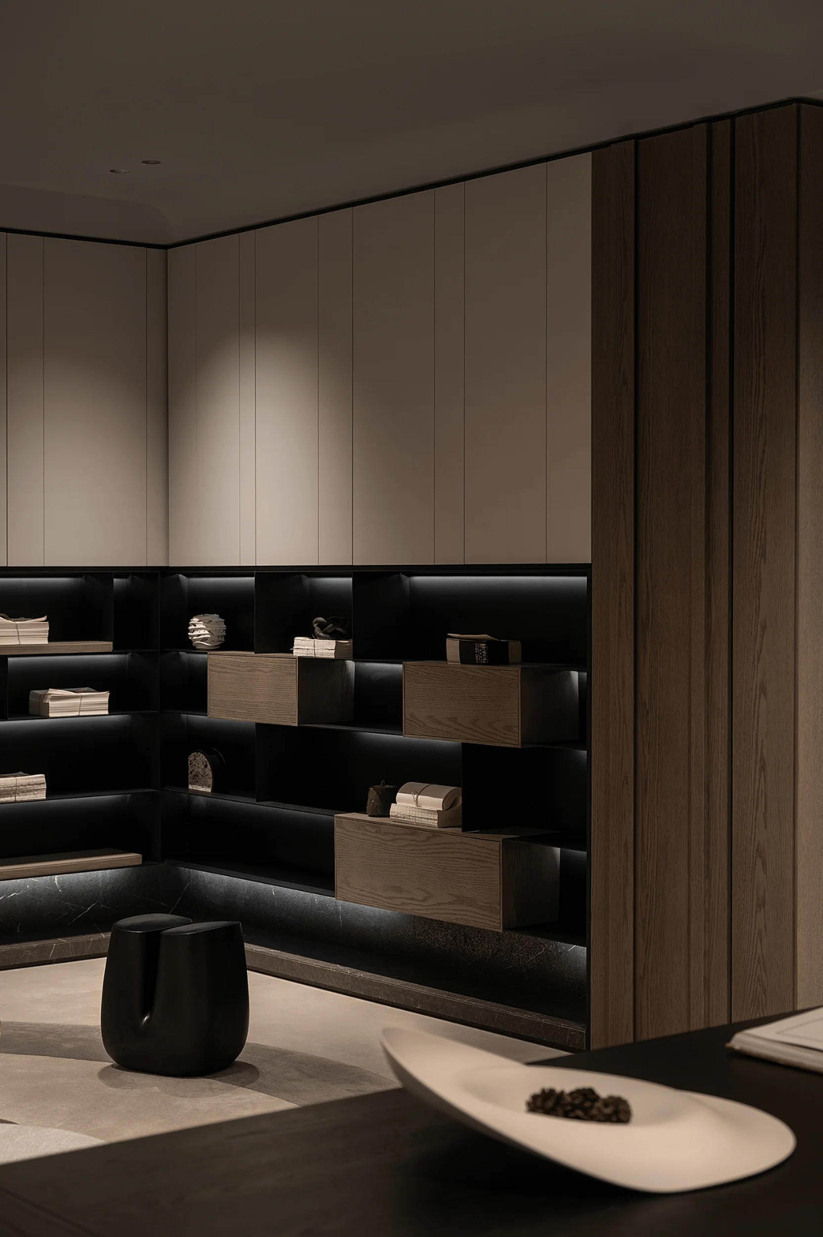
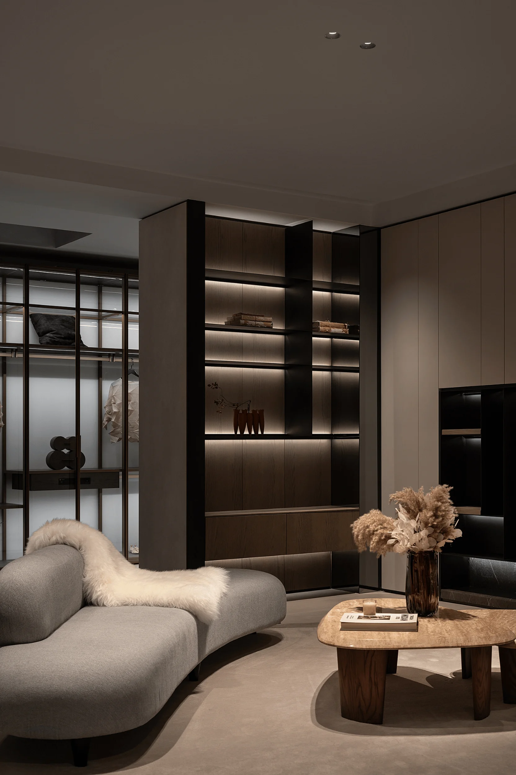
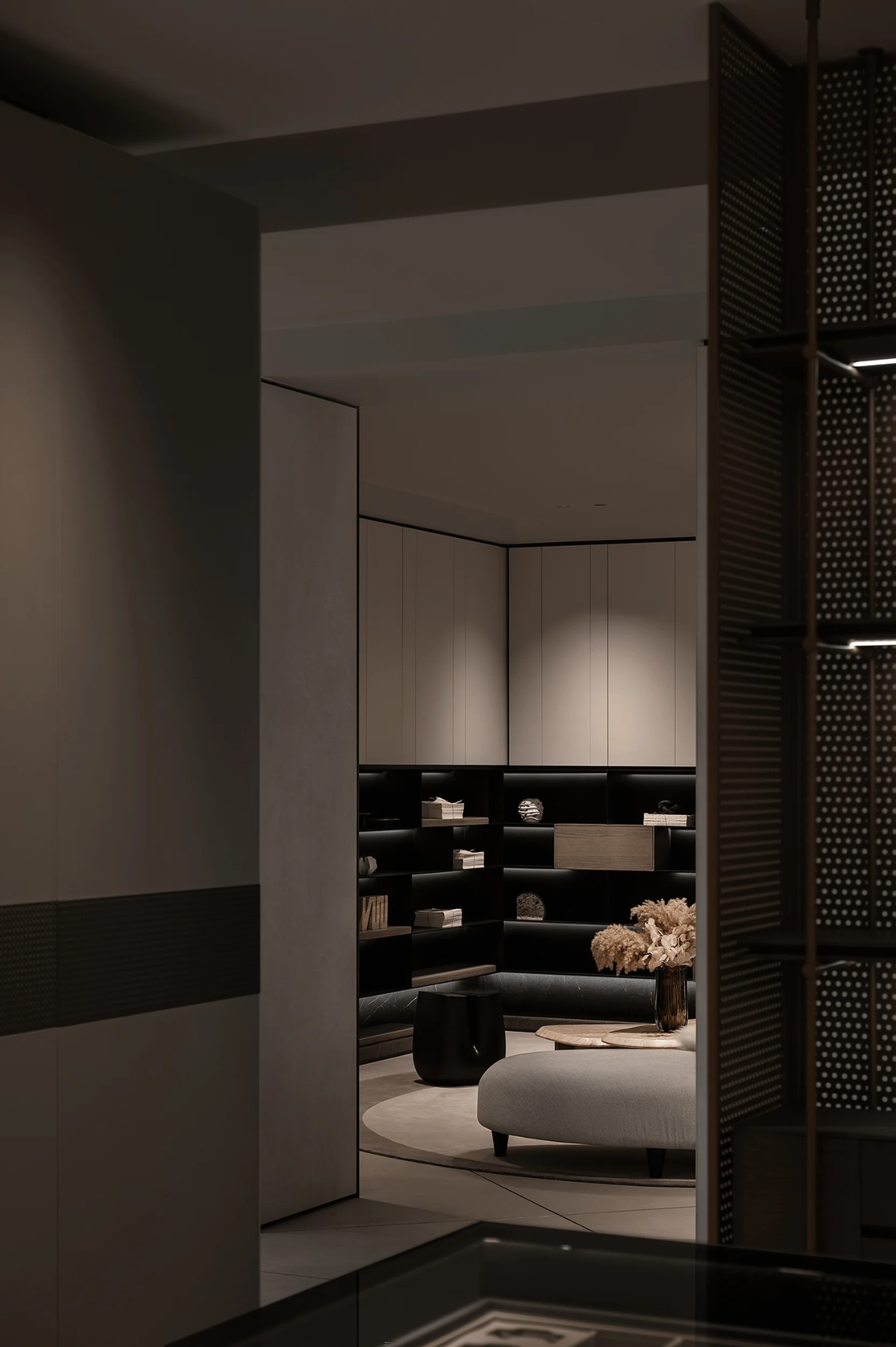
Suzhou Between the Original Showroom, minimalist interior design, harmony.
Contents
Project Background and Design Inspiration
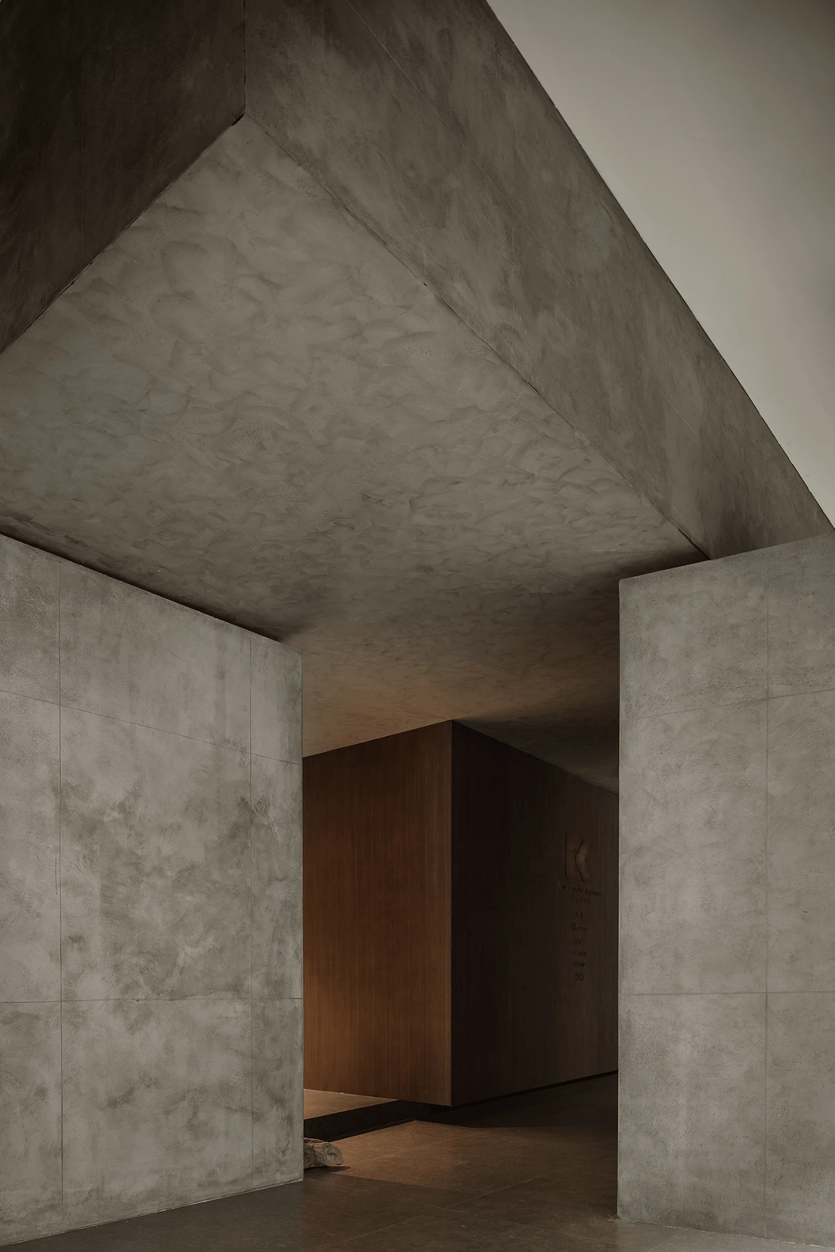
The Suzhou Between the Original Showroom is a testament to the “Less is More” design philosophy, emphasizing simplicity as both a design concept and a lifestyle. It underscores the significance of removing unnecessary elements, allowing the essence of the space to shine through. The showroom, located in the J Structure Life Art Gallery in Suzhou, China, seeks to convey a sense of tranquility and comfort to visitors within a fast-paced urban environment. This is achieved by adopting a minimalist aesthetic and embracing the concept of “Between the Original”, a pursuit of a better life grounded in the local culture and design heritage of the region. The project, helmed by Near Sense Design, blends historical charm with a contemporary vibe, creating an environment that is both rich in heritage and refreshing in its modernity. This minimalist interior design approach also aims to showcase the essence of the products of ‘Between the Original’ brand, enhancing the brand’s impression in the minds of visitors. Suzhou, widely acclaimed as the “paradise on earth”, provides the perfect backdrop for such a design with its unique water town landscape, long history, and prosperous modern economy. Minimalist interior design, like a soothing melody, helps visitors to find inner peace and feel comfortable within the space. This project aims to bring harmony and a unique minimalist style to the bustling city.
Design Concept and Objectives
The core design concept revolves around simplicity and harmony. The design team has carefully curated a space that removes visual clutter, offering a peaceful and comfortable ambiance. This concept seamlessly integrates with the brand’s identity and aims to instill a sense of serenity within the fast-paced urban lifestyle. The primary objective of the design was to create an environment that encourages interaction between family members and guests in the heart of the home. They also aimed to enhance the spatial functionality, introducing opportunities for random pauses and extended engagement with the brand’s products through a series of interconnected pathways and thoughtfully positioned focal points. In addition to its aesthetic value, the design aims to deepen the brand’s perception by encouraging visitors to interact with the products and learn about the brand’s mission and values. This ‘Between the Original’ brand embodies the belief that good design should enhance the quality of life. The design draws inspiration from Ludwig Mies van der Rohe’s renowned “Less is More” philosophy, which emphasizes the importance of simplifying a design by eliminating unnecessary elements to reveal its essence. It is about creating spaces that are not simply functional, but also serve as artistic havens, encouraging reflection and connection with the beauty of everyday life. The design, therefore, prioritizes materials and their subtle interactions with light and shadow to elevate the spatial experience, guiding visitors through various zones, each with a distinct mood and purpose. This minimalist interior design approach reflects the brand’s core values and aims to inspire a sense of serenity within the space.
Functional Layout and Spatial Planning
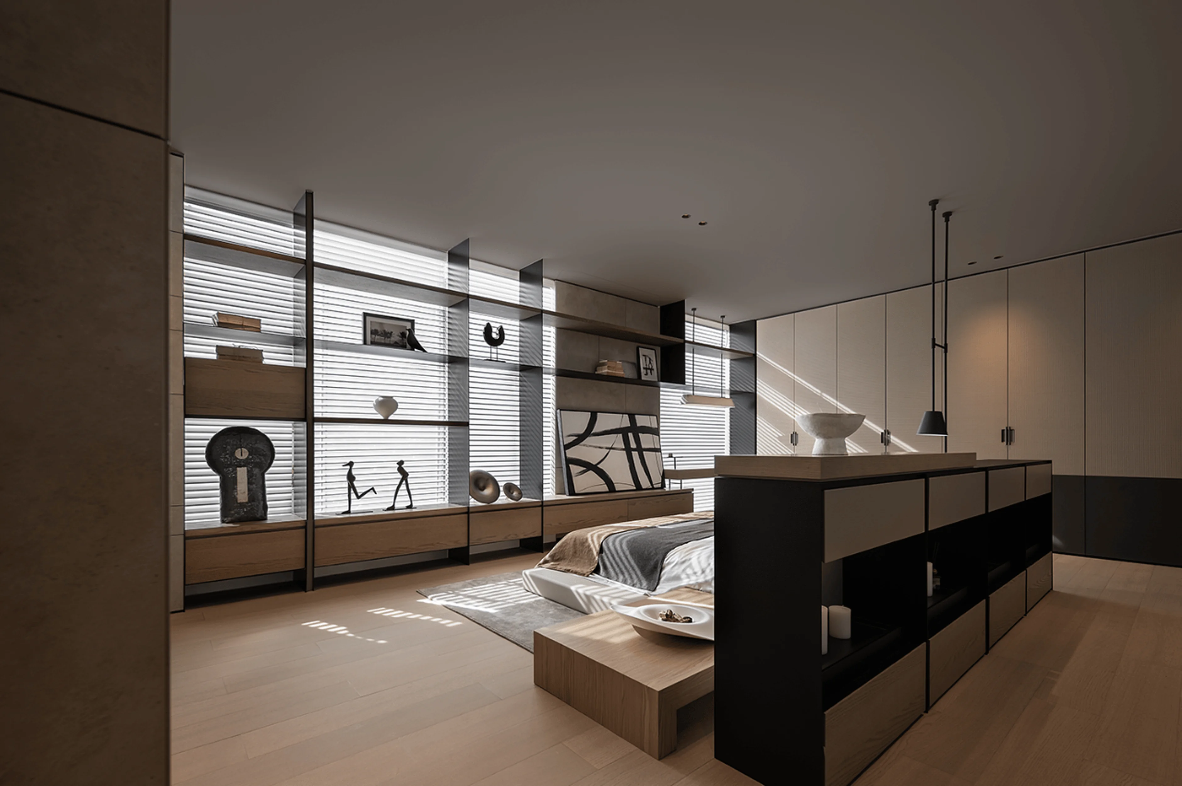
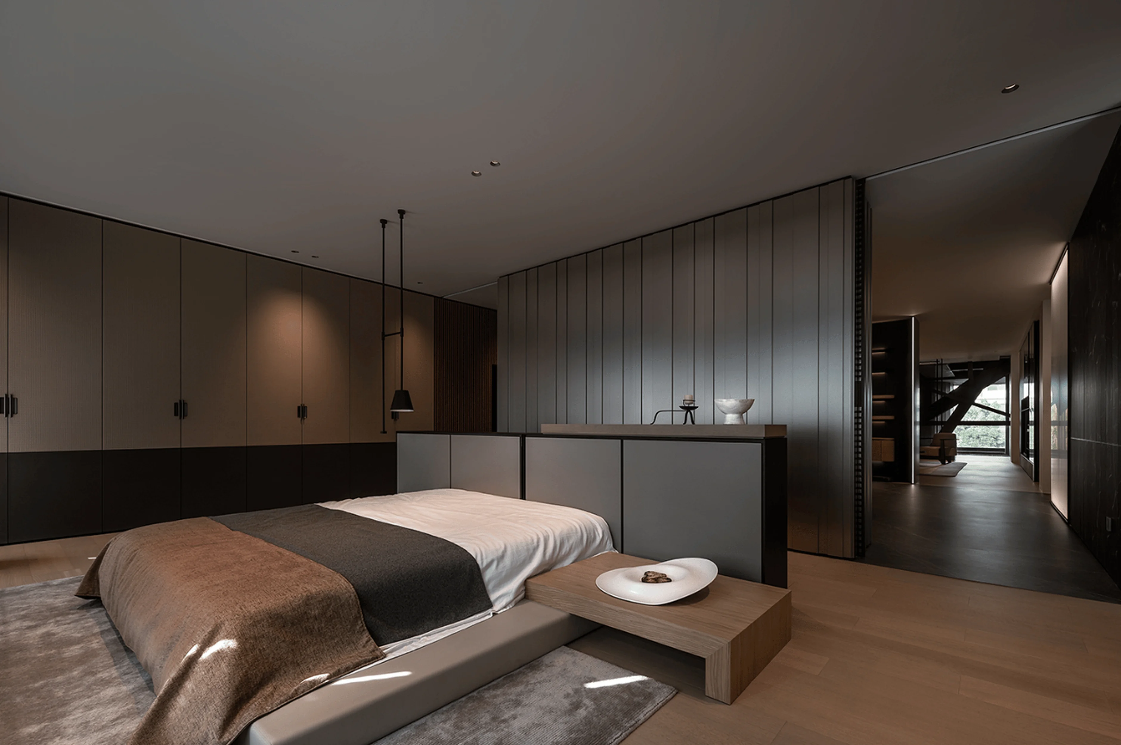
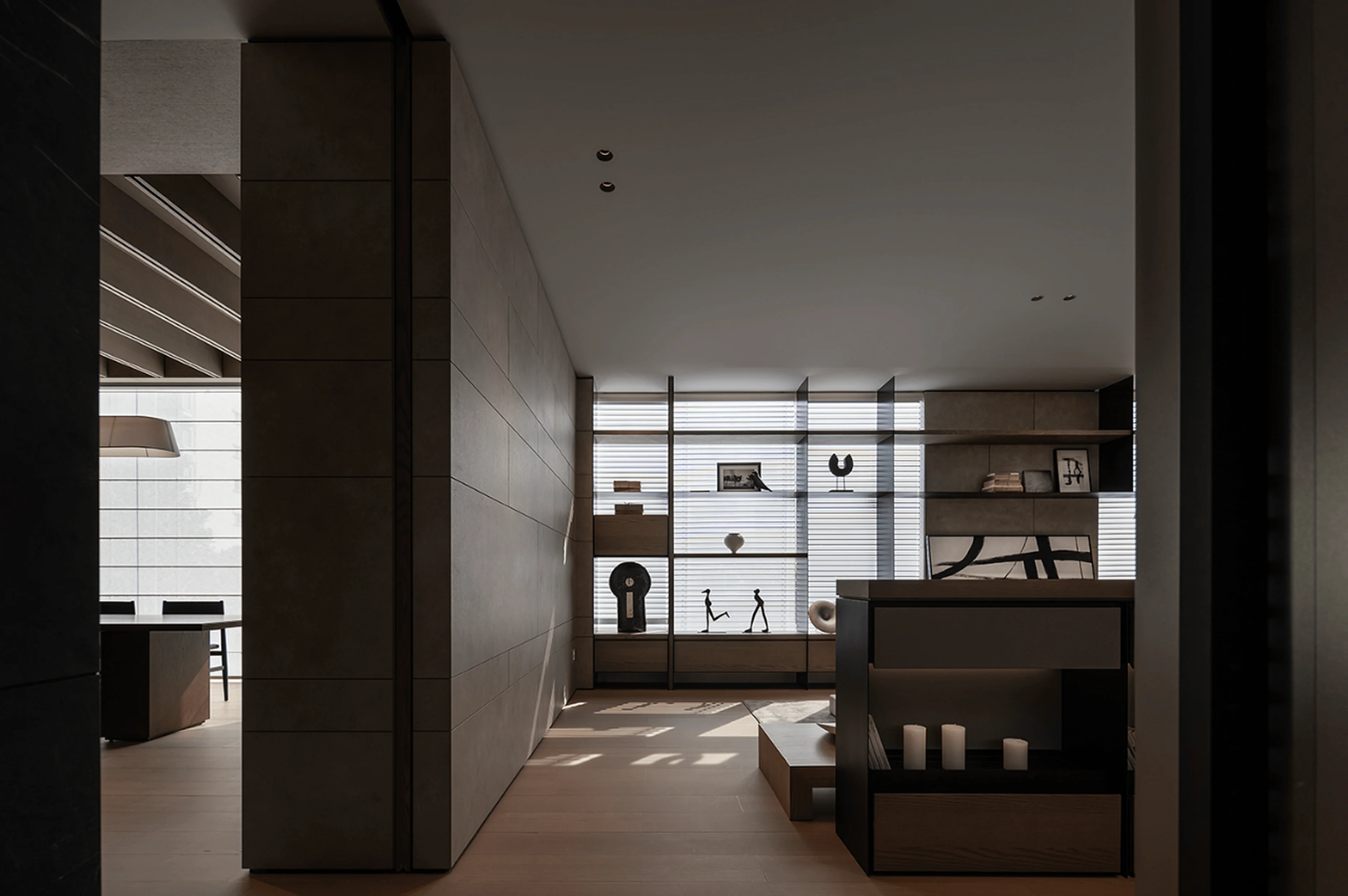
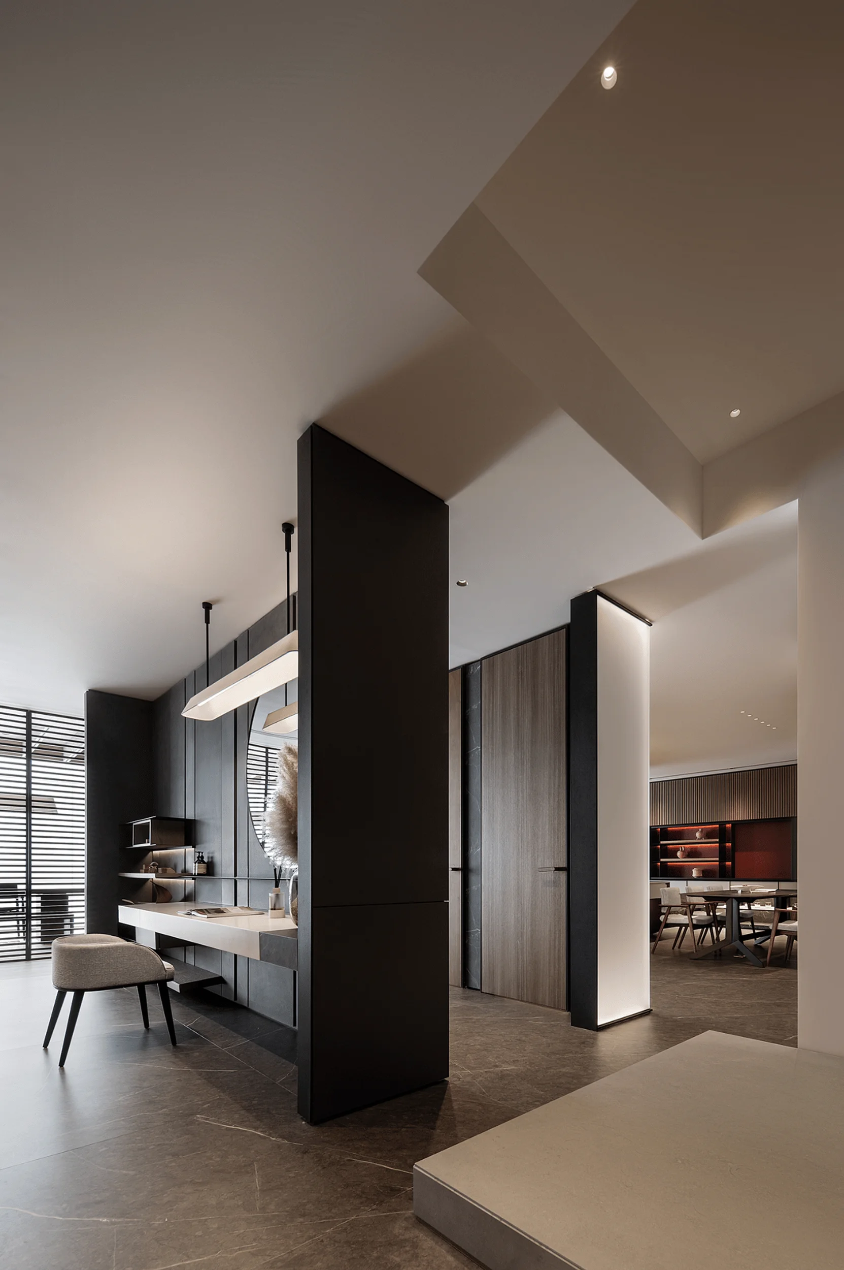
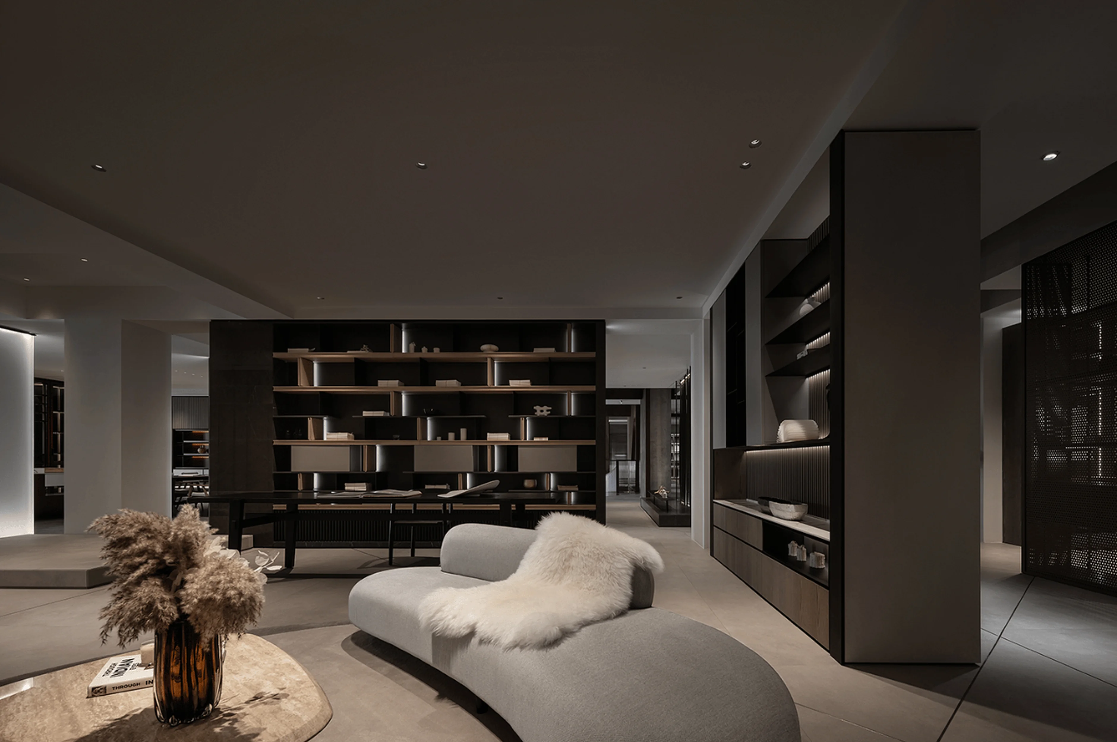
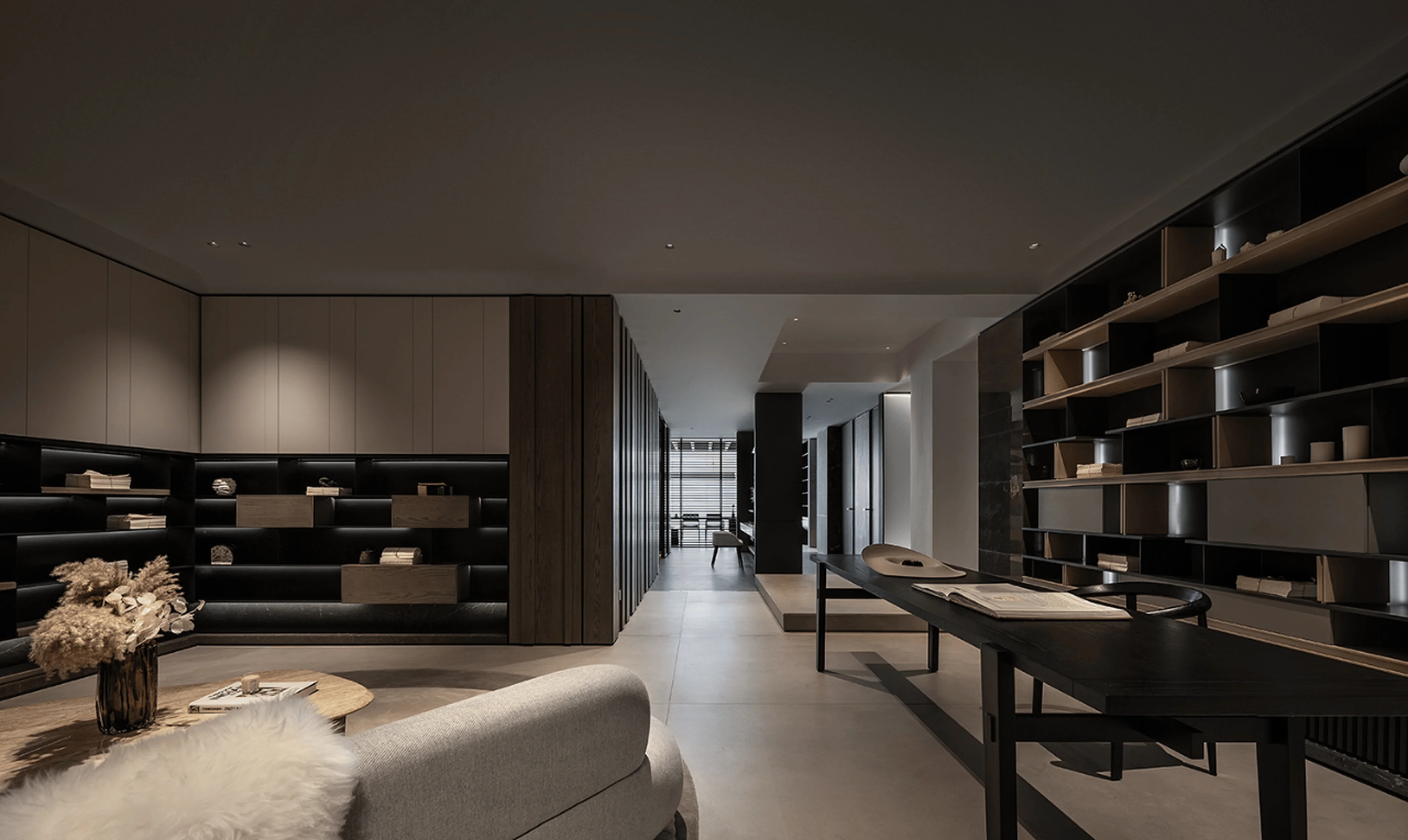
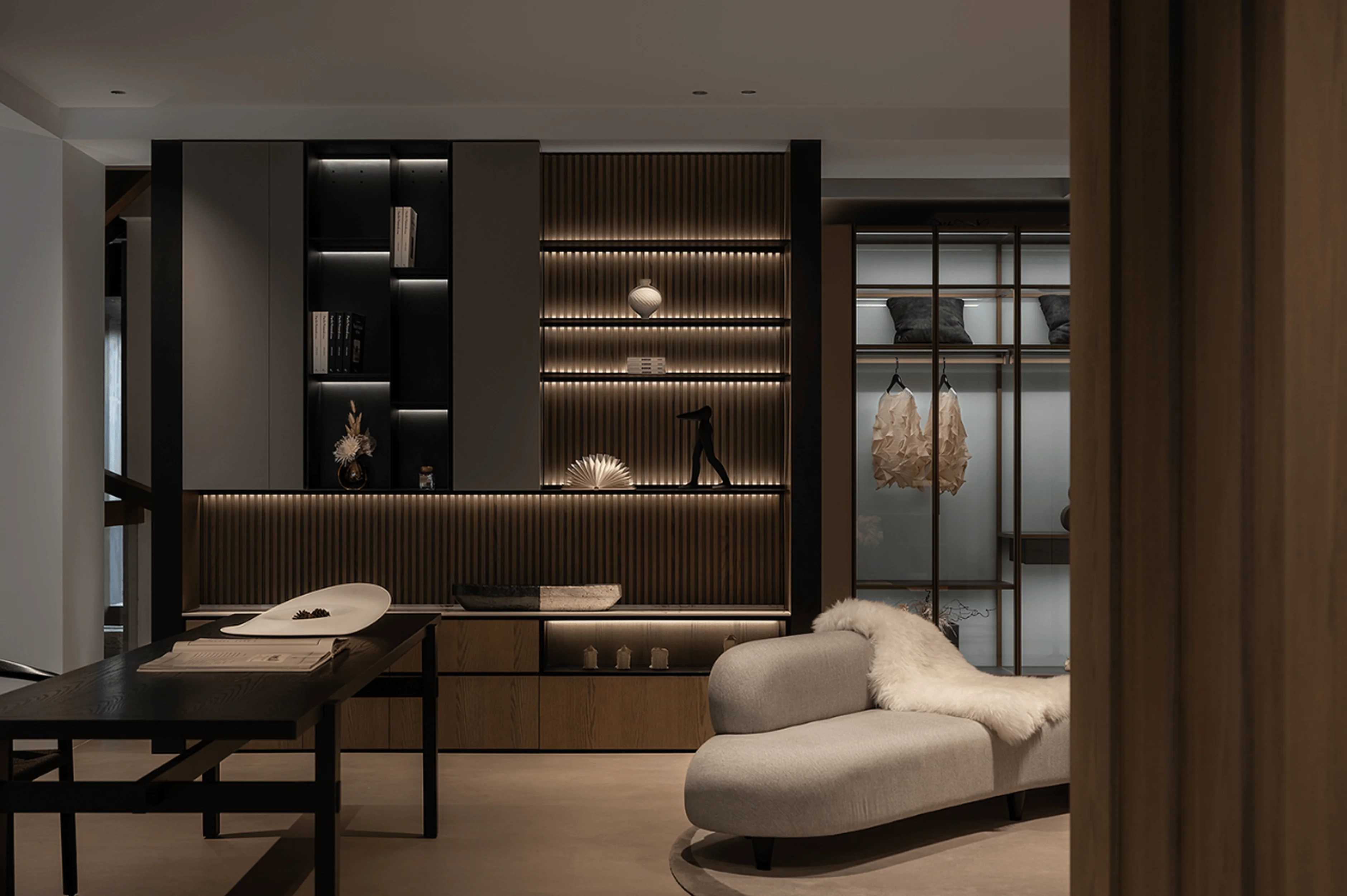
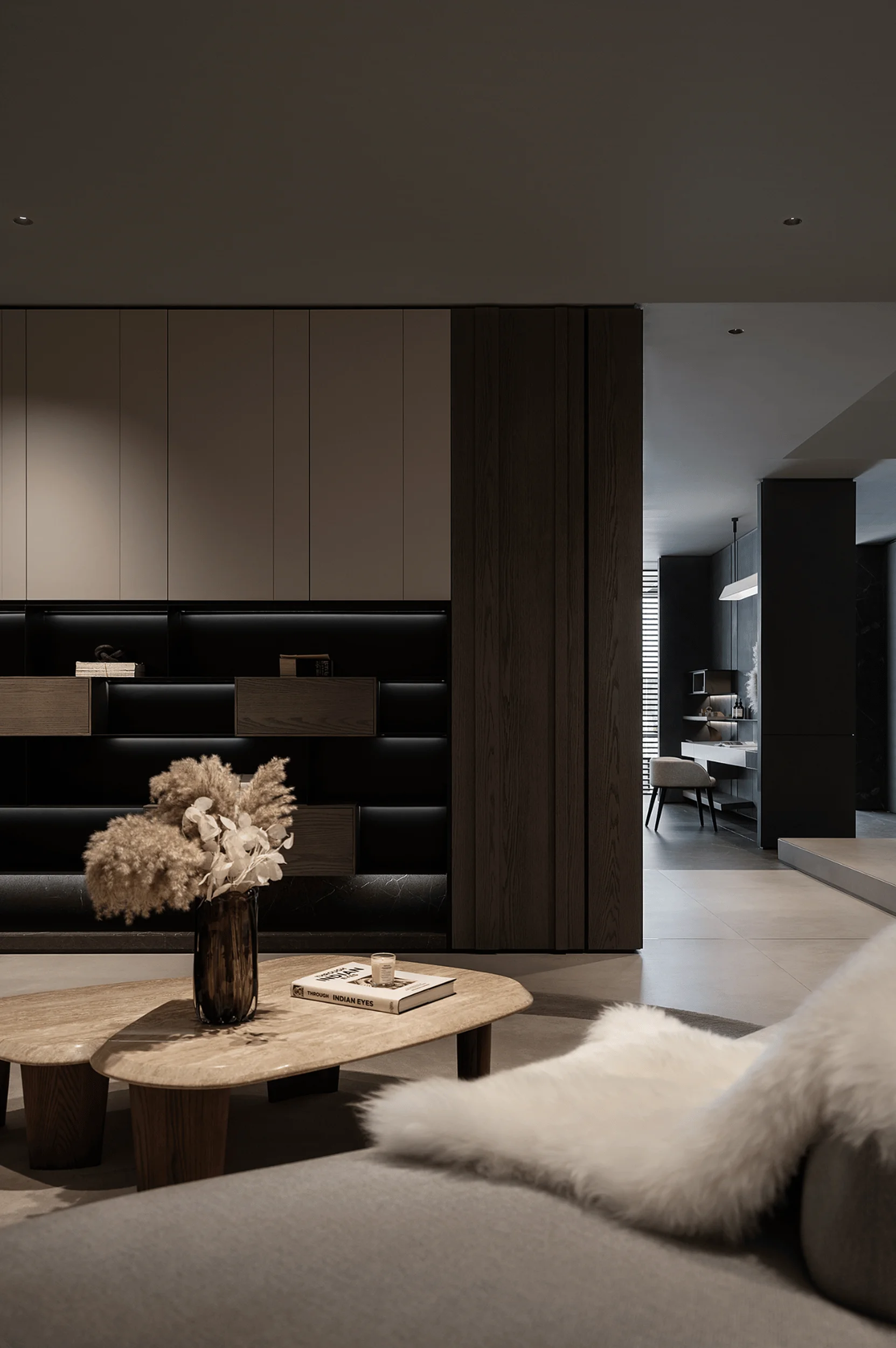
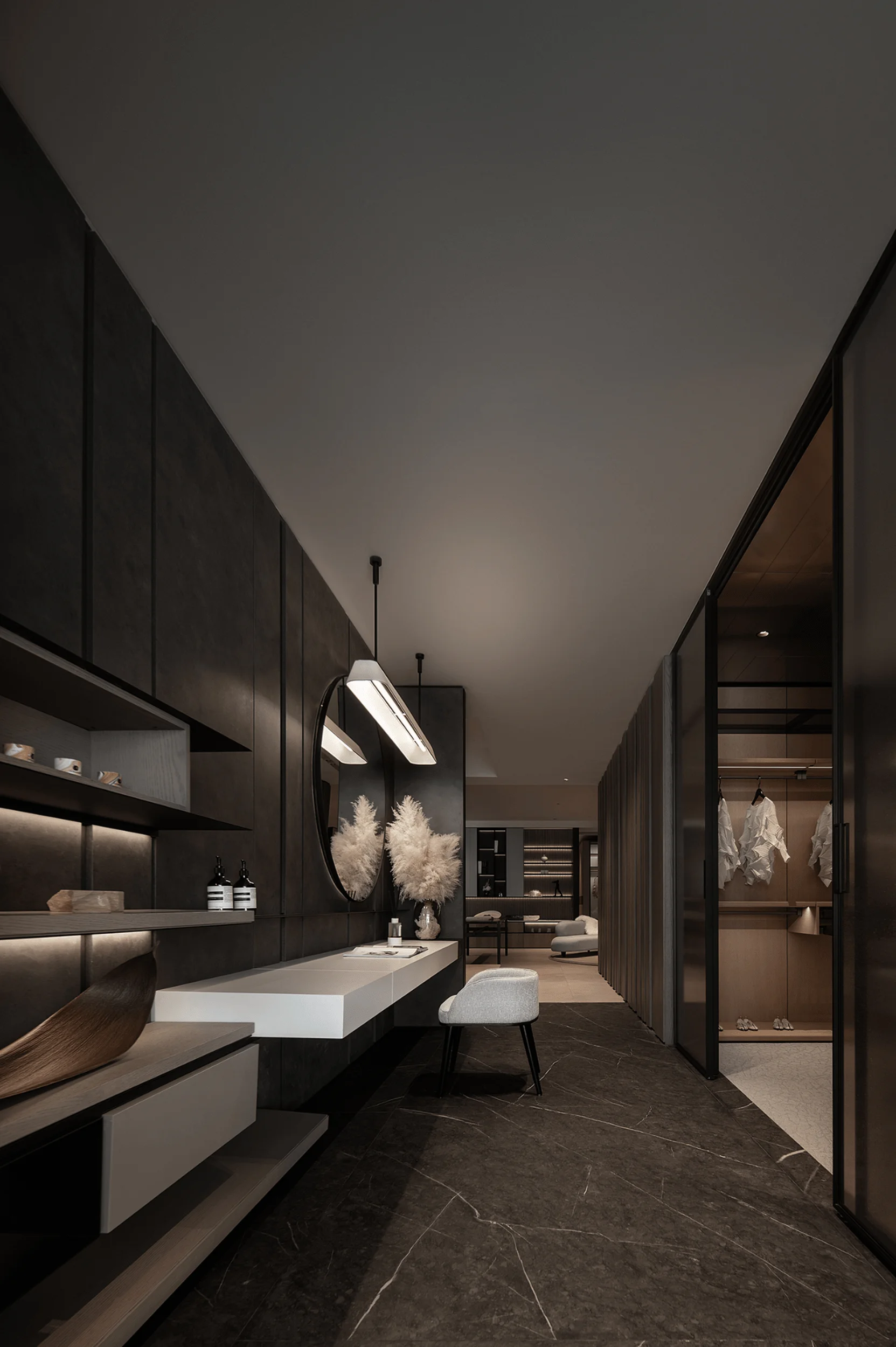
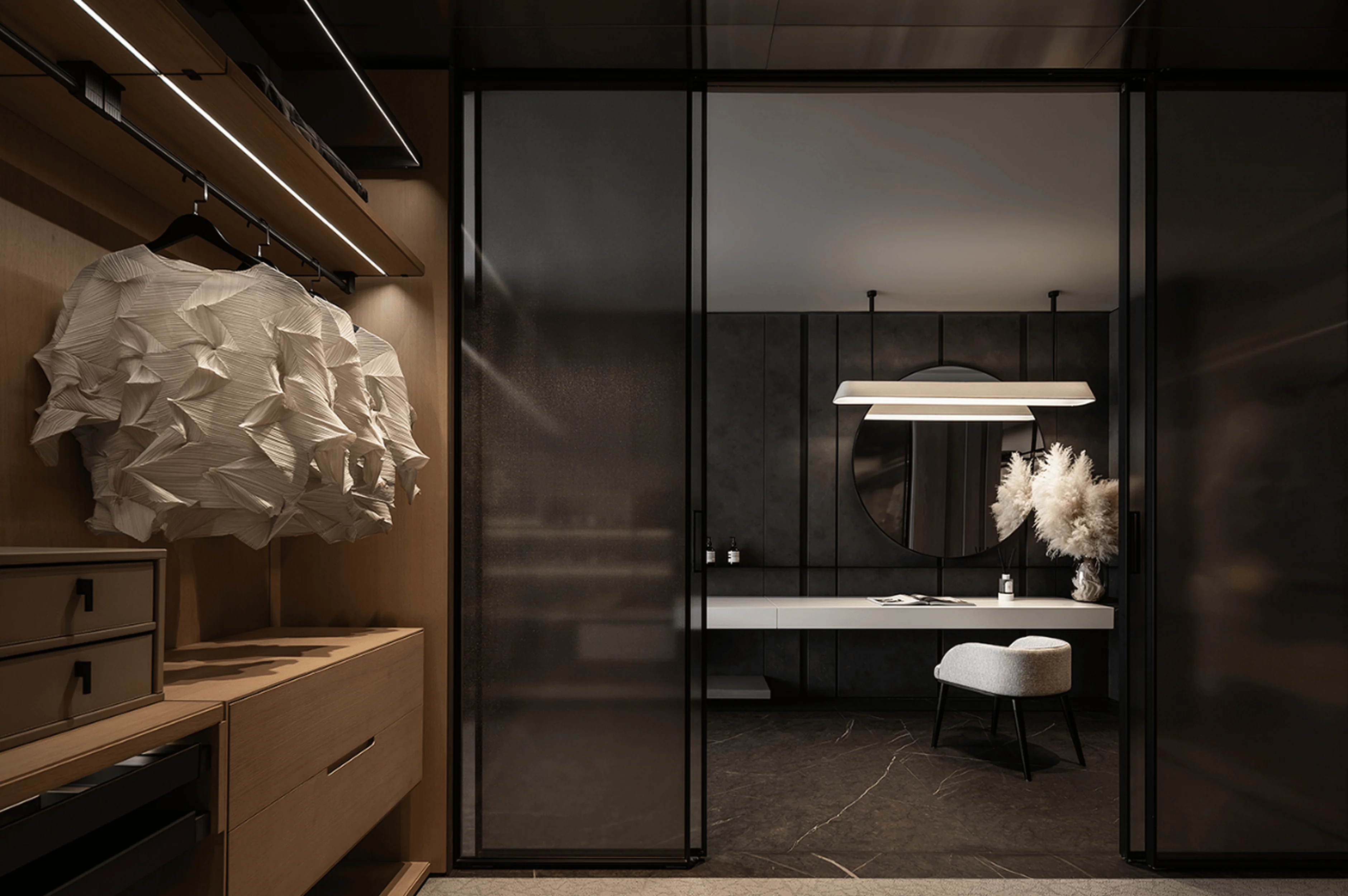
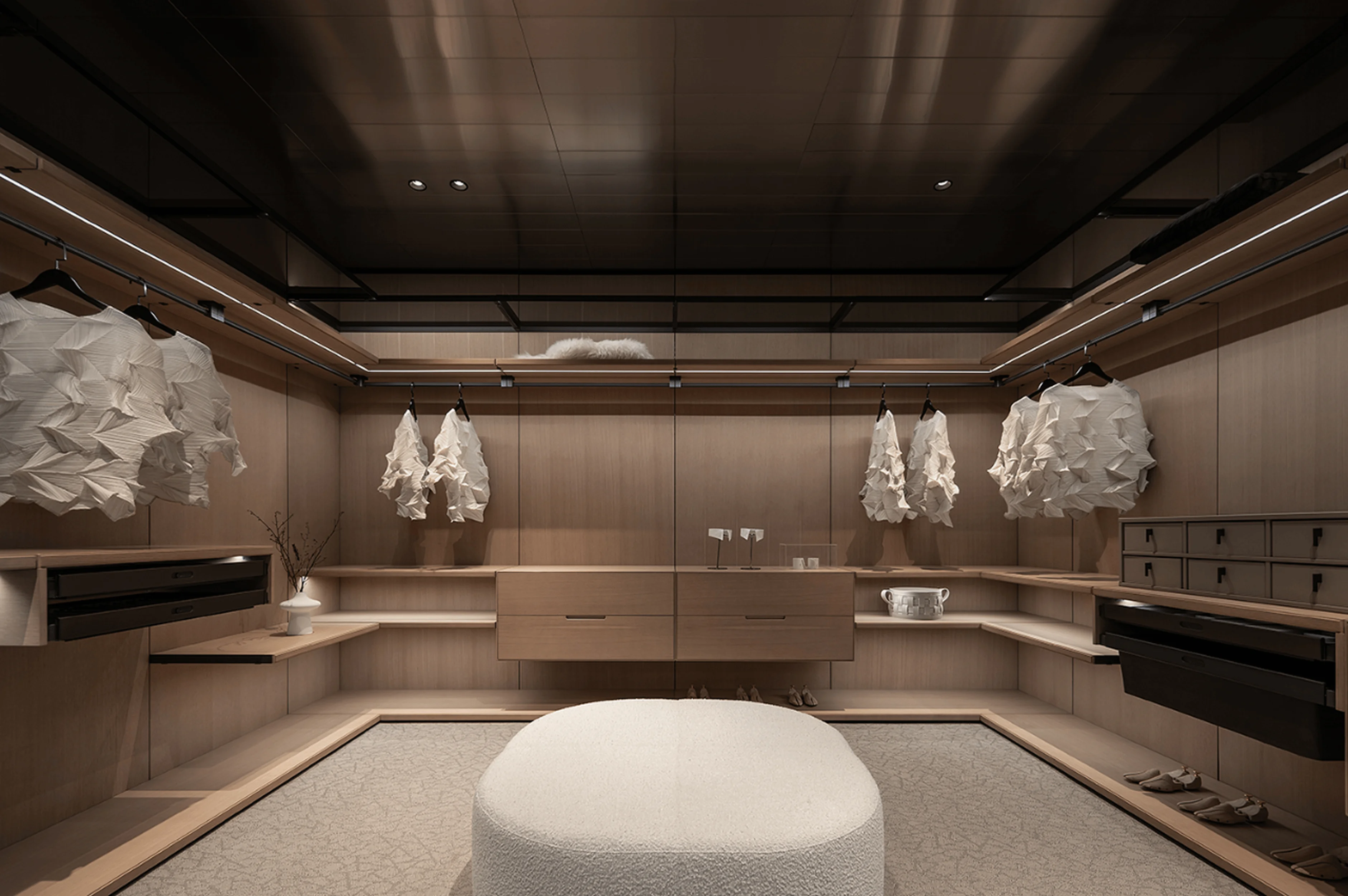
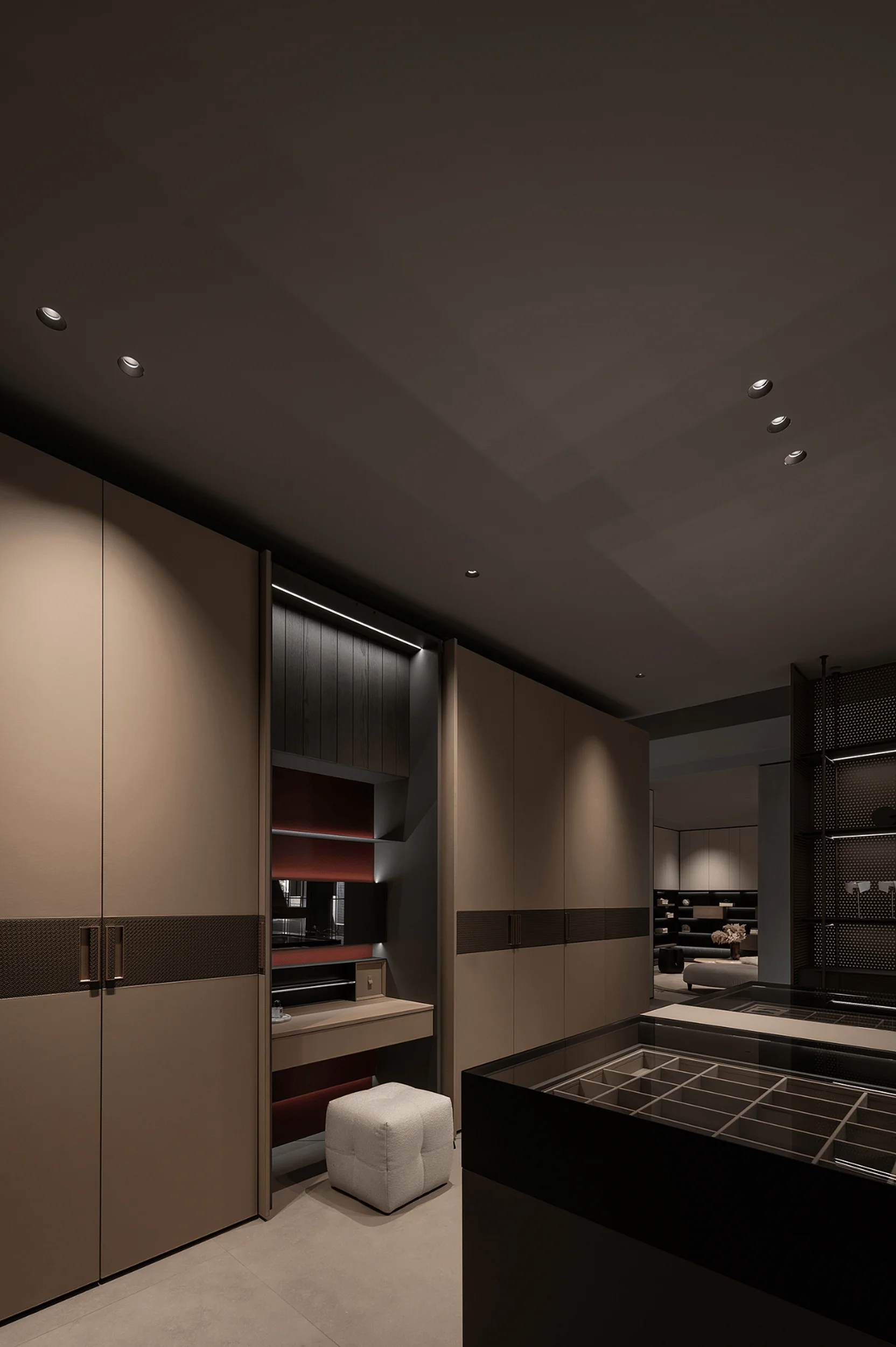
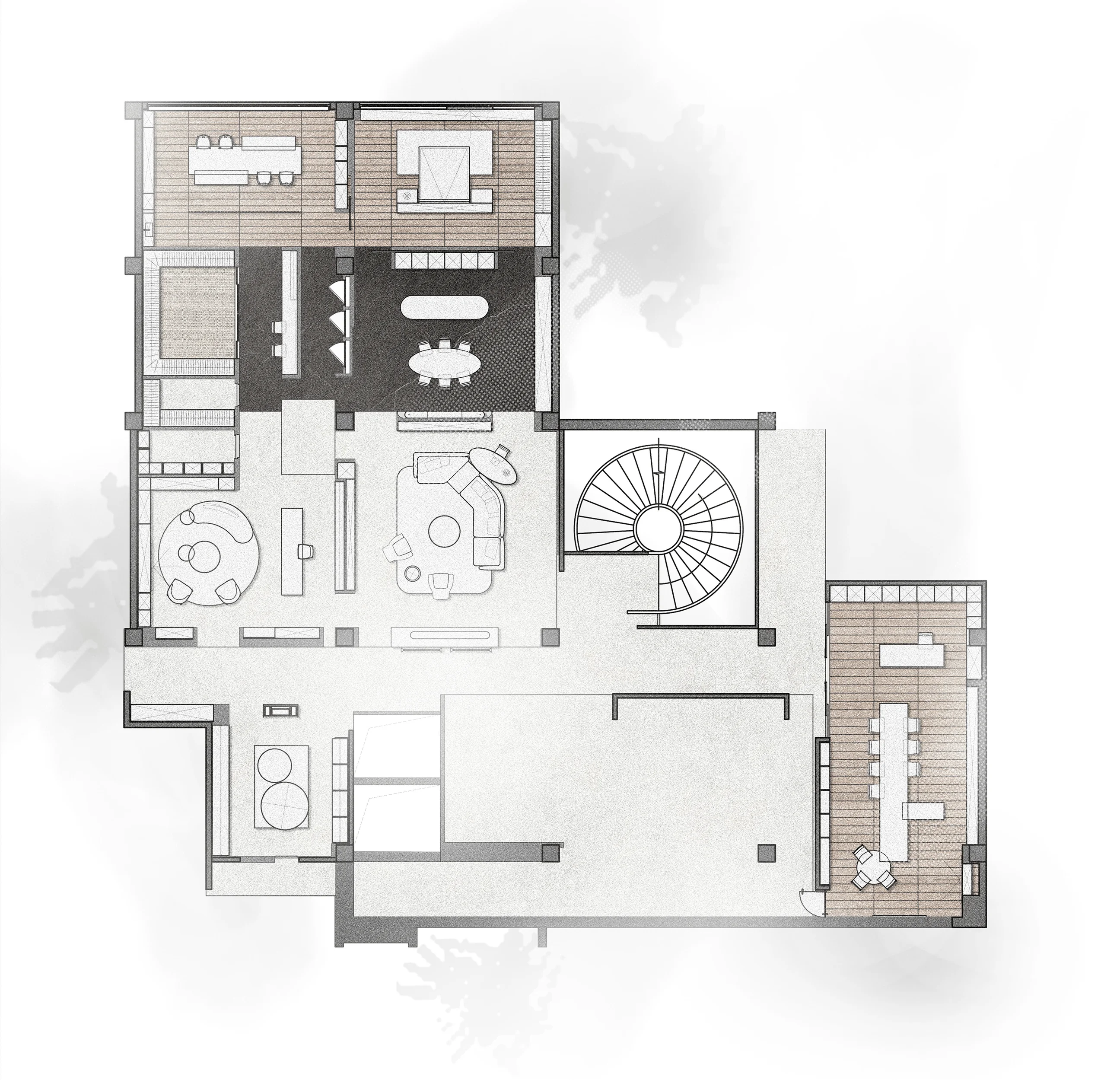
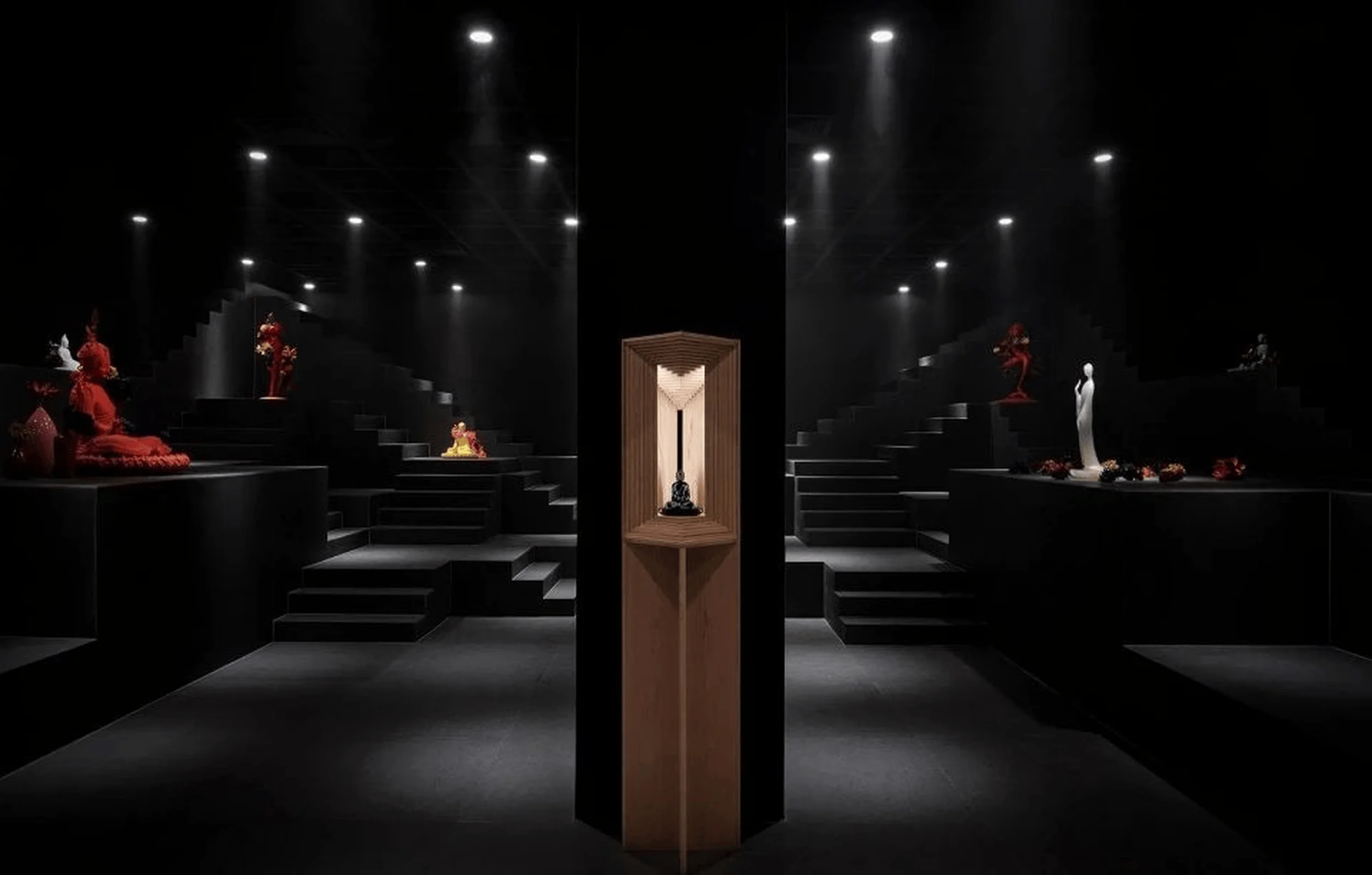
The showroom’s layout has been meticulously designed to highlight the brand’s products and create a fluid and engaging experience for visitors. The space is divided into different zones, each with a distinct function and atmosphere. The living area is an open and welcoming space that facilitates social interaction, acting as a central hub for family gatherings and guest interactions. The spatial flow has been expertly orchestrated to guide movement and ensure a harmonious transition between areas, creating a sense of fluidity and balance. This helps in the creation of separate spaces with different functions while preserving a sense of visual unity. The wall-mounted coatroom provides a functional and private space for storing garments while reinforcing the overall design concept. A careful selection of materials and finishes is used throughout the space, with natural textures, such as wood, enhancing the warm and welcoming ambiance. Metal accents and a subtle color palette create a sophisticated and contemporary feel, enhancing the overall aesthetic. The spatial configuration allows visitors to wander through various sections, each focusing on different aspects of the brand and its product line. A strategic use of light and shadow adds depth and interest to the space, creating a sense of dynamic interplay between elements. The use of light and shadow to create a specific atmosphere is a popular approach in contemporary minimalist interior design and serves to enrich the overall visitor experience. Minimalist interior design and space planning have been used to bring a sense of visual unity and consistency.
Exterior Design and Aesthetics
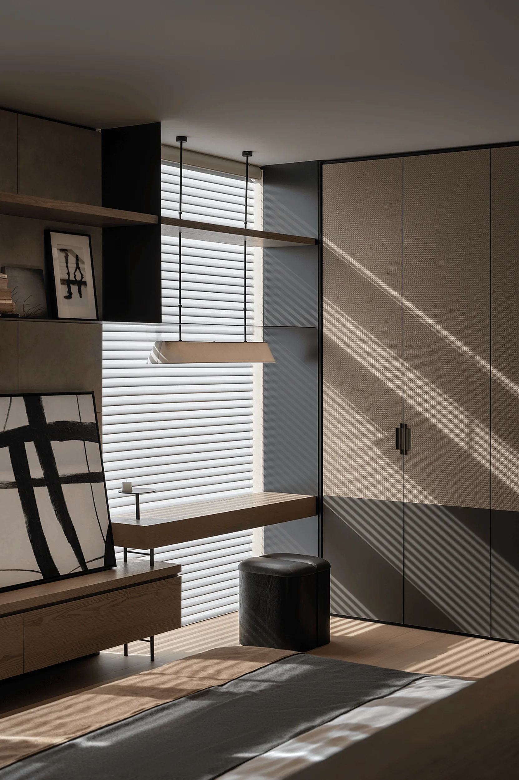
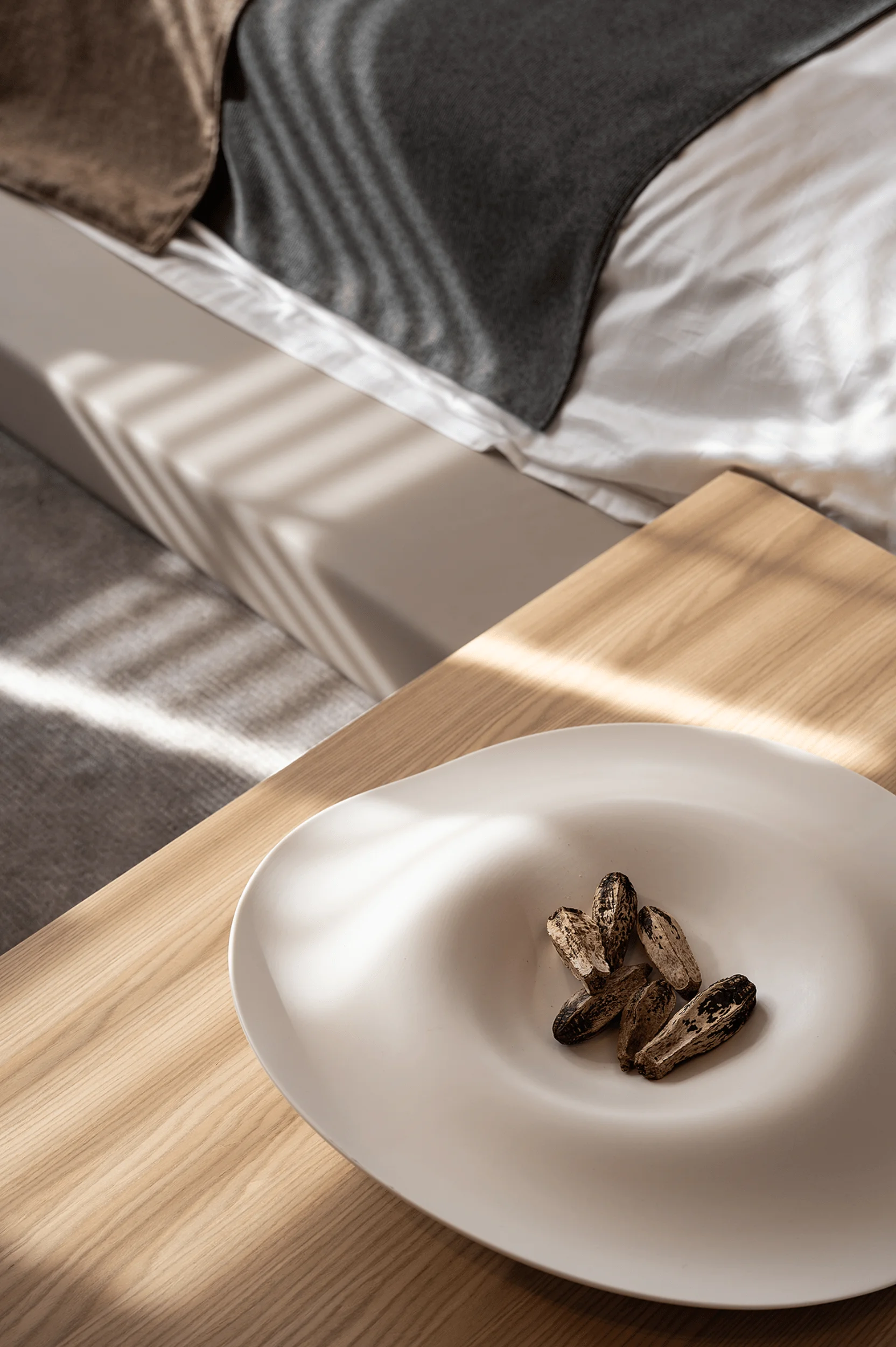
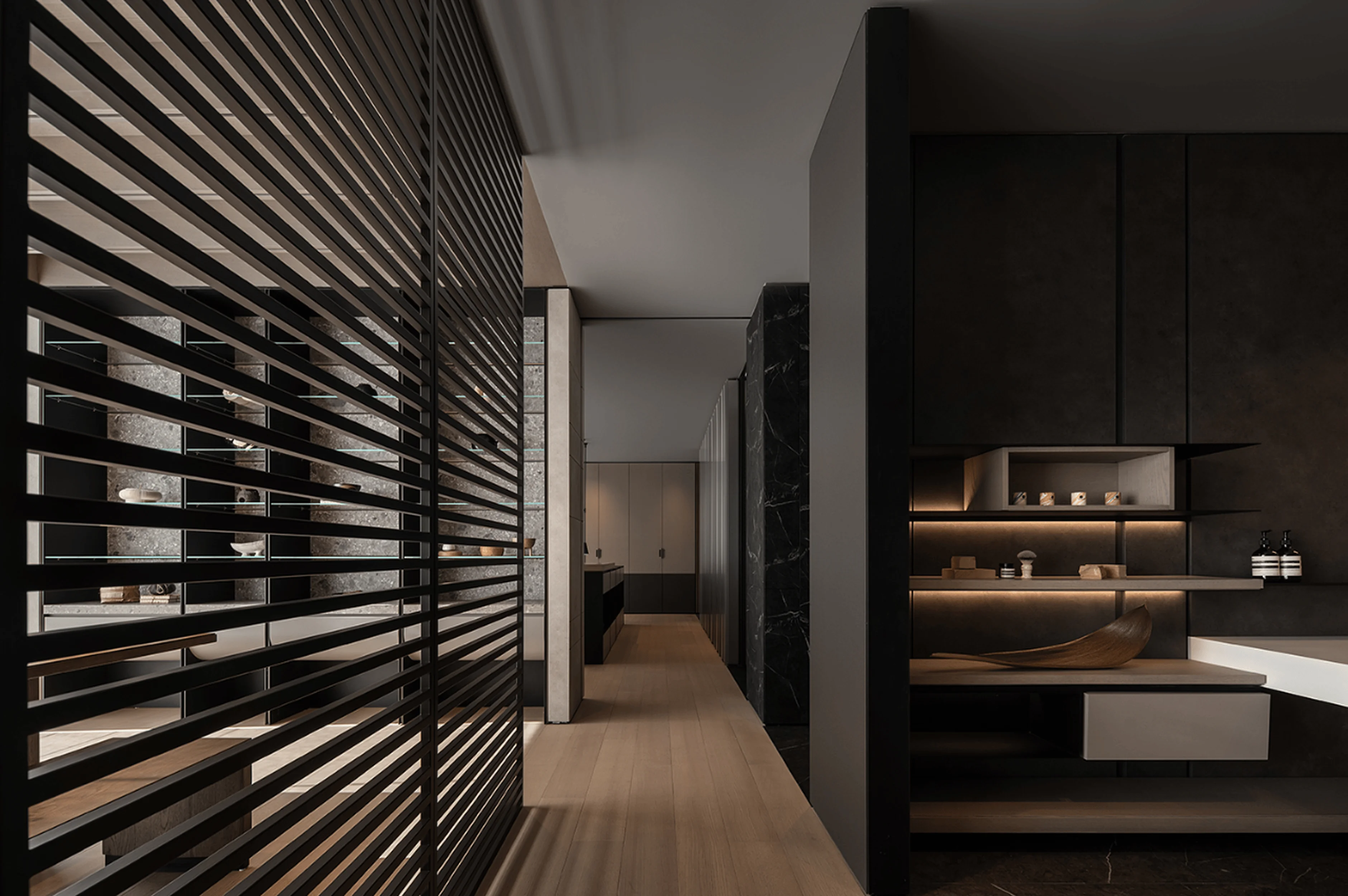
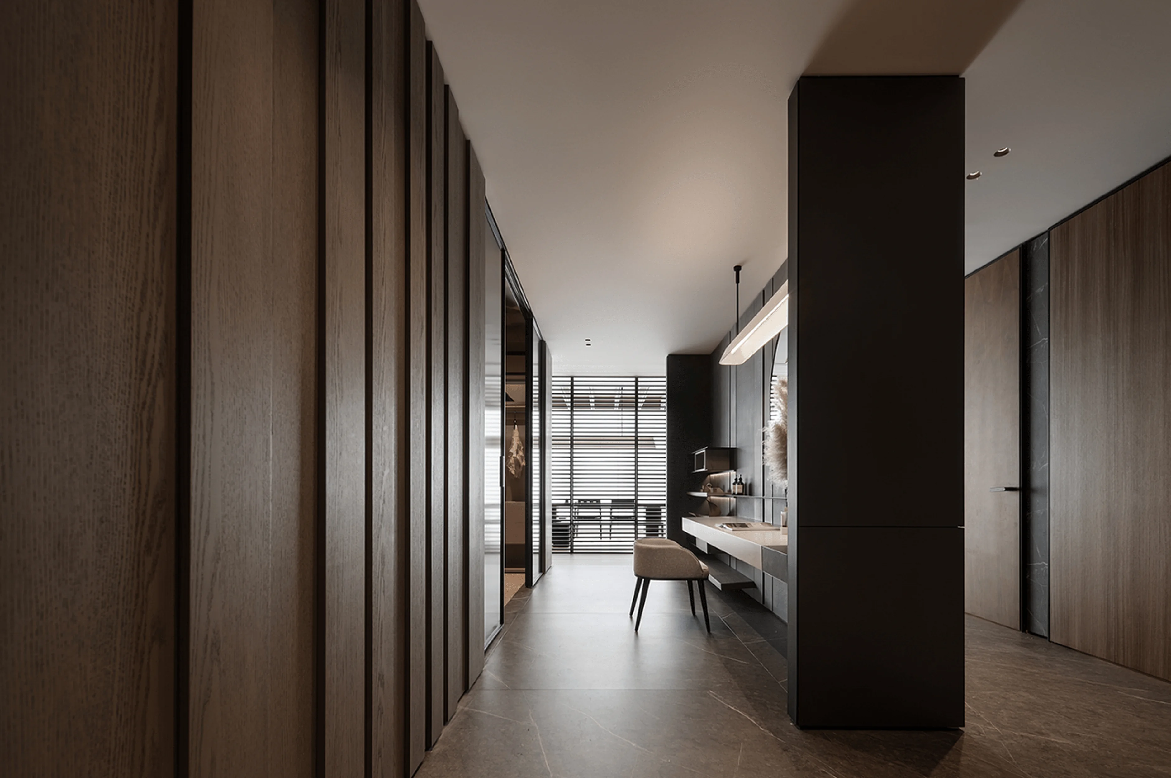
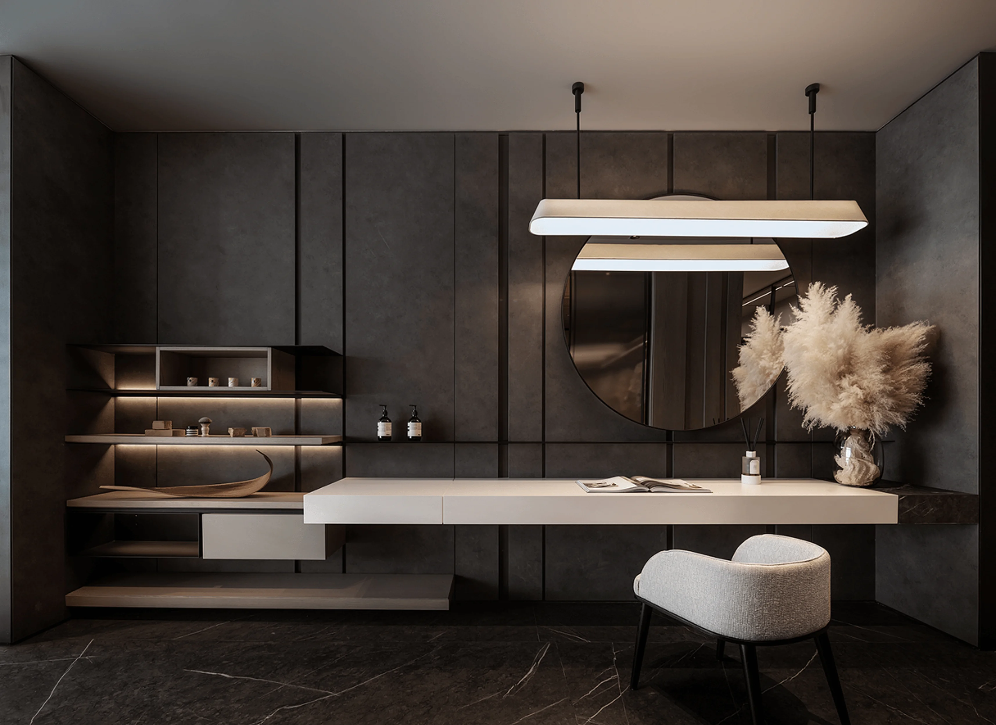
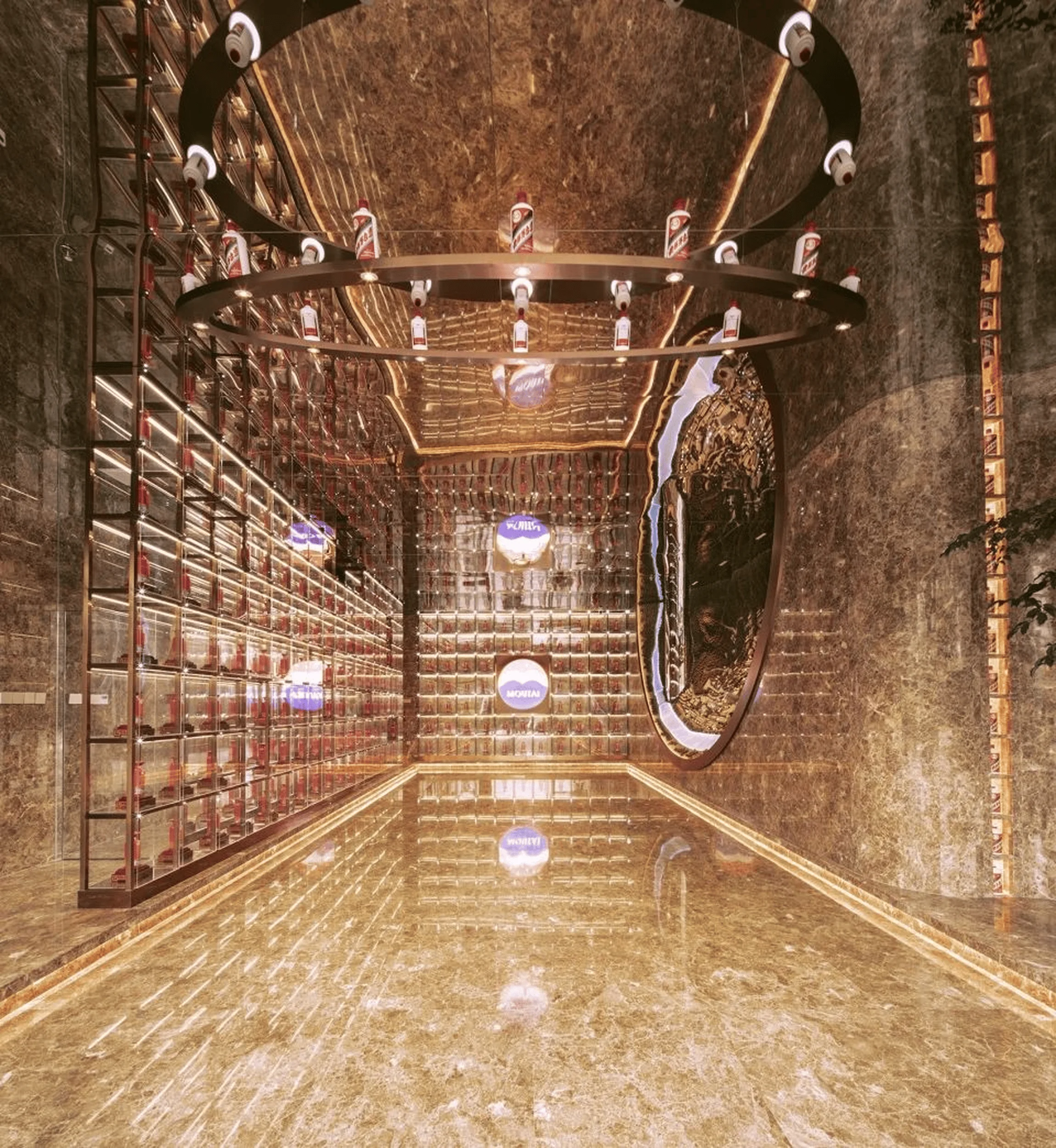
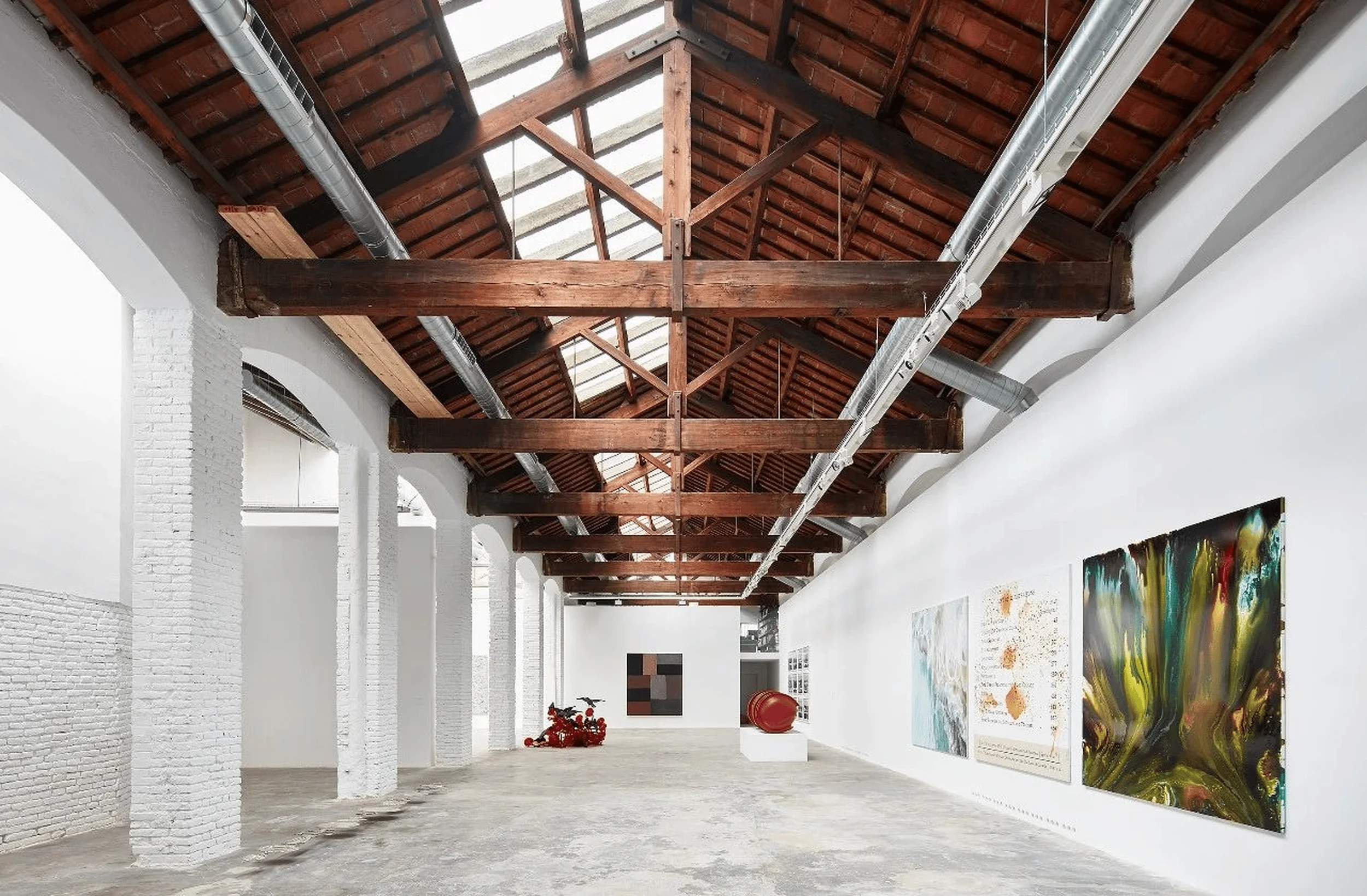
The showroom’s aesthetics are strongly influenced by the minimalist design philosophy. The clean lines and simple forms create a sense of order and harmony within the space. Natural materials, such as wood, are utilized extensively, complementing the black metal accents that provide a contemporary edge. The combination of wood and metal creates a dynamic interplay of textures and colors, creating a sophisticated and visually captivating interior. The walls feature a vertical striped pattern, which subtly extends the space’s visual depth and adds a contemporary touch. Clean lines and color pairings define the overall design, resulting in a stylish and refined environment. The lighting plays a key role in enhancing the spatial experience, creating a warm and inviting atmosphere. The natural light pouring in enhances the overall beauty of the interior. Careful consideration has been given to the arrangement of furniture and other objects within the space to ensure visual balance and functionality. The light and shadow effects that dance across the floor and furniture add an artistic touch and dynamic quality to the room. In a minimalist interior design scheme, light and shadow effects can be used to create a sense of movement and visual interest. Minimalist interior design uses muted color palettes to create a calm and serene ambiance in the space.
Material Choices and Sustainability
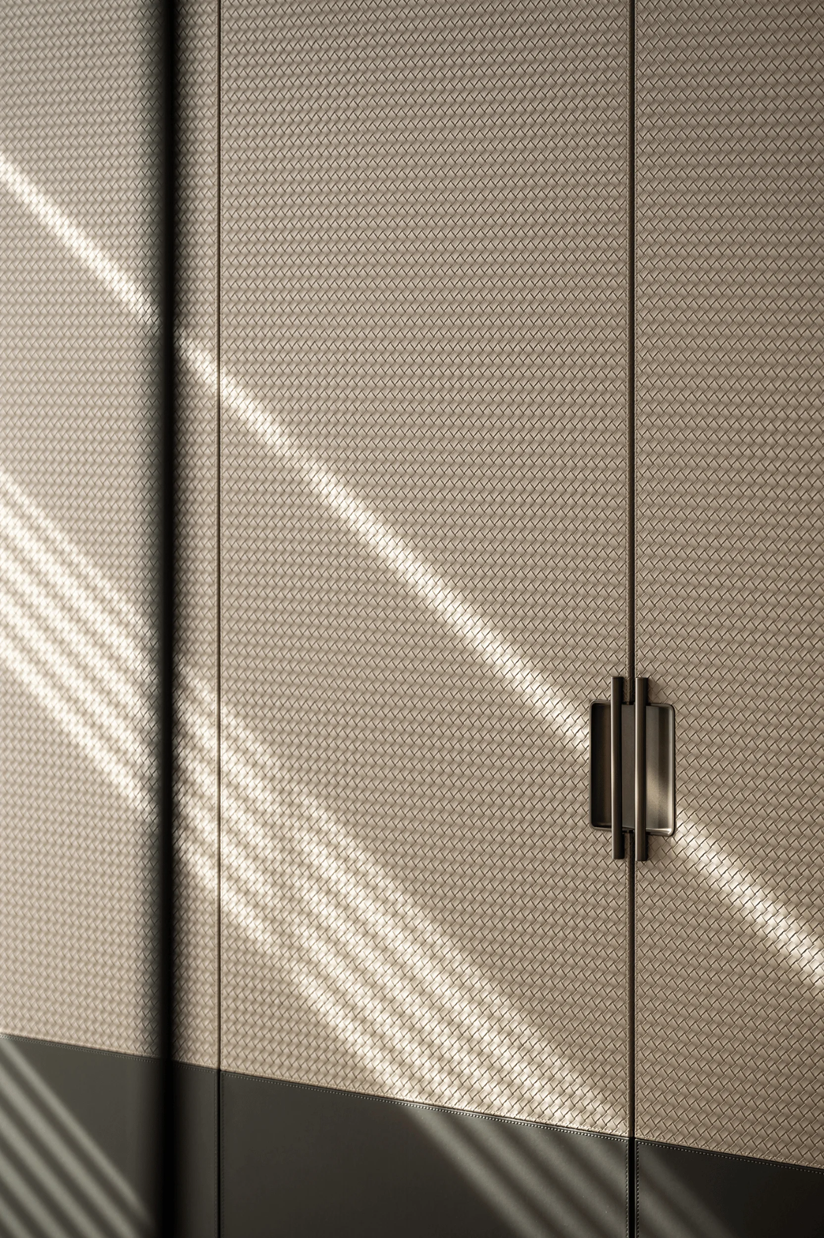
The selection of materials is integral to the overall design. A minimalist aesthetic is often complemented by a palette of natural materials. The design team has carefully selected black metal materials for their ability to add a contemporary edge to the overall aesthetic. The richness and depth of the space are enhanced by this choice, which contrasts with the warmth of the wooden accents used throughout the showroom. This balanced interplay of materials elevates the spatial experience, lending depth and detail. The use of wood not only complements the black metal elements but also adds a touch of warmth to the interiors. The interplay of textures is crucial in achieving a balanced design in a minimalist interior design scheme. This use of natural wood adds warmth and texture to the scheme. The application of geometric lines and surfaces within the design is another notable feature. The designers have skillfully incorporated wooden materials and beige and white-lacquered panels to infuse a sense of calm and tranquility into the reception area. This integration of diverse elements contributes to the space’s overall sophistication and unique personality. This subtle combination of materials creates a visually captivating and elegant ambiance within the space. Sustainable design choices are also reflected in material selection. Minimalist interior design often uses sustainable materials to reduce its environmental impact.
Social and Cultural Impact
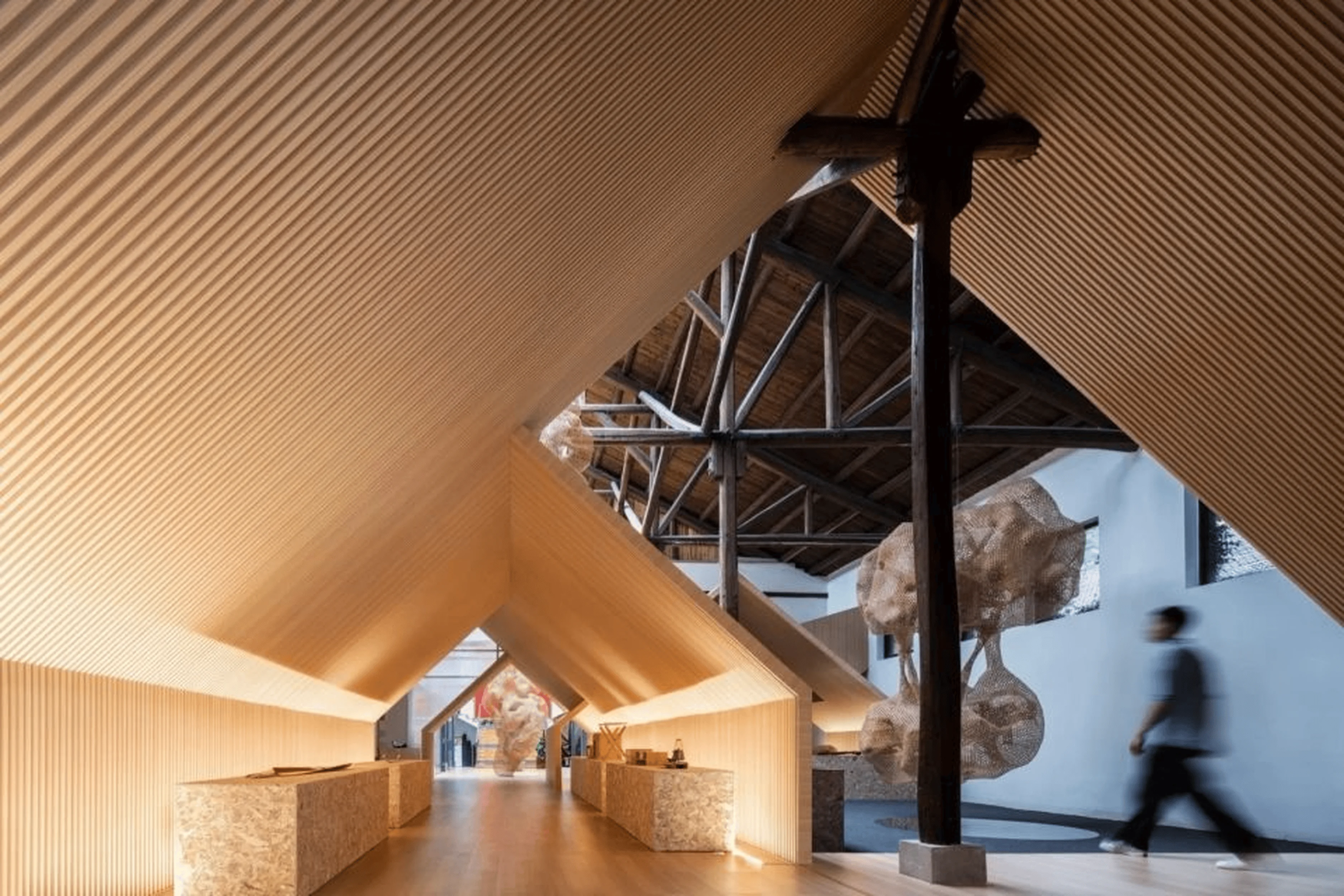
The Suzhou Between the Original Showroom serves as a platform to showcase the brand’s commitment to regional culture and design excellence. It presents a modern interpretation of traditional Jiangnan architectural features, creating a unique space that honors Suzhou’s heritage while embracing contemporary design principles. The fusion of tradition and modernity elevates the design to a new level, fostering a deeper appreciation for the cultural heritage and promoting a broader understanding of its aesthetic value. The project demonstrates a successful integration of local craftsmanship and design principles, fostering a greater appreciation for the artistic and cultural identity of the region. This creates a sense of place and enhances the visitor experience by providing a connection to the local cultural context. The integration of minimalist interior design within a cultural context can enhance the overall experience for visitors by providing them with a deeper understanding and appreciation of the local culture. Minimalist design, in this particular instance, contributes to the urban landscape by creating a space that is both respectful of its context and innovative in its approach.
Conclusion
The Suzhou Between the Original Showroom is an exceptional example of how minimalist design can elevate a space beyond mere functionality and create a holistic experience. Through a focus on simplicity, harmony, and the integration of regional culture, Near Sense Design has crafted a showroom that is both aesthetically pleasing and conceptually enriching. It effectively showcases the brand’s products and design philosophy while creating a sense of tranquility and visual elegance within a vibrant urban setting. The project highlights the importance of embracing simplicity, as it is not just a design philosophy but a lifestyle that can bring peace, comfort, and a greater appreciation for the beauty of life. The Suzhou Between the Original Showroom demonstrates that minimalist design can be used to create a space that is both functional and aesthetically pleasing, providing a harmonious environment for visitors to experience the brand’s products and design philosophy. Minimalist interior design is a growing trend in the industry, and this project is a great example of how it can be used to create a unique and memorable visitor experience. The project’s success lies in its ability to seamlessly integrate minimalist design principles with a deeper understanding of the cultural context and the brand’s identity. The minimalist interior design approach, inspired by Ludwig Mies van der Rohe’s ‘Less is More’ philosophy, has given birth to a showroom that is both inspiring and functional. The space serves as a testament to how thoughtful design can transform a living environment into a haven of tranquility and visual elegance.
Project Type: Showroom
Architect: Near Sense Design
Area: 370 sqm
Year: 2023
Country: China
Main Materials: Wood, Black Metal, Beige and White Lacquered Panels
Photographer: Shan Ye Space Photography
Designer: TT. Tang


