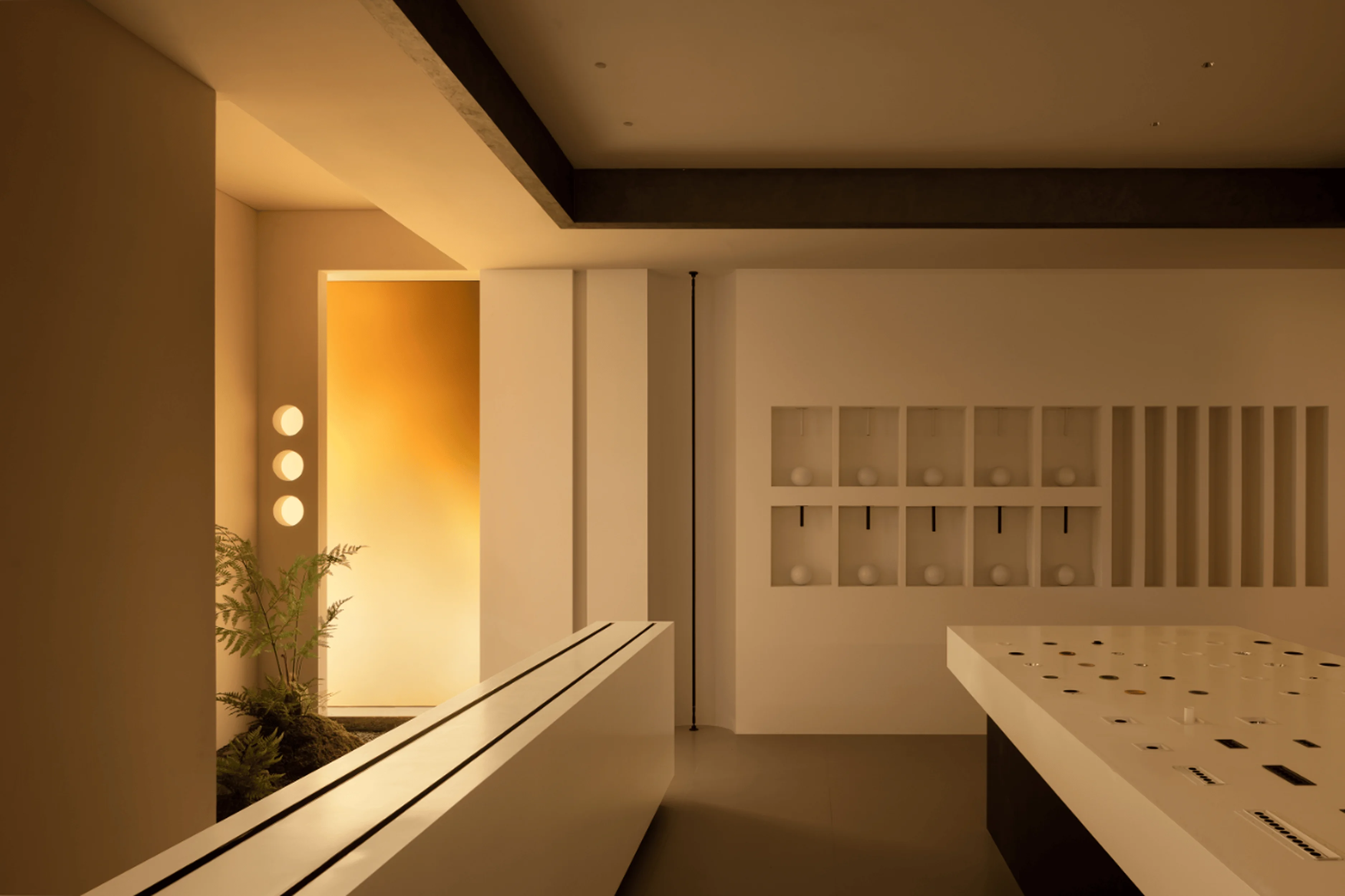
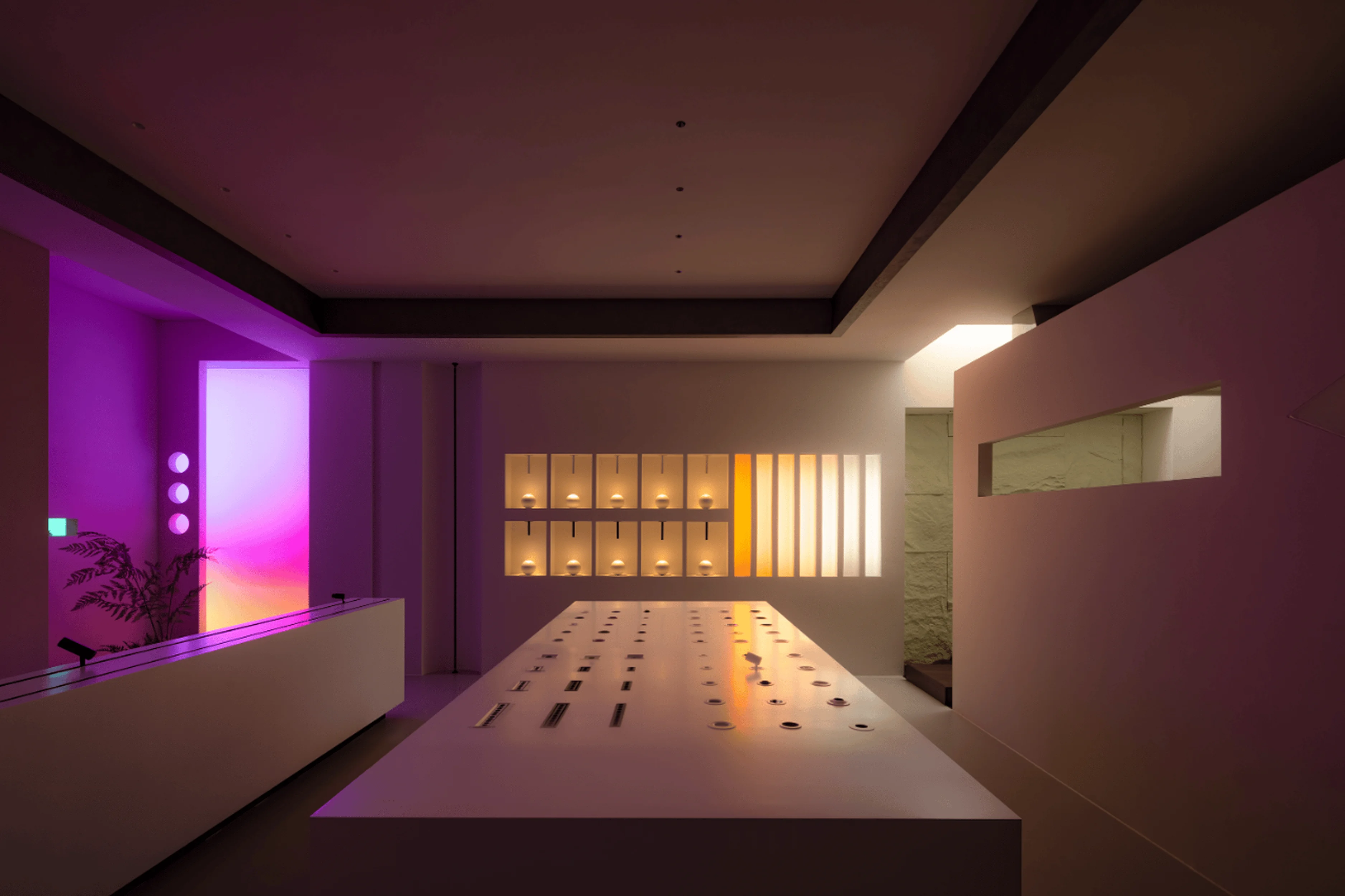
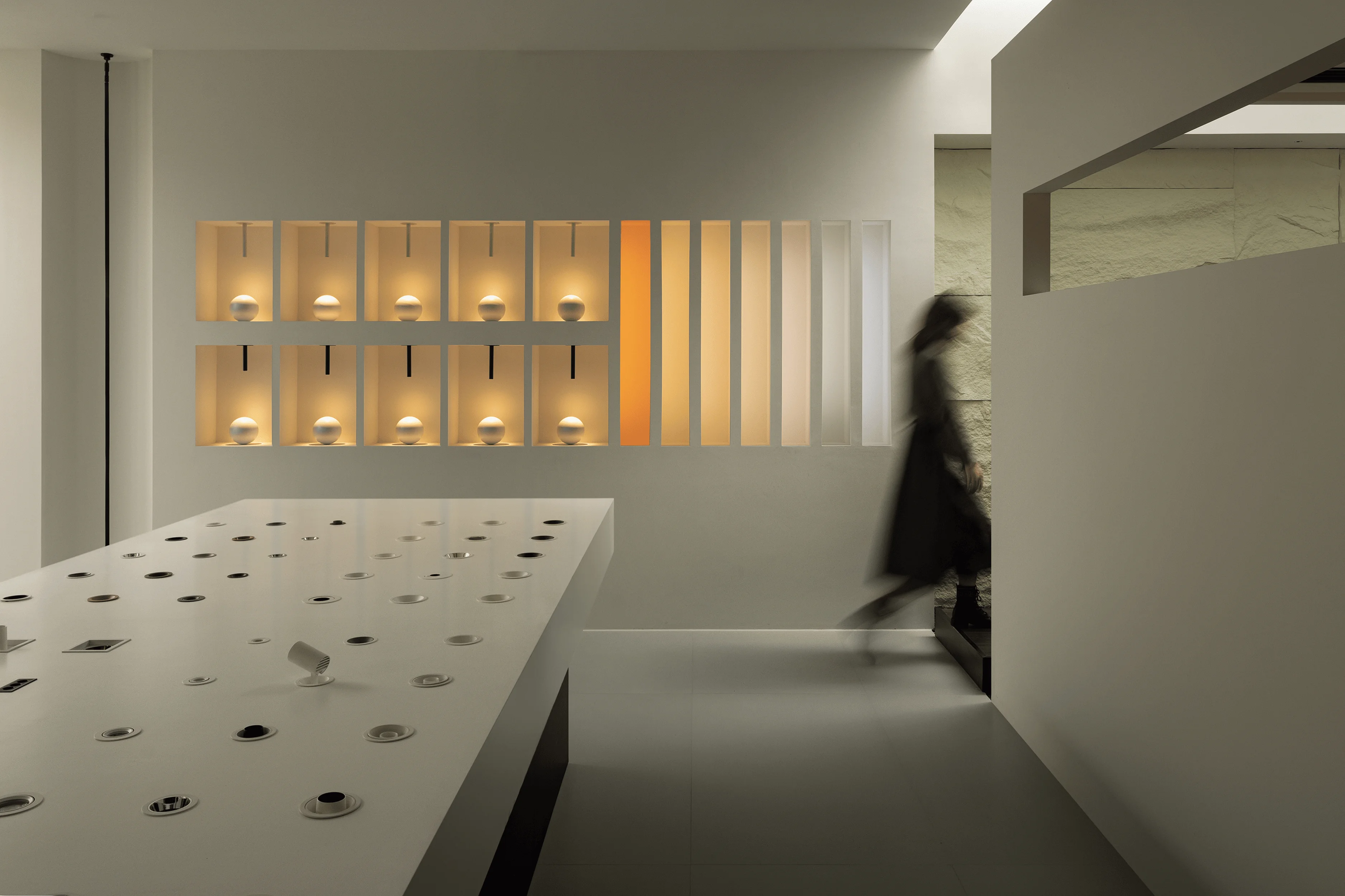
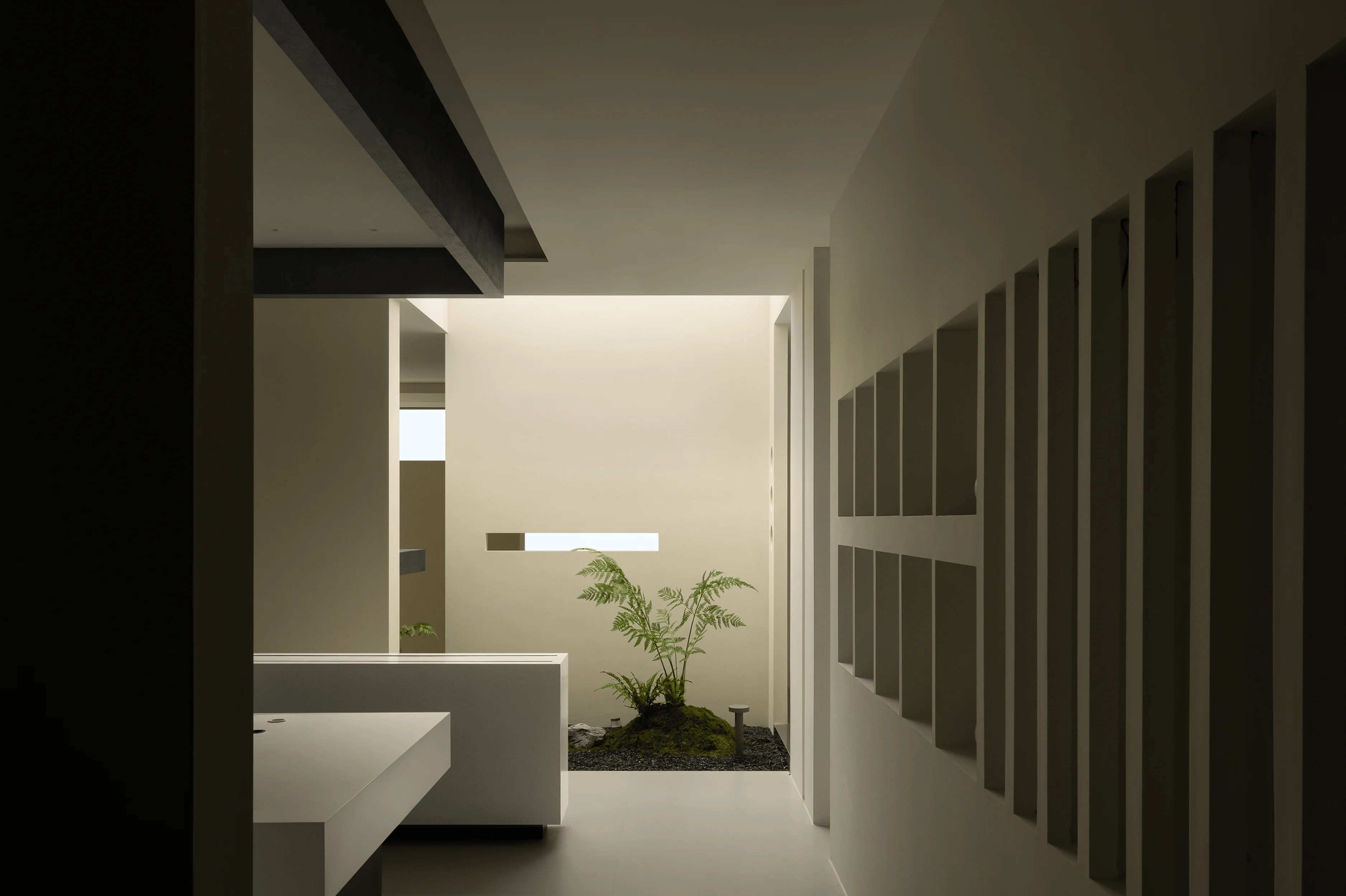
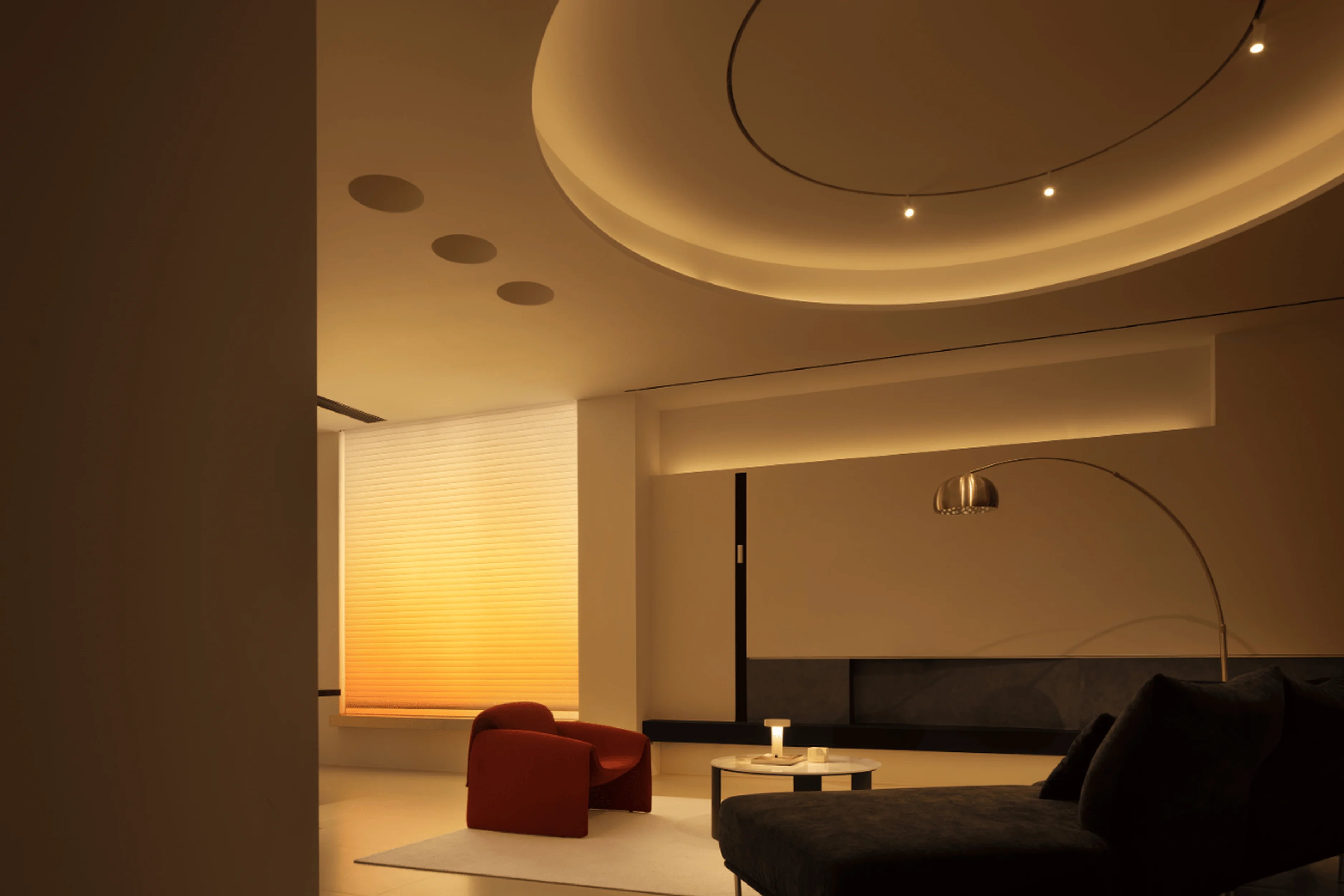
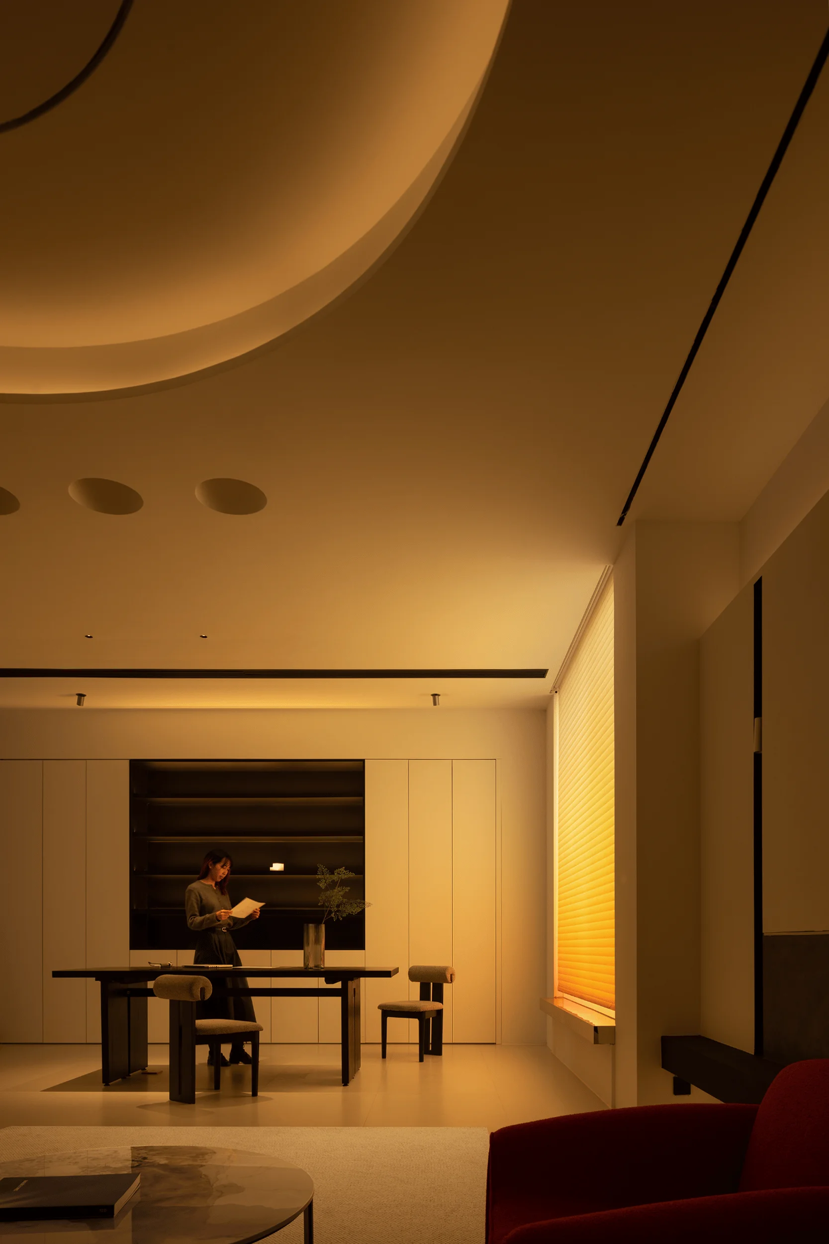
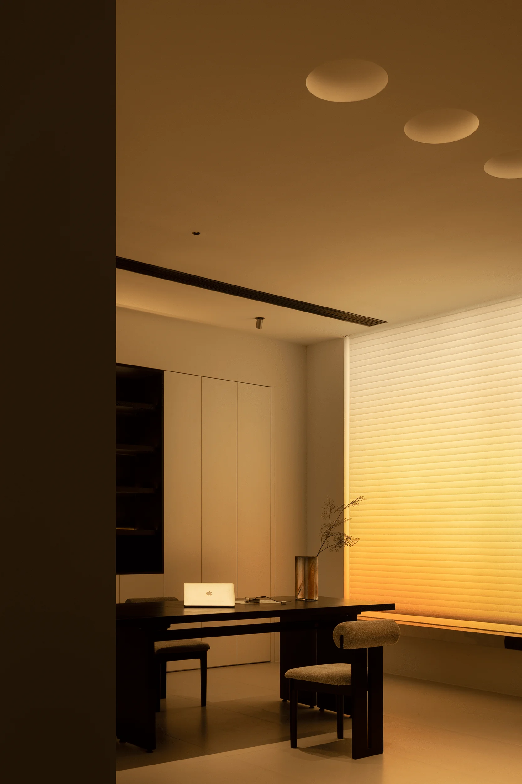
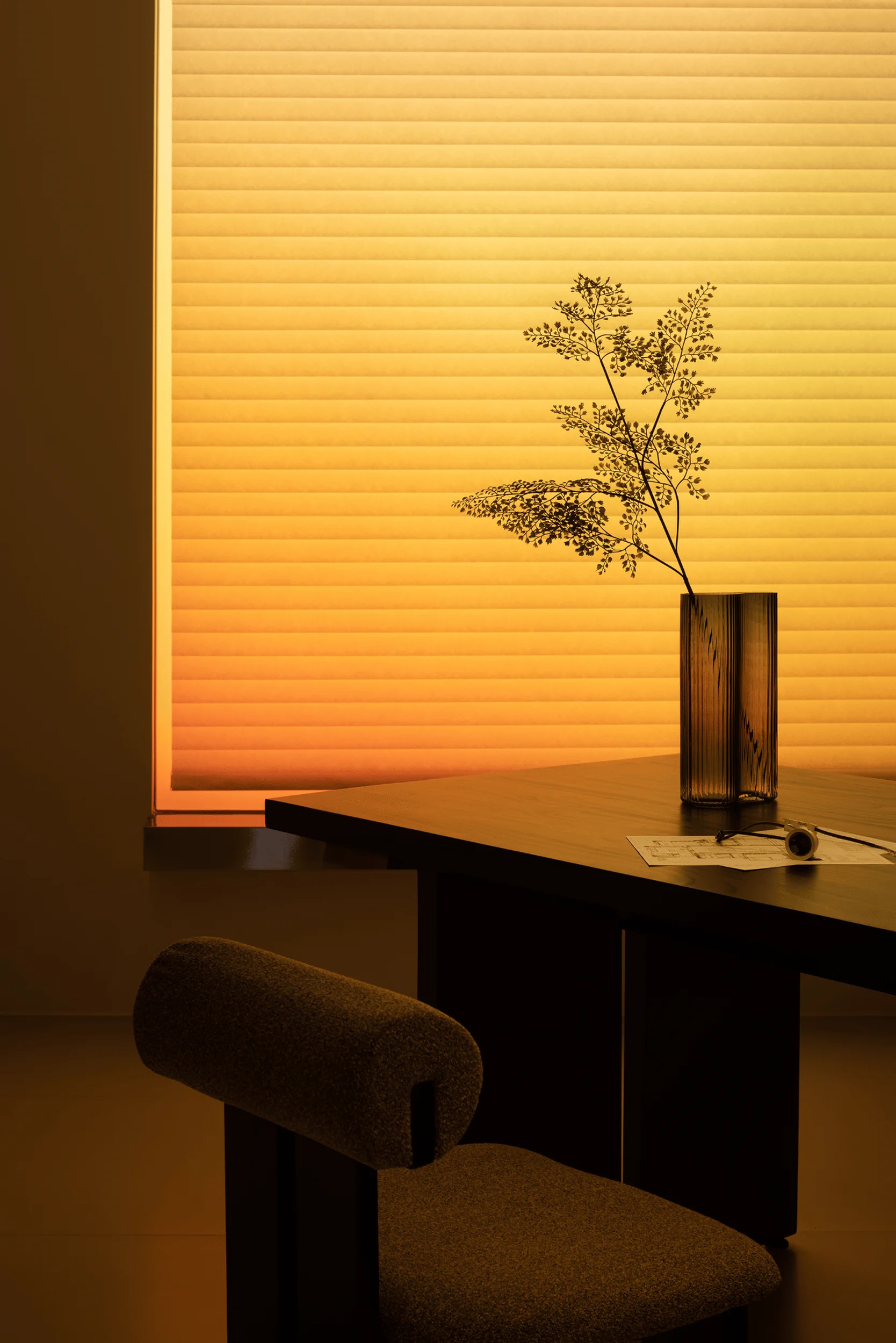
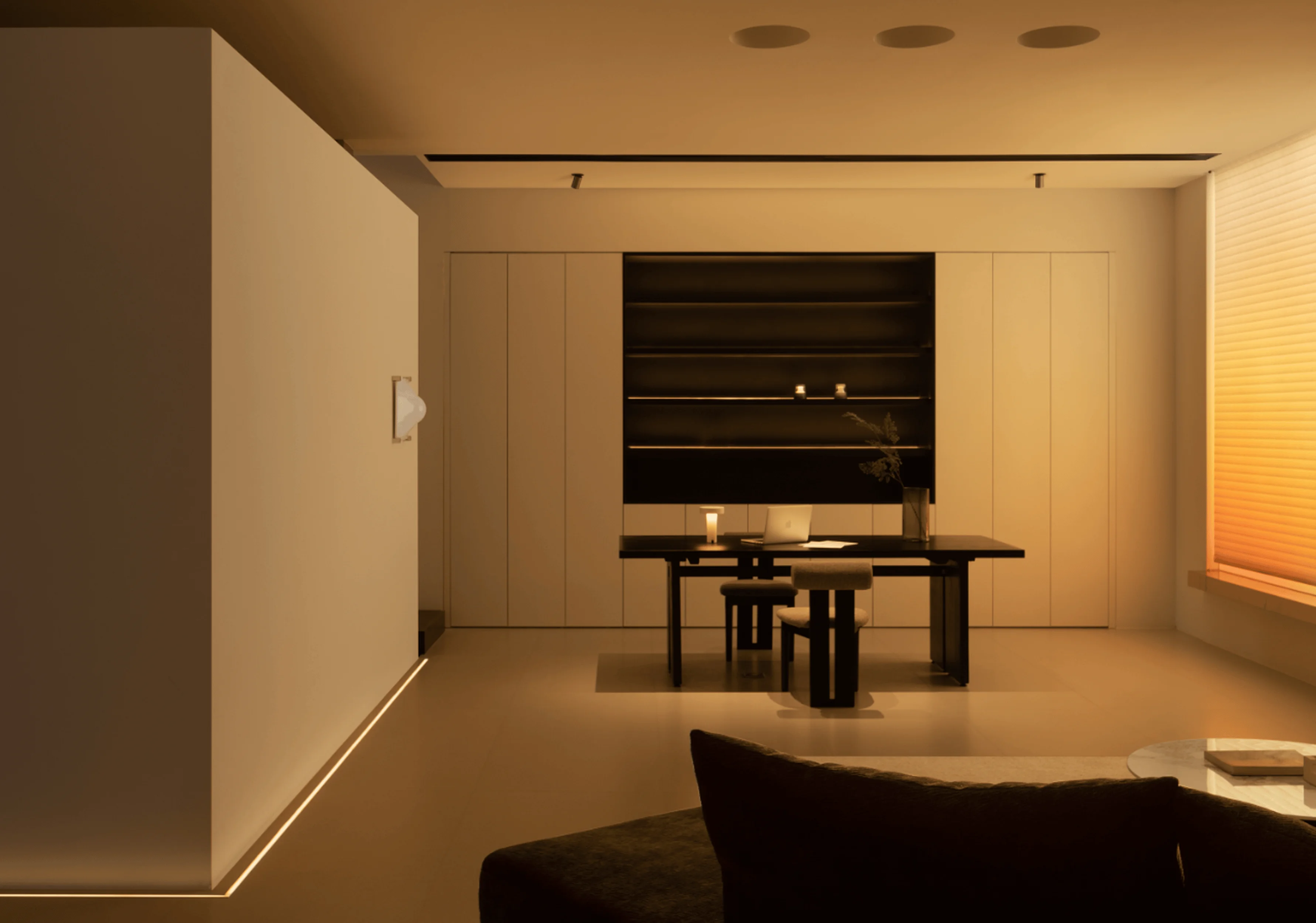
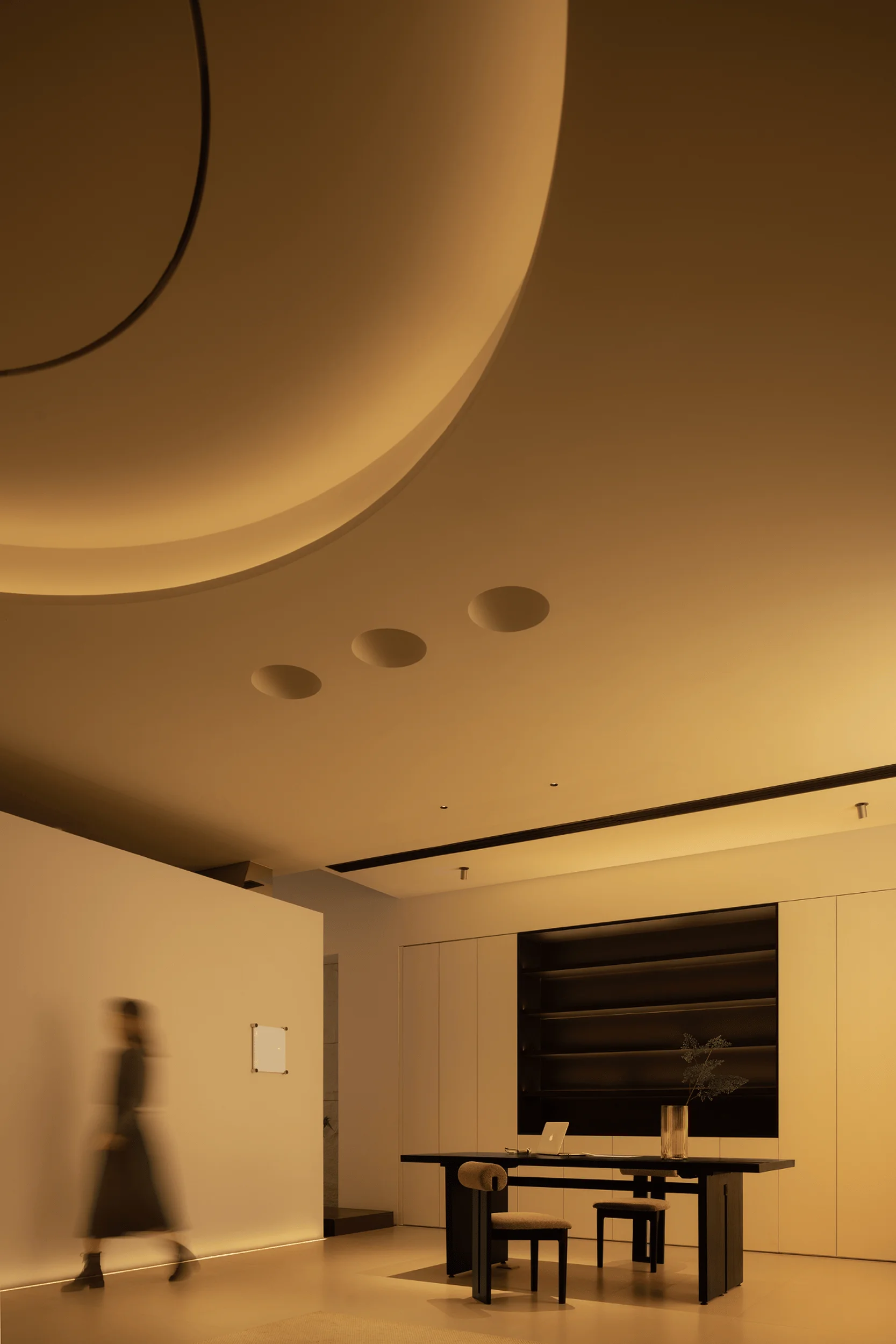
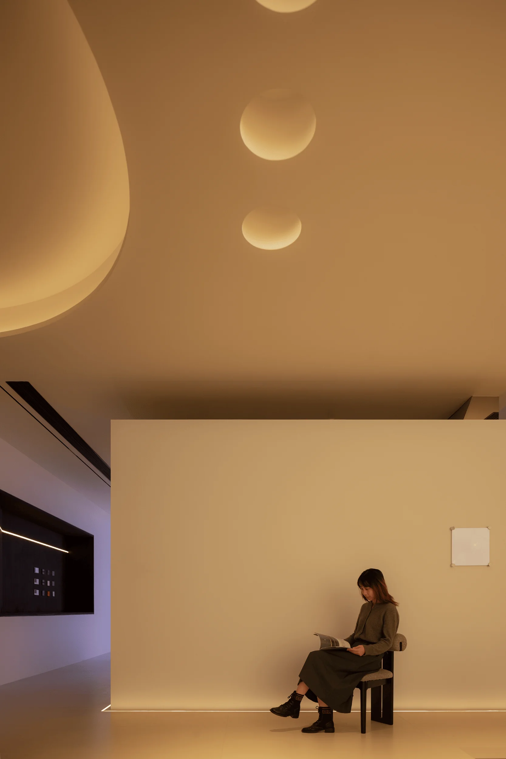
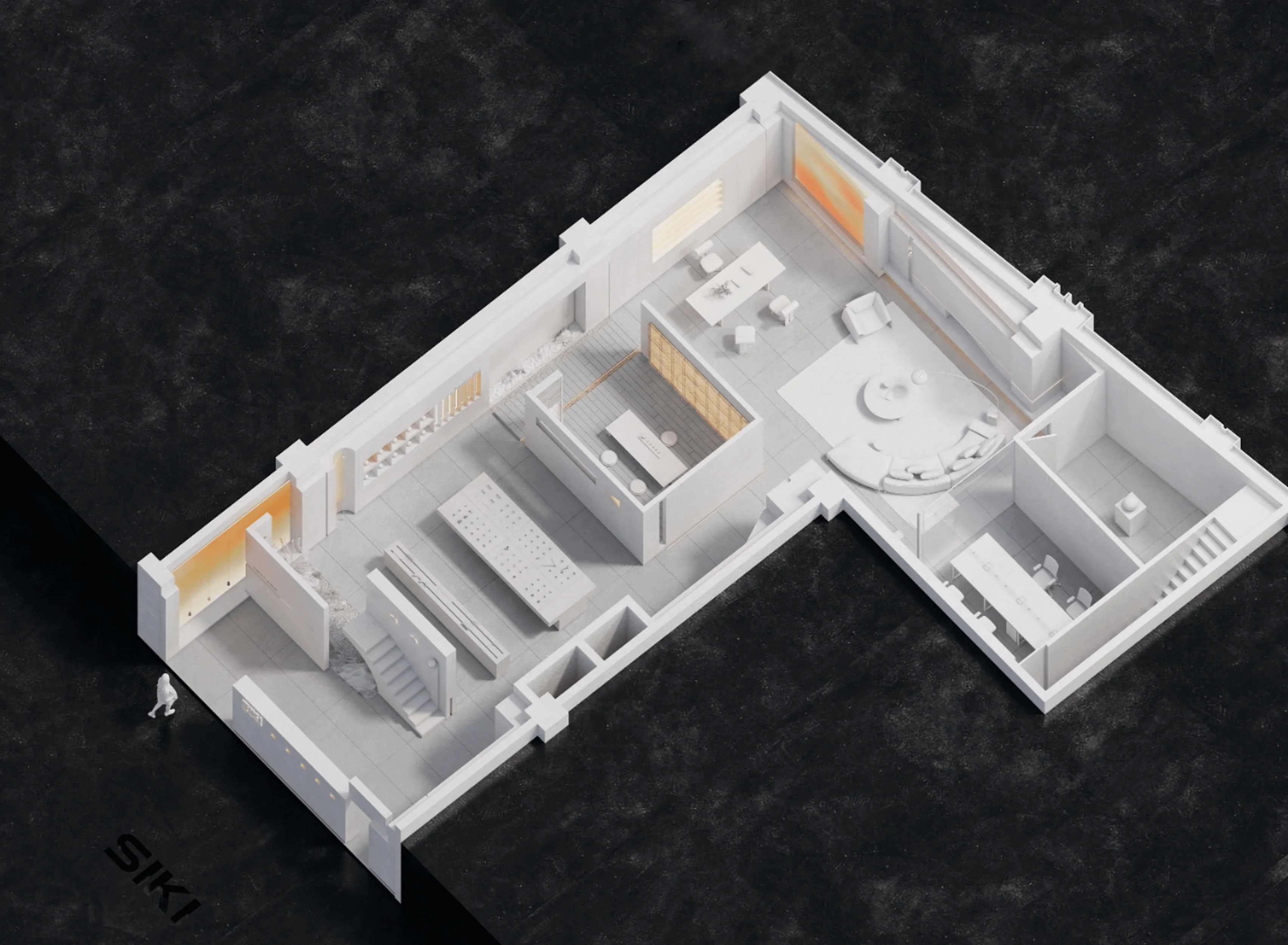
SIKI Lighting Showroom design in China uses lighting design to shape space and atmosphere.
Contents
Project Background and Concept
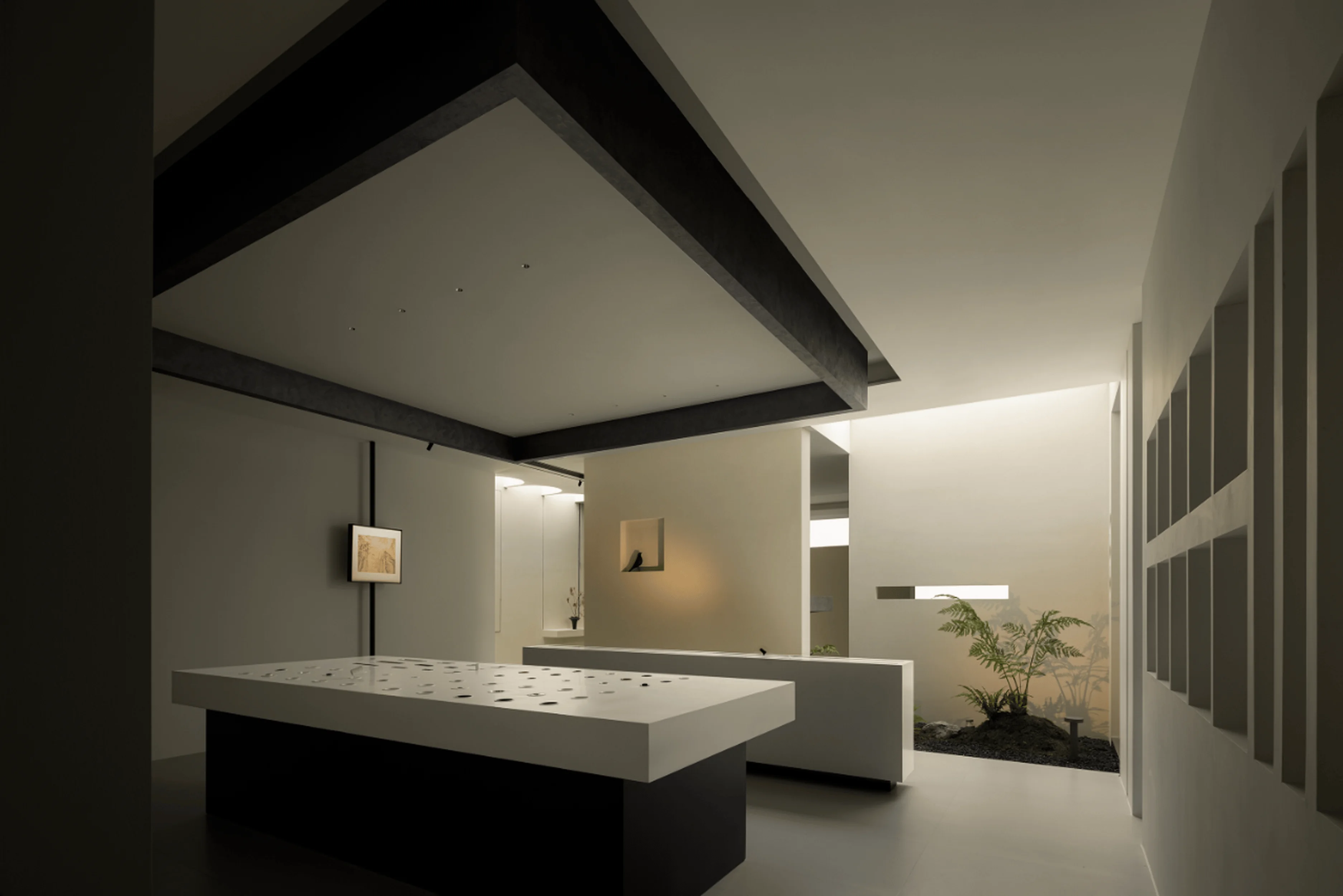
The SIKI Lighting Showroom project in Wuxi, Jiangsu, China, aims to redefine the traditional exhibition space. Rather than a mere container for product displays, it aspires to blur the lines between functionality and immersive experiences. The designers, ZHIBAI DESIGN, and the brand, SIKI, prioritized the creation of atmosphere over mere lighting techniques. This approach centered on the color and quality of artificial light sources to shape the environment, ultimately fostering a vibrant, illuminated exhibition space. The project’s core design philosophy revolves around the concept of ‘knowing the white’ derived from Laozi’s teachings in Taoism, where ‘knowing’ signifies awareness and clarity, while ‘white’ represents a state of purity, simplicity and possibility. This philosophy underscores the design team’s commitment to finding the essence of space by stripping away unnecessary elements and allowing necessary elements to shine.
#lightingdesignshowroom #lightingdesign #interiordesign #spaceshaping #experientialdesign
Spatial Order and Artistic Expression
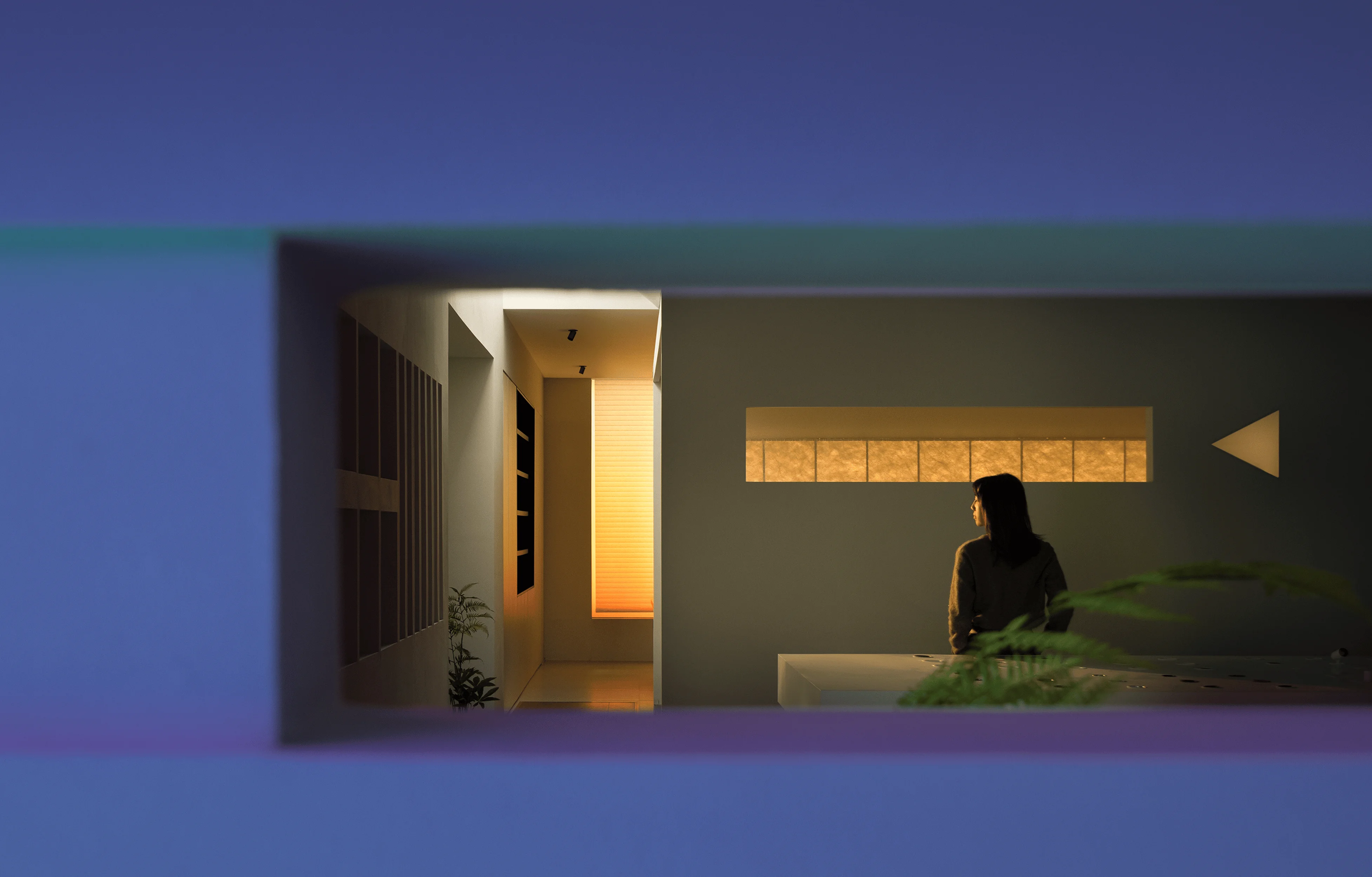
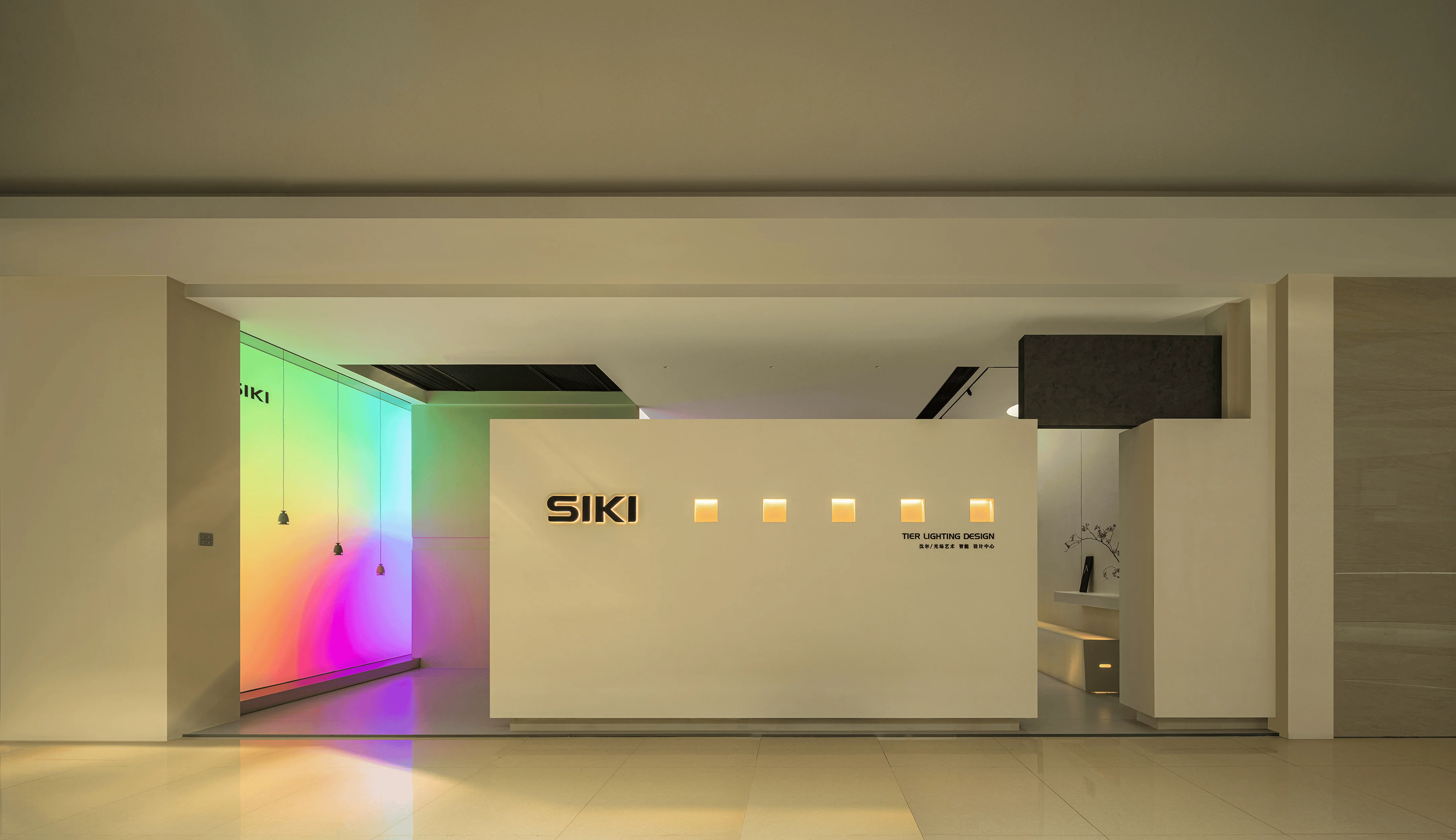
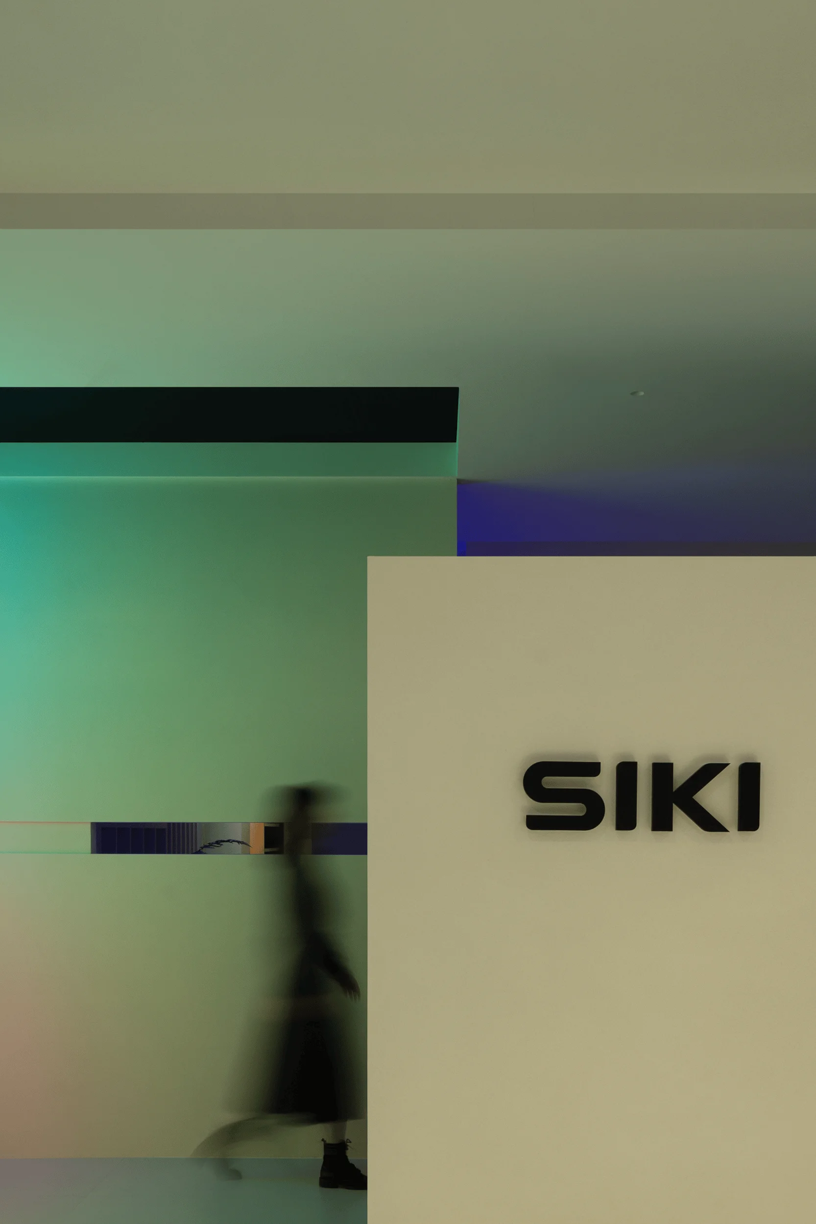
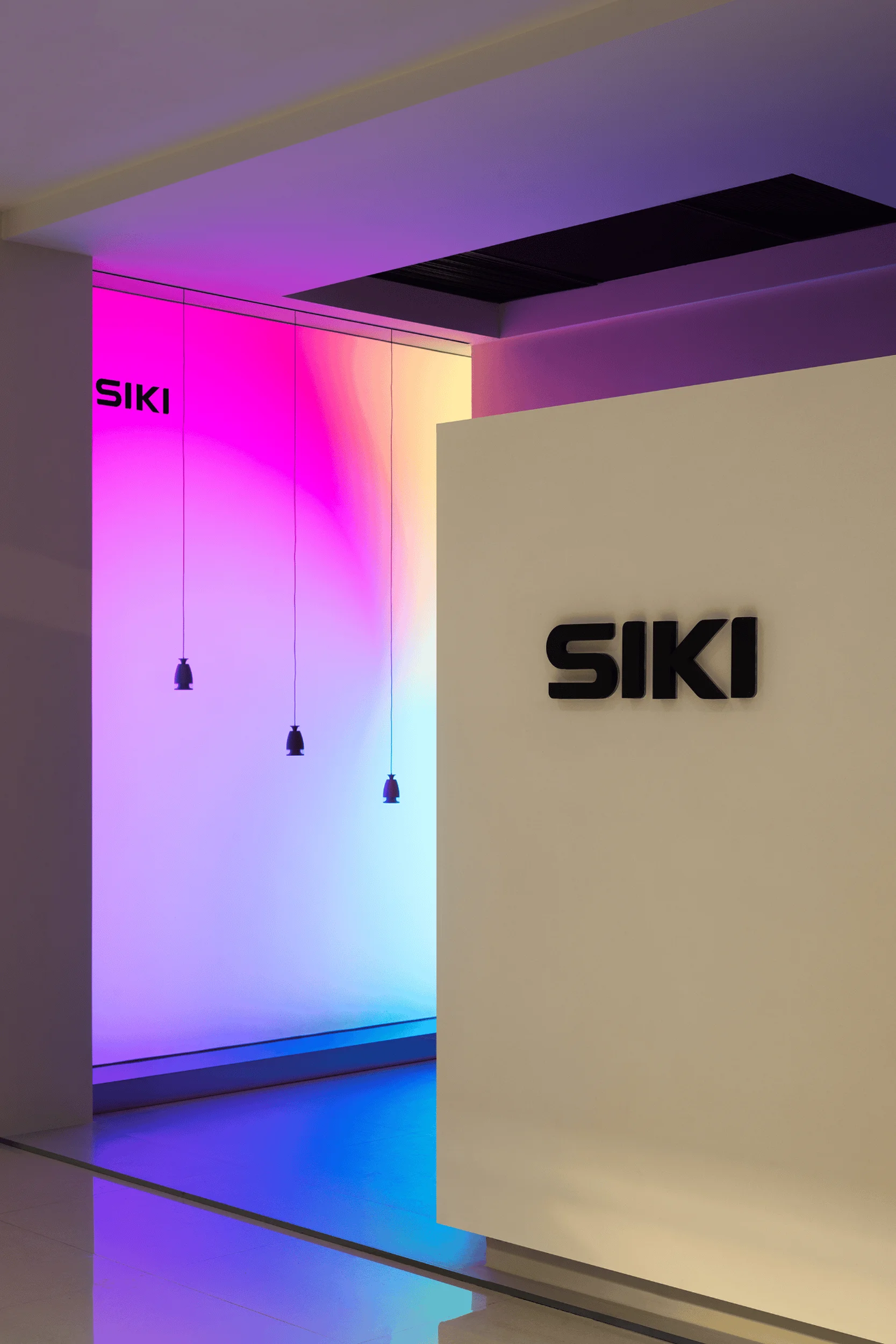
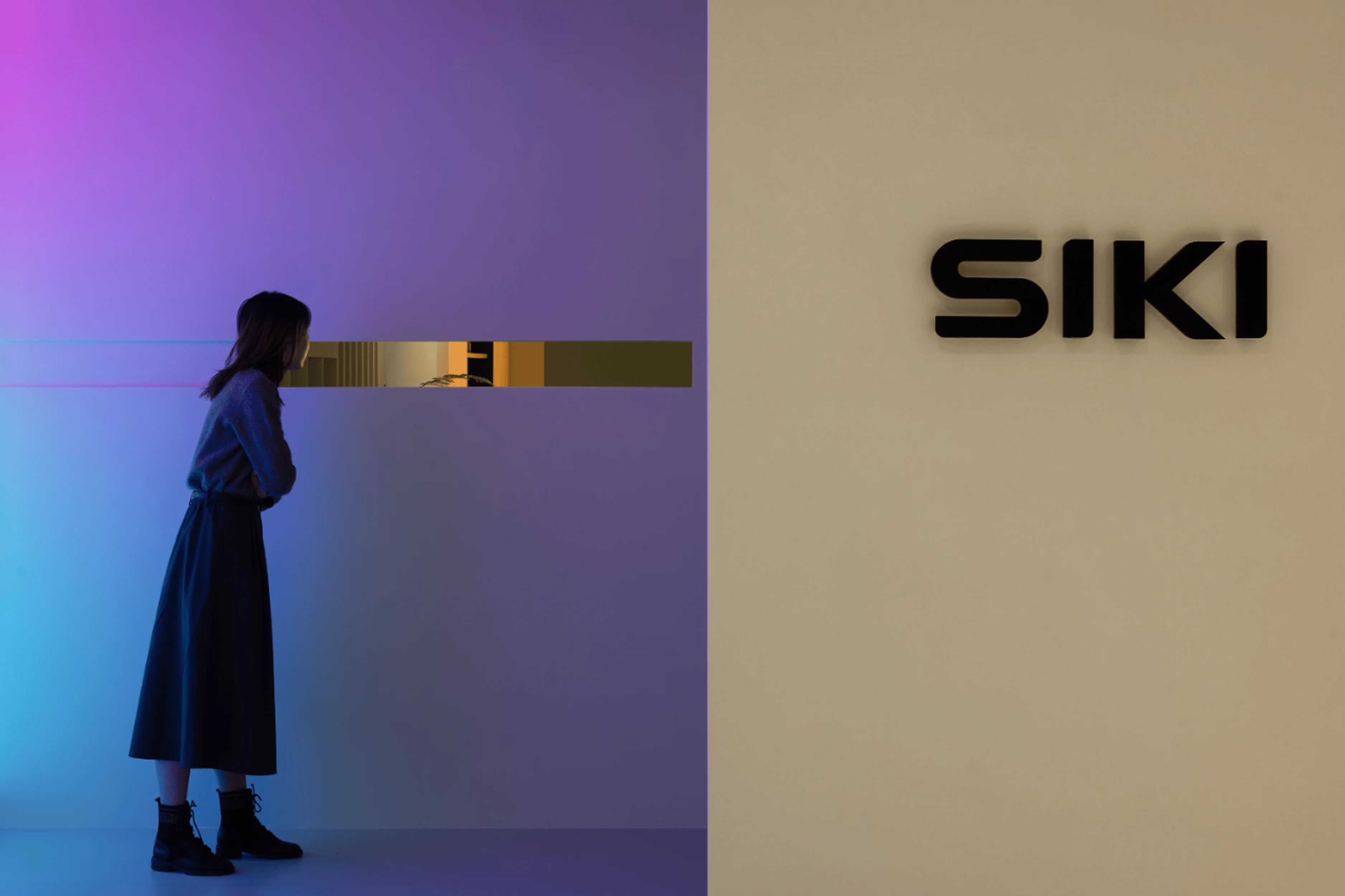
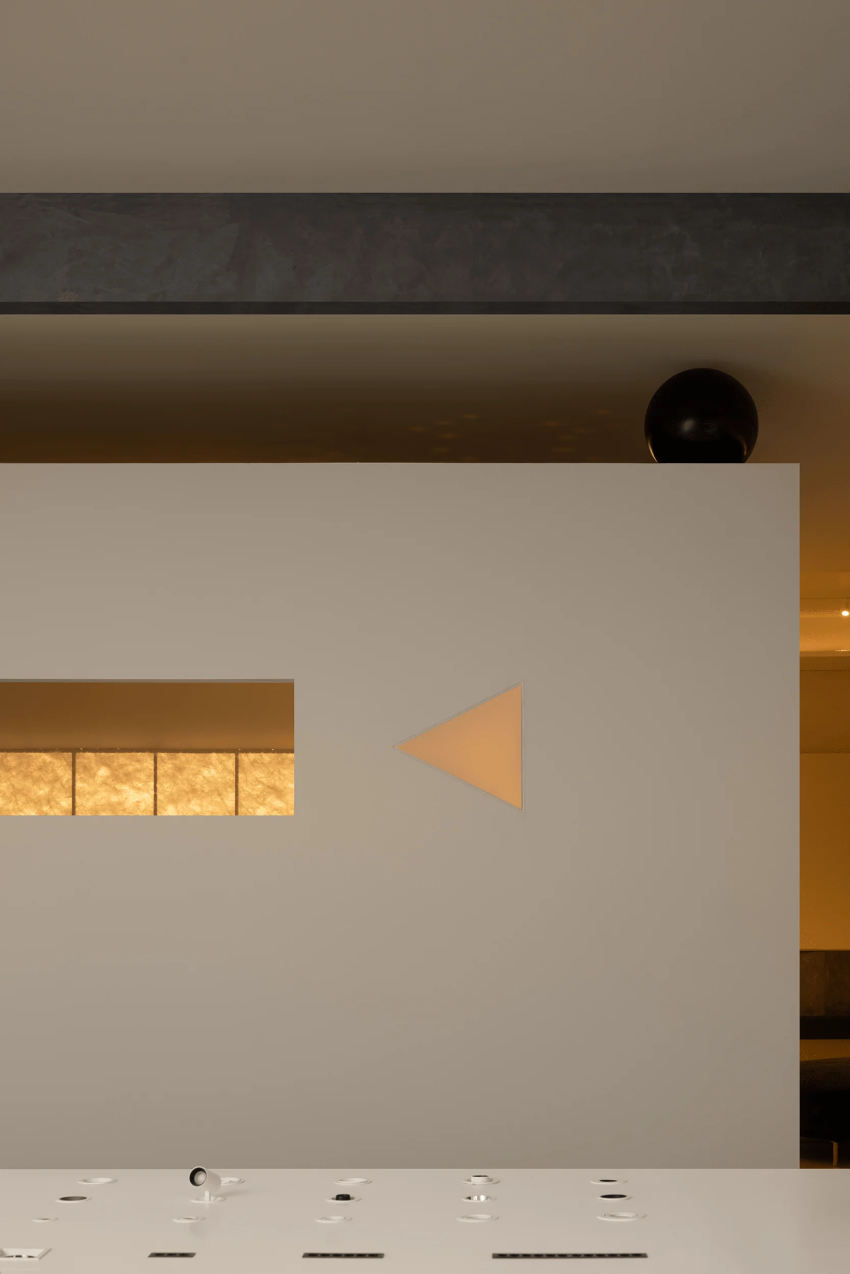
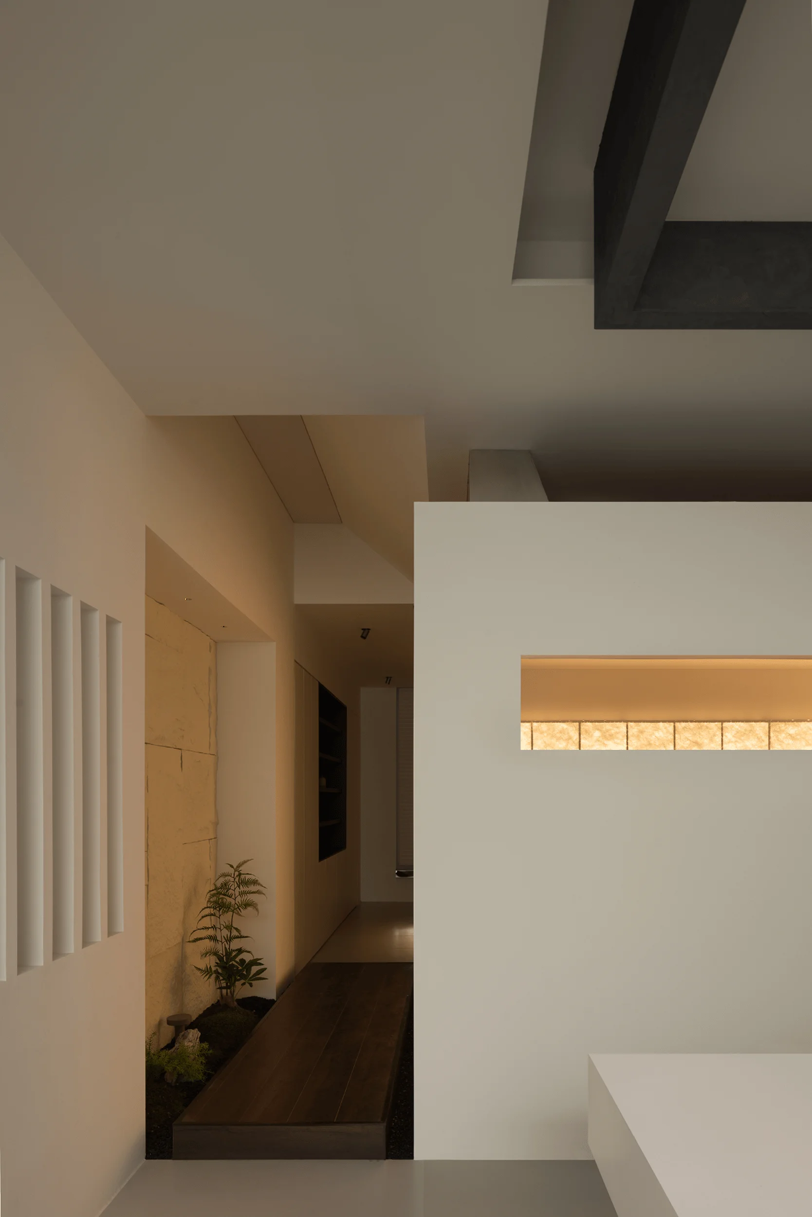
The external facade of the showroom is characterized by geometric blocks, which are segmented and interlocked in various ways to establish a clear spatial order. The interplay of solid and void creates a sense of transparency, while also enhancing the building’s artistic expression. The use of iridescent soft film contributes to the dynamic feel of the interior, adding a touch of movement and visual dynamism. The subtle, inviting light coming from long horizontal windows adds to the sense of intrigue and mystery. These simple rectangular apertures break the monotony of the walls, encouraging interaction and a sense of engagement with the spaces within and beyond. This design element seamlessly incorporates natural light as a core design component, creating a visual connection between the interior and exterior.
#lightingdesignshowroom #interiordesign #architecturaldesign #spatialorder #geometricdesign
Natural Light and Spatial Connection
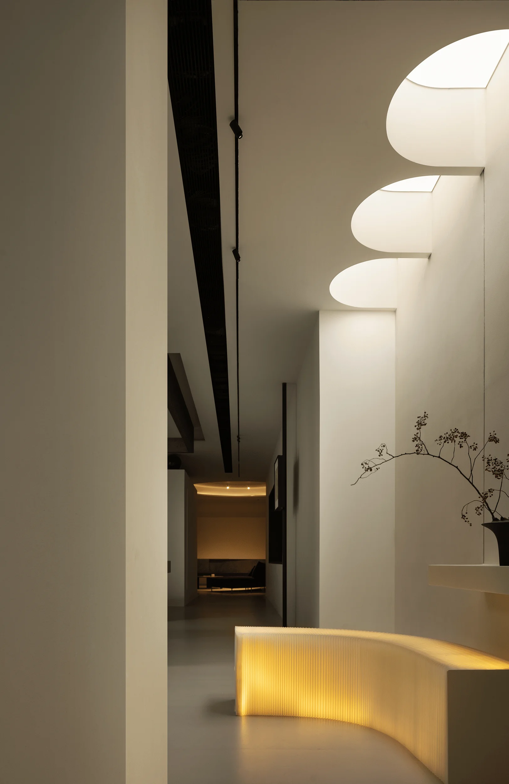
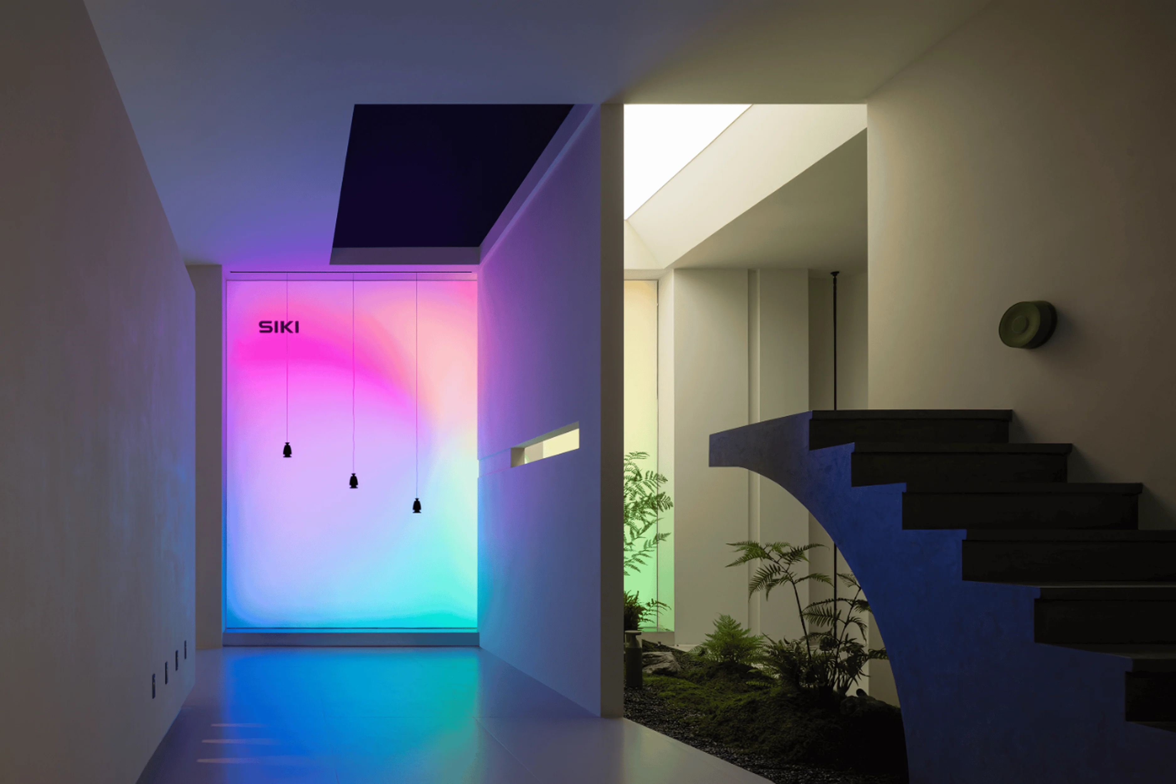
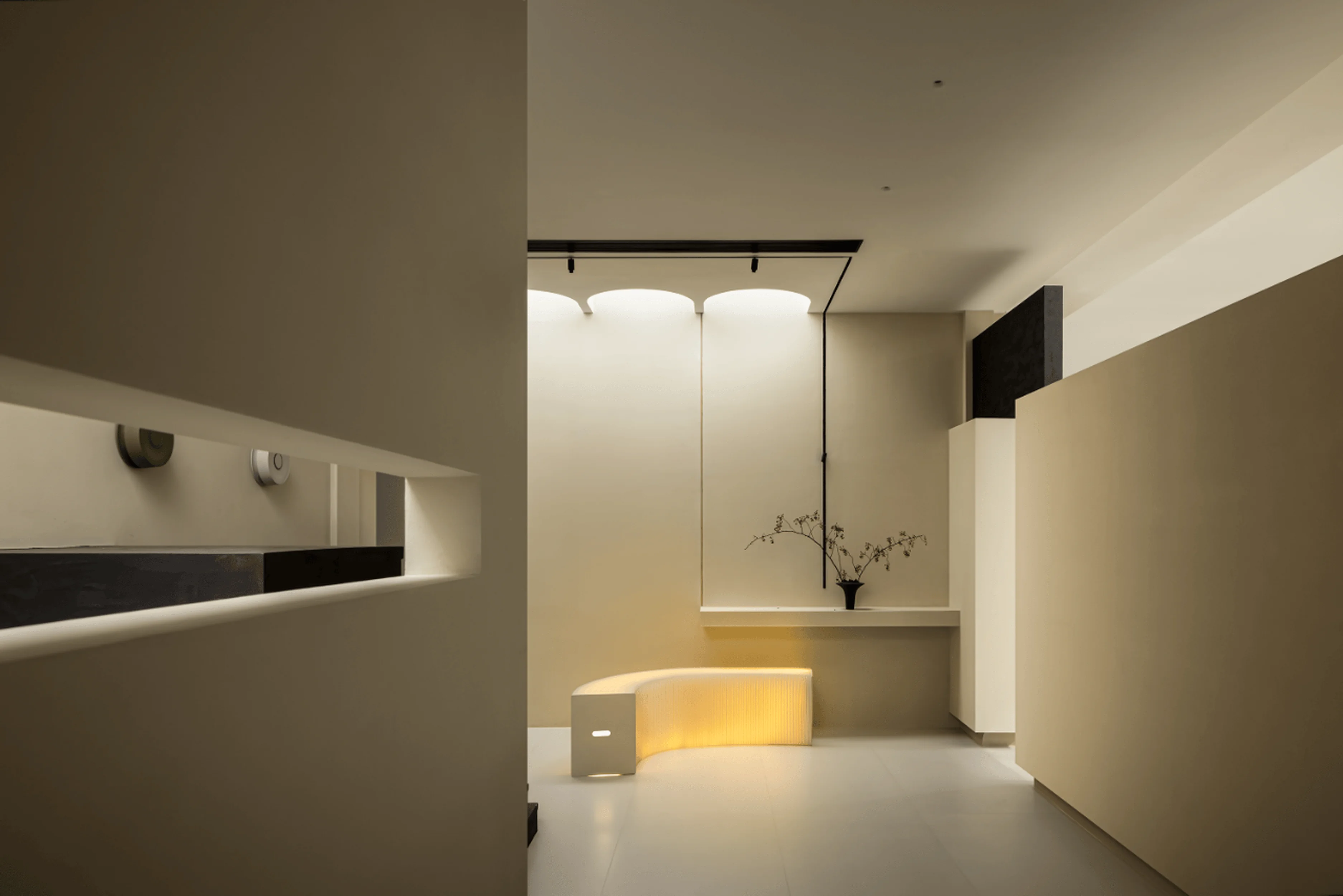
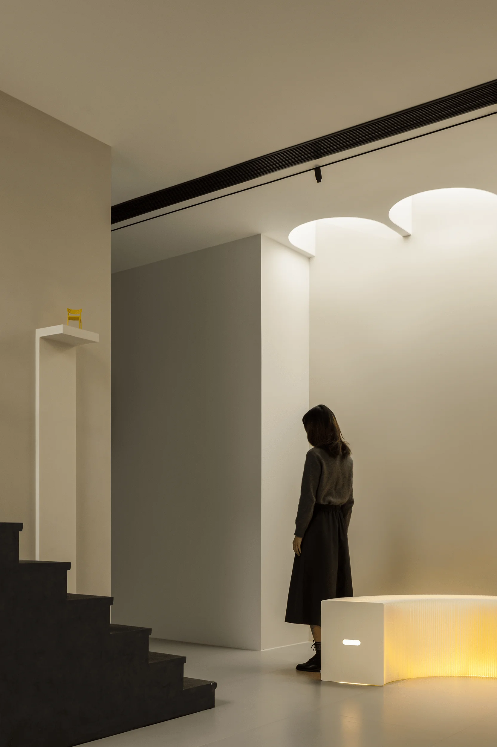
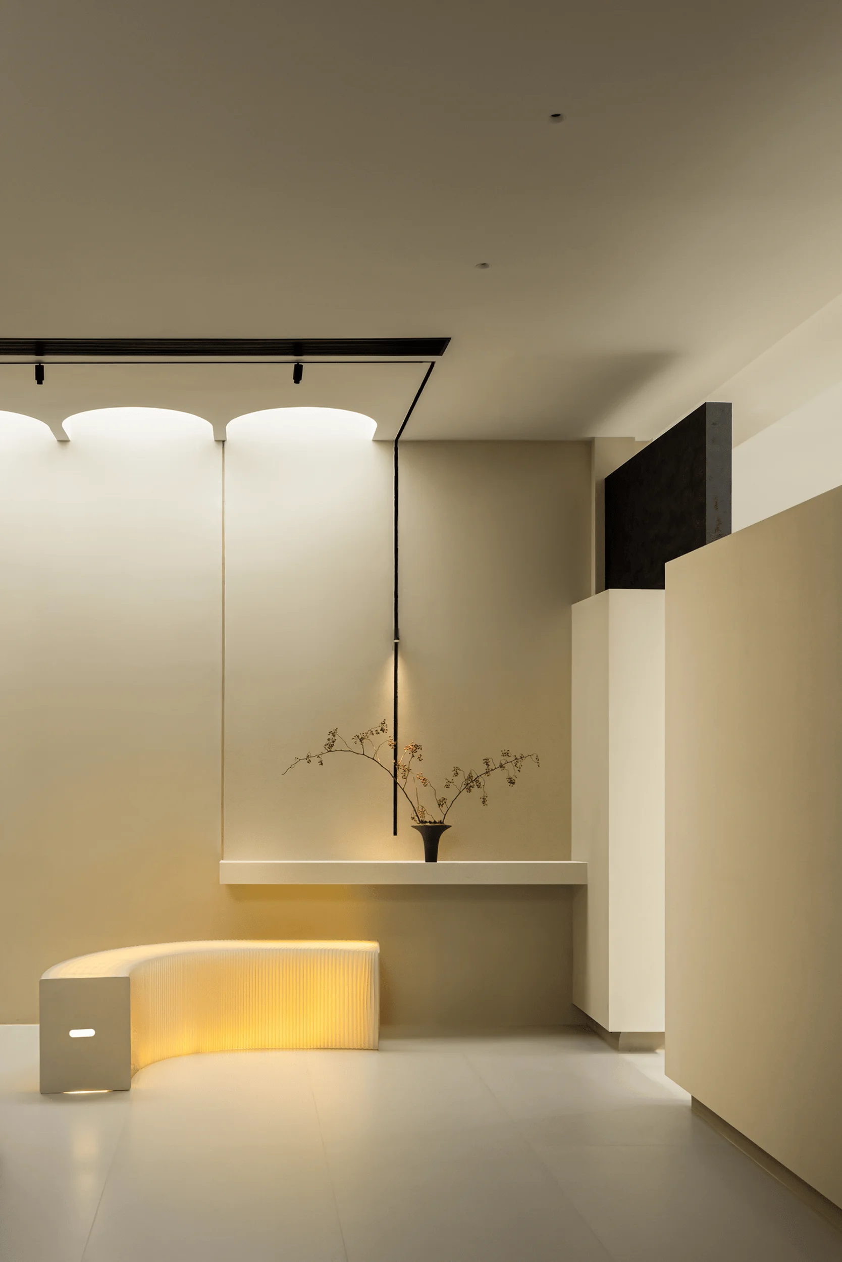
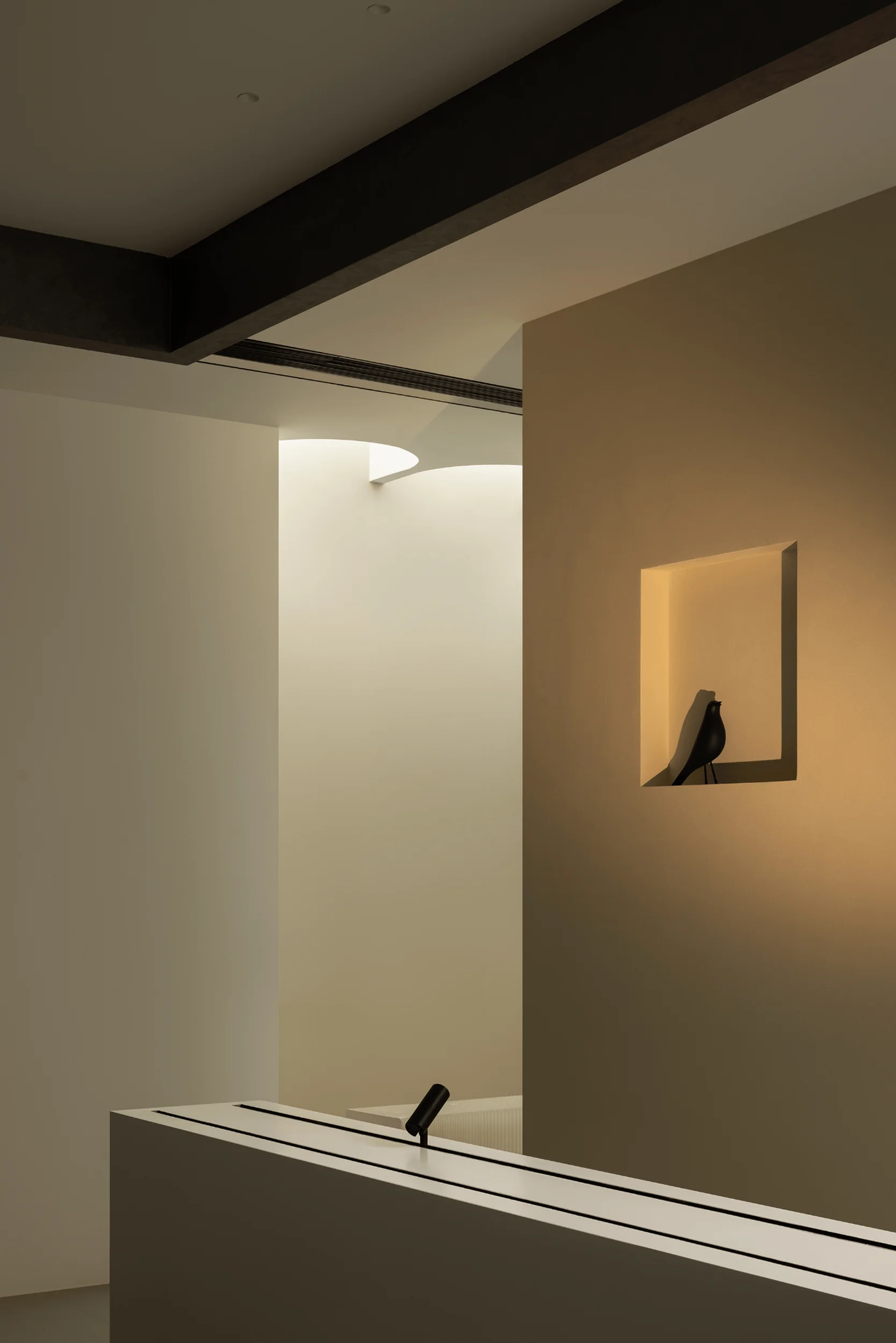
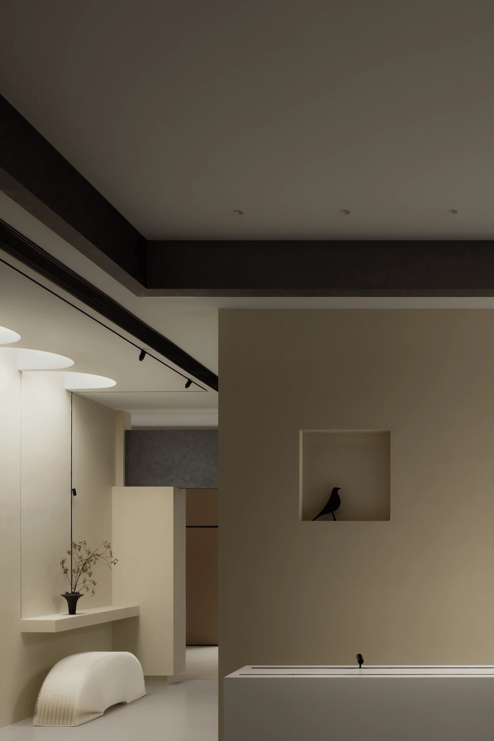
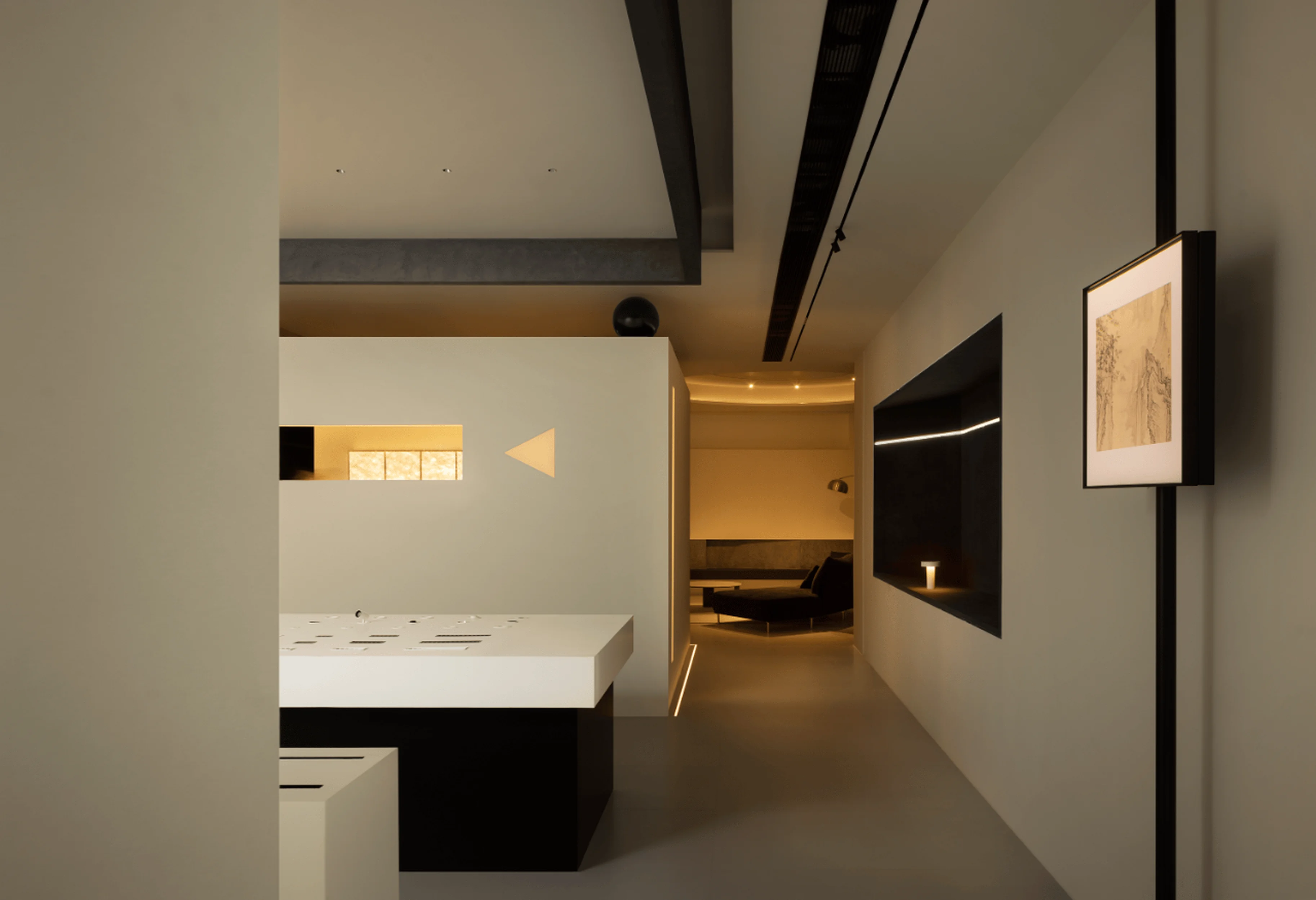
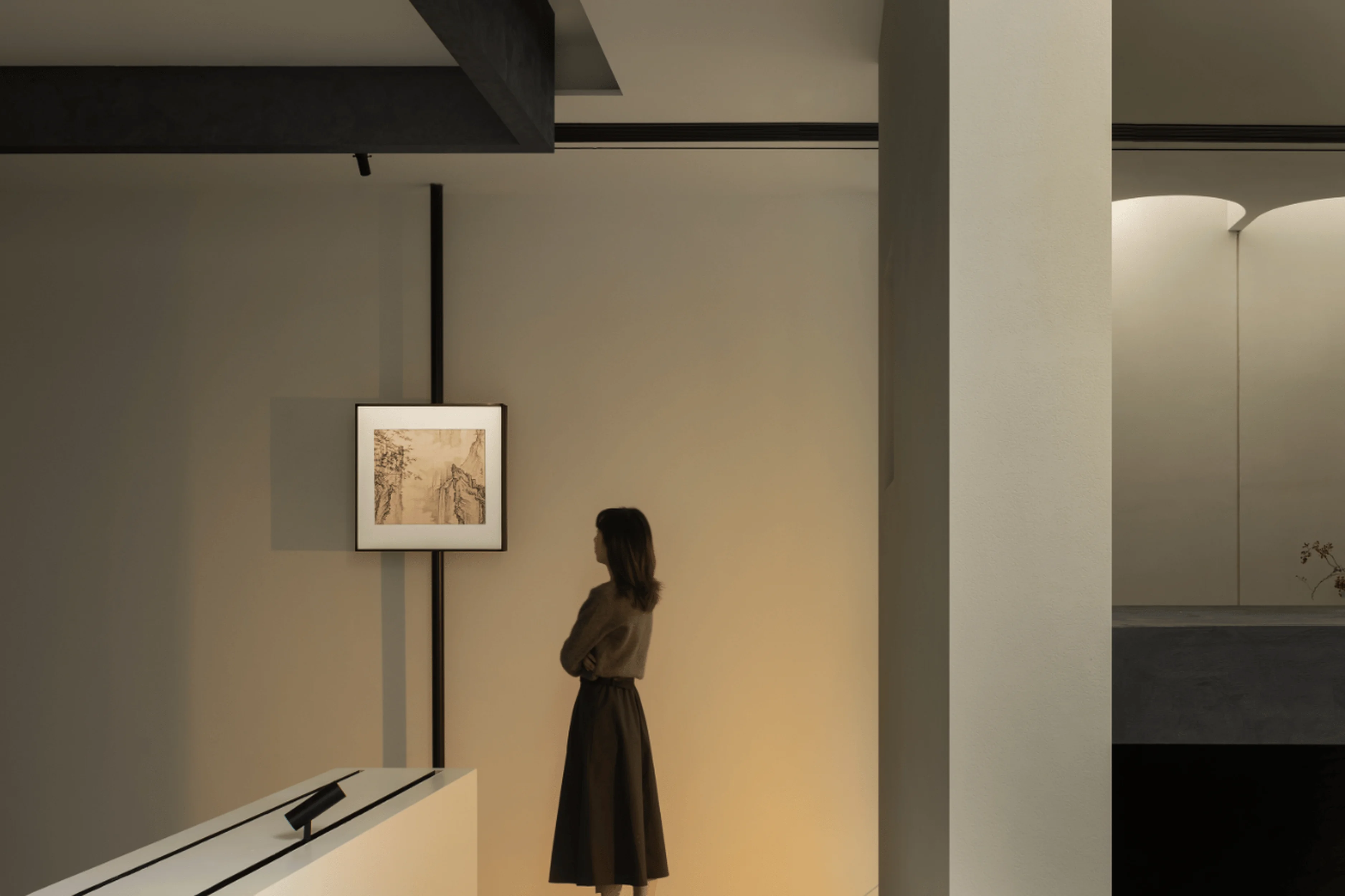
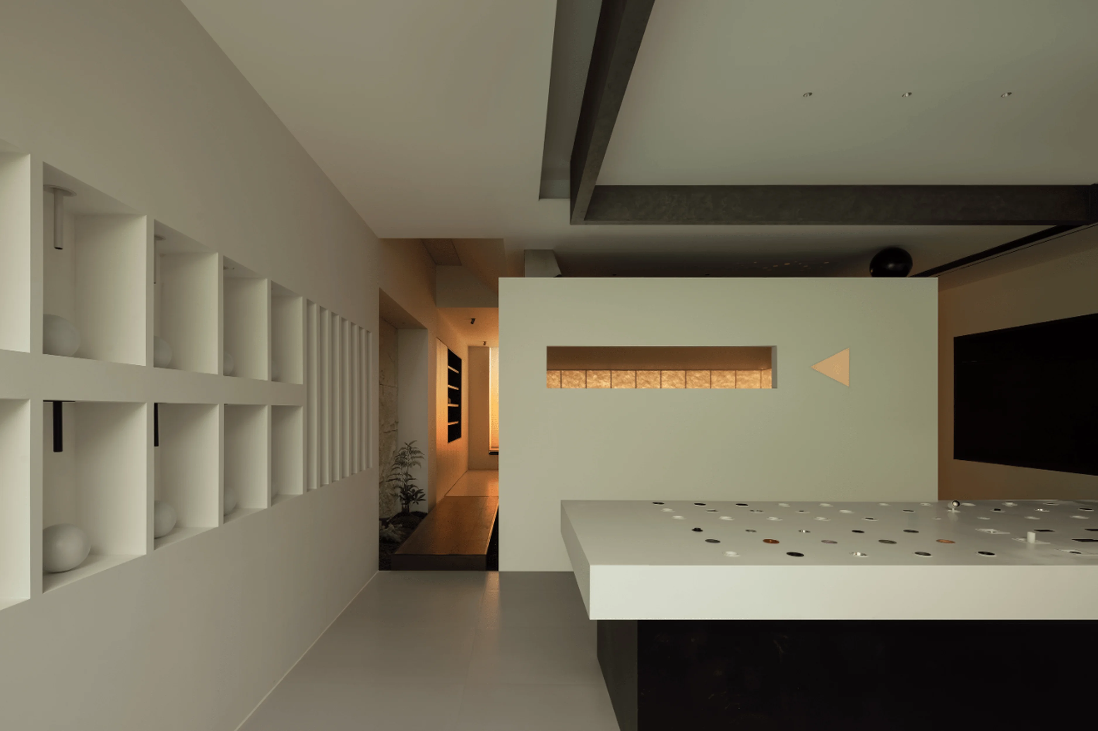
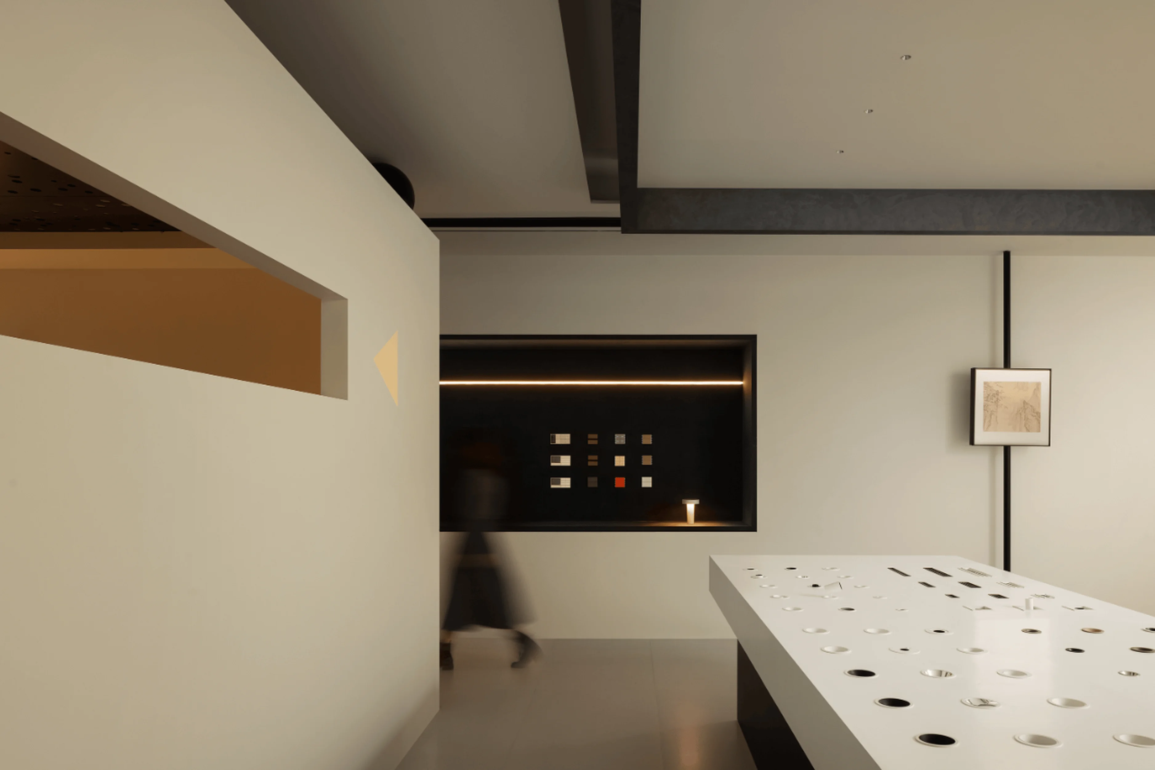
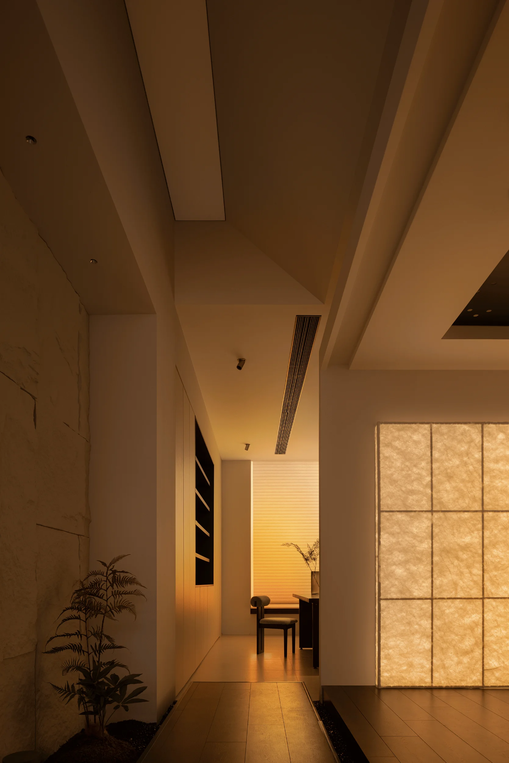
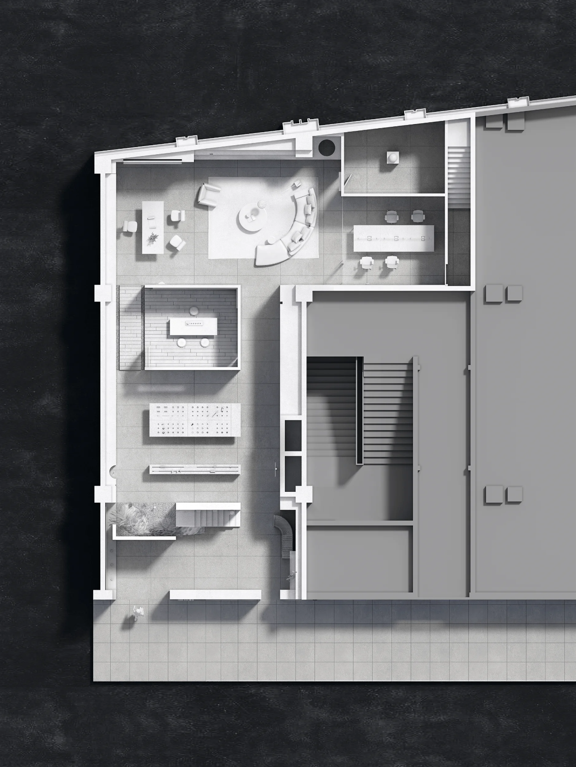
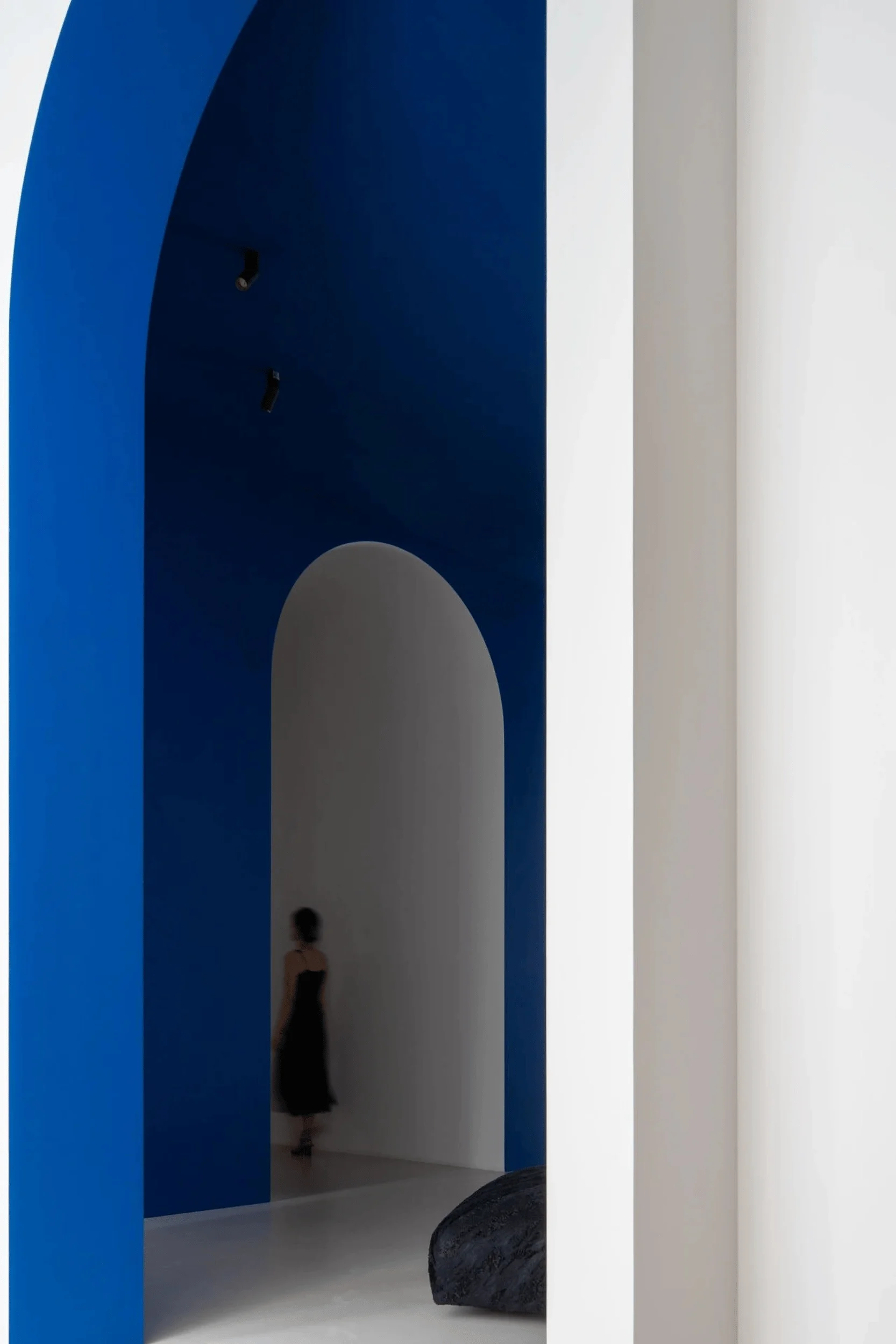
The incorporation of natural light is central to the showroom’s design. Drawing inspiration from Louis Kahn’s philosophy, who stated that “natural light is the only light, for it has mood, it gives us the basis of our understanding. It allows us to touch eternity,” the designers utilized curved openings and skylights to mimic the effects of natural light. This allows light to flow evenly into the interior, producing a soft and diffused glow on the walls. Within the muted, understated interior of the showroom, light establishes a vital connection to the natural world. The corridors serve a dual purpose: they are pathways for visitor movement, offering views of both sides while simultaneously providing spatial divisions. The strategic deployment of lighting enhances the artistic effect of the displayed products, fostering a deeper connection between viewers and the exhibited items. This thoughtful use of light creates a sense of depth and layering within the space, while accent lighting adds the perfect finishing touch, enhancing the aesthetic experience.
#lightingdesignshowroom #naturallight #spatialexperience #interiorlighting #architecturallighting
Materiality, Light, and Shadow Play
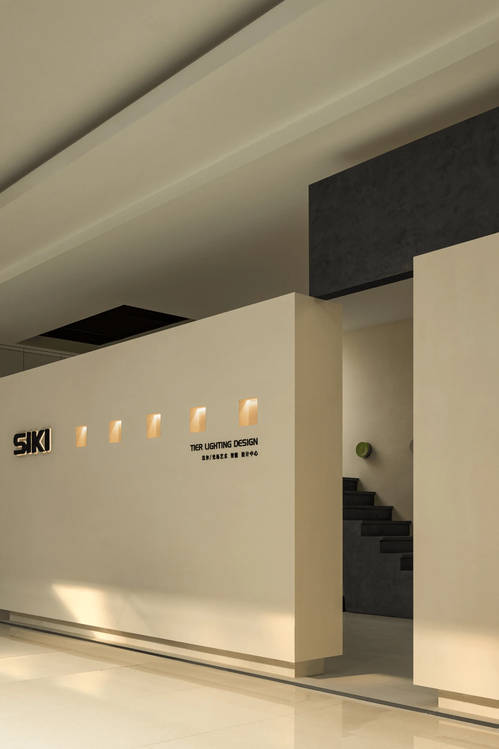
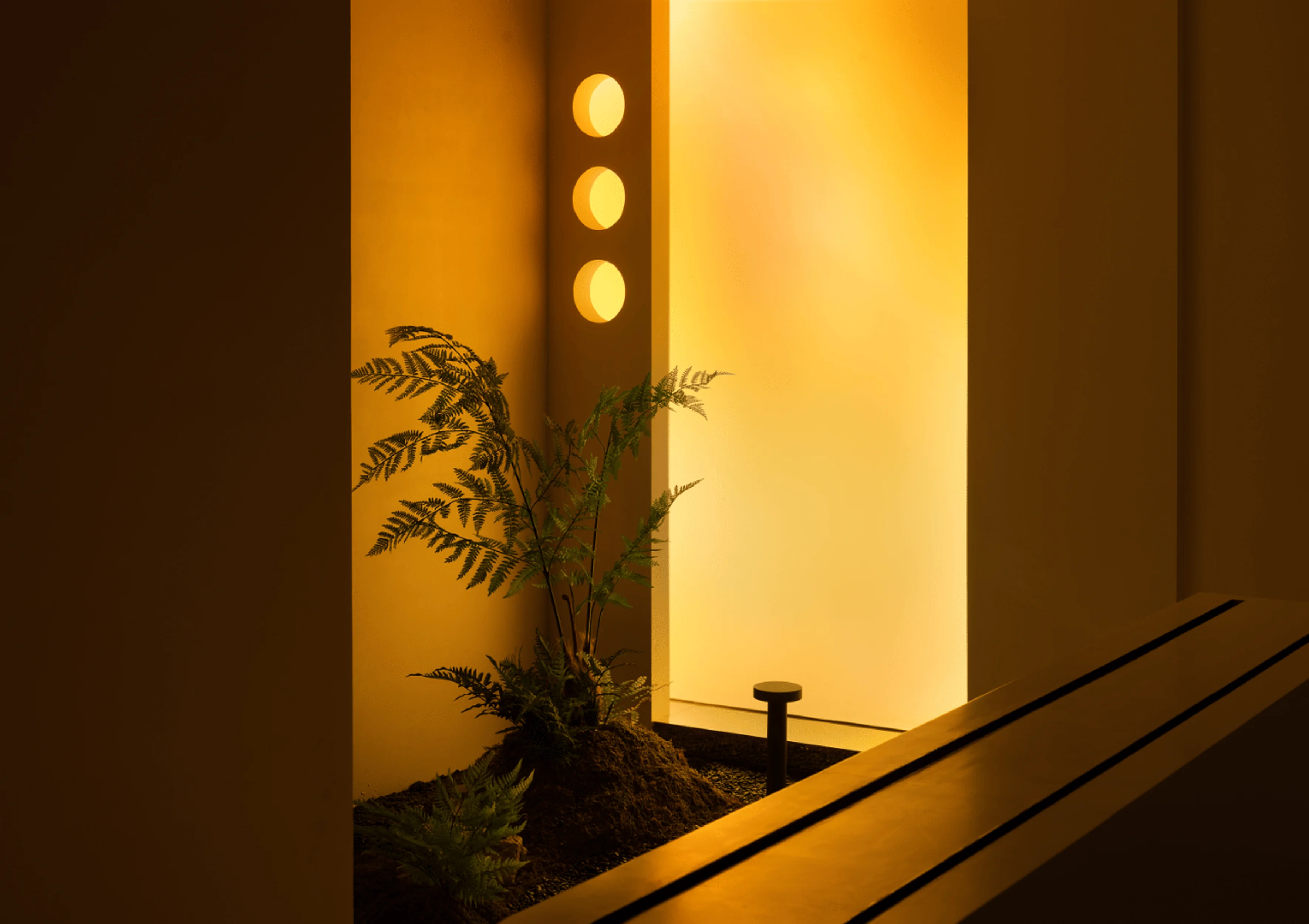
The building’s surfaces are designed with a focus on simplicity and directness. The raw, natural materials – white walls, greenery, and metal elements – allow the intrinsic qualities of light and color to shine through. This approach ensures that light remains the central element of the design. Light imbues the space with a sense of warmth and invites exploration and contemplation, further emphasizing the inherent beauty that lies within the interplay of light and shadow. The design intentionally incorporates wall recesses that serve as conduits for light, effectively drawing visitors into the space. The subtle, almost mystical ambience created by the strategic use of light acts as a gentle invitation for people to pause and appreciate the subtle beauty of the space.
#lightingdesignshowroom #interiordesign #materials #materiality #lightandshadow
Functionality and Product Display
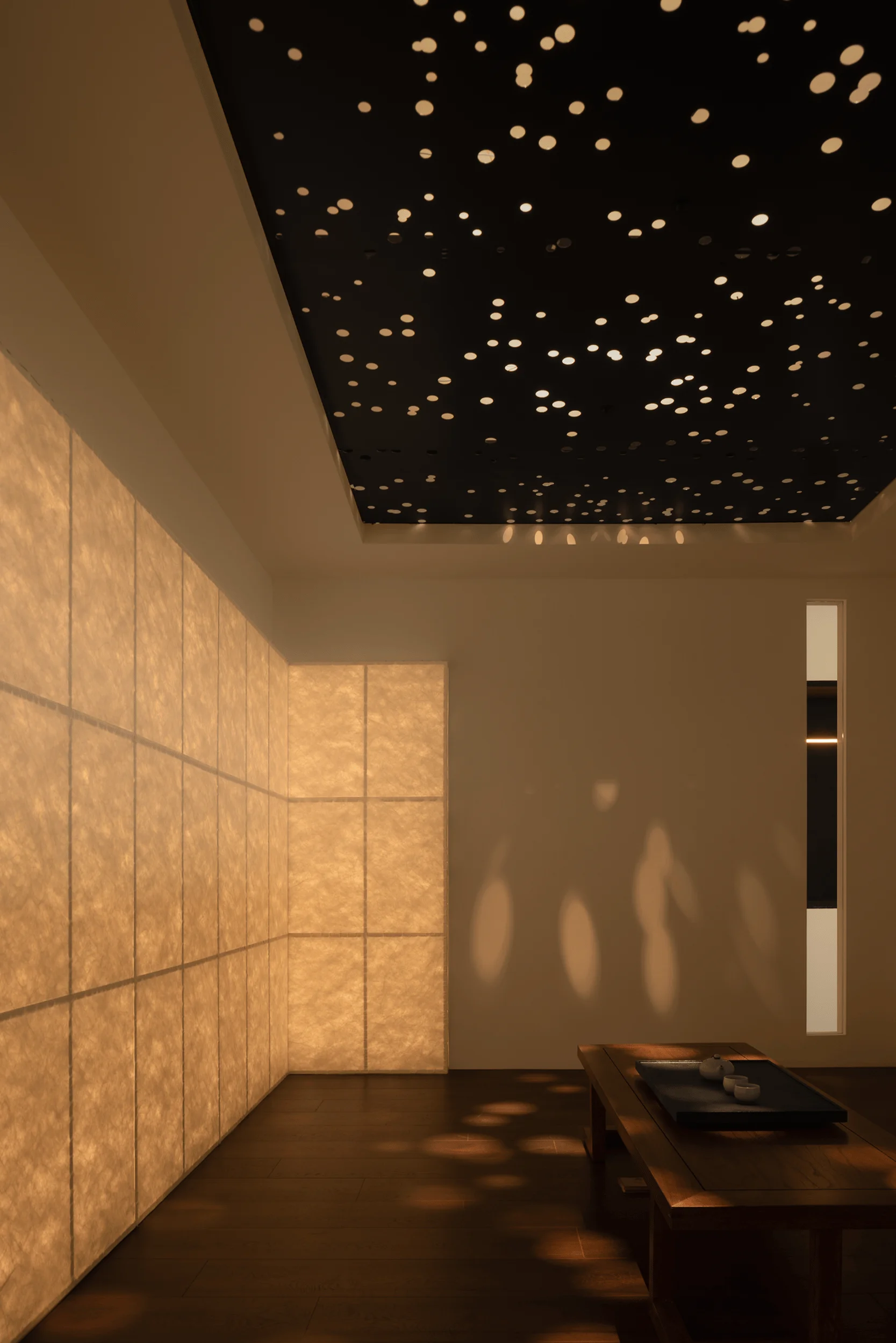
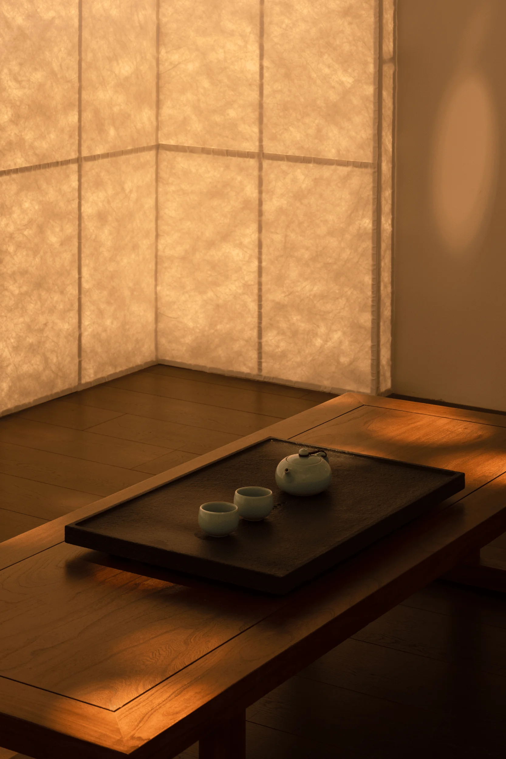
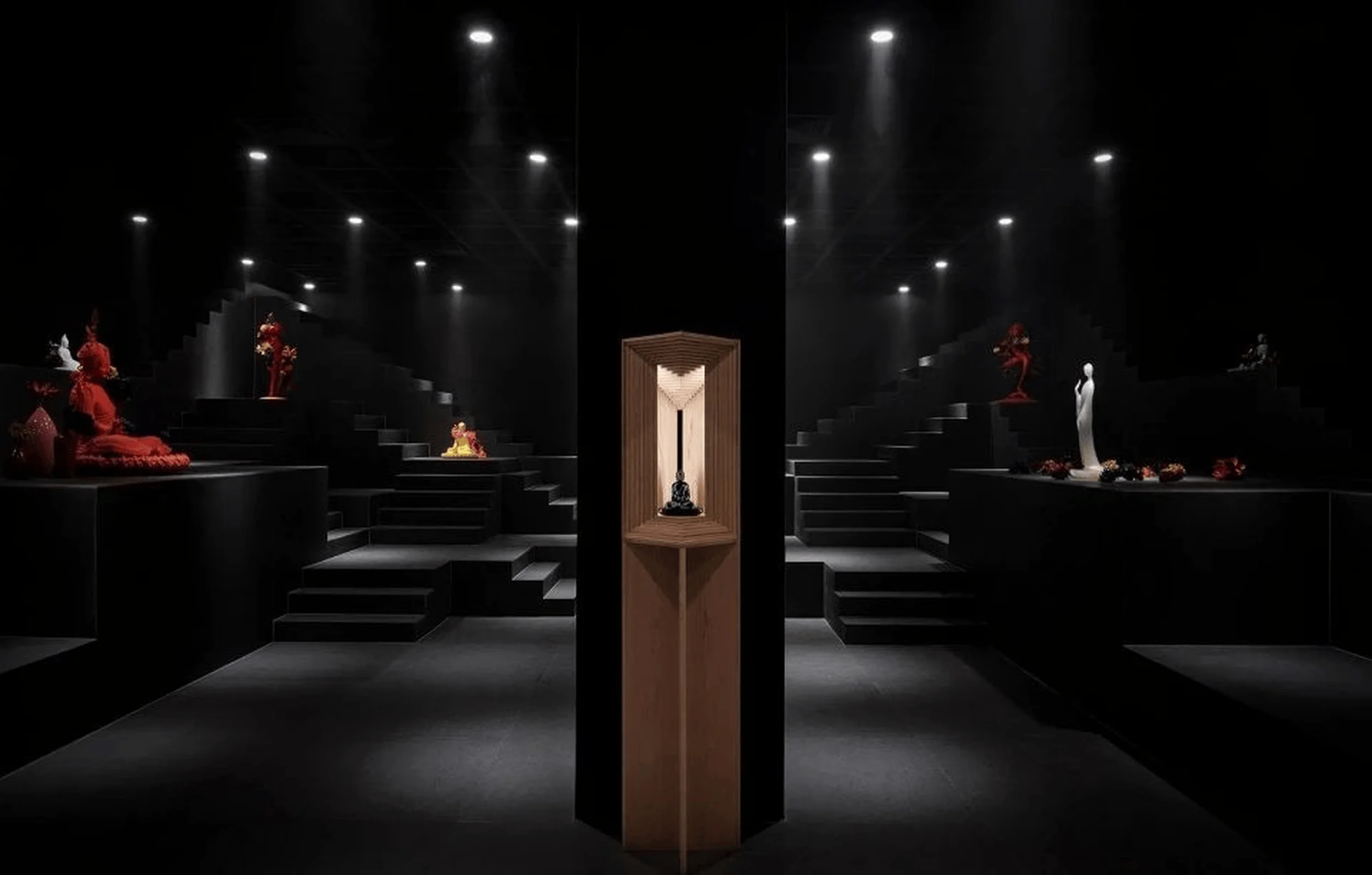
The showroom’s design is carefully calibrated to serve its commercial purpose. The arrangement of the space ensures that SIKI’s key products are prominently featured and strategically placed. The design incorporates perforated aluminum panels, which cast intricate patterns of light and shadow. This intricate interplay of light and texture contributes to the creation of a unique and contemplative atmosphere. The designers aimed to evoke a sense of spirituality and meditation through the evocative use of light, employing it as a tool to reinforce the character of the space. The subtle, muted, and ethereal light creates a sense of serenity and visual depth.
#lightingdesignshowroom #productdisplay #commercialinteriors #spatialdesign #atmosphericlighting
Color Temperature and Emotional Response
The color temperature of light sources plays a critical role in shaping the emotional atmosphere of a space. Varying the color temperature can shift the experience from warmth and relaxation to formality and introspection. Lighting, therefore, can subtly shape the environment and subtly influence human emotions. This impact underscores the crucial role that lighting design plays in shaping user experience and perception. Lighting becomes an integral part of the space, impacting the overall emotional response and contributing to the visitor’s experience.
#lightingdesignshowroom #colortemperature #emotionaldesign #experiencedesign #spatialpsychology
Conclusion: Light as a Spatial Medium
Light is a constant presence in our lives, permeating both interior and exterior environments. In the SIKI Lighting Showroom, light is used as a medium to connect people with their surroundings. It serves as a dynamic element within the space, acting as a conduit for creating a unique atmosphere. Light’s capacity to transform, to evoke emotion, and to communicate enhances the sensory richness of the environment. This is evident in the SIKI Lighting Showroom, where light is artfully employed to generate a range of experiences and foster a deeper appreciation for the space’s aesthetic and functional potential.
#lightingdesignshowroom #lightingdesign #interiordesign #spatialdesign #lightasartisticmedium
Project Information:
Project Type: Showroom
Architect: ZHIBAI DESIGN
Area: 204 sqm
Year: 2023
Country: China
Photographer: Neiwai Space Photography – Zhao Long
Lighting Design: SIKI Lighting


