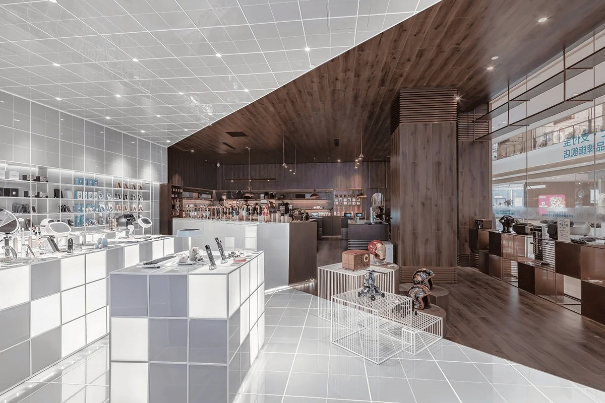
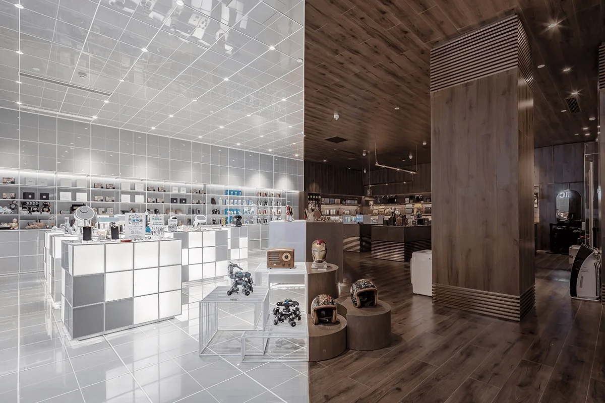
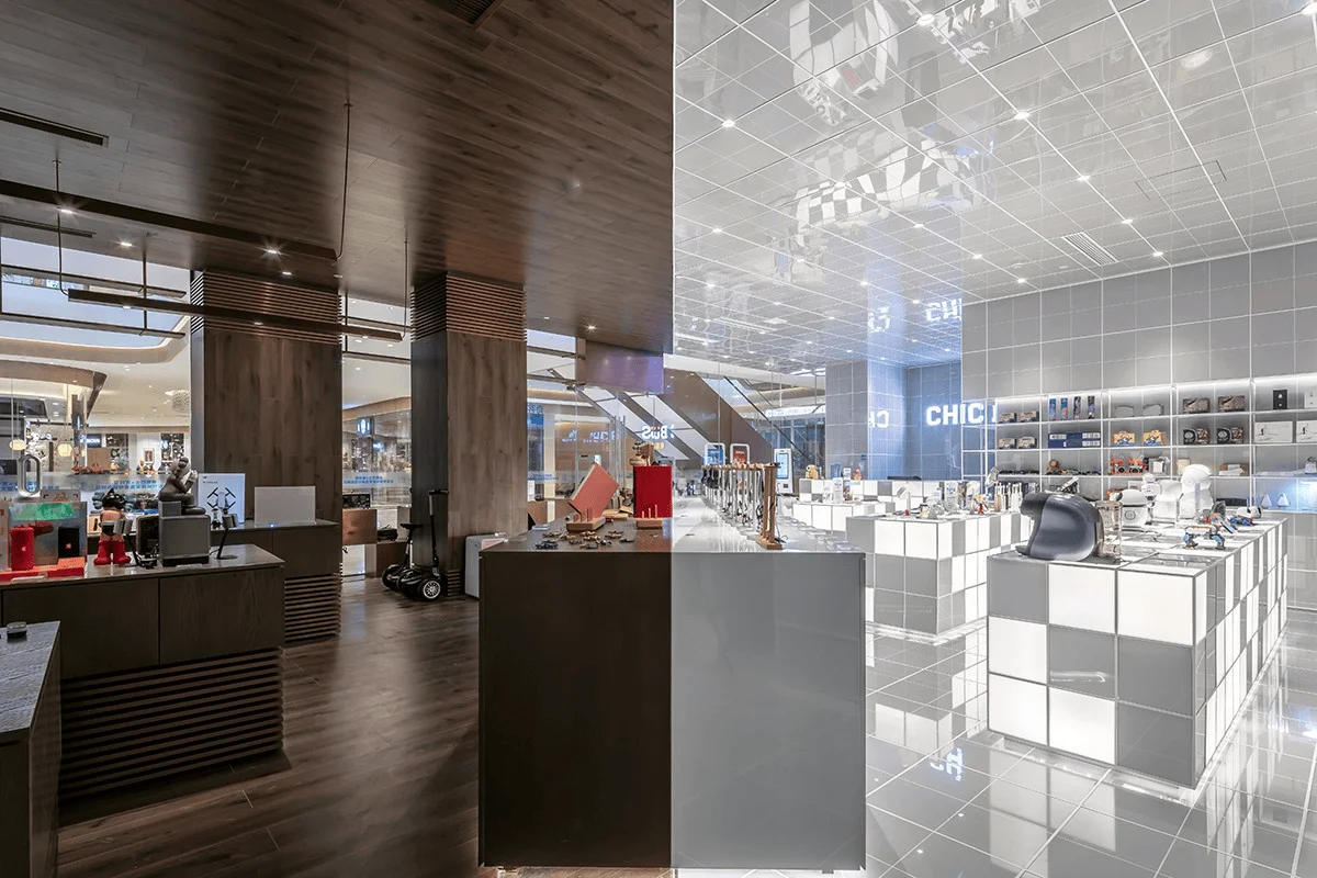
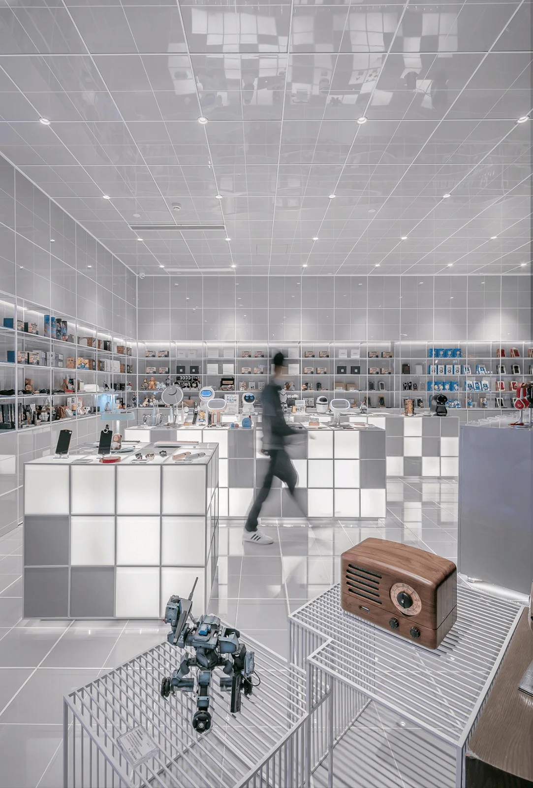
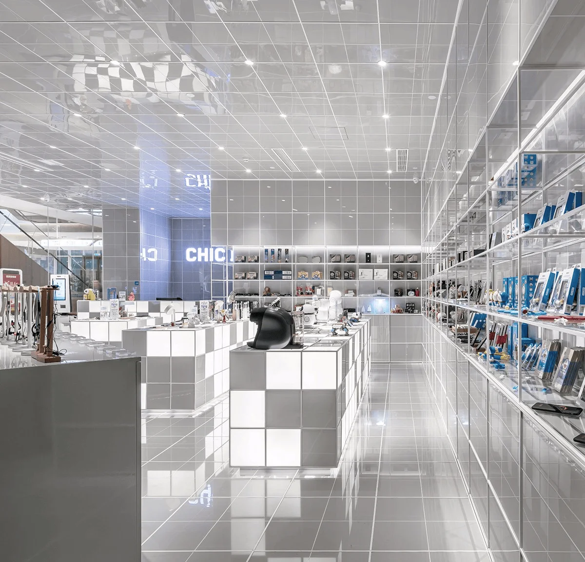
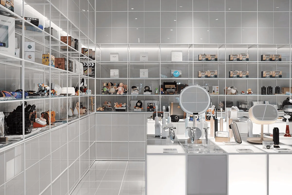
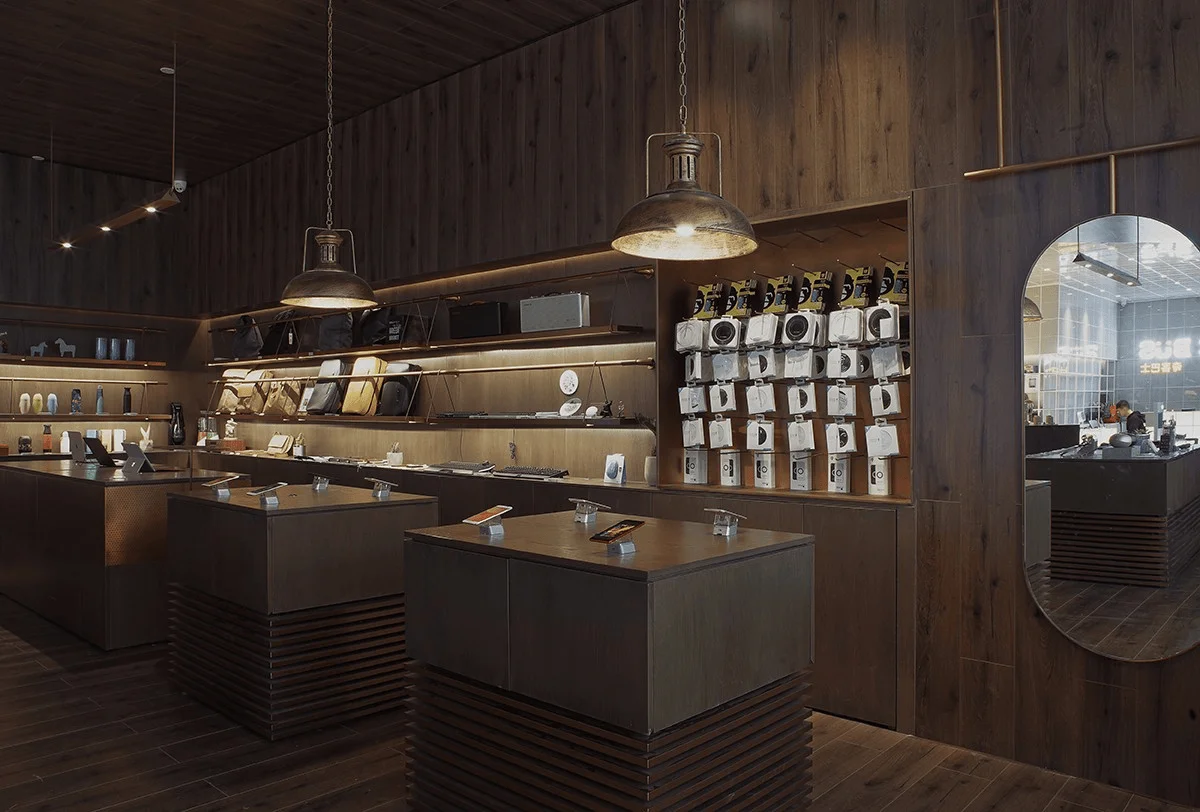
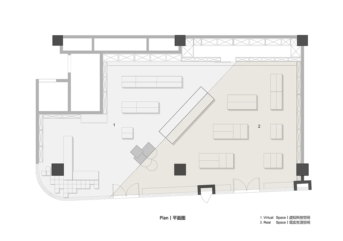
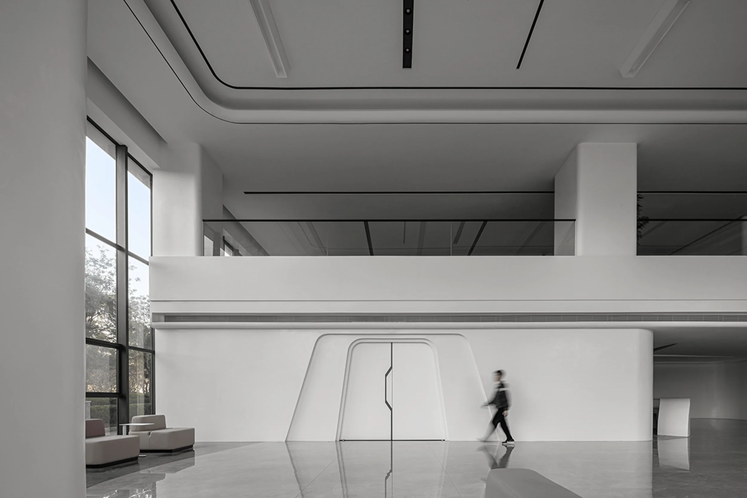
Zero One City Architecture has designed a new store space for Geek Bus, a “high-value” collection store that aims to bring technology closer to life and make life better. This brand upgrade was first applied to the Geek Bus Alipay Flagship Store in Hangzhou’s West Lake Yintai, where the design draws inspiration from the “Greenwich Meridian Line, which divides the eastern and western longitudes.” The design utilizes a futuristic, sci-fi space and a regional contrast to traditional humanism to depict the collision between the future and tradition, the coldness of technology and the warmth of life in the process of technological development, creating a high-tech retail store that closely aligns with the brand’s positioning. In the design, Geek Bus appears as a “connector of the virtual and the real:” The regular rectangular space is divided diagonally, and the 0-degree intersection line, like the “Greenwich Meridian Line,” serves as the main axis of the space, dividing the entire space into two parts with strong contrasts, designated as the “Virtual Technology Space” and the “Real Life Space.” These two spaces meet at 180 degrees. The “Greenwich Meridian Line” allows the virtual and the real to collide on the largest interface, creating a directional flow that guides customers into the space. While shopping, visitors can also straddle both “virtual” and “real” spaces to take photos. Separated by an invisible partition wall extending from the floor to the ceiling, the two spaces offer customers distinctly different “virtual” and “real” spatial experiences. The two spaces, with their contrasting light and dark characteristics, are designed for different product types: one side displays cool, youthful, high-tech products, while the other displays trendy, traditional, and life-focused products. The bright “virtual space” and the dark “real space,” though distinct in form, are unified in their display cabinet layouts and space materials, strengthening the overall design integrity. The high-tech product area, composed of light-colored matrices, features translucent “energy box” display cabinets and transparent, smooth surfaces, creating a dreamlike future feel for the “virtual space.” The traditional product area, with its extensive use of dark wood flooring and metallic brass, creates a “real space” with a rugged industrial feel. The interior lighting utilizes specific lighting techniques to create different spatial atmospheres. The “virtual space” lighting is set at the intersection points of the ceiling matrices, reinforcing the matrix relationship of the space and creating an overall bright “virtual space.” The “real space,” with its reduced brightness, uses a combination of metallic pendant lights and hidden LED strips to create a blend of traditional humanism in the atmosphere created by the dark wood.
Project Information:


