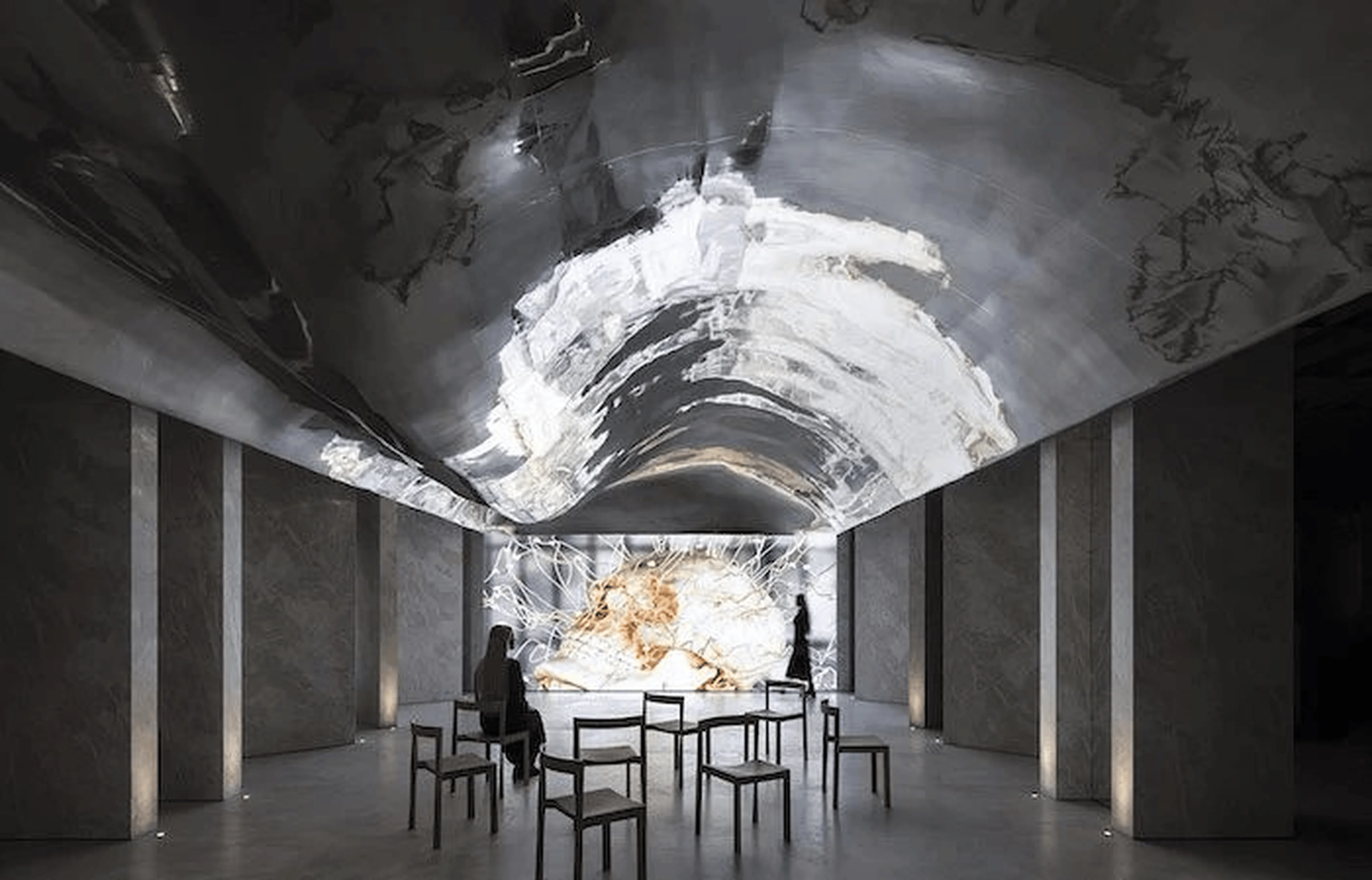
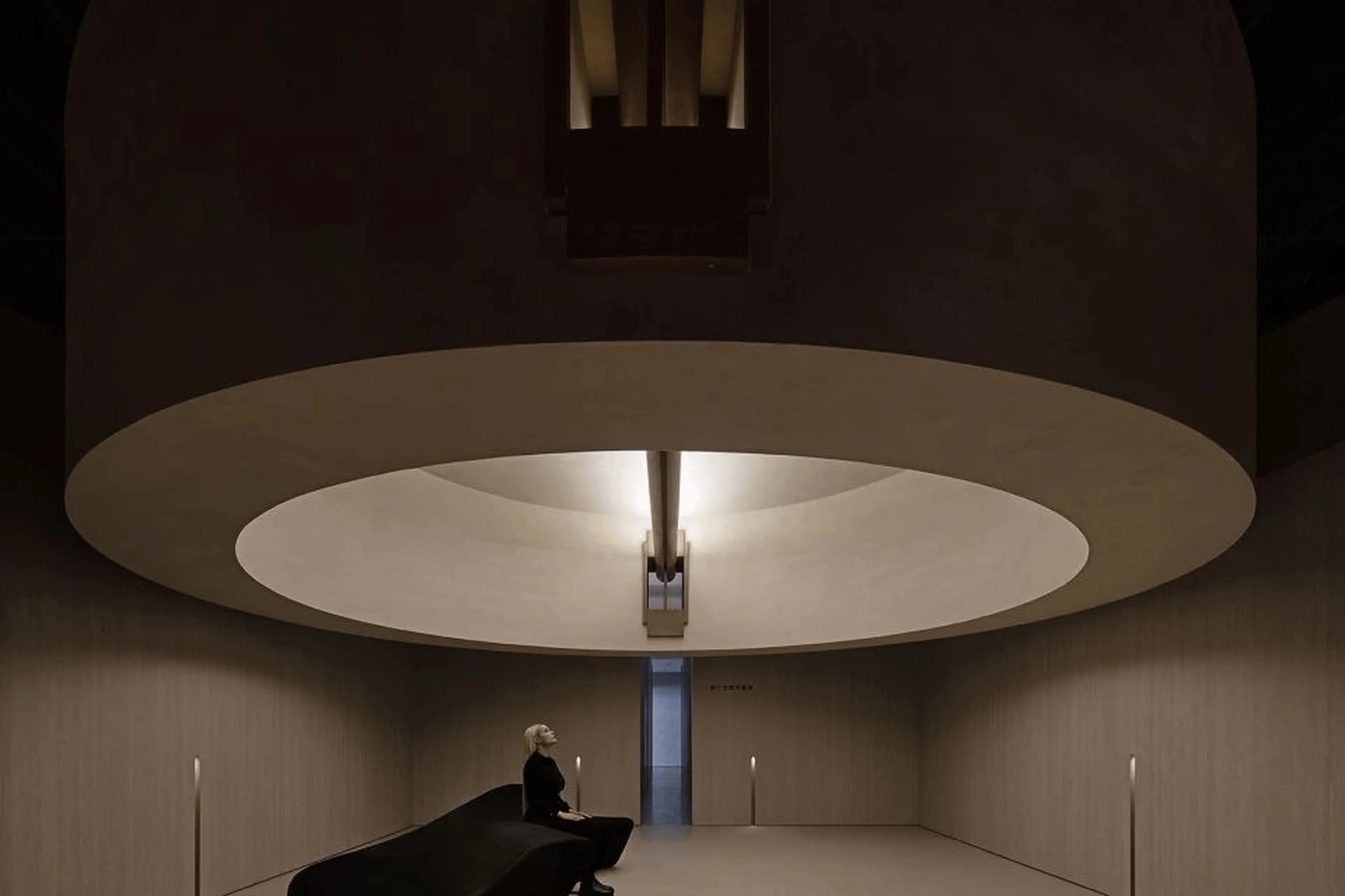
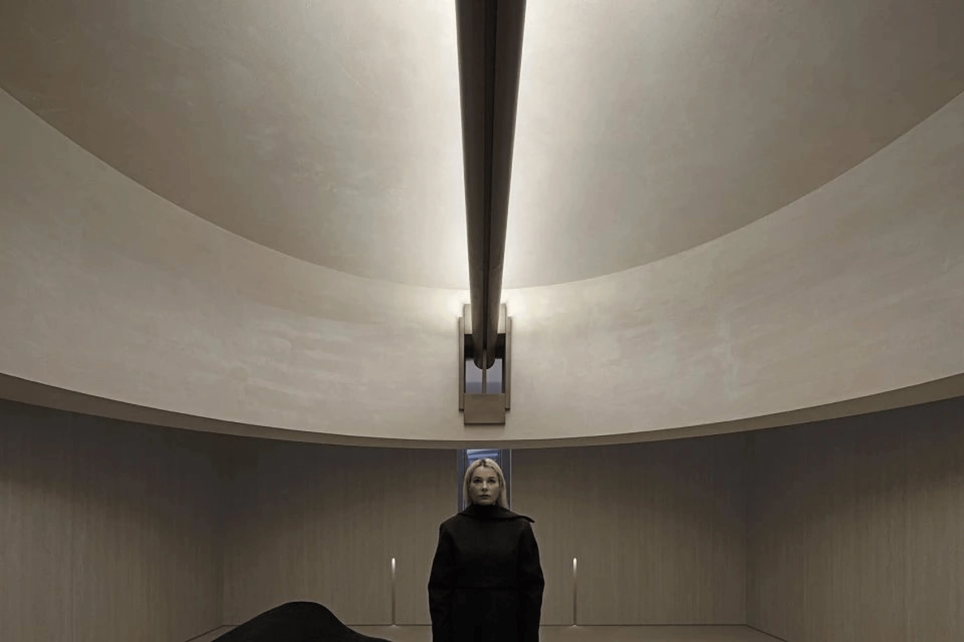
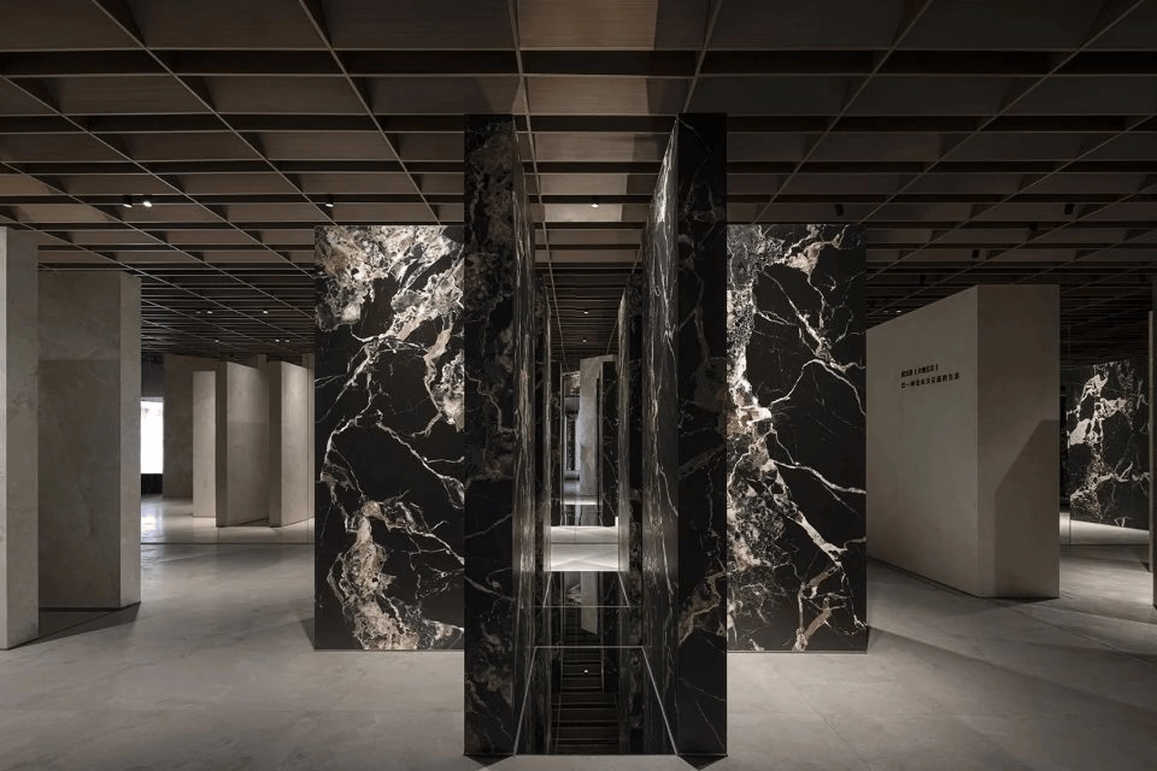
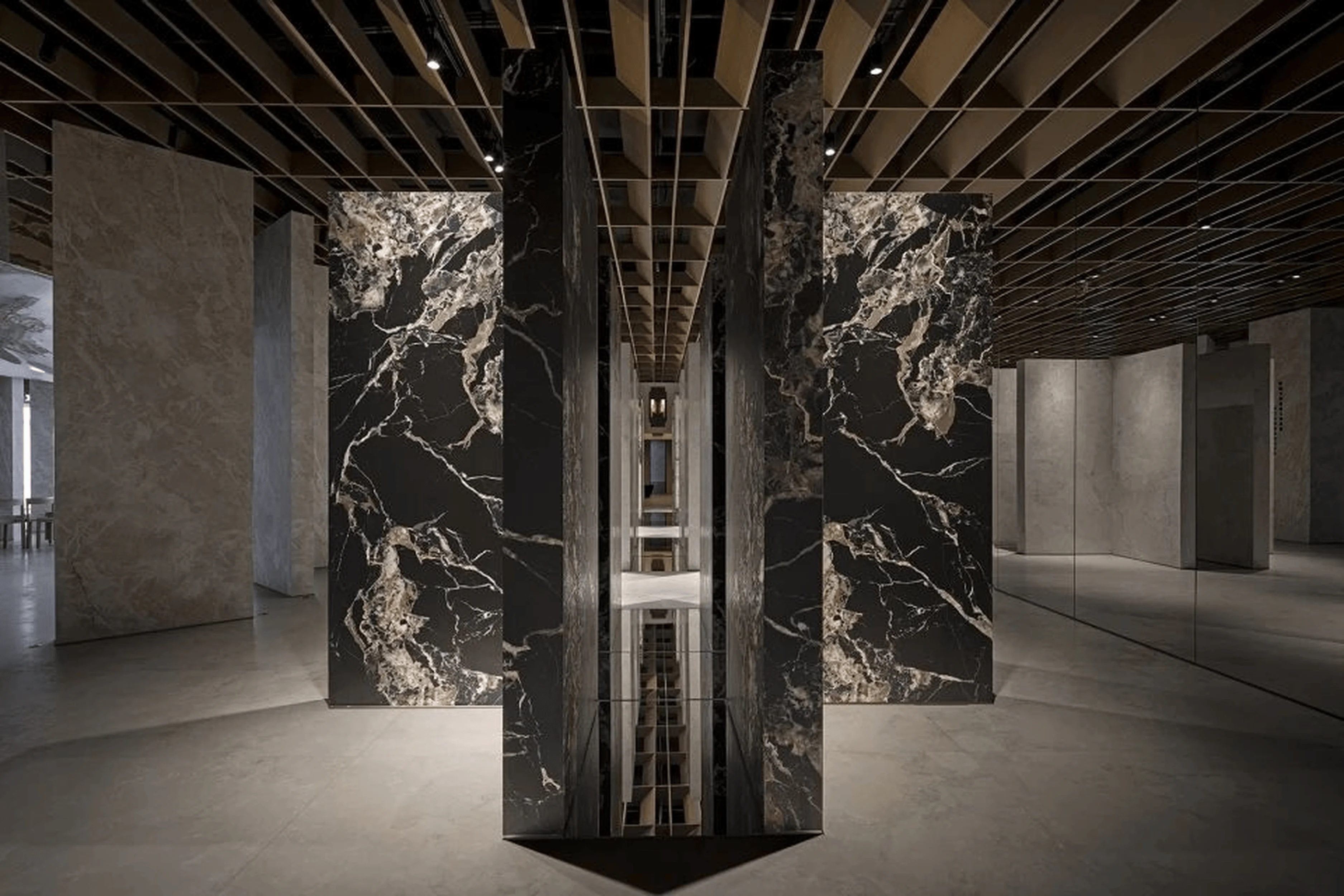
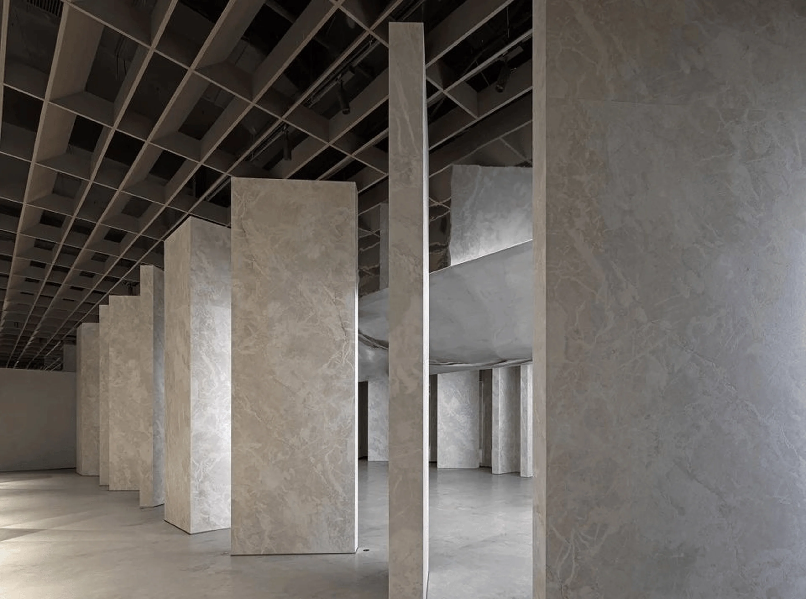
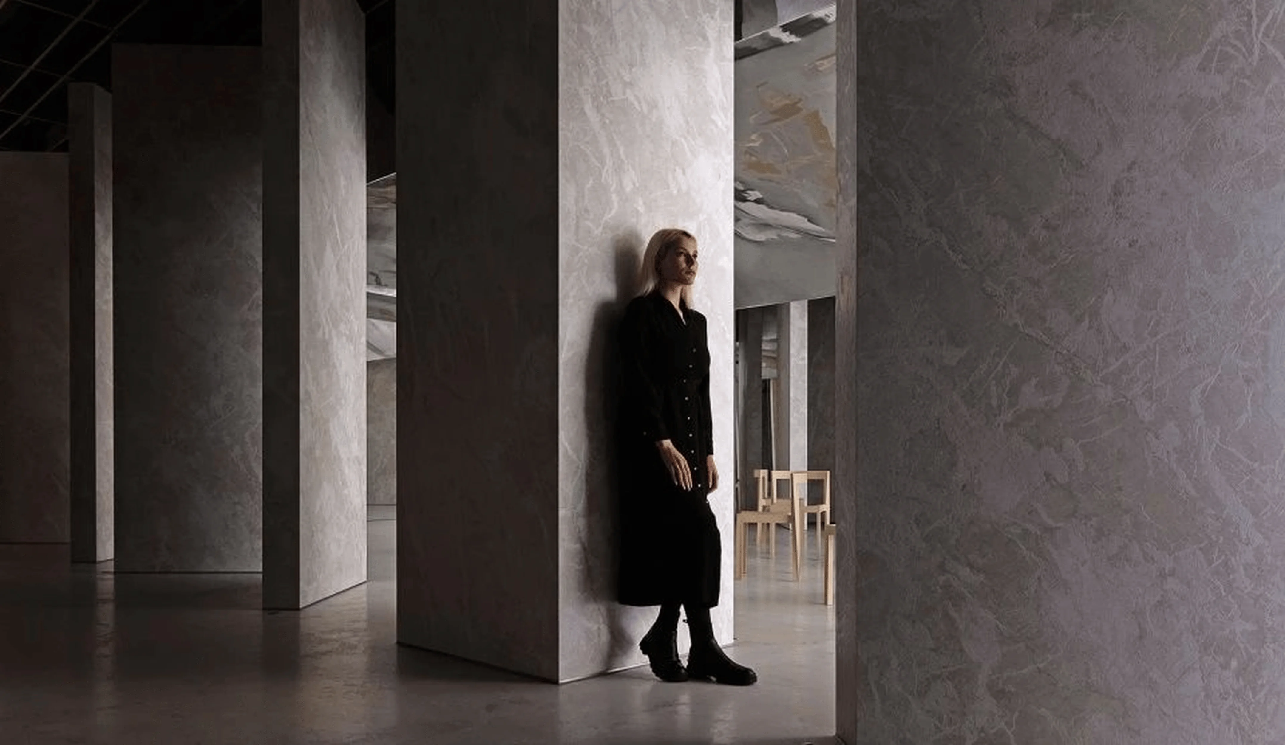
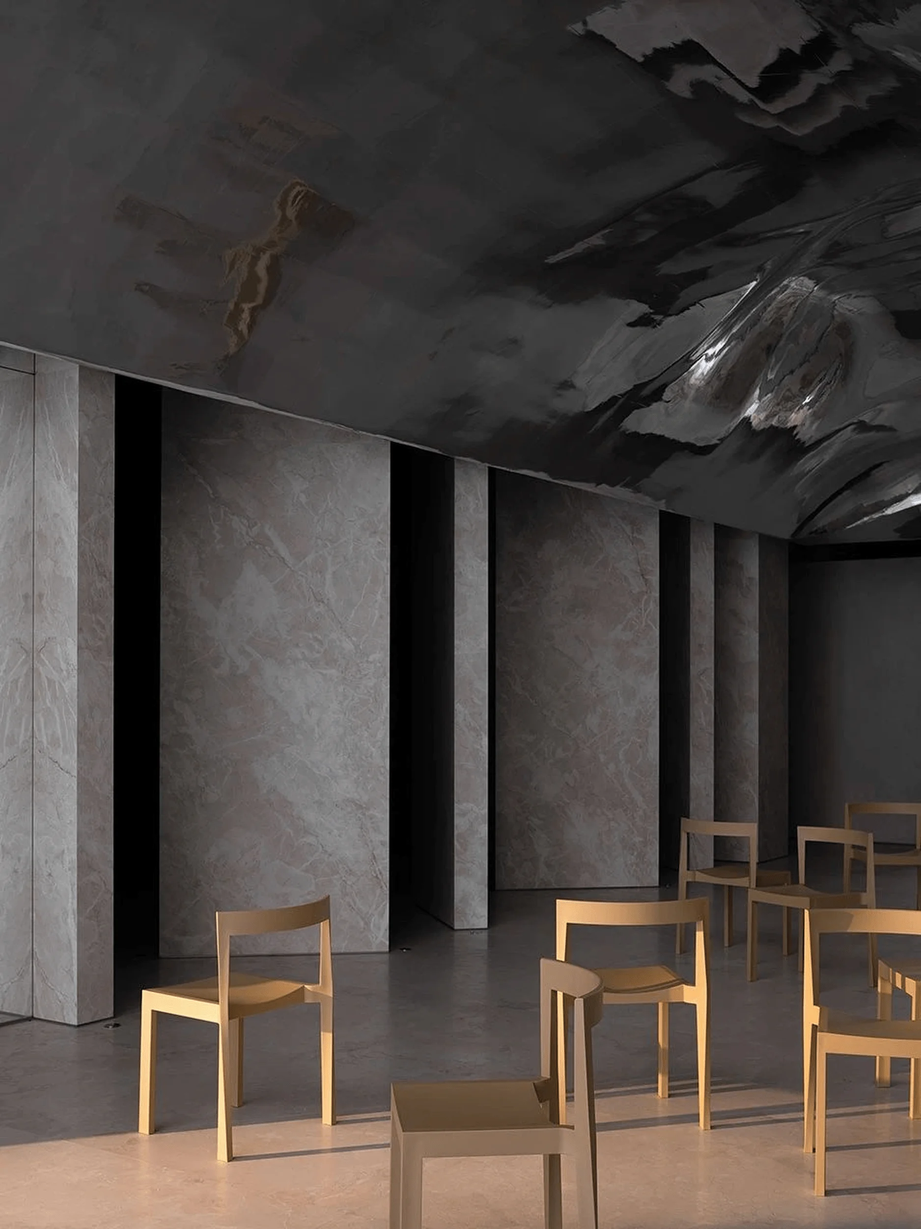
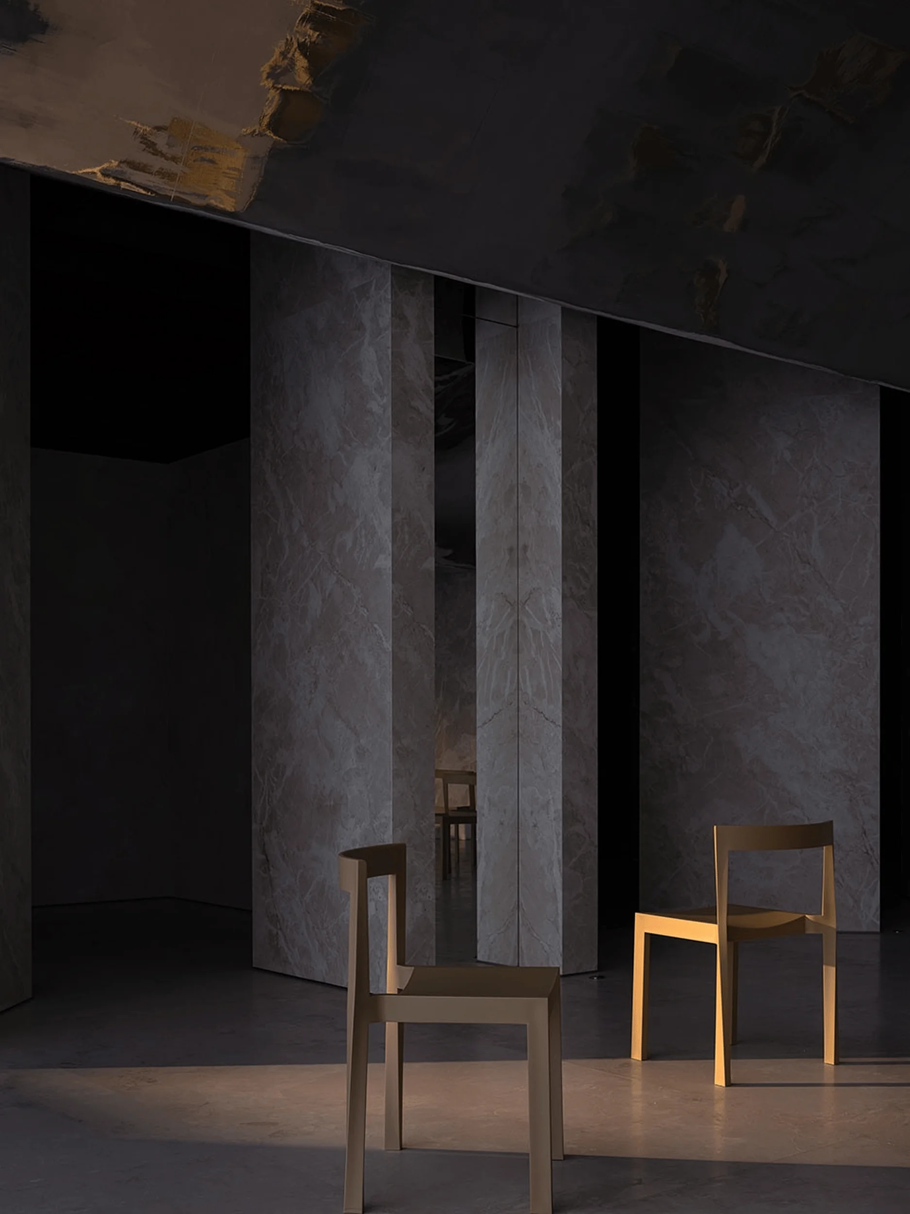
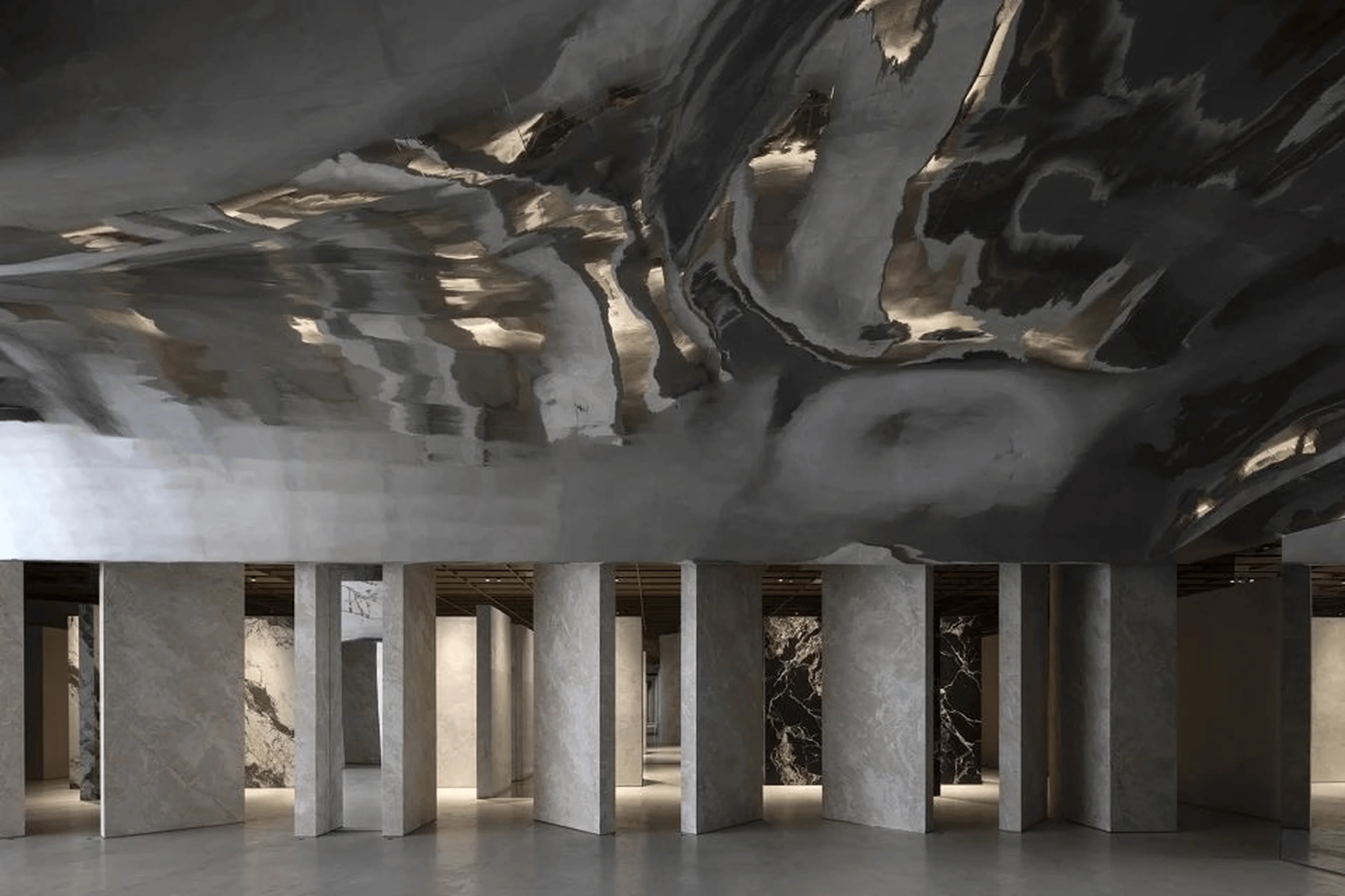
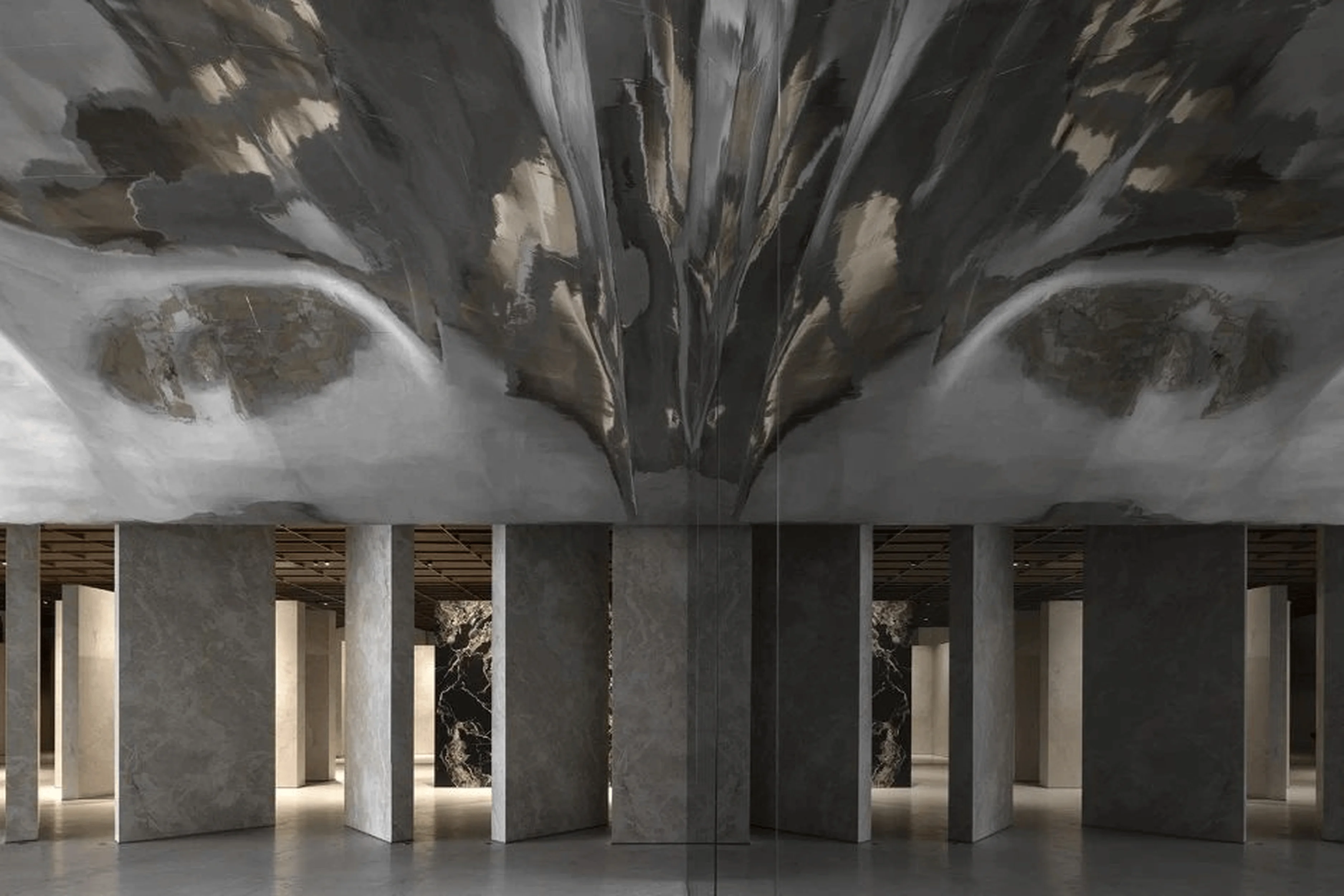
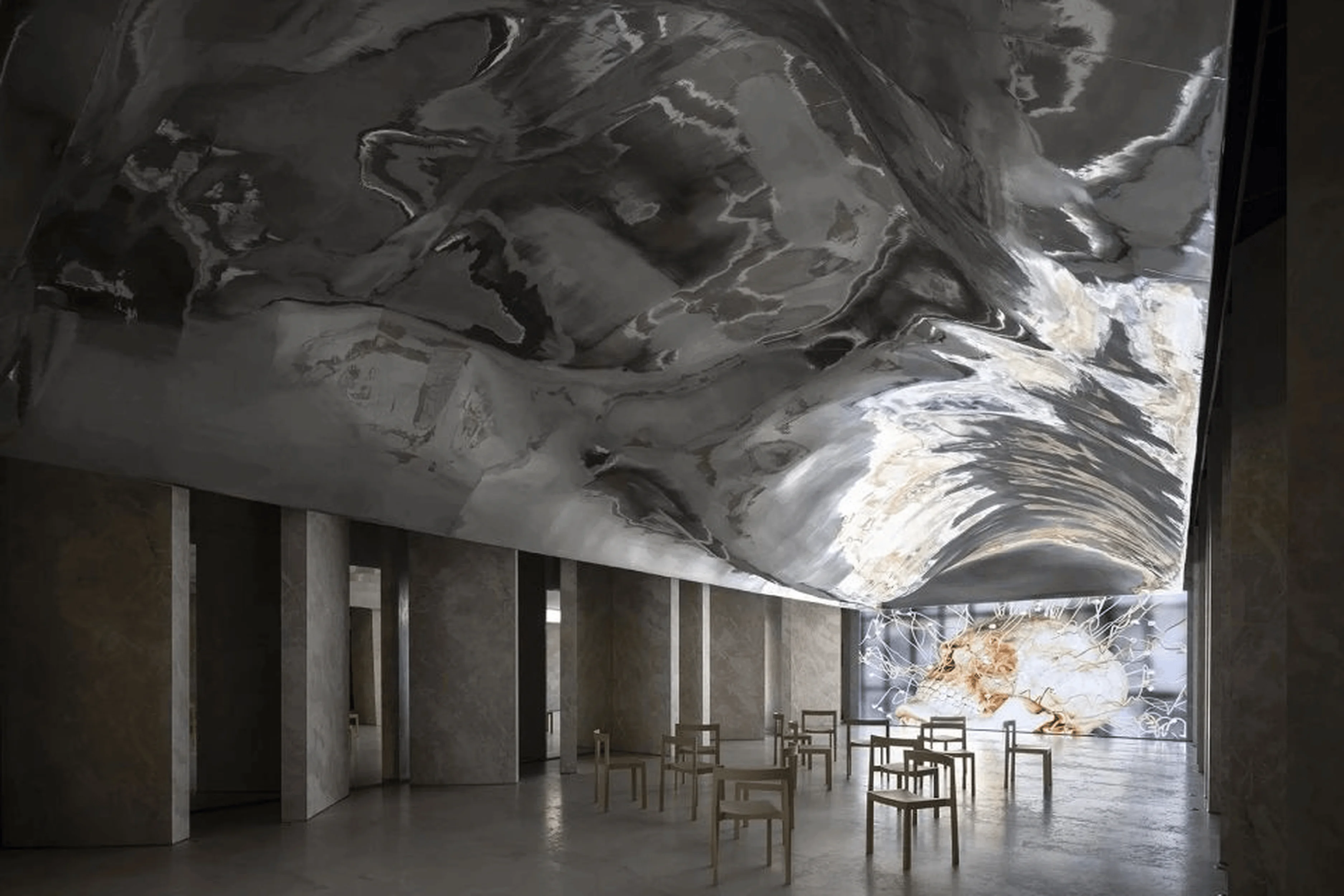
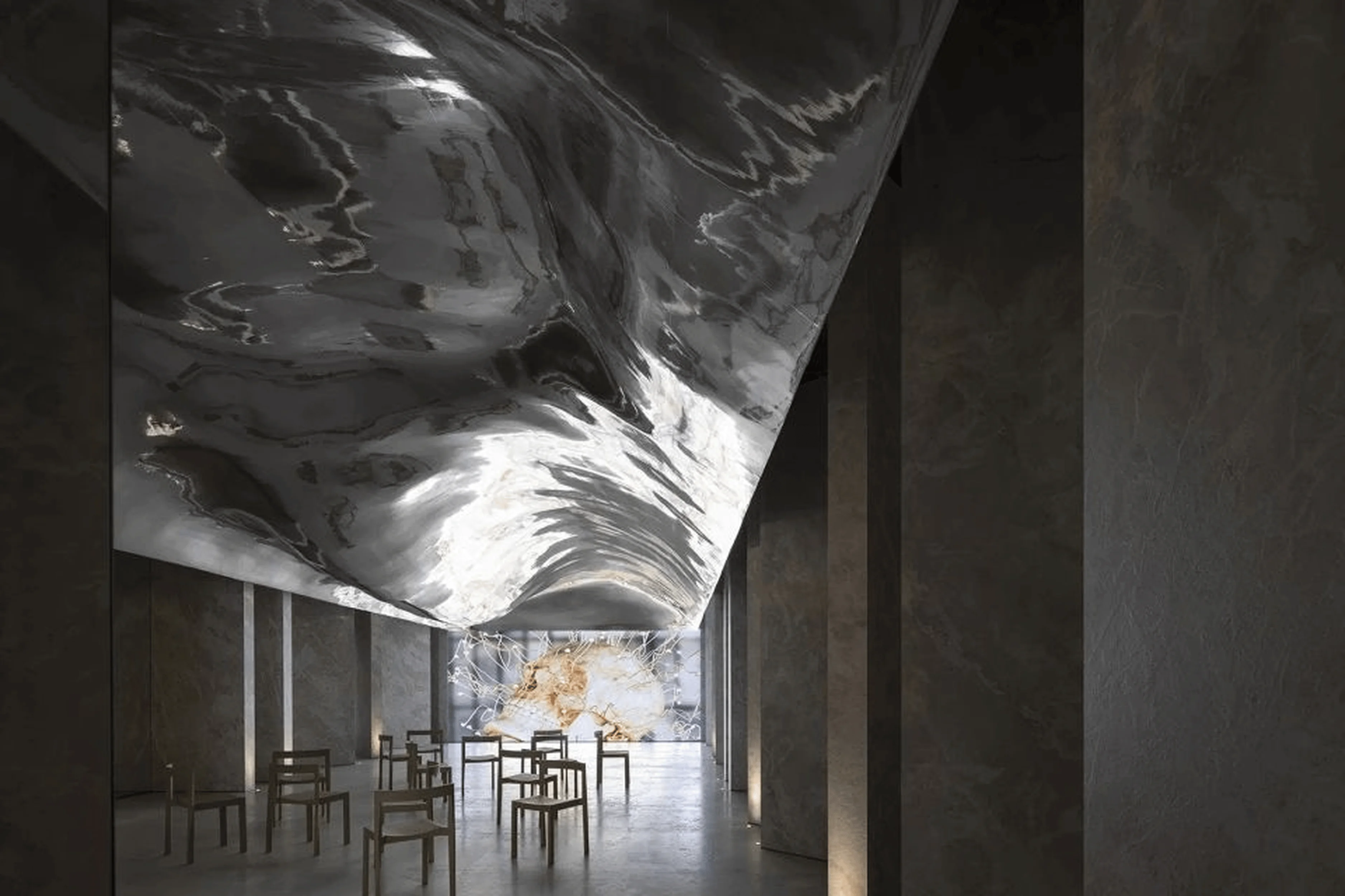
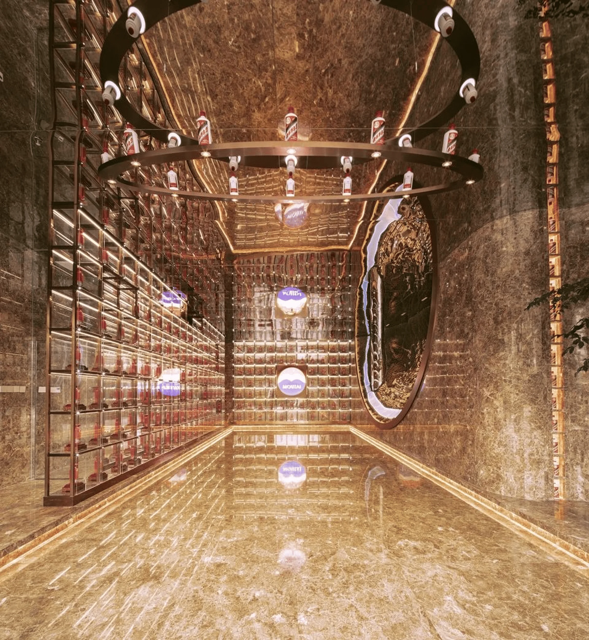
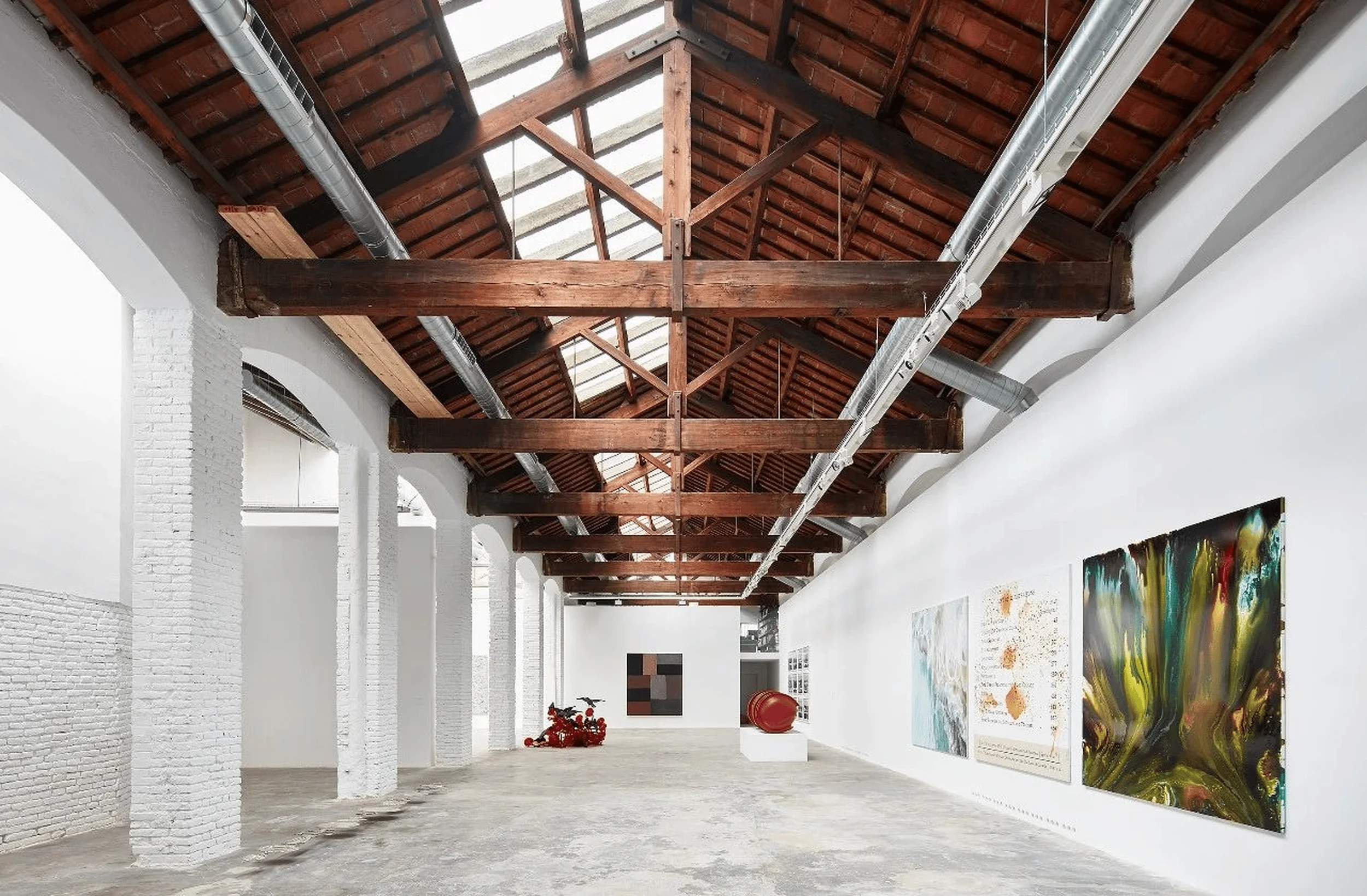
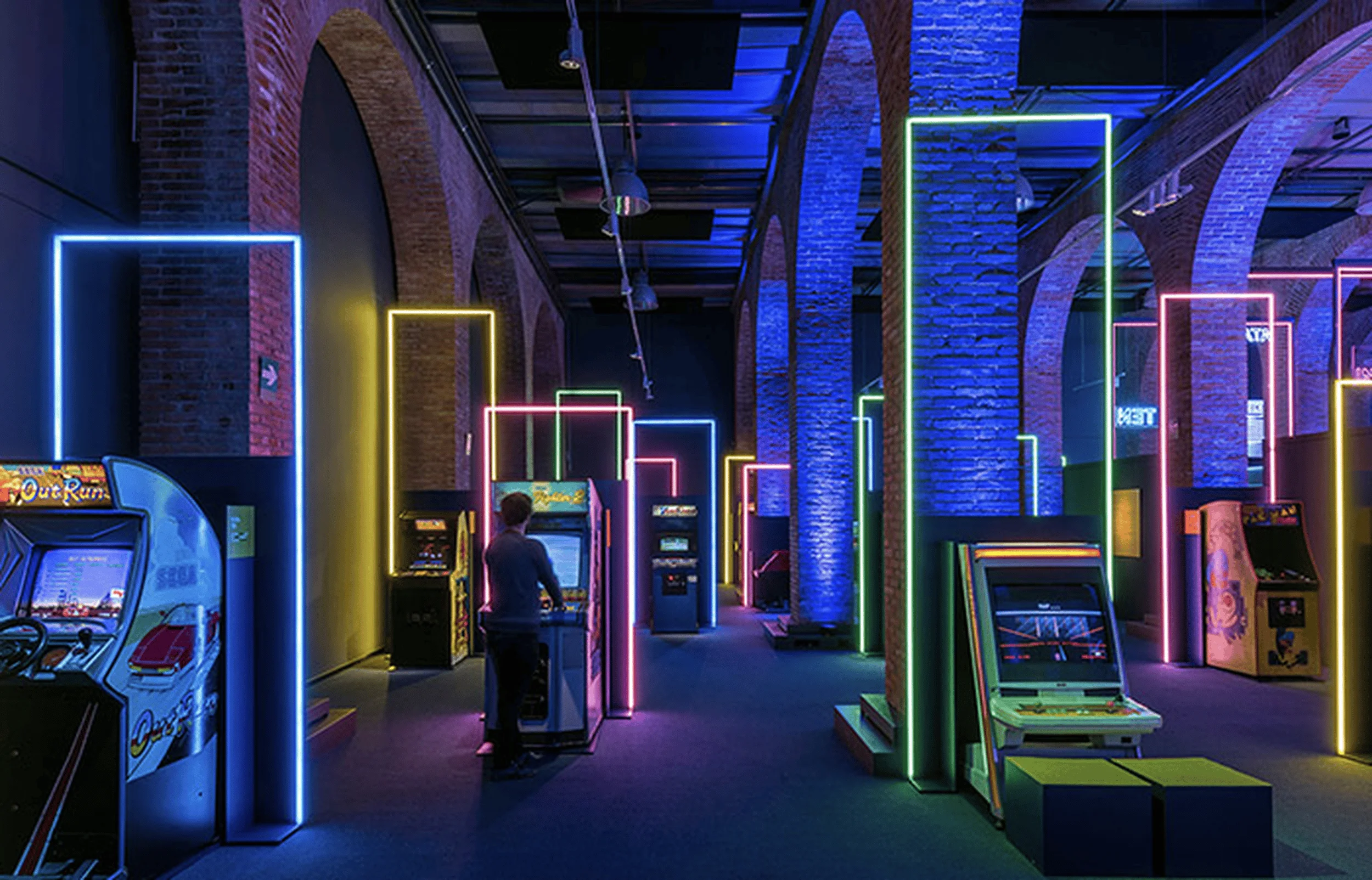
AD Architecture designs an innovative exhibition hall for Owenlai, characterized by a unique spatial array, interplay of light and geometry, and a harmonious blend of natural materials.
Contents
Project Background: A Collaborative Upgrade for Owenlai’s Headquarters
In October 2023, AD Architecture was commissioned by Owenlai Group to design a new exhibition space for their ‘Dadizhuyi’ product series as part of a headquarters upgrade. Located in Foshan, China, the project involved revamping the public spaces and brand experience center, creating a multifunctional environment for reception and product display. This marked the second collaboration between the design team and Owenlai, emphasizing a shared commitment to innovation in commercial interior architecture design. The commercial interior architecture design brief called for a space that would effectively communicate the essence of the ‘Dadizhuyi’ series while reinforcing Owenlai’s brand identity.
tag: commercial interior architecture design
Brand Continuity and Product Characteristics: Exploring the Essence of ‘Dadizhuyi’
Owenlai’s brand philosophy centers around integrating natural aesthetics with modern manufacturing techniques. Their ‘Dadizhuyi’ (Earth Style, Naturalism) series embodies this philosophy by drawing inspiration from natural elements and advocating for a ‘life without ceilings’. The series utilizes innovative ‘muscle-texture symbiosis technology’ to seamlessly blend texture and structure in porcelain tiles, achieving a natural aesthetic previously unattainable. AD Architecture’s design aimed to encapsulate Owenlai’s brand ethos, the essence of ‘Dadizhuyi’, and the connection between architecture, nature, and human experience. The design team meticulously studied the product line, categorizing its colors and patterns to showcase the individuality and quality of each tile, aligning with the commercial interior architecture design principles of creating engaging and informative displays.
tag: commercial interior architecture design
Breaking the Mold: A ‘Non-Sample Room’ Approach to Exhibition Design
AD Architecture took a bold approach by rejecting the traditional ‘sample room’ format often seen in ceramic tile showrooms. They envisioned the space as a fashion runway for the products, employing innovative methods to showcase their interaction with space, nature, people, and time. This signifies a significant shift in the presentation of ceramic products within commercial interior architecture design, promoting a more experiential and interactive engagement with the material. The team’s ‘non-sample room’ approach aimed to create a positive disruption within the industry, moving away from conventional displays towards a more conceptual and immersive experience.
tag: commercial interior architecture design
Spatial Organization: A Free Array and Multifunctional Zones
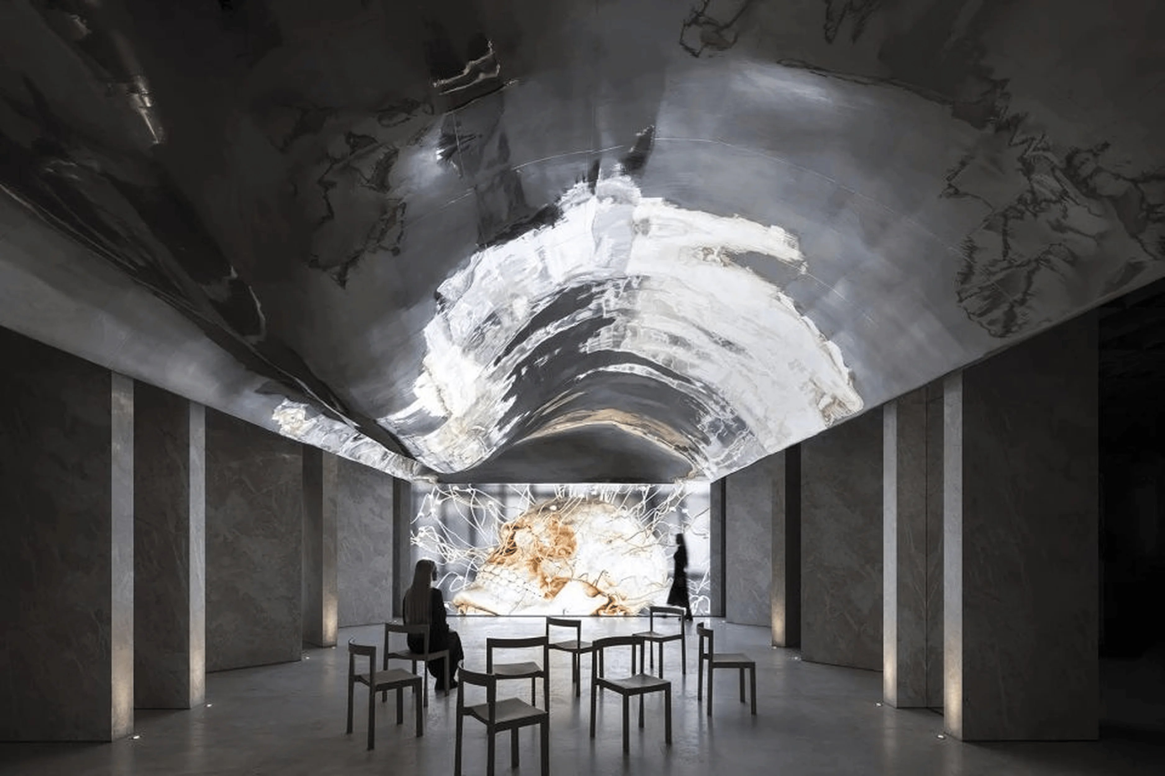
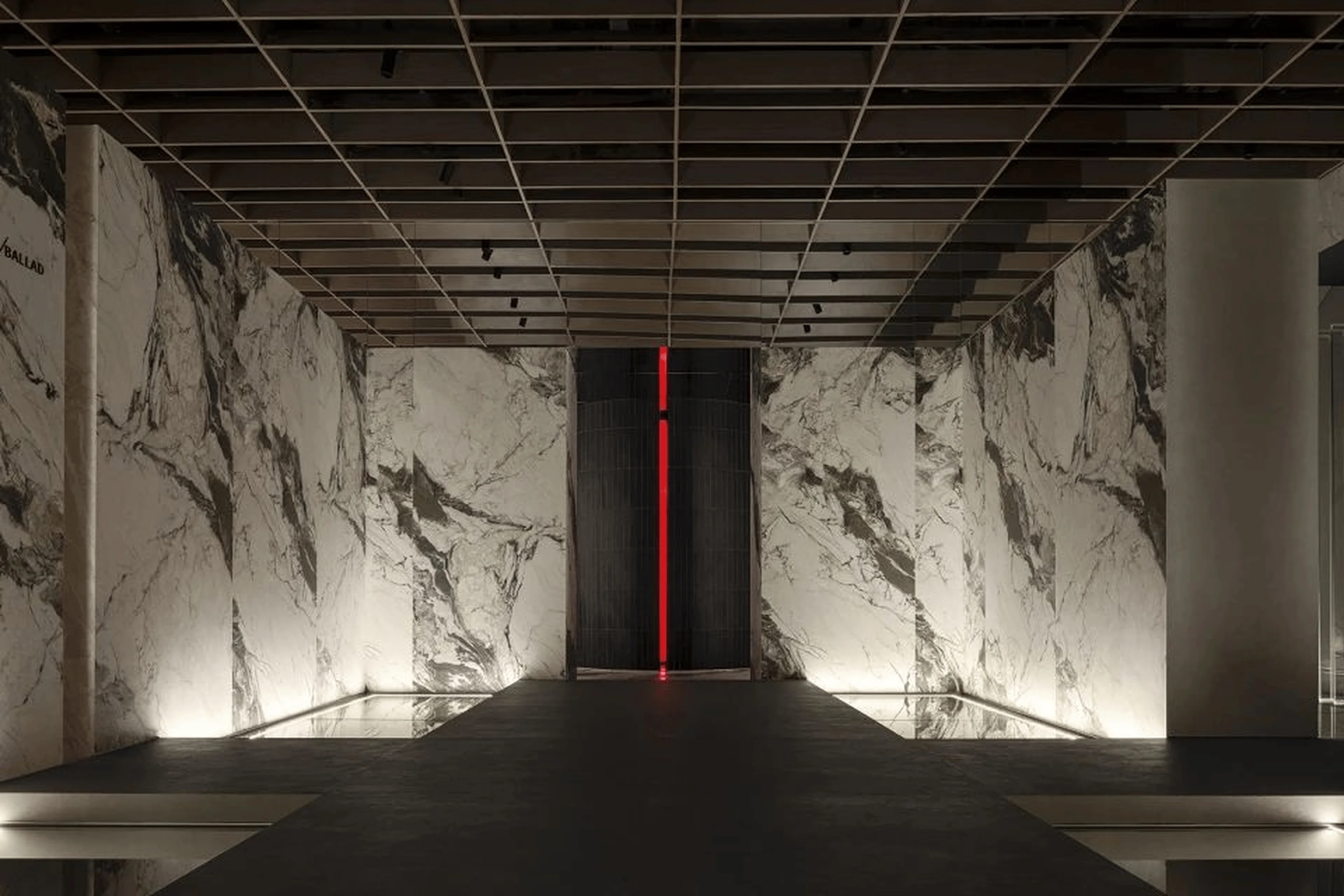
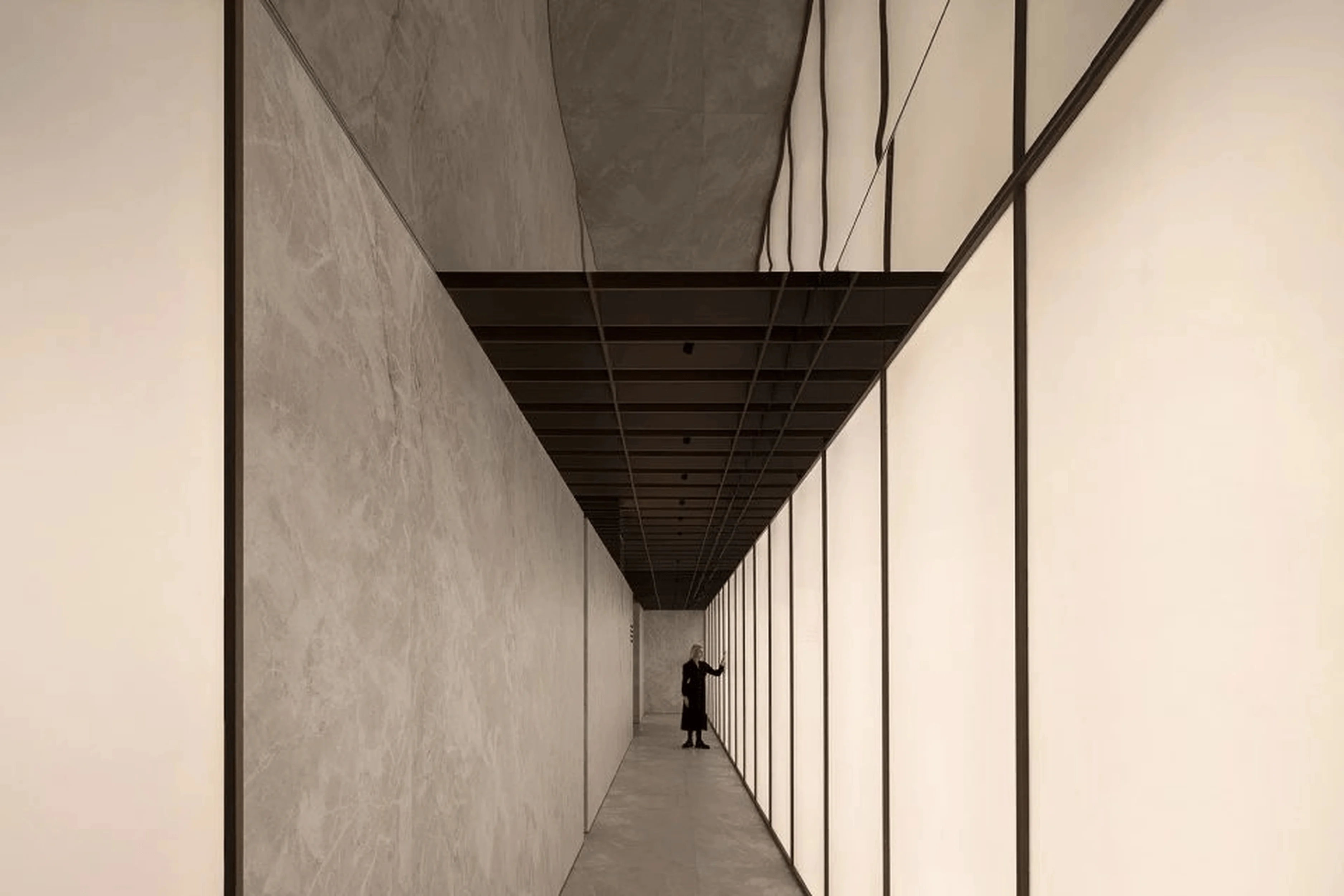
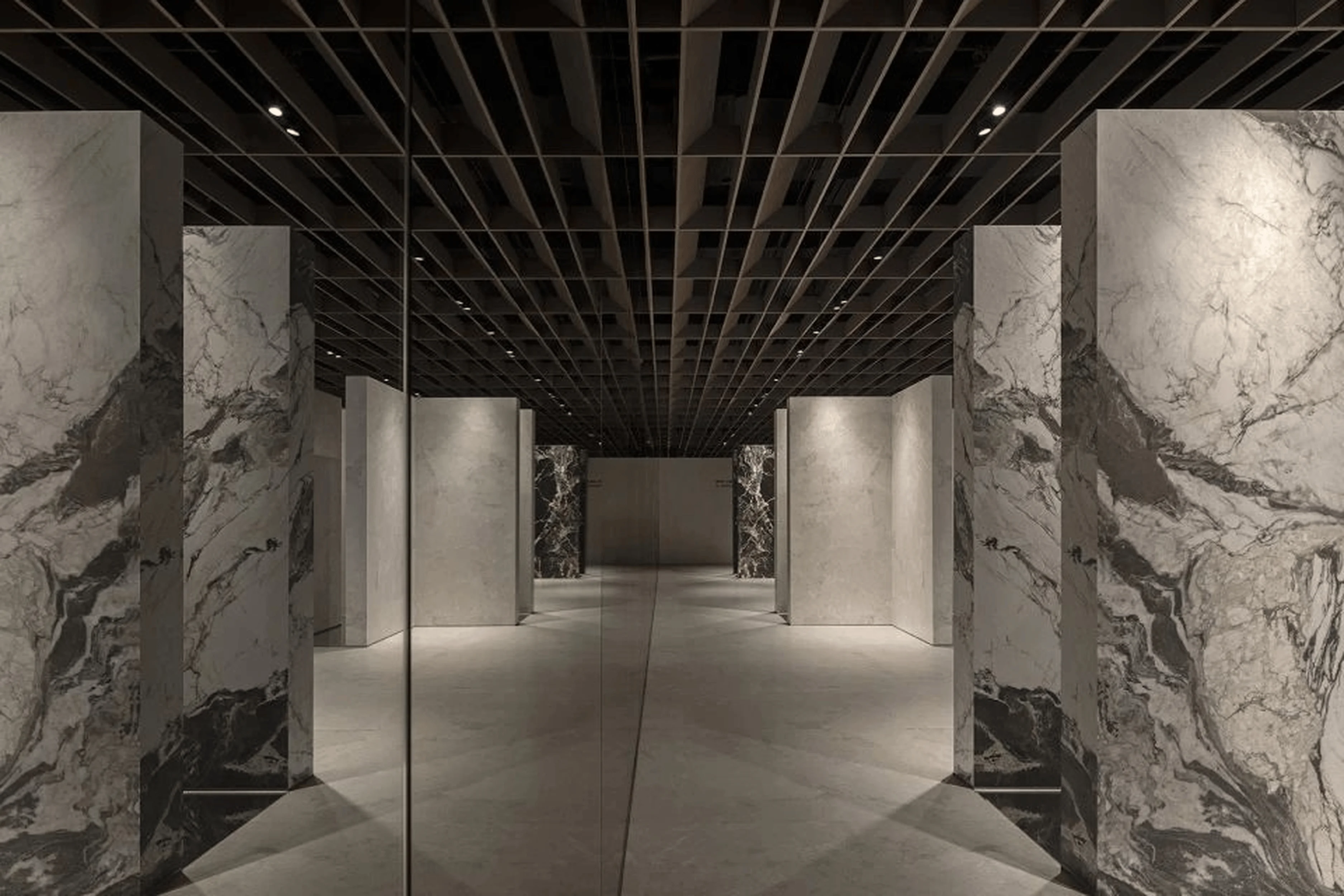
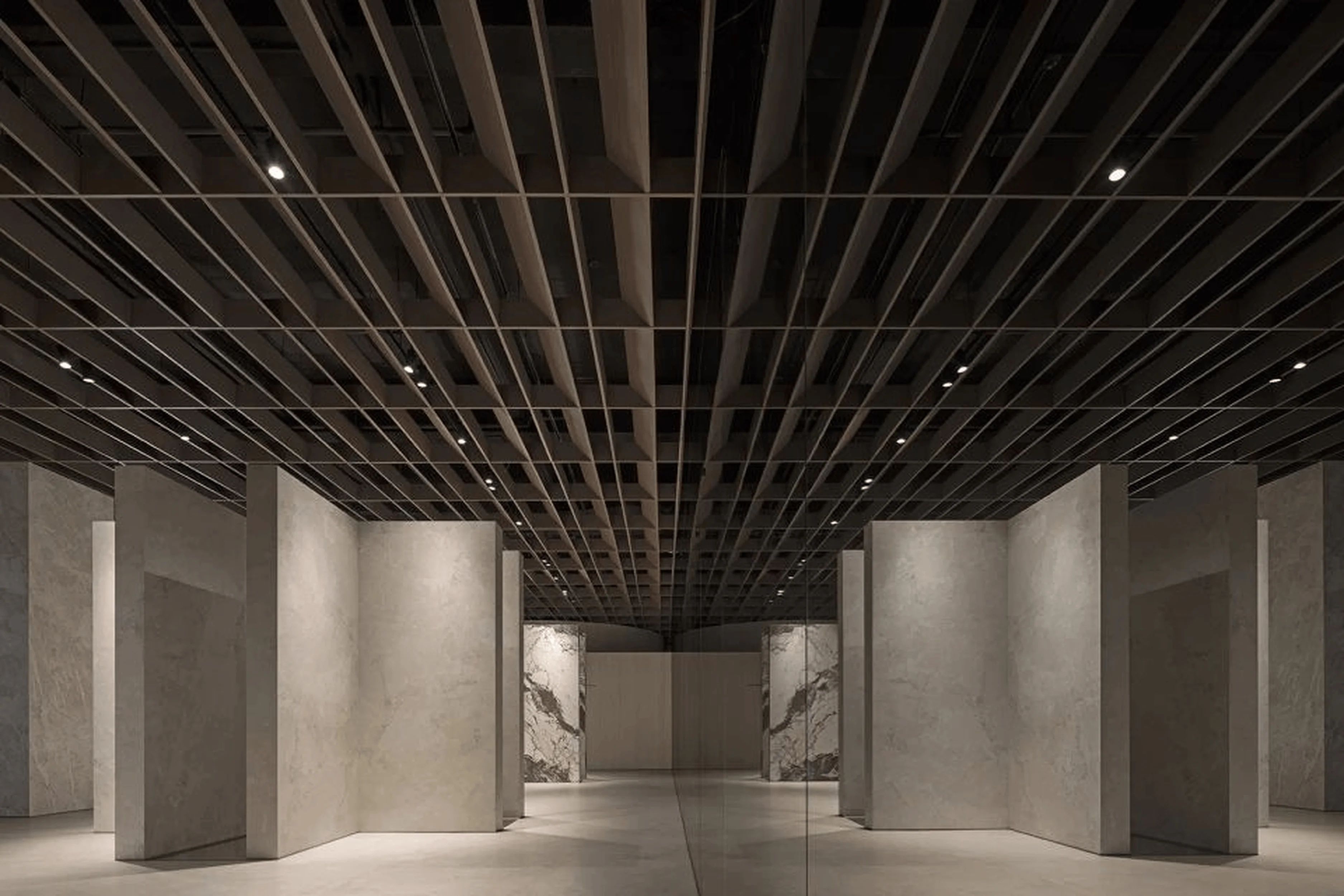
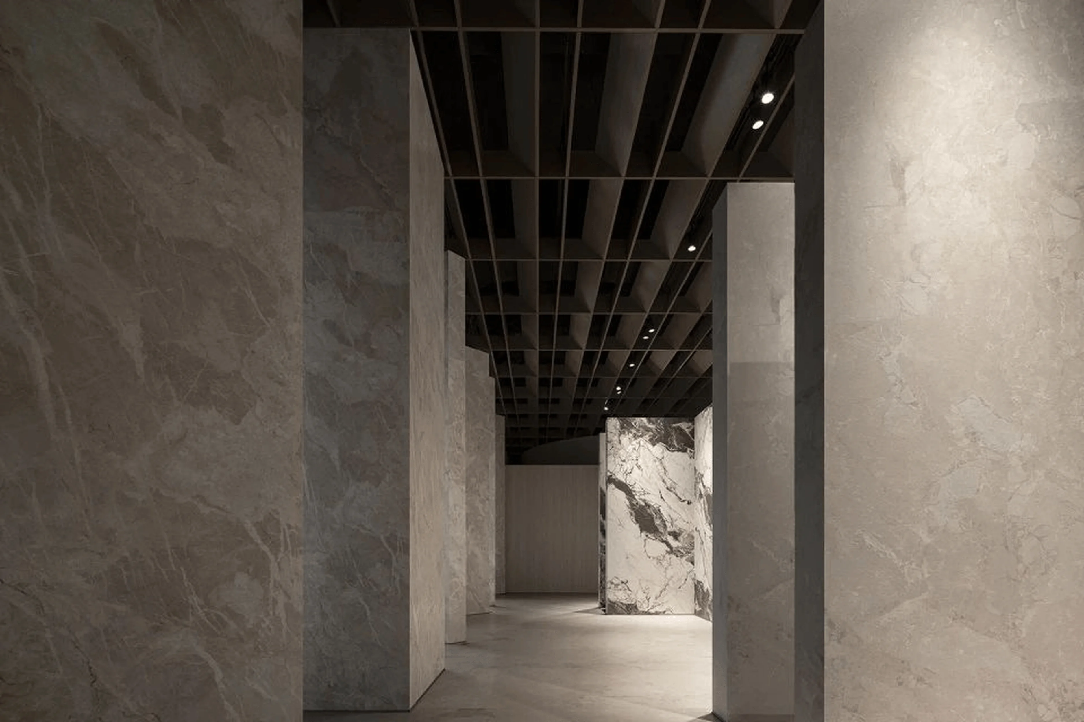
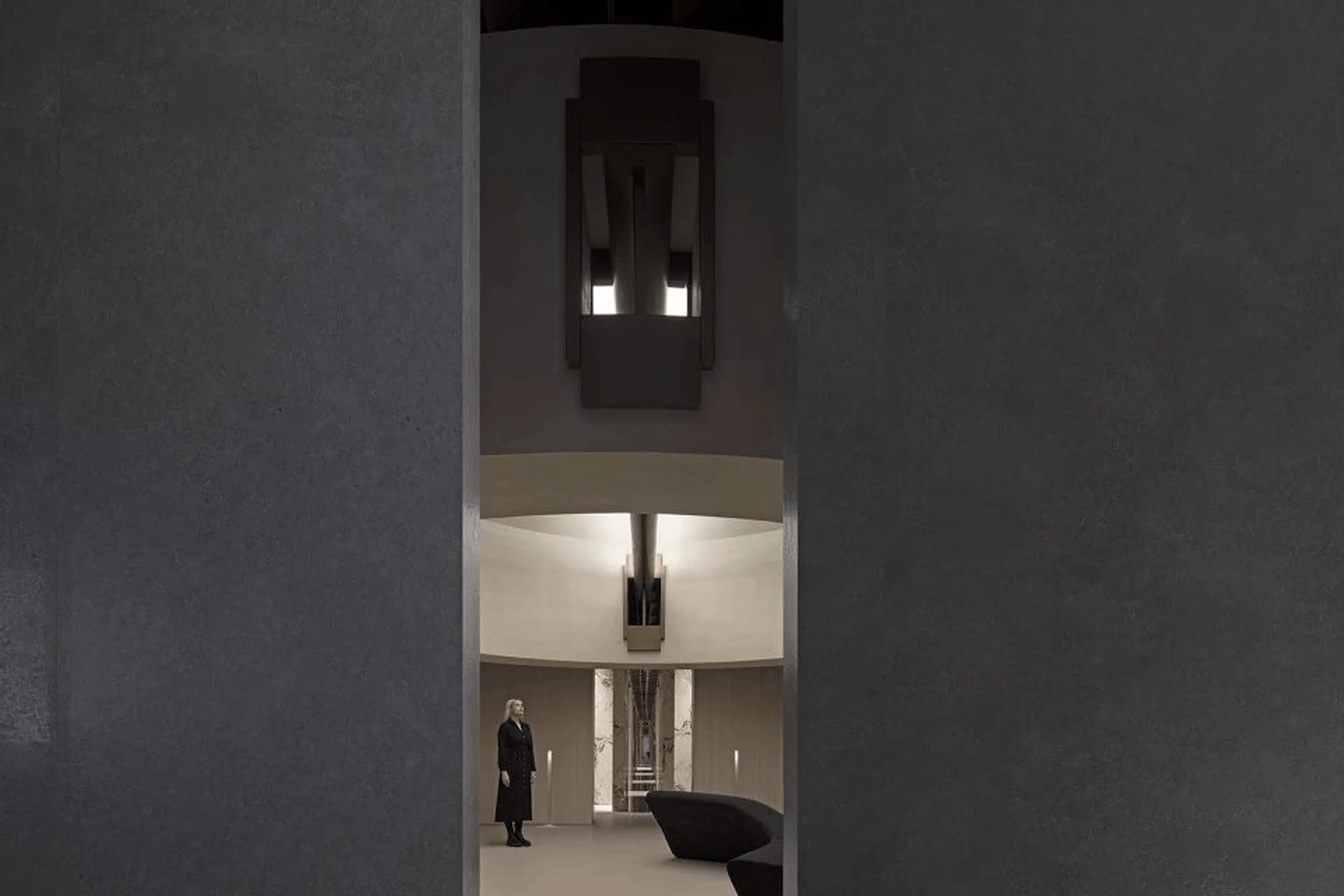
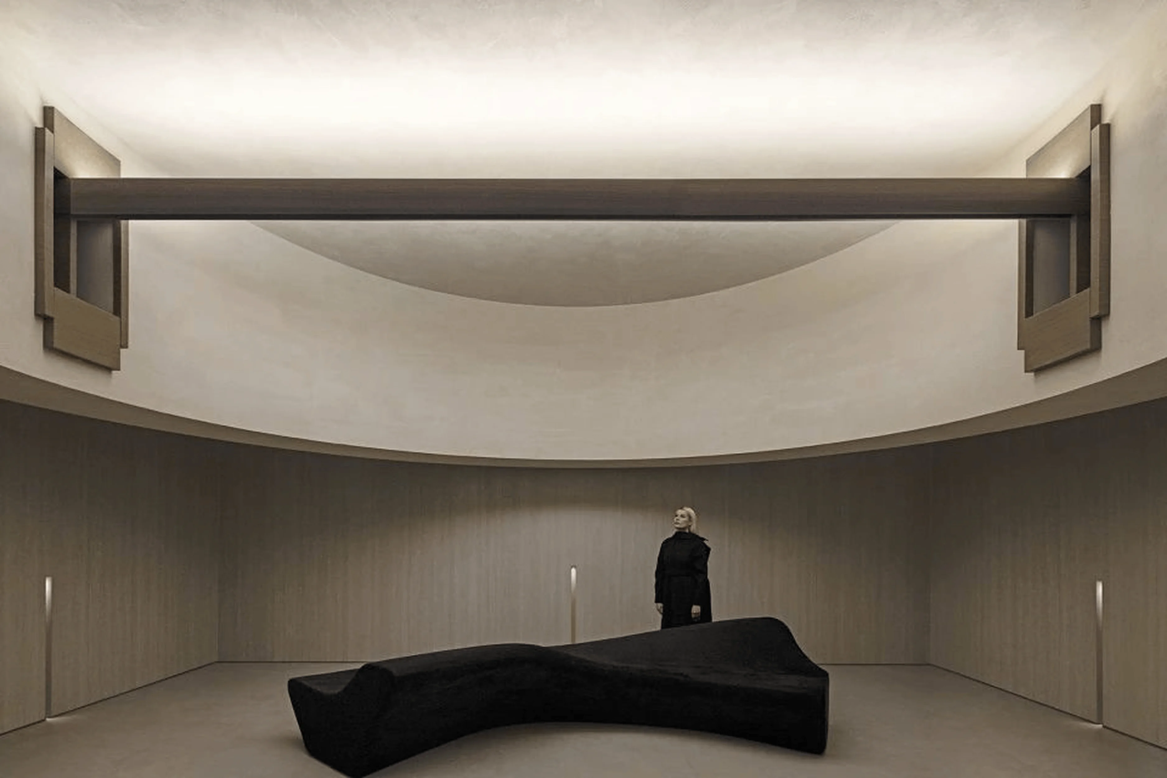
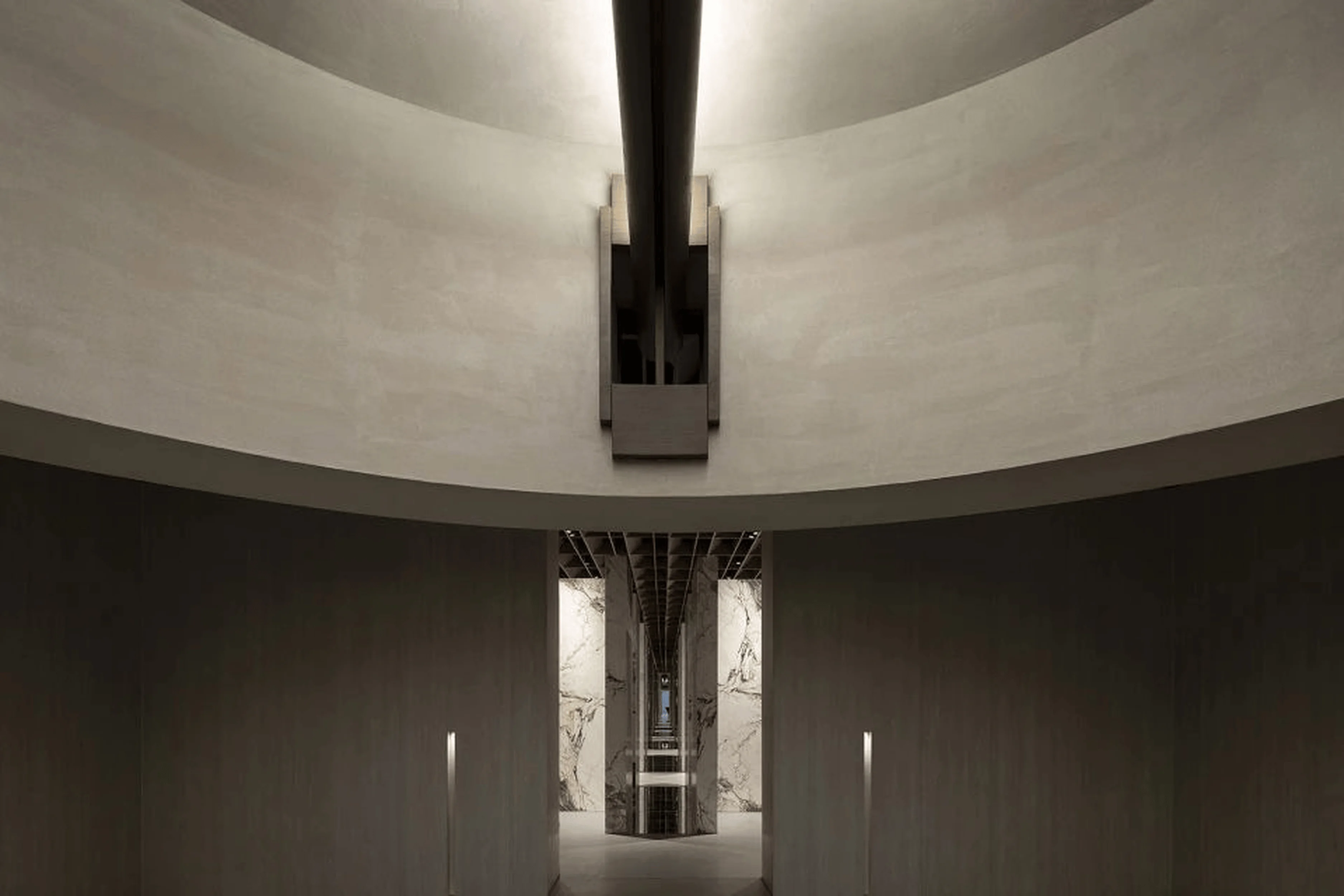
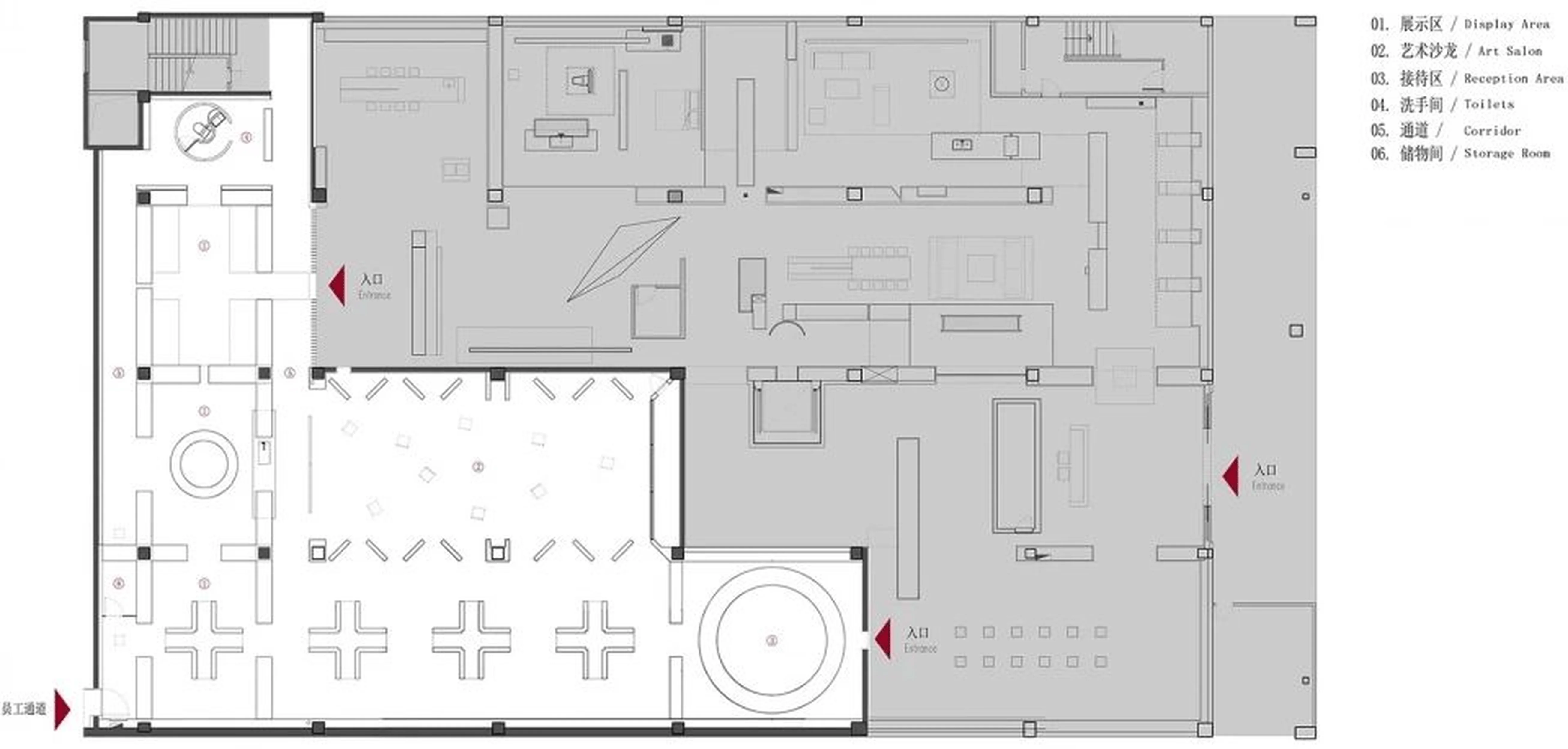
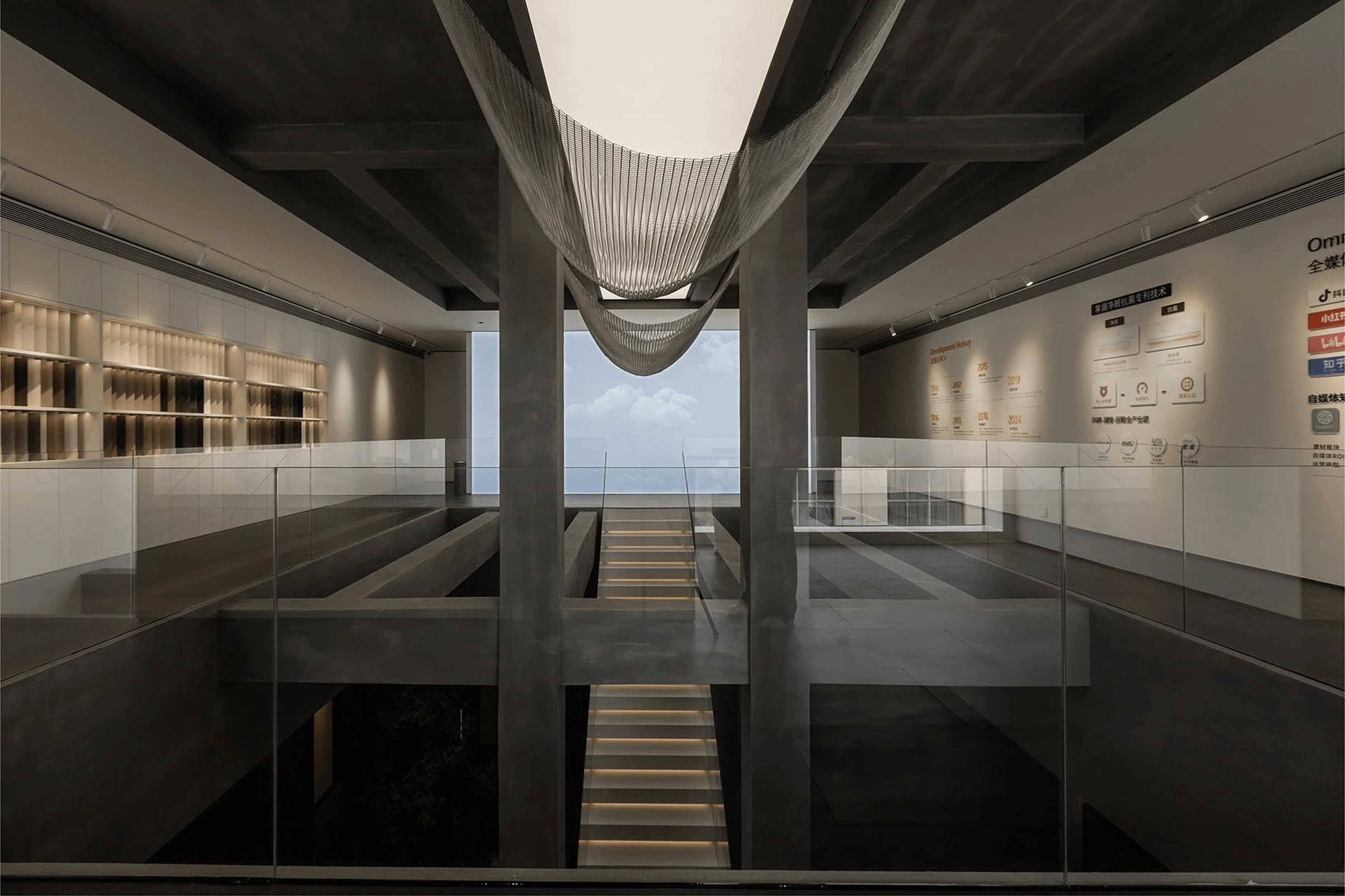
The spatial layout revolves around a free array, creating a sense of sequence and exploration. The introduction of gaps between product displays fosters a sense of freedom and allows for low-density interactions. Boundaries become blurred and spaces merge into each other, inviting movement and discovery. A central salon space provides a versatile area for events and discussions. Its symmetrical layout, softened by a flowing ceiling design, establishes a strong visual impact and reinforces the brand’s presence within the overall commercial interior architecture design. This central hub acts as a focal point, drawing visitors in and creating a lasting impression.
tag: commercial interior architecture design
Highlights of the Exhibition Hall: Exploring Key Design Features
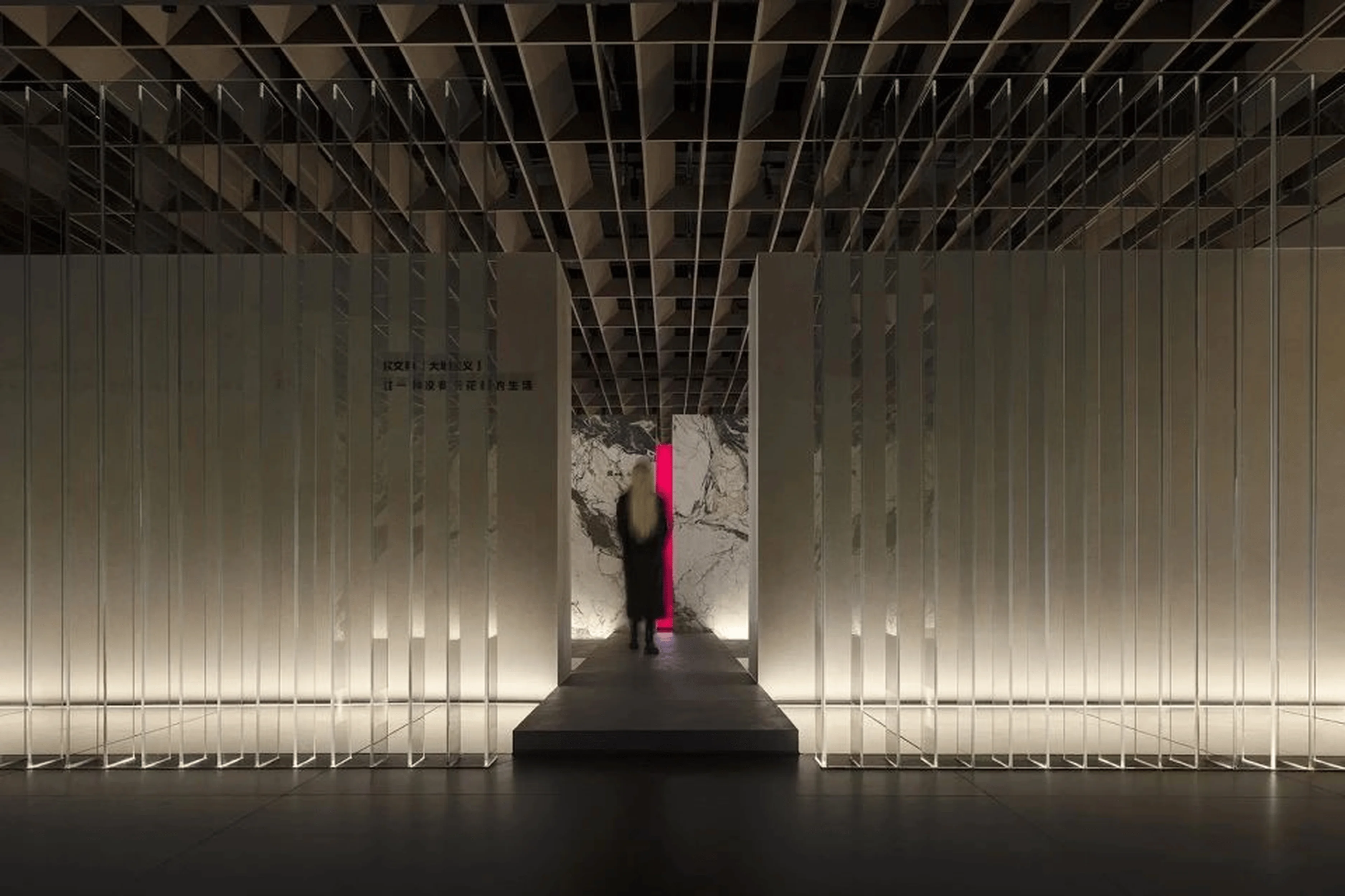
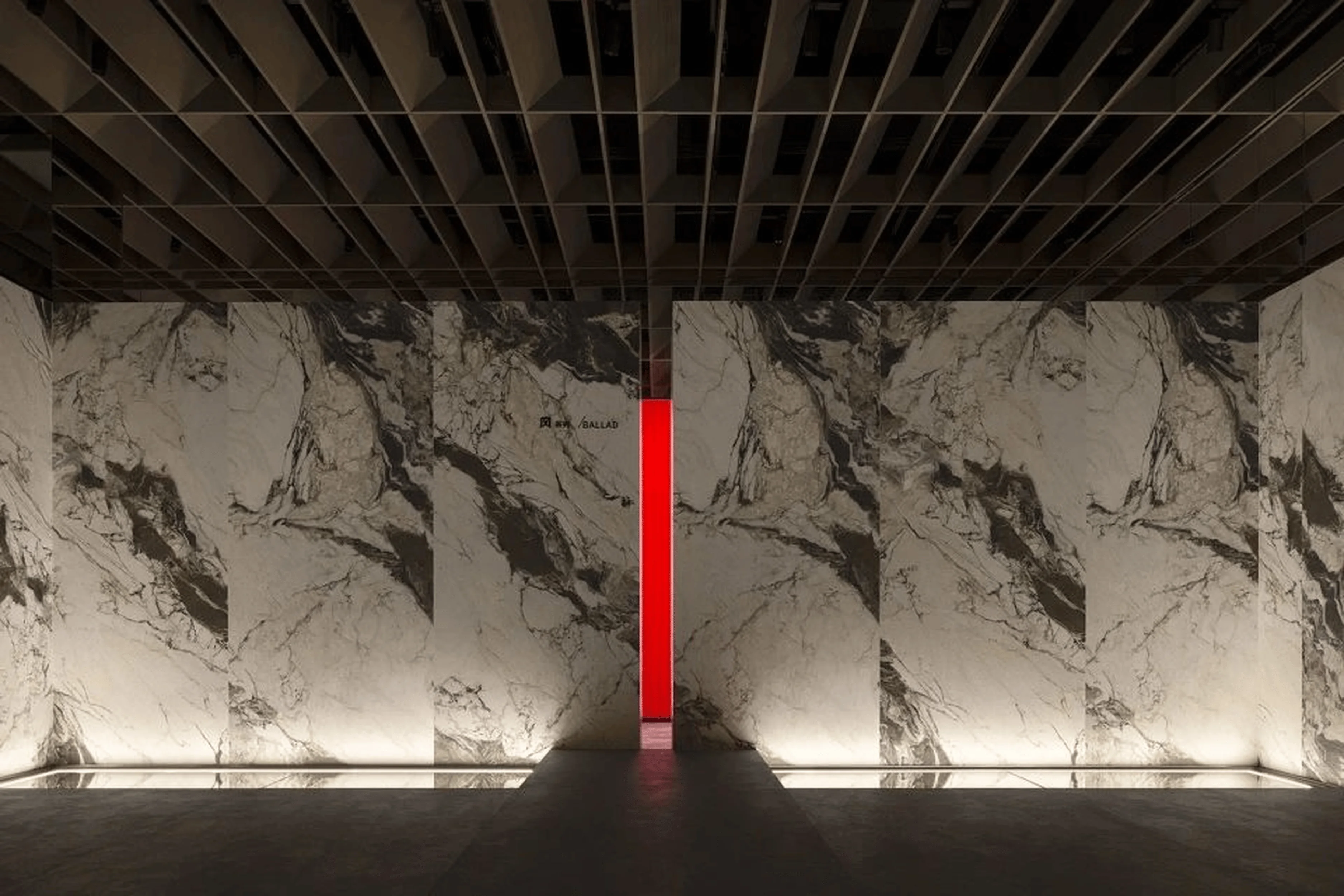
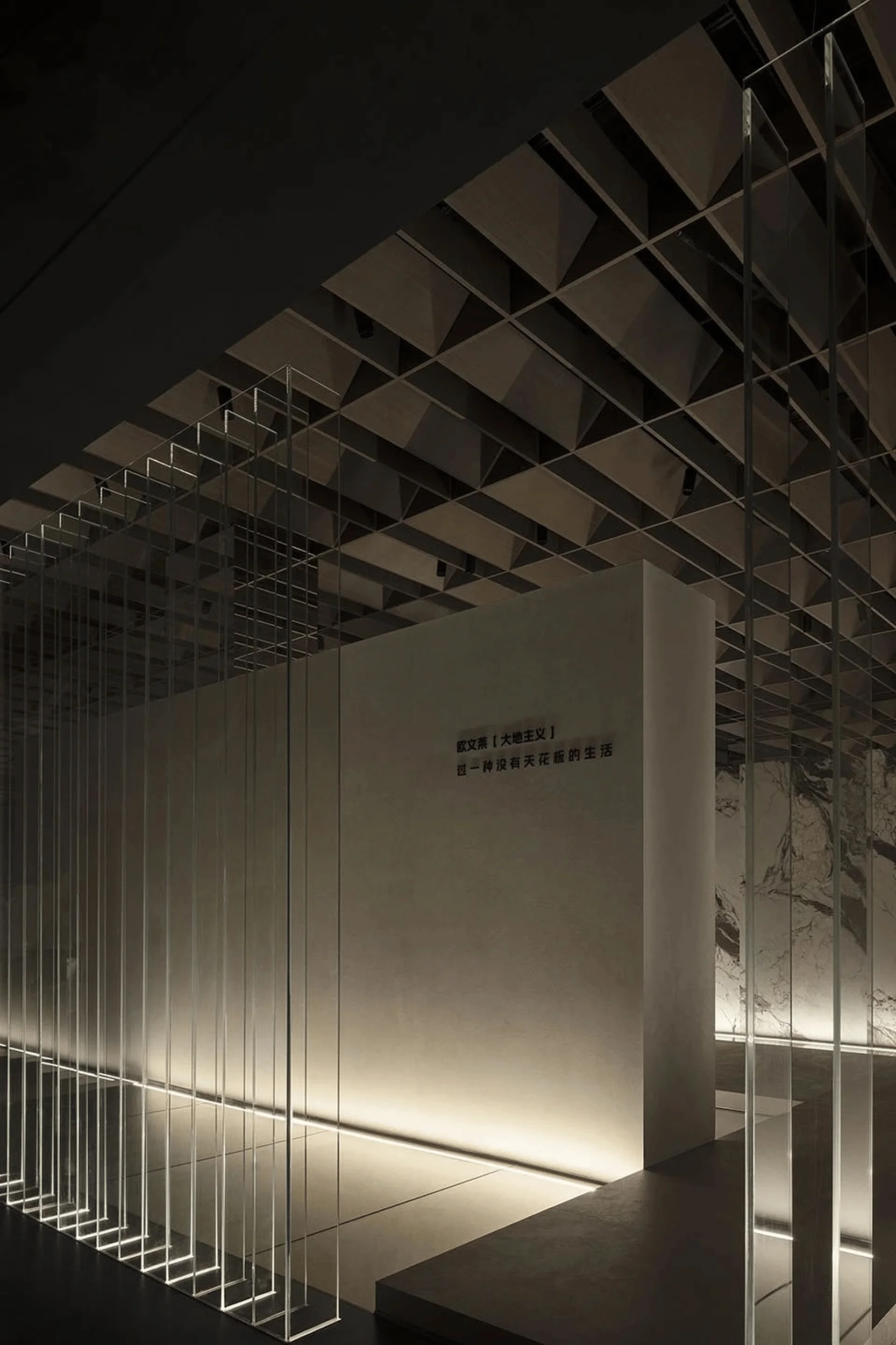
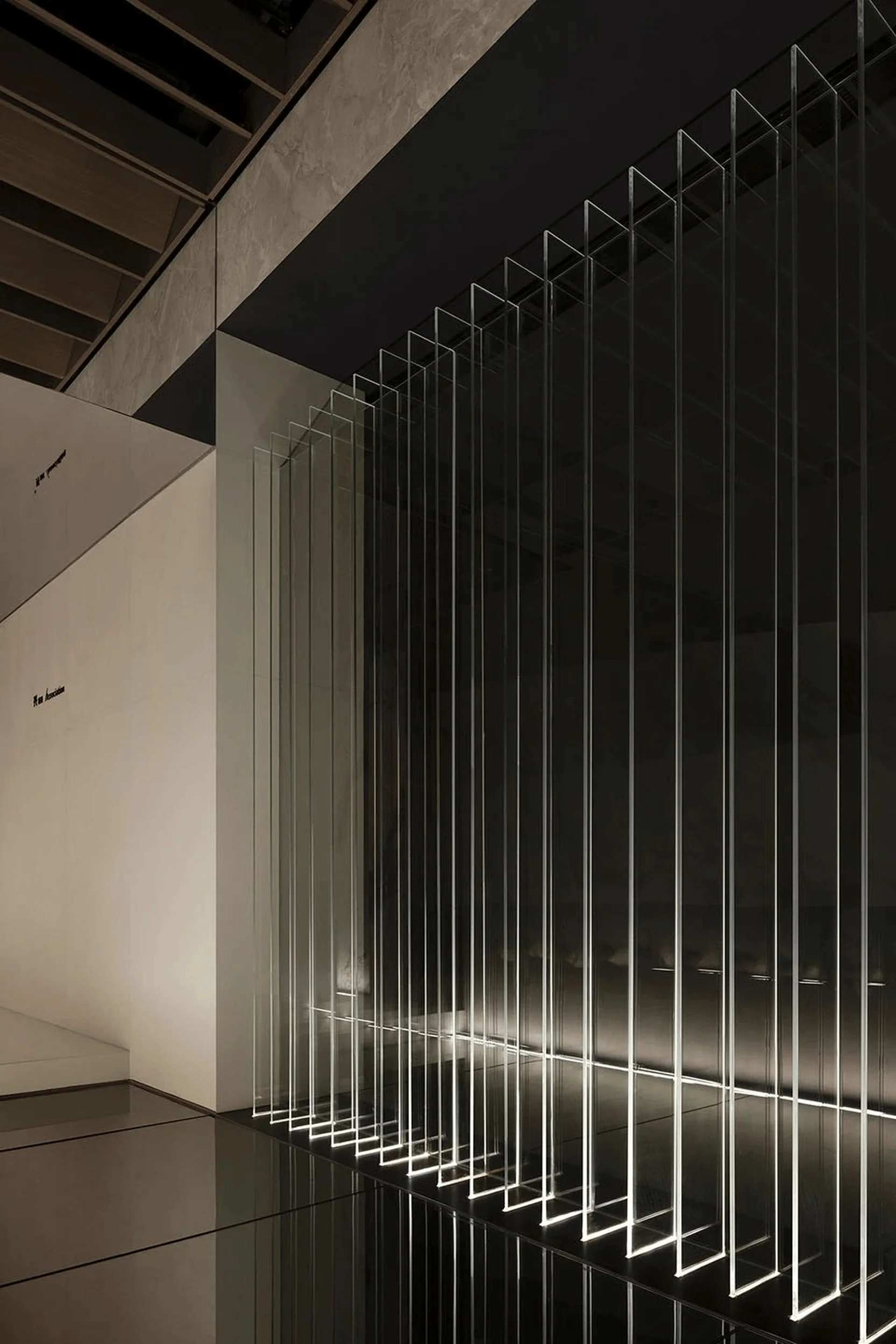
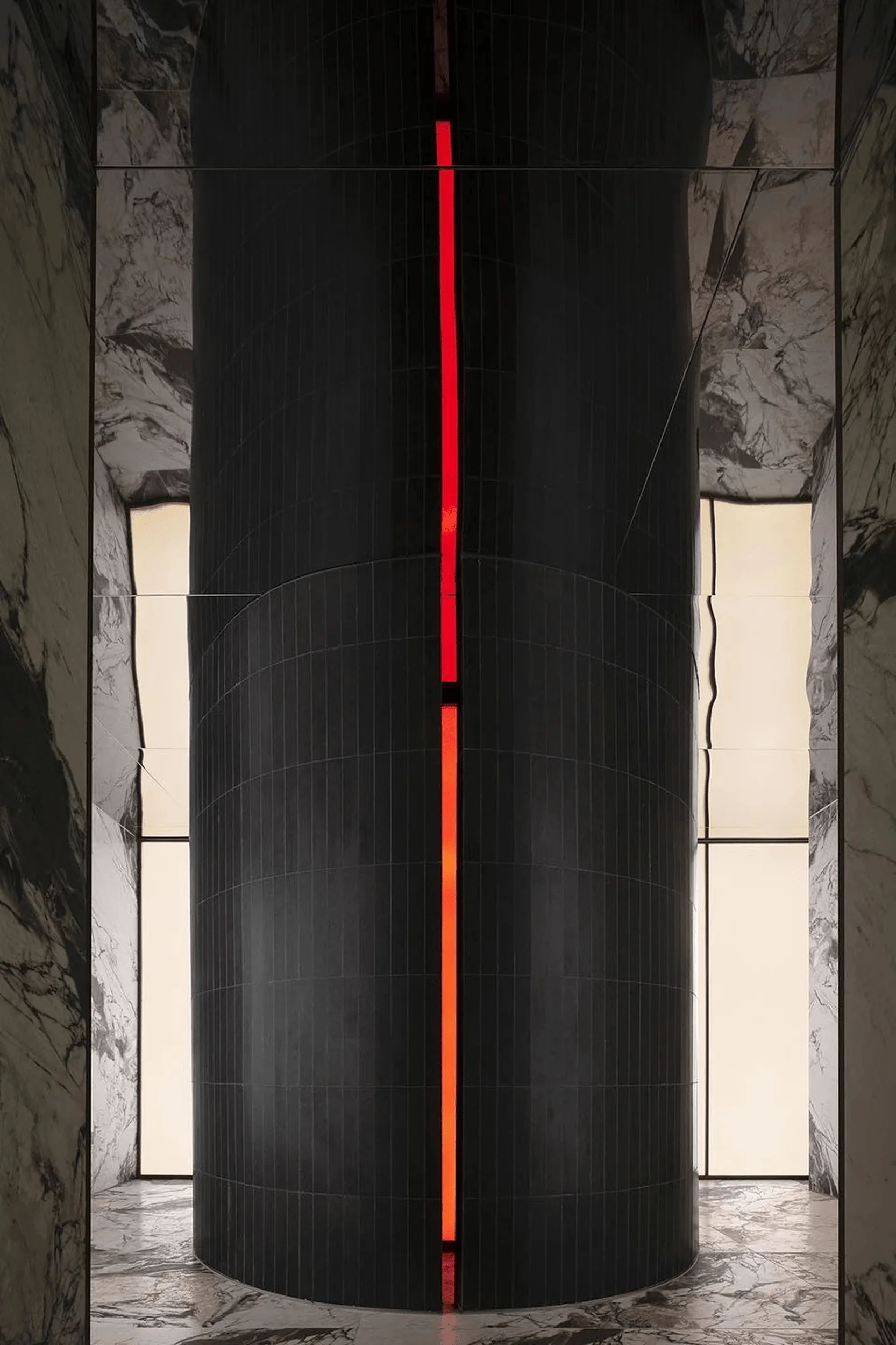
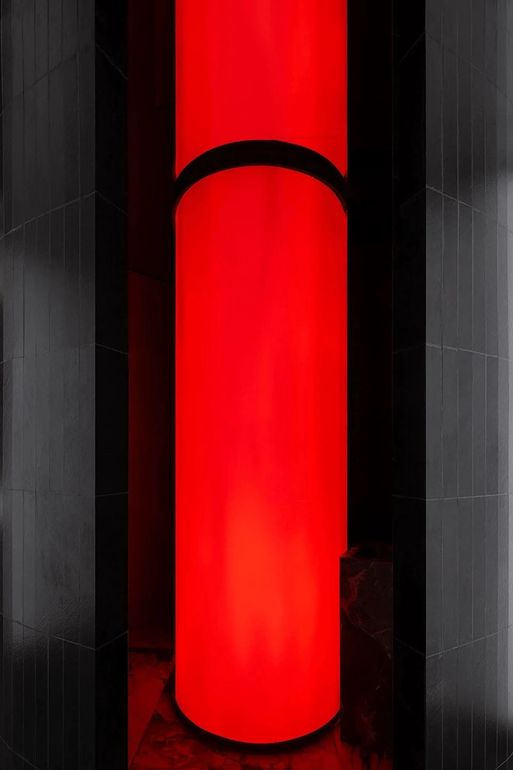
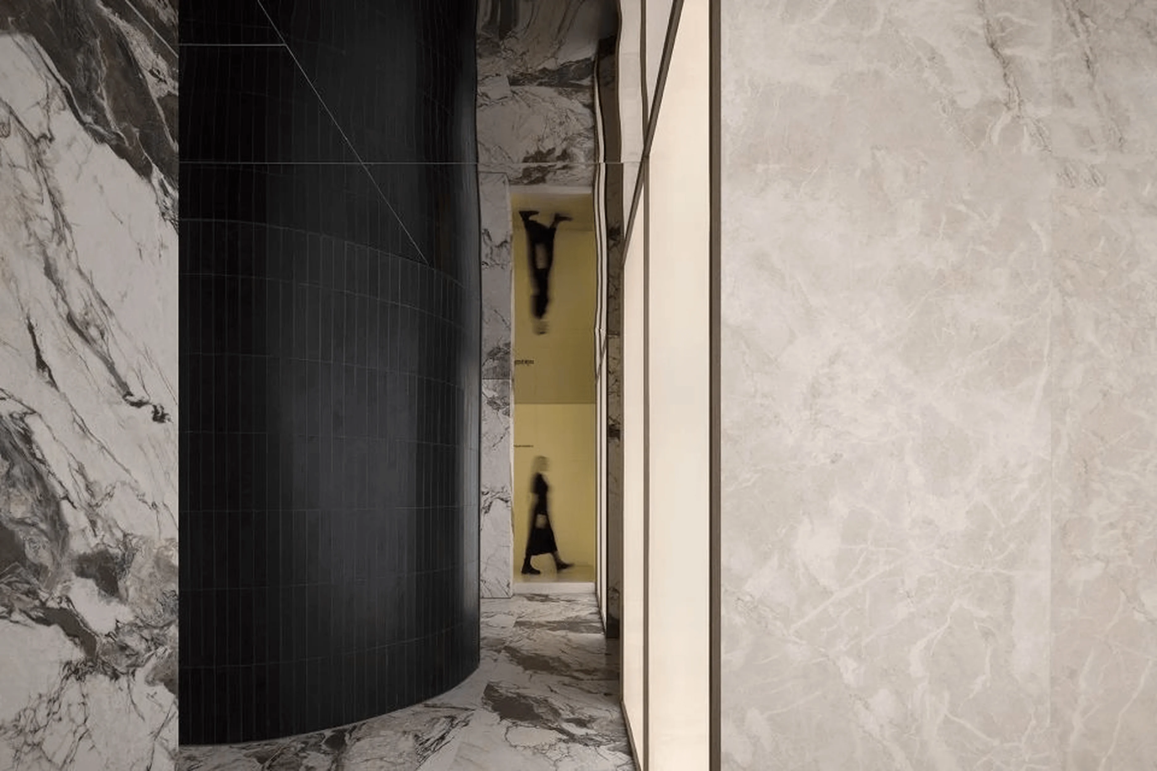
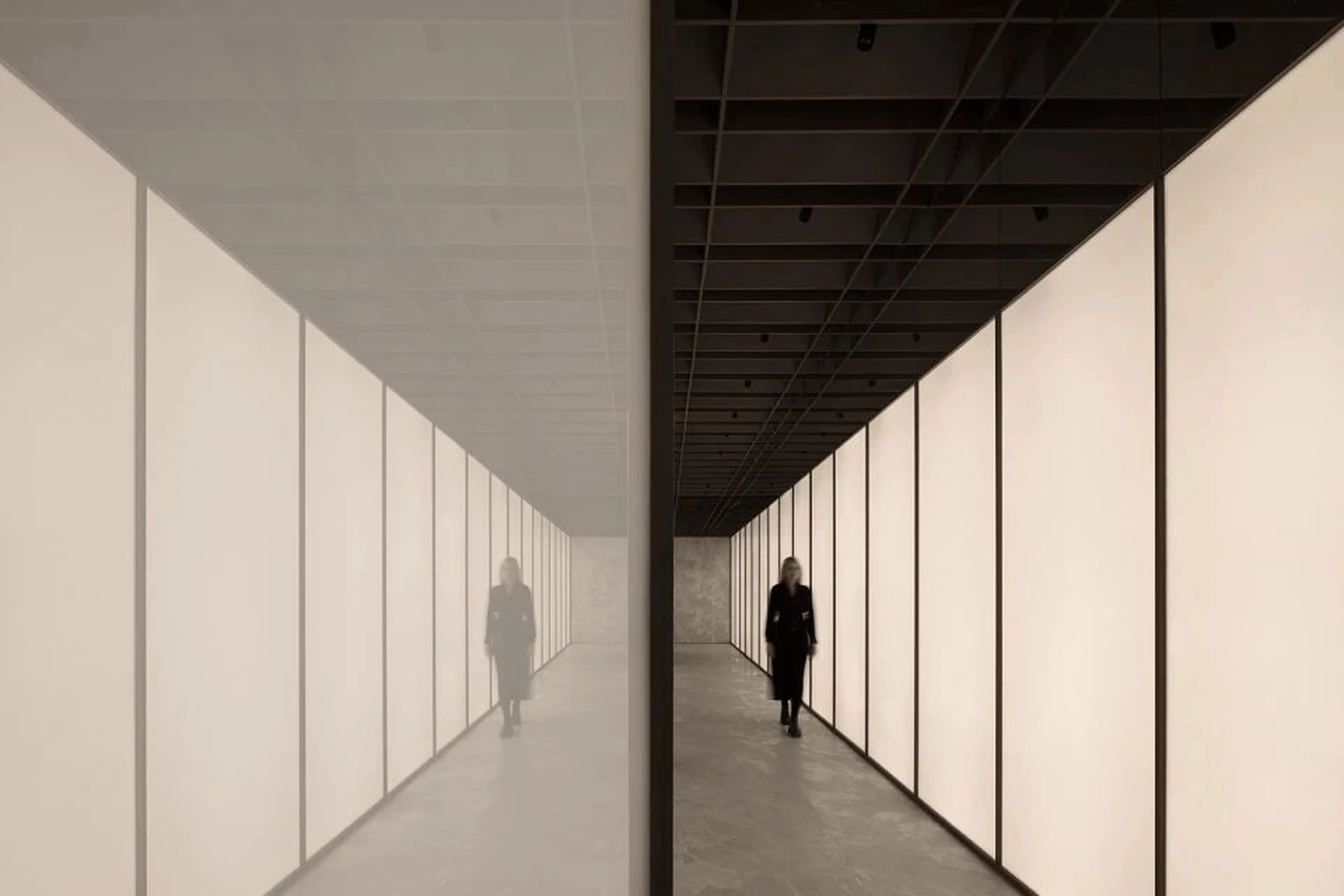
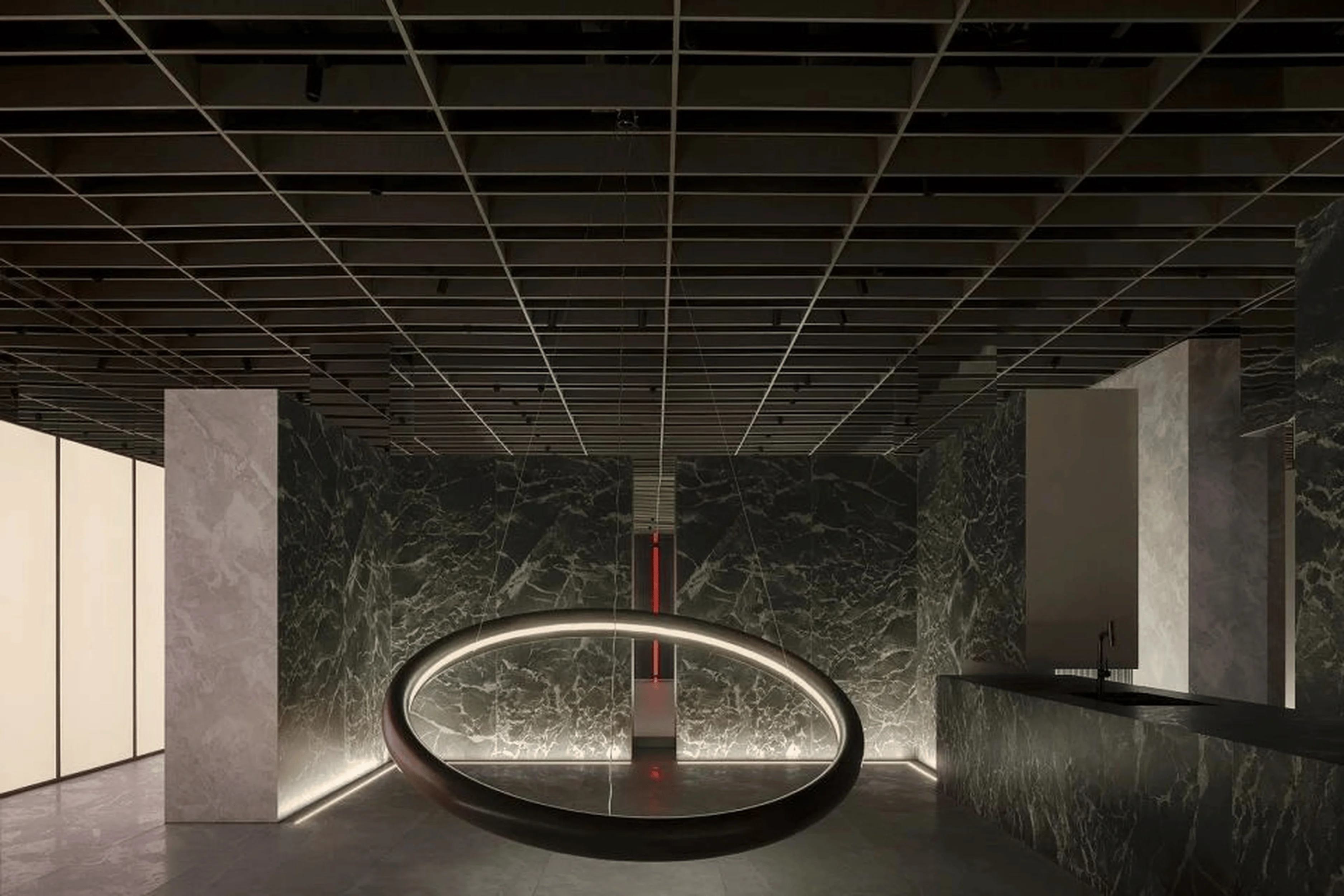
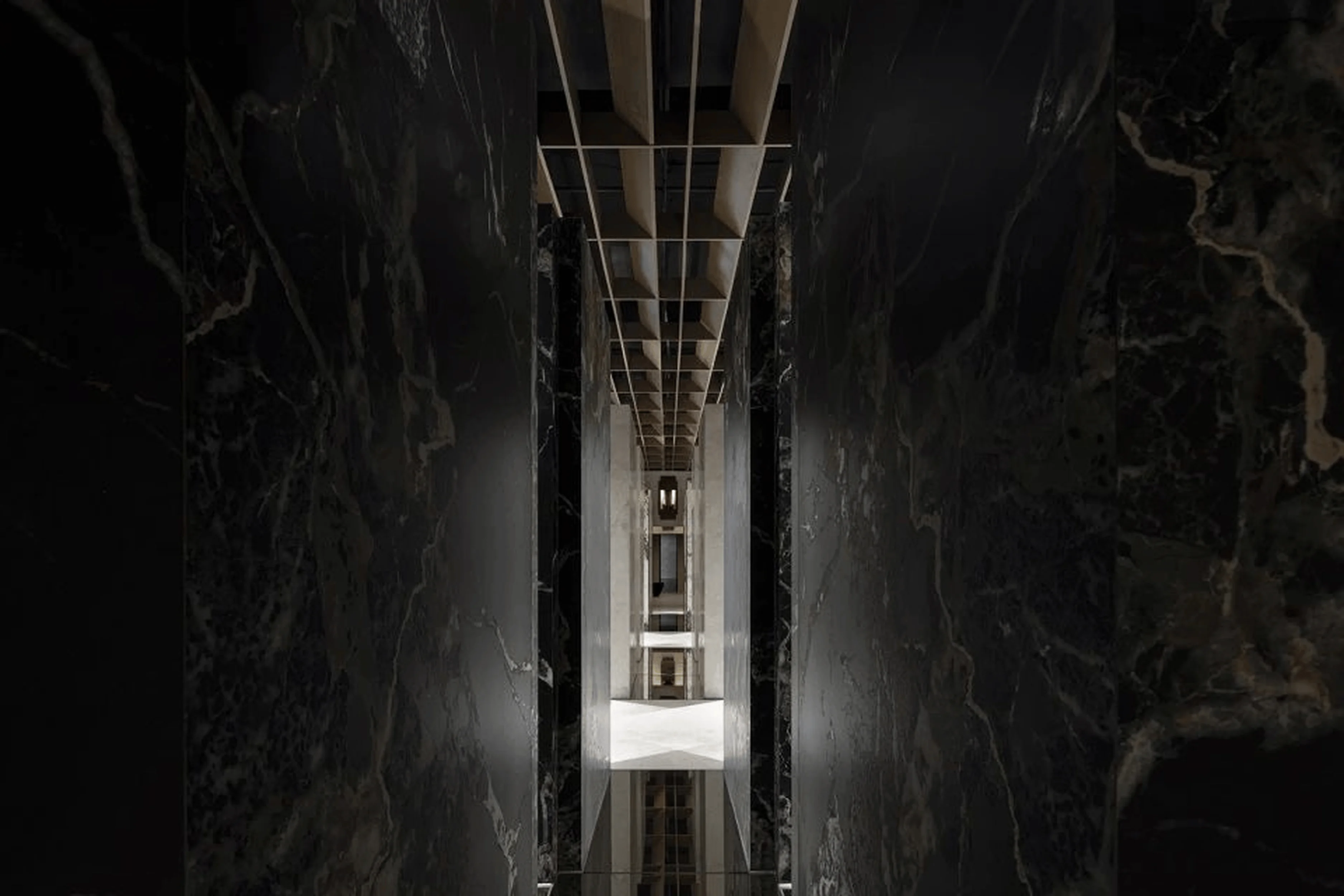
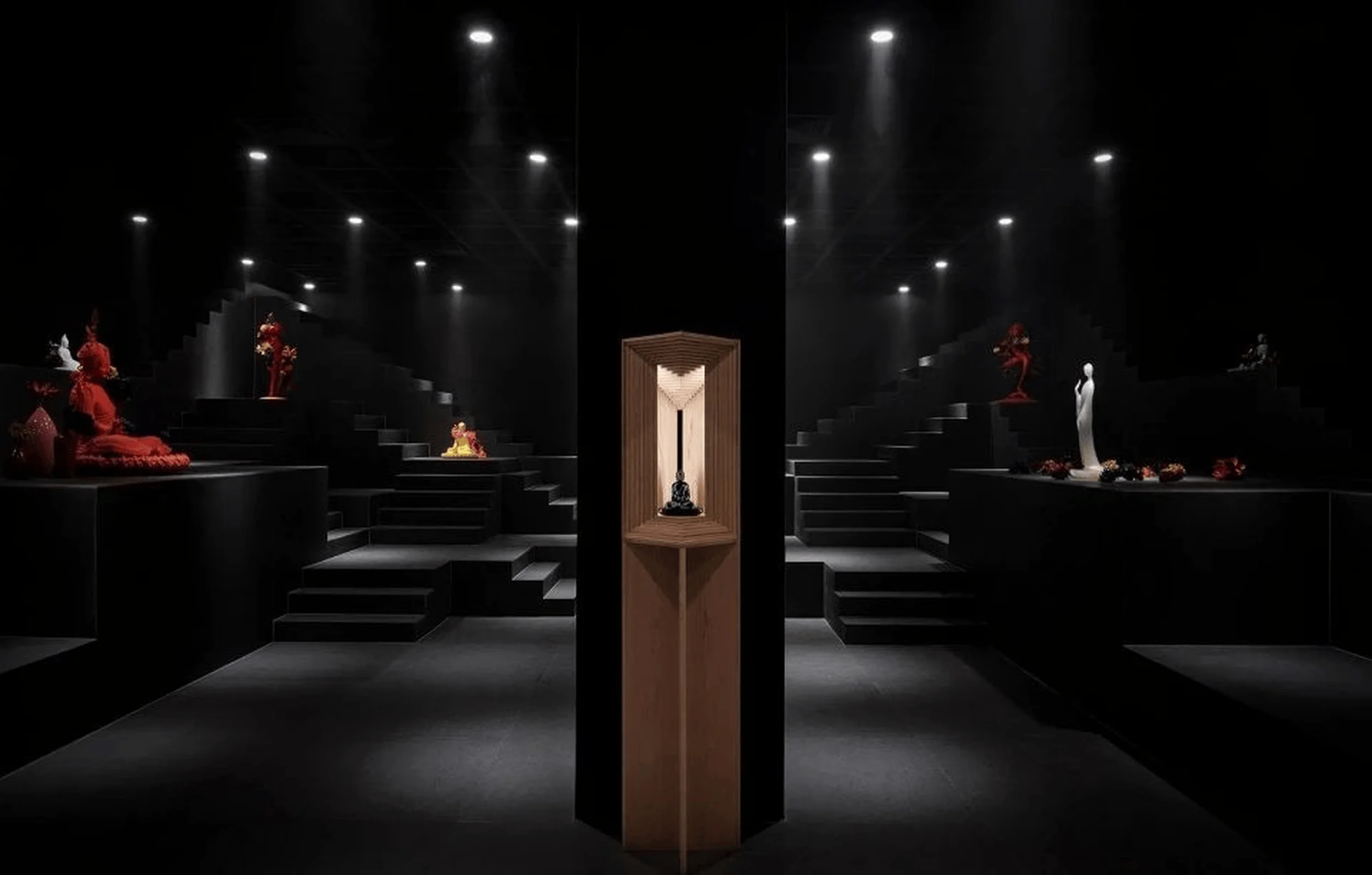
The exhibition hall features several distinct zones that highlight specific product lines and design concepts. A section with an array of glass partitions and thick L-shaped walls showcases the application of Owenlai’s ‘Dadizhuyi’ series in various settings. The reception and lounge area features a mirrored floor evoking a serene water-like ambiance, softening the space and creating a visual separation between zones. A black cylindrical structure at the visual center of the hall, illuminated with red light through a gap, creates a striking contrast with the surrounding black rock slabs and backlit walls. This bold element further emphasizes the texture and color variations within the ‘Dadizhuyi’ series, engaging visitors with its strong visual appeal.
tag: commercial interior architecture design
Materials and Aesthetics: A Harmonious Blend of Natural and Modern Elements
The material palette primarily consists of rock slabs, artistic paint, mirrors, wood grilles, and metal, reflecting Owenlai’s focus on natural materials and a modern aesthetic. The wood grid ceiling adds warmth and a connection to nature, complementing the raw beauty of the rock slabs. The use of mirrors throughout the space expands the perceived dimensions and enhances the interplay of light and shadow, further amplifying the textural qualities of the displayed products. This integration of natural and modern materials reflects a design approach that is both sophisticated and grounded, underscoring the versatility of Owenlai’s products within various commercial interior architecture design contexts.
tag: commercial interior architecture design
Conclusion: A Showcase of Natural Aesthetics and Innovative Design
The Owenlai Headquarters Dadizhuyi Exhibition Hall designed by AD Architecture stands as a testament to the brand’s commitment to natural aesthetics and innovation. The project seamlessly integrates the brand’s identity with the unique features of the ‘Dadizhuyi’ series, resulting in an engaging and immersive experience for visitors. The free array layout, the interplay of light and geometry, and the harmonious blend of natural and modern materials create a space that is both visually striking and functionally effective. This project demonstrates the transformative potential of commercial interior architecture design, showcasing how strategic spatial planning and material selection can elevate the presentation of a product and reinforce a brand’s core values.
tag: commercial interior architecture design
Project Information:
Project Name: Owenlai Headquarters Dadizhuyi Exhibition Hall
Project Owner: Guangdong Owenlai Ceramics Co., Ltd.
Design Institution: AD ARCHITECTURE
Chief Designer: Xie PeiHe
Project Location: China
Building Area: 850㎡
Main Materials: Rock slabs, artistic paint, mirror, wood grille, metal
Design Time: November 2023
Completion Time: January 2024
Photographer: Ouyang Yun
Video Editor: AD ARCHITECTURE


