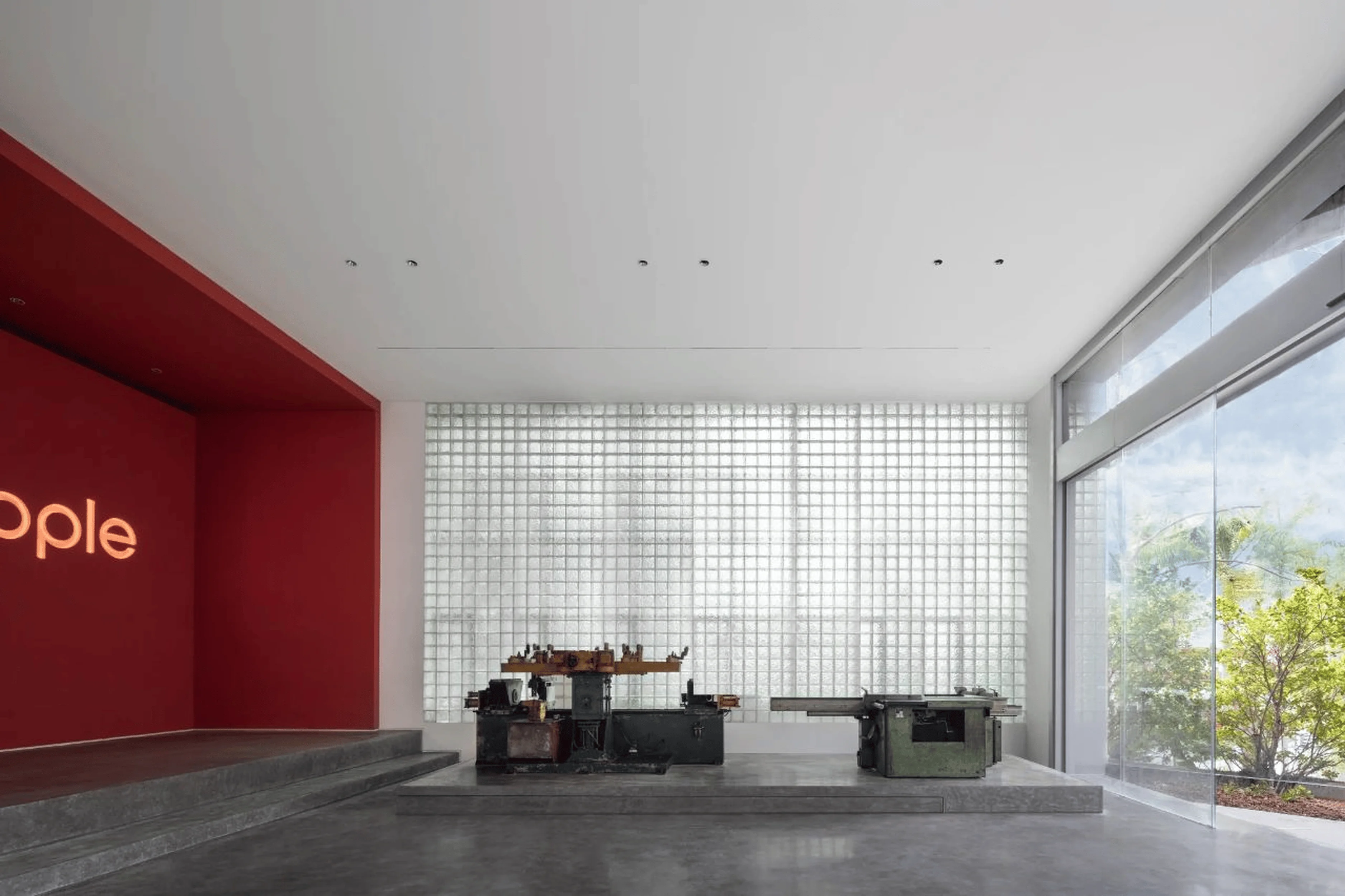
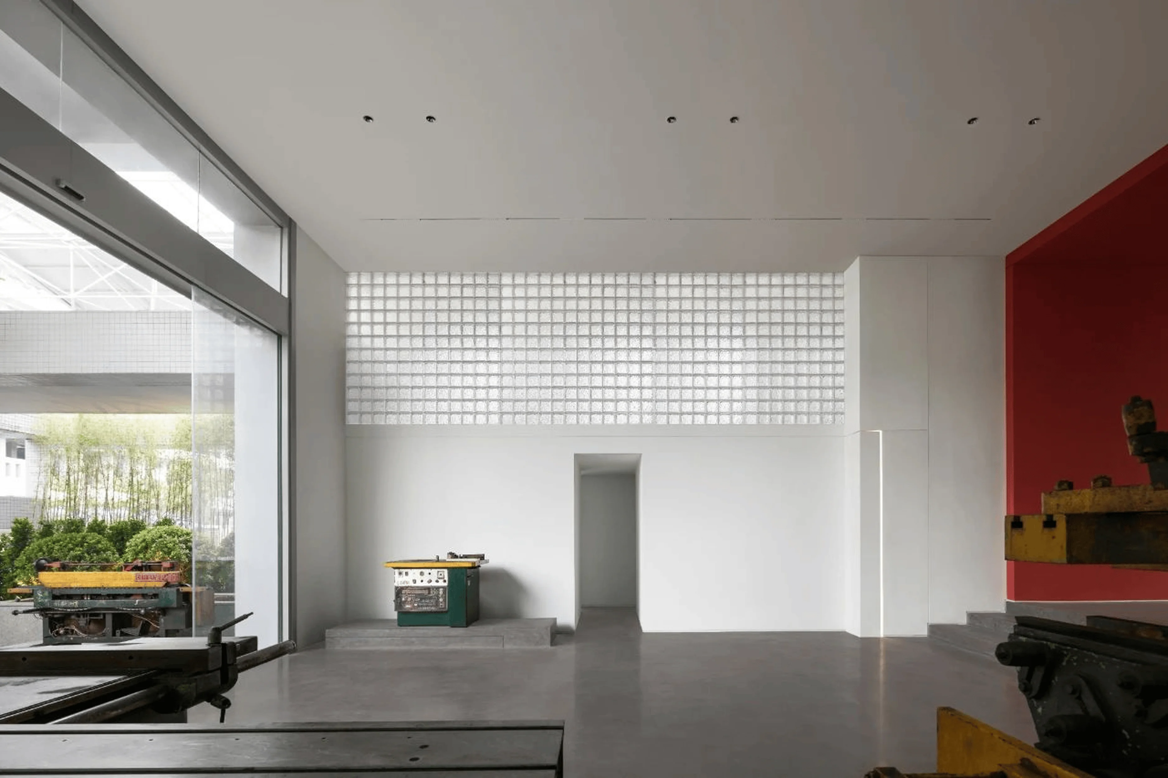
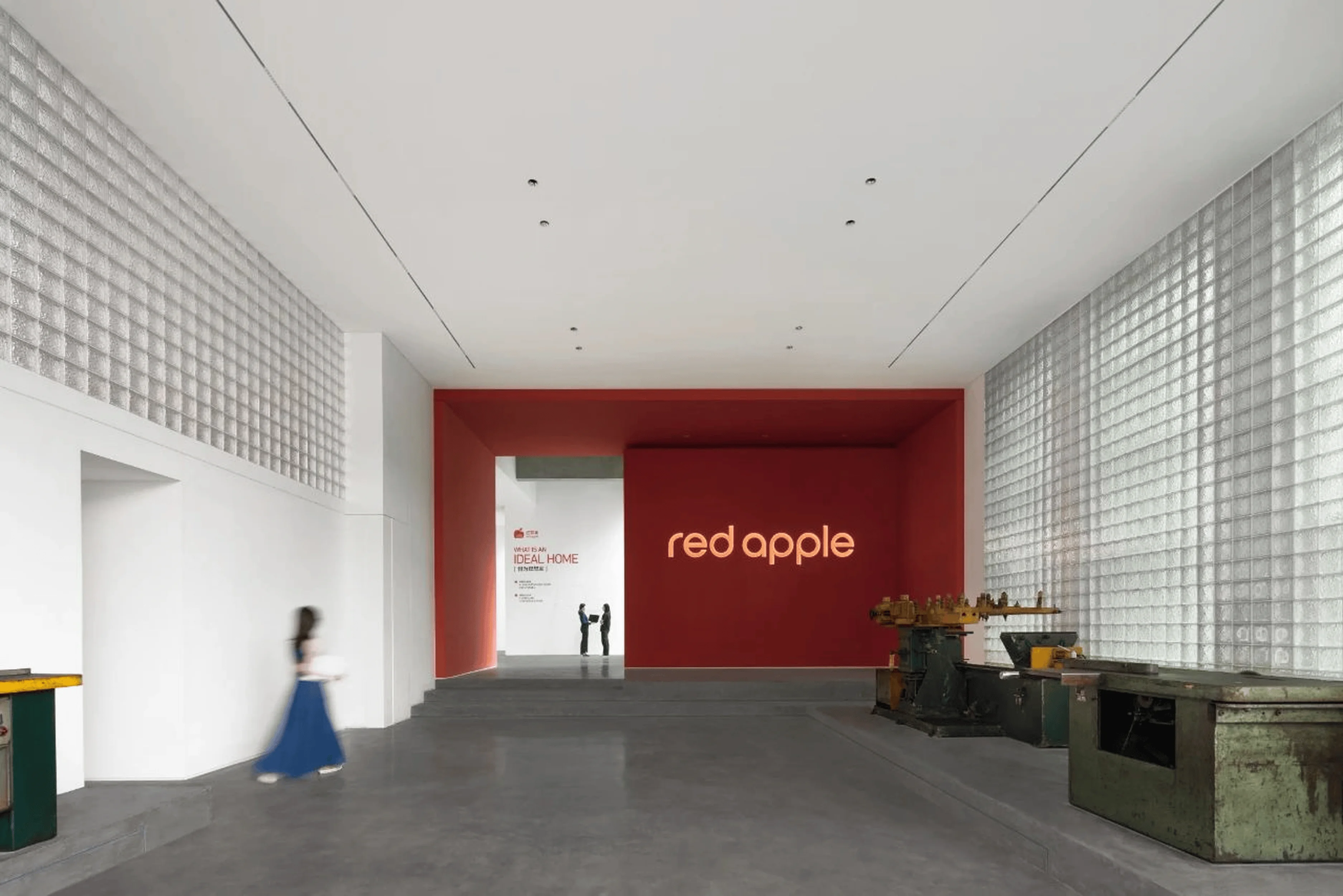
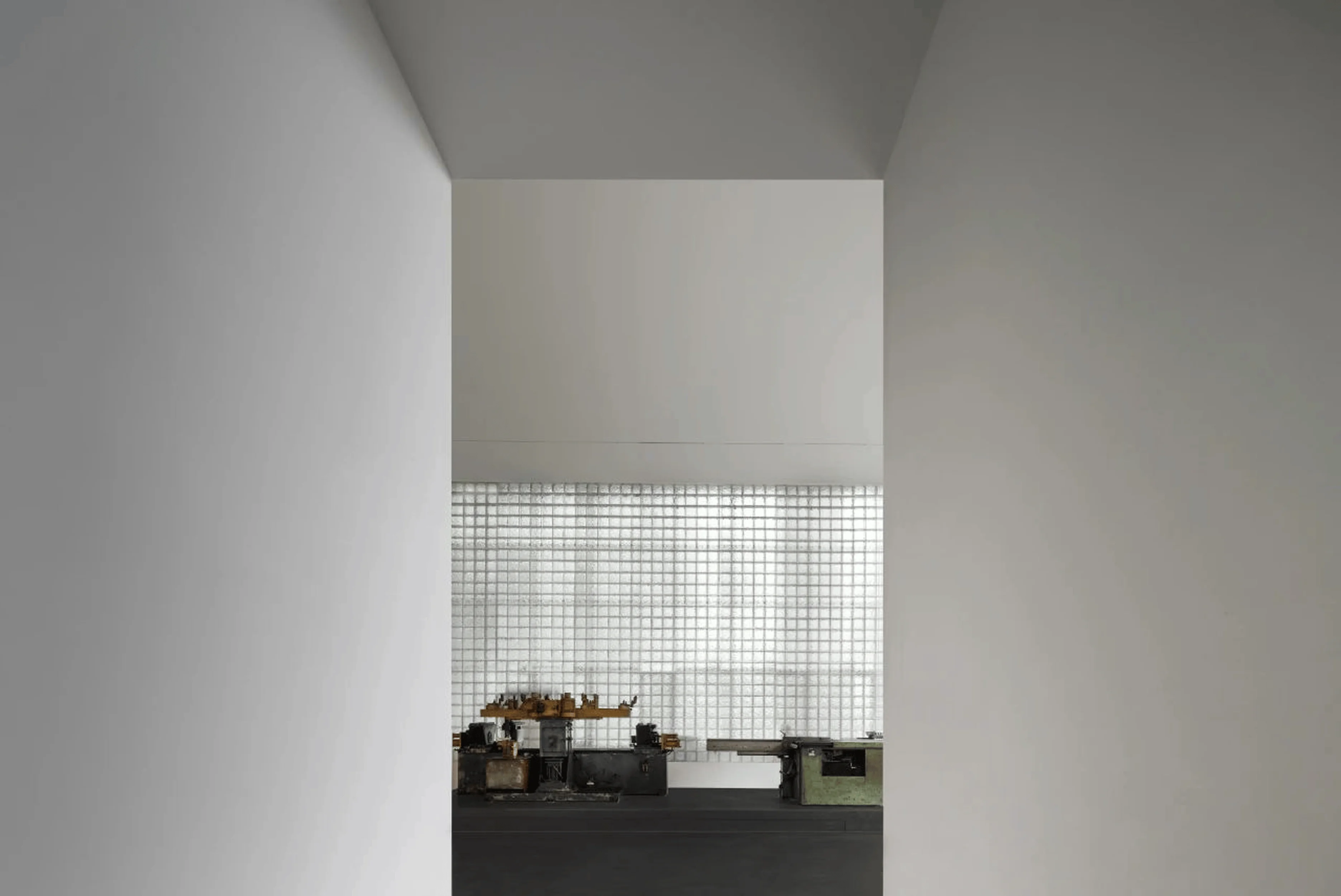
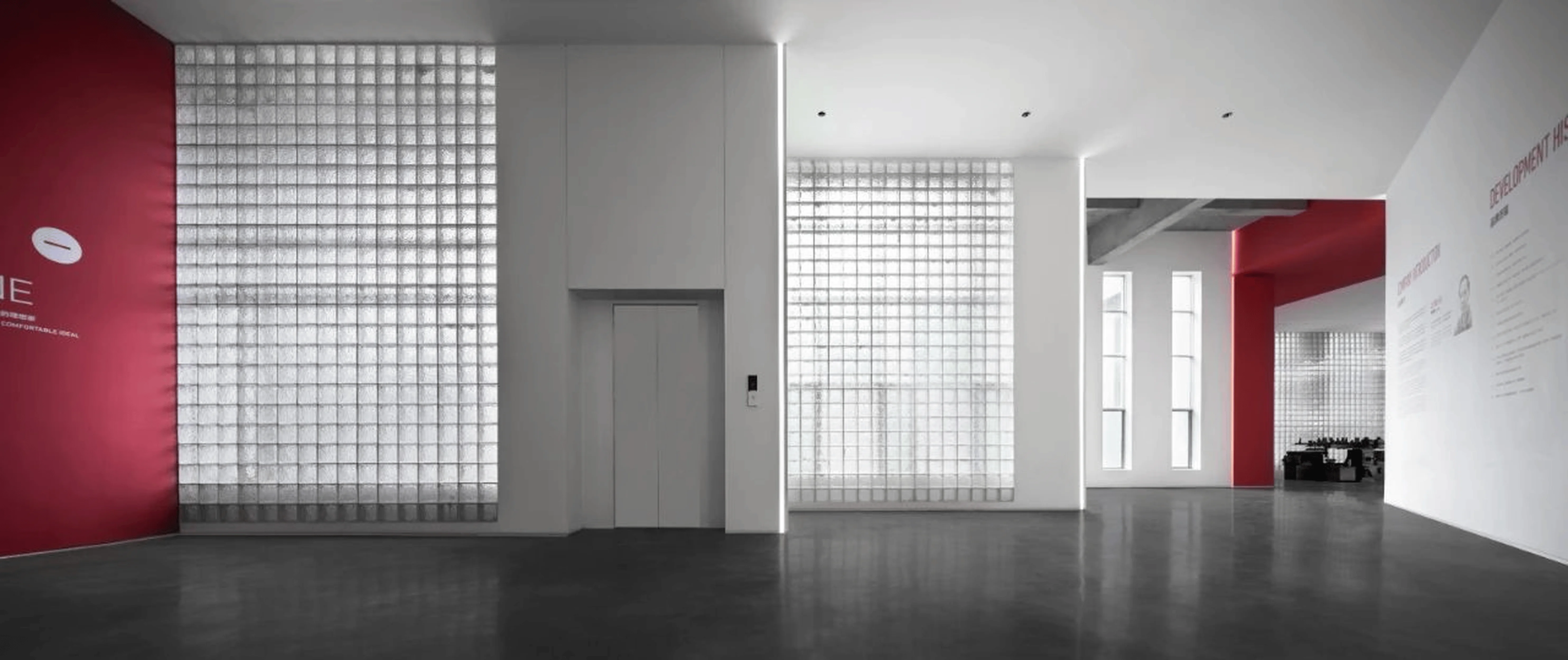
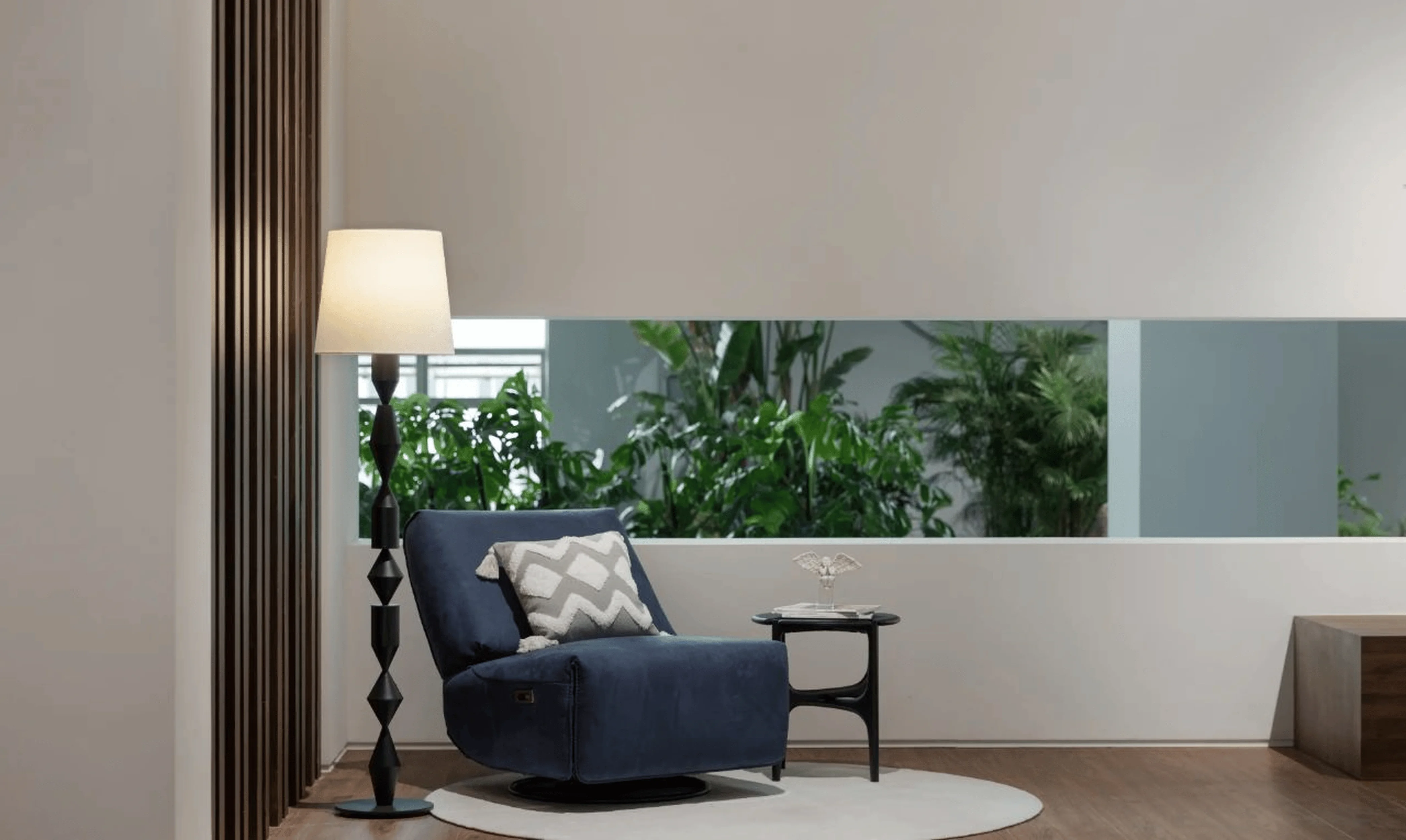
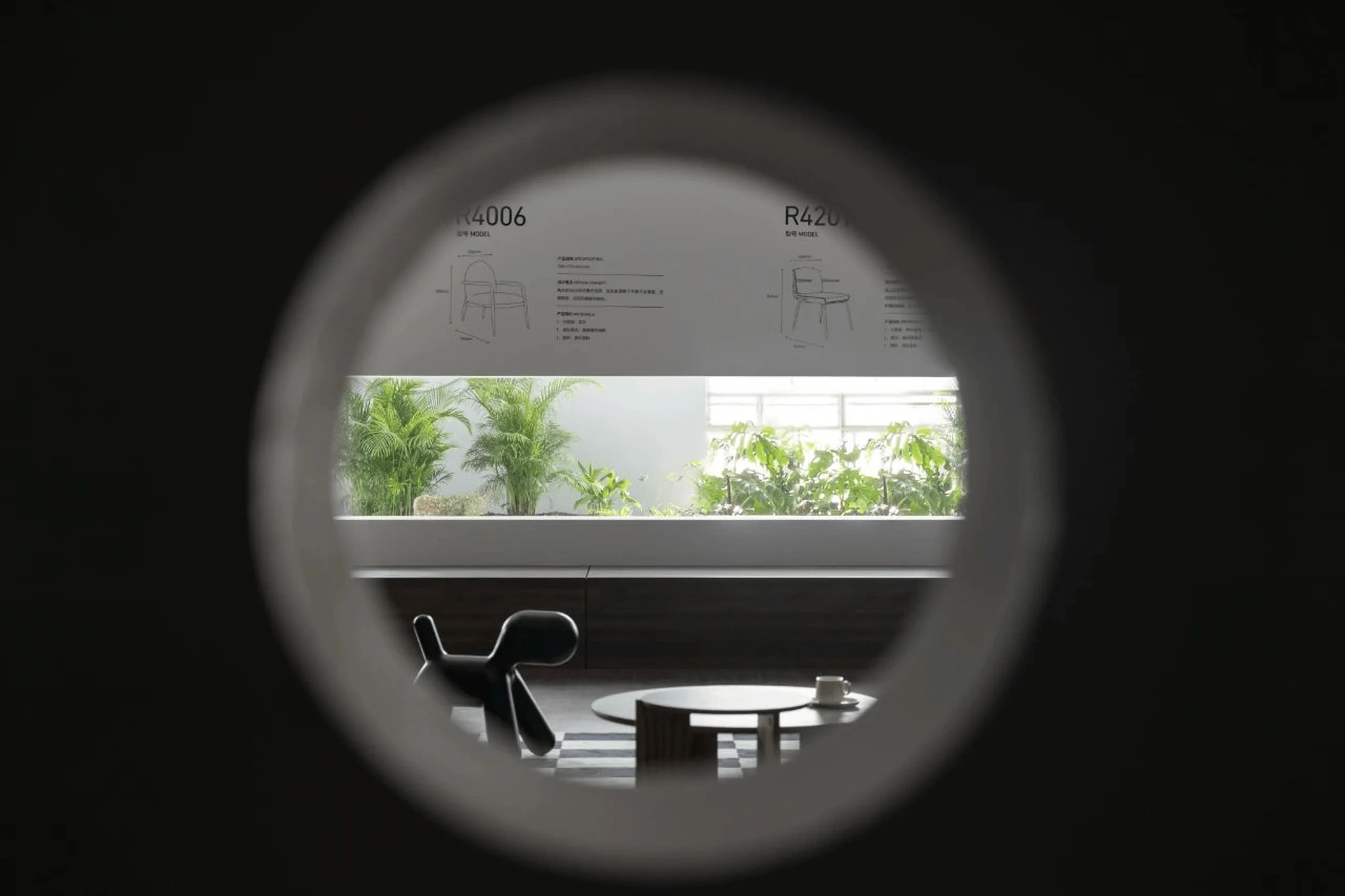
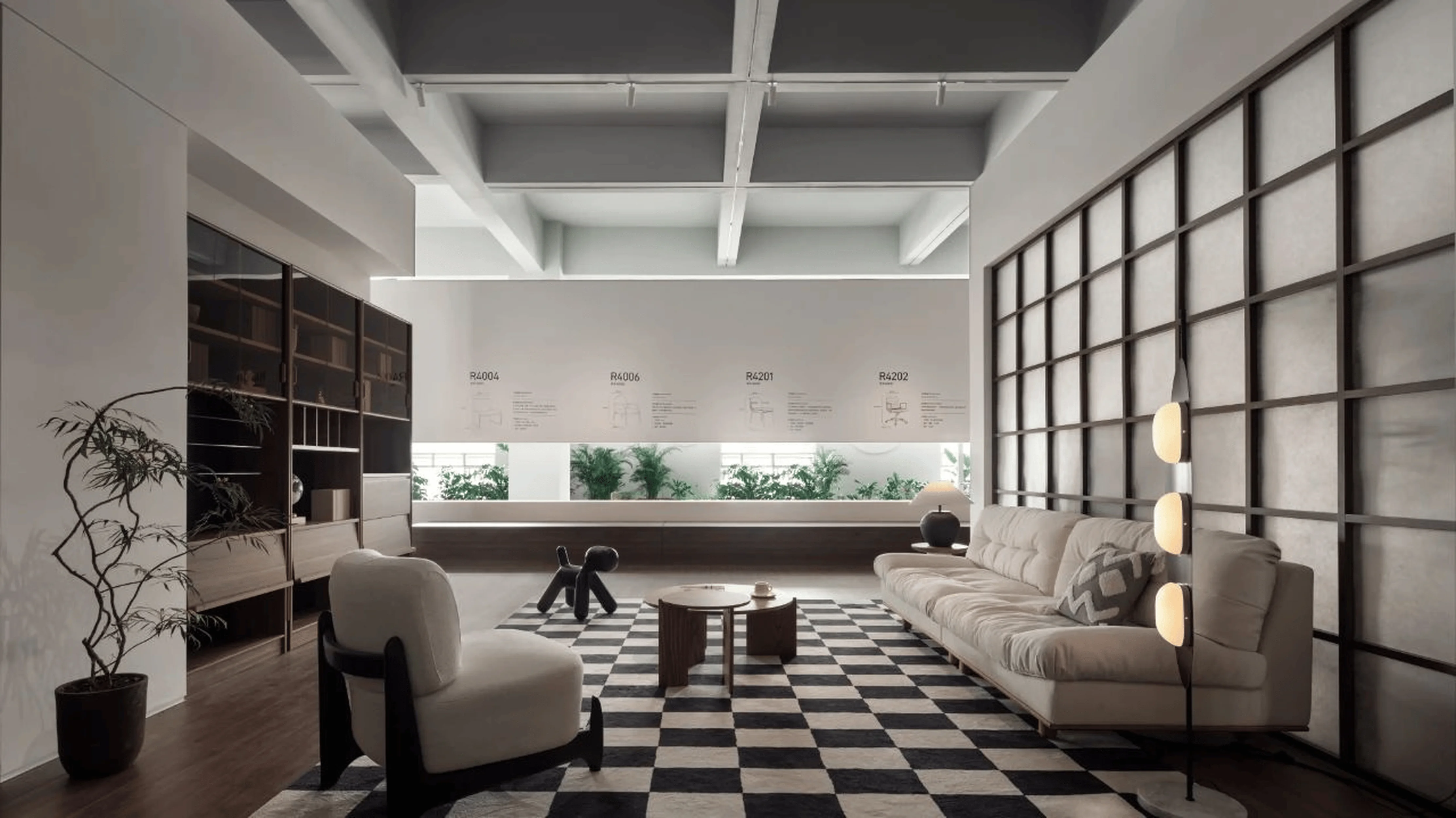
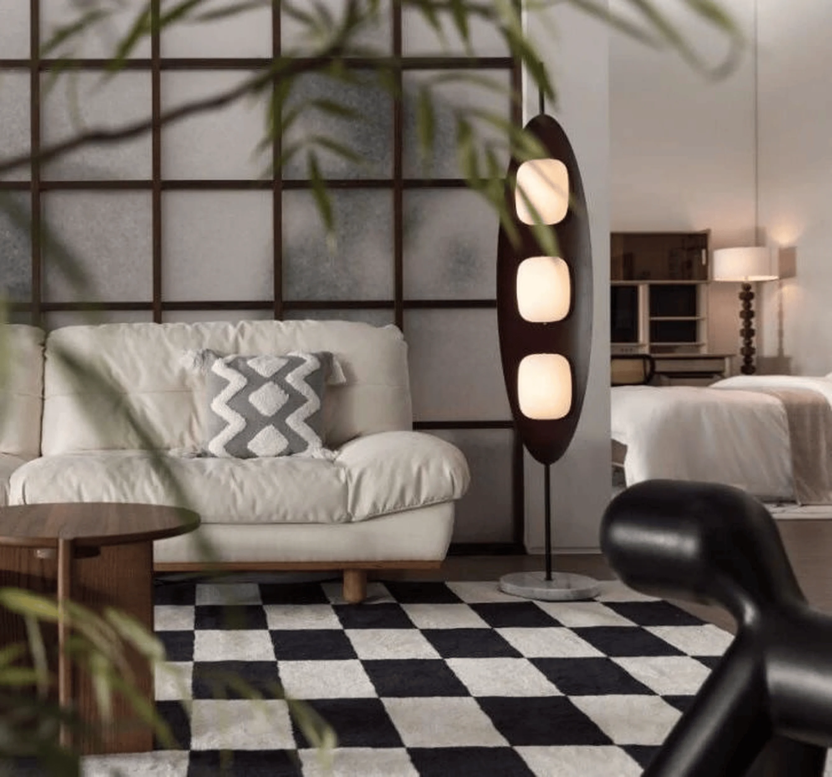
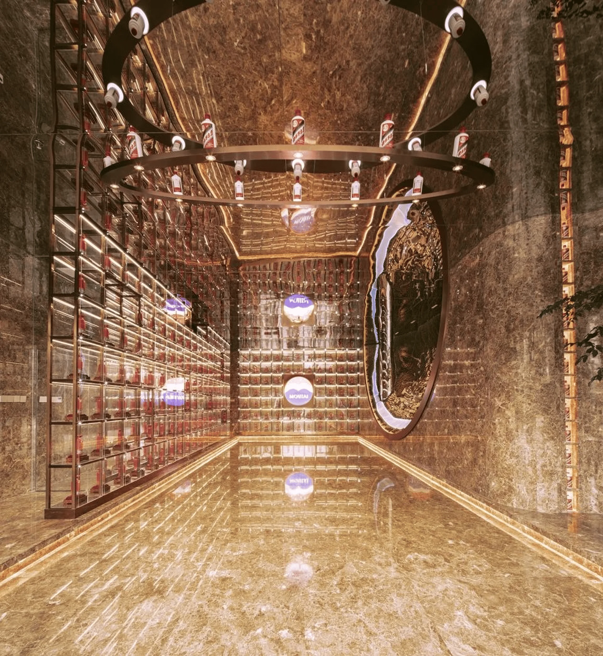
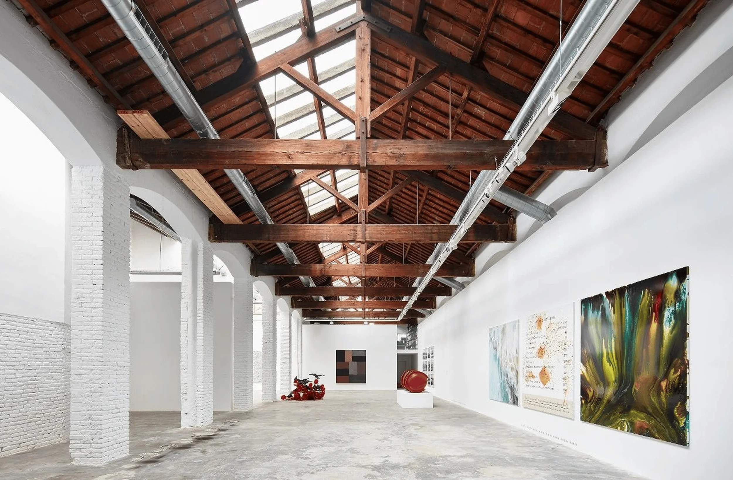
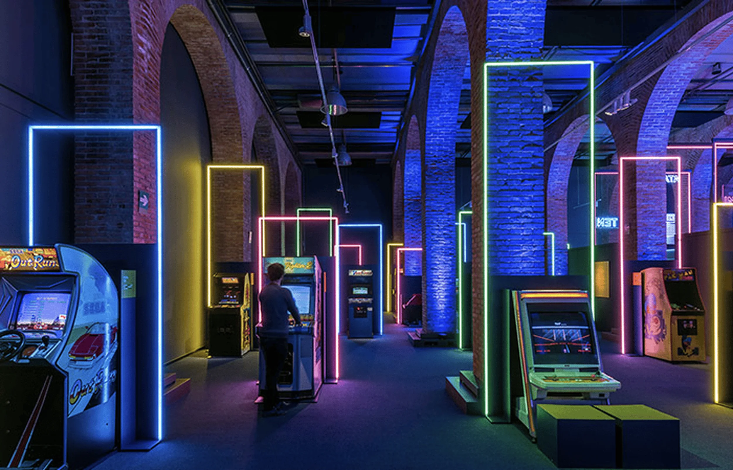
Red Apple Showroom design in Shenzhen, China integrates industrial heritage with modern aesthetics to create a harmonious space.
Contents
Project Background and Site Context
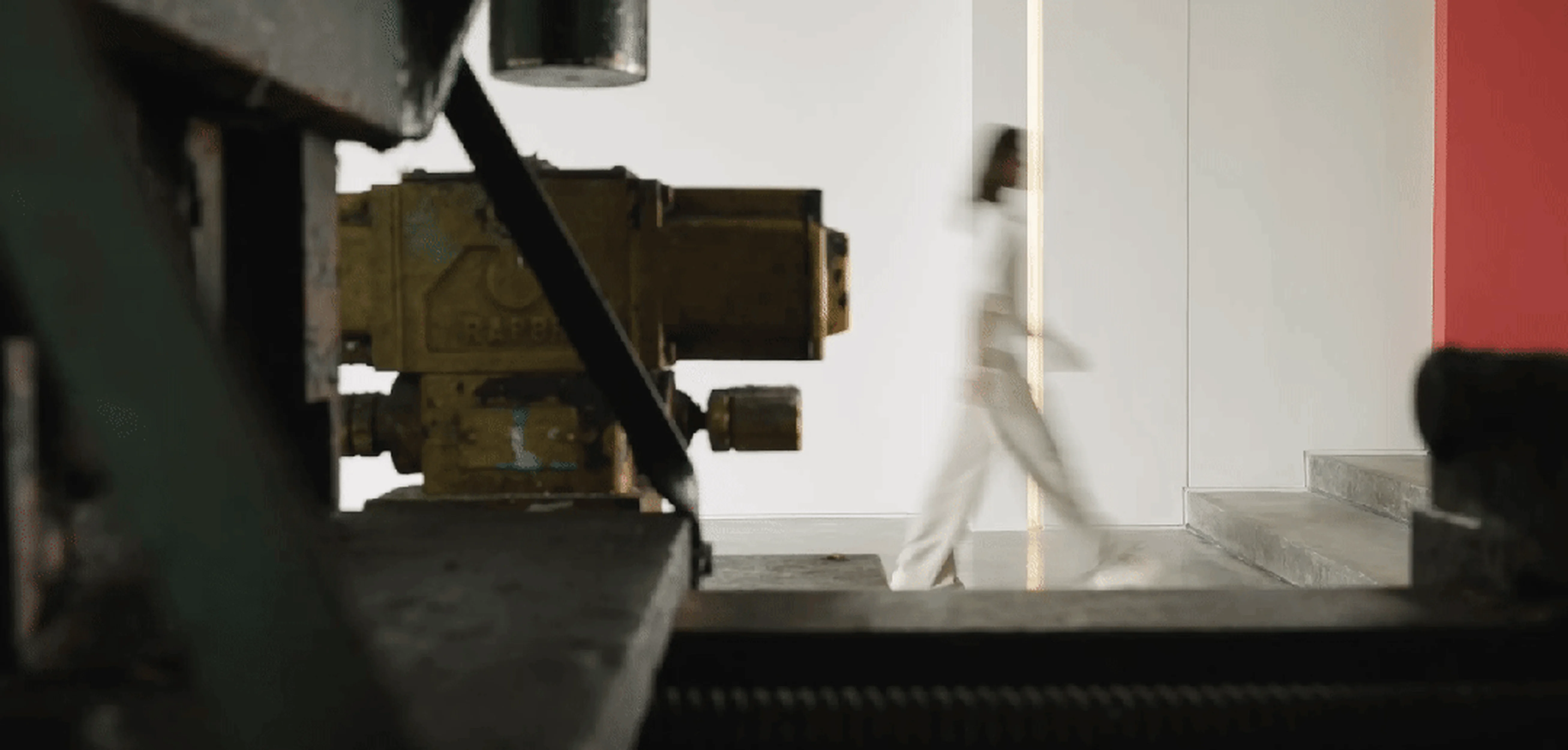
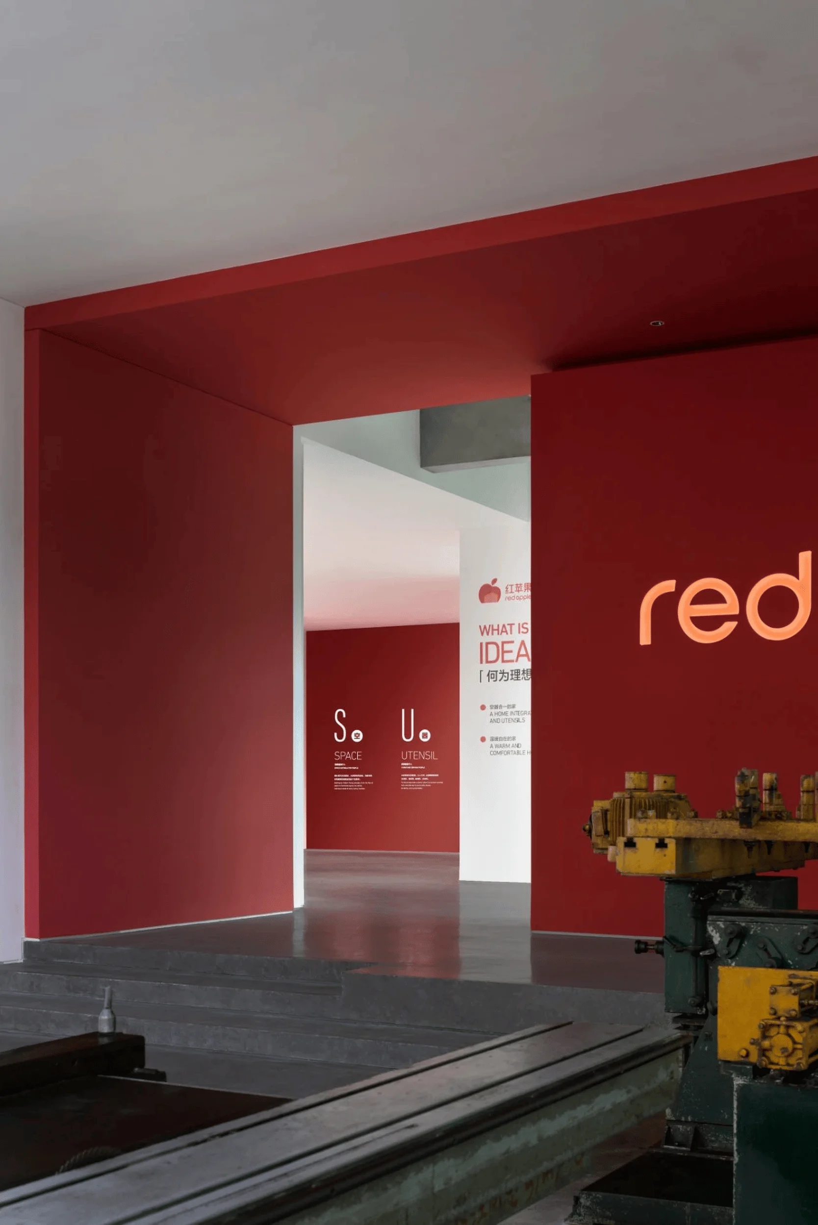
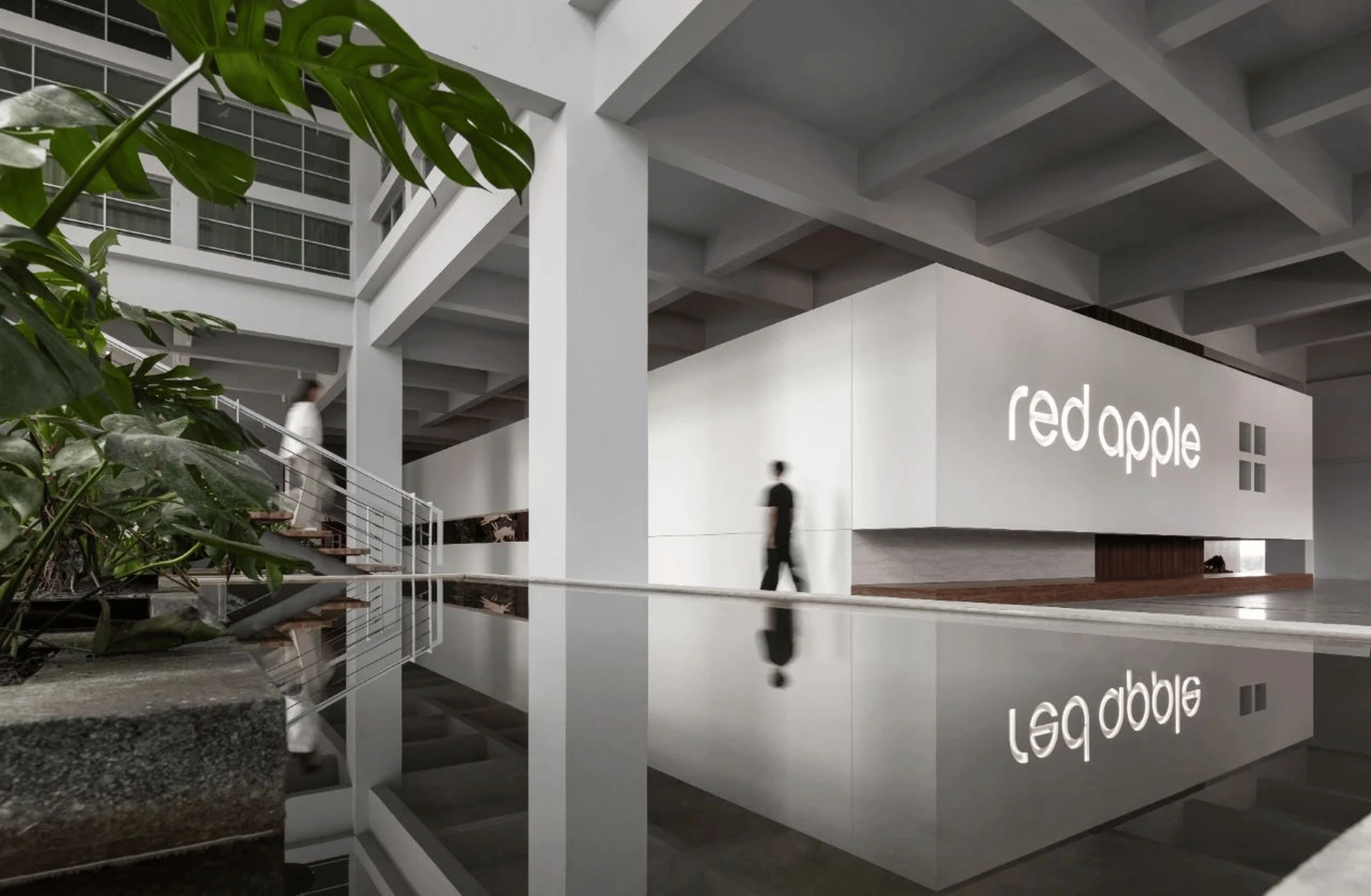
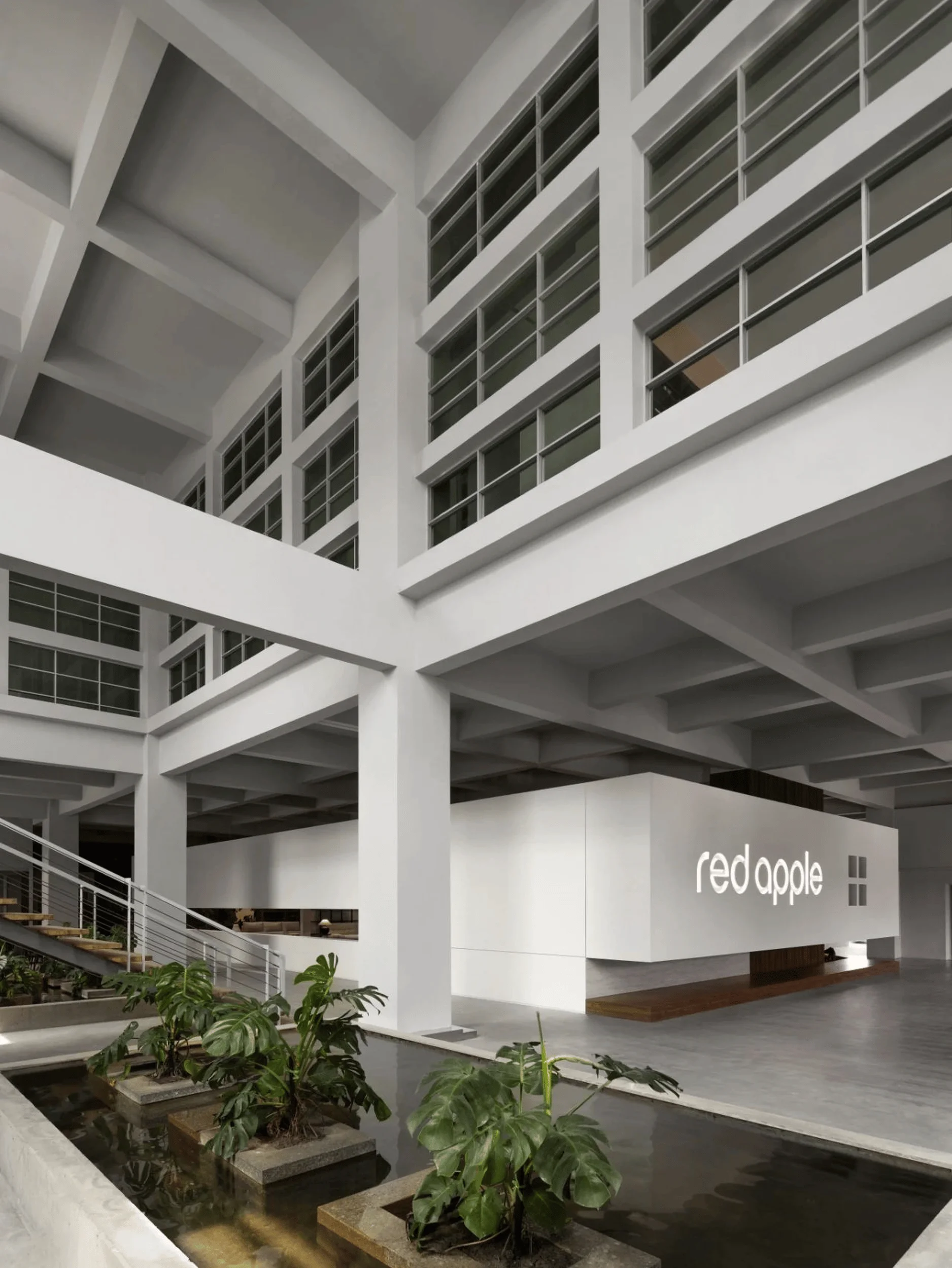
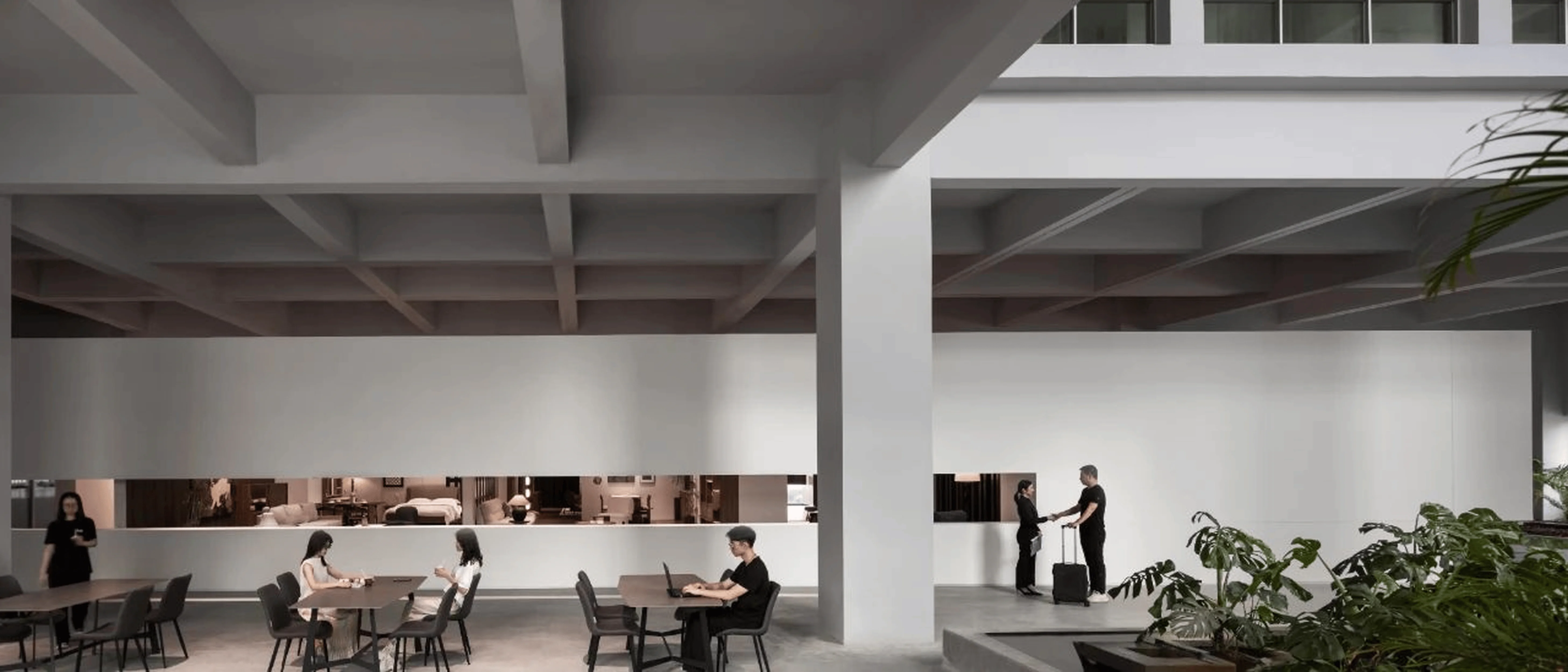
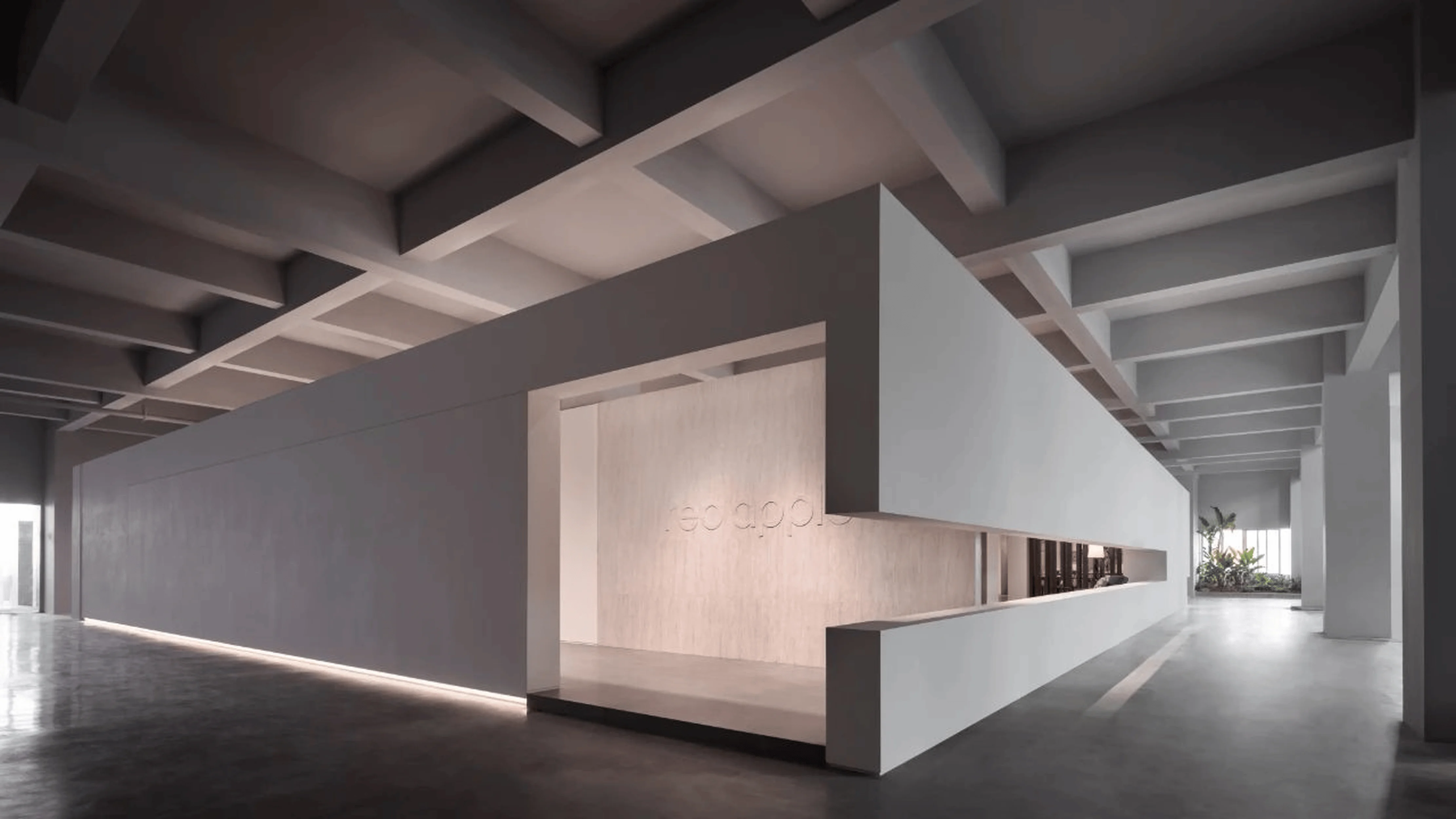
Located in Shenzhen, China, the Red Apple headquarters has witnessed over 40 years of evolution. The site, initially an industrial space, now embraces the vibrant energy of nature and the brand’s history. The design team, BDSD Wu Jie Design, aimed to preserve the existing architecture’s inherent character while adapting it to the needs of a modern showroom. The industrial heritage, evident in the old machinery and robust structures, becomes a key element in the design, establishing a connection to the brand’s history. The site’s natural environment, with its lush greenery and abundant foliage, also plays a crucial role in the design. The design of Red Apple Showroom aims to balance the industrial heritage and surrounding natural environment, fostering a strong connection between the built environment and nature. This red apple showroom design showcases a thoughtful integration of architecture, industrial heritage, and the natural environment, creating a truly unique experience for visitors. In addition to showcasing the products, the design seeks to represent a unique connection with nature and the brand’s historical foundation, a common design trend in architectural and interior design spaces.
Design Concept and Goals
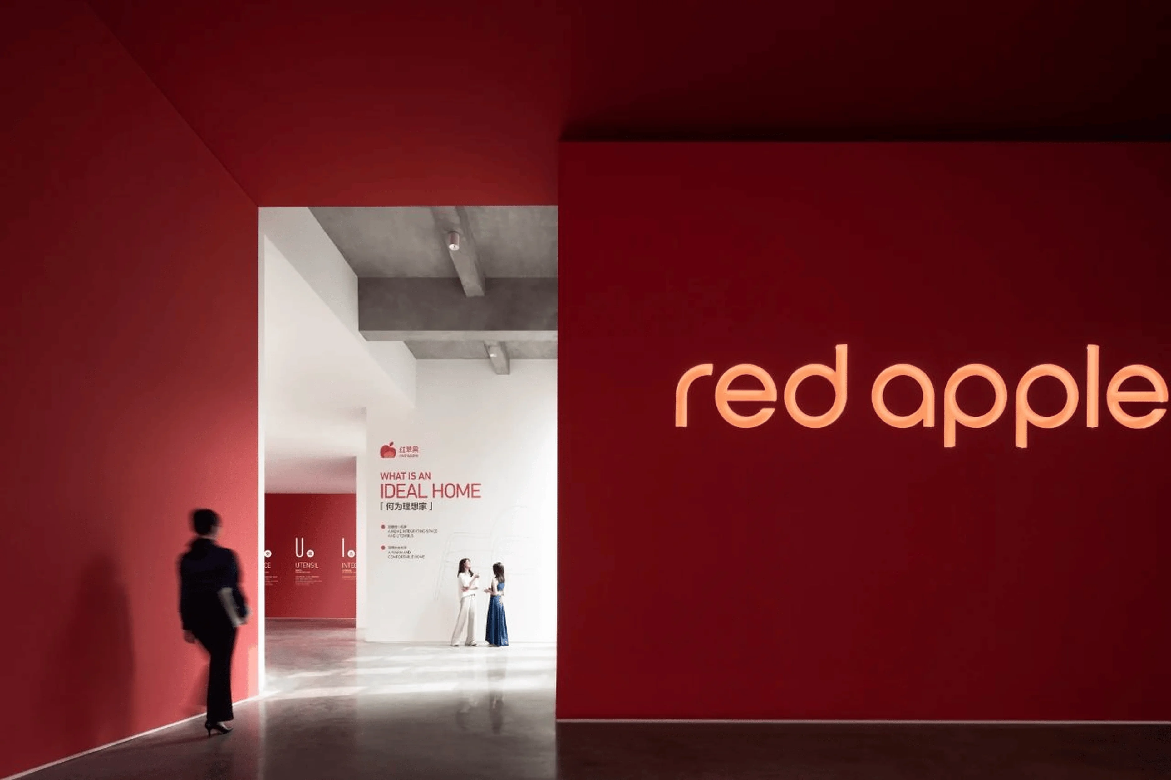
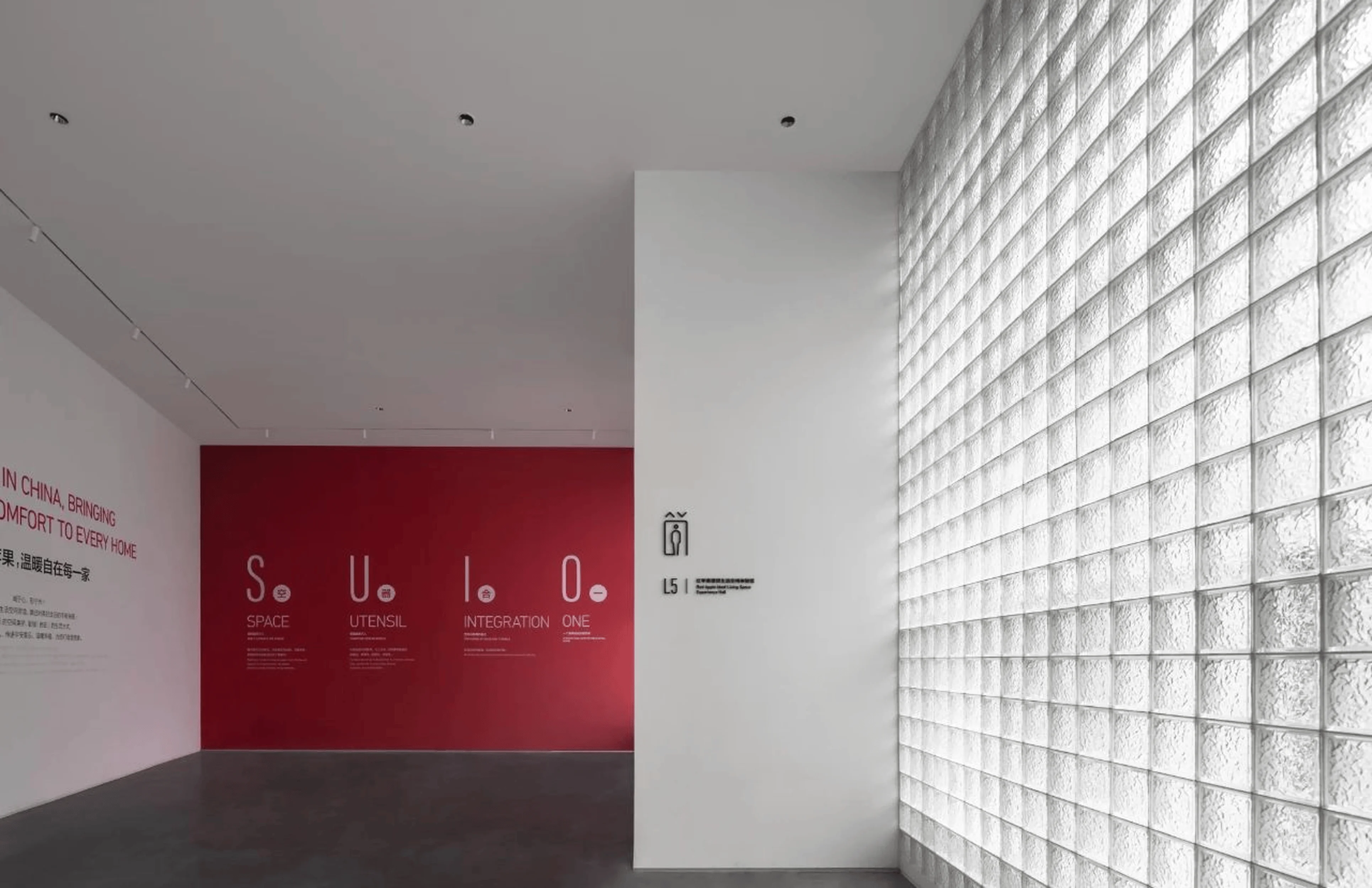
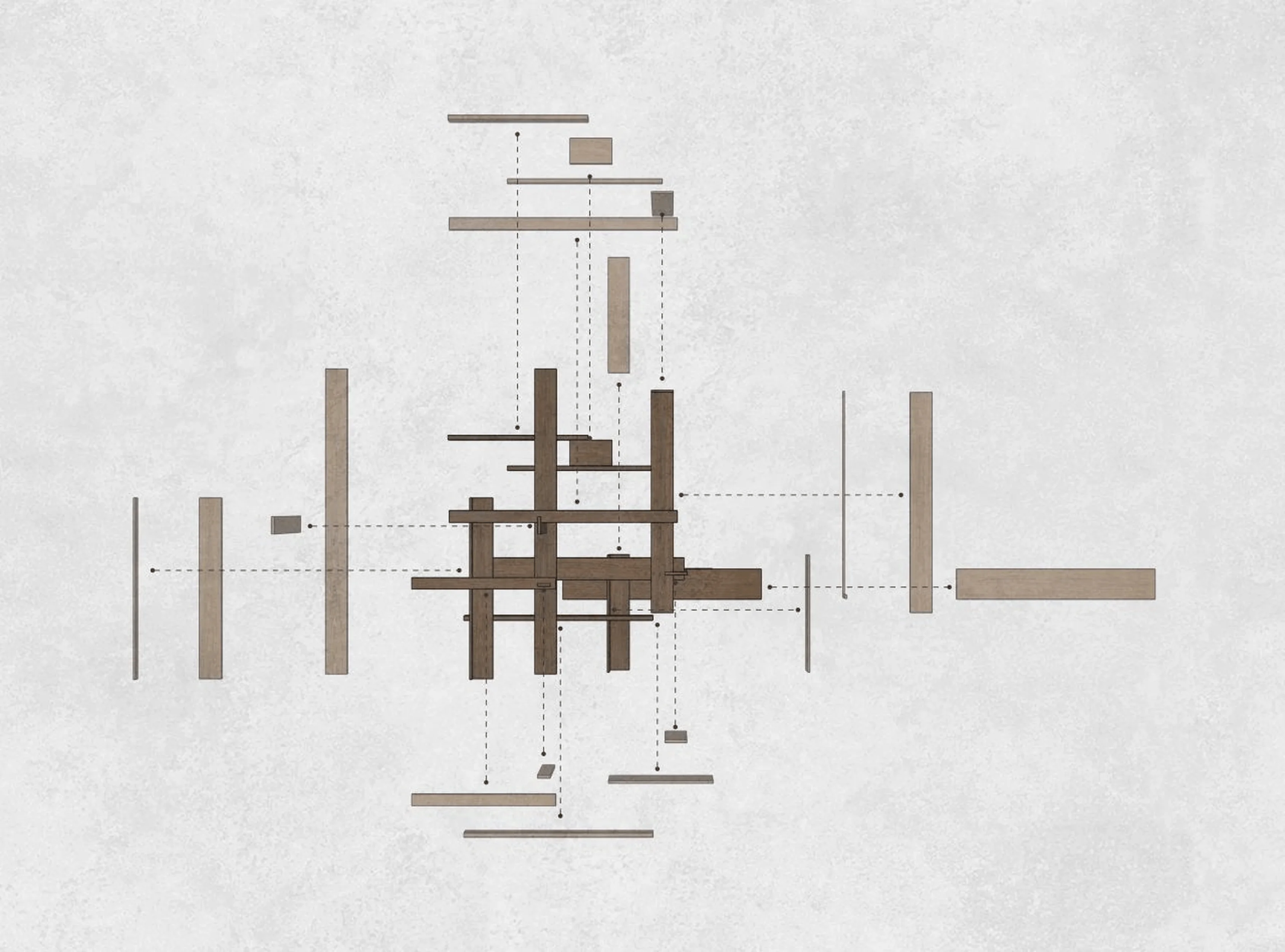
The primary design concept, integrationofspaceandutensils,aims to achieve a harmonious blend between architecture, furniture, and human experience. The designers focused on creating a space where the products become integrated within the architecture itself, enhancing the functionality and aesthetics. The Red Apple brand philosophy, bringingcomforttoeveryhome has guided the design in establishing a welcoming and inviting atmosphere. The designers sought to create a space that goes beyond a simple product showroom, focusing on creating a comprehensive experience that embodies the brand’s philosophy of warmth and comfort. This red apple showroom design highlights the importance of establishing a sense of place and promoting the brand’s narrative while effectively representing the products. The design draws inspiration from the Red Apple brand’s heritage while creating a modern and versatile exhibition space. The design focuses on creating a seamless transition between the interior and the exterior environments, allowing natural light to flood the spaces. This design trend in the interior design field helps to create a comfortable and inviting ambiance. By integrating industrial remnants and elements from the existing structure, the red apple showroom design effectively creates a unique spatial narrative.
Functional Layout and Spatial Planning
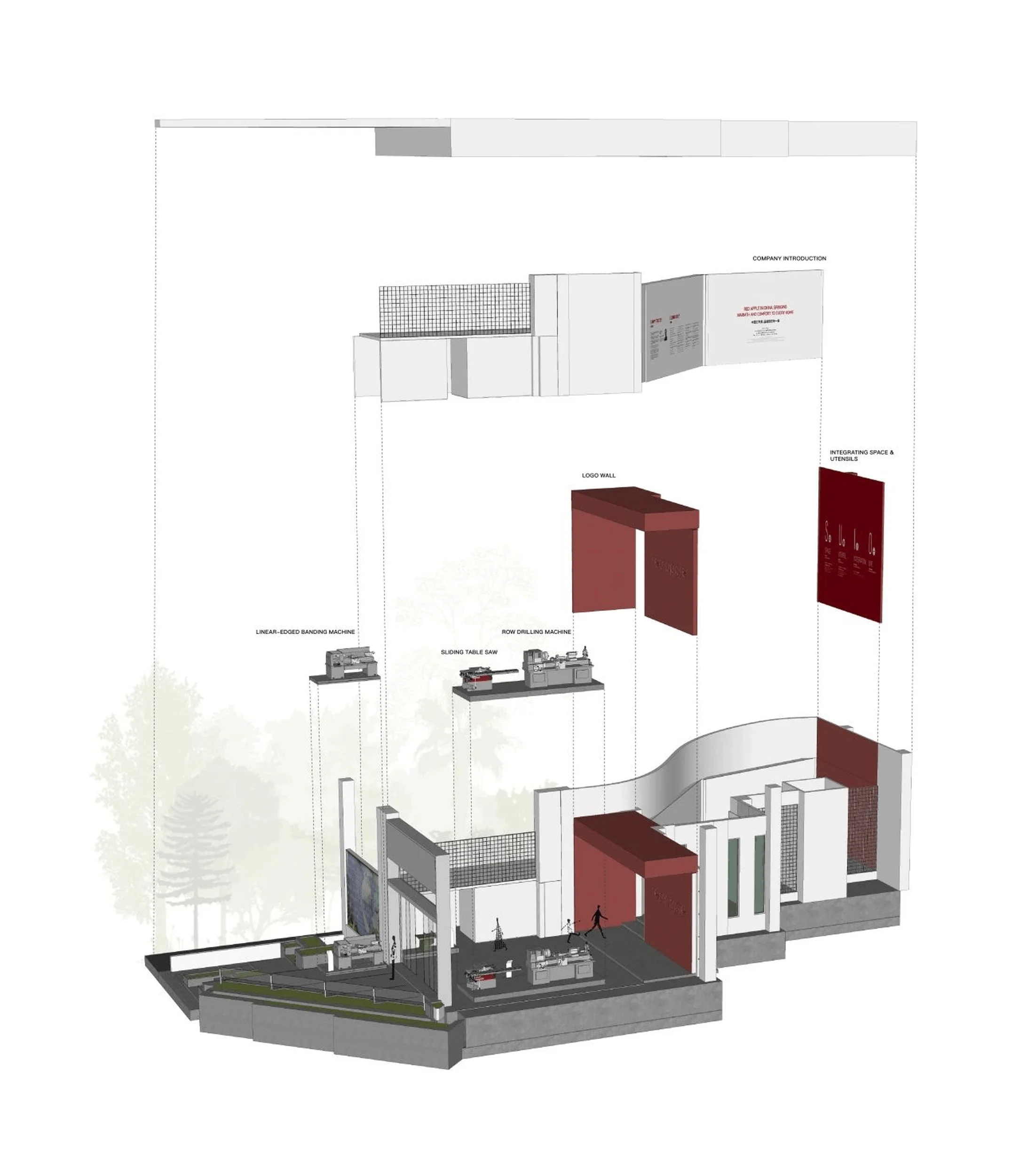
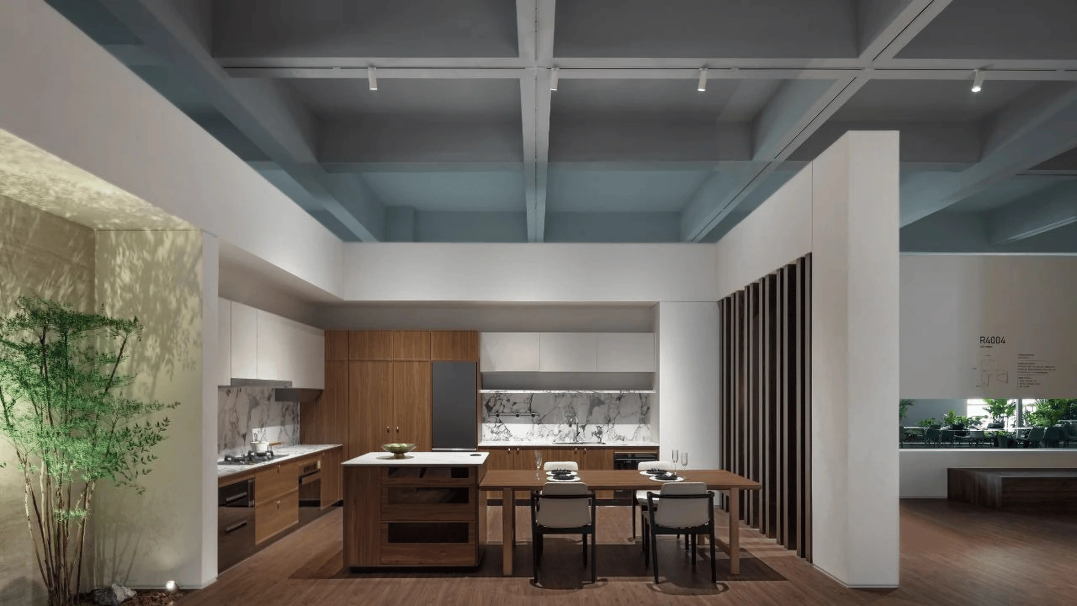
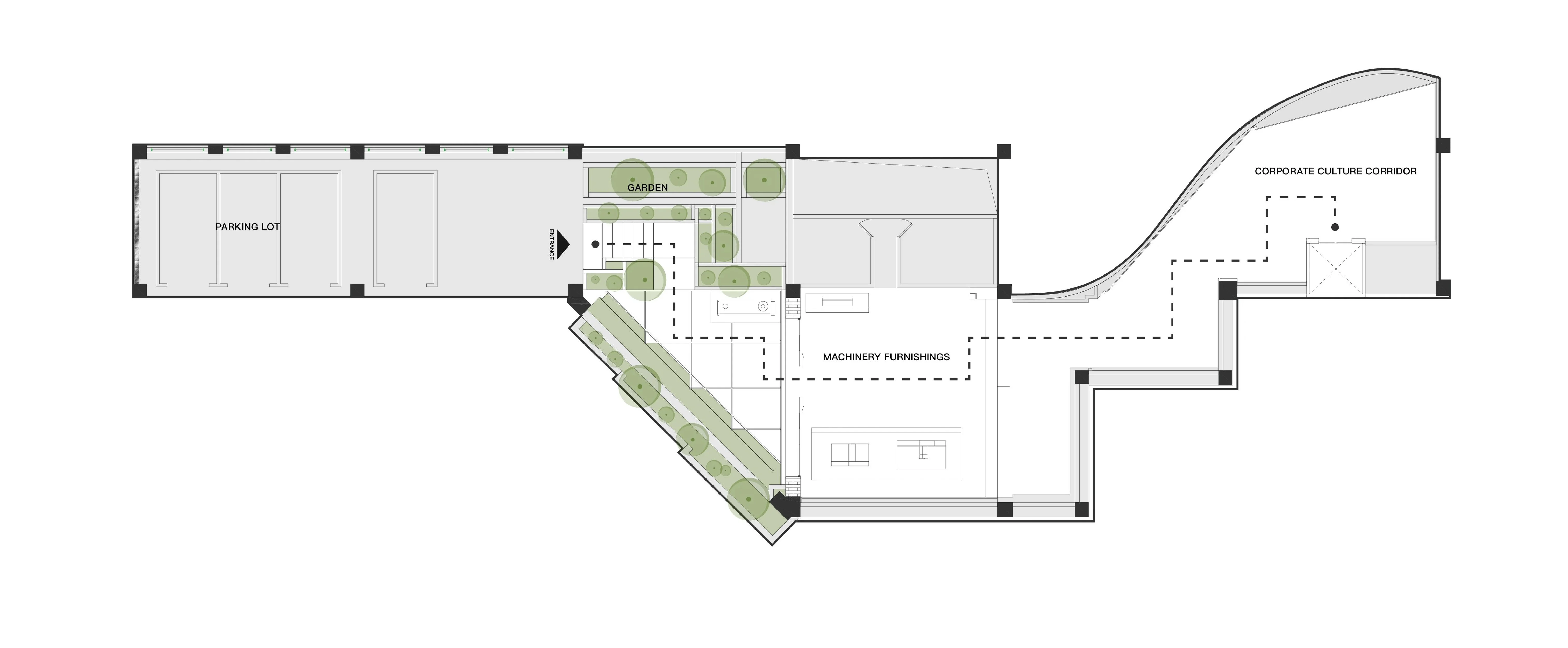
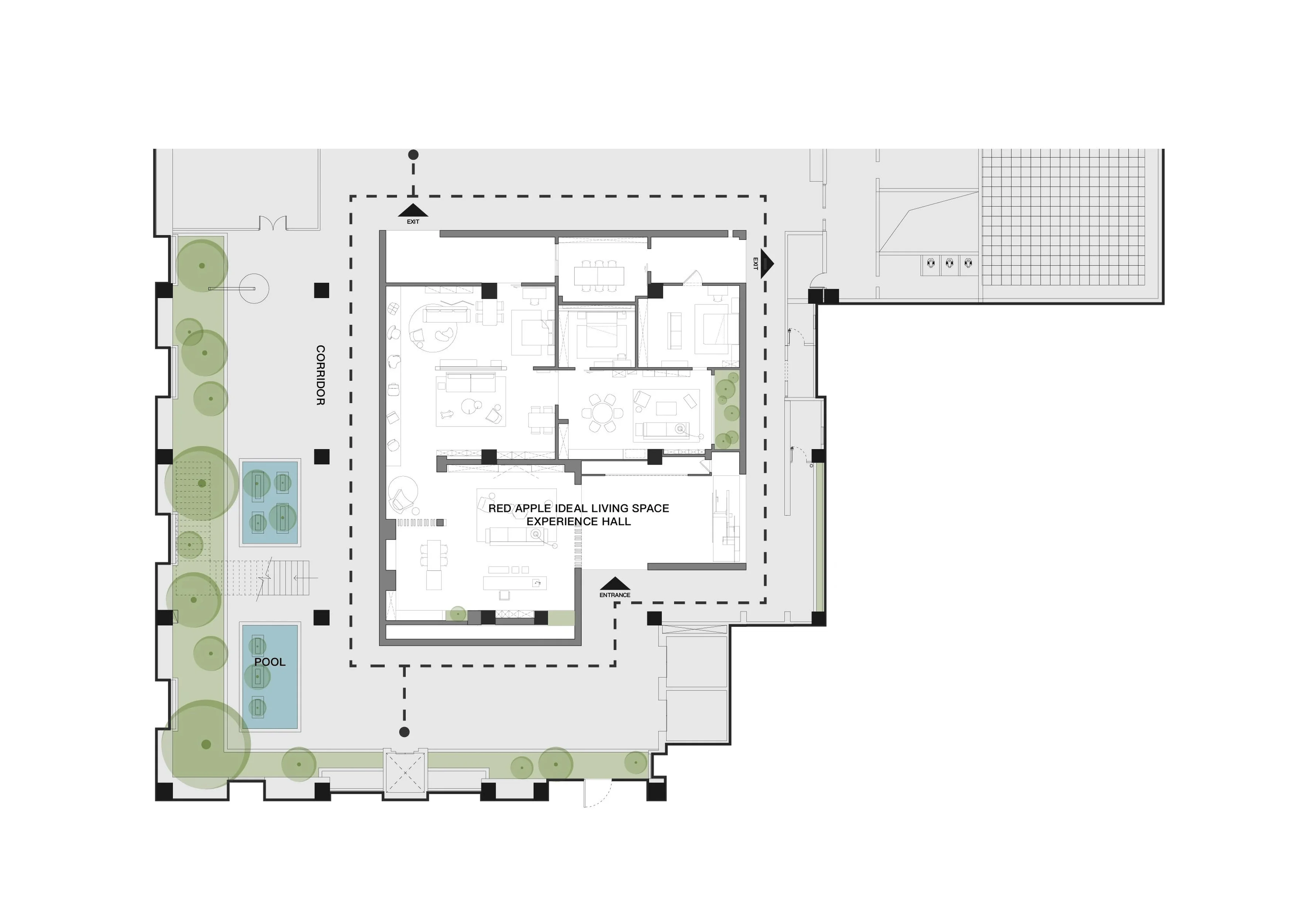
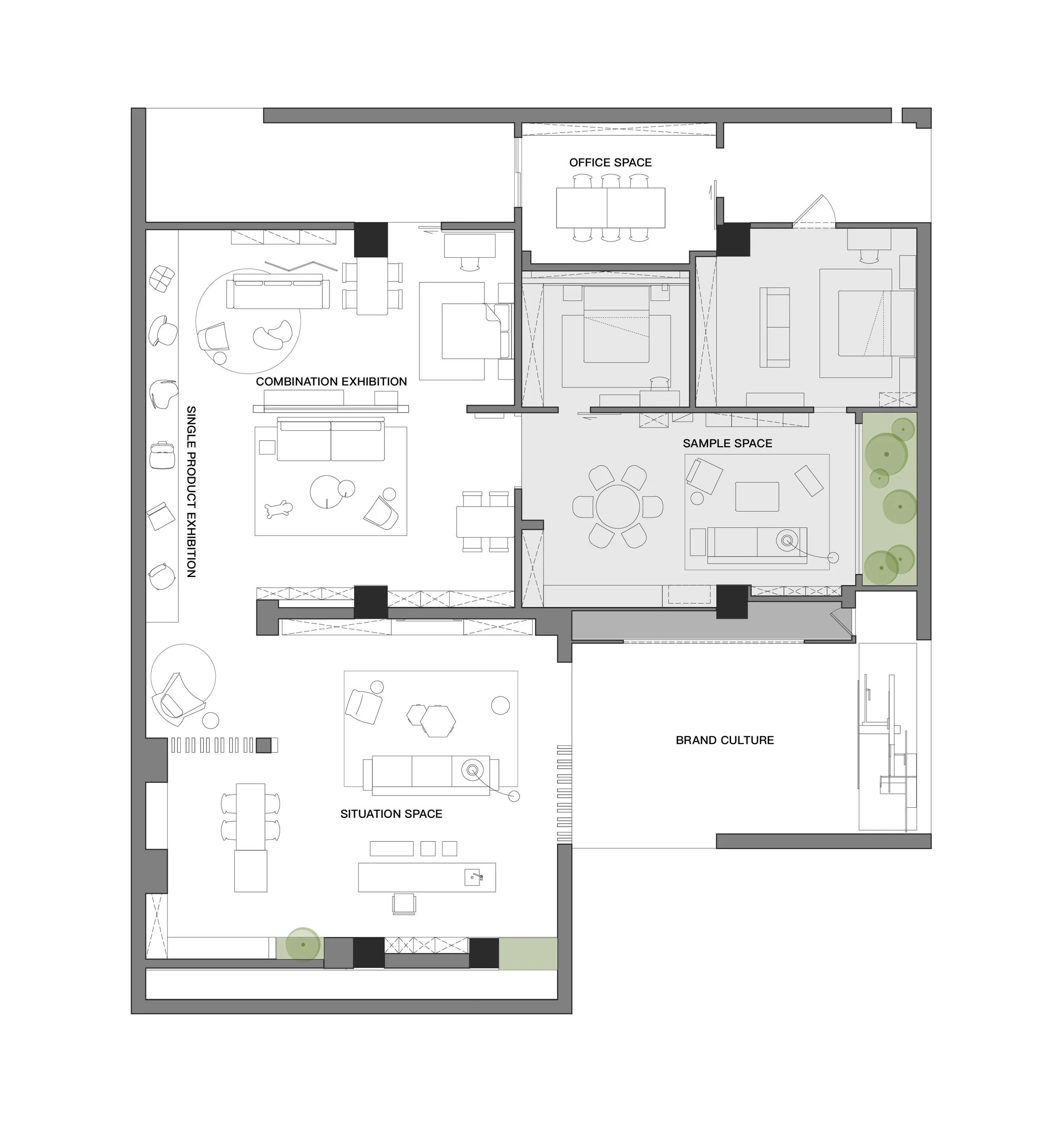
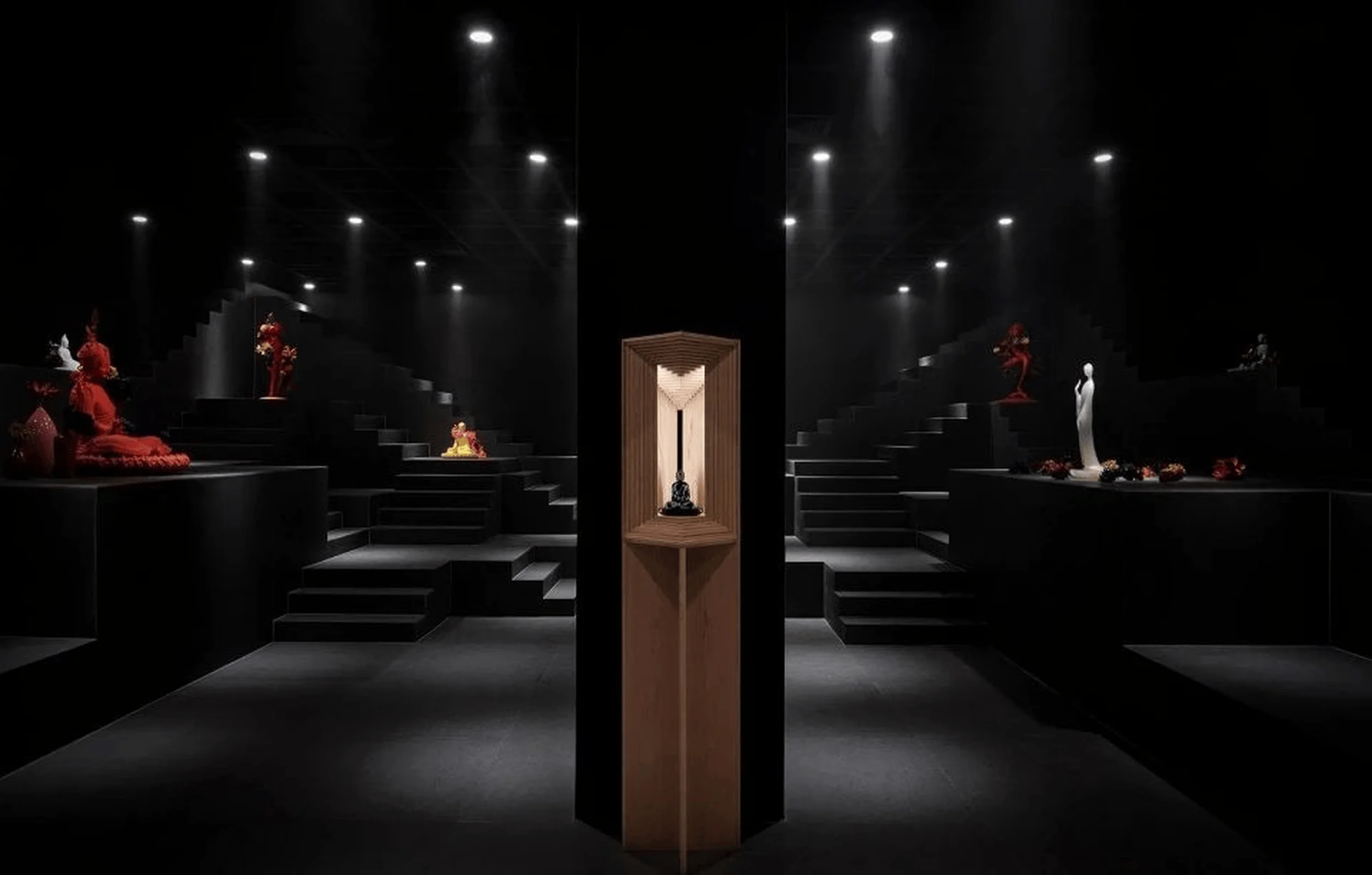
The Red Apple showroom is organized into multiple functional zones, including a brand culture display area, scenario spaces, single-product displays, combination displays, sample spaces, and office areas. The flow of the space is carefully designed to ensure a smooth and engaging visitor experience. The design team prioritized an intuitive and engaging user experience, seamlessly guiding visitors through the different areas. They sought to integrate the functions with the surrounding environment while maintaining the integrity of the existing building. The Red Apple showroom integrates a multi-functional exhibition hall that aims to showcase various cultural elements, products, and experiences, establishing a unique connection with visitors. This integration of brand storytelling and product display fosters a deeper understanding of the Red Apple brand. The showroom serves as a platform for demonstrating the Red Apple brand’s heritage, product designs, and the brand’s ideal vision for living spaces. The design features a variety of functional areas, promoting a comprehensive experience that transcends merely displaying products. This red apple showroom design emphasizes how interior design can influence brand identity. Each area within the showroom serves as a distinctive space for different brand narratives and product storytelling, enhancing the overall brand experience.
Exterior Design and Aesthetics
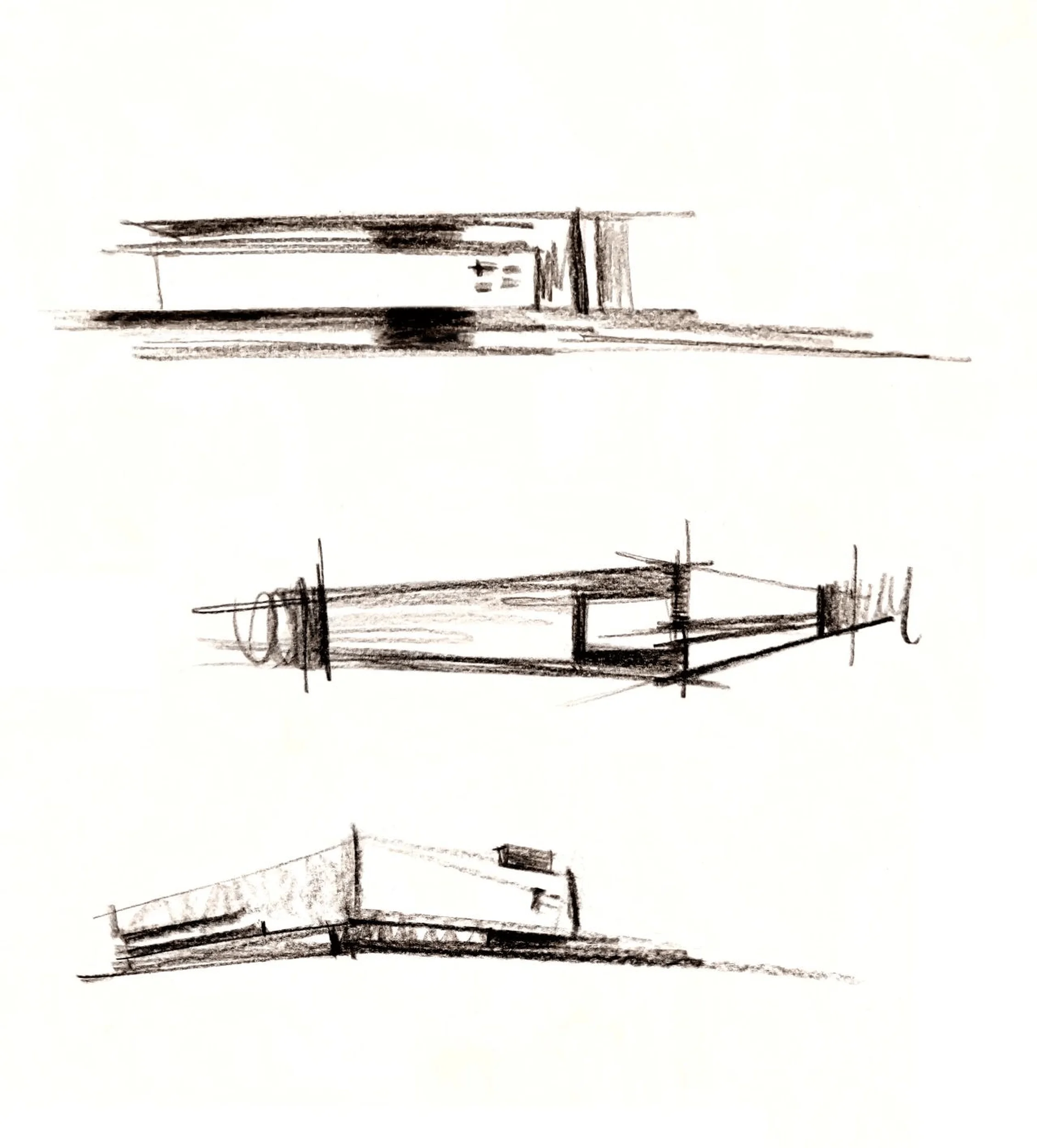
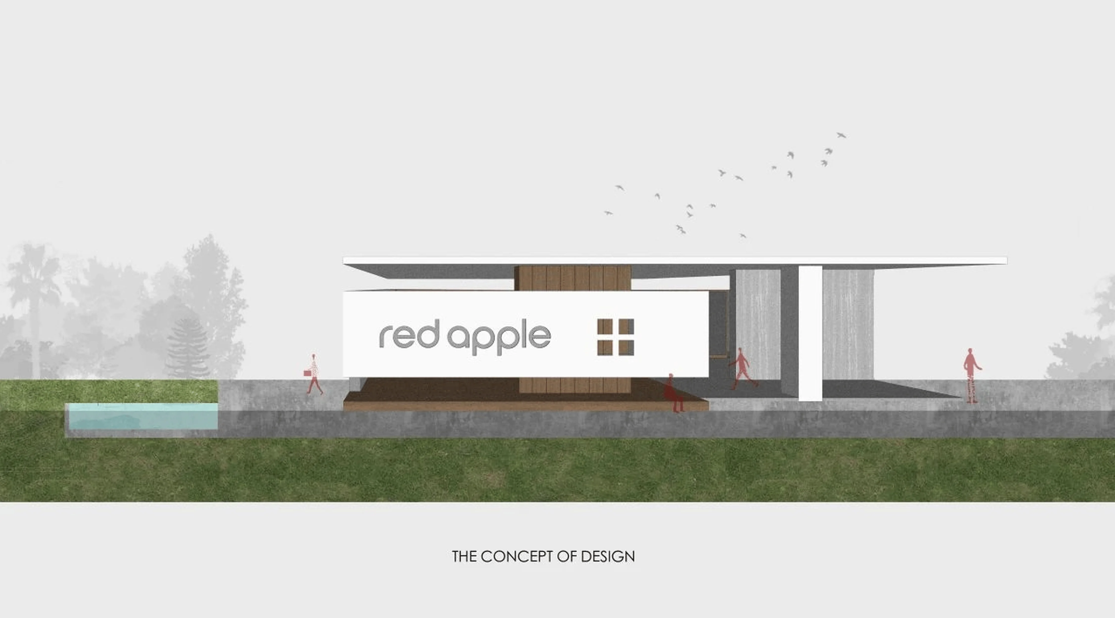
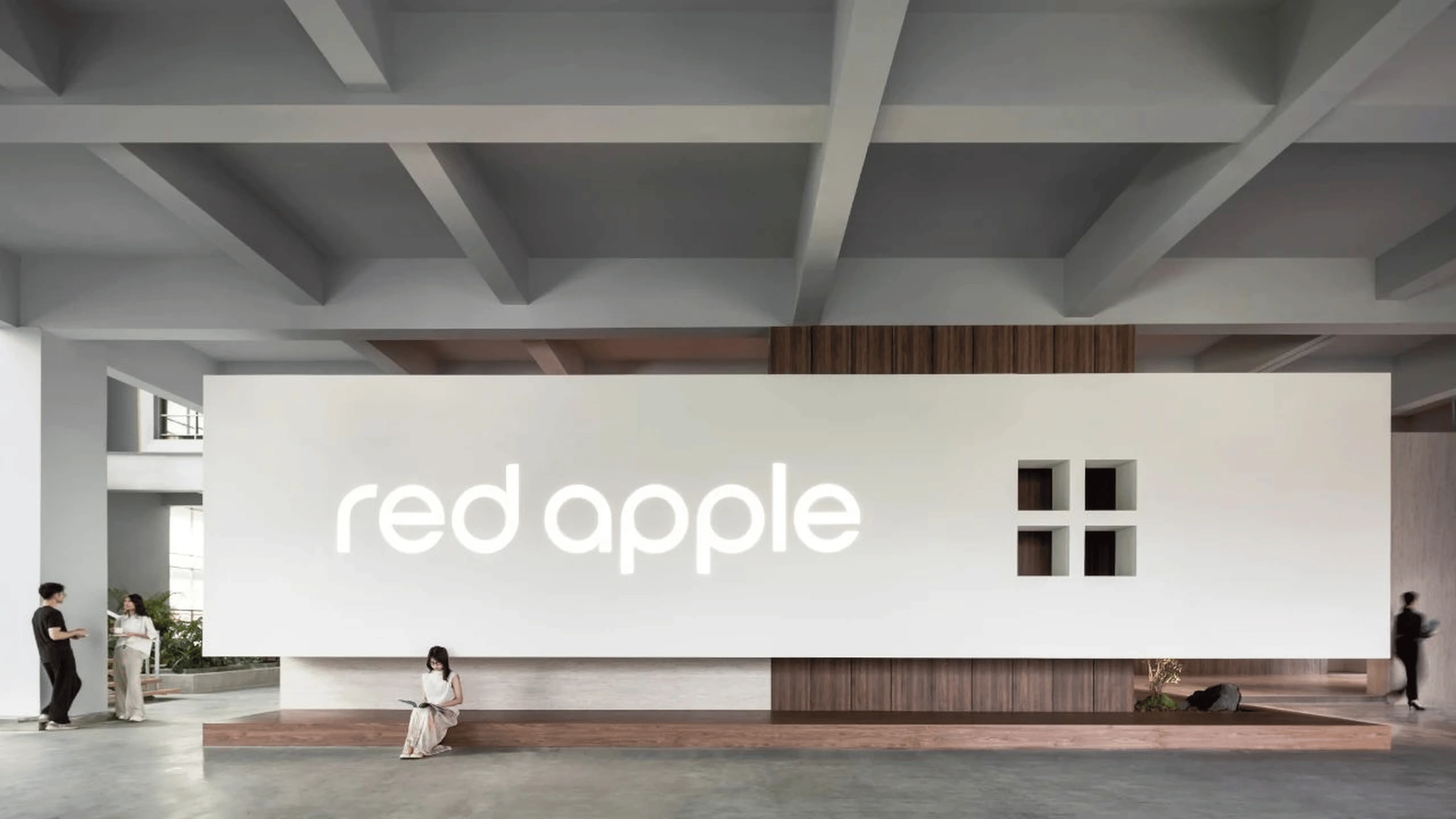
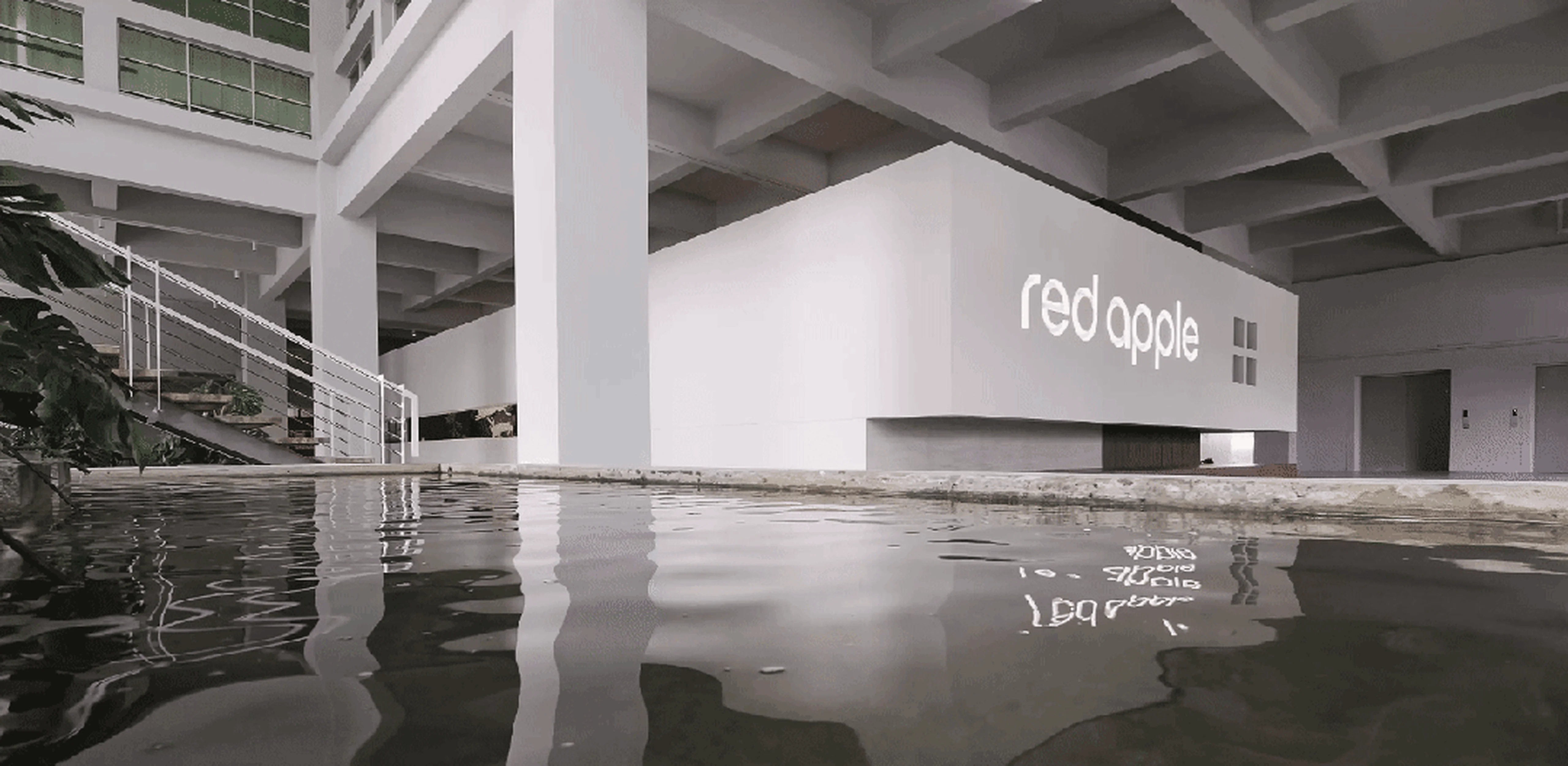
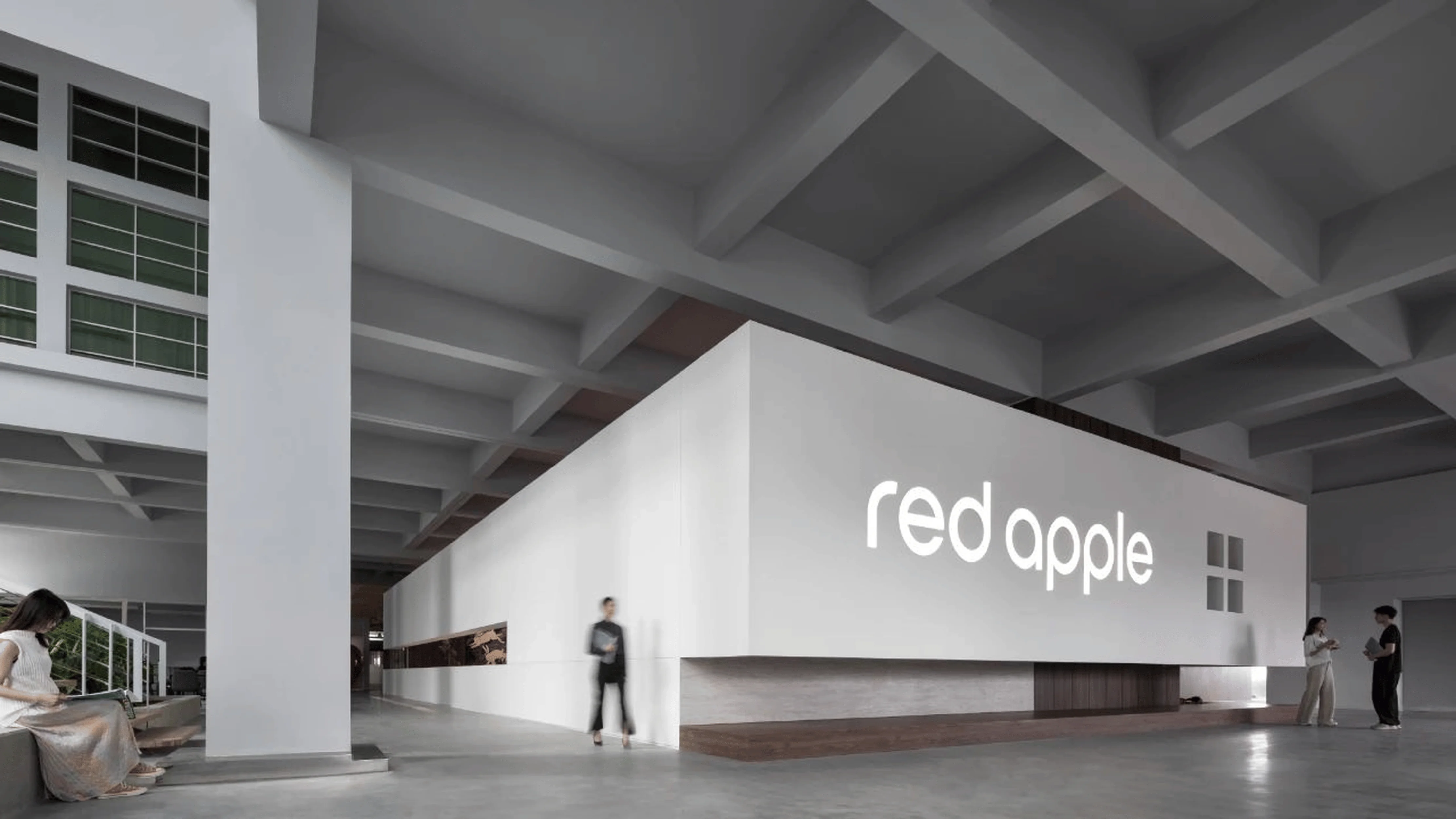
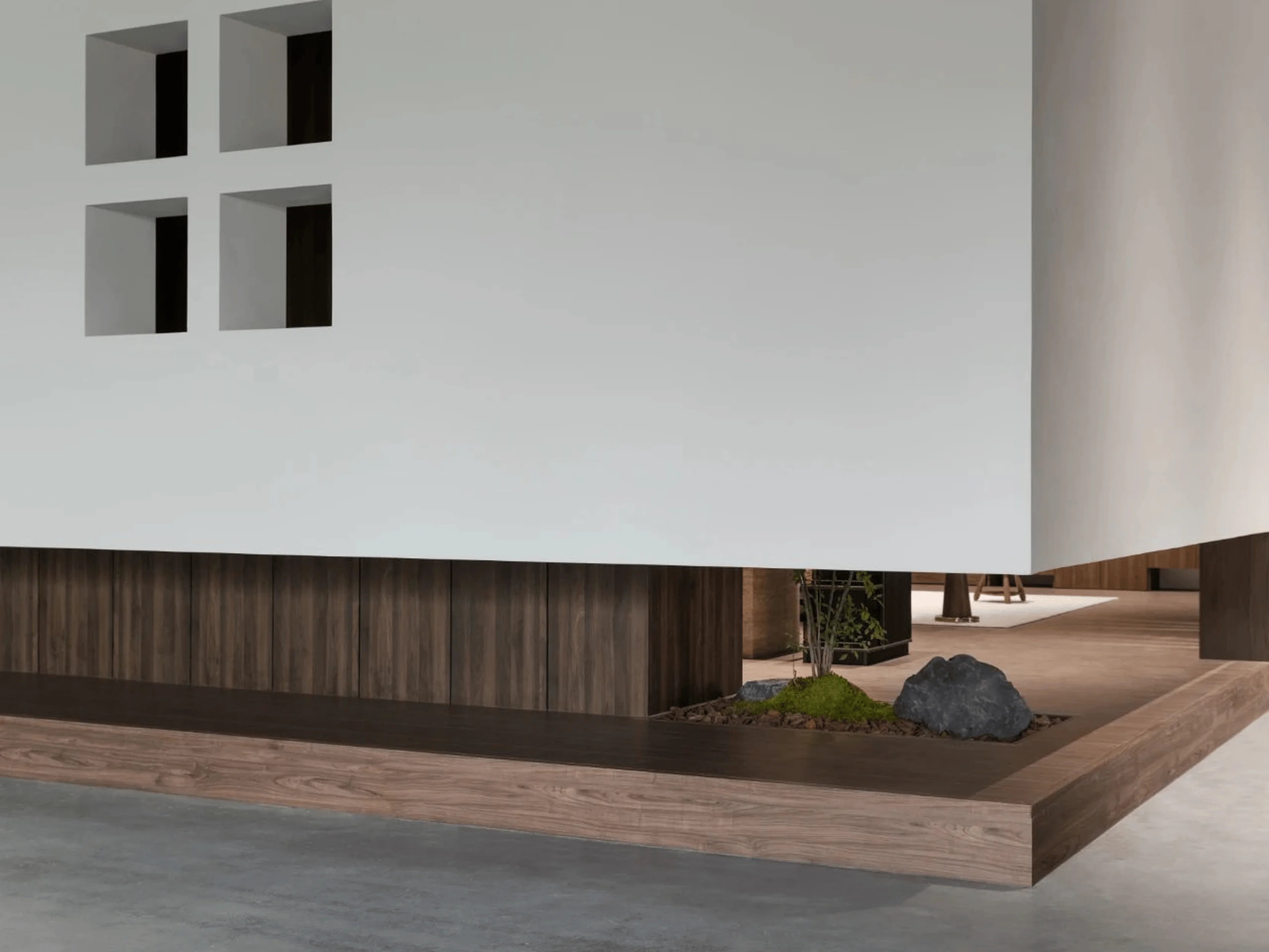
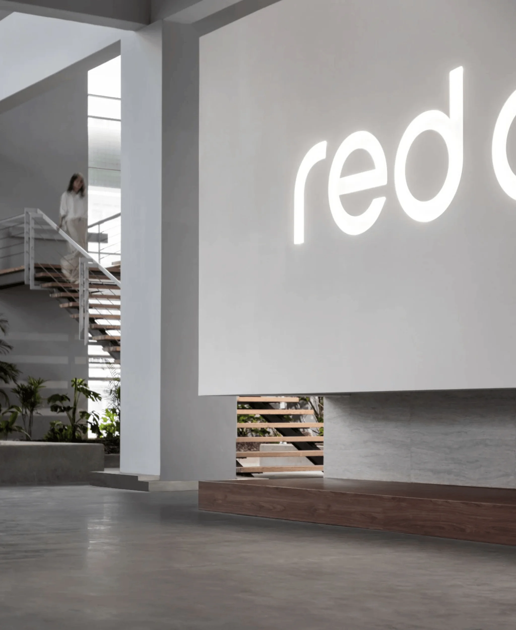
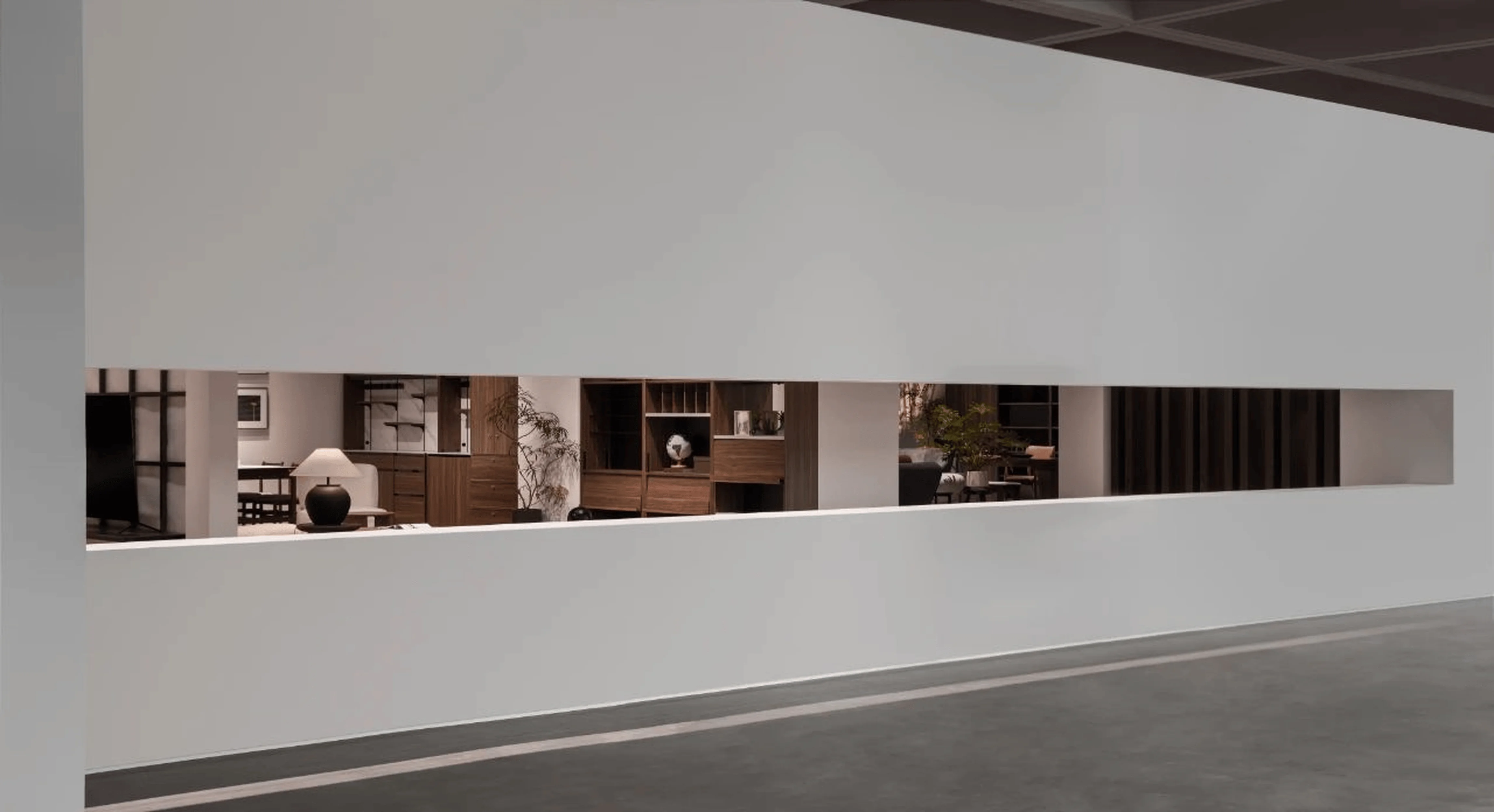
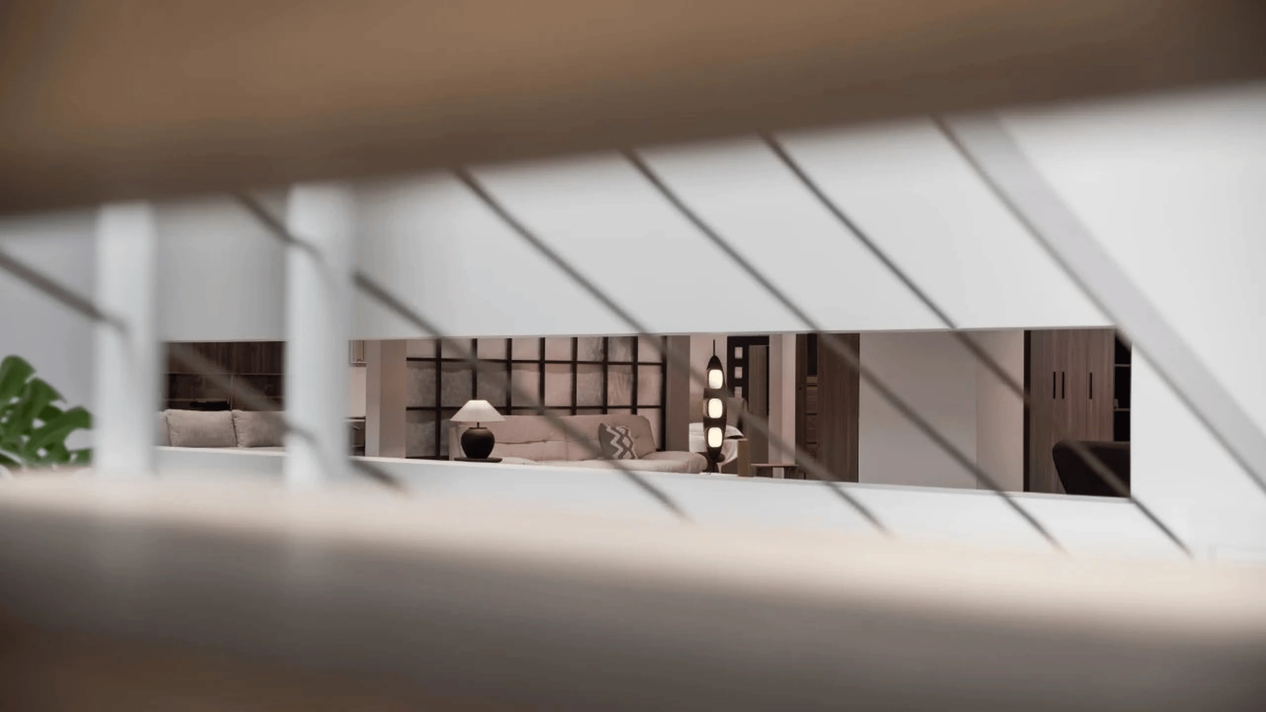
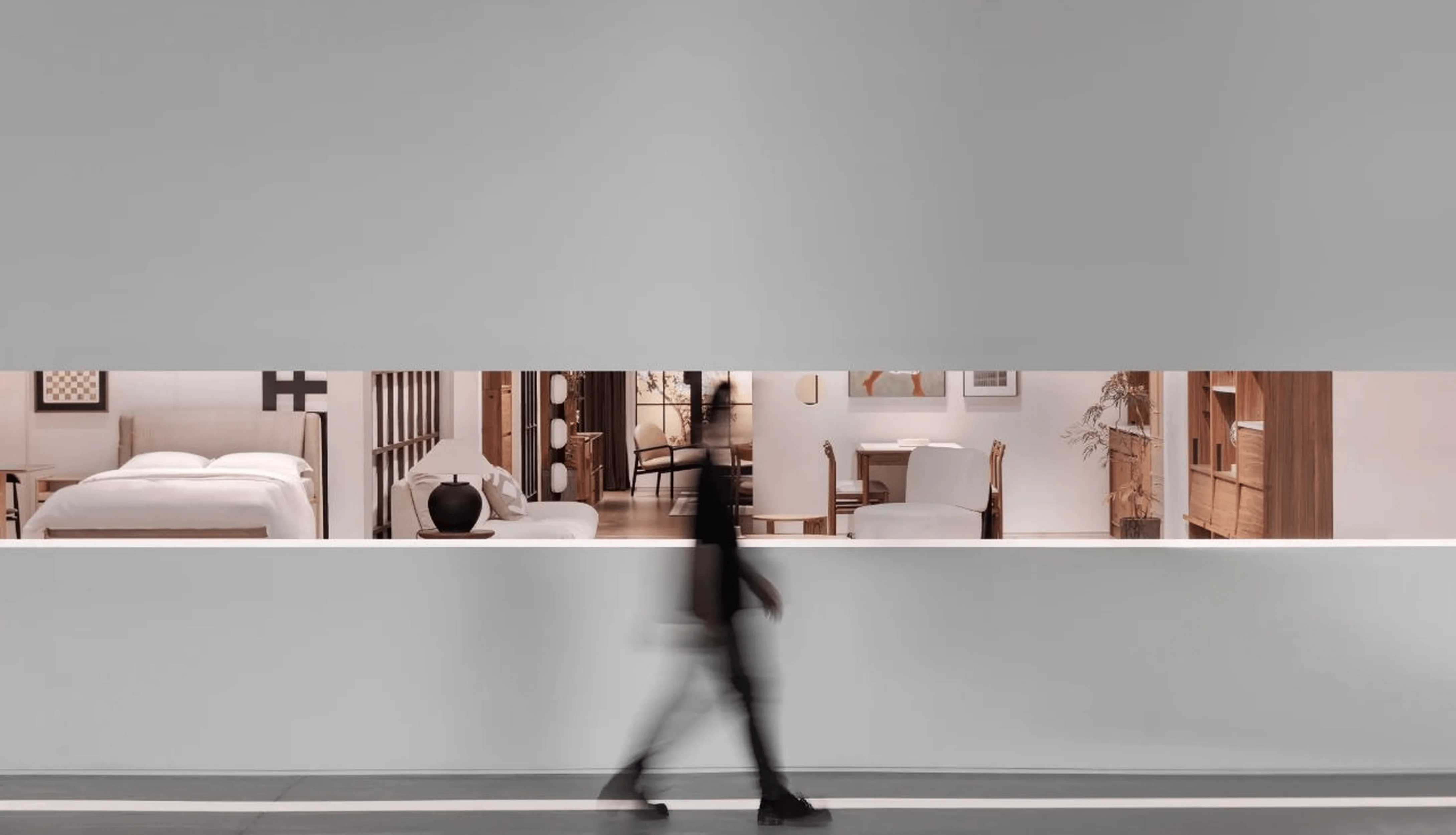
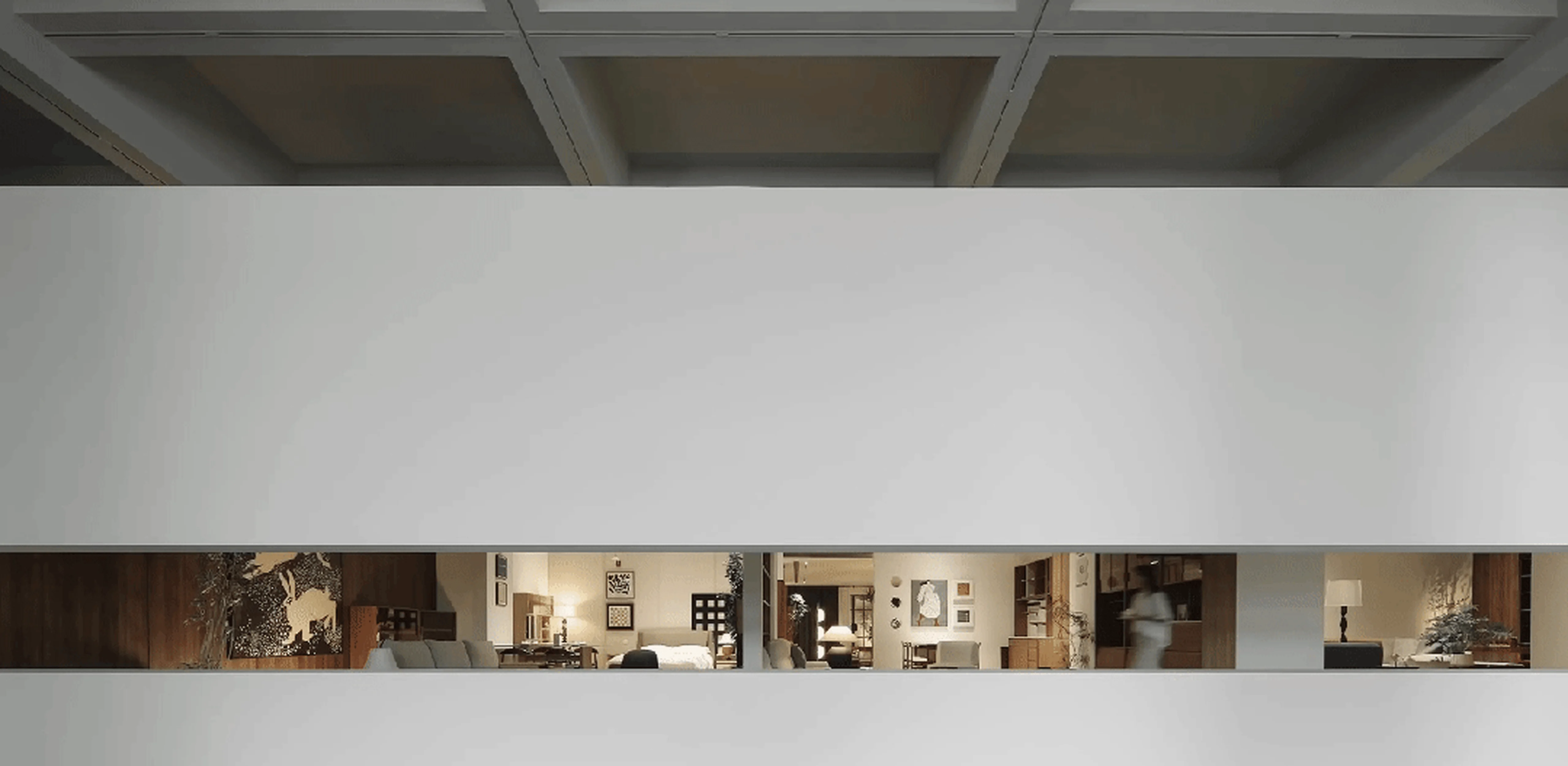
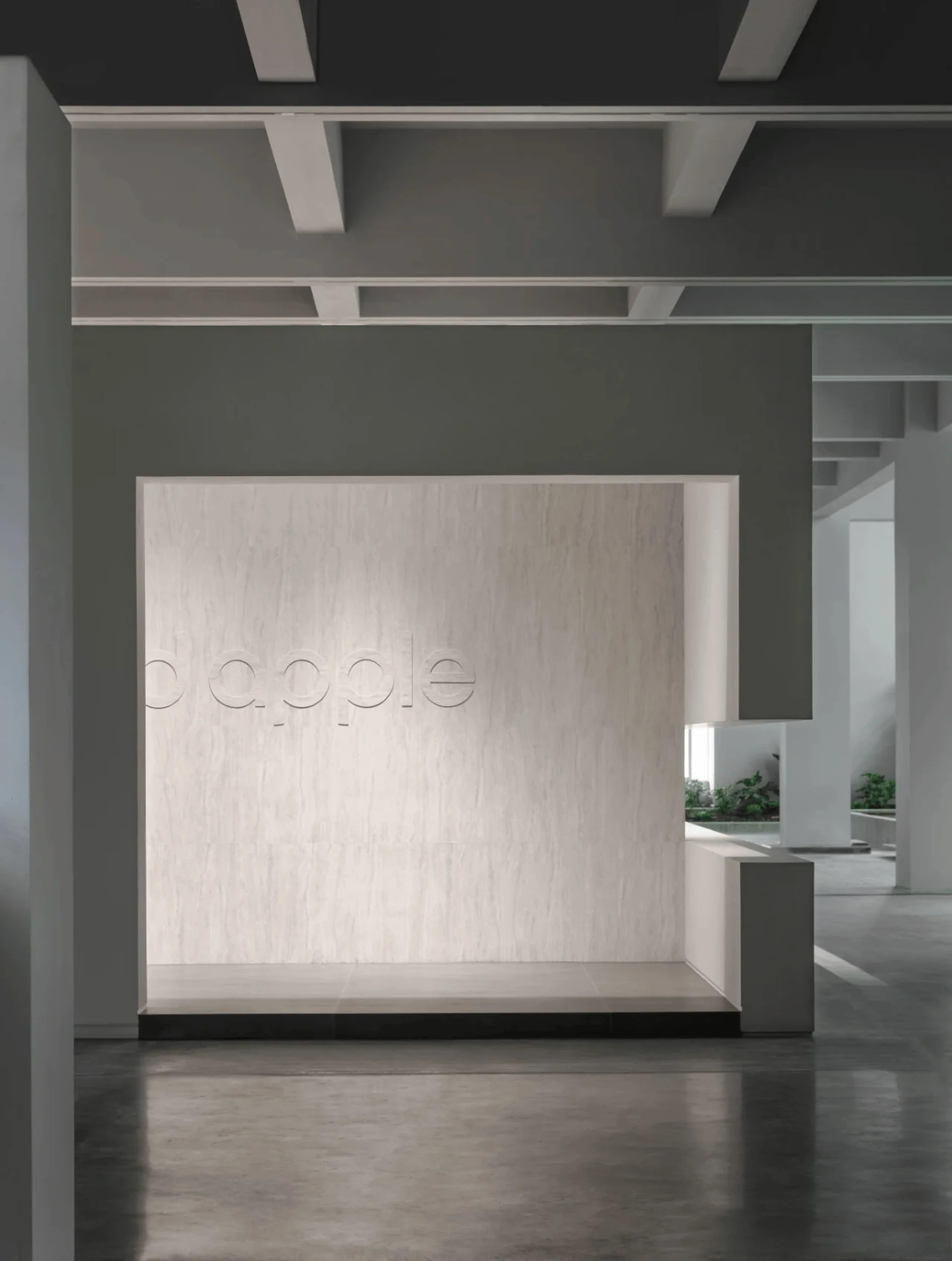
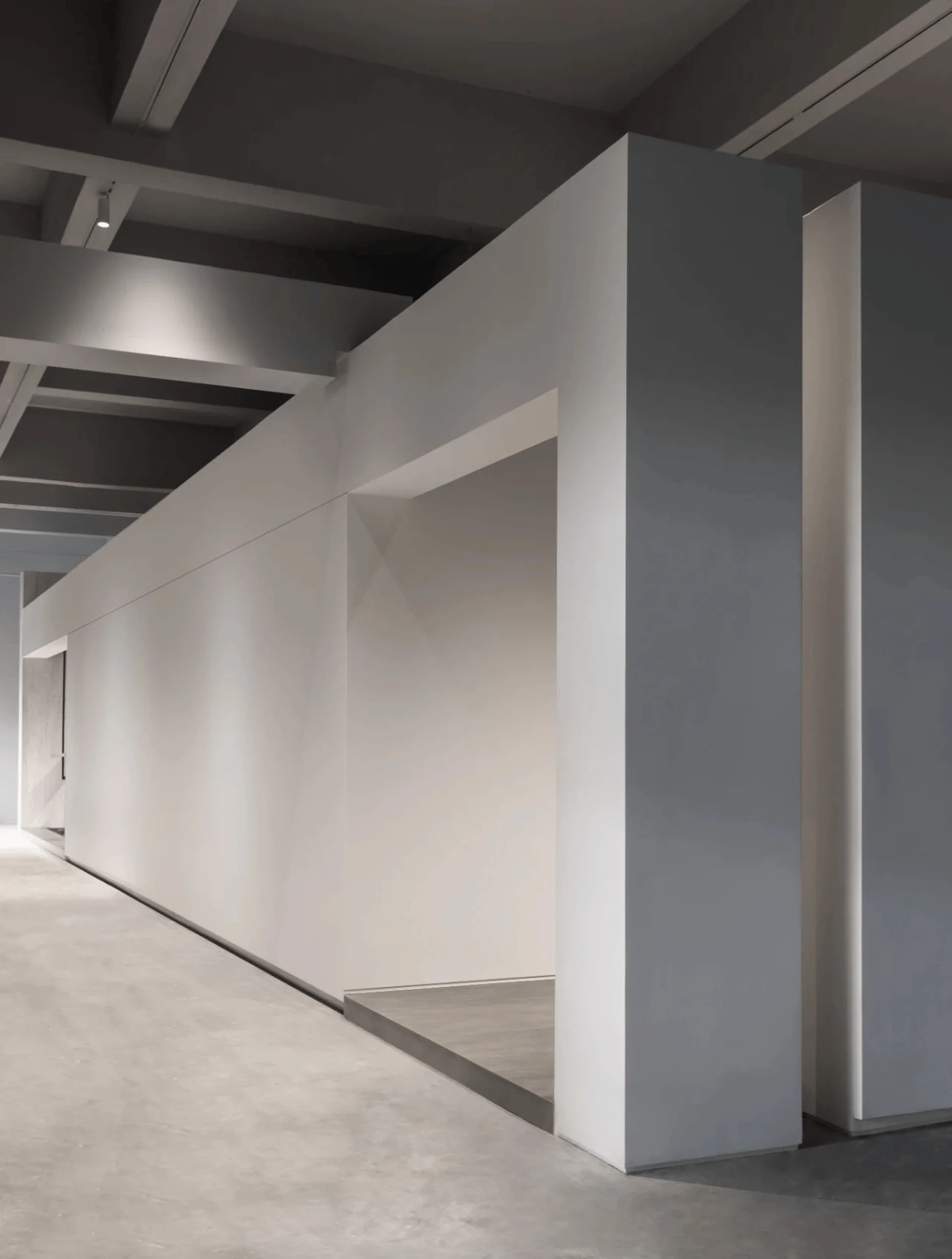
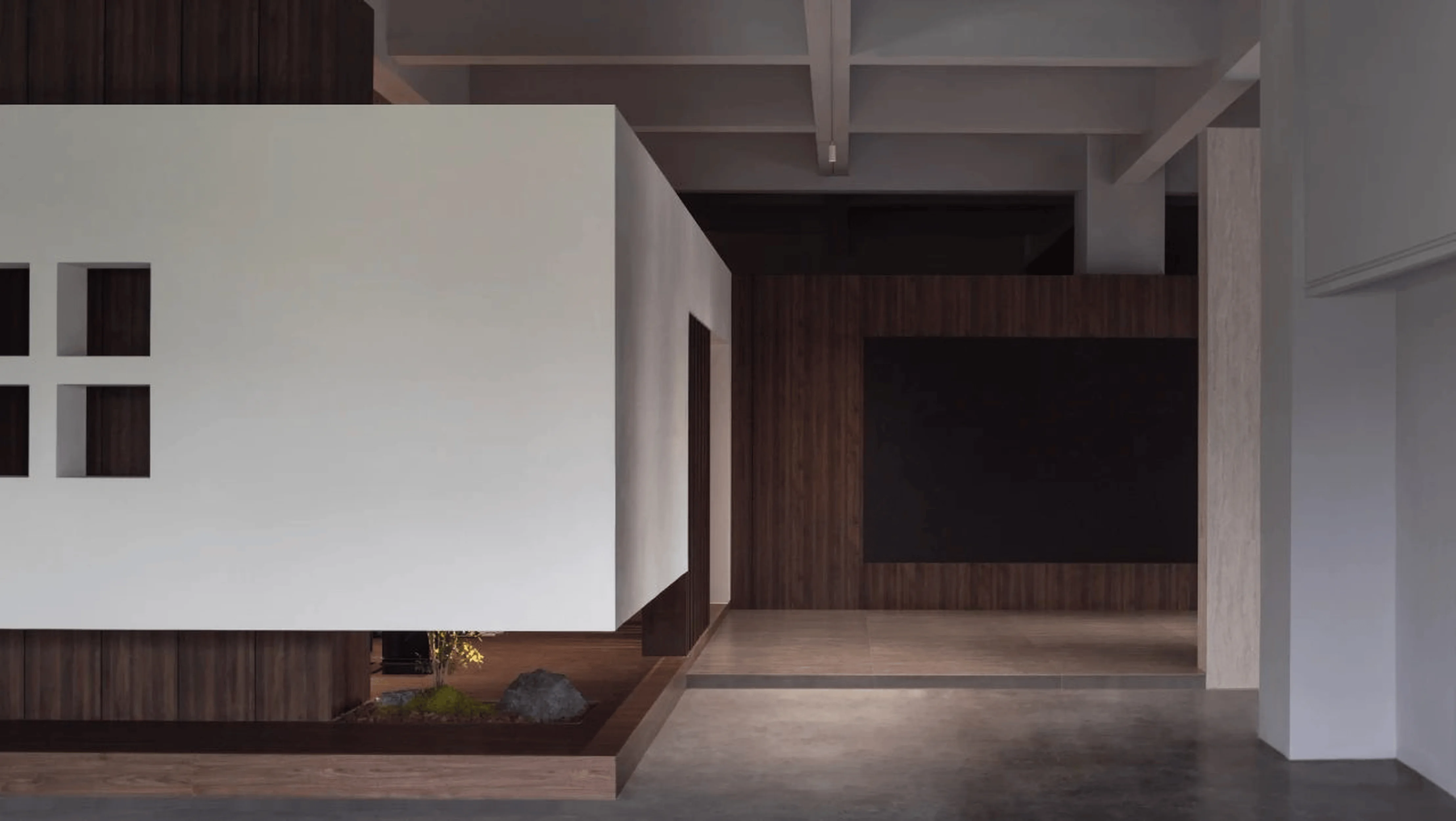
The 5th floor, where the showroom is located, boasts expansive scale and is surrounded by a water feature and a lush garden. The design team sought a subtle architectural language that would complement the surrounding environment and the existing structure. They chose a simple box-like form for the new exhibition hall, emphasizing a sense of lightness and transparency. The designers integrated the industrial elements within the architecture with a contemporary style. The horizontal long windows provide a connection between the interior and exterior landscapes. The design team also integrated the brand’s logo into the building’s facade, incorporating a cut-out pattern that echoes the brand’s first-generation logo and the concept of integrationofspaceandutensils. The exterior design is both functional and aesthetically pleasing, promoting a strong brand identity. The red apple showroom design masterfully blends modern architectural elements with the heritage of the existing site, creating a sense of continuity and cohesion. The design team sought to balance the scale and mass of the new addition with the surrounding environment, avoiding any dominance or disruptive impact on the existing site. This red apple showroom design demonstrates how architectural design can use historical elements and modern aesthetics to create a unique space.
Interior Design and Material Palette
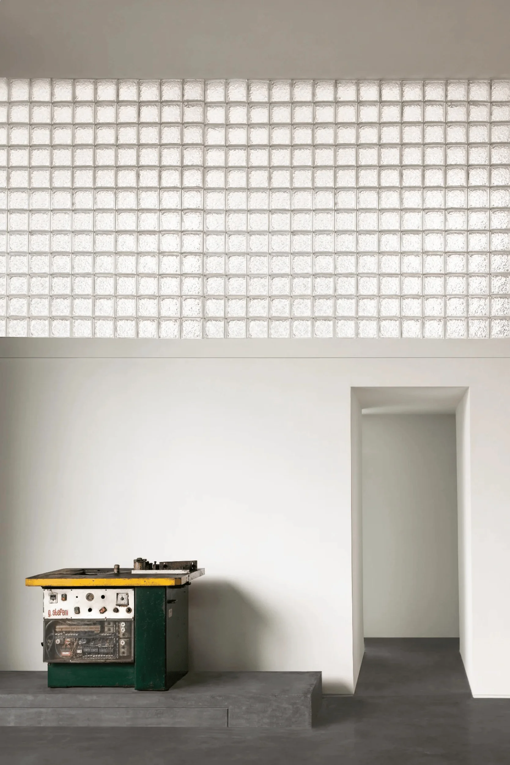
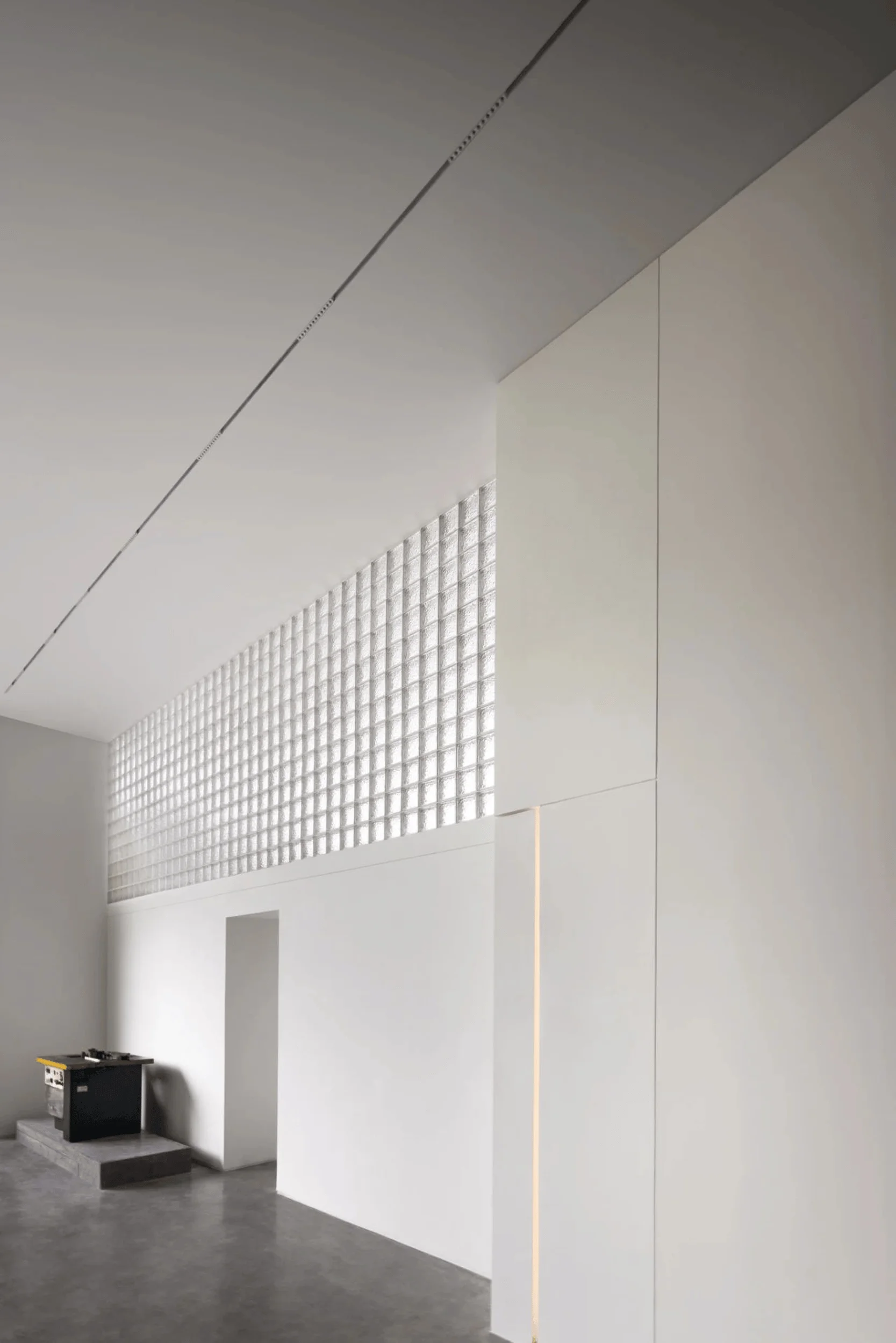
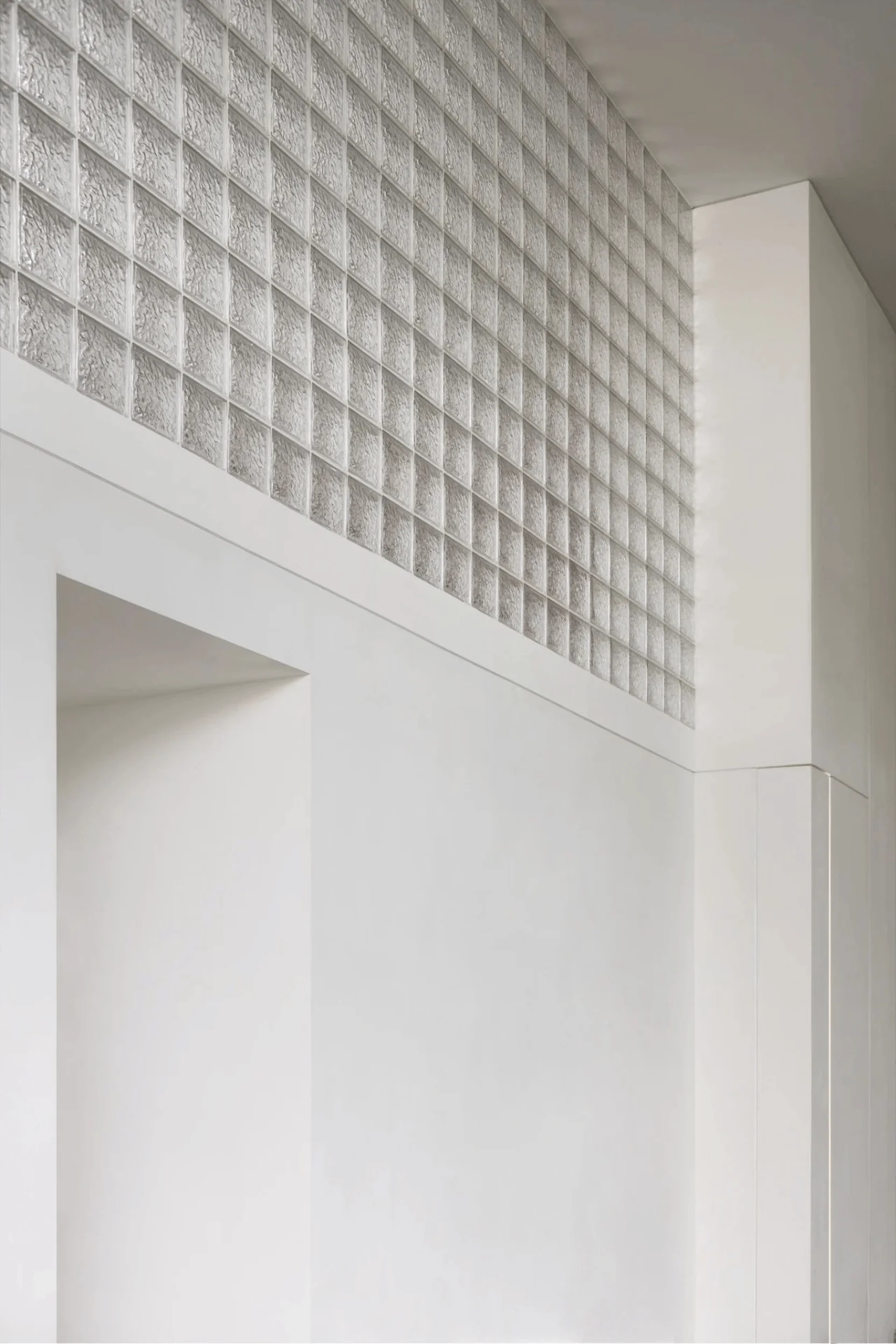
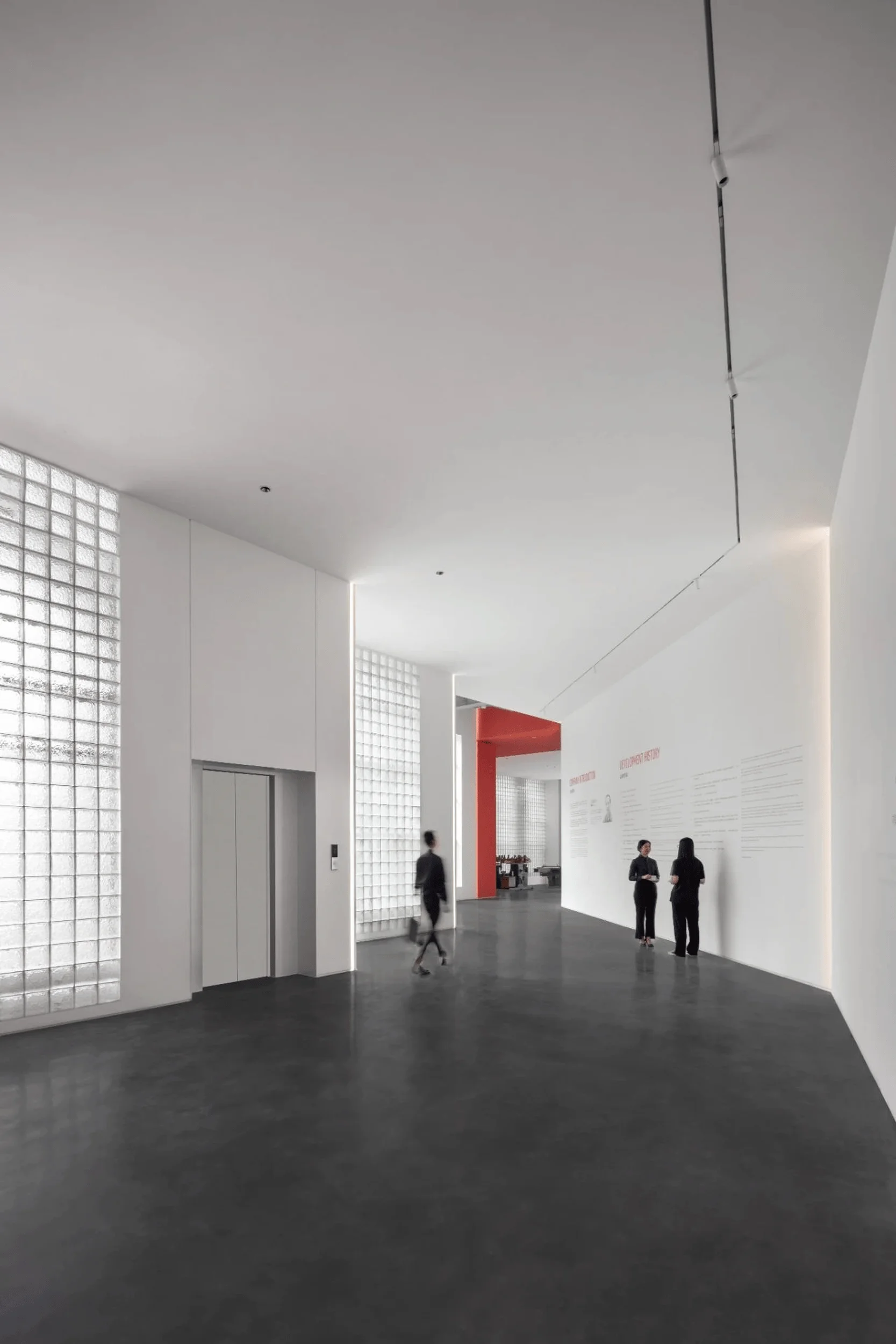
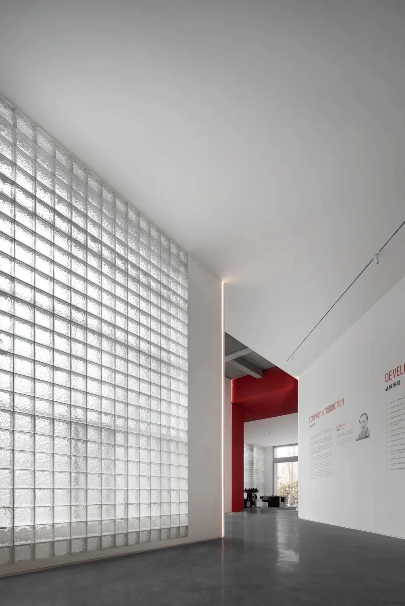
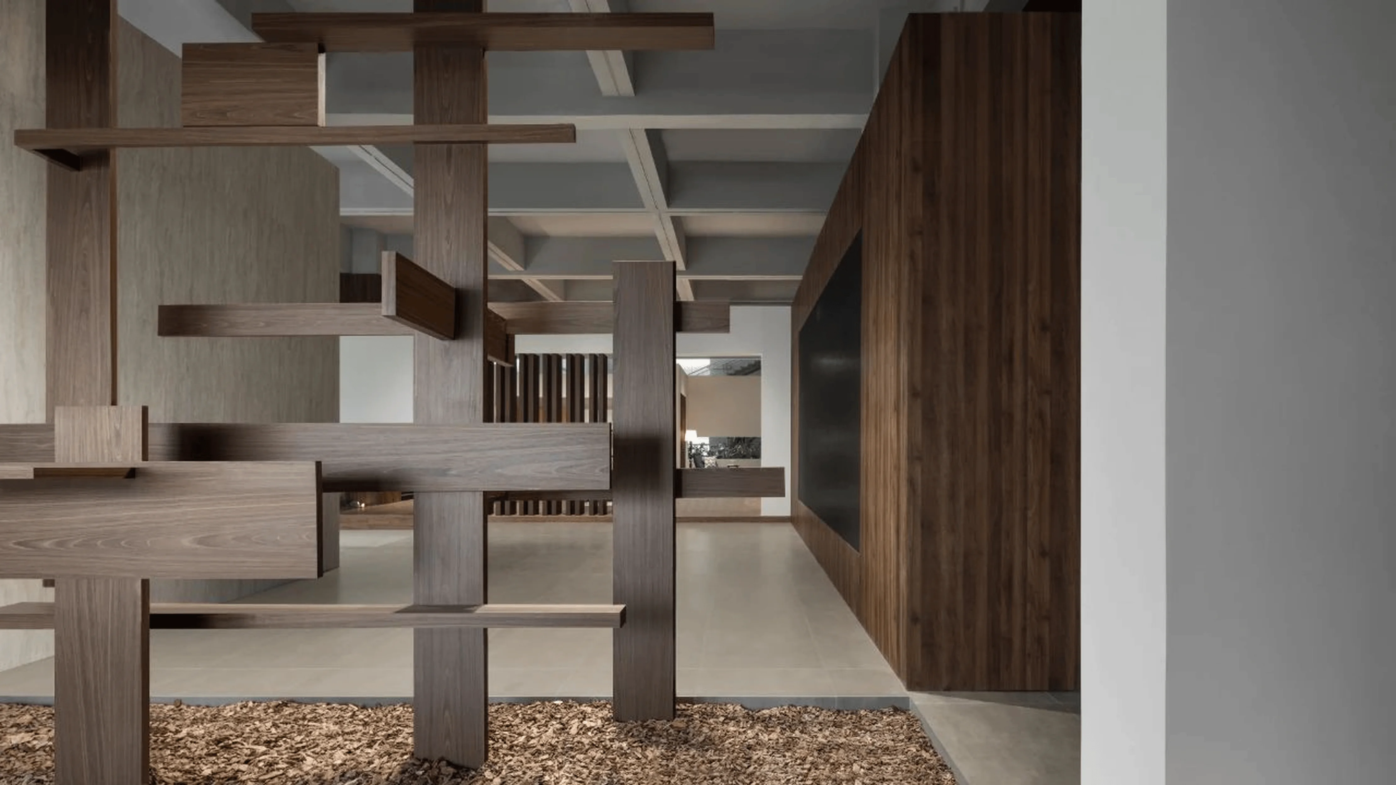
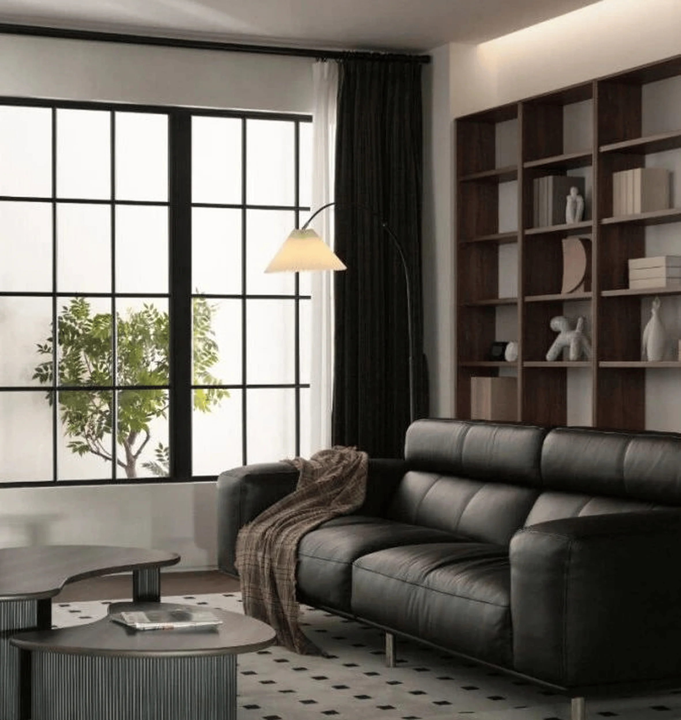
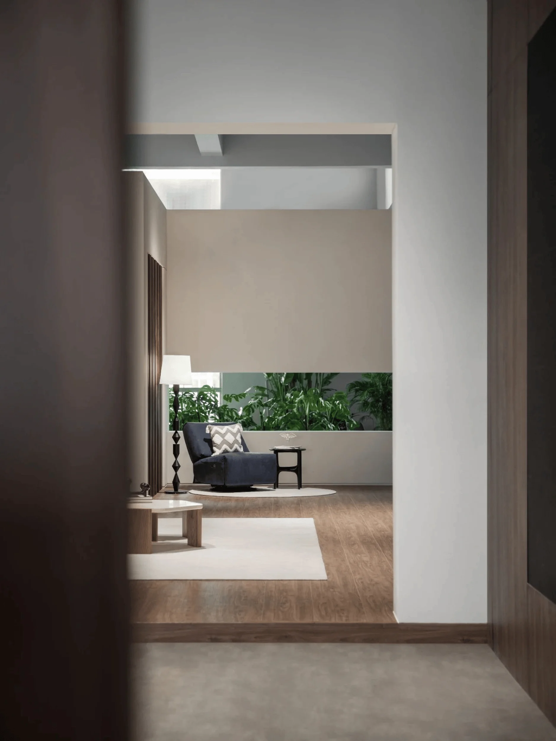
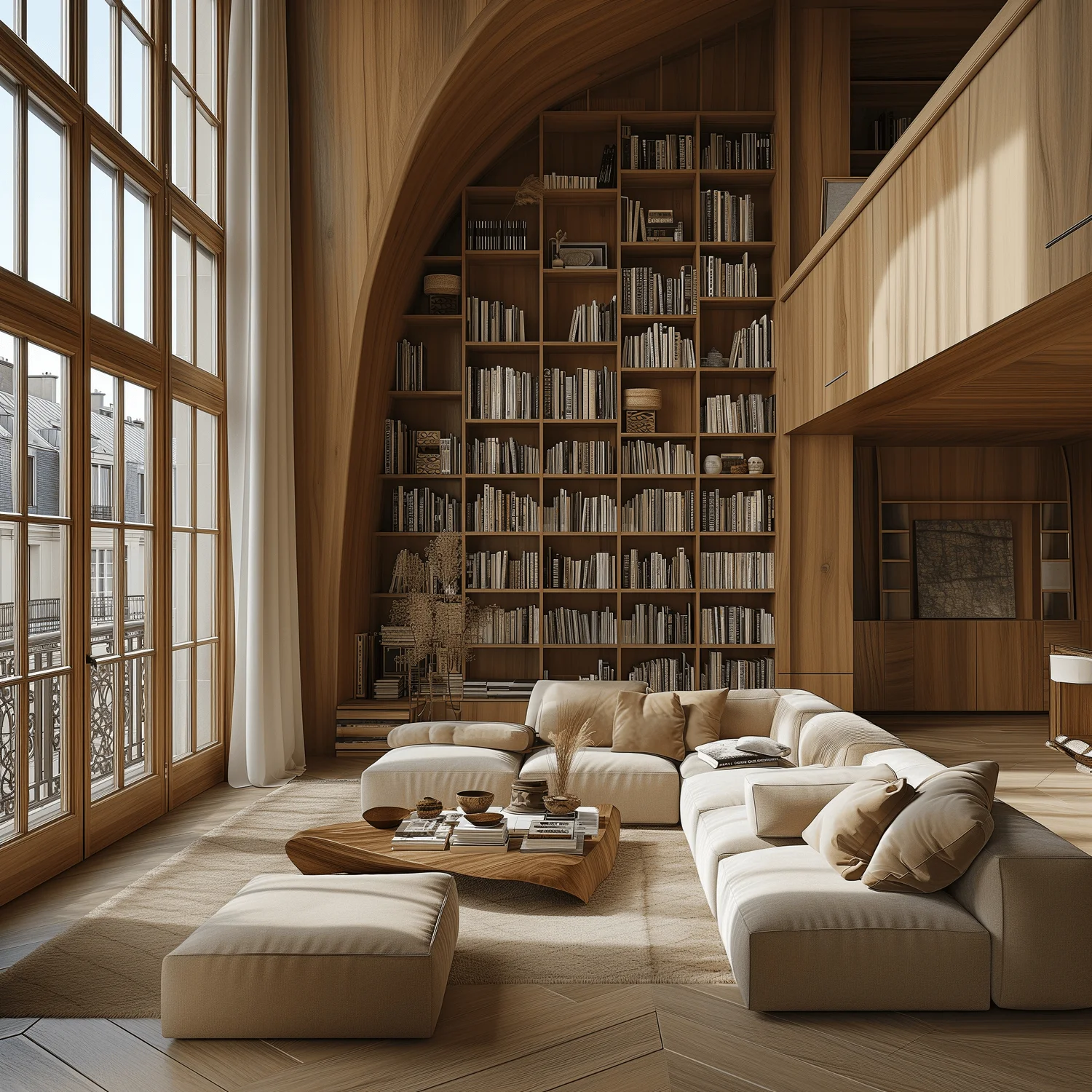
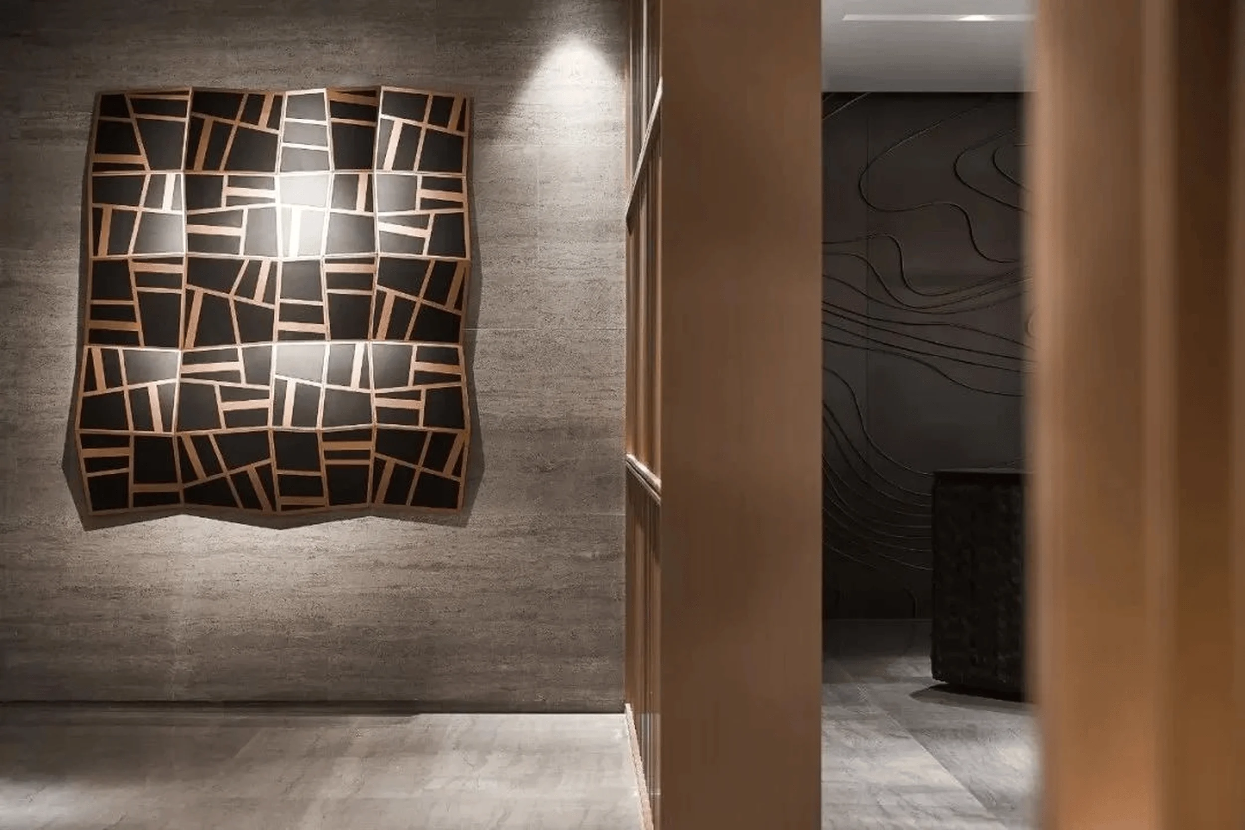
The interior design is characterized by a minimalist aesthetic with a focus on natural materials, warm color palettes, and a strong connection with the surrounding natural environment. The integration of natural materials and subtle lighting creates a warm and inviting ambiance. The designer incorporated glass bricks to establish a balance between natural light and the surrounding environment. The warm color palette and soft lighting contribute to the space’s soothing and harmonious atmosphere. This color palette can be seen as a trend in commercial and interior design. The utilization of a warm color palette and natural materials reflects the Red Apple brand’s emphasis on comfort and warmth. The Red Apple showroom design focuses on creating an interior environment that inspires a sense of well-being and connection with the natural world, further complementing the brand’s narrative. This red apple showroom design underscores the importance of creating a holistic experience for visitors, promoting a balance between functionality and aesthetics in interior design. The minimalist and modern aesthetic complements the building’s industrial heritage and the surrounding natural environment, creating a harmonious balance of old and new within the space.
Technology, Sustainability, and Innovation
The Red Apple showroom utilizes a range of technologies and innovative design strategies to create an engaging and memorable visitor experience. The integration of technology plays a vital role in enhancing the overall experience. The lighting and glass brick system provides an innovative and sustainable solution to incorporate daylight. The design team sought to minimize the environmental impact of the project, integrating natural elements and utilizing sustainable materials throughout the design process. This showcases the growing awareness of eco-conscious design in the architectural and interior design fields. The red apple showroom design integrates innovation through various technological solutions that enhance the experience, creating a modern and functional environment. The Red Apple showroom is a successful example of how innovation and sustainability can be incorporated into architecture and interior design to create a forward-thinking and environmentally conscious space. This design trend is increasingly being applied in the design of interior and public spaces.
Social and Cultural Impact
The Red Apple showroom fosters a sense of community and connection within the local context. The design encourages a relaxed and comfortable interaction with the products. By integrating the historical and industrial elements of the site, the design promotes cultural preservation. The design incorporates local features, creating a sense of place and highlighting the unique character of the Shenzhen region. The Red Apple showroom design creates an immersive environment that connects visitors to the brand’s story, its values, and its products. This Red Apple showroom design underscores the importance of branding and brand storytelling in design. The red apple showroom design provides a compelling example of how thoughtful design can promote a positive brand experience, fostering a connection between the community and the Red Apple brand, a critical aspect of commercial and interior design.
Economic Considerations
The Red Apple showroom project demonstrates a successful integration of design and economic practicality. The project’s focus on preserving the existing structure led to cost-effective strategies. By incorporating a variety of design solutions, the project created a multifunctional space. The design team achieved flexibility within the space, allowing for future alterations and adjustments. This is an important aspect of commercial and interior design. The Red Apple showroom design is a testament to the fact that design solutions do not need to be expensive to achieve a desired outcome. This red apple showroom design serves as a model for successful cost-effective design in the commercial and interior design field.
Construction Process and Management
The construction process involved meticulous planning and coordination to ensure the integration of new elements into the existing structure. The project involved various construction methods, including the integration of glass bricks, sustainable materials, and the creation of innovative lighting systems. The construction team focused on achieving a high level of quality and craftsmanship. The Red Apple showroom project demonstrates how meticulous project management can successfully integrate new design features into existing structures. This red apple showroom design emphasizes the importance of integrating construction planning and design to ensure a successful outcome. The construction process involved a balance between preserving the existing heritage and creating a modern and functional space. The project management team oversaw all stages of construction to ensure that the project was completed on schedule and within budget, creating a testament to the value of collaboration between the design and construction teams.
Conclusion
The Red Apple Ideal Living Space Experience Hall is a remarkable example of how thoughtful design can transform an existing industrial space into a vibrant and engaging showroom. The design team masterfully combined historical elements, natural beauty, and innovative design solutions to create a space that embodies the Red Apple brand’s philosophy of comfort and warmth. It serves as a valuable model for future projects that aim to combine industrial heritage with contemporary design. This Red Apple showroom design showcases a unique integration of architectural design, industrial heritage, and interior design to create a compelling and successful project. The design serves as a reminder that good design can create a powerful connection with both people and place. The red apple showroom design promotes a brand experience that is both functional and aesthetically pleasing, further strengthening the brand’s presence in the competitive market.
Project Information:


