Teriwood Exhibition Hall in Beijing uses minimalist interior design to showcase wood flooring with inspiration from the Temple of Heaven.
Contents
Entrance Design and Inspiration
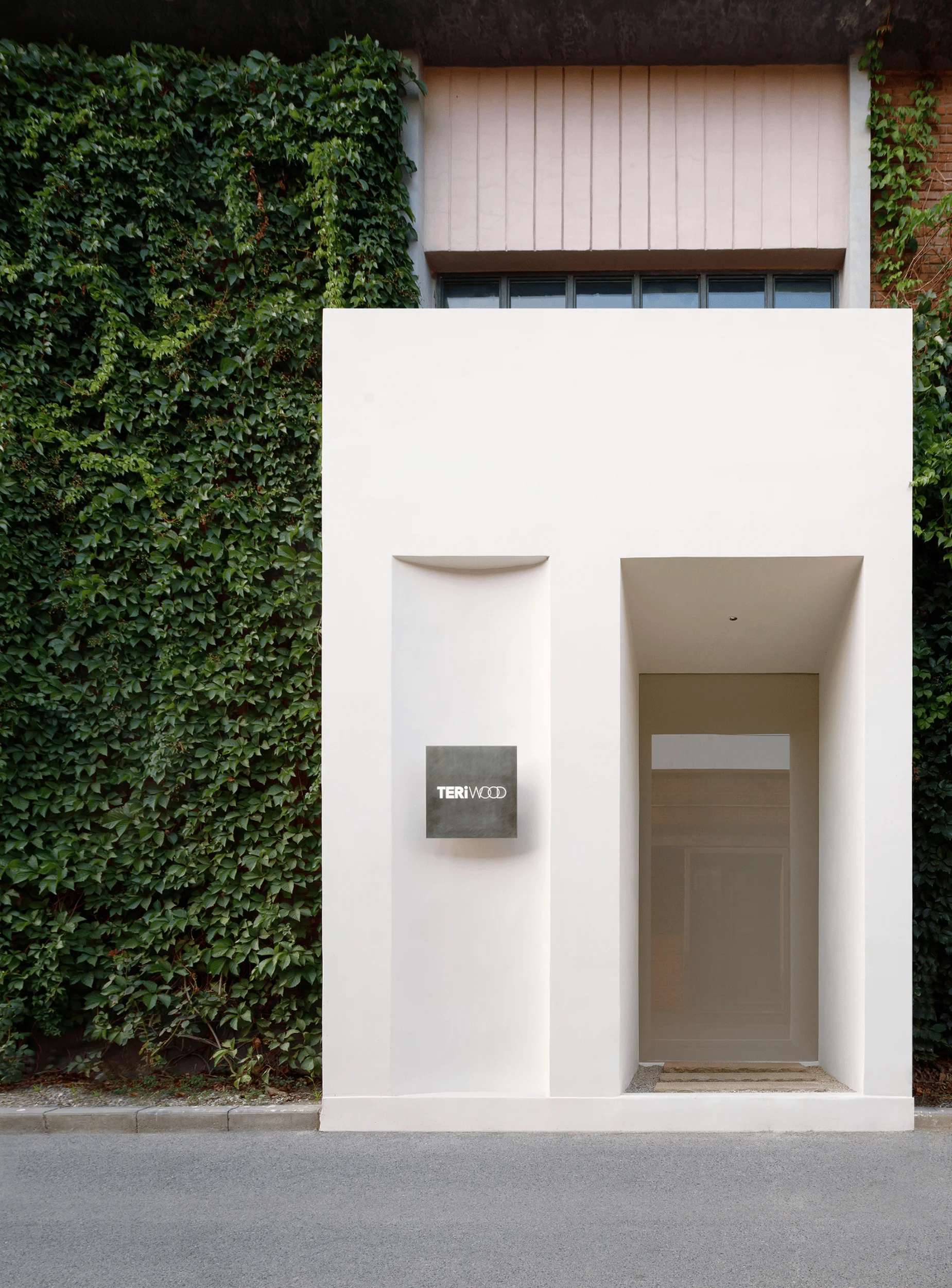
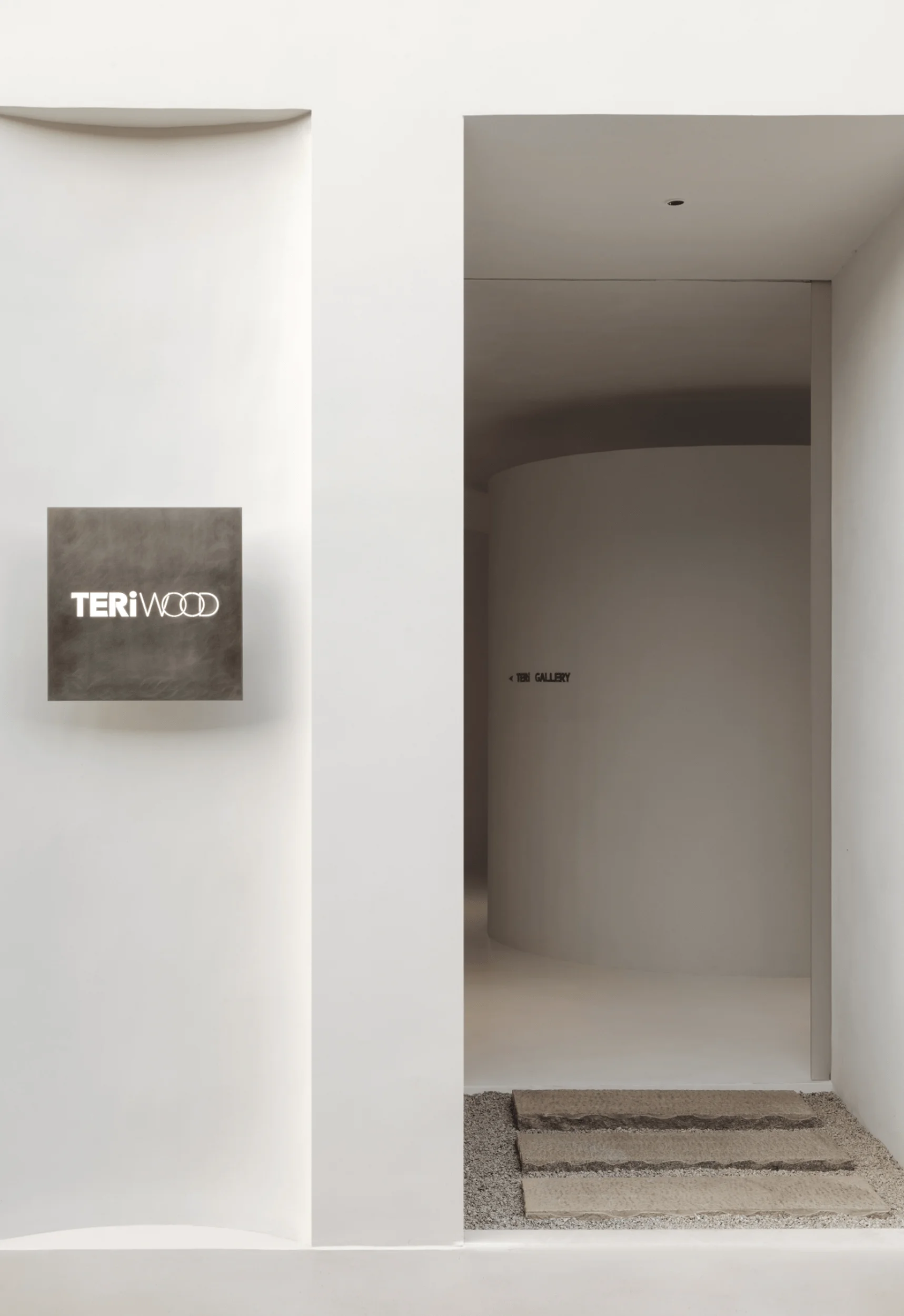
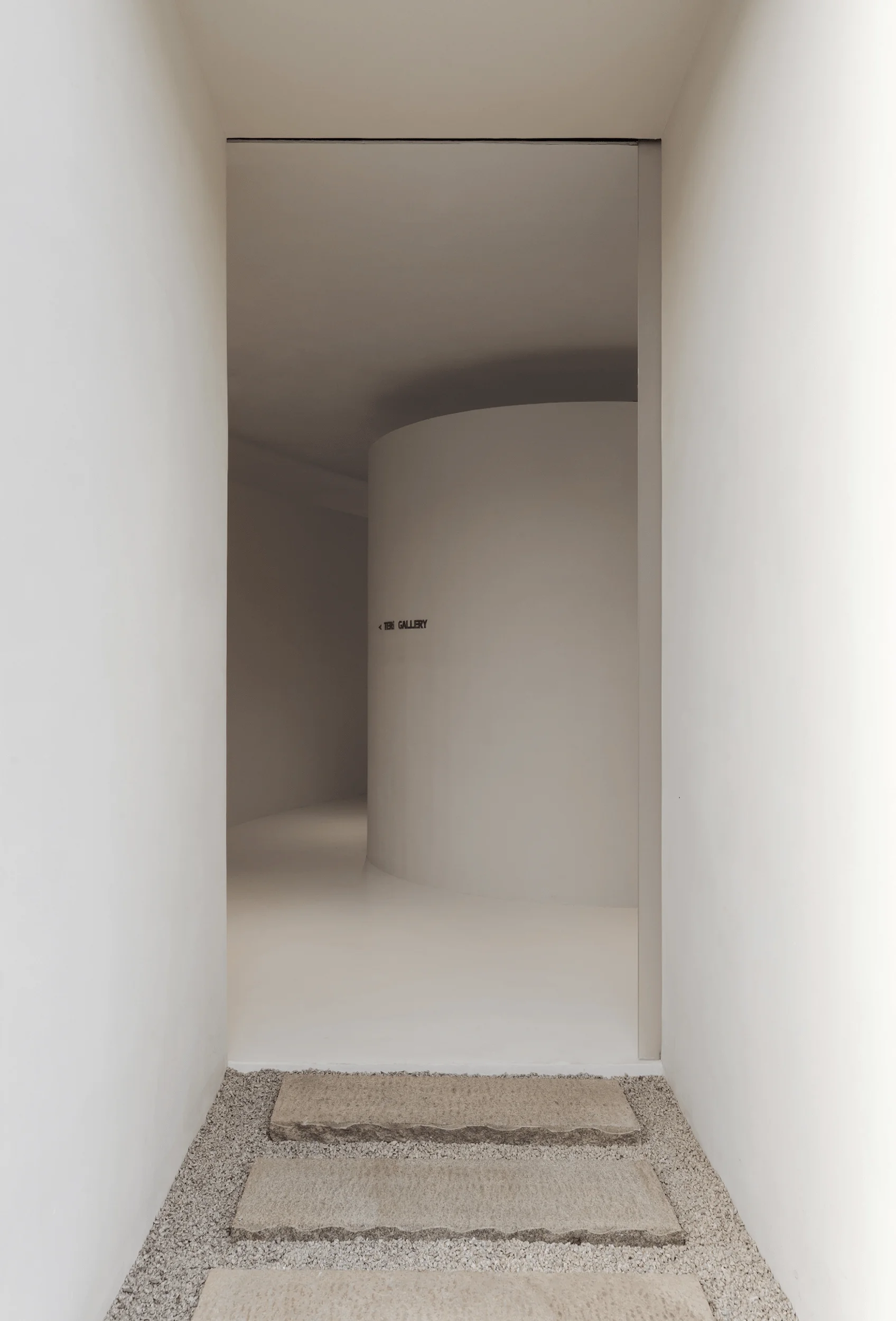
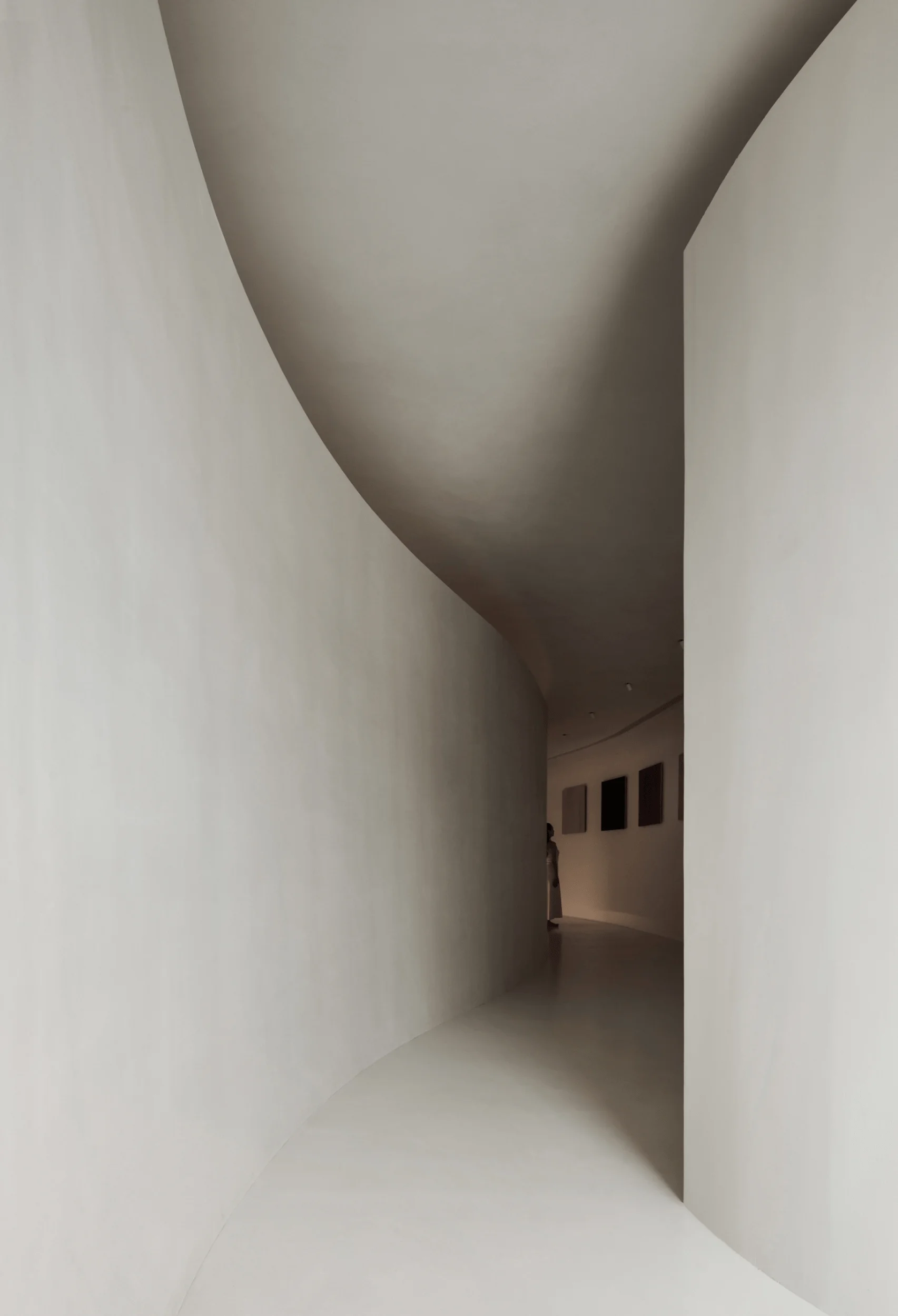
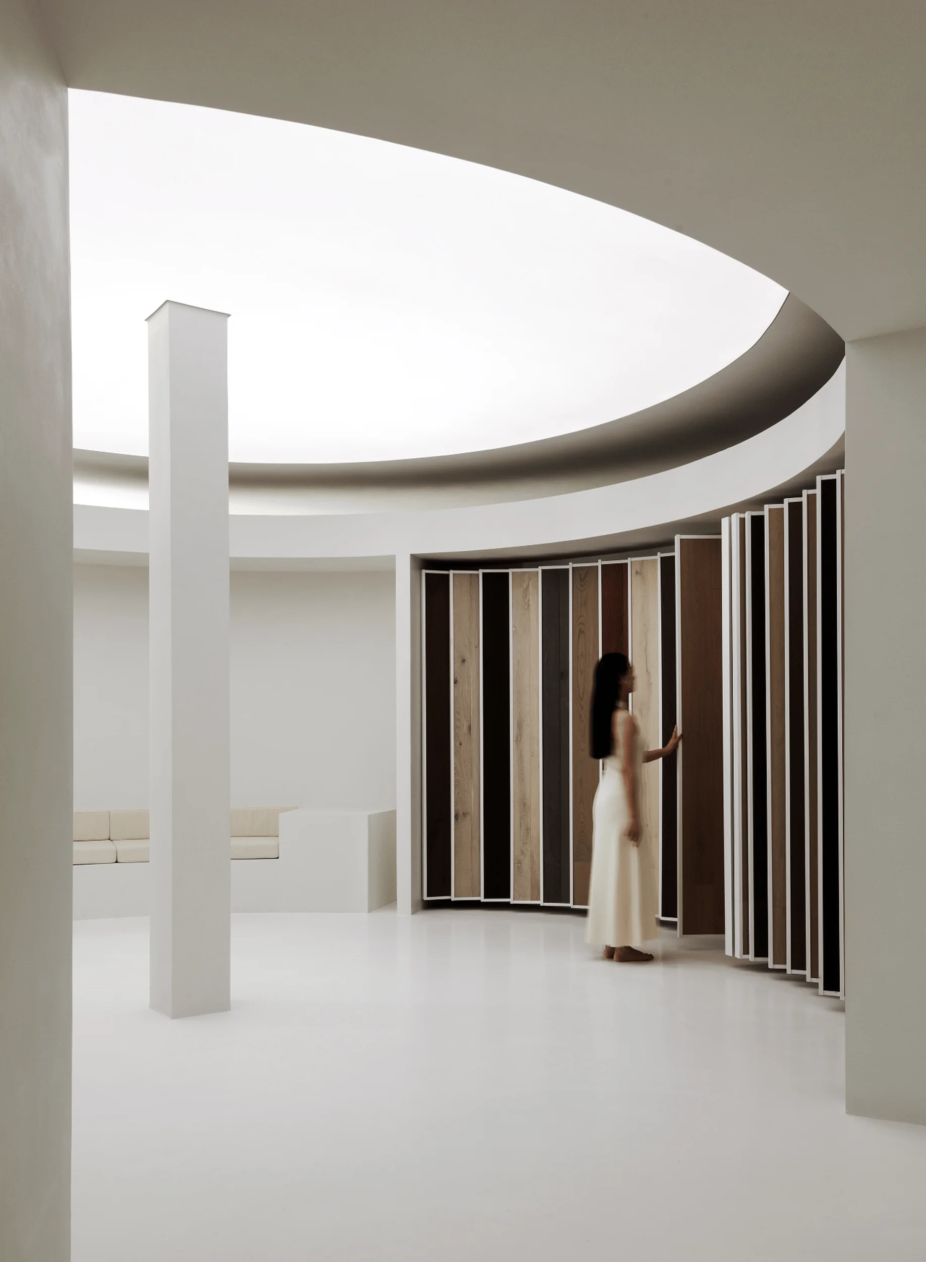
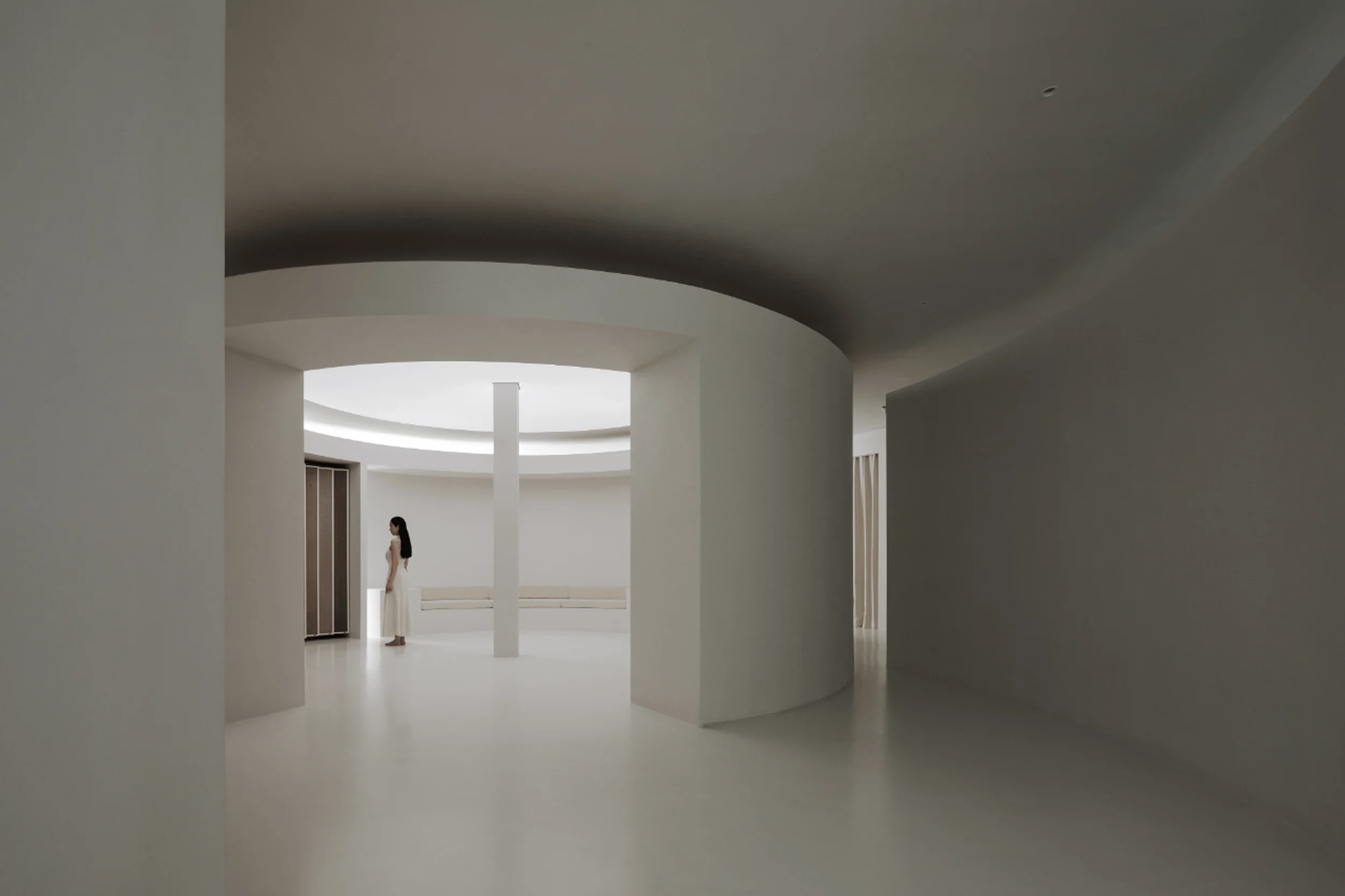
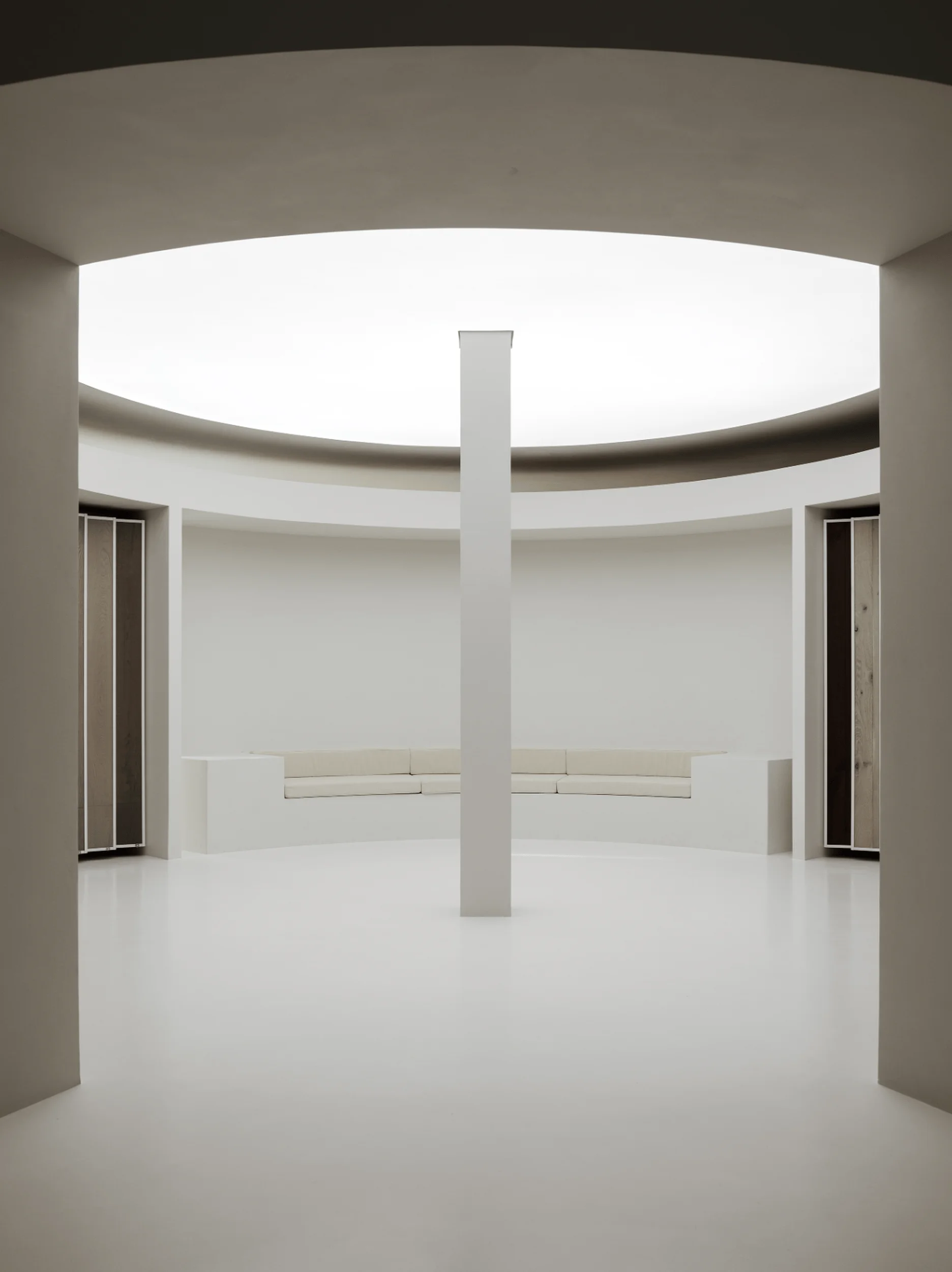
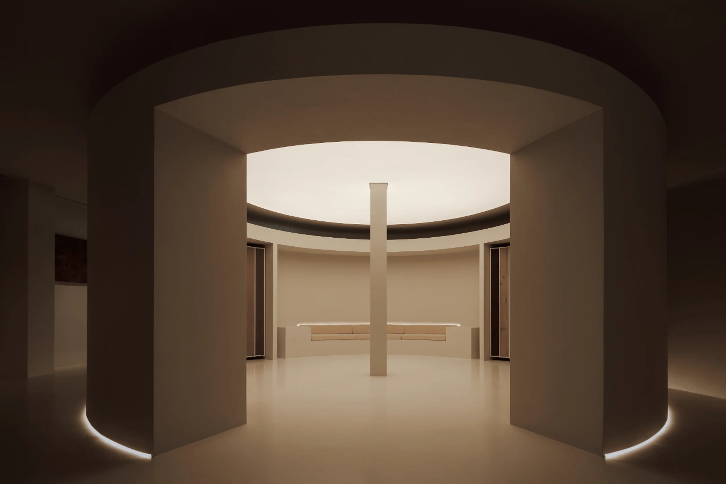
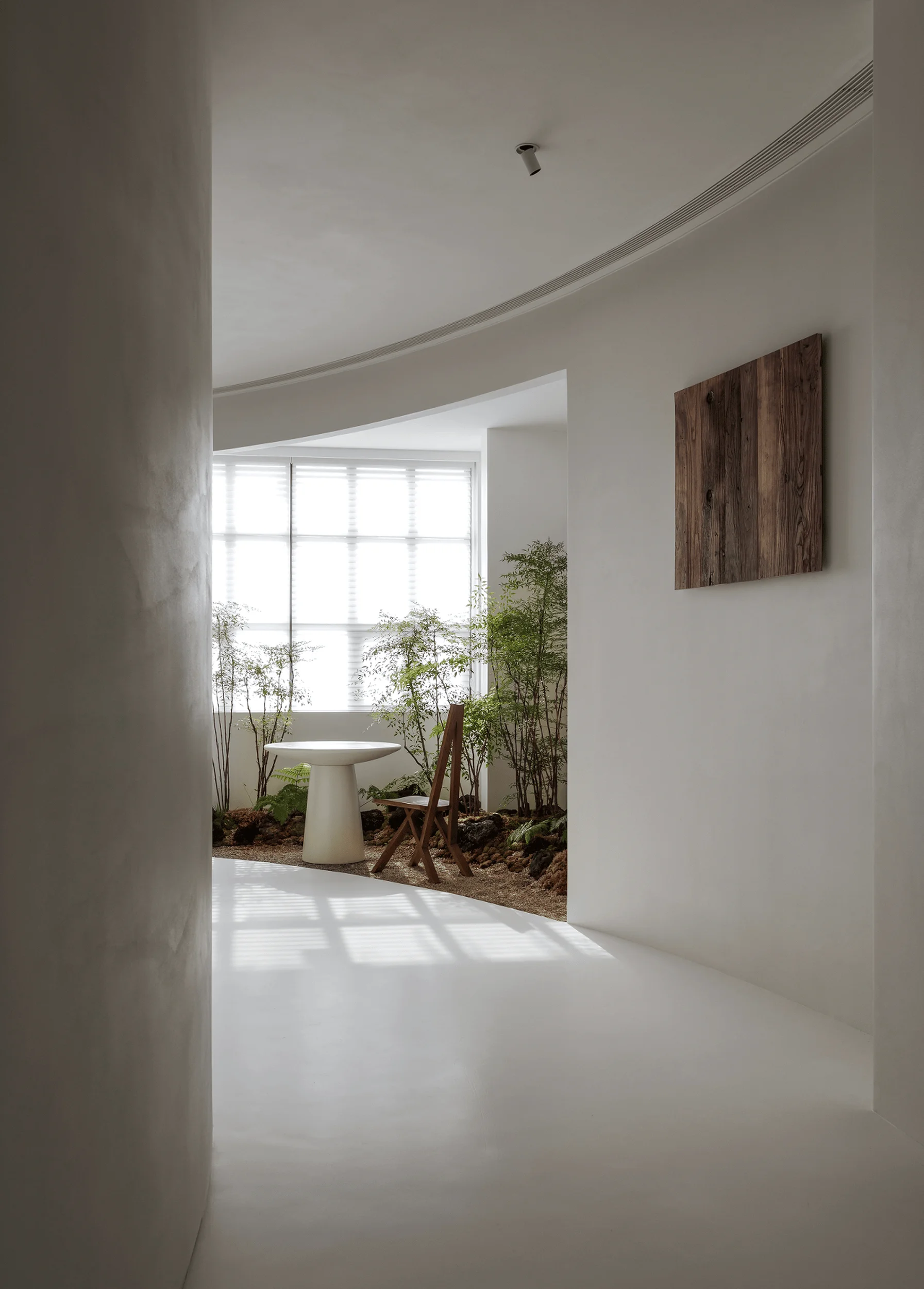
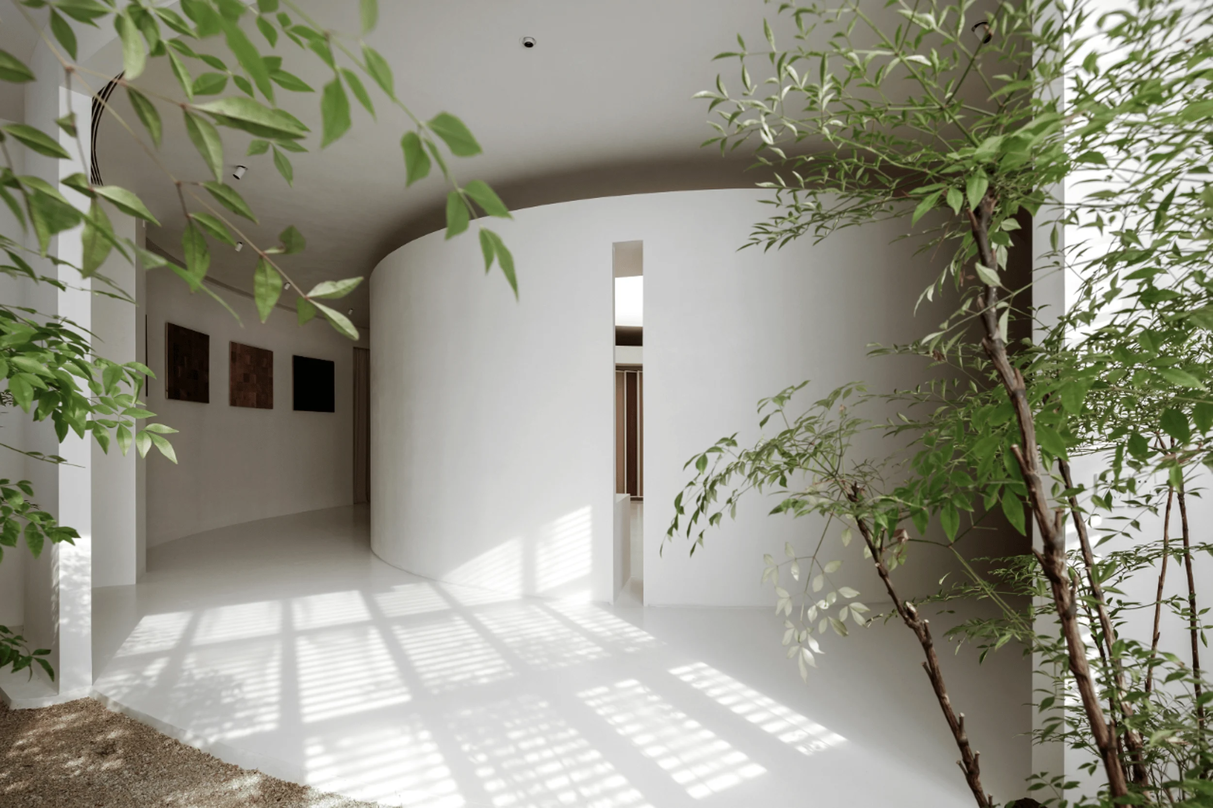
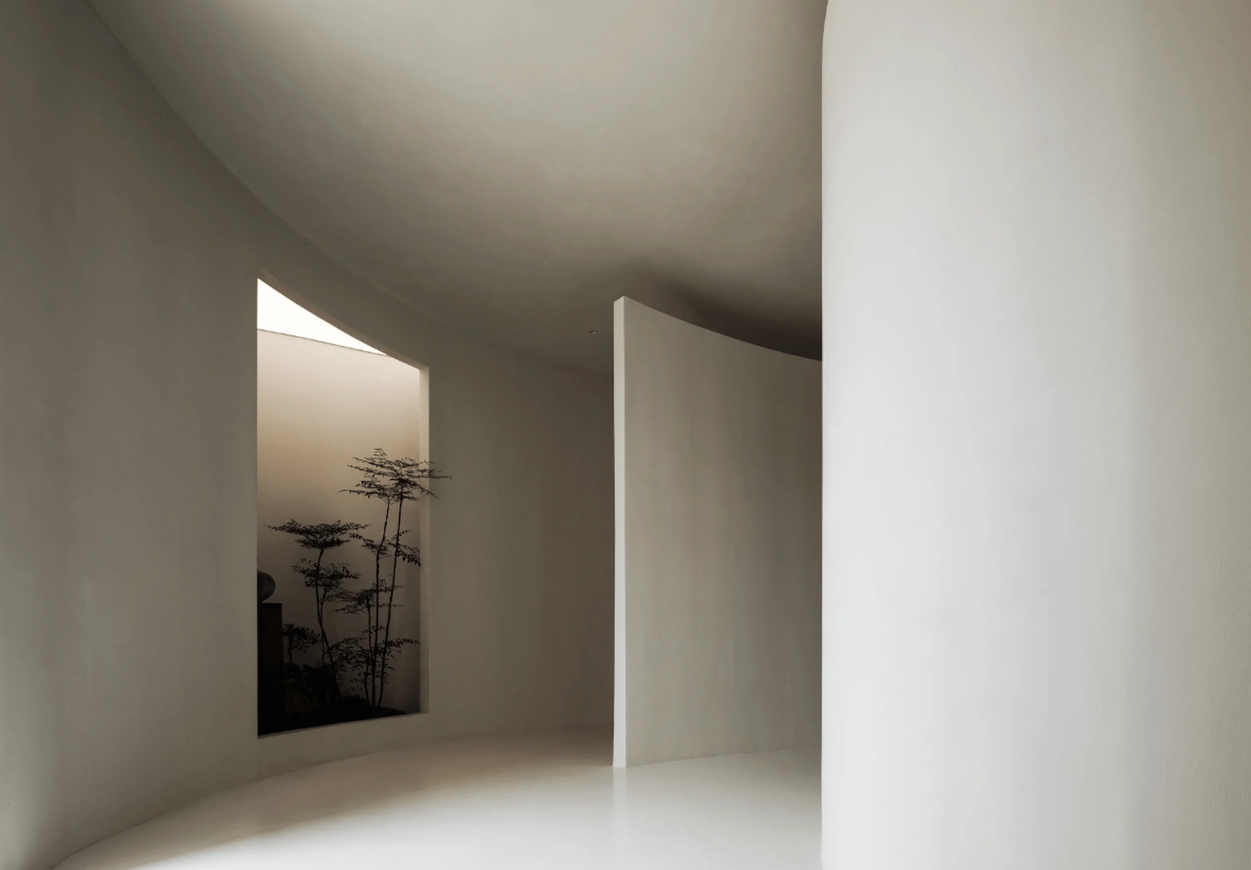
The entrance to the Teriwood Exhibition Hall draws inspiration from the Hall of Prayer for Good Harvests in Beijing’s Temple of Heaven. The circular shape of the hall holds cultural significance, symbolizing completeness, harmony, and eternity. It represents the philosophical concept of the unity of heaven and humanity, a revered motif in Chinese culture. minimalist interior design enhances the visual impact of the wood flooring, emphasizing its natural beauty and craftsmanship. The design of the entrance aims to establish a sense of reverence and anticipation, drawing visitors into the immersive experience within the exhibition hall.
Art Gallery and Spatial Experience
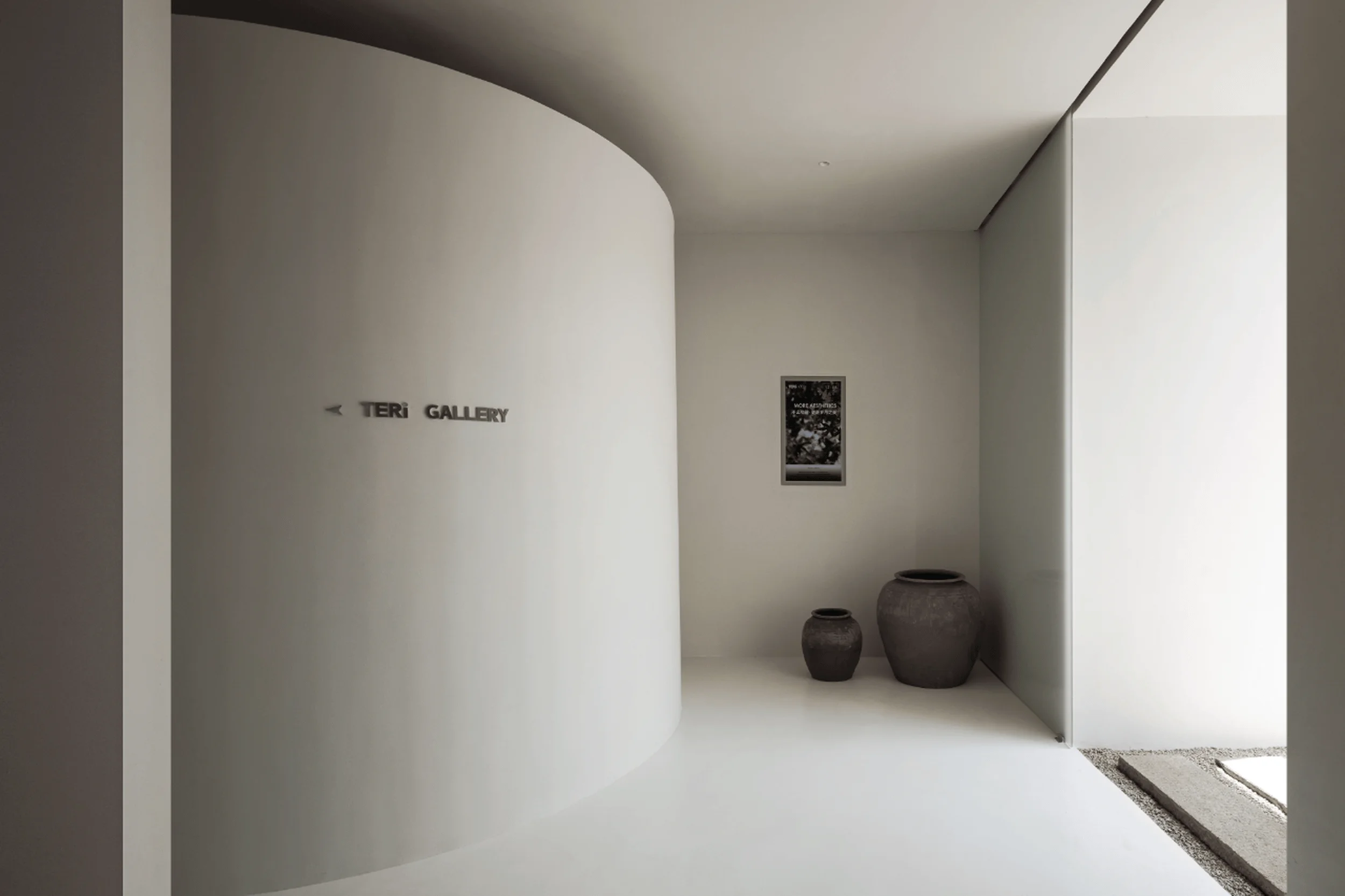
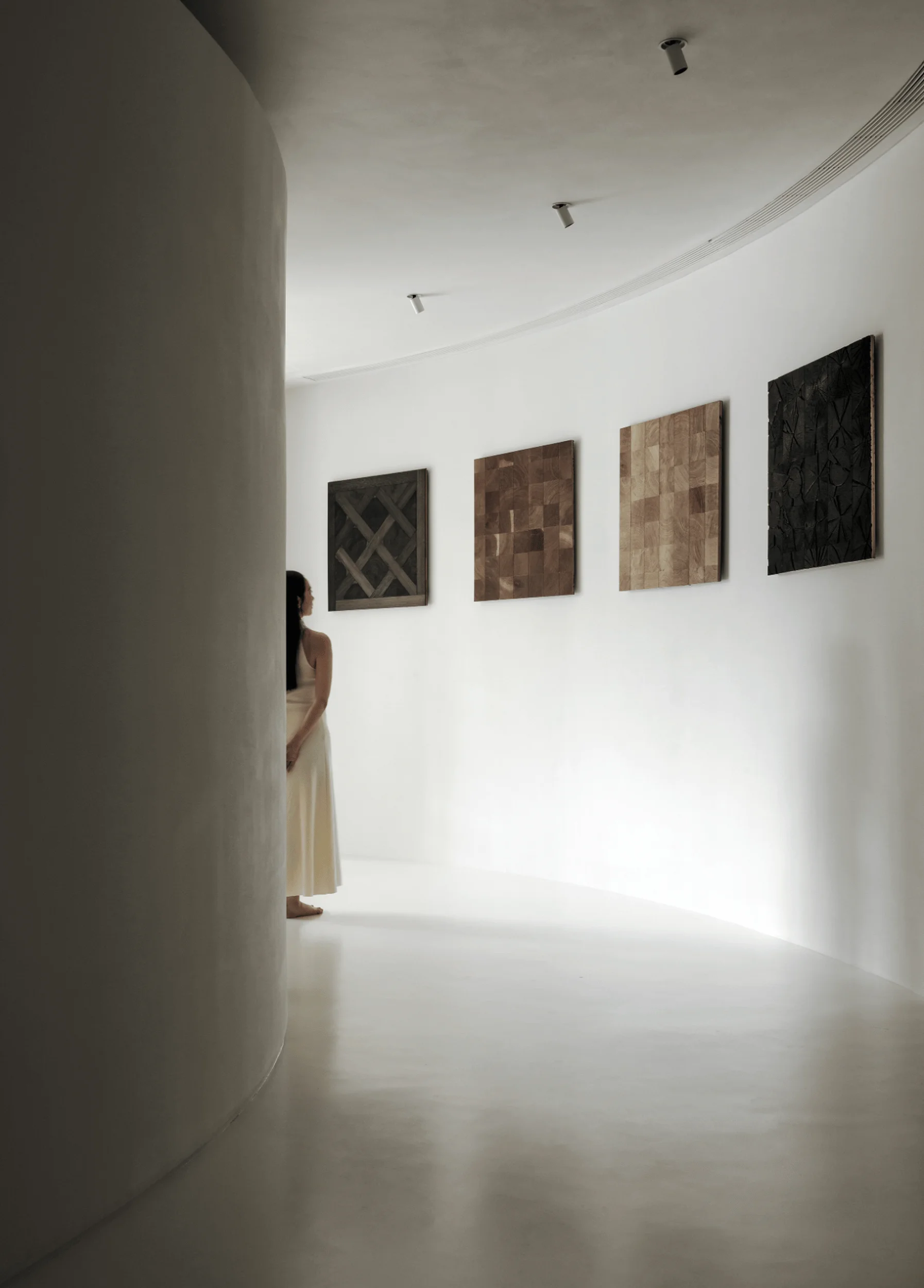
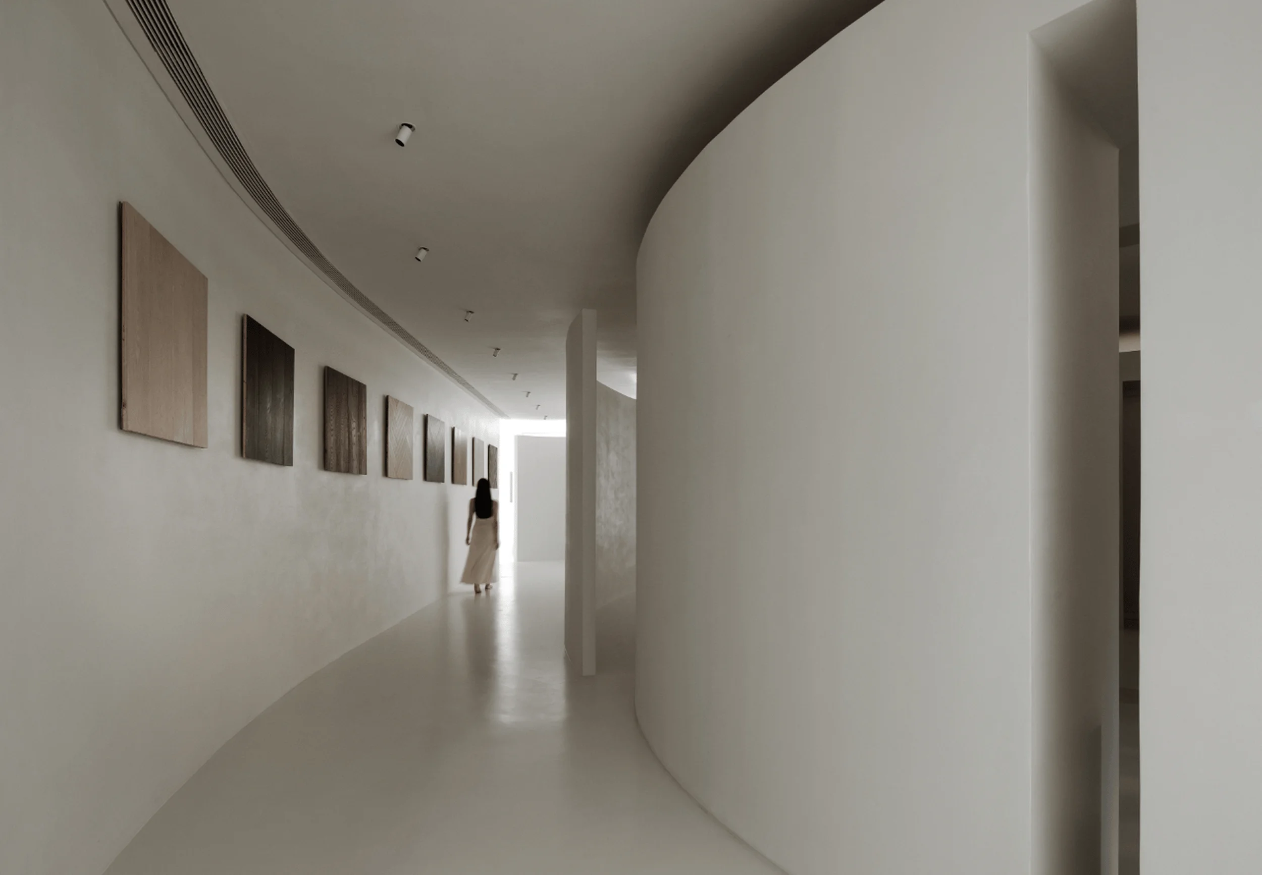
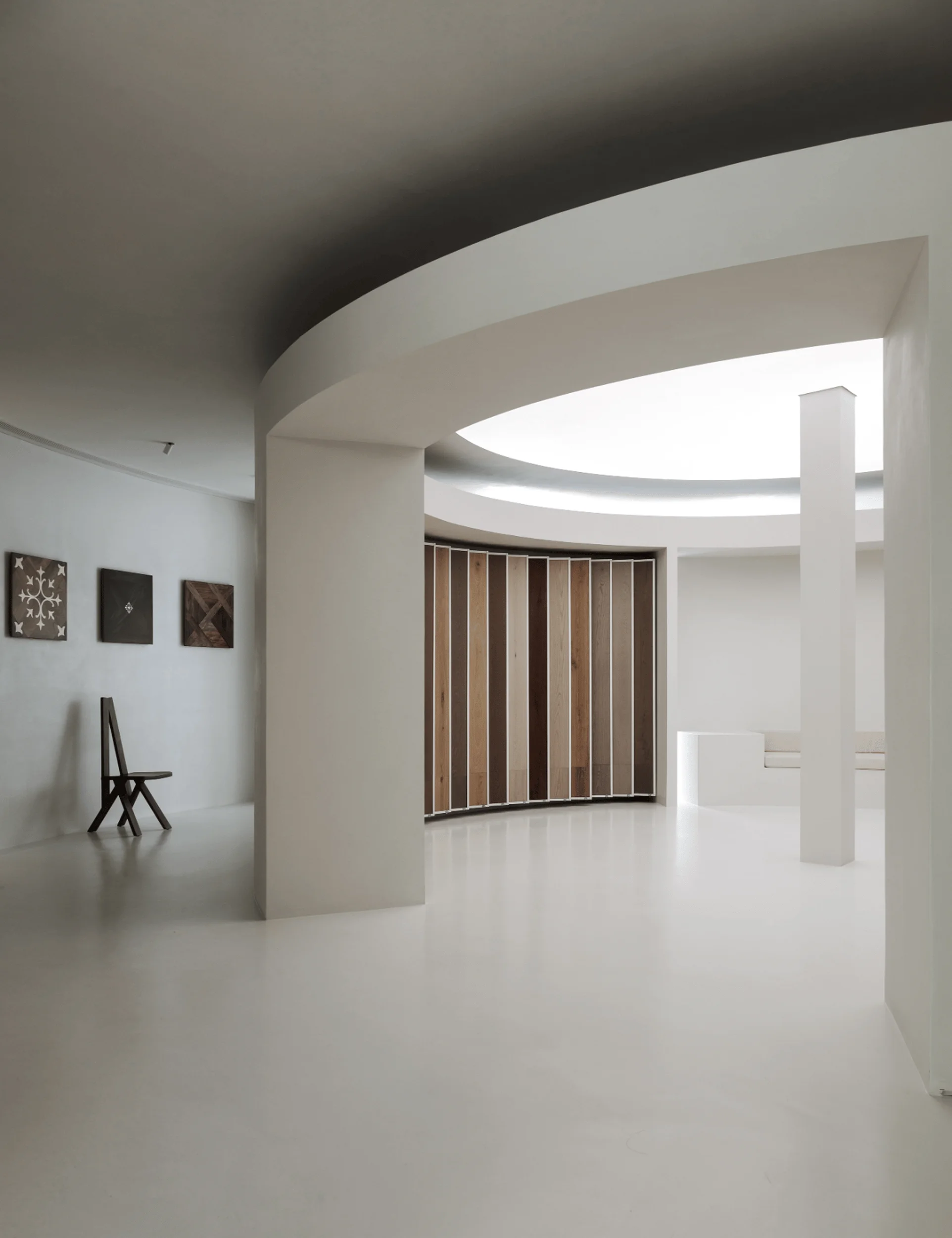
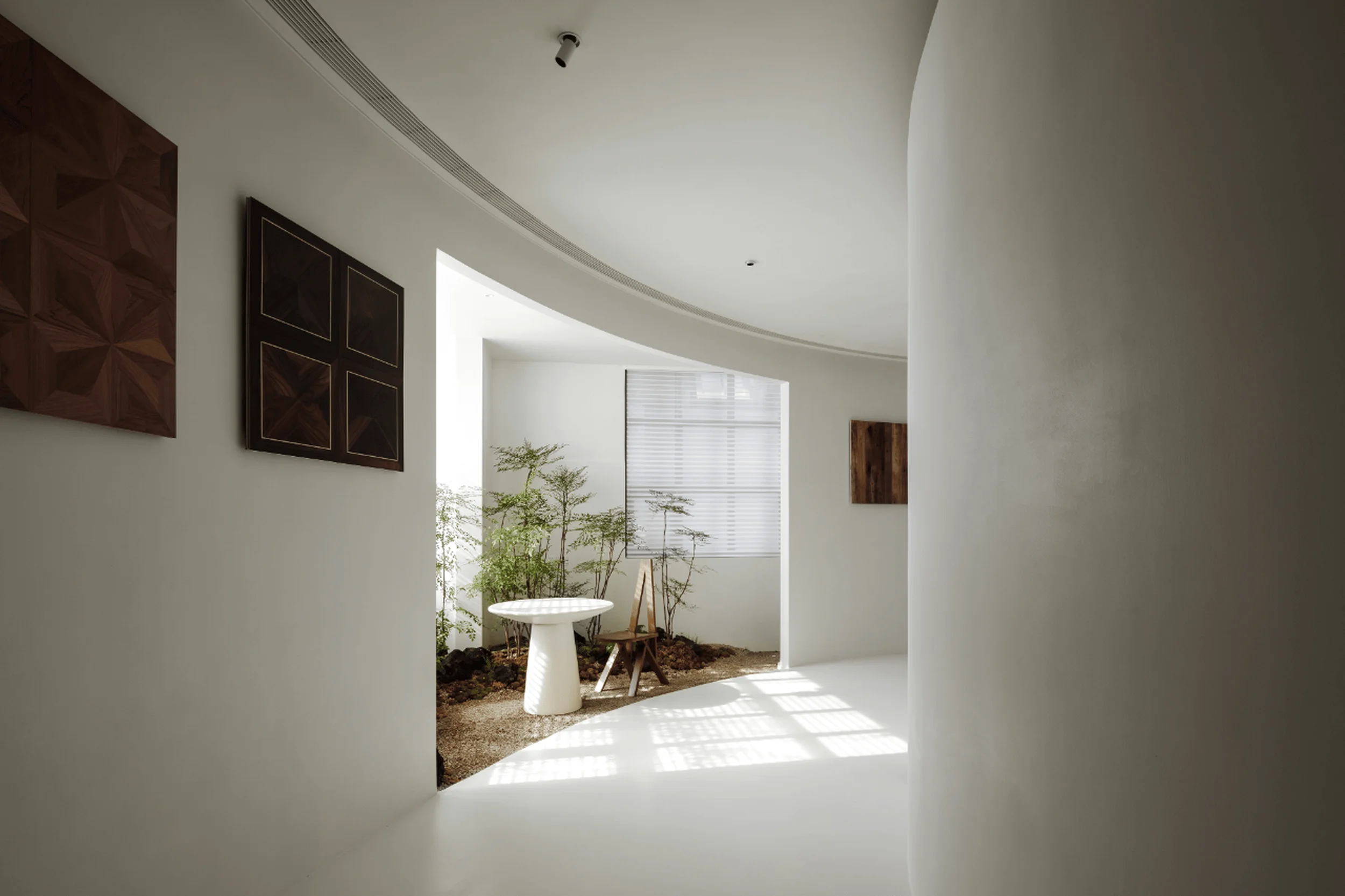
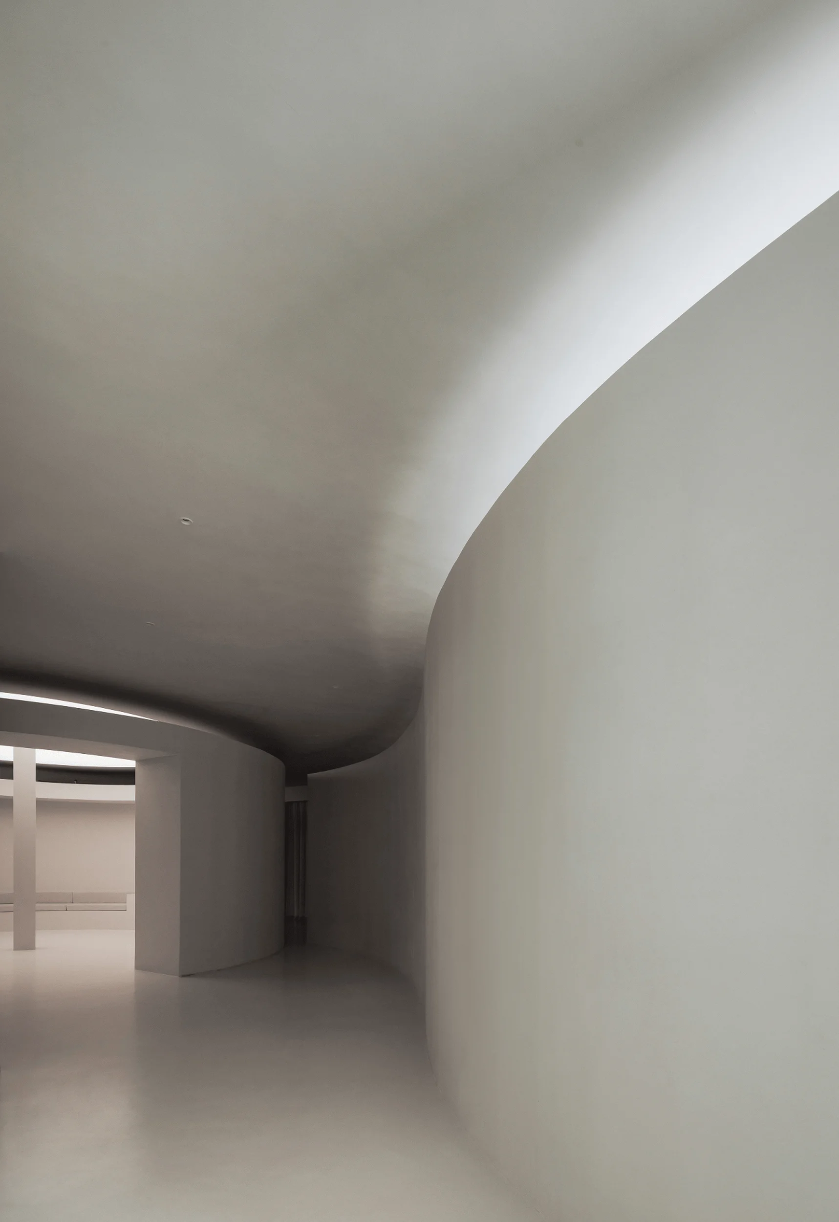
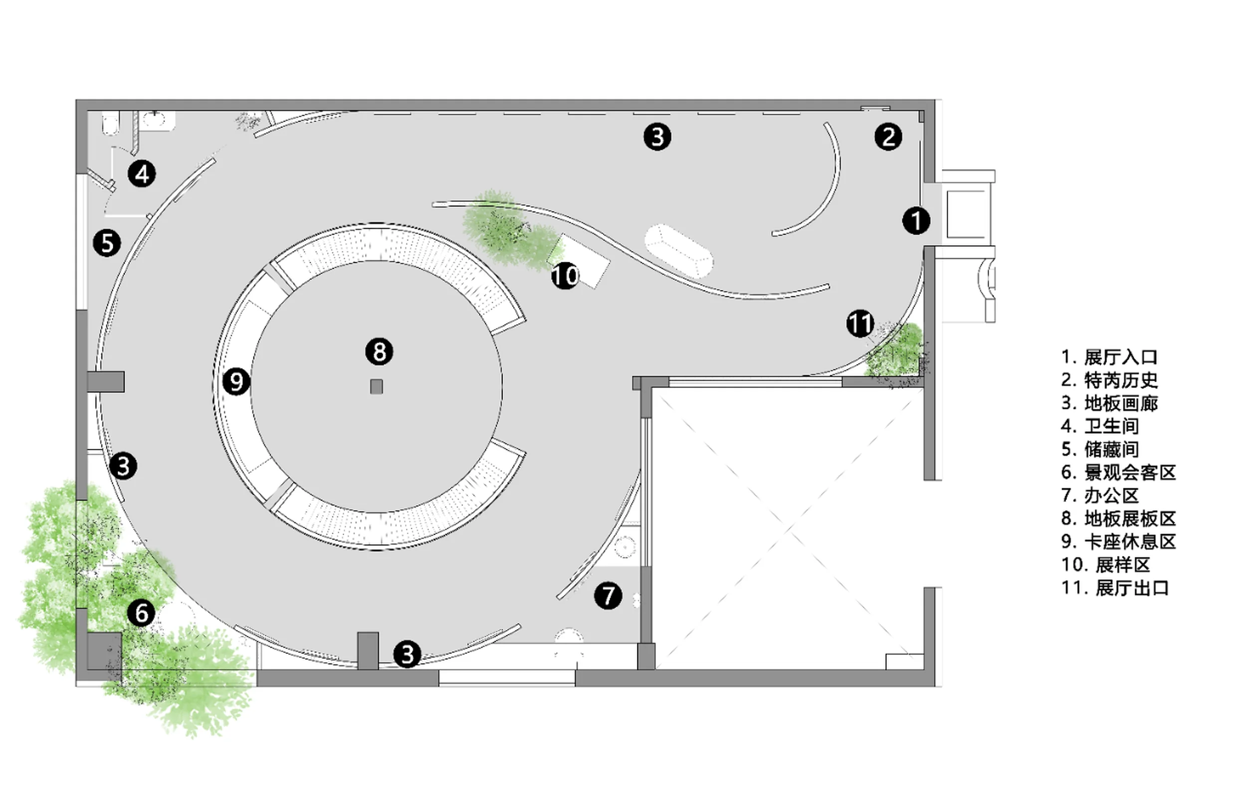
Departing from traditional exhibition hall layouts, the Teriwood Exhibition Hall integrates elements of an art gallery, amplifying the inherent aesthetics of the wood flooring products. A circular space is nested within the square building, creating a dynamic flow for visitors as they navigate the exhibition. The minimalist interior design, featuring sleek white walls and flooring, provides a neutral backdrop that allows the natural beauty of the wood to take center stage. This approach elevates the products beyond mere commodities, transforming them into works of art to be appreciated for their craftsmanship and visual appeal. The circular layout encourages visitors to engage with the exhibits from various perspectives, enriching their overall experience.
Central Atrium: A Blend of Display and Interaction
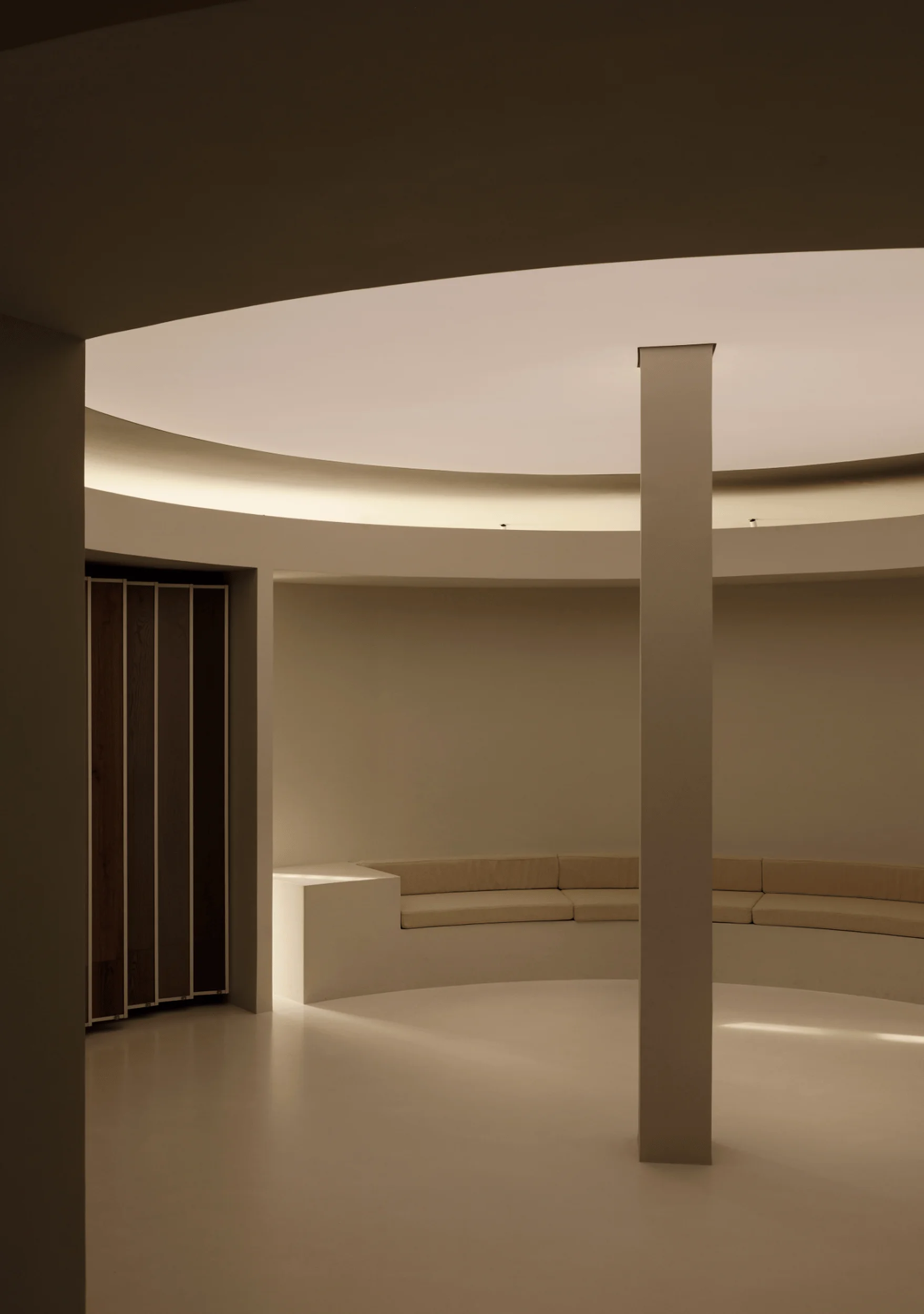
The central atrium serves as a focal point, showcasing the wood flooring in a minimalist setting. Natural light filters through the ceiling, illuminating the space and enhancing the tactile qualities of the wood. The walls and floor are seamlessly integrated with a unified coating, fostering a sense of tranquility and focus. This central area functions as both a display zone and a discussion space, where visitors can interact with the products and engage in conversations. The minimalist interior design and lighting create an atmosphere conducive to contemplation and appreciation of the natural beauty of the materials.
Reception Area: Celebrating the Essence of Wood
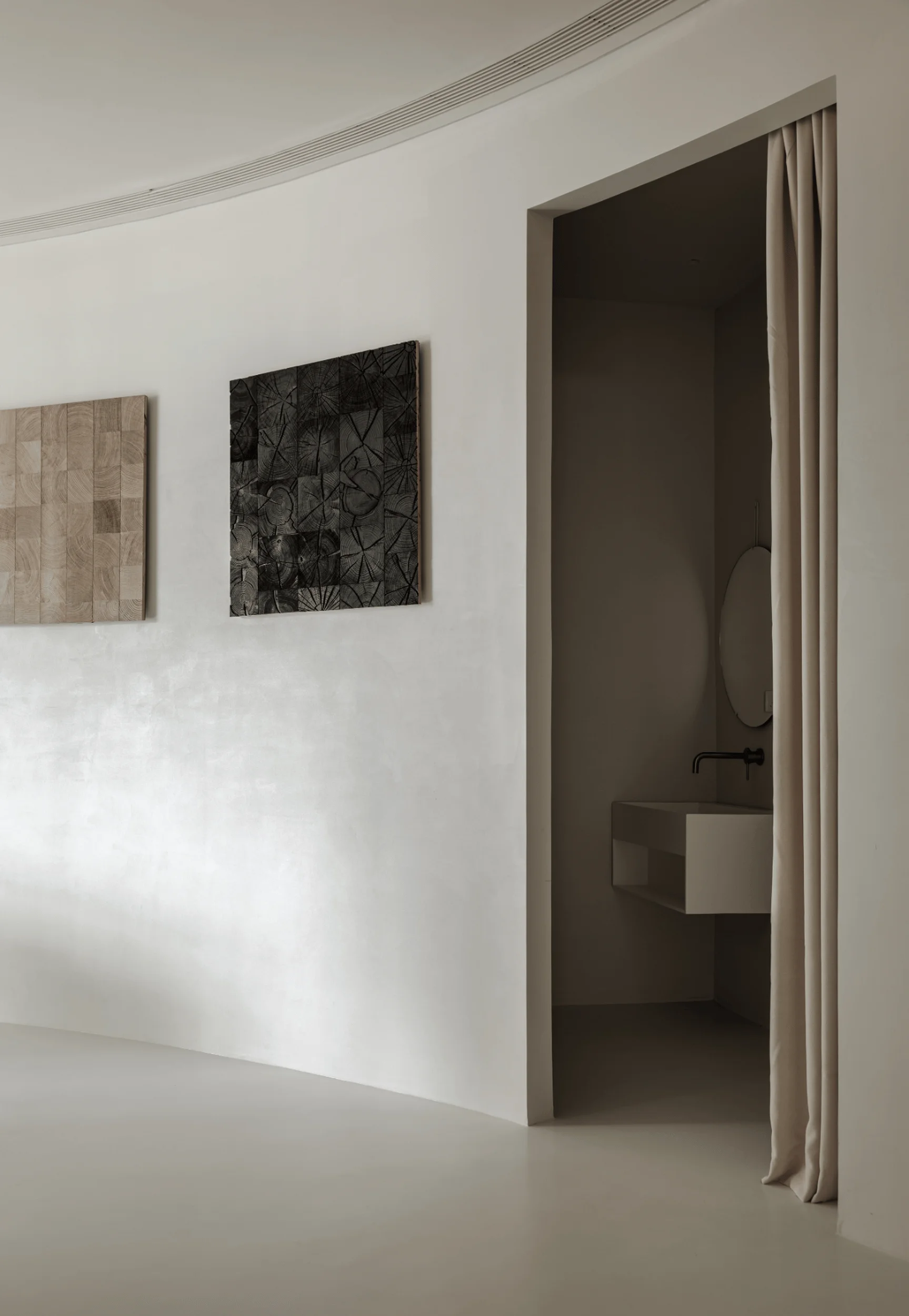
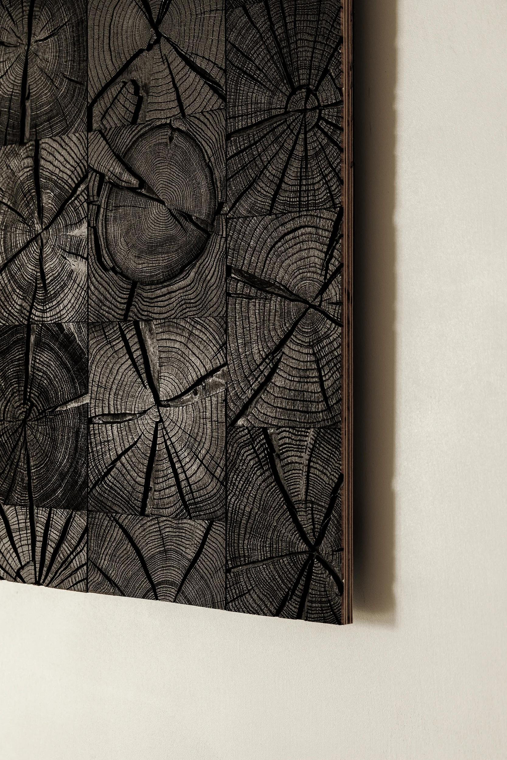
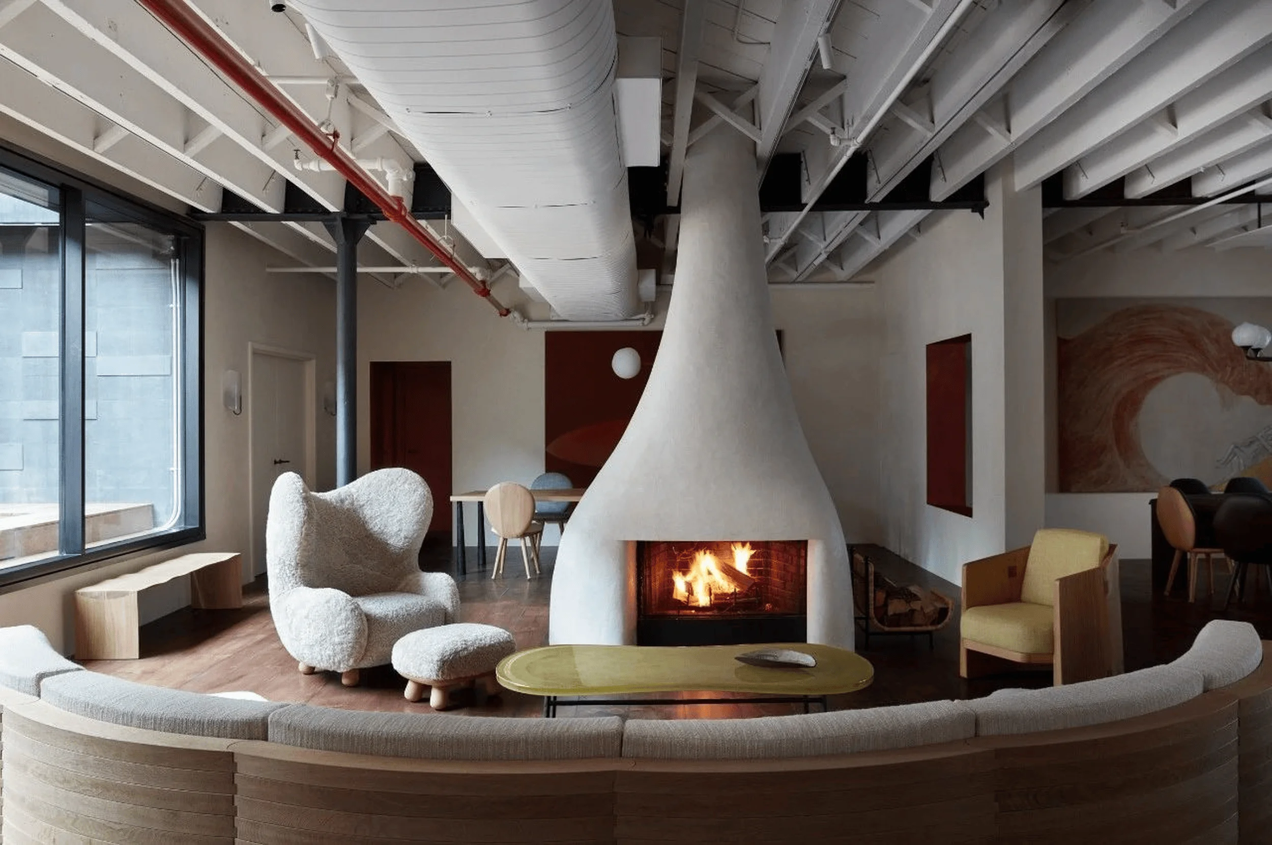
The reception area emphasizes the unique characteristics of wood, where each growth ring tells a story of time and resilience. The textures, formed by years of exposure to the elements, are highlighted through meticulous cutting and finishing techniques. This minimalist interior design approach allows visitors to connect with the natural world and appreciate the inherent beauty of wood. The reception area serves as a space for both relaxation and engagement, where visitors can immerse themselves in the craftsmanship and natural aesthetics of the wood flooring products.
Exit and Design Philosophy
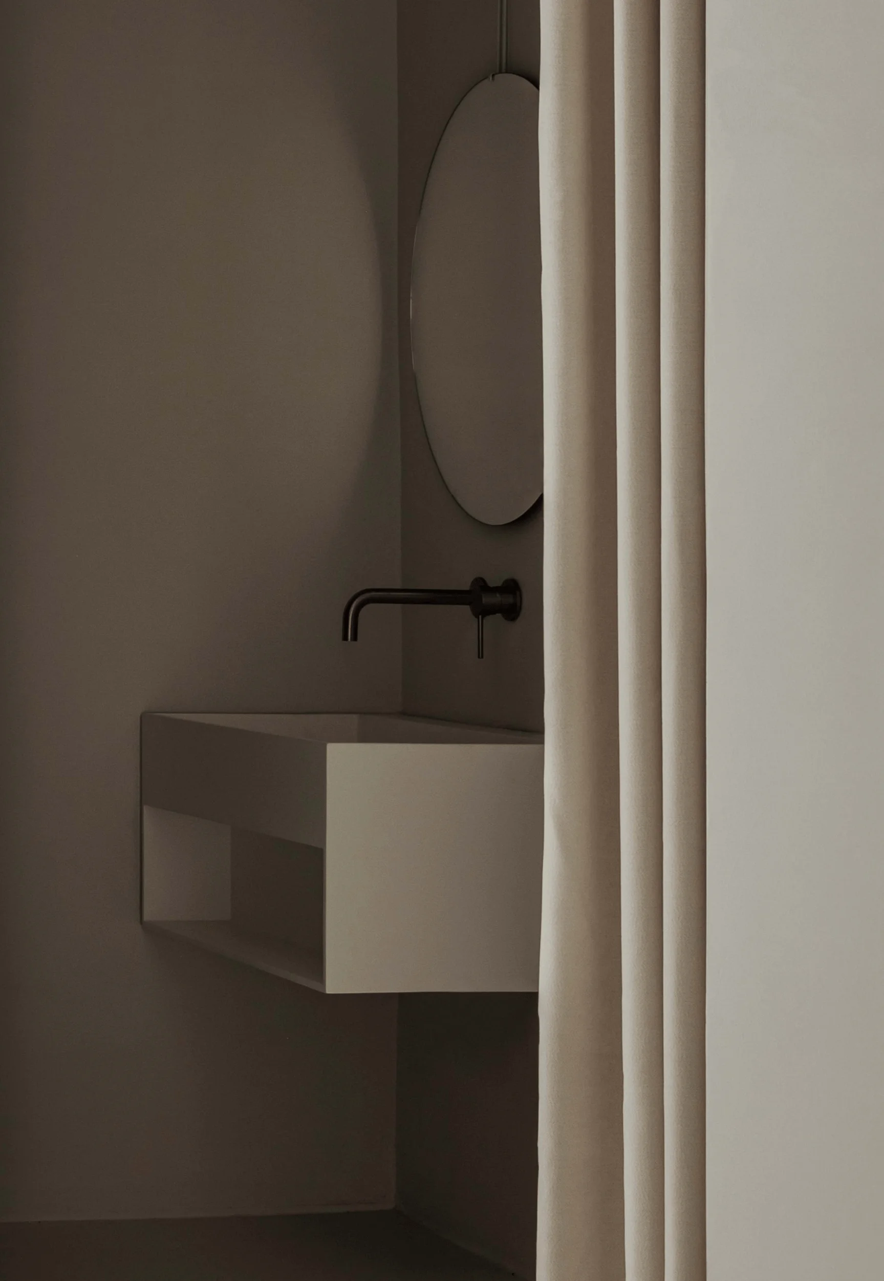
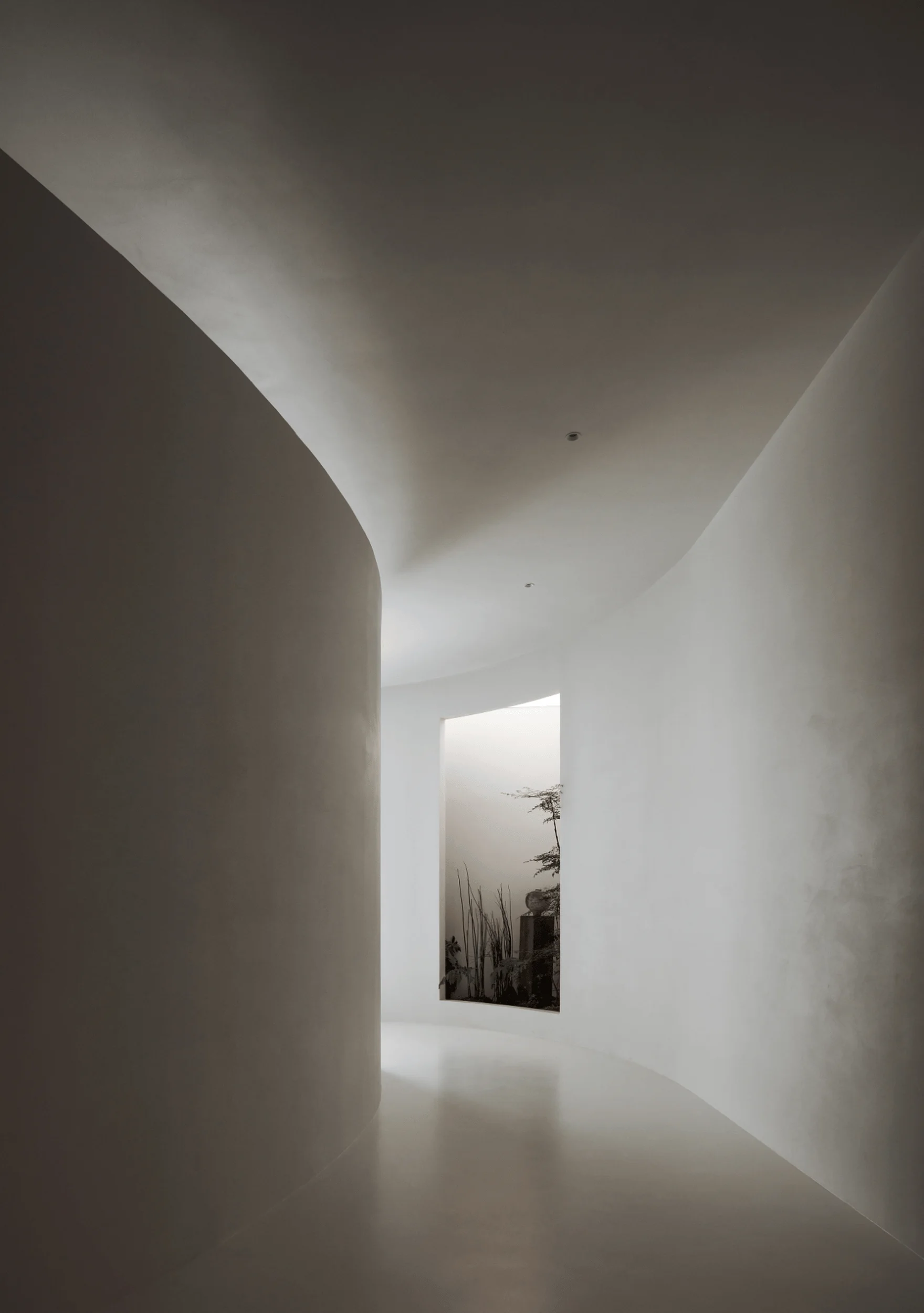
The exit of the exhibition hall continues the minimalist interior design aesthetic, with white walls and micro-cement flooring. The textured surfaces interact with light to create a serene atmosphere, isolating the space from external distractions. The journey through the exhibition hall unfolds like a narrative, revealing the story of wood from its origins to its transformation into exquisite flooring. The minimalist interior design reinforces the focus on the natural beauty of the materials, fostering a sense of calm and appreciation for the craftsmanship involved.
Project Information:
Project Type: Exhibition Hall
Architects: Tong Hua Space Design
Area: 200㎡
Project Year: 2023
Country: China
Main Materials: Wood flooring, Microcement, minimalist interior design
Photographer: Fang Liming


