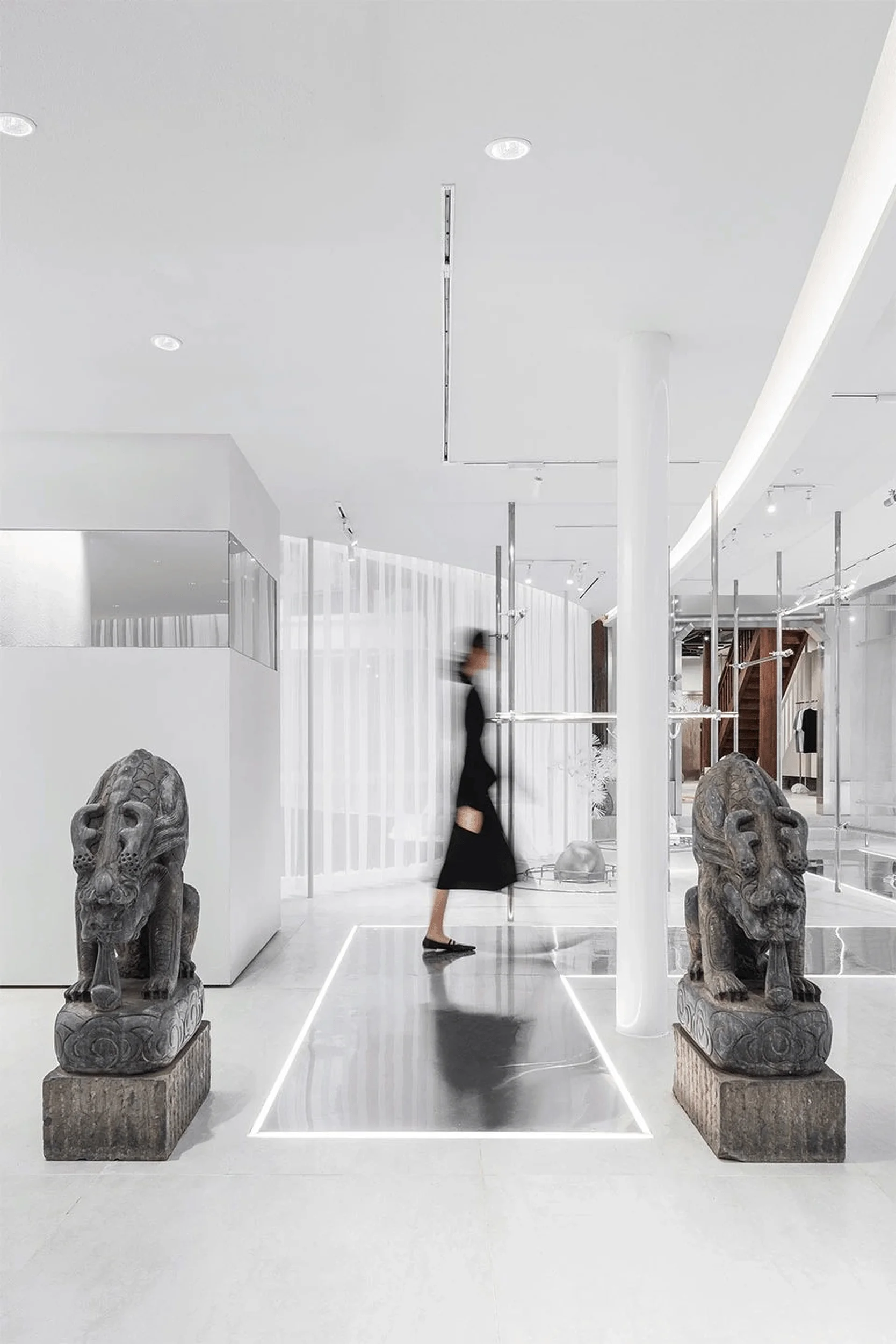
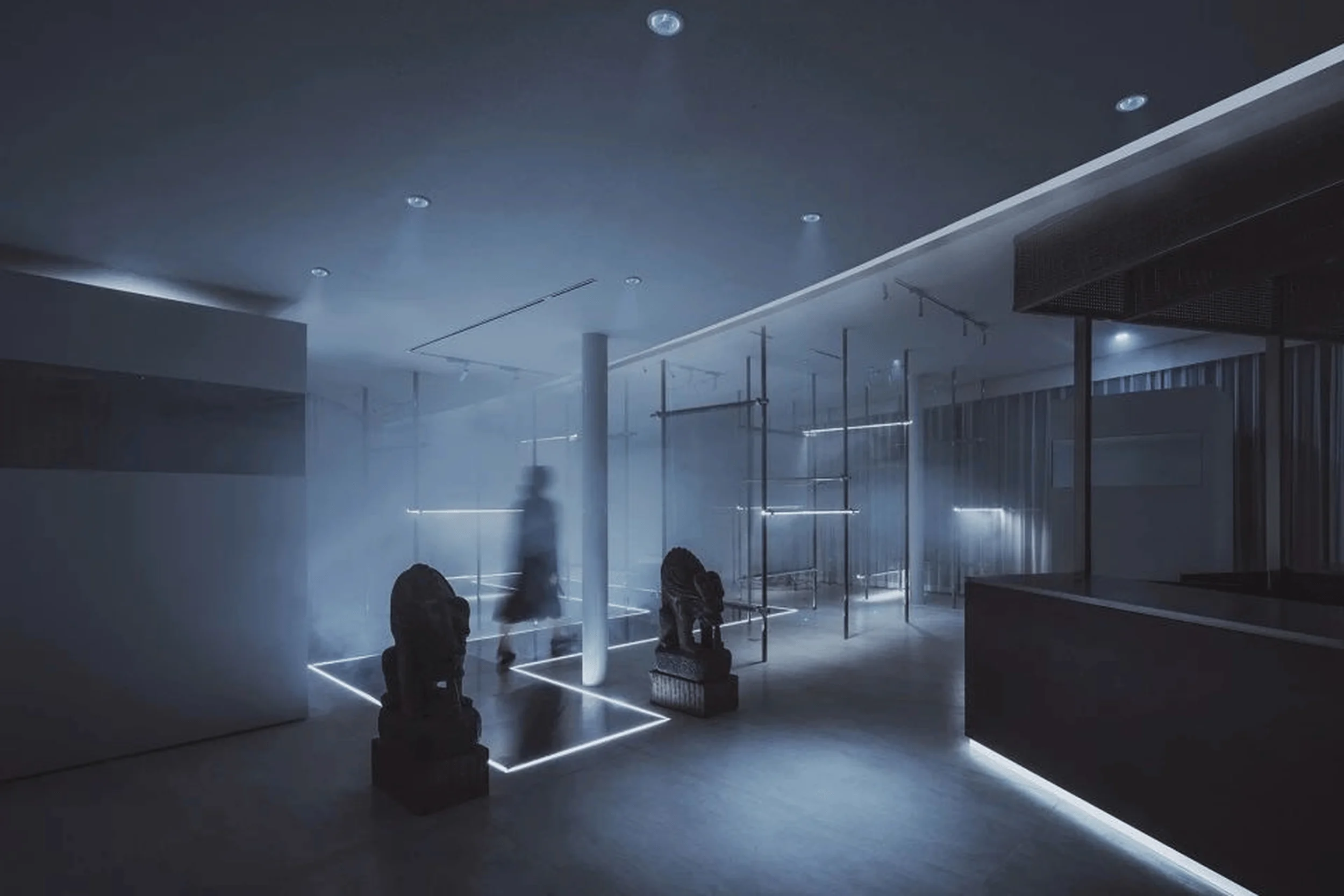
FOURTRY SPACE Pop-up retail building in China designed by SLT that blends traditional Chinese with modern retail elements.
Contents
Project Background
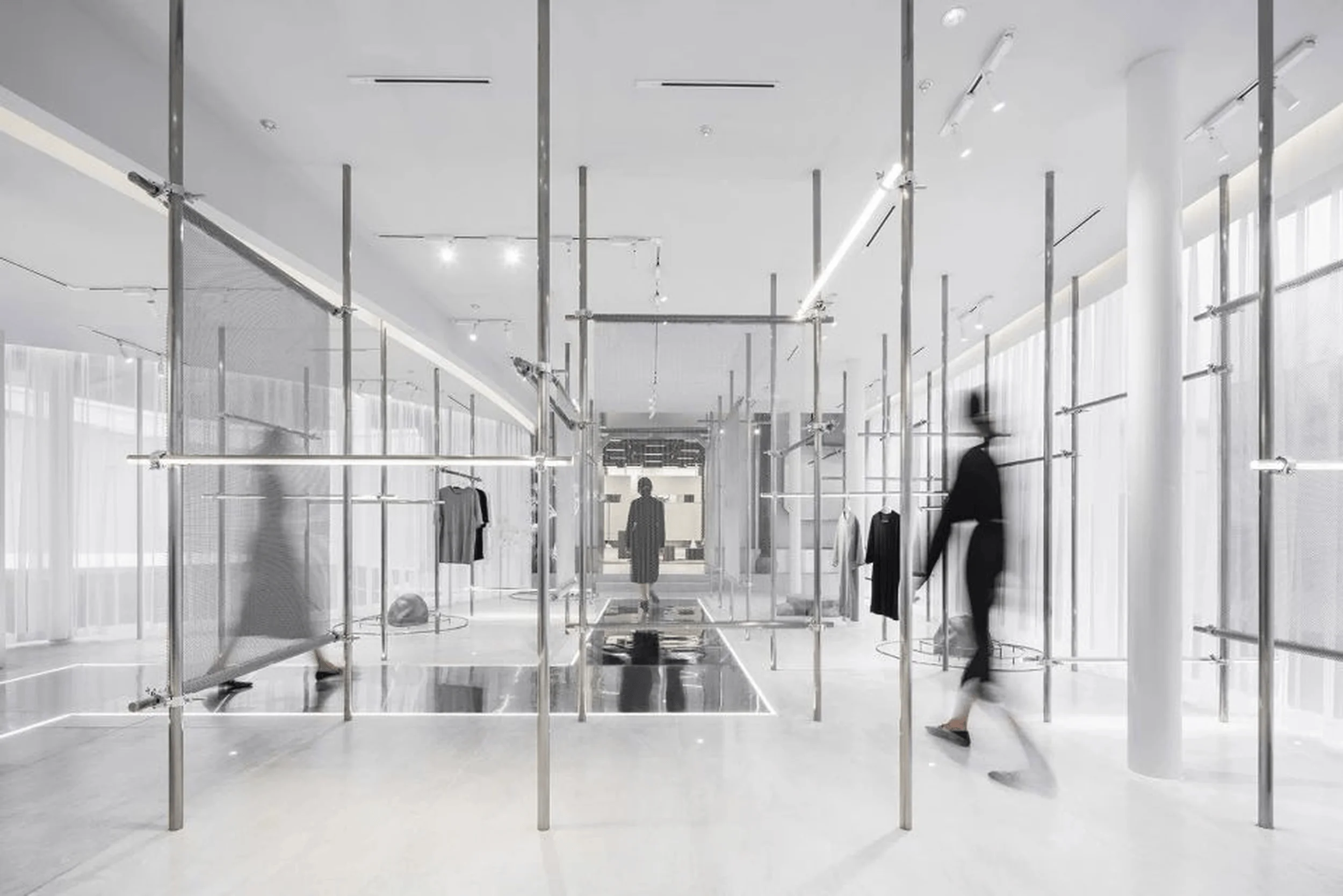
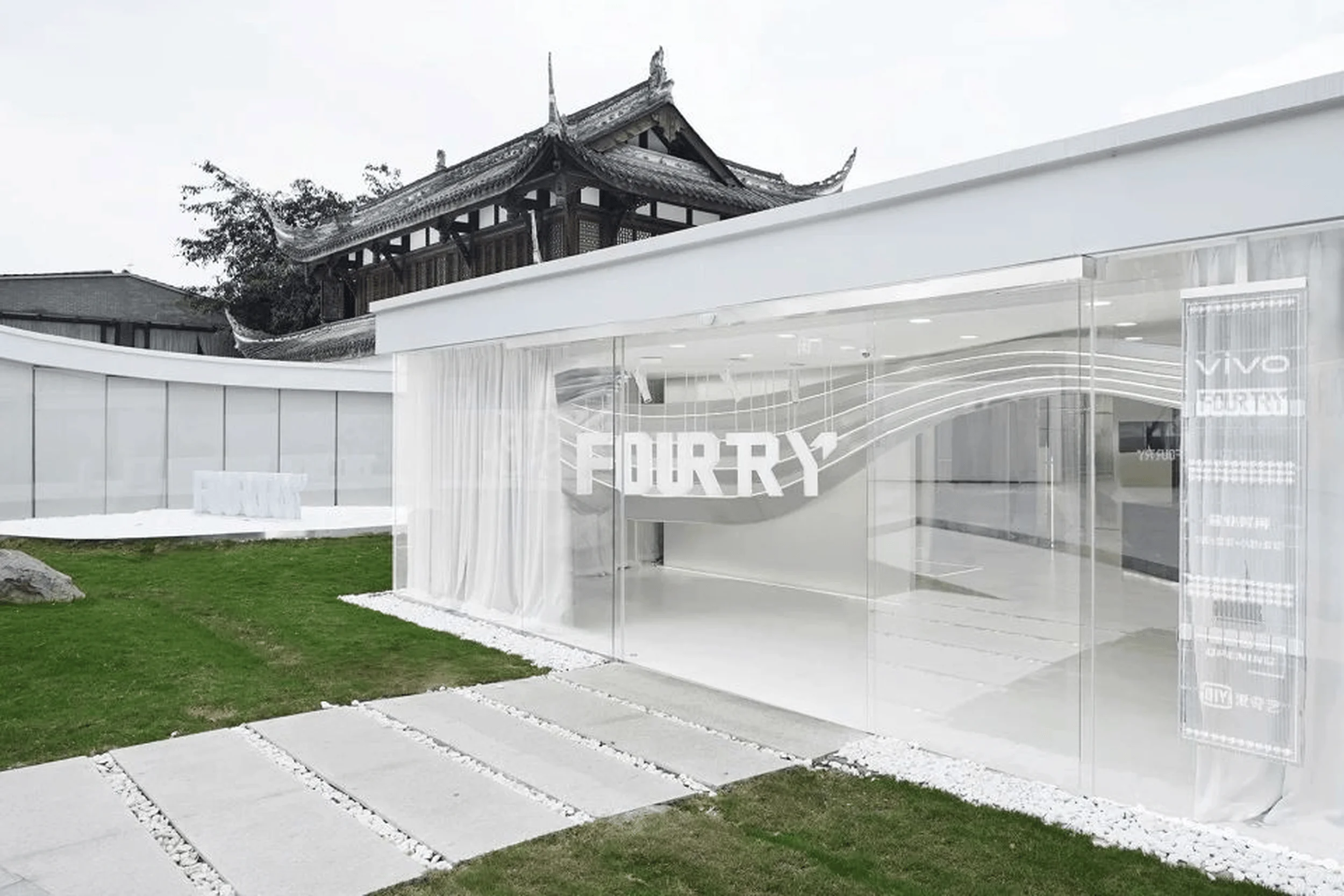
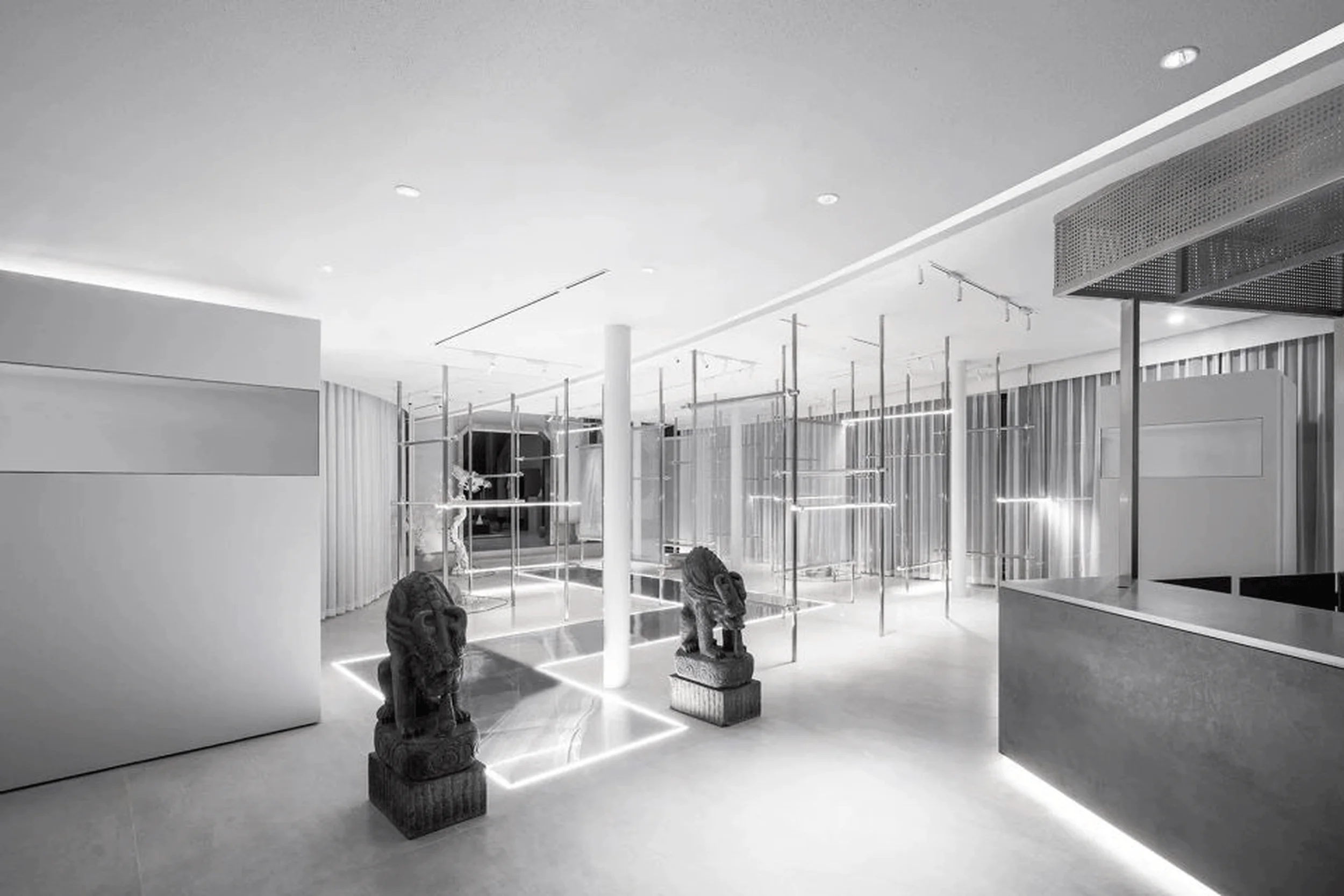
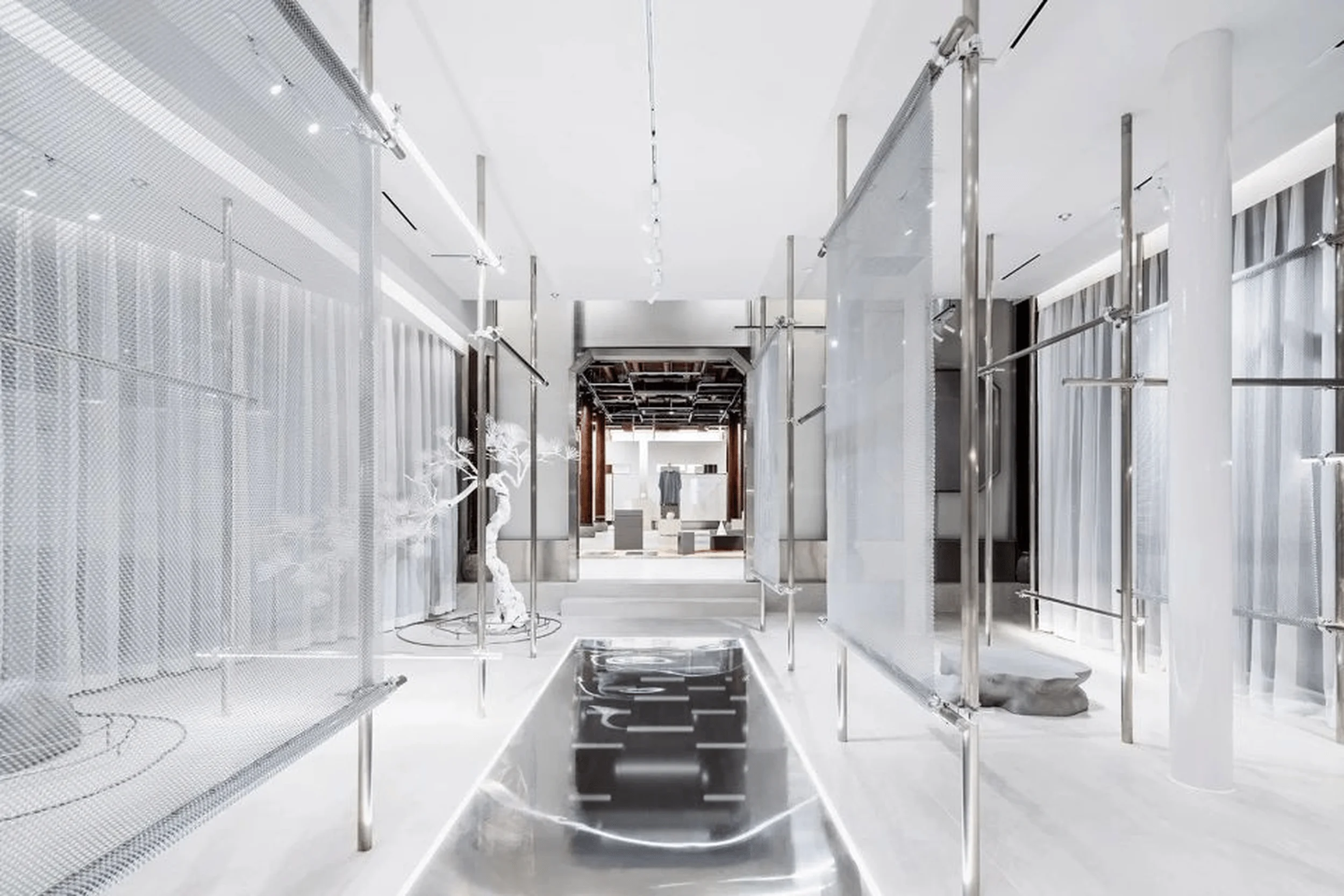
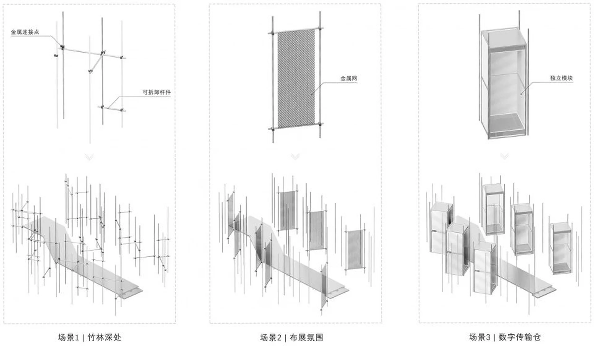
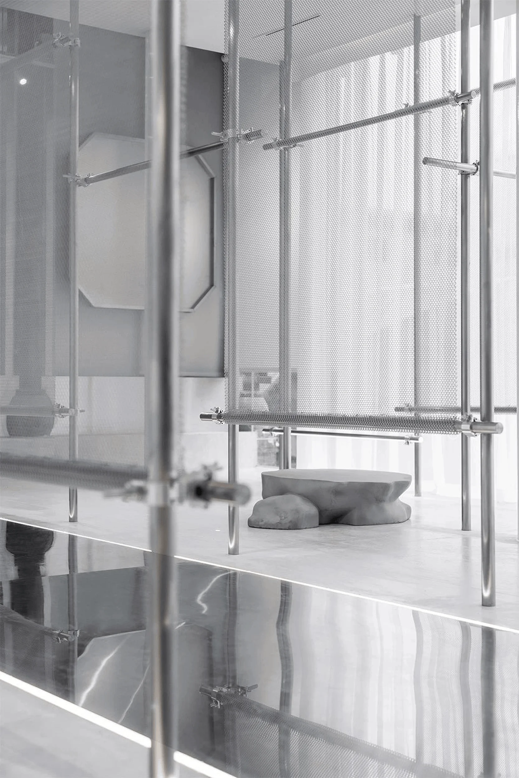
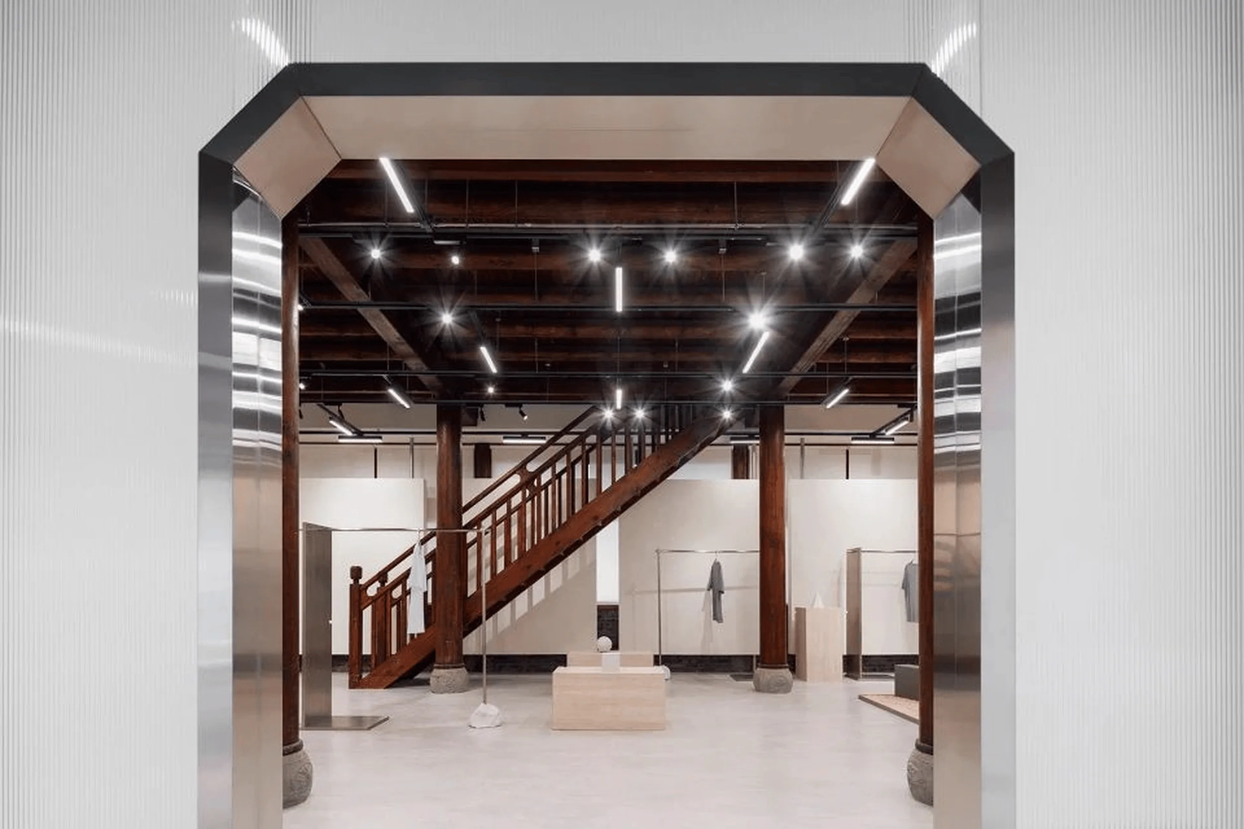
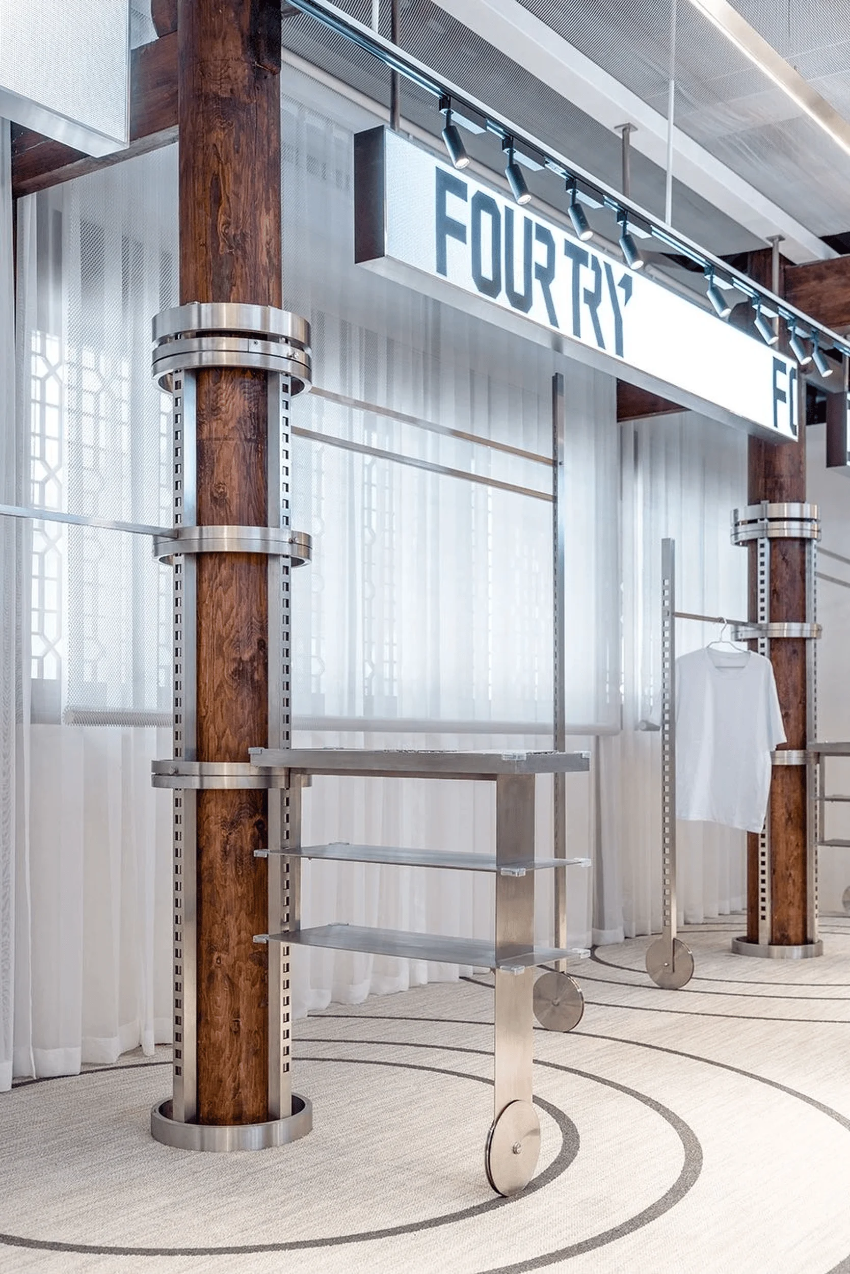
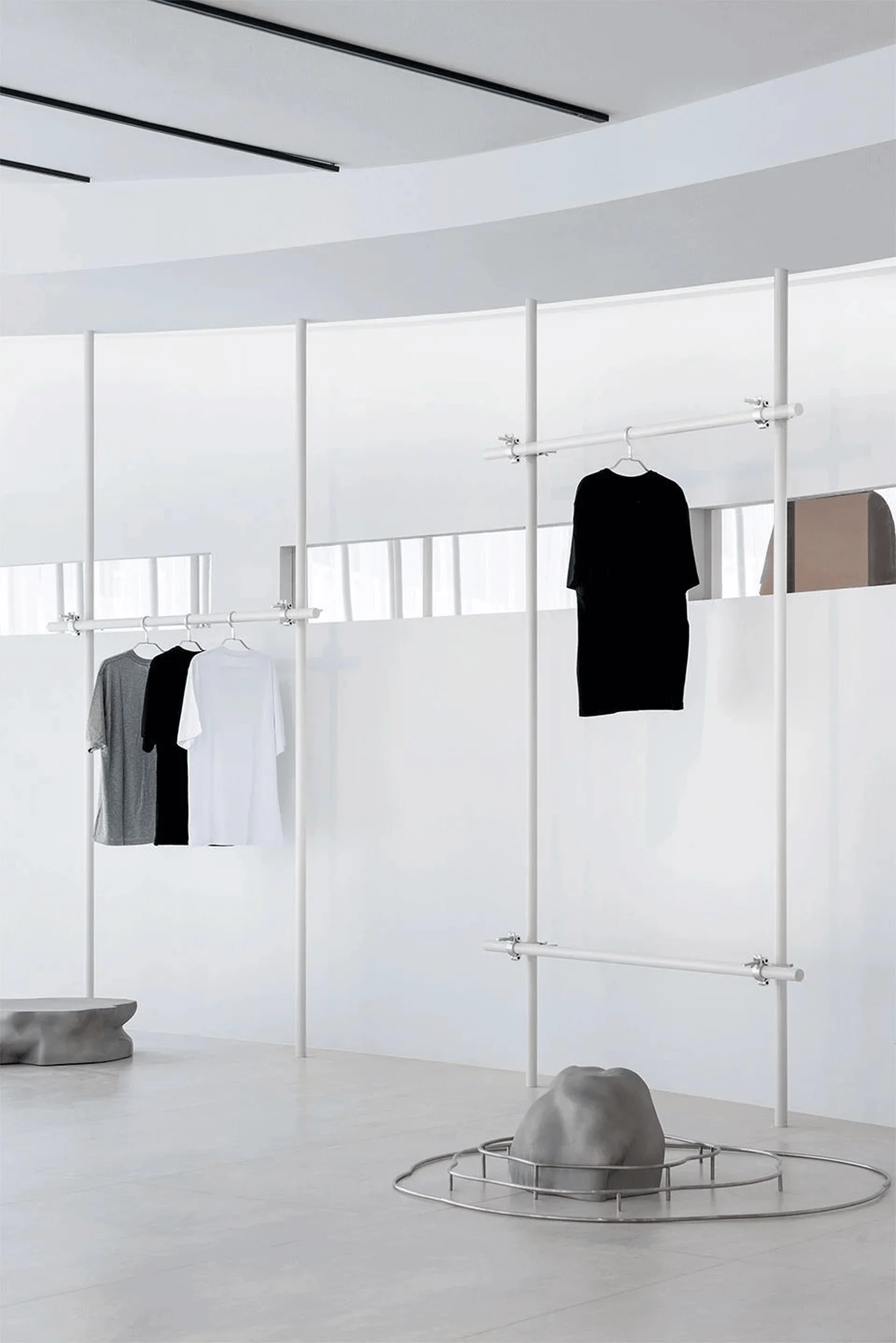
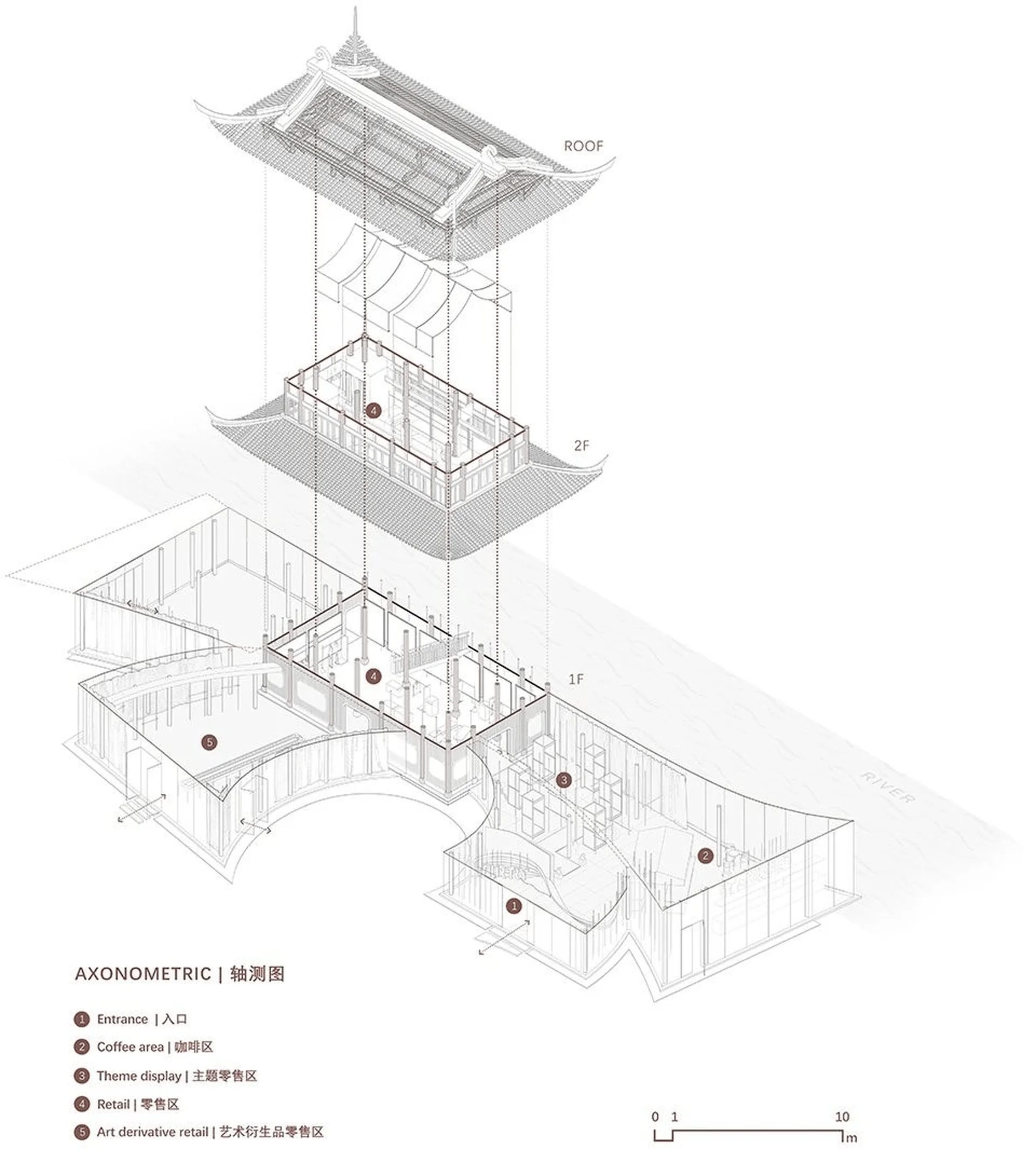
The FOURTRY SPACE project, located in the Tiexiang Temple area of Chengdu’s High-Tech Zone, served as the offline retail space for the second season of iQiyi’s popular variety show “Fourtry.” The show, focused on fashion and lifestyle, features celebrities like William Chan, Ouyang Nana, Fan Chengcheng, THE9-Liu Yuxin, and Zhou Yangqing, running a pop-up store within the space. Shanghai Let’s Talk Design Studio (SLT) was tasked with creating a unique architectural and spatial experience that would not only accommodate filming and short-term retail operations but also function as an independent boutique after the show’s conclusion. The designers took on the challenge of integrating traditional Chinese architectural elements with a modern, trendsetting retail aesthetic, aiming to create a space that authentically reflects the evolving interests of Chinese youth culture and their relationship with fashion and lifestyle. The chosen site, nestled between a historic district and a newly developed residential area, presented the opportunity to explore the dynamic interplay between old and new, reflecting the city’s vibrant urban fabric. The project aimed to create a retail design vocabulary that goes beyond conventional store layouts, transforming the space into an integral part of the consumer experience, blurring the lines between product display and experiential immersion. The design’s central concept revolved around a bamboo forest-inspired structure supporting the extended volume. Metal pillars were used to depict the natural growth of bamboo from the ground to the eaves, seamlessly integrating with the roof’s steel structure. In addition to this, the design process involved referencing Sichuan’s traditional architecture, incorporating natural elements, and embracing a forward-thinking approach to design. The intention was to foster a dialogue between tradition and innovation, facilitating an environment where fashion and everyday life could intersect and revitalize one another.
Design Concept and Objectives
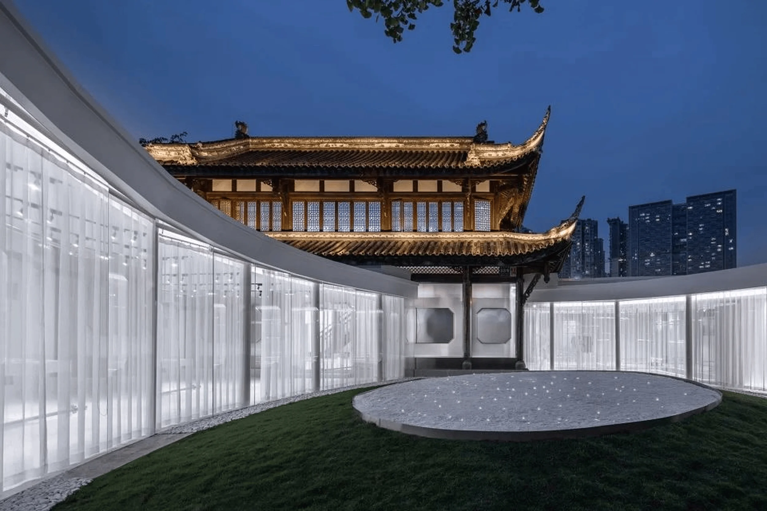
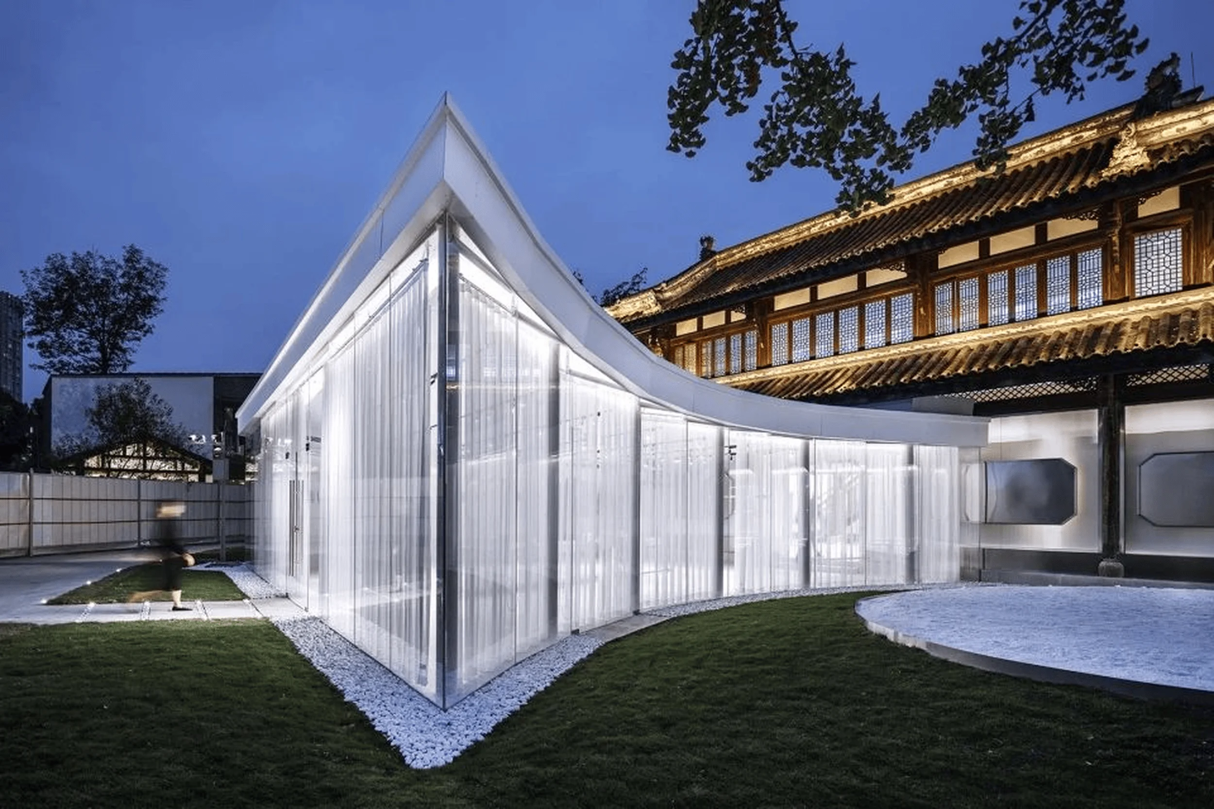
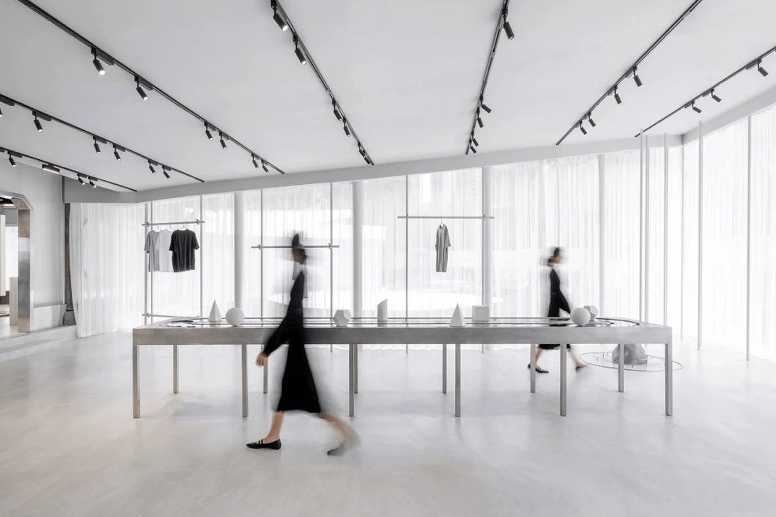
The design for FOURTRY SPACE was driven by the need to create a space that would successfully serve multiple purposes – as a film set, a pop-up store, and a standalone boutique. This multifaceted approach was central to the project’s objectives. The design aimed to go beyond a purely functional approach, pushing the boundaries of traditional retail spaces. By creating an environment that was not just a backdrop for product display but an immersive experience in itself, the designers sought to elevate the retail experience for the show’s participants and customers. The concept of a “bamboo forest” was integrated into the design to visually represent the connection between nature and the urban environment. This thematic element also helped to create a sense of continuity with the surrounding historical district, respecting the local architectural vernacular. The project aimed to create a space where tradition and modernity could coexist harmoniously. The transparent glass facade was a key element in achieving this objective, as it fostered a visual connection between the historical and modern elements of the surrounding area. The designers also sought to create a sense of openness and transparency, reflecting a contemporary design aesthetic that contrasts with the enclosed nature of many traditional retail spaces. The use of glass and open spaces aimed to blur the lines between the interior and exterior, welcoming natural light and encouraging interaction with the surrounding urban landscape.
Spatial Layout and Functionality
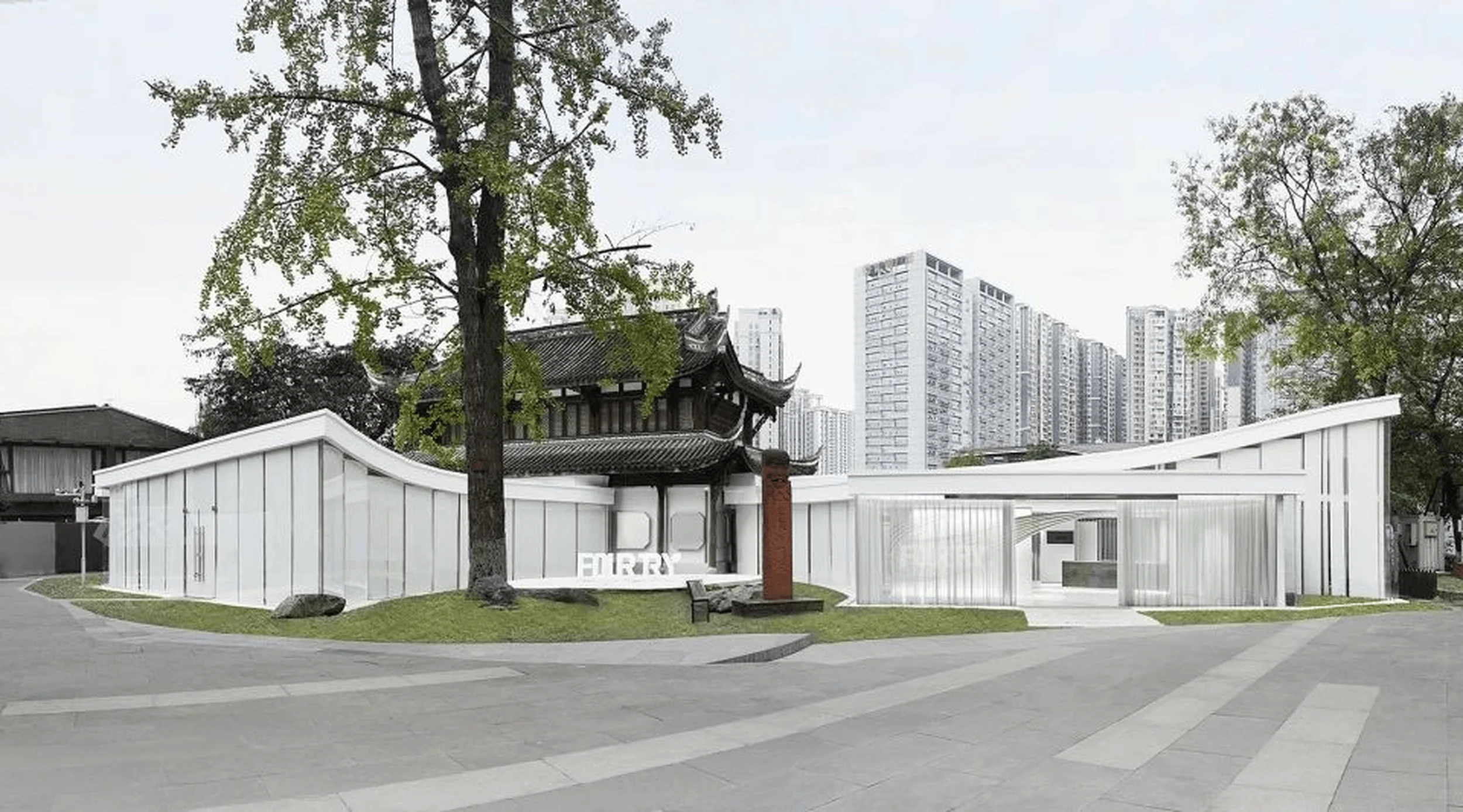
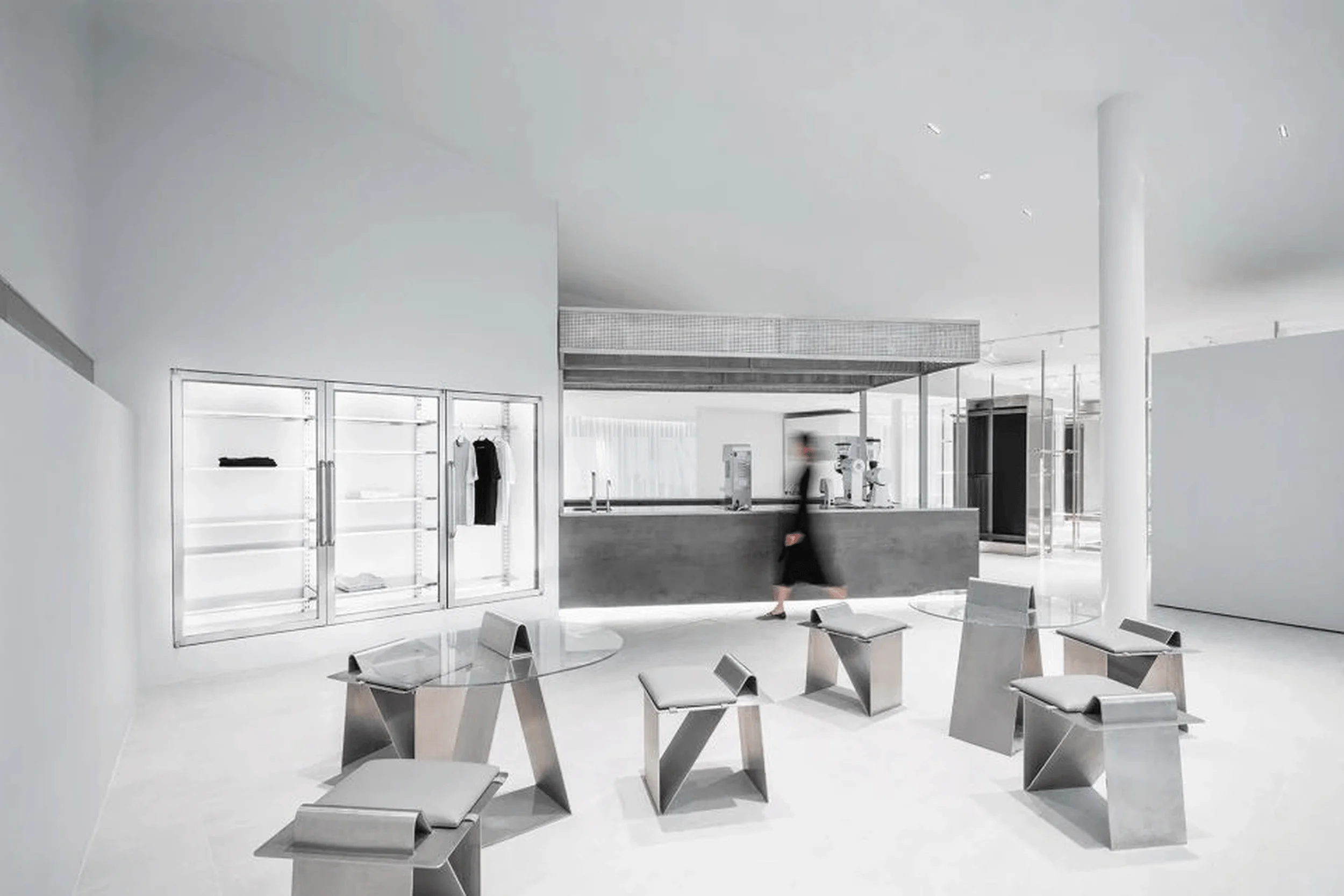
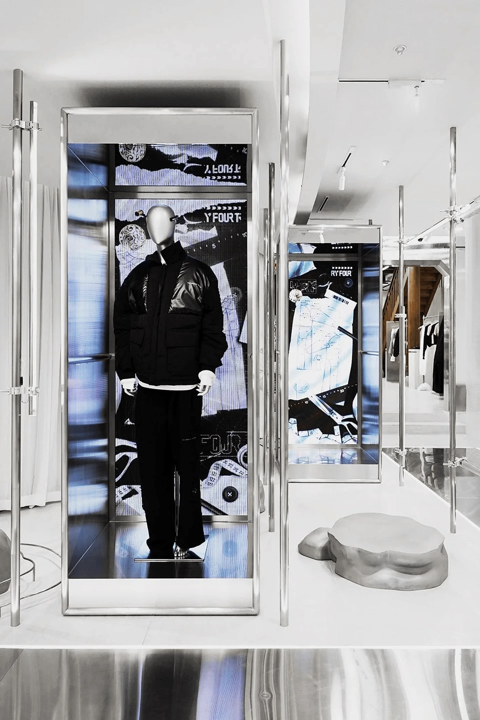
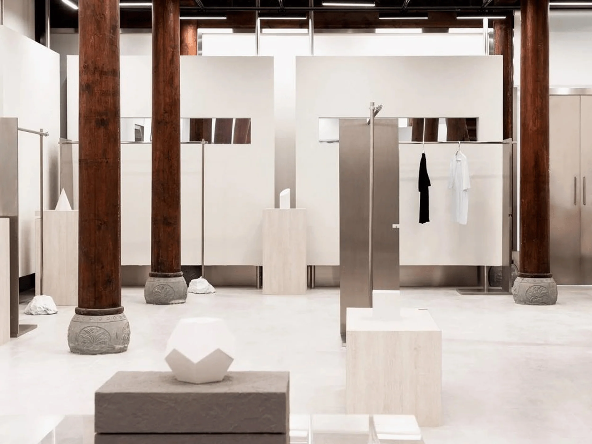
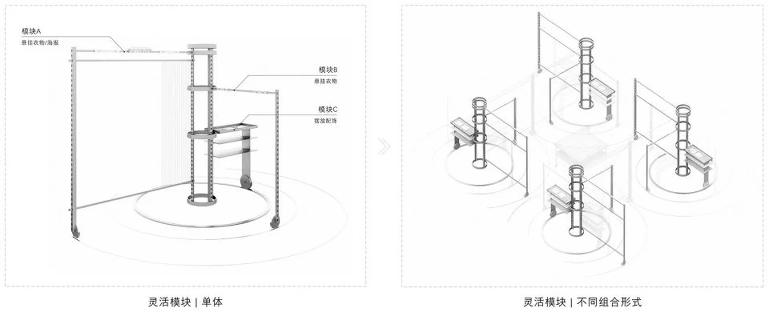
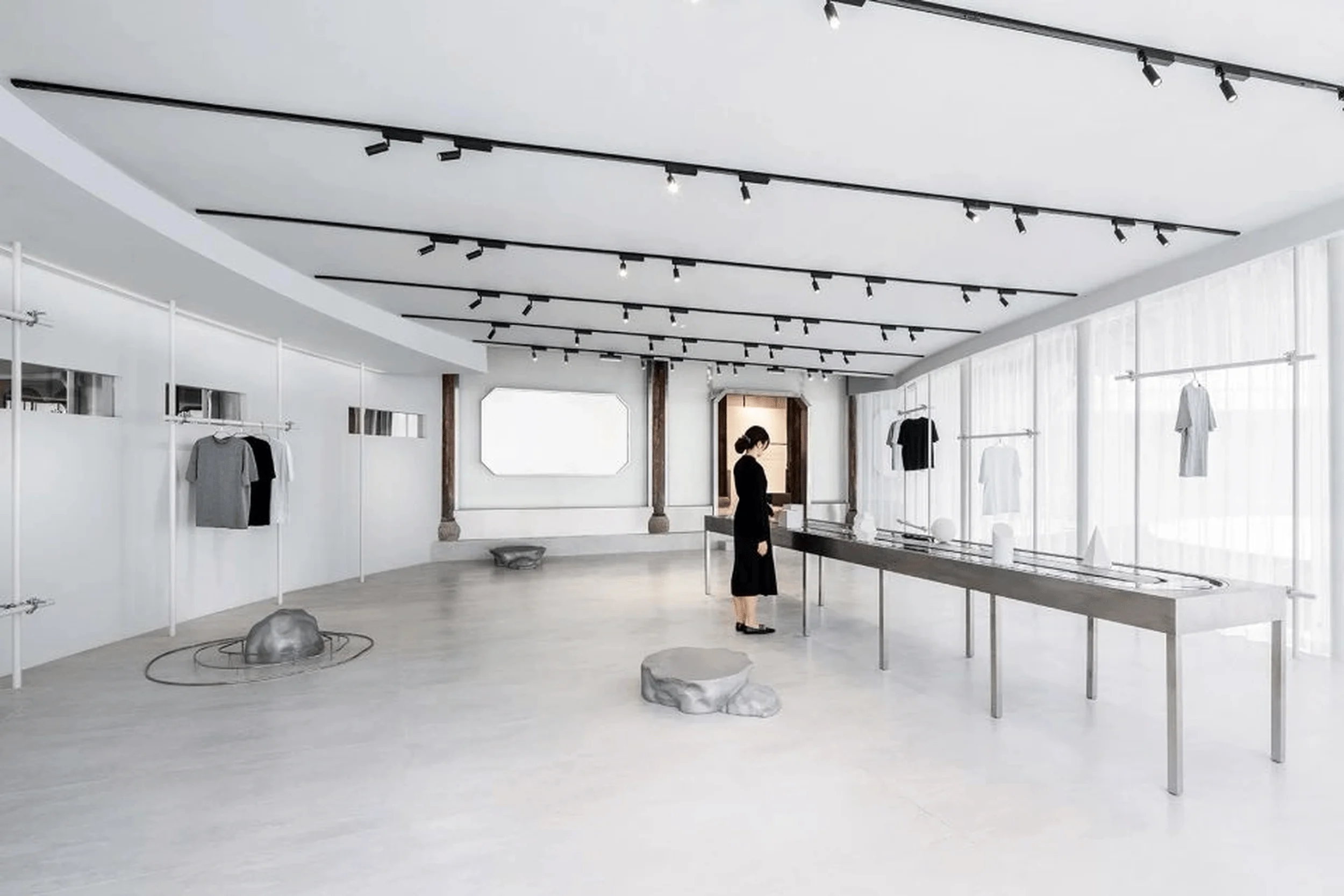
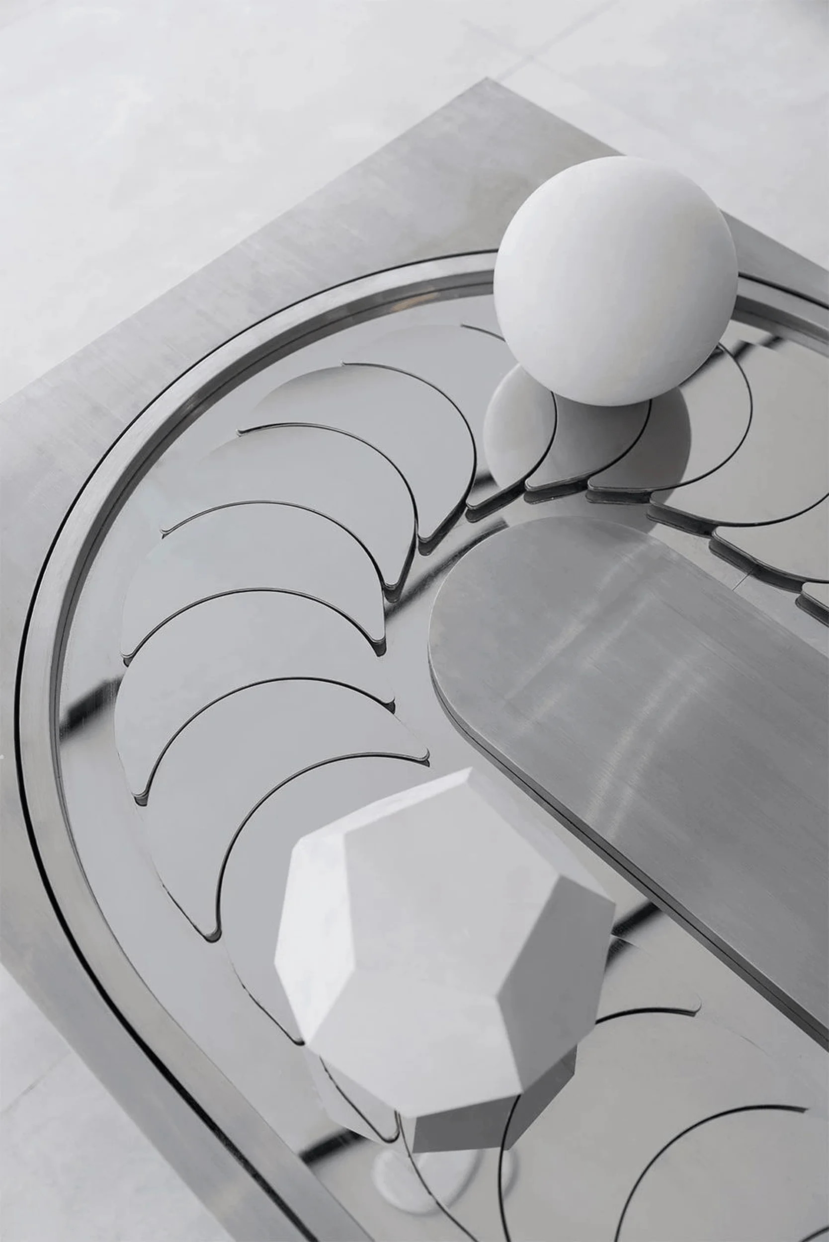
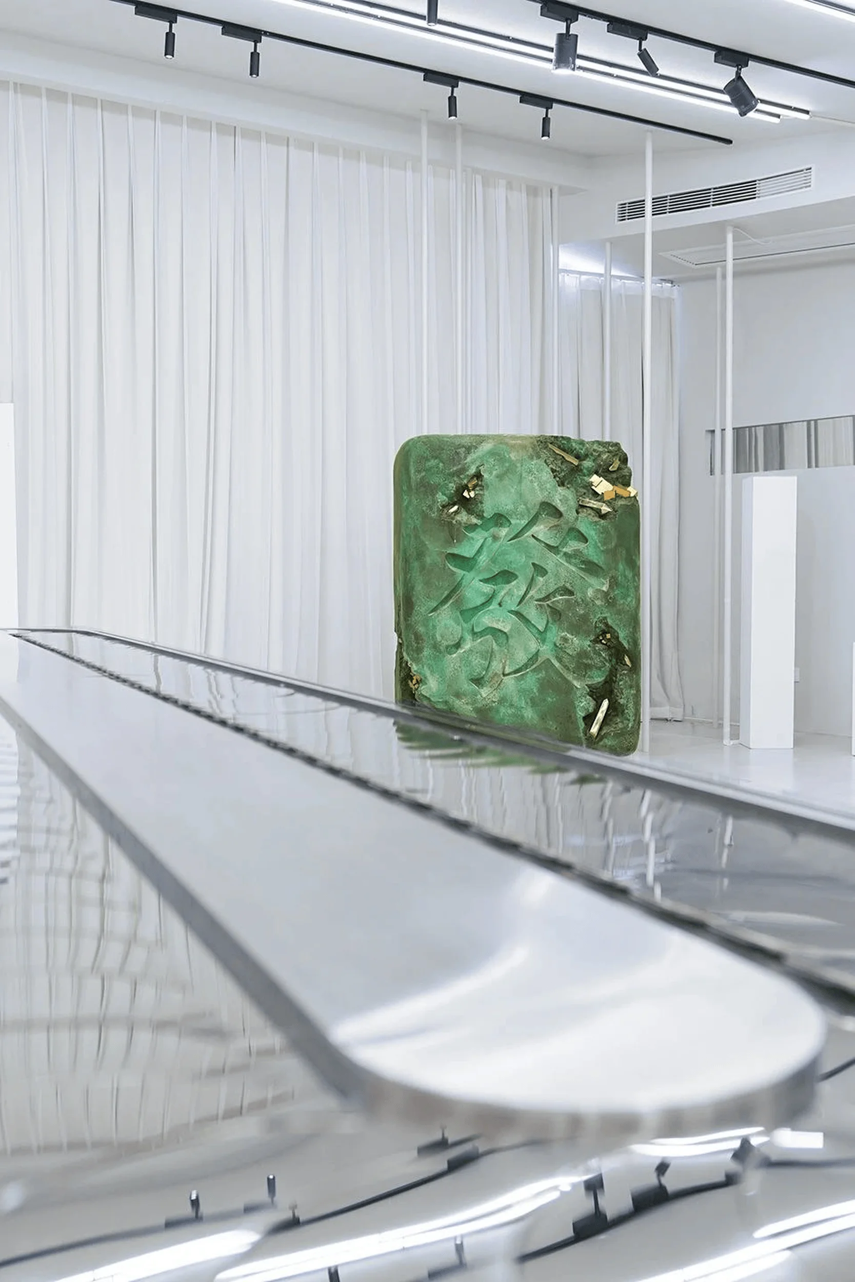
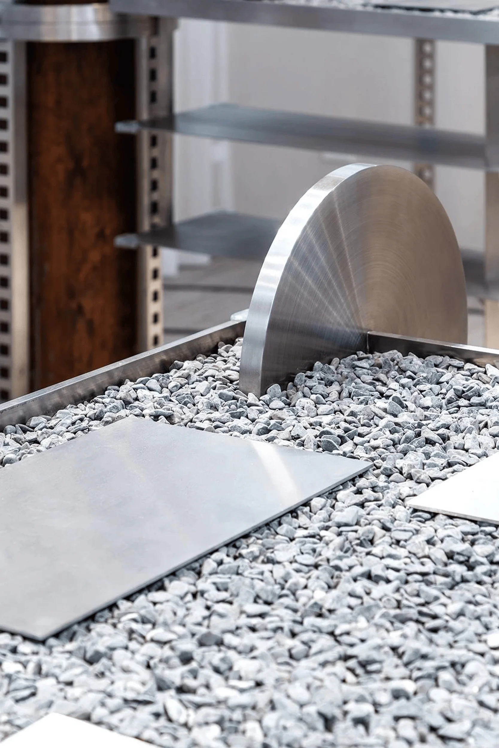
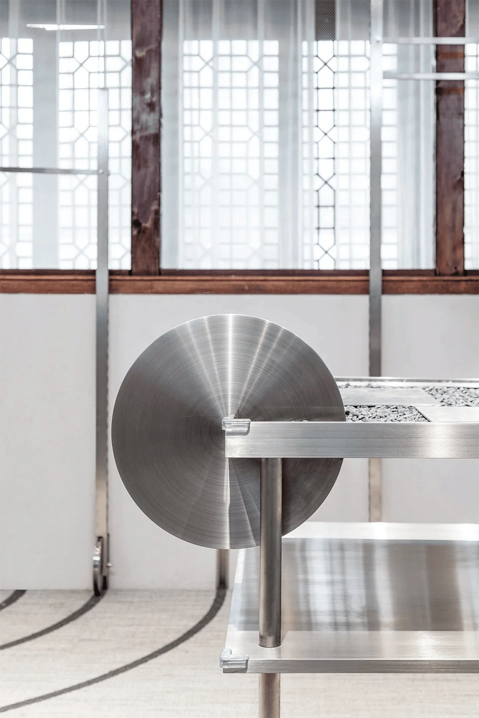
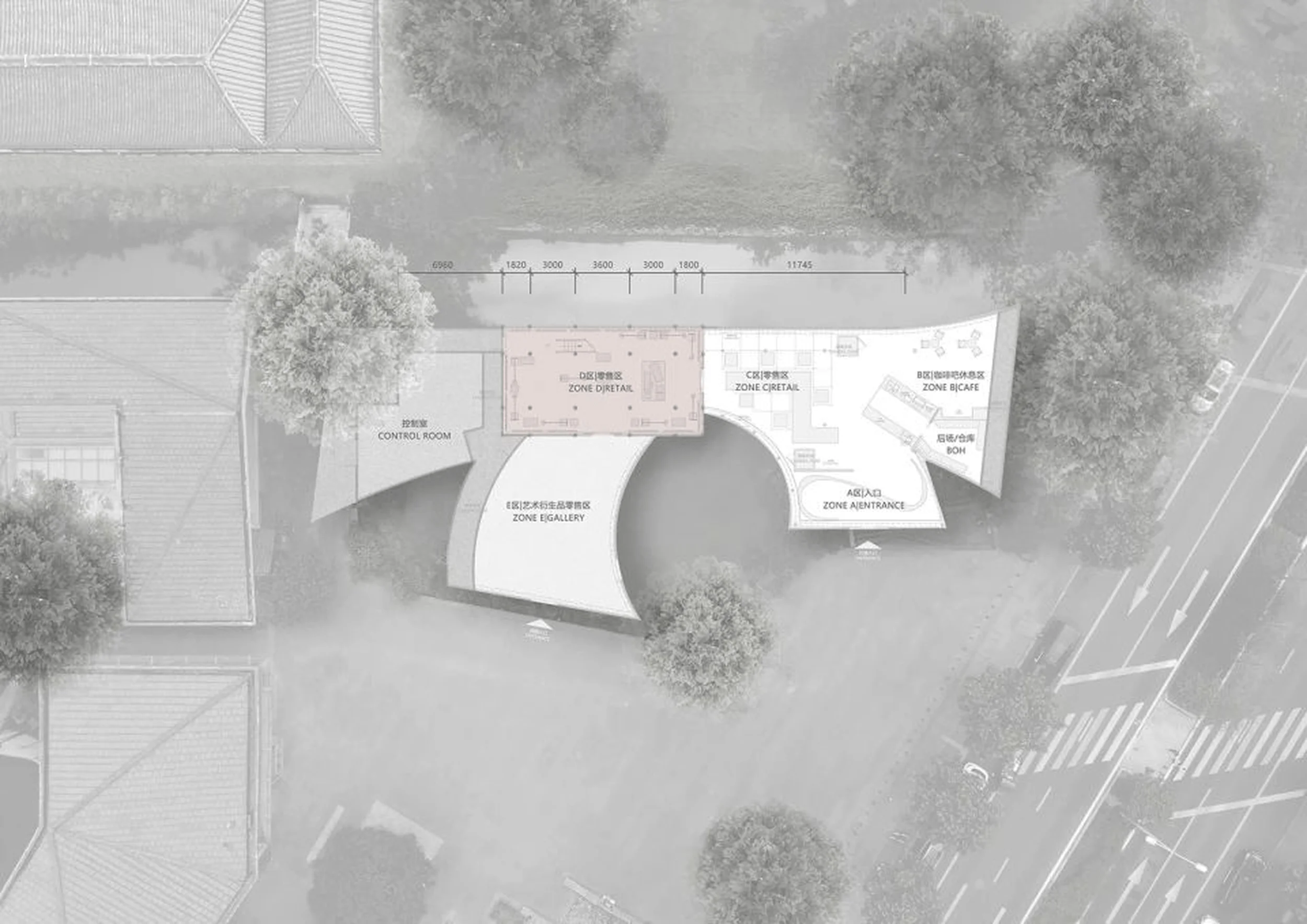
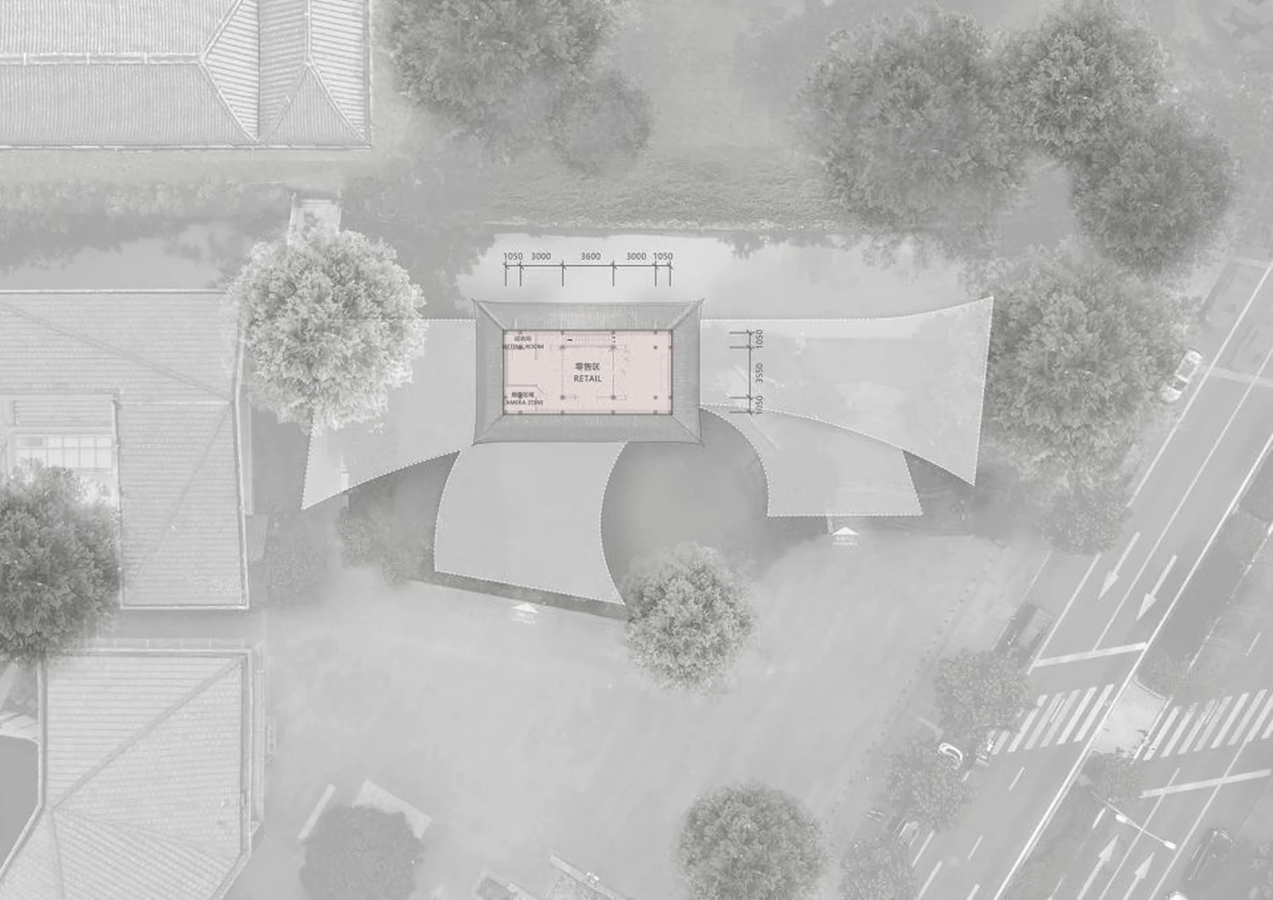
The layout of FOURTRY SPACE was carefully planned to accommodate the diverse needs of the project. The building features two distinct areas: a main retail space on the ground floor and a pop-up art exhibition space on the second floor. The main retail area is characterized by an open floor plan, with the central “bamboo forest” structure as a defining feature. Flexible display units and minimalist decor allow for versatile configurations to showcase different product collections and adapt to the evolving needs of the pop-up store. The second floor provides a dedicated space for art installations and temporary exhibitions, allowing FOURTRY to explore creative collaborations and showcase emerging artists. This space is envisioned as a dynamic and experimental area where different mediums and expressions can be explored. The central courtyard in front of the historic building adds another layer of functionality to the design. This outdoor area was envisioned as a versatile space for hosting various events, exhibitions, and gatherings, blurring the lines between indoor and outdoor experiences. The courtyard acts as an extension of the retail space, providing an opportunity for FOURTRY to engage with the wider community and activate the street-facing aspect of the building. The integration of a customized metal conveyor system into the pop-up art space adds a unique interactive element to the design. This dynamic feature was intended to symbolize the constant flow of new trends and ideas within the fashion and lifestyle world. The conveyor system functions as a visual focal point and provides a playful way to present products or art pieces, creating a sense of movement and energy within the space.
Exterior Design and Aesthetics
The exterior of FOURTRY SPACE is characterized by a minimalist aesthetic that blends seamlessly with its surroundings. The building’s transparent glass facade allows the interior activities and displays to be seen from the street, creating a sense of openness and transparency. This design choice also helps to visually connect the space to the historical context of the neighborhood, respecting the architectural legacy of the area. The extension of the building creates a natural courtyard in front of the adjacent historical structure. This courtyard provides a transition zone between the old and the new, blurring the lines between different architectural styles and eras. The choice of materials, with an emphasis on glass, metal, and concrete, creates a cohesive and contemporary look that complements the building’s innovative design concept. The subtle integration of traditional Chinese design elements, such as the “bamboo forest” inspired pillars and the minimalist aesthetic, creates a dialogue between tradition and modernity. The building’s design reflects a growing trend in contemporary Chinese architecture, where traditional elements are reinterpreted and incorporated into modern design vocabularies. The overall effect is a structure that is both visually striking and respectful of its historical context, making a strong architectural statement in the Chengdu cityscape. The exterior design seamlessly integrates with the interior concept, creating a cohesive and engaging experience for visitors. The transparency of the facade allows natural light to flood the interior, enhancing the spatial qualities and creating a vibrant atmosphere.
Construction and Management
The construction of FOURTRY SPACE presented some unique challenges due to the project’s dual nature as a temporary television set and a permanent retail space. The design team had to carefully consider the flexibility and adaptability of the building to accommodate the changing needs of the project over time. The use of modular and prefabricated elements allowed for a relatively fast and efficient construction process, minimizing disruption to the surrounding neighborhood. The construction management team worked closely with the designers and the production team of the television show to ensure that the building met all the technical requirements for filming. The project also had to adhere to strict building codes and regulations, particularly those related to historical preservation in the Tiexiang Temple area. The team worked closely with local authorities to ensure that the project was completed in compliance with all applicable regulations.
Project Information:
Project Type: Pop-Up Retail Building
Architect: Shanghai Let’s Talk Design Studio
Project Year: 2020
Country: China
Photographer: 24designclub


