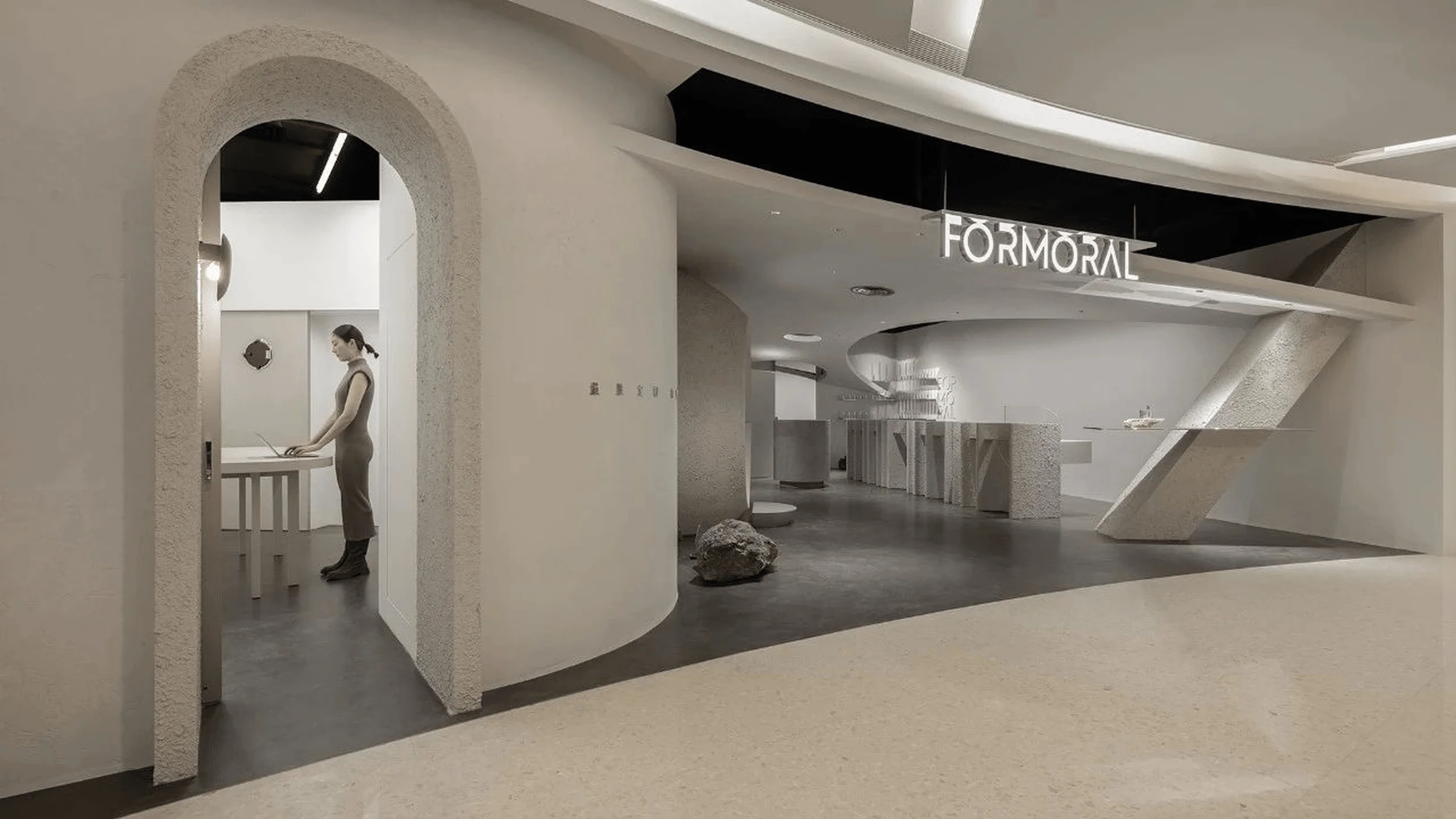
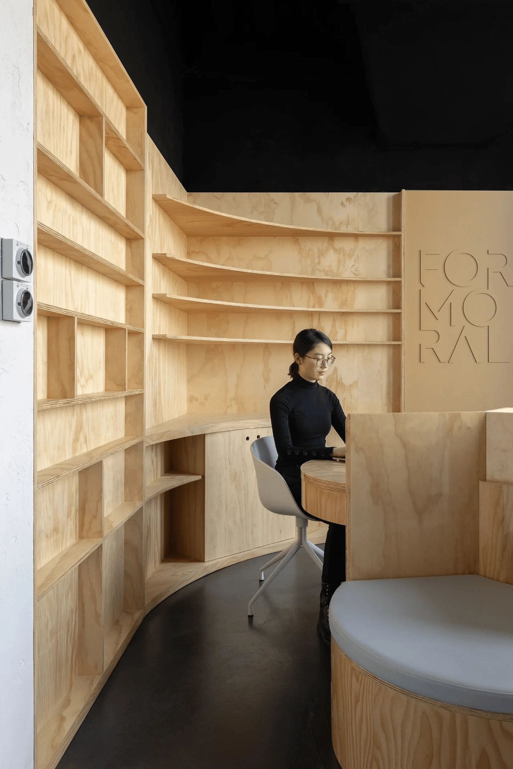
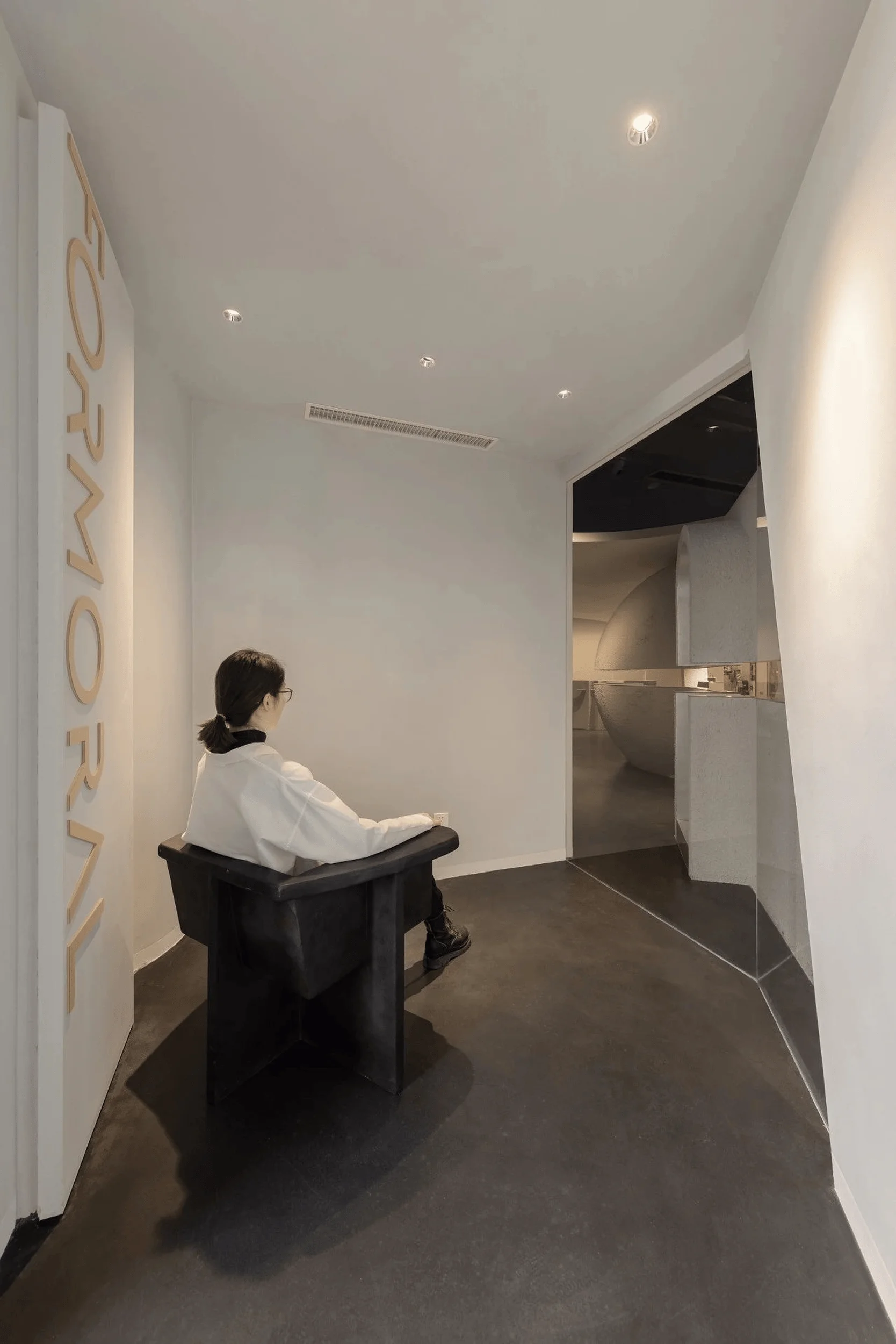
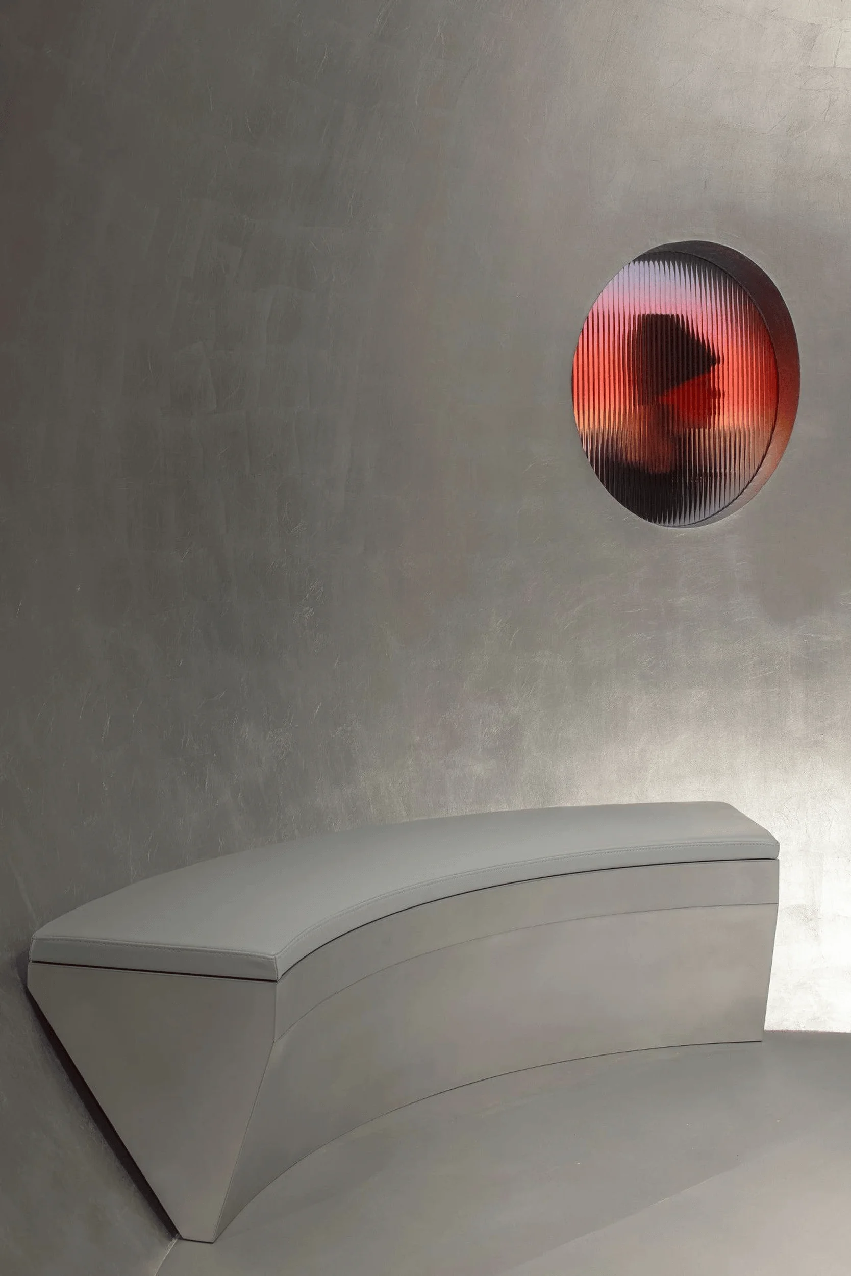
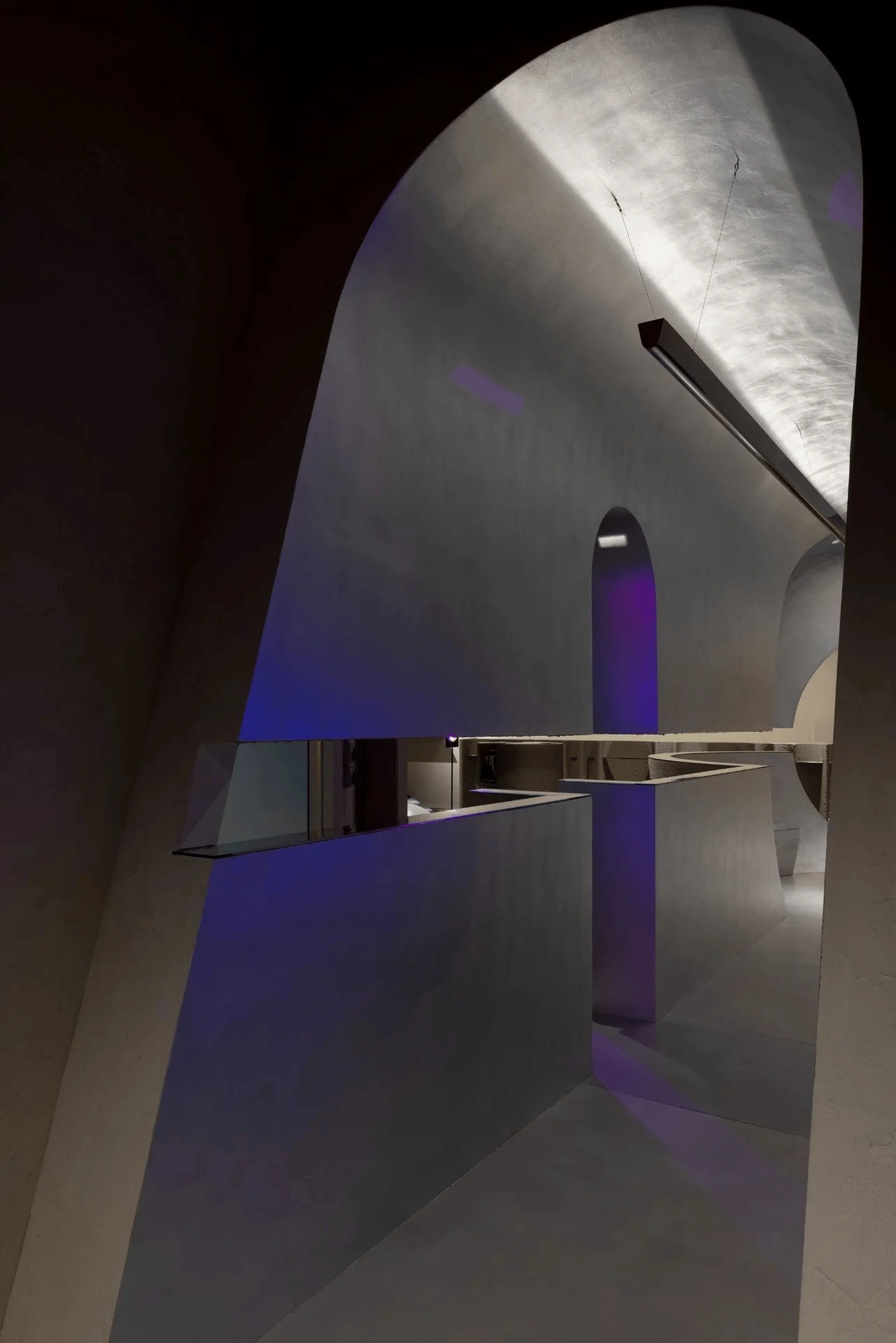
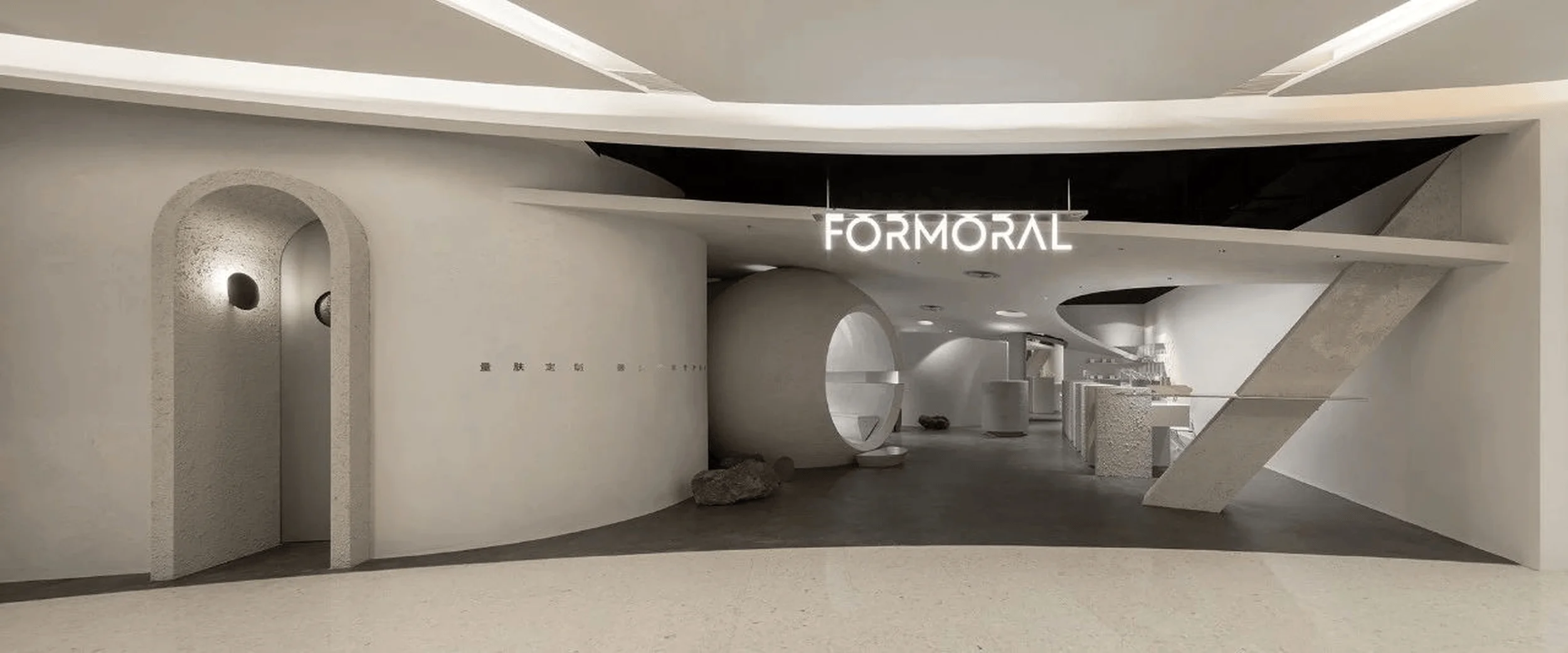
The FORMORAL Concept Flagship Store in China seamlessly integrates nature and technology, offering a unique and immersive retail experience through innovative architectural design.
Contents
Project Background and Design Brief
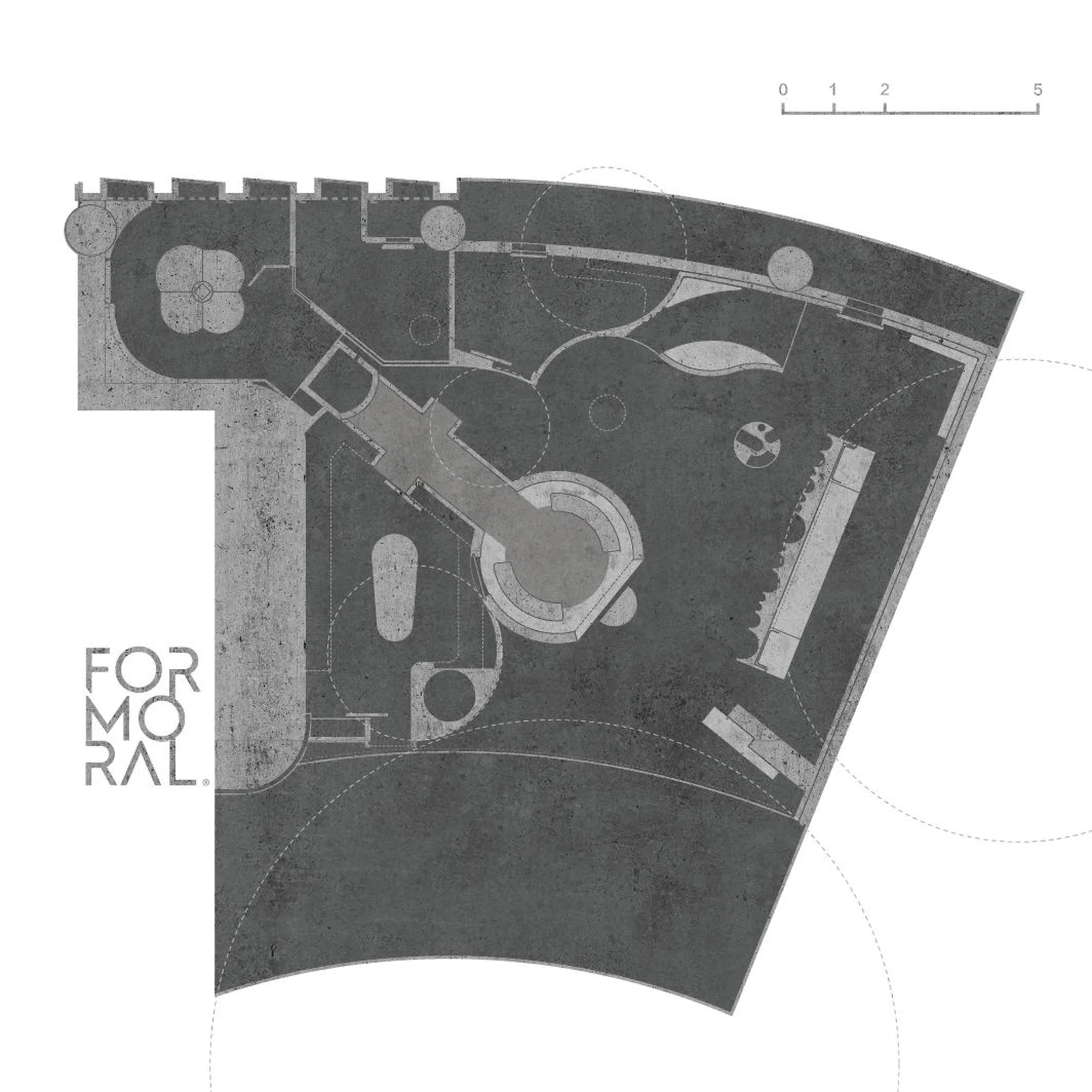
FORMORAL, an independent skincare brand rooted in medical science, tasked lialawlab with designing their concept flagship store in Hangzhou, China. The design brief emphasized the brand’s unique identity, which merges natural ingredients with cutting-edge technology. The goal was to create a space that not only showcased FORMORAL’s products but also embodied its philosophy and commitment to innovation. The design needed to stand out from the ‘homogeneous’ landscape of modern retail spaces and offer customers a memorable and engaging experience. The store also had to accommodate eight distinct functional areas within a relatively compact 120-square-meter site, including brand display, skin testing and product sales, rest and communication, events and demonstration, self-care and washing, office, product storage, and an employee break room. The design team aimed to create a space that was both functional and aesthetically pleasing, reflecting the brand’s commitment to both science and beauty. The concept of ‘Retro-Futurism’ was chosen as the overarching theme, allowing the designers to explore the interplay between nature and technology, past and future.
Design Concept and Objectives
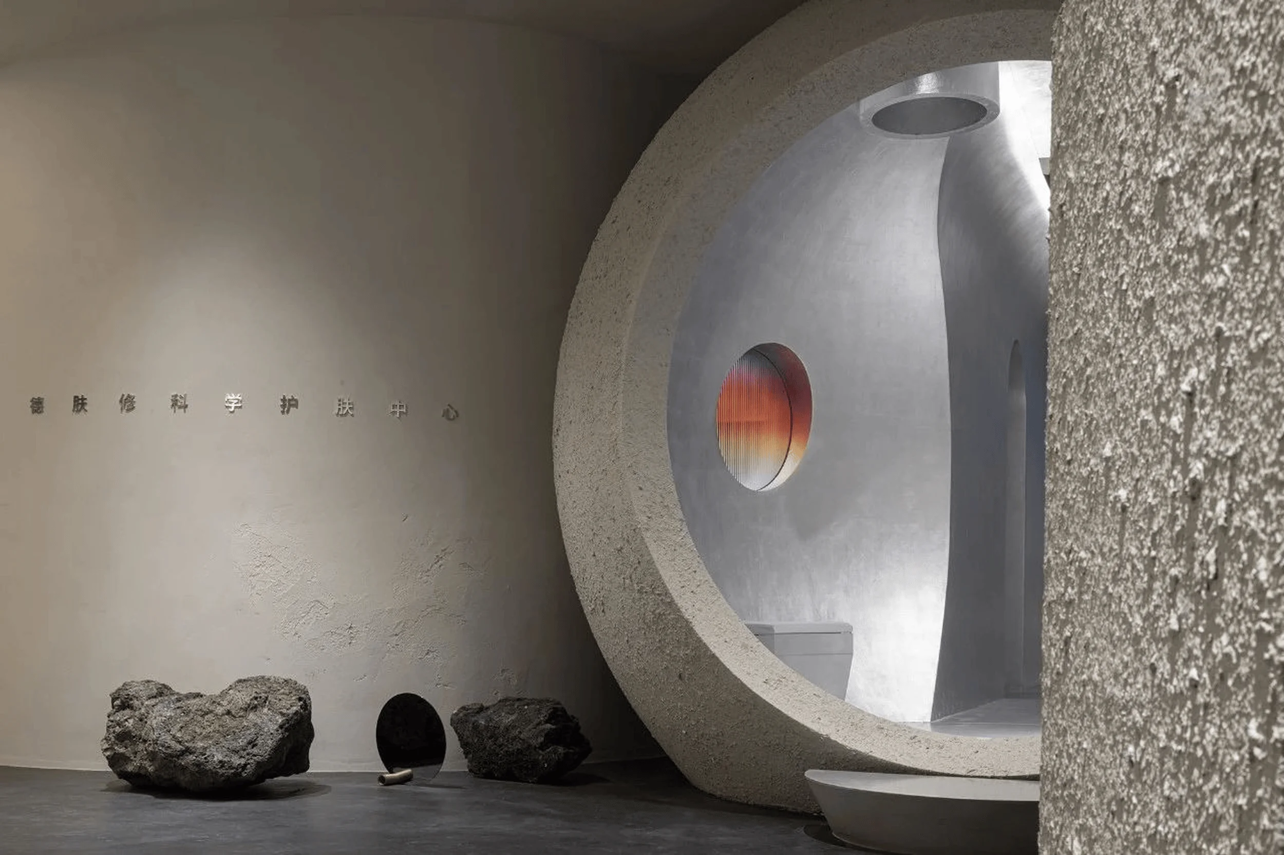
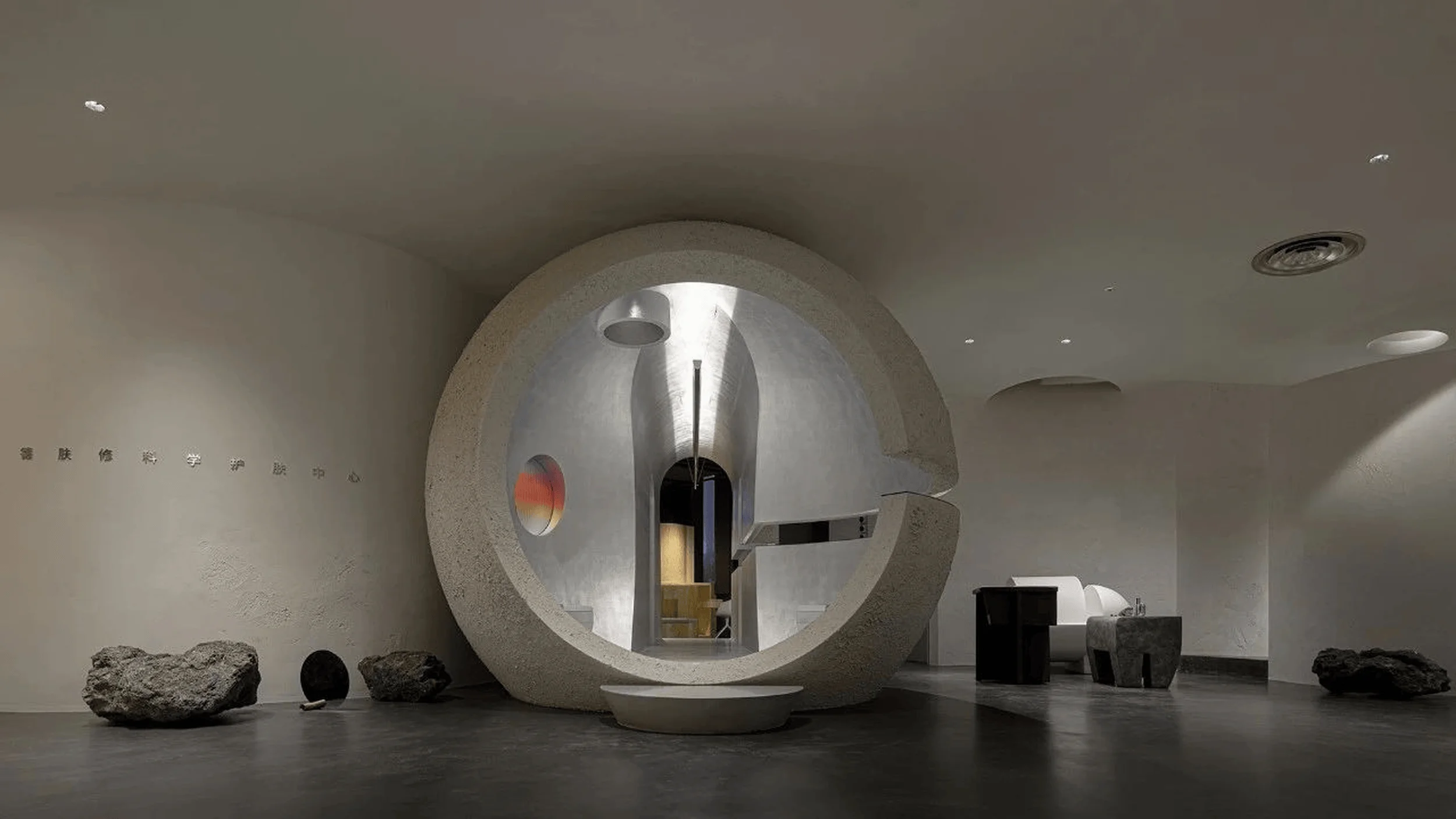
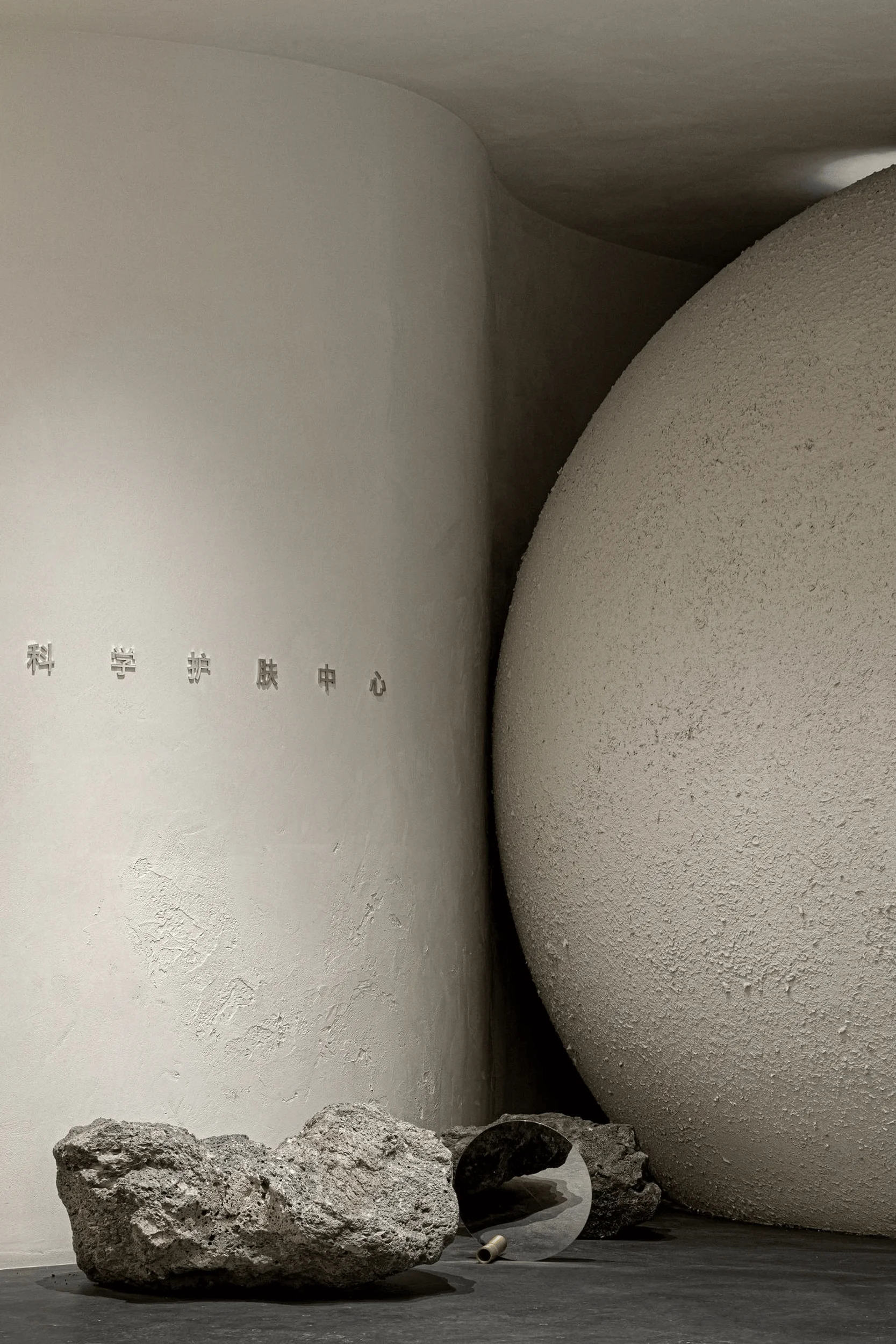
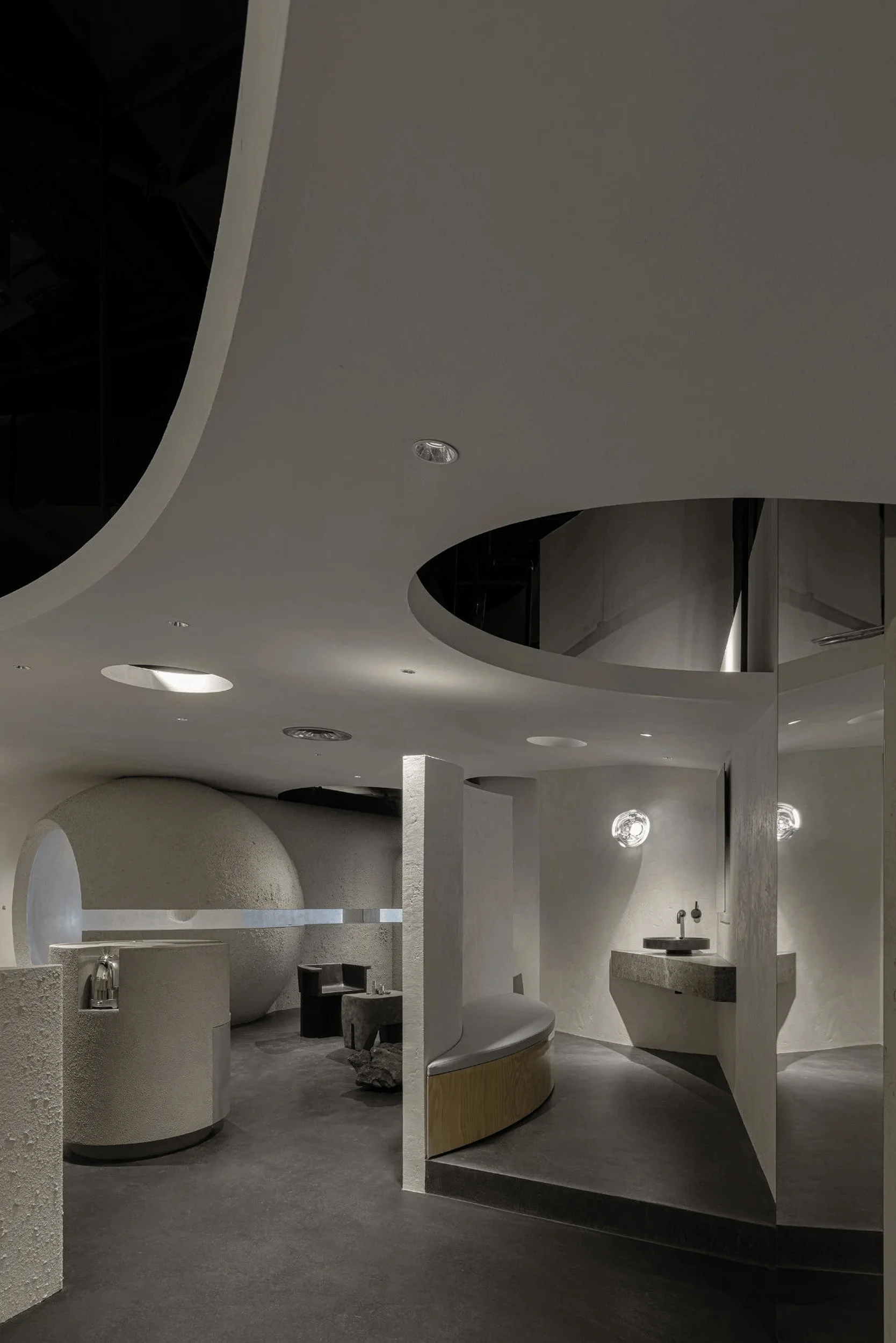
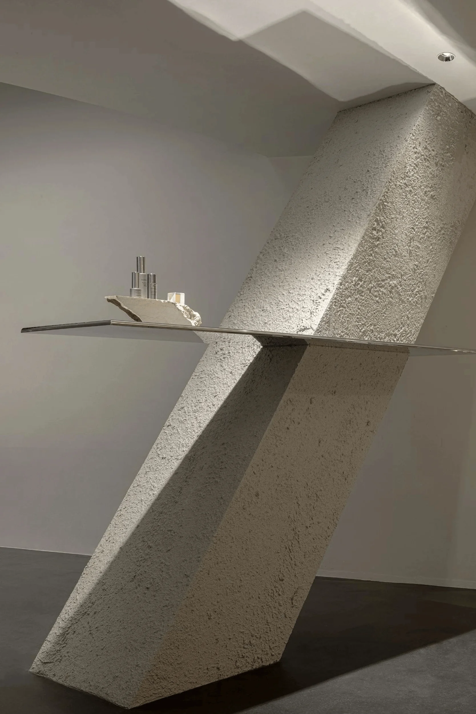
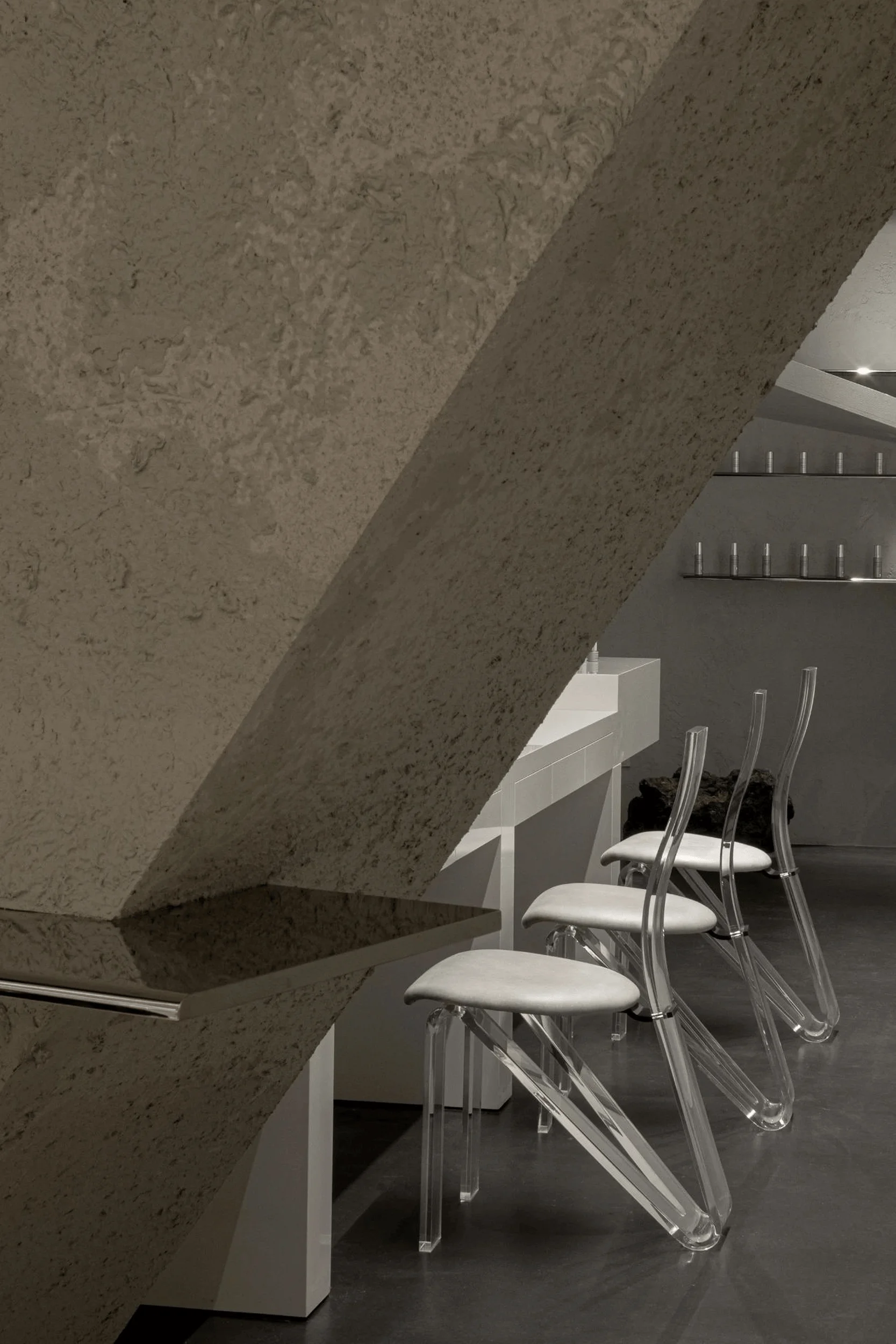
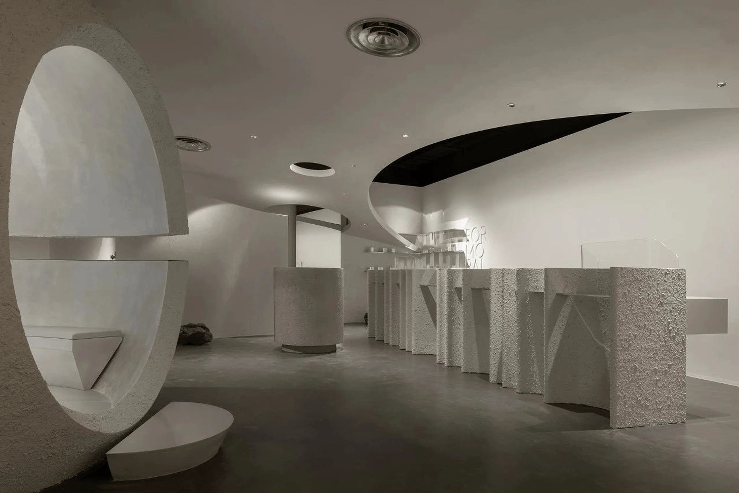
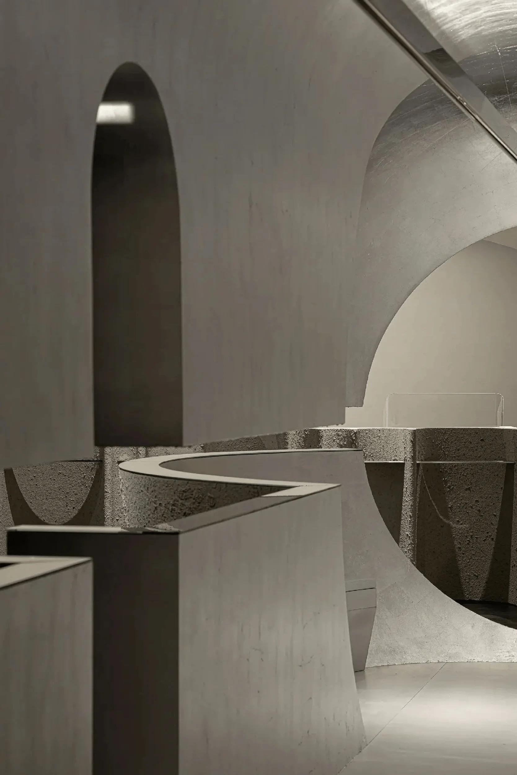
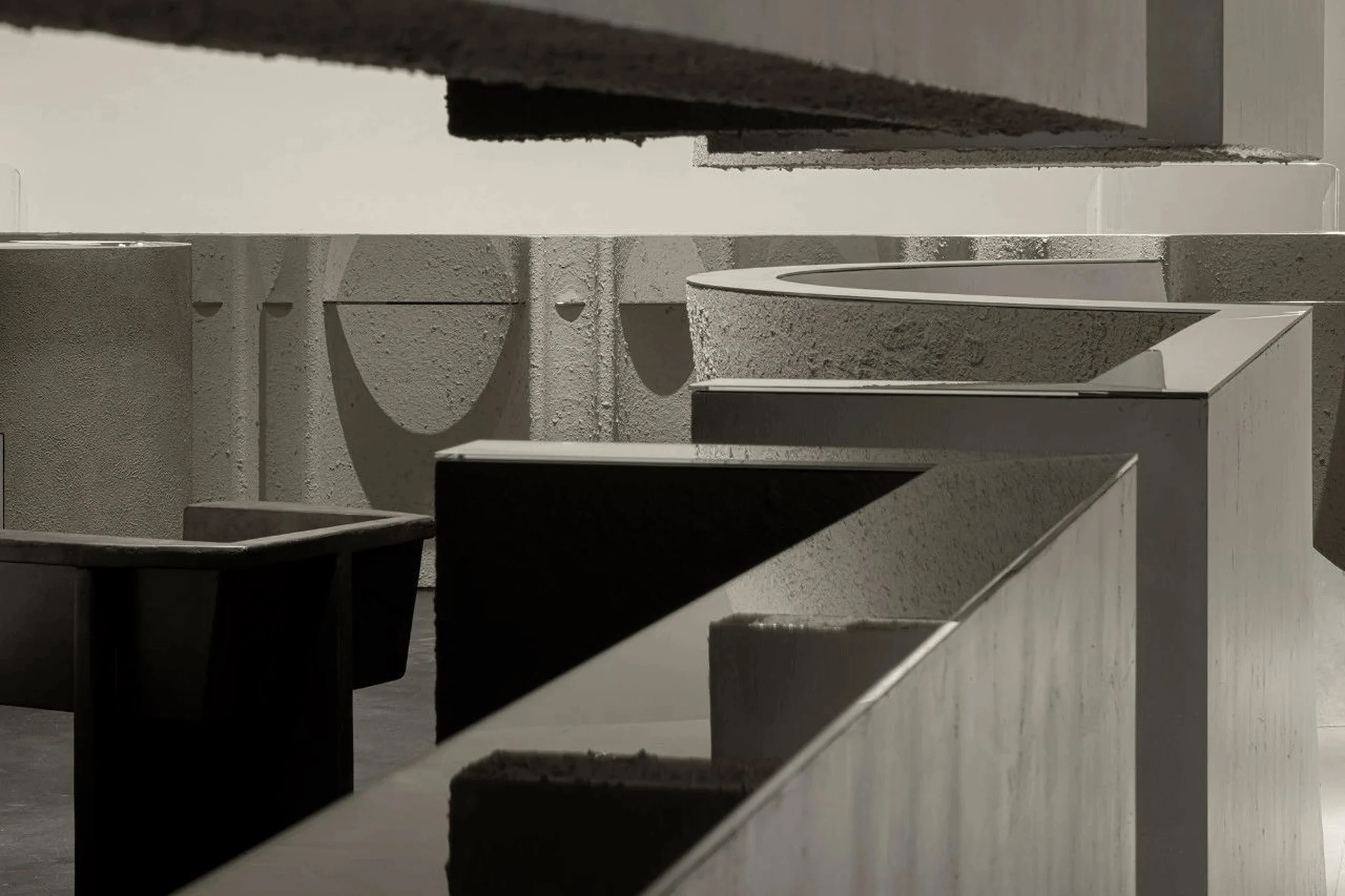
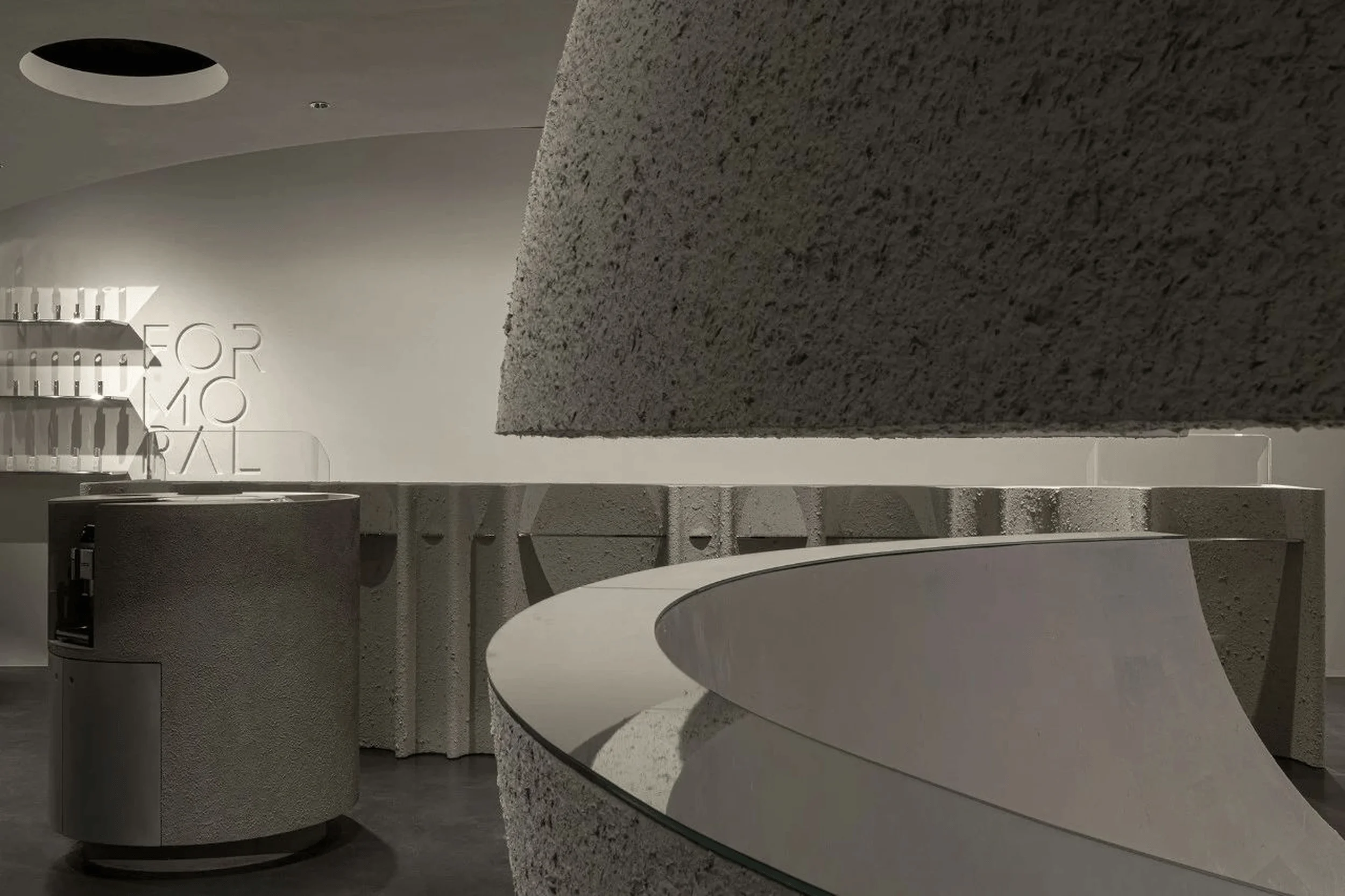
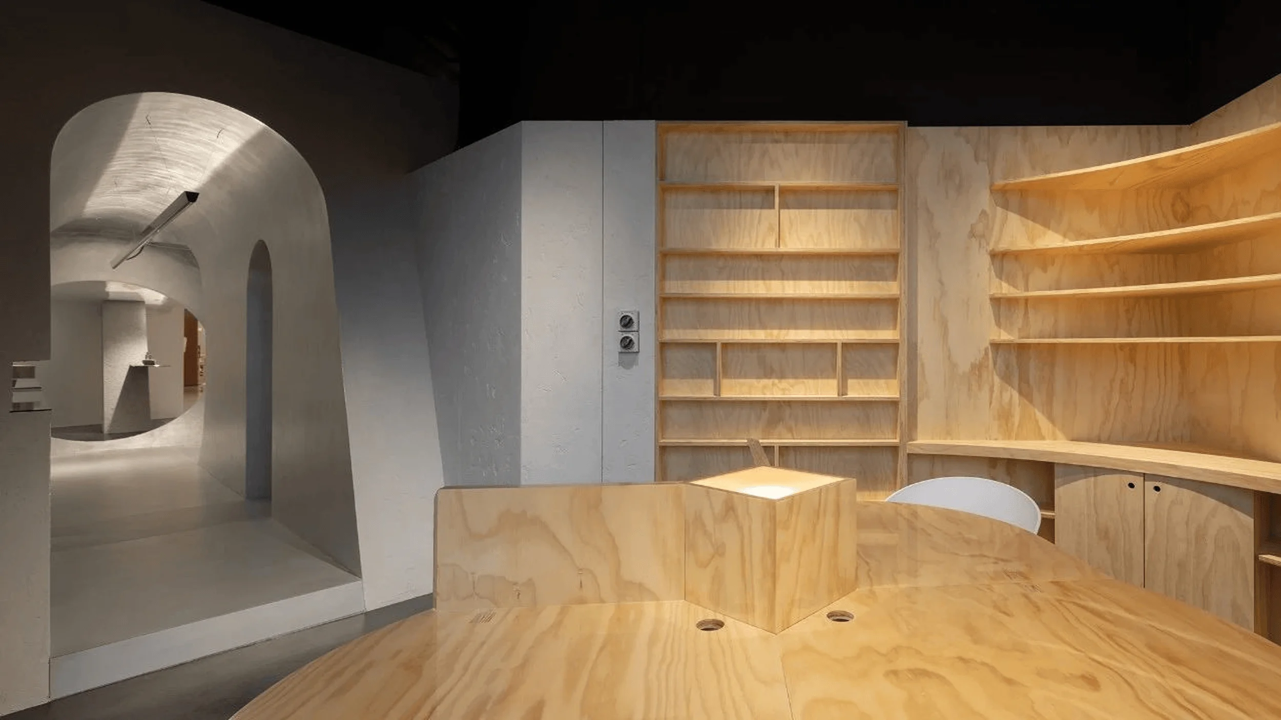
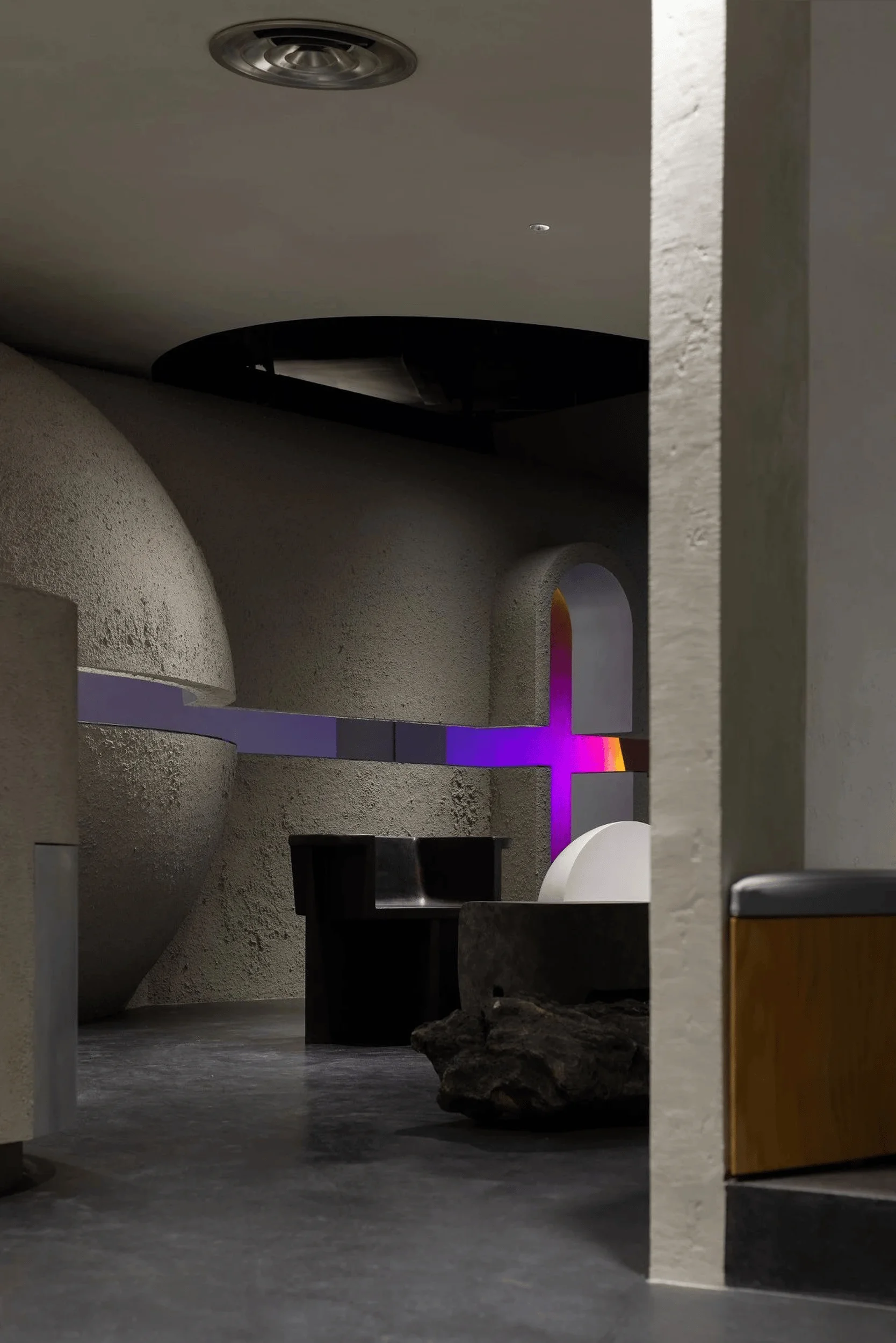
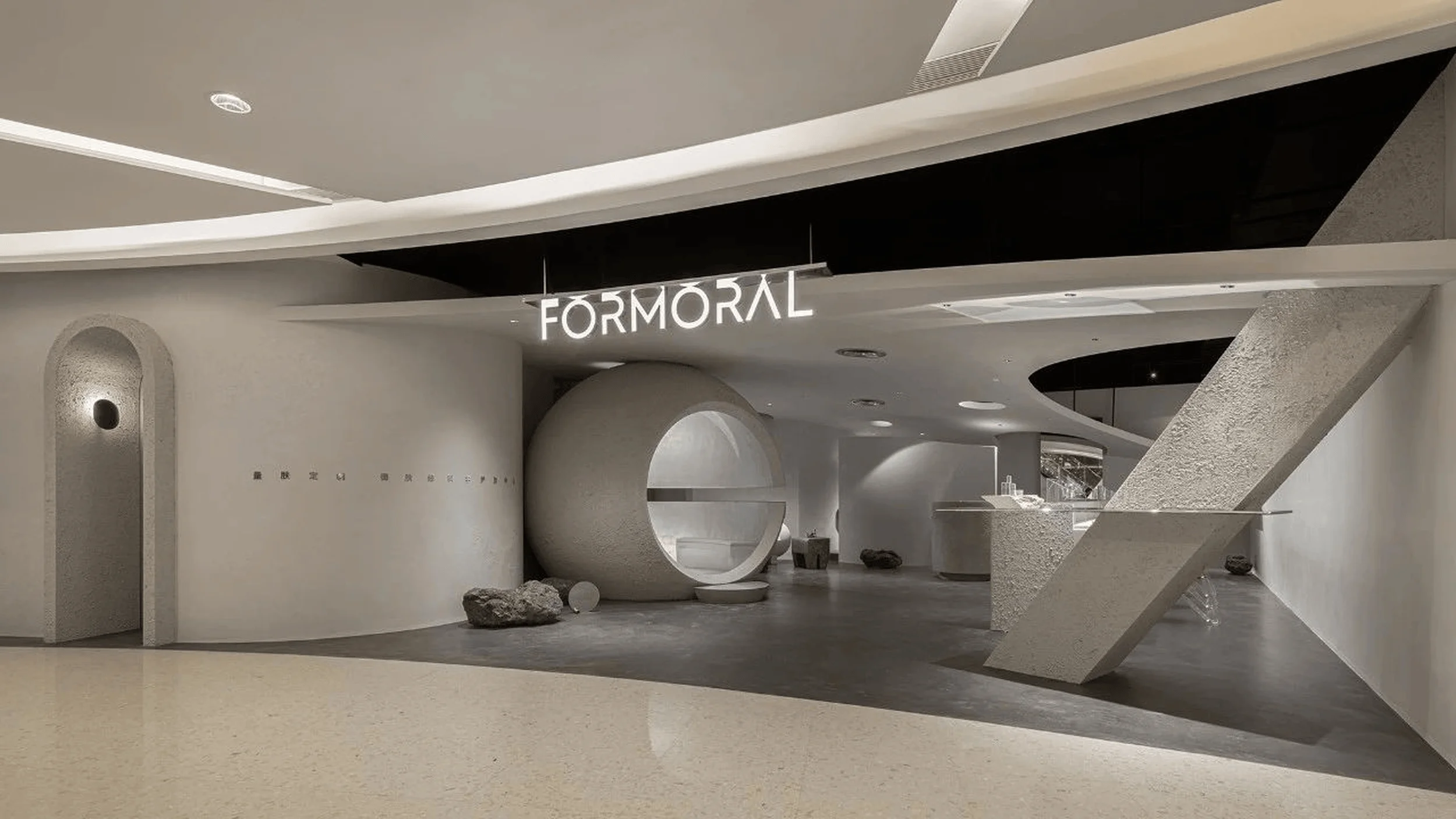
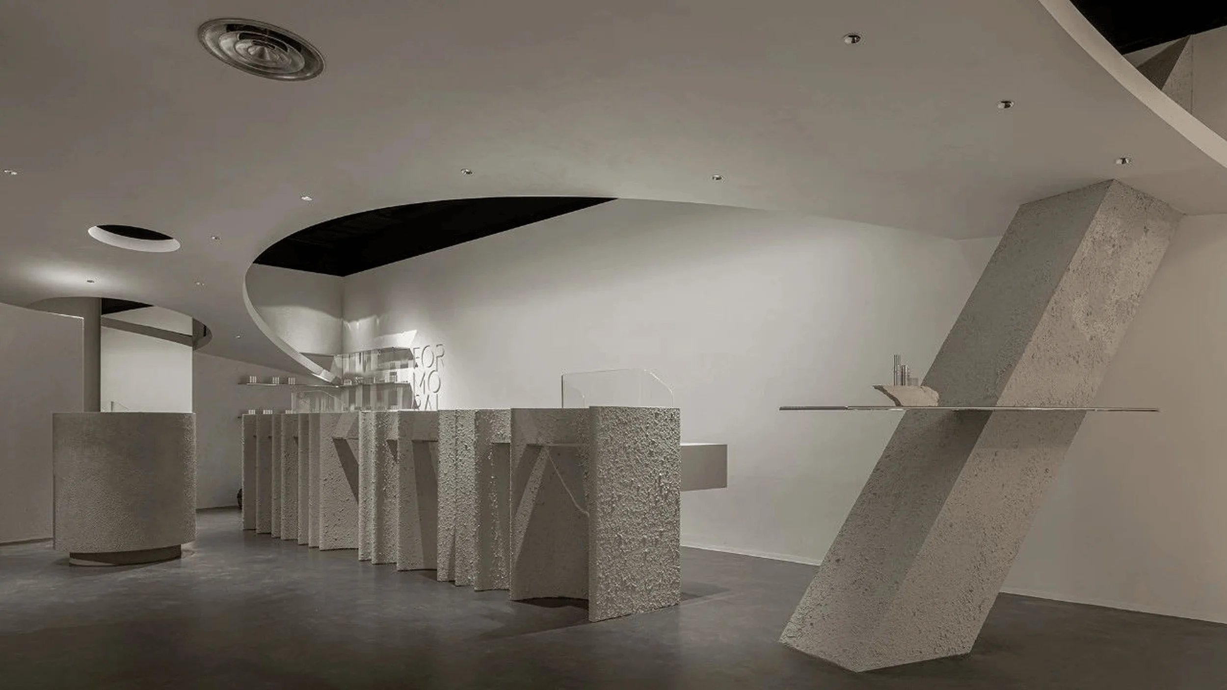
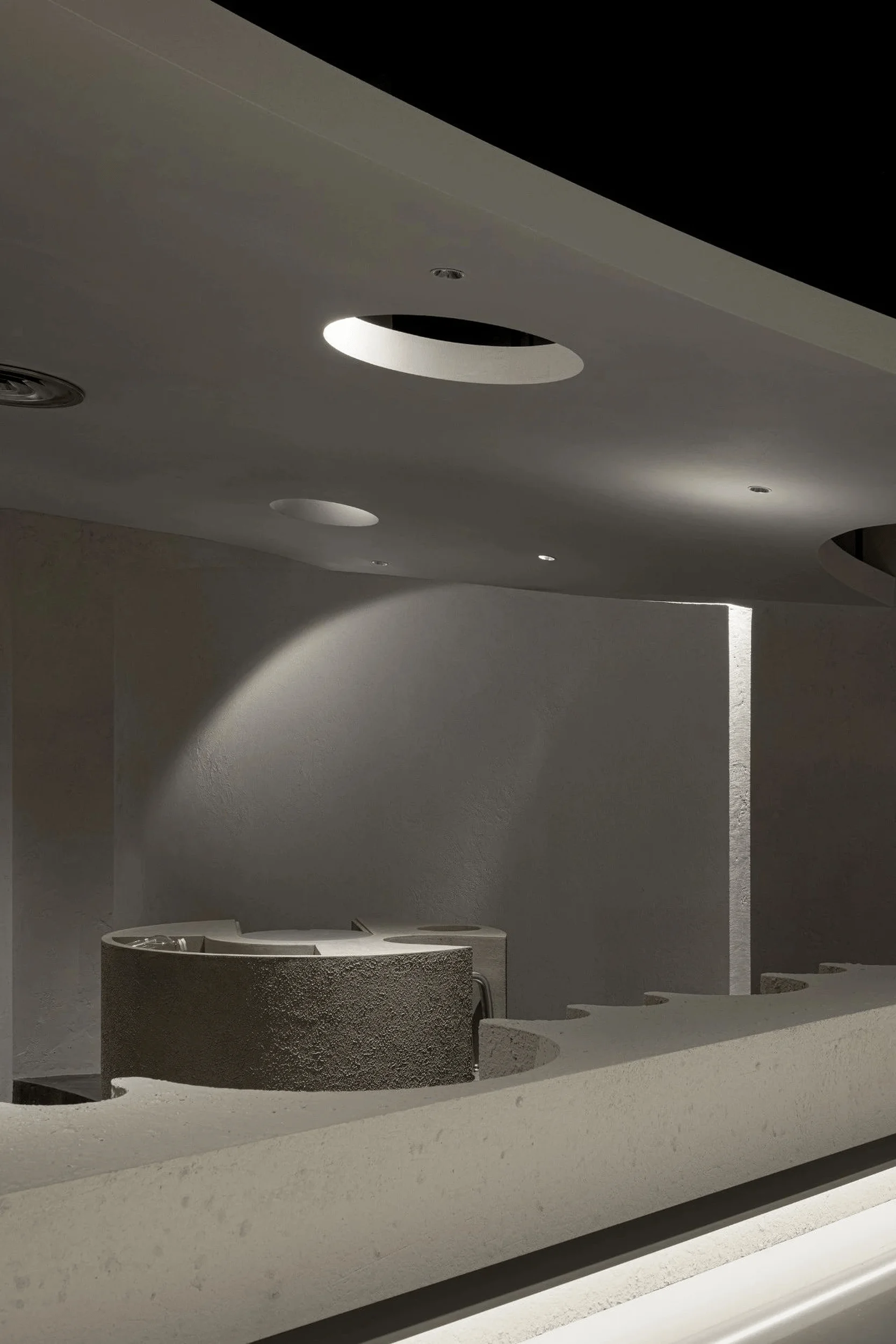
Inspired by the brand’s fusion of nature and technology, the design team embraced the theme of ‘Retro-Futurism’ to create a series of contrasting yet unified spatial scenes. The concept aimed to challenge conventional notions of retail design and explore the deep relationship between nature and the artificial, bioscience, and lifestyle aesthetics. The designers sought to create a space that was both visually striking and emotionally engaging, prompting customers to interact with the brand and its products in new and meaningful ways. The use of gray textural paint on large interior surfaces set a minimalist tone, echoing FORMORAL’s affinity for nature while evoking the image of a ‘desert planet.’ This austere backdrop served to highlight the innovative architectural elements and product displays.
Spatial Strategies and Interactive Designs
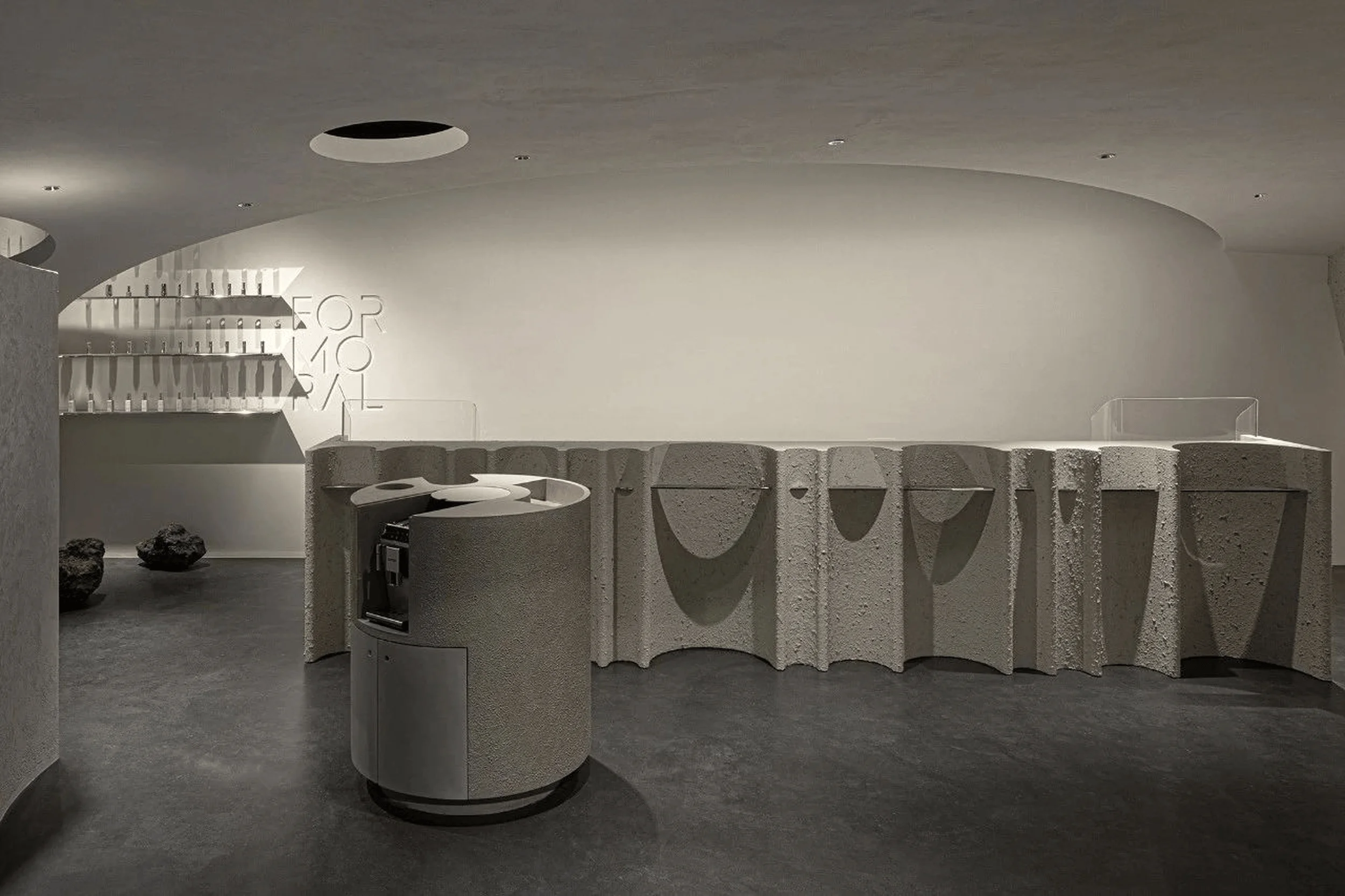
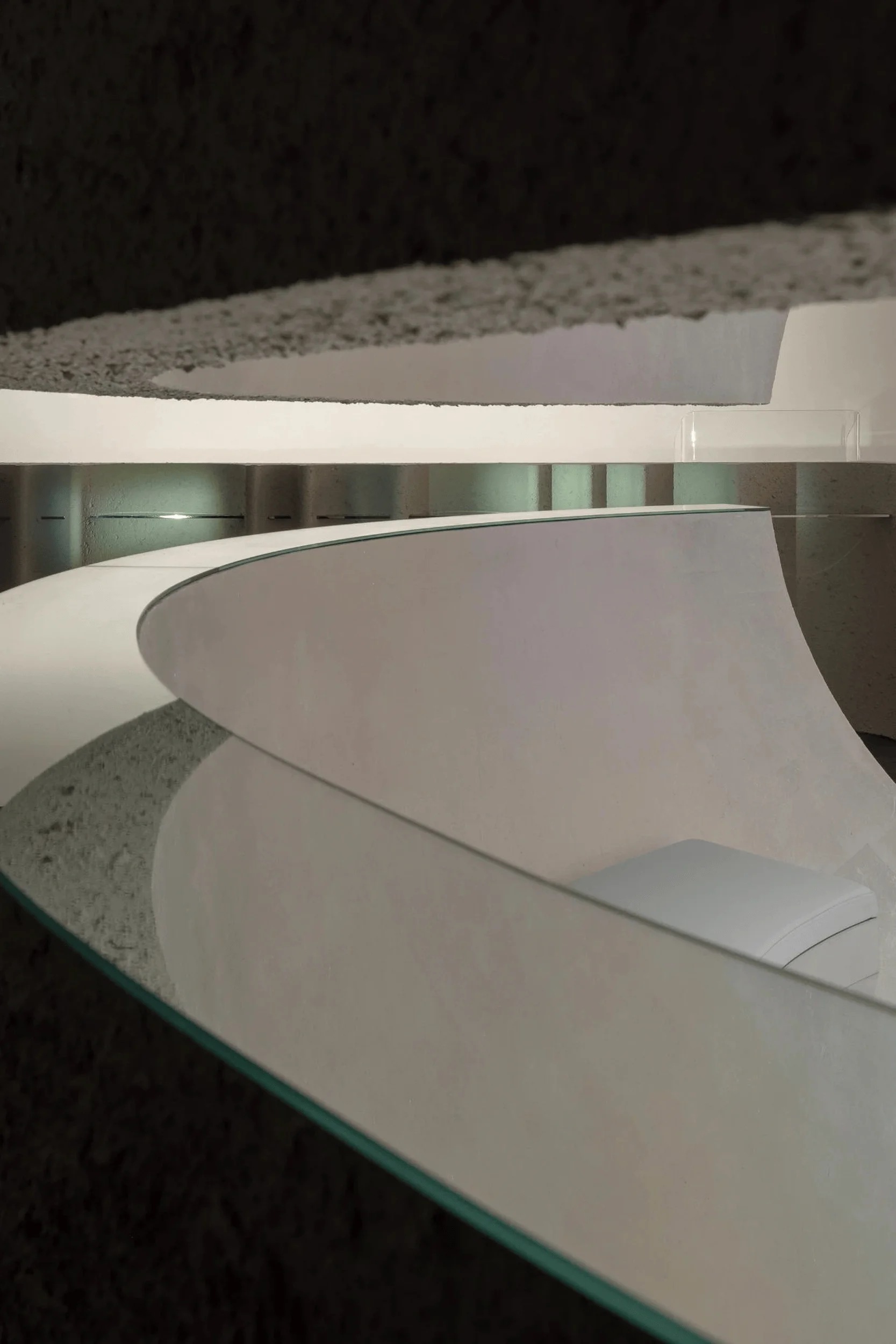
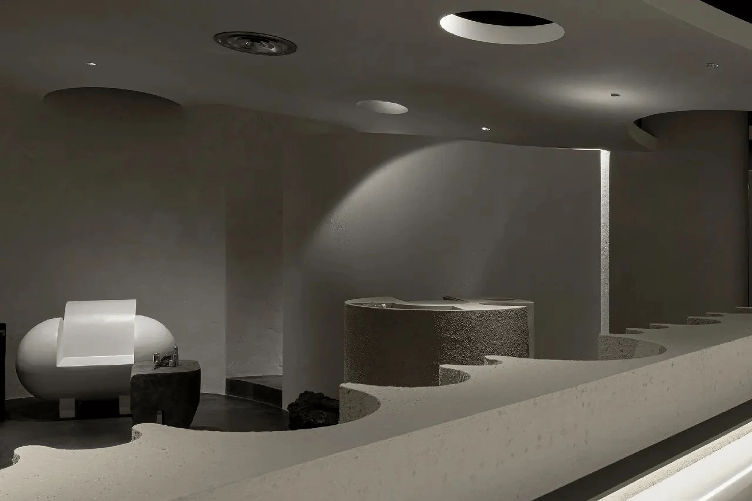
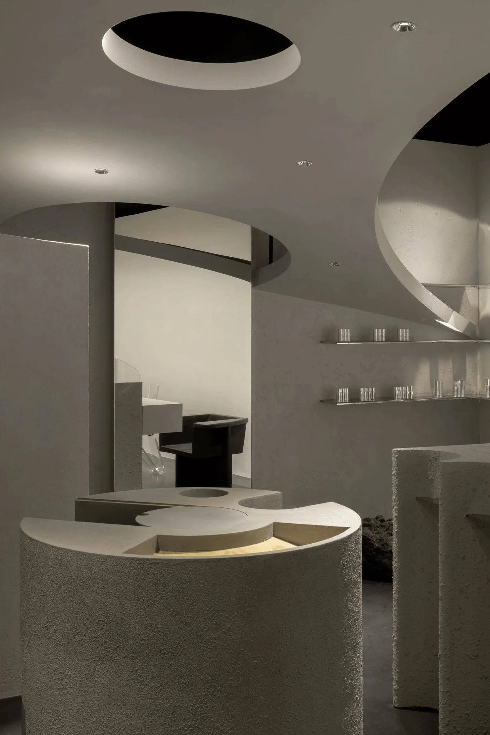
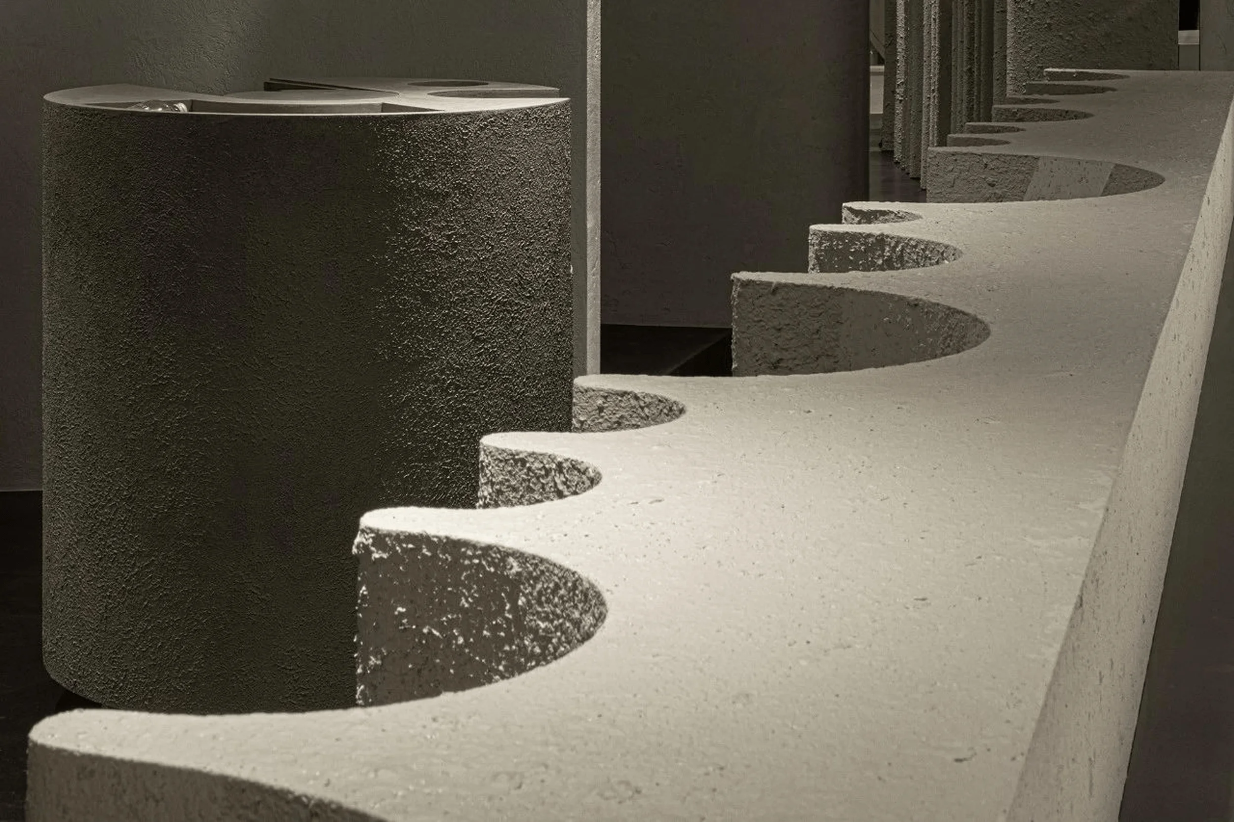
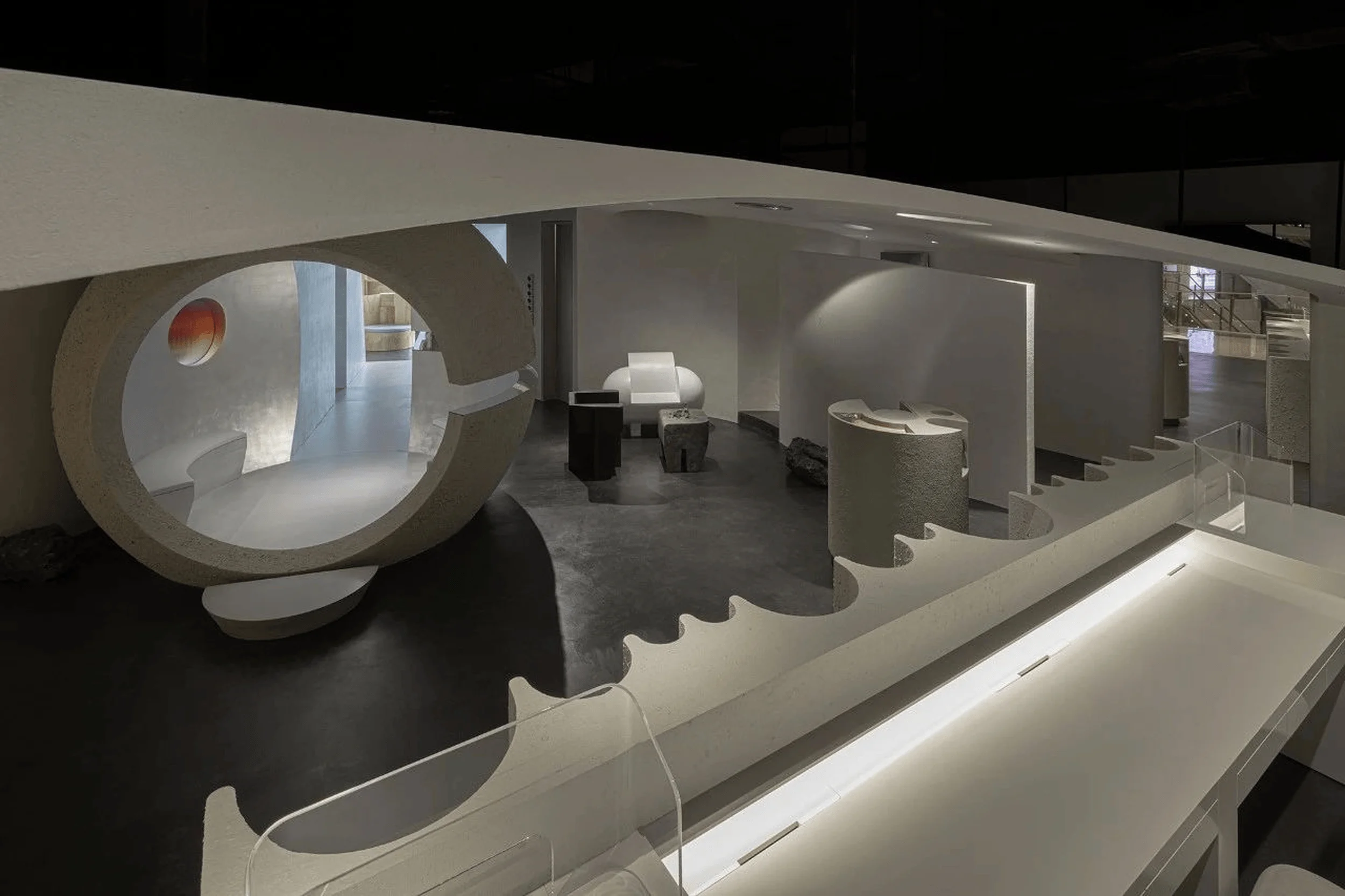
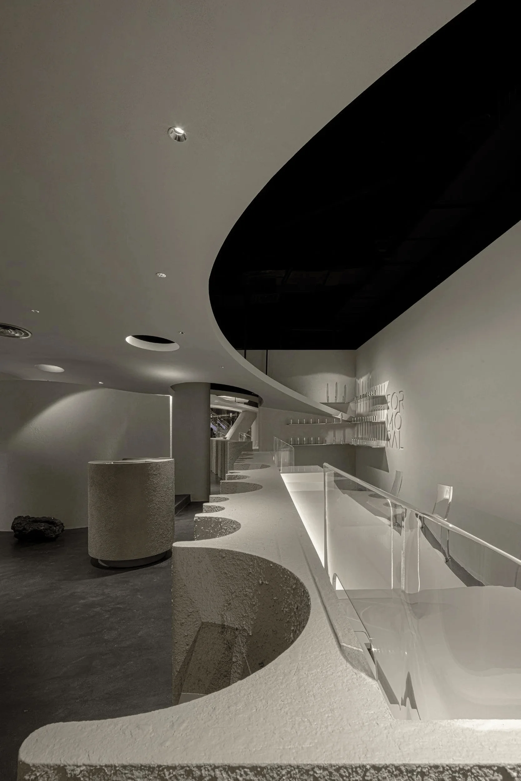
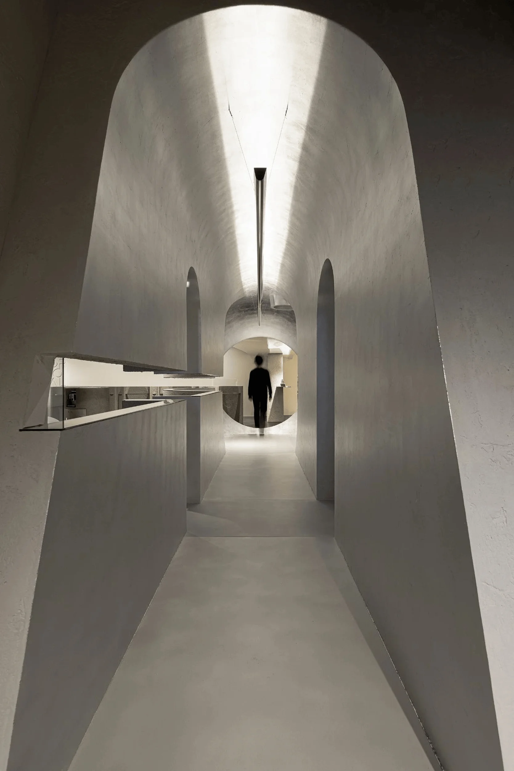
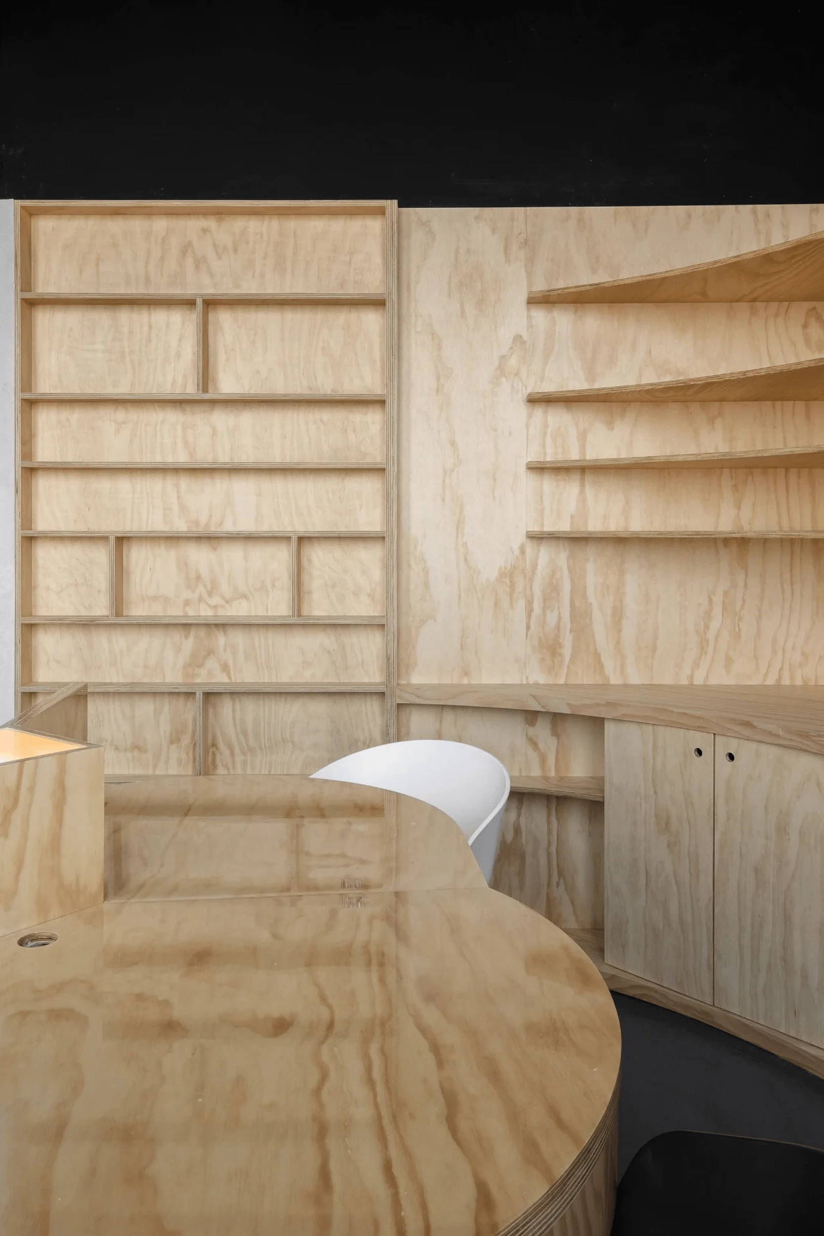
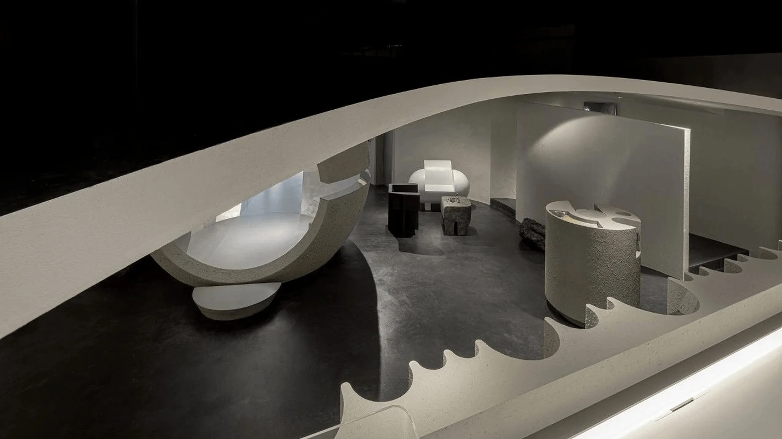
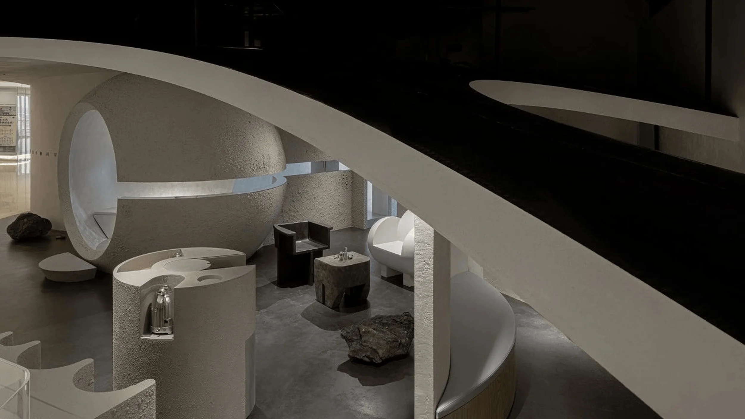
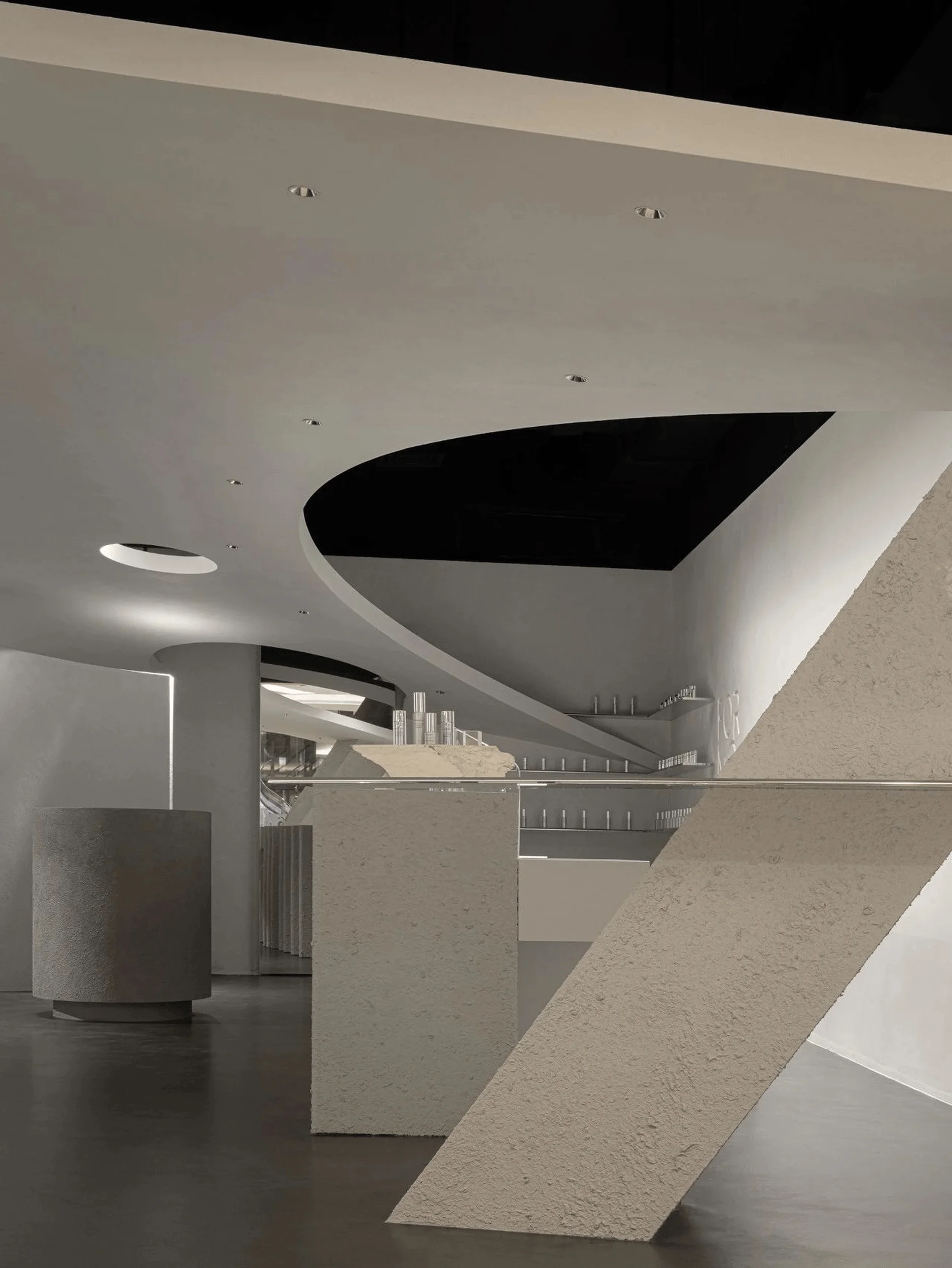
To address the site’s limitations and accommodate the diverse functional requirements, the design team employed innovative spatial strategies and interactive design elements. Arcs, a recurring motif throughout the store, were used in four different forms and scales, all derived from tangent circles. Curves with radii under 600 mm were applied to furniture, while arcs with radii between 1500 mm and 1800 mm were integrated into the massive sphere and walls. Openings in the ceiling were predominantly defined by arcs with a 6000 mm radius. These arcs served to guide the flow of movement, create visual interest, and define distinct zones within the store.
Key Architectural Features and Circulation
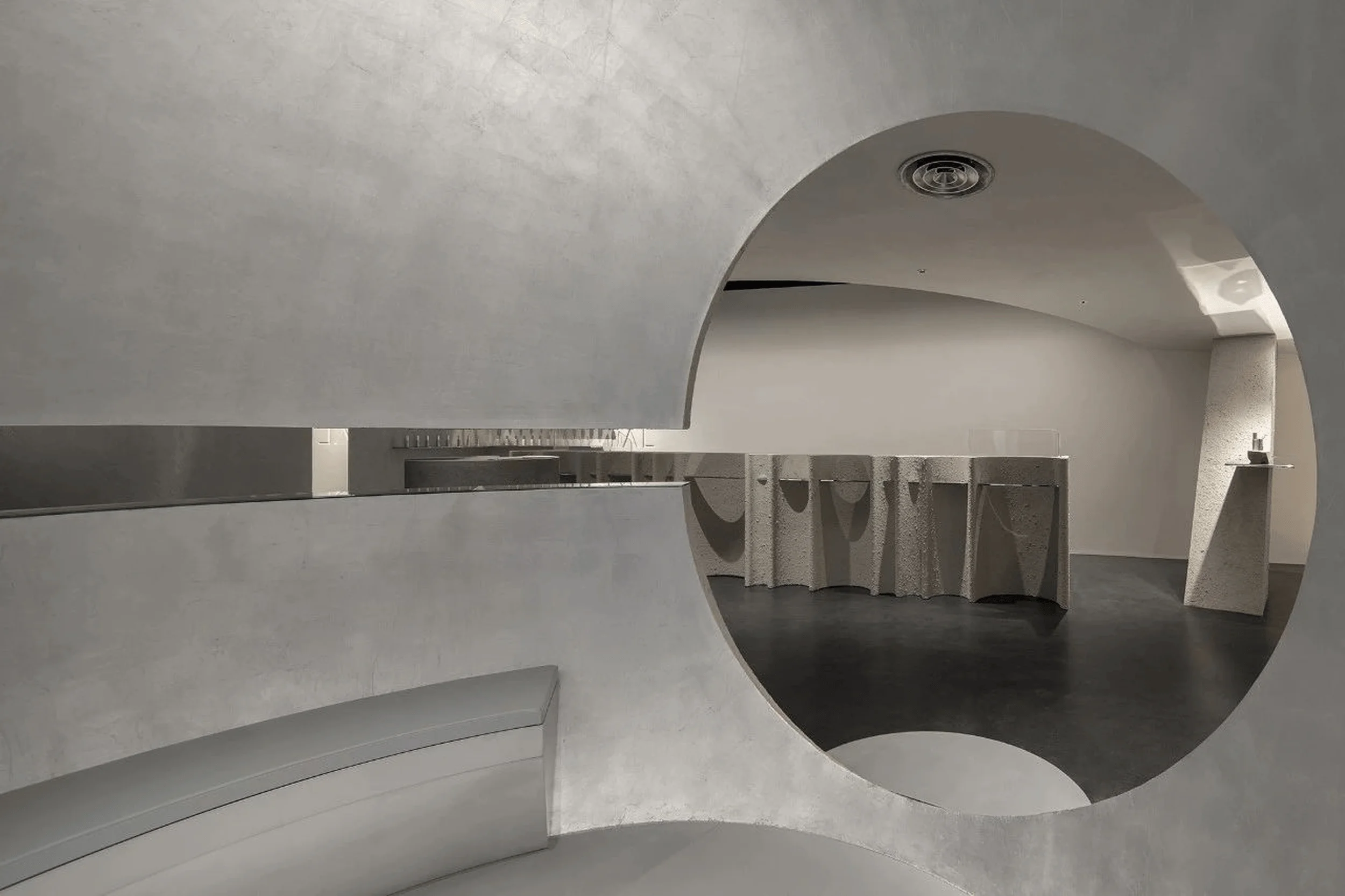
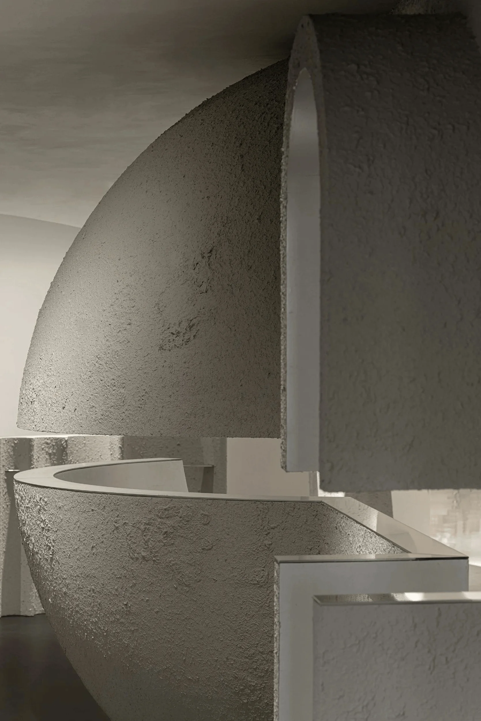
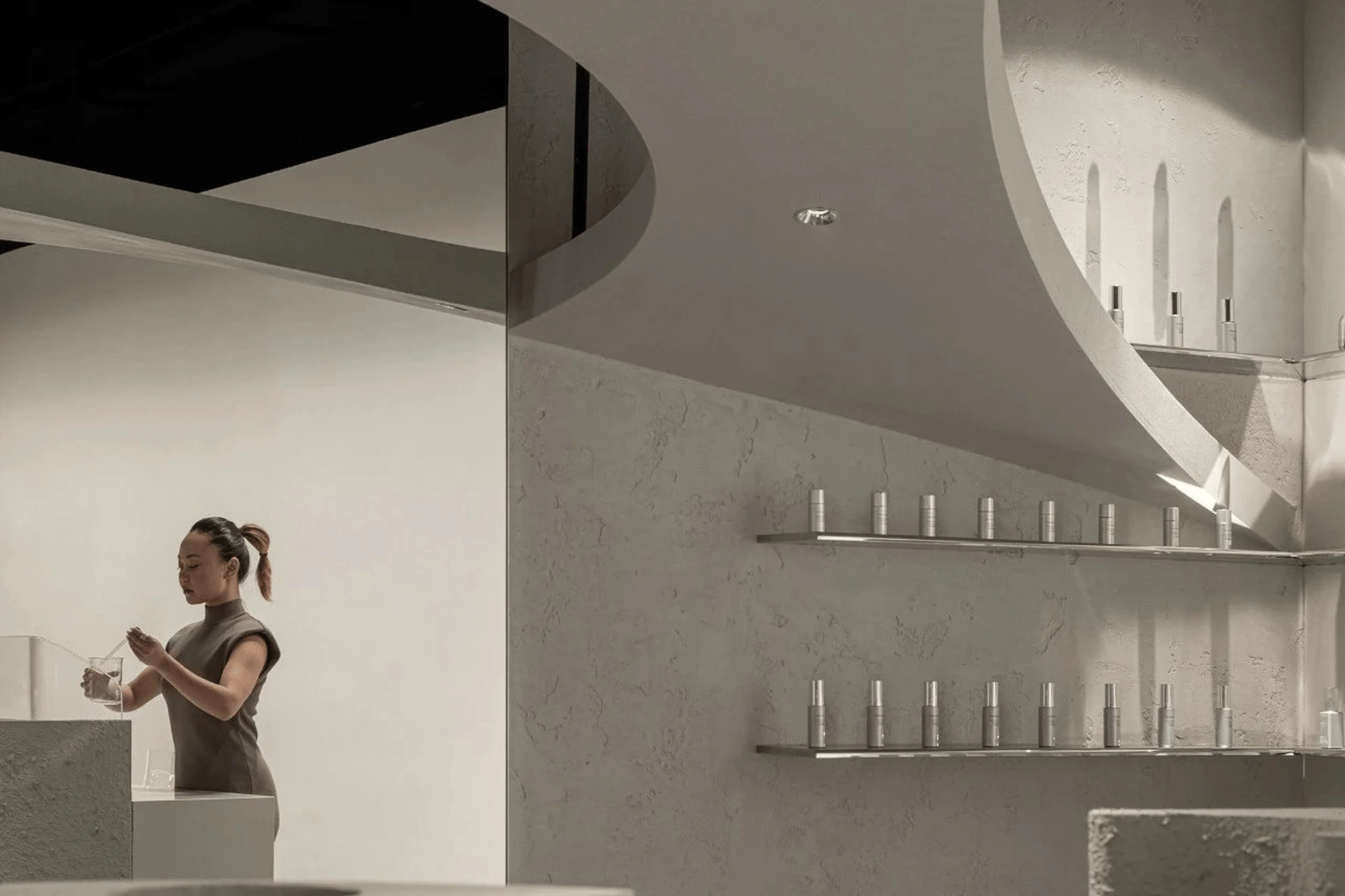
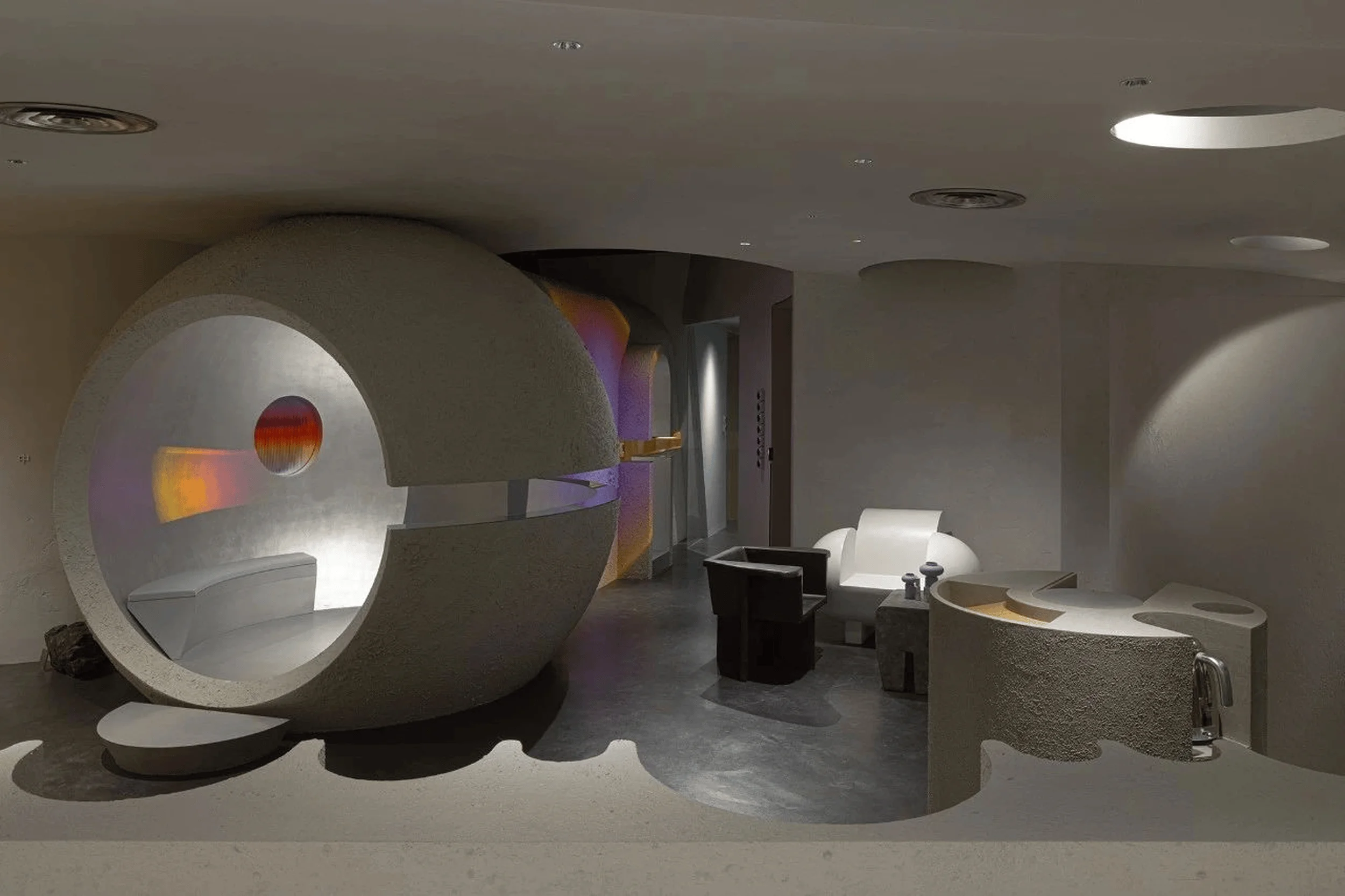
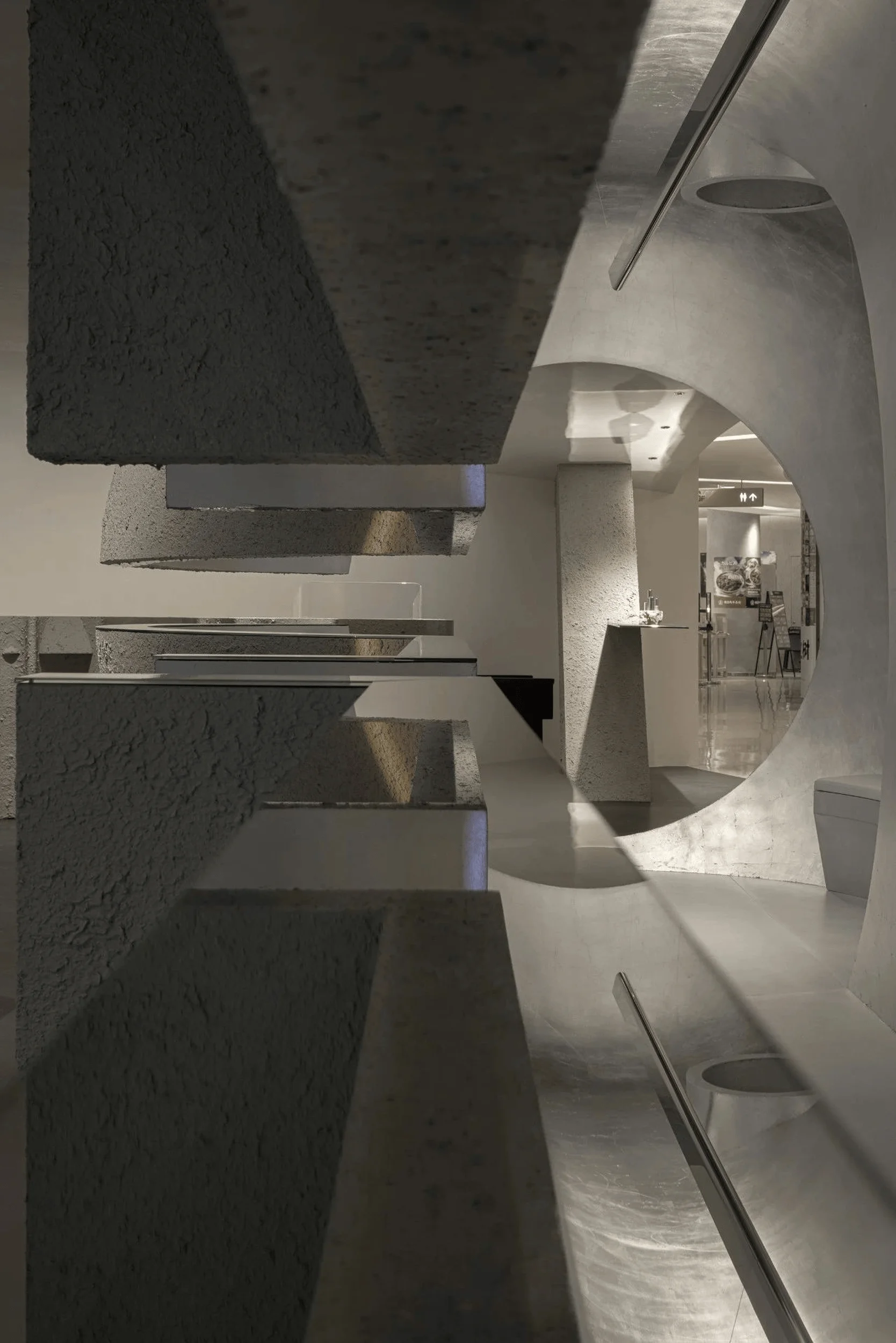
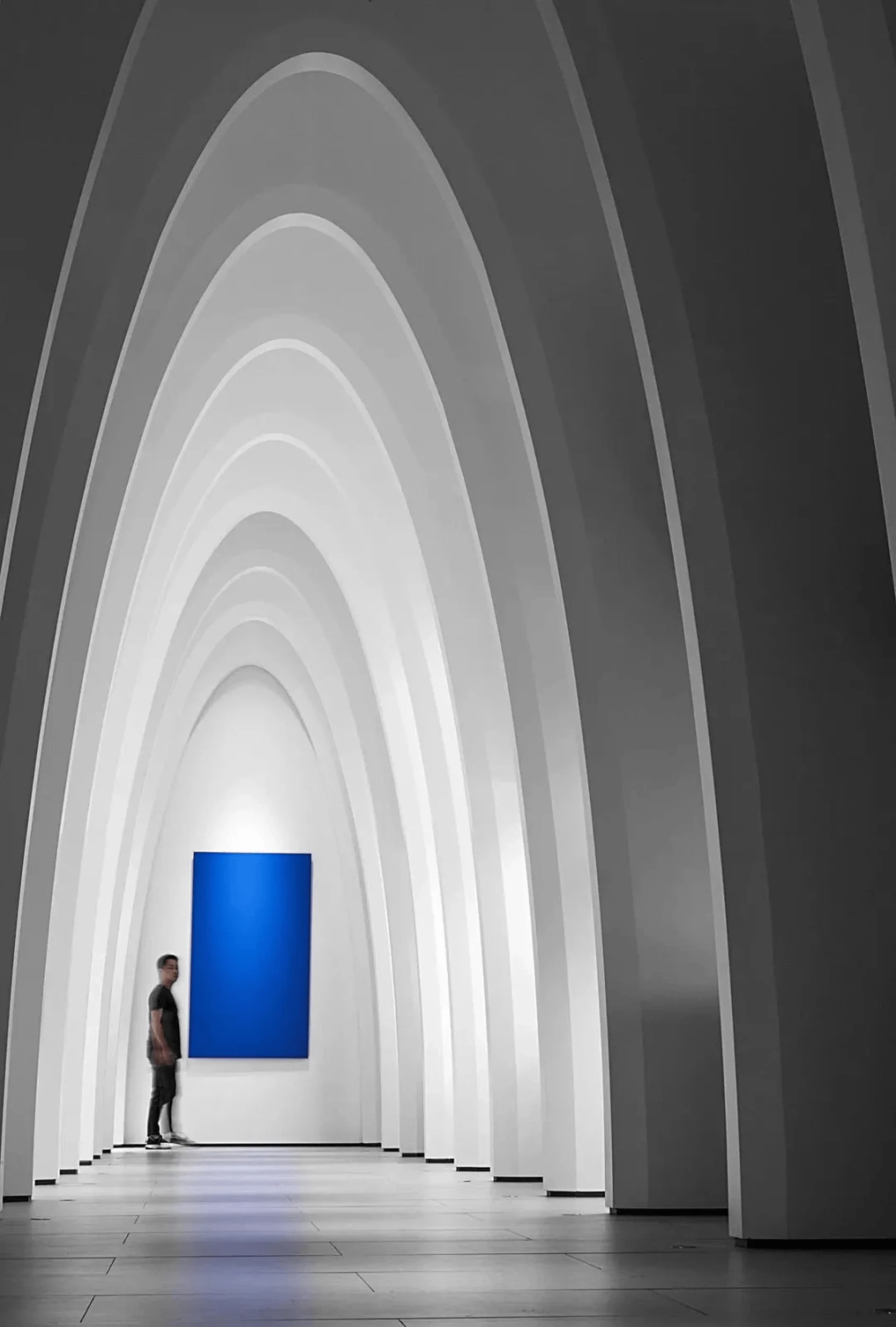
A central feature of the store is a rising ‘planet’ – a massive sphere clad in matte silver foil and aluminum plates. This sphere, along with a futuristic tunnel and two cabin doors, connects the eight functional areas and helps to delineate public and private realms. To encourage exploration, a 200 mm wide gap at a height of 1.25 meters was carved out between the sphere and the tunnel, allowing customers to peek through and stimulating their curiosity. The open, curved ceiling, reaching a maximum height of 2.75 meters and overlapping with the central sphere, adds a dynamic element to the space while avoiding a sense of confinement. A large, arc-shaped opening above the reception desk further enhances the sense of openness and connects the reception area to the public realm.
Materials and Finishes
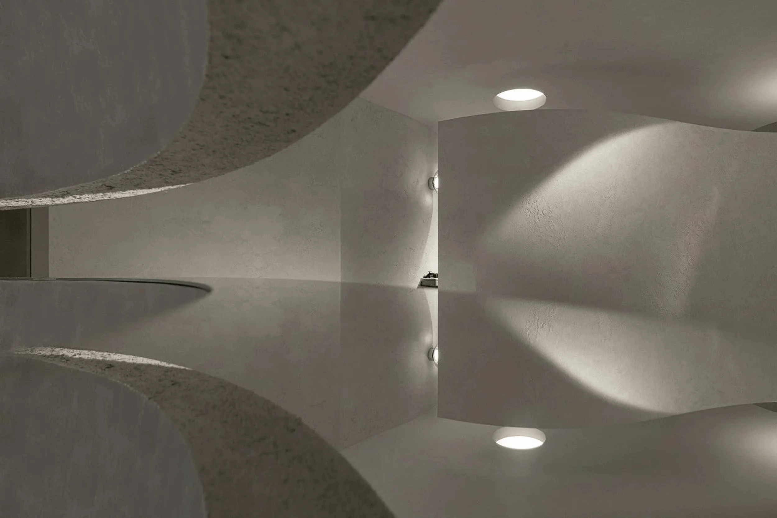
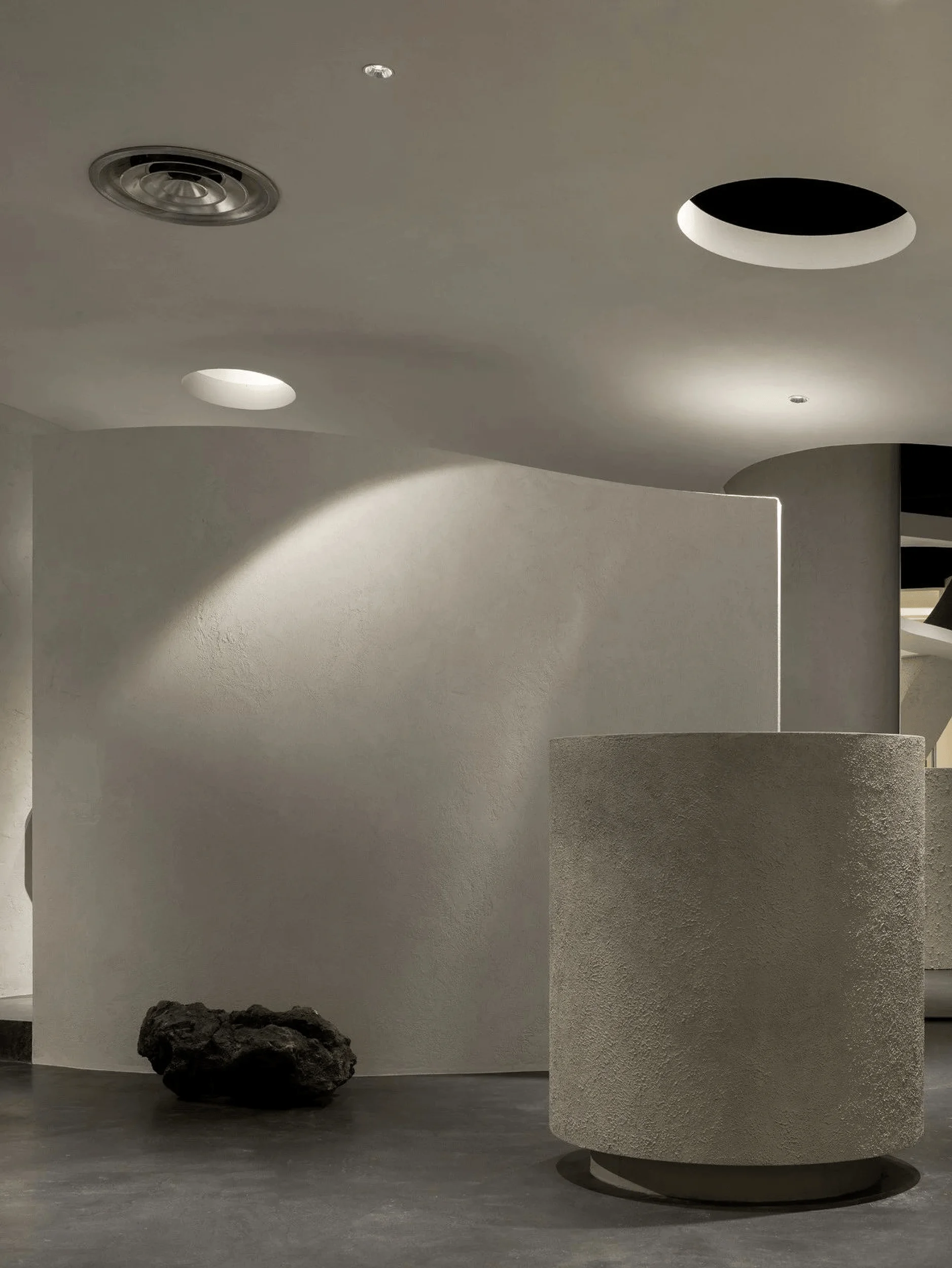
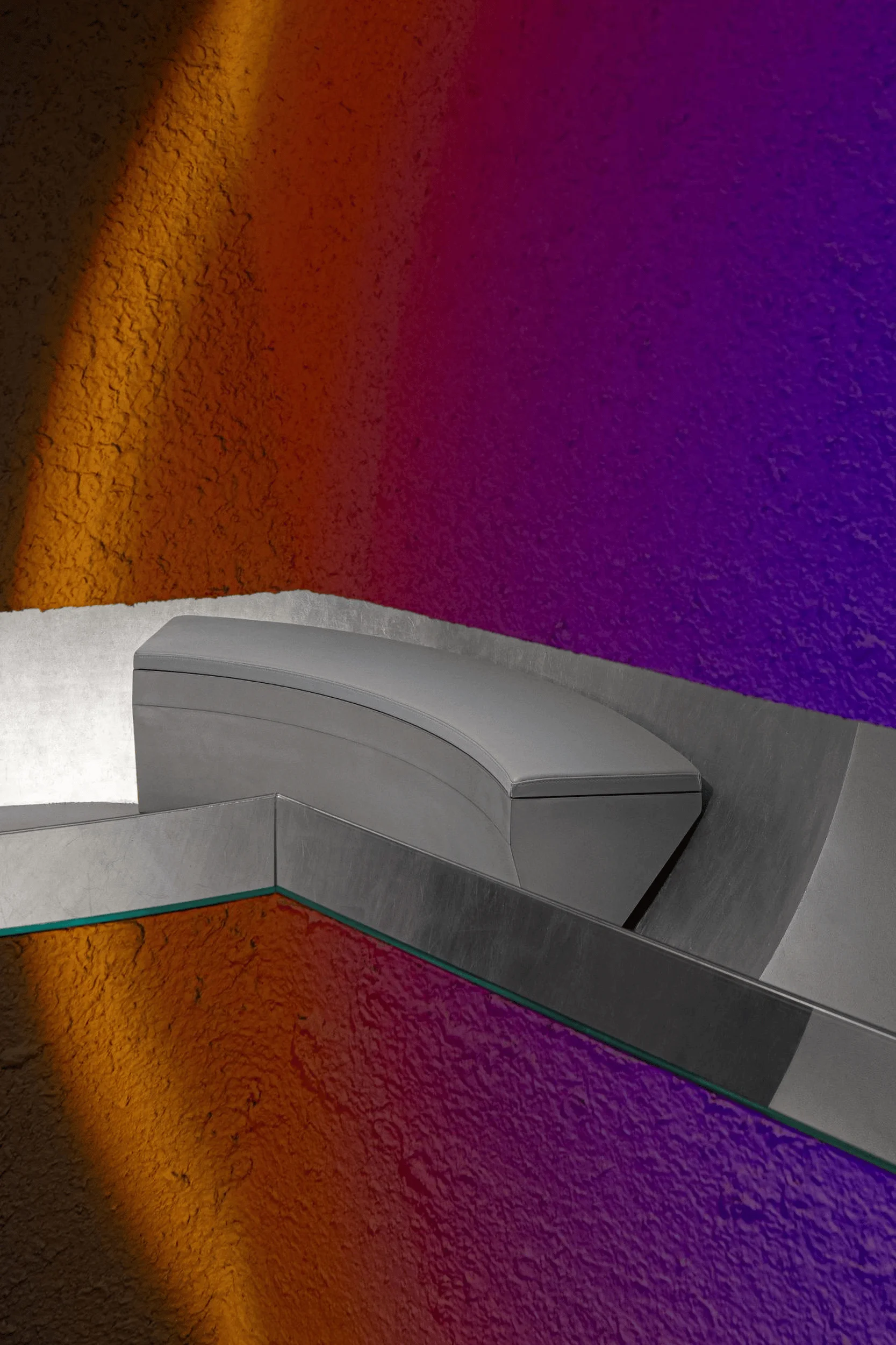
The selection of materials and finishes played a crucial role in realizing the design concept. Gray textural paint, applied in an unconventional manner to large interior surfaces, set the overall tone of the space. This minimalist approach not only echoed FORMORAL’s connection to nature but also helped to highlight the more striking architectural elements, such as the silver-clad sphere and the curved ceiling. The use of mirrored materials in strategic locations, such as the gap between the sphere and the tunnel, added depth and intrigue to the space, encouraging customers to pause and reflect.
Lighting Design
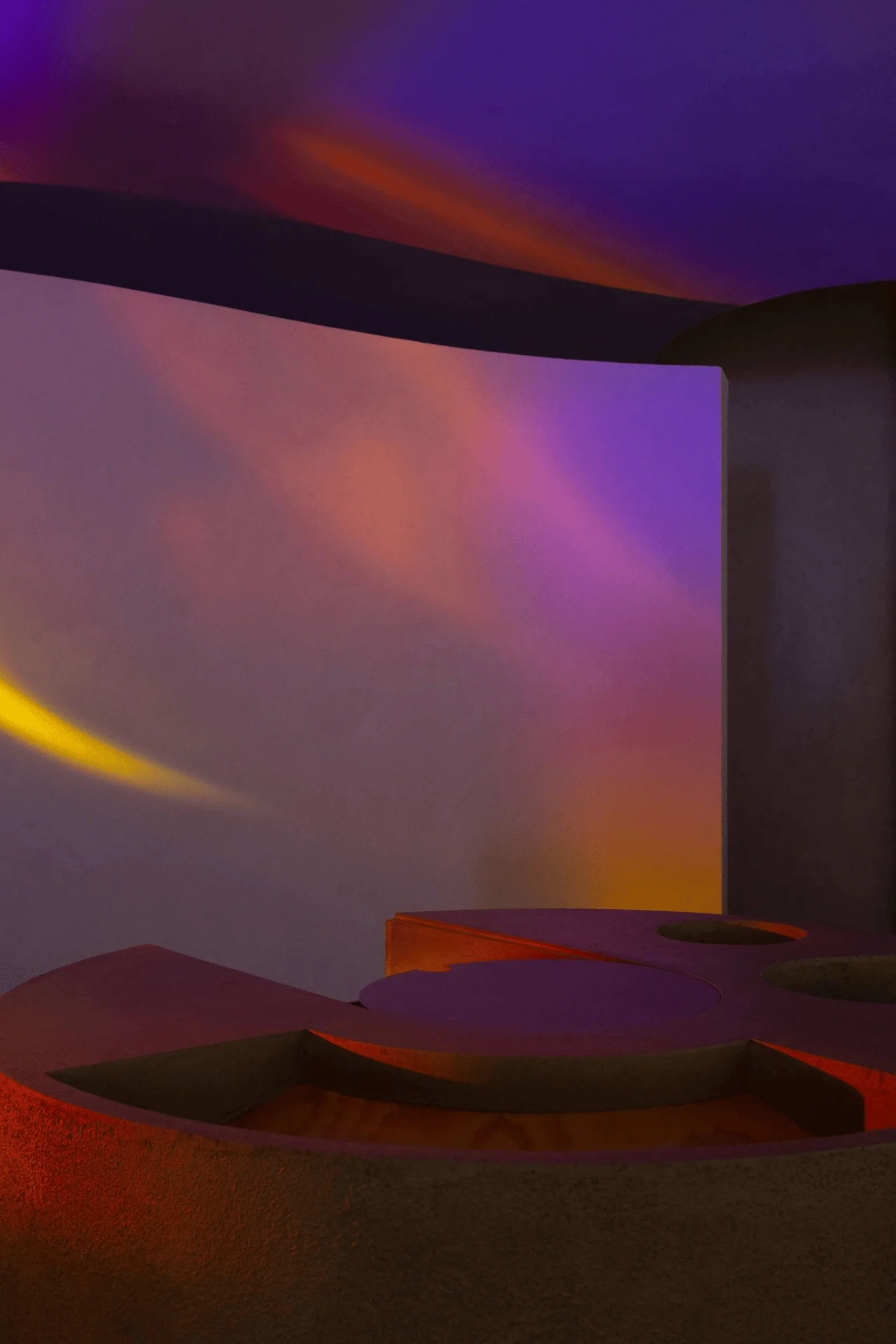
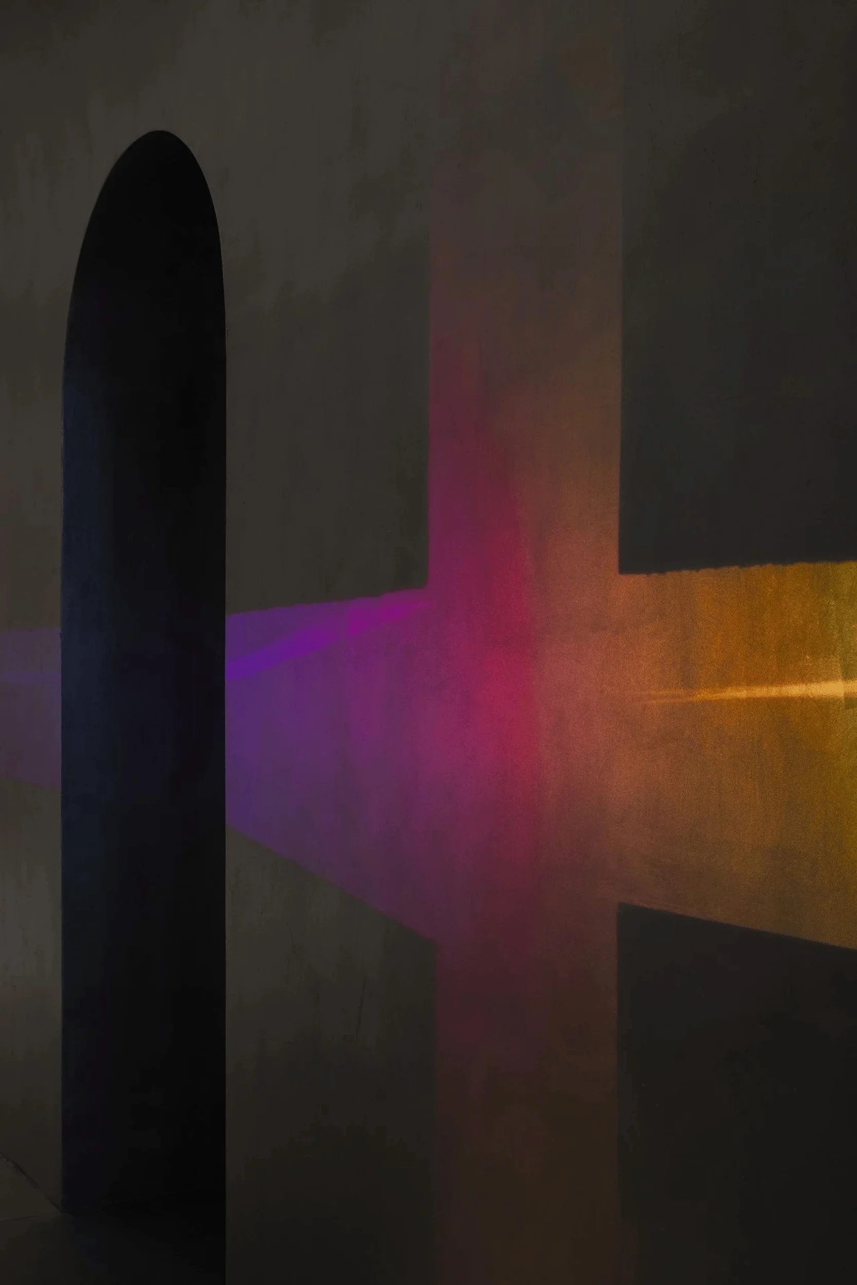
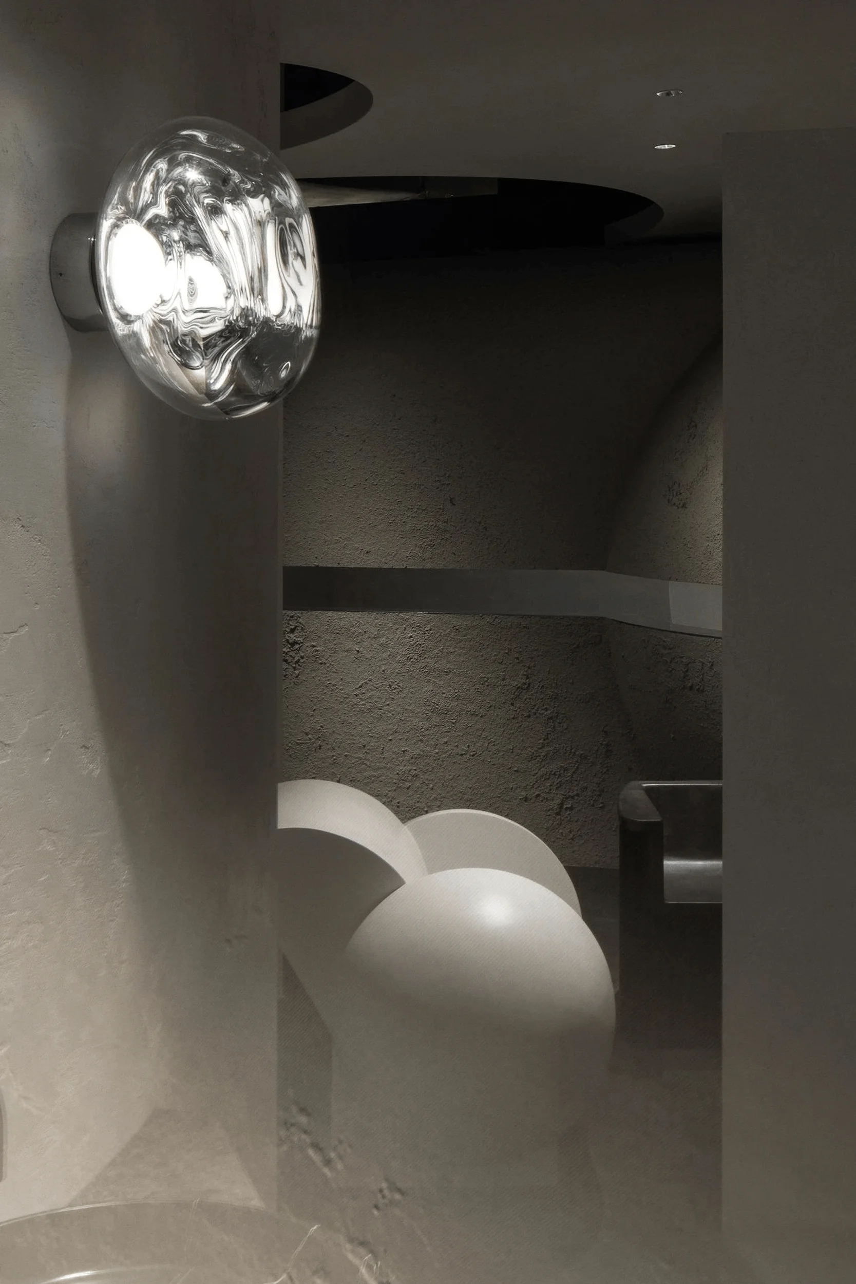
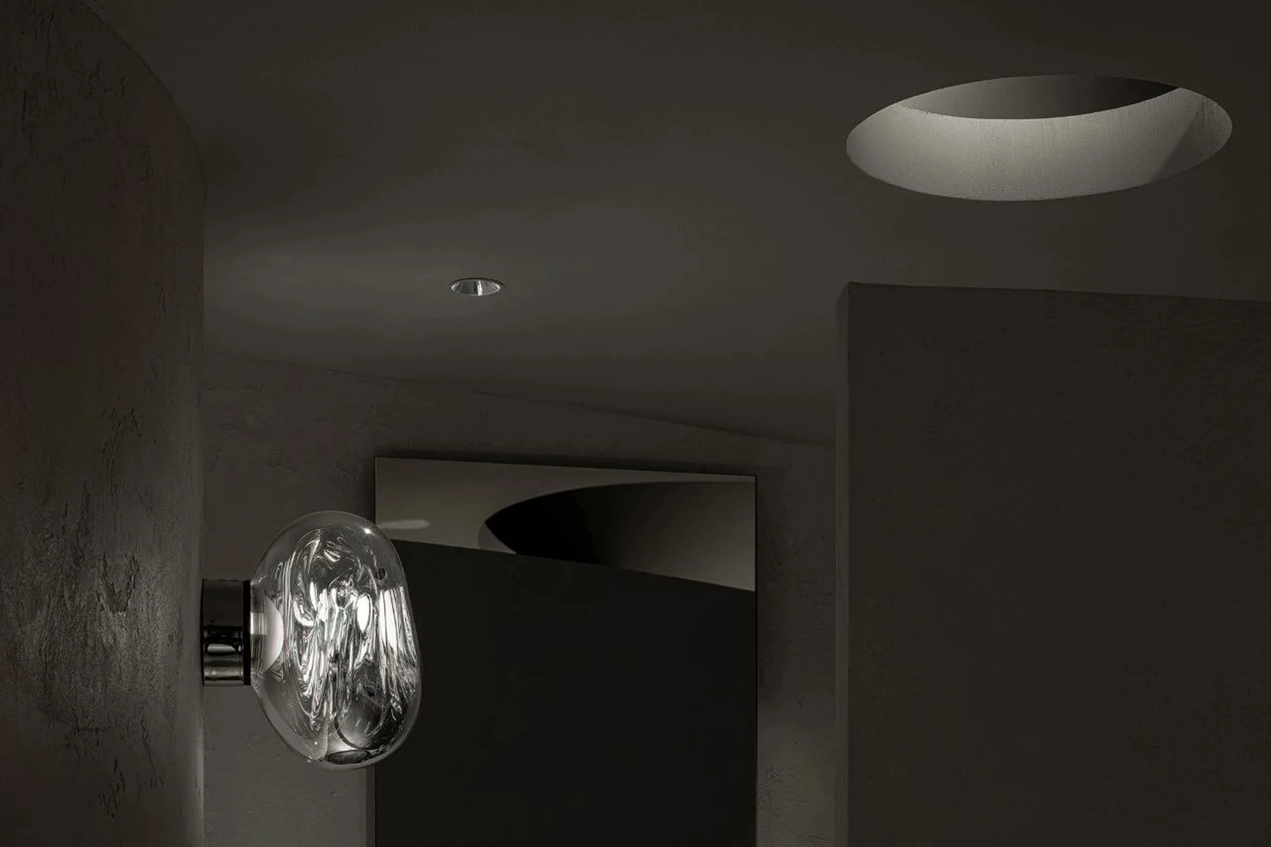
The lighting design was carefully considered to enhance the spatial experience and highlight key features. Recessed lighting in the ceiling provided general illumination, while strategically placed spotlights drew attention to product displays and architectural details. The use of indirect lighting, such as the illumination within the tunnel, created a sense of depth and mystery. The interplay of light and shadow further emphasized the textural qualities of the materials and contributed to the overall ambiance of the store.
Project Information:
Project Type: Commercial Interiors Design
Architect: lialawlab
Area: 120 m2
Project Year: 2022
Country: China
Photographer: 利落建造


