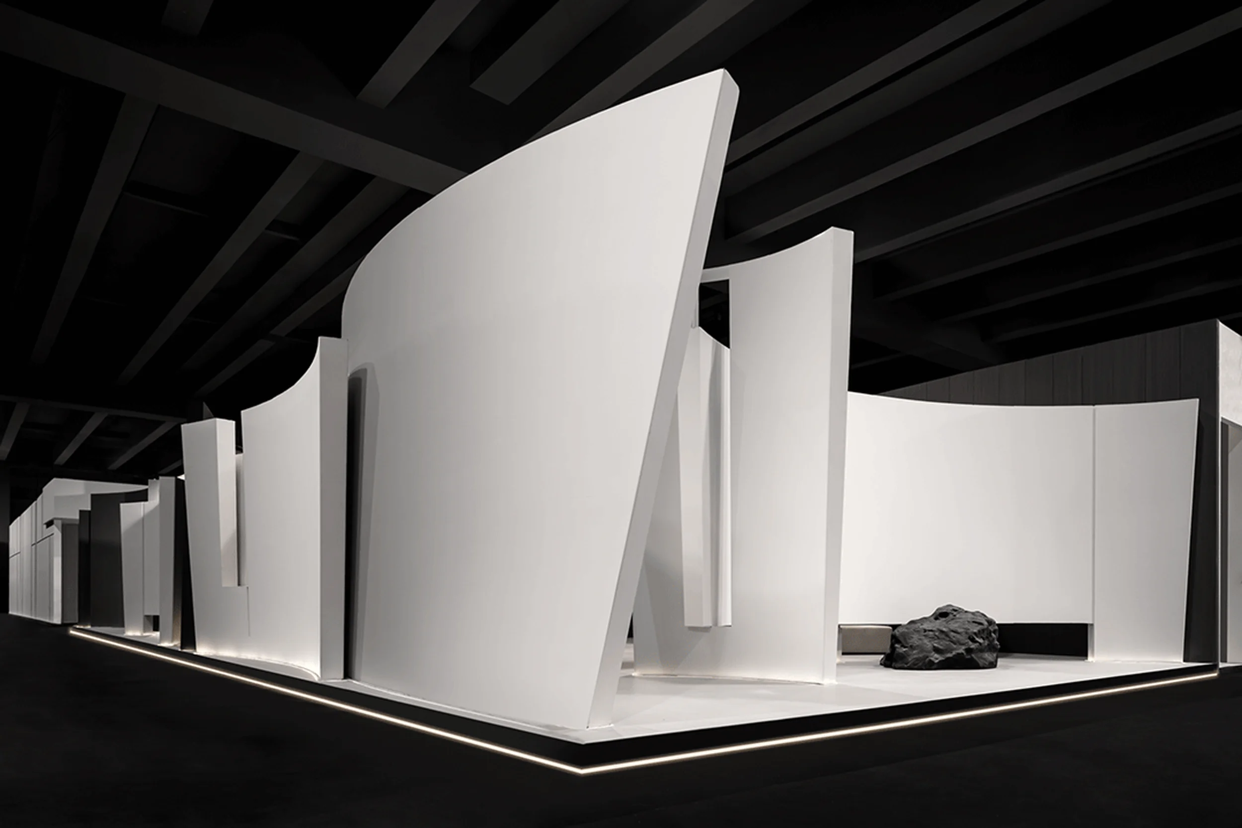
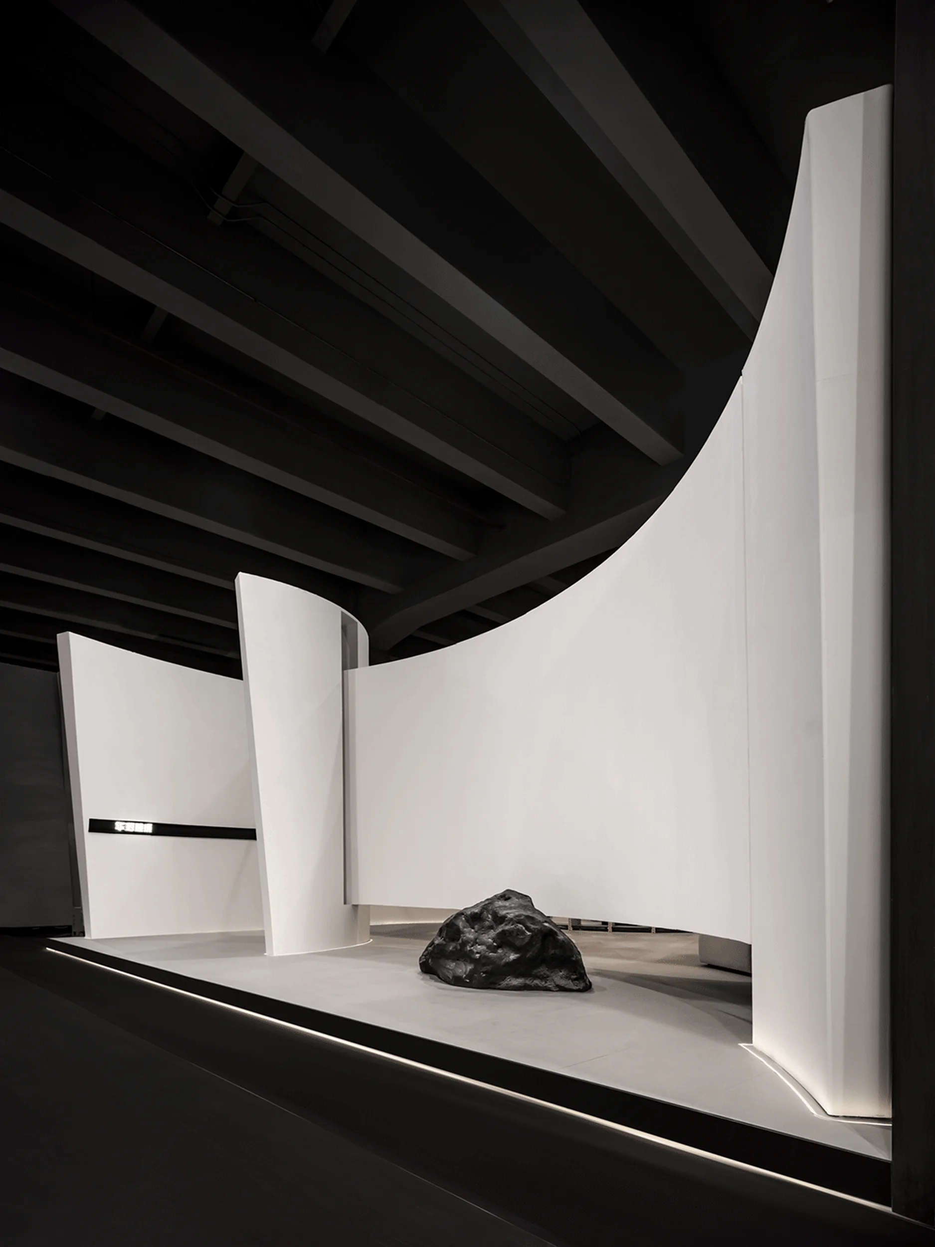
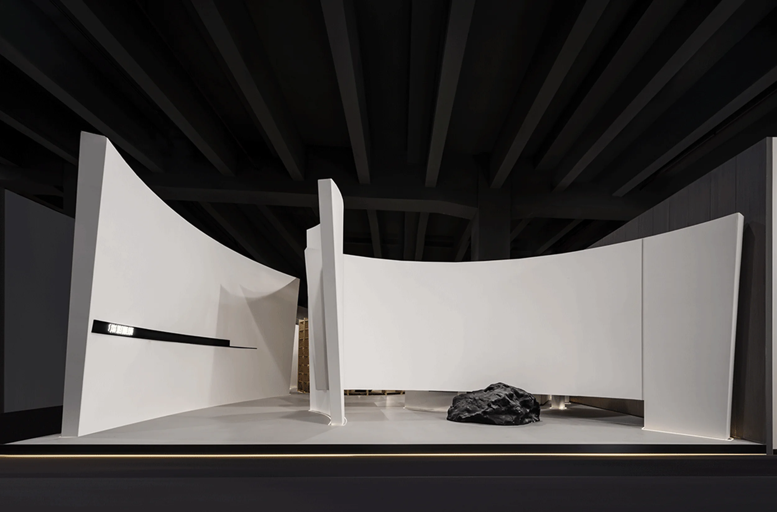
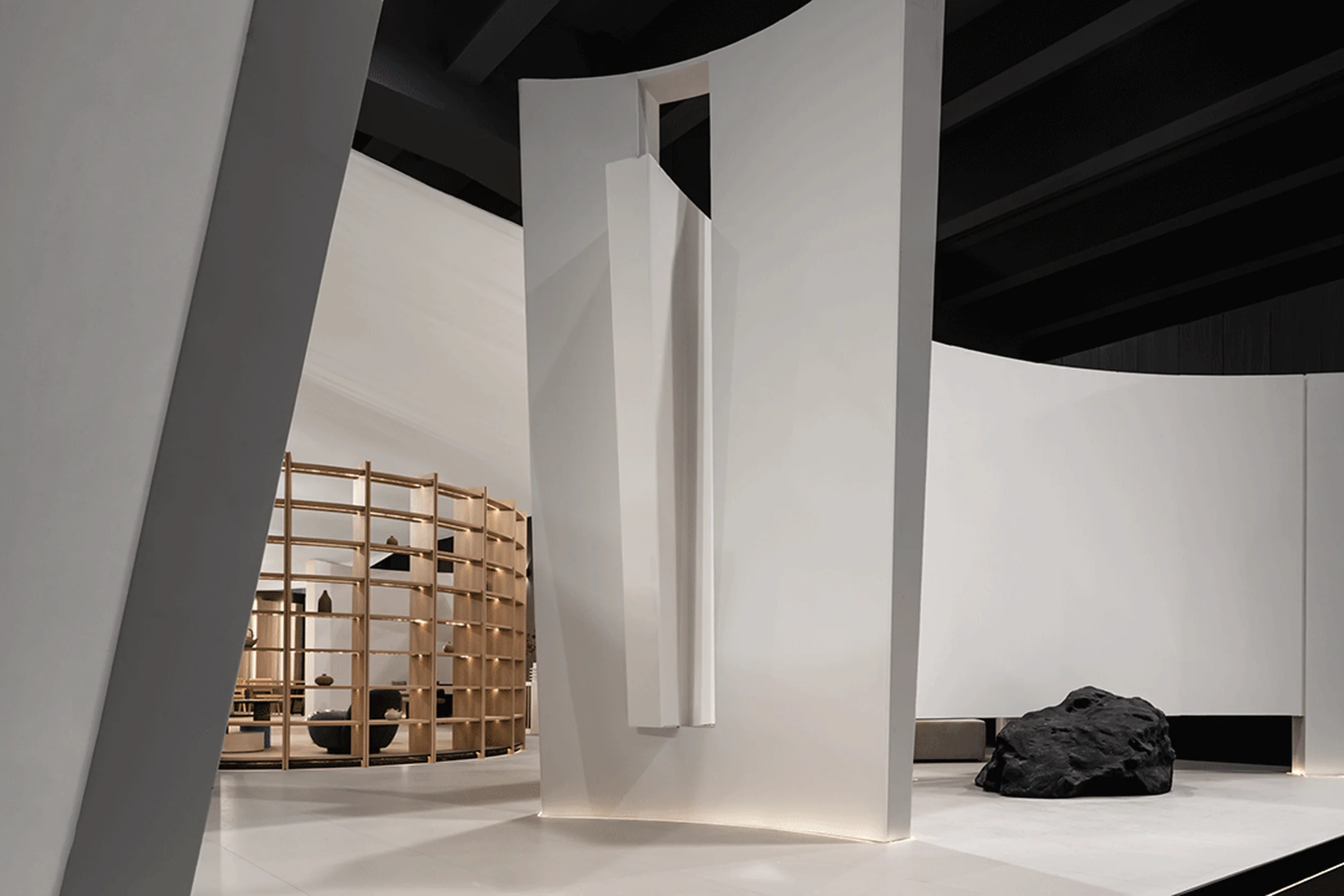
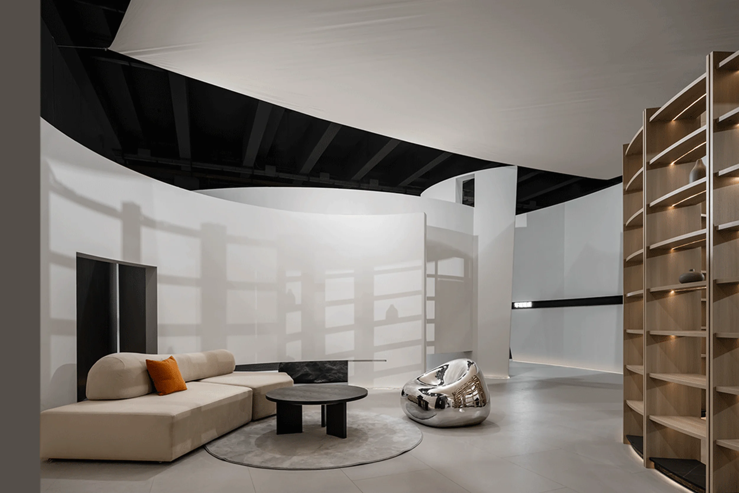
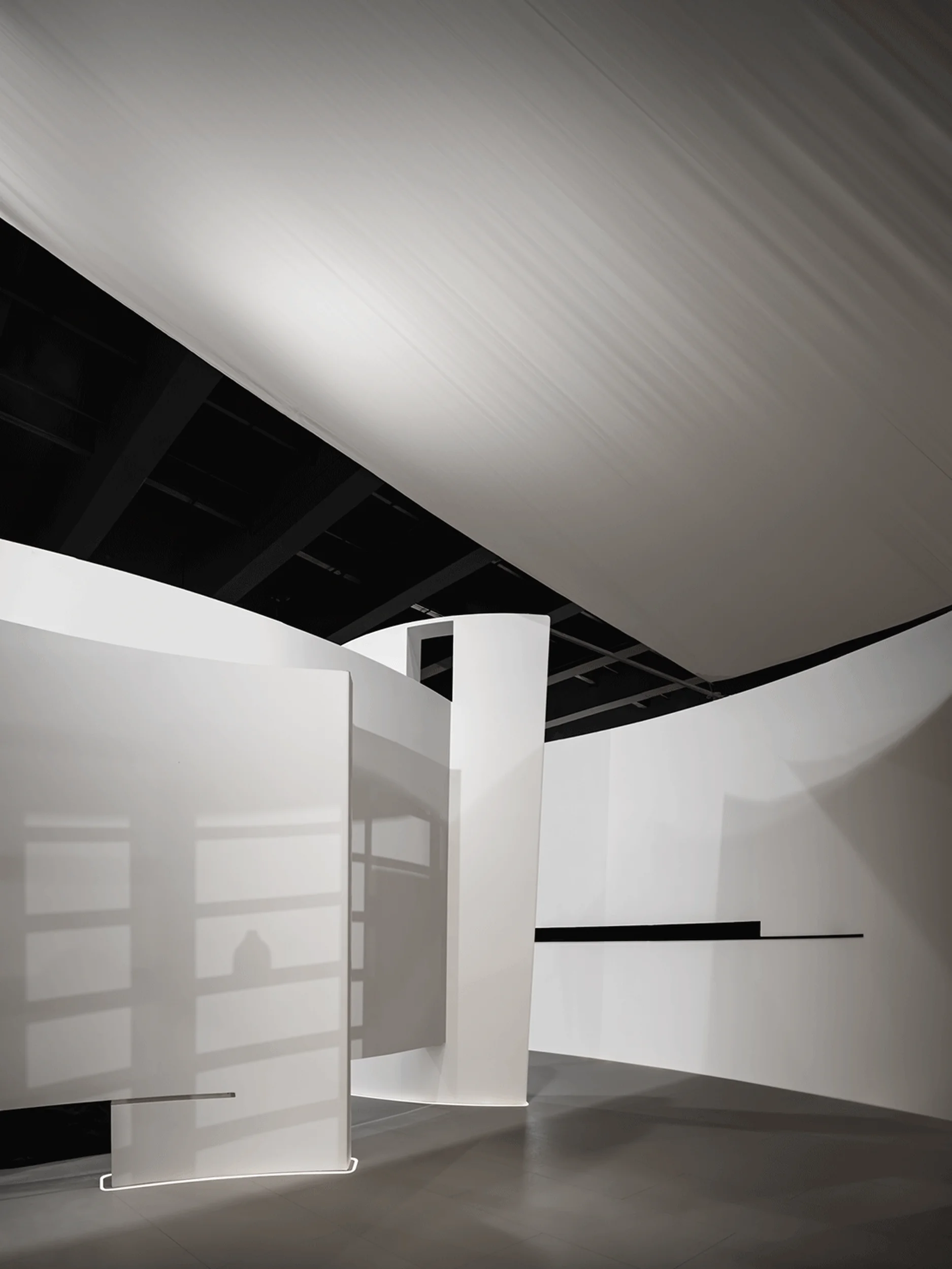
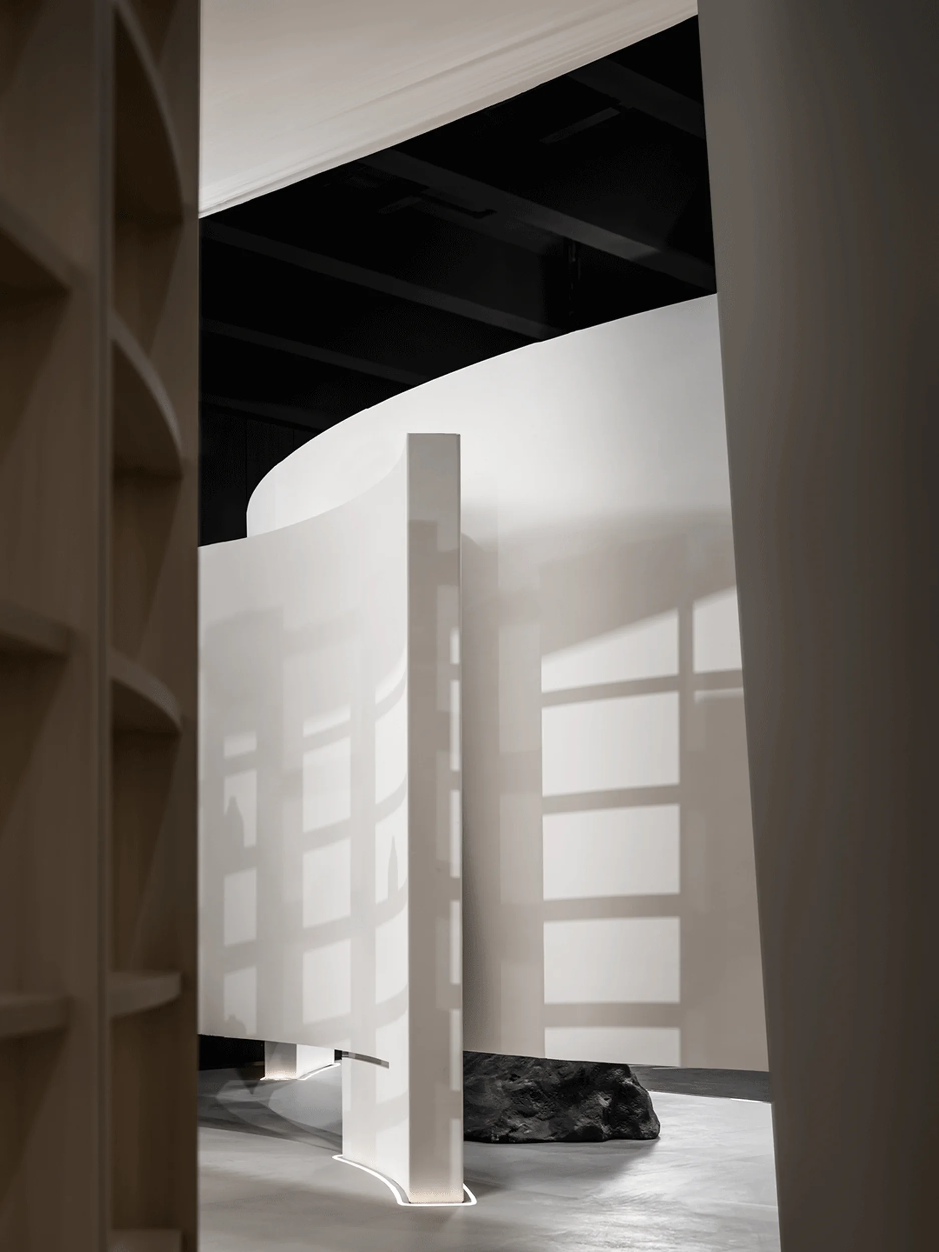
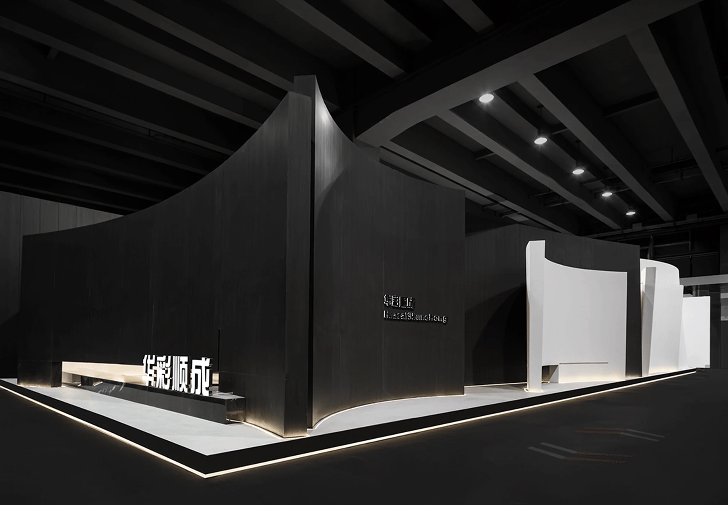
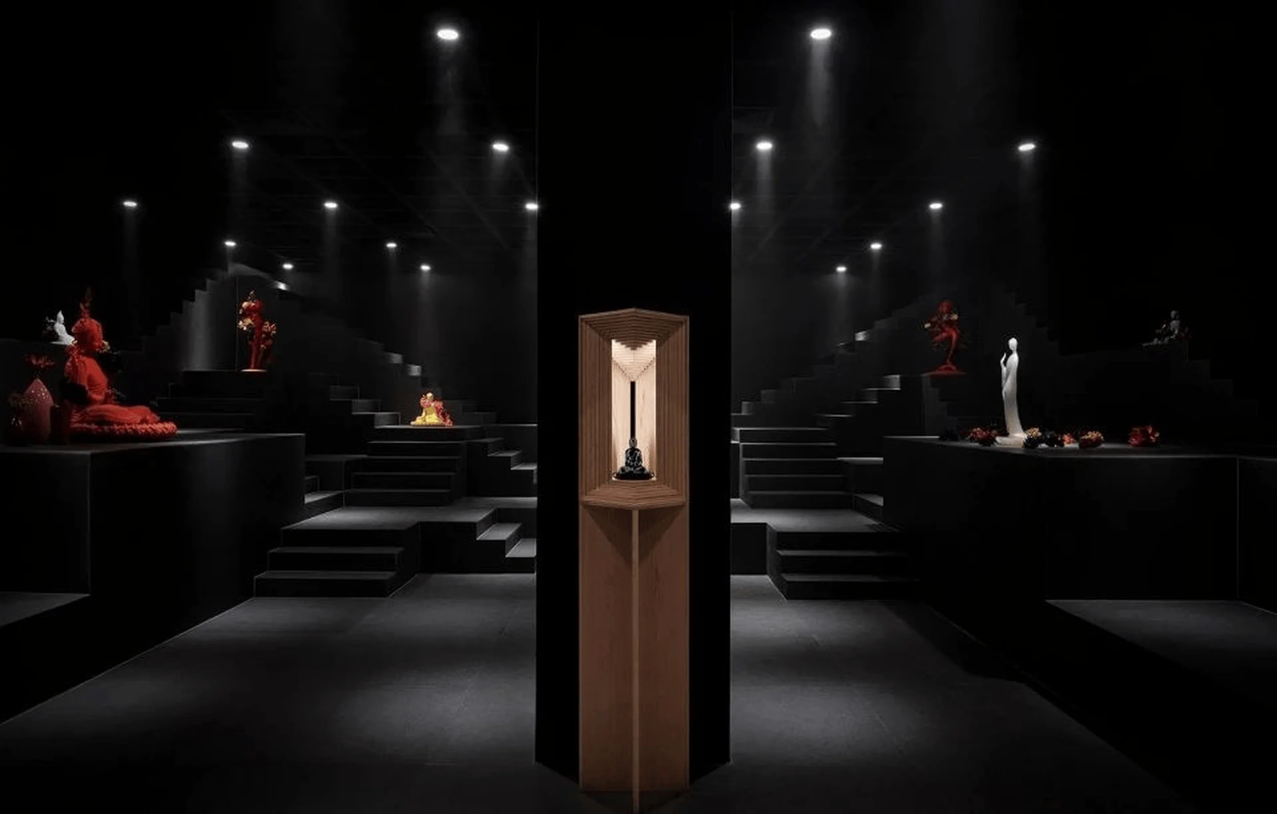
The design prioritizes simplicity to explore the essence of space, allowing light to shape an undefined and rich experience within the exhibition space design.
Contents
Project Background
HuaCai ShunCheng, a decorative materials company, commissioned DEEPRICH DESIGN to create an exhibition space that embodies the essence of their products and brand identity. Inspired by the words of Louis Kahn, the design team aimed to create a ‘song of space’ where light would take center stage, interacting with the spatial layout and materiality to define the overall atmosphere. This minimalistic approach seeks to highlight the inherent qualities of the materials and create a memorable experience for visitors, emphasizing the beauty of light and shadow play in exhibition space design.
Design Concept and Objectives
The design concept revolves around the idea of ‘less is more’, aiming to strip away unnecessary elements and reveal the fundamental beauty of the space. The designers sought to avoid predefining the space or design and instead let the interplay of light with the spatial layout, textures, and composition to shape the overall experience. The objective was to create an exhibition space design that is both immersive and thought-provoking, allowing visitors to experience the products in a unique and memorable way, all while emphasizing the power of light as a design element.
Spatial Layout and Planning
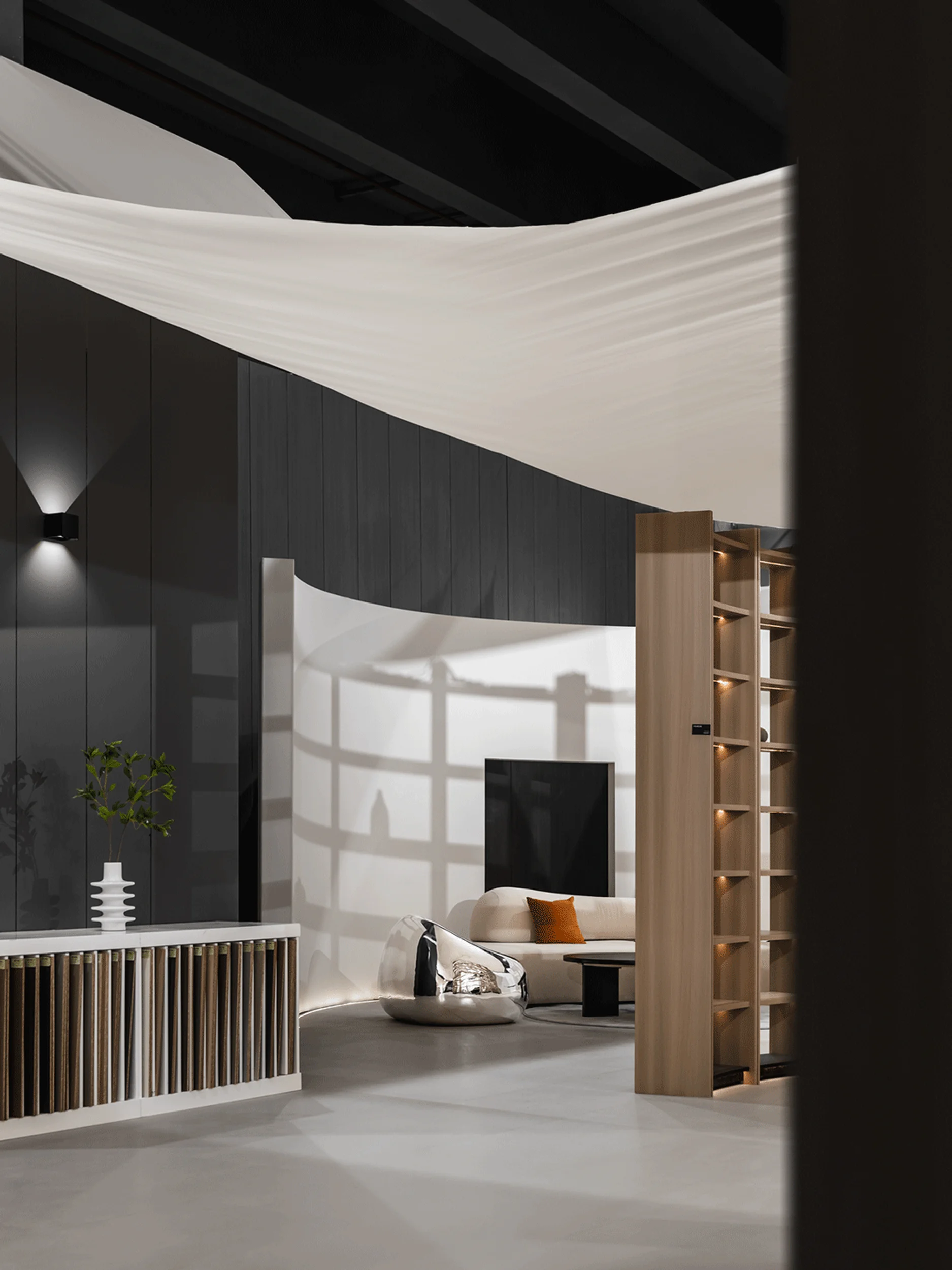
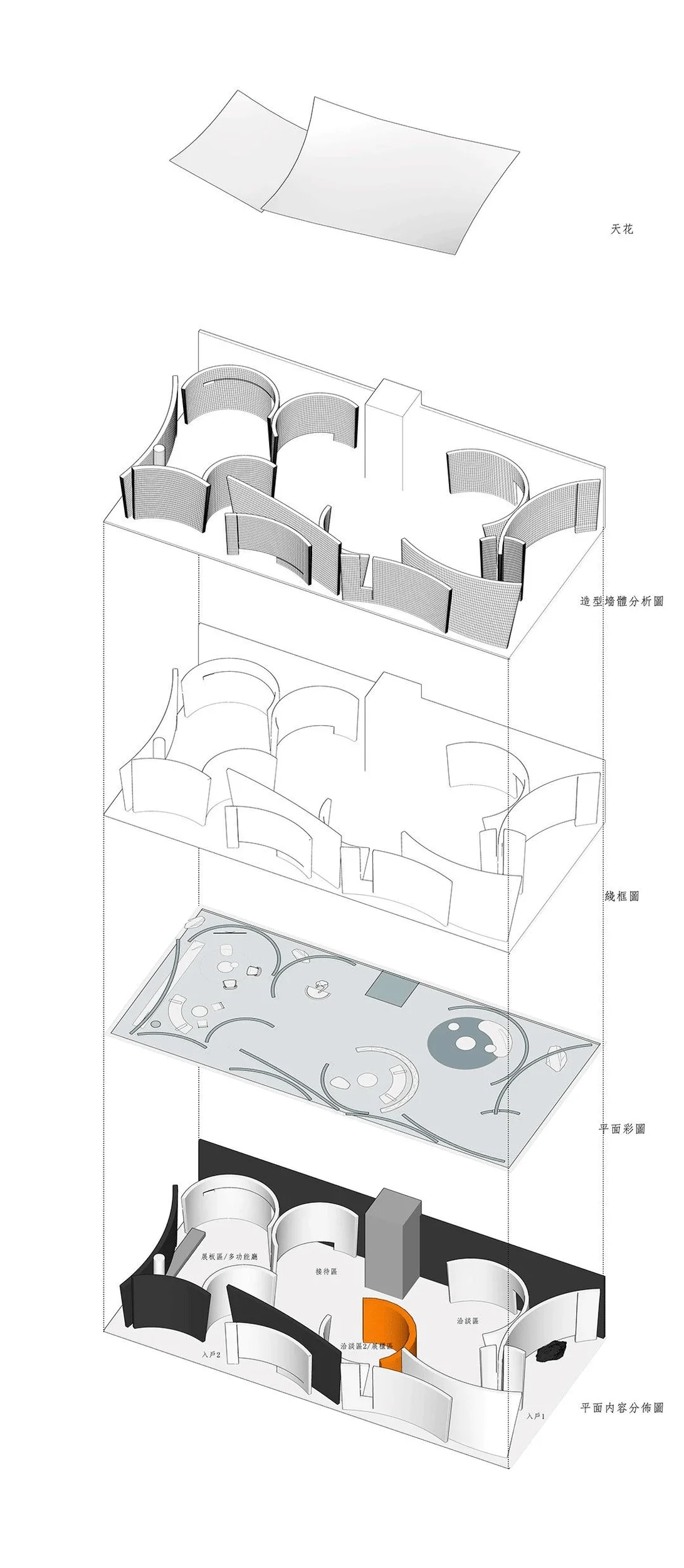
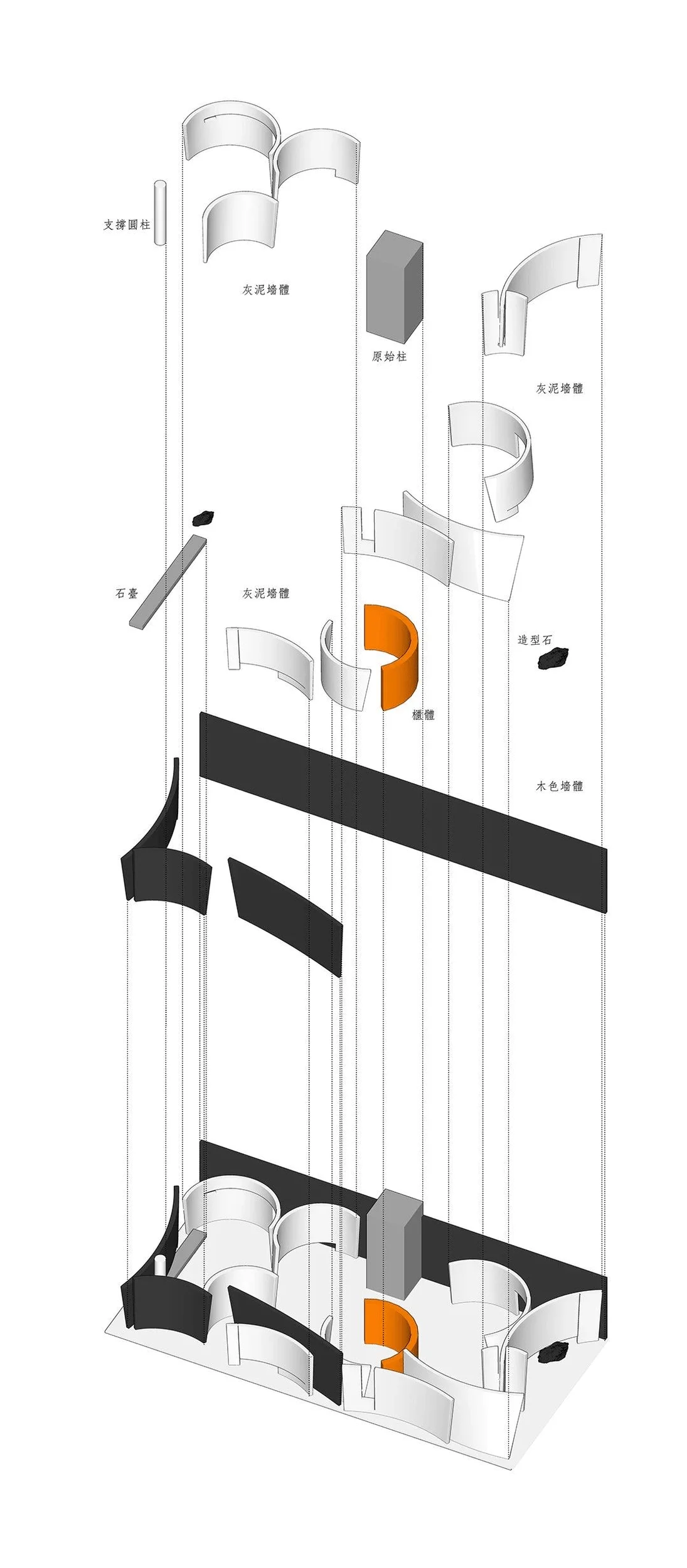
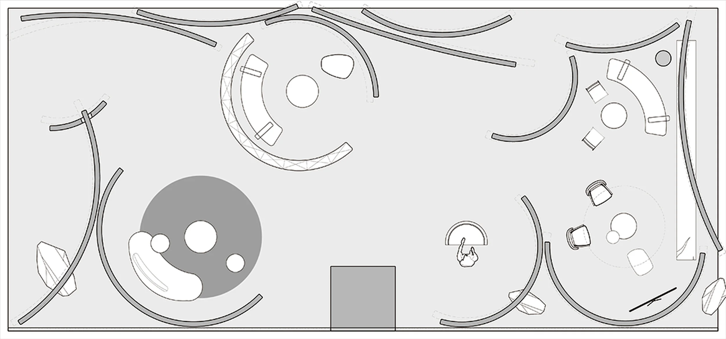
The exhibition space design features a multi-layered spatial arrangement that incorporates concepts of ‘stacking’ and ‘penetration’. The spaces seamlessly flow into one another, creating a sense of continuity and visual interest. This approach adds depth and complexity to the layout, guiding visitors through the exhibition in a natural and intuitive way. The design also introduces the concept of ‘luring and retaining’ to create an immersive experience, drawing visitors deeper into the exhibition space design and encouraging them to explore its various offerings.
Exterior Design and Aesthetics
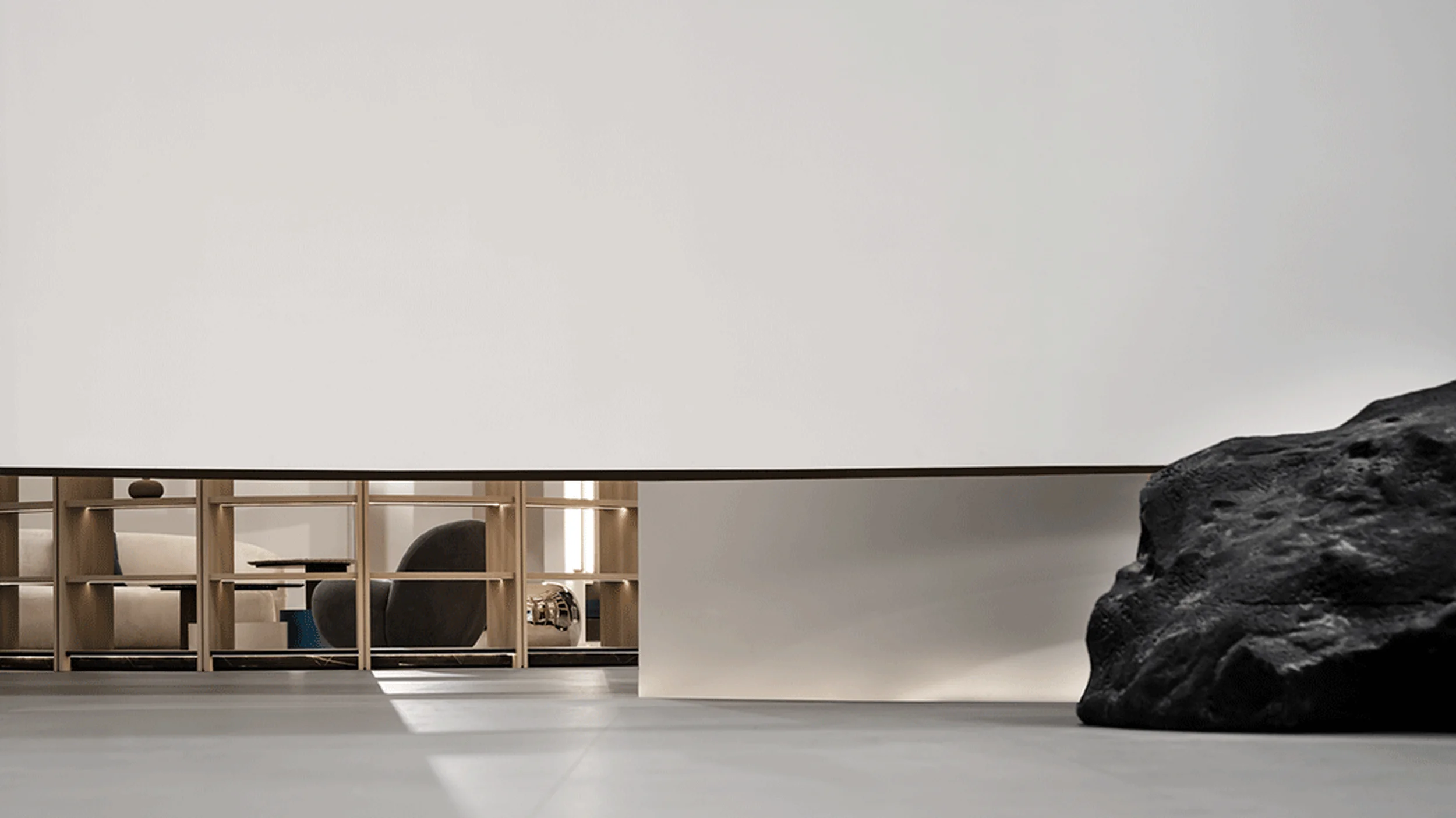
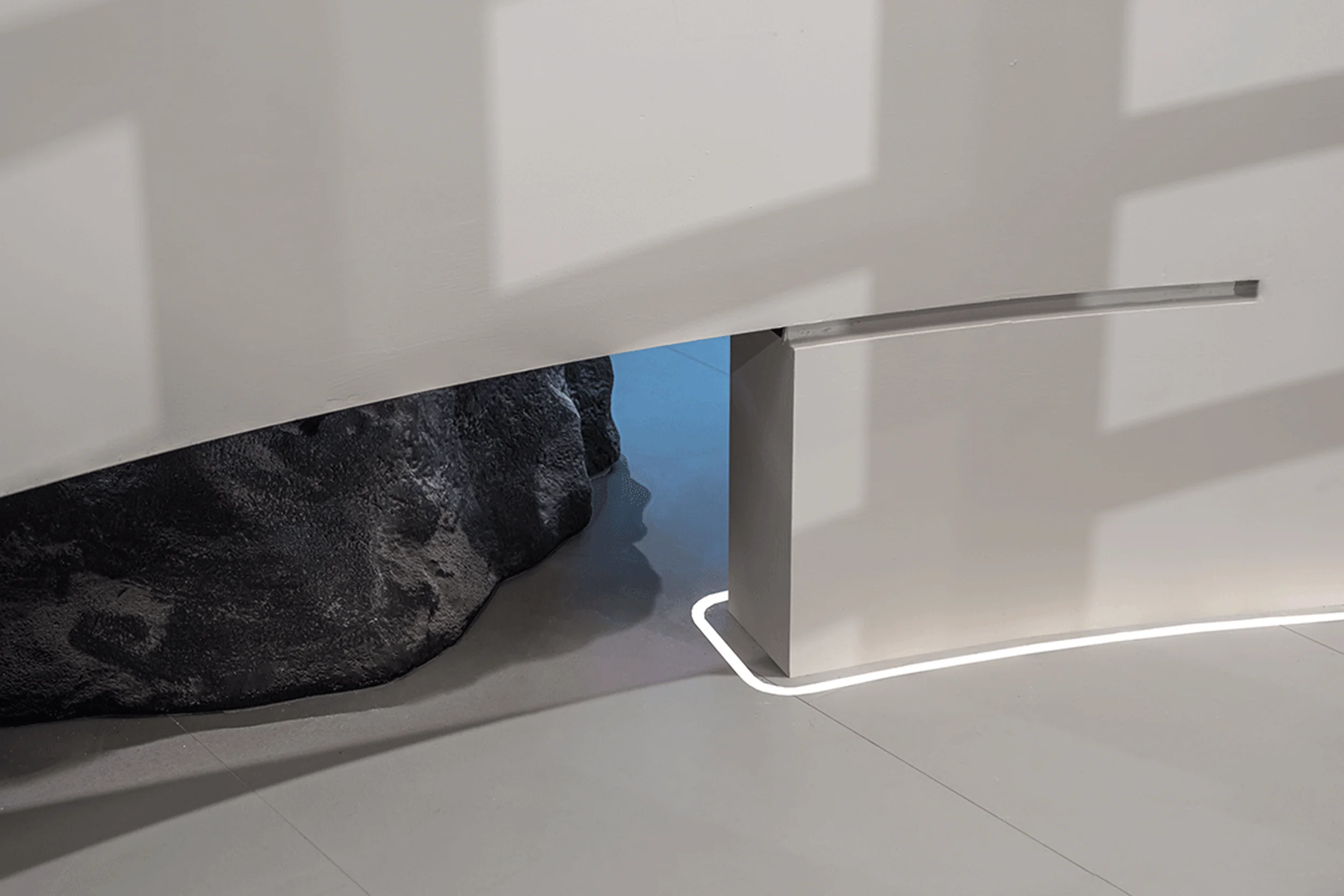
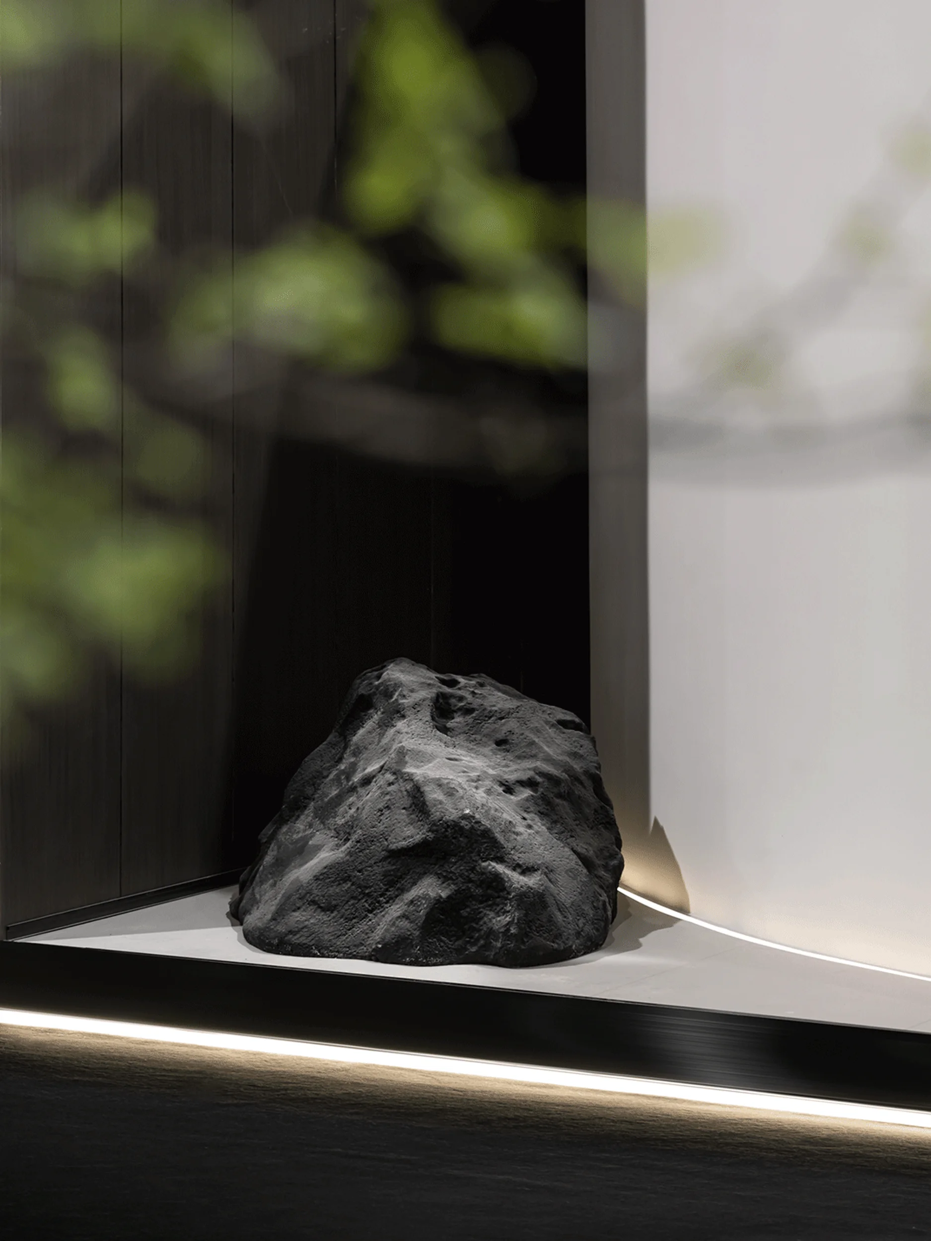
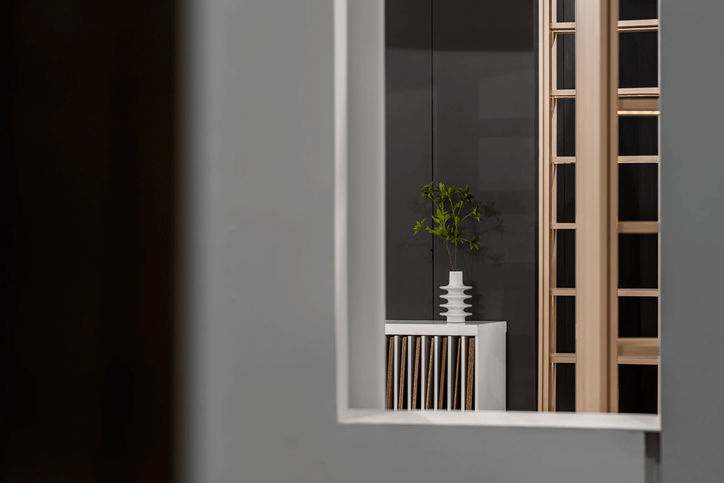
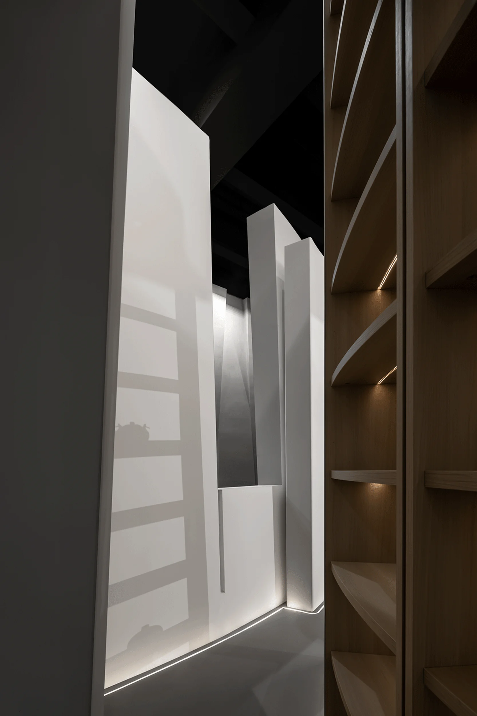
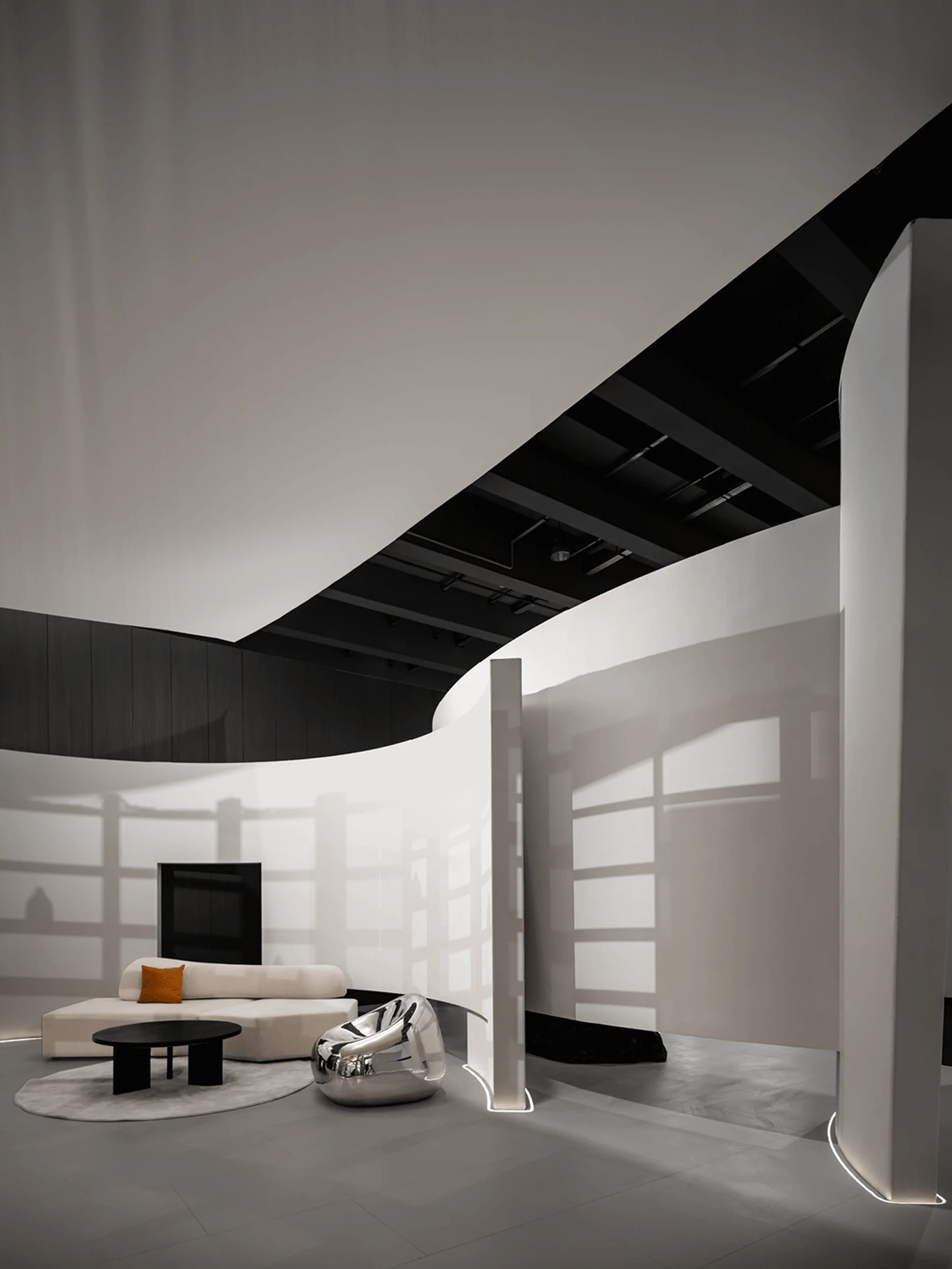
The exhibition space design embraces a minimalistic aesthetic, utilizing clean lines, simple forms, and a neutral color palette to create a sense of tranquility and sophistication. The use of natural light is carefully considered, with strategically placed openings that allow sunlight to filter into the space, creating a dynamic interplay of light and shadow. The minimalist approach extends to the choice of materials, with a focus on high-quality, natural materials that complement the overall aesthetic and contribute to a sense of warmth and elegance in the exhibition space design.
Construction Process and Management
The construction process was meticulously managed to ensure that the design vision was faithfully translated into reality. The design team worked closely with skilled craftsmen and contractors to ensure that every detail was executed to the highest standards. The use of prefabricated elements helped to streamline the construction process and minimize waste, while also ensuring a high level of precision and consistency in the finished product. This collaborative approach ensured the successful realization of the exhibition space design’s vision.
Project Information:
Project Client: Guangdong HuaCai ShunCheng Decoration Materials Co., Ltd.
Exhibition Location: Guangzhou, China
Project Area: 220 square meters
Design Company: DEEPRICH DESIGN
Design Director: Tang, Chung-Han
Project Coordination: Huang, Kaiyun
Construction Director: Ye, Yanzhi
Project Year: Not specified
Photographer: Not specified


