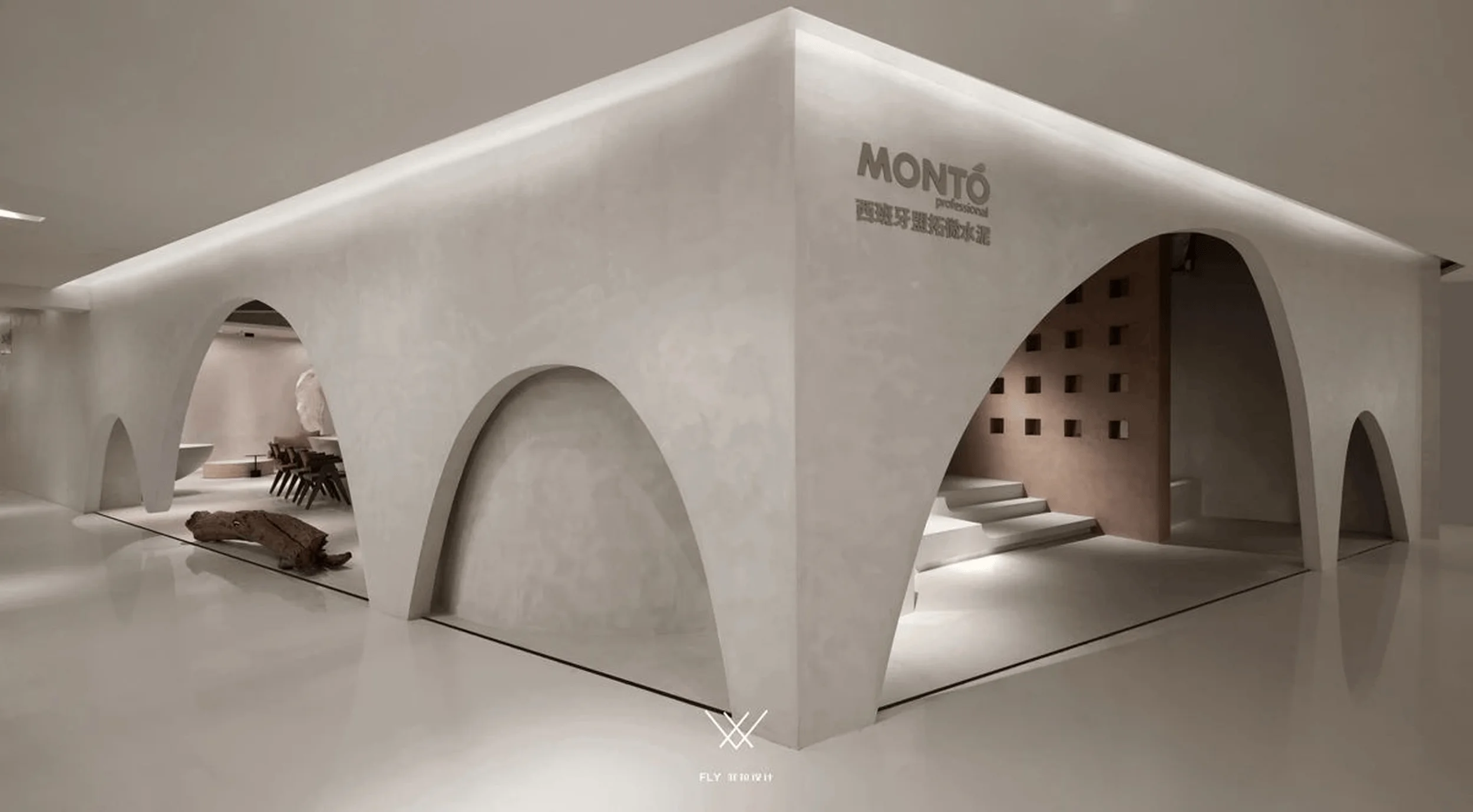
MONTO Experience Center showcases the artistic potential of microcement through a unique blend of material and spatial structure.
Contents
Project Background and Design Inspiration
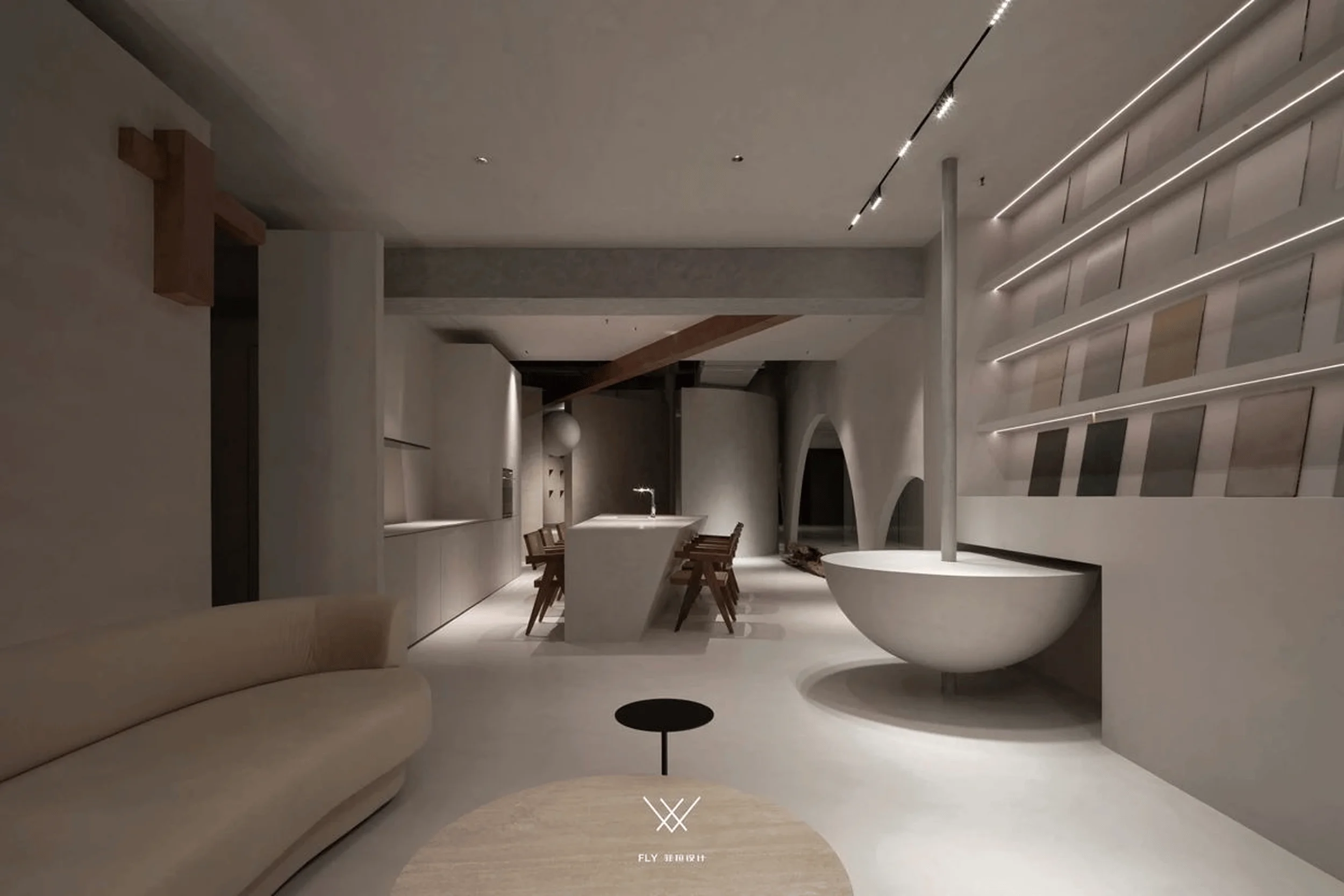
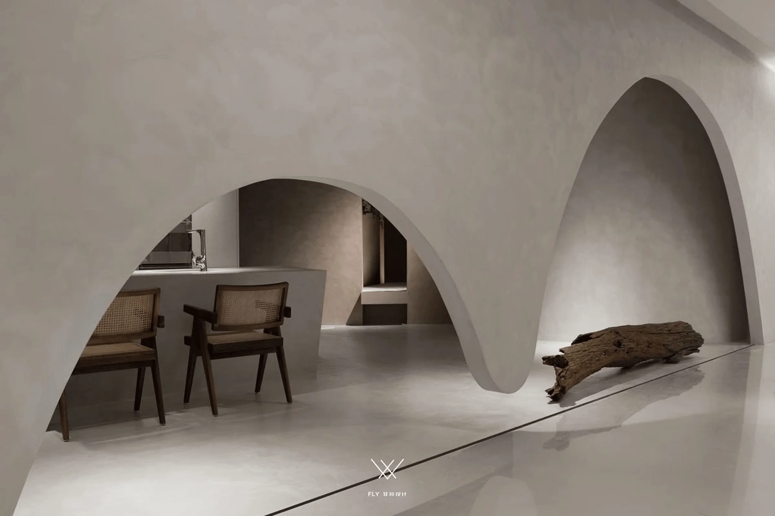
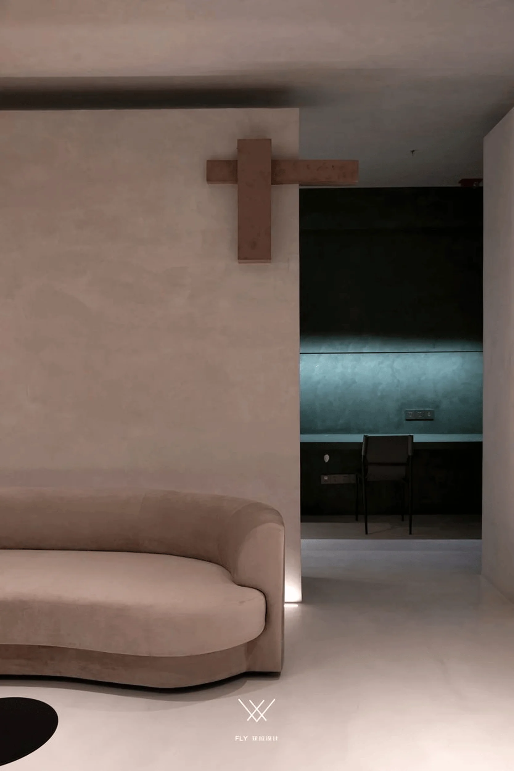
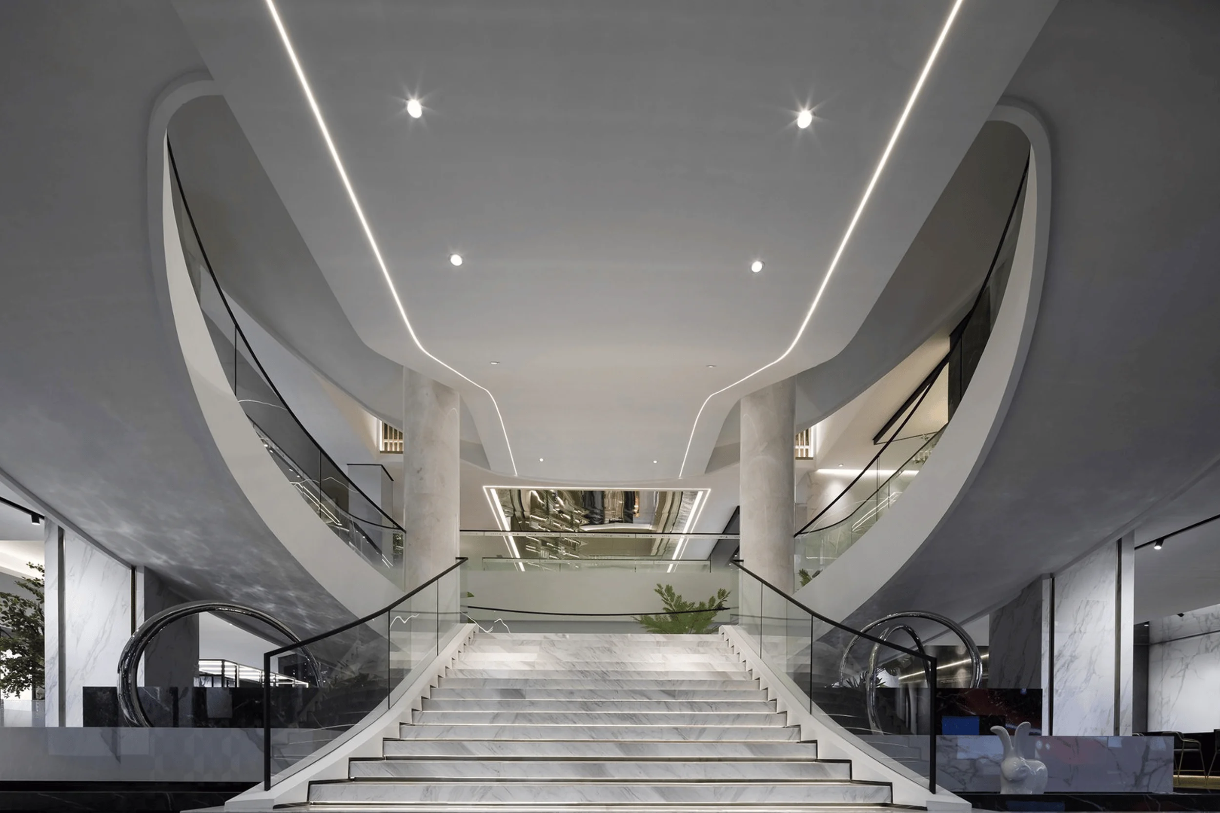
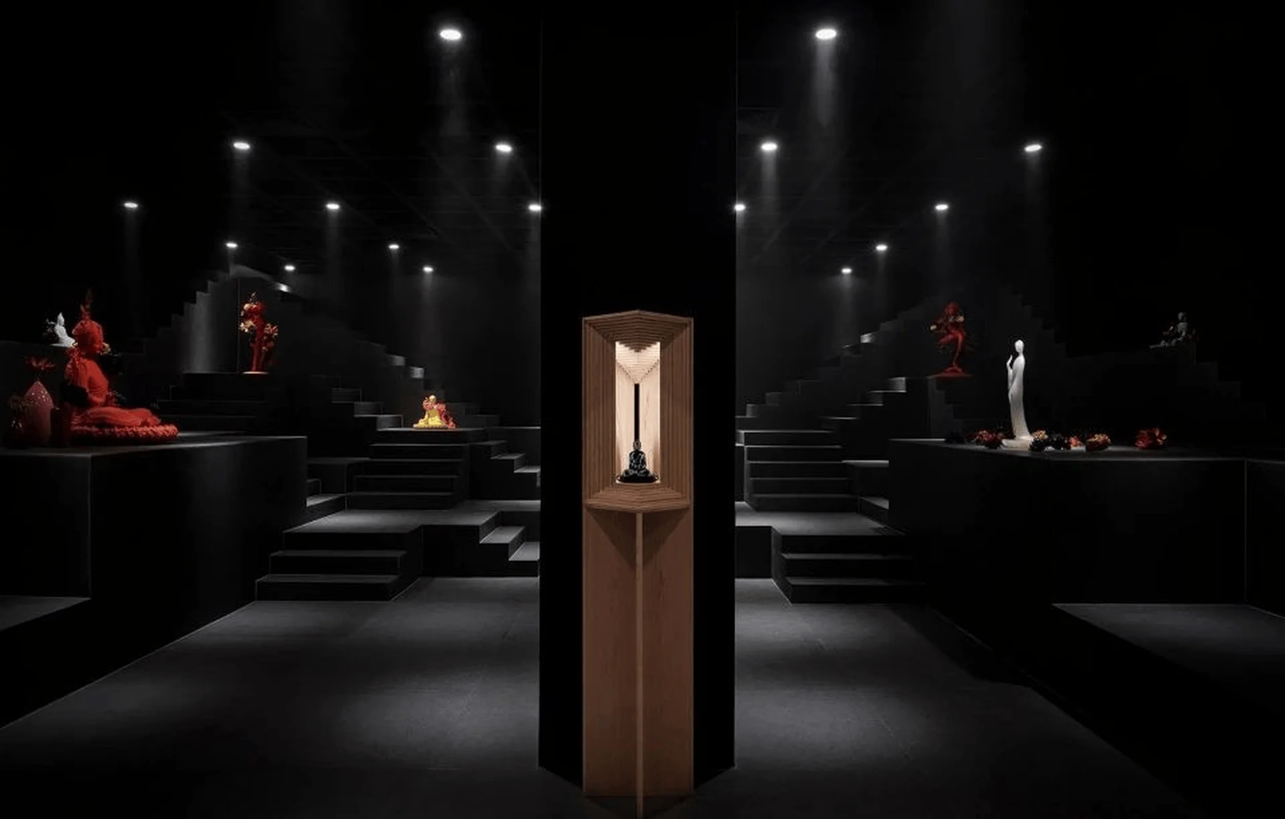
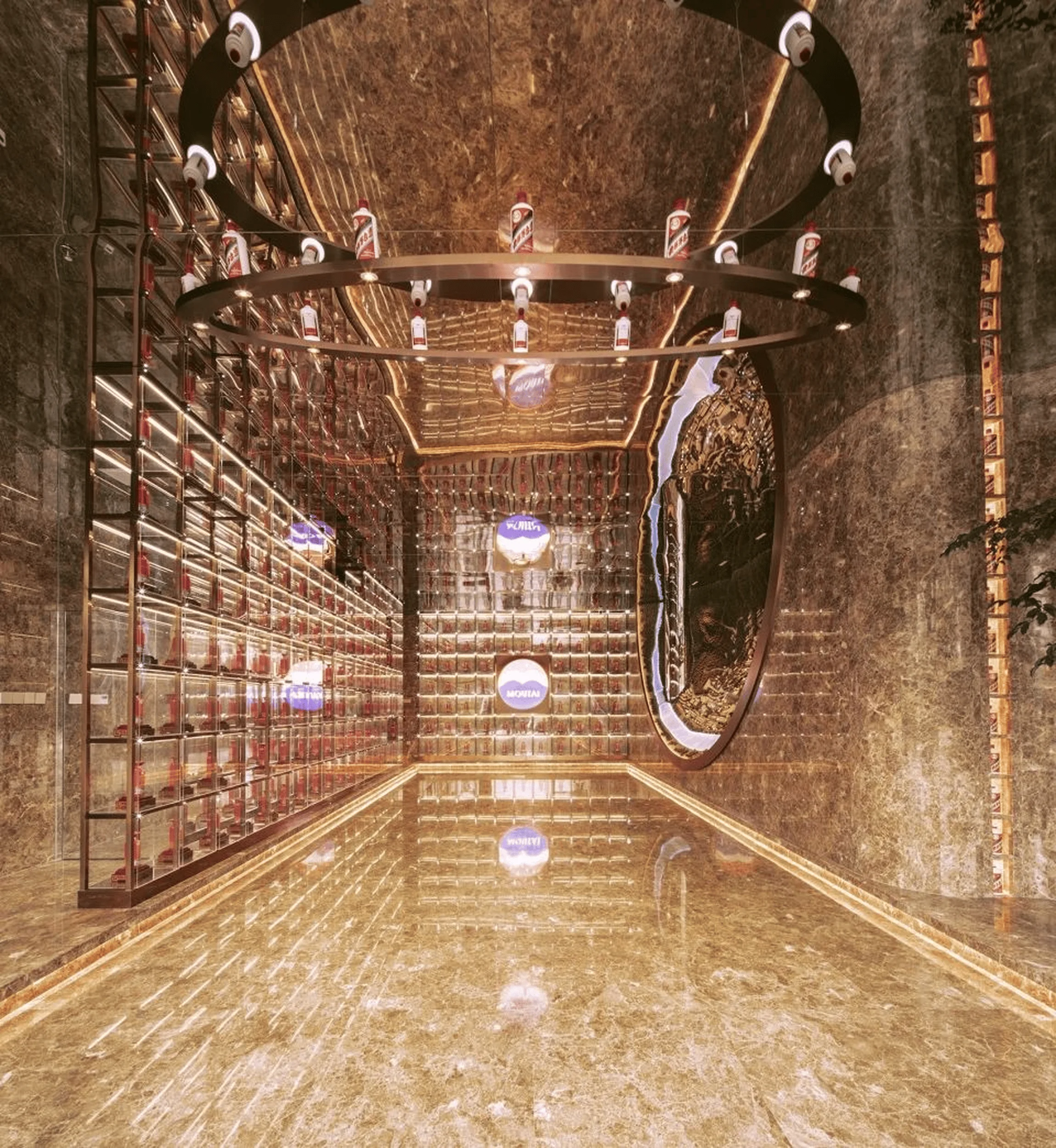
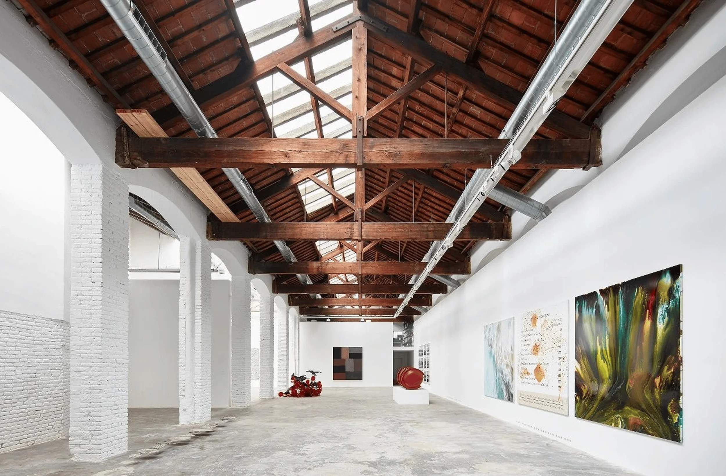
The MONTO Experience Center, located in Binjiang Sixth Space, showcases the unique charm of microcement, a material developed by MONTO, Spain’s largest paint company and a top ten European paint enterprise. Inspired by the abstract painter Kazimir Malevich, FLY Design drew inspiration from geometric paintings and translated them into a three-dimensional space. The design focuses on showcasing the versatility of microcement while creating a captivating spatial experience. This minimalist microcement architectural design stands as a testament to the innovative use of materials in shaping modern spaces. The interplay of light and shadow further enhances the textural depth of the microcement surfaces, creating a dynamic and engaging visual experience. The project involved close collaboration between various departments to ensure a timely and high-quality execution, with the final built environment faithfully reflecting the initial design vision. The microcement’s smooth, uninterrupted surfaces create a sense of fluidity and continuity throughout the space. tags:minimalist microcement architectural design,microcement interior design,microcement design,microcement architecture
Spatial Structure and Materiality
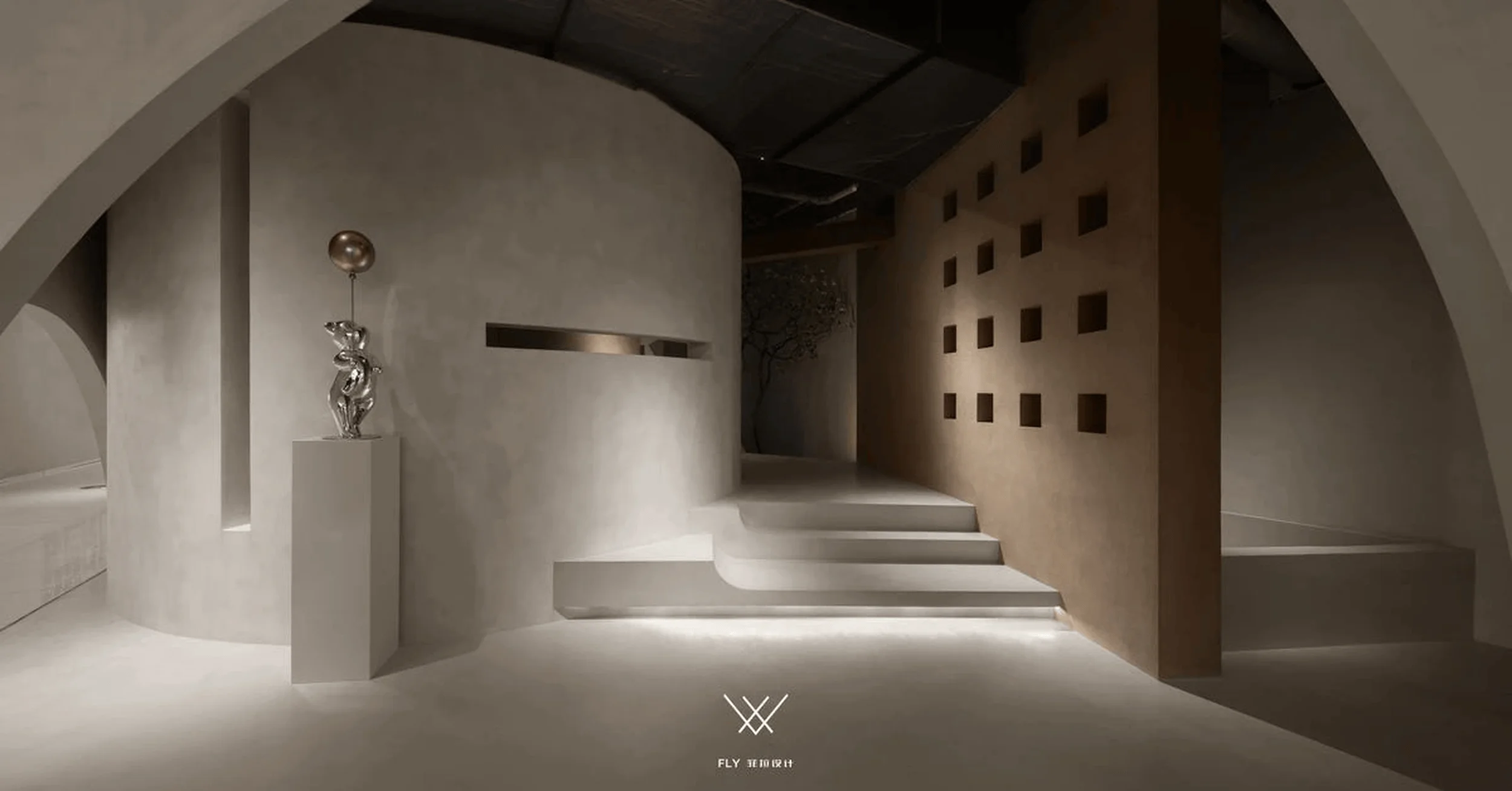
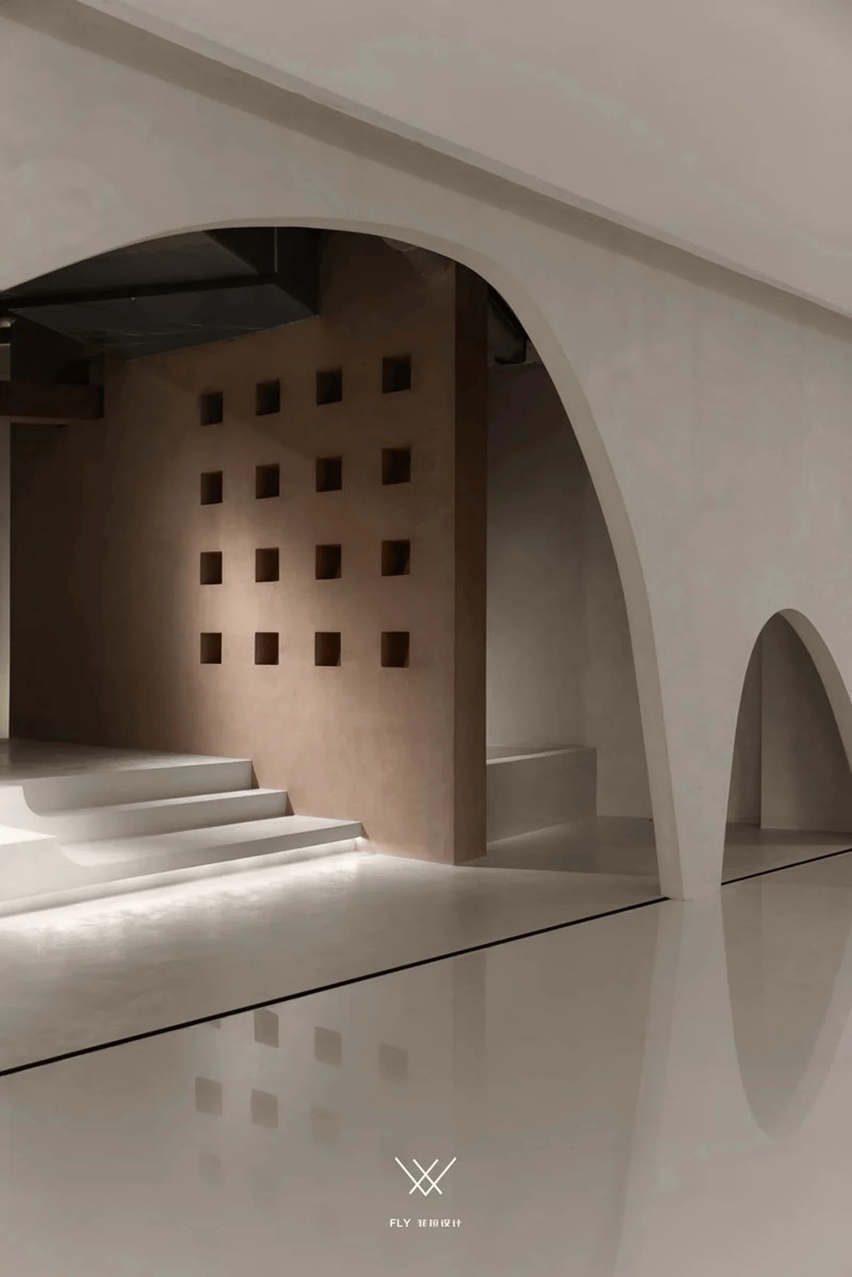
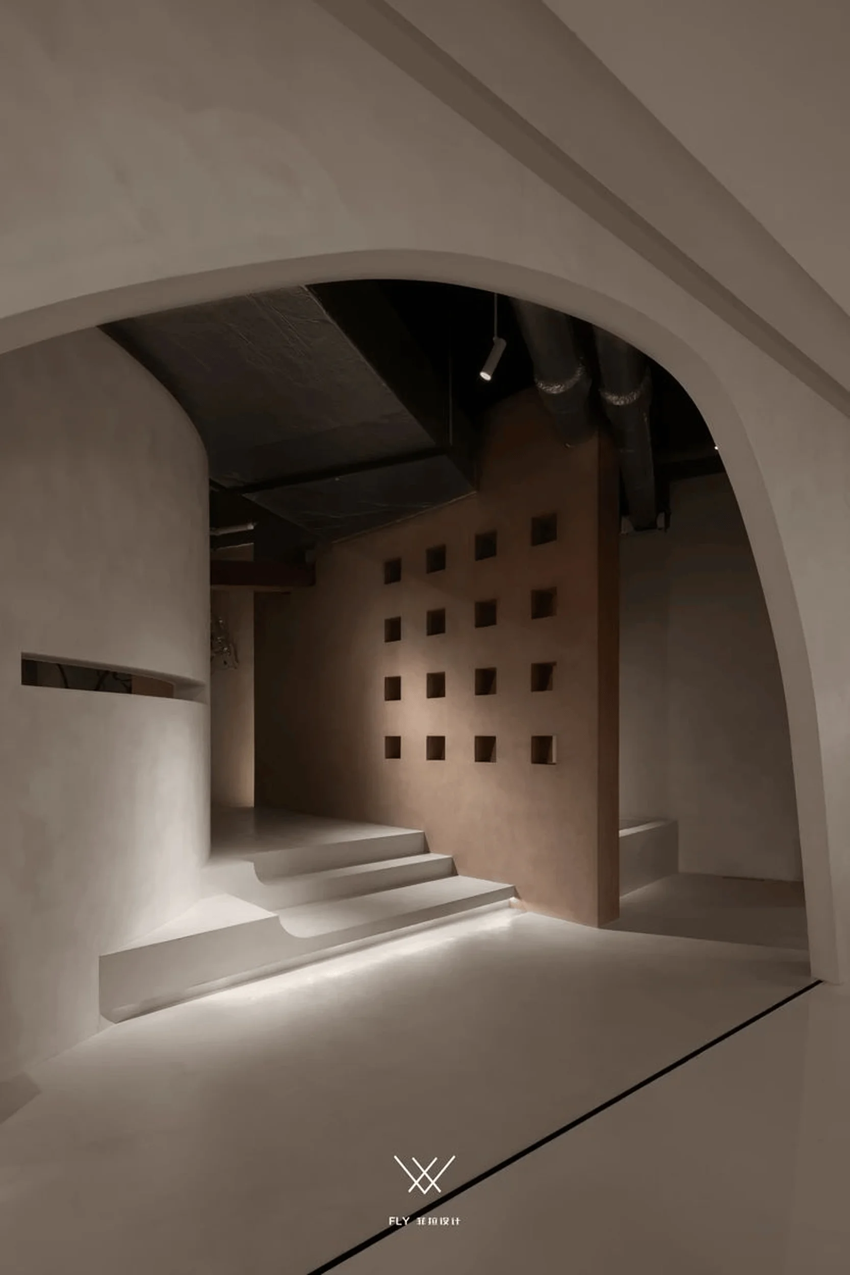
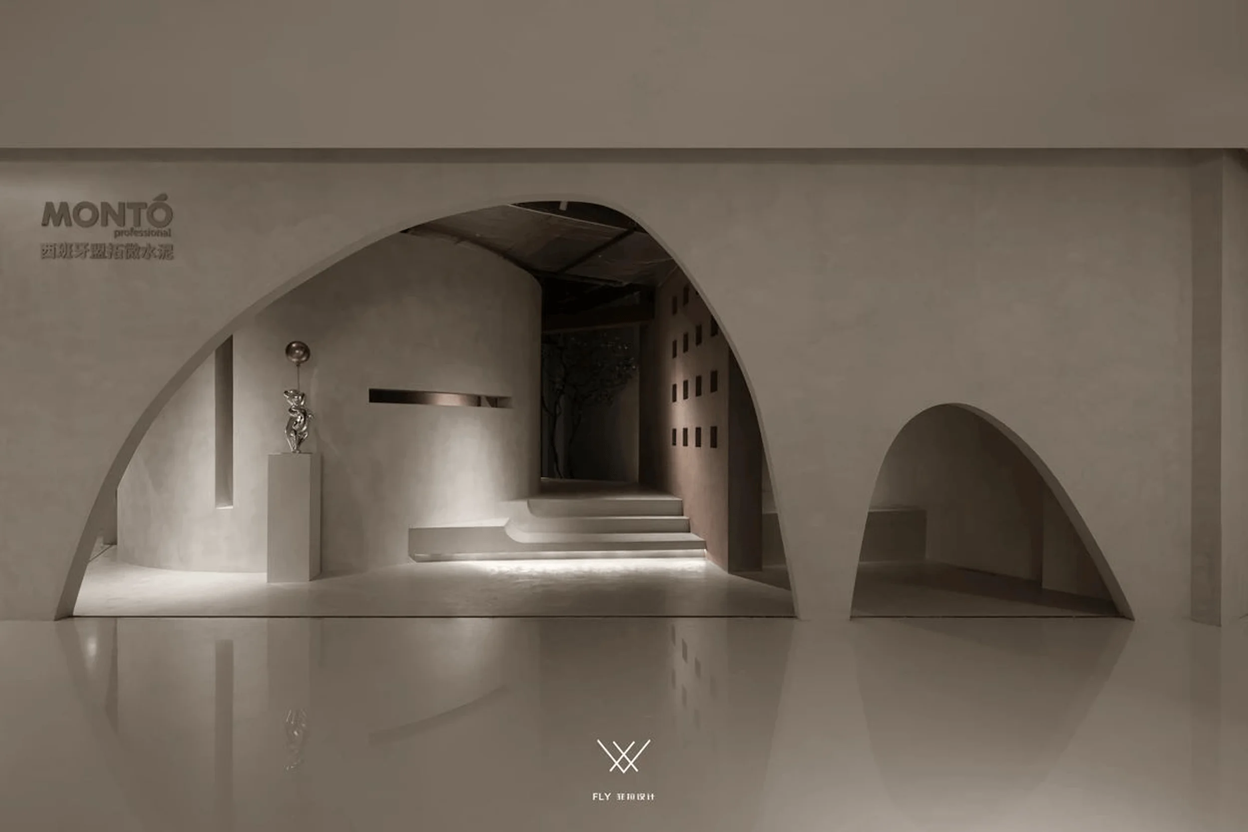
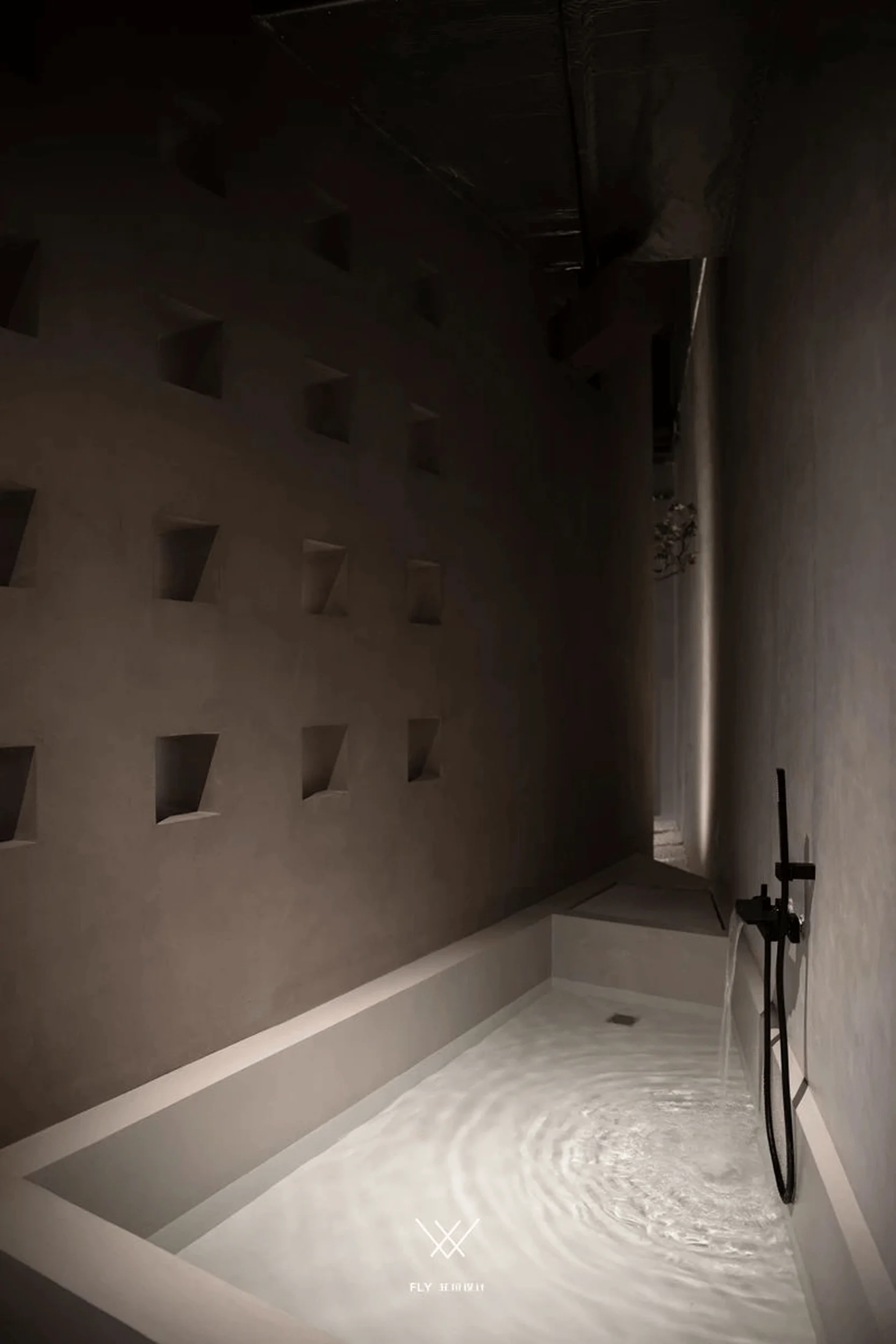
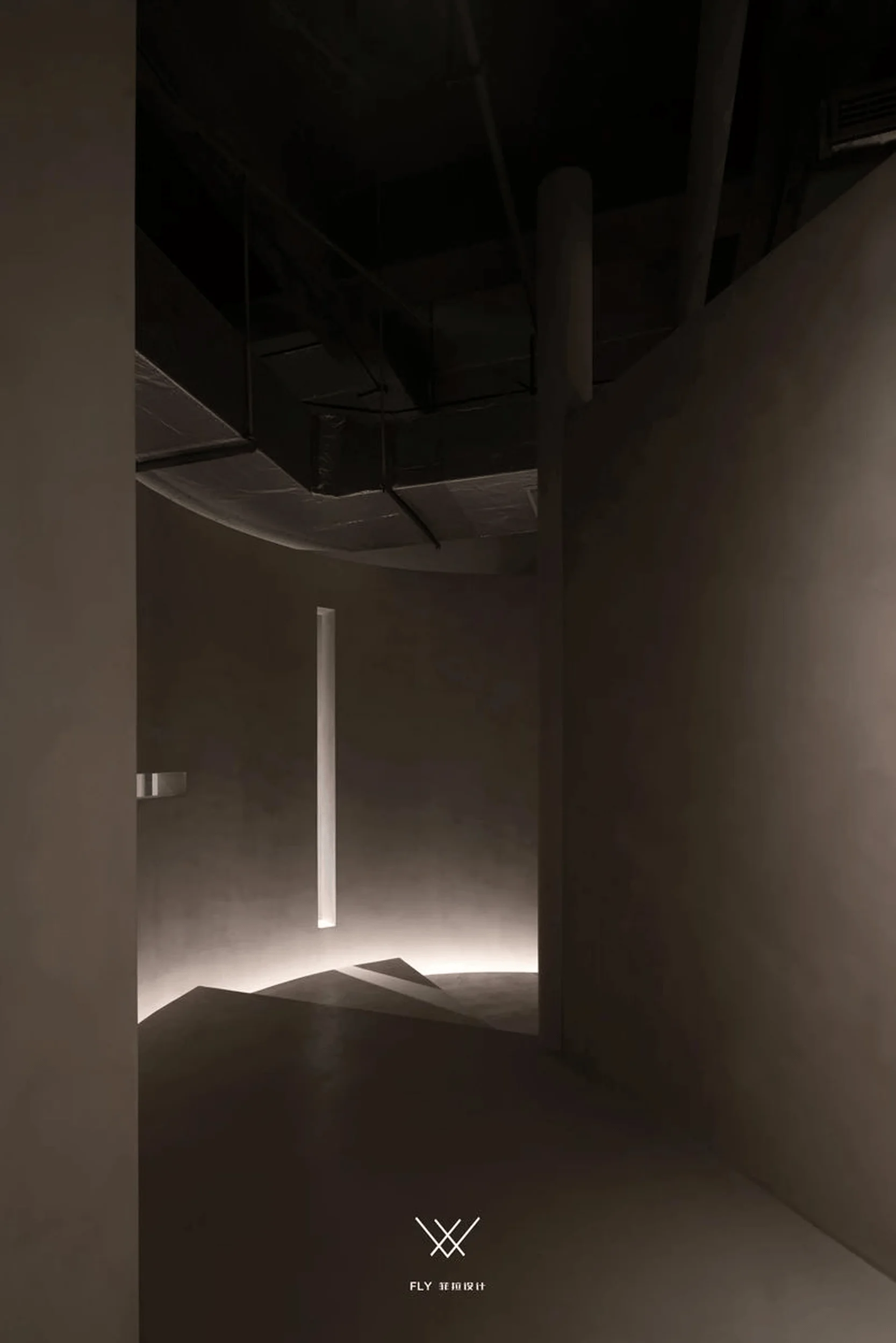
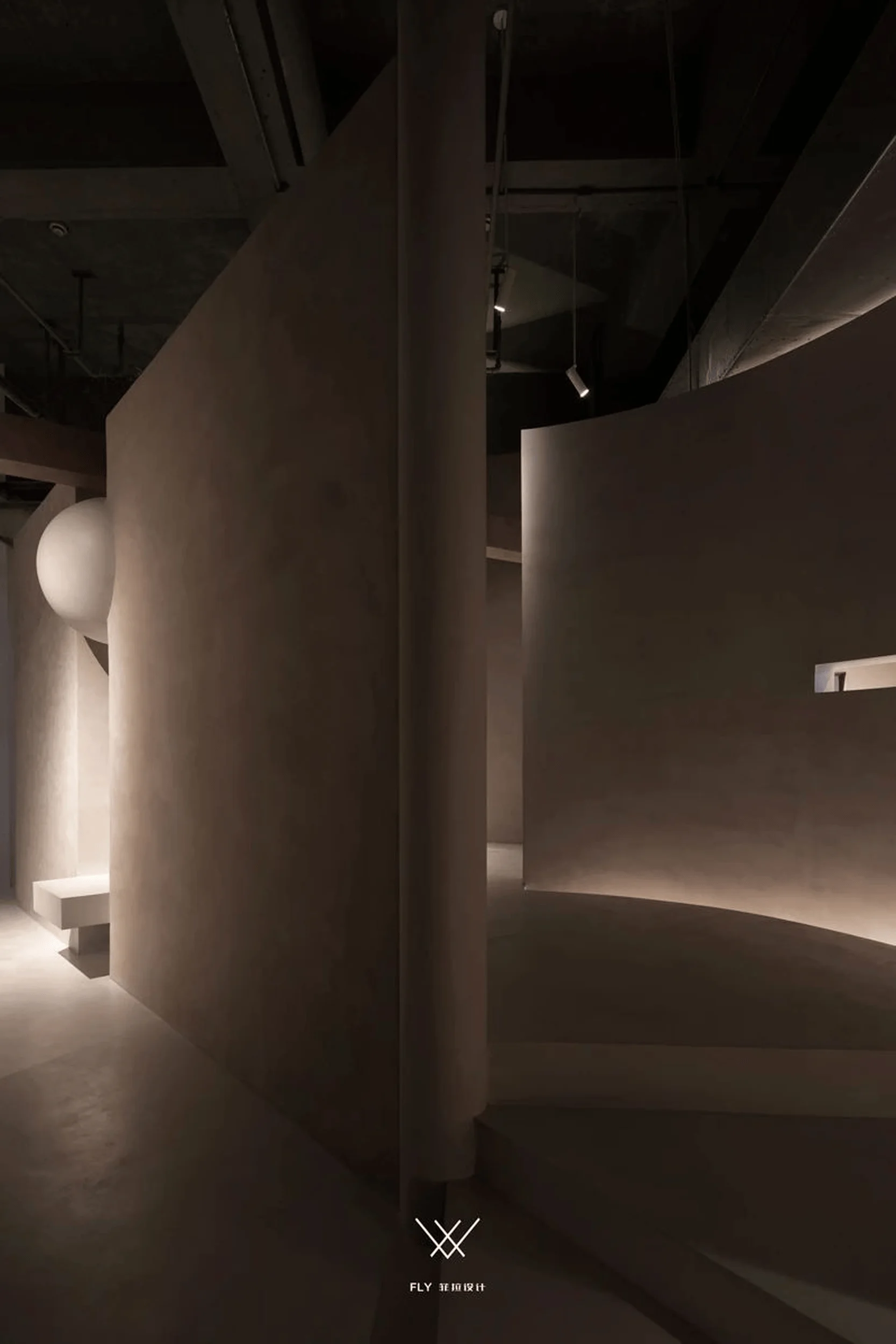
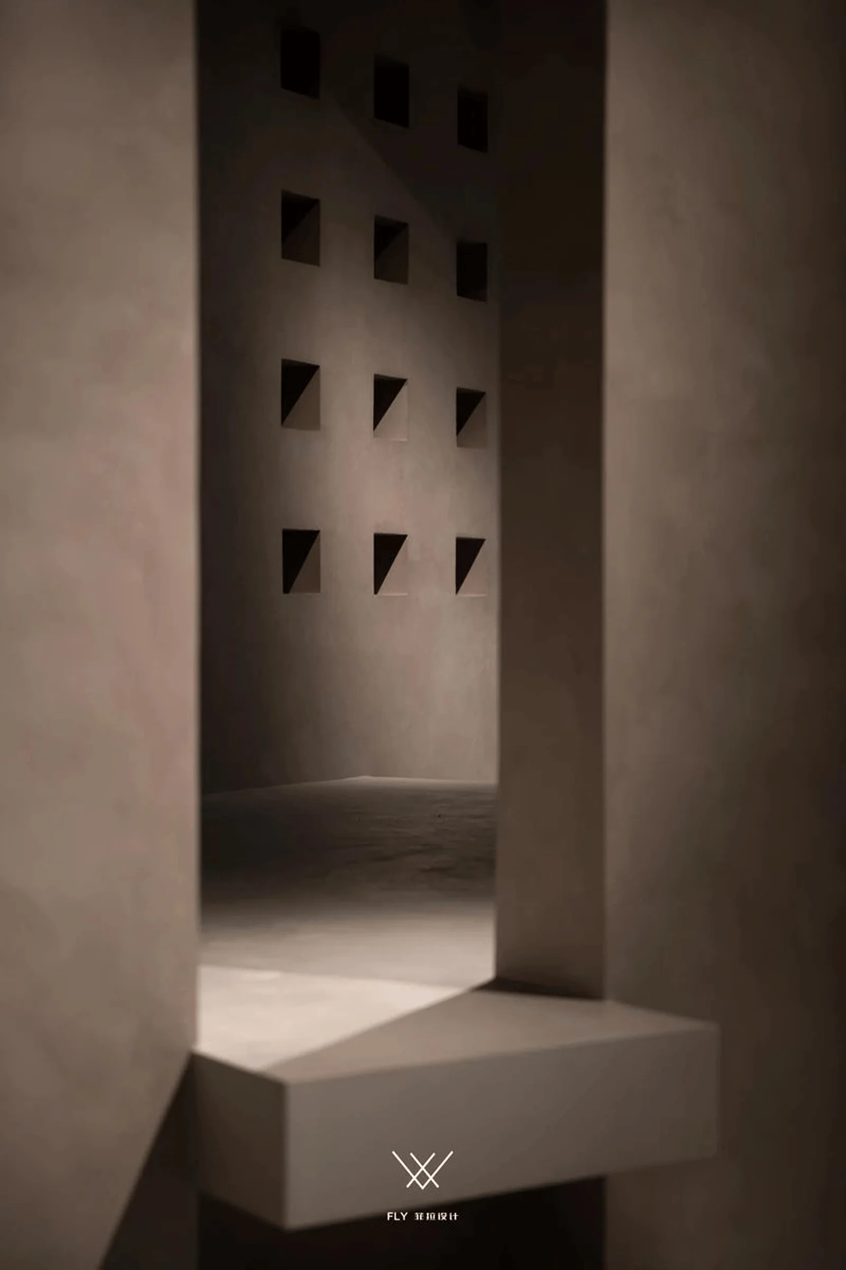
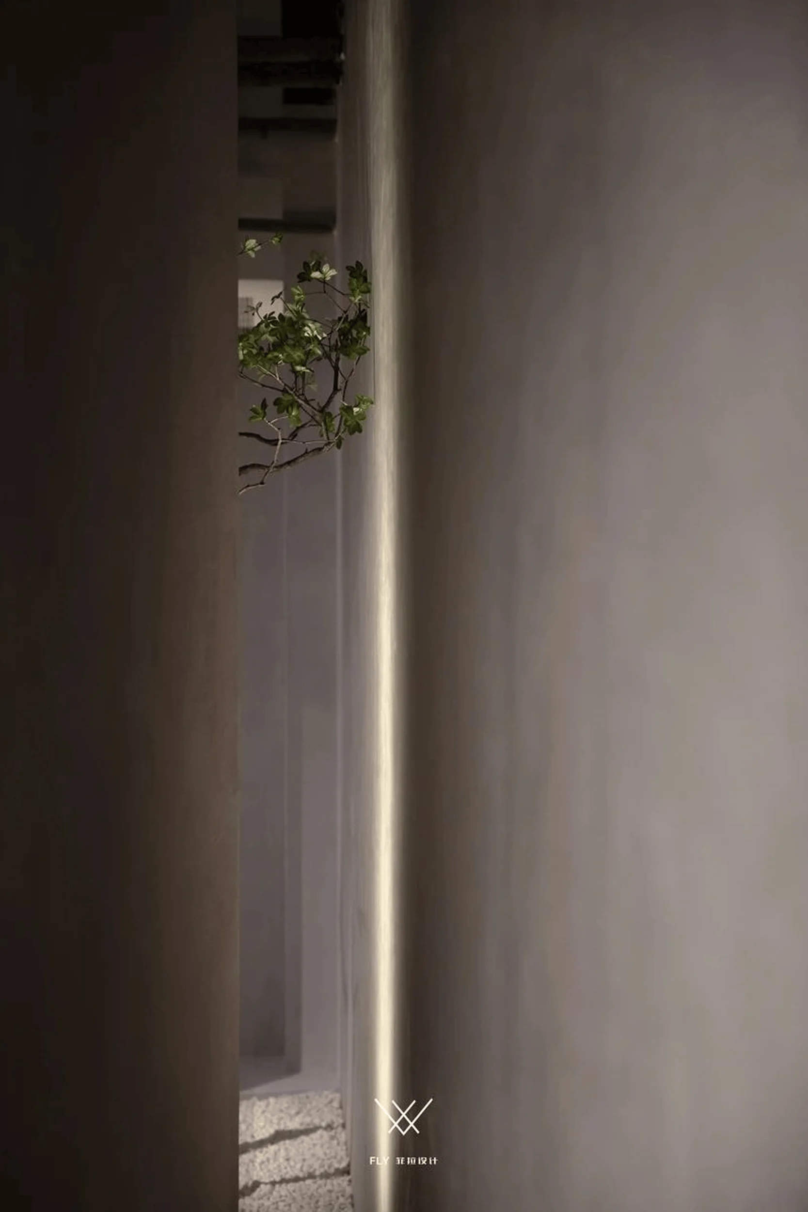
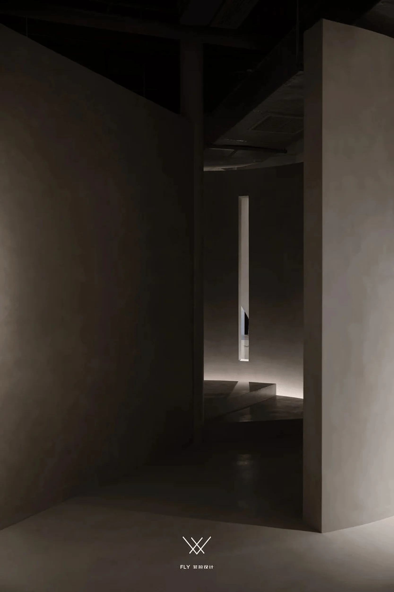
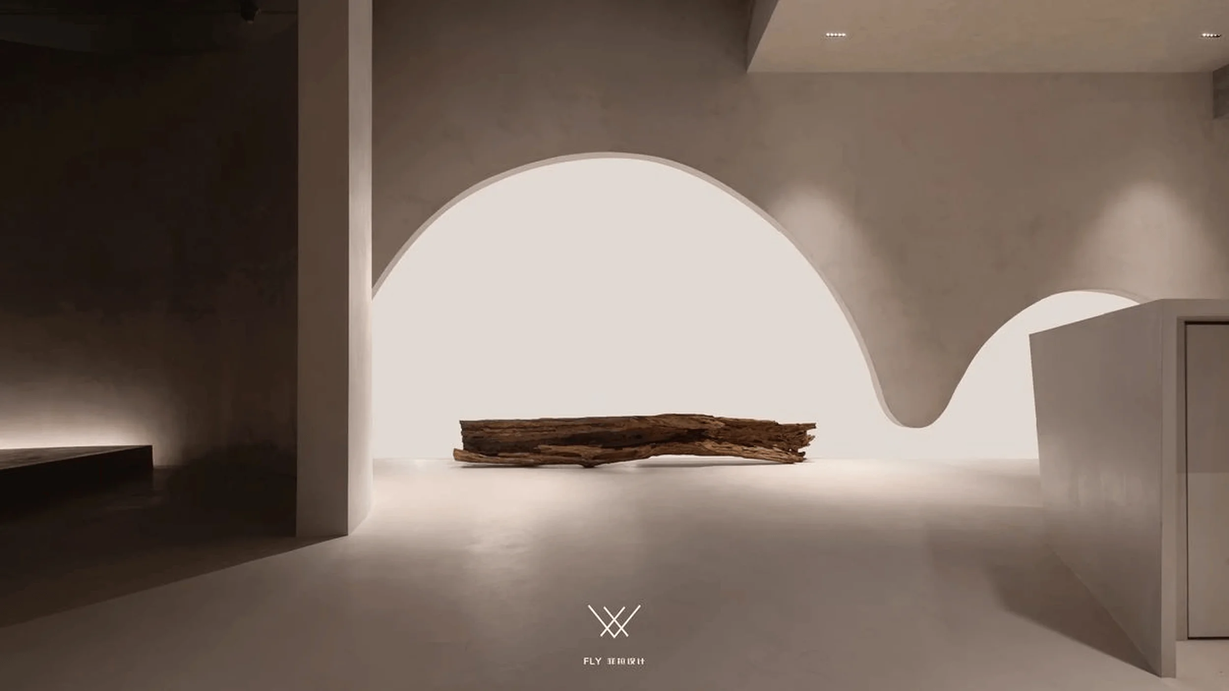
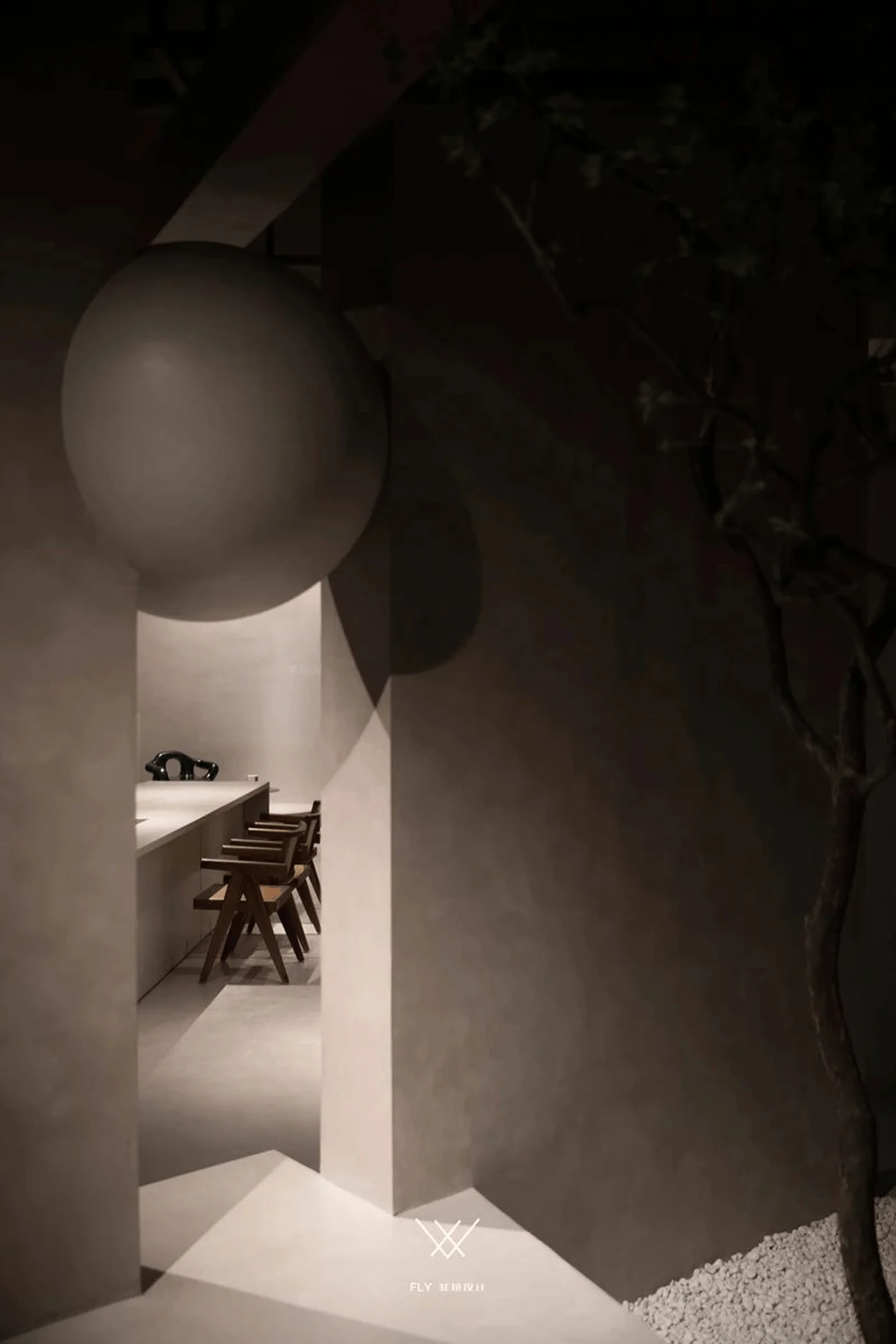
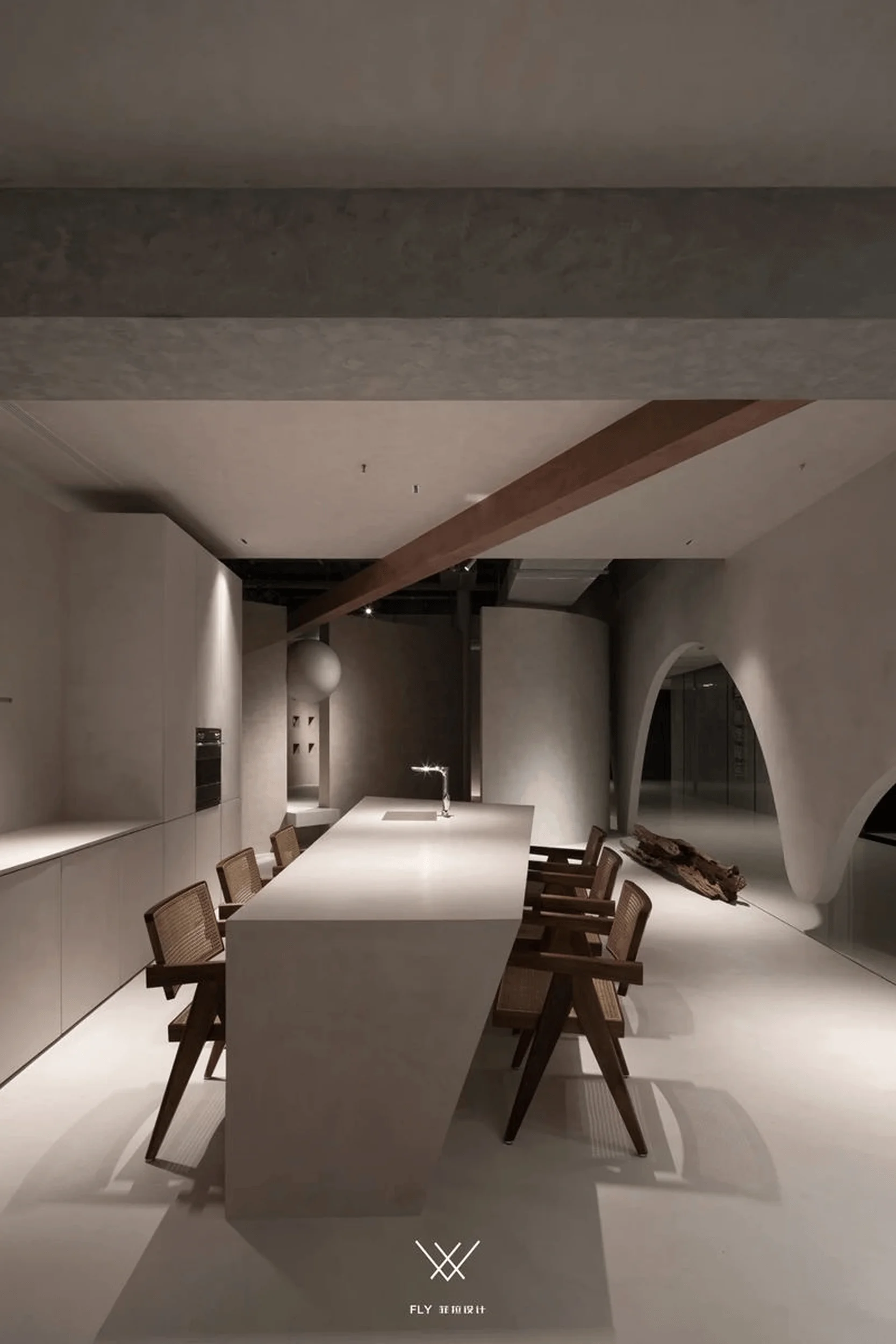
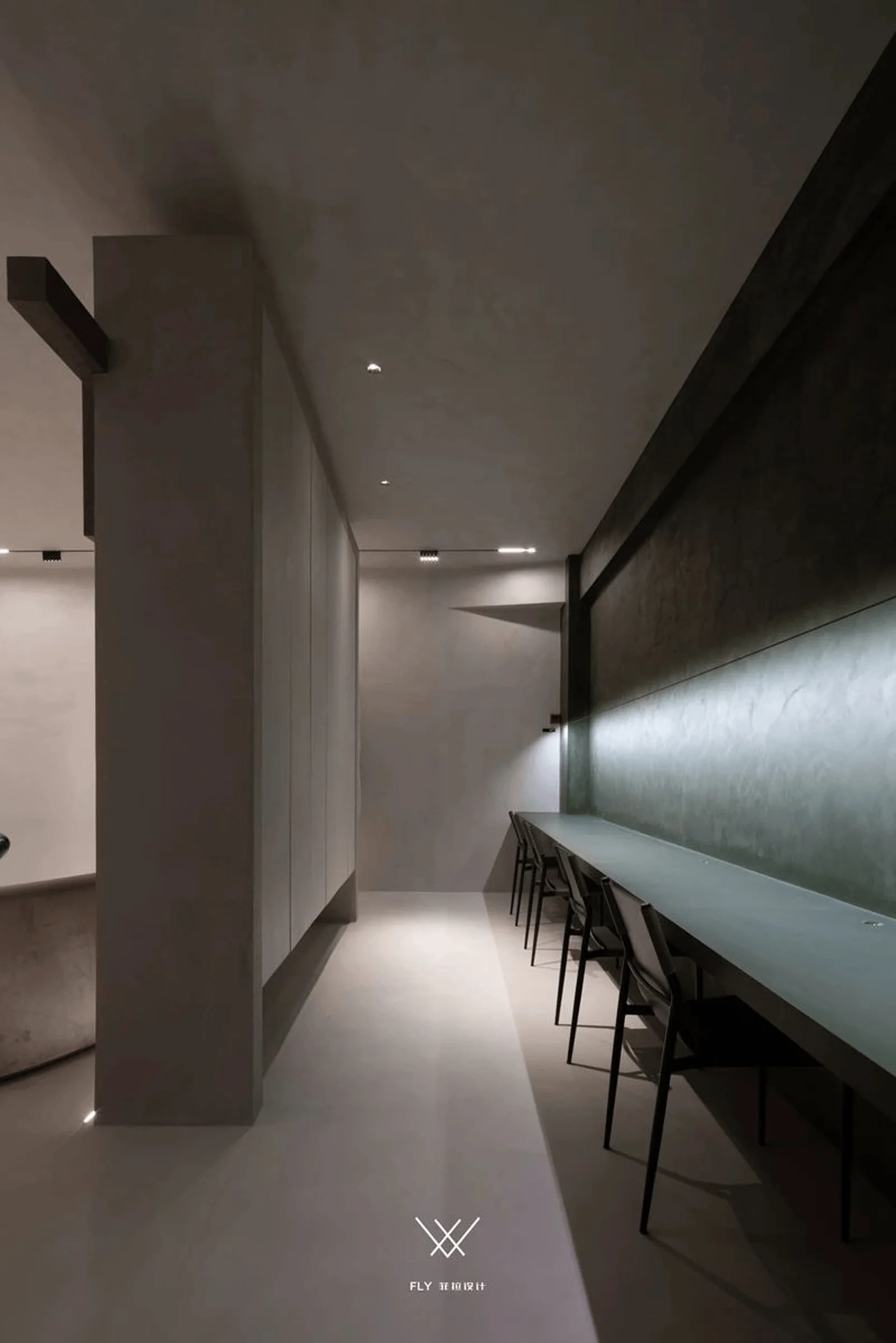
The design features arched entrances and a multi-faceted exposed frame structure, guiding visitors through a dynamic and interconnected journey. Upon entering, a geometrically structured foyer with voids and three-dimensional explorations creates a sense of visual intrigue. Stepping inside, the intentional variations in floor levels and a strategically placed staircase add depth and rhythm to the space. Rectangular light and shadow patterns cast by a semi-transparent partition wall introduce an element of mystery and connection. The application of microcement goes beyond mere aesthetics, as it plays a vital role in shaping the very structure of the space. This seamless integration between material and form creates a cohesive and aesthetically pleasing environment. The minimalist approach to design allows the microcement’s natural beauty to shine through. tags:minimalist microcement architectural design,microcement interior design,microcement design,microcement architecture
Exploring the Versatility of Microcement
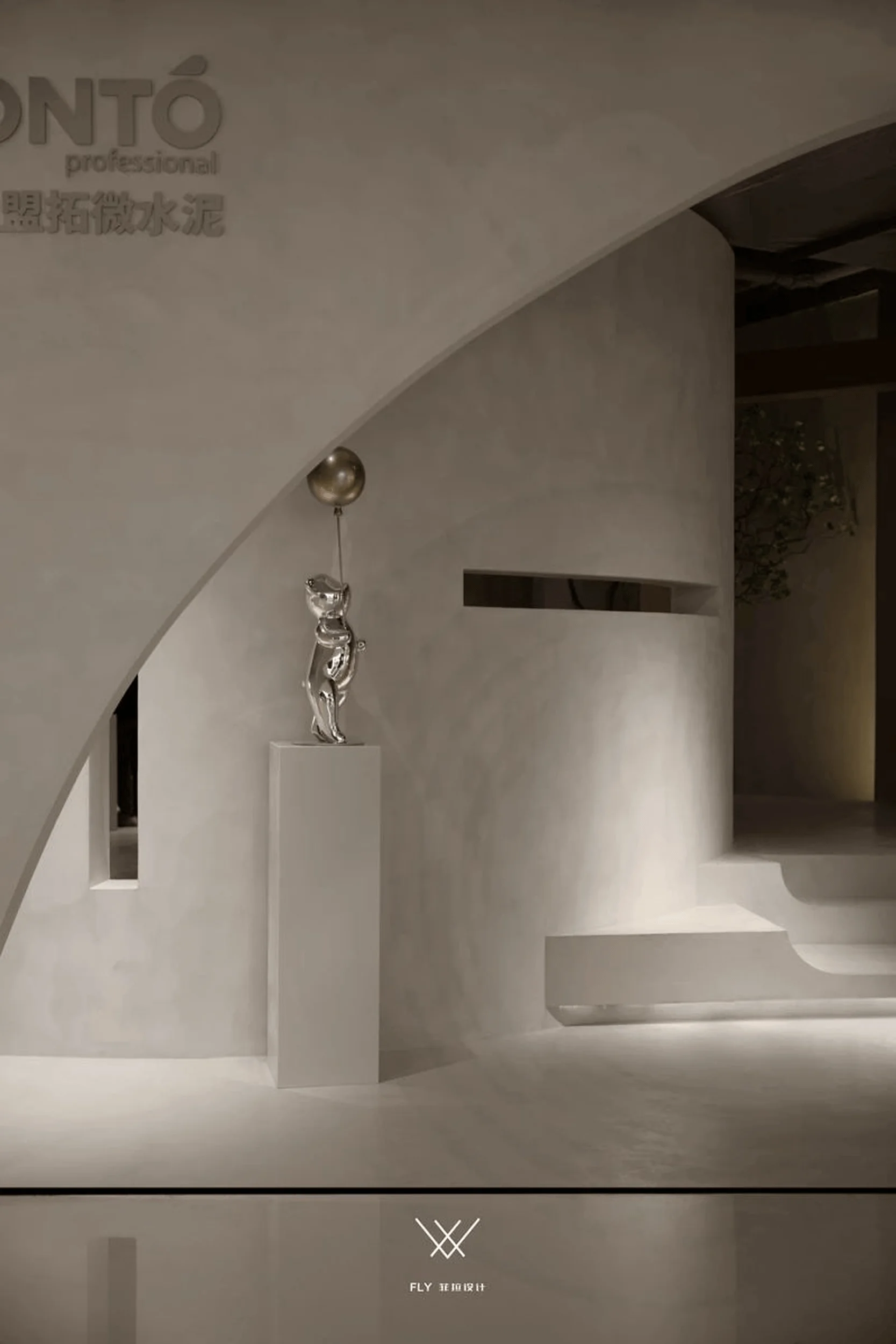
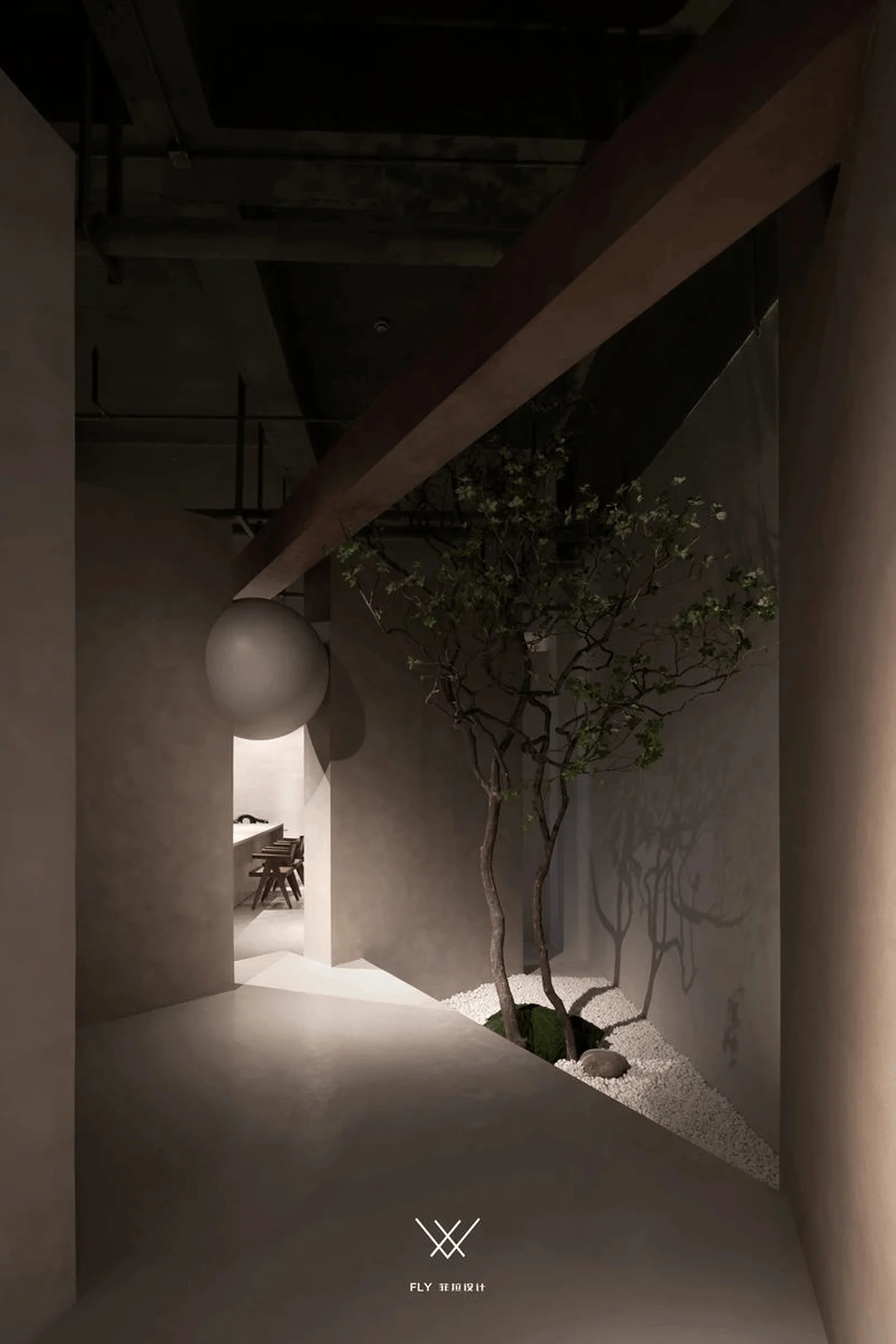
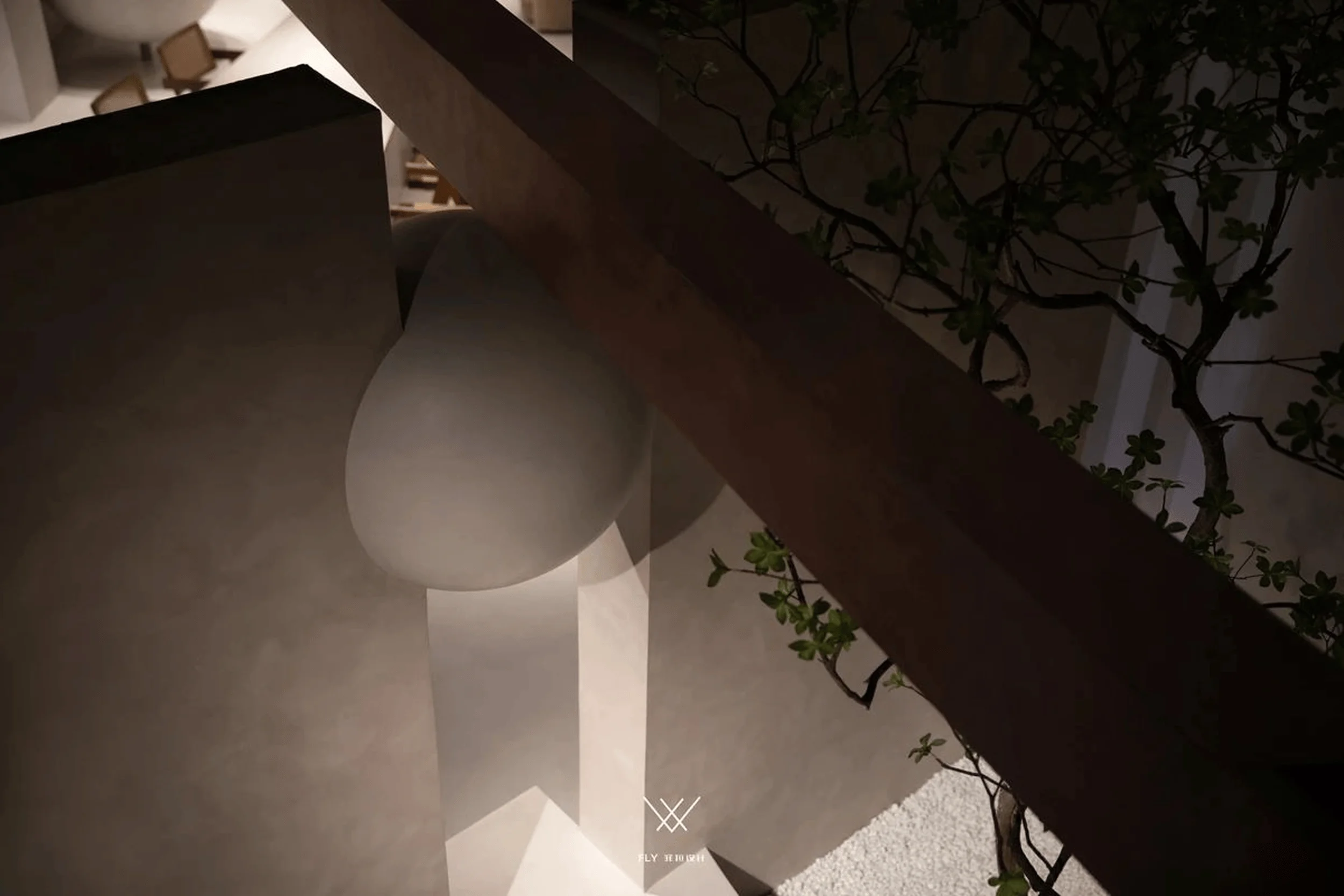
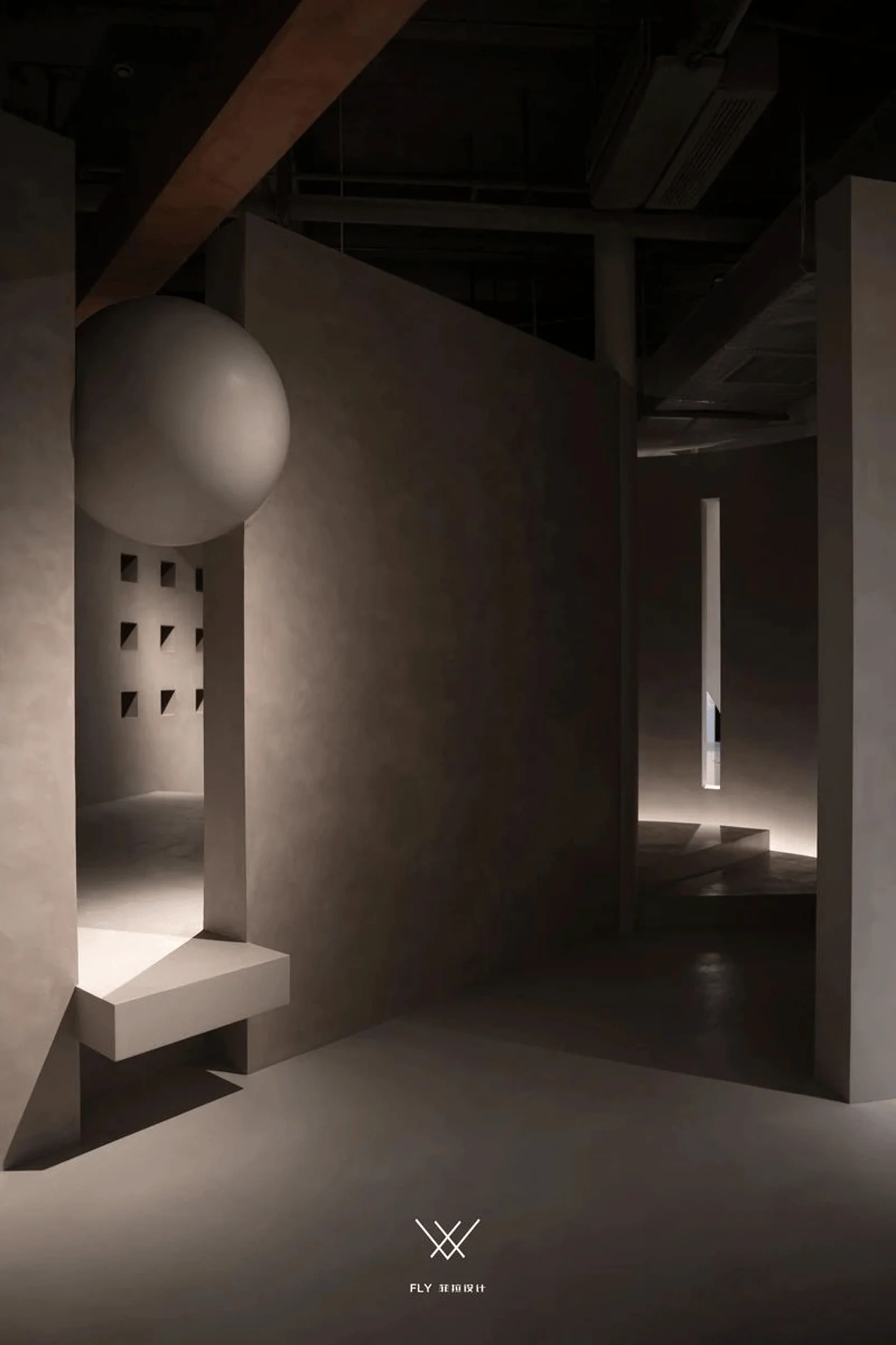
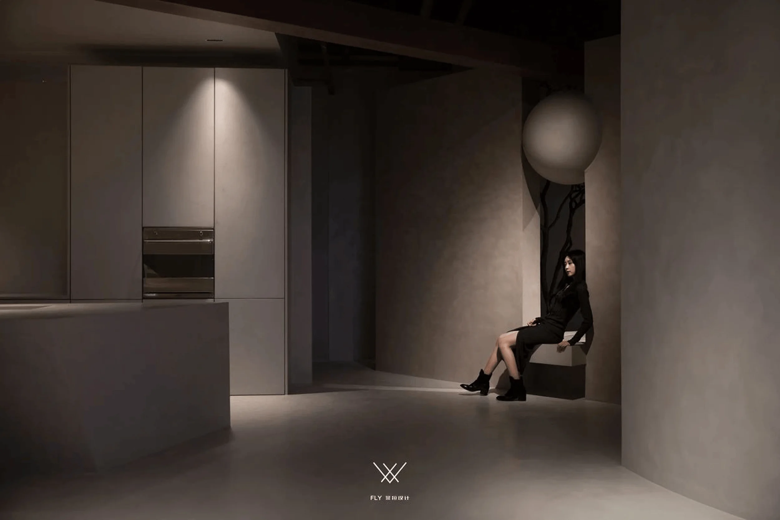
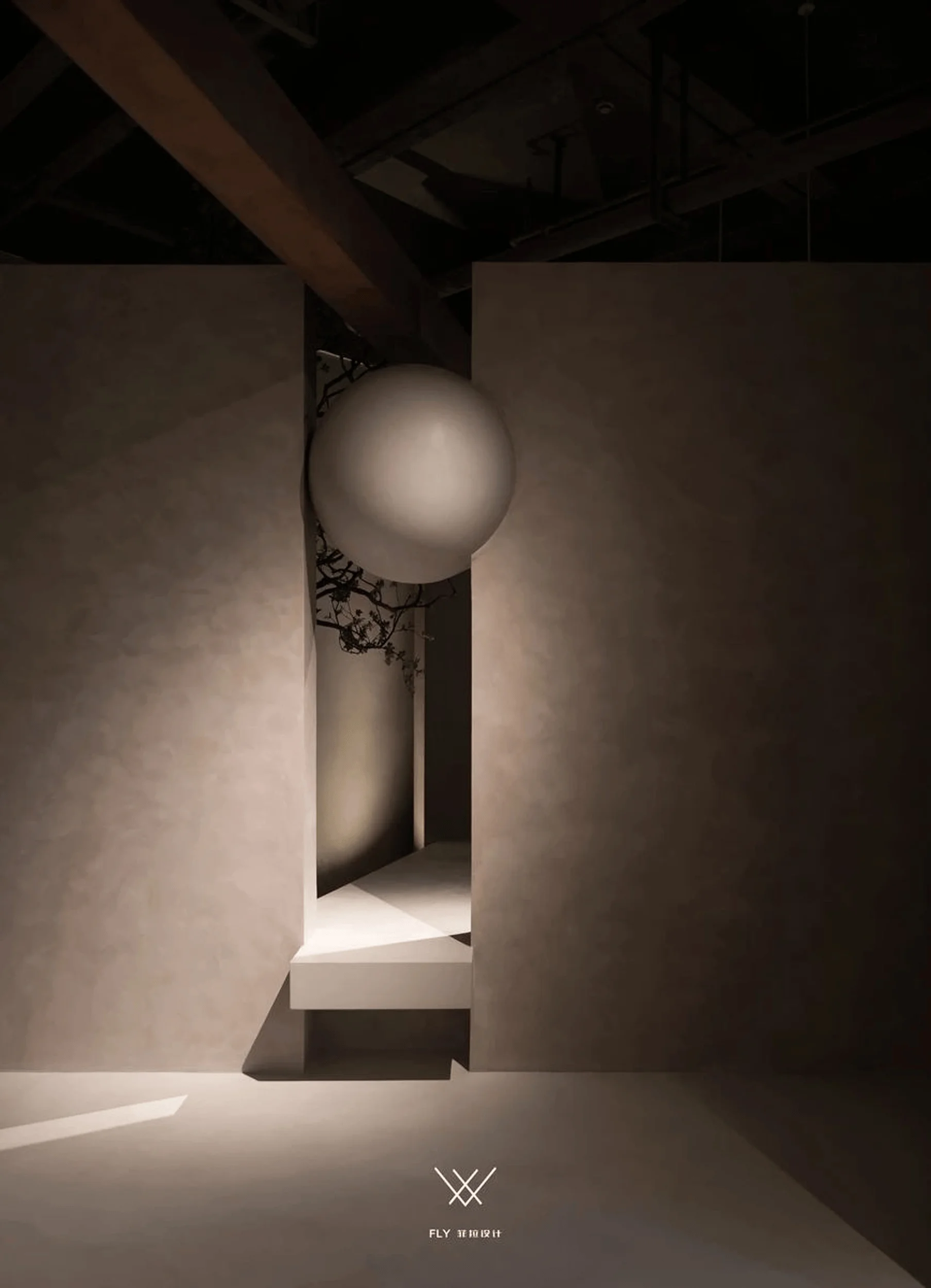
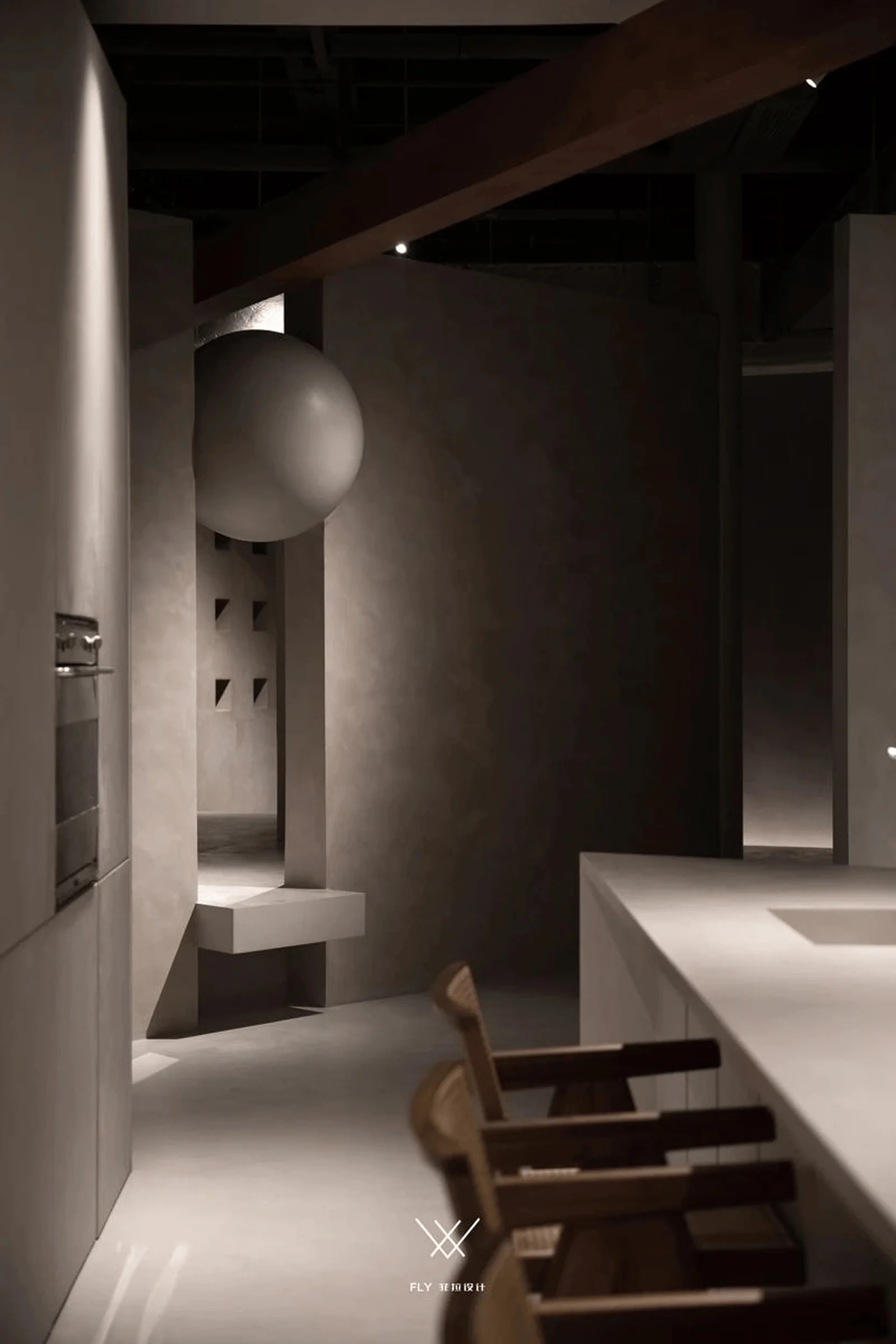
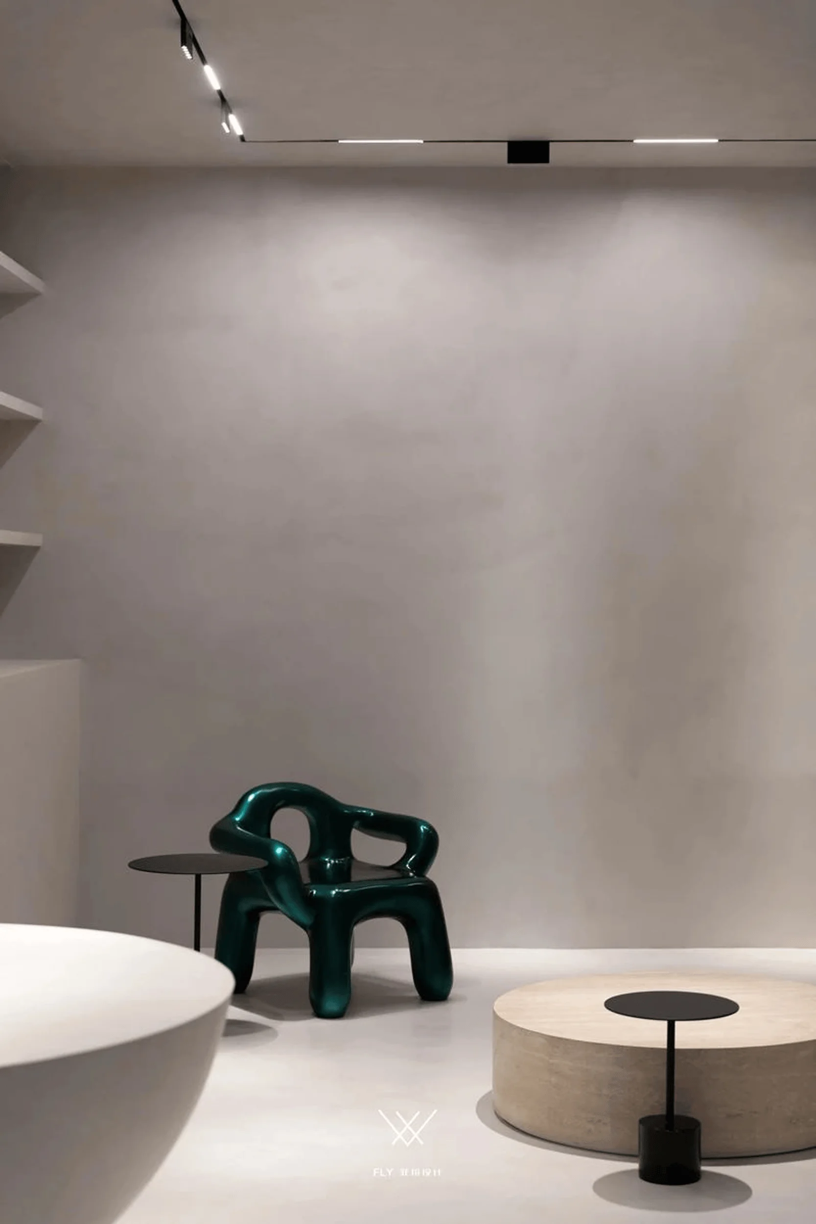
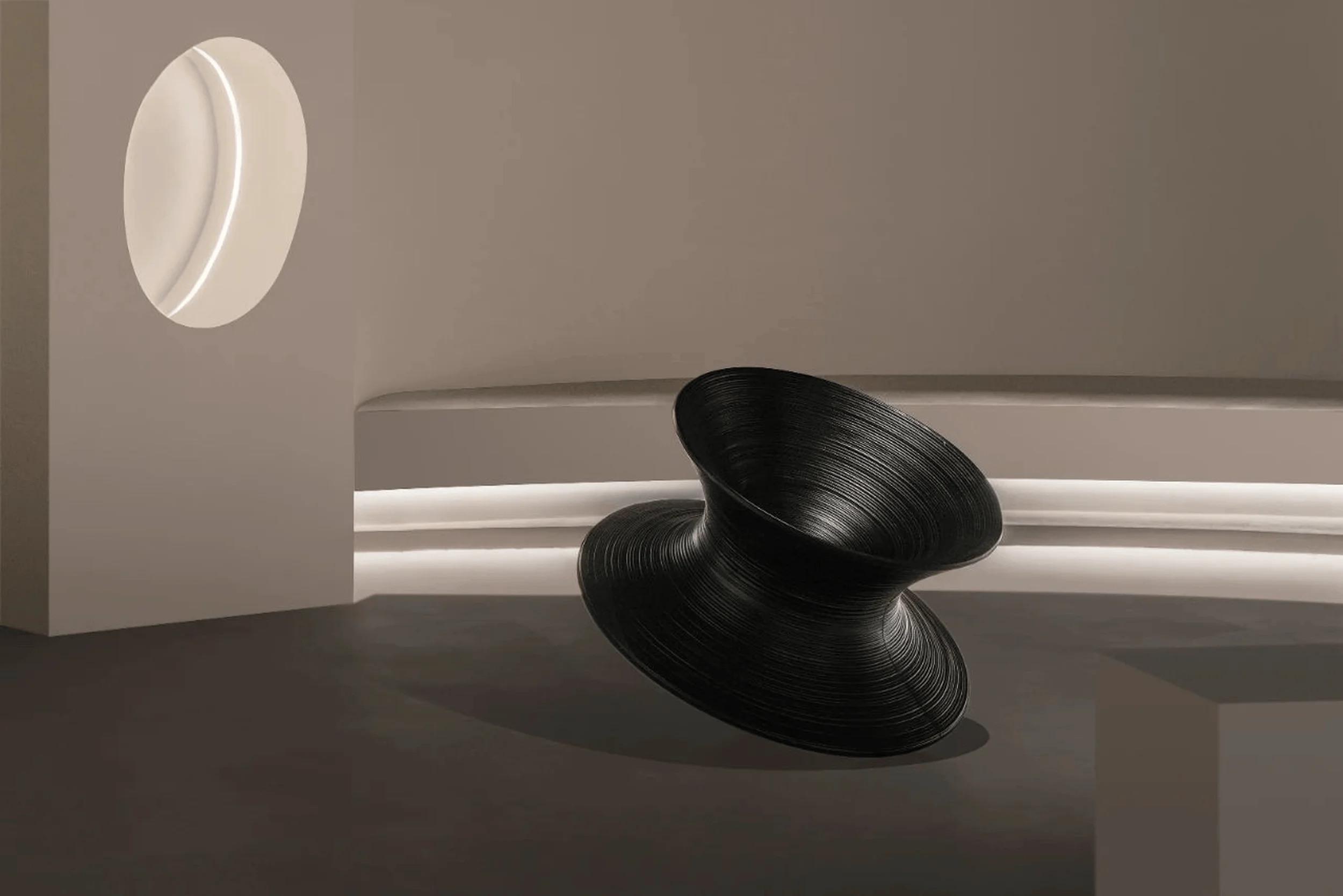
The main exhibition area highlights the interplay between form, color, and space using microcement. A suspended, spherical geometric element between two walls adds a sense of freedom and dynamism. This section demonstrates the material’s ability to seamlessly integrate with diverse shapes and structures, showcasing its strength and adaptability. Microcement’s inherent artistic qualities are further emphasized through its ability to create textured surfaces and facilitate diverse aesthetic expressions. The seamless application of microcement allows for the creation of continuous, flowing surfaces that enhance the overall aesthetic appeal of the space. Minimalist design principles are employed to create a serene and uncluttered atmosphere, allowing the inherent beauty of microcement to take center stage. tags:minimalist microcement architectural design,microcement interior design,microcement design,microcement architecture
Functional Areas and Design Highlights
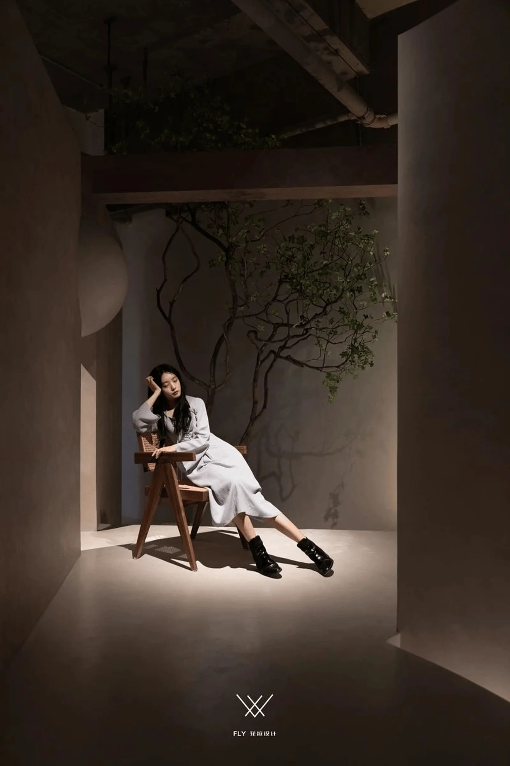
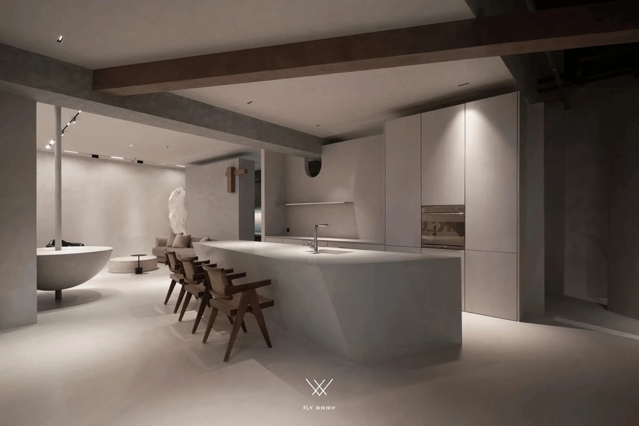
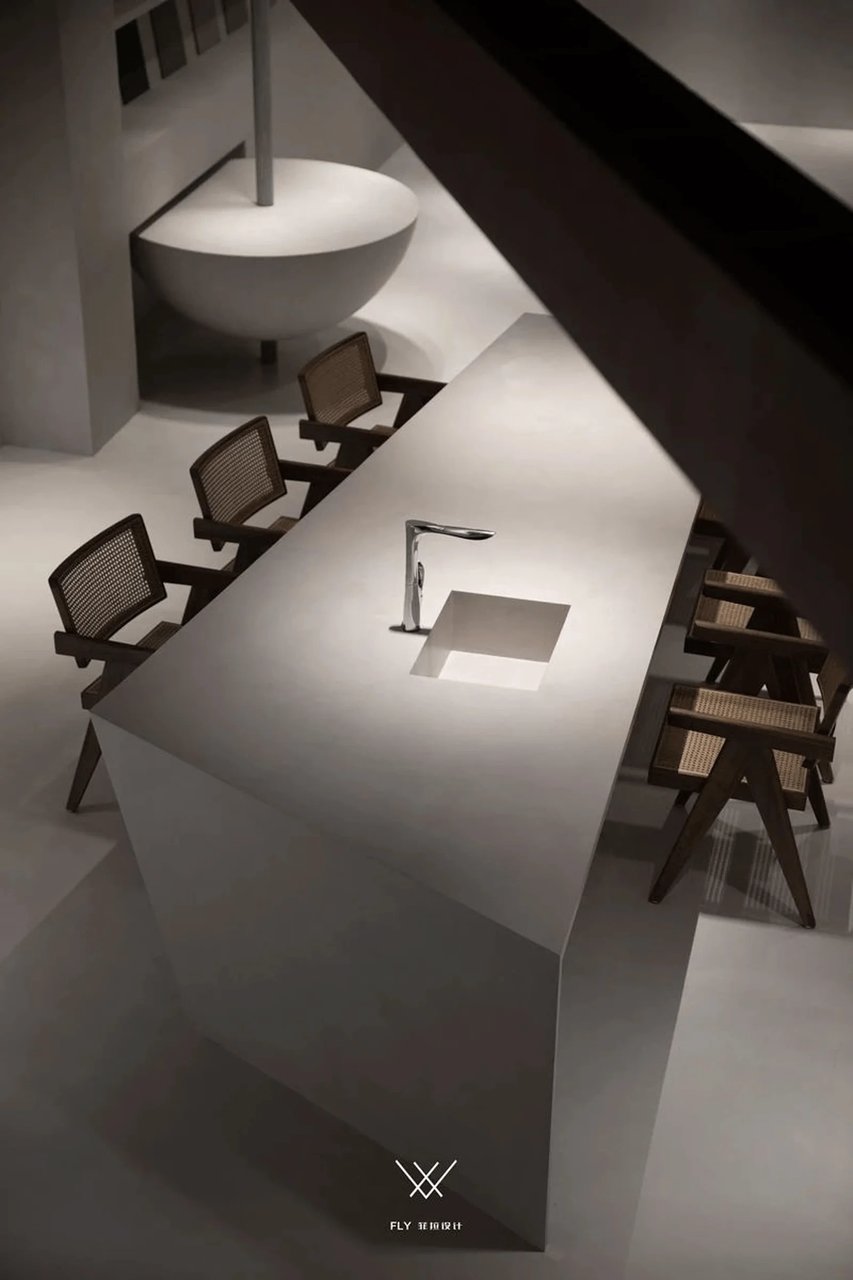
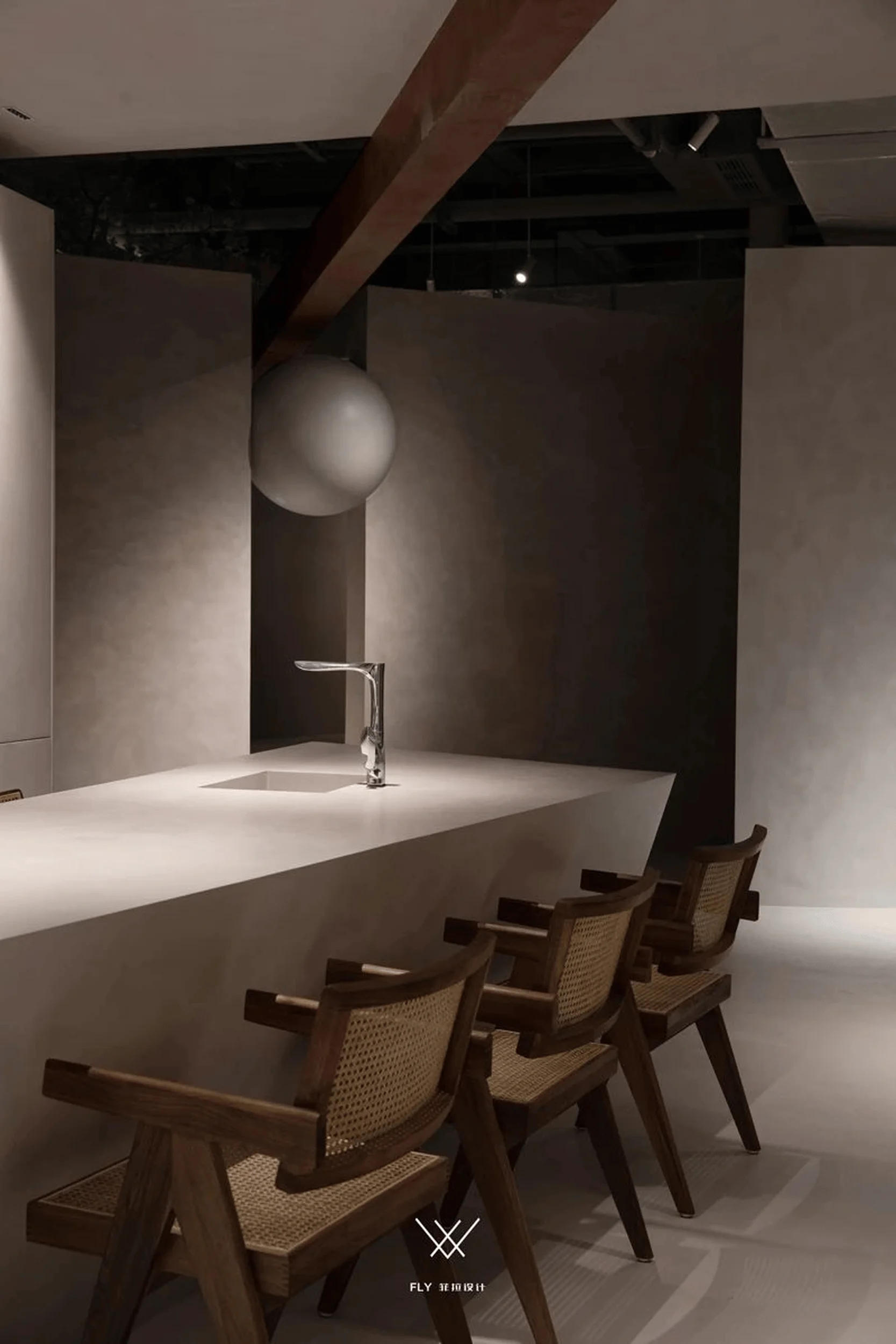
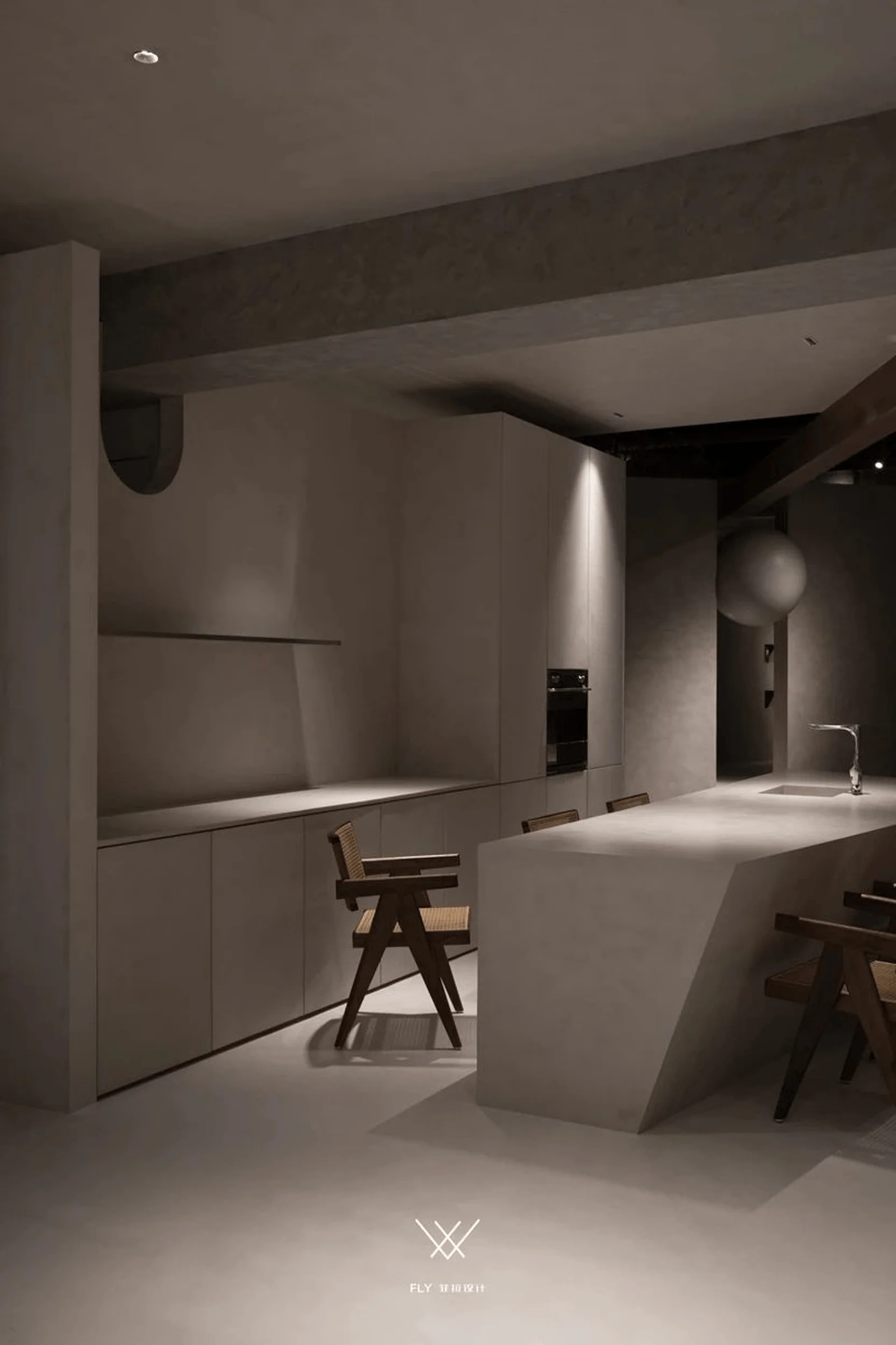
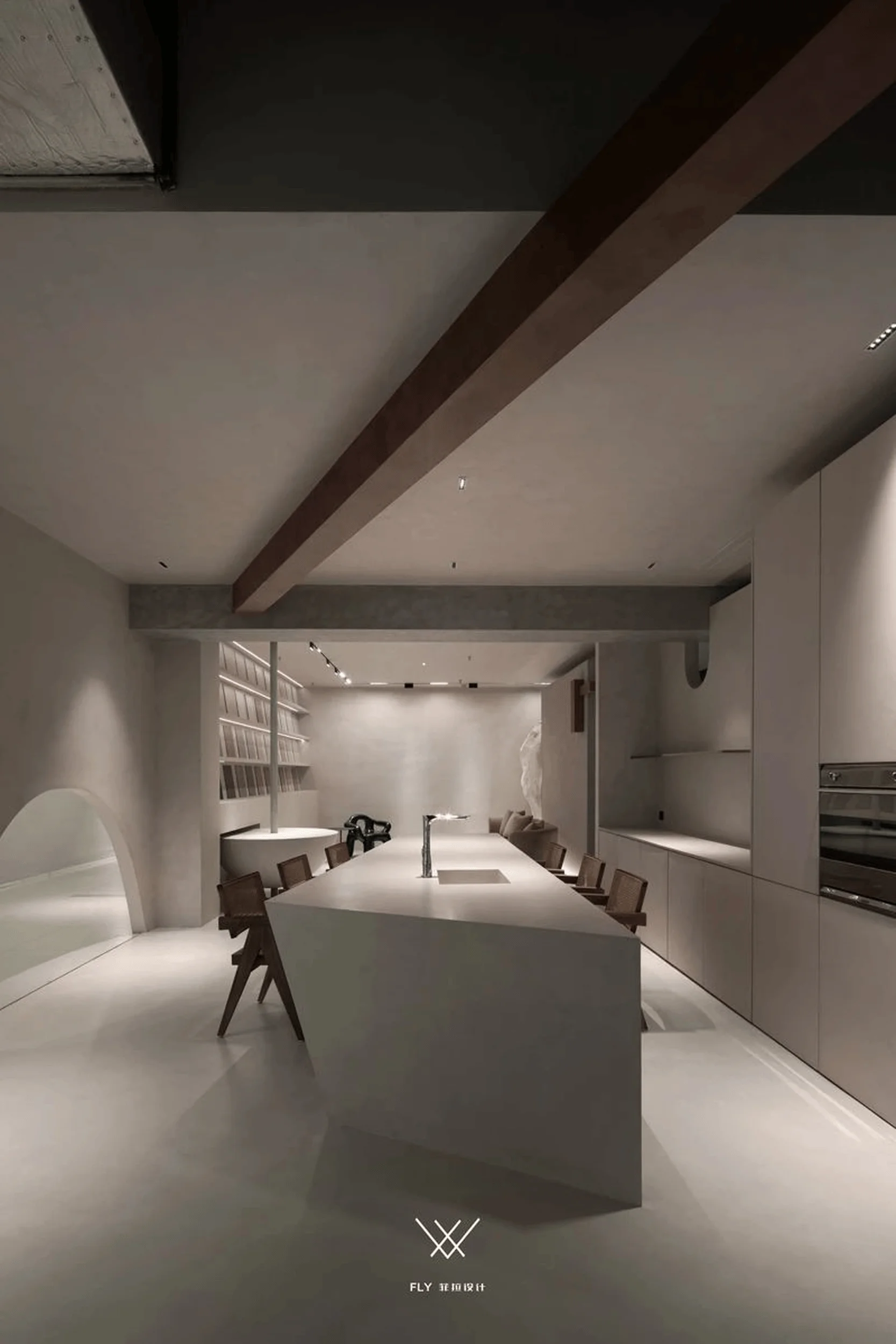
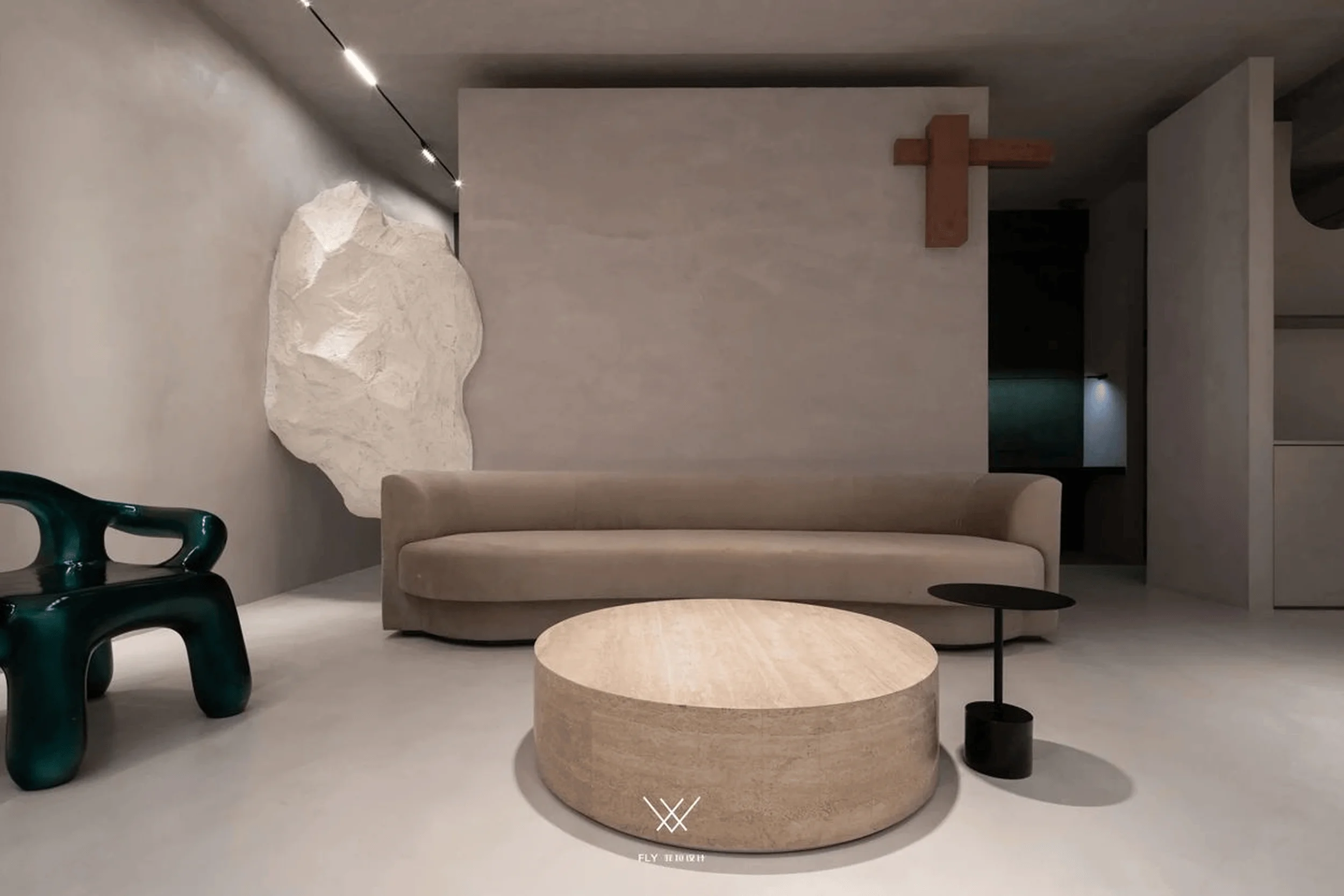
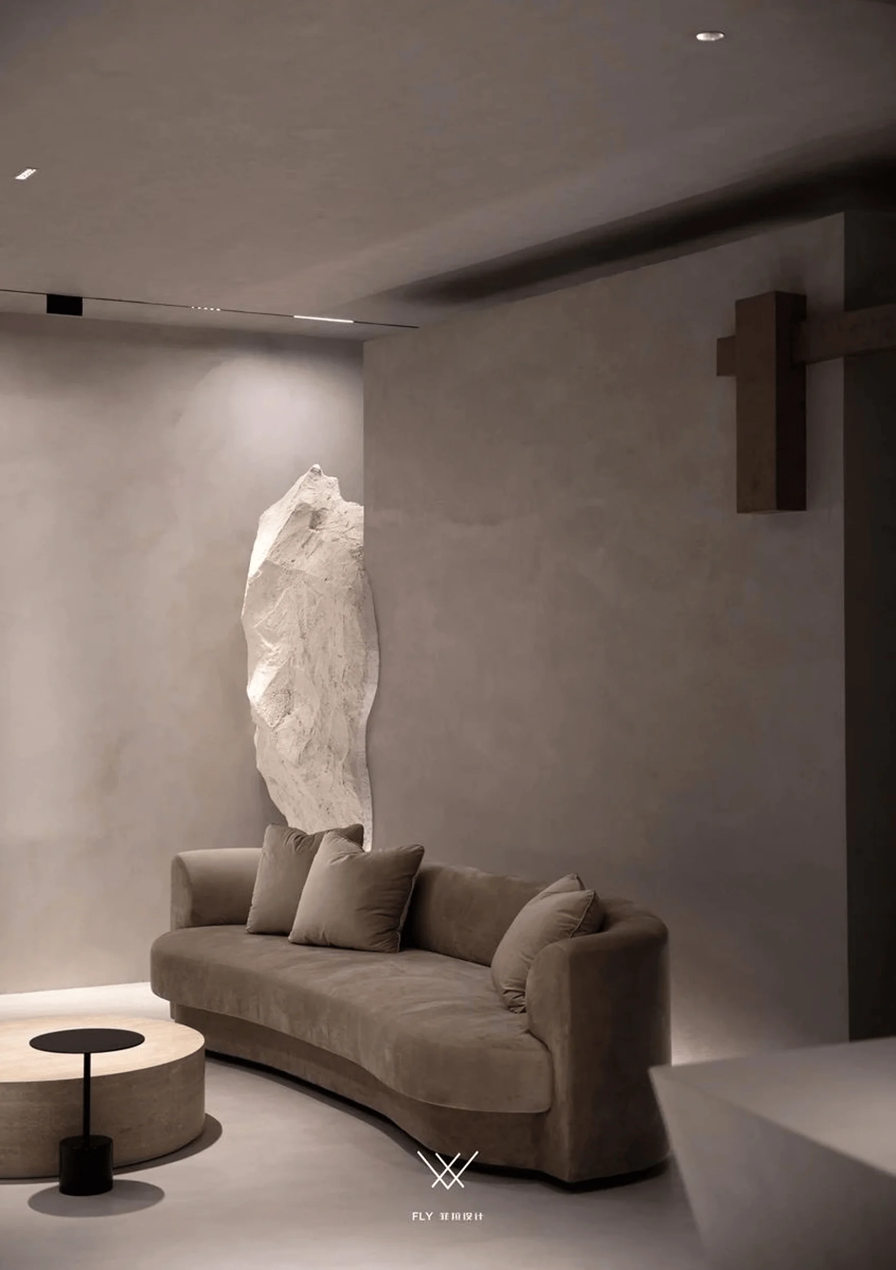
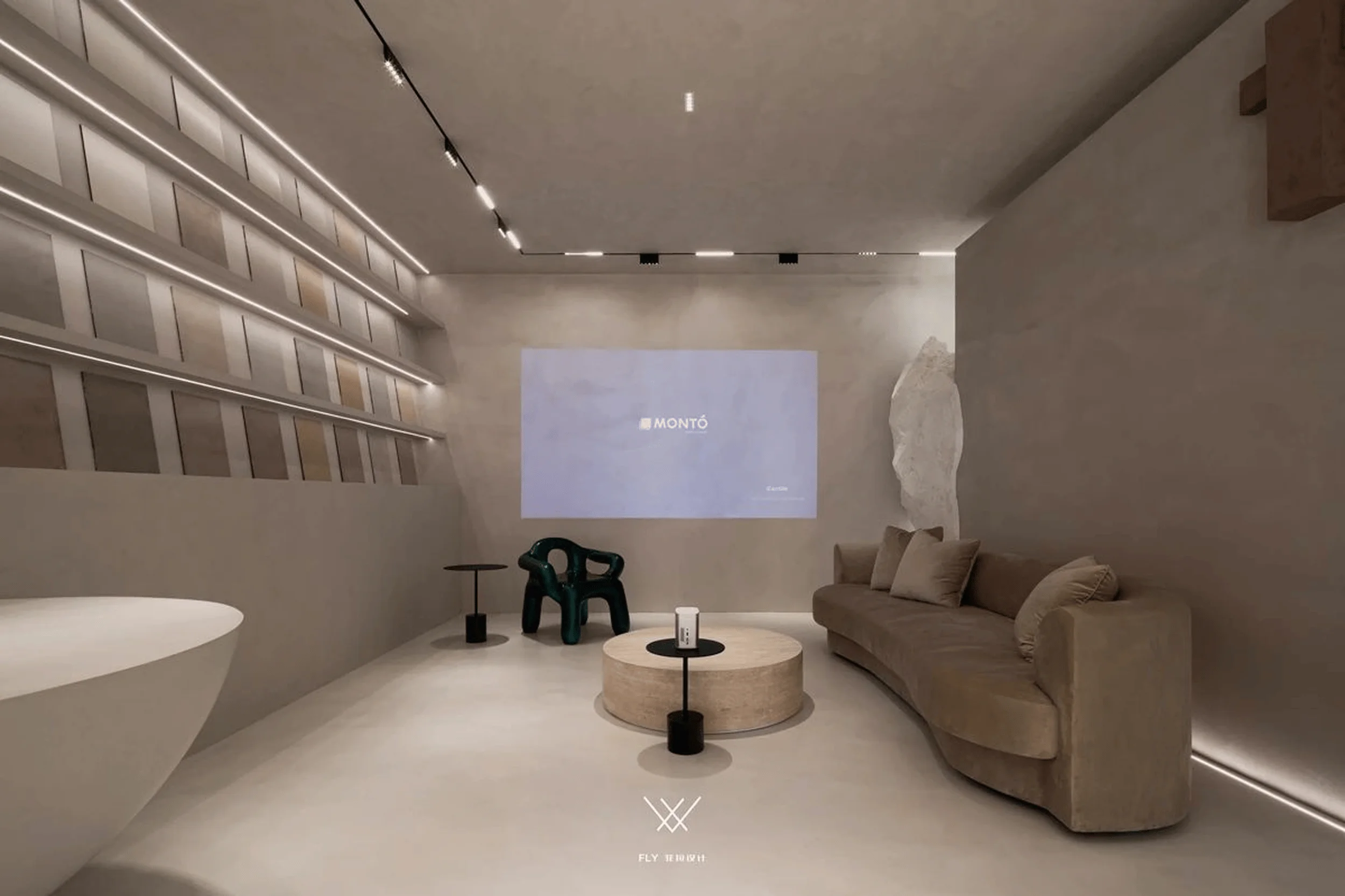
The Western Kitchen exemplifies the boundless possibilities of microcement in terms of volume, variables, form, and structure. The reception area features a suspended, irregular geometric element that complements the unique texture of microcement, fostering a sense of openness and freedom. The space is designed for versatility, serving as both an exhibition and projection area. The seating area includes a multifunctional wall that provides a sense of security, acts as a partition, and offers storage space. This innovative use of space maximizes functionality while maintaining a minimalist aesthetic. The interplay of natural light and carefully placed lighting fixtures enhances the microcement’s texture and creates a warm and inviting atmosphere. tags:minimalist microcement architectural design,microcement interior design,microcement design,microcement architecture
Color Palette and Artistic Influence
Inspired by the works of Giorgio Morandi, the design incorporates a muted color palette characterized by gentleness, simplicity, and tranquility. The colors, while rich and nuanced, remain understated and contribute to the overall minimalist aesthetic. This minimalist approach extends to the color palette, creating a visually harmonious and calming environment. The use of soft, muted tones complements the microcement’s subtle texture, resulting in a space that exudes both elegance and tranquility. By exploring the relationship between form, color, and space through irregular geometric shapes, the design achieves a unique and visually captivating expression. tags:minimalist microcement architectural design,microcement interior design,microcement design,microcement architecture
Project Information:
Project Type:Experience Center
Architect:FLY Design
Project Year:Not Available
Country:Spain
Main Materials:Microcement
Photographer:FLY Design


