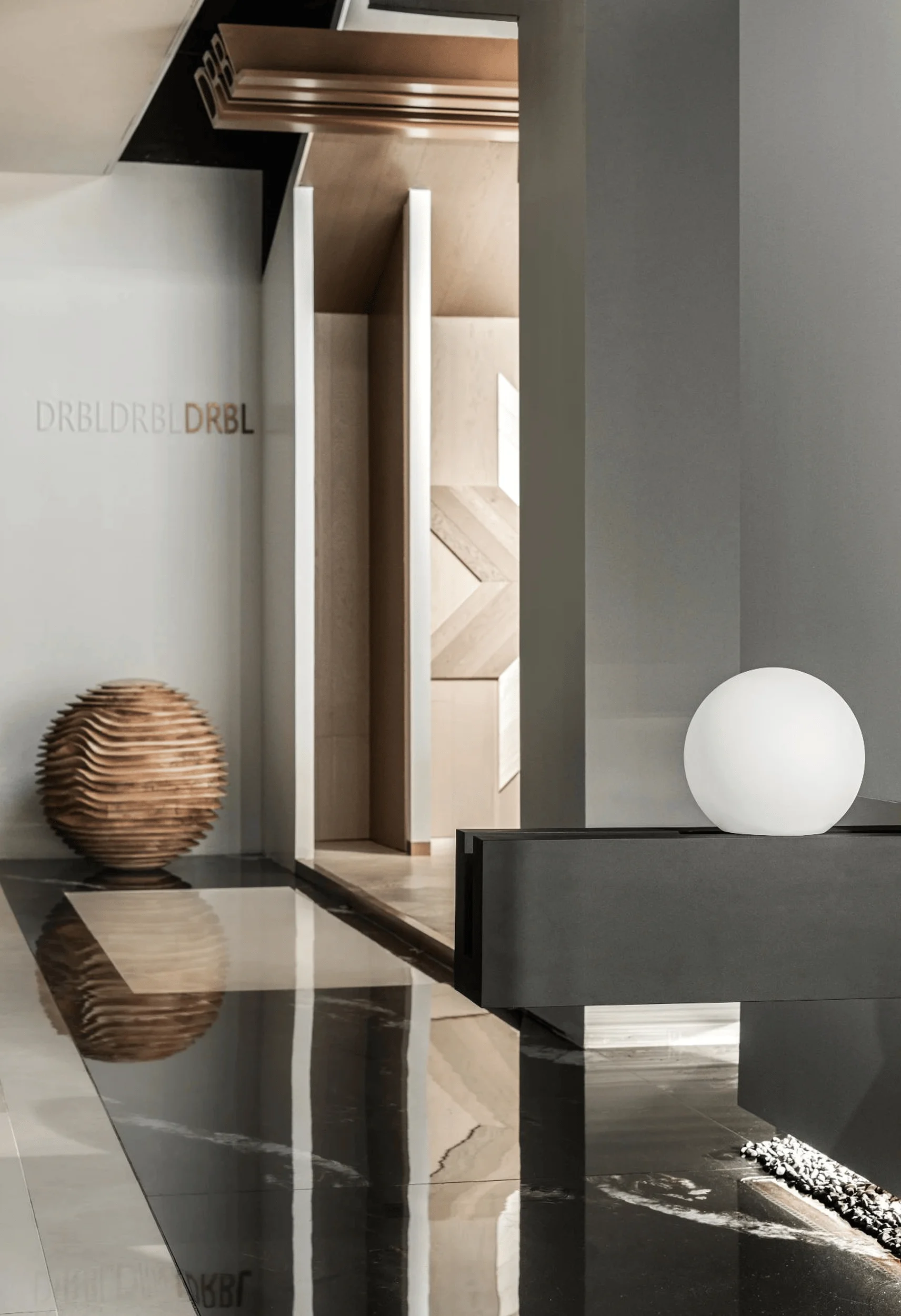
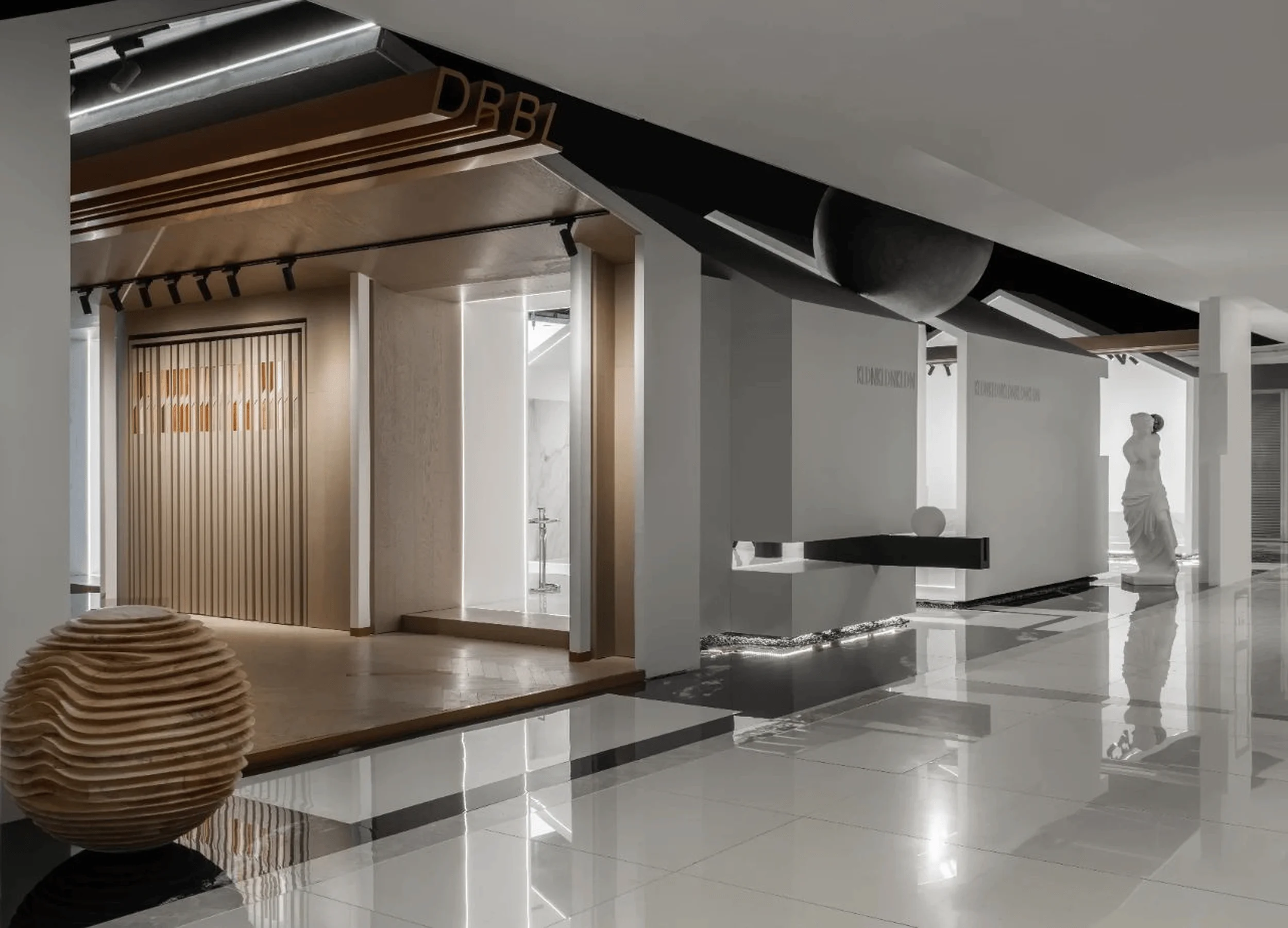
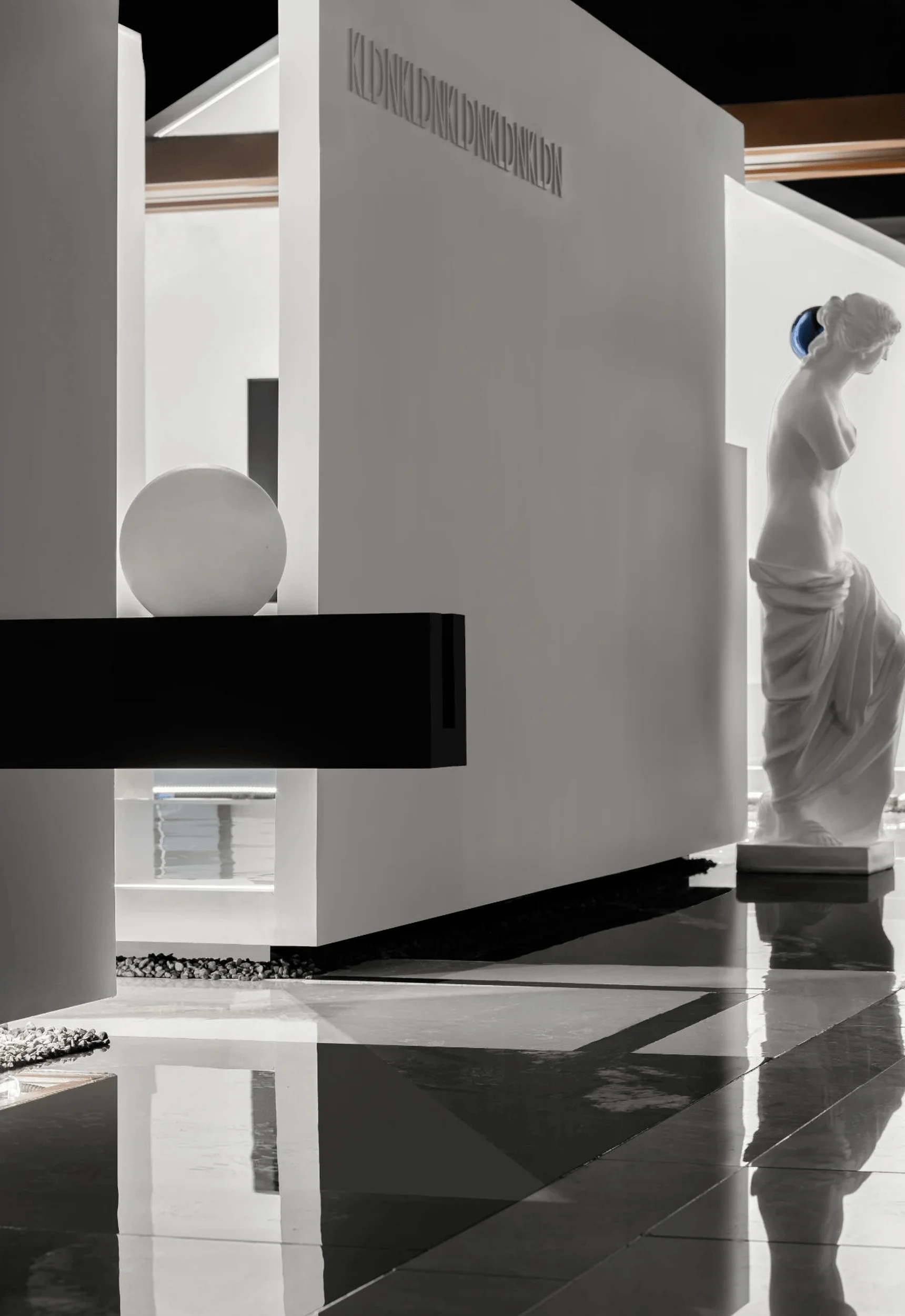
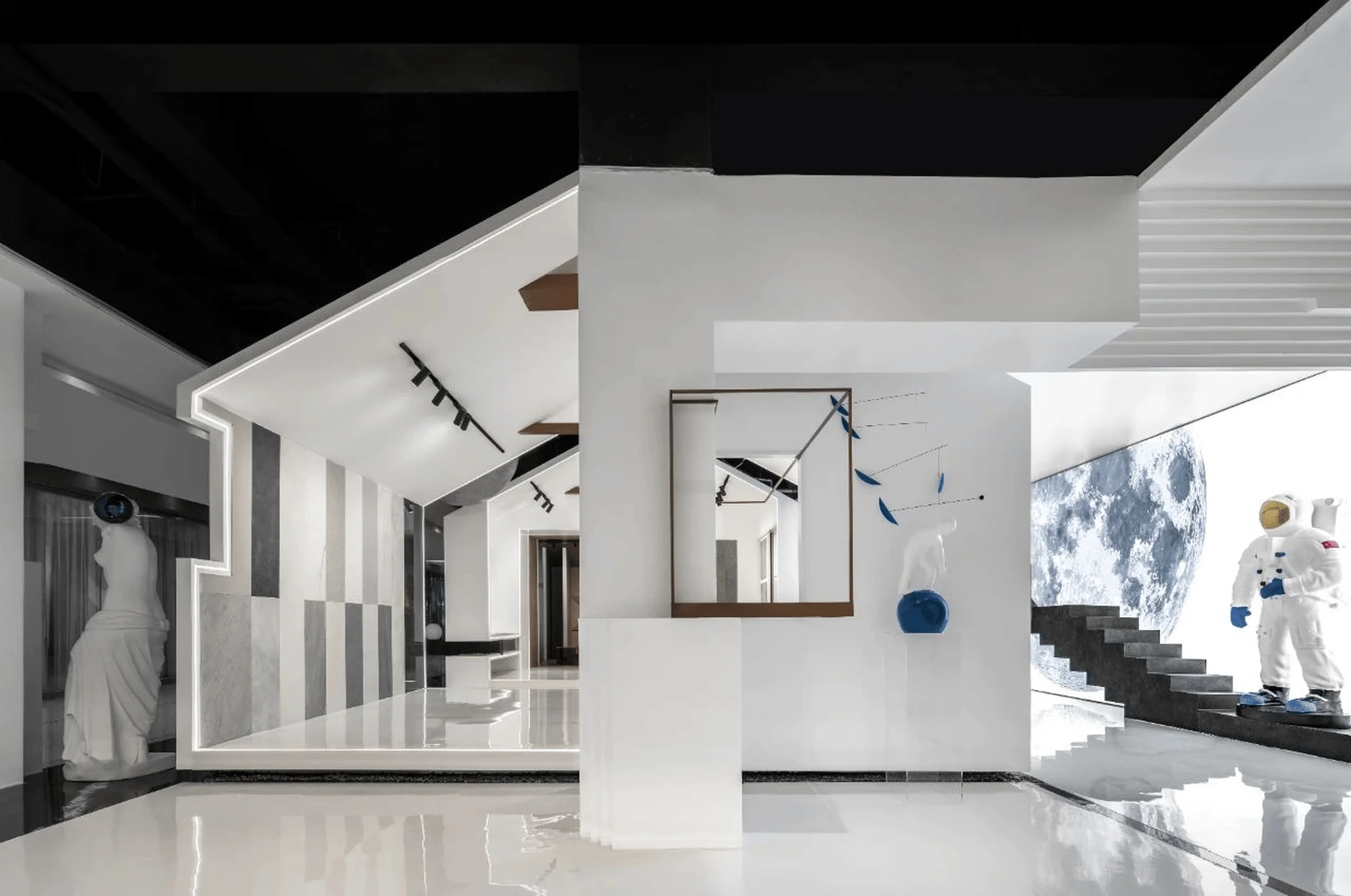
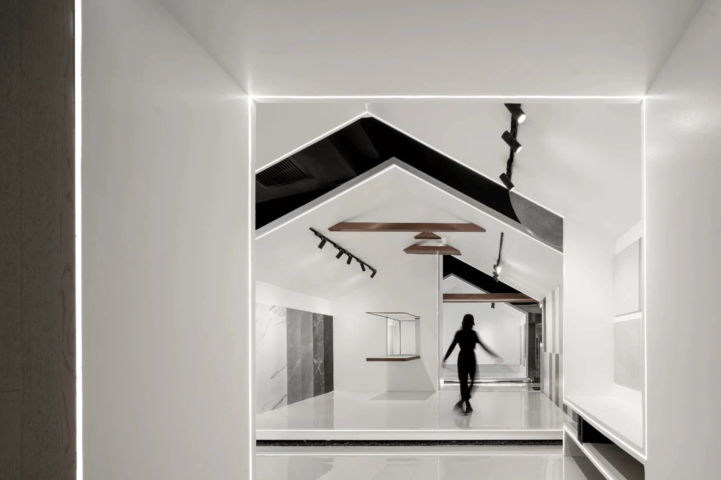
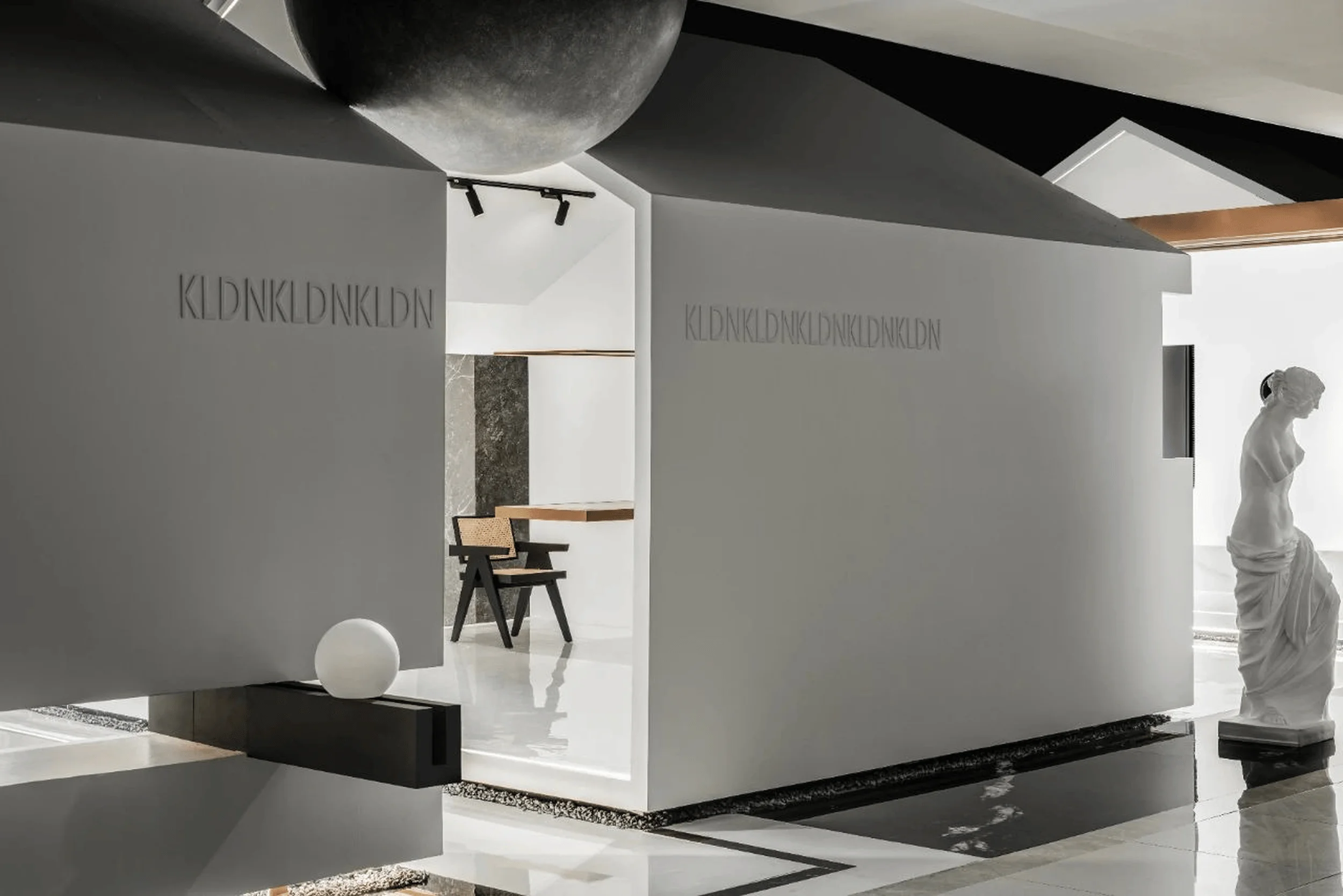
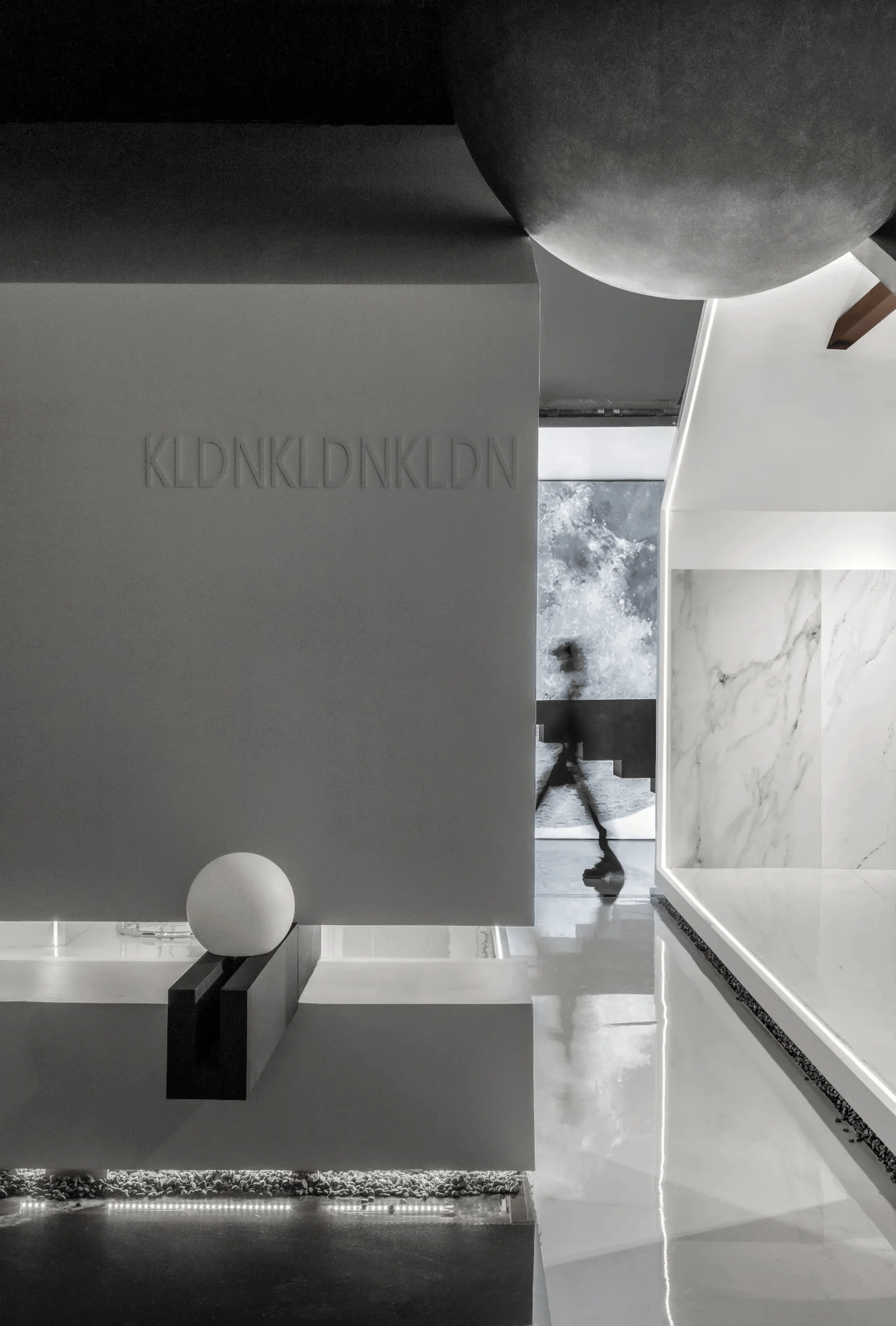
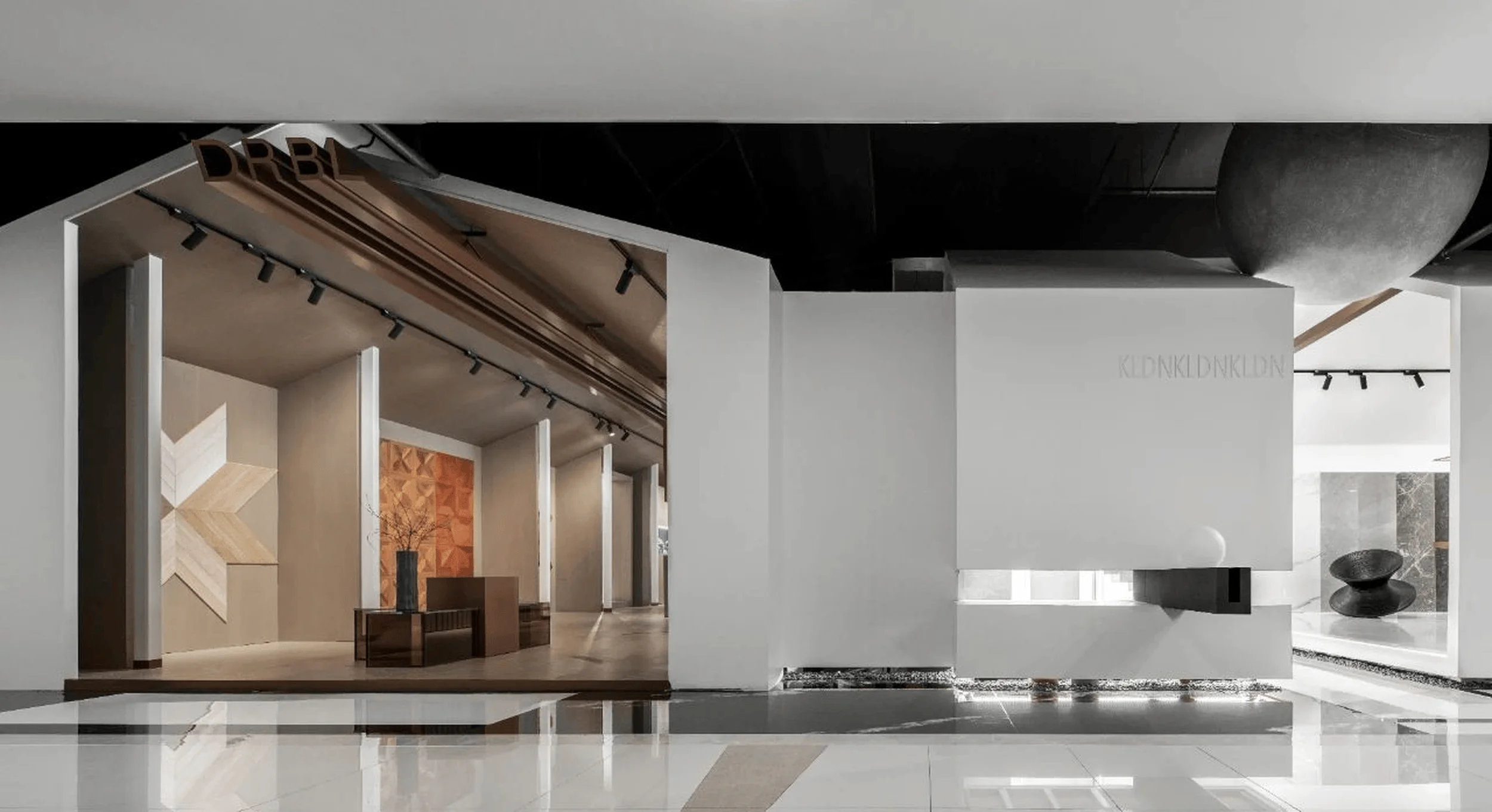
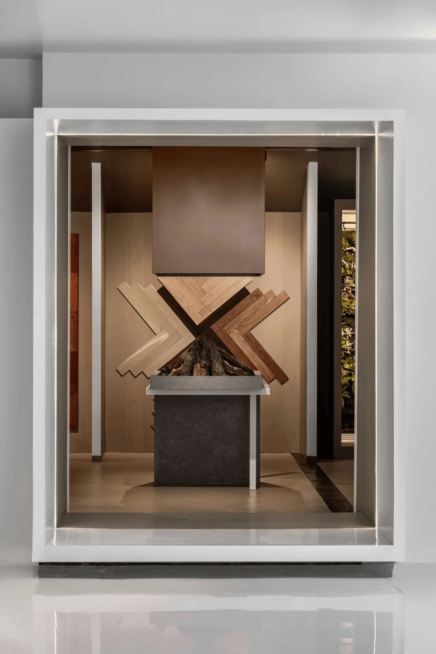
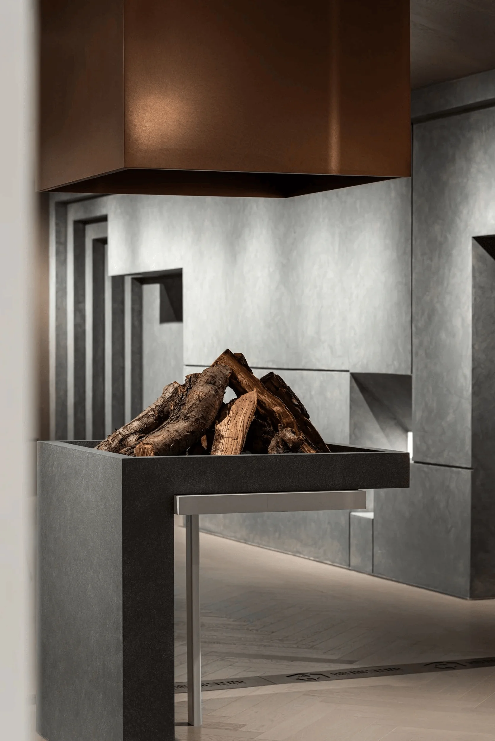
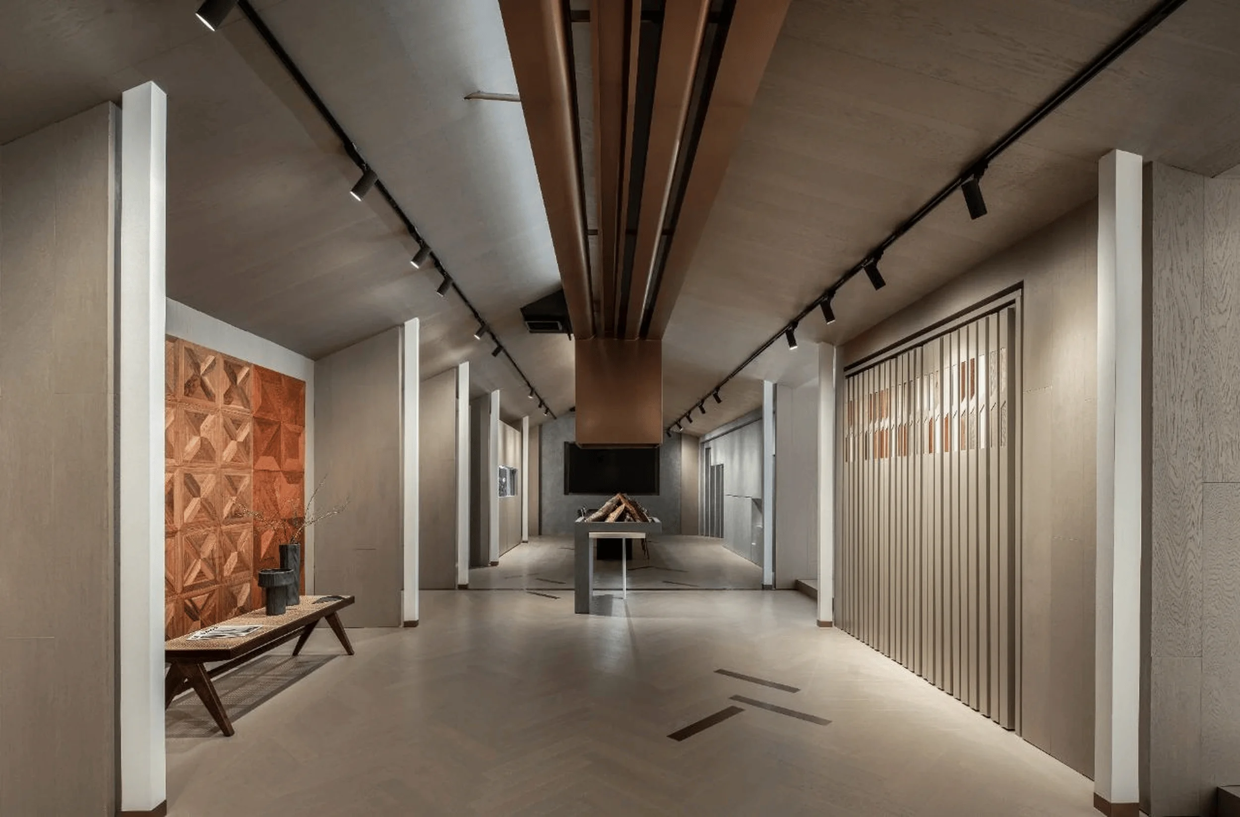
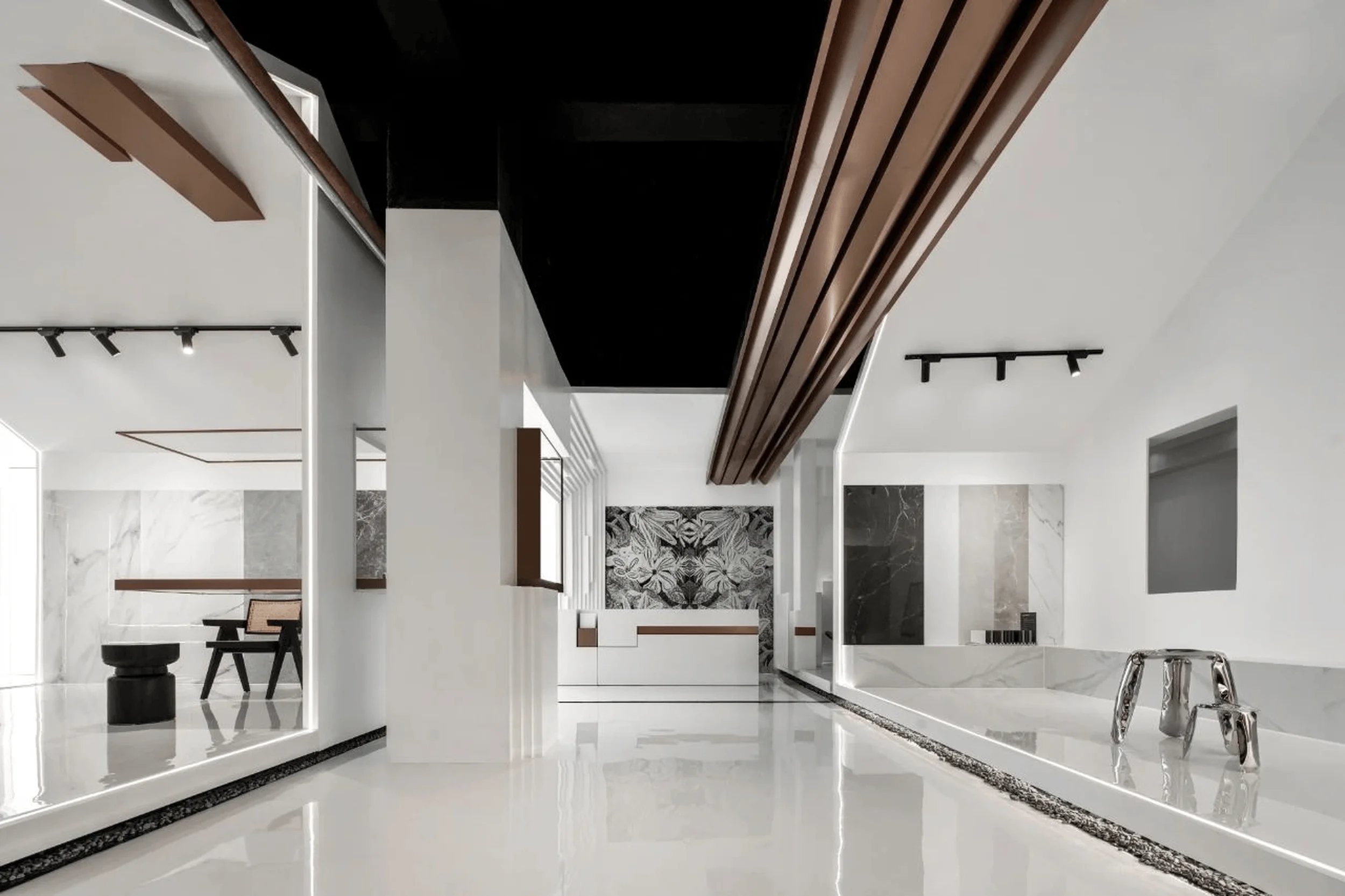
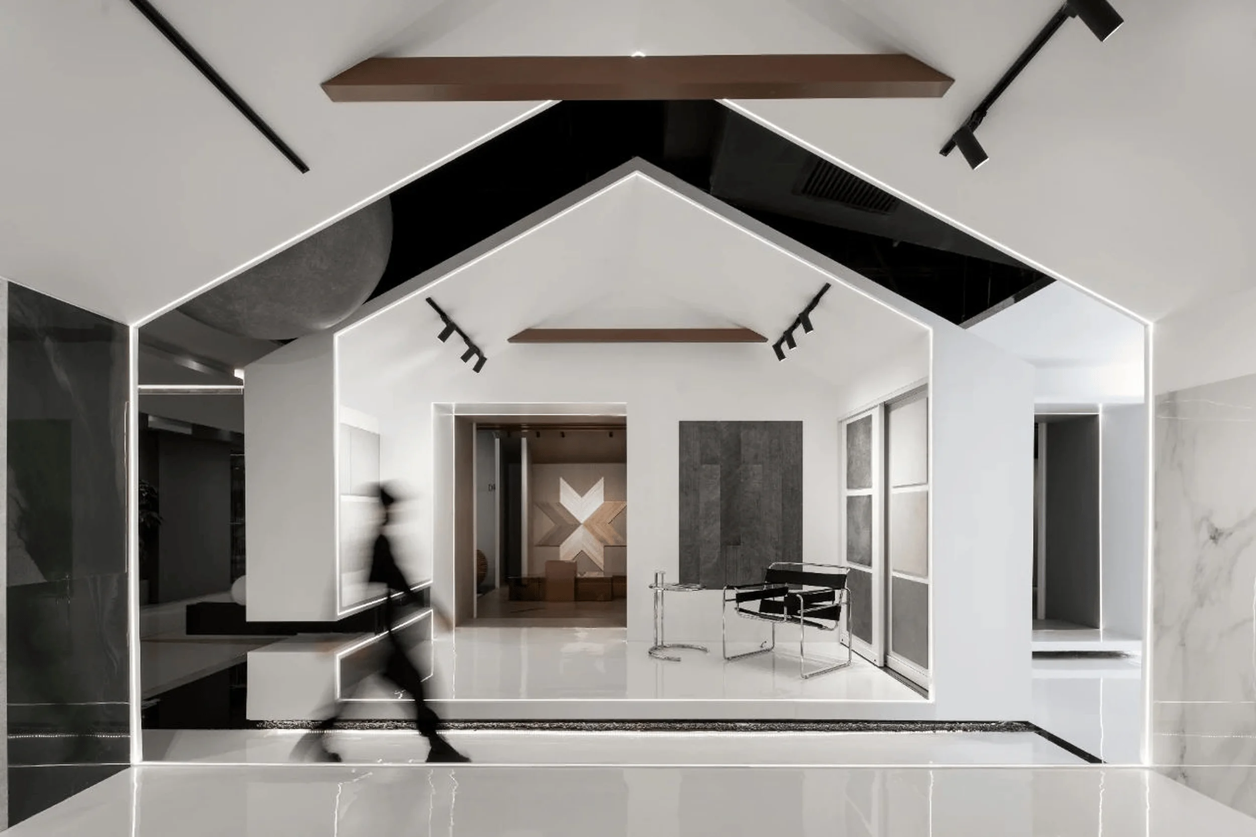
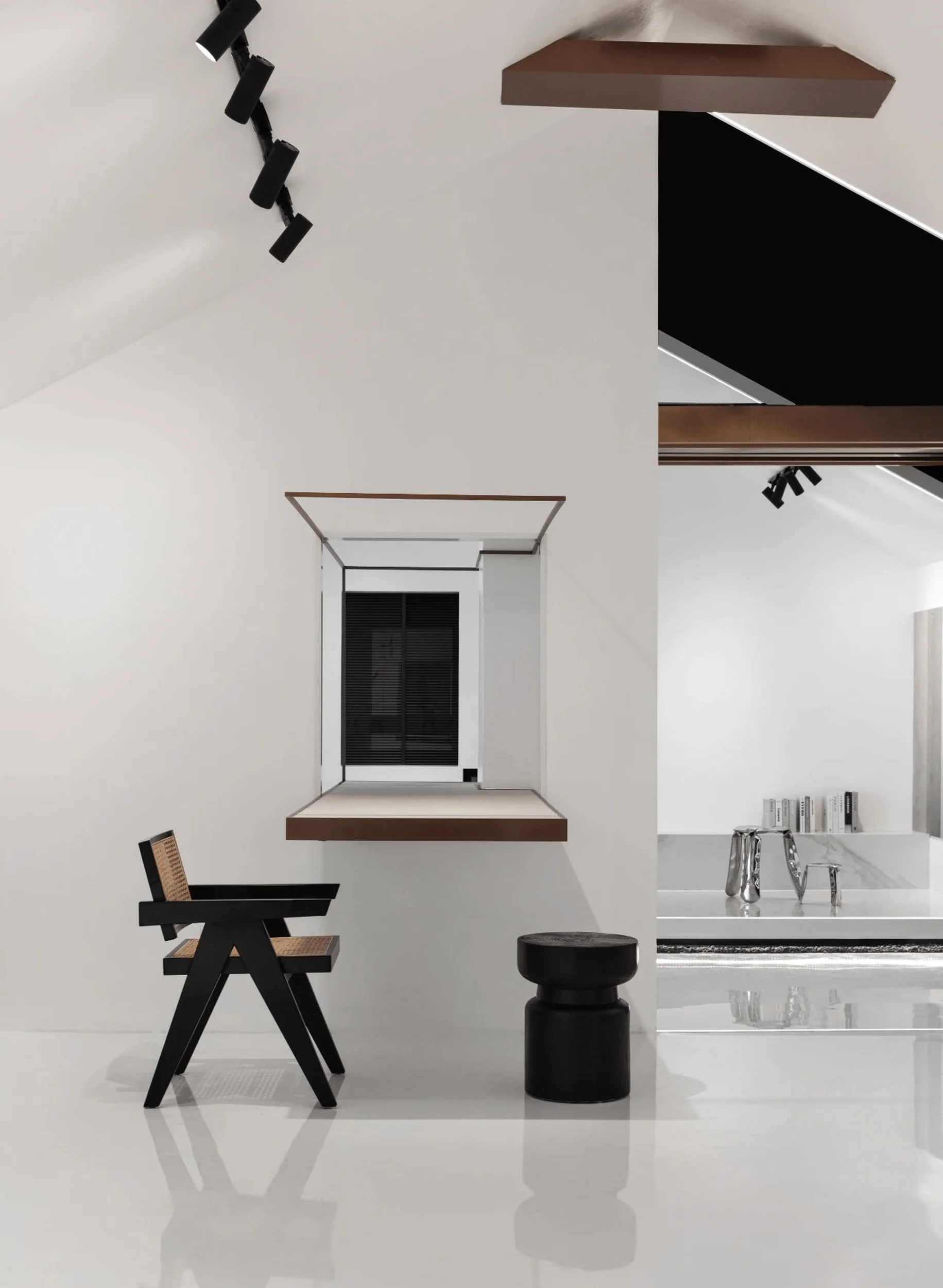
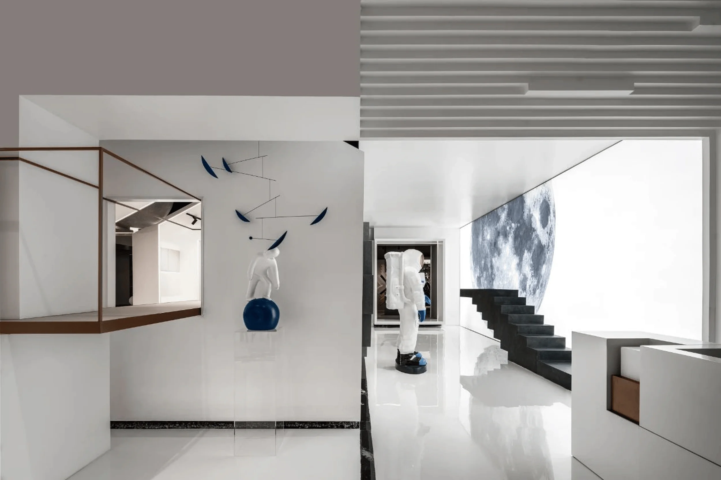
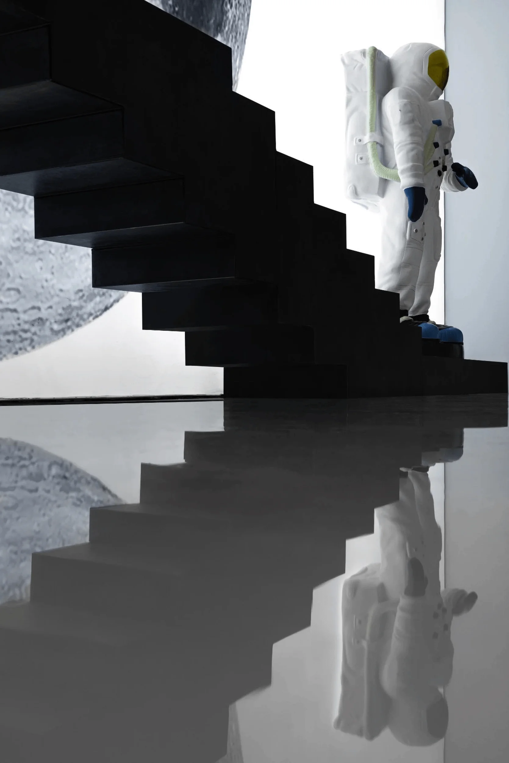
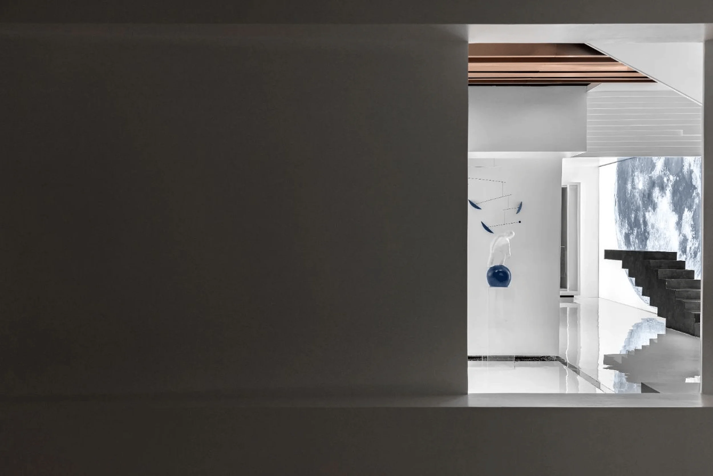
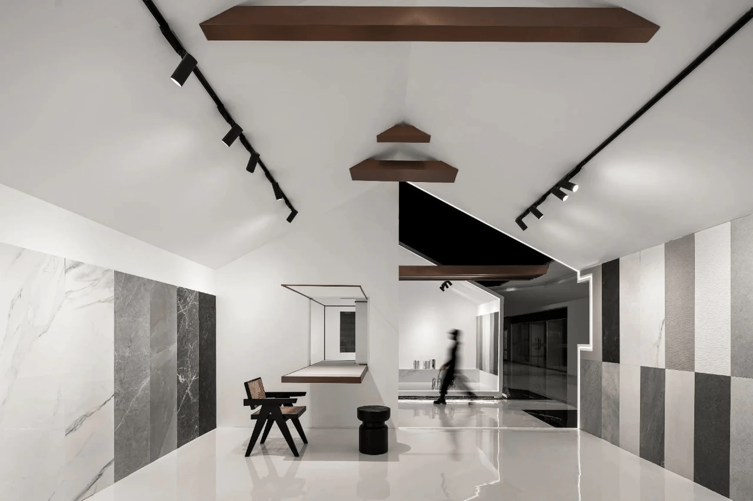
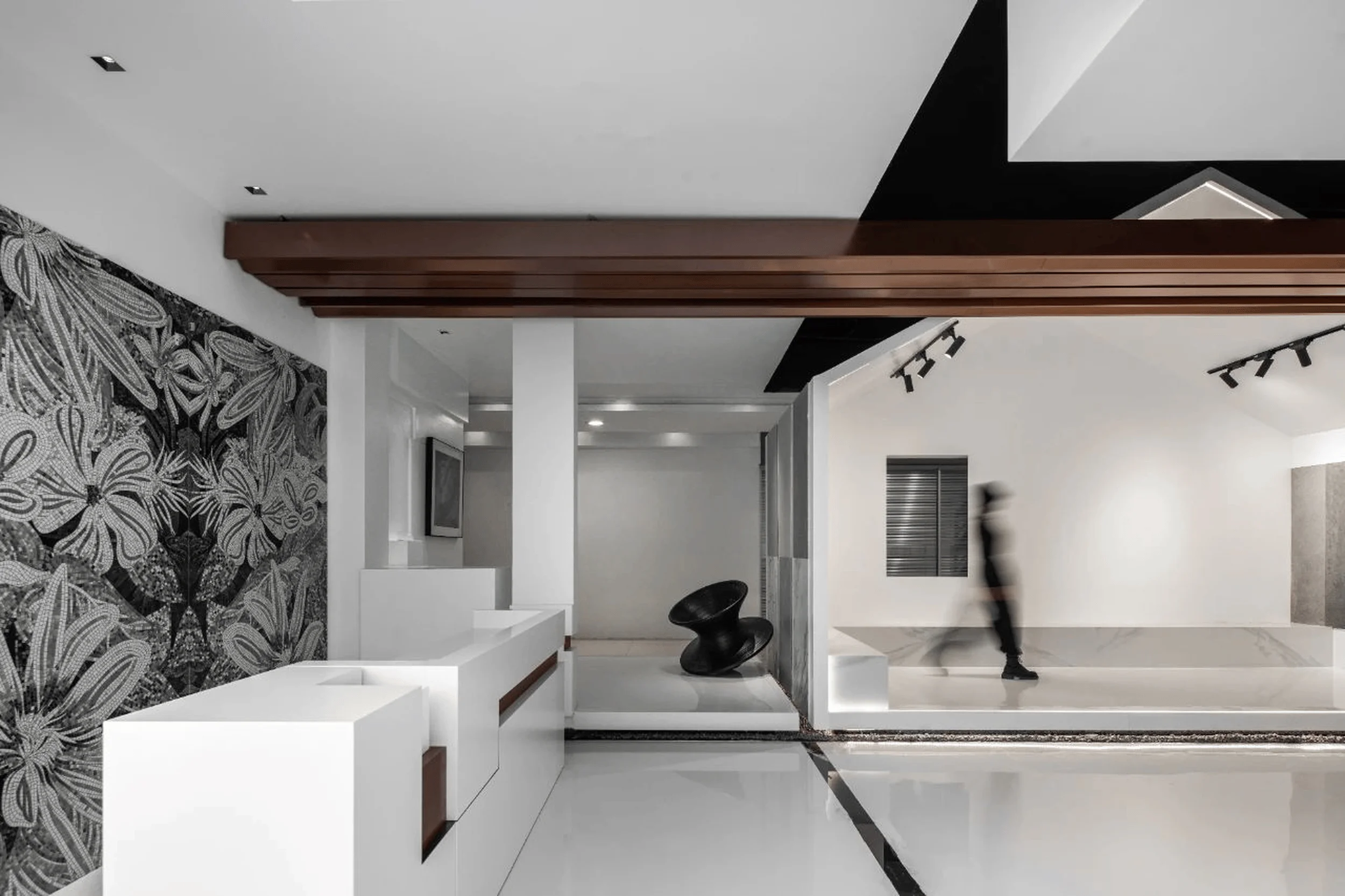
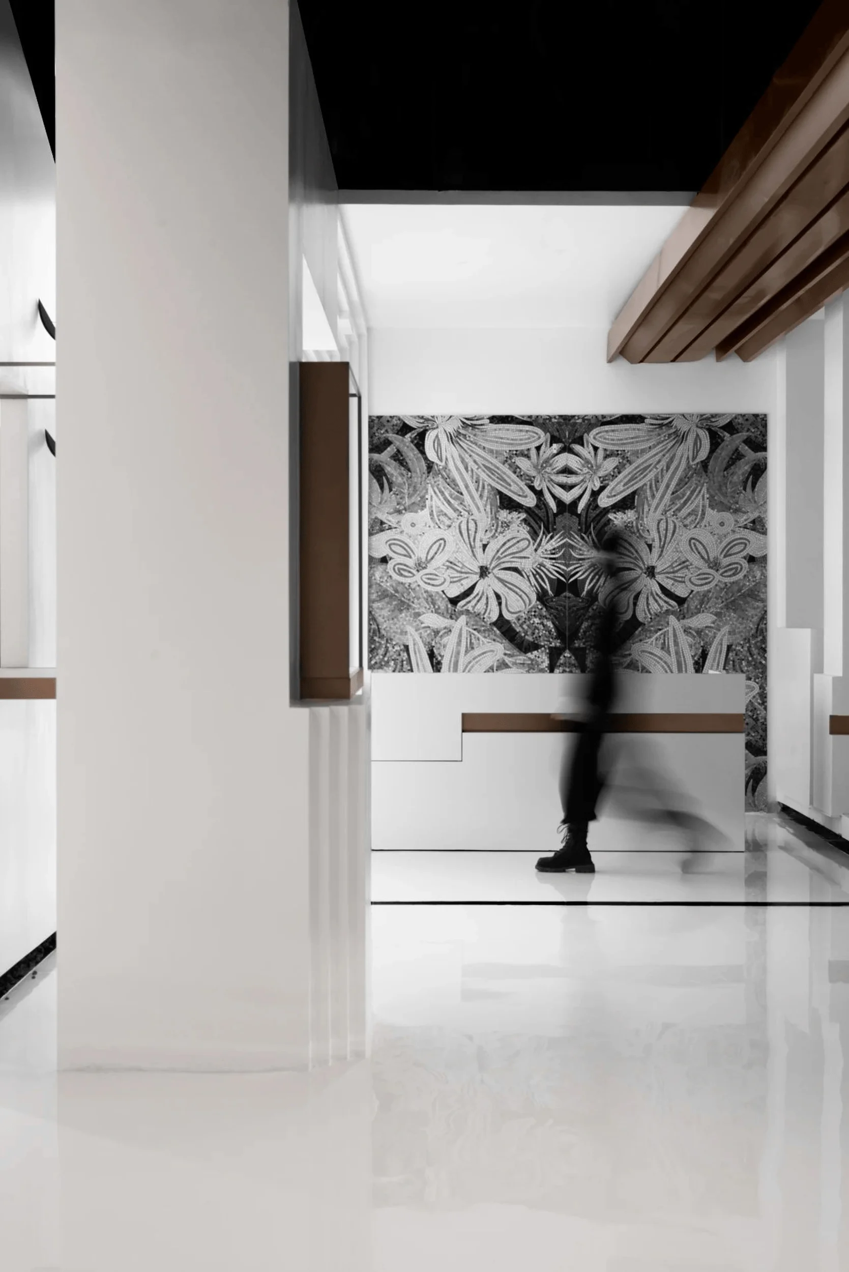
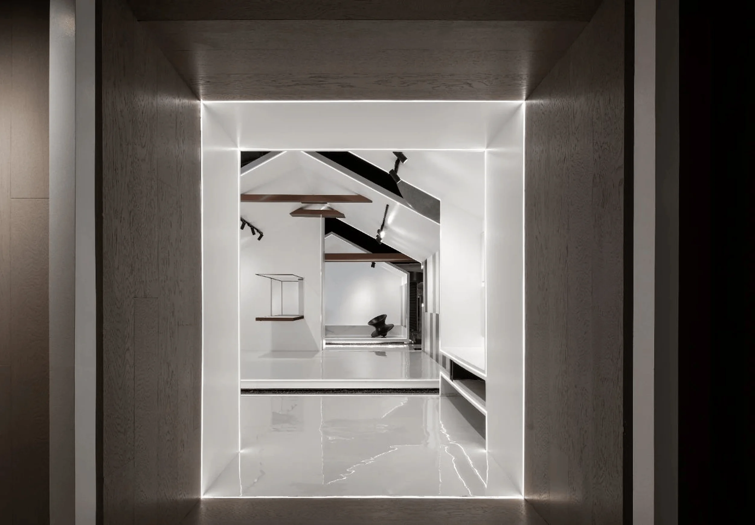
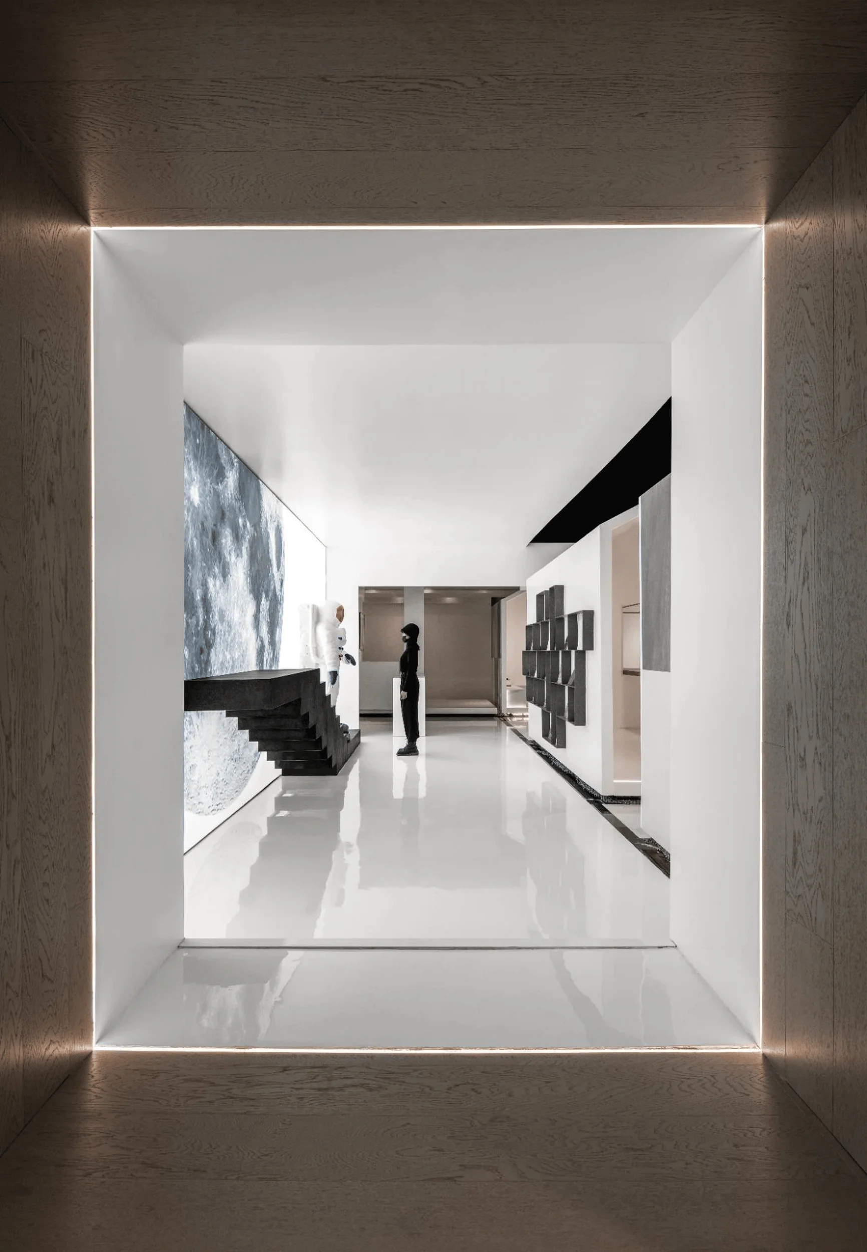
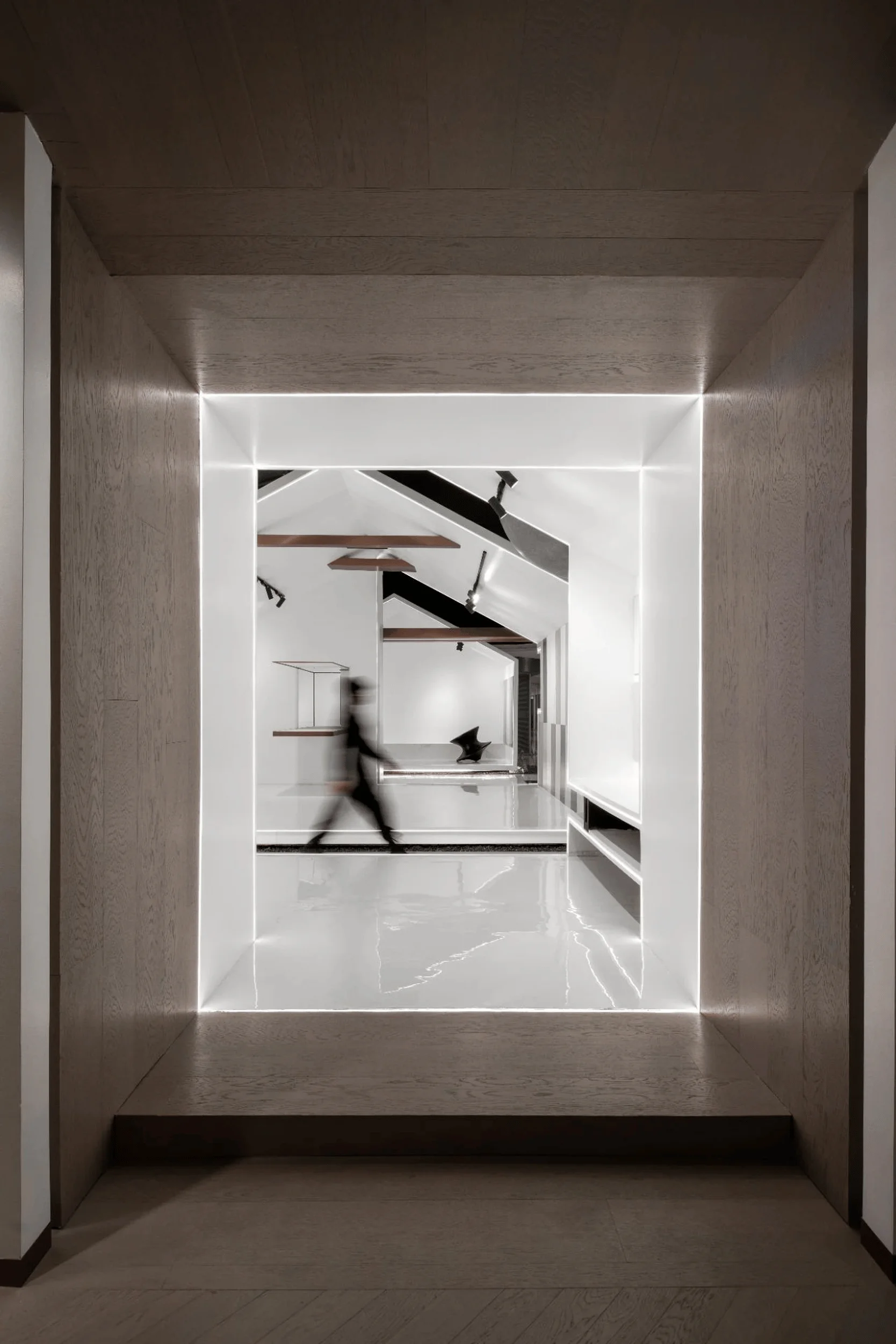
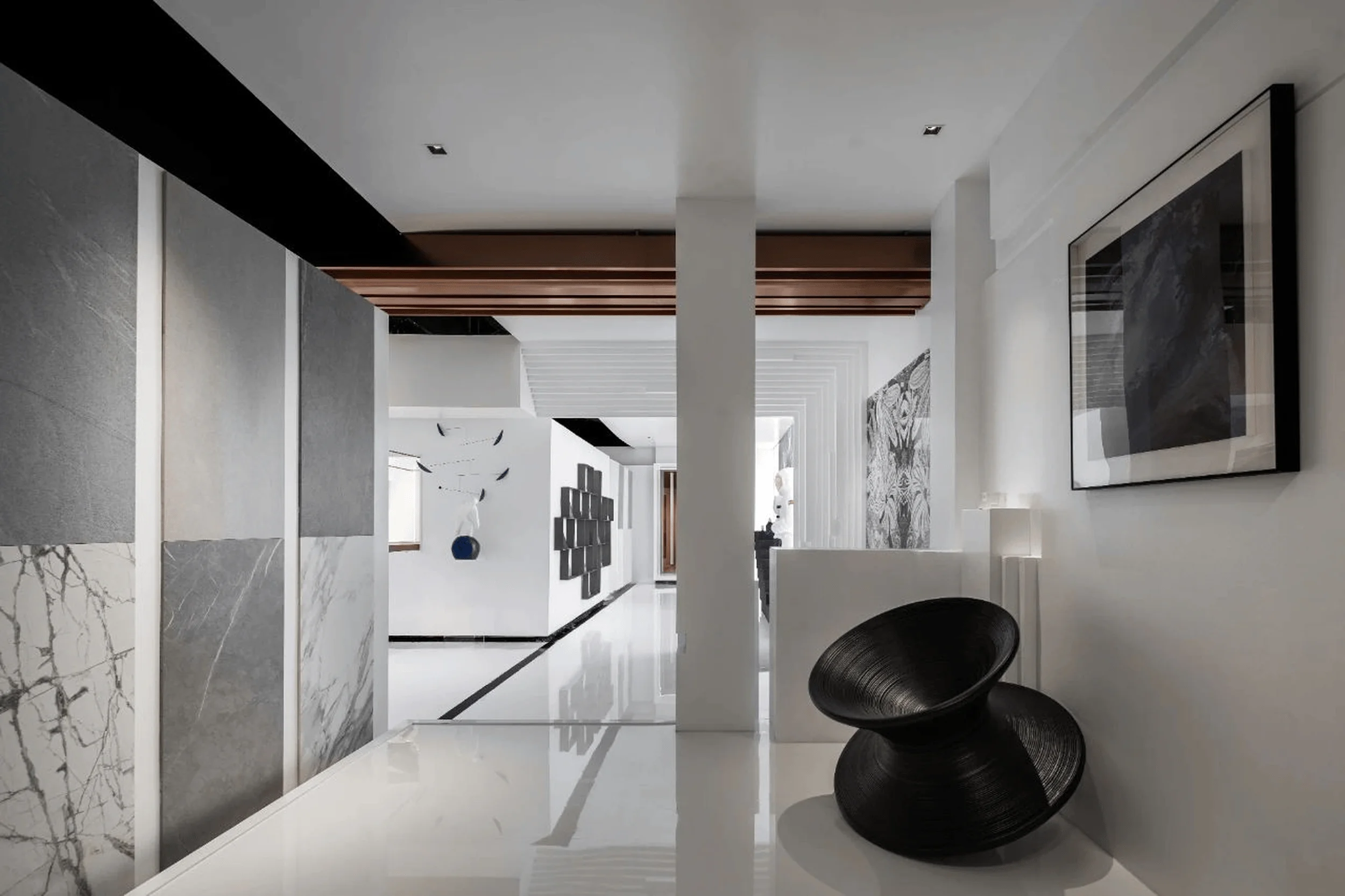
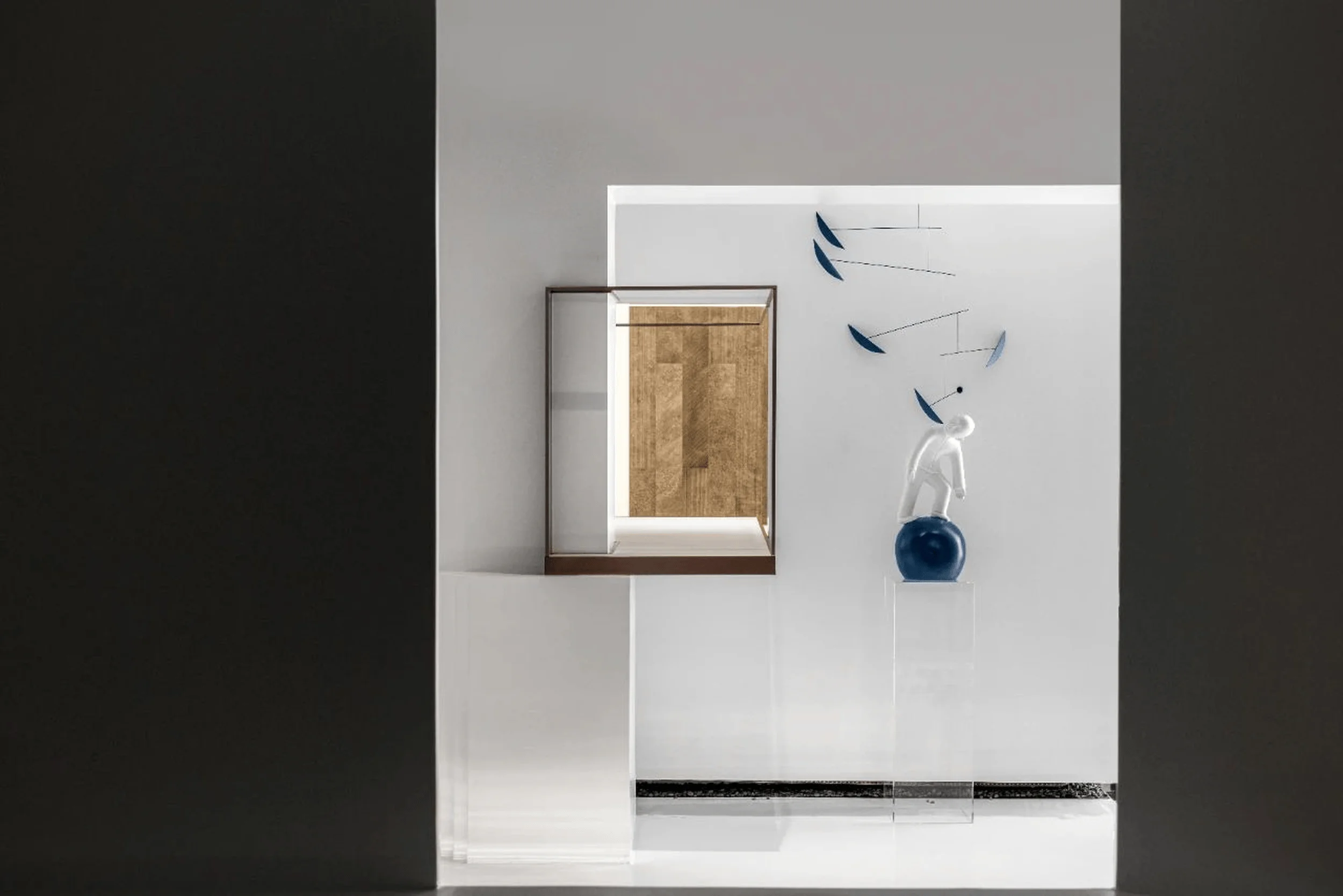
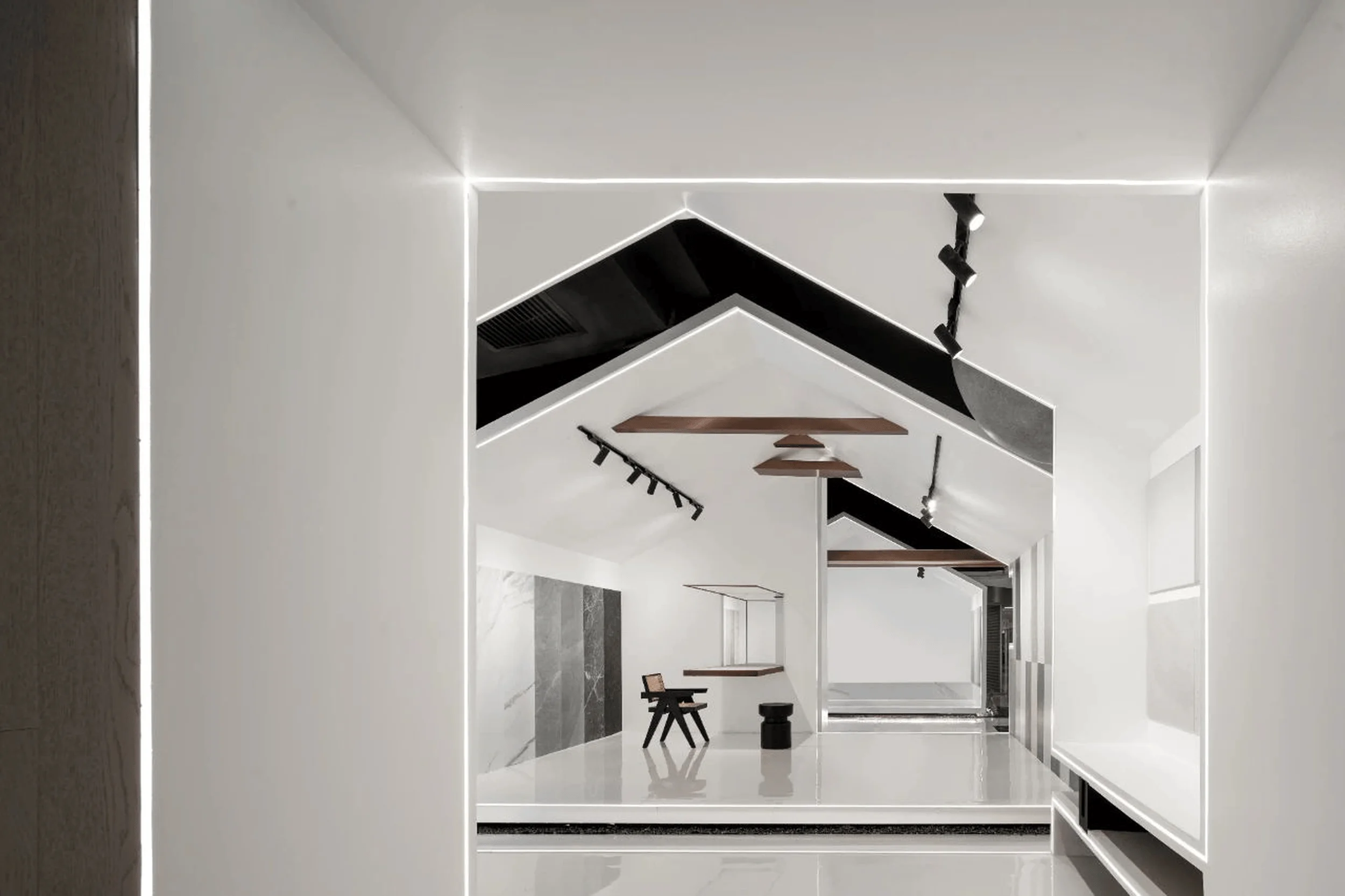
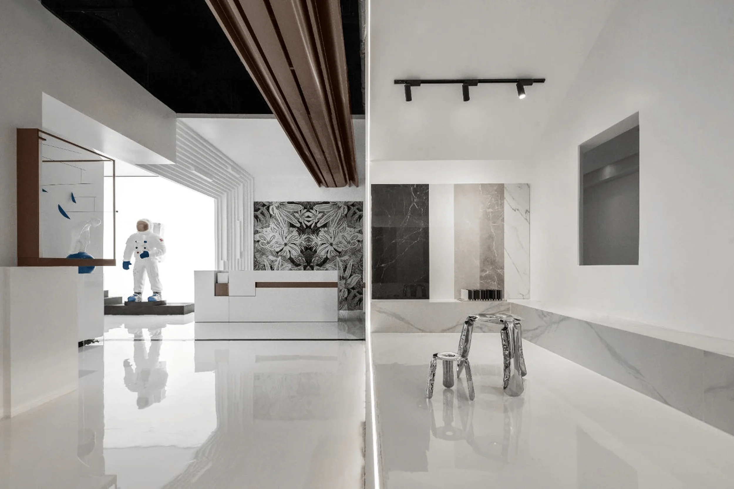
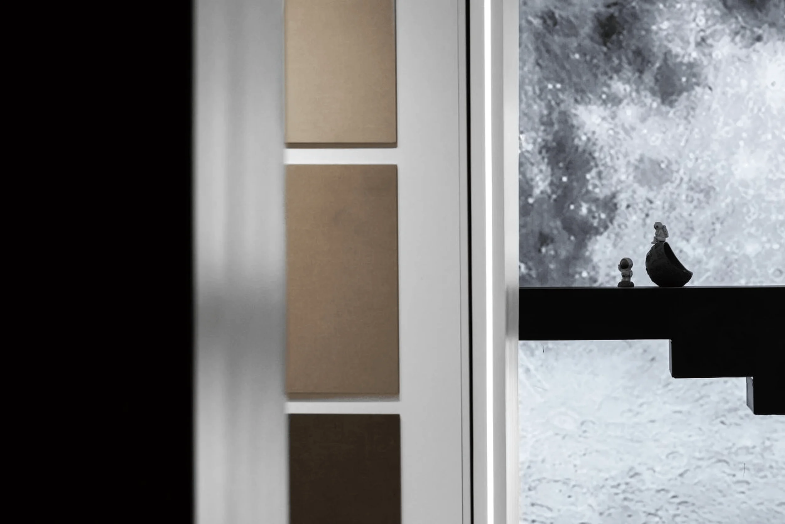
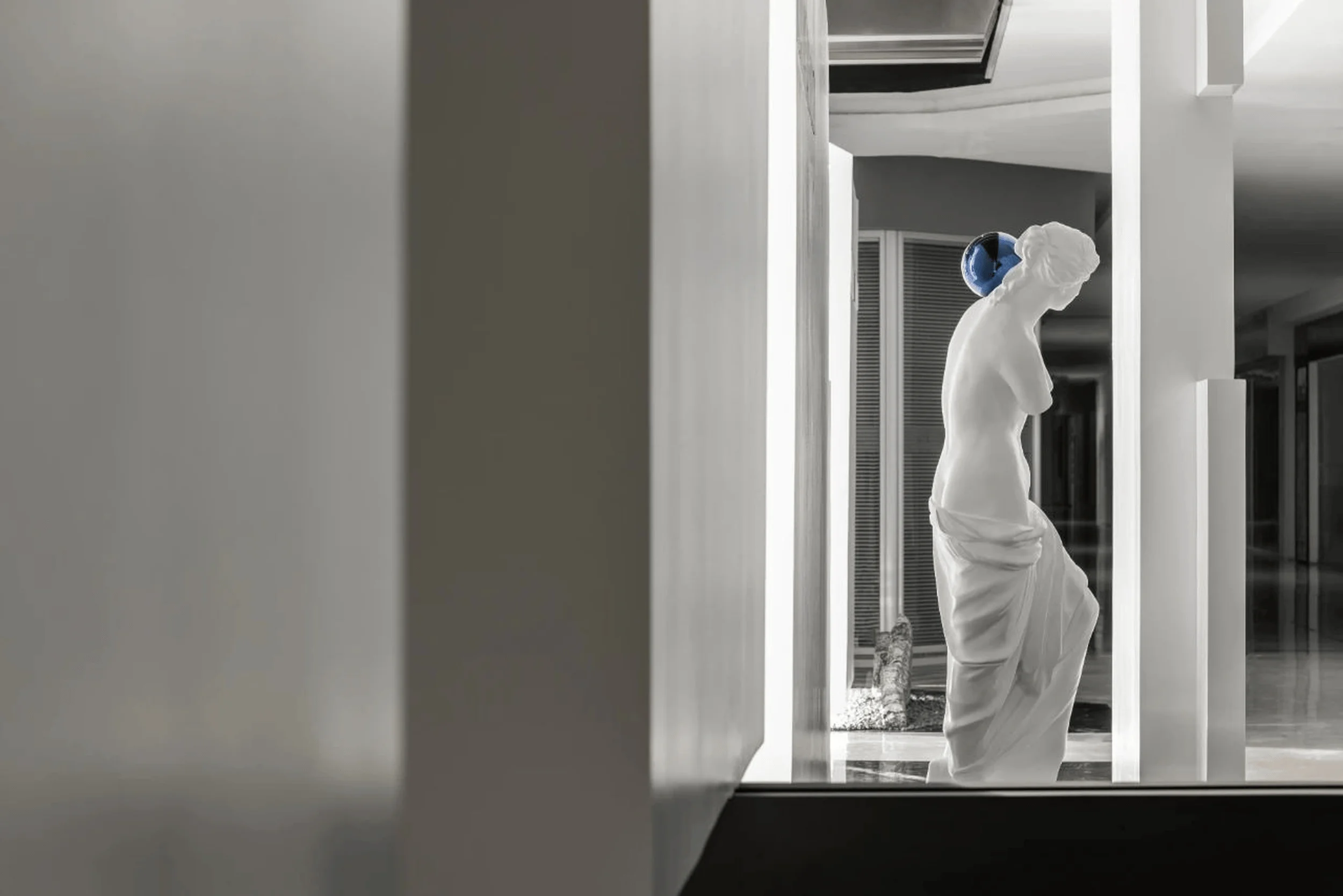
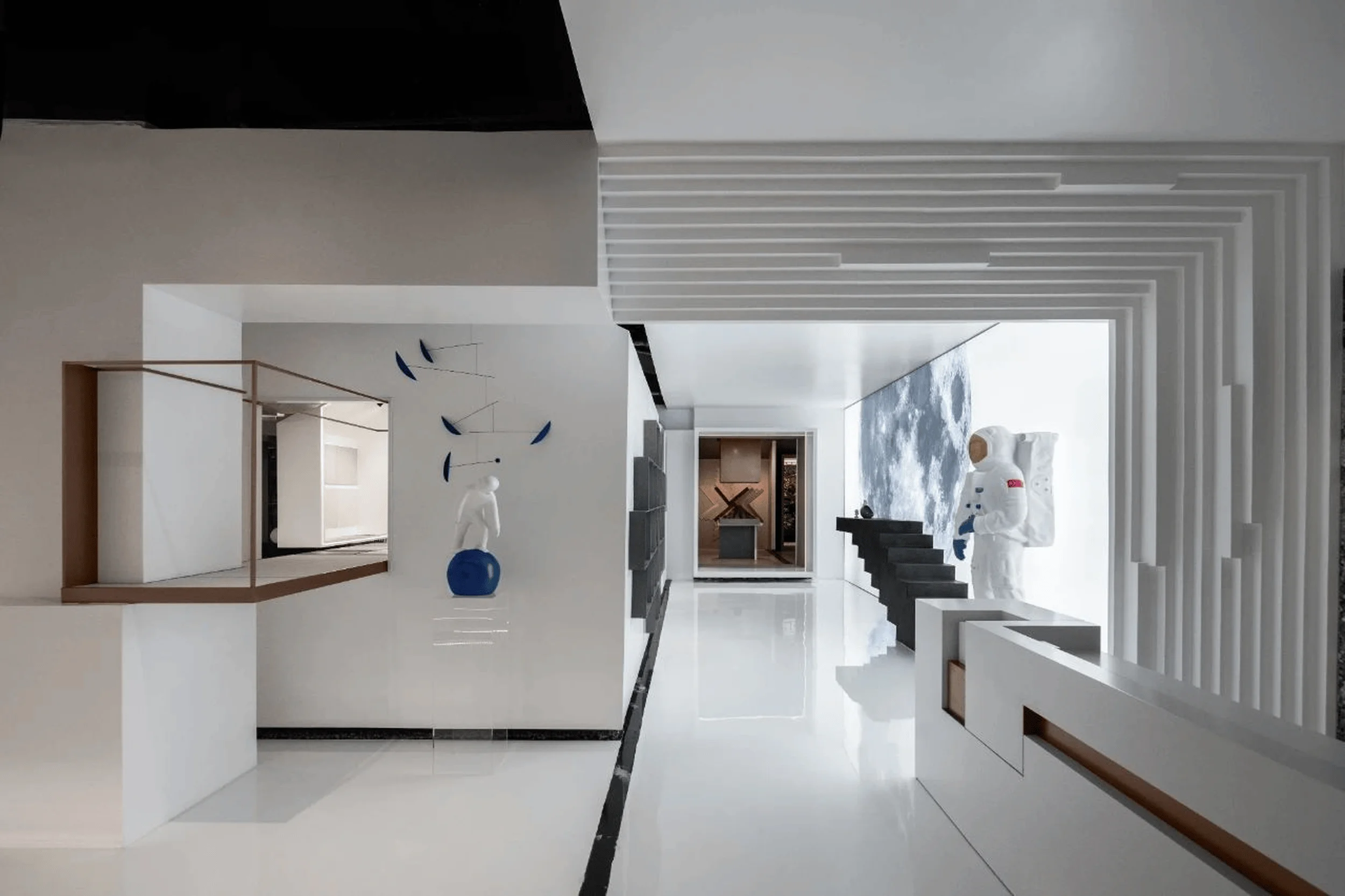
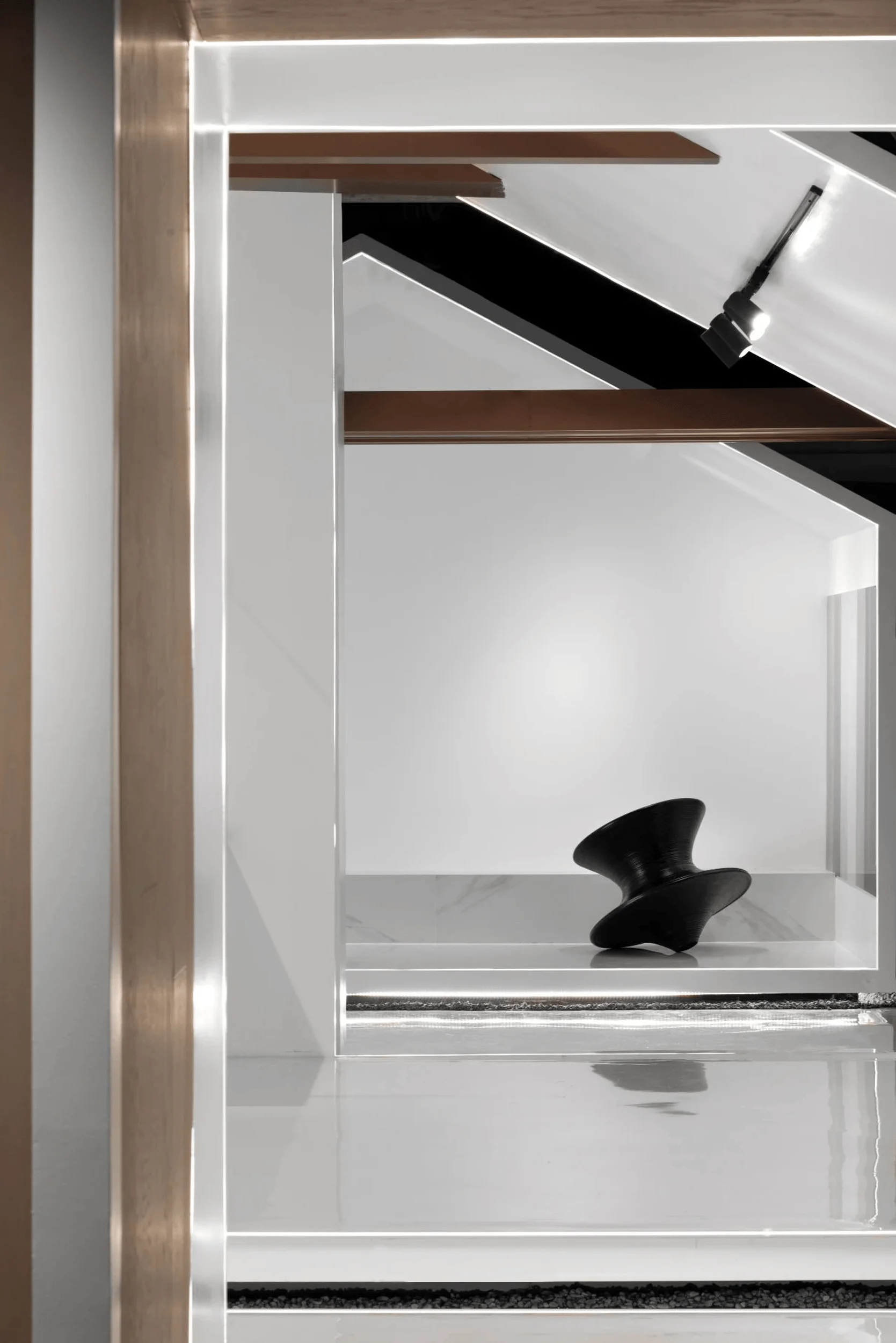
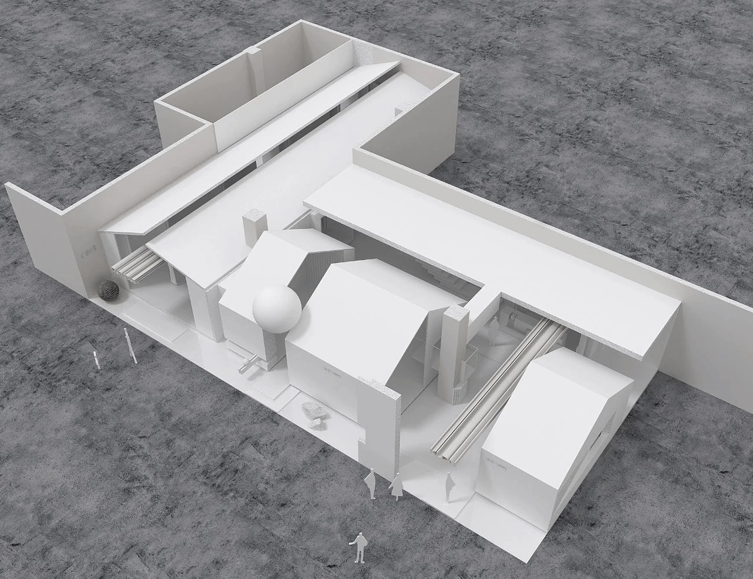
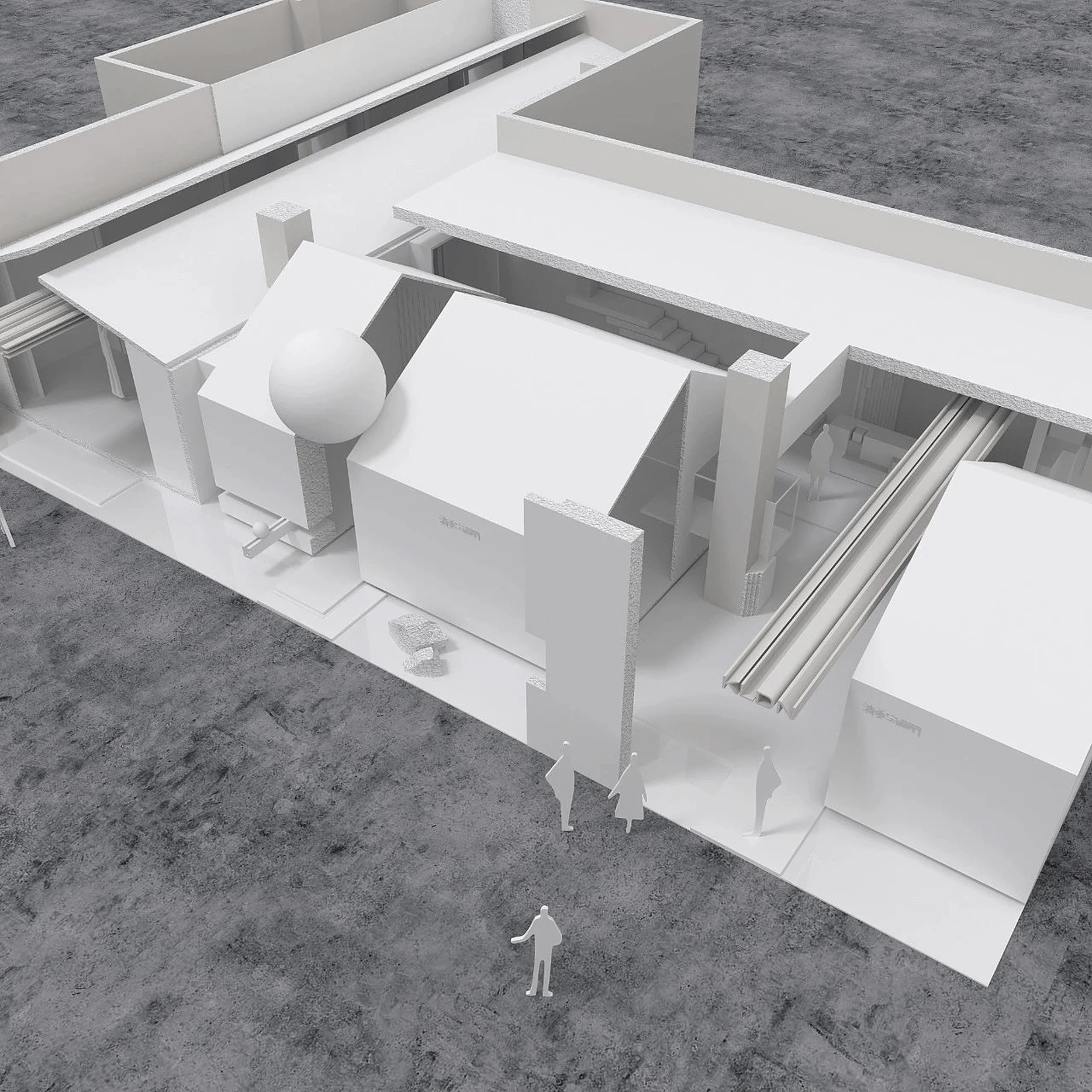
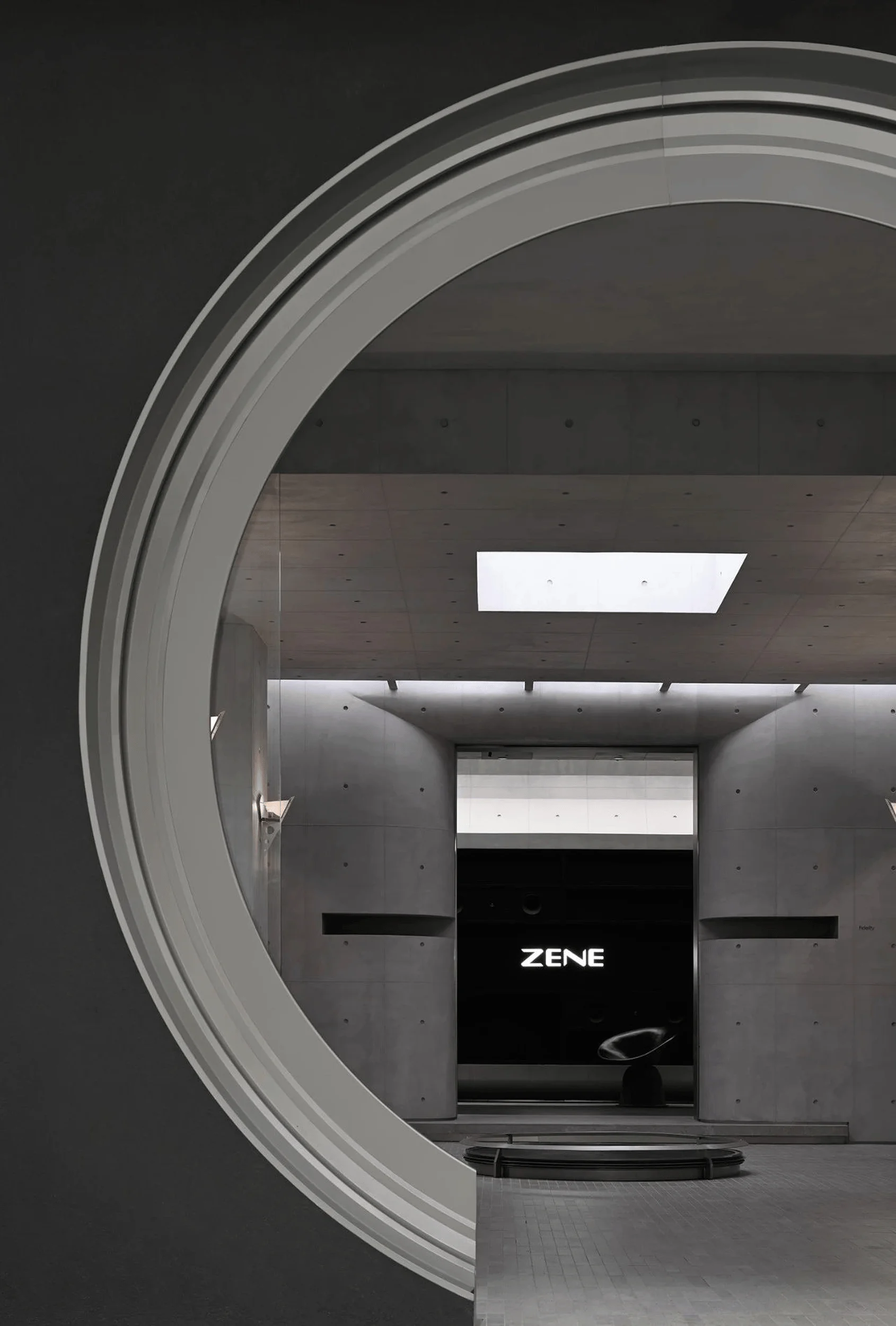
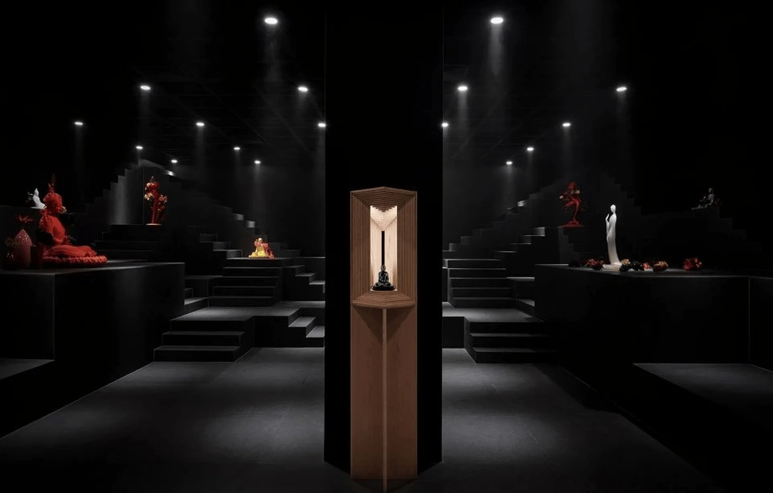
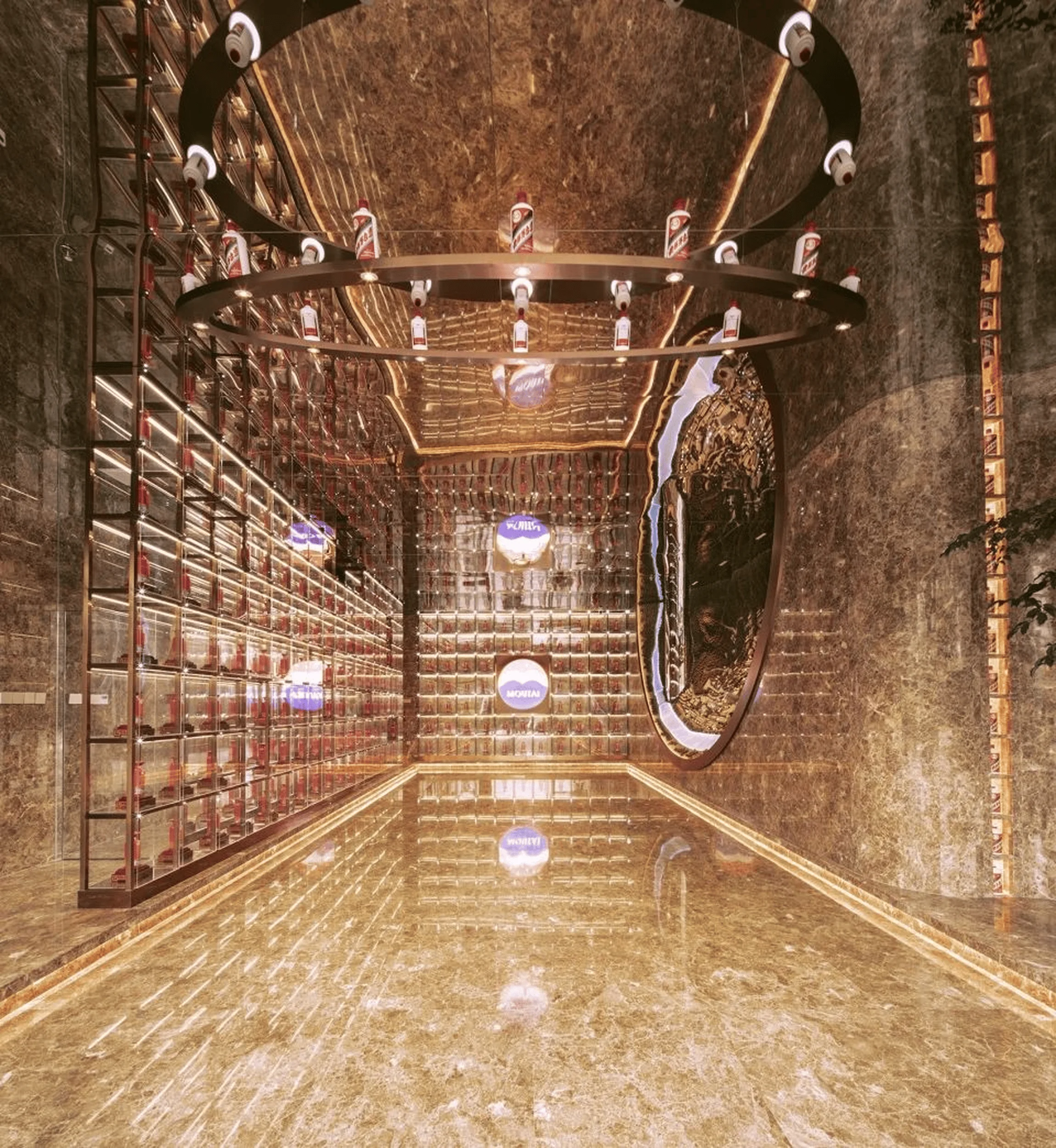
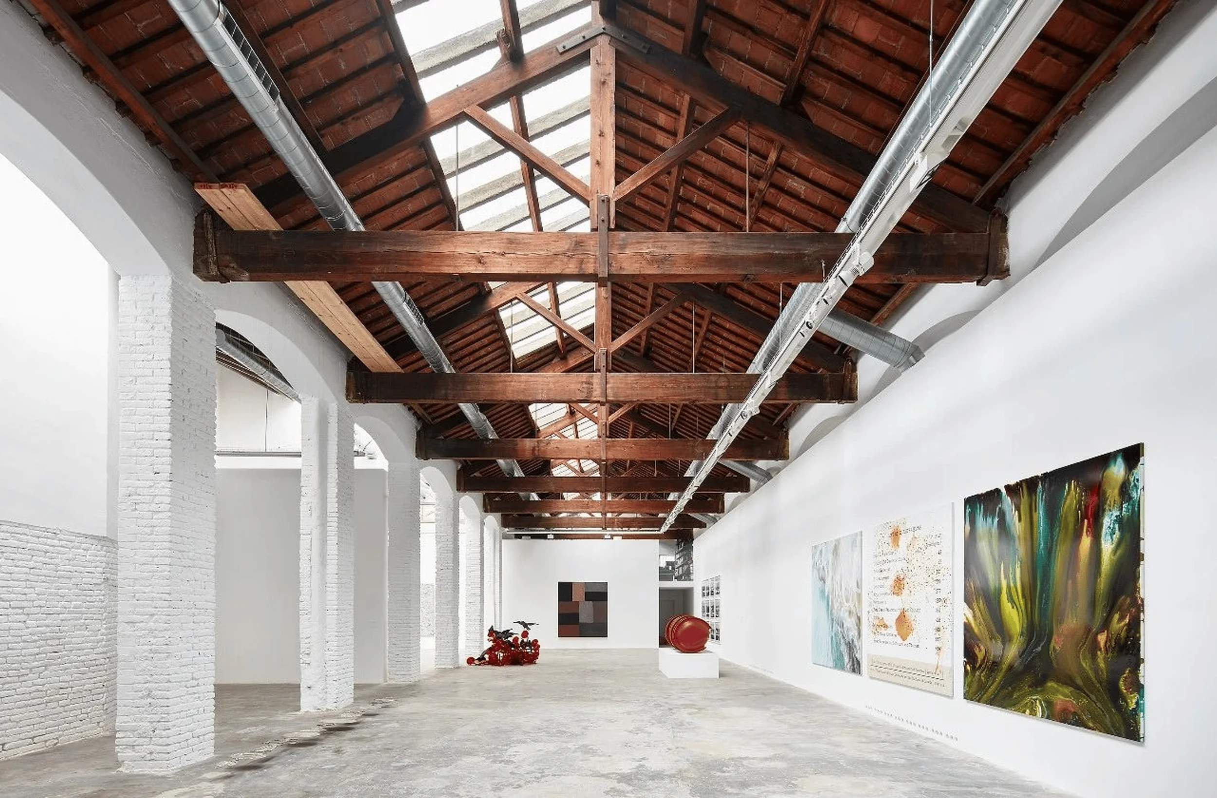
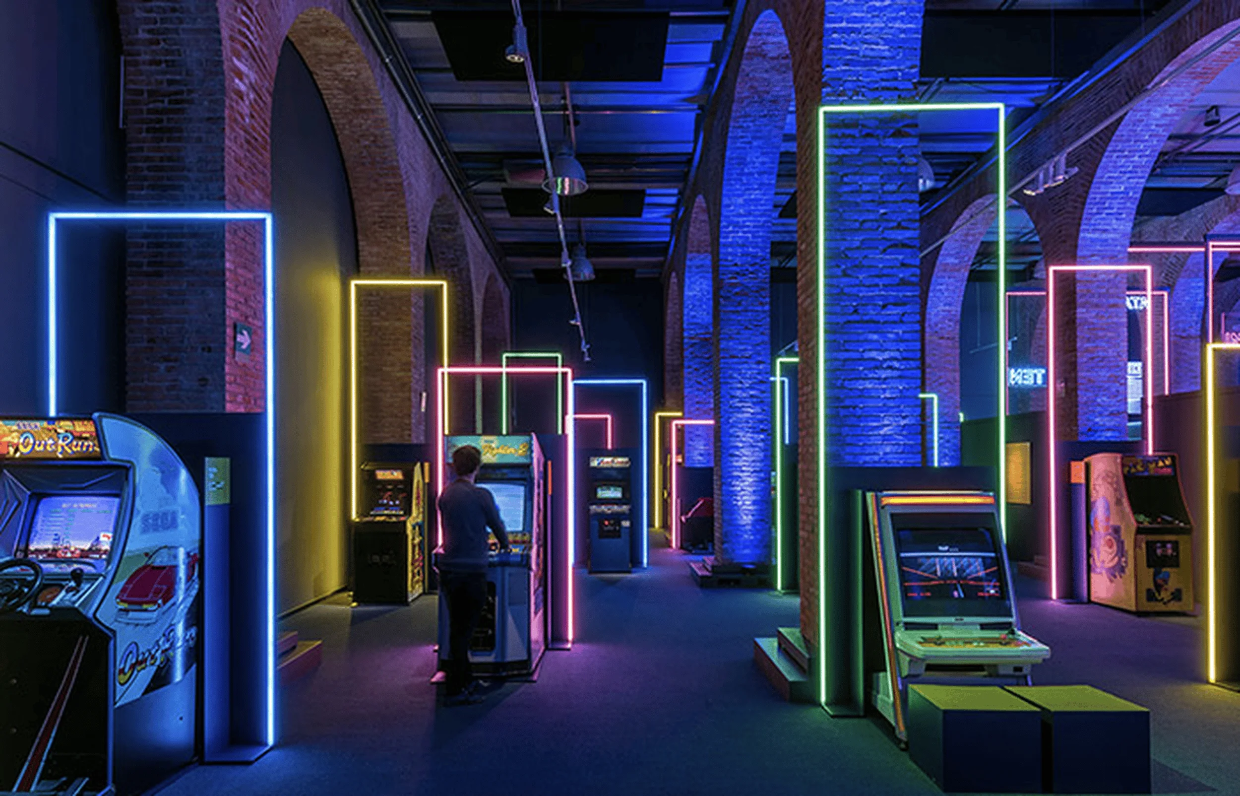
This architectural design transforms a tile exhibition hall into a deconstructed “home,” emphasizing minimalist aesthetics and geometric forms.
Contents
Project Background and Design Brief
Beijing Zao Ying Qing Mei Design was tasked with redesigning two adjoining exhibition halls for Driade and KL&KT ceramic tiles in the Hongxing Meikailong mall, Beijing. The design brief called for a space that transcended the typical showroom format, fostering interaction and engagement while showcasing the tile products in a novel and inspiring way. The designers aimed to challenge the conventional single-function, enclosed nature of the original space, creating a more dynamic and inviting atmosphere. The concept of “home” served as the primary inspiration, guiding the creation of an interior “building community.”
Design Concept and Objectives
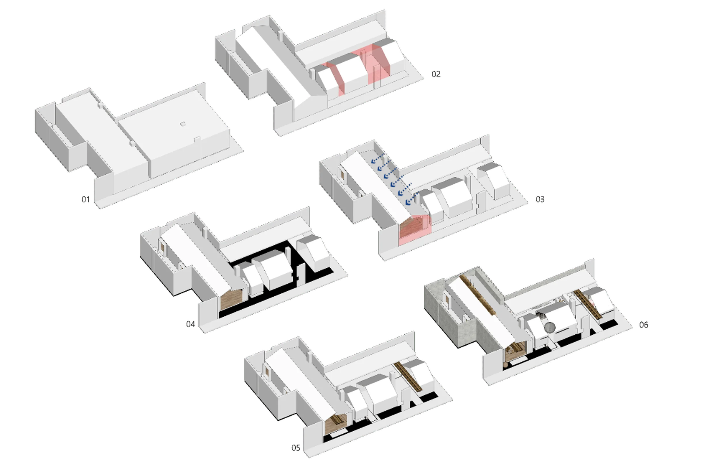
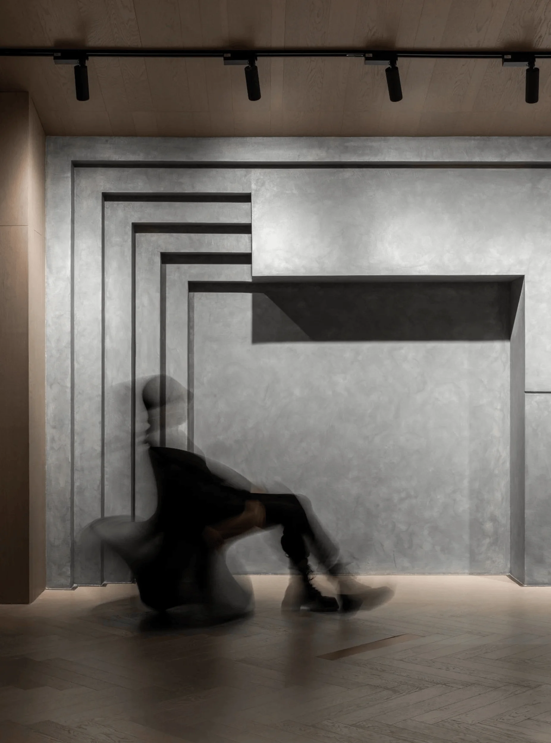
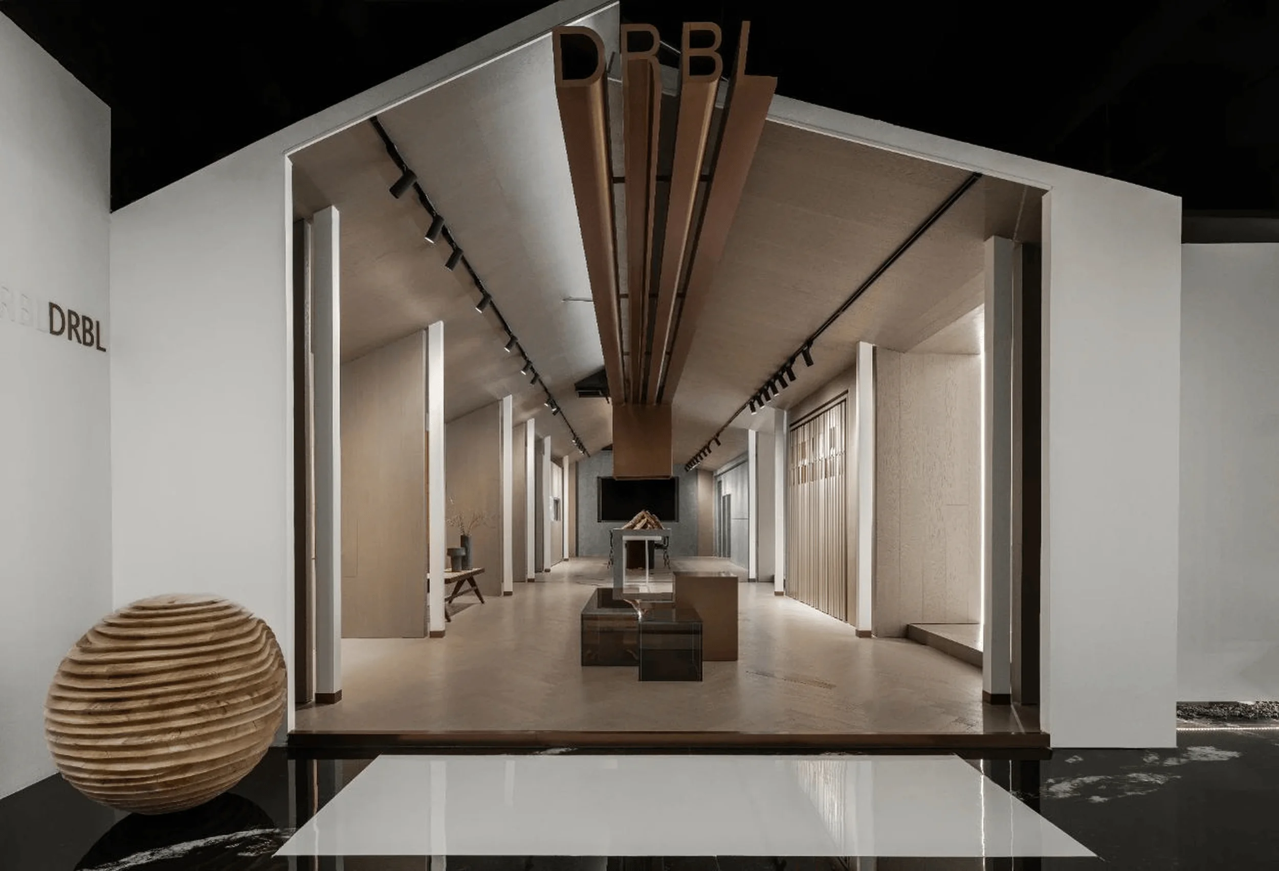
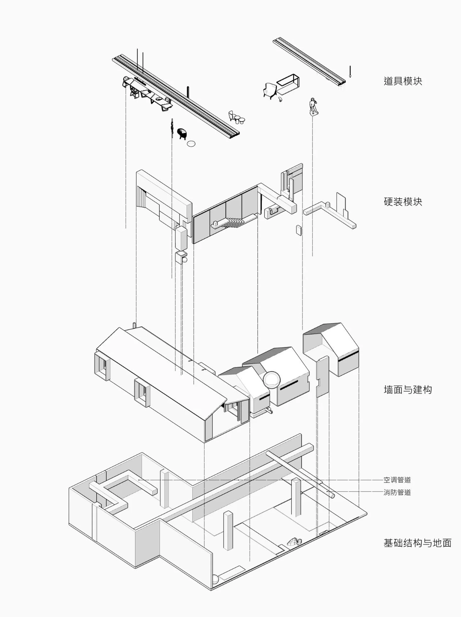
The design team envisioned an abstract notion of “home” materialized through a cluster of deconstructed architectural forms within the exhibition halls. This involved dismantling the traditional idea of a house into basic geometric elements, such as roofs and rooms, and reinterpreting them as interconnected volumes within the larger space. The design aimed to evoke a sense of community and warmth while maintaining a minimalist aesthetic, emphasizing the purity of form and material. The designers sought to create a space that was clean, sober, poetic, and authentic, drawing on their love of constructive geometry to achieve a cohesive overall effect.
Spatial Layout and Planning
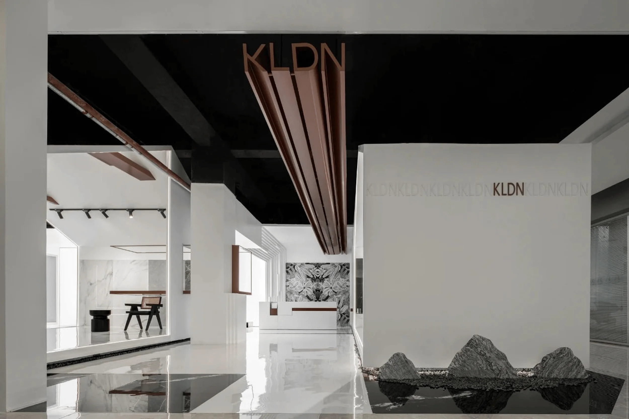
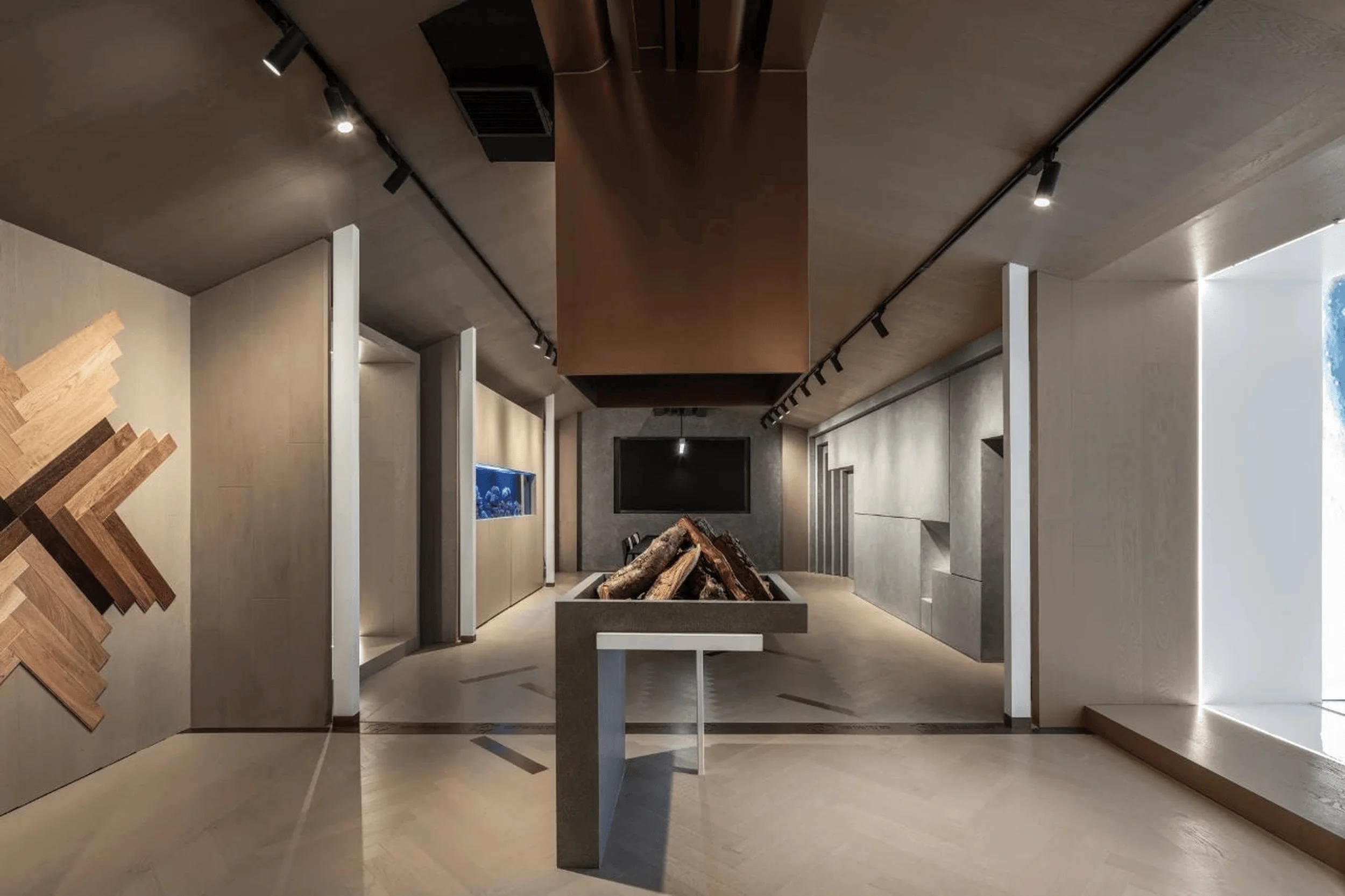
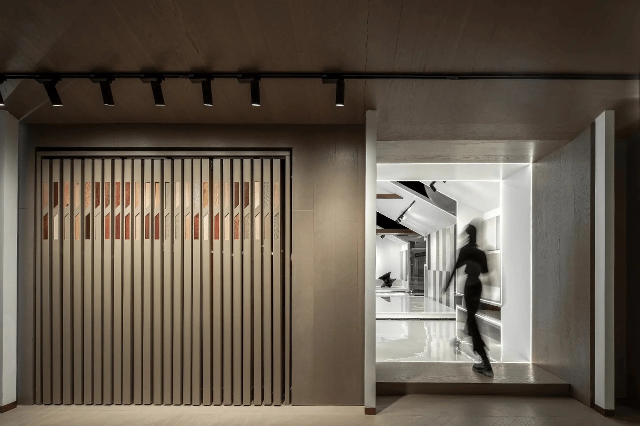
The two exhibition halls were merged, eliminating a formal entrance and allowing visitors to freely circulate and interact within the space. A central axis guides movement through the interconnected volumes, with strategically placed doorways and openings creating a rhythmic flow. The floor area features a symmetrical layout, imbuing the space with a subtle sense of ritual. The use of mirrored tiles on the floor creates the illusion of a shallow pool reflecting the white architectural forms, adding depth and intrigue to the space.
Aesthetic and Material Considerations
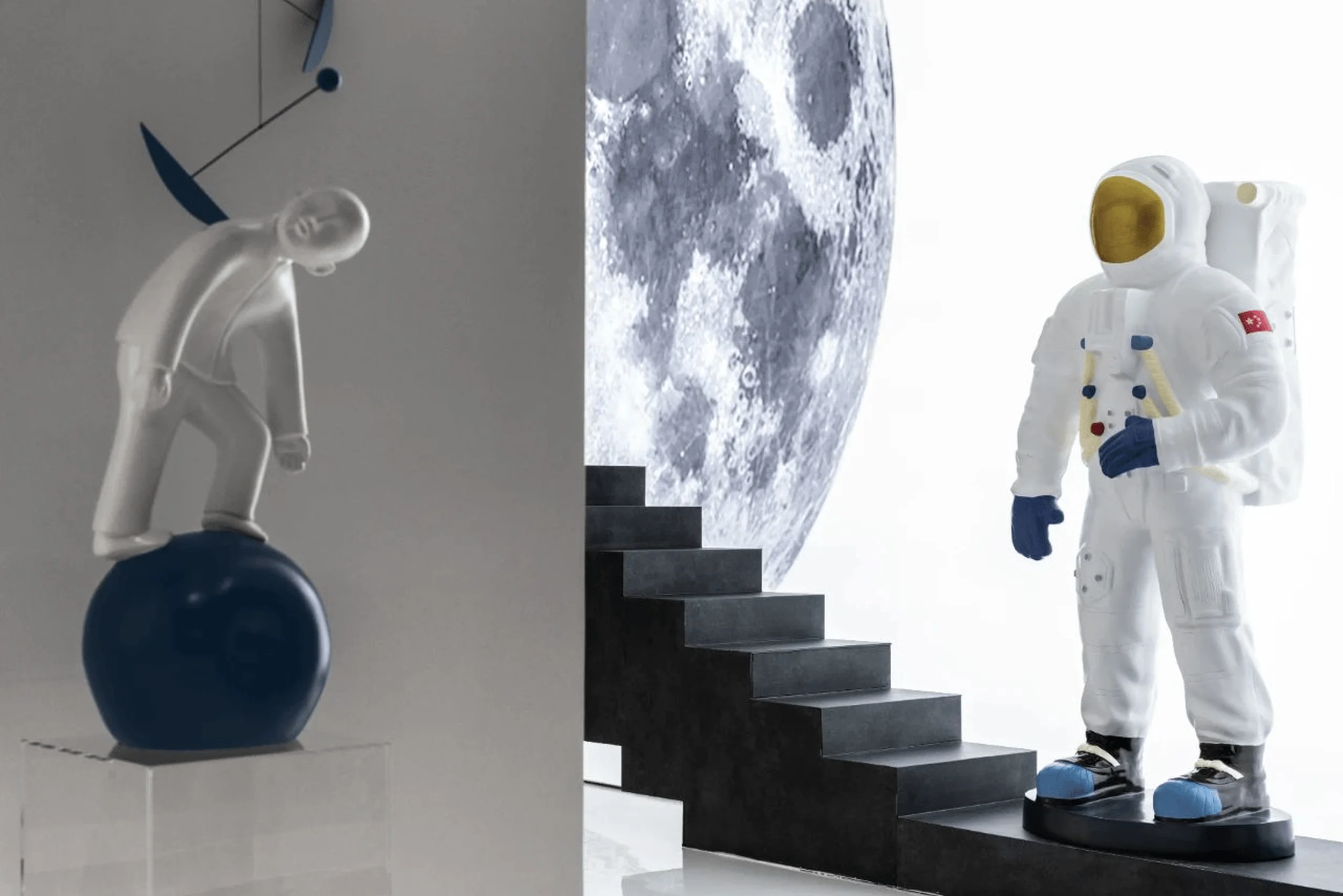
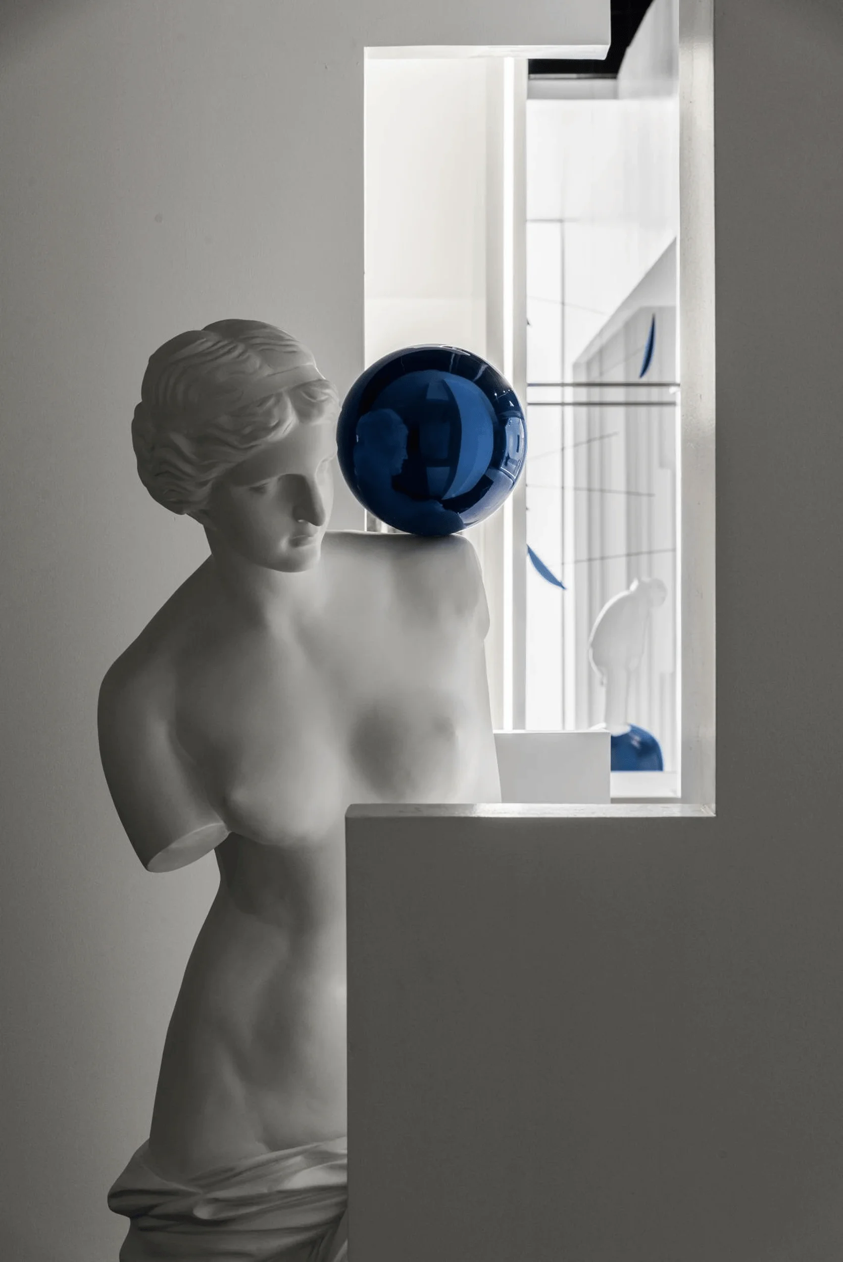
The color palette is predominantly monochromatic, with pure white architectural volumes contrasting against the dark floor and ceiling. This minimalist approach highlights the textures and patterns of the showcased tile products. The metal-clad ceiling integrates concealed air conditioning and sprinkler systems, while a large, prominent logo reinforces the brand identity. A spherical installation suspended above the “rooftops” adds a touch of surrealism, seemingly poised to disrupt the balanced composition of the space.
Details and Sustainability
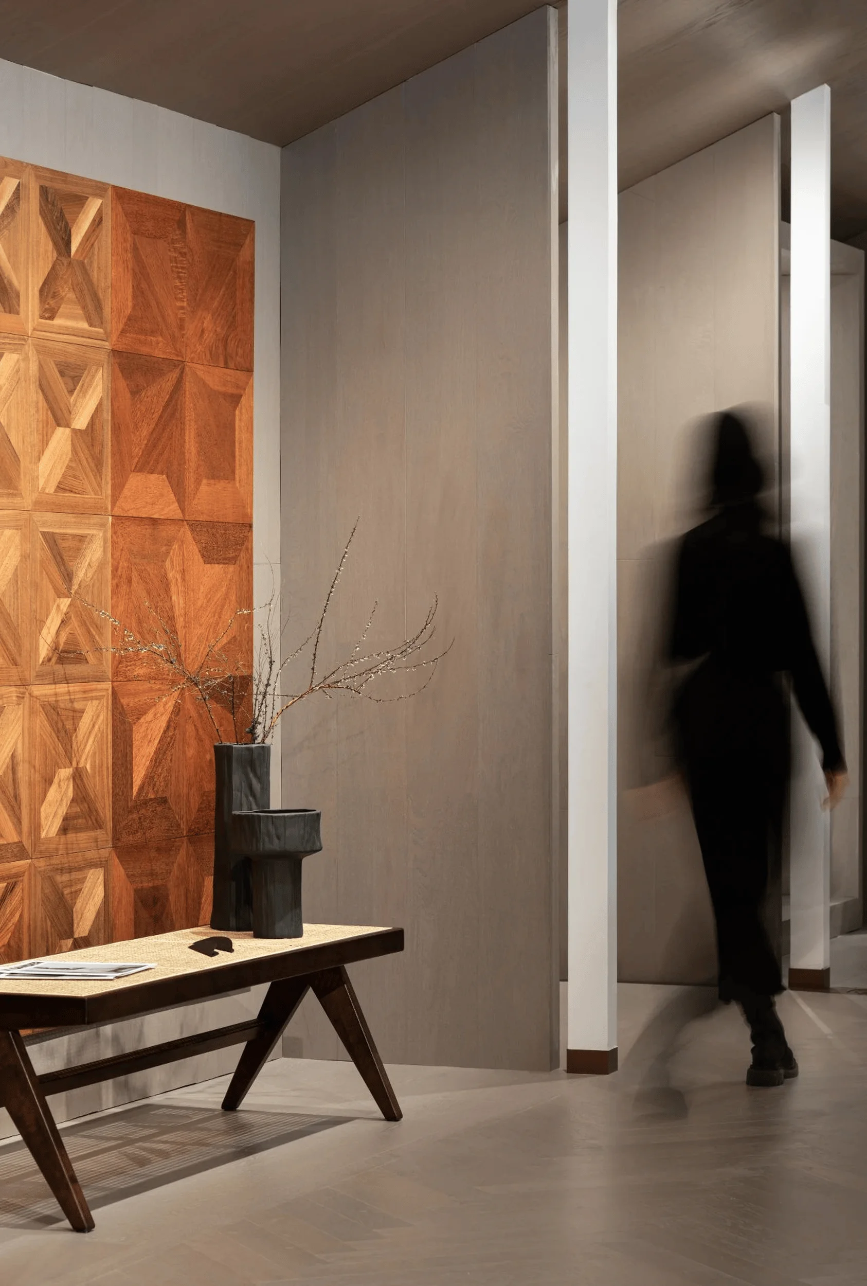
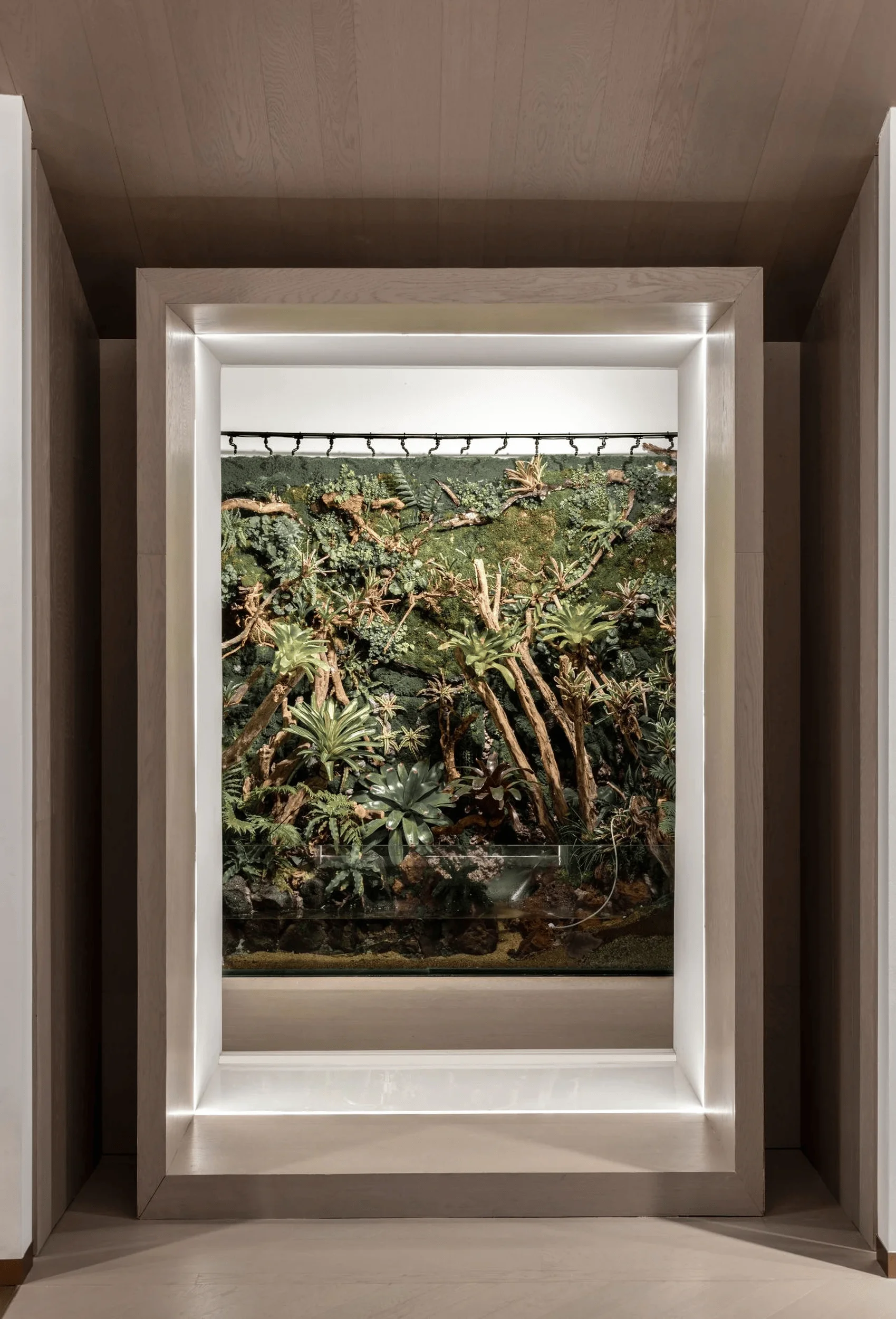
The design integrates subtle details that enhance the visitor experience. The logo is inlaid into the floor using metal plates, serving both as decorative elements and wayfinding guides. Tiles are displayed on multiple surfaces, including walls and ceilings, maximizing visibility and showcasing their versatility. A rainforest installation further emphasizes the concept of “home” by evoking a return to a primal, natural state. While the project description doesn’t explicitly mention sustainability, the minimalist approach to materials and emphasis on durable, high-quality tiles suggests a consideration for longevity and reduced environmental impact.
Project Information:
Project Type: Tile Exhibition Hall
Architect: Beijing Zao Ying Qing Mei Design
Lead Designer: Andy Sun Jialiang
Design Team: Lü Bin, Feng Xingfan, Lu Yaojie, Peng Yuxin
Area: 251 sq.m
Year: Not specified
Location: China
Photographer: Gao Tengyun


