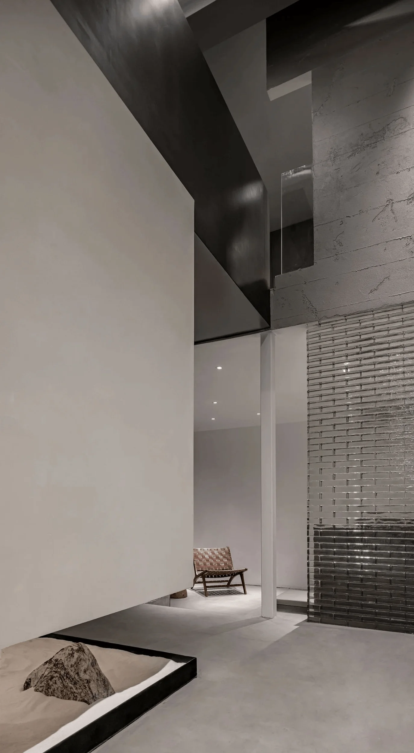
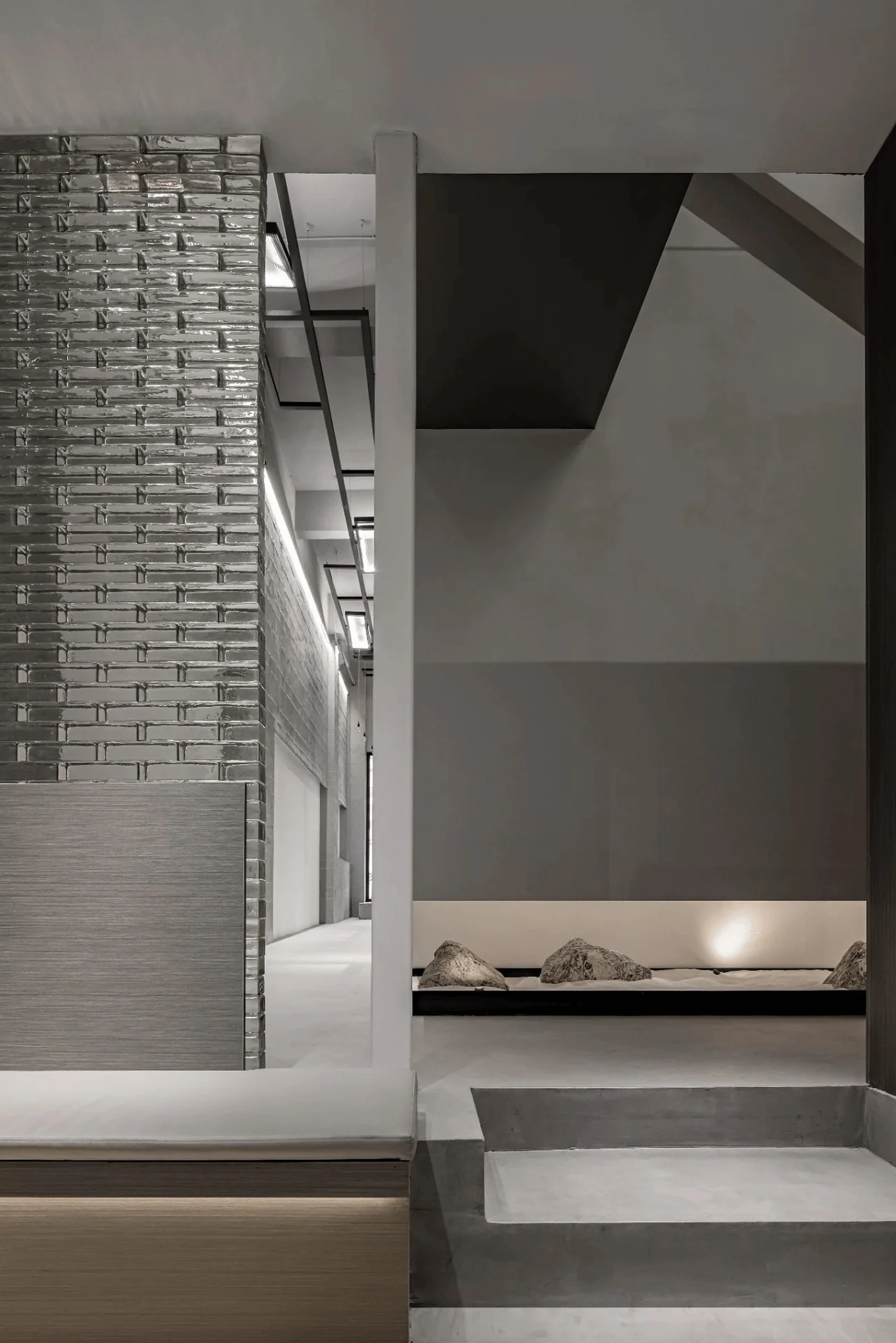
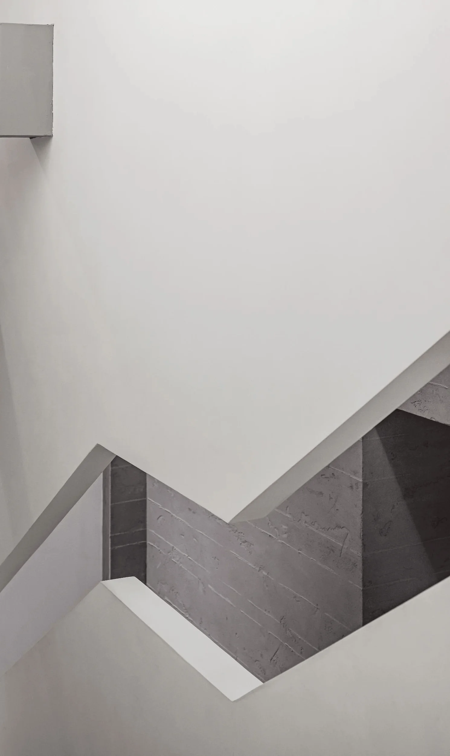
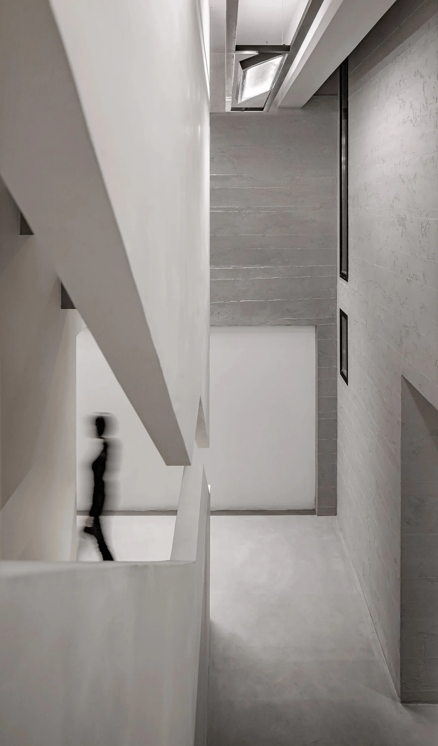
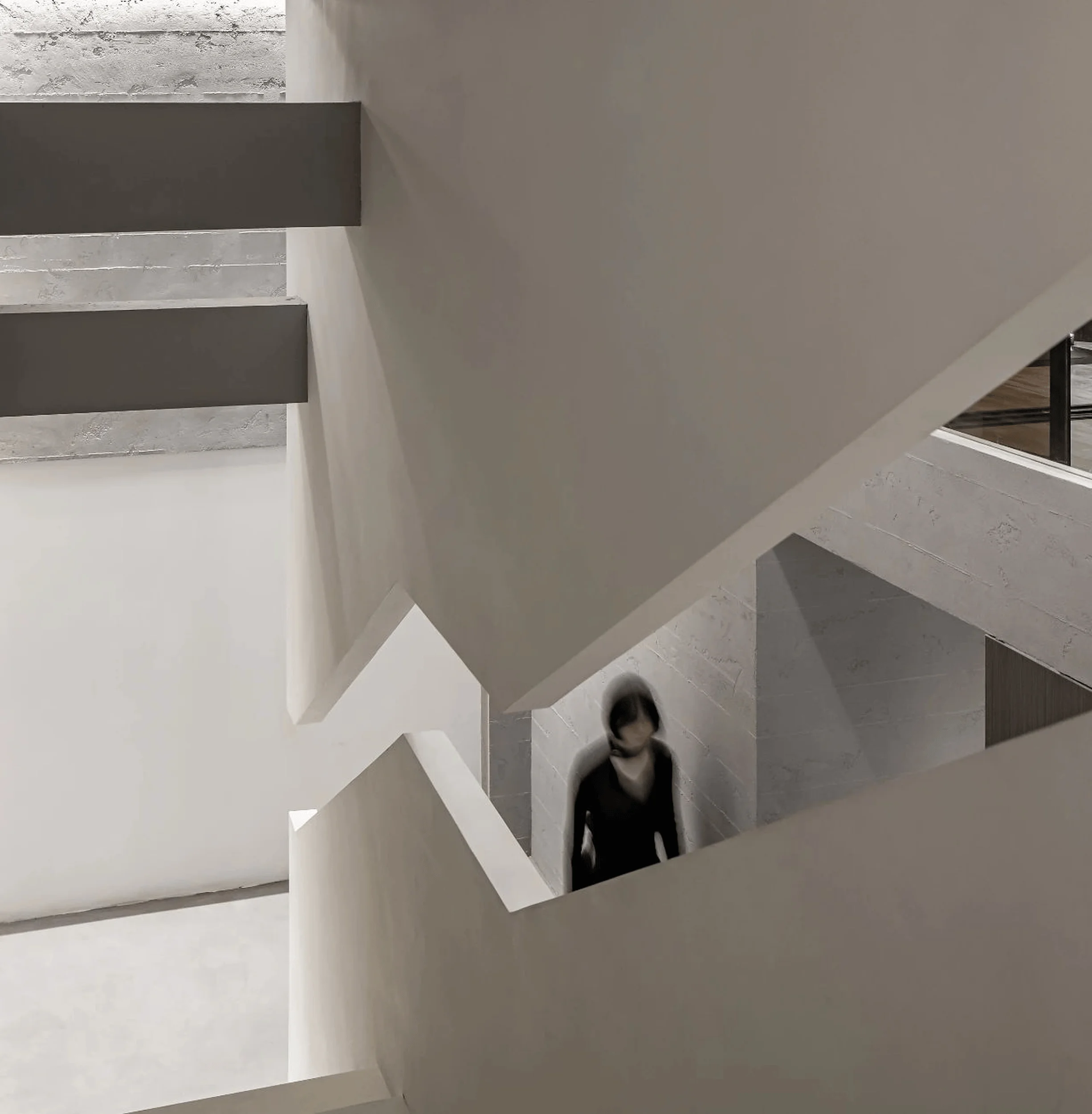
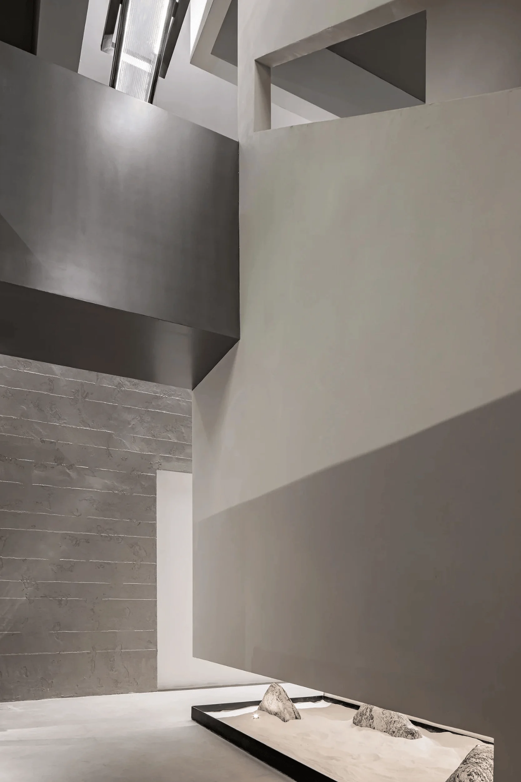
DeeSen Space Design crafts a poetic modernist showroom in Nanjing, China, blending architectural and interior design to create an urban landscape.
Contents
Context and Inspiration
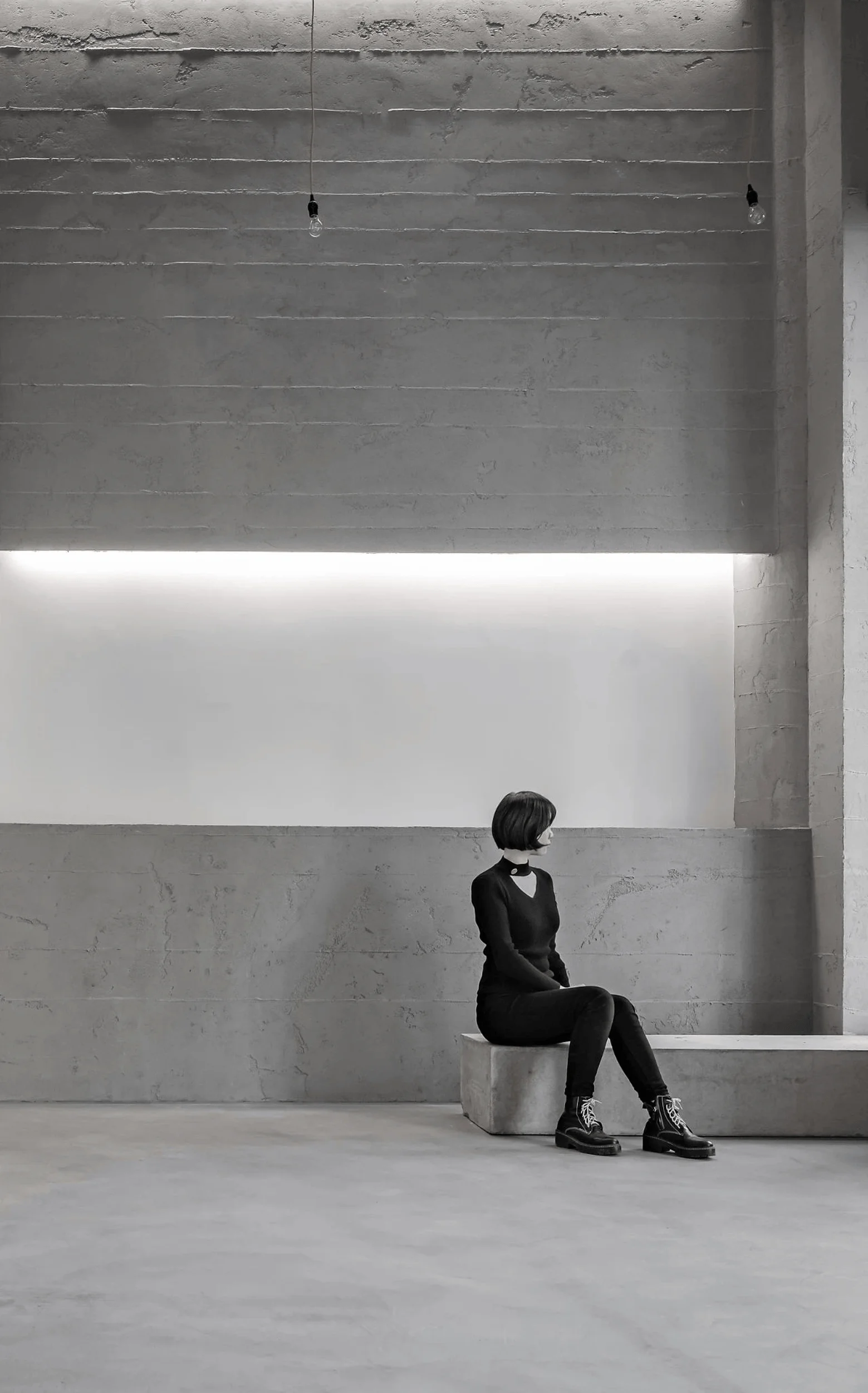
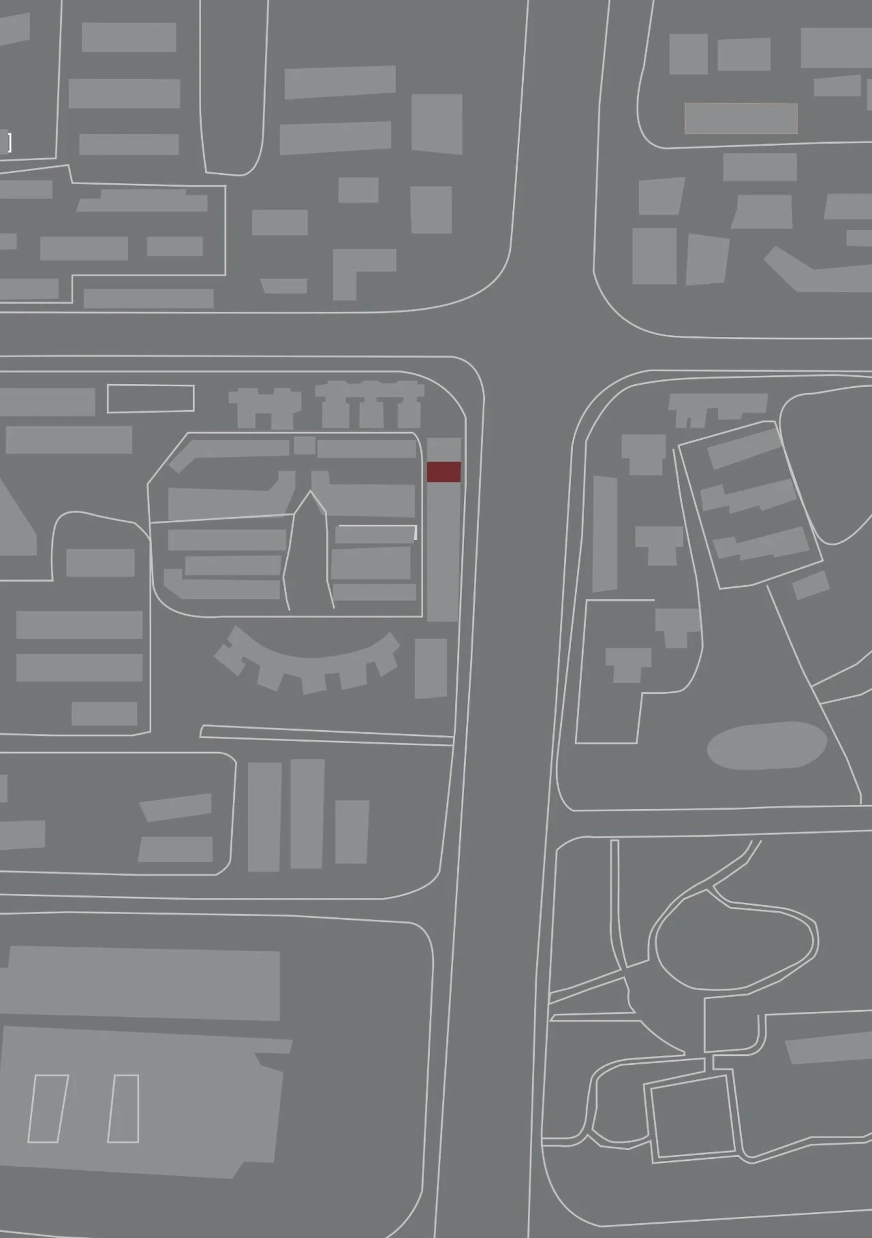
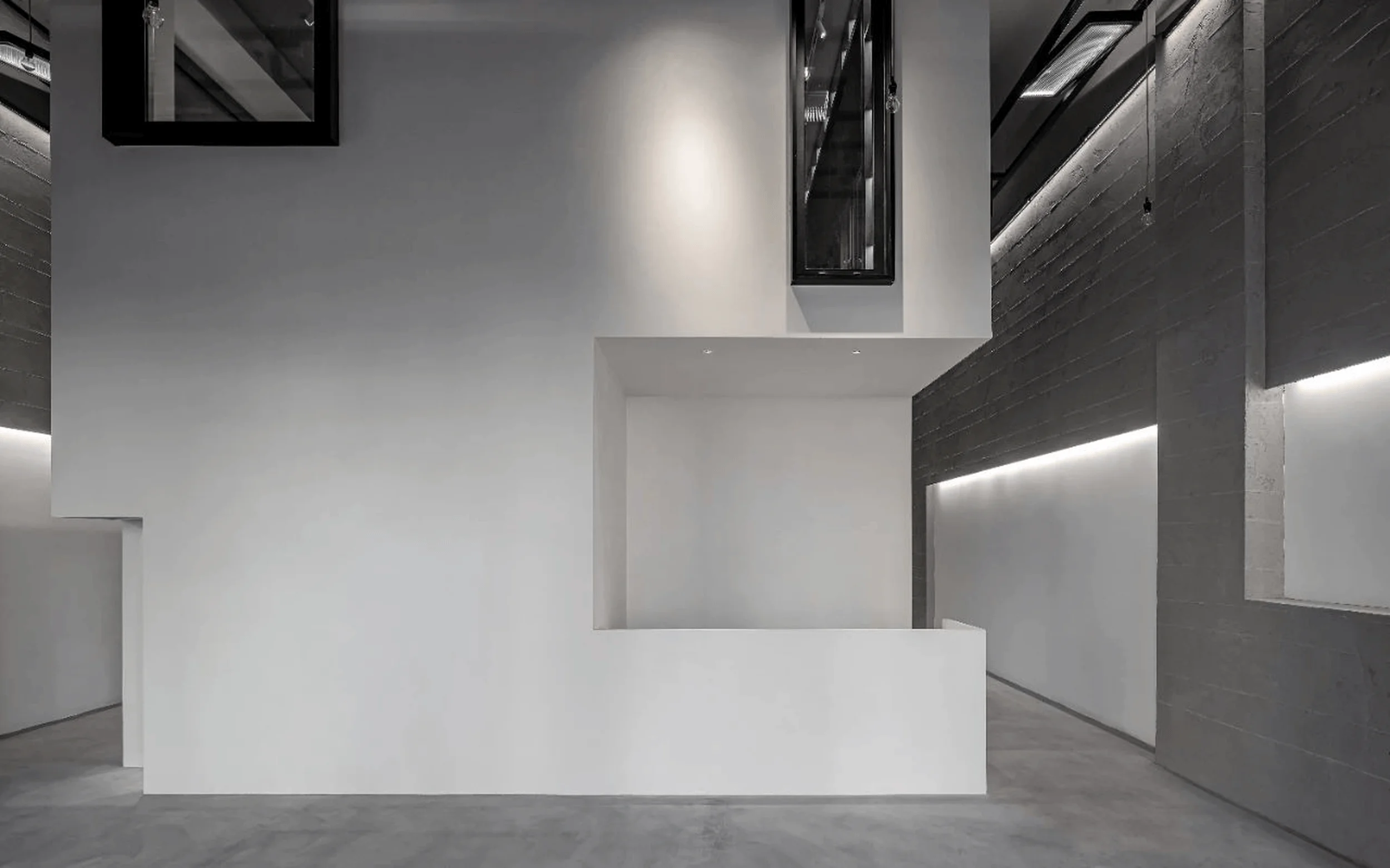
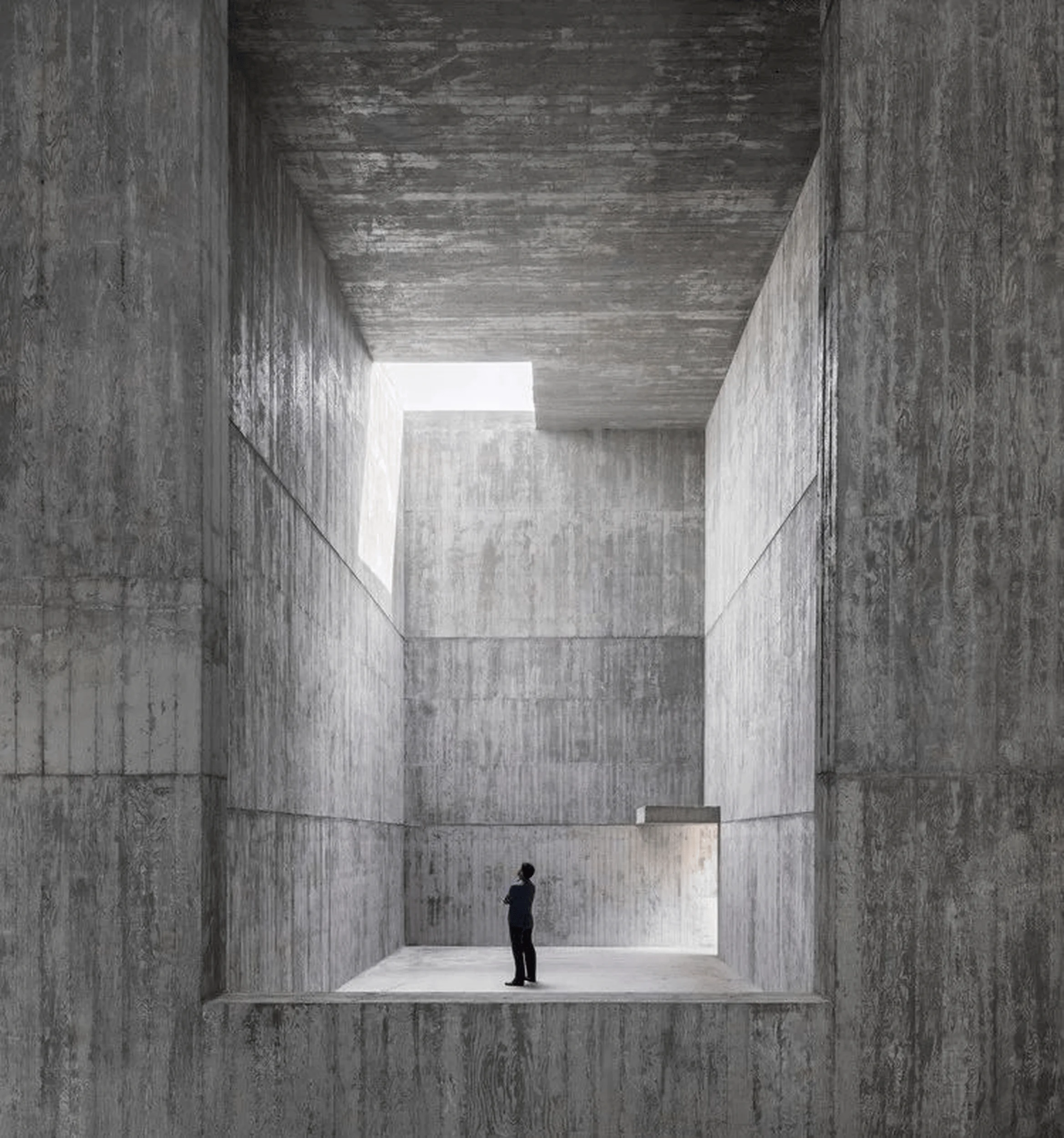
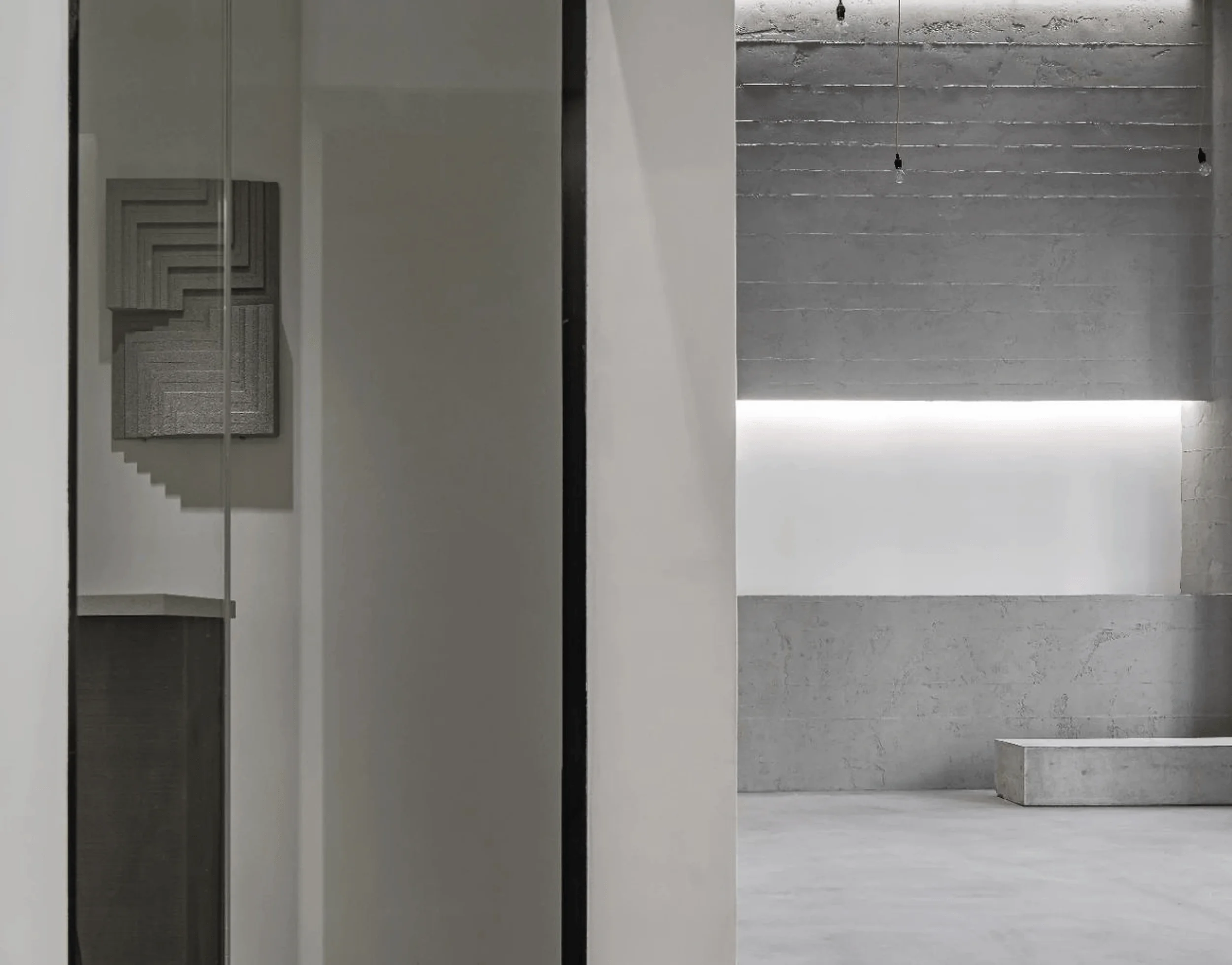
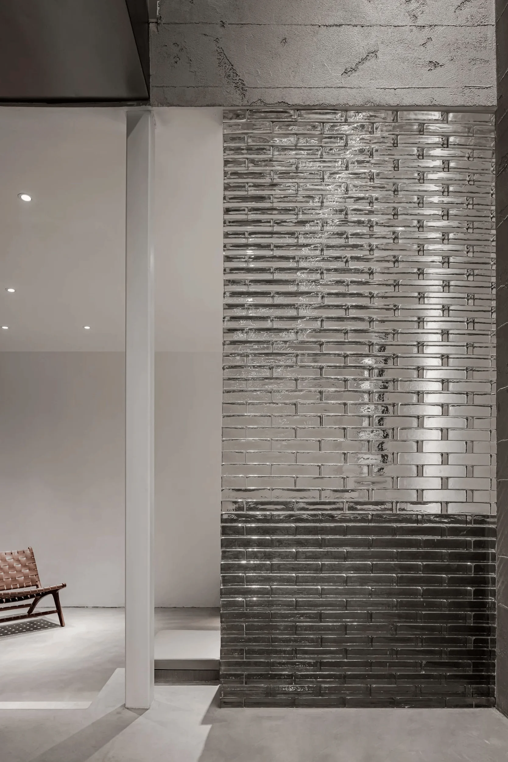
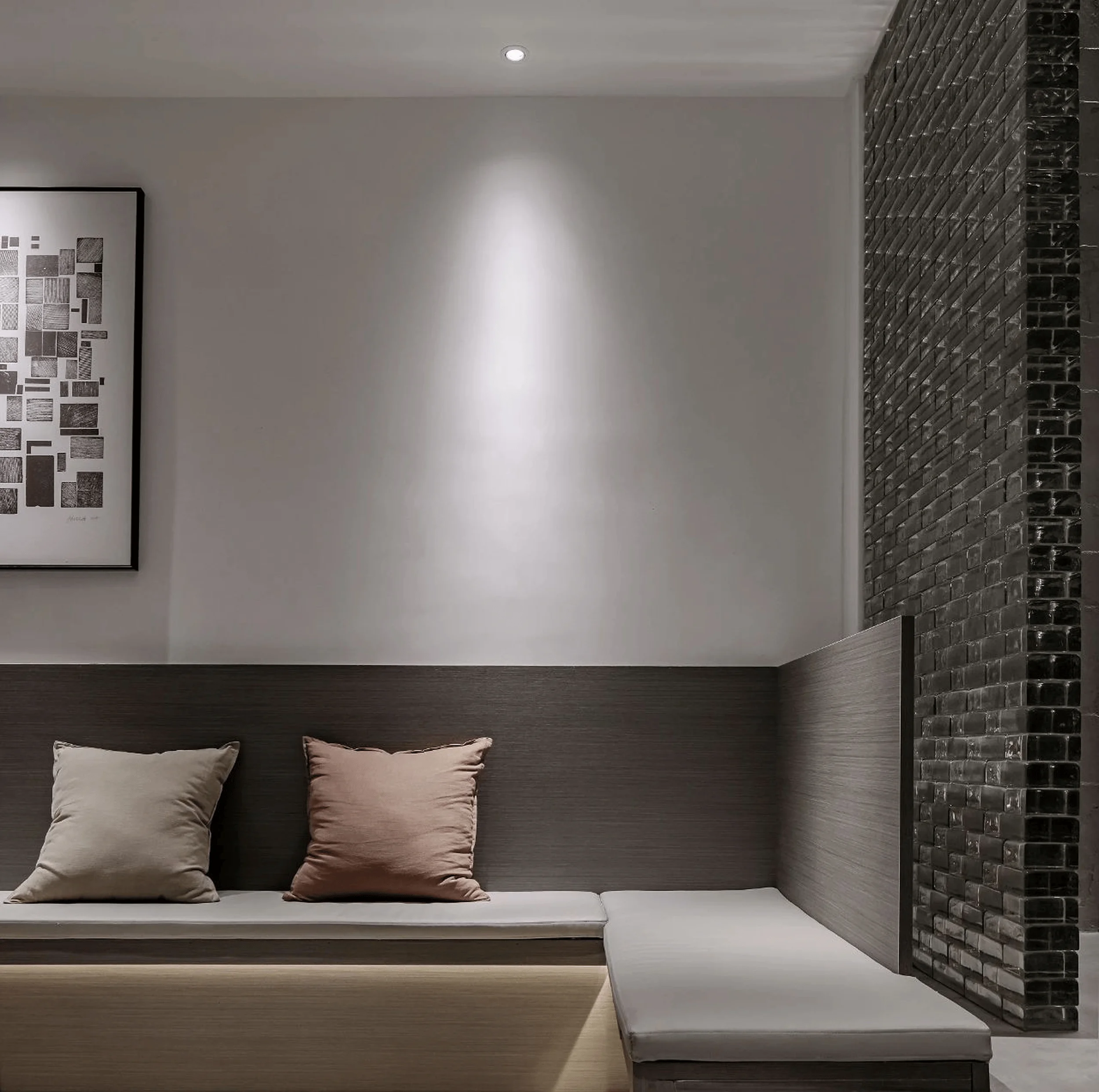
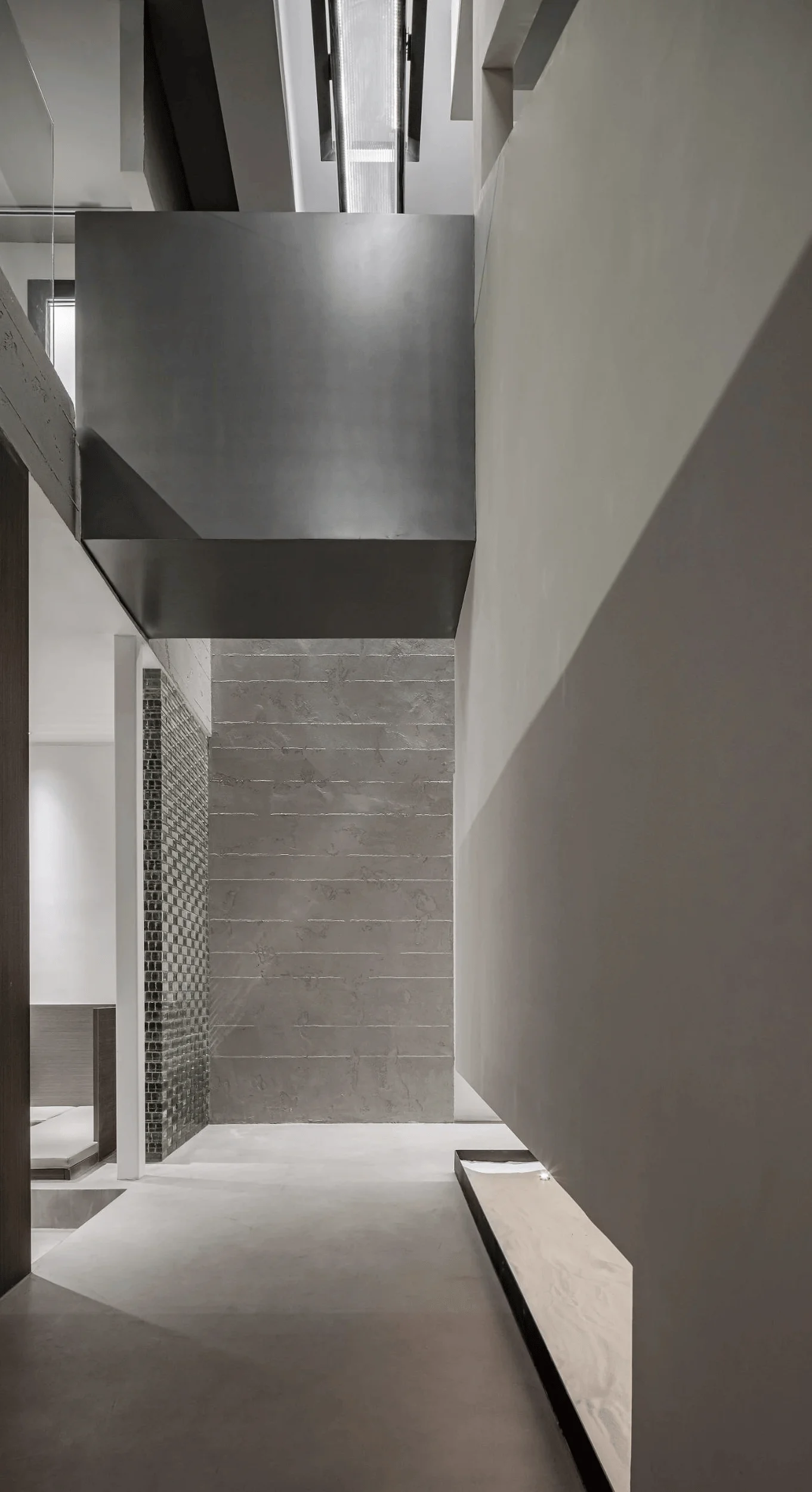
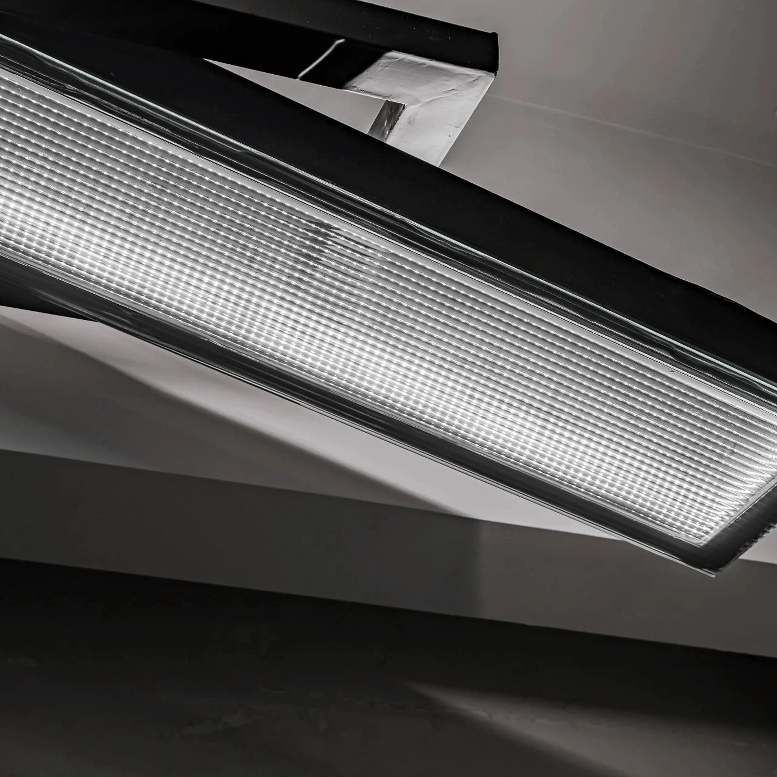
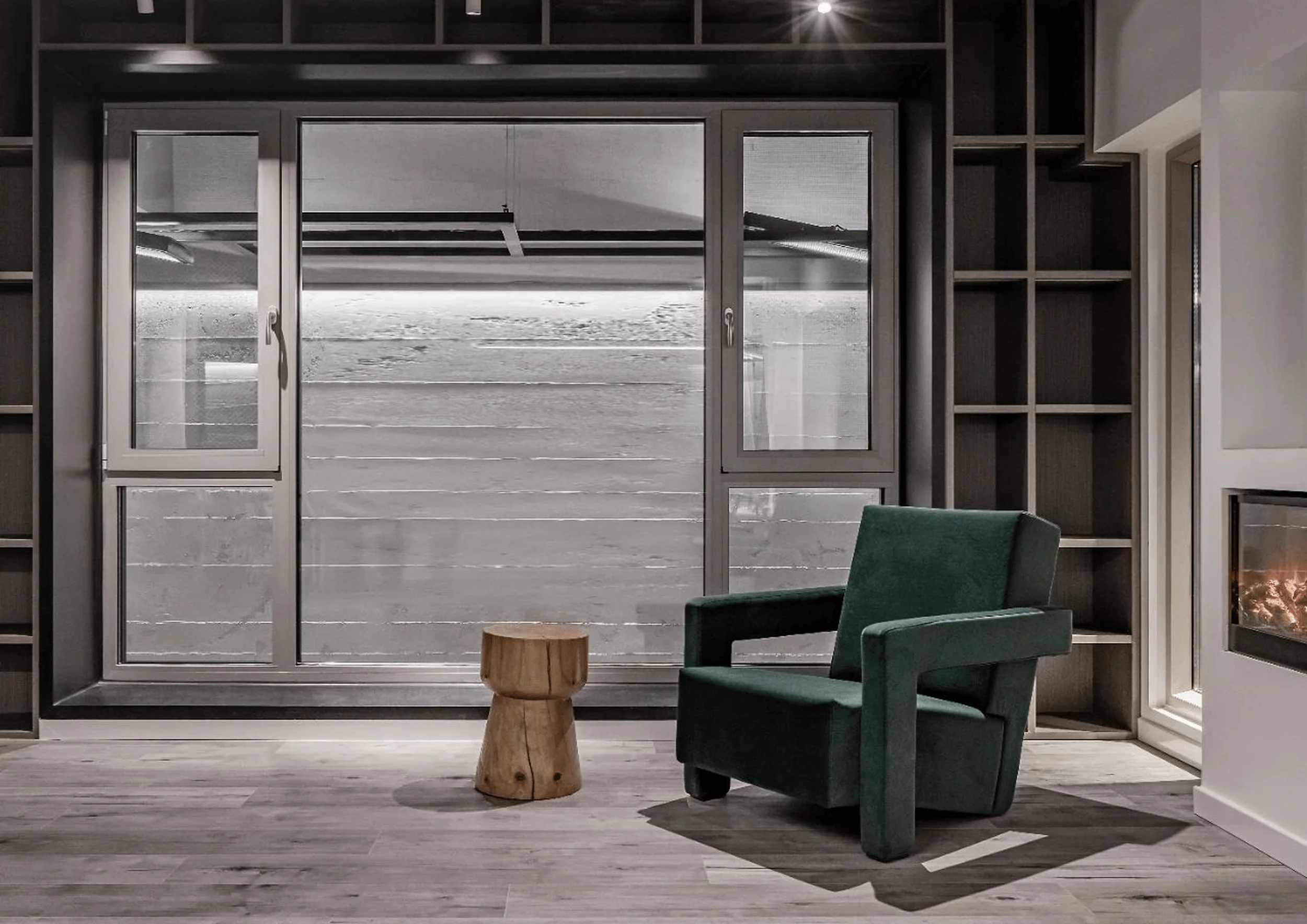
Located across from the Nanjing Massacre Memorial Hall, Mini Urban showroom inhabits a space imbued with solemnity. DeeSen Space Design drew inspiration from Álvaro Siza’s poetic modernism, responding to the site’s character with a sculptural interior that evokes the urban landscape. The firm aimed to create a space that transcends mere product display, offering visitors an immersive experience that resonates with the essence of urban living. This sensitivity to context and the incorporation of light as a design element are key aspects of Siza’s philosophy, which sought to “have light in my building, but there is no light.” This guiding principle influenced the showroom’s design, with natural light playing a critical role in shaping the space. The choice of simple materials like concrete, white lime, glass, wood, and stone reinforces the showroom’s connection to the urban landscape, echoing the materials often found in cityscapes.
Spatial Organization and Materiality
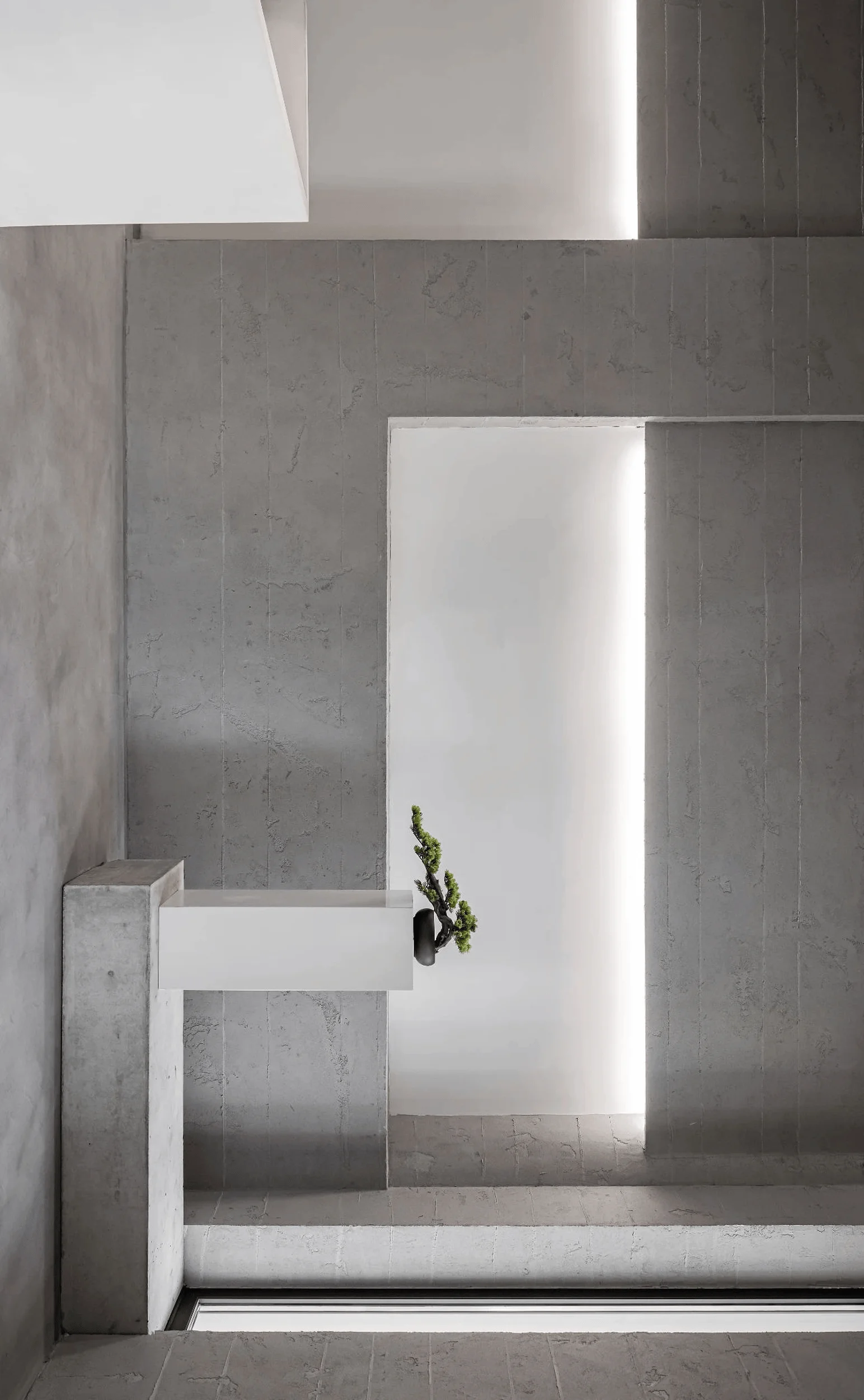
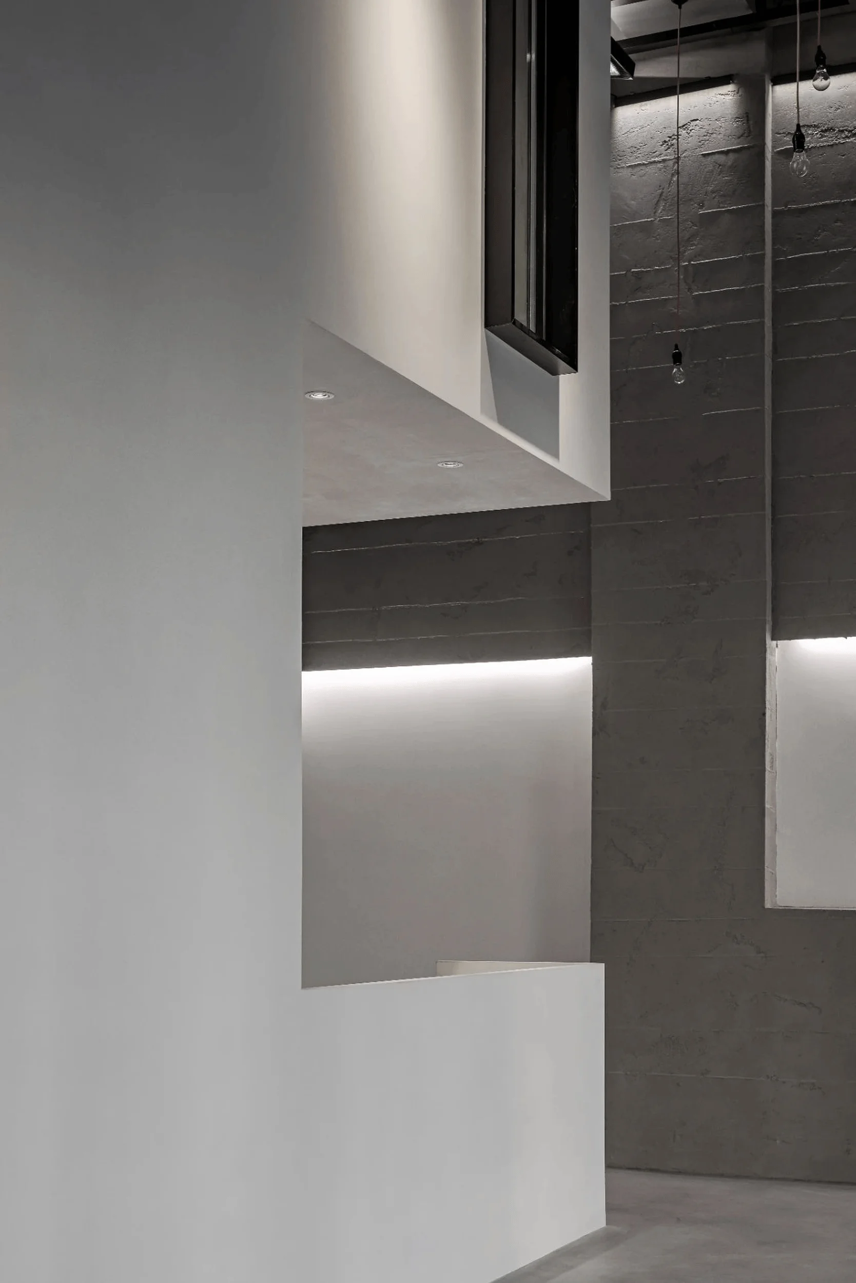
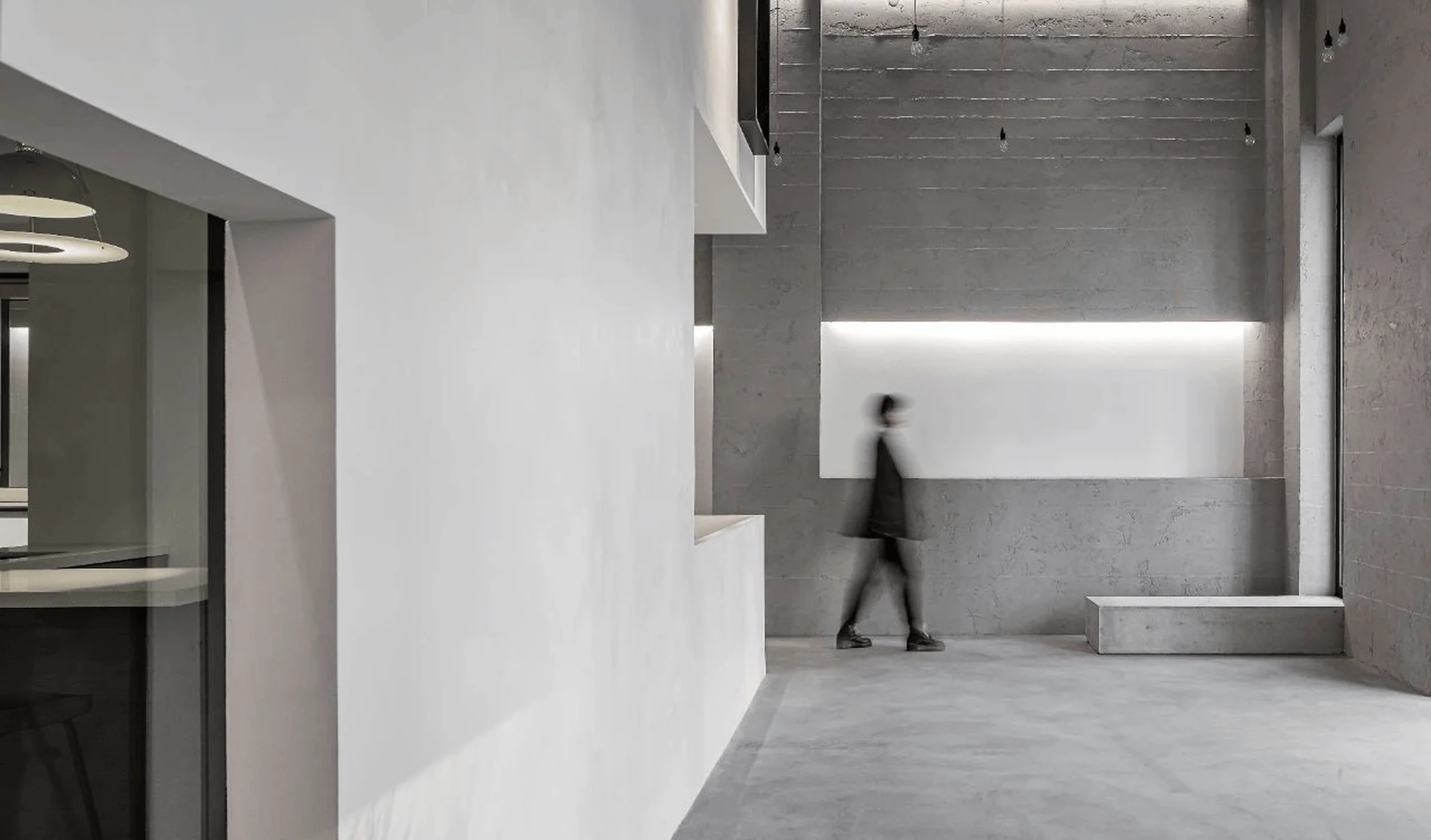
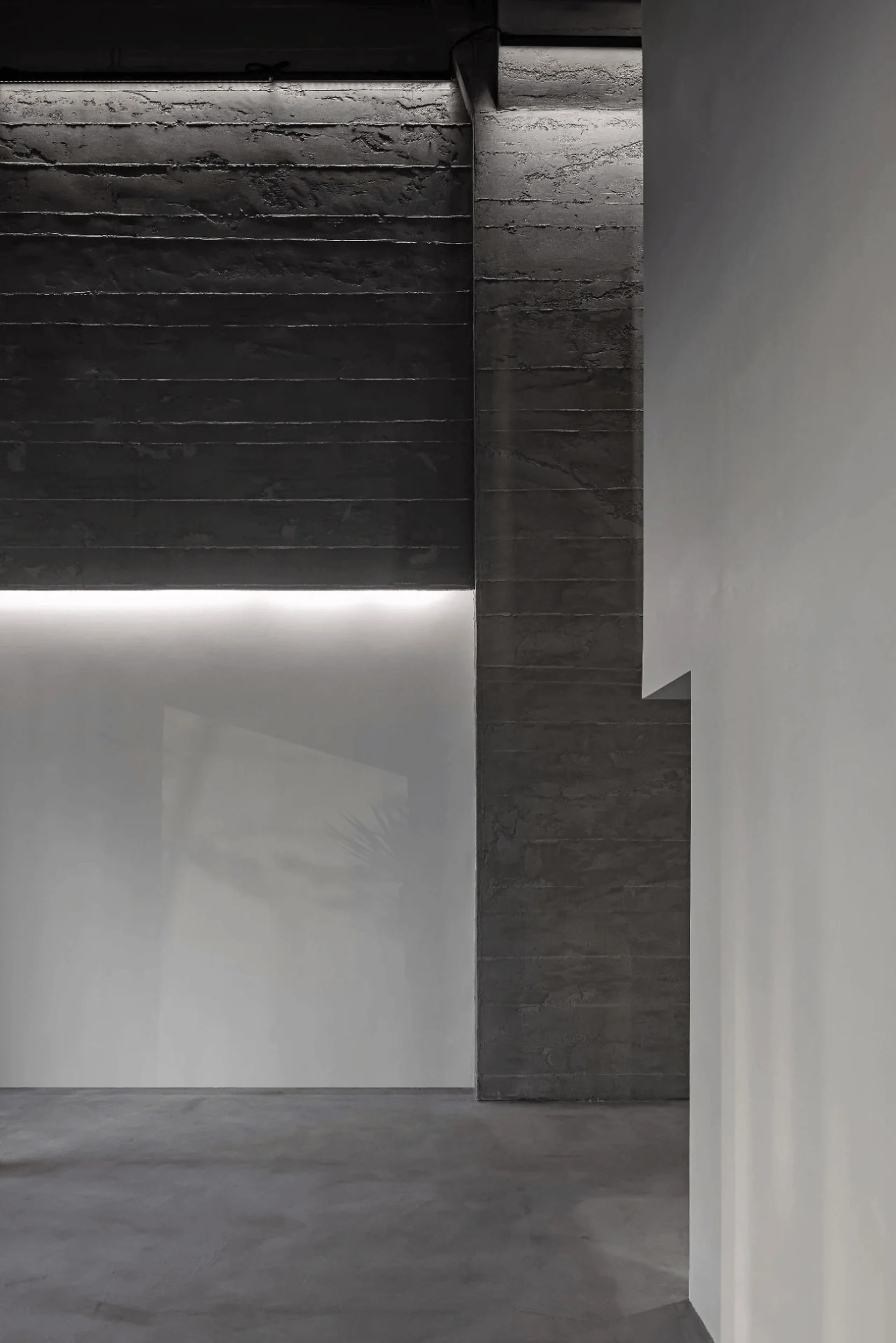
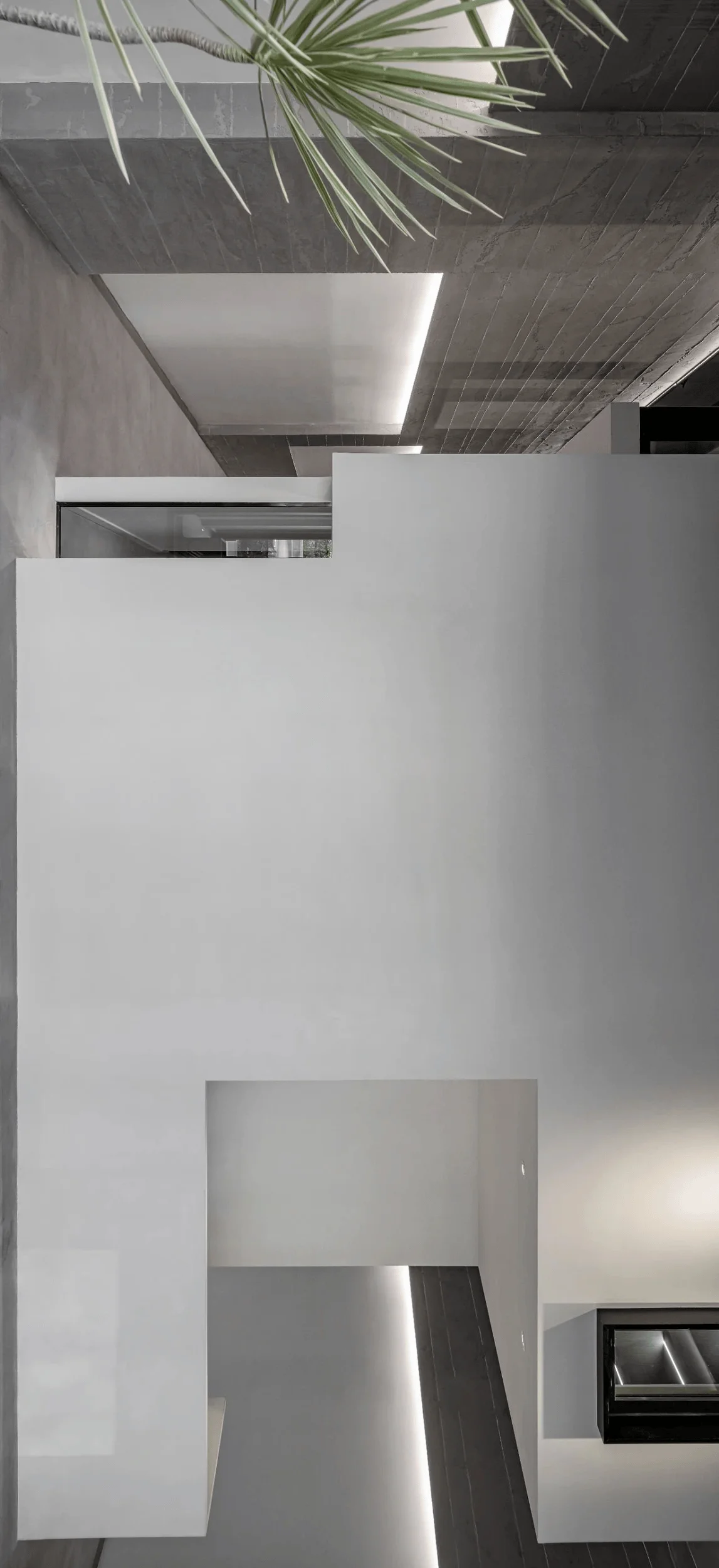
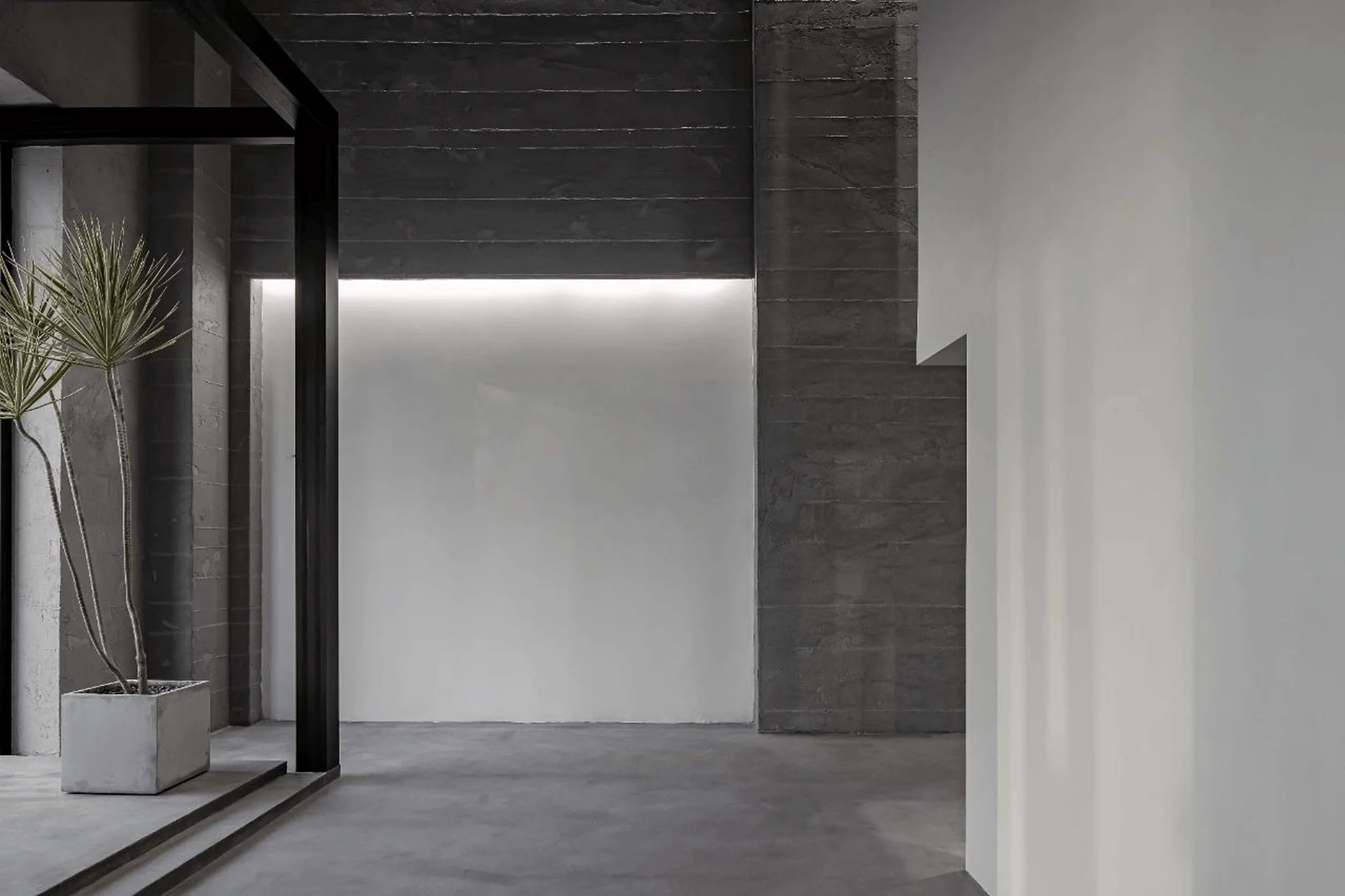
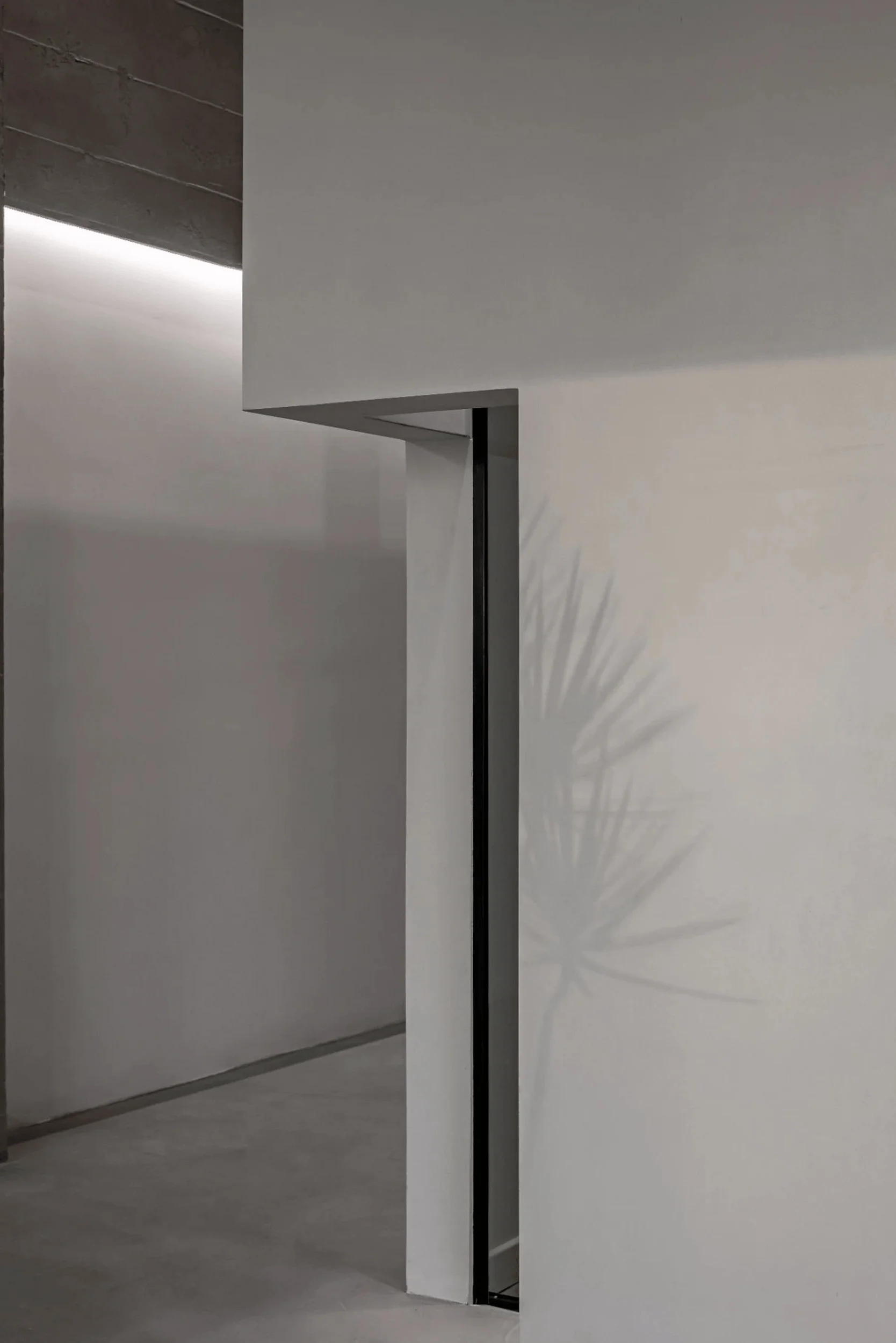
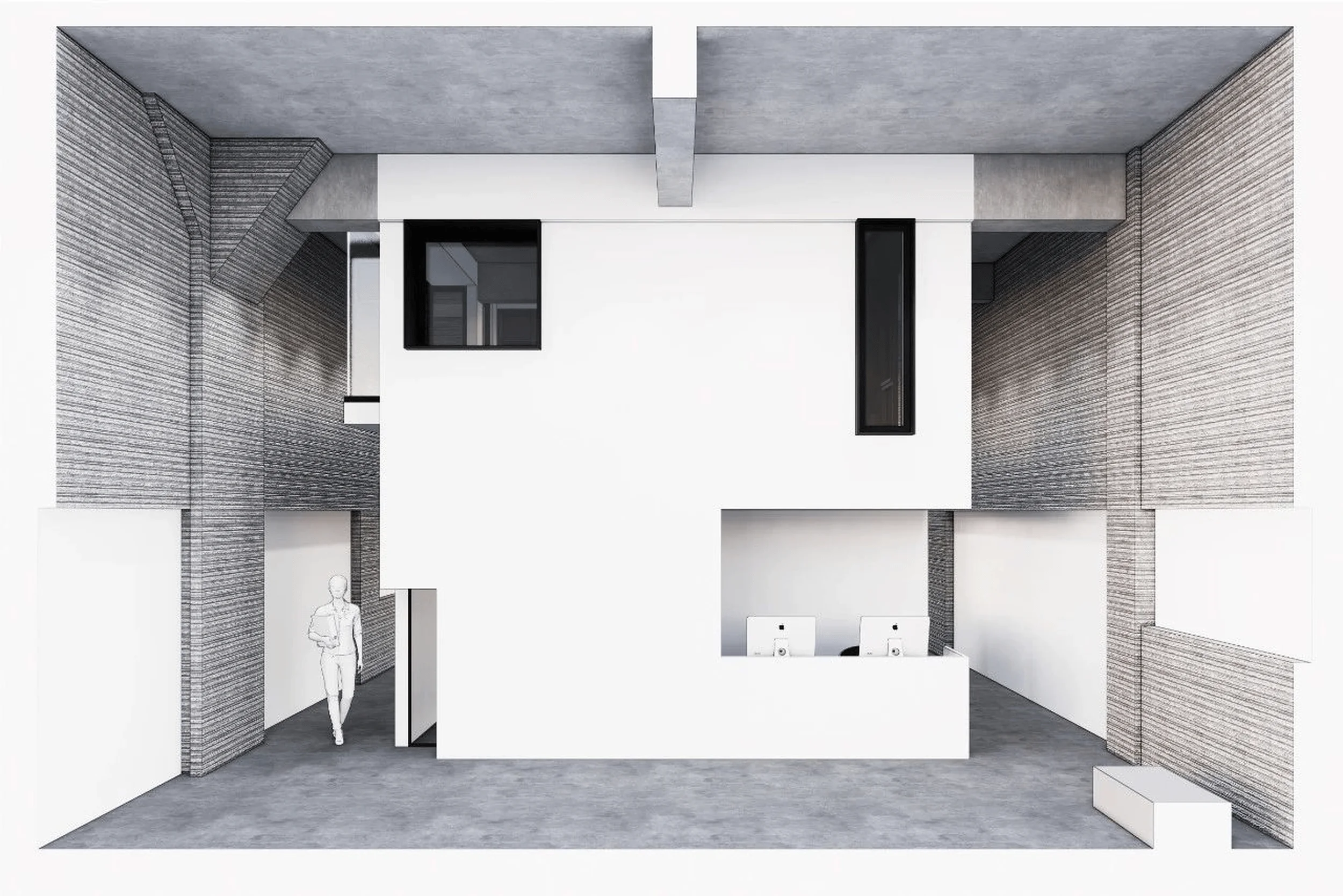
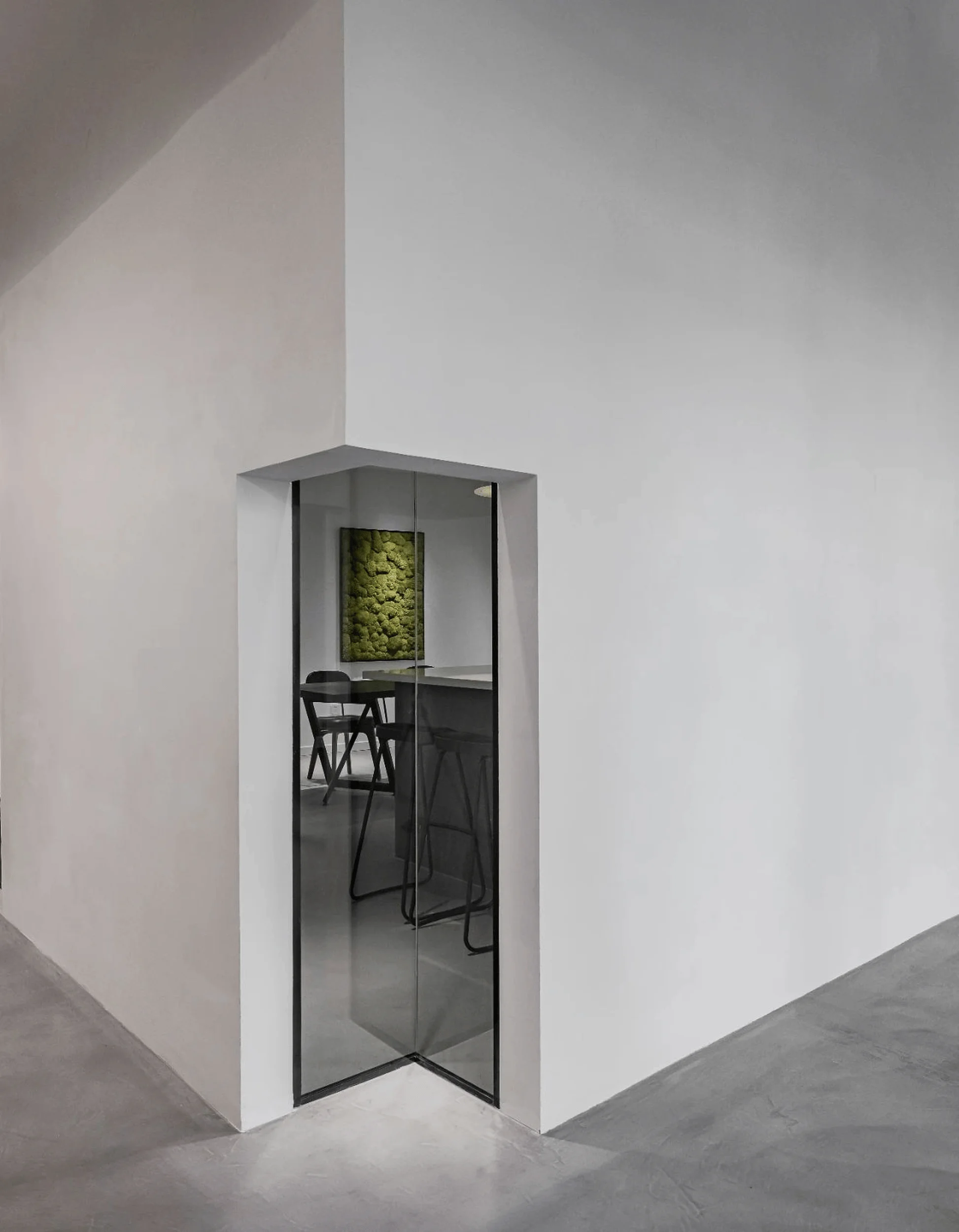
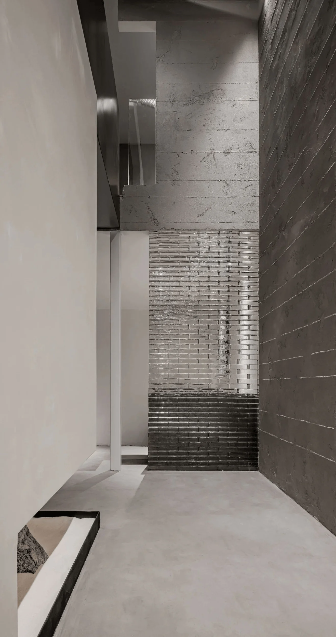
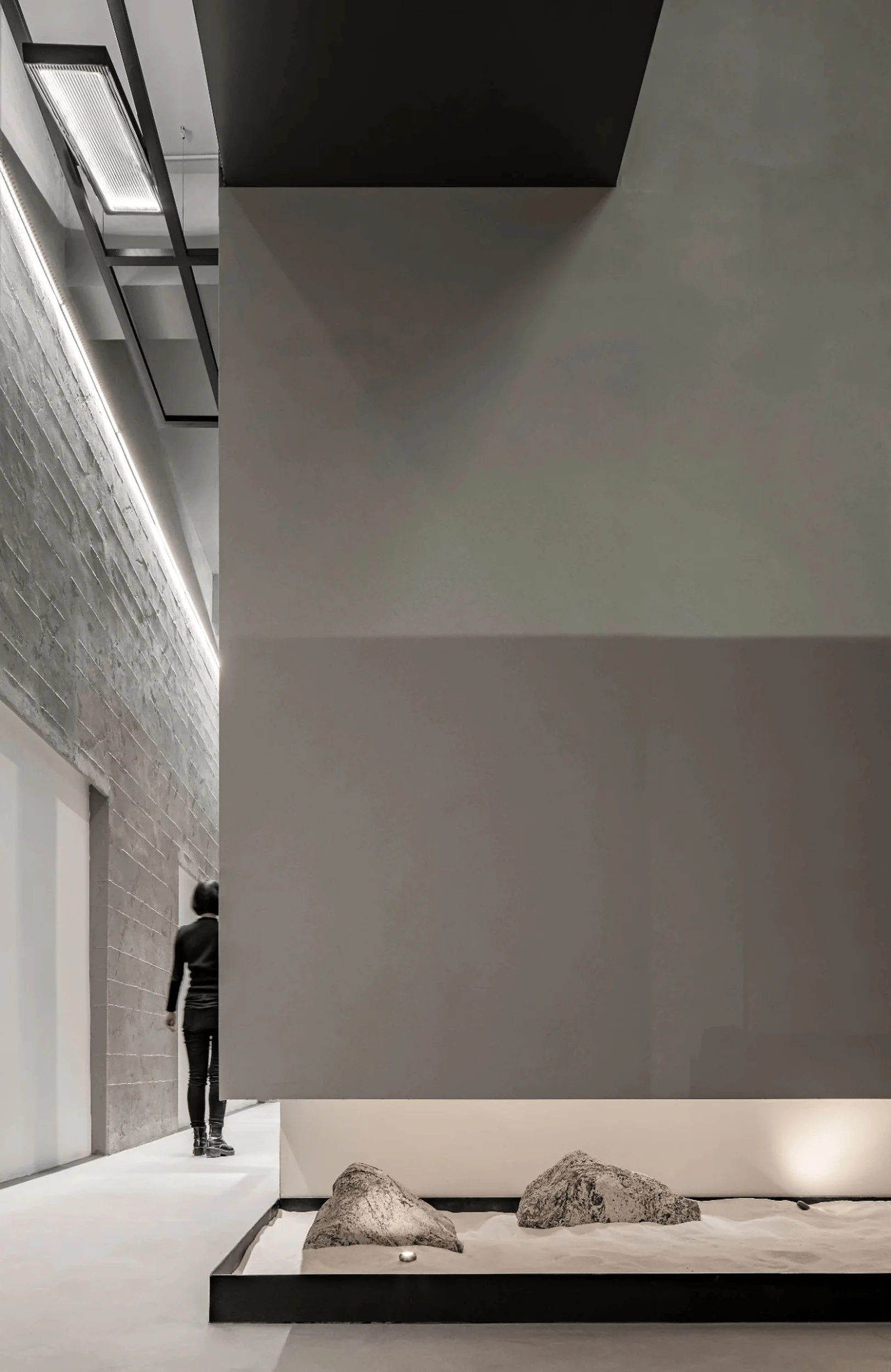
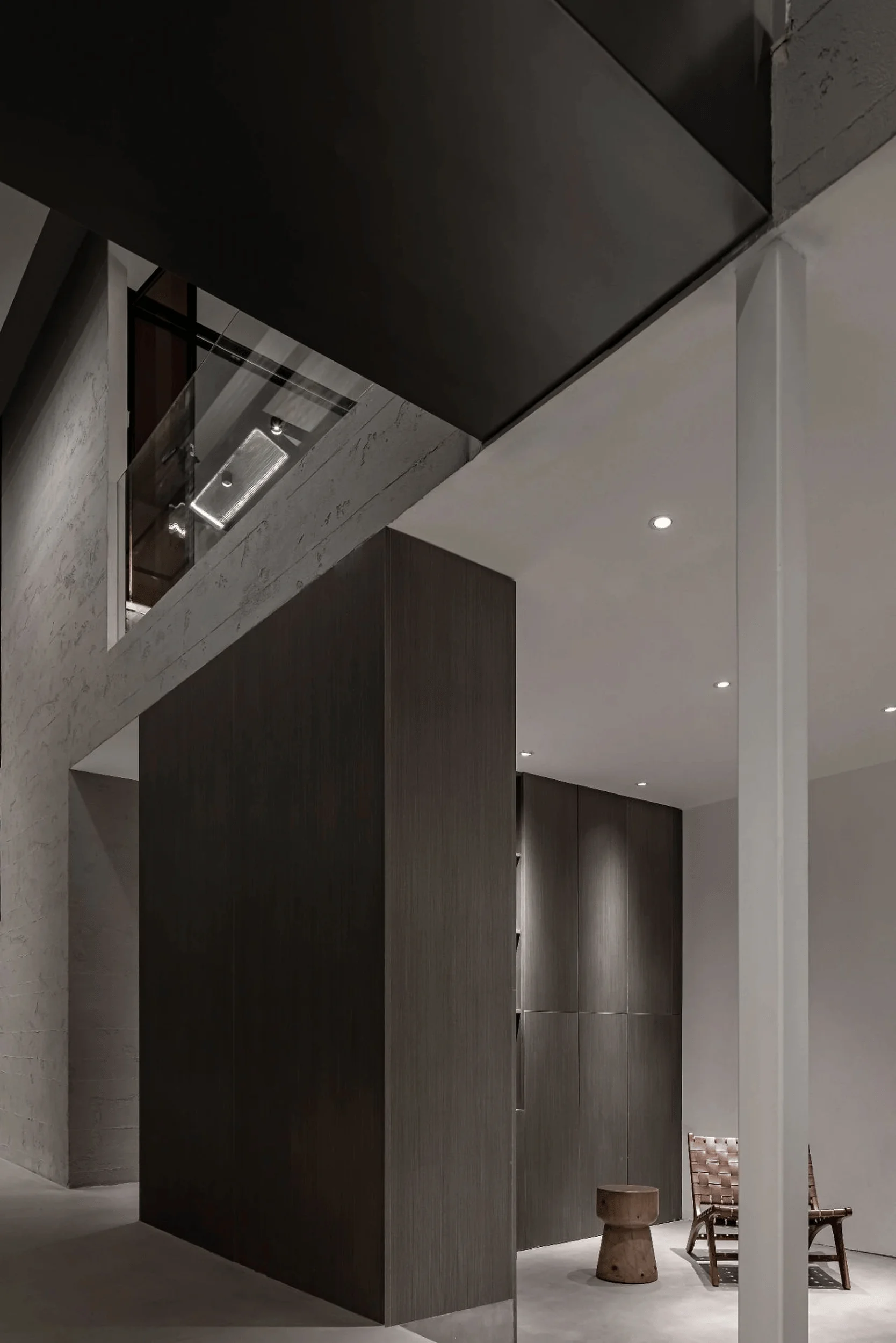
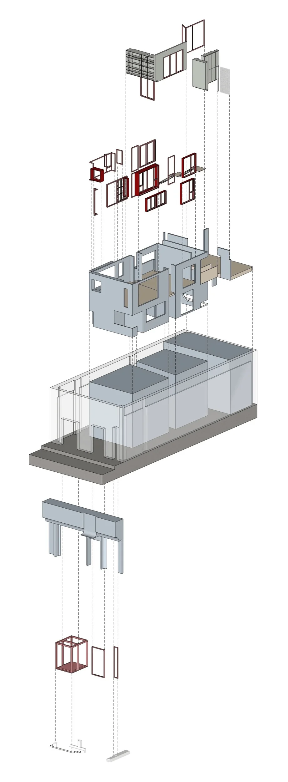
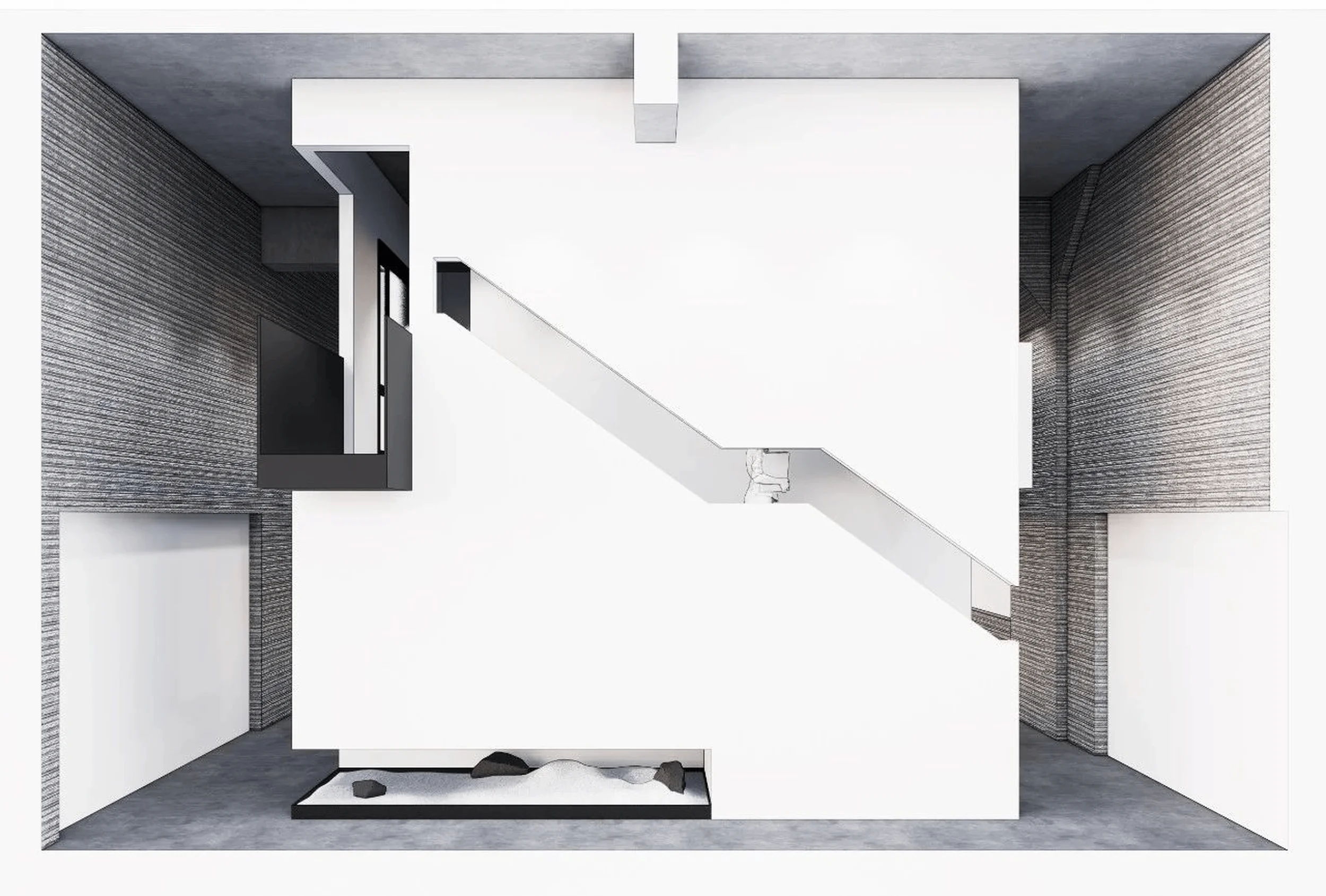
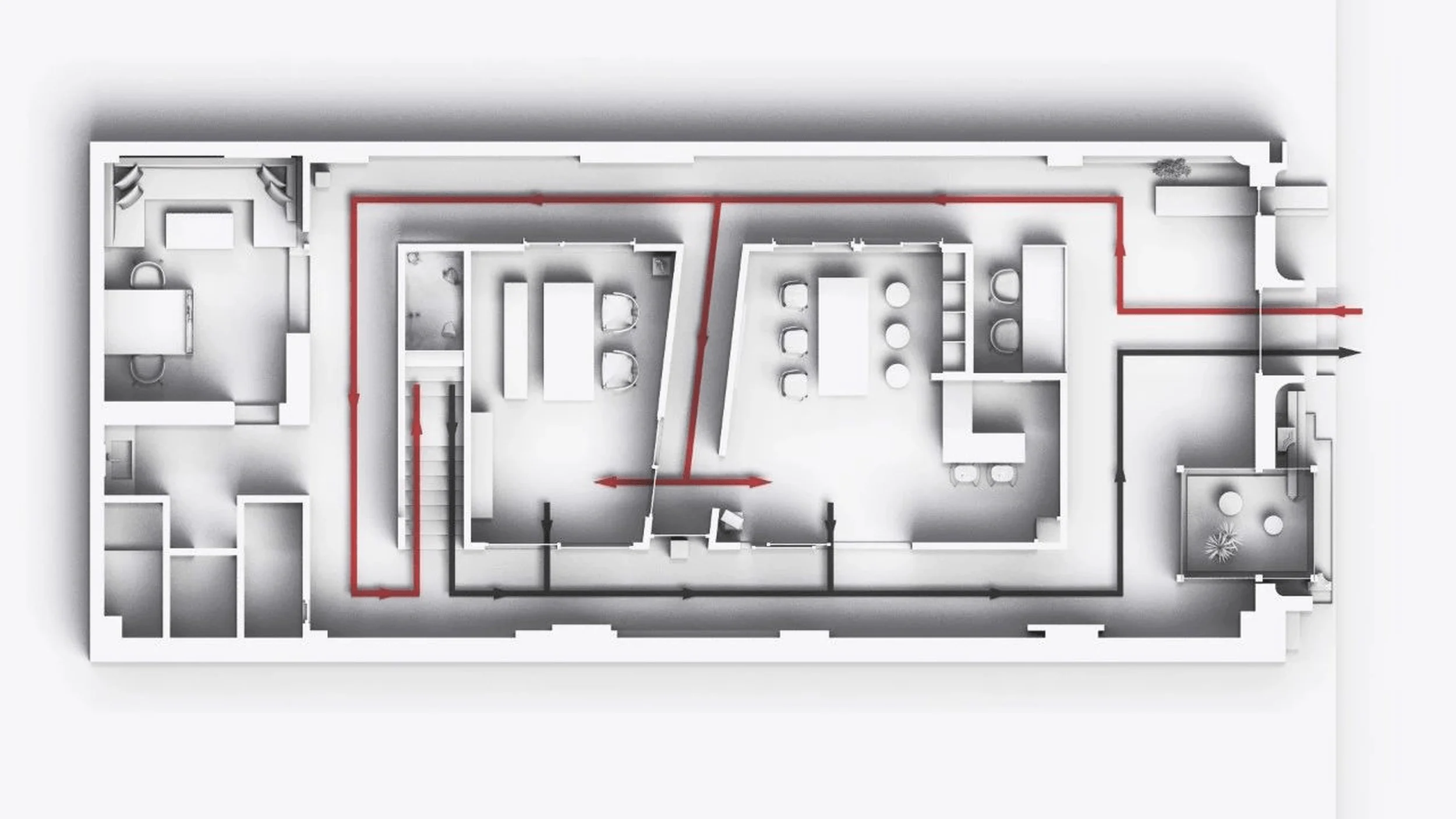
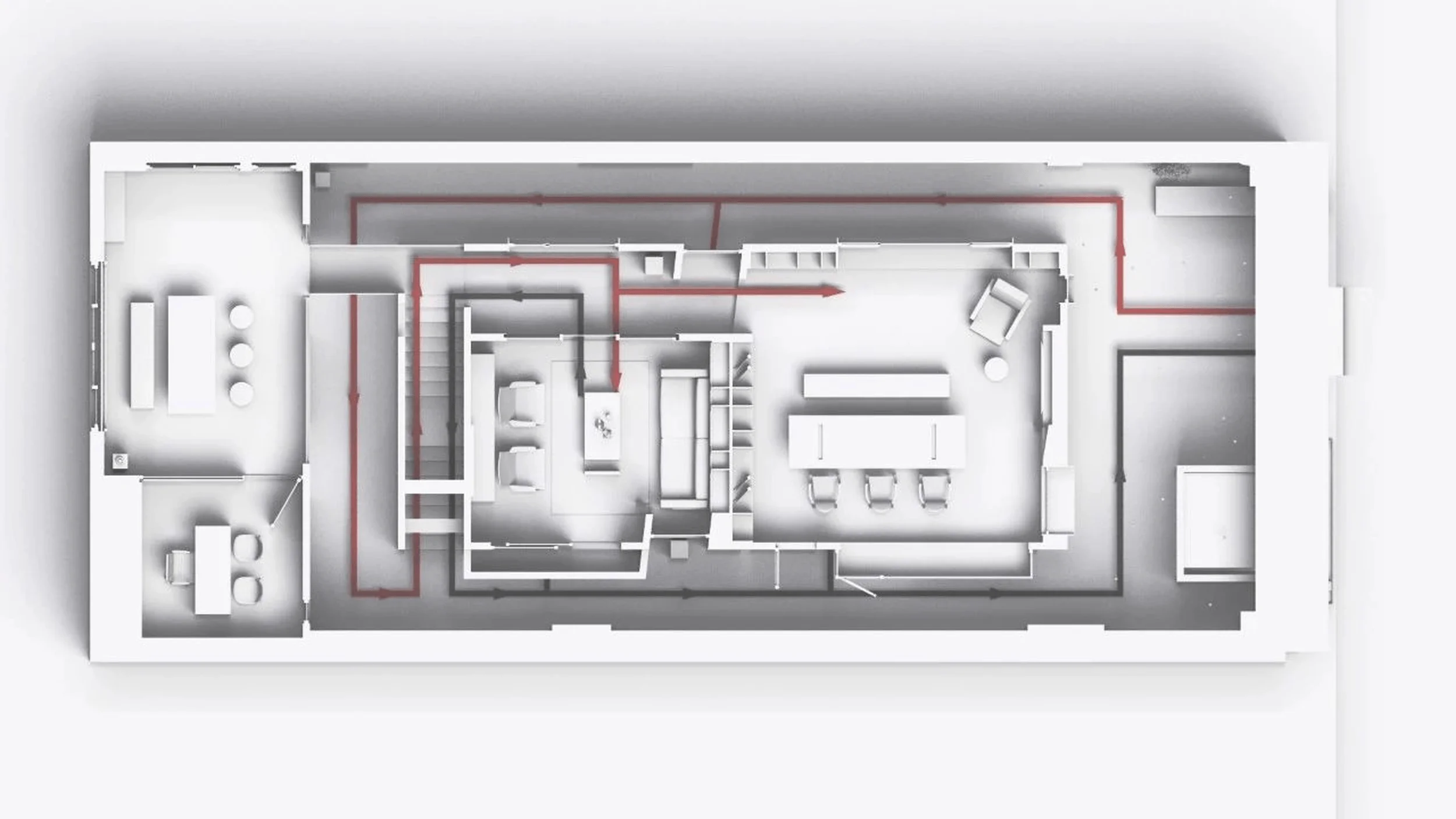
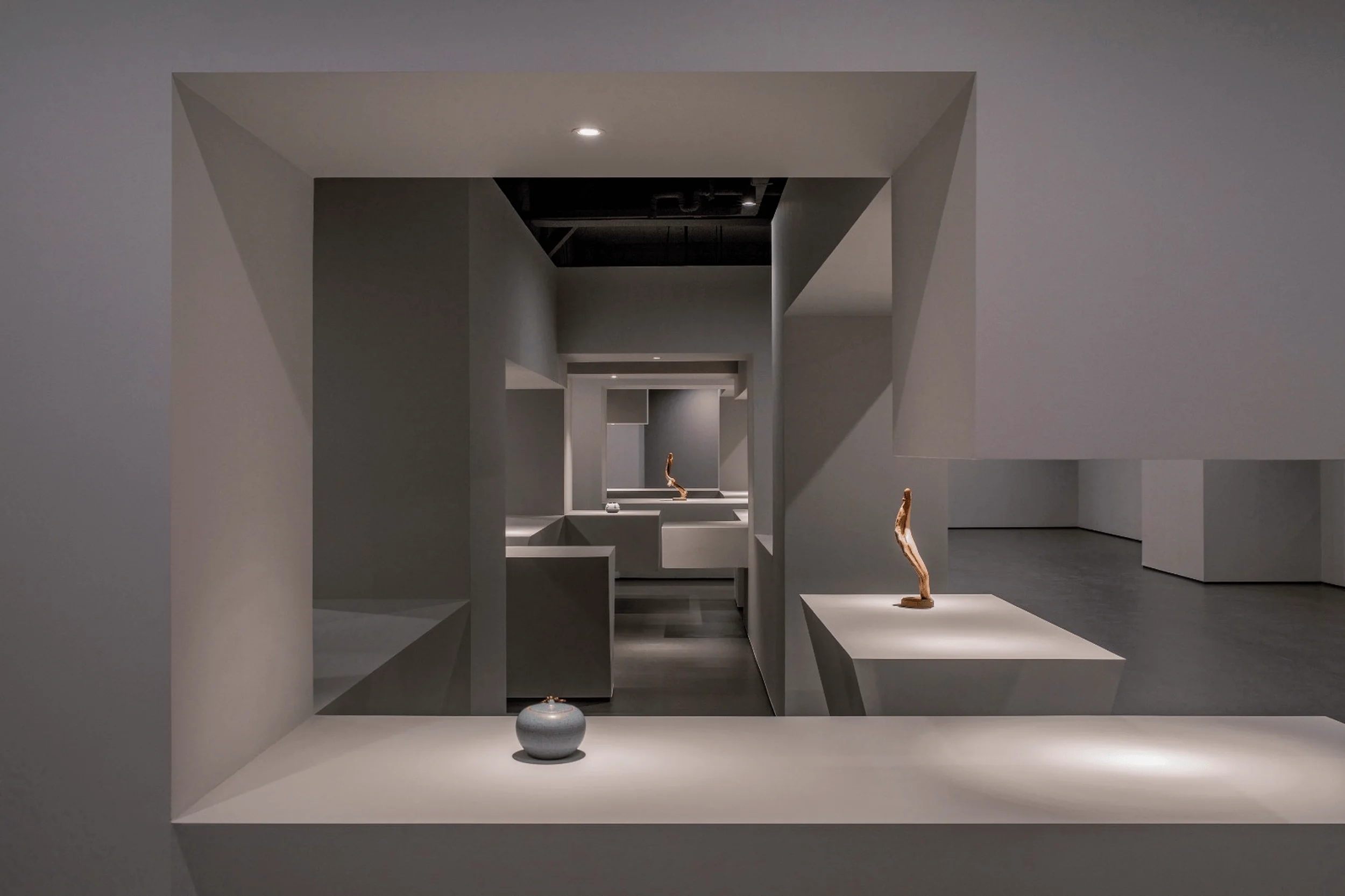
The showroom’s square layout presented opportunities for innovative shaping. DeeSen Space Design devised a clear spatial logic, maximizing each plane and utilizing diverse door and window systems to curate specific atmospheres. The juxtaposition of rough existing textures against the pristine white architectural interventions creates a compelling dialogue, expressing abstract aesthetic metaphors reminiscent of postmodernist architecture. The firm embraced the interplay of material and structure, transforming the door and window systems from mere products into integral elements of the environment. By carefully choreographing the visitor’s journey through the space, DeeSen Space Design fosters moments of pause and contemplation.
Sculptural Elements and Design Philosophy
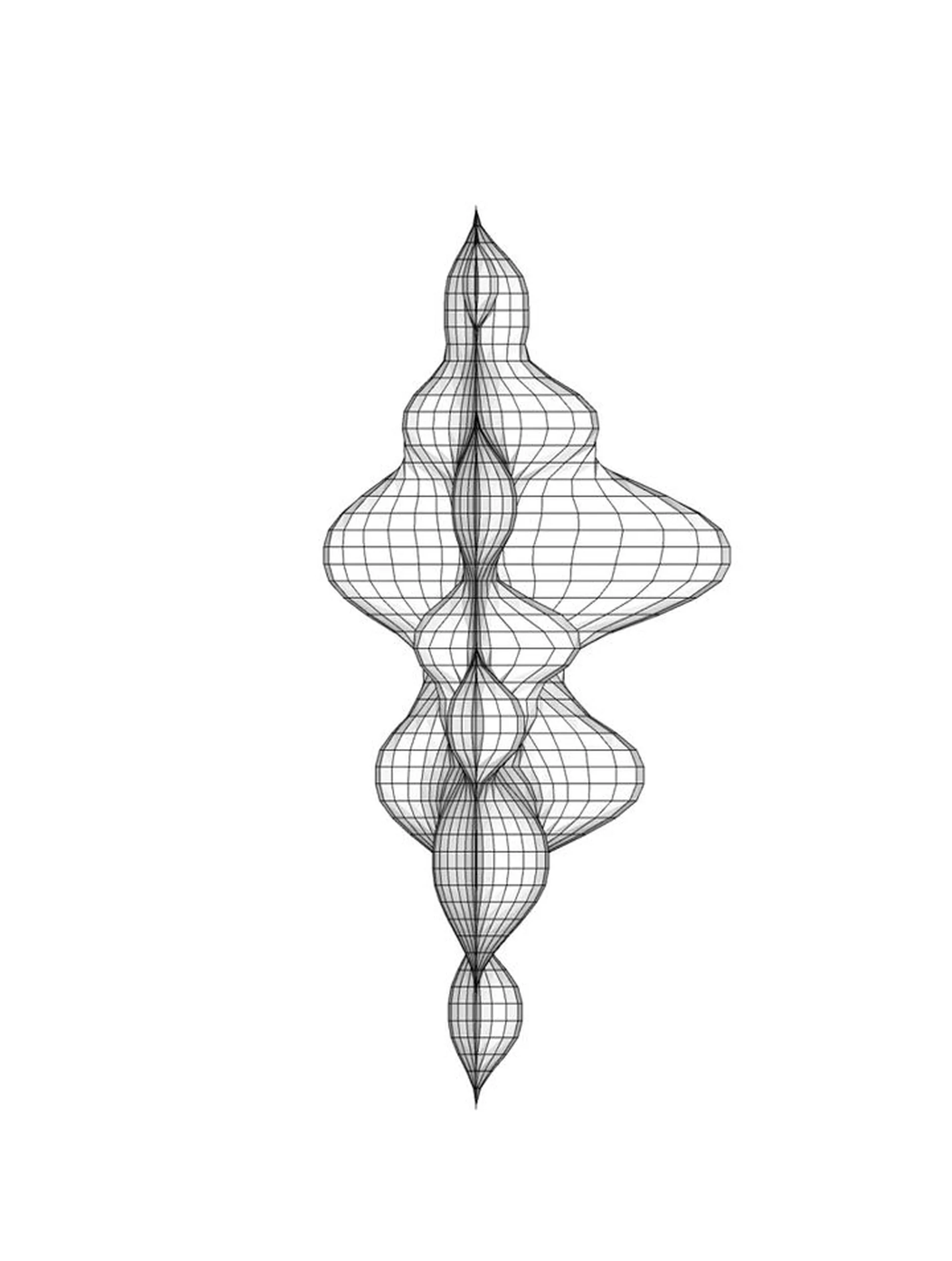
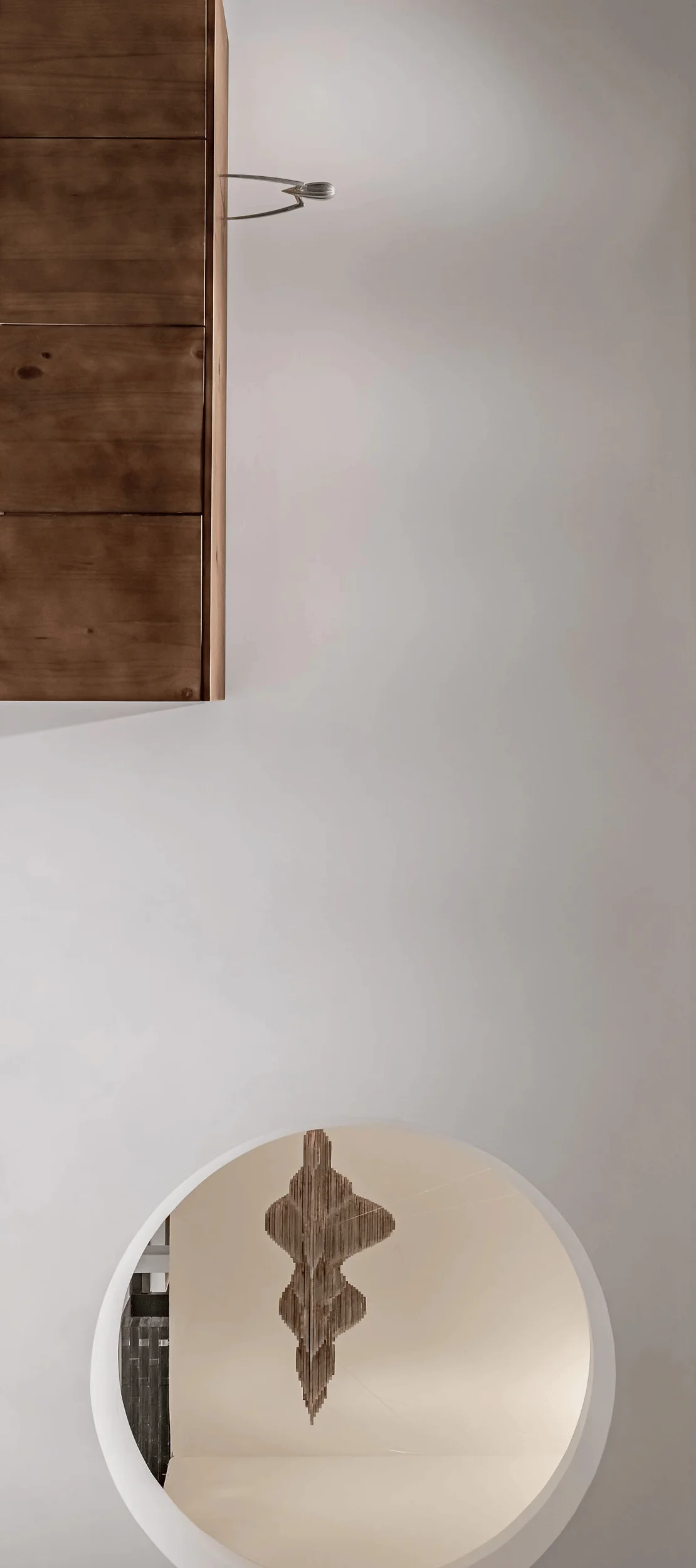
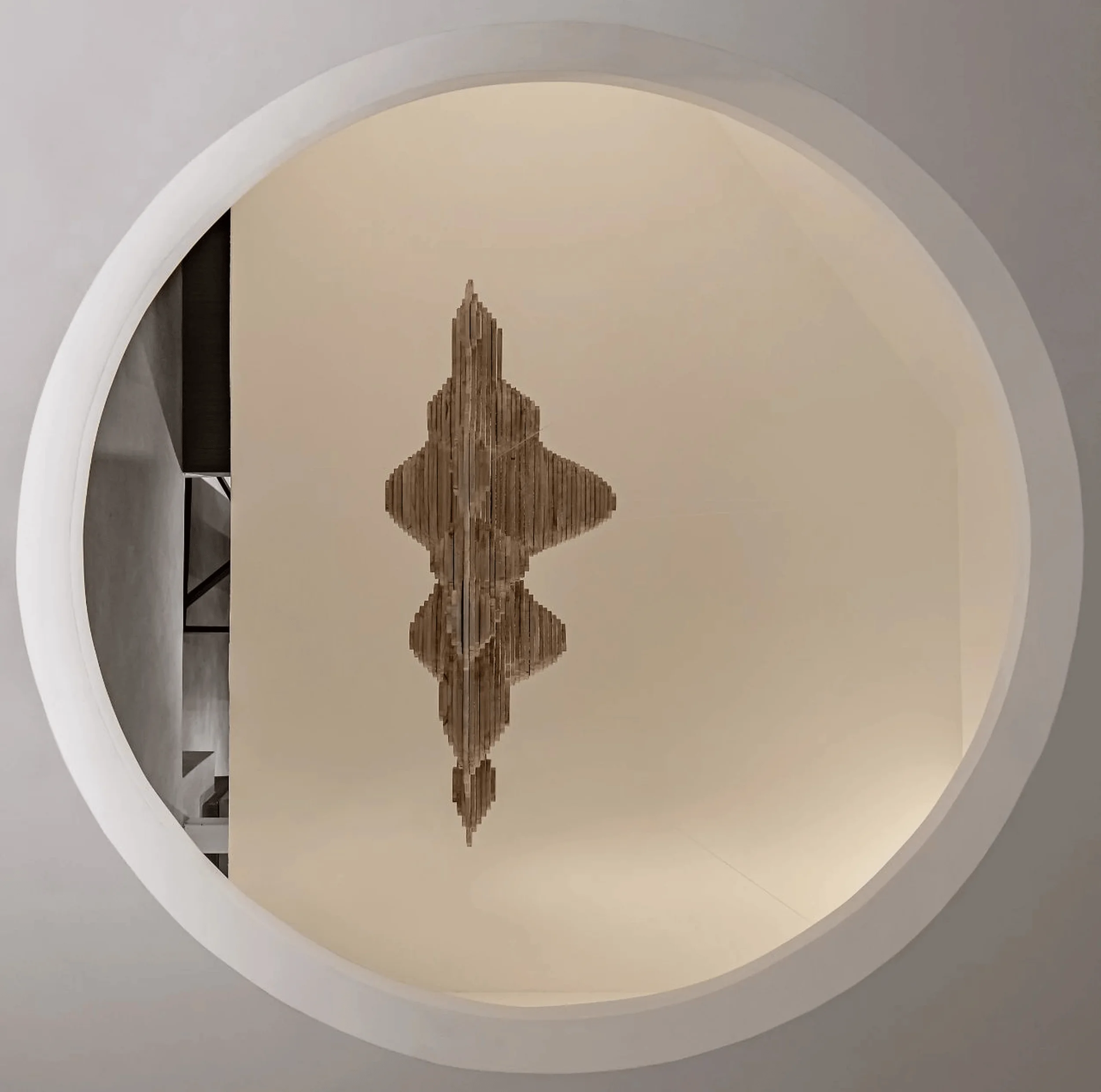
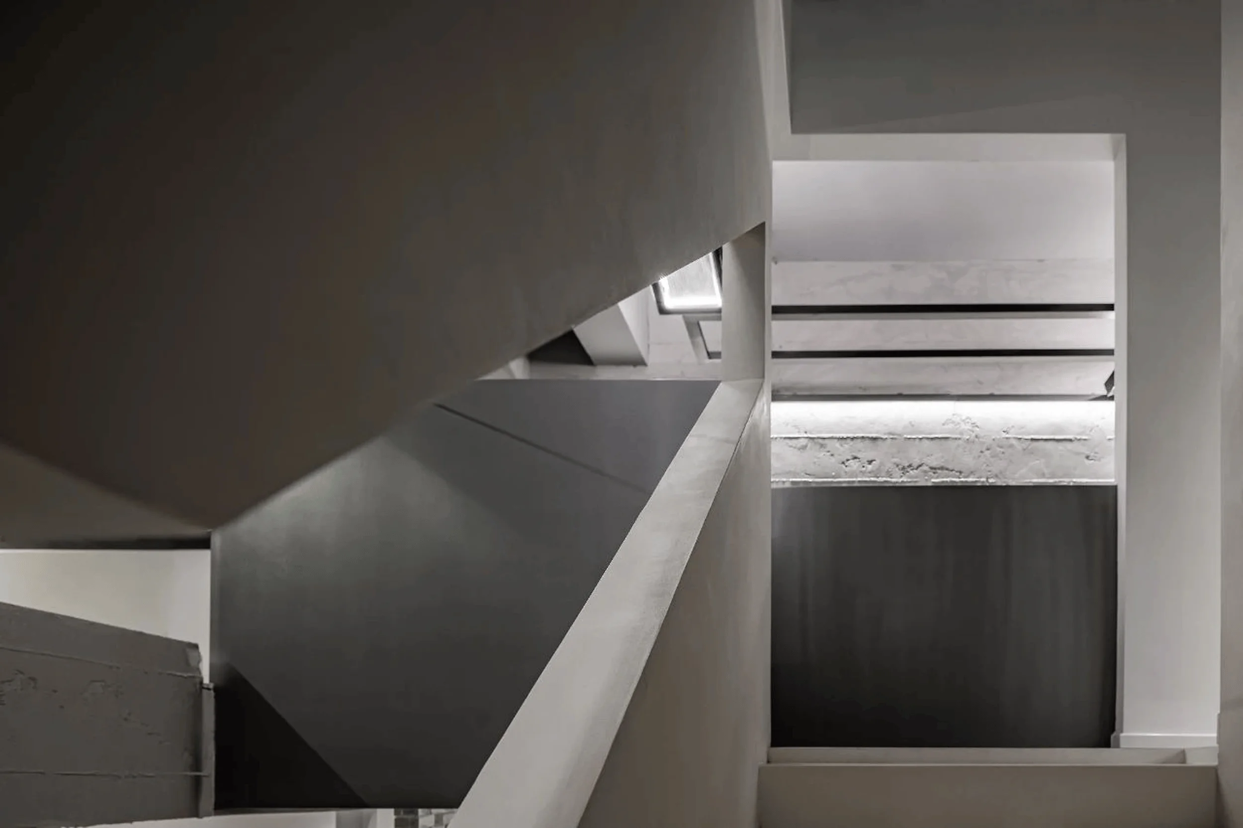
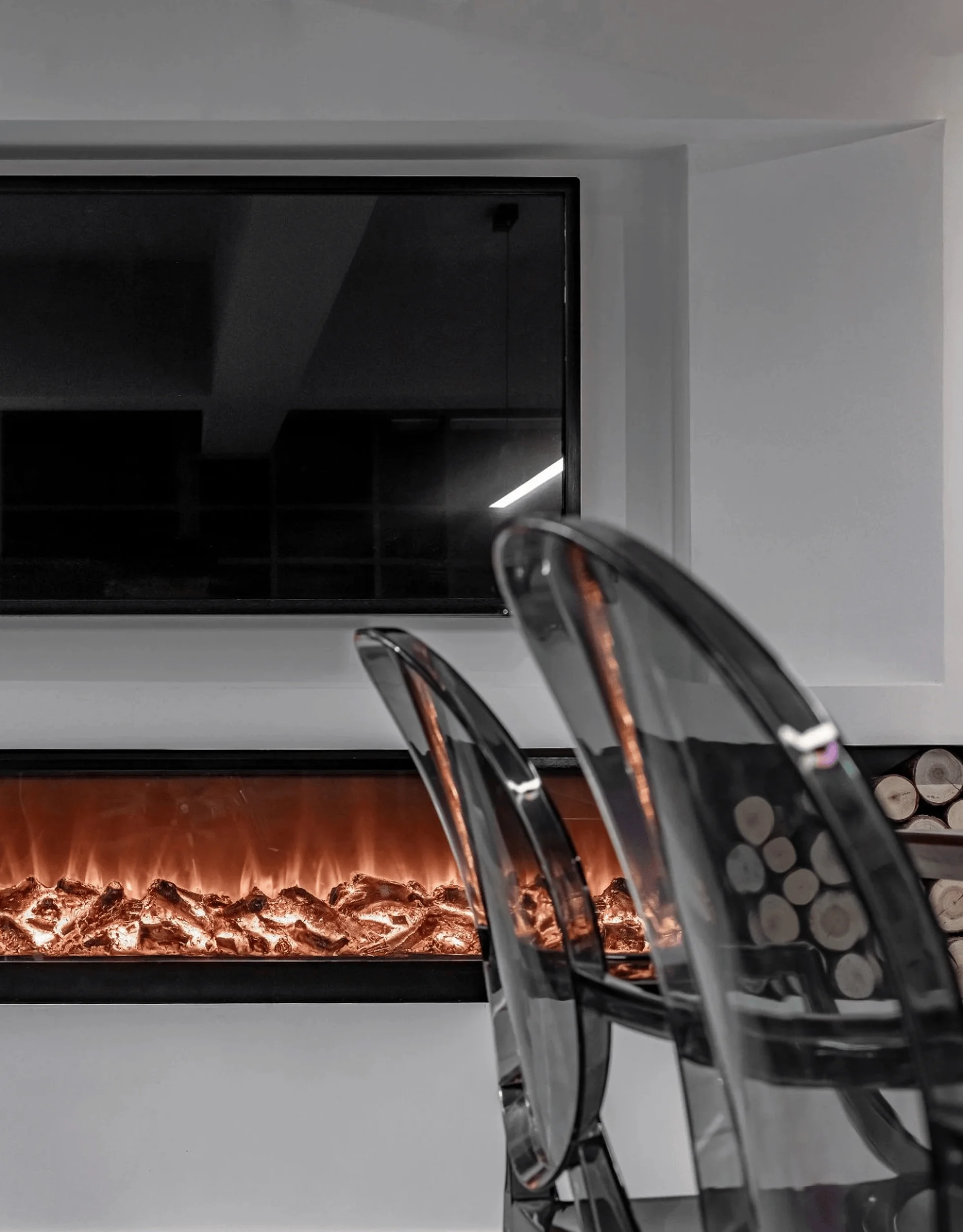
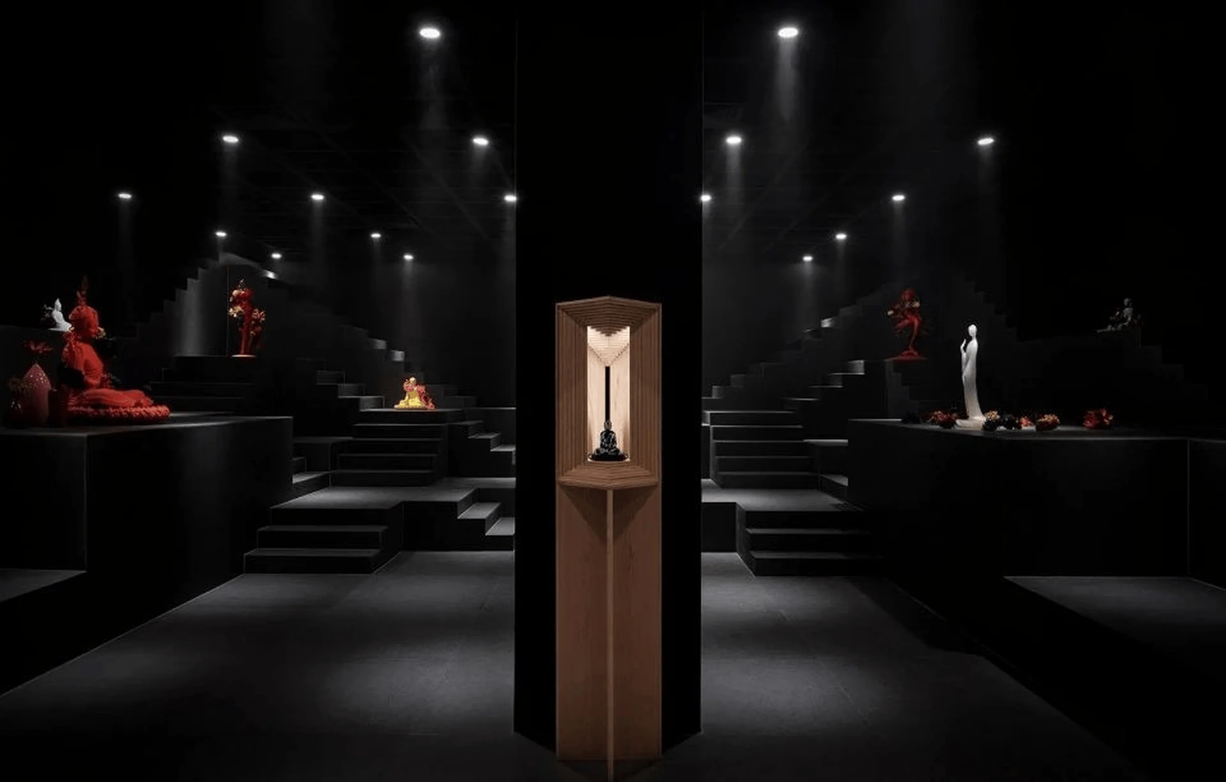
Beyond the minimalist aesthetic lies a complex interplay of details. A suspended mountain crafted from wood chips defies gravity, creating a virtual courtyard within the showroom. This feature, along with other carefully curated details, draws visitors deeper into the space, evoking an emotional resonance with the urban landscape. The white space extends inward, culminating in a hidden dry landscape that embodies Eastern design philosophy. The interplay of light and shadow further enhances the showroom’s dramatic effect. This interplay extends to the carefully considered placement of doors and windows, which serve as both barriers and mediators between the interior world and the exterior urban environment.
Architectural Features and Visitor Experience
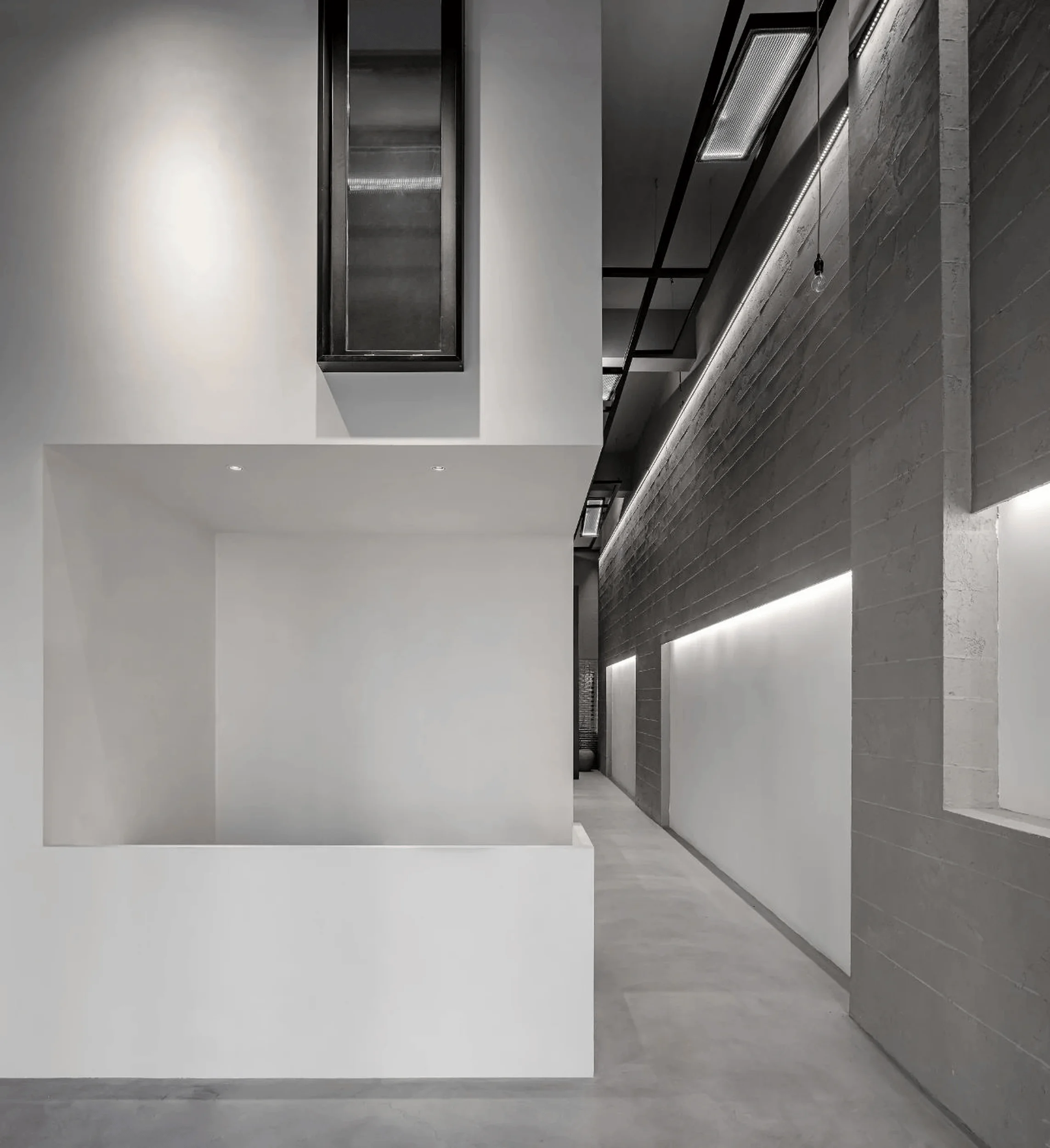
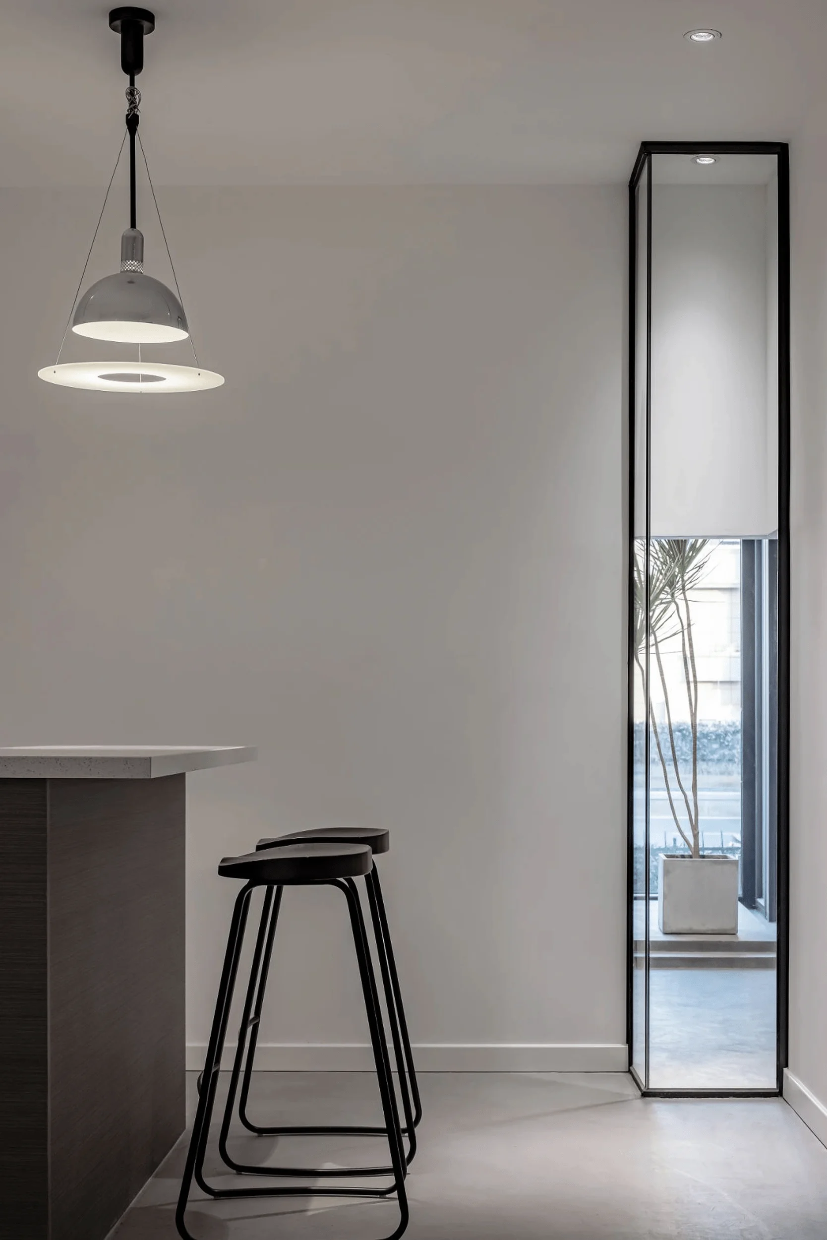
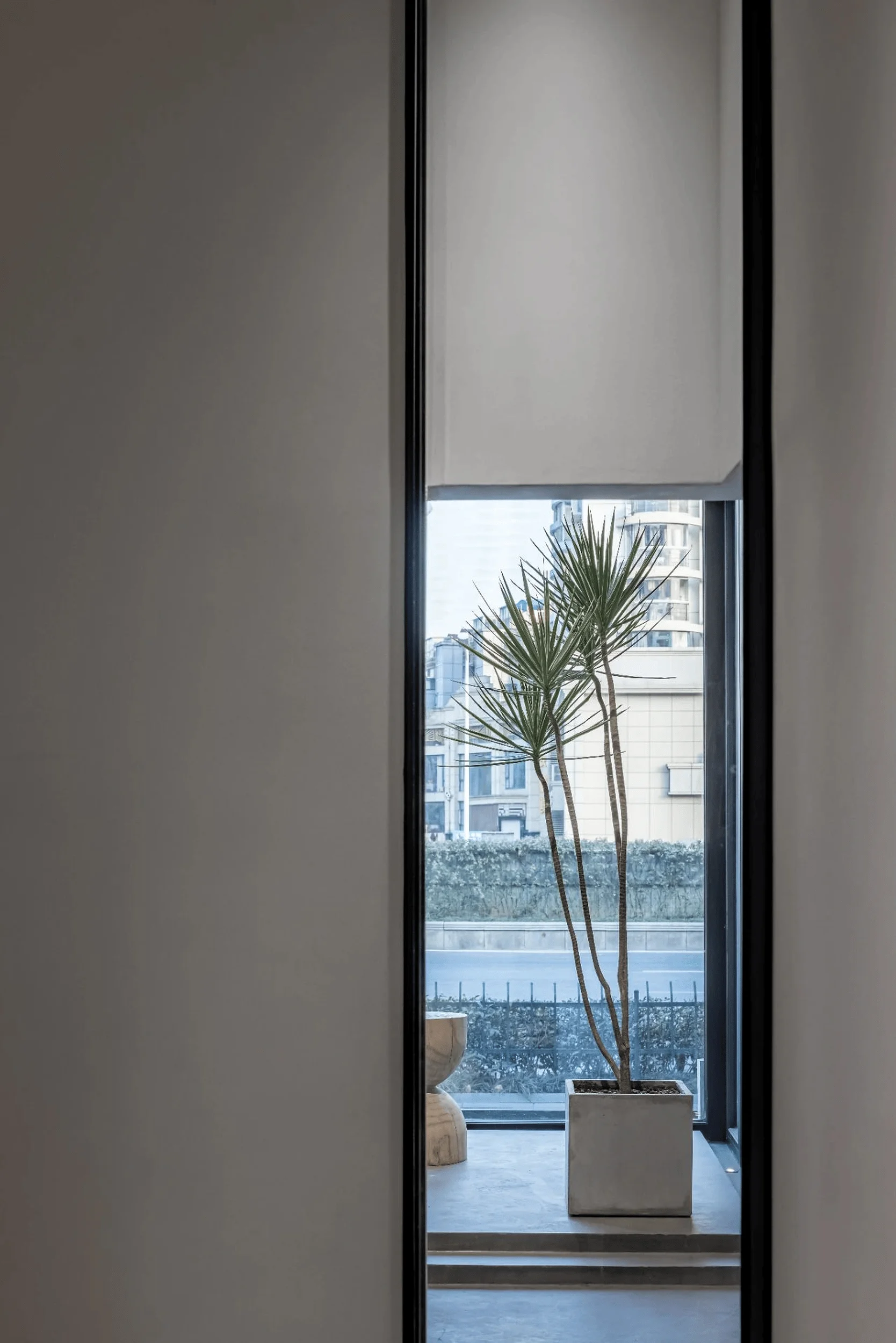
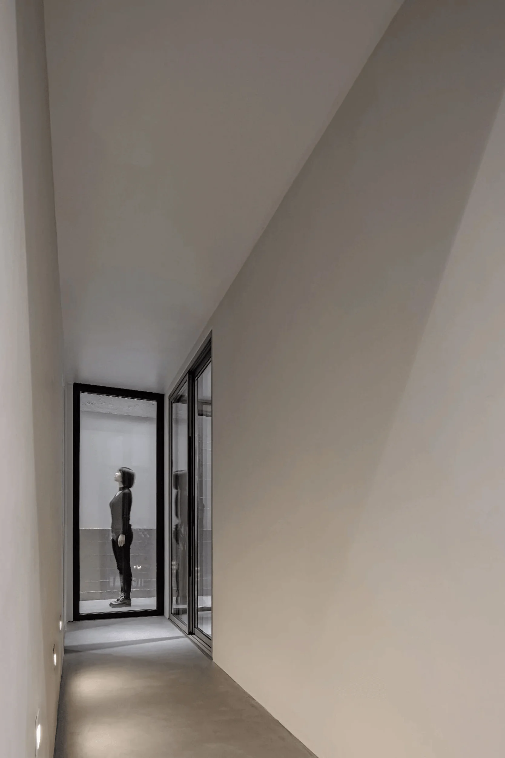
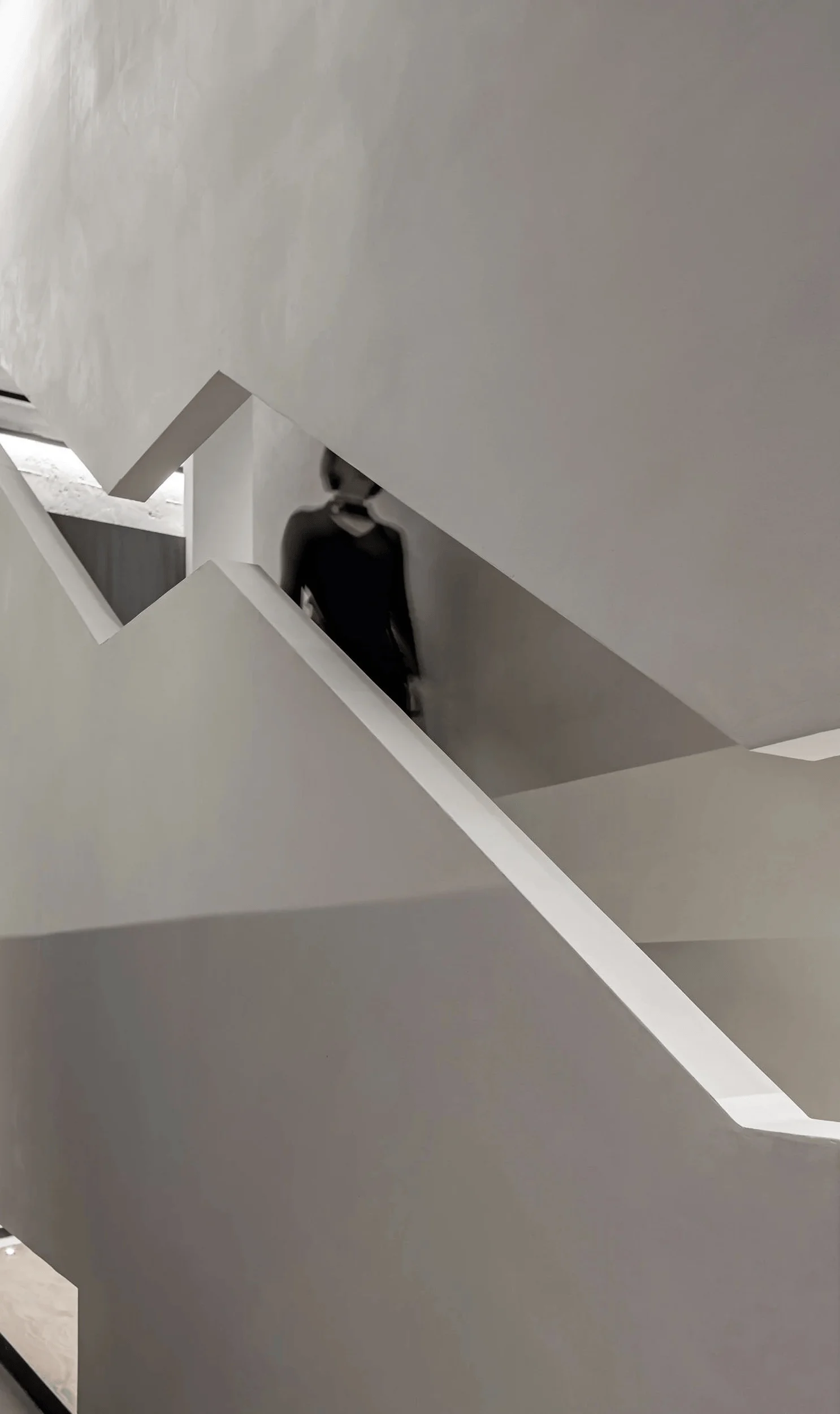
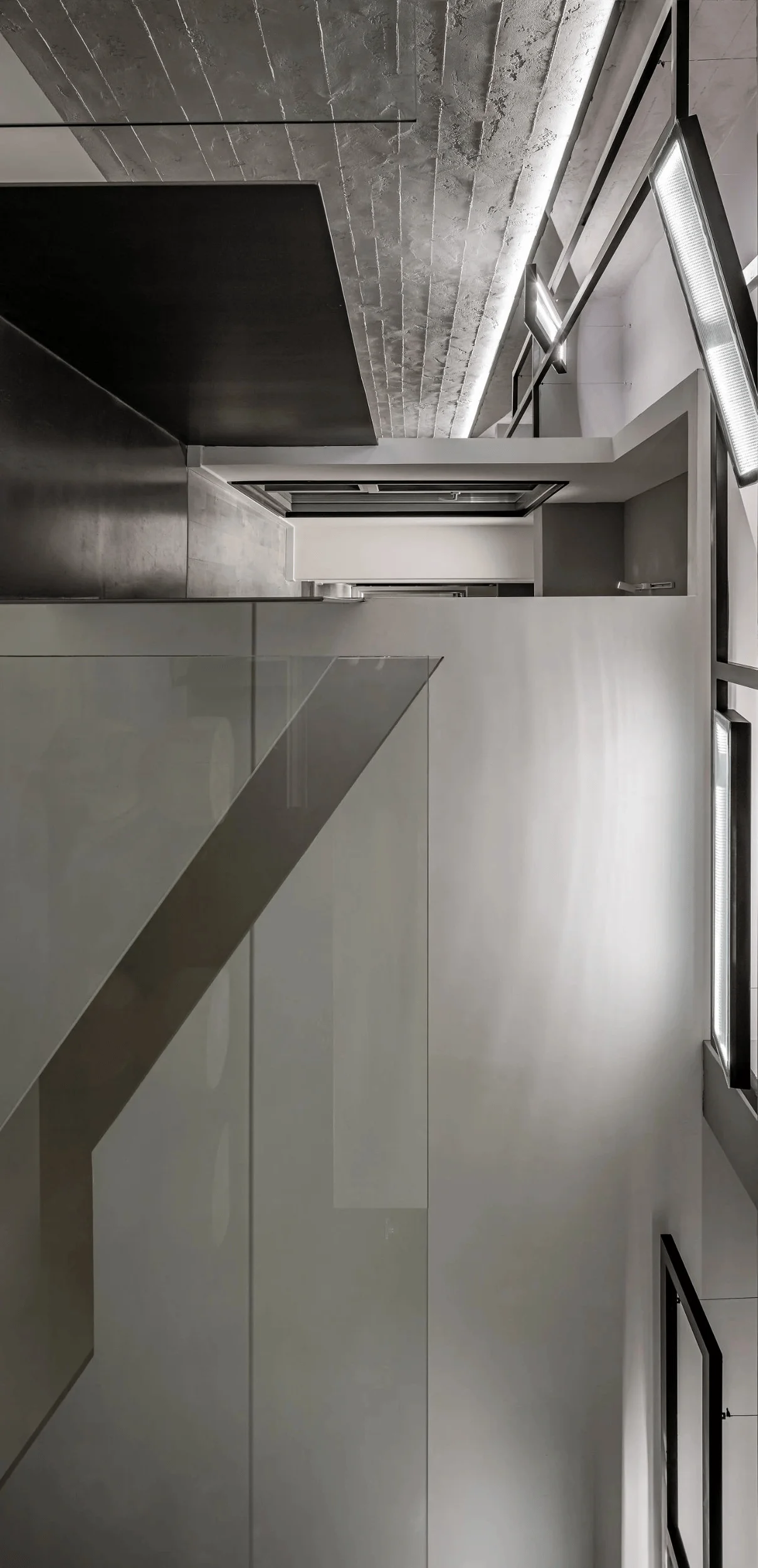
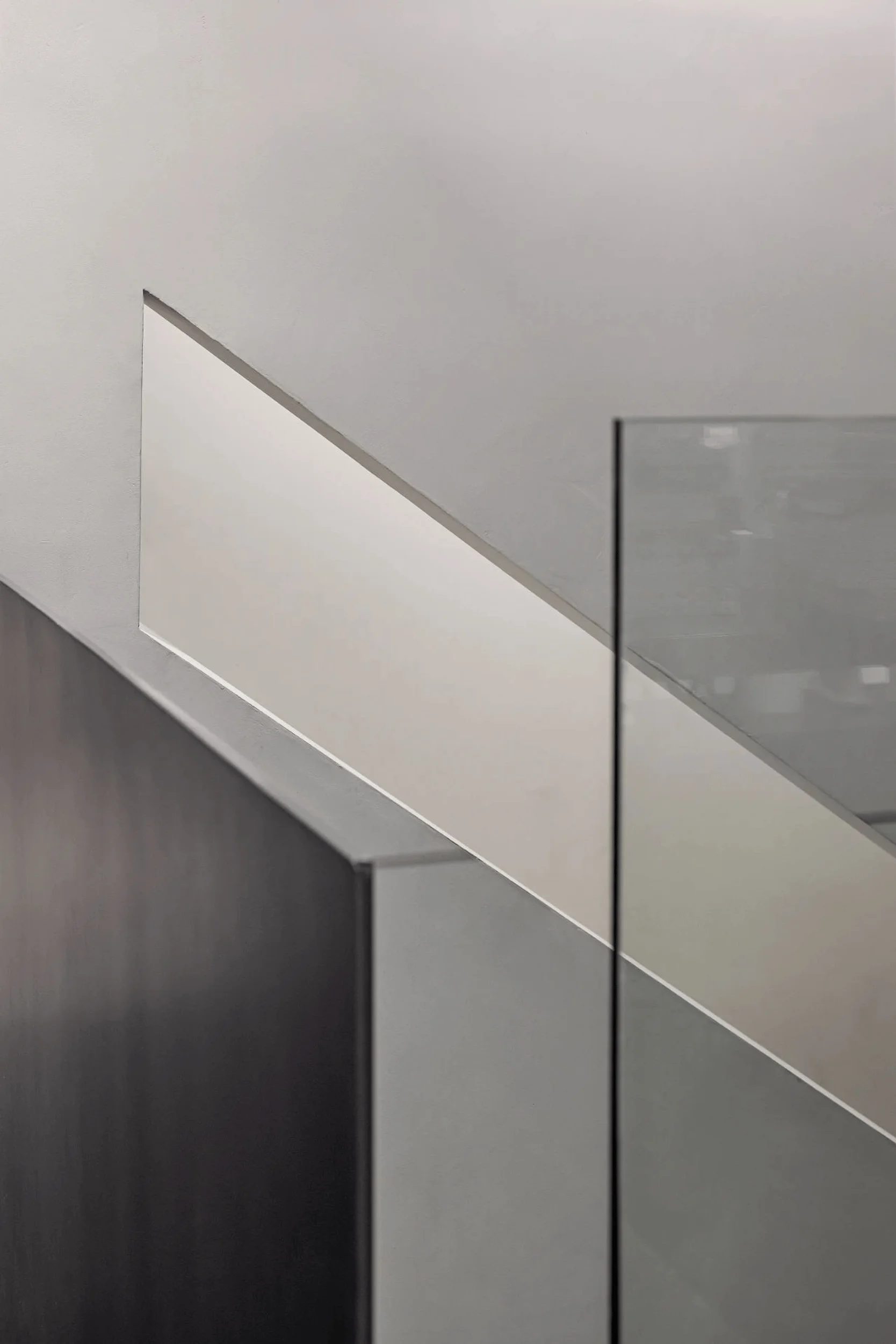
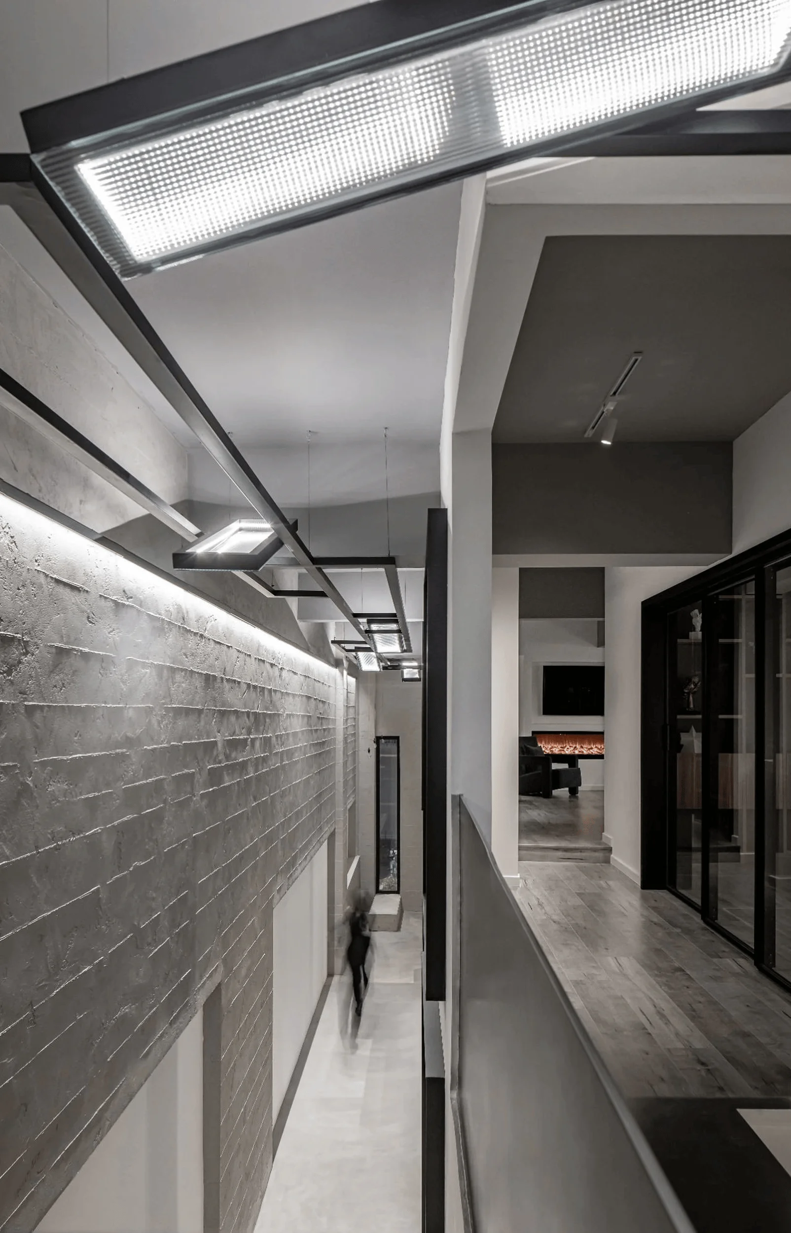
A double-story structure connected by a covered bridge maximizes space utilization while minimizing disruption. The design of this bridge, an independent element that extends the architectural skin, showcases the door and window systems in a unique way, mimicking real-world applications and moving beyond conventional product displays. Following Le Corbusier’s architectural principles, a long window on the staircase’s side lowers the perceived ceiling height, subtly guiding visitors’ gaze and inviting exploration. The project aims to avoid gimmicks and artificiality, instead embracing a truthful expression of form and function. This honest approach, combined with the project’s unique spatial qualities, reflects Siza’s belief that architects “merely remade reality.”
Facade Design and Integration
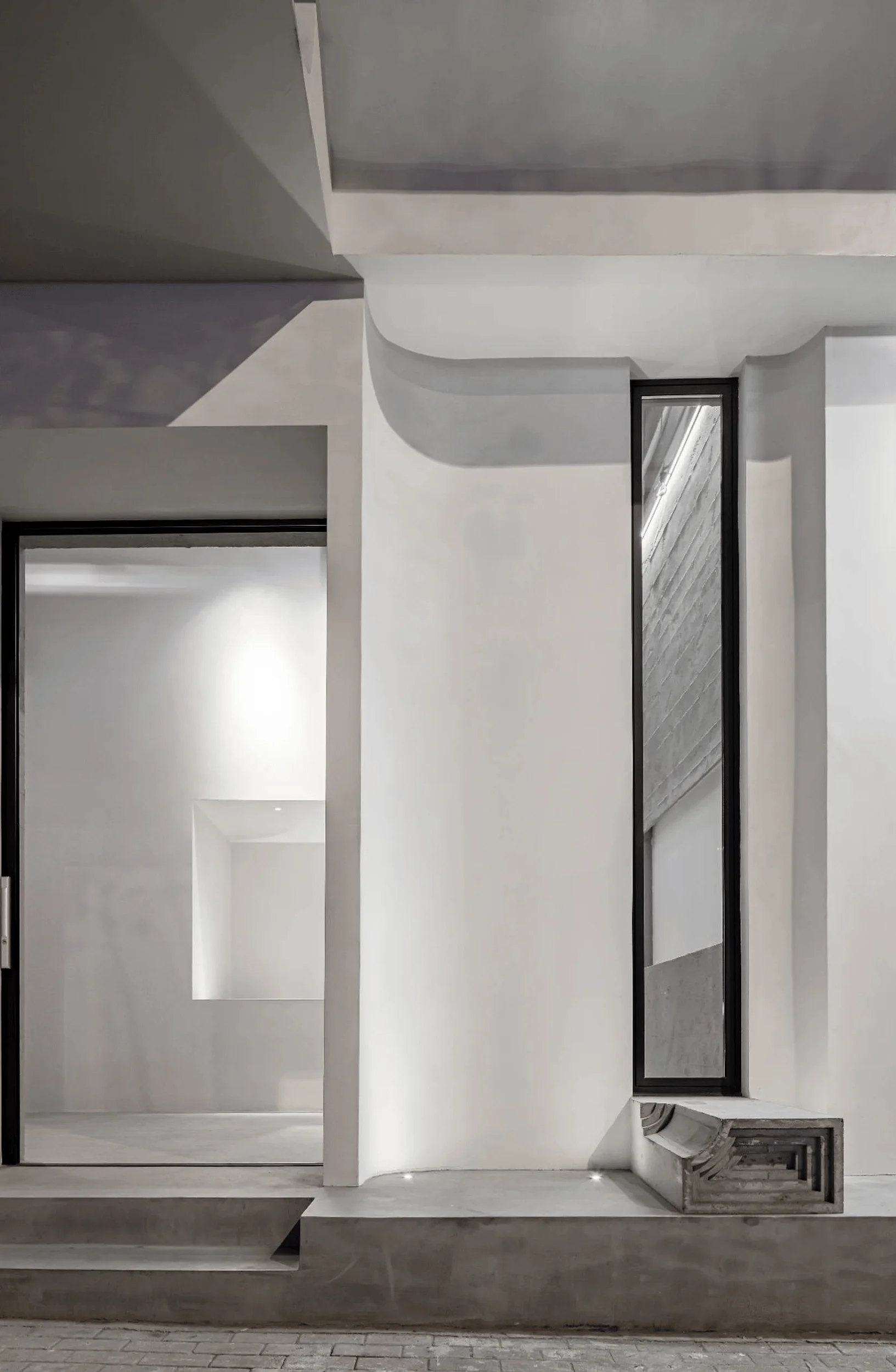
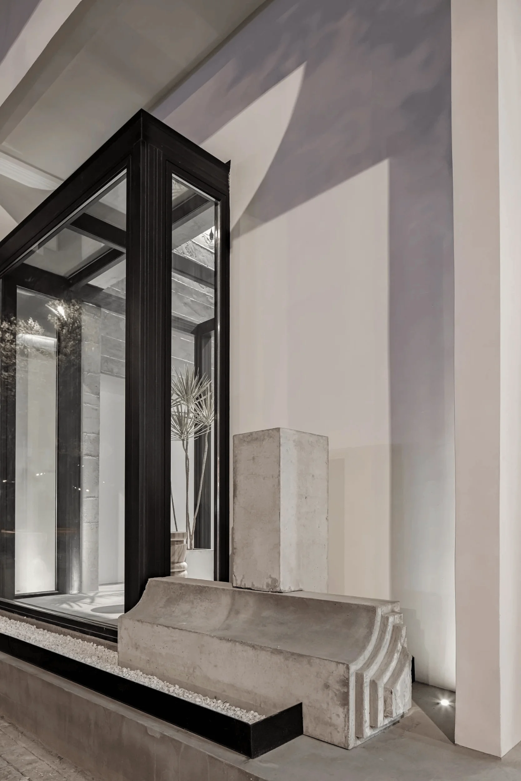
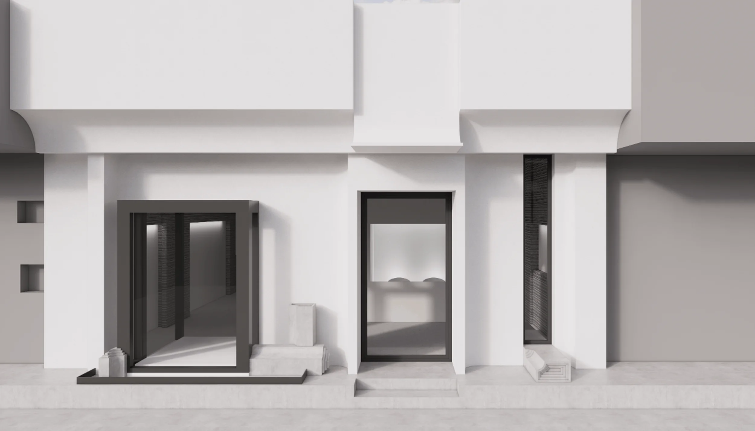
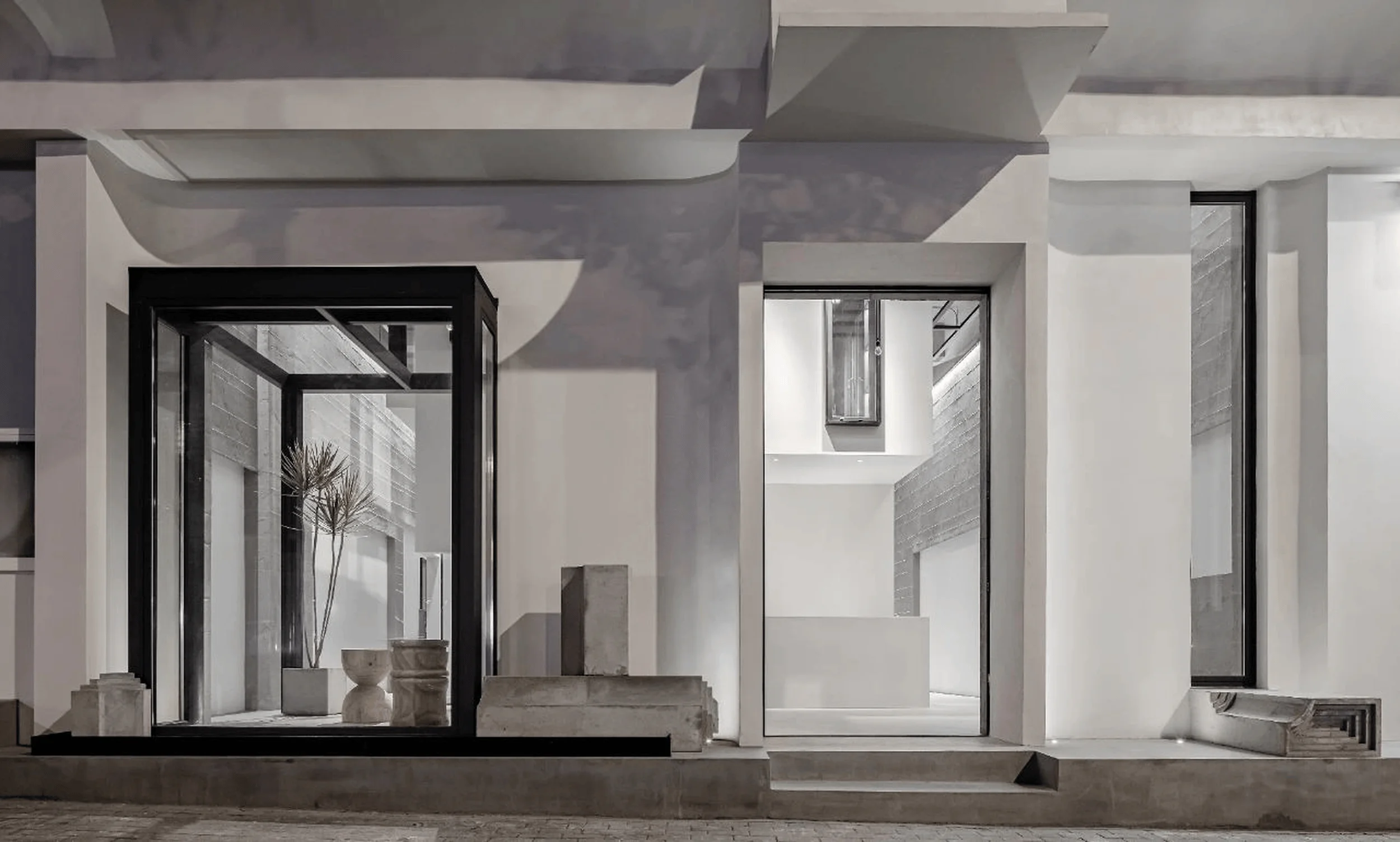
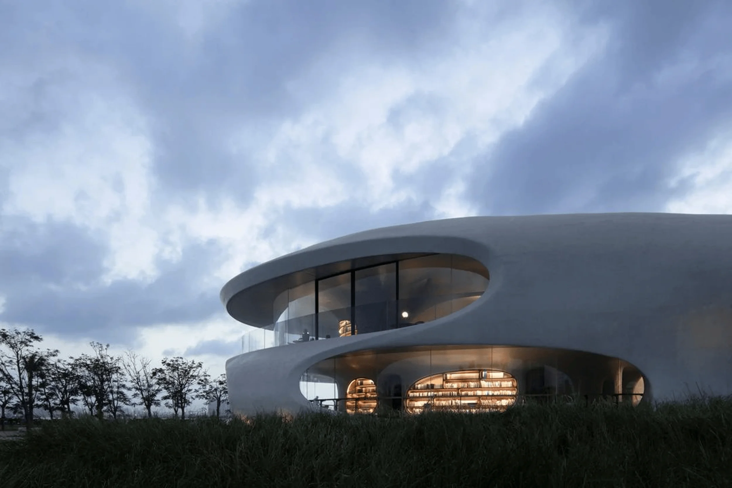
The showroom’s facade acts as a statement of brand identity while creatively revealing the interior structure. Geometric elements extracted from aluminum frames are cast in concrete, forming a stacked pattern inspired by Carlo Scarpa’s work. This textured facade integrates seamlessly with a transparent sunroom, juxtaposing the rough exterior with the light-filled interior to create a sense of tranquility. This thoughtful combination of materials and design elements allows for the prominent display of the brand’s flagship products in a context that highlights their functionality and aesthetic appeal within a built environment.
Project Information:
Project Type: Brand Windows Exhibition Hall
Architect: DeeSen Space Design
Design Director: Tao Sheng
Senior Team: Zhang Yi, Tan Jiaoli, Wang Changjian, Wei Luhan
Area: 230㎡
Year: 2020
Location: China
Main Material: Thick layer coating, baking paint steel plate, cement self leveling, solid glass brick
Photographer: EMMA


