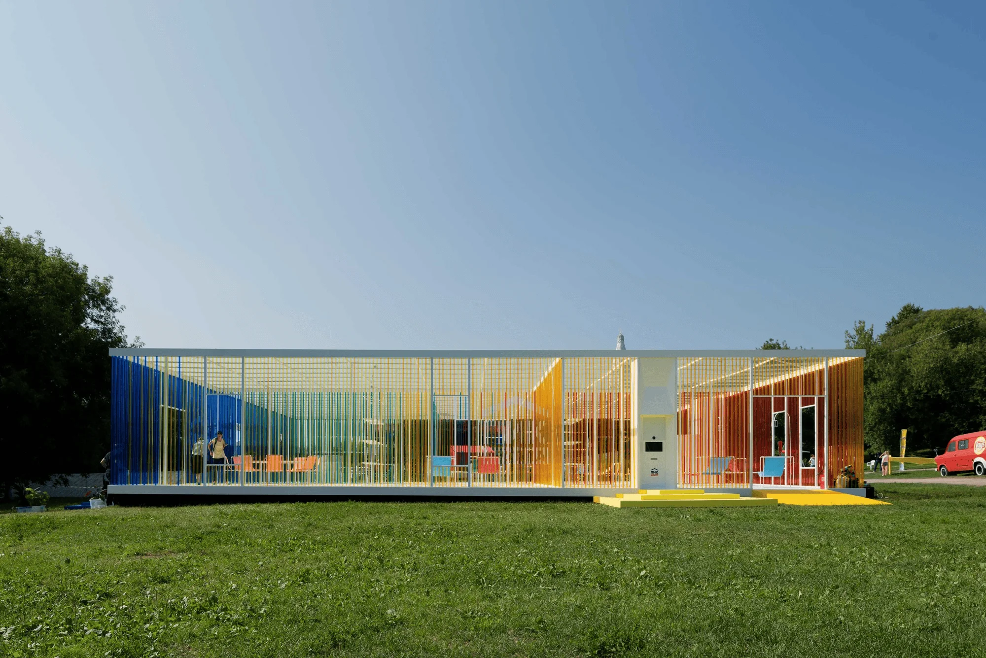
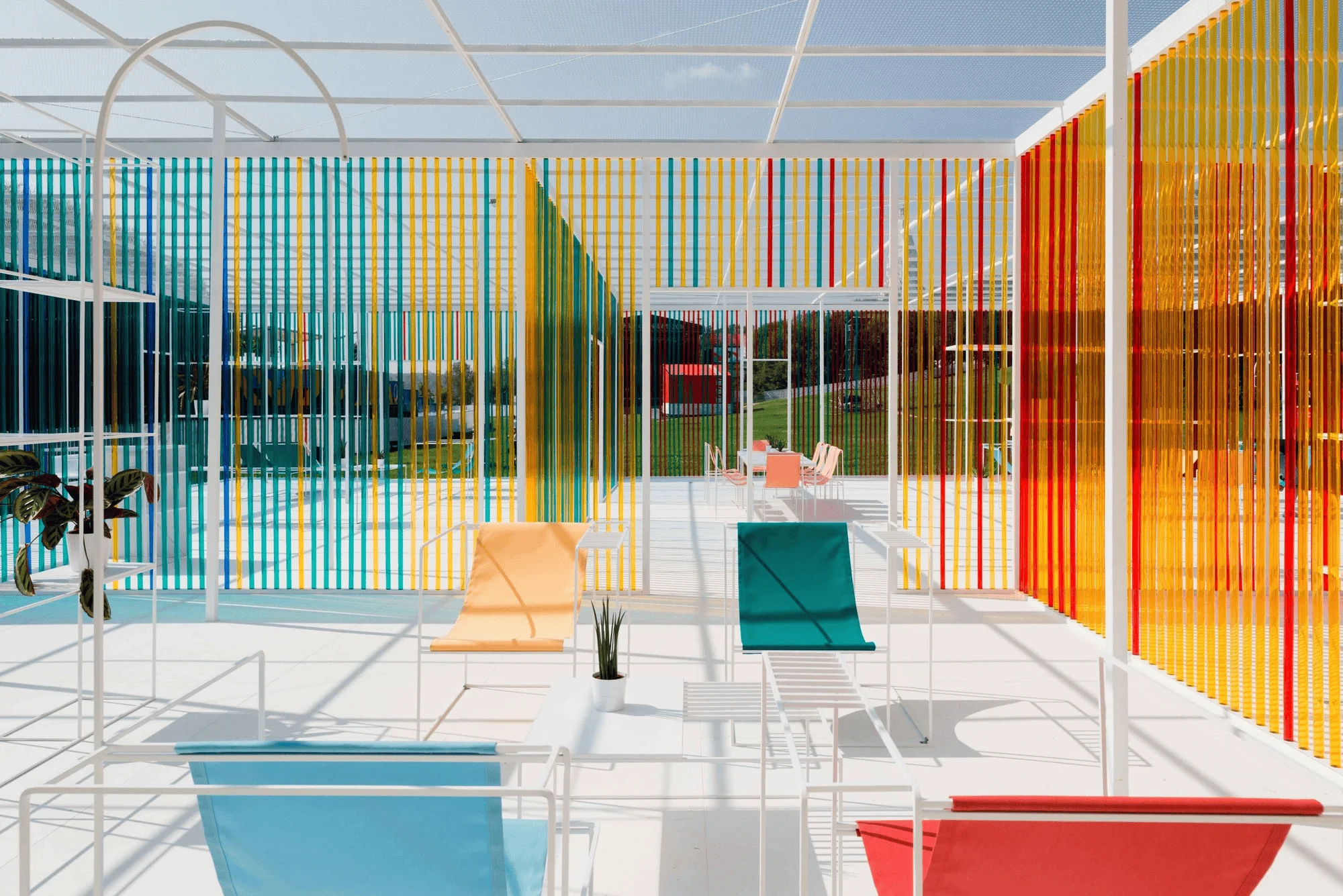
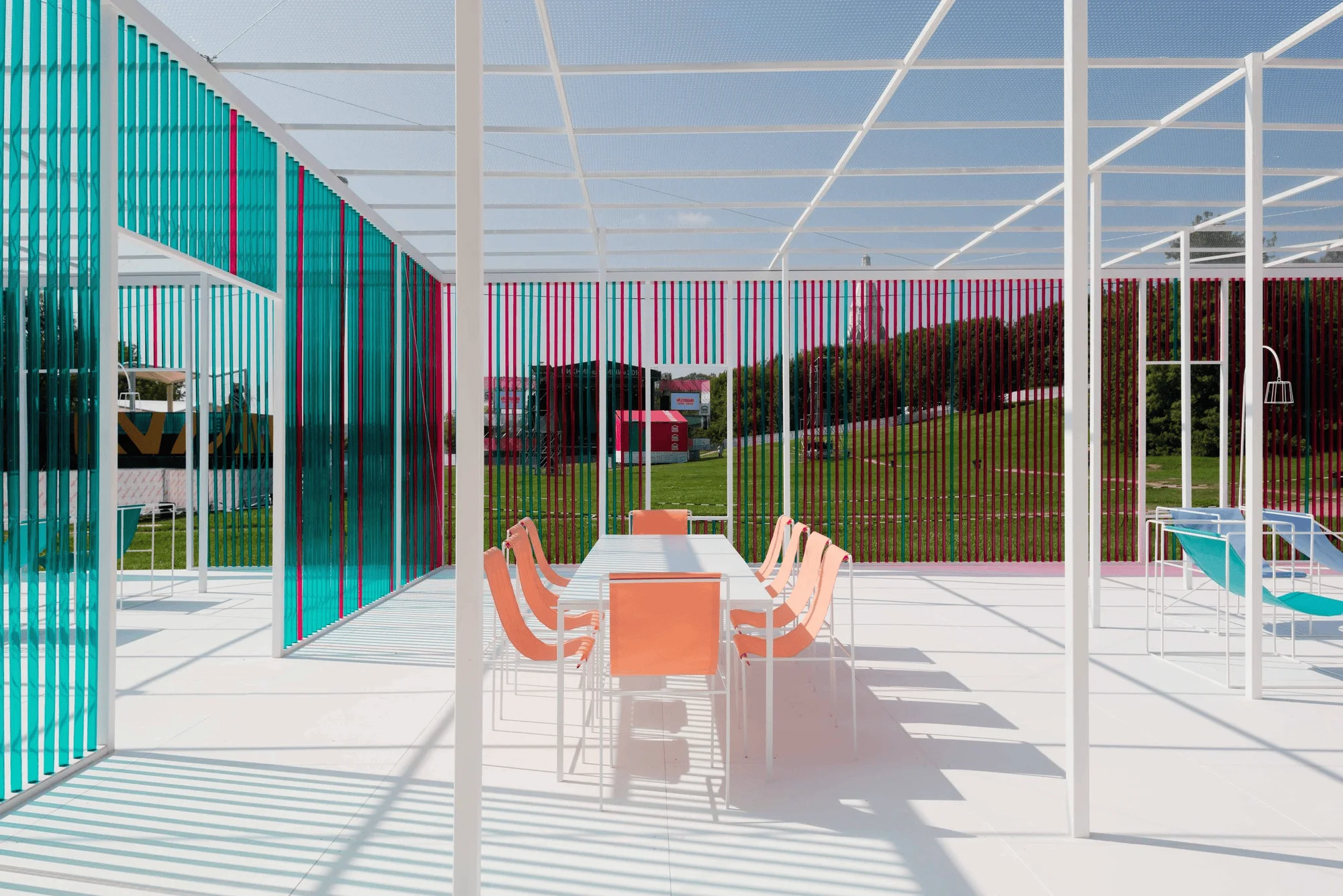
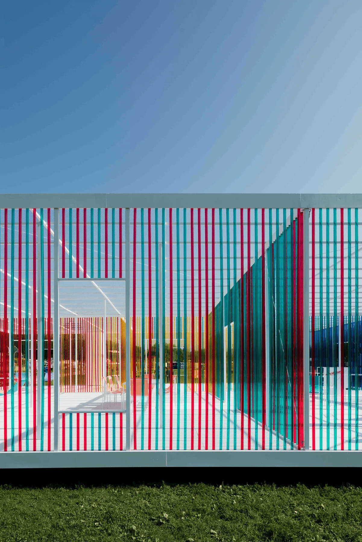
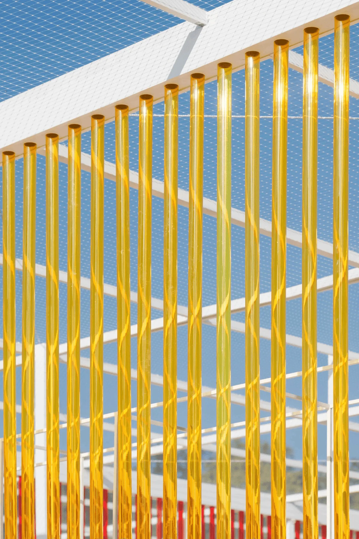
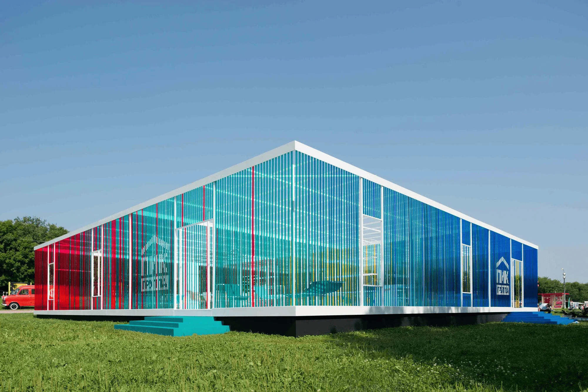
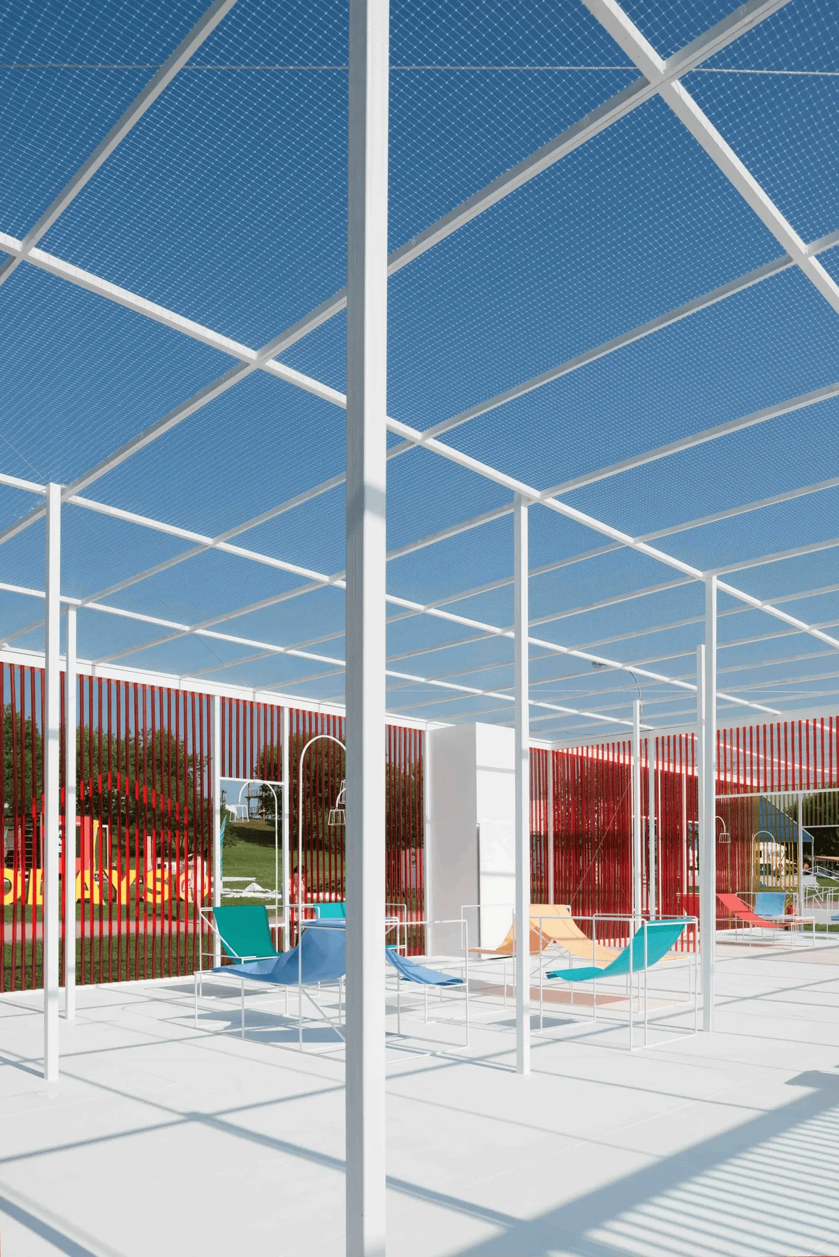
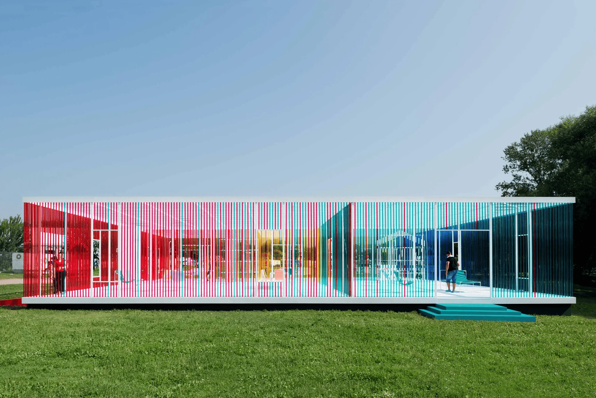
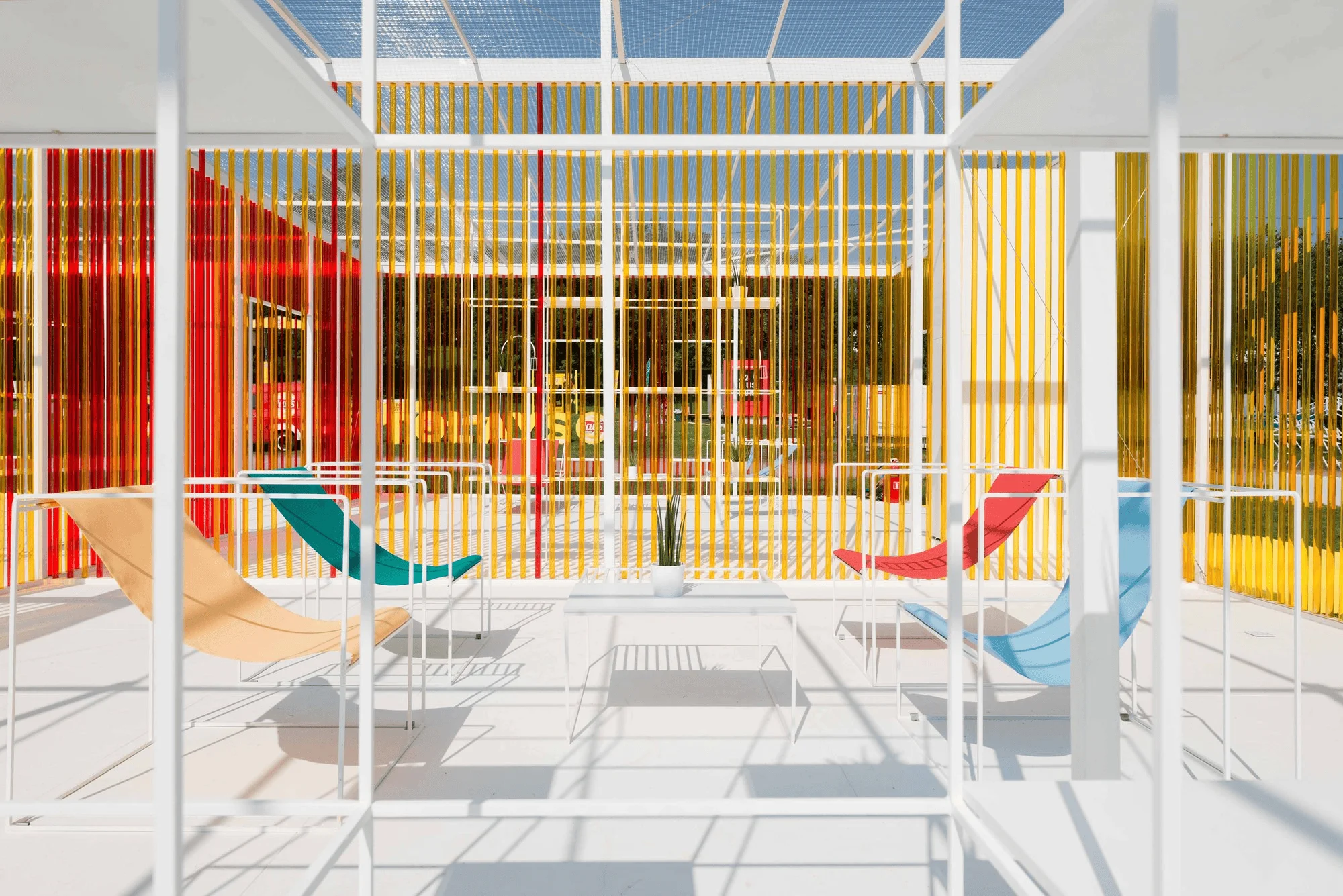
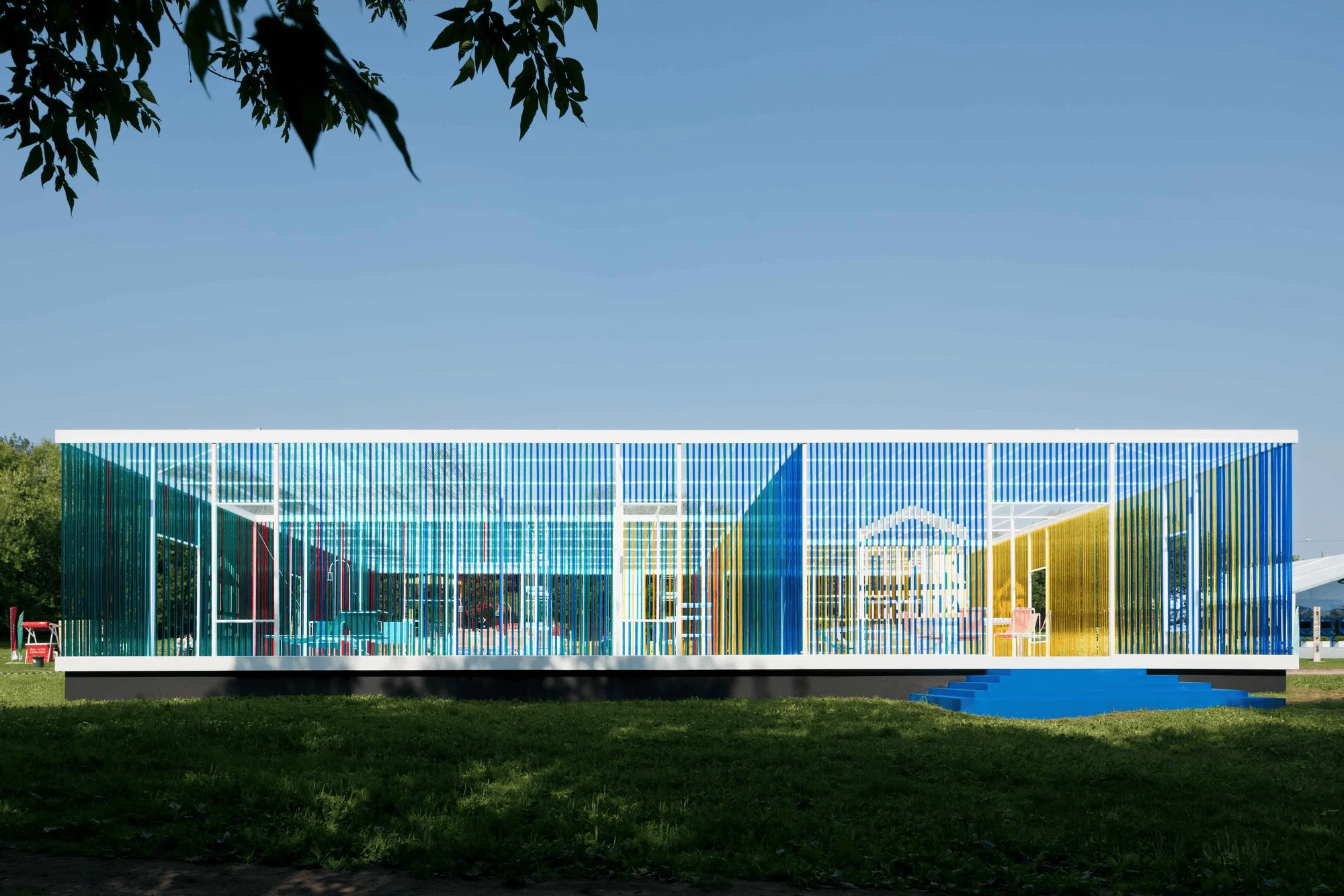
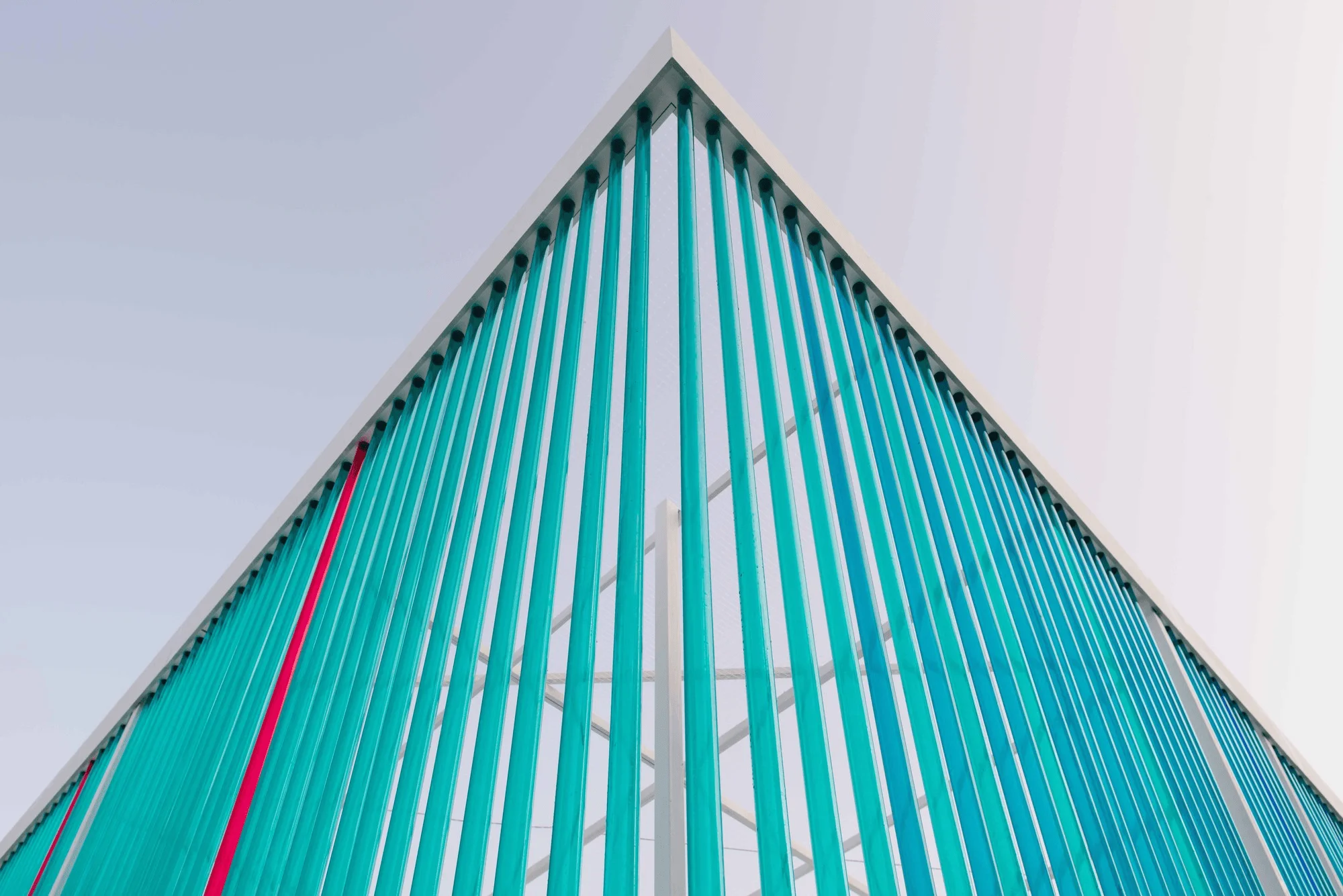
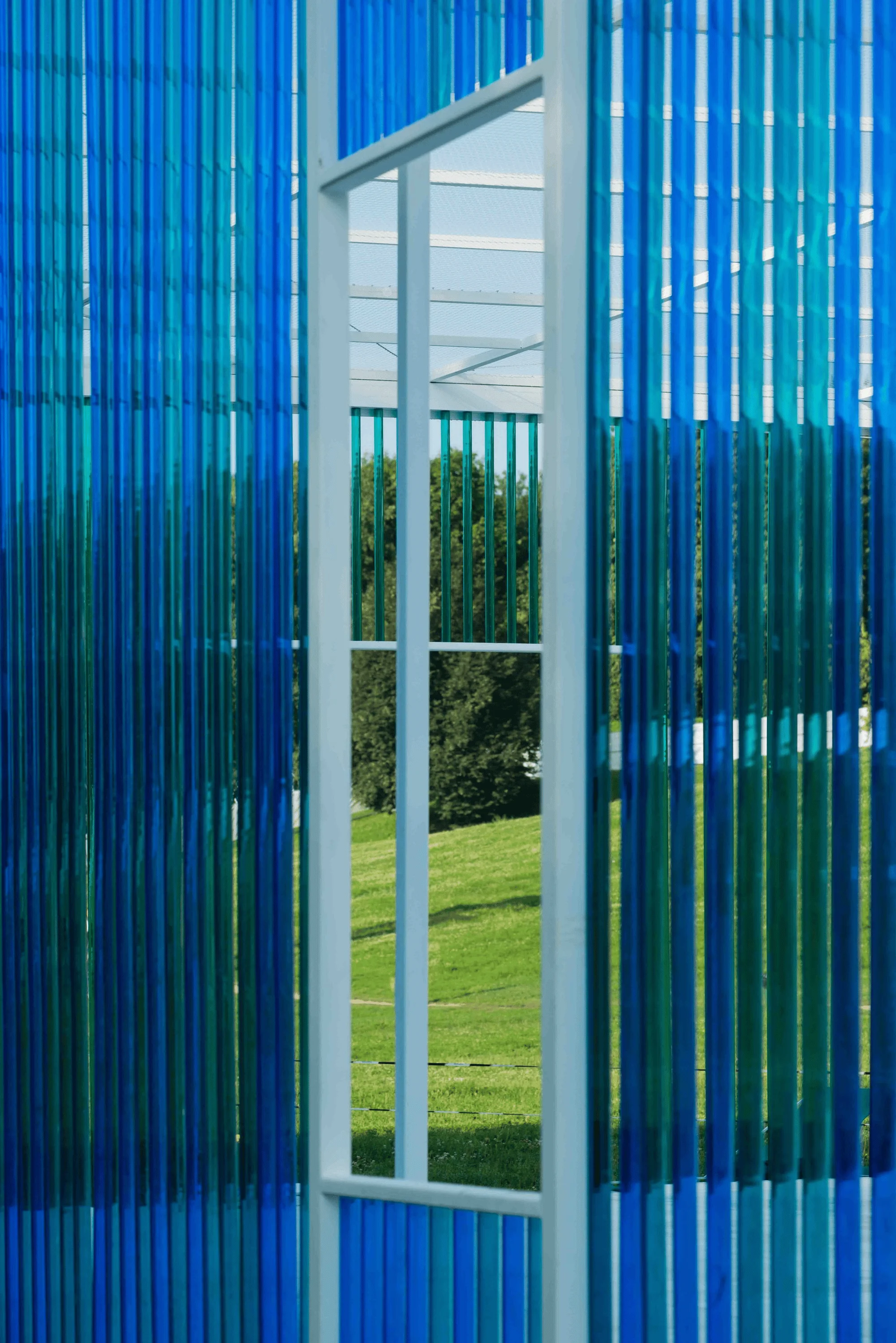
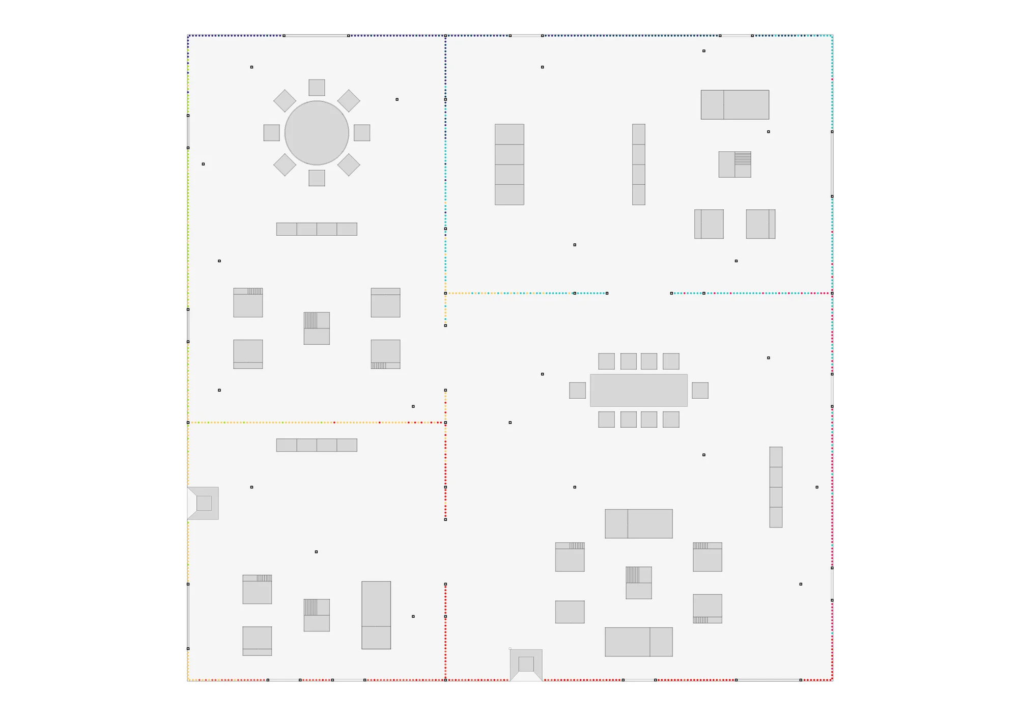
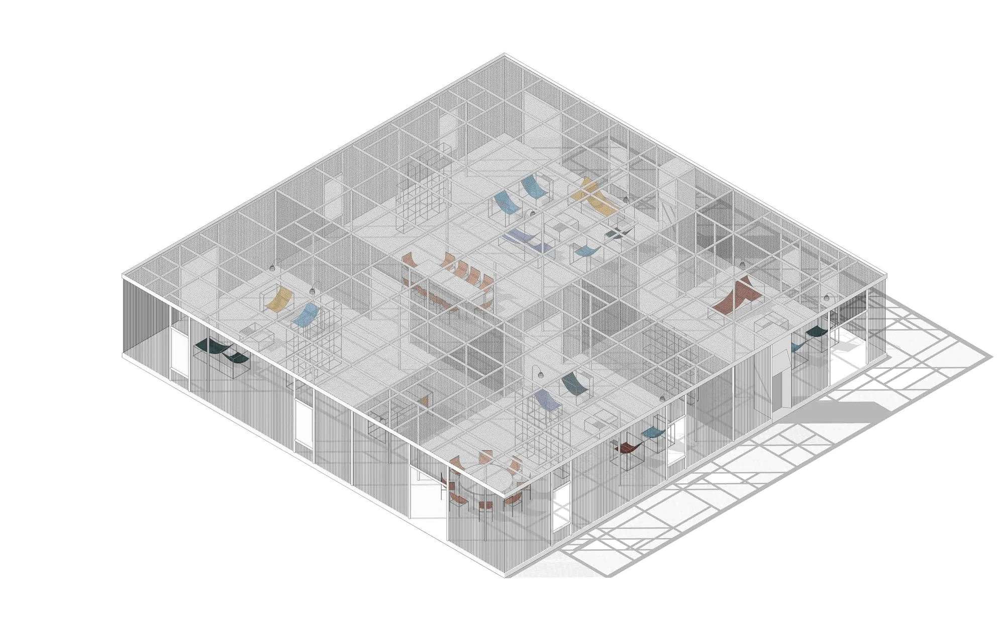
The pavilion was part of a project called “Open Air Apartments” that was organized by PIK Group, one of Russia’s leading real estate developers, for the Afisha Picnic Music Festival. The pop-up structure, symbolizing an abstract apartment space, was located in various zones of Kolomenskoye Park, where the festival has been held since 2007. The project’s pavilion is a reinterpretation of a living room, which is the common area in any apartment for socializing and activity. The structure was set in one of the festival’s most crowded areas, between the food court and the main music stage. This particular location meant that the pavilion was both an art piece with aesthetic qualities and a functional object with a clear purpose. The translucent walls were built using rainbow-colored plastic tubes, with the bright colors truly making the pavilion stand out from its surroundings. Inside, the building is divided into separate compartments. Each compartment is a distinct and independent structure in a precisely rectangular form, filled with an irregular grid made of white metal frames and plastic tubes. Some sections are intentionally designed with uneven surfaces, creating a dynamic and expressive atmosphere in the space, and a slight ripple effect within this seemingly simple form. The colorful living room pavilion was built on a sunny green lawn, creating a dramatic contrast within the serene and tranquil natural environment. Beyond its design excellence, the pavilion is a relaxing and leisure space. Each zone is equipped with comfortable armchairs and festival lounge chairs. These furnishings, coupled with coffee tables and lights, form lightweight structural elements. The pavilion’s interior structure is clear and bright, allowing visitors to see what’s happening elsewhere at the festival and even catch performances on the main stage without leaving the grounds. Despite containing only living room space within, the structure resembles more of a single-story mansion, reminiscent of 20th-century architectural classics like the Villa Savoye and the Farnsworth House. Its furniture design was also inspired by iconic designs by Marcel Breuer and Le Corbusier. While the pavilion is heavily influenced by Modernist architecture, its International Style private residence exterior design is unique. The pavilion’s high transparency sets it apart from Philip Johnson’s Glass House or Mies van der Rohe’s Farnsworth House, mentioned earlier. Its transparency is formed through crystalline prisms, producing rainbow colors through the refraction of light beams. This paradoxical impression is amplified by the irregular frame grid, symbolizing the deconstruction of the entire building and the functional layout of a yet-to-be-constructed building. The building’s vibrant colors and dynamic nature are related to works by conceptual architectural firms of the 1960s, such as Archigram and Superstudio, which both employed grid structures in their utopian projects, and the grid could be considered the ultimate constituent element in their experimental projects. Decades later, the grid has frequently appeared in science fiction stories about “cyberspace.” So, the use of a grid structure with deconstructive forms in this modern, retro-futuristic pavilion is a clever and elegant choice.
Project Information:
Architect: Project Eleven
Location: Moscow, Russia
Lead Architects: Igor Chirkin, Pavel Prishin
Area: 400 sq m
Year: 2016
Photography: Ilia Ivanov


