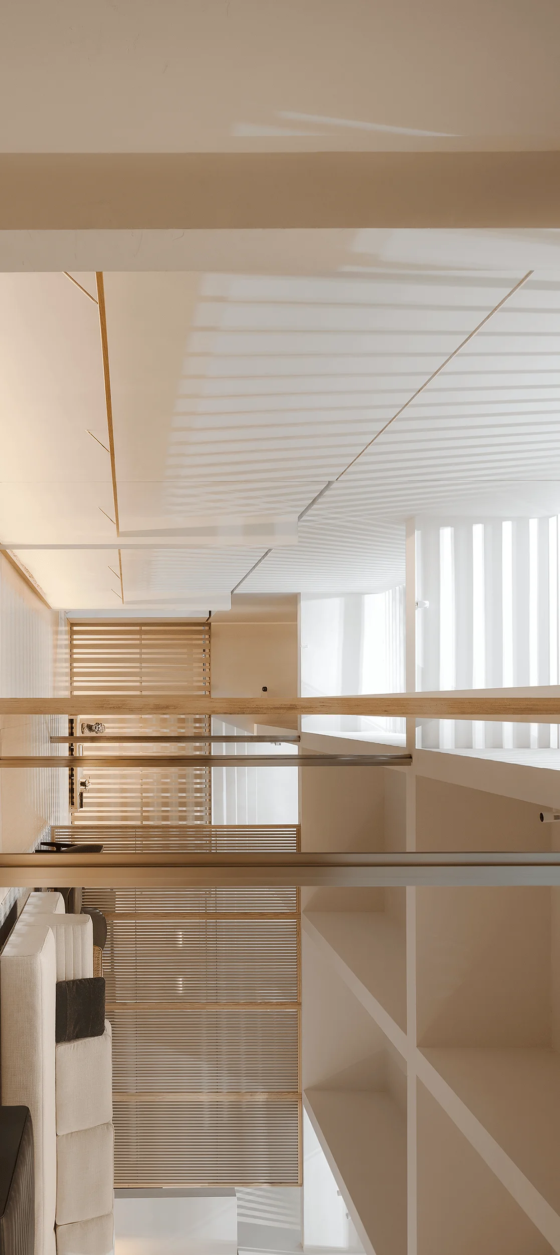
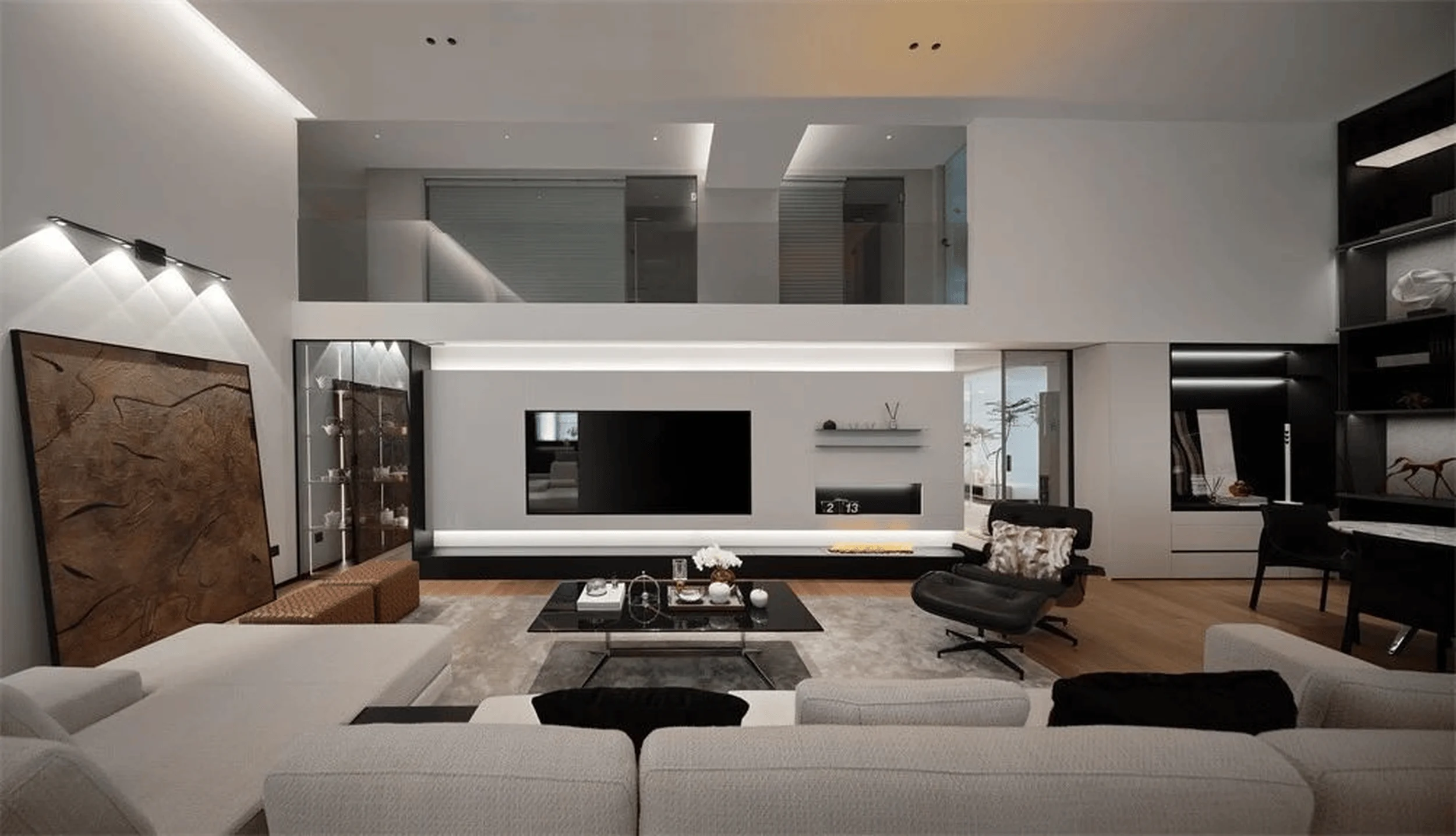
ABX’s pavilion at Guangzhou Design Week uses borrowed light and spatial design to overcome challenges and create a minimalist interior.
Contents
Background
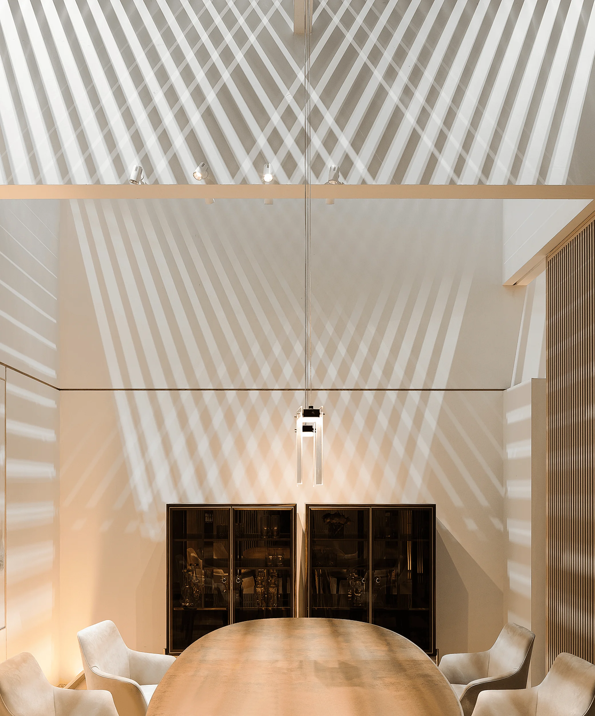
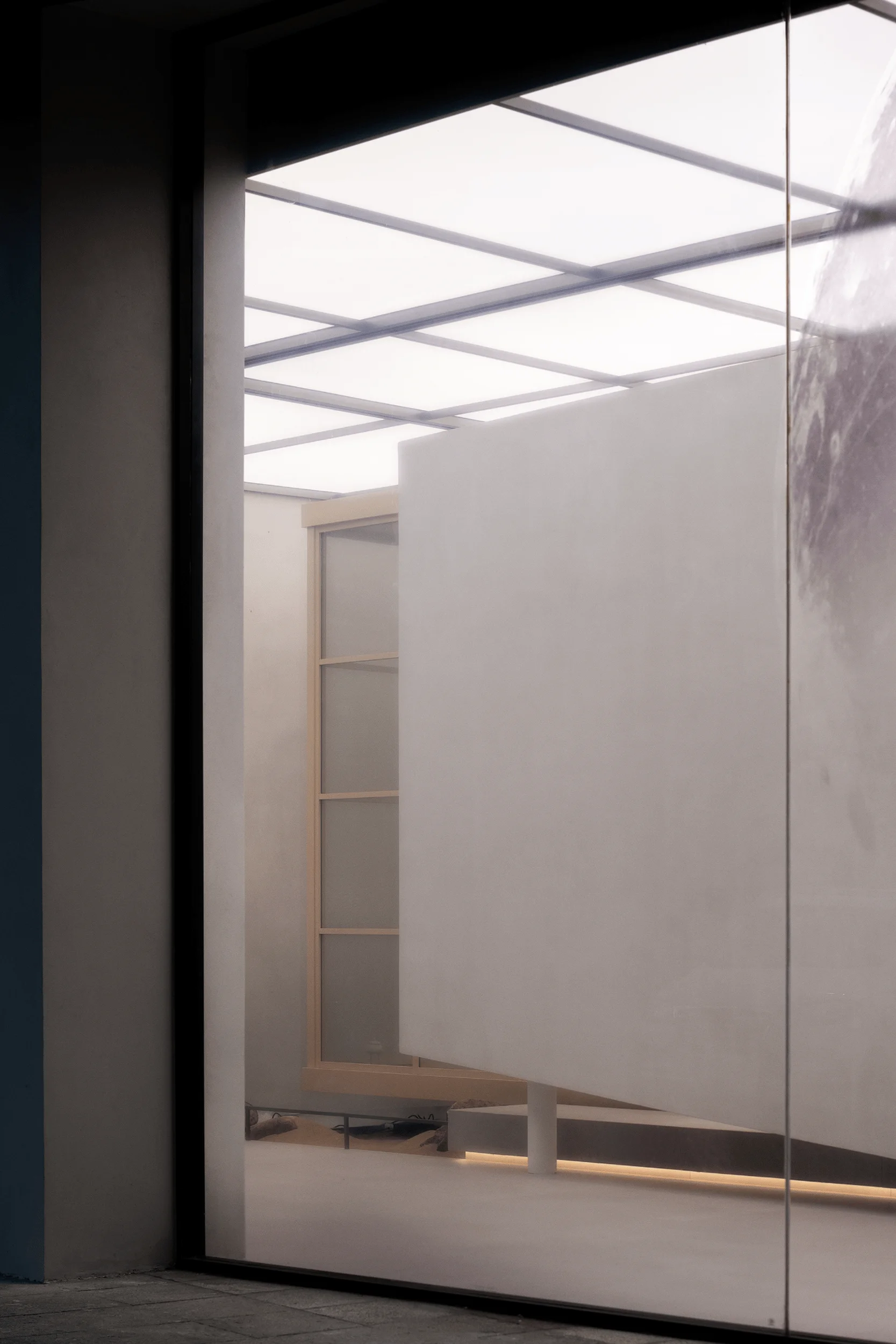
The ABX pavilion at Guangzhou Design Week 2023 was a minimalist interior design marvel achieved under challenging circumstances. With only 10 days from design conception to the exhibition’s opening and a limited 140 square meter space with a 4.5-meter height restriction, V2GETHER, led by Zhao Rui, faced a significant task. The pavilion’s design needed to stand out amidst a bustling exhibition environment while effectively showcasing ABX’s products, many of which were semi-finished or required customisation. The existing venue lighting, with its uniform cool white illumination from ceiling lights, posed an additional challenge, as it wasn’t ideal for furniture display. The design team had to work quickly and precisely, ensuring every detail was meticulously executed from concept to construction, pushing the boundaries of their teamwork and organizational skills. Interior design played a pivotal role in transforming the limitations into a powerful and unique design statement. This minimalist interior design stood out against a backdrop of vibrant exhibition booths.
Design Concept and Objectives
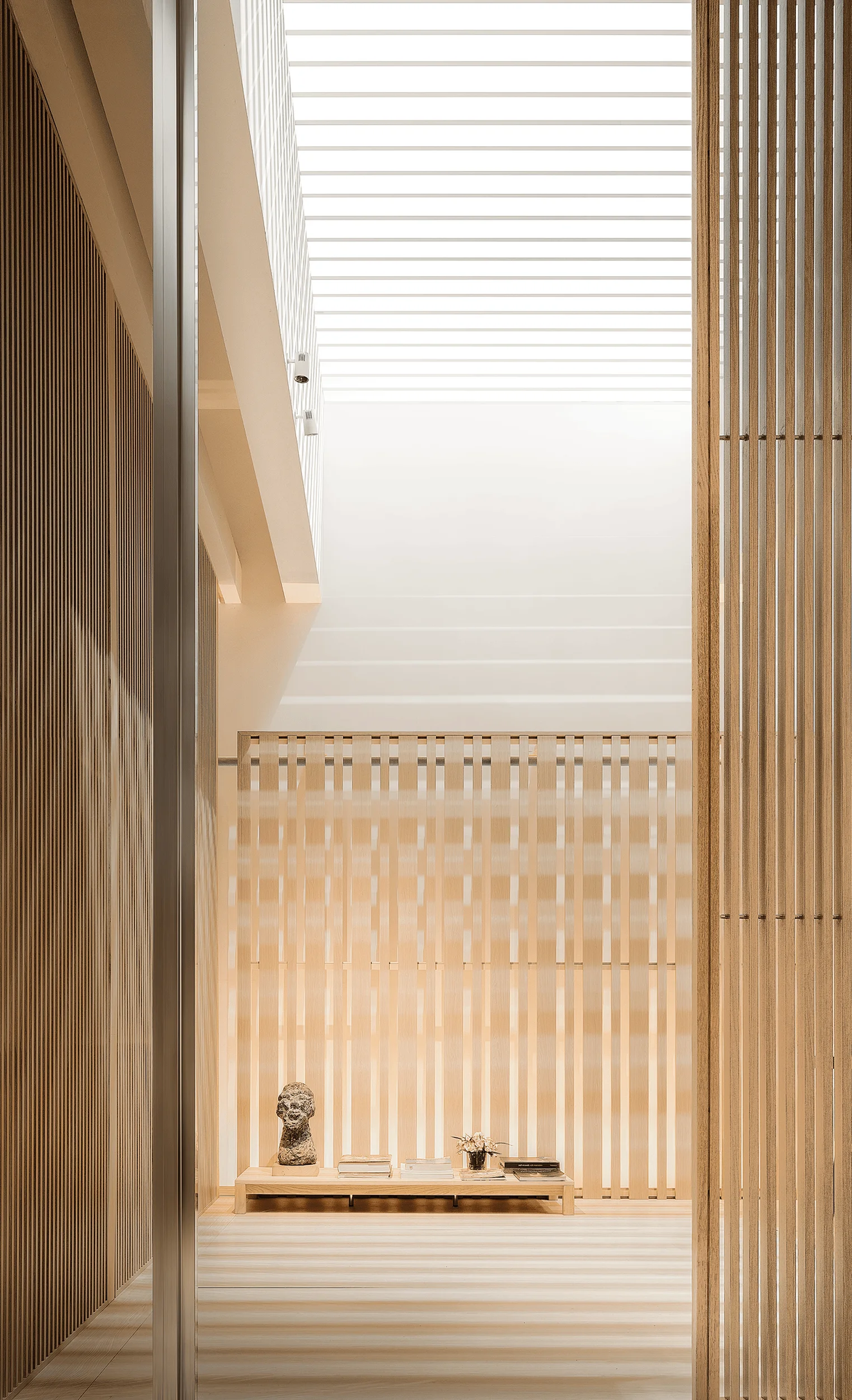
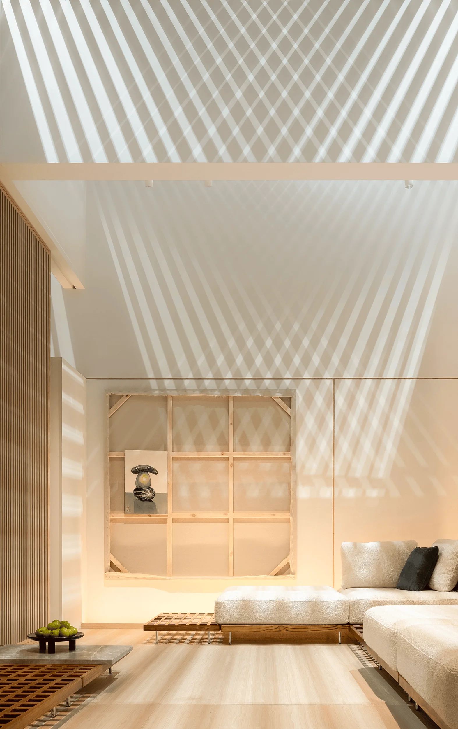
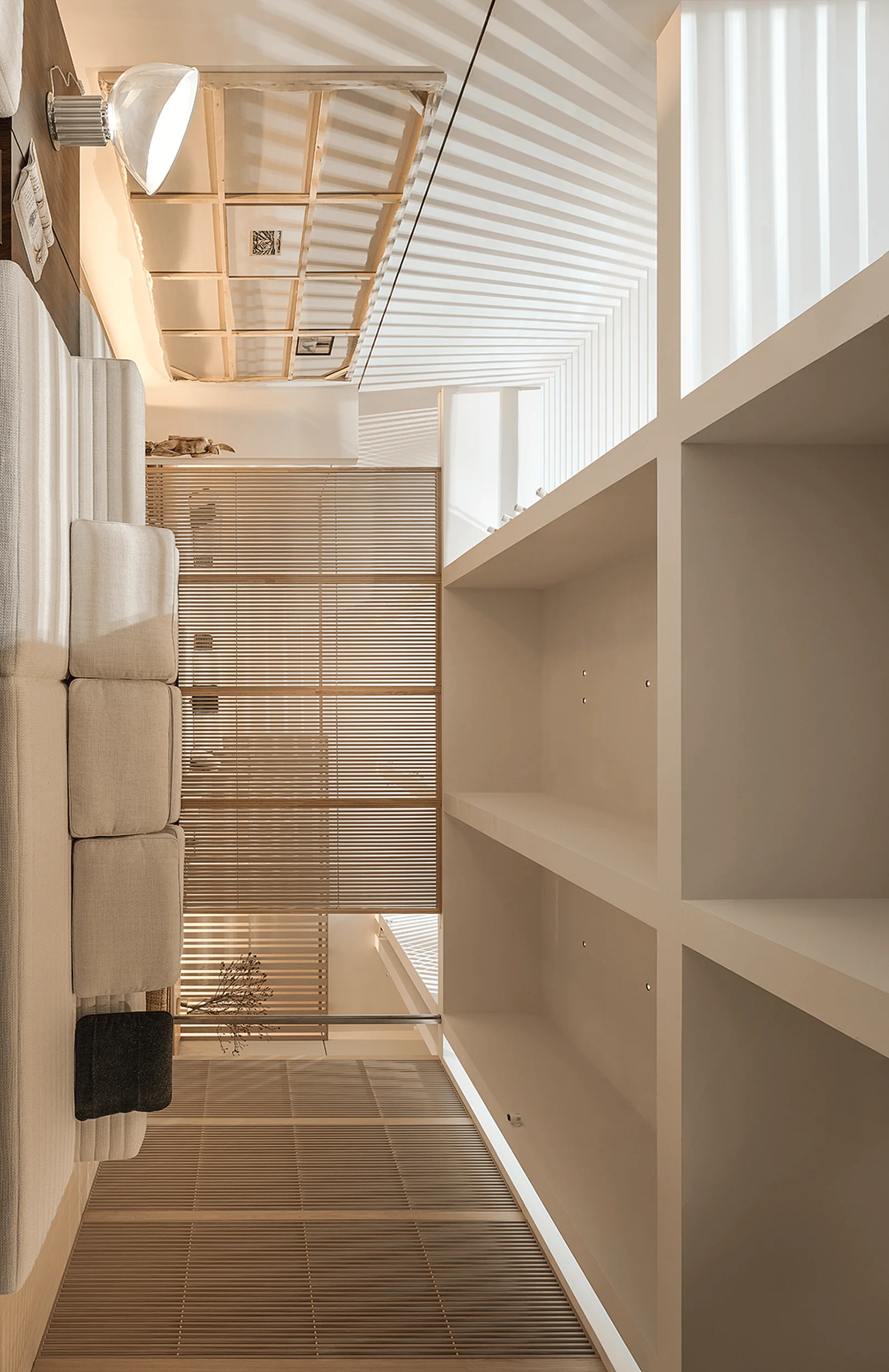
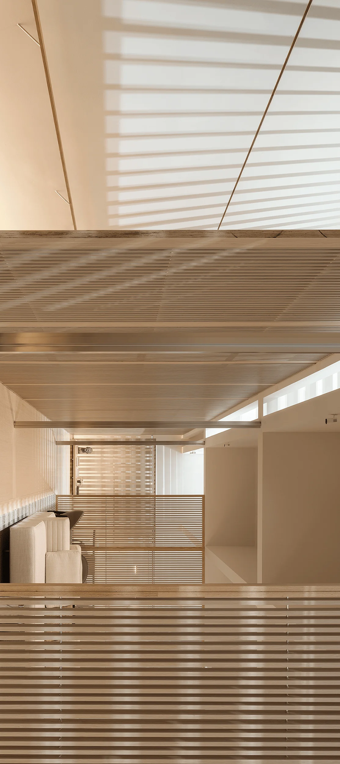
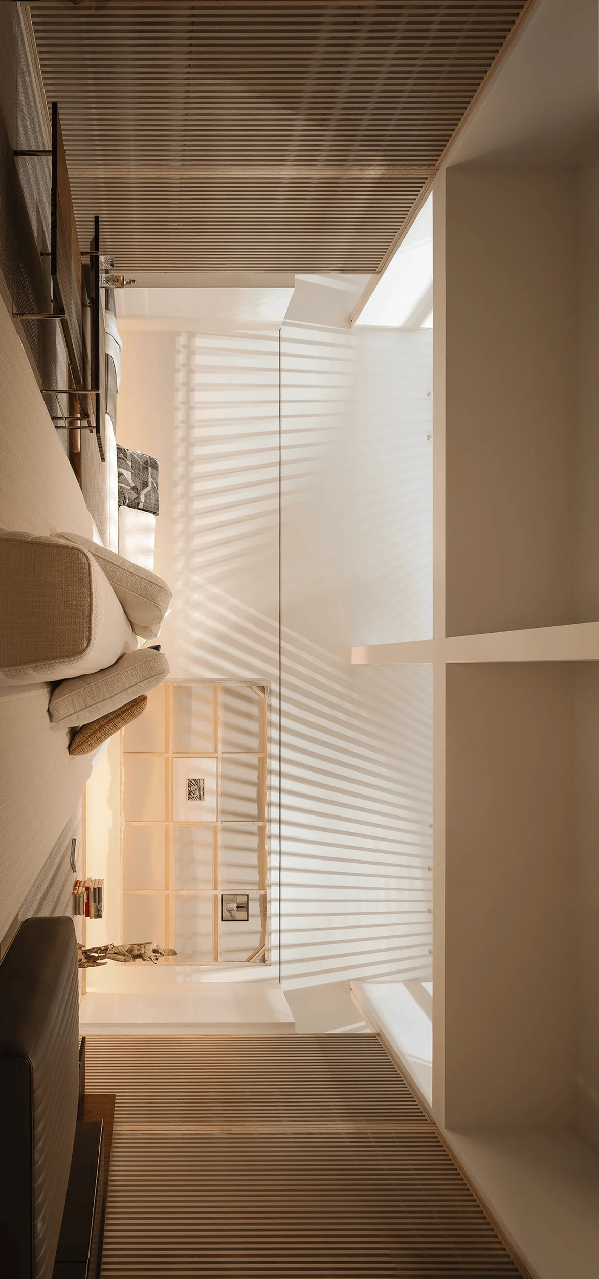
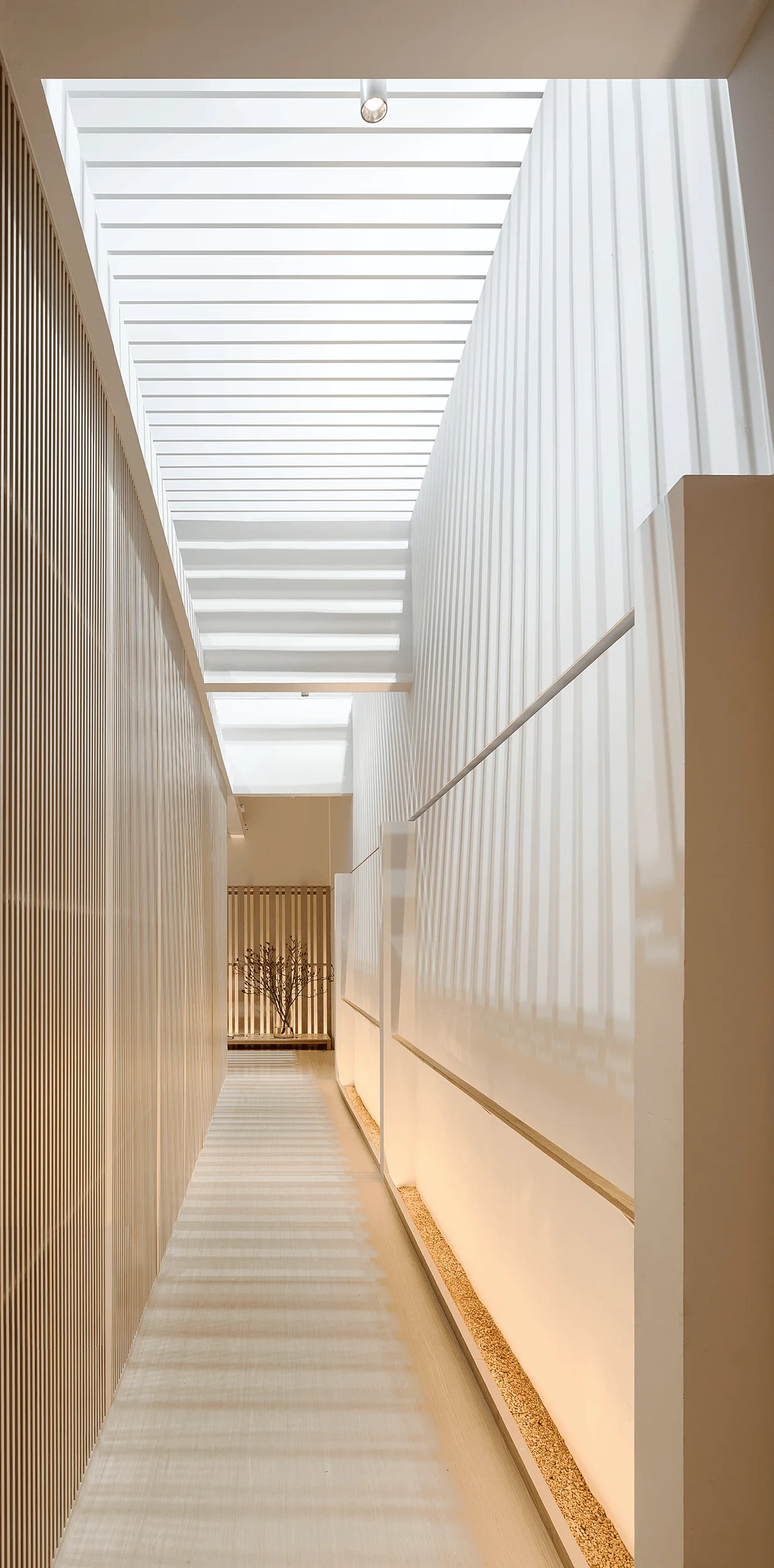
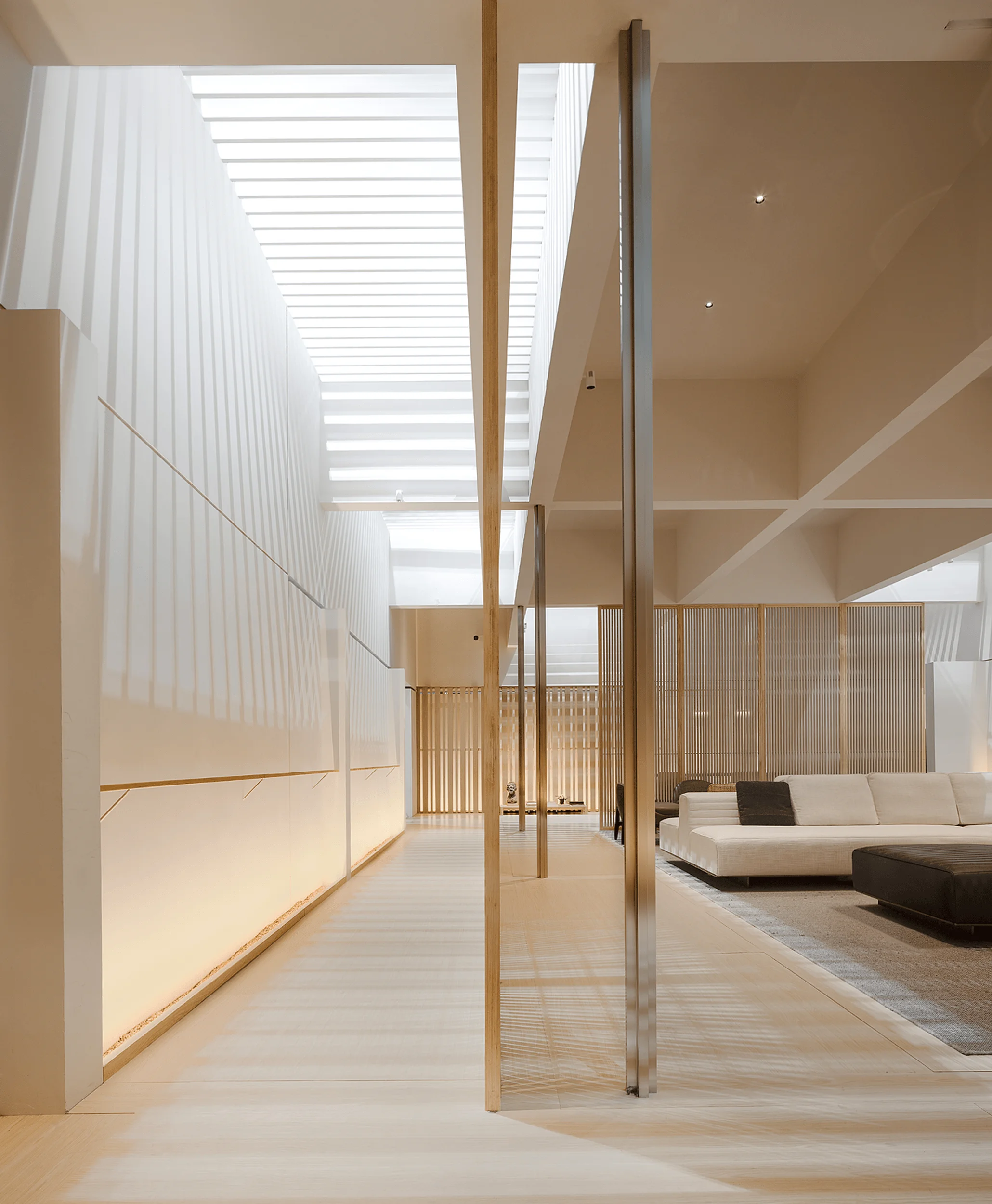
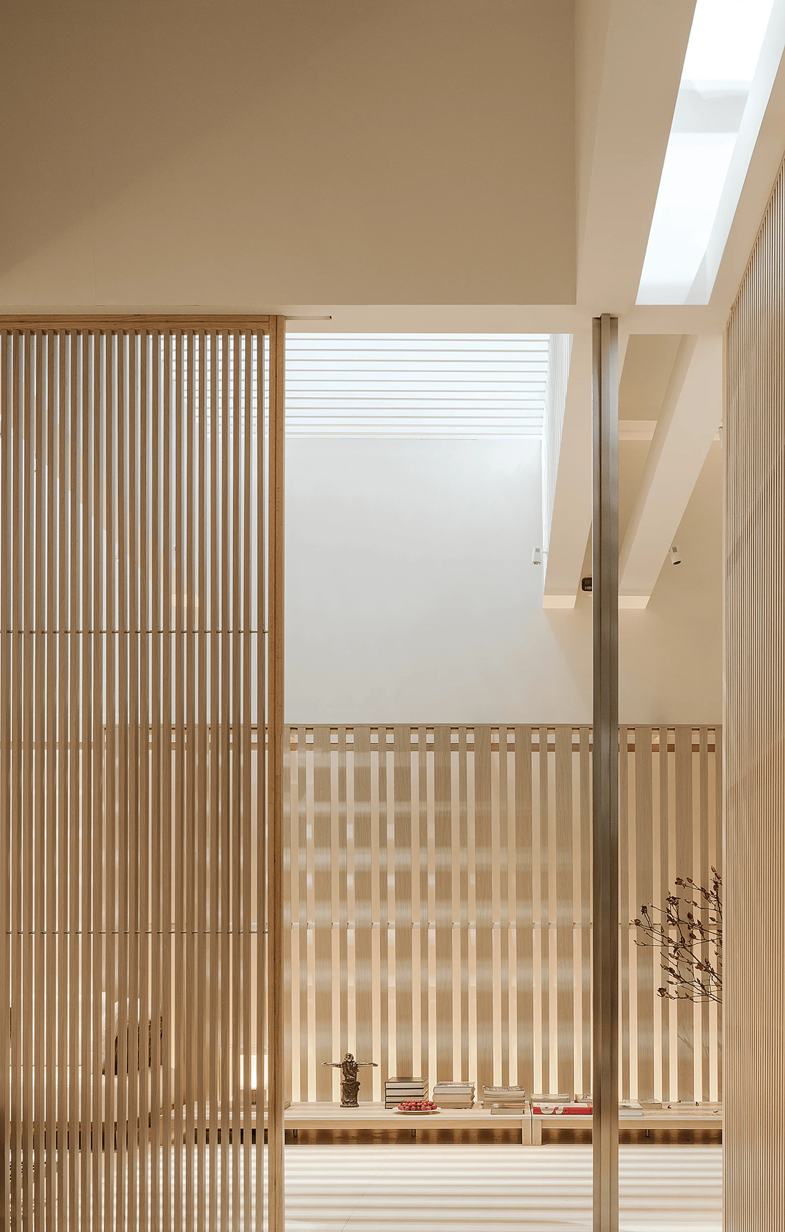
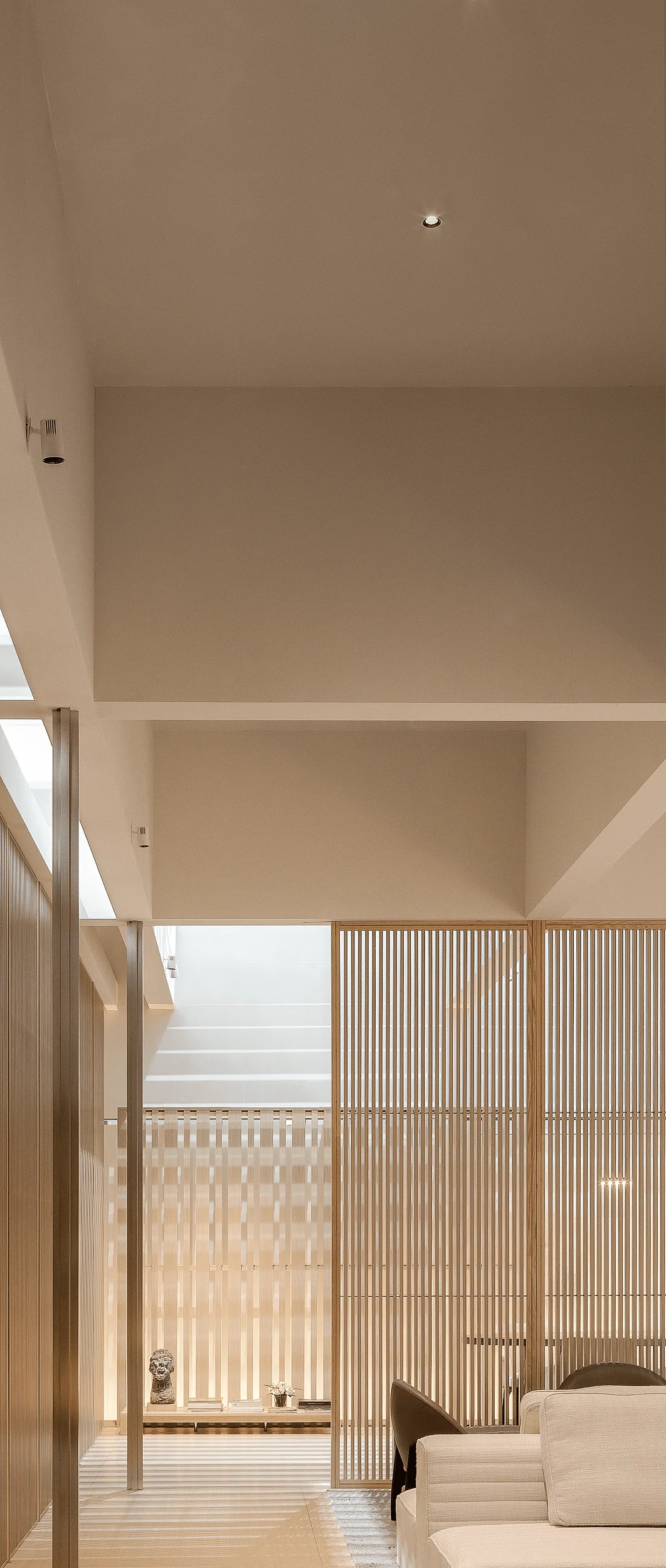
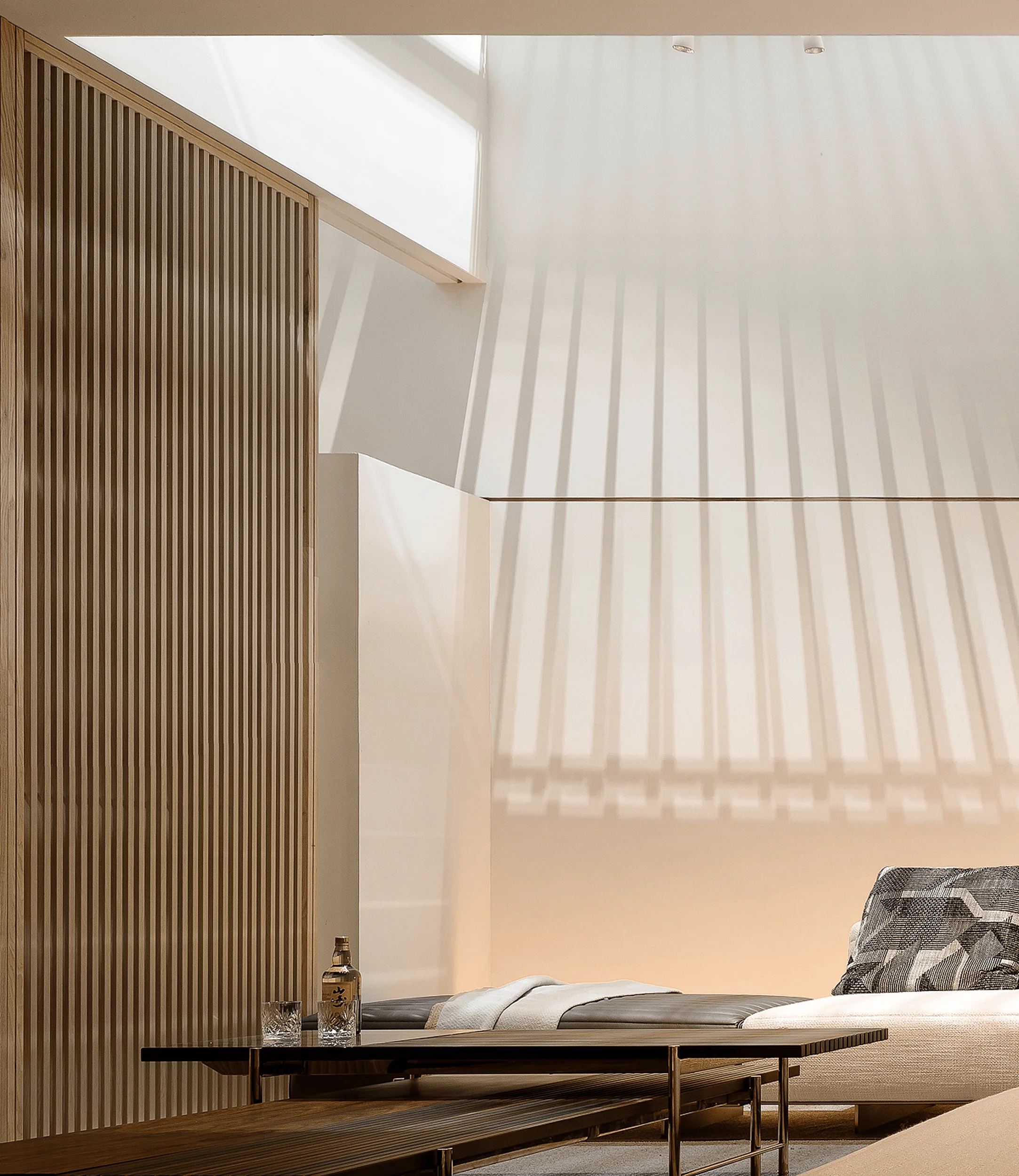
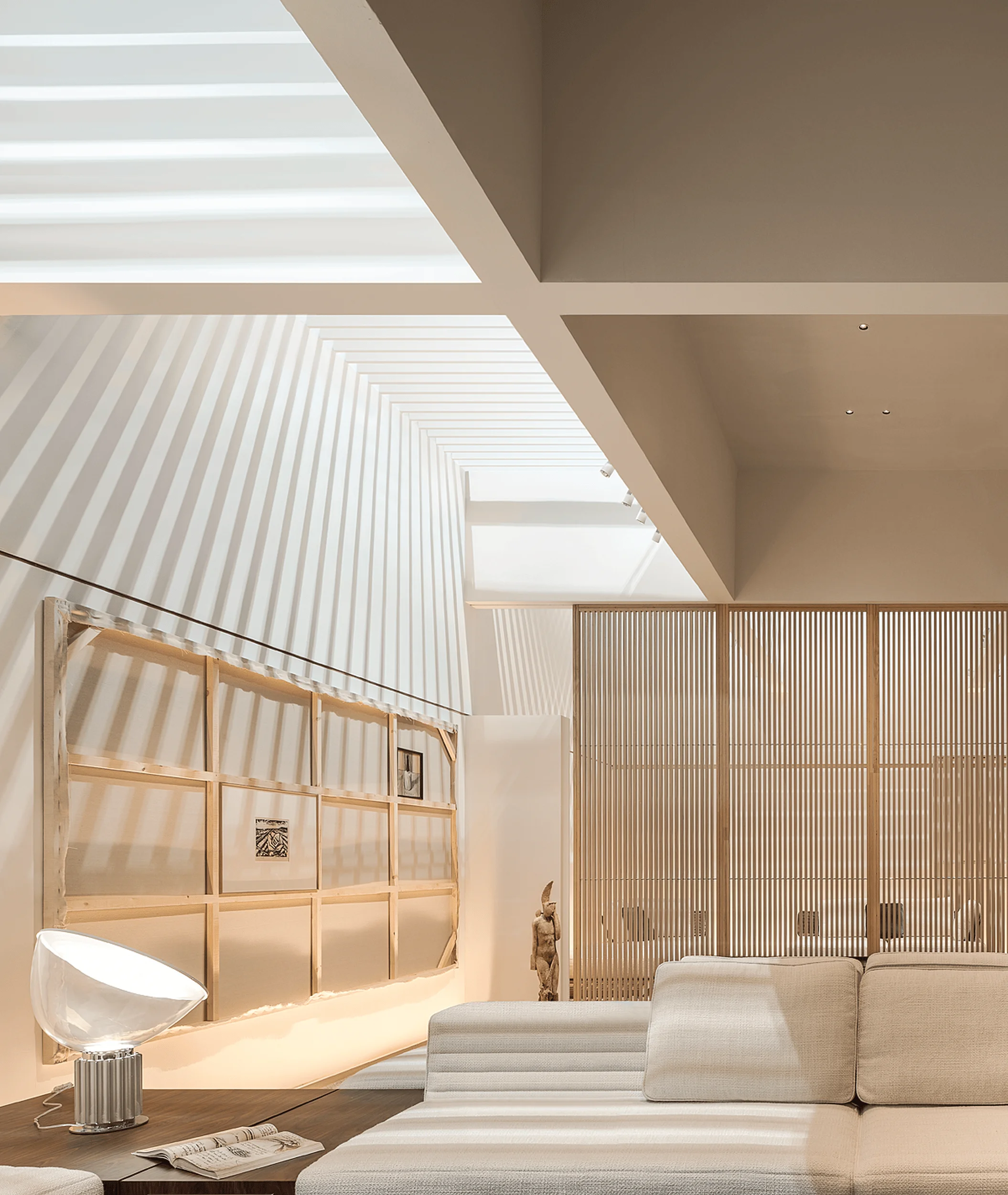
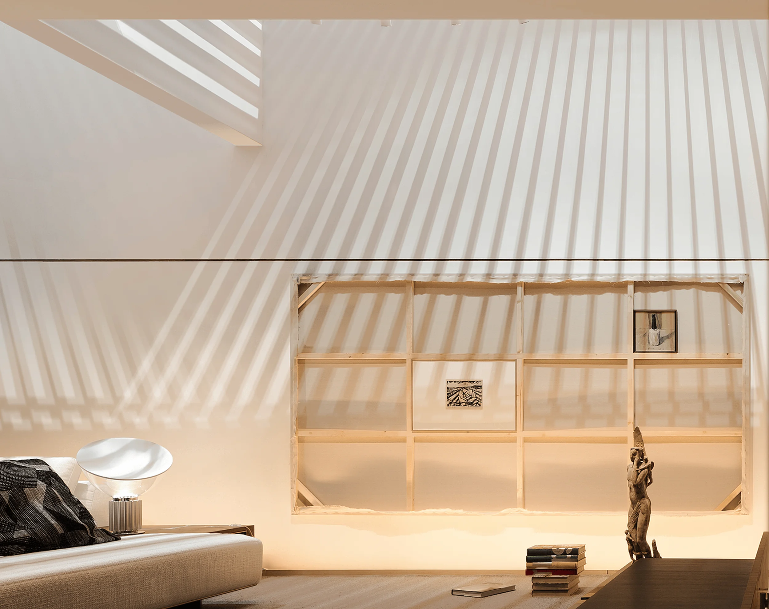
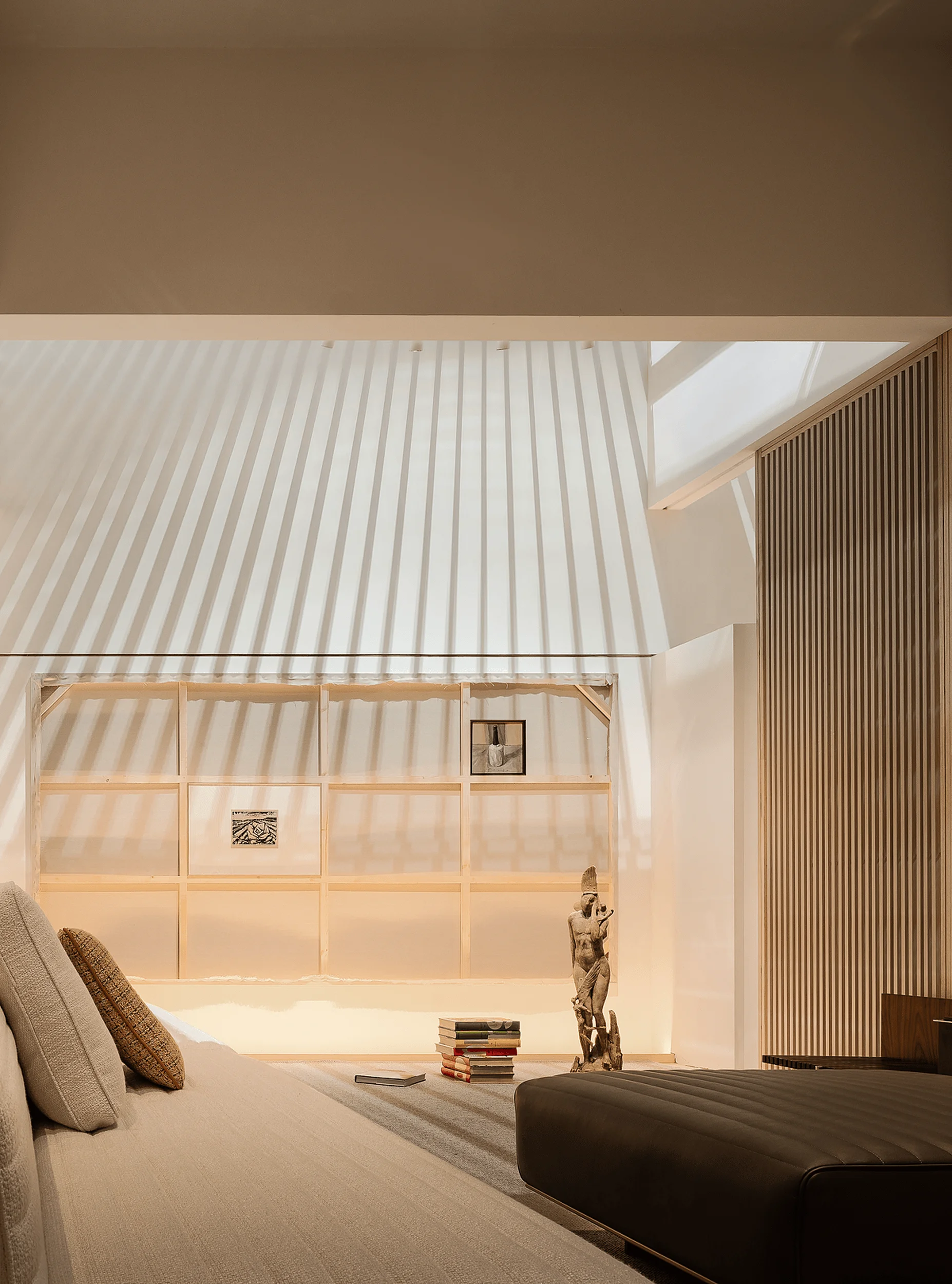
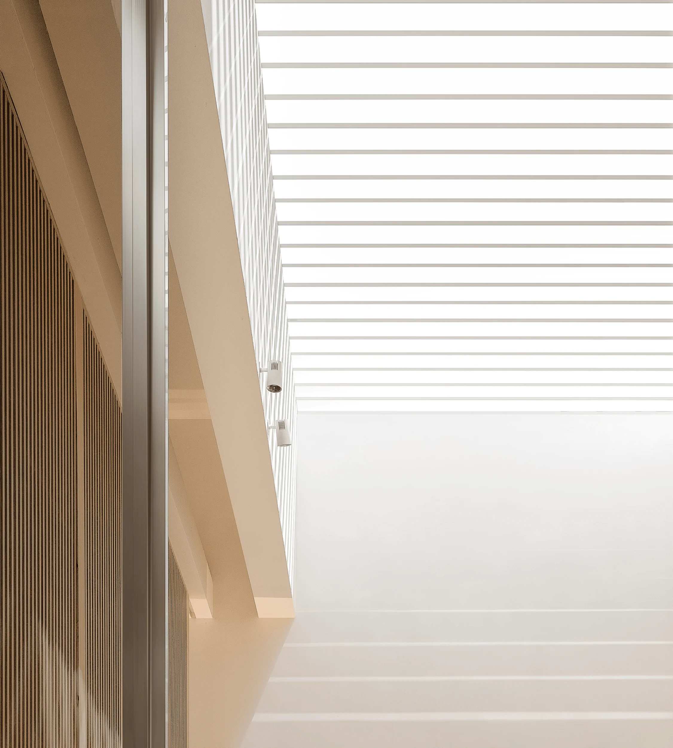
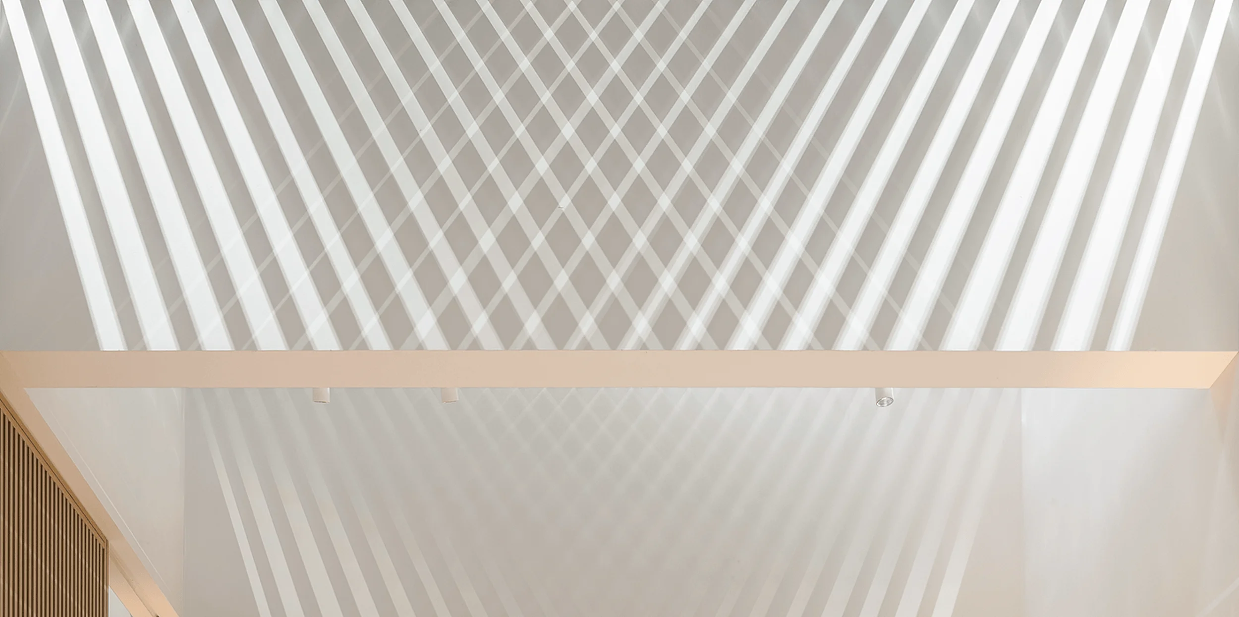
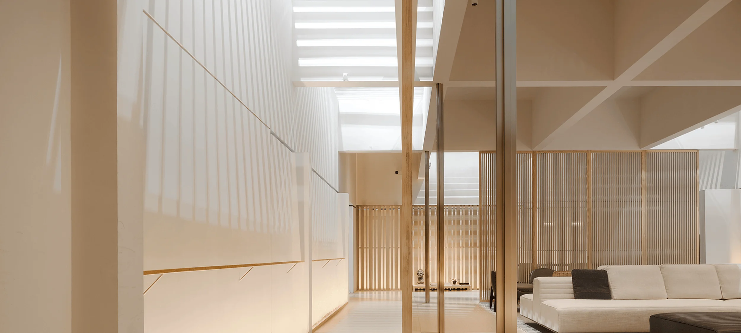
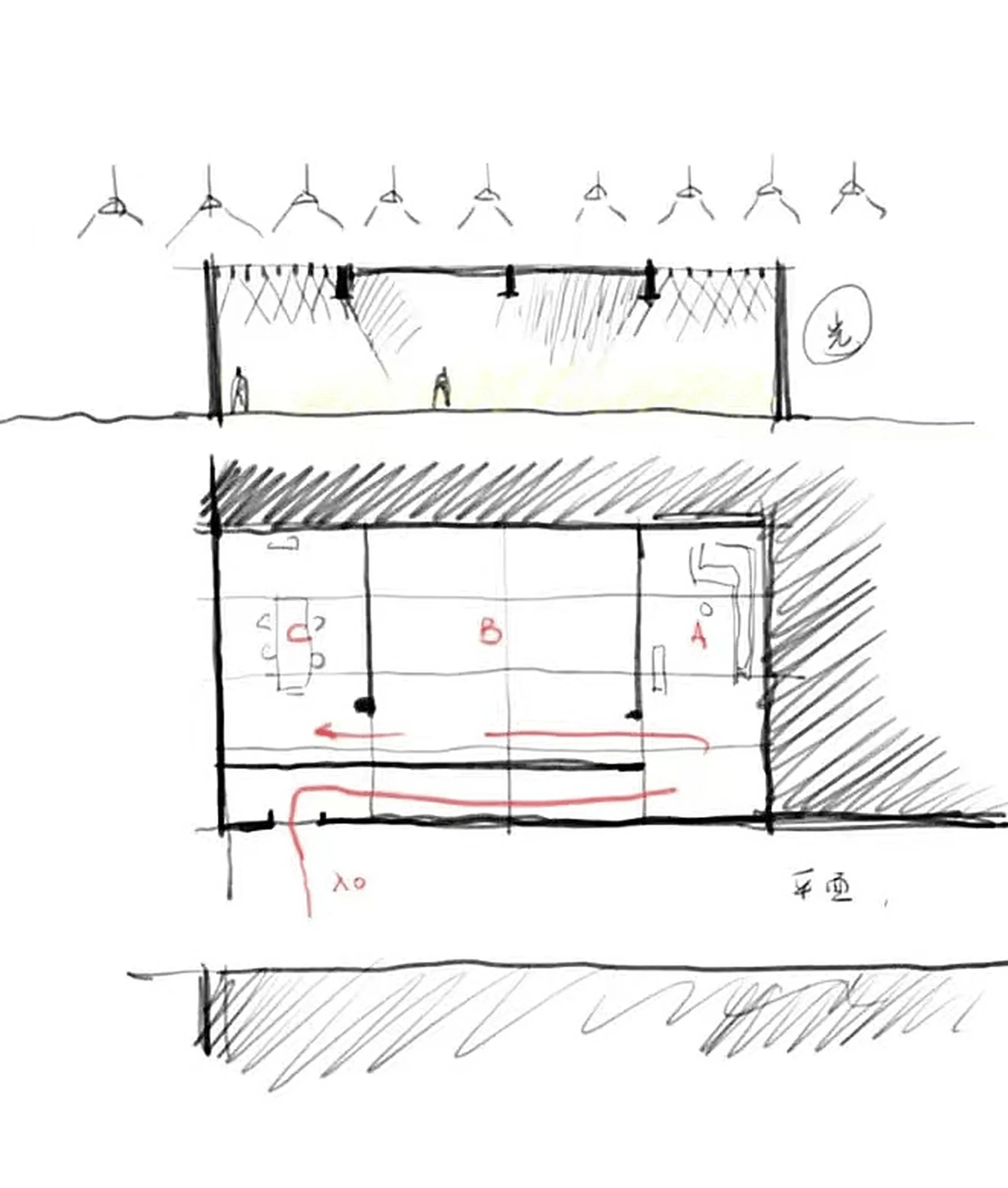
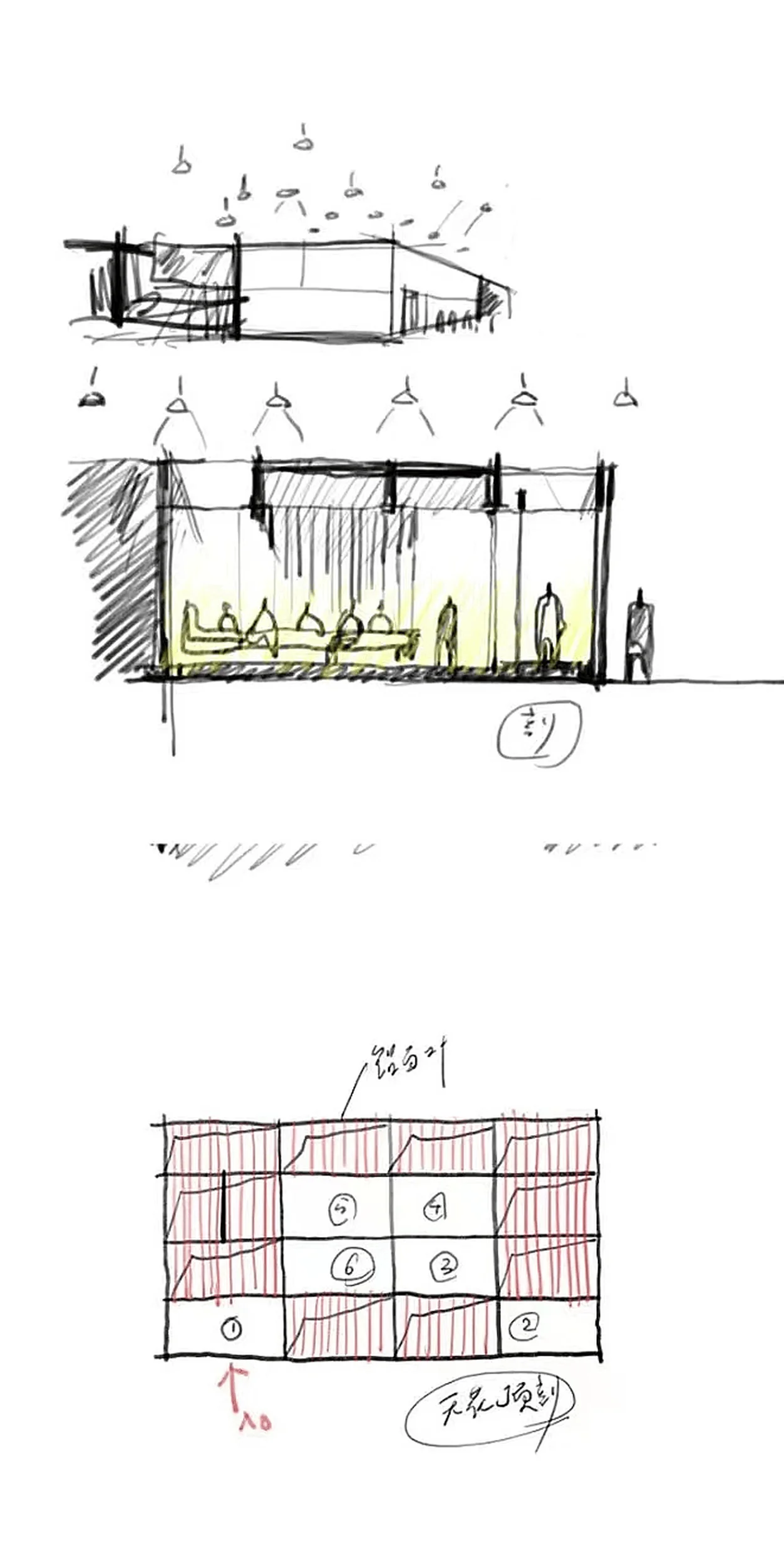
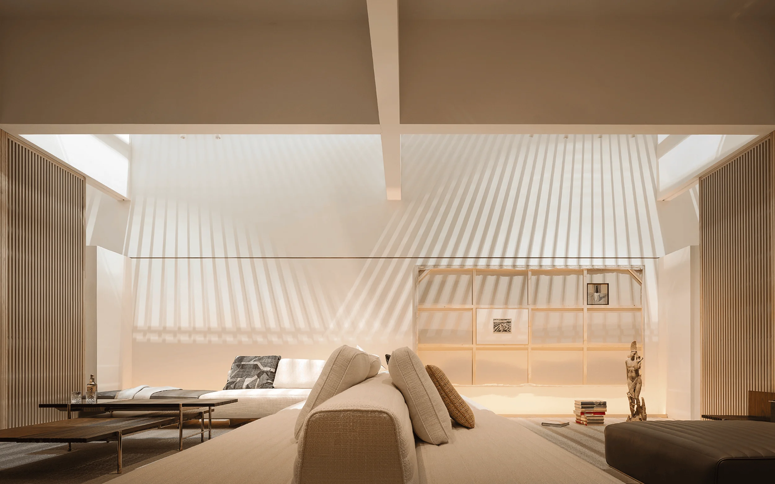
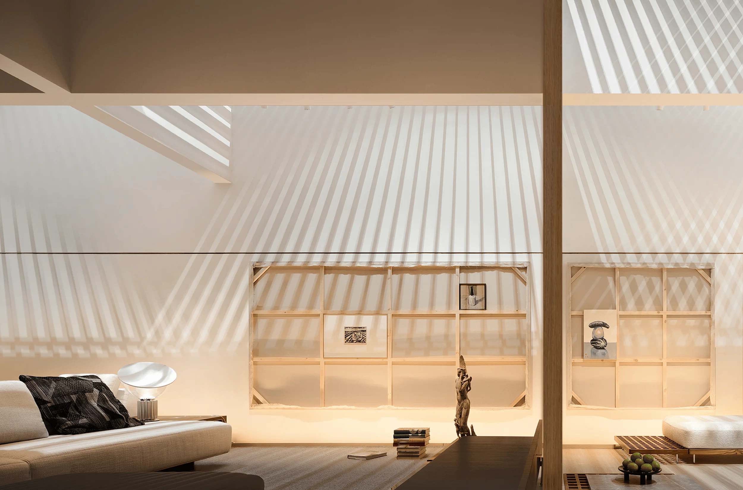
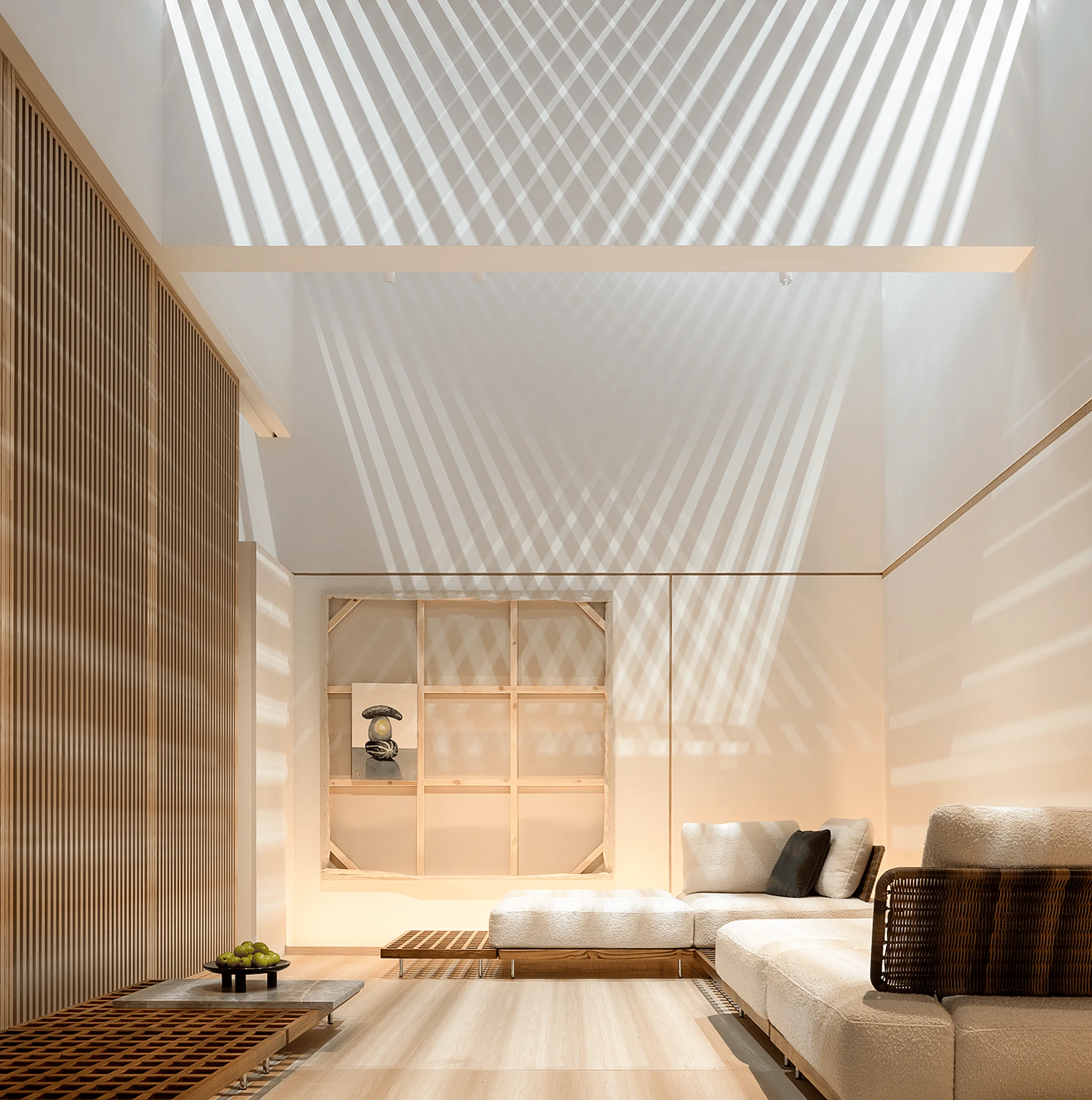
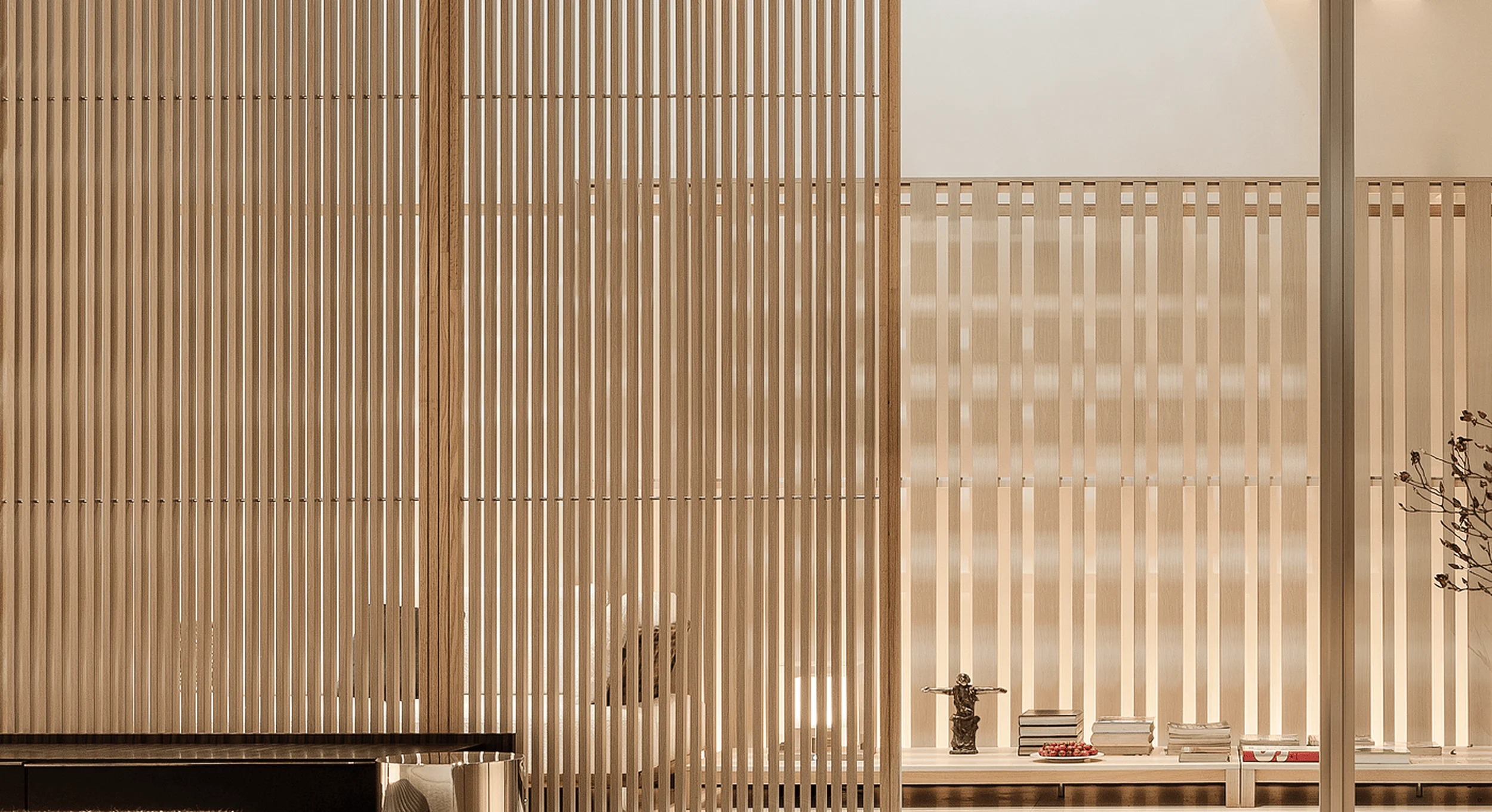
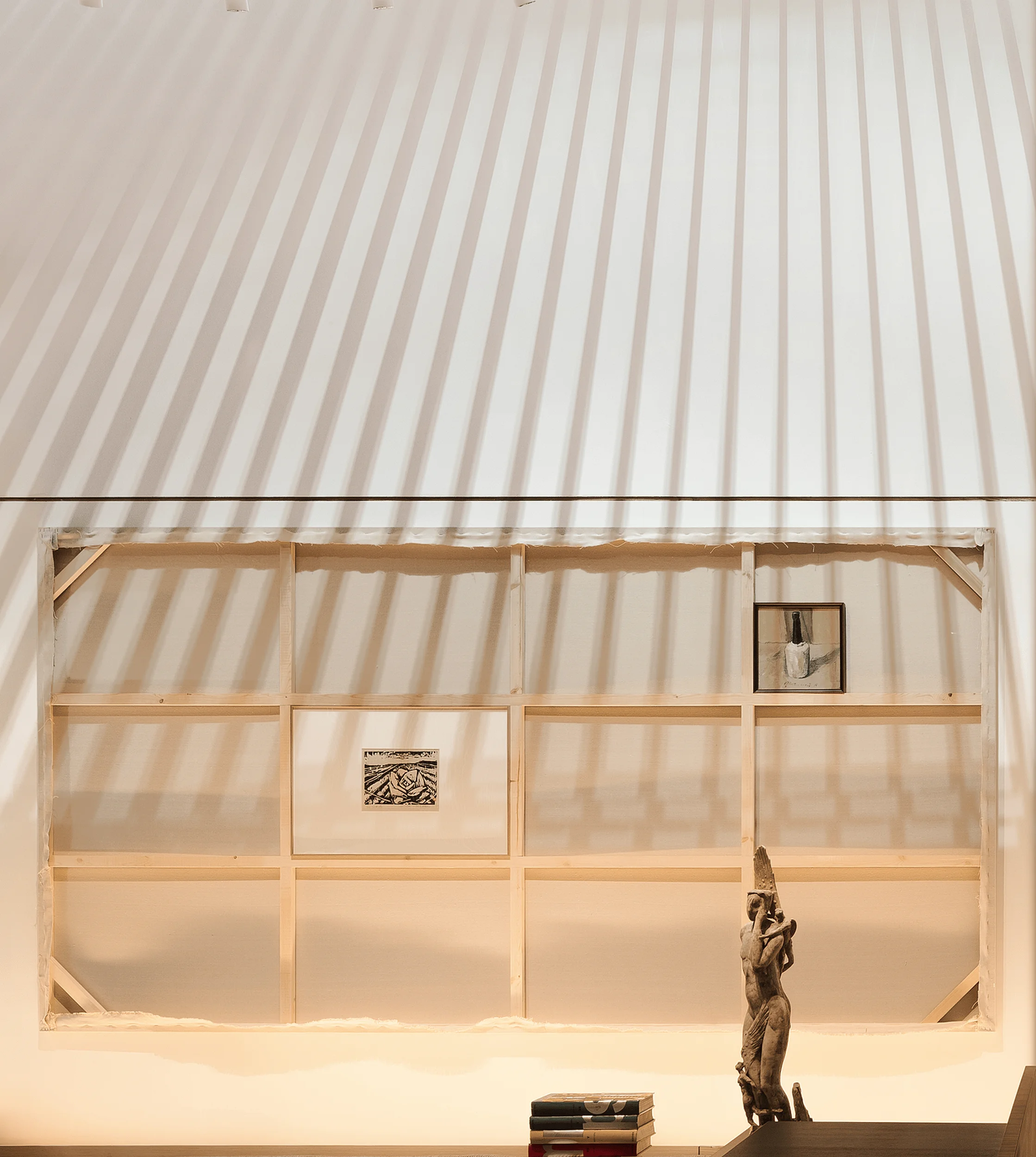
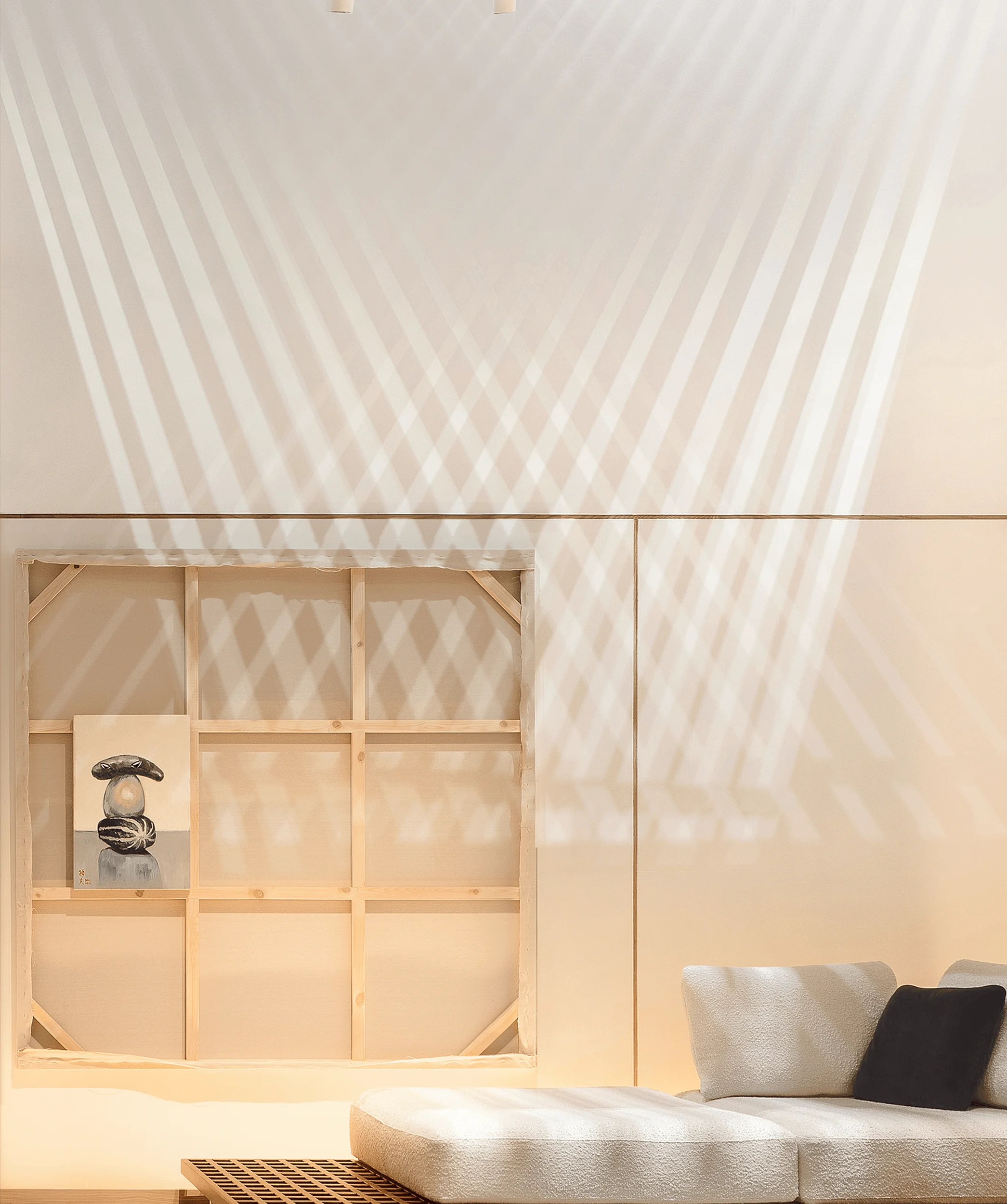
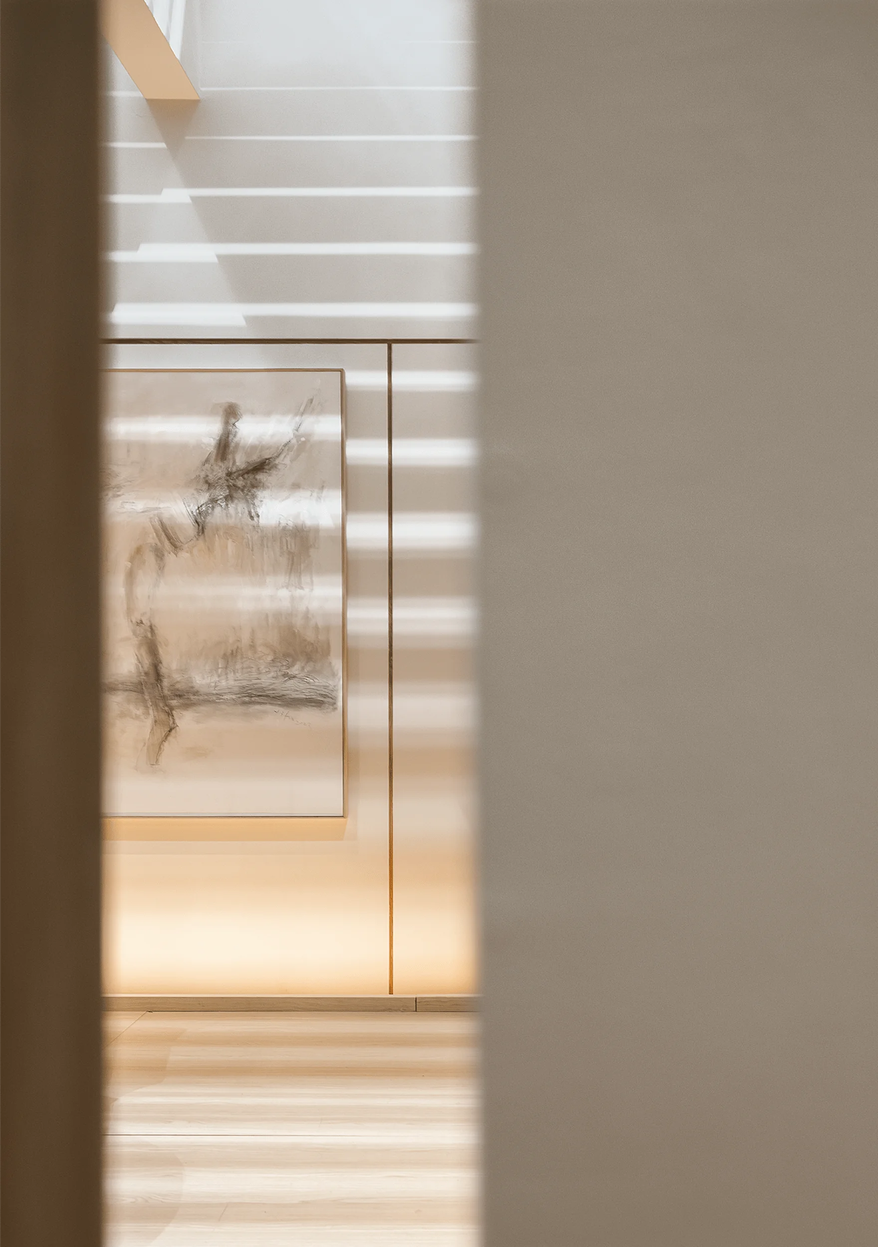
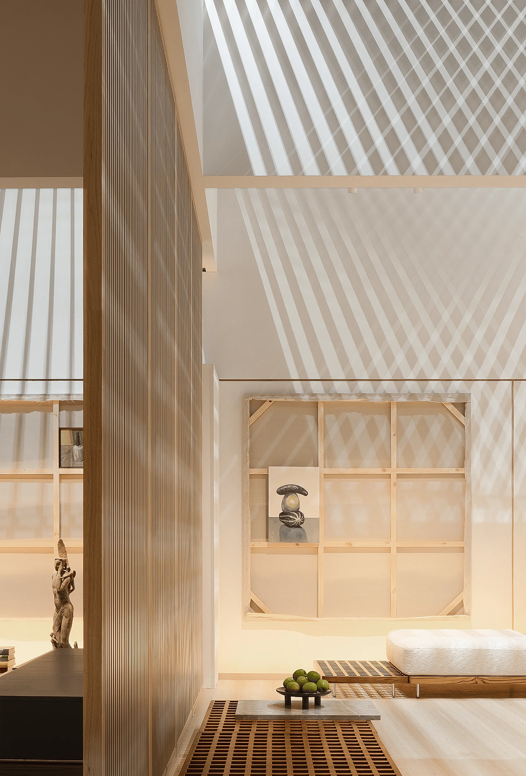
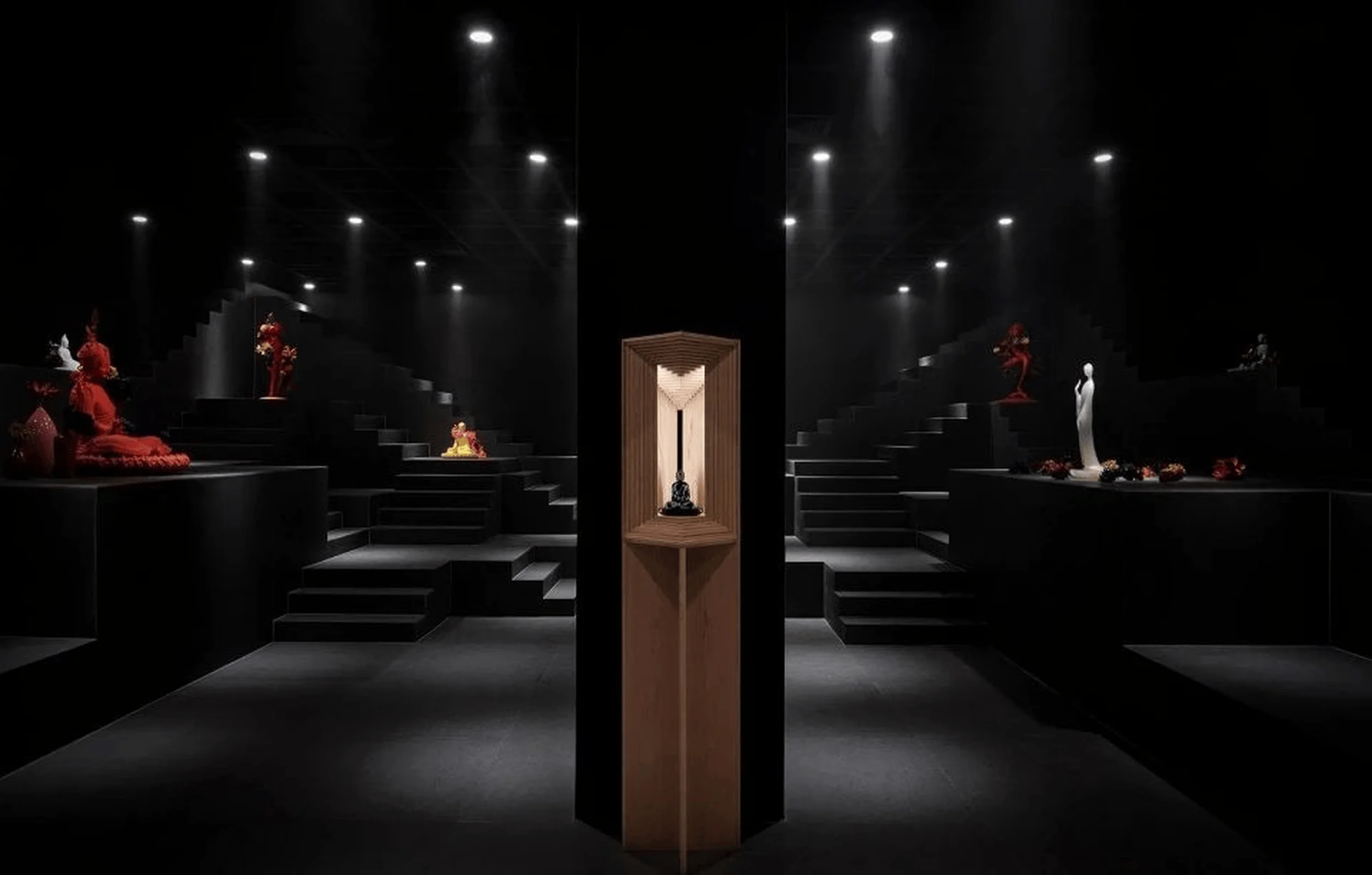
V2GETHER’s design strategy centered on ‘Borrowing Light,’ transforming the venue’s cool white ceiling lights into a powerful design element. The team meticulously designed the roof shielding to manipulate and compartmentalize the existing light, creating a dynamic interplay of light and shadow within the pavilion. This minimalist interior design approach aimed to create a sense of tranquility and focus within the chaotic exhibition environment. By using light as the primary sculptor of the space, V2GETHER crafted a unique atmosphere that enhanced the display of ABX’s furniture. The interior design choices emphasized the interplay of light and shadow, creating a minimalist yet engaging space.
Spatial Layout and Planning
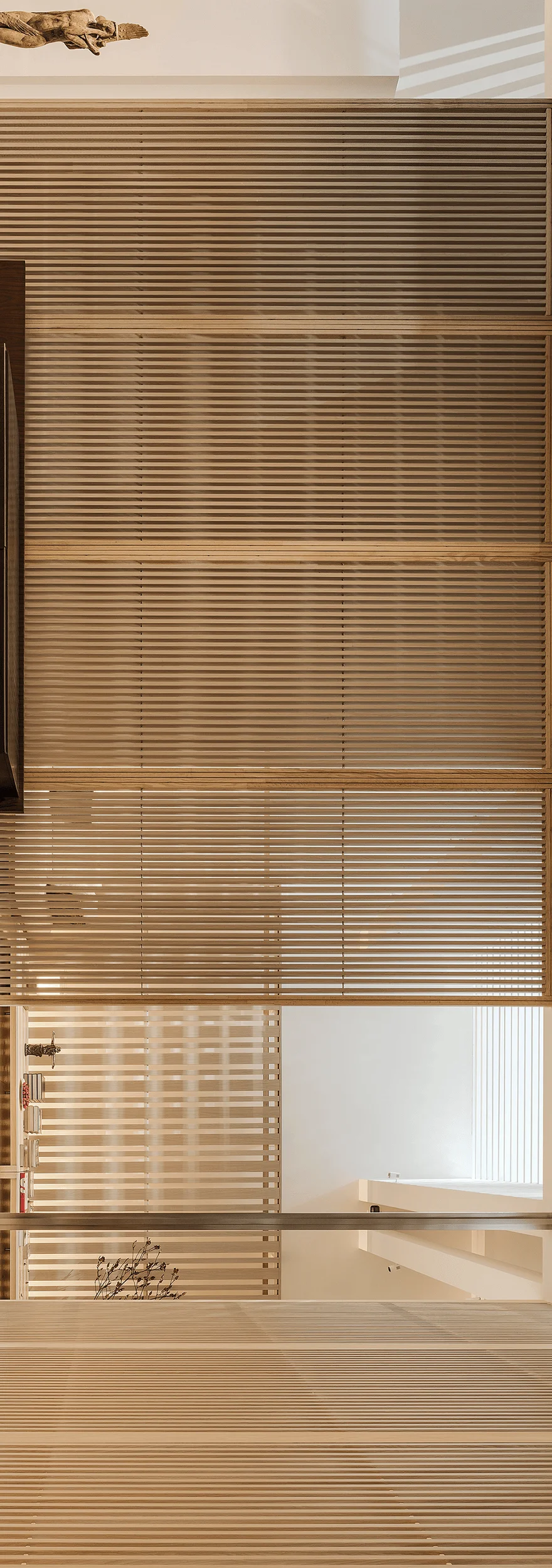
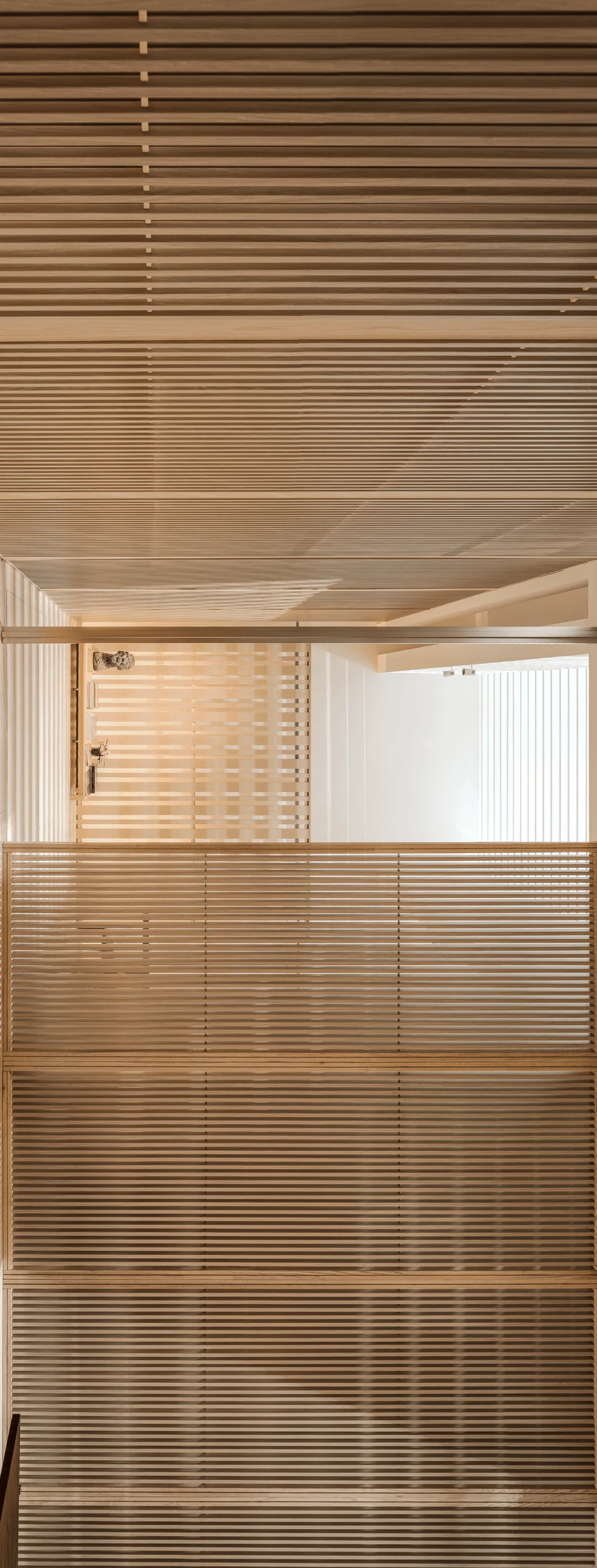
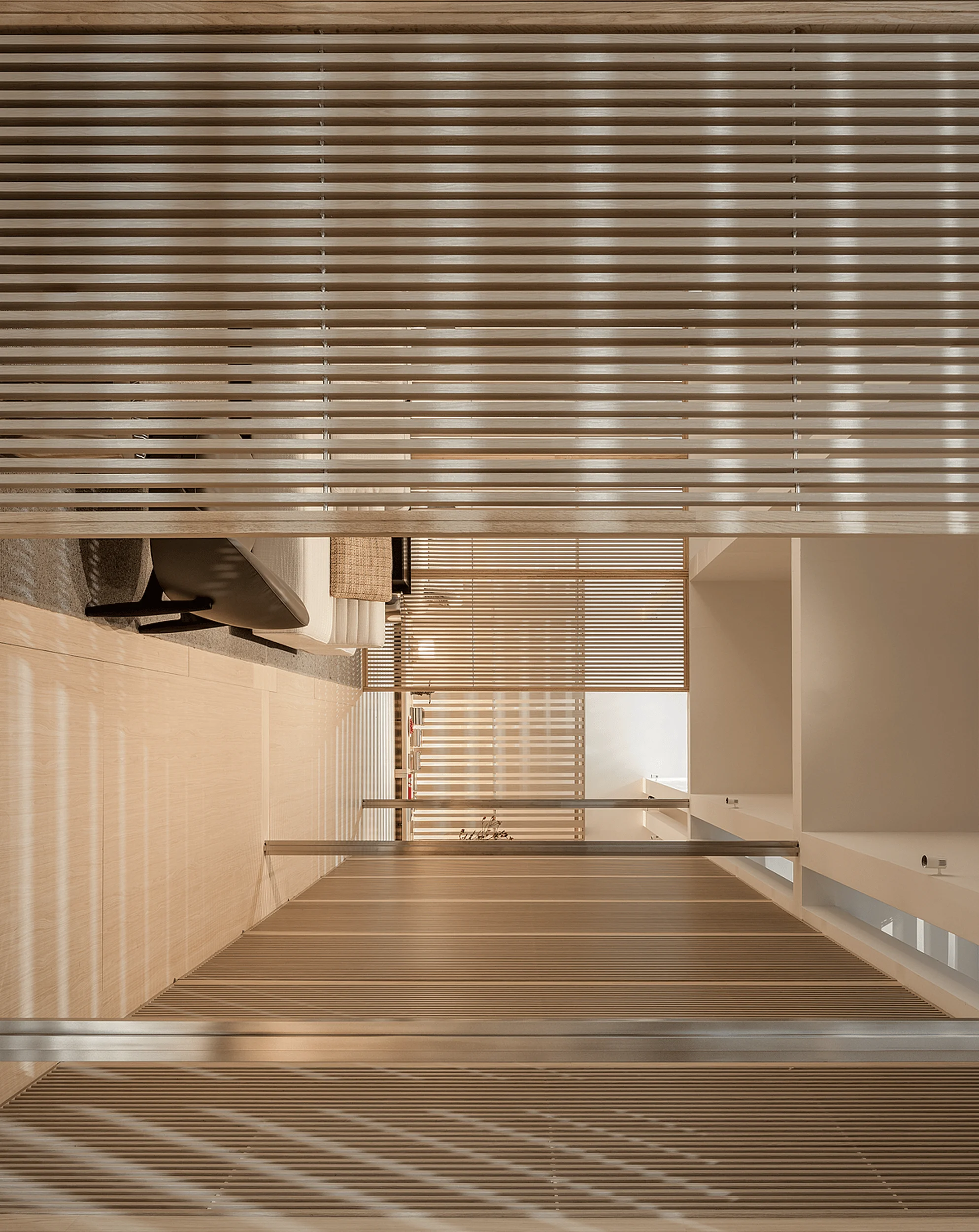
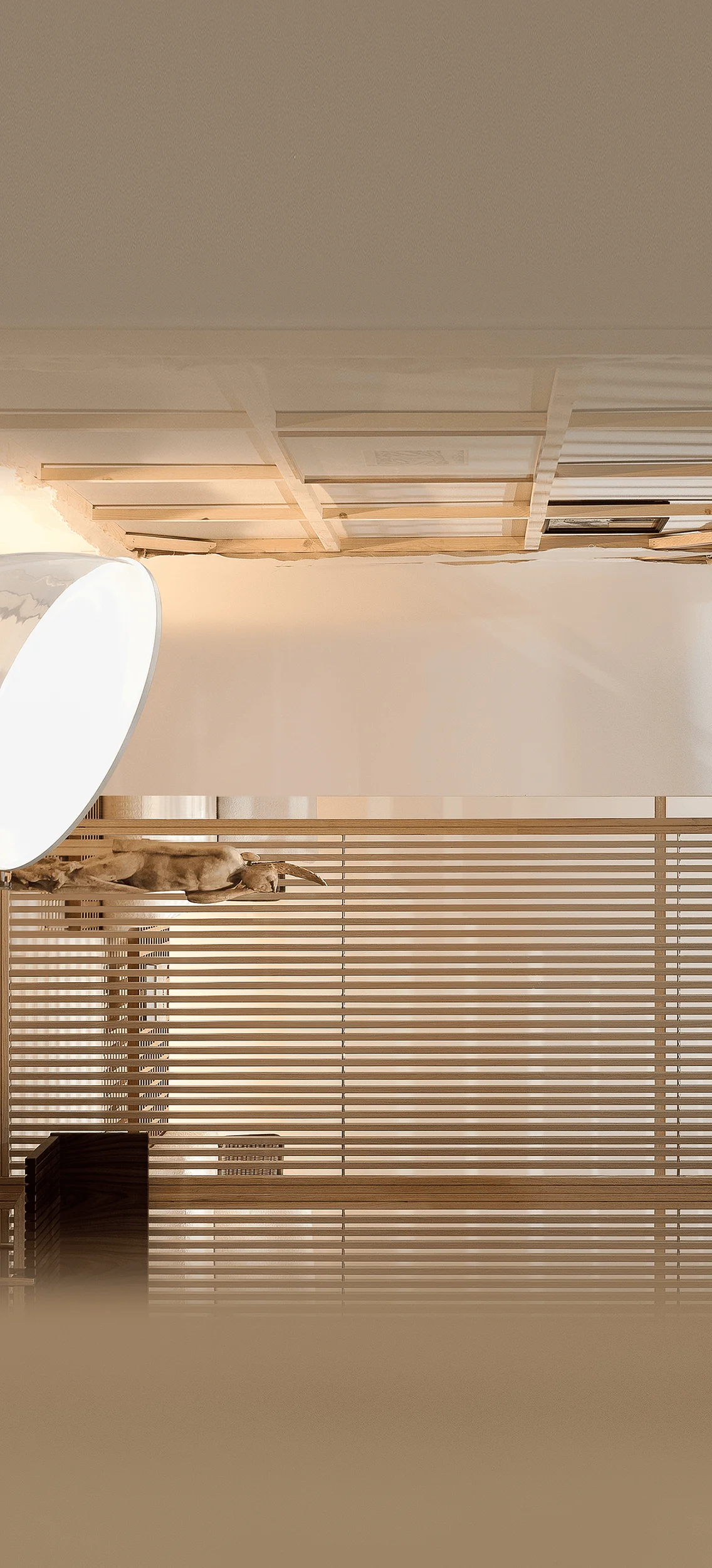
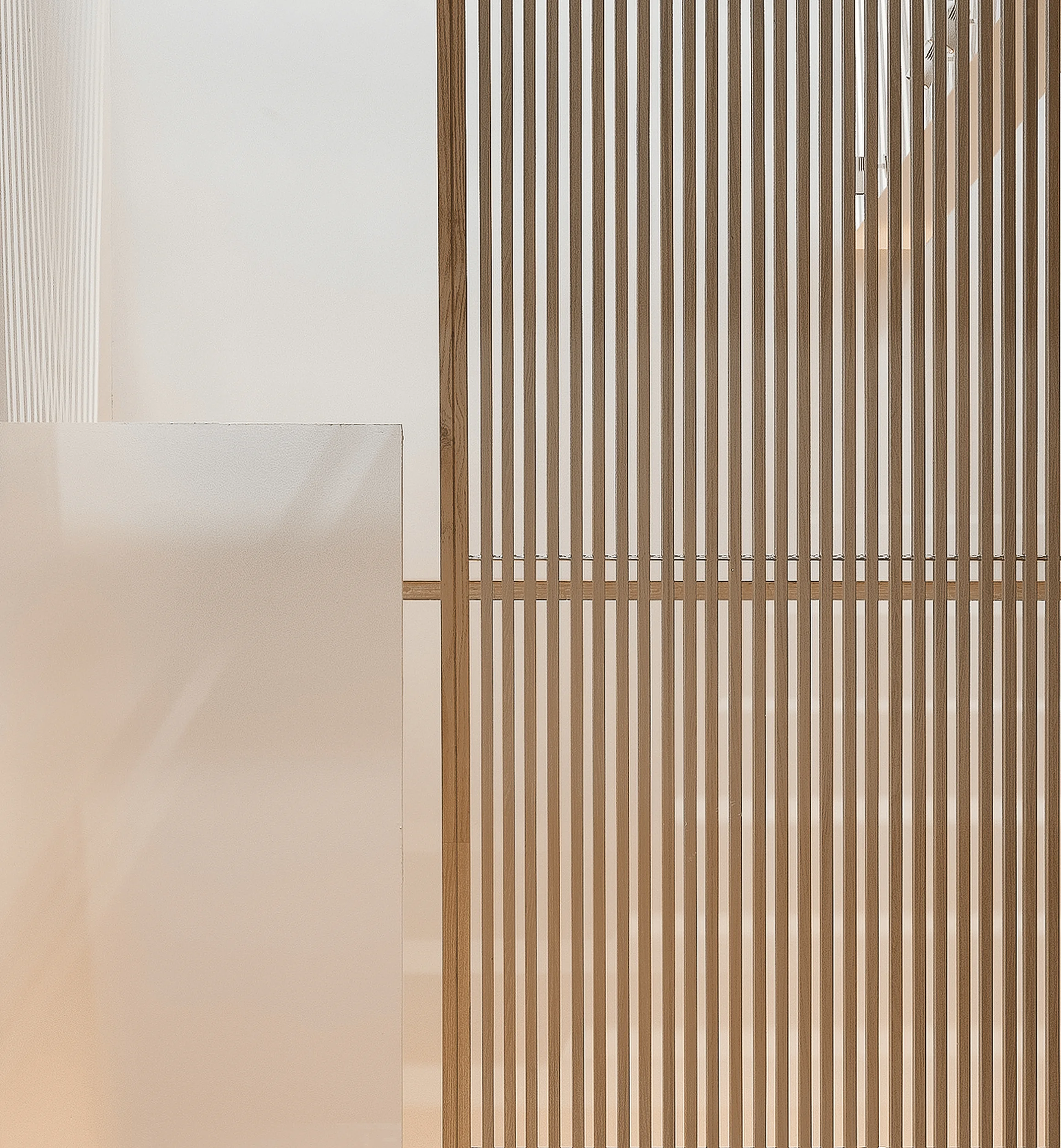
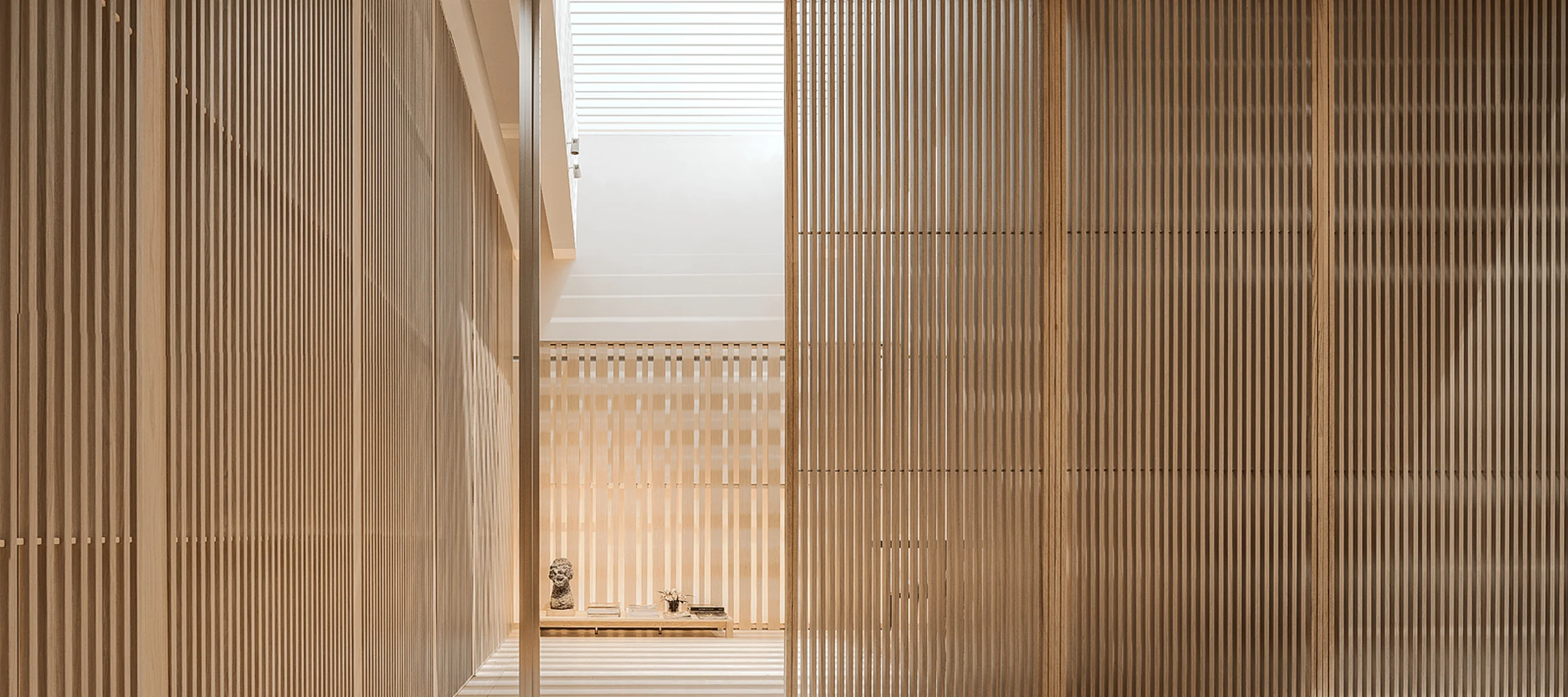
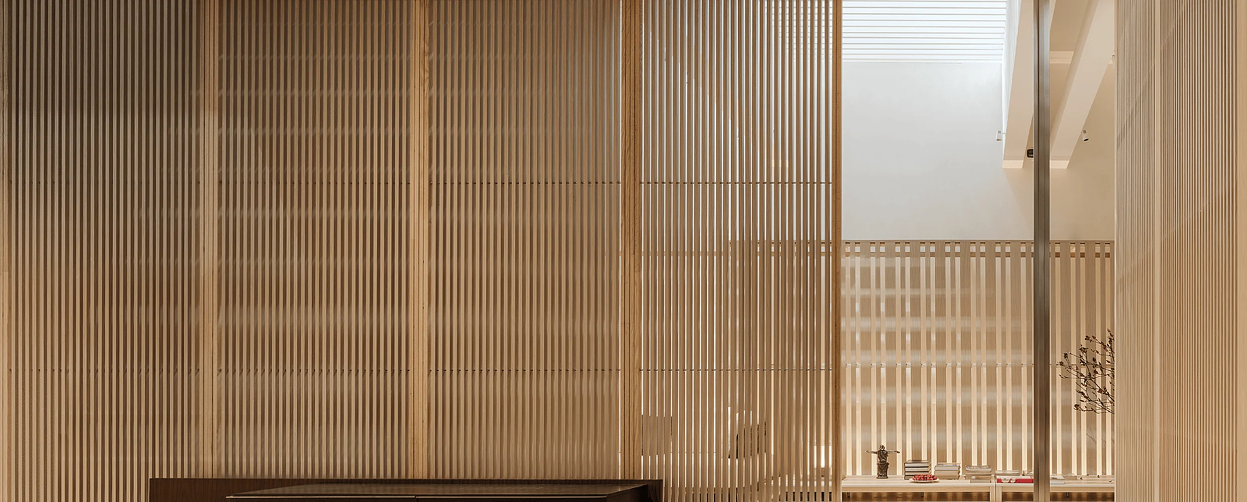
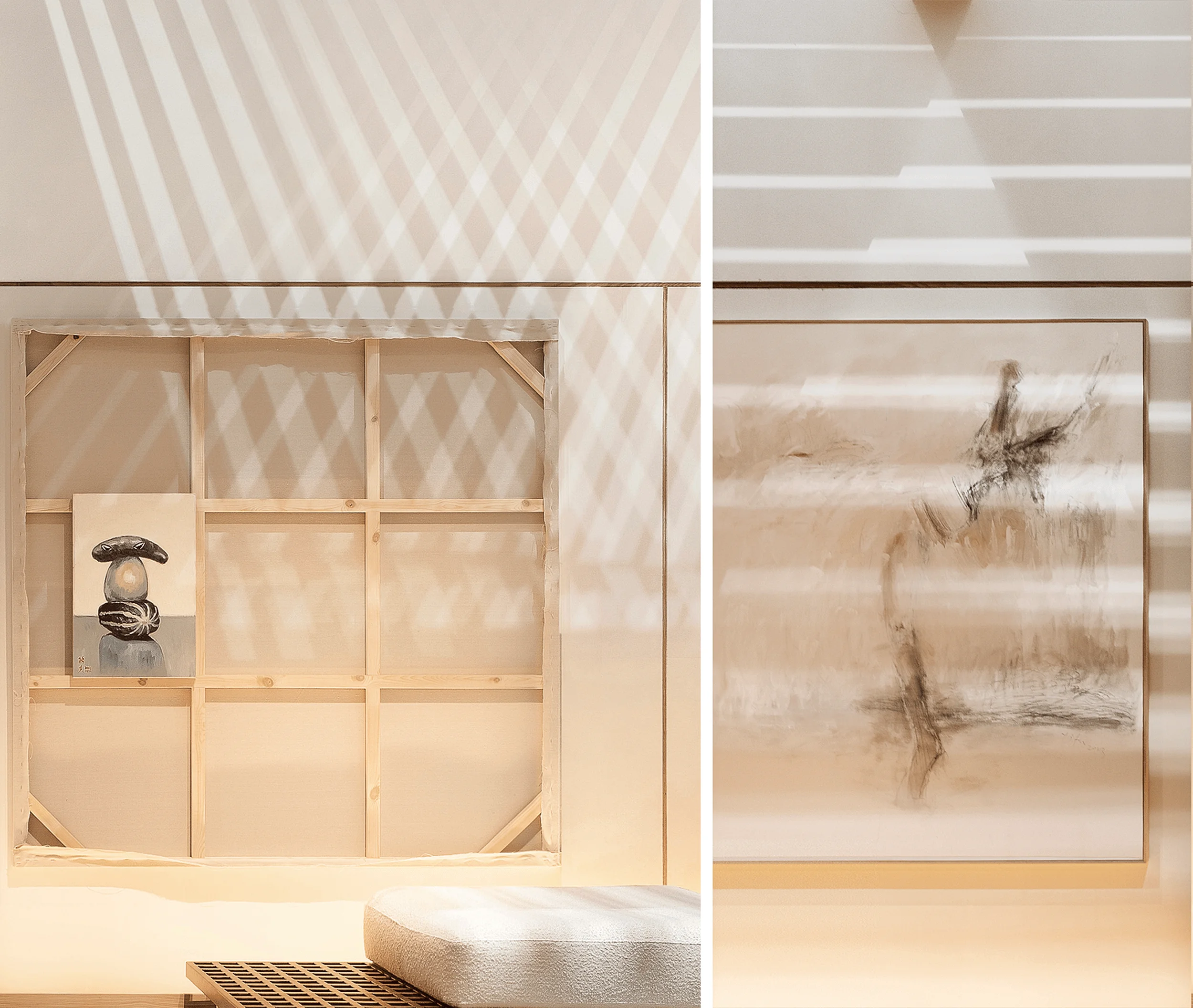
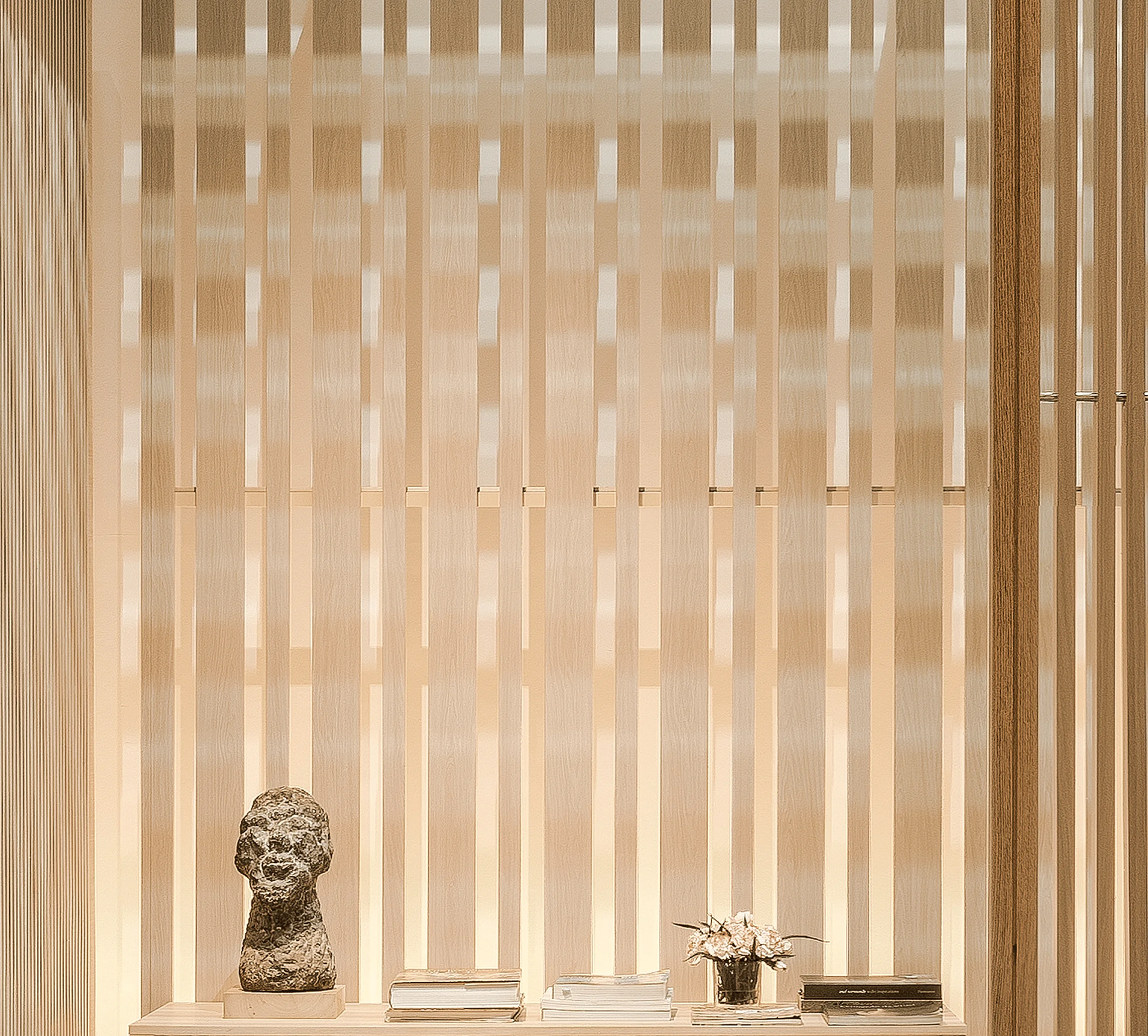
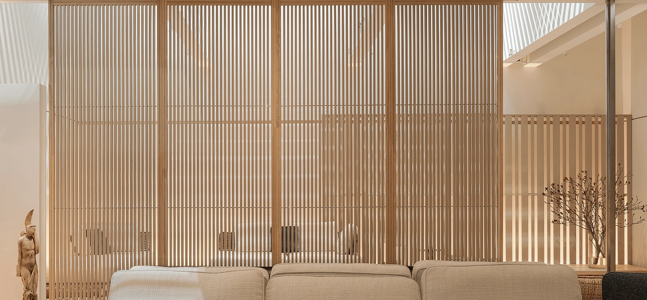
The pavilion’s layout strategically guided visitors through a 12-meter long entrance corridor, providing a gradual transition from the vibrant exhibition hall into a serene, minimalist interior. This design choice was intentional, offering respite from the surrounding activity. Upon entering the 1.3-meter wide entrance, visitors were enveloped in a calming atmosphere where light filtered through the signature aluminum-transfer wood-grain grille screens, casting intricate patterns on the walls. These screens, a product of ABX, were reimagined as the primary spatial dividers, offering transparency when viewed from the front and solidity from the side. This minimalist interior design effectively created a sense of depth and intrigue, enticing visitors to explore further. The layout also featured strategic placement of artwork and sculptures, enhancing the artistic ambience of the space.
Construction Process and Project Management
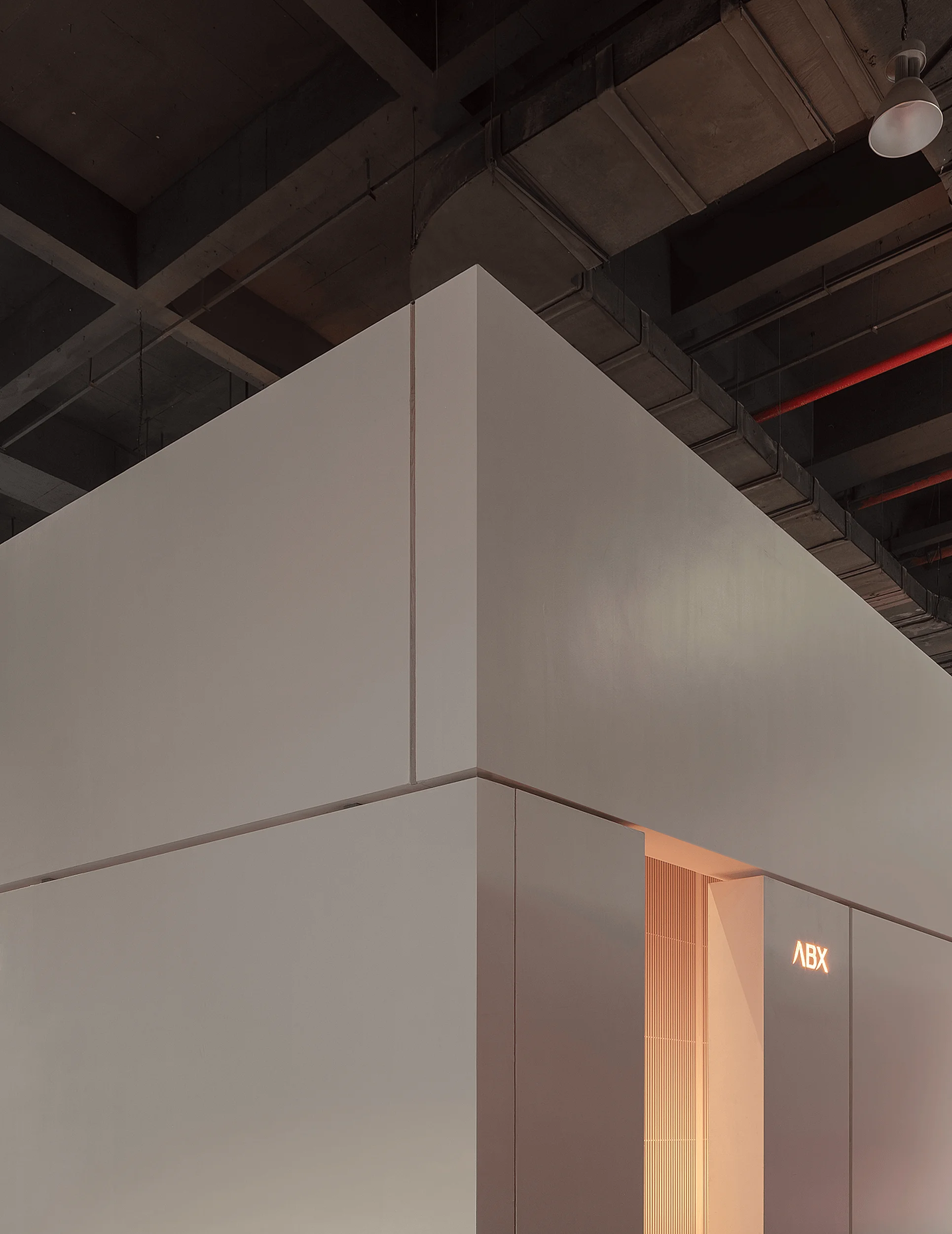
The pavilion’s construction was a testament to meticulous planning and efficient project management, crucial given the tight 10-day timeframe. The design team opted for a modular approach, breaking down complex structures into simpler units for streamlined fabrication. These units were meticulously categorized and assigned to various manufacturers, with Zhao Rui overseeing the entire process to ensure seamless integration and adherence to design specifications. This modular approach, a hallmark of minimalist interior design, facilitated efficient assembly on-site. The exposed structural elements, a deliberate design choice, created a layered aesthetic, highlighting the beauty of the construction process itself. The team’s innovative approach to construction ensured that the minimalist interior design vision was realized within the challenging timeframe.
Project Information:
Project Type: Exhibition Pavilion
Architect: Zhao Rui / V2GETHER
Area: 140m²
Project Year: 2023
Country: China
Main Materials: Aluminum-transfer wood-grain grille, ABX · Naiting porcelain film, Meixun
Photographer: Wu Qidiao / V2GETHER


