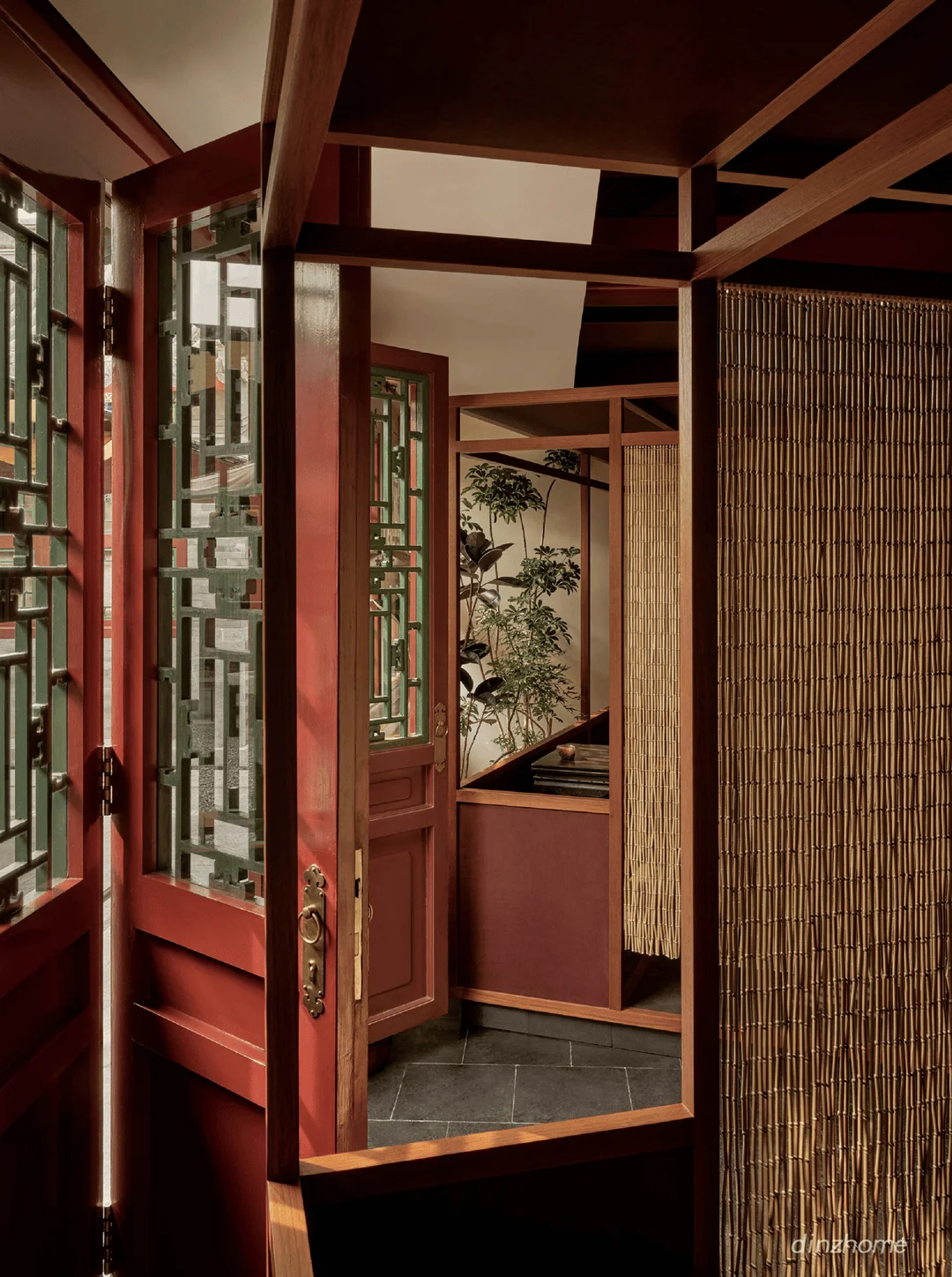
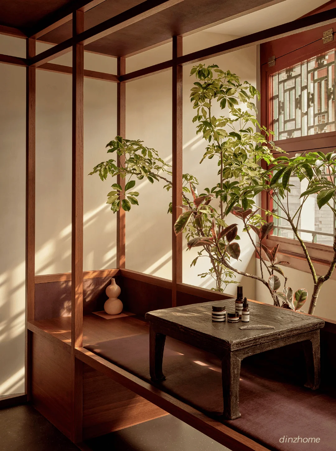
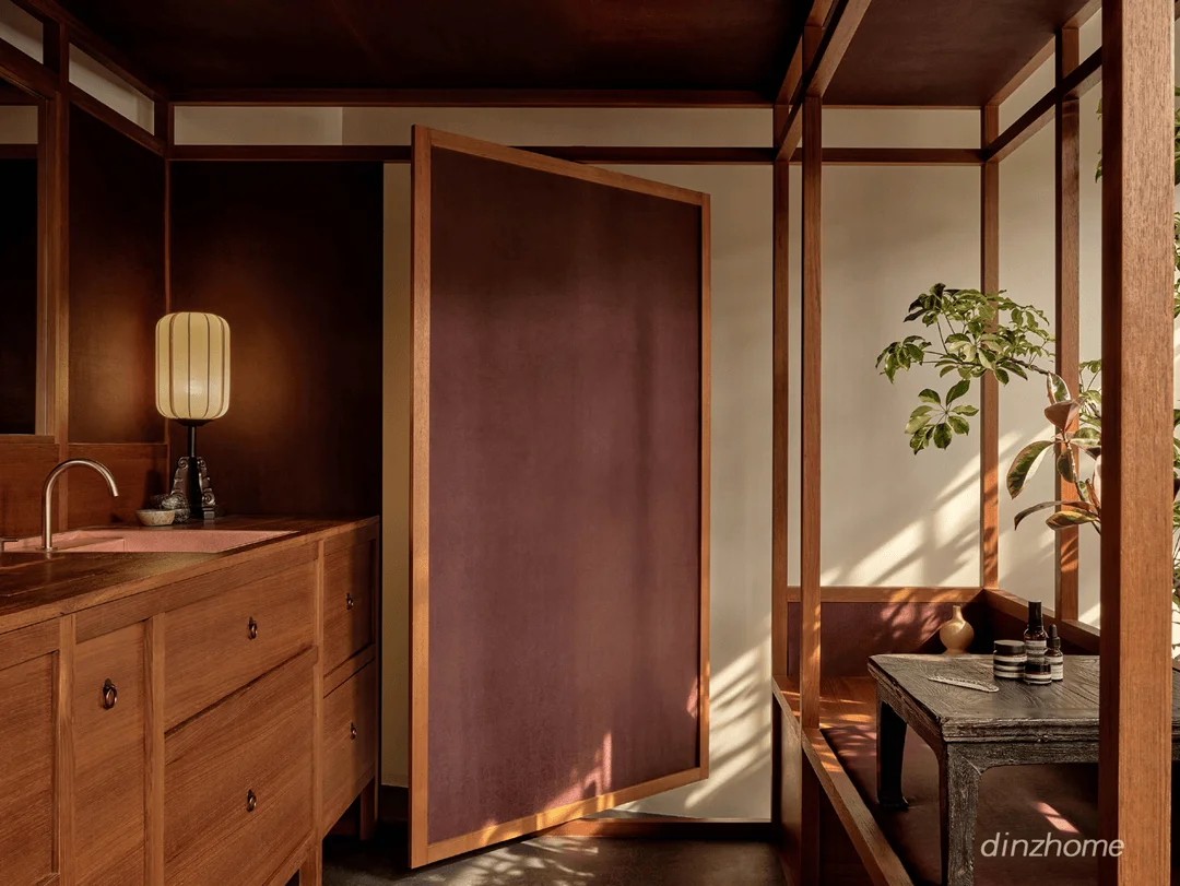
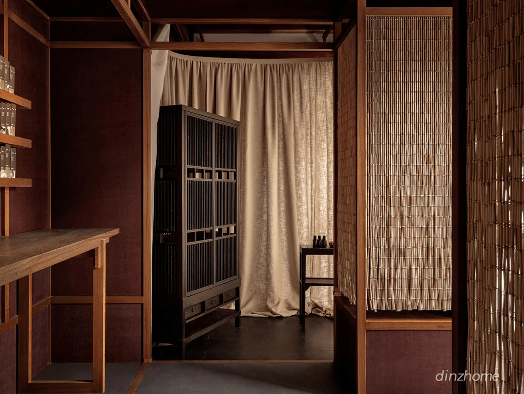
Aesop Beijing siheyuan store design features Ming dynasty furniture and contemporary elements.
Contents
Context and Background: Traditional Siheyuan Revitalization
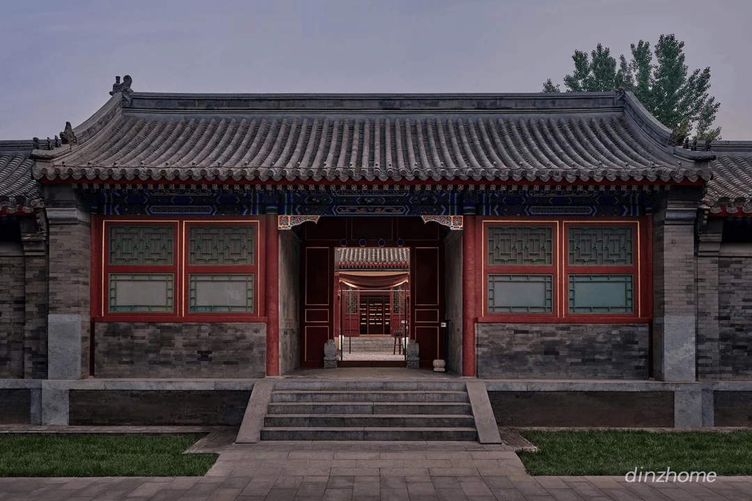
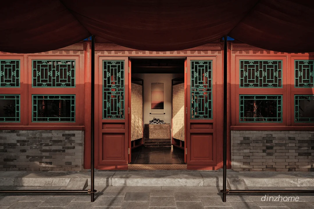
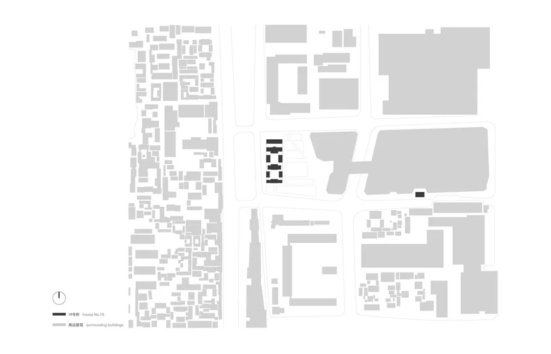
Aesop, renowned for its distinctive store designs that integrate seamlessly with local architecture and culture, has established a new flagship store in the heart of Beijing’s Wangfujing district. Notably, this store is housed within a historical siheyuan, a traditional courtyard house with a rich cultural significance. This project represents a unique opportunity to revitalize a traditional Chinese architectural style and introduce a modern retail experience while maintaining the building’s historical integrity. This project integrates traditional Chinese courtyard architecture with the modern design of a retail space, demonstrating the potential for innovative architecture and interior design within culturally significant structures. The design process involves a careful consideration of the existing structure and its historical context, seeking to create a new retail space that is both modern and respectful of the past.
Design Concept and Objectives: Blending Old and New
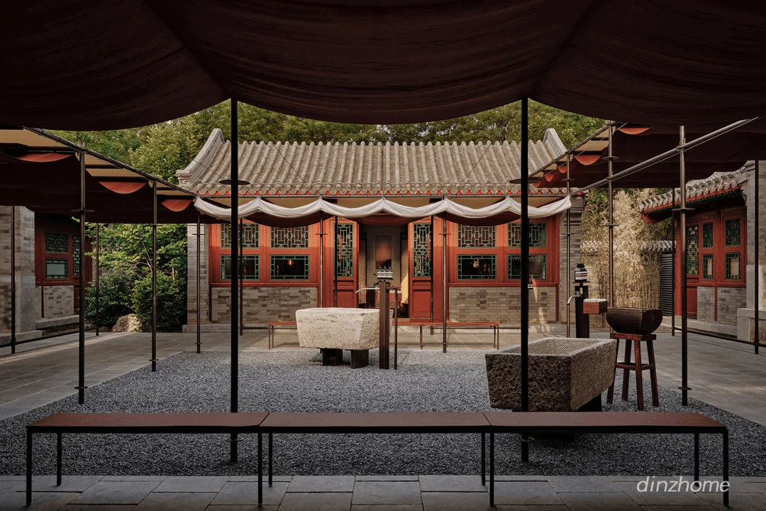
Atelier Suasua, the architects behind this project, took on the challenge of harmonizing the traditional siheyuan structure with the brand identity of Aesop. The design philosophy aimed to create an environment that is both welcoming and unique, one that reflects the local culture while celebrating the essence of Aesop’s brand. The design is centred around a courtyard and incorporates Ming Dynasty furniture with contemporary design elements. This combination creates a space that is both familiar and unexpected, evoking the rich cultural heritage of Beijing while offering a contemporary retail experience. The design prioritizes the integration of new design elements within the existing structure, focusing on the balance of traditional and modern to create a seamless and harmonious atmosphere. The project aims to demonstrate how a historical structure can be adapted and repurposed to accommodate modern functions while retaining its historical character. This approach demonstrates a sustainable and culturally sensitive approach to architectural design and interior design in a heritage context.
Spatial Planning and Functionality: Courtyard as a Central Element
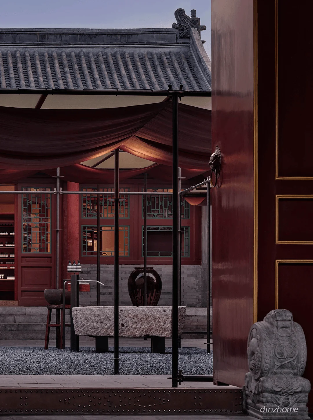
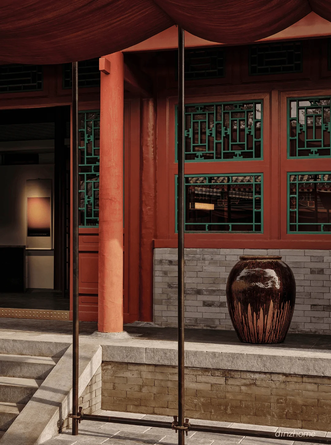
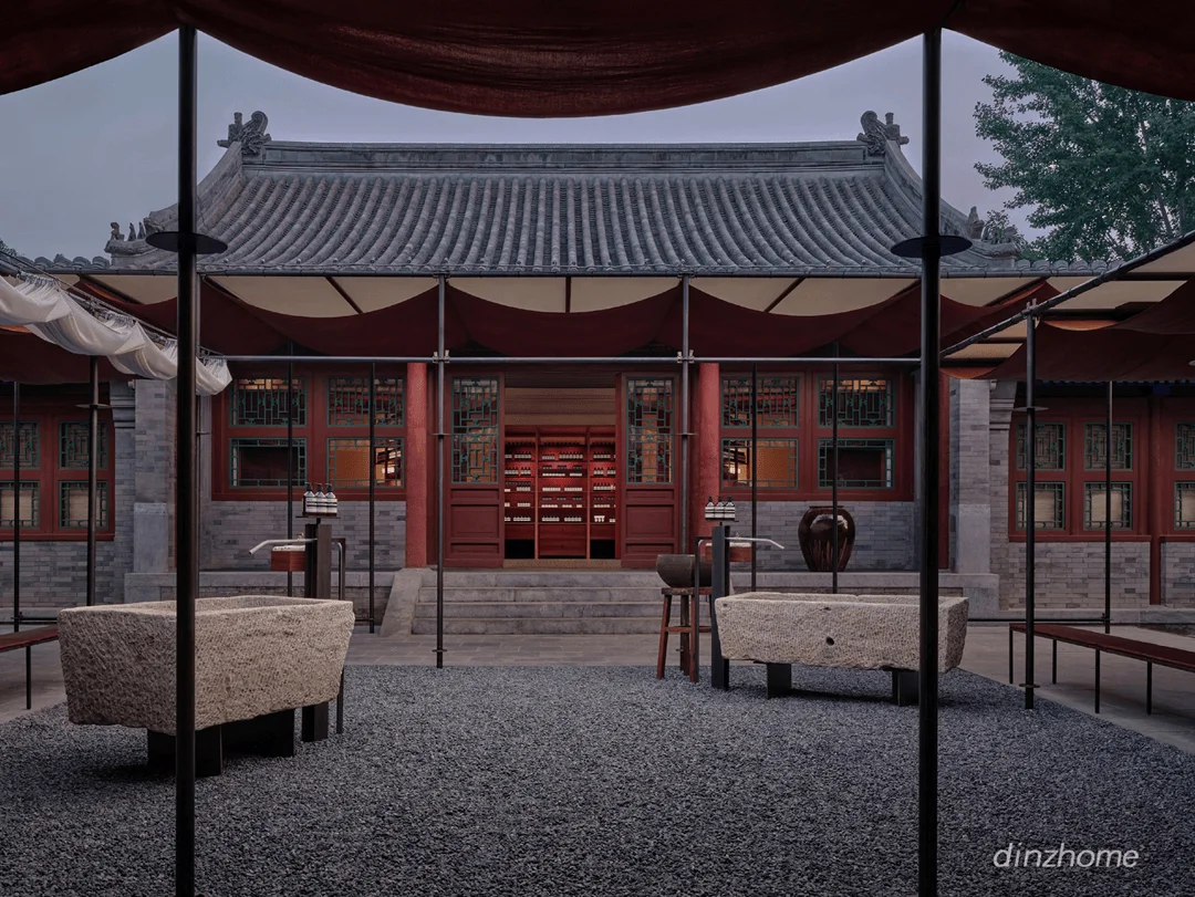
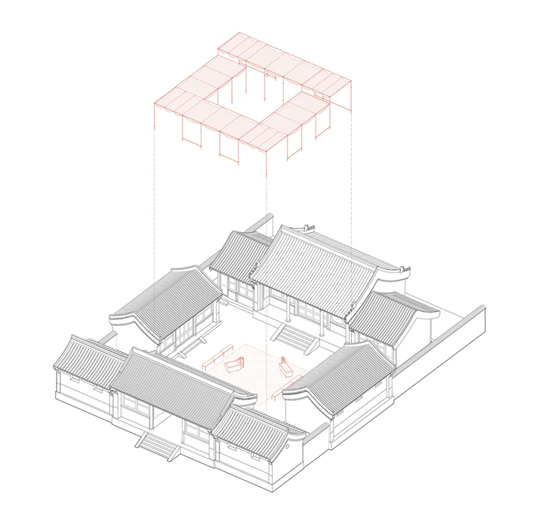
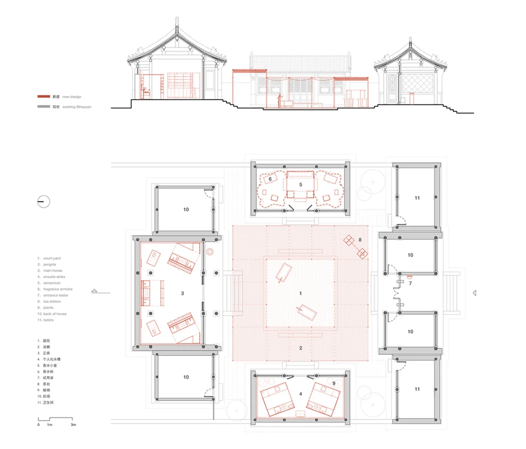
The siheyuan’s spatial organization is characterized by a central courtyard, which forms the heart of the design. This open space serves as a transition point between the interior and exterior spaces and serves as a gathering place for guests and visitors. The designers used the existing courtyard’s structure as a base and designed a 3-meter wide cool arbor structure, which draws inspiration from traditional Beijing liangpeng designs. This design leads guests naturally through the various rooms and provides an interesting spatial transition to the main retail sections. This spatial organization is essential for creating a flow and enhancing the visitor’s experience, highlighting the courtyard’s role as a focal point and a connector for various functional spaces. The function of the courtyard evolves beyond merely a passive element of the siheyuan architecture and serves as an integral part of the user’s experience of the Aesop space. This approach demonstrates how design can repurpose and reinvent existing features in heritage structures.
Architectural Aesthetics and Design Details: Ming Dynasty Furniture as Design Element
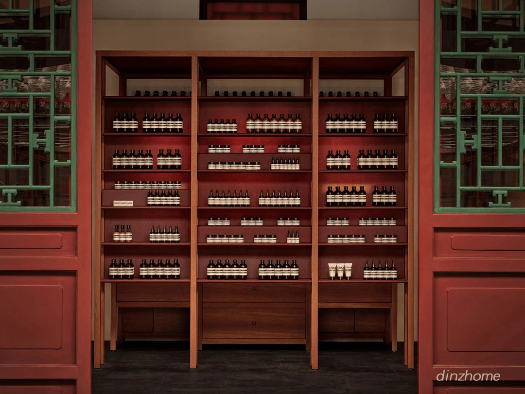
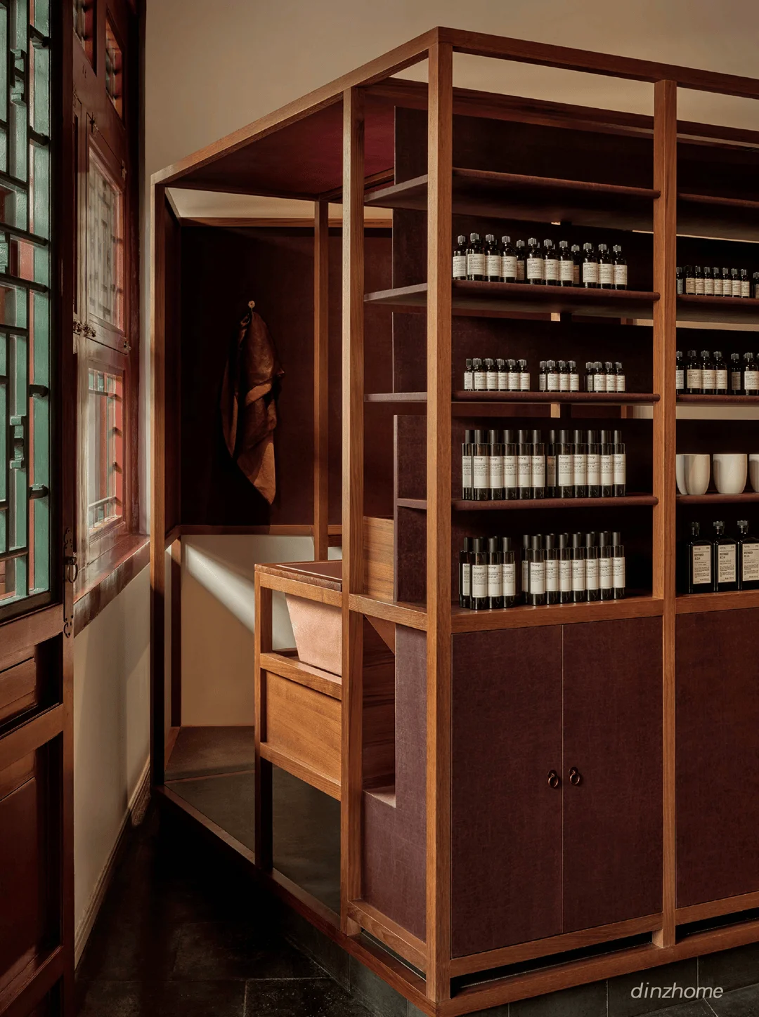
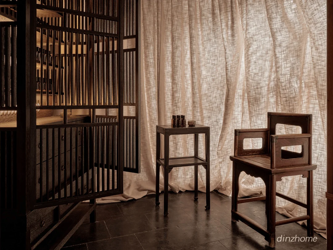
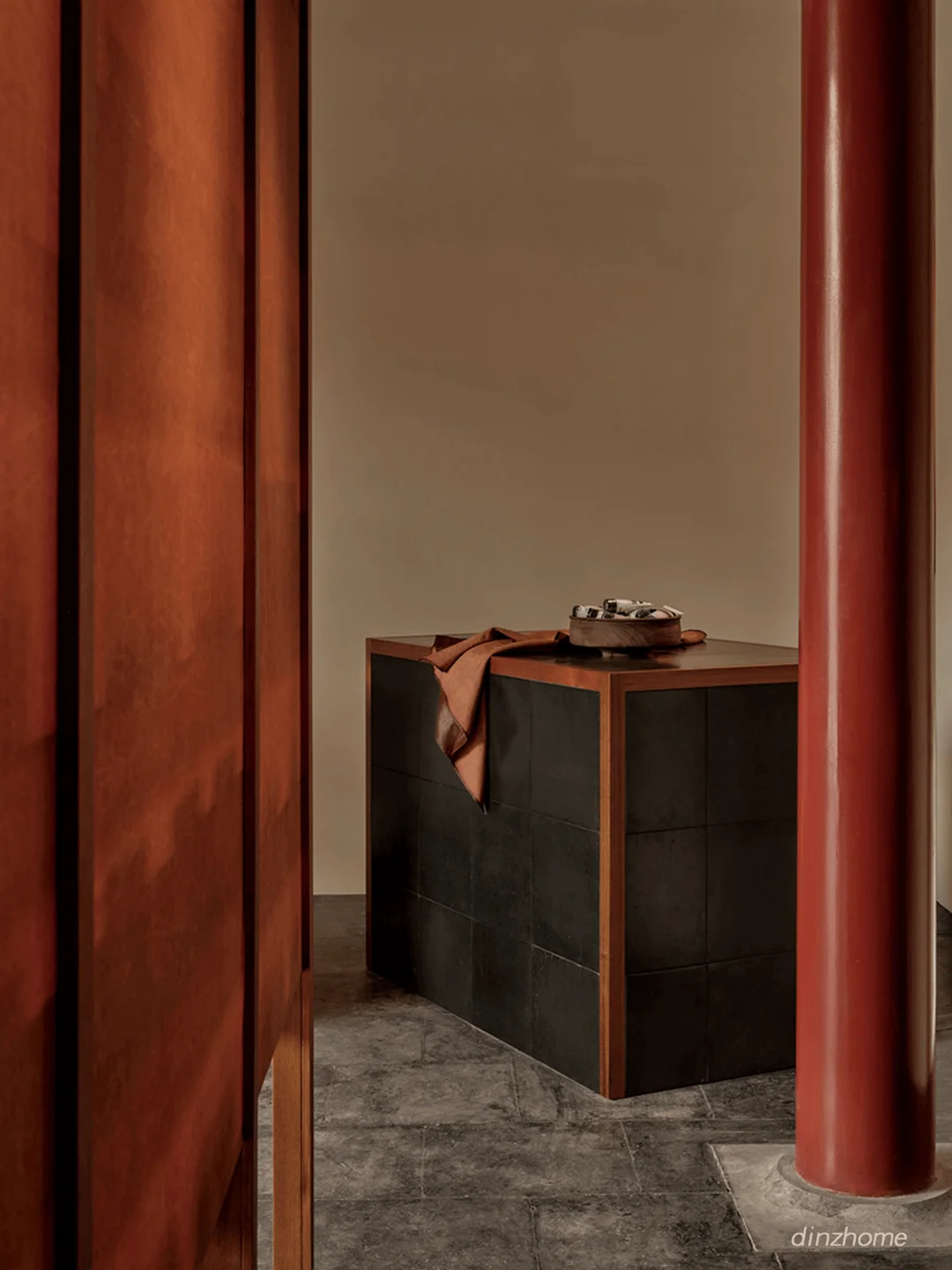
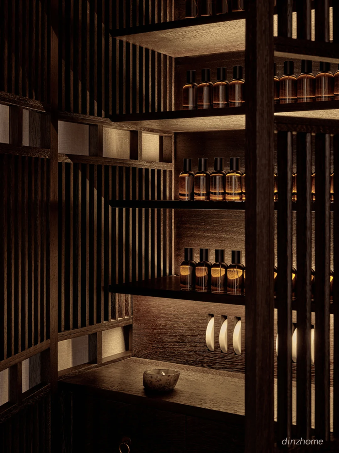
The project involves integrating Ming Dynasty furniture into the retail space. The integration of traditional Chinese furniture is not simply for aesthetics, but a crucial component of the overall design concept. Babu beds, a signature type of bed from the Ming and Qing dynasties, were placed in the main rooms to help define different functions of the space. This approach helps create a unique atmosphere that connects the history and the culture of the siheyuan with Aesop’s modern design aesthetics. The team meticulously restored and incorporated the existing siheyuan structure, ensuring that the intervention was respectful and harmonious with the original architectural style. The materials chosen for the project, such as teak, Xiangyunsha silk and red copper, are carefully selected to create a sense of continuity and harmony between the interior and exterior spaces. The color palette and materials are meticulously curated to reflect the aesthetics and cultural heritage of the siheyuan, creating a cohesive and authentic design. This project showcases the design potential of integrating historical artefacts and references within a contemporary interior design and retail context.
Sustainability and Environmental Considerations: Water Feature Integration
A central element of the courtyard design is the aolishi (blue stone) trough washbasin, which serves both a practical and aesthetic purpose. The washbasin is an unexpected element that helps to connect the visitor to the culture of Beijing and is placed strategically as a focal point of the central courtyard. The designers incorporated a water feature that adds to the atmosphere and helps to create a connection to nature within the urban environment. The use of natural materials in the construction of the new structure and furnishings reduces the environmental impact of the design. The project showcases a commitment to sustainability through the integration of water-related design features. The use of water elements such as the washbasin not only enhances the visual appeal but also improves the overall atmosphere, demonstrating a sophisticated approach to design in the context of heritage architecture.
Cultural and Social Impact: Blending Modernity with Tradition
The project highlights the potential of contemporary design to engage with and enhance historical spaces. It demonstrates how modern retail can be successfully integrated into a traditional siheyuan while honouring its cultural and historical significance. The store design features a balance of traditional Chinese and modern elements, creating a unique atmosphere that attracts both local and international customers. This approach demonstrates the potential for contemporary design to be both innovative and sensitive to local context. The project offers a new model for how heritage buildings can be sensitively adapted to accommodate modern retail while preserving their cultural value. Through incorporating traditional Chinese elements with modern design techniques, the project creates a sense of place and contributes to the cultural richness of the Wangfujing district. This project can be seen as a pioneering example of successful architectural and interior design interventions in culturally significant structures.
Project Information:
Project Type: Cultural Buildings
Architect: Atelier Suasua
Area: 268 m²
Year: 2024
Country: China
Main Materials: Teak, Xiangyunsha silk, red copper
Photographer: Lei Tantan


