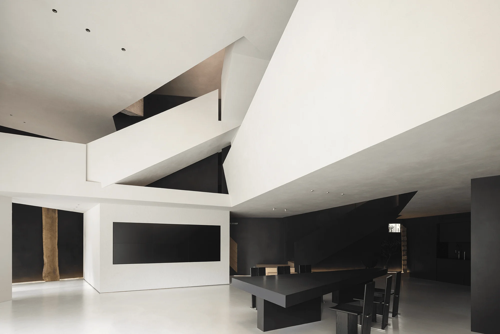
This commercial interior design project by AD ARCHITECTURE in Shantou, China, showcases minimalist geometric forms and dynamic spatial relationships.
Contents
Project Background
The ANBONG HOME Material Aesthetics Museum is located in Shantou’s burgeoning east coast district, surrounded by new residential developments, bustling markets, and shopping malls. This area has become a hub for Shantou’s new consumer demographic, characterized by a young, vibrant population with a taste for convenience and comfort. In response to this context, the design team sought to create a space that not only showcases the beauty of Beimei flooring and OIKOS art but also resonates with the discerning tastes of this new generation of consumers.
Design Concept and Objectives
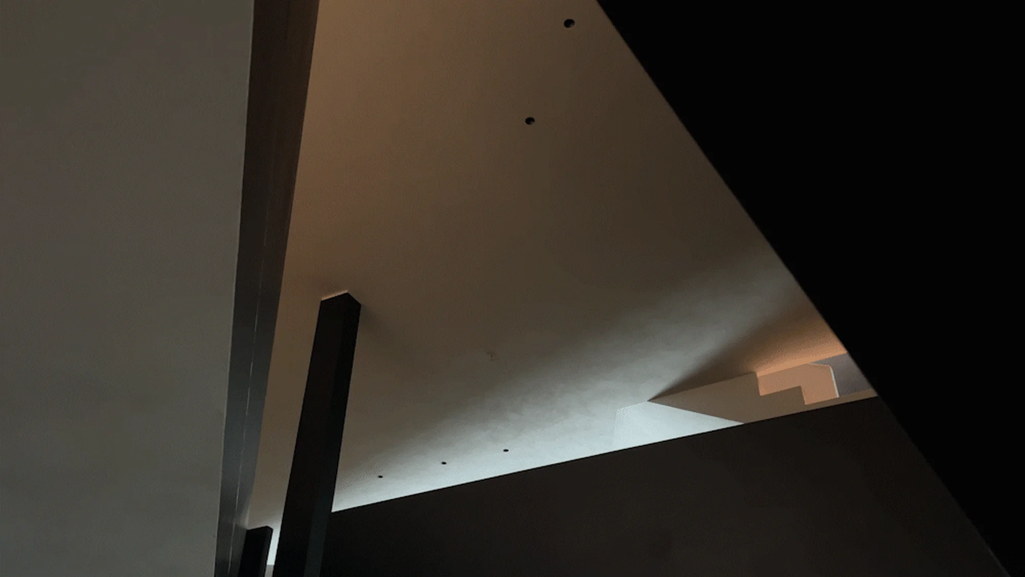
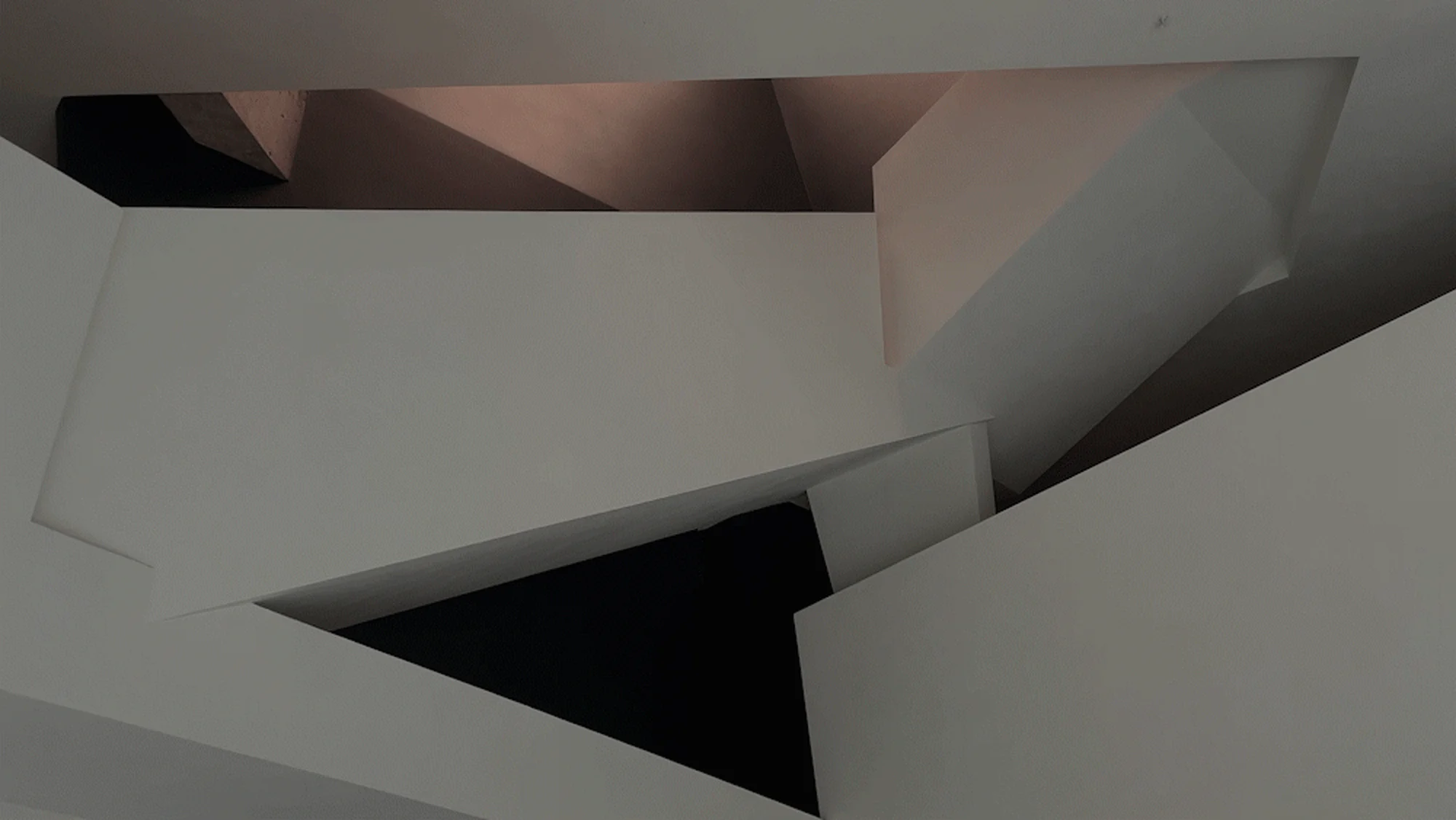
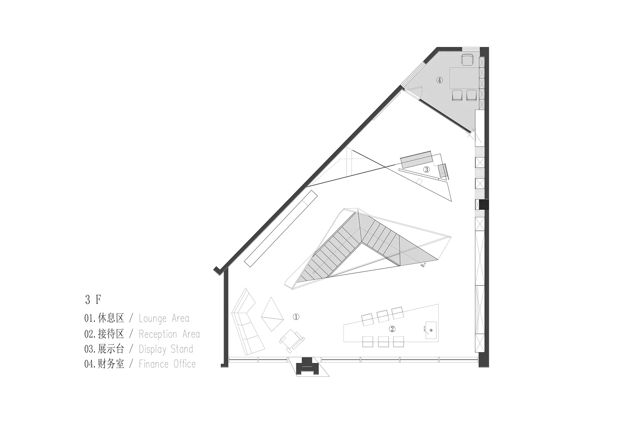
The primary design challenge was to transform an irregular site into an aesthetically pleasing and functional showroom. AD ARCHITECTURE, known for its innovative approach to spatial design, embraced this challenge. Lead architect Xie Pei He envisioned a space that would “awakenbalancewithinimbalance.” By strategically employing sloping planes and lines, the design team created a dynamic spatial composition that evokes a sense of harmony and intrigue while counteracting the initial sense of unease that the irregular site presented. This manipulation of spatial perception, achieved through meticulous aesthetic refinement, forms the core of the project’s design system.
Spatial Organization and Layout
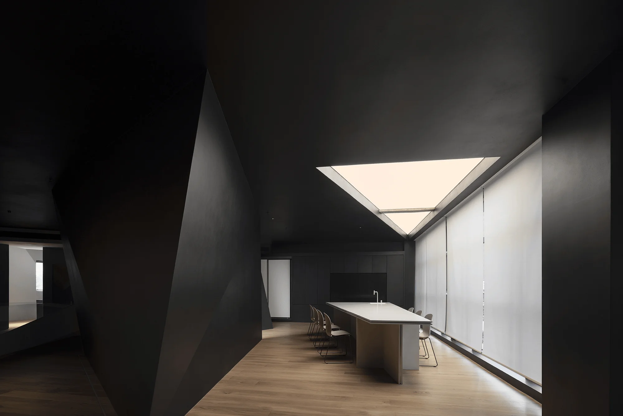
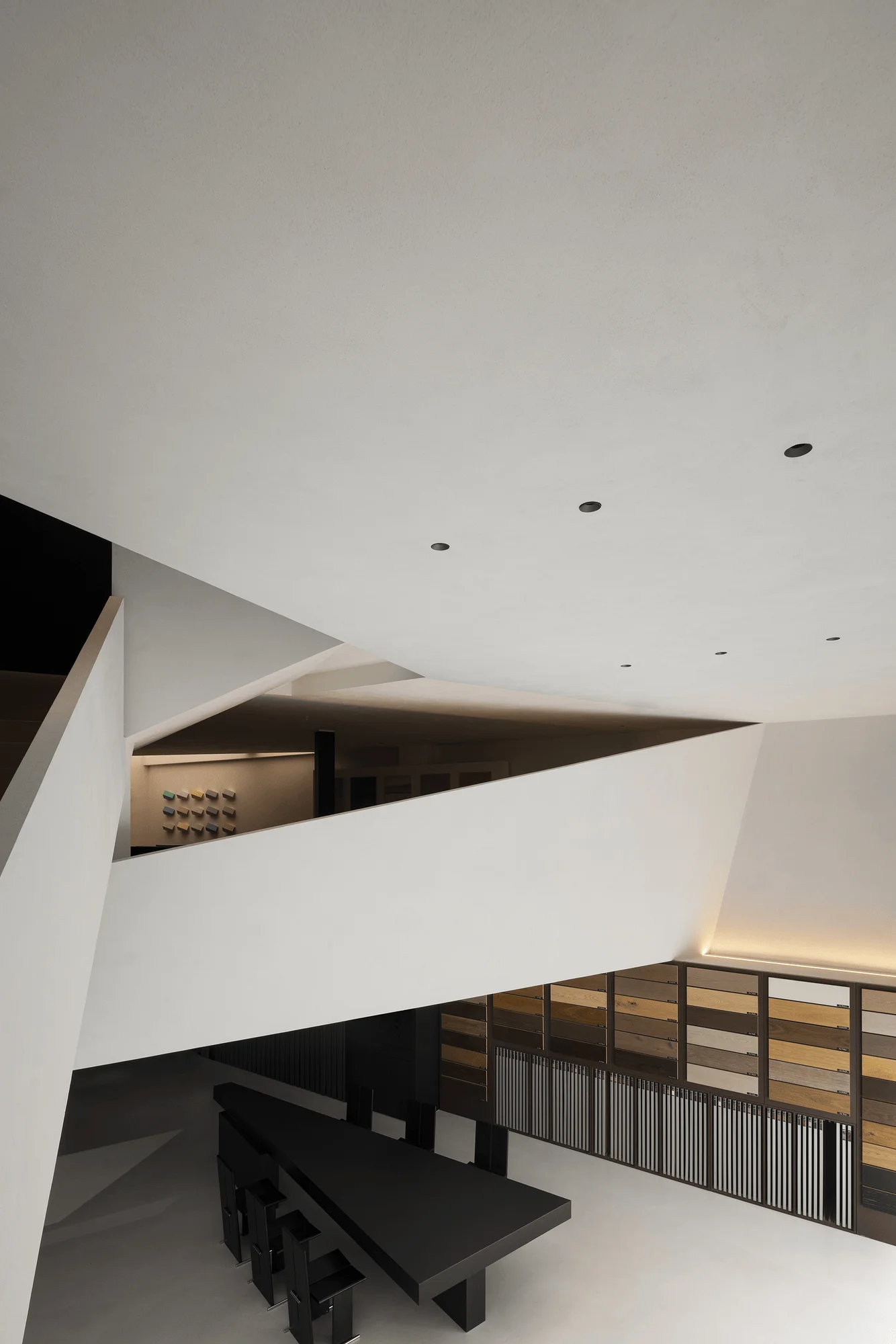
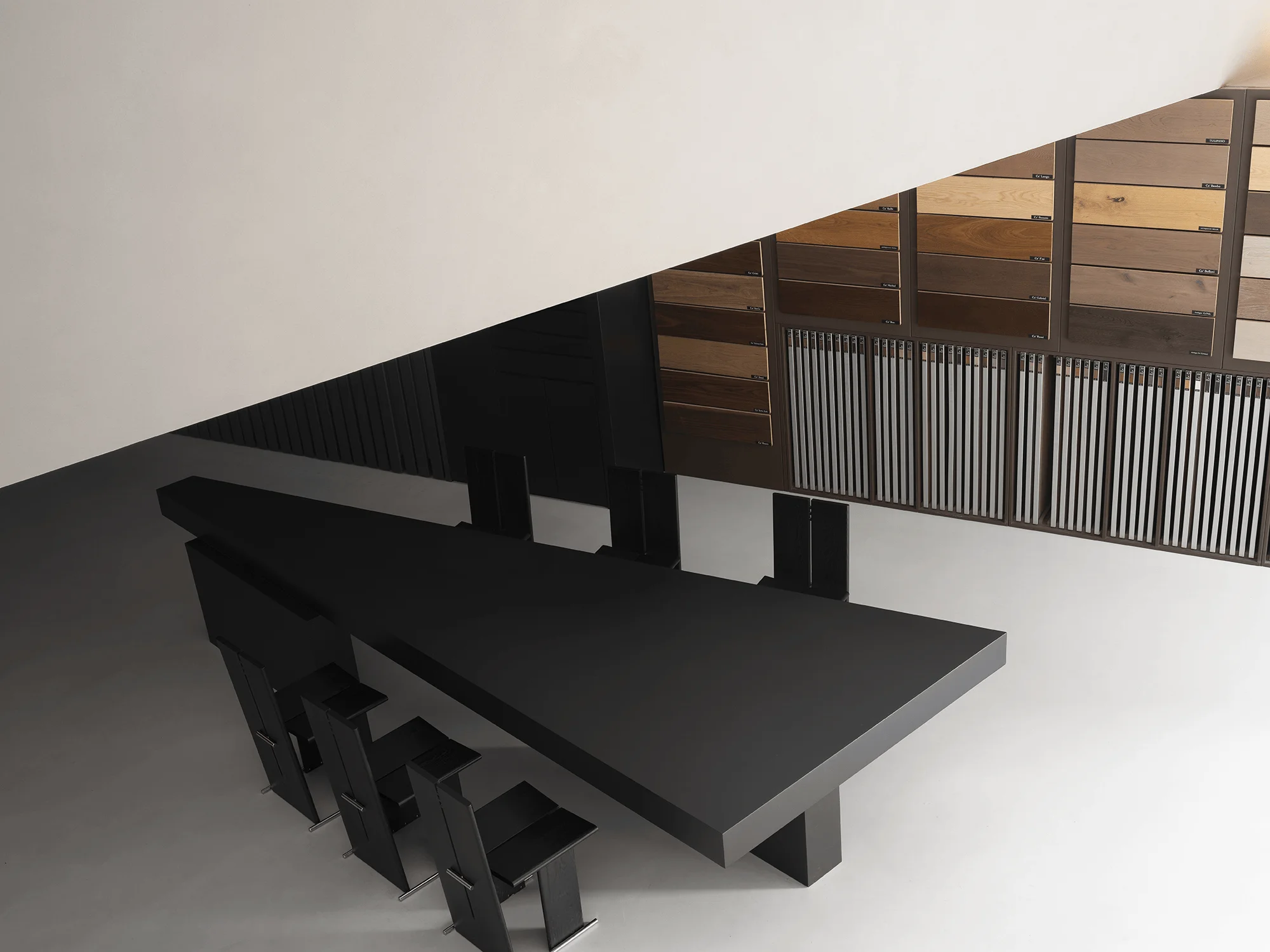
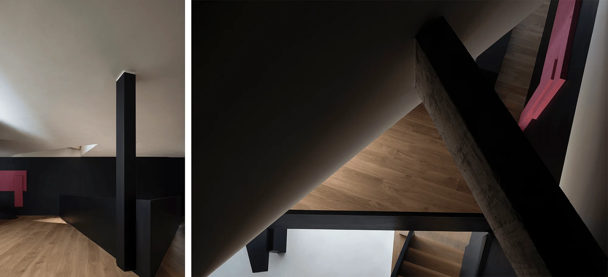
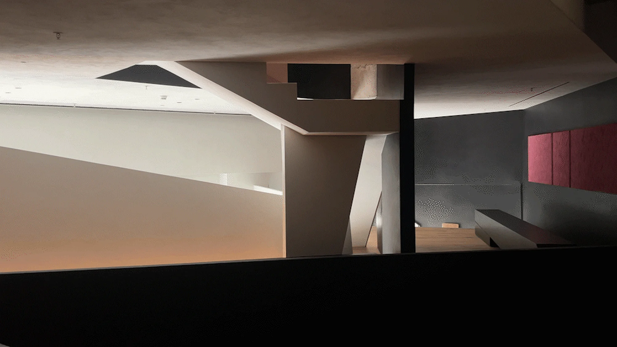
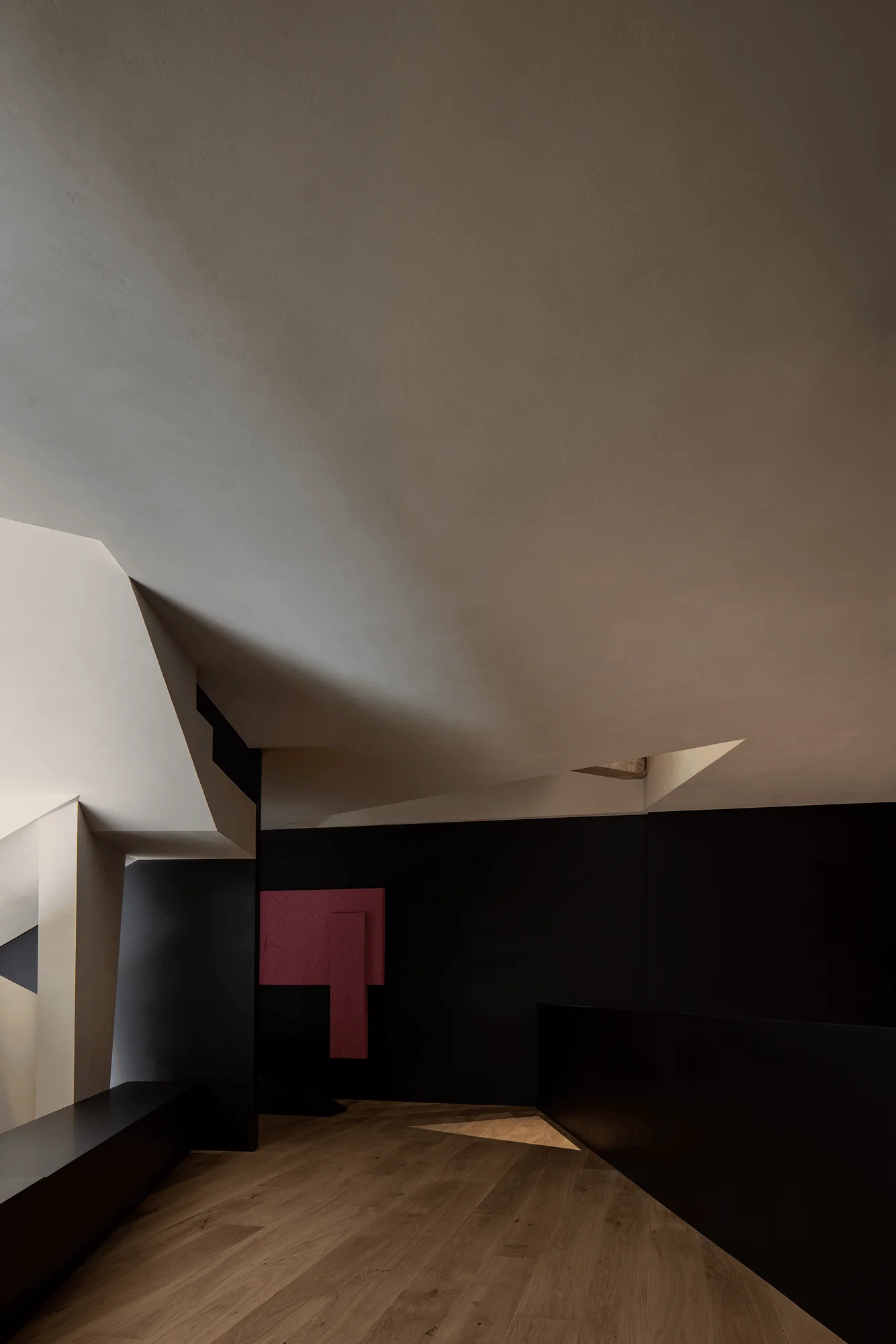
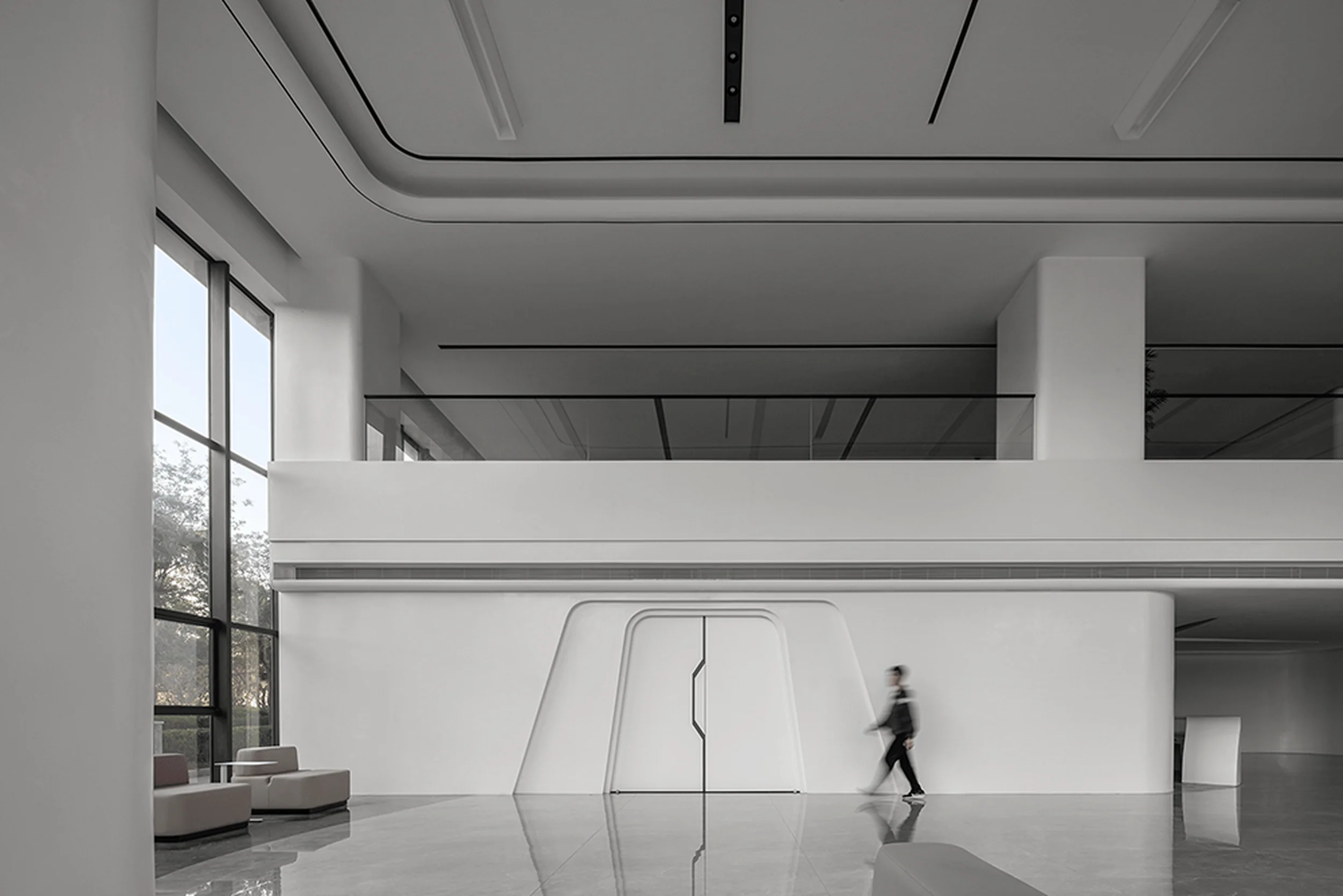
The museum’s entrance is designed as a compressed transitional space that serves as a prelude to the grandeur of the main hall. Upon entering, visitors are greeted by a multi-layered space with an interplay of diagonal lines and sloping planes. This dynamic configuration adds complexity and visual interest while maintaining a minimalist aesthetic. The black display walls accentuate the warm tones and textures of the wood flooring products, while the central reception area provides a versatile space for consultations, meetings, and social gatherings.
Exterior Design and Aesthetics
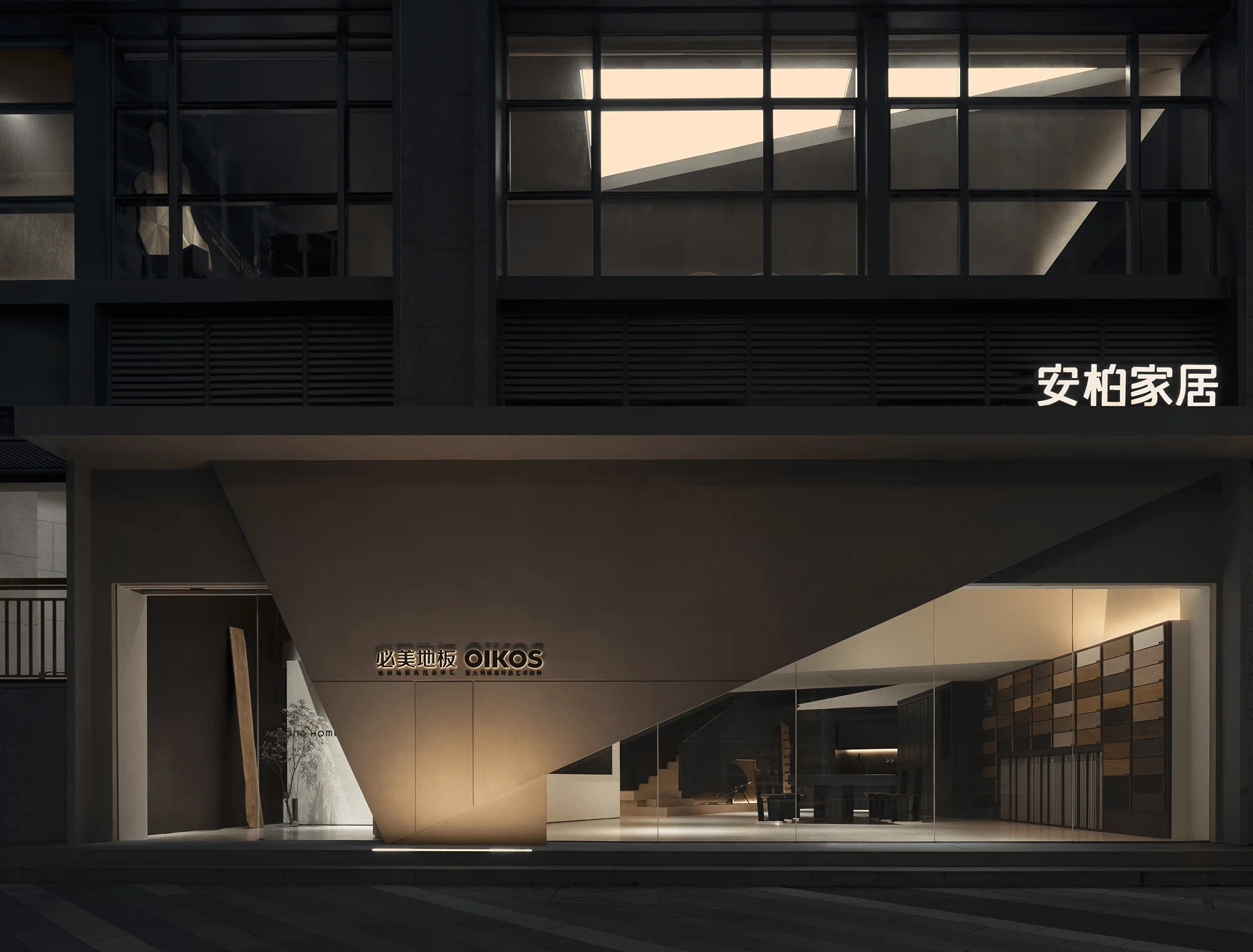
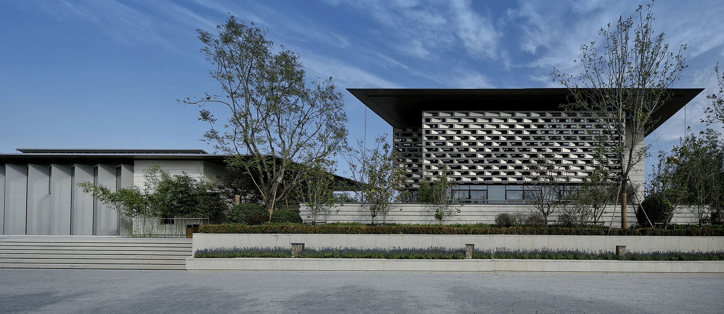
The building’s exterior breaks away from the constraints of the original structure with bold triangular elements that extend from the interior. This design intervention strengthens the building’s identity and enhances its commercial appeal. The facade’s strong geometric language creates a striking visual presence within the surrounding urban fabric.
Circulation and Visual Engagement
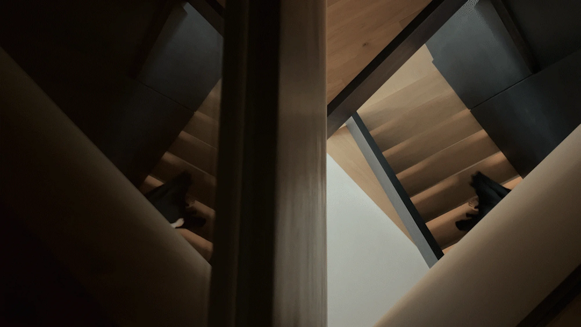
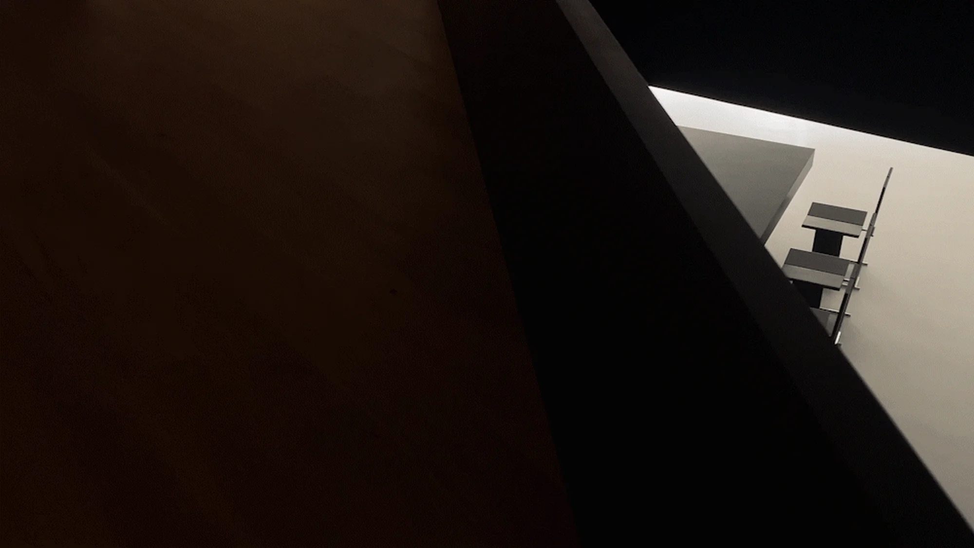
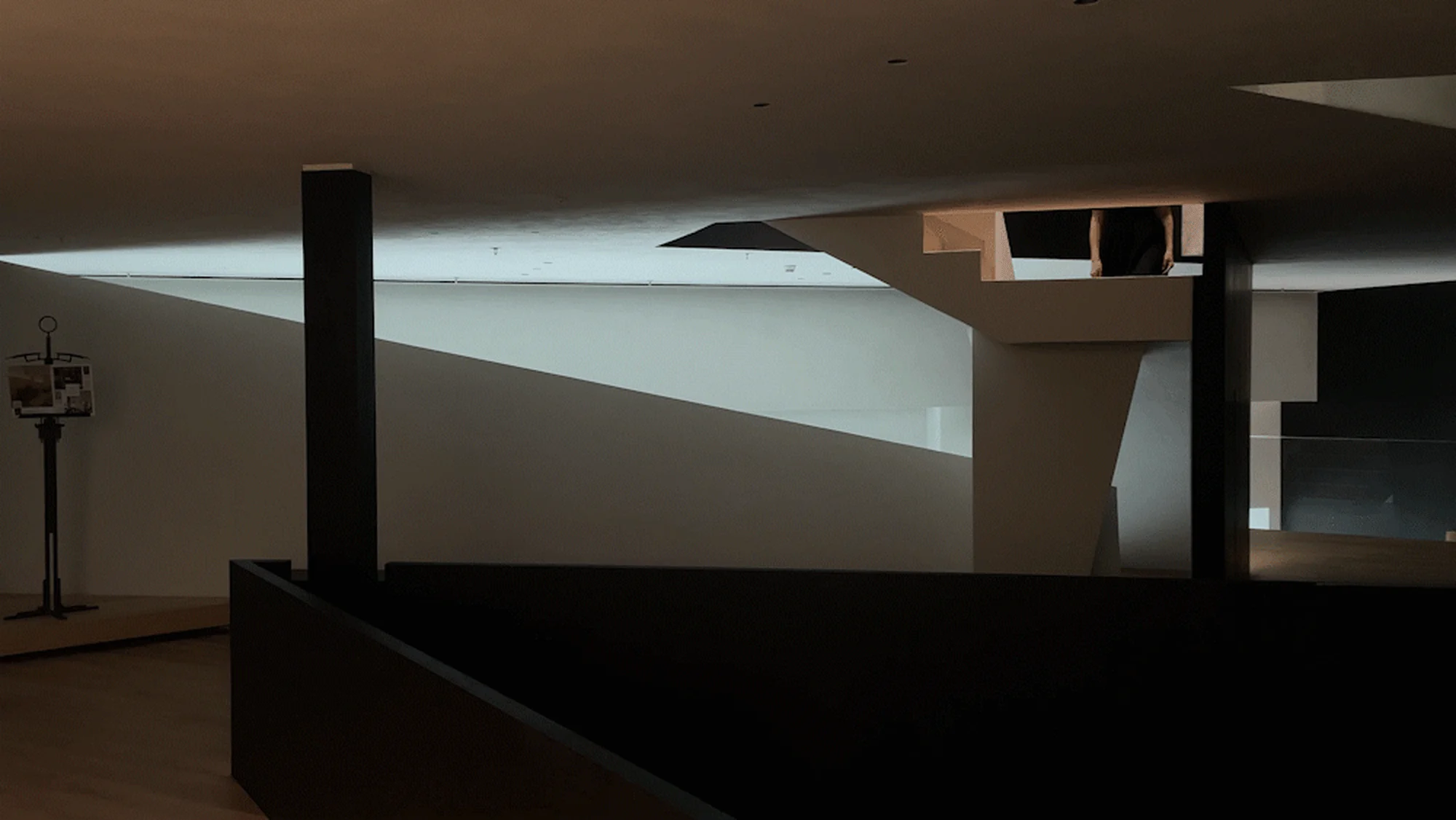
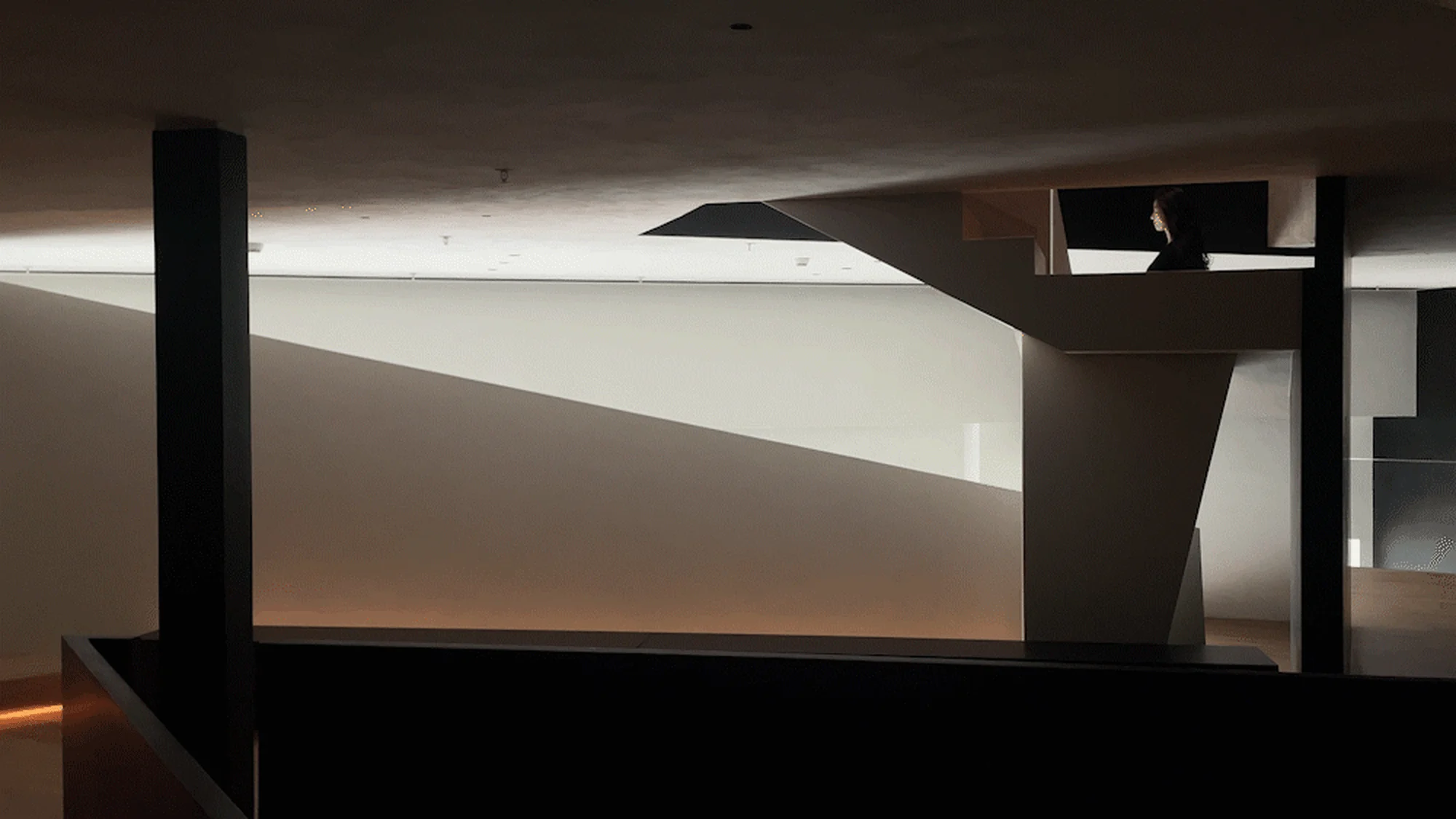
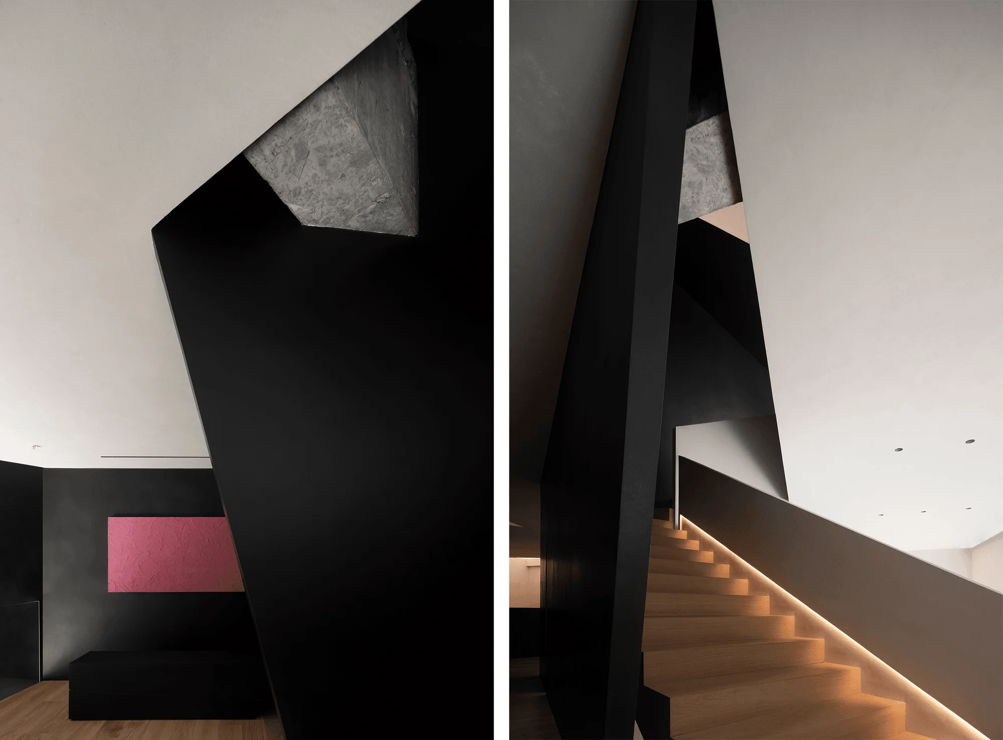
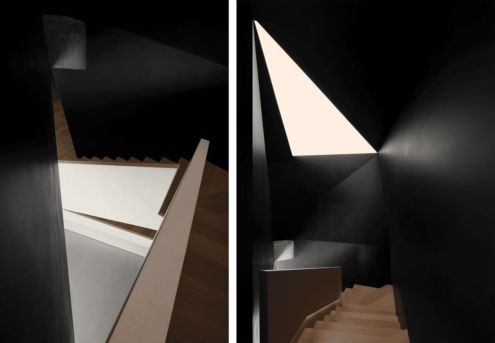
Three substantial staircases connect the different levels of the museum, creating a sense of vertical continuity. By strategically opening up the floor slabs and employing design techniques such as digging, shielding, penetrating, stacking, and bypassing, the architects have introduced a dynamic circulatory flow. This approach maximizes spatial exploration, providing visitors with an extended journey through the museum’s diverse offerings.
Integration of Natural Elements
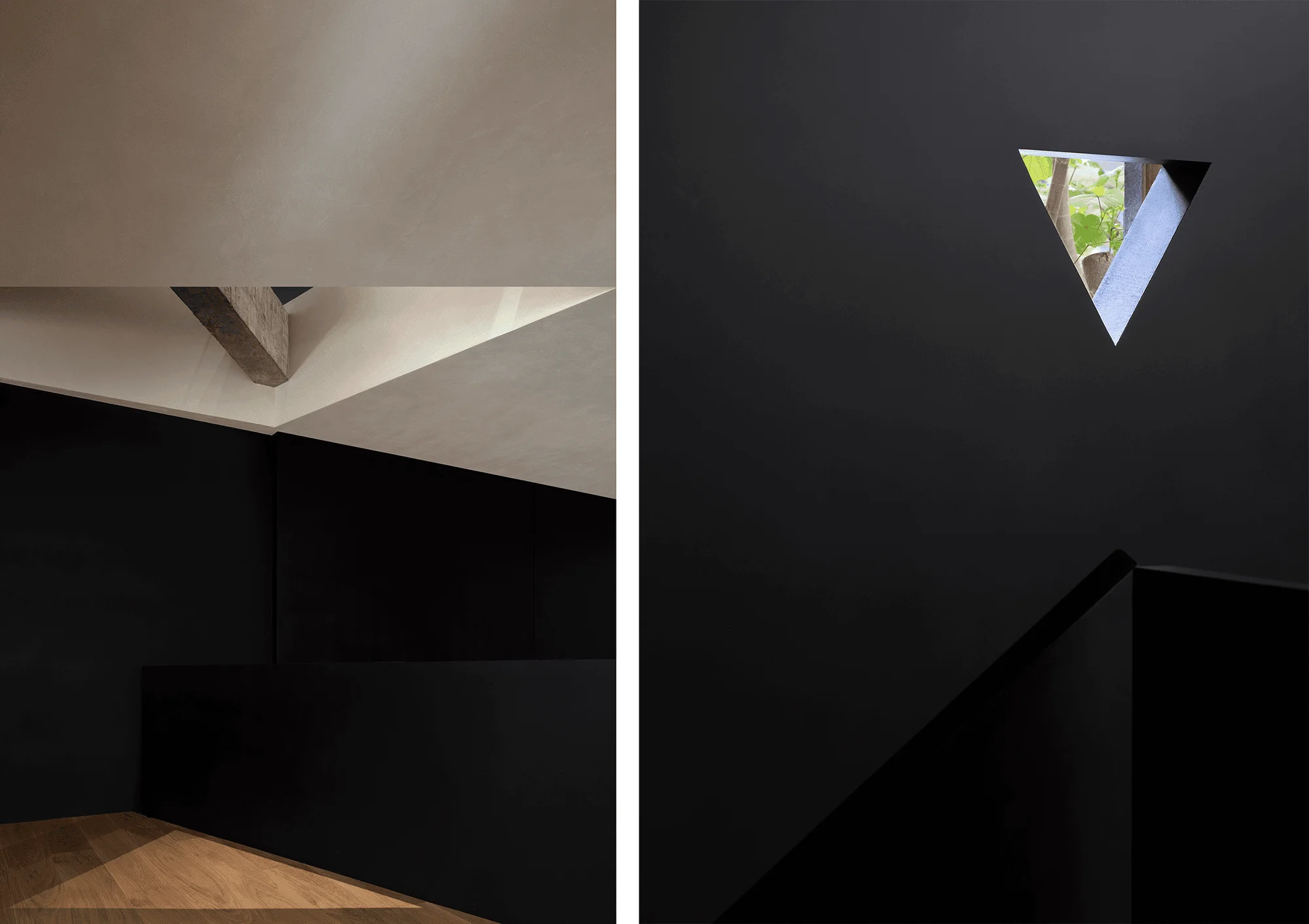
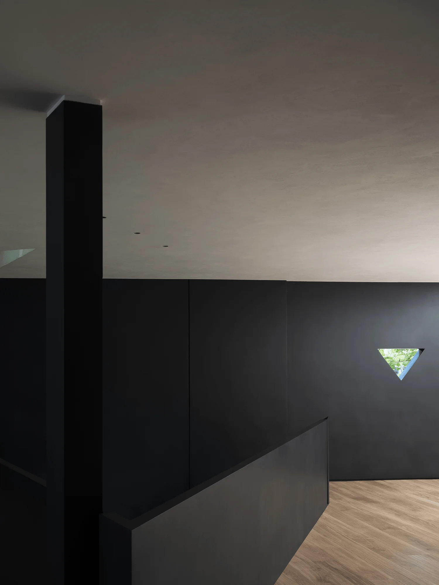
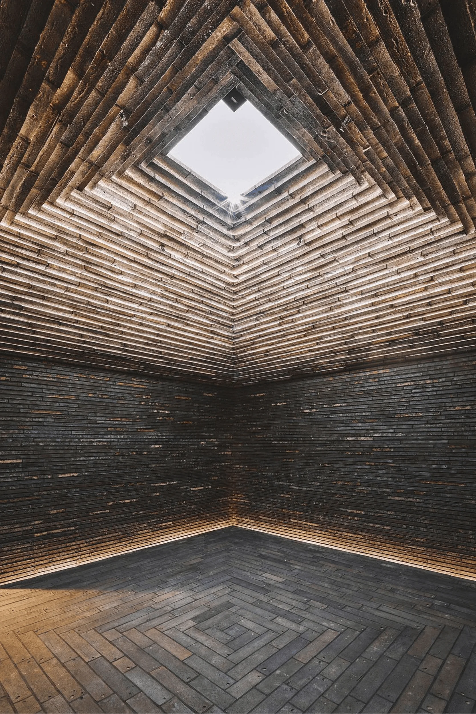
Natural light plays a crucial role in enhancing the spaciousness and ambiance of the museum. An inverted triangle on the mezzanine level frames a view of an outdoor tree, bringing nature into the interior and creating a unique visual experience. The architects have skillfully integrated natural elements and daylight to complement the building’s minimalist geometry.
Materiality and Construction
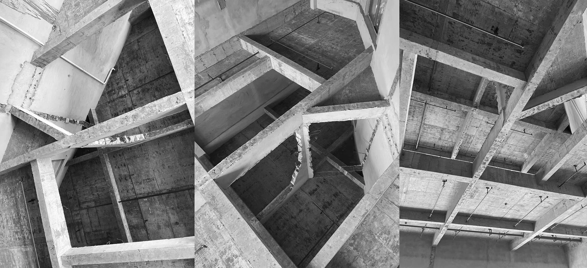
Exposed concrete structural beams become an unexpected design feature, adding an industrial aesthetic to the refined interior. The interplay of diagonal lines and sloping surfaces generated by the triangular geometry creates a dynamic spatial experience. This interplay is further emphasized by the movement of people within the space, highlighting the relationship between human interaction and architectural form. The selection of materials, such as textured walls and wood flooring, adds warmth and tactility to the minimalist environment.
Project Information:
Architects: AD ARCHITECTURE
Area: 300 m²
Year: 2024
Location: Shantou, China
Main Materials: Handmade Coatings, Micro Cement, Metal Mesh, Concrete, Light-transmitting Film
Project Type: Commercial Buildings
Photographer: Ou Yang Yun


