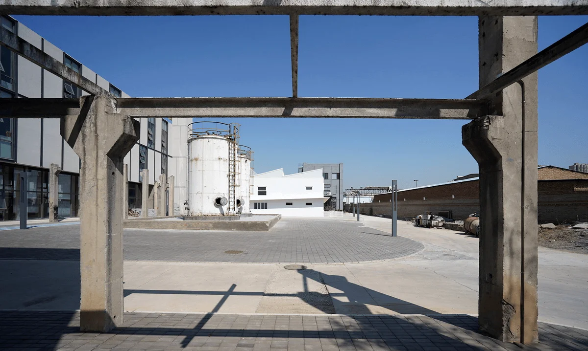
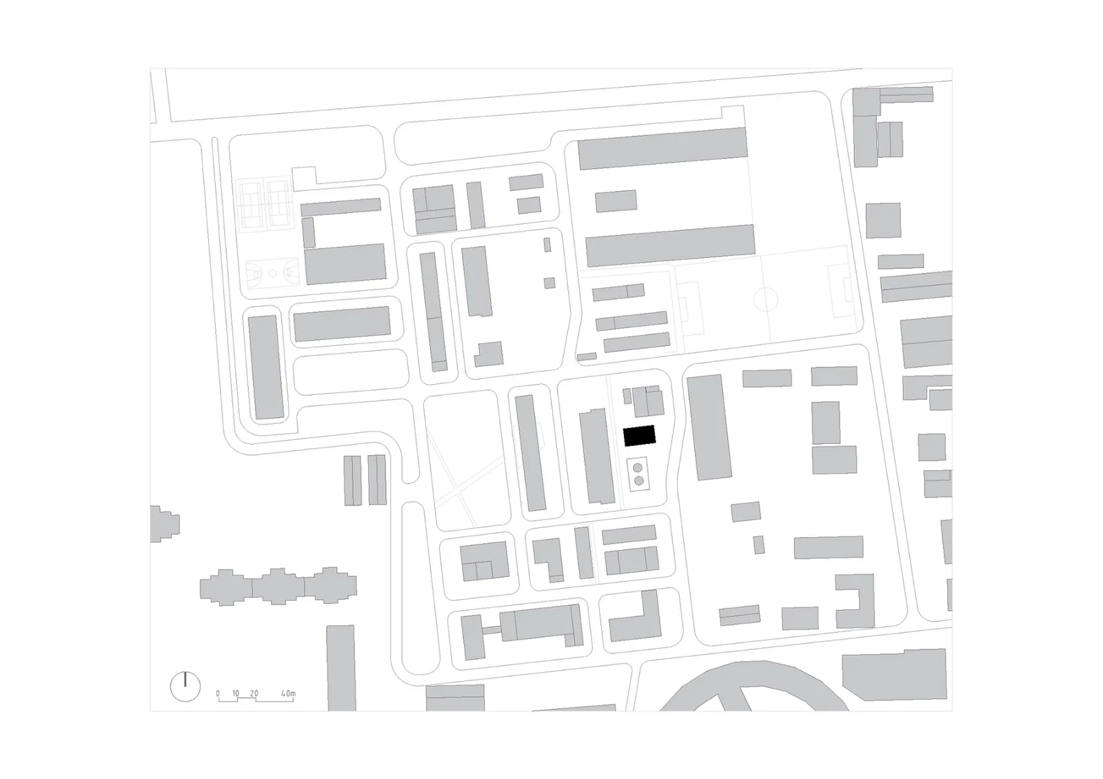
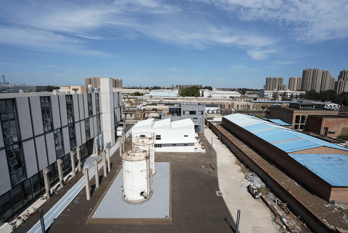
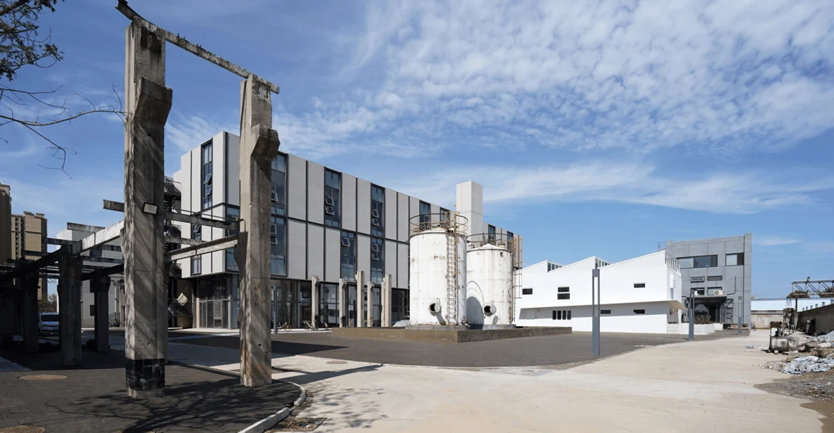
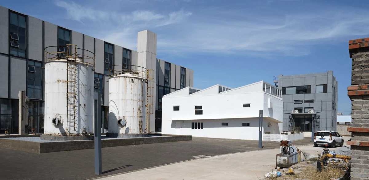
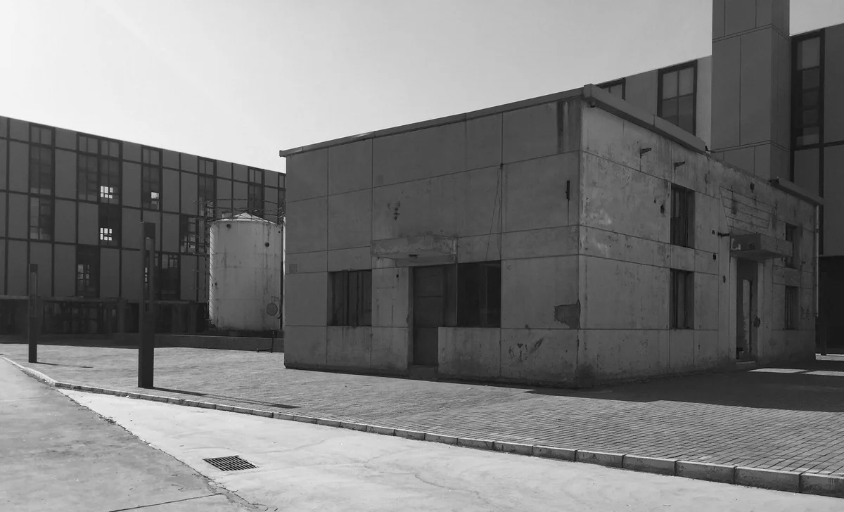
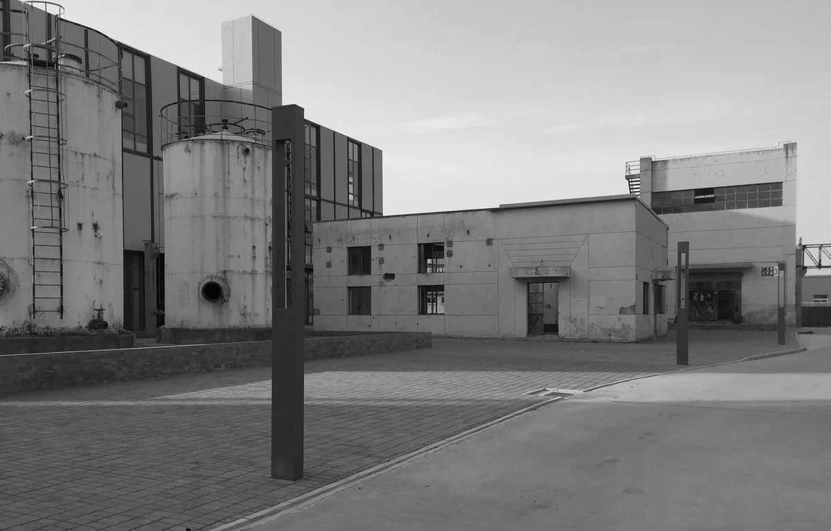
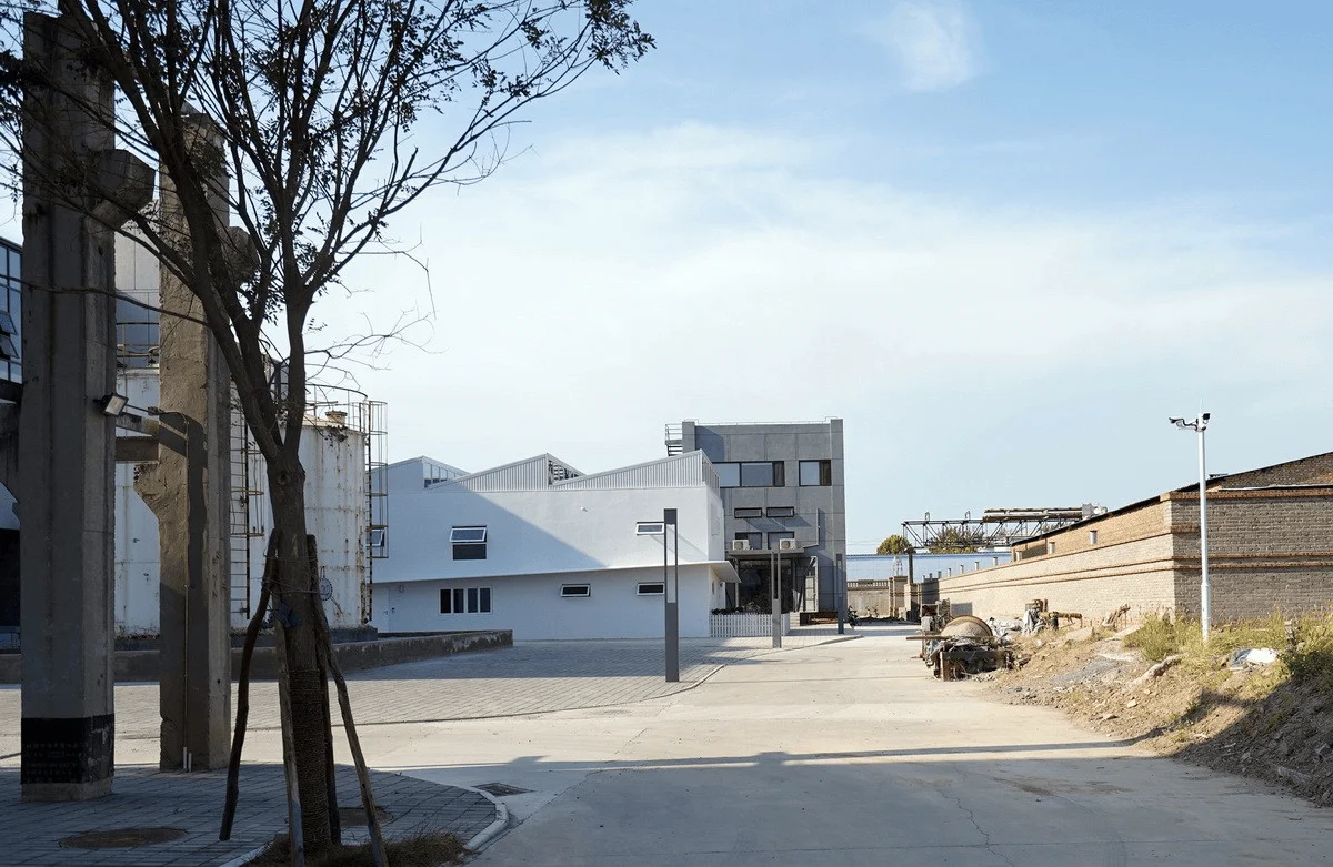
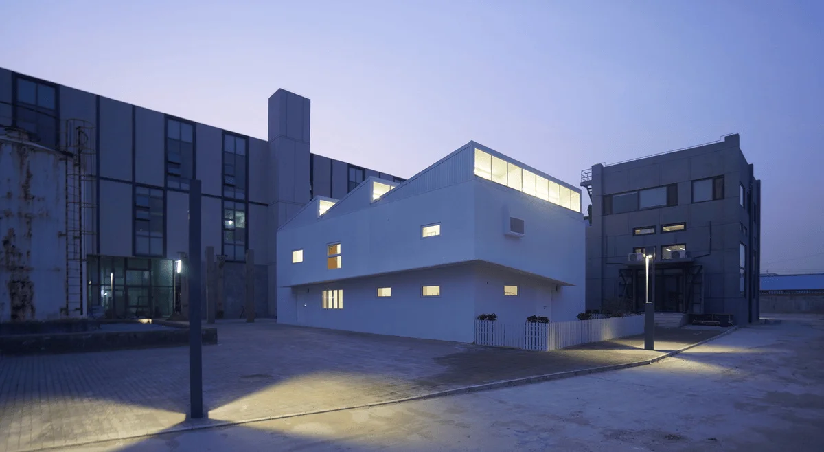
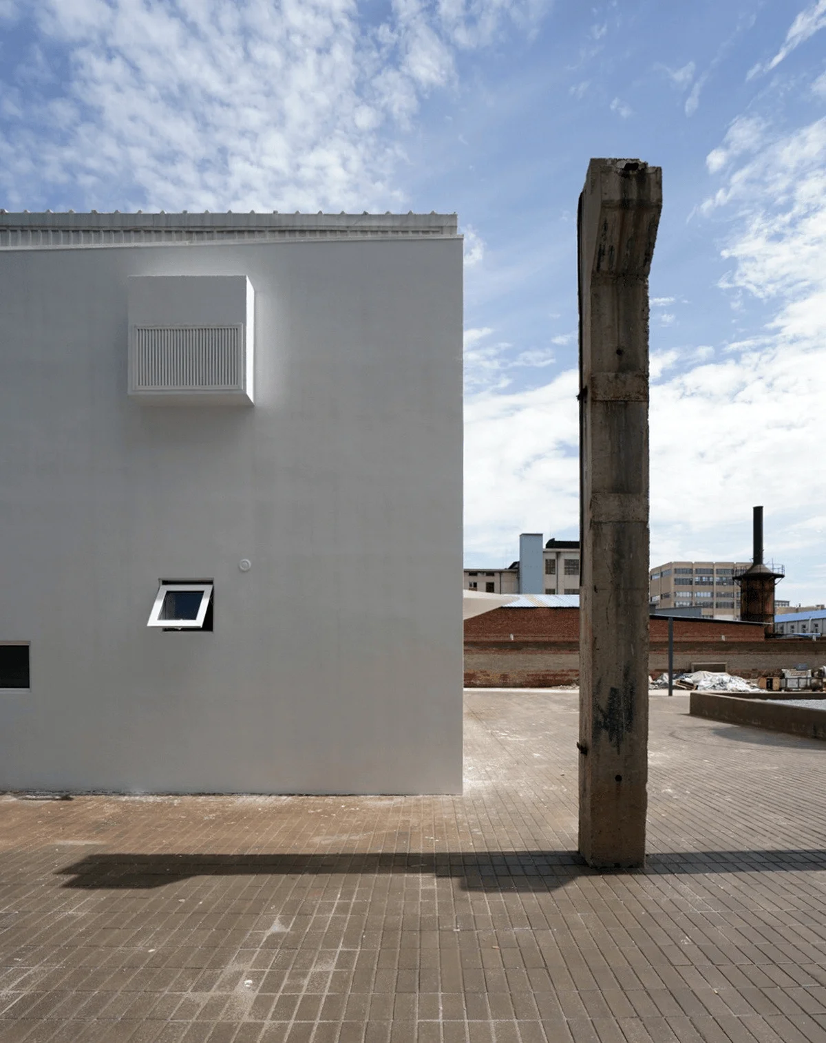
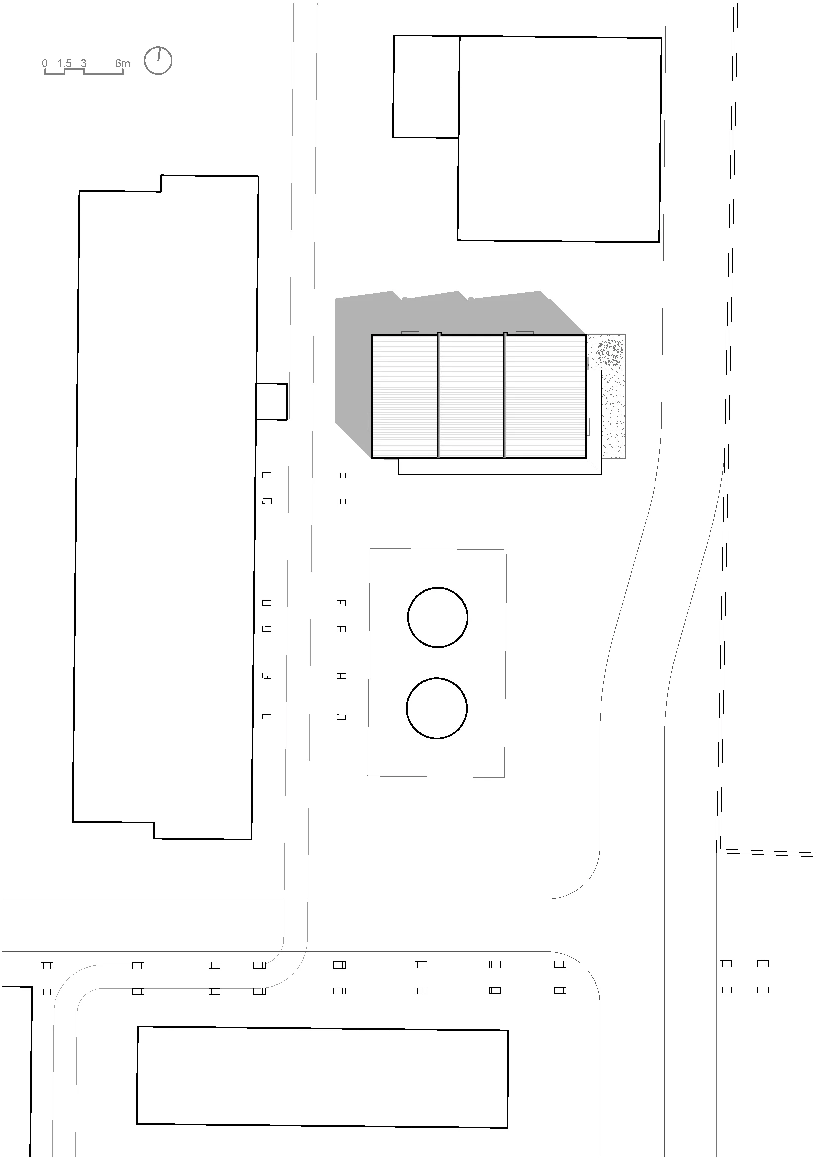
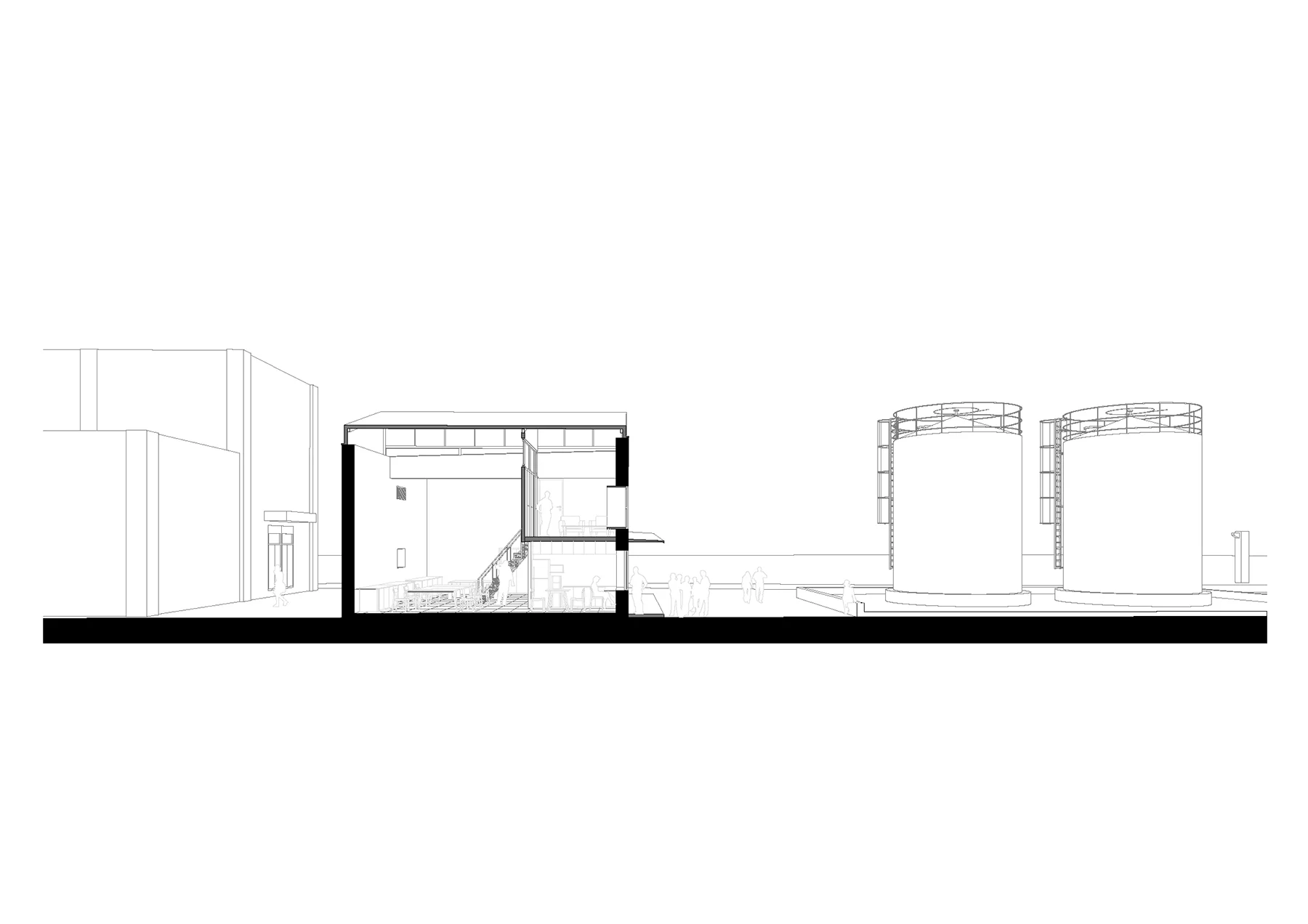
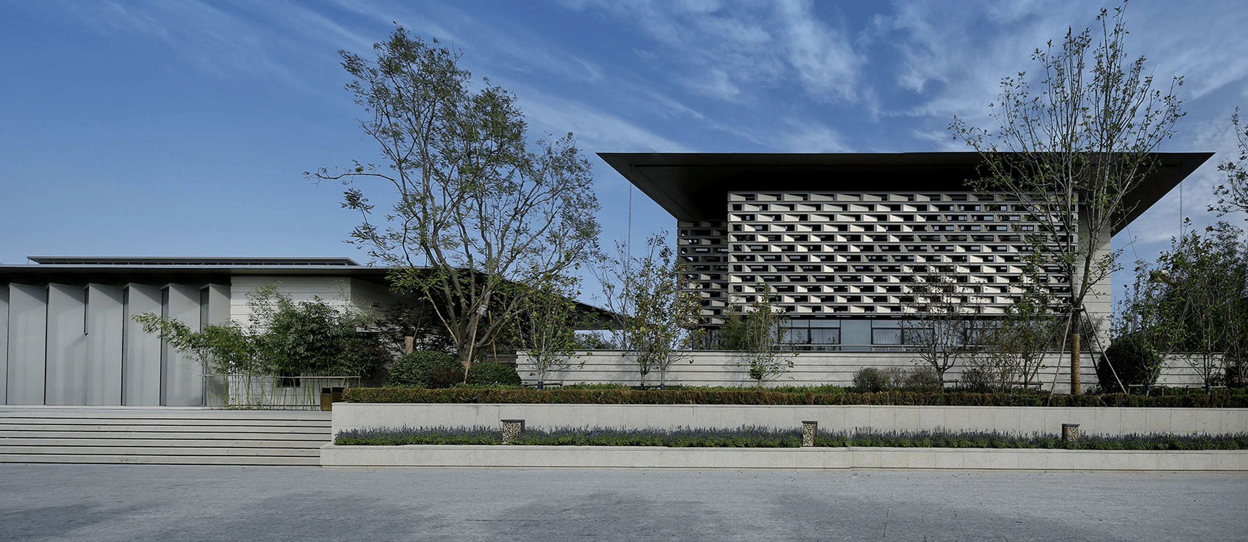
Located in the outskirts of Beijing, Atelier Heimat’s new studio is a testament to the power of simplicity. Situated in a former chemical factory, the site, now a creative park, boasts sparse textures and vast distances between buildings. The structure, a small single-story building in the park, sits in an urban environment, surrounded by large industrial tanks, creating a small, open square. The studio is the result of a renovation project that sought to transform an isolated unit into a space that engages with its environment and promotes a sense of community.
The design team faced challenges due to budget constraints and the need for quick construction. In response, they opted for a minimal approach, adding only necessary elements to refine the space and influence human behavior. The design team envisioned a space that would not only serve as a functional workspace but also as a place where people could gather, collaborate, and relax.
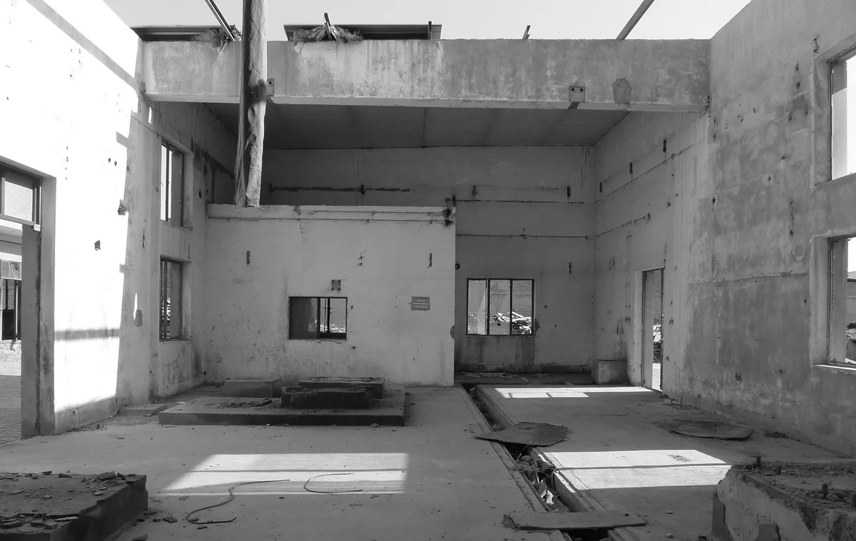
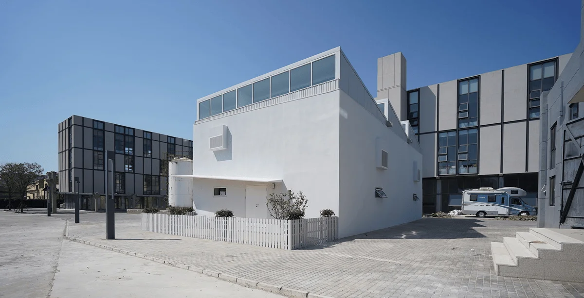
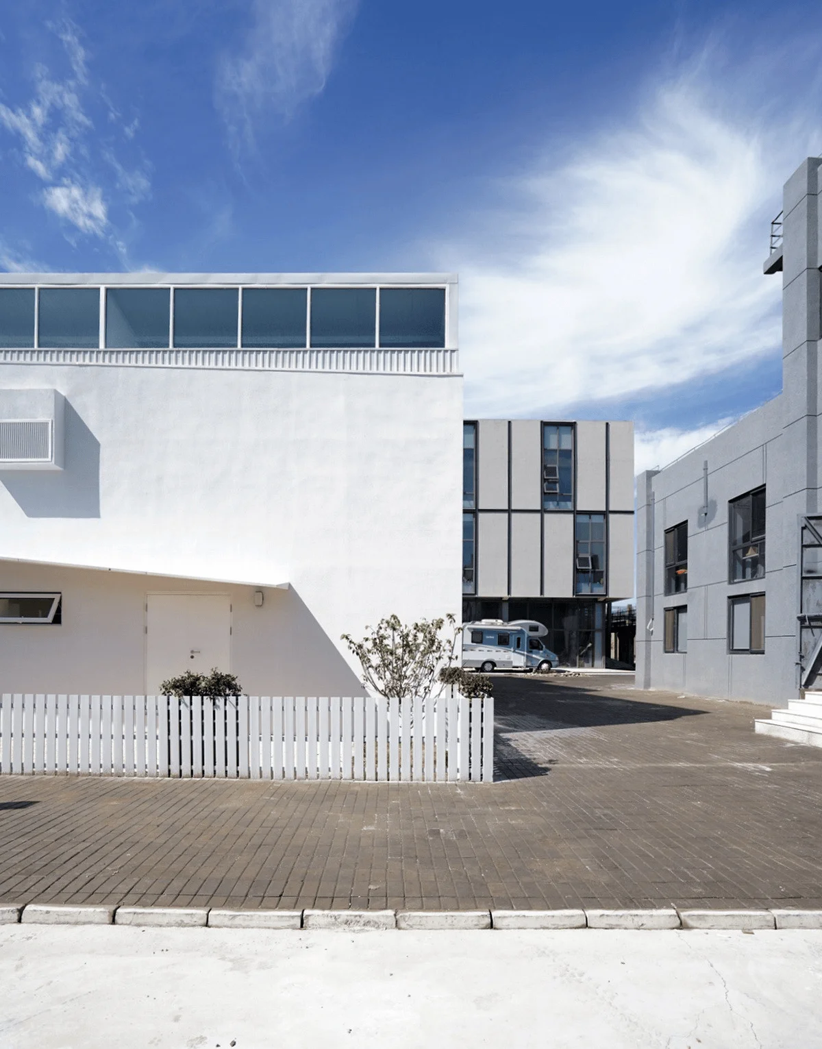
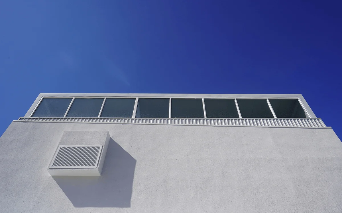
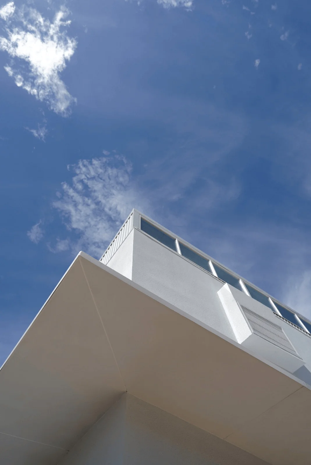
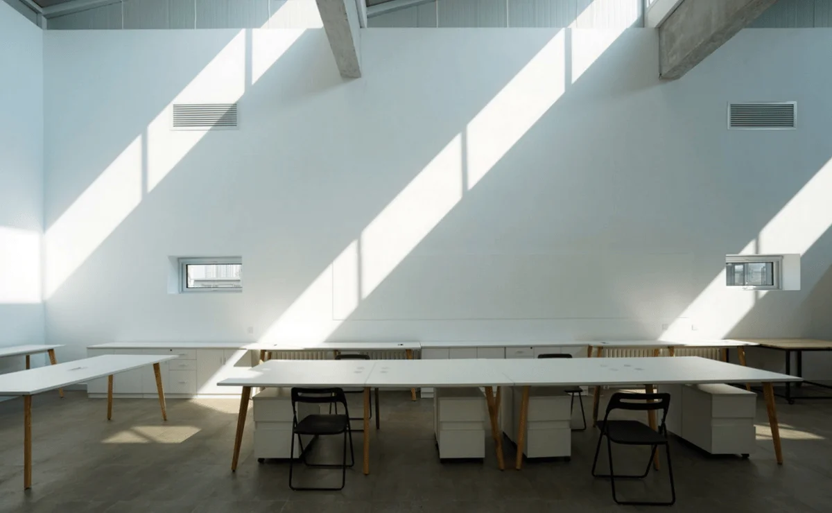
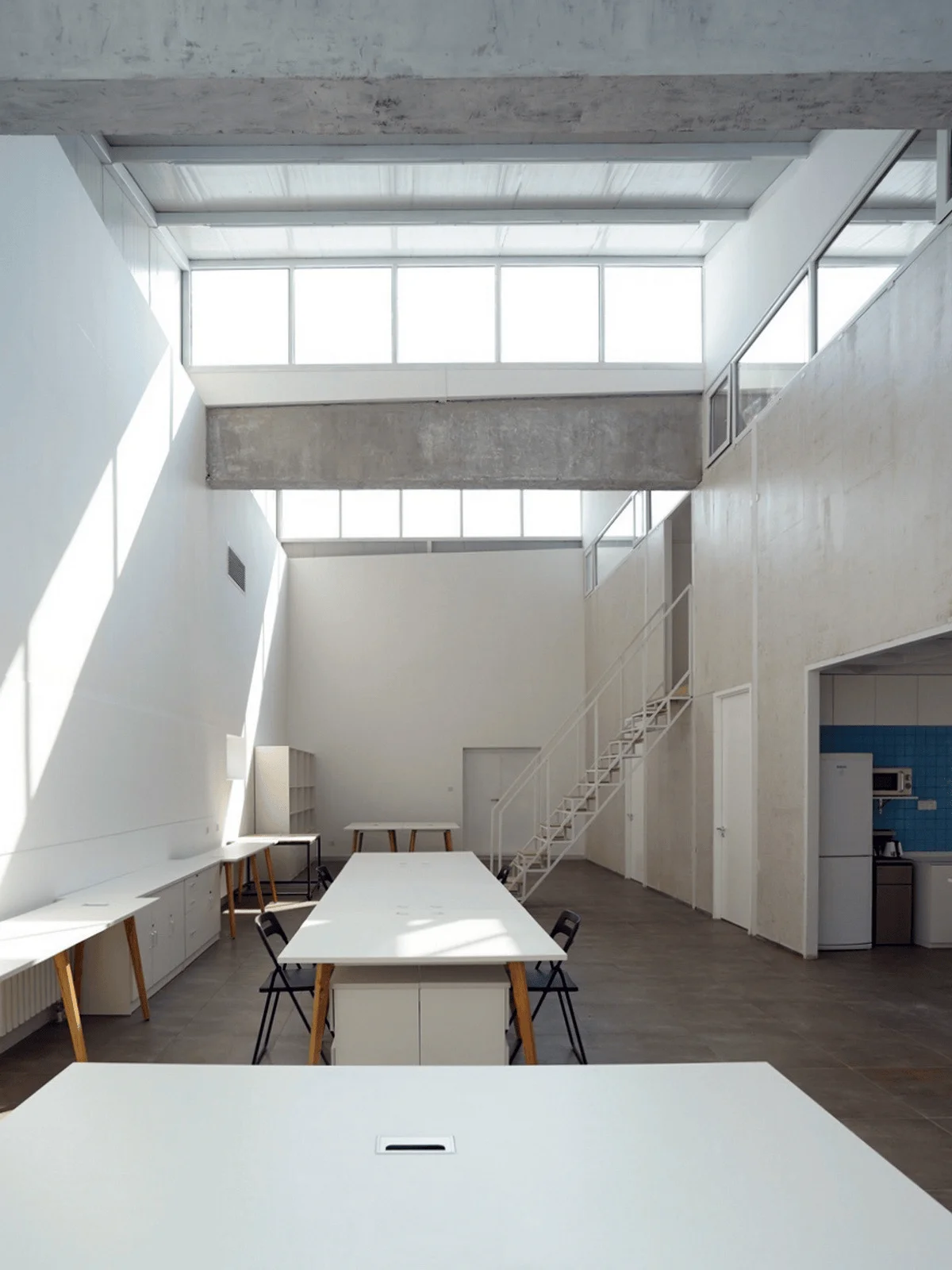
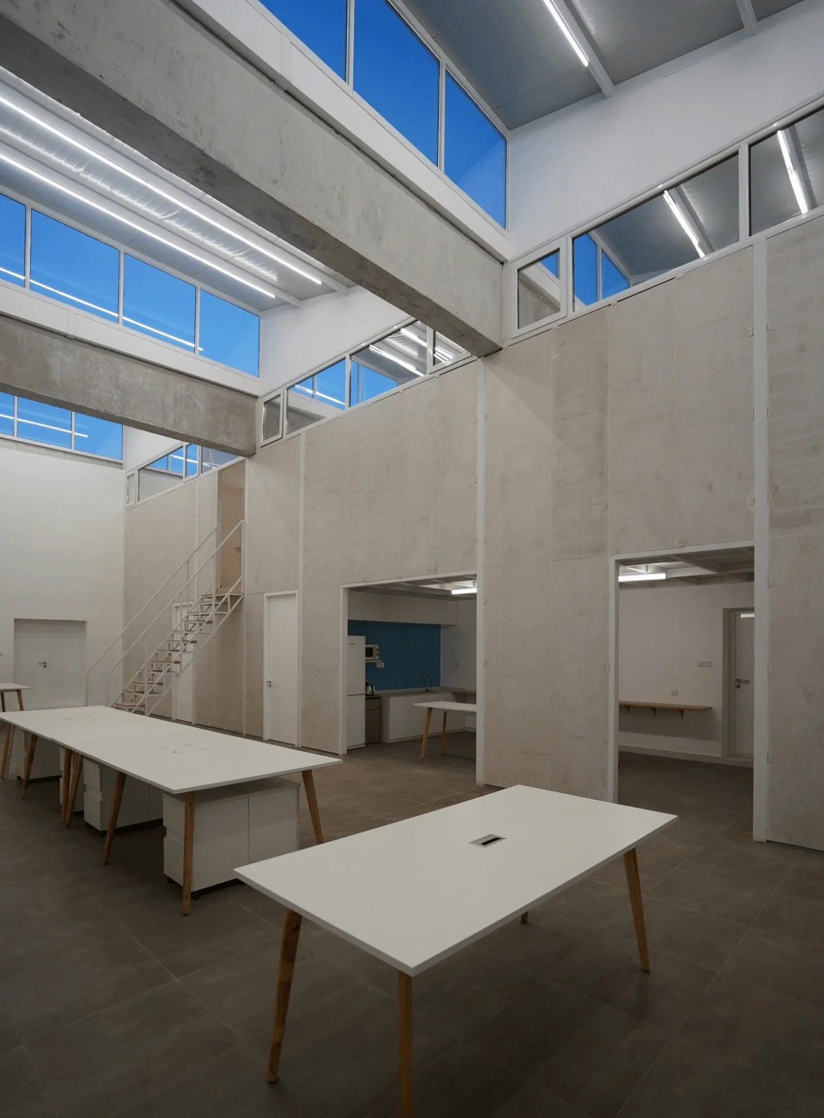
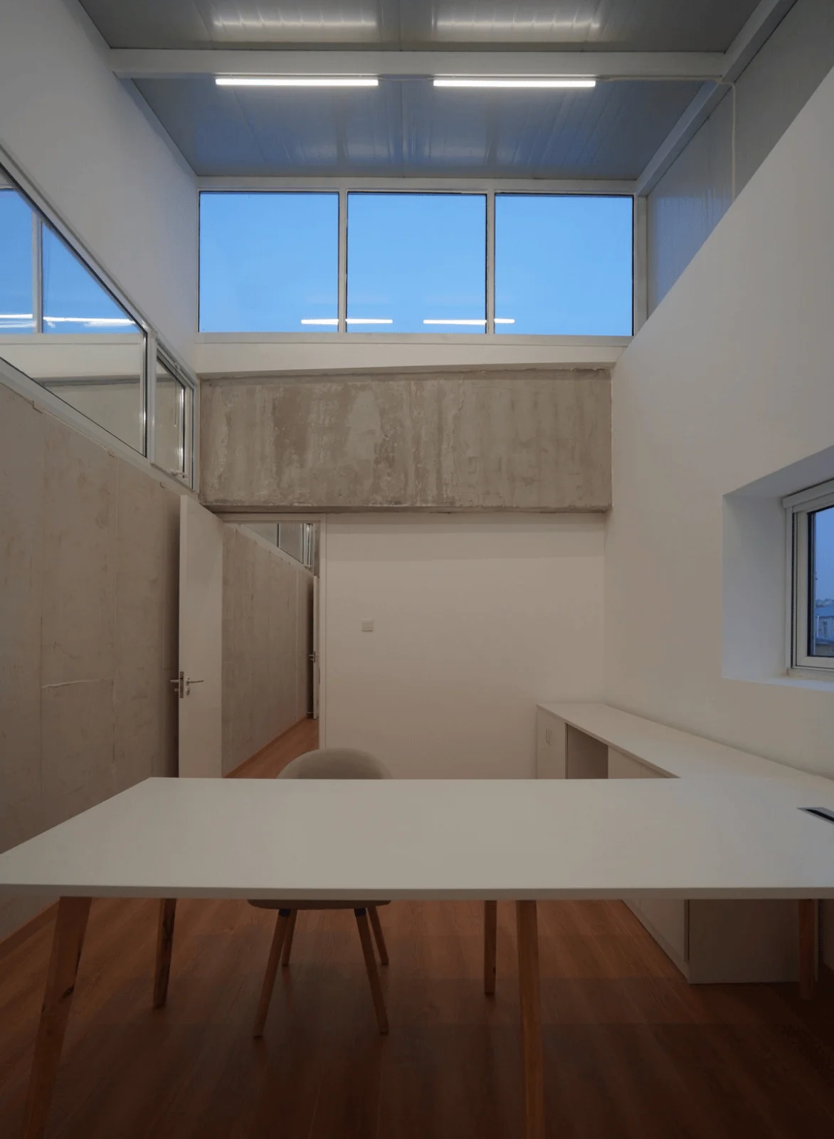
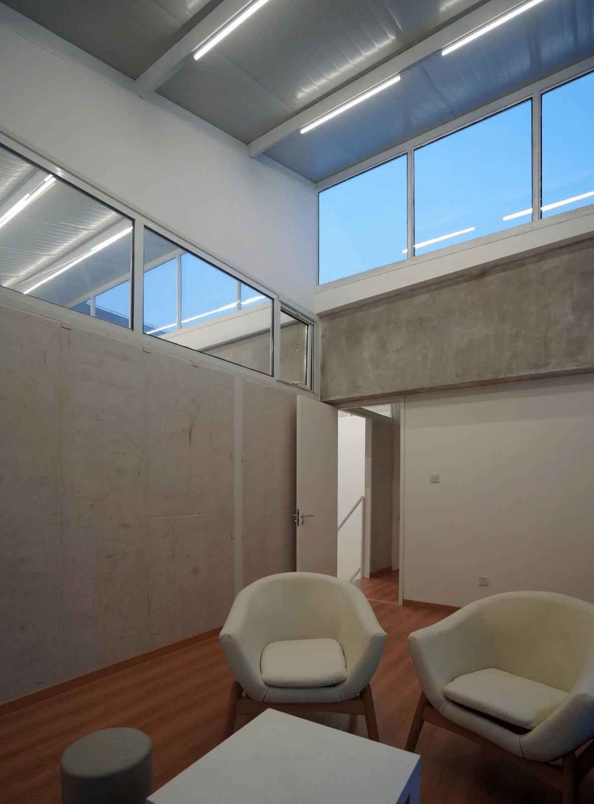
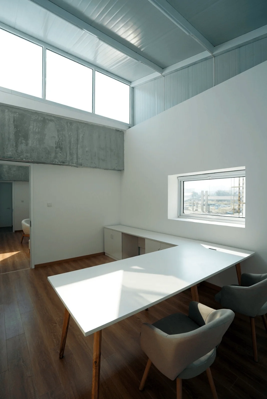
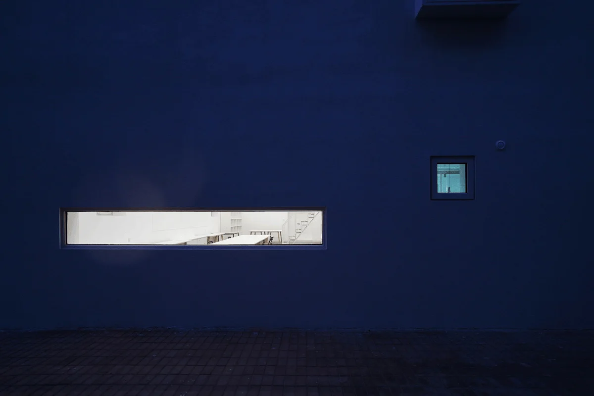
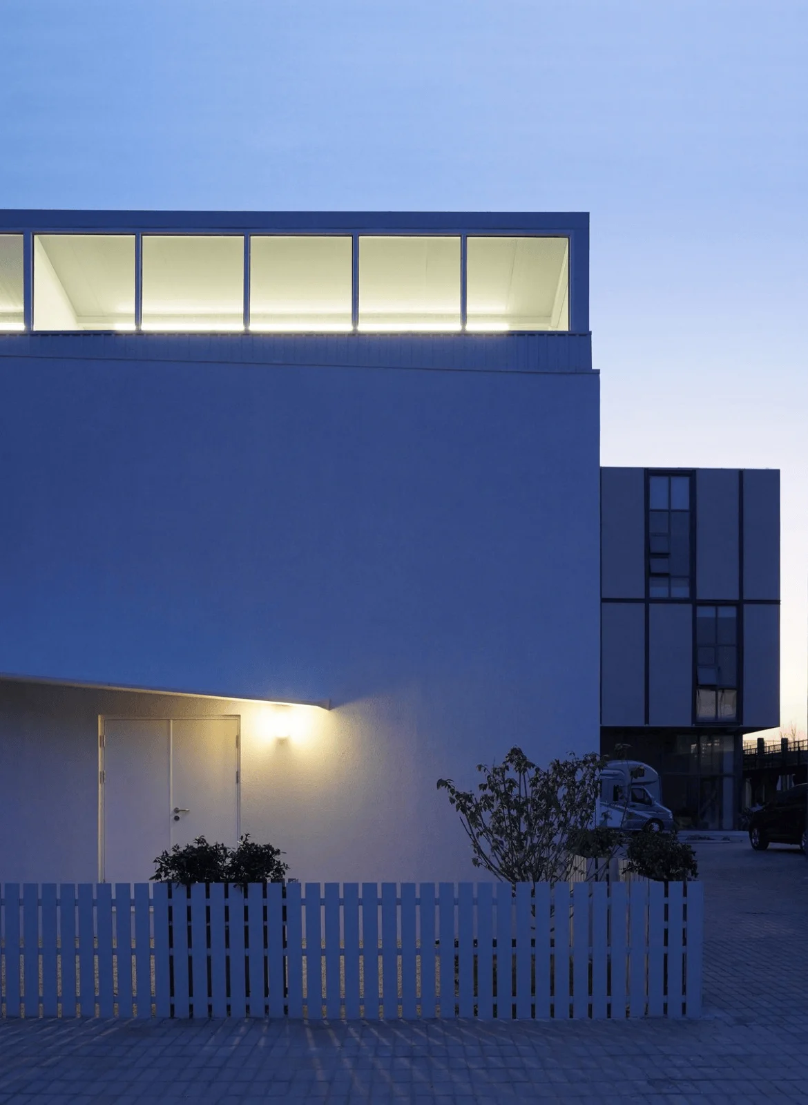
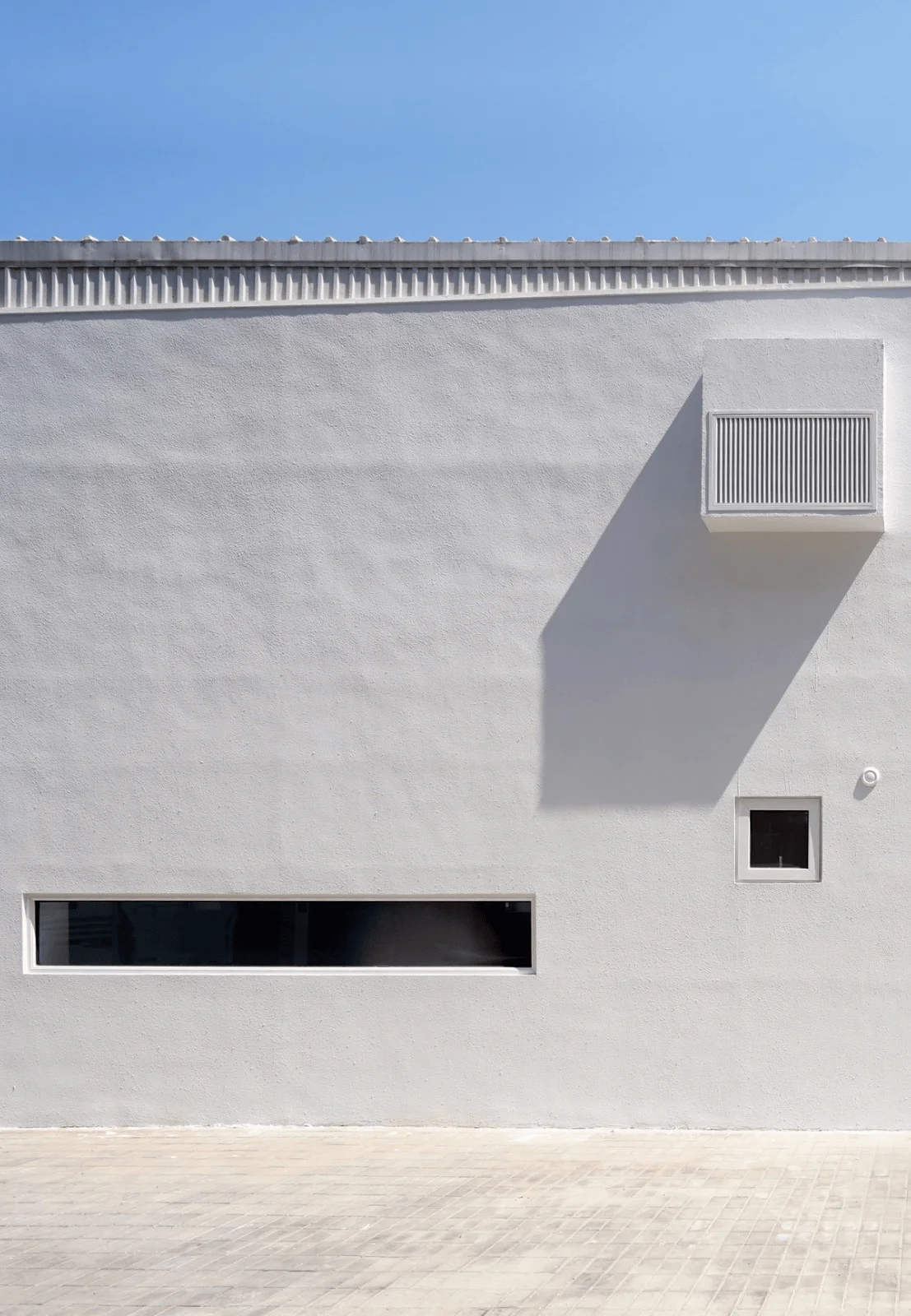
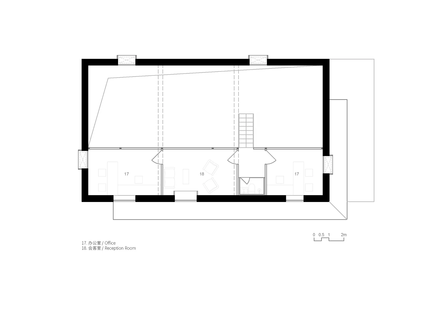
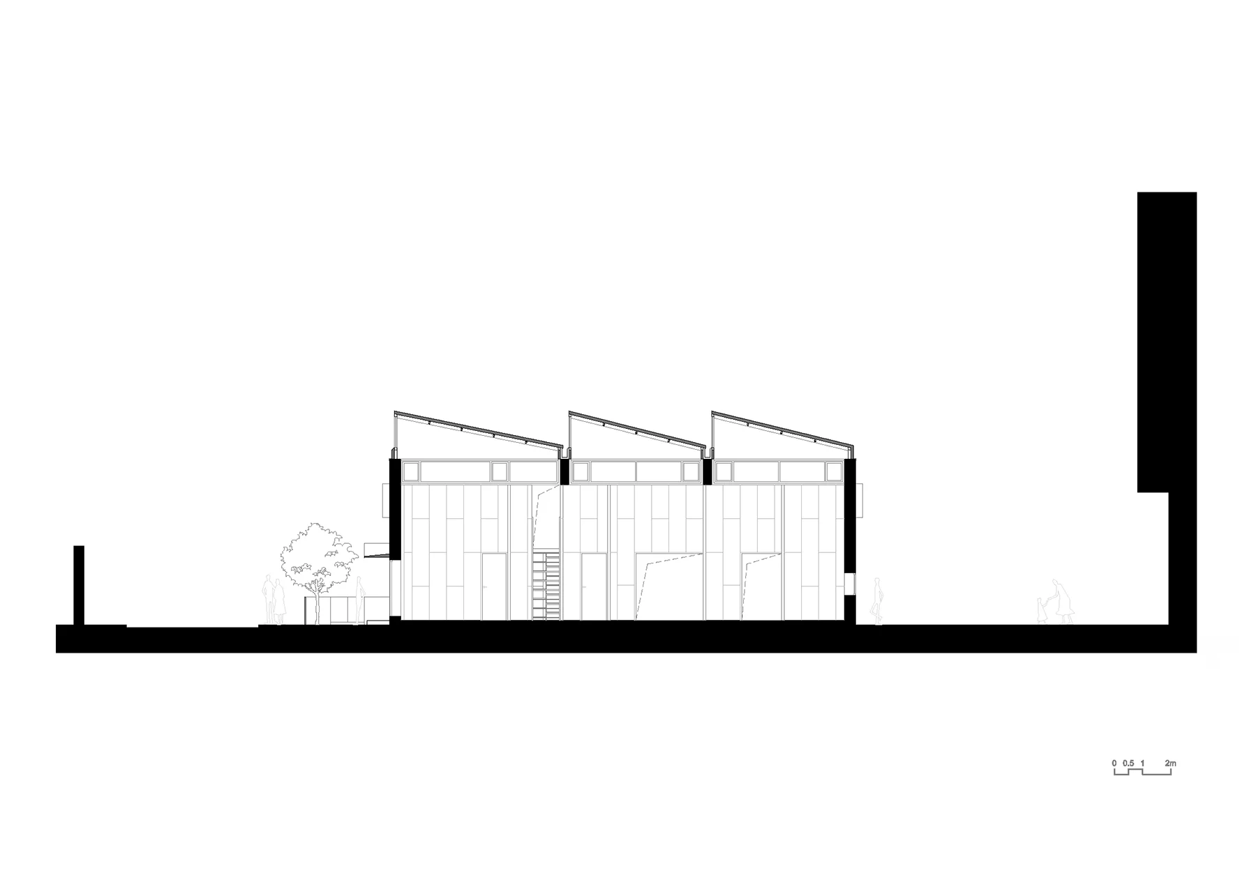
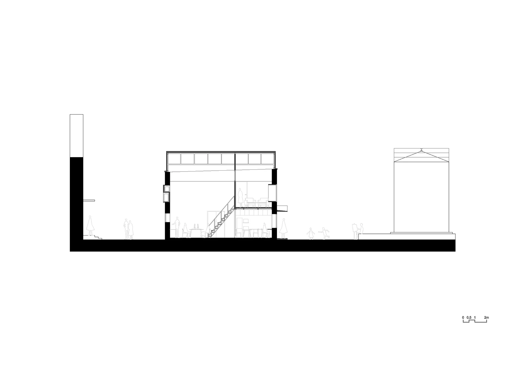
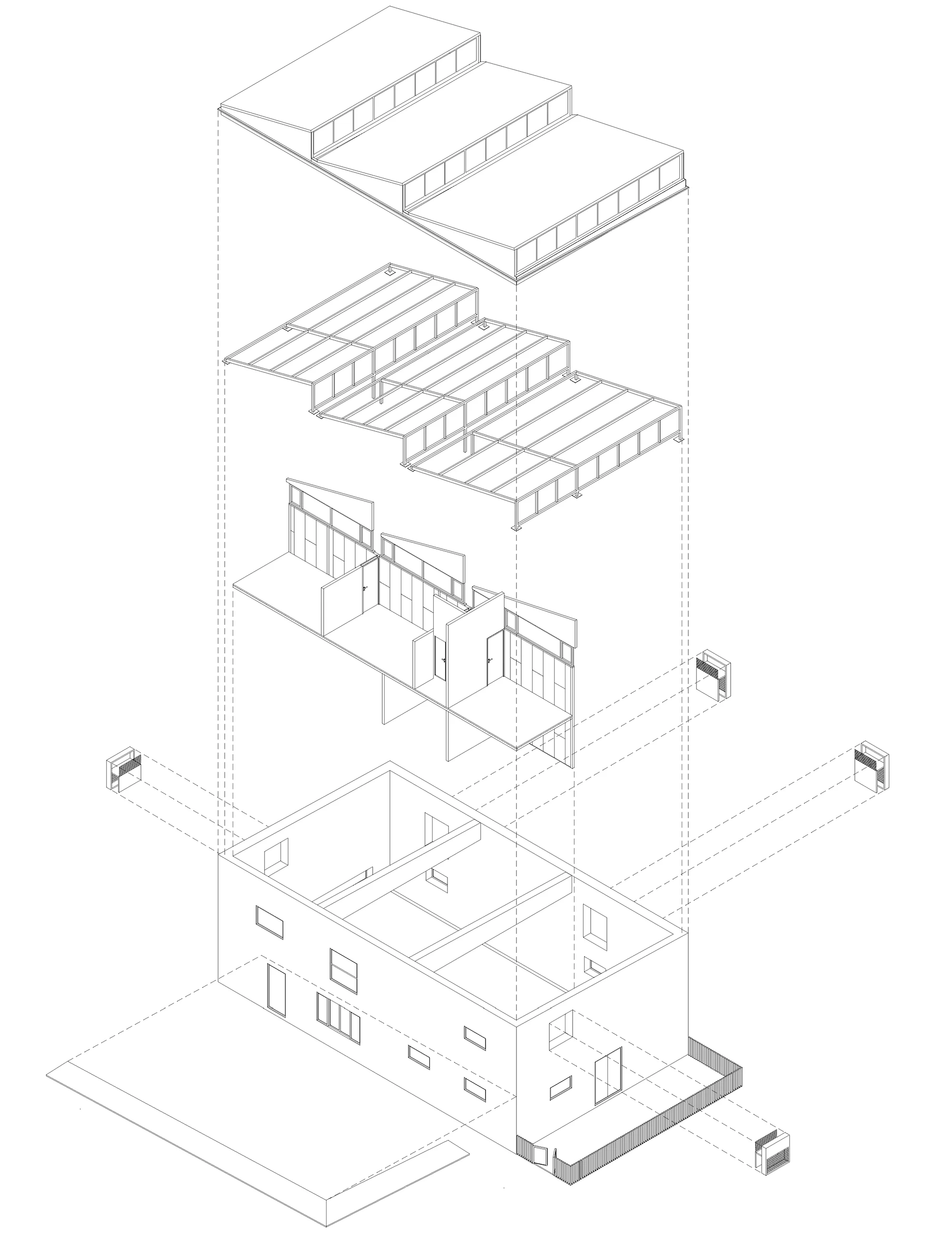
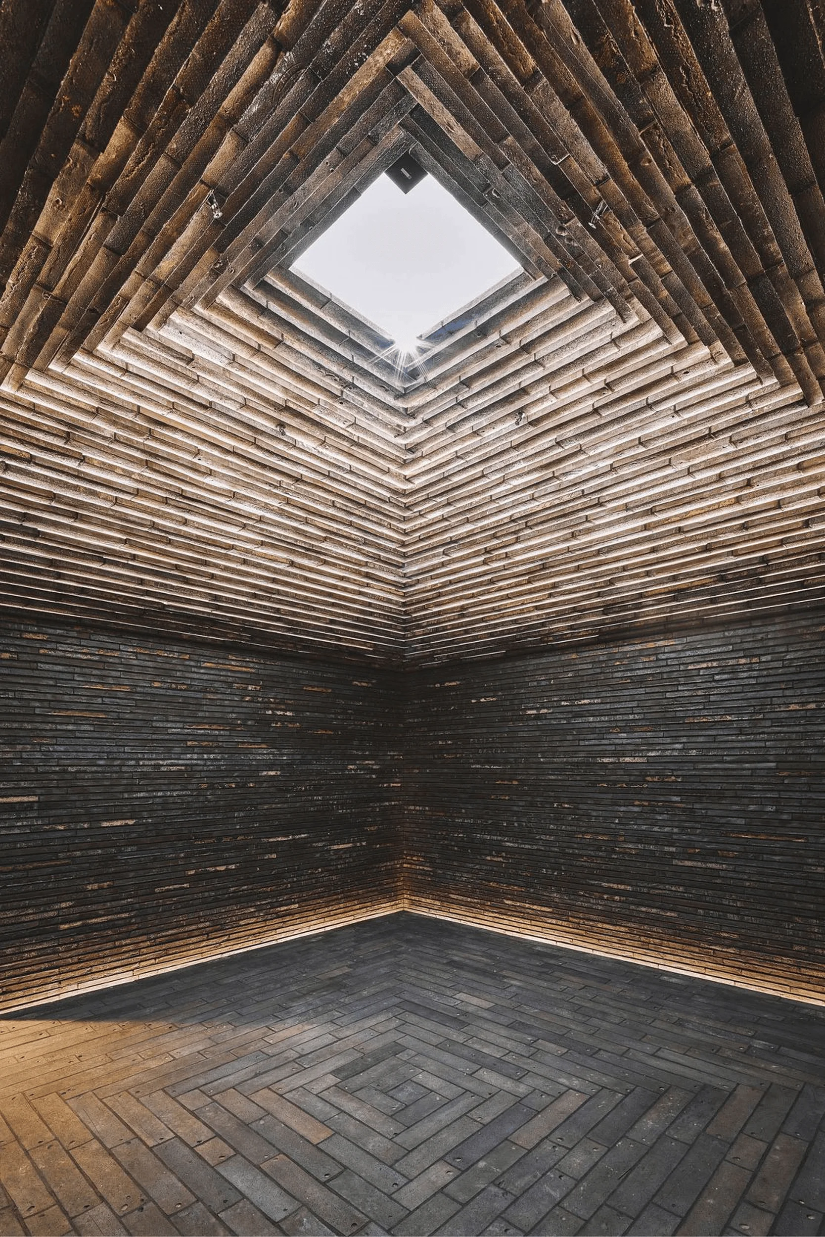
The existing structure’s towering space and the light filtering through its damaged roof inspired the design team to create a space that would be both inspiring and functional. They extended the jagged roof towards the sky, adding a skylight to let sunlight in. The studio’s exterior walls are punctuated by openings that respond to the surrounding environment. The design team also created a series of “gray spaces,” sheltered areas under the awnings and gardens that offer different perspectives on the surrounding environment and create opportunities for interaction.
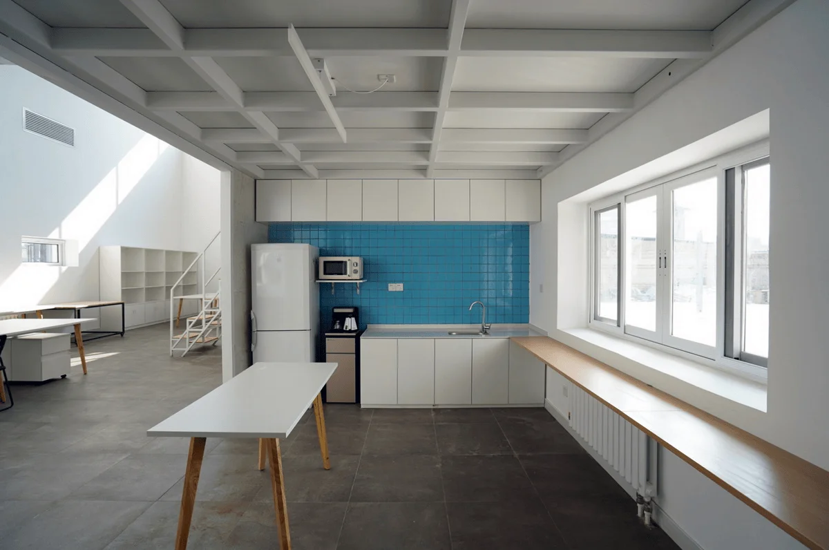
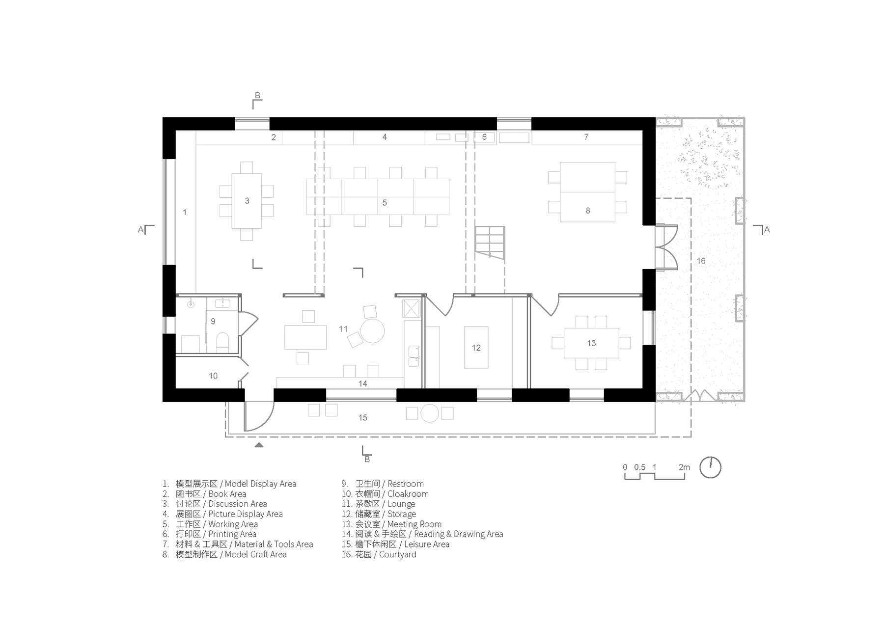
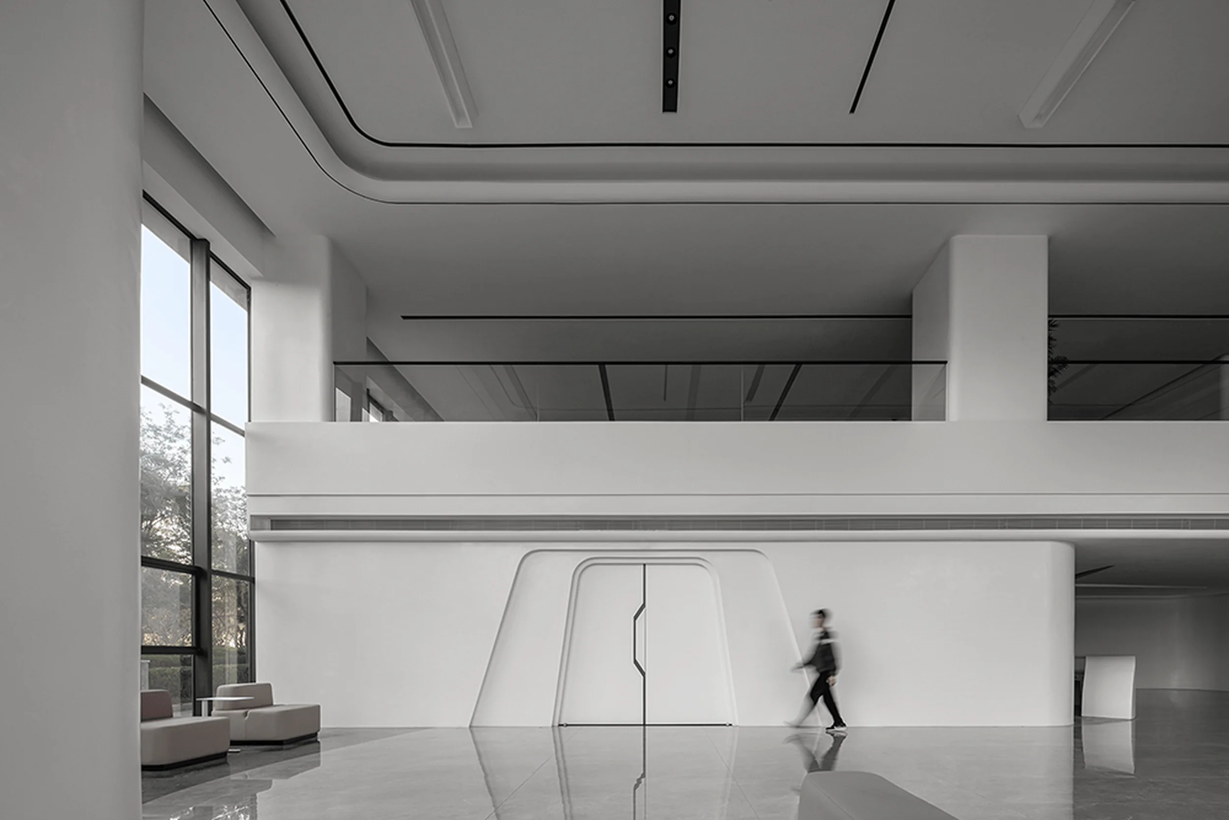
The studio is divided into two distinct areas by a tall dividing wall. The north side boasts a towering, open space, while the south side features a more intimate space that is closer to the square. The main entrance is located on the south side, emphasizing a desire for connection and communication. The design also incorporates elements that encourage relaxation and social interaction, such as a large window and a window sill table in the rest area. The studio’s exterior walls and roof are painted white, creating a visual dialogue with the nearby white tanks. This creates a composition of geometric forms and plays with light and shadow, changing throughout the day.
The design team used readily available, low-cost industrial materials to reduce the overall cost of the project. These materials, such as steel bars, corrugated sandwich panels, polystyrene bead sandwich panels, and cement fiber boards, are common in the Beijing area. The addition to the building is a light steel frame system covered with cladding panels. The simple structure allowed the design team to use a small construction team, simple equipment, and manual labor to complete the project, reducing the overall cost.
Project Information:
Architectural Design: Atelier Heimat | Atelier Heimat
Project Location: Beijing, China
Design Team: Liu Wenjuan, Zhang Dongguang, Ma Di
Building Area: 210 square meters
Completion Year: September 2019
Photographer: Atelier Heimat | Atelier Heimat
Contact: [email protected]
Overall Construction: Beijing Dalle Architecture Decoration Engineering Co., Ltd.
Roof Construction: Beijing Baixinchen Construction Engineering Co., Ltd.


