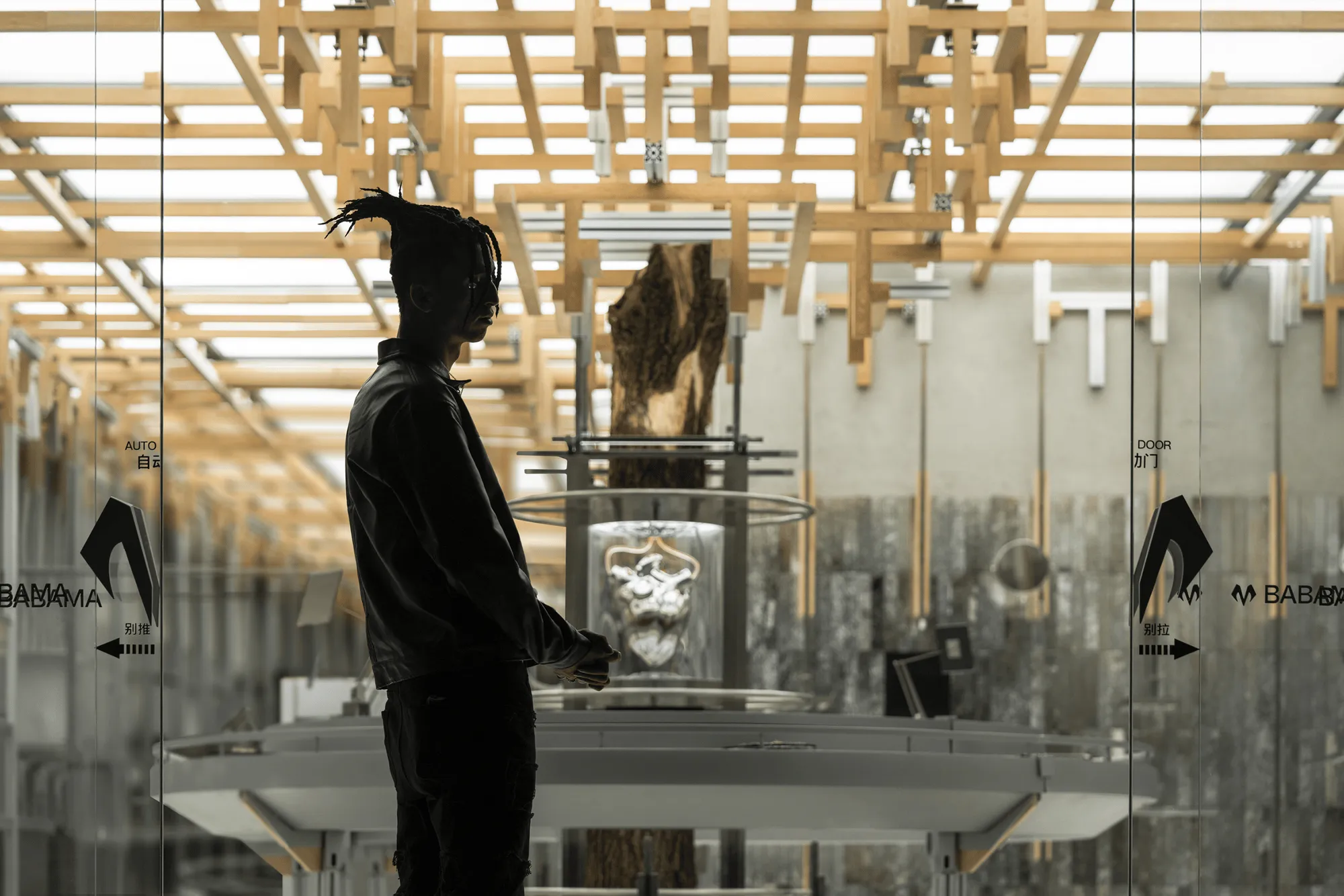
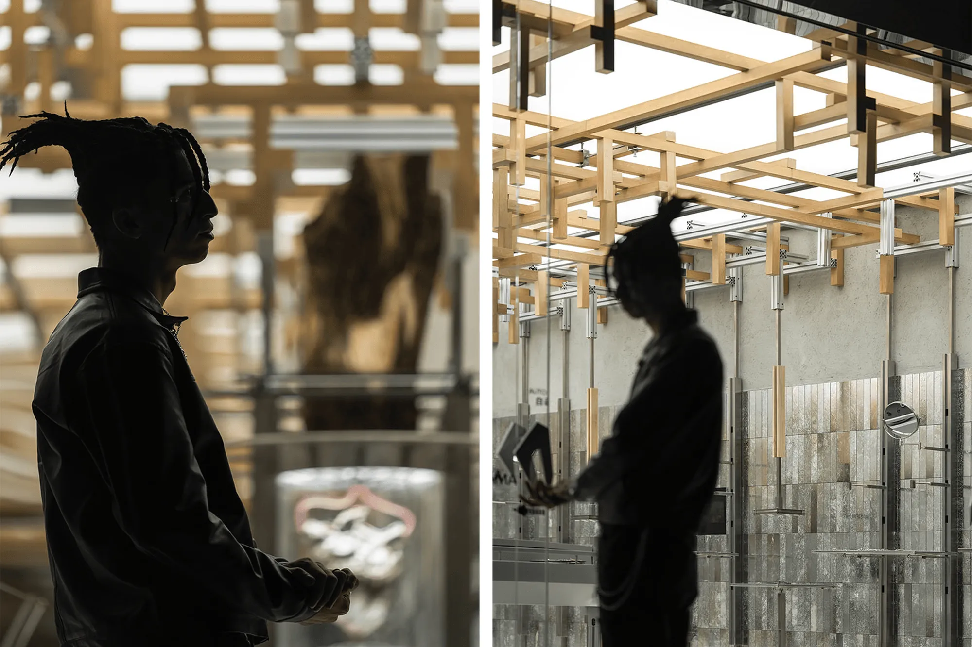
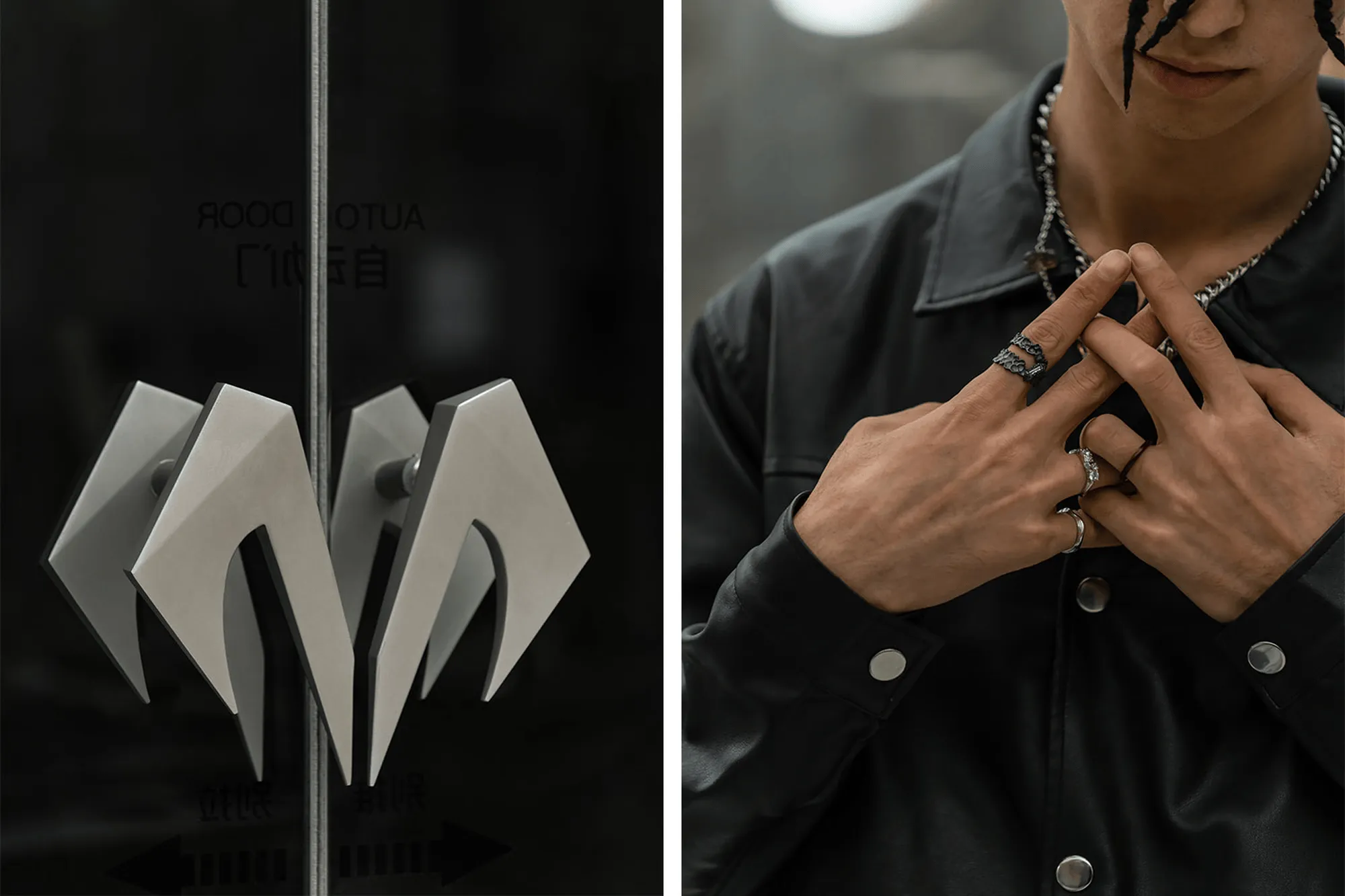
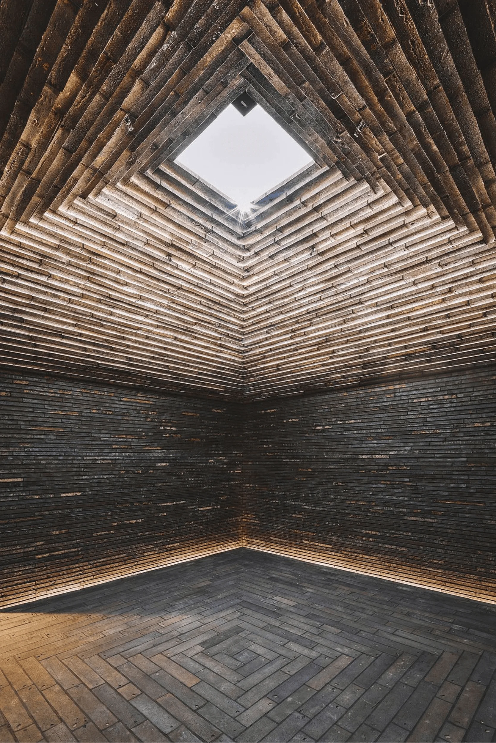
The BABAMA Concept Store in Shanghai, designed by ATMOSPHERE Architecture, is a unique retail space that embodies the brand’s core values of industrial aesthetics, natural elements, and the concept of a beating heart. This innovative space showcases a blend of traditional Chinese architectural elements and modern design, creating a visually captivating and immersive retail experience.
Located in the heart of Shanghai’s Xintiandi fashion district, the BABAMA Concept Store is situated in a prime location with high foot traffic and a clientele that values individuality and self-expression. This first-ever physical store represents a significant milestone for the brand, establishing a tangible embodiment of BABAMA’s abstract brand spirit and attitude. The store serves as a platform for a profound dialogue between tradition and contemporary trends, anchored in an industrial aesthetic perspective.
The store’s design is anchored around three core elements: nature, machinery, and the heart. These elements coalesce to form a unique “circulatory system” that exemplifies BABAMA’s brand identity. The design draws inspiration from traditional industrial aesthetics, incorporating natural elements and heart imagery to convey the essence of a “beating organism.” This concept serves as a foundation for both future product design and the current physical space presentation.
**A Heartbeat of Design:**
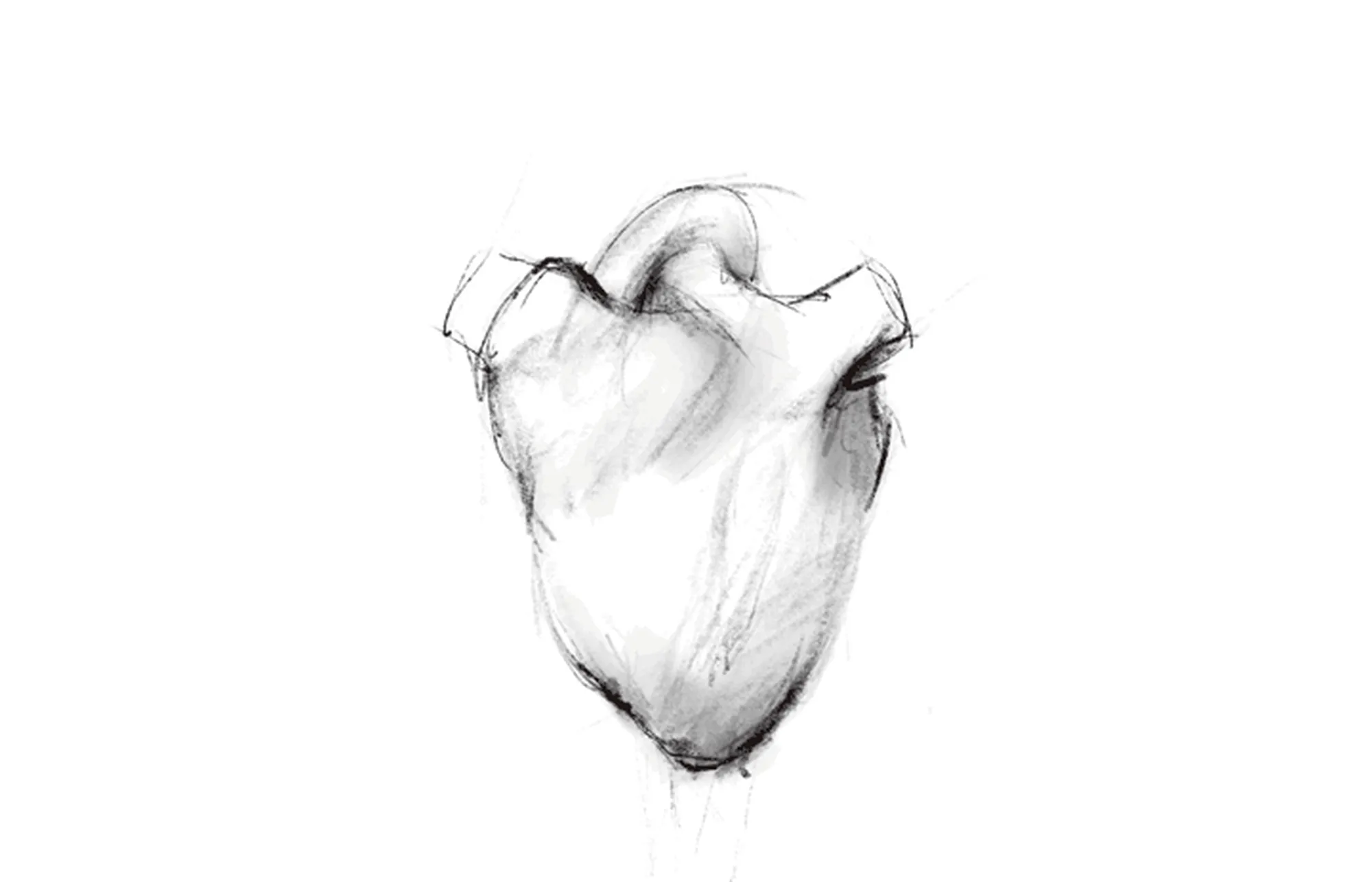
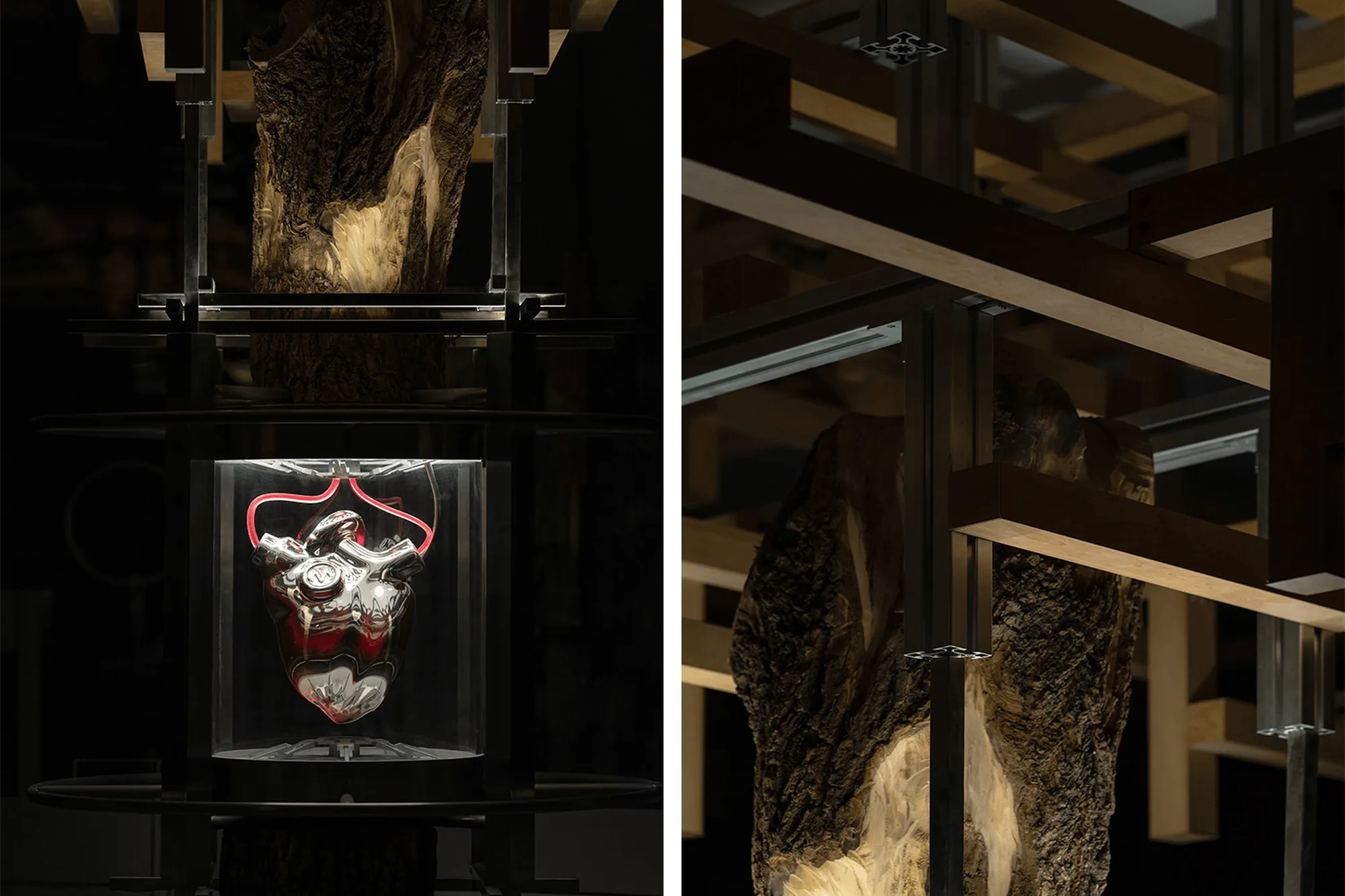
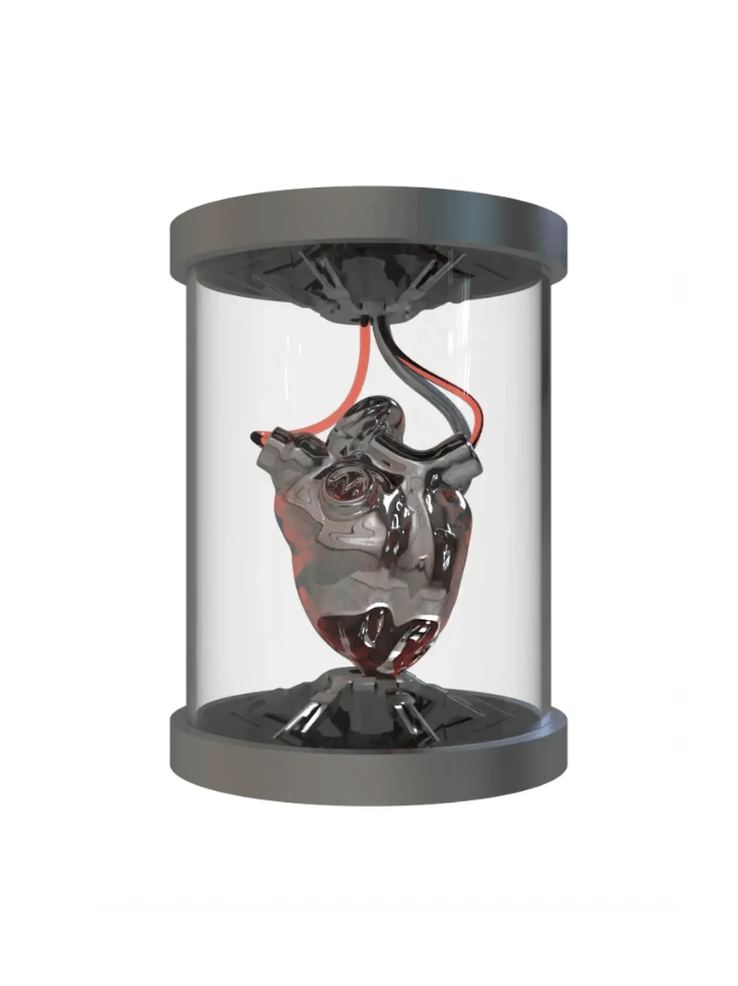
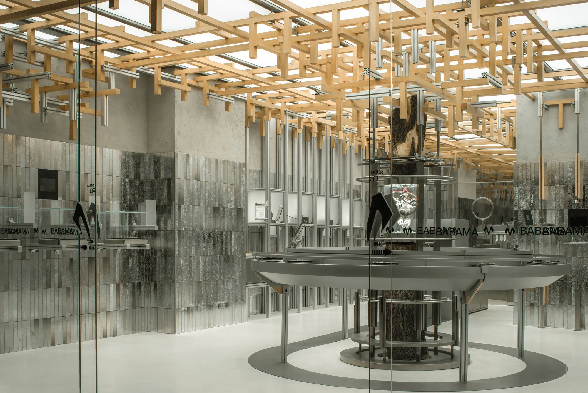
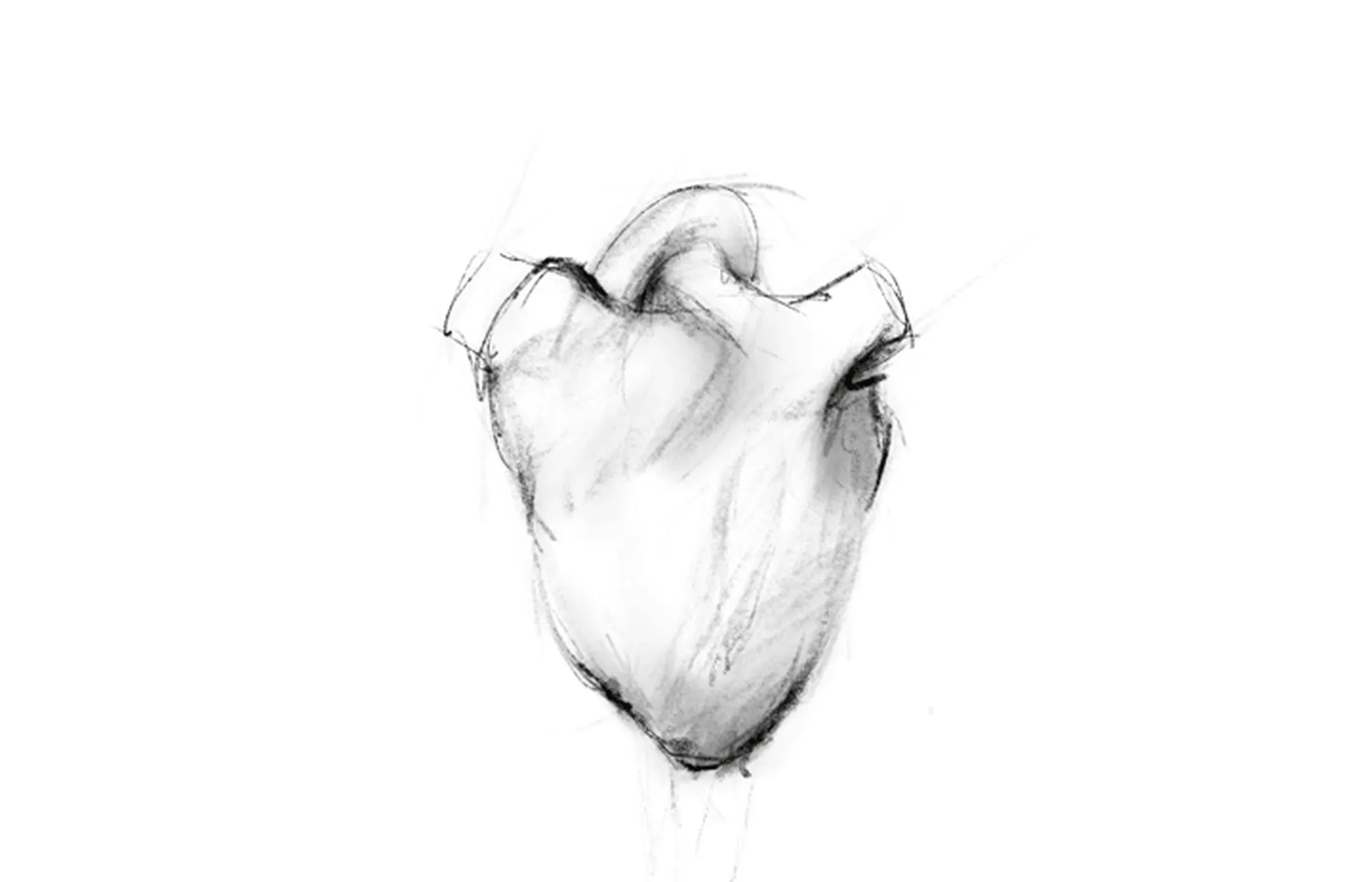
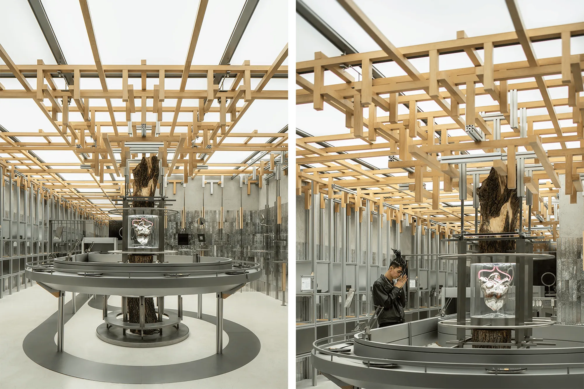
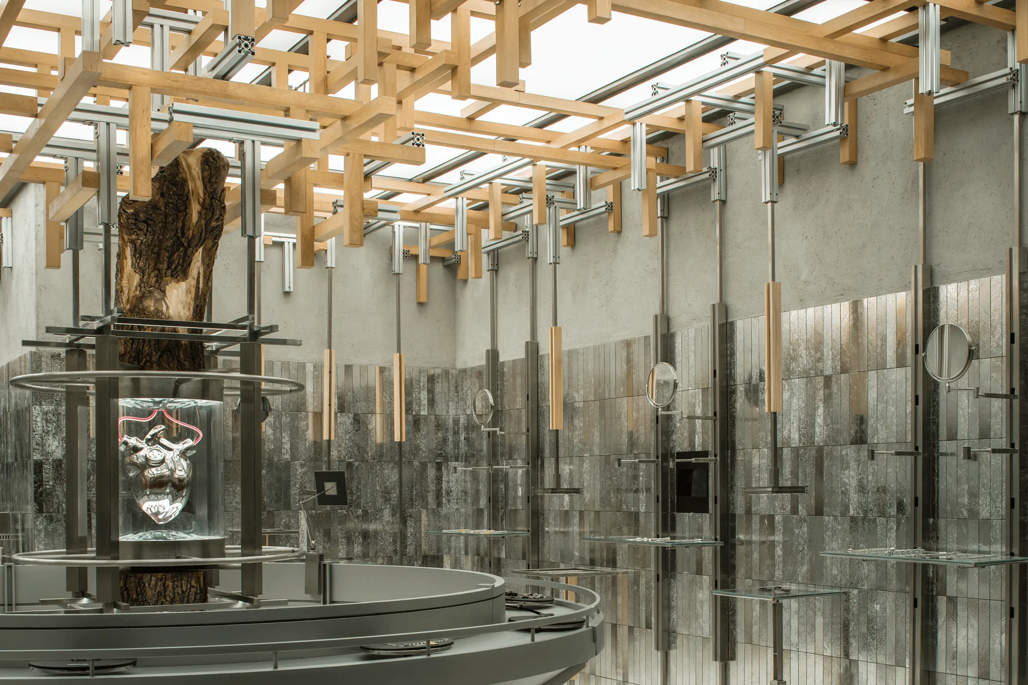
The store’s central feature is a captivating art installation representing a beating heart, a vital component of the circulatory system. This installation serves as a physical manifestation of the brand’s core values and acts as a visual focal point. Inspired by the circulatory system’s intricate network of arteries and veins, the store’s narrative unfolds through a thoughtful deconstruction and reinterpretation of biological concepts related to blood flow and material transport. This concept guides the spatial organization, circulation, and content creation, with the beating heart installation serving as the central source of energy for the various sub-zones within the space.
**Growth and Sustainability:**
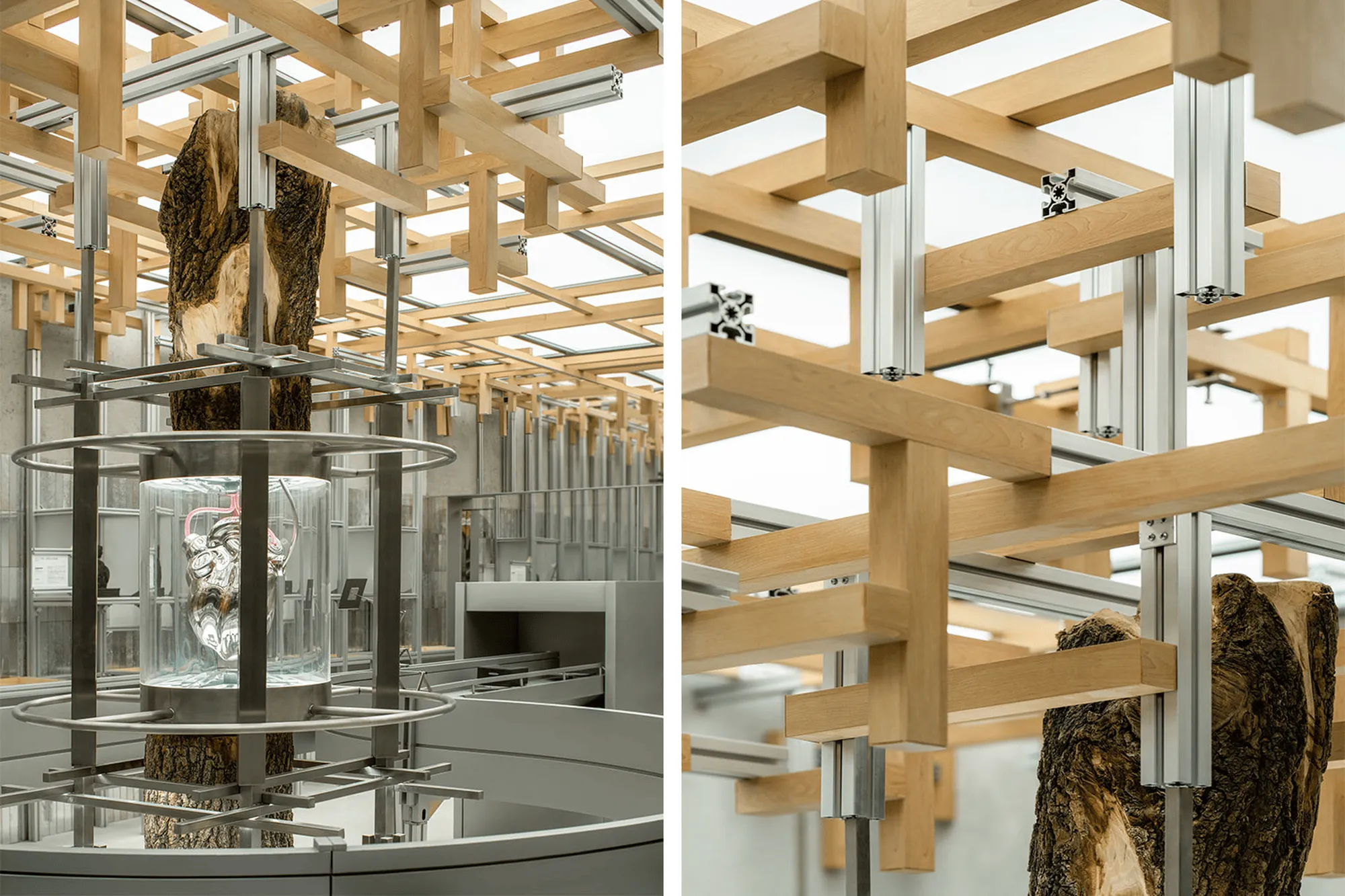
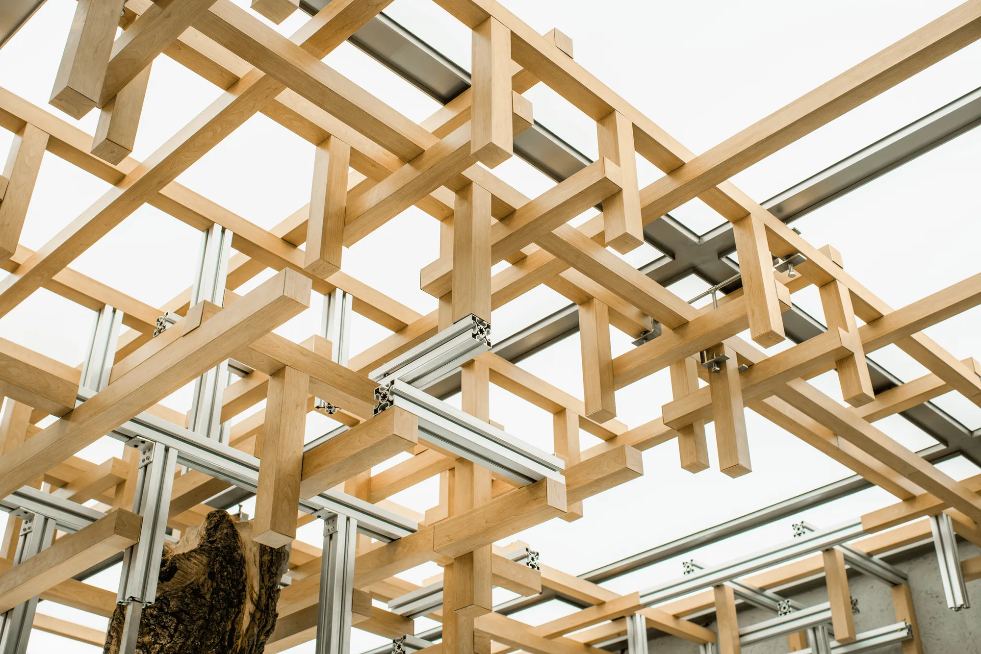
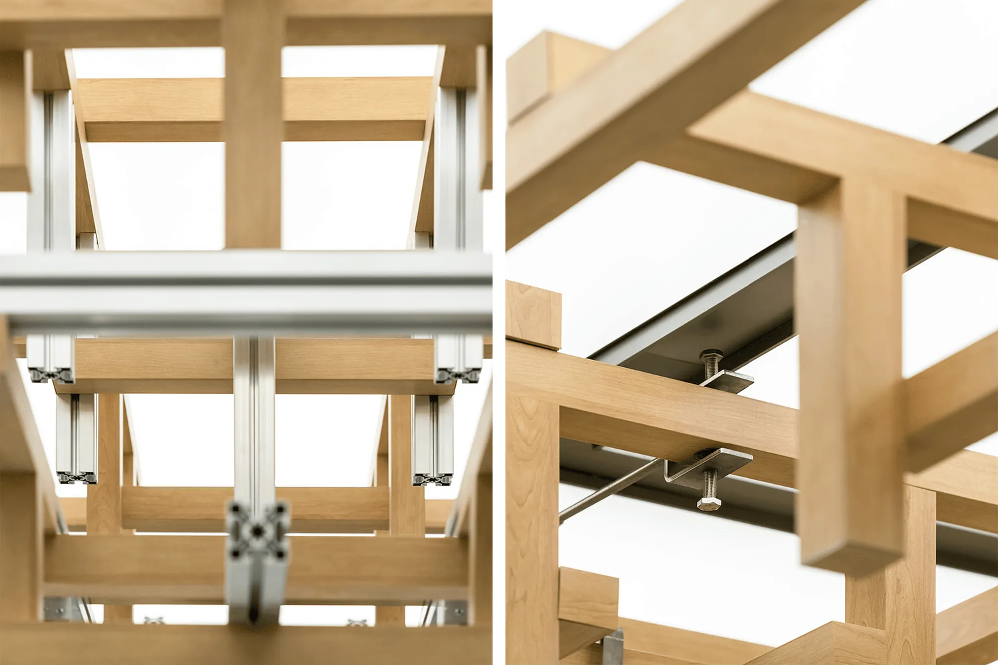
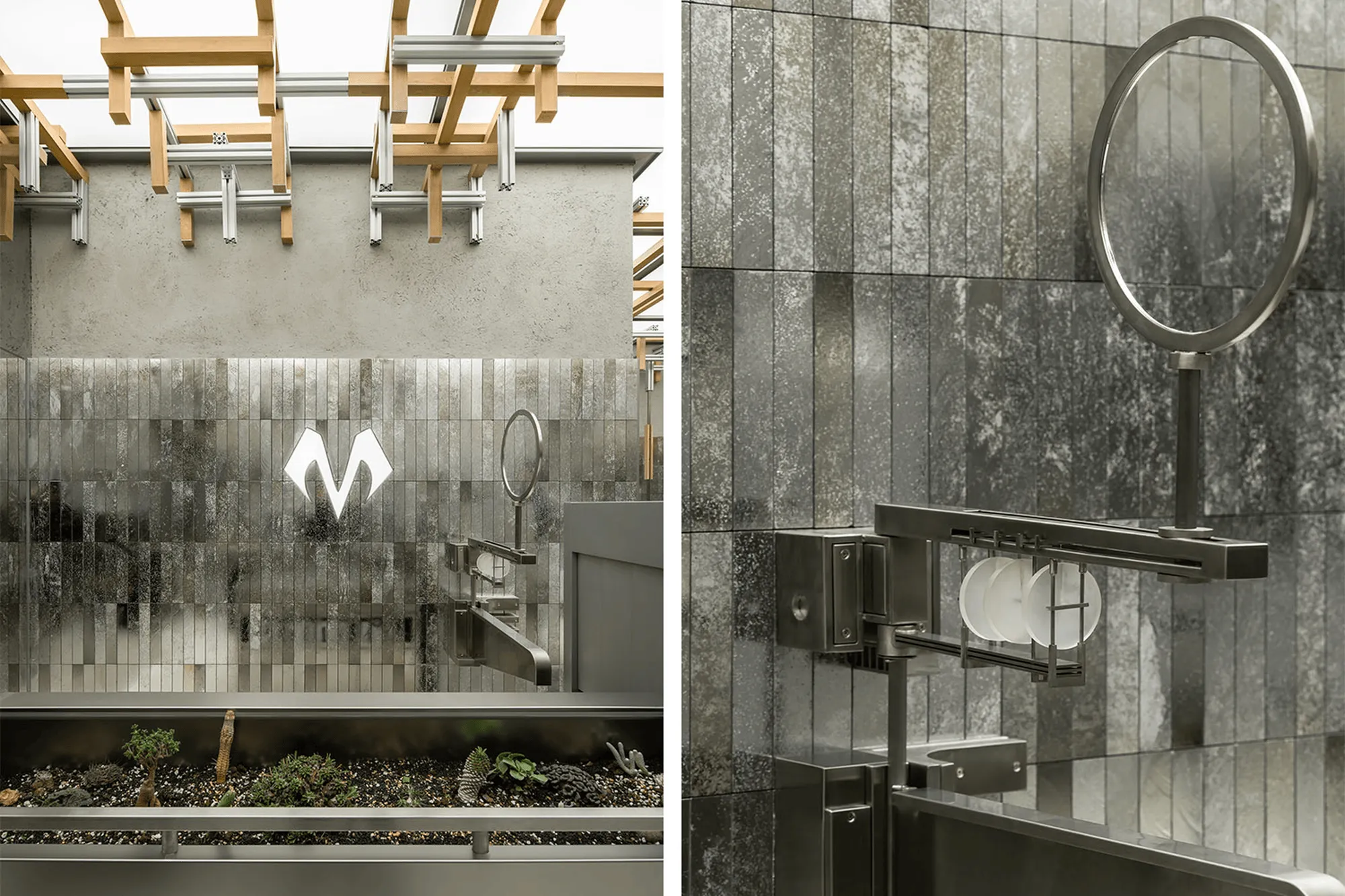
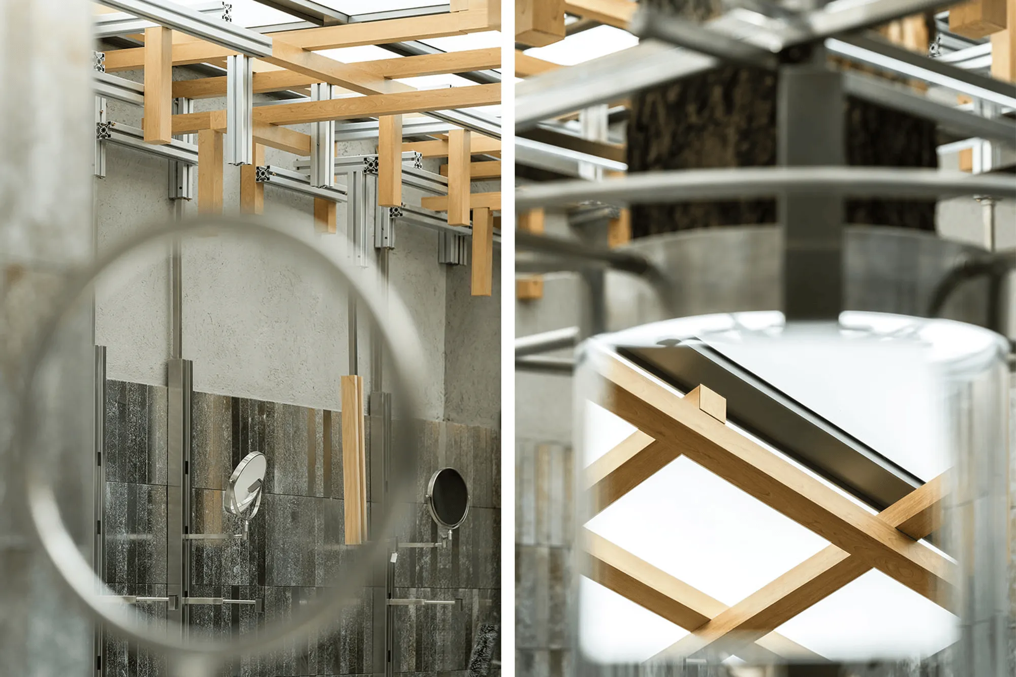
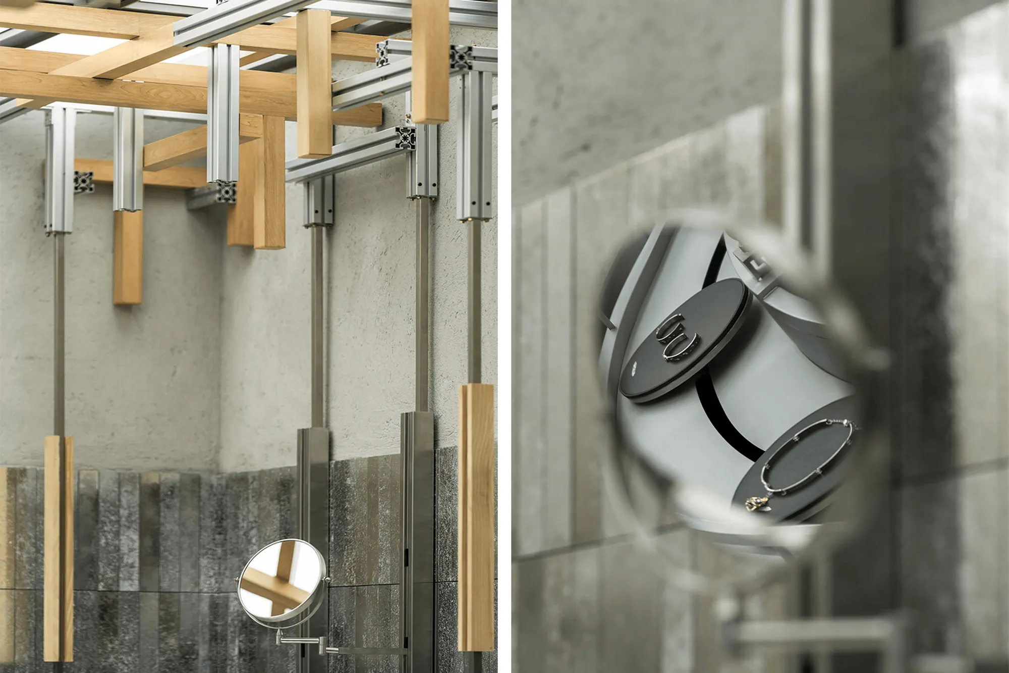
Extending upwards from the central installation, a series of metal and wood elements, mimicking the branching structure of a tree, reach towards the ceiling. This organic design element, infused with the energy of the beating heart, appears to grow endlessly within the confined space. The juxtaposition of aluminum profiles and wood harmonizes the strong industrial character of the space with natural elements, fostering a sense of harmony and symbiosis.
**A Legacy of Craftsmanship:**
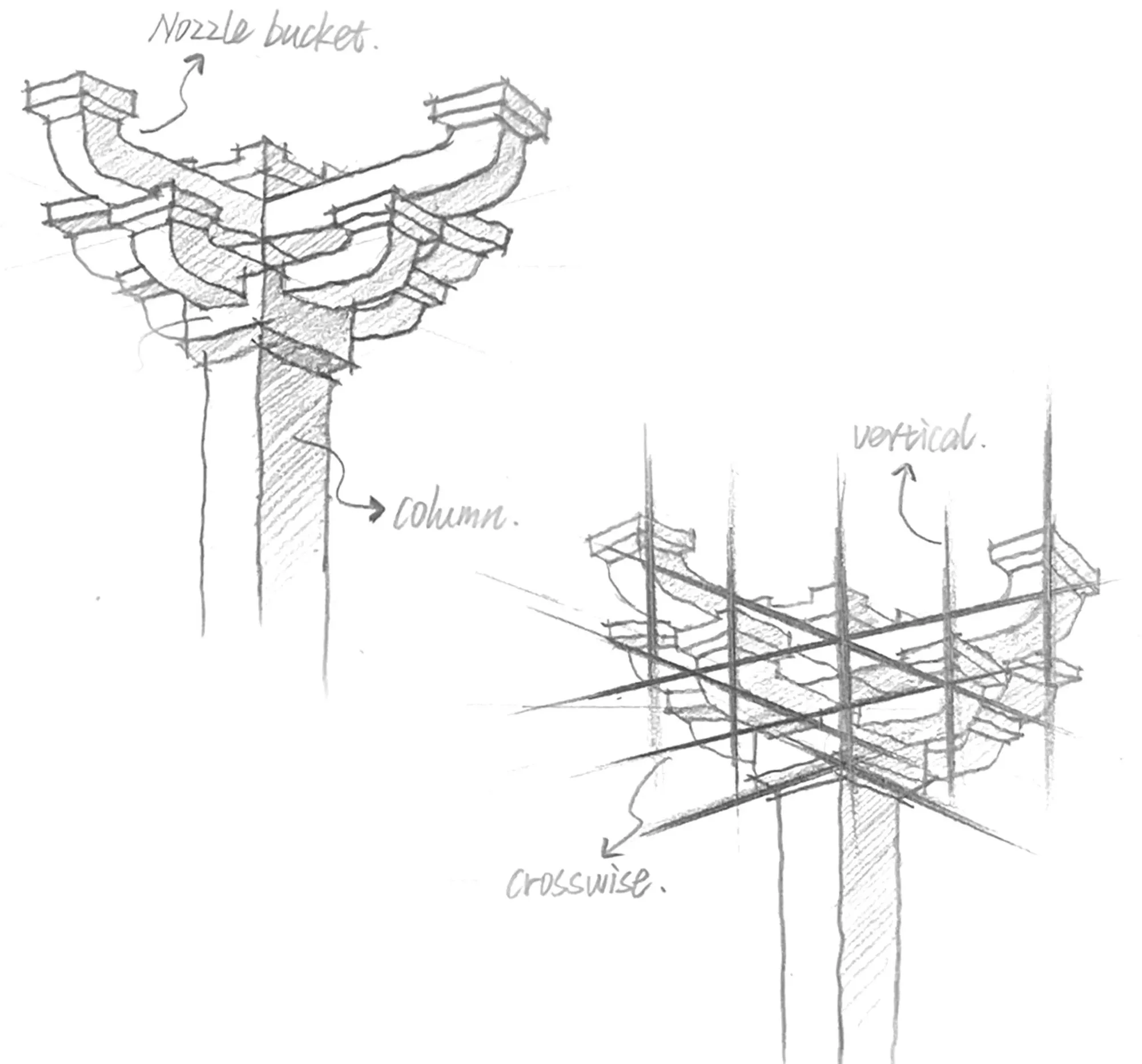
The store’s design incorporates traditional Chinese architectural elements, specifically the “dougong” (bracket set), a structural element that holds significant cultural meaning. The dougong, typically used in grand historical buildings, signifies commemoration and importance. By adapting this traditional component to a contemporary context, the store draws upon the cultural essence of the dougong and integrates it into the space’s design. The design team streamlined the traditional structure, retaining the essential features of the dou, sheng, gong, and qiao elements while incorporating metal materials alongside traditional wood. This innovative approach creates a distinctive visual identity for the space, reinforcing the design concept and delivering a deeper message.
**A Sustainable Approach:**
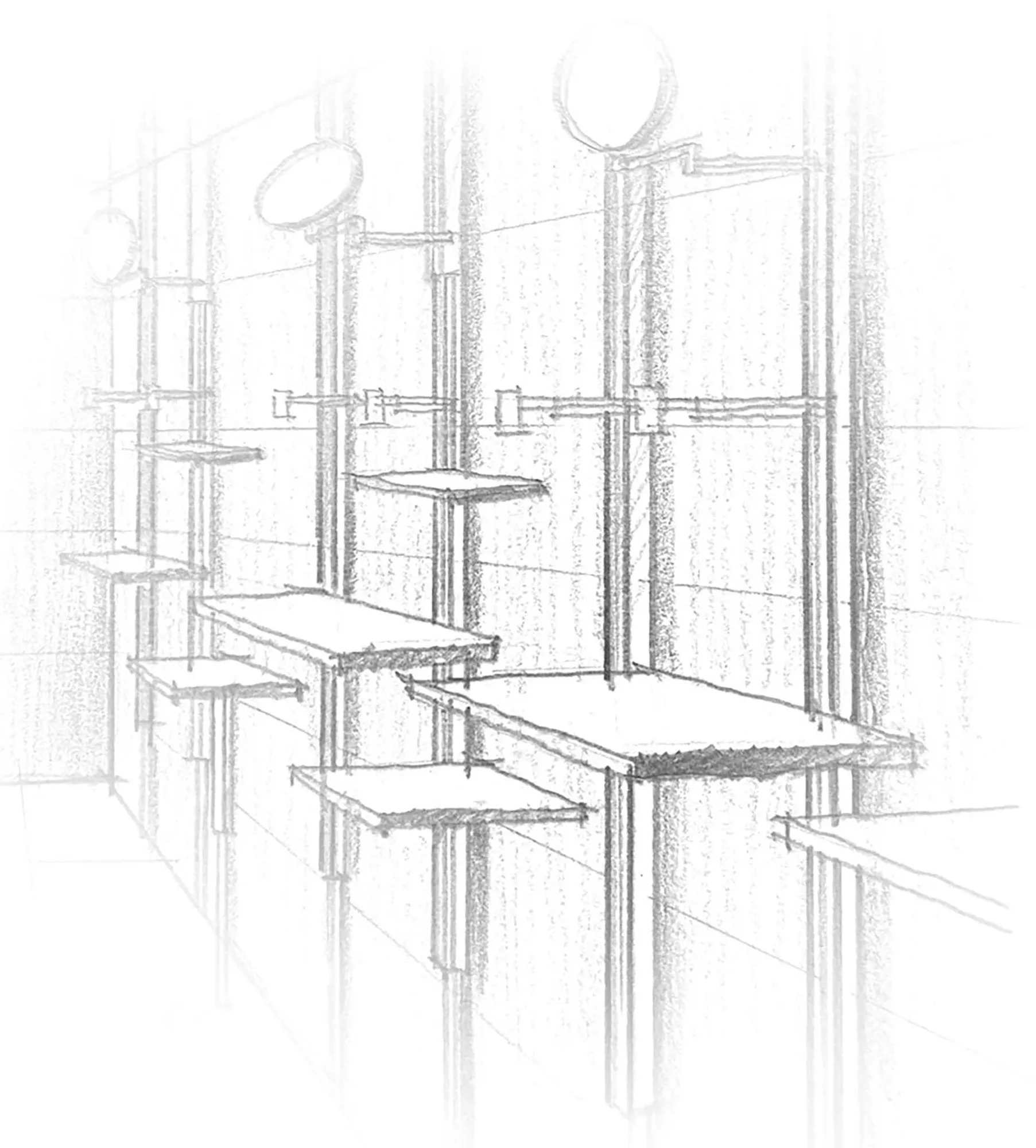
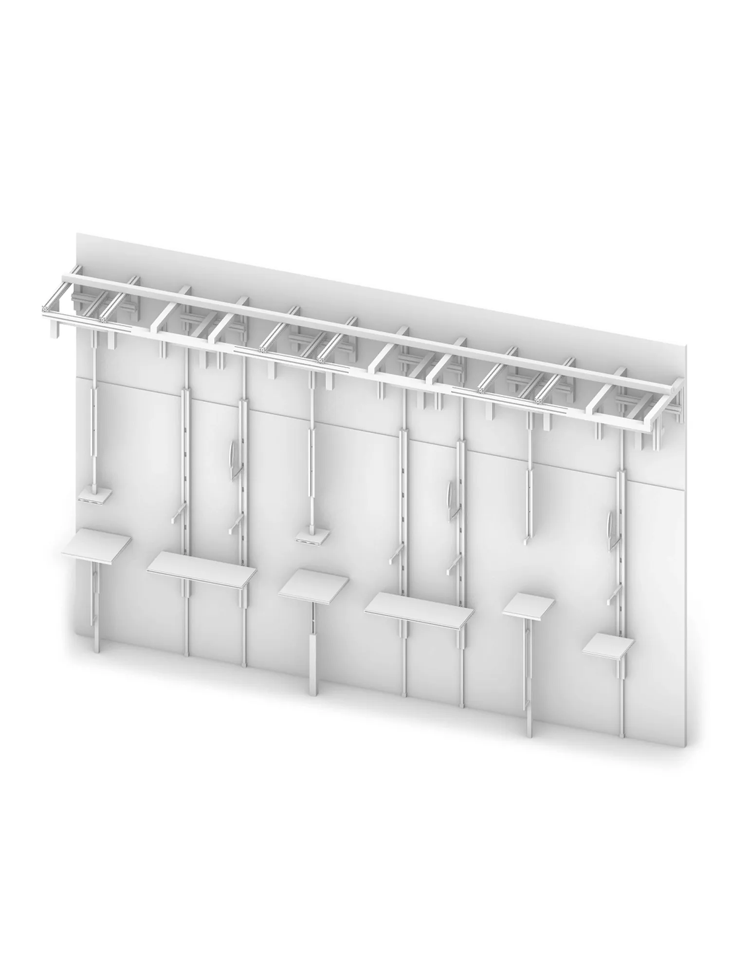
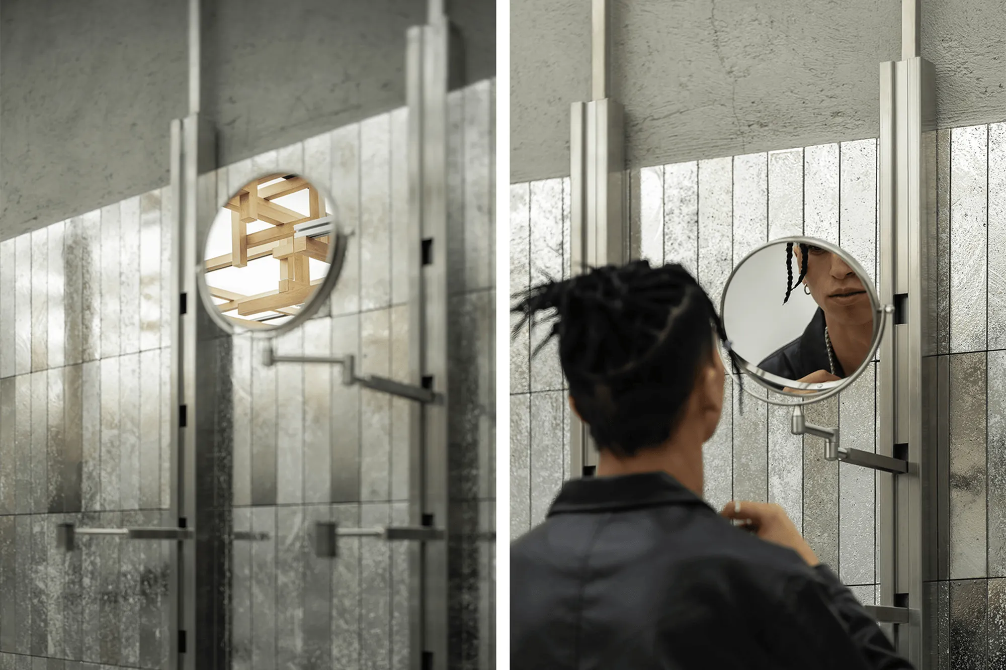
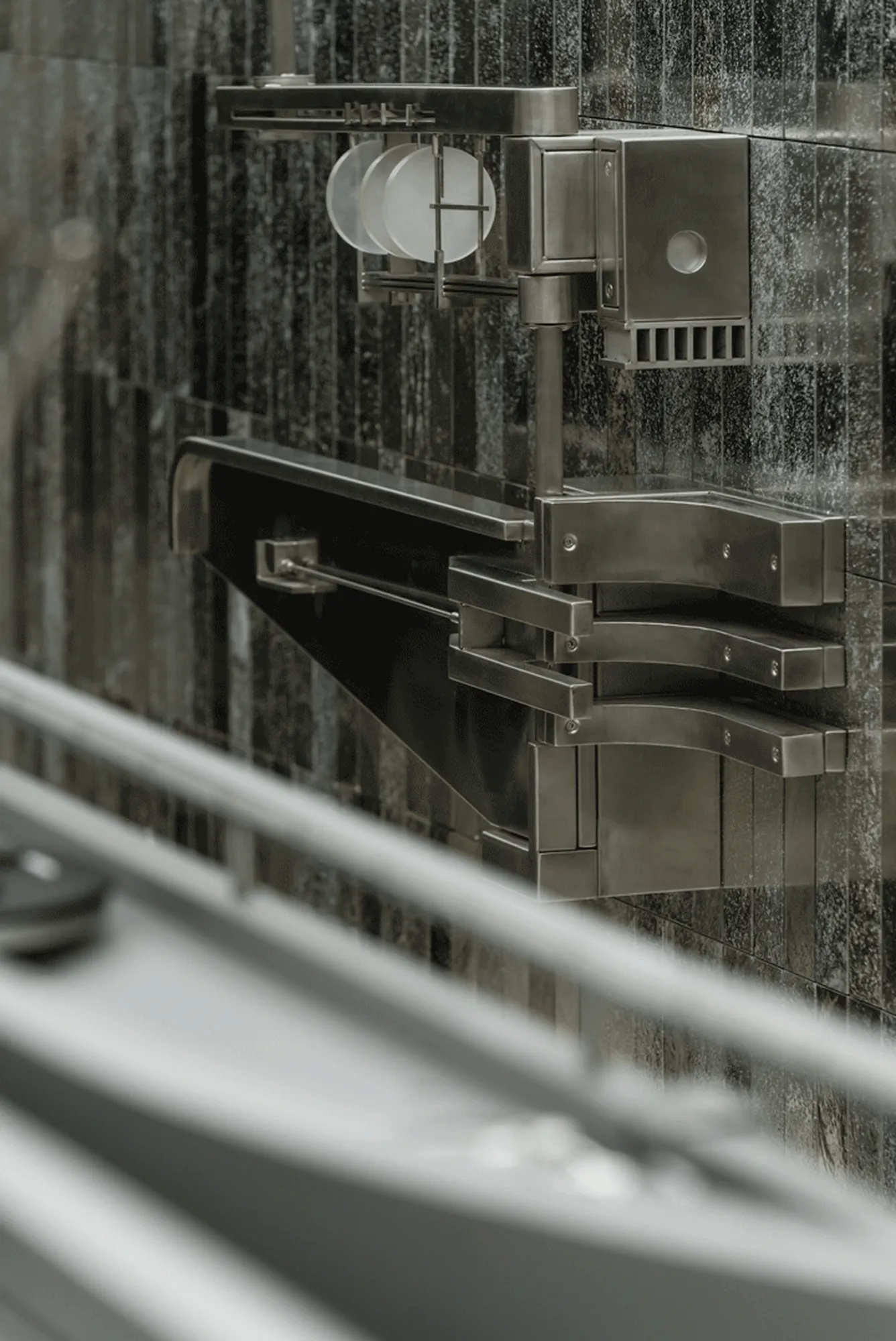
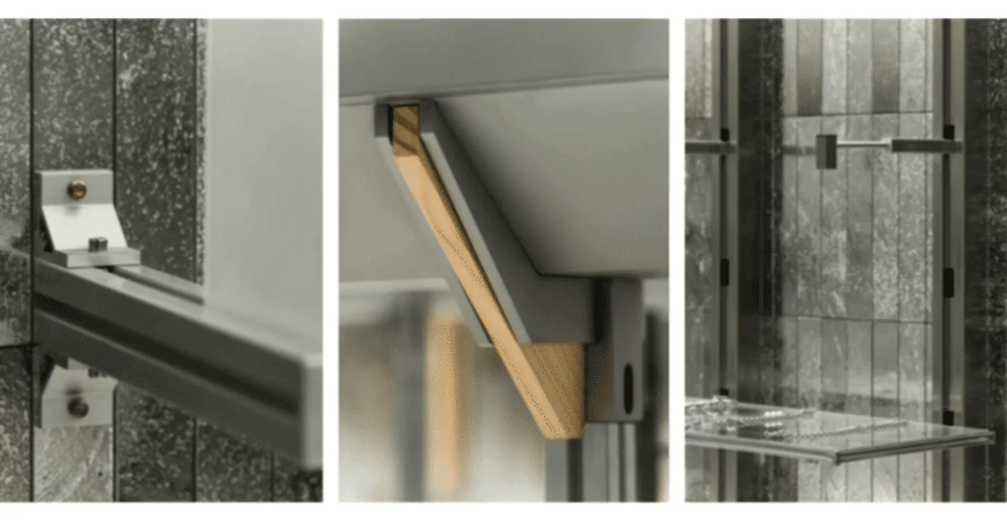
Sustainability is a paramount concern for the design team, who sought to create a sustainable design system that optimizes resource usage in today’s world. The store’s design incorporates modular display units, reflecting the trends of the new retail landscape. These modular units are designed to be easily disassembled and reassembled, facilitating transport and adaptability to different projects. The use of consistent materials, including metal, glass, and circular mirrors, cater to customer needs for fitting and trying on products, seamlessly integrating into the interactive experience.
**Dynamic Circulation:**
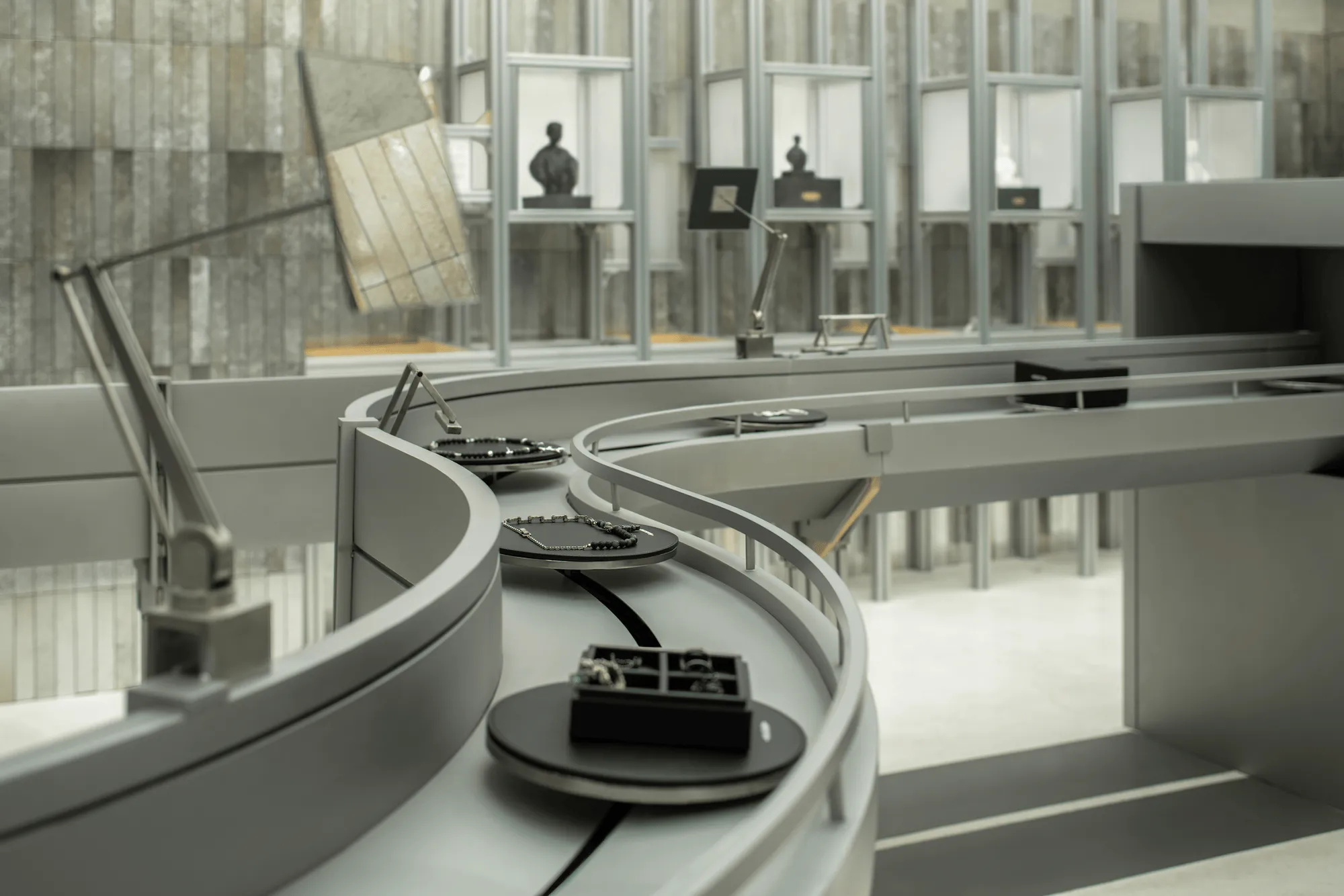
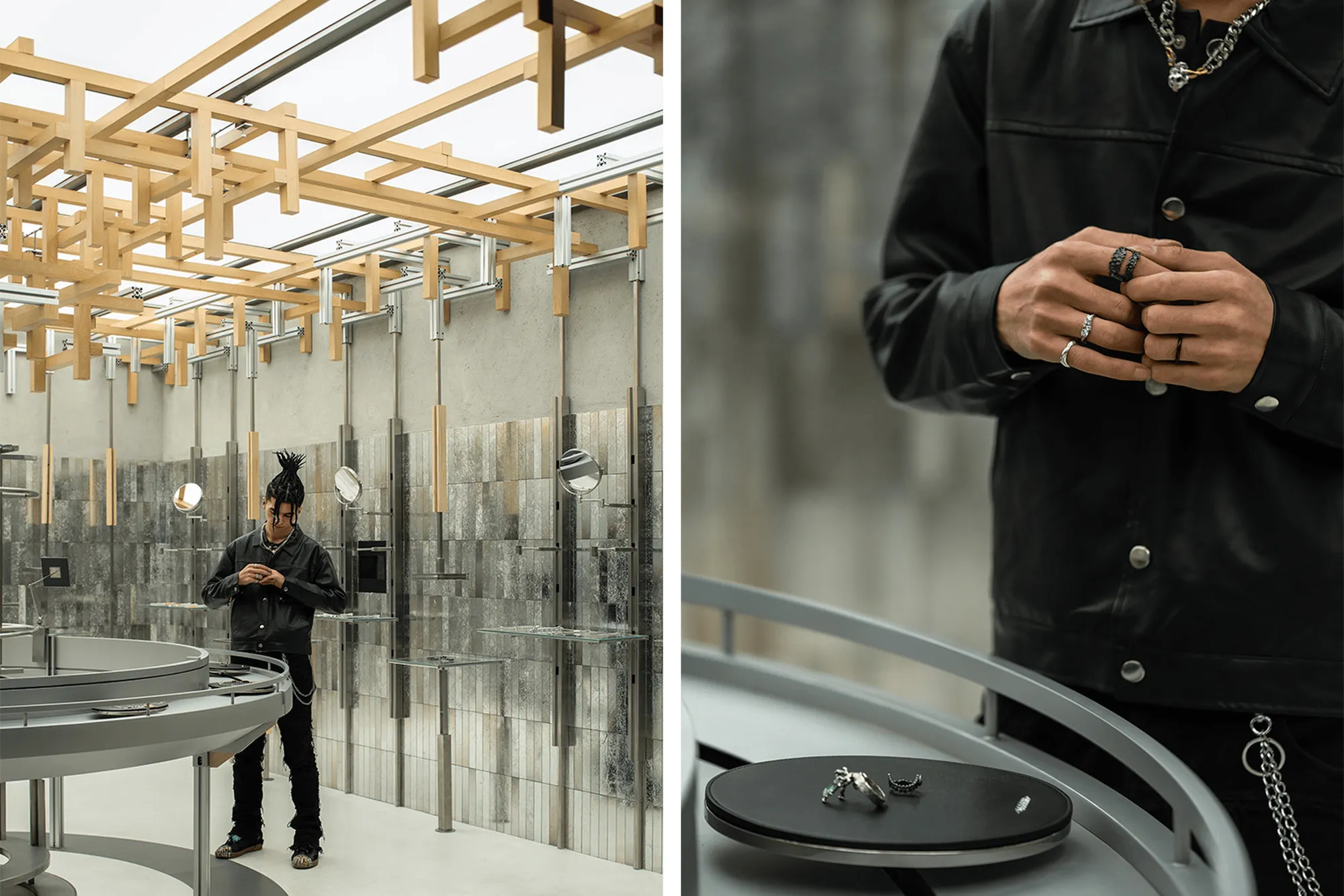
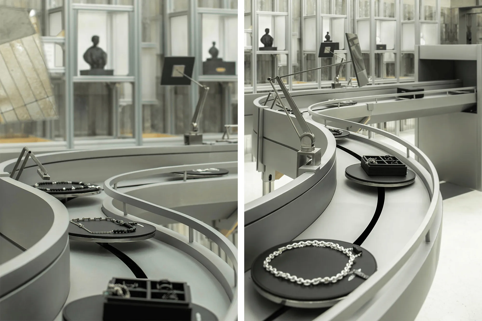
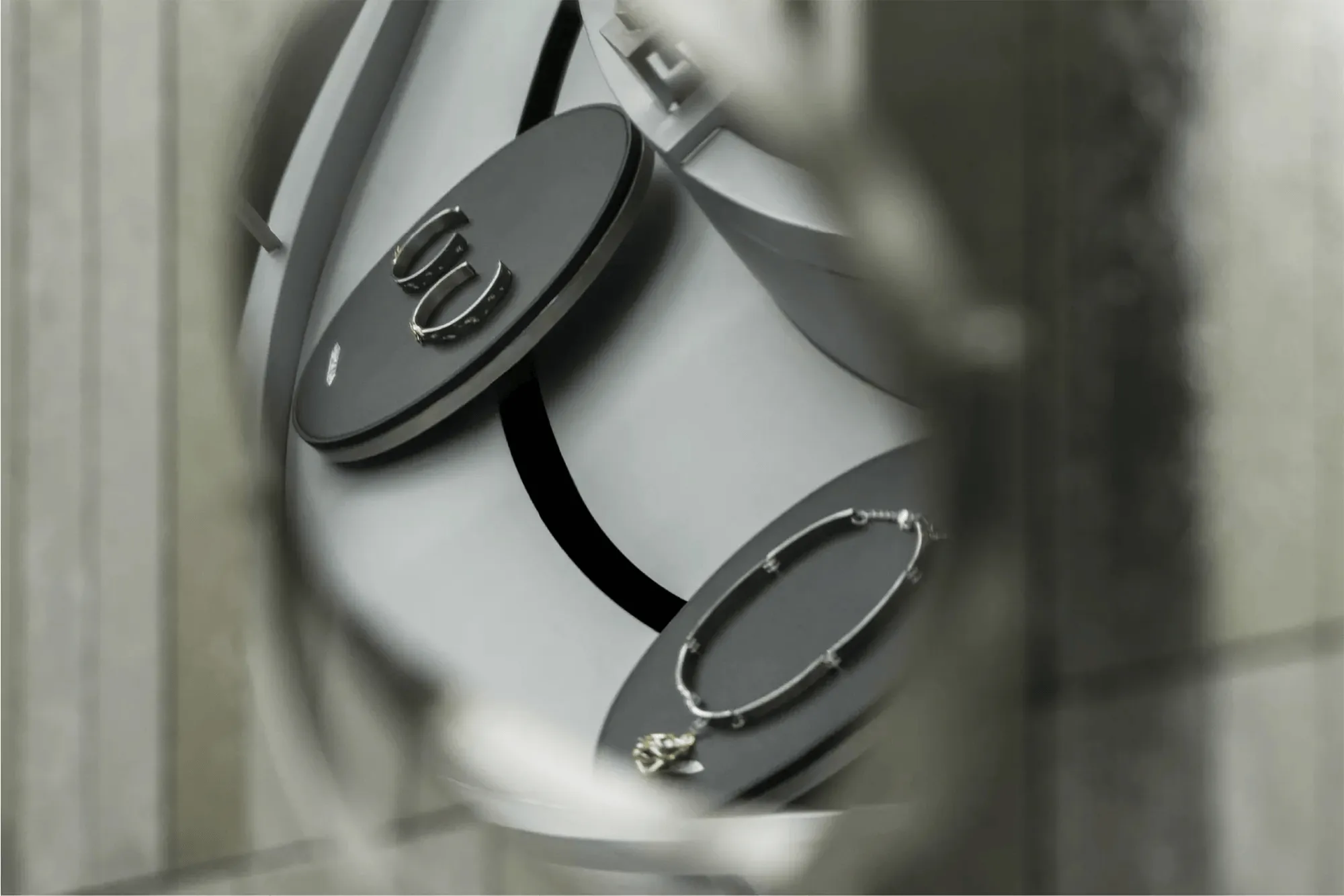
The space’s layout incorporates a conveyor belt system that aligns with the practical needs of product display, fitting, purchasing, and packaging. The conveyor belt, a familiar element in industrial operations, serves as a dynamic visual element that animates the space and further reinforces the concept of the circulatory system, echoing the flow of energy and resources. Products are showcased on circular trays along the curved conveyor belt, allowing for a captivating viewing and interactive experience. The black leather base of the trays accentuates the inherent quality of the metal and gemstone products.
**Blurring Boundaries:**
The conveyor belt system seamlessly transitions into the cashier area, serving as the final “packaging” step in the retail process. This design approach dissolves the conventional blocky structure of cashier areas, opting for a more fluid, lightweight separation. This subtle design strategy blurs the boundaries between the interior and exterior, fostering a seamless flow within the space. Despite maintaining its independent function, the cashier area blends harmoniously with the surrounding environment, creating a unified and continuous experience for shoppers.
Project Information:
Project Name: BABAMA Concept Store
Space Type: Commercial Space, Retail Space, Concept Store, Trend Store, National Trend Store
Space Address: No. 6, Lane 123, Xingye Road, Huangpu District, Shanghai
Design Company: ATMOSPHERE Architecture
Lead Designer: Tommy Yu
Design Team: Aubrey Liu, Valo Xiao
Animation Design: ViVi Lee
Props and Installations: ATM Team
Lighting Design: ArtLuci x Owen
Construction Company: Shanghai Yimuhe Architectural Engineering Co., Ltd.
Space Area: 108 square meters
Main Materials: Electroplated Brick, Soft Film Ceiling, Aluminum Profile, Wood Grain Transfer, Micro-Cement, Stainless Steel
Photography Copyright: Shape in Space Photography Here Space Hechuan


