YiLai Design created the minimalist Boundless Future Exhibition Hall in China, balancing individuality with functionality.
Contents
Dual Entrances and Central Reception
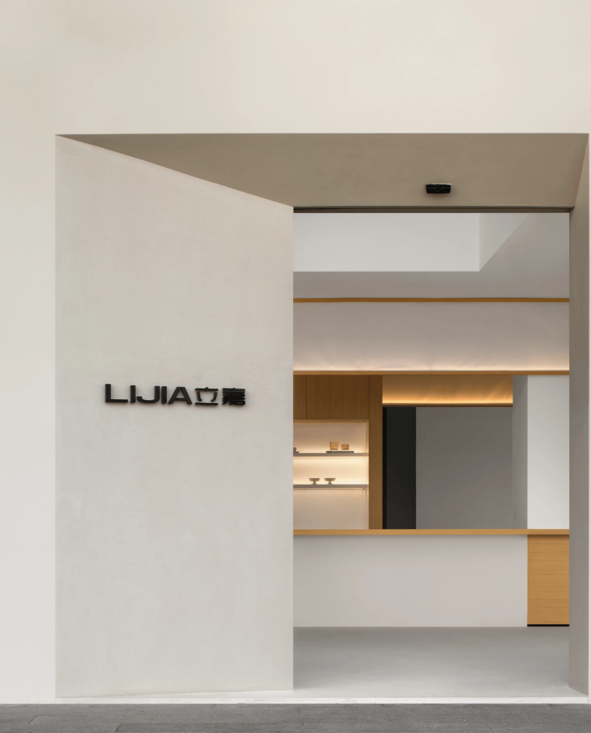
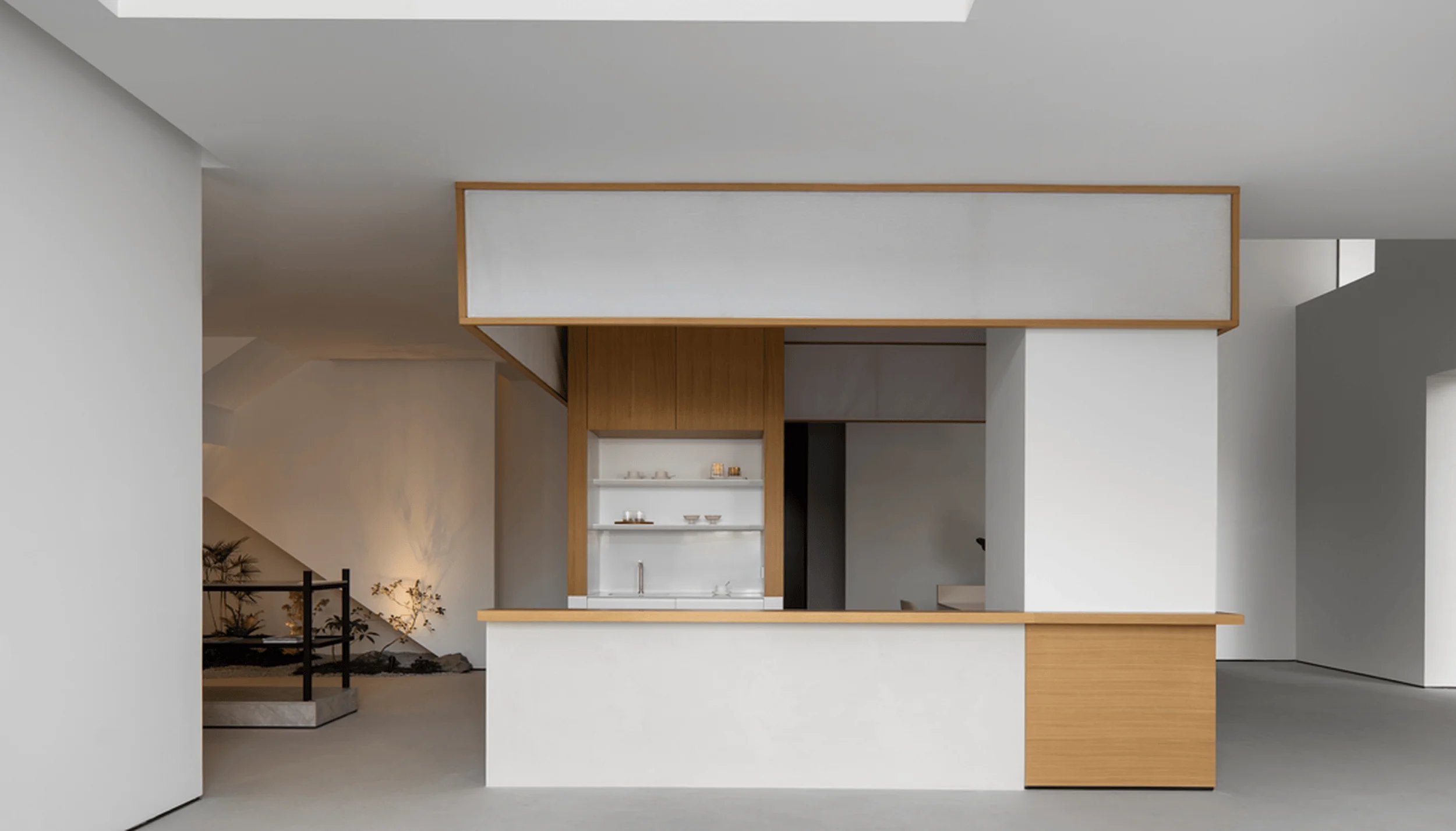
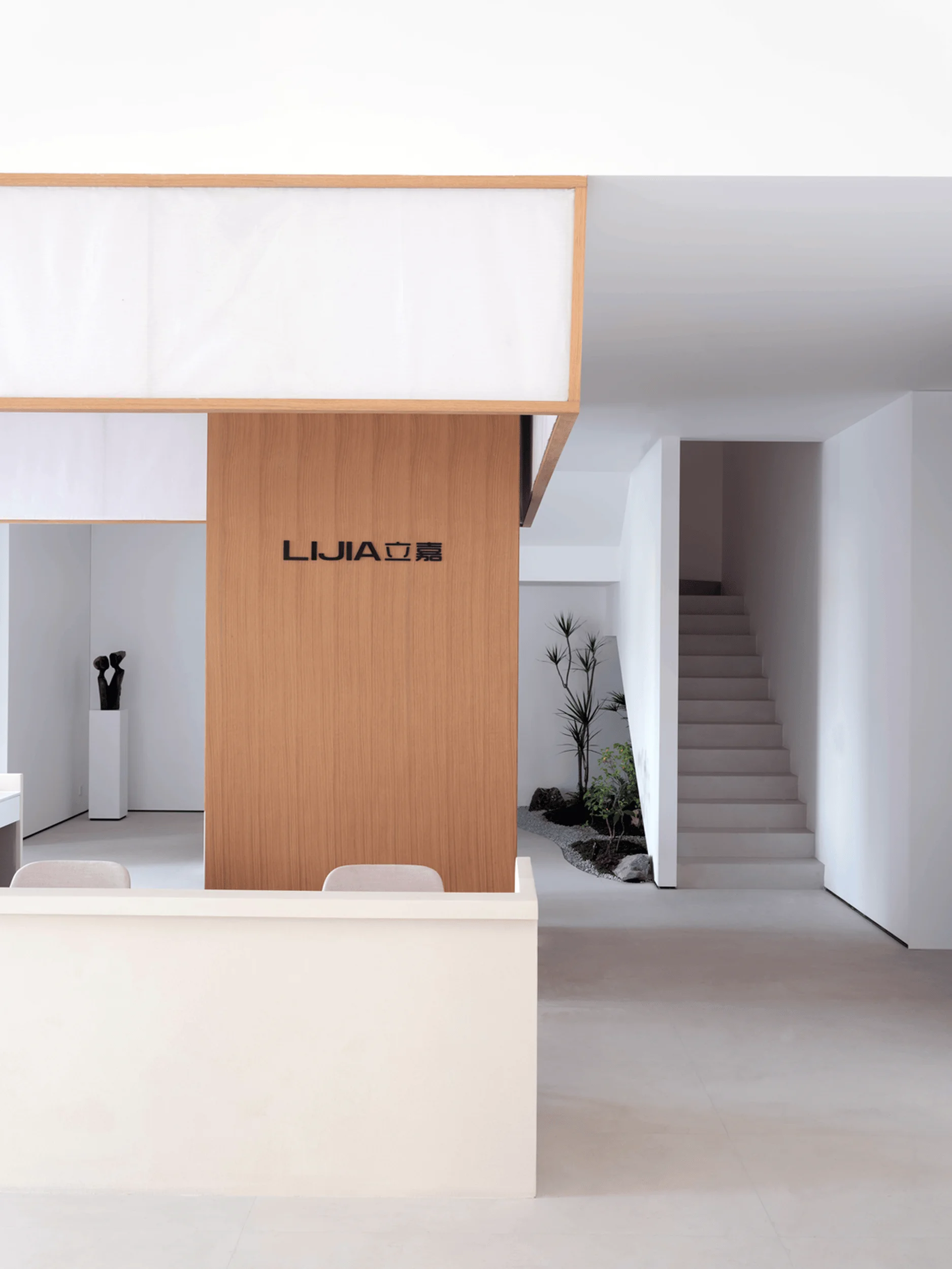
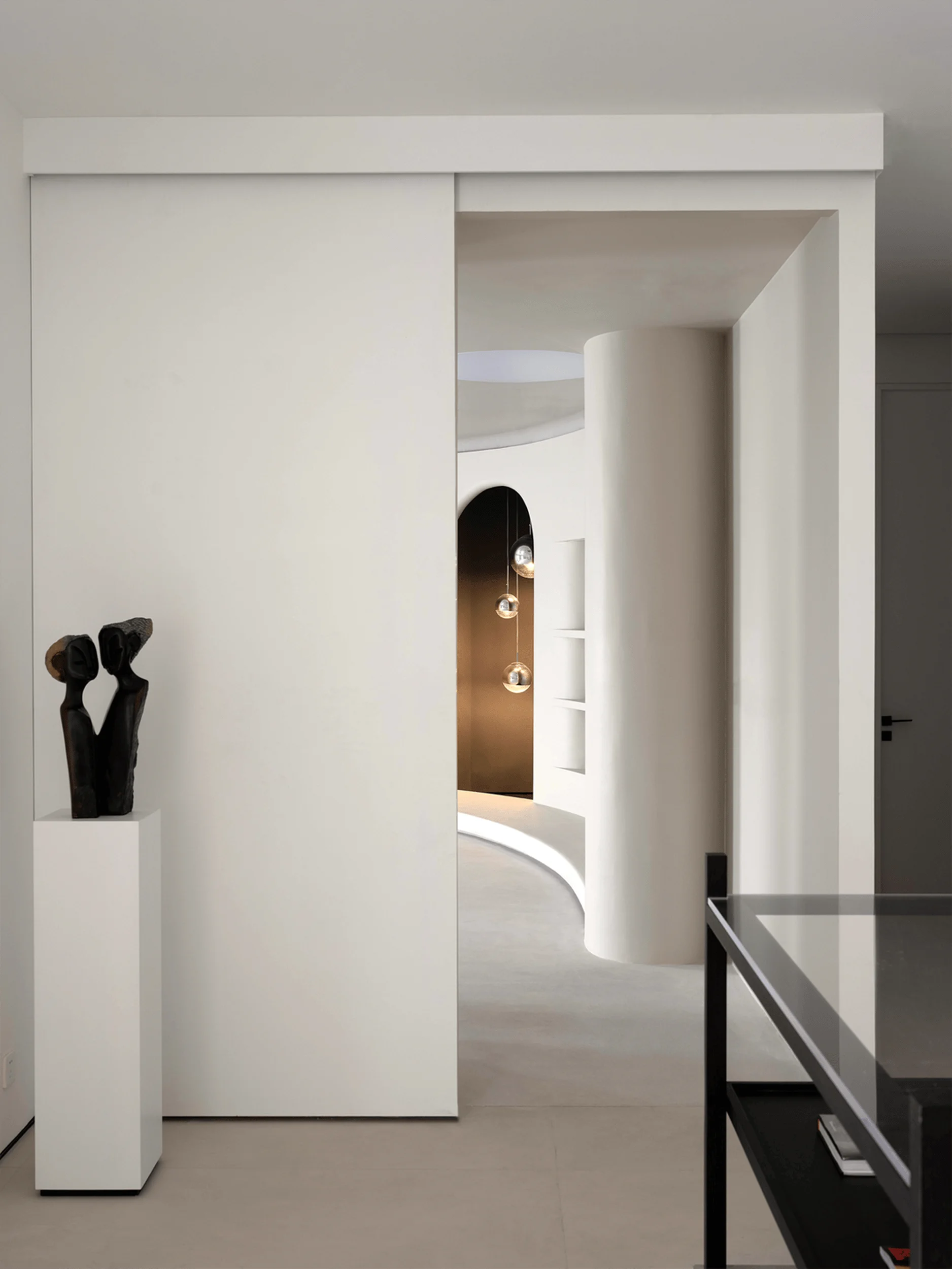
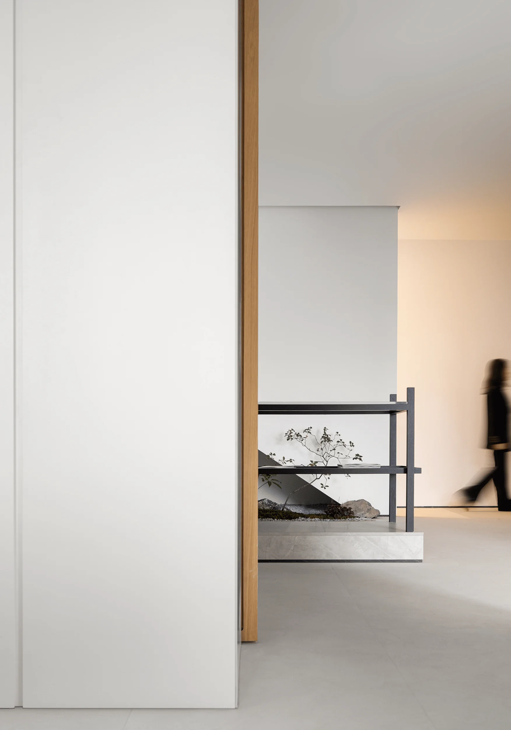
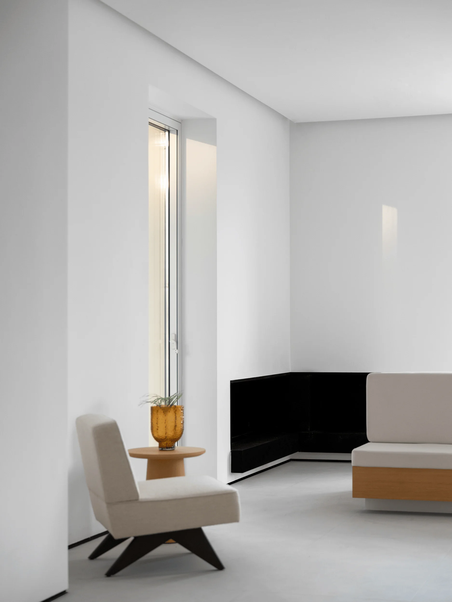
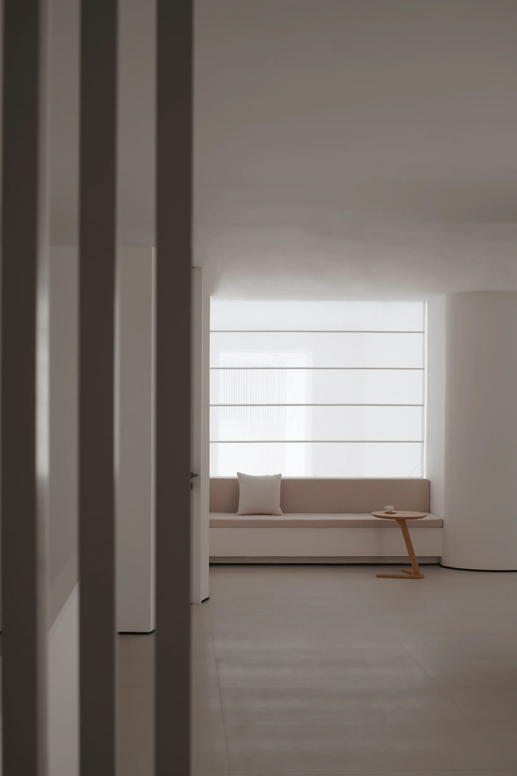
The Boundless Future Exhibition Hall features two entrances: one facing the riverside near the parking lot, offering views and natural light, and another within a commercial corridor. YiLai Design chose to retain both entrances, placing the reception area at the center to accommodate traffic from both directions. This layout ensures a seamless flow of visitors while maximizing the spatial potential of the showroom. The minimalist interior design in China employs a two-way interactive relationship, catering to diverse commercial needs. The hall showcases a balanced interplay of individuality and functionality, typical of minimalist commercial interior design.
Harmonizing Curves and Straight Lines
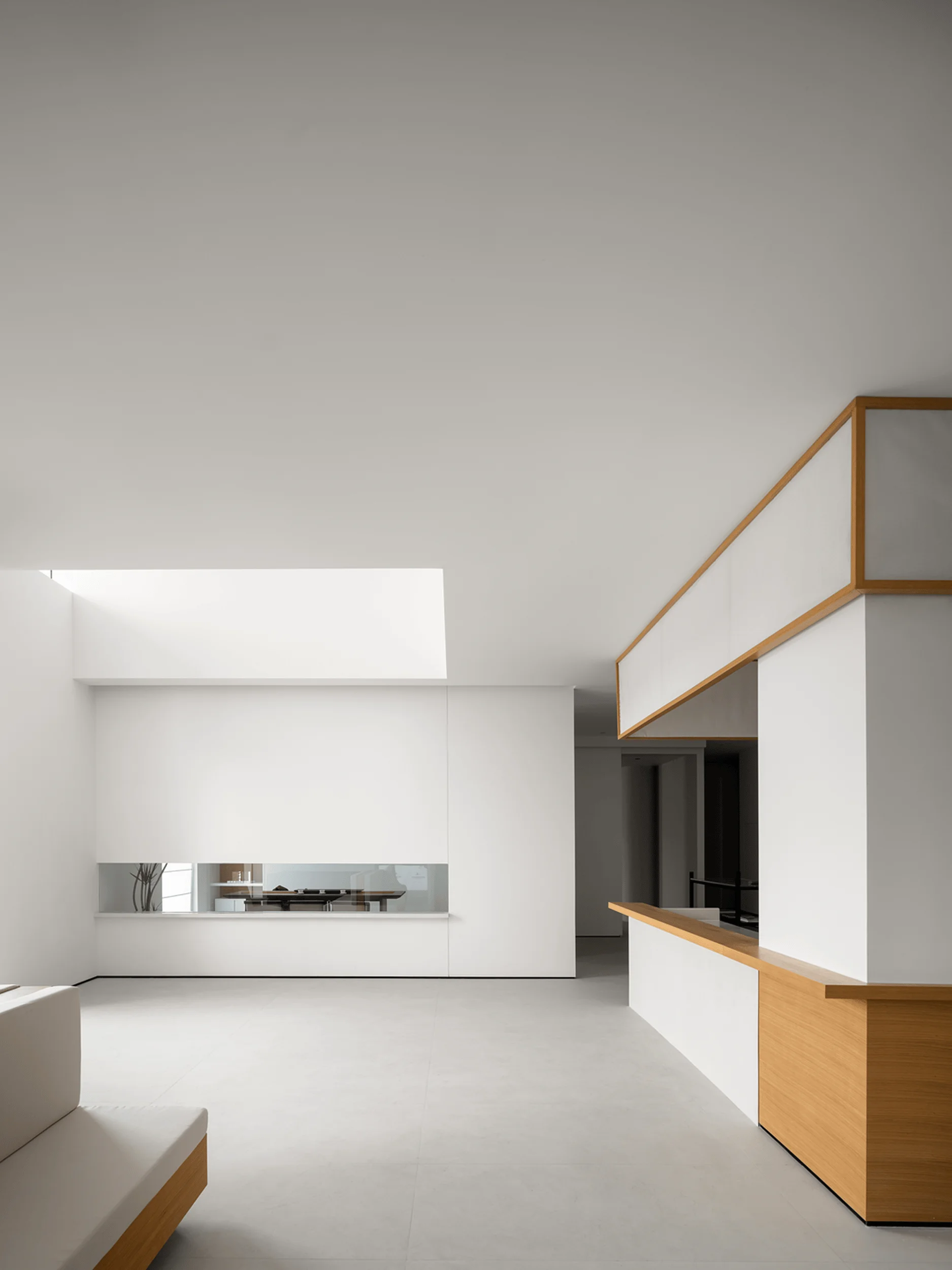
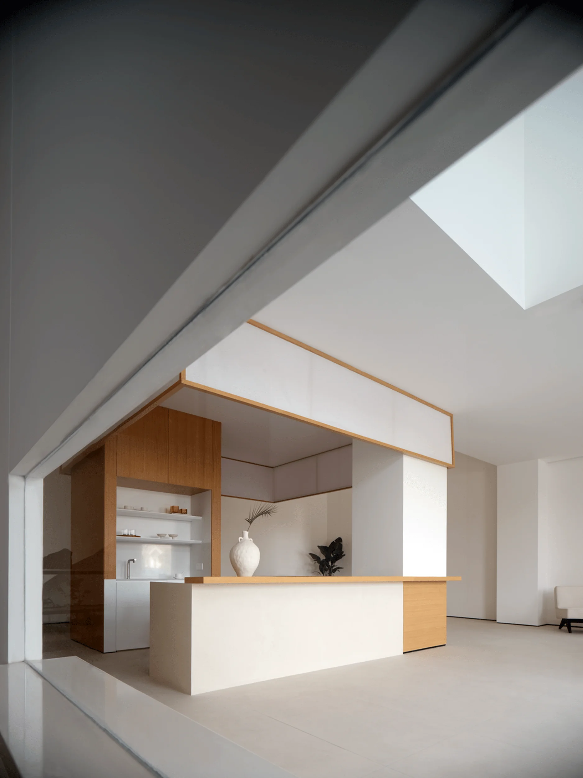
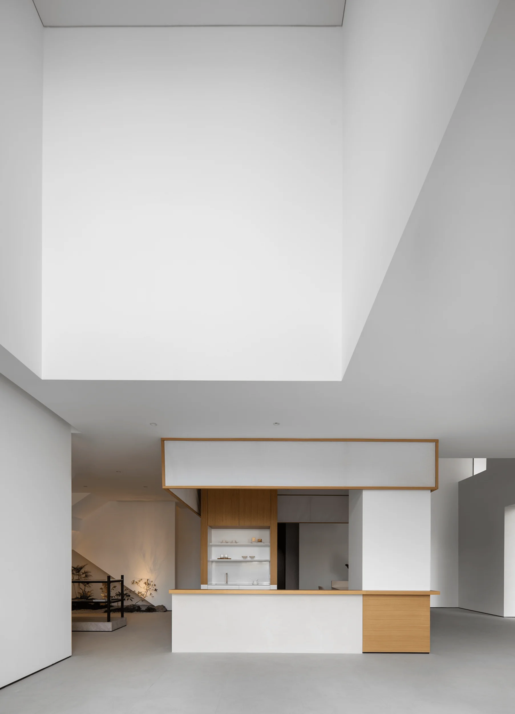
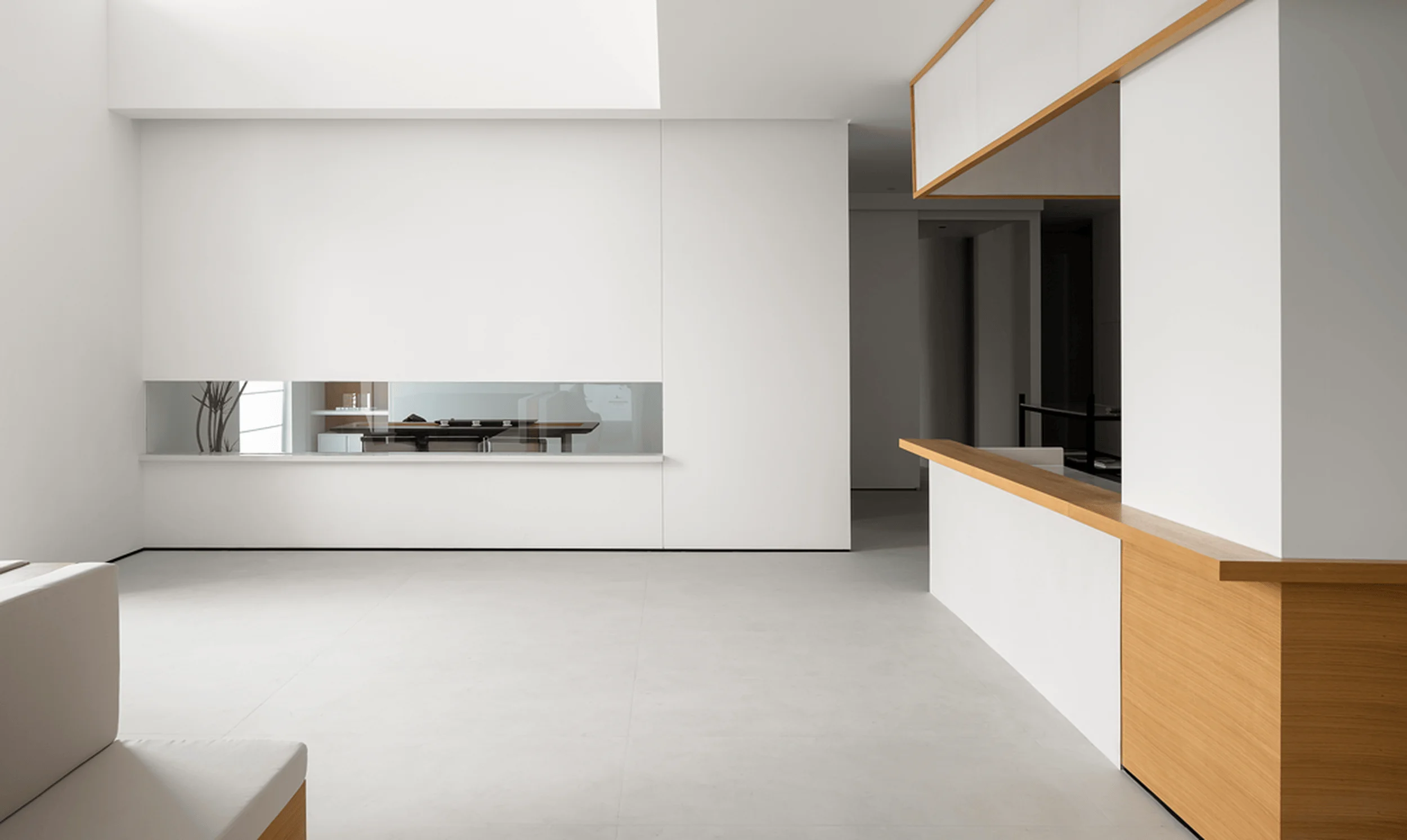
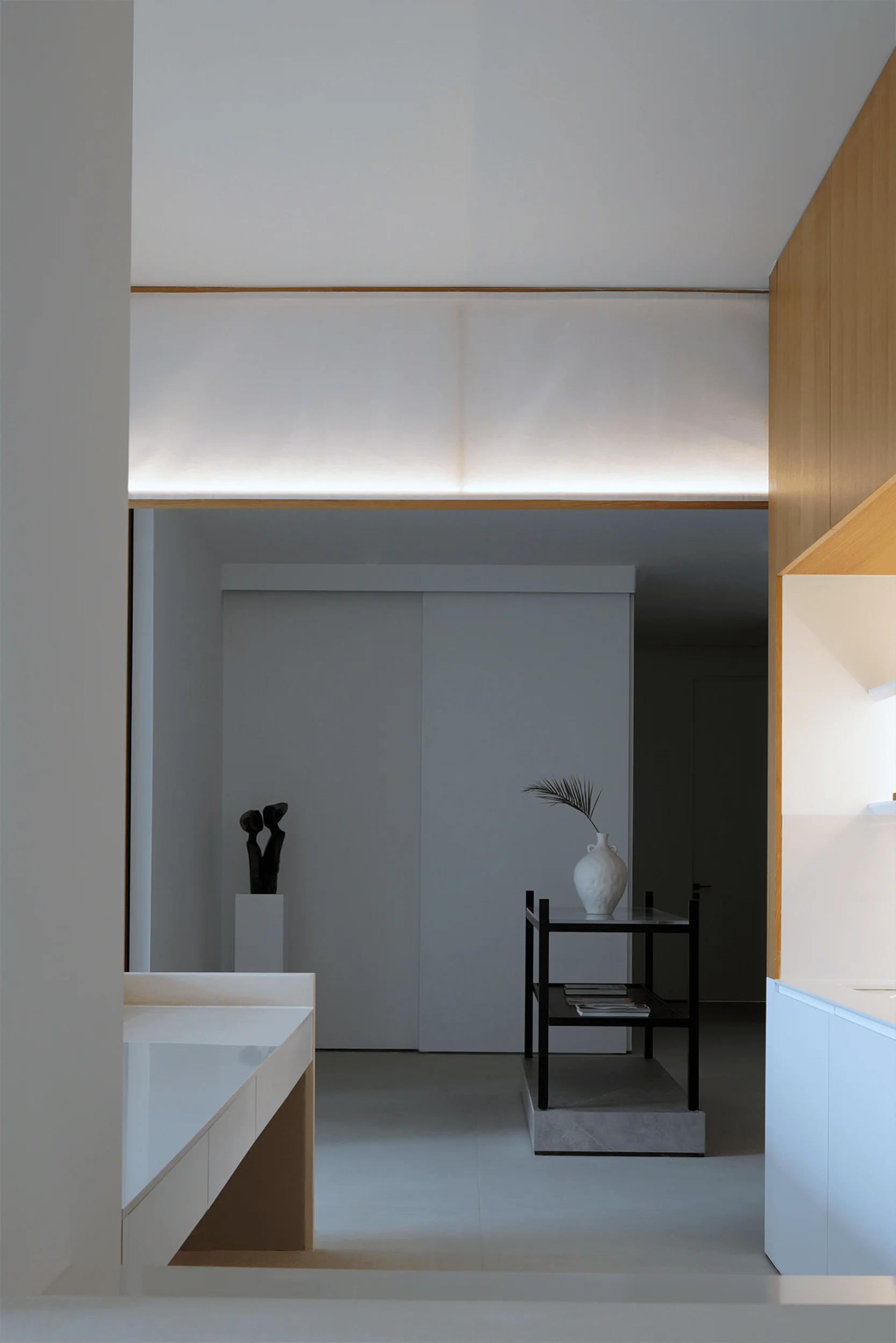
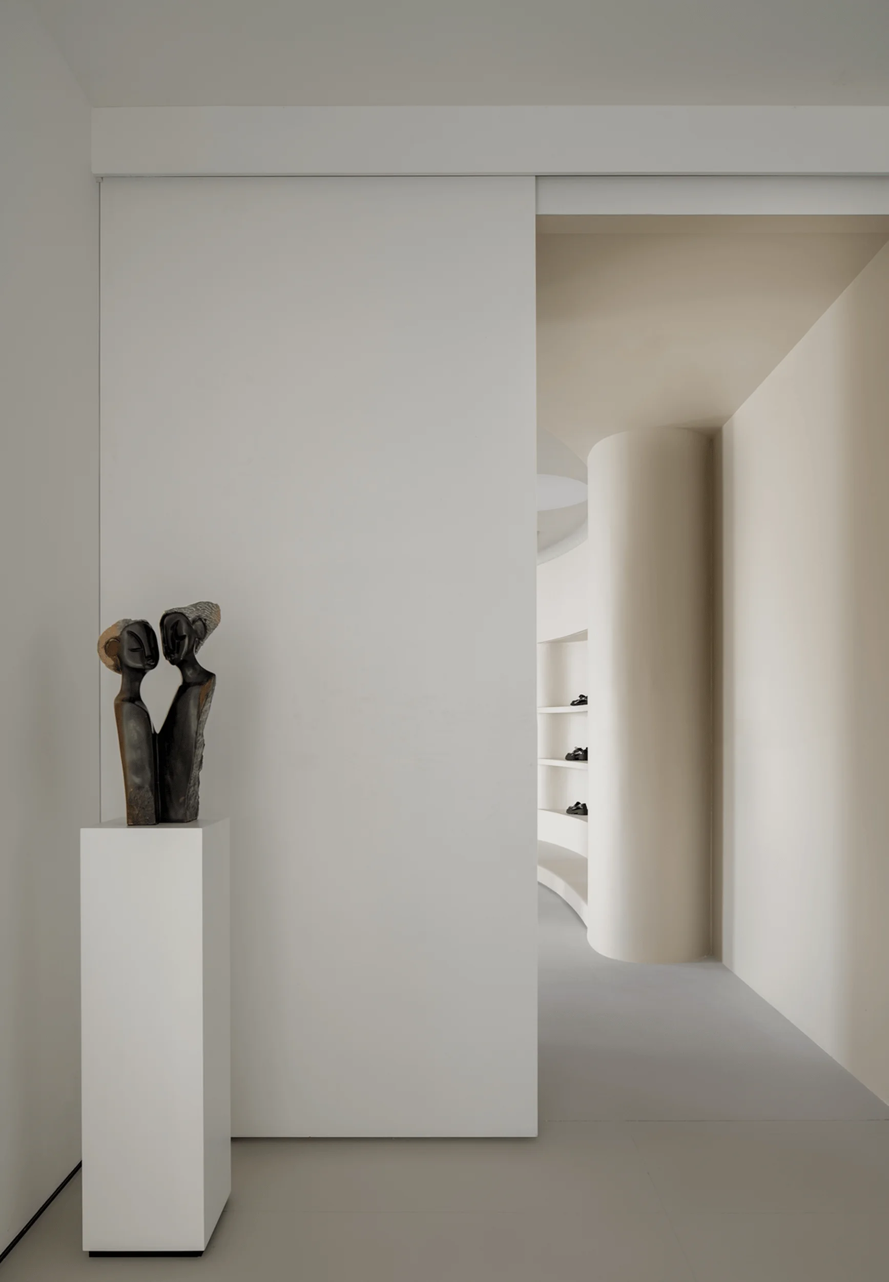
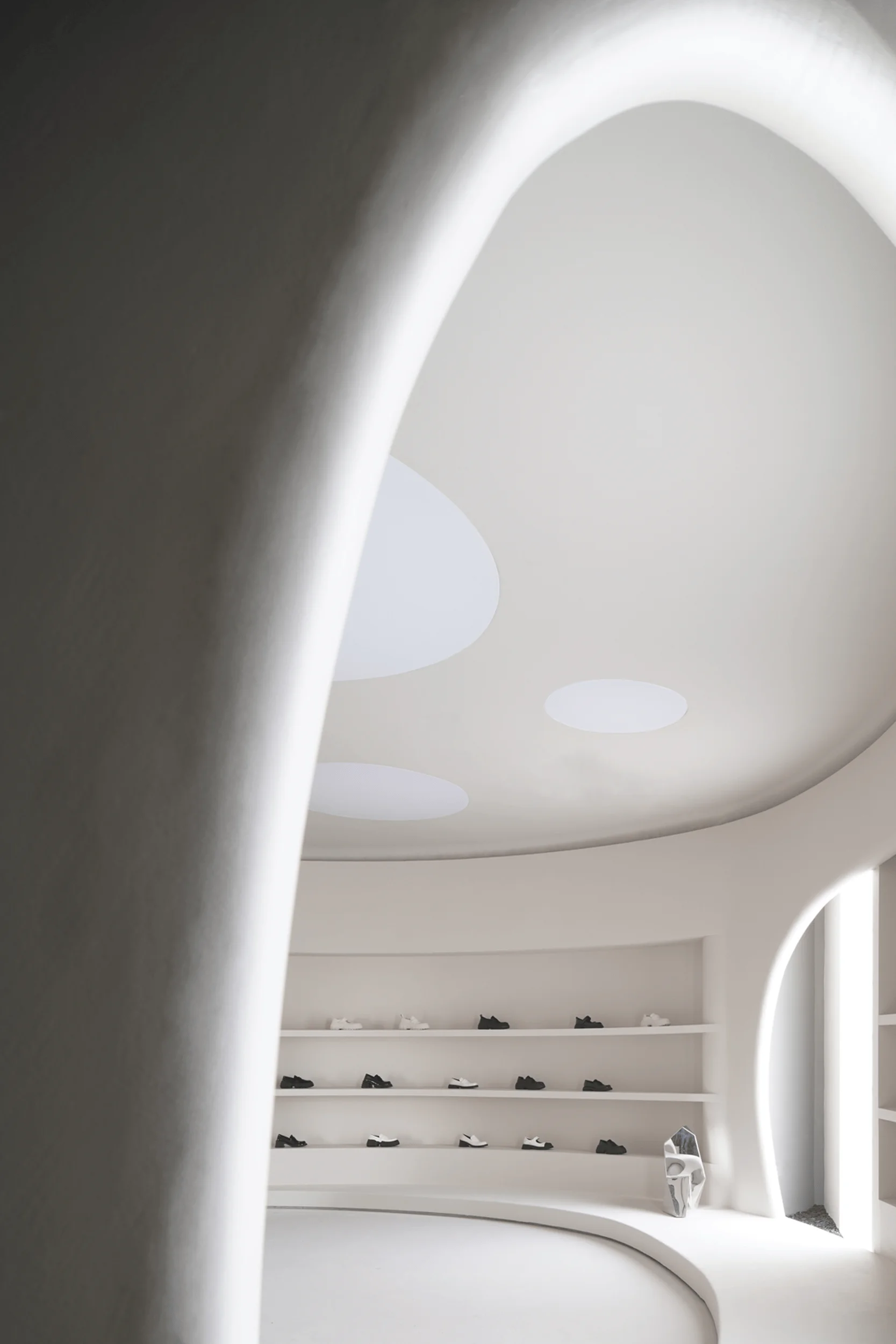
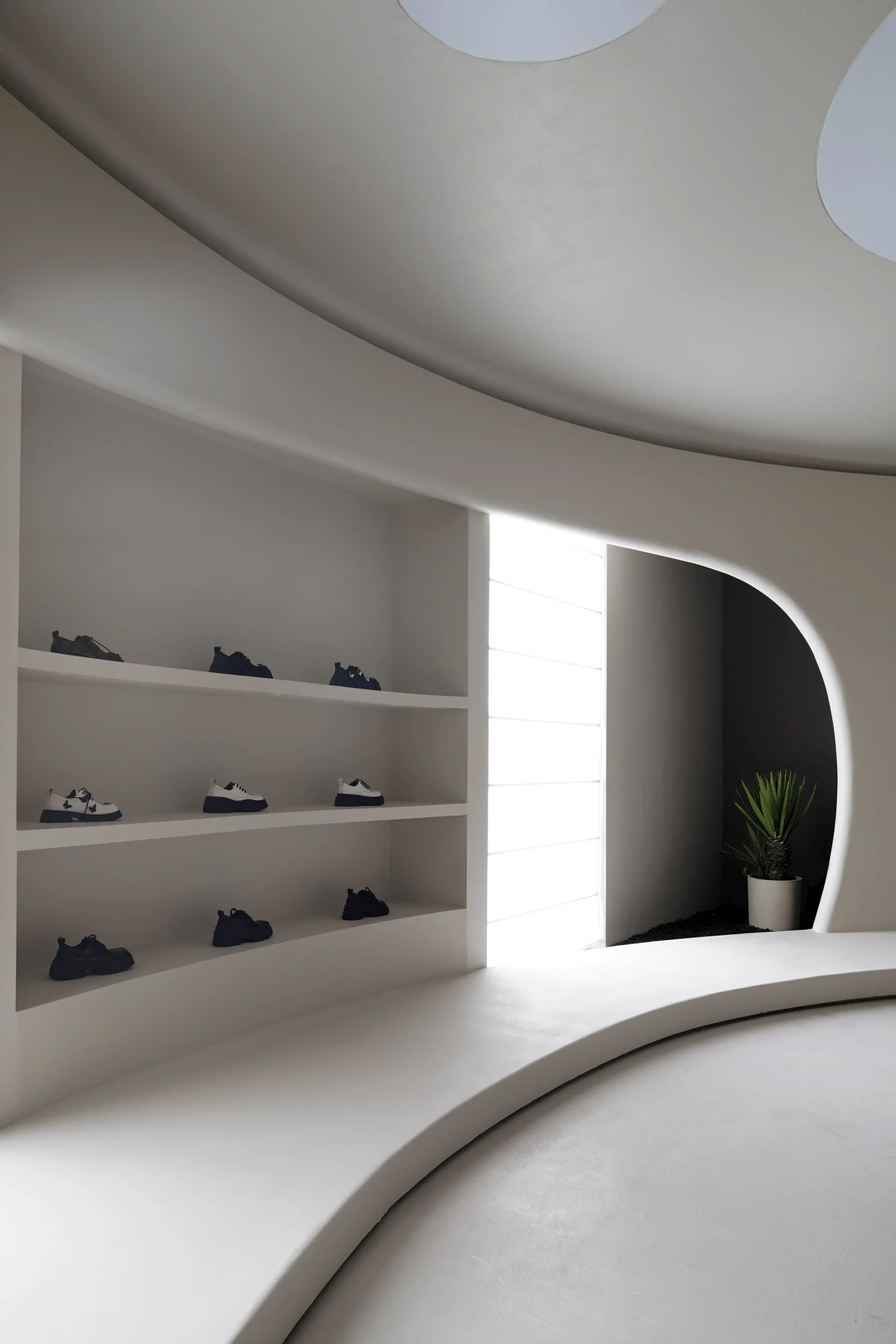
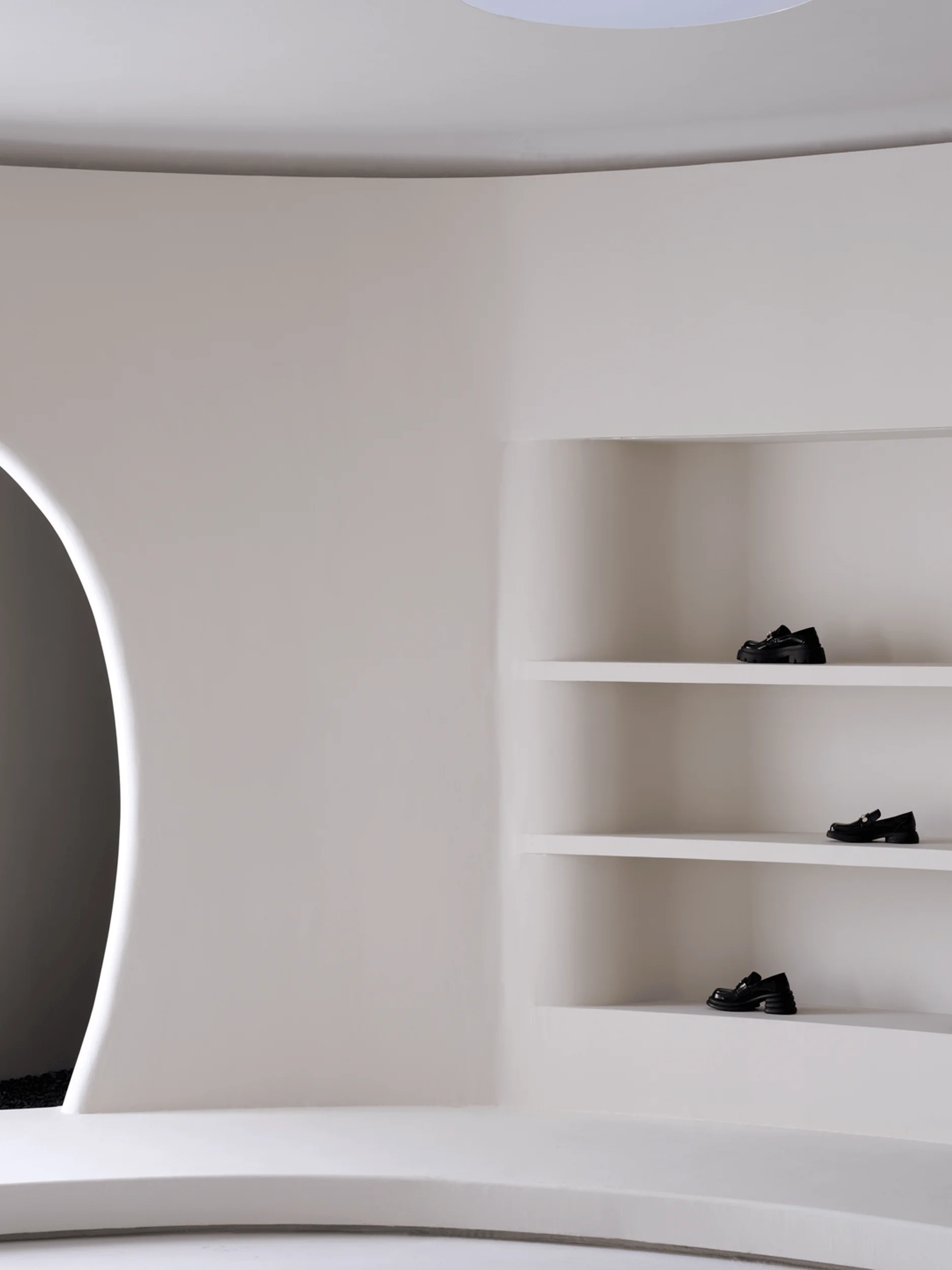
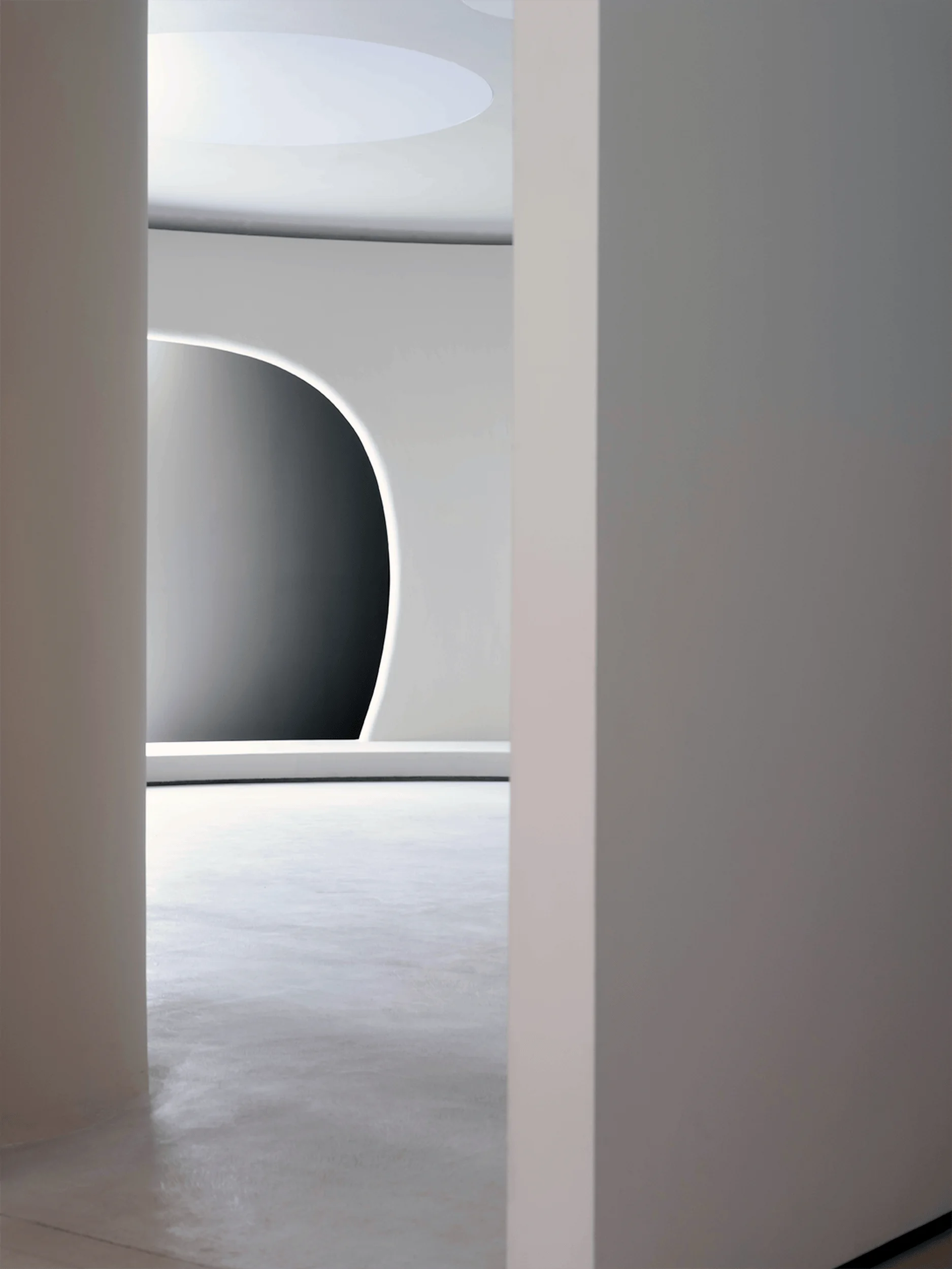
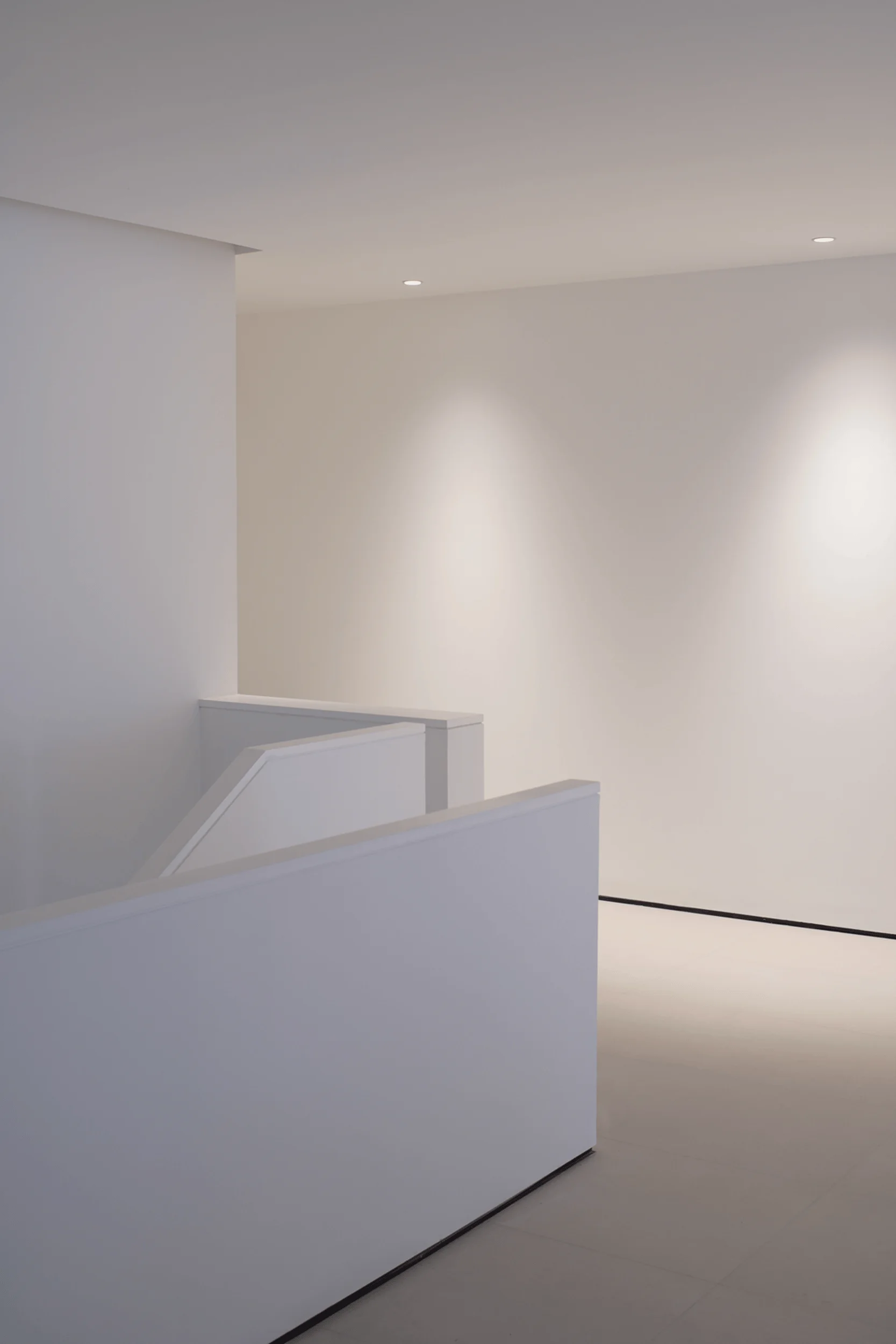
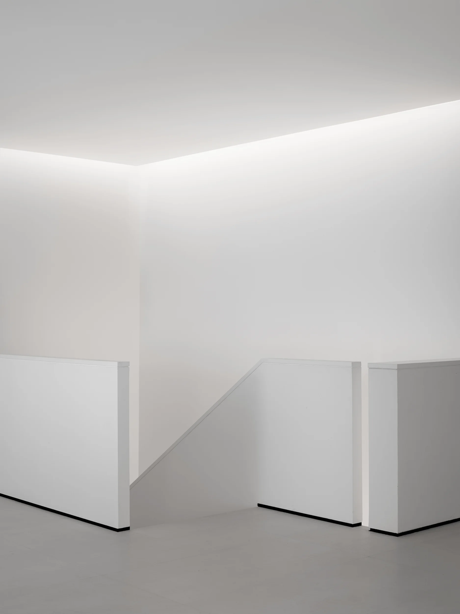
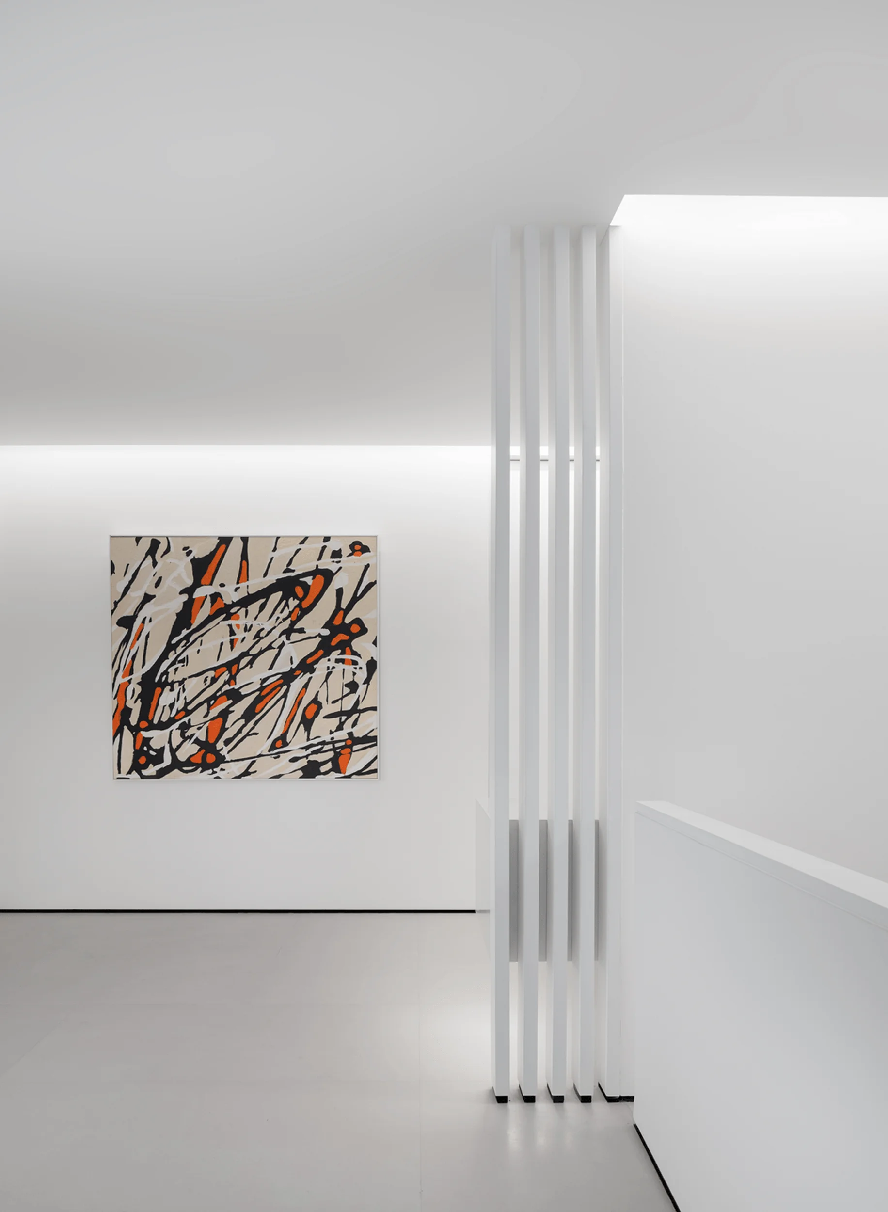
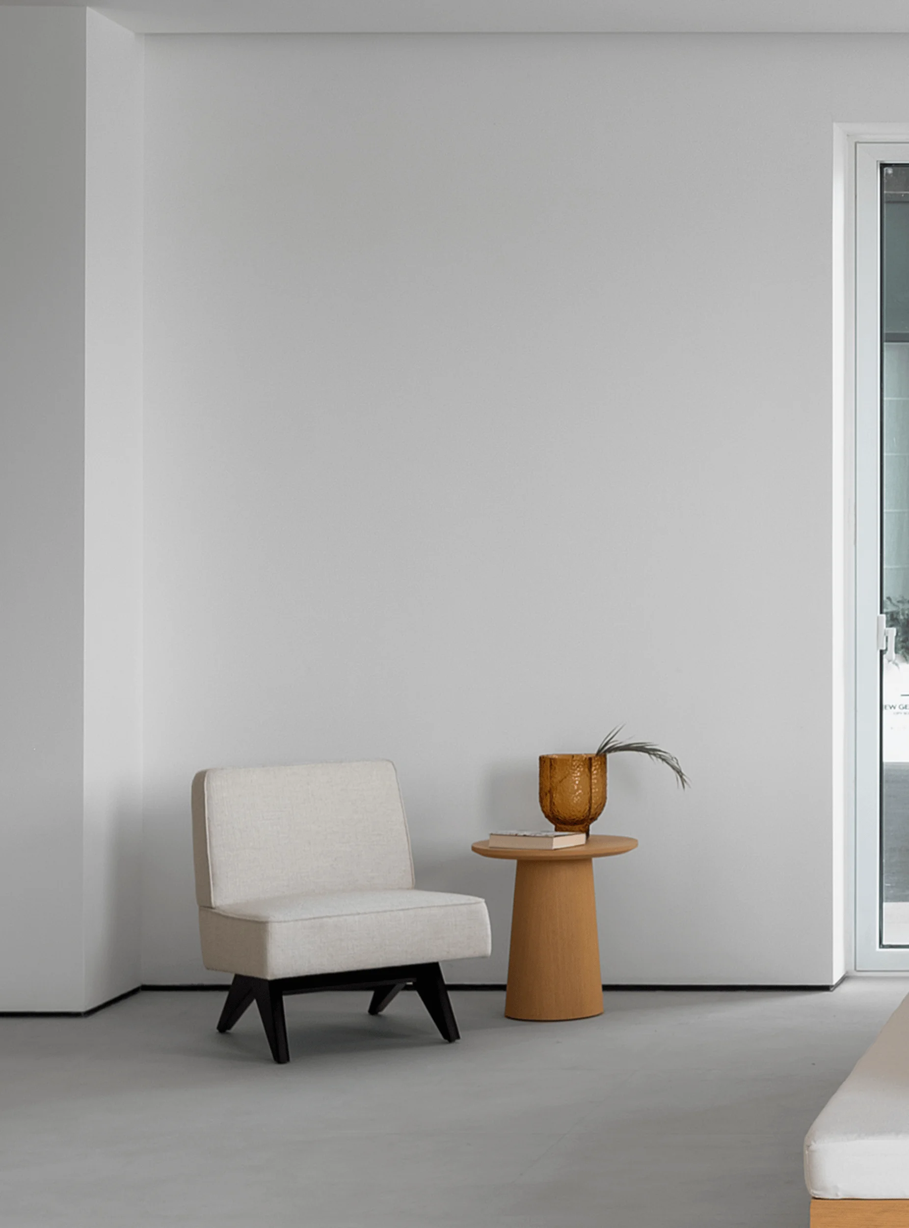
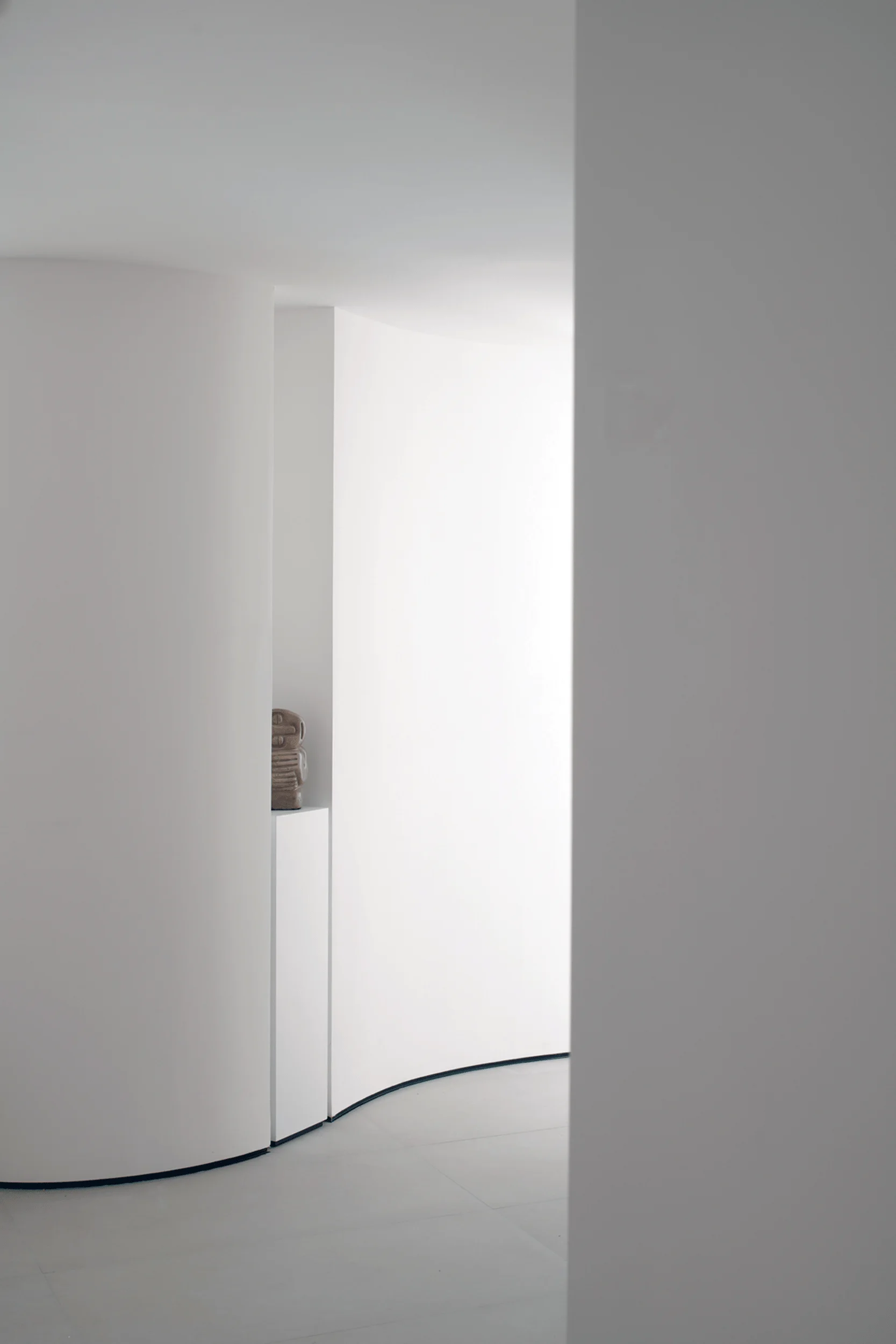
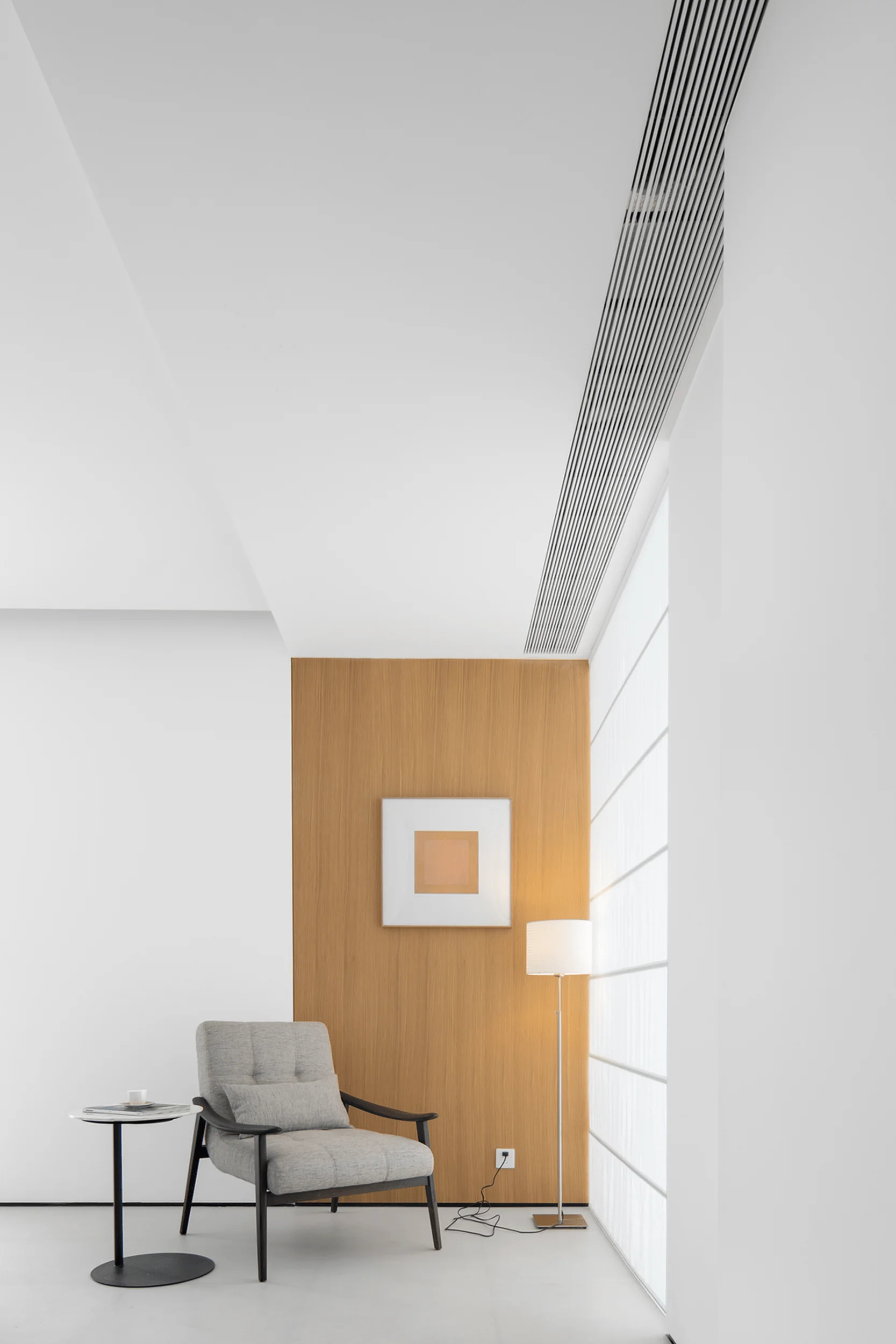
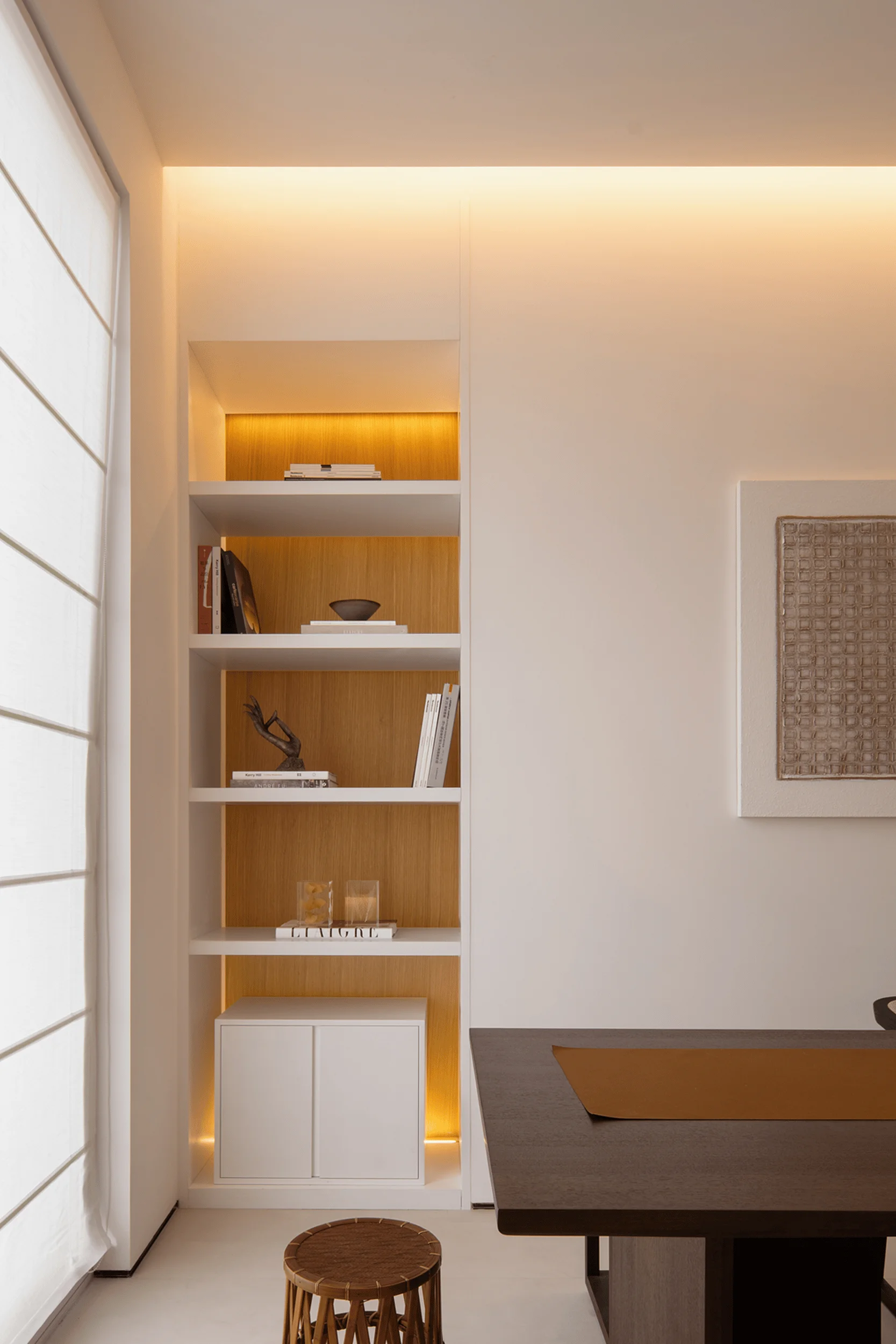
The ground floor serves as both a reception and display area. YiLai Design introduced curved lines into the otherwise orthogonal space to soften its edges and create visual interest. This minimalist aesthetic allows the inherent beauty of the space to shine, enhancing the presentation of the shoe products. The showroom is characterized by its sleek and minimalist design, utilizing artistic paint to create a smooth texture and interplay of light and shadow, highlighting the minimalist interior design trends in China.
Spatial Coordination and Practicality
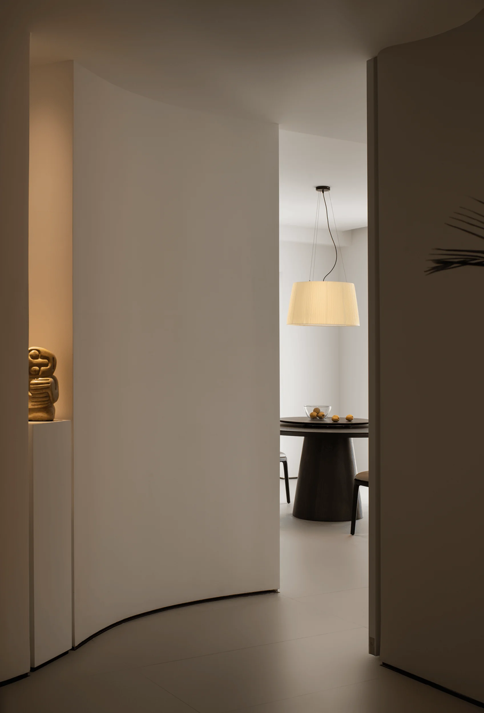
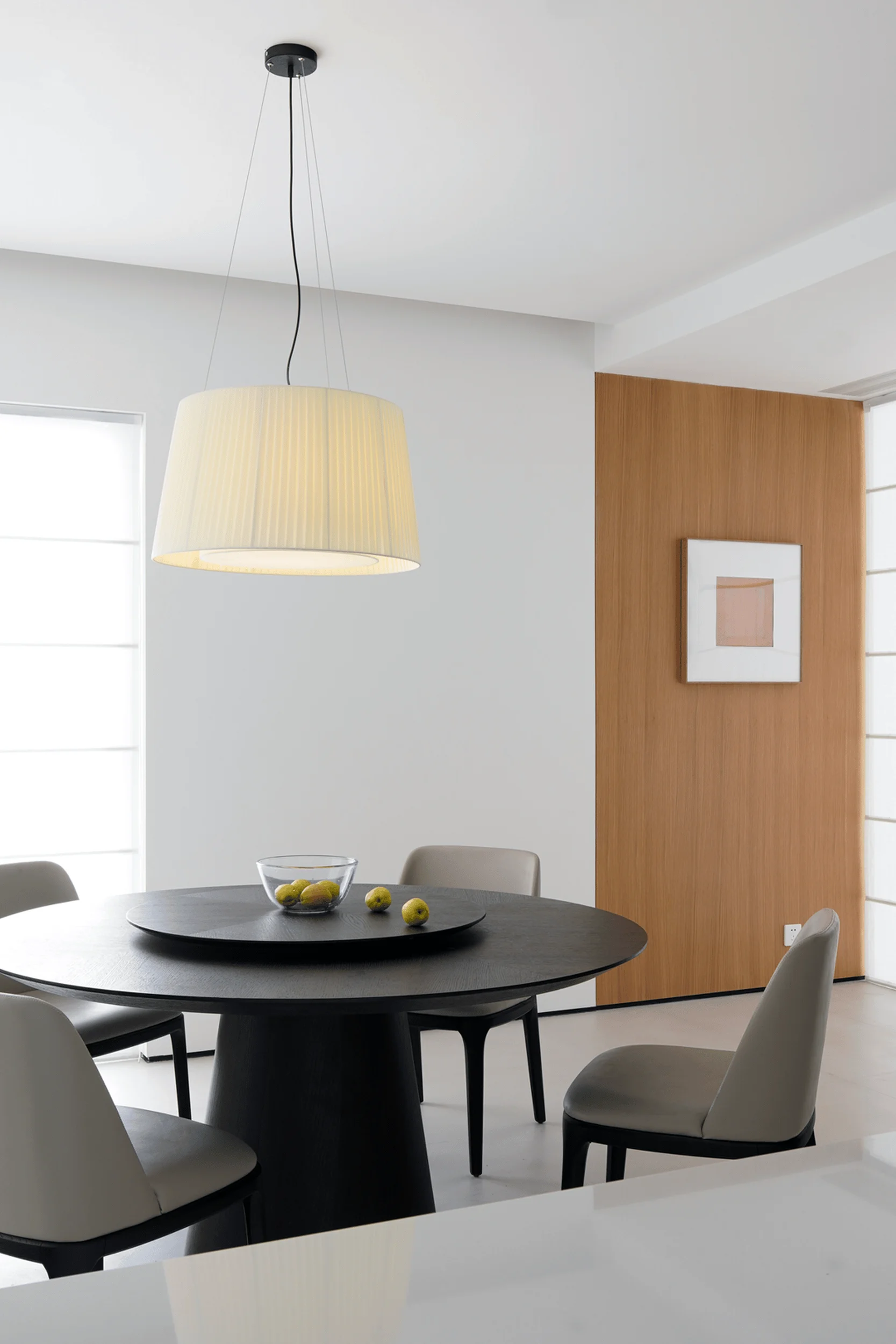
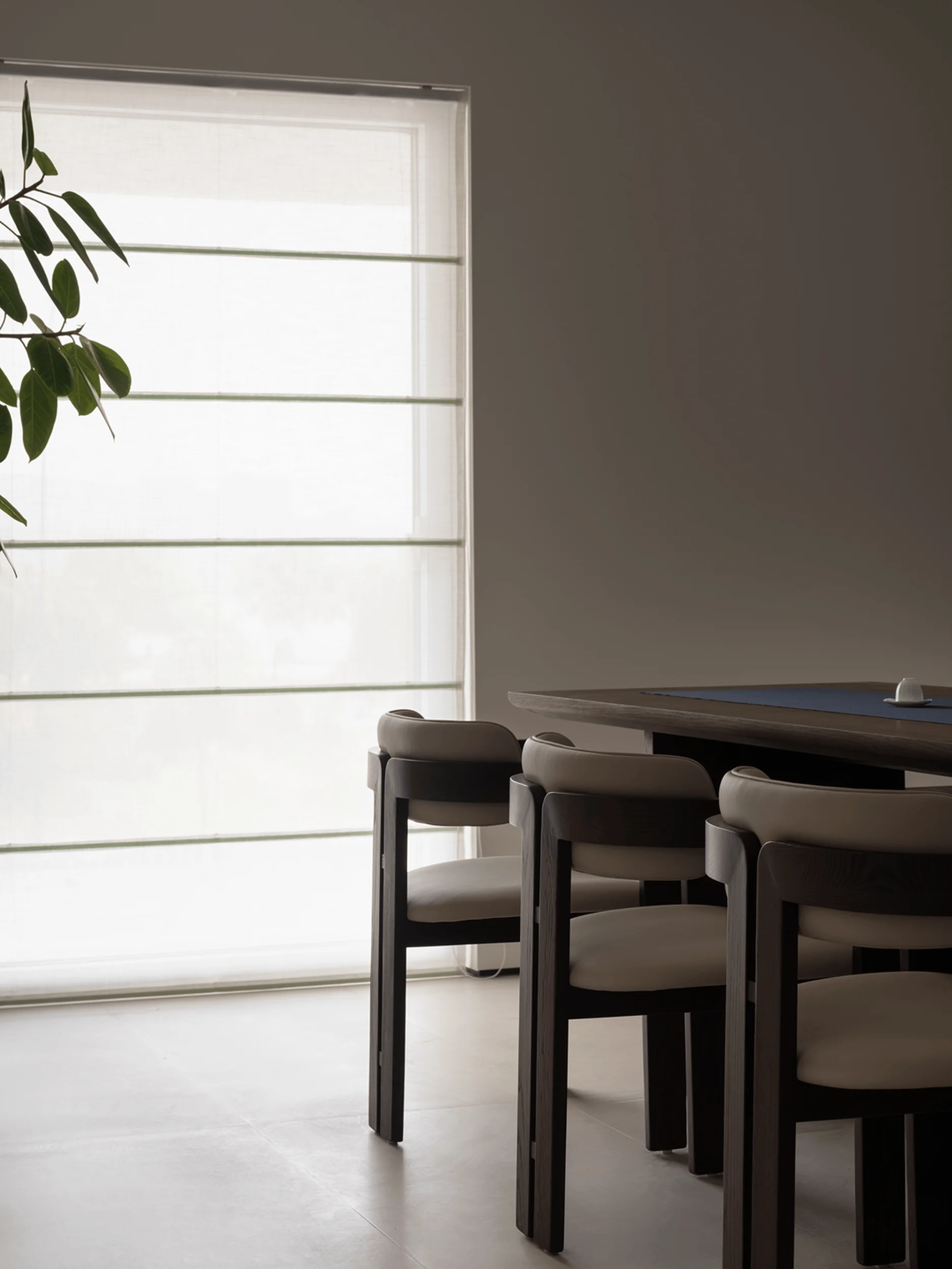
The second floor echoes the ground floor’s curved elements, creating a sense of continuity and minimalist interior design in China. As a more inward-facing space, the design transitions towards a focus on ambiance. The practicality-driven approach ensures the layout and material choices prioritize functionality. The dining area is strategically positioned near the riverside with optimal views and connects to the ground floor’s double-height space, creating a dynamic three-dimensional interaction. This setup adds rhythm and vitality to the dining experience.
Exterior Design and Minimalist Aesthetic
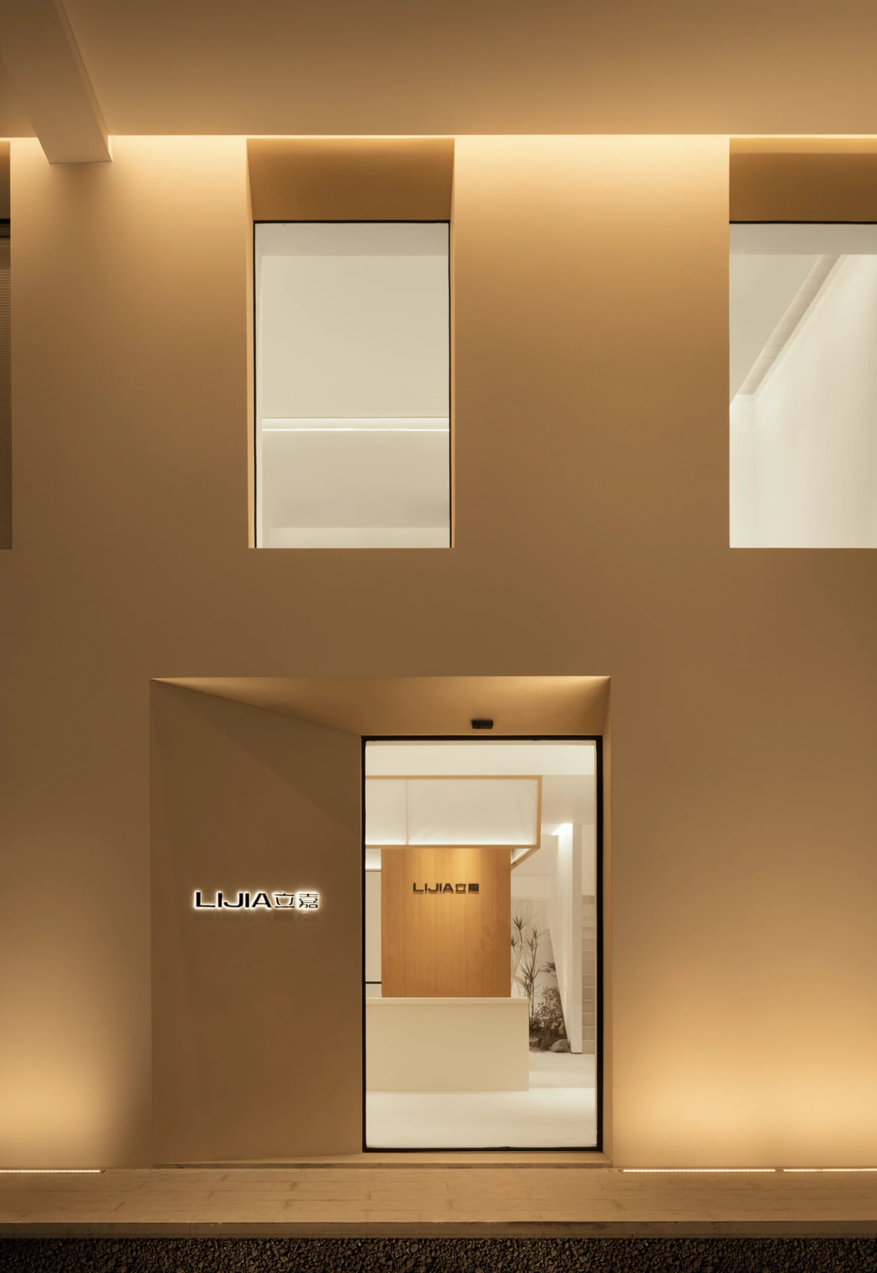
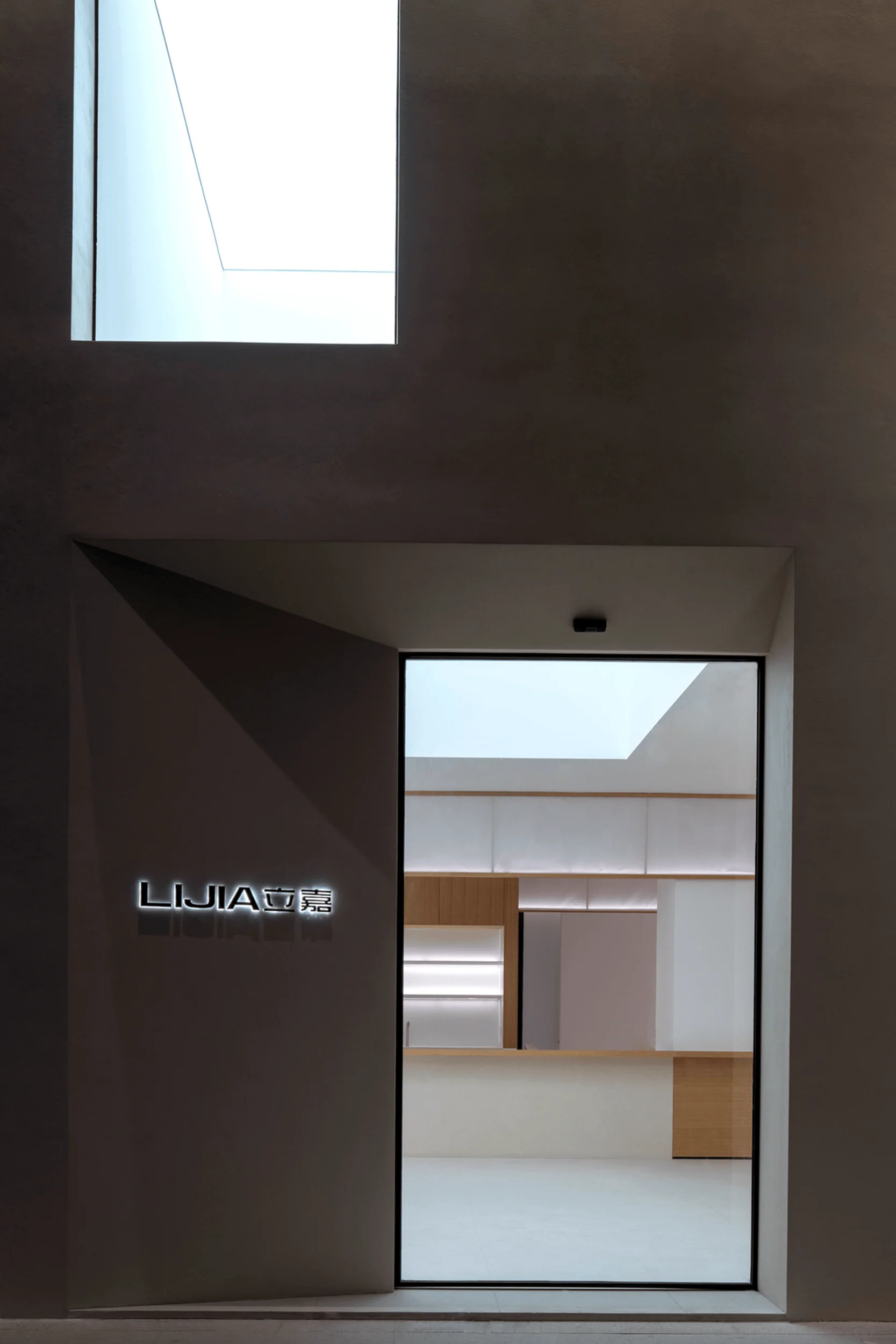
YiLai Design aimed for a youthful and minimalist aesthetic for the building’s exterior. The extensive use of white art paint creates a sense of purity and weakens the building’s boundaries. Light filtering through the glass windows gives the building a futuristic appeal, especially at night, drawing the attention of passersby. This approach complements the minimalist interior design in China and ensures the design prioritizes functionality without unnecessary embellishments. The minimalist interior design principles in China are embodied in the showroom’s emphasis on functionality and minimal aesthetics.
Design Team and Philosophy
YiLai Design, a young and dynamic spatial design team, champions innovation and exploration. Their approach integrates diverse information and technology to create minimalist commercial interior design in China. They are known for designing spaces that embody multi-dimensional aesthetics and cater to practical needs. The Boundless Future Exhibition Hall is a testament to their commitment to minimalist design principles and innovative spatial solutions.
Project Information:
Project type: Exhibition Hall
Architect: YiLai Design
Area: 590㎡
Project Year: 2023
Location: China
Photographer: Luo Wenjie, Xiao Tingting, Zhang Xiaoguang


