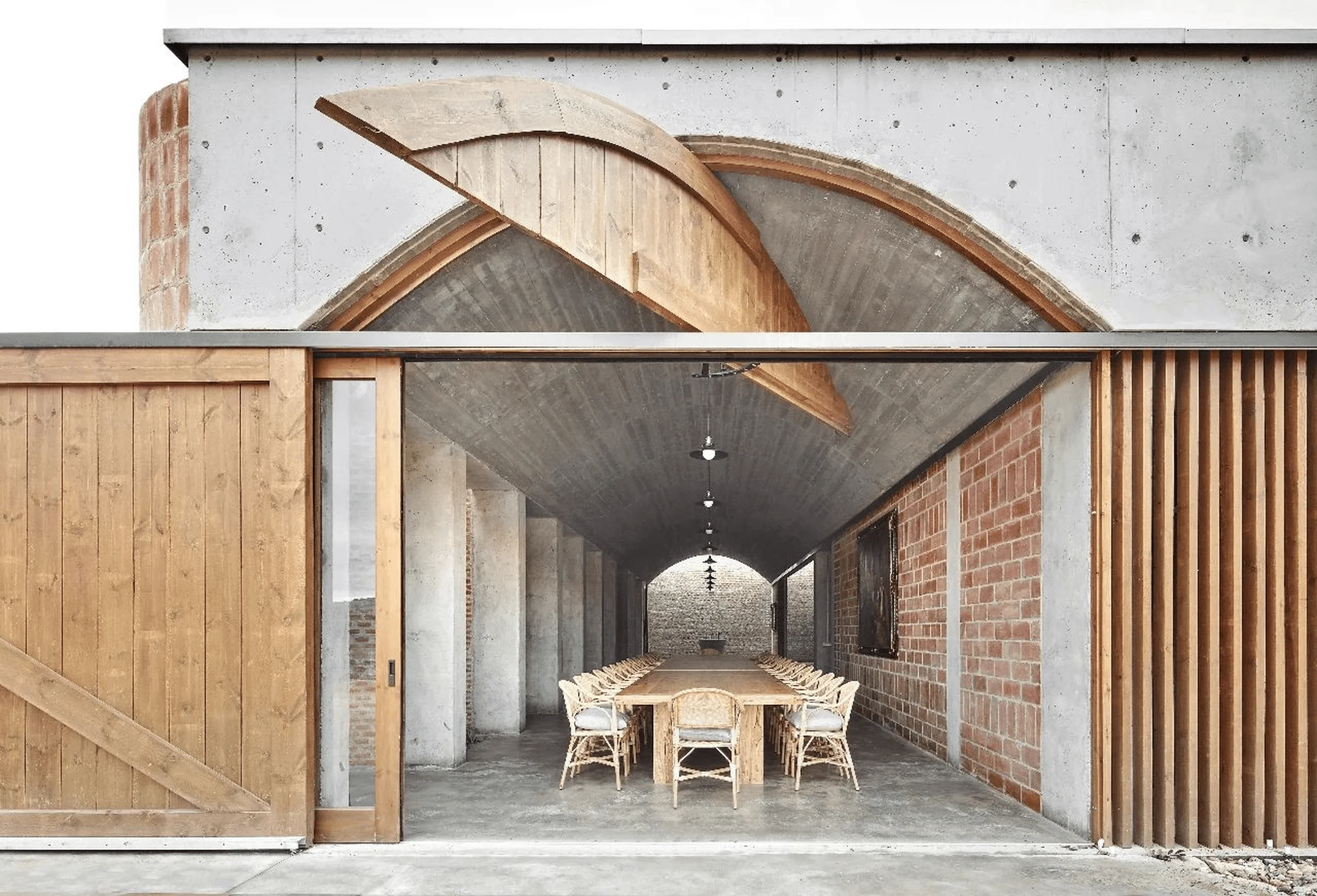
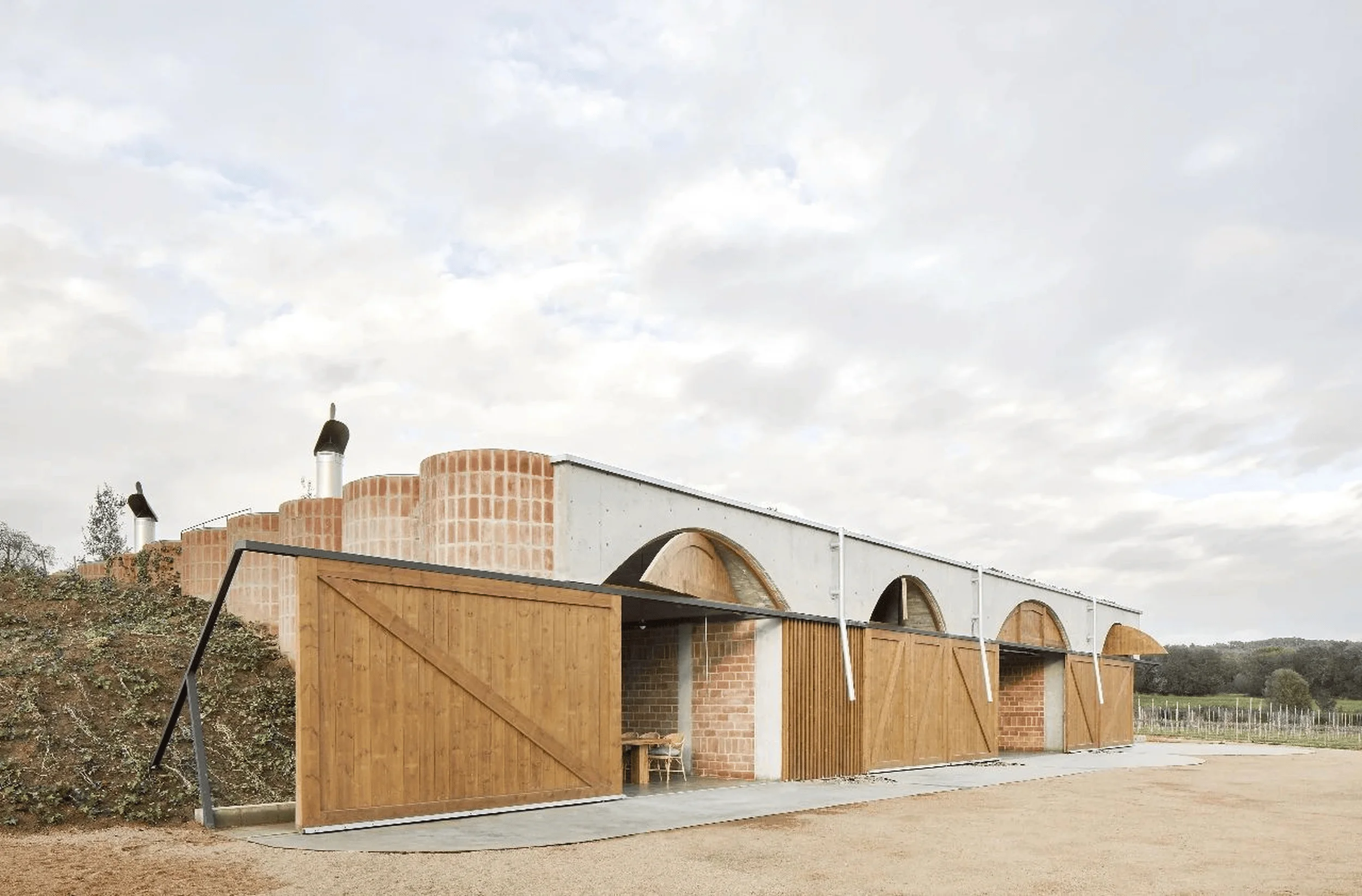
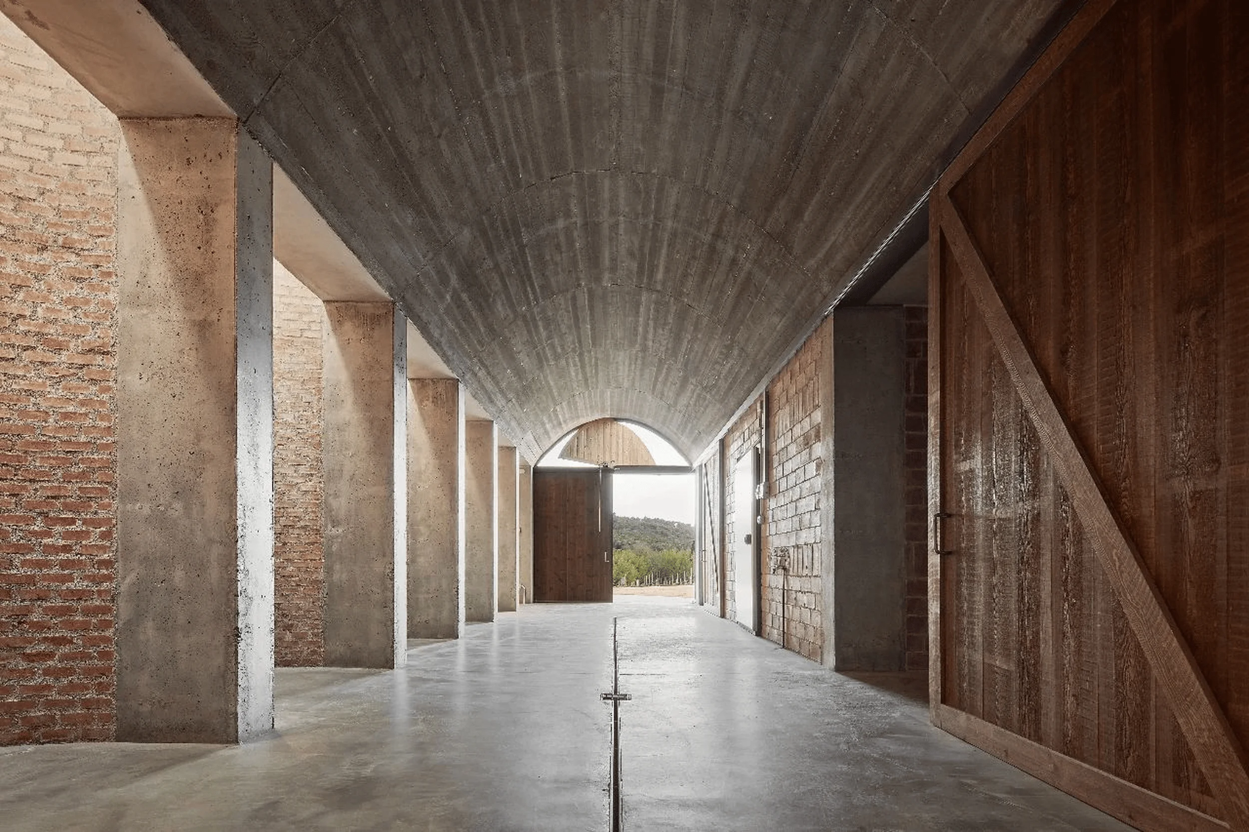
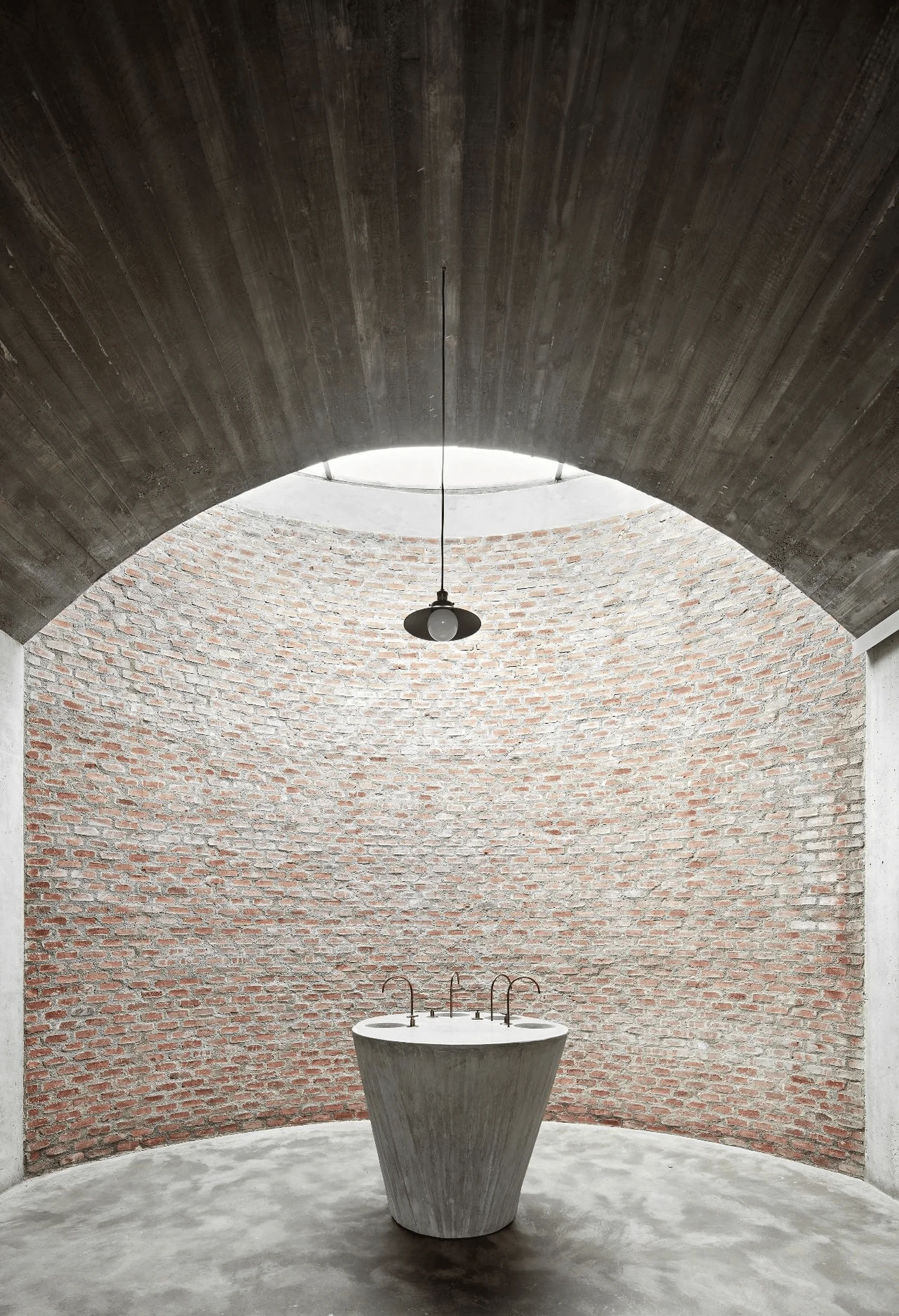
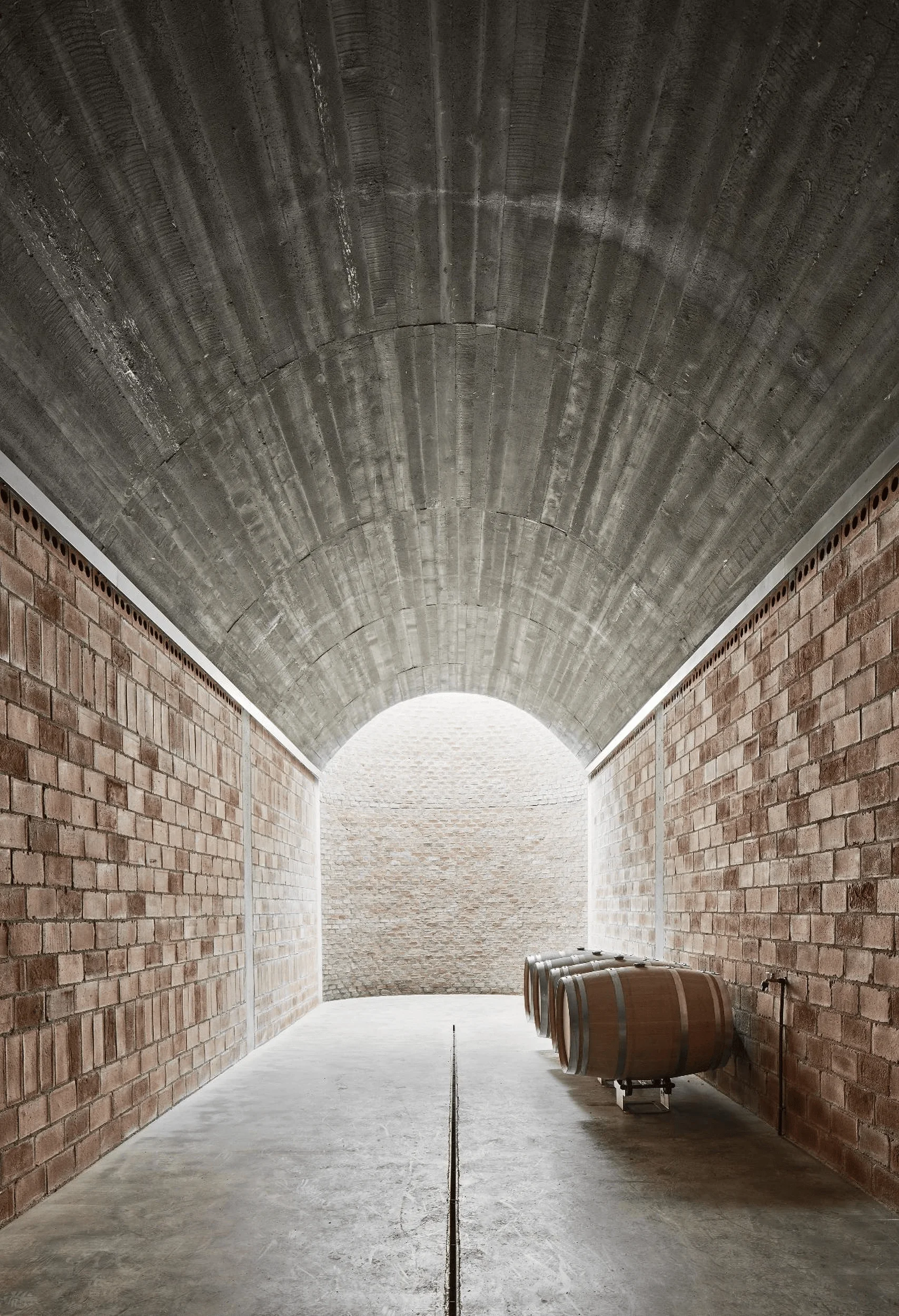
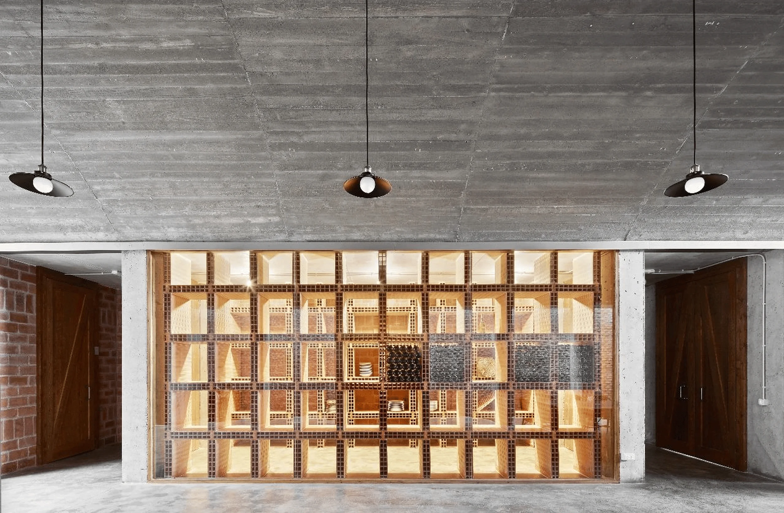
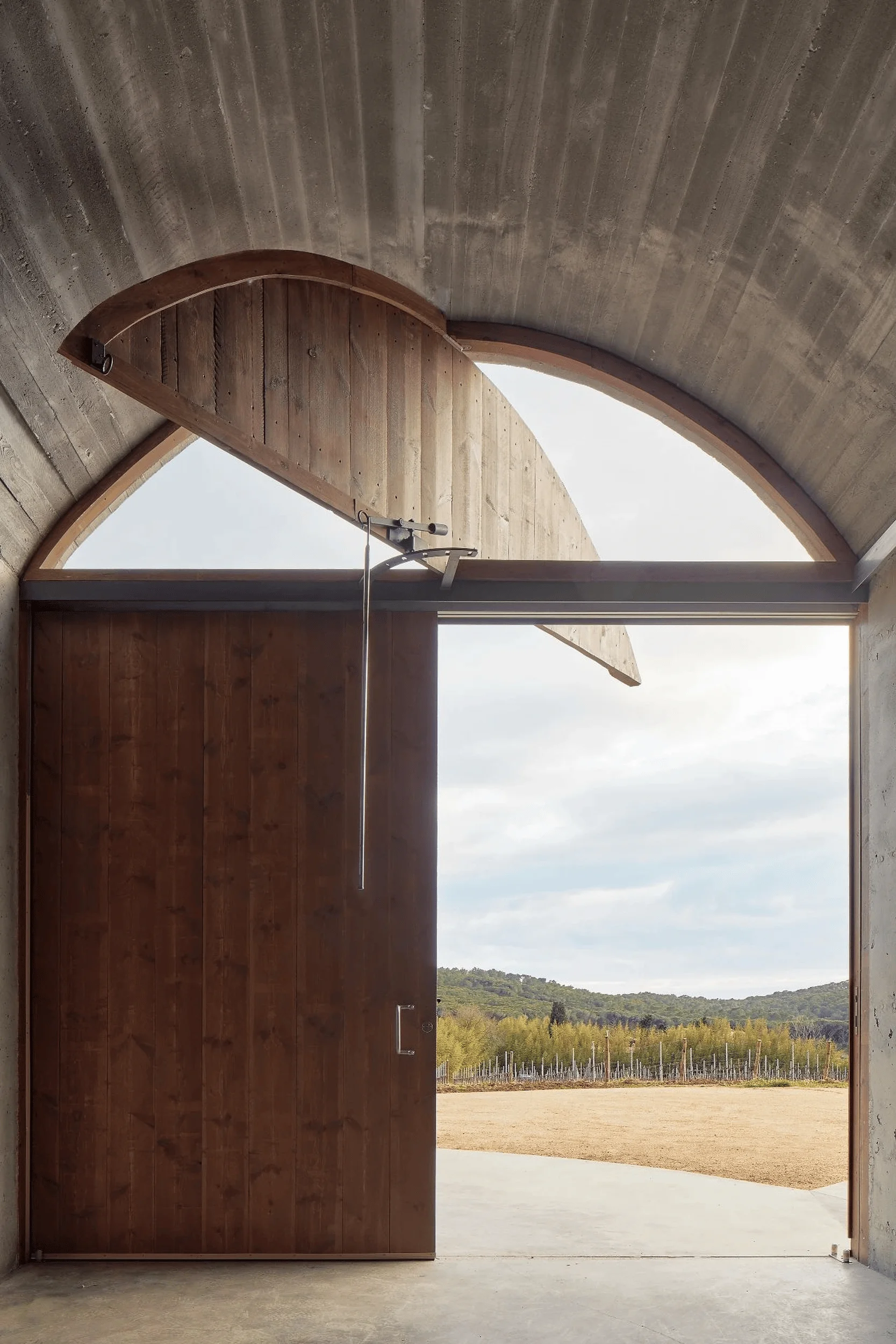
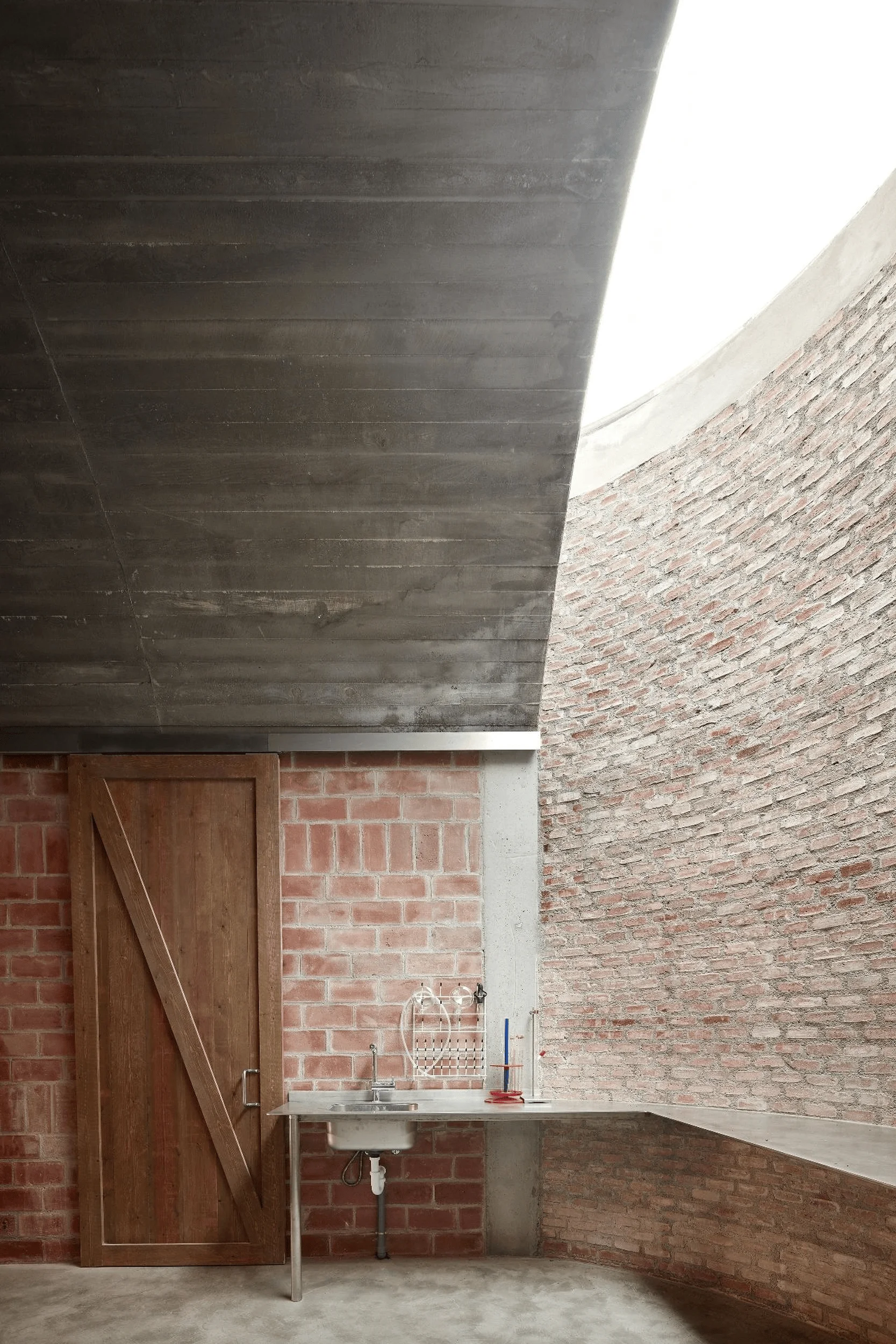
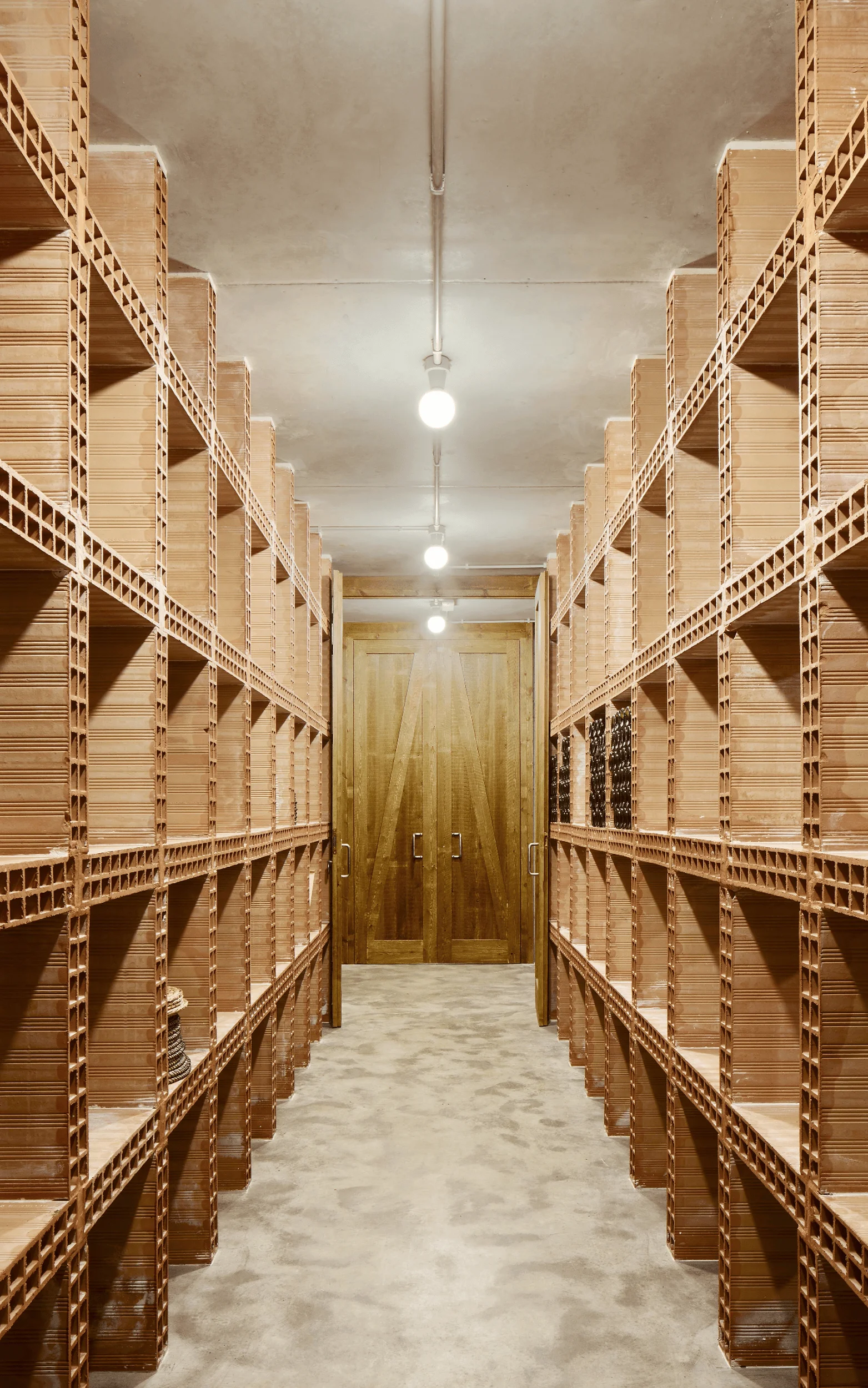
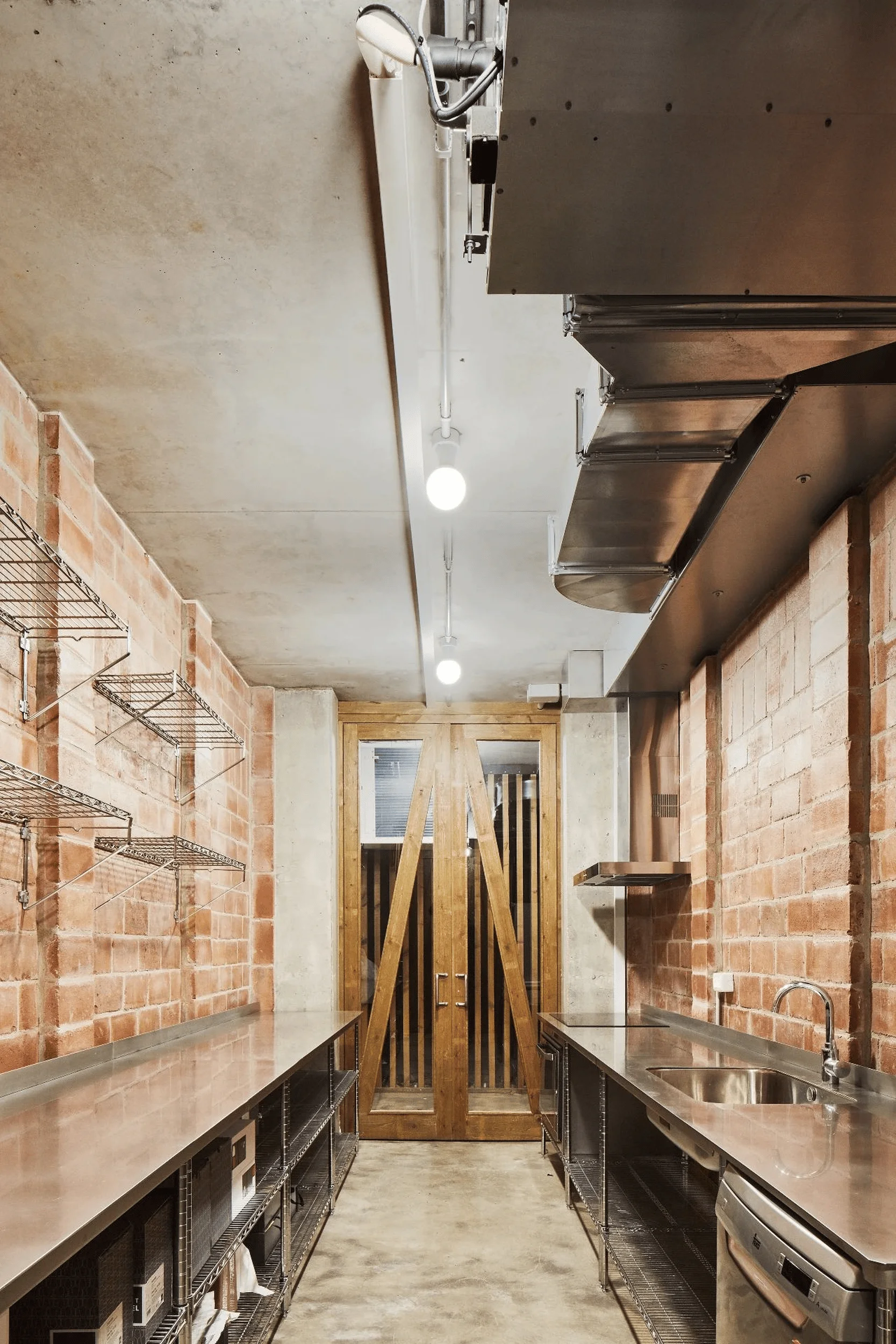
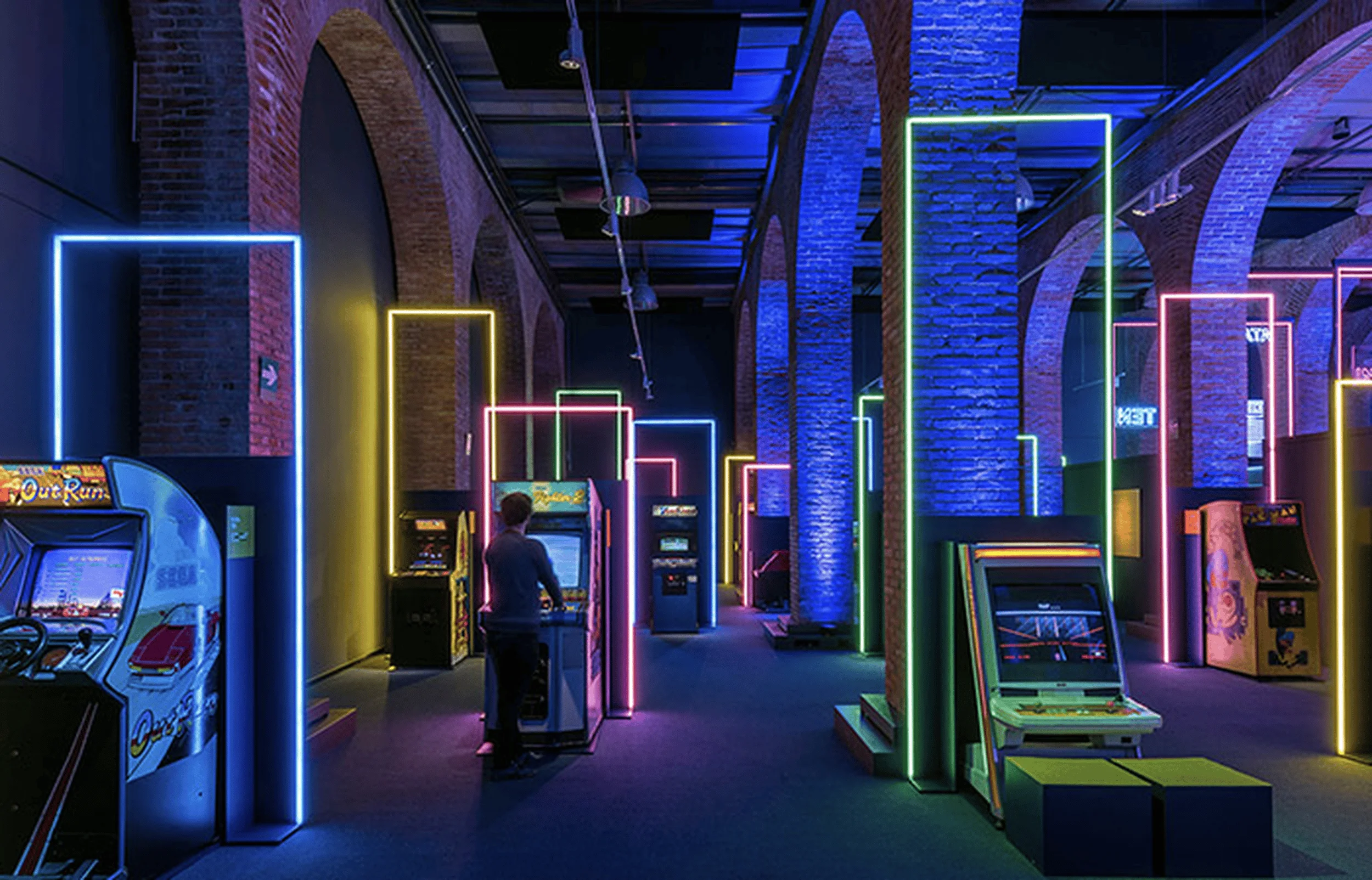
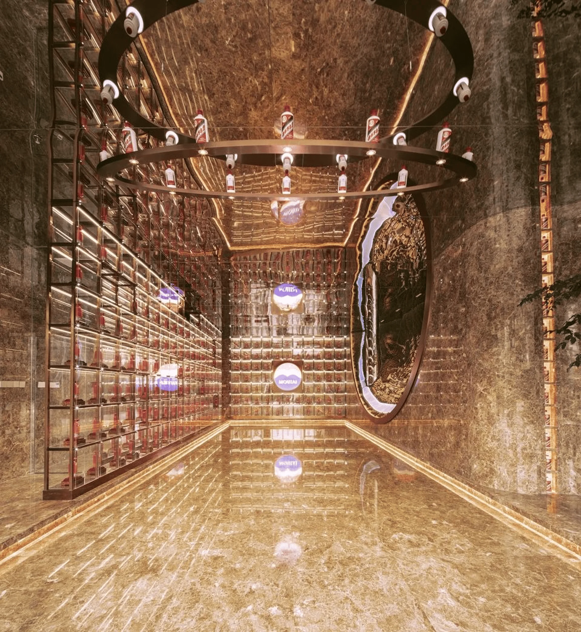
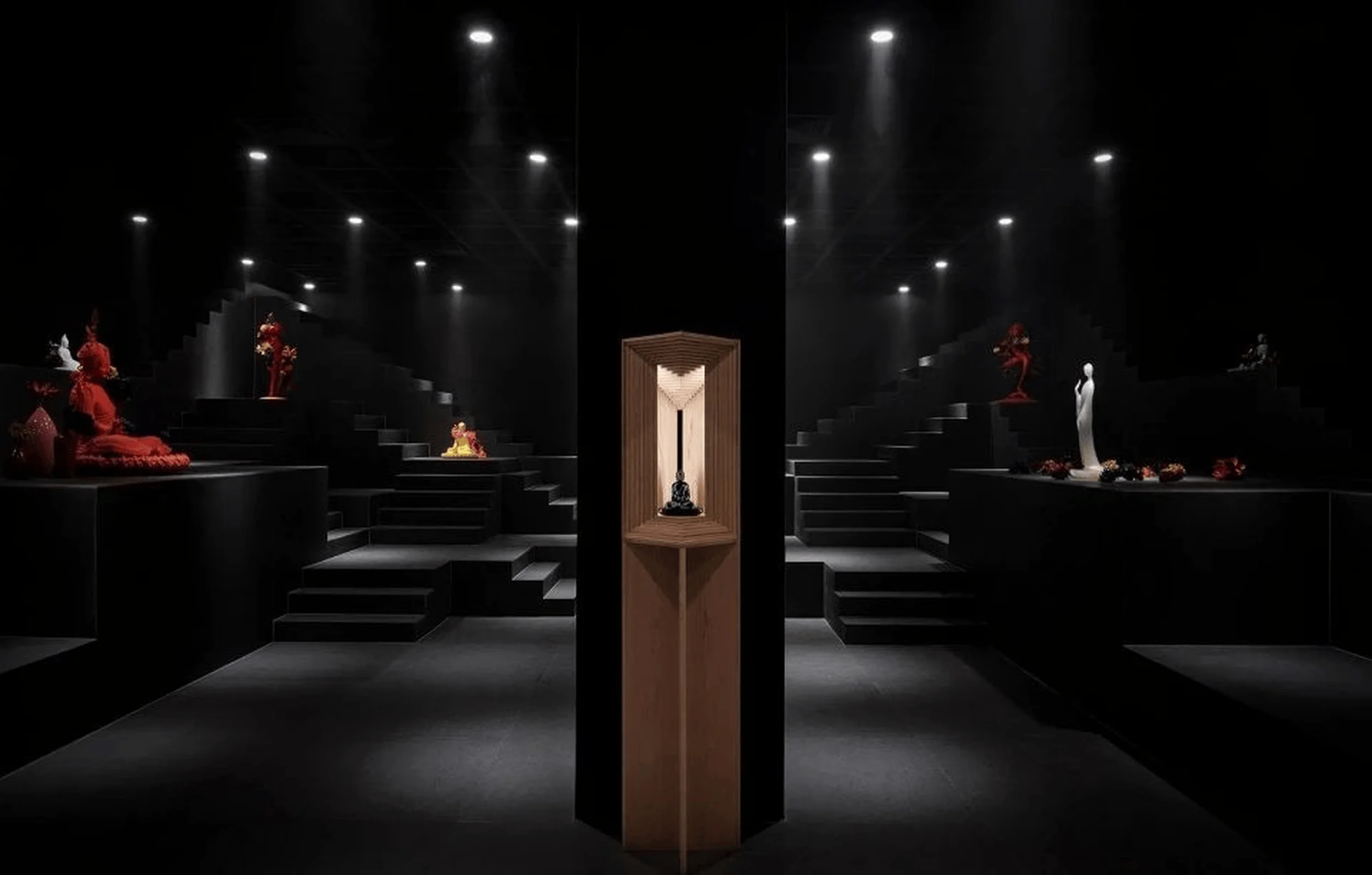
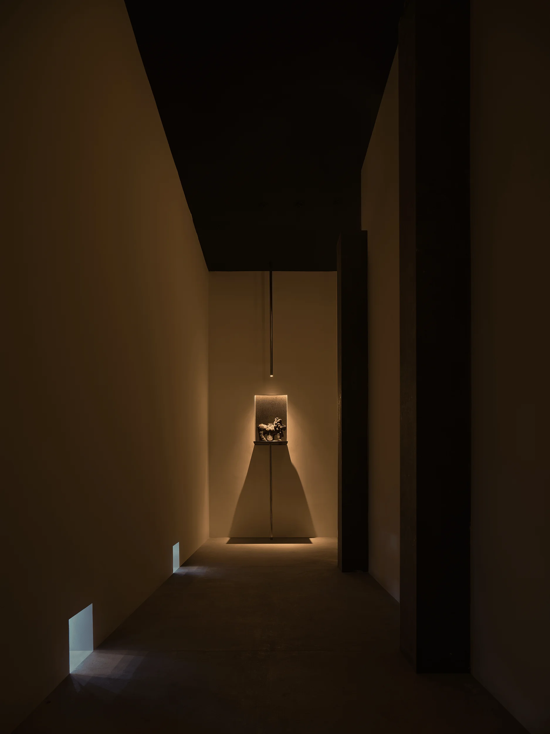
Carles Taché Art Gallery in Spain emphasizes spatial clarity and light for contemporary art installations.
Contents
Project Background
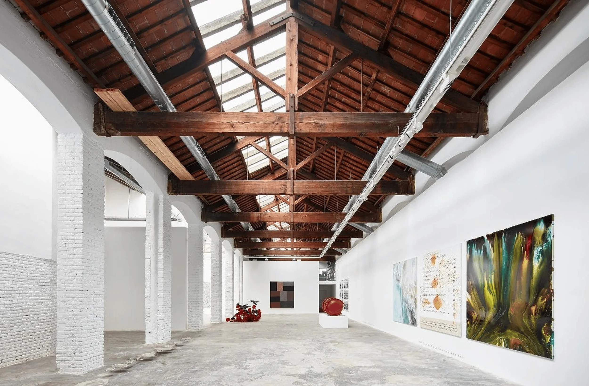
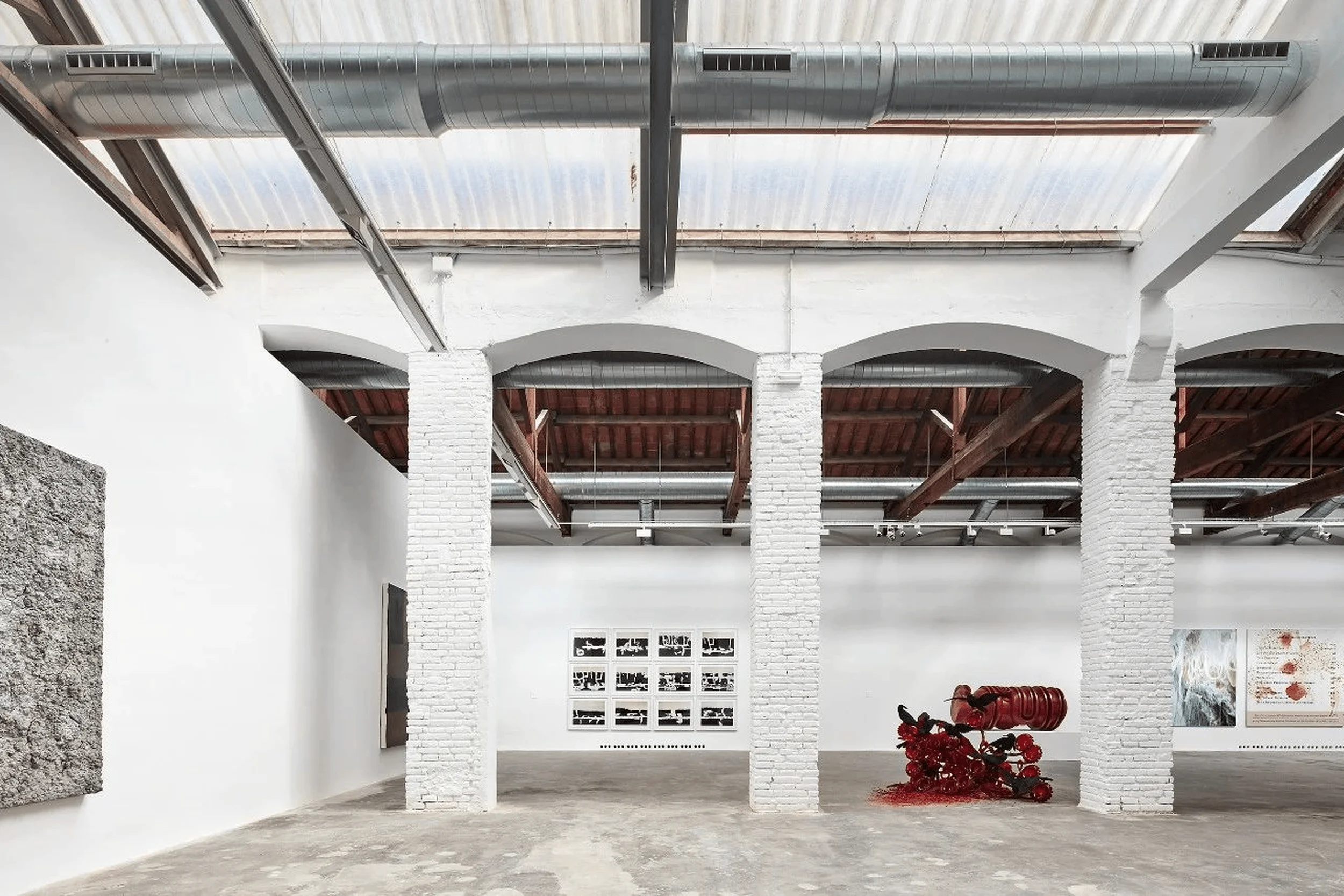
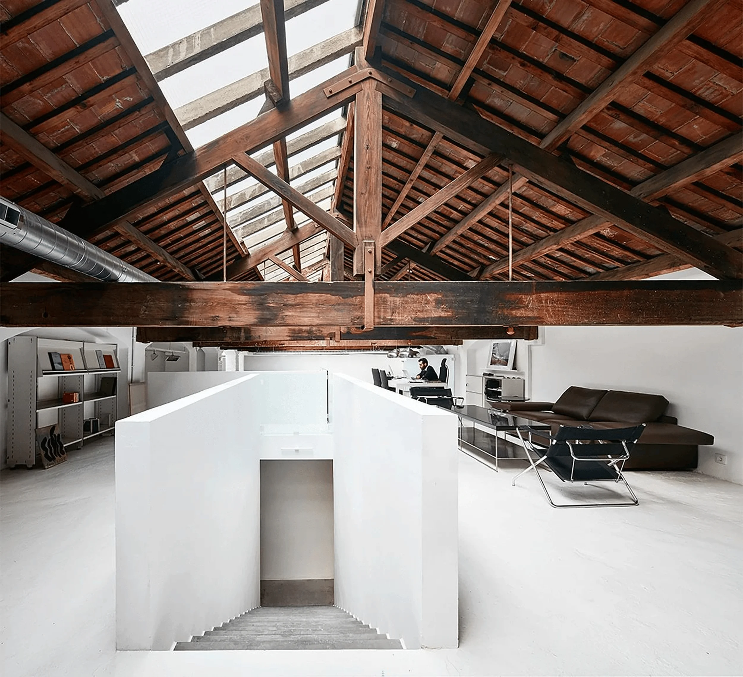
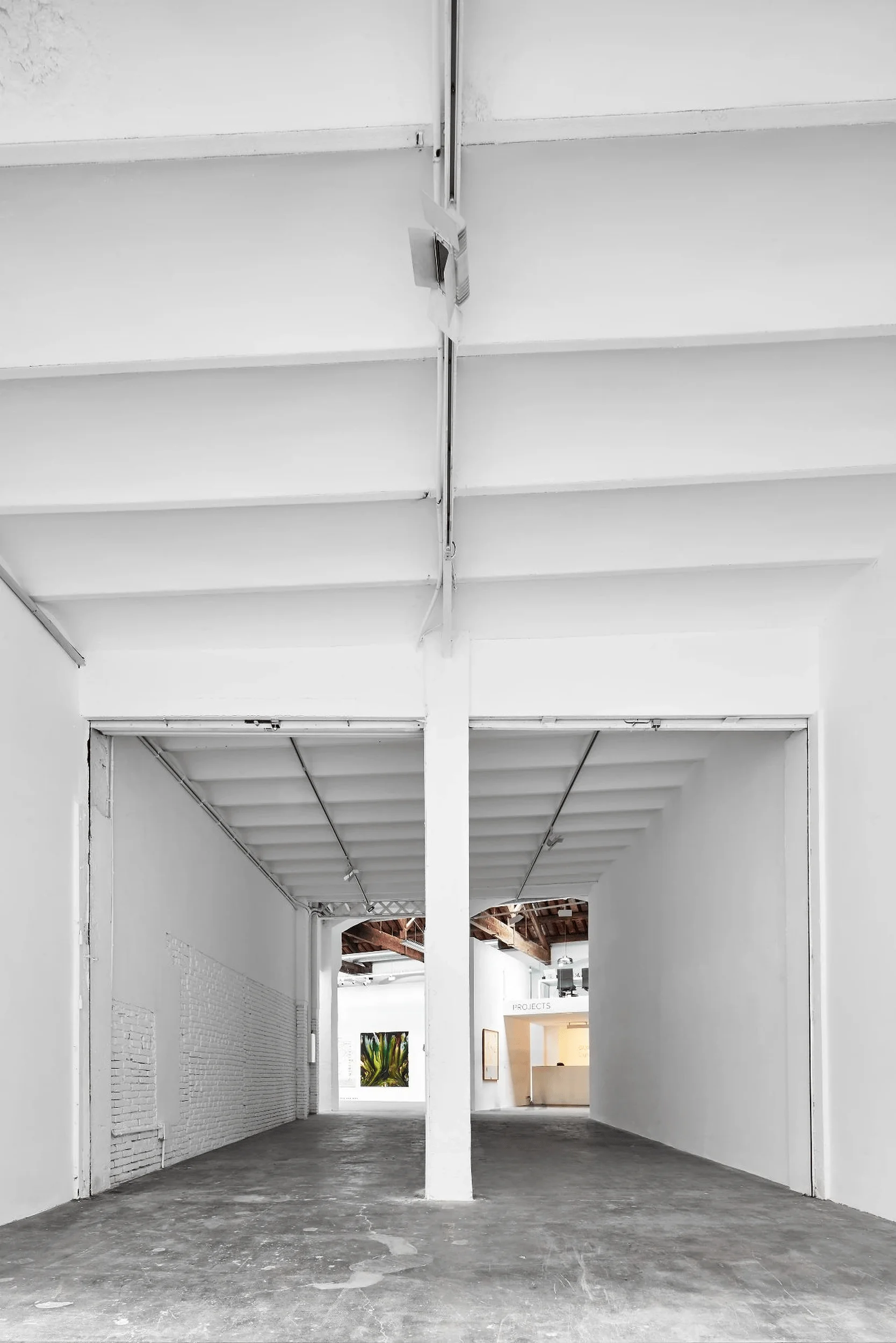
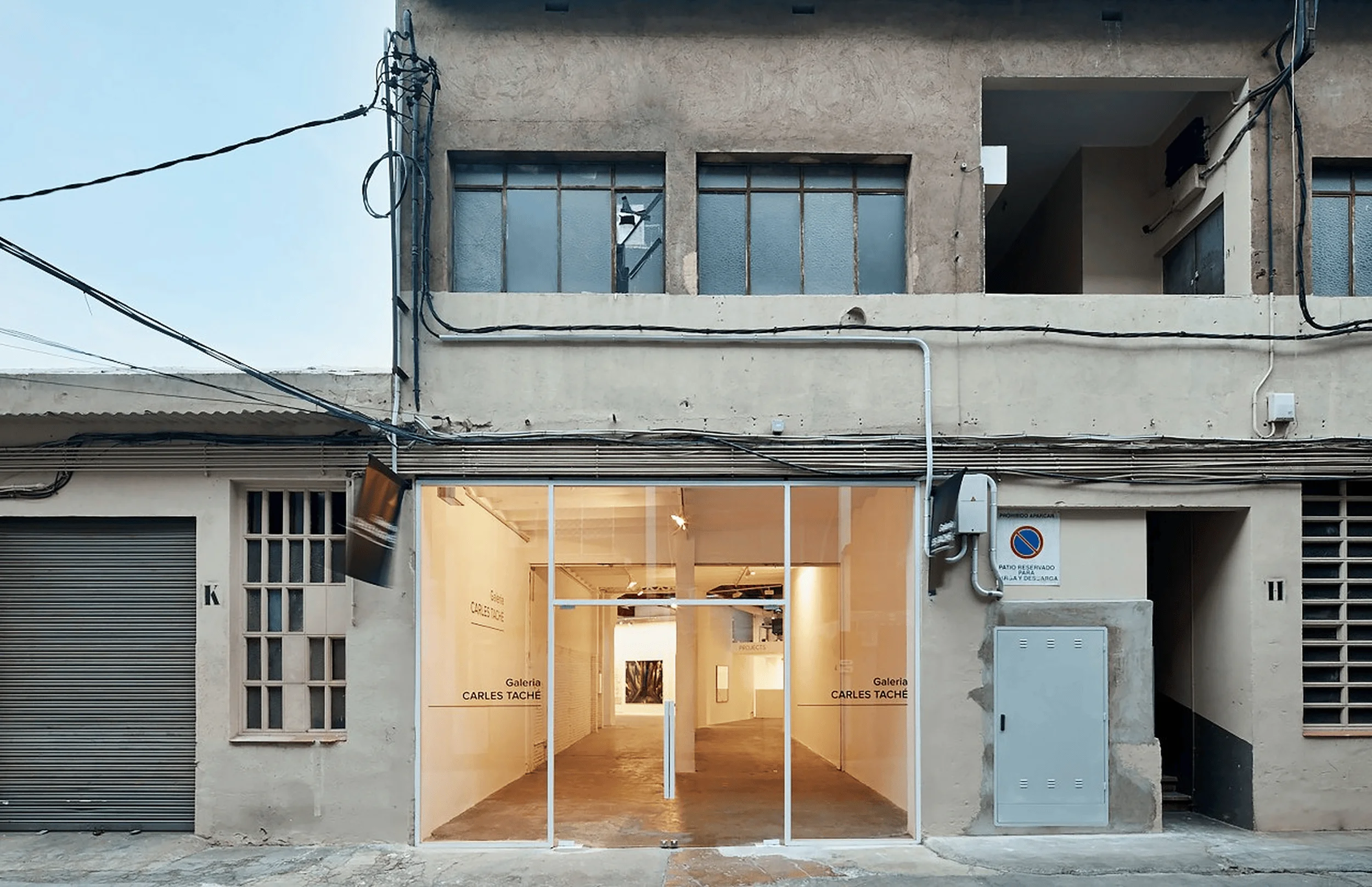
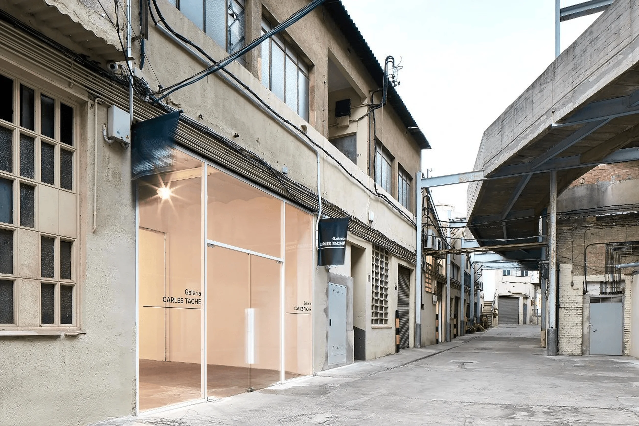
The Carles Taché Art Gallery, located in a former industrial enclosure in Barcelona, Spain, presented a challenge of transforming a cluttered space into a cohesive gallery experience. Kee Yen Architect aimed to create an environment that prioritized the art itself, minimizing distractions while subtly highlighting the building’s existing structure and the interplay of light and volume. This minimalist approach stands in contrast to the museum building boom of the last century, offering a more intimate and focused setting for experiencing contemporary art installations. The gallery’s design champions a “less is more” philosophy, providing a neutral backdrop that allows the art to take center stage. This project aimed to provide a meeting place between the artist and visitor.
Design Concept and Objectives
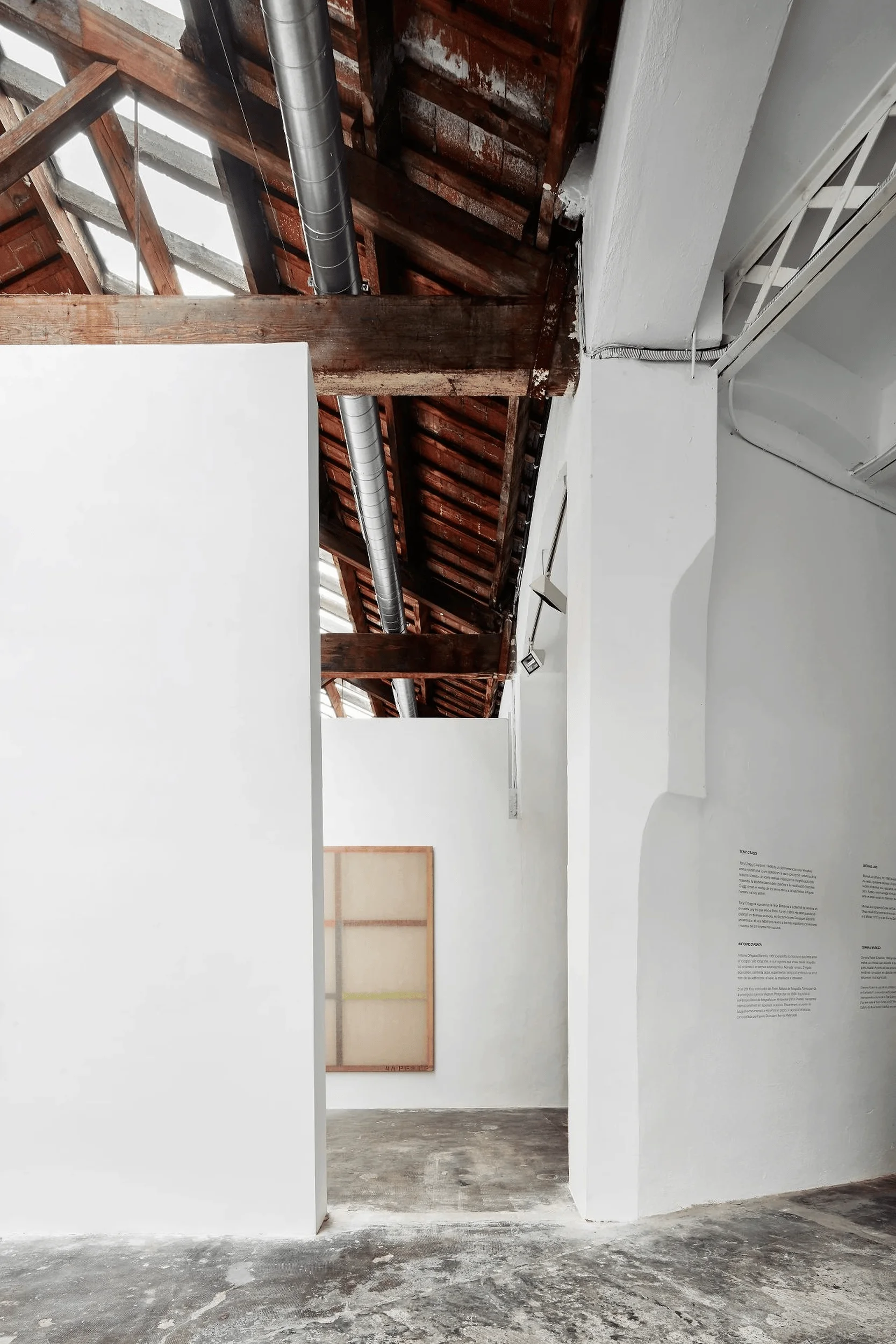
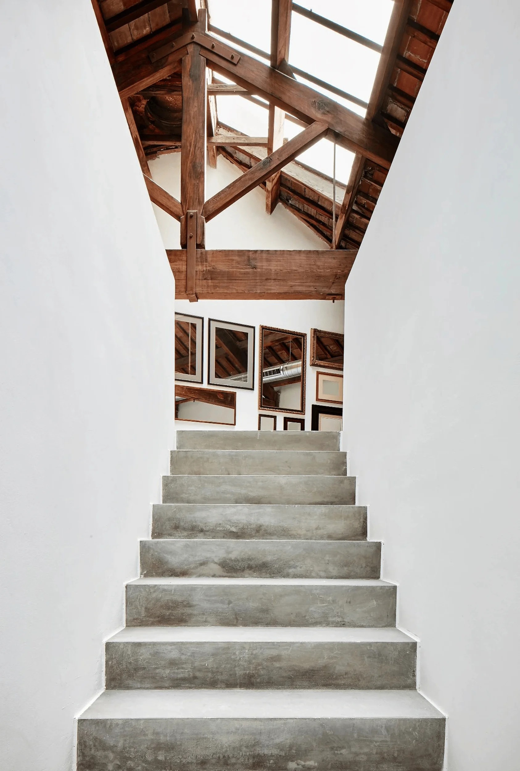
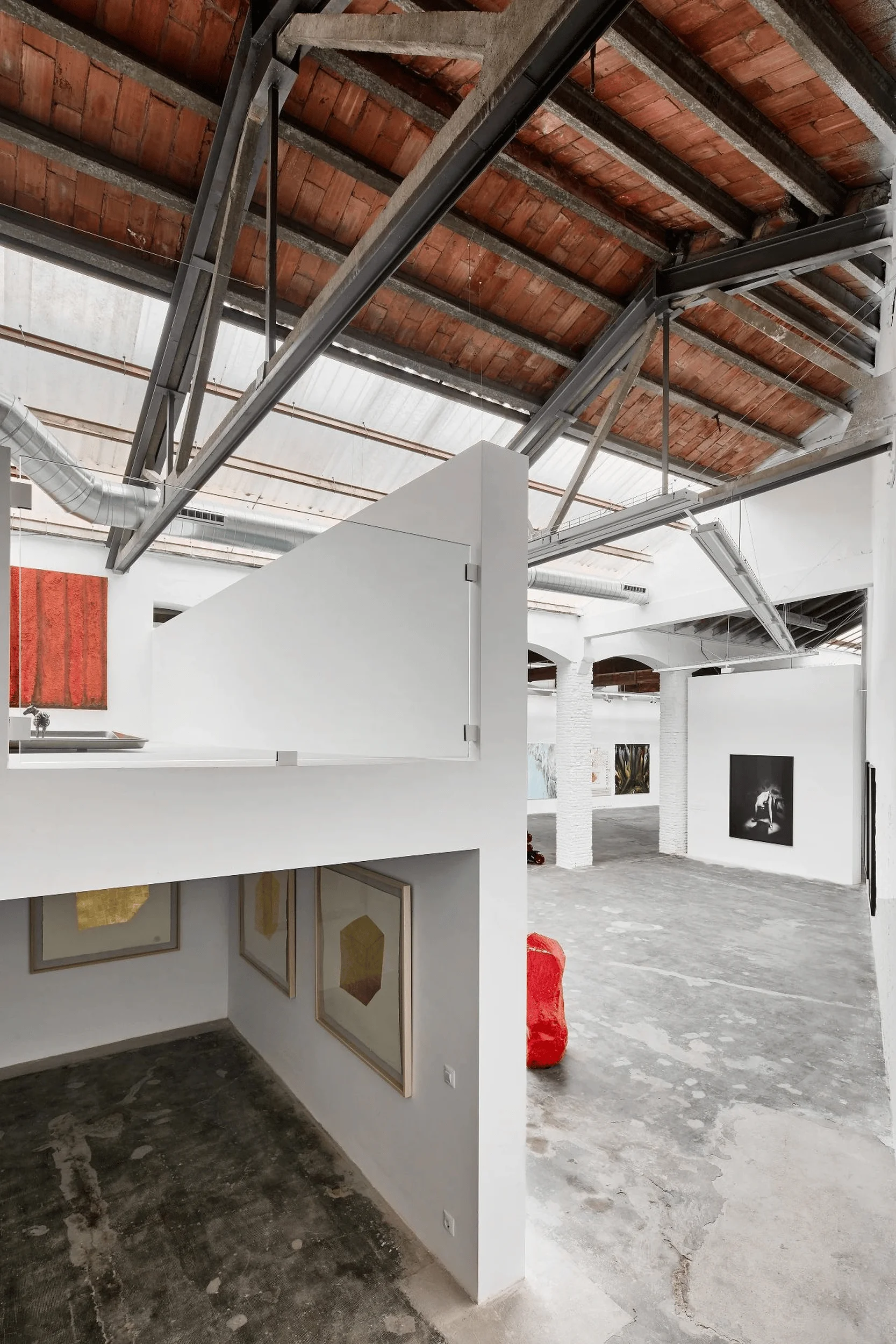
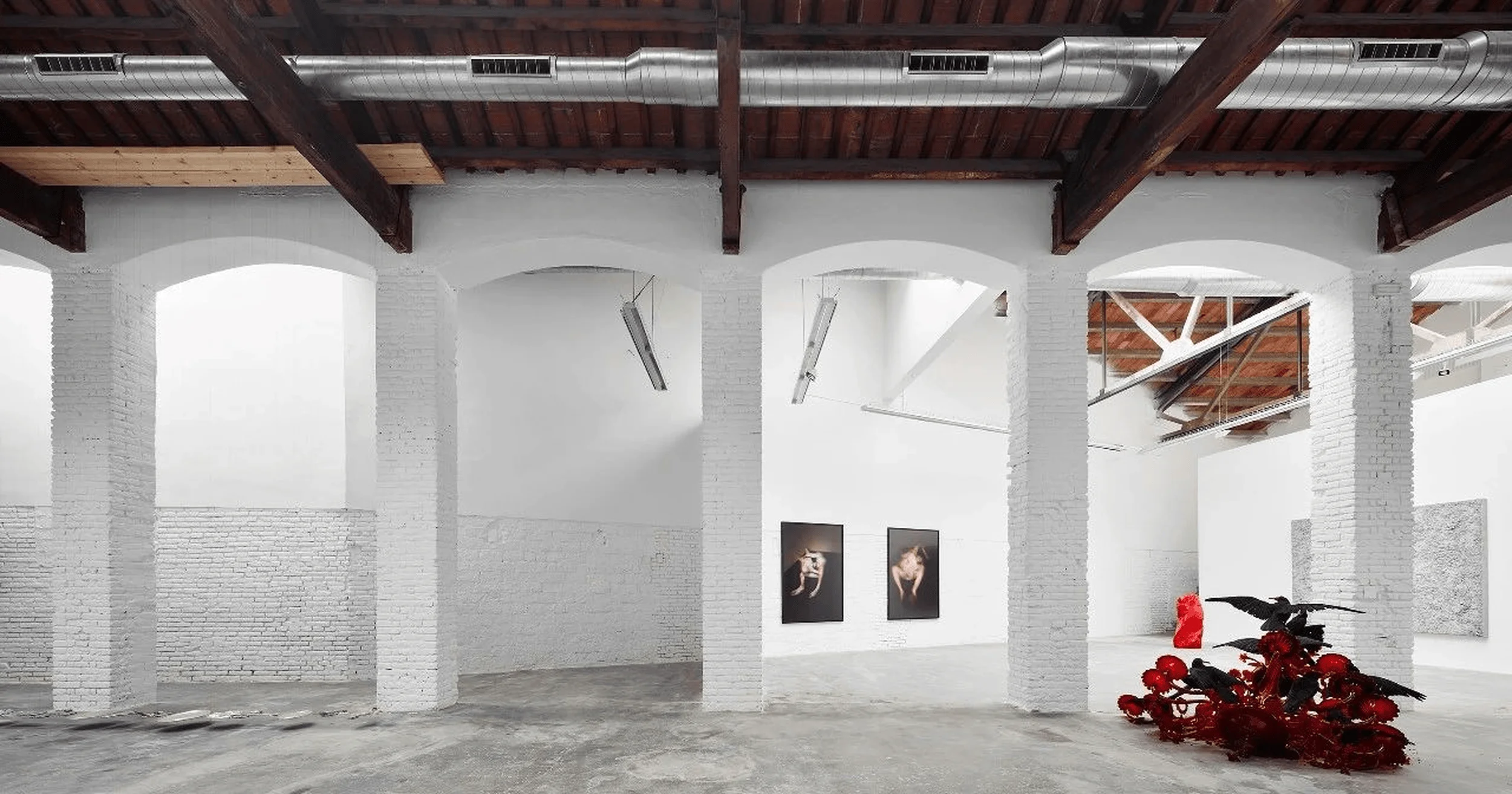
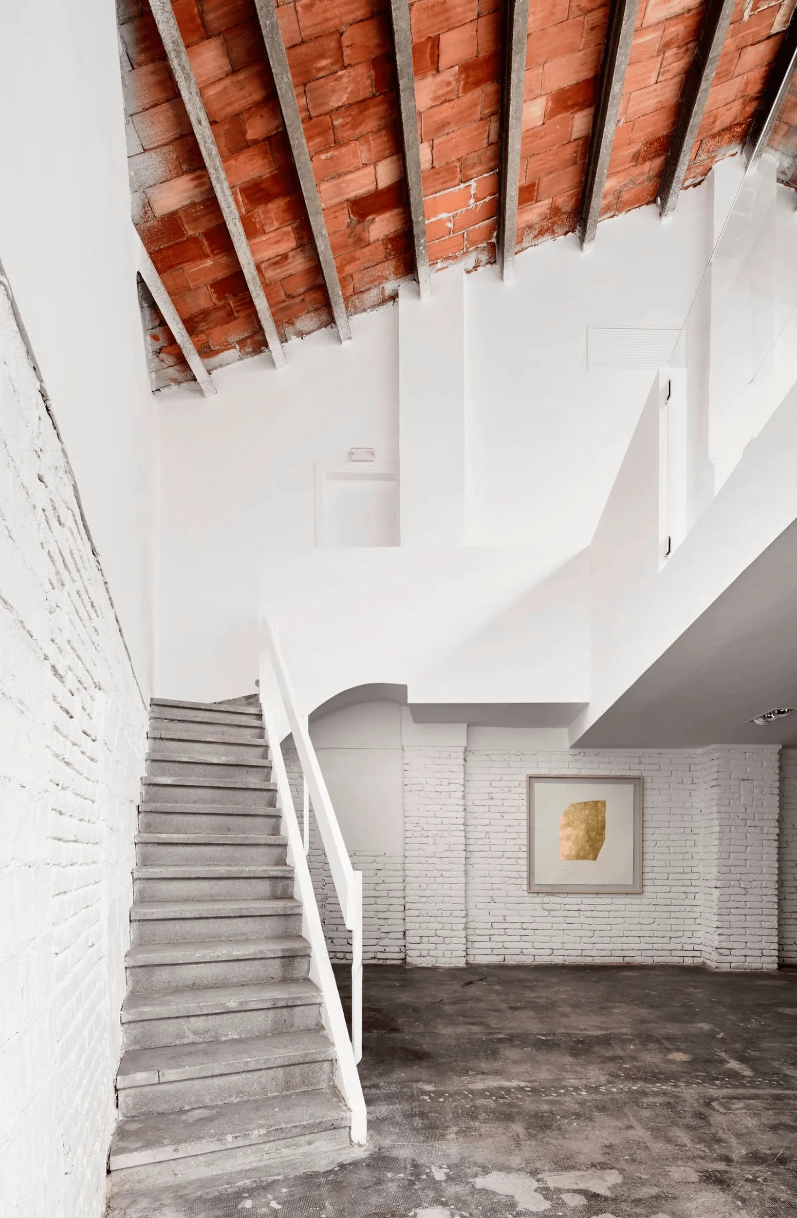
Kee Yen Architect’s design for the Carles Taché Art Gallery centers around the concept of “interior order.” The architects sought to establish a new order within the existing industrial framework, connecting disparate elements to form a cohesive whole. The gallery’s layout is a deliberate composition of new and existing elements, creating a series of interconnected rooms and spaces that vary in scale, proportion, and light quality. The original building is revealed in its raw state, stripped bare, while the new additions are minimalist and autonomous, standing in stark contrast. This interplay creates a dynamic environment where the old and new coexist harmoniously.
Spatial Layout and Planning
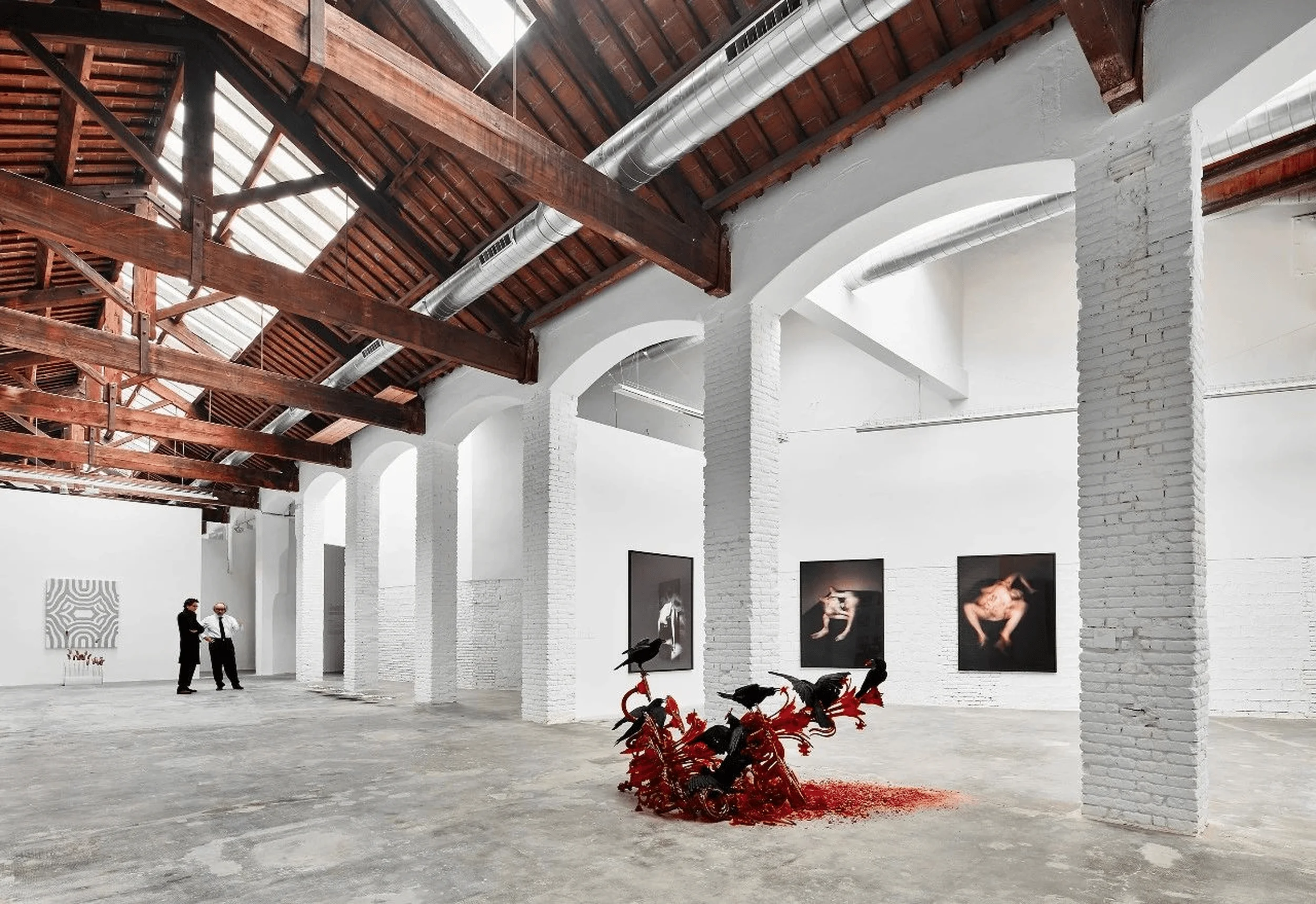
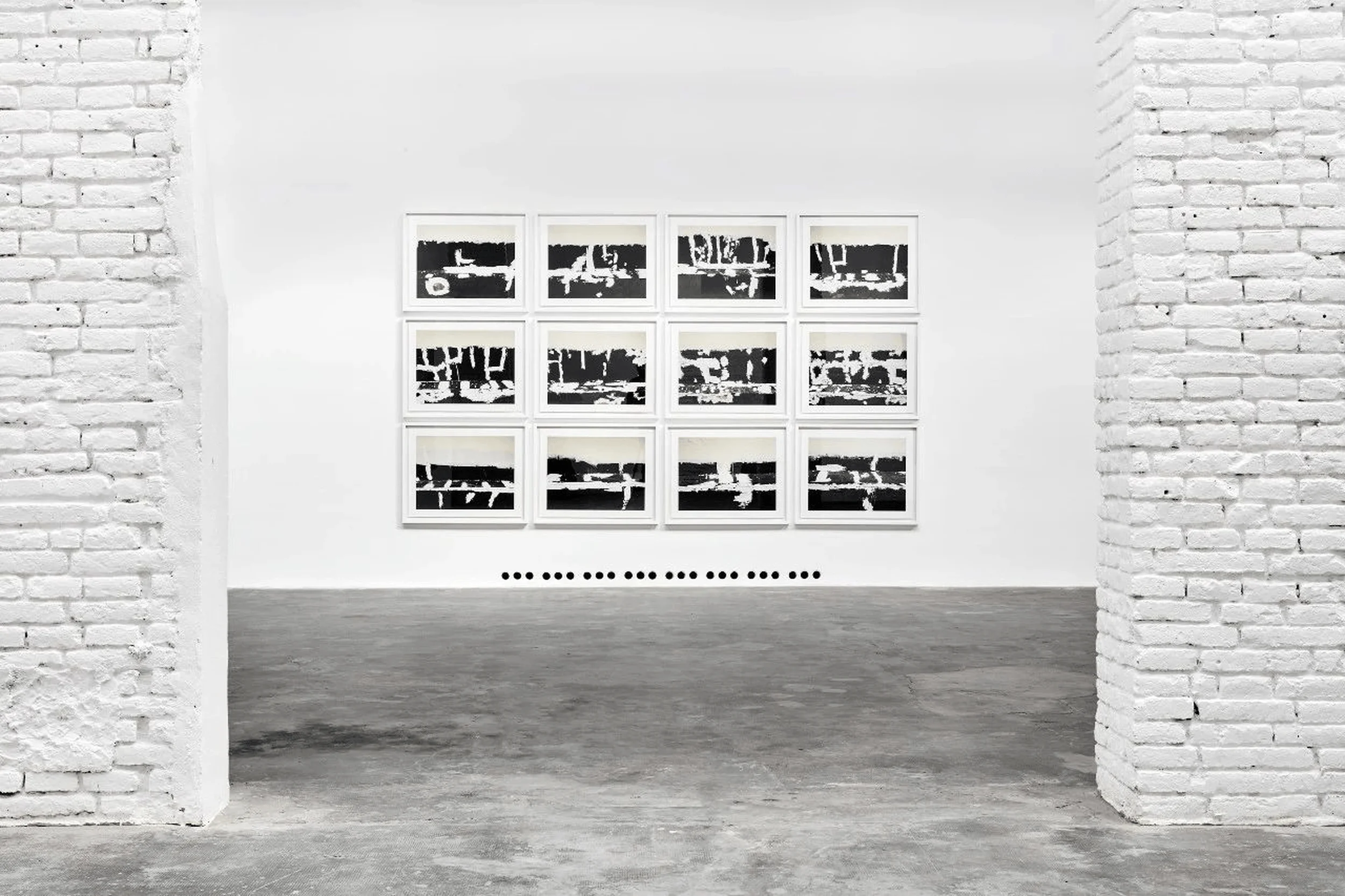
The gallery’s spatial layout prioritizes the art installations. The design intentionally avoids distracting elements, creating a neutral canvas for the art. The architects carefully considered the volume, structure, and materiality of the space, ensuring these elements enhance rather than detract from the viewer’s experience. The gallery’s design echoes successful permanent art installations like the Dia Bacon Foundation and the Chinati Foundation, emphasizing the symbiotic relationship between art and space. This minimalist approach focuses on the artwork.
Aesthetics and Materiality
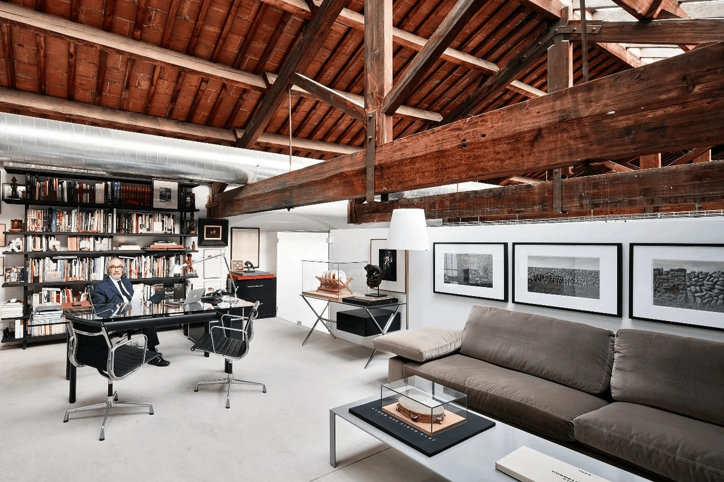
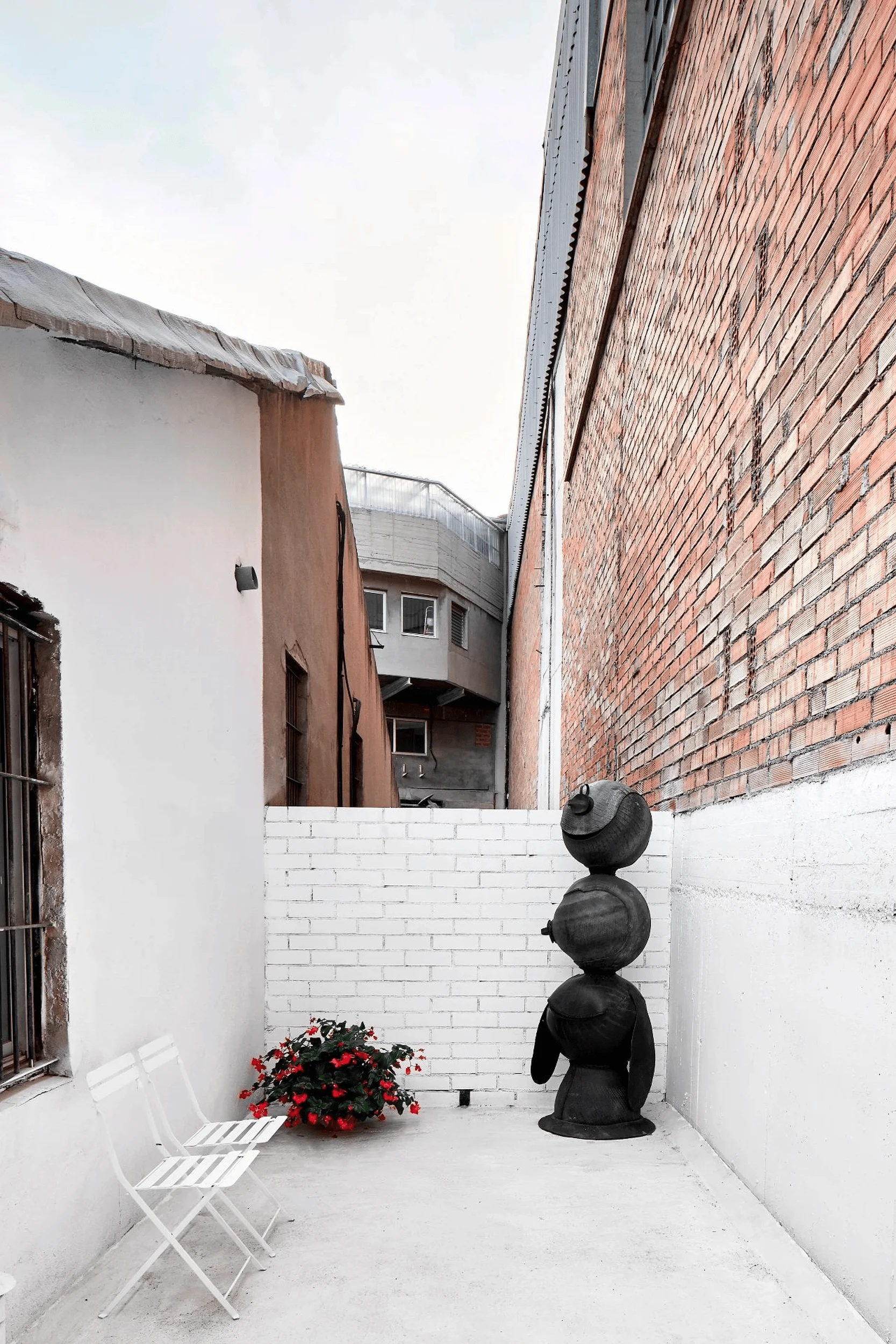
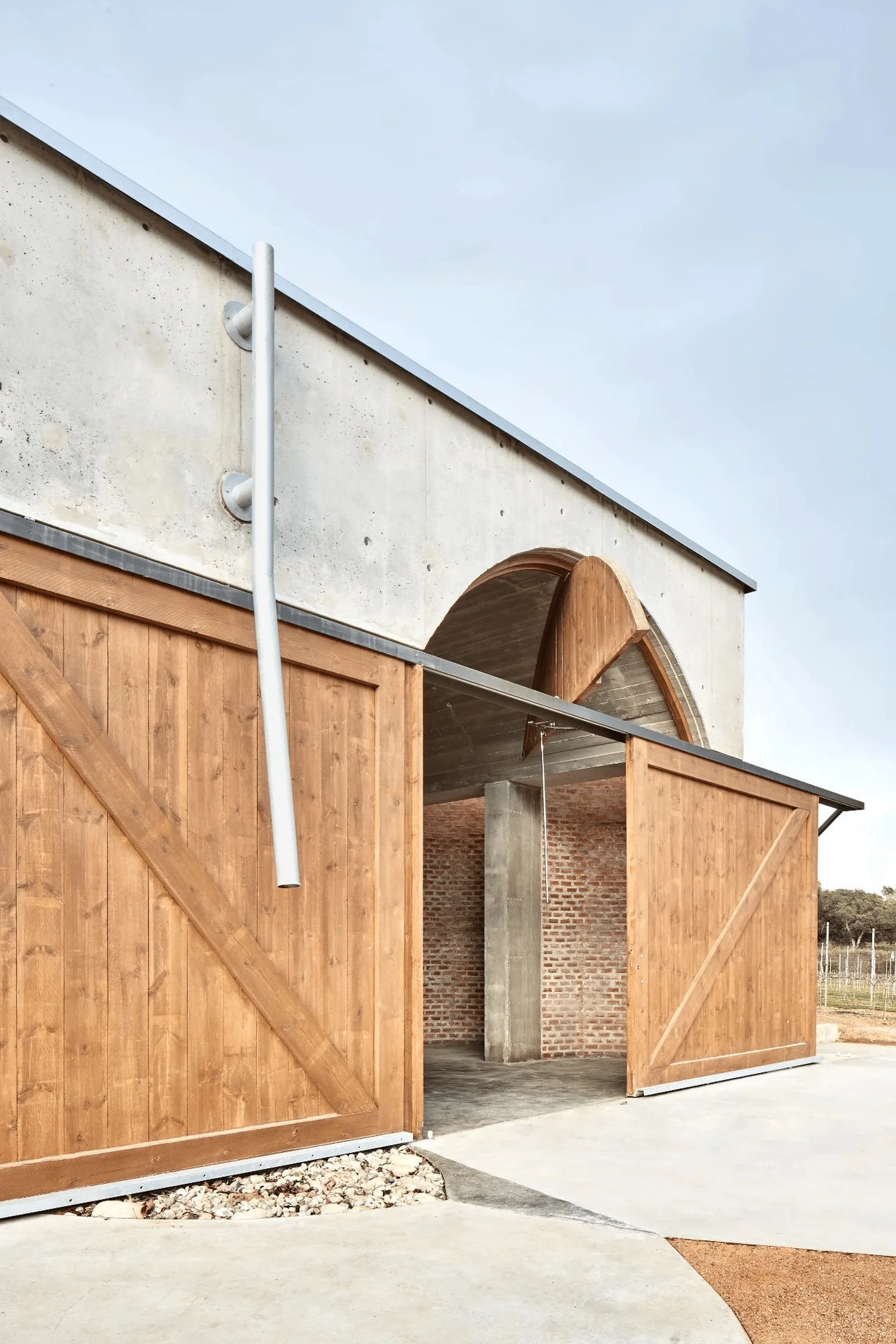
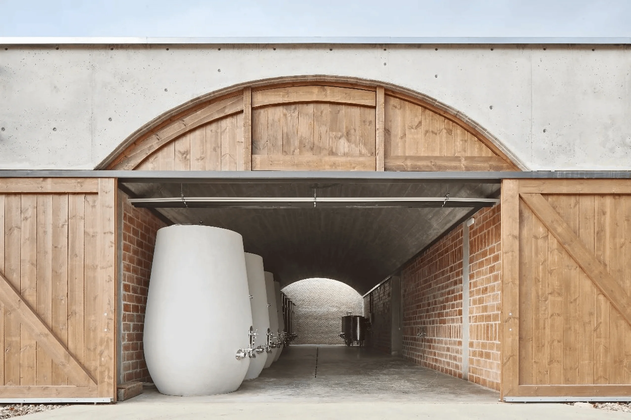
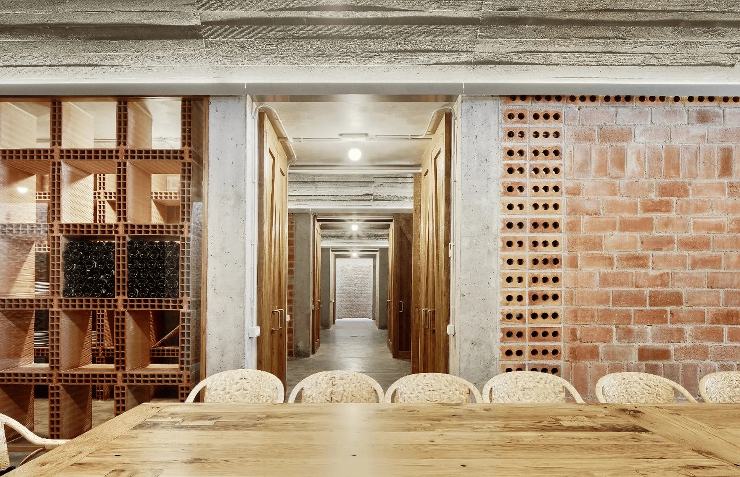
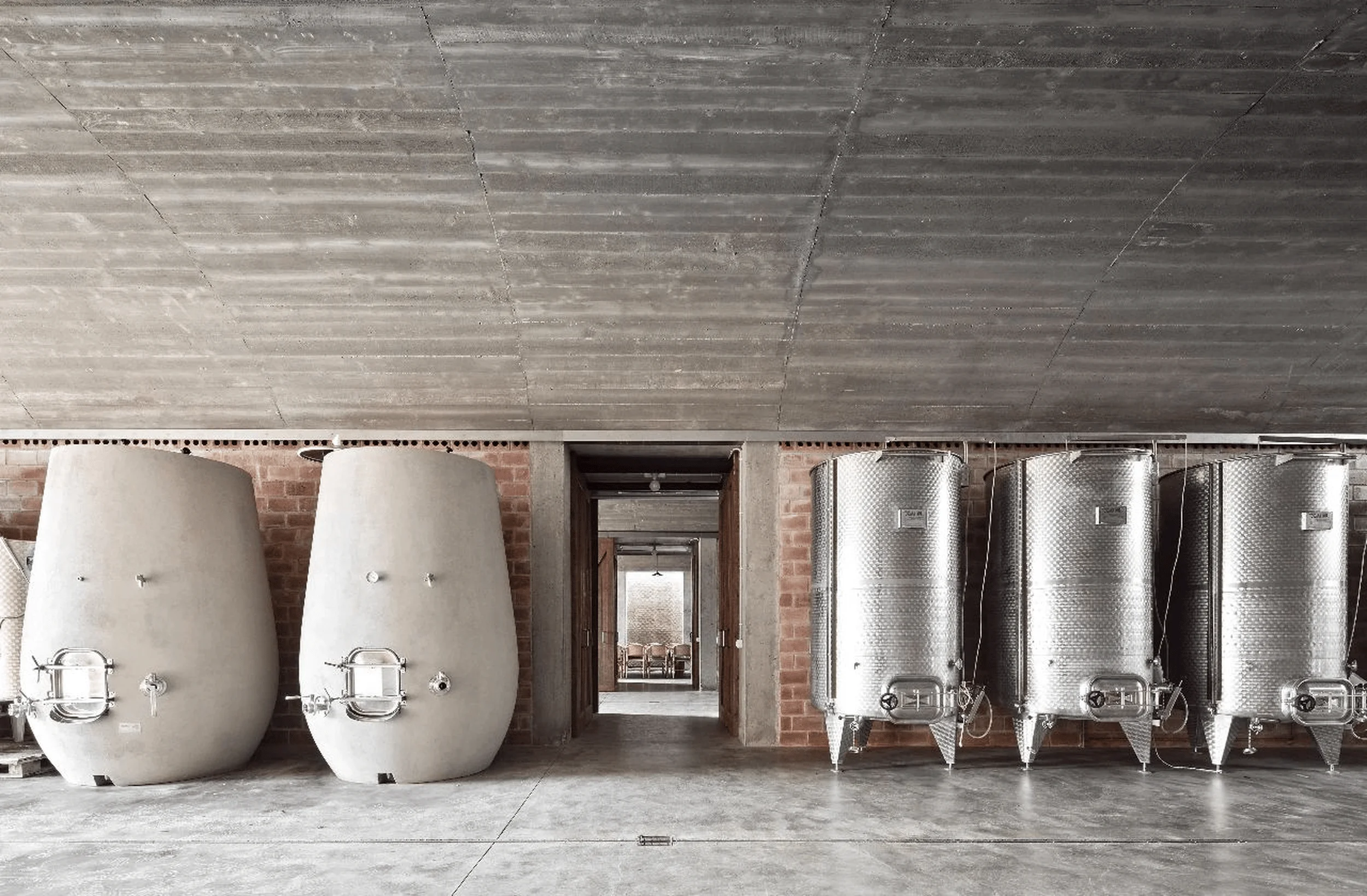
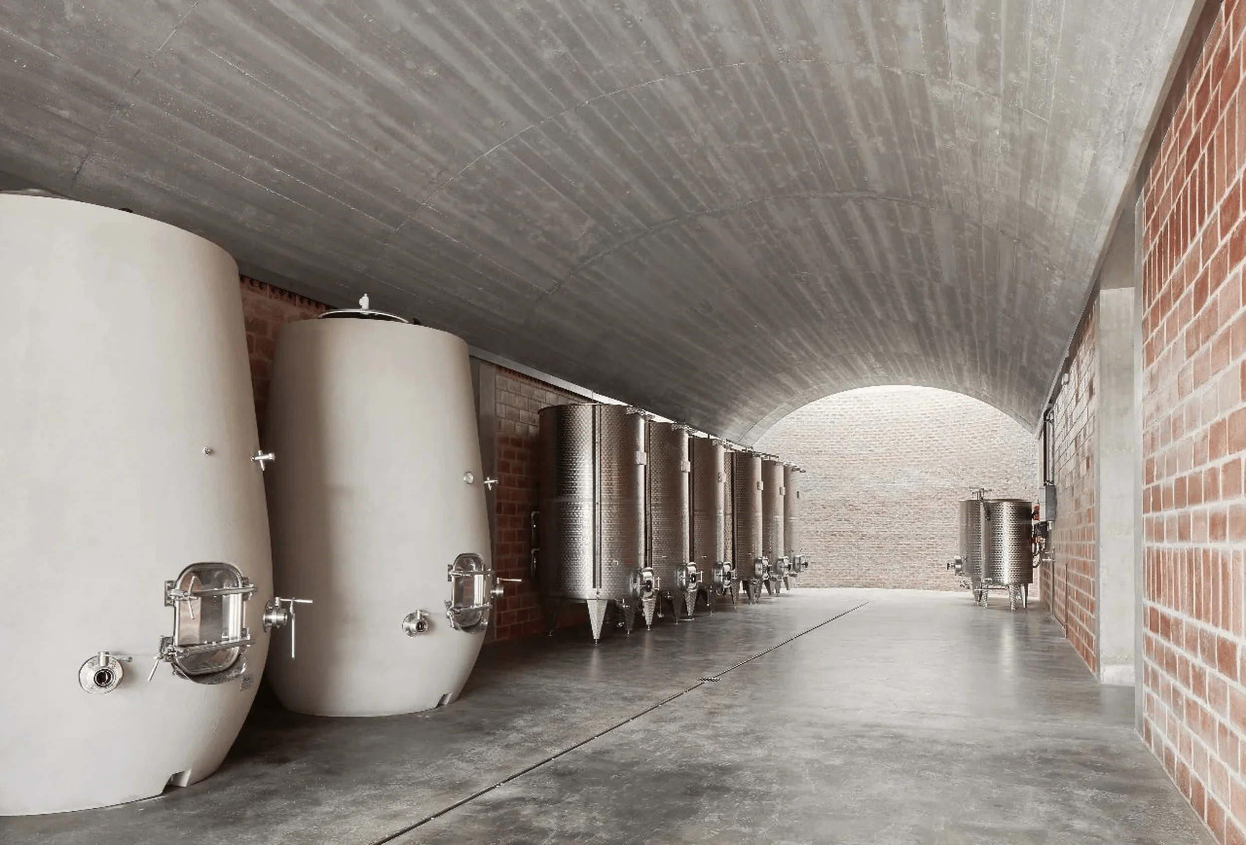
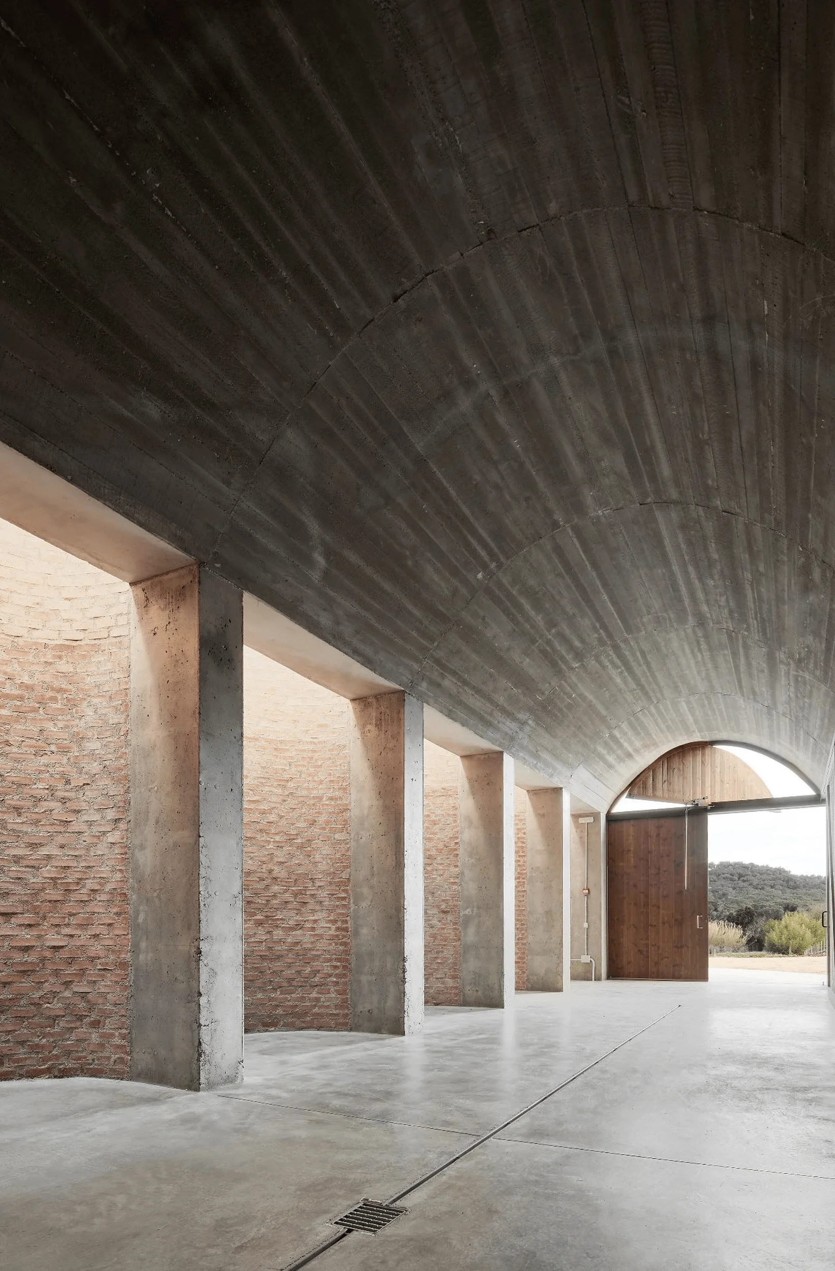
The aesthetic of the Carles Taché Art Gallery is defined by minimalism and the careful use of light. The existing industrial structure, with its exposed brick walls and wooden beams, is preserved and celebrated. New elements are introduced with restraint, using simple materials and clean lines. Light is a key design element, used to sculpt the space and highlight the artwork. The architects’ attention to detail is evident in every aspect of the gallery, from the carefully chosen materials to the subtle play of light and shadow.
Project Information:
Project type: Art Gallery
Architect: Kee Yen Architect
Project Year: Not specified
Country: Spain
Photographer: Not specified


