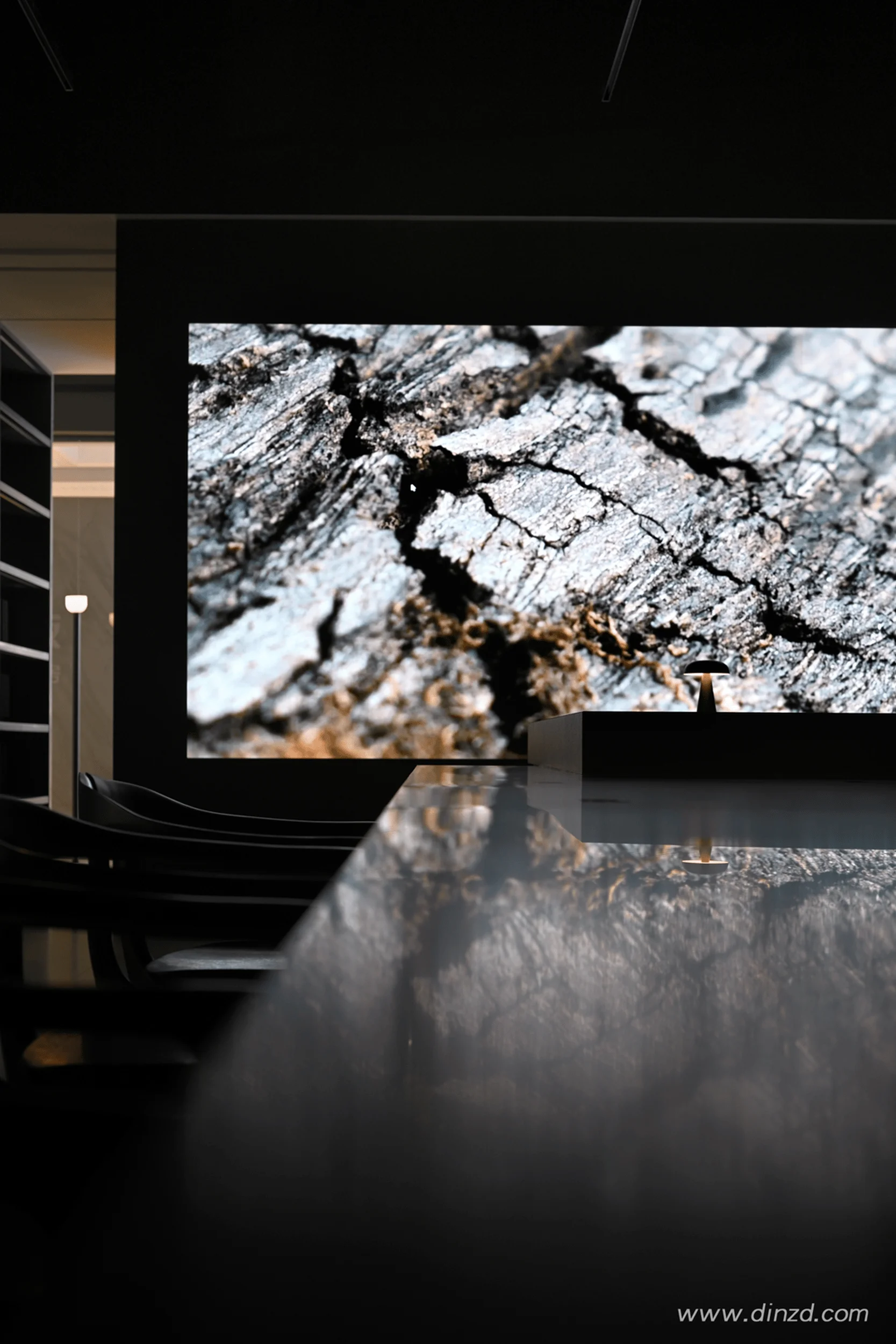
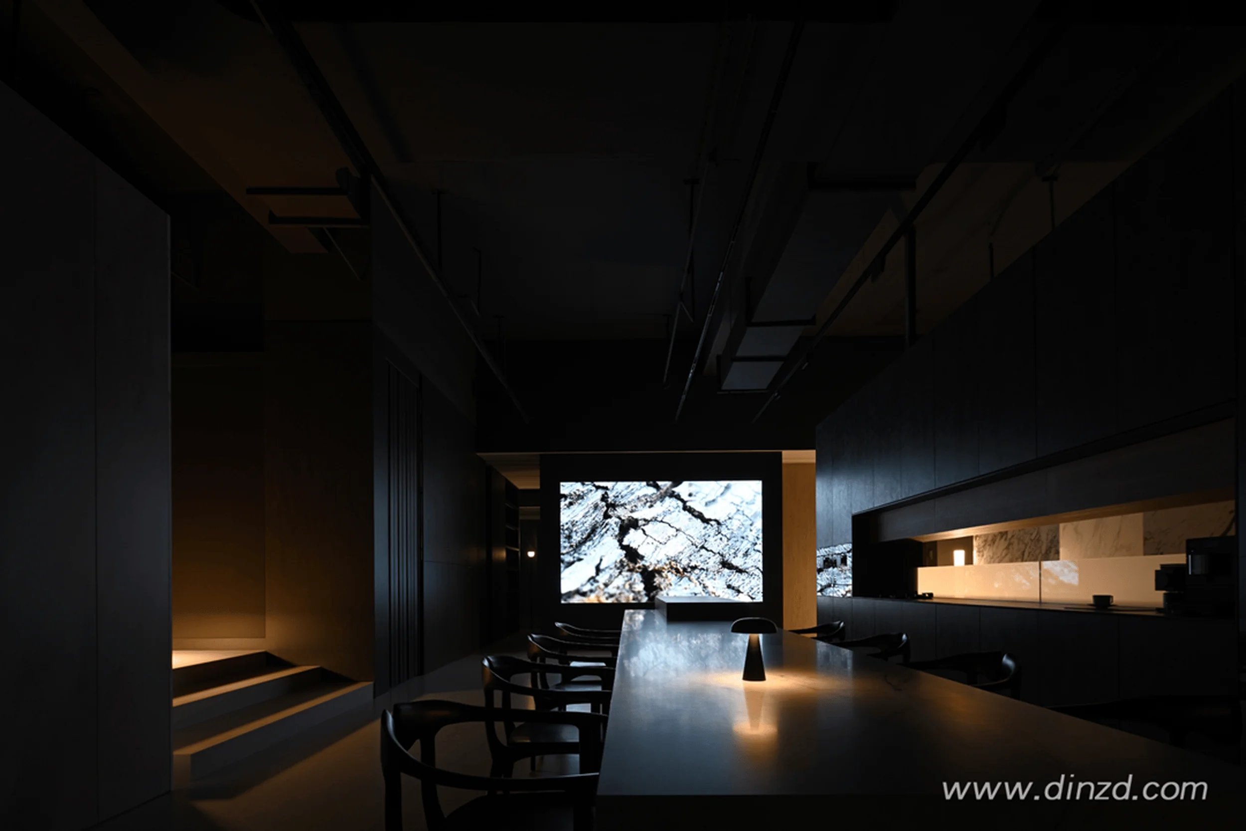
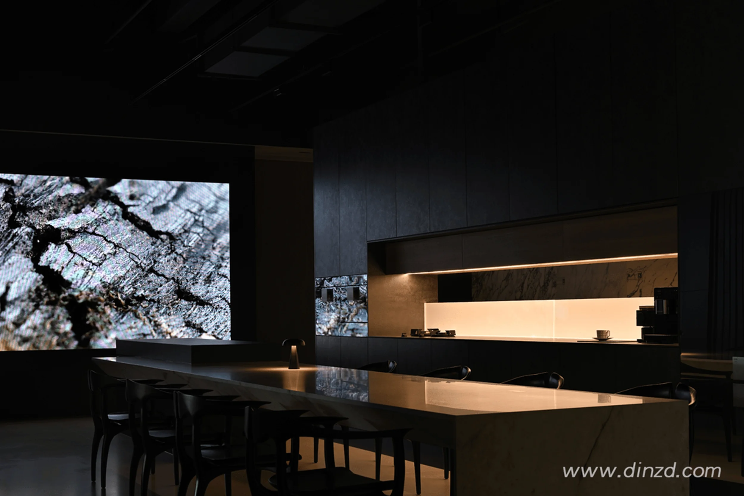
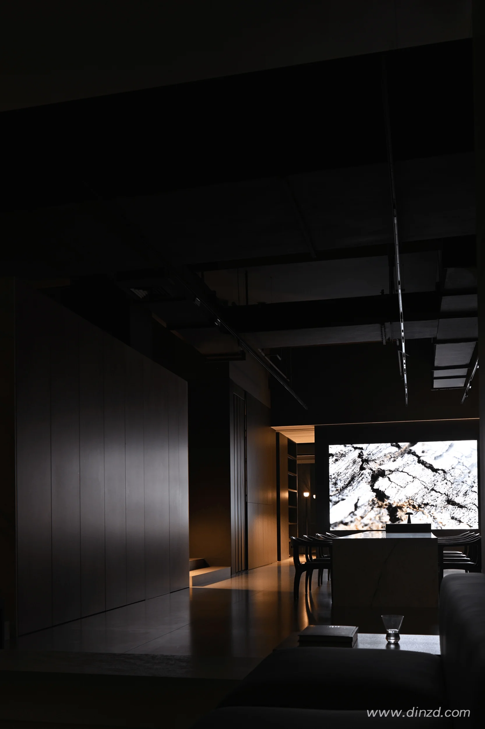
This commercial exhibition space design utilizes rock panels to craft a flexible and artistic atmosphere, reflecting the brand’s pursuit of lifestyle aesthetics.
Contents
Background of the DeSeSi Rock Panel Showroom Project
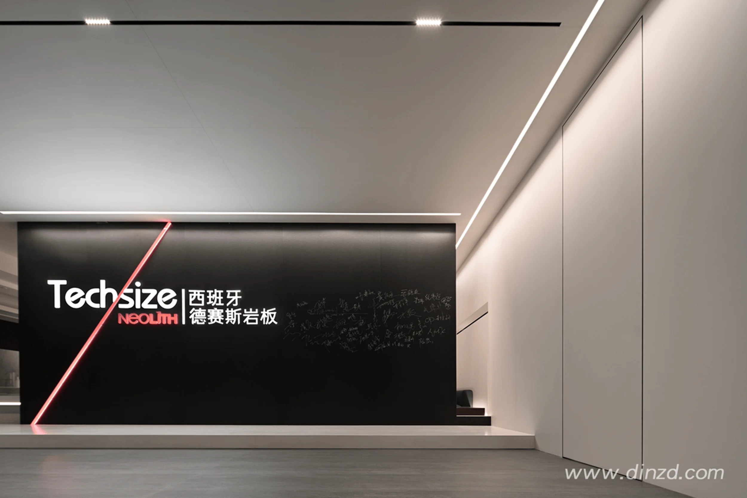
The DeSeSi rock panel showroom project, located in Wenzhou, China, showcases the brand’s vision of being a “creator of a better life.” Damo Design aimed to create a commercial exhibition space that transcends the conventional, utilizing rock panels to redefine spatial aesthetics and establish a free and dynamic environment. This project embodies the exploration of commercial exhibition space design, emphasizing the seamless integration of product display and spatial functionality. The design brief called for a departure from traditional array-style displays, favoring an embedded layout that blends products with spatial elements. The project commenced in March 2022 and reached completion in November 2022, with a total area of 320 square meters. DeSeSi, as a leading Spanish brand in the industry, sought a showroom design that would highlight its commitment to linking life aesthetics through natural rock panels, blurring the boundaries between architecture and nature. The commercial exhibition space design aimed to embody this vision, using rock panels not just as display items but as integral components of the space itself.
Design Concept and Objectives of the DeSeSi Showroom
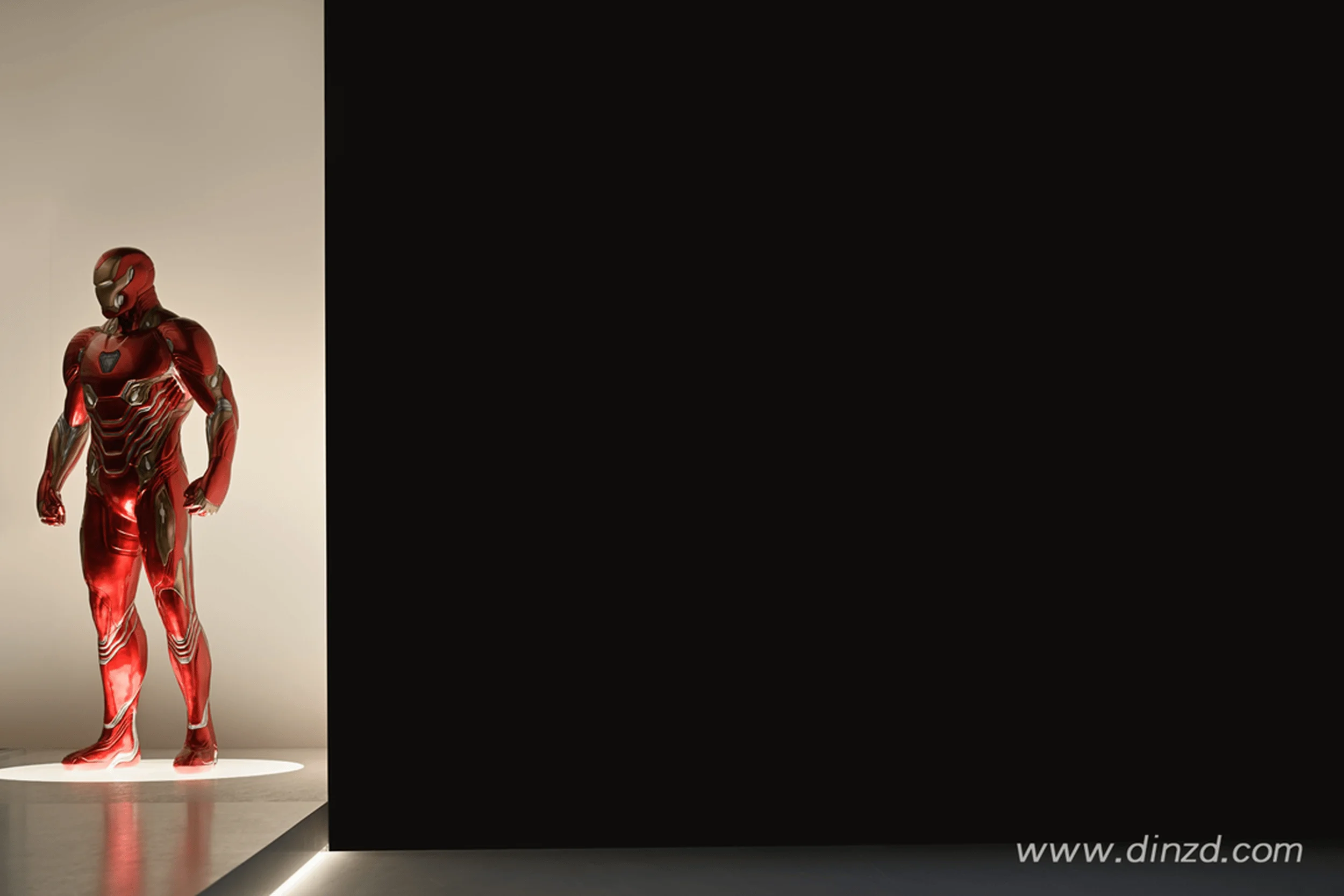
Damo Design’s approach to the DeSeSi showroom’s commercial exhibition space design was to prioritize the brand and product over the space itself. The design intent was to infuse the products with a soul, integrating design ingenuity into the presentation of each item. The overarching goal was to maximize the expression of the rock panels’ texture within the space, effectively communicating the brand’s philosophy and image positioning. The design focused on creating a unique aesthetic within the space, building inspiration from the tangible product categories and ensuring that the design retained both a spiritual essence and practical functionality. Central to the design concept was the use of rock panels as a primary spatial element, shaping a realm of spatial freedom and using the products themselves to define the space. This approach reflects a contemporary understanding of commercial exhibition space design, where the product becomes an active participant in the spatial narrative.
Spatial Layout and Planning in the DeSeSi Showroom
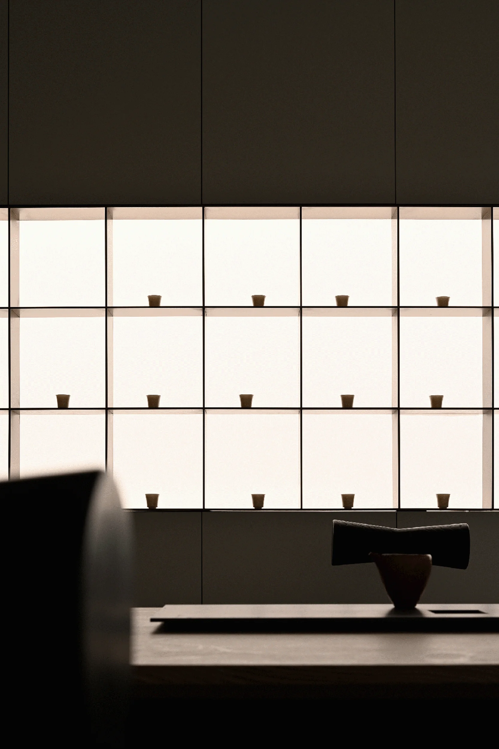
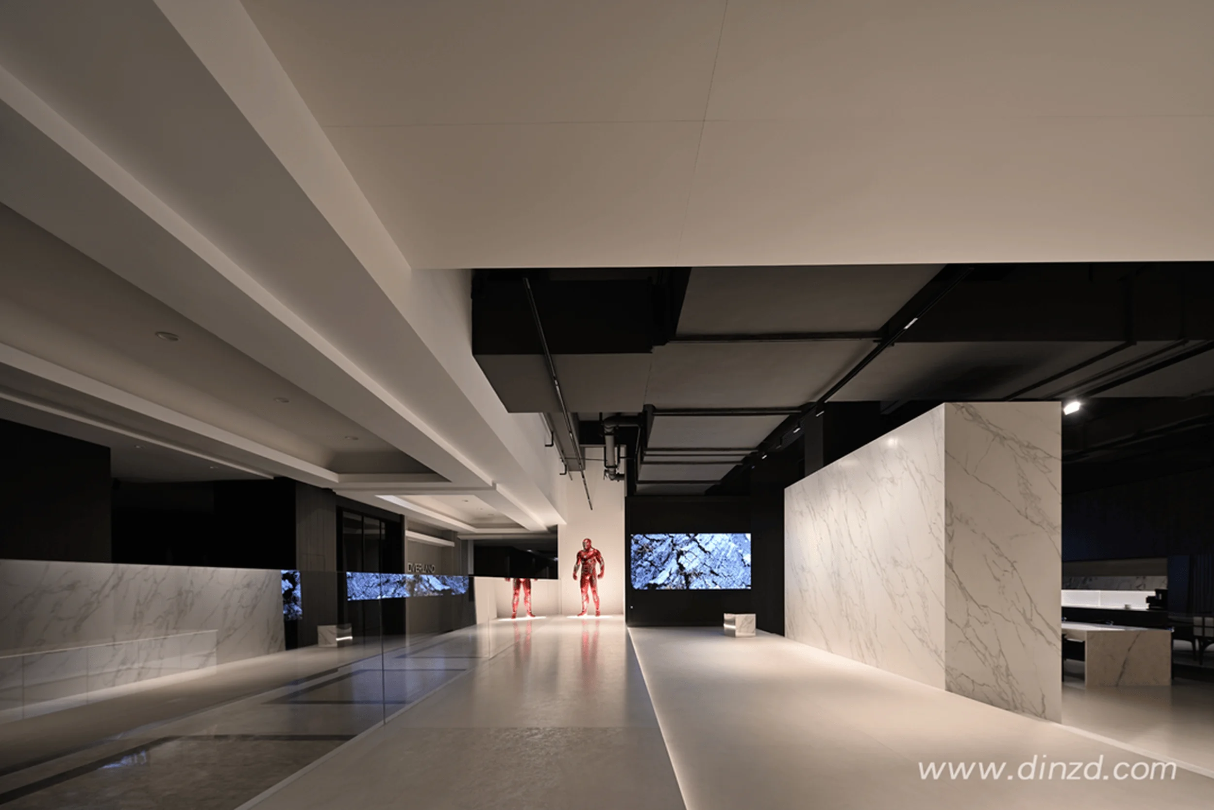
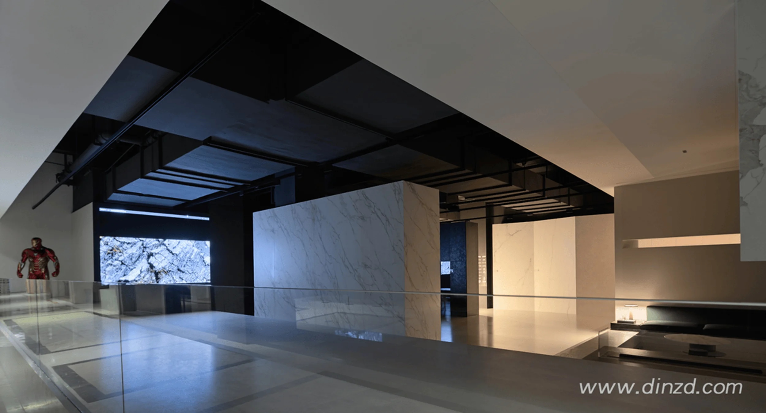
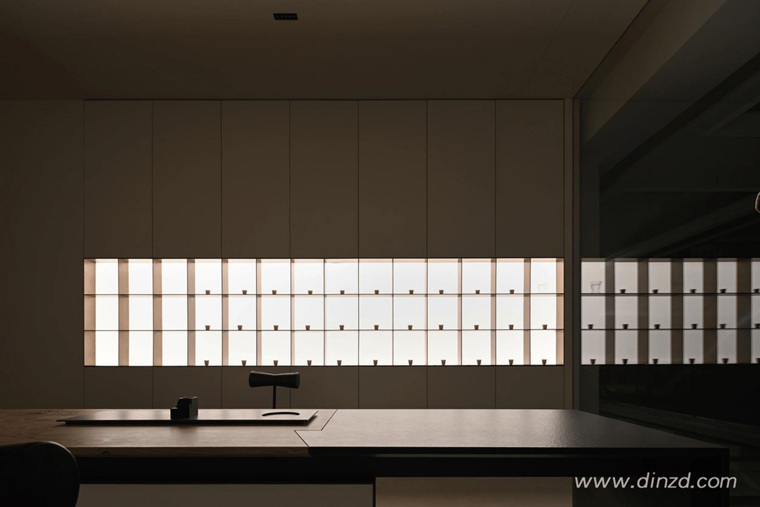
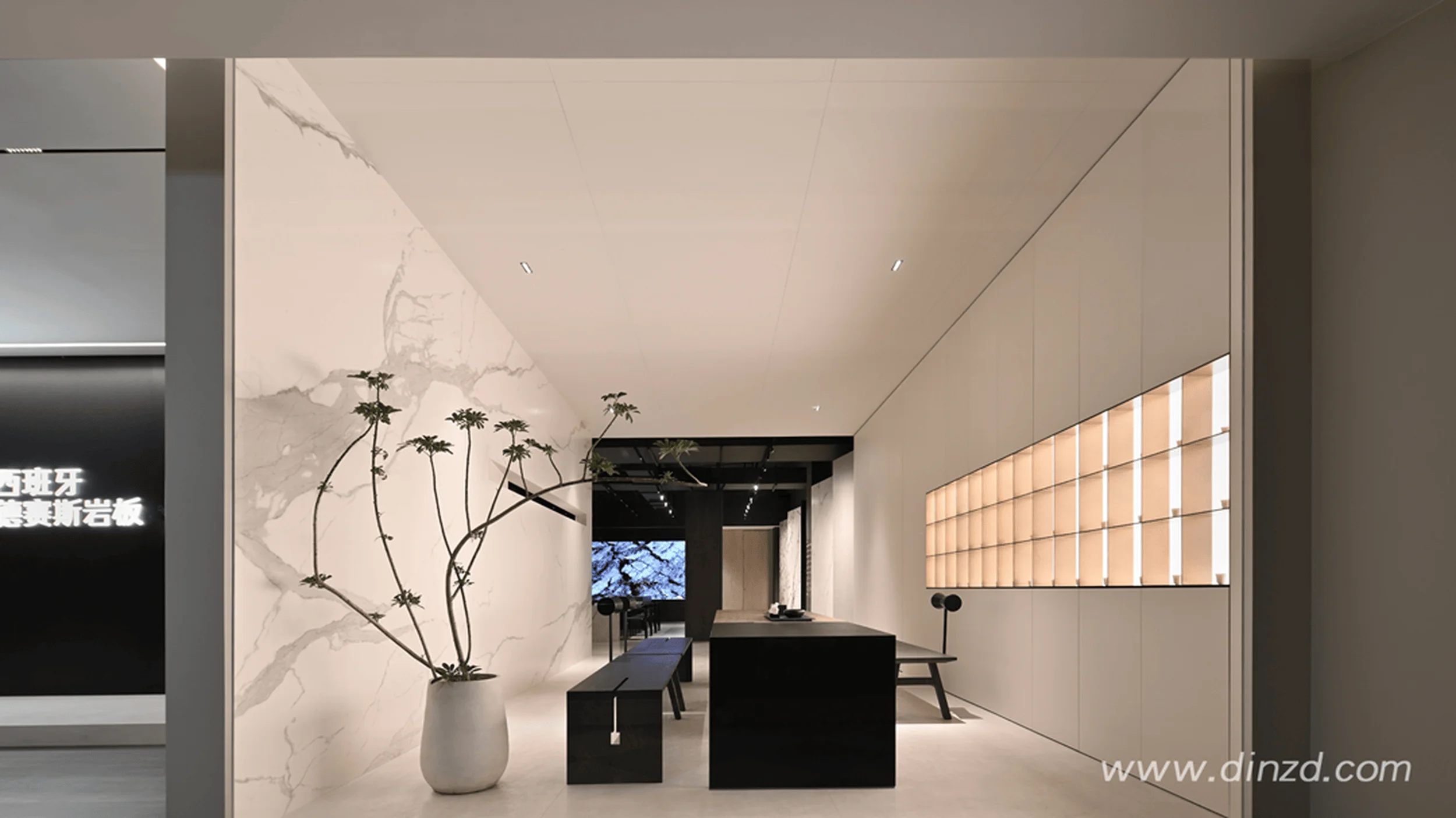
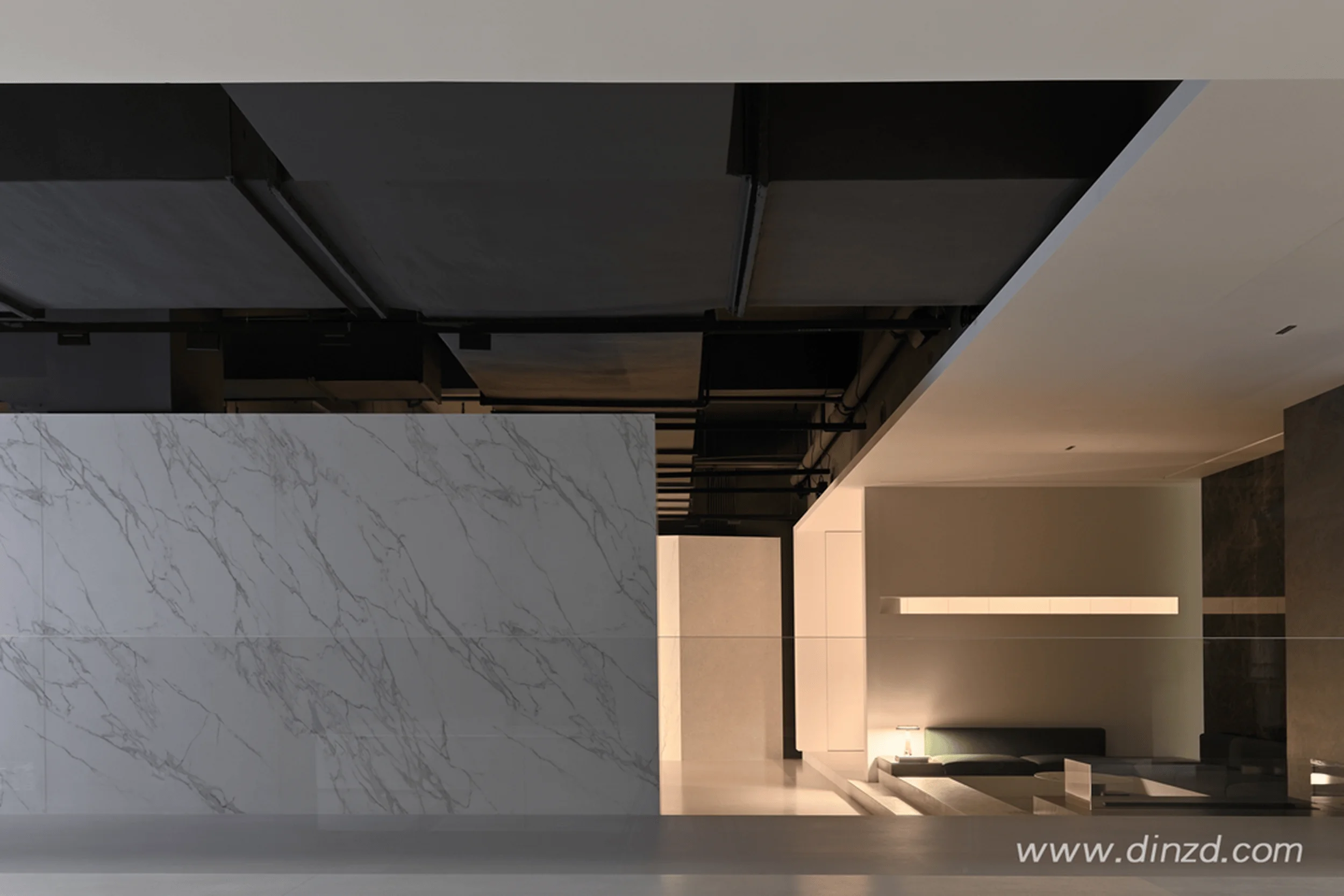
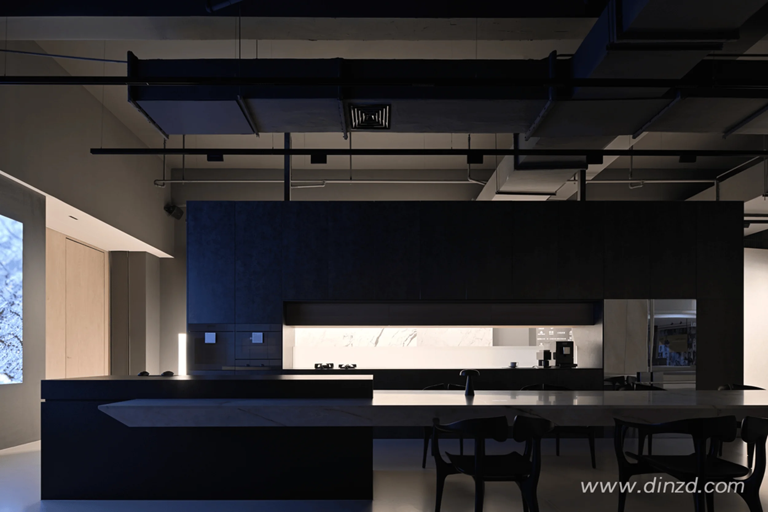
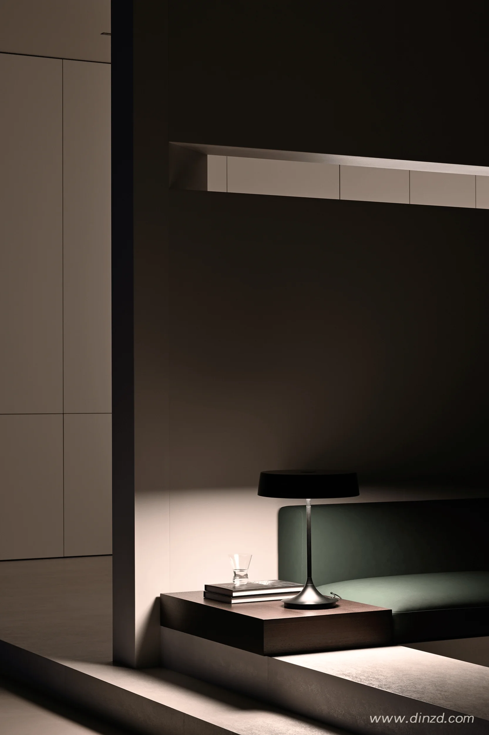
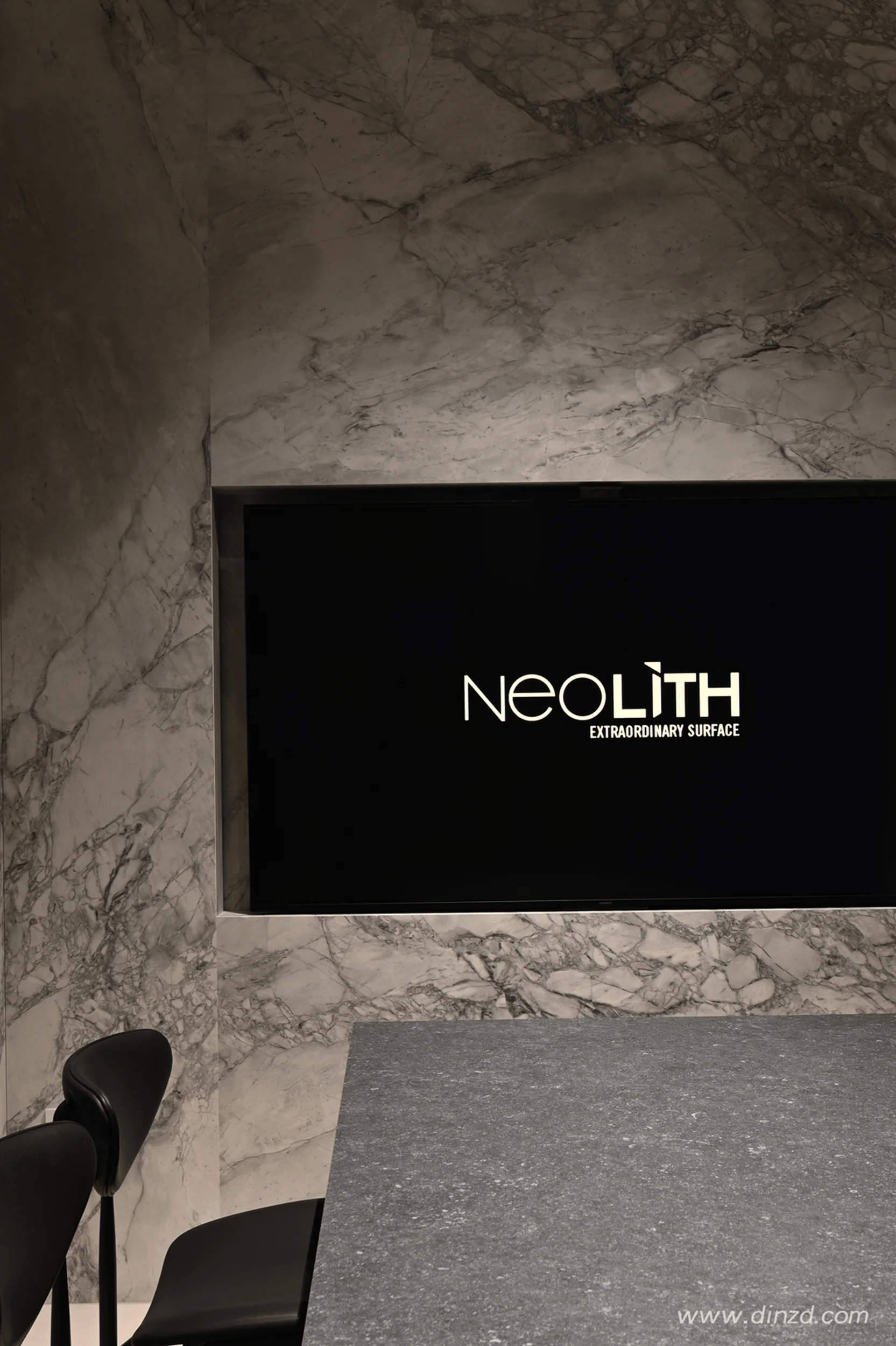
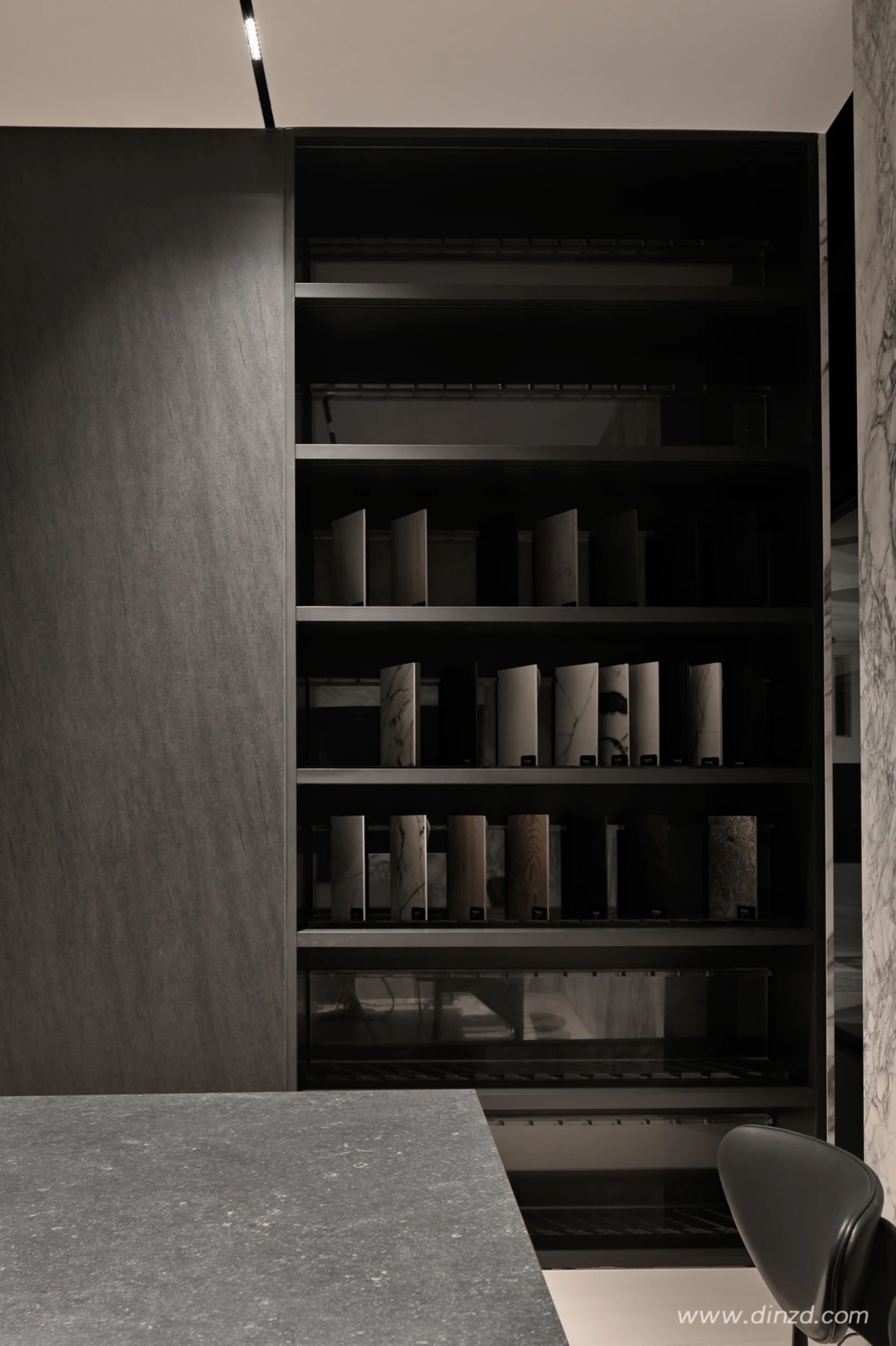
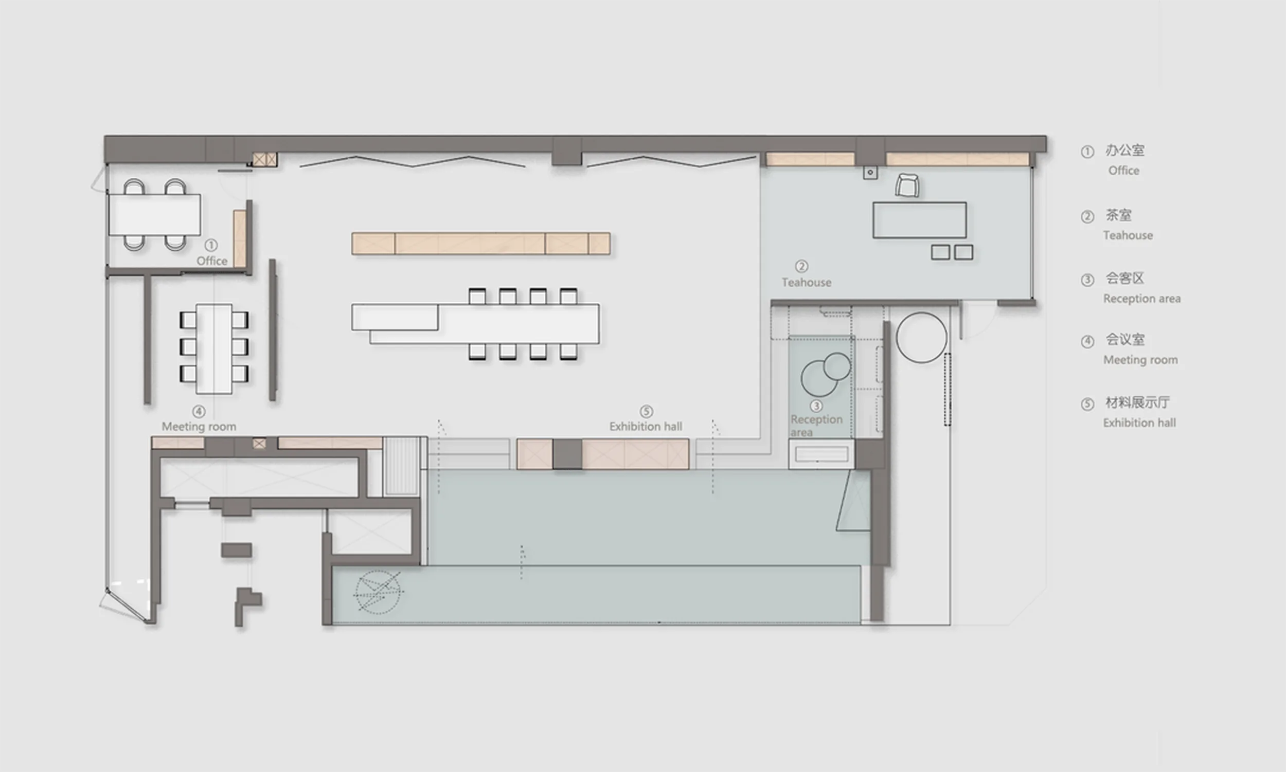
The commercial exhibition space design of the DeSeSi showroom demonstrates a thoughtful approach to spatial layout and planning. The reception area features a tea table designed by Sun Shaochuan, meticulously crafted from various DeSeSi rock panels. The wood-grain texture creates a welcoming and relaxed atmosphere for business discussions. The reception island also showcases ingenious design, with an embedded heating device that allows for direct cooking on the rock panel countertop, showcasing the material’s versatility and functionality while maintaining its aesthetic appeal. The open-plan layout symbolizes inclusivity and artistic expression. The spacious entrance hall provides a panoramic view of the entire layout, revealing a harmonious and dynamic aesthetic. To complement the bold presence of the rock panels, soft materials like leather are incorporated, adding a touch of warmth and sensory richness to the space. This interplay of contrasting materials conveys the brand’s ultimate pursuit of lifestyle aesthetics within the commercial exhibition space design.
Visual Language and Materiality in the DeSeSi Showroom
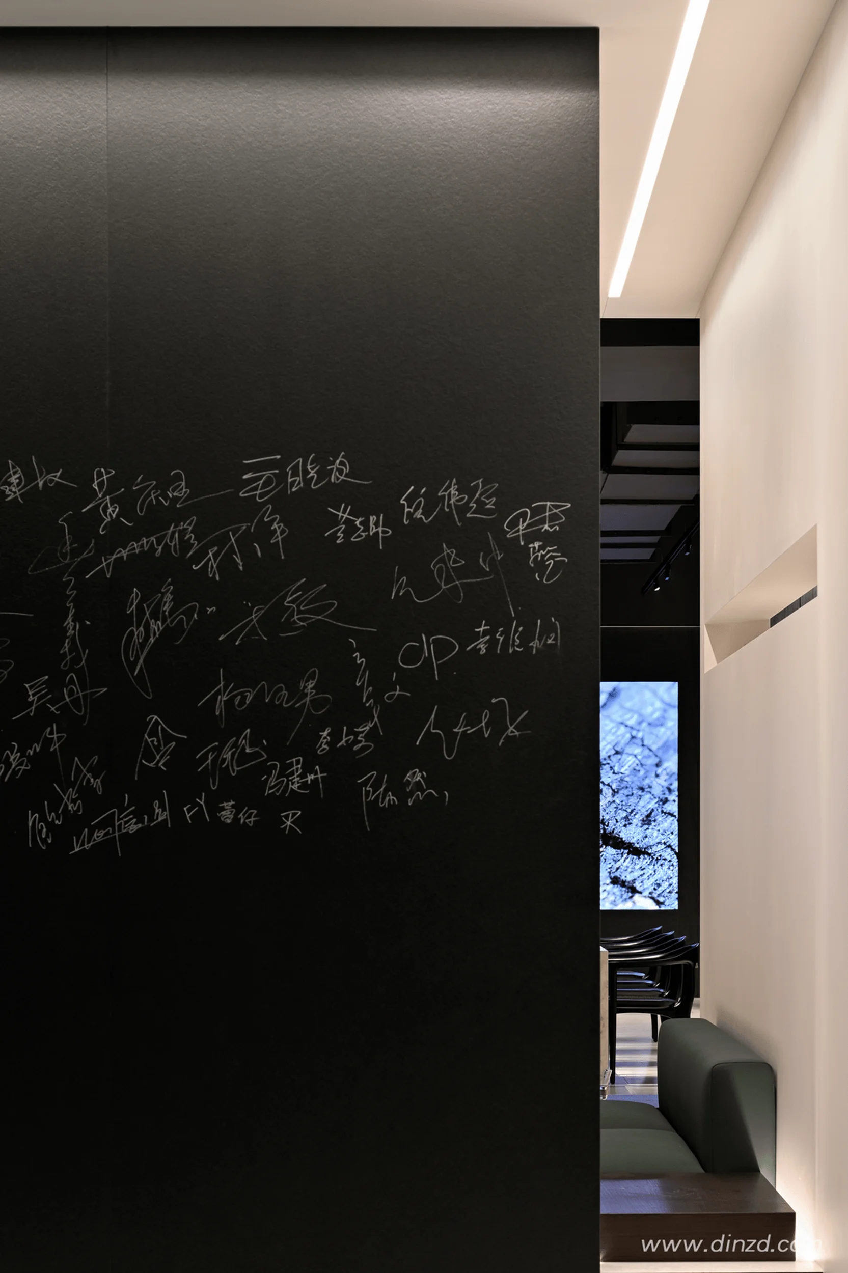
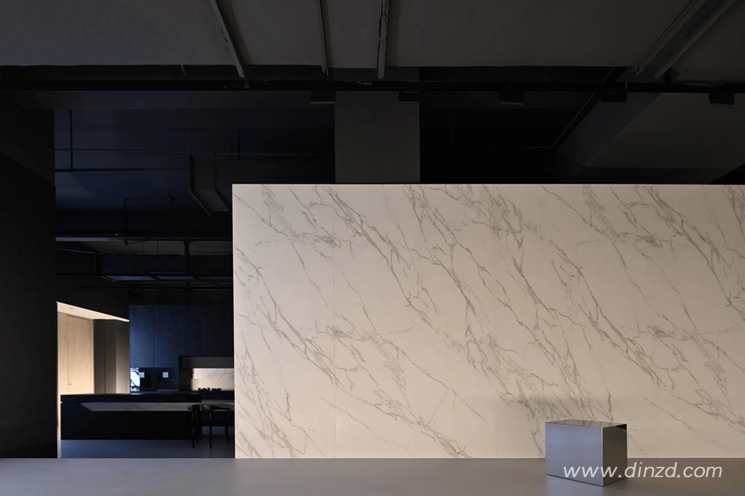
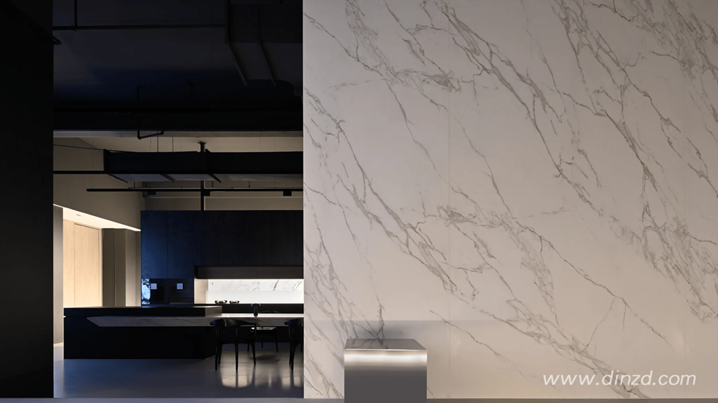
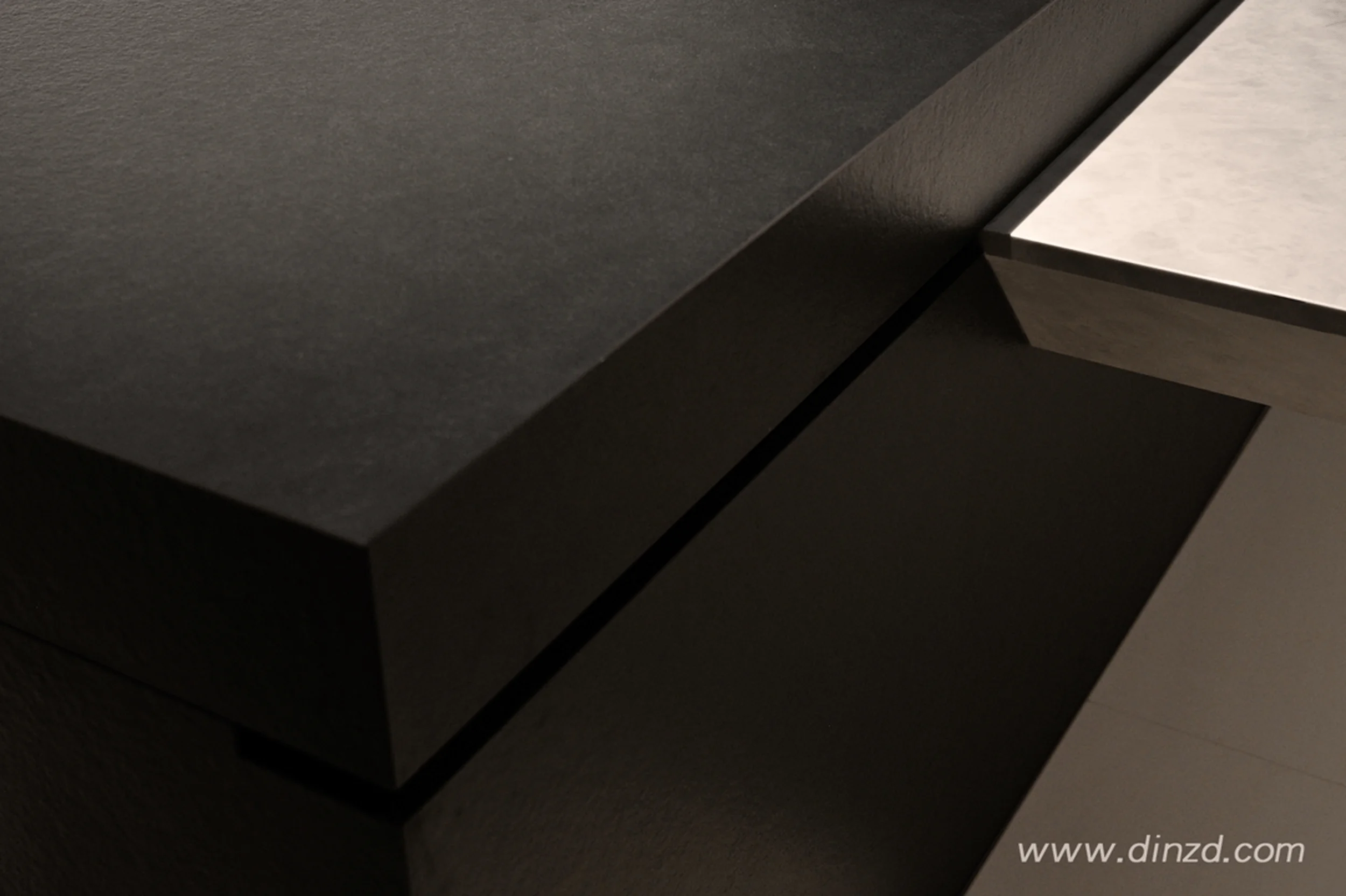
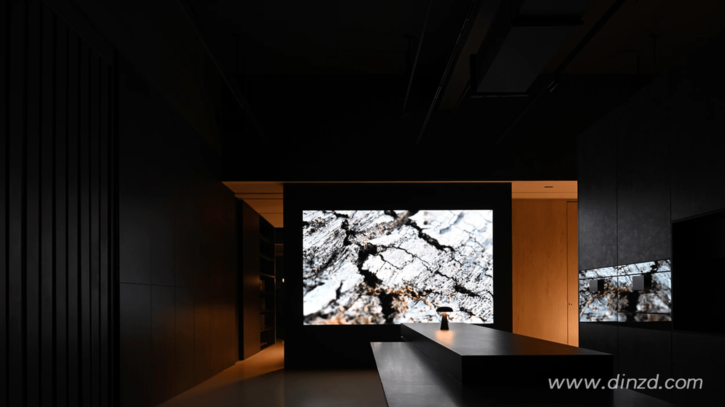
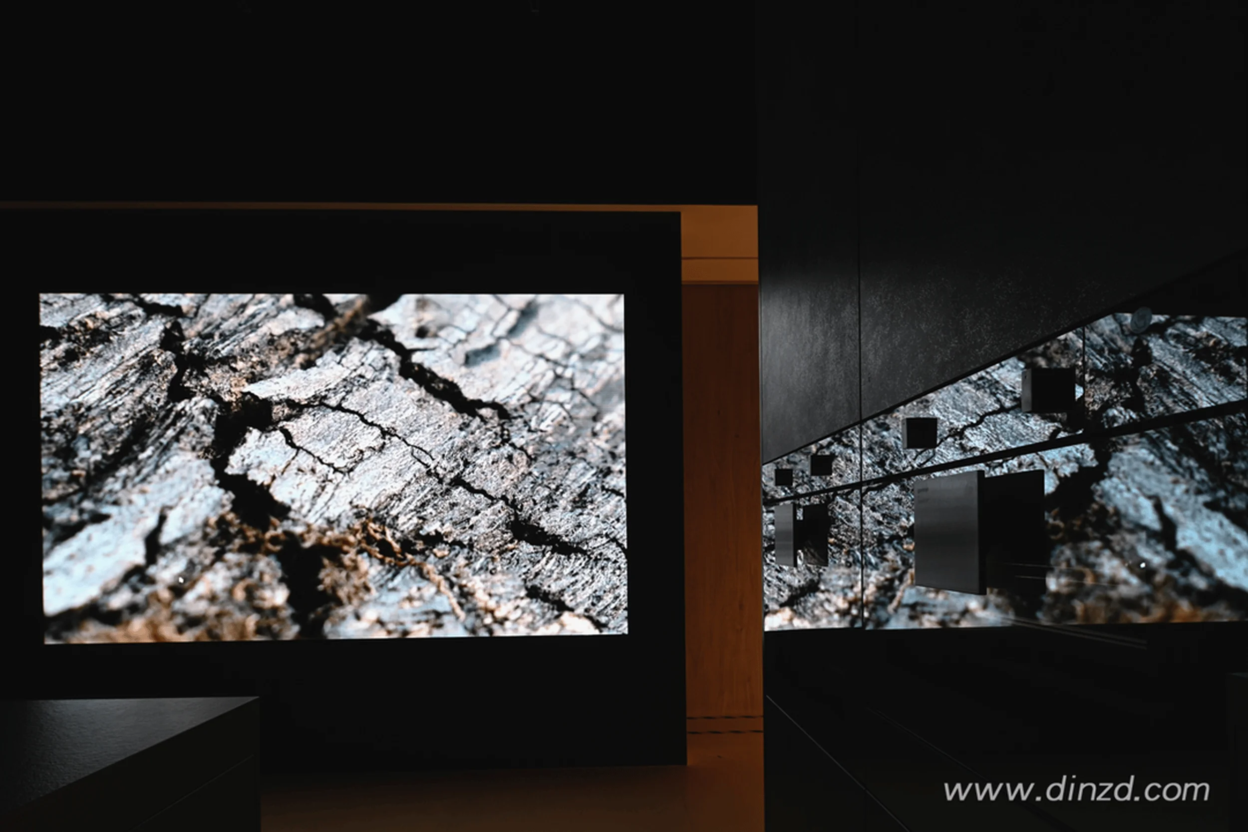
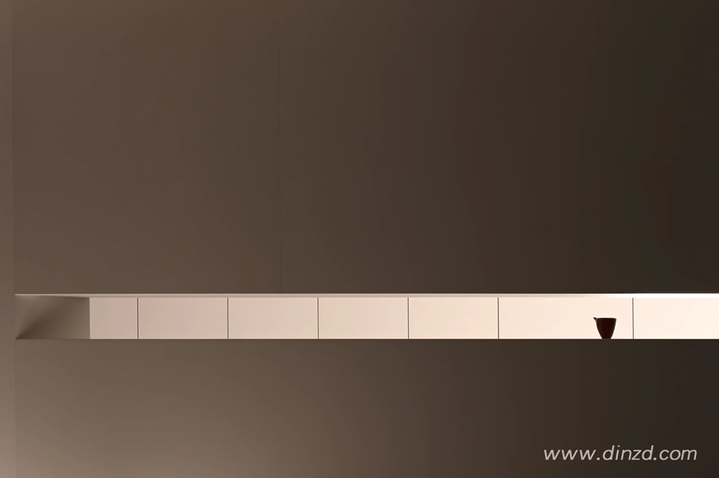
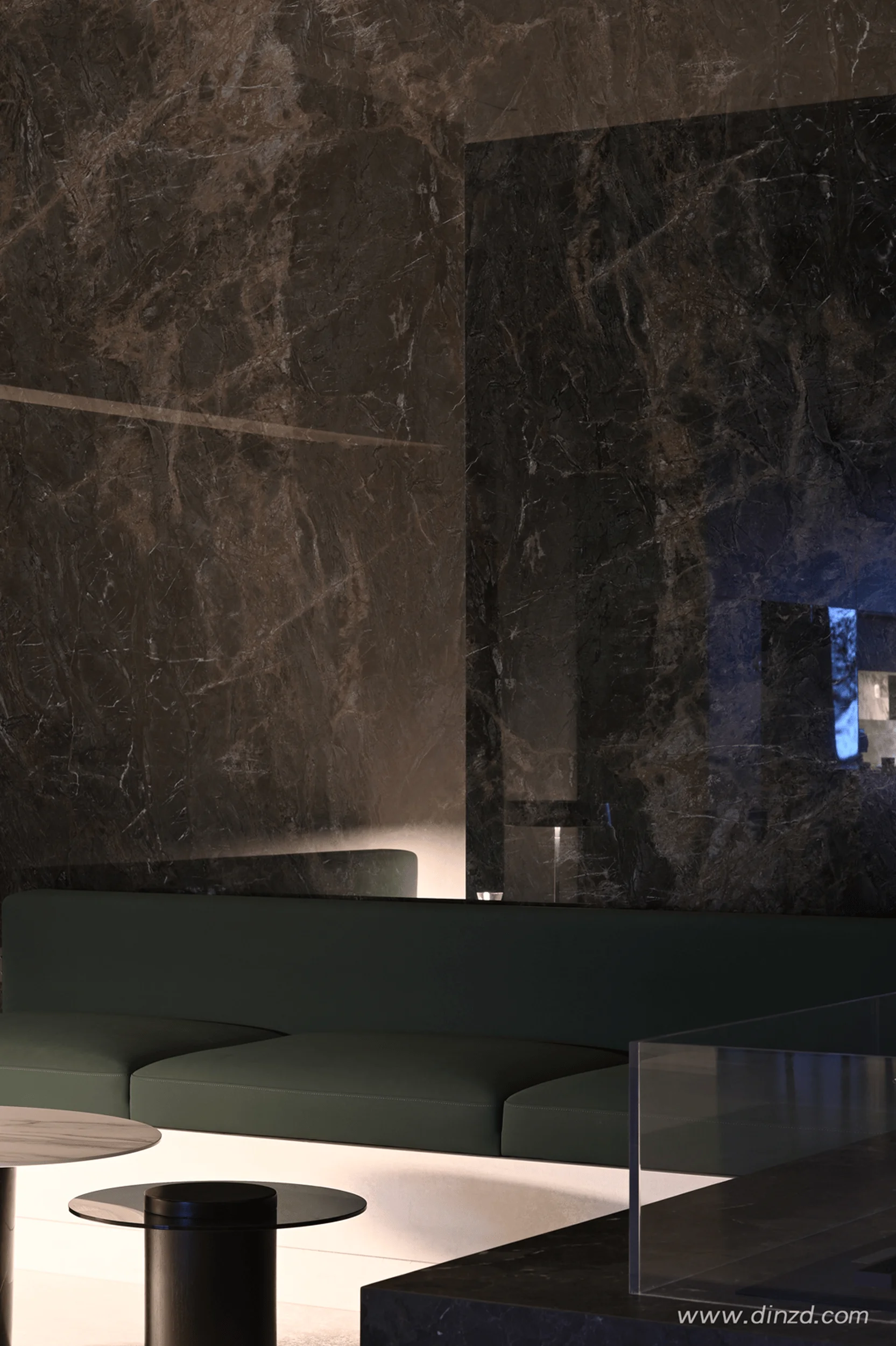
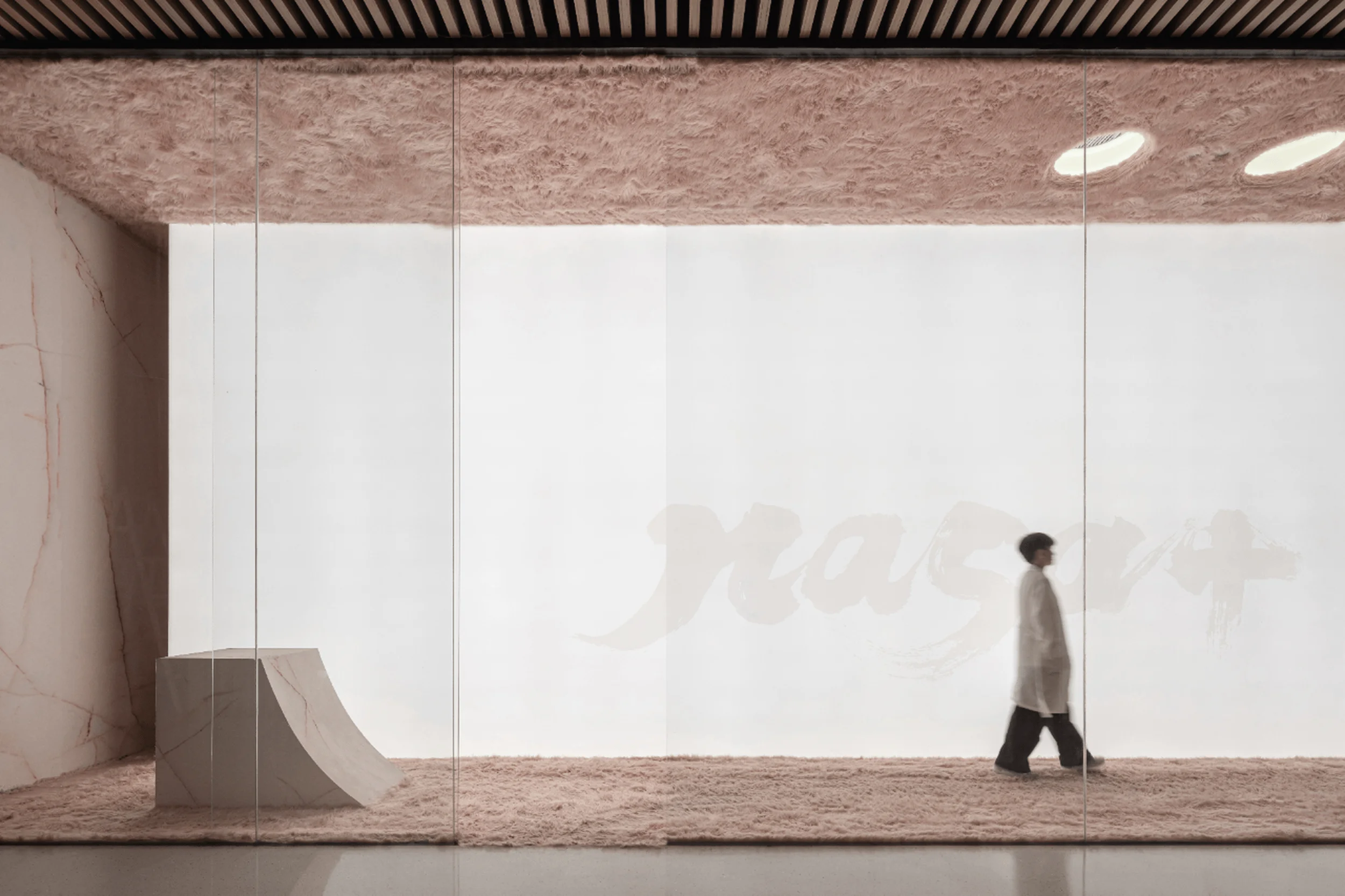
The DeSeSi showroom’s commercial exhibition space design masterfully employs visual language and materiality to create a unique atmosphere. In areas where the design focuses on the product itself, an inherent artistic conception emerges. This exploration of artistic conception is evident in the subtle visual cues throughout the space. The use of stone-patterned rock panels creates an ethereal ambiance. The ink-wash texture of the panels, resembling flowing water, establishes a sense of fluidity within the space, reminiscent of the gentle landscapes of Jiangnan, China. Each finished product’s unique pattern symbolizes freedom, offering a sense of tranquility in a fast-paced world, embodying the charm of traditional Chinese ink painting and the preciousness of nature’s gifts. The commercial exhibition space design utilizes lines and textures to enhance the spatial experience. The elegant lines replace expansive surfaces, demonstrating meticulous craftsmanship. The arrangement of lines transforms the static two-dimensional space into a dynamic three-dimensional environment, creating a visually striking experience that elevates the overall ambiance of the showroom.
Lighting and Atmosphere in the DeSeSi Showroom
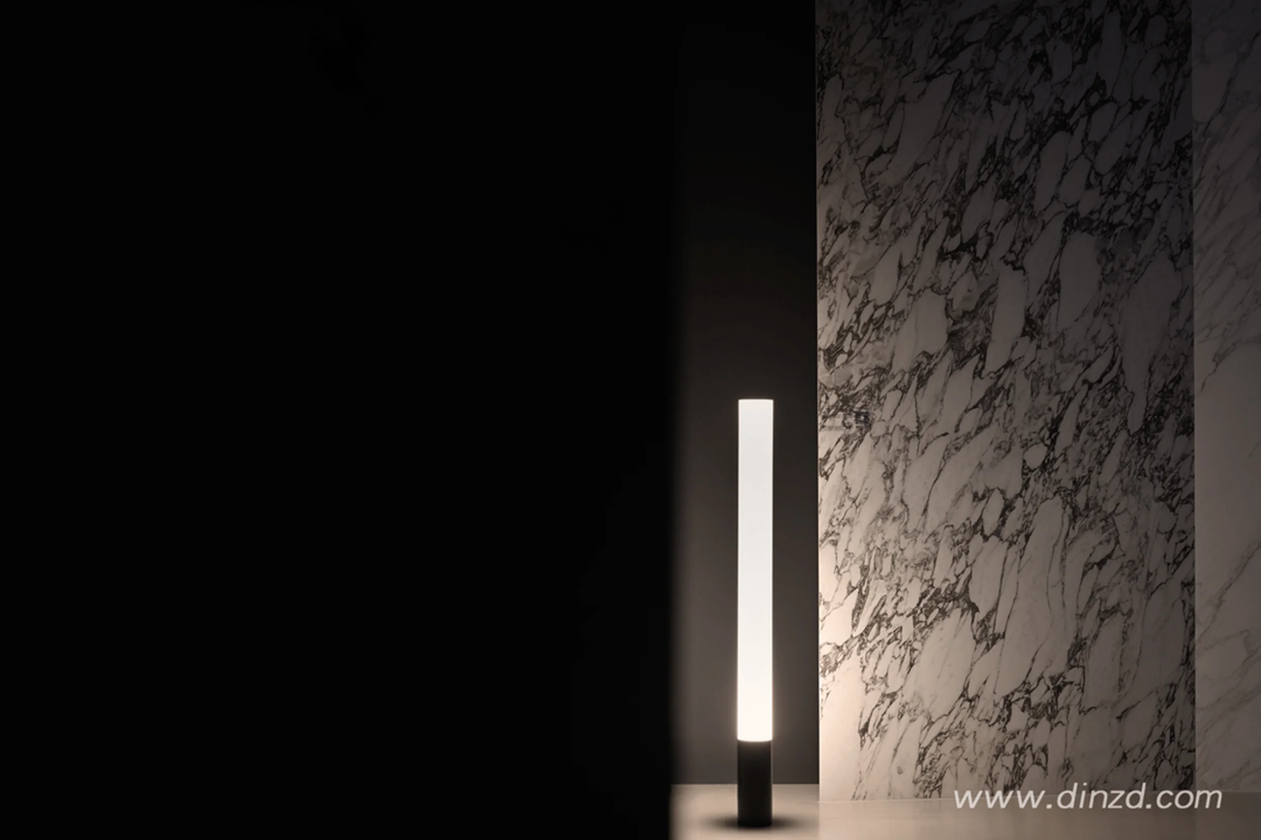
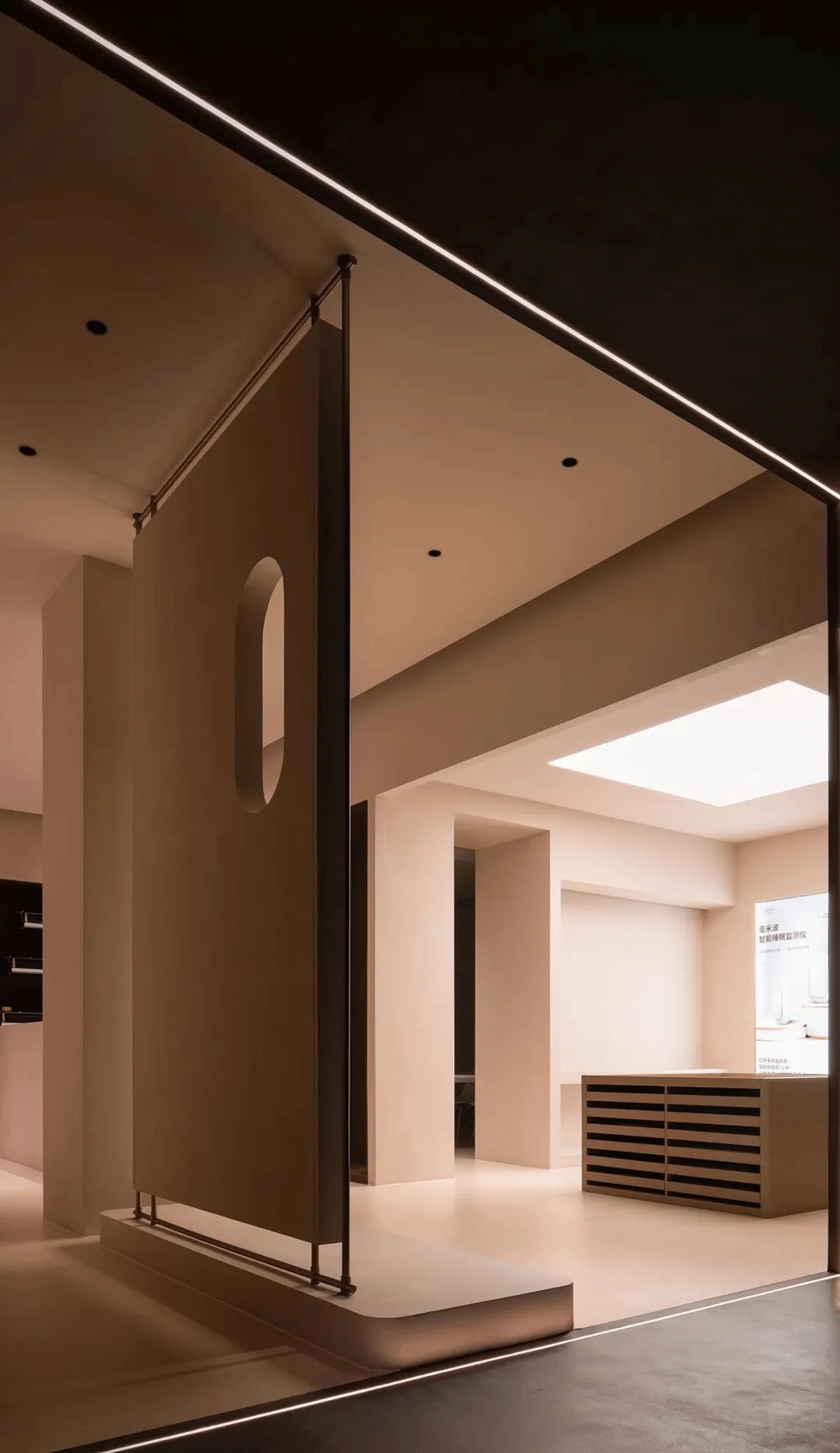
The commercial exhibition space design of the DeSeSi showroom incorporates strategic lighting to enhance the atmosphere and highlight the features of the rock panels. Built-in light sources draw attention to the central display area, where black patterns on a white background create a striking visual contrast, reminiscent of the imagery of trees in traditional Chinese aesthetics. This subtle detail adds a sense of life and energy to the otherwise tranquil space. The showroom’s lighting design also serves to emphasize the clarity and translucence of the rock panels. Extensive use of monochrome colors ensures a clean and textured spatial experience. The unique 45-degree splicing technique employed by DeSeSi facilitates smooth transitions within the space, contrasting with the traditional perception of inflexible rock panels. This precise control over hardness and softness allows for the creation of curved surfaces, showcasing the unique capabilities of DeSeSi rock panels within the commercial exhibition space design.
Sustainability Considerations in the DeSeSi Showroom
The DeSeSi showroom project demonstrates a commitment to sustainability through the use of durable and environmentally friendly materials like rock panels. The extraction, forging, and pressing processes used in the creation of the rock panels align with sustainable practices. The showroom’s minimalist design approach, featuring ample open space and minimal embellishments, further reinforces the brand’s commitment to resource efficiency. The use of low-saturation lighting complements the mirror-like texture of the rock panels, showcasing the true nature of the materials while minimizing energy consumption. By prioritizing natural materials and minimizing unnecessary decorative elements, the commercial exhibition space design aligns with the principles of sustainable design, contributing to a more environmentally responsible approach to commercial spaces.
Project Information:
Project Type: Commercial Exhibition Space
Architect: Damo Design
Area: 320㎡
Project Year: 2022
Project Location: China
Main Materials: Rock Panel
Photographer: Xu Yiweng


