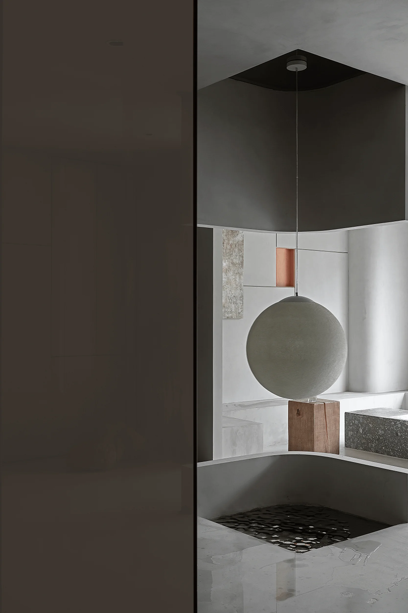
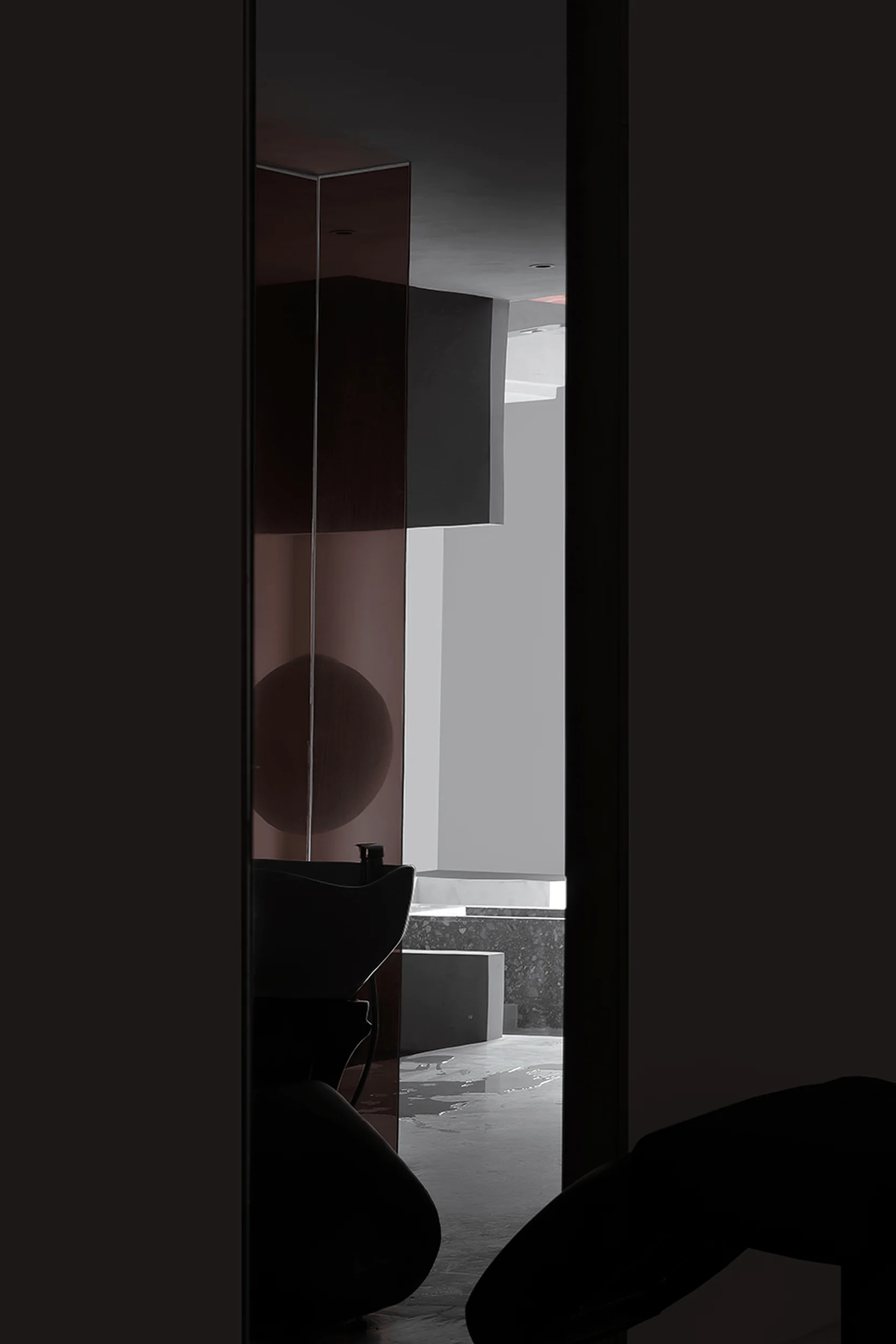
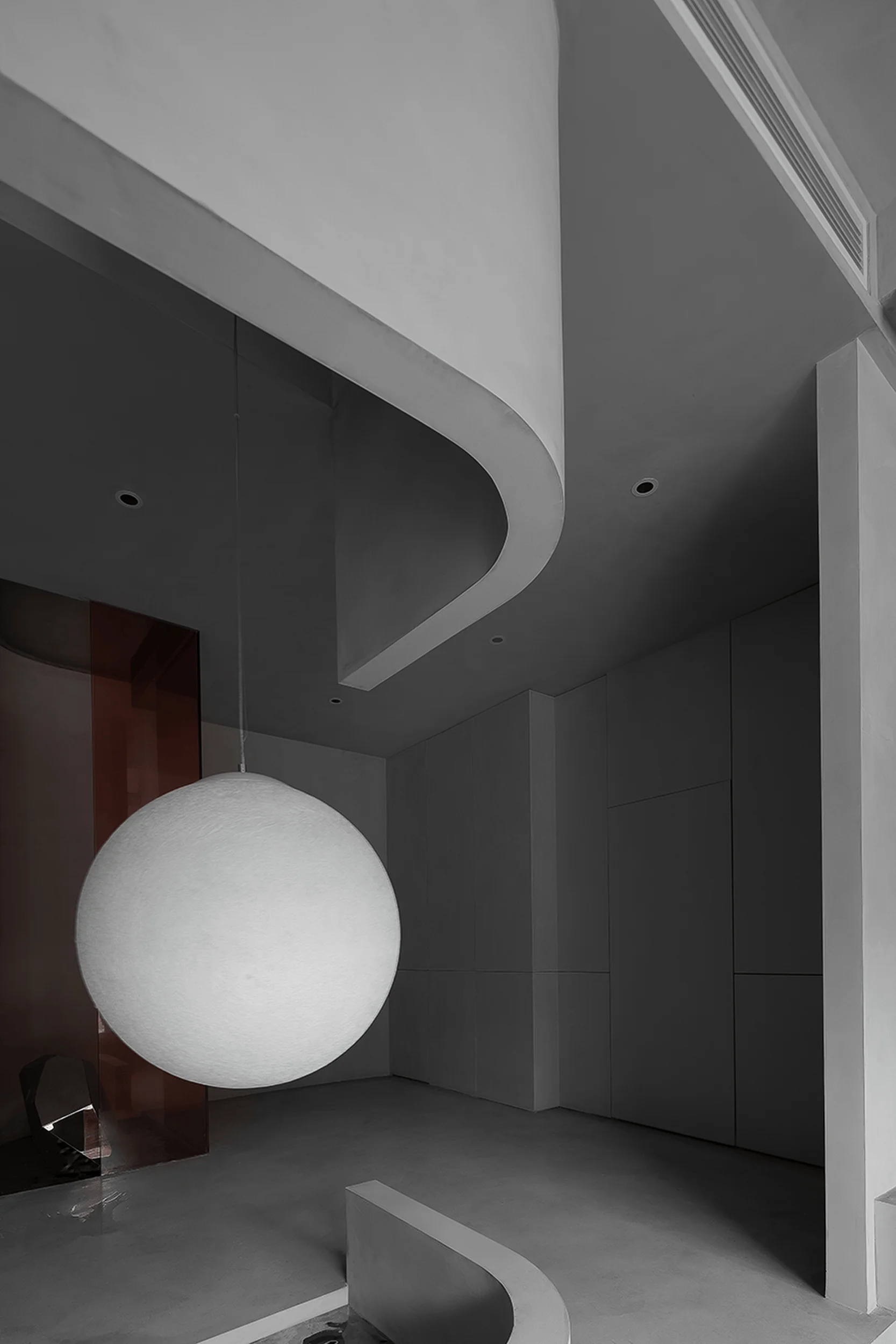
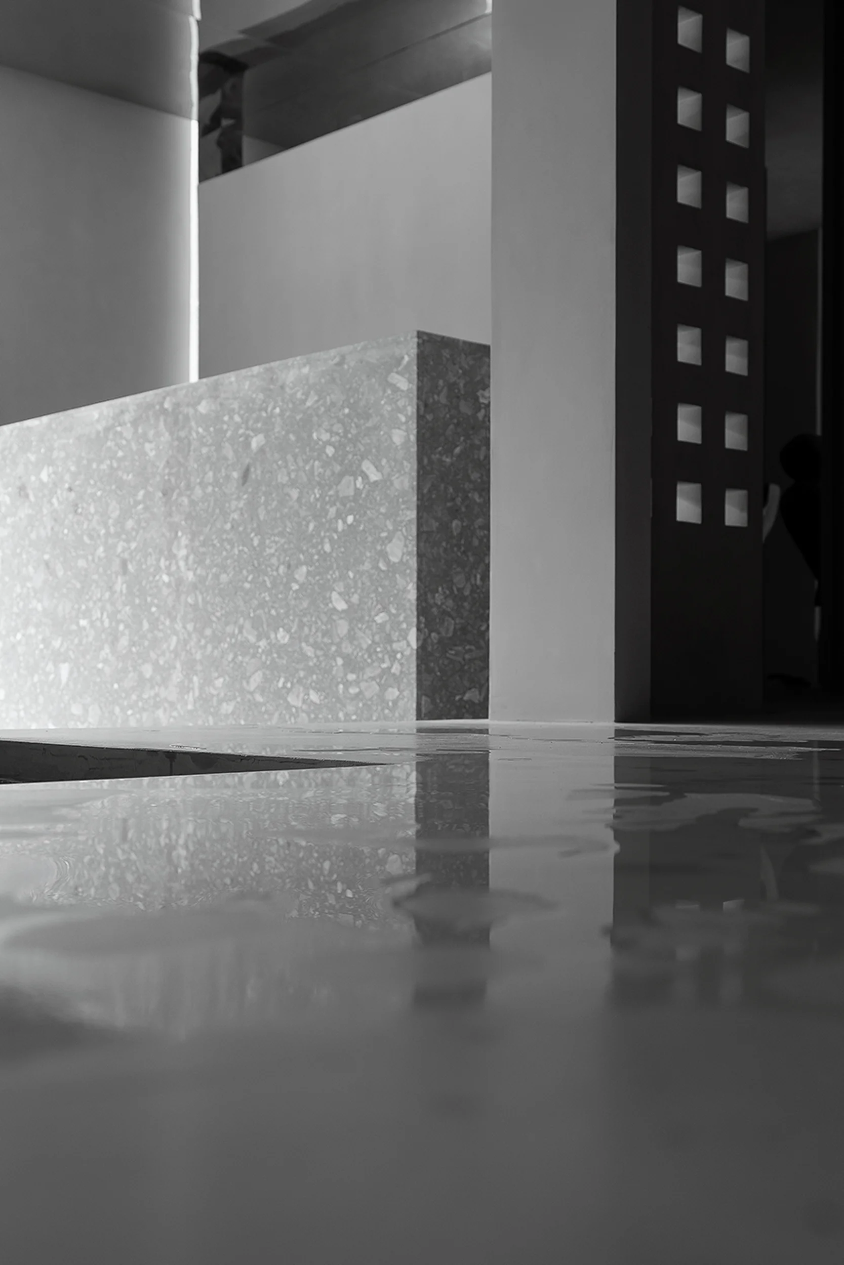
LJ-JNxNEO architects designed the Dushi Headspa Flagship Store, a minimalist beauty salon in Taizhou, China, that embodies visual dominance and minimalist aesthetics.
Contents
Project Background
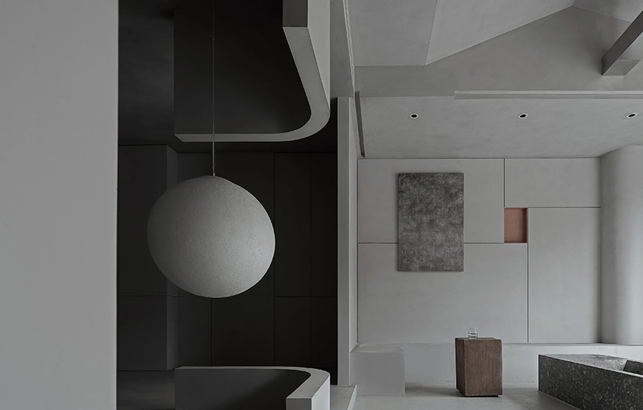
The Dushi Headspa Flagship Store, located in Taizhou, Jiangsu Province, China, is a project by LJ-JNxNEO architects. The design seeks to enhance the brand’s cultural connotation through the construction of minimalist aesthetics and spatial elements. This minimalist beauty salon serves as a testament to the brand’s commitment to visual dominance and a refined aesthetic experience, offering a retreat-like environment for scalp health management. minimalist beauty salon design prioritizes the user’s visual journey within the space, fostering a sense of tranquility and sophistication. The project is part of a larger effort by Lobom Group, a leading scalp health management company, to elevate its brand image and presence in the market. minimalist beauty salon design aesthetic carefully balances functionality with artistic expression, crafting an environment that is both practical and visually captivating.
Design Concept and Objectives
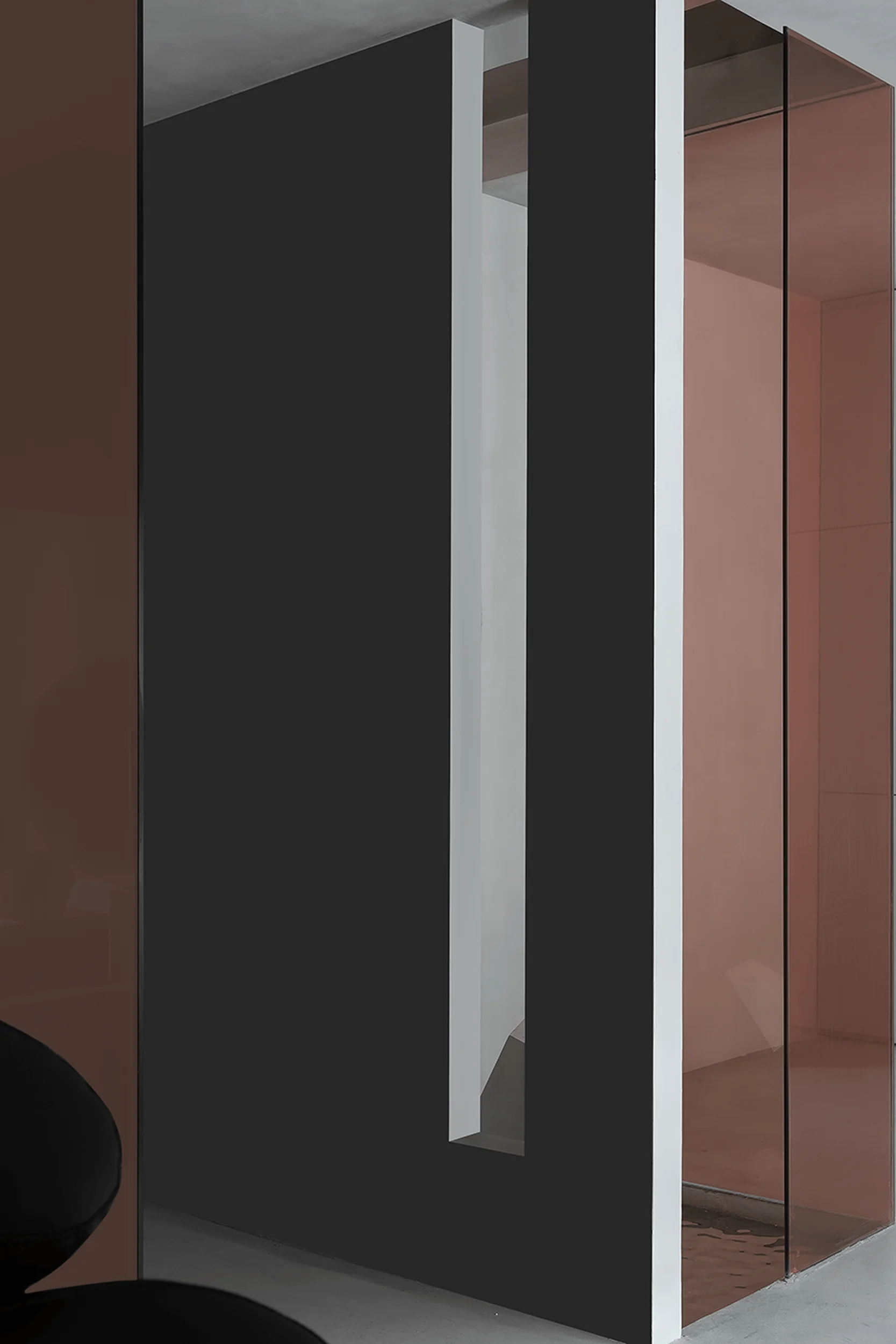
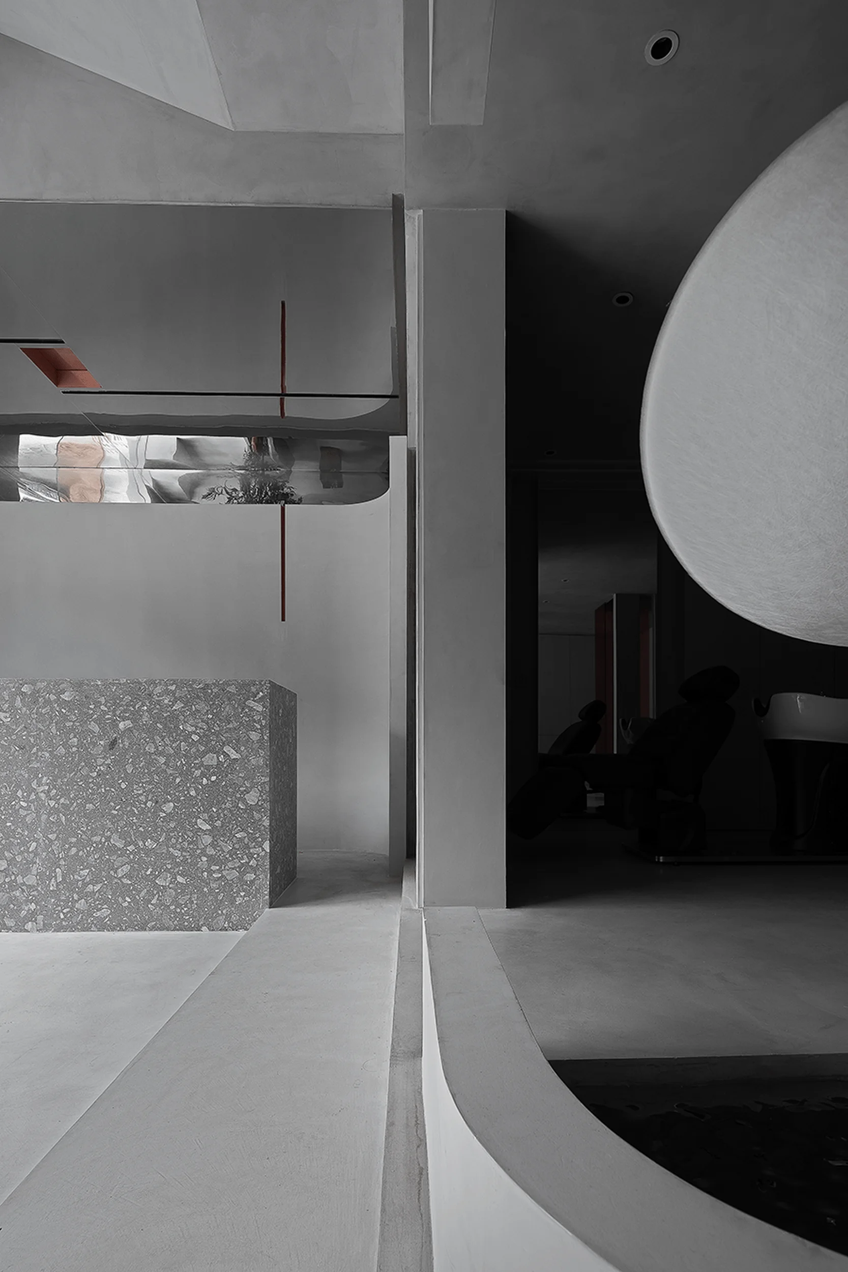
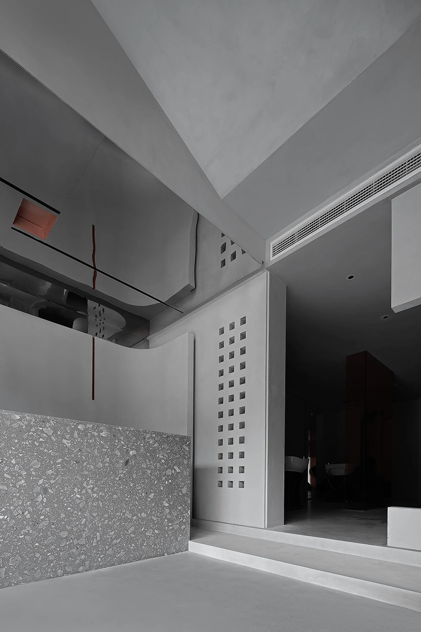
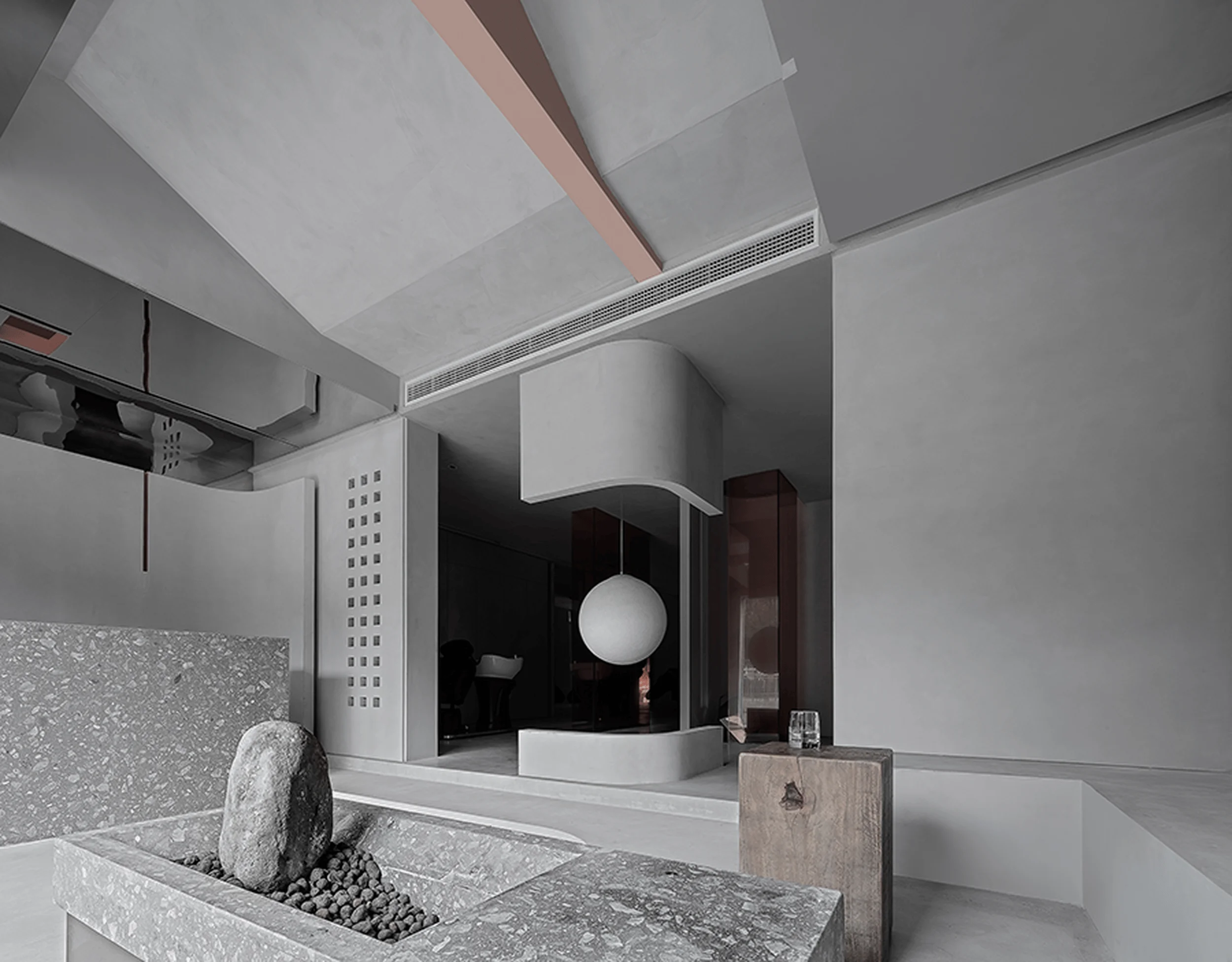
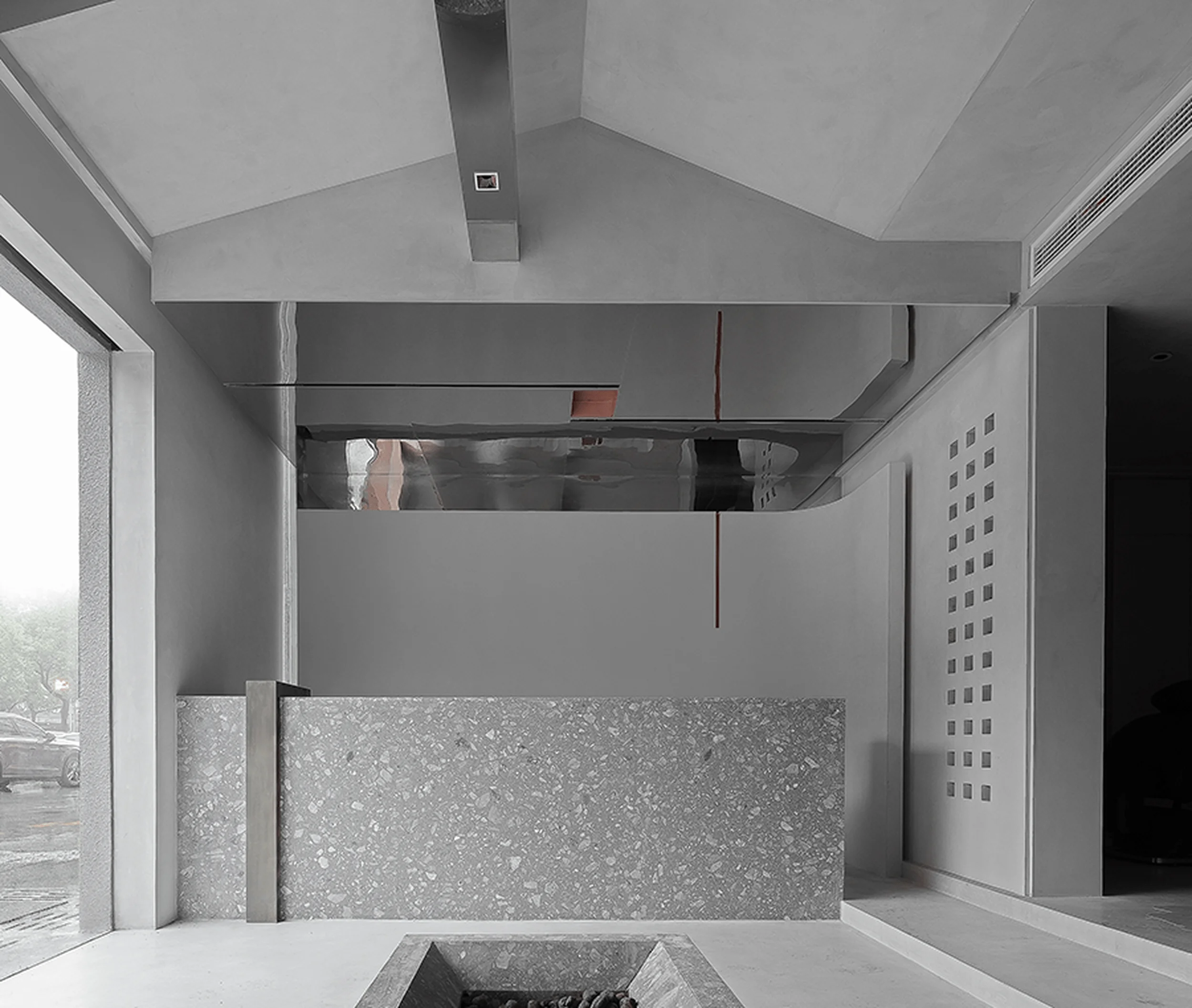
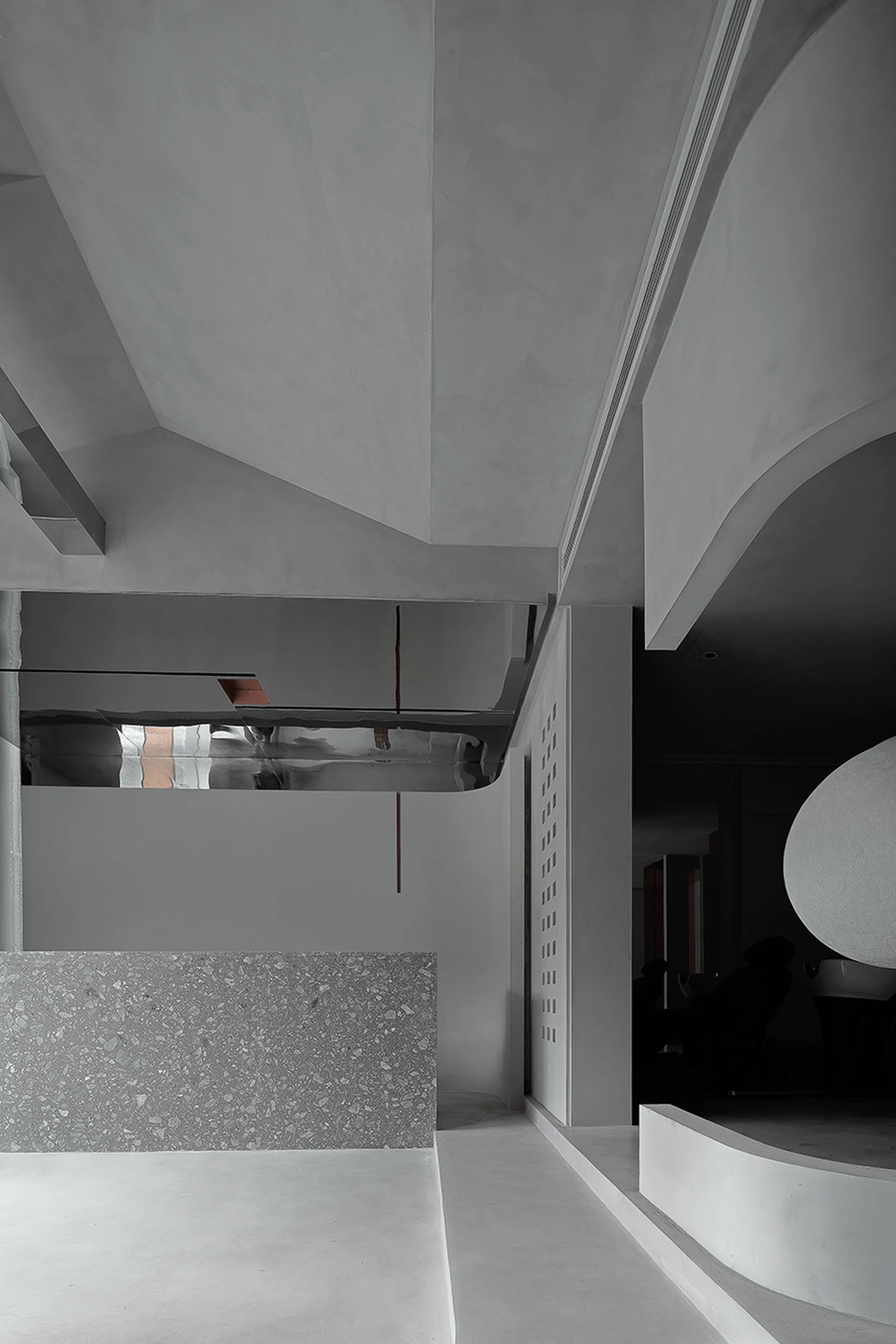
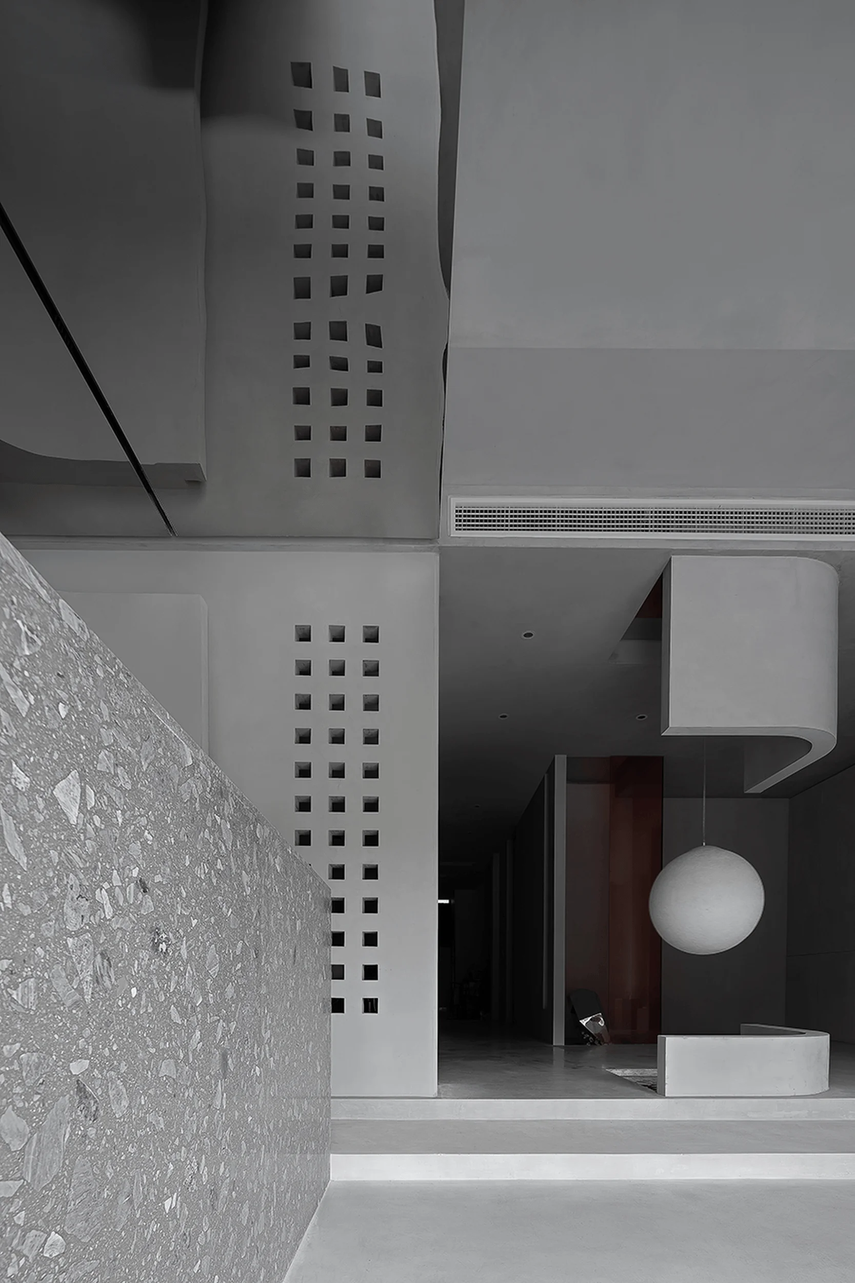
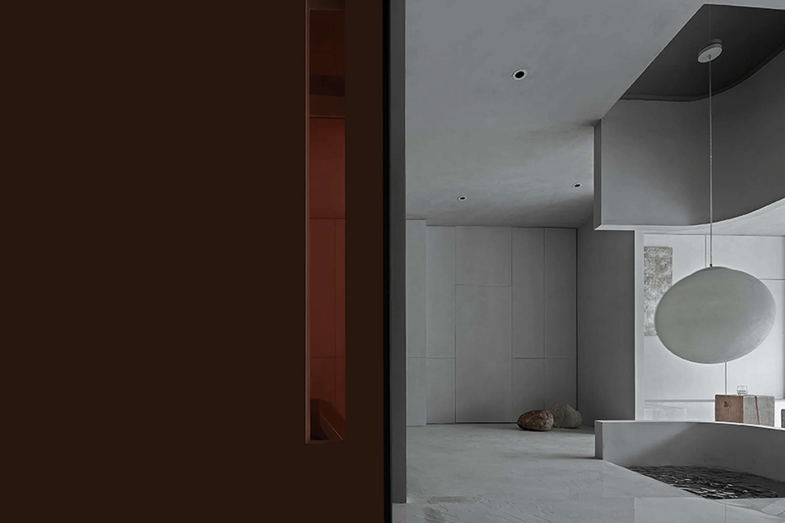
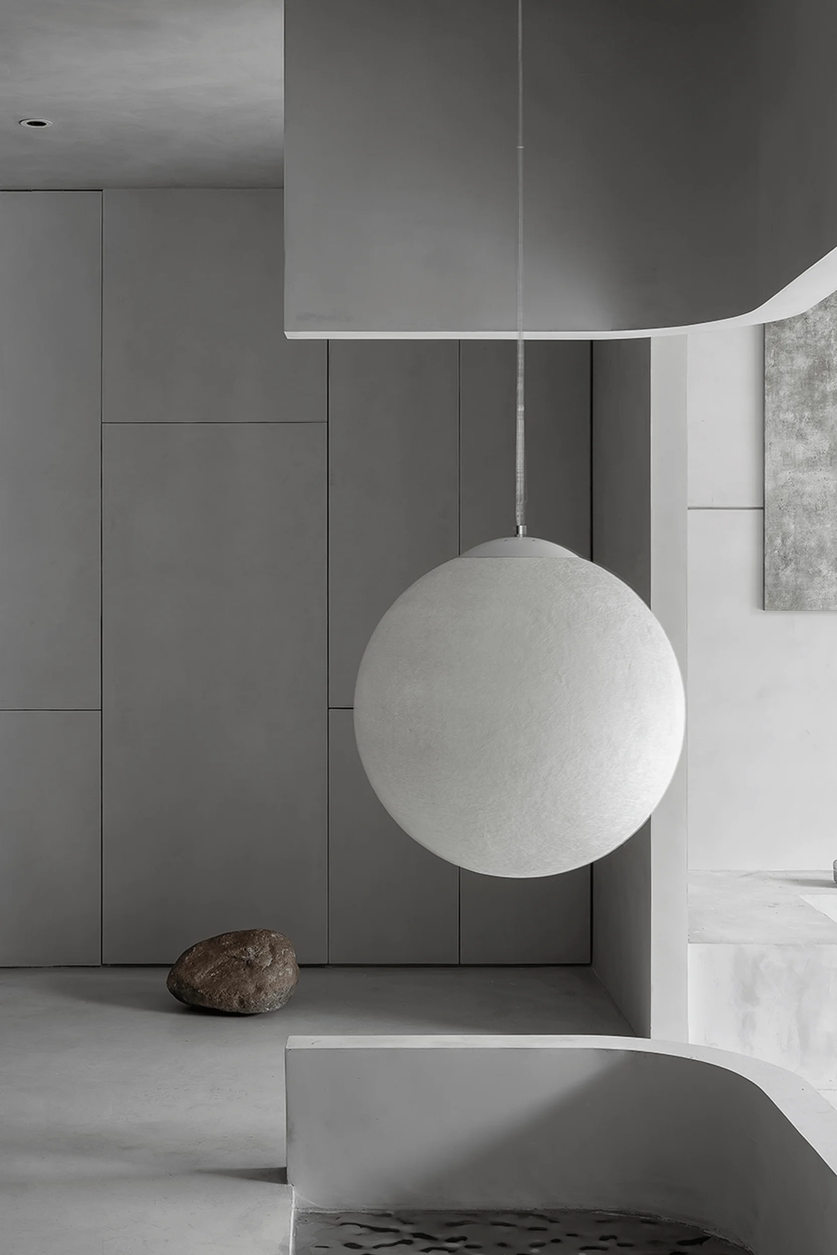
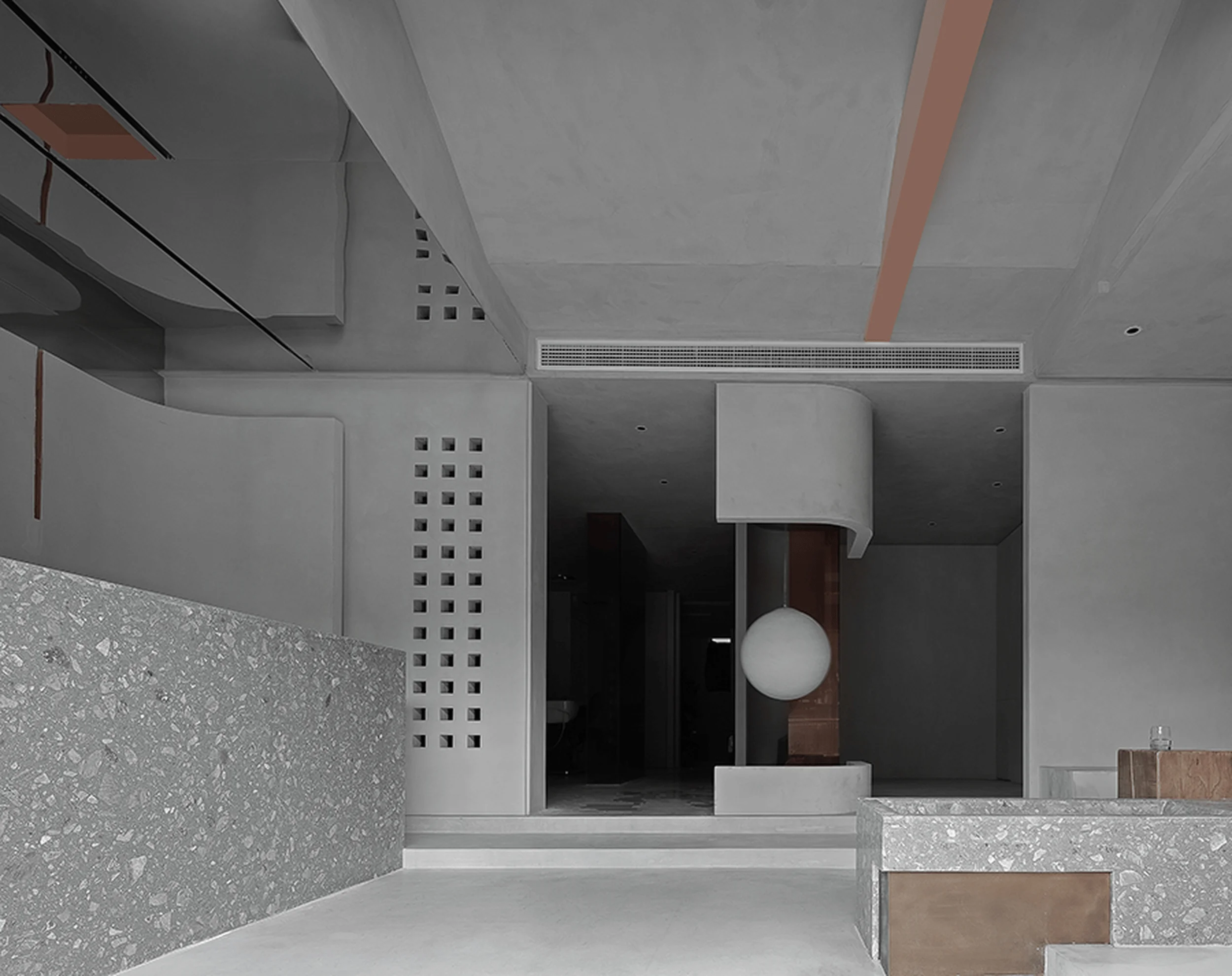
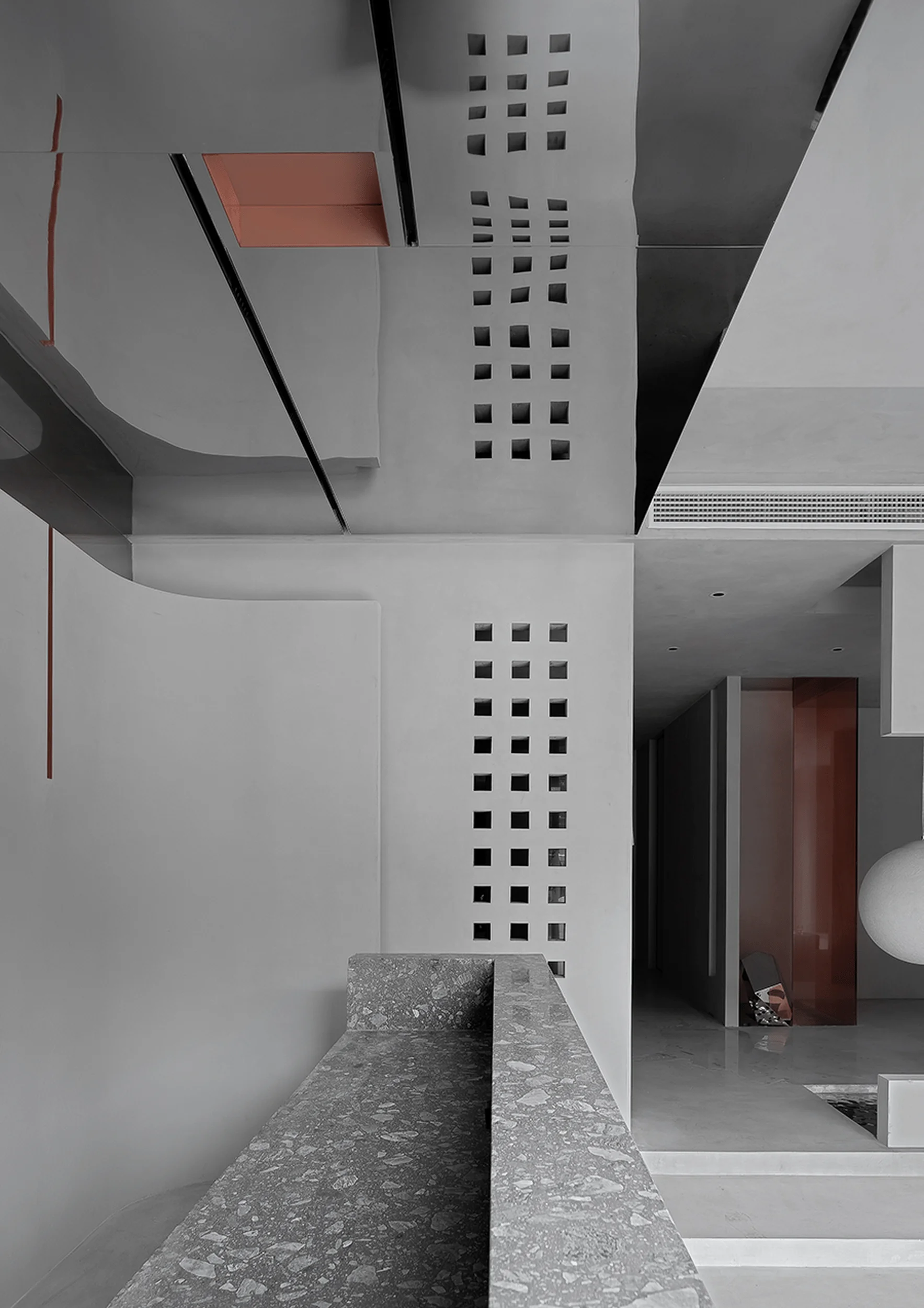
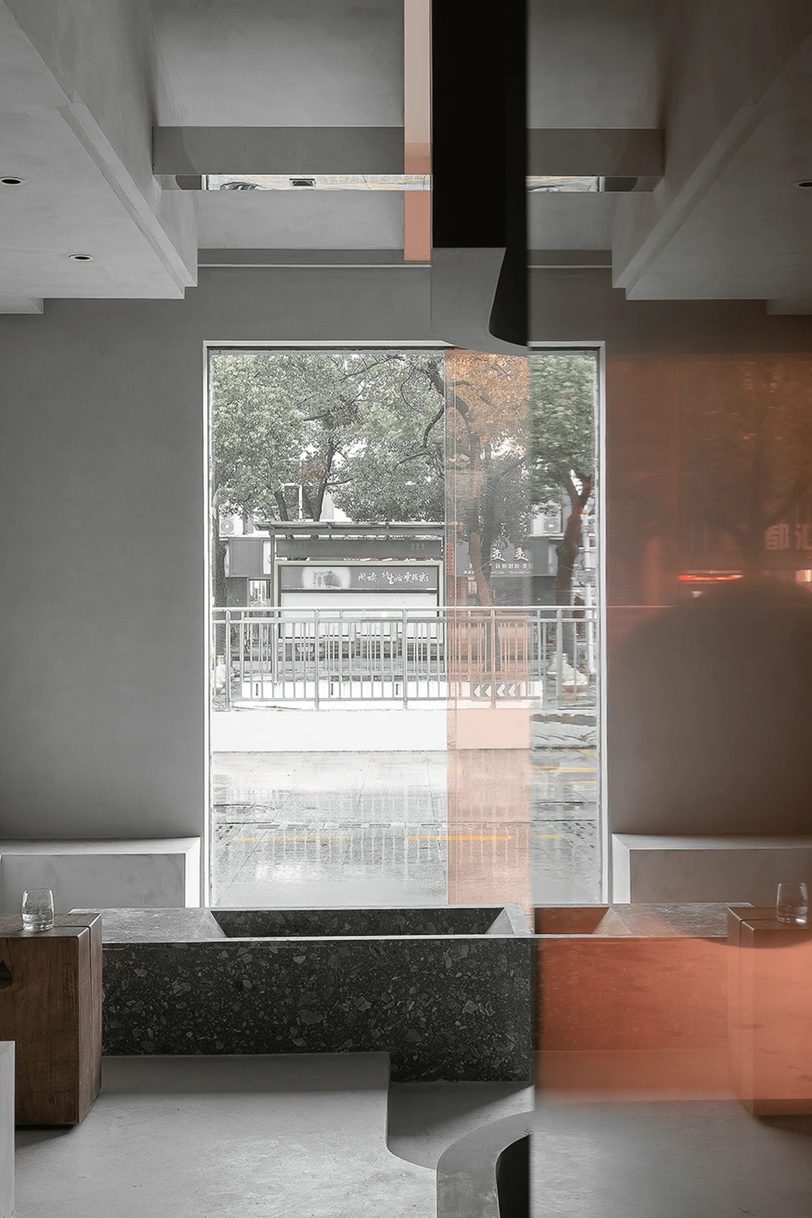
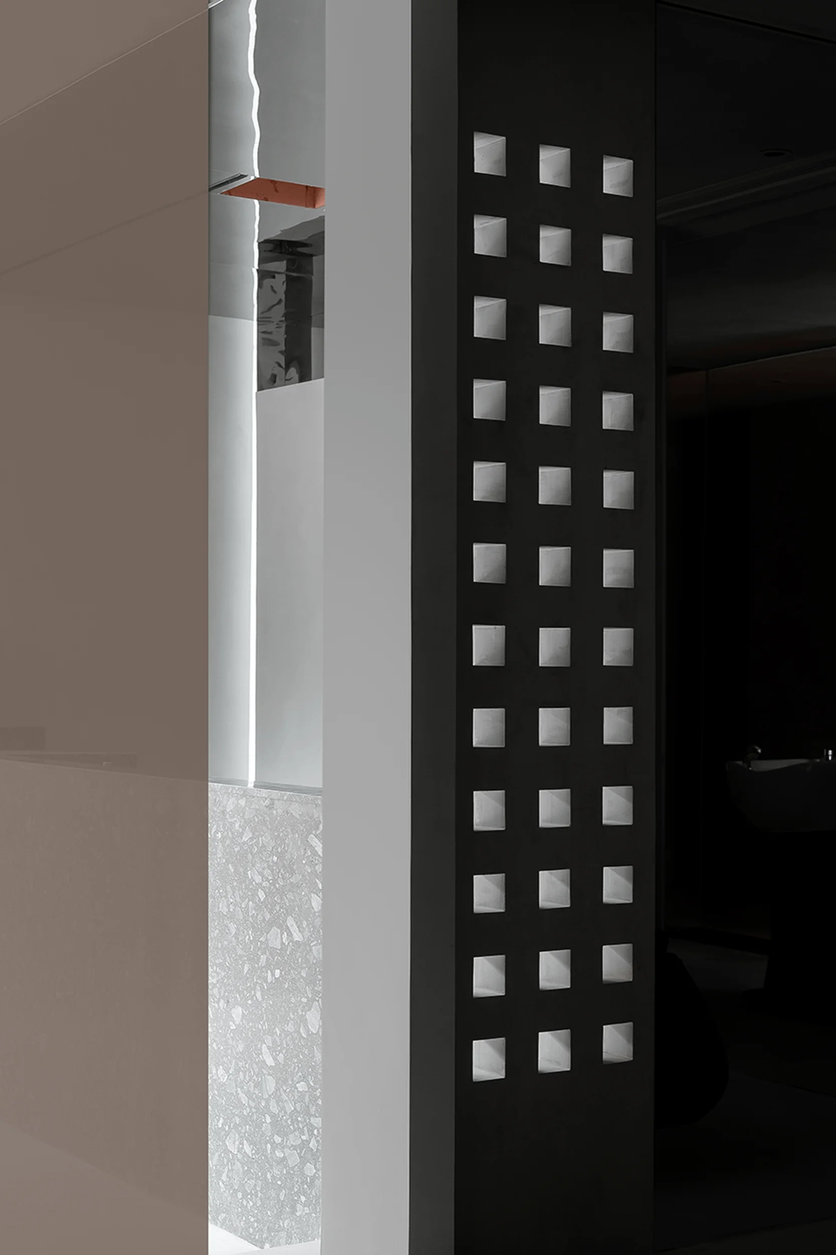
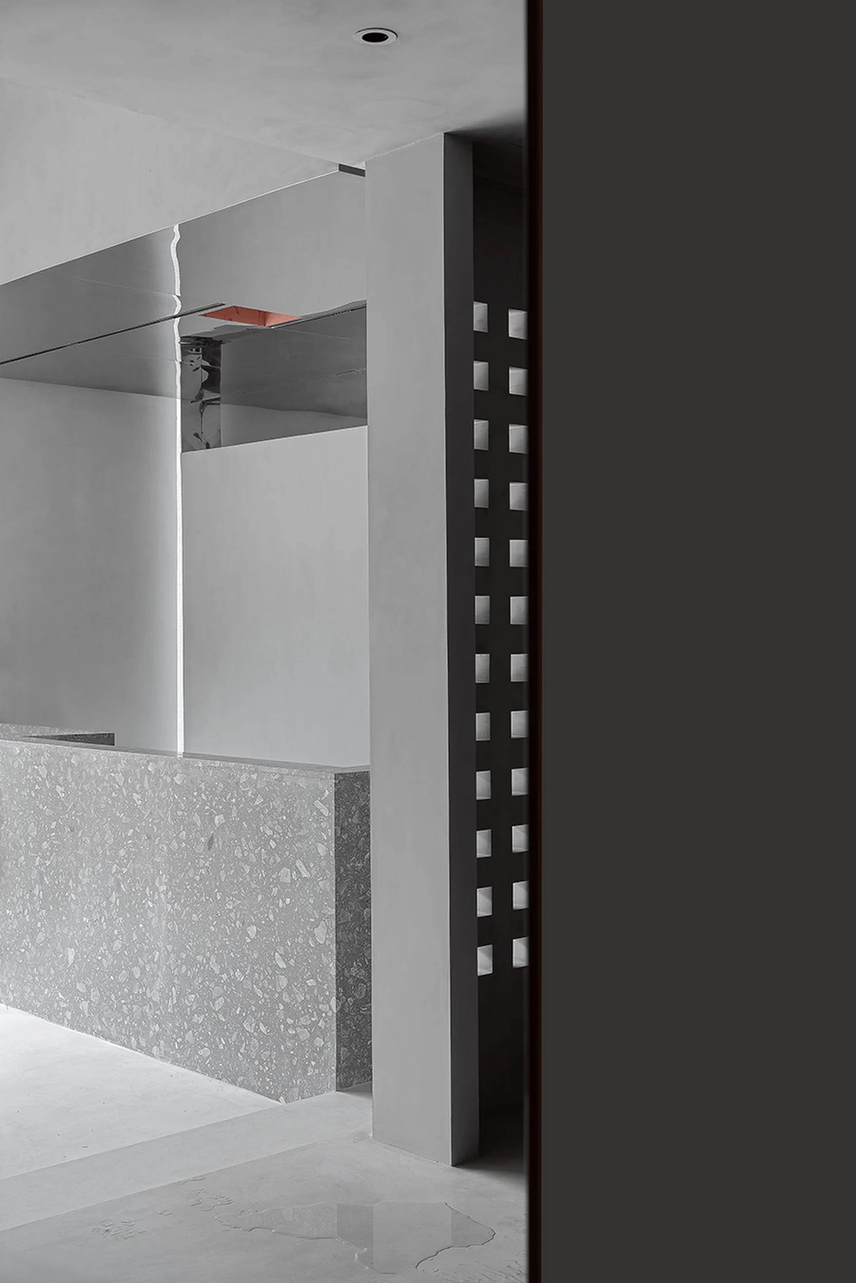
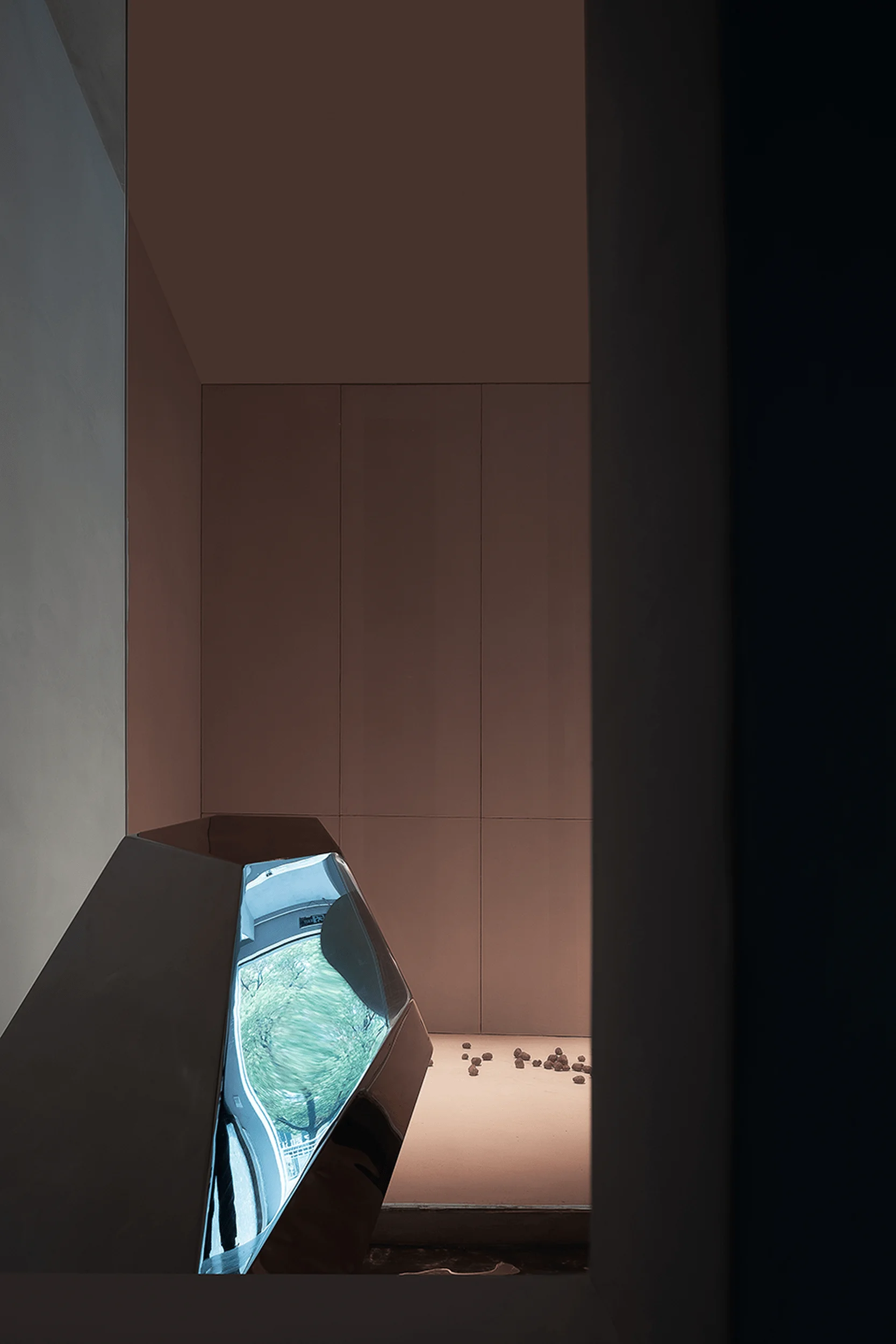
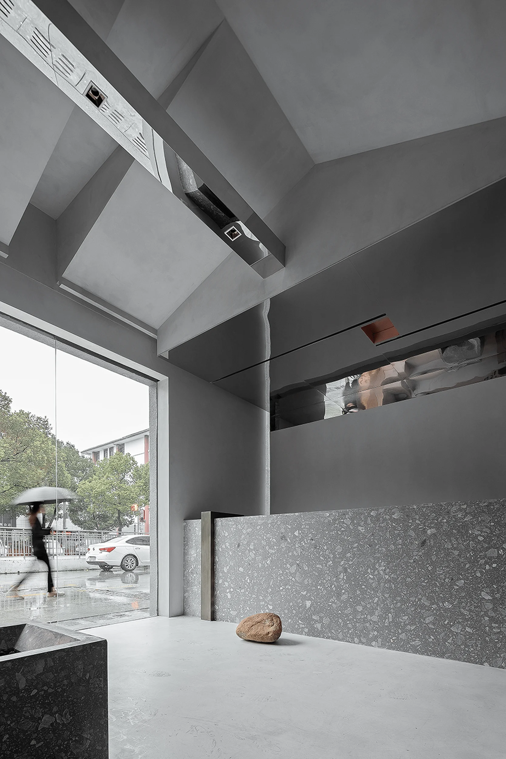
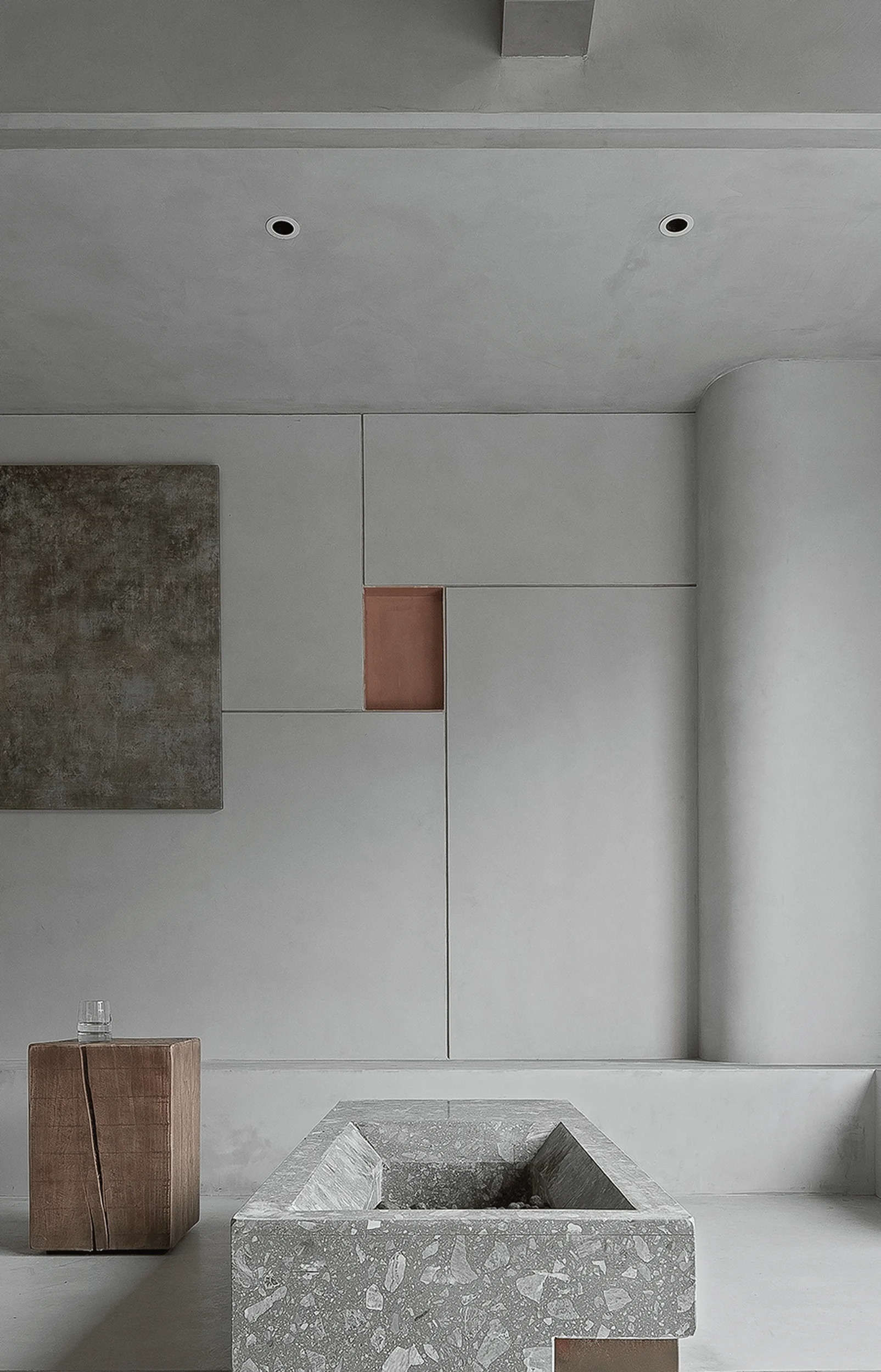
The designers aimed to create a unified and transformative spatial experience by employing a consistent material palette throughout the space. The walls, ceiling, and floor are clad in the same material, creating a seamless visual flow. The use of a cross-shaped mirrored stainless steel frame enhances the minimalist beauty salon design aesthetic by adding a touch of understated elegance. The designers deliberately sought to challenge conventional notions of functionality and aesthetics in minimalist beauty salon design, introducing elements of deconstruction, weightlessness, and a sense of floating within the space. By exploring the tension between “functionality” and “uselessness,” the design prompts users to question the significance of visual dominance in shaping their perceptions.
Spatial Layout and Planning
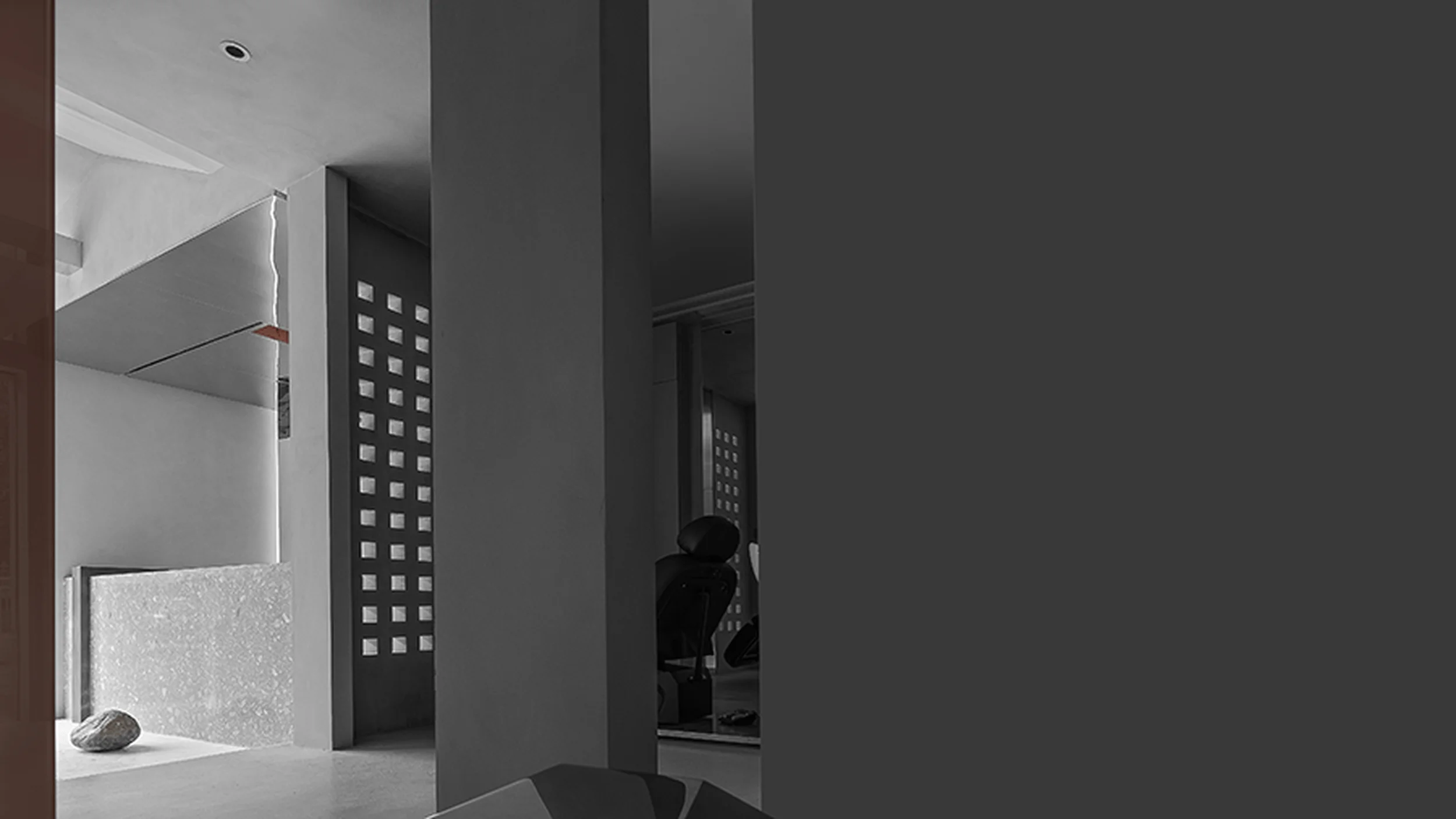
A two-step platform demarcates the waiting area from the operational zone, establishing a clear distinction between public and private spaces. The service counter’s top surface and the rear of the resting area are connected, further unifying the overall spatial form. This connection contributes to a sense of visual dominance by guiding the user’s gaze and establishing a visual hierarchy. The design skillfully integrates small spaces within the larger open area, fostering a sense of intimacy and enclosure. The resulting minimalist beauty salon design provides a carefully orchestrated visual journey that guides visitors through various zones, ensuring both functionality and aesthetic appeal. This approach ensures that the minimalist beauty salon design not only caters to practical needs but also offers a captivating sensory experience.
Exterior Design and Aesthetics
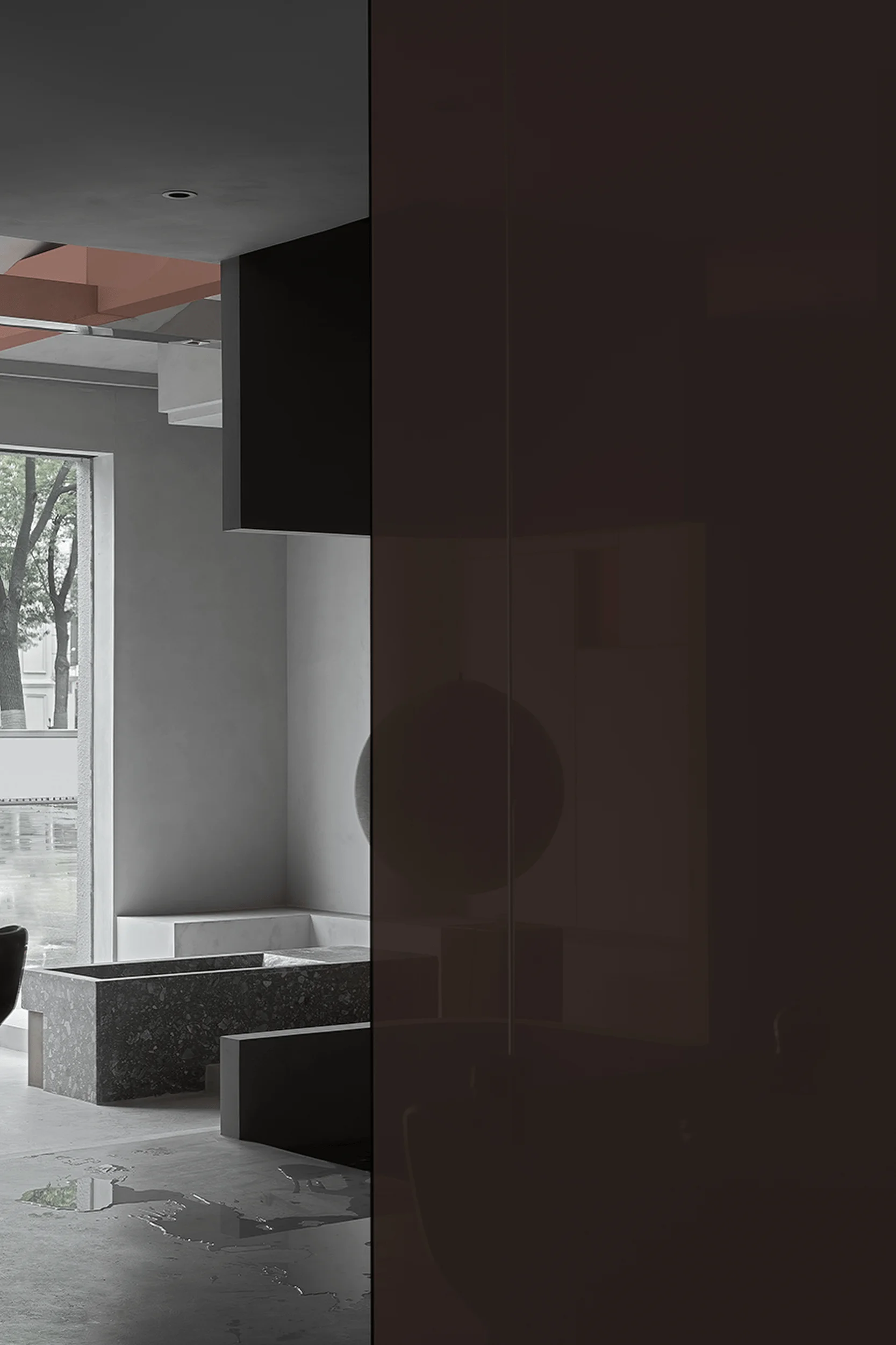
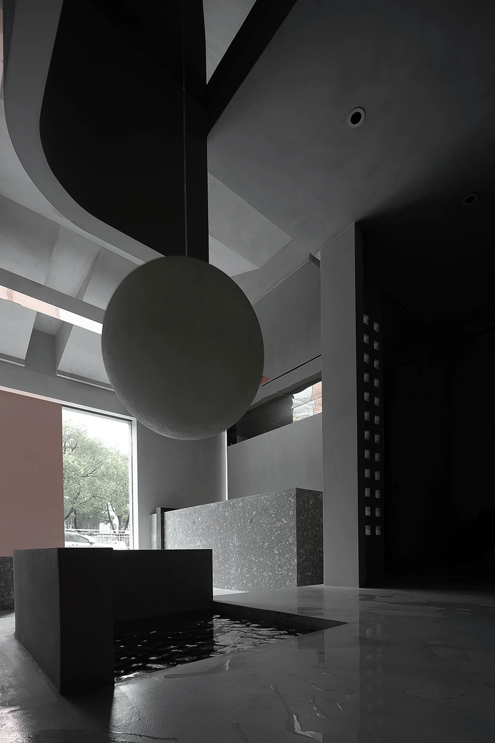
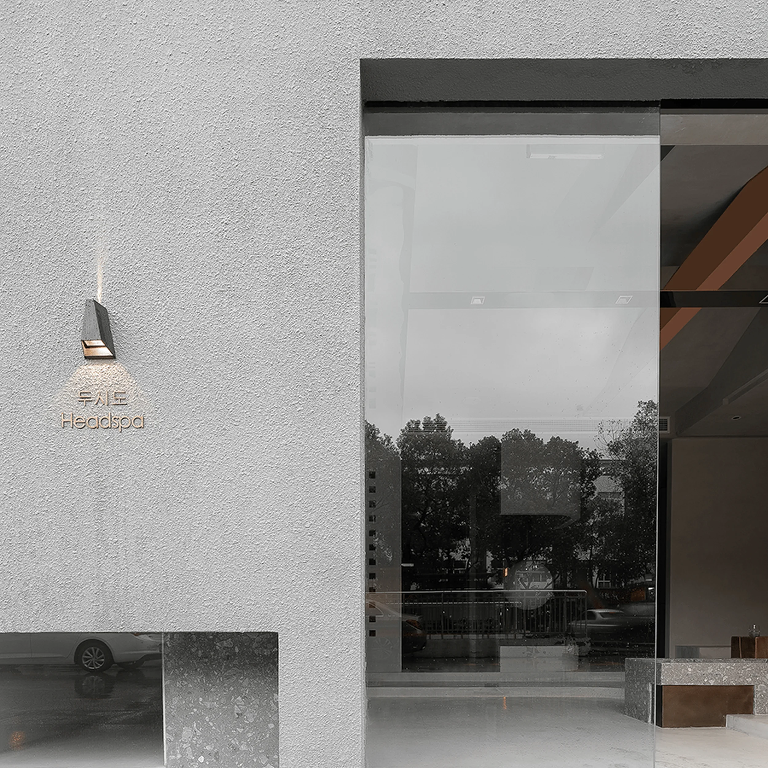
The building’s exterior embodies a minimalist aesthetic, aligning with the overall design concept of visual dominance. Clean lines, simple forms, and a restrained material palette characterize the exterior design, emphasizing a sense of purity and sophistication. Large windows invite natural light into the minimalist beauty salon’s interior, creating a bright and welcoming atmosphere. The design fosters a connection with the outdoors, providing glimpses of the surrounding environment while maintaining a sense of privacy. The careful placement of windows and openings in the minimalist beauty salon design allows for the interplay of light and shadow, adding another layer of visual interest to the exterior.
Visual Dominance and User Experience
The design of the Dushi Headspa Flagship Store prioritizes the exploration of “visual dominance” or “visual centrism.” The minimalist beauty salon design concept is to guide the user’s gaze and influence their perception of the space. Through the strategic placement of elements and the use of a consistent material palette, the designers create a visual hierarchy that draws attention to specific areas and features. This visual dominance is meant to evoke a sense of focus and contemplation, encouraging users to engage with the minimalist beauty salon environment in a more mindful and immersive way.
Project Information:
Project Type: Beauty Salon
Architects: LJ-JNxNEO
Project Year: Not specified
Country: China
Photographer: Not specified


