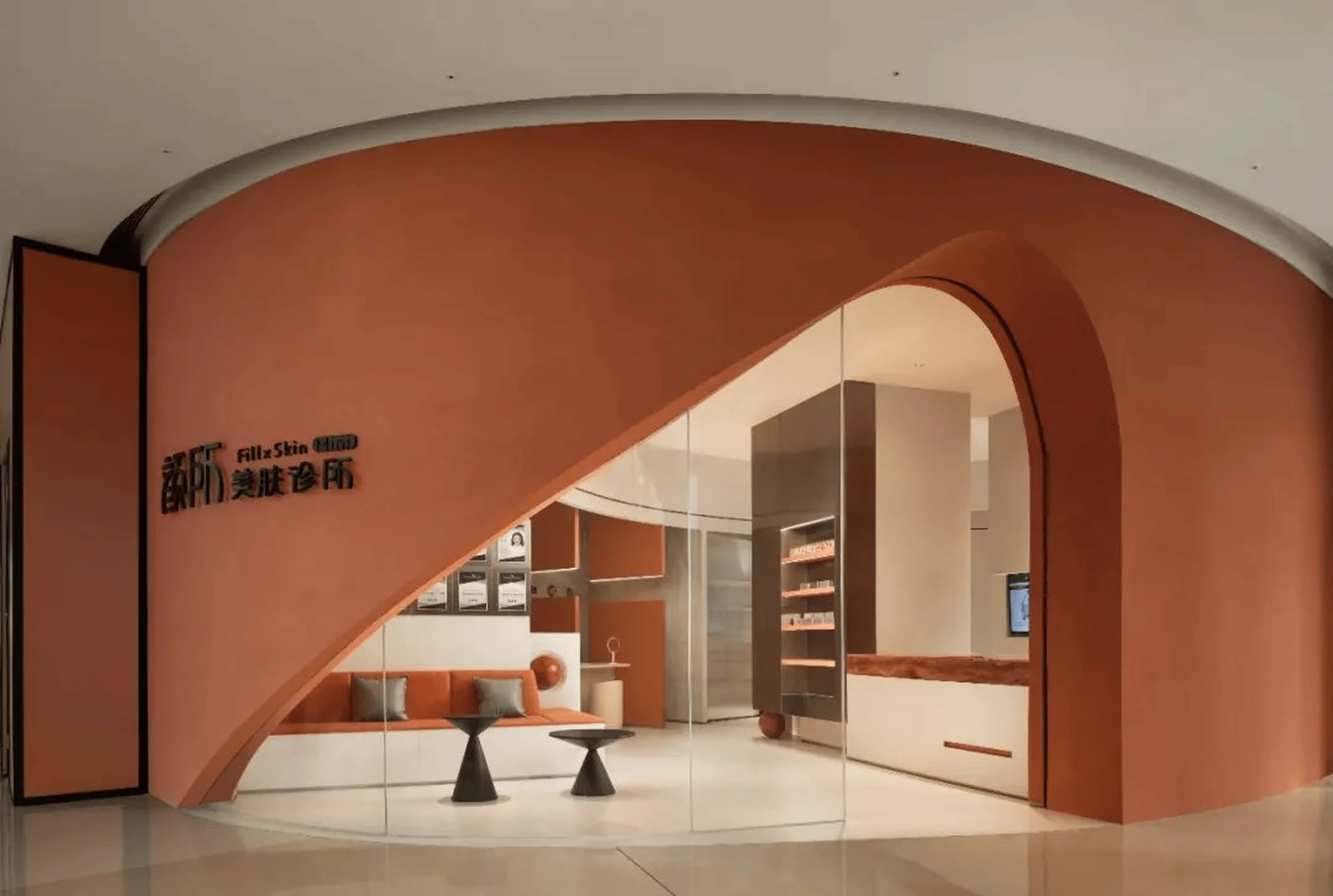
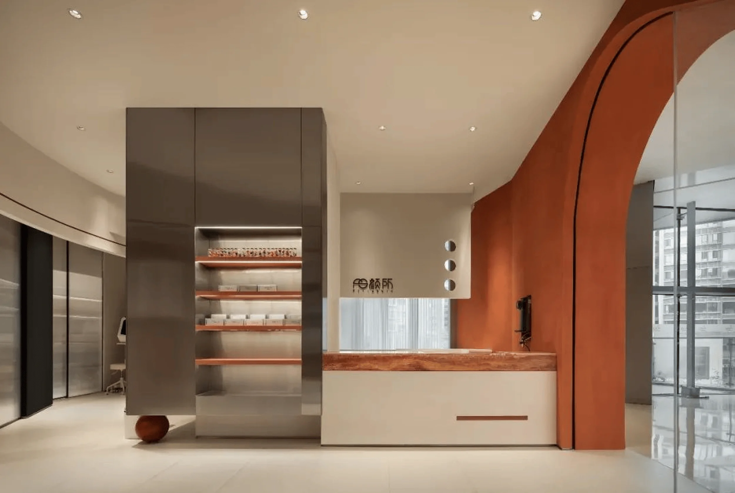
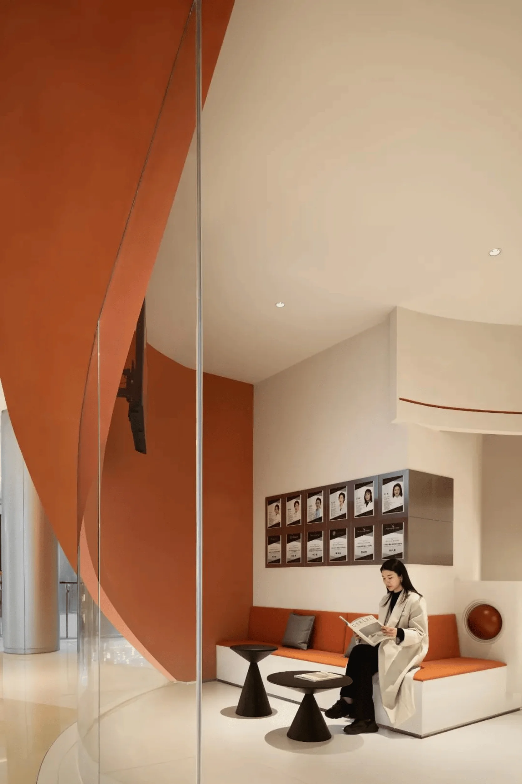
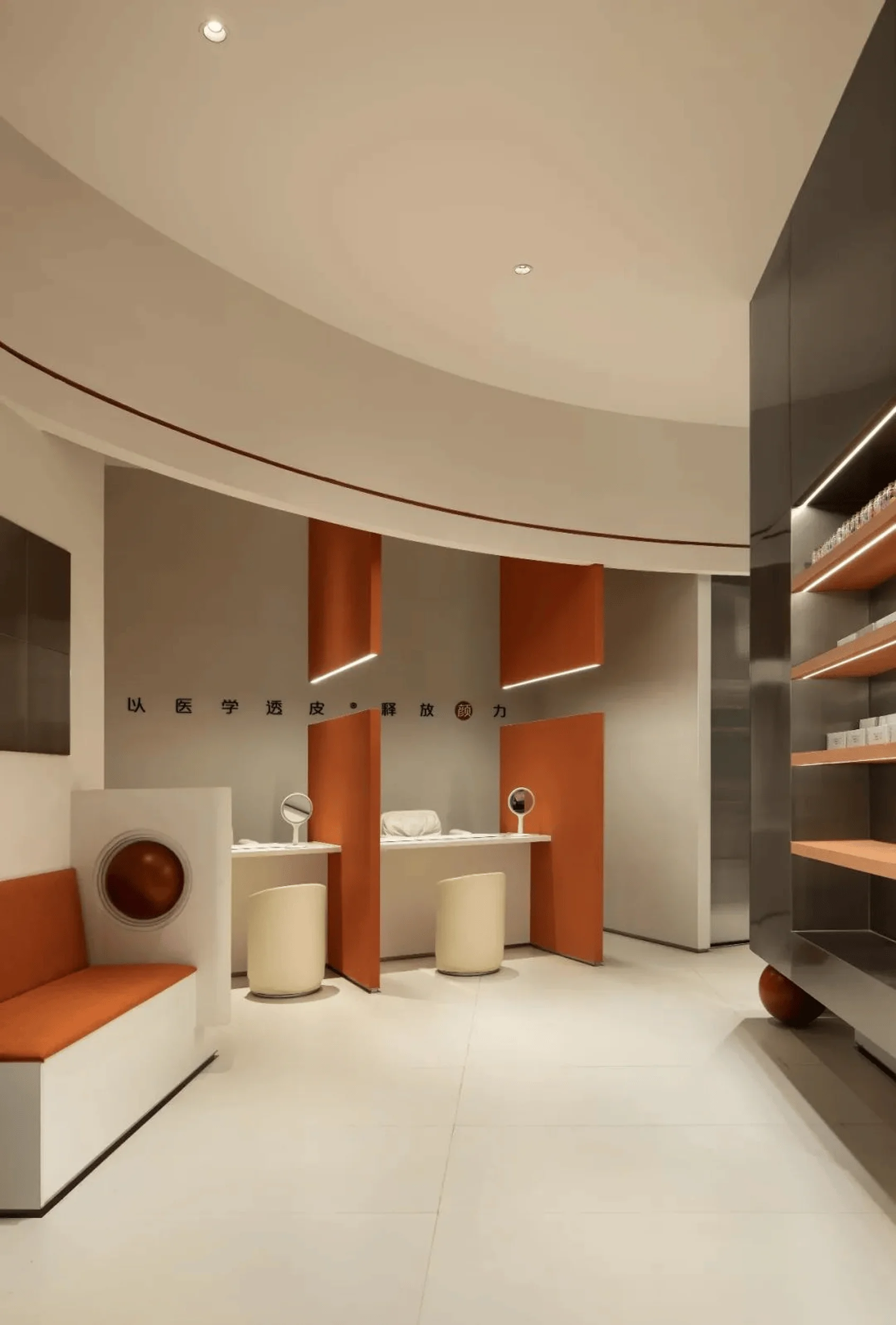
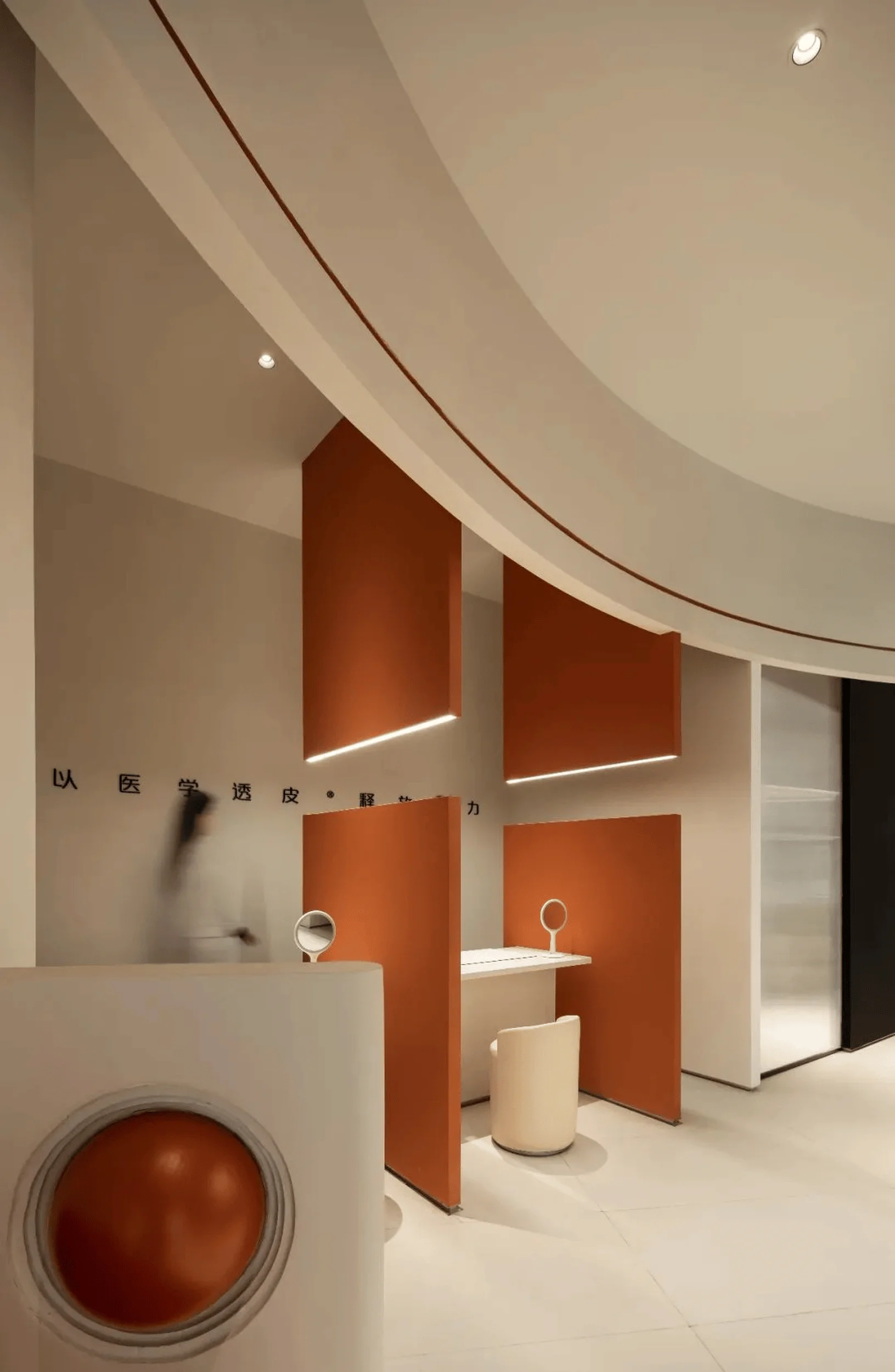
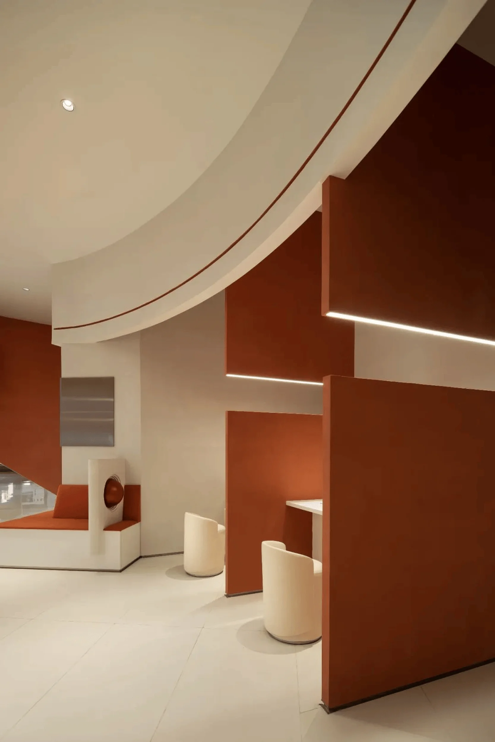
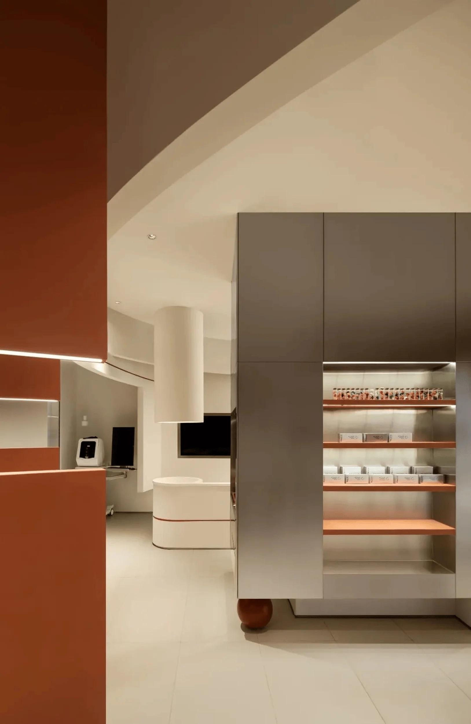
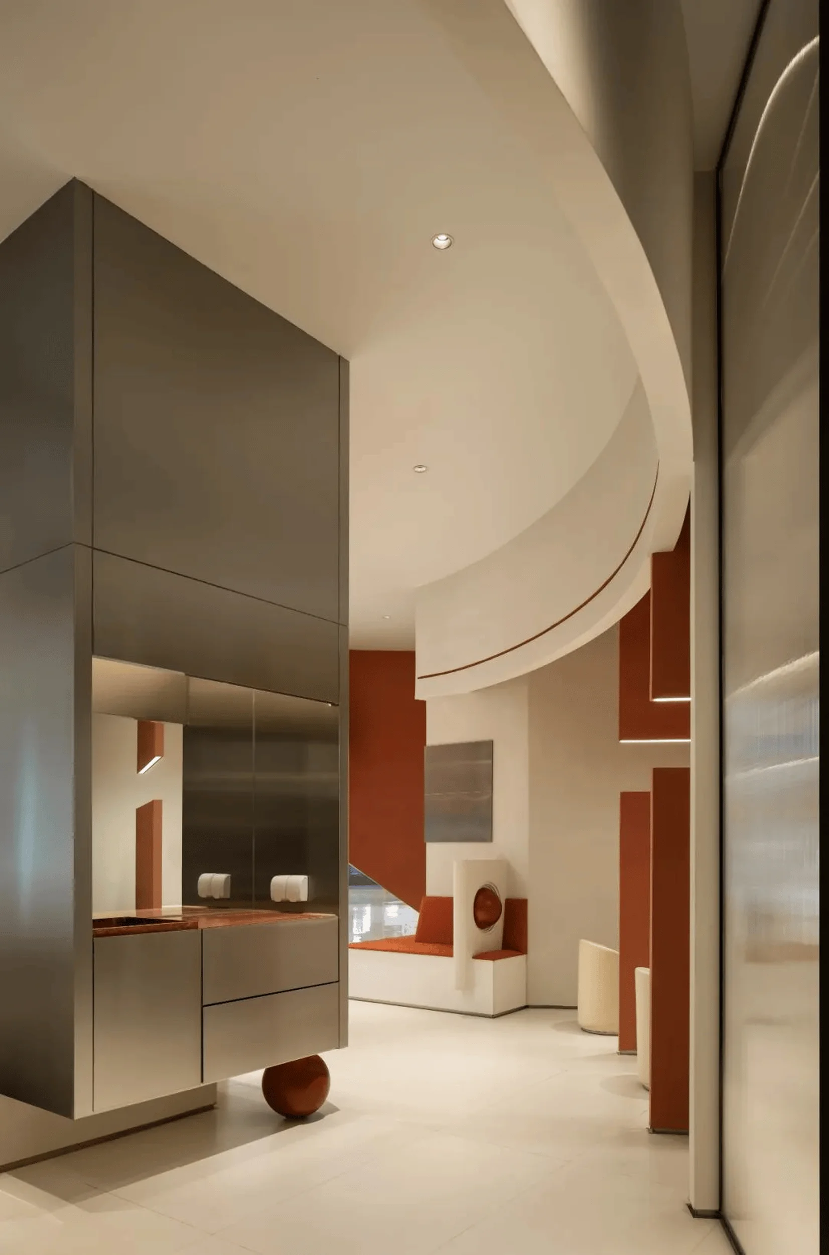
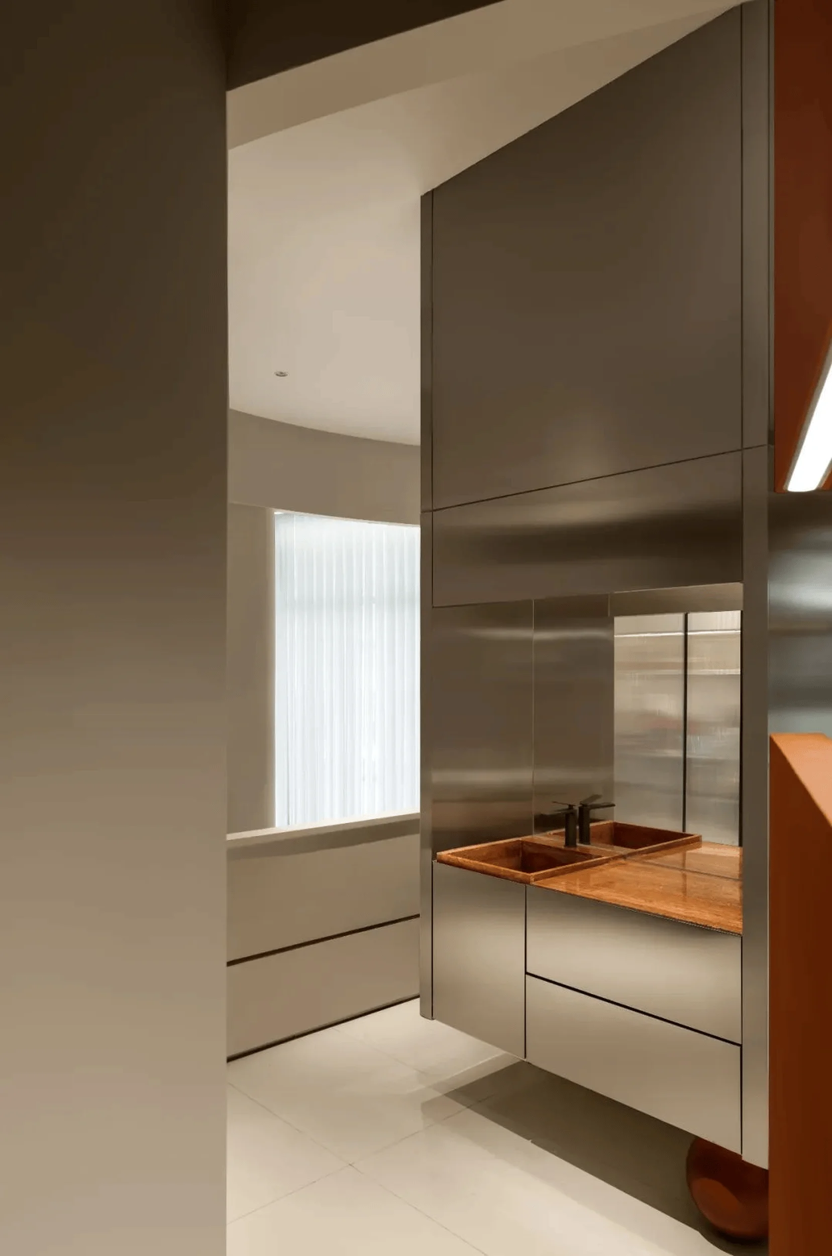
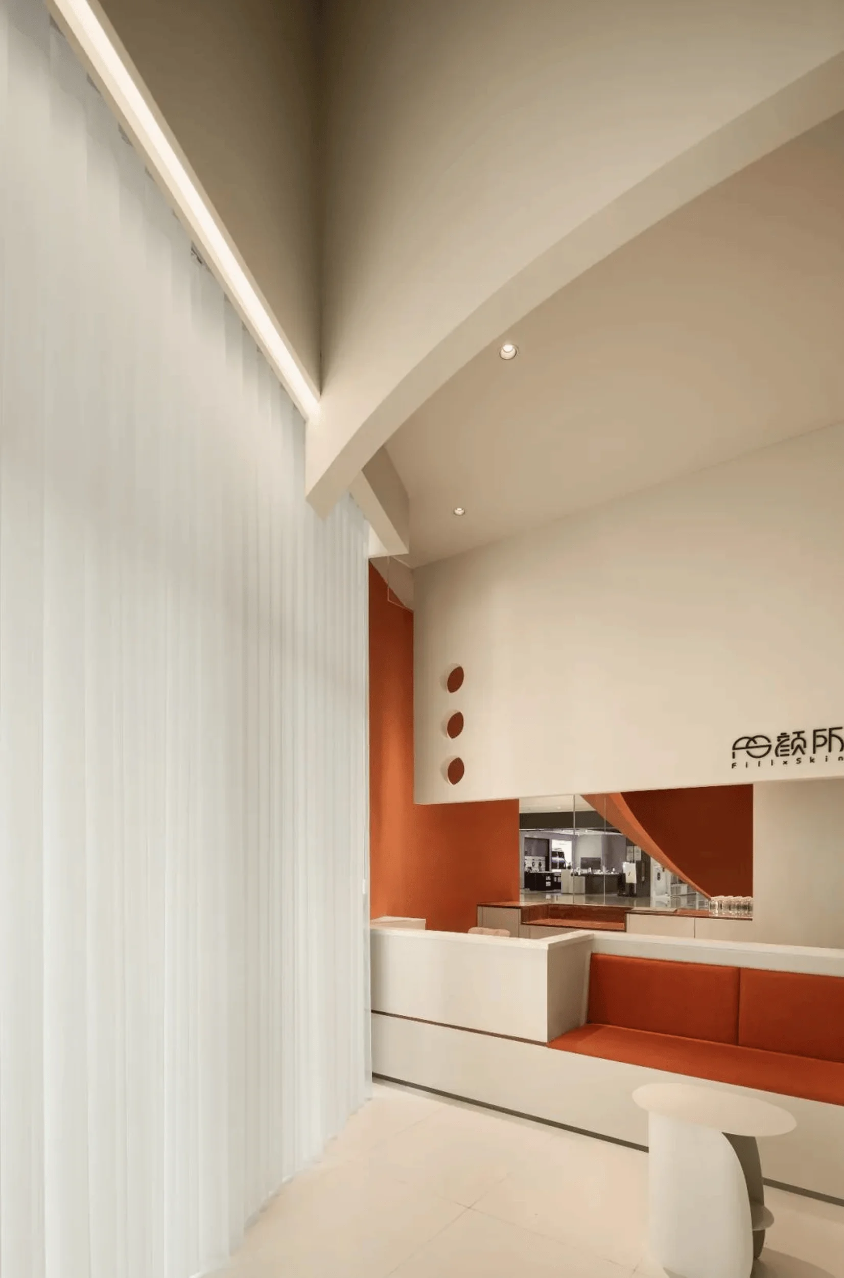
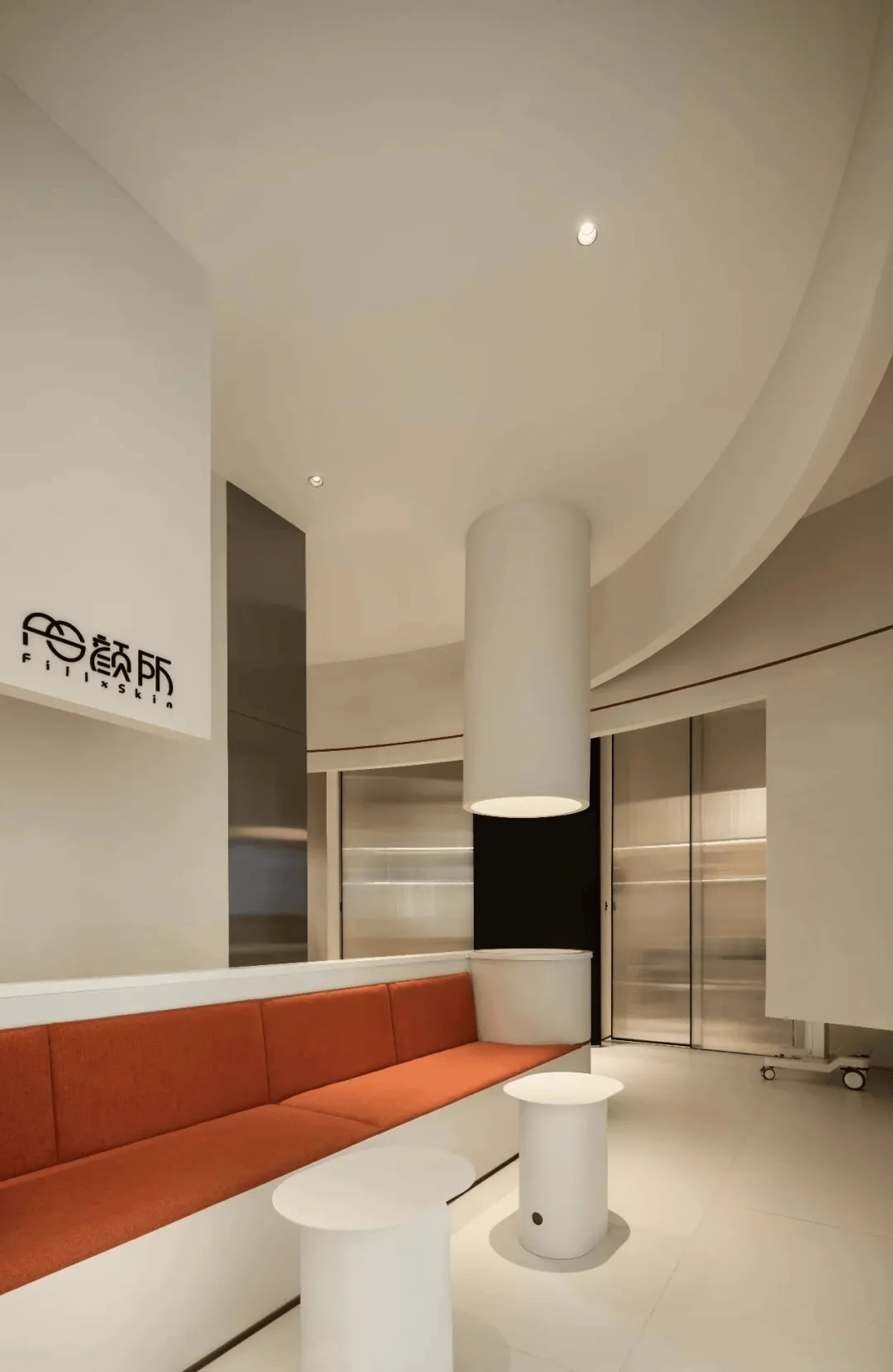
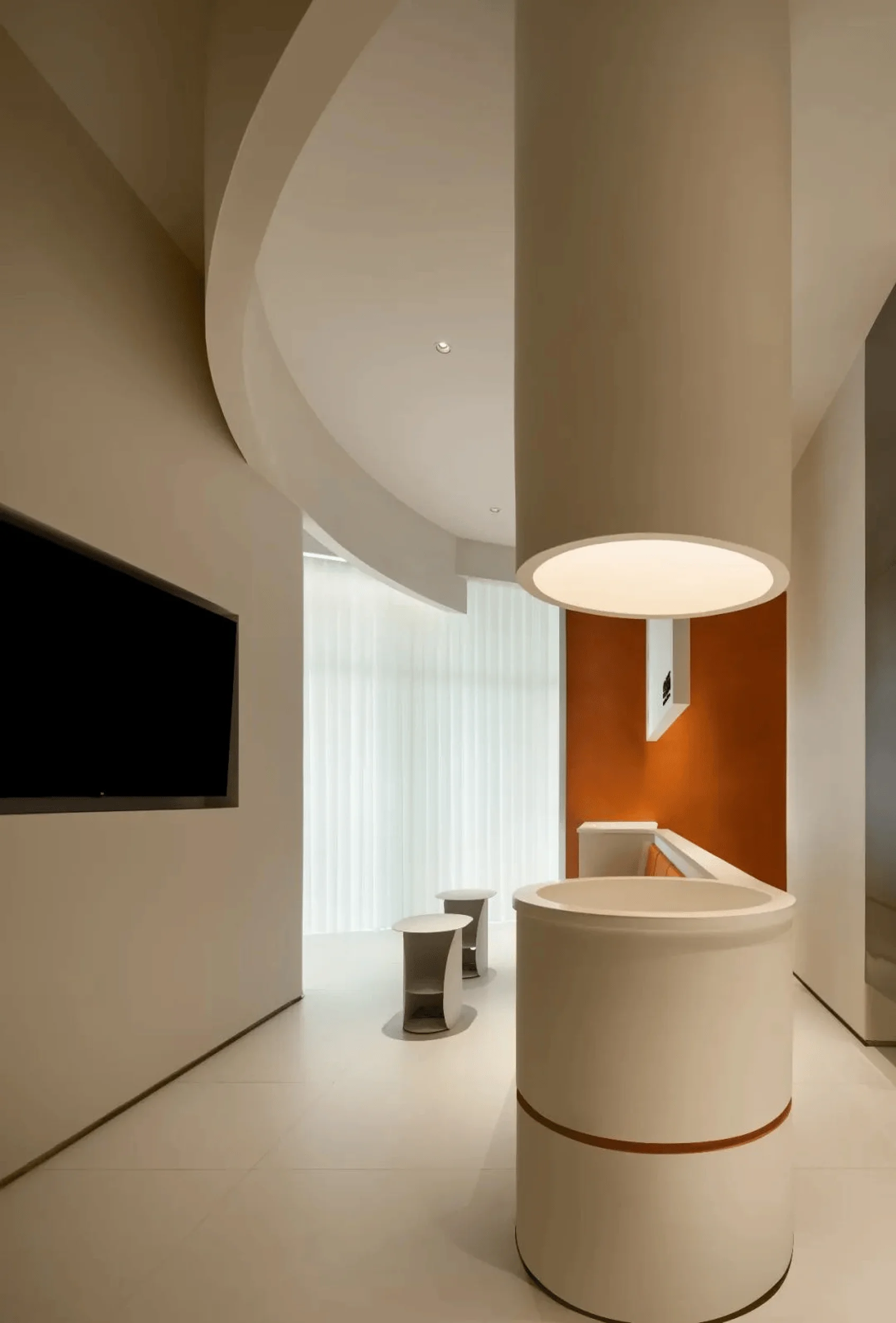
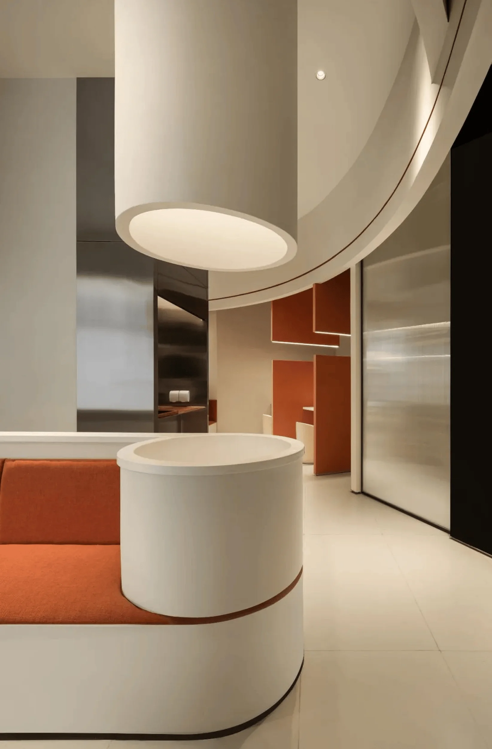
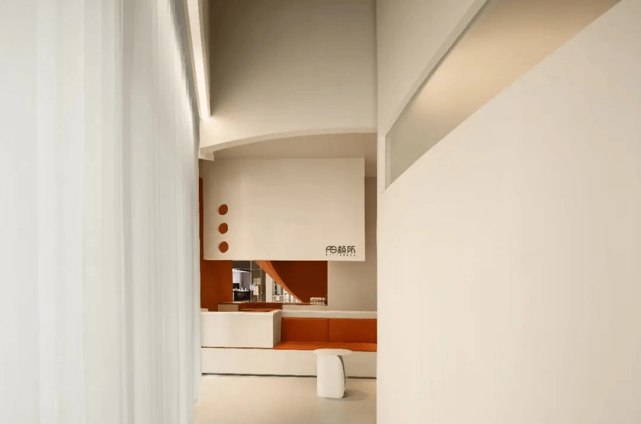
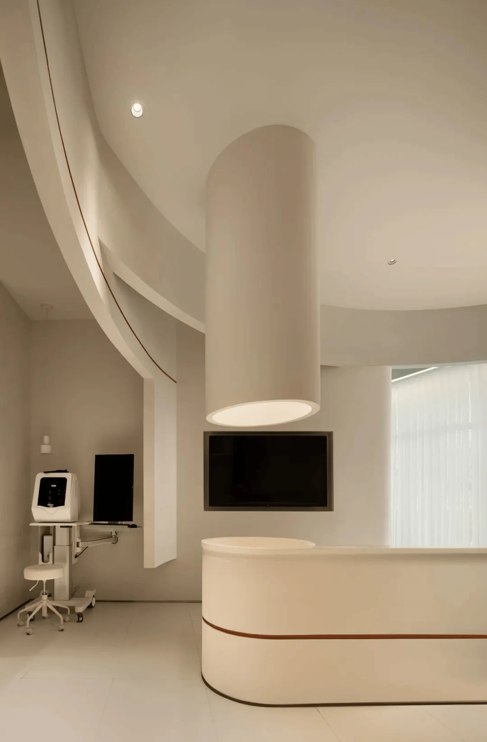
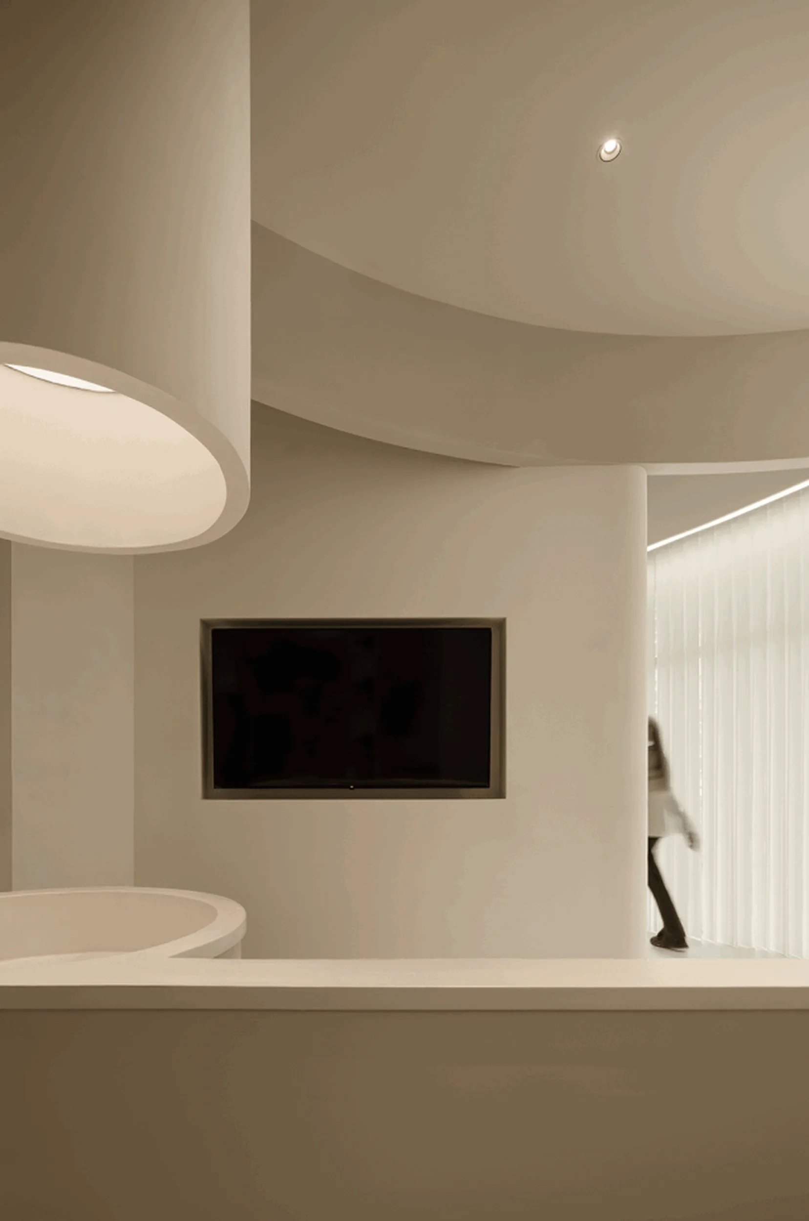
Fillxskin Clinic in Chengdu showcases a minimalist medical beauty clinic design with geometric forms and a strategic use of orange and white.
Contents
Project Background
Fillxskin, a renowned medical beauty clinic brand, sought to establish a new presence in Chengdu, China, within the Xichen Tianjie shopping mall. The design brief emphasized the need to maintain the brand’s strong visual identity while creating a calming and sophisticated environment for its clientele. Yansuo, a design firm known for its minimalist approach and expertise in medical beauty clinic design, was commissioned to undertake the project. The resulting space is a testament to the power of simplicity and the strategic use of color in creating a memorable and effective medical beauty clinic design.
Design Concept and Objectives
Yansuo’s design concept for the Fillxskin Clinic centered around the idea of “subtractive design,” prioritizing the sensory experience of the space and the individual’s journey within it. This minimalist approach, inspired by the principles of geometric abstraction, aimed to create a sense of purity and tranquility. The design team focused on using clean lines, geometric forms, and a limited color palette to achieve this objective, resulting in a medical beauty clinic design that is both visually striking and emotionally resonant.
Reception Area and Transition
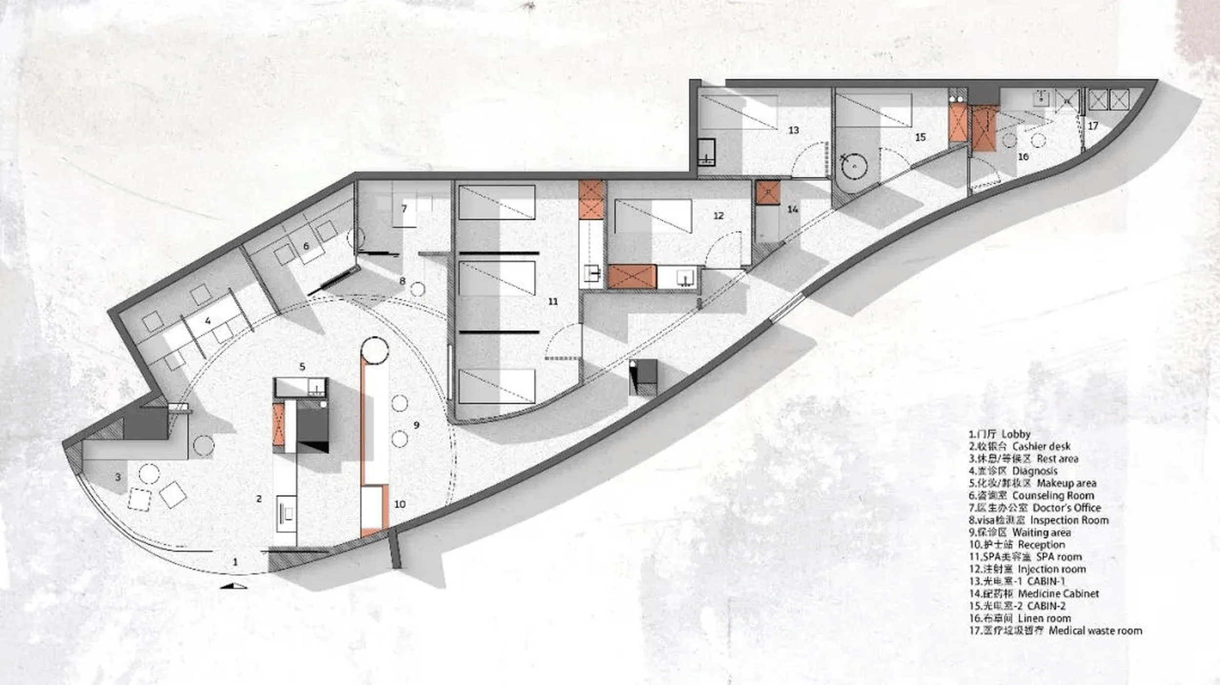
The reception area serves as a prelude to the main clinic space, intentionally differentiated through lighting and material choices to provide a psychological buffer for visitors upon entry. This transitional space offers a moment of pause and preparation before entering the core areas of the clinic, enhancing the overall experience within this medical beauty clinic design. The deliberate contrast between the reception and the main space reinforces the clinic’s commitment to creating a calming and welcoming atmosphere.
Spatial Layout and Circulation
The main working area, situated at the heart of the clinic, functions as a central hub for energy and activity. The design team meticulously planned the spatial layout and circulation to ensure a smooth and intuitive flow for both staff and clients. This central location also serves as a focal point for the clinic’s minimalist medical beauty clinic design, emphasizing the importance of functionality and efficiency within the space.
Color Palette and Materiality
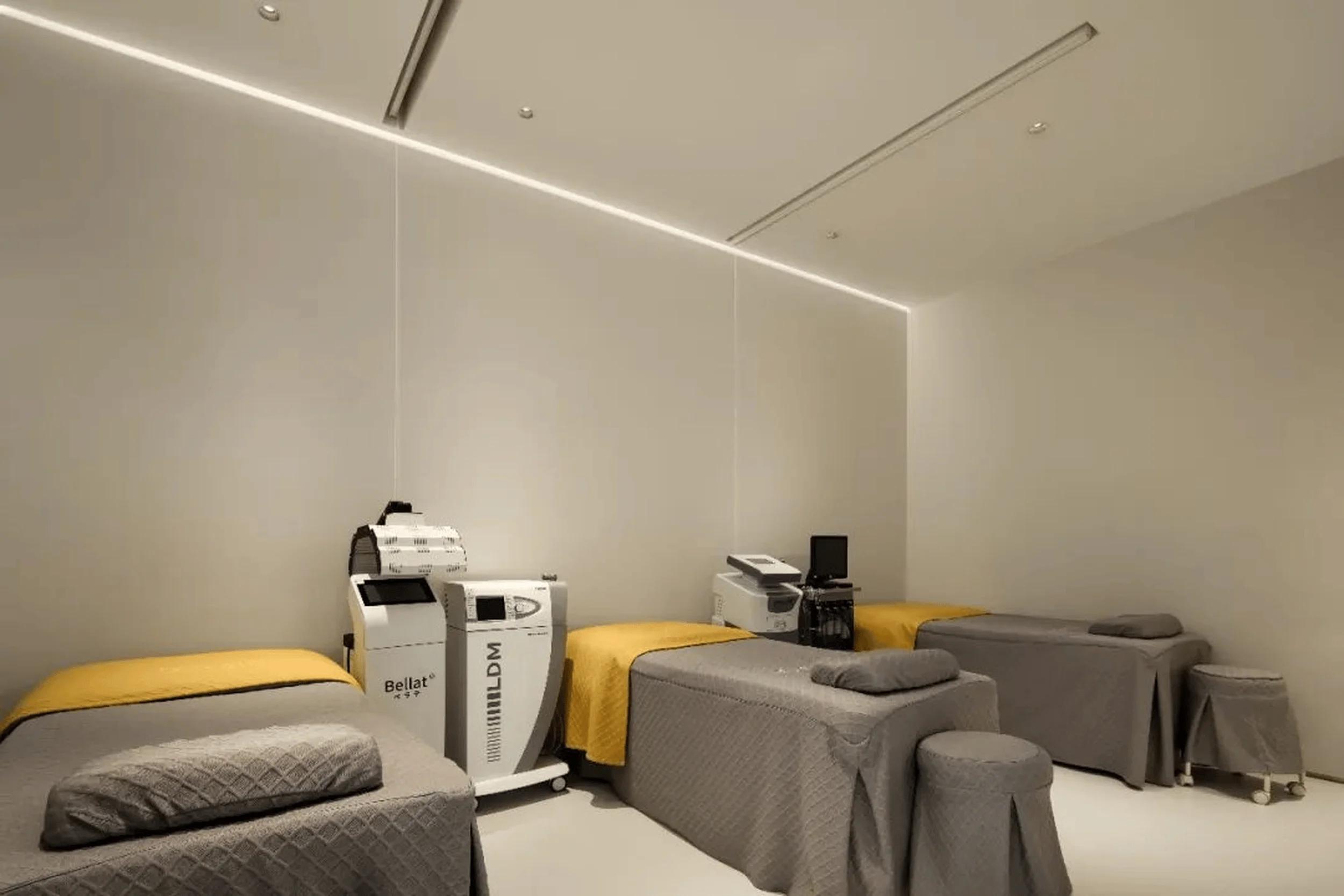
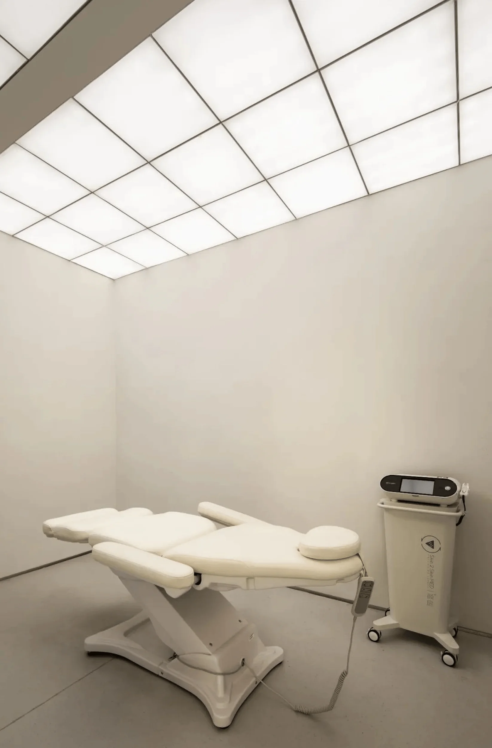
Fillxskin’s signature orange color, known for its strong brand recognition and emotional impact, is retained and integrated throughout the clinic. However, the primary color scheme is dominated by white, achieved through the use of various materials and textures. This strategic use of white creates a sense of cleanliness, purity, and spaciousness, providing a neutral backdrop for the vibrant orange accents. The interplay of these two colors contributes to the clinic’s unique and memorable medical beauty clinic design.
Lighting Design
Lighting plays a crucial role in shaping the atmosphere and experience within the Fillxskin Clinic. The design team employed a combination of ambient, task, and accent lighting to create a layered and dynamic lighting scheme. This approach enhances the minimalist aesthetic of the medical beauty clinic design while providing optimal illumination for various tasks and functions within the space. The careful consideration of light and shadow further contributes to the clinic’s calming and serene environment.
Project Information:
Project type: Medical Beauty Clinic Design
Architects: Yansuo
Project Year: Not Specified
Country: China
Photographer: Not Specified


