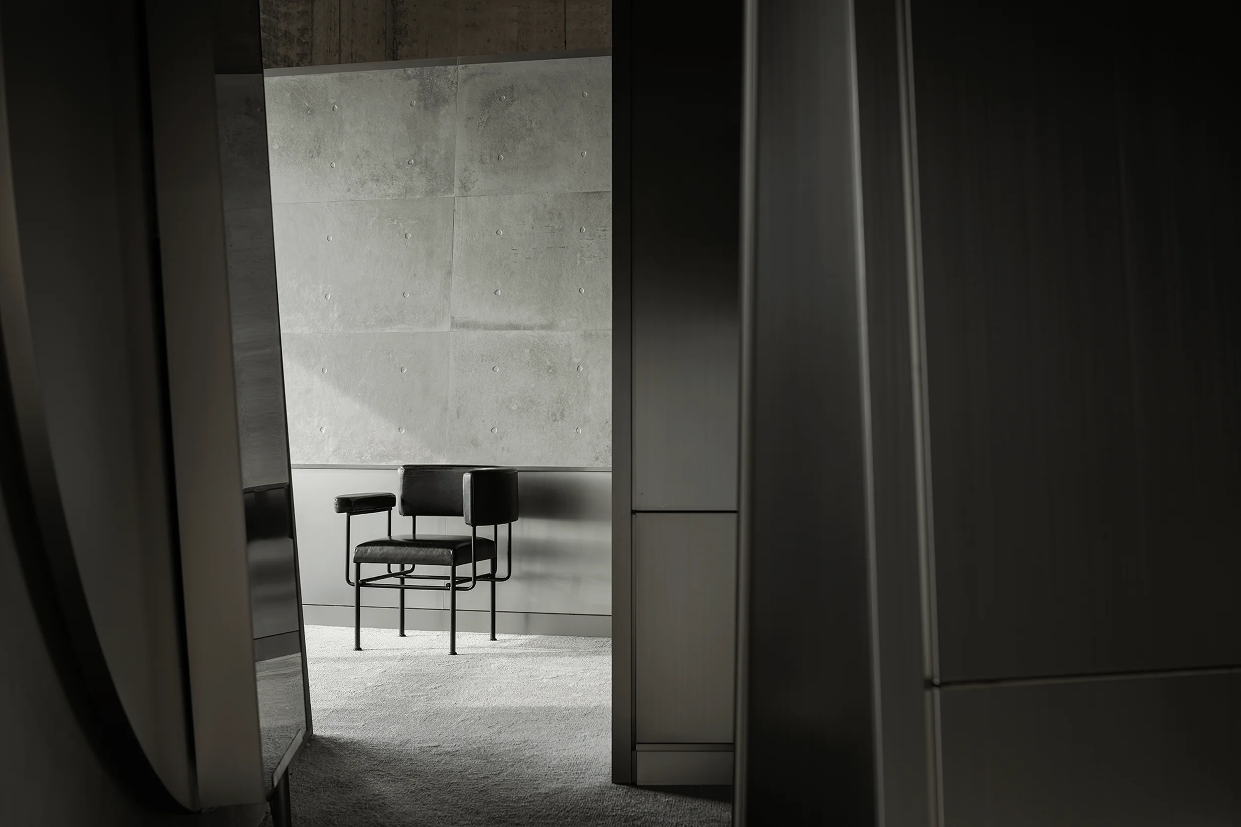
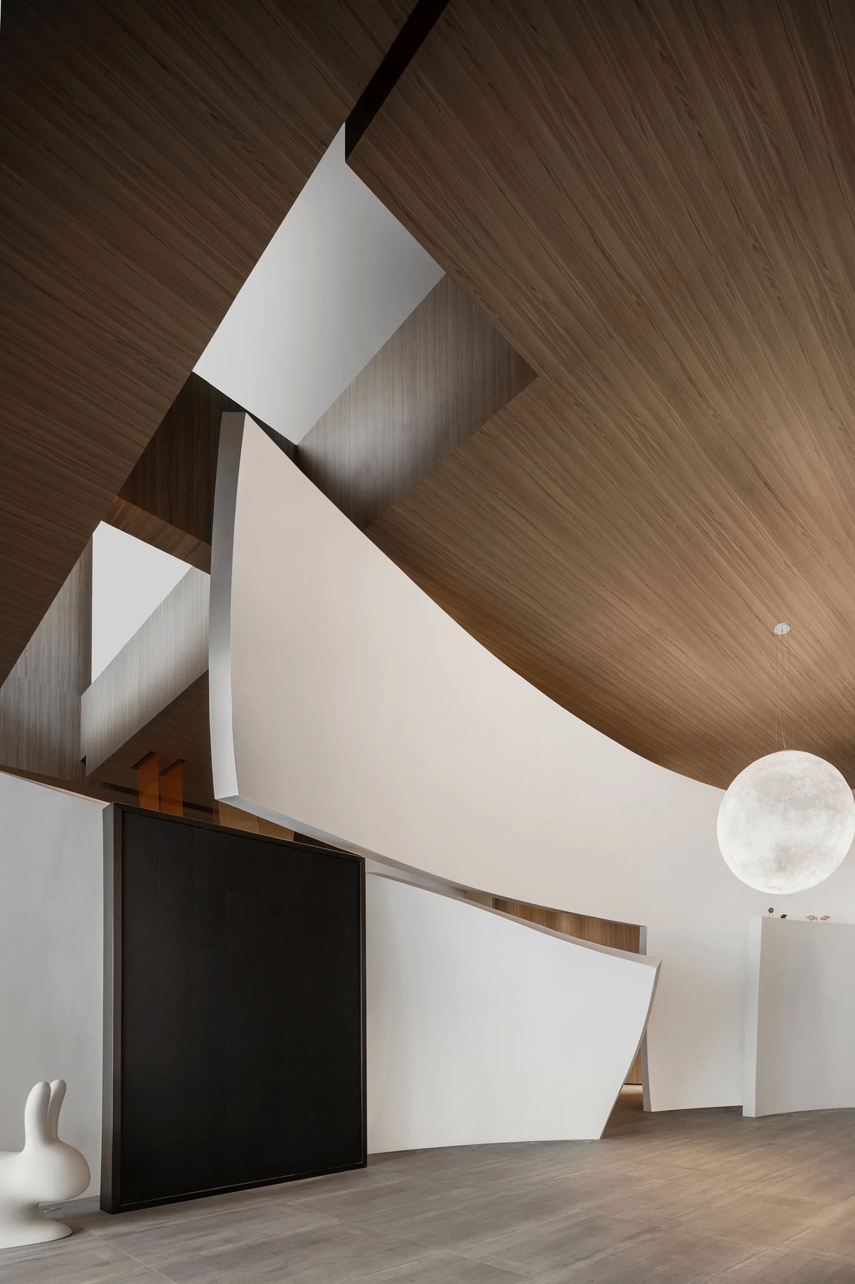
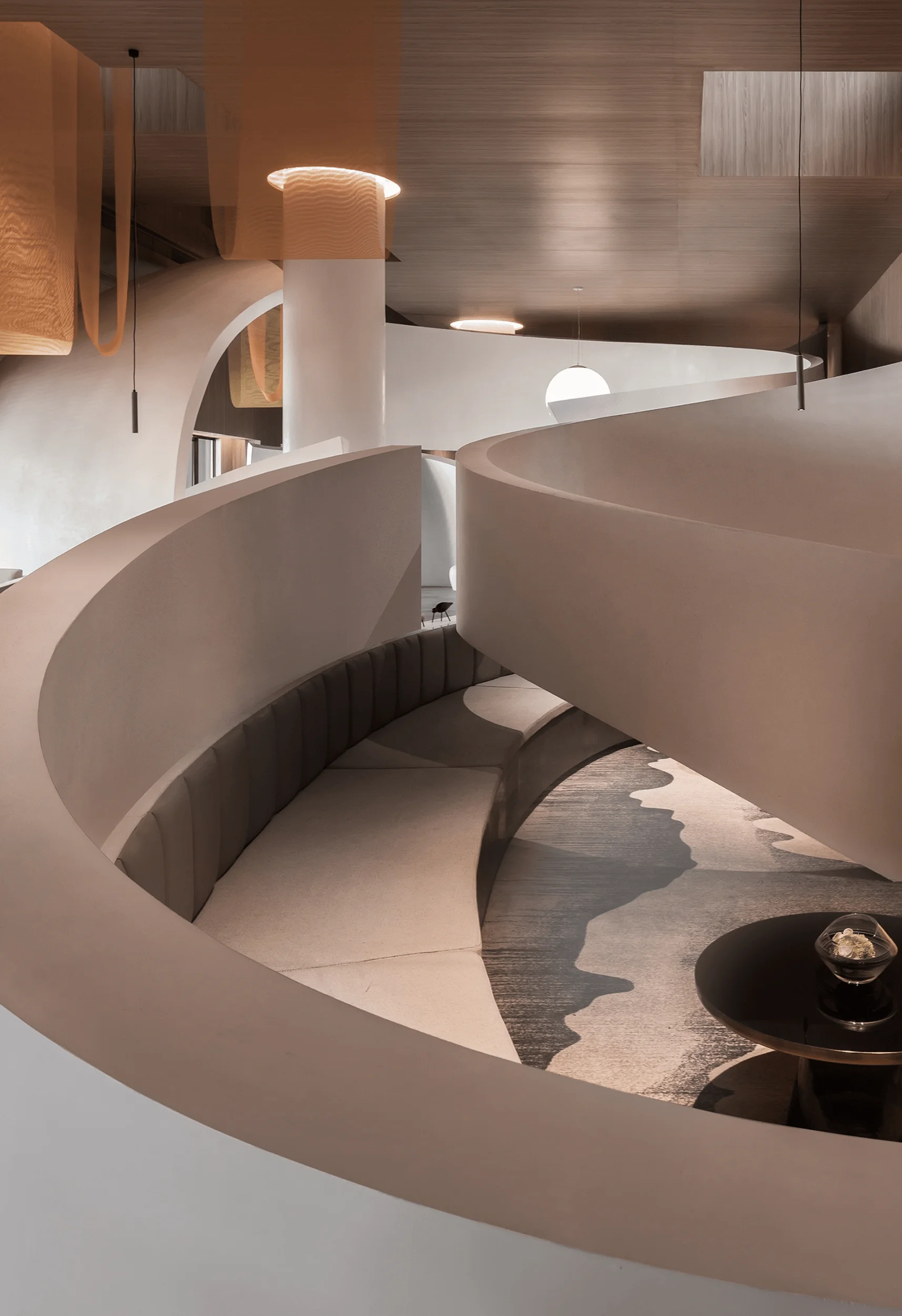
Florina’s New Concept Exhibition Hall, designed by Zhengfang Liangxing Design, is a stunning example of immersive retail space and architectural design.
Contents
Background of the Florina New Concept Exhibition Hall
The Florina brand draws inspiration from the science fiction novel “The Currents of Space” by Isaac Asimov. In Asimov’s writing, Florina is a mystical and imaginative planet renowned throughout the cosmos for its abundant reserves of a precious material known as “jì ér.” The Florina cement tile brand embarks on a new chapter, utilizing a reconstructed futuristic, technological, and high-end retail-style headquarters exhibition hall to interpret the essence of the Florina brand. Their interpretation of “jì ér” reflects their cherished brand philosophy— creativity, pioneering spirit, and artistry. The new Florina headquarters exhibition hall is an example of how to create an immersive retail space that is both functional and aesthetically pleasing, using sustainable materials and design practices that reflect the brand’s commitment to environmental responsibility. The Florina brand has always been committed to creating high-quality, sustainable products, and the new exhibition hall is a reflection of that commitment.
Design Concept and Objectives of the Florina Exhibition Hall
In the ever-evolving landscape of commercial trends, the continuous exploration and optimization of iterative approaches are imperative. To establish a high-end new retail space for traditional businesses, designers have delved into the boundaries of commercial new retail and technological art, transforming a conventional ceramic tile exhibition hall into an entirely new realm. This space seamlessly integrates commercial viability, artistic expression, and the new retail experience. The home furnishing and building materials industry is often categorized as a low-frequency consumption sector. However, in the era of rapid information and internet development, experiential commerce has progressively emerged as the dominant trend in mainstream social consumption. The design philosophy behind the new Florina headquarters exhibition hall centers on the fusion of technology and new retail, employing a distinctive style to craft an immersive new retail experience space.
Spatial Planning and Layout of the Florina Exhibition Hall
The design concept transcends industry constraints, aiming to shift the perception of low-frequency consumption tile products towards a high-frequency retail display model. This approach fosters a greater suitability for drawing inspiration from the high-frequency consumption spaces within daily life. Consequently, the Florina exhibition hall is transformed into a high-end retail display space, capturing the attention of younger consumers and bridging the gap between products and consumers. Establishing a leading role within the industry necessitates connecting with the younger generation, aligning with their daily consumption aesthetics. The transition of ceramic tile exhibition halls from low-frequency to high-frequency consumption venues necessitates an extended lifespan for these high-frequency spaces. By understanding consumer habits in clothing, food, housing, and transportation from the commercial market, emotional connections can be fostered. With “fashion, technology, nature, and individuality” as the core design values, an immersive experience space with multi-sensory engagement is created.
Exterior Design and Aesthetics of the Florina Exhibition Hall
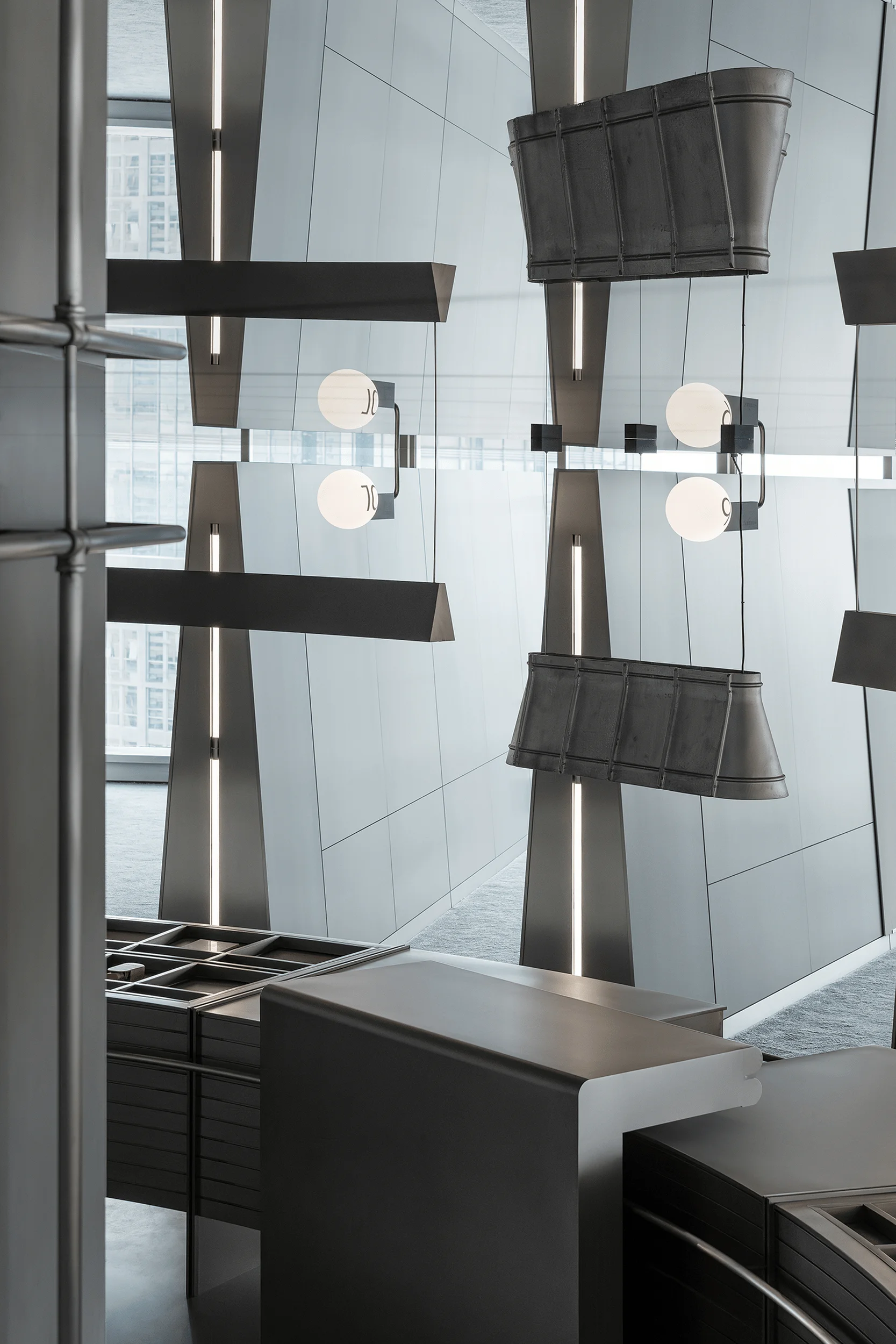
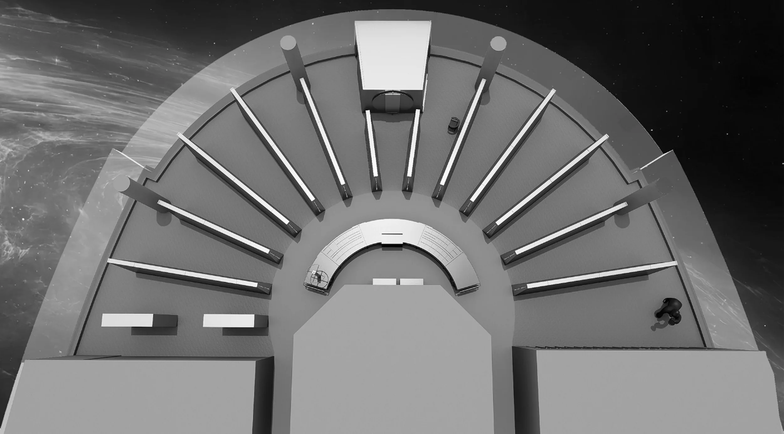
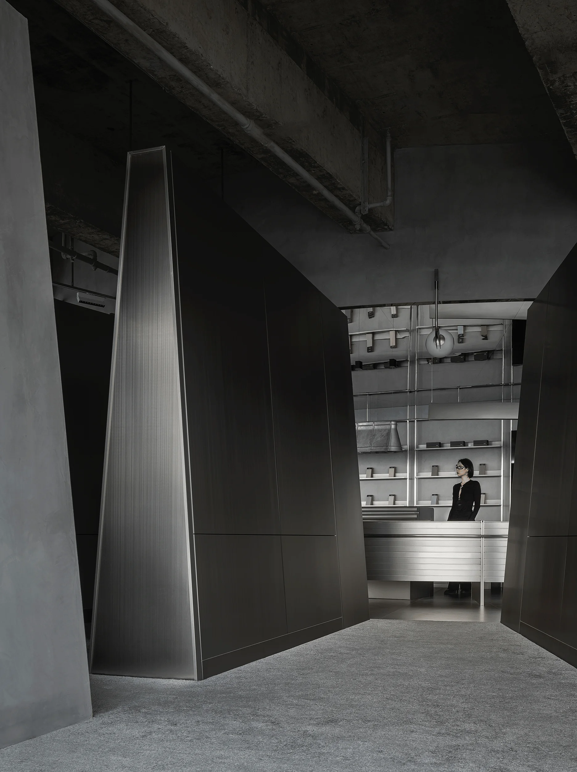
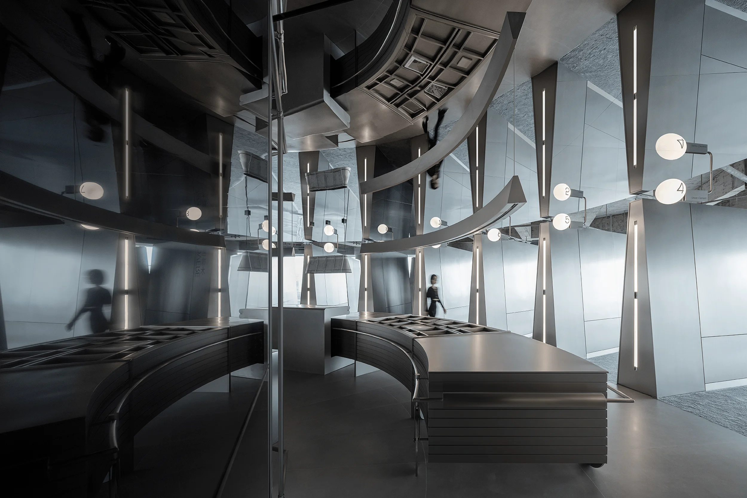
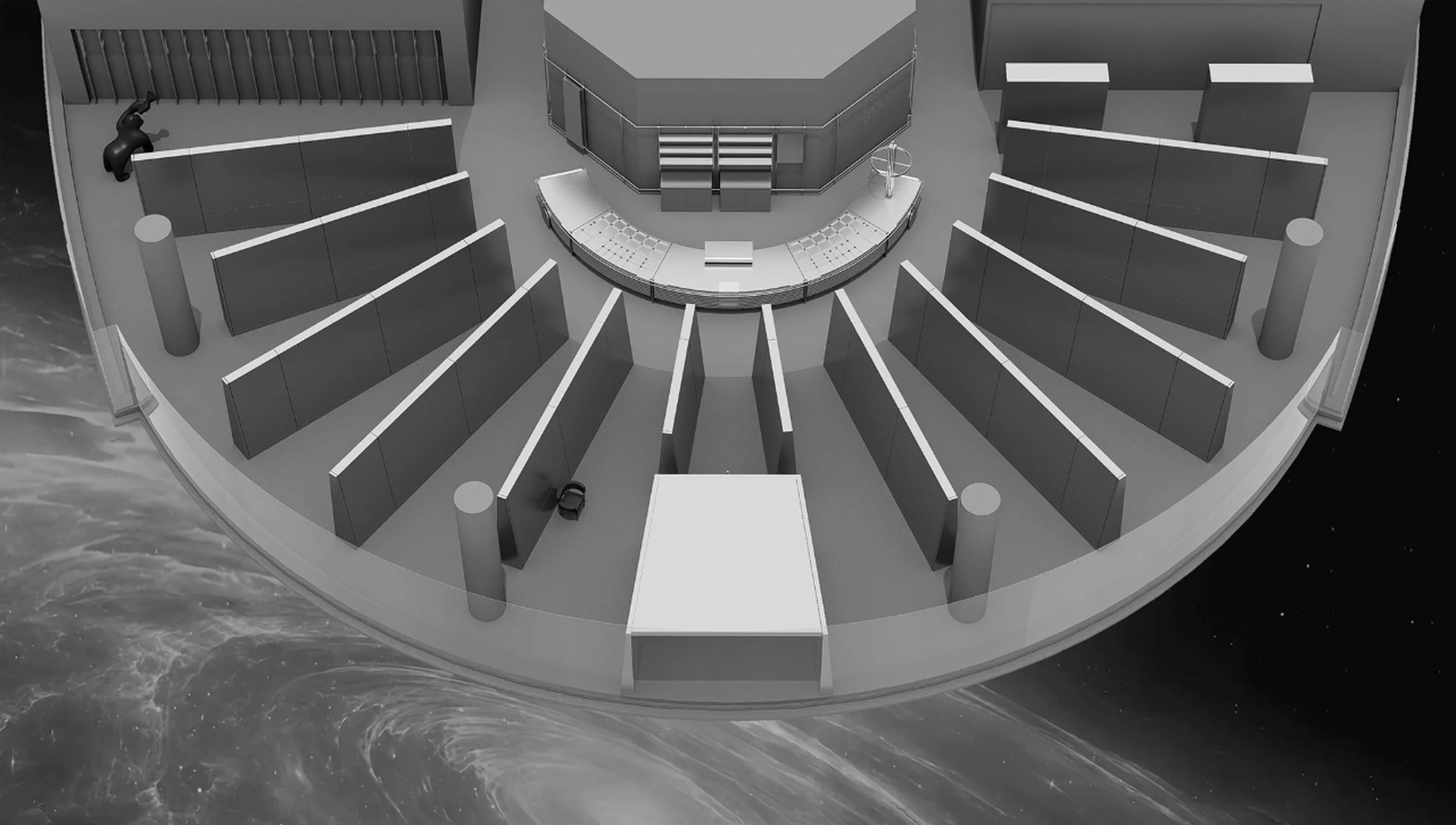
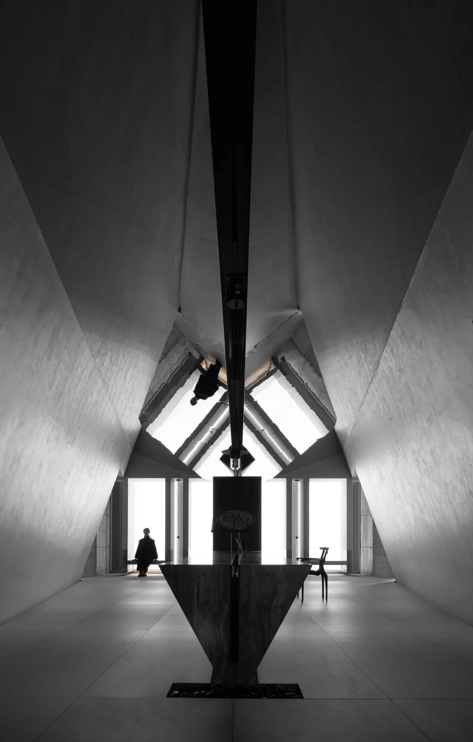
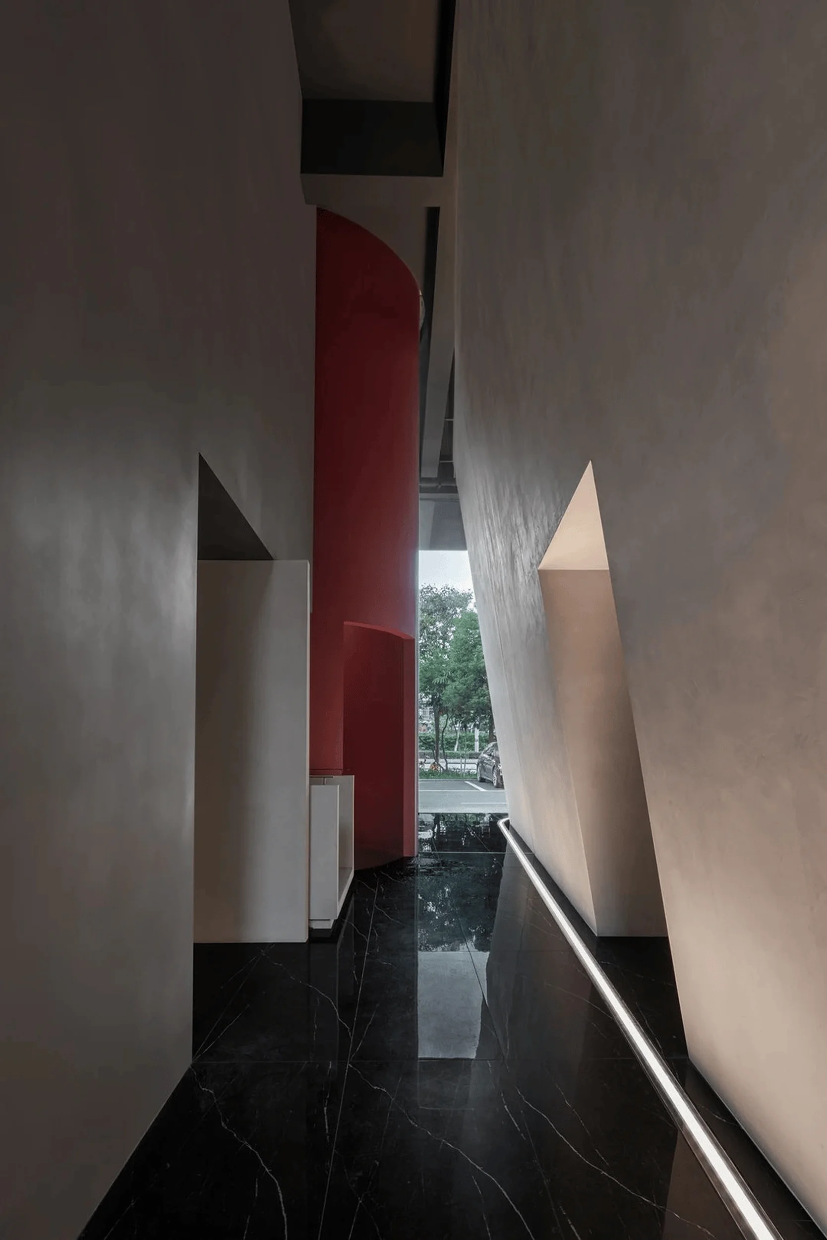
Leveraging light, space, and materials, the visitor’s emotional rhythm is guided, exploring forward-looking exhibition methods. This allows the Florina brand, with its pioneering concepts, to continuously lead industry development. From the matte gray of the stone to the futuristic silver, the design elements harmonize uniquely, narrating the story of the Florina brand’s legacy and its journey into the future. The exhibition hall’s original space exhibited a fan-shaped structure. The overall exhibition hall’s planar design was adapted to local conditions, adopting a radial layout. The flexible and interconnected circulation paths are unrestricted, bestowing the new retail space with a free-form transformation. This breaks away from traditional exhibition hall circulation design, with a “de-circulation” approach that grants maximum freedom to the space. The designers have created designated entry and exit points for the exhibition hall. Upon entering, visitors can freely navigate between the display shelves, engaging with the space’s unrestricted form. Their footsteps interweave, forming spontaneous natural enclosures wherever they choose to pause.
Construction Techniques and Materials of the Florina Exhibition Hall
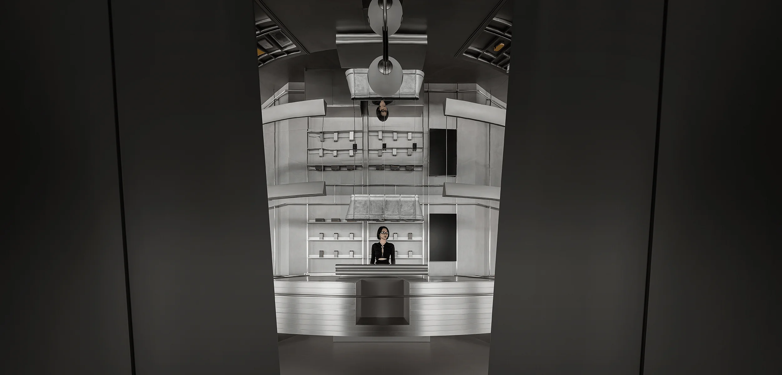
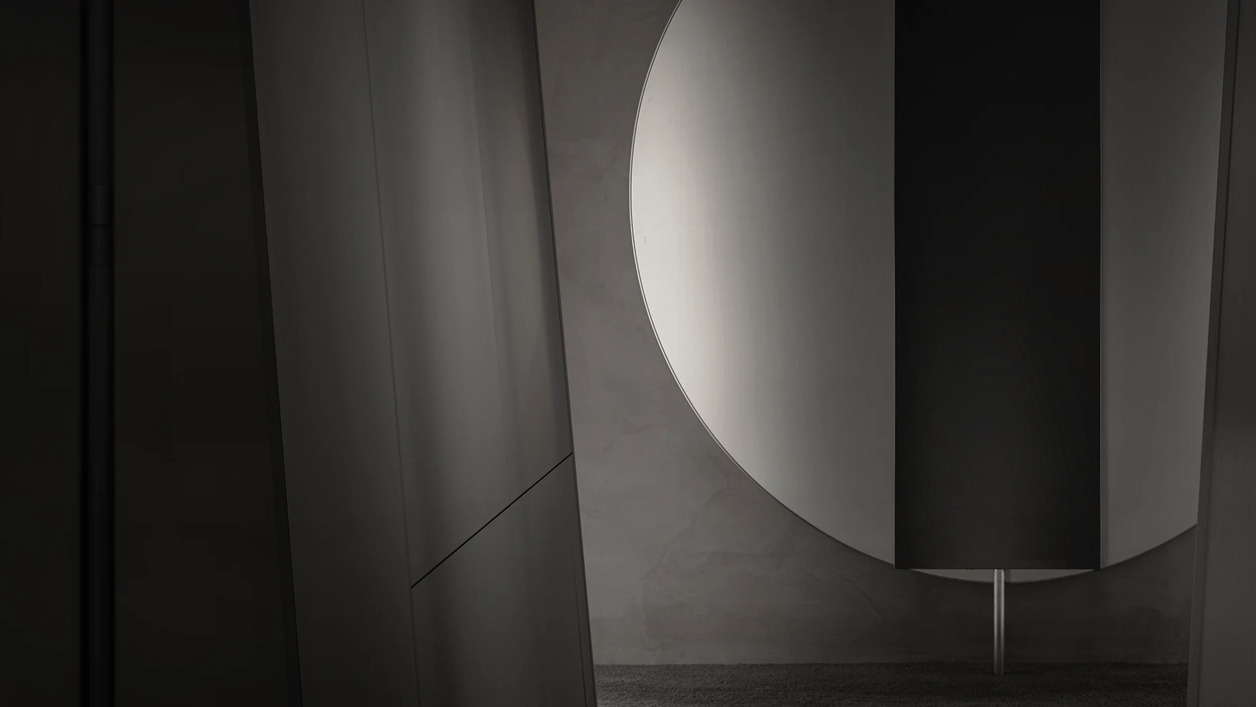
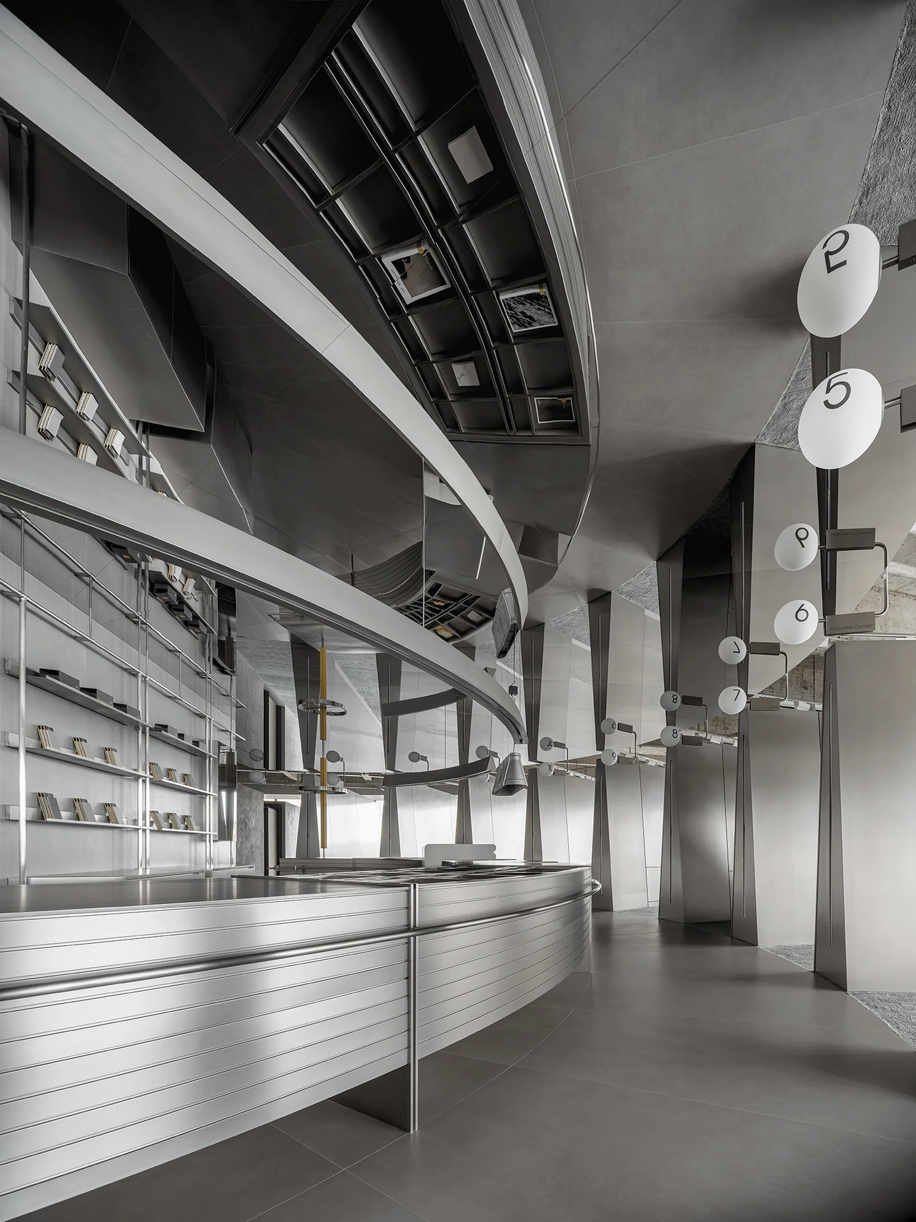
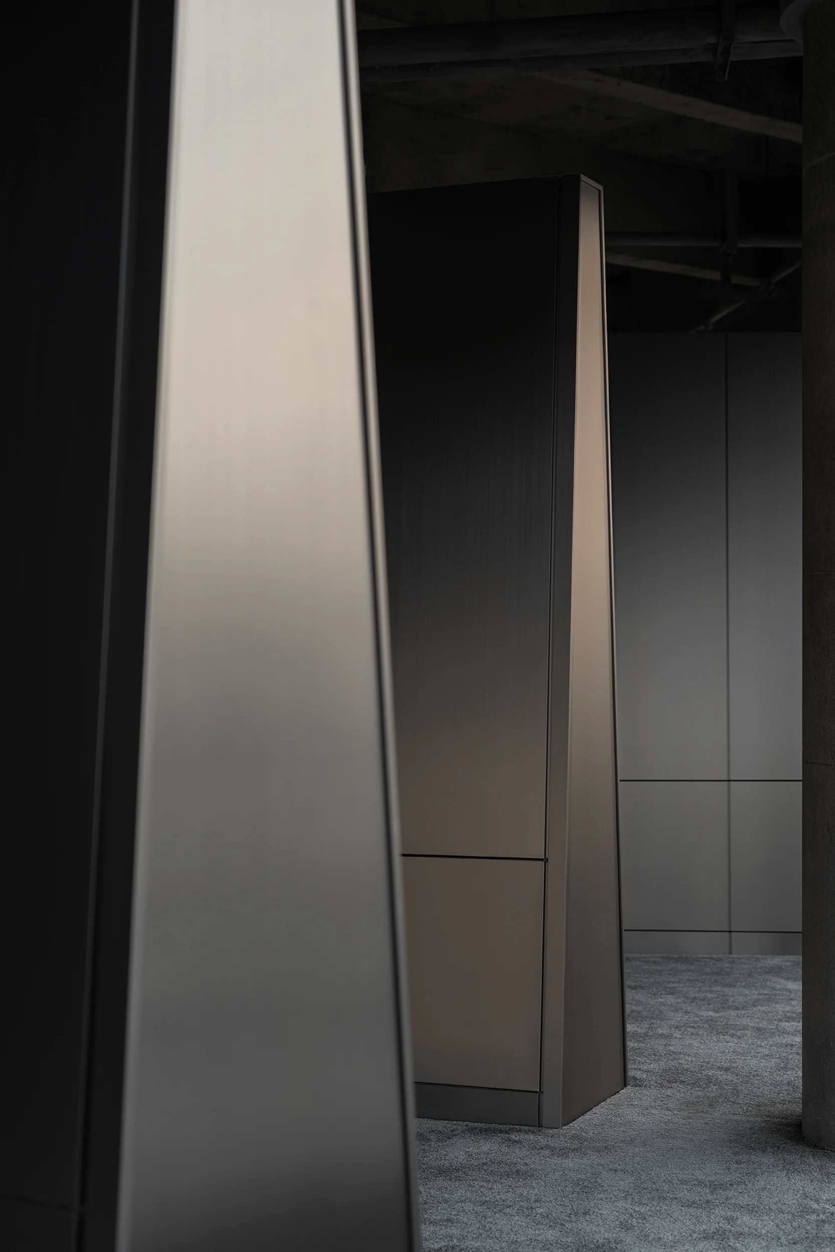
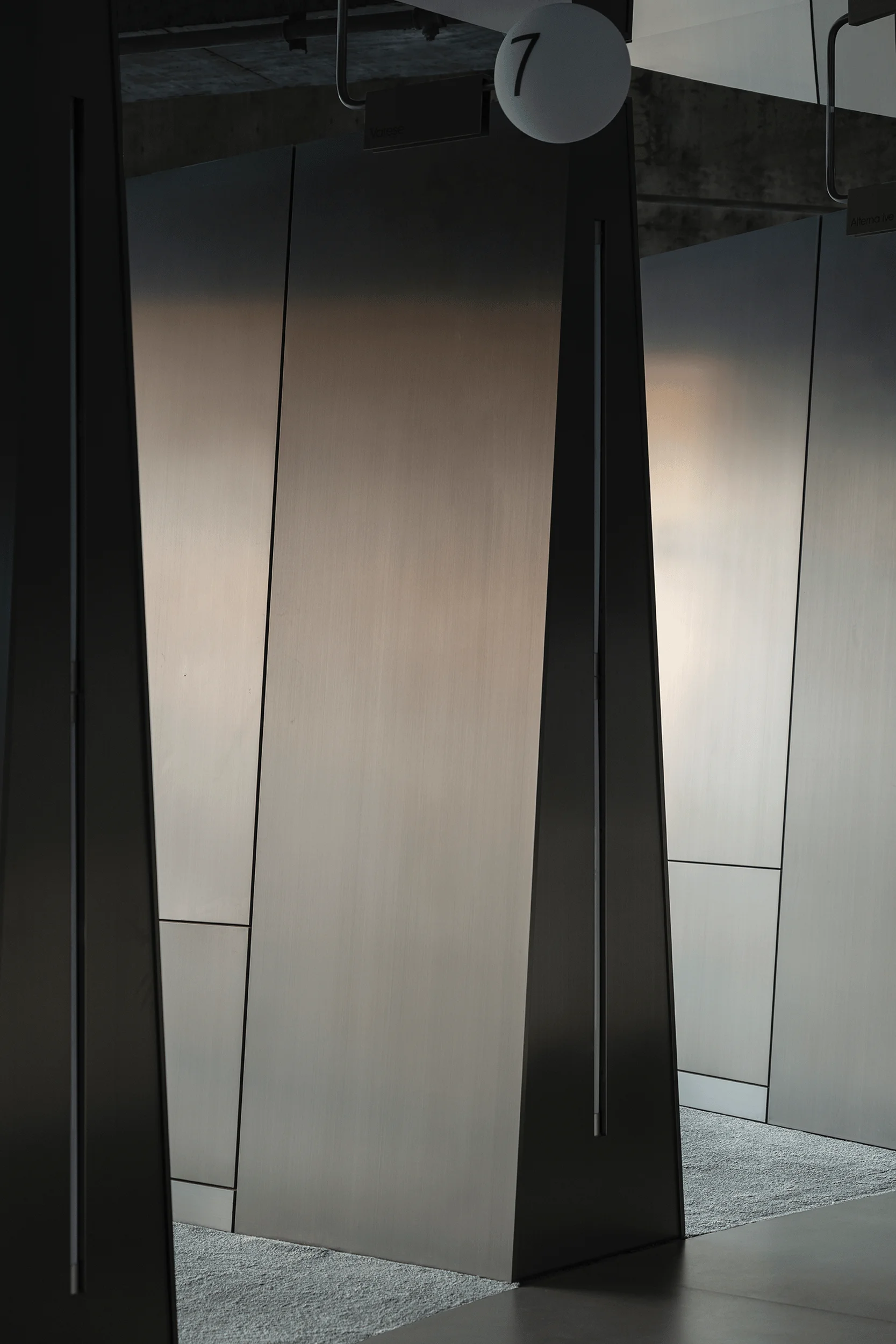
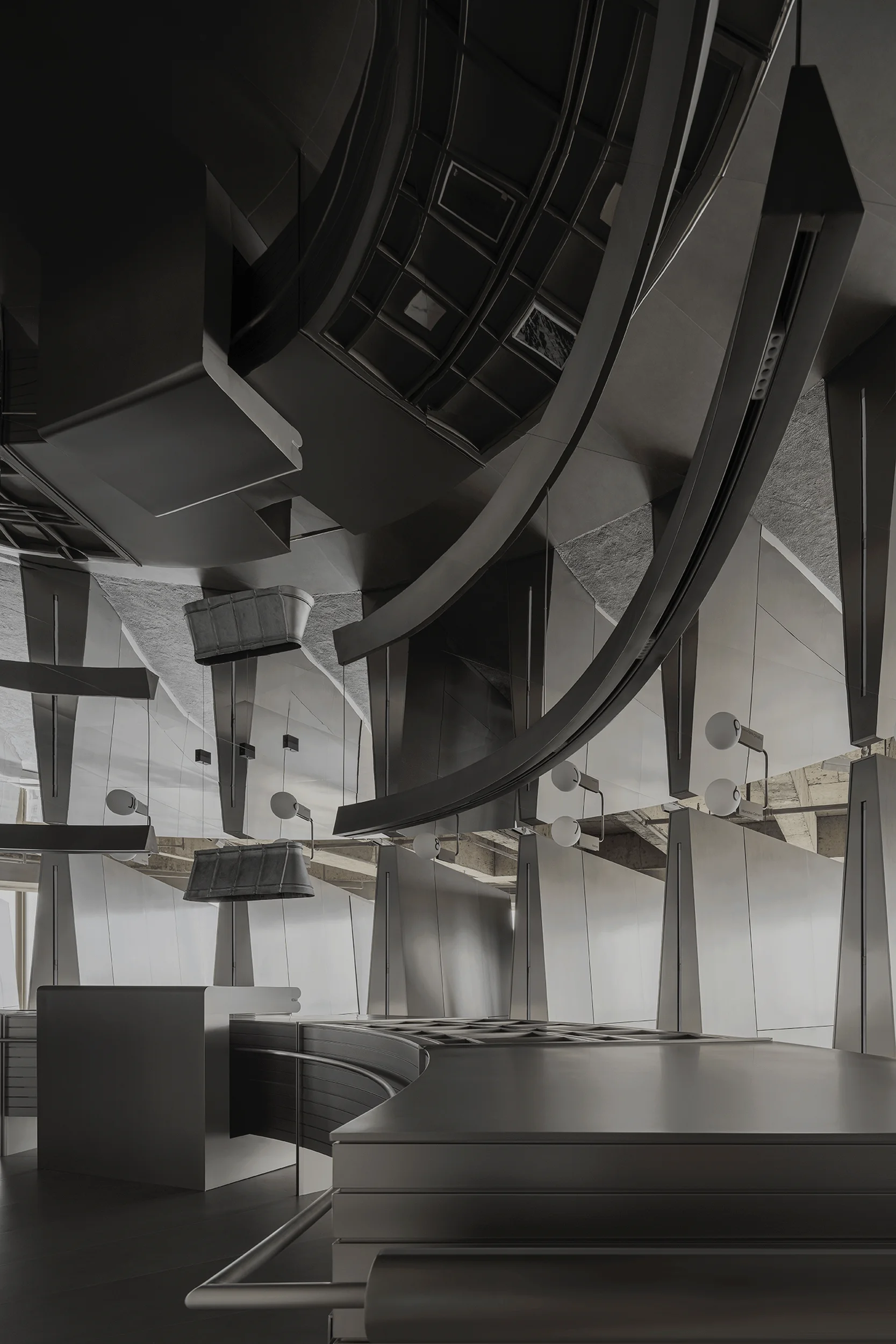
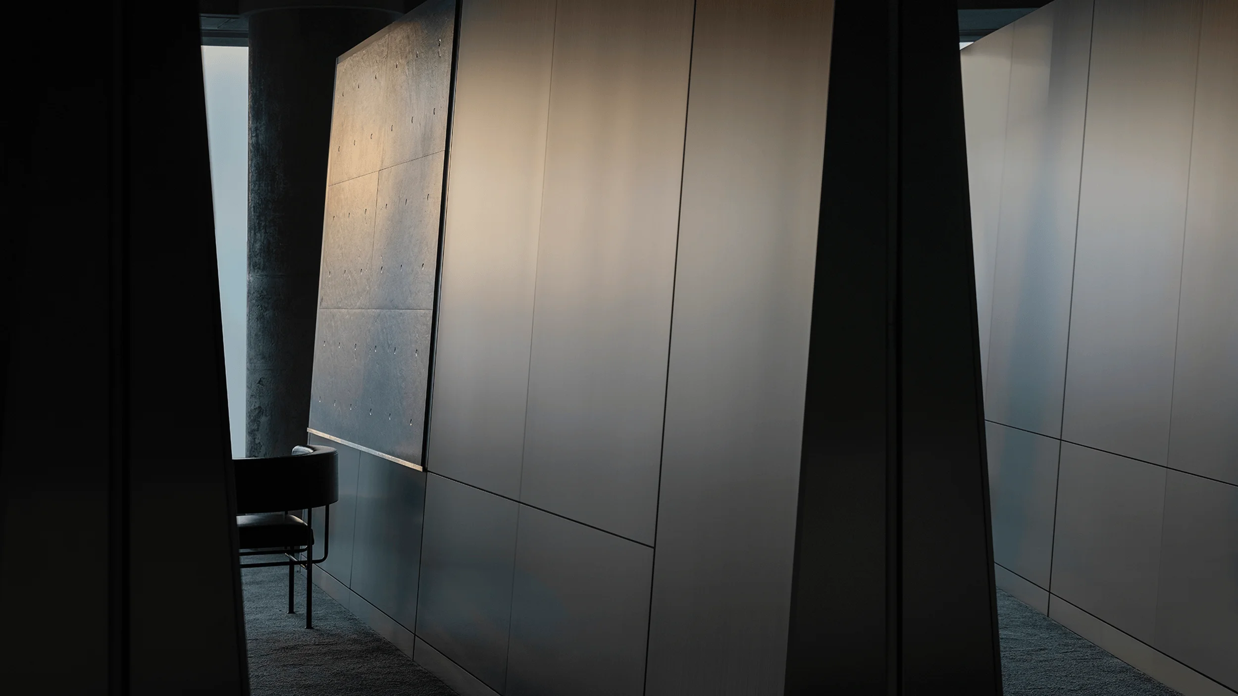
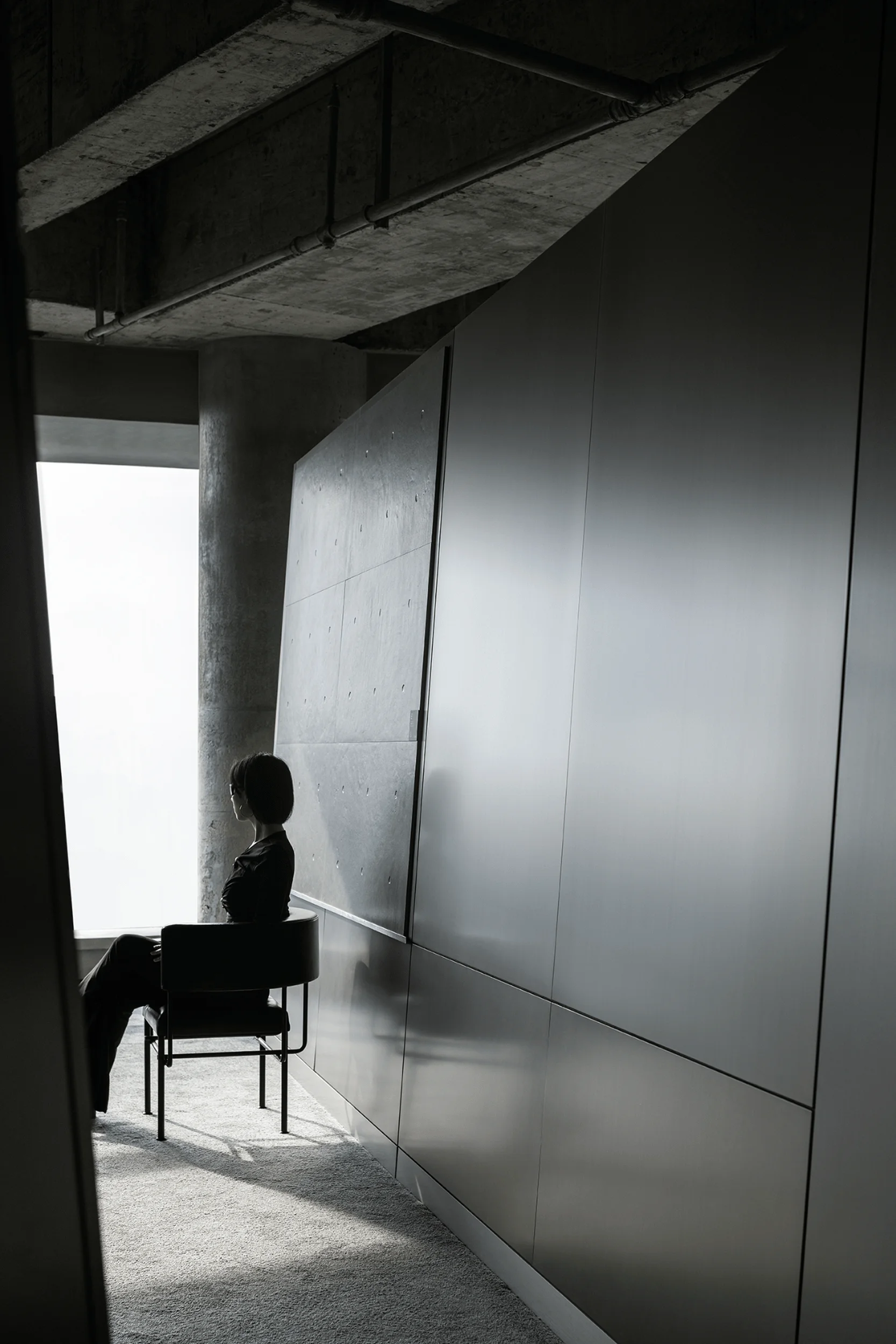
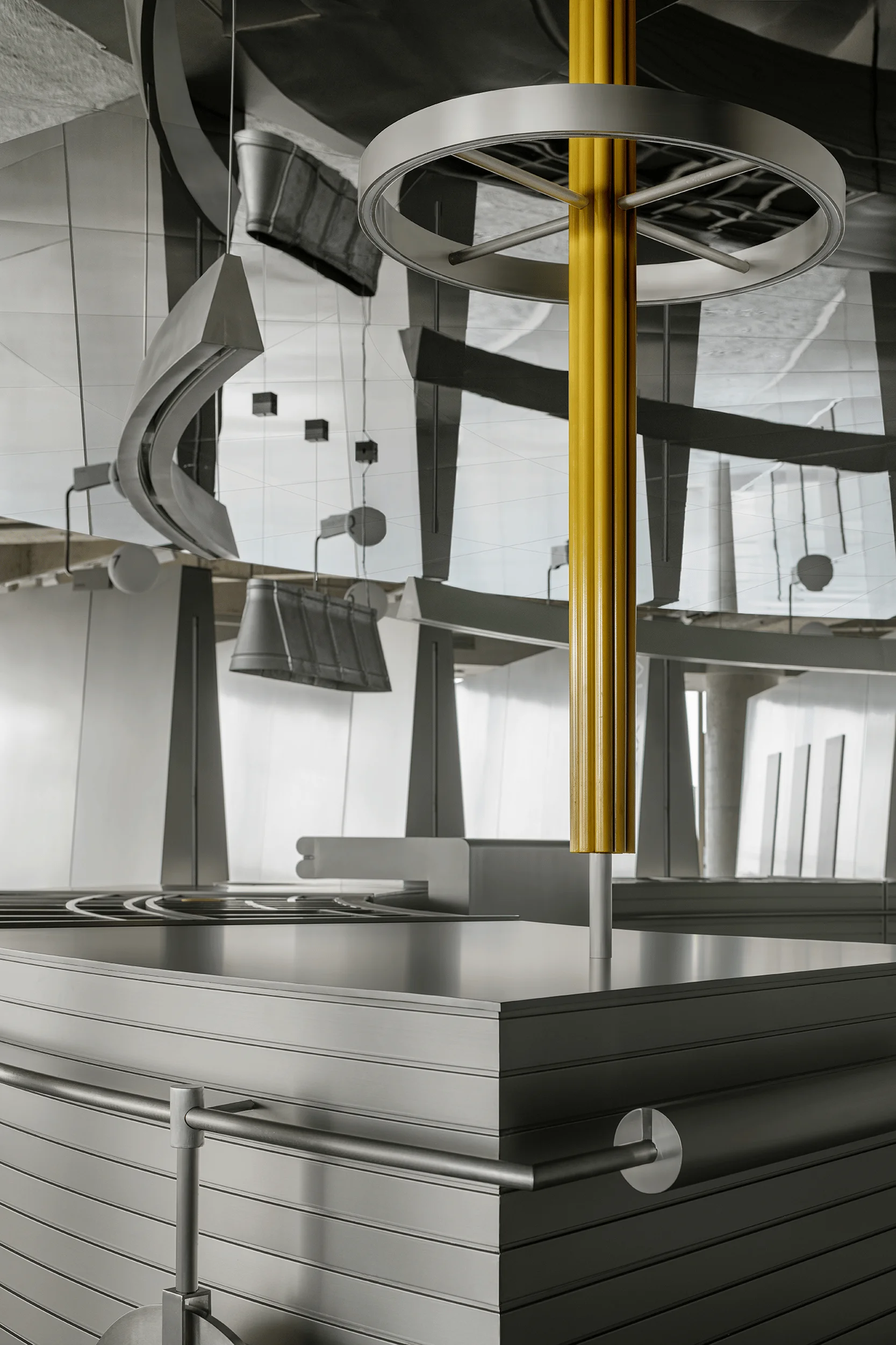
The exhibition hall utilizes brushed stainless steel as the sole decorative material, standing upright within the space to categorize the displayed products. The central “island counter” serves as the focal point for visual convergence. The floor-to-ceiling glass windows along the exhibition hall’s perimeter introduce natural light into the interior, enriching the interplay of light and products, and revealing the natural essence of the products. Life is progressively moving away from complexity, seeking a rationality that integrates materials, functionality, and form with the shortest distance possible. Alongside the pursuit of simplicity and individual expression, the space incorporates elements of experimentation and experiential settings. The organic and natural transformations within the space allow visitors to perceive the fusion of materials as they navigate the environment.
Sustainability and Environmental Impact of the Florina Exhibition Hall
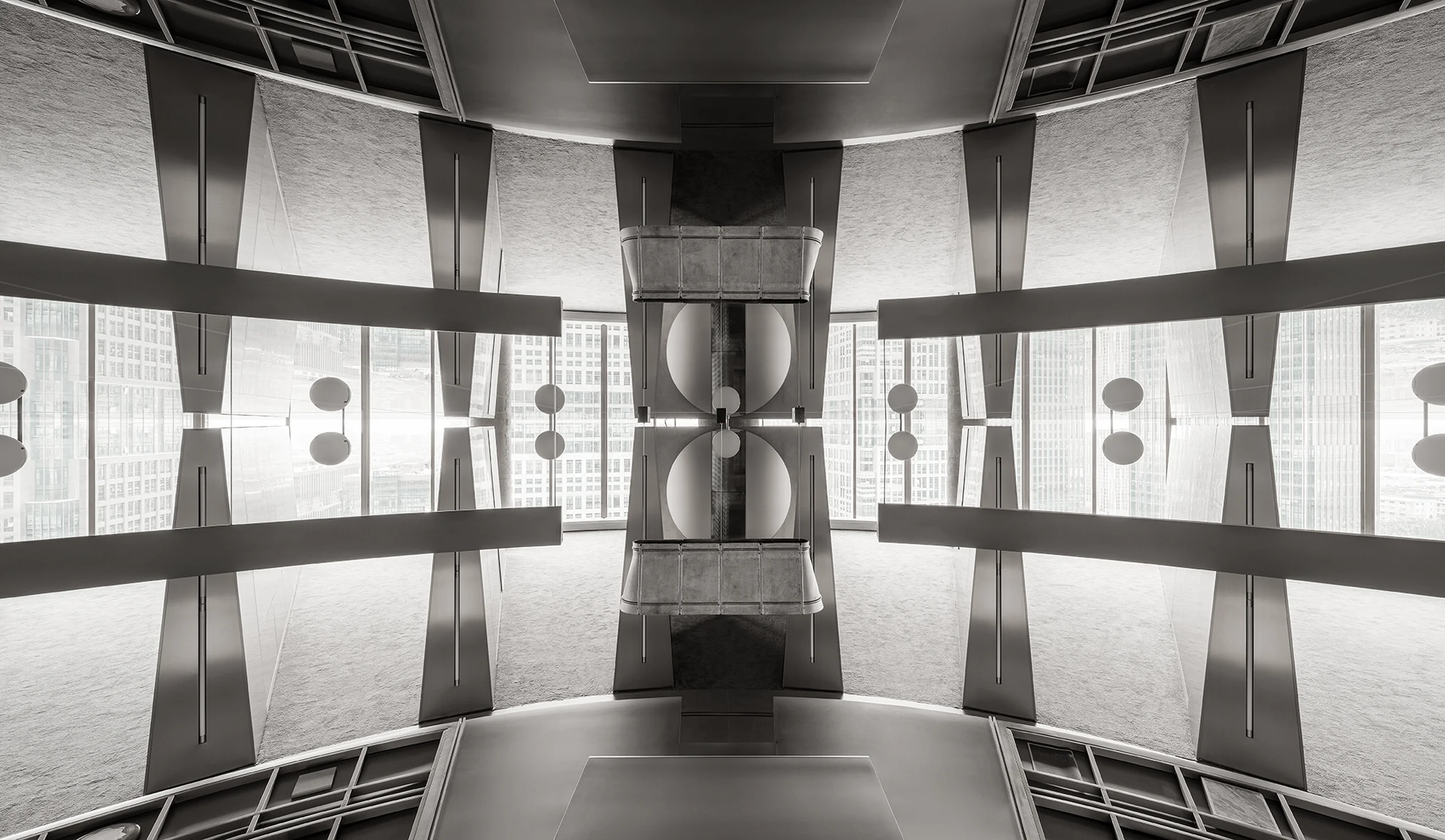
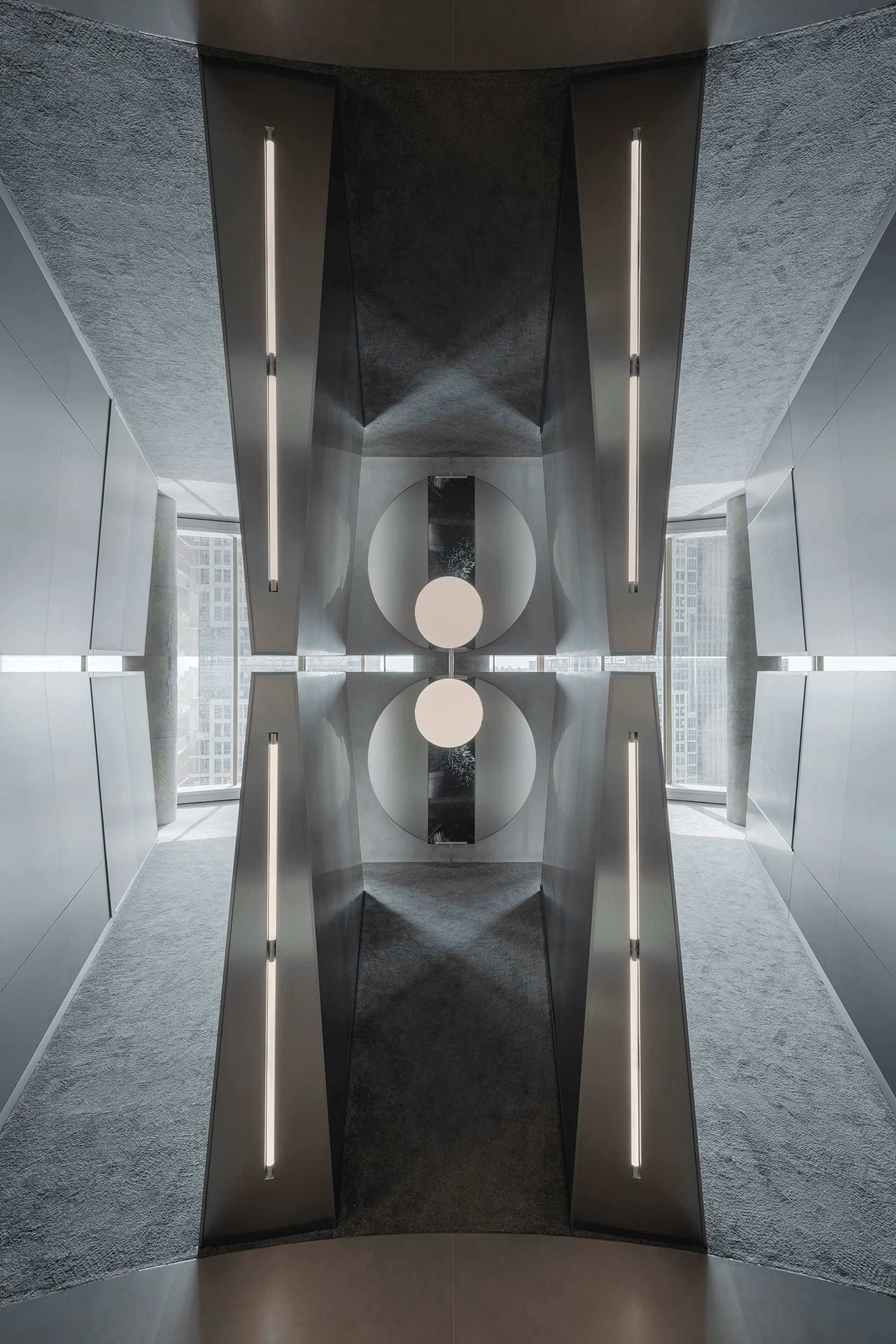
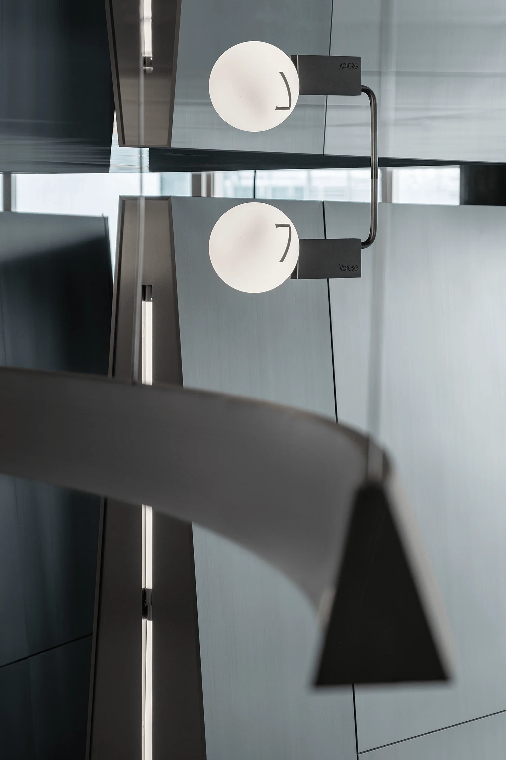
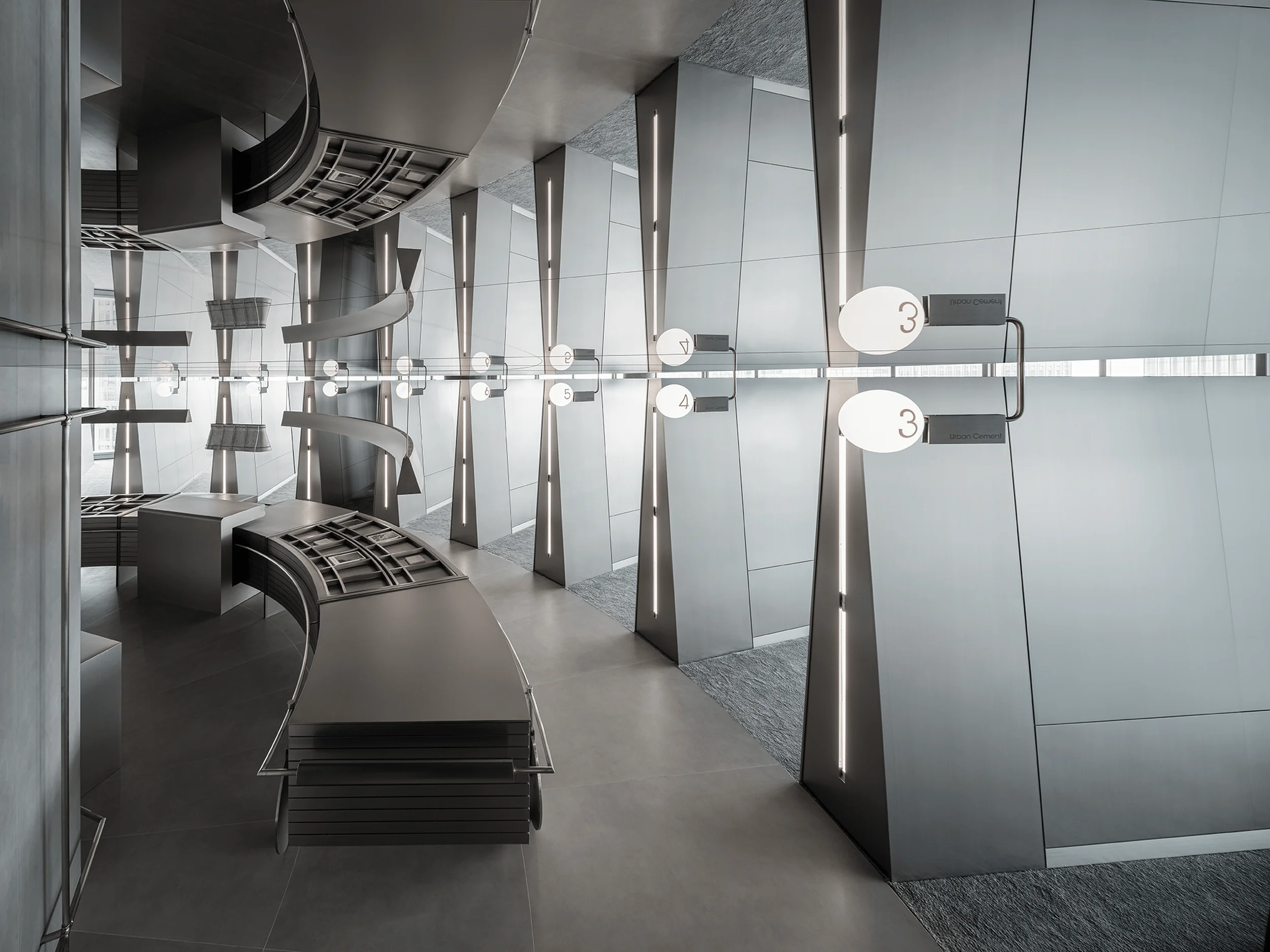
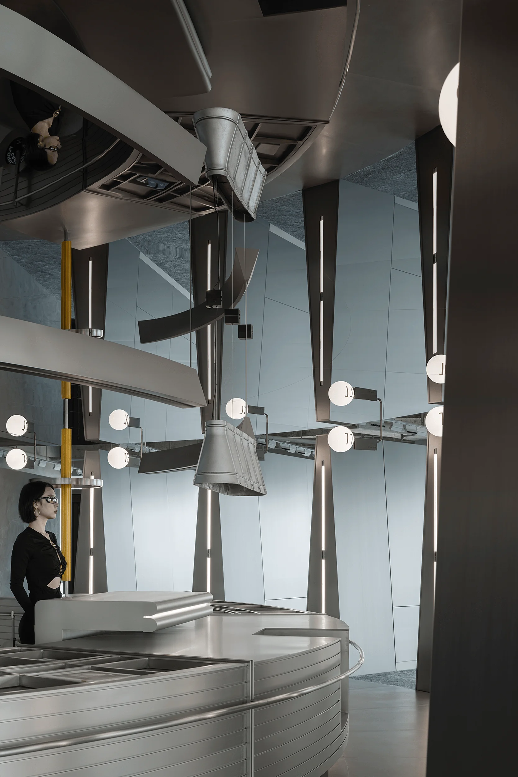
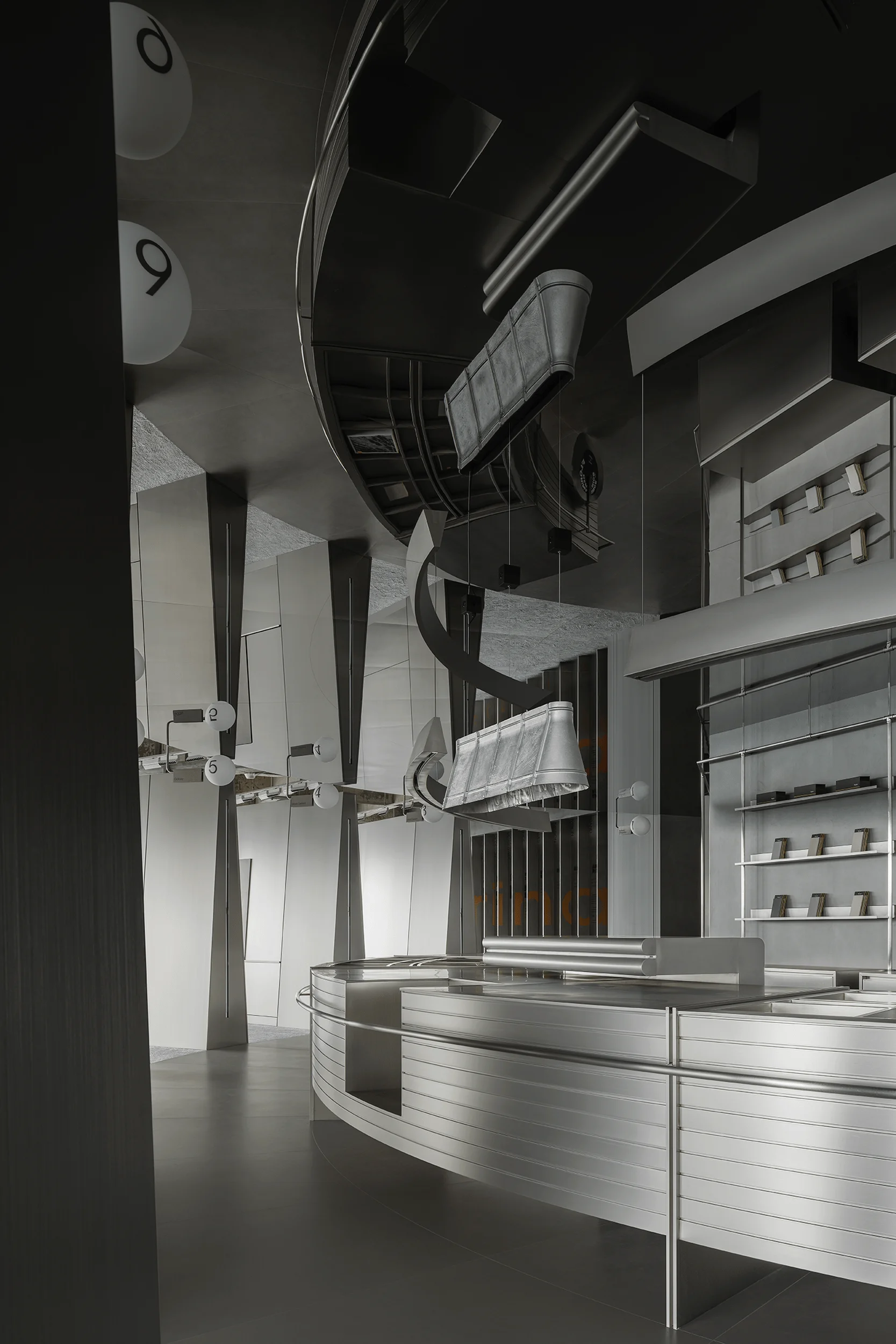
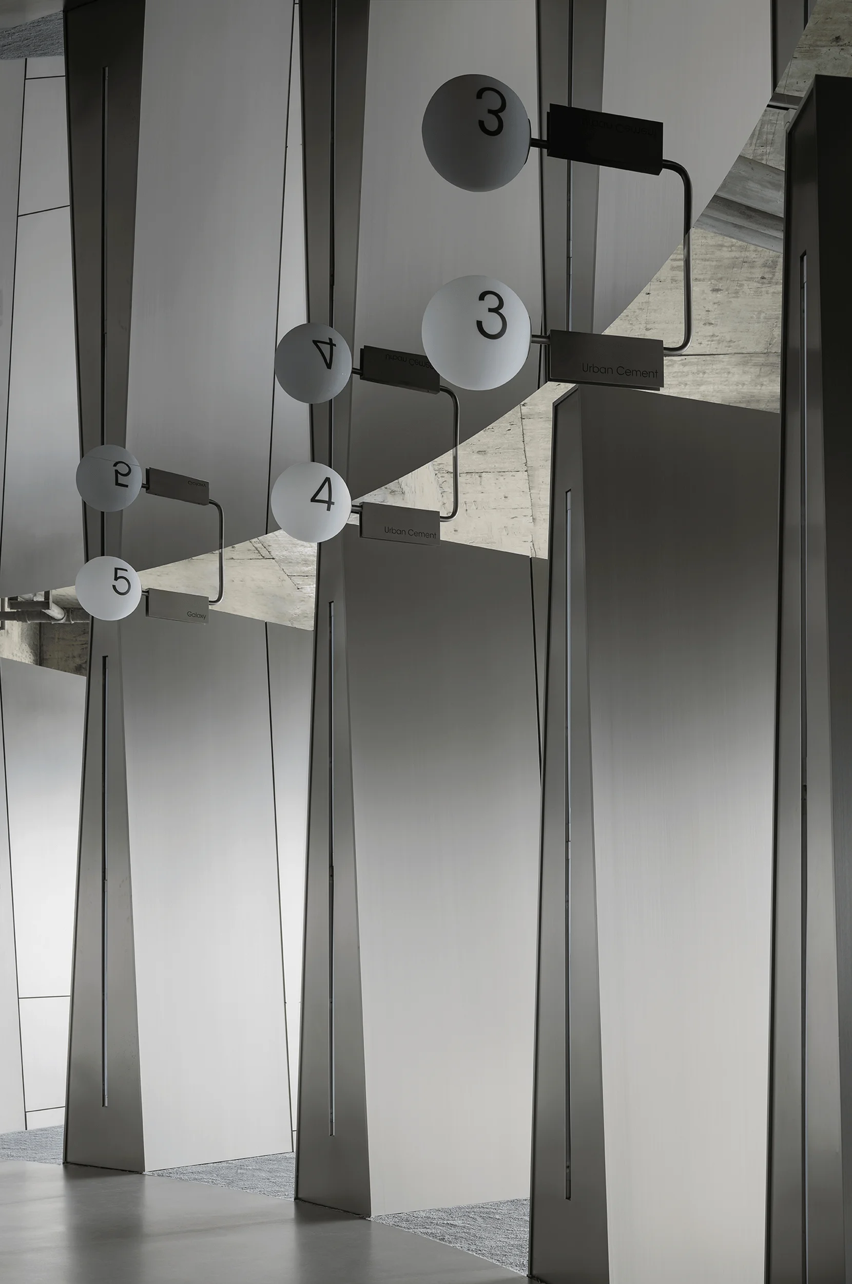
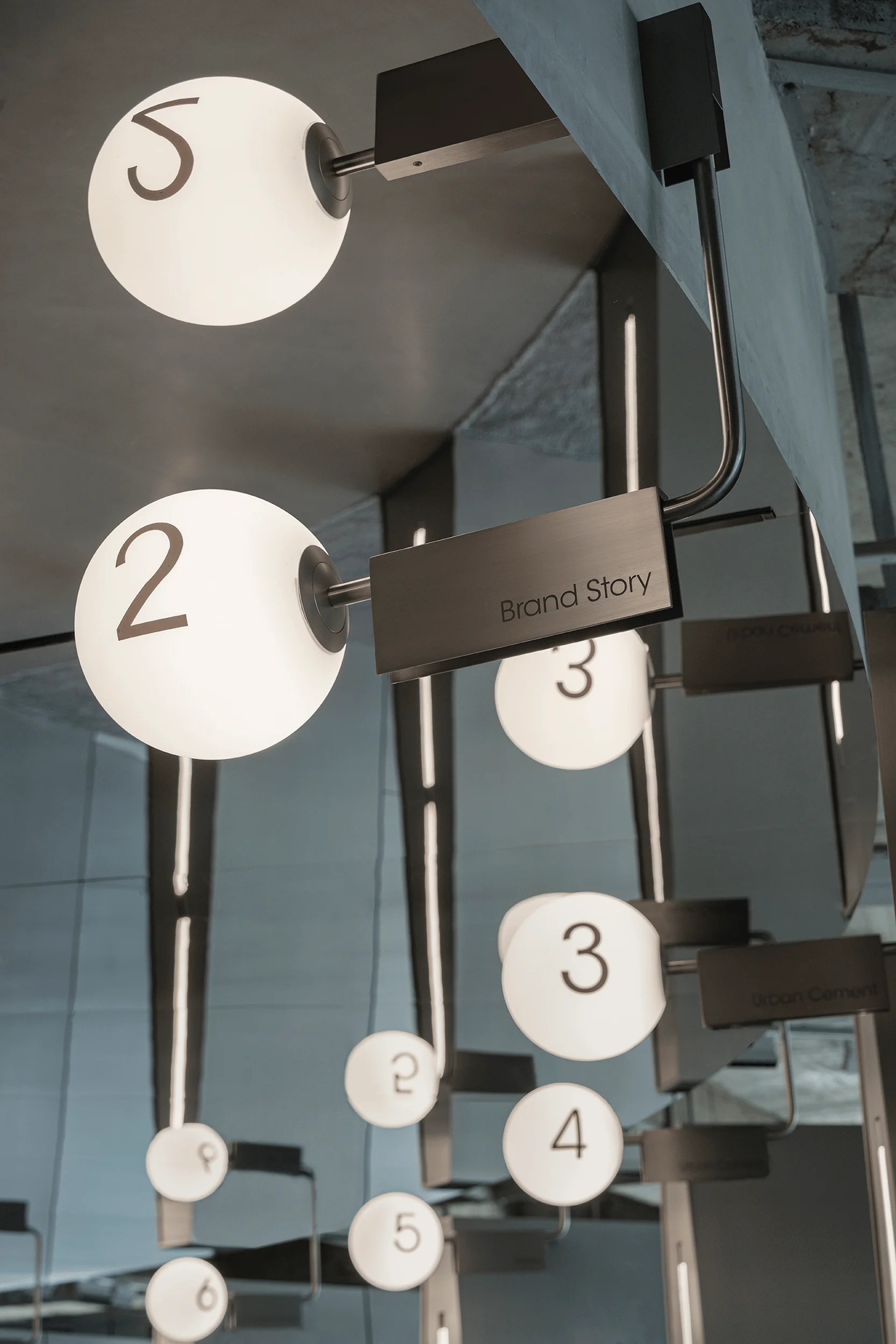
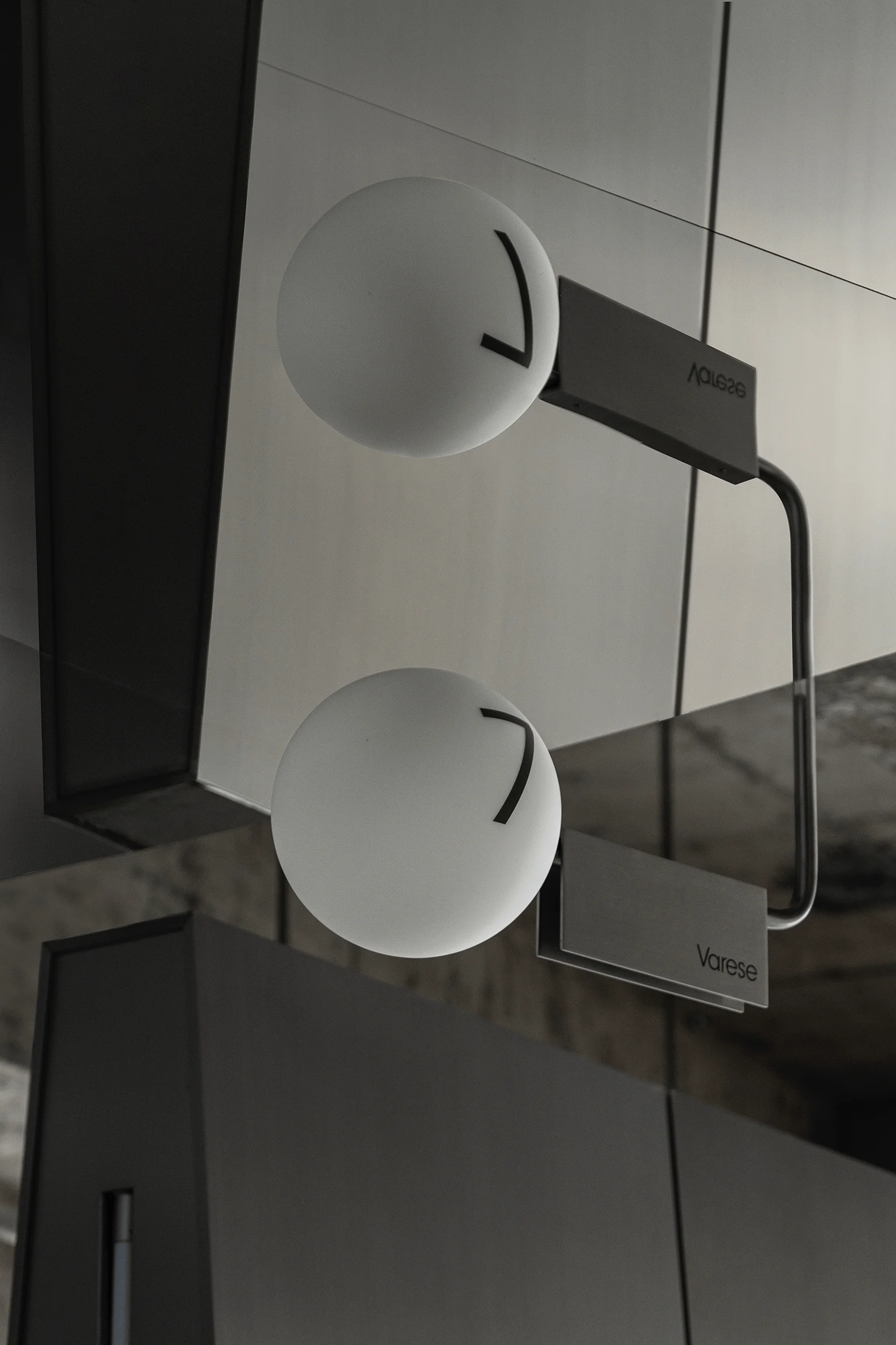
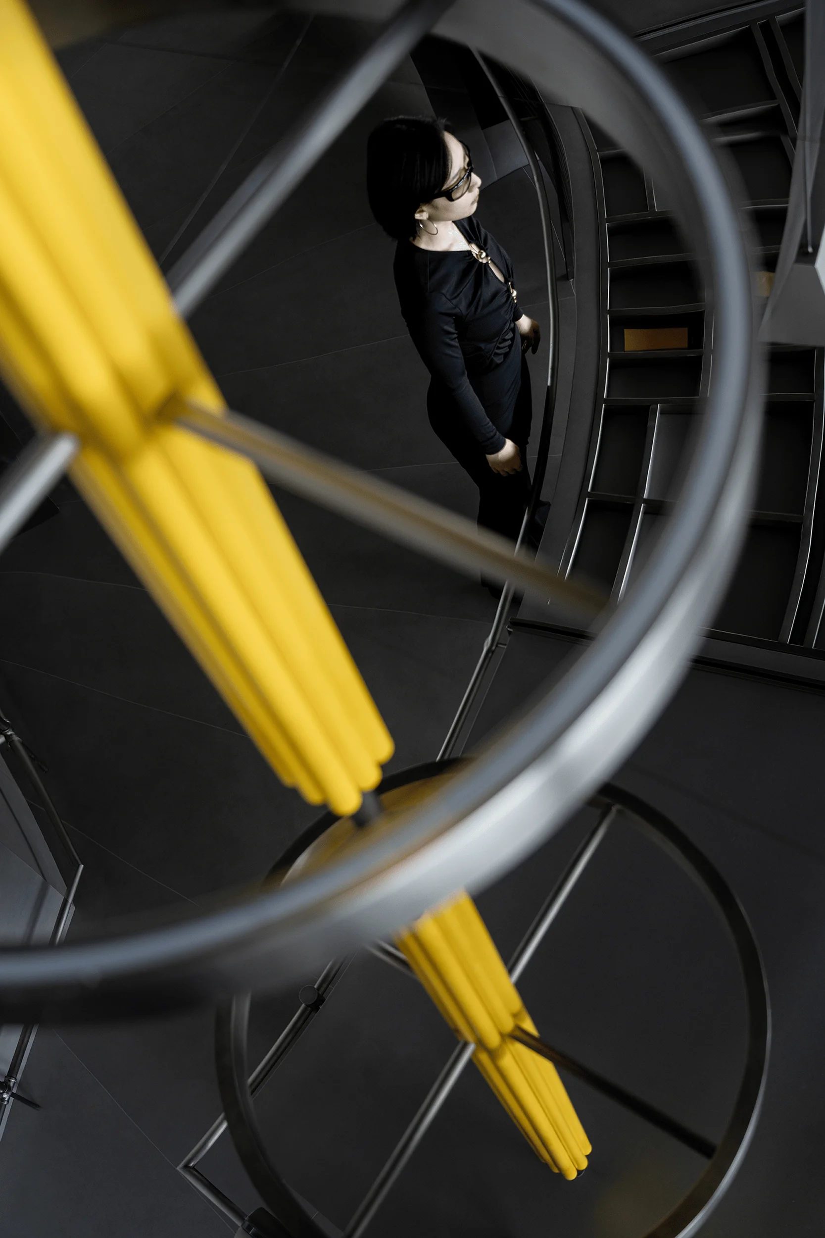
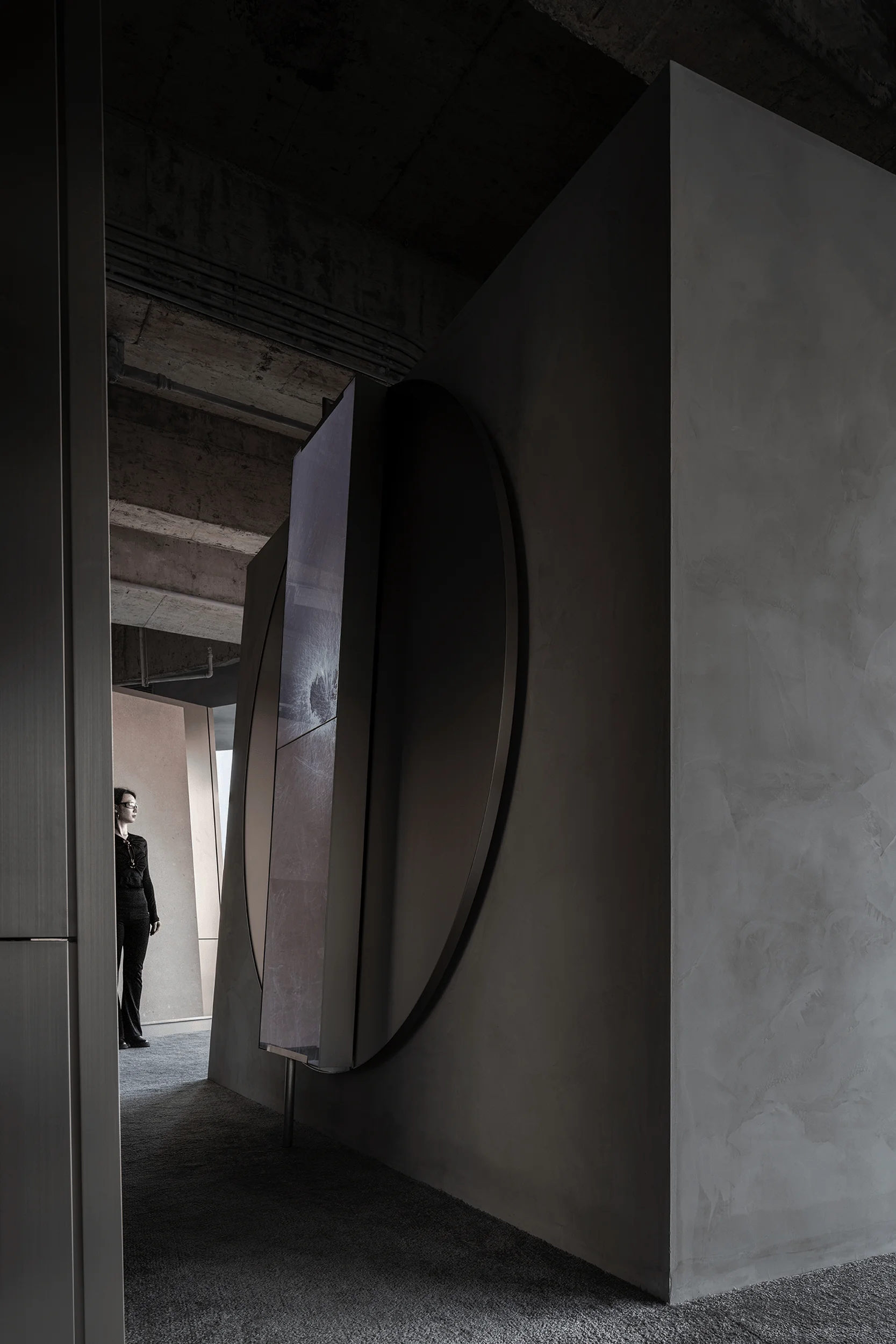
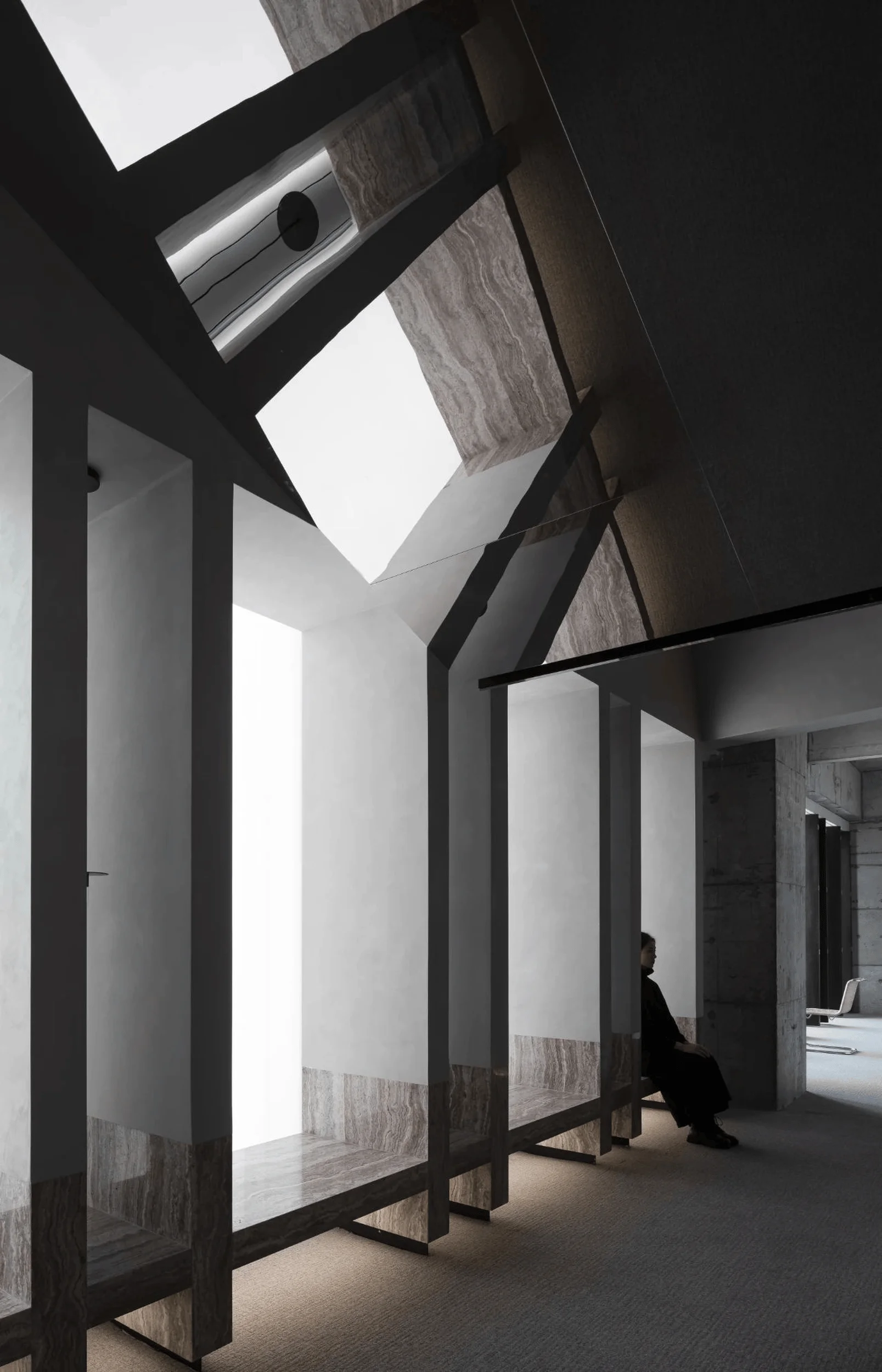
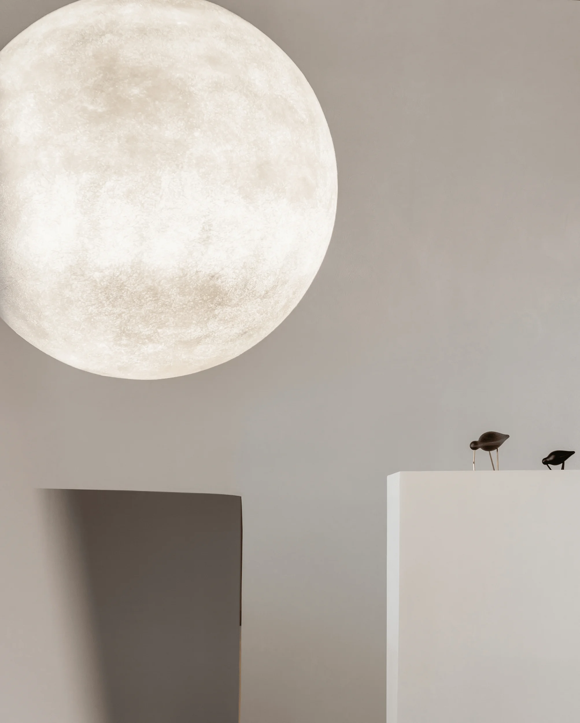
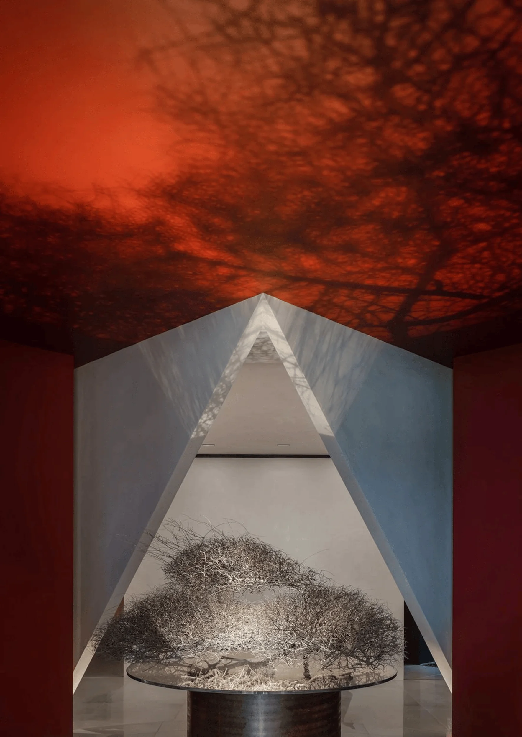
The dynamic arc-shaped planar arrangement features a radial design. Fourteen doorways encircle the fan-shaped exhibition hall, with custom-made spherical lighting fixtures suspended overhead, recreating the brand’s cosmic interstellar origins. Exterior light streams through the doorways into the exhibition hall, creating a three-dimensional and dynamic effect that enhances the space’s transparency. This imbues the exhibition hall with a more unrestrained narrative power while sculpting its spatial character. By utilizing light, space, and materials to guide the visitor’s emotional rhythm, the design showcases the advantages of a large space accommodating diverse exhibits, creating a unique exhibition space. The extensive use of brushed stainless steel throughout the exhibition hall creates a futuristic technological ambiance with an ultra-high sense of quality. Arcs of varying distances intersect in both planar and elevational relationships, seamlessly blending into the overall spatial atmosphere while maintaining a balanced rhythm. This design transcends the realm of conventional practicality, venturing into the artistic domain.
Social and Cultural Impact of the Florina Exhibition Hall
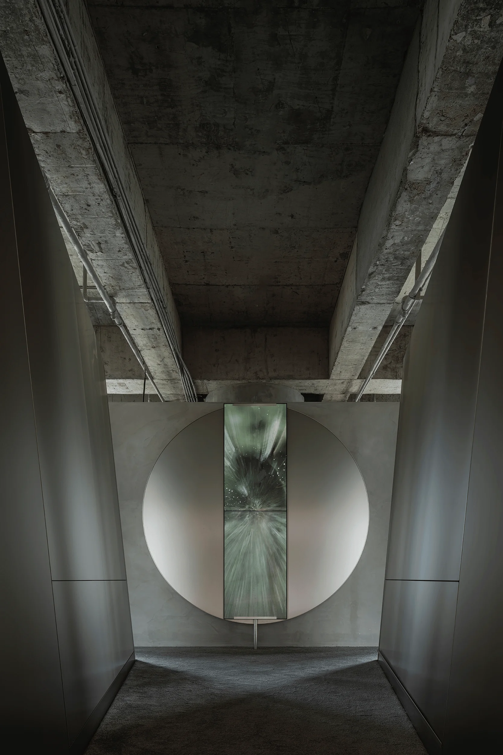
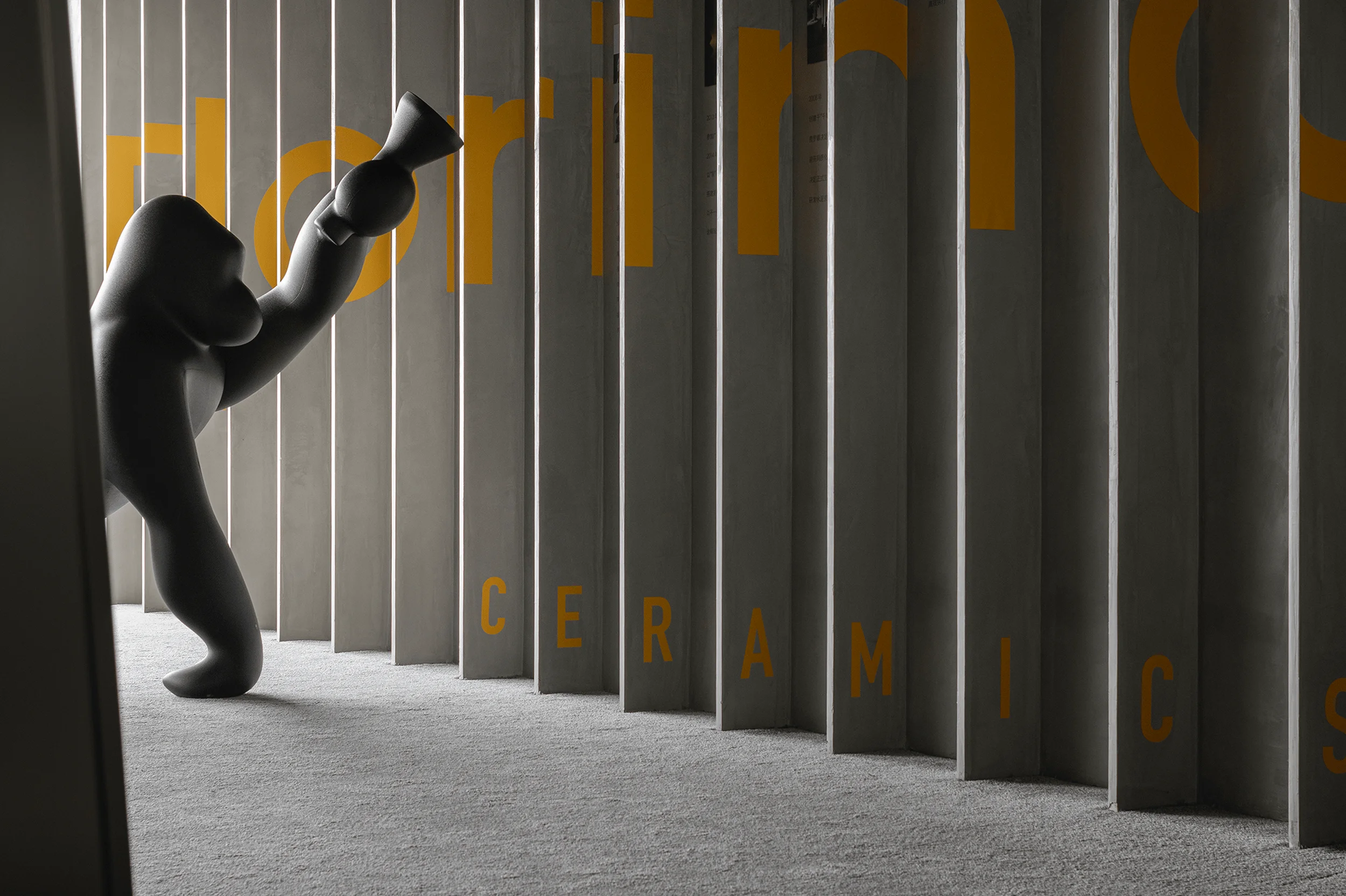
Fourteen doorways also serve as fourteen display walls, each showcasing products of different specifications. Adjustable metal inserts enable a more flexible display of product diversity. Above the display walls are multimedia digital screens playing rhythmic music. The screens showcase a kaleidoscope of product textures, resembling a galaxy with spherical lighting fixtures suspended like countless stars. This evokes imagery of spaceships traversing diverse realms in science fiction films, with the fusion of sound, light, and electricity infusing the entire space with a futuristic aura. The display racks depart from the traditional combination of wood and flannel, opting for stainless steel construction. Carpets are strategically placed in areas where users select products, providing visitors with a natural, comfortable, and human-centered experience as they navigate the space. Amidst the juxtaposition of warm and cool elements, as well as the interplay of old and new, the creative utilization of different materials delivers a unique sensory experience.
Economic Considerations of the Florina Exhibition Hall
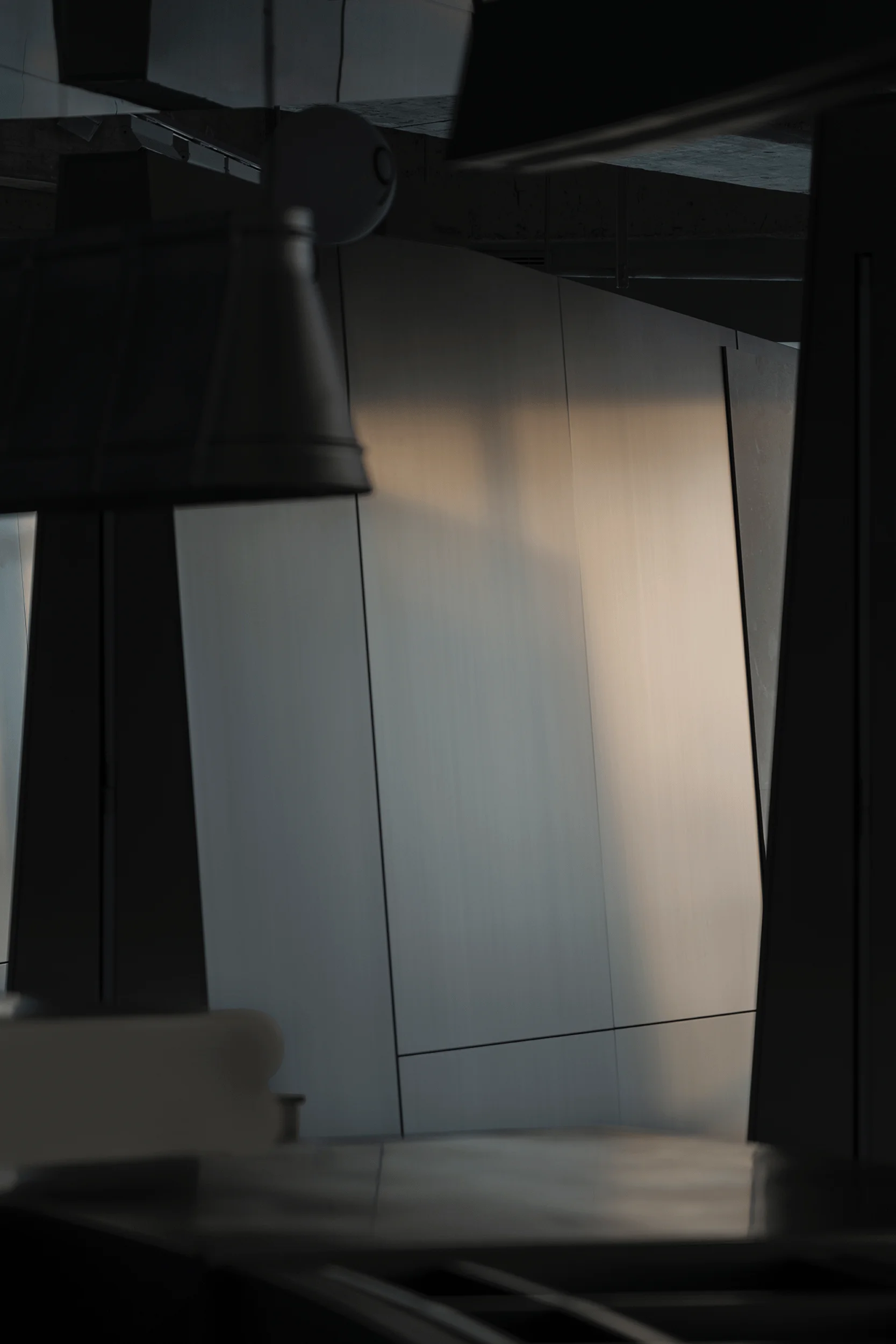
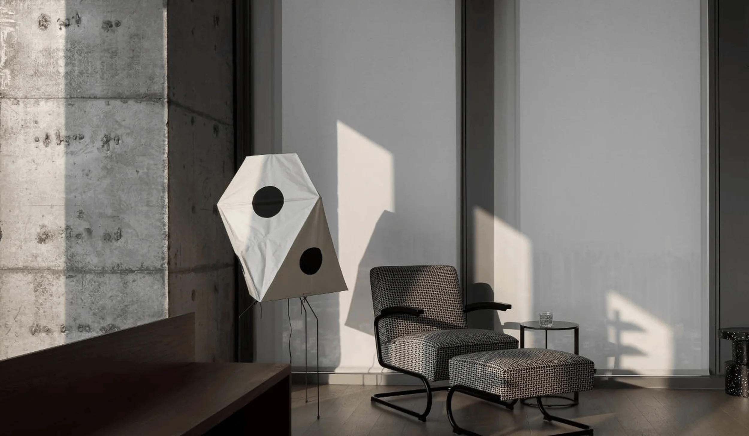
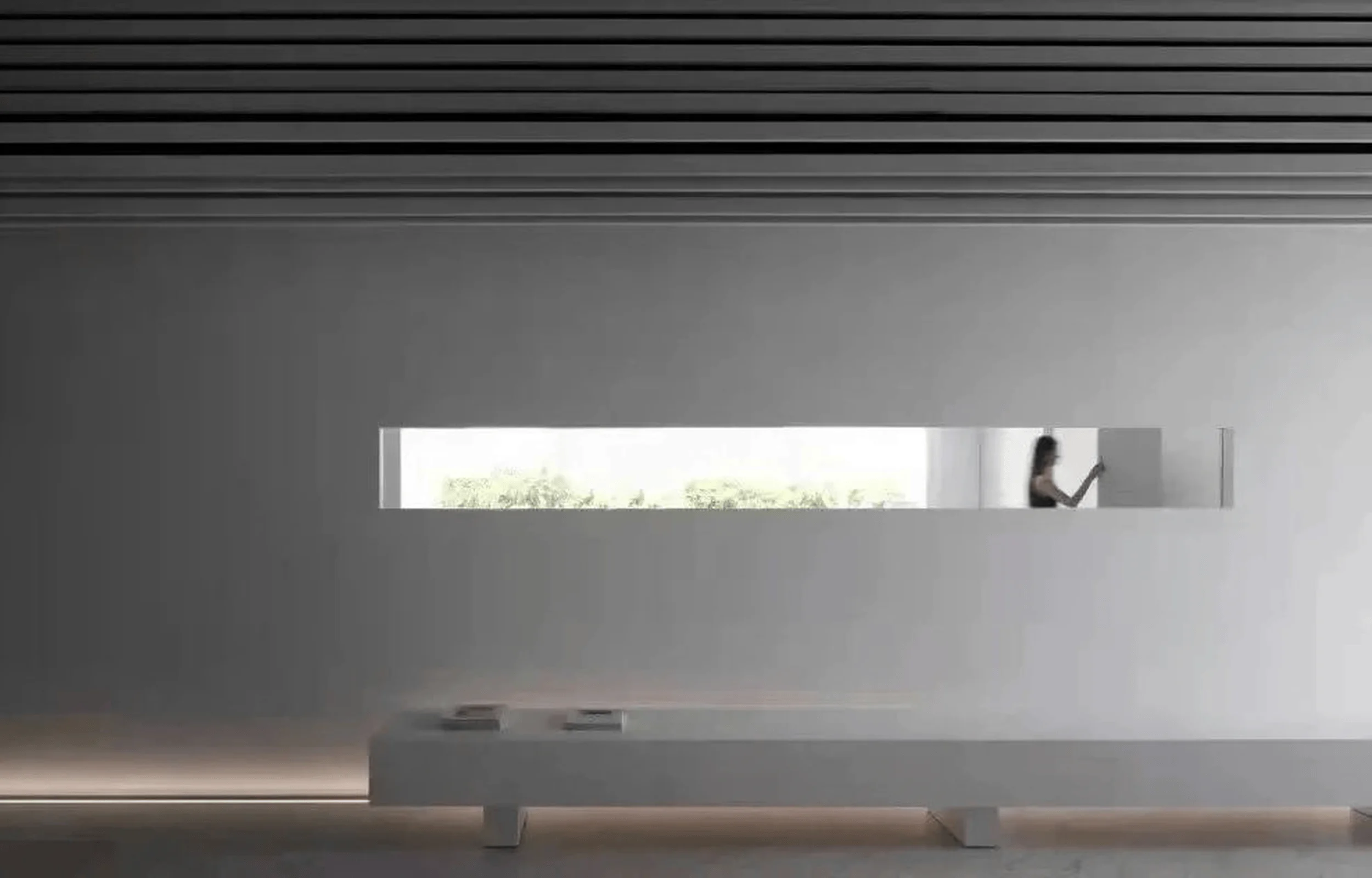
The brushed stainless steel display walls reflect the natural light streaming in through the floor-to-ceiling glass windows, bathing the entire exhibition space in light. The shadows cast by the reflections from the windows outside resemble embedded murals, blending seamlessly with the interior. At times, the interplay of light and shadow is full of tension, while at other moments, it is subtle and restrained. The design maximizes the product’s advantages amidst the interplay of “curves” and “light and shadow.” Visitors can experience the diverse textures of the products under both natural and artificial lighting. The design maximizes natural light, expands the field of vision, and utilizes the interplay of light, shadow, and artificial illumination to construct a futuristic ambiance within the exhibition hall. The brand aims to connect with the preferences and tastes of the new generation of young people, aligning with their understanding of product consumption to achieve commercial objectives. Innovative cross-border brand peripheral products are developed to resonate with young consumers. The product display showcases a combination of high and low platforms and cabinets, arranged in a staggered and visually engaging manner. The use of stainless steel materials further enhances the sense of luxury associated with the products. The enveloping and rhythmic design creates a more profound new retail display island counter area.
Post-Completion Evaluation and Feedback
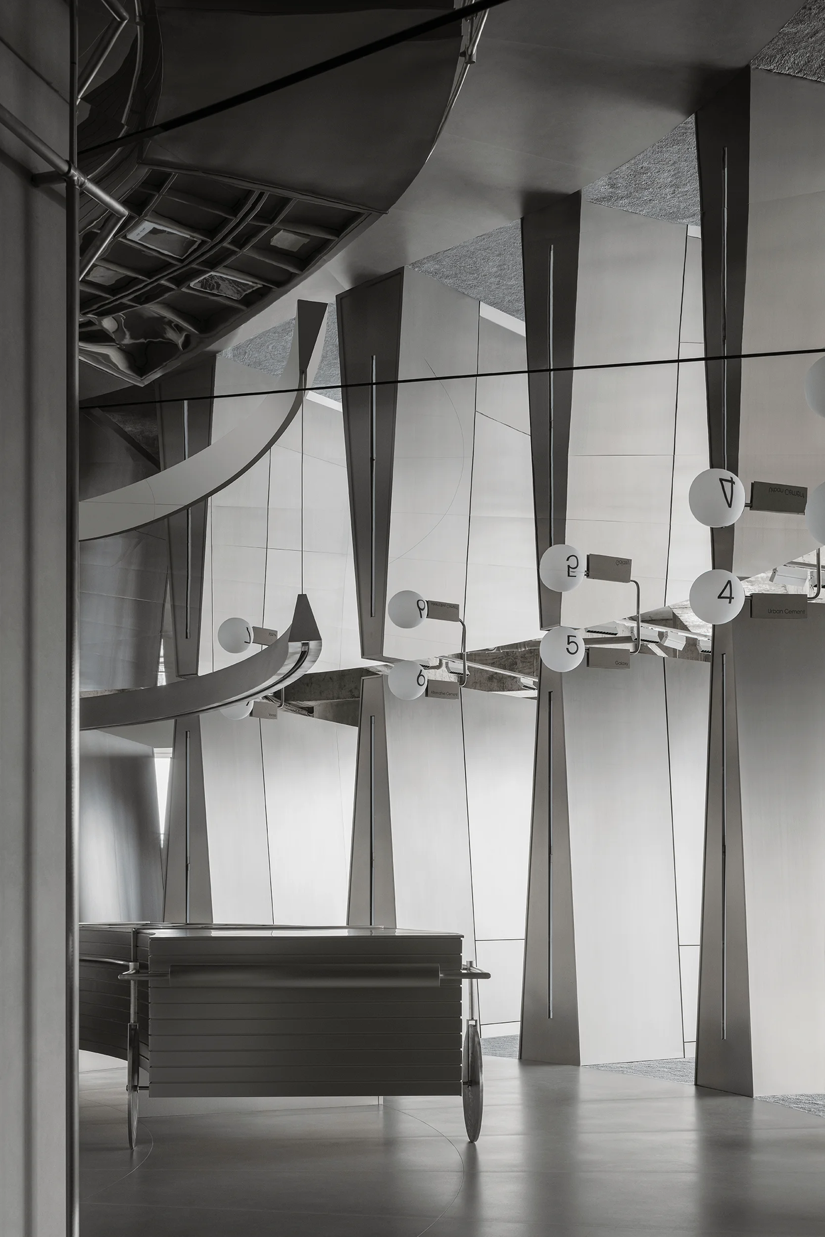
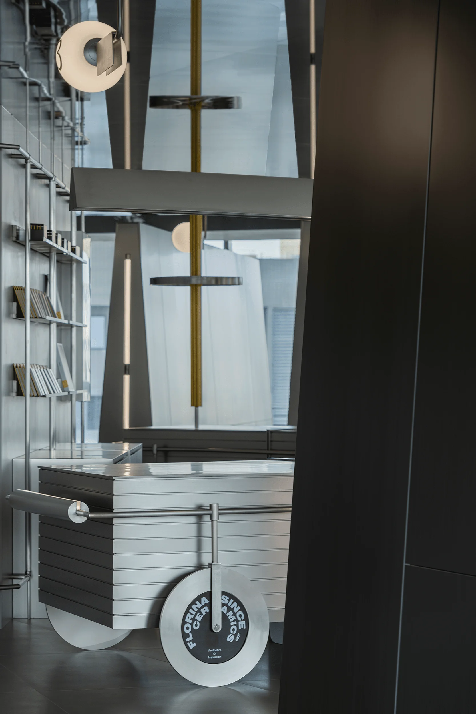
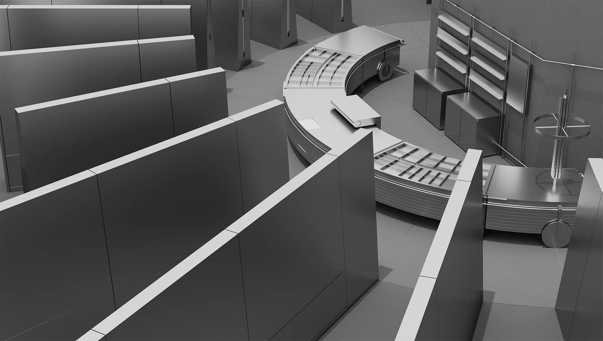
The “island counter,” situated at the heart of the exhibition hall space, fulfills the brand’s multi-functional display requirements for peripheral product forms. It serves as both the starting and ending point for all pathways, connecting the central point of the space through multiple routes. The island counter area is transformed into a new commercial retail scenario, showcasing the brand’s creative peripheral products in the form of “sample carts.” The exhibition hall also features a live broadcast studio, employing online communication methods favored by young people to expand the brand’s audience reach. As a brand that prioritizes sustainable development, Florina has incorporated a significant amount of recyclable stainless steel materials into the overall design and construction of the exhibition hall. Additionally, readily demountable and recyclable construction materials, such as display racks, have been utilized, reflecting the shared commitment to environmental protection upheld by both the brand and the designers.
Project Information:


