Hanger Exhibition Hall in Guangzhou, China, showcases a ‘beyond daily life’ design inspired by temples, using natural elements and order to create an immersive experience.
Contents
Design Inspiration: Embracing Temple Aesthetics
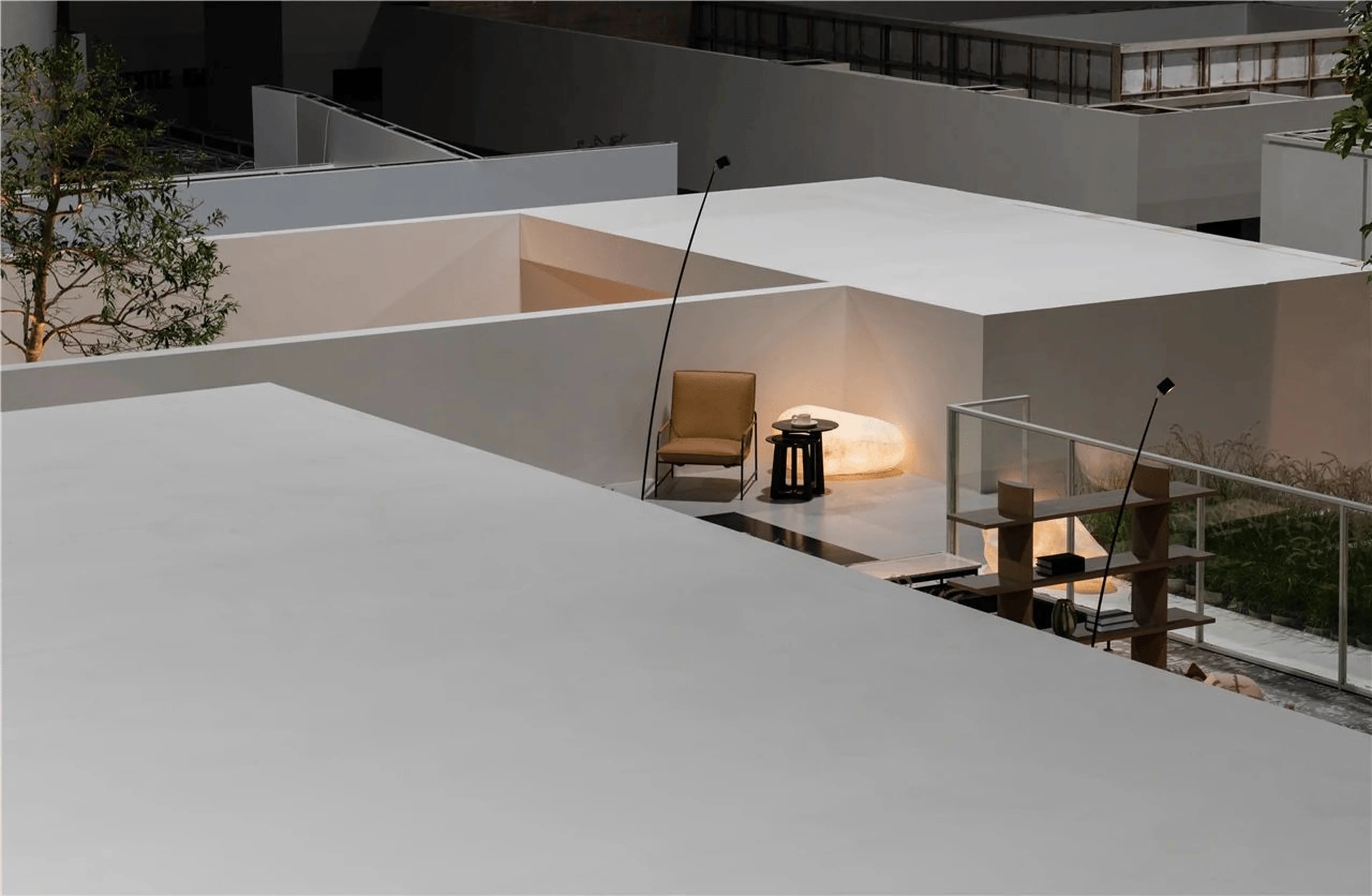
The Hanger exhibition hall in Guangzhou, China, draws inspiration from temple architecture, creating a space that transcends the ordinary. This “beyond daily life” design concept goes beyond mere aesthetic appeal, offering a profound reflection on daily life and its reinterpretation. The design beautifully blends the solemnity and stability of temples with modern exhibition design, representing a prime example of a super-daily design approach. ‘Beyond daily life’ design prioritizes not just visual beauty but also the deeper spiritual connotations, prompting viewers to reassess their own life experiences and appreciate the often-overlooked aspects of beauty and meaning. This design approach offers a soothing counterpoint to our fast-paced, high-stress contemporary society, fostering a sense of inner peace and tranquility. This approach is a significant example of retail space design and showroom design in China. This design includes elements like a roof garden and uses light and shadow to create a temple-like experience in the context of the exhibition hall, also a good example of interior design for furniture displays. tags: retail space design, showroom design, interior design, furniture display, beyond daily life design, China
Spatial Organization: Symmetry, Order, and Colonnades
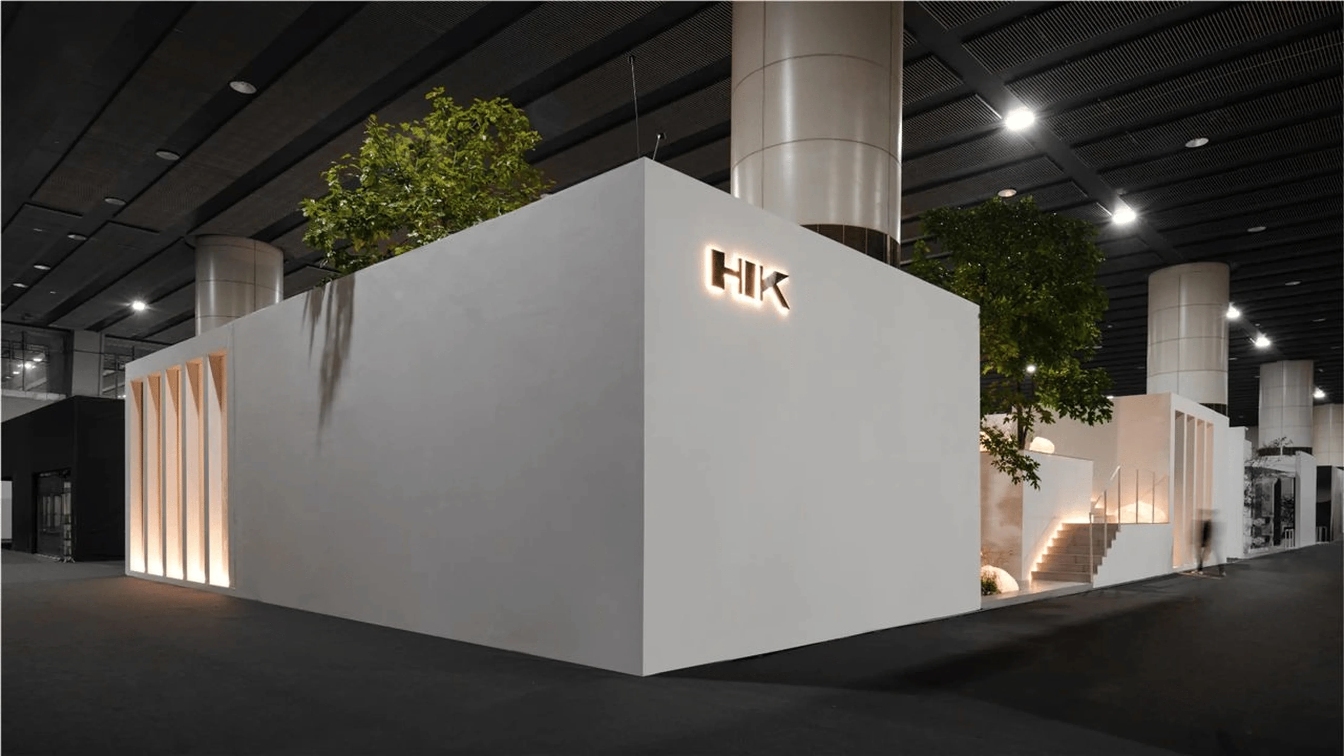
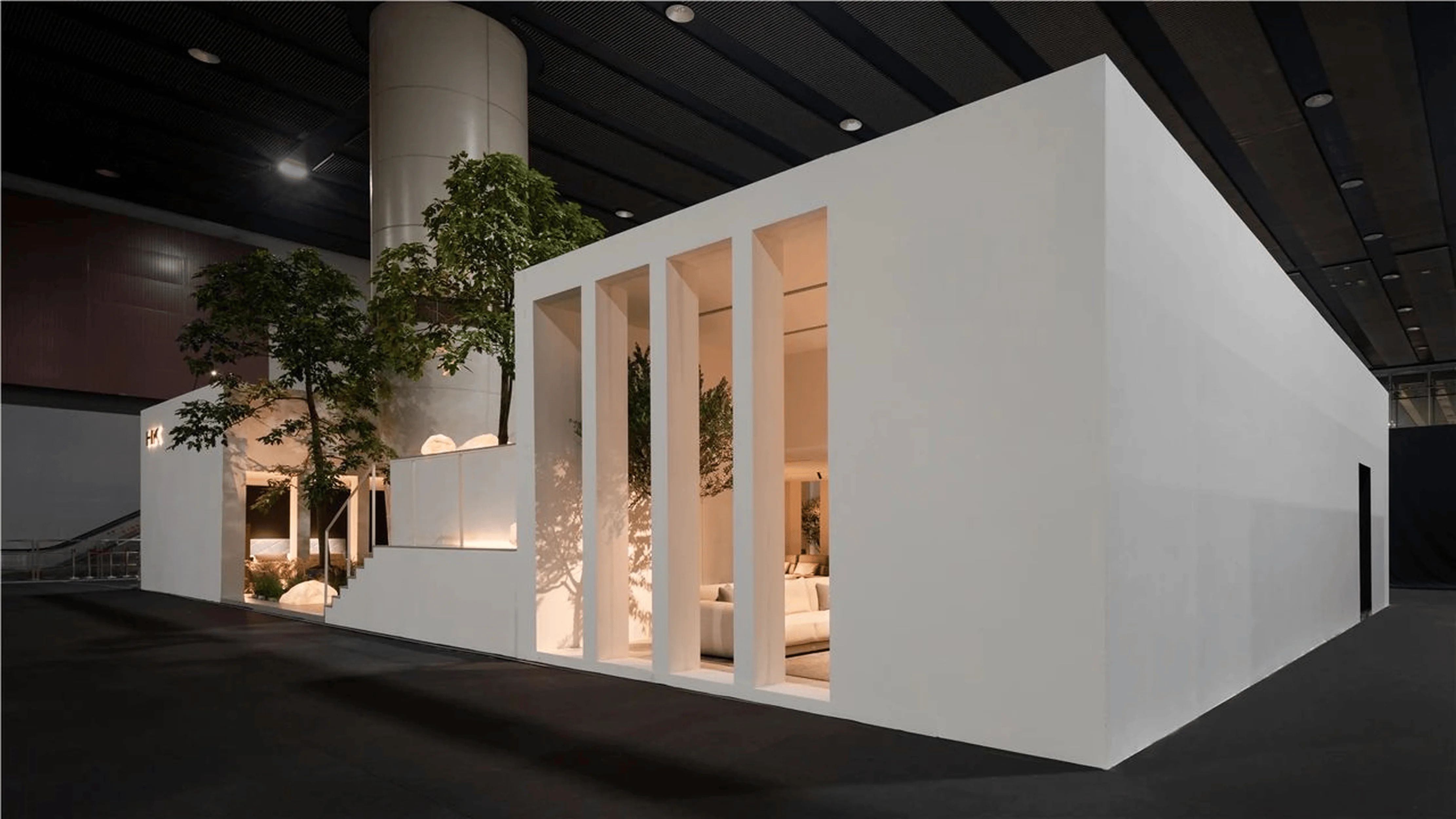
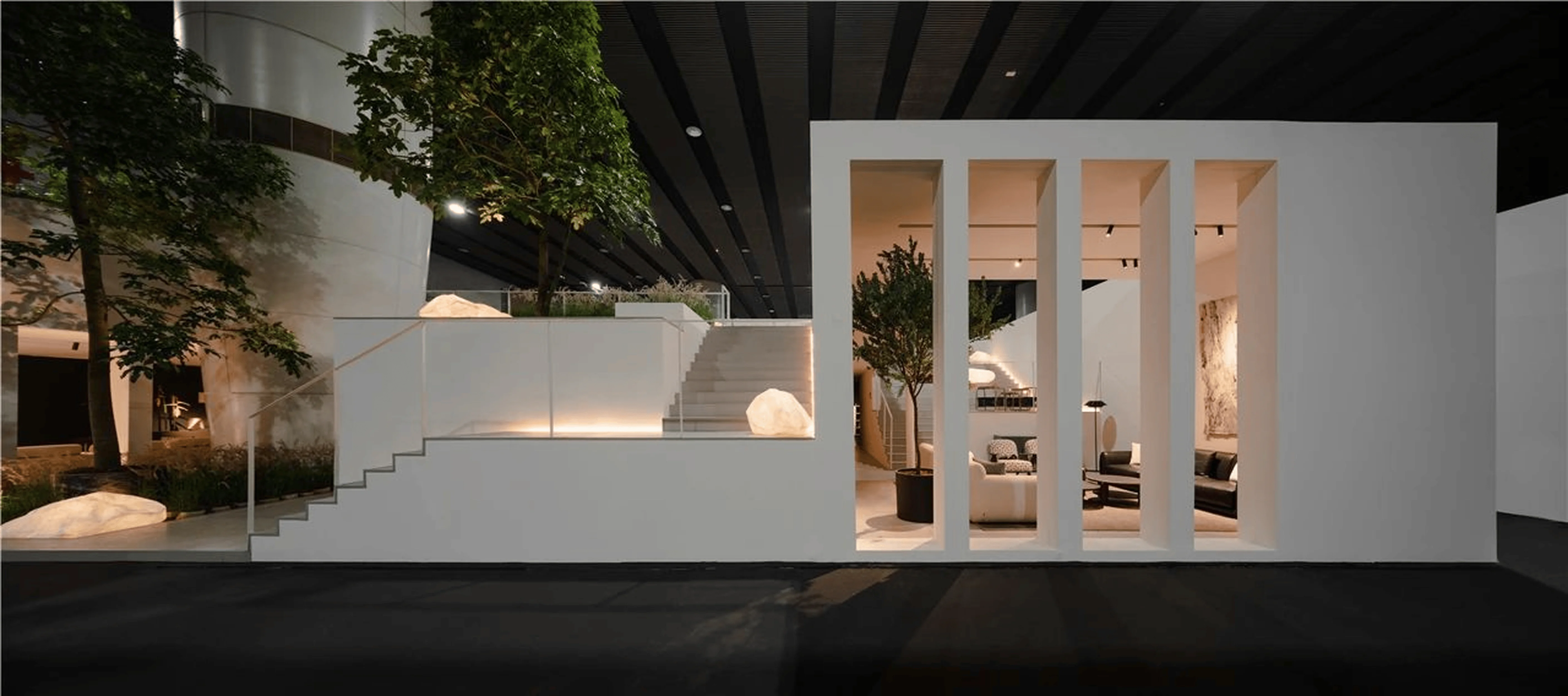
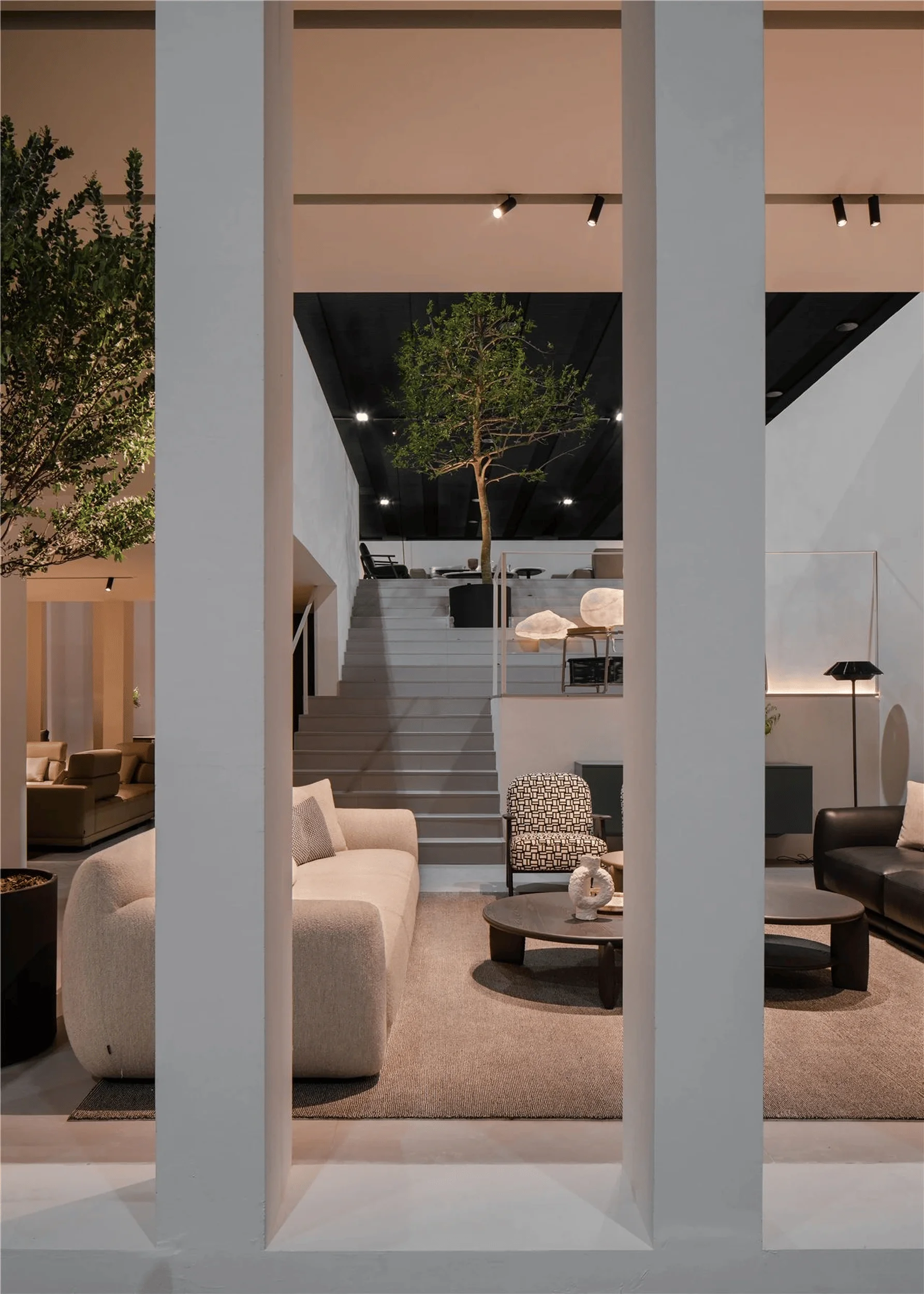
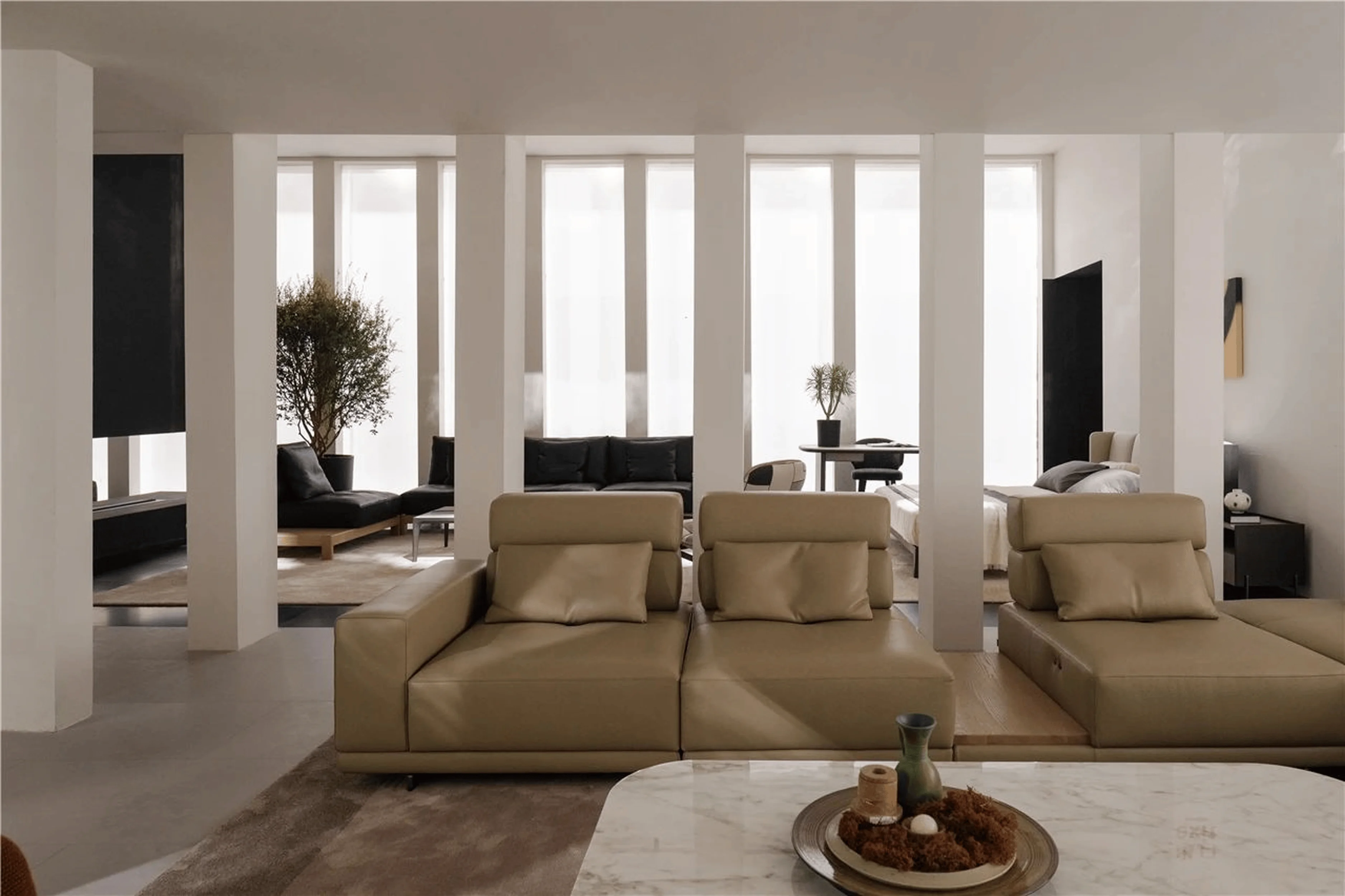
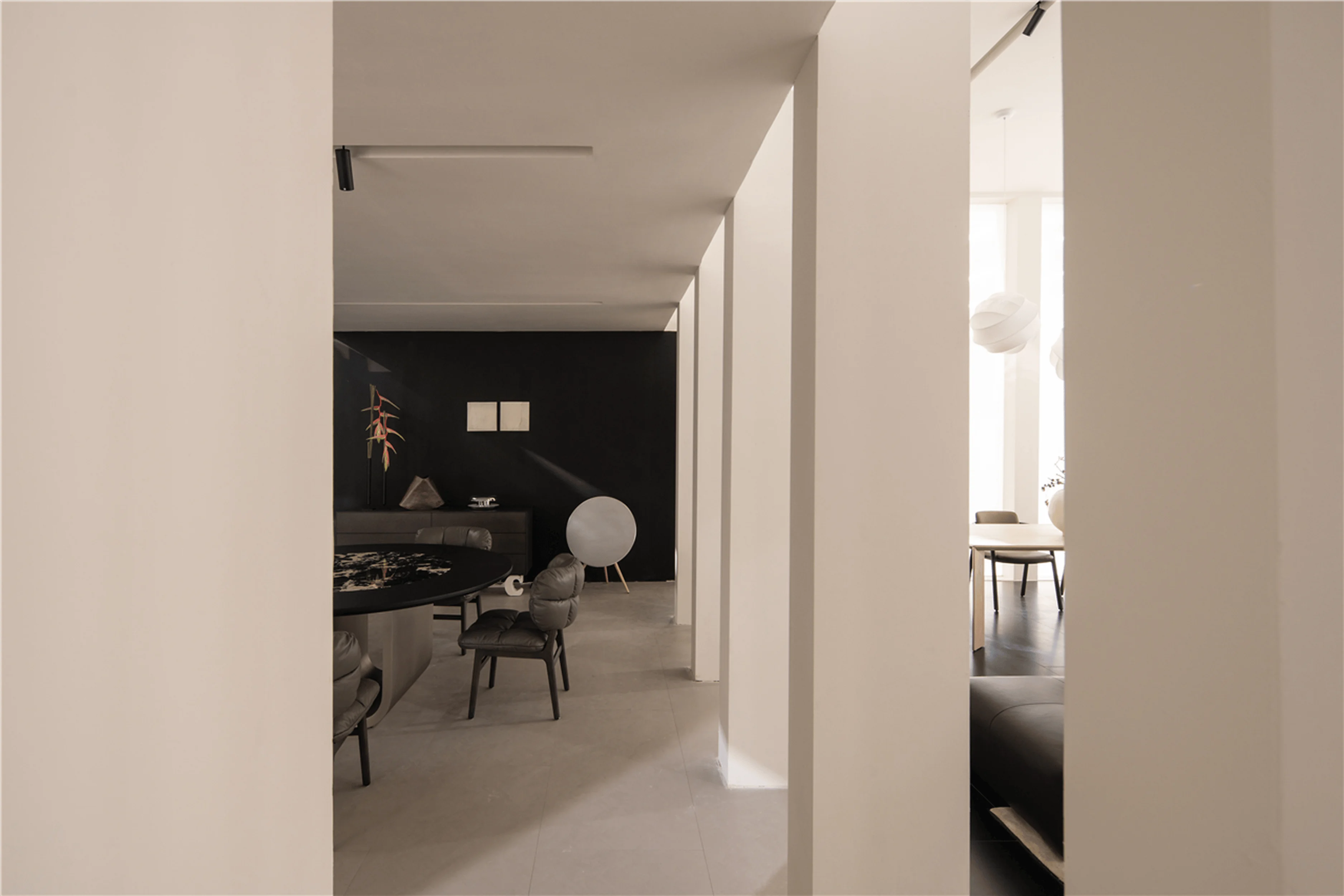
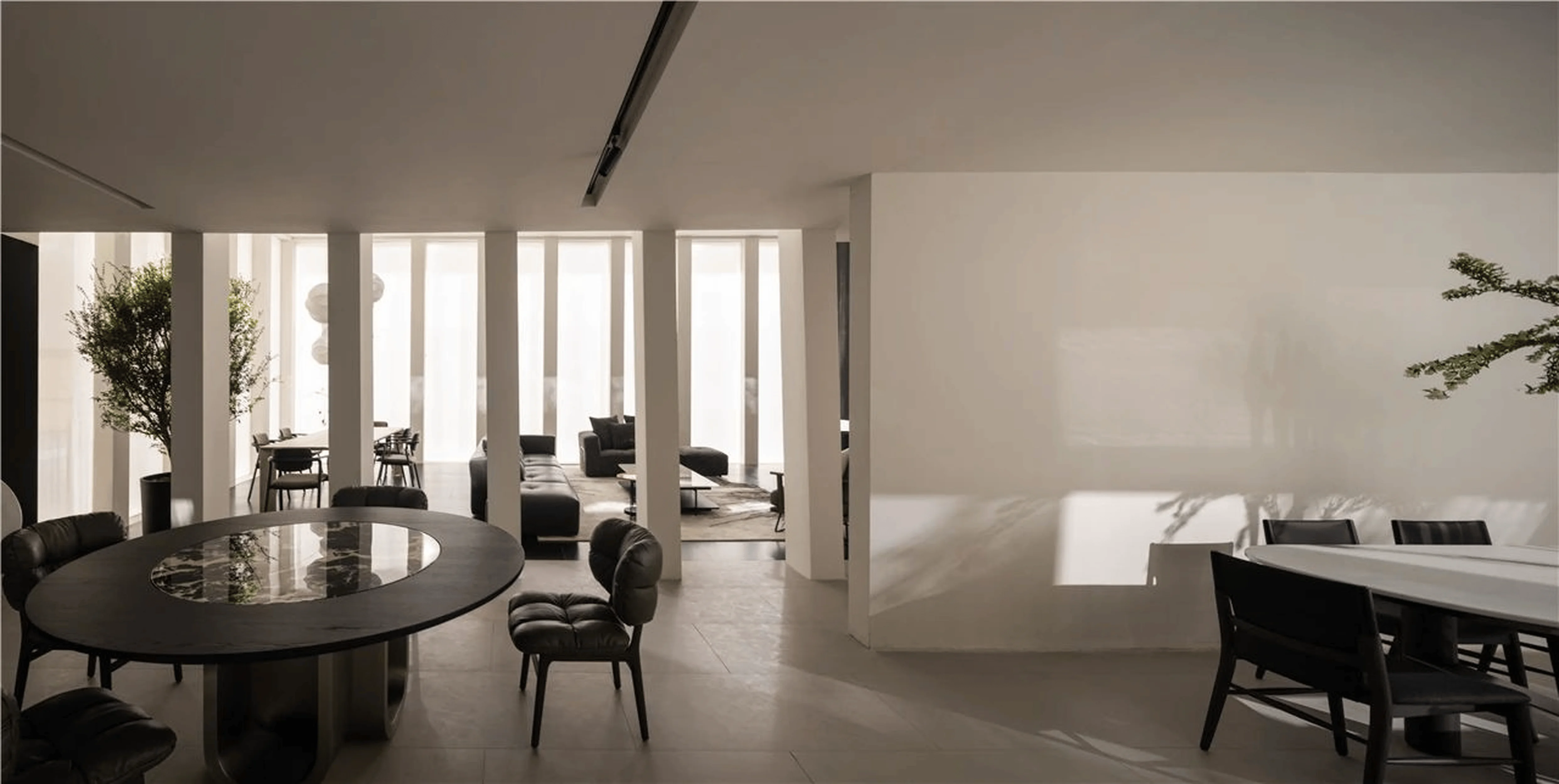
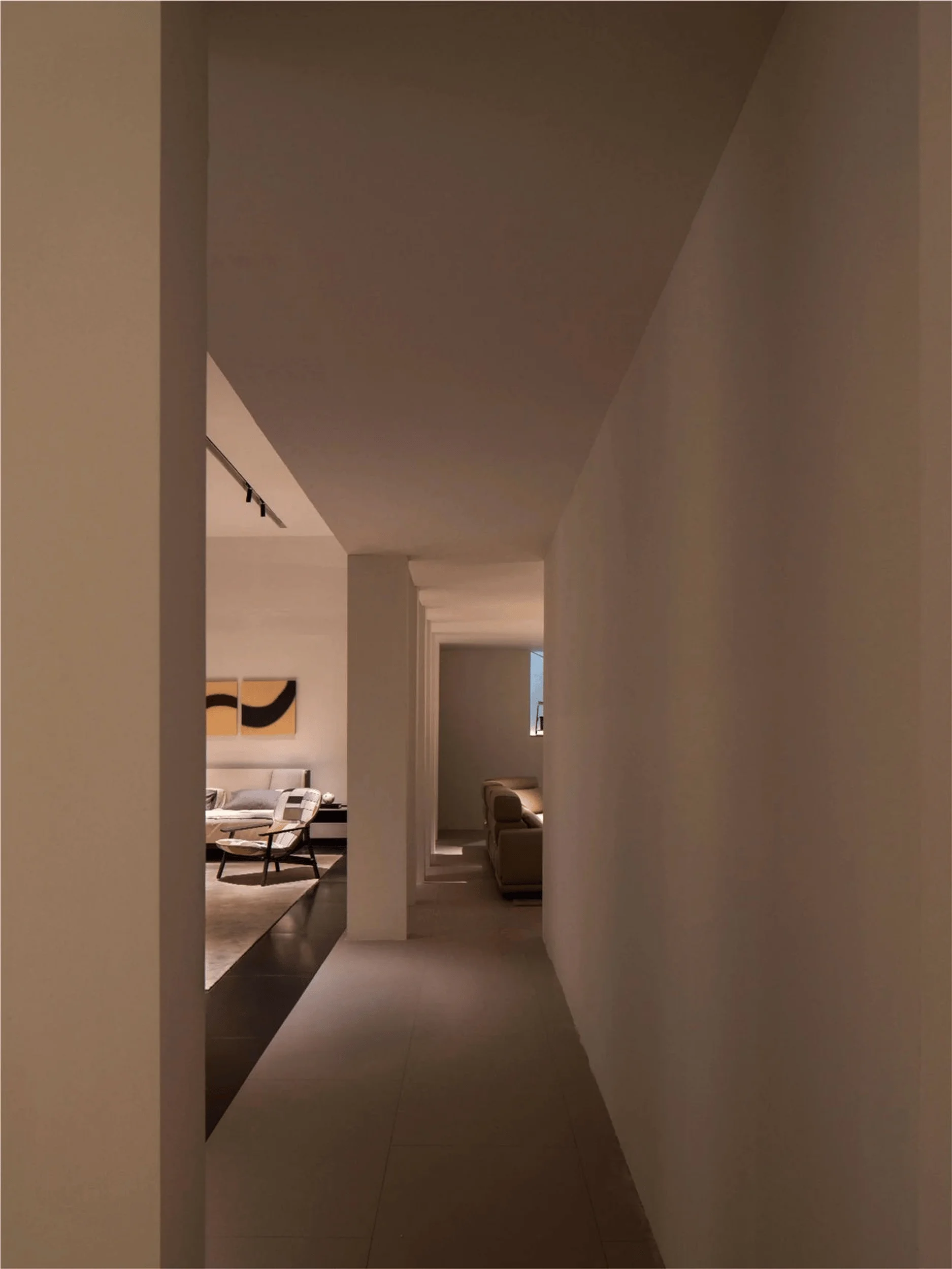
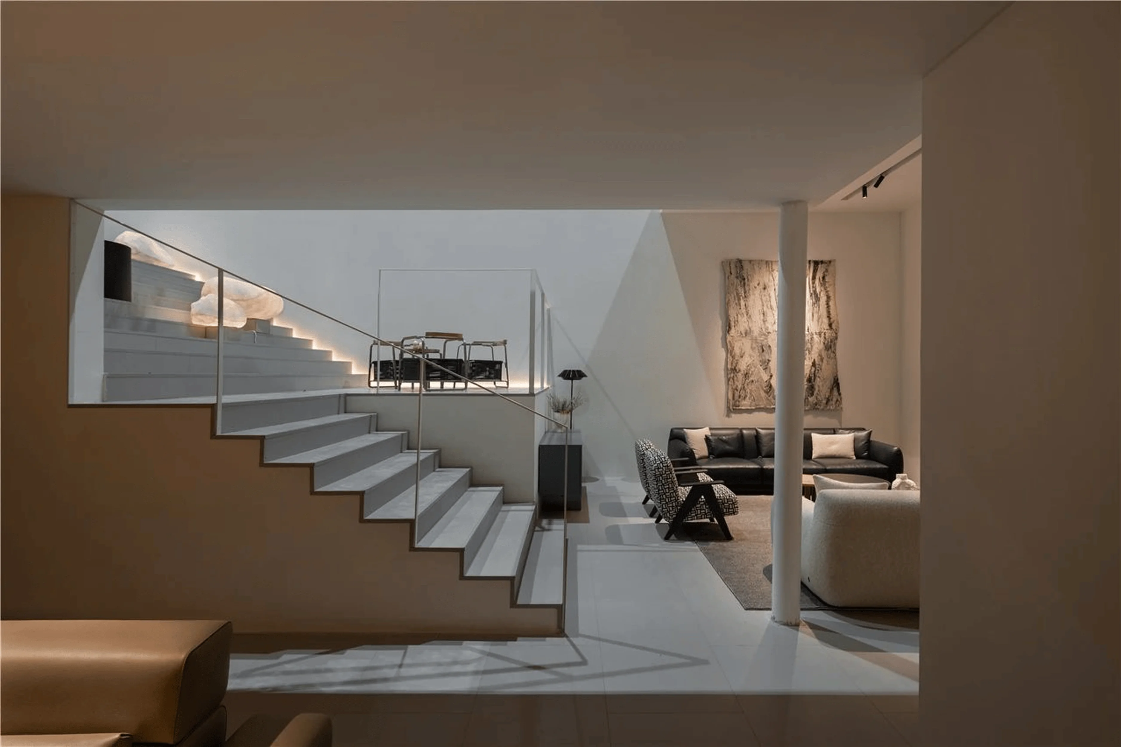
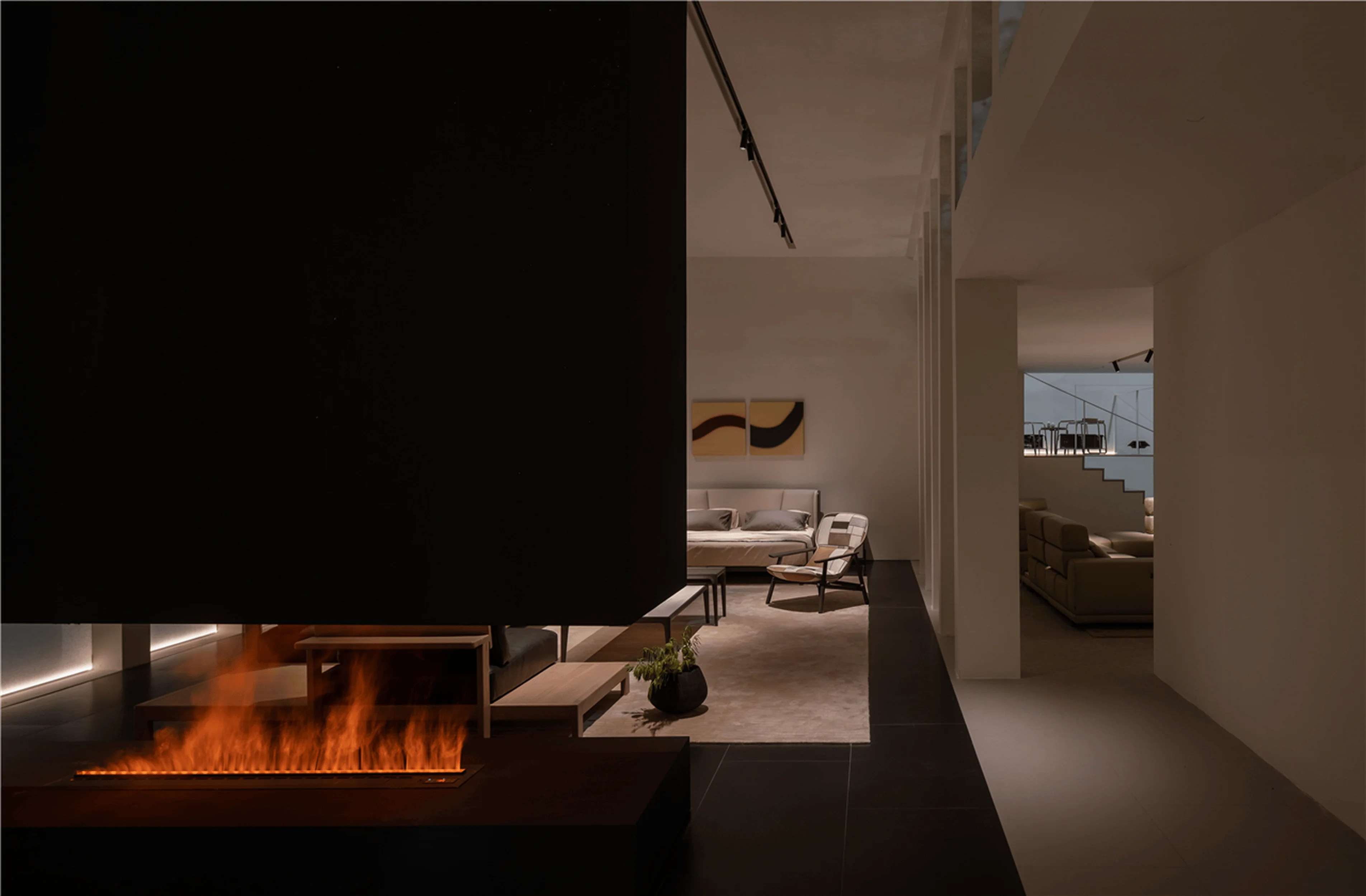
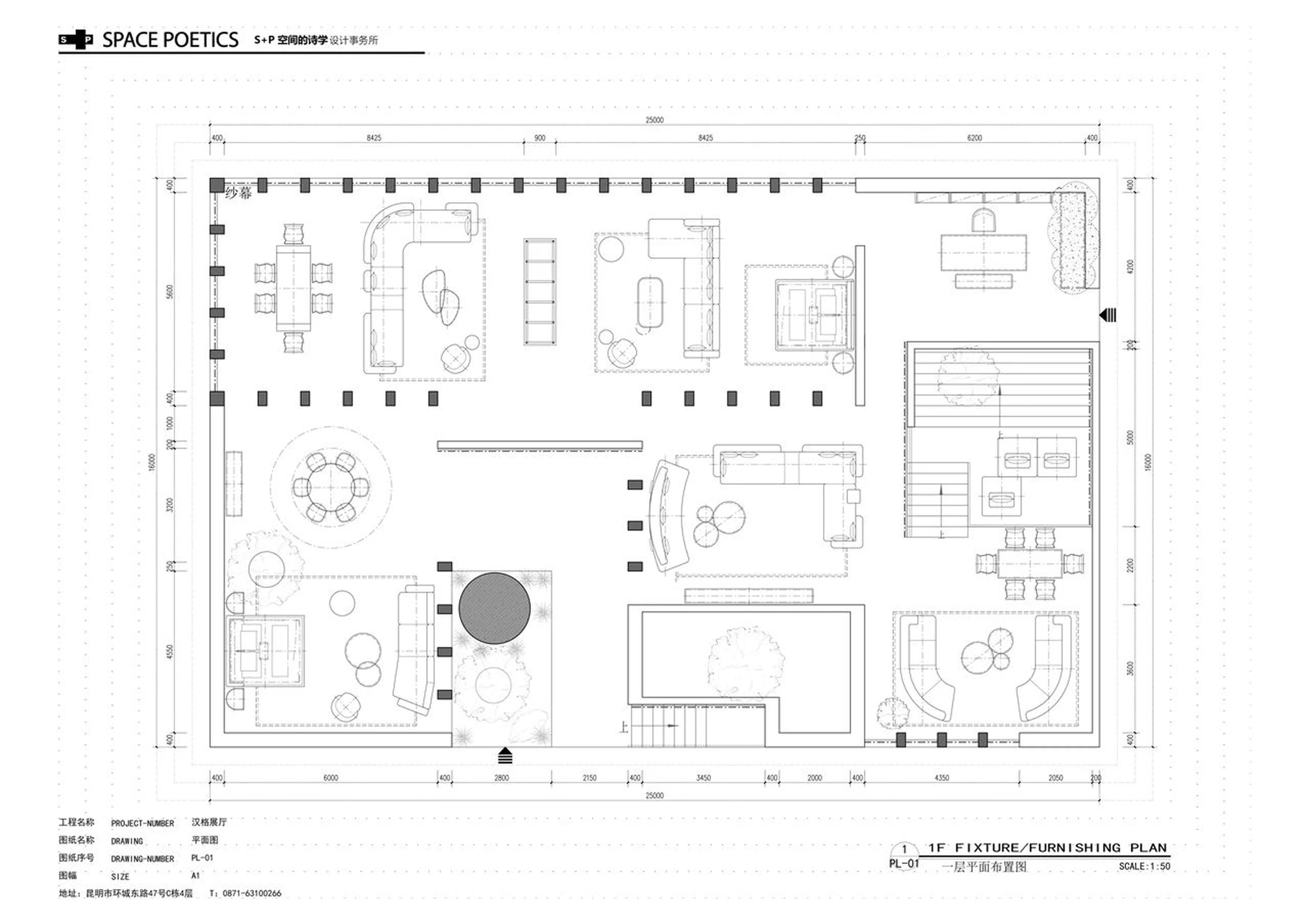
The Hanger exhibition hall deftly employs elements like symmetrical designs, staircases, and colonnades to break free from the confines of conventional exhibition hall layouts. The result is a space that exudes both solemnity and modernity. Visitors are not only exposed to high-quality furniture but also immerse themselves in a spiritual experience that transcends daily routines. Through the implementation of a symmetrical design, the designers created balance and harmony that provides a spiritual experience for the visitor. The symmetrical design includes colonnades which creates interesting views and perspectives that guide the visitor through the space. The colonnades act as a frame for the furniture and allow the visitor to experience the furniture in a new way. The columns provide a visual rhythm and help to define the space. tags: symmetrical design, colonnades, spatial organization, exhibition hall design, furniture display, retail space design, China
Temple Architecture’s Modern Interpretation
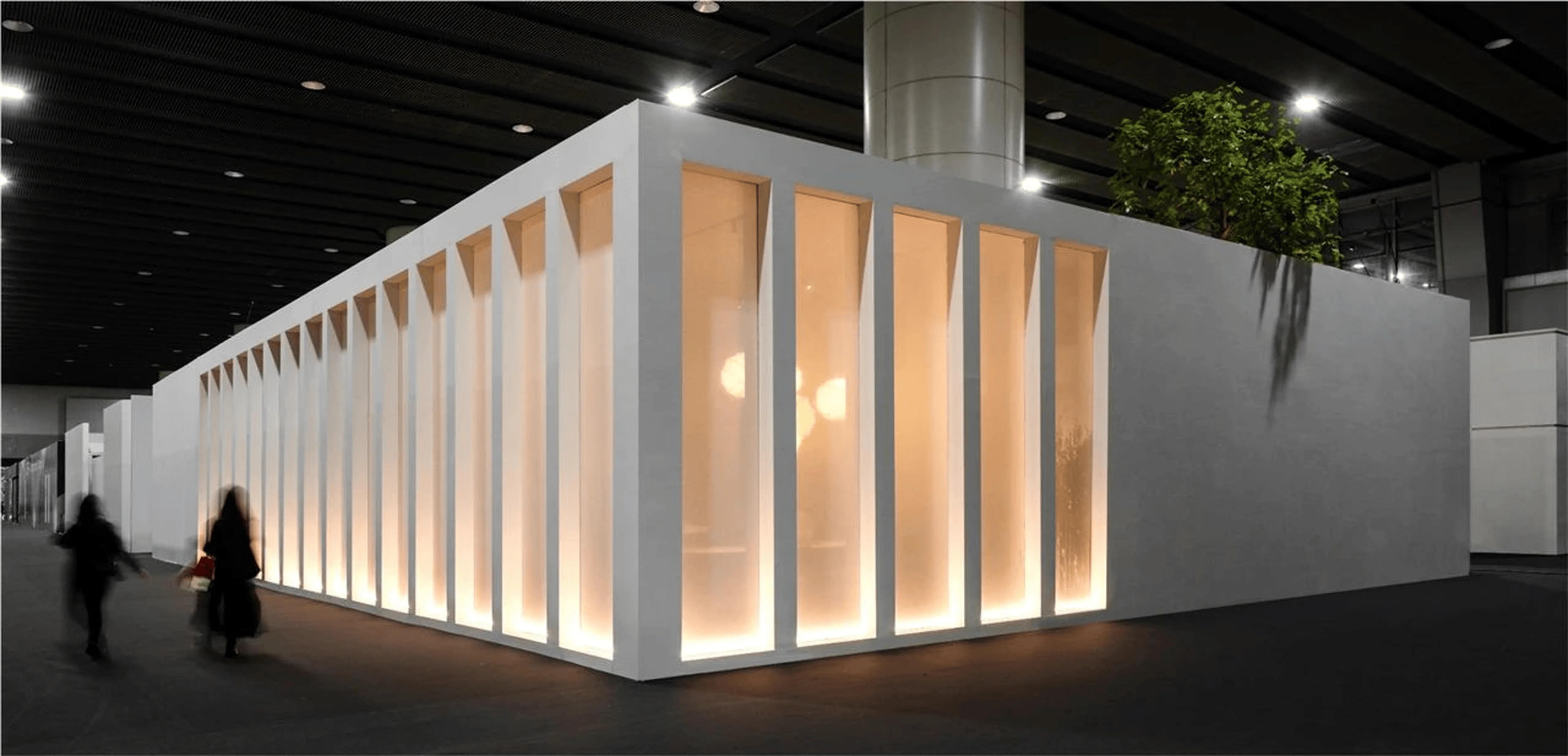
Temple architecture, as a building typology, boasts a unique narrative across diverse cultures and historical periods. Mies van der Rohe’s New National Gallery in Germany epitomizes this versatility, employing modern materials like steel and glass to craft a contemporary architectural marvel reminiscent of the Parthenon. The building’s minimalist aesthetic captures the elegance and finesse of modern architecture while simultaneously cultivating a serene, solemn atmosphere, echoing the majestic and mystical aura of ancient temples. The Hanger exhibition hall’s design, centered on the concepts of space and order, seamlessly integrates elements of nature and structure, representing a contemporary interpretation of traditional temple design principles. The modern architecture is inspired by ancient temples, which is reflected in the use of symmetrical designs, colonnades, and natural elements. tags: temple design, modern architecture, Mies van der Rohe, New National Gallery, Germany, retail space design, exhibition hall design, China
Structural Elements: Elevating Spatial Flow
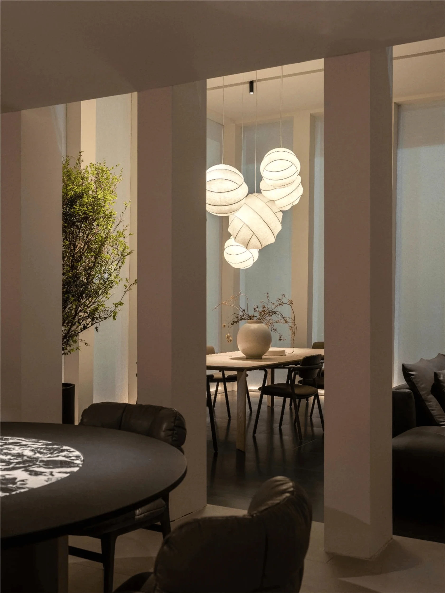
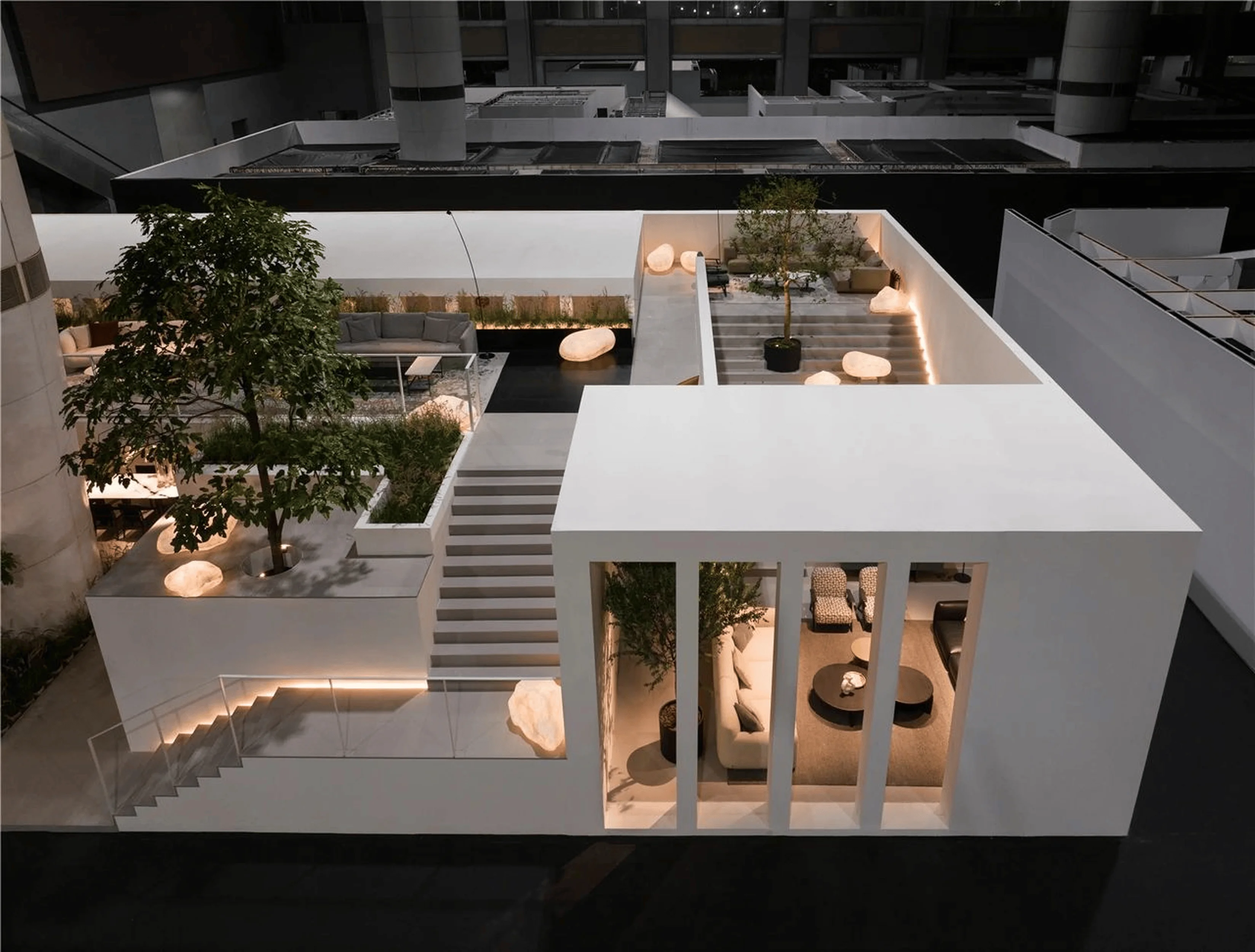
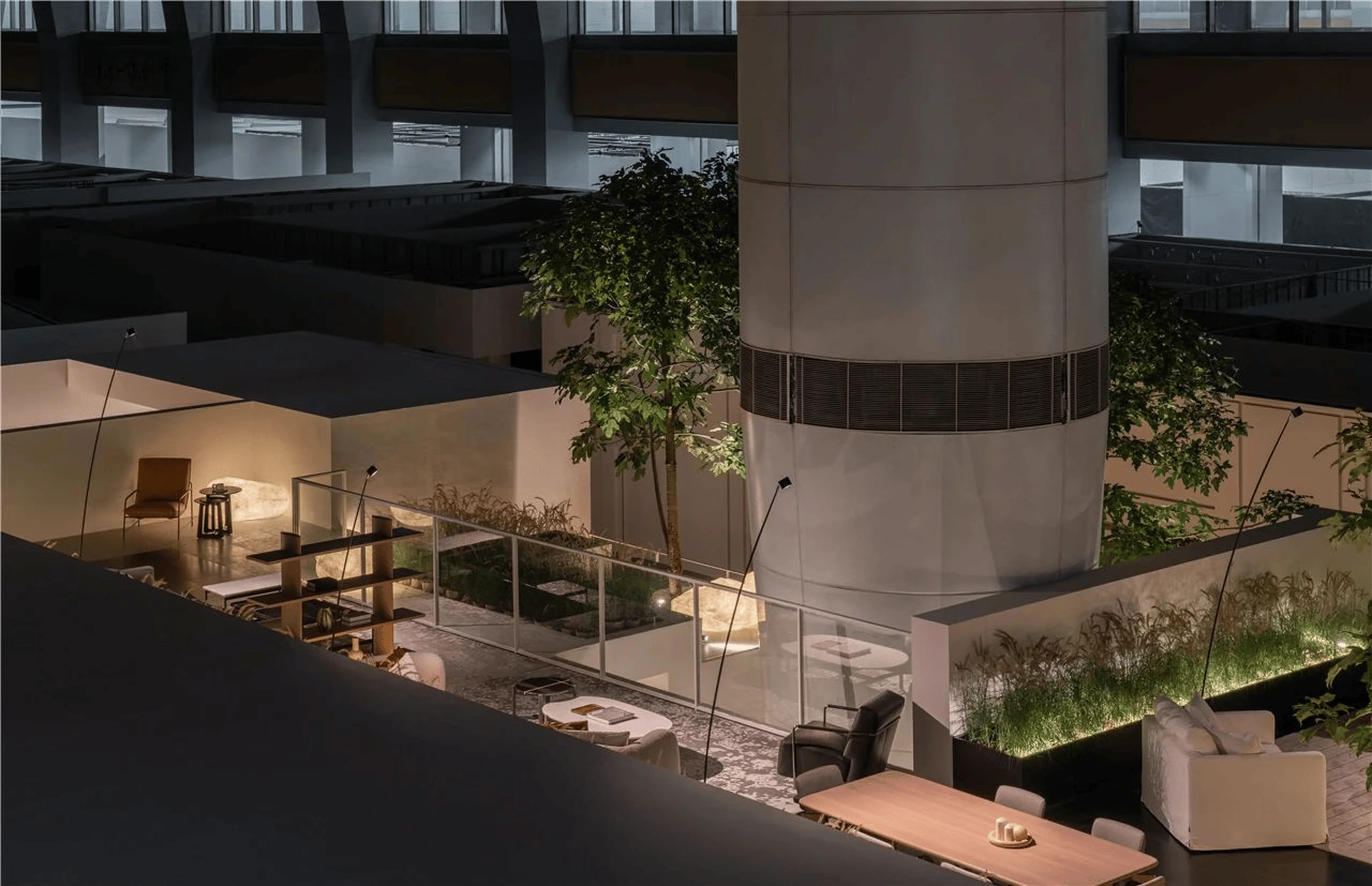
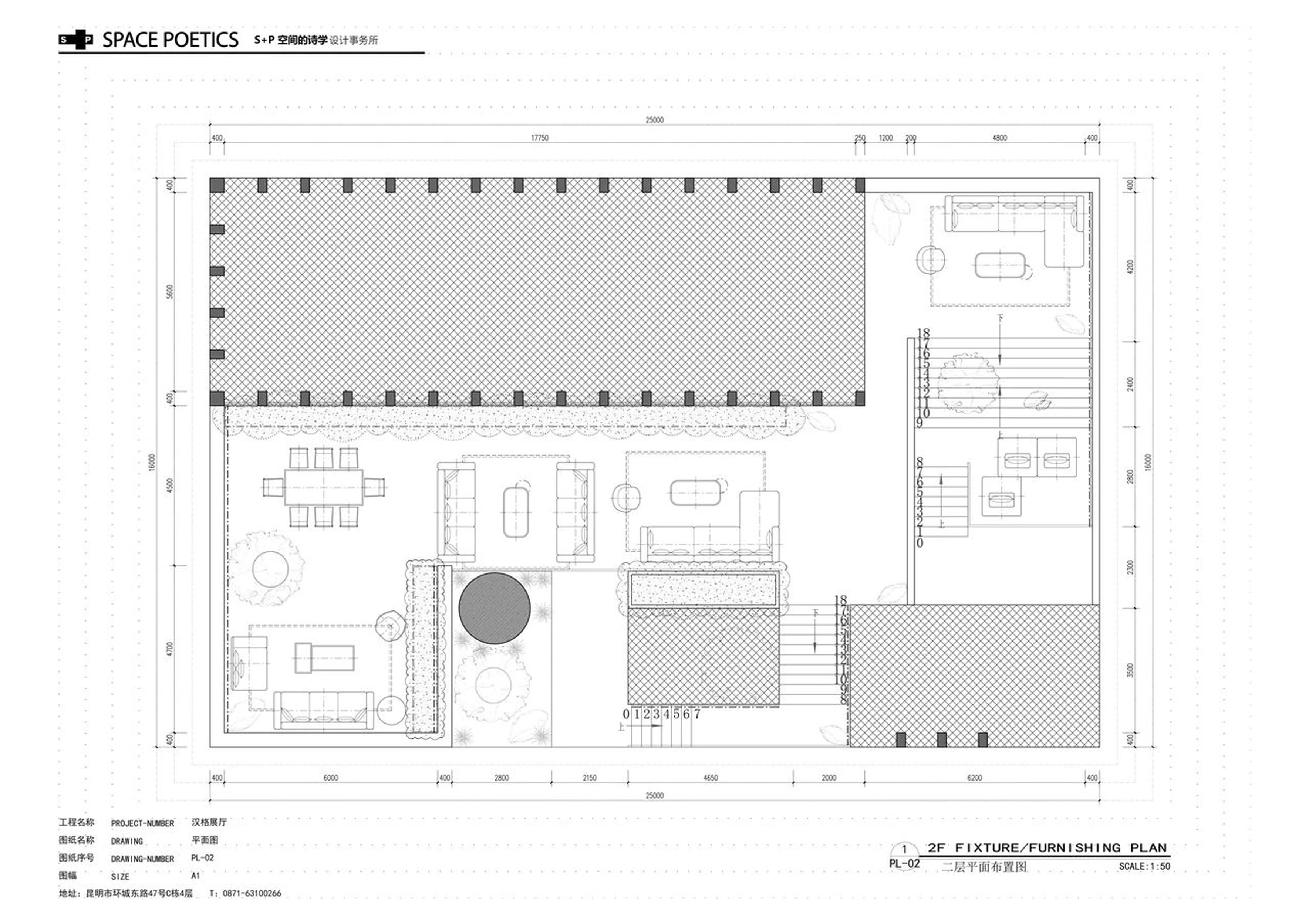
The exhibition hall’s design relies on 32 vertical columns to support its structure. This structural element cleverly reduces the prominence of the facade while significantly enhancing the flow between spaces. The overall structure of the space appears lighter and more transparent. This creates a feeling of grandeur and dignity, perfectly reinforcing the theme of space and order. The columns serve as visual markers that guide the visitor through the space, and also create a sense of rhythm and harmony. The columns create a variety of views and perspectives from different angles, allowing the visitor to experience the space in a new way. tags: spatial flow, vertical columns, structure, exhibition hall, architecture, retail space design, showroom design, China
Curated Experience: Blending Nature and Order
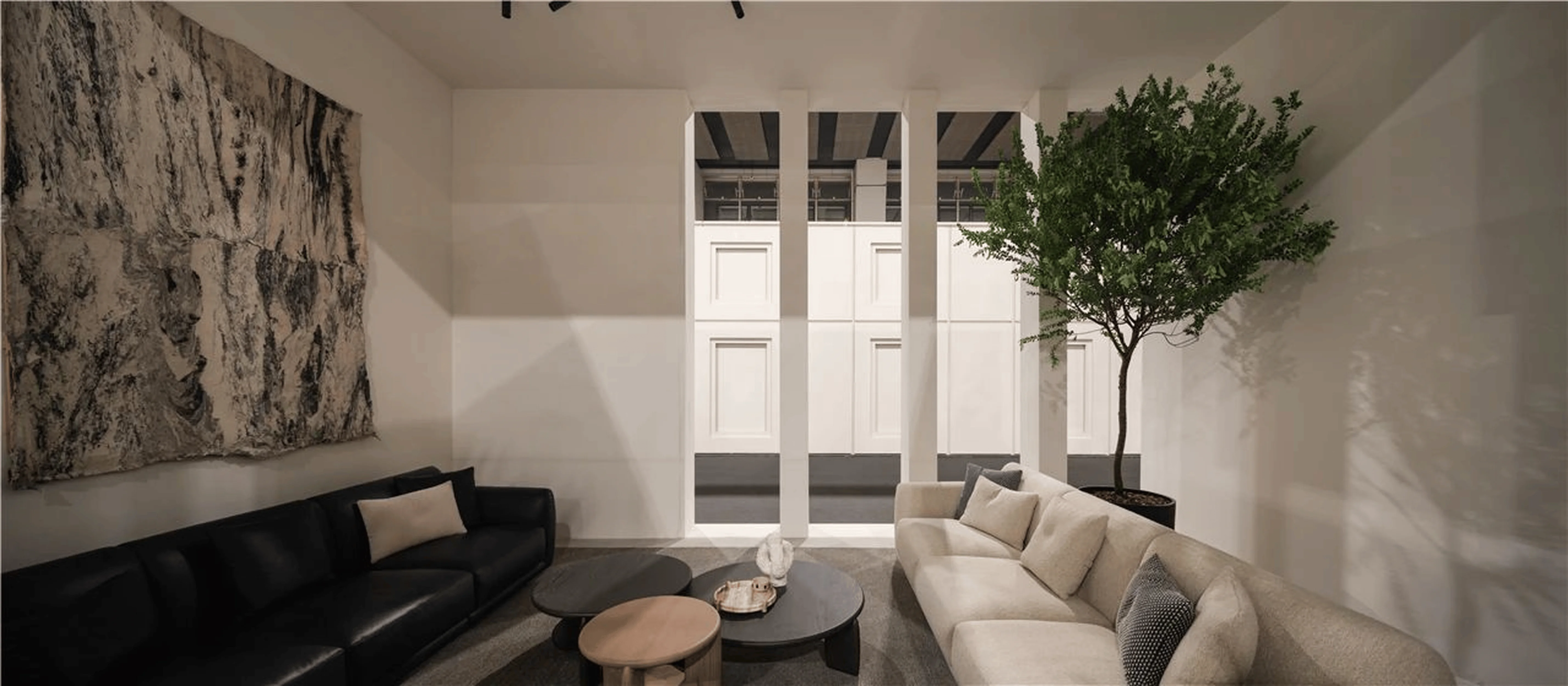
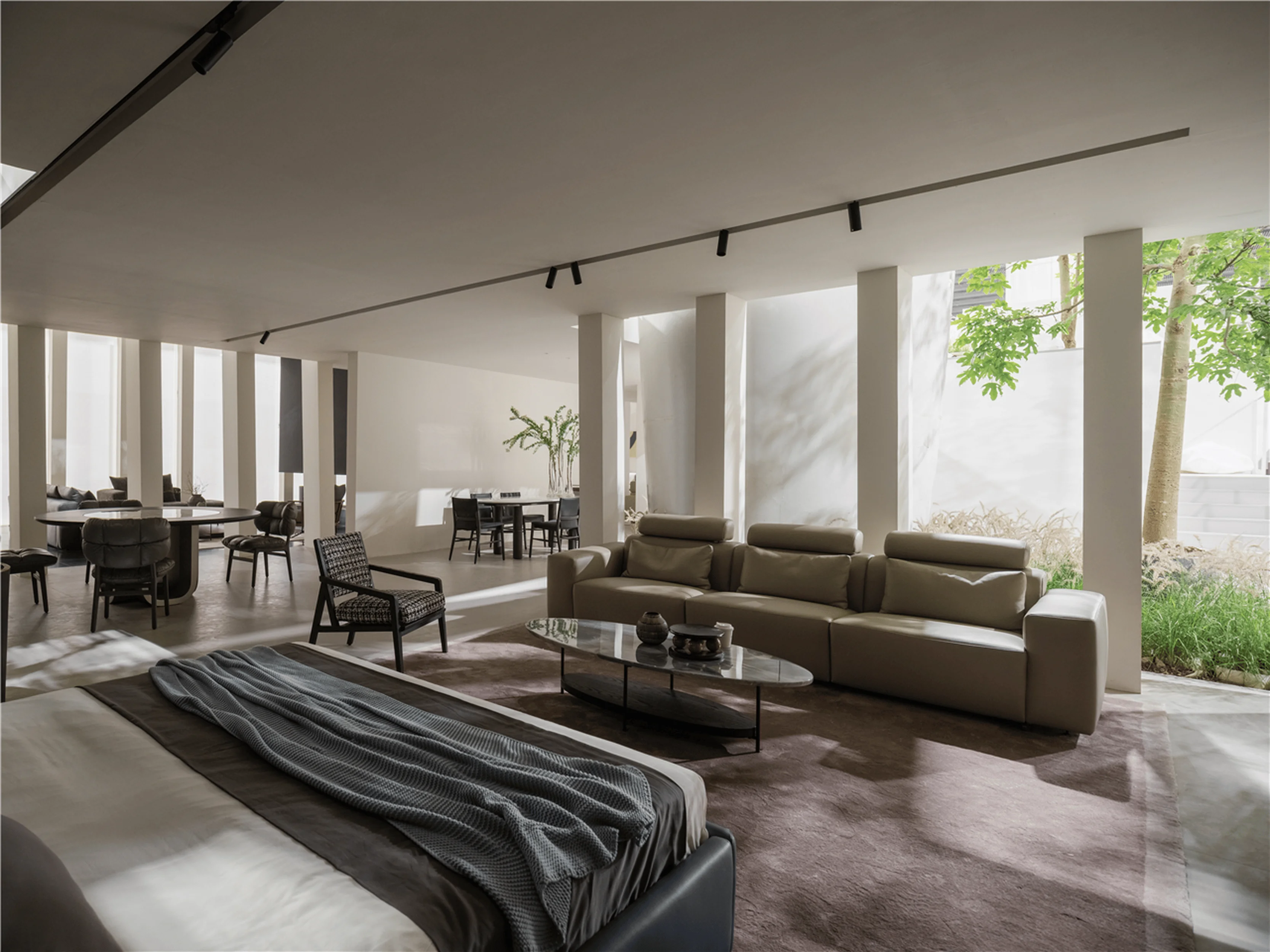
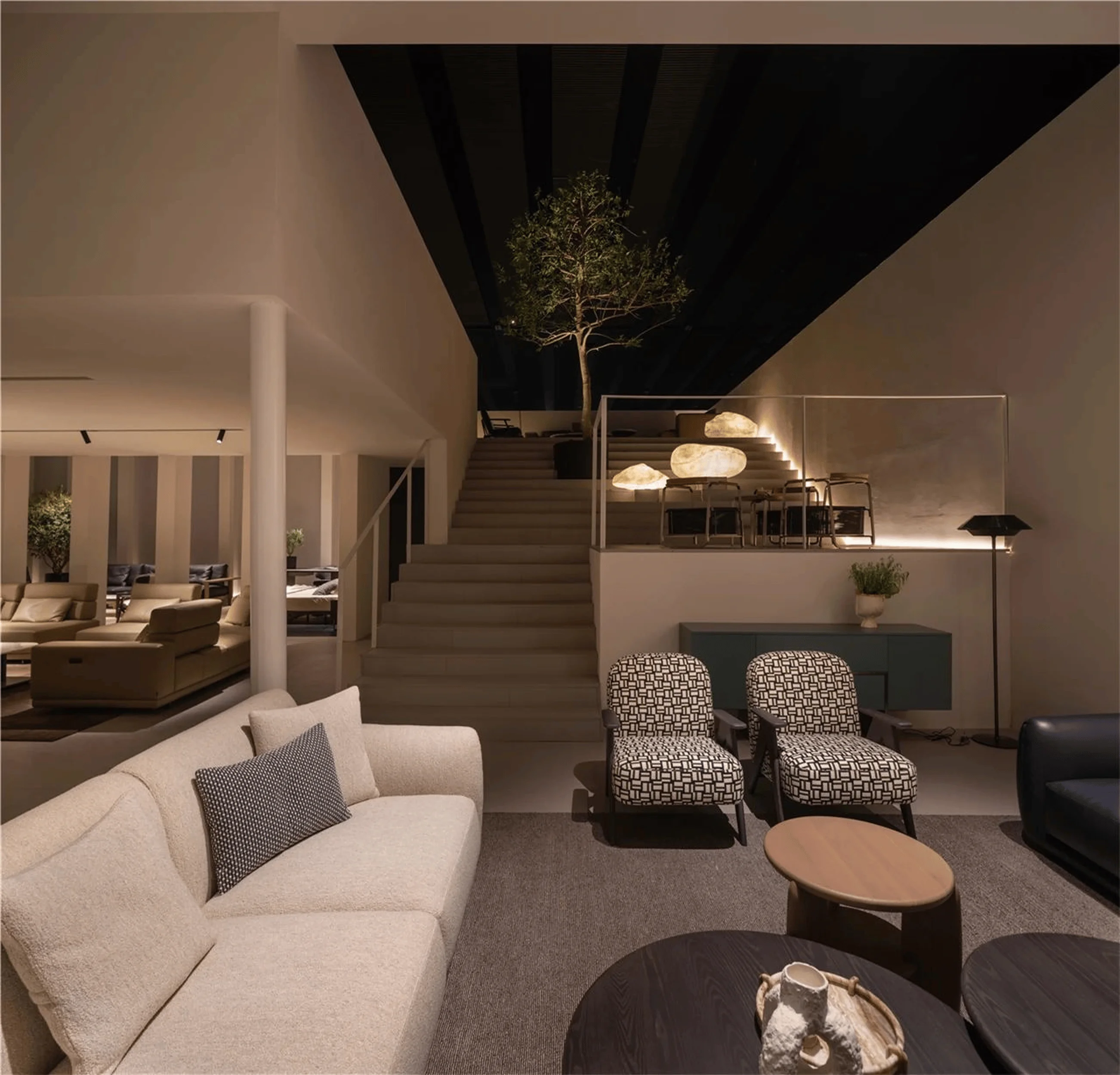
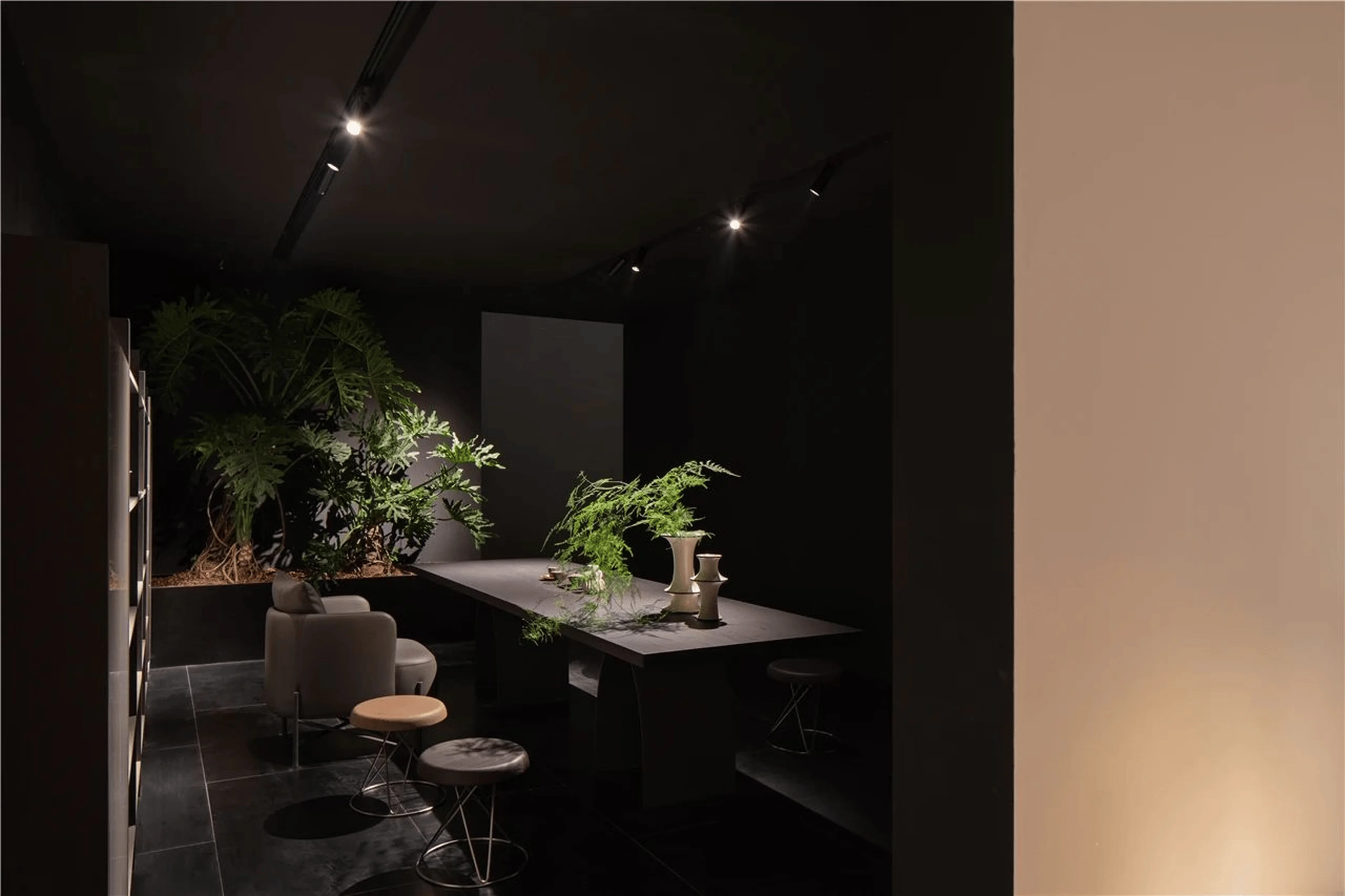
The Hanger exhibition hall showcases a harmonious balance of spatial layout and material choices, prioritizing a sense of order. Simultaneously, the design incorporates natural light and the strategic placement of greenery to infuse the space with life and natural elements. This approach transforms the exhibition hall into a work of art and provides an ideal backdrop for the furniture displays. Each piece of furniture is strategically showcased, allowing the full extent of its texture and aesthetic to shine. The natural light and greenery create a tranquil and inviting atmosphere, and also help to soften the hard lines of the architecture. tags: natural light, greenery, spatial layout, furniture display, retail design, exhibition hall design, China
Incorporating Nature: Courtyard and Roof Garden
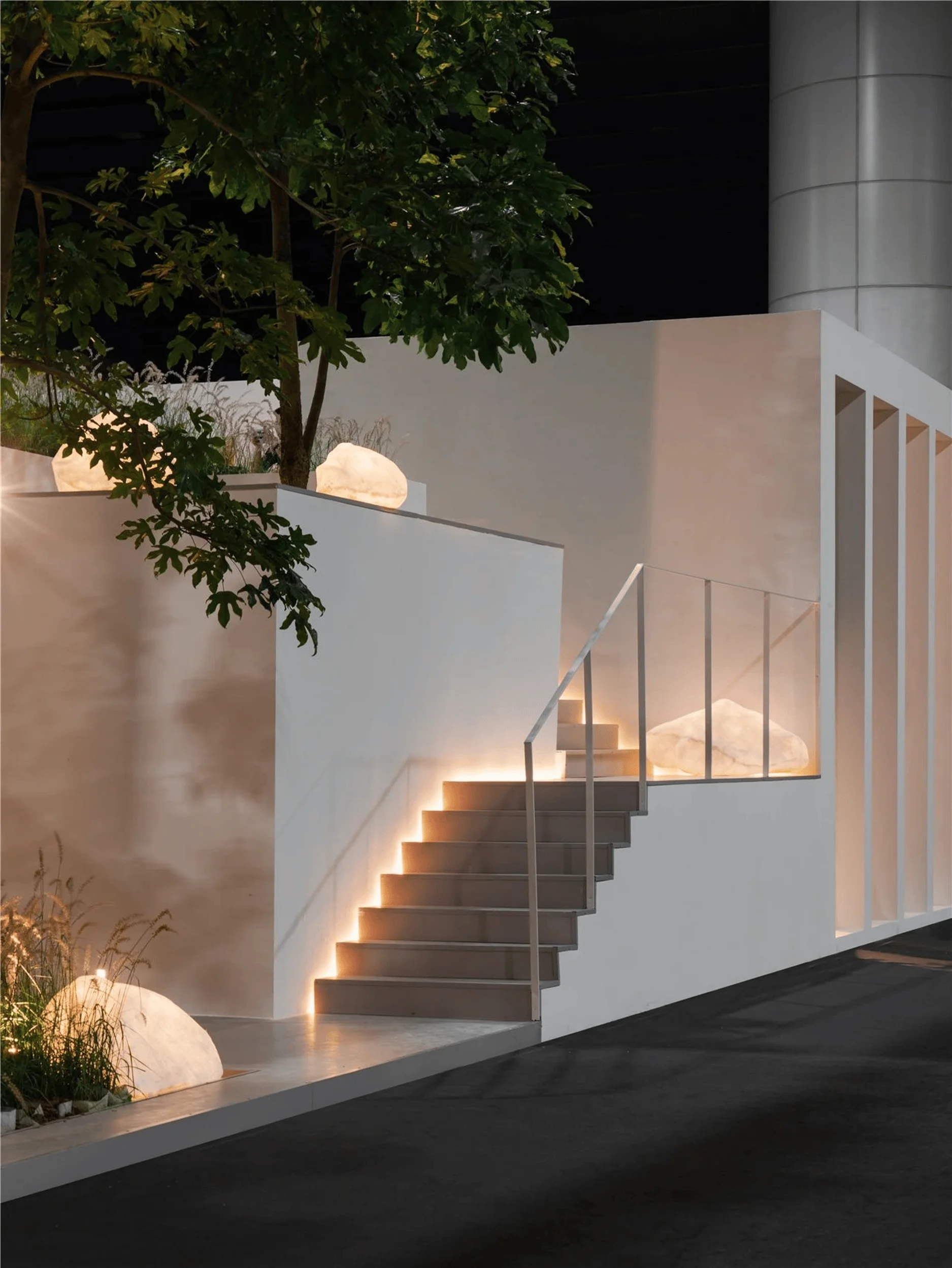
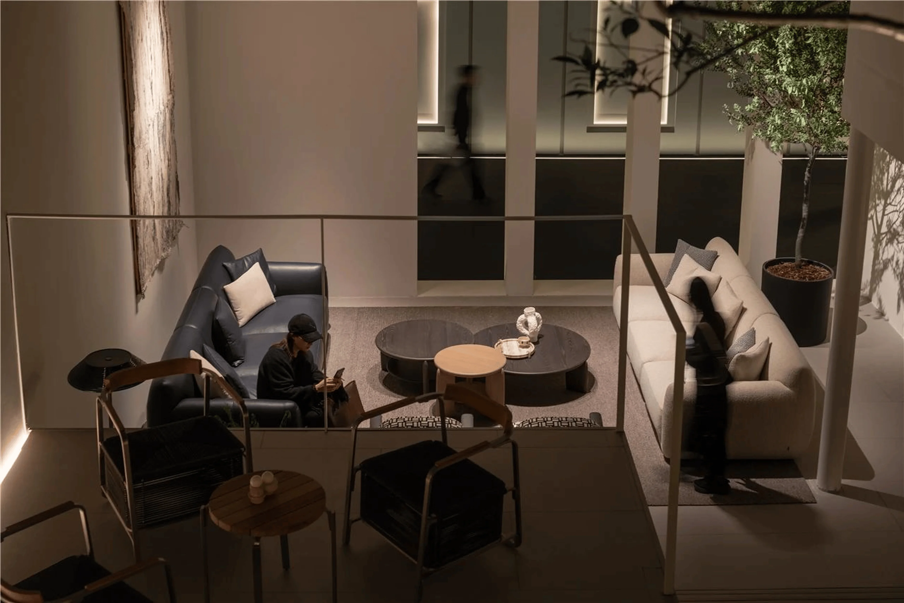
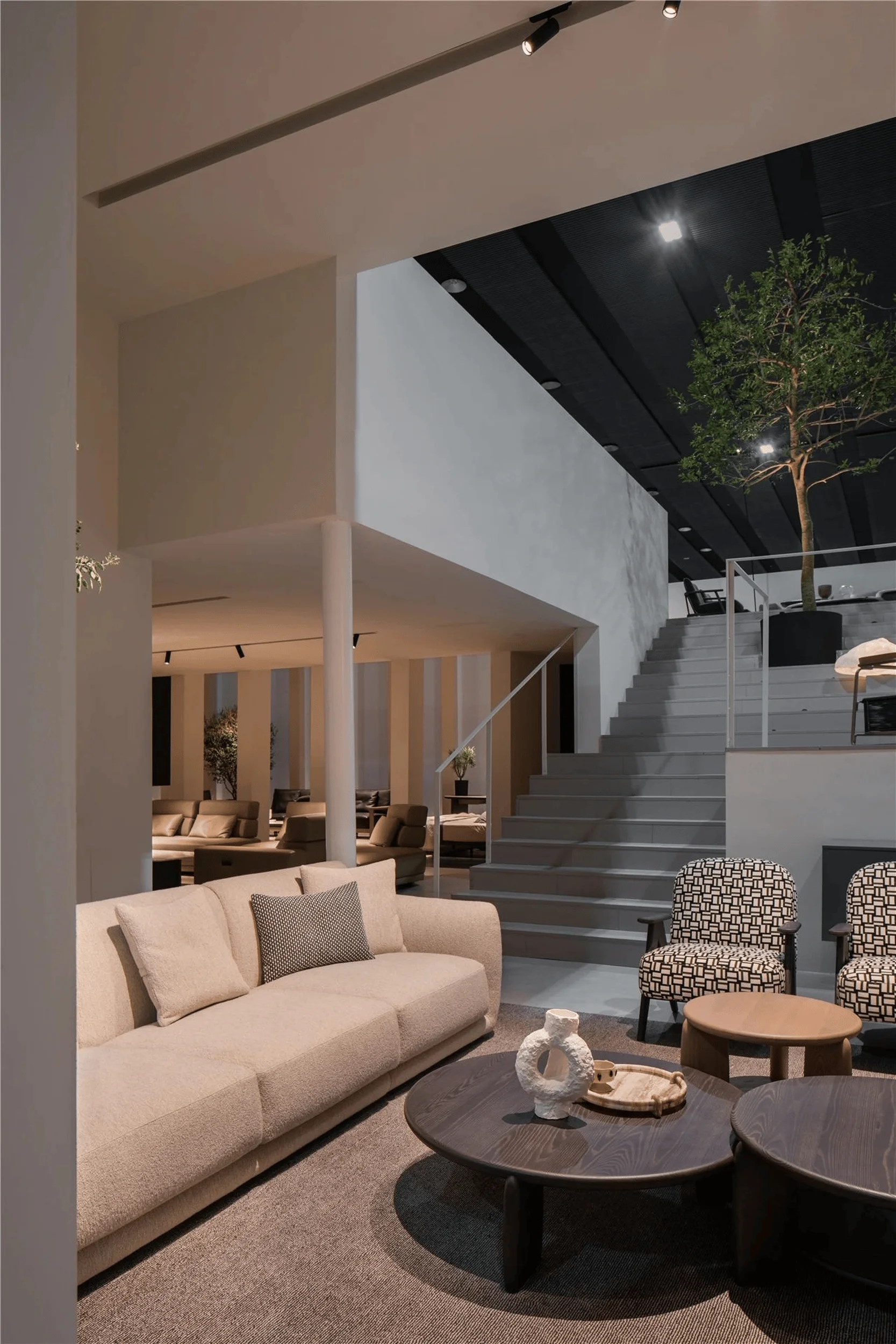
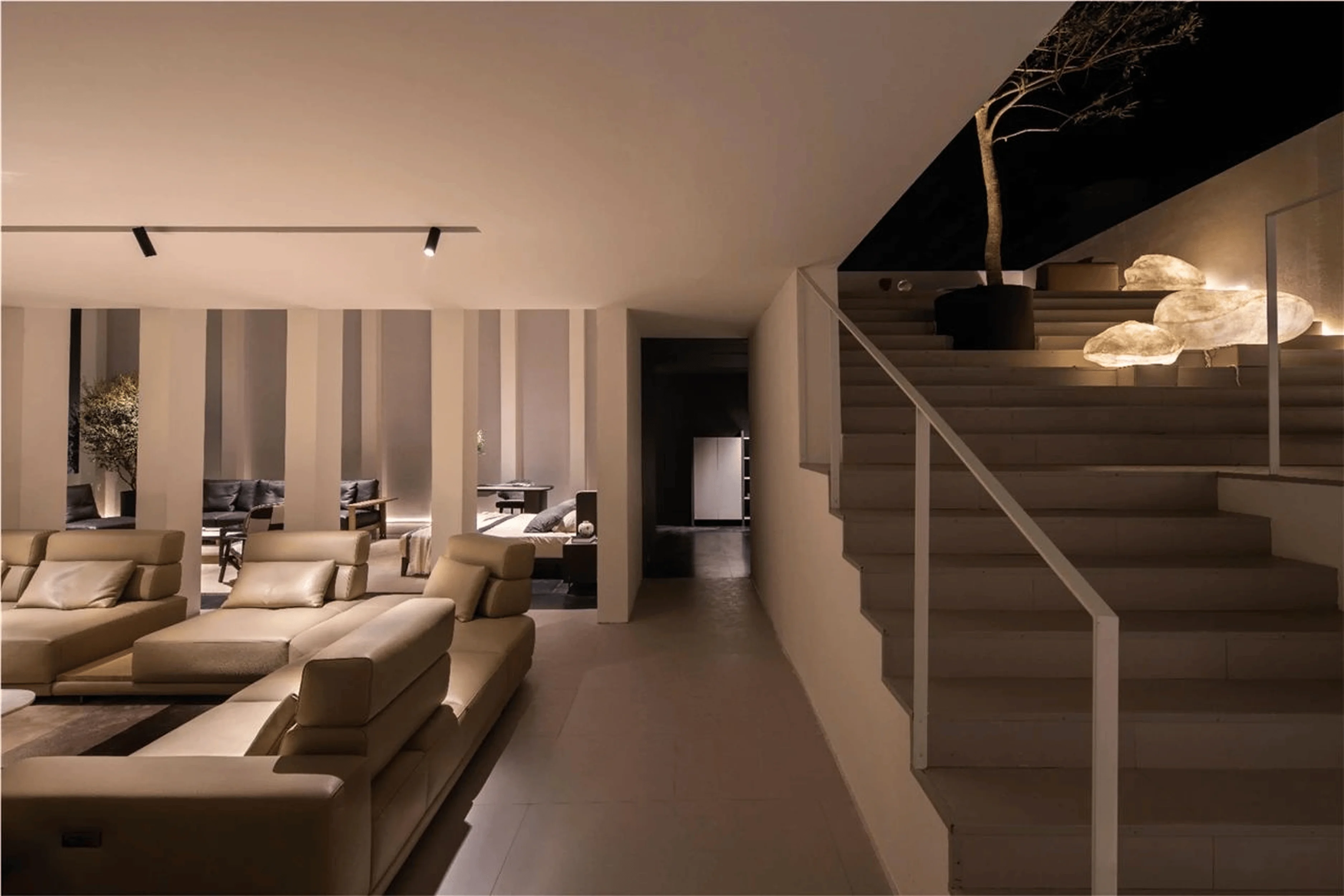
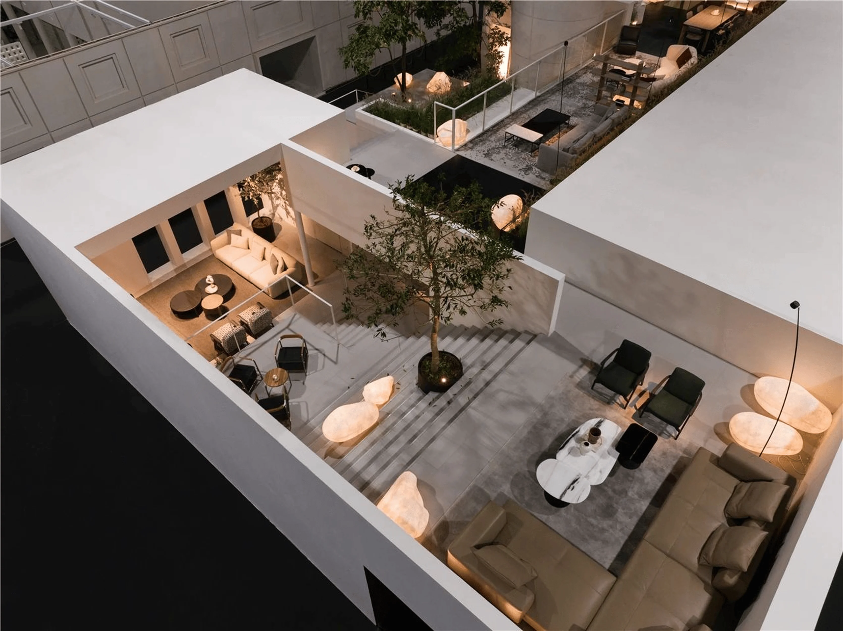
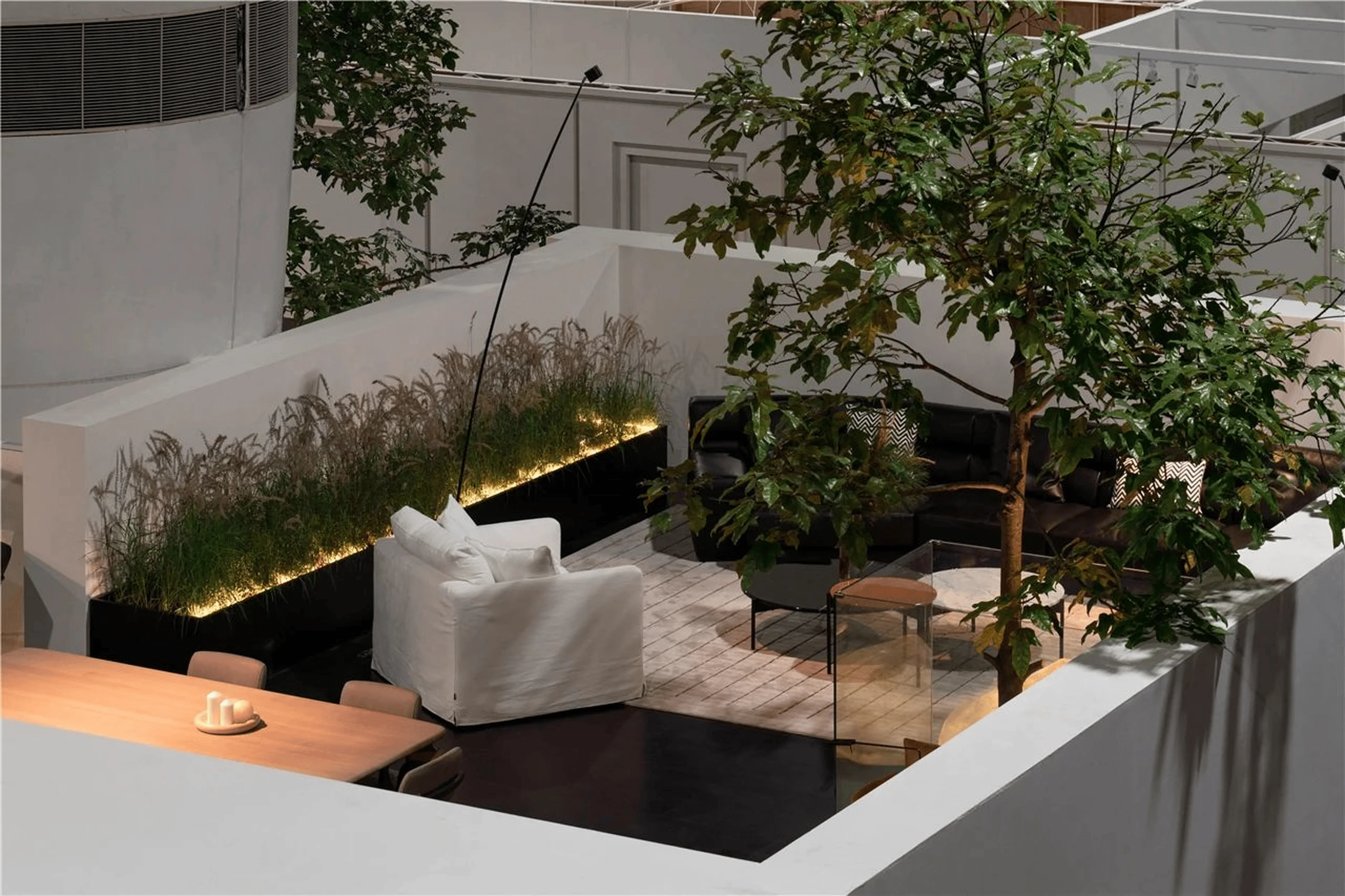
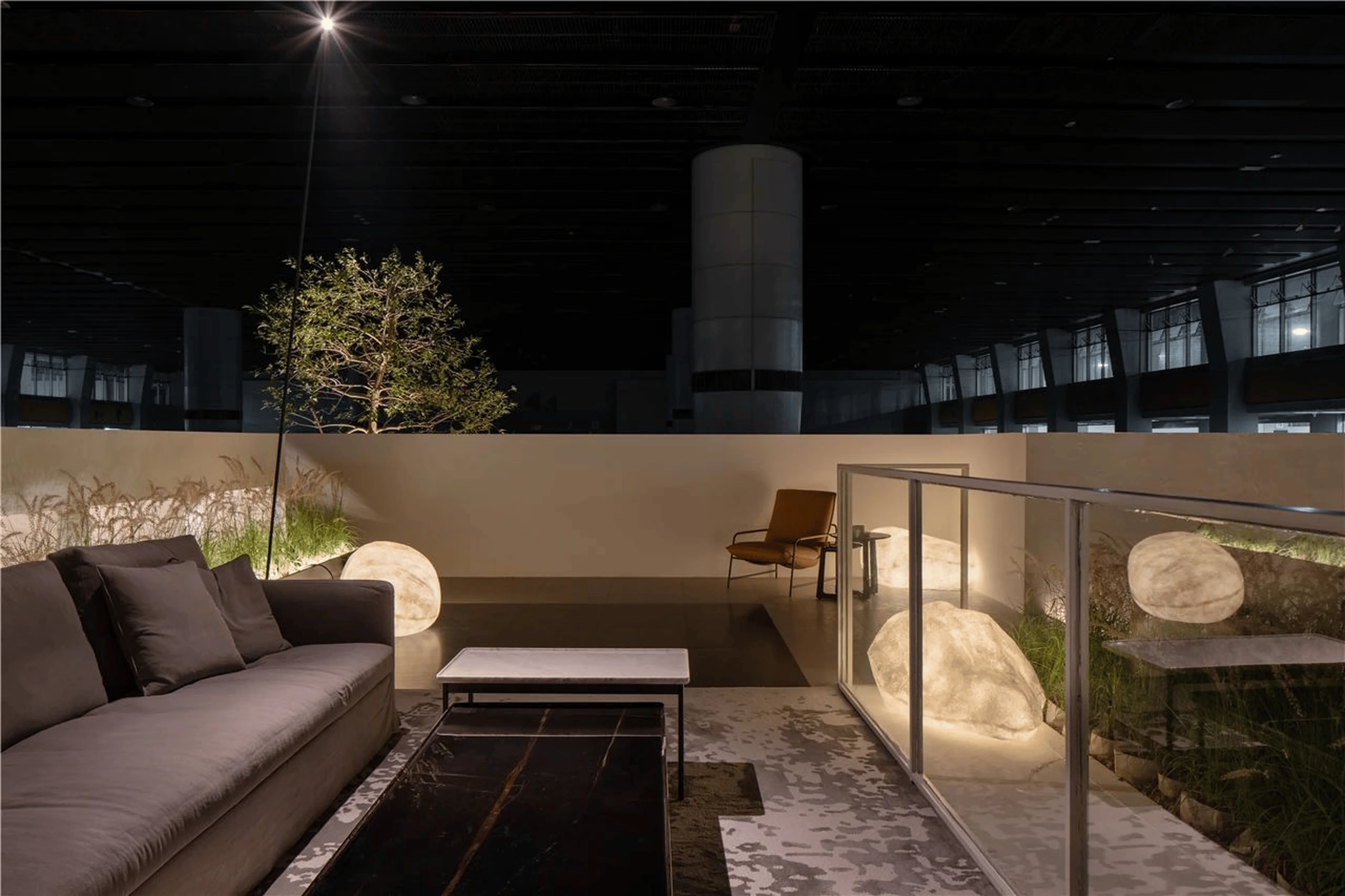
The Hanger exhibition hall’s design boldly integrates a natural courtyard within the structure, establishing a juxtaposition between nature and order. Four large trees, four groups of plants, and twelve stone lights combine to create a rich experience within the courtyard and roof garden. These elements are enhanced by the incorporation of staircases that create an undulating landscape throughout the space. The furniture is strategically placed to create a sense of flow and movement around the space. This is an example of biophilic design and it is becoming increasingly popular in the design community. The exhibition hall offers a unique and immersive experience for visitors to enjoy. tags: biophilic design, courtyard, roof garden, nature, order, furniture display, retail design, exhibition hall, China
Enhancing the Experience: Light, Shadow, and Stone
The four large trees serve as a focal point before visitors enter the main exhibition space and add to the appeal of the exhibition hall. The vibrant greenery immediately draws the attention of visitors, providing a natural feel to the space. The trees also act as a visual anchor for the space, creating a sense of calm and serenity. The inclusion of illuminated stones introduces a touch of mystery and wonder. Their strategic placement throughout the space, on the stairs and the rooftop, seems to guide visitors on their journey through the exhibition. These stones add a playful element to the experience and transform the path from a routine experience into an adventure. tags: light, shadow, stone, biophilic design, natural element, experiential design, retail design, exhibition hall, China
Creating Atmosphere: Light and Shadow
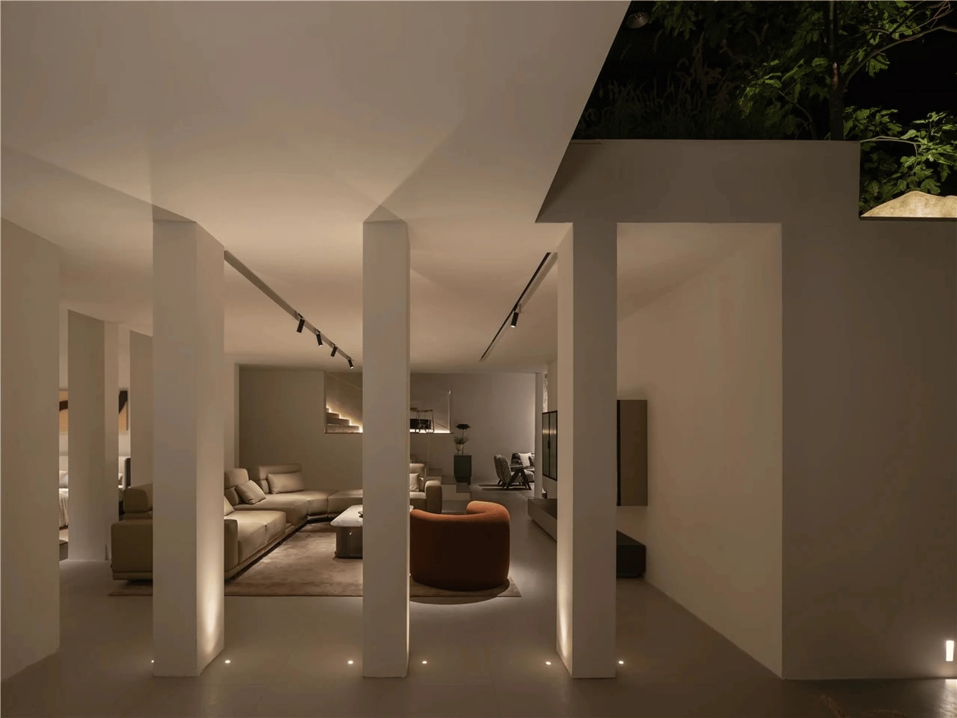
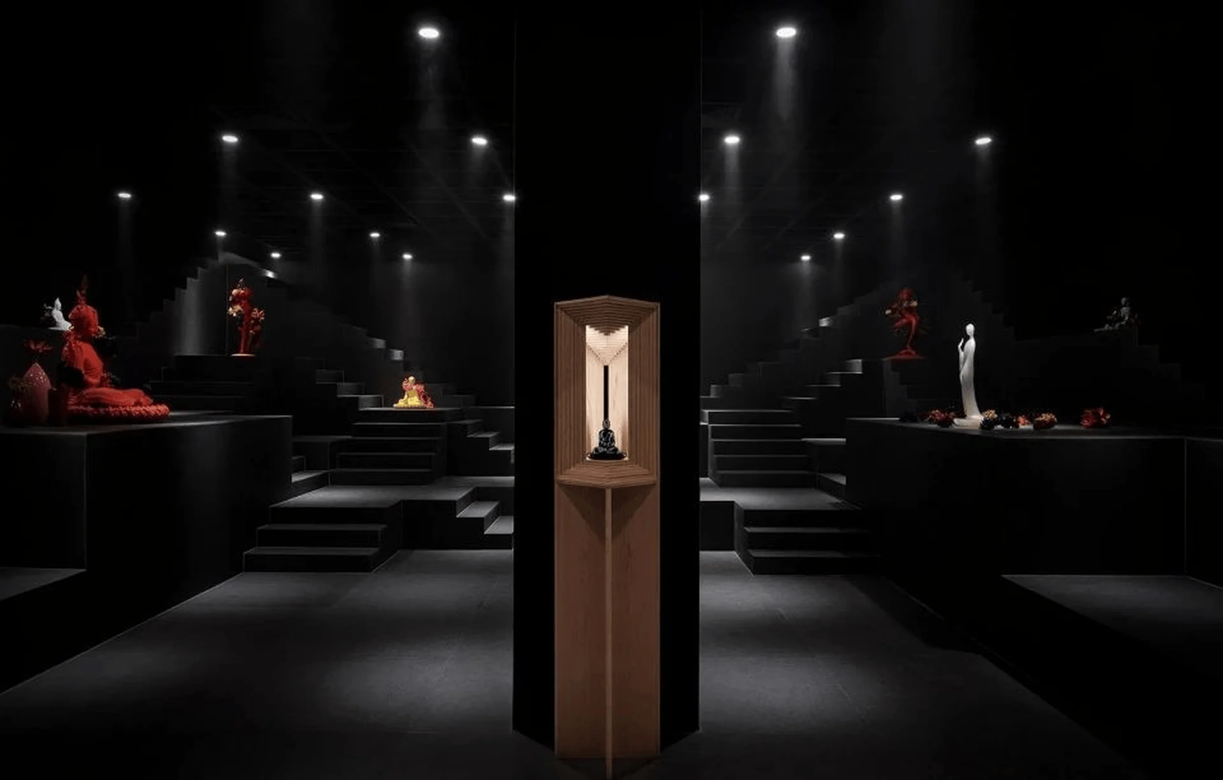
The play of light and shadow within the Hanger exhibition hall generates a unique ambiance. The interplay of bright and dark areas creates a sense of mystery and depth in the space, encouraging visitors to explore further. By deviating from conventional lighting techniques that are commonly used in residential interiors, the designers shift the light source from the ceiling to the ground. They use artificial lighting to create a sense of dawn or dusk light, further adding to the mysterious atmosphere of the space. The lighting design uses a variety of techniques, including spotlights, ambient lighting, and accent lighting. tags: light, shadow, retail design, showroom design, lighting design, exhibition hall design, China
The Synthesis of Design and Life
The Hanger exhibition hall masterfully integrates spatial order with natural elements, creating a harmonious experience that transcends daily life. The interplay of light, the guiding presence of colonnades, and the careful integration of plants and luminous stones collectively evoke a sense of wonder, akin to being immersed in a dreamlike realm. The space transcends its role as a mere furniture display and becomes a nexus where design and everyday life intertwine. The exhibition hall is an example of how design can be used to create an immersive experience that is both functional and aesthetically pleasing. The visitor can experience the space and the furniture in a new way. tags: design, life, order, nature, furniture display, exhibition hall, retail space, China
Project Information:
Project Type: Experience Center
Architect: S+P Space Poetics Design
Area: 650㎡
Year: March 2024
Country: China
Photographer: Wang Ce
Brand: Hanger


