Hennesa Screen Showroom in Chengdu showcases minimalist interior design, highlighting the brand’s European craftsmanship and high-end customized screen doors.
Contents
Embracing Minimalist Interior Design Principles
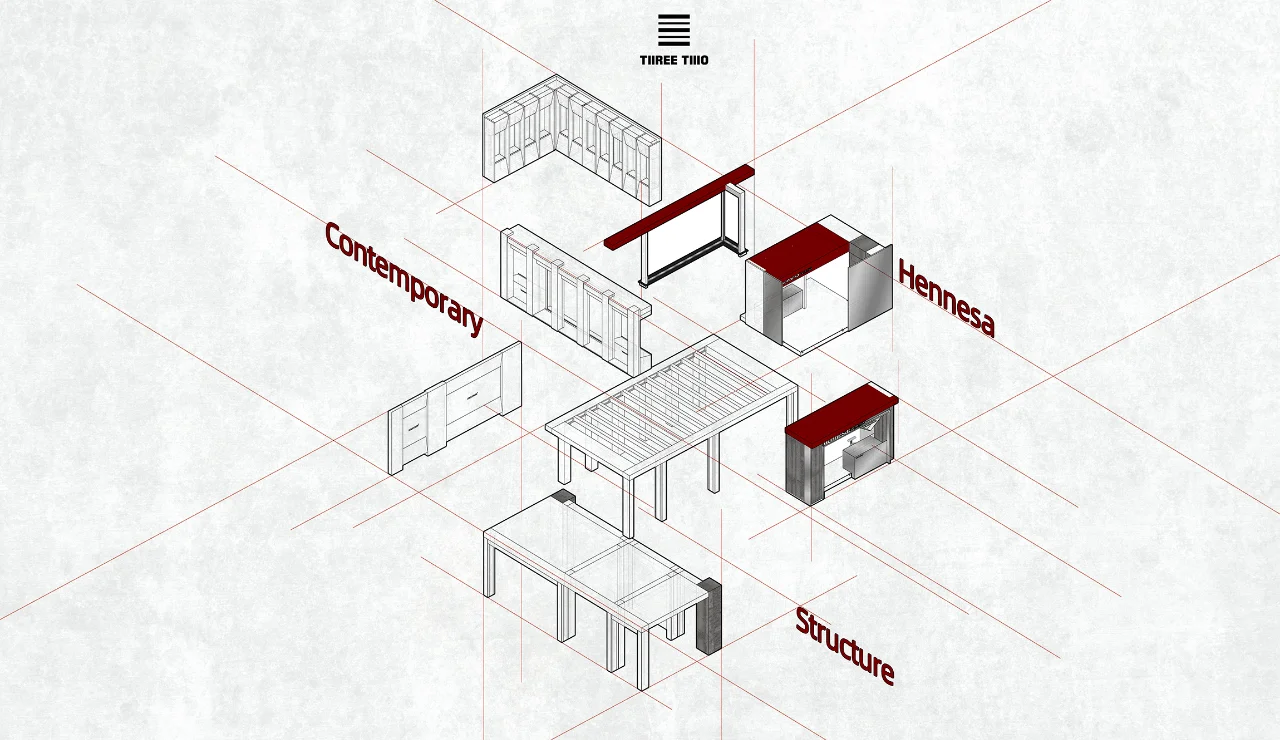
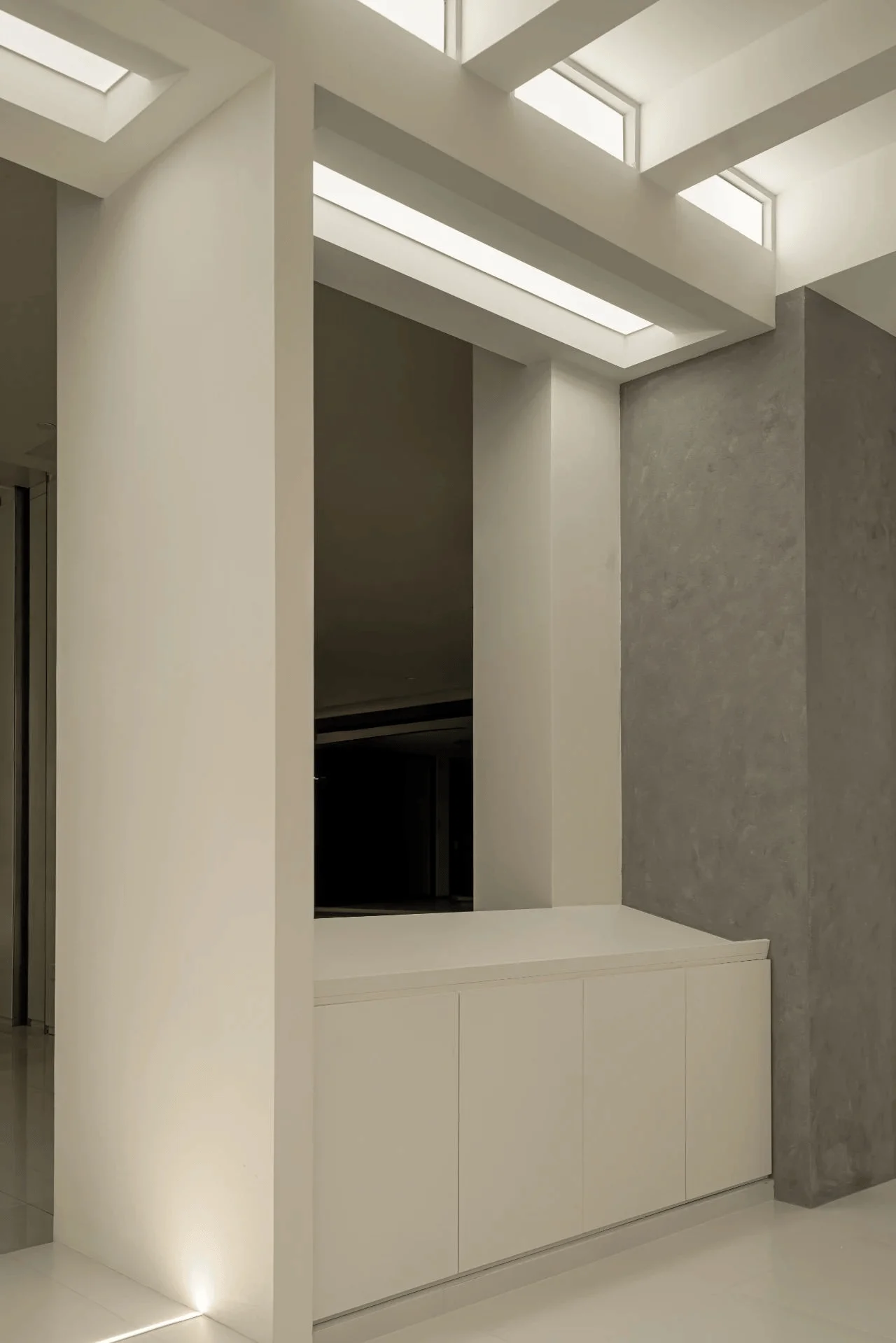
The Hennesa Screen Showroom, located in Chengdu, China, is a testament to the power of minimalist interior design. Designed by Three Two Design, the showroom embodies the brand’s commitment to high-end customized screen doors. The space is characterized by clean lines, a restrained color palette, and a focus on functionality, creating a serene and sophisticated atmosphere that allows the products to take center stage. The design team skillfully utilized architectural language to express the brand’s tonality, resulting in a rational and engaging space that seamlessly blends aesthetics and practicality.
Entrance Design and Spatial Experience
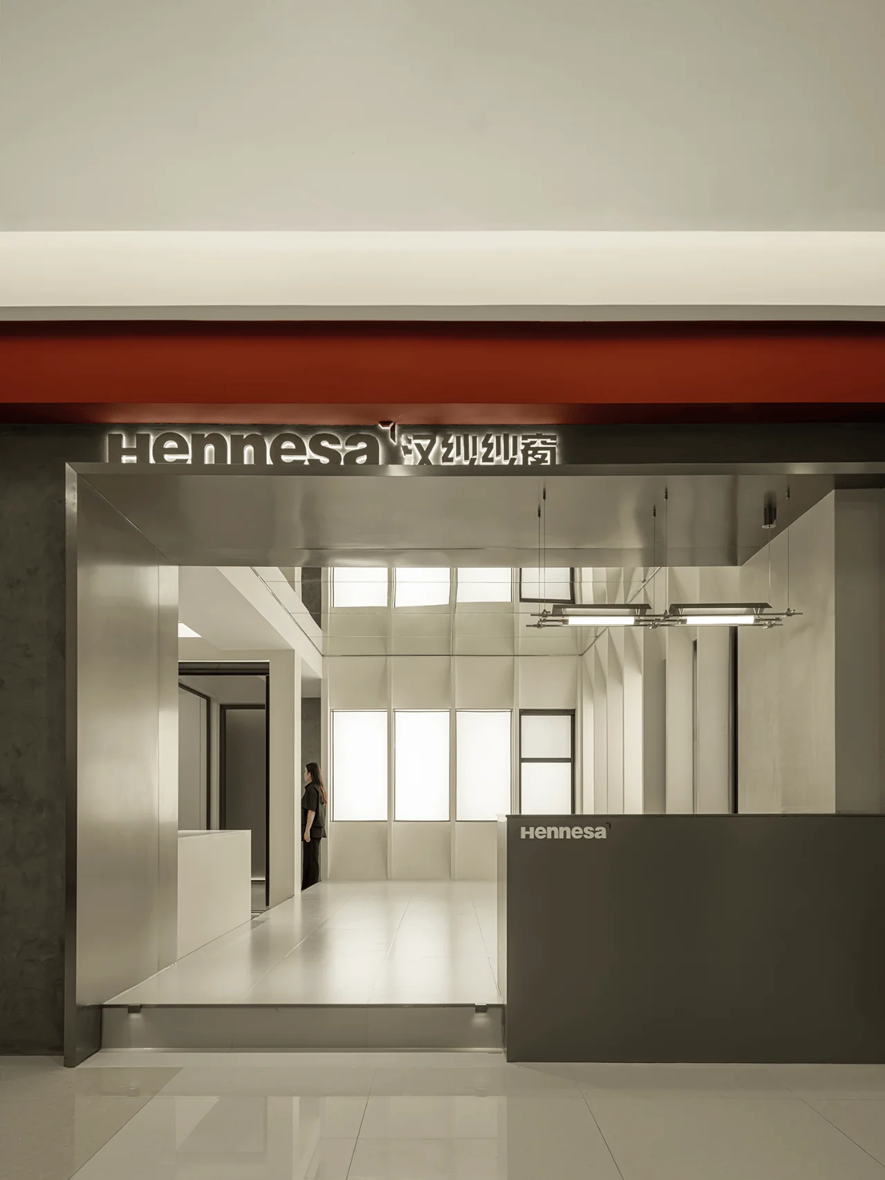
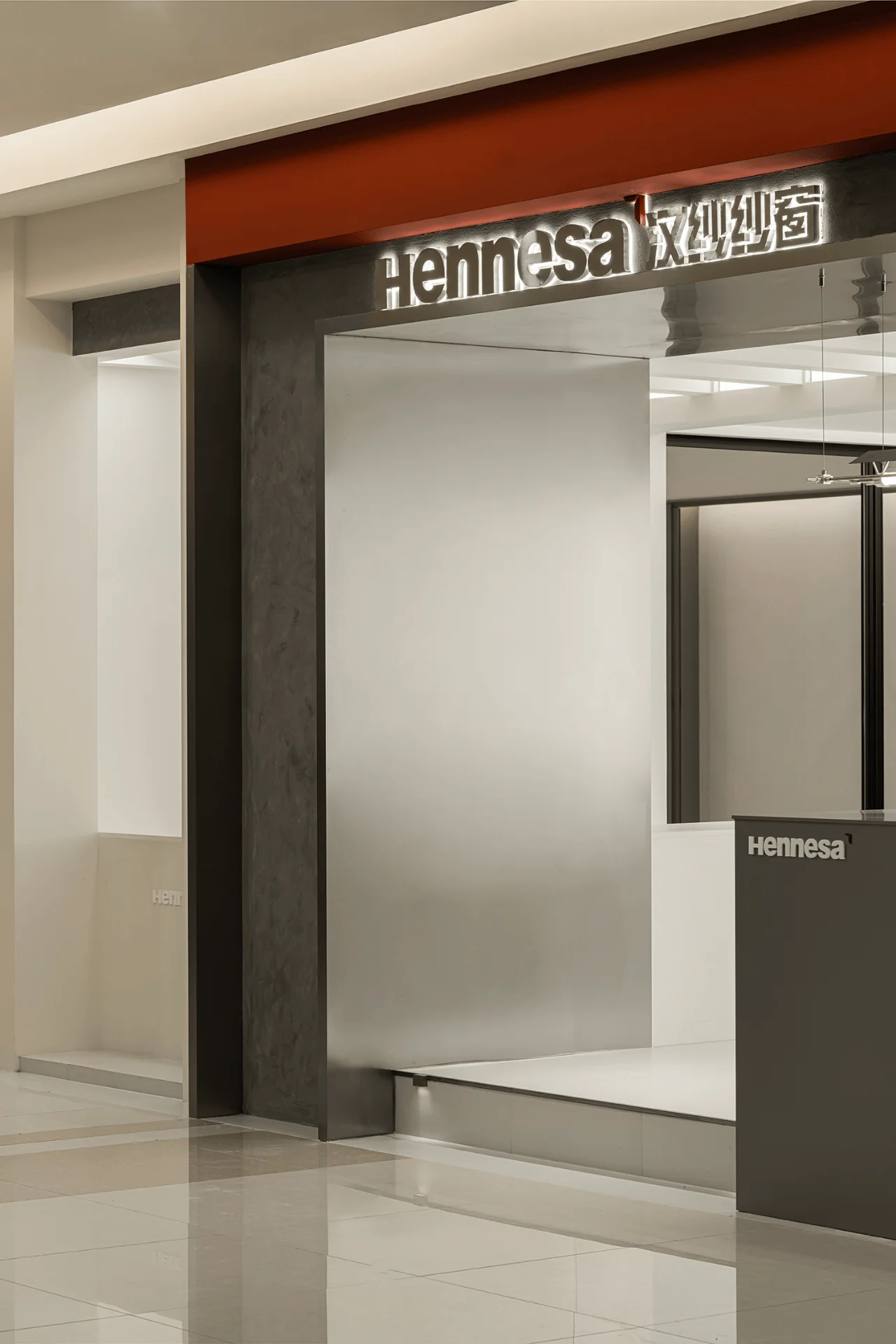
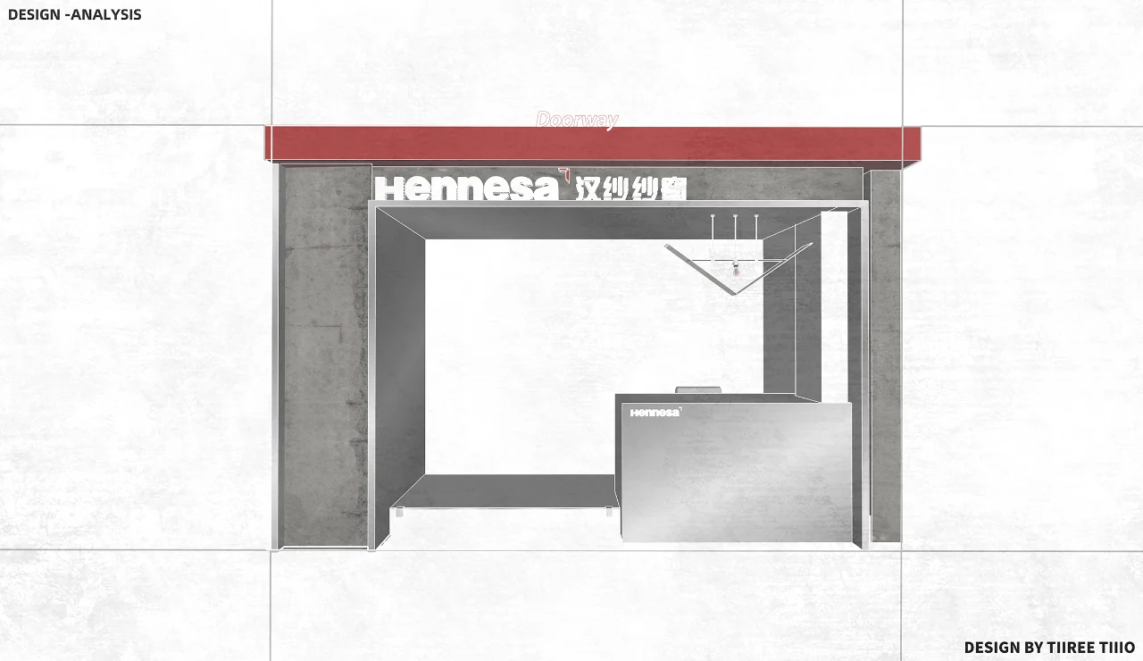
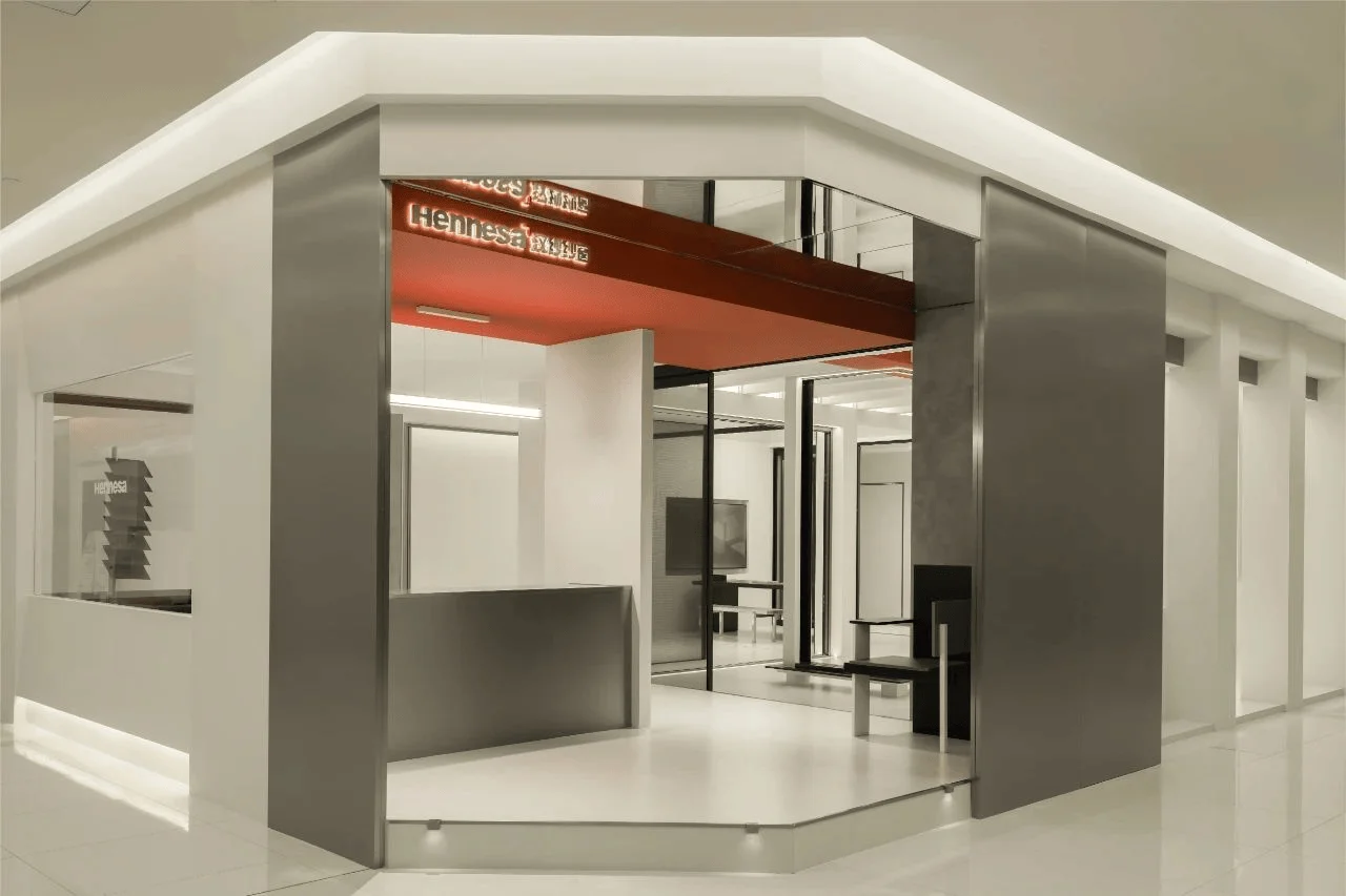
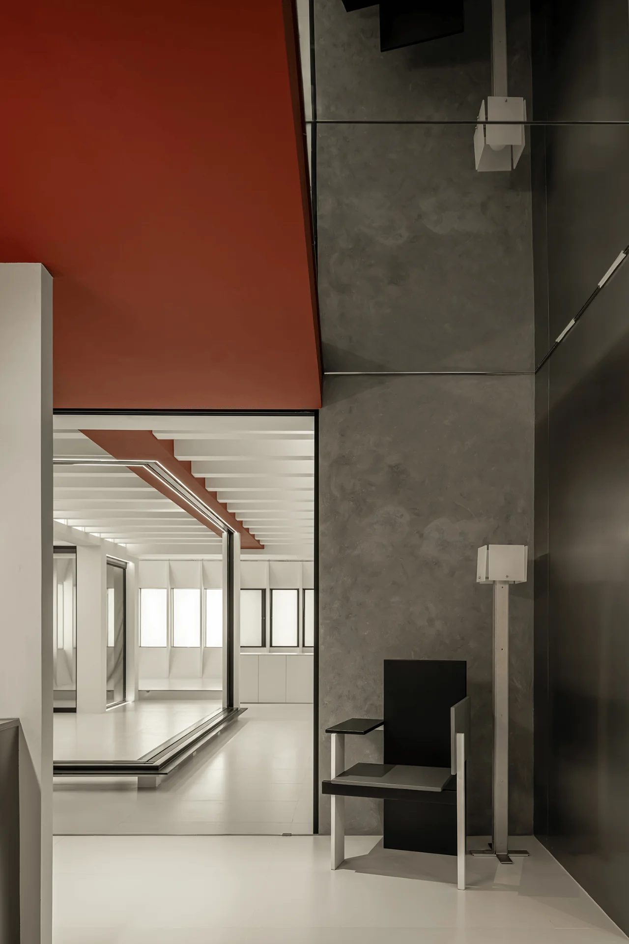
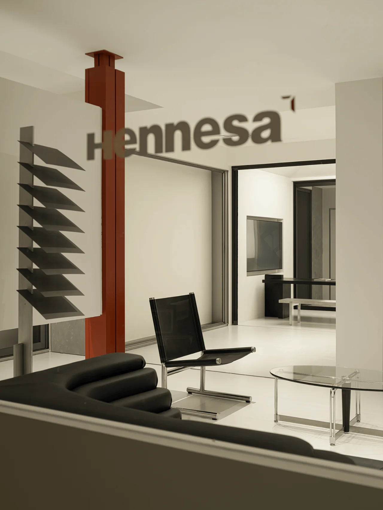
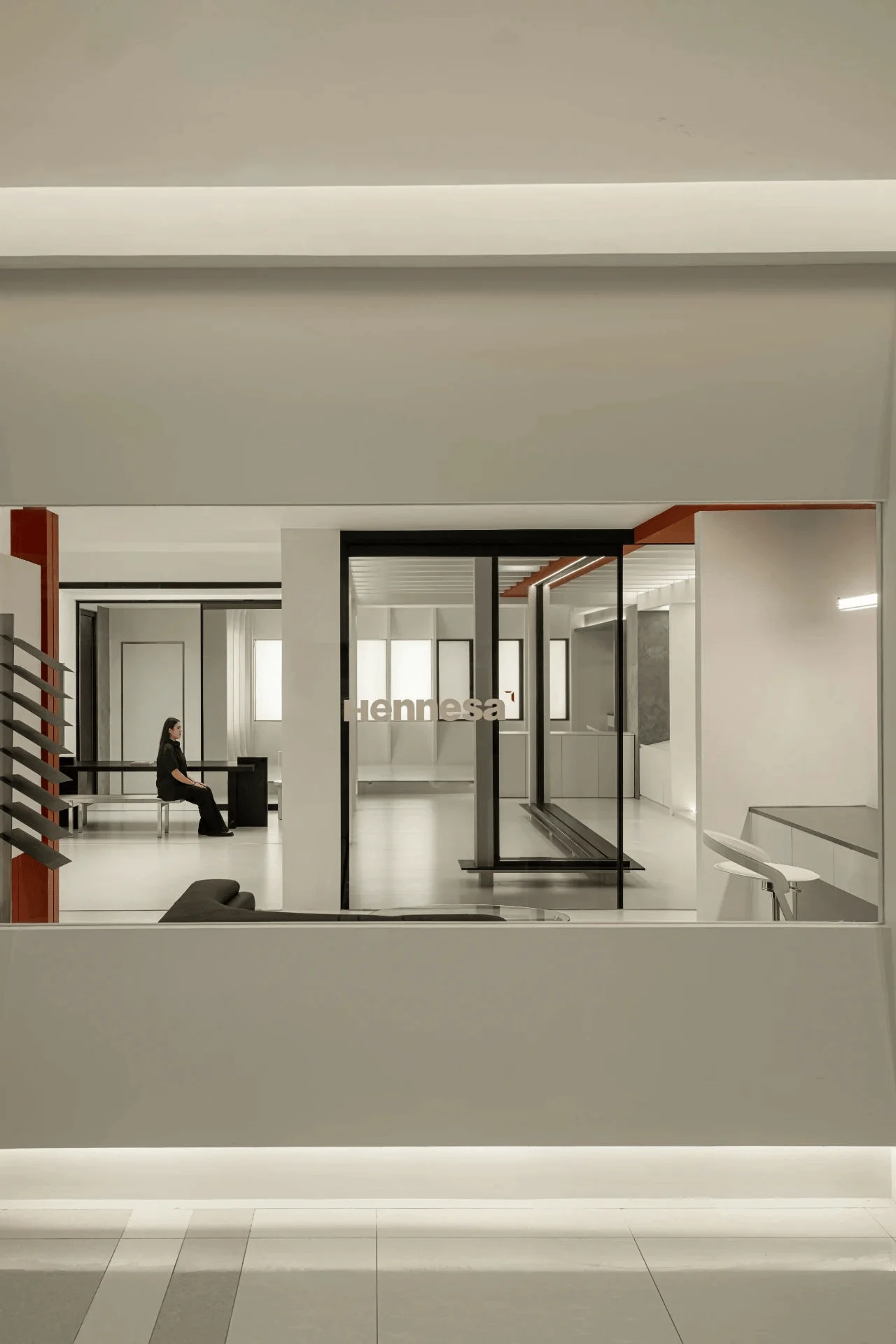
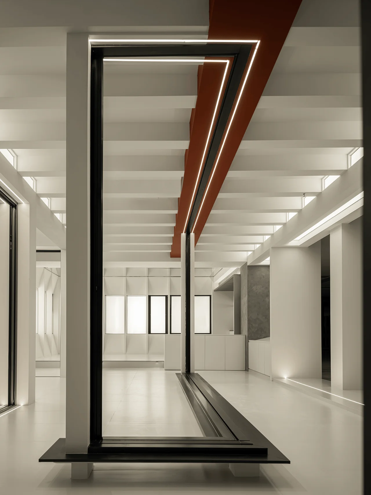
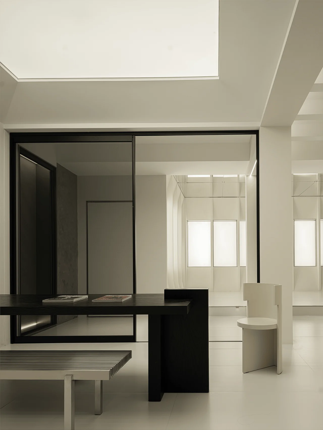
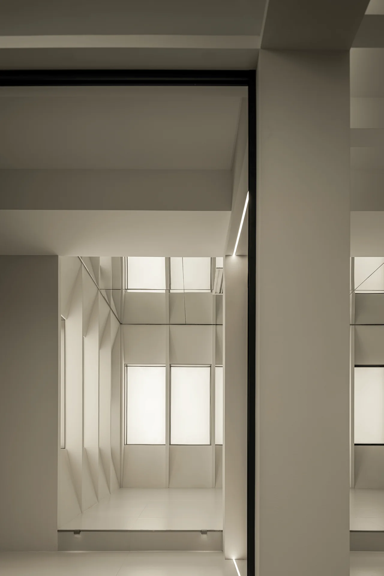
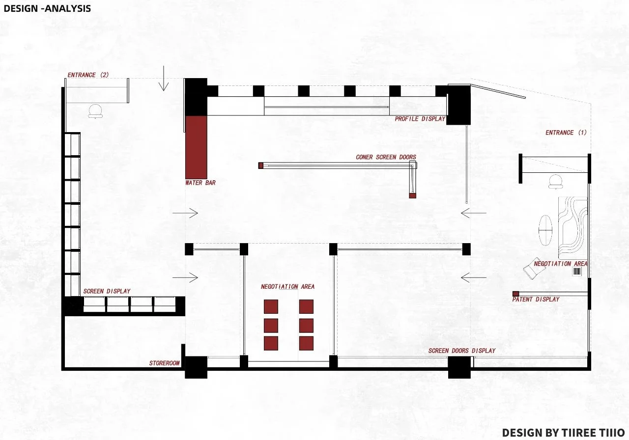
The showroom features two distinct entrances, each offering a unique spatial experience. Mirrors are strategically placed at the entrances to amplify the visitor’s visual perception and create a sense of expansiveness. This design element not only enhances the showroom’s contemporary aesthetic but also serves as a subtle nod to the brand’s dedication to pushing boundaries in screen door design and technology. The use of mirrors creates an illusion of depth and spaciousness, inviting visitors to explore the showroom with a sense of curiosity and wonder.
Facade Design and Transparency
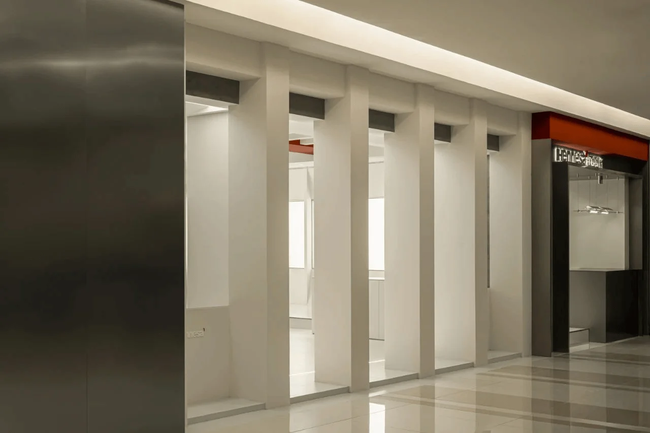
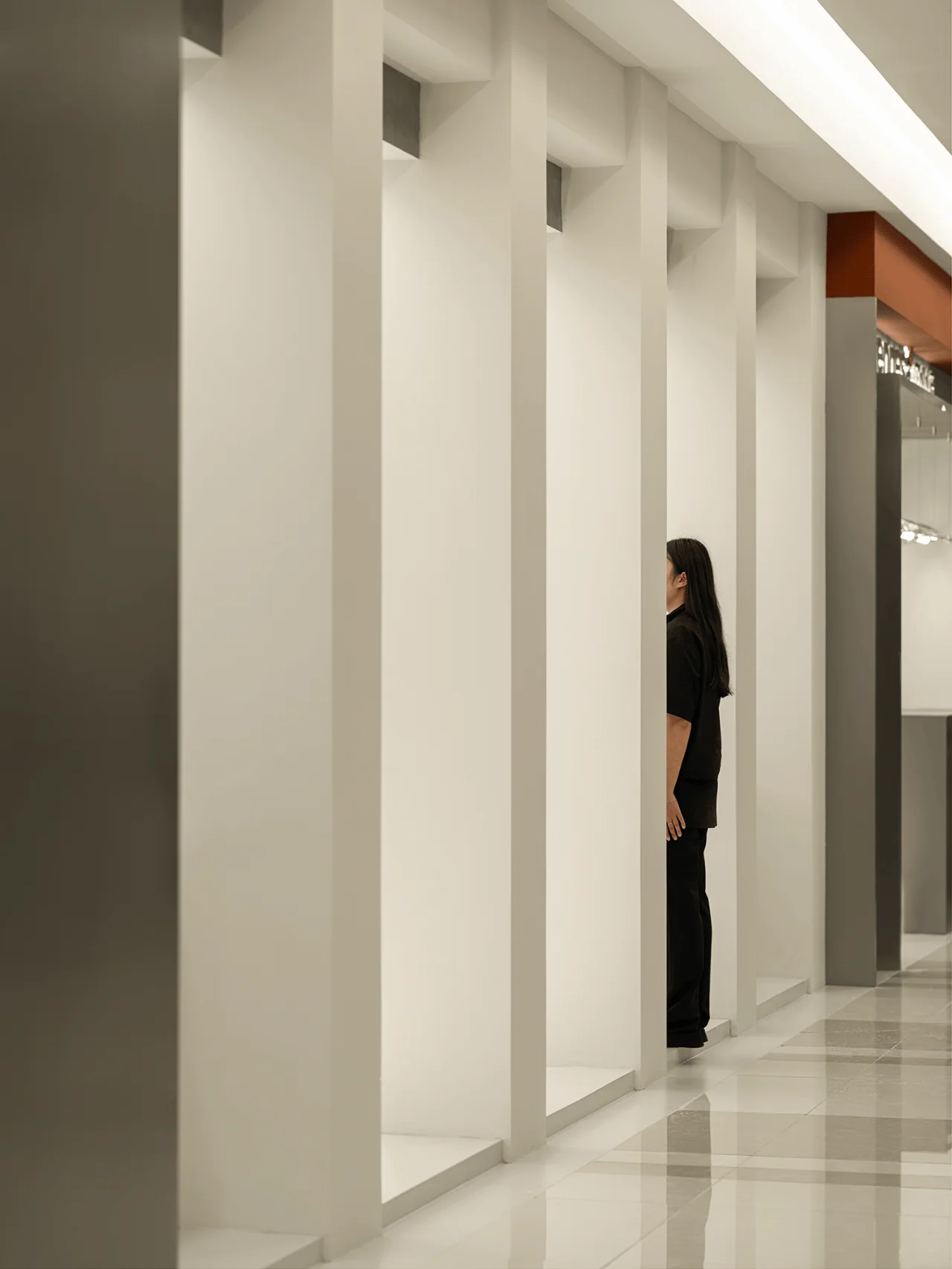
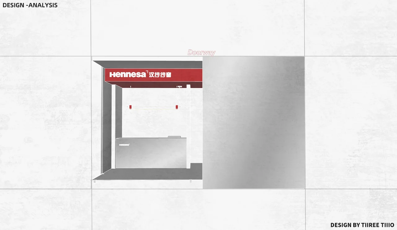
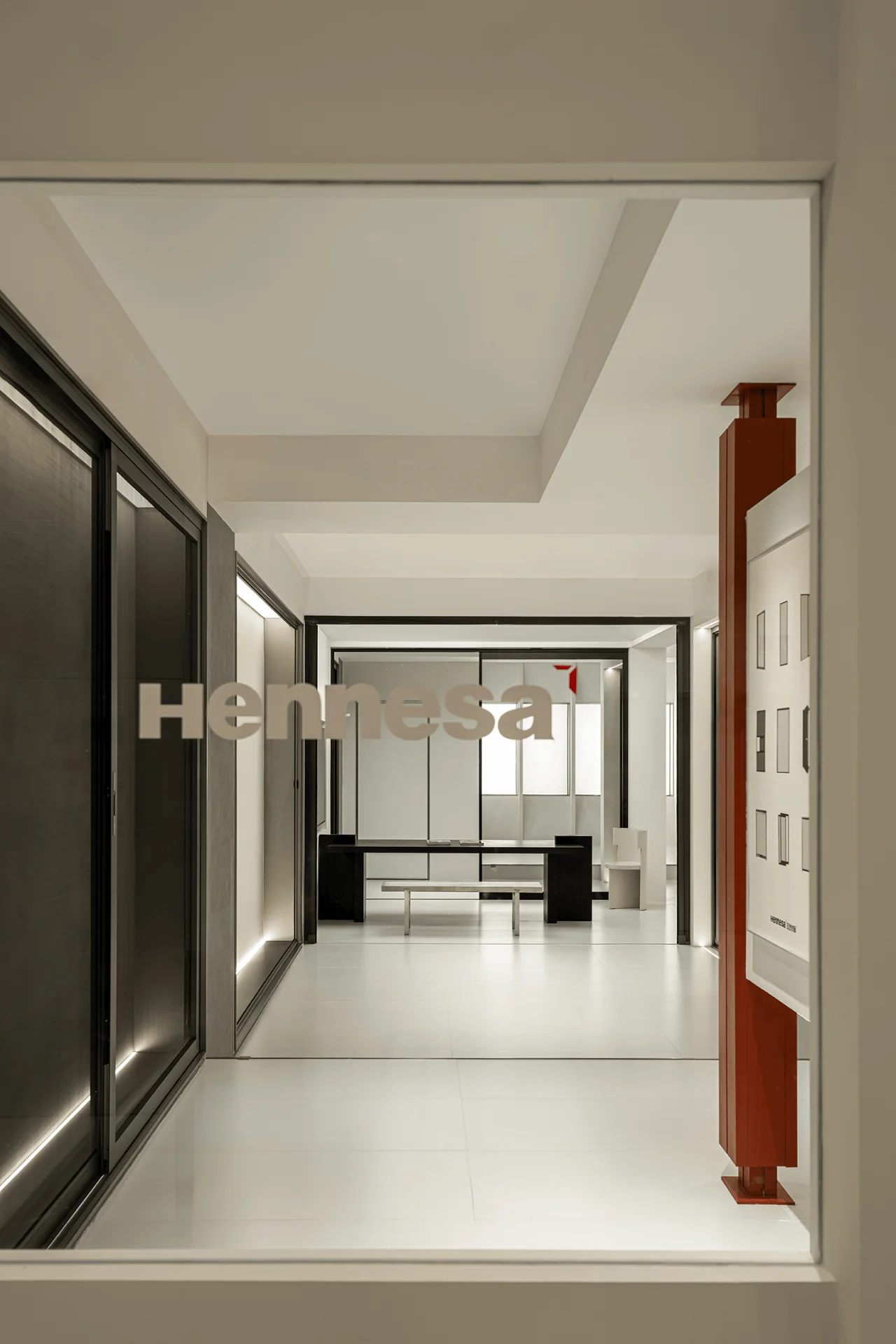
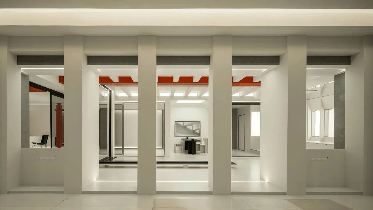
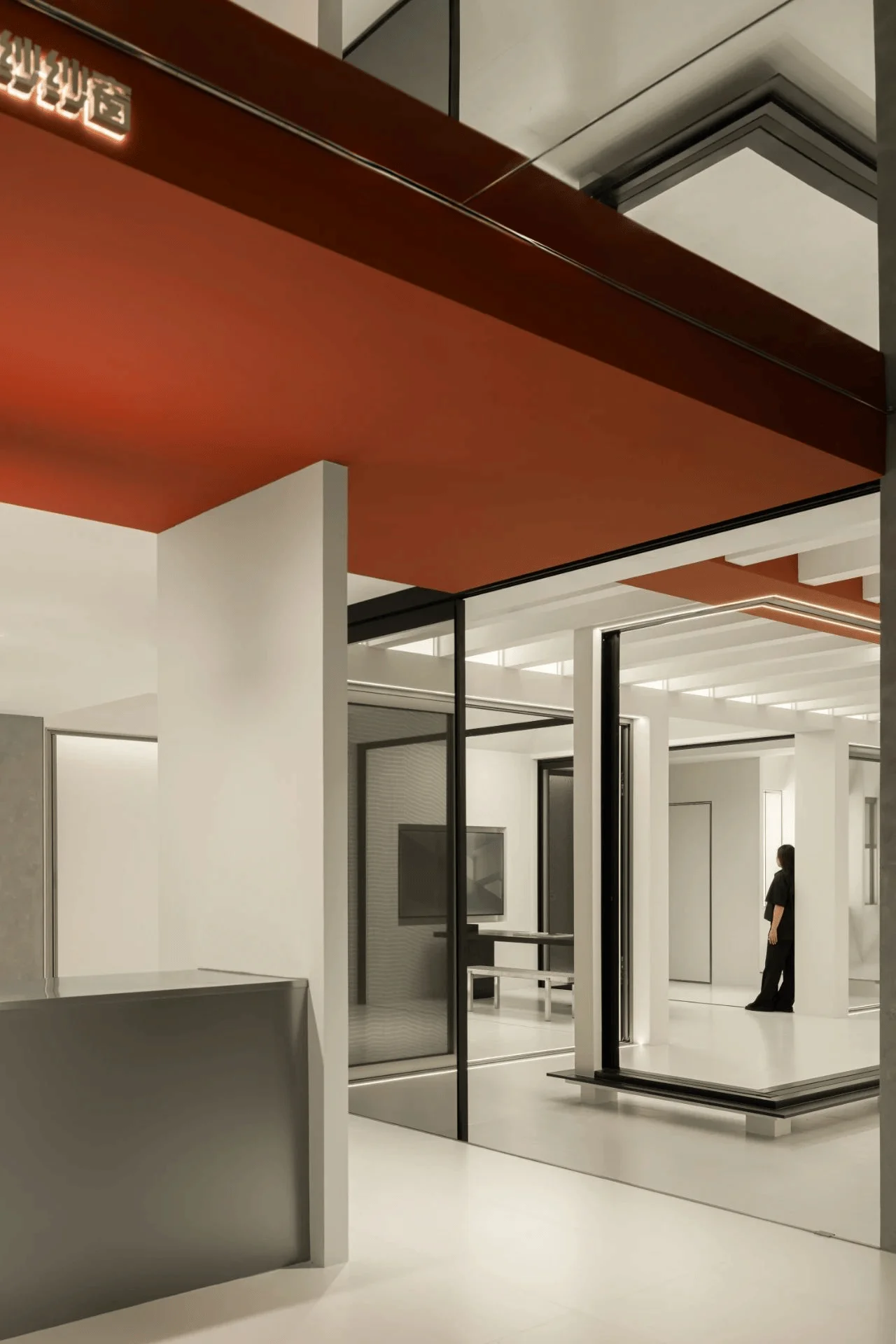
The facade of the showroom is characterized by a series of independent columns that break away from traditional frameworks. This design choice creates a sense of openness and transparency, allowing for the seamless integration of indoor and outdoor spaces. The columns act as visual dividers while maintaining a connection between the showroom and its surroundings. This approach also enhances the showroom’s visibility and recognition within the shopping mall environment, drawing attention to the brand’s presence and offerings.
Rational Design and Materiality
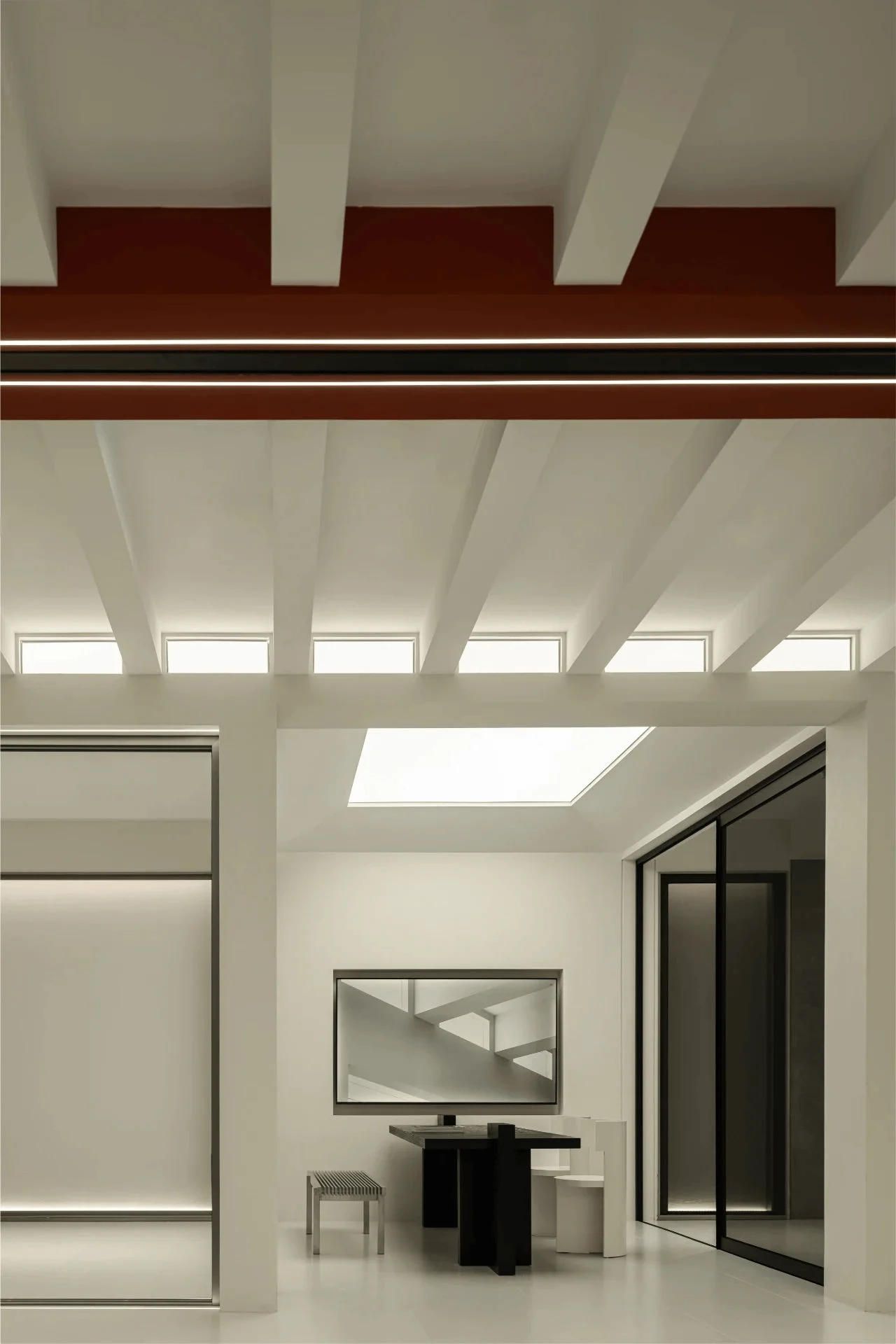
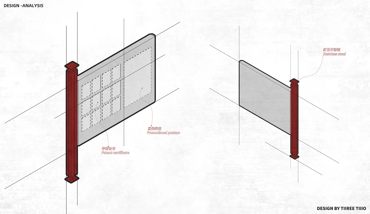
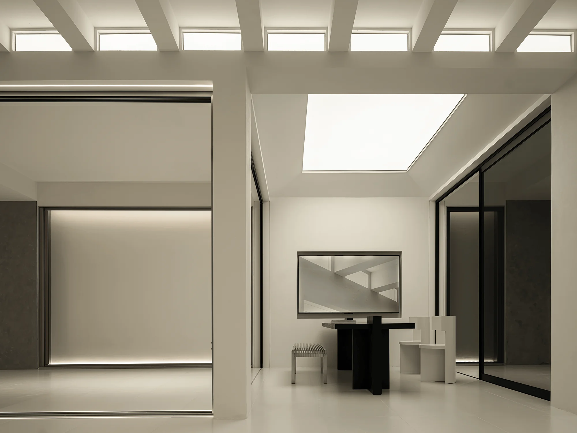
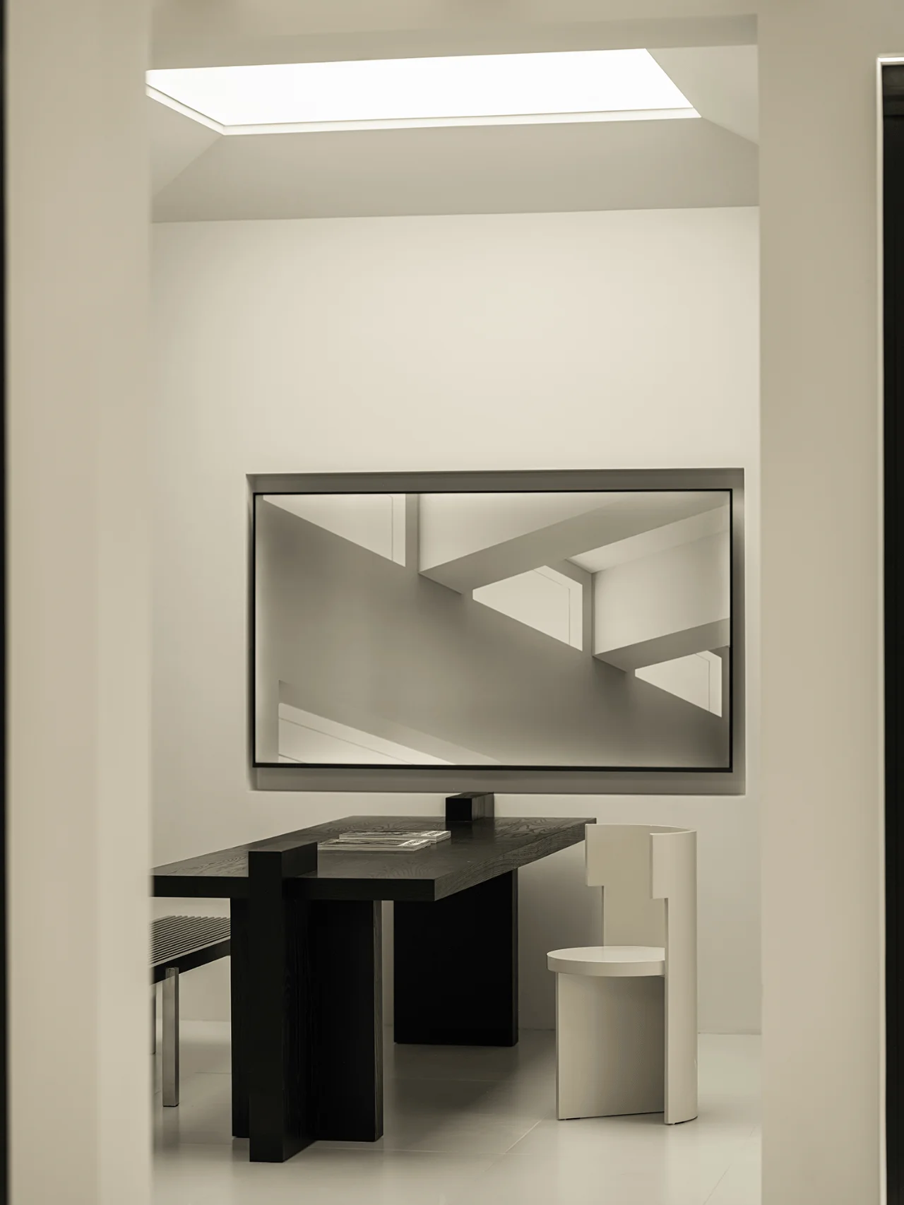
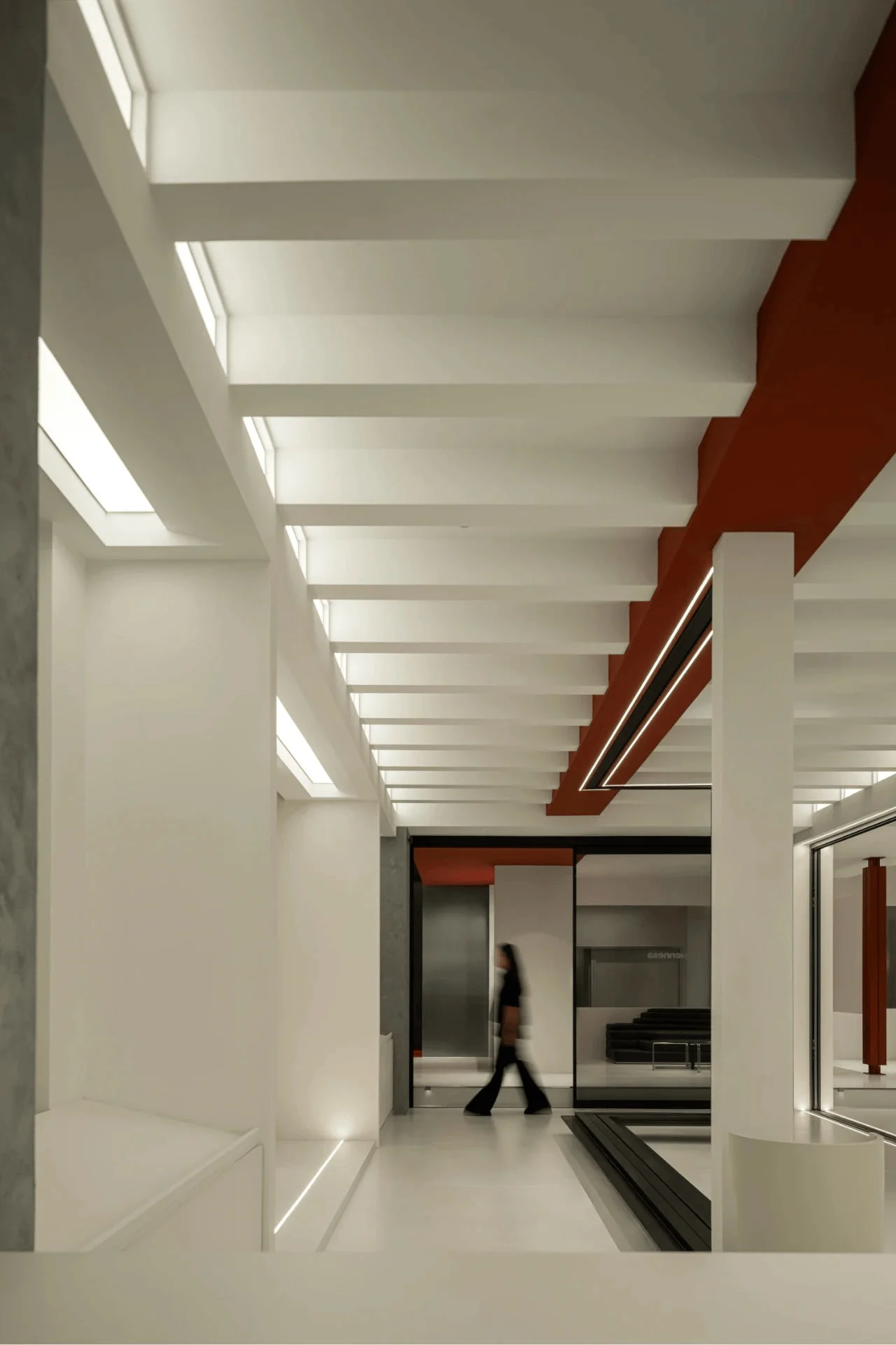
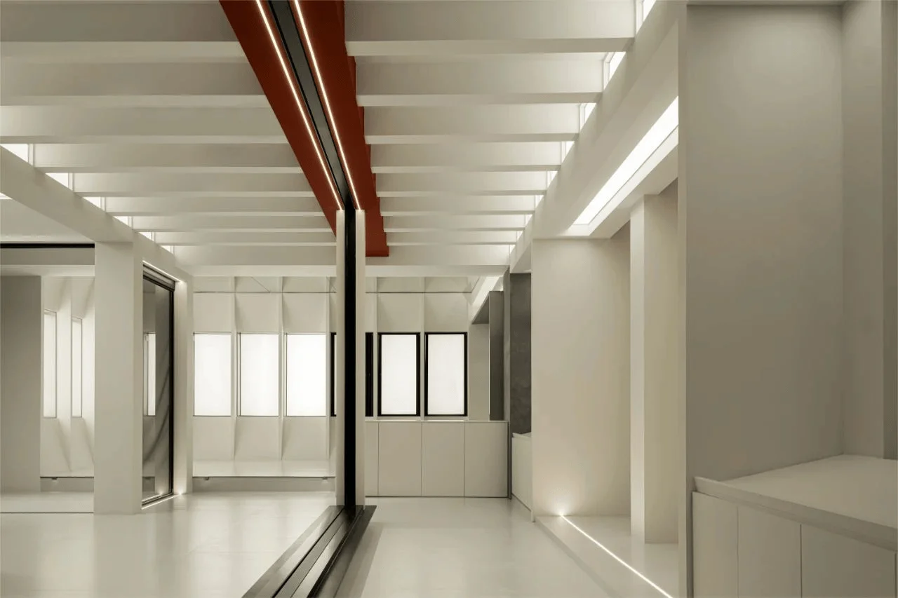
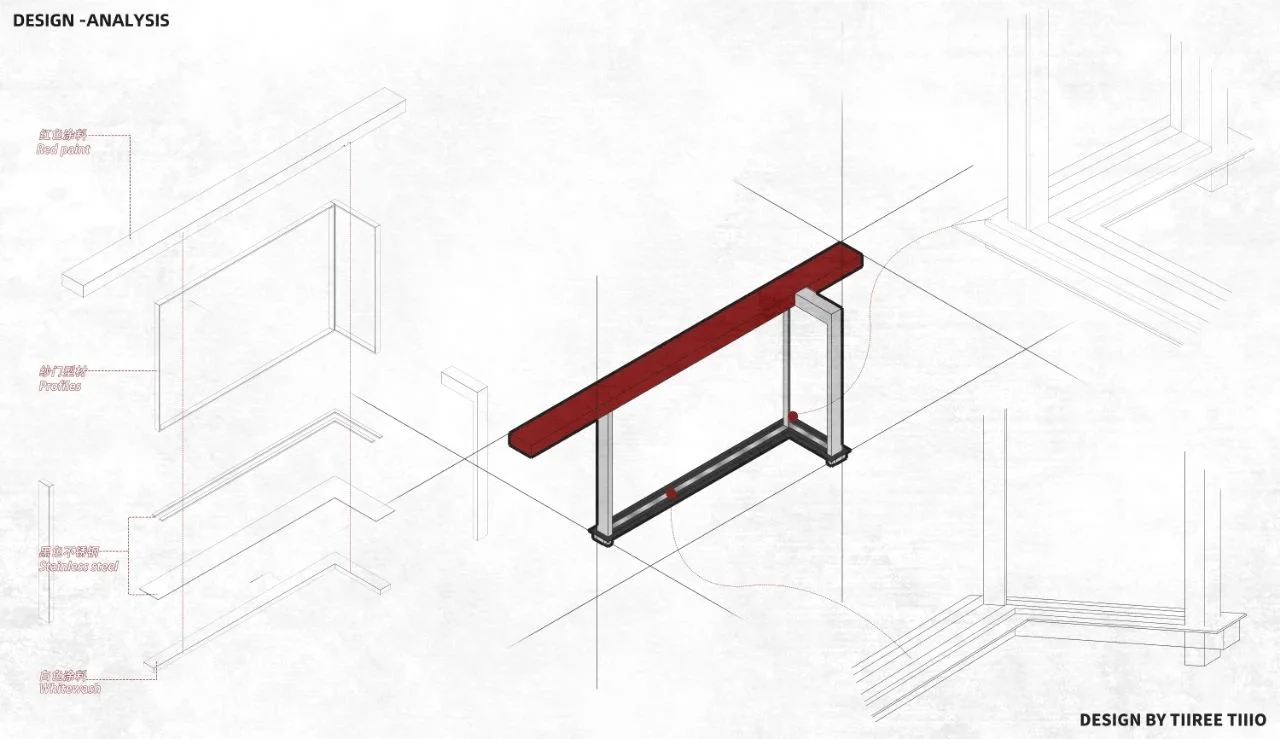
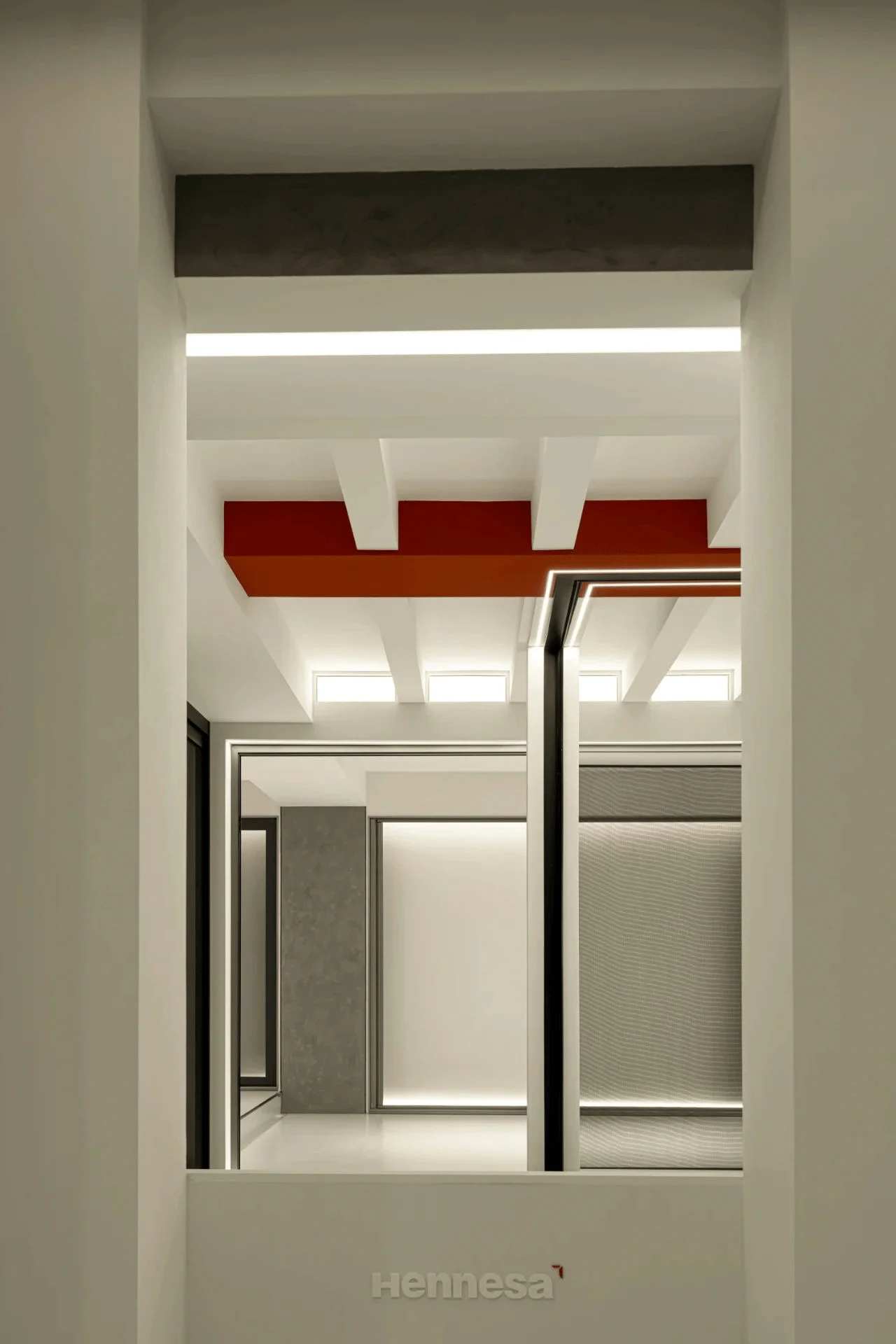
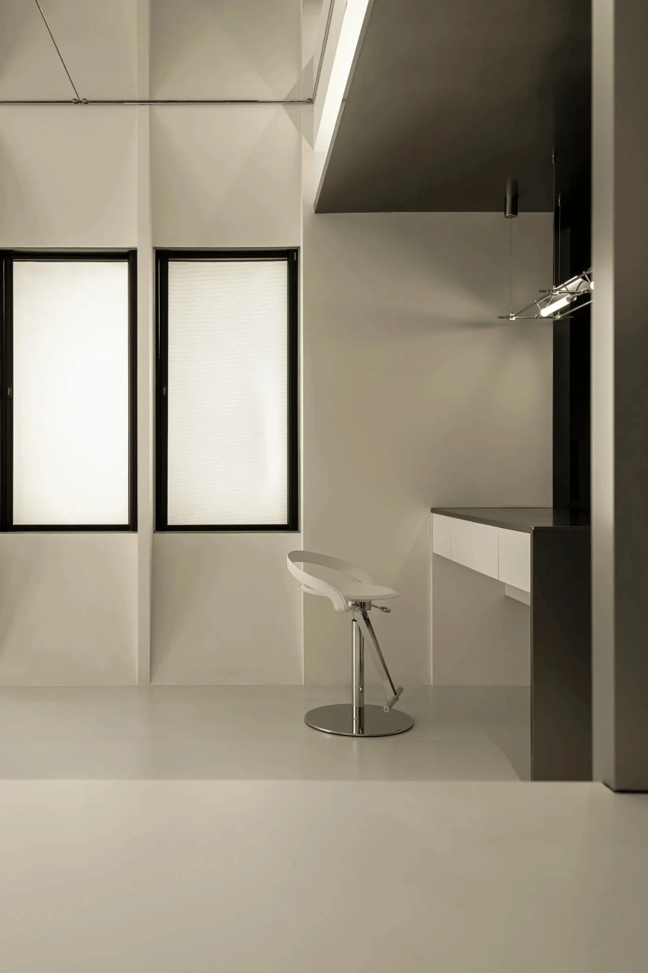
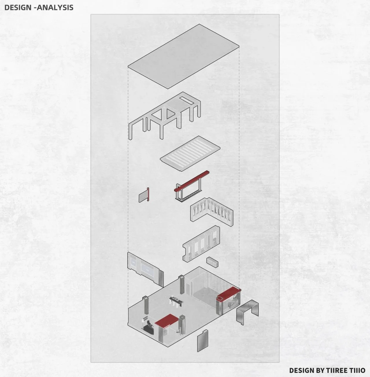
The interior design of the showroom is rooted in rationality and functionality. A limited color palette of black, white, and red is employed to maintain a sense of visual coherence and sophistication. The predominant use of white creates a sense of spaciousness and allows the products to stand out, while black accents provide contrast and visual interest. Red is used sparingly as a highlight color, adding a touch of vibrancy and dynamism to the space. The careful selection of materials, including three different types of paint and two different colors of stainless steel, adds depth and texture to the showroom’s minimalist aesthetic.
Lighting Design and Spatial Atmosphere
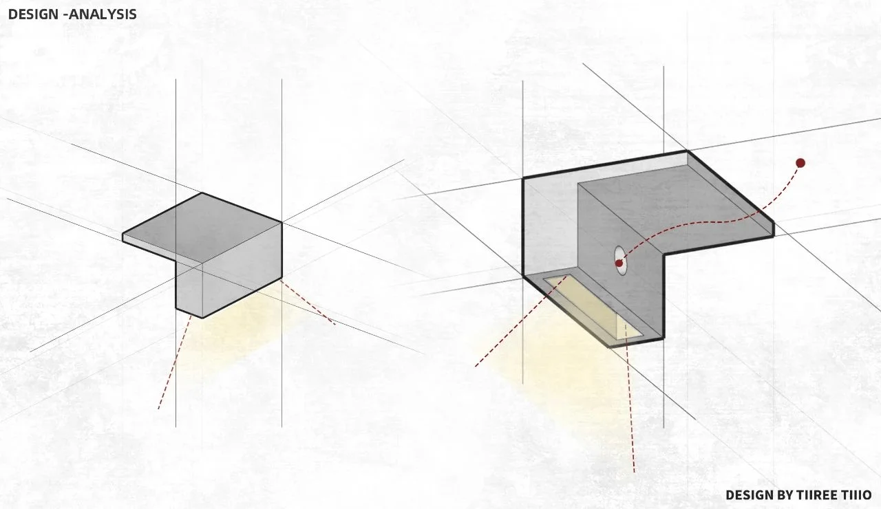
The showroom’s lighting design is meticulously crafted to enhance the presentation of the products and create a comfortable atmosphere for visitors. A combination of floor lamps, linear lights, and light films is used to illuminate the space effectively. The lighting scheme is designed to showcase the products in their best light while creating a warm and inviting ambiance. The interplay of light and shadow adds depth and dimension to the showroom, further enhancing its minimalist aesthetic.
Construction and Project Details
The Hennesa Screen Showroom spans an area of 150 square meters and was completed in May 2024. The project was a collaborative effort between Three Two Design, Chengdu Lunhuan Architectural Decoration Engineering Co., Ltd. (construction), and Chengdu Shida Lighting Design Co., Ltd. (lighting design). The showroom’s design and construction reflect the brand’s commitment to quality and craftsmanship, evident in every detail of the space. The project’s success is a testament to the collaborative spirit and shared vision of the design and construction teams.
Project Information:
Architects: Three Two Design
Area: 150 m²
Project Year: 2024
Project Location: Chengdu, China
Main Materials: Paint, Stainless Steel
Project Type: Showroom
Photographer: Youyu Nie, Puyu


