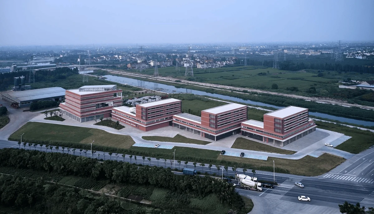
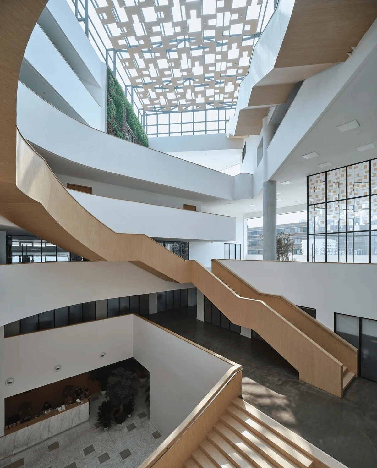
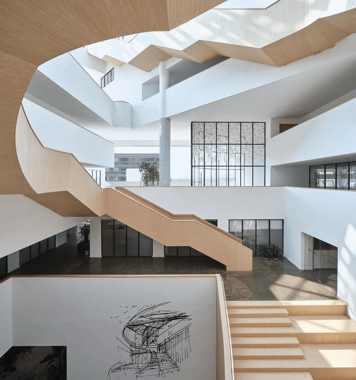
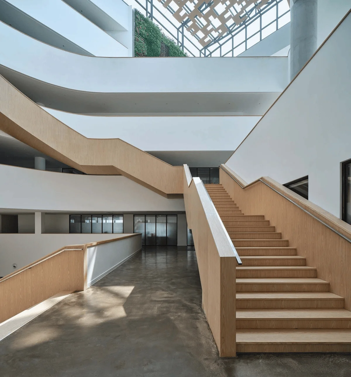
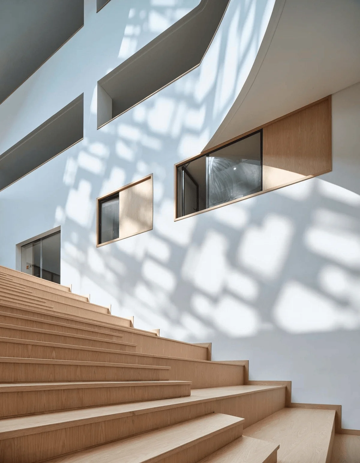
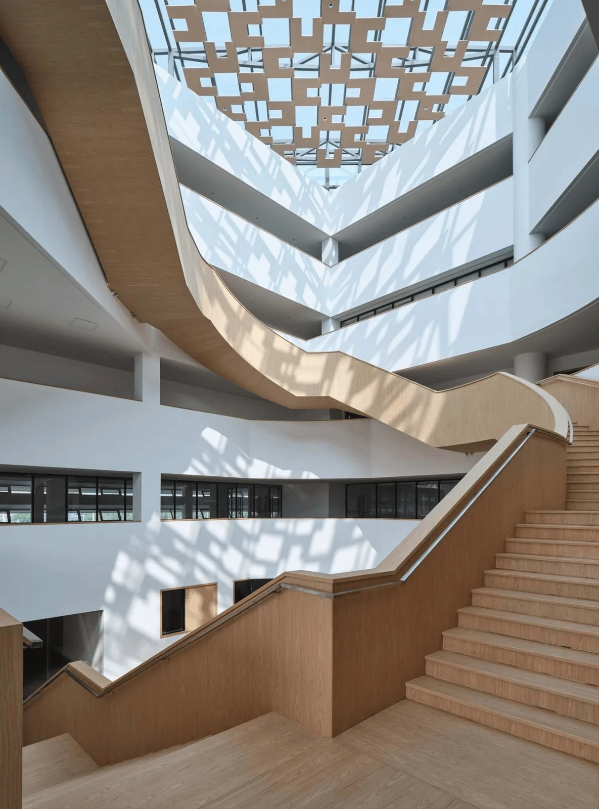
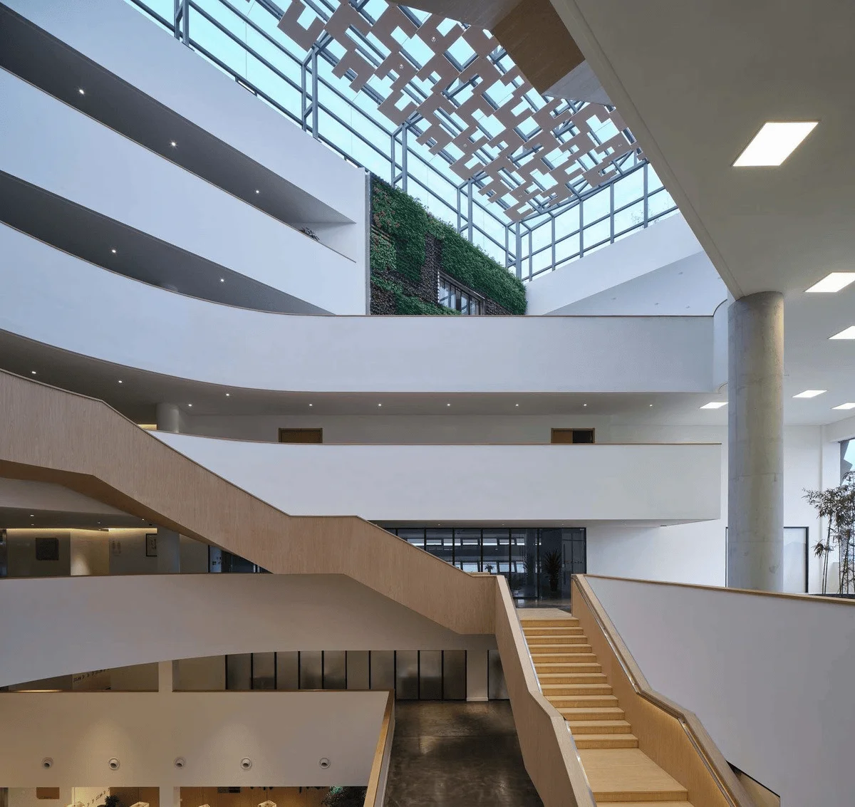
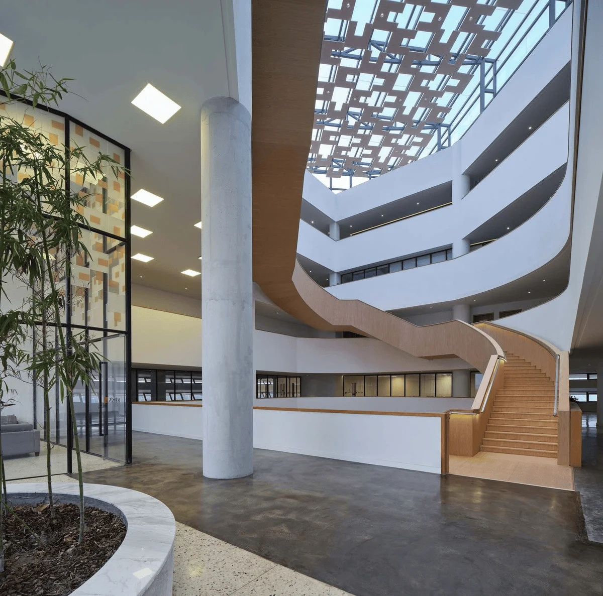
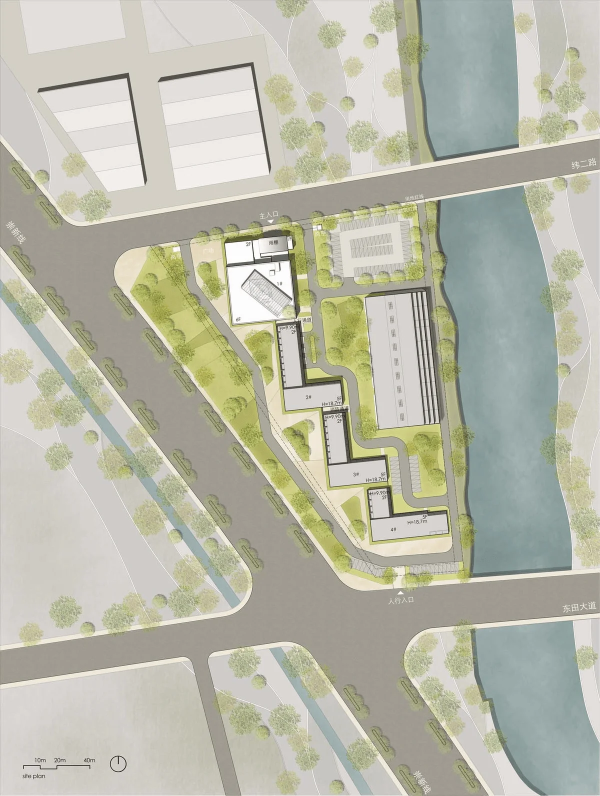
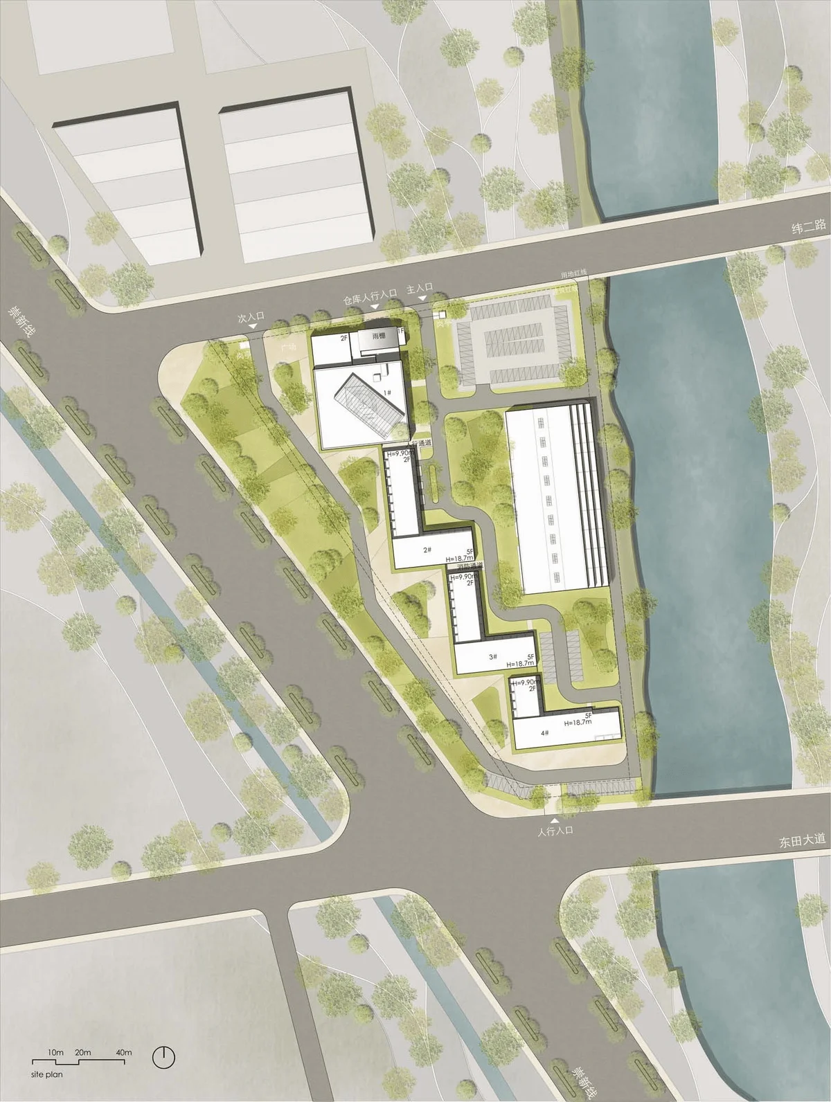
Located in Zhouquan Town, Tongxiang, Zhejiang Province, China, the Huaten Headquarters sits near Chongxin Highway, an area bustling with factories and constant truck traffic. Faced with this noisy environment, Yikao Architecture sought to create a tranquil office space for Huaten, one that evokes the serene beauty of a mountain and water garden, filled with natural light and air.
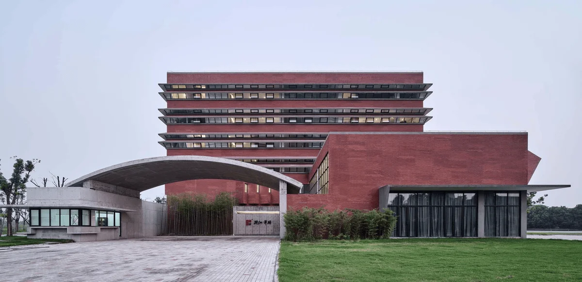
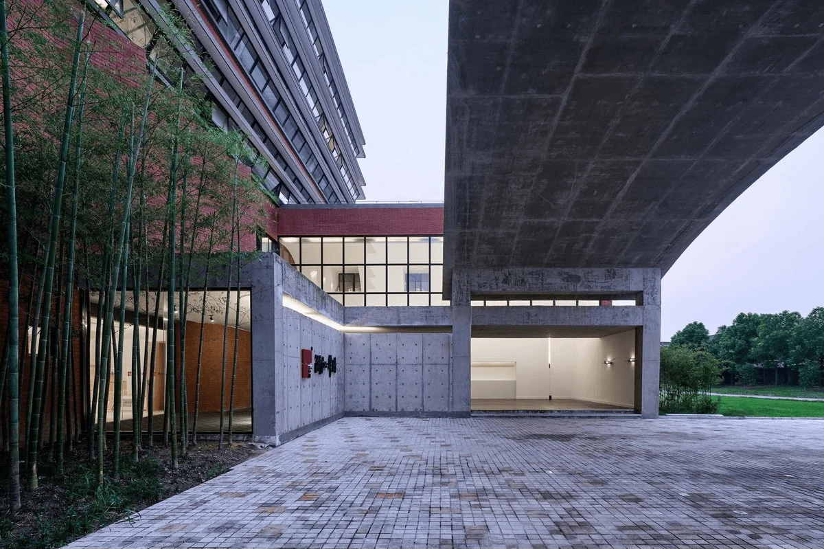
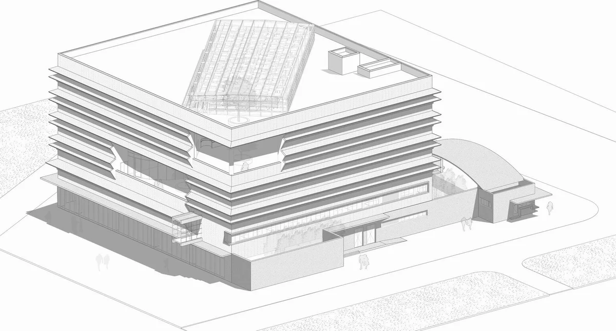
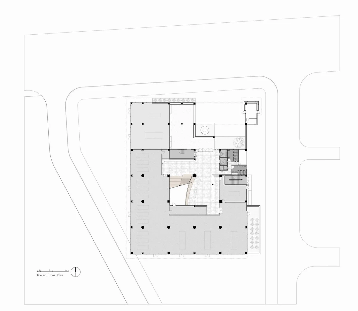
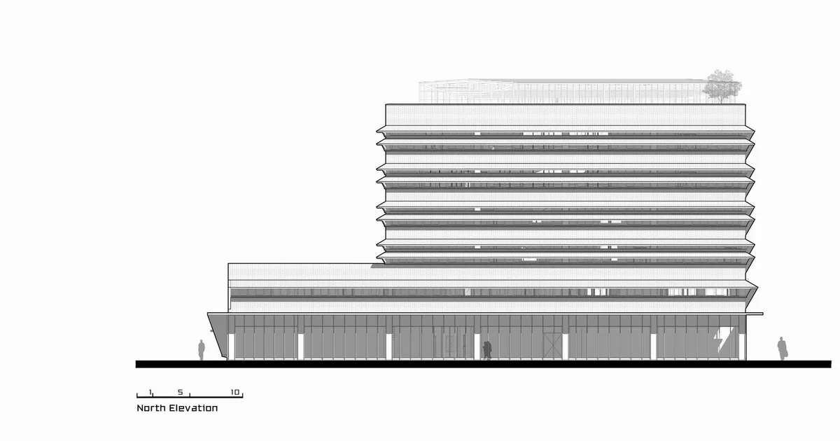
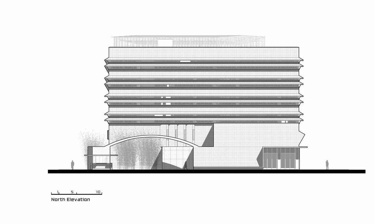
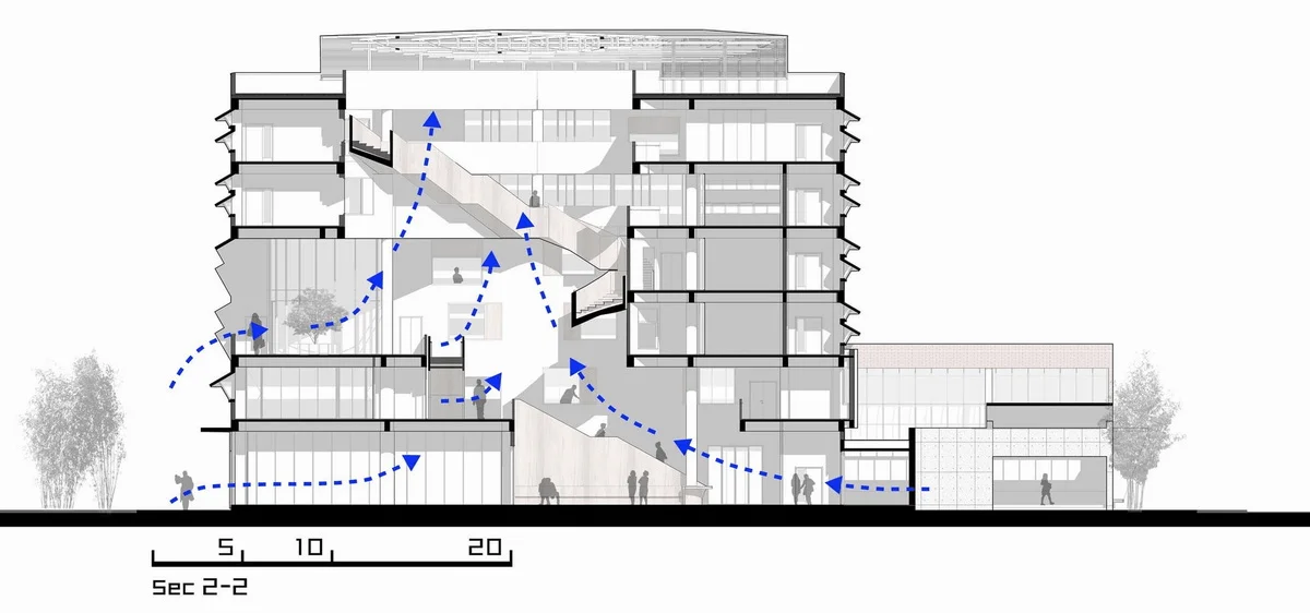
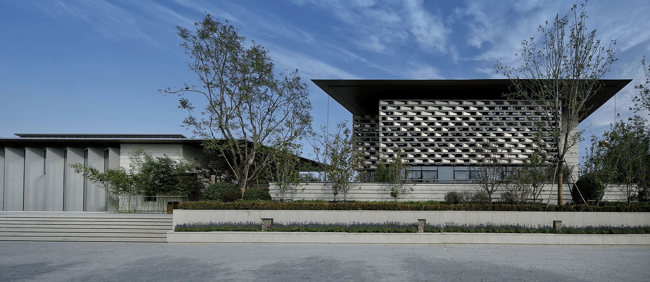
The traditional office building canopy is directly connected to the main structure in a typical design, but at Huaten Headquarters, a pre-order space is inserted between the canopy and the main building. If the main building is likened to a house, then the pre-order space is the entrance hall. The pre-order space serves two purposes: extending the time and spatial dimension of the walk-through space, and breaking the taboo of the north entrance, ensuring that the main building does not face north directly but instead, the entry is achieved after several turns. This spatial treatment is commonly found in traditional garden layouts.
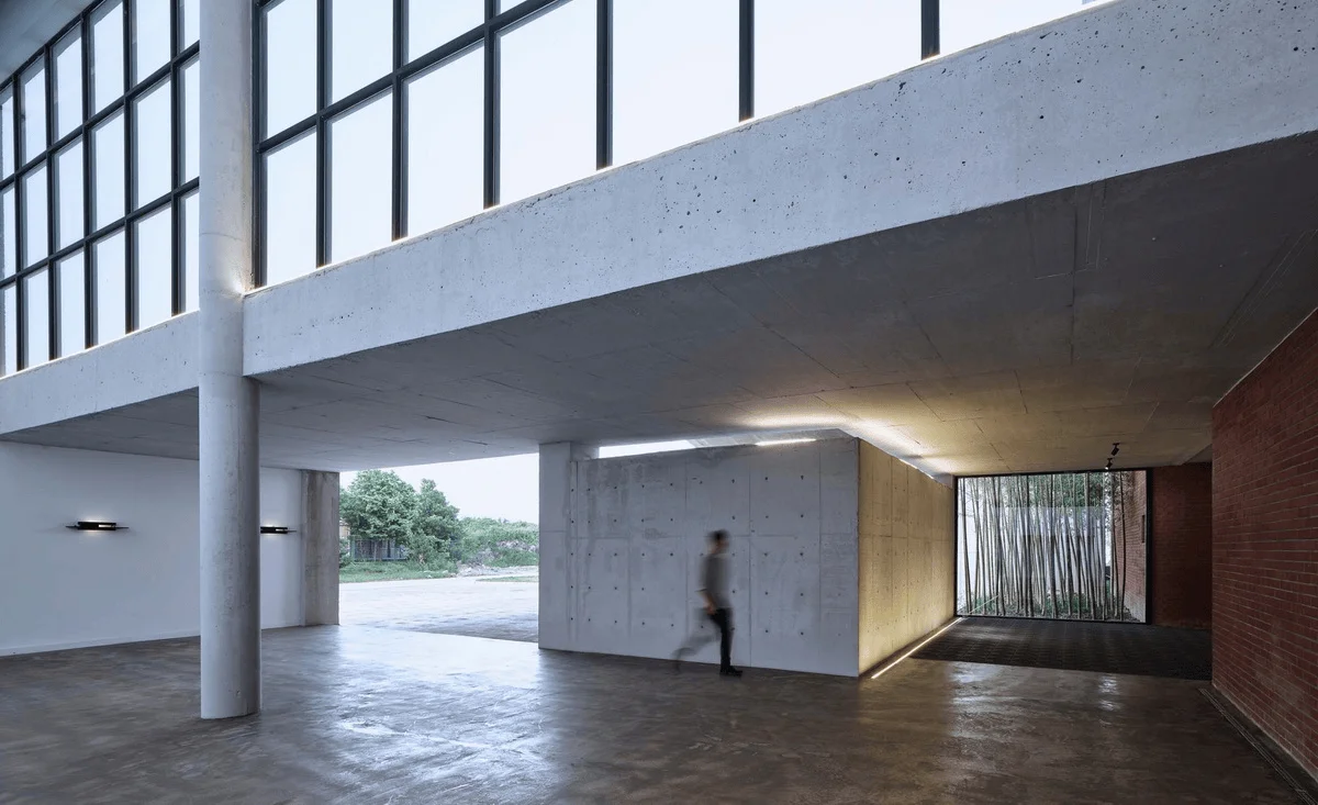
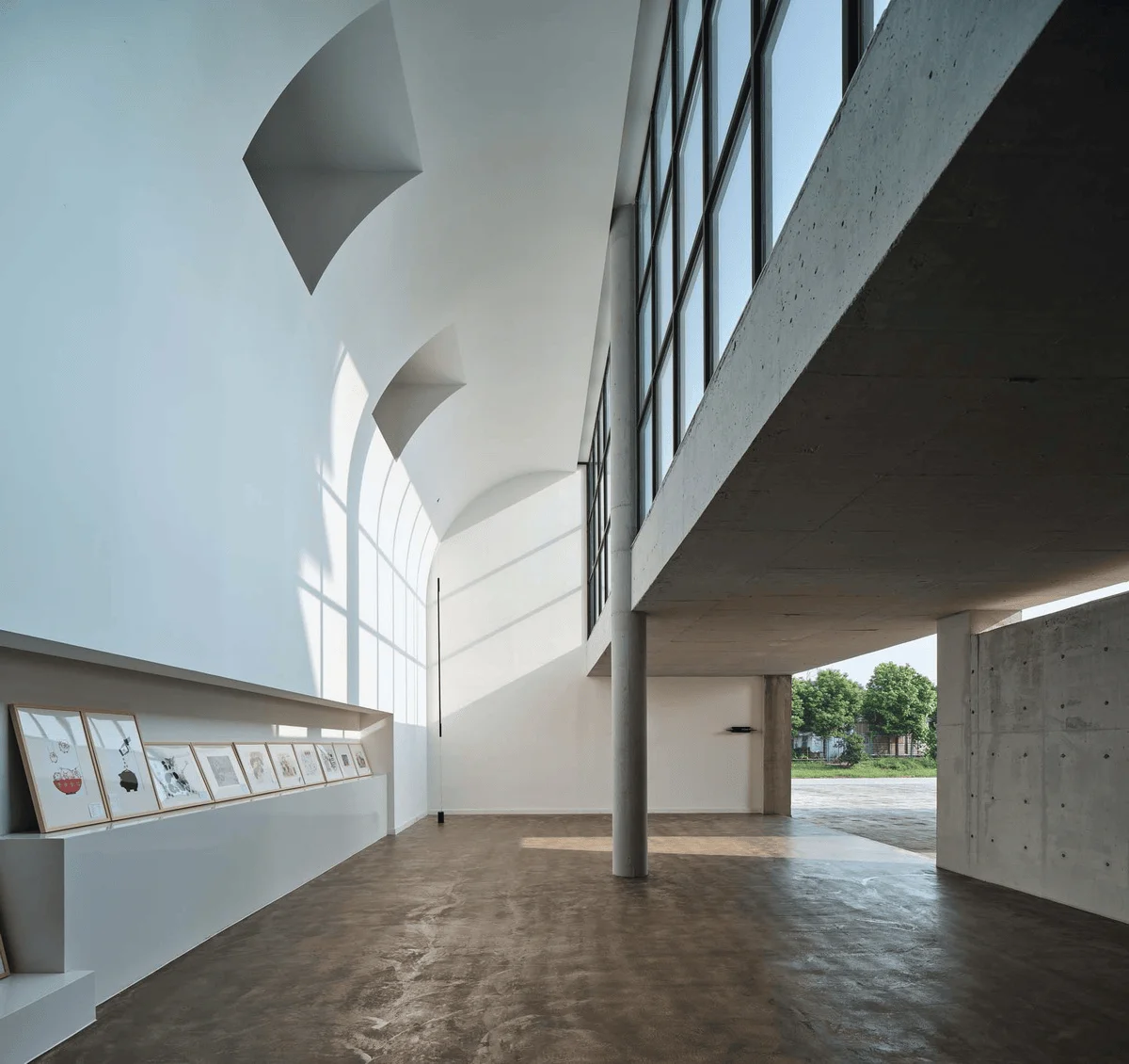
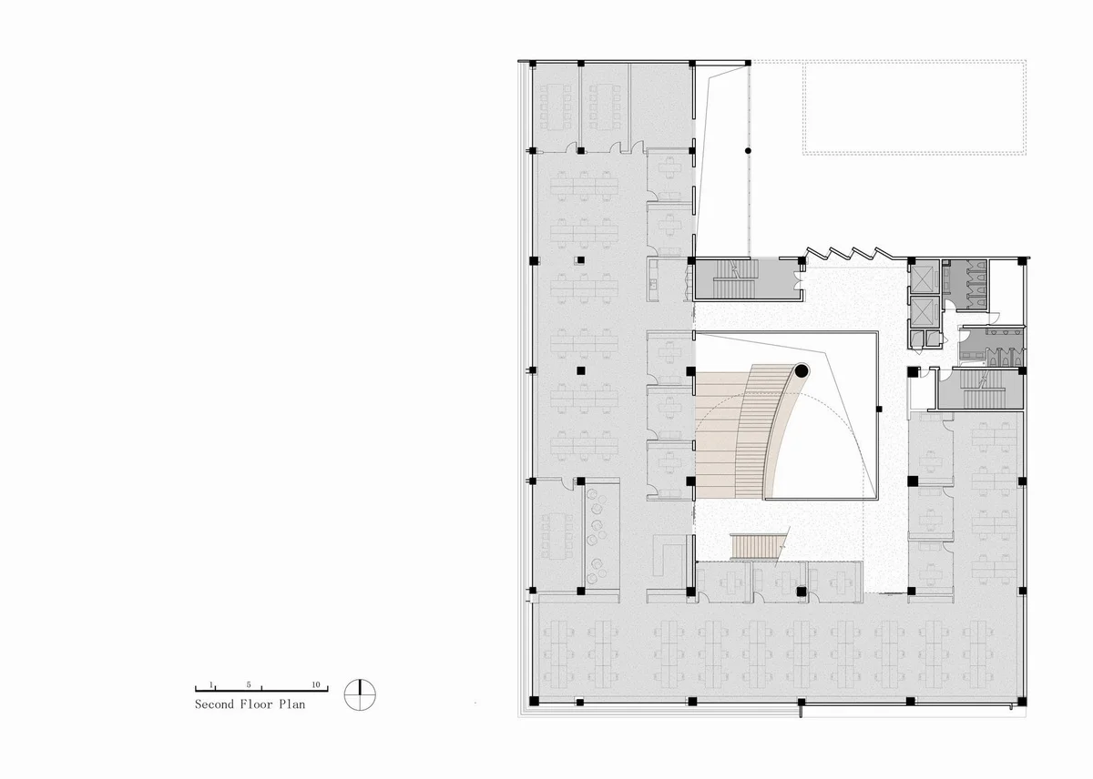
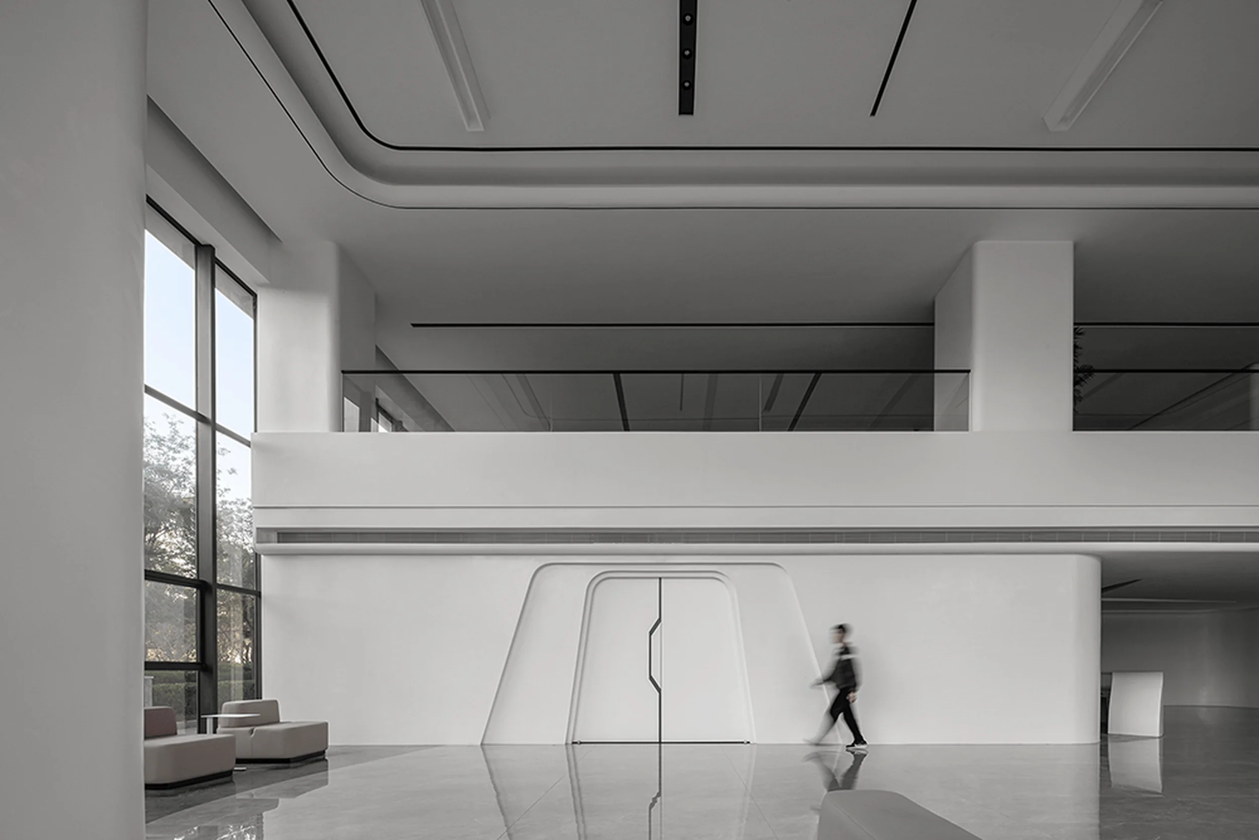
The pre-order space is divided into two sections: one plays the role of “suppression” in the “suppression and then elevation” approach, creating a contrast with the grand narrative of the mountain and water garden of the main building. The other section is a space for showcasing Huaten’s achievements, spanning two stories and providing ample natural light for the second-floor office.
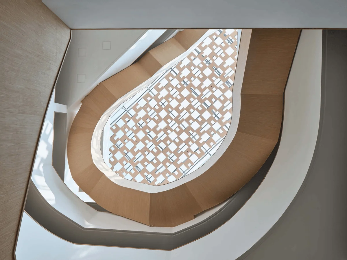
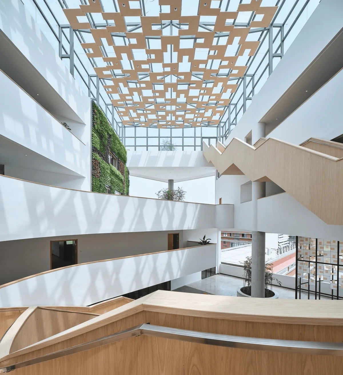
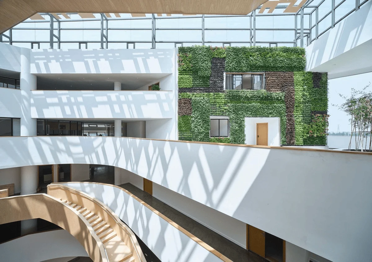
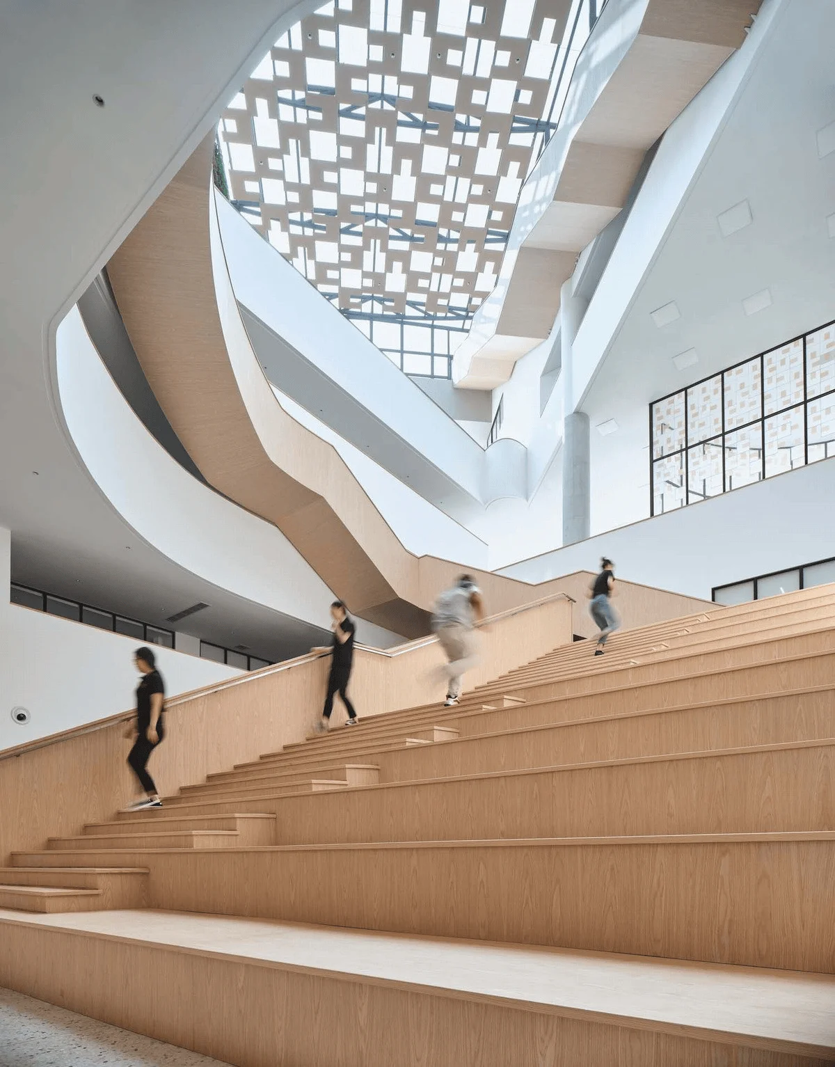
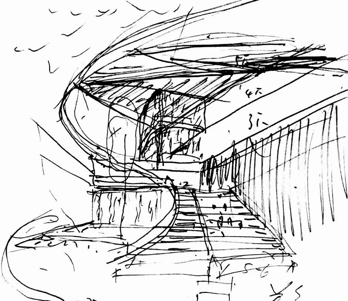
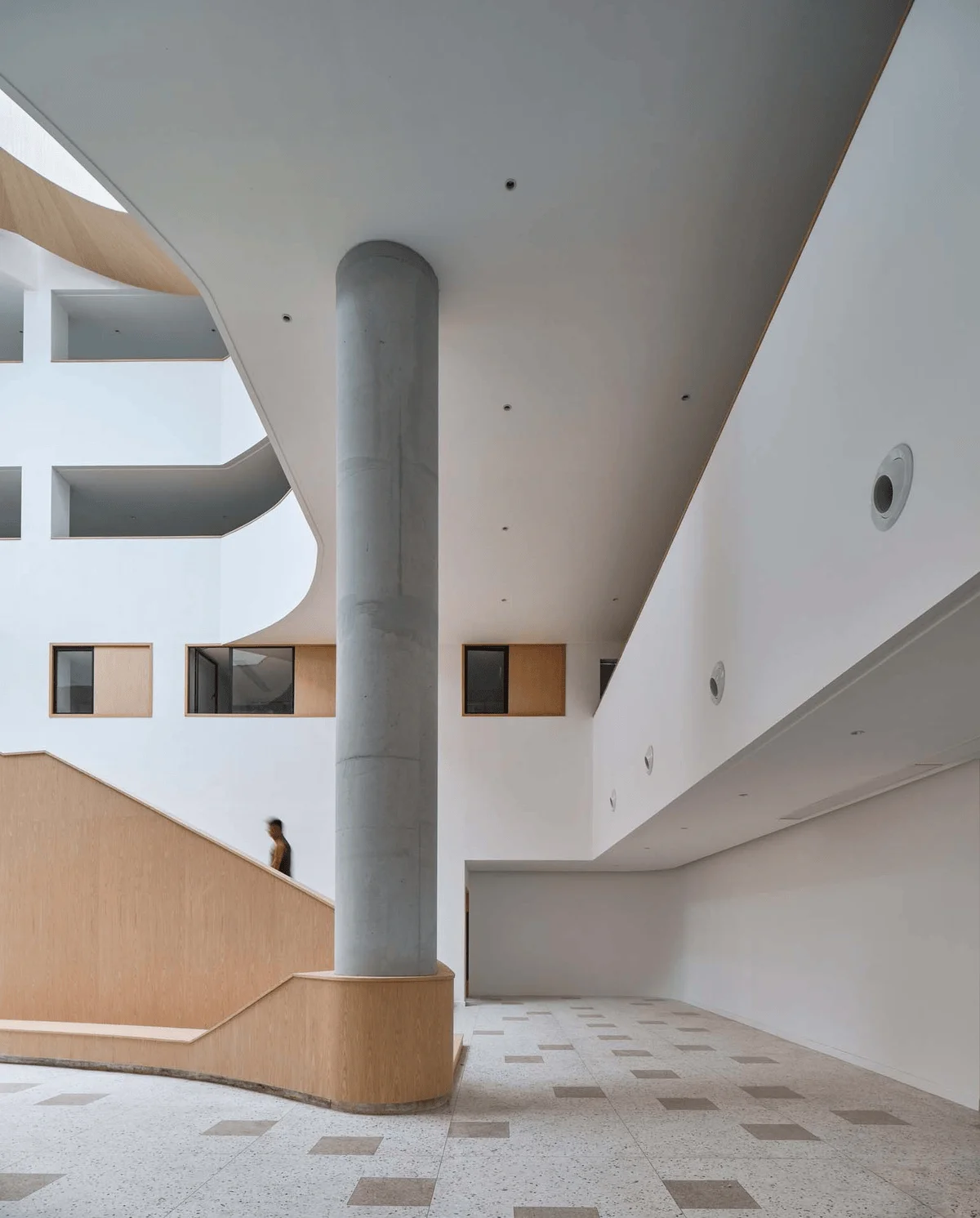
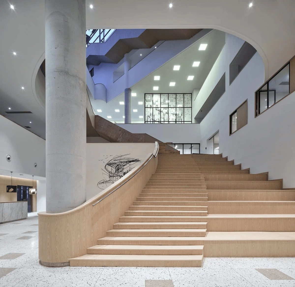
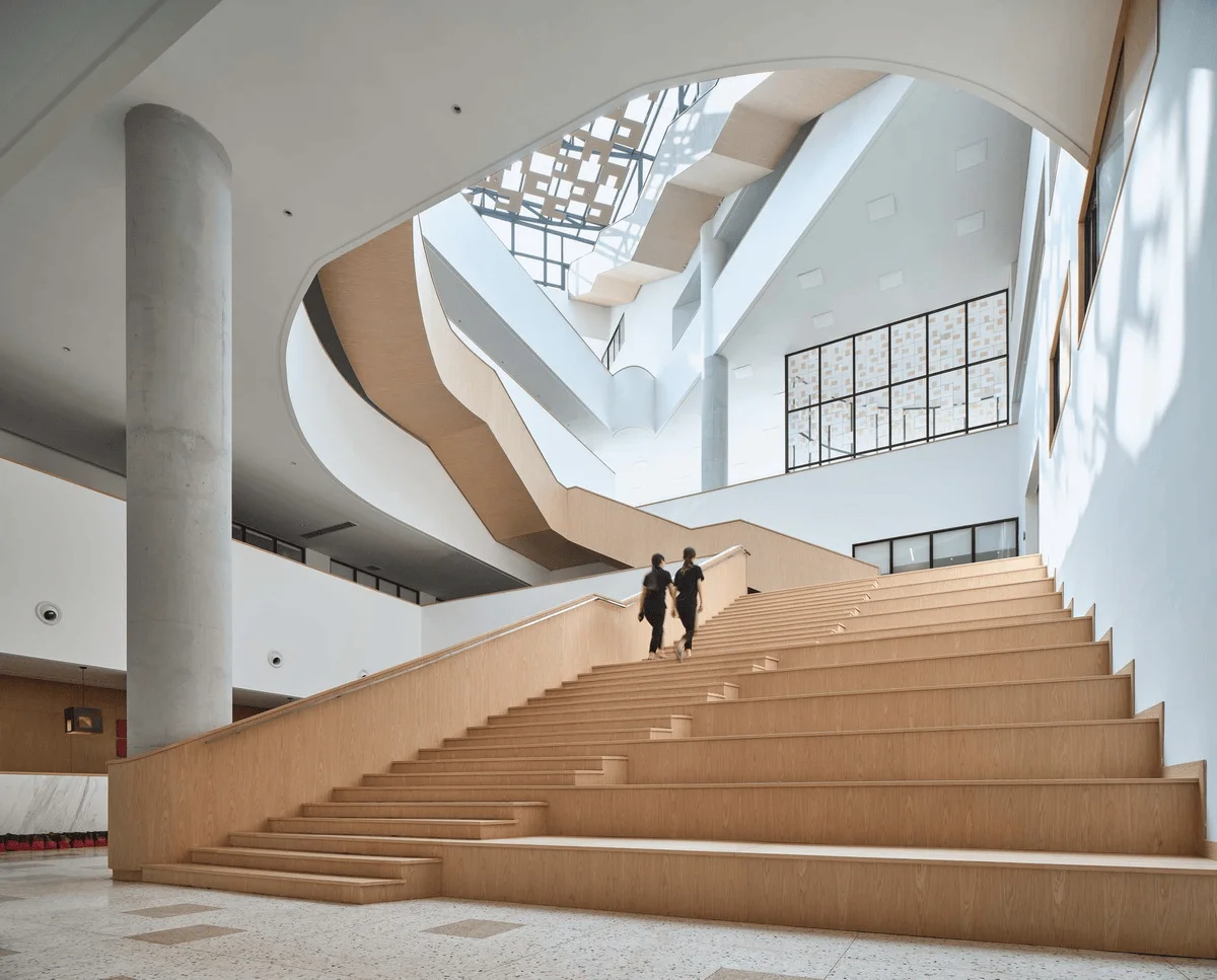
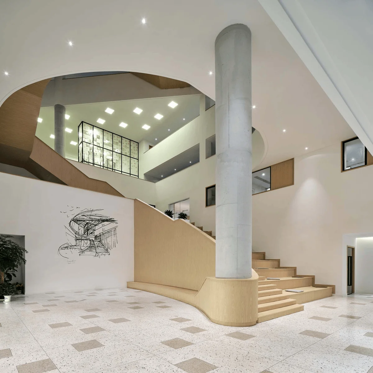
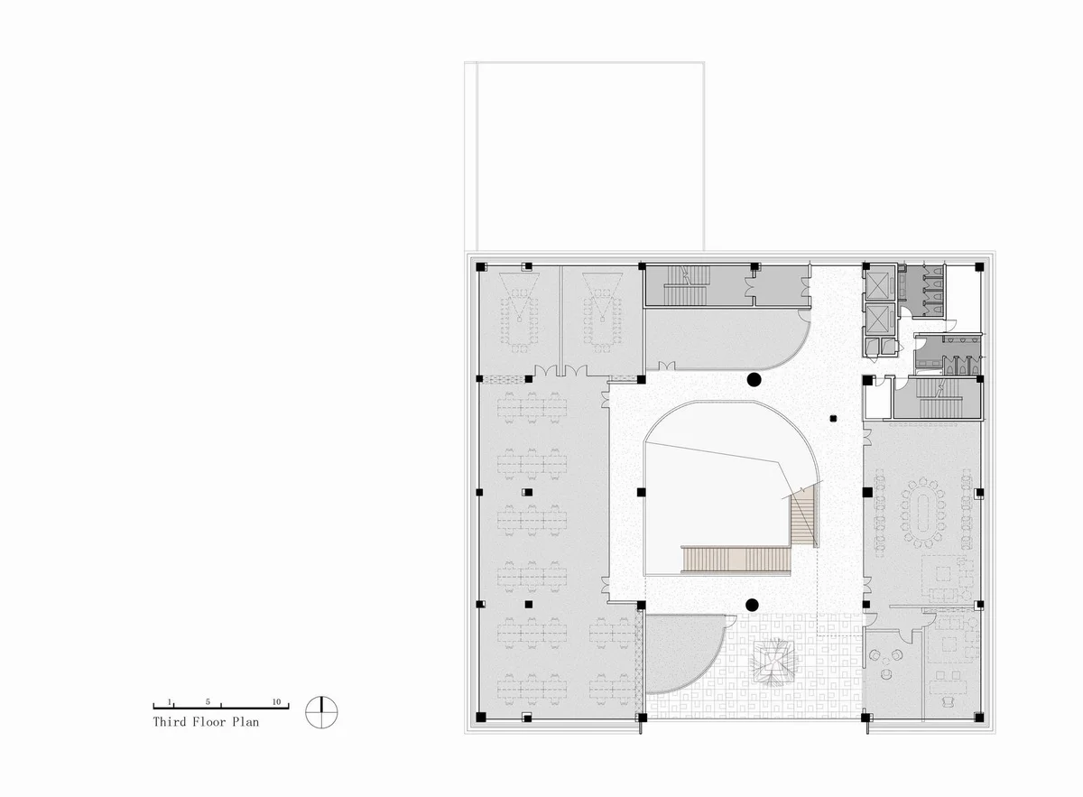
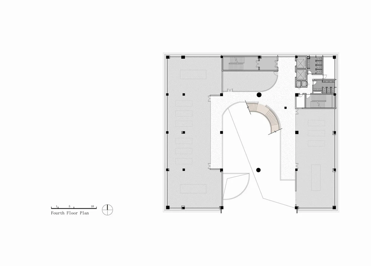
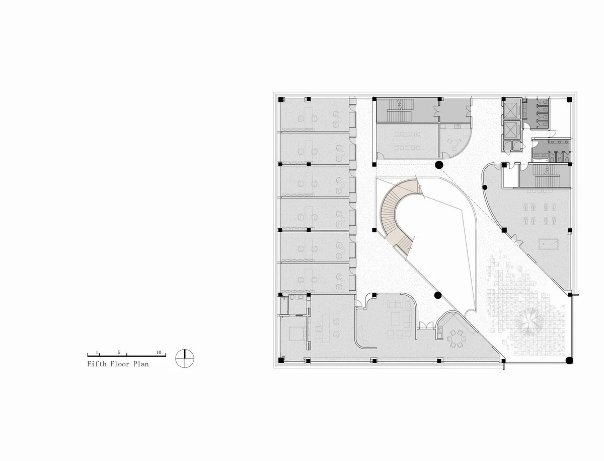
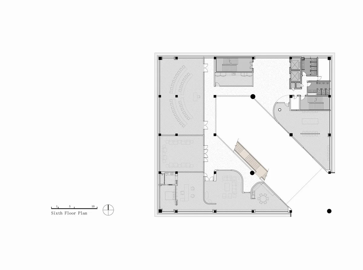
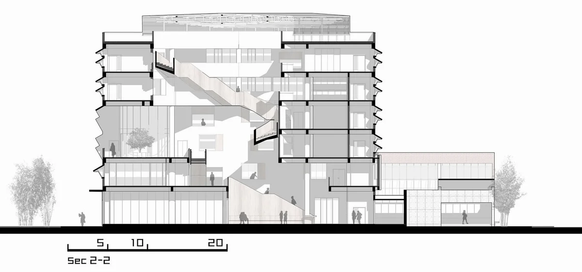
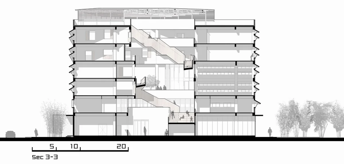
To fully appreciate the tranquility of a mountain and water garden requires a bit of imagination, akin to Japanese Zen gardens where sand becomes the sea and stones become islands. Walking through the interior of the Huaten Headquarters, one can envision themselves as a figure in a landscape painting. Unlike traditional gardens that unfold along the horizon, the public spaces in Huaten Headquarters resemble a traditional Chinese garden with pavilions, platforms, buildings, and pavilions arranged at different floor elevations. The way of touring the garden shifts from a flat or slightly undulating terrain to a mountainous landscape like in a painting. This is why I call it a “mountain and water garden.” Walking through it, as the spaces change, one appears and disappears within them. The walker can rest, look up, gaze afar, and look down, mirroring the near, far, and high perspectives of a landscape painting.
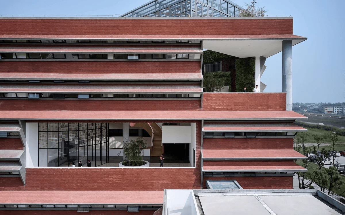
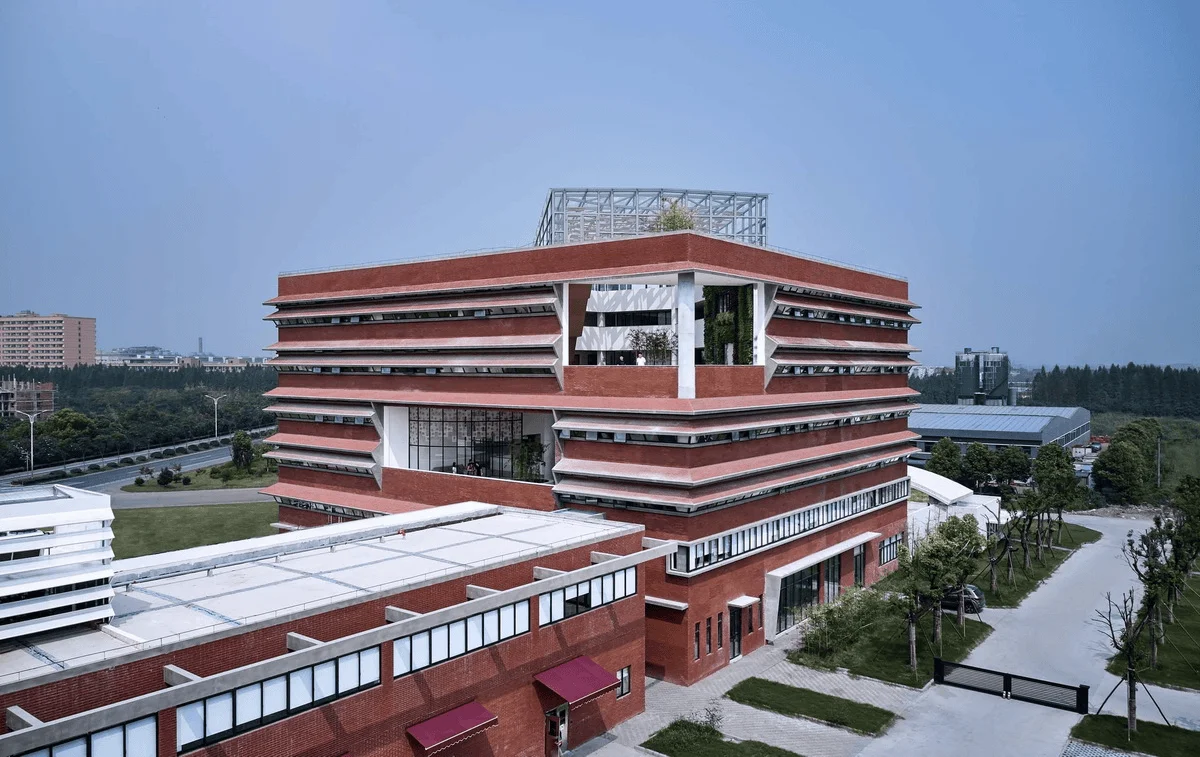
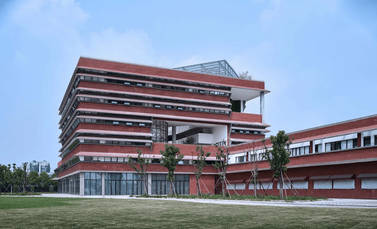
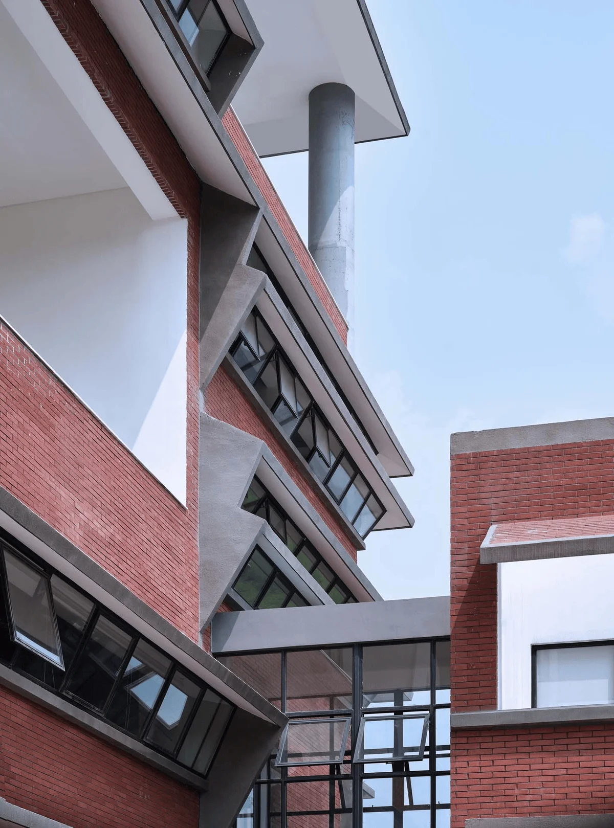
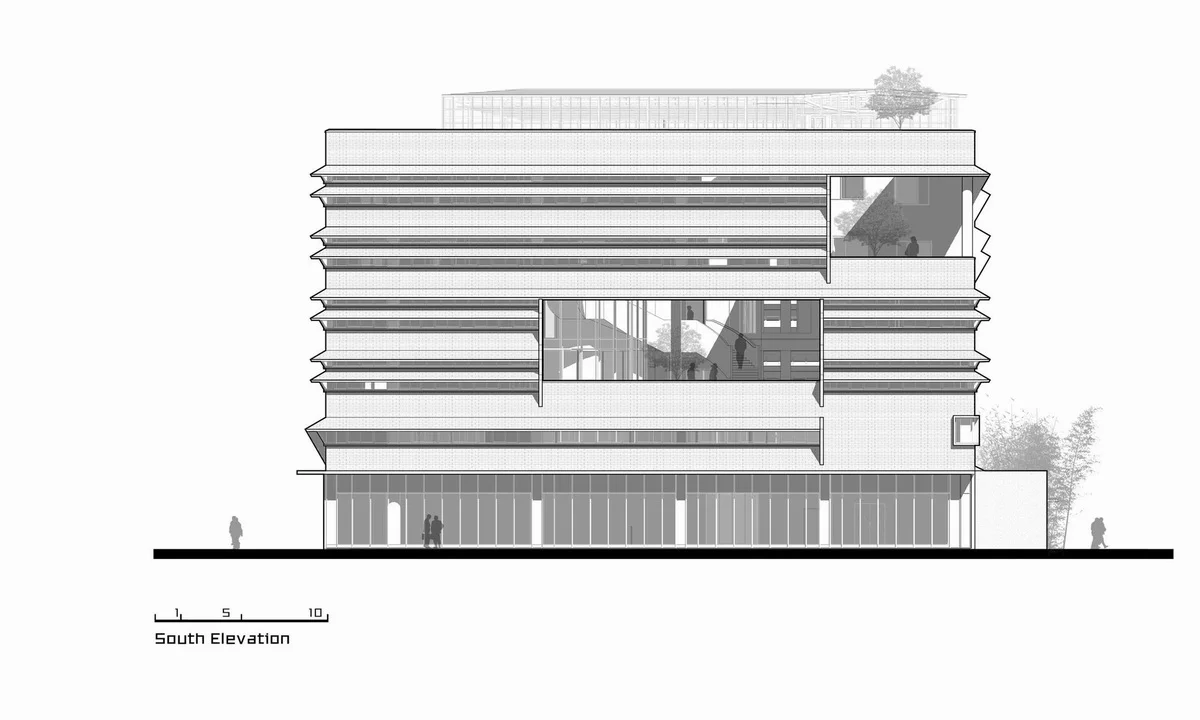
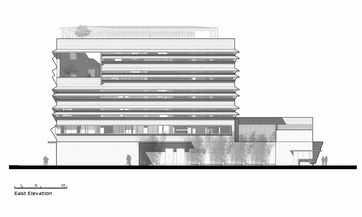
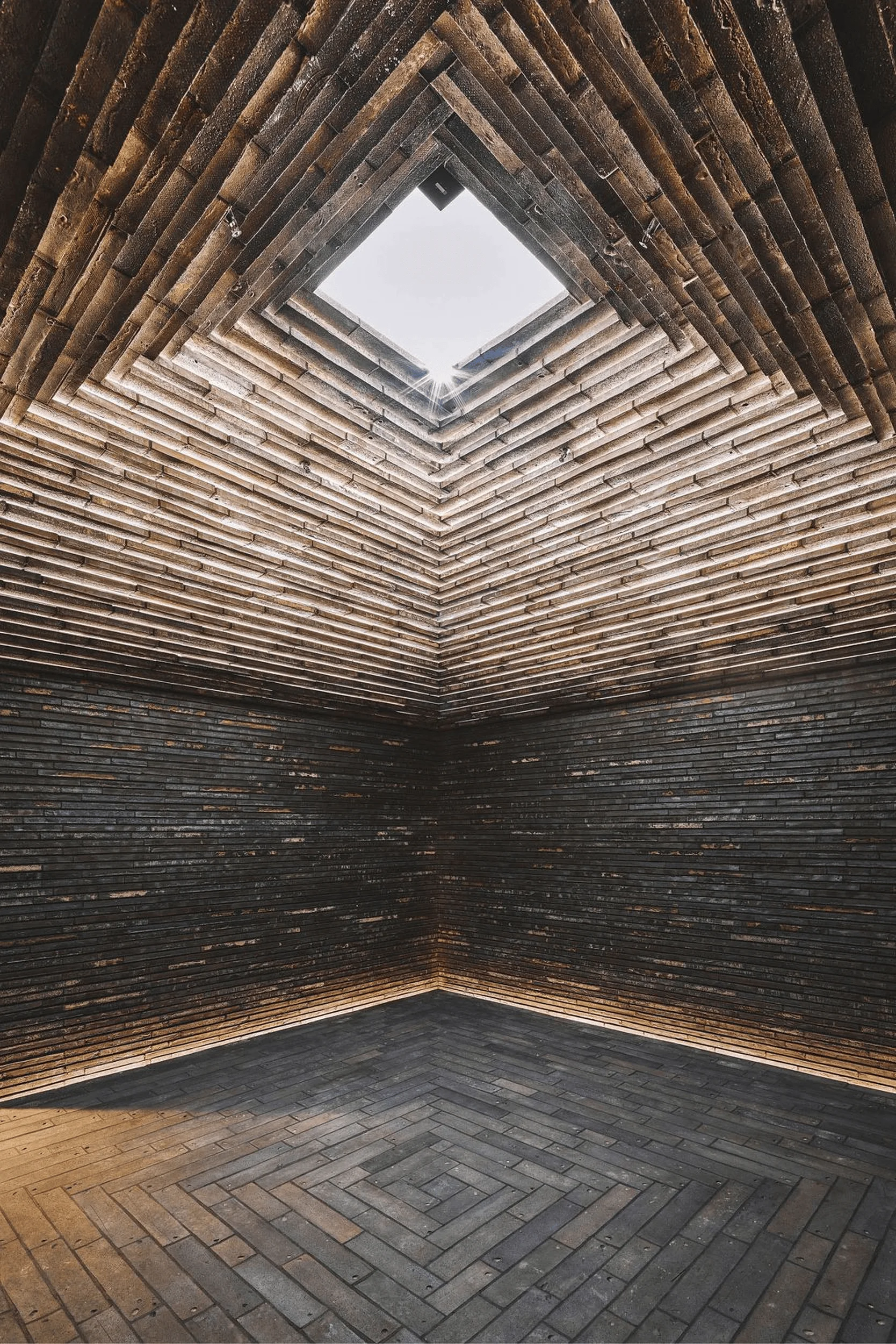
Continuing the understated style of Yikao Architecture’s previous projects in the Huaten series, Huaten Headquarters boldly embraces red earthenware tiles that cost 35 yuan per square meter. Anyone with a basic understanding of aesthetics knows this isn’t a conventional choice. However, Yikao Architecture decided to give it a try. The intention was to save budget on the façade to invest in the interior, as Yikao Architecture believes that building façades are for the eyes, and the visual pleasure and stimulation they offer are temporary, while the interior directly affects the daily mood of the occupants. With a limited budget, Yikao Architecture prioritized allocating more resources and effort to the daily users of the building. Another reason for this choice was to explore the possibility of transforming unconventional materials into an integral part of the architecture and making them aesthetically pleasing.
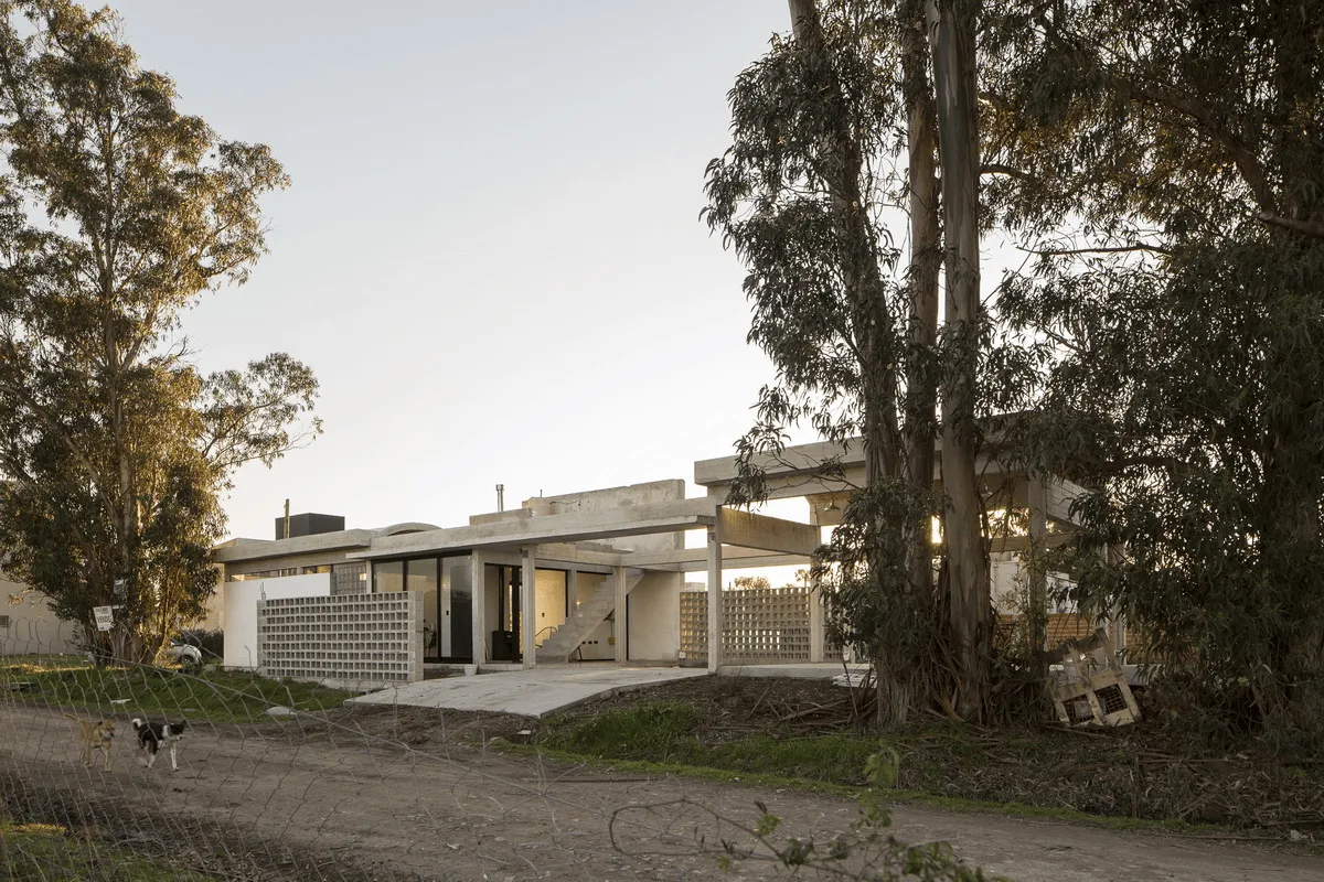
We often use the human body’s proportions as a standard of beauty and frequently discuss the consistency of language between the interior and exterior of a building. However, if you examine the human body’s anatomical cross-section, the skin, muscles, bones, and internal organs are entirely different in terms of material and expression because they serve different functions. Yet, they work together to maintain a living organism’s physical and vital characteristics. A living organism is not disrupted by the inconsistency of language between the inside and outside. Similarly, a building’s outer wall is intended to withstand the climate, while the interior materials are designed for close interaction with people. They have different roles, so the exterior wall material can be rough, while the interior materials should be soft, warm, and close to people. From this perspective, the material features of a building’s interior and exterior can be entirely different, serving their respective functions and collectively maintaining the building’s operation, and even mixing and matching. For example, at Huaten Headquarters, a plain concrete canopy and pre-order space are inserted into the red brick main building. When there is no explicit relationship between the interior and exterior language symbols, is there a need for a more powerful internal logic? What kind of logic is that? With these questions that remain unanswered, Yikao Architecture will continue to explore them in future projects.
Despite the simplicity and somewhat closed nature of Huaten’s façade, two large windows were strategically placed on the south and southeast corners. The south window is the “City Window” facing Zhouquan Town. From the third and fourth floors, one can gaze upon the town’s appearance. The southeast window, on the fifth and sixth floors, is the “Ecological Window” facing the nearby countryside, offering a view of the local rural fields. On the roof, skylights allow light to penetrate the interior mountain and water garden office space.
Project Information:


