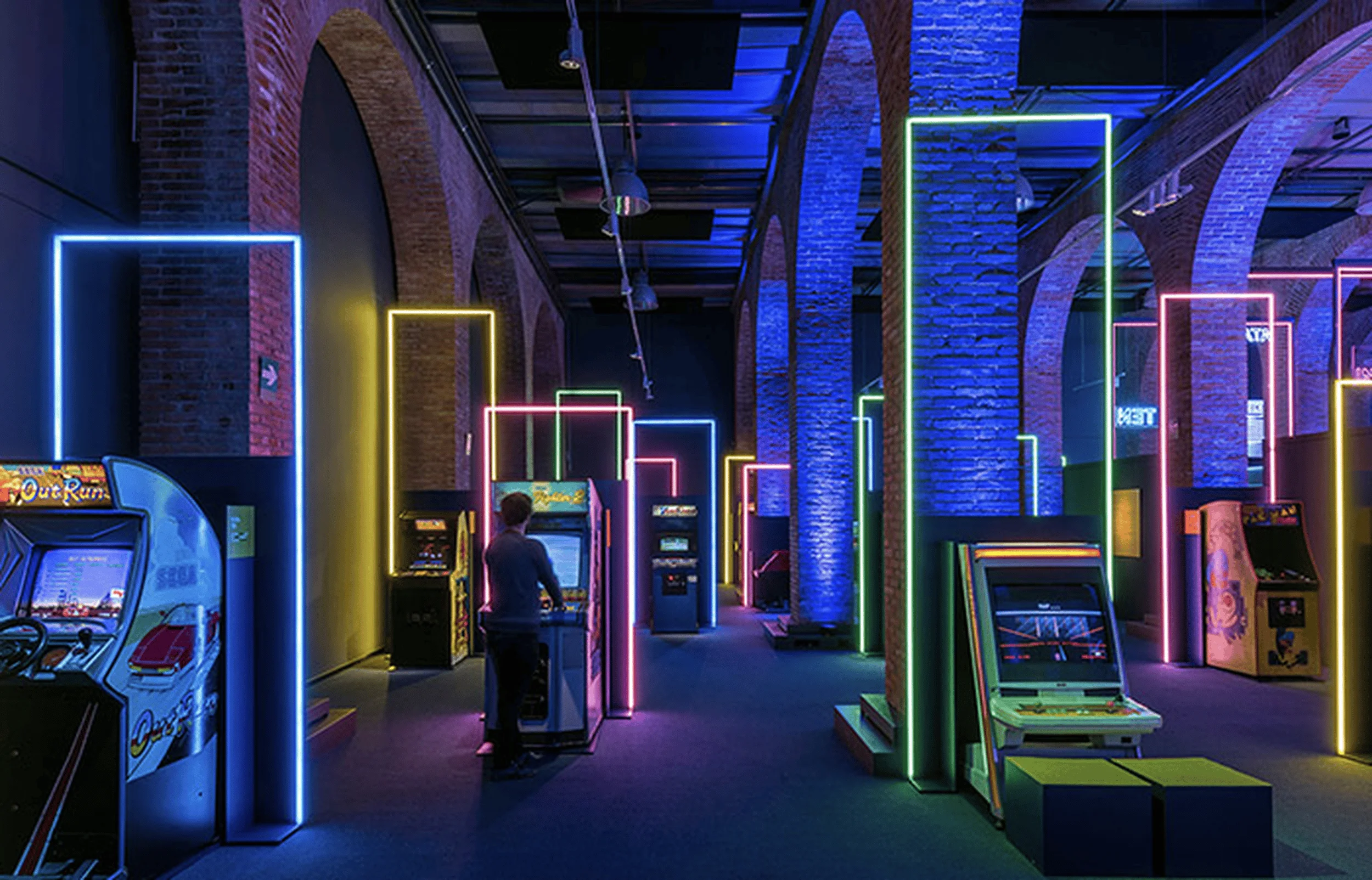
The Huiya Ceramics Headquarters Exhibition Hall seamlessly blends contemporary aesthetics with the brand’s industrial heritage, creating a dynamic and engaging exhibition space design.
Contents
Background
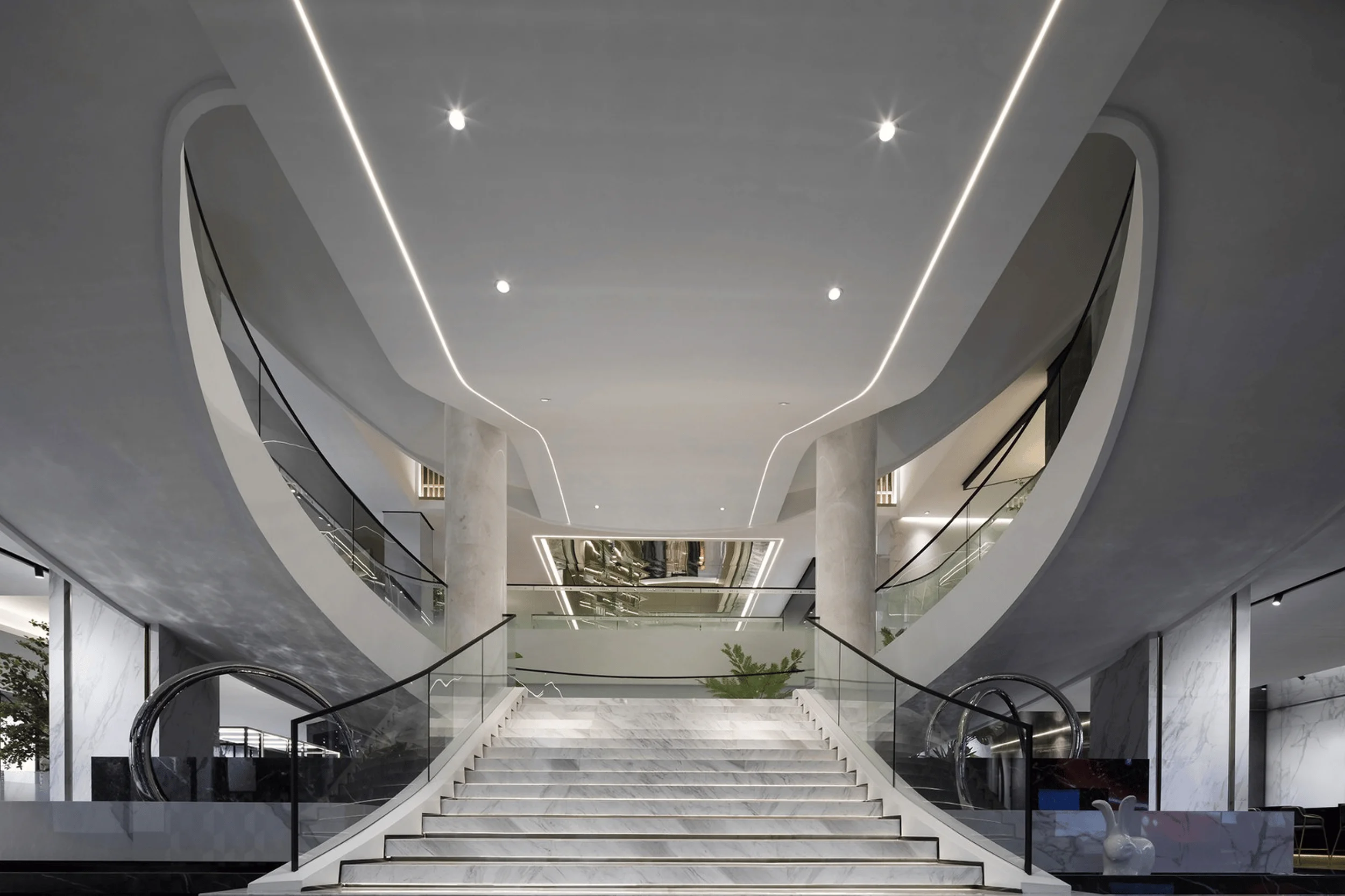
Nestled in Foshan, the heart of the Pearl River Delta’s manufacturing hub, Huiya Ceramics Headquarters stands as a testament to over two decades of industry leadership in China. The design challenge involved transforming an aging building, symbolic of the brand’s rich history, into a contemporary exhibition space that would resonate with modern sensibilities while honoring its past. The existing structure presented several limitations, including a bulky staircase dominating the entrance lobby and a massive void fragmenting the central space. The architects sought to revitalize the building through strategic spatial interventions, creating a seamless flow and interconnectedness that would breathe new life into the old structure. exhibition space design, contemporary aesthetics, industrial heritage
Design Concept and Objectives
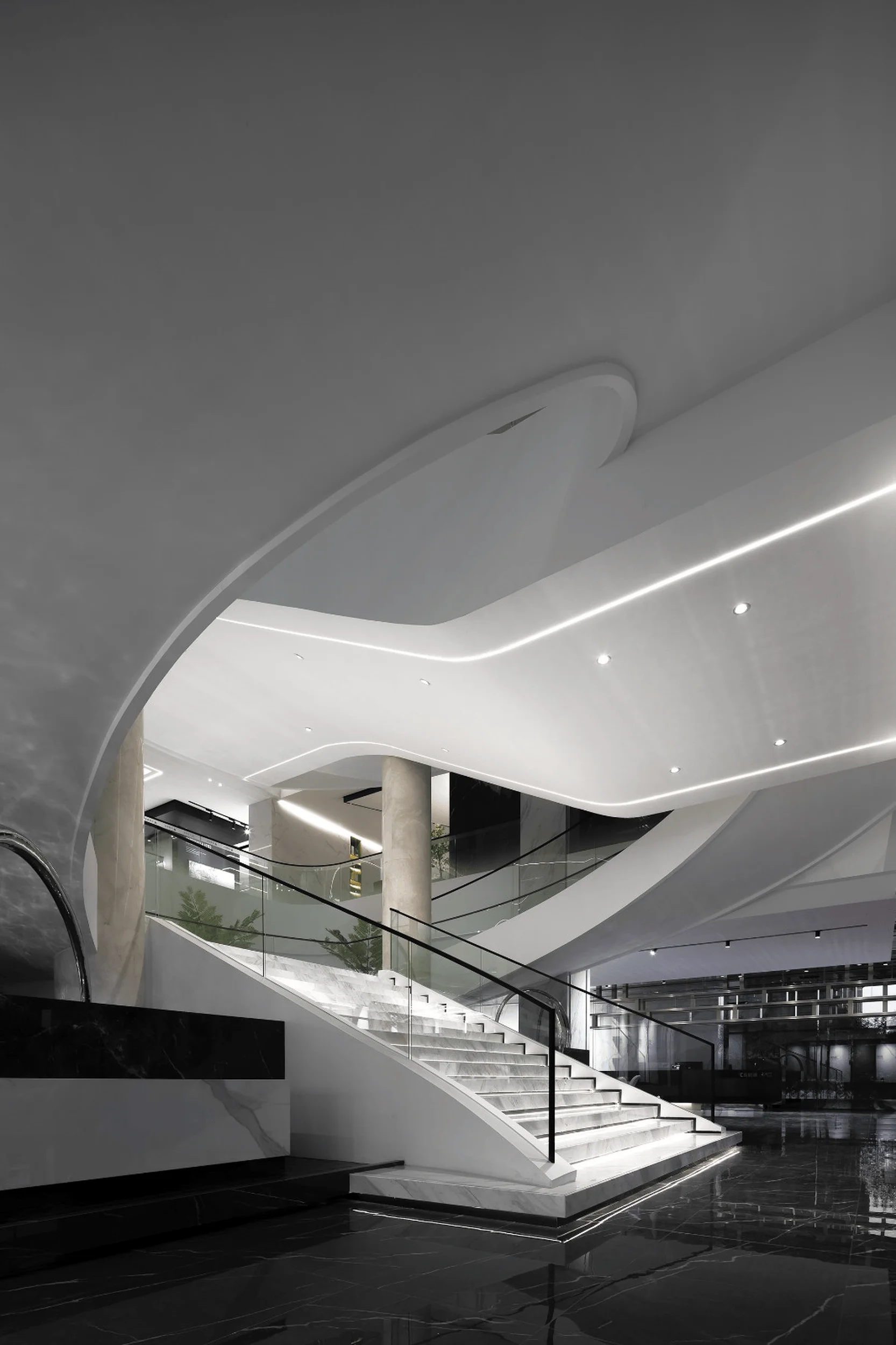
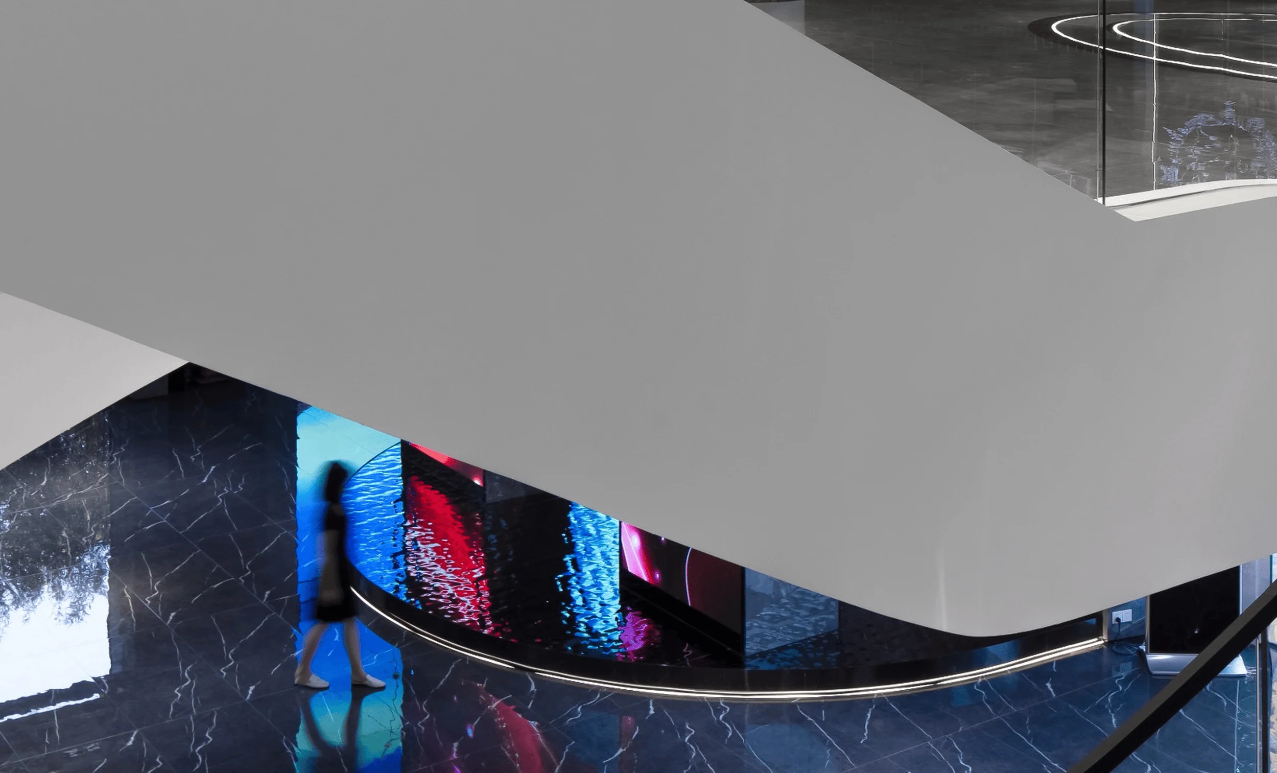
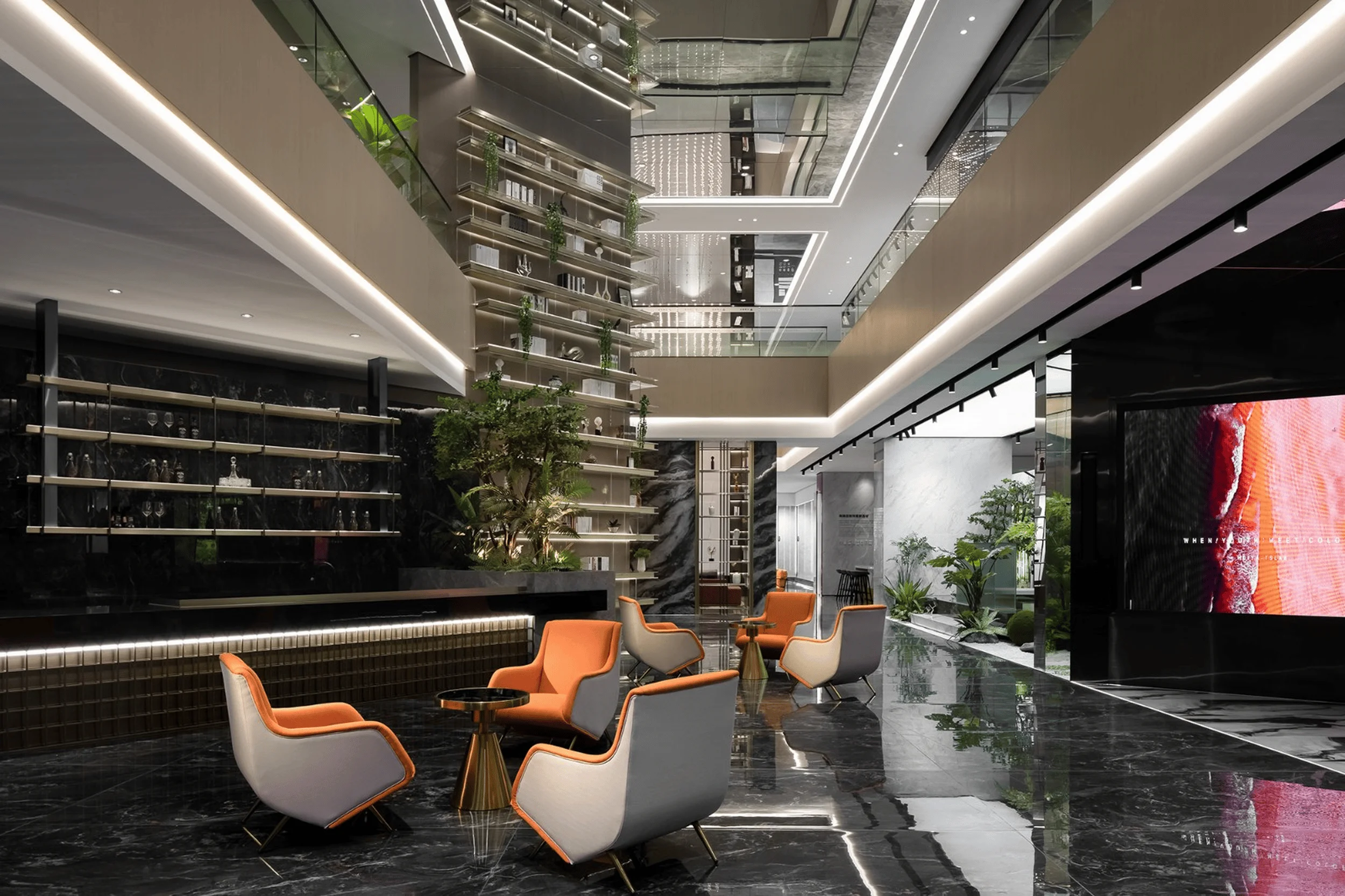
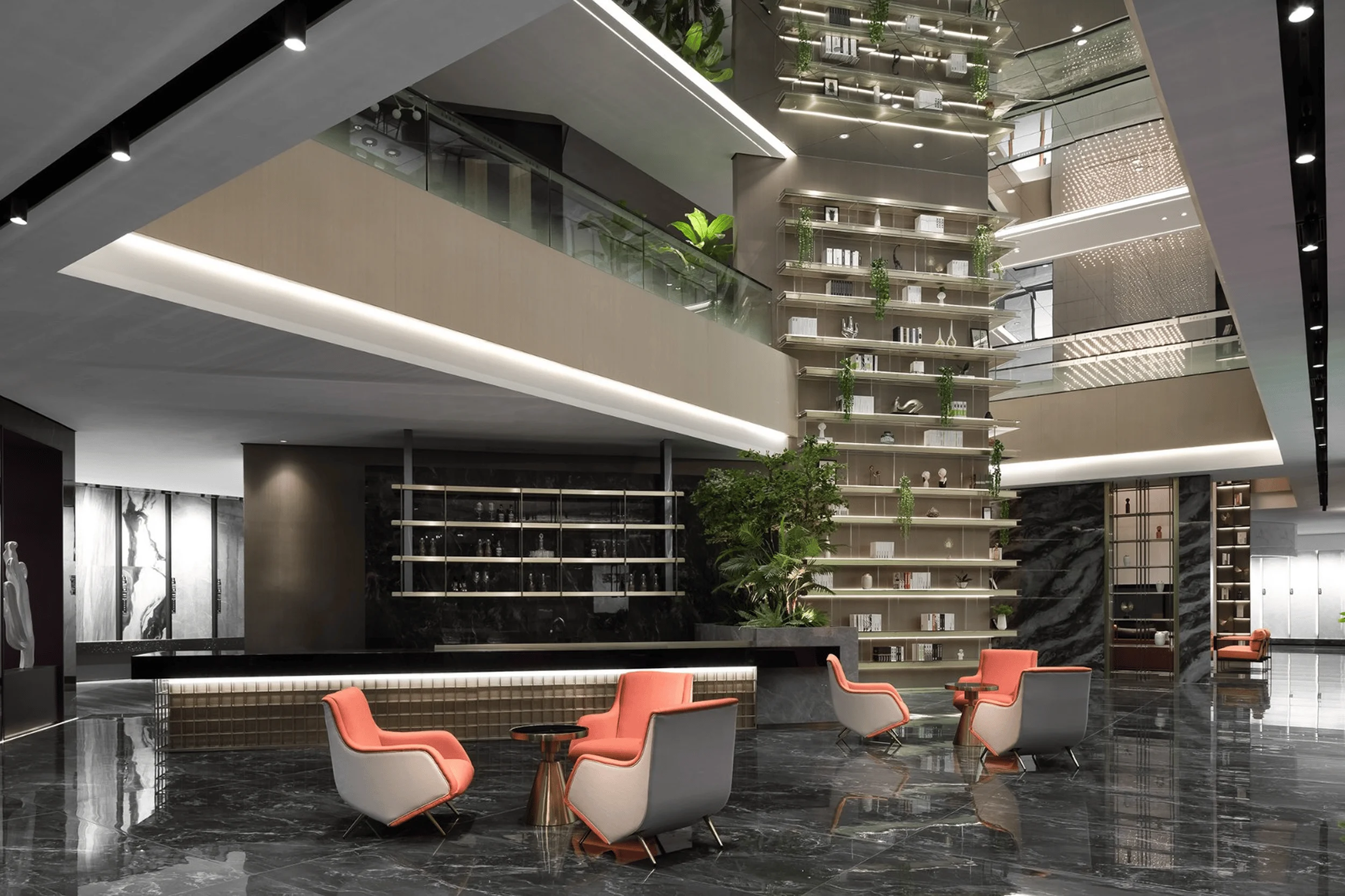
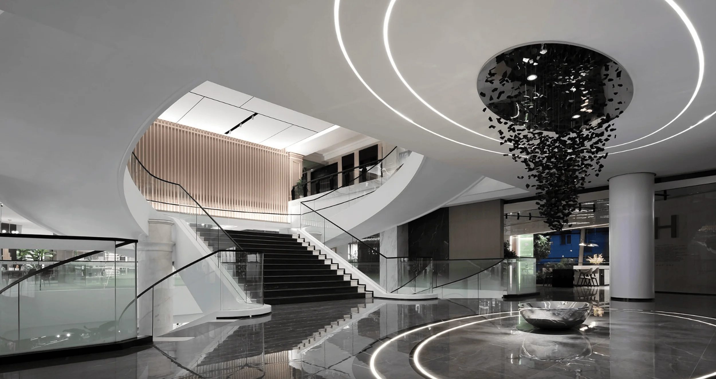
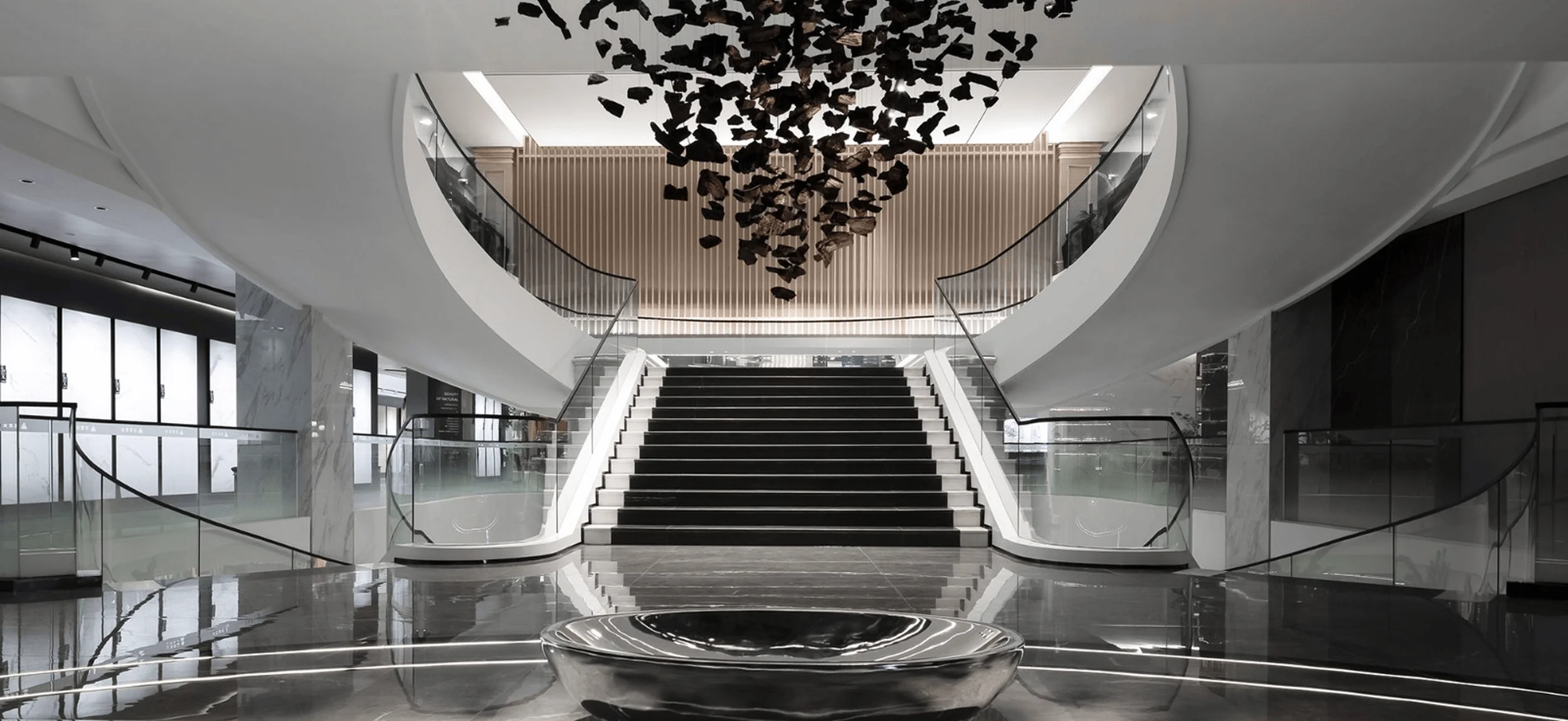
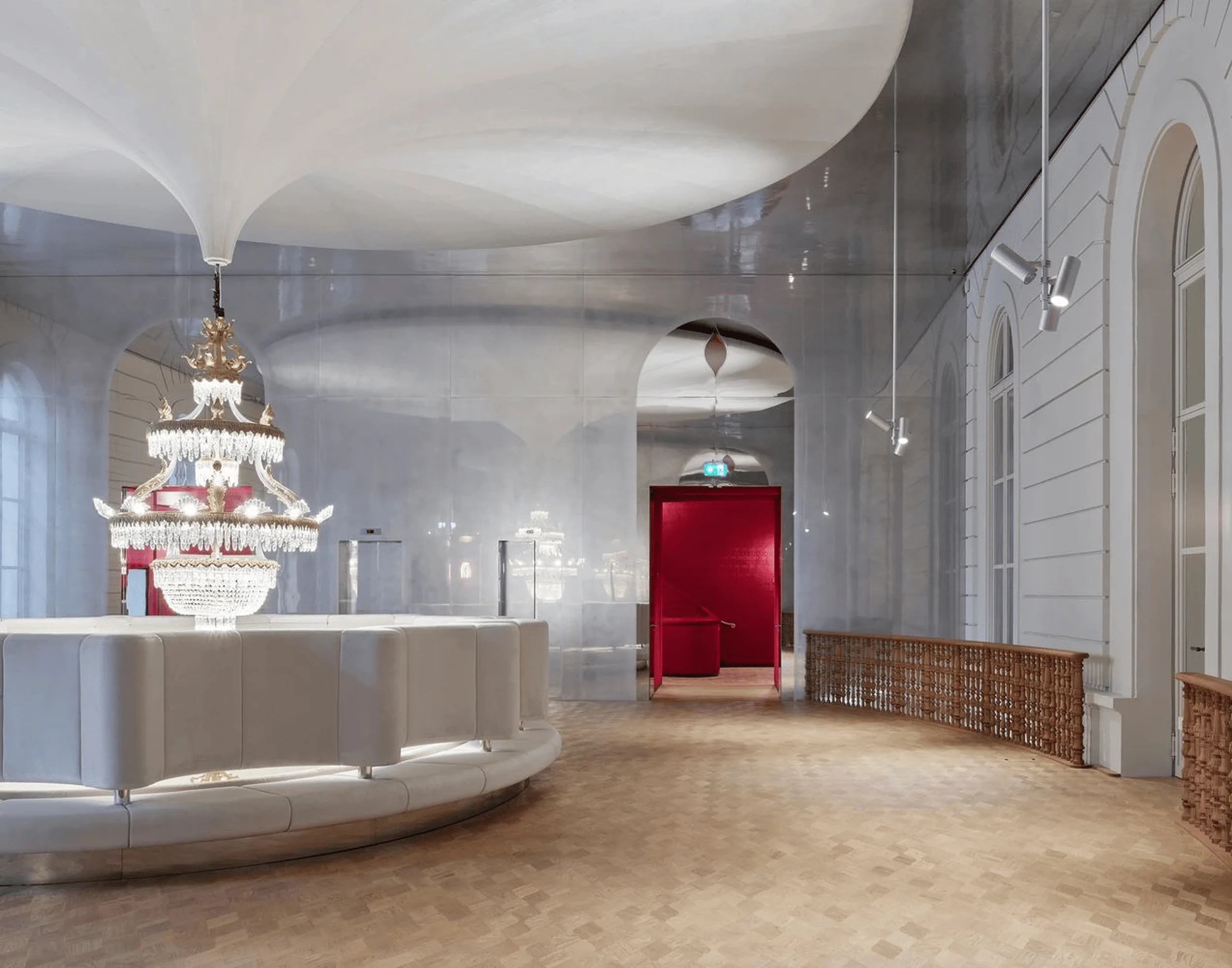
The design team embraced the concept of “free space” to infuse an element of dynamism within the established industrial character of the building. Contemporary aesthetics were meticulously integrated into the existing spatial framework, enhancing the curvature of the staircase to create a fluid visual journey. The strategic use of white materials imparted a sense of lightness and vibrancy, transforming the once-heavy staircase into a graceful, flowing element. The ceiling above the staircase evokes the imagery of a white drape billowing into the distance, further emphasized by two light strips that symbolize the brand’s narrative, weaving through the space like threads of a story. This bold design choice aimed to bridge the gap between the brand’s past and its future aspirations. exhibition space design, contemporary aesthetics, industrial heritage
Spatial Planning and Layout
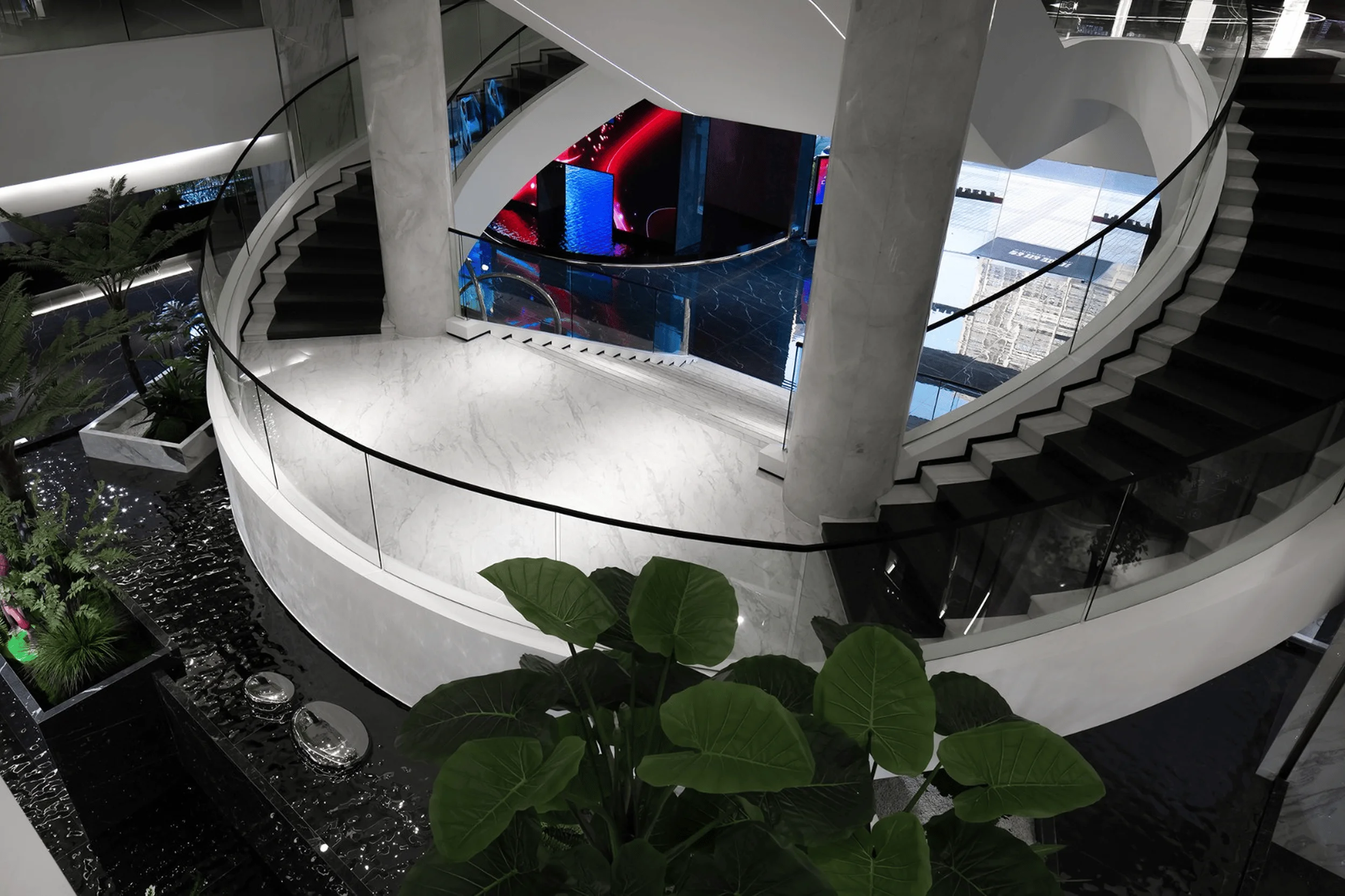
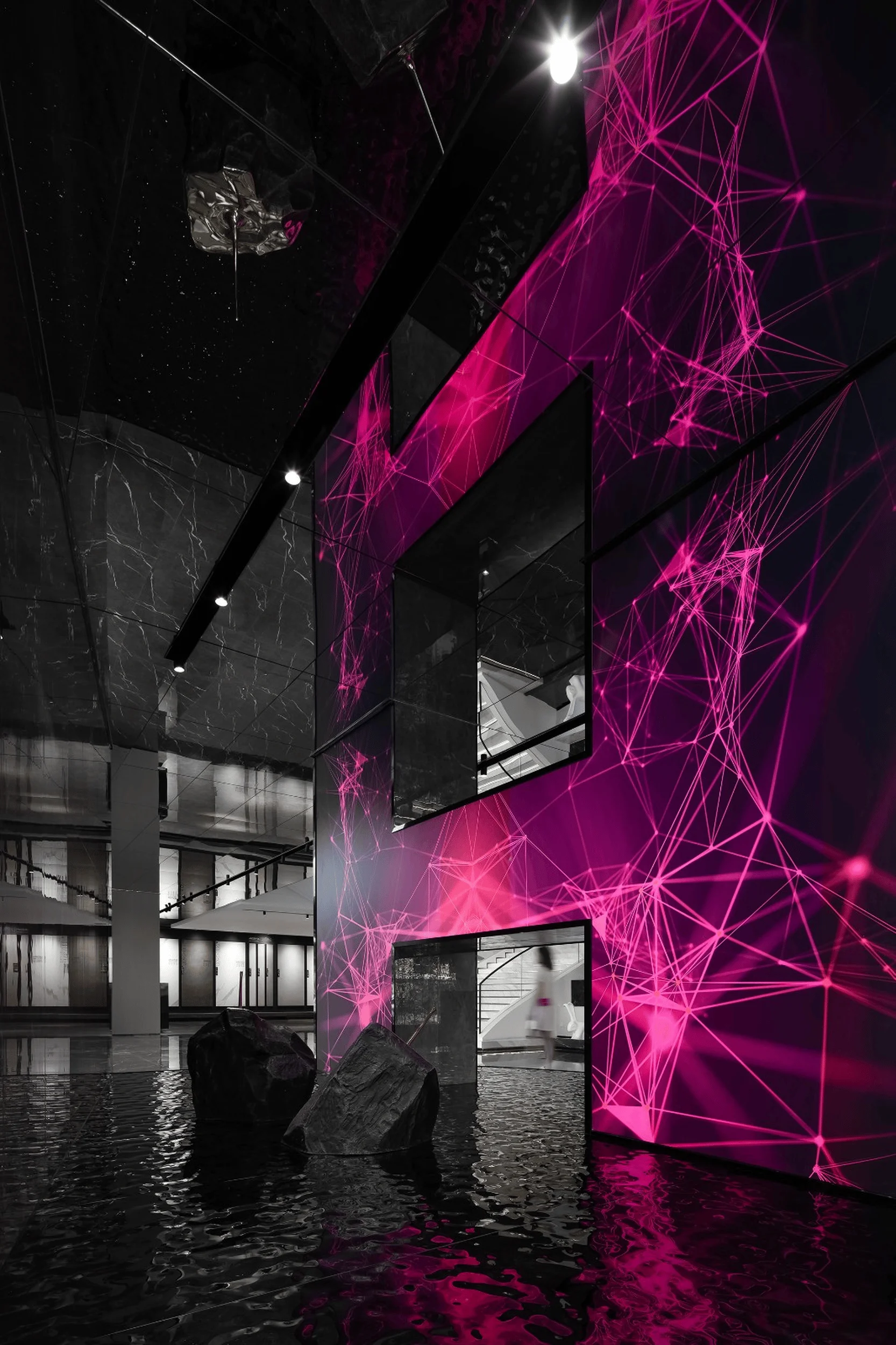
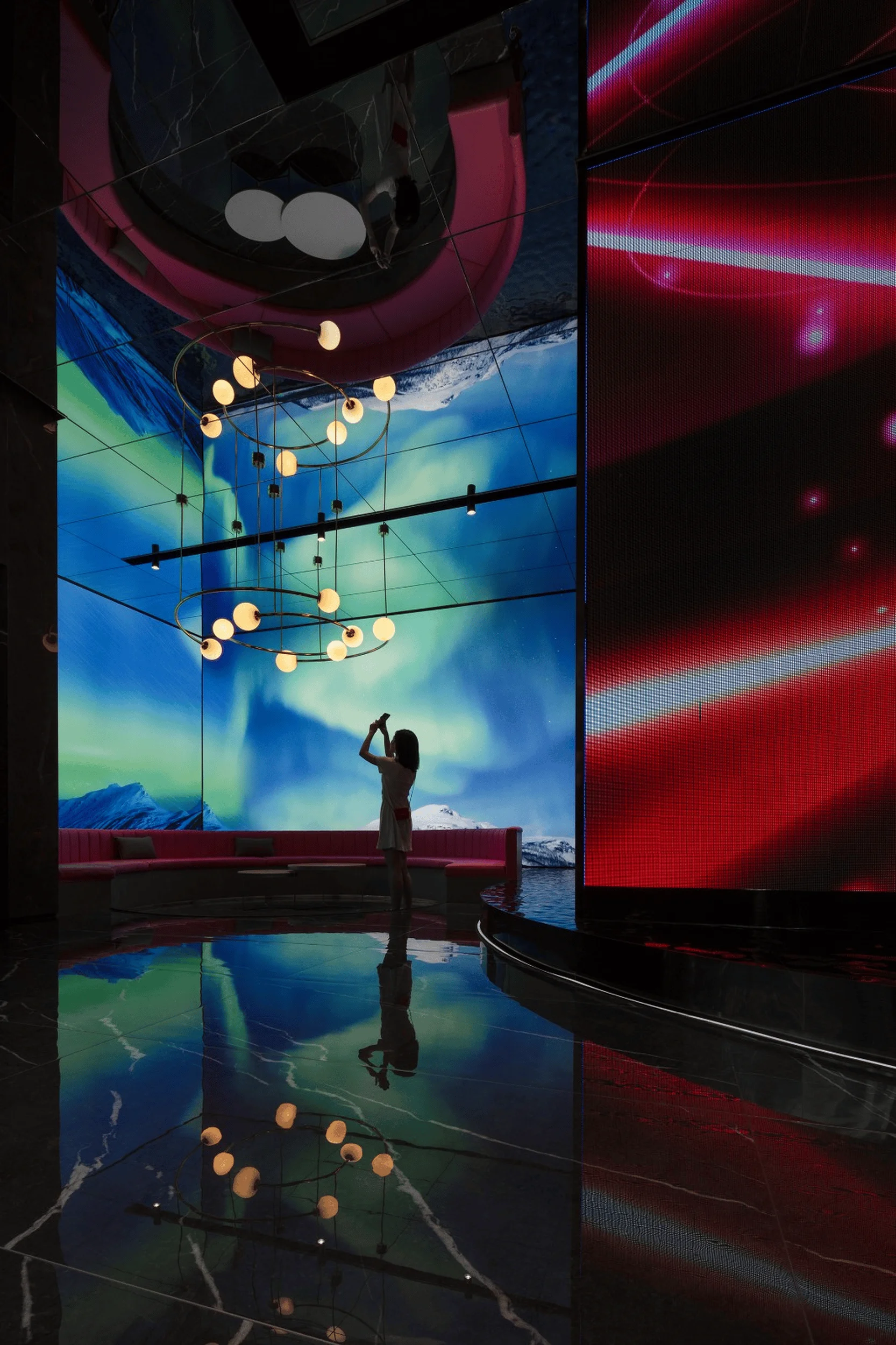
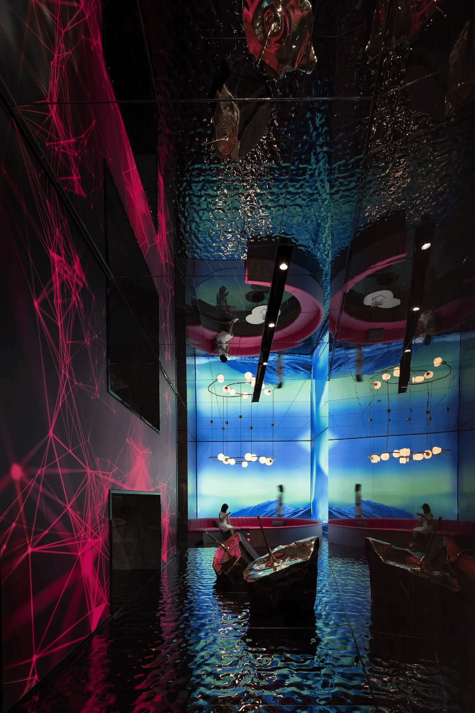
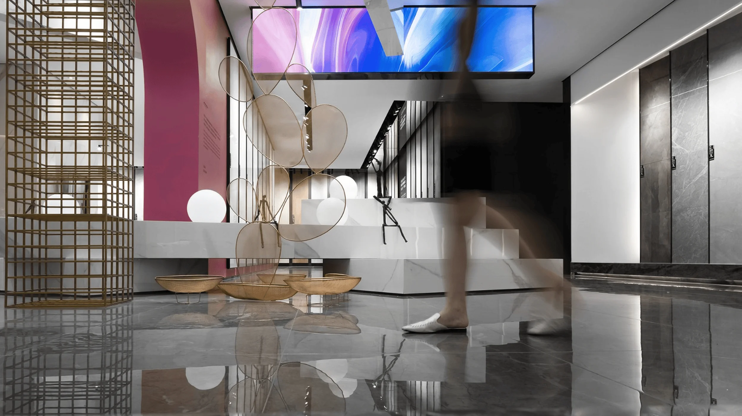
To maximize spatial efficiency and enhance the visitor experience, the design team creatively utilized the space beneath the staircase. A series of stacked boxes of varying forms, interspersed with stainless steel rings, were strategically placed, allowing water to flow freely between them. This interplay of elements fostered a sense of movement and fluidity, creating a harmonious balance between stillness and motion. The “H” sculpture, formed by two structural columns, represents the first letter of the Huiya brand, serving as both a cultural symbol and a nod to industrial design principles. The incorporation of dynamic visuals, such as auroras, clouds, and cosmic imagery, onto the sculpture’s surface amplifies the theme of free space, while interactive elements invite visitors to engage with the brand’s story in a unique and immersive way. exhibition space design, contemporary aesthetics, industrial heritage
Exterior Design and Aesthetics
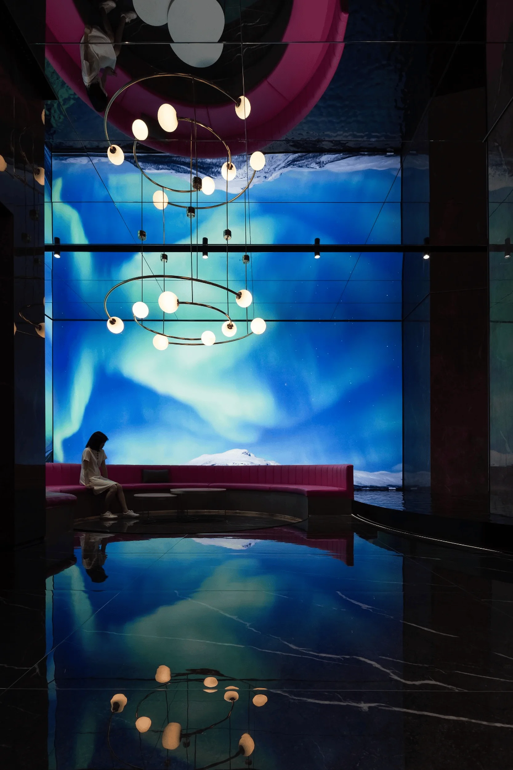
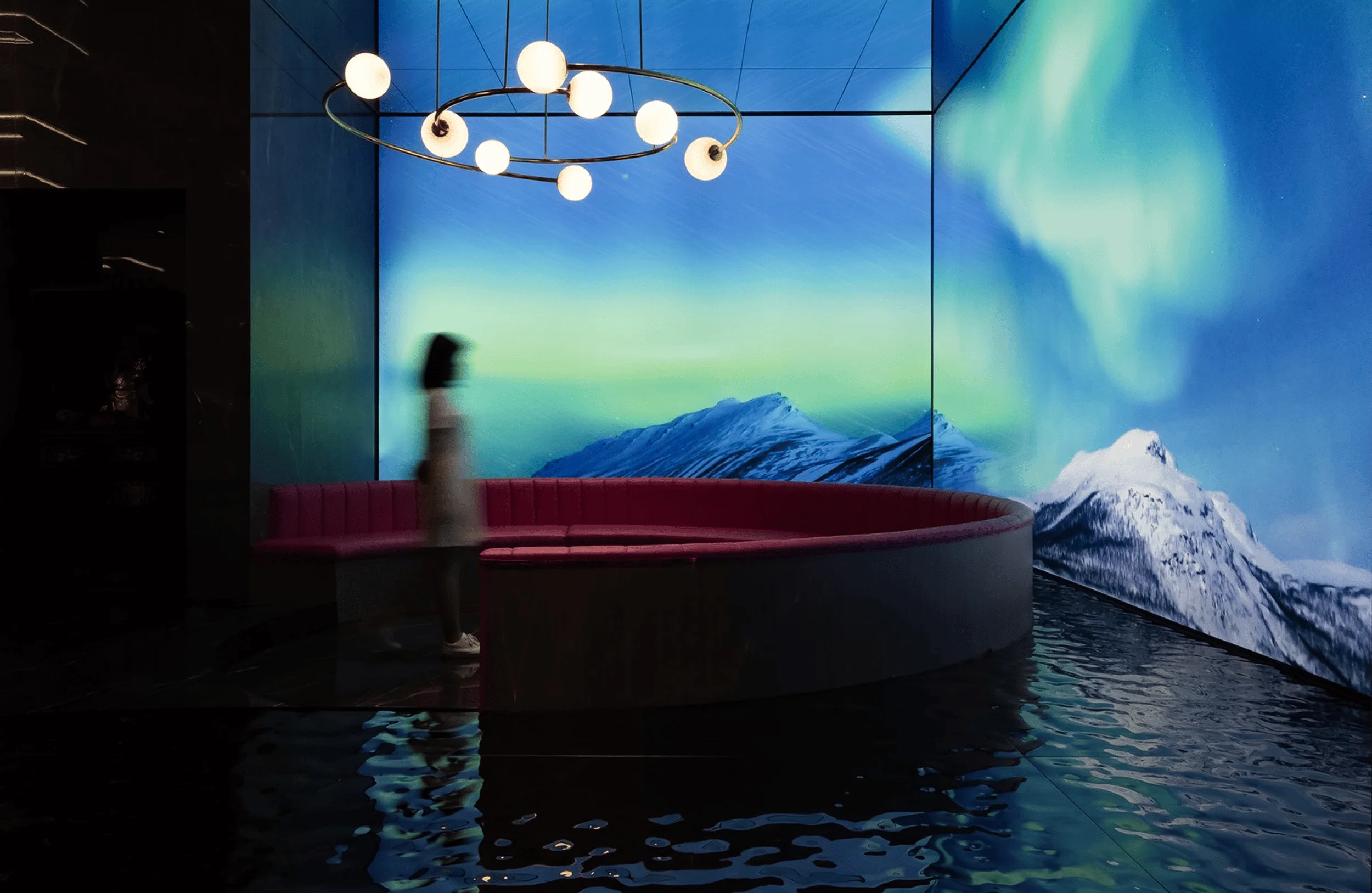
The entrance leisure area features an array of multimedia displays, immersing visitors in virtual scenarios and showcasing the brand’s commitment to innovation. As guests move through the space, accompanied by soft music, they encounter mesmerizing visuals, such as virtual auroras reflected on water surfaces. This seamless integration of technology and design elements creates a captivating, immersive experience that sparks curiosity and fosters a deeper connection with the brand. exhibition space design, contemporary aesthetics, industrial heritage
Technology and Sustainability
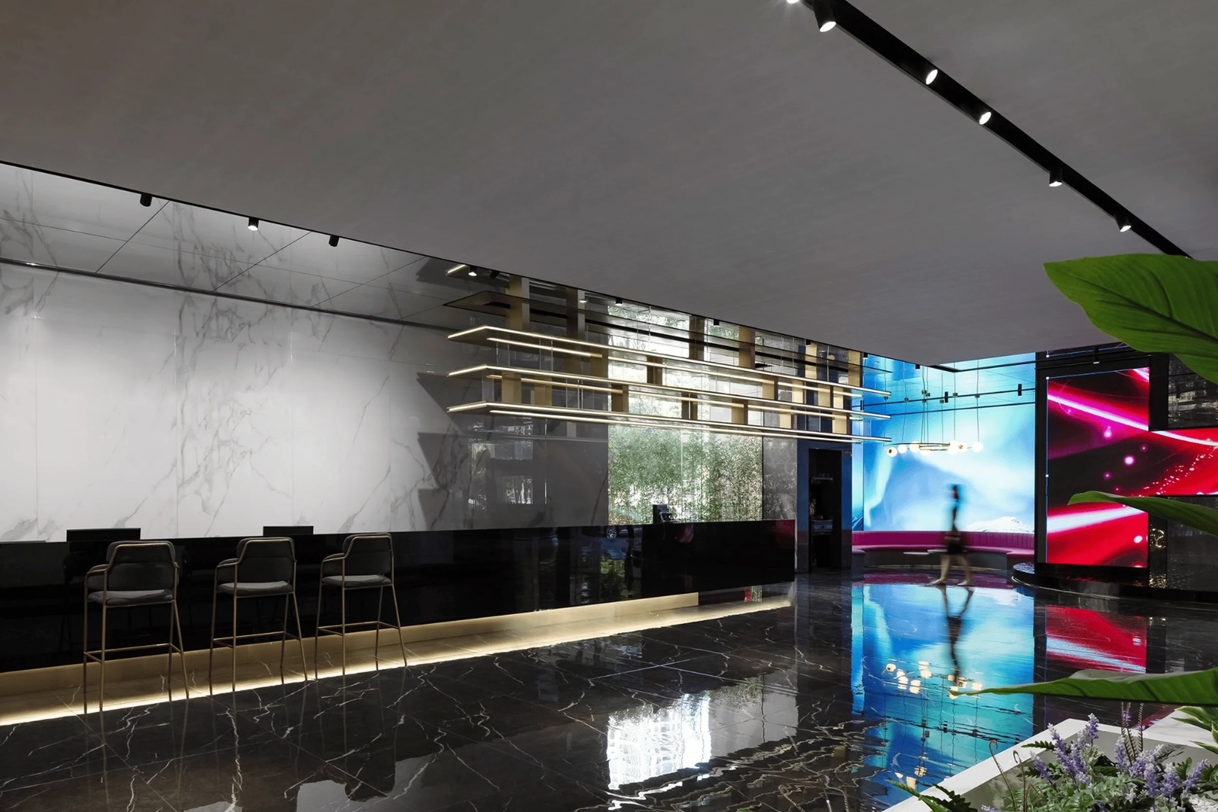
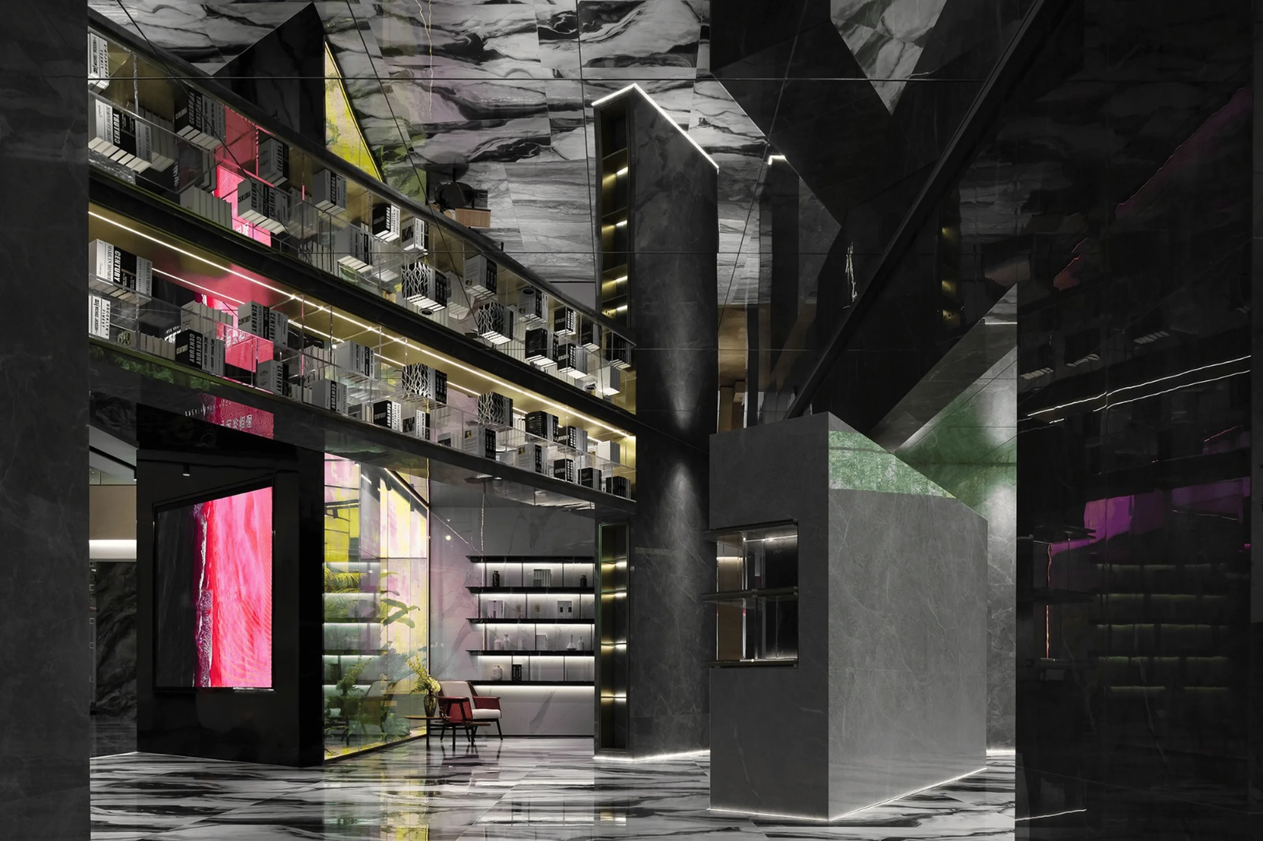
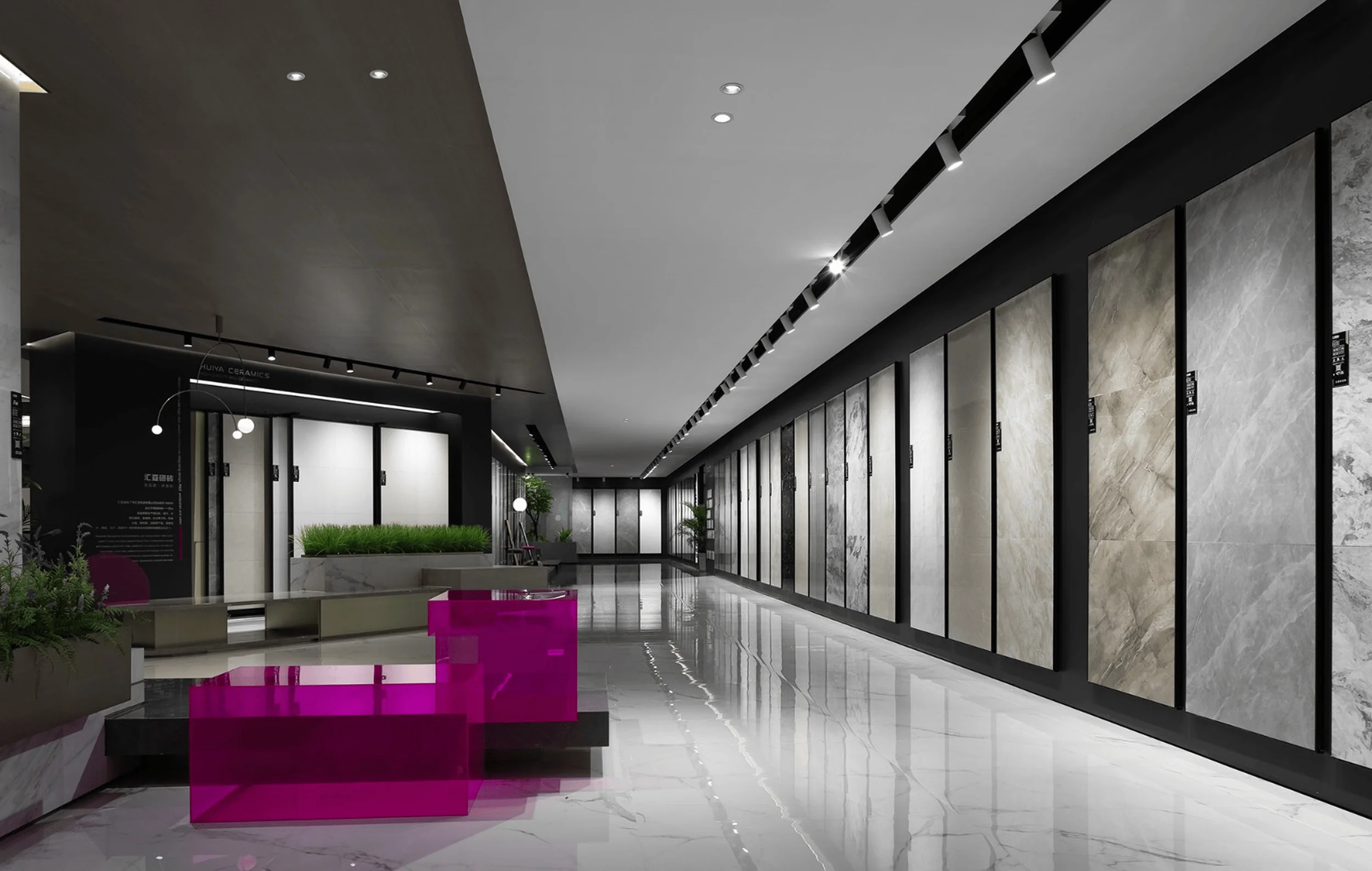
The brand image area is anchored by an elongated reception desk that guides the flow of movement and expands the spatial boundaries. By blending real and virtual elements, the design blurs the lines between physical and digital realms, creating an illusion of infinite space. The free-flowing layout, punctuated by a series of captivating vignettes, encourages visitors to explore the space at their own pace, fostering a sense of discovery and engagement. exhibition space design, contemporary aesthetics, industrial heritage
Social and Cultural Impact
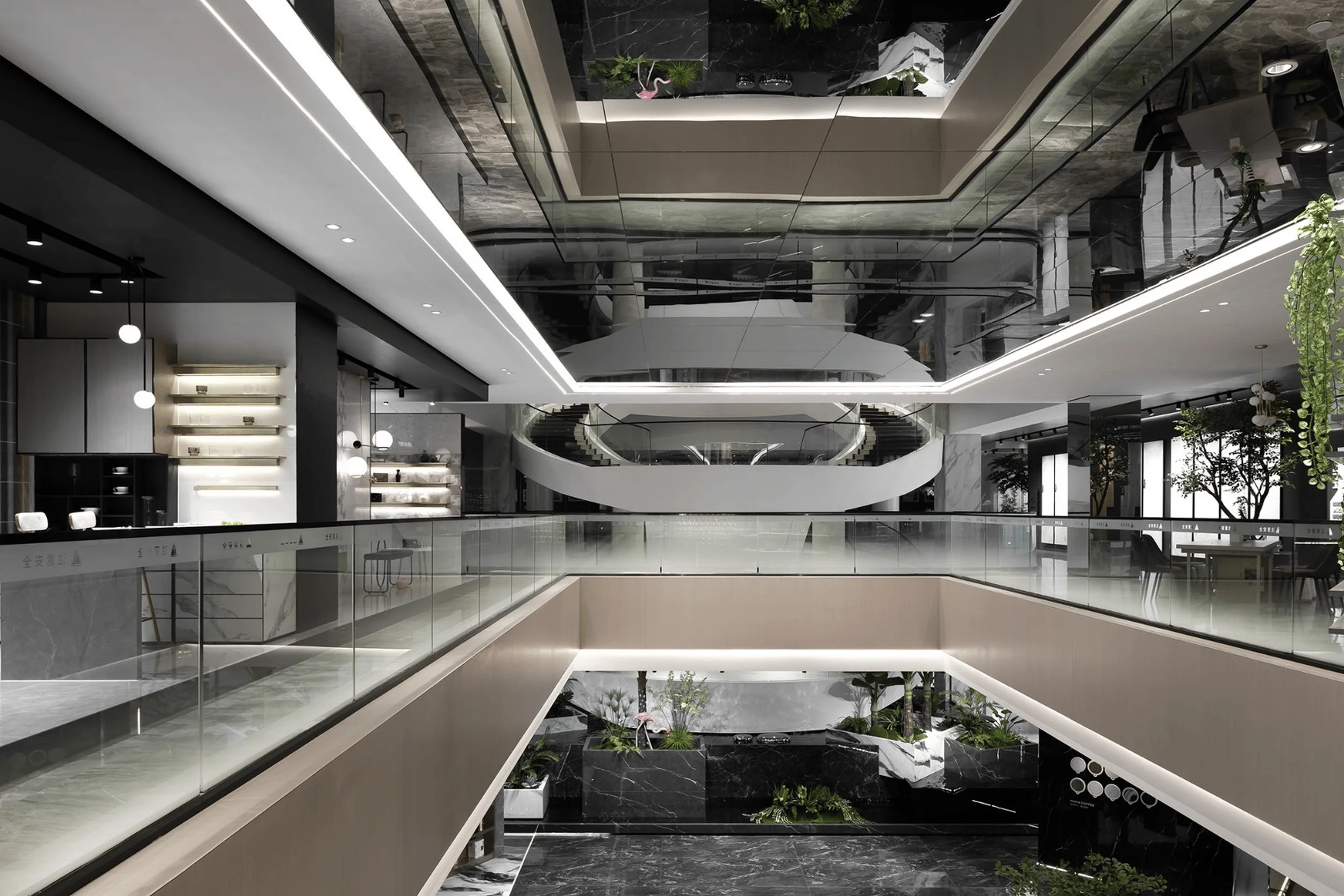
Recognizing the inherent human desire for connection with nature, the design team harnessed the exhibition hall’s height to create an interior atrium. This light-filled space, adorned with lush greenery, introduces a sense of tranquility and natural beauty into the environment. The atrium’s presence not only enhances the aesthetic appeal of the lobby but also serves as a refreshing oasis, promoting a sense of well-being and fostering a connection between the indoor and outdoor realms. exhibition space design, contemporary aesthetics, industrial heritage
Construction and Project Management
The café area is defined by a slanted bookshelf wall that extends to the second floor, creating a striking visual contrast. This multifunctional space serves as both a customer service hub and a shared social area. The design approach embraces a minimalist aesthetic, prioritizing natural elements over artificial embellishments. Clean lines, a harmonious palette of colors, and materials with varying textures create a serene and inviting atmosphere that complements the surrounding natural environment. exhibition space design, contemporary aesthetics, industrial heritage
Post-Completion Evaluation and Feedback
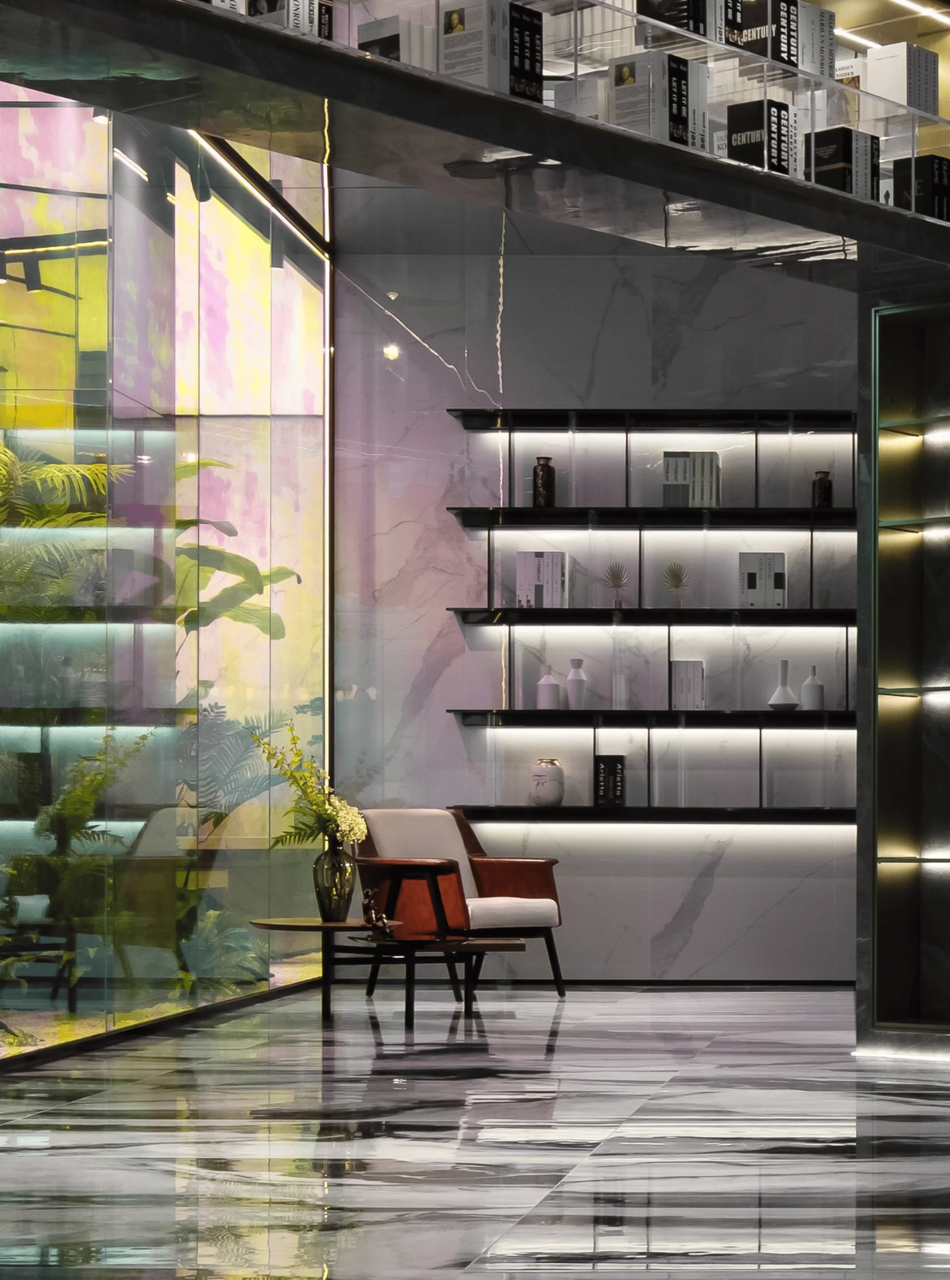
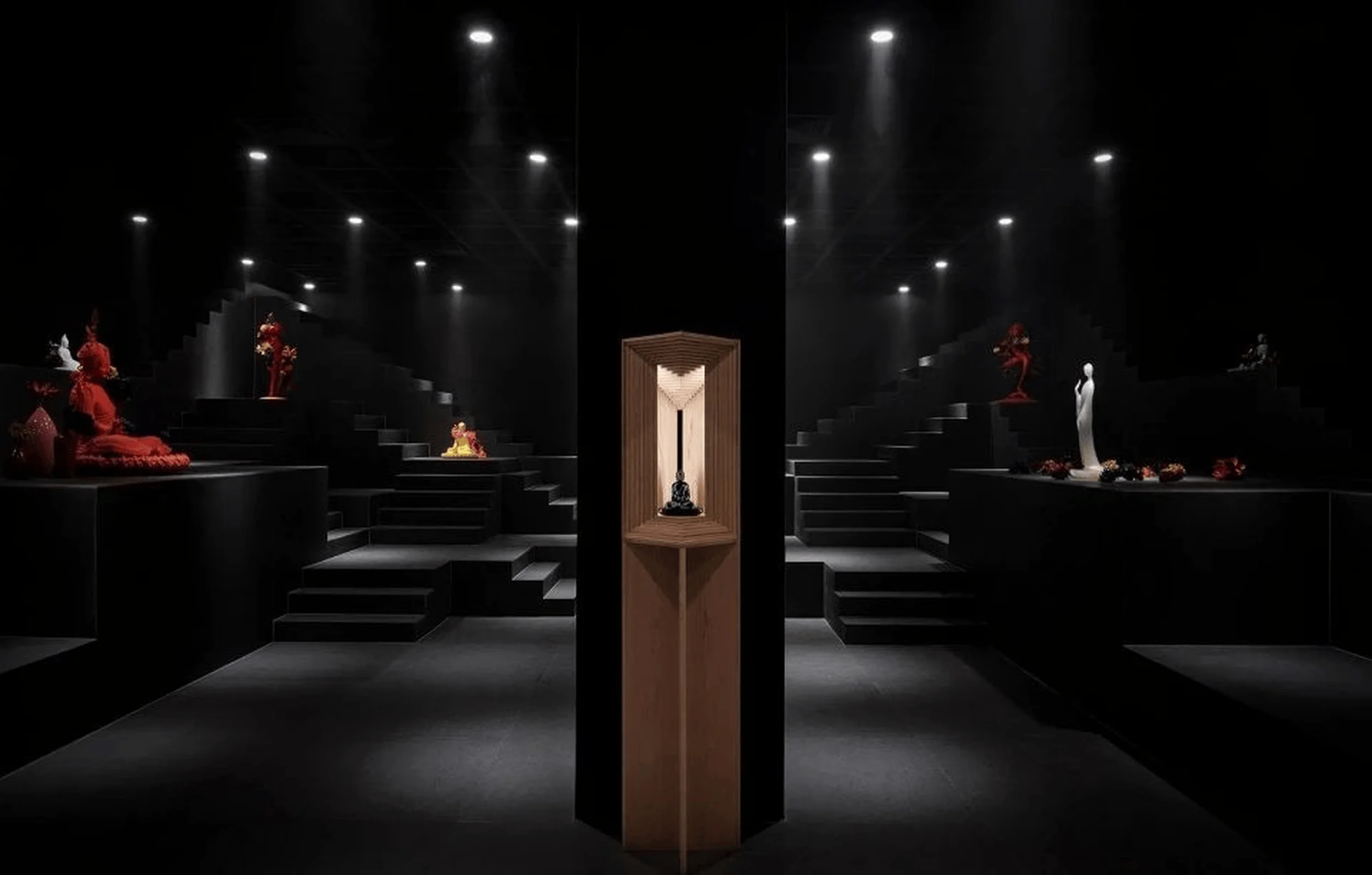
The interplay of light and color throughout the exhibition hall evokes a dreamlike ambiance, inviting visitors to embark on a journey through time and space. The design team’s meticulous approach to simplifying spatial relationships, combined with the strategic use of color and lighting, transforms the traditional exhibition format into a captivating narrative experience. The interplay of light and shadow creates a dynamic and engaging environment, stimulating the senses and encouraging exploration. exhibition space design, contemporary aesthetics, industrial heritage
Conclusion
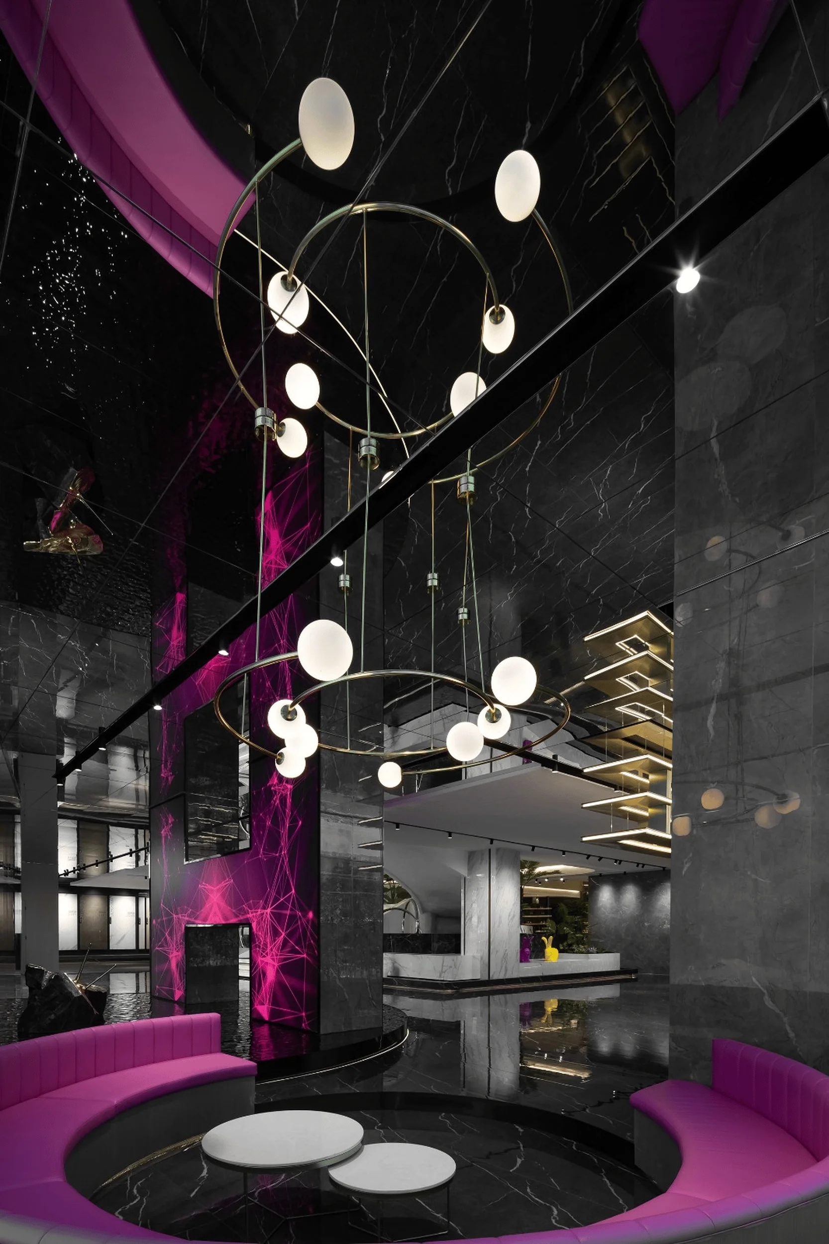
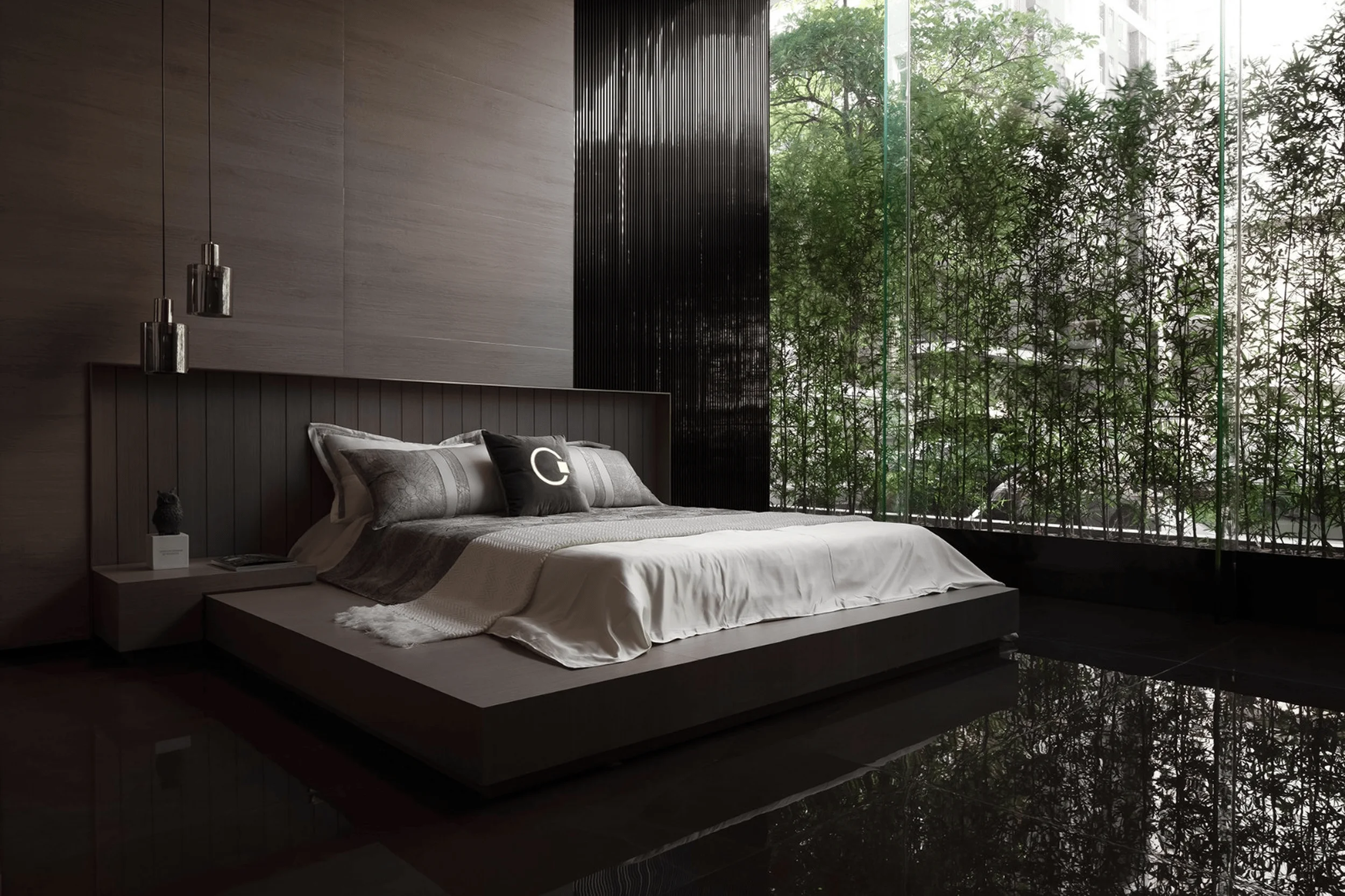
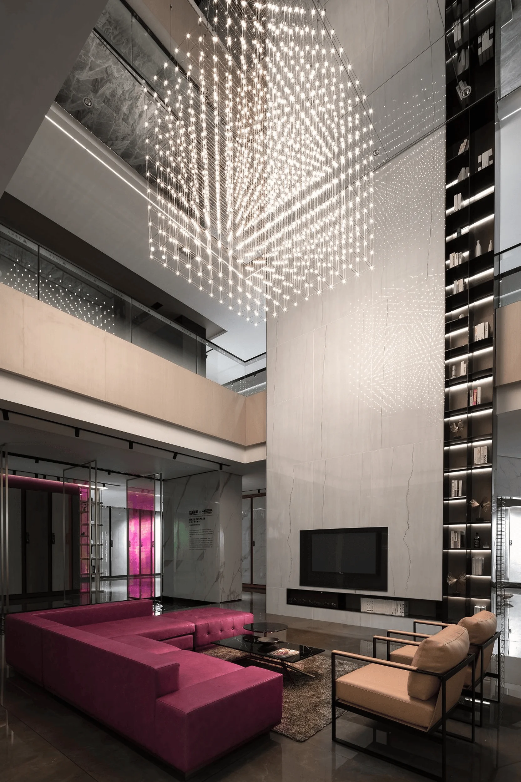
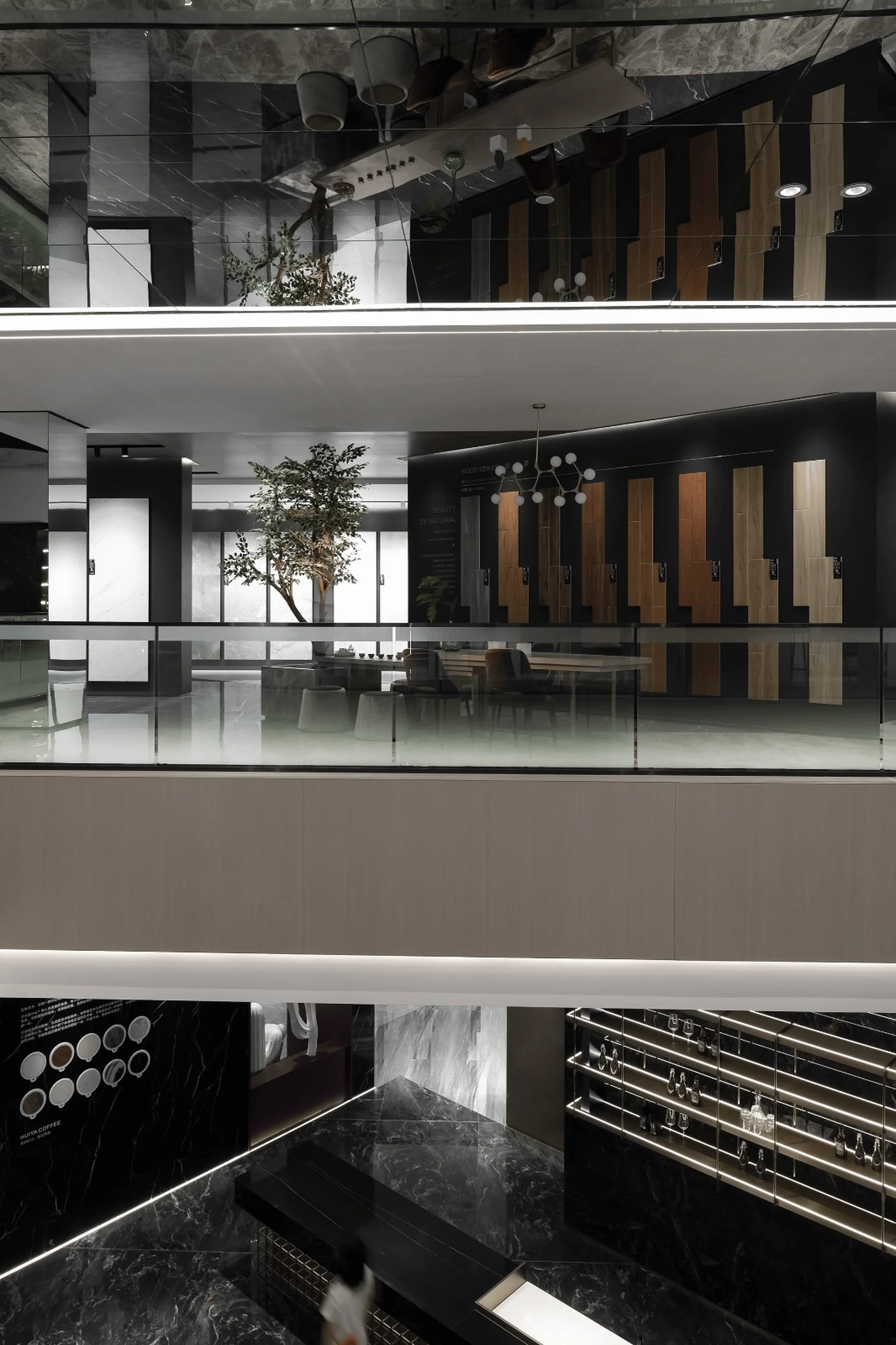
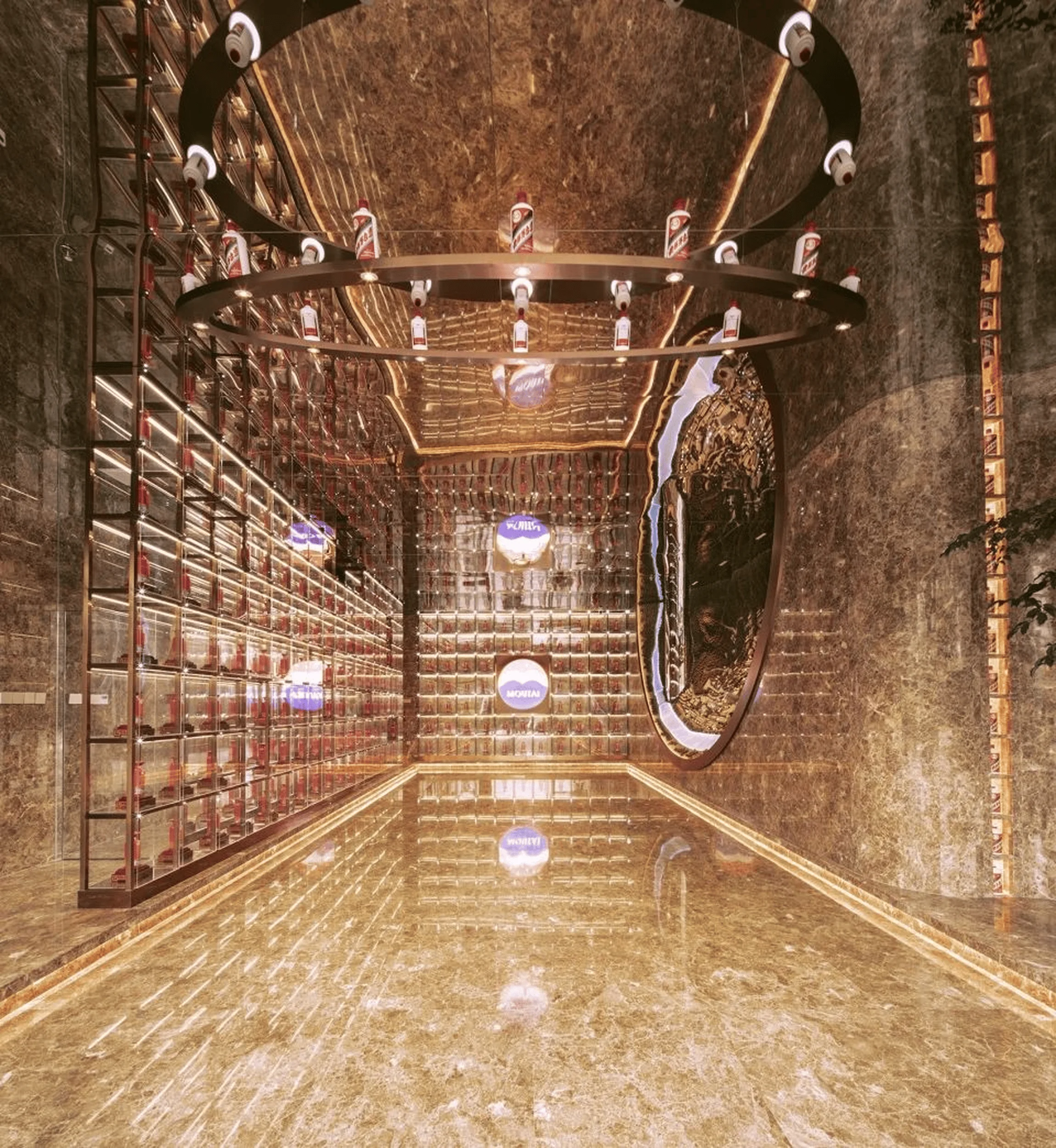
The meeting room, characterized by its generous proportions, features a backdrop of large-scale marble and a mirrored ceiling that amplifies the sense of space. The vibrant purple-red sofa adds a touch of warmth, while the matrix starlight chandelier casts a mesmerizing glow, creating an inviting and comfortable atmosphere. The bedroom exudes a sense of tranquility and refinement, with its combination of matte wood textures, soft fabrics, and expansive floor-to-ceiling windows that seamlessly integrate the outdoor garden into the interior space. exhibition space design, contemporary aesthetics, industrial heritage
Economic Considerations
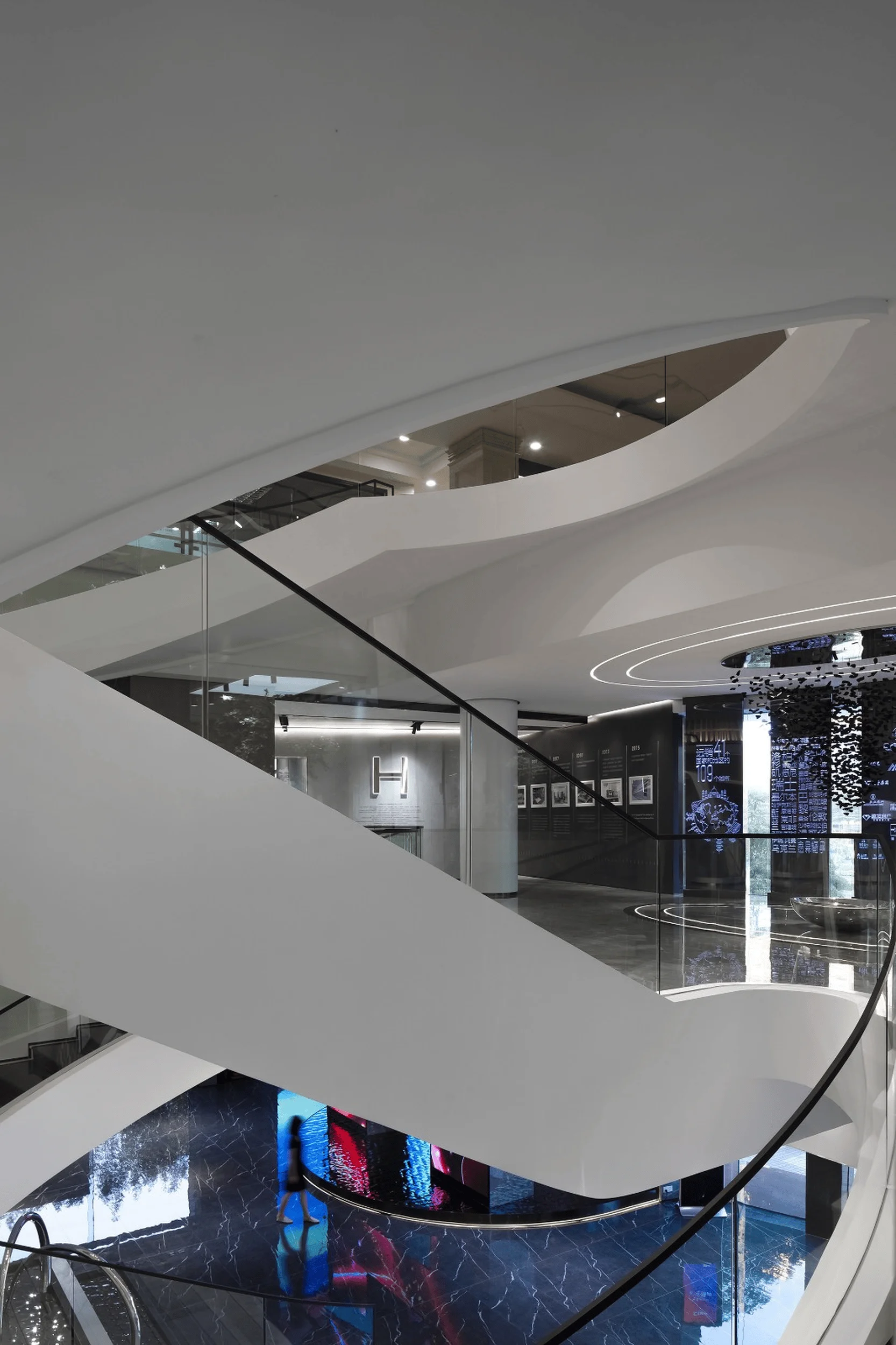
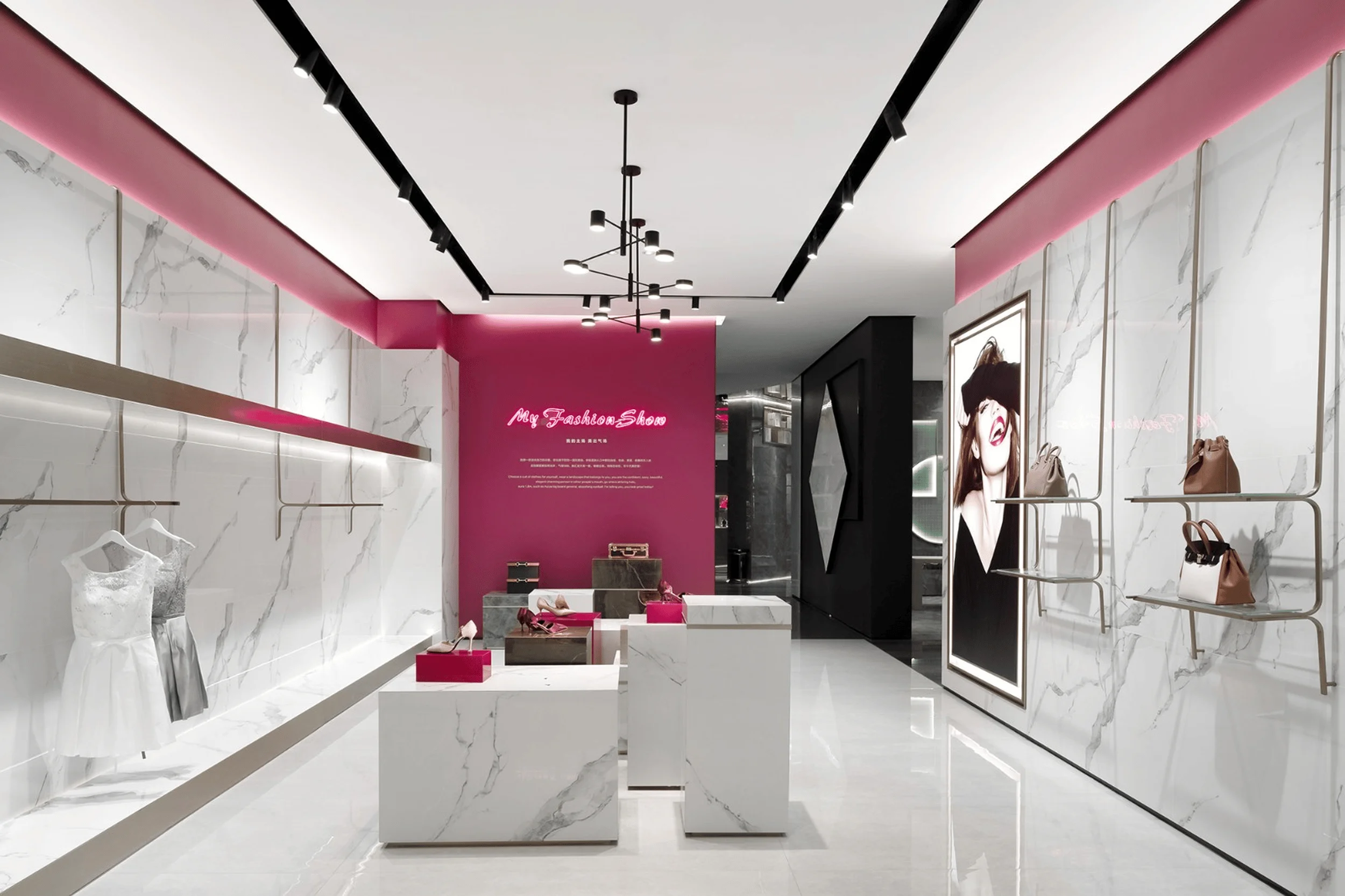
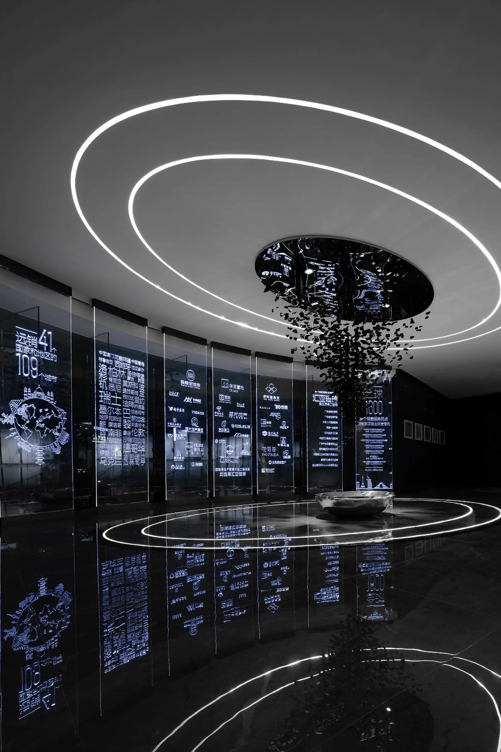
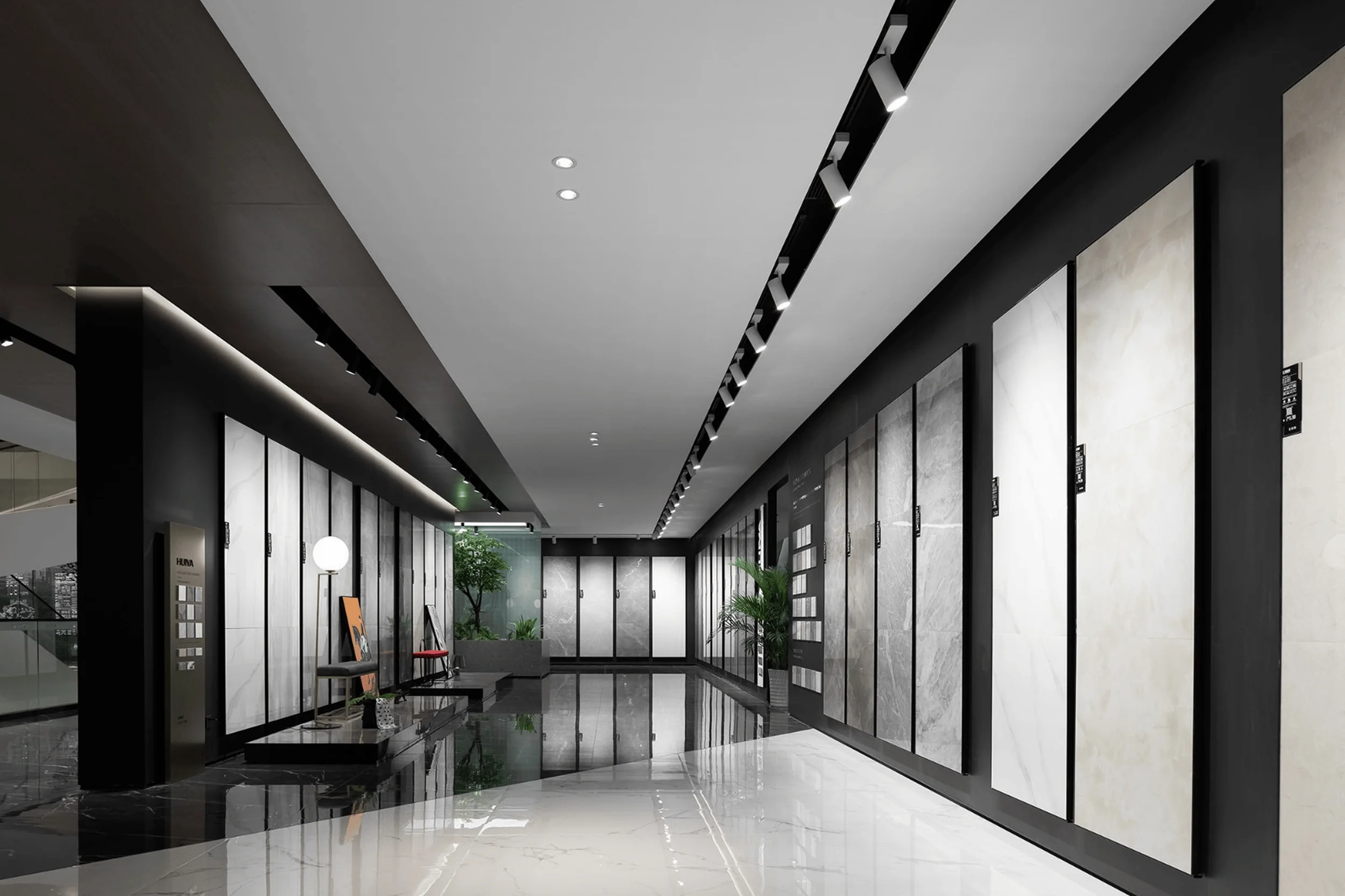
The exhibition hall’s design incorporates a variety of architectural elements and artistic installations that add depth and visual interest. Metal mesh installations, stylish lightboxes, and carefully curated soft furnishings enhance the overall aesthetic appeal, while the interplay of textures and forms creates a dynamic and engaging environment. The elliptical ceiling and floor lighting elements complement each other, while the inverted triangular charcoal installation appears to float in mid-air, adding a touch of cultural significance. The brand’s story is etched onto organic glass panels, illuminated by concealed lighting, creating a sense of technological sophistication and visual intrigue. exhibition space design, contemporary aesthetics, industrial heritage
Design Innovation and Impact
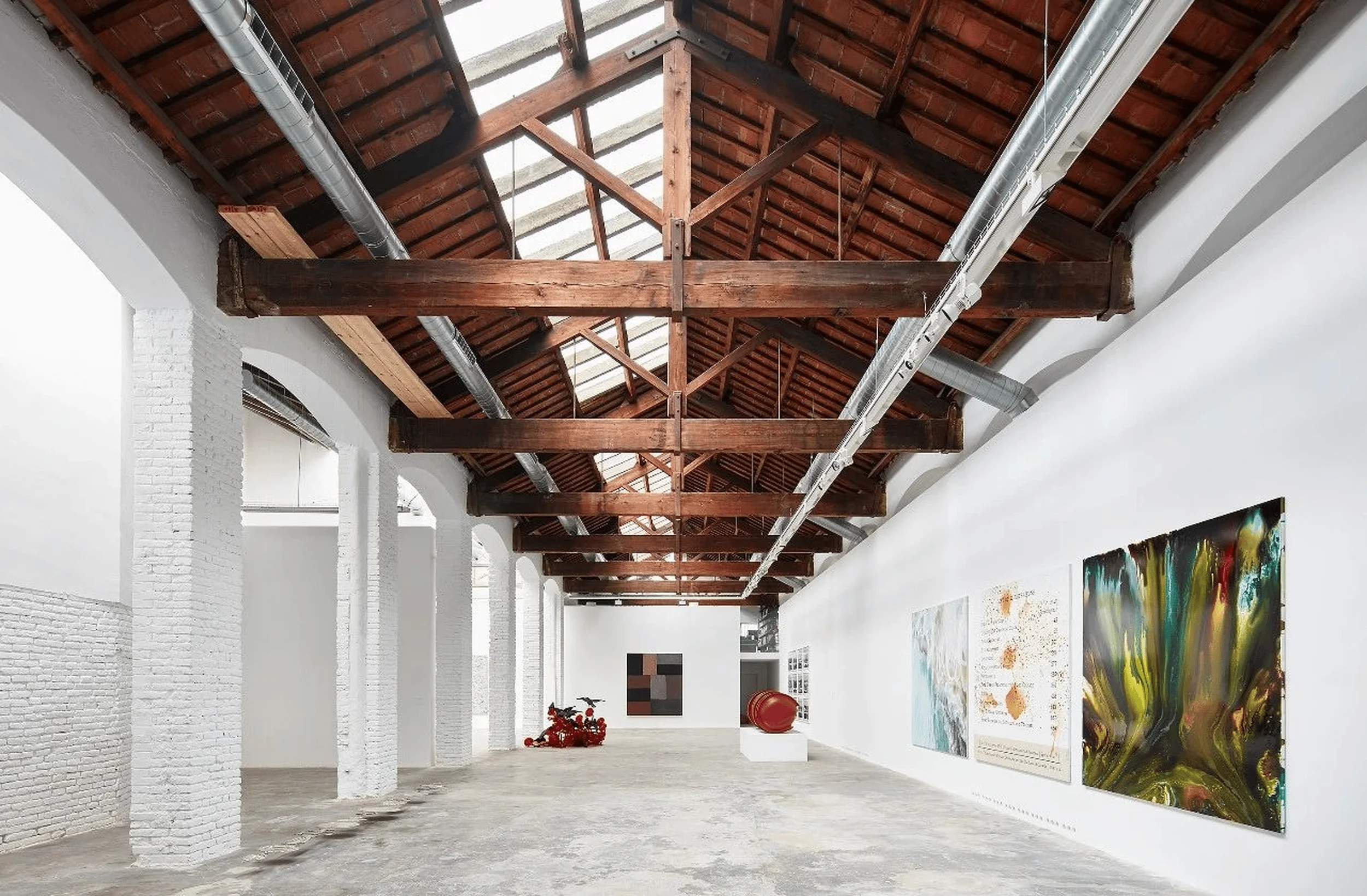
The three-level exhibition space is characterized by its open and fluid layout, with interconnected areas that seamlessly blend into one another. The mirrored ceiling creates an illusion of infinite space, maximizing the visual impact of the design. This innovative approach to spatial planning fosters a sense of exploration and discovery, while the strategic use of materials and lighting enhances the overall aesthetic appeal. The Huiya Ceramics Headquarters Exhibition Hall stands as a testament to the power of design to transform an aging building into a dynamic and engaging space that reflects the brand’s rich history and future aspirations. exhibition space design, contemporary aesthetics, industrial heritage
Project Information:
Project Name: Huiya Ceramics Headquarters Exhibition Hall
Project Type: Corporate Headquarters, Exhibition Space
Project Location: China
Design Firm: Foshan Topway Interior Design Co., Ltd.
Lead Designers: Wang Zhike, Li Xiaoshui
Project Area: 4000 square meters
Design Time: July 2019
Completion Time: October 2019
Main Materials: Benjamin Moore Paint, Huiya Tiles, Iridescent Glass
Photographer: 24designclub


