Sergio Mannino Studio designed Medly Pharmacy, integrating interior design with digital service, enhancing the patient experience.
Contents
Background of the Medly Pharmacy Project
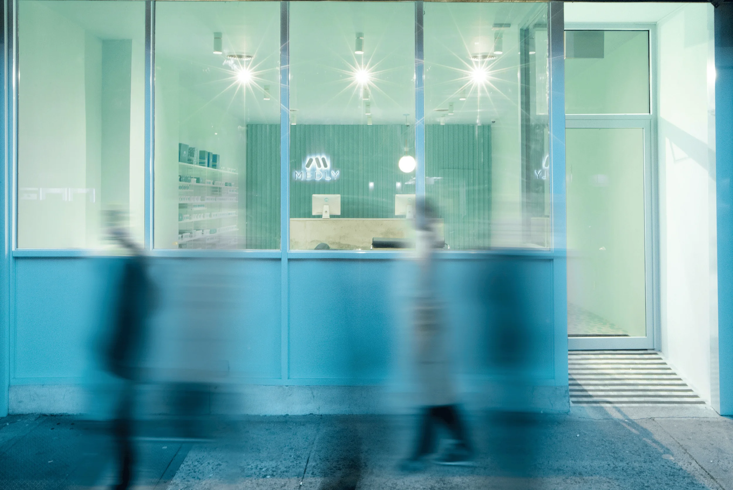
Medly Pharmacy, located in Brooklyn, New York, represents a unique approach to prescription services, combining an online platform with a physical storefront. The pharmacy was designed by Sergio Mannino Studio to provide New Yorkers with a more efficient and enjoyable experience in managing their prescriptions. While Medly offers delivery services, its Graham Avenue location also allows users to pick up online orders and engage in face-to-face consultations with professionals. This hybrid model addresses the limitations of traditional pharmacies and aligns with the evolving needs of customers who seek convenience and accessibility in healthcare. The project highlights the growing trend of integrating technology and design within the healthcare industry to improve patient care and satisfaction. pharmacy interior design, innovative pharmacy design, patient-centered design
Design Concept and Objectives
Sergio Mannino Studio’s design for Medly Pharmacy seamlessly blends functionality with aesthetics, creating a welcoming and efficient space for both customers and staff. The design concept centers around Medly’s commitment to providing a hassle-free and positive experience for its customers, eliminating the need for them to leave their homes when sick or endure long waits in traditional pharmacies. This patient-centric approach translates into a design that prioritizes convenience, accessibility, and a sense of community. The interior reflects Medly’s green and white branding, incorporating a soothing aqua color palette that promotes a sense of calm and well-being. The design choices are carefully considered to enhance the customer journey and create a positive association with the Medly brand. pharmacy interior design, innovative pharmacy design, patient-centered design
Spatial Layout and Functionality
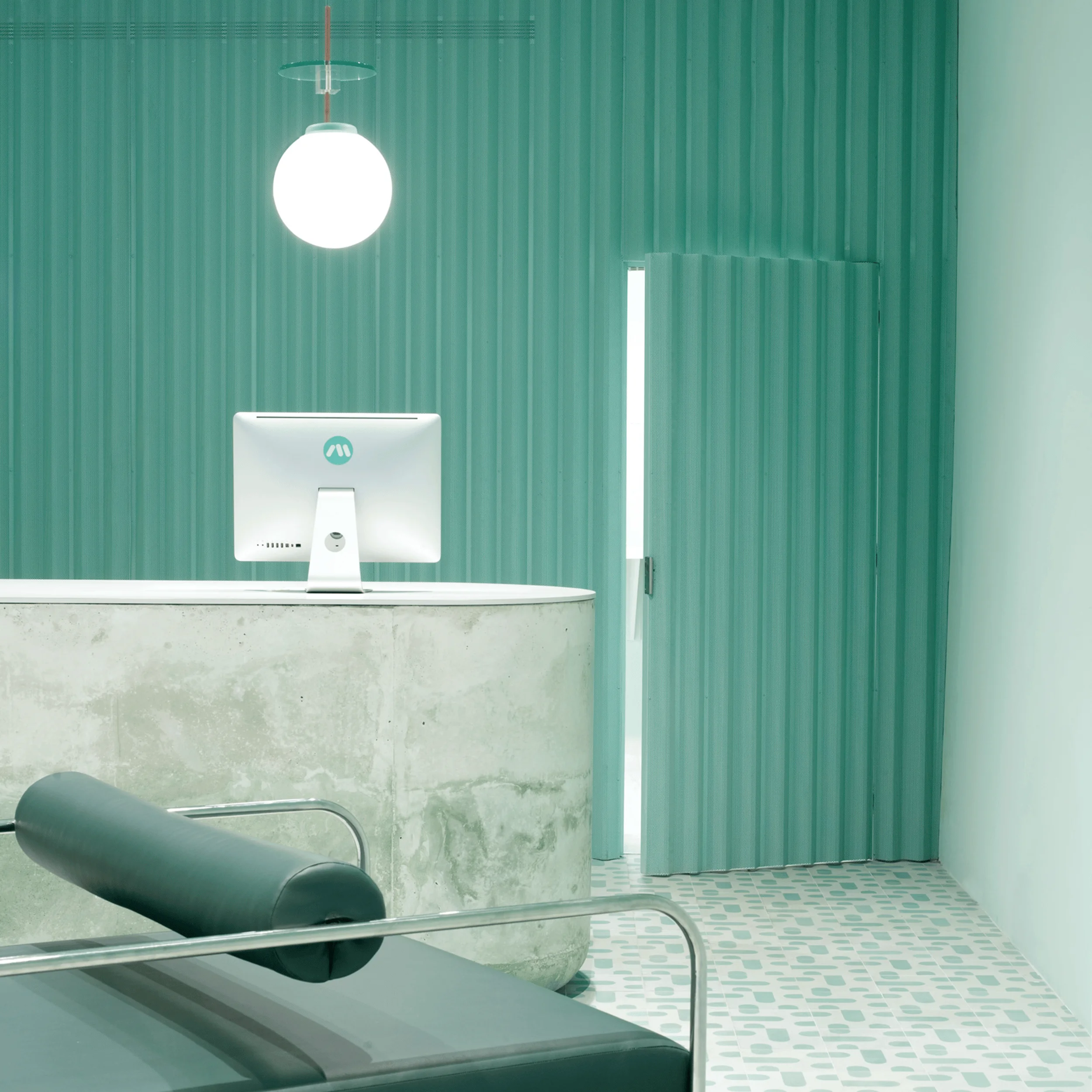
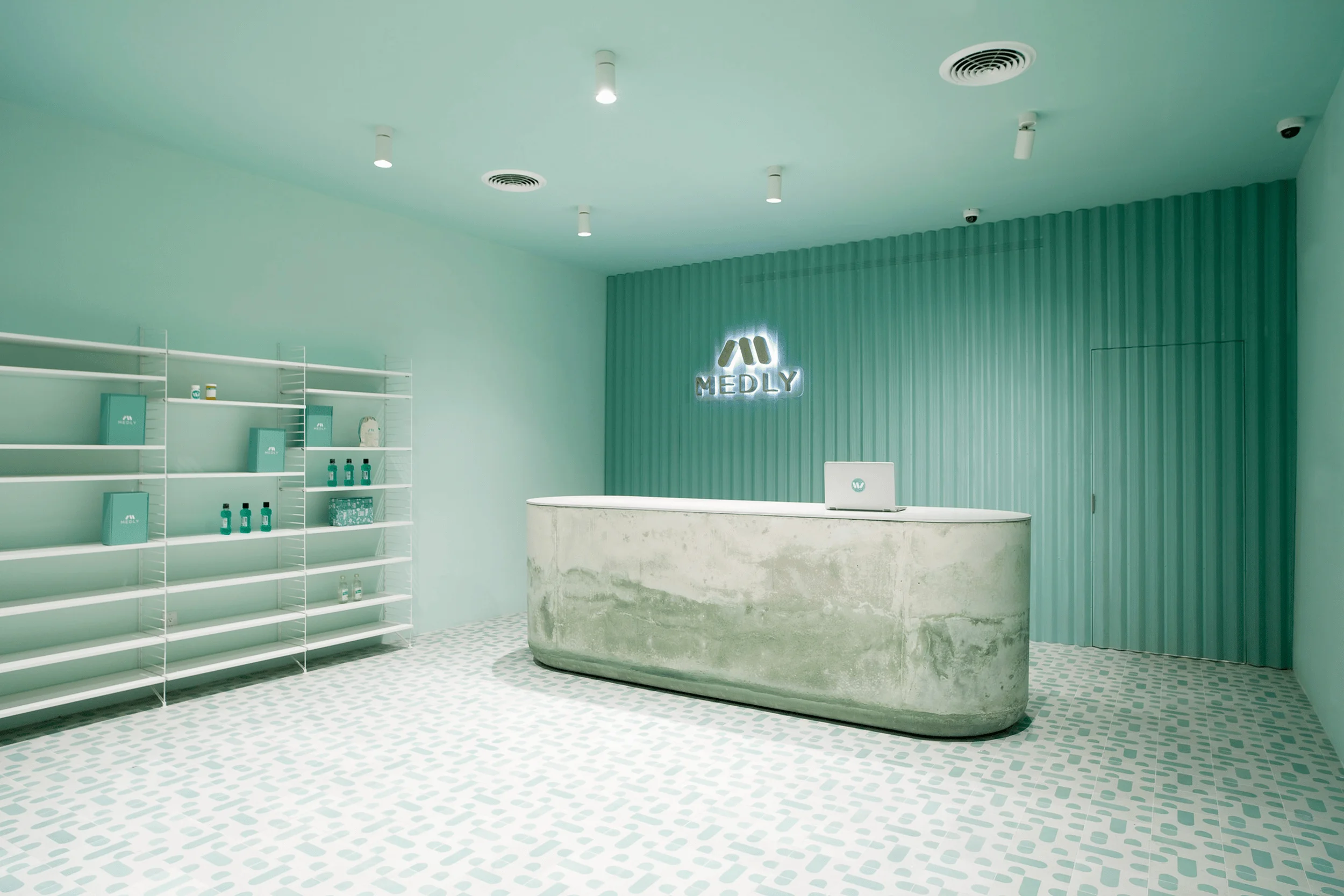
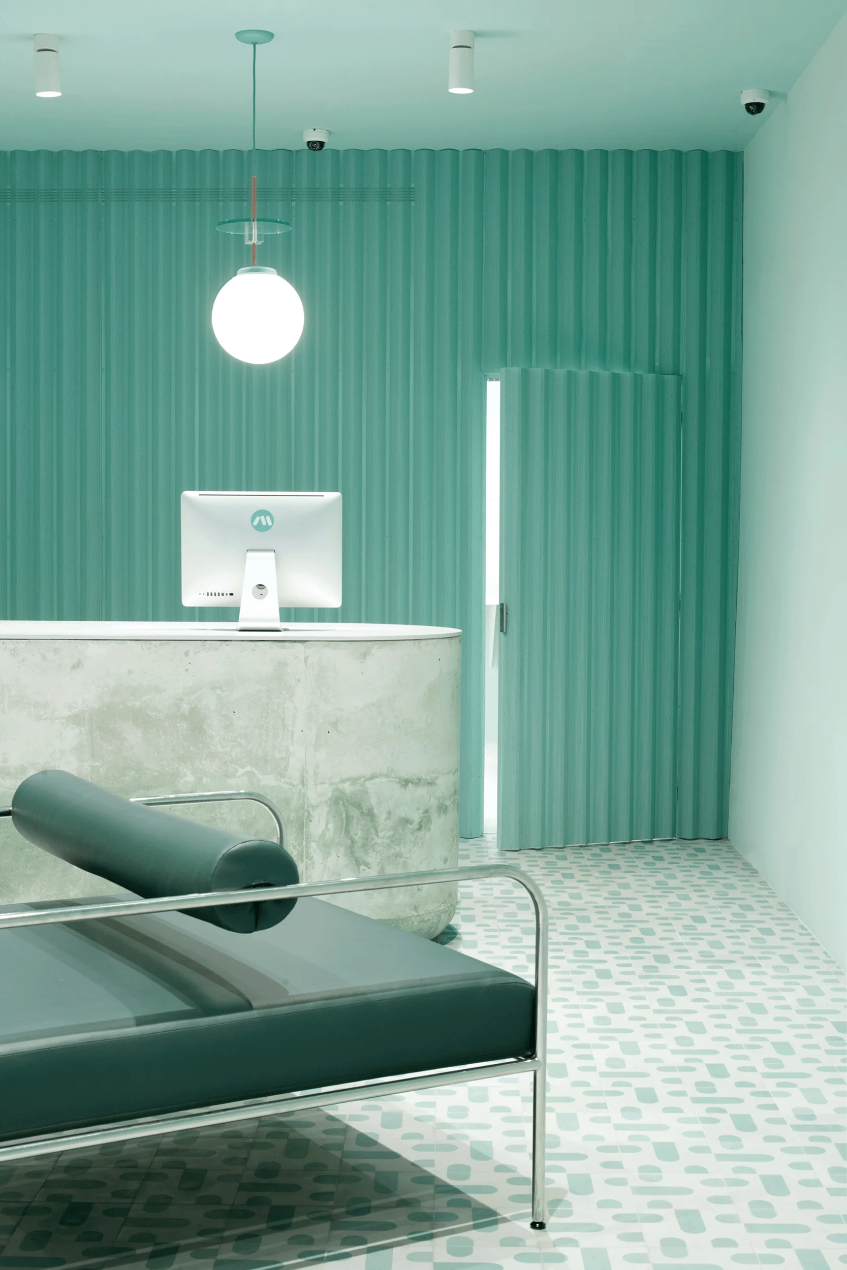
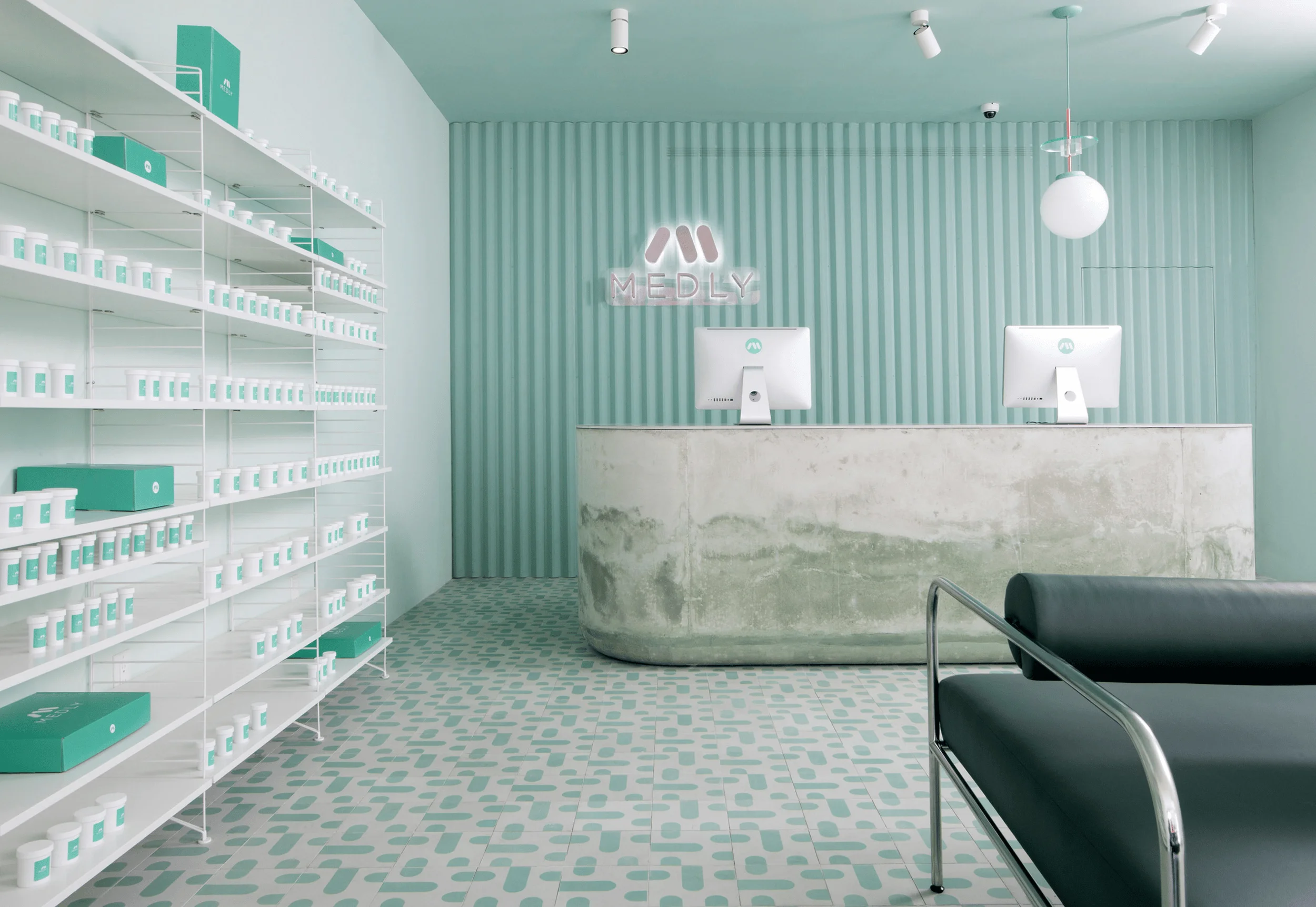
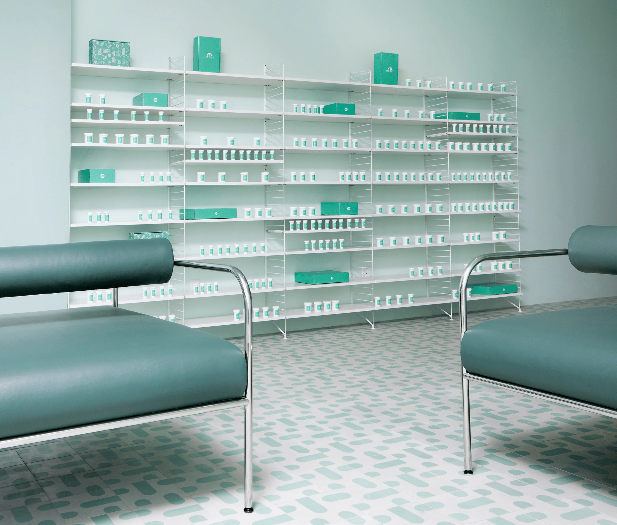
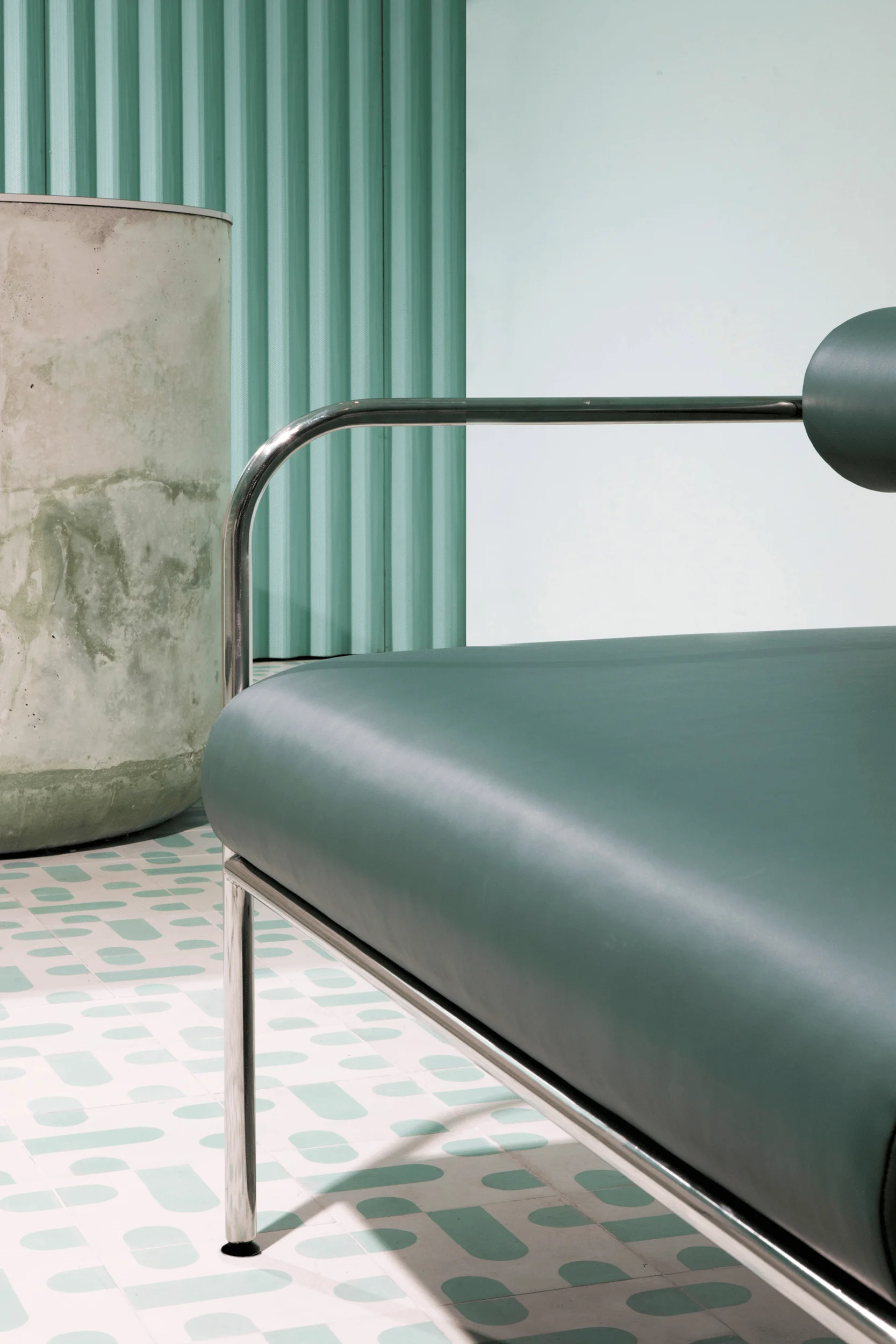
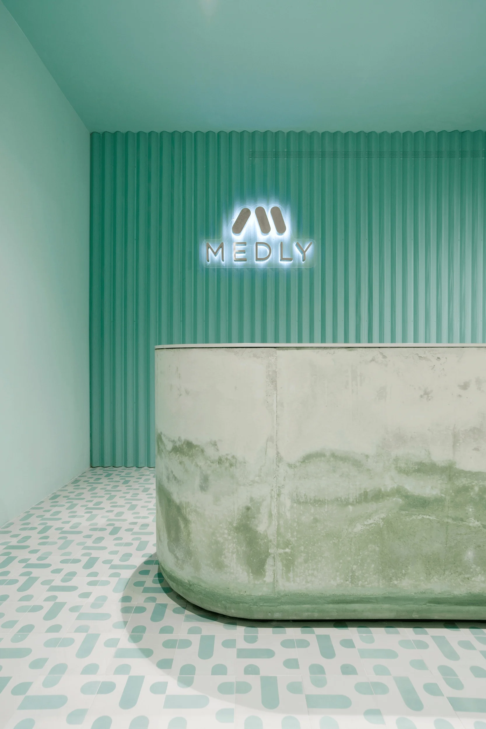
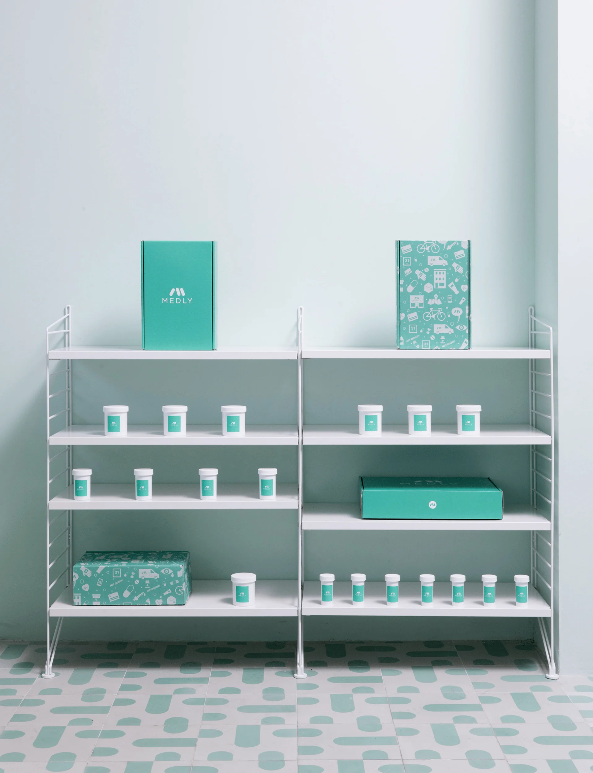
The layout of Medly Pharmacy is thoughtfully designed to optimize workflow and facilitate interactions. The waiting area features mint-painted walls and vibrant cement floor tiles designed by Jaime Hayón for Bisazza. These tiles, with their rounded and colorful shapes, echo the brand’s logo and add a playful touch to the space. A custom-made, polished cement counter at the back of the space subtly fades in color, adding depth and visual interest. The choice of materials and finishes contributes to a sense of both elegance and playfulness. Two long benches, upholstered in deep green vinyl leather and chrome, provide comfortable seating for customers while also serving as a nod to the work of 20th-century Japanese designer Shiro Kuramata. The benches are strategically arranged to encourage conversation and foster a sense of community among those waiting for their prescriptions. pharmacy interior design, innovative pharmacy design, patient-centered design
Aesthetic Elements and Material Palette
The aesthetic of Medly Pharmacy deviates from the typical clinical atmosphere often associated with pharmacies. Instead, the space embraces a warm and inviting atmosphere achieved through a thoughtful selection of materials and colors. The aqua color palette, derived from Medly’s branding, creates a calming and refreshing environment. The use of cement floor tiles with playful shapes injects a sense of vibrancy and personality. The custom-made cement counter adds a touch of sophistication, while the deep green vinyl leather and chrome benches provide a comfortable and stylish seating option. The overall effect is a harmonious blend of aesthetics and functionality, creating a space that feels both modern and approachable. pharmacy interior design, innovative pharmacy design, patient-centered design
Unique Design Features and Details
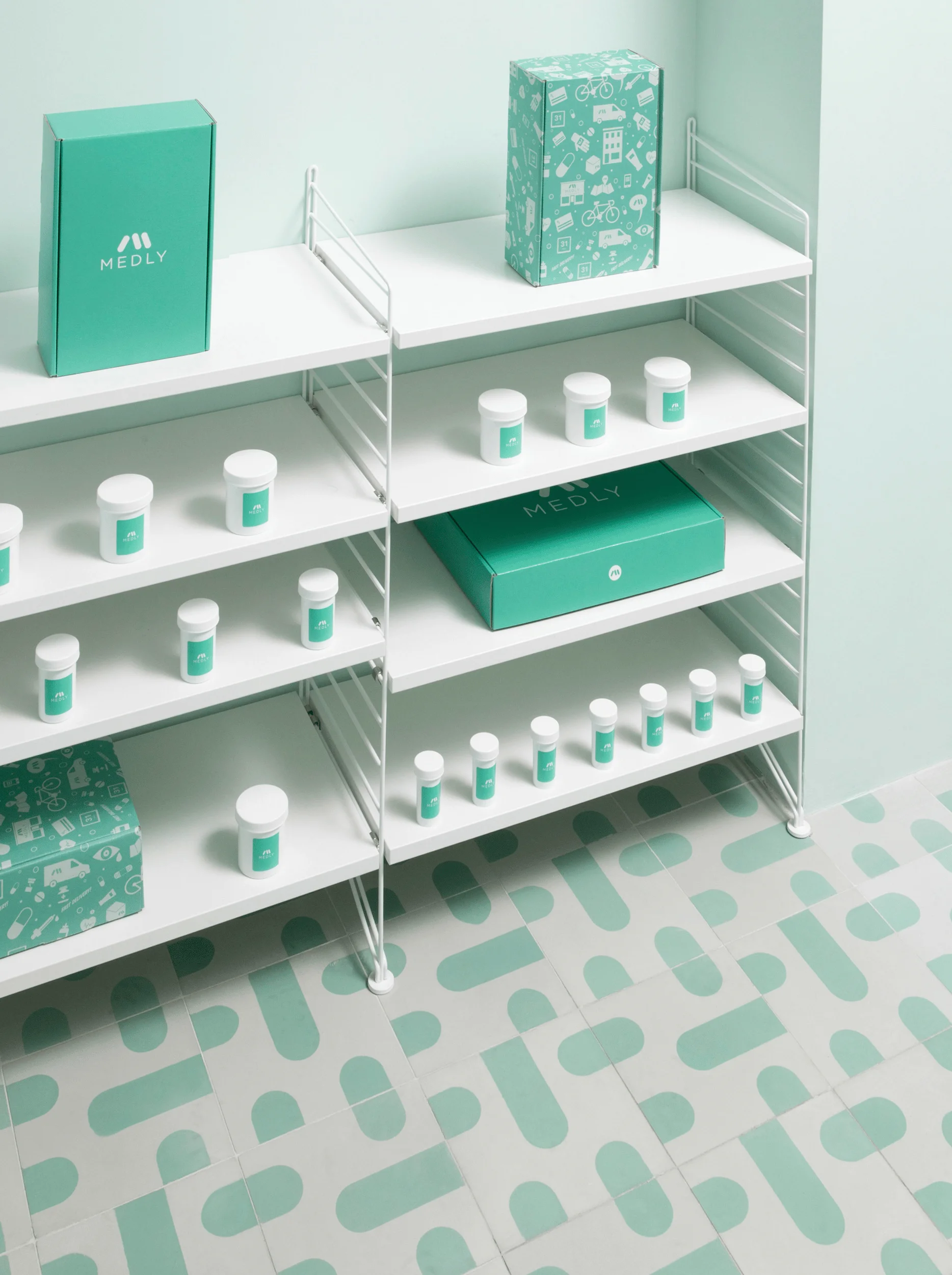
Several unique design features contribute to the distinctive character of Medly Pharmacy. Delicate white shelves, built along one wall, showcase Medly-branded prescriptions, reinforcing the brand’s identity throughout the space. A circular, white pendant lamp adds a touch of elegance and provides soft illumination. A corrugated, perforated screen runs along the back wall, creating a visual separation between the waiting area and the administrative area where prescriptions are sorted. This screen adds an element of privacy while maintaining an open and airy feel. These carefully considered details contribute to the overall positive experience of visiting Medly Pharmacy. pharmacy interior design, innovative pharmacy design, patient-centered design
Project Information:
Project Type: Pharmacy Interior Design
Architect: Sergio Mannino Studio
Area: 177 square meters
Project Year: Not specified
Country: USA
Main Materials: Cement, vinyl leather, chrome
Photographer: Charlie Schuck and Sergio Mannino Studio


