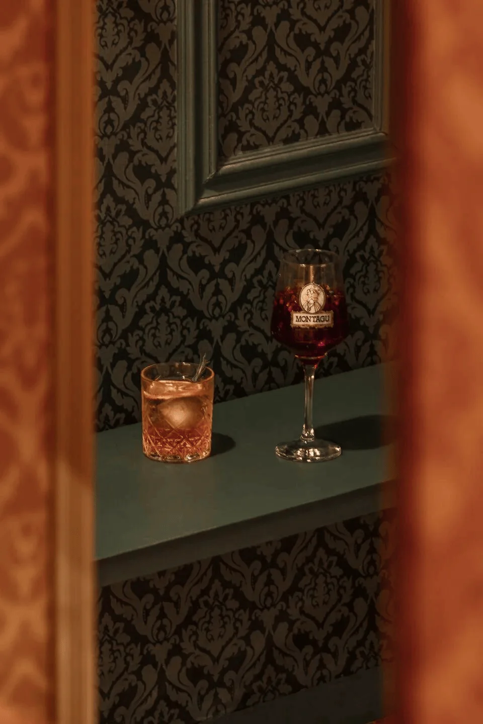
Montagu restaurant interior design in Argentina showcases a fusion of classic and contemporary styles, featuring kitsch elements and a unique aesthetic.
Contents
Project Background: A Reimagined Sandwich Experience
Montagu was born from a desire to redefine the sandwich experience, taking its name from the renowned John Montagu, the Earl of Sandwich, credited as the inventor of this popular food item. The restaurant concept is rooted in the duality of elegance and the commonplace, merging these ideas in a kitsch manner to create an atmosphere of ironic luxury. This project reflects an innovative approach to restaurant interior design, blending the familiar with the unexpected. The design explores the concept of kitsch aesthetic in interior design, which involves embracing elements of irony, playfulness, and a fusion of high and low culture. This type of design can be found in a variety of settings, from restaurants and bars to homes and public spaces. Montagu’s interior design is a prime example of how the kitsch aesthetic can be used to create a unique and memorable experience.
Design Concept and Objectives: A Fusion of Old and New
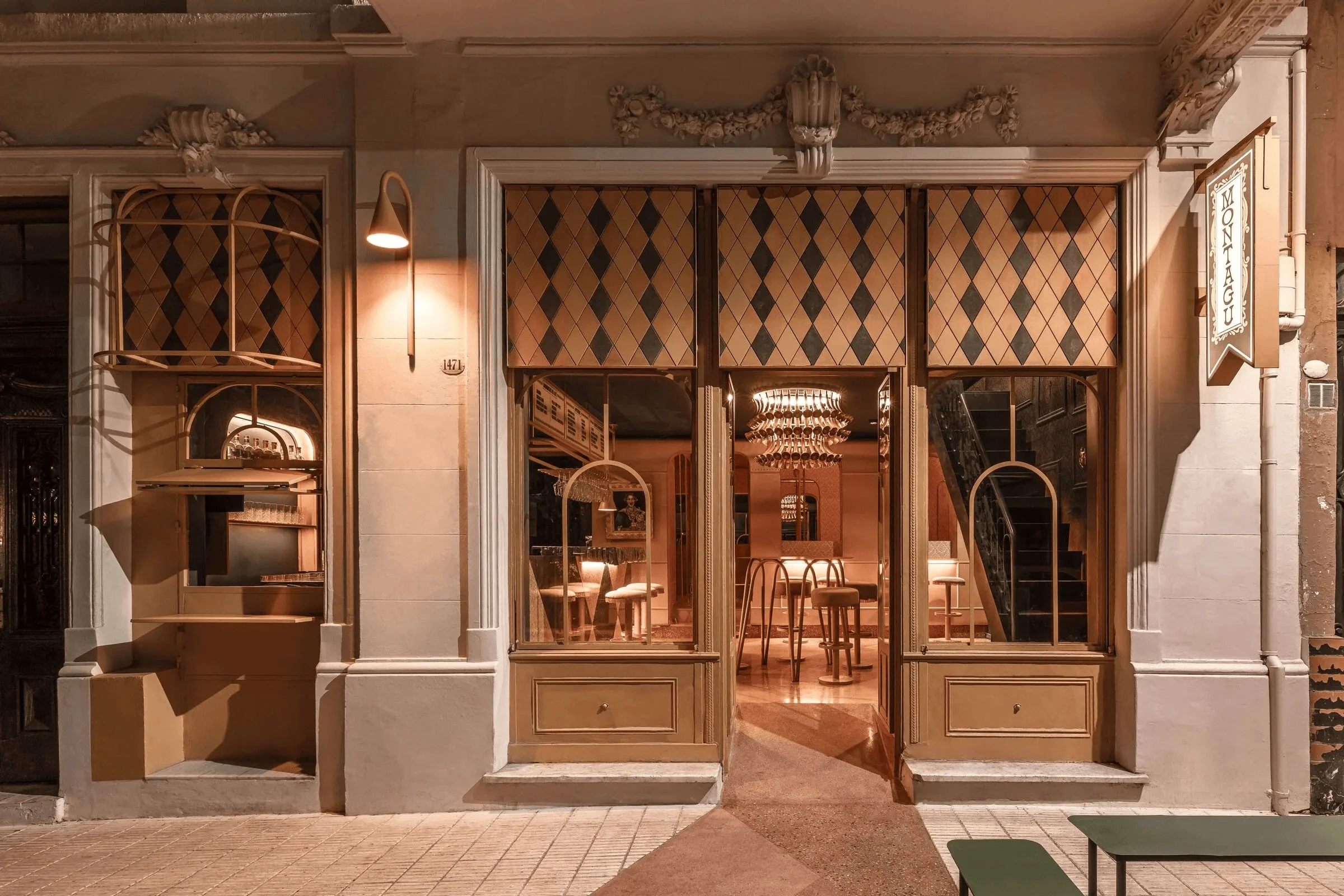
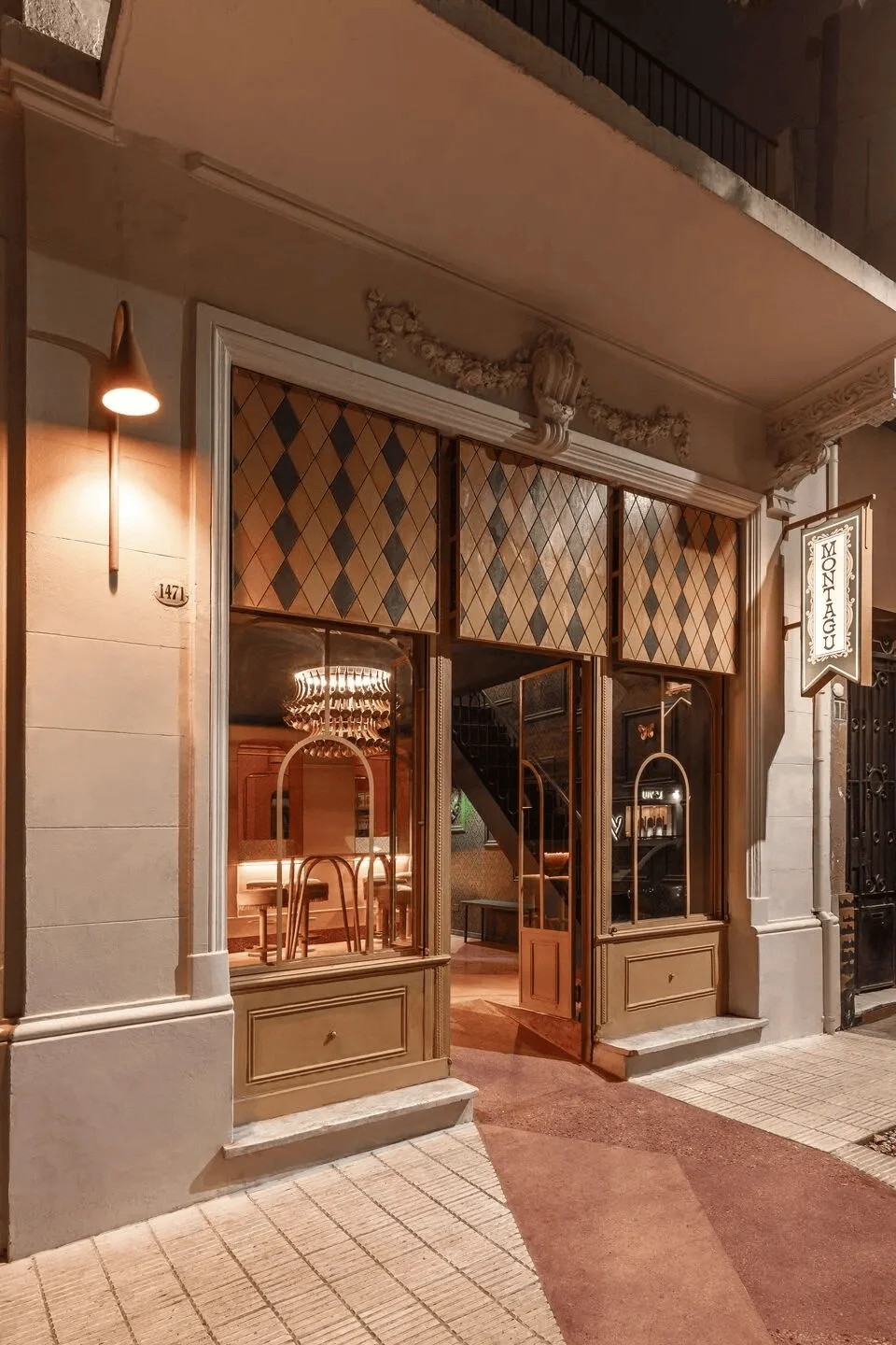
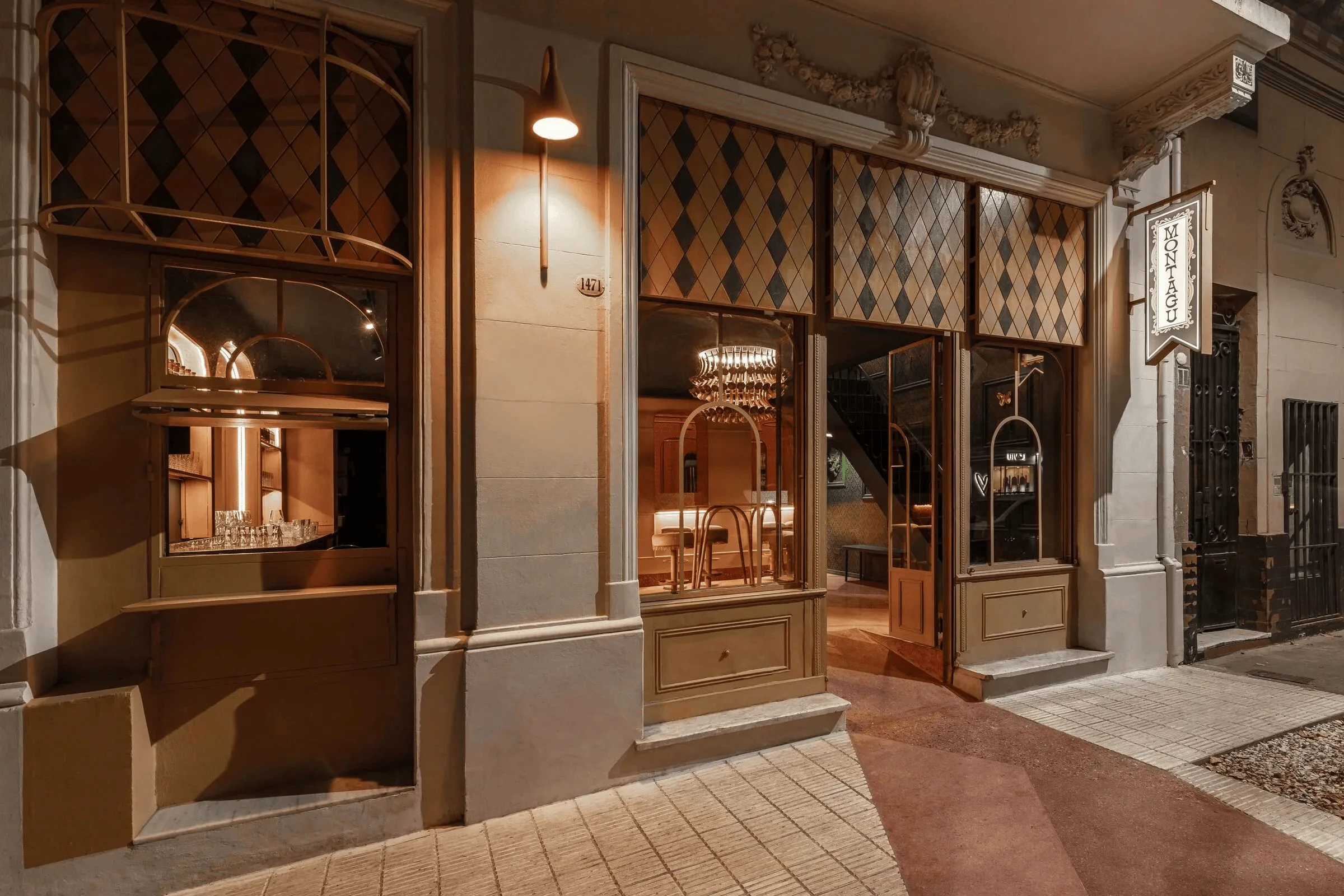
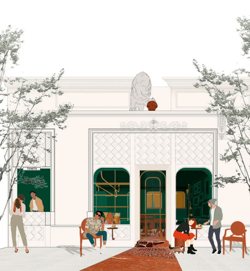
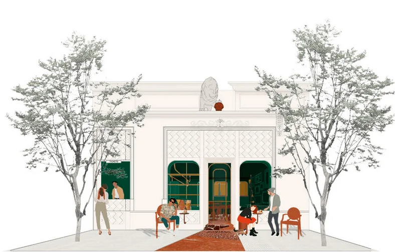
The original building facade, adorned with lines and decorative elements, has been revitalized with a new aesthetic. The design aims to create a harmonious transition between the external and internal spaces, seamlessly blending antique and modern design elements in the context of restaurant interior design. The facade has been clad in diamond-shaped limestone panels, creating a pattern reminiscent of classic British prints. The addition of burgundy-toned geometric terrazzo blocks guides the main pathway into the space. The goal is to create a design narrative that highlights a distinct fusion of traditional and contemporary styles, appealing to a modern audience that appreciates this type of aesthetic. The project highlights how the use of color and pattern can be combined to create a unique and welcoming atmosphere in restaurant interior design.
Layout and Spatial Planning: A Sense of Continuity and Movement
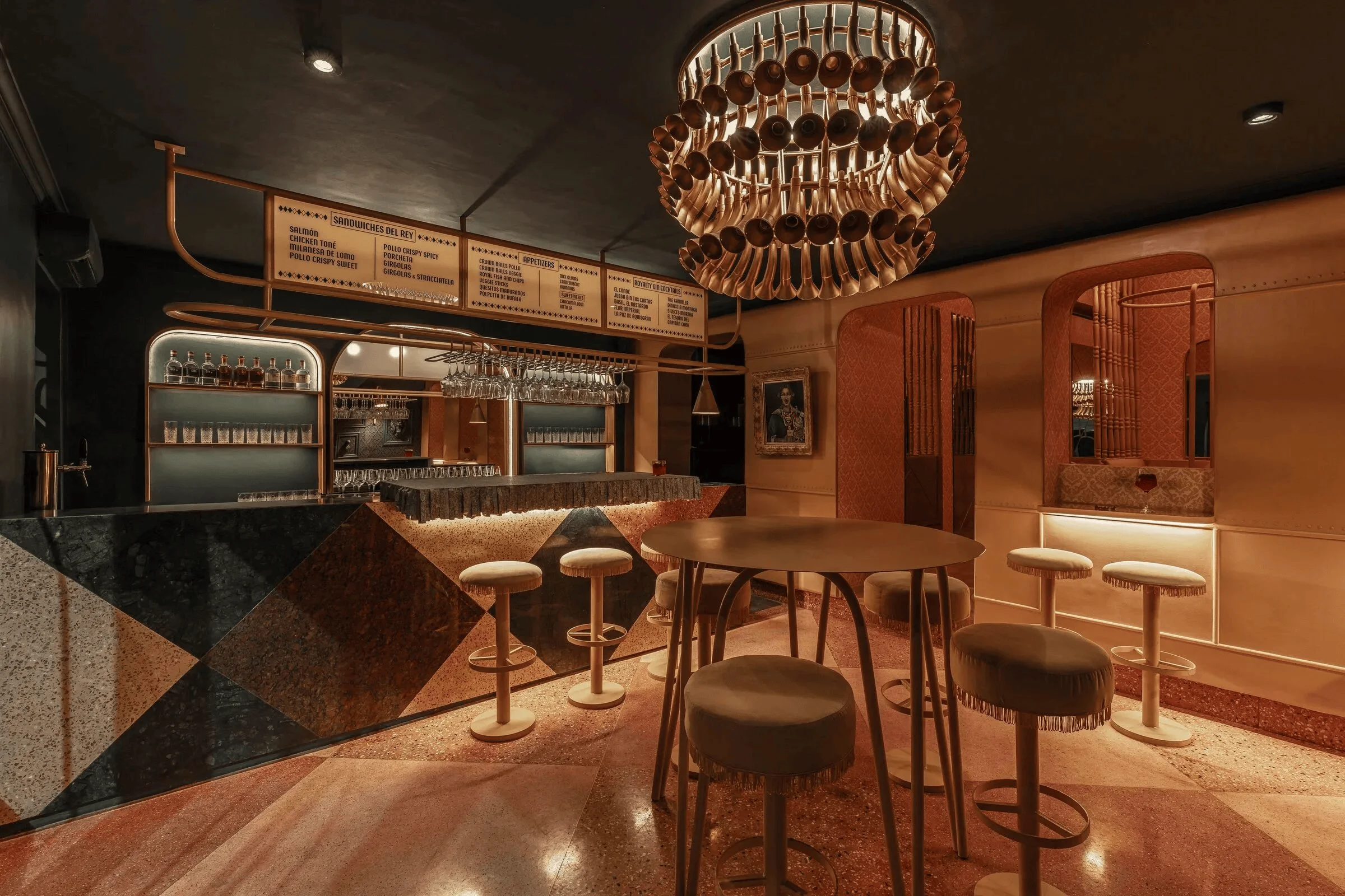
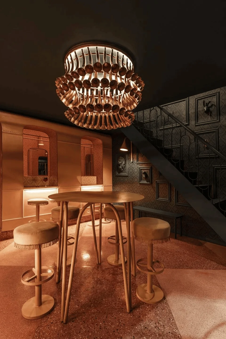
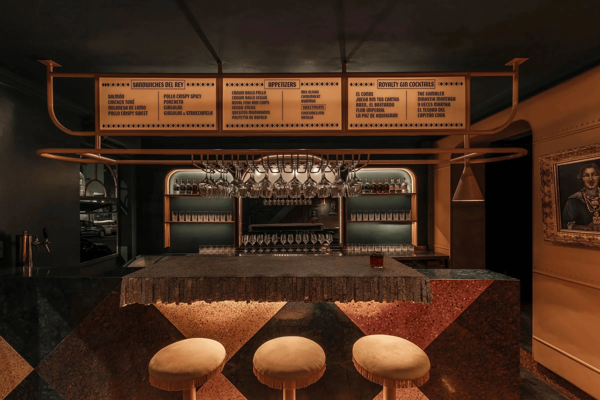
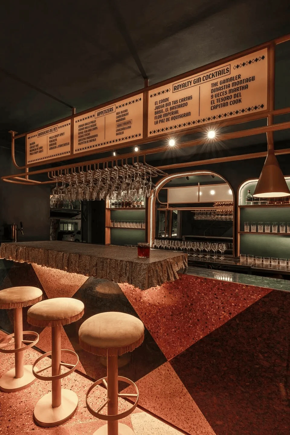
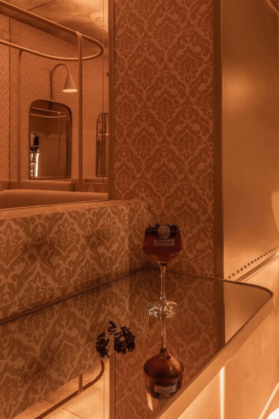
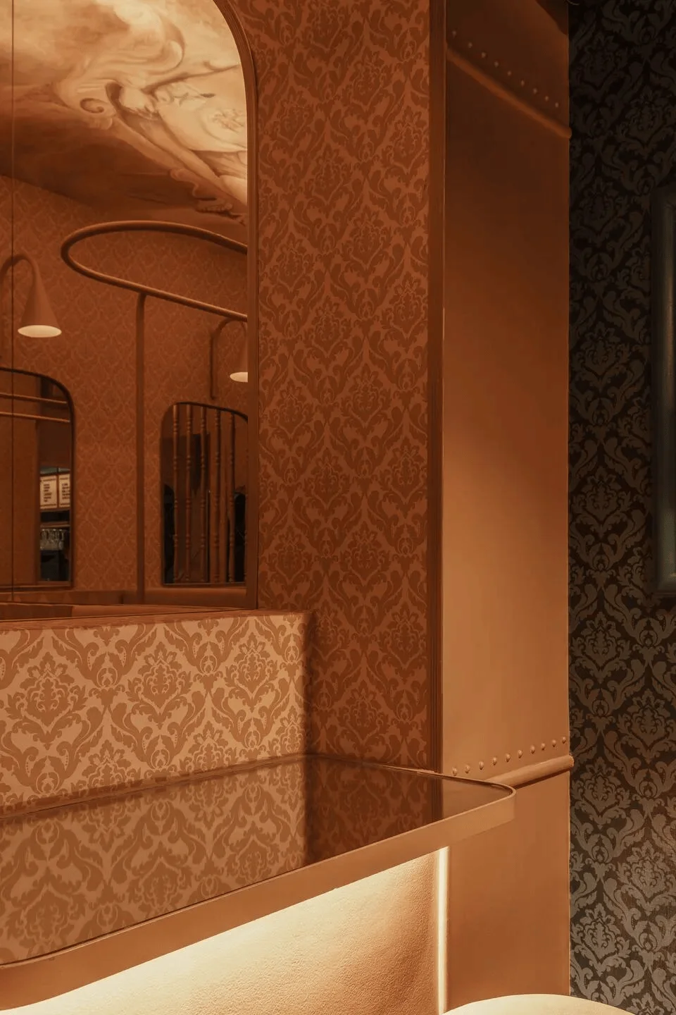
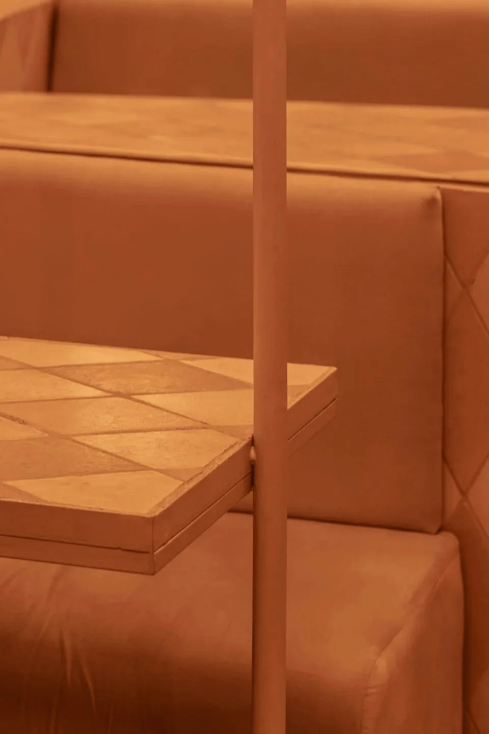
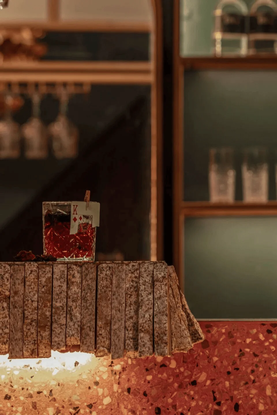
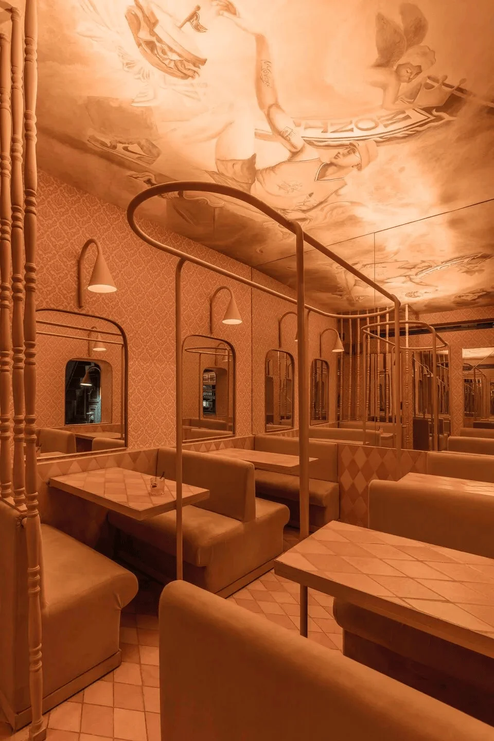
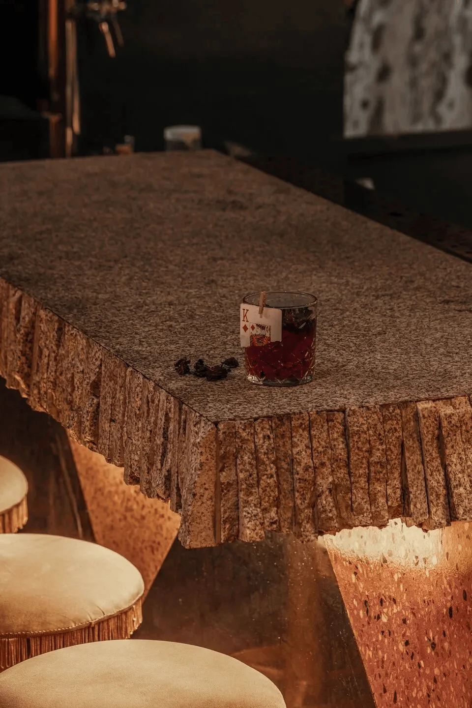
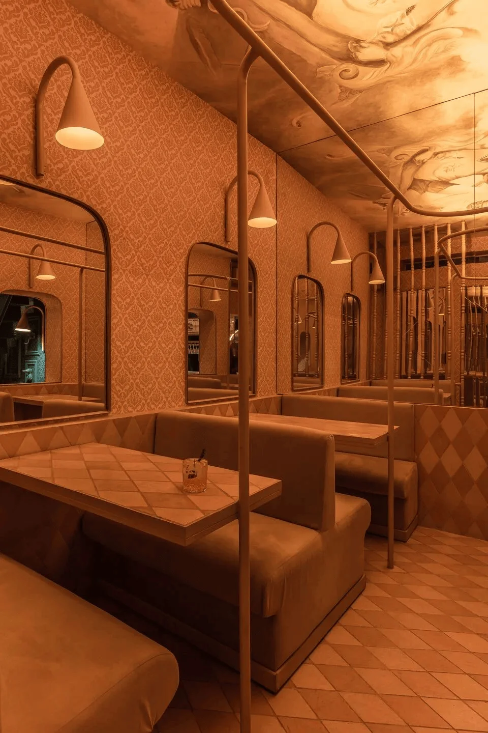
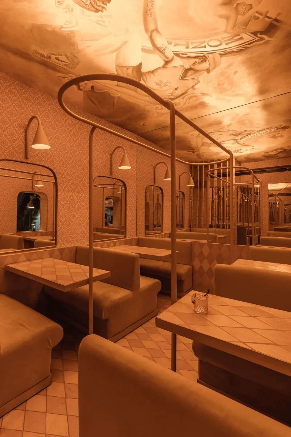
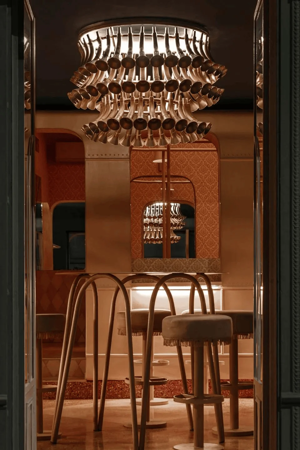
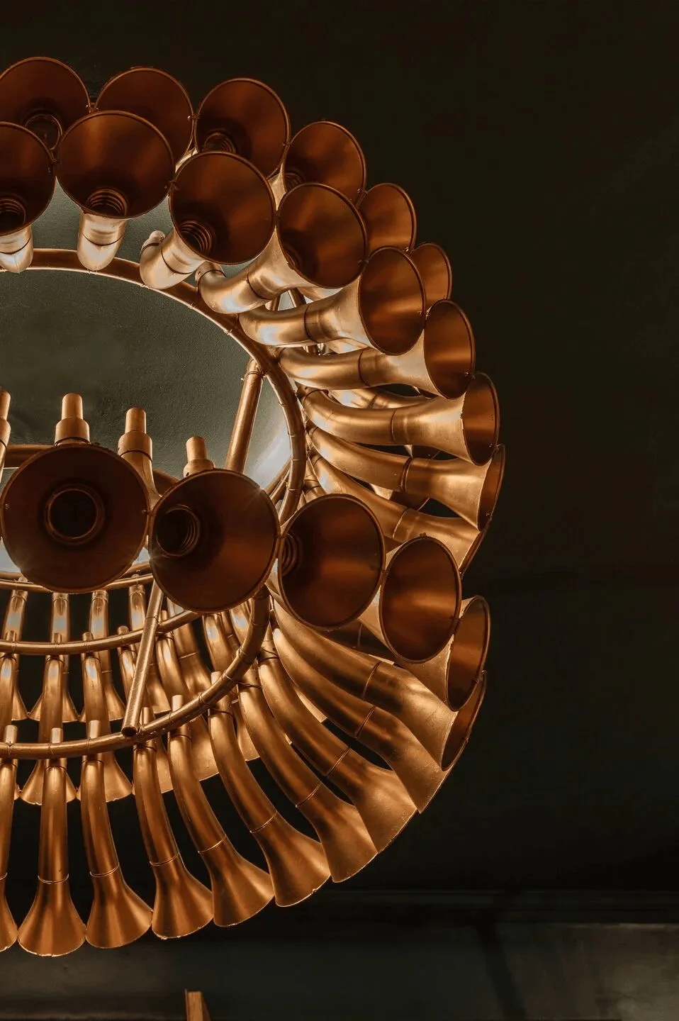
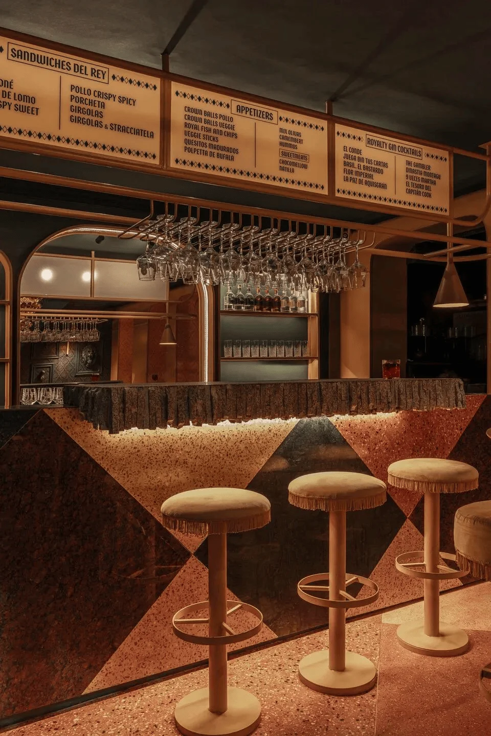
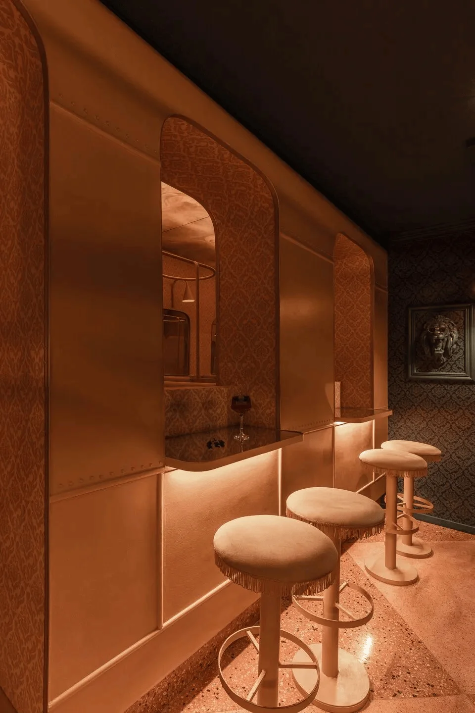
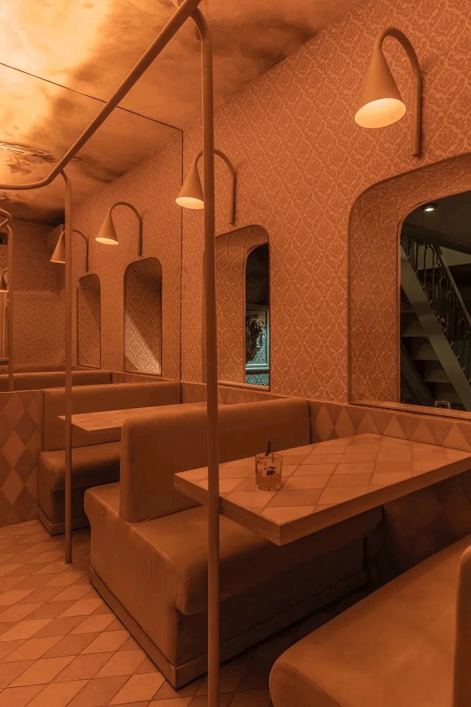
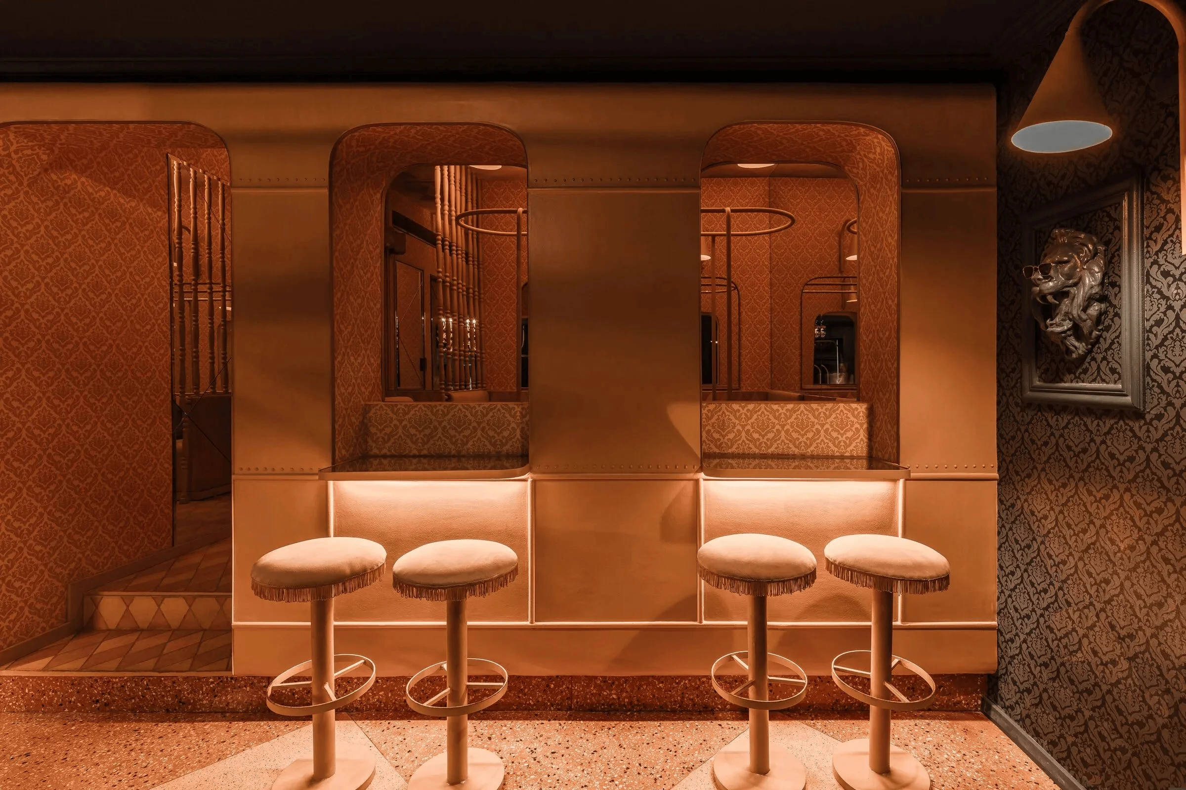
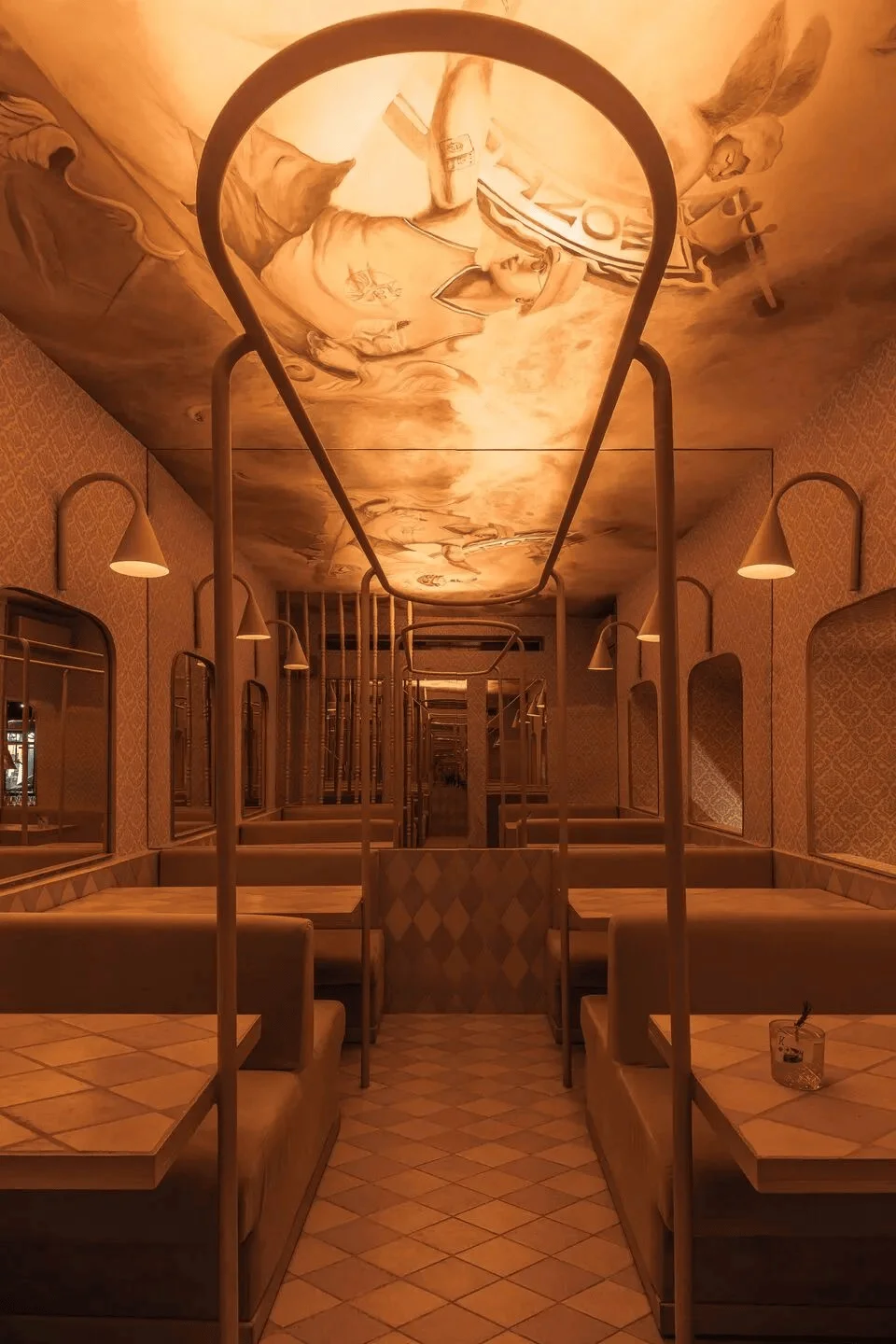
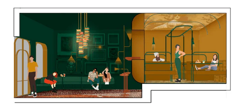
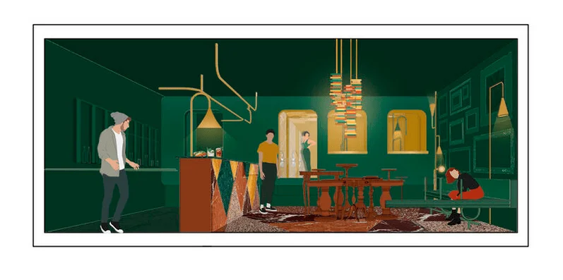
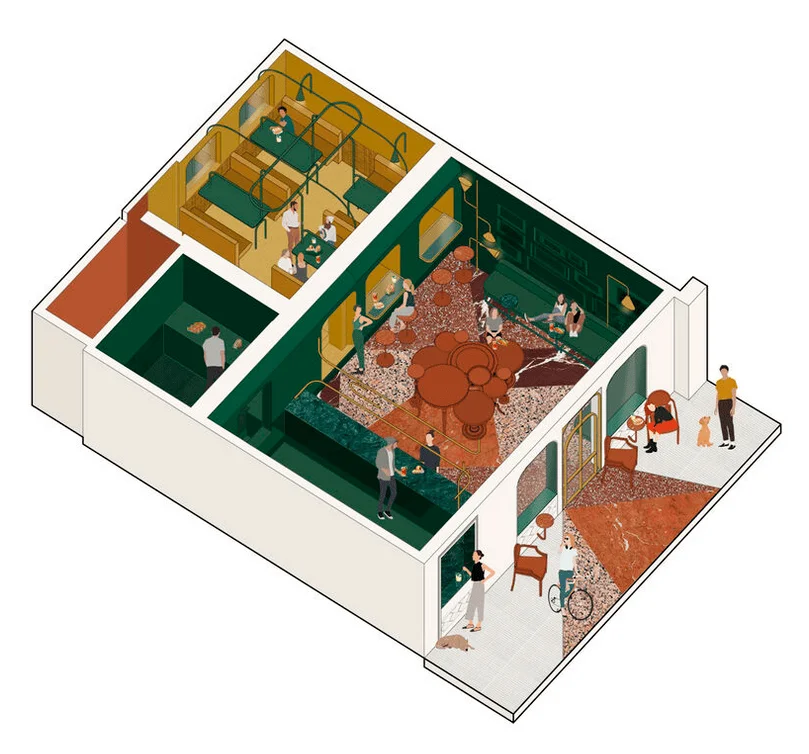
Inside, a chandelier crafted from golden plastic party favors immediately catches the eye. It hangs from an inverted crown, serving as a unique centerpiece. The bar is covered in grey granite fragments arranged side-by-side, contrasting with polished marble, evoking a sense of elegant decay, a reminder of past glory. The back of the building is designed as a British train carriage, a concept often explored in interior design for public spaces. The restaurant’s interior design concept is heavily influenced by the train’s design features, utilizing a repeat of seating and window patterns, and strategically placed mirrors create a sense of visual continuity and length, hinting at the experience of being in a train carriage. This creative use of mirrors highlights a key design technique often used to enhance a sense of space and openness. The integration of this theme within the restaurant successfully establishes a unique and immersive experience for guests.
Exterior and Aesthetic Design: A Playful Interpretation of Classic Tropes
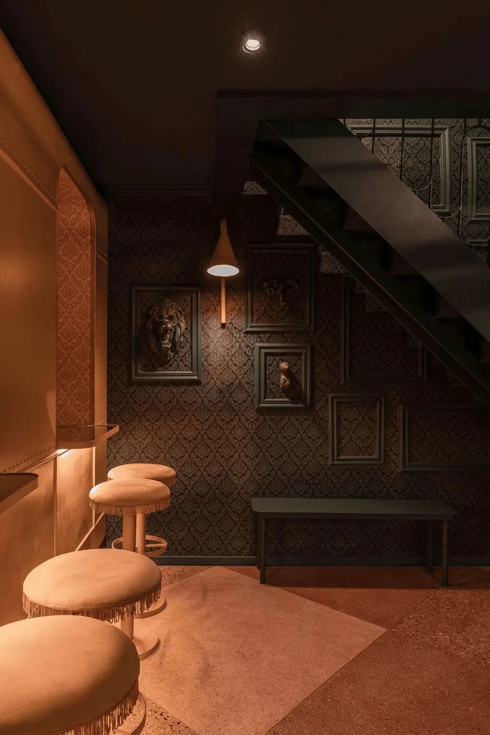
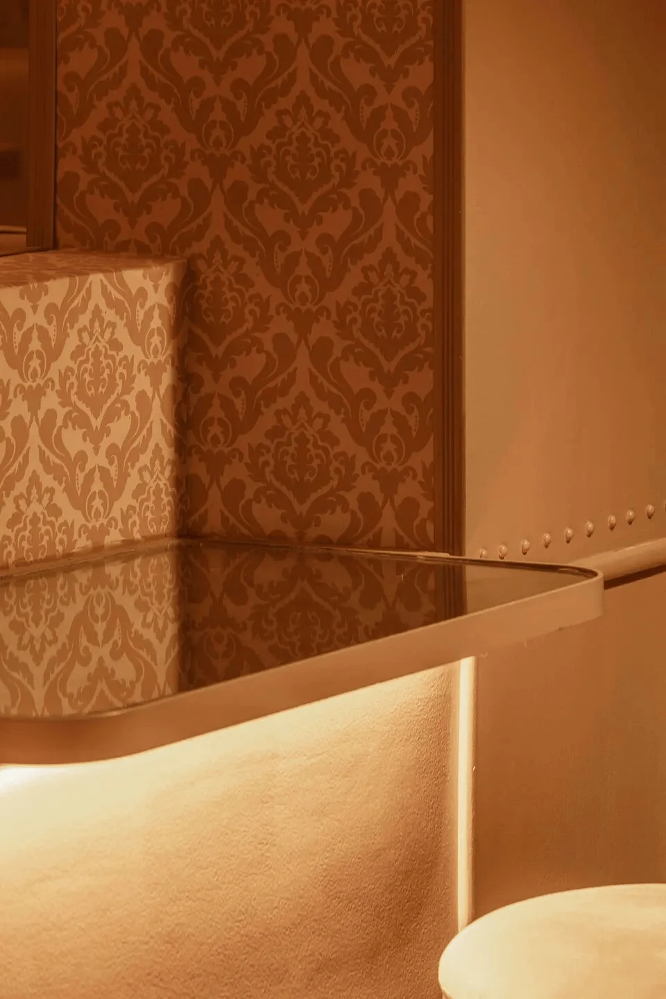
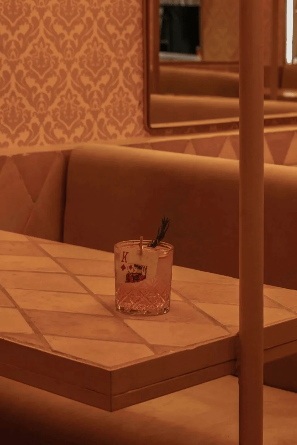
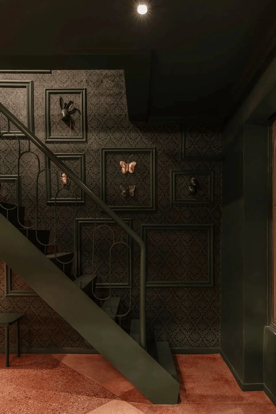
The walls are adorned with ironic hunting trophies, represented by small plastic animals, framed with green wallpaper and spectacles and modern accessories. This humorous reinterpretation of classic trophy design adds a touch of wit and playfulness to the space. The aesthetic consistency throughout the space is evident in the floor, wall coverings, and tables, all custom-designed with a cohesive color scheme. This attention to detail contributes to the space’s sense of unity and visual flow. This type of interior design where a cohesive color palette is used throughout creates a sense of balance and harmony, making the space feel more welcoming and inviting. In restaurant interior design, this type of aesthetic consideration is paramount for creating an enjoyable dining experience. The design can be described as a combination of vintage and modern styles, highlighting a kitsch aesthetic that is found in interior design.
Interior Highlights: A Contemporary Take on a Classic Masterpiece
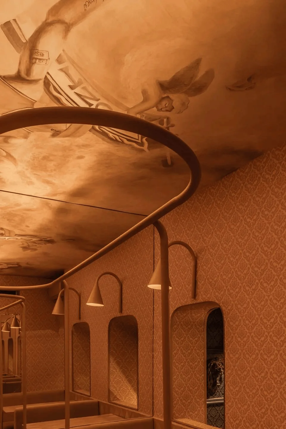
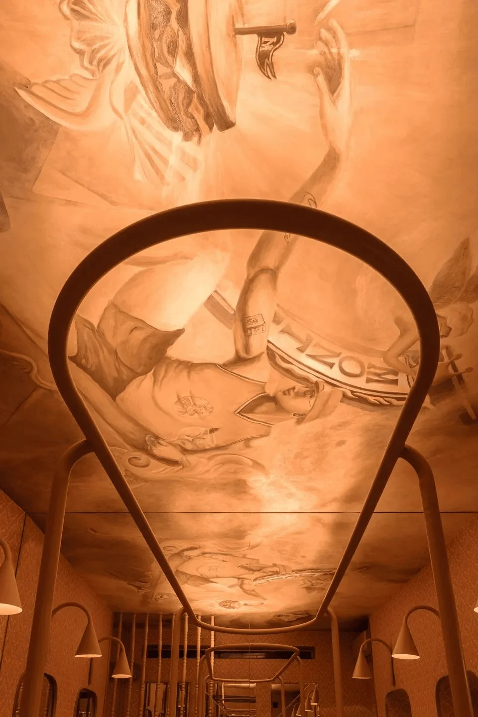
The ceiling is a centerpiece of the interior design. A contemporary and playful mural reimagines Michelangelo’s famous ‘Creation of Adam,’ where God’s hand is replaced with a winged sandwich, and Adam is dressed in Jordan sneakers, a basketball jersey, and tattoos, representing a merger of Montagu’s heritage and modern times. This playful approach to classic art is a signature feature of the restaurant’s kitsch aesthetic and a conversation starter amongst guests. This type of playful interior design is becoming increasingly popular in restaurants and bars as a way to differentiate themselves and create a unique and memorable experience. The design’s success lies in its ability to successfully integrate traditional elements with contemporary elements.
Project Information:
Restaurant
Pioneer Design
Argentina
2023
Plastic, limestone, marble, terrazzo, granite
Unknown


