More Design Office creates a minimalist showroom design for Mutina, featuring natural elements and light and shadow interplay.
Contents
Reshaping Brand Experience: A Perceptible Field
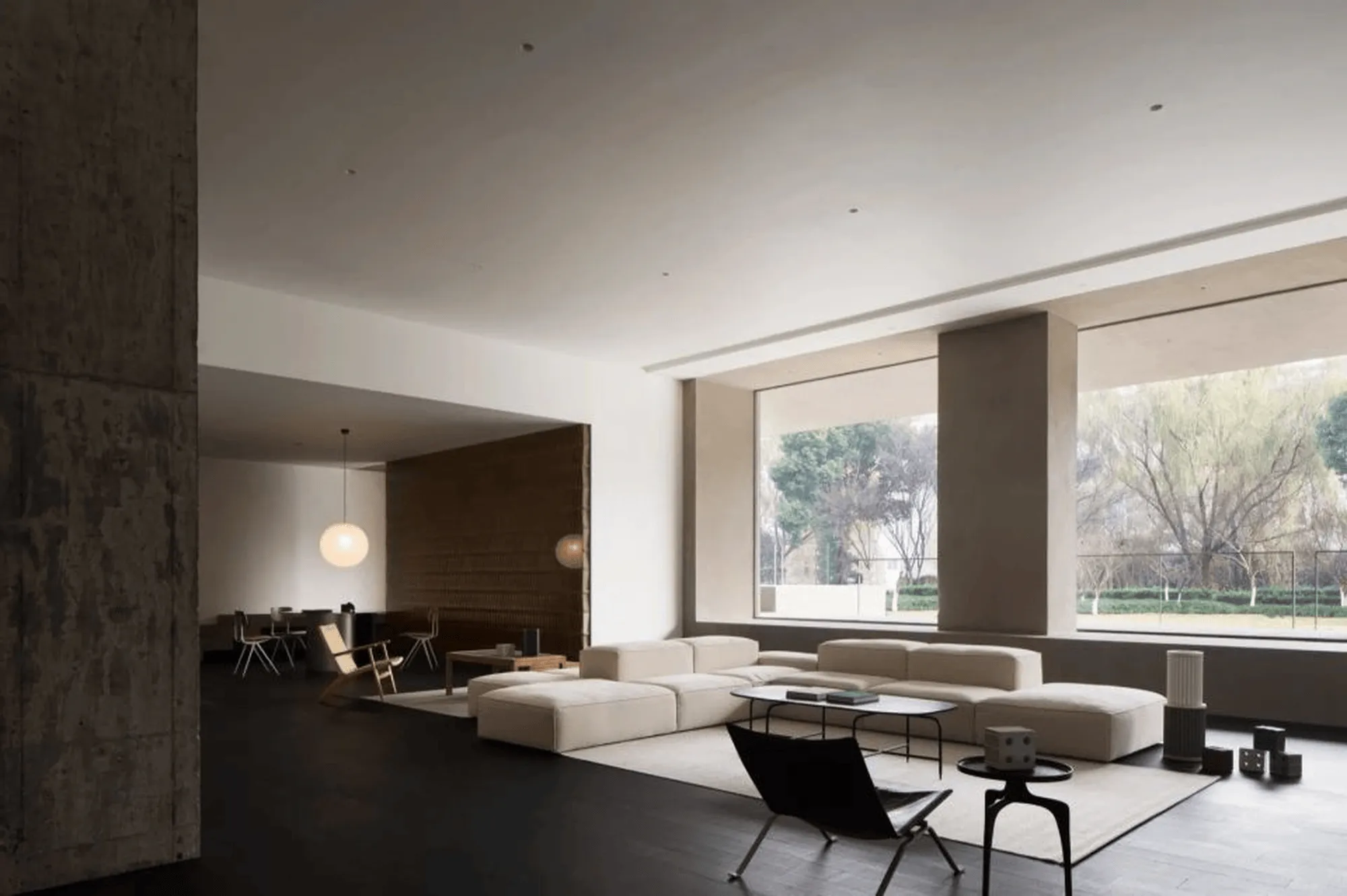
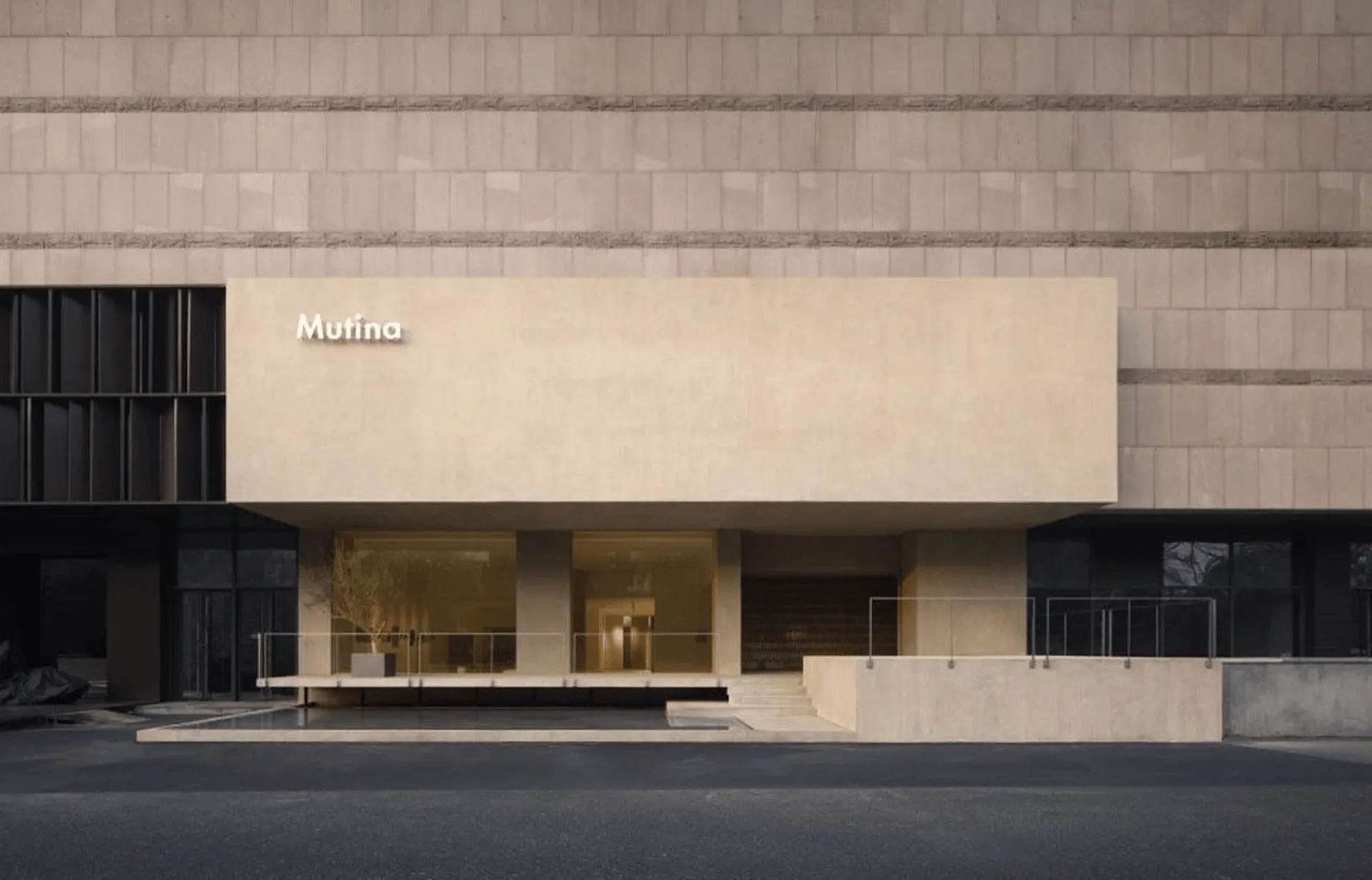
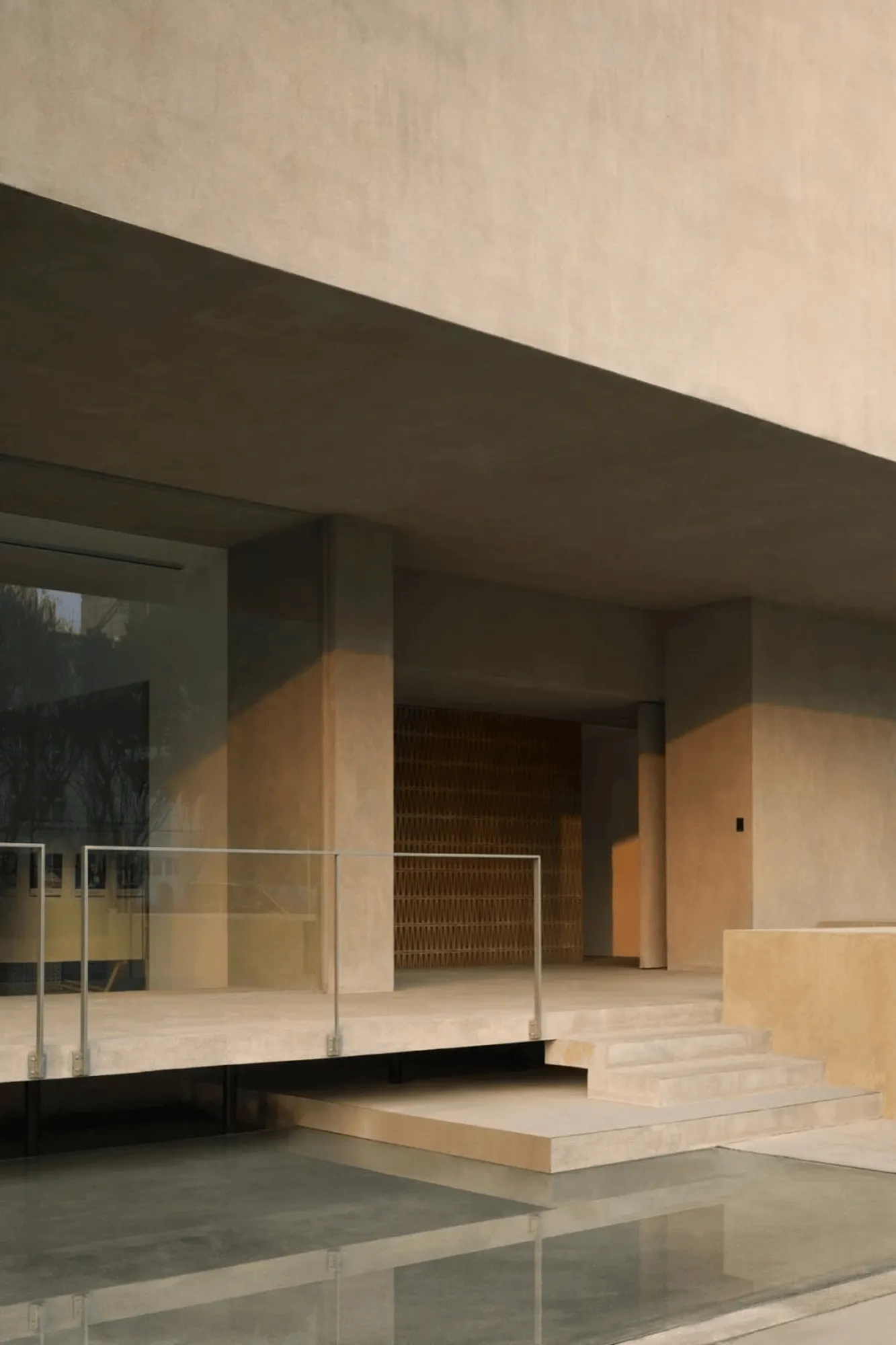
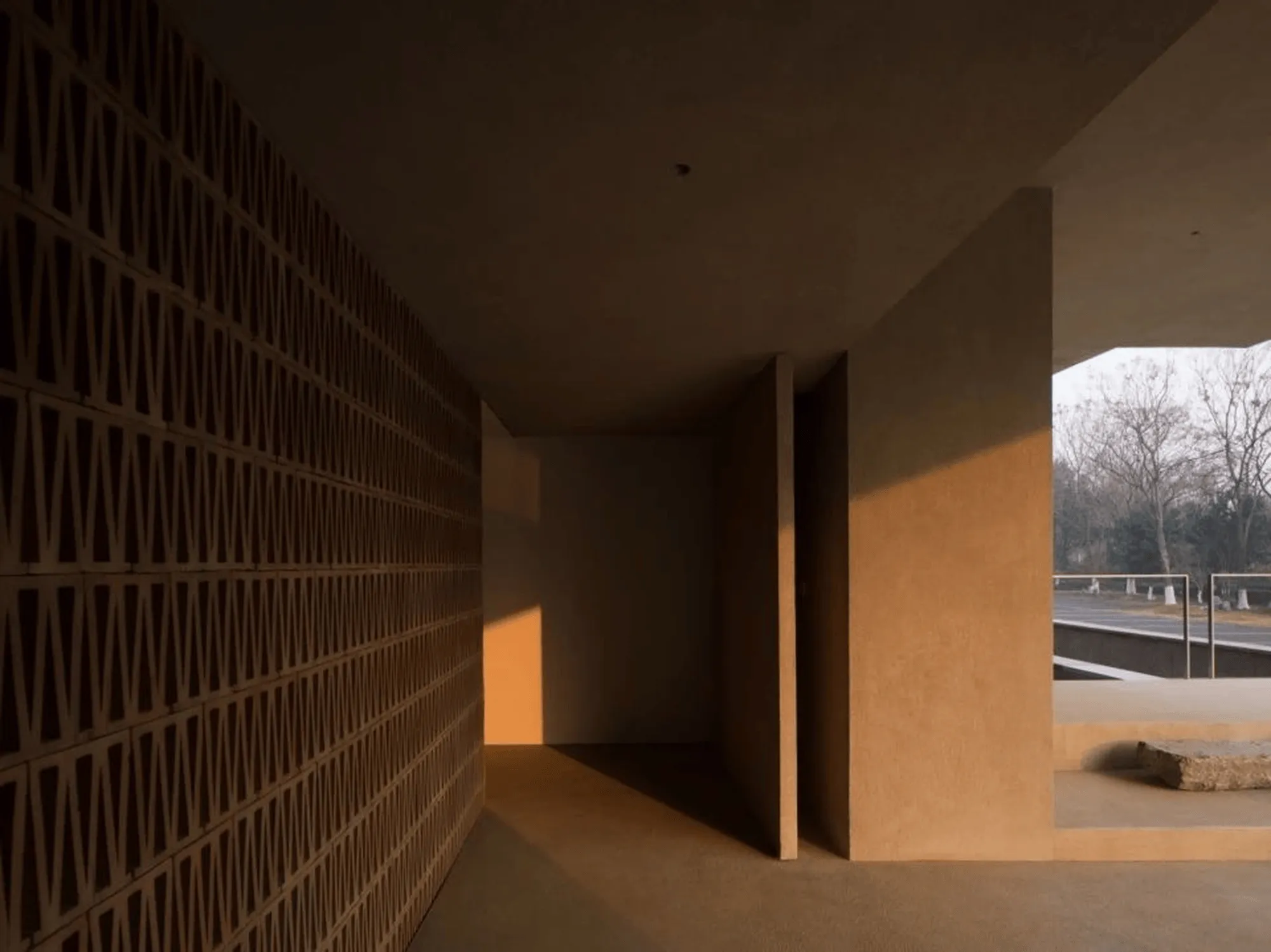
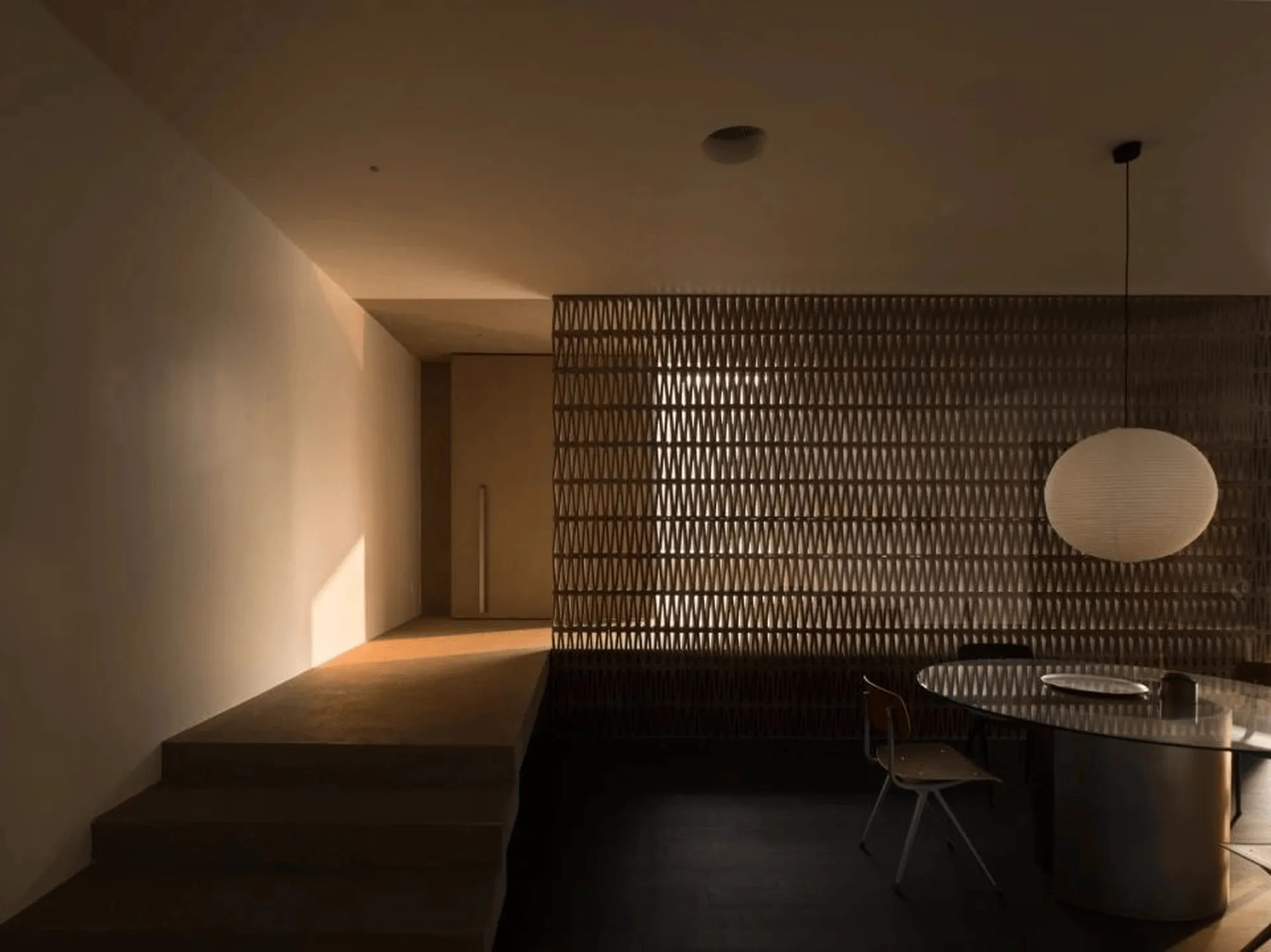
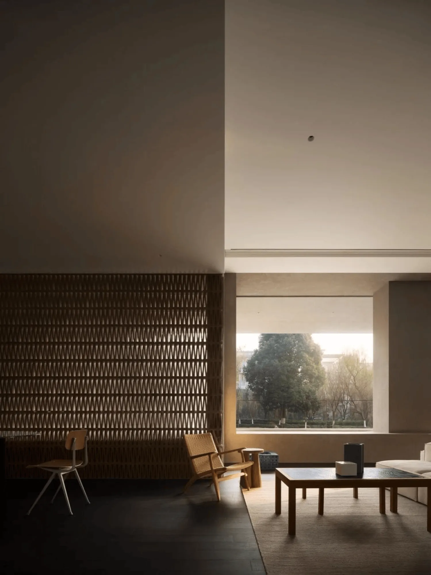
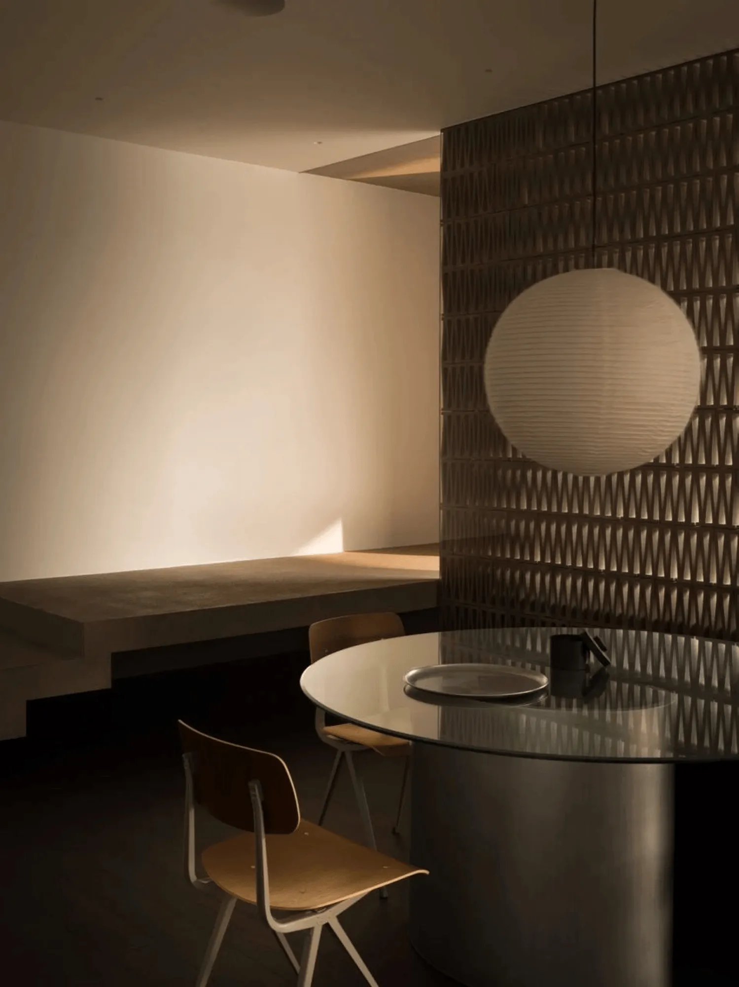
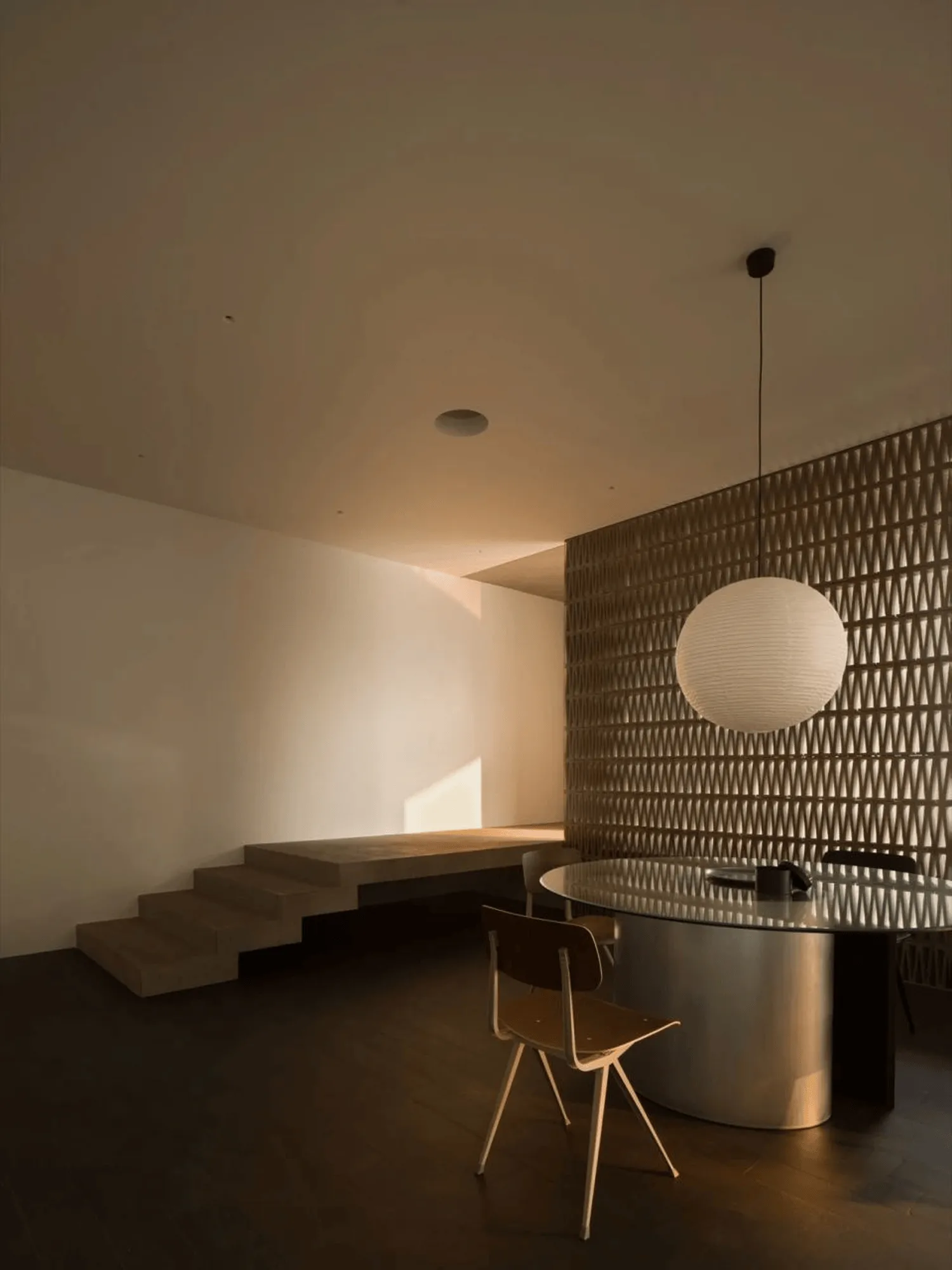
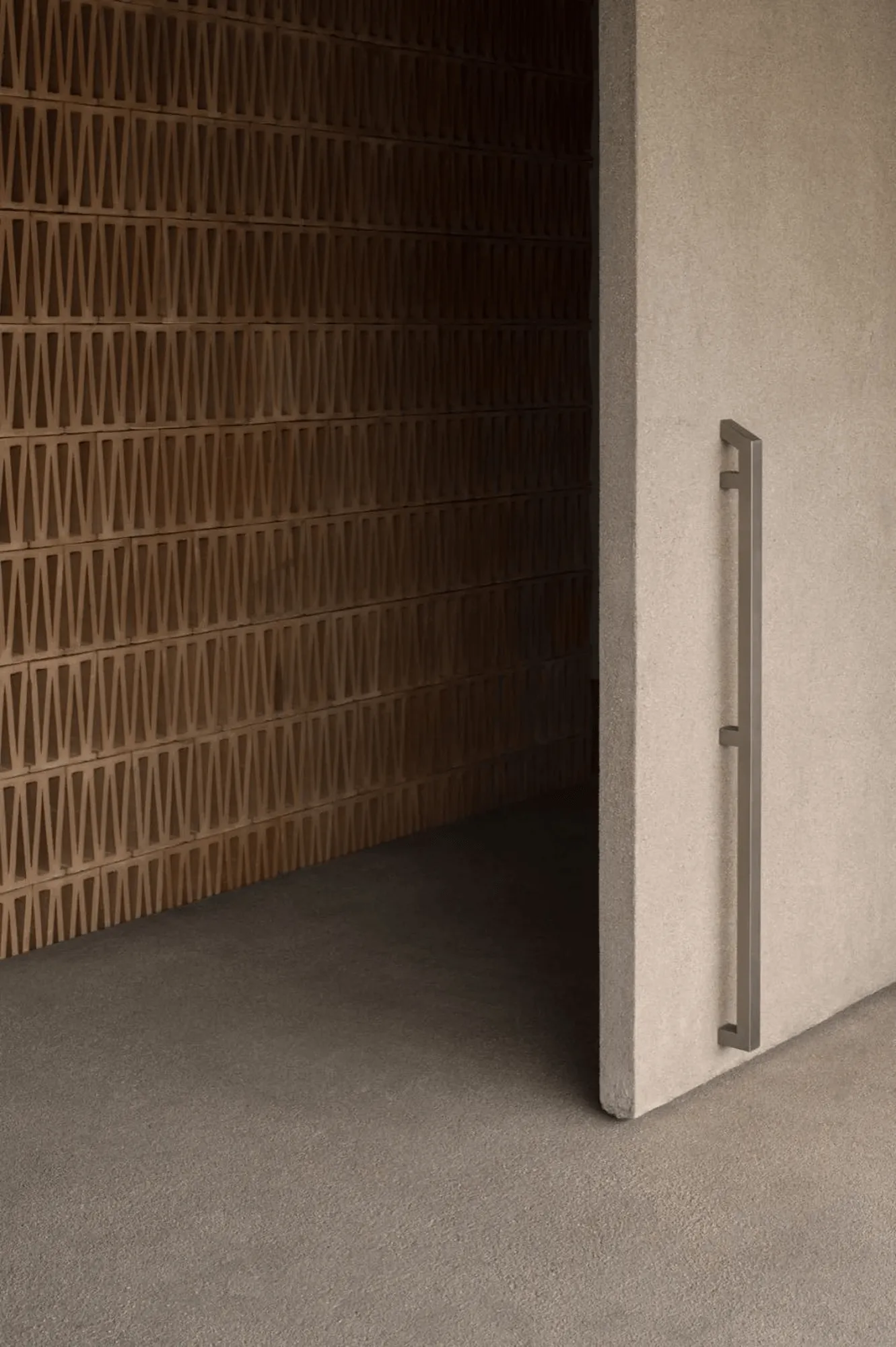
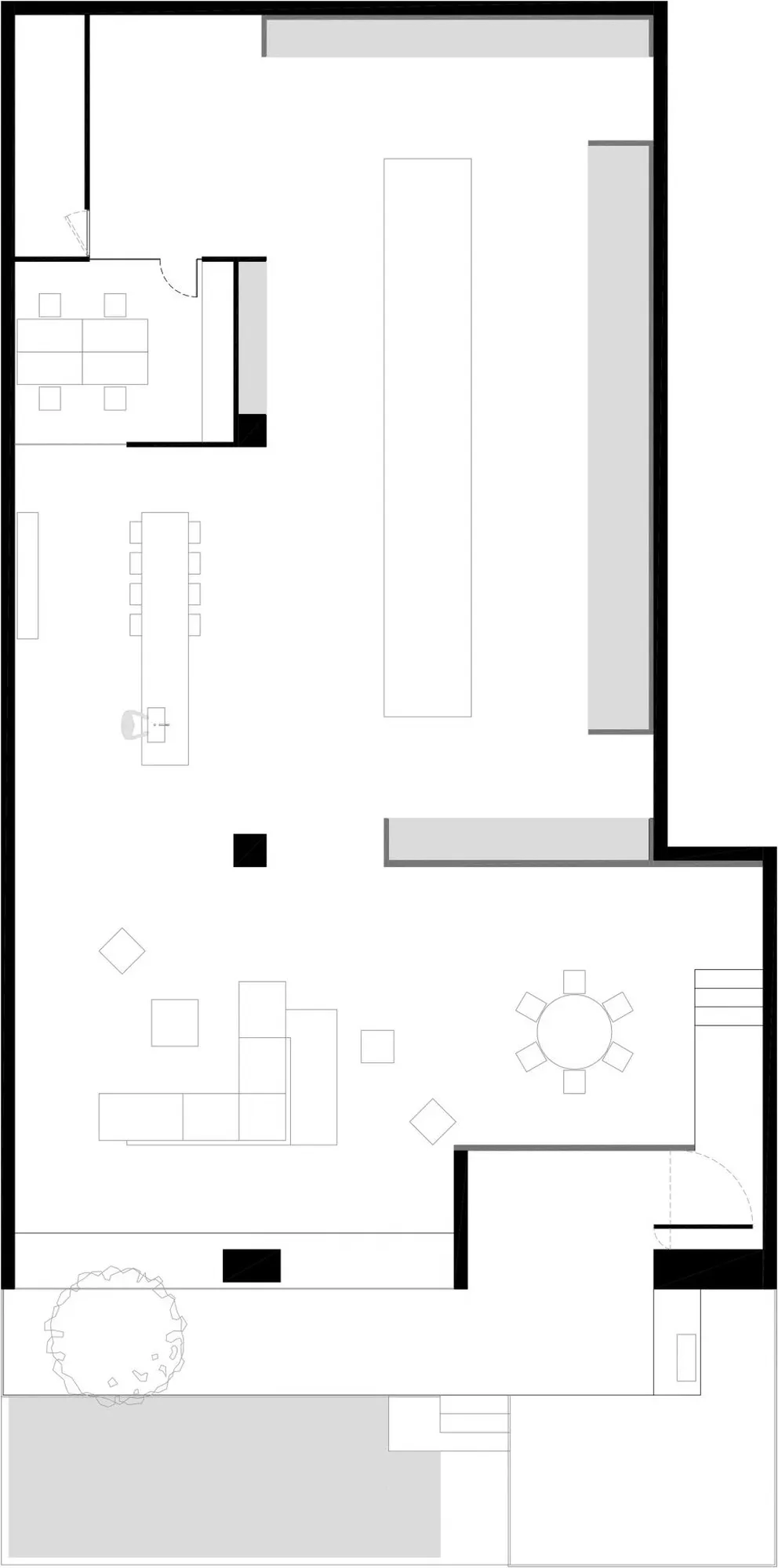
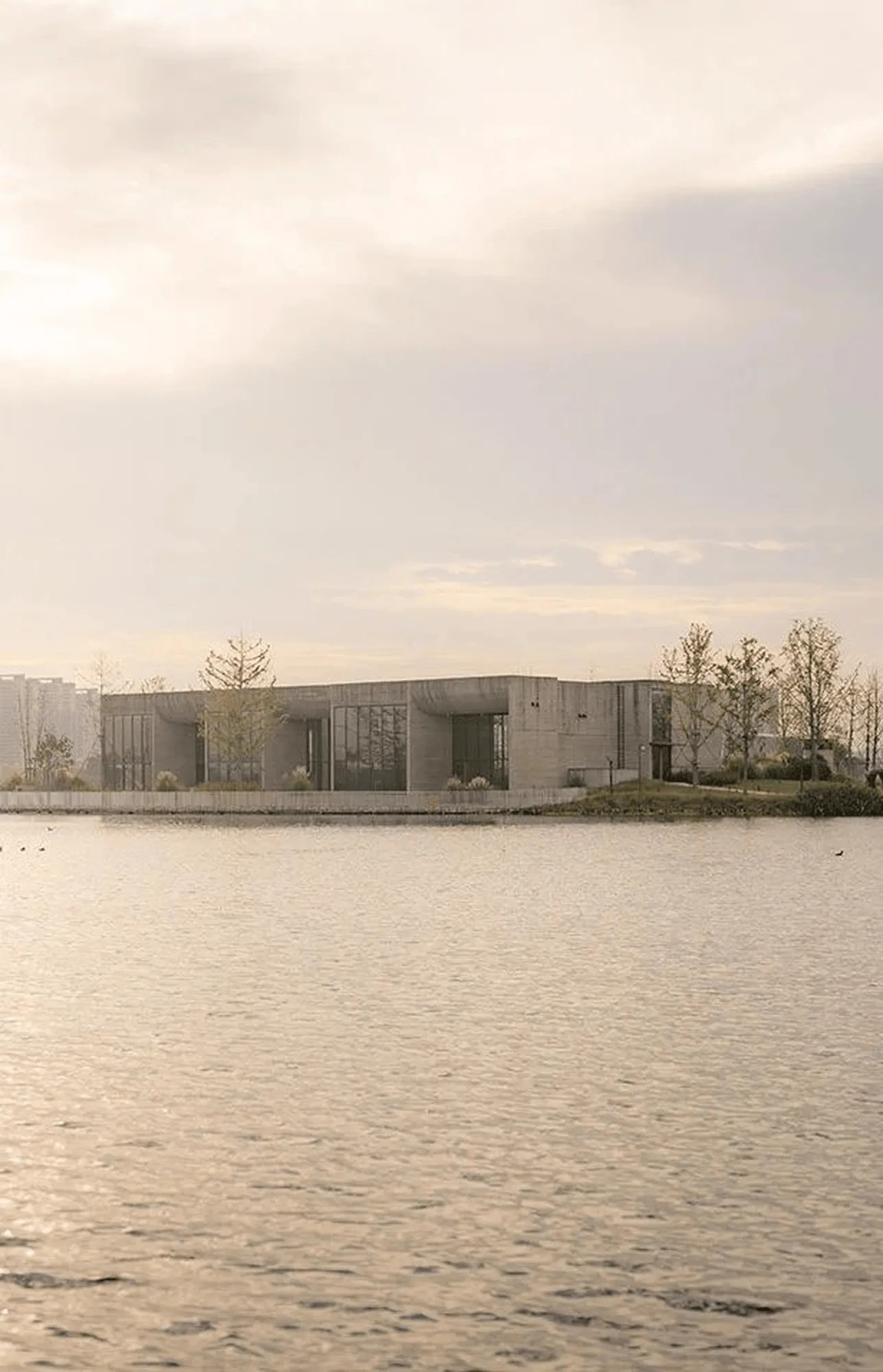
More Design Office, guided by the principles of nature and light and shadow, transformed the originally bland and disadvantageous spatial form of the Mutina Showroom in Jiaxing, Zhejiang. By excavating the inherent characteristics of the space, they employed a rational and restrained design language to reconstruct the facade, reflecting the brand’s essence. The meandering circulation path was reorganized, incorporating elevation changes to enrich the spatial journey and transition from the external hustle and bustle to the internal tranquility. Minimalist and restrained language, coupled with a still water feature and a viewing platform, instantly established a sense of serenity and leisure within the space.
Embracing Natural Aesthetics: A Light and Shadow Art Gallery
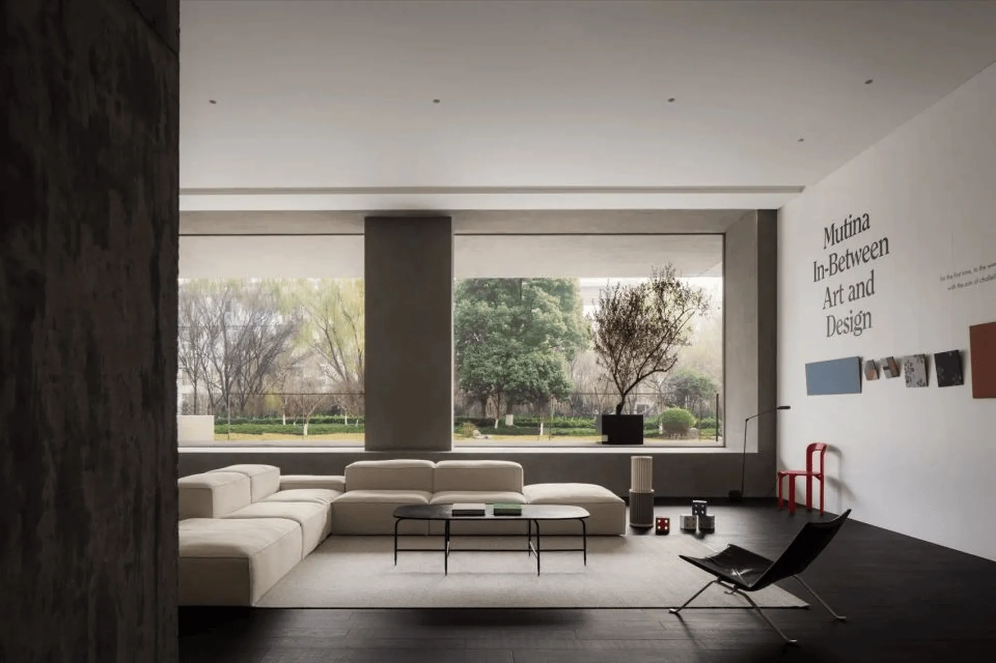
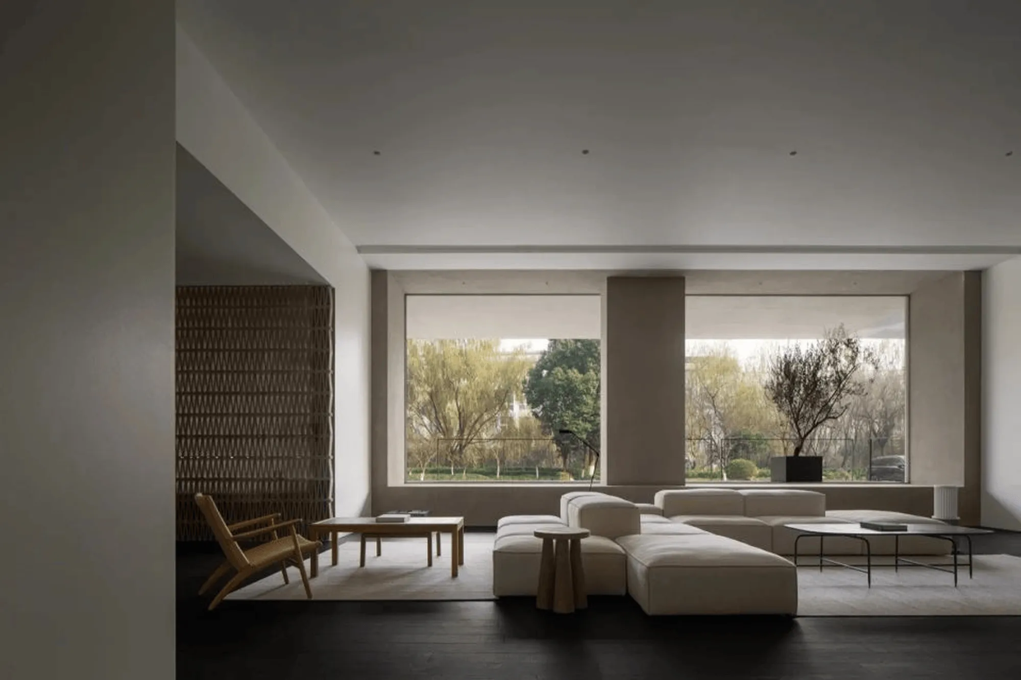
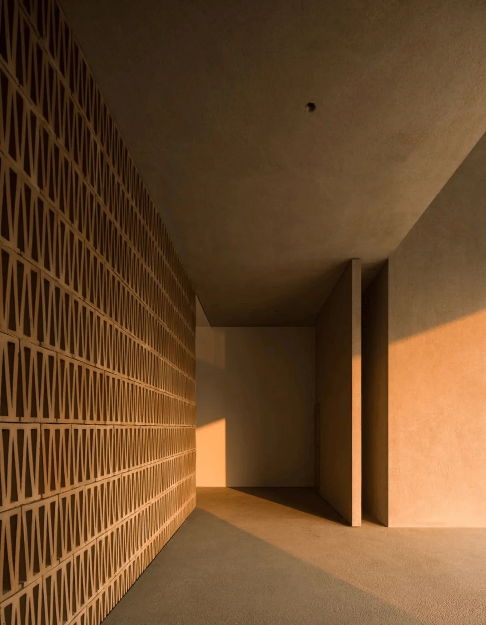
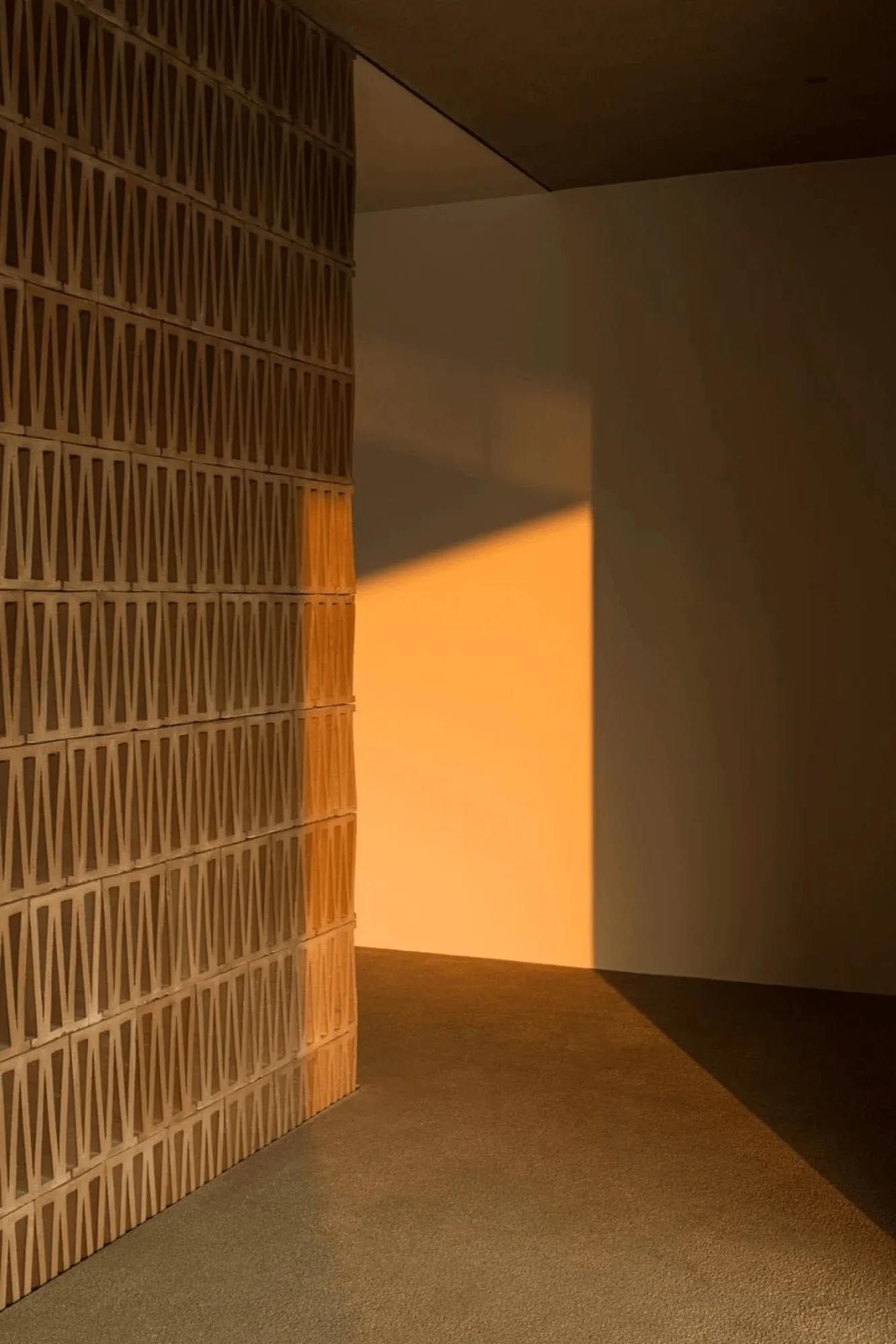
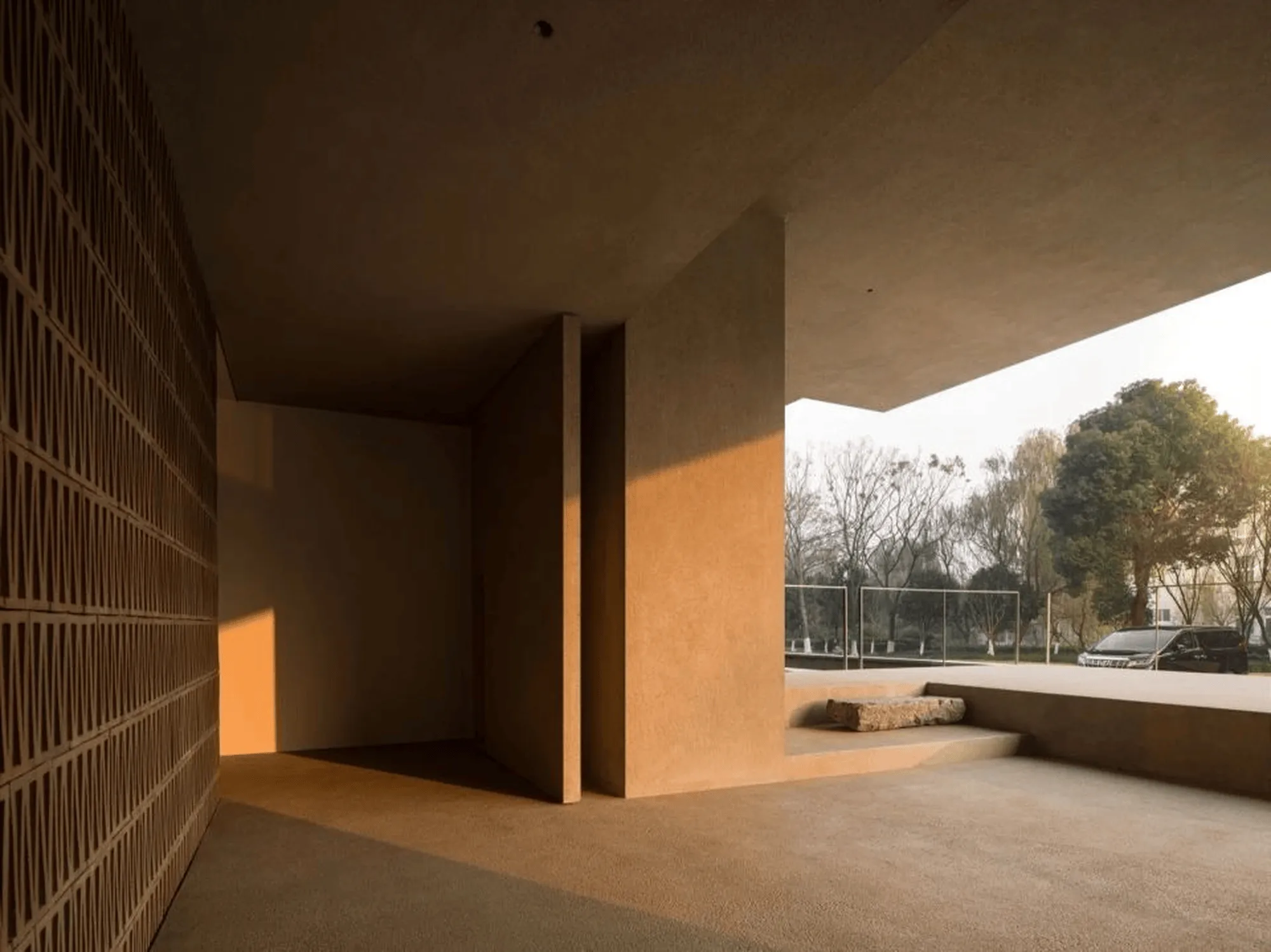
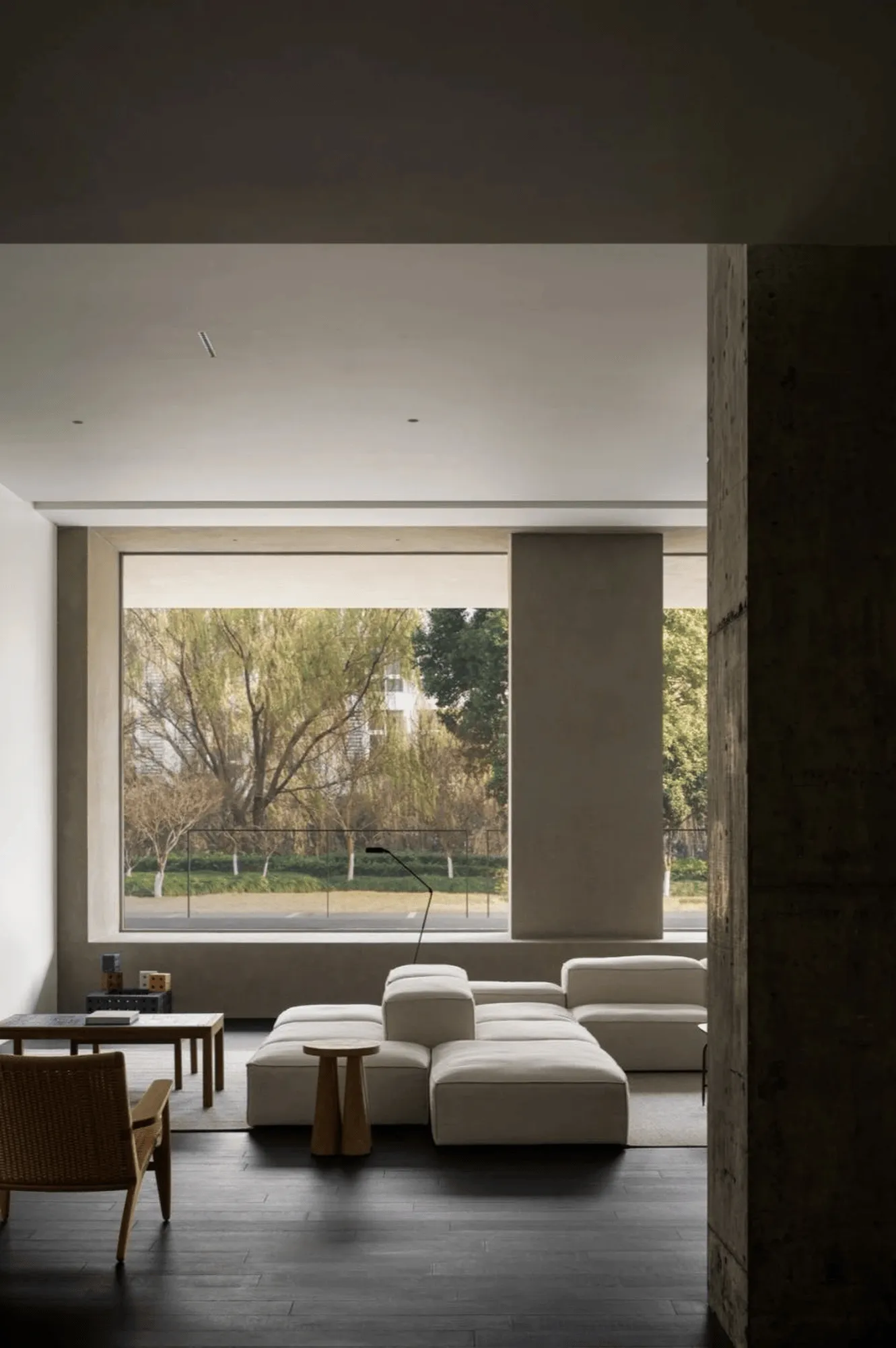
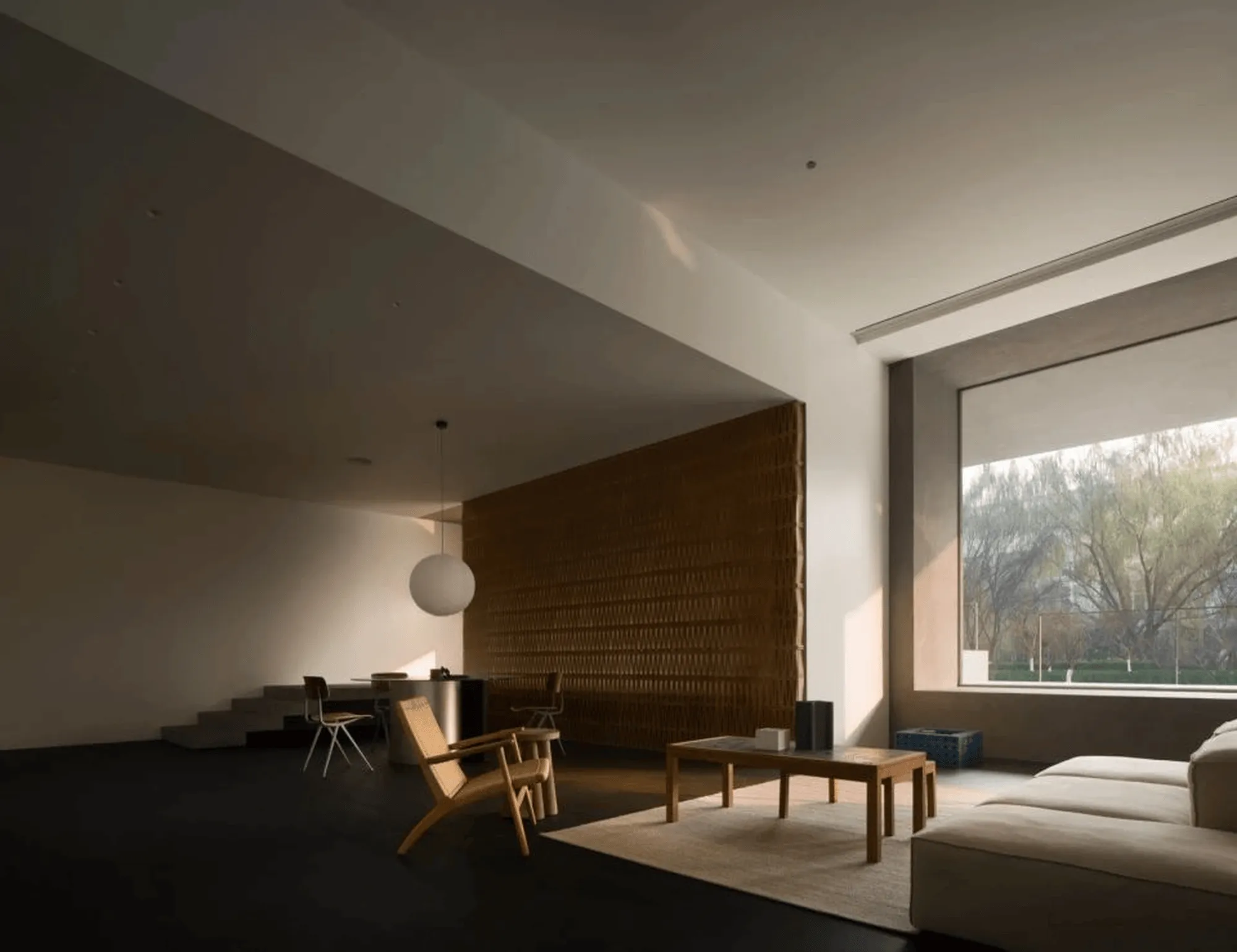
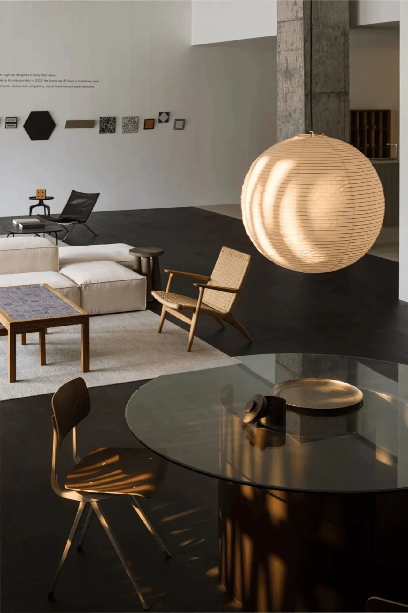
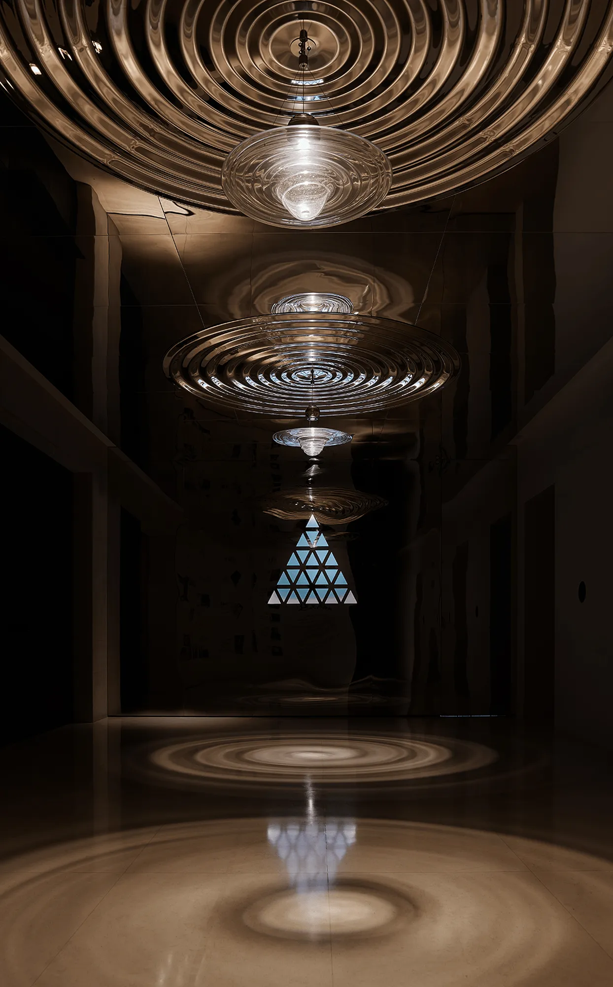
Natural light and shadow are allowed to flow freely within the Mutina Showroom, creating a temporal aesthetic. Visitors can stroll through the space, experiencing the interplay of shade and light, order and freedom. As time passes, the light and shadow caress every corner of the venue, imbuing it with a vibrant vitality and enduring beauty. At the convergence of shade and light, a 9-meter-long integrated glass curtain wall extends the building’s facade, allowing the external nature and light to permeate the interior.
Revealing Authentic Textures: Rational Spatial Construction
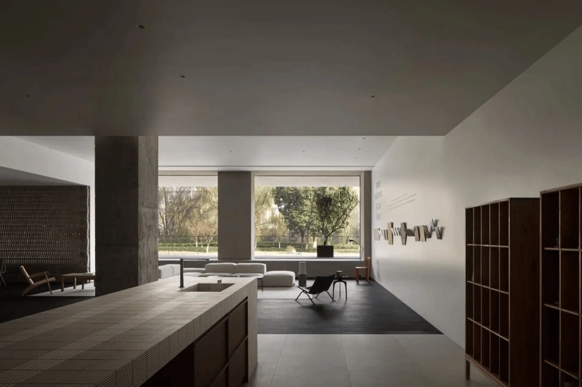
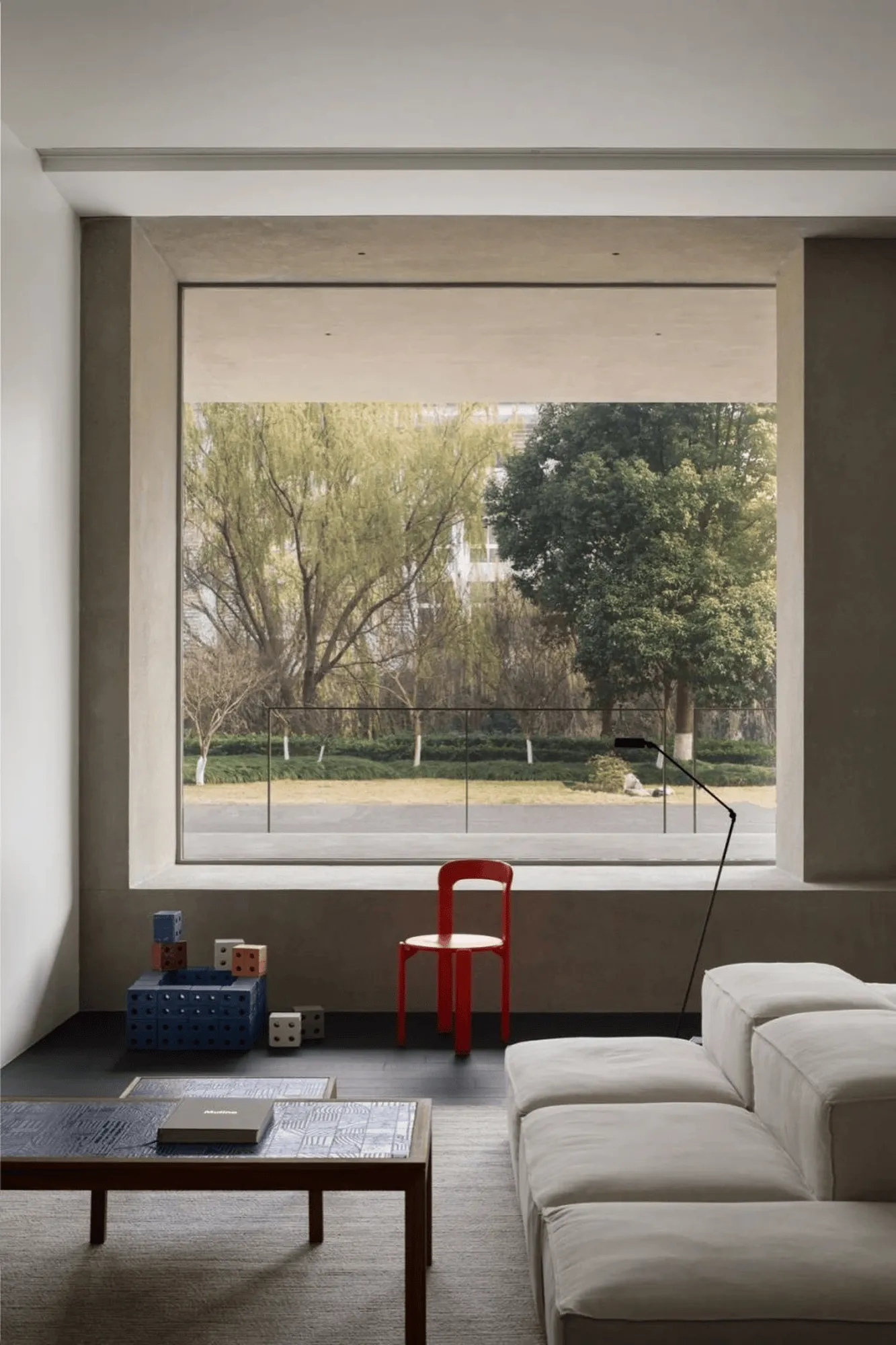
The Mutina Showroom design embraces the brand’s philosophy of natural integration, focusing on the relationship between humans and nature. Large windows provide unobstructed views of the surrounding greenery and the changing seasons, extending the sense of transparency and breathability within the space. Adhering to the principle of “FORM follows THOUGHT,” the design provides designers with unlimited space for perceptual creation through rational methods such as straight lines, modularity, geometric shapes, and three-dimensional forms.
Showcasing the Essence of Ceramic Art: A Space for Artistic Curation
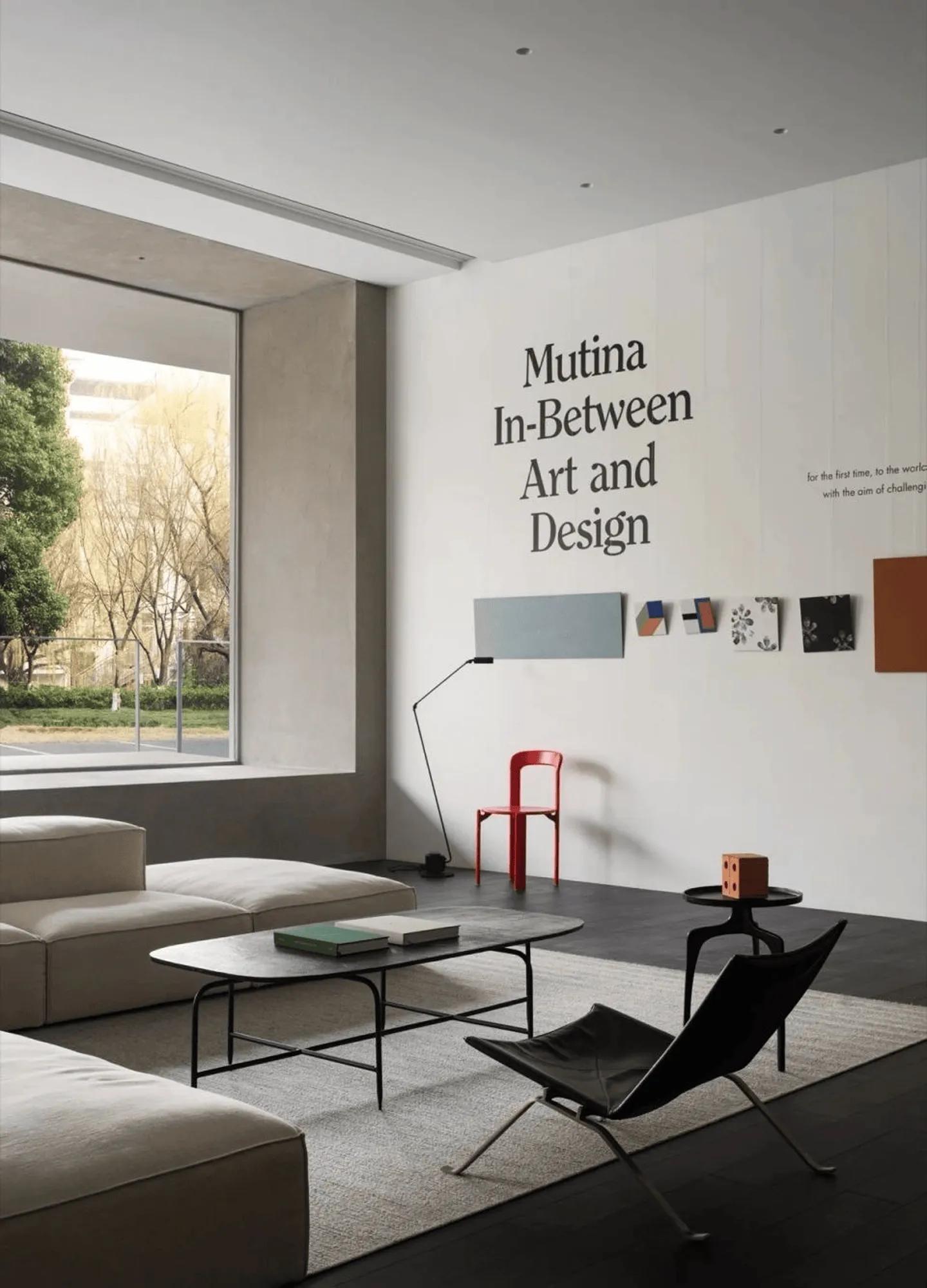
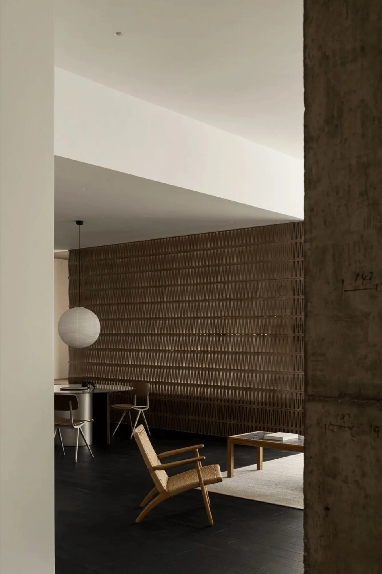
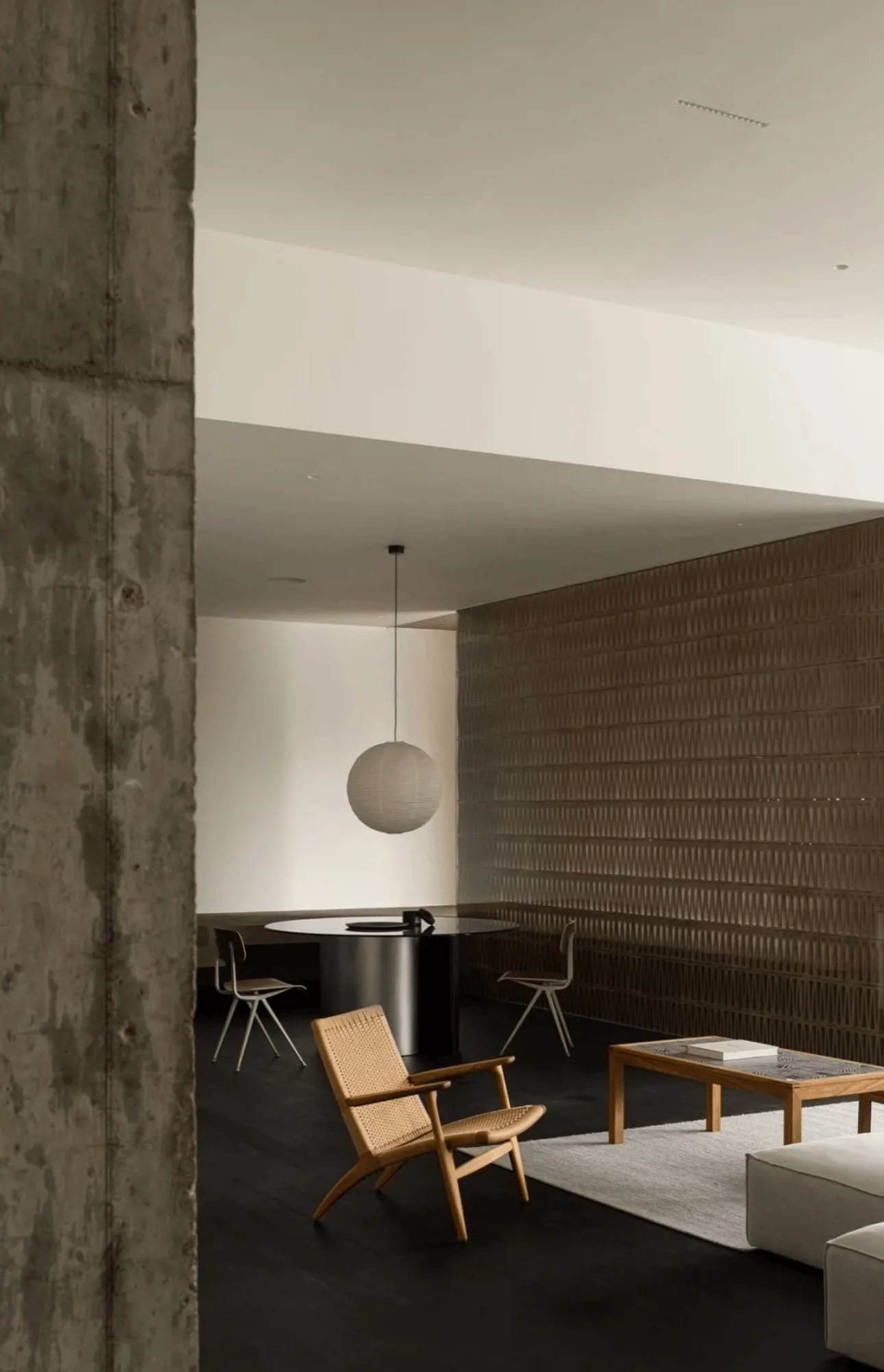
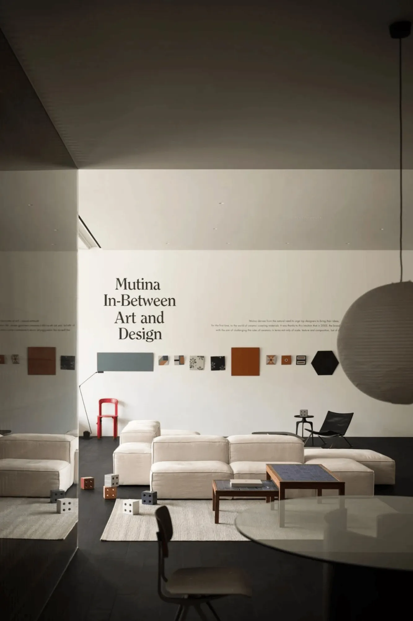
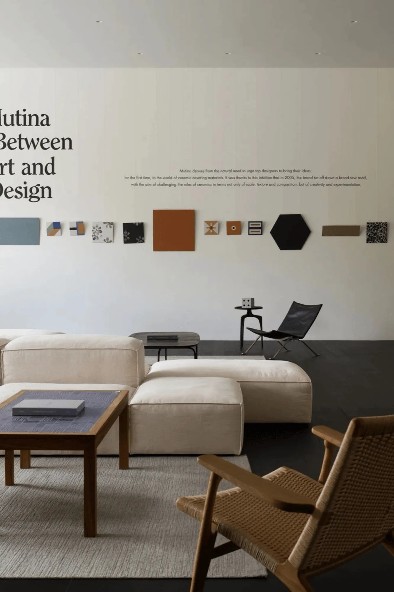
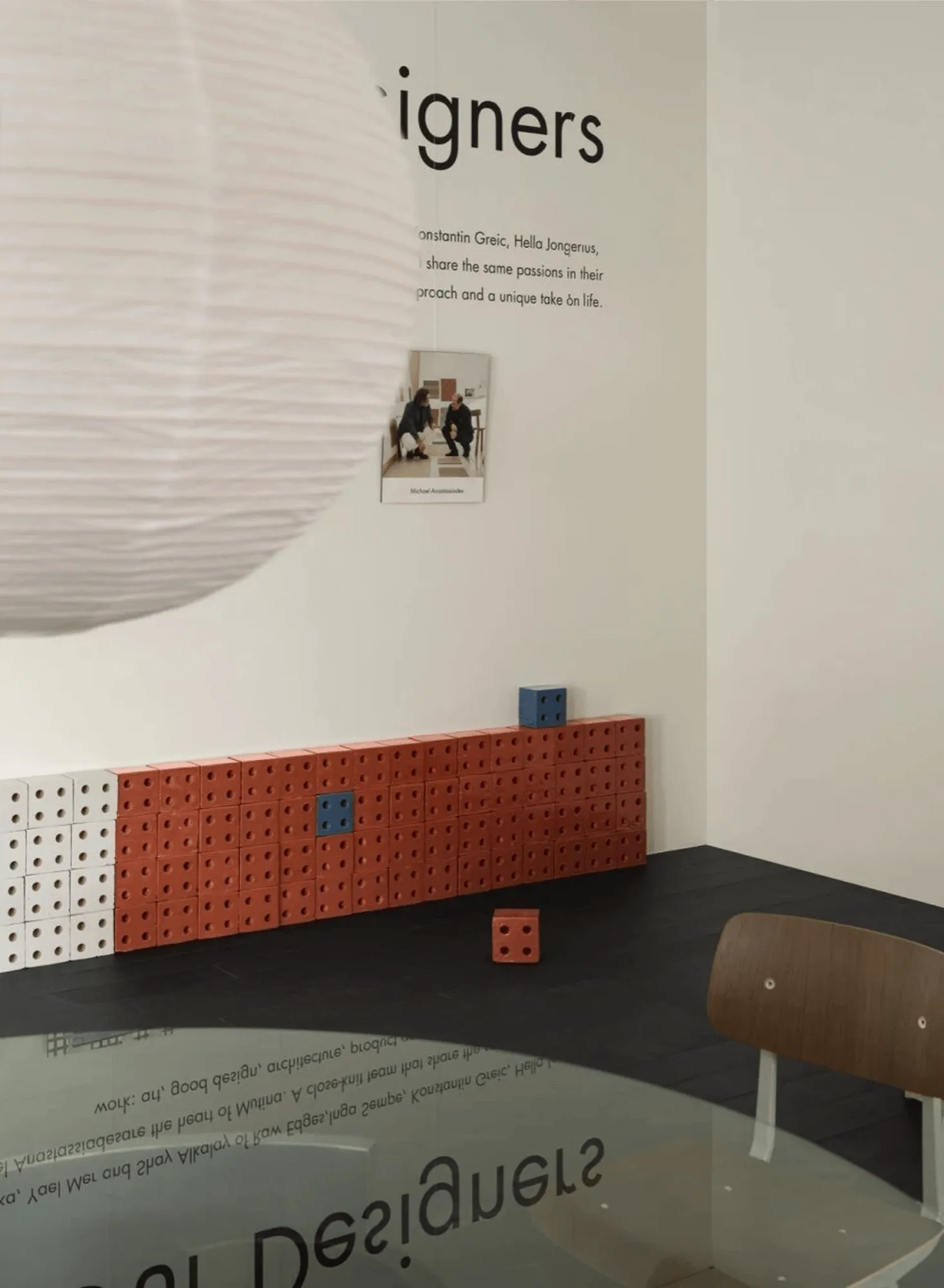
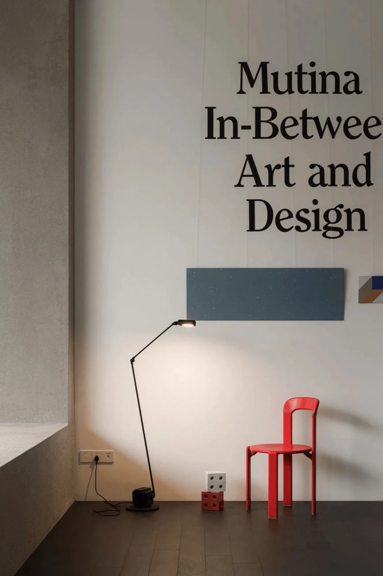
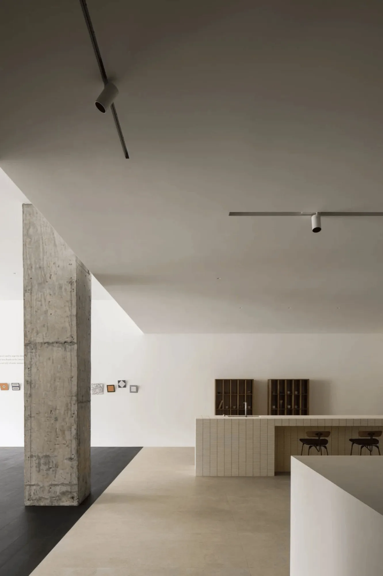
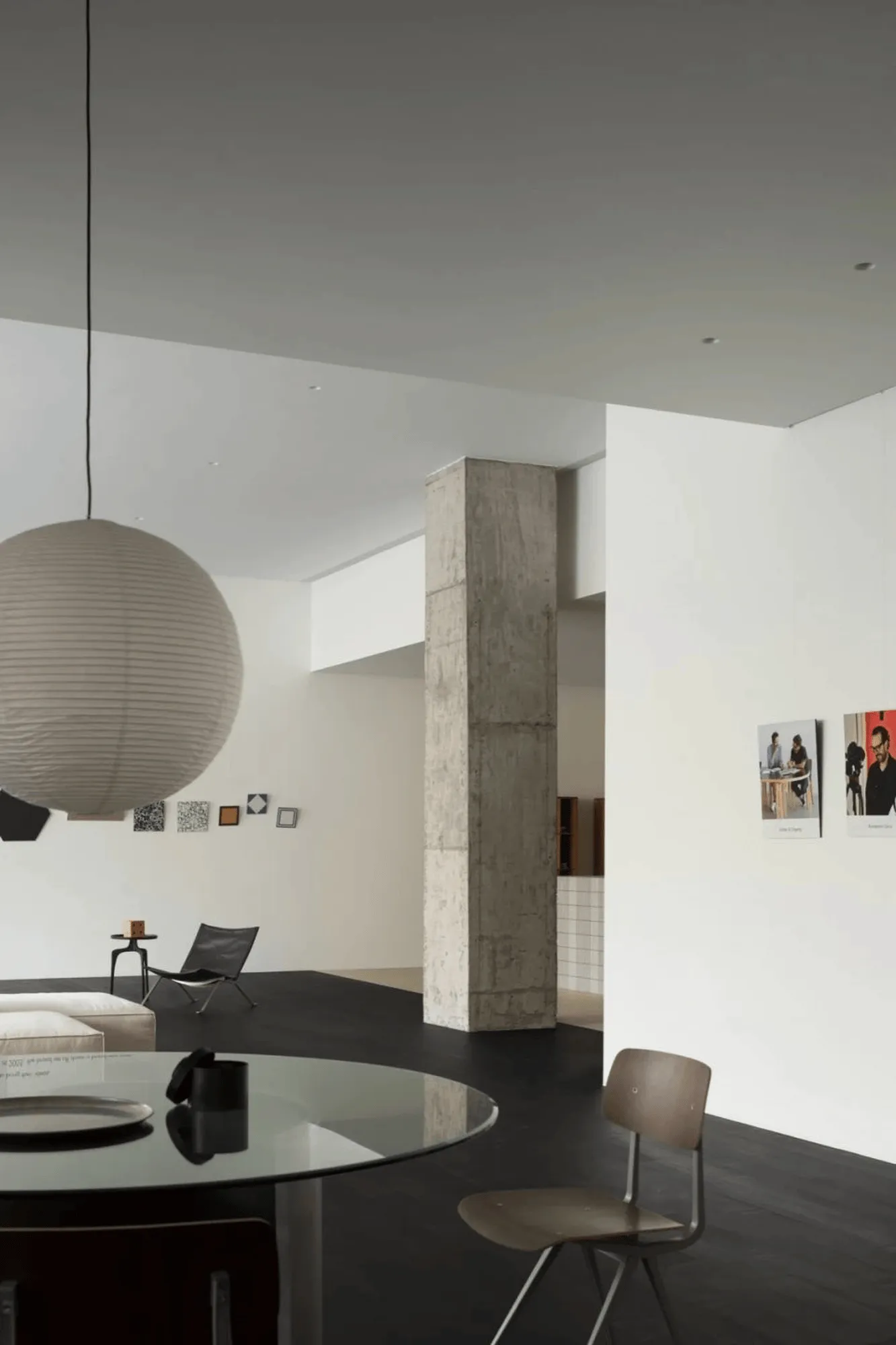
More Design Office incorporated product displays into the warm and peaceful spatial backdrop of the Mutina Showroom in a subtle and restrained manner, allowing them to be presented to customers in a natural state. Under the interplay of light, the space assumes varying forms, and time leaves its mark. Within the textured concrete, gentleness and roughness find a harmonious balance, creating a sense of tranquility and relaxation. Beyond the poetic use of materials, the products themselves become interior decorative art pieces, injecting interest, color, and vitality into the space.
Mutina’s Philosophy: Breaking Boundaries in Ceramic Design
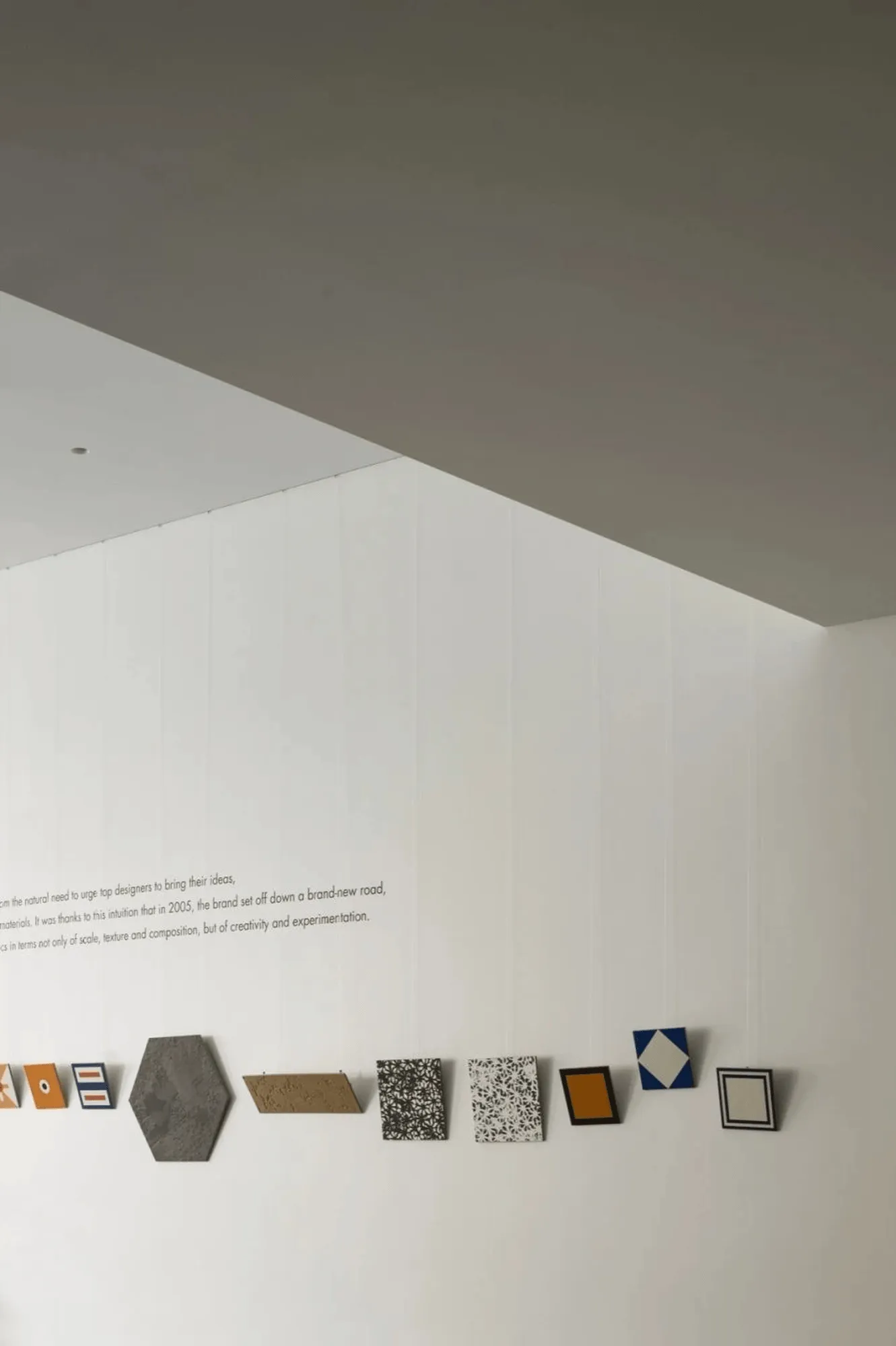
“Acting as the second skin of the space.” – Artists, through their design and consideration of the specifications, textures, and material composition of ceramic tiles, make them approachable and applicable, empowering spatial design. The design eliminates the boundaries of the space, prompting customers to engage in new behaviors. An artistic curation approach creates a unique showroom ambiance. Products are delicately suspended from the ceiling with wires, akin to displaying artwork, allowing visitors to freely stroll, gaze, appreciate, and interpret.
Blending Functionality and Aesthetics: Fringe Series in the Bar Area
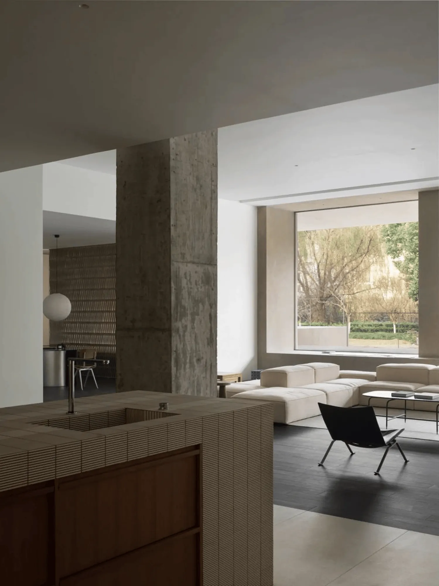
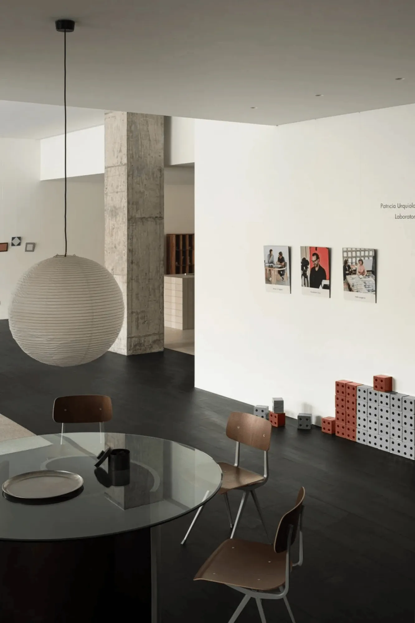
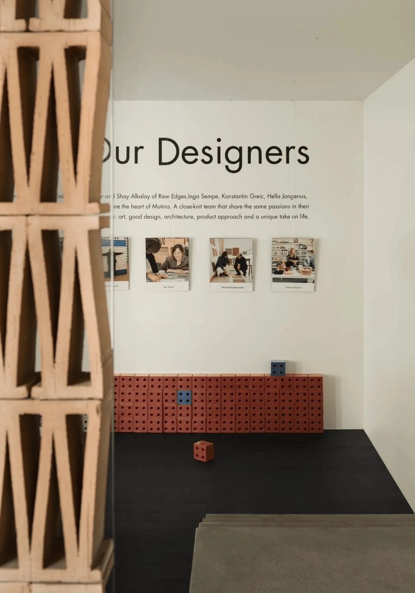
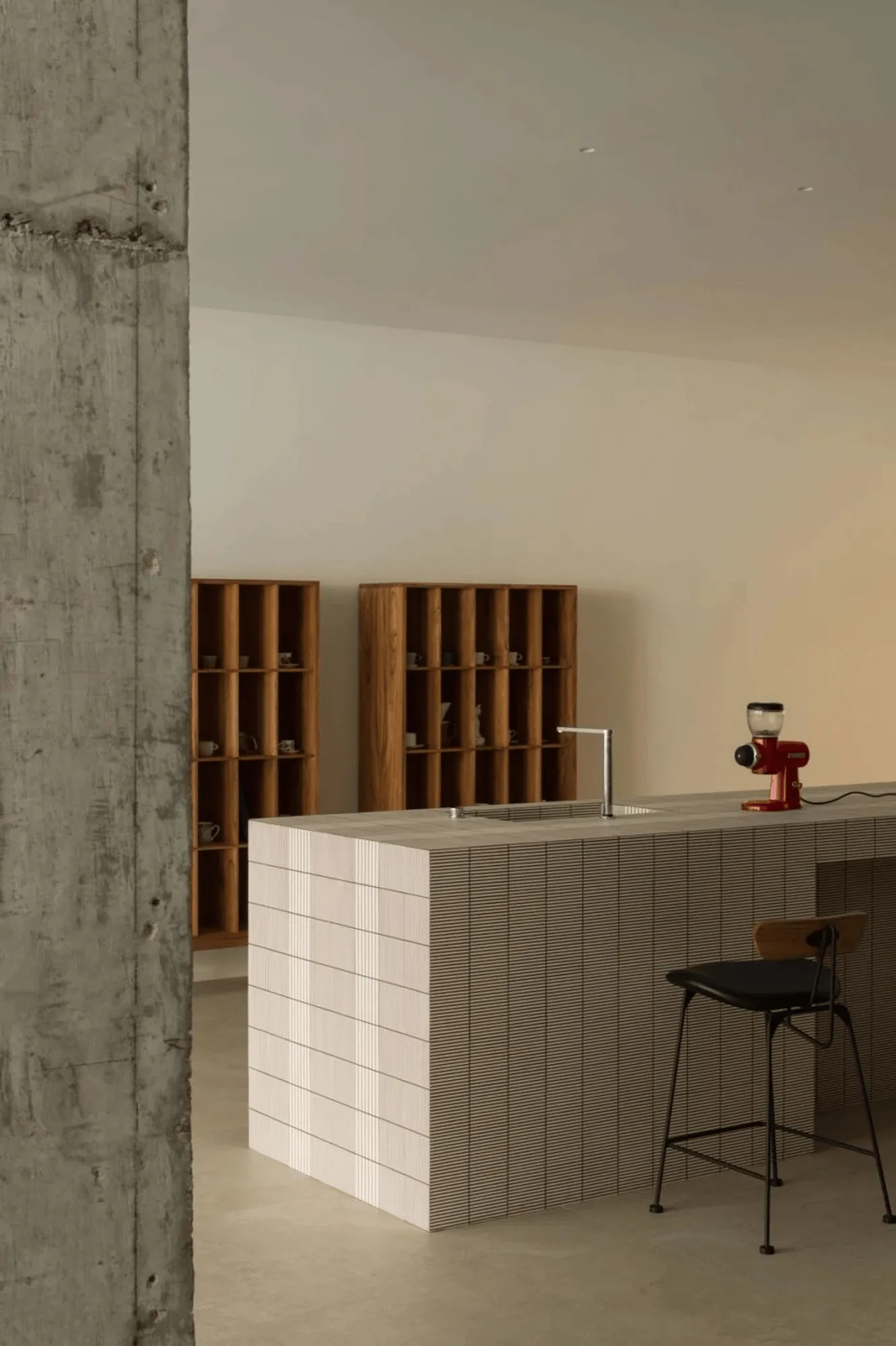
The interior of the Mutina Showroom is devoid of unnecessary walls, providing ample space for movement. The exposed and unadorned architectural columns reveal the authentic nature and natural colors of the materials, showcasing their inherent warmth and texture, while also allowing time to leave its mark. Ceramic works are seamlessly integrated into the space, blending harmoniously with the environment. Design is not a mere accessory but an enabler that serves the space. Repetitive rhythms and meticulously aligned lines create a captivating visual order, conveying the brand’s meticulous craftsmanship. The designers aimed for the product displays to be subtly integrated into the scene, focusing on providing functional services, existing like artworks that subtly permeate the guests’ perceptions.
Conclusion: An Immersive Journey into Spatial Art
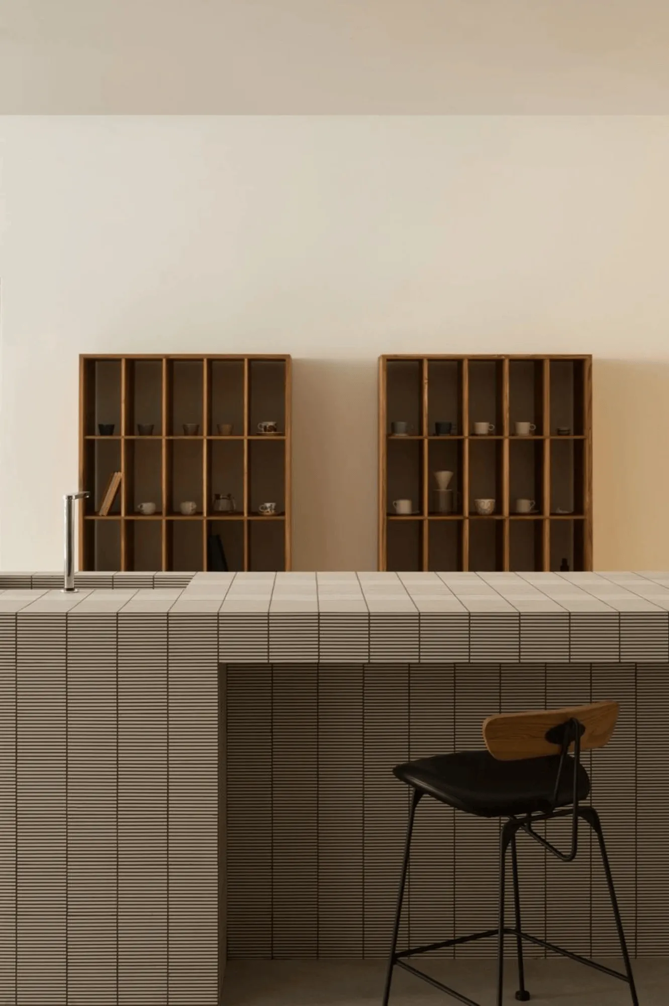
The bar area in the Mutina Showroom features the Fringe series products. Parallel lines of two different widths are engraved on the bar surface, forming a brick-like structure. The parallel lines of varying densities are outlined with contrasting epoxy grout, creating a variety of seamless patterns through simple alterations in line color and size, visually impacting visitors with a strong sense of order. True to Mutina’s founding principles, the showroom design breaks away from conventional perceptions and practices regarding ceramic use, exploring and unearthing the potential of ceramics. More Design Office transcends the typical framework of a product sales showroom, instead, refining the brand’s tonality and focusing on creating a natural rhythm and exceptional texture within the space. This leads visitors on an immersive journey into spatial art, allowing them to deeply appreciate the seamless fusion of ceramic art and modern spatial aesthetics.
Project Information:
Architects: More Design Office
Area: 350 m²
Project Year: 2022
Project Location: Jiaxing, Zhejiang, China
Main Materials: Concrete, Ceramic Tile, Glass
Project Type: Showroom
Photographer: Zhao Long


