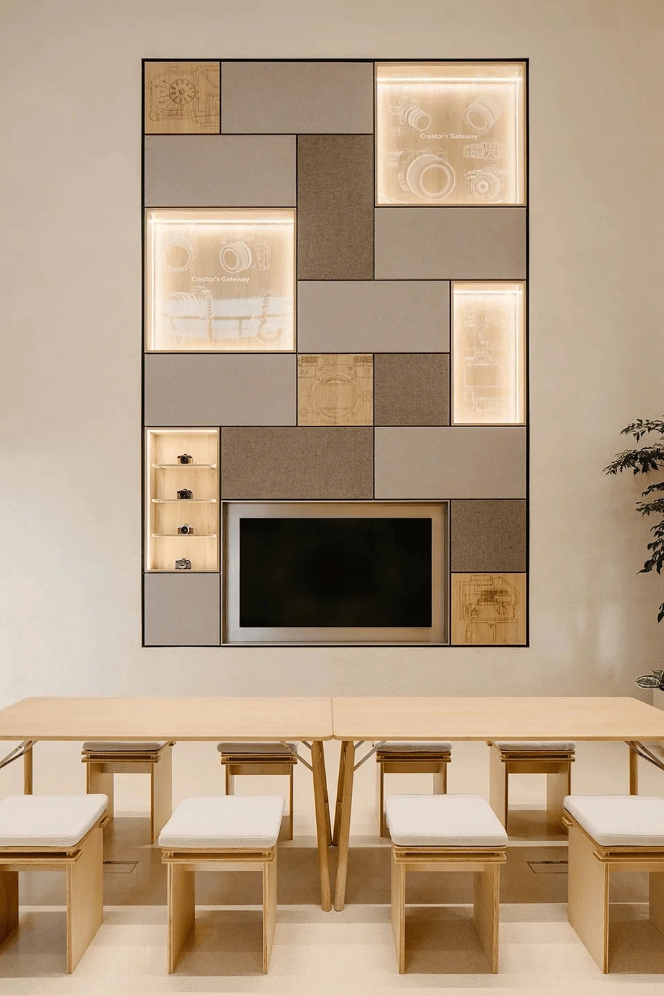
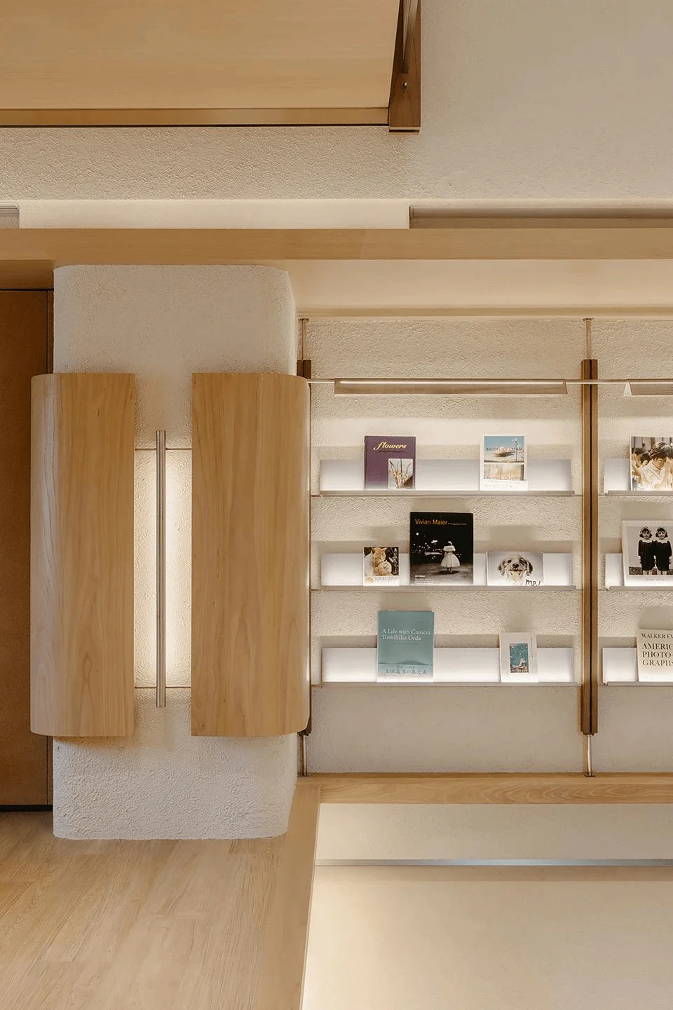
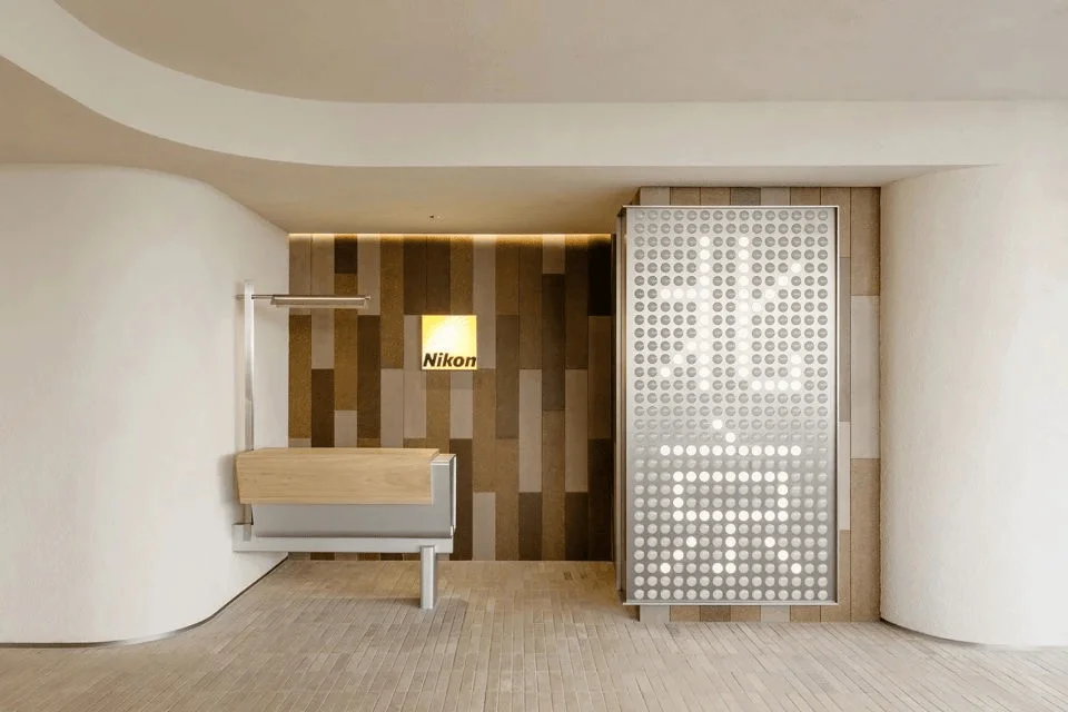
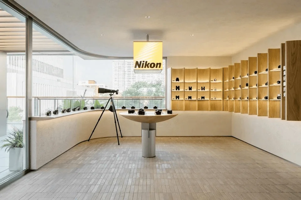
Nikon Beijing flagship store retail design in China by Lukstudio.
Contents
Project Background: A New Chapter for Nikon in Beijing
The Nikon Beijing Flagship Store, located in the Sanlitun Taikoo Li South district, represents a significant retail venture for the renowned camera brand. Collaborating with Lukstudio, Nikon sought to redefine its presence in Beijing by crafting a space that not only showcased its products but also fostered a deeper connection with the city’s vibrant photographic community. This project posed a unique design challenge, encompassing the need to revitalize the existing facade and make the most of the eight-meter-high interior space, setting it apart from traditional retail layouts within shopping malls. nikon retail design in china involves understanding the technical intricacies and aesthetics of cameras and skillfully weaving them into the design fabric, thereby creating a distinct brand identity within the context of modern commercial architecture. nikon retail design in china tag.
Design Concept and Objectives: Merging Nature and Technology
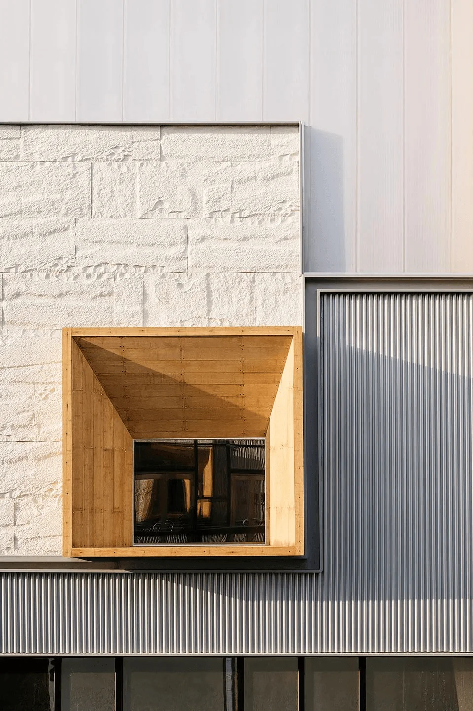
Drawing inspiration from the natural world, the design team seamlessly fused organic and industrial design elements to create a cohesive spatial narrative. The objective was to establish a strong brand identity for Nikon while simultaneously creating a sense of belonging within the local cultural landscape. This design approach manifests in the selection of materials, layout, and overall aesthetic of the space. For instance, the integration of bamboo steel into the facade windows imparts a sense of dynamism and connection to the surrounding environment. This approach to nikon retail design in china tag exemplifies the designers’ ability to articulate the brand’s values through a nuanced and innovative spatial expression.
Functionality and Spatial Planning: Curated Zones for Interaction and Exploration
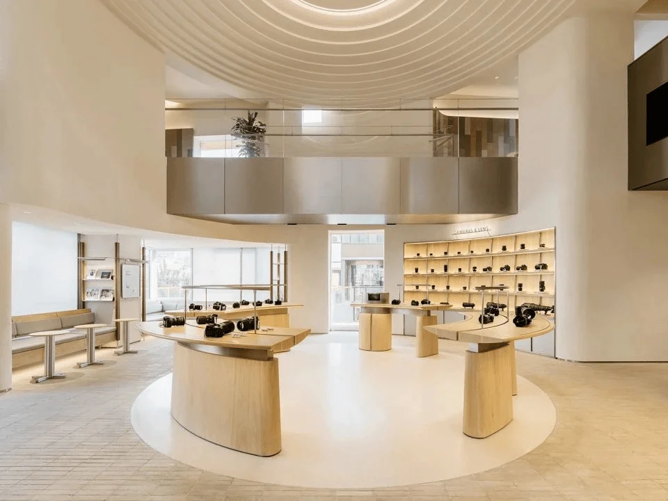
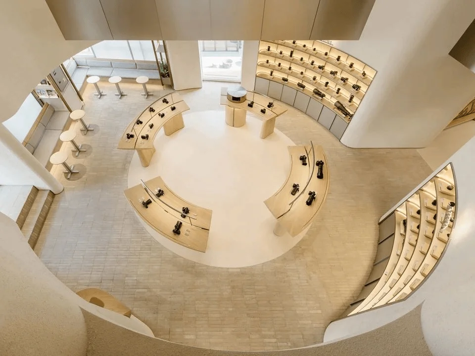
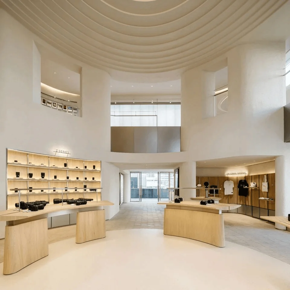
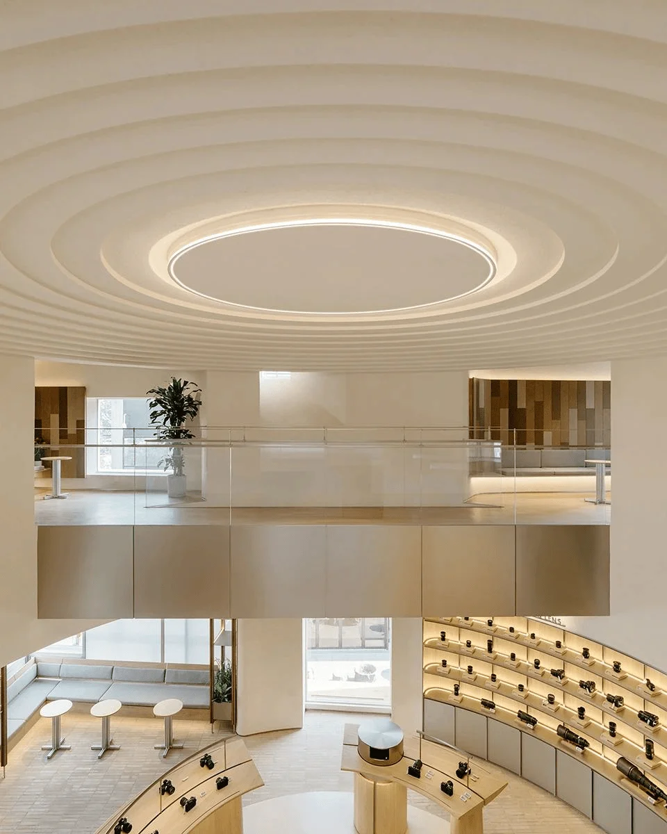
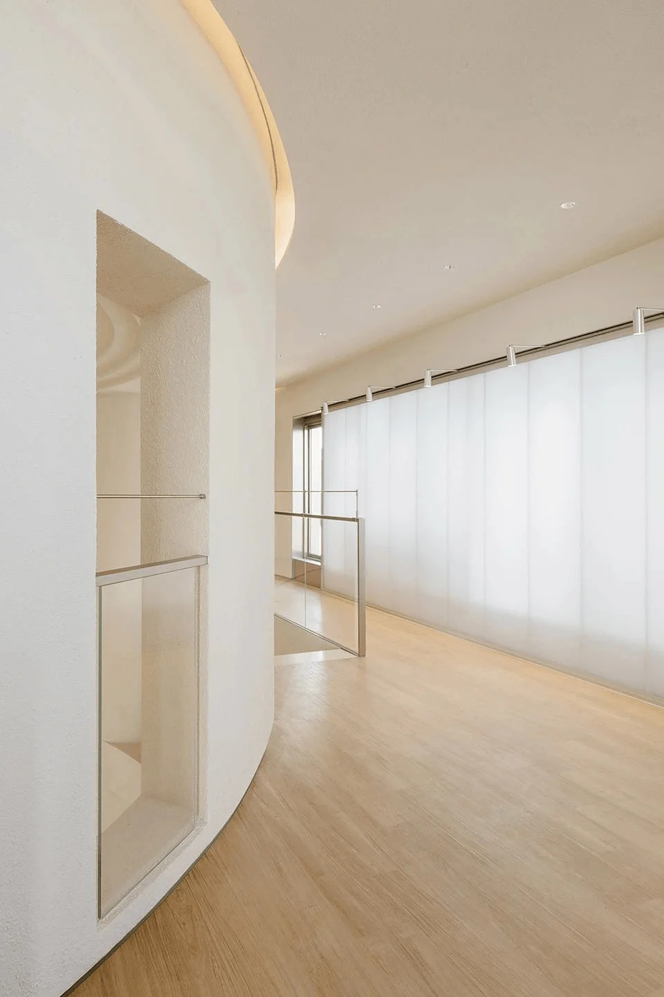
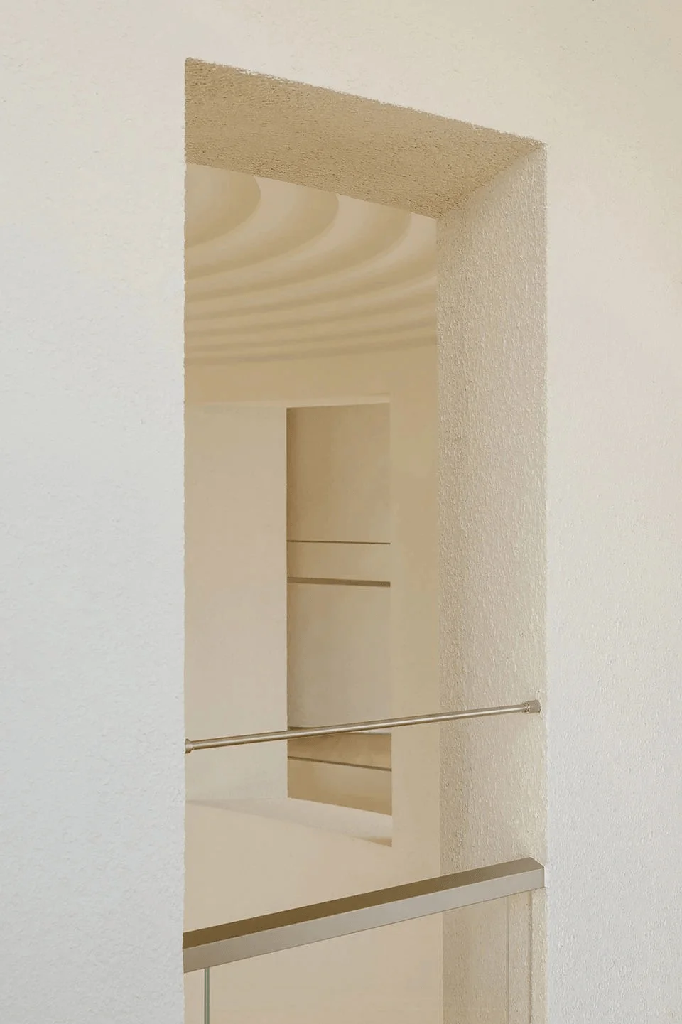
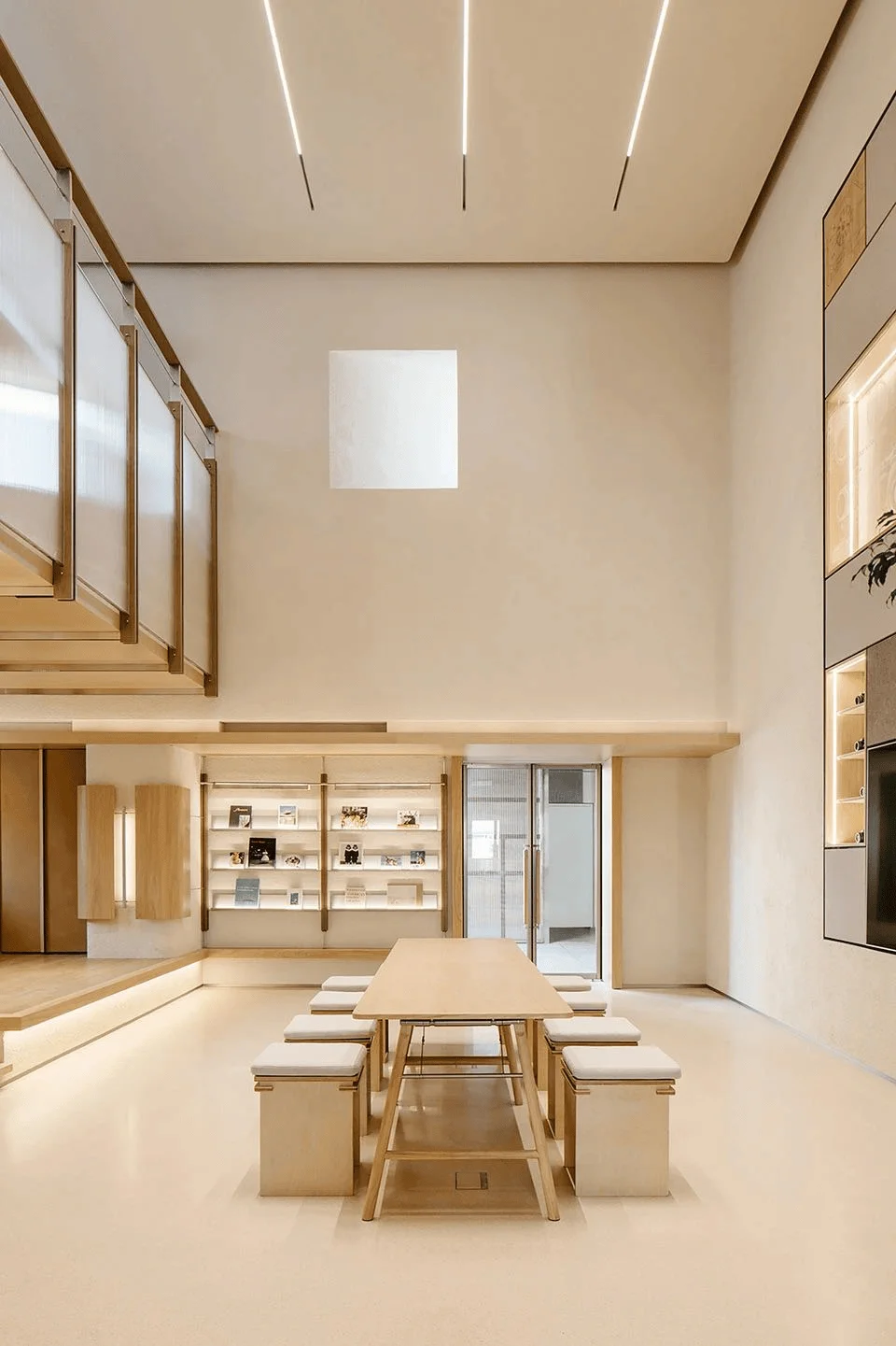
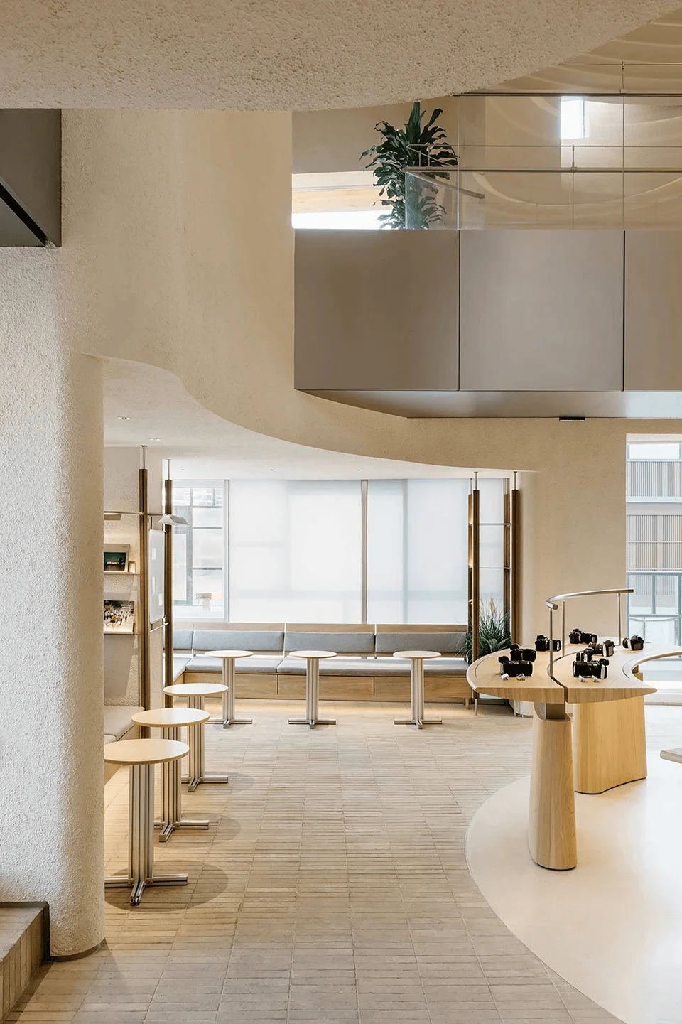
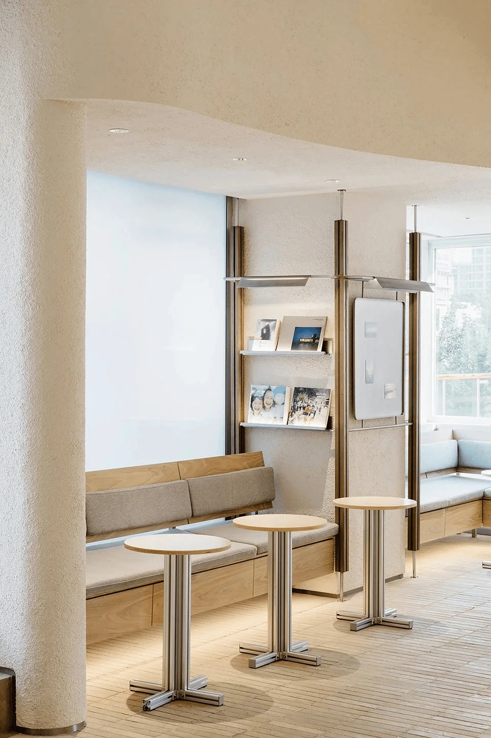
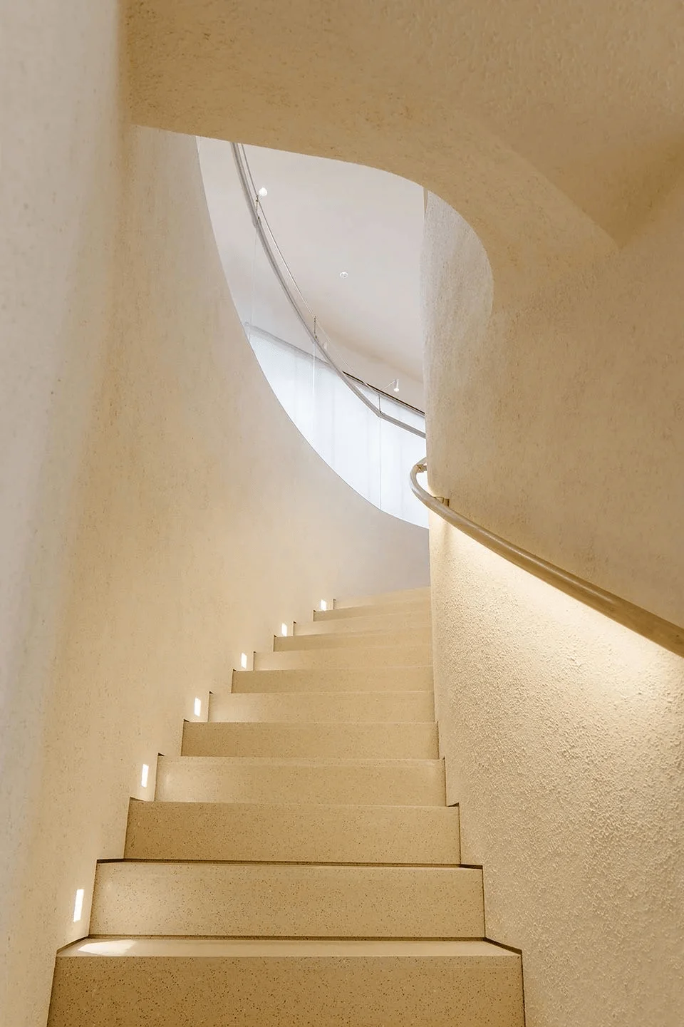
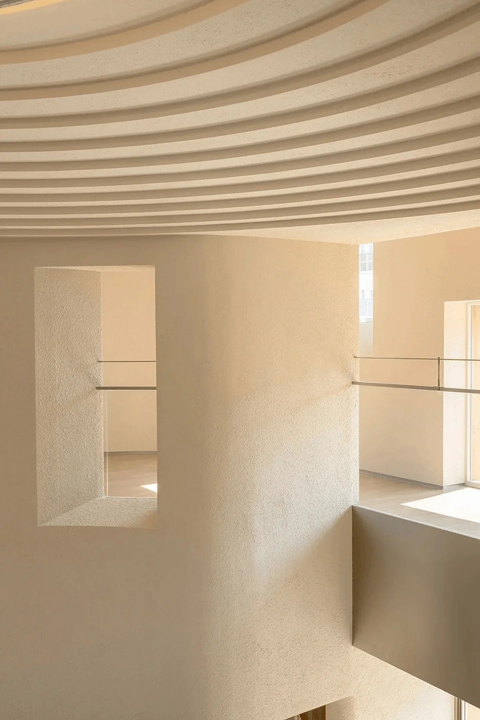
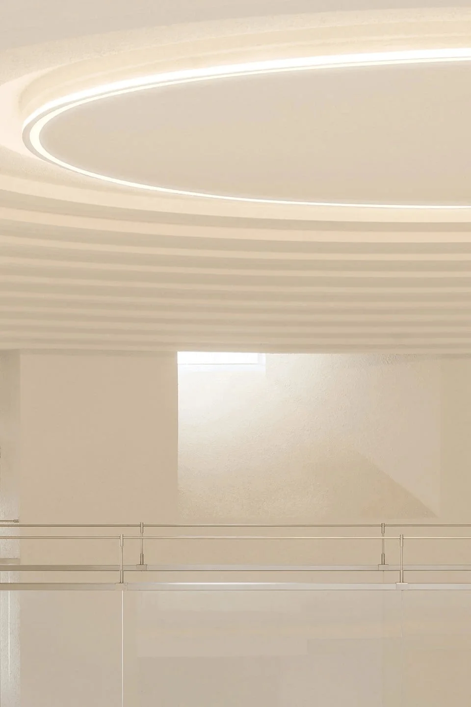
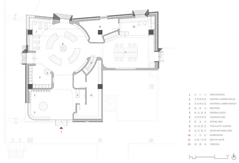
A central, circular, high-ceiling atrium serves as the visual focal point of the space, with various functional zones organically nested around it. The atrium’s design creates a natural flow and serves as a central hub that connects all the different areas of the store. The use of beige textured paint not only evokes a sense of primal cave-like texture but also aids in noise reduction, creating a tranquil atmosphere within the otherwise dynamic space. The flooring is composed of recycled old bricks from demolished ancient Beijing structures, adding a layer of local character and promoting sustainability in nikon retail design in china tag. The use of elm wood and stainless steel details throughout the space further amplifies the harmonious interplay between nature and technology, adding to the overall spatial narrative.
Exterior Design and Aesthetics: A Multi-Layered Facade
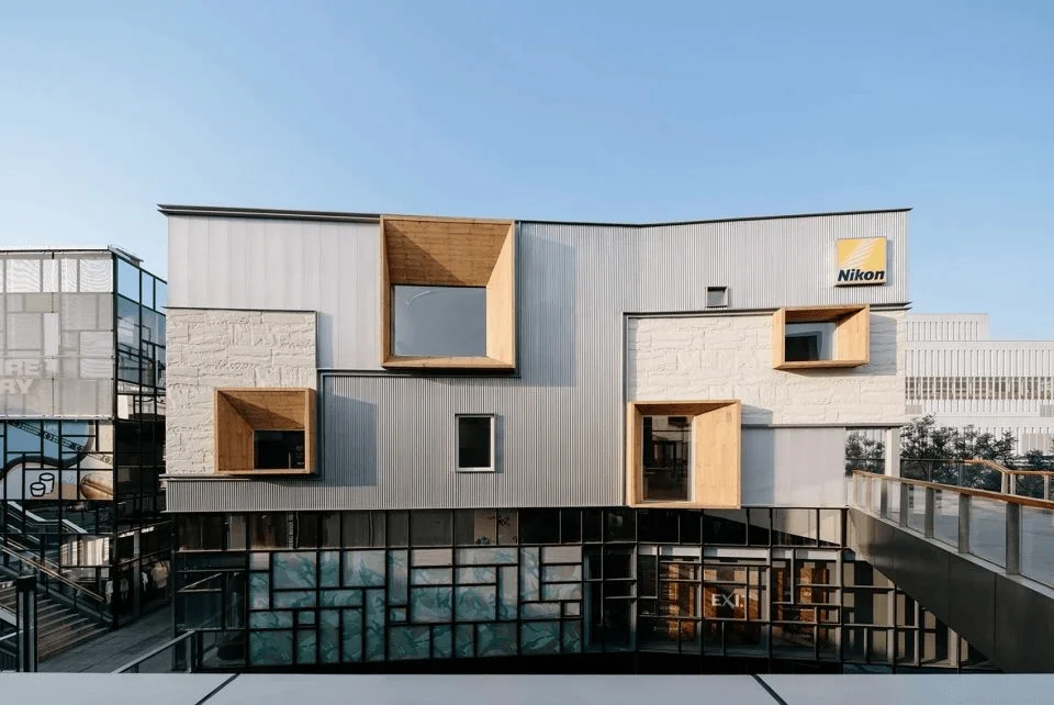
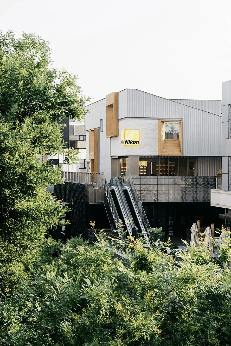
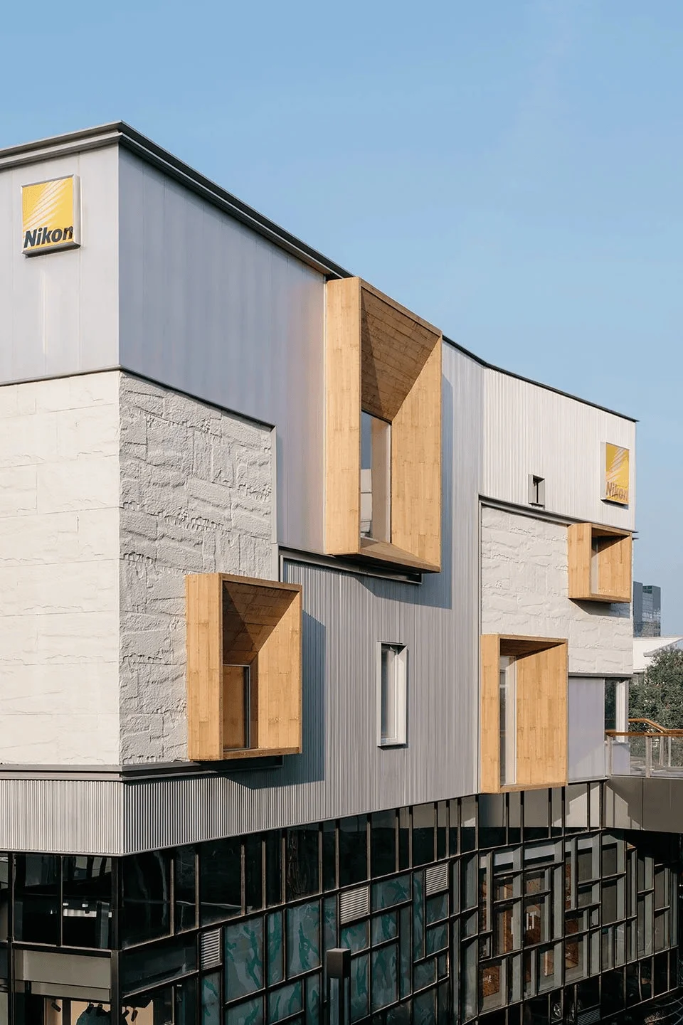
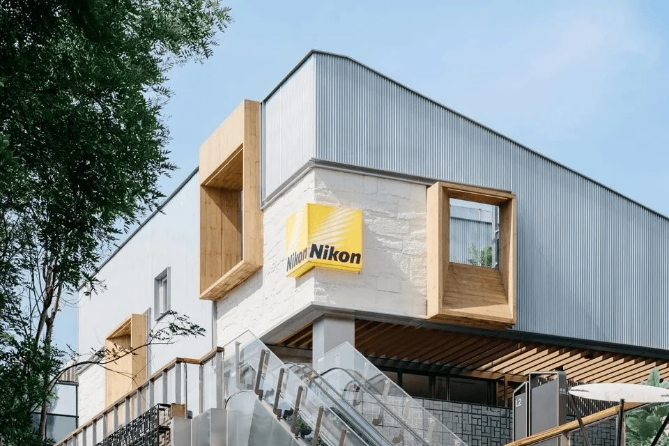
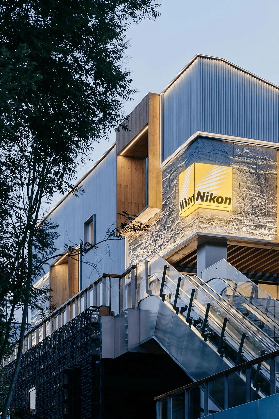
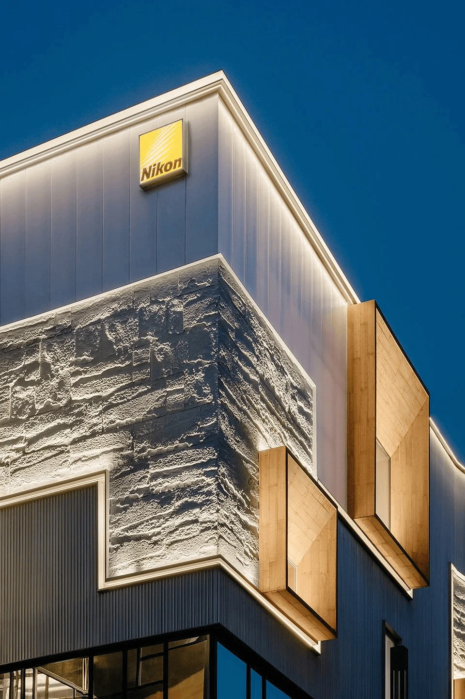
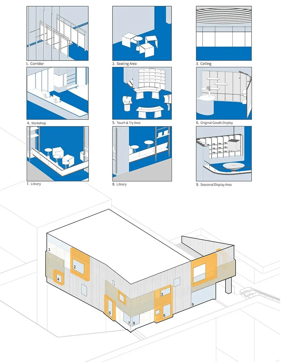
The project embraced sustainable practices from its inception, prioritizing the repurposing of the existing curtain wall structure. By reorganizing the primary and secondary structures and integrating indoor and outdoor functions, Lukstudio envisioned a new exterior design. The team chose a range of materials, including corrugated metal sheets, soft stone panels, polycarbonate panels, and bamboo steel, to craft a visually captivating facade. These materials, in their varying textures and forms, create a dynamic and multi-layered appearance. The windows framed with bamboo steel appear to stretch outward, giving the facade a lively dynamic presence. These windows, which come in a variety of sizes, serve as a visual metaphor for the camera’s lens, capturing the surrounding environment and adding an element of playfulness to the nikon retail design in china tag.
Technological Features and Sustainability: A Focus on Innovation
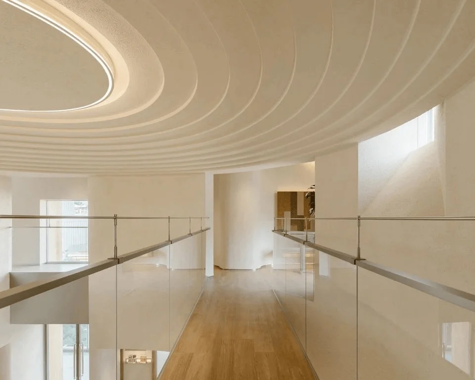
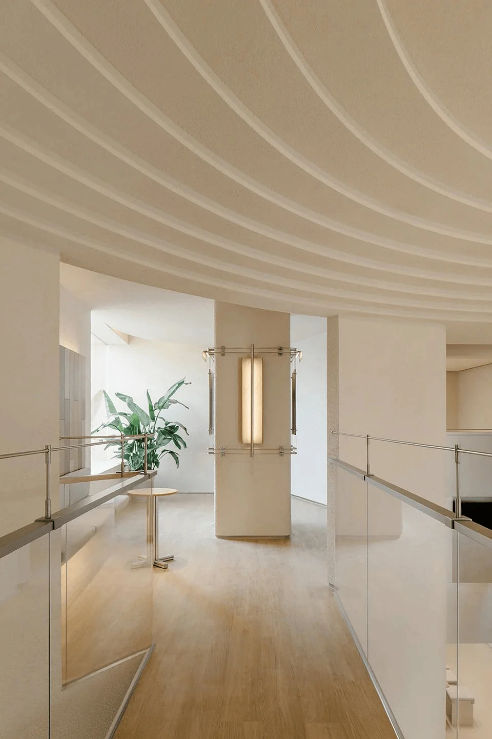
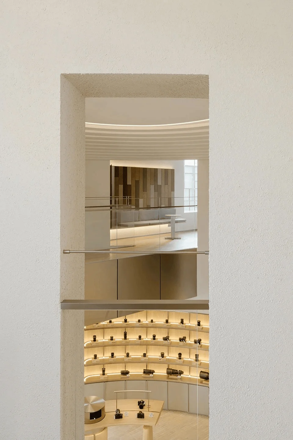
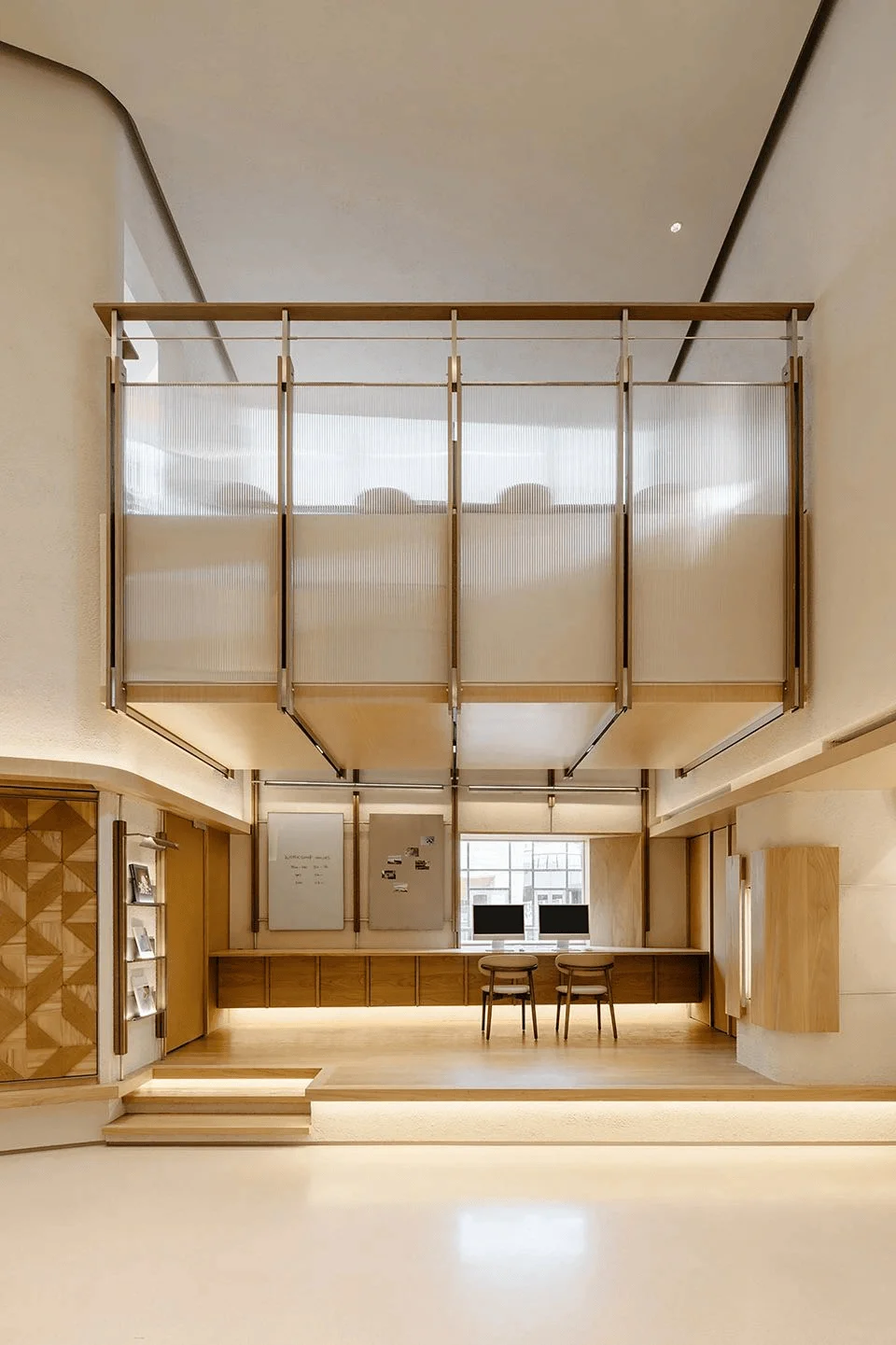
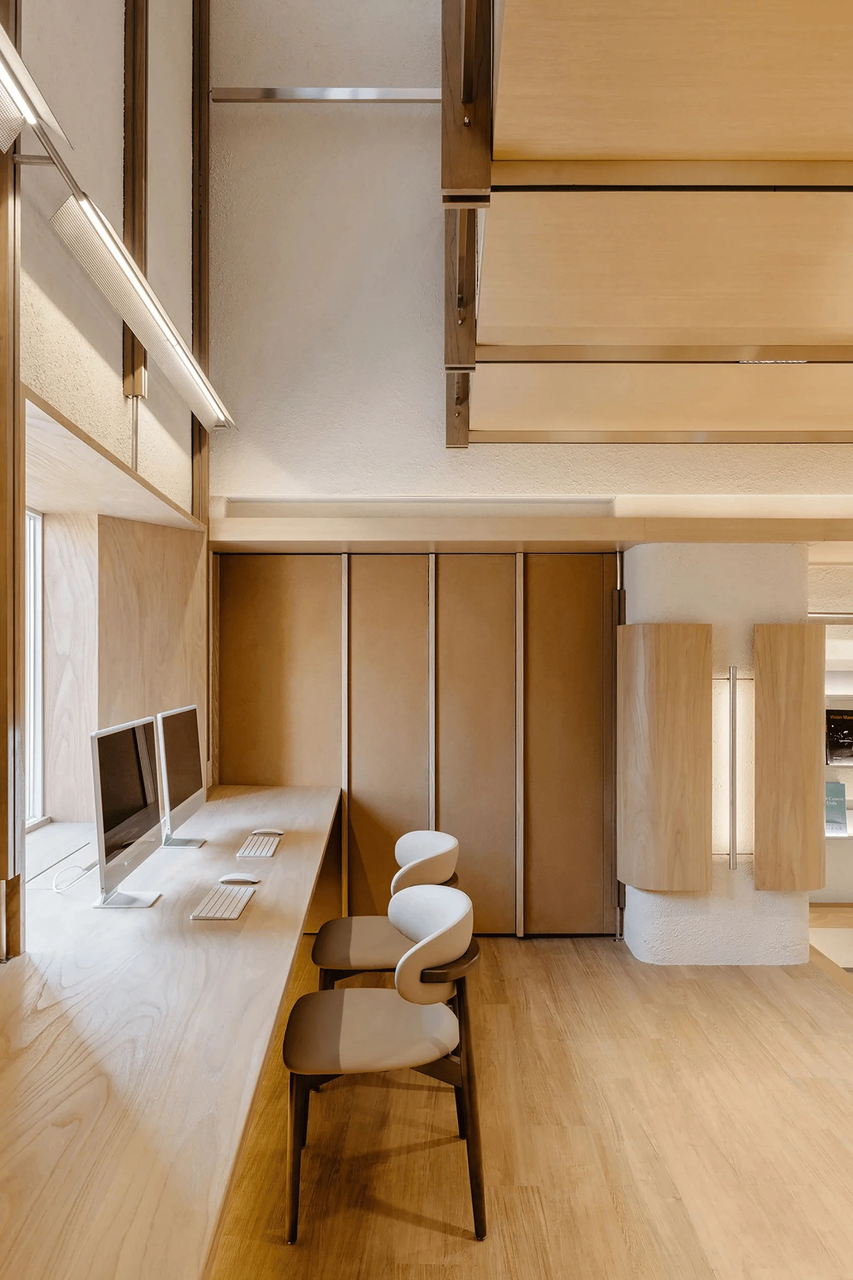
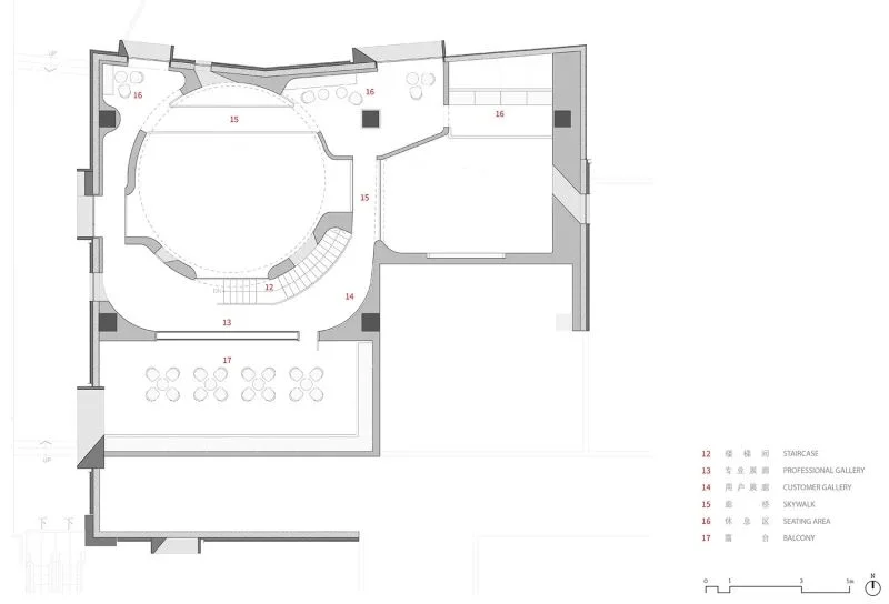
Throughout the space, the design team thoughtfully incorporated elements that highlight Nikon’s commitment to innovation and technology. The use of polycarbonate panels in the construction of the mezzanine bridge exemplifies this. The panels allow natural light to permeate the space and offer a clear view between the two floors, which enhances the overall spatial experience. Moreover, the design of the bridge’s framework extends to the lower level of the corridor and the ground floor walls. Through the systematic arrangement of lines, the design seamlessly integrates elements like railings, lights, and shelving, creating a sense of visual harmony. The design strategy is a core element of nikon retail design in china tag, and it shows that designers successfully create a visual narrative that blends innovation and aesthetics.
Social and Cultural Impact: Fostering a Photographic Community
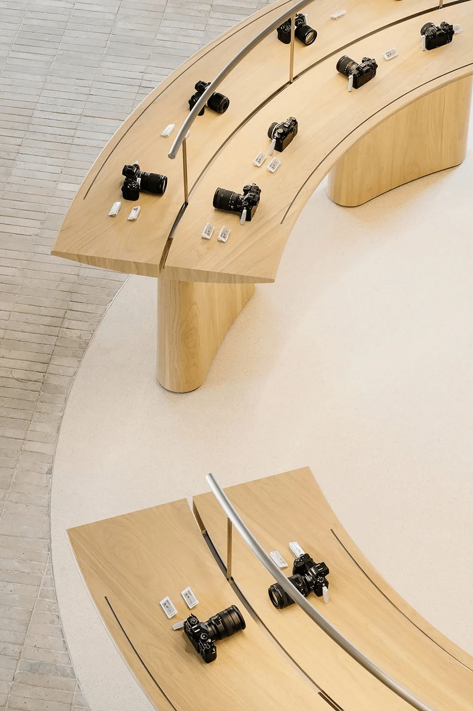
The design for the Nikon Beijing store aims to cultivate a sense of community among photography enthusiasts in the area. The store aims to be more than just a retail outlet for Nikon products; it is a space where photography lovers can meet, discuss their work, and share their passions. This is achieved by the creation of functional spaces within the store, which encourage interaction. Notably, the design of the entrance desk, an iconic element of Nikon stores, incorporates a back wall made of sustainable, straw-derived materials. The selection of materials is a powerful statement for the brand’s commitment to sustainability. The use of sustainable materials exemplifies a core element of the nikon retail design in china tag, highlighting a strong commitment to ecological and social responsibility.
Conclusion: A Space for Inspiration and Connection
The Nikon Beijing Flagship Store stands as a testament to the successful fusion of innovative design, brand identity, and community engagement. By prioritizing sustainable practices, integrating technological features, and establishing a cohesive spatial narrative, Lukstudio has created a space that truly celebrates the art of photography. The project has generated a sense of place and fostered a connection between the brand, the local community, and the broader world of photography. It is a space where the art of photography can flourish, inspire creativity, and bring people together, establishing the nikon retail design in china tag as a truly forward-thinking design project.
Project Information:
Project Type: Interior / Retail
Architect: Lukstudio
Area: 377 sqm
Year: 2024
Country: China
Photographer: Wen Studio
Materials: Bamboo Steel / Soft Stone Panel / Polycarbonate Panel


