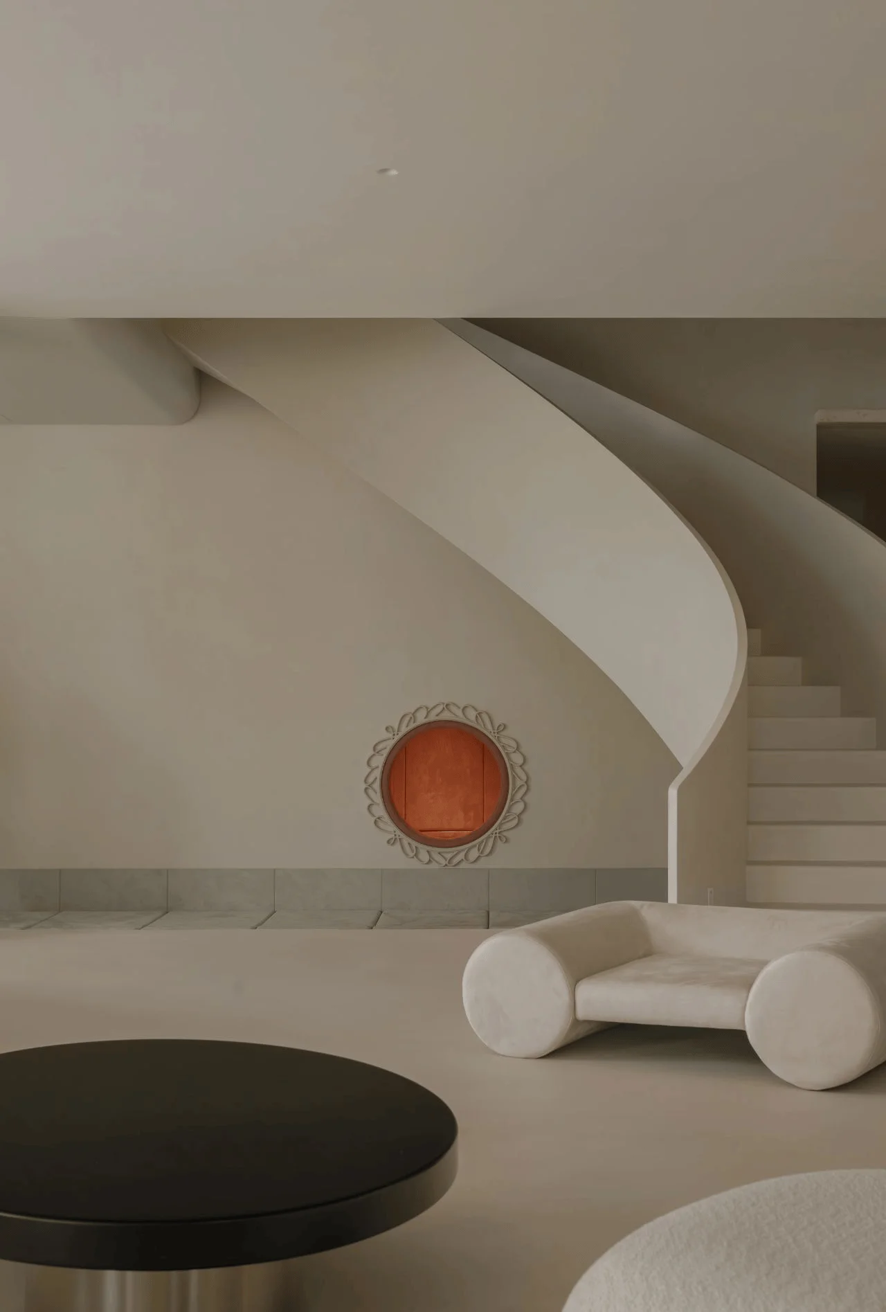
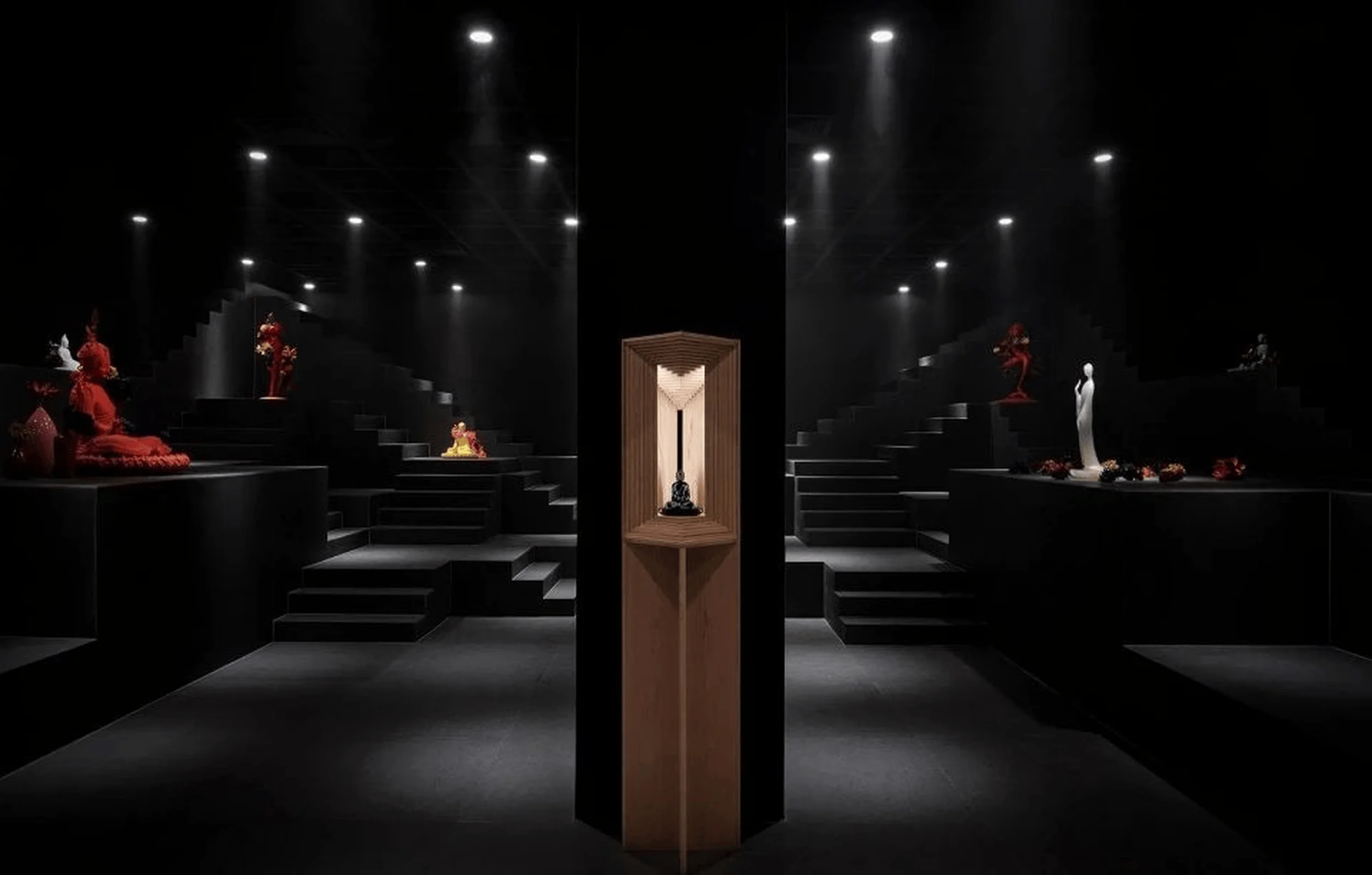
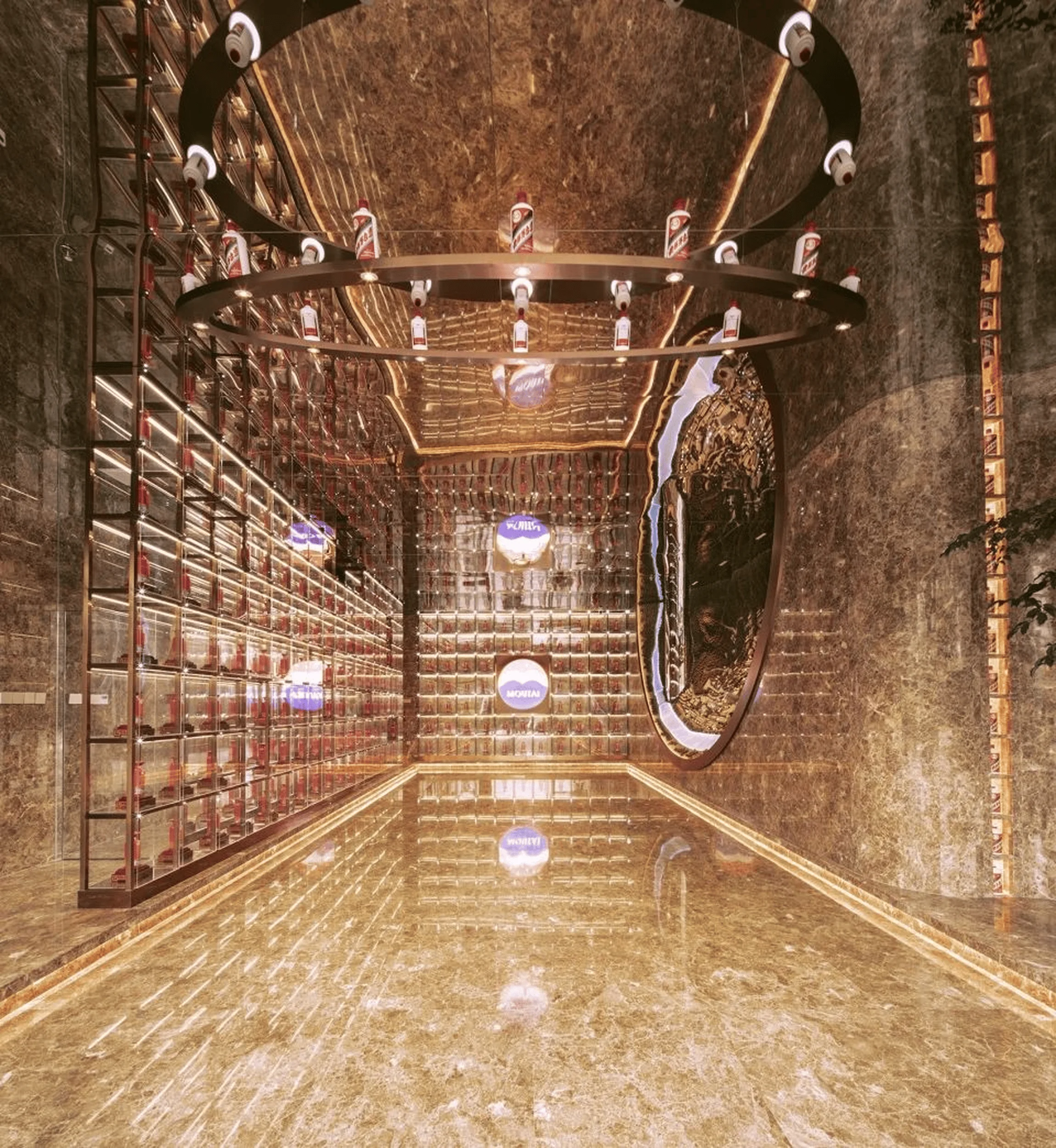
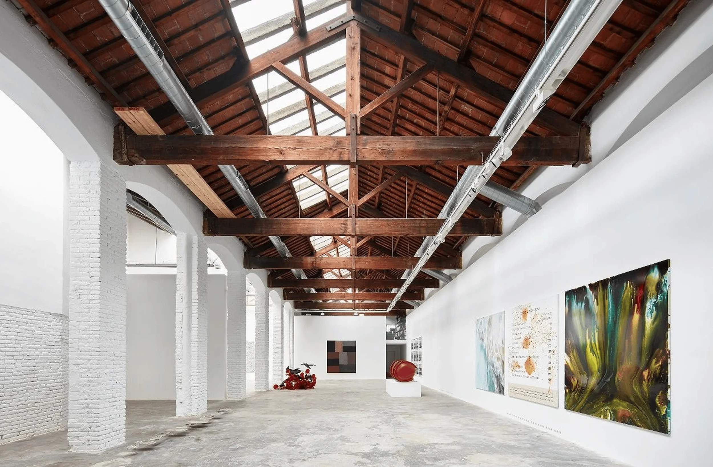
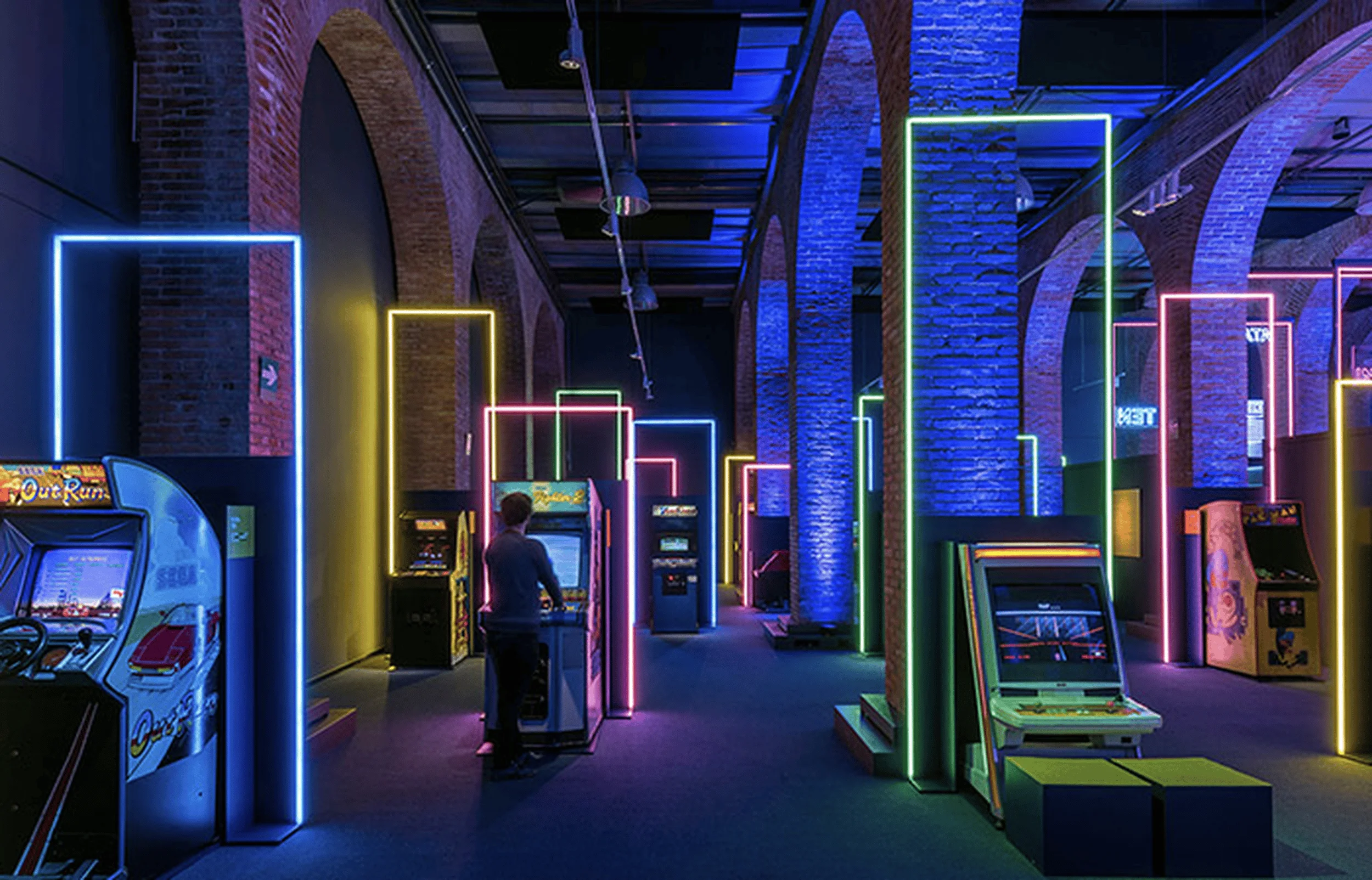
OSILAN Cosmetics Exhibition Hall in China: A multi-sensory immersive retail design experience featuring diverse zones and innovative spatial planning.
Contents
Project Overview
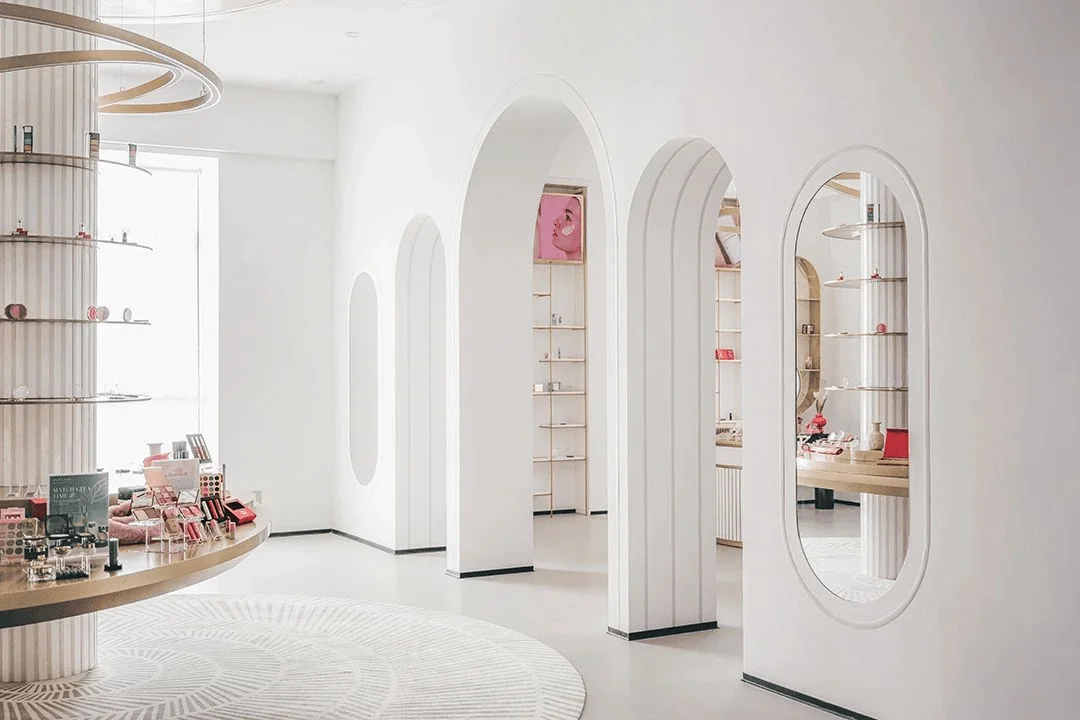
The OSILAN Cosmetics Exhibition Hall, located in Huzhou, China, represents a groundbreaking departure from traditional exhibition design. Developed by Ping Jie Design, the project prioritizes a multi-sensory experience, engaging visitors through touch, smell, taste, hearing, and sight. This innovative approach aims to provide an immersive environment that surpasses the conventional reliance on visual and auditory elements. The design concept draws inspiration from Japanese architect Kenya Hara’s sensory experience theories, promoting a holistic approach to design that caters to the diverse senses of the human body. The hall’s design strategy seamlessly integrates with the existing site conditions, utilizing technology and aesthetics to enhance the dissemination of the company’s image, culture, and products, particularly for the expansion of business into European and American markets.
Functional Layout and Spatial Planning
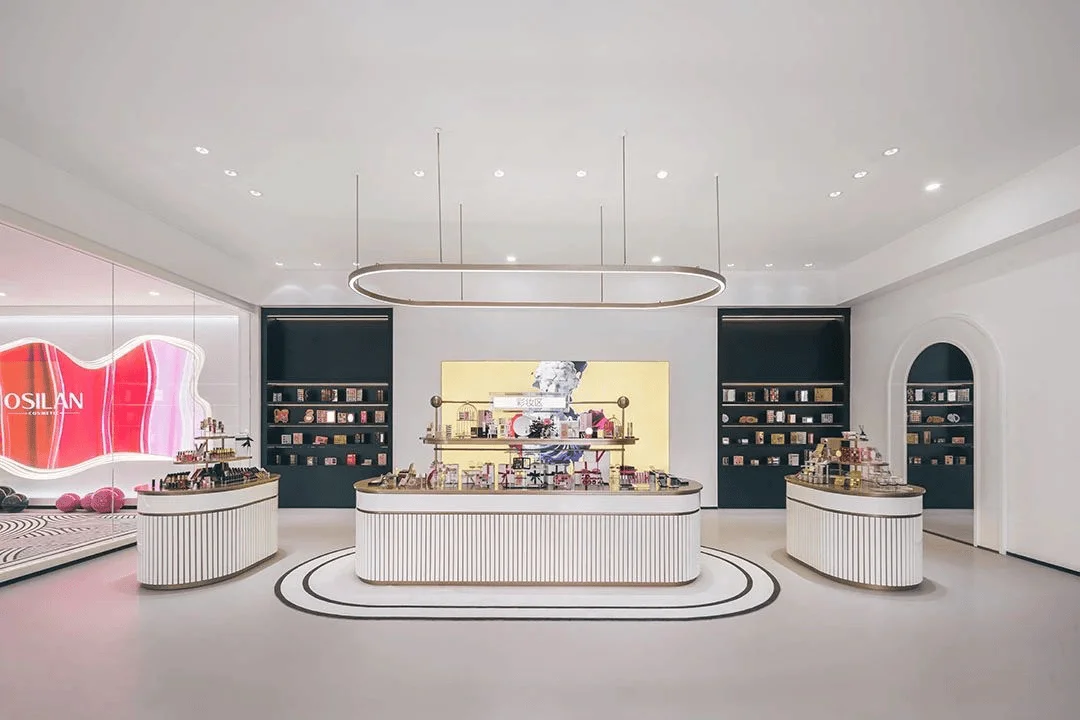
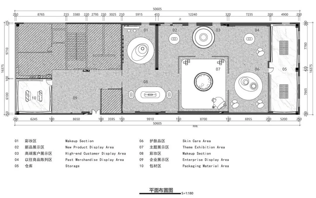
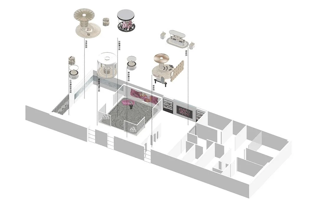
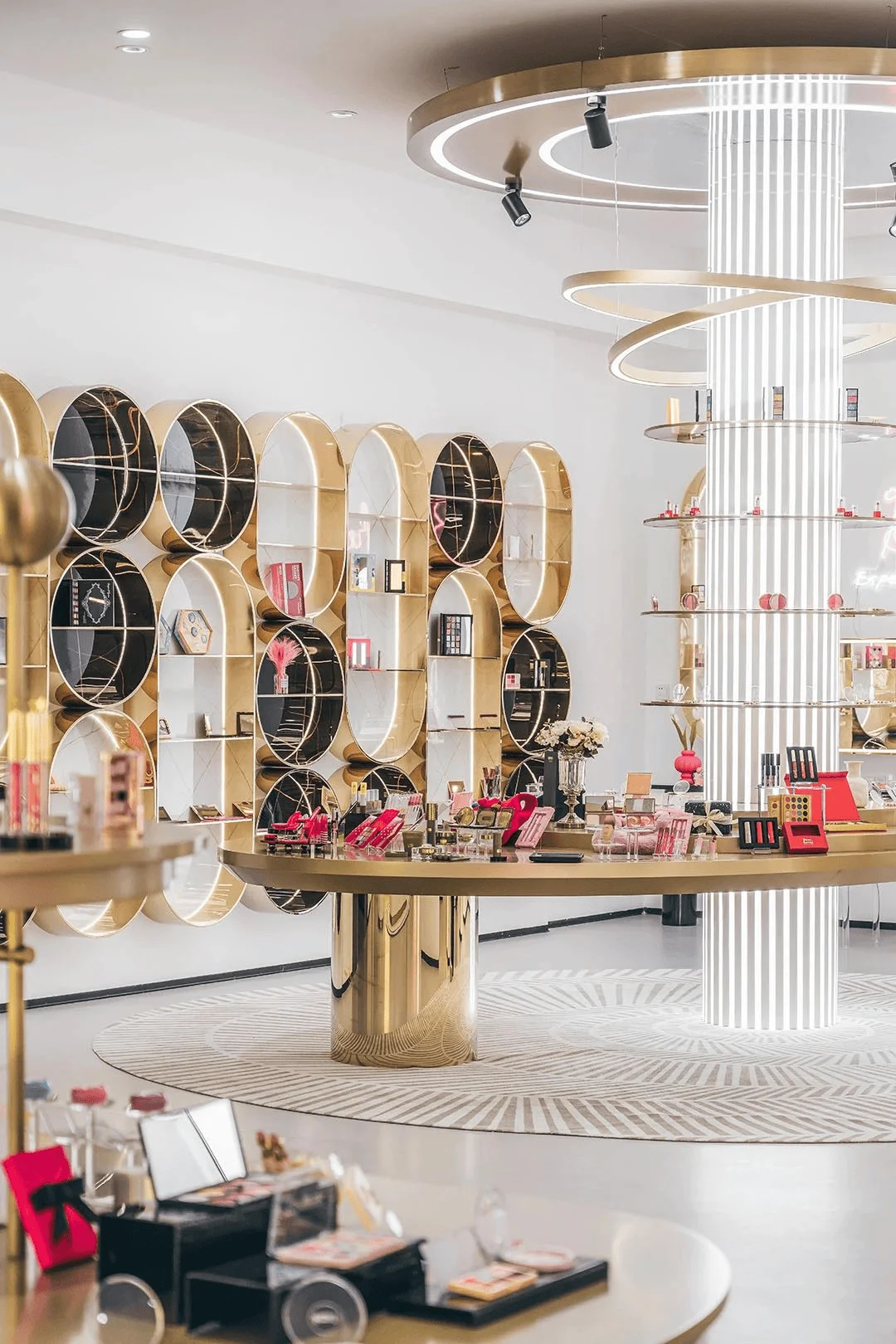
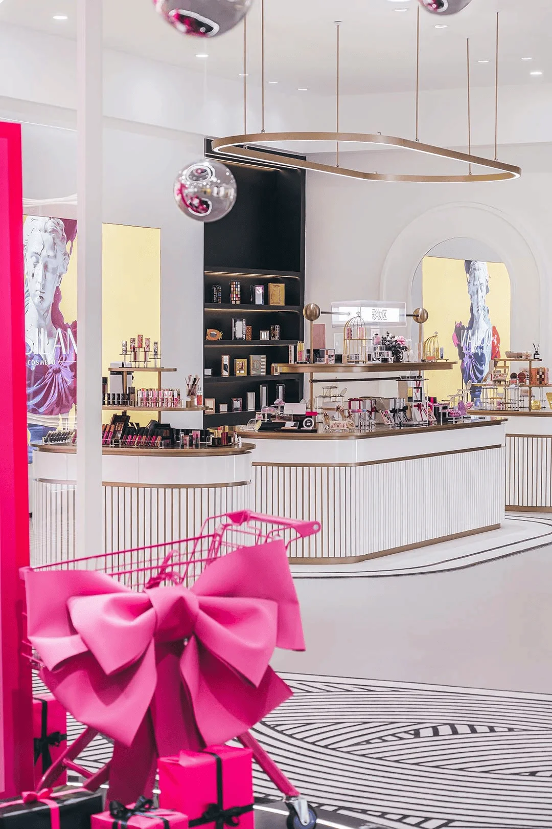
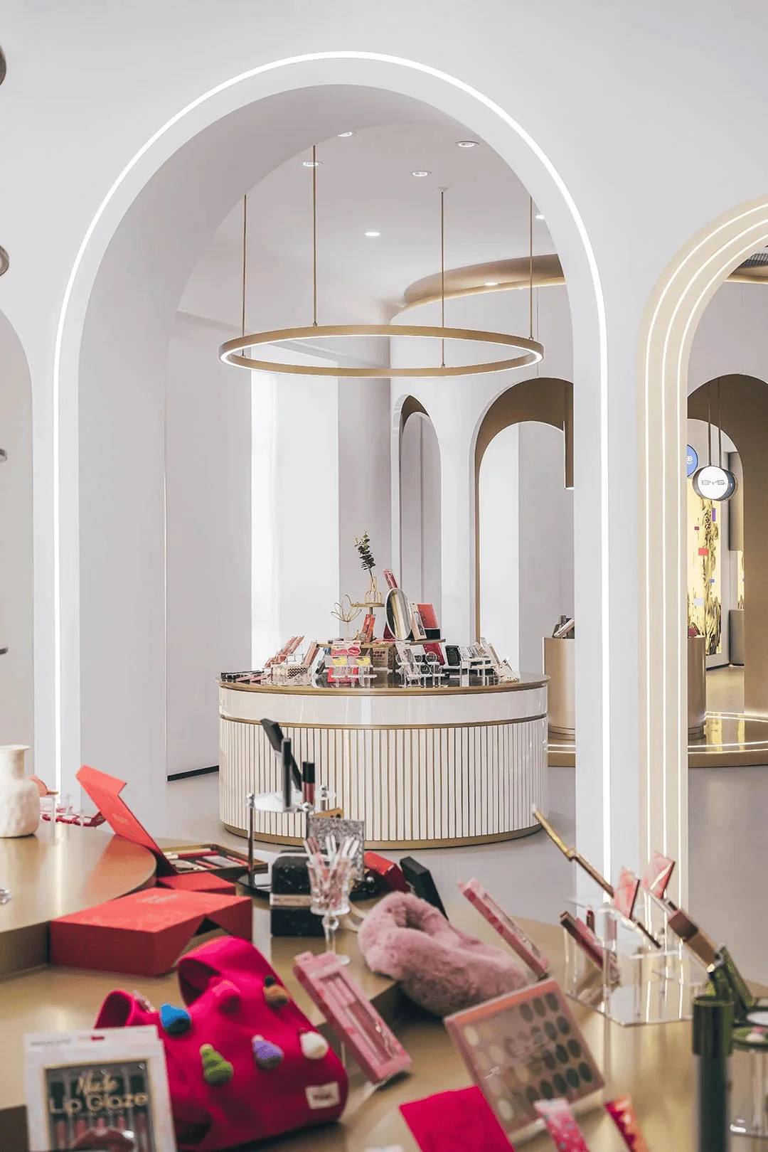
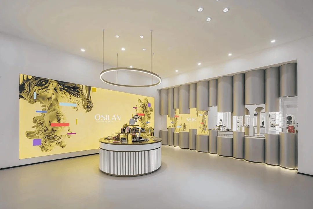
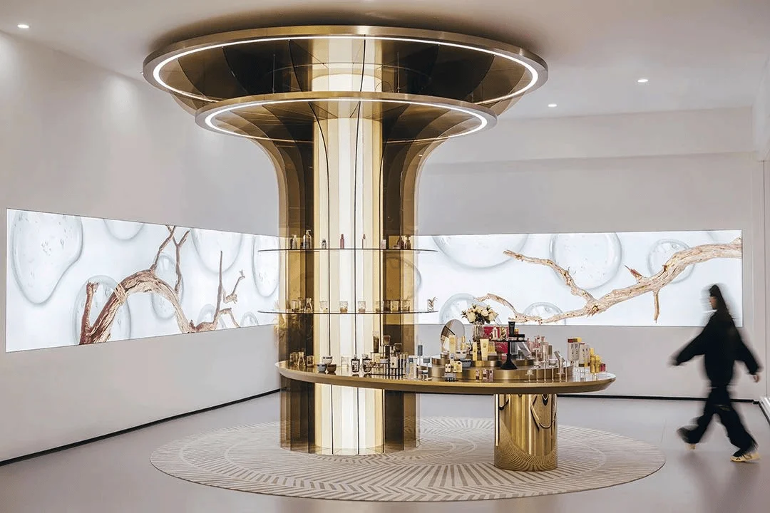
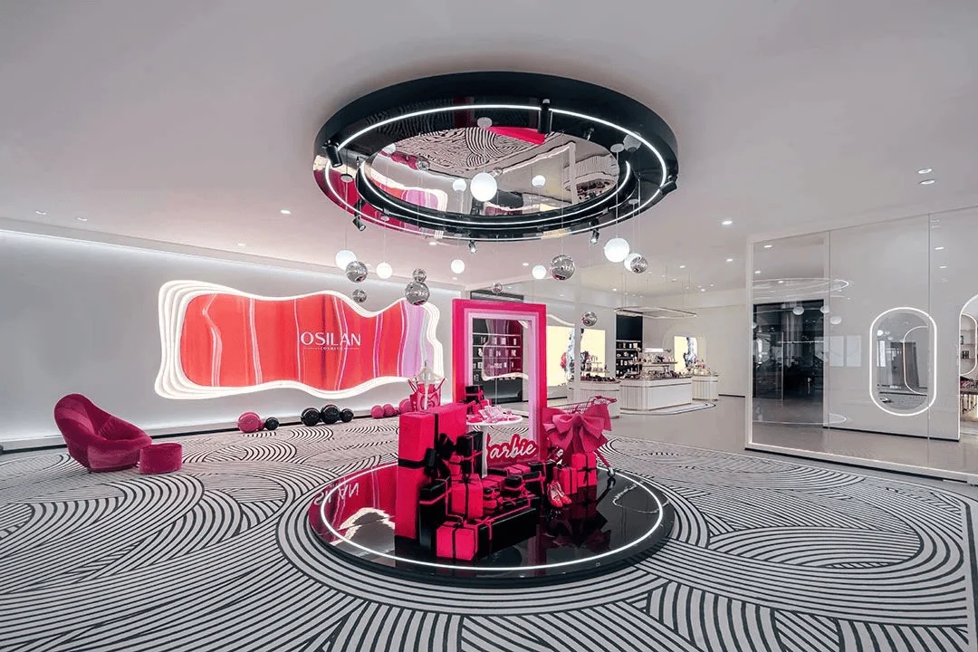
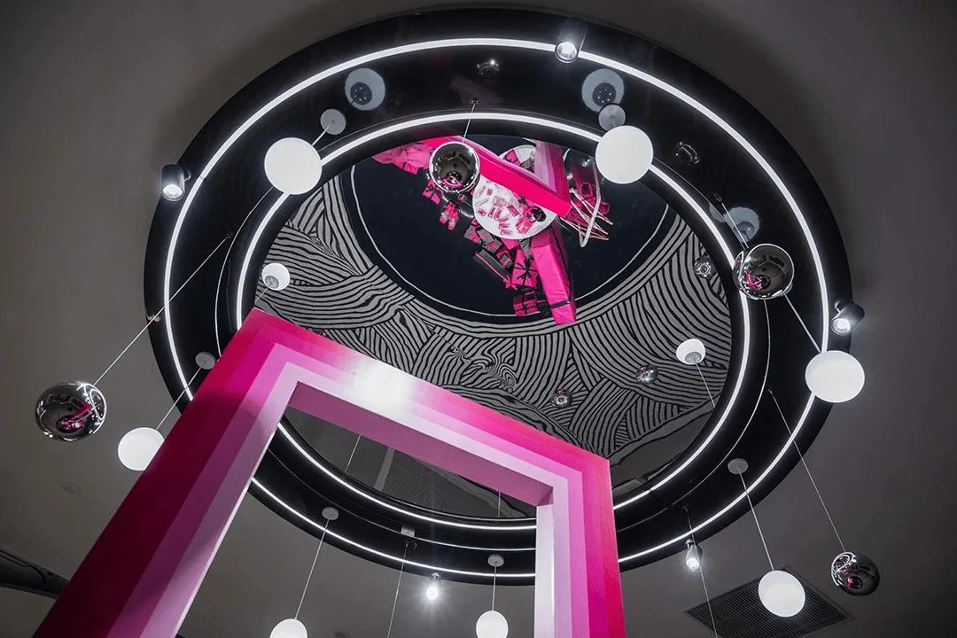
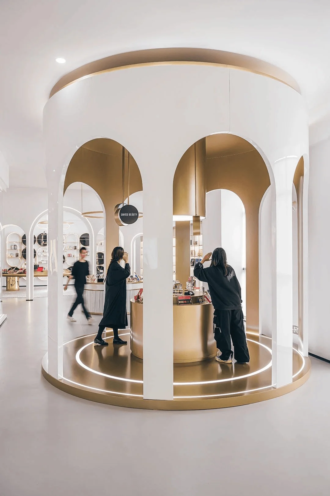
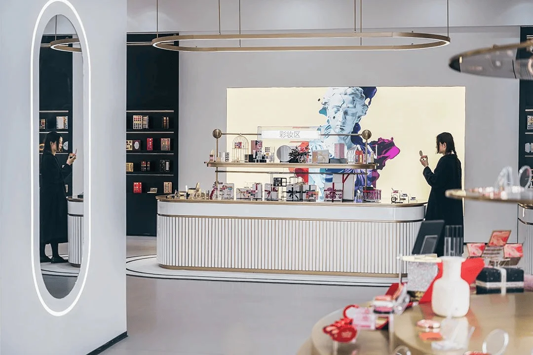
The exhibition space is divided into four primary functional zones: packaging materials, corporate culture, exhibition hall, and warehouse. This division ensures a clear and organized flow for visitors. The overall design incorporates European and American elements, utilizing elements such as installation modeling, materials, product displays, intelligent digital screens, and background music to effectively convey the brand’s message. The exhibition hall is further categorized into seven functional areas: cosmetics, new product display, high-end customer display, past merchandise display, skincare, and a themed exhibition area. This segregation caters to different aspects of the brand’s offerings, providing visitors with a comprehensive understanding of OSILAN’s products and history. The spatial organization utilizes circular and arc-shaped installations, softening the rigidity of traditional rectangular spaces. The arrangement of these installations follows a diagonal pattern, creating a visually dynamic and engaging layout.
Sensory Experience
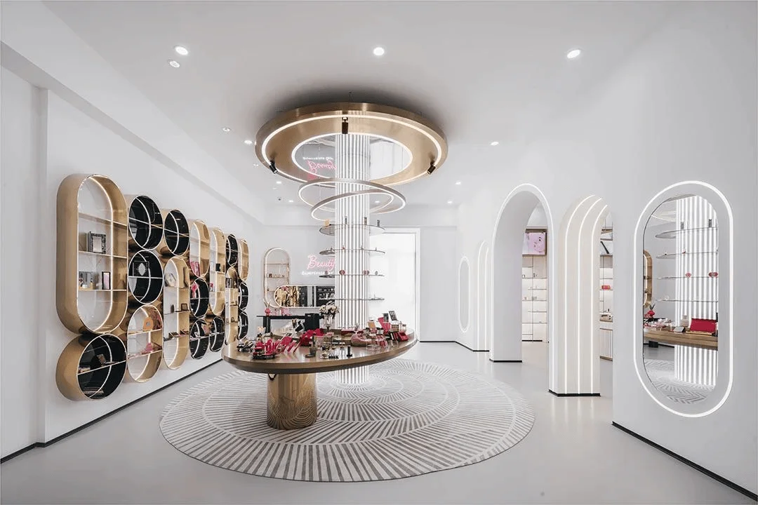
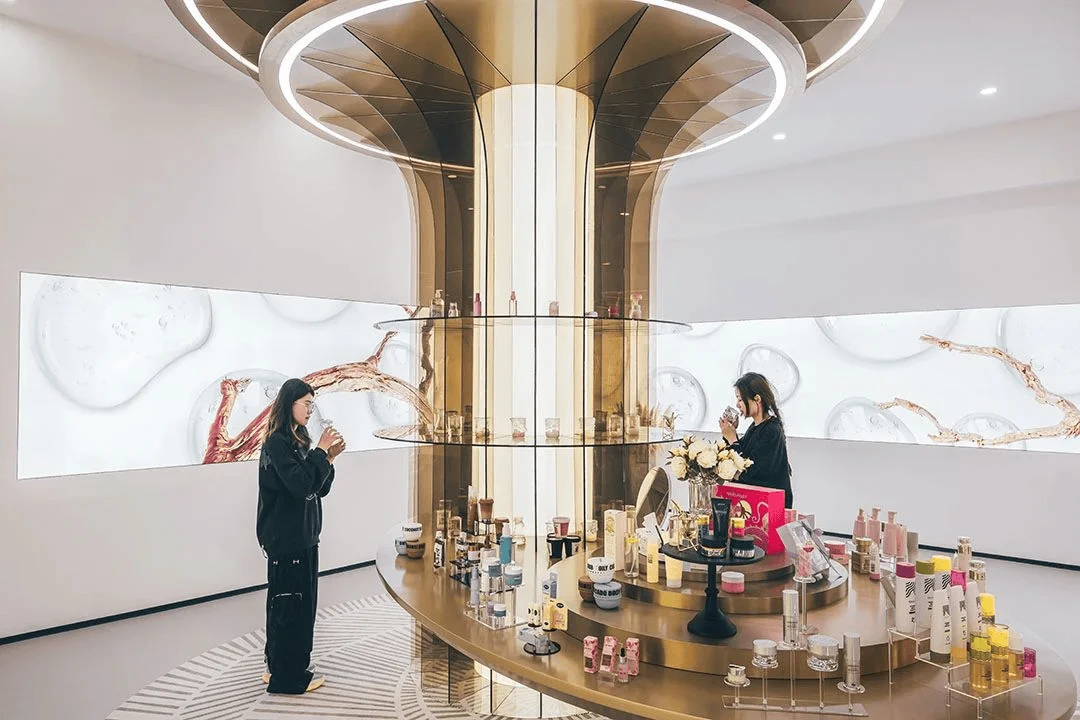
The design emphasizes the interaction between visitor flow and spatial order, incorporating both structured and free-flowing movement patterns to encourage exploration and interaction with exhibits. A single-series layout is employed, ensuring a clear and linear progression through the exhibition. This approach streamlines the visitor journey, guiding them from cultural introduction to material exploration and product experience. As visitors navigate the space, their sensory engagement progressively intensifies, enriching their emotional experience. The exhibition hall serves as a central node, attracting a significant number of visitors and providing a platform for in-depth interaction with products and brand information. Diverse sensory elements are strategically integrated into the design to amplify the visitor experience. For example, the skincare area features installations with white acrylic light columns interwoven with colored acrylic sheets, producing a captivating visual and auditory display.
Visual, Auditory, and Tactile Engagement
Visually, the exhibition prioritizes clarity and consistency. The new product display and past merchandise display areas are symmetrically arranged around the high-end product display area. These areas utilize downward-facing display stands, contrasting with the upward-facing high-end product display. Circular chandeliers unify the three areas visually. The past merchandise display area incorporates a large digital screen, showcasing product iterations and collaborations to establish brand recognition. Auditory elements, including background music and staff explanations, enhance the visitor experience. The skincare area, for example, features installations that emit sounds as light passes through colored acrylic sheets, creating a multi-sensory experience that reinforces brand identity. Tactile engagement is promoted through the use of diverse materials, such as metal, acrylic, and white lacquered wood finishes. Visitors can interact with the packaging materials in the packaging area, gaining a deeper understanding of the design evolution. In the cosmetics area, visitors can try on products, experiencing their texture and effects firsthand.
Smell and Taste Experience
Smell and taste, often linked to memory and emotion, play a crucial role in the visitor experience. The products showcased, including makeup and skincare items, emphasize natural and organic ingredients, promoting a concept of ingredient safety. Visitors can smell the products to discern the natural components and even experience the raw materials in dedicated areas. This interactive approach allows visitors to connect with the production process and appreciate the brand’s commitment to quality. The integration of technology and innovative materials allows the exhibition to provide a truly immersive and unforgettable experience. By engaging multiple senses, the design enhances visitor satisfaction, strengthens brand communication, and creates new opportunities for commercial success.
Project Information:
Project Type: Exhibition Center
Architect: Ping Jie Design
Area: 400㎡
Project Year: 2024
Country: China
Main Materials: Metal, Acrylic, White Lacquered Wood
Photographer: Xu Yingda


