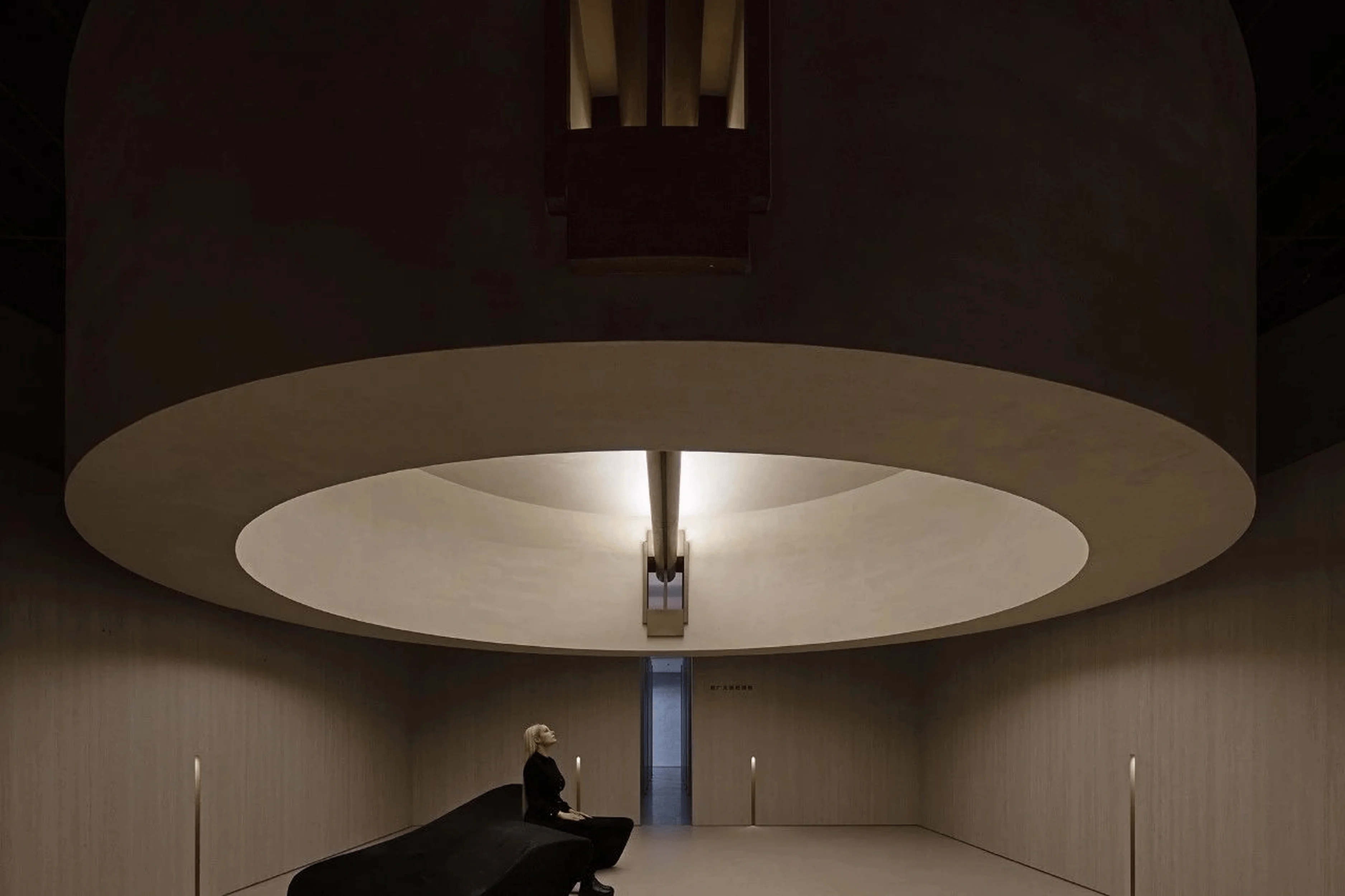
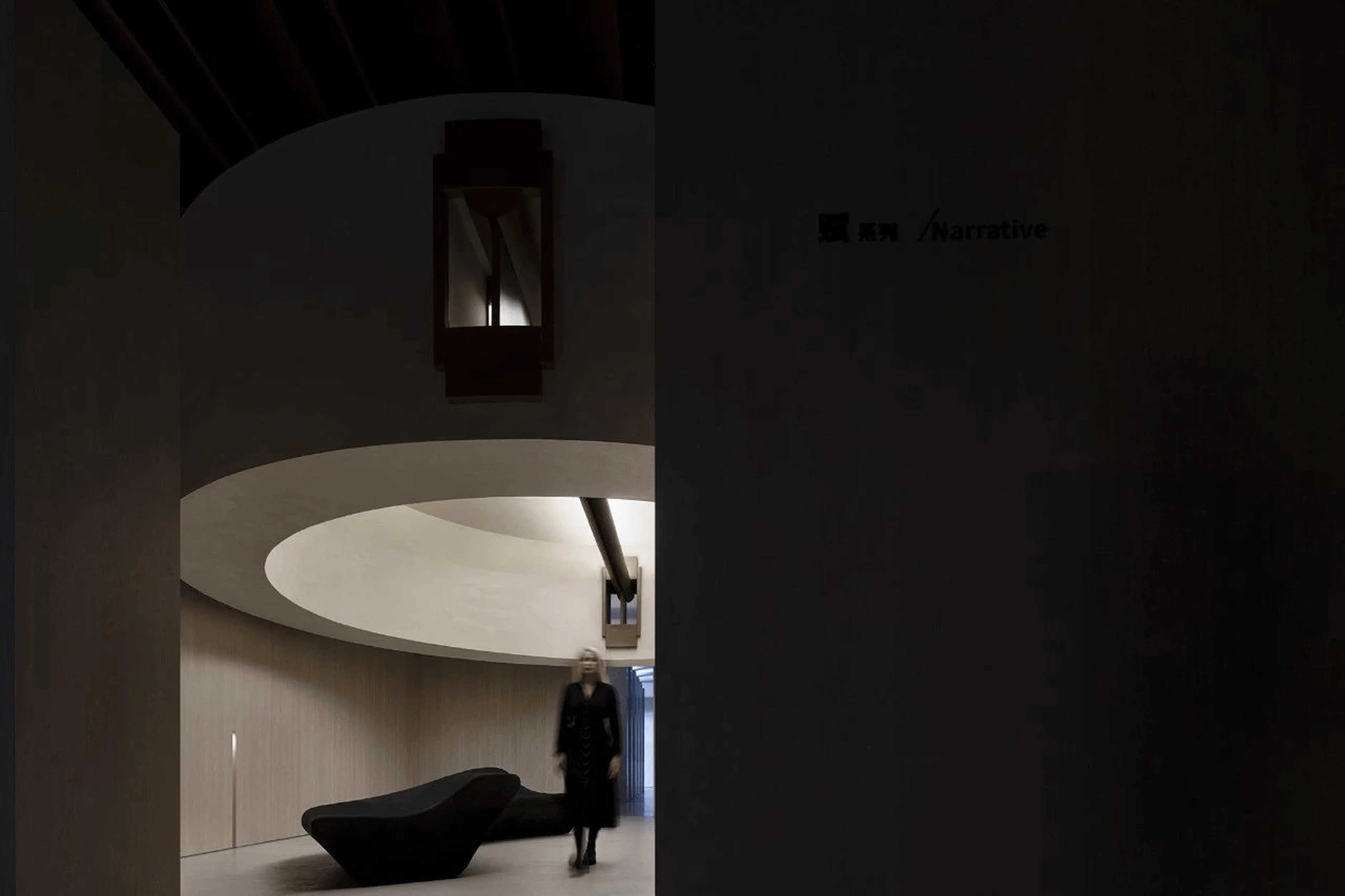
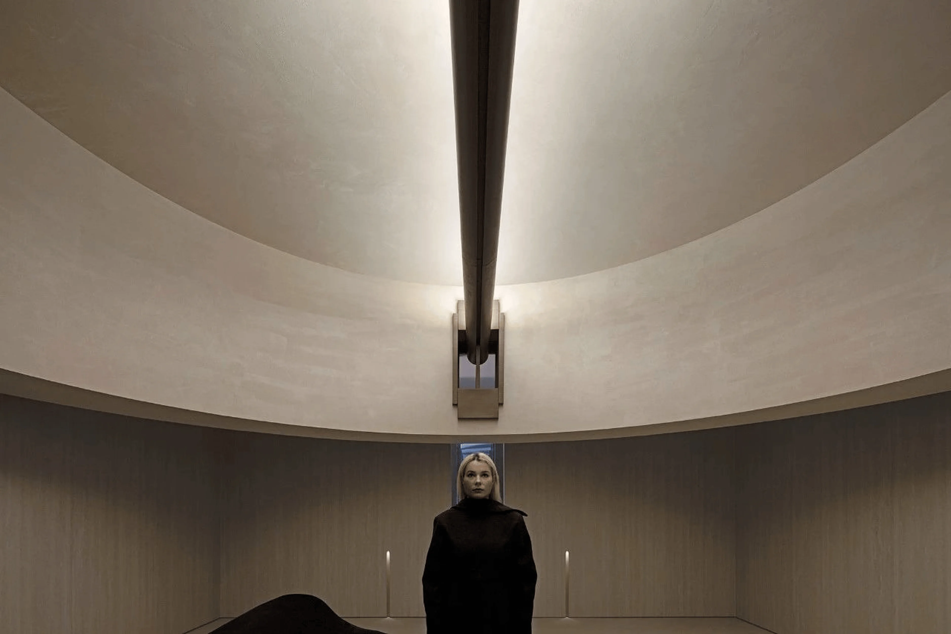
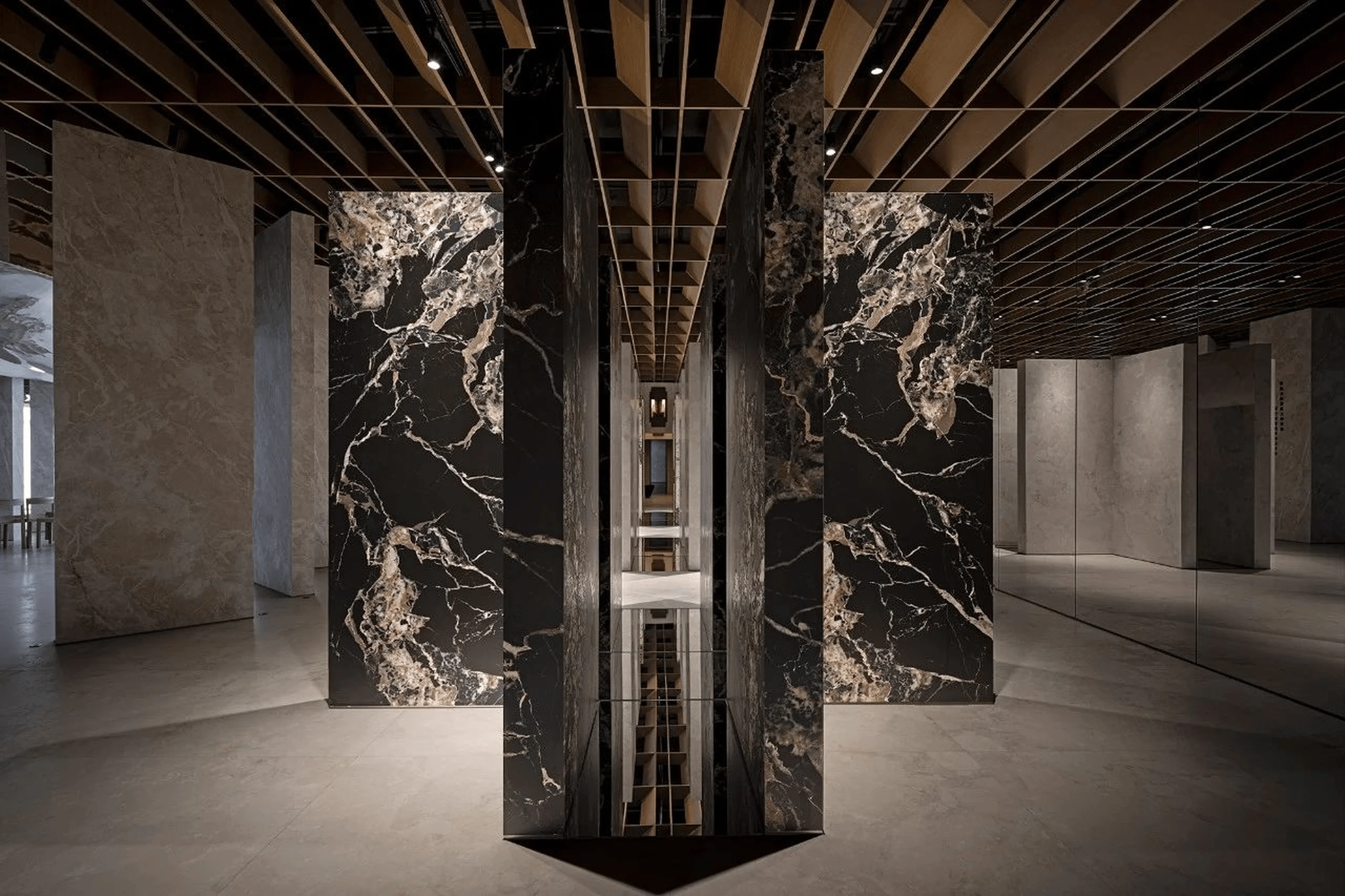
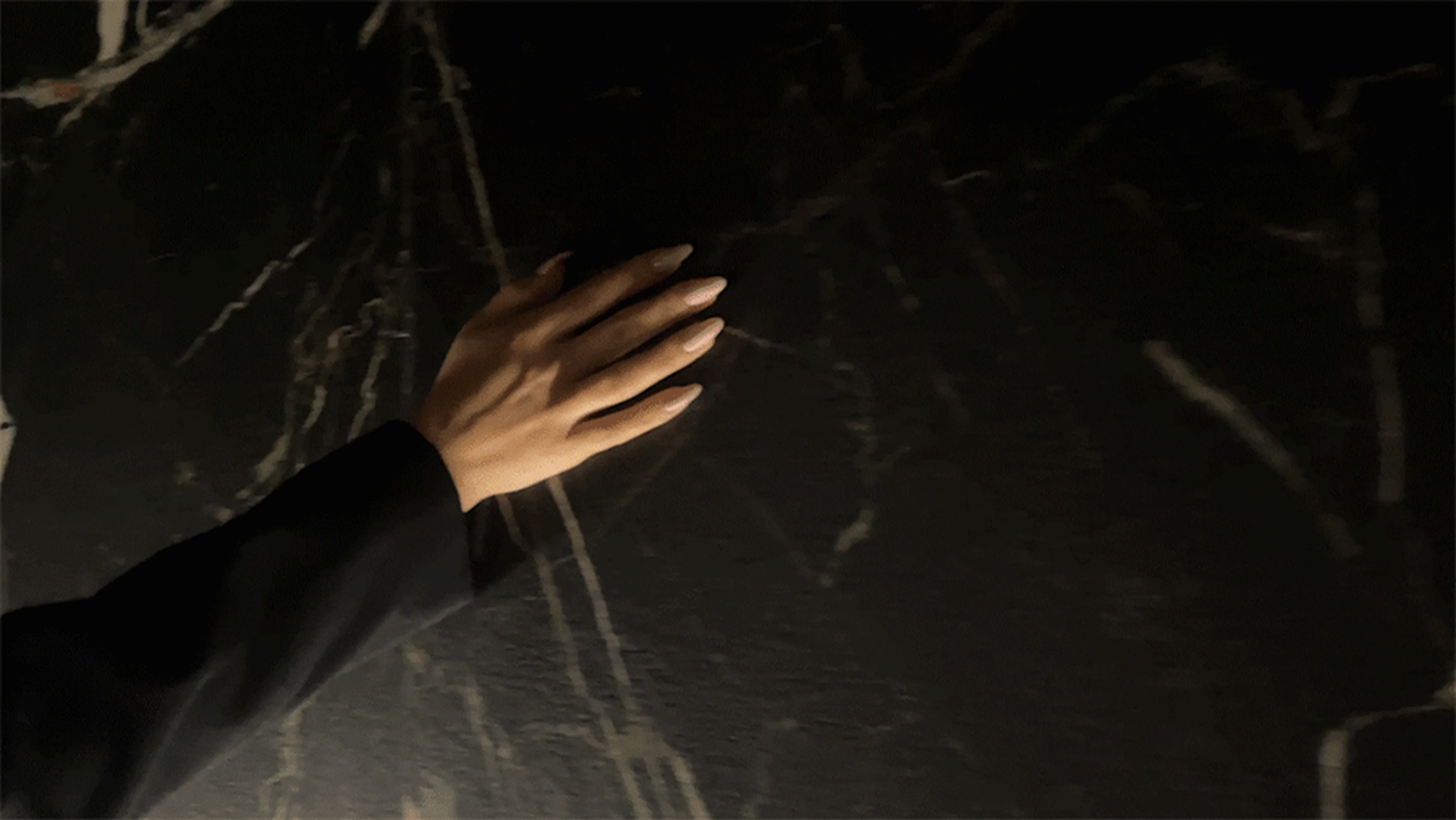
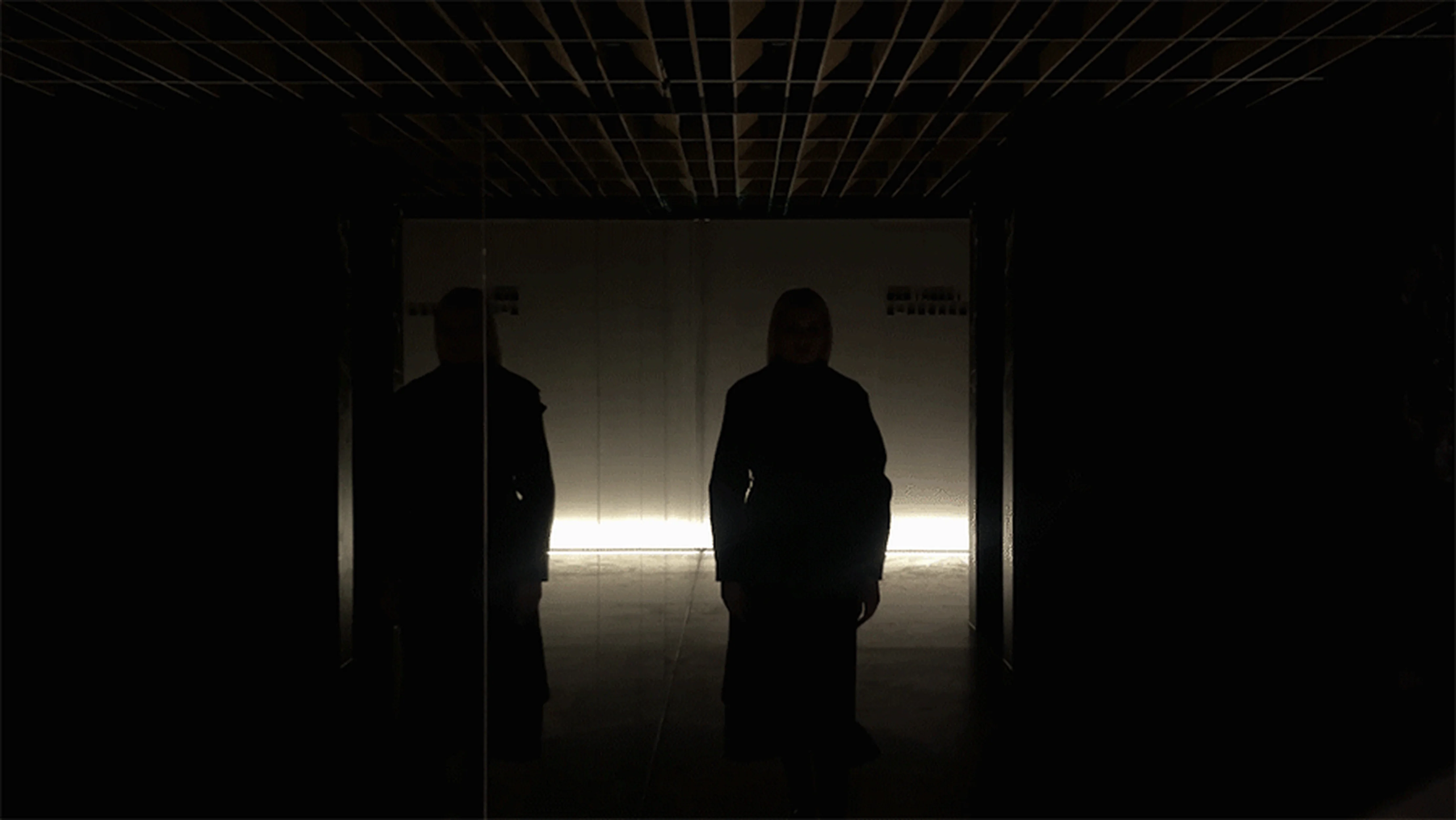
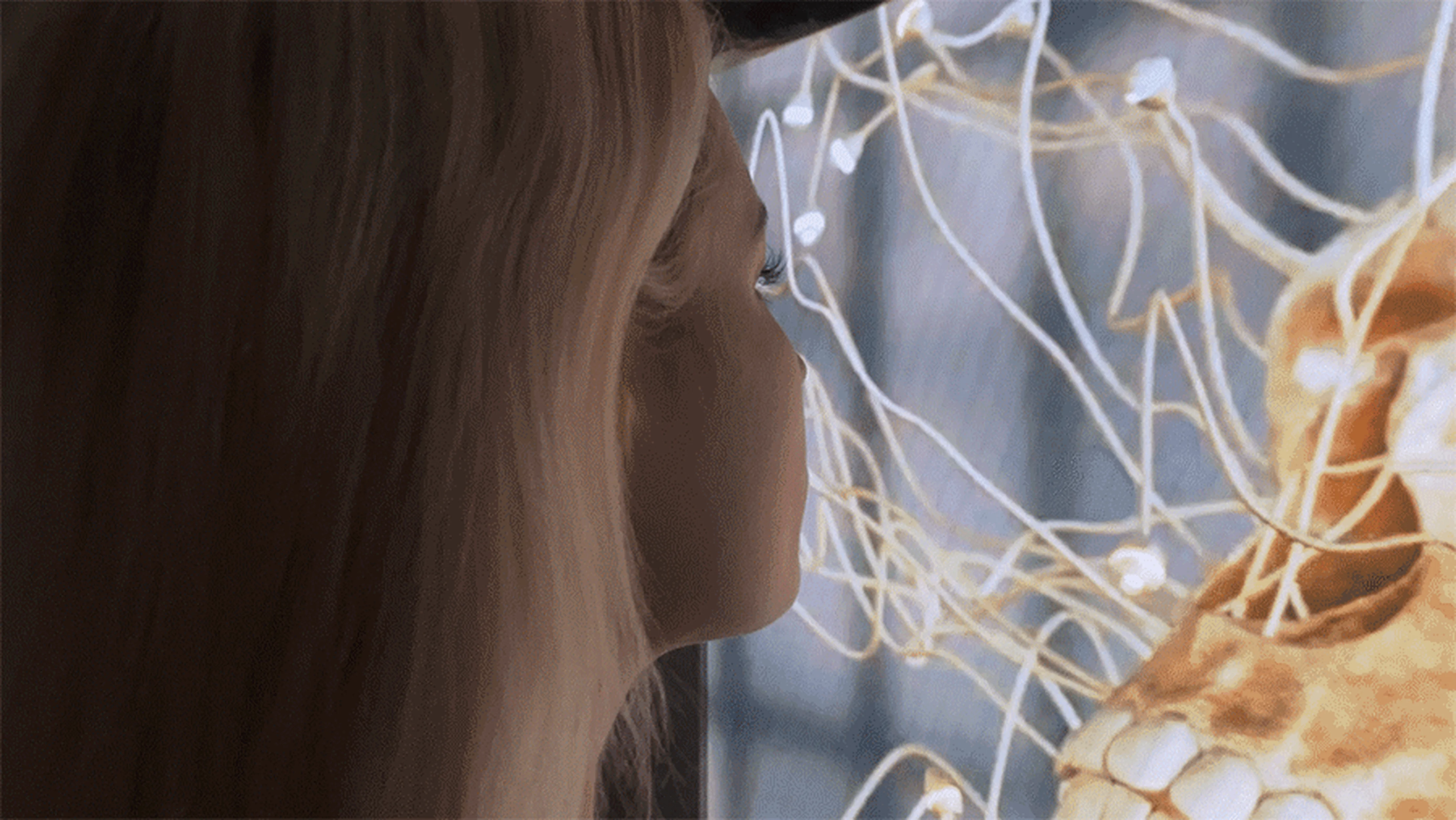
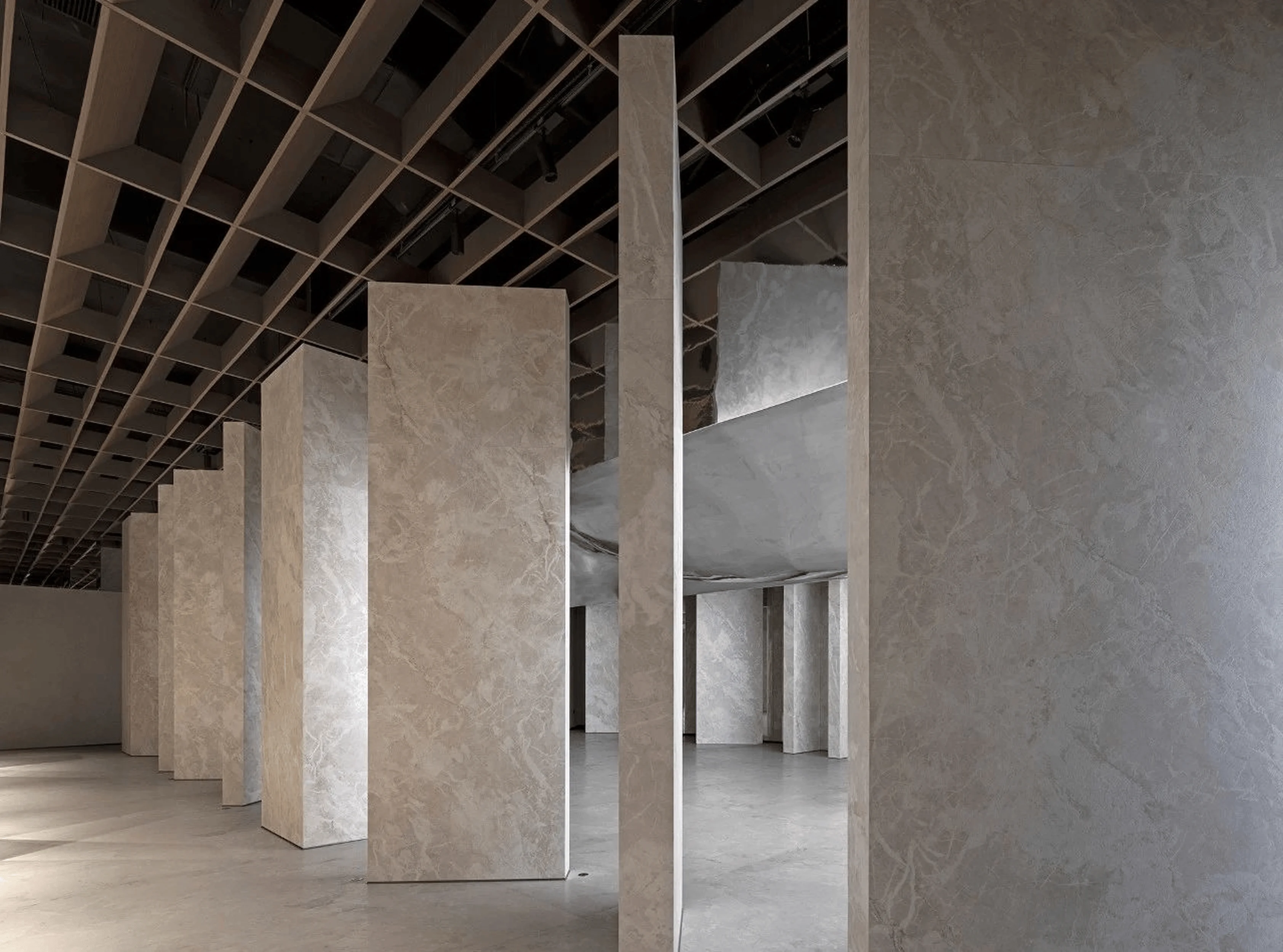
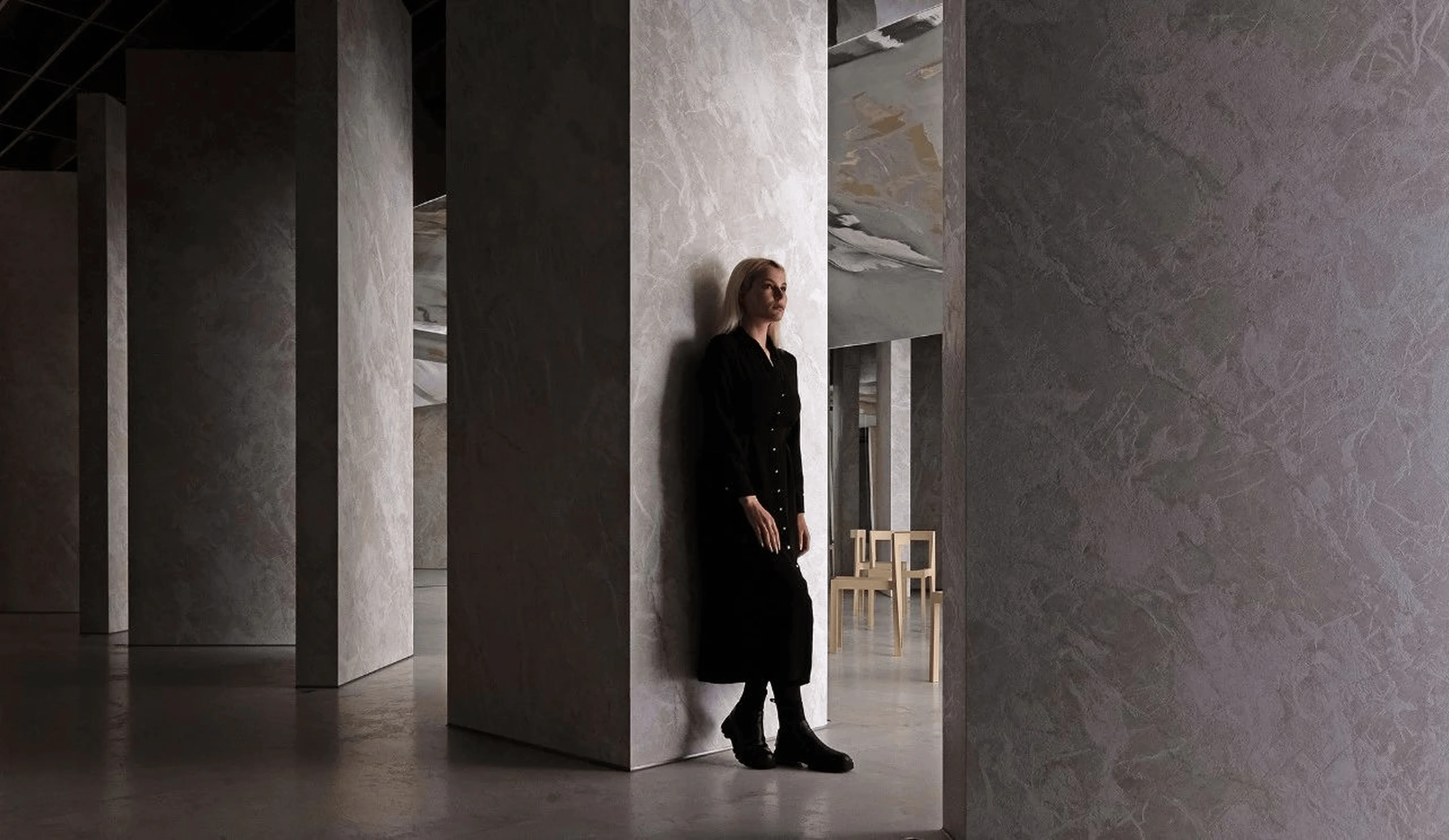
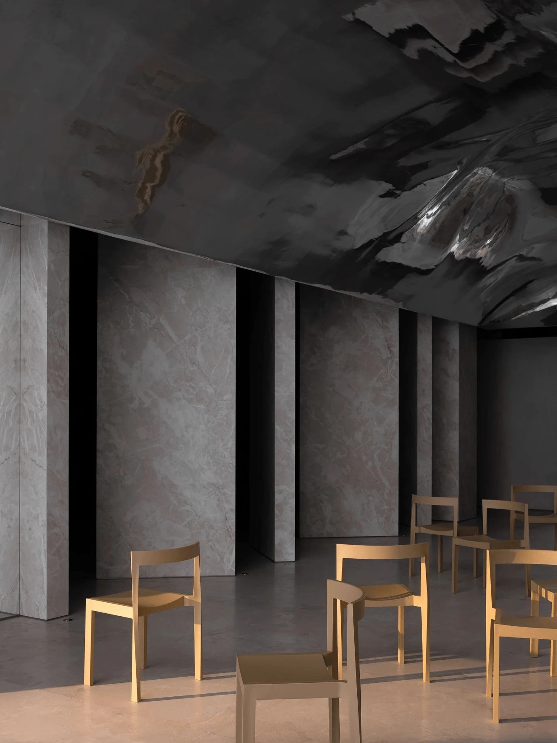
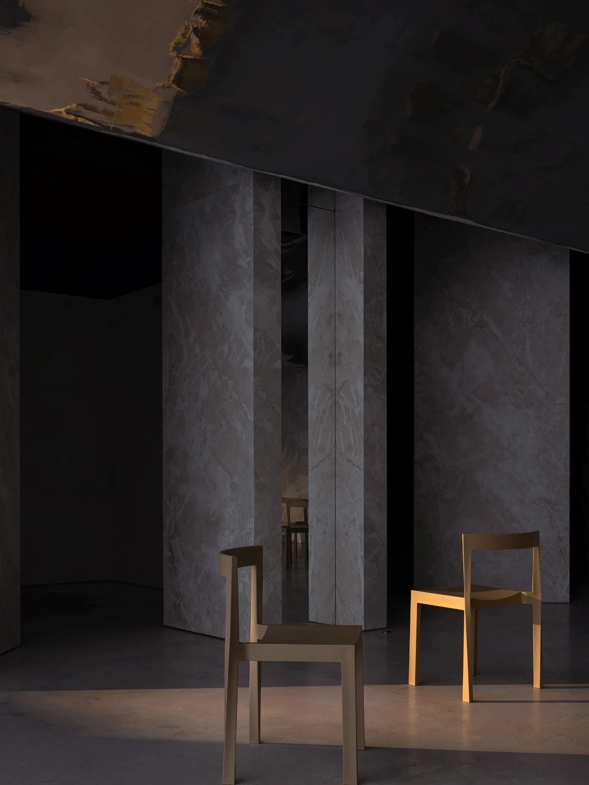
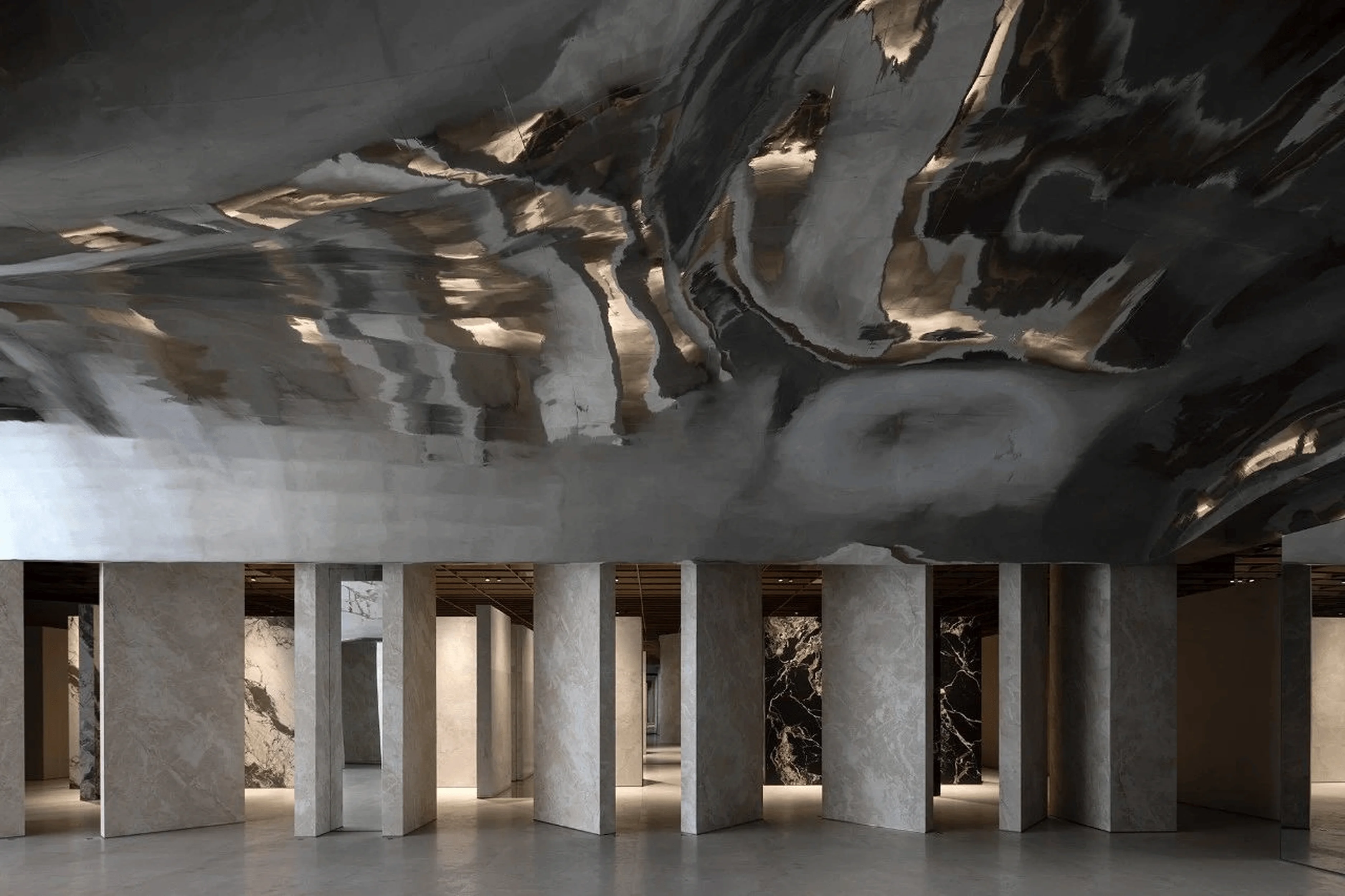
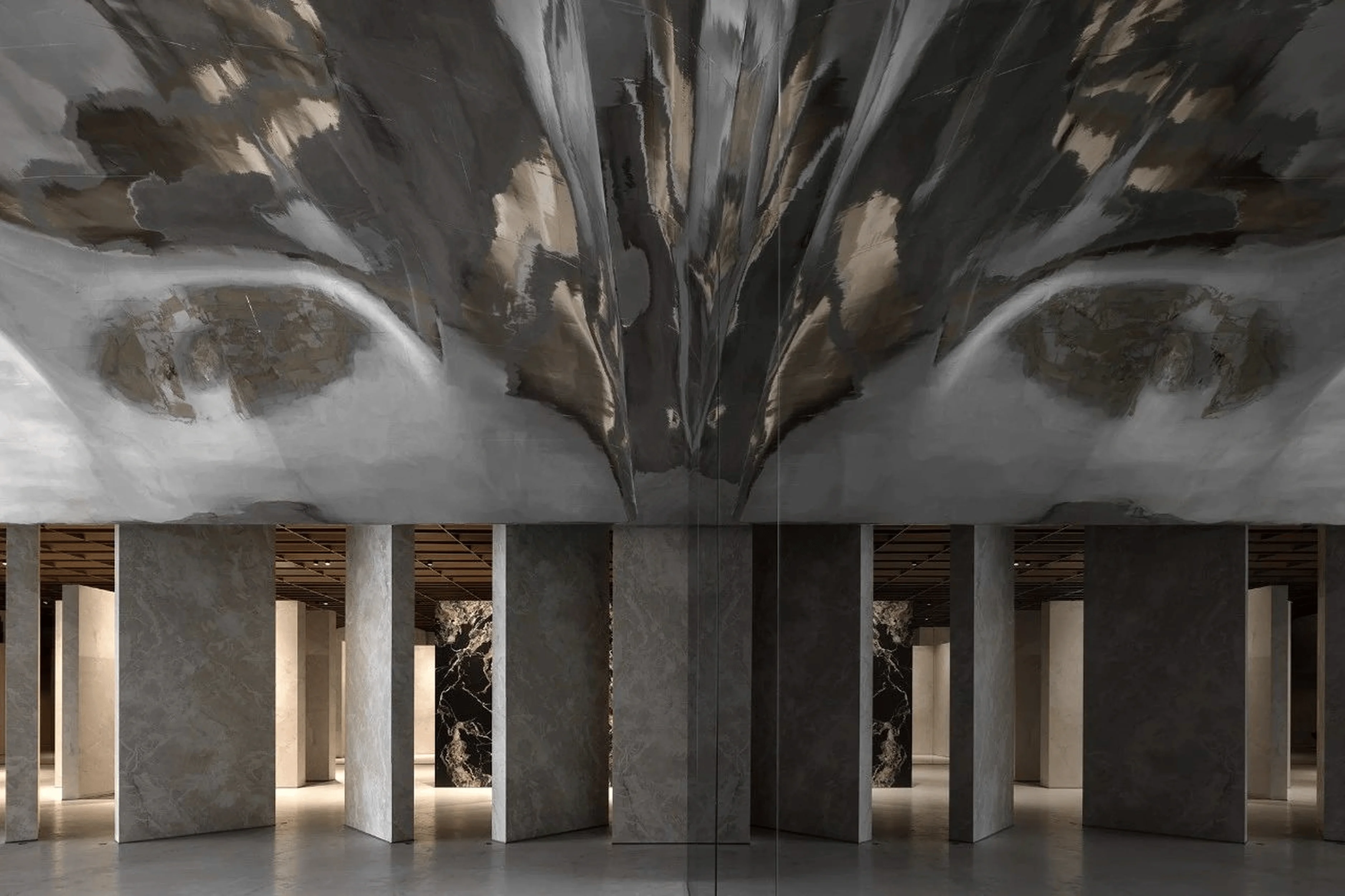
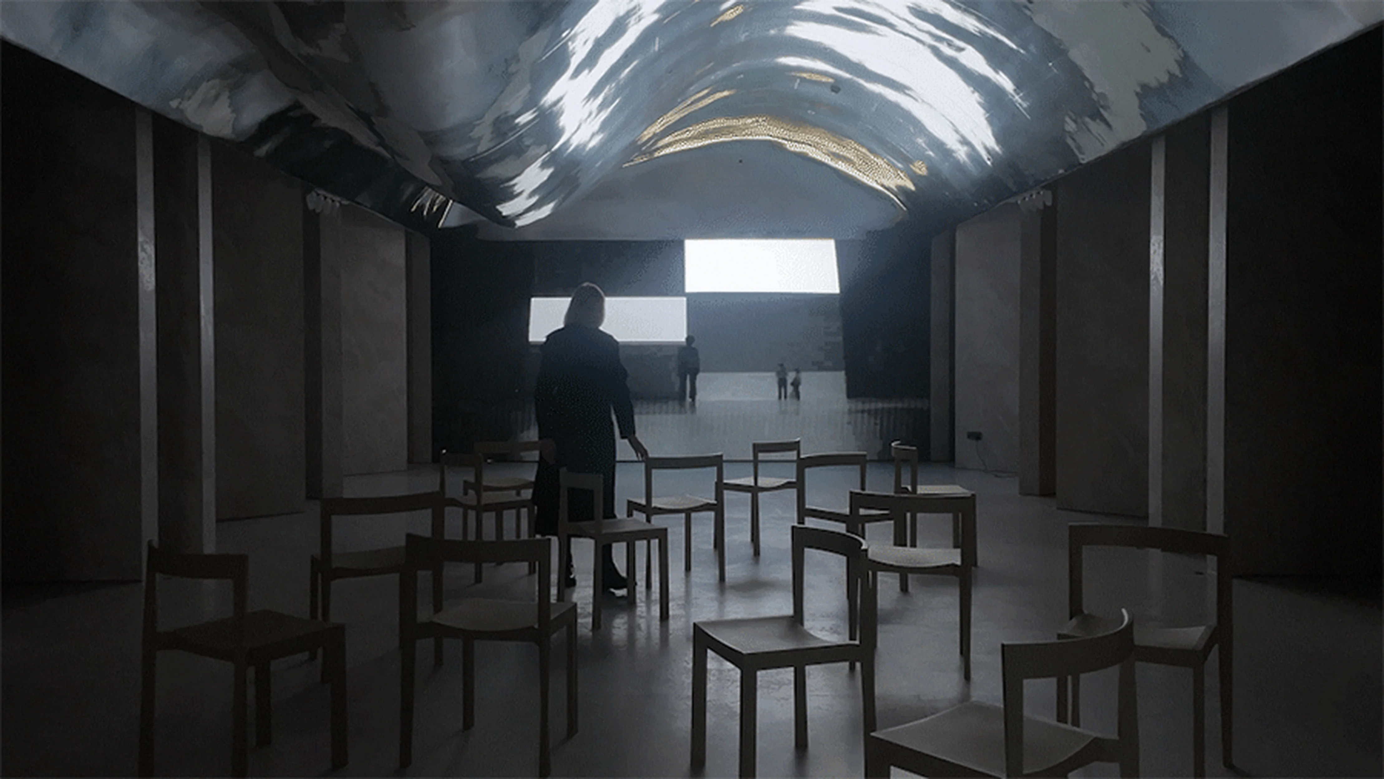
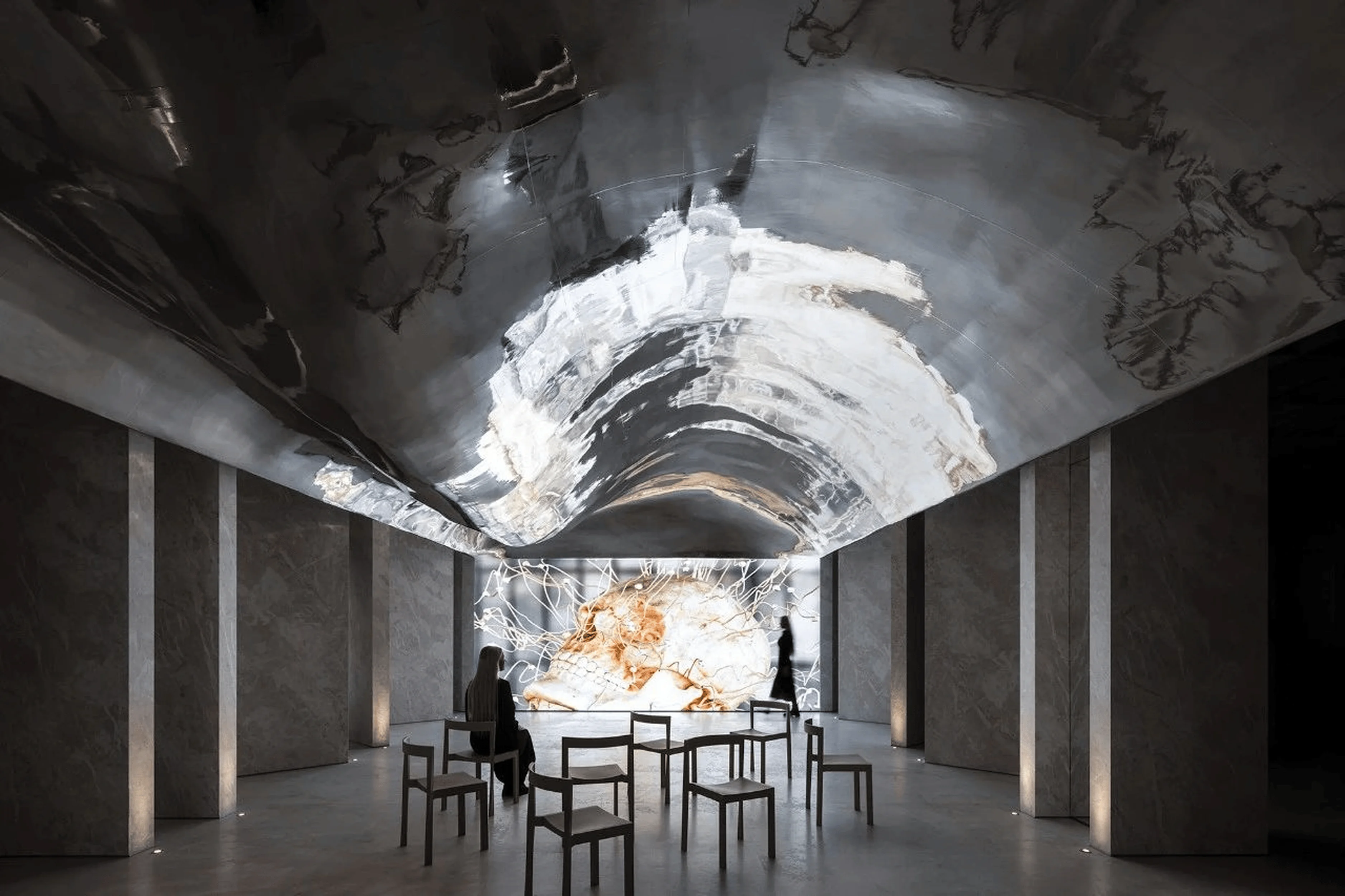
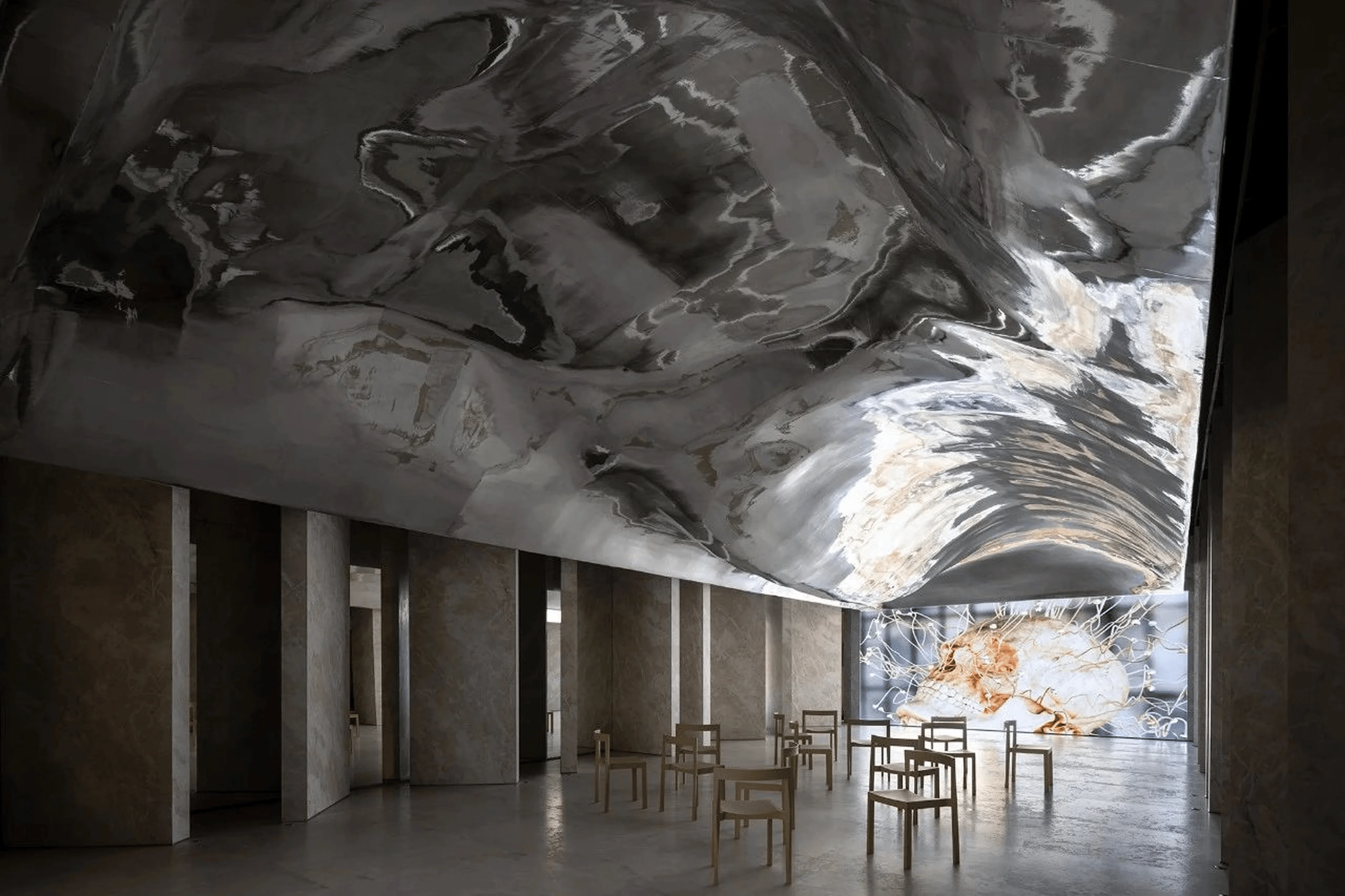
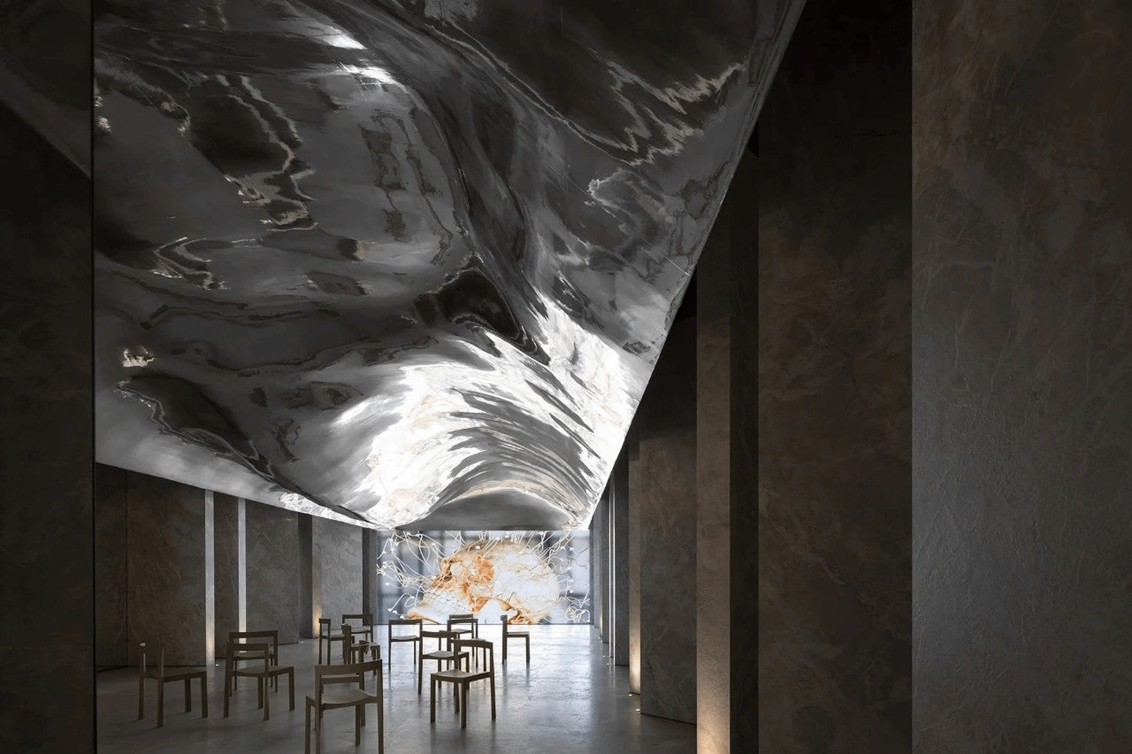
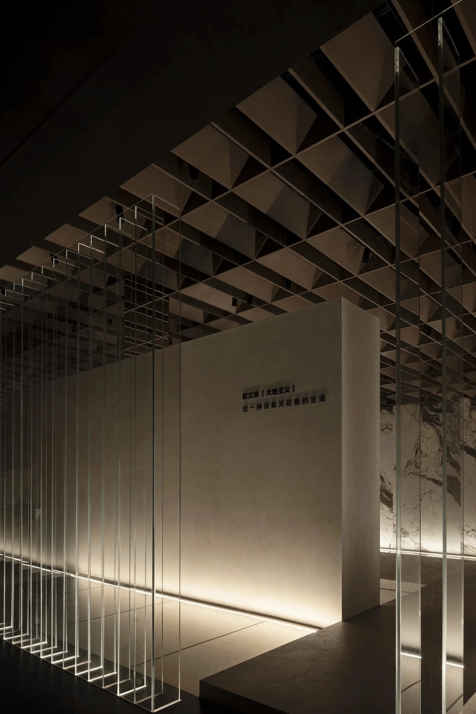
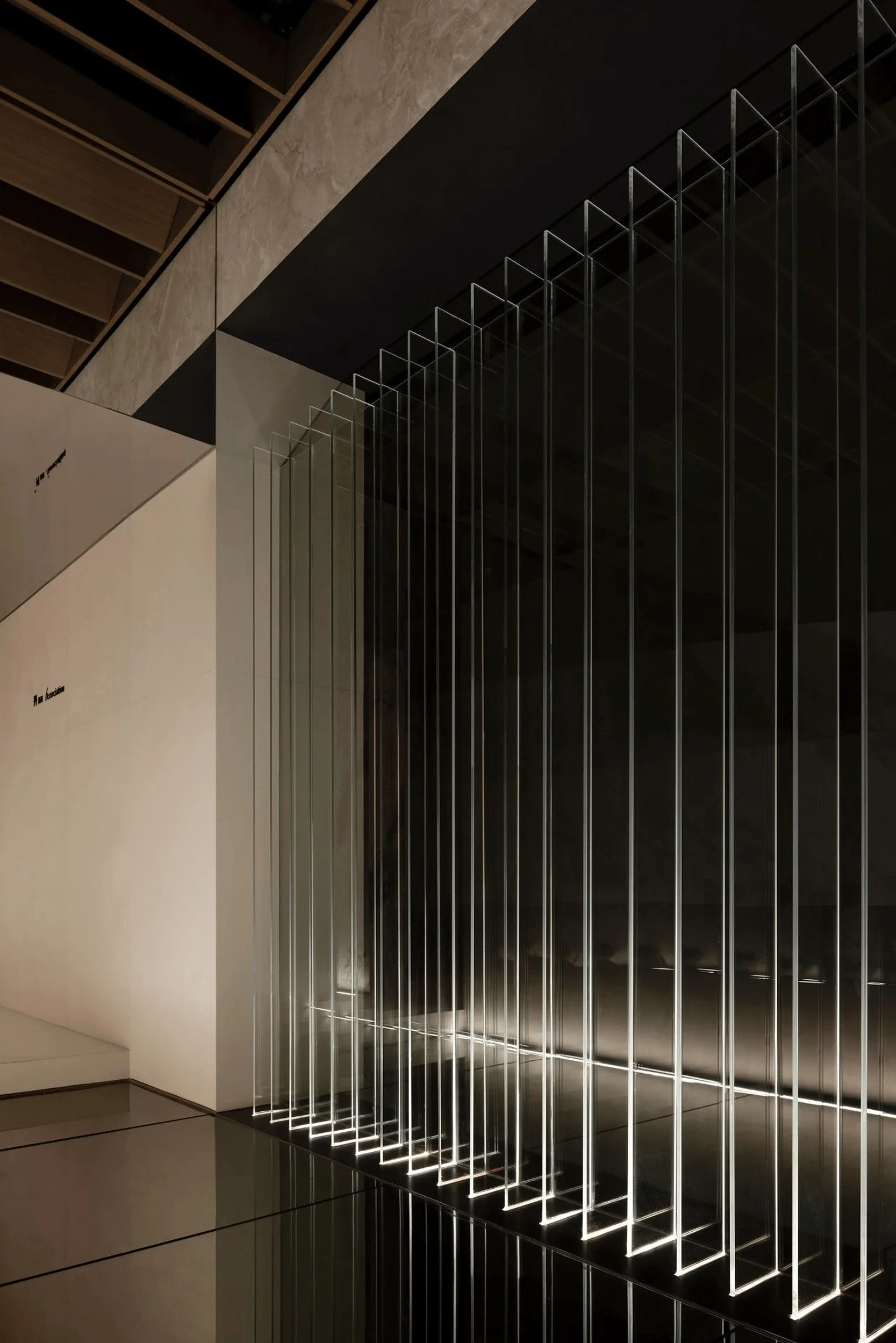
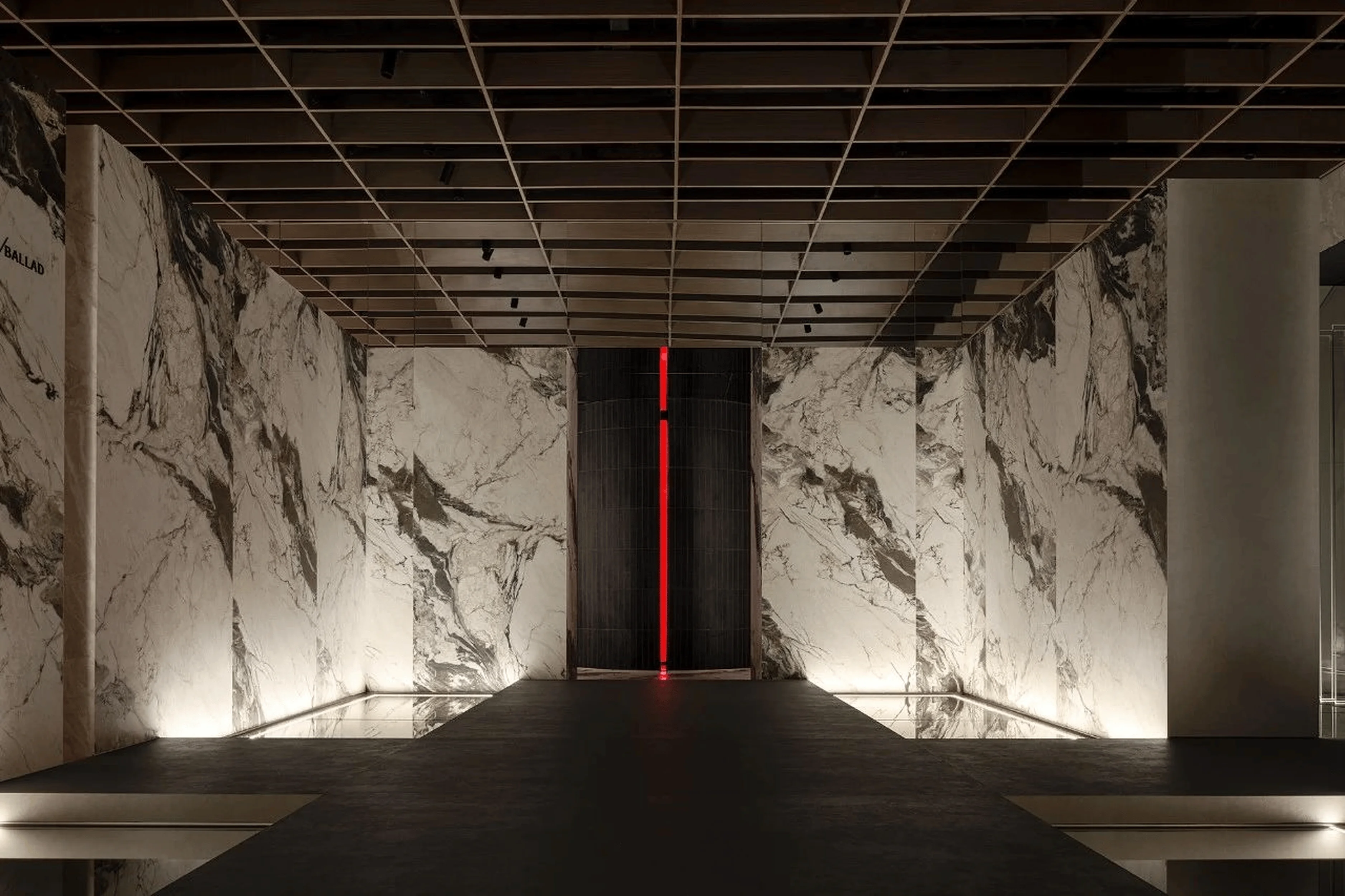
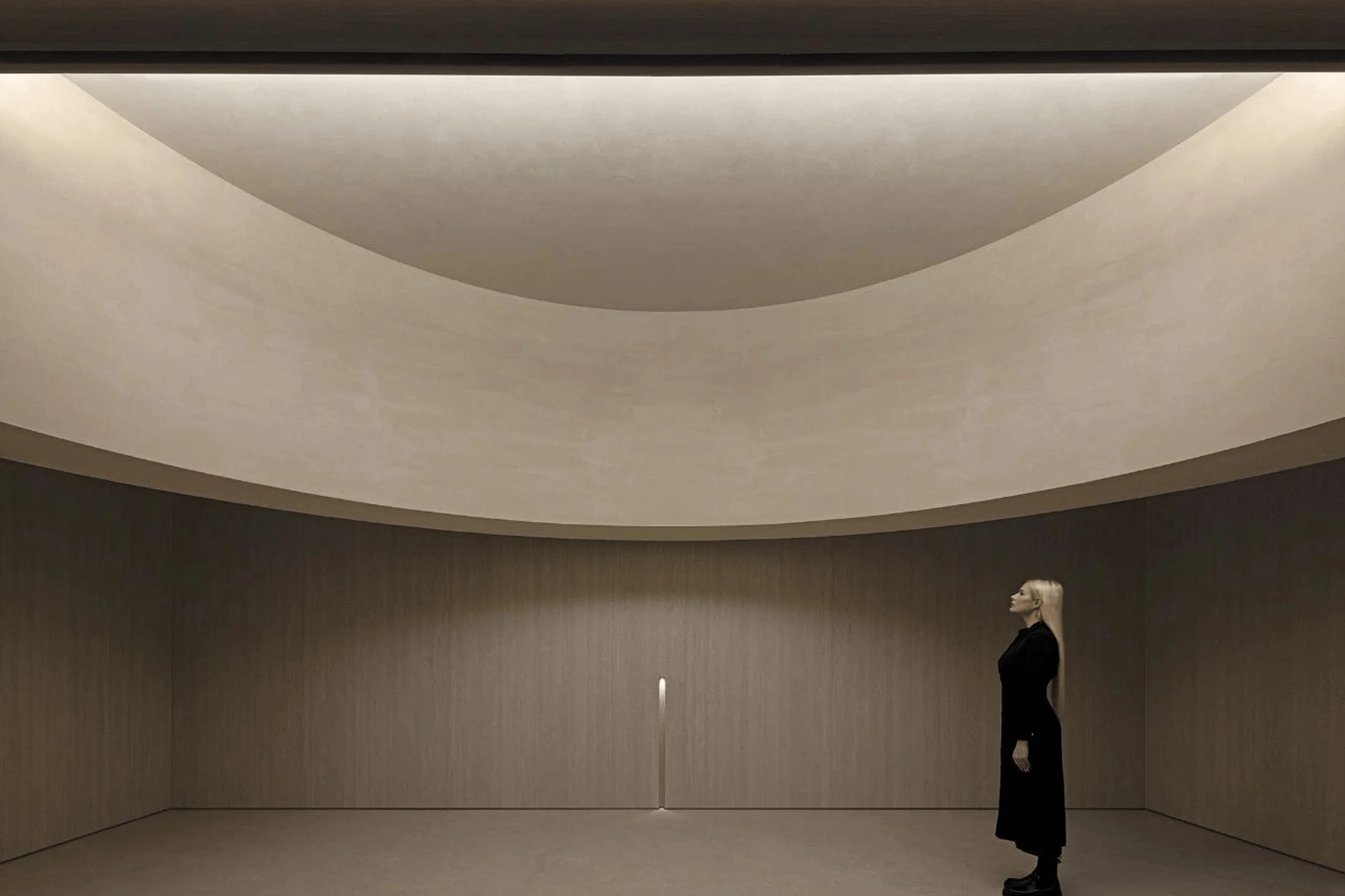
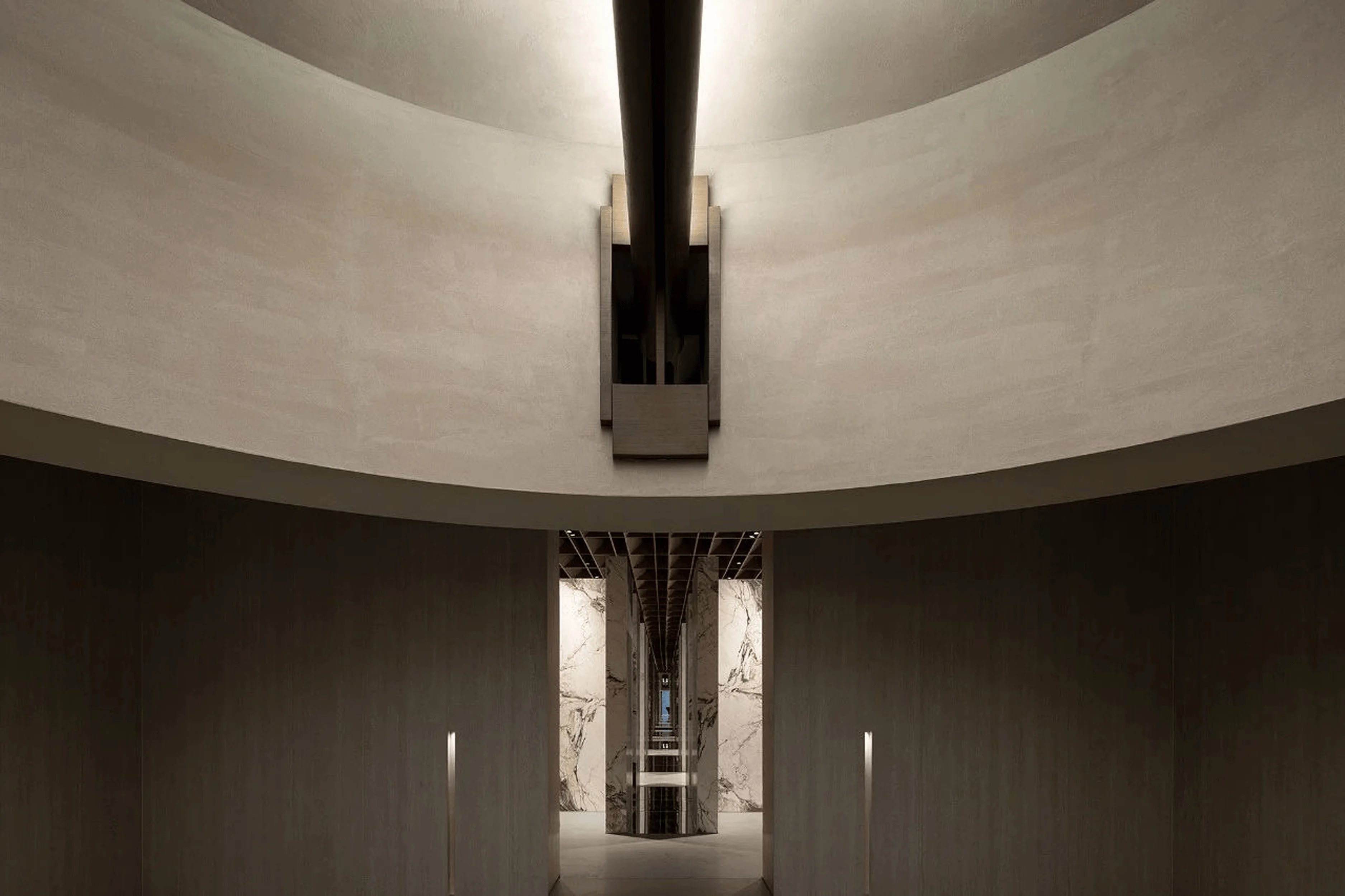
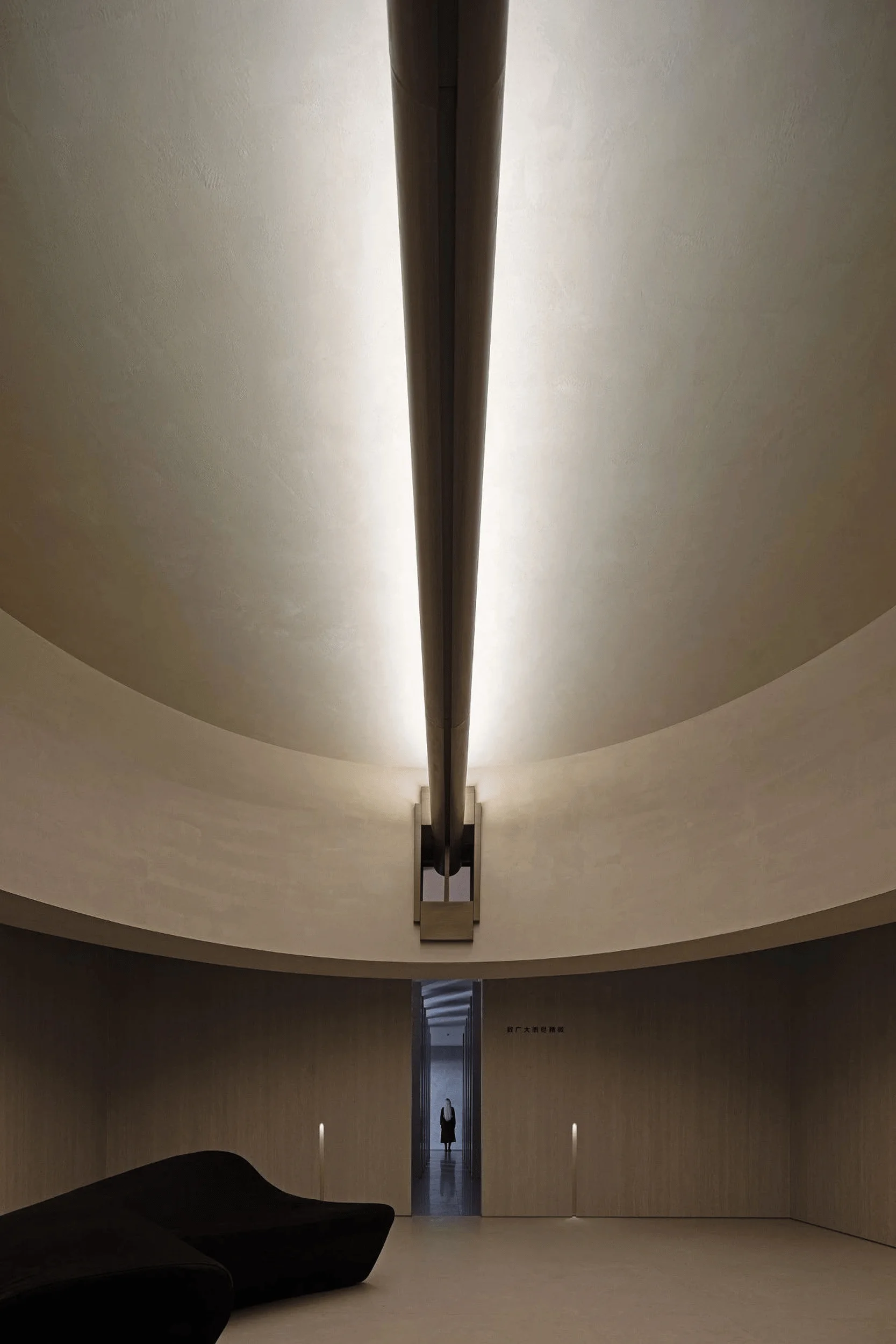
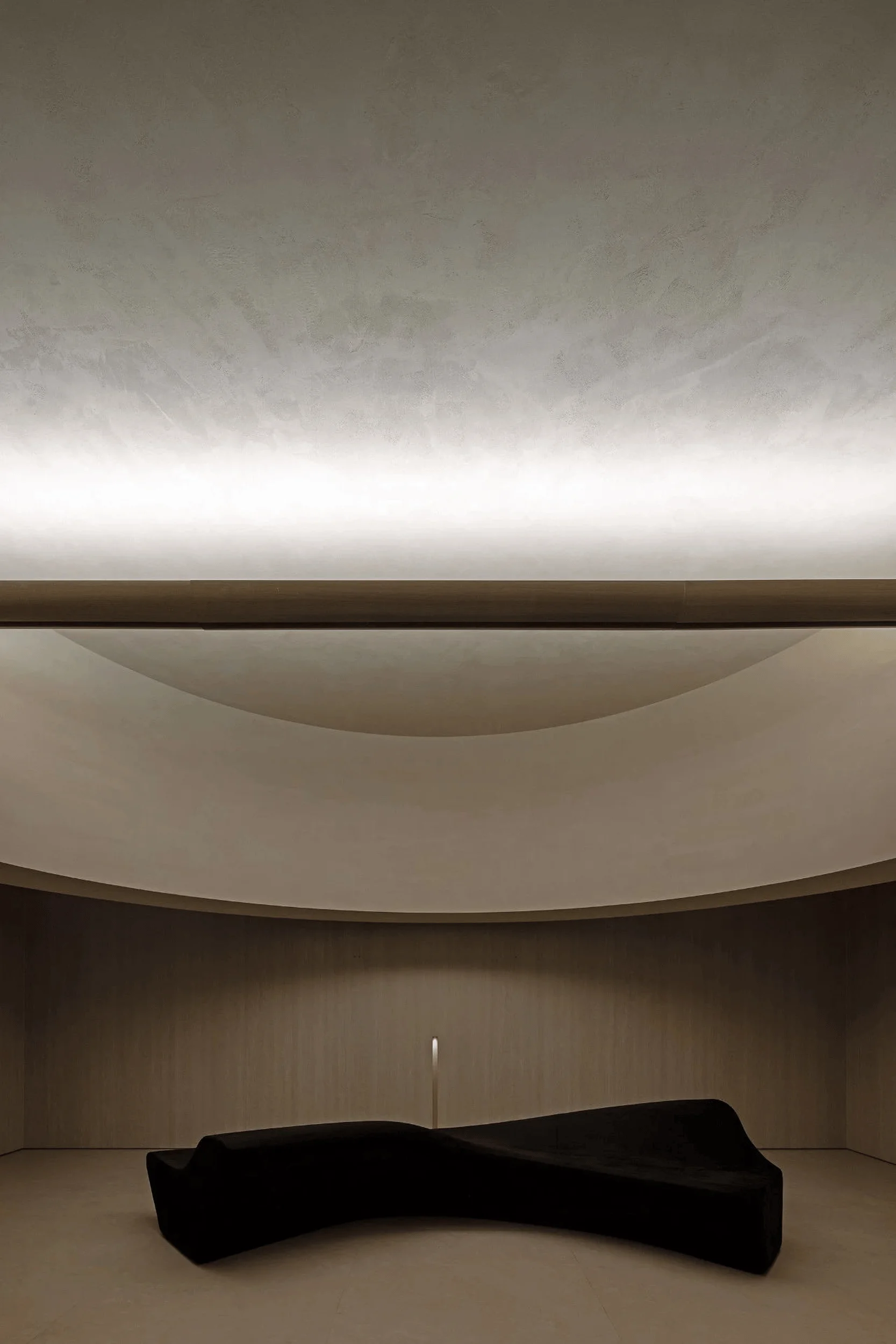
Ouwenlai “Earthism” exhibition hall leverages light and geometry to showcase the new ceramic tile collection.
Contents
Project Background and Collaboration
In October 2023, AD Architecture received a renewed invitation from Ouwenlai Group to participate in a second upgrade of its headquarters. This project aims to create an experiential space for the brand’s new “Earthism” product series, signifying a continuation of the long-standing partnership between the design firm and Ouwenlai. Located within the Foshan Ceramics Headquarters Base in China, the project encompasses the public spaces and brand experience center of Ouwenlai headquarters, encompassing a multi-faceted space for reception and product showcasing and contributing to a significant brand image upgrade. The project incorporates elements of architectural design with light and geometry within interior design in an impressive way, which is a vital tag in this project.
Brand Heritage and Product Innovation
Ouwenlai’s plain-colored ceramic tiles are the result of converting subjective user perceptions into technical parameters. The brand merges aesthetics with advanced manufacturing, embracing natural, modern, and composite elements. It incorporates multiple dimensions in design and development, including aspects of color, texture, feel, and light. Ouwenlai caters to high-end aesthetic demands. Its products emphasize the fusion of natural and contemporary elements, including premium rock slabs and ceramic tiles. Catering to a niche market of discerning individuals, the brand maintains a modern, sleek, and pure design language. The launch of the “Earthism” product series in 2024 marks the 8th generation of Ouwenlai’s plain-colored tile offerings. It uses the concept of “attentive to details, dedicated to perfection” to initiate a fresh approach to ceramic tile material language. This “Earthism” design with light and geometry within interior design is a notable tag in the project. It introduces the notion of “experiencing life without ceilings”, the new series incorporates “muscle texture symbiosis technology” to address the challenge of harmoniously integrating traditional tile textures and natural materials. The “Earthism” design incorporates a vital tag of light and geometry within interior design.
Design Concept and Objectives
The design process was a deep dive into the brand’s product culture and a careful consideration of how to best showcase the “Earthism” series. Ouwenlai interprets “Earthism” as representing “earth style and naturalism.” The Earth is a space without ceilings, and life should be lived with a sense of relaxation. The design team also emphasizes the continuity of nature in a remarkable architectural environment. People live in buildings, and buildings serve as the medium for communication between people and nature. The tile materials that form the building’s skin communicate natural emotions. Therefore, the design aims to go beyond simply representing Ouwenlai’s respect for nature, sleek aesthetics, and pure brand culture and to deeply understand the new product concept. The use of architectural space and light, as well as light and geometry within interior design, serves as the vehicle to provide a fitting backdrop for these products. The design is guided by the principles of respecting nature and fostering harmonious coexistence. The “Earthism” project design focuses on the crucial tag of light and geometry within interior design.
Breaking the Mold of Traditional Showrooms
How can one create a forward-thinking brand exhibition space? How does one challenge conventional design? The design team found that a departure from the typical showroom format has yielded effective results for Ouwenlai’s first headquarters exhibition space. This early design phase was structured like an art gallery, while the current design concept is more akin to a fashionable runway. The “Earthism” design uses this approach of light and geometry within interior design. This approach presents a unique way to integrate products and display them within a broader environment. This has sparked valuable discussions about how Chinese ceramic exhibition spaces are perceived, which is a vital tag in the project. The “Earthism” design utilizes light and geometry within interior design to present a unique approach to product display and experience. Rather than prioritizing products as the sole focus, the design prioritizes fostering a sense of harmony between the products, spaces, nature, people, and the passage of time. It represents an insightful exploration of how to present the products in a more holistic way.
Spatial Layout and Arrangement
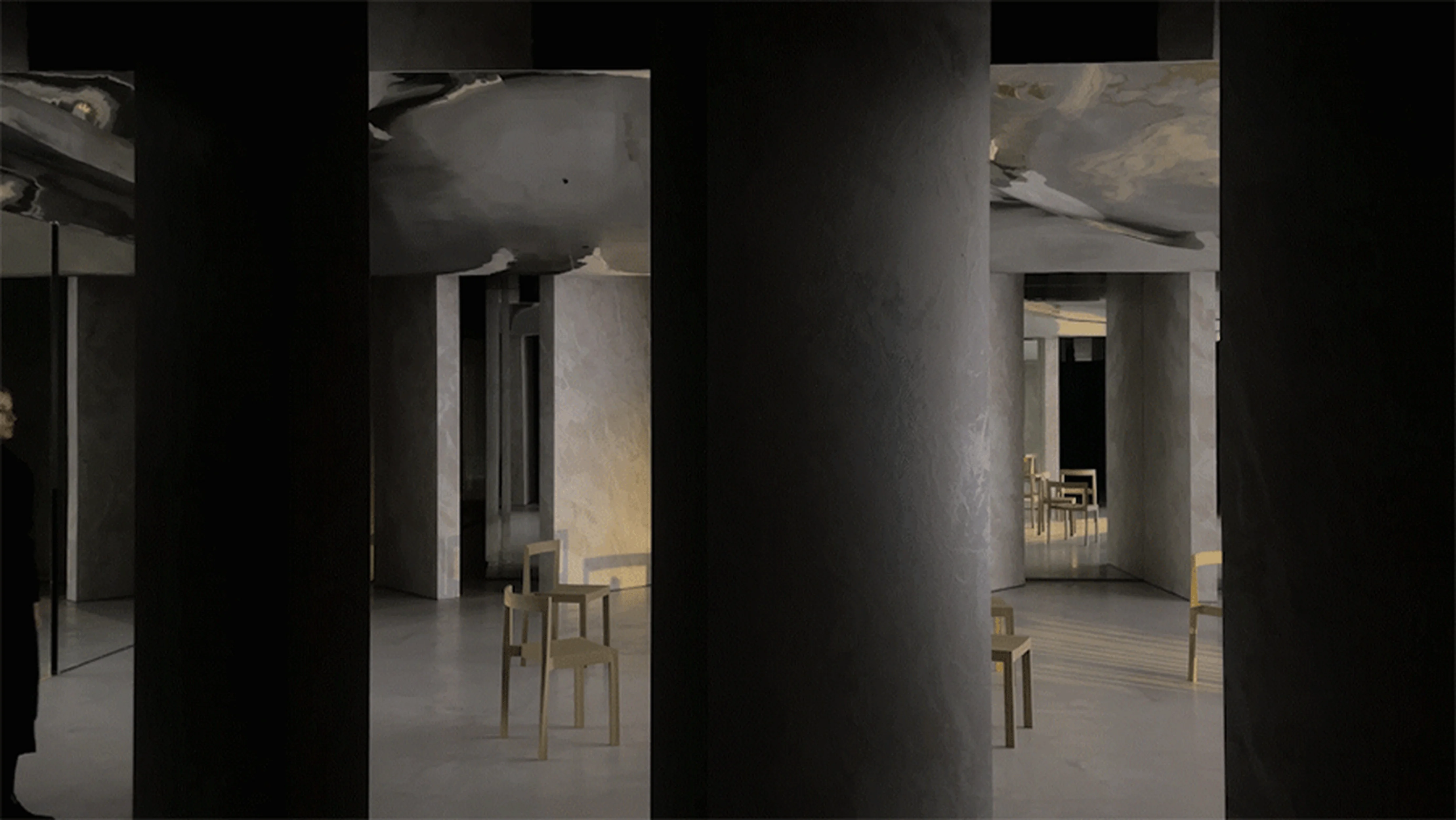
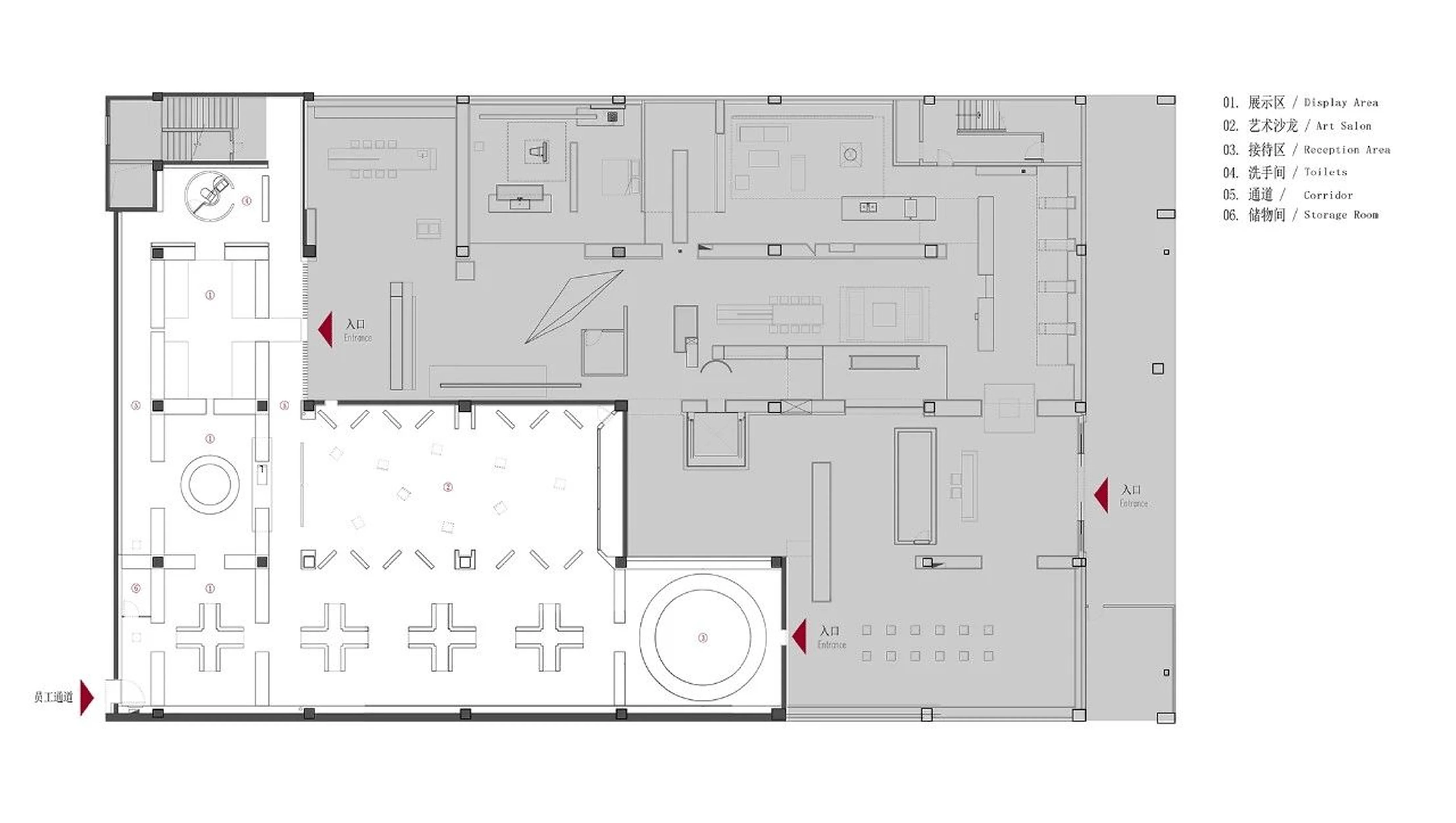
The design leverages an array of spaces to establish a sense of visual and physical sequence. The introduction of crevices between these spaces illustrates a process of spatial freedom. The design also maintains a sense of directionality within the interior, which is a significant tag in the project. This creates a sense of playfulness and intrigue, and each individual space allows for low-density interaction between the viewers. Boundaries become less divisive and more integrated. The “Earthism” design also strategically utilizes light and geometry within interior design to create a seamless visual sequence.
Product Display and Materiality
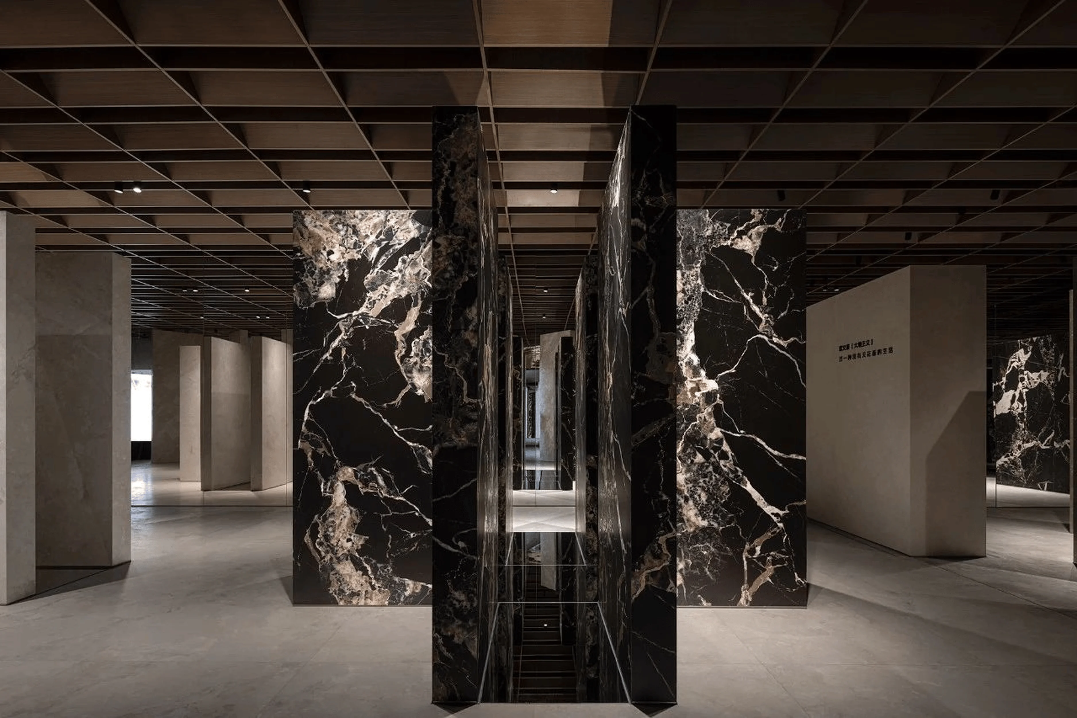
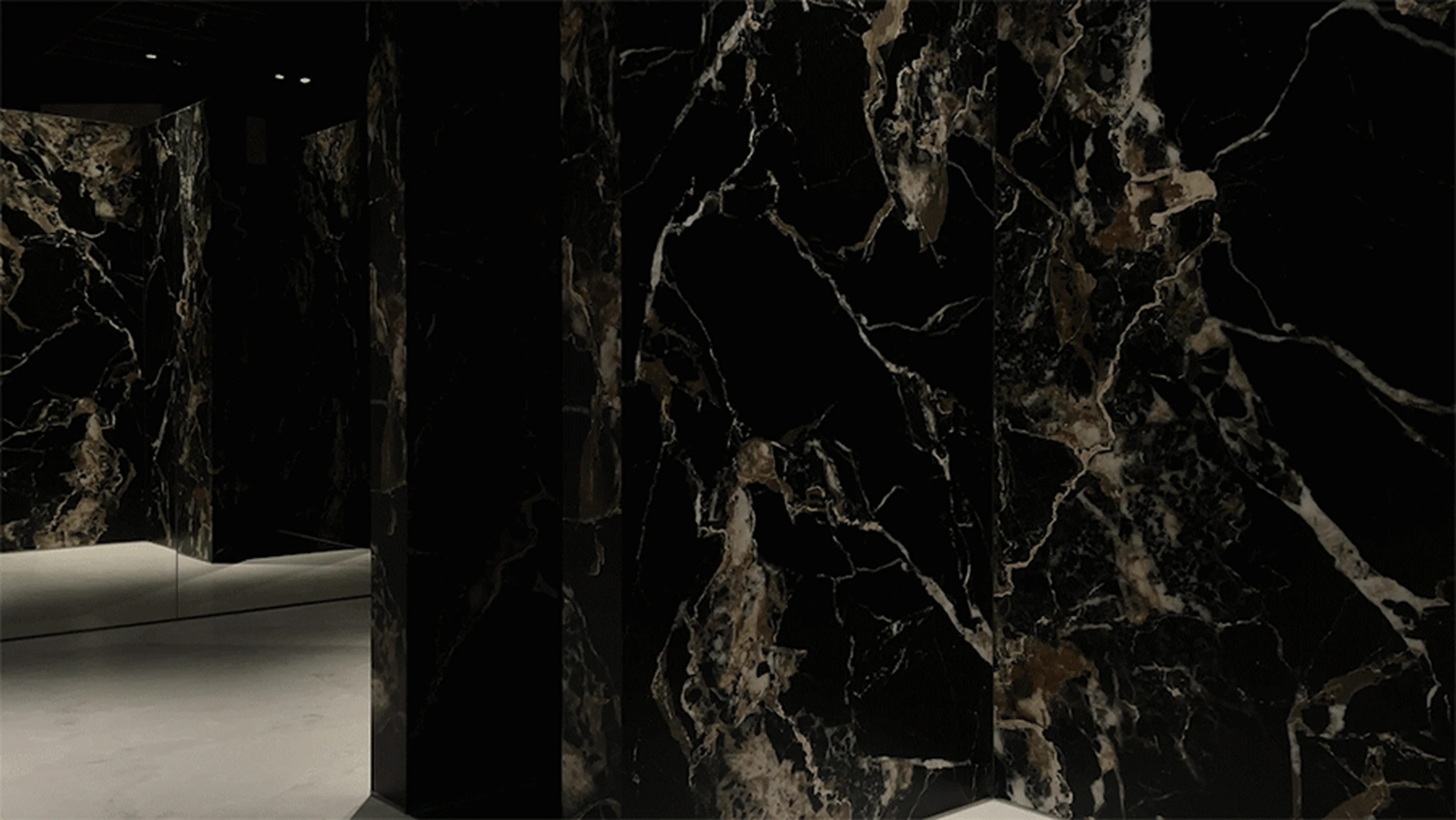
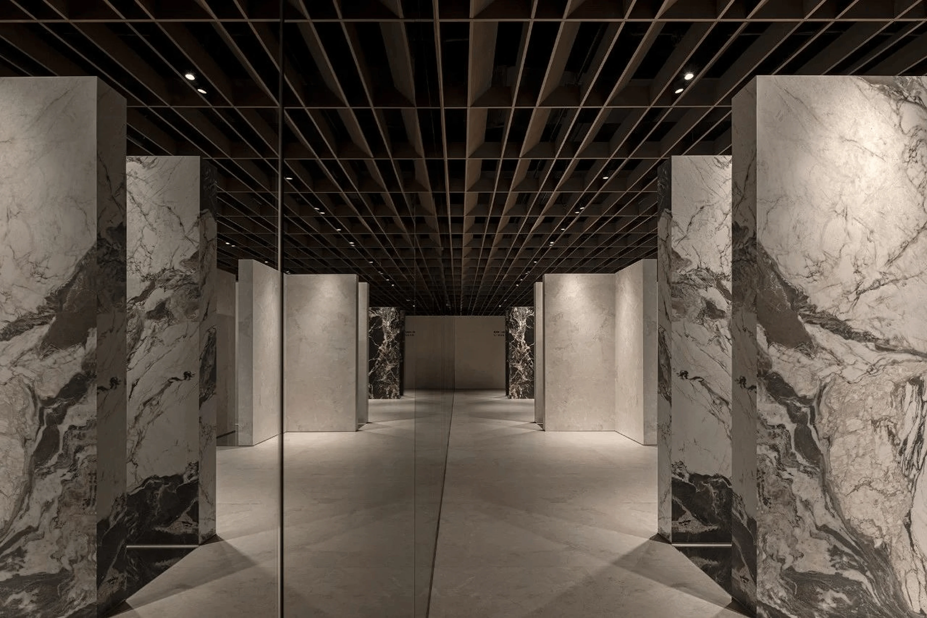
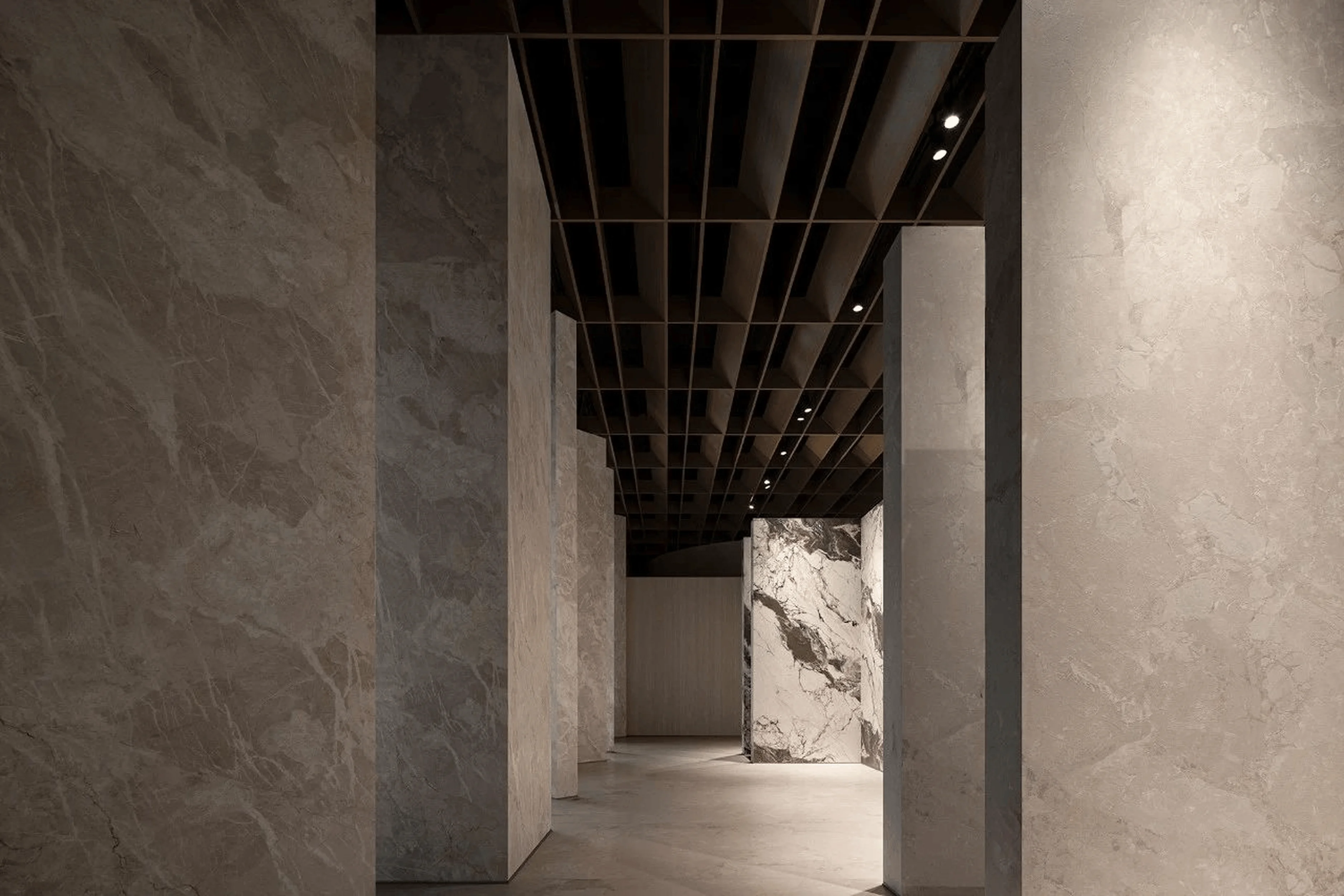
Ouwenlai’s “Earthism” product series features a fresh perspective on replicating the natural textures of marble. In response to the recent surge in popularity of monochrome and advanced gray tones, Ouwenlai has embraced a new trend. It marks a return to a style that has been popularized throughout history. The team has taken great care to classify the products in a structured way. The variety of marble’s natural patterns increased the design complexity and underscored the importance of meticulous product organization. The design team has utilized a semi-enclosed format to isolate the products, thereby enhancing their individuality and quality. This approach emphasizes the important tag of light and geometry within interior design.
Spatial Narrative and Functionality
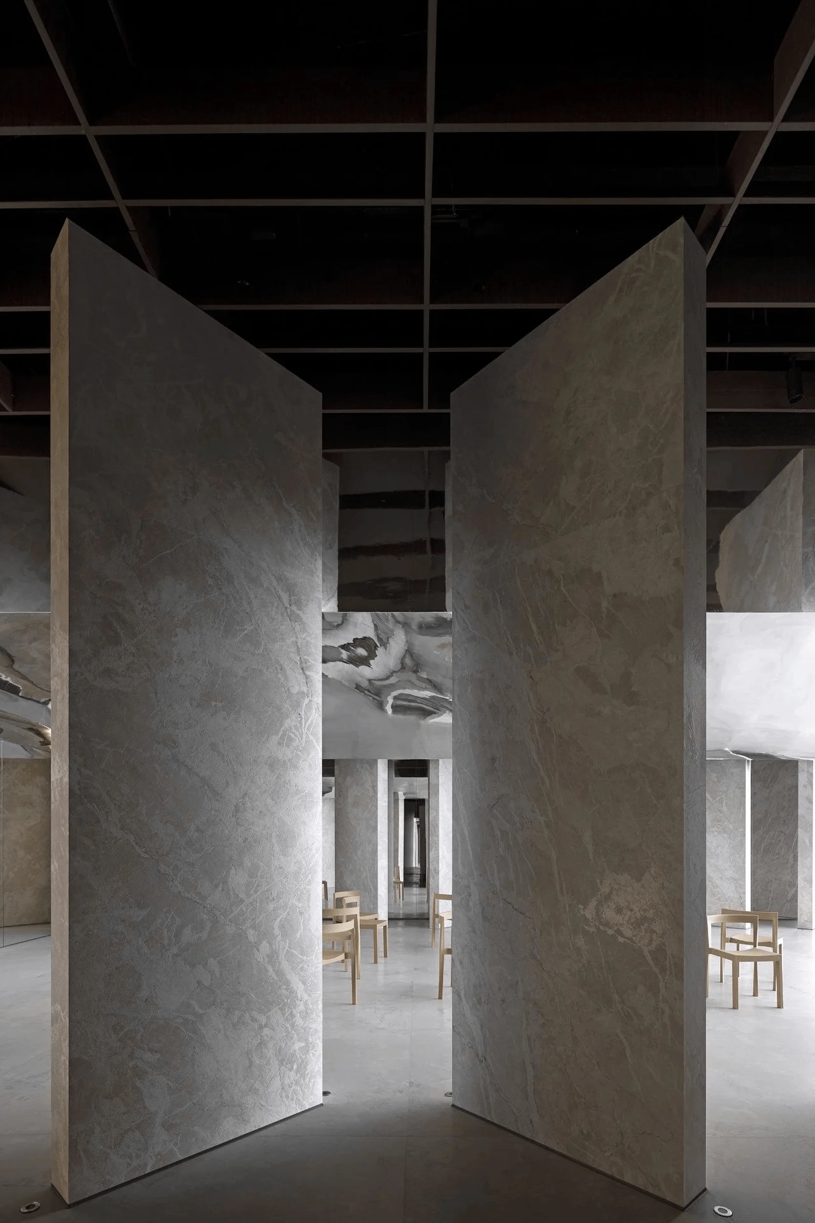
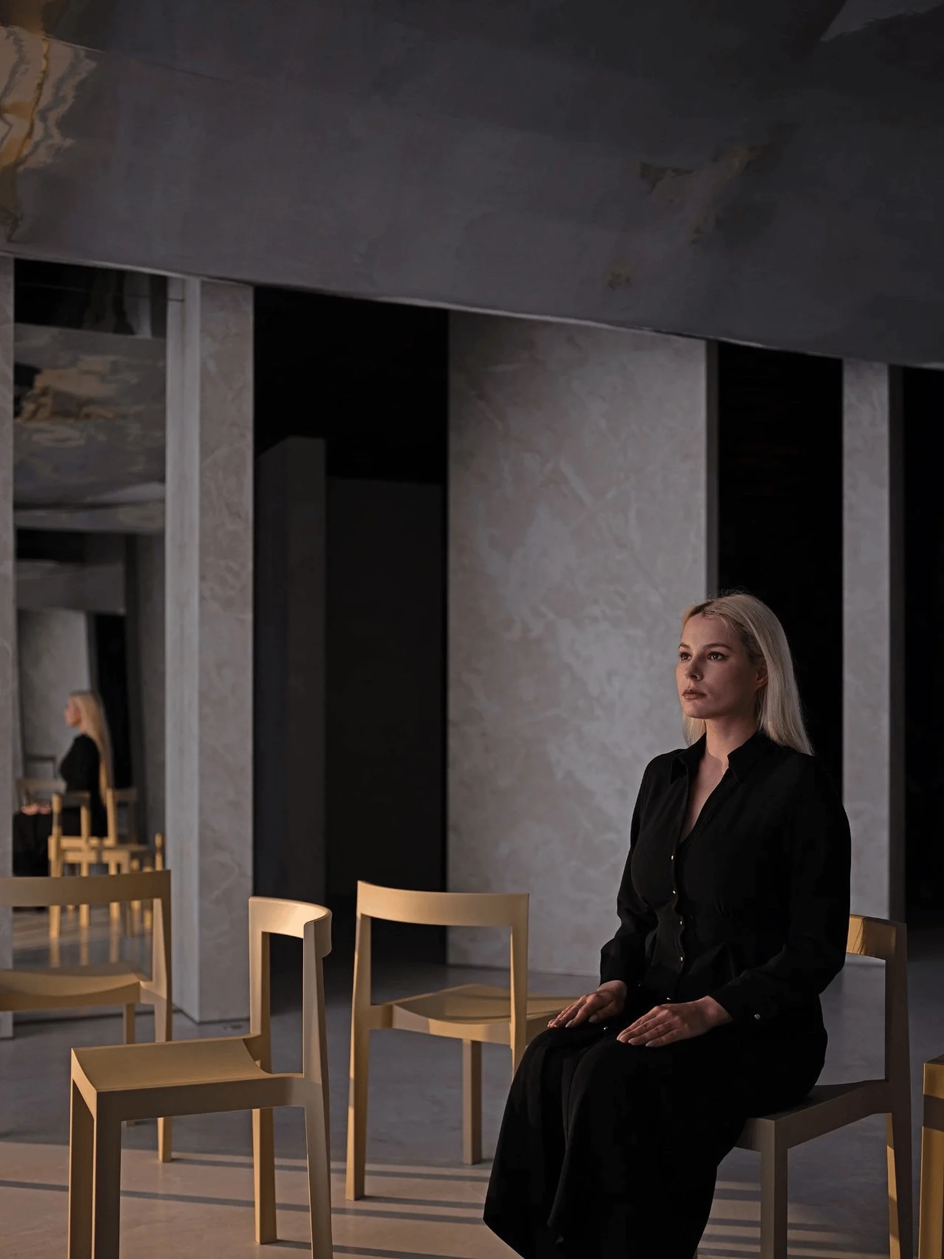
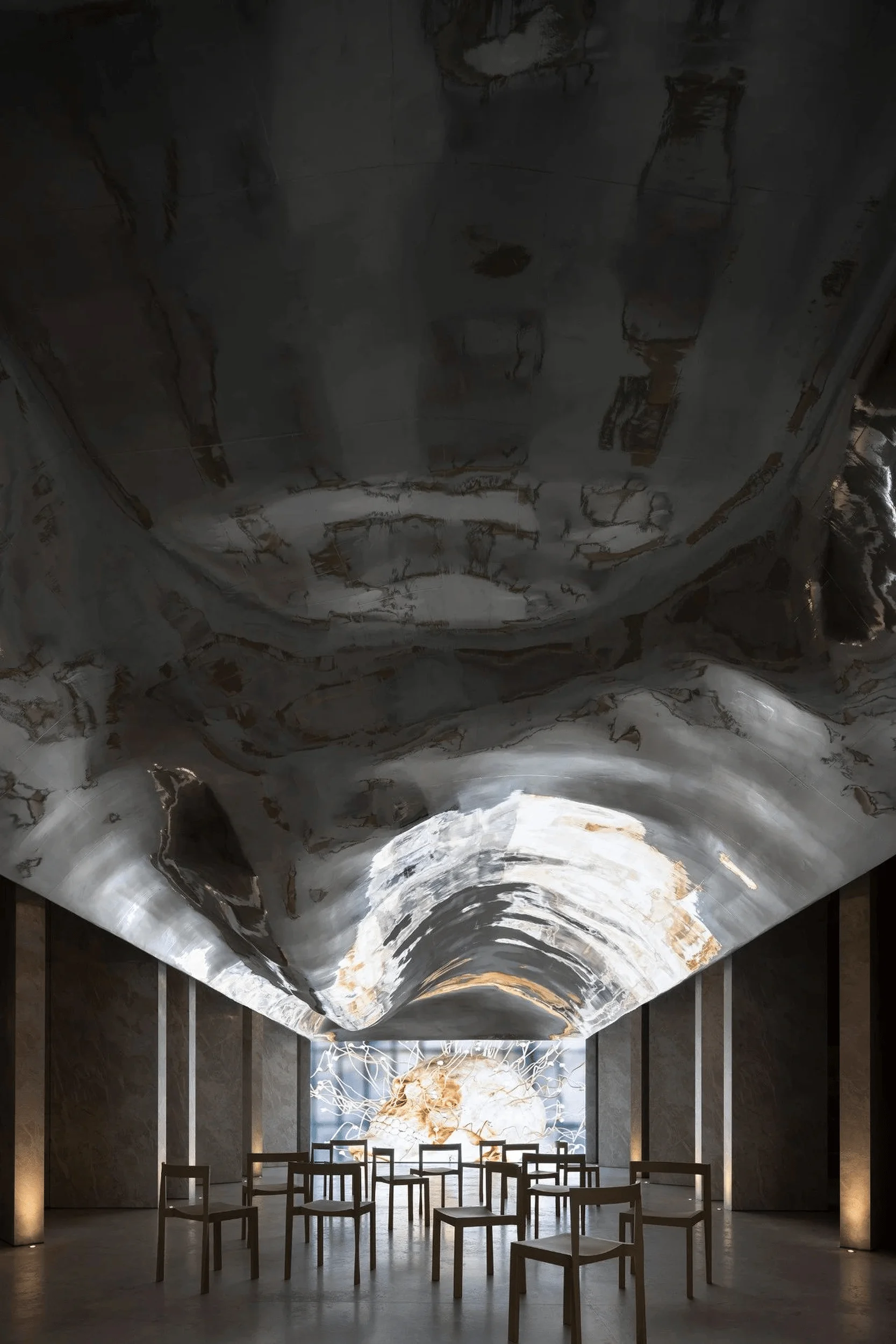
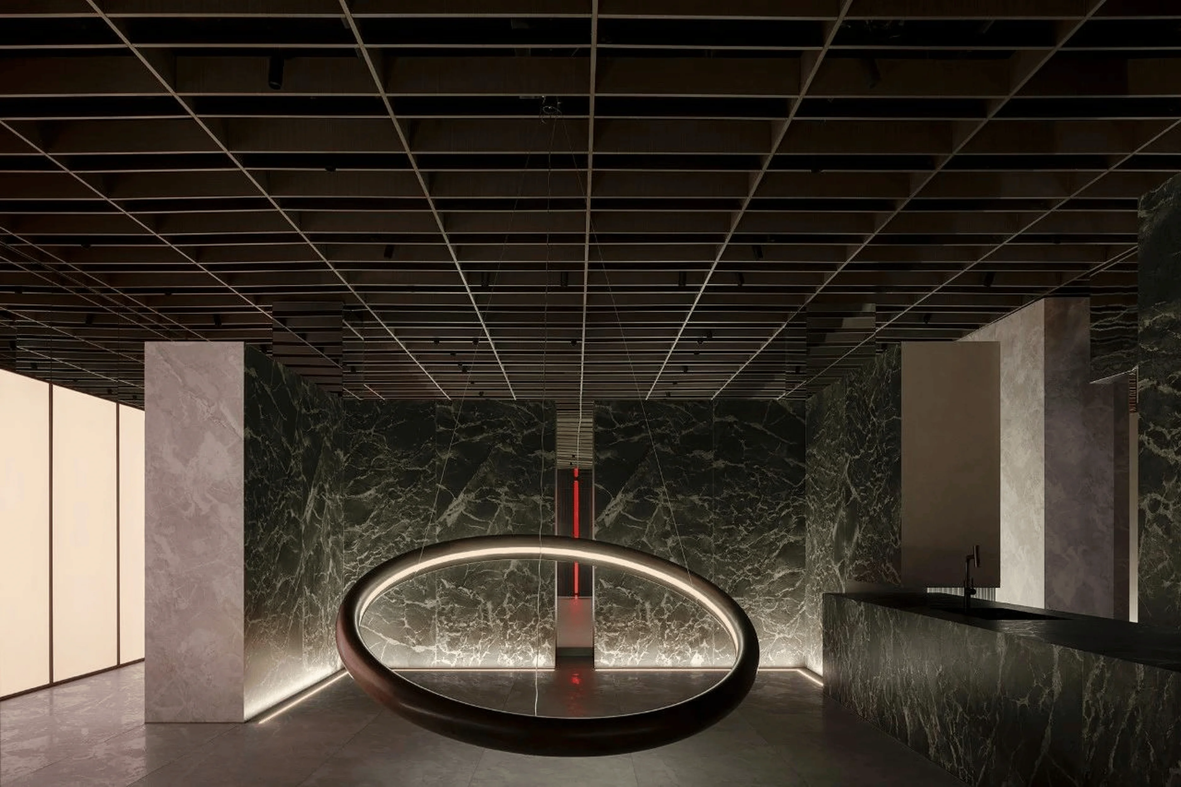
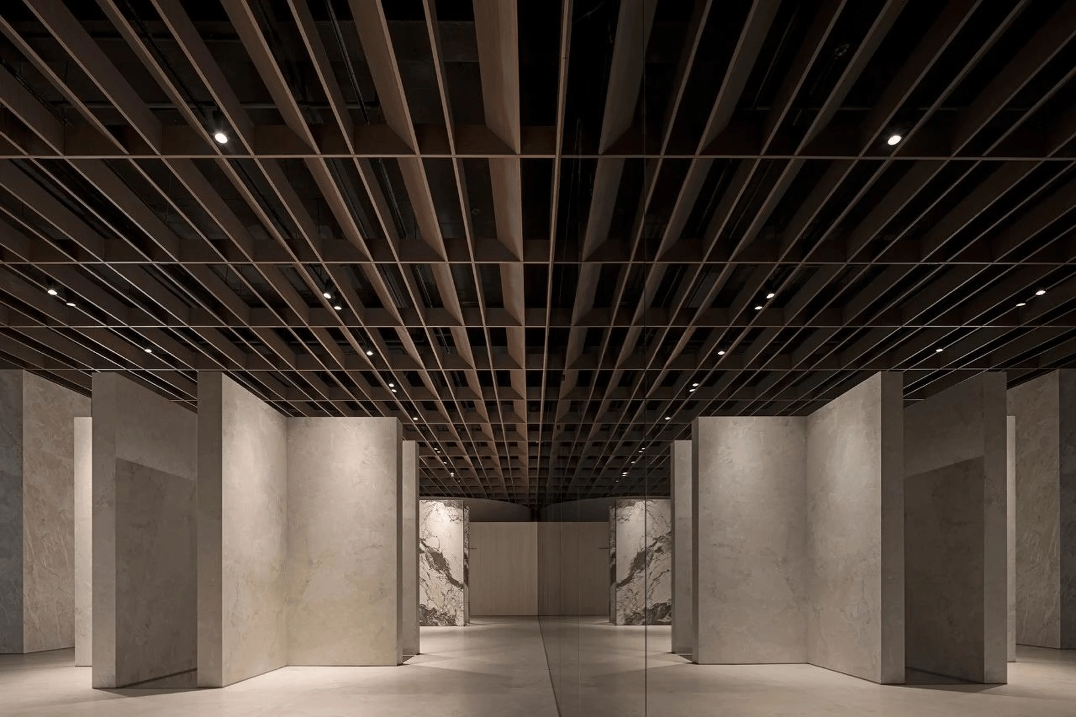
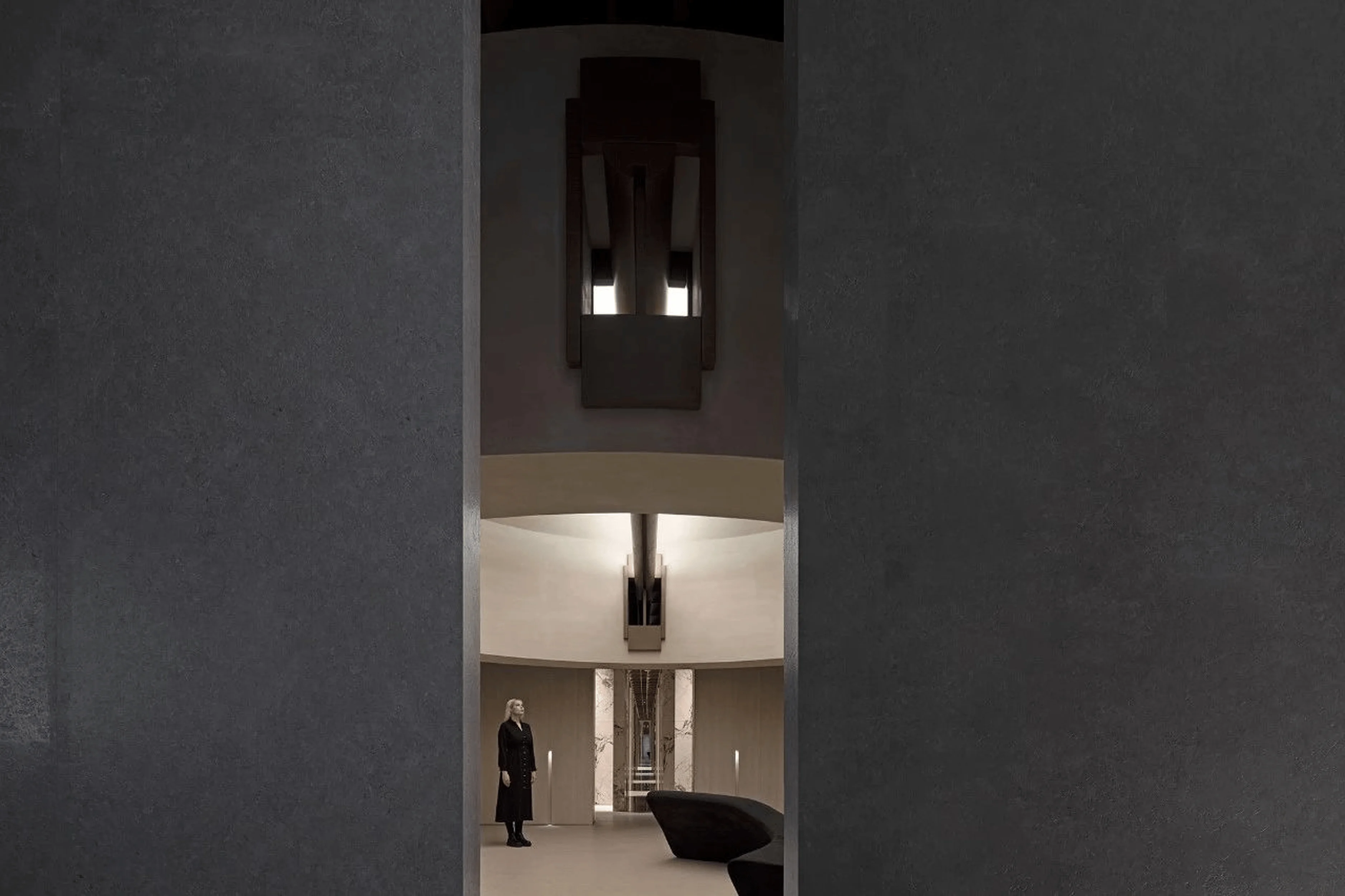
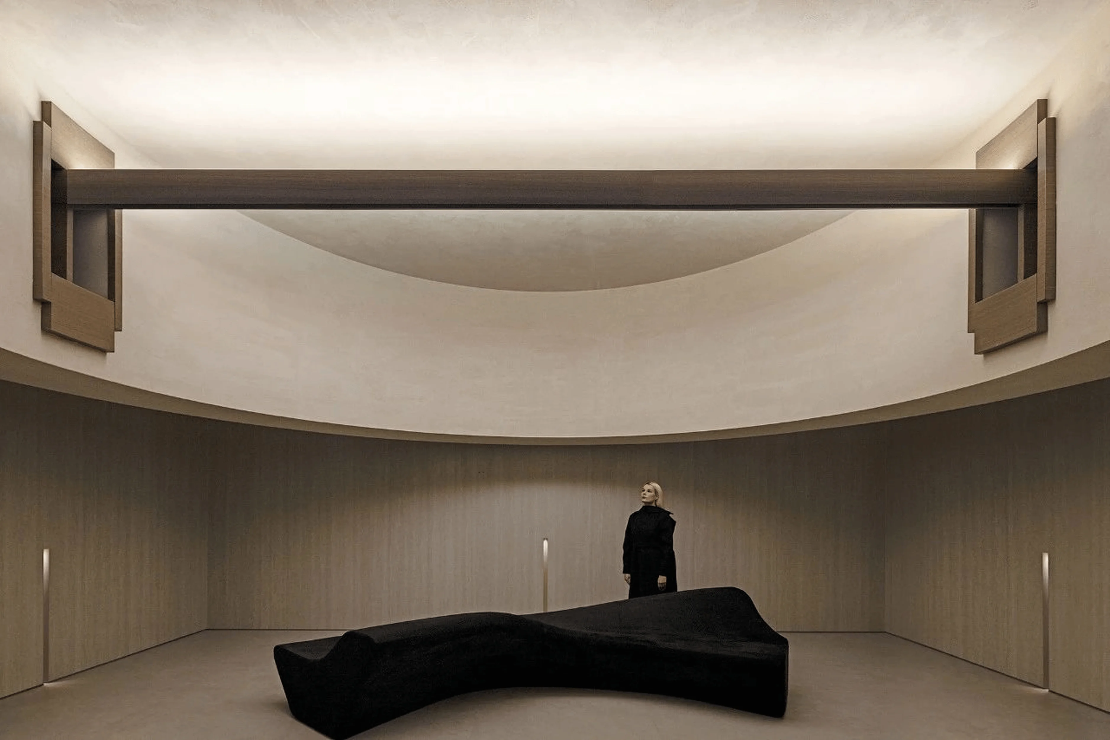
The overarching design approach is to create a product showcase. The design team aimed to foster a sense of human-object interaction, highlighting the relationship between people, spaces, and products, particularly in this design that incorporates light and geometry within interior design. The space is designed with rock slabs as a central element, and the wooden ceiling structure enhances the overall sense of nature and warmth. The primary customer base for the headquarters consists of designers and distributors. The design integrates a variety of spaces, including a future salon. The salon area embraces symmetry to enhance its spaciousness and formality. The large-scale, flowing ceiling design softens the overall spatial rigidity, establishing a strong artistic focal point in the heart of the headquarters to emphasize the brand’s identity, which is a vital tag in this project. The “Earthism” design thoughtfully employs light and geometry within interior design to enhance functionality and aesthetic appeal.
Space Sequencing and Interaction
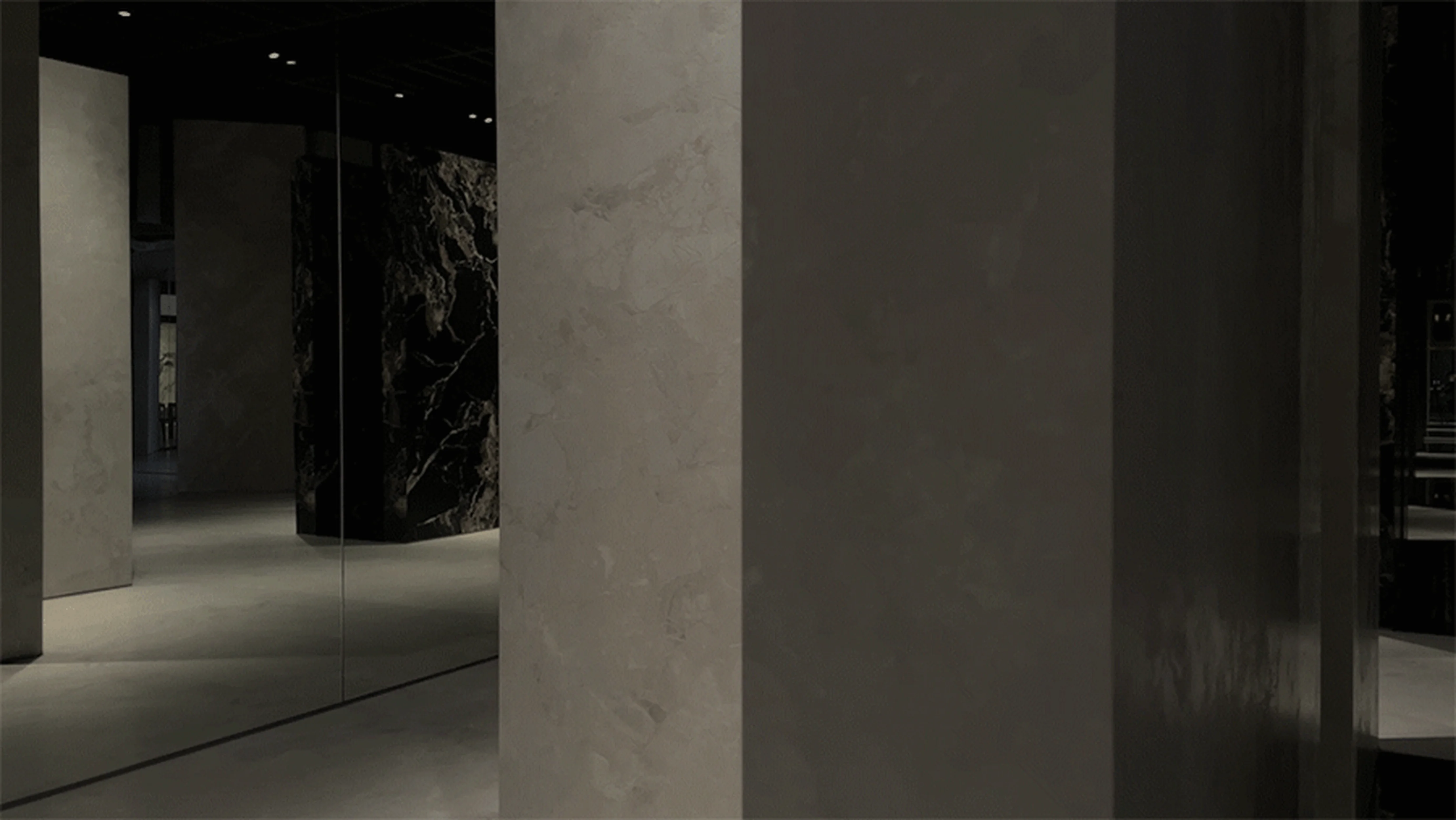
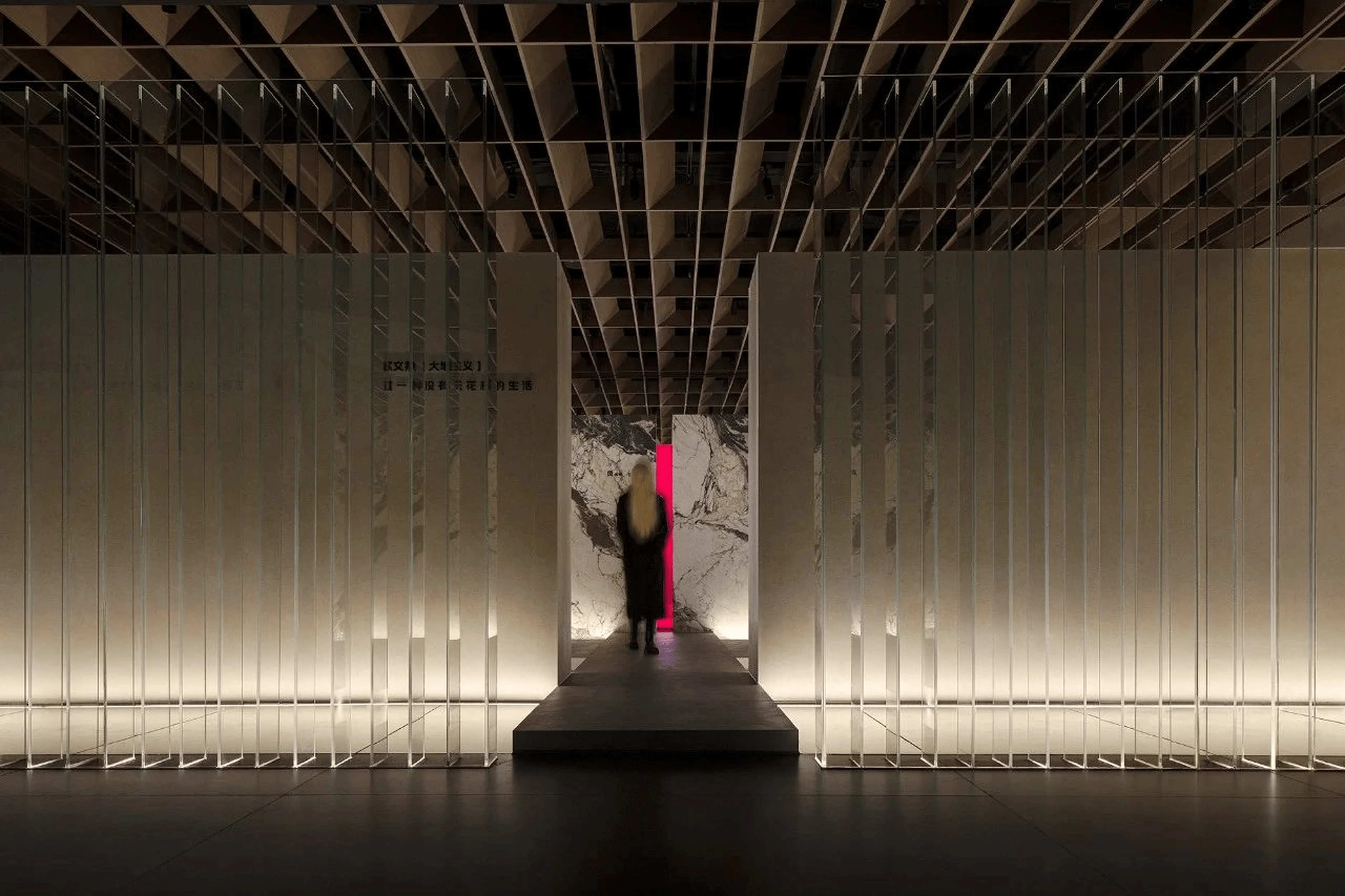
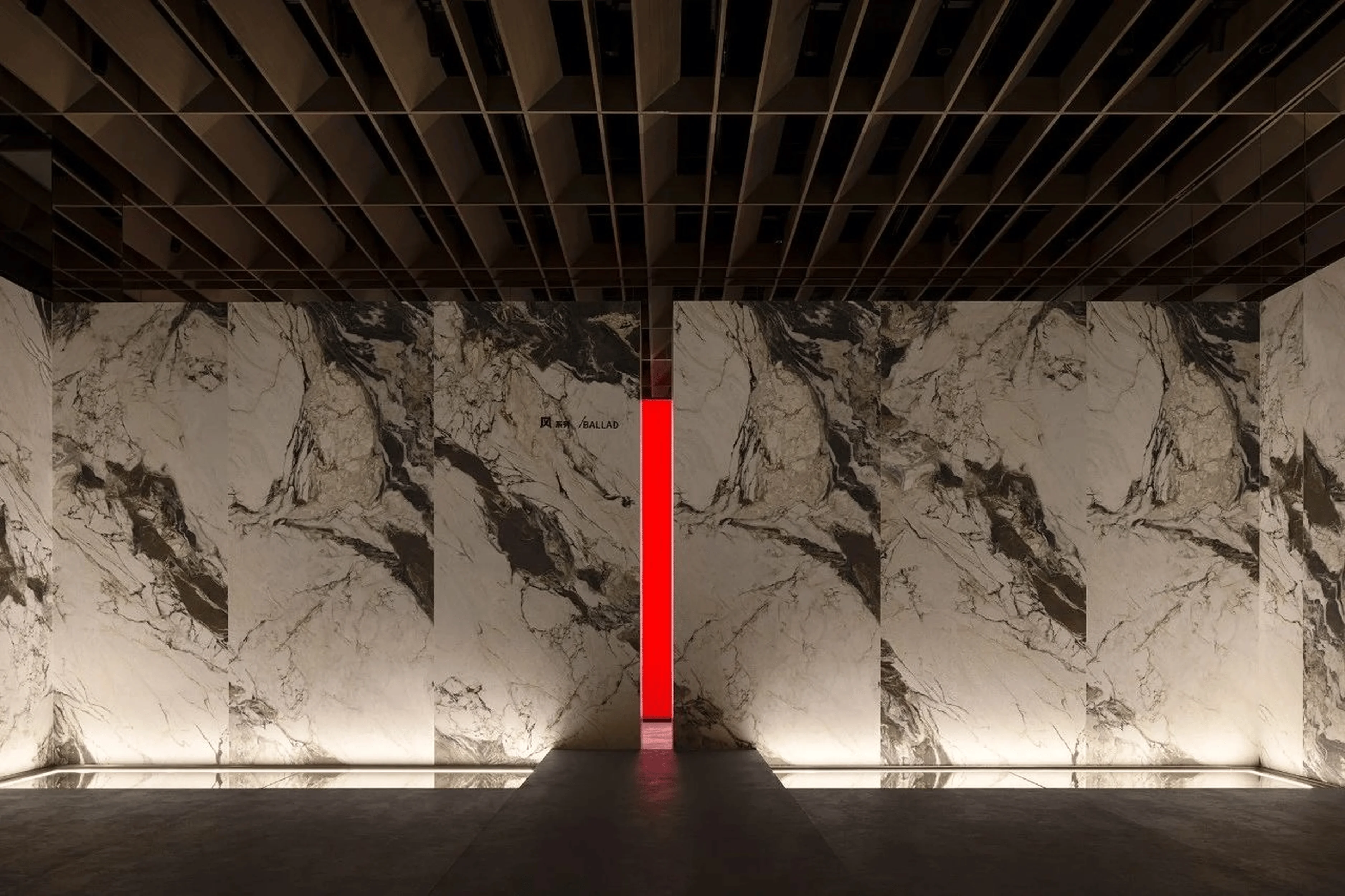
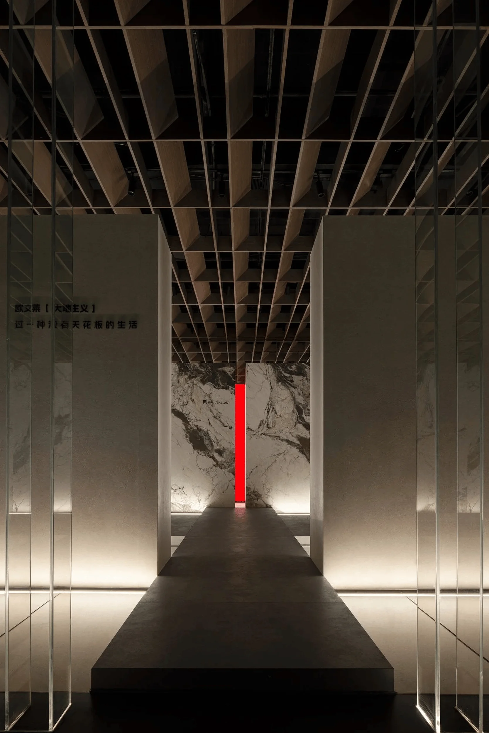
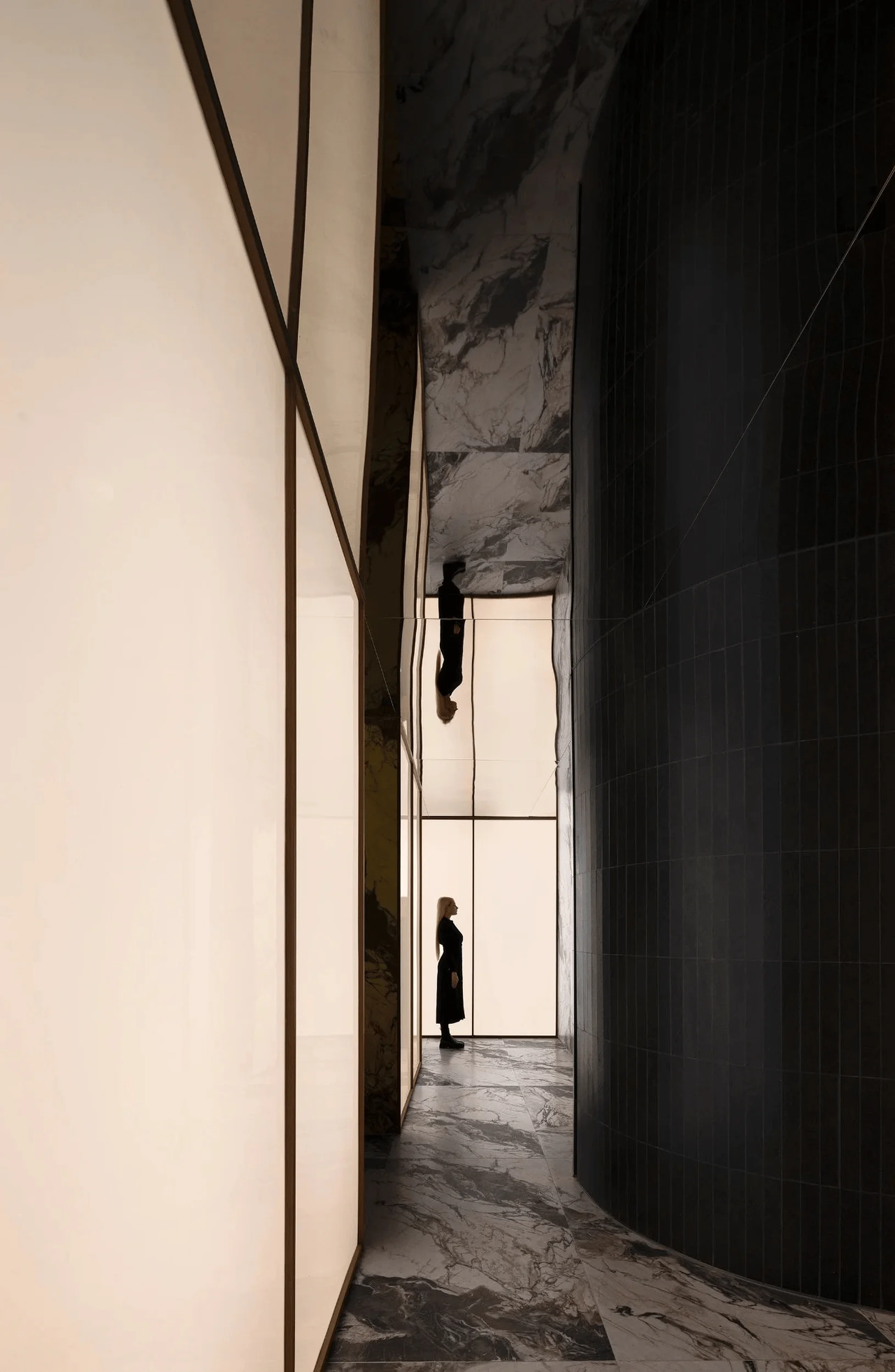
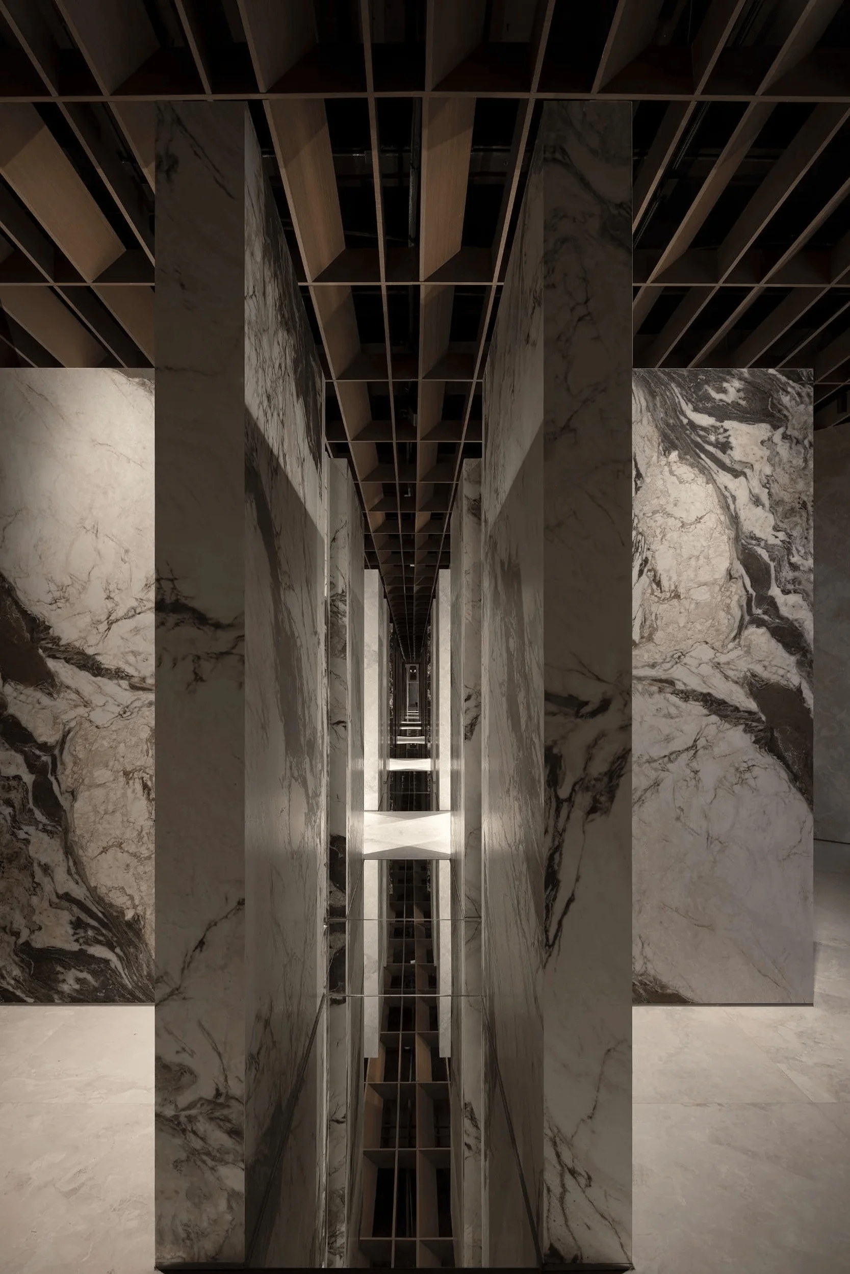
In areas of the existing structure that are not undergoing renovation, the design incorporates an array of glass panels to serve as partitions. Four L-shaped walls define the initial product display space. The reception and relaxation area is connected to the brand space closest to the entrance. The mirror-like surfaces on the ground have a water-like quality that mitigates spatial rigidity and creates a sense of discontinuity. The enclosing design highlights the “Wind” series of Ouwenlai’s “Earthism” product line. The surrounding products serve to emphasize the natural and unrestrained character of the “Wind” series, which is a vital tag in this project. The cross-shaped flooring enhances the sense of balance, and a wide opening guides visitors toward a corridor. The design’s incorporation of light and geometry within interior design allows for seamless navigation and transition between different spatial zones.
Visual Emphasis and Contrast
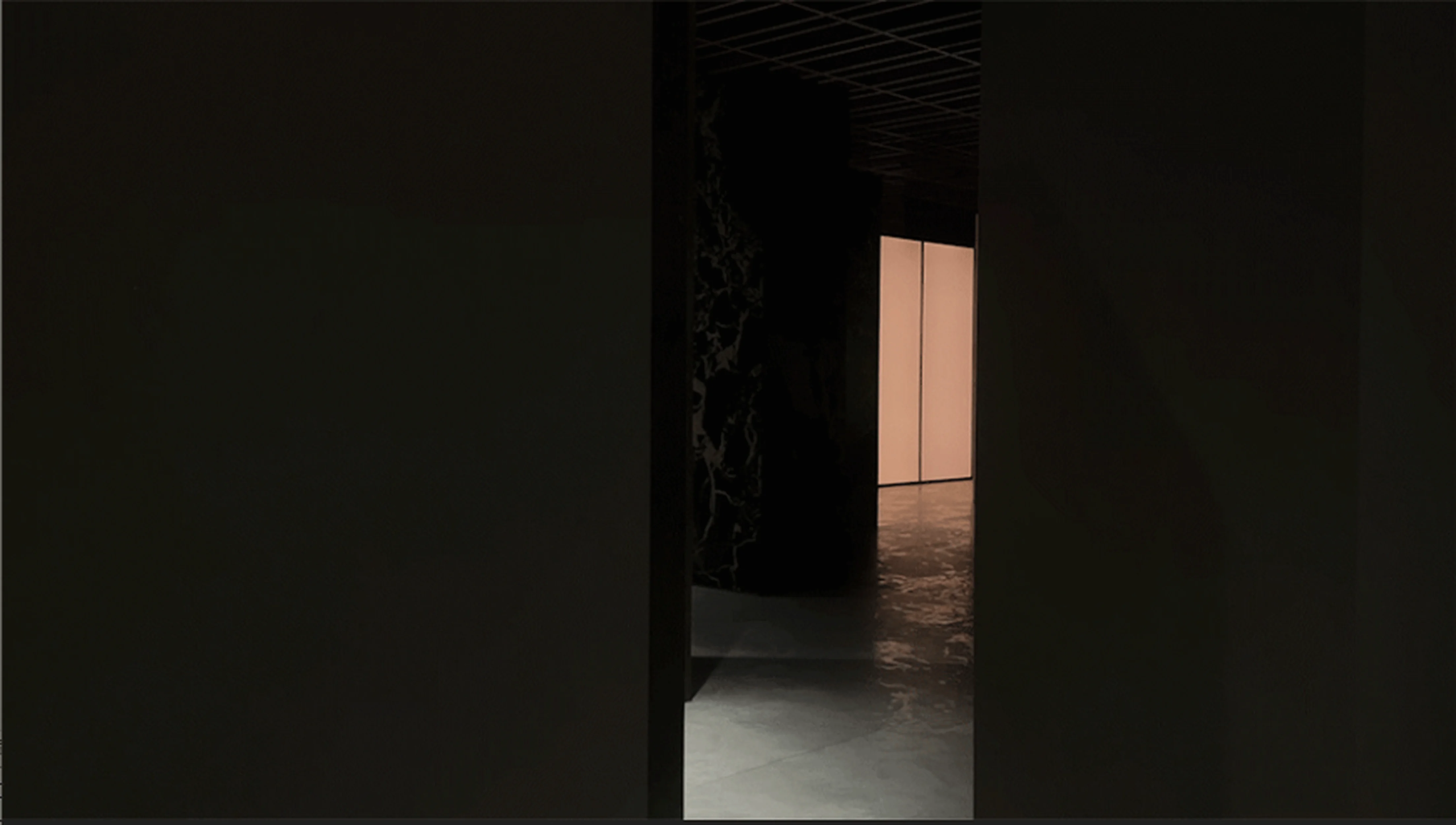
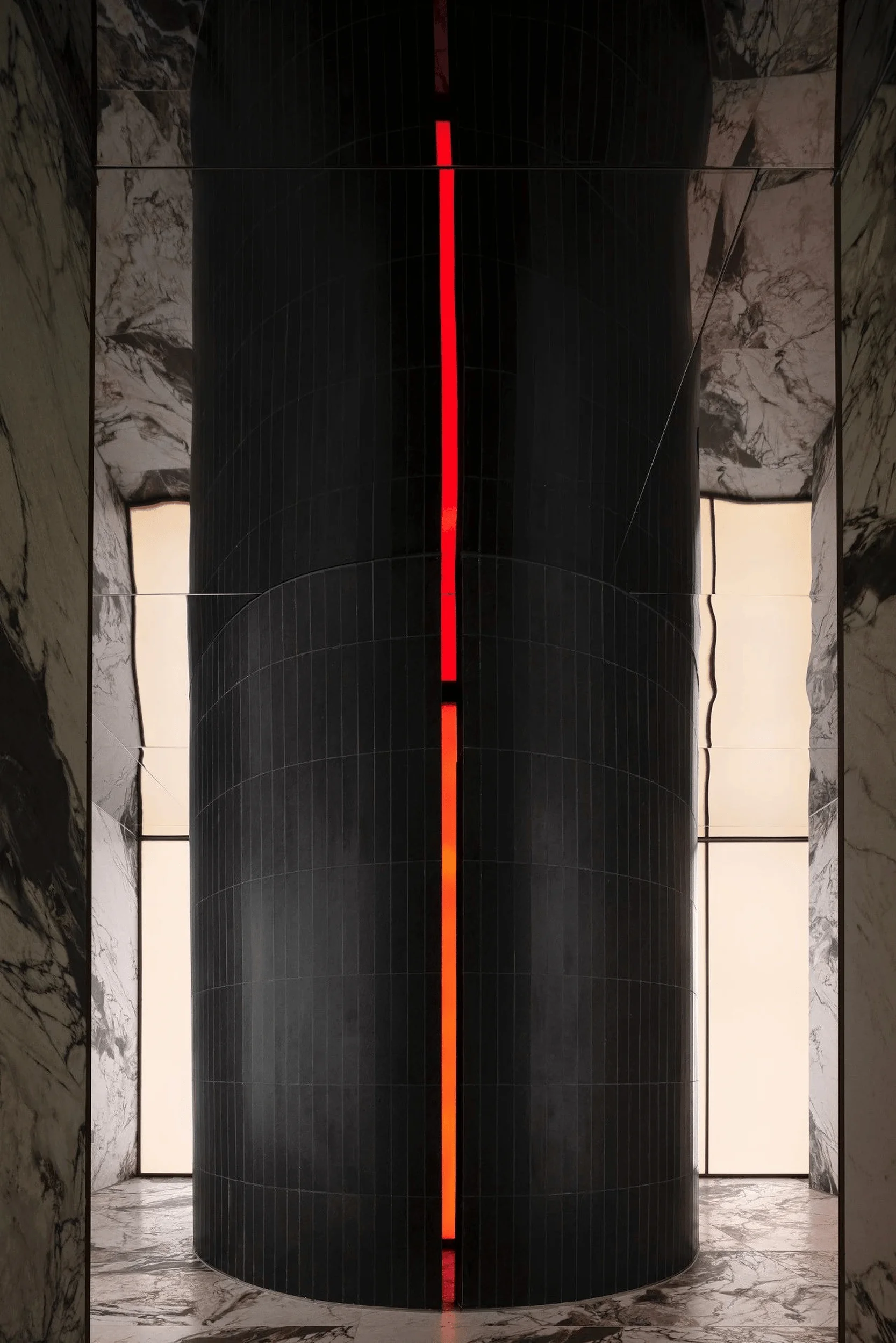
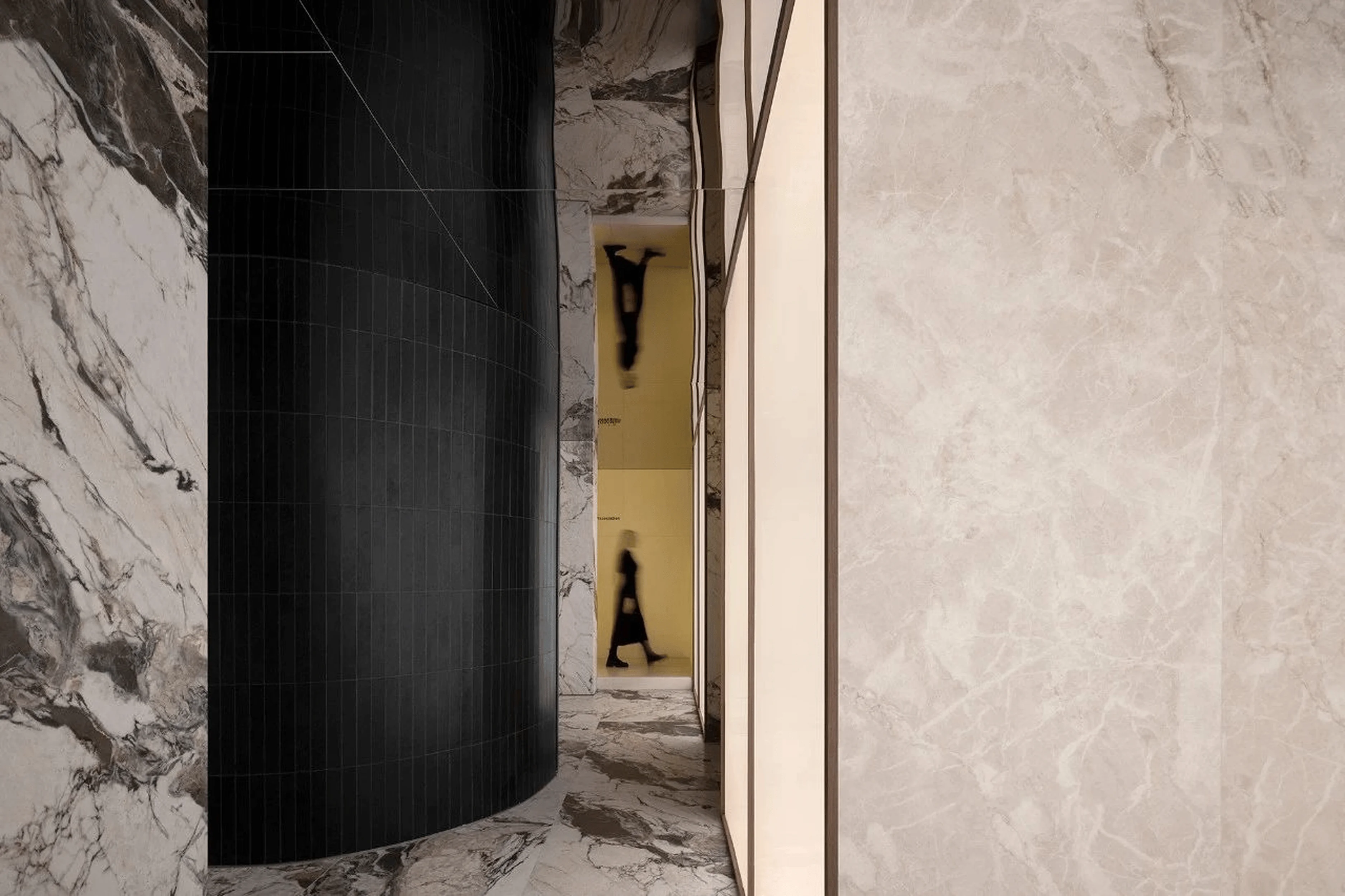
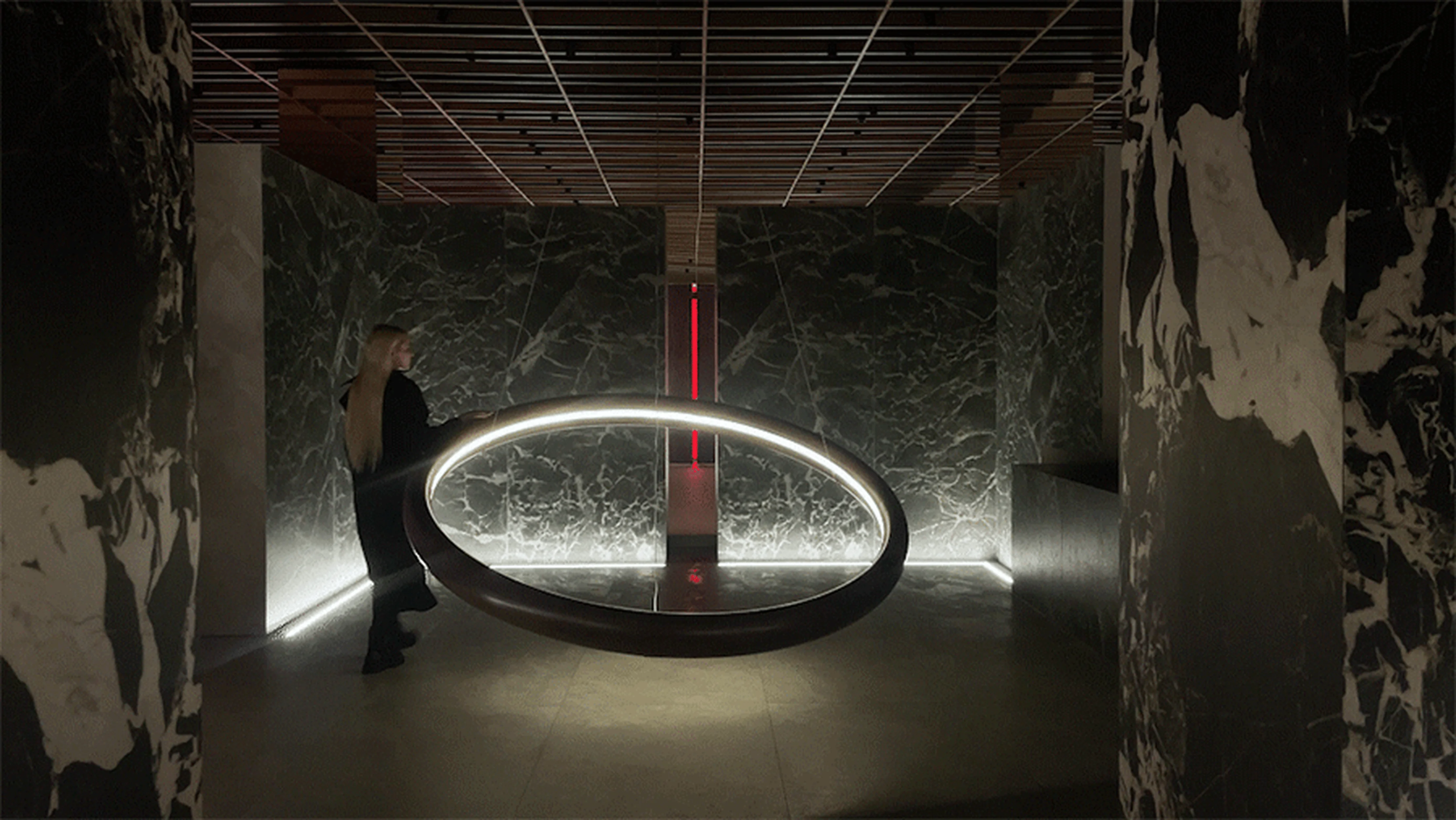
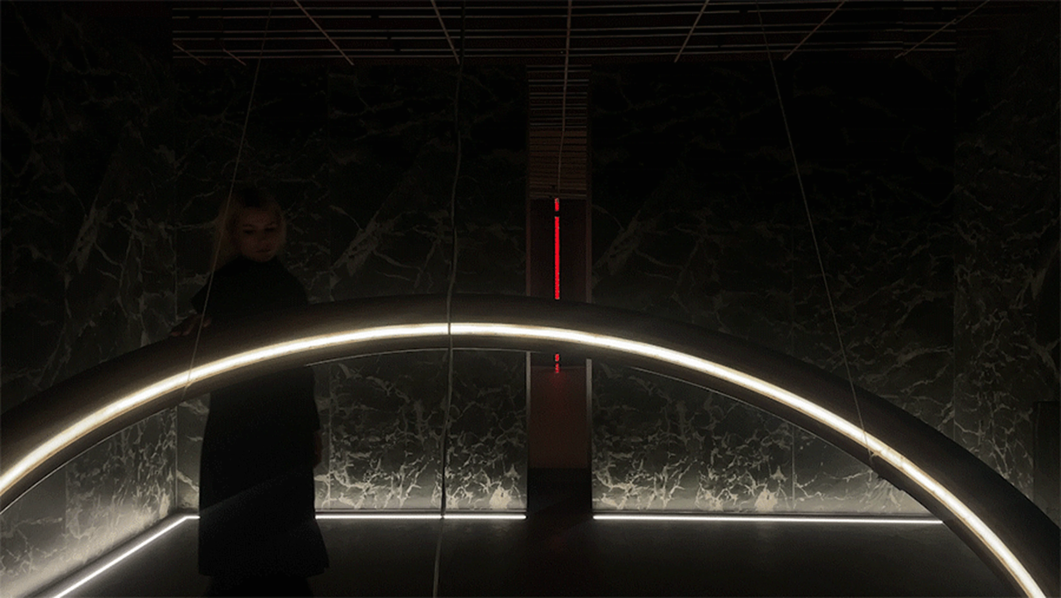
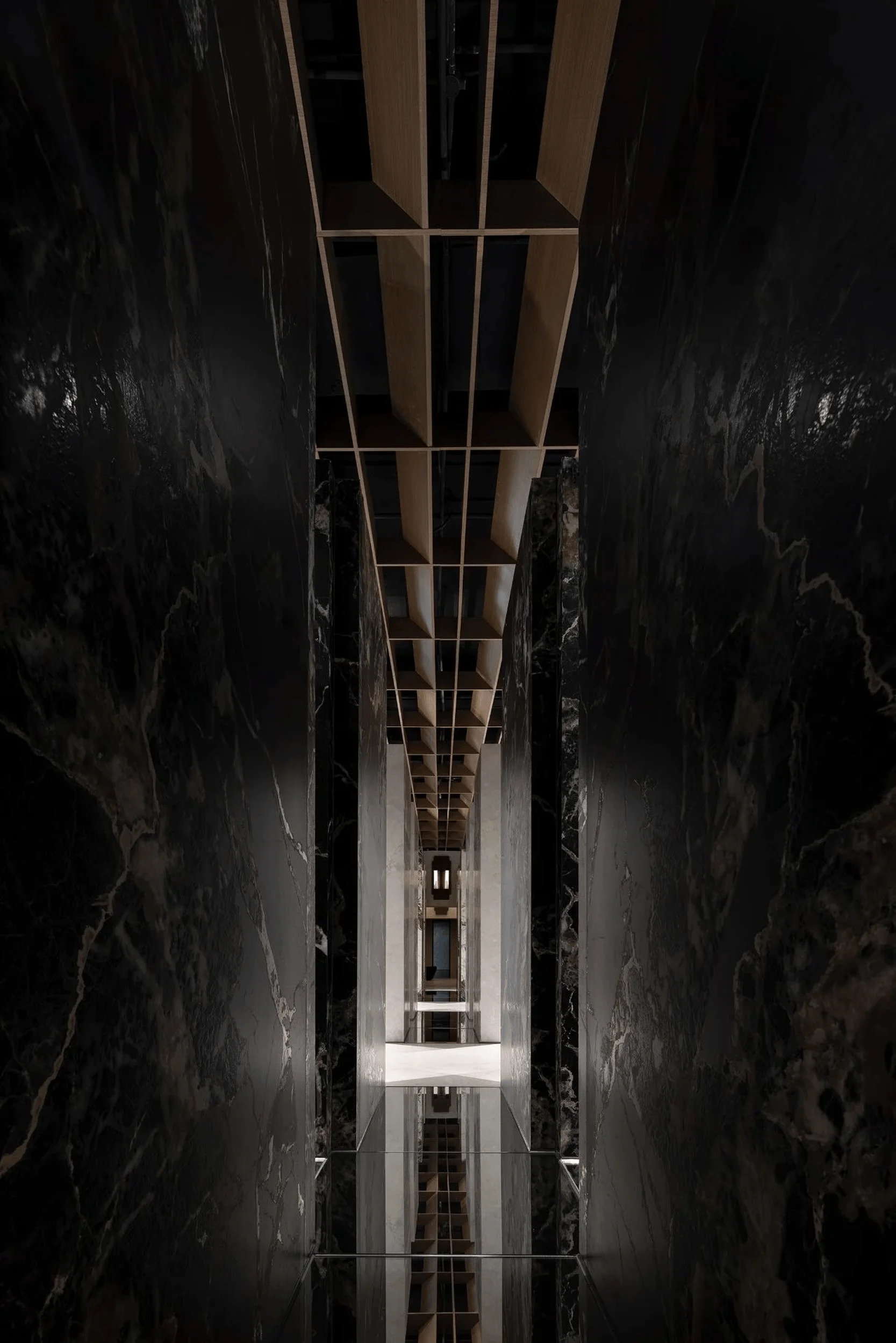
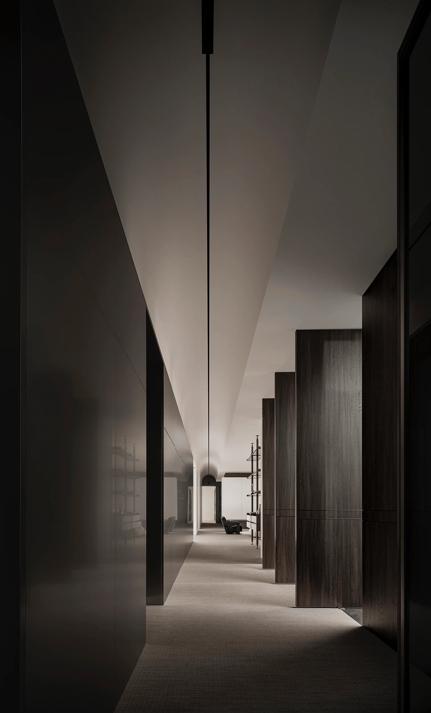
A central black cylindrical structure features a gap through which red light spills. The striking contrast between the dark rock slab and the backlit wall is further emphasized by a mirror-like ceiling. The ceiling expands the visual boundaries of the space while enhancing the contrast, creating a powerful visual impact that draws people in. The corridor features a pristine design approach. Its walls and floors are integrated with pure-colored rock slabs and extending light walls, promoting a sense of harmony. This creates a subtle and calming environment. A space enclosed by green marble accents serves both as a display area for products and as a complement to the salon’s bar. The design emphasizes both the visual experience and the integration of functionality. Future-forward spatial experiences are also integral to the design’s vision. The “Earthism” design uses the vital tag of light and geometry within interior design to establish spatial and visual narratives.
Product Emphasis and Spatial Ambiguity
In traditional exhibition halls, product displays are often wall-mounted. However, the “Earthism” exhibition hall employs a new display format. A cross-shaped structure formed from four L-shaped elements positions the products at the center of the space, emphasizing that the products are the true core value of the space, which is a significant tag of the project. The design also uses the strategic approach of light and geometry within interior design to highlight these elements. The repetition of this structural element creates a strong sense of sequence. The strategic use of mirrors on the walls and floors creates an illusion, blurring the boundaries of the space, causing viewers to wonder whether they are within a realm of reality or illusion. The exhibition hall design also concludes with a fully enclosed square space serving as a transition between the existing and the renovated areas, serving as a visual and spatial buffer. The striking architectural elements and lighting create a sense of stillness, concluding with a scene that facilitates interaction. A solitary curved sofa, in a setting where light and geometry are integral to interior design, highlights a social interactive space.
Project Information:


