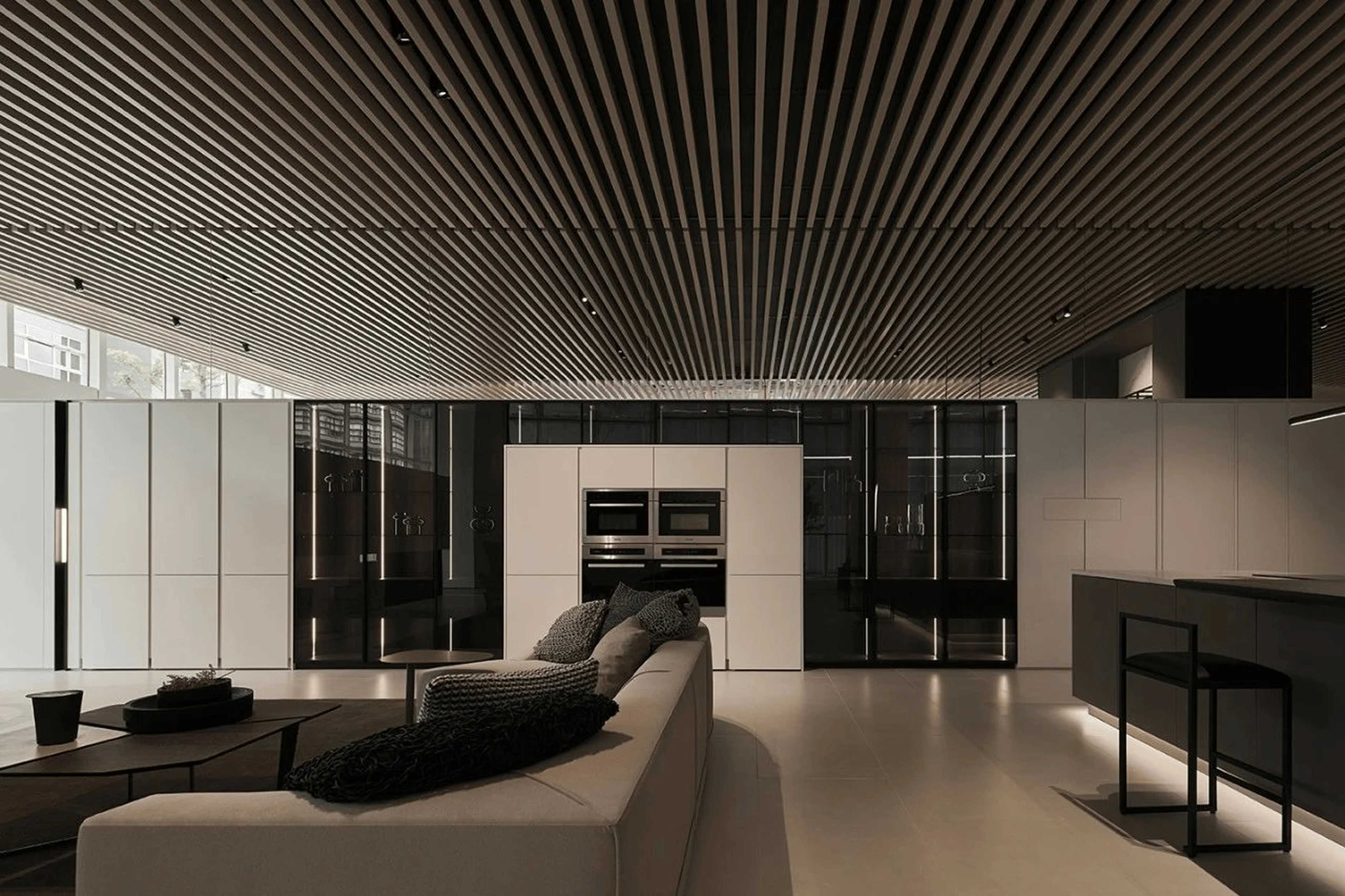
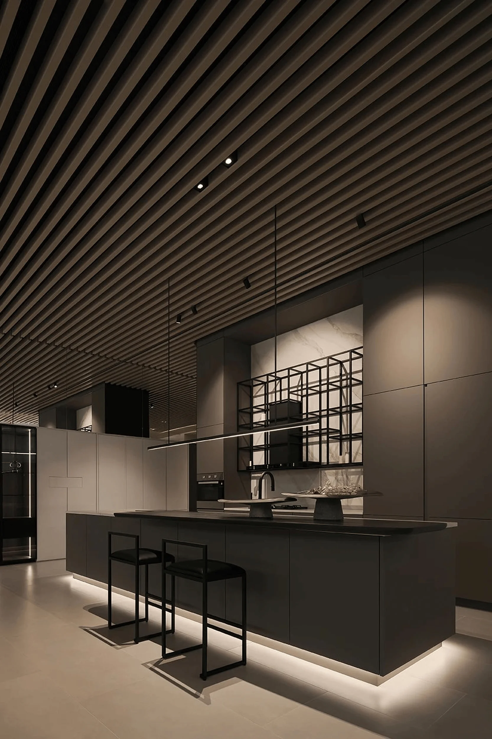
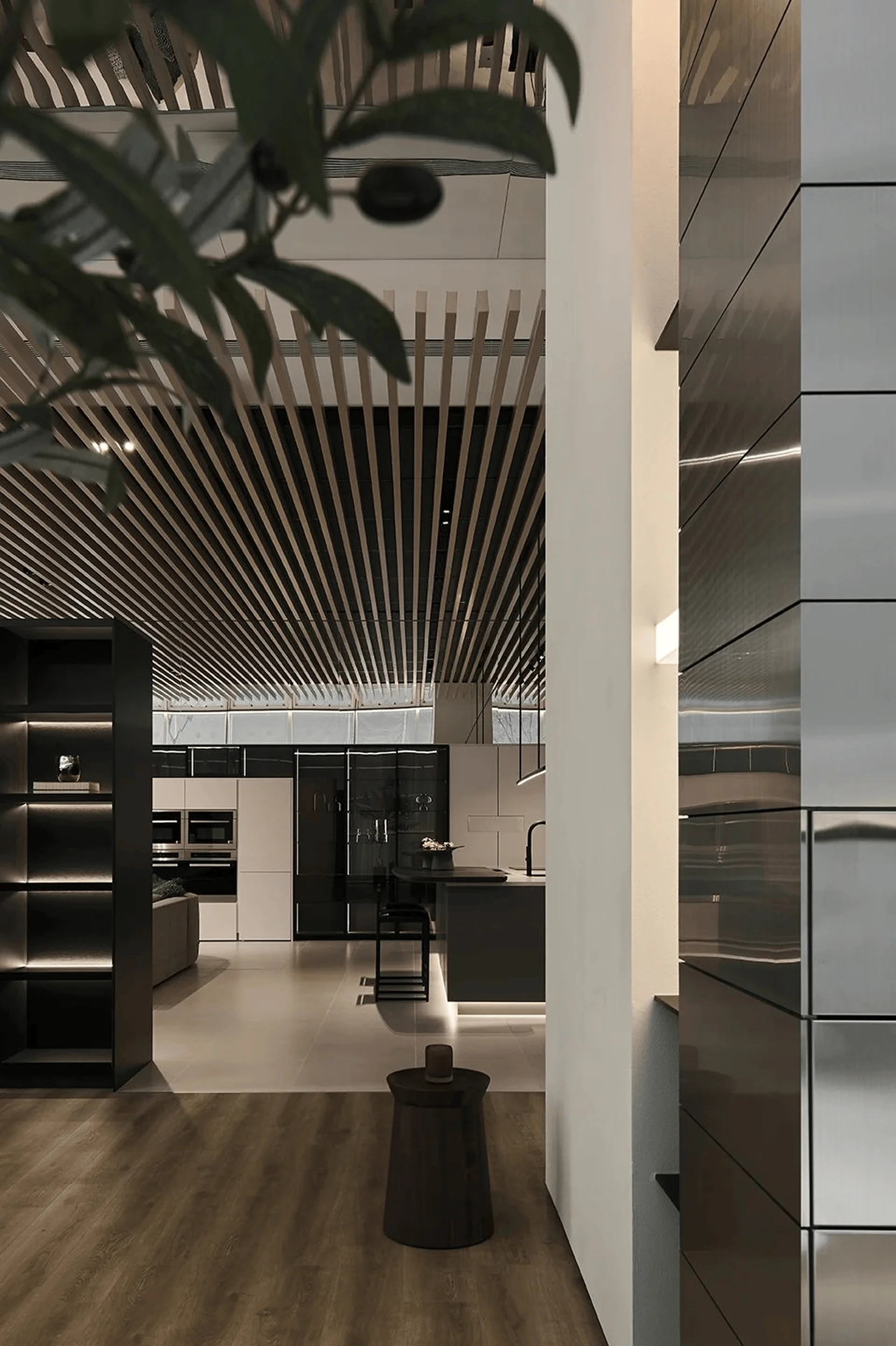
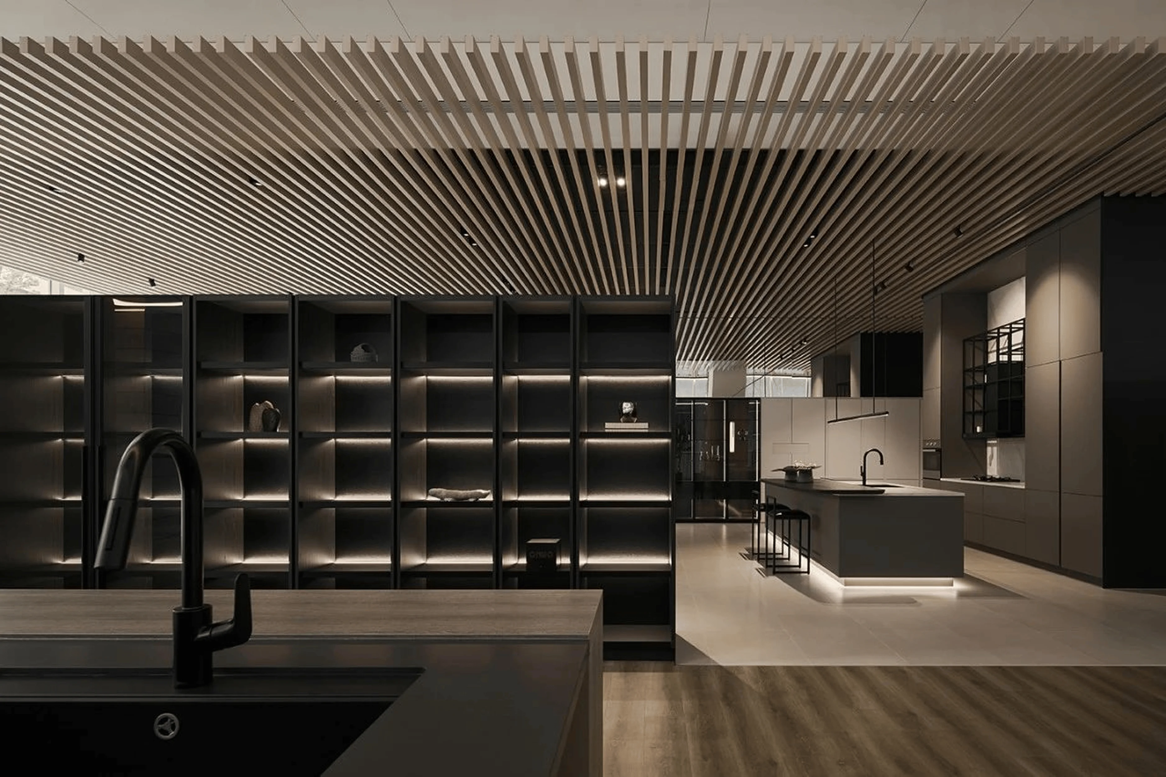
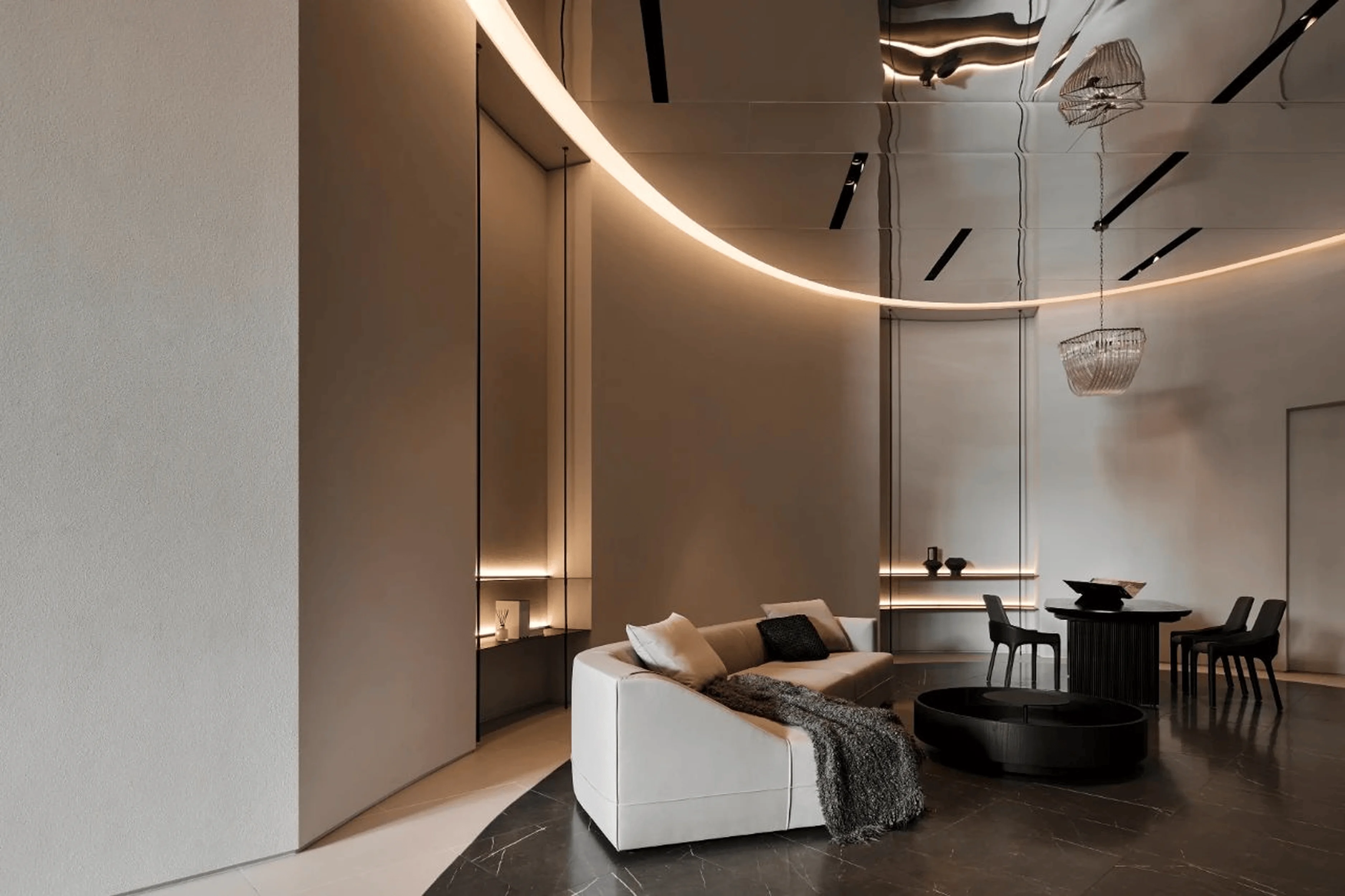
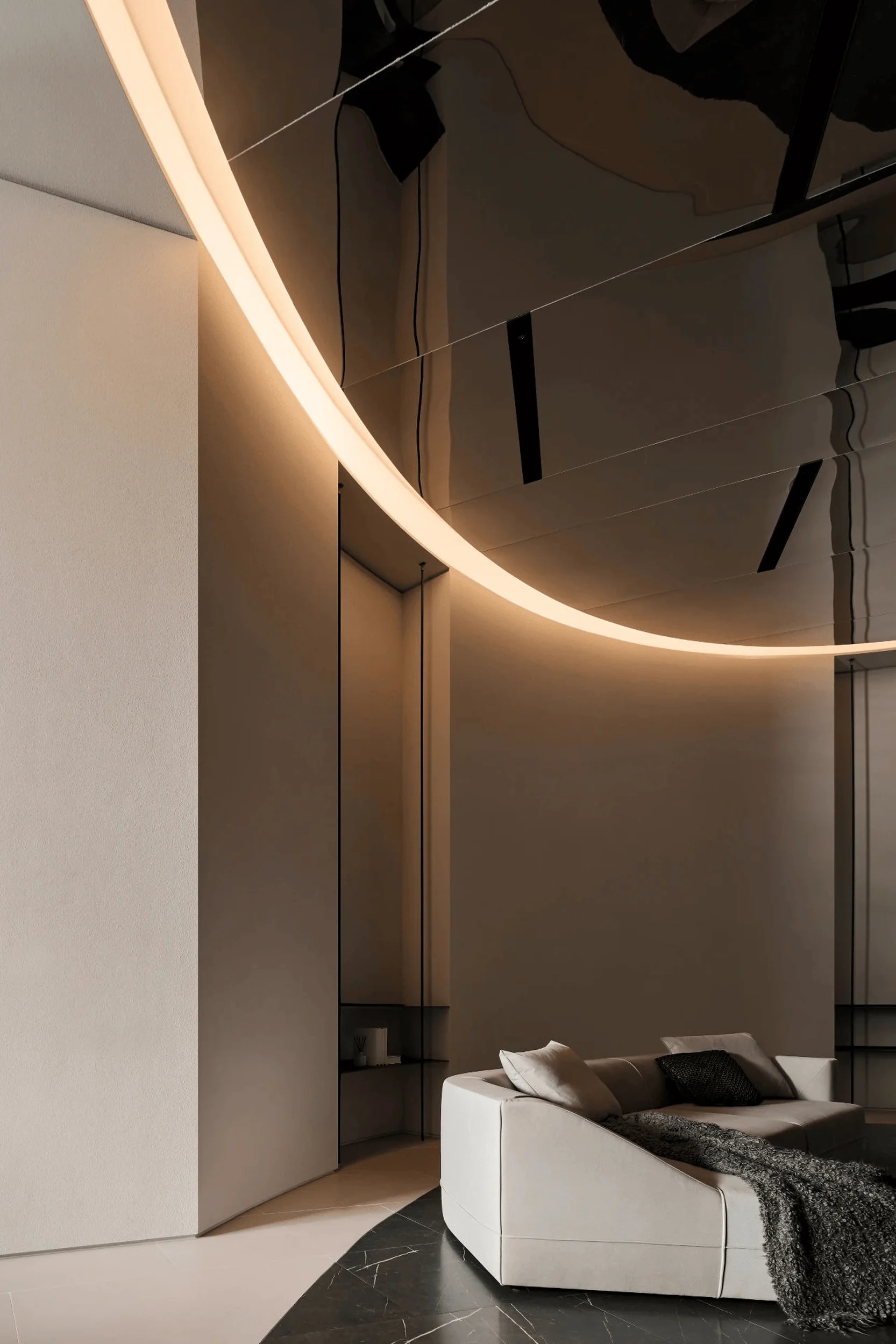
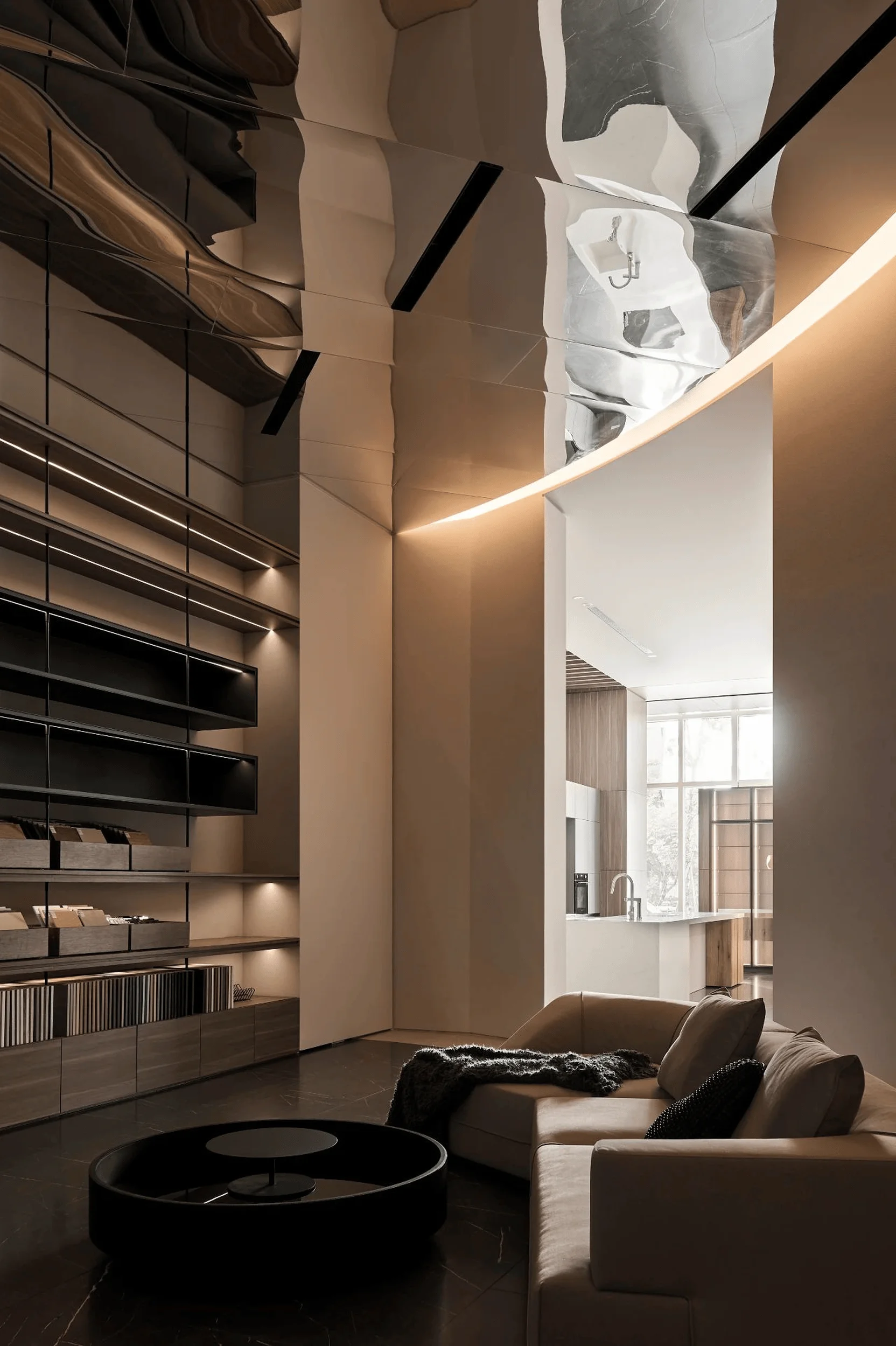
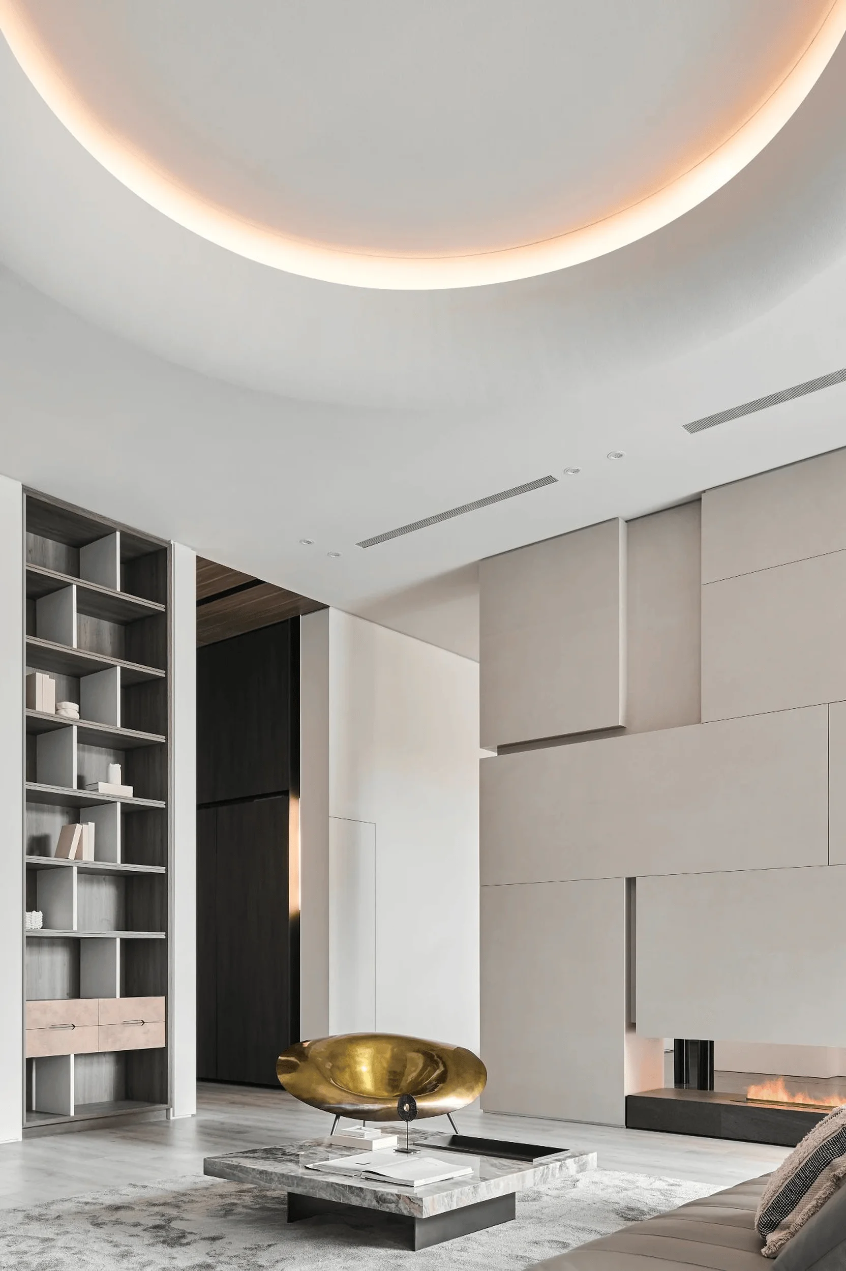
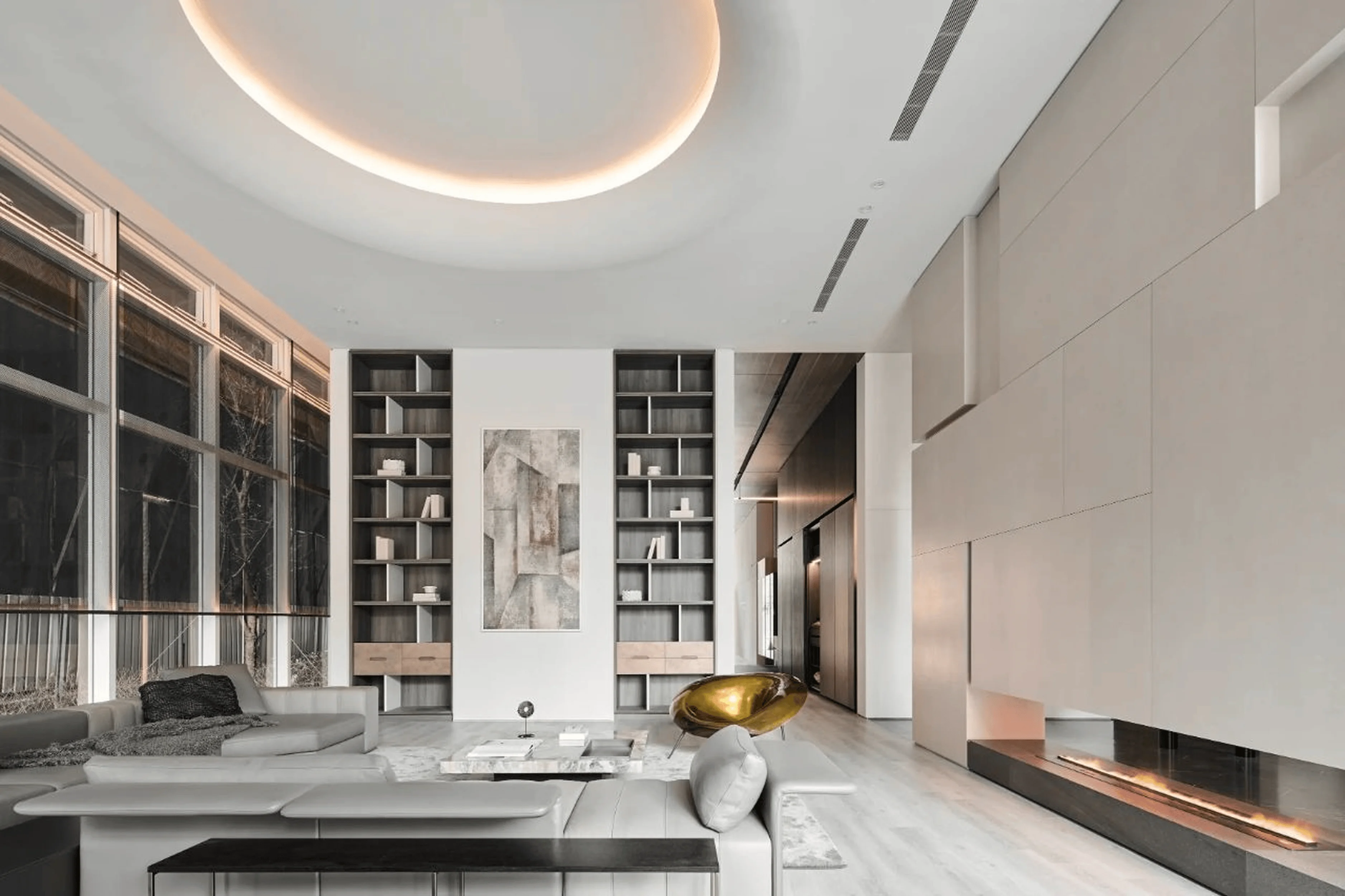
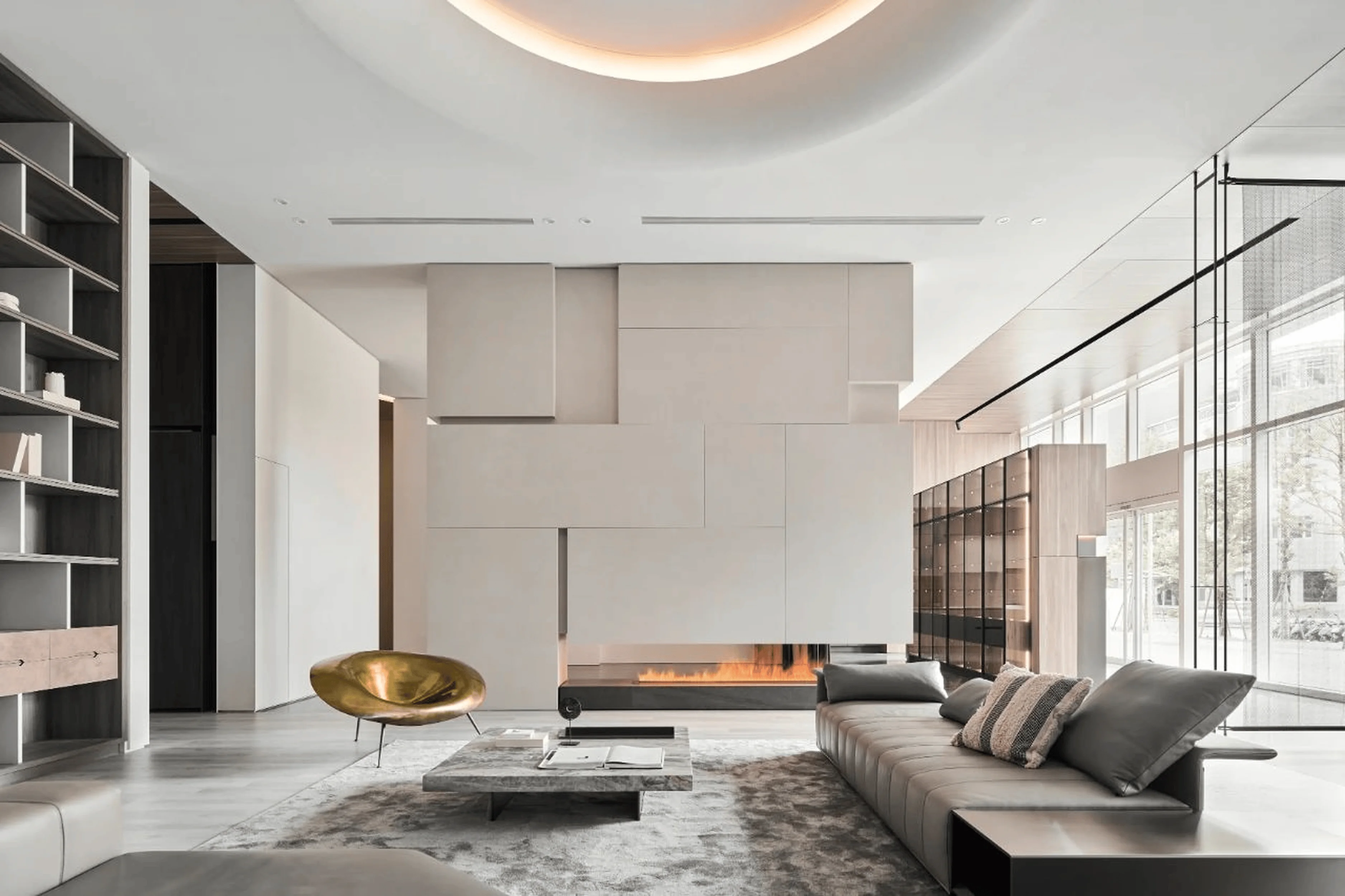
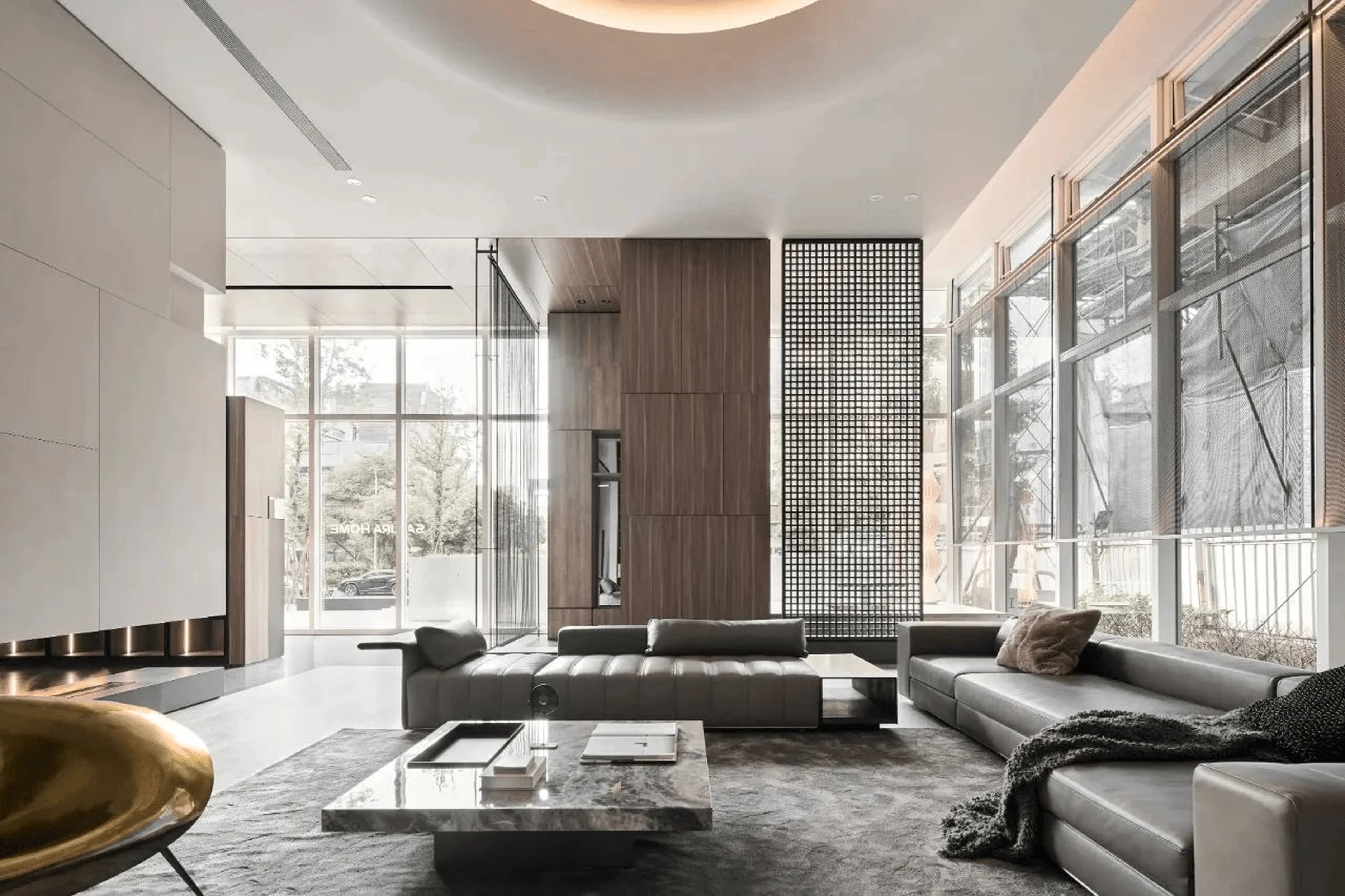
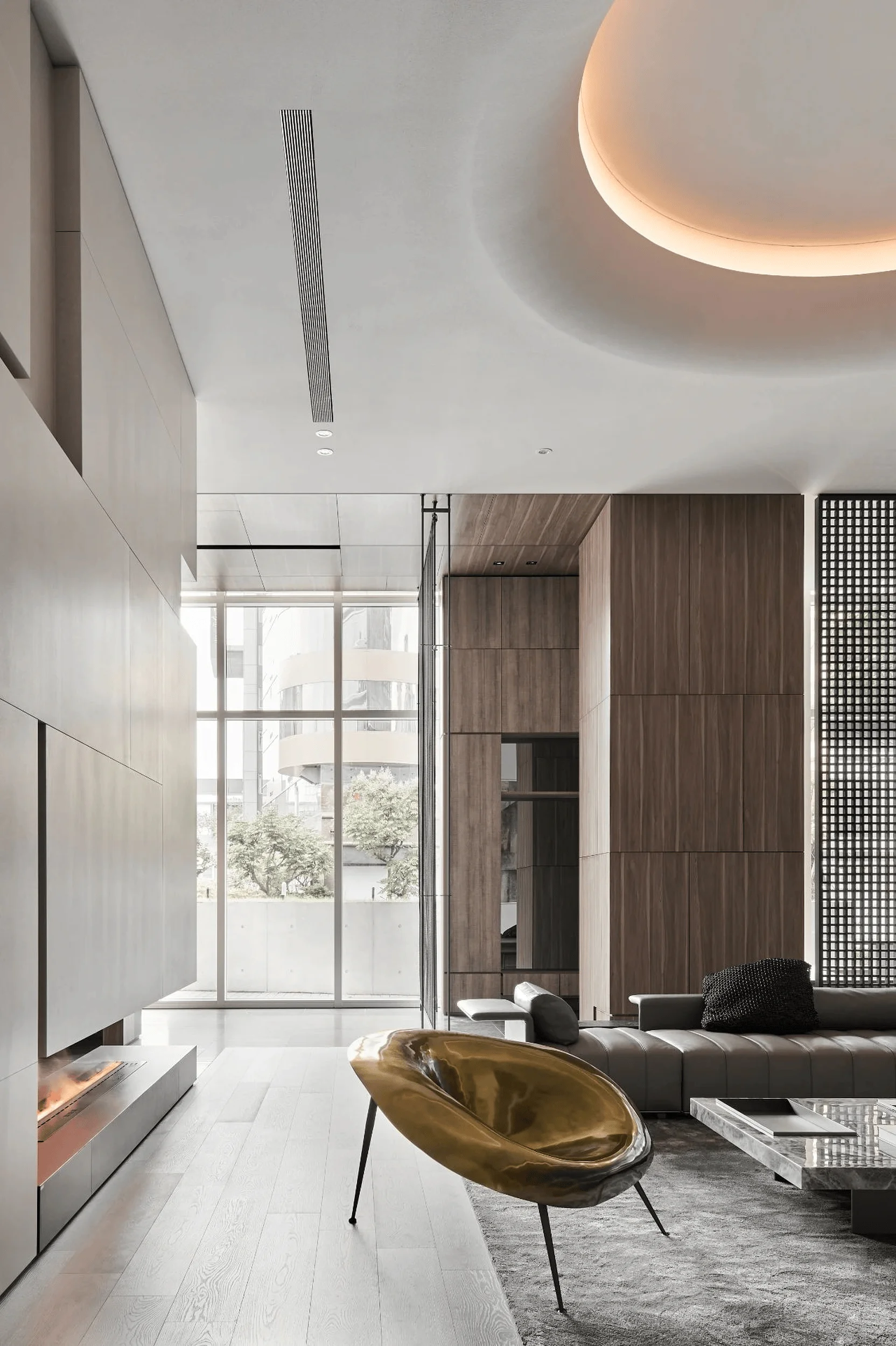
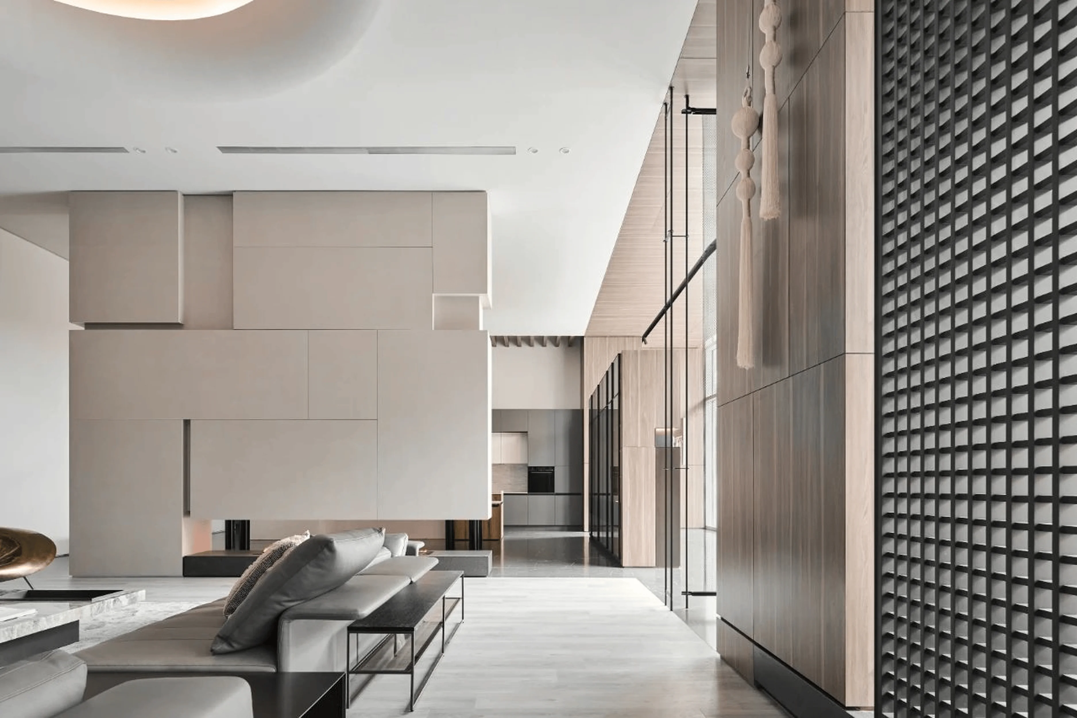
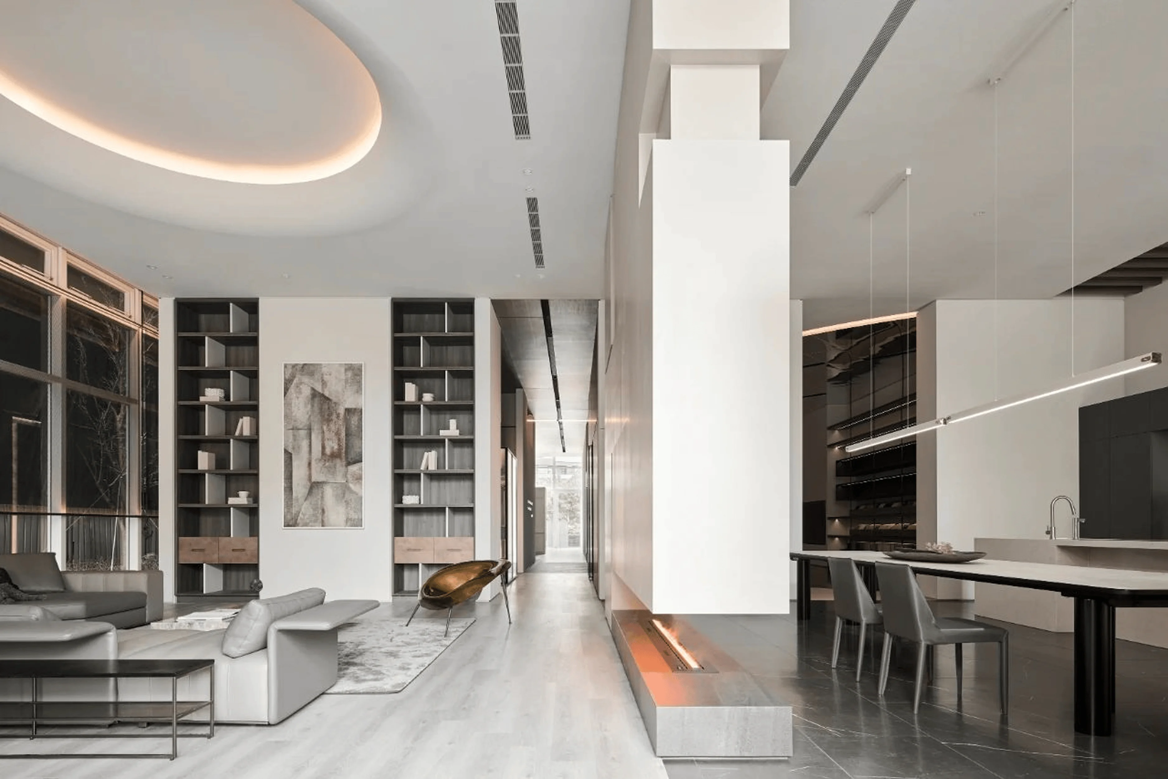
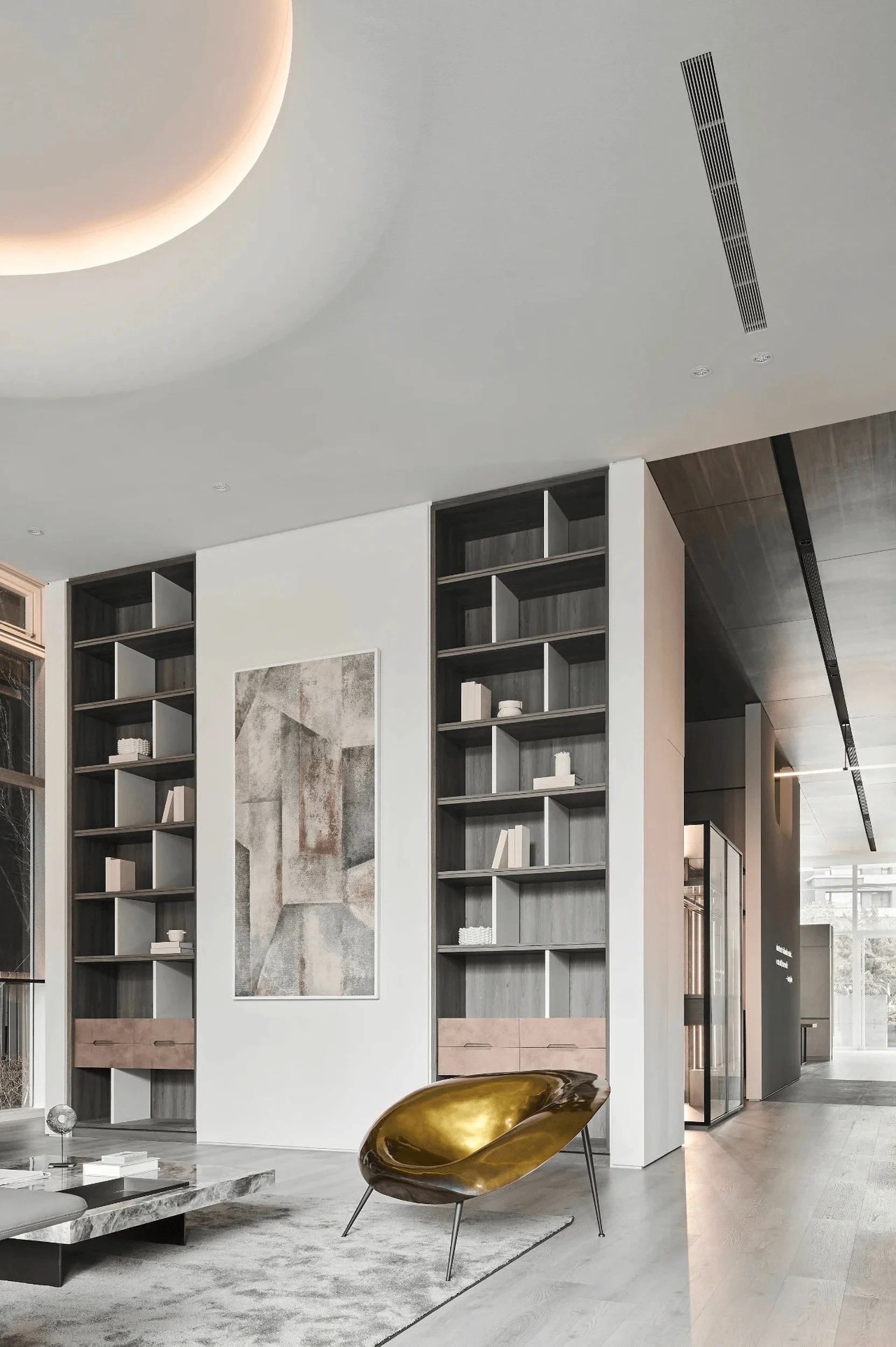
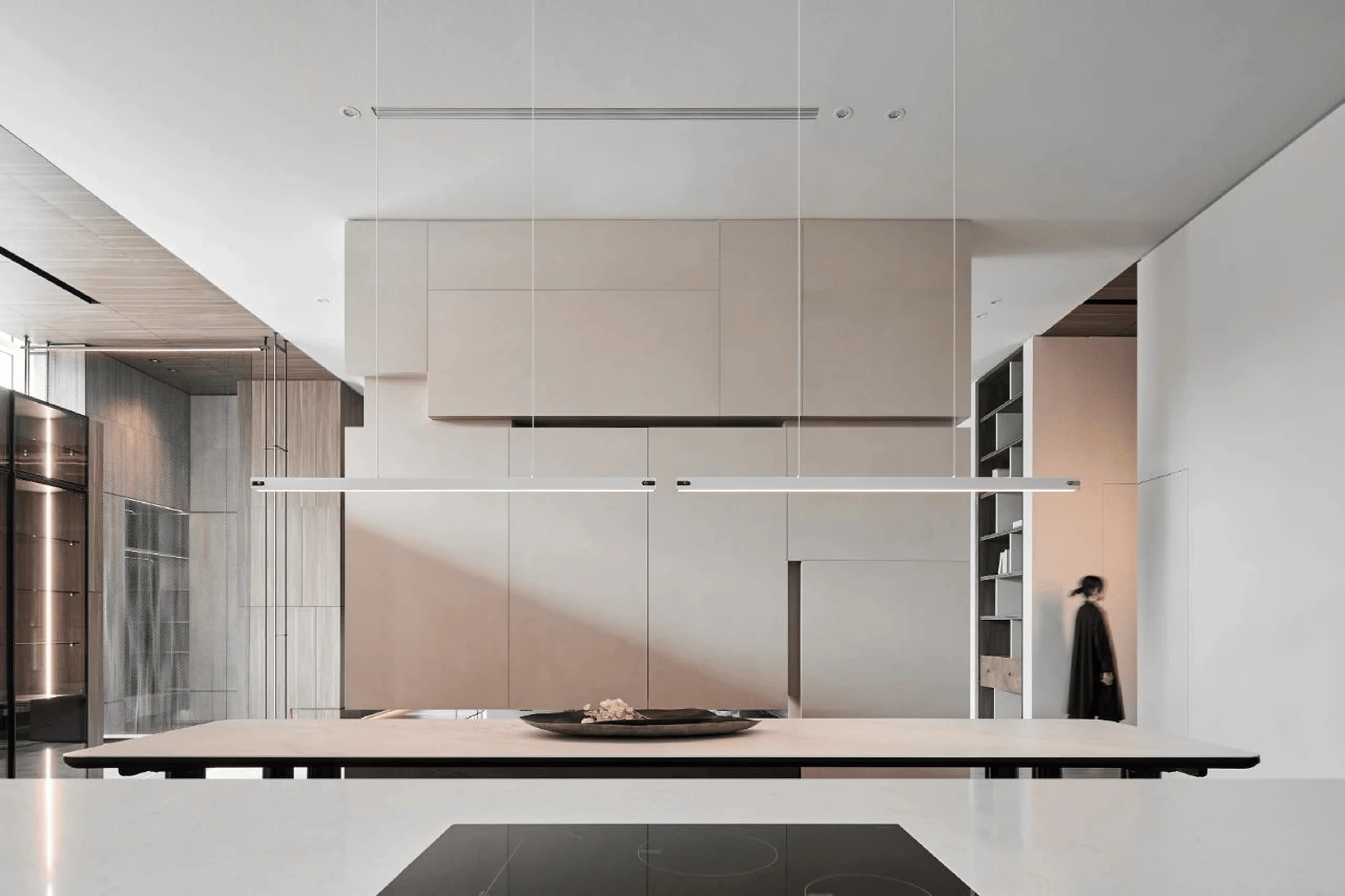
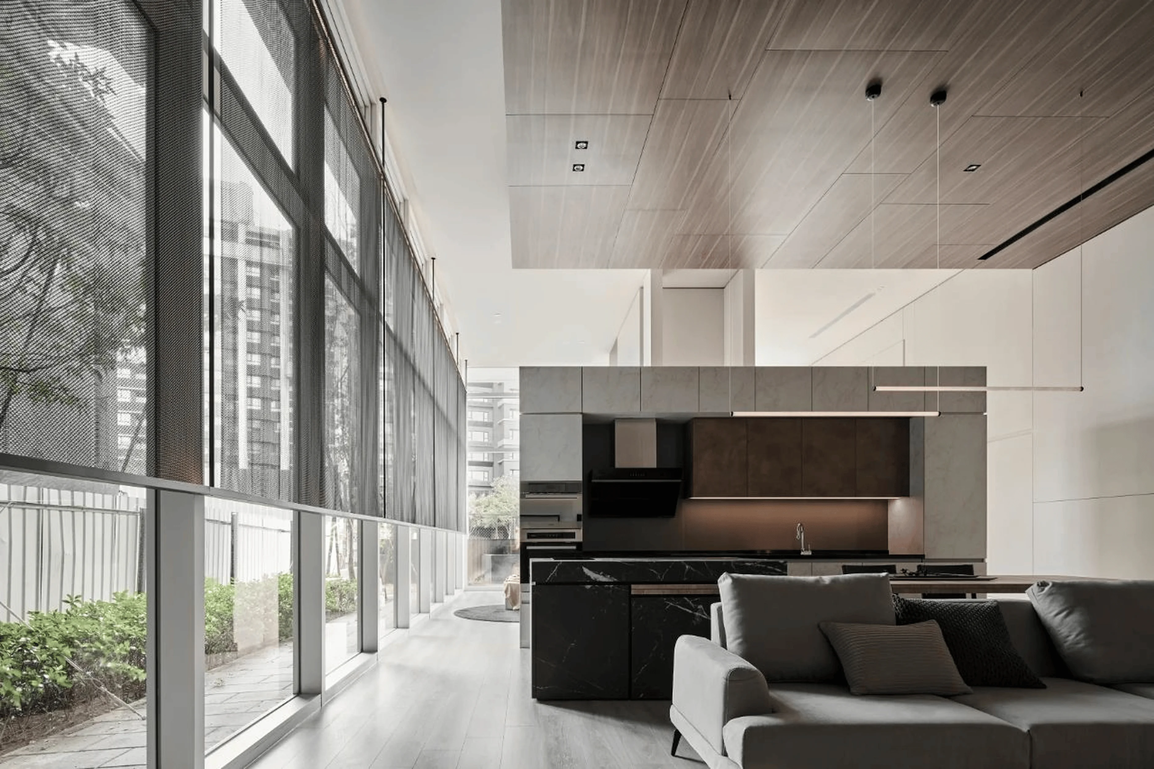
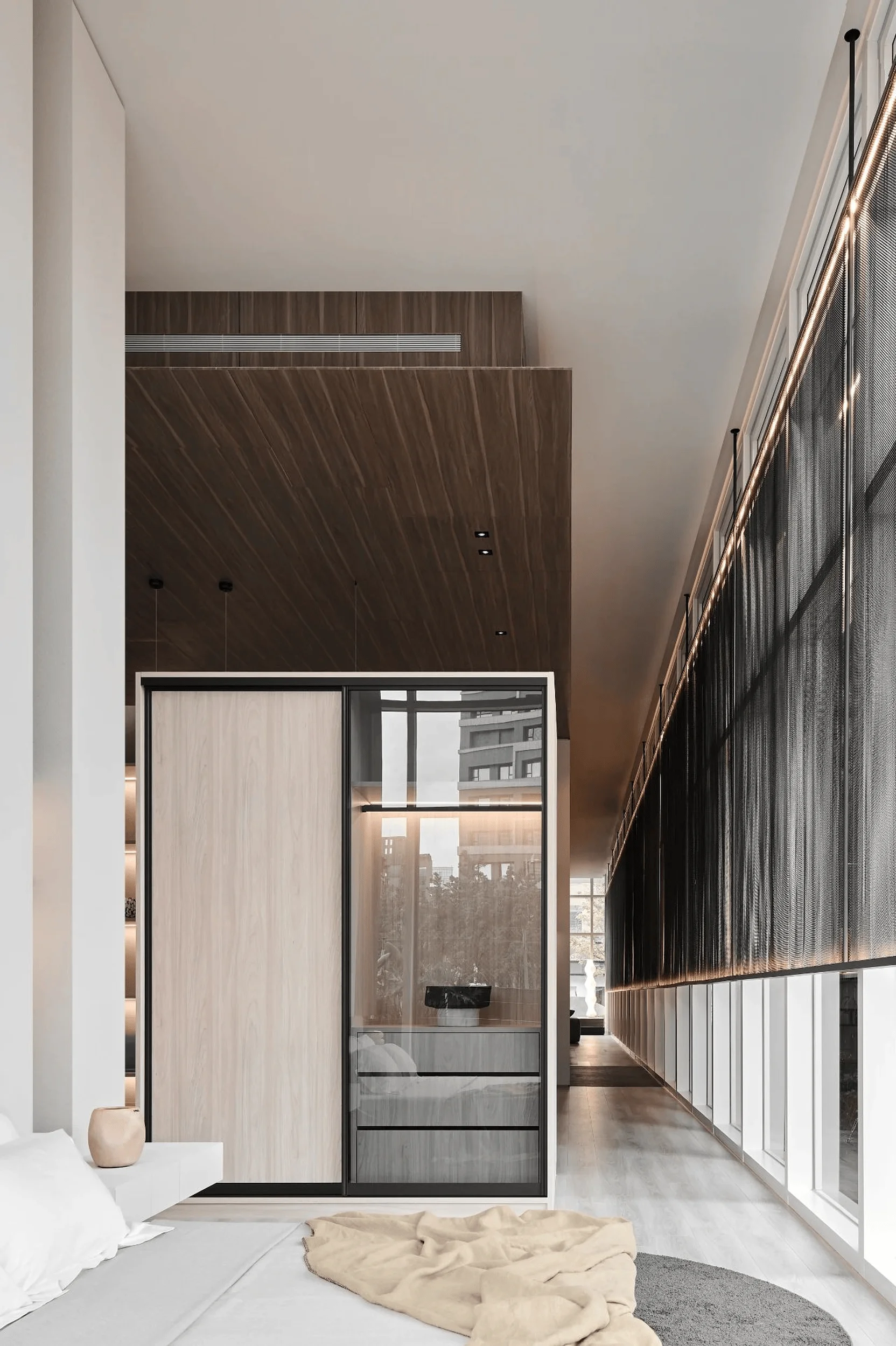
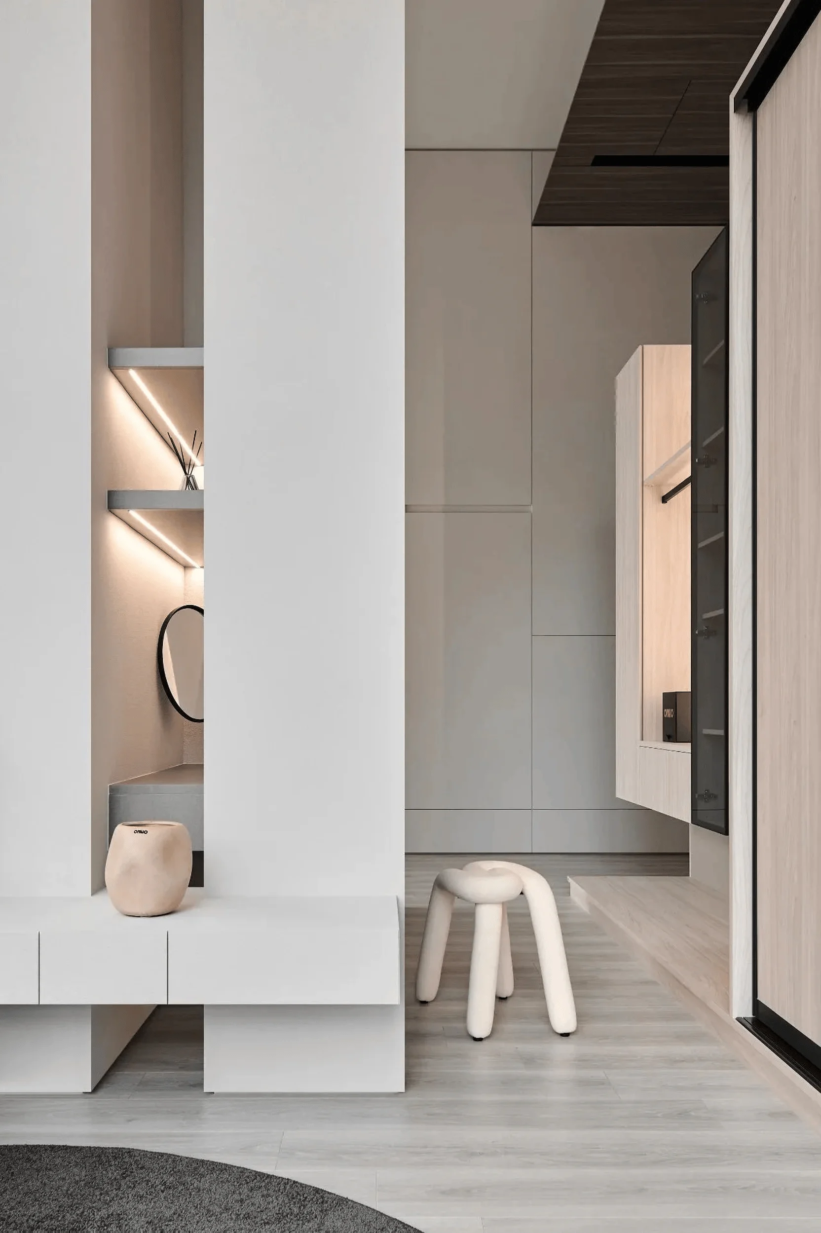
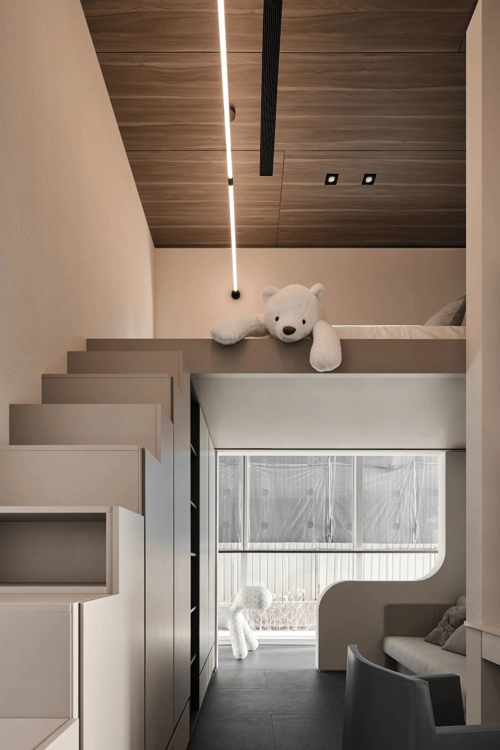
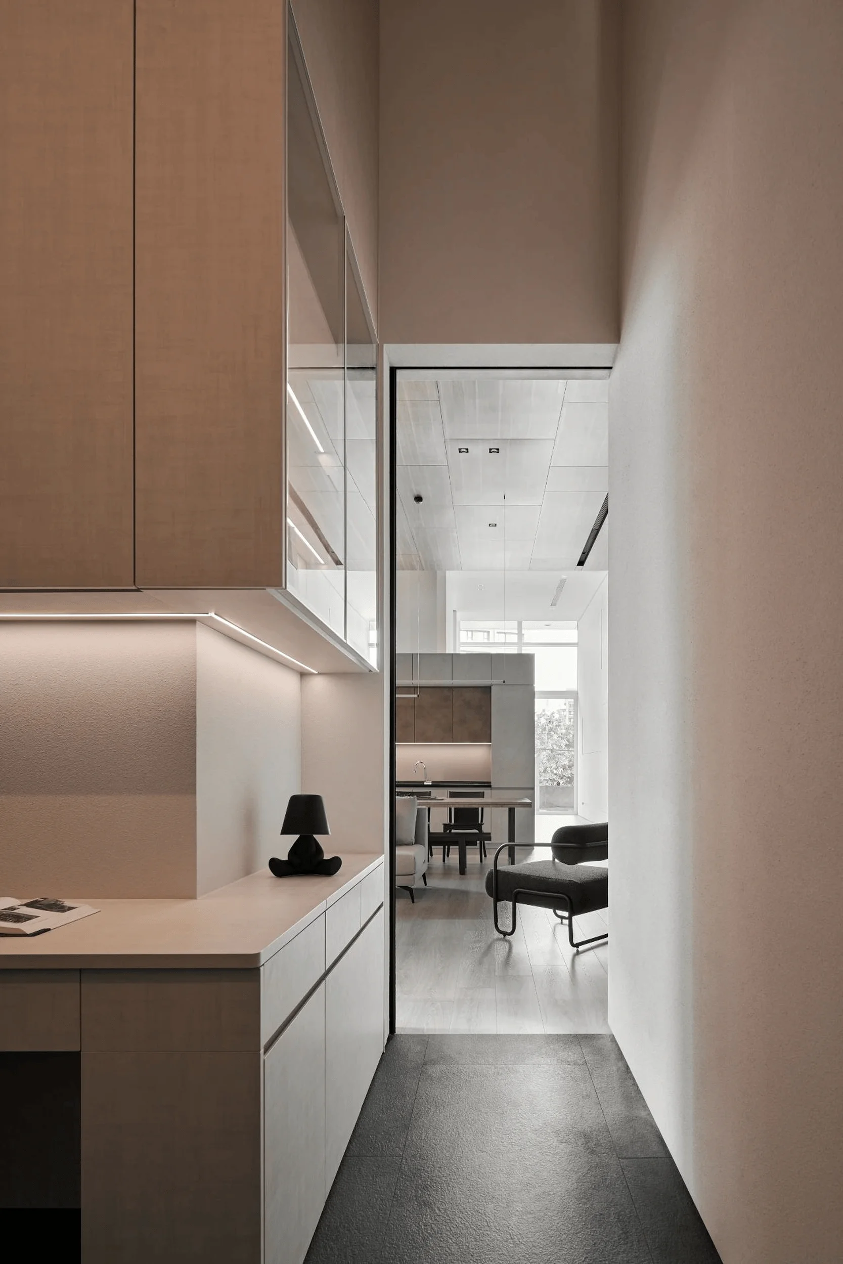
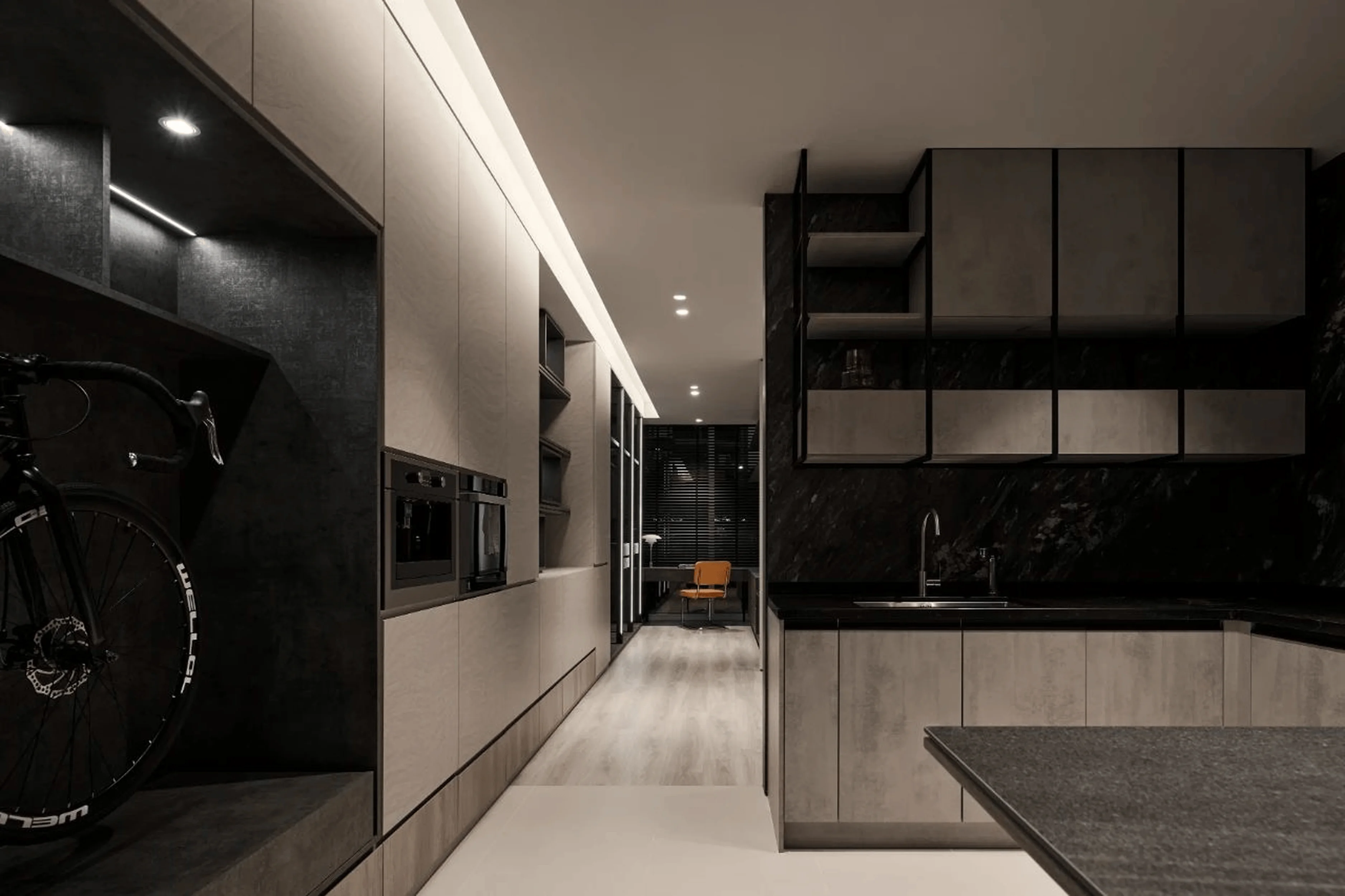
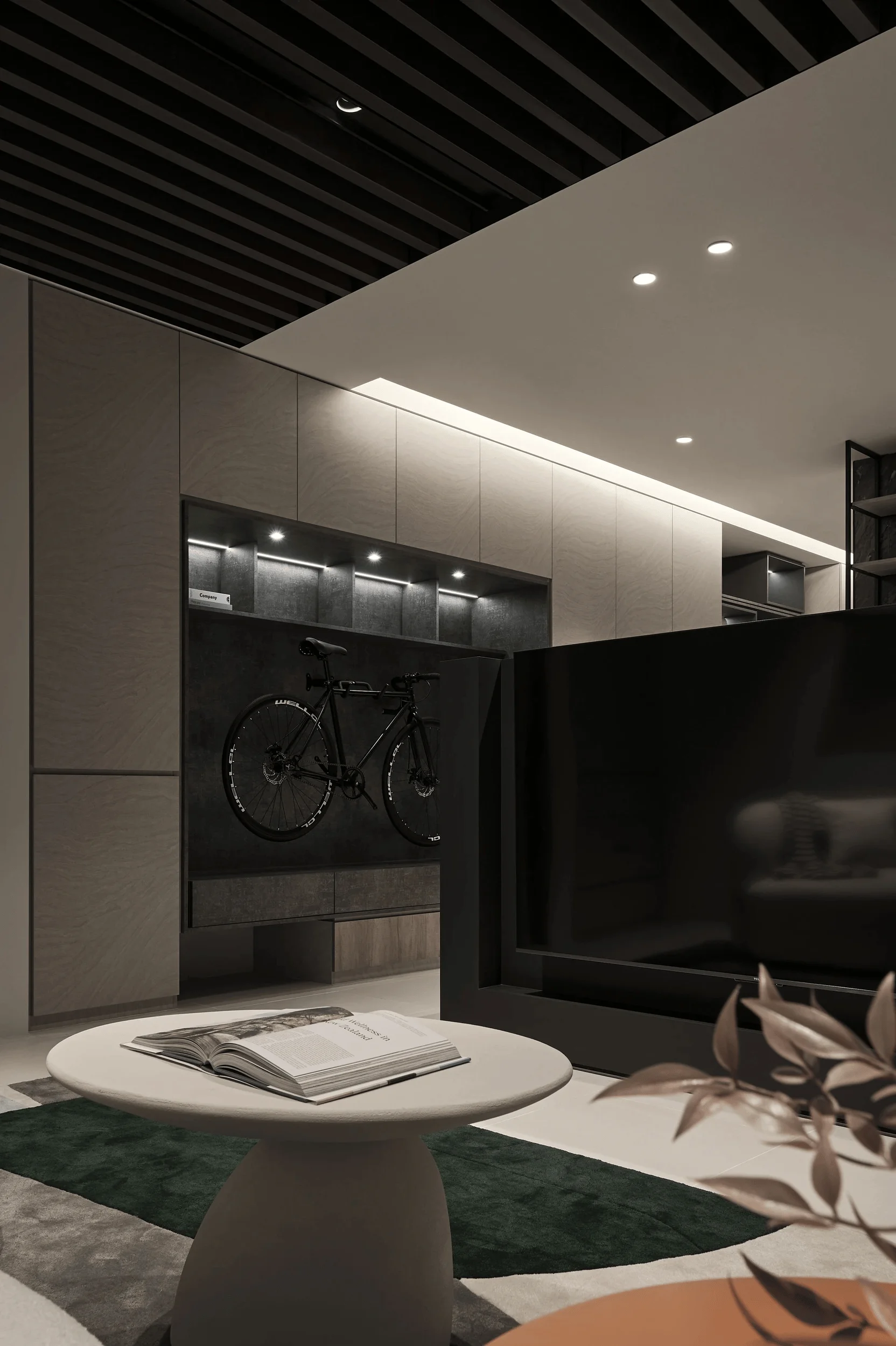
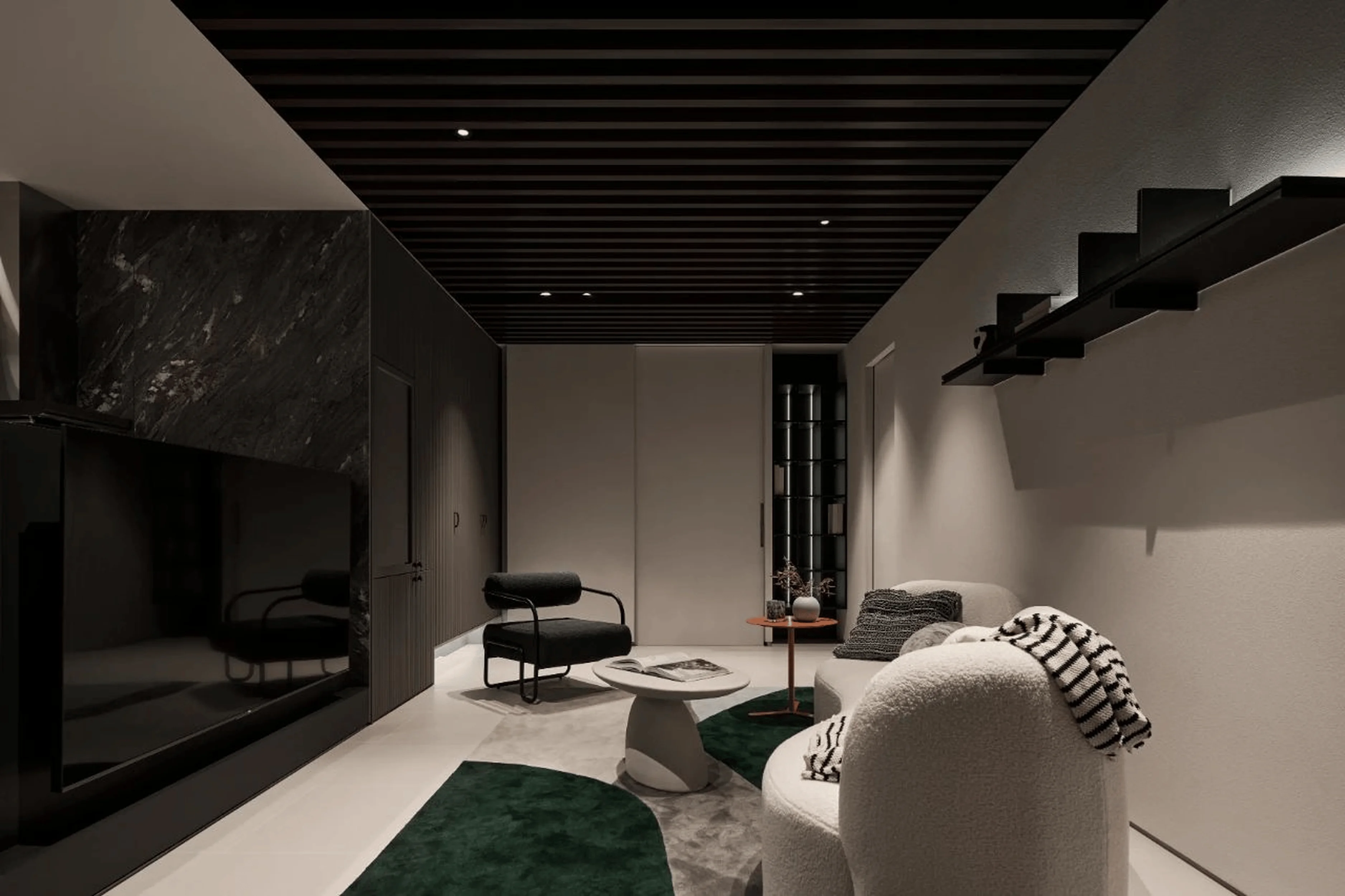
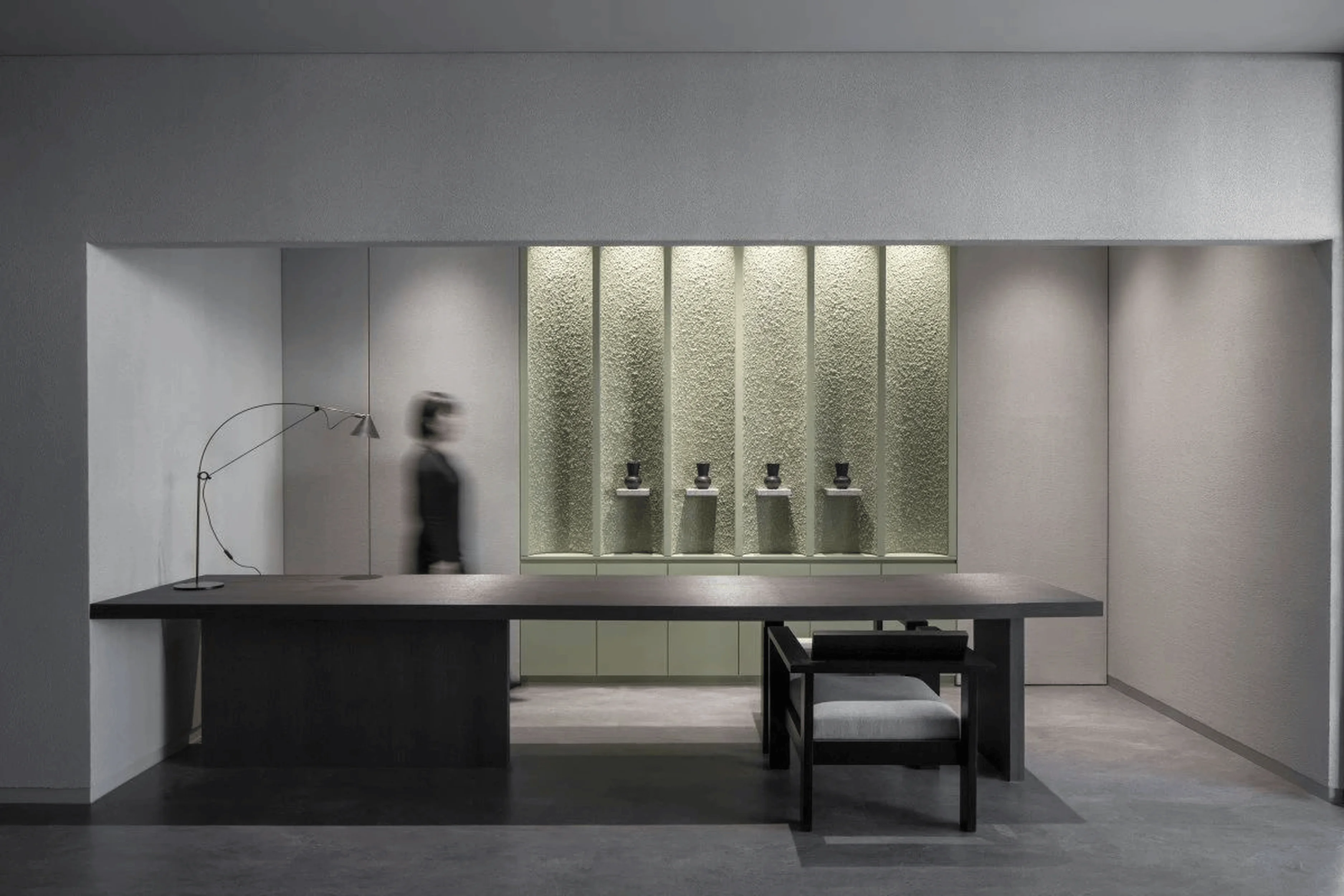
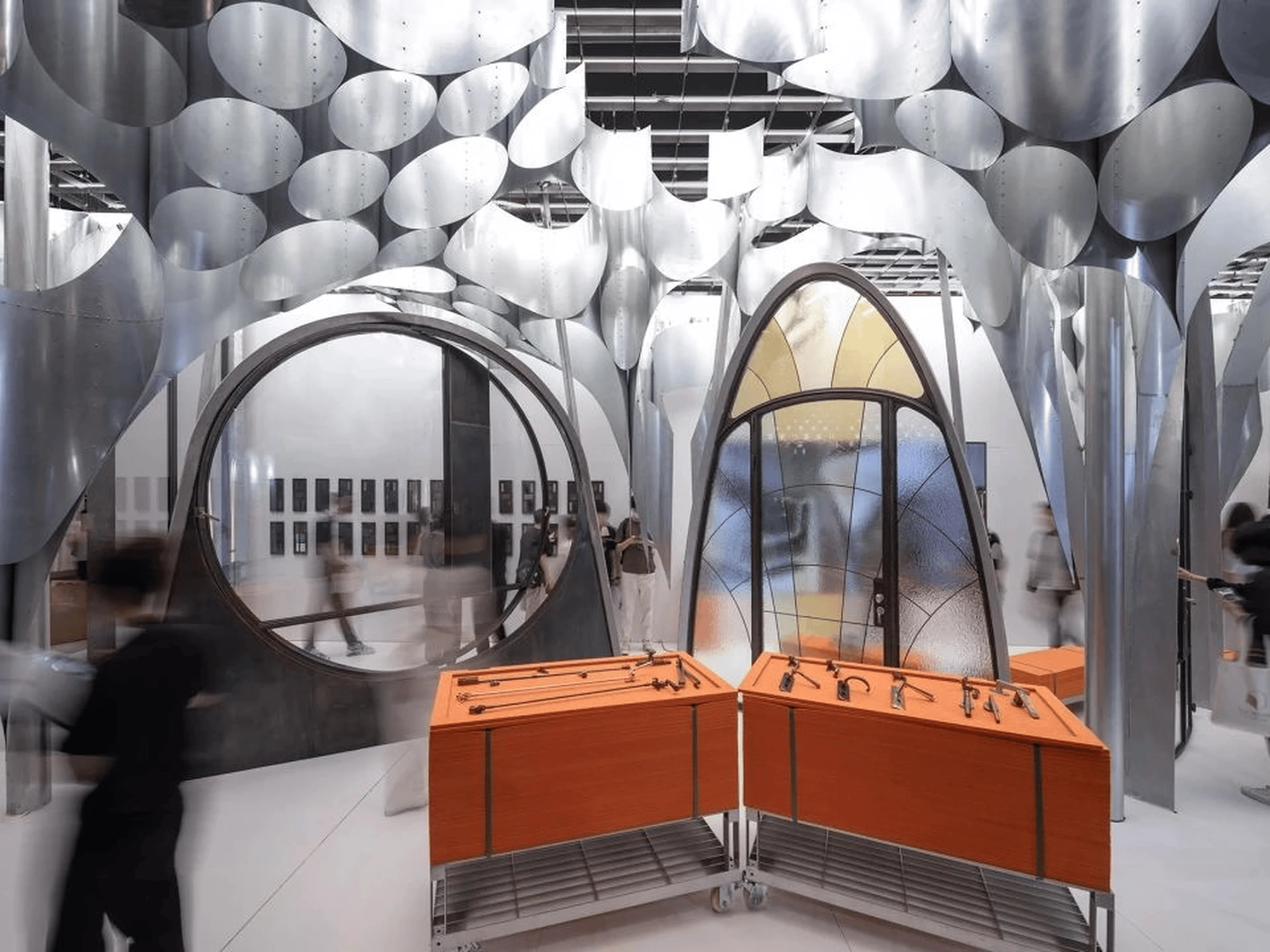
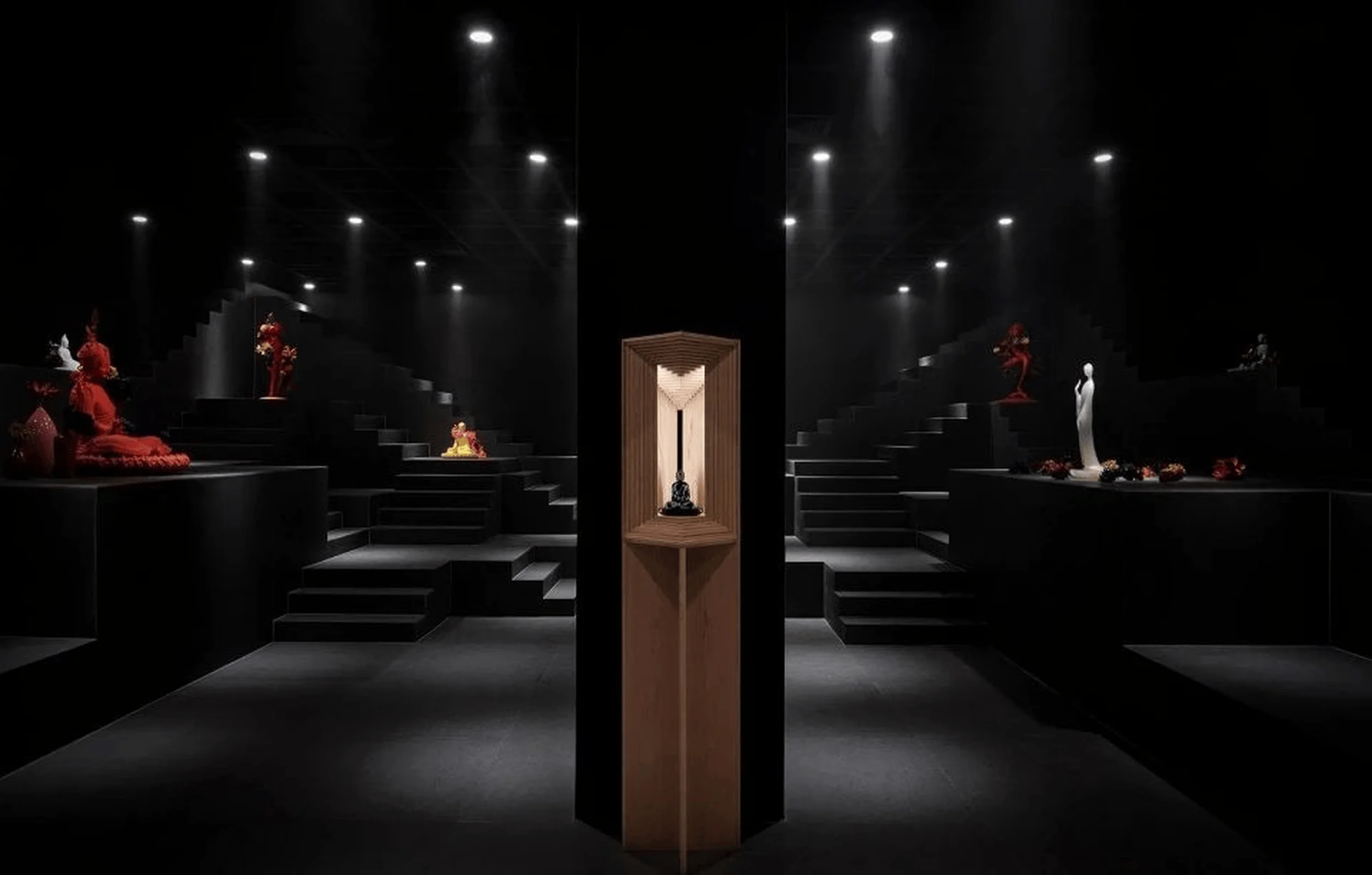
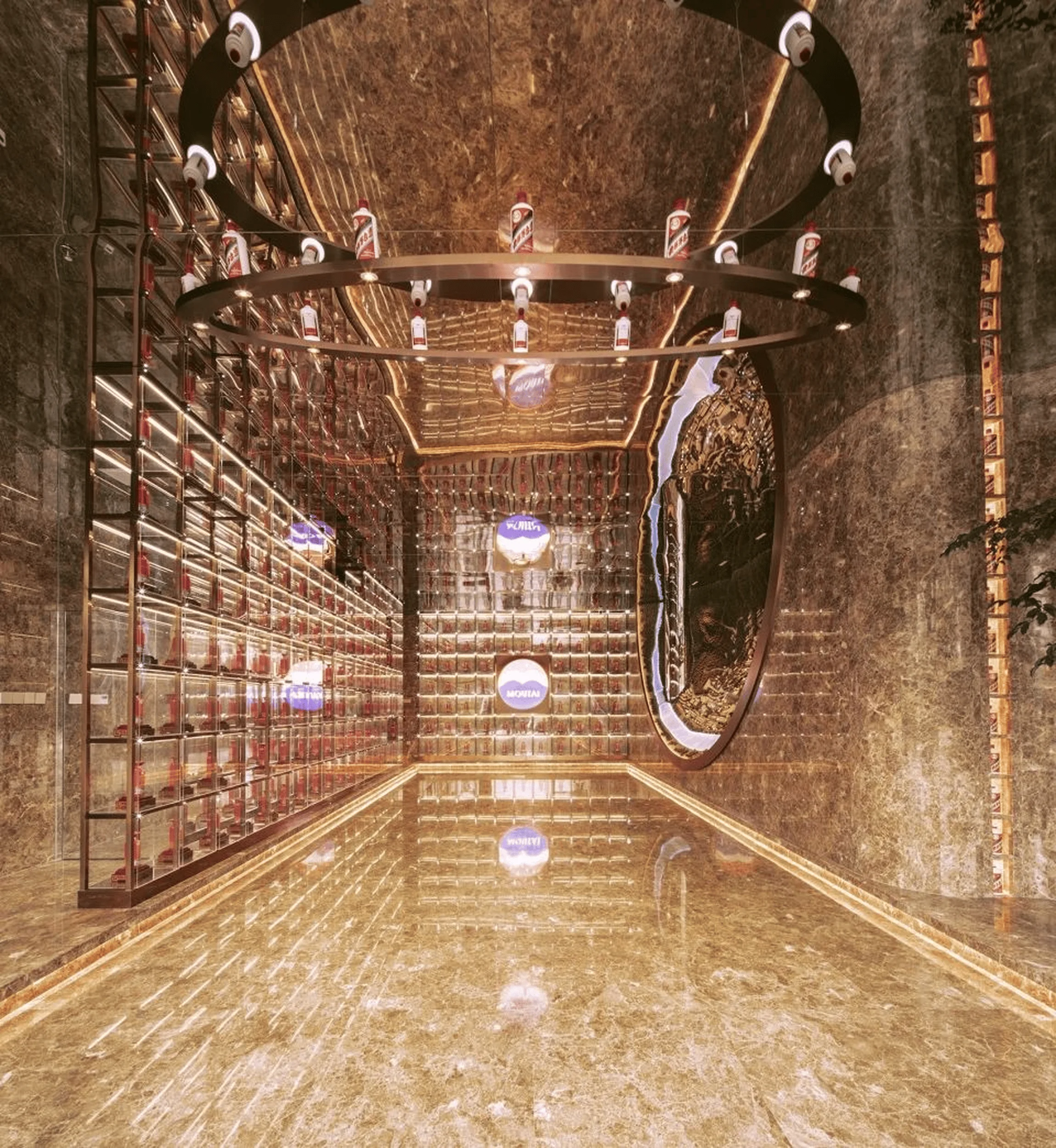
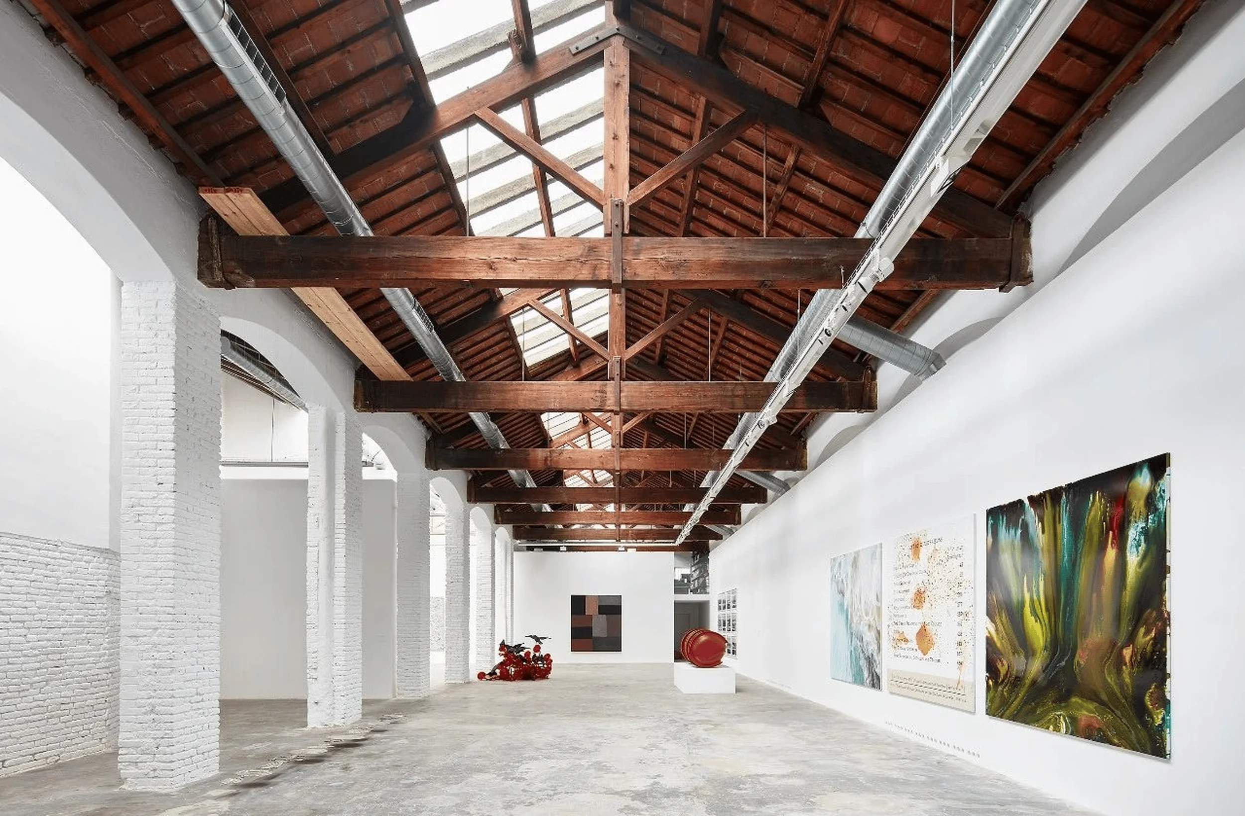
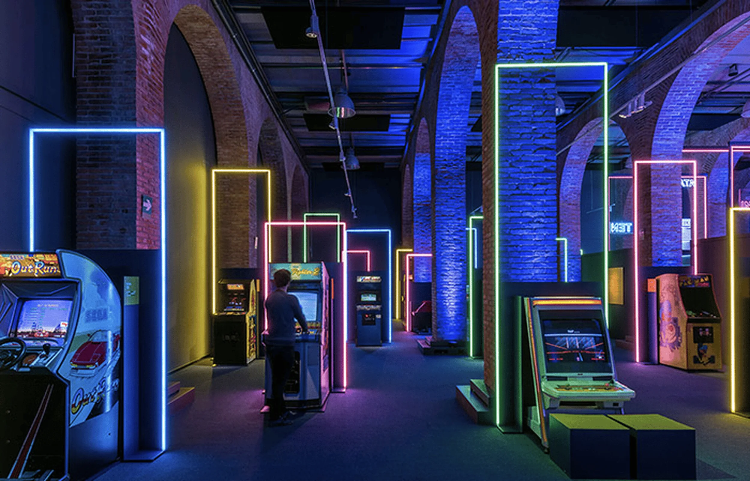
SAKURA’s Taipei showrooms highlight modern interior design and serene atmospheres, emphasizing functionality and aesthetics in a variety of living spaces.
Contents
A Fusion of Aesthetics and Functionality in SAKURA Brand Pavilion
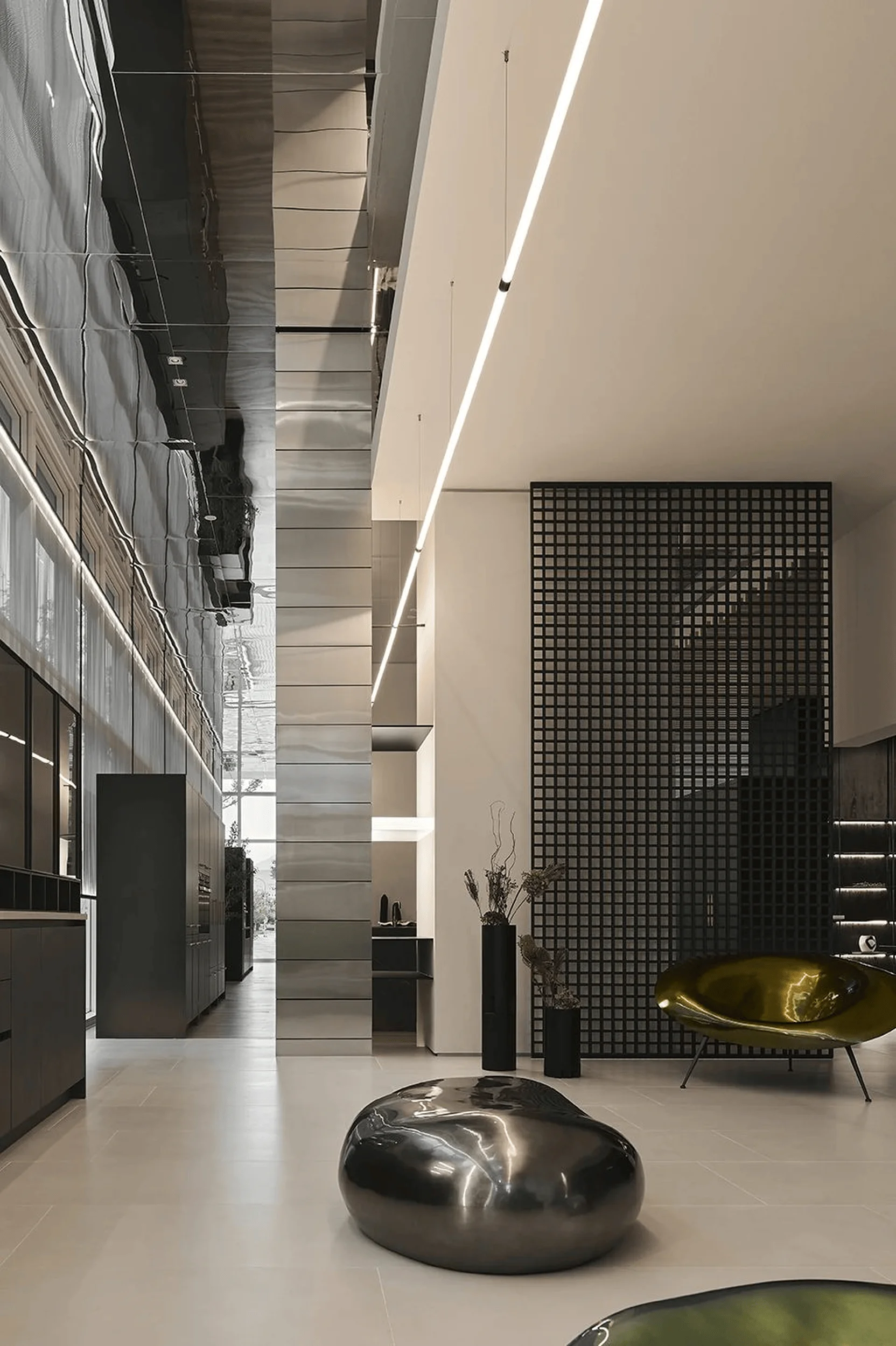
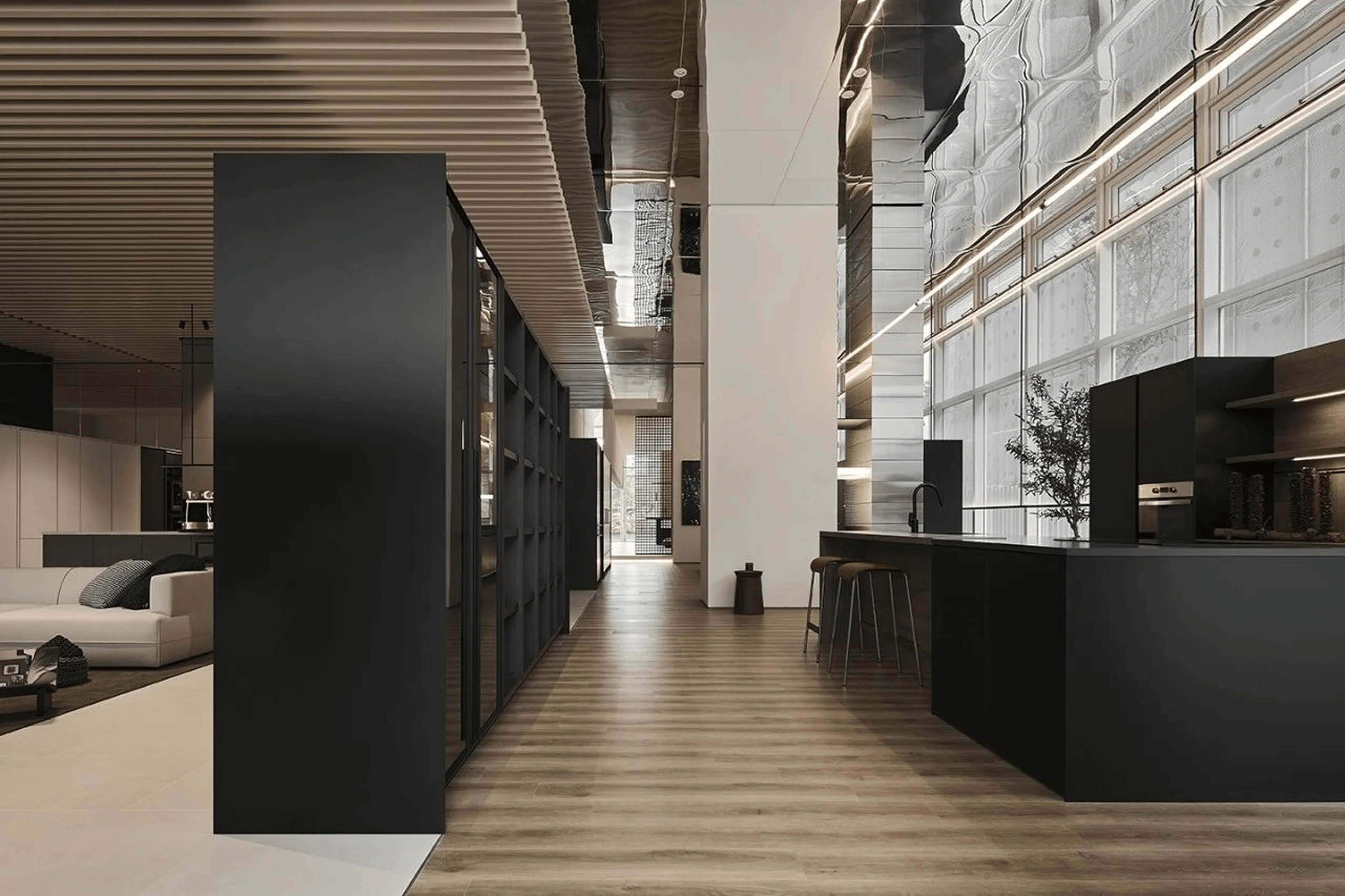
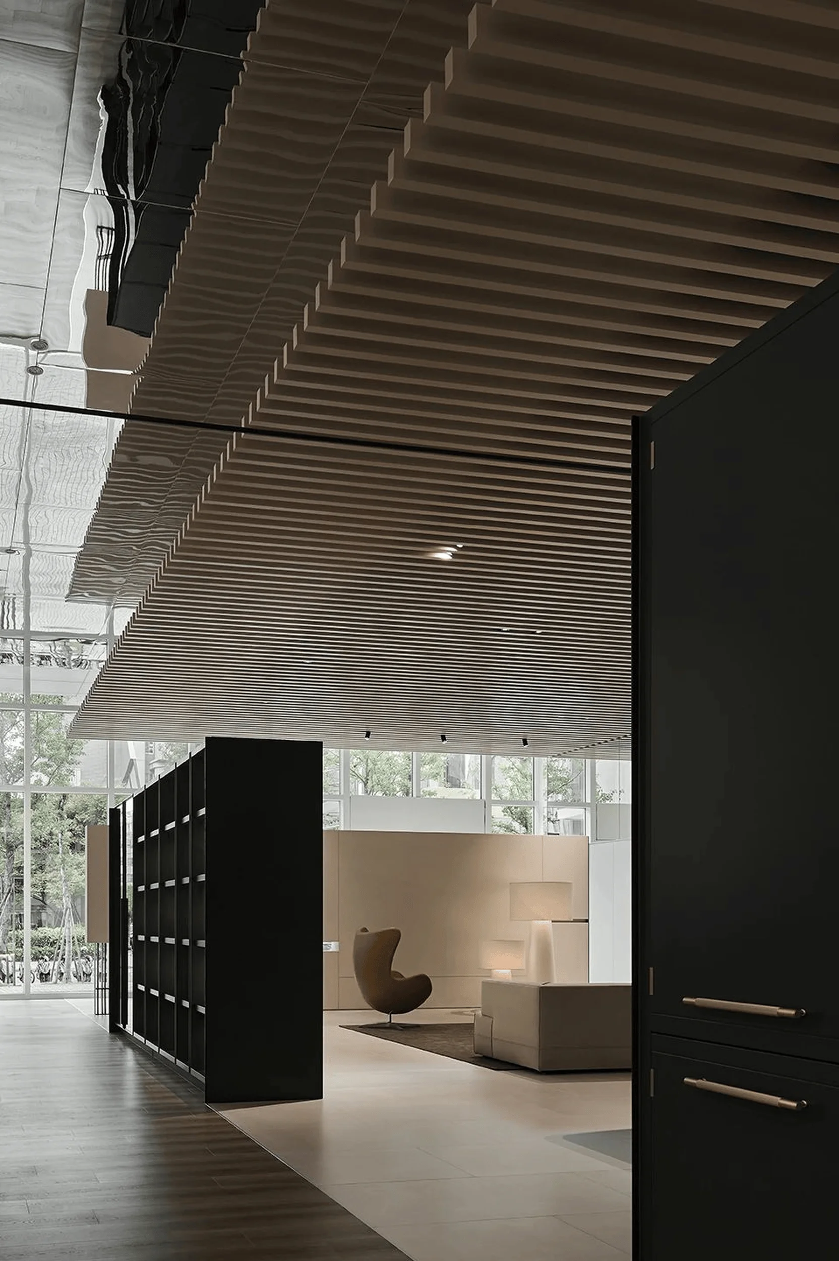
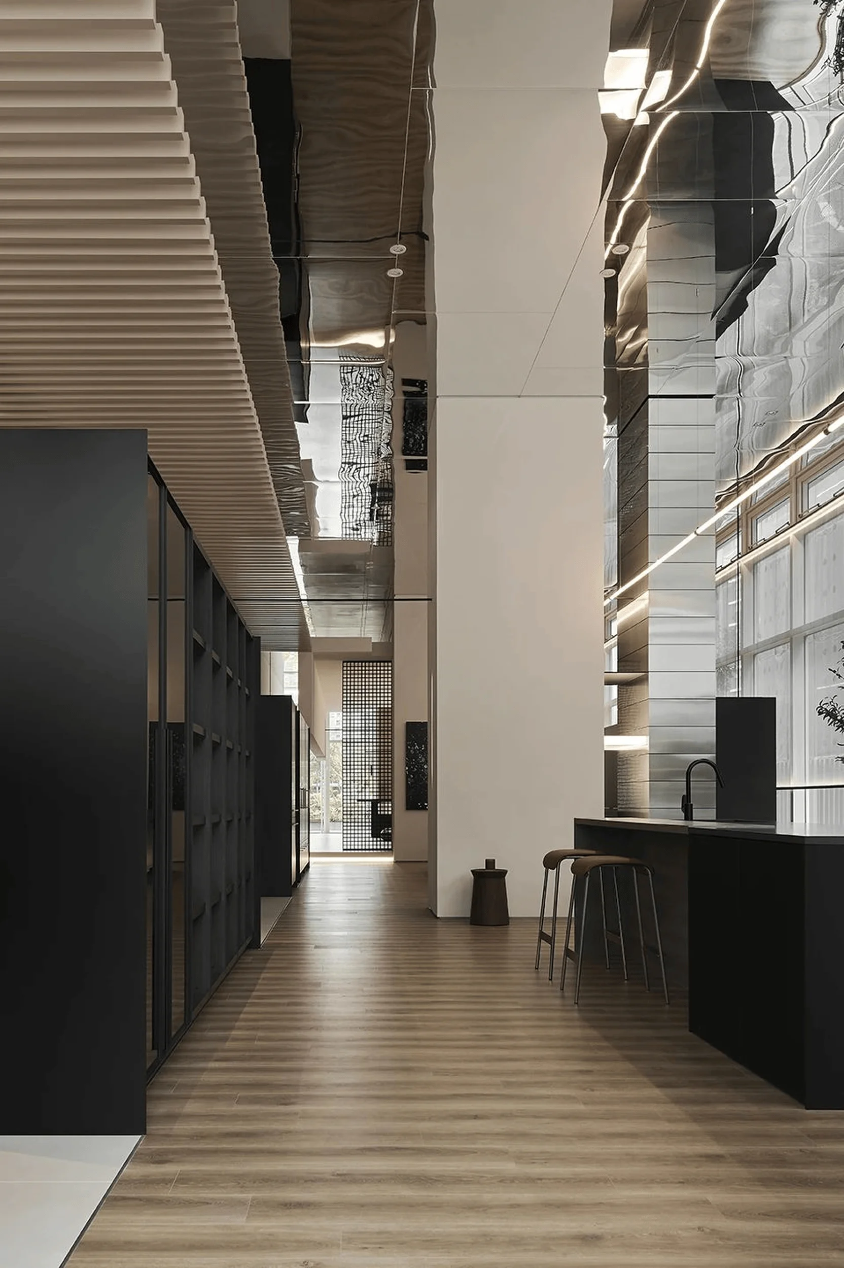
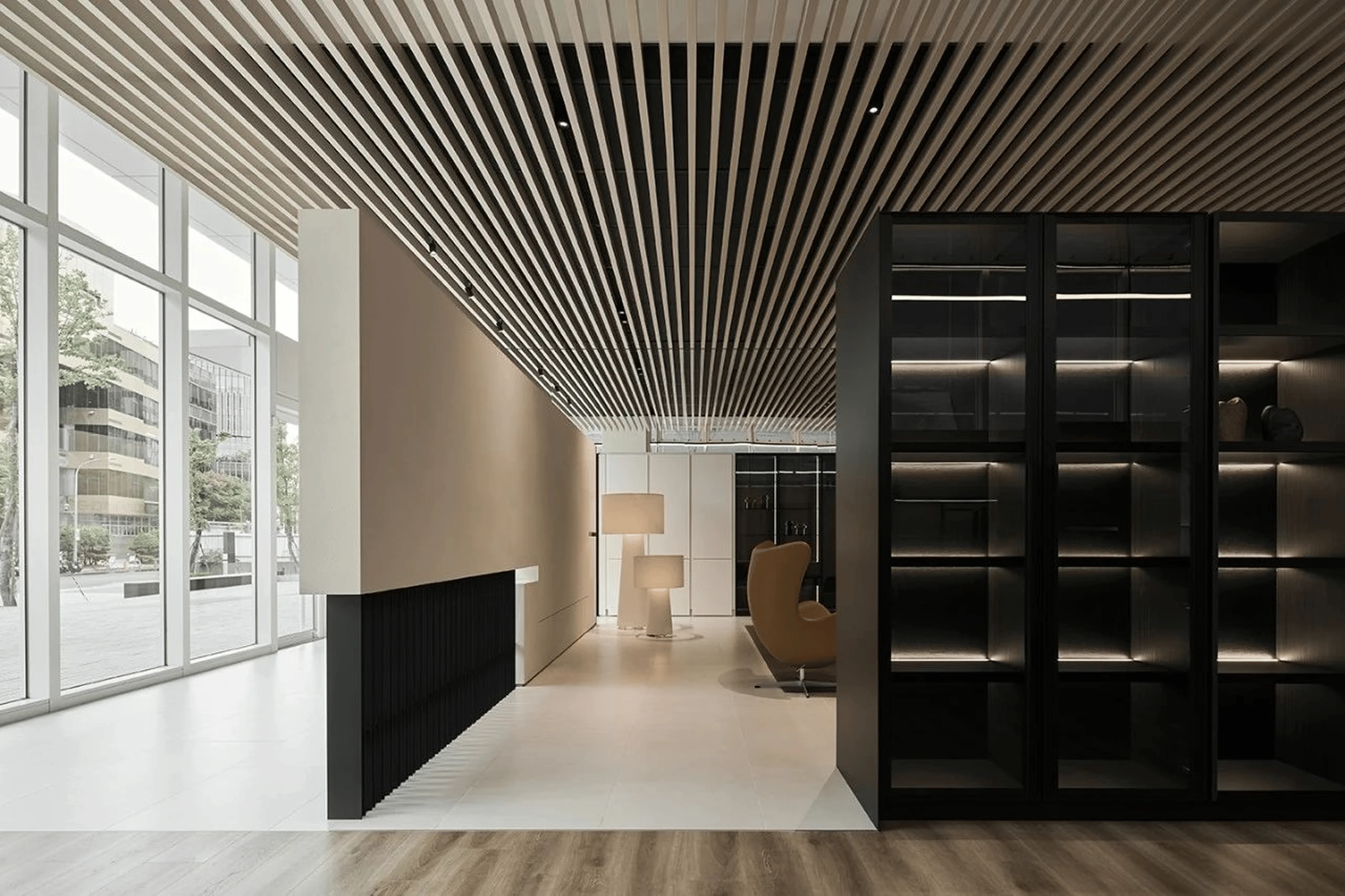
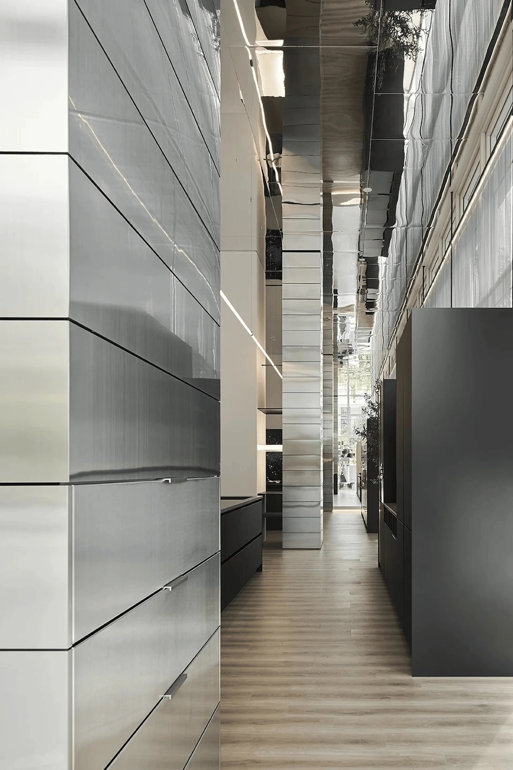
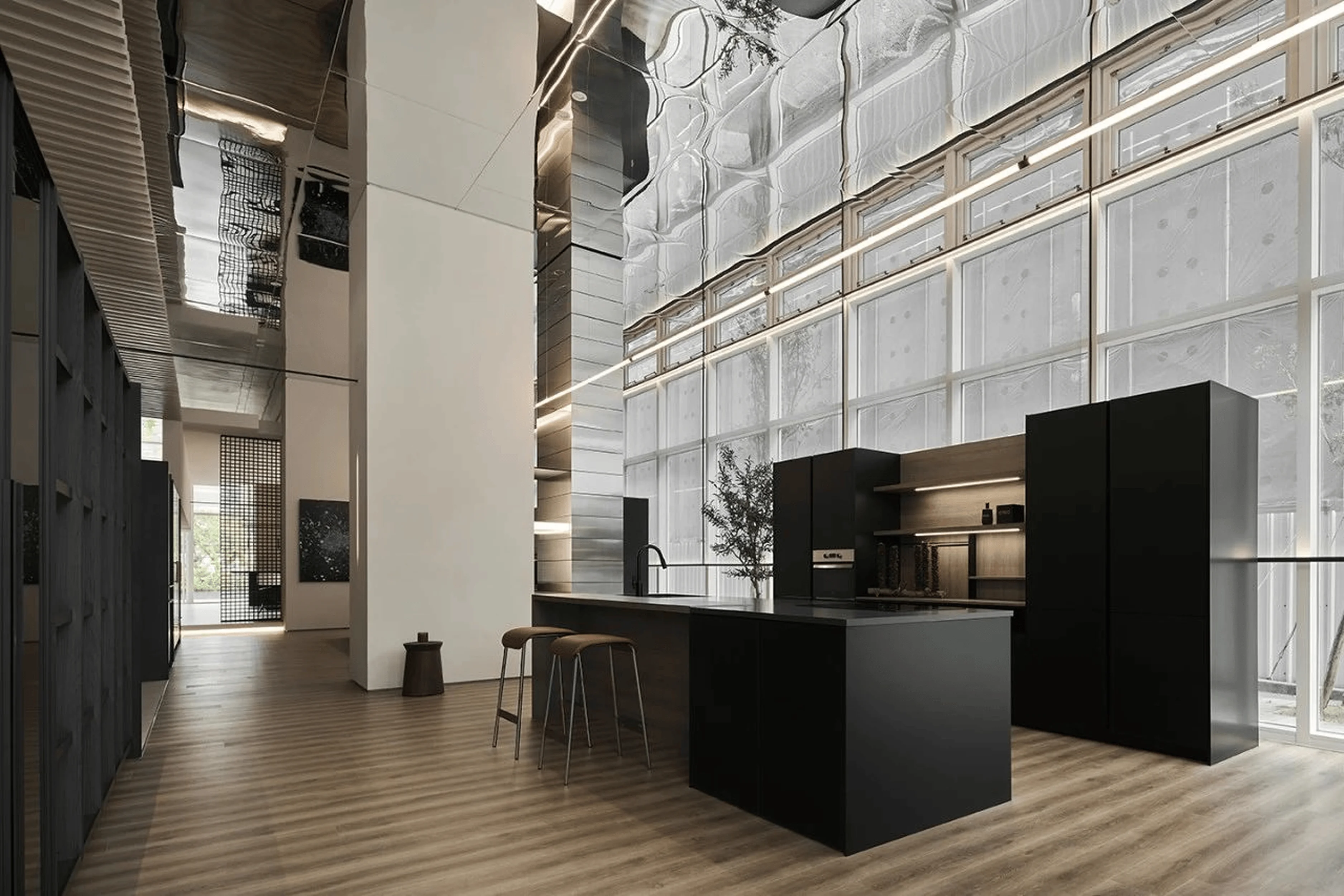
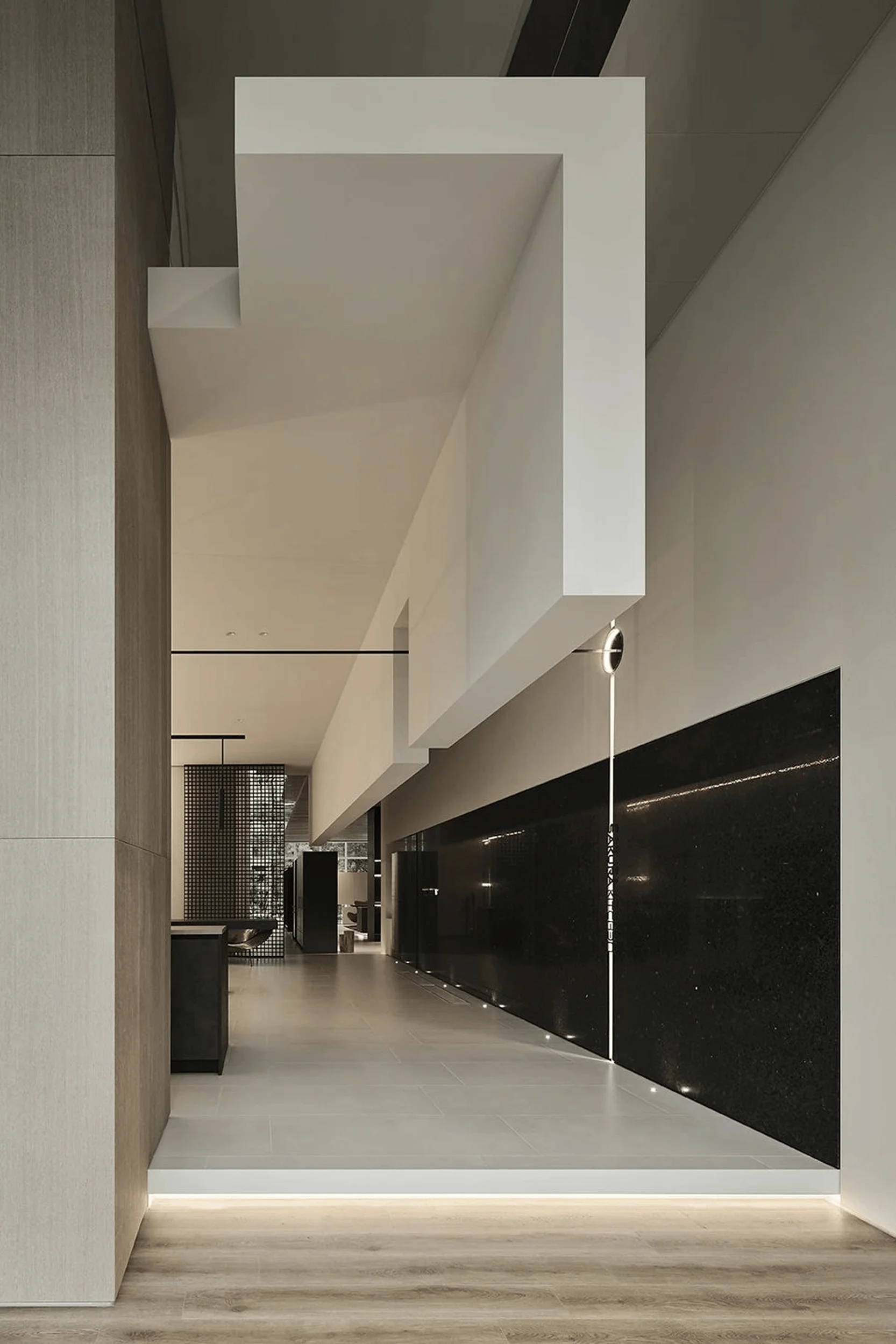
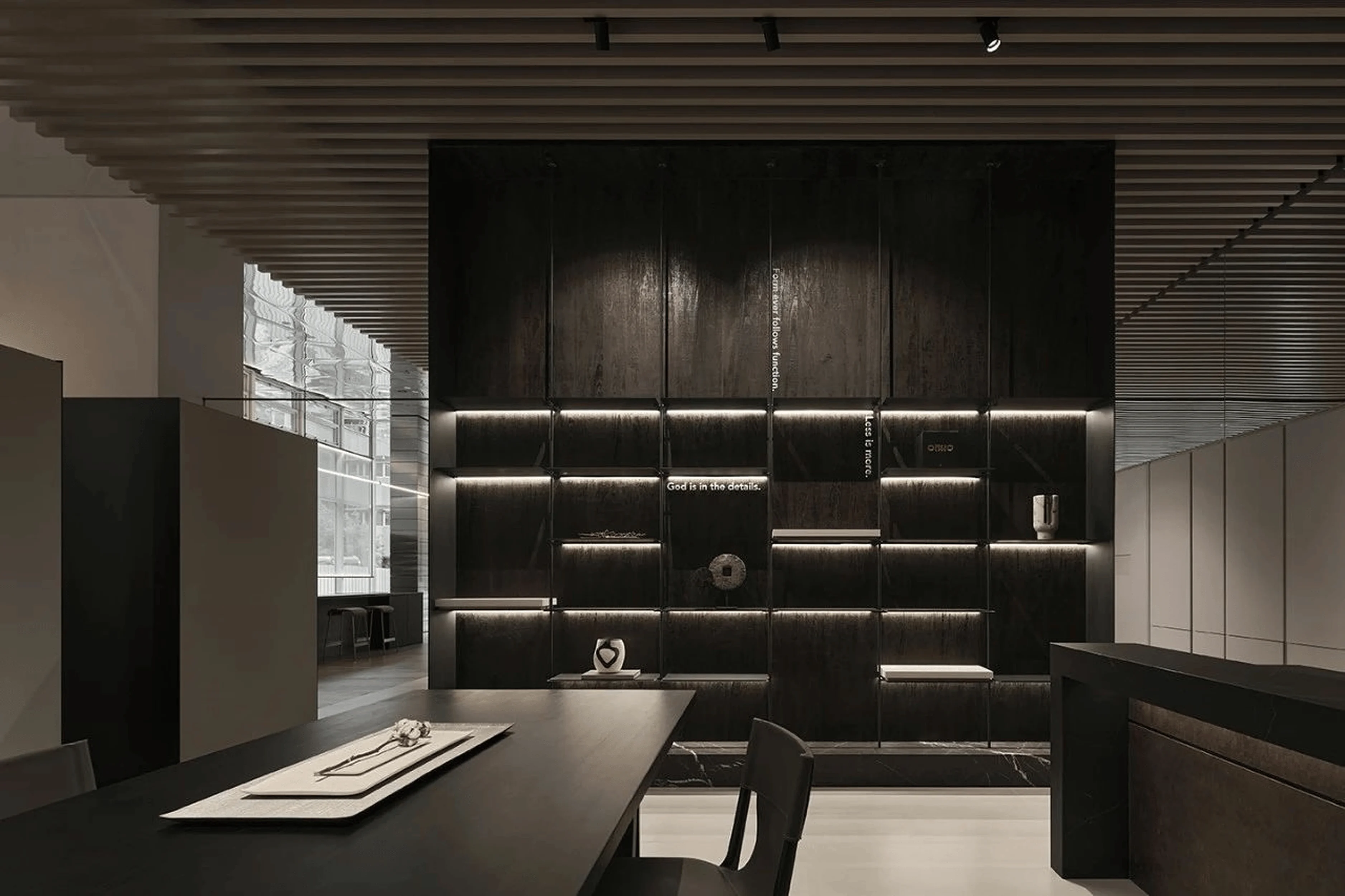
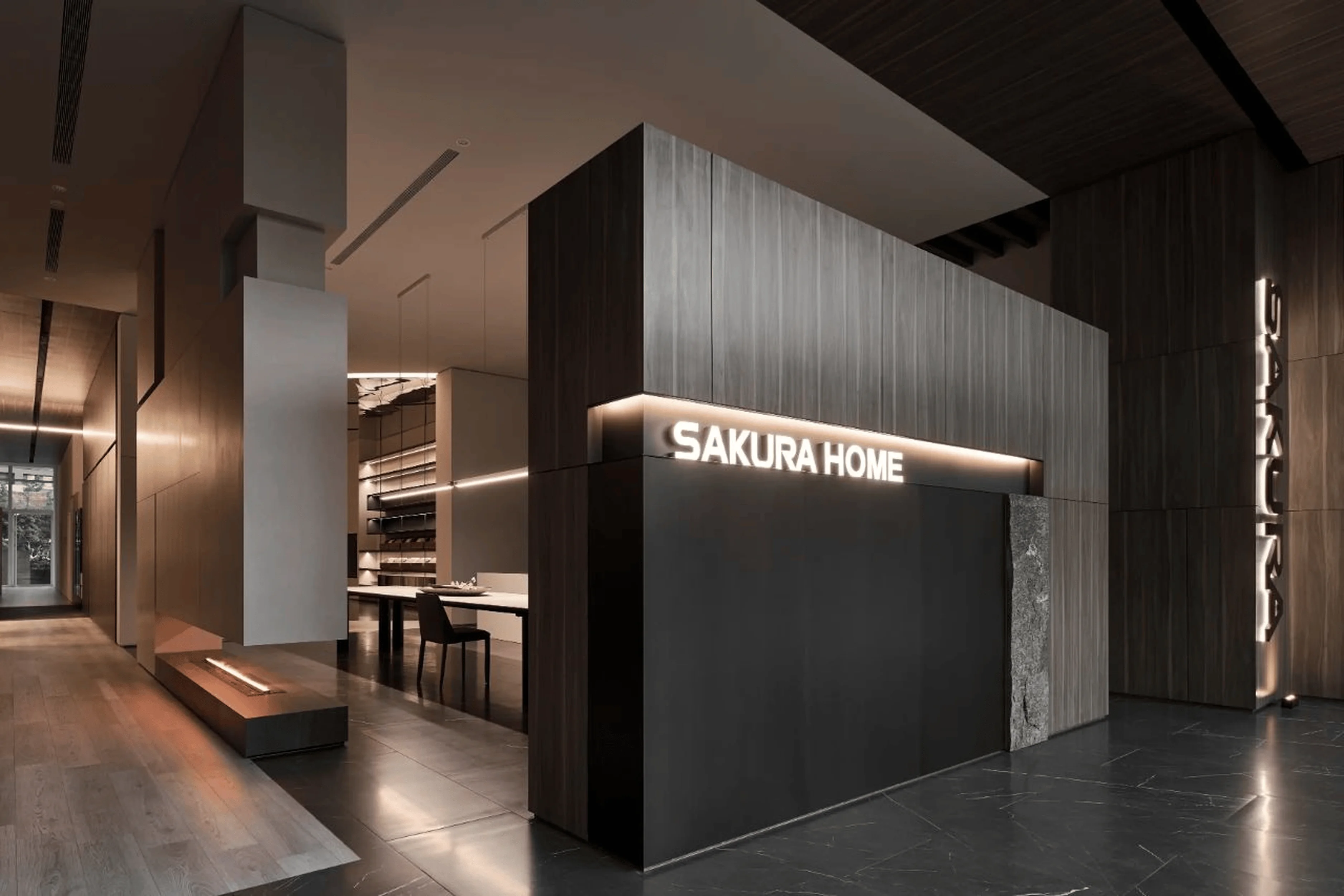
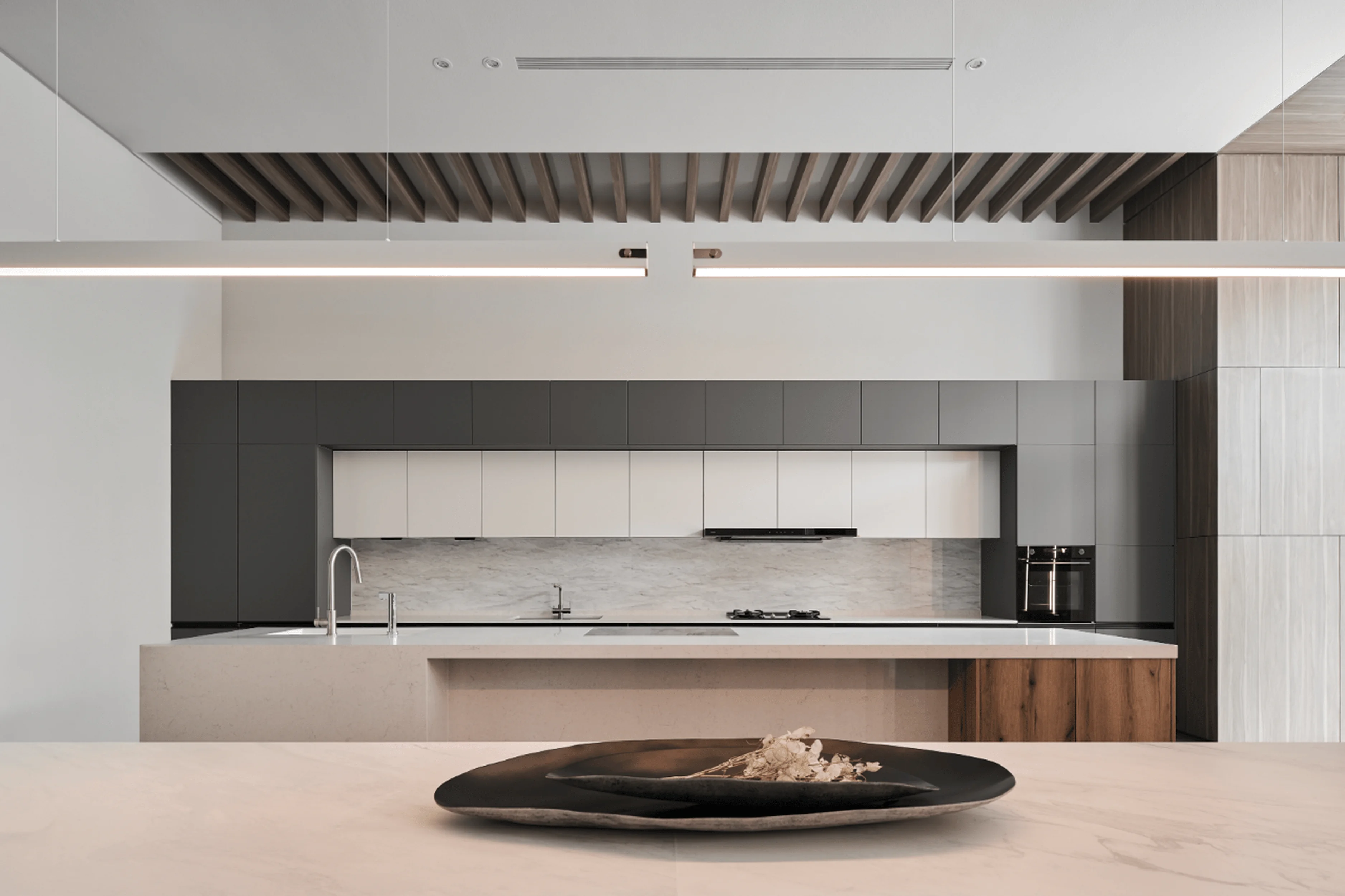
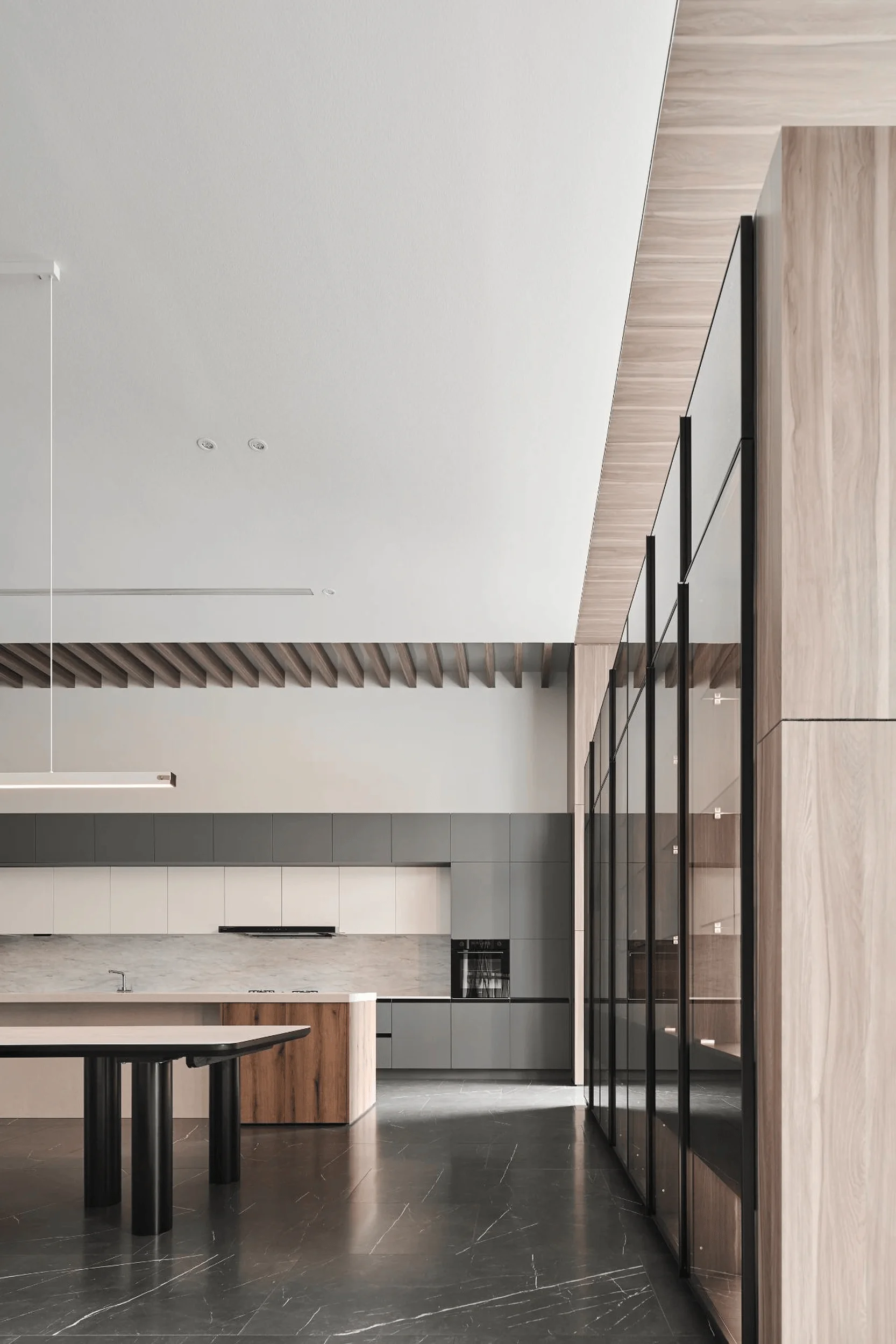
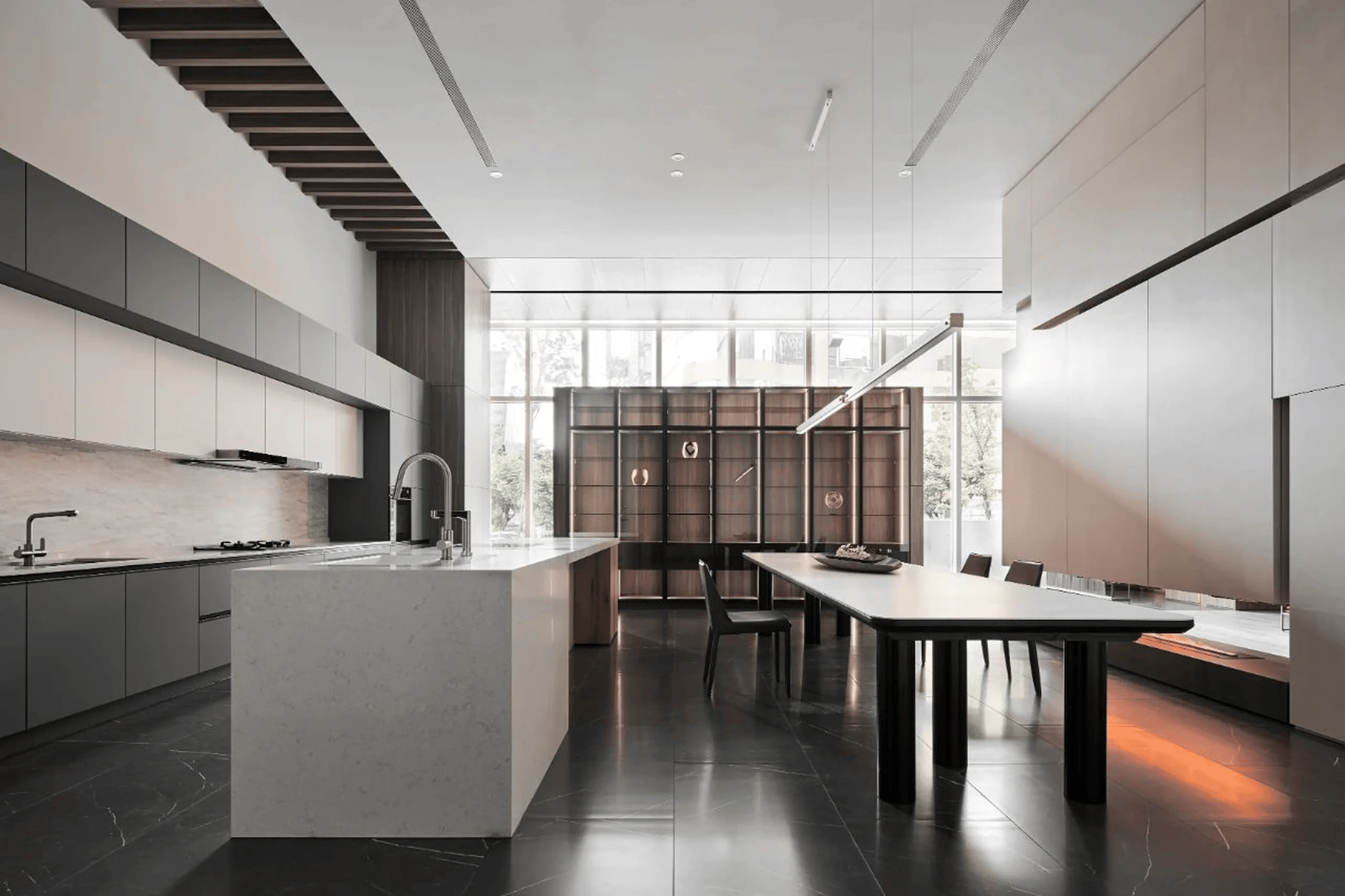
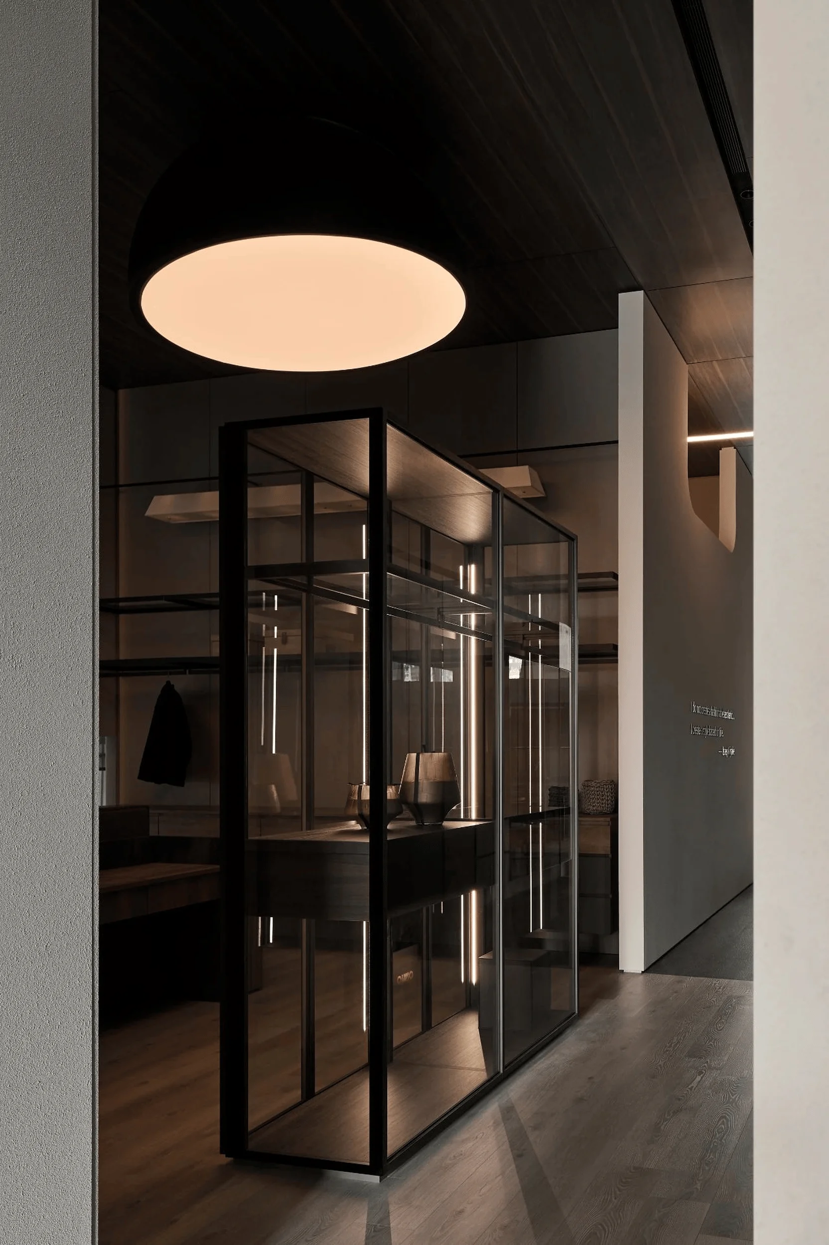
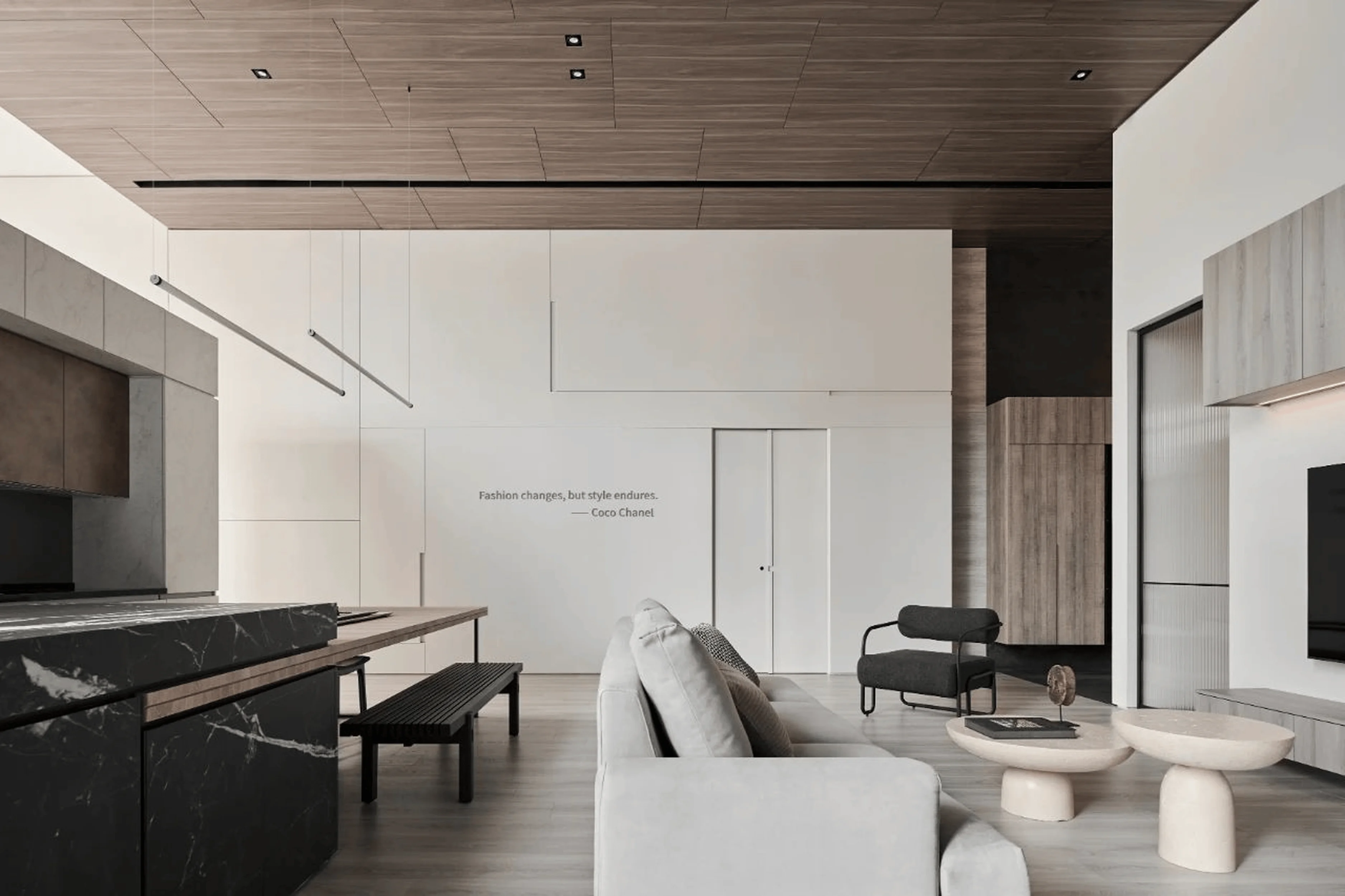
The SAKURA Brand Pavilion, a 480-square-meter culinary showroom in Taipei, is a testament to J.C. Architecture Design’s mastery of modern interior design principles. The pavilion’s design seamlessly integrates aesthetics and functionality, creating a space that is both visually captivating and highly practical. Reflective mirrors and varied ceiling heights introduce a dynamic interplay of light and shadow, adding depth and intrigue to the showroom. The use of a simplified material and color palette, combined with horizontal and vertical axes, contributes to a sense of order and spaciousness, allowing the architectural elements to stand out. Linear lighting, a hallmark of contemporary design, permeates the entire space, highlighting the clean lines and minimalist aesthetic. The clever use of light enhances the overall visual appeal and creates a welcoming atmosphere, inviting visitors to explore the showroom’s offerings. Interior design elements, such as the grid ceiling and the use of light strips, add a touch of sophistication and elegance to the space, creating a modern and inviting environment for showcasing SAKURA’s kitchen appliances.
Creating a Seamless Flow and Openness in SAKURA Brand Pavilion
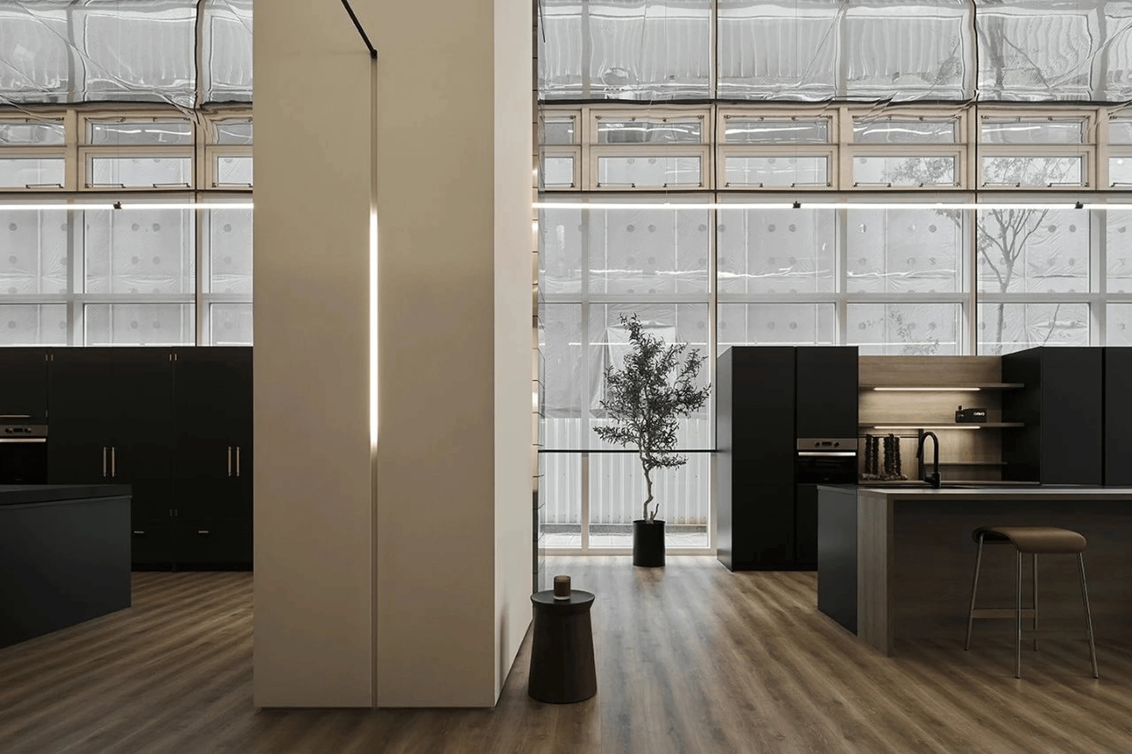
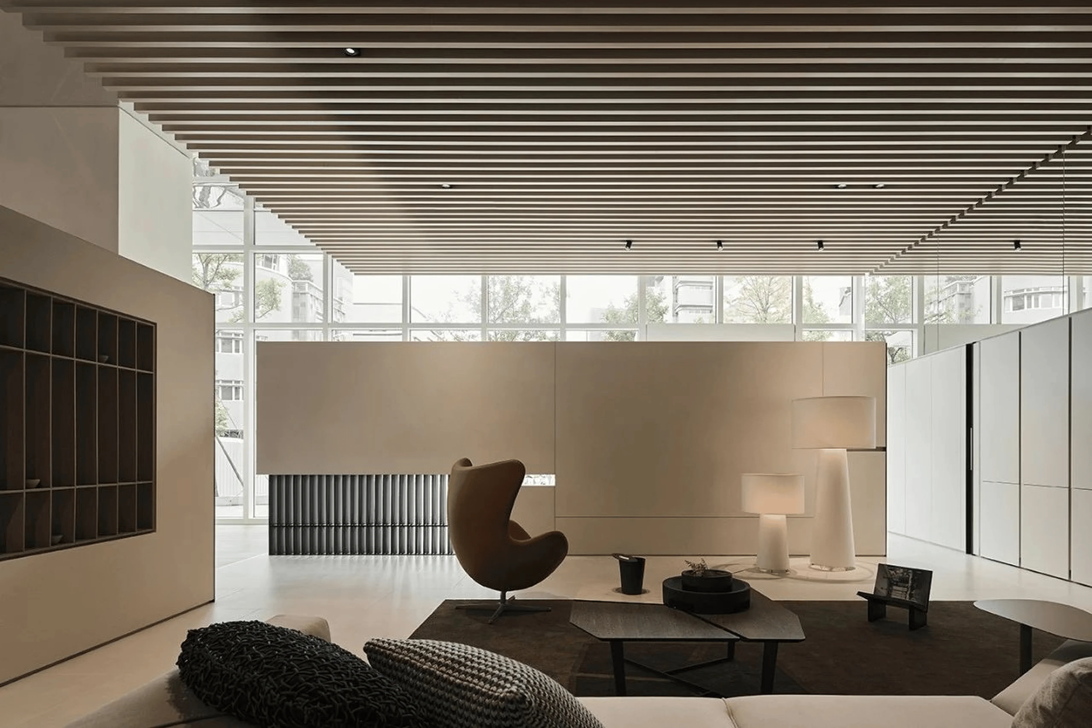
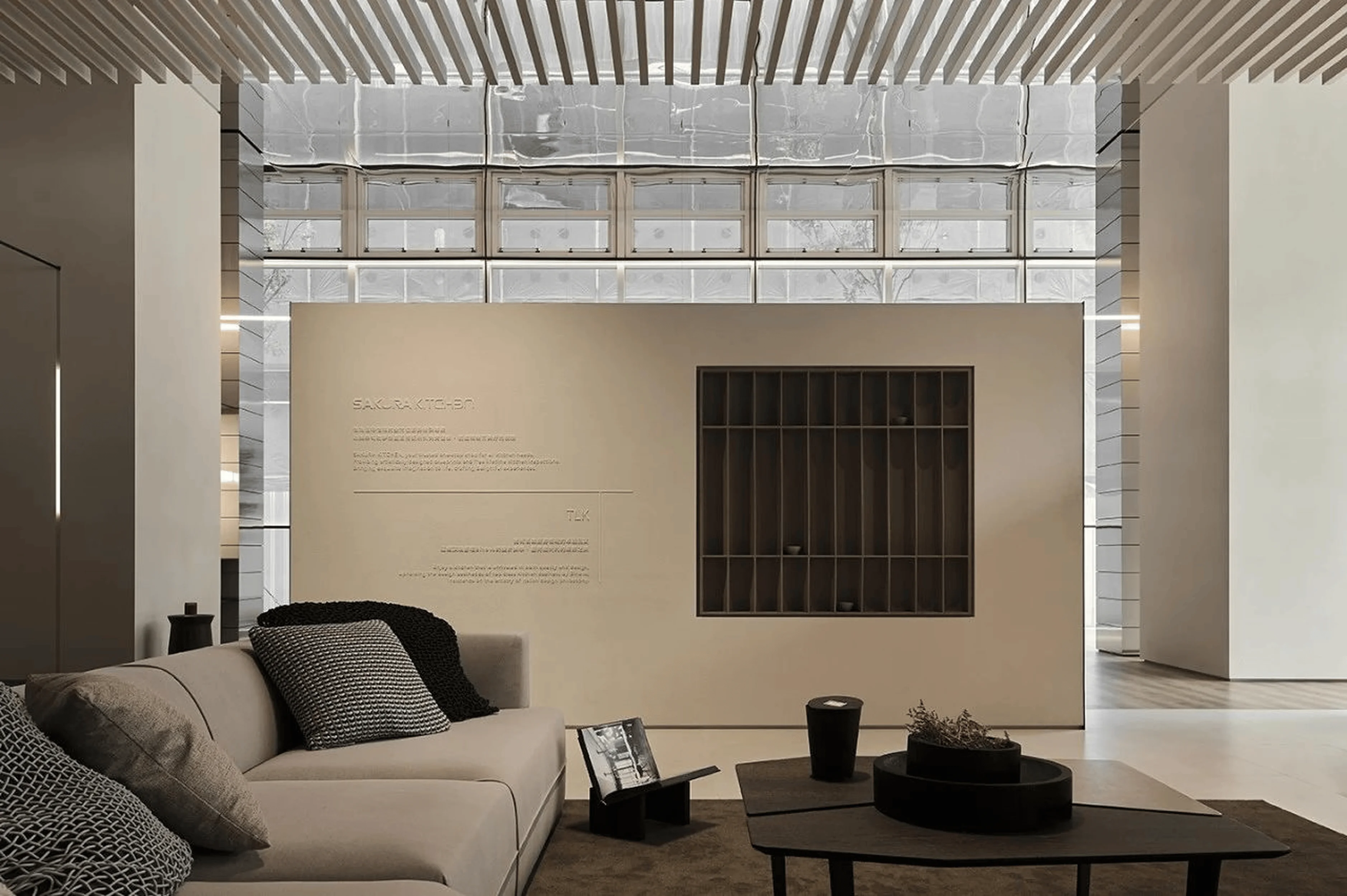
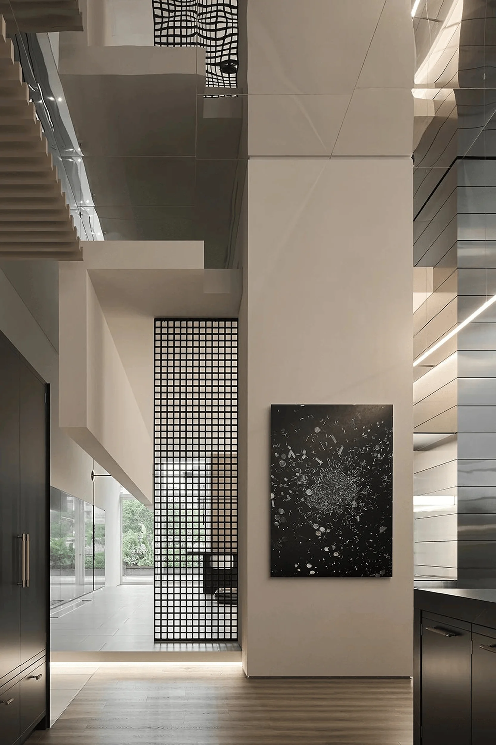
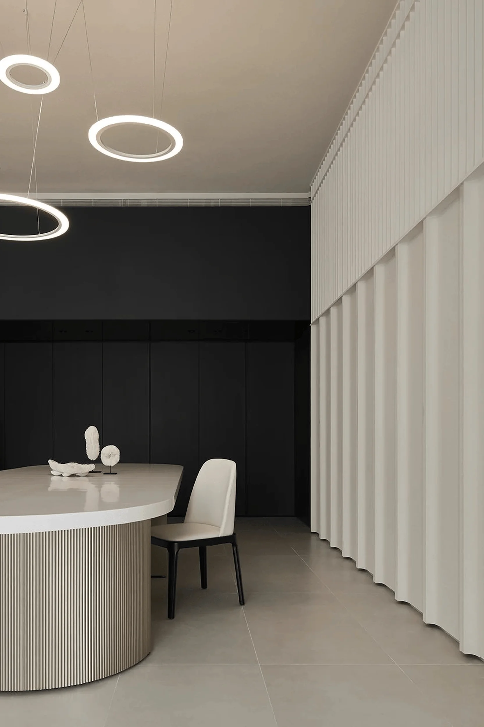
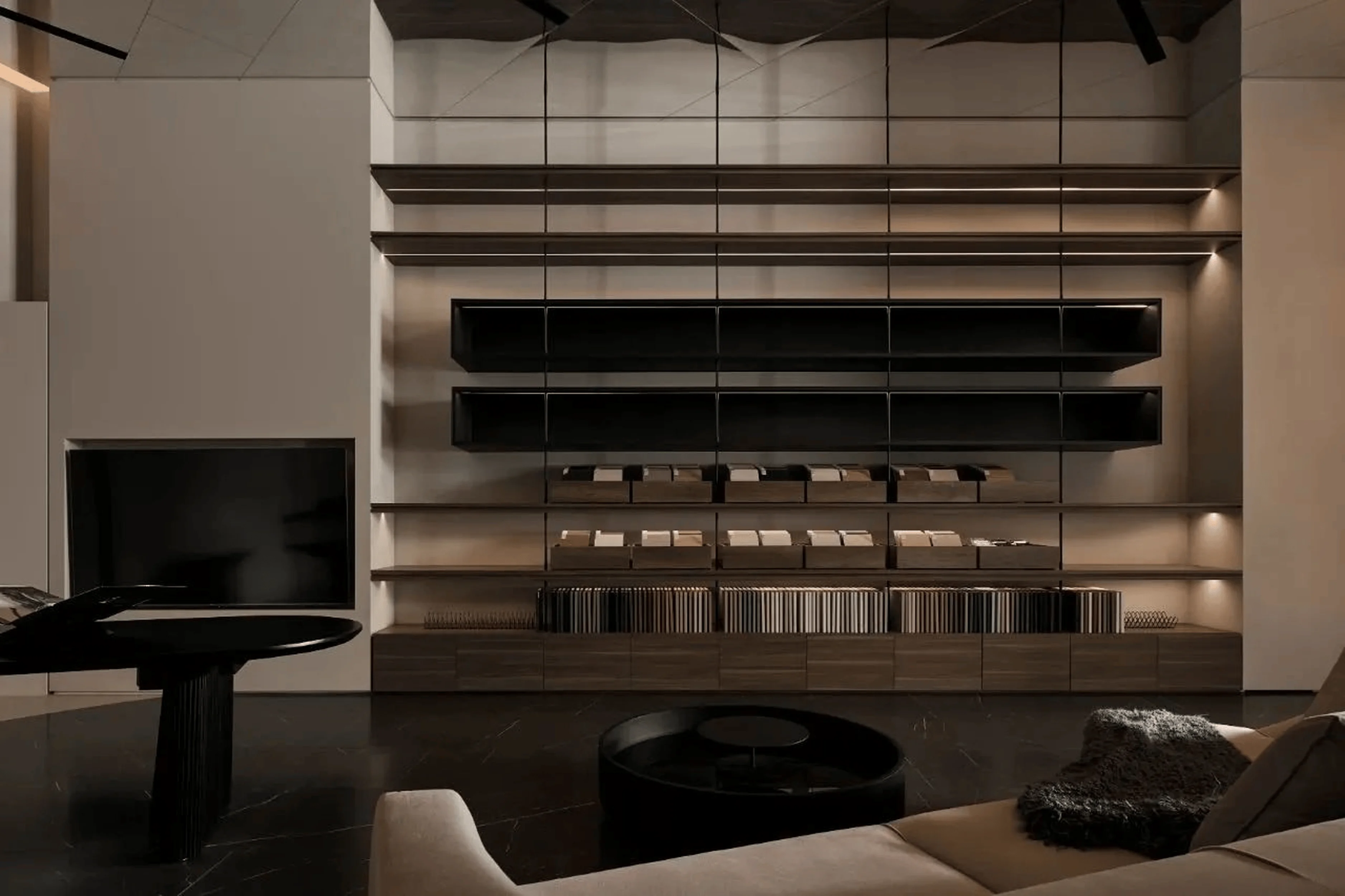
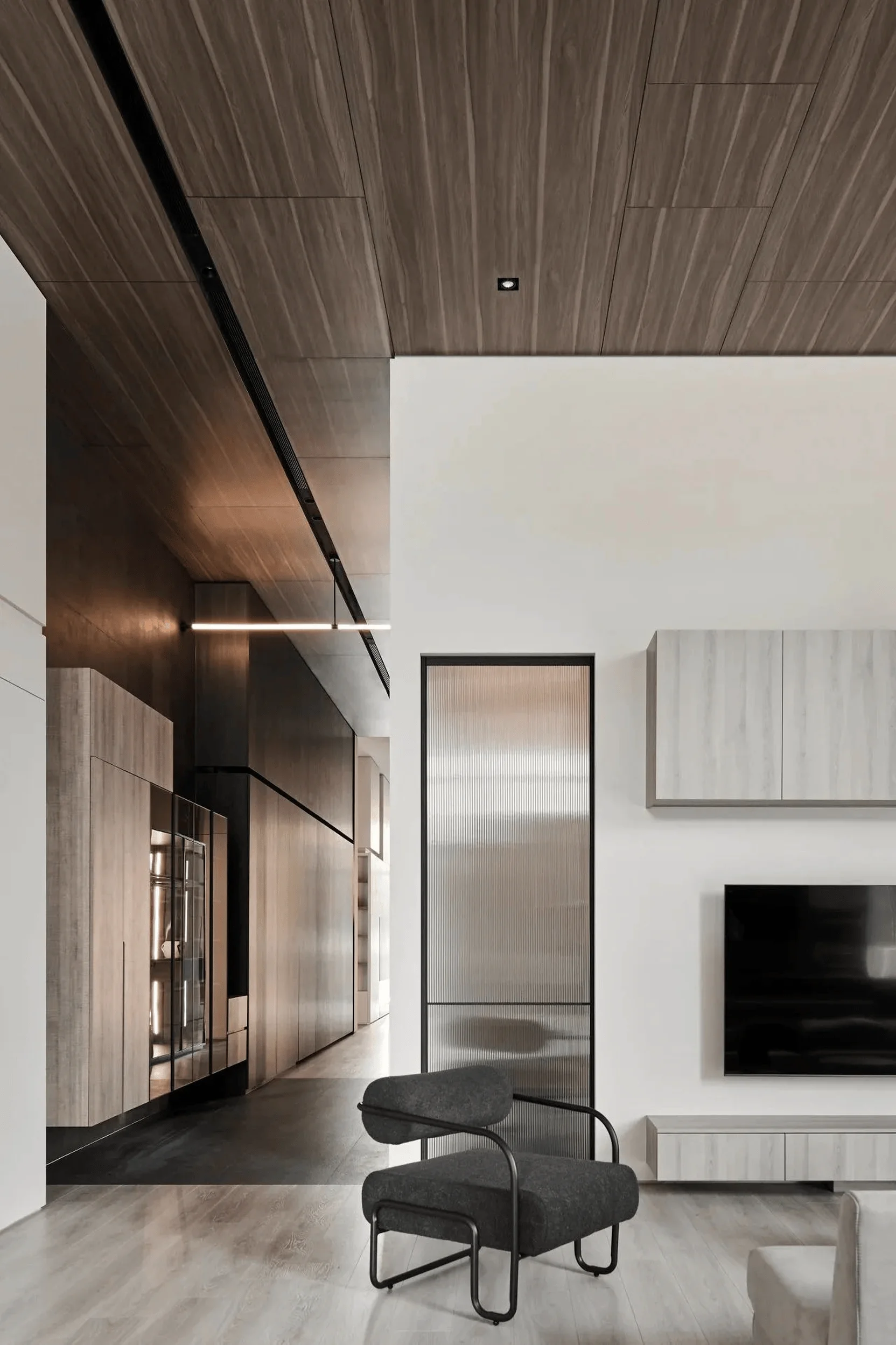
The pavilion’s interior layout is characterized by a fluid and open design, seamlessly connecting the various functional areas, including the living room, dining room, western kitchen island area, and conference room. This interconnectedness is achieved through the use of horizontal design elements that create a sense of continuity and flow. J.C. Architecture Design employs a micro-architectural concept to create a private axis, discreetly incorporating all necessary functional elements within the overall design. The use of chicken wing wood veneer adds a warm and inviting touch, complementing the light-transmitting exterior walls and creating a sense of grandeur and modernity. Meticulous detailing further enhances the elegance of the space. The grid ceiling, a prominent feature, serves to guide and permeate light throughout the pavilion, while large-scale grid-patterned screens add flexibility to the use of the space, reflecting an unfettered and comfortable lifestyle. The open-plan kitchen islands showcase a variety of design options, with some cabinets featuring metal handles and others employing a concealed handle design, allowing users to experience different possibilities. Dark wood-grained cabinets near the dining table, adorned with embedded lighting and artistic elements, add visual interest without overwhelming the space, creating a harmonious blend of functionality and aesthetics.
SAKURA Flagship Home Furnishing Store: Embracing Modernity and Serenity
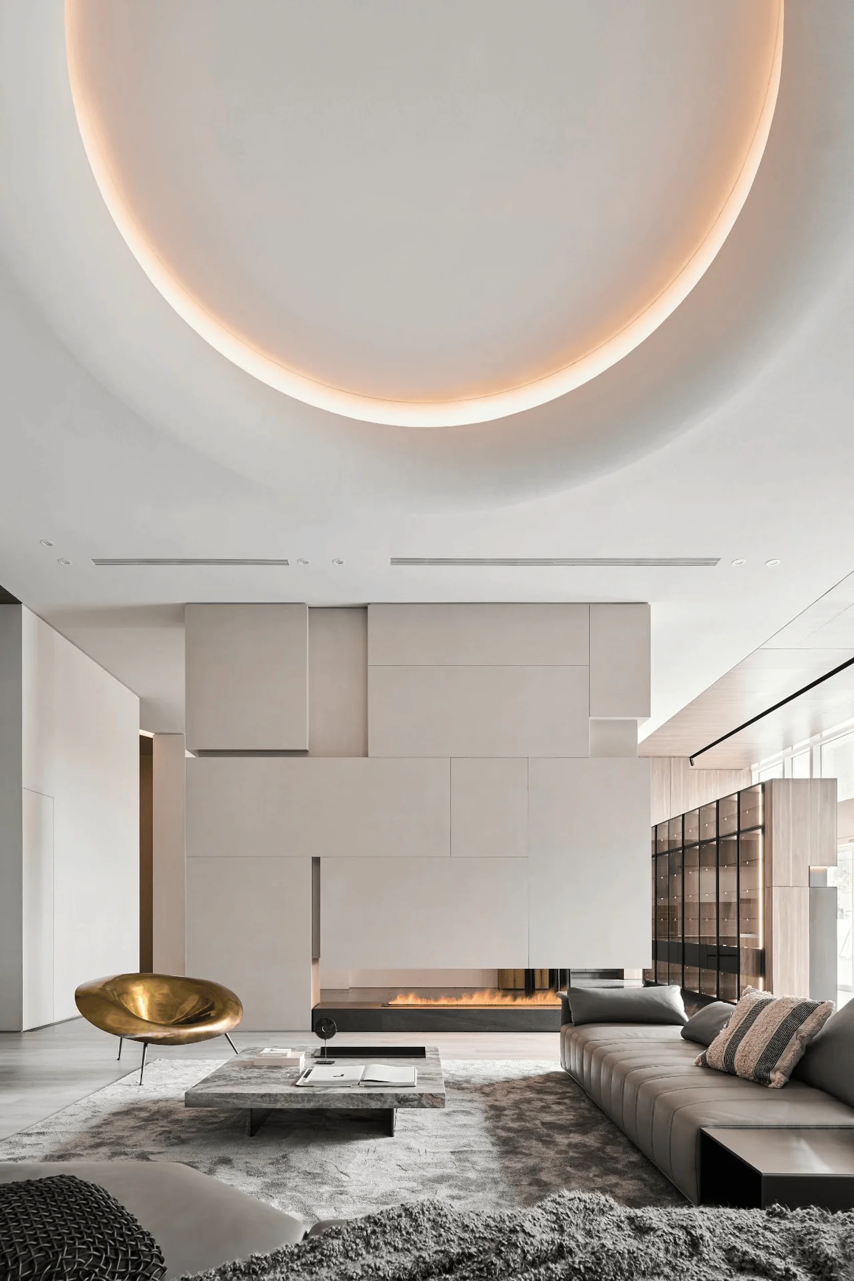
The SAKURA Flagship Home Furnishing Store, a 525-square-meter space, further demonstrates J.C. Architecture Design’s expertise in creating modern and tranquil living environments. The store’s design is a testament to the firm’s commitment to creating spaces that are both functional and aesthetically pleasing. The store’s layout is thoughtfully designed to showcase SAKURA’s home furnishings in a variety of settings, allowing visitors to envision how the pieces would integrate into their own homes. The use of natural materials, such as wood and stone, creates a sense of warmth and tranquility, while the incorporation of minimalist design principles ensures that the focus remains on the furnishings themselves. In model A, a minimalist palette of wood and paint creates a serene backdrop for the living spaces. Varying textures and the interplay of light and shadow throughout the day add depth and visual interest. The use of transparent walls, metal curtains, and grid partitions extends sightlines and creates a sense of interconnectedness between different areas.
Diverse Spatial Experiences in SAKURA Flagship Home Furnishing Store
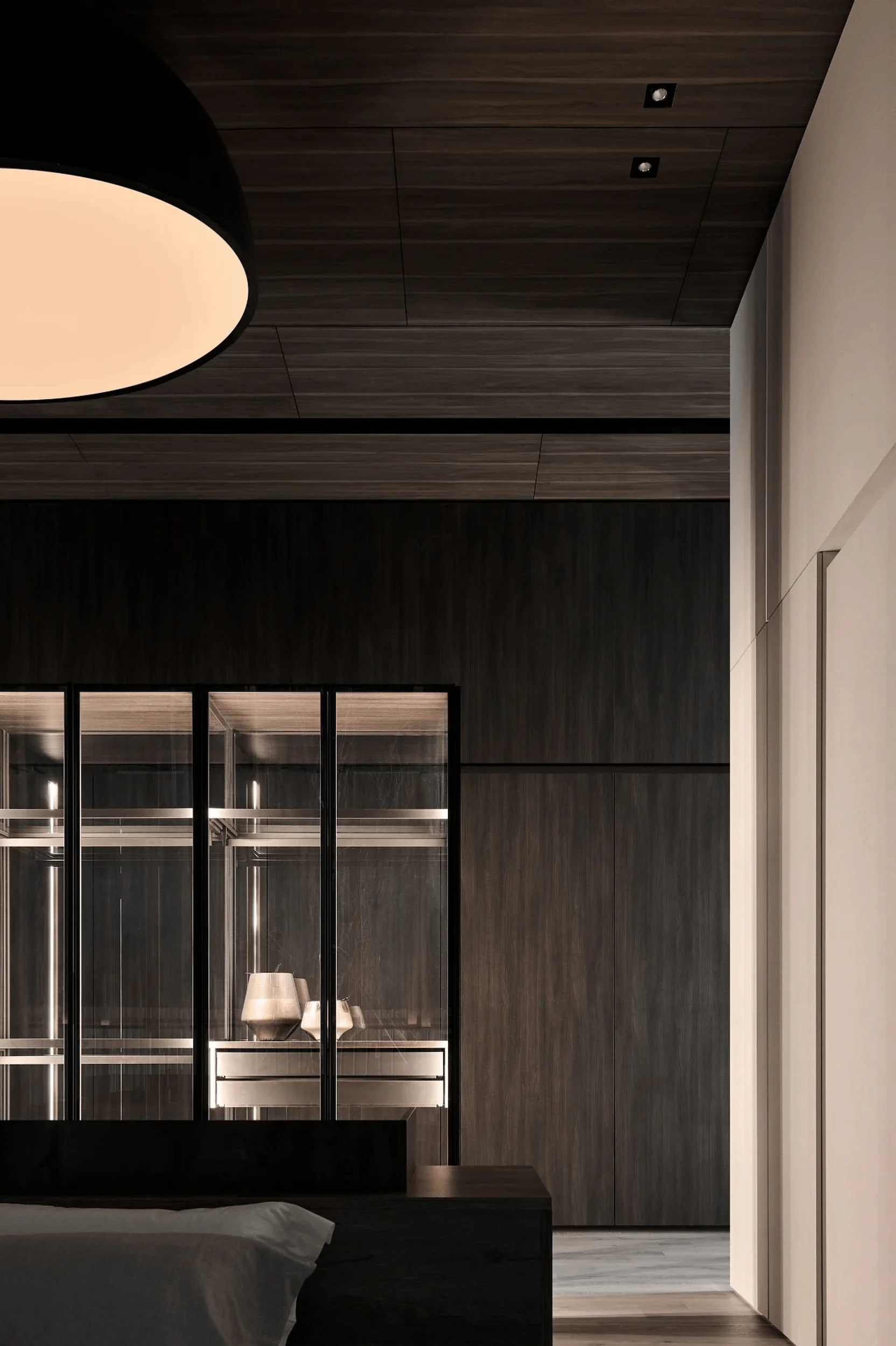
Model C features a continuous storage wall that runs through the entire living area, blurring the boundaries between public and private spaces. Changes in ceiling and floor materials subtly delineate the different functional zones, creating a harmonious and balanced feel. In model B, the common area is centrally located, fostering a sense of togetherness and connection. The master bedroom is cleverly divided by a structural column, creating two distinct zones where couples can enjoy their own moments of relaxation. Each model within the SAKURA Flagship Home Furnishing Store showcases a unique approach to modern living, emphasizing functionality, aesthetics, and a sense of tranquility. The careful selection of materials, the thoughtful use of lighting, and the seamless integration of various design elements contribute to the creation of spaces that are both visually stunning and highly livable.
Highlighting Materials and Lighting to Enhance the Essence of Design
Throughout both the SAKURA Brand Pavilion and Flagship Home Furnishing Store, J.C. Architecture Design prioritizes the use of natural materials, particularly wood. The inherent qualities of wood convey a sense of stability and warmth, setting the foundation for the overall spatial ambiance. The designers skillfully combine wood with other materials, such as stone and metal, to create a harmonious and inviting atmosphere. Lighting plays a crucial role in enhancing the spatial experience. In the brand pavilion, the grid ceiling and wood-grained flooring create a sense of harmony, while light strategically illuminates display cabinets, the bar, mirrored door frames, and wall columns, extending throughout the entire space. Linear lighting seems to breathe life into the walls, and the recessed lighting in the ceiling above the feature wall allows pendant lights to penetrate through, creating a visually dynamic and layered effect.
Tang Chung-Han: A Leading Figure in Taiwanese Interior Design
The visionary behind these impressive SAKURA showrooms is Tang Chung-Han, the design director of J.C. Architecture Design. Tang is a renowned figure in Taiwanese interior design, widely recognized as a leading proponent of the “Taiwanese style.” For over 16 years, he has dedicated his practice to the pursuit of spatial essence in interior design. His creative process centers around the concept of “people,” drawing inspiration from interior architecture principles and using thematic concepts and spatial narratives as supporting elements. Tang’s designs emphasize inner aesthetics rather than superficial embellishments, reflecting the lifestyle of a new generation. Through his unique approach to interior architecture, he explores the interplay of space, light, materials, and details, seeking to create human-centered designs that explore modern Eastern residential styles and address real needs. He elevates the psychological and ritualistic aspects of spatial transitions, ensuring that residential spaces not only meet basic needs but also offer a profound experience that transcends mere design.
Project Information:
Project Type: Showroom, Flagship Store
Architect: J.C. Architecture Design
Design Director: Tang Chung-Han
Area: 480 ㎡ (Brand Pavilion), 525 ㎡ (Flagship Store)
Project Year: Not specified
Project Location: Taiwan
Main Materials: Wood, Stone, Metal, Mirrors, Grids
Photographer: Dayform Studio


