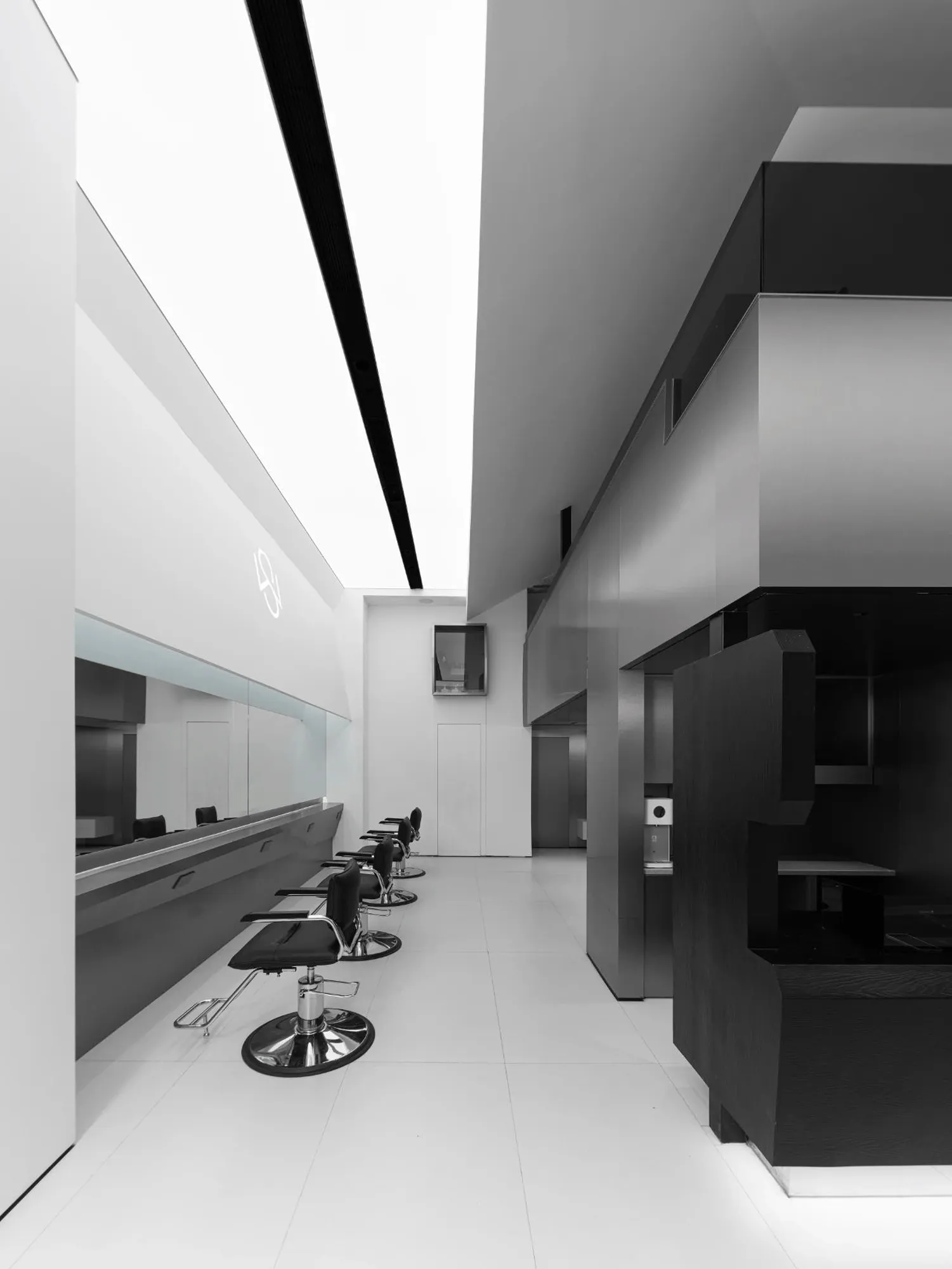
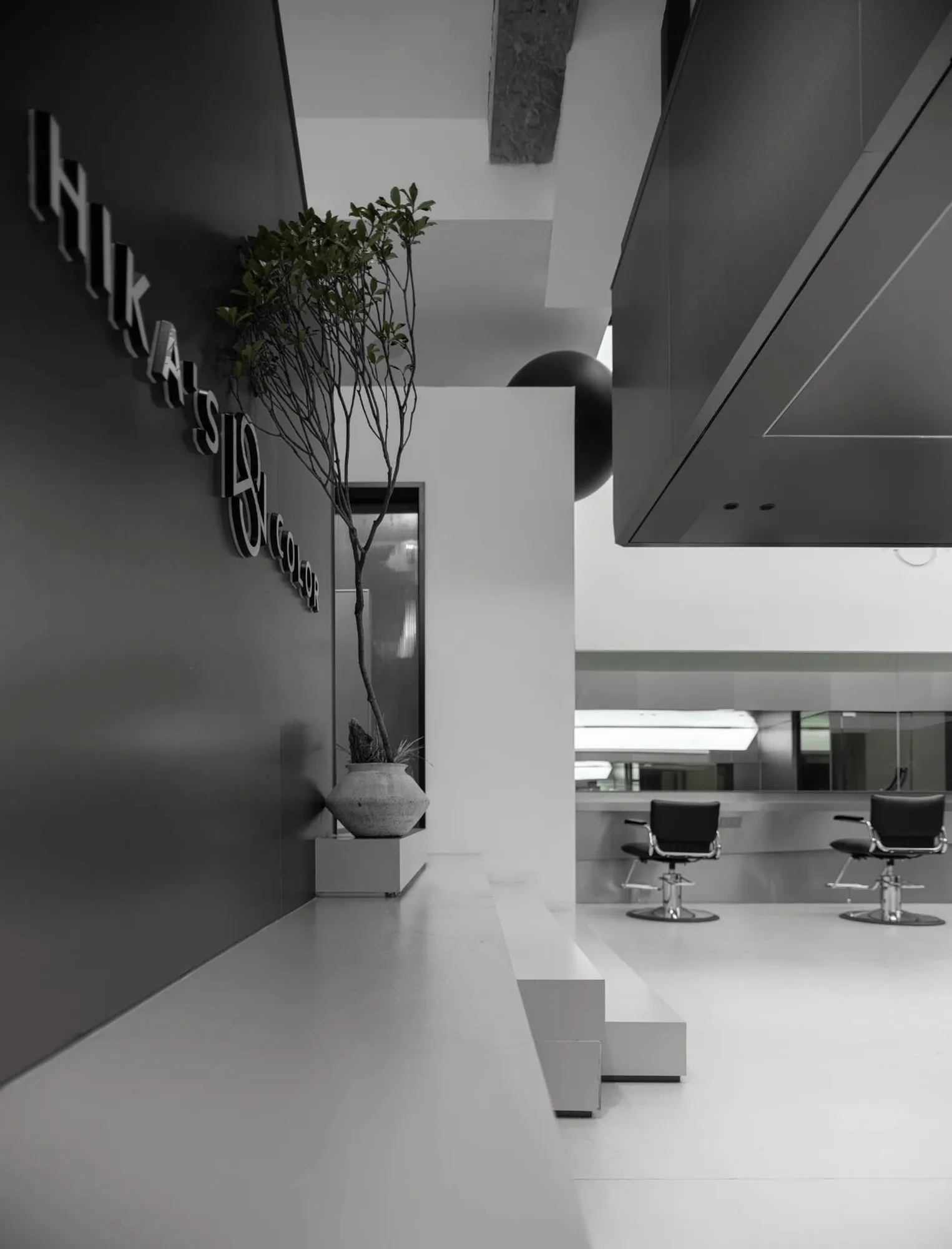
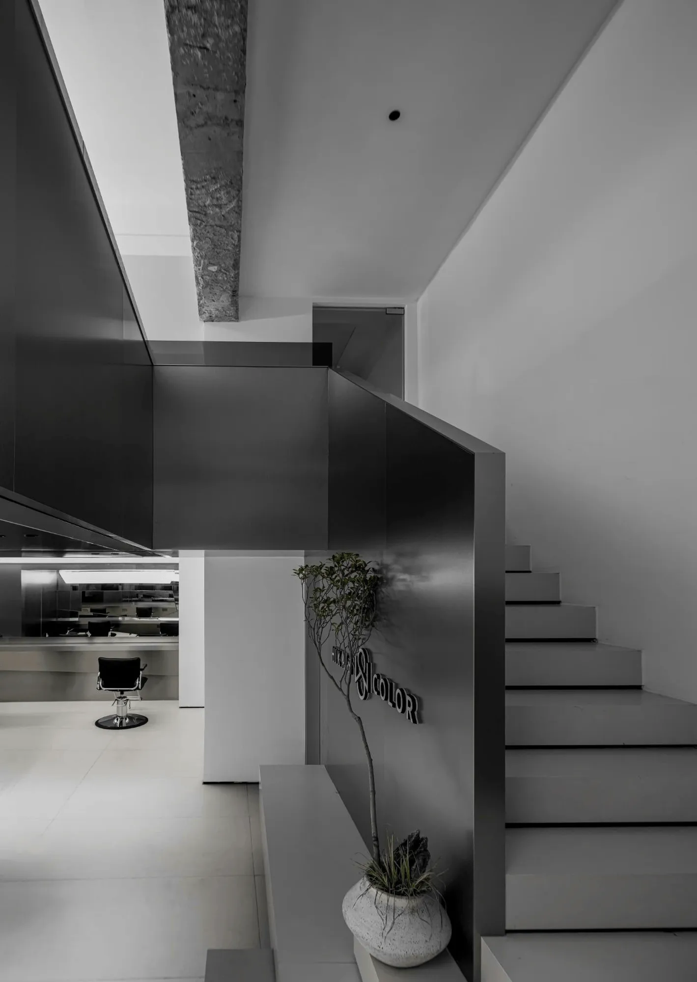
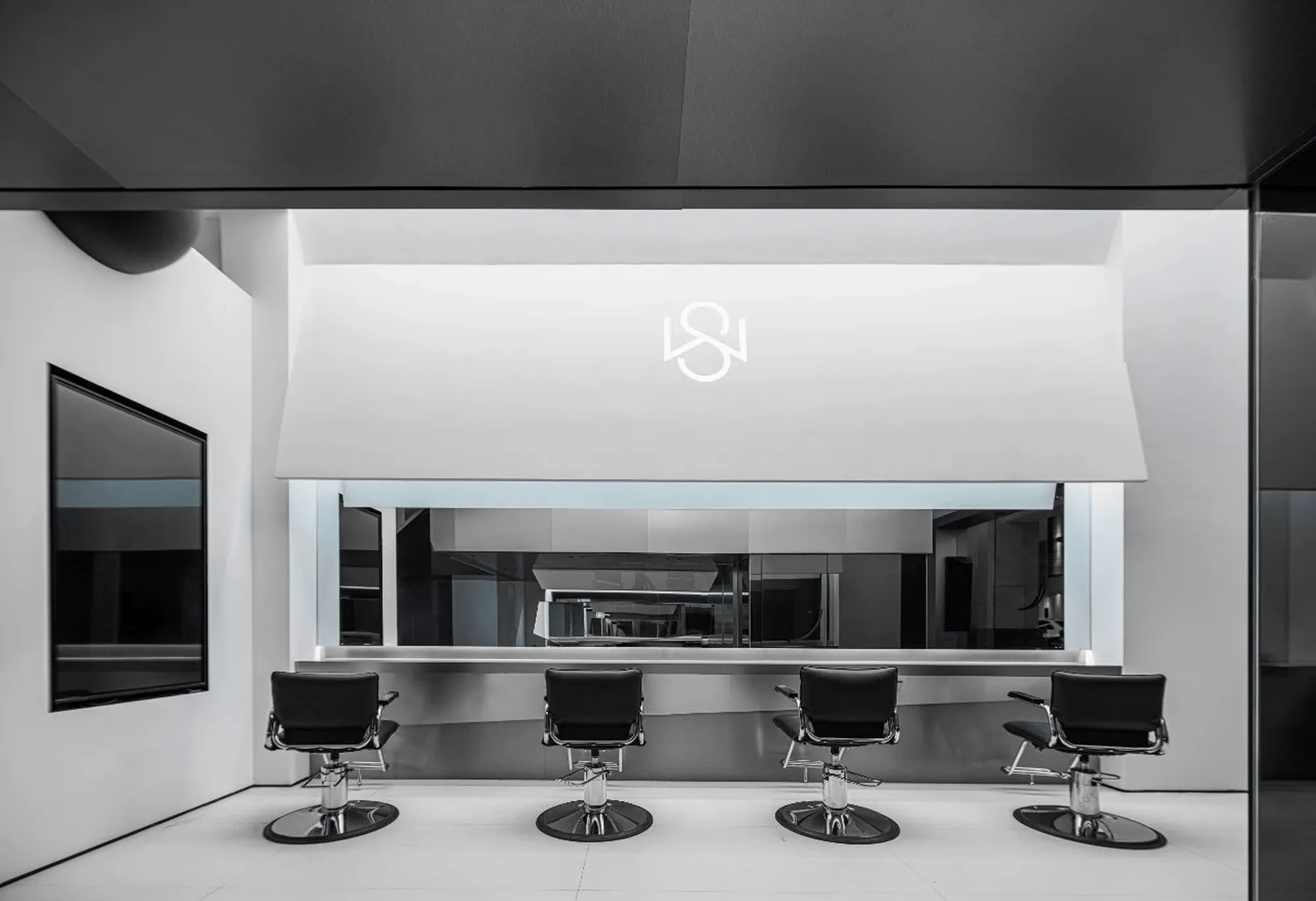
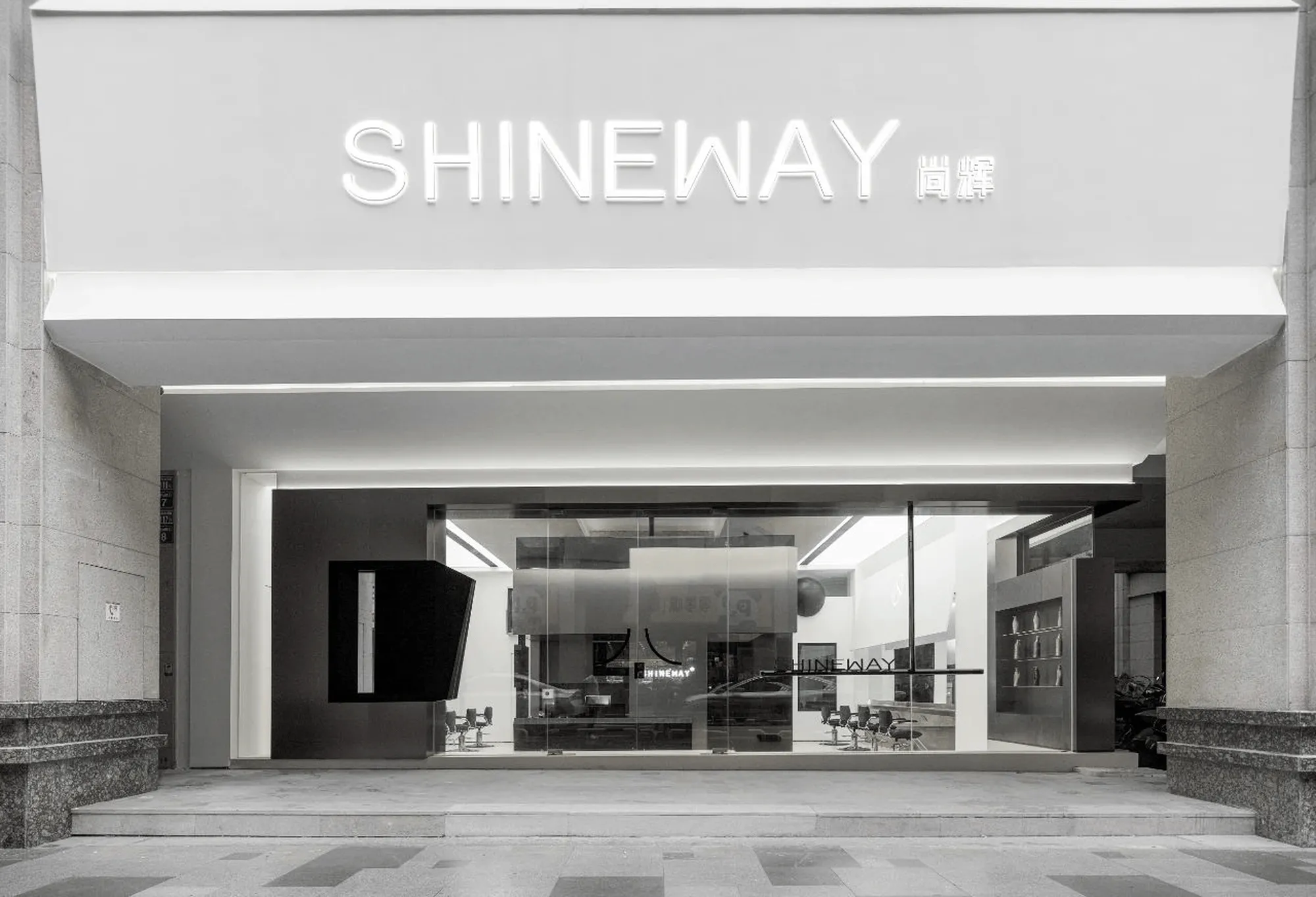
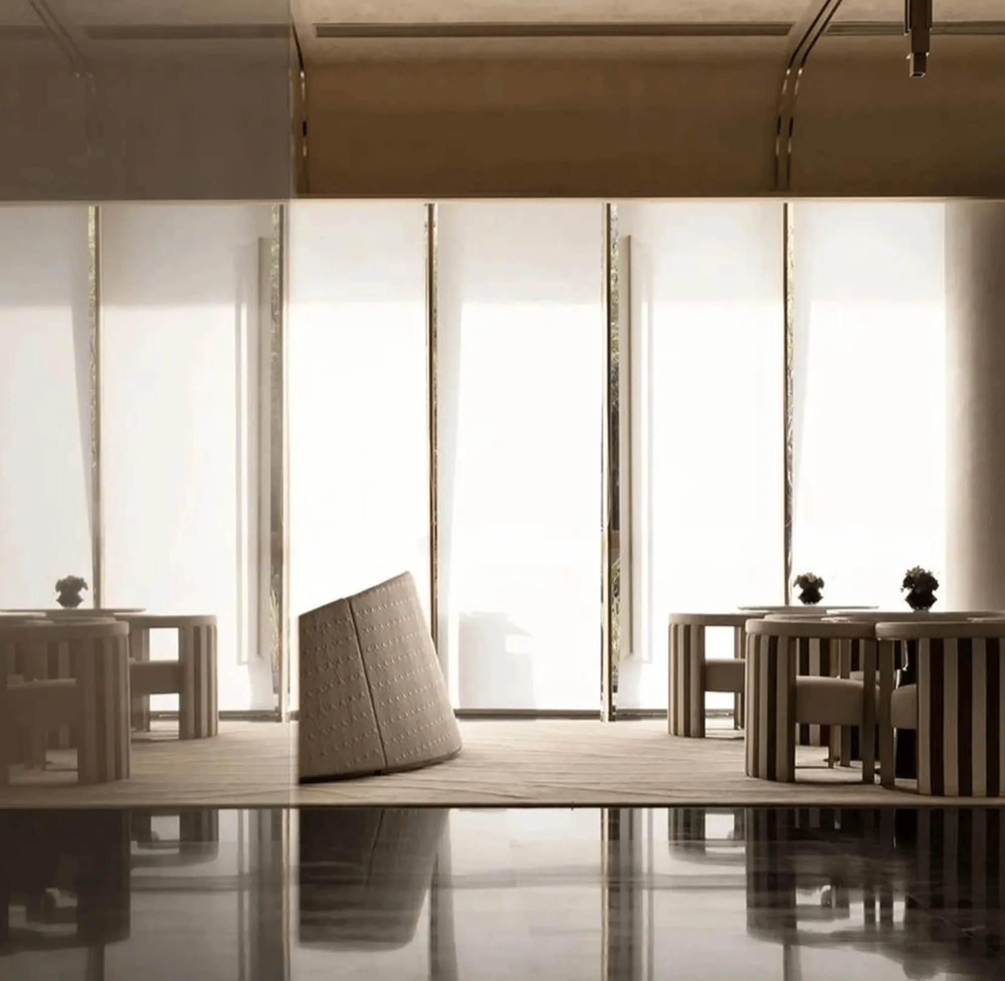
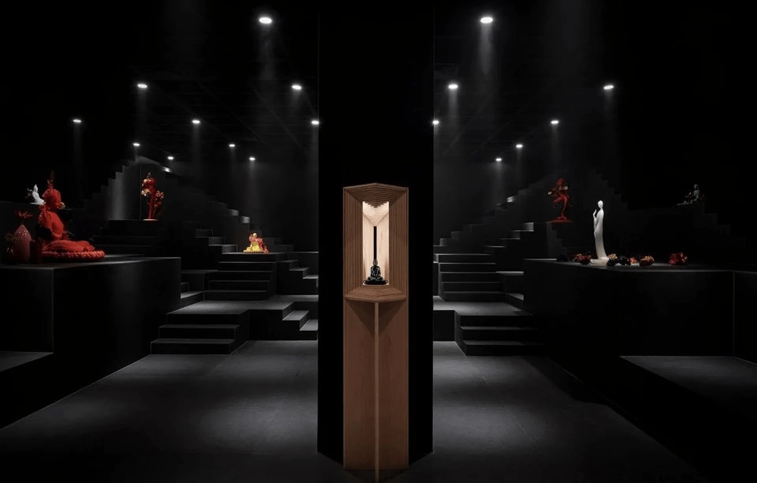
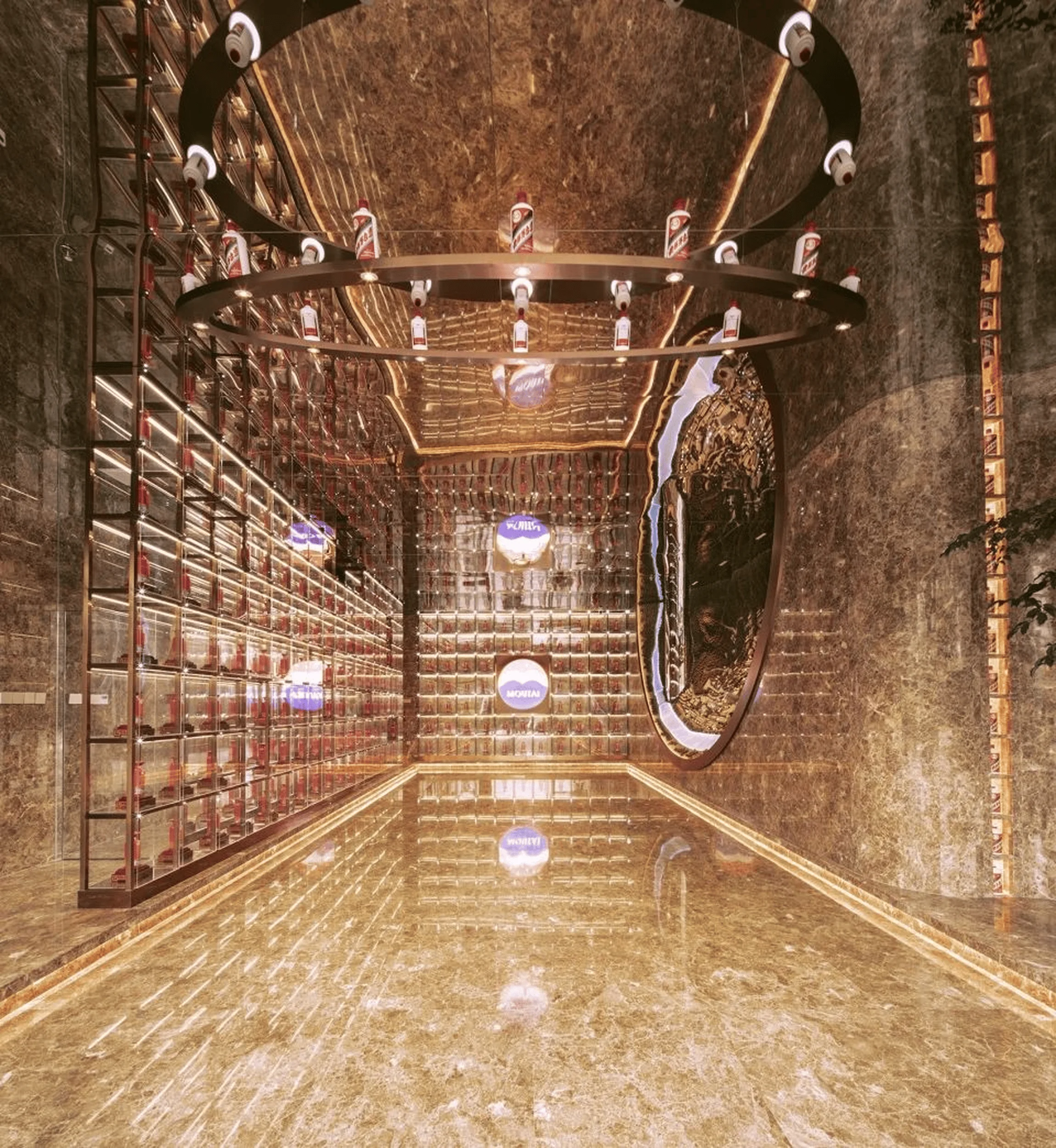
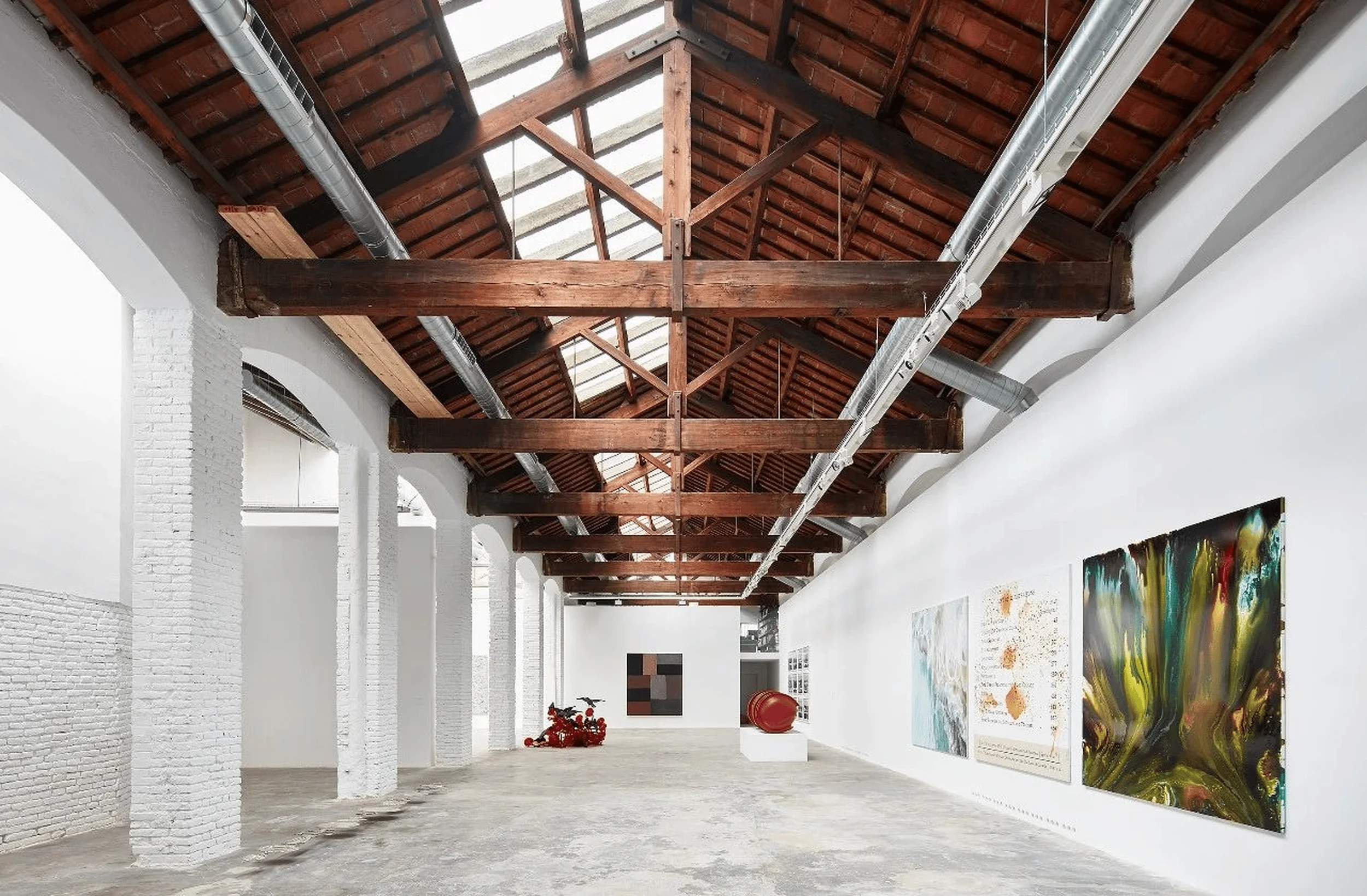
SHINEWAY Hair Salon in Quanzhou, China, designed by Benyan Design, showcases a modern aesthetic in **commercial interior design**.
Contents
Project Background and Client Collaboration
The SHINEWAY Hair Salon project in Quanzhou, China, was born from a strong collaborative relationship between Benyan Design and the SHINEWAY beauty team. Prior successful collaborations established a shared understanding of the desired aesthetic and functional needs for a high-quality salon space. This “homofrequency” ensured that the design vision could be translated into a physical reality that met the client’s exacting standards.
Design Concept and Objectives: Embracing a New Aesthetic in Commercial Interior Design
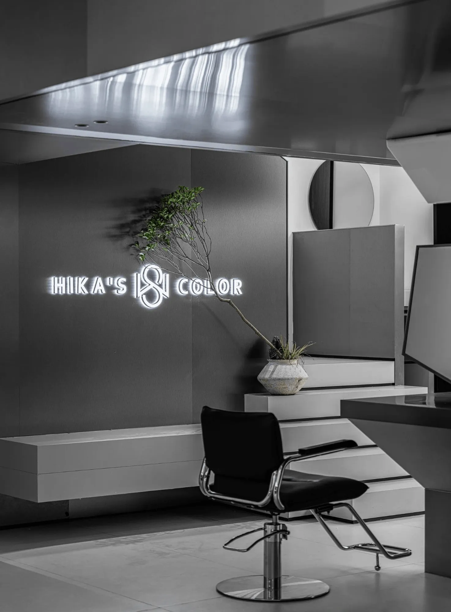
Benyan Design approached the project with a fresh perspective on hairstyling and its role in modern society. Recognizing that hair is not merely a practical necessity but a powerful tool for self-expression and a reflection of individual aesthetics, the designers aimed to create a space that embodied this philosophy. They conceptualized the salon as a vessel for presenting the SHINEWAY brand values. Every element, from material choices to structural forms, was meticulously considered to cultivate a cohesive brand identity and elevate the customer experience within the **commercial interior design** framework. The pursuit of a specific design style was secondary to crafting a unique sensory journey that fostered both customer satisfaction and commercial success.
Spatial Composition and Layout: A Play of Forms and Proportions
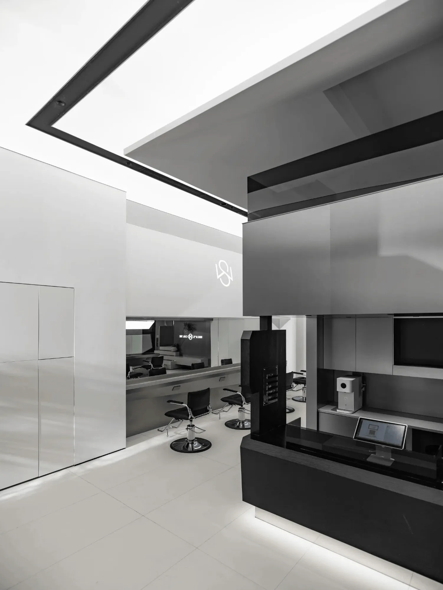
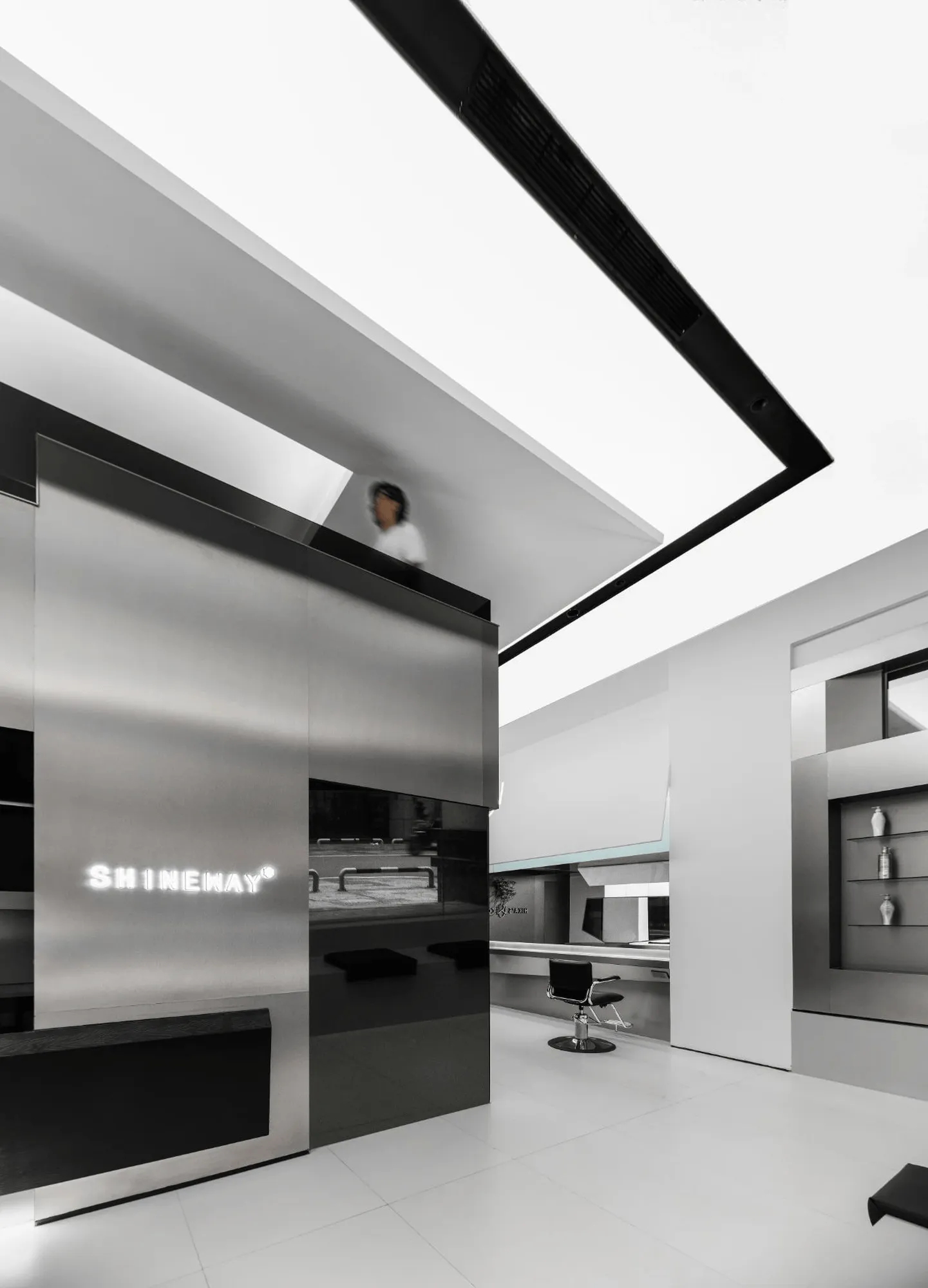
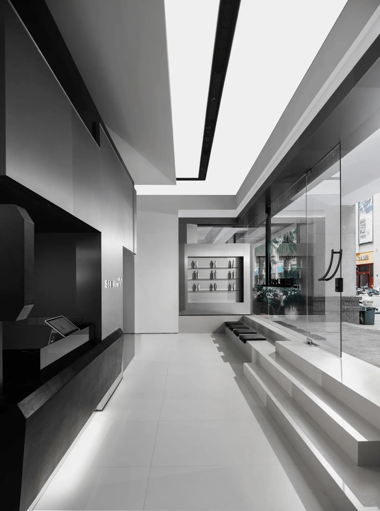
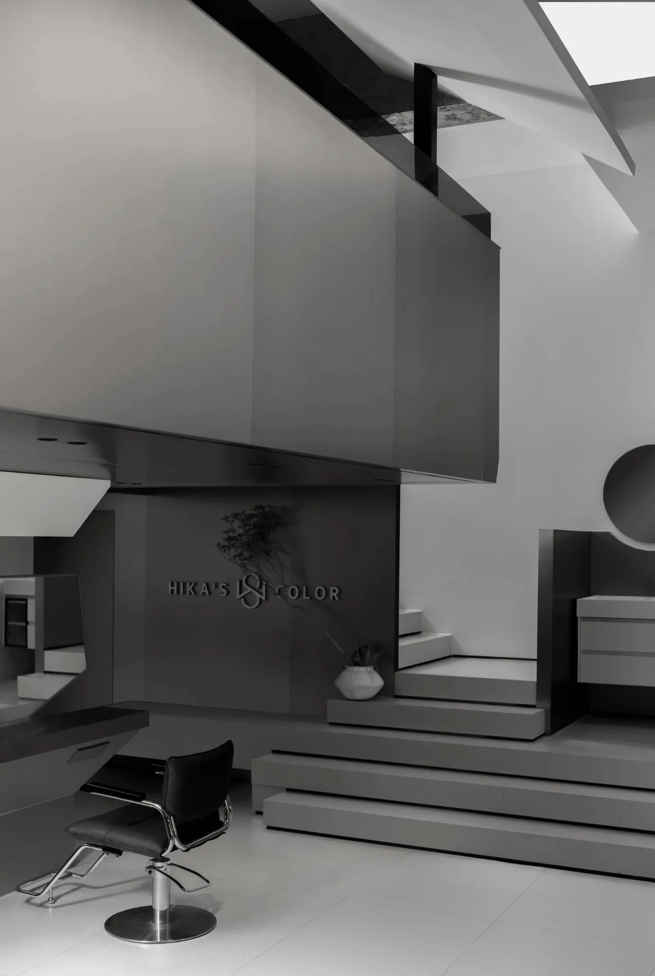
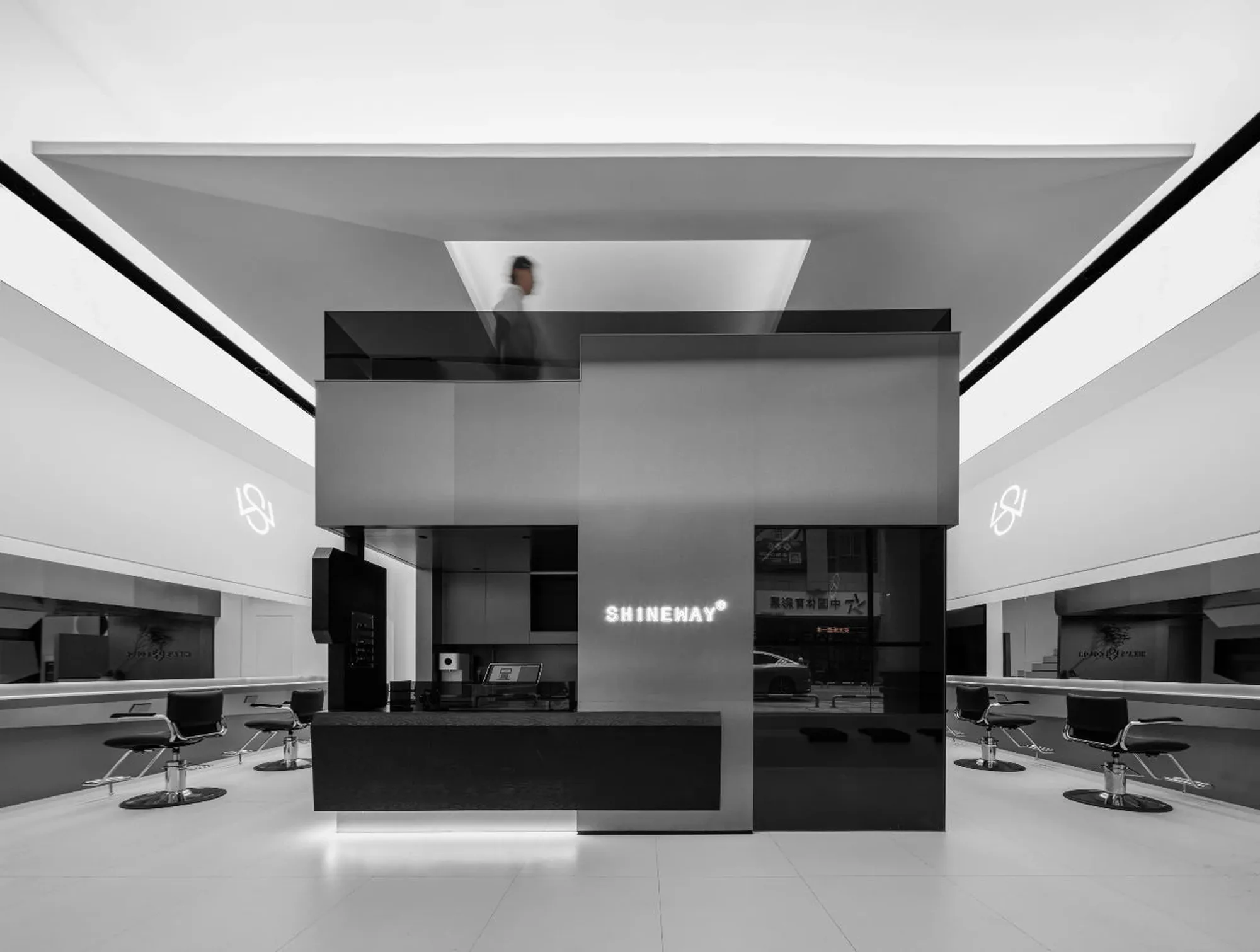
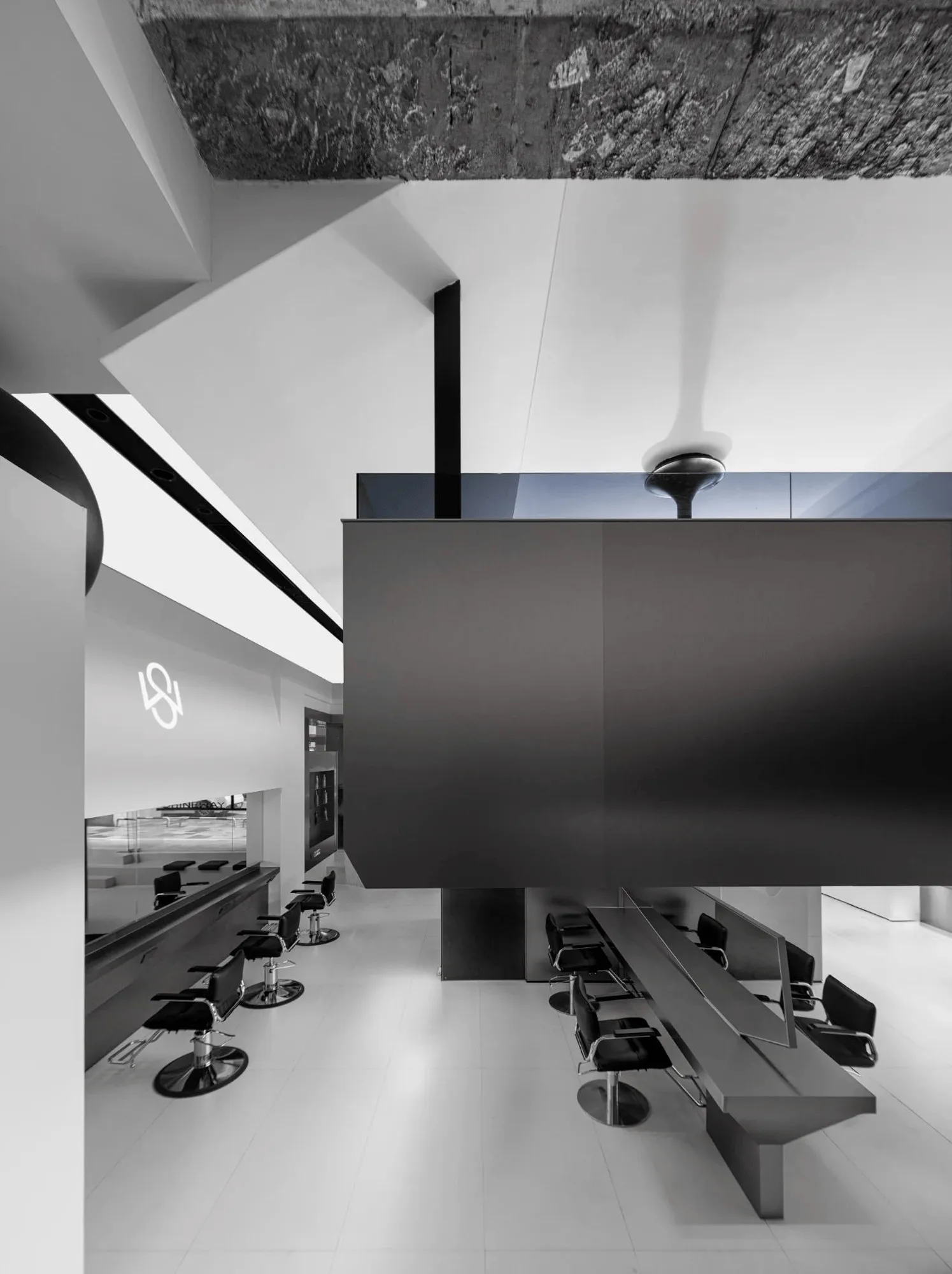
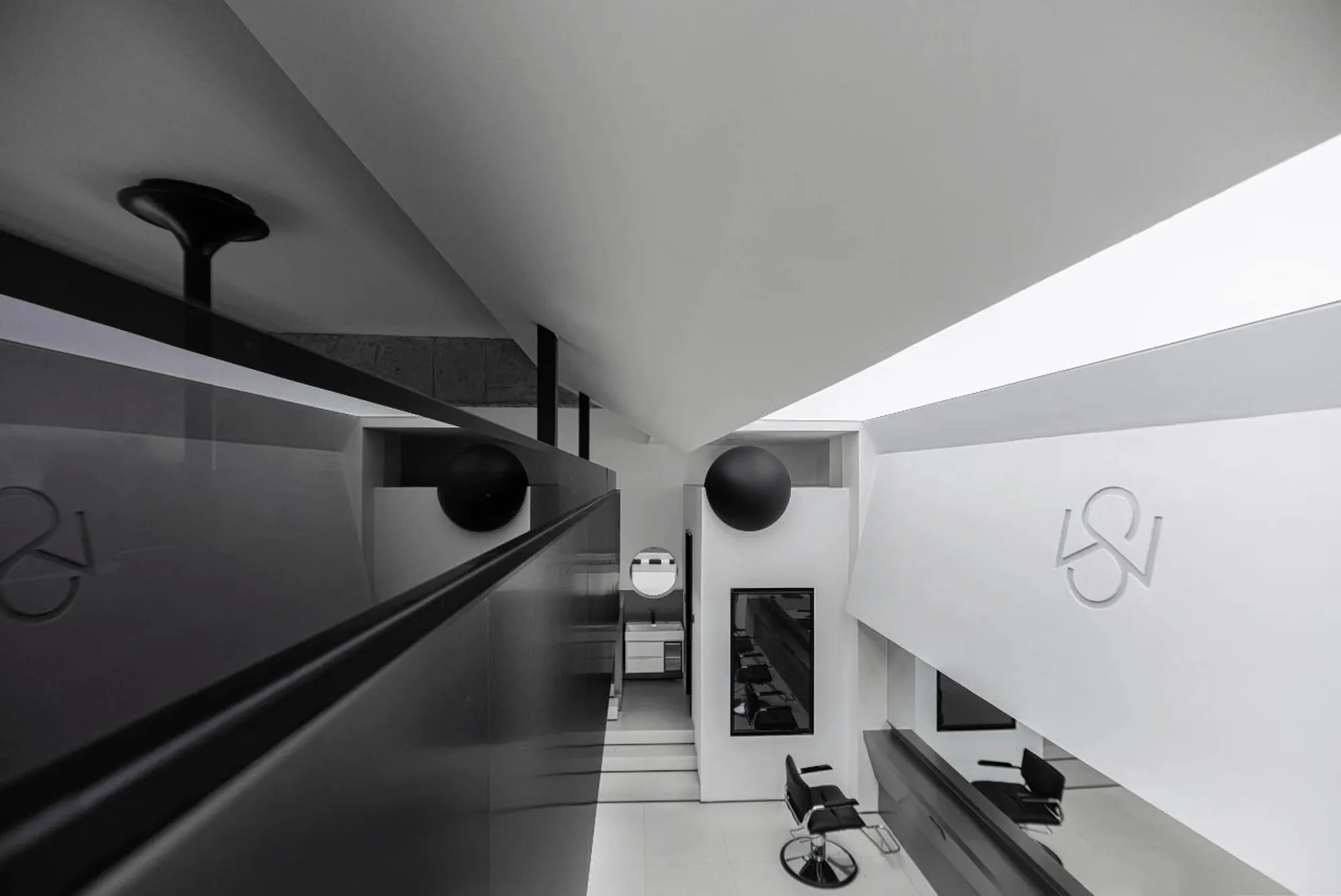
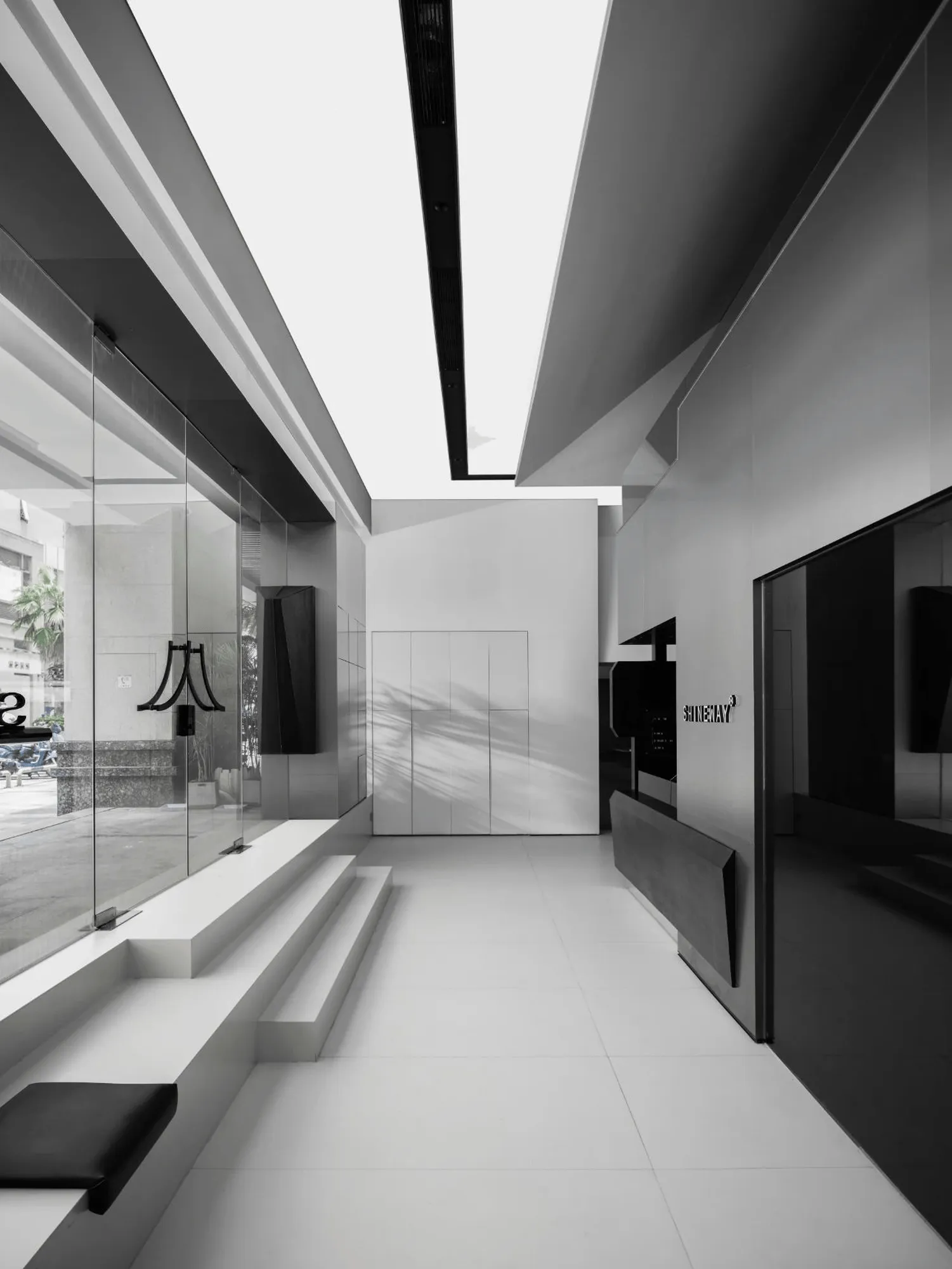
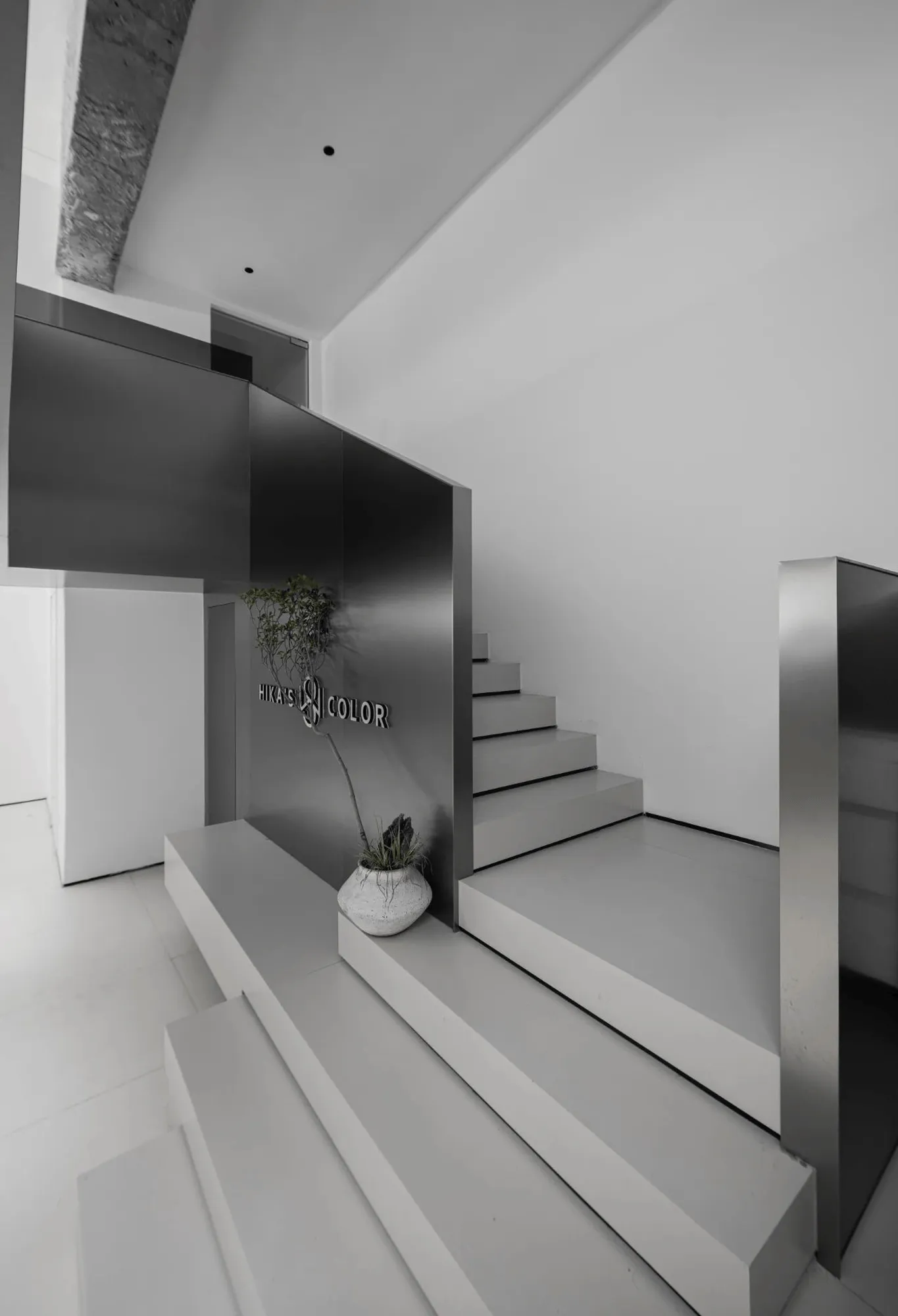
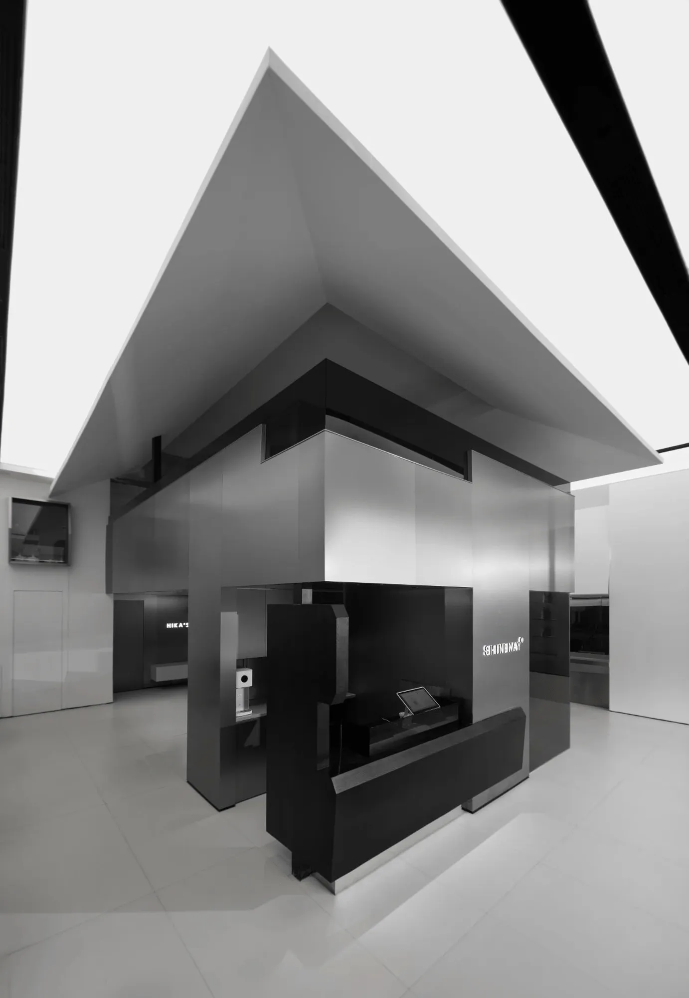
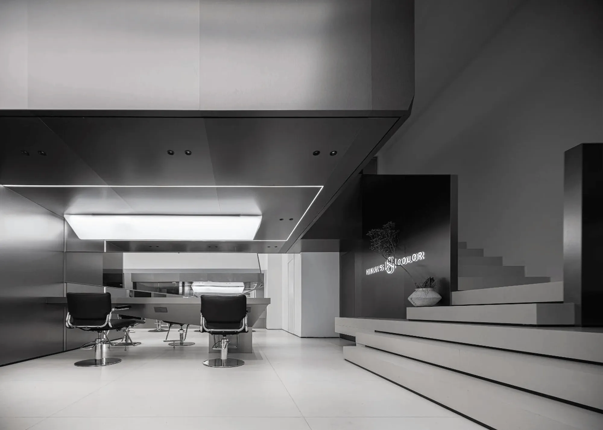
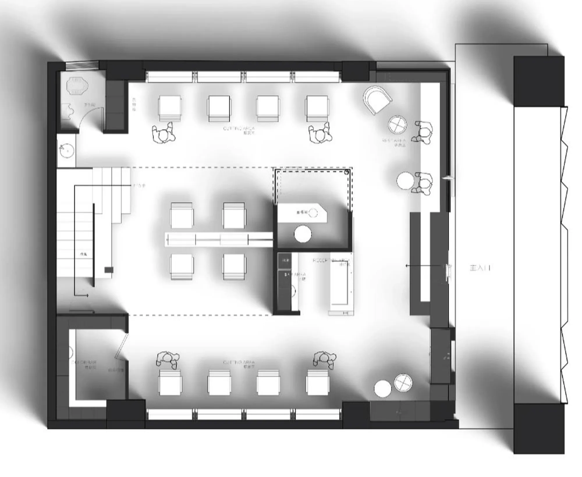
Benyan Design utilized a sunken floor plan to create a multi-layered spatial experience within the salon. A central architectural block was strategically placed to facilitate a dynamic circulation flow, directing customers through the various functional zones while subtly revealing glimpses of the salon’s overall design. This approach maximized the relatively compact space and imbued it with a sense of discovery and exploration, a hallmark of successful **commercial interior design**. The interplay of forms and proportions contributed to a captivating atmosphere that defied the salon’s physical limitations.
Spatial Interface and Visual Connections
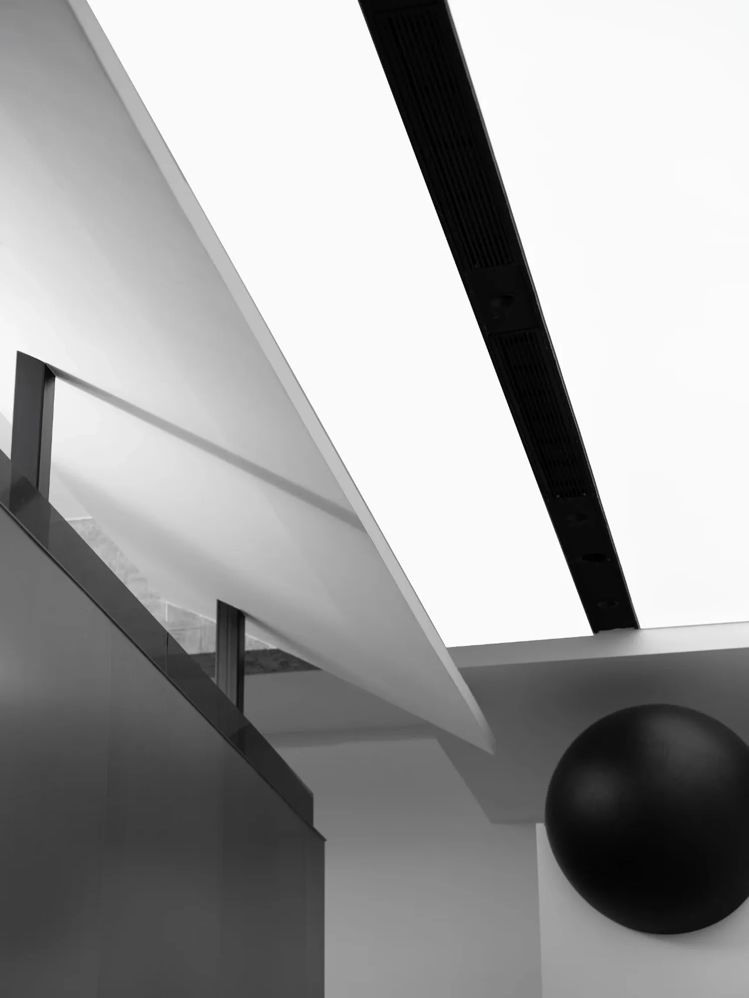
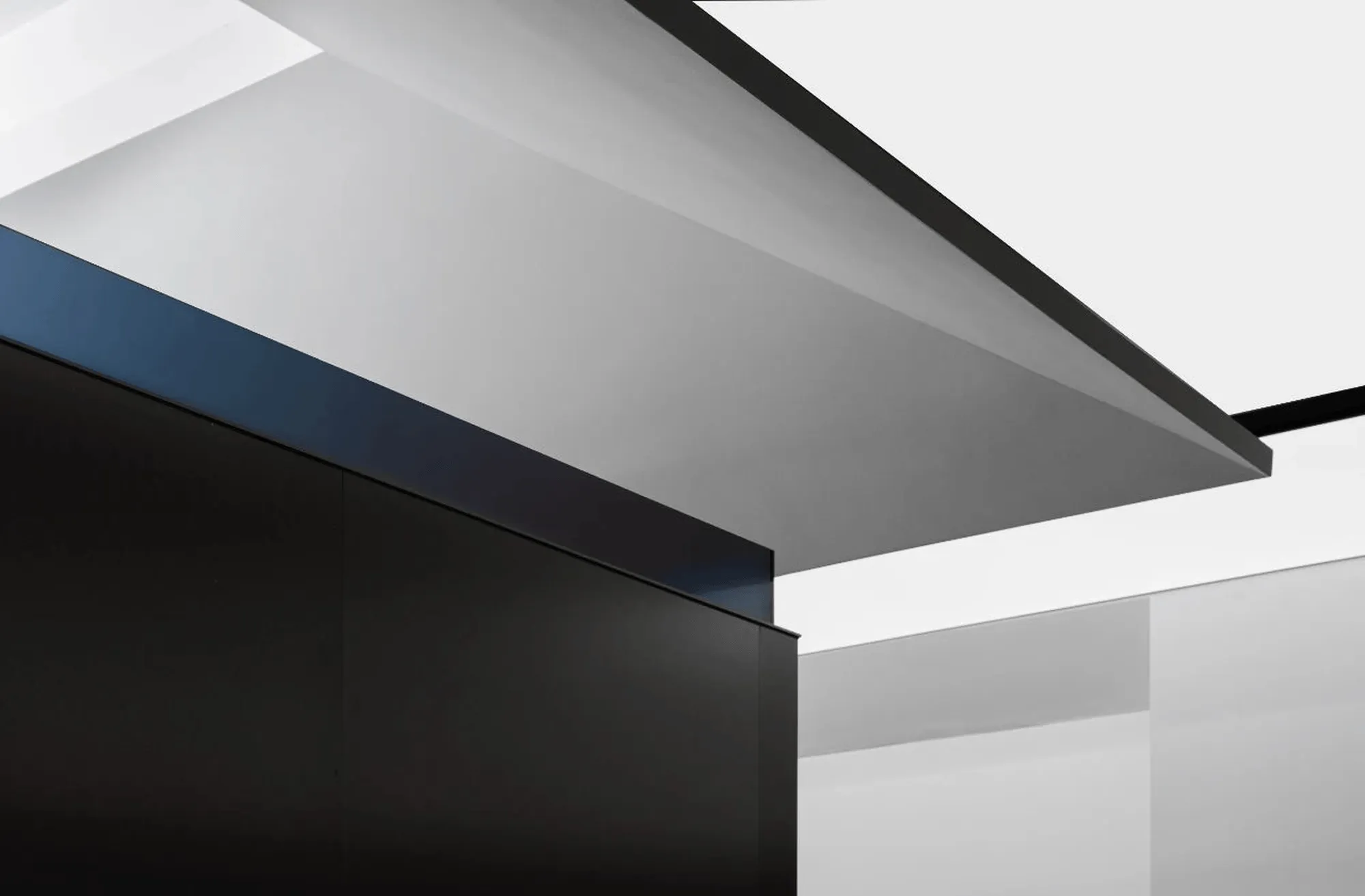
Rejecting a hierarchical approach to spatial design, Benyan Design prioritized the customer’s perspective and sensory engagement. The salon’s layout encourages visual connectivity between different functional areas without compromising privacy or creating distractions. The incorporation of an independent architectural block, featuring a dramatically sloped roofline, introduced a “space within a space” concept. This design choice not only achieved a contemporary aesthetic but also transcended traditional spatial boundaries, fostering a sense of creativity and imagination within the **commercial interior design**.
Spatial Dialogue: Contrasting Materials and Forms
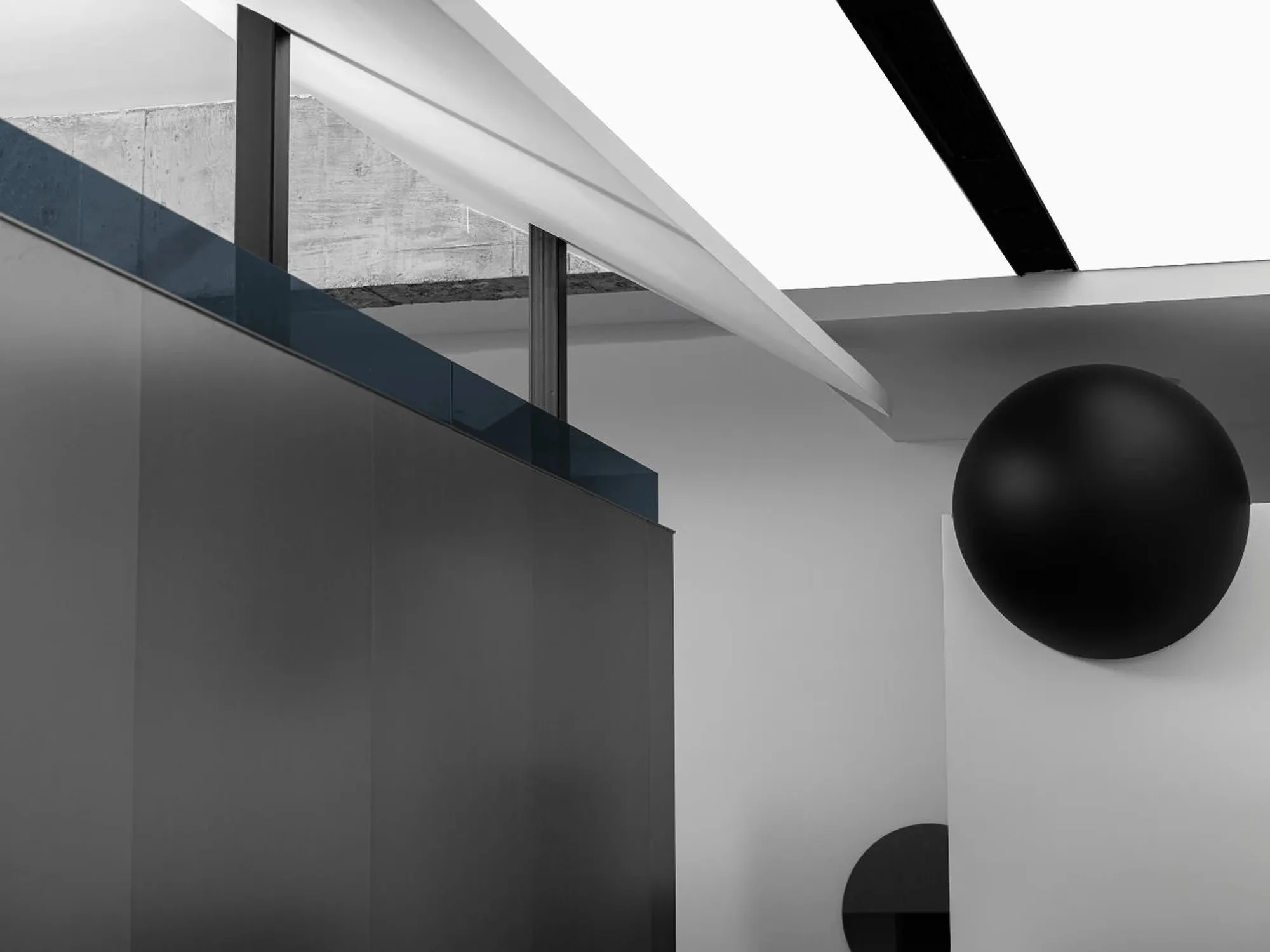
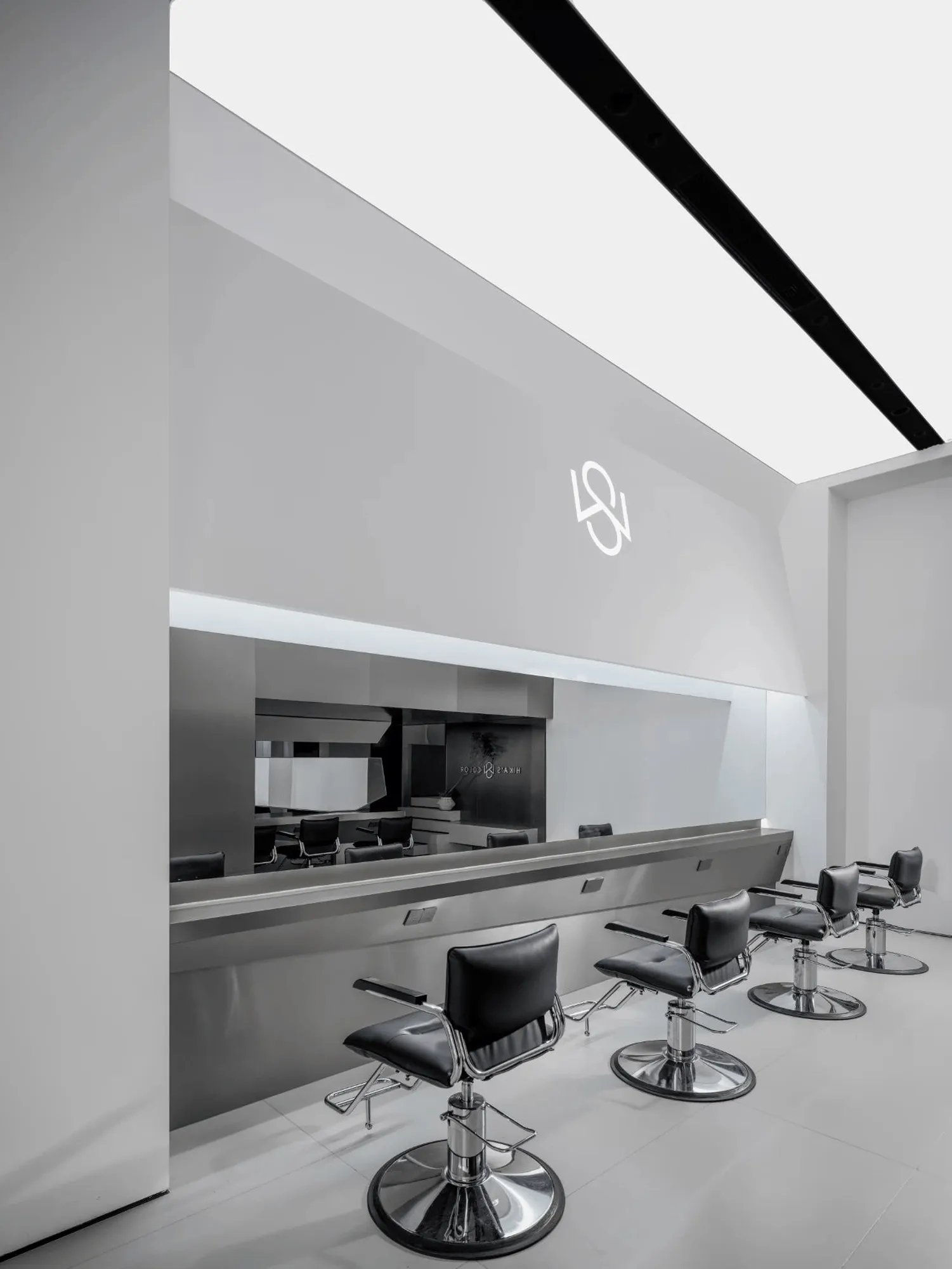
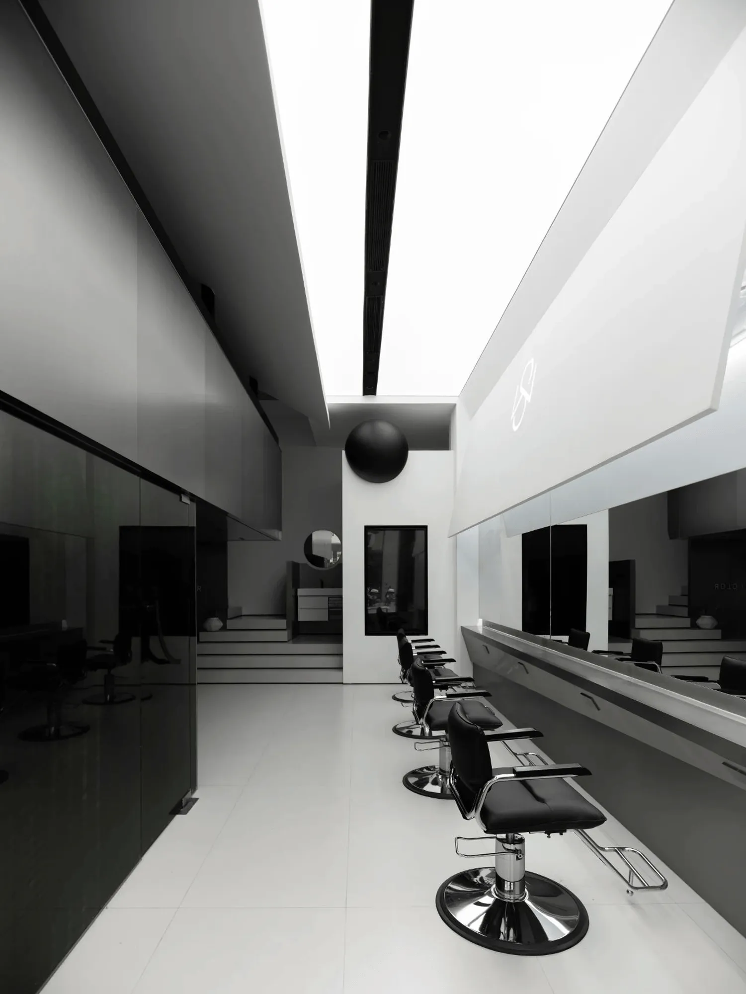
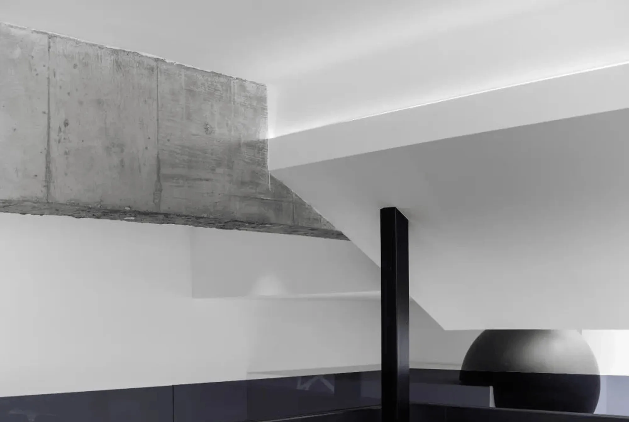
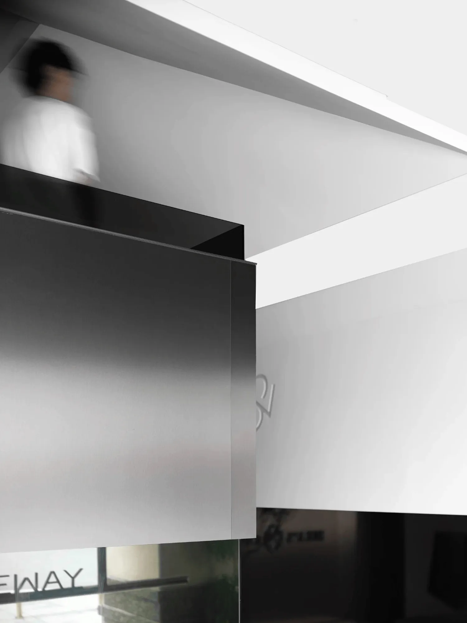
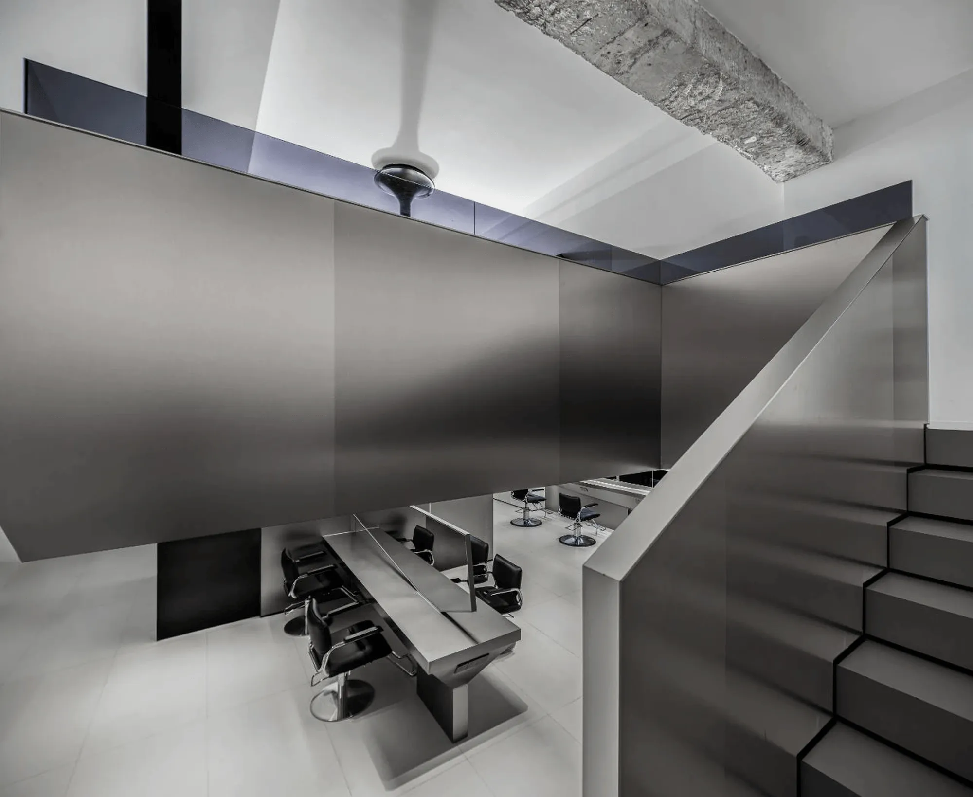
The design team’s meticulous attention to material selection and detailing played a crucial role in realizing the salon’s overall concept. Exposed, rough-hewn beams juxtaposed against sleek wall surfaces and polished stainless steel created a striking dialogue between contrasting textures and forms. This bold interplay of materials mirrored the dynamic nature of hairstyling, emphasizing the salon’s commitment to both artistry and functionality. The cantilevered wash area, with its three-sided open design, further enhanced the spatial dialogue. This feature liberated the space from a sense of confinement, creating visual depth and encouraging a natural flow of movement and interaction within the **commercial interior design**.
Spatial Form and Human Interaction
Benyan Design approached the SHINEWAY project with the understanding that architecture is more than just physical form; it’s a relationship between space and human experience. The salon’s design aimed to evoke an emotional response from visitors, fostering a sense of ease, comfort, and belonging. The design process adhered to a clear set of principles, prioritizing clarity of form and functionality. The resulting spatial configuration not only satisfies the practical needs of a hair salon but also creates a positive impact on the customer’s physical and emotional well-being, a key element of effective **commercial interior design**.
Blurring Boundaries: Light, Texture, and Materiality
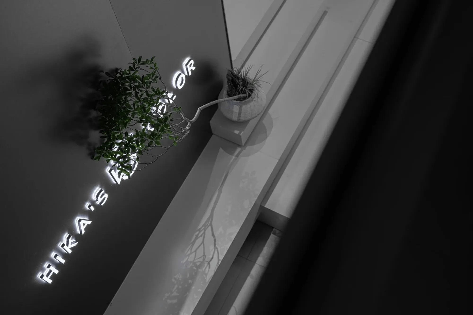
The SHINEWAY salon’s design masterfully blends light and space, creating a sensory experience that transcends the purely visual. The use of contrasting textures and materials—from the rippling patterns on surfaces to the interplay of black and white—adds depth and visual interest to the space. The stainless steel elements introduce a futuristic touch, while the matte white surfaces and exposed concrete beams ground the design in a sense of natural authenticity. This **commercial interior design** skillfully balances contrasting elements, blurring the lines between the natural and the man-made.
Project Information:
Architects: Benyan Design
Area: 160 m²
Project Year: Not specified
Project Location: Quanzhou, Fujian, China
Lead Architects: Huang Hanliang
Design Team: Lu Ming, Li Peiqi, Lu Xiaobin, Yang Hongxin
Construction Company: Wanhui Meiyie Decoration
Photography: Long Wen
Project Type: **Commercial Interior Design**, Hair Salon


