Society of Home, Shanghai retail space design creates a home-like and relaxing atmosphere.
Contents
Project Background: Society of Home in the Bund’s Cultural Hub
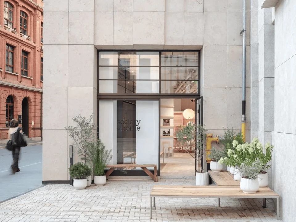
Located in Shanghai’s Bund, a historical area symbolizing the city’s modernization, Society of Home’s first retail store finds its home within the “Bund Source” district. This culturally vibrant district blends historical buildings showcasing the legacy of the concession era with modern Art Deco structures. The store, nestled along Huqiu Road, provides a unique retail experience within this dynamic area. Society of Home is a lifestyle brand established post-pandemic. The brand’s name beautifully reflects a shift in modern society – the lines between society and home have become increasingly blurred and open. People are more inclined to share their lives and remain true to their genuine feelings. The design of the space was inspired by this philosophy. The retail space design for Society of Home, Shanghai, adopts the concept of a “creator’s home”. In a world where the boundaries between life, work, personal, and social are increasingly ambiguous, and traditional structures are gradually dissolving, the project aims to create a space where visitors can unwind, experience new inspiration, and cultivate creativity. This innovative store not only presents clothing and lifestyle goods but also offers coffee, music, and workshops, ultimately fostering a home-like, comfortable space with a refreshing and accessible studio environment. The interior design also uses the concept of a “creator’s home” to create a comfortable and inspirational space for customers to relax and explore the brand’s products. #RetailSpaceDesign #HomeLikeAtmosphere #InteriorDesignShanghai
Giant Wardrobe as Architectural Element:
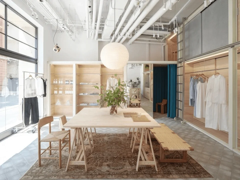
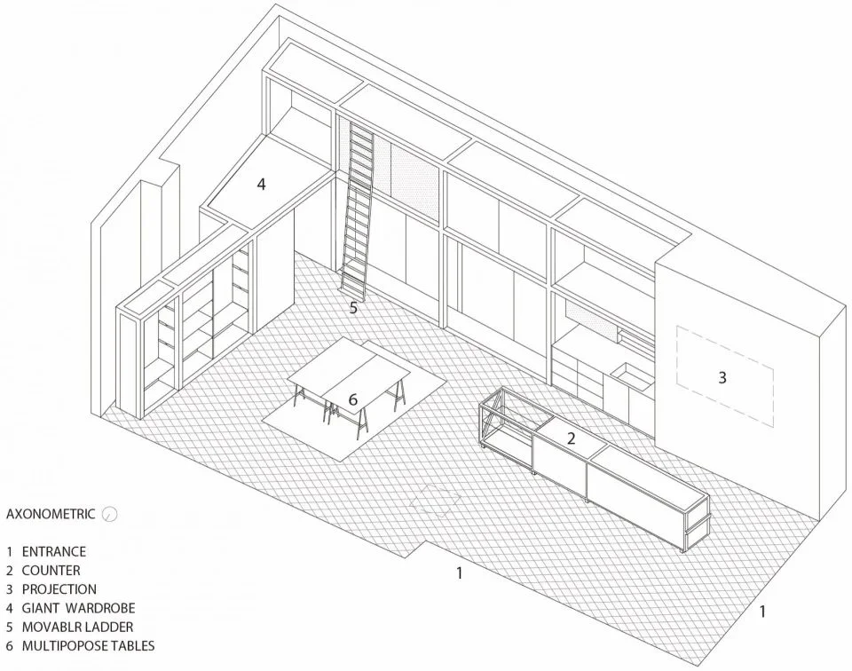
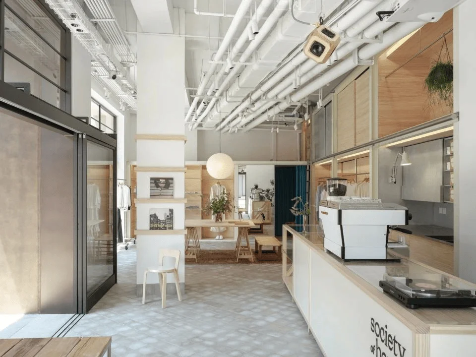
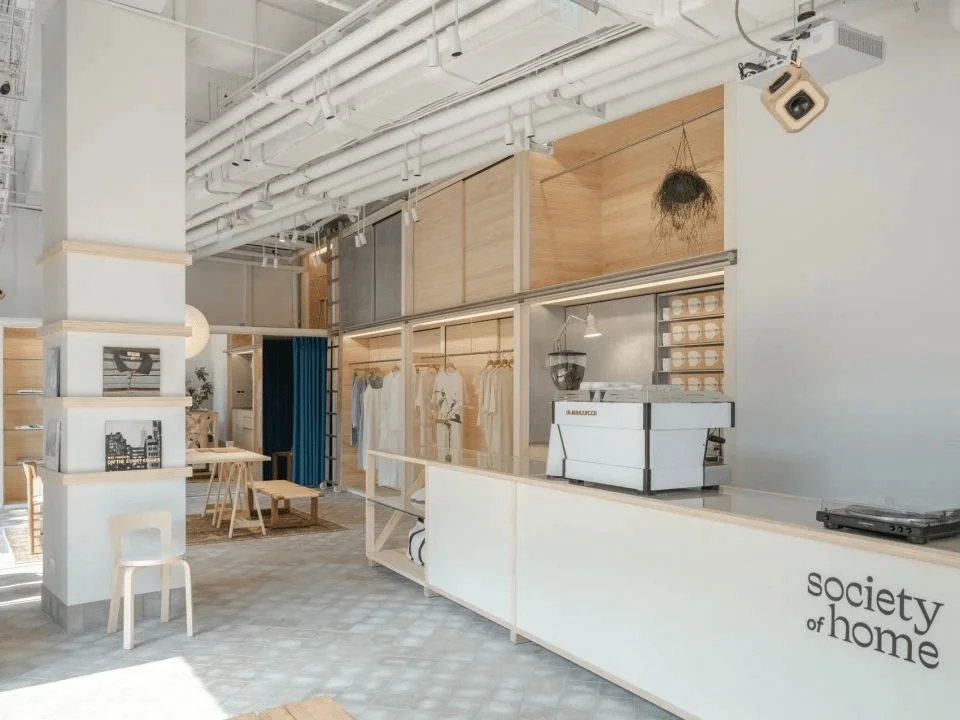
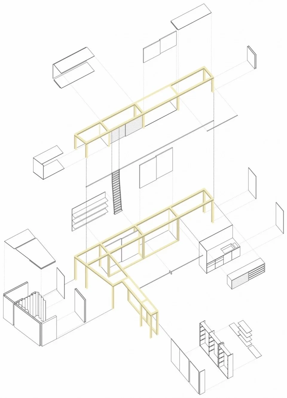
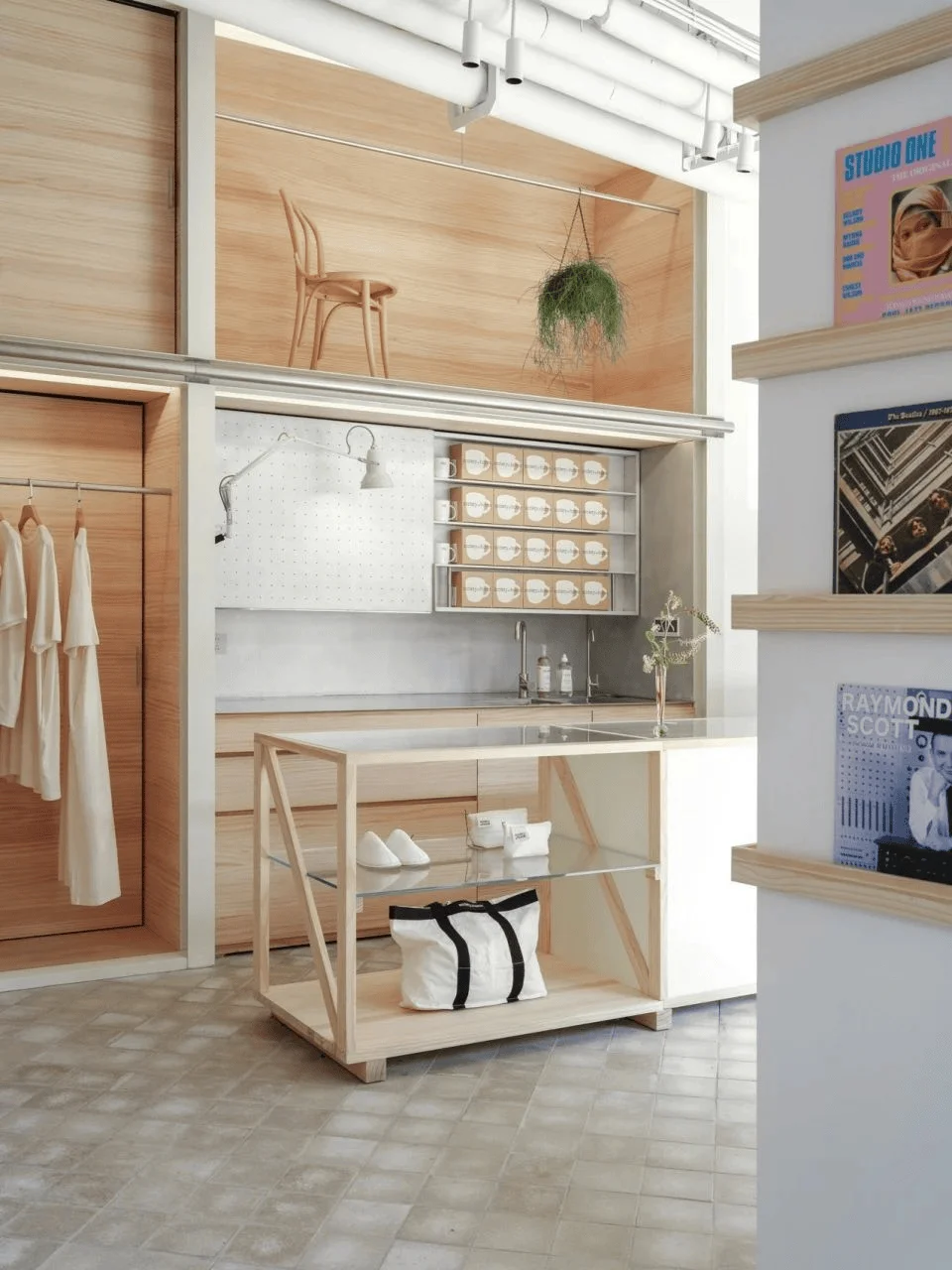
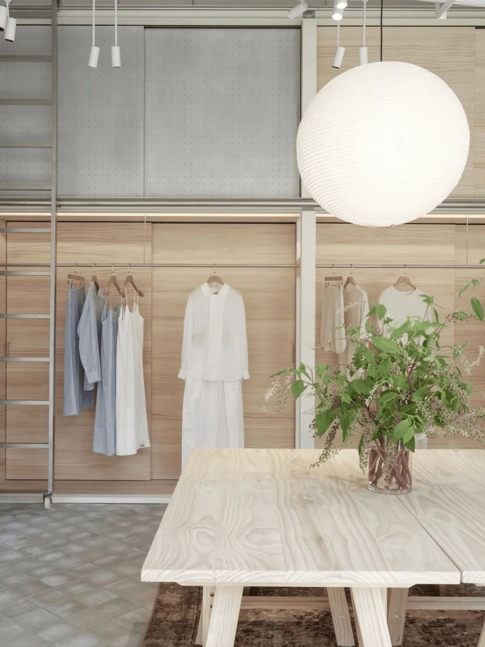
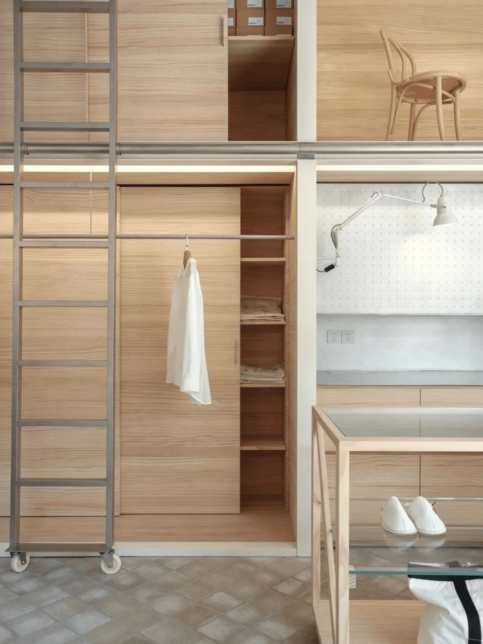
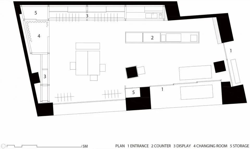
Leveraging the 4-meter ceiling height, a significant feature of the design is the construction of a large wardrobe along the walls. This wardrobe is made of H-steel framework, pinewood, and aluminum panels. It acts as a multi-purpose element in the space, accommodating various functionalities. The wardrobe integrates the areas for garment and product displays, a coffee bar, a counter, a fitting room, a staff lounge, and two-story storage space. Interestingly, some elements of the framework are intentionally kept in an unfinished state, leaving the function open to future adaptation. This enhances the flexibility of the space and imparts a sense of spaciousness and freedom. By fulfilling diverse roles, the wardrobe ensures a balance between order and freedom within the open space, thereby catering to the dynamic needs of the future. The large wardrobe is a key feature of the space and it acts as a storage and display area. It’s also designed with functionality in mind, providing areas for a coffee bar, a counter, a fitting room, and a staff lounge. The wardrobe helps maintain the order and freedom of the space, creating a unique retail experience that caters to the needs of the customers. #RetailSpace #HSteelFramework #StudioInteriorDesign
Home-like Furnishing and Ambiance:
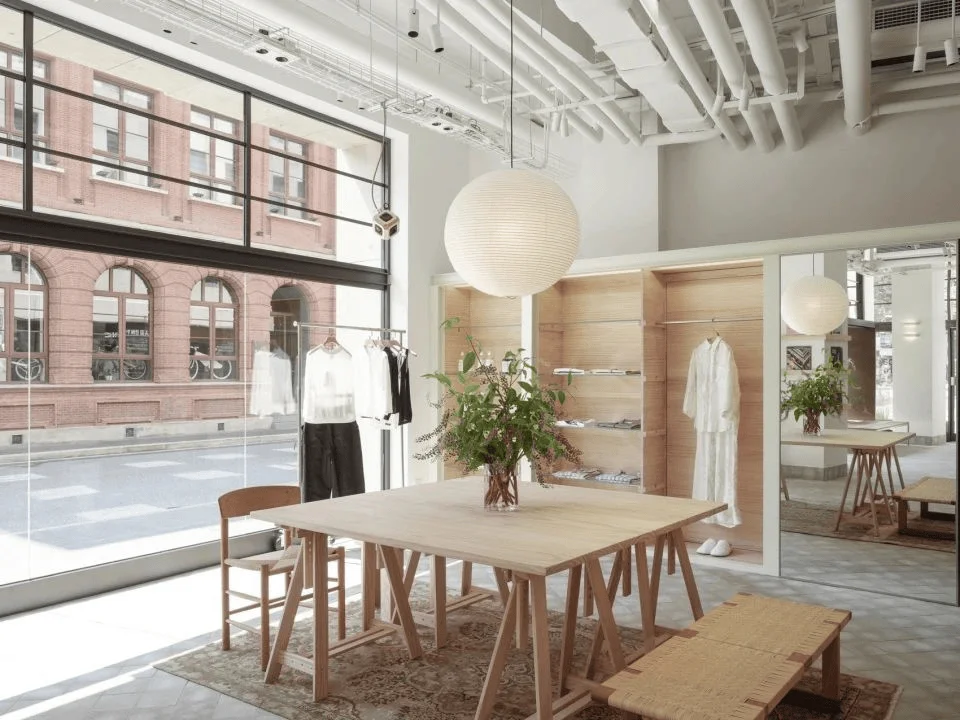
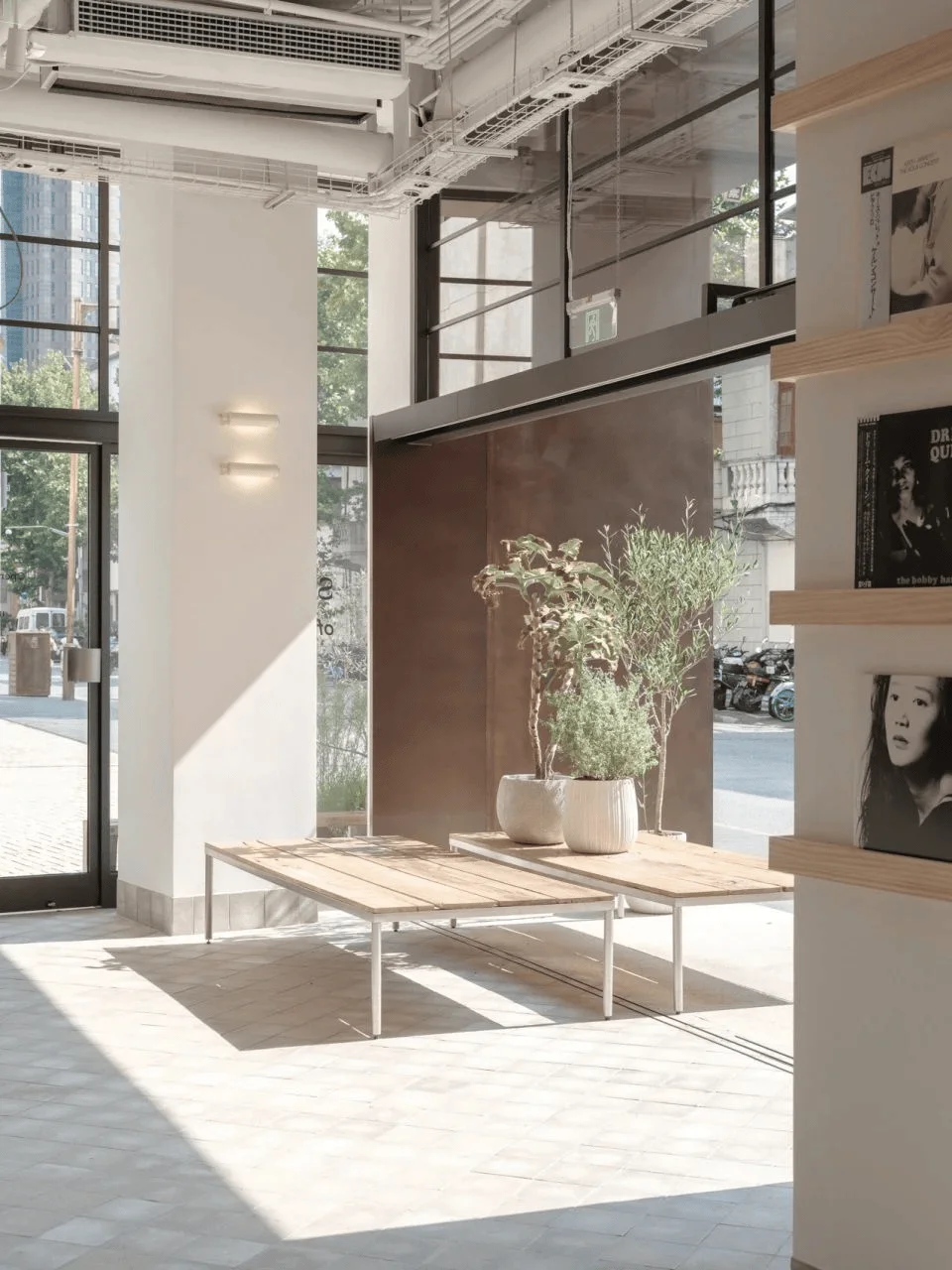
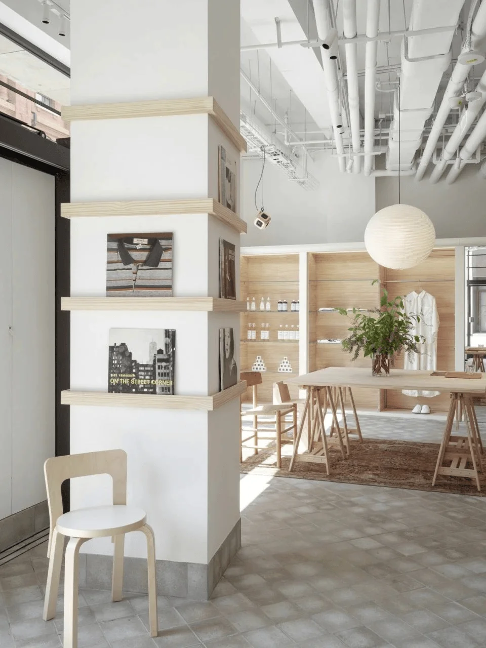
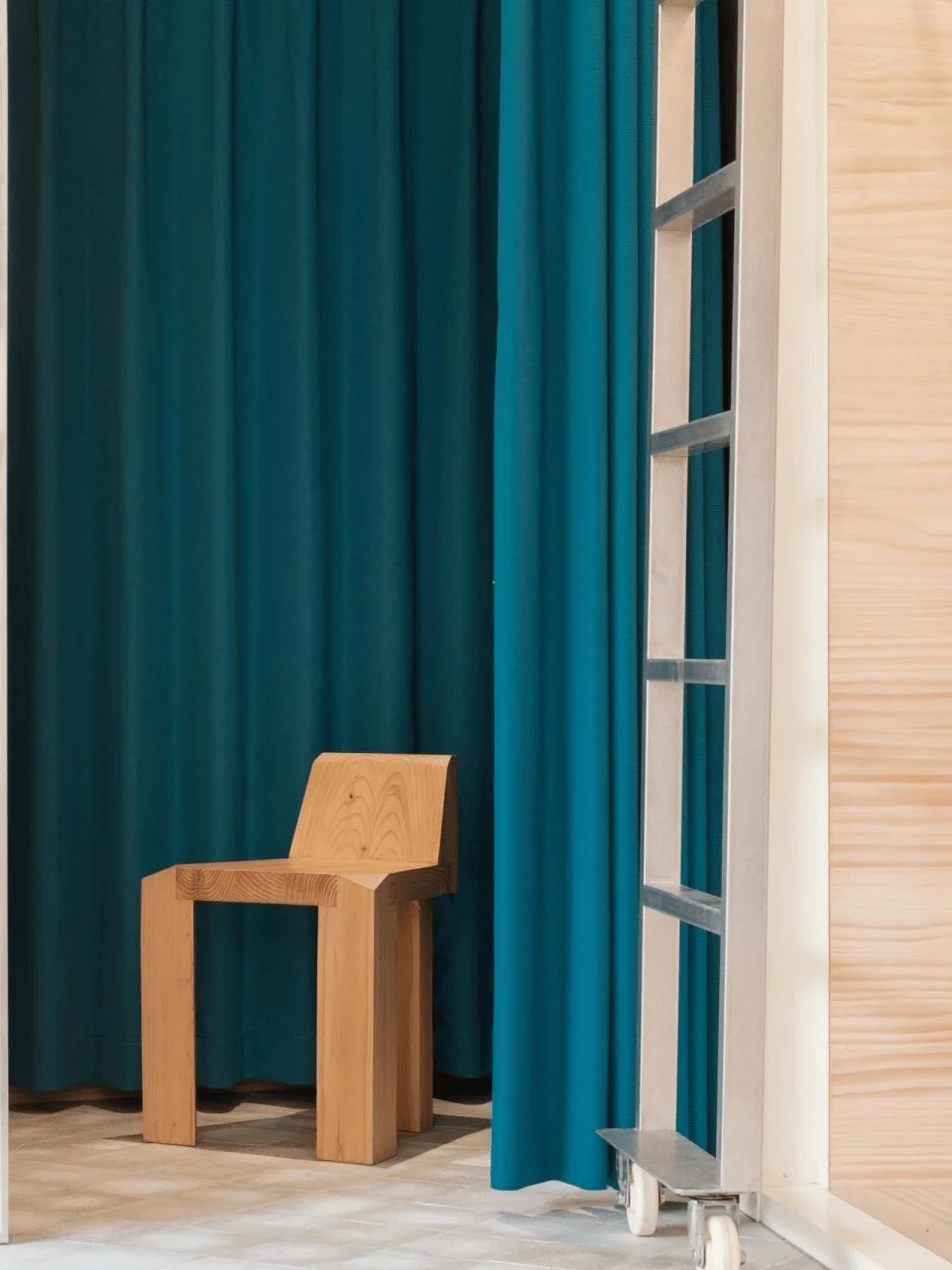
The store incorporates a range of furniture that evokes memories of everyday living. The designers selected a variety of furniture elements to create a home-like ambiance within the space. This includes benches made of reclaimed wood, ARTEK chairs, vintage IKEA lighting, a pendant speaker system with 360-degree surround sound, and office-style clothes racks. Notably, TOWERLAND’s triangular stools are present in the changing rooms. The space becomes a blend of industrial elements, crafts, vintage, and original furniture, resulting in a rich and diverse interior design. This combination conveys the quality of life while maintaining a comforting, home-like environment. The interior design of the shop utilizes a variety of furniture and elements to create a comfortable and relaxed atmosphere. This includes benches made of reclaimed wood, ARTEK chairs, vintage IKEA lighting, and TOWERLAND triangular stools. The combination of different furniture and elements helps create a unique retail experience that feels both relaxing and functional. The use of natural materials, such as wood, creates a warm and inviting atmosphere. #RetailFurnitureDesign #VintageLighting #IndustrialInteriorDesign
Society of Home’s Space: A Blend of Society and Home:
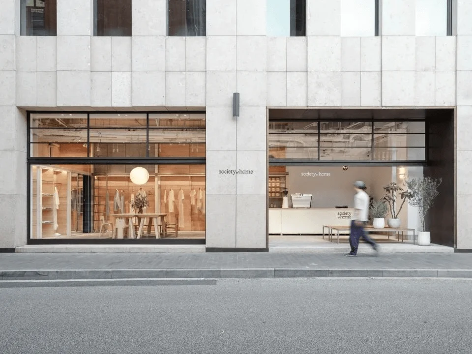
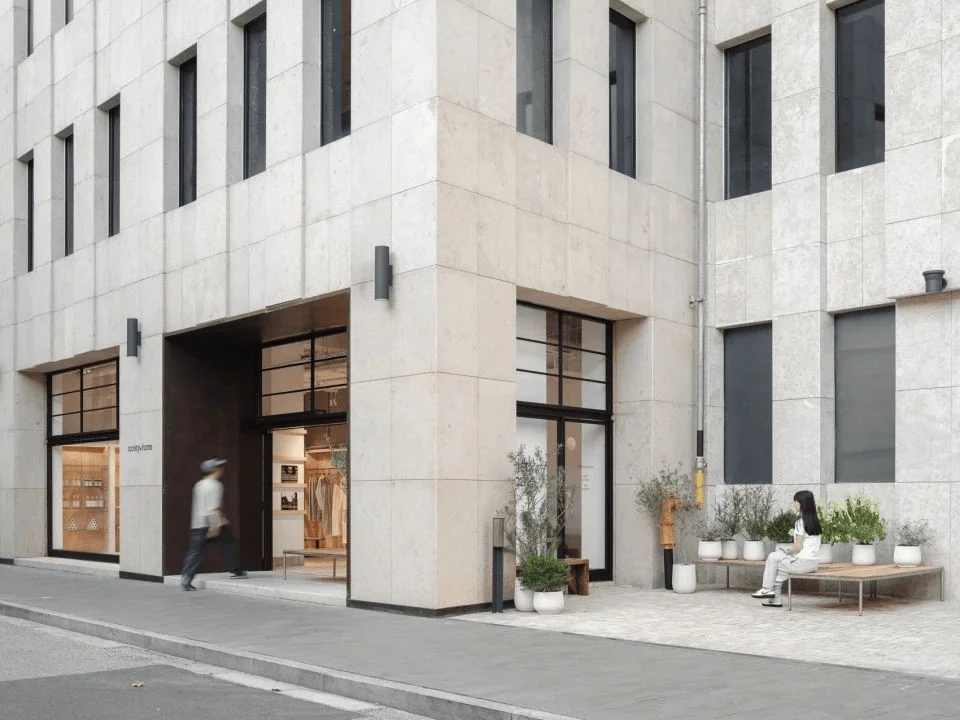
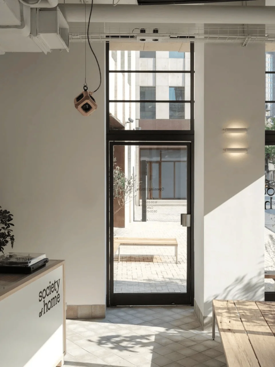
In the historical Bund, within the ground-floor spaces of the stately stone buildings, the welcoming Society of Home finds its place. Upon opening the sliding doors at the entrance, the lines between inside and outside blur. The scent of coffee and the sounds of vinyl records gently greet visitors. This space serves as a haven for exploring a relaxed lifestyle and engaging in open communication. As people’s daily routines evolve, this adaptable space, with its inclusive nature, will continue to accommodate the changes. It has the potential to become a focal point where imagination can spark a new understanding between society and home. Society of Home is designed to be a space where people can relax and enjoy a coffee, listen to music, and explore the brand’s products. It is also a space where people can connect with each other and share their ideas. This blend of social and home environments creates a unique and welcoming experience for customers. The retail space is designed to evolve and adapt to changes in people’s lifestyles. It’s a space for innovation and inspiration, where the boundaries between society and home are blurred. #LifestyleStoreDesign #SocialRetailSpace #ModernRetailDesign
Project Information:
Project Type: Retail Space
Architect: Office Coastline
Area: 65 sqm
Year: 07.2024
Country: China
Photographer: Zhu Runzi
Website: www.officecoastline.com
Email: [email protected]


