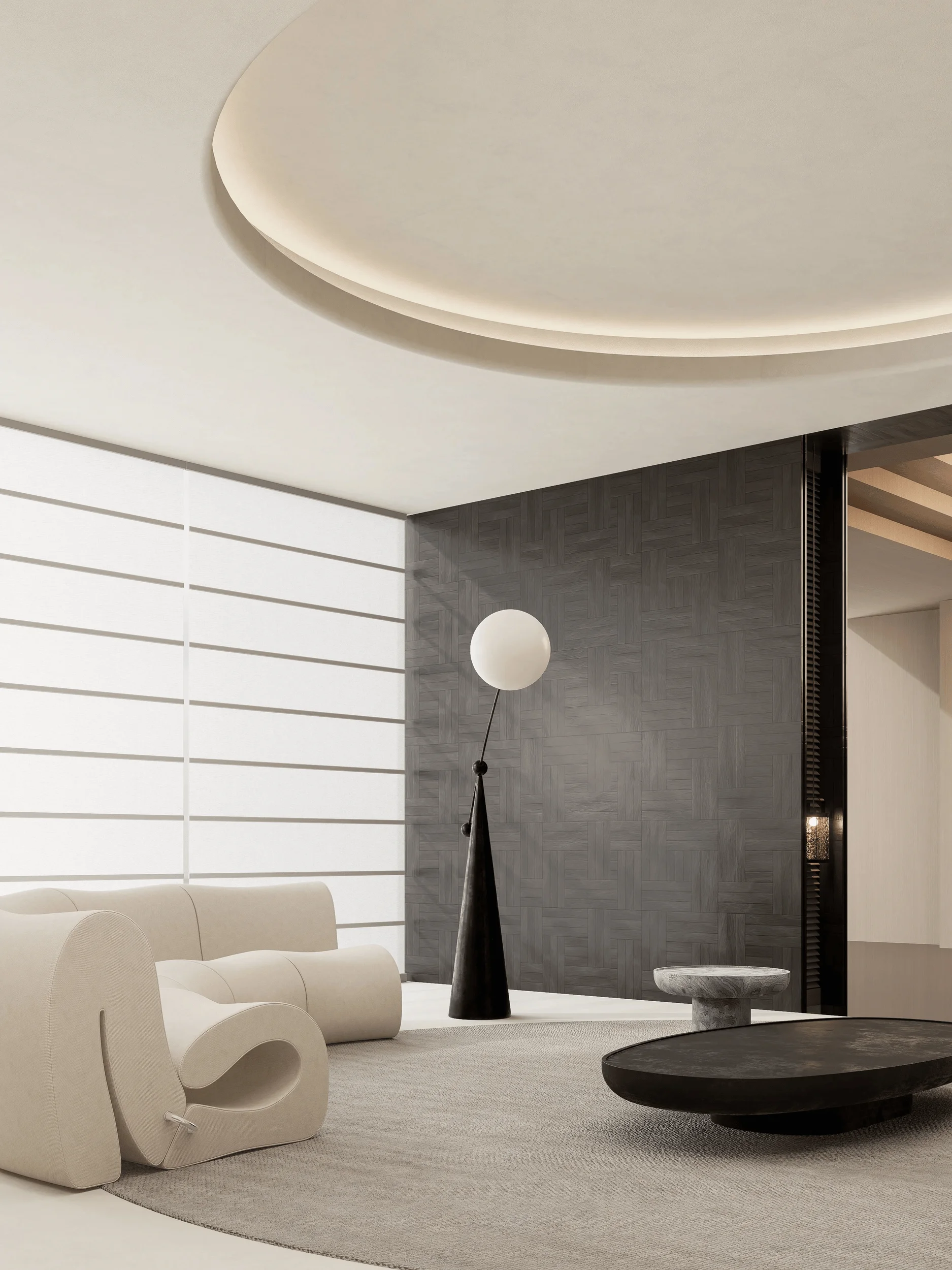
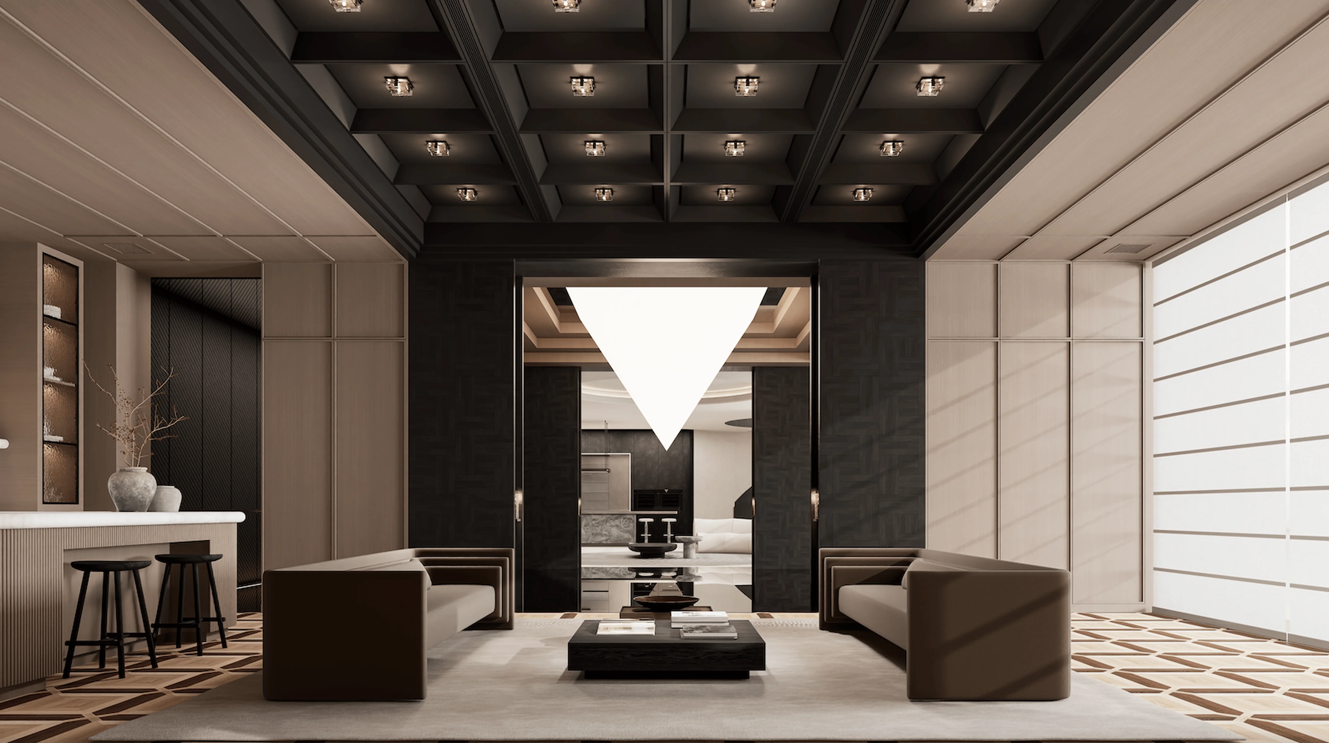
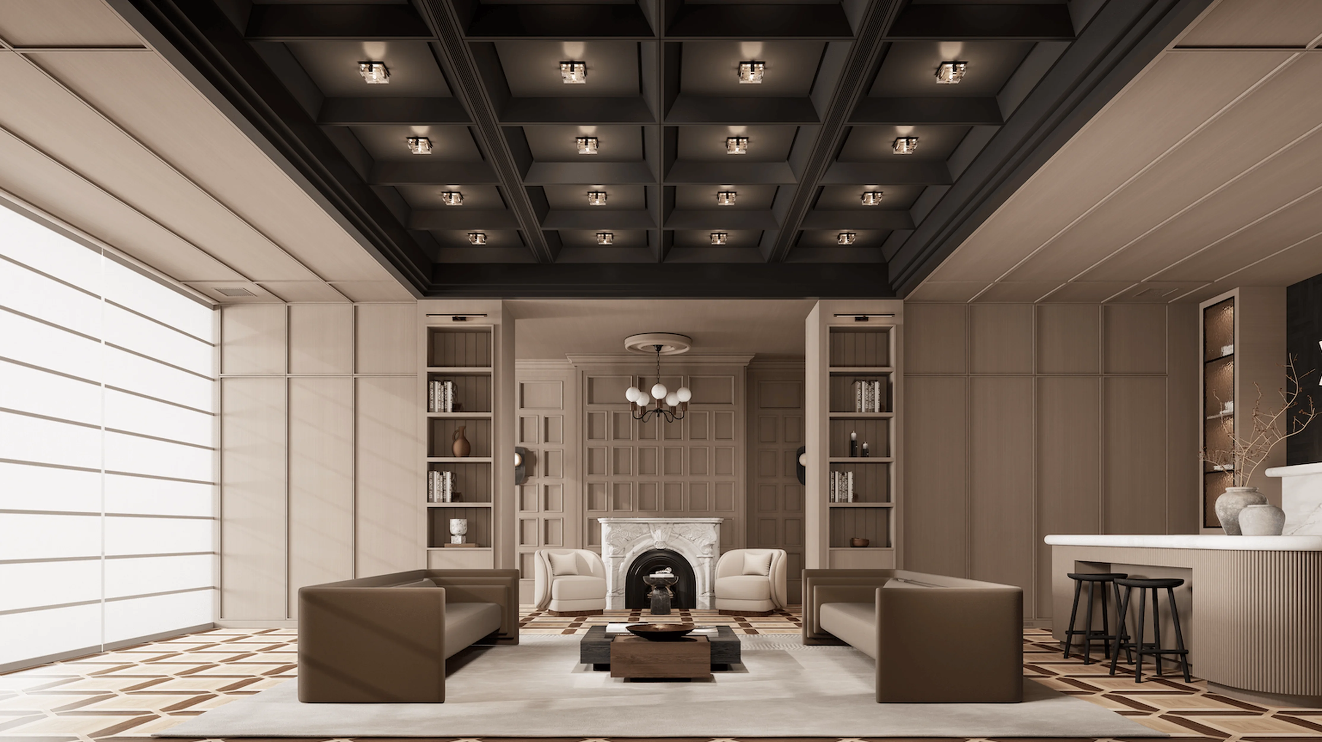
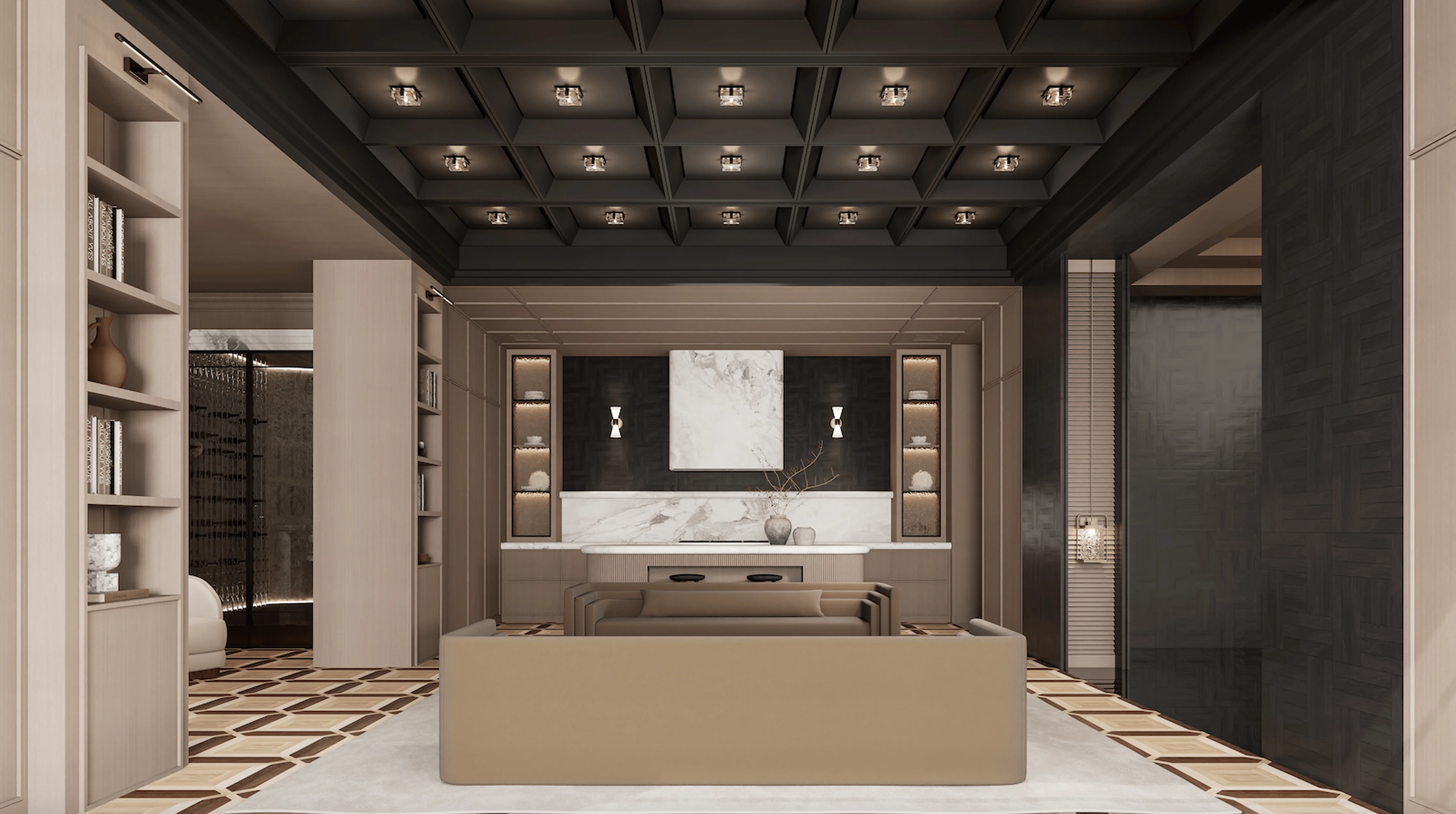
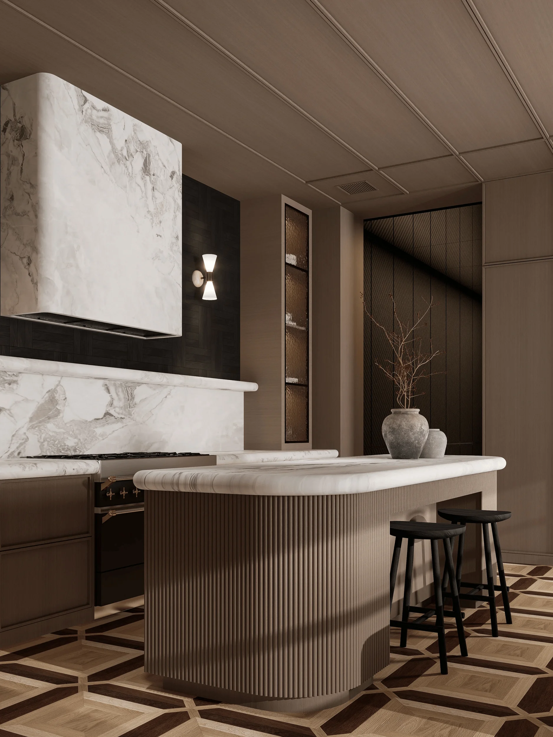
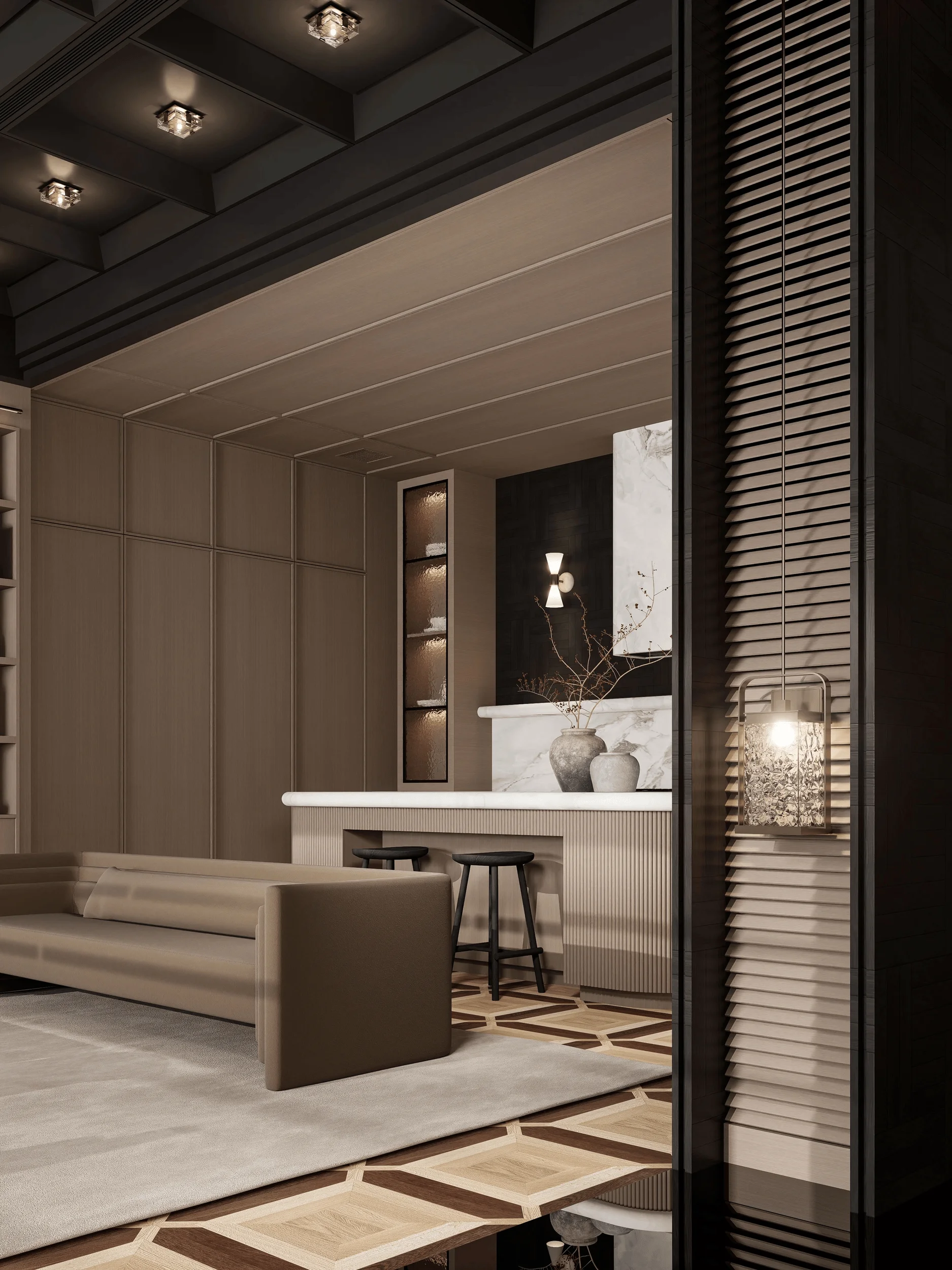
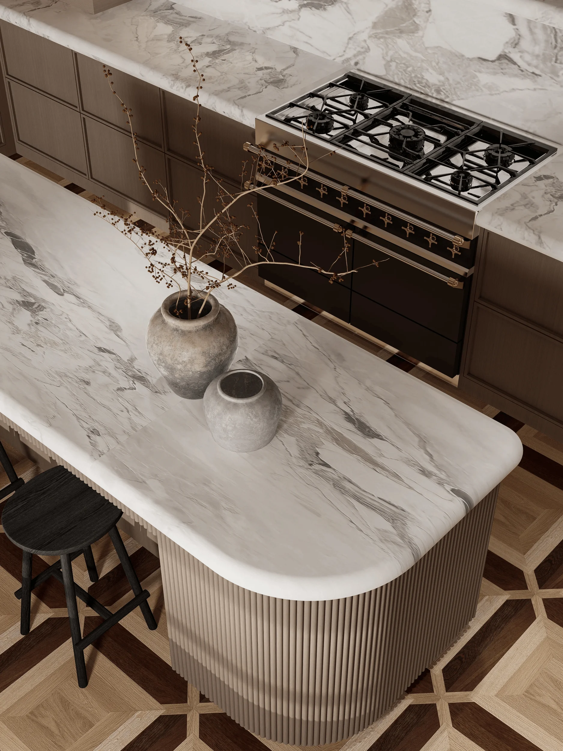
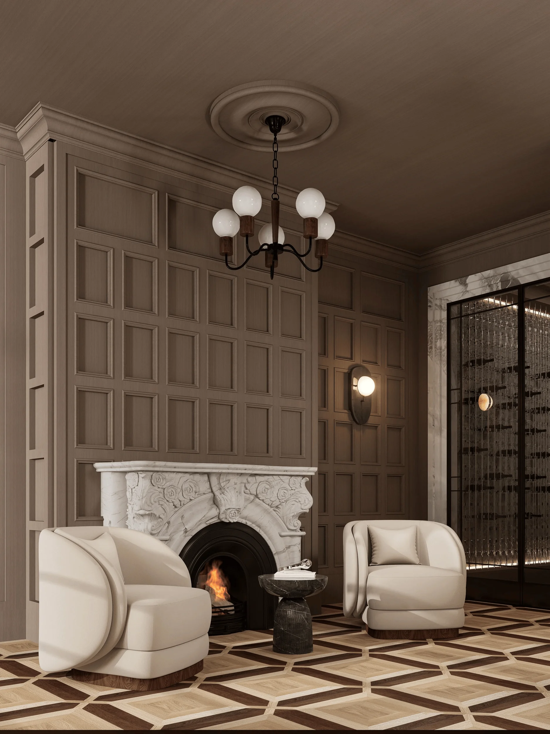
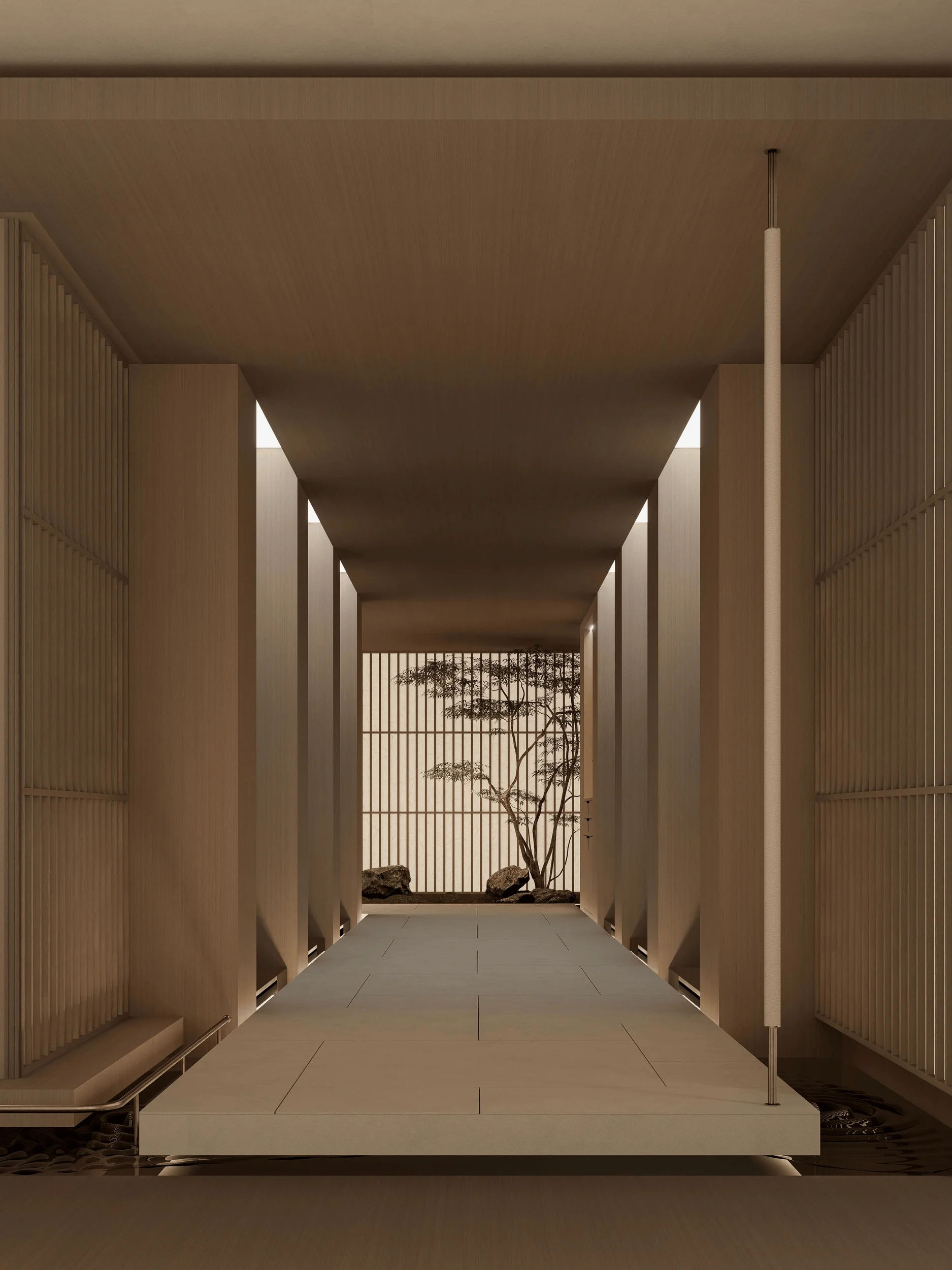
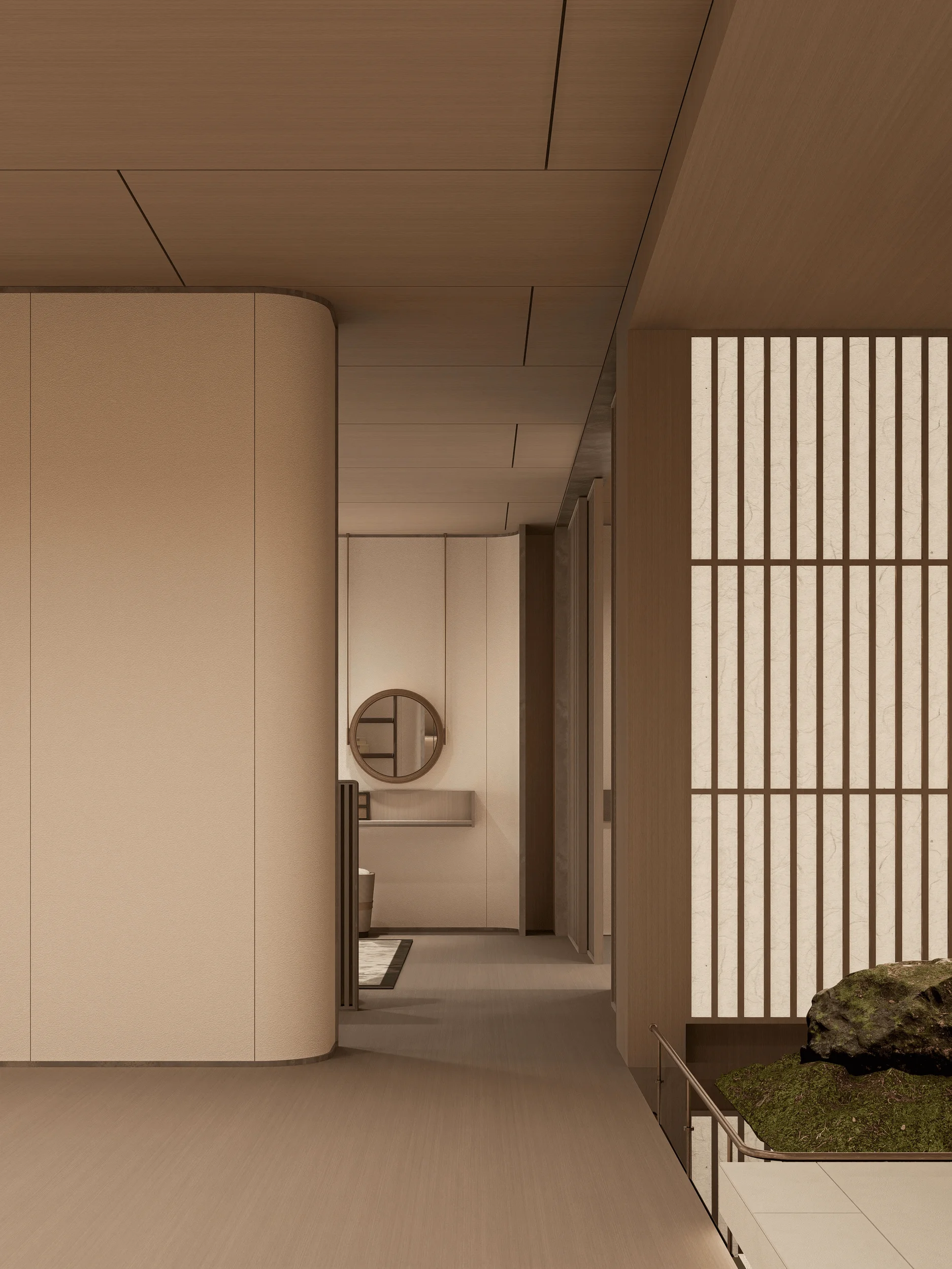
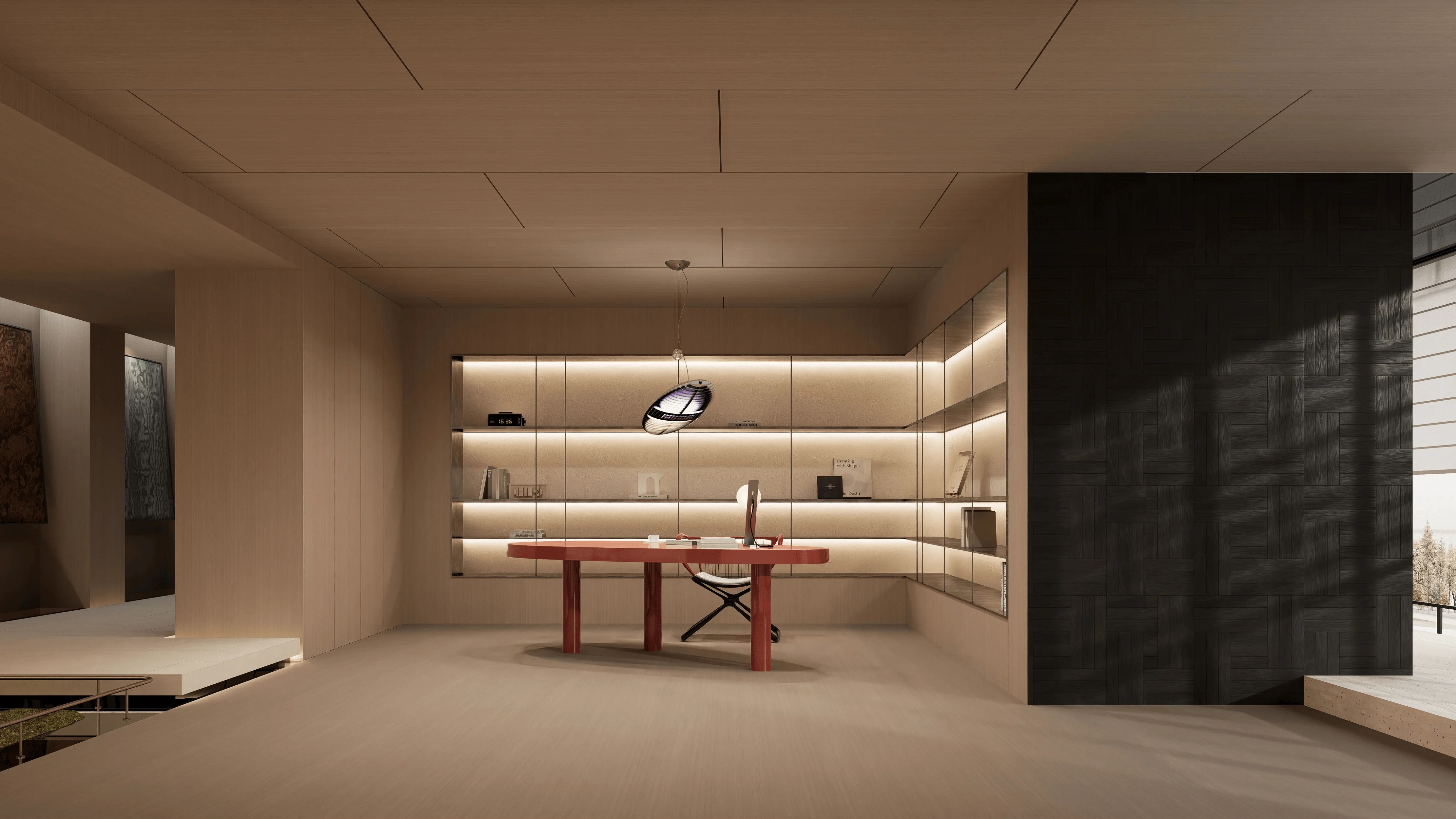
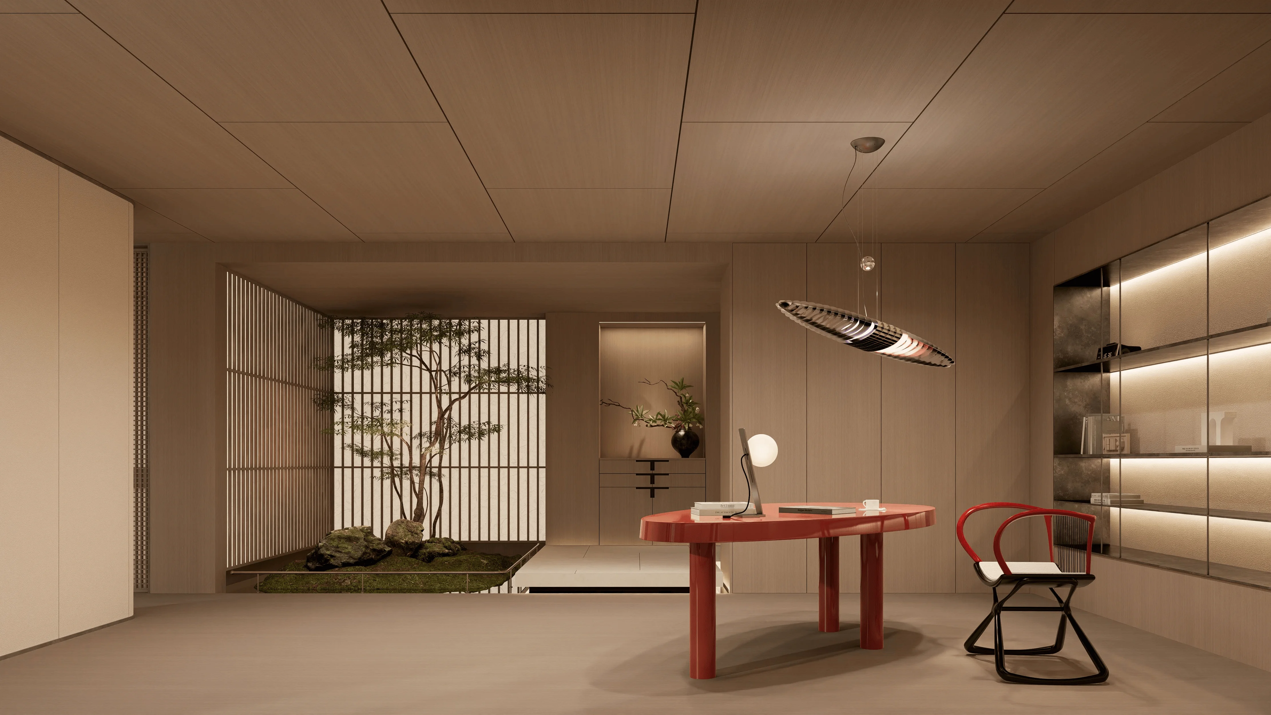
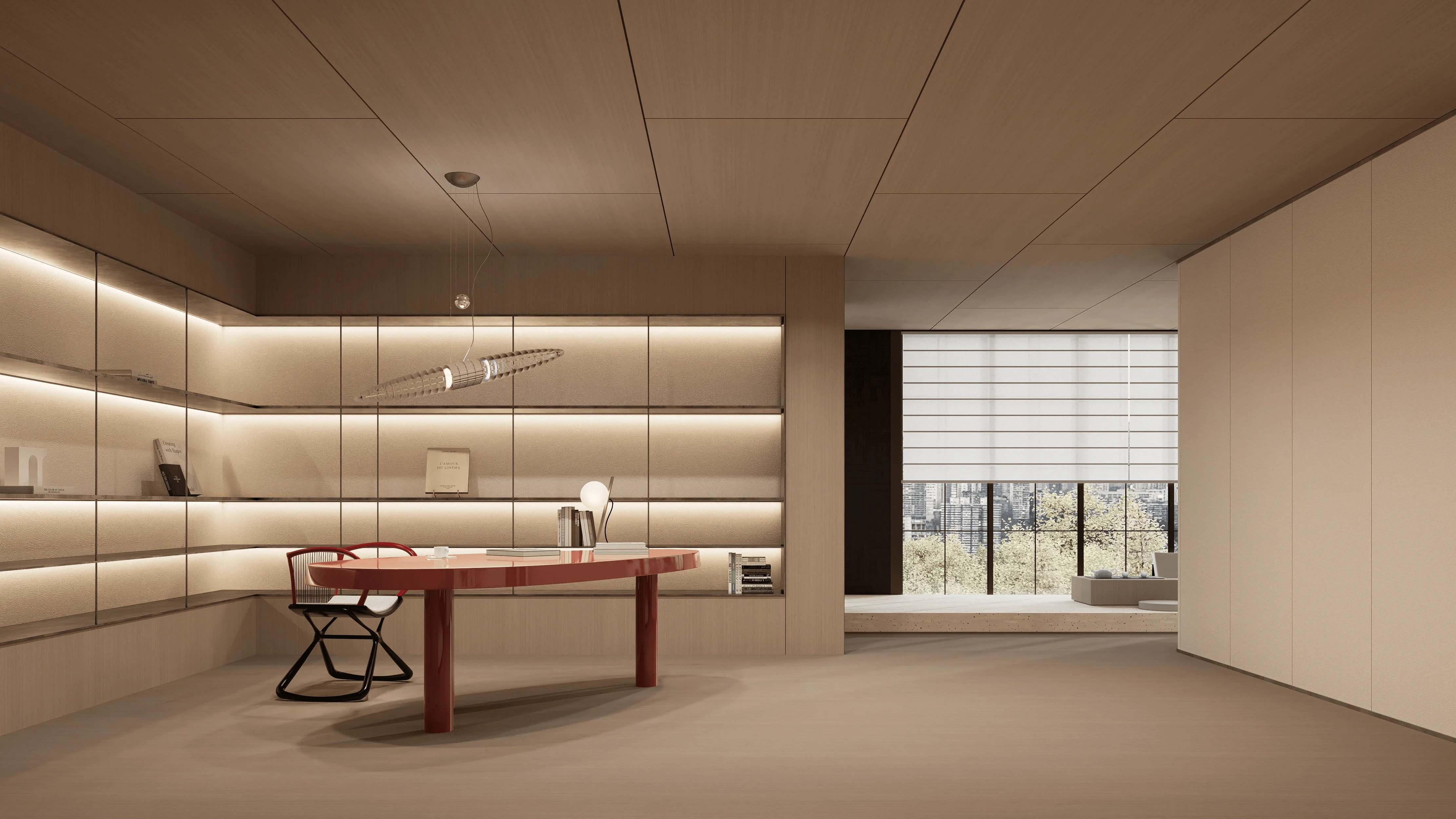
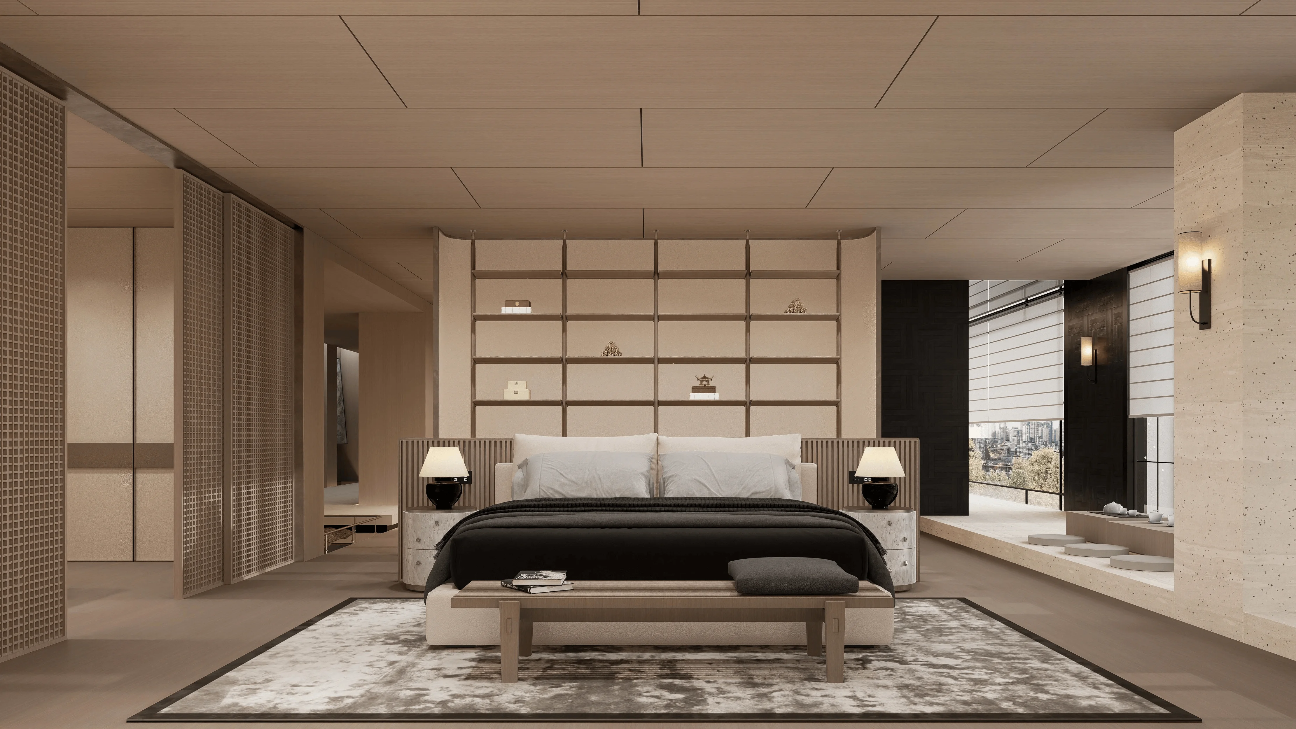
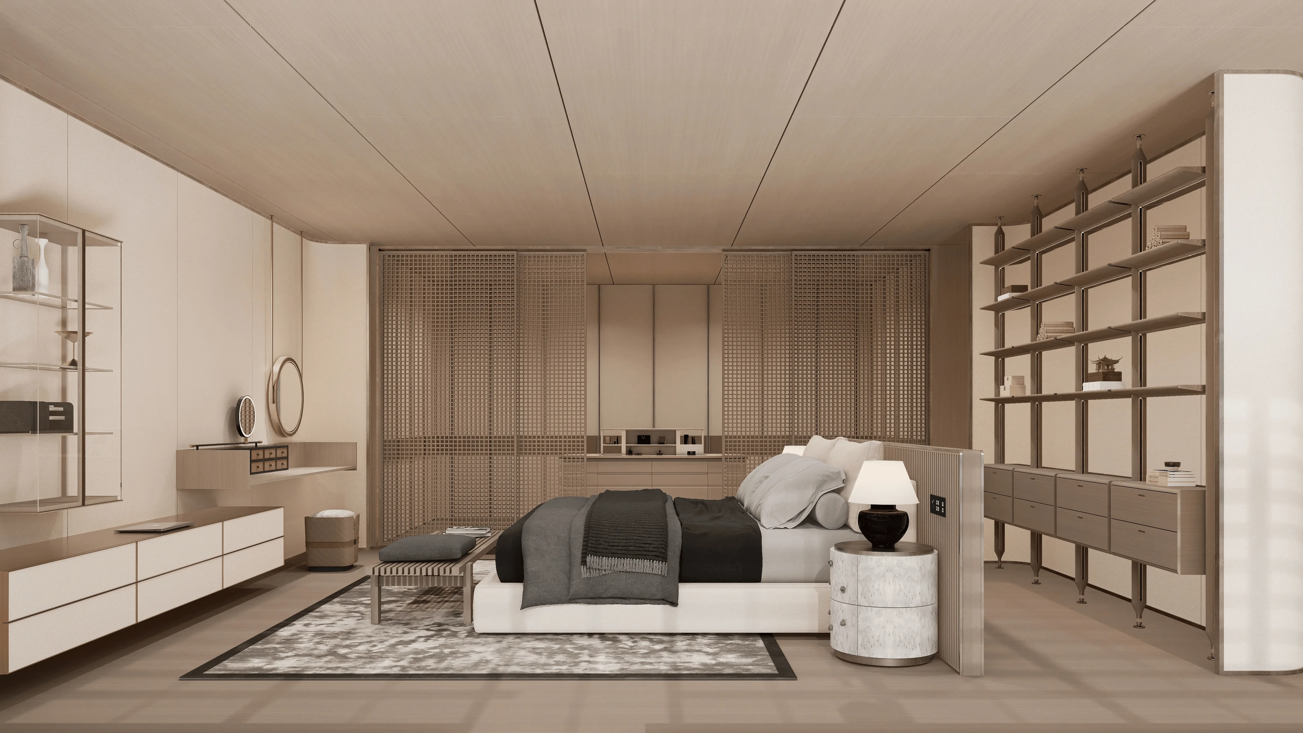
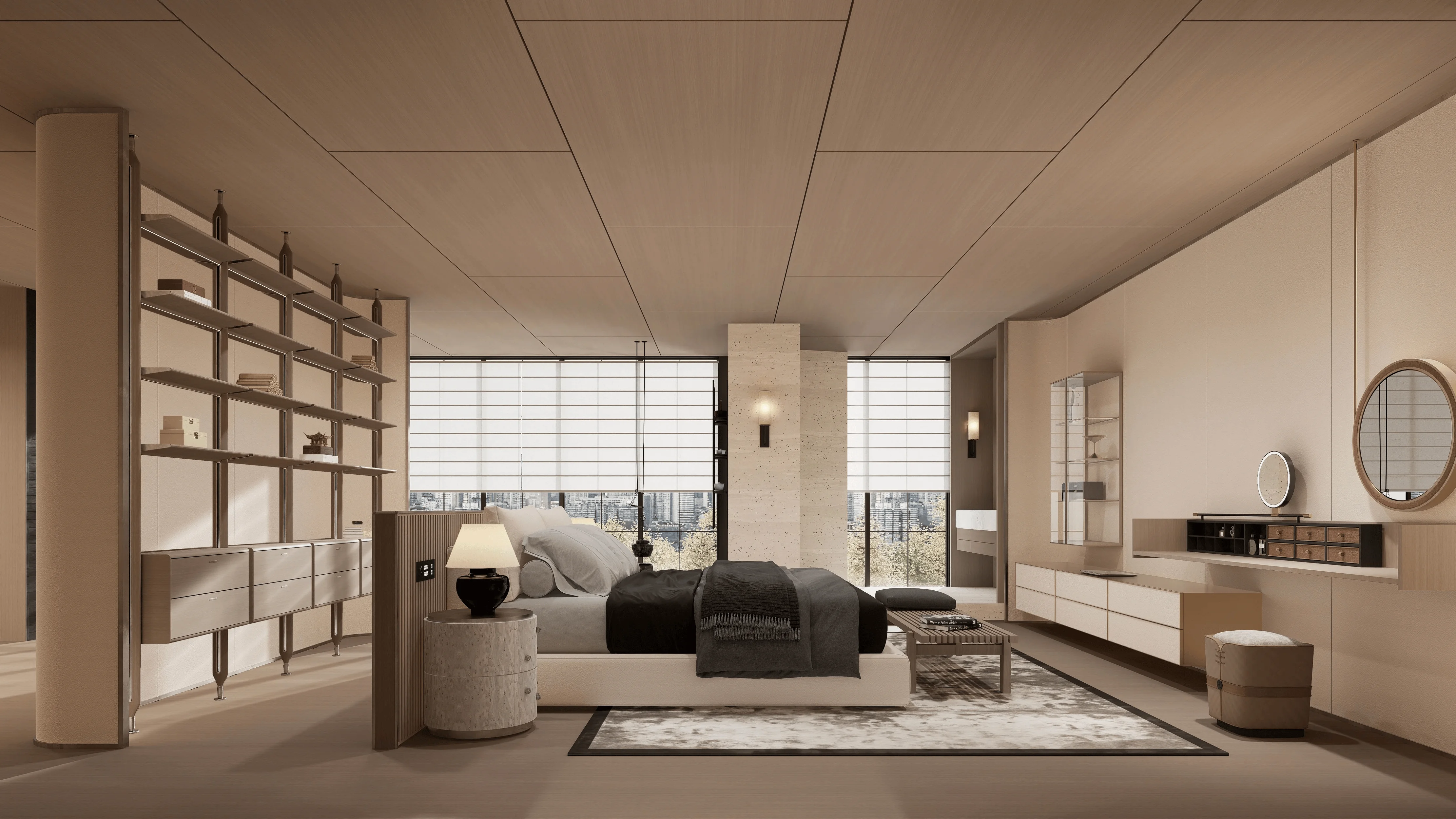
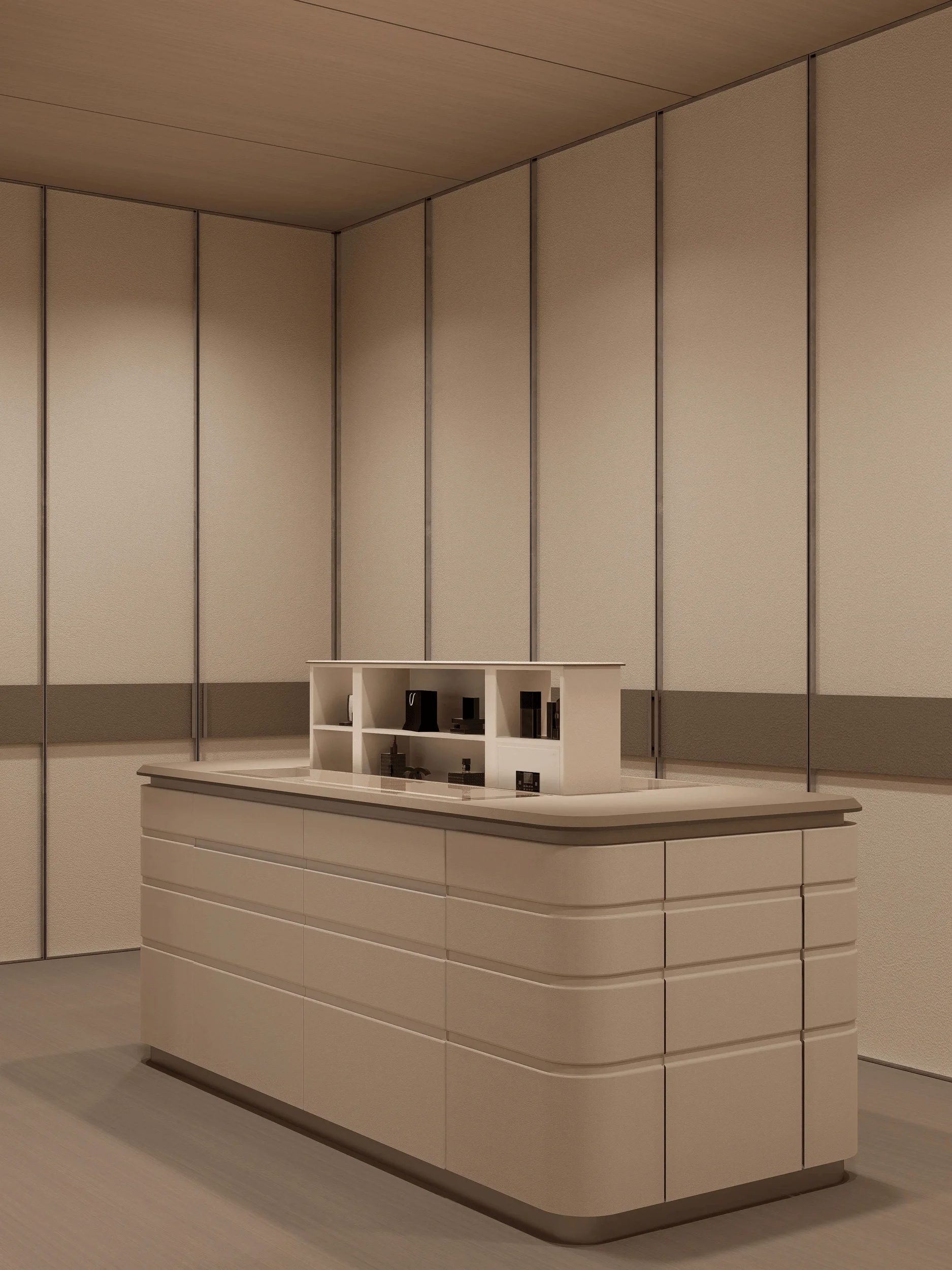
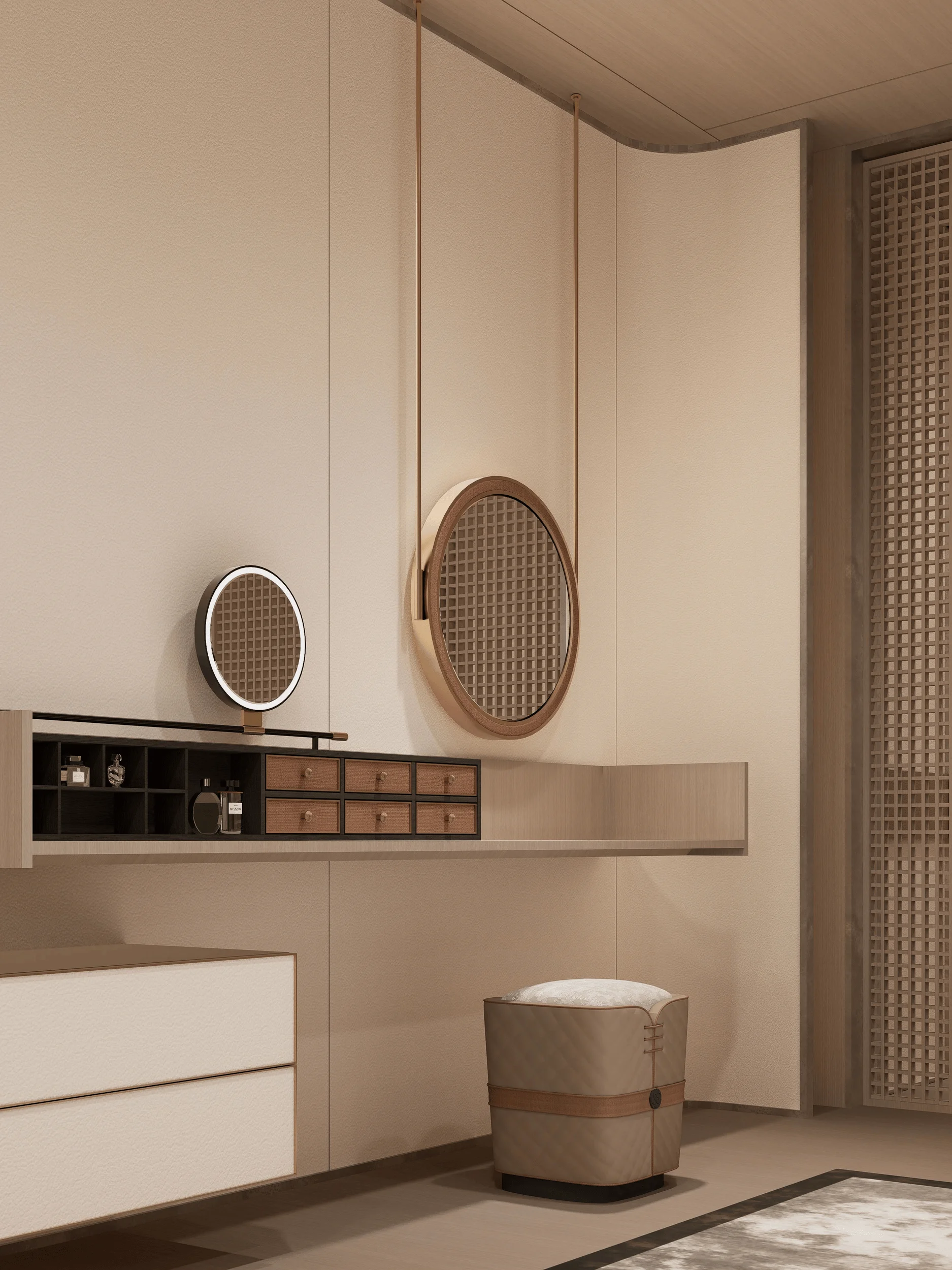
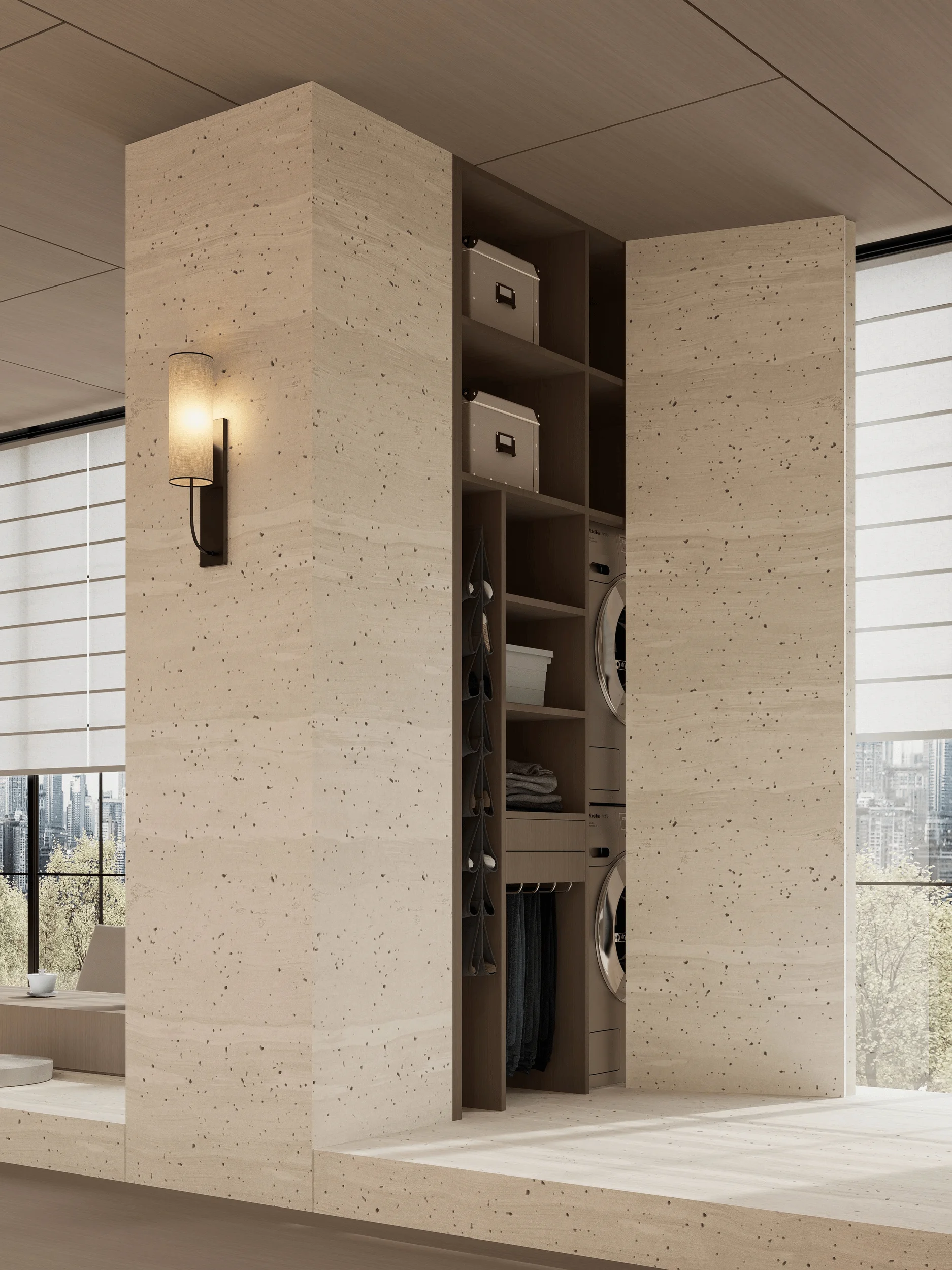
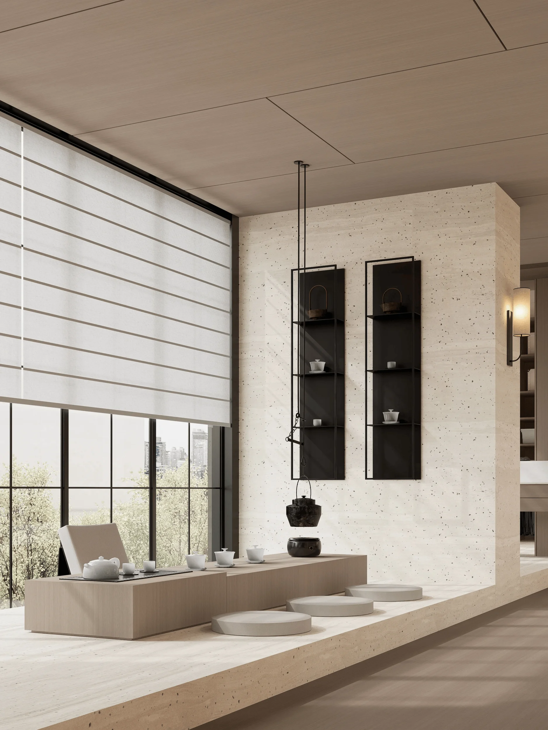
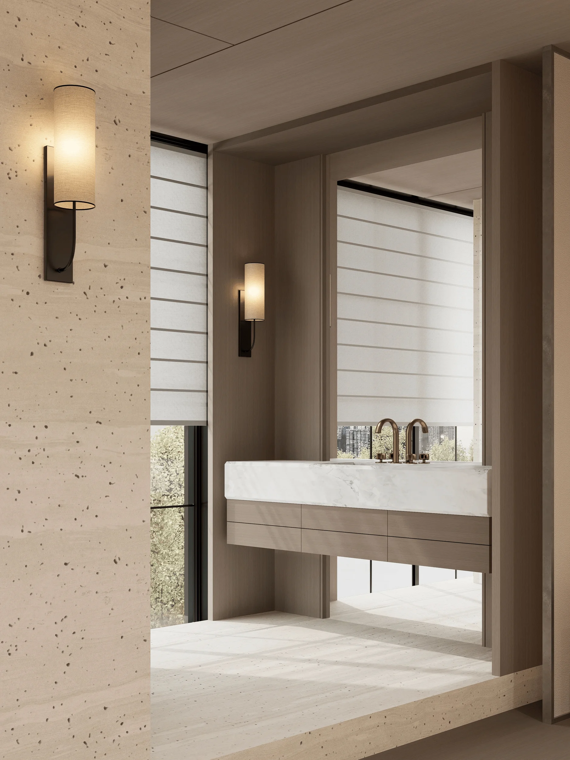
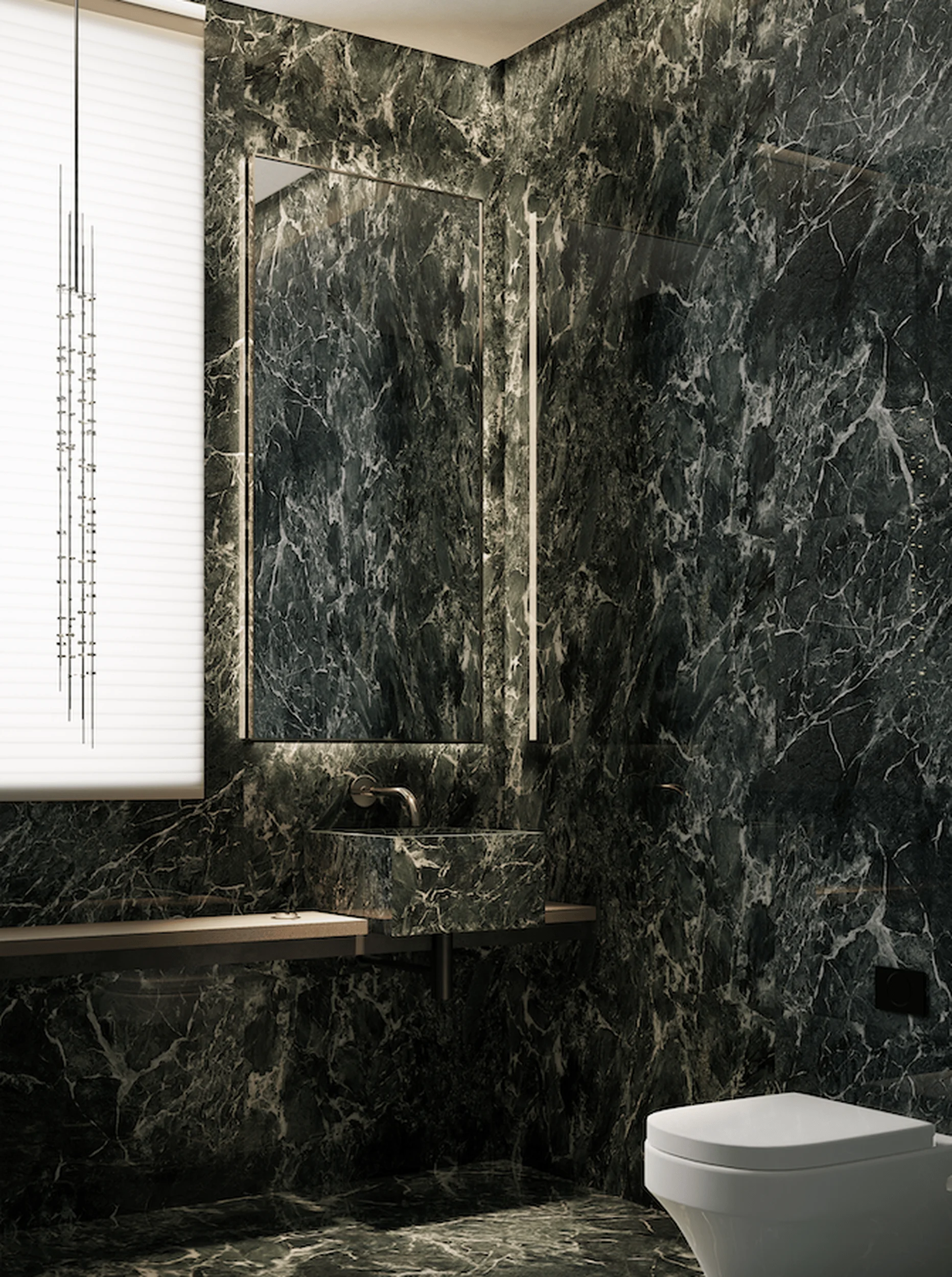
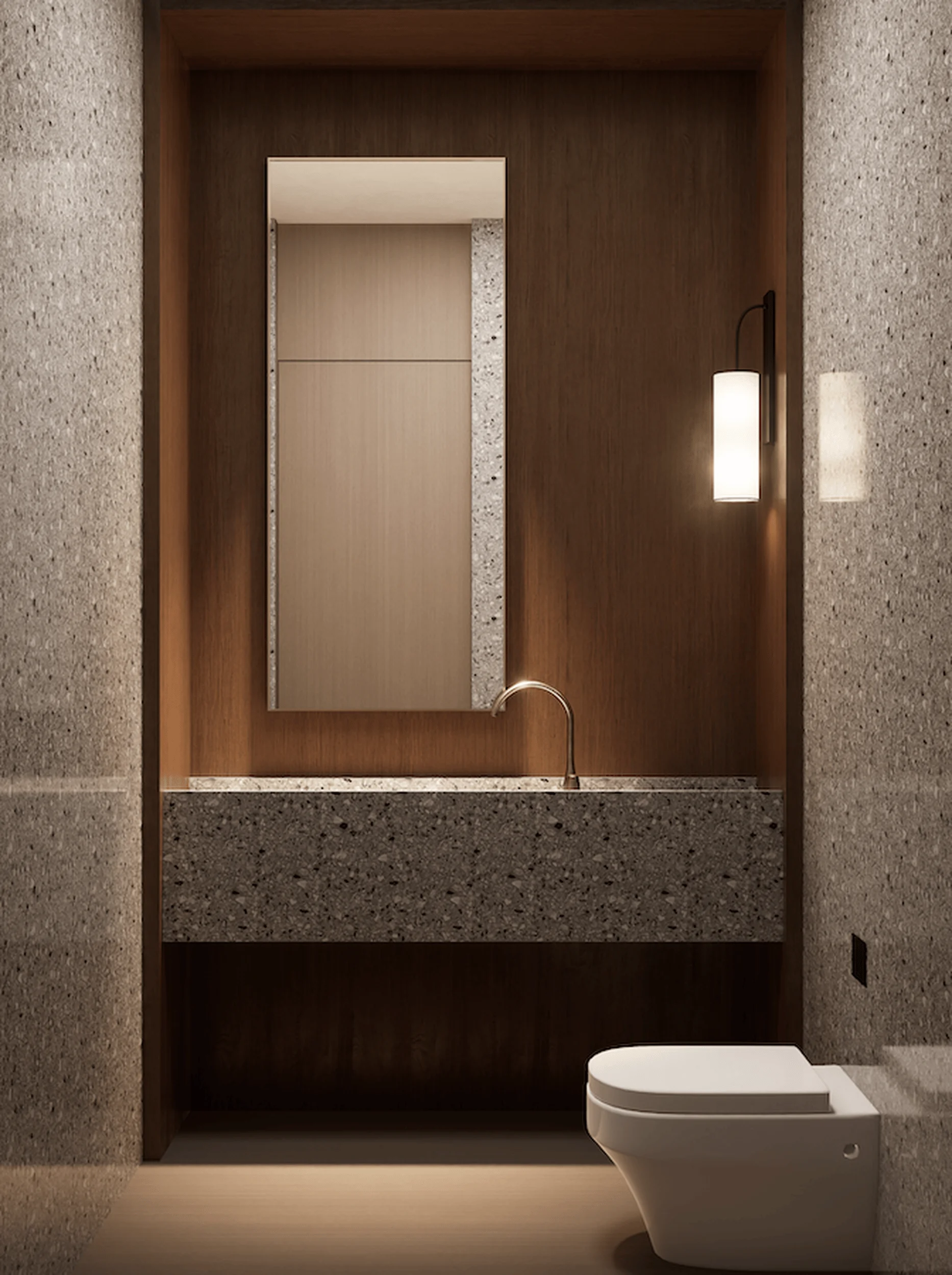
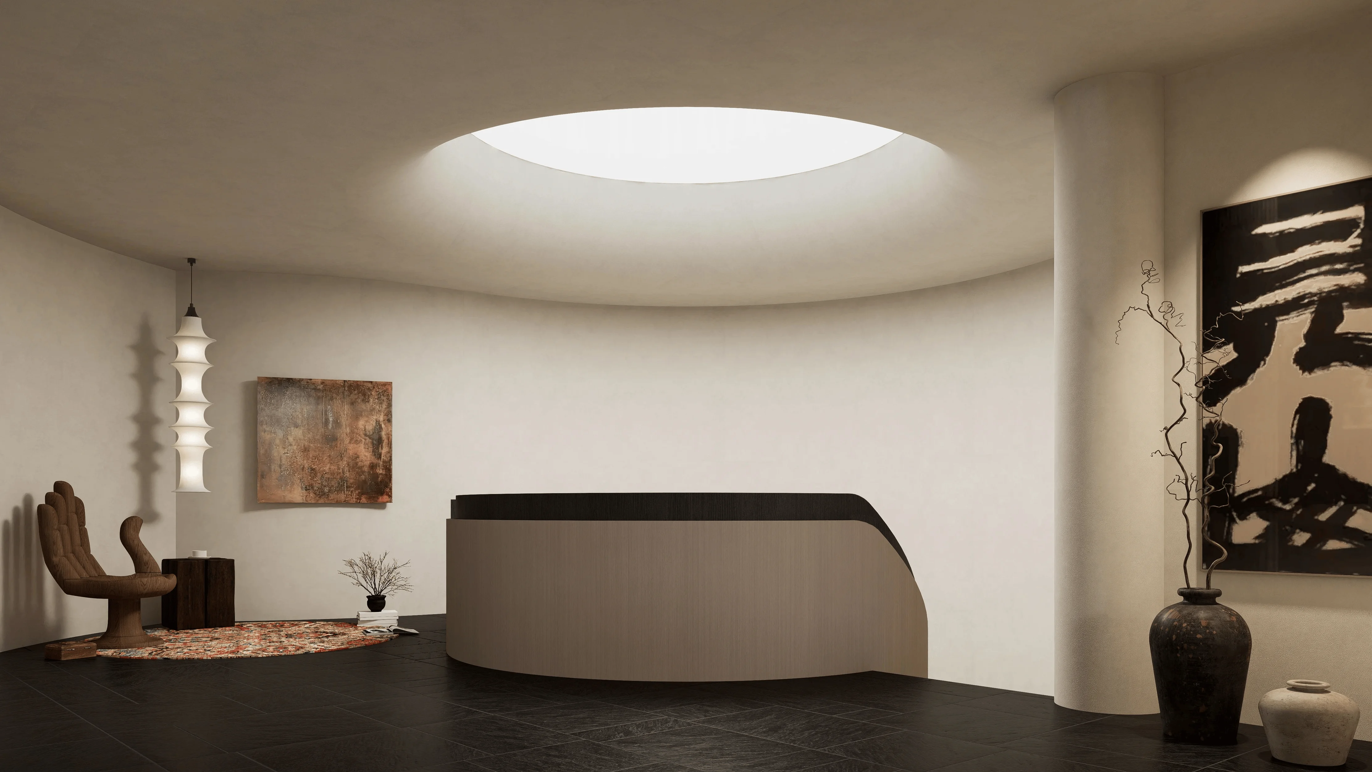
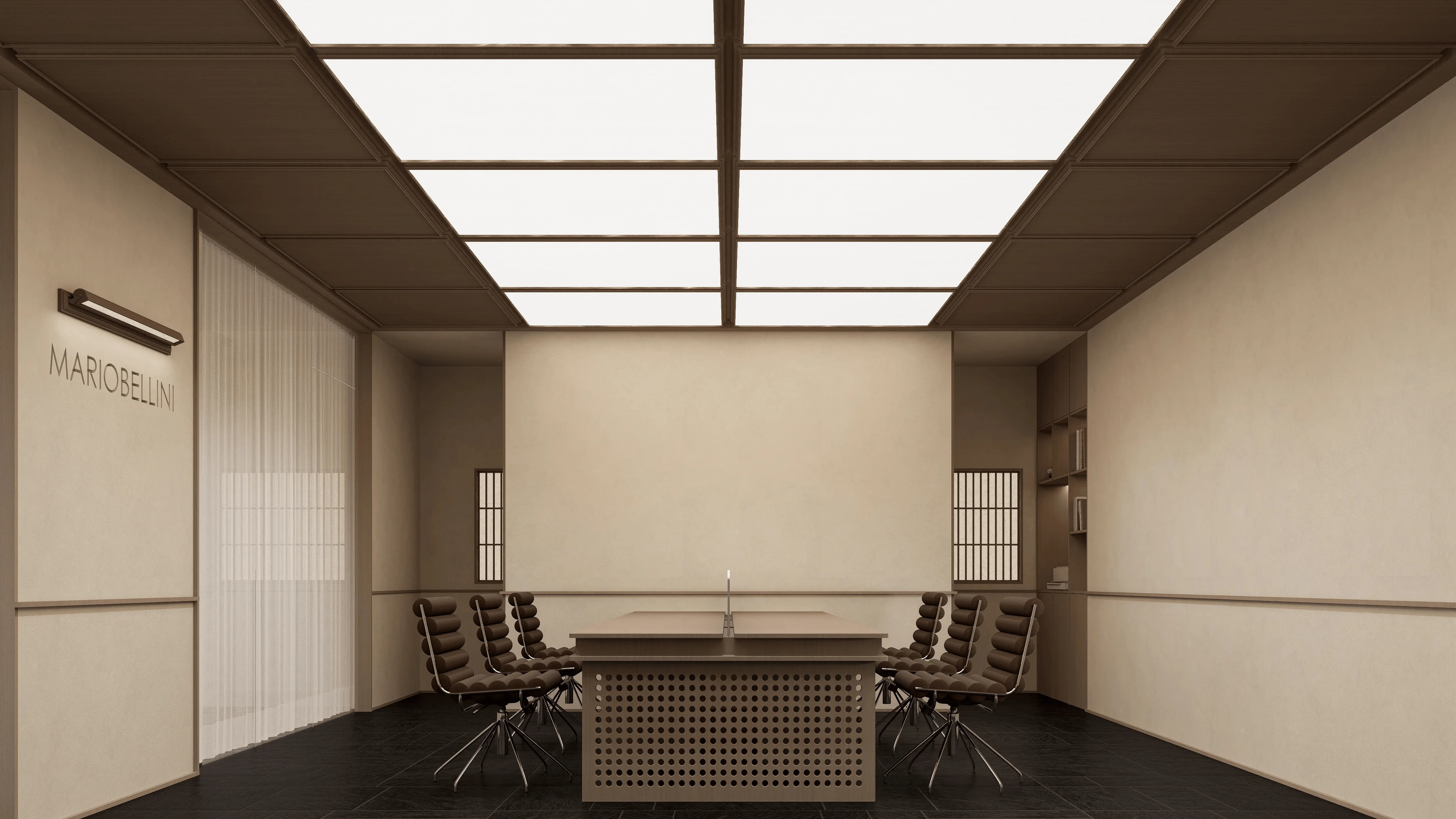
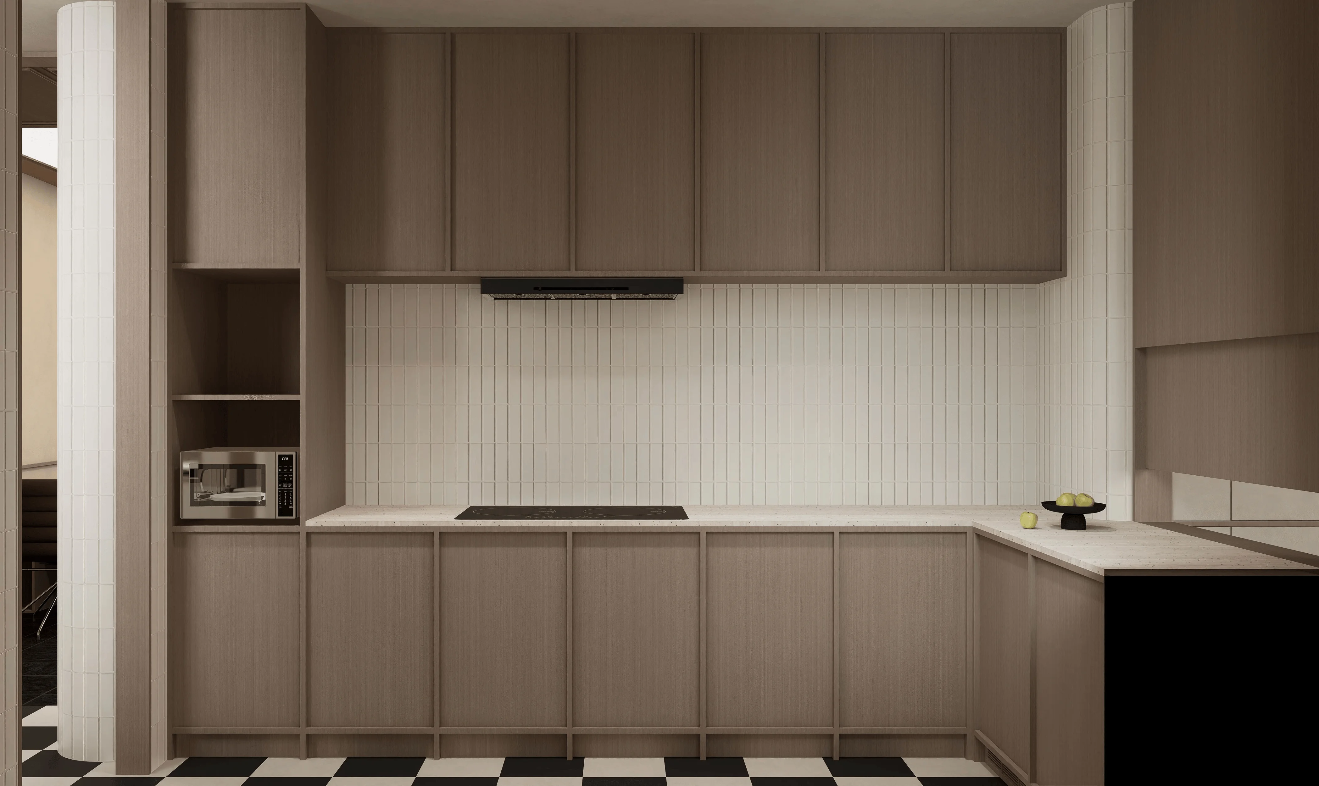
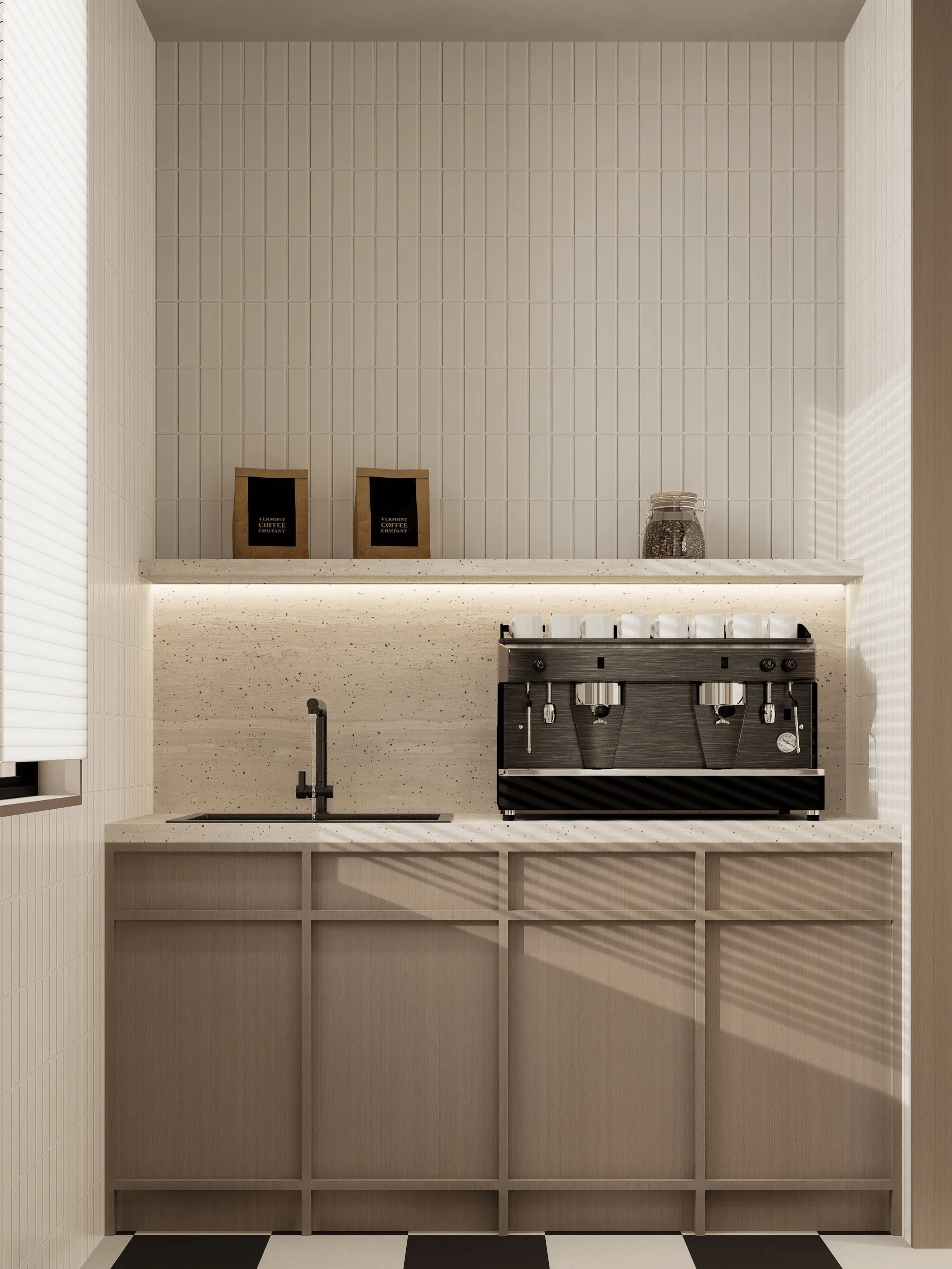
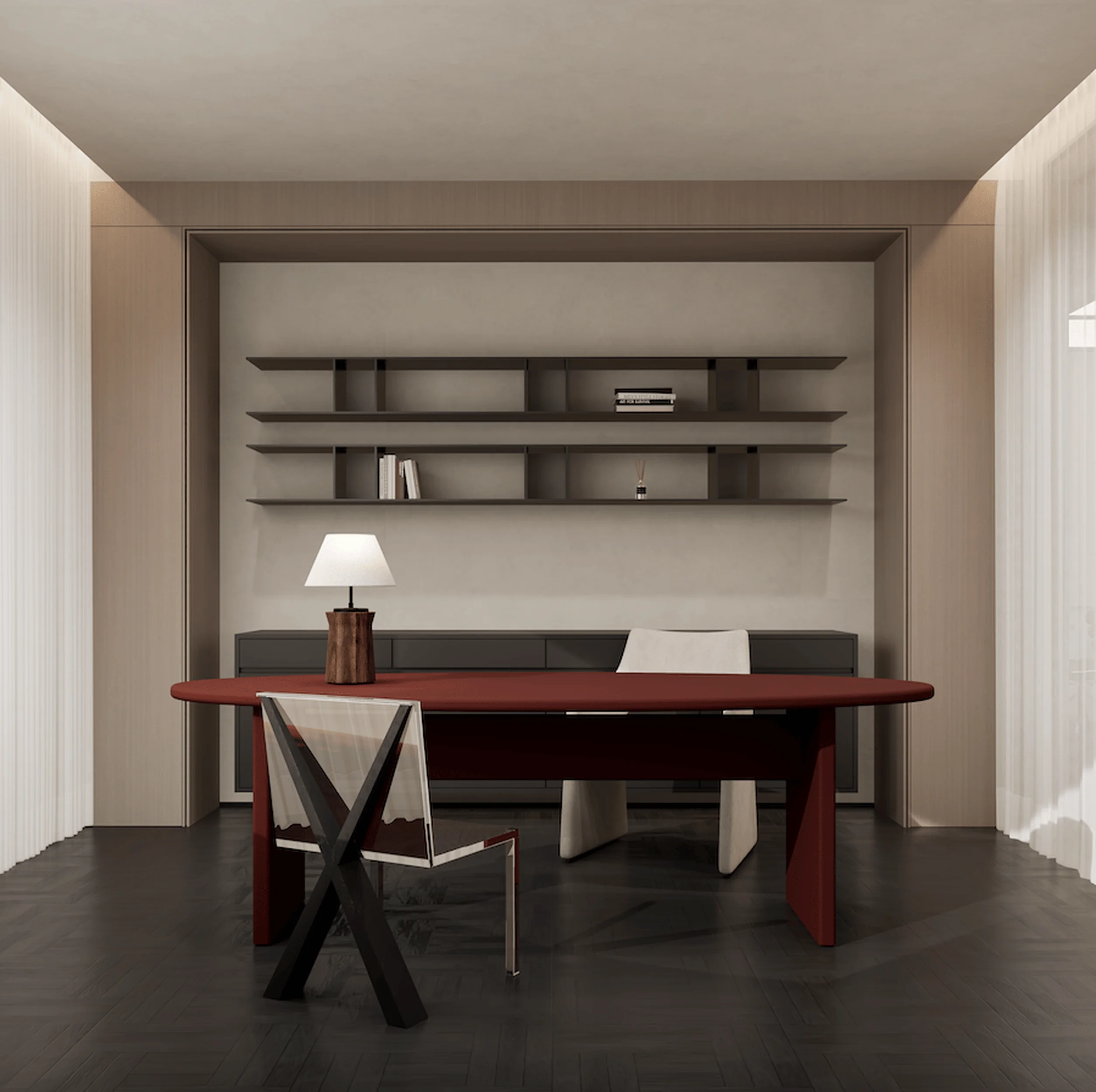
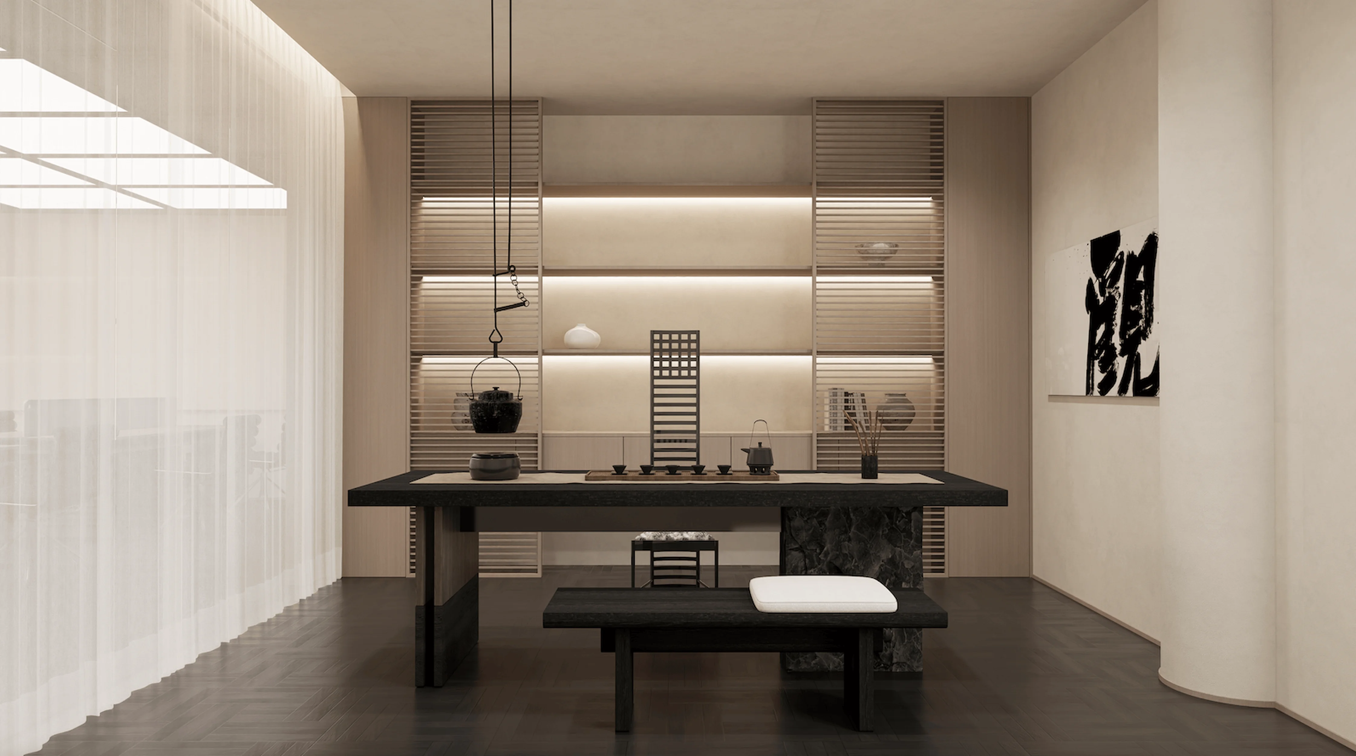
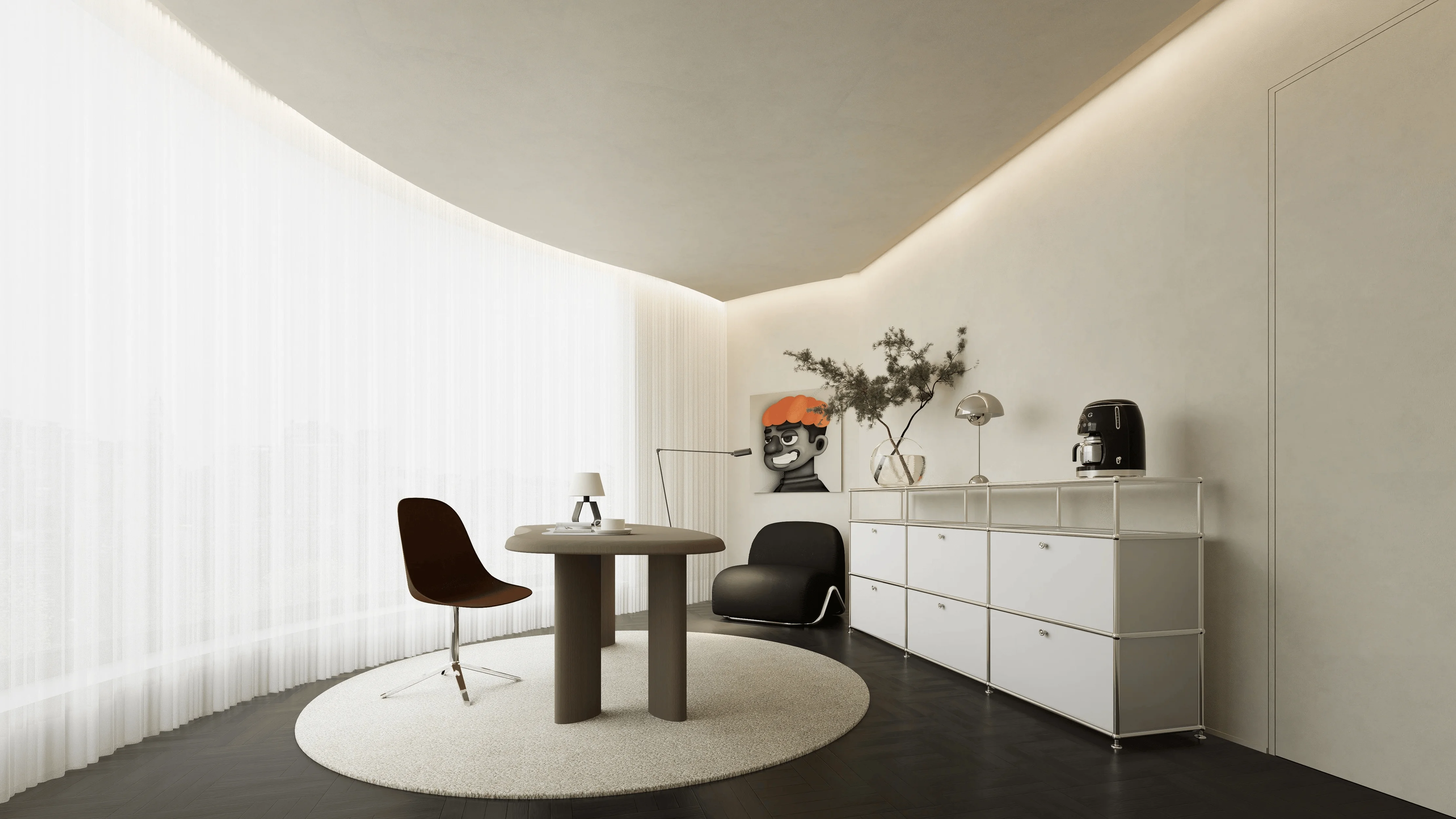
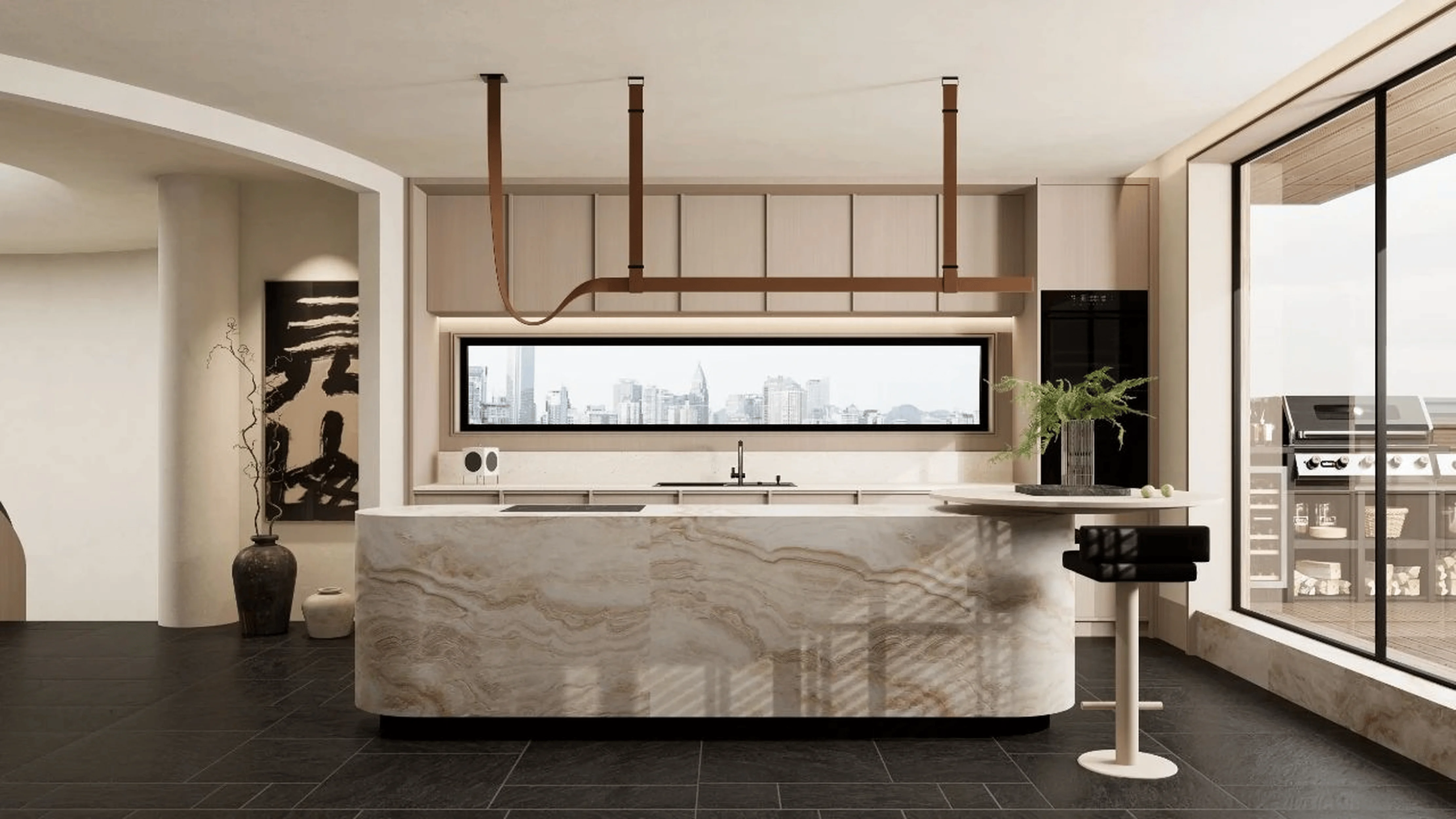
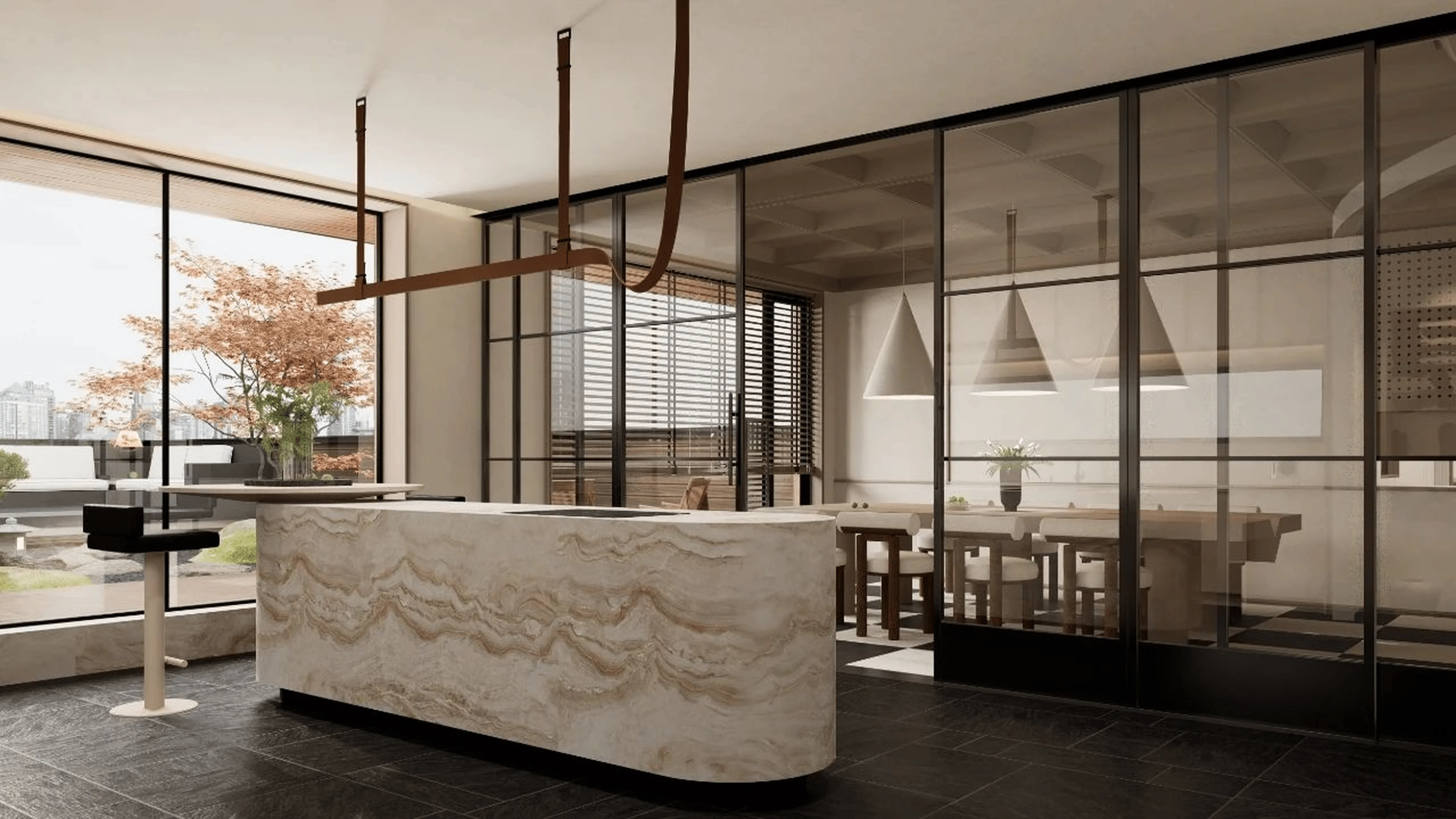
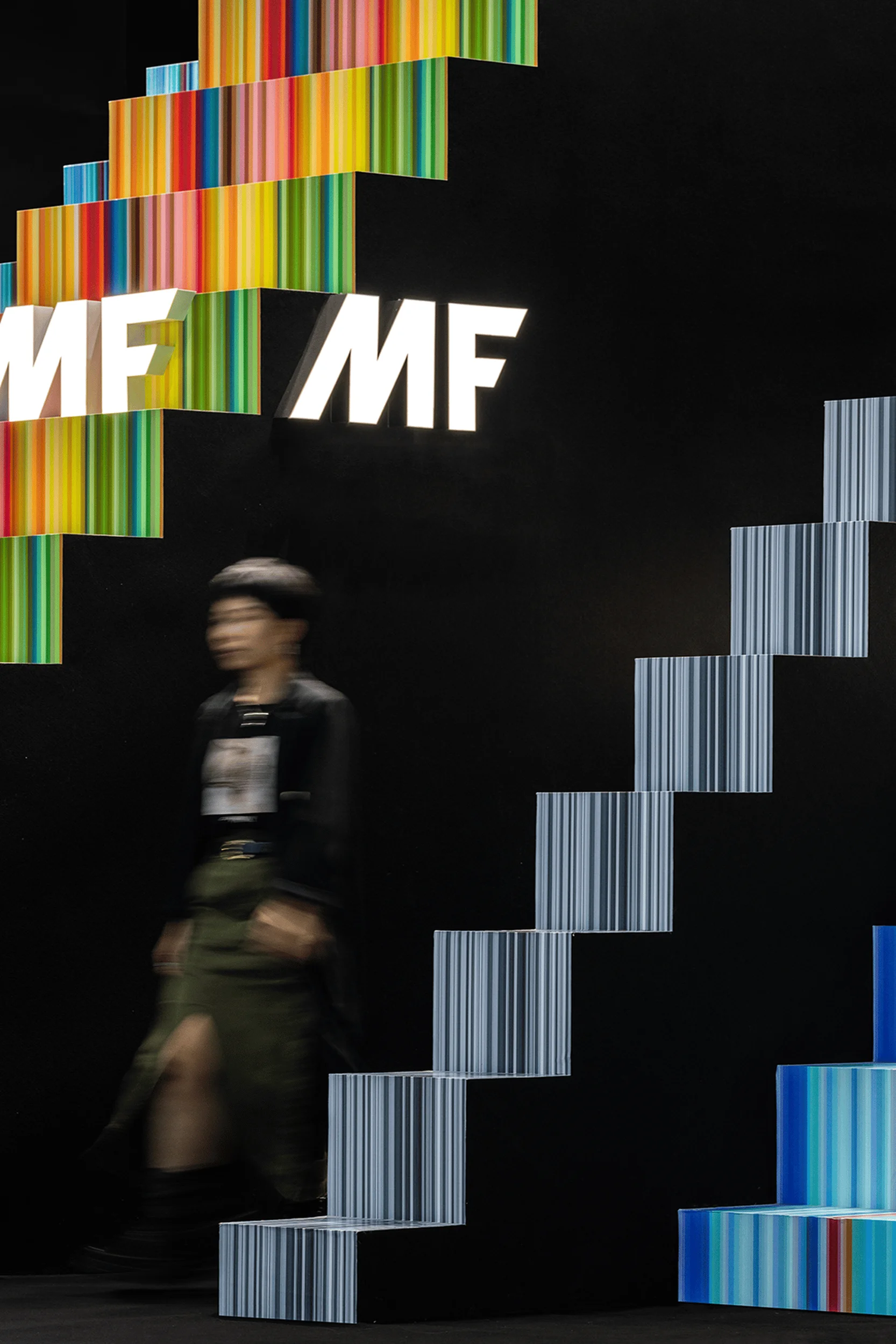
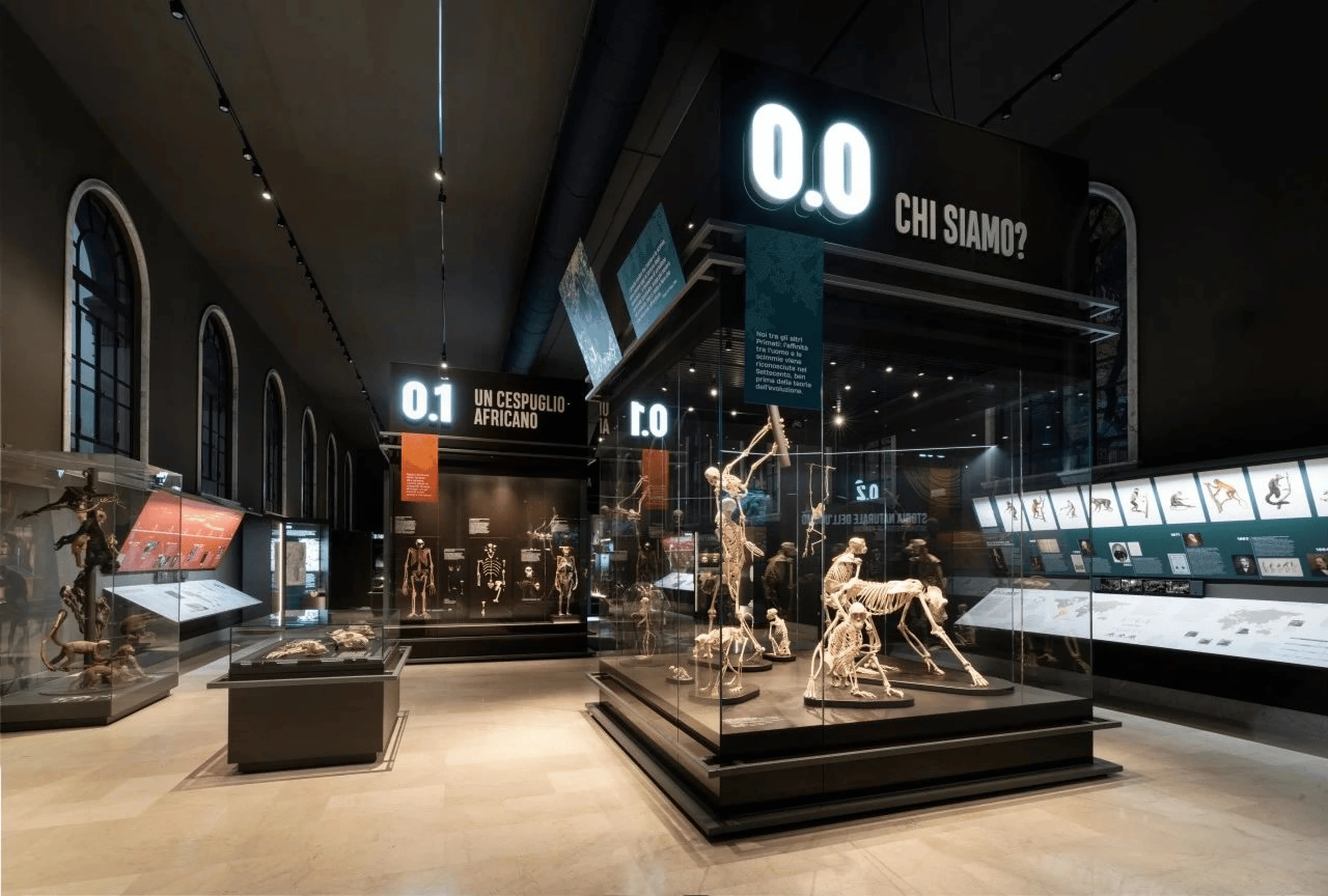
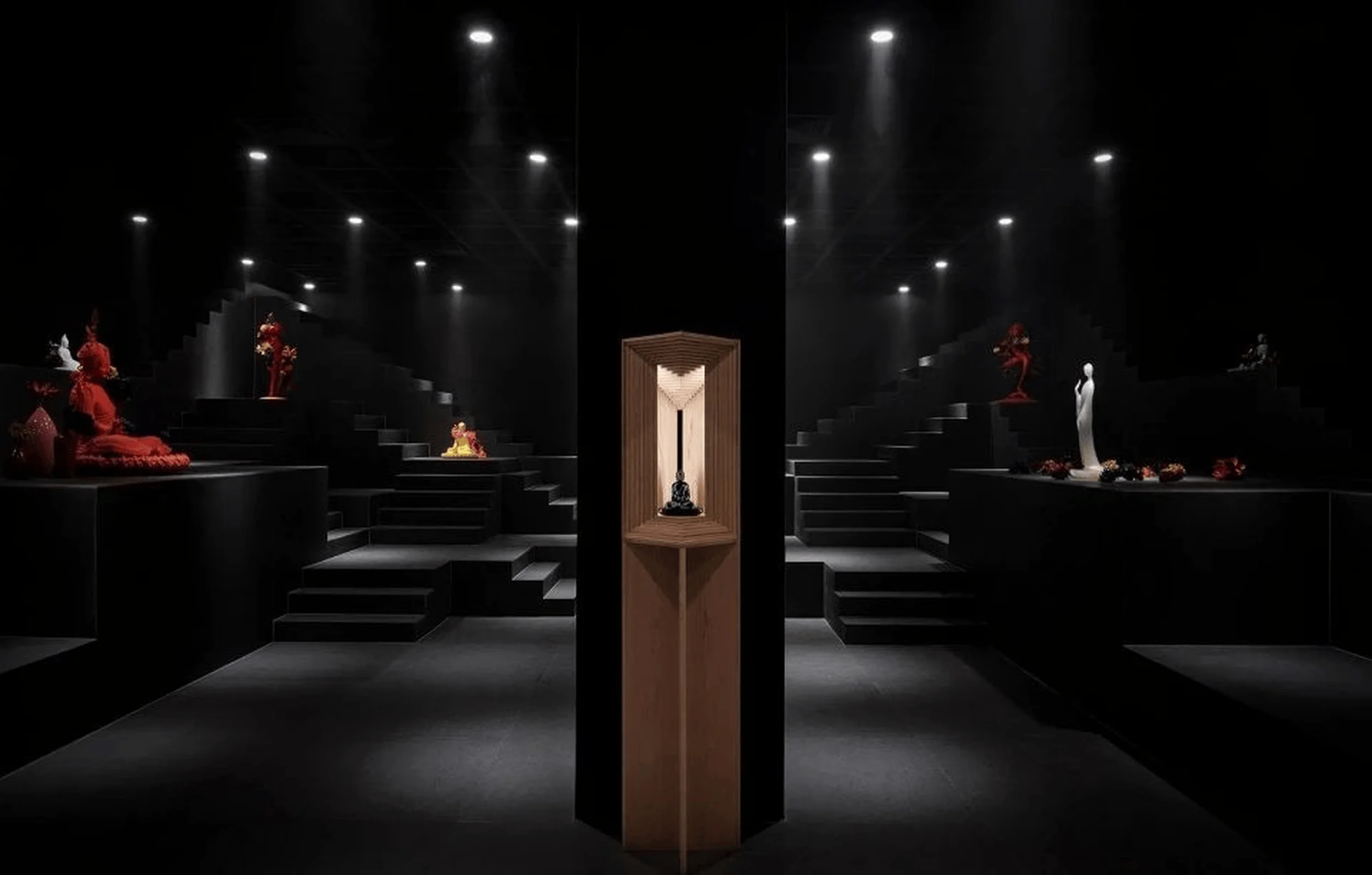
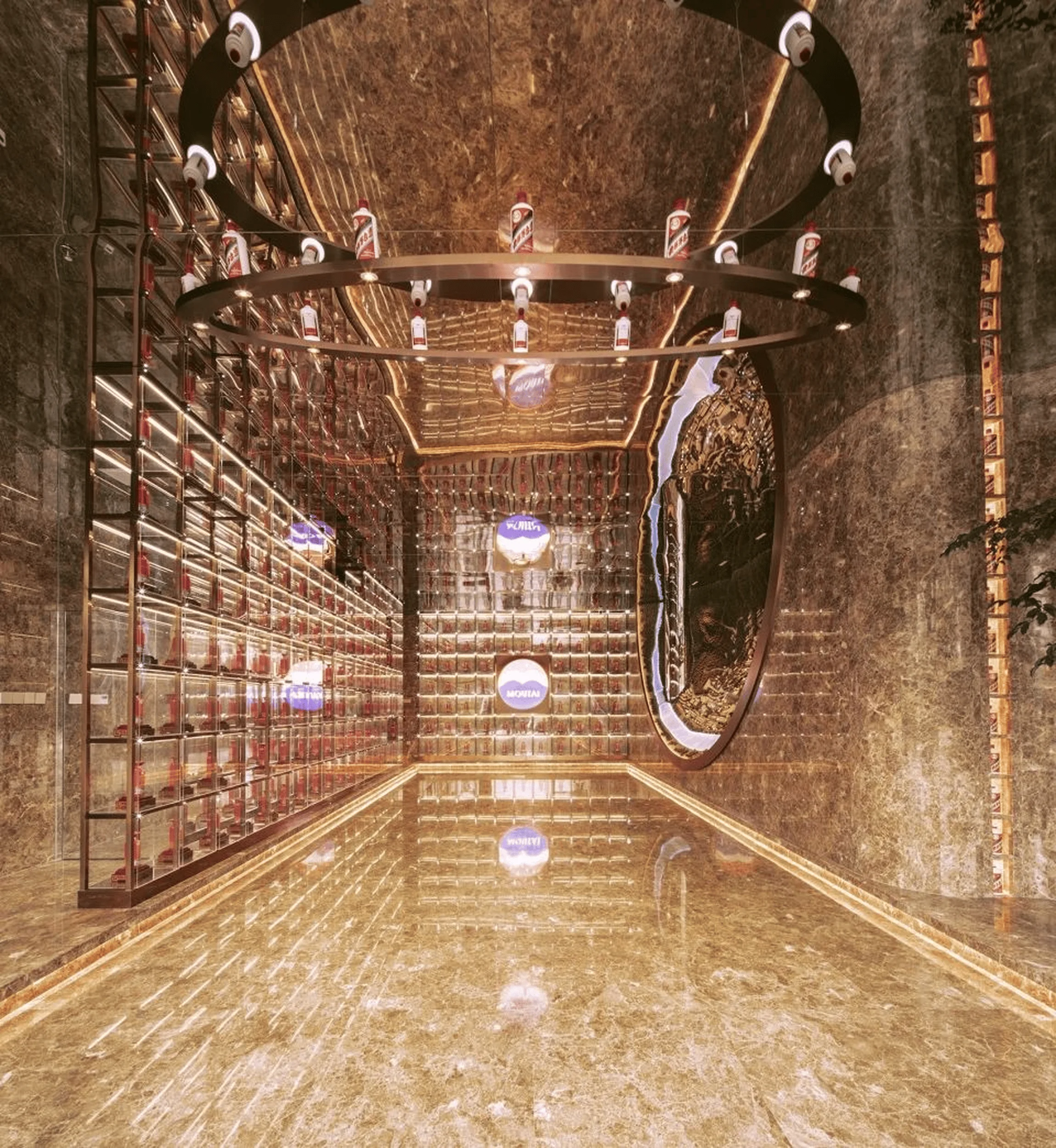
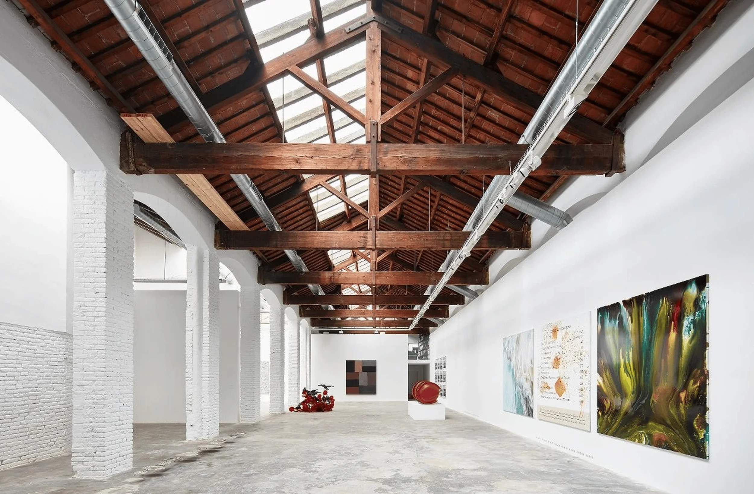
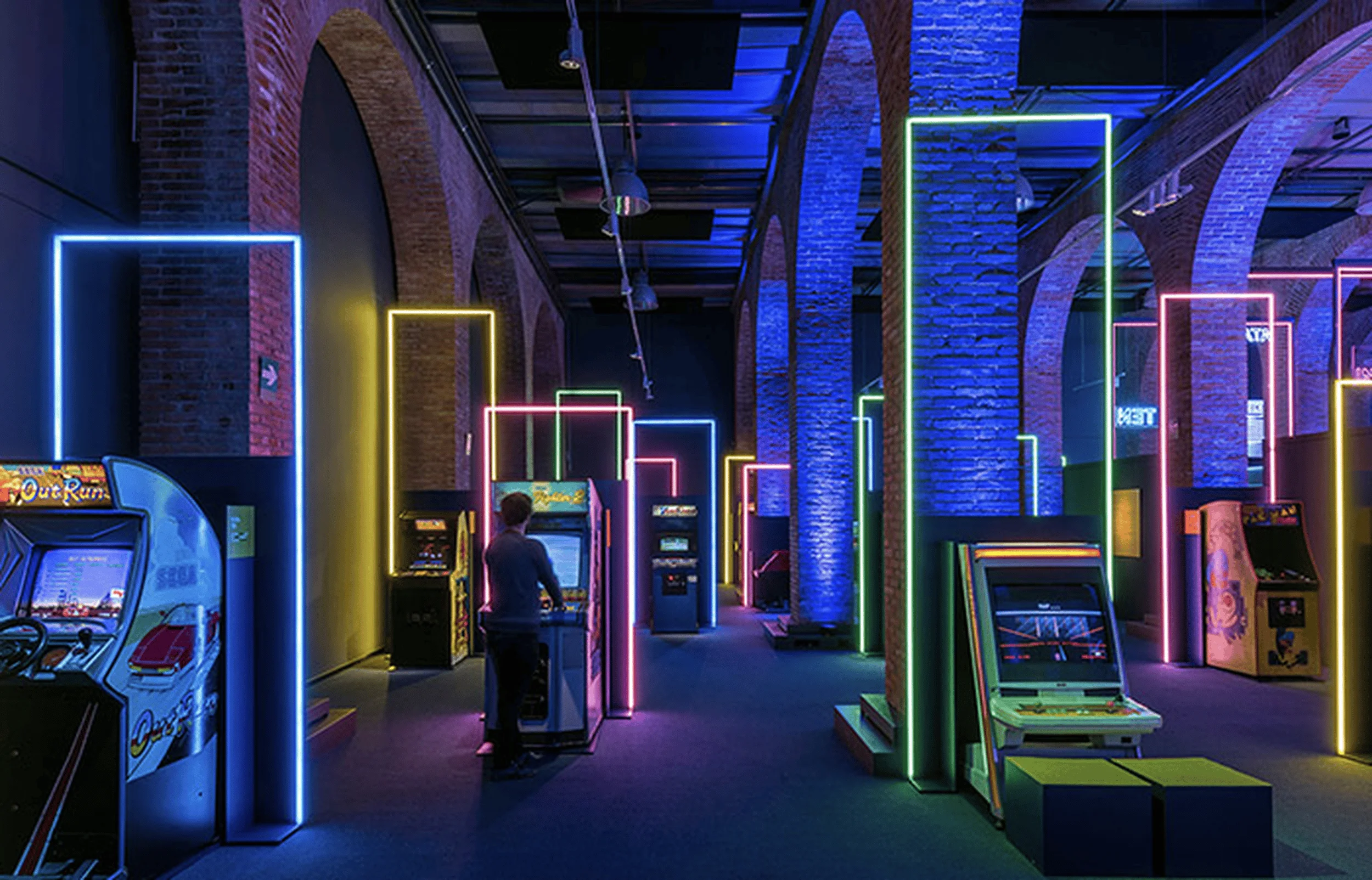
SOLILOQUY DESIGN’s new exhibition hall in China masterfully combines modern aesthetics with high-end residential design principles, creating a phenomenal visual feast.
Contents
Project Background and Design Goals
SOLILOQUY DESIGN, a leading design firm based in Nanjing, Jiangsu, China, embarked on a mission to create a brand new exhibition hall within an outdated environment. Completed in 2023, the 1200㎡ space serves as a testament to the brand’s core philosophy of blending concise and refined white space with an elegant and textured ambiance. The designers, Lin Sen and Yang Tianyu of SOLILOQUY DESIGN, aimed to showcase the brand’s commitment to high-quality materials, artistry, and design within a space that embodies both visual appeal and spiritual sustenance. The overall goal was to create an immersive experience that transcends the traditional exhibition hall, offering visitors a glimpse into a refined and sophisticated lifestyle. The high-end residential design principles are seamlessly integrated into the exhibition hall’s layout, creating a harmonious blend of functionality and aesthetics. modern aesthetics in residential design are at the forefront, showcased through the innovative use of materials, lighting, and spatial planning. The exhibition hall also acts as a testament to the brand’s commitment to sustainability, with careful consideration given to material selection and energy efficiency throughout the design process. The project serves as a model for future exhibition hall designs, demonstrating how brands can effectively communicate their core values and aspirations through a thoughtfully curated and immersive spatial experience. The exhibition hall design reflects the brand’s deep understanding of the modern consumer’s desire for spaces that are not only visually appealing but also functional and emotionally resonant. This project is a significant milestone for SOLILOQUY DESIGN, solidifying its position as a leading force in the high-end residential design sector in China.
high-end residential design, modern aesthetics in residential design, exhibition hall design
Spatial Planning and Layout
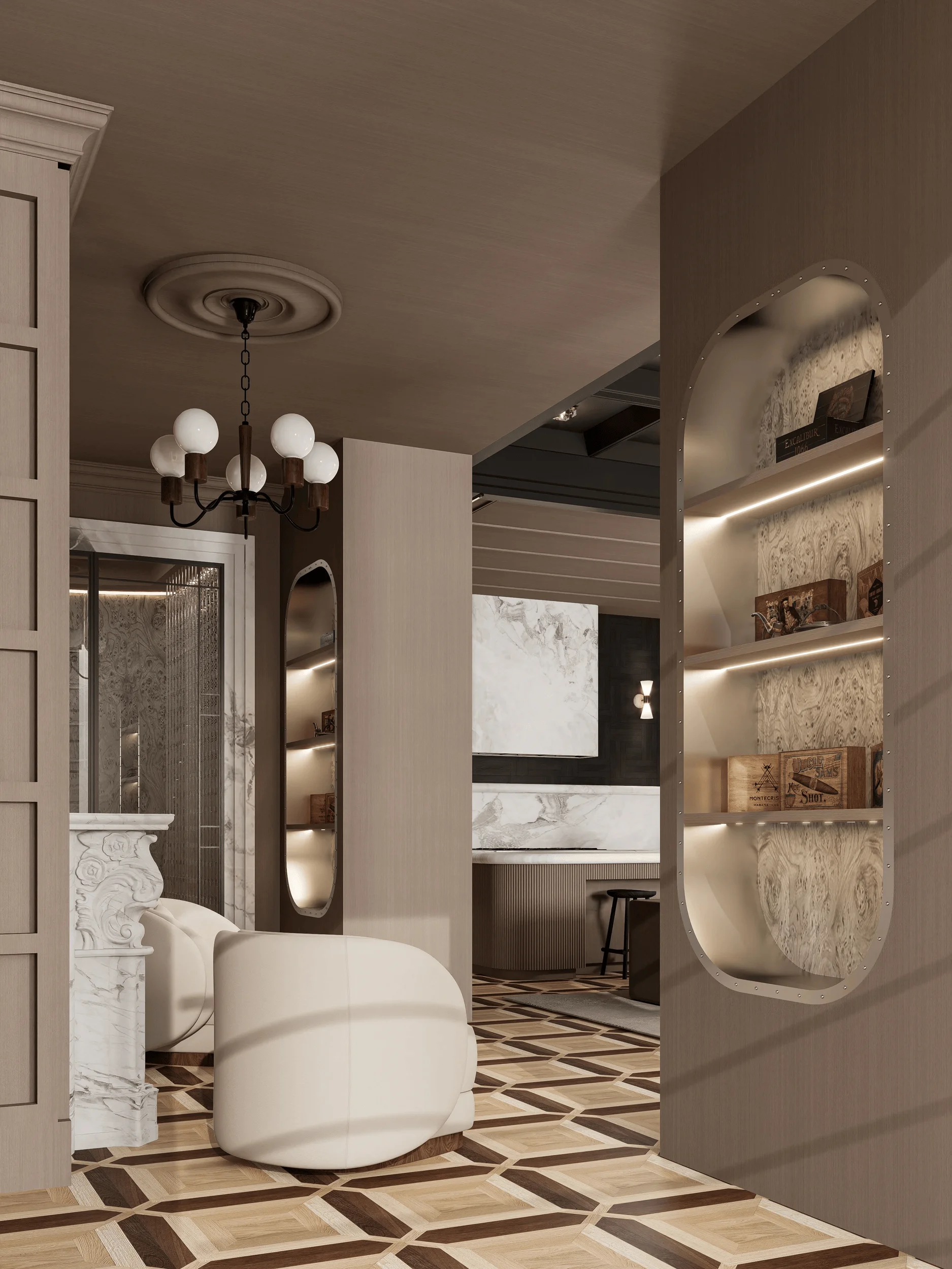
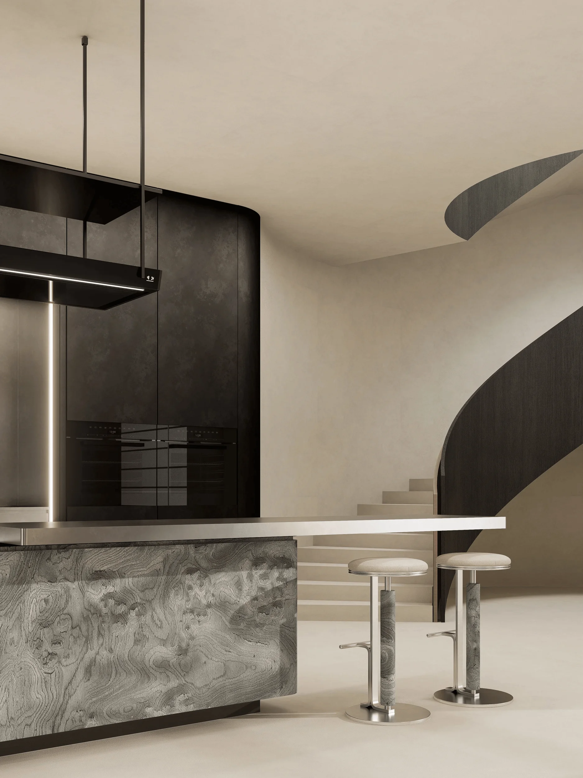
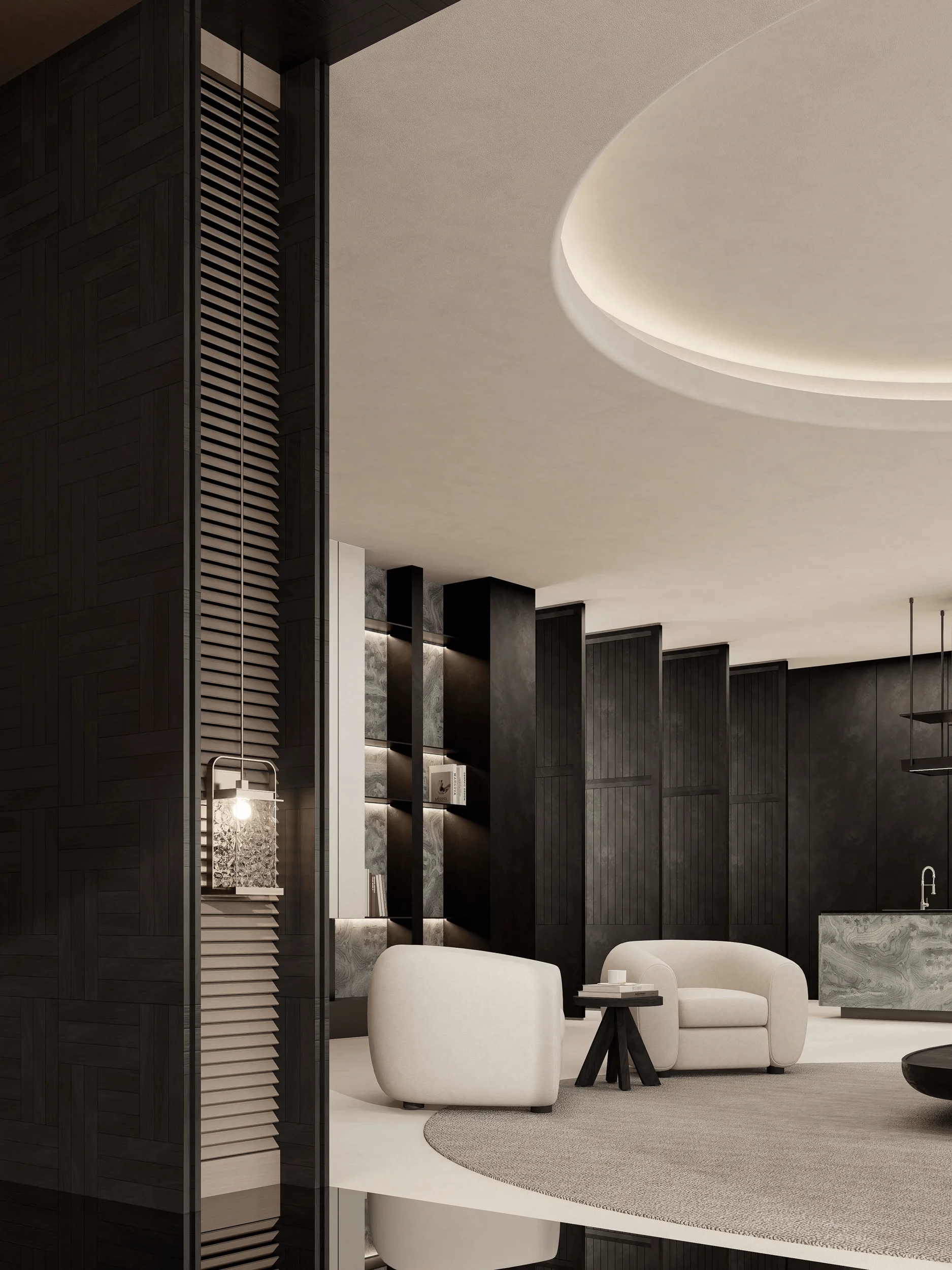
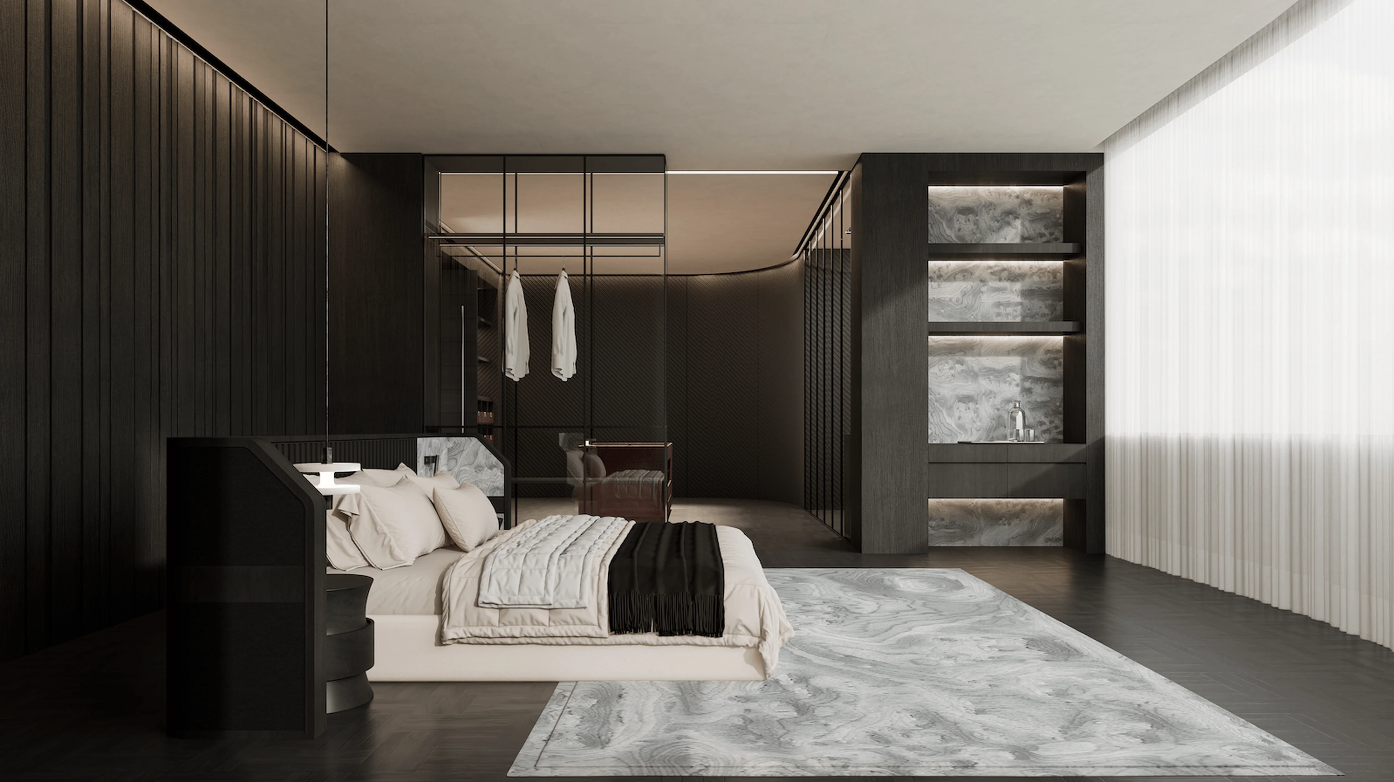
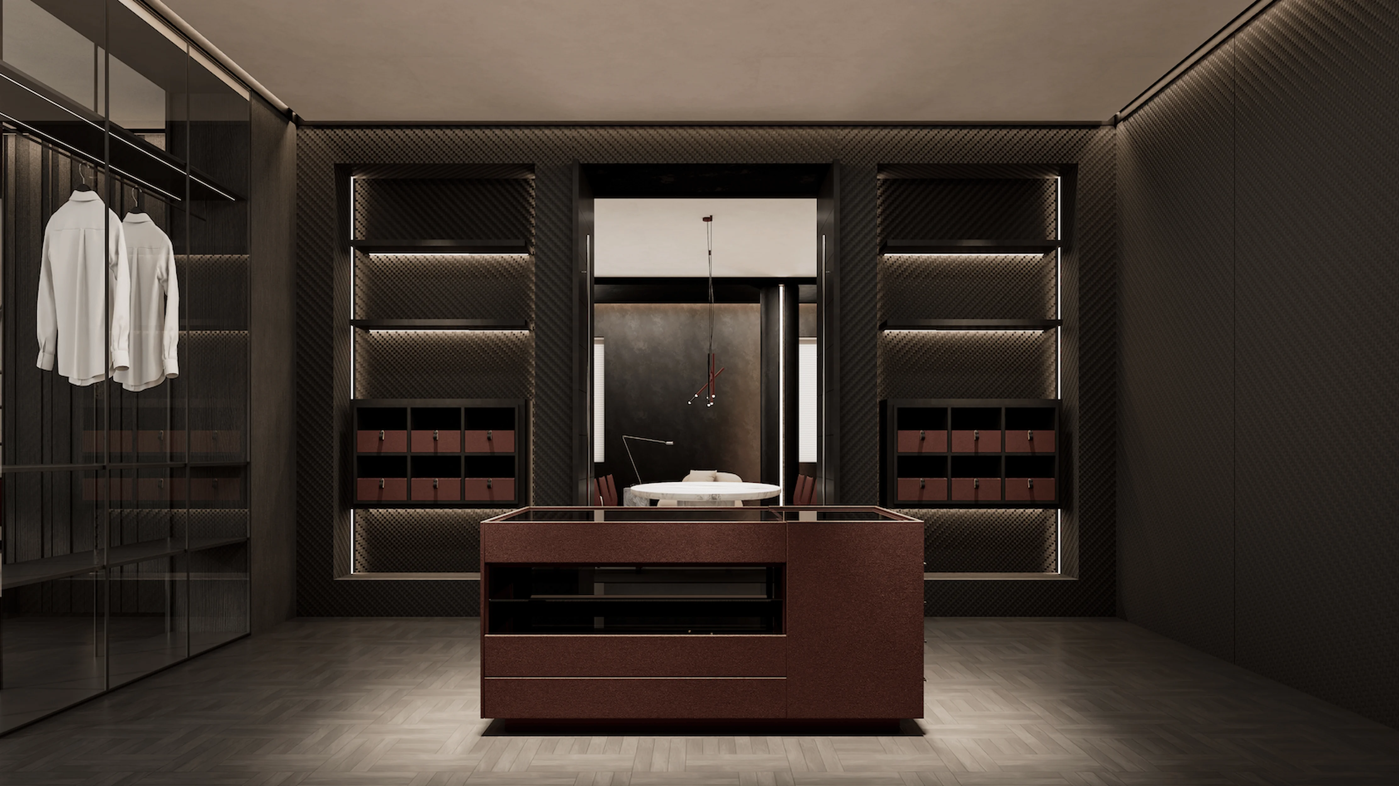
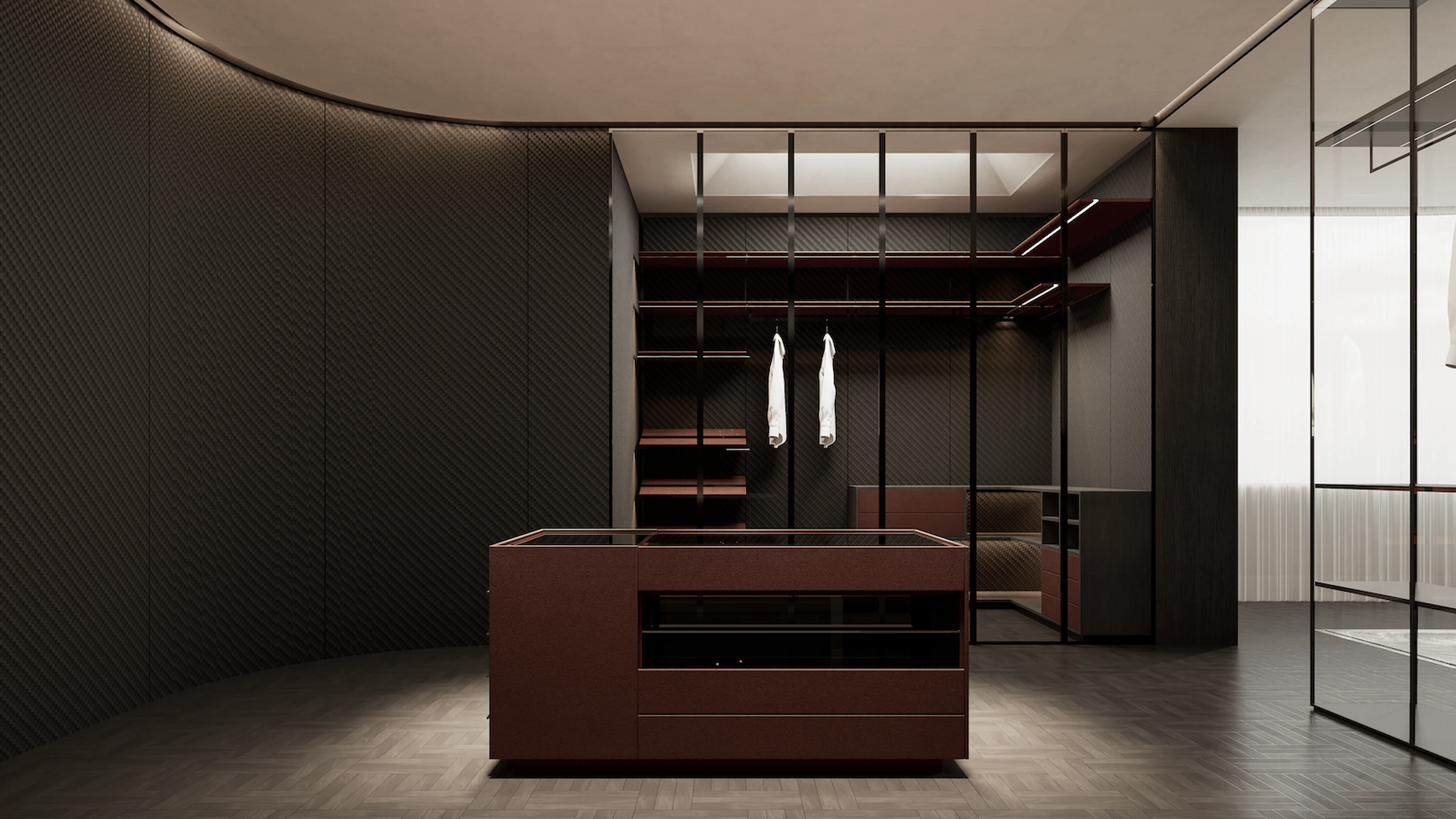
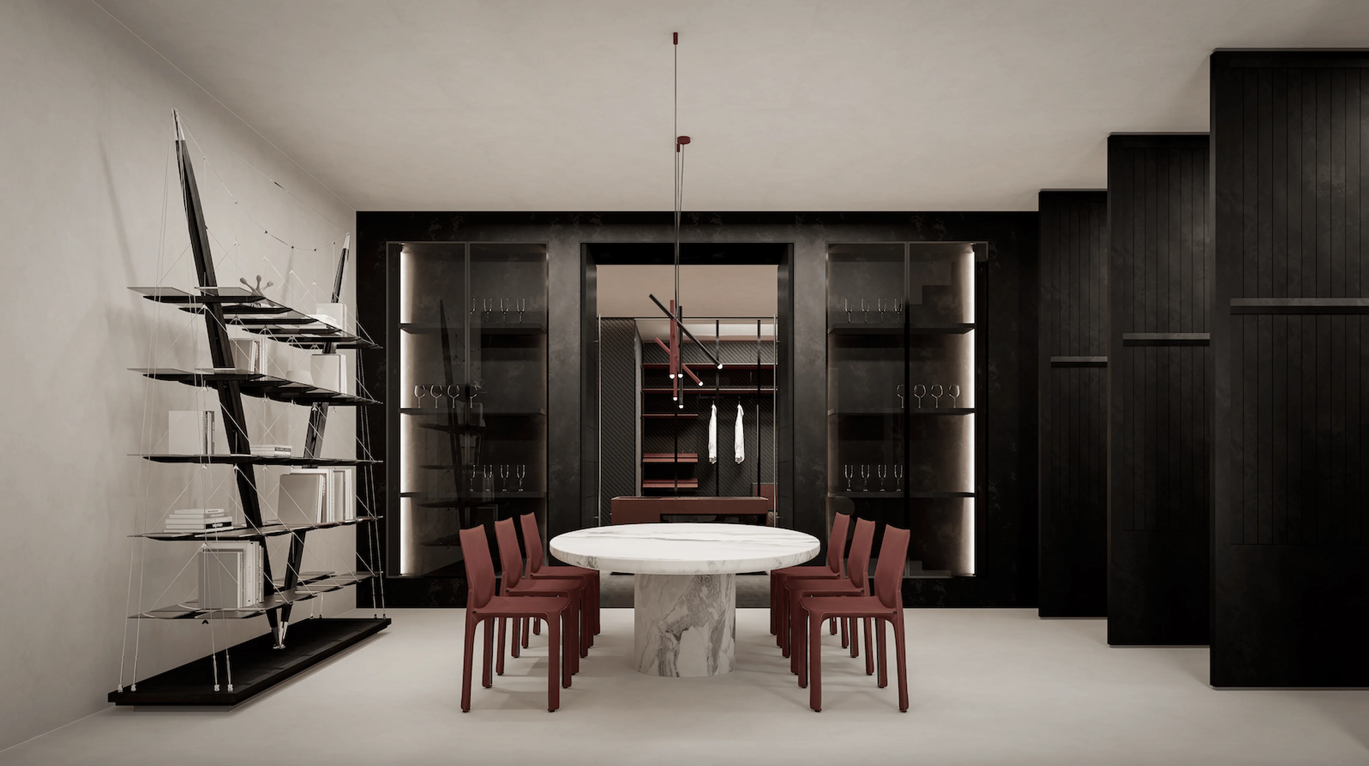
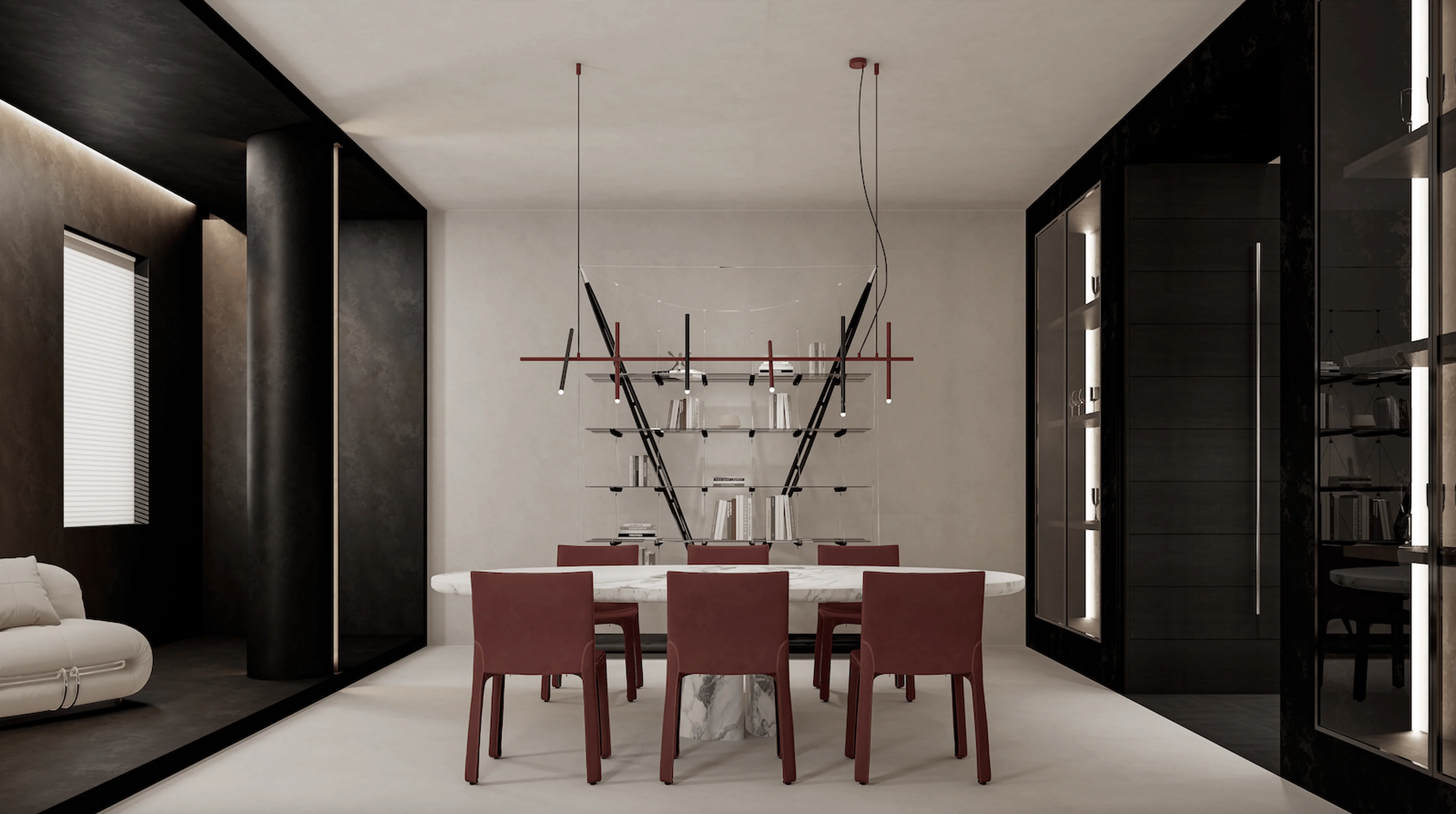
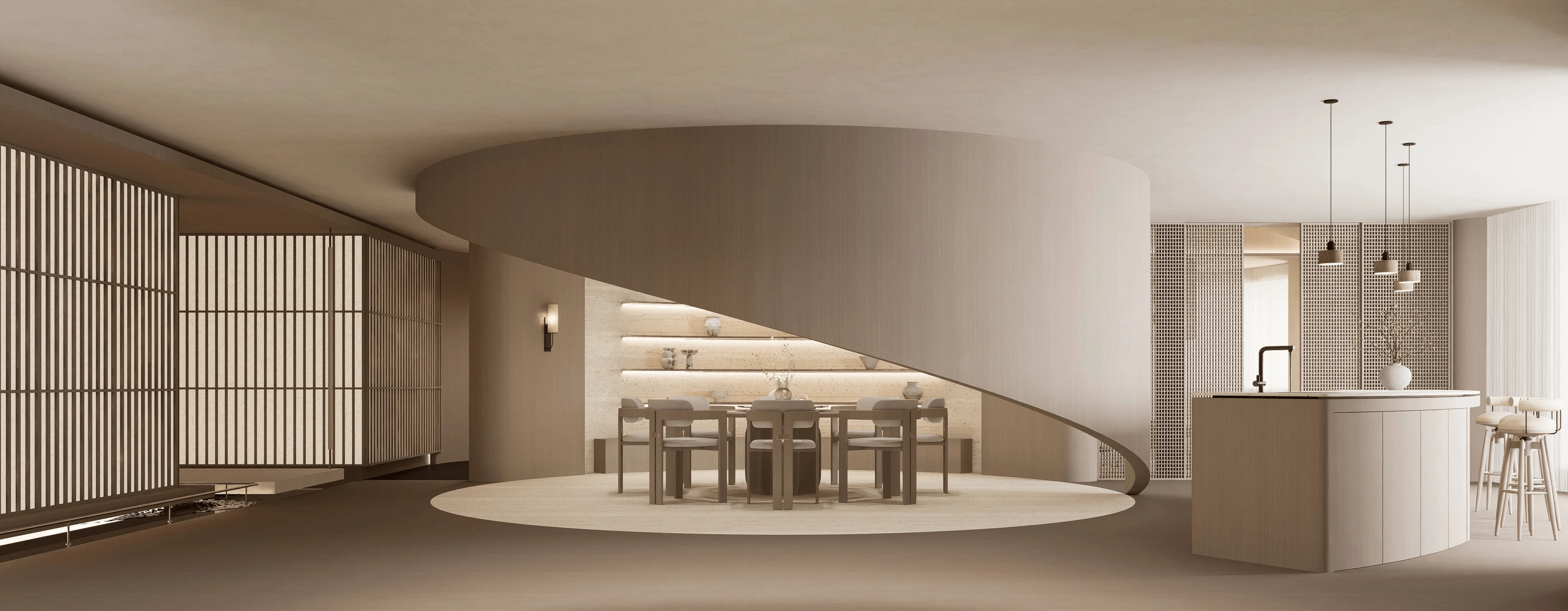
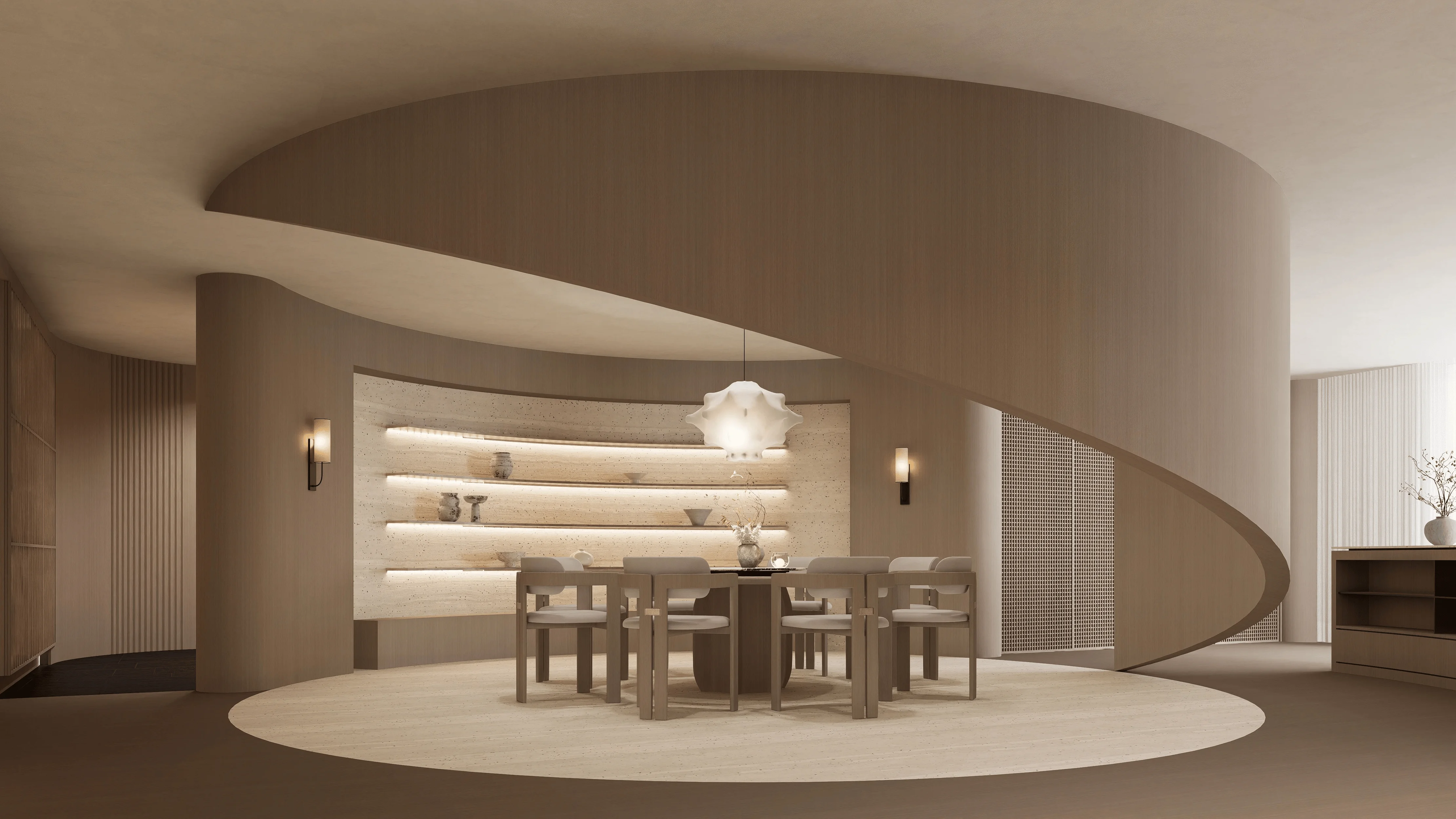
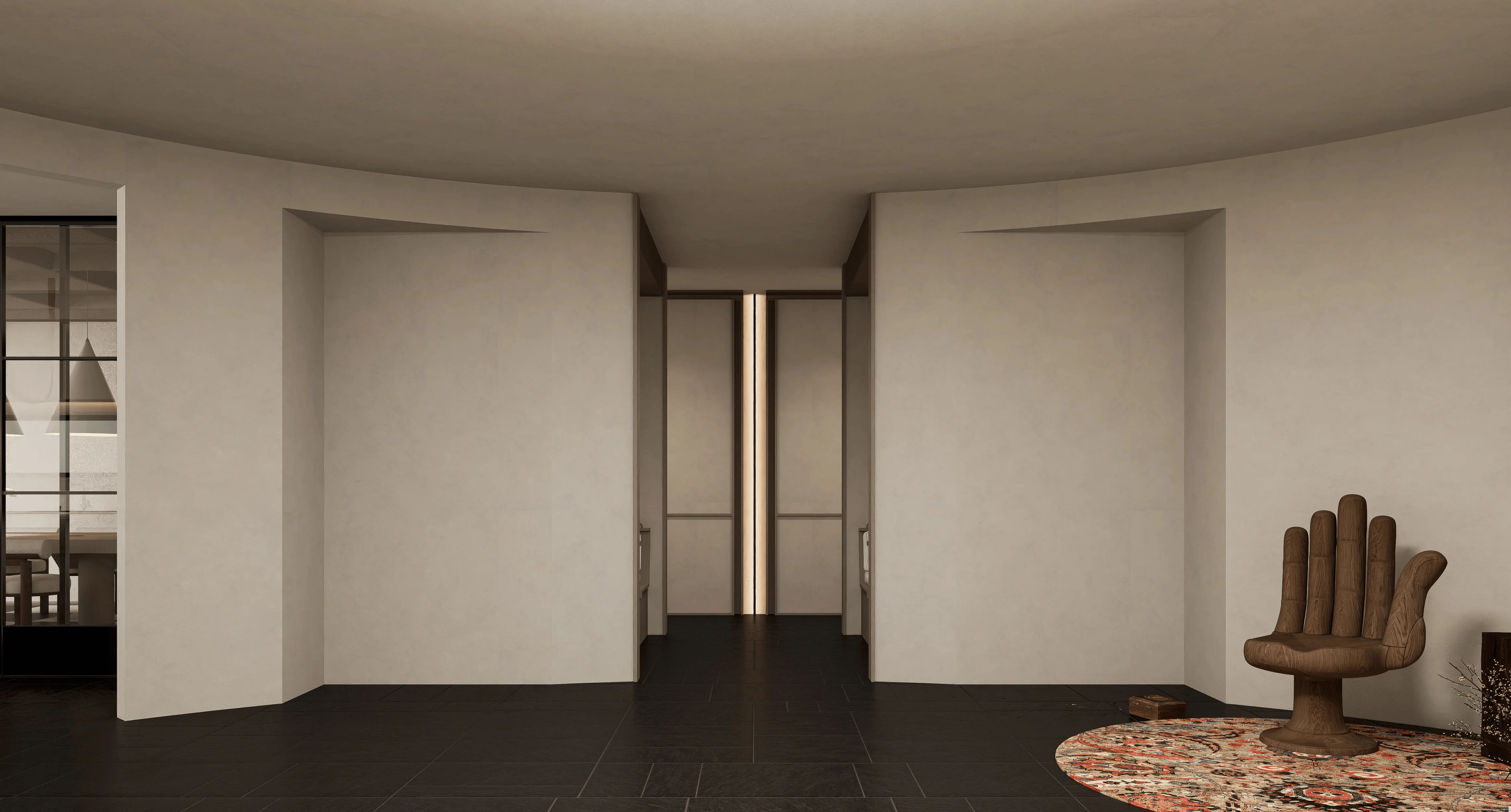
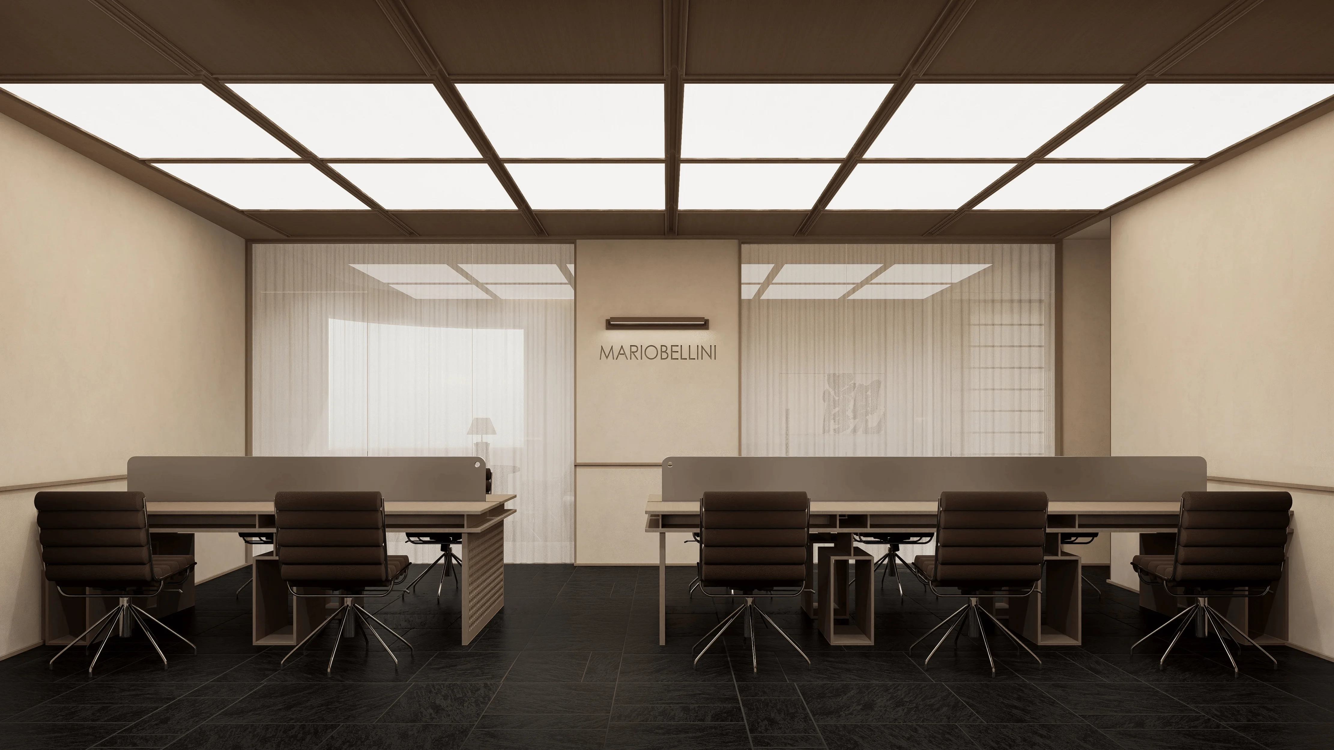
The exhibition hall’s layout is thoughtfully organized to guide visitors through a seamless journey of discovery. The main entrance welcomes guests with a semi-open reception area, where the overall wooden space’s artistry immediately sets the tone for the immersive experience that awaits. Moving through the space, a clever combination of partitions and open areas subtly divides the office and reception areas, demonstrating a keen understanding of spatial dynamics. The second floor adopts a softer approach, incorporating Chinese elements and a centrally designed feature that evokes a sense of security and tranquility. The use of geometric circles throughout the space adds a touch of fluidity and dynamism, challenging traditional notions of spatial organization. The third floor embraces a lighter and more relaxed atmosphere, with soft lighting and a carefully curated selection of materials that create a sense of warmth and intimacy. The wardrobe bedroom space, with its blend of wine red and black wood, exudes sophistication and a touch of introversion, enhanced by the subtle glow of integrated light strips. The high-end residential design principles are evident in every detail, from the choice of materials to the layout of furniture, creating a space that feels both luxurious and inviting.
high-end residential design, modern aesthetics in residential design, exhibition hall design
Materiality and Craftsmanship
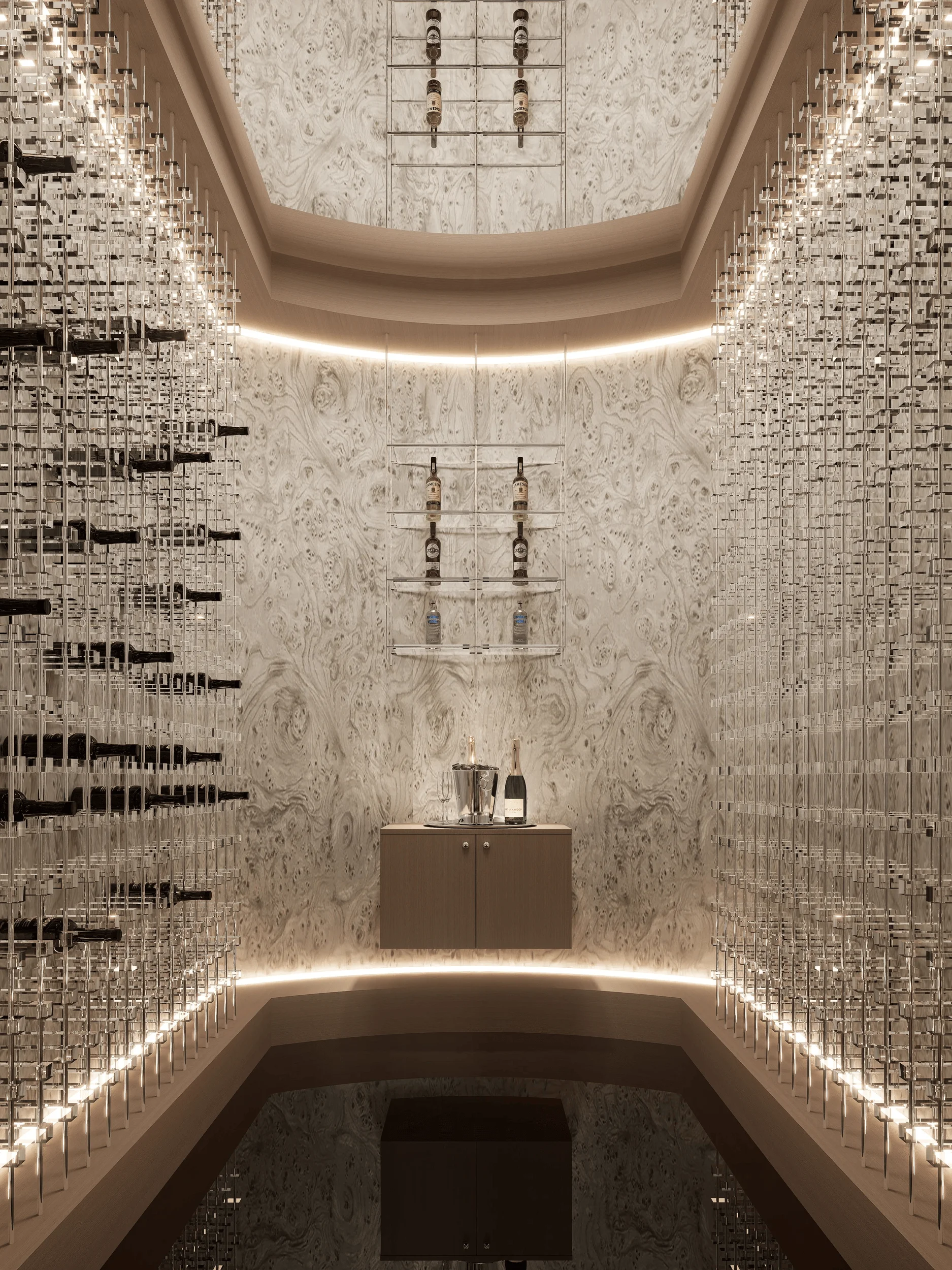
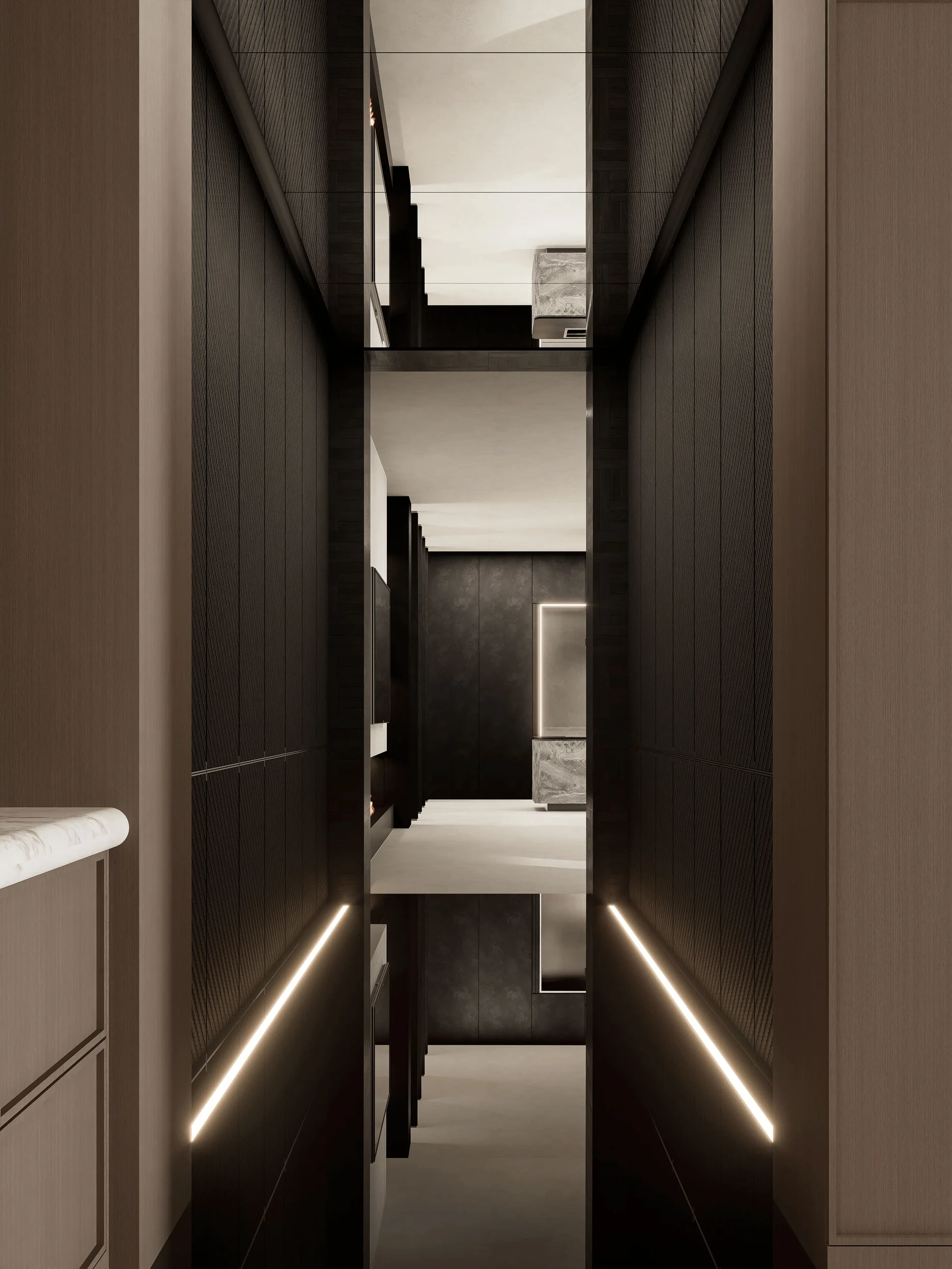
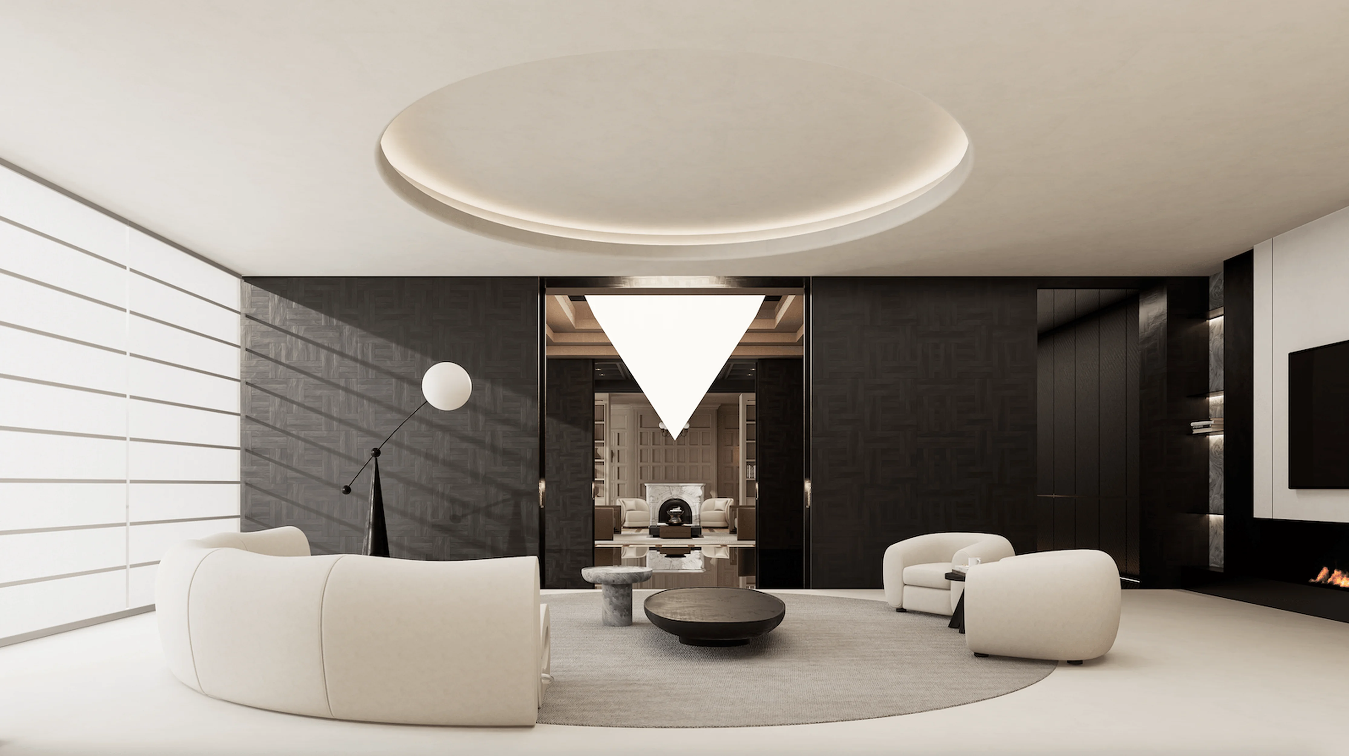
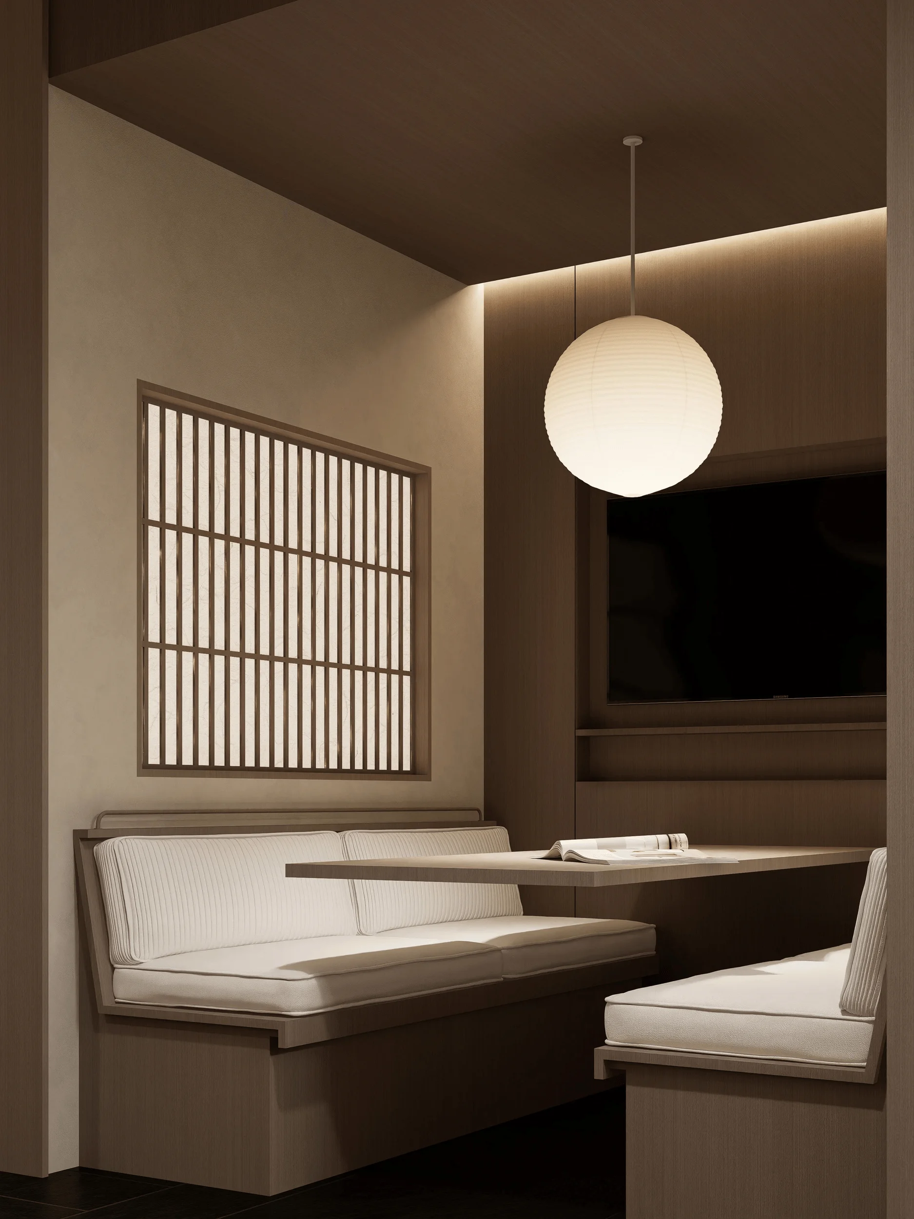
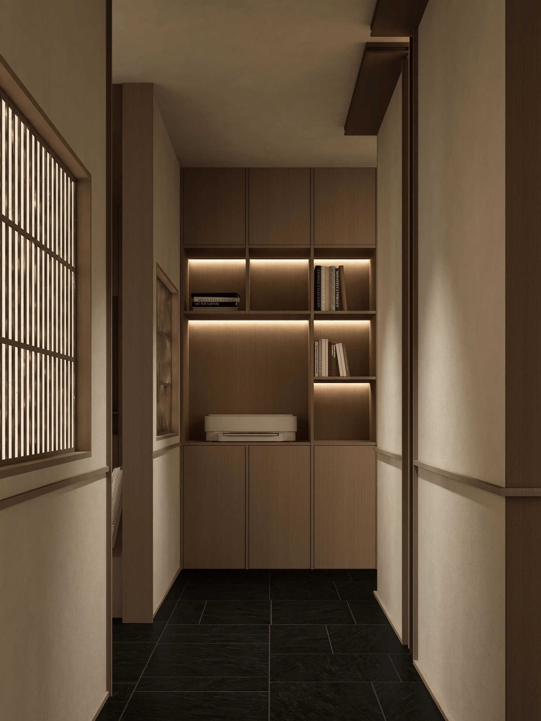
A defining feature of the exhibition hall is its meticulous attention to materiality and craftsmanship. The designers carefully selected materials with a focus on their primitive textures and inherent beauty. The warm texture of wood, the sleekness of glass, and the subtle sheen of metal are thoughtfully combined to create a symphony of textures that engage the senses. Under the artful projection of light, these materials come to life, revealing their inherent qualities and adding depth to the overall spatial experience. The use of geometric shapes, such as the silver triangle rotating around a central pivot in a darkened space, highlights the interplay between form and light, creating a sense of dynamism and visual interest. The interplay of light and shadow further accentuates the materiality of the space, adding layers of complexity and nuance. The craftsmanship is evident in every detail, from the meticulously crafted wood paneling to the precisely placed light fixtures. The designers’ commitment to quality and detail is palpable, elevating the exhibition hall beyond a mere display space into a work of art in itself.
high-end residential design, modern aesthetics in residential design, exhibition hall design
Aesthetics and Atmosphere
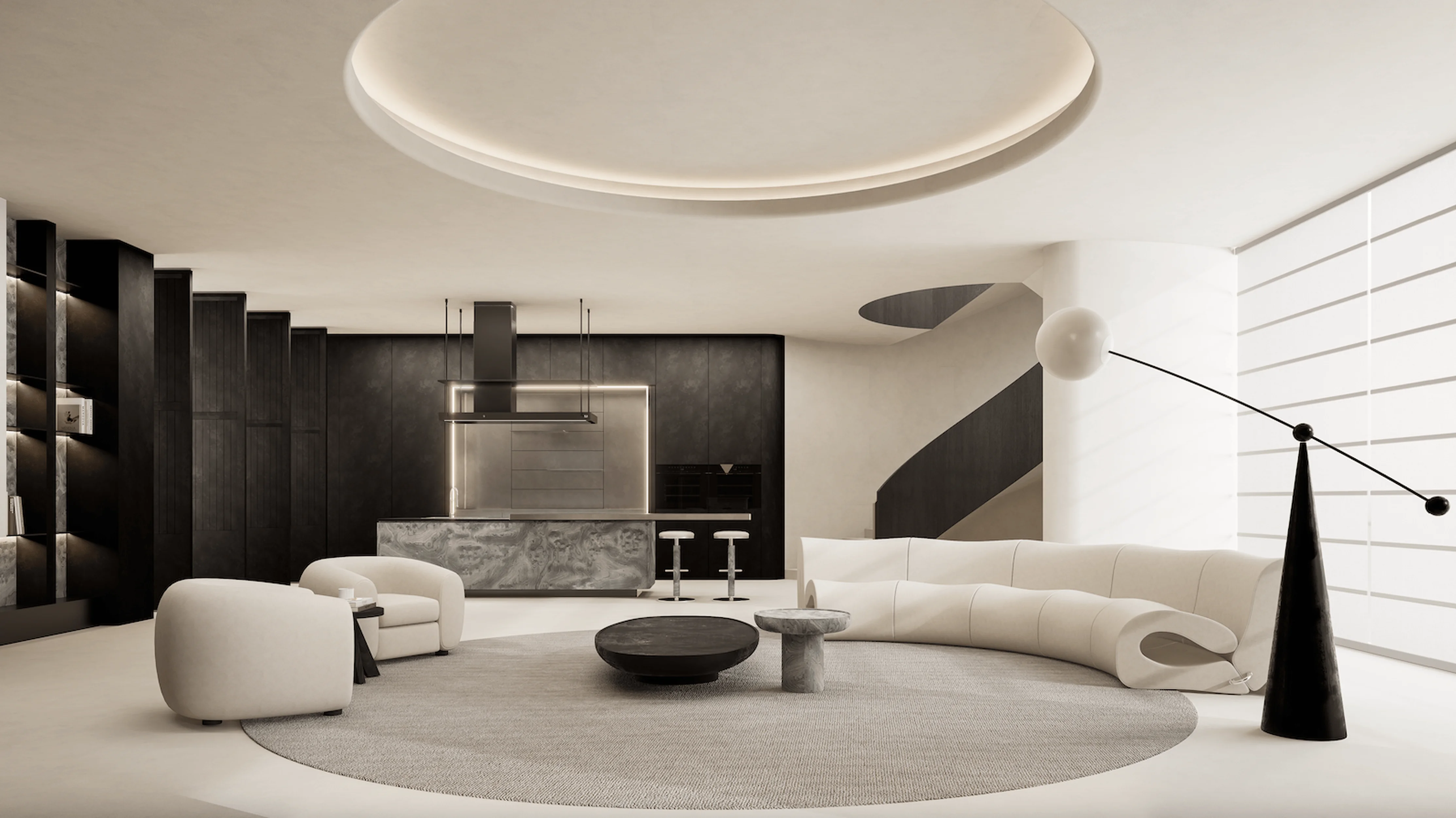
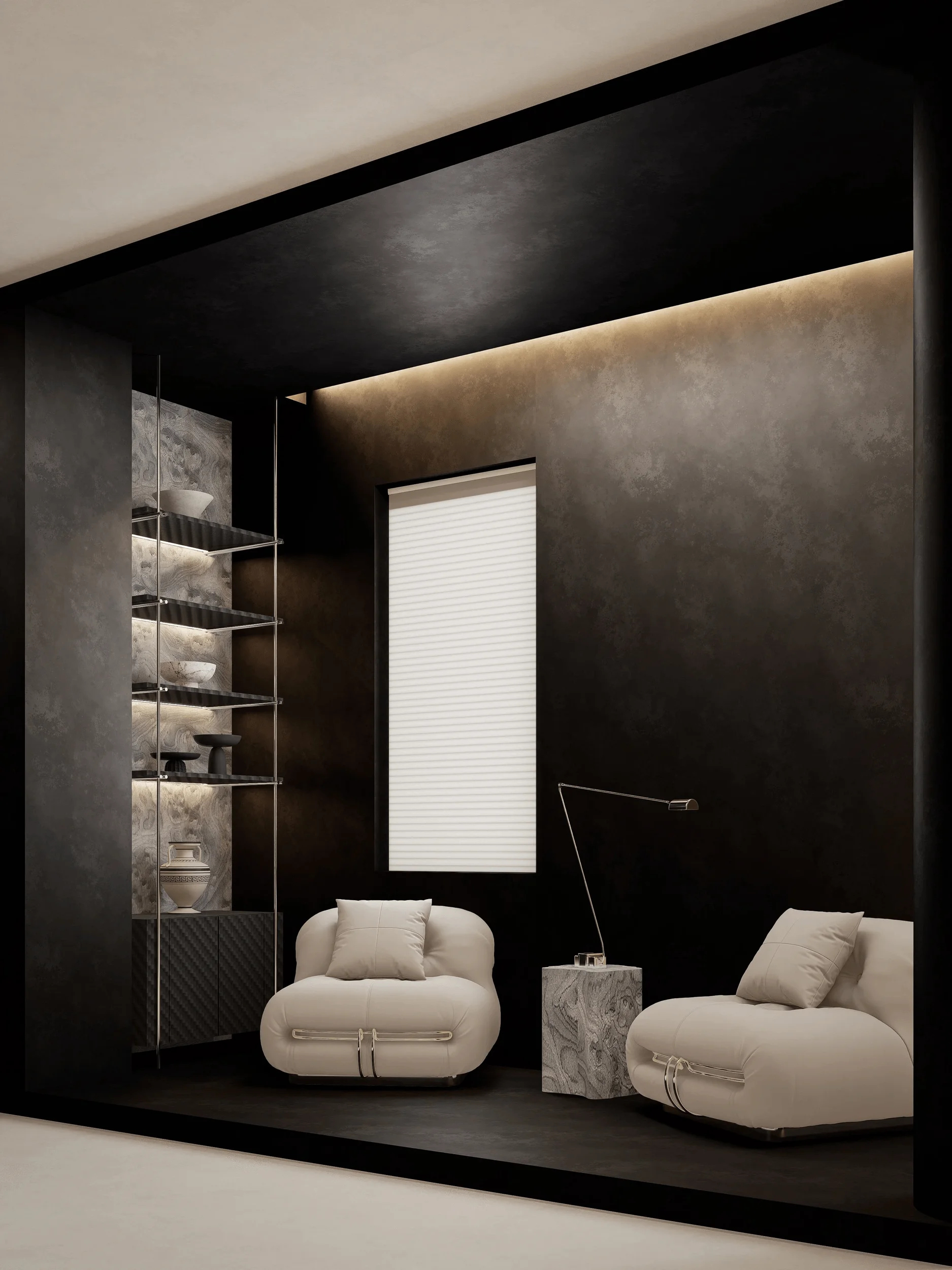
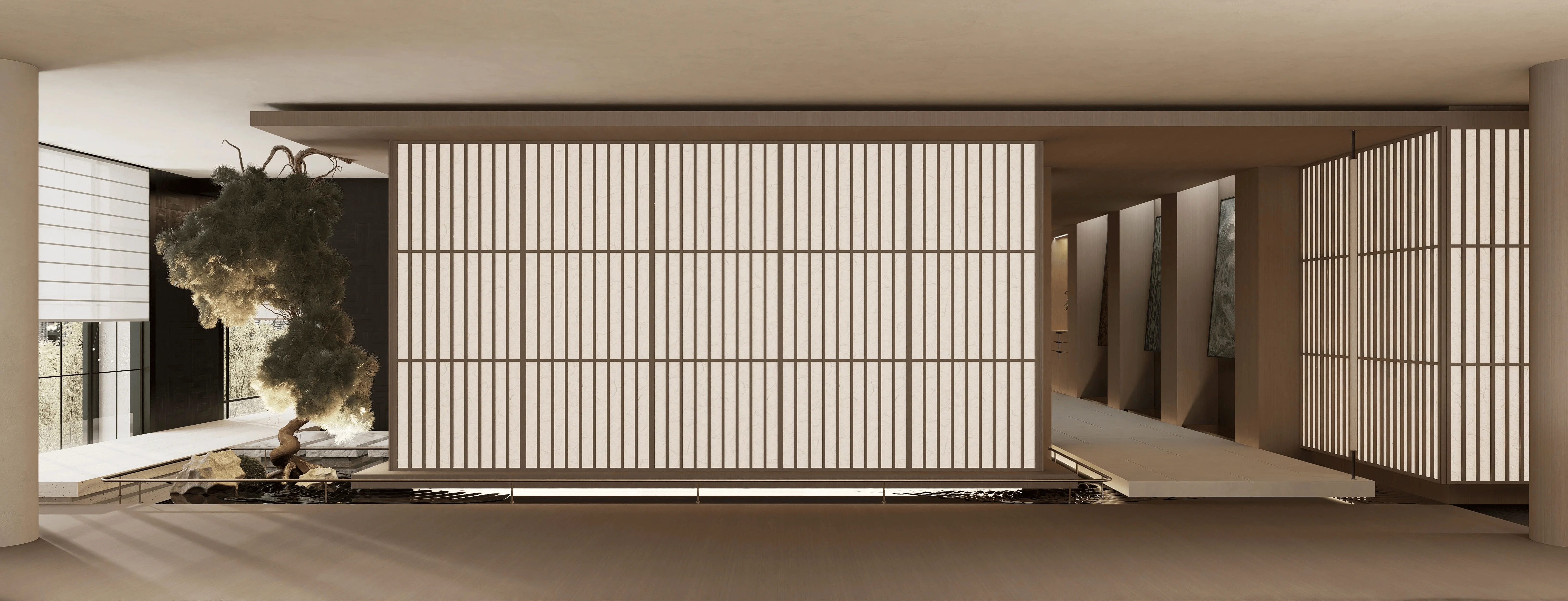
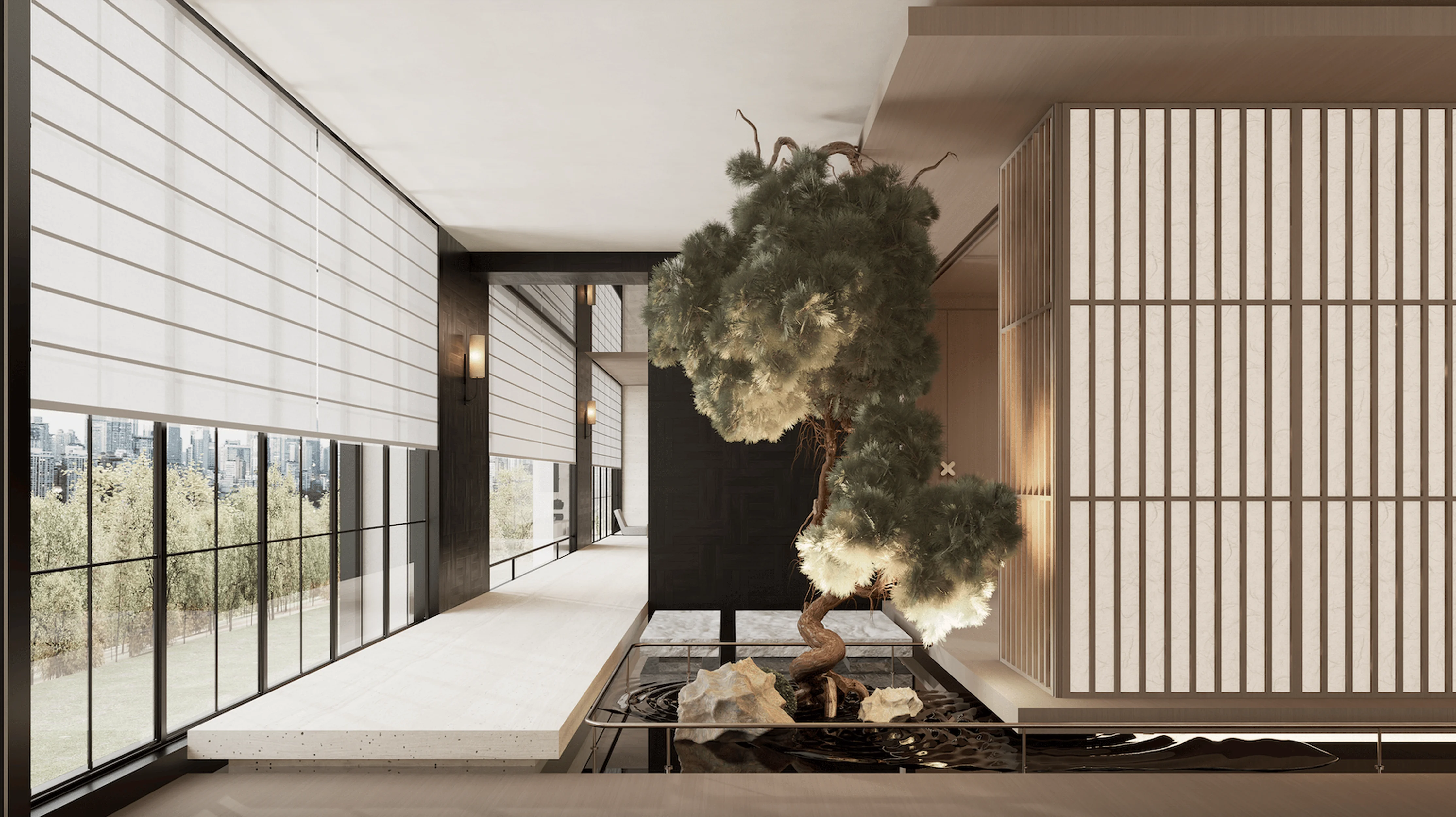
The exhibition hall’s aesthetics are characterized by a harmonious blend of modern elegance and traditional Chinese influences. The designers masterfully utilize a neutral color palette, with shades of beige, brown, and gray dominating the space. This creates a sense of tranquility and sophistication, allowing the carefully curated furniture and artwork to take center stage. The lighting design plays a crucial role in shaping the atmosphere, with soft, diffused light creating a warm and inviting ambiance. The use of light strips and strategically placed spotlights highlights key features and adds depth to the space. The integration of natural elements, such as the bonsai tree in the second-floor space, adds a touch of tranquility and reinforces the connection to nature. The overall atmosphere is one of refined elegance and understated luxury. The exhibition hall successfully captures the essence of high-end residential design, offering visitors a glimpse into a world of sophistication and comfort.
high-end residential design, modern aesthetics in residential design, exhibition hall design
Functionality and User Experience
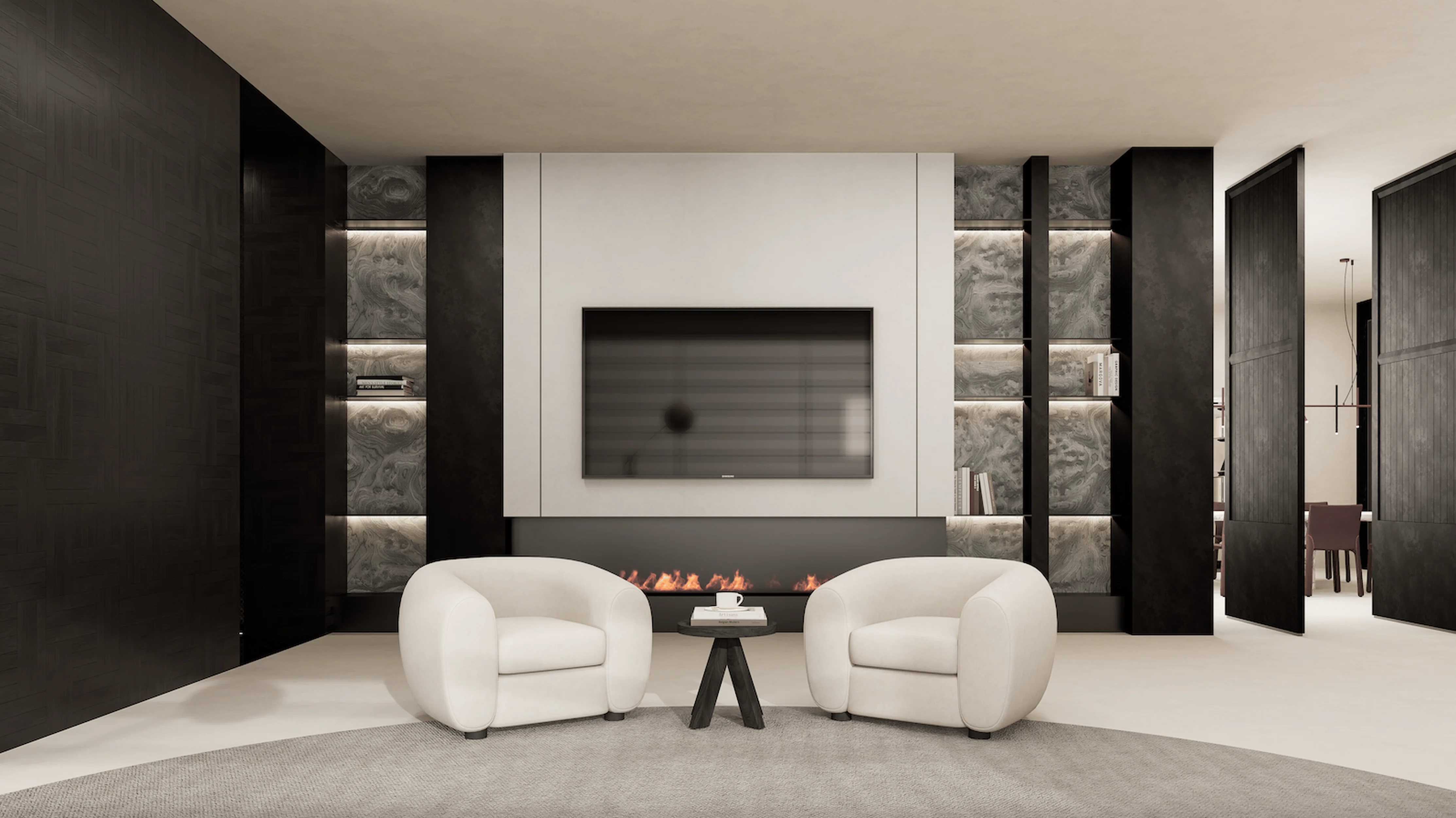
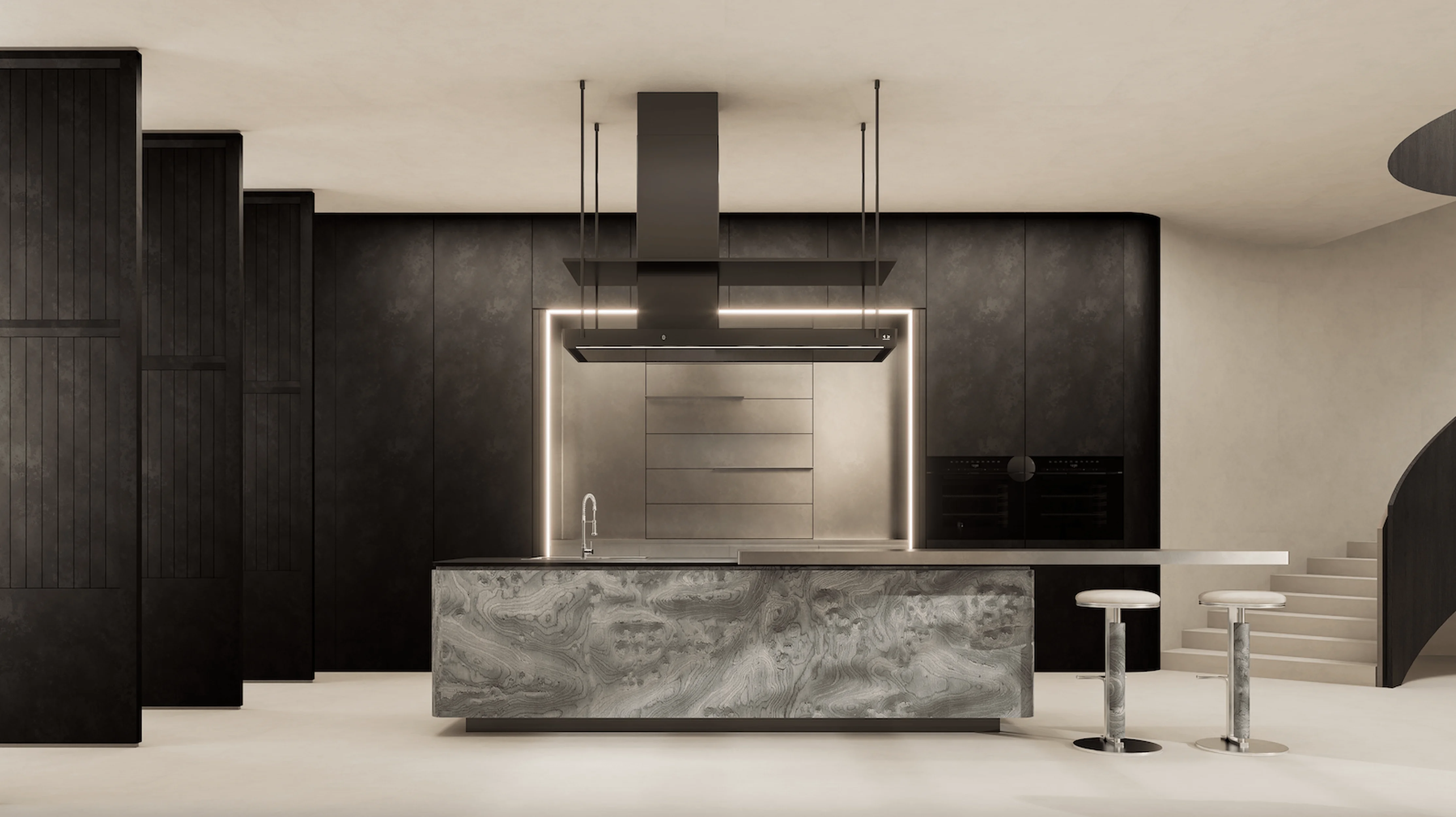
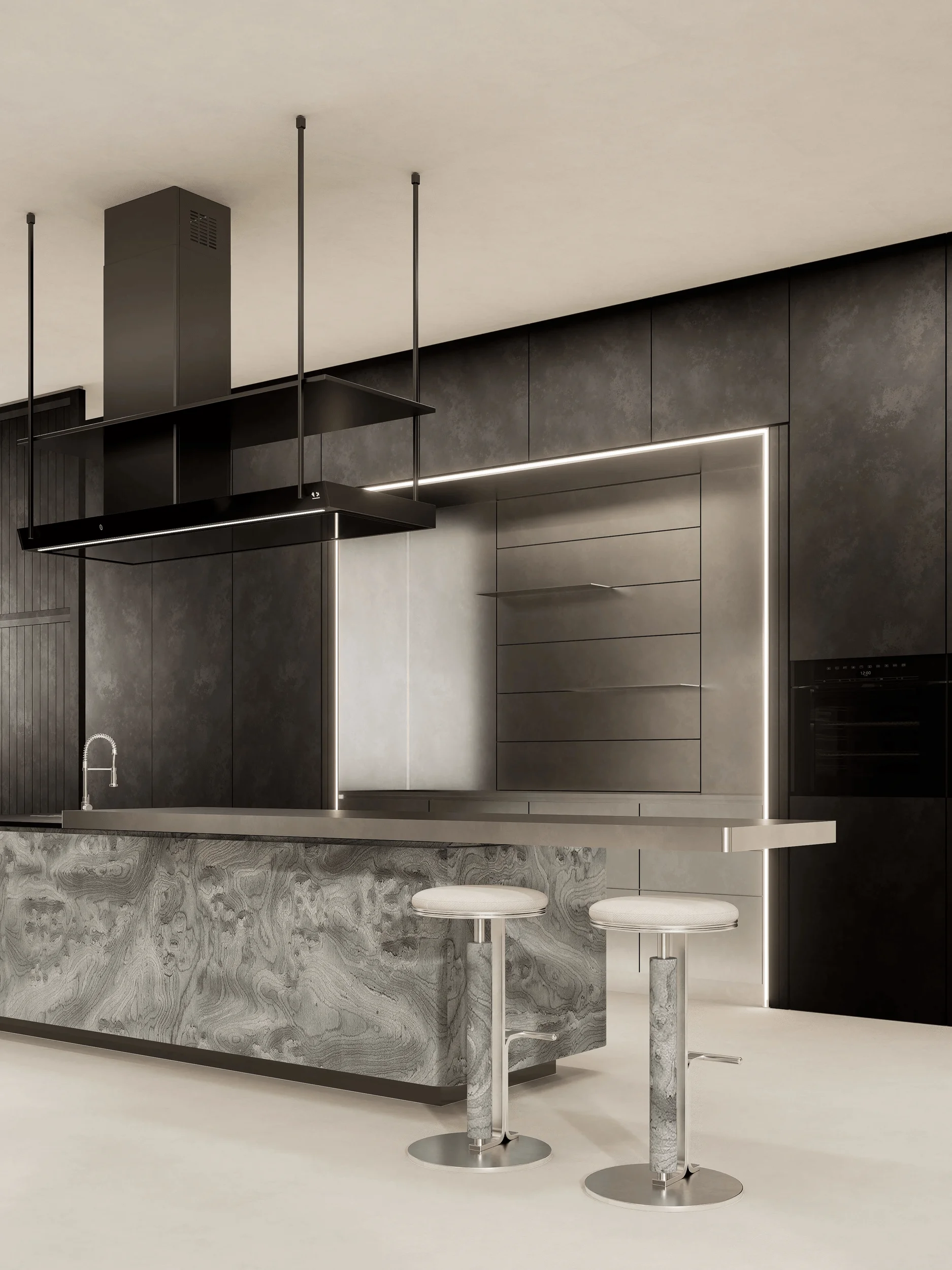
While aesthetics are paramount, the exhibition hall is also designed with a strong emphasis on functionality and user experience. The layout of the space is intuitive and easy to navigate, allowing visitors to explore the various exhibits and areas seamlessly. The semi-open reception area provides a welcoming space for guests to gather and interact, while the cleverly partitioned office and reception areas ensure both privacy and efficiency. The second-floor space, with its centrally designed feature and incorporation of Chinese elements, offers a sense of tranquility and security, perfect for relaxation or contemplation. The third-floor suite, with its carefully selected materials and artful lighting, provides a luxurious and comfortable retreat. The integration of technology, such as the TV in the dining area and the modern appliances in the kitchen, enhances the overall user experience and adds a touch of modernity to the space. The exhibition hall is a testament to the designers’ ability to create spaces that are not only visually stunning but also functional and user-friendly.
high-end residential design, modern aesthetics in residential design, exhibition hall design
Project Information:
Project Type: Exhibition Hall
Architect: SOLILOQUY DESIGN
Area: 1200㎡
Project Year: 2023
Country: China
Main Materials: Wood, Glass, Metal
Photographer: HETUI-STUDIO


