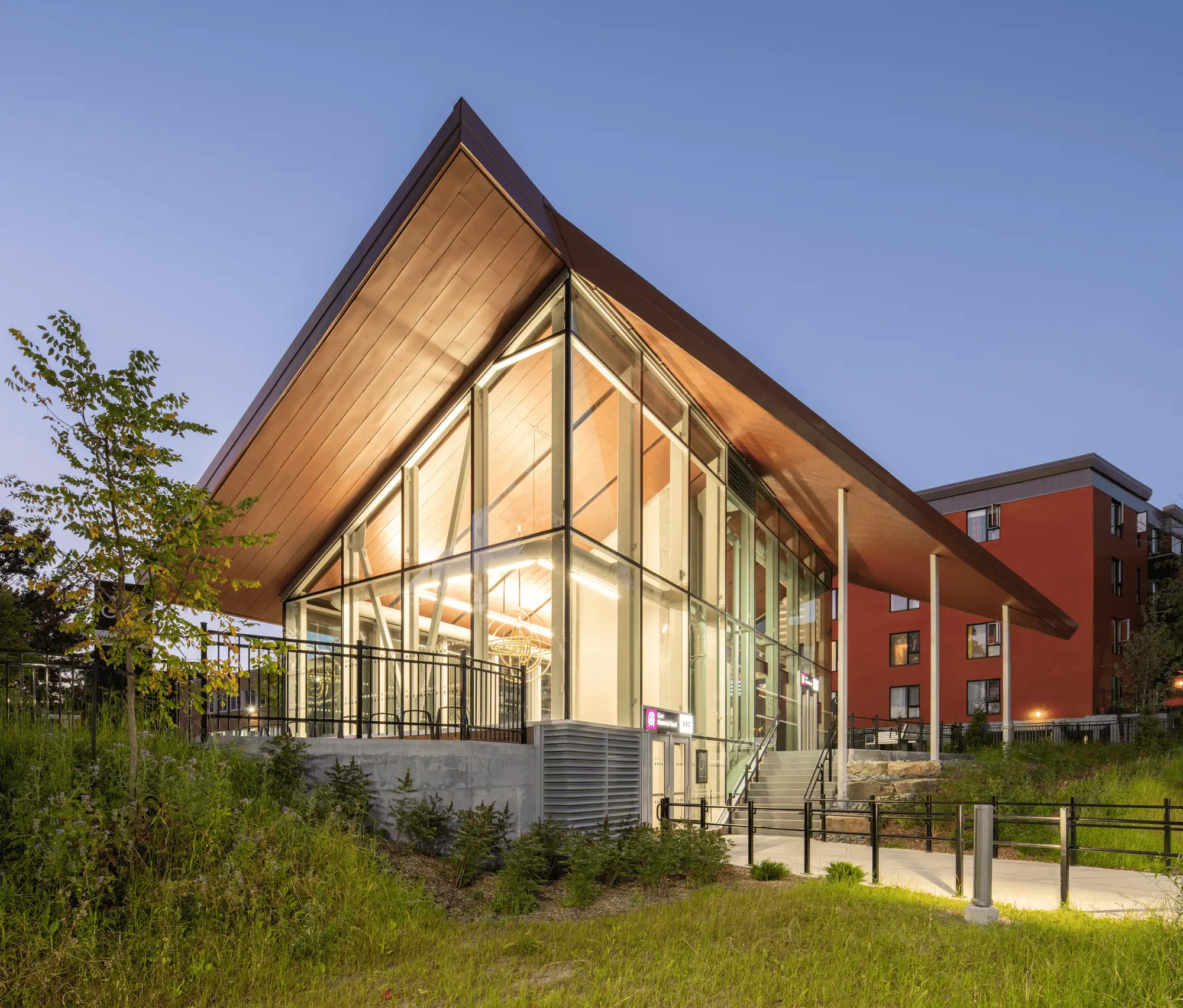
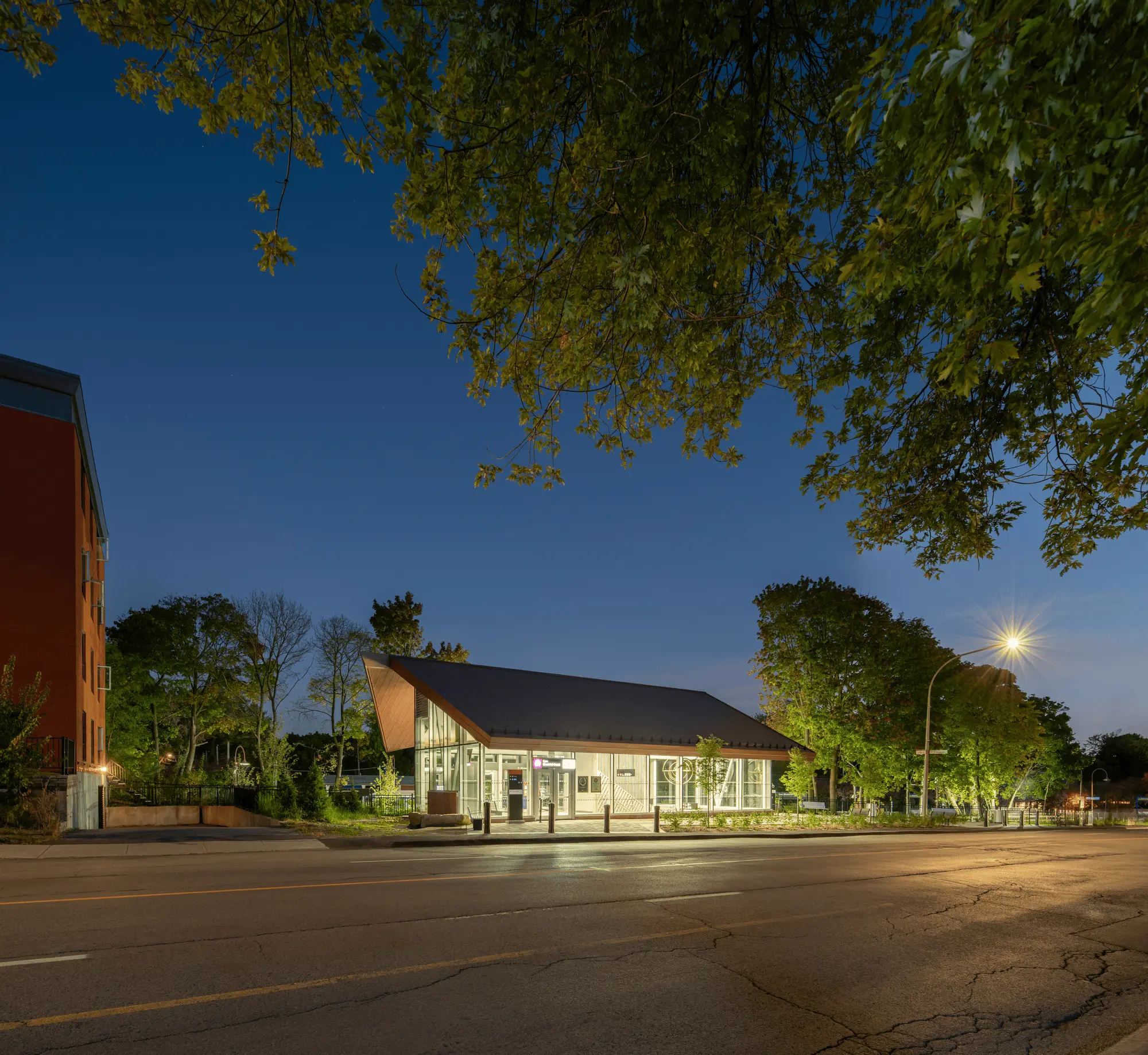
Sid Lee Architecture’s new Montreal West Station pavilion is a stunning example of contemporary public transit design. This innovative structure, inspired by the neighborhood’s heritage building typology, boasts a unique double-pitched roof that maximizes natural light and evokes a sense of security. The pavilion’s thoughtful interior design, featuring a chevron-grooved concrete treatment and a suspended art installation, creates a welcoming and inspiring space for commuters. This project exemplifies Sid Lee Architecture’s commitment to architectural quality, accessibility, and sustainability.
Combining architectural finesse with the neighbourhood’s heritage building typology, the new train station pavilion, designed by Sid Lee Architecture, acts as a beacon at the heart of the Côte-des-Neiges – Notre-Dame-de-Grâce neighbourhood, for the well-being of its surrounding community.
The station’s new iteration is part of a transformation project that aims at upgrading exo’s entire transit network to improve the uniformity of its services. The new building serves as a crucial hub on one of the busiest lines of the transit system. At its origin, the project aimed to update the station to meet exo’s new safety and accessibility objectives. Thus, the new pavilion embodies an innovative approach that seeks to transcend the simple function of an access point to become a distinct symbol within the community’s landscape.
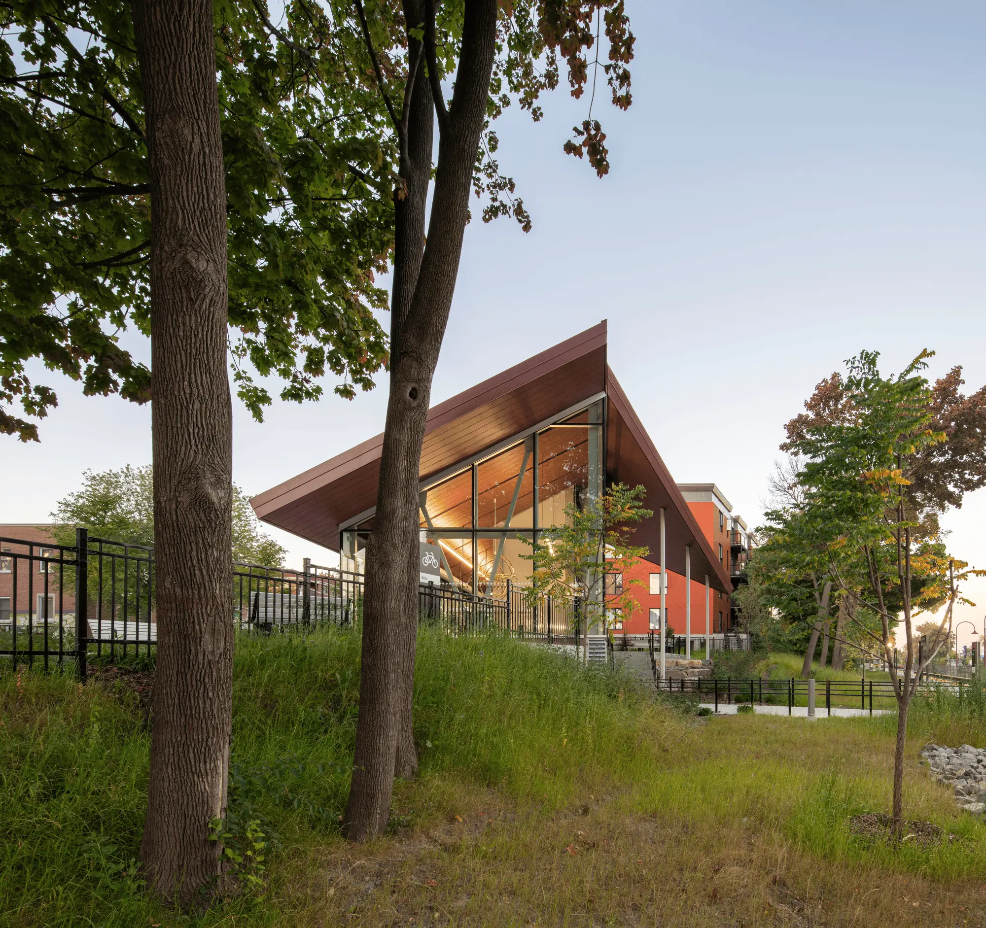
The location, on a small and difficult-to-use area, posed unique integration challenges. Preserving the existing woodland, including its trees and biodiversity, while creating an underground rail connection, required careful consideration.
Sid Lee Architecture embraced the mission to create a unique space that both reflects its environment and a contemporary vision of public transit. The resulting architectural proposal addresses the initial commission, but also demonstrates the firm’s commitment to architectural quality, universal accessibility, and sustainability.
The roof as a starting point
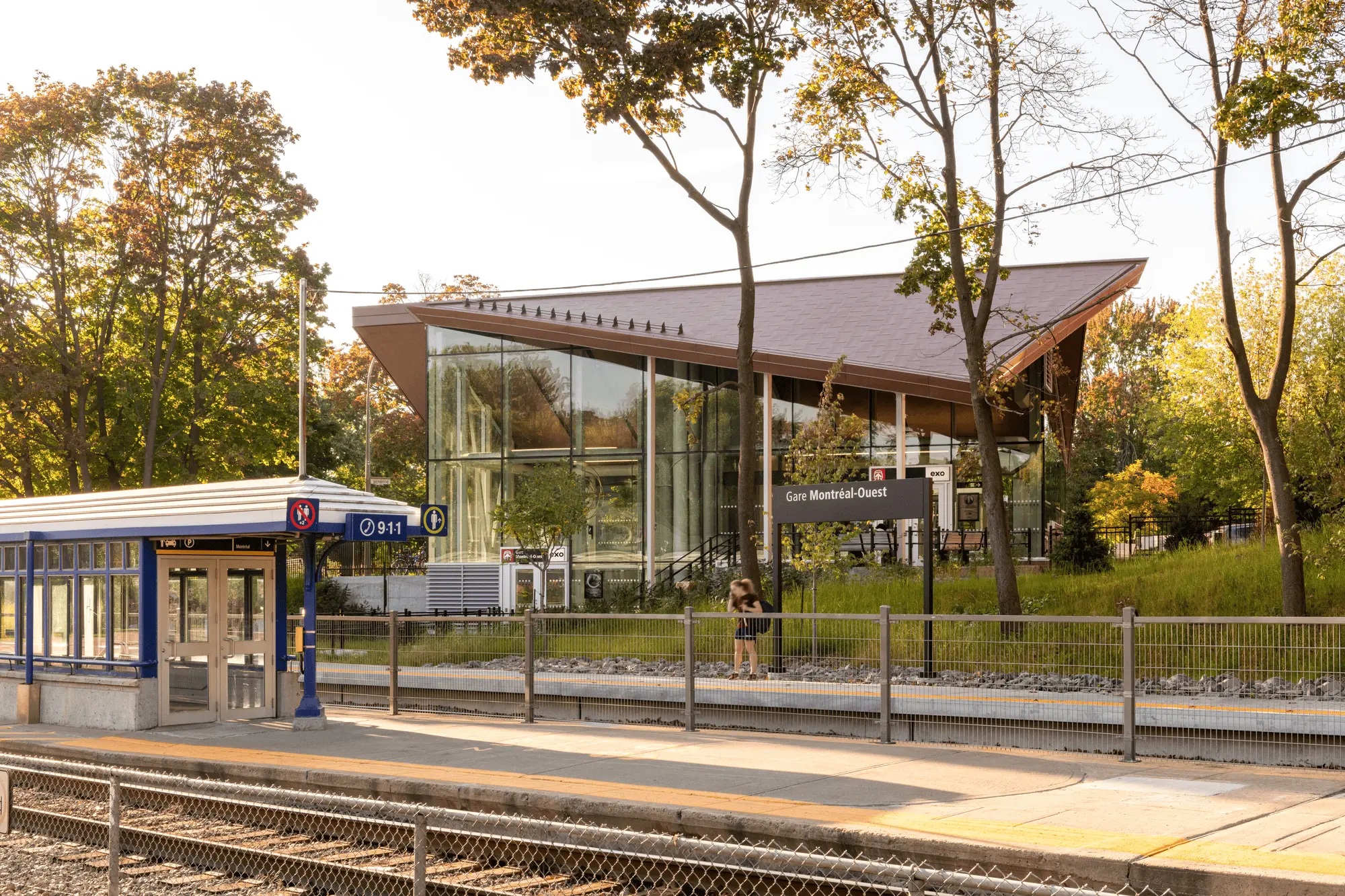
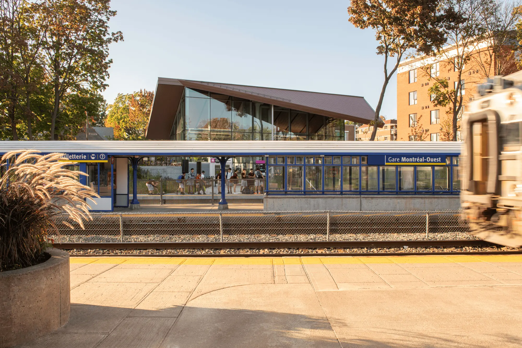
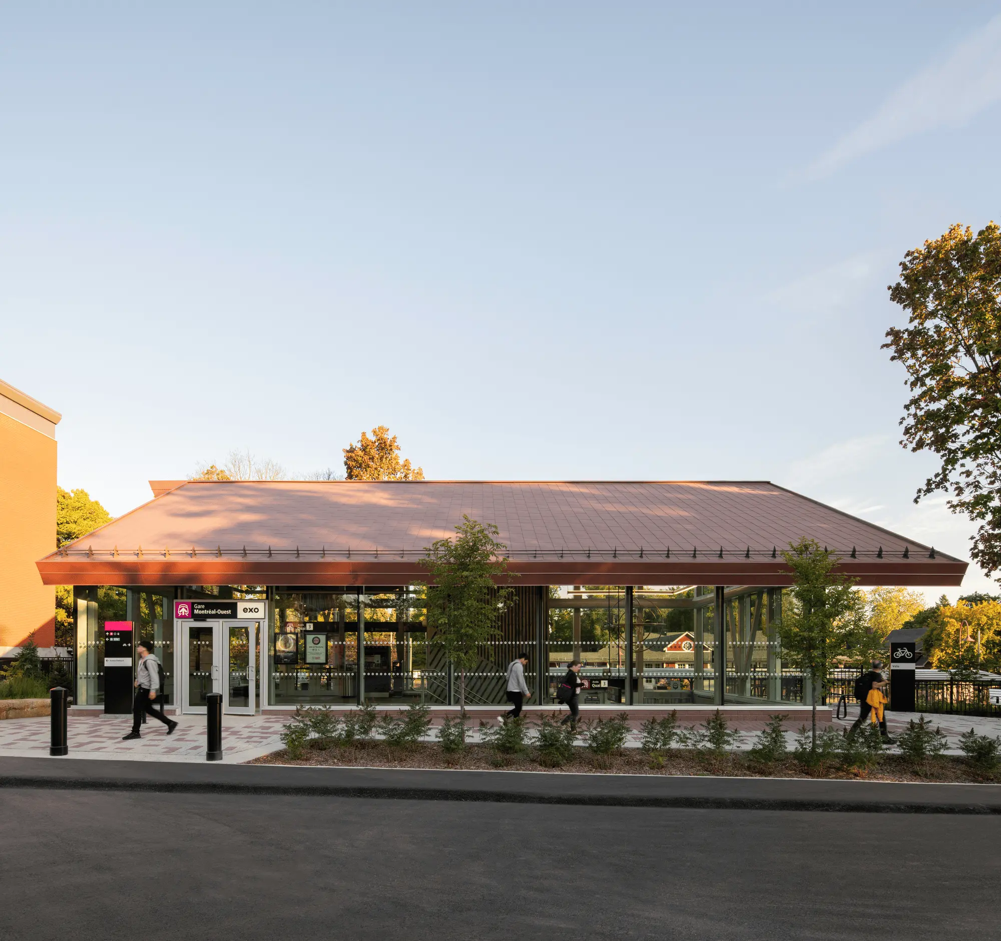
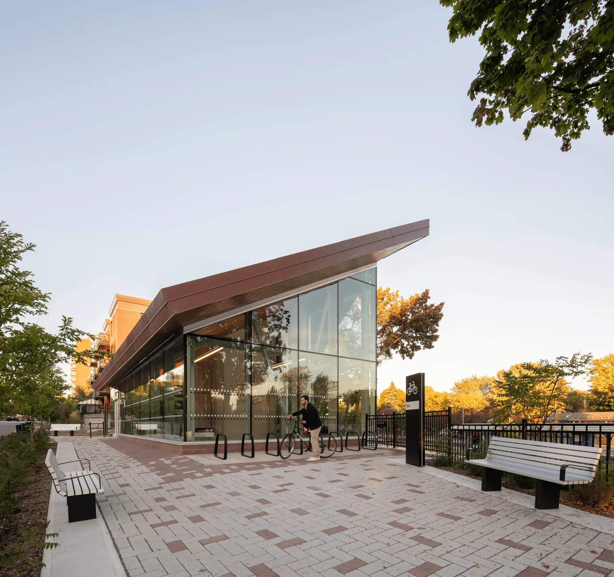
First and foremost, the architects carefully studied the typology of the neighborhood. Inspired by surrounding references such as St. Philip’s Church, the existing train station building, and the area’s numerous residential buildings, it was ultimately the double-pitched roof that was chosen as the starting point to ensure a context-sensitive integration.
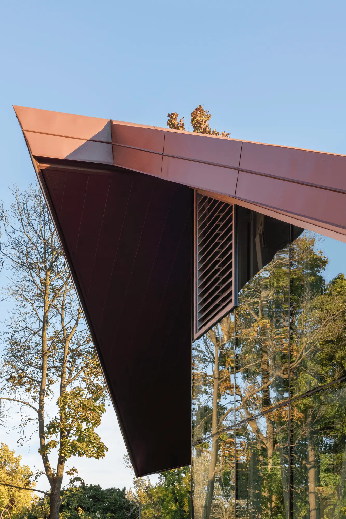
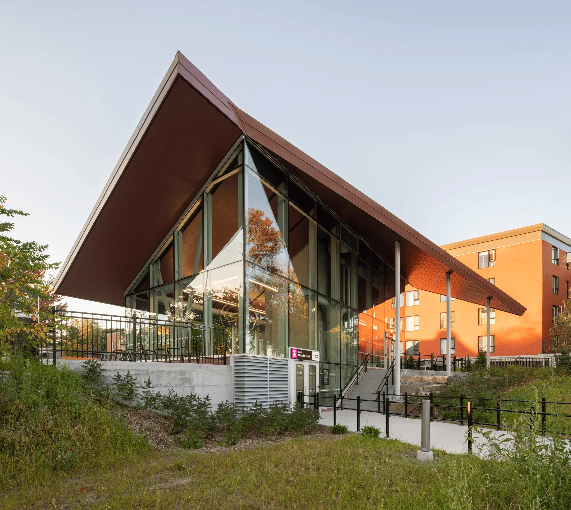
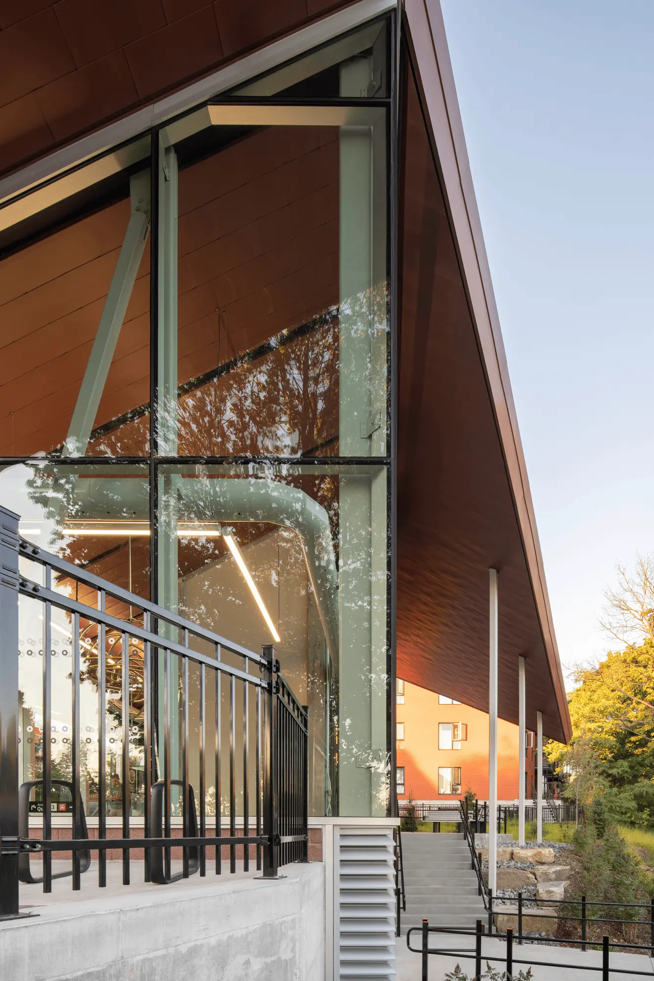
Updated and modernized, the vernacular roof nods to the simplified form of a shelter. It evokes a sense of familiarity and security through its elemental yet elegant expression. Like a carefully folded and then slit piece of paper to maximize natural light into the building, it gives the structure a timeless appeal.
To honour the brickwork of the existing train station, Sid Lee Architecture opted for a zinc treatment with a reddish hue as an enduring choice that not only adds character to the building, but also highlights the appreciation of ancestral craftsmanship.
A beacon on Sherbrooke Street West
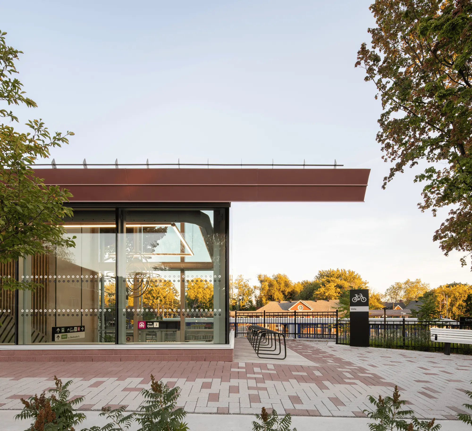
To create a harmonious balance, the roof has been delicately placed on a spacious glass box with a simplified shape, but notable volume. In addition to offering a unique design, this arrangement holds a poetic tension that makes the approach smoother and more inviting for users.
Characterized by the simplicity of its schematic aspect, the building is easily recognizable and stands as a beacon on Sherbrooke Street West. During the day, the glass box reflects the surrounding nature and the landscaping work done by Agence RELIEFDESIGN. At nightfall, the project’s cleverly integrated lighting creates a glow that accompanies passersby, highlighting the civic function of the structure, while also inspiring a sense of security.
A detailed oriented approach to the interiors
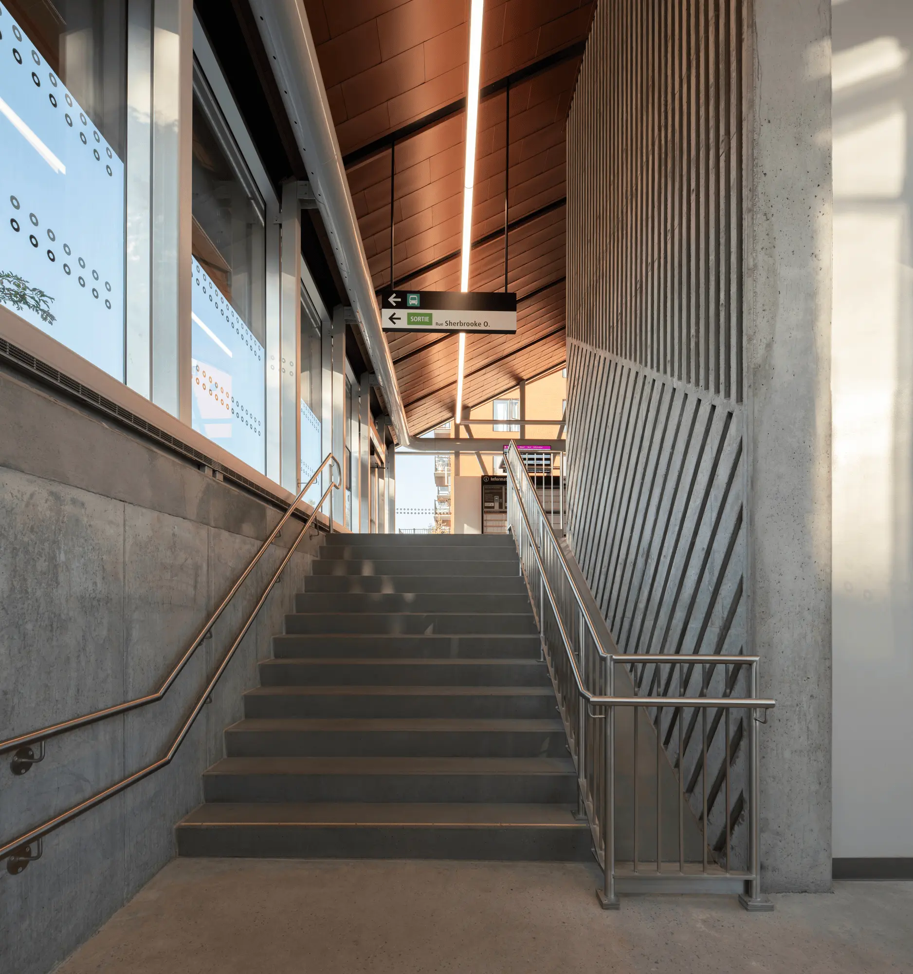
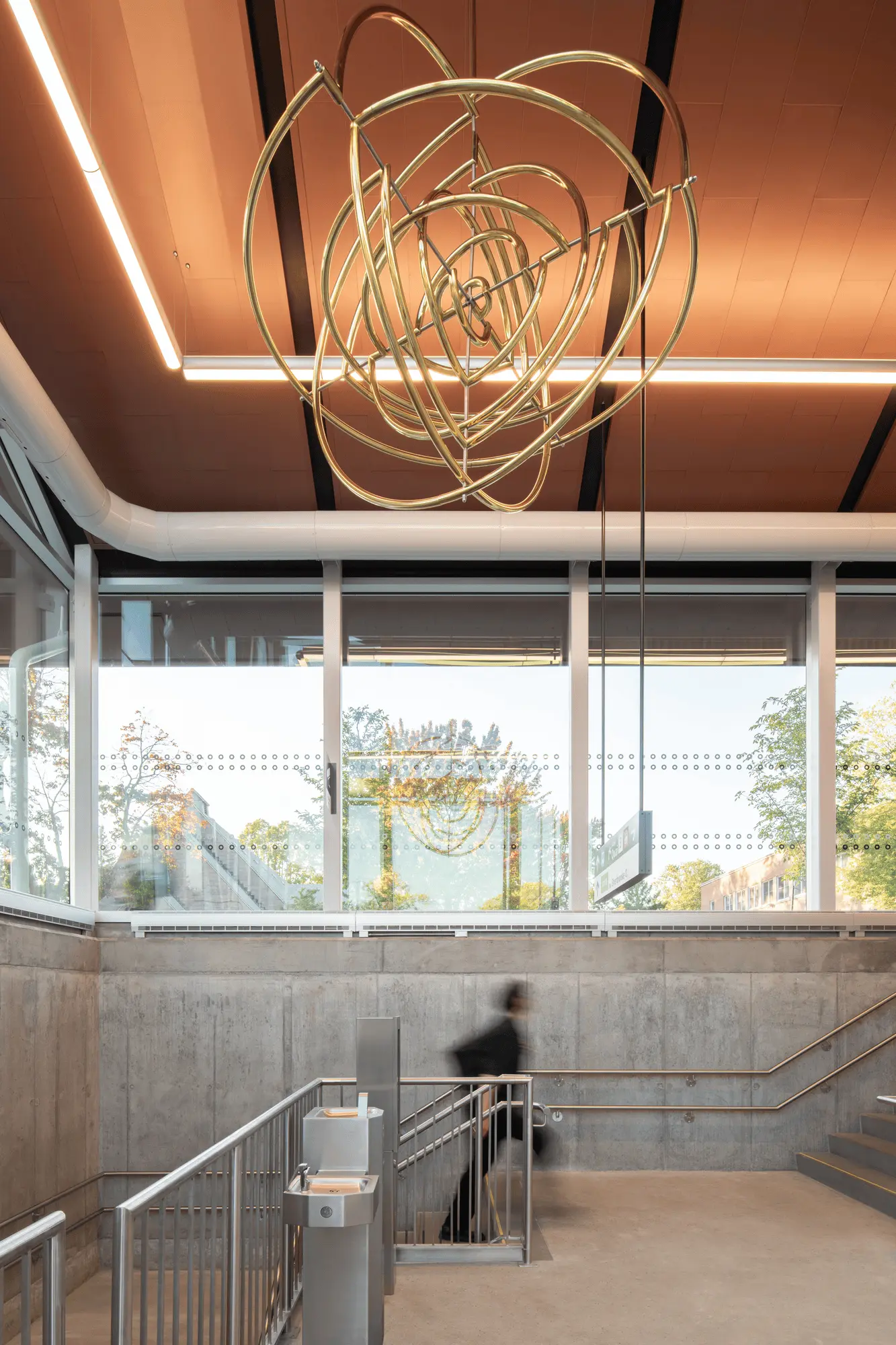
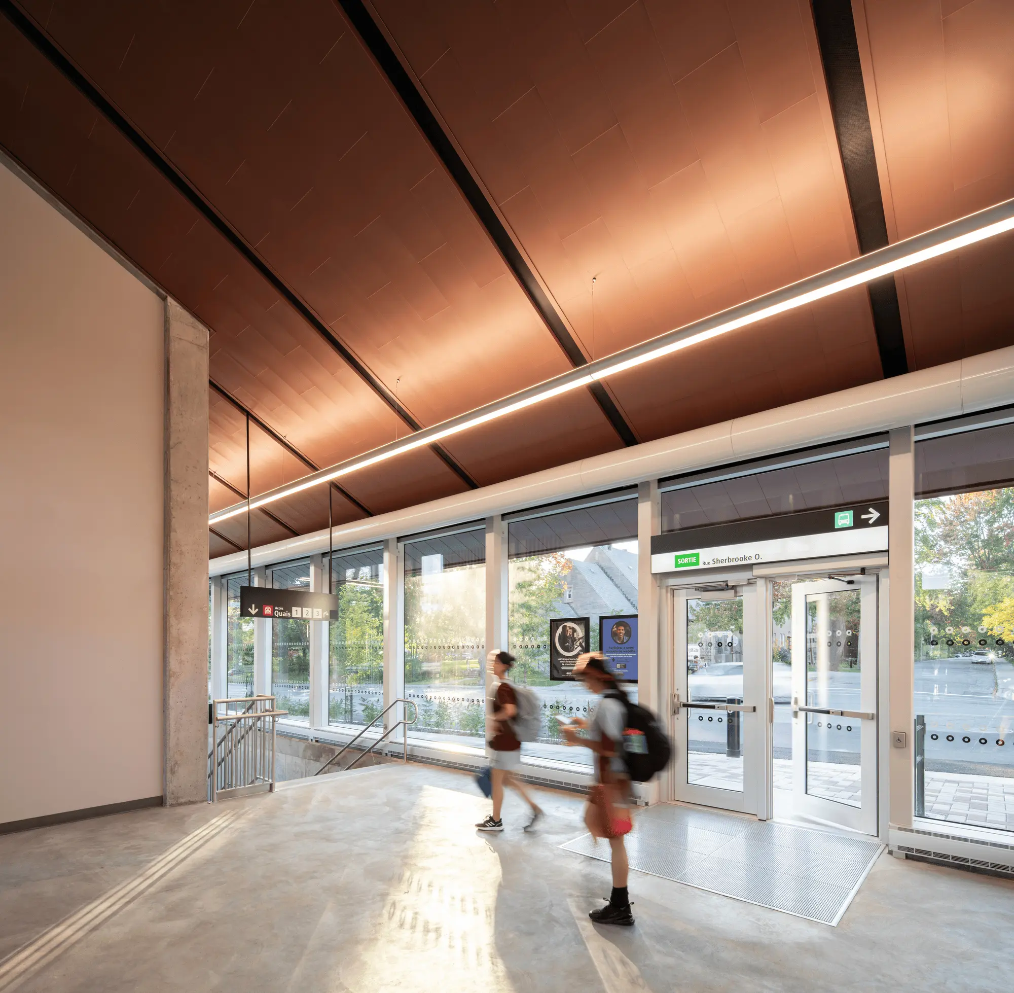
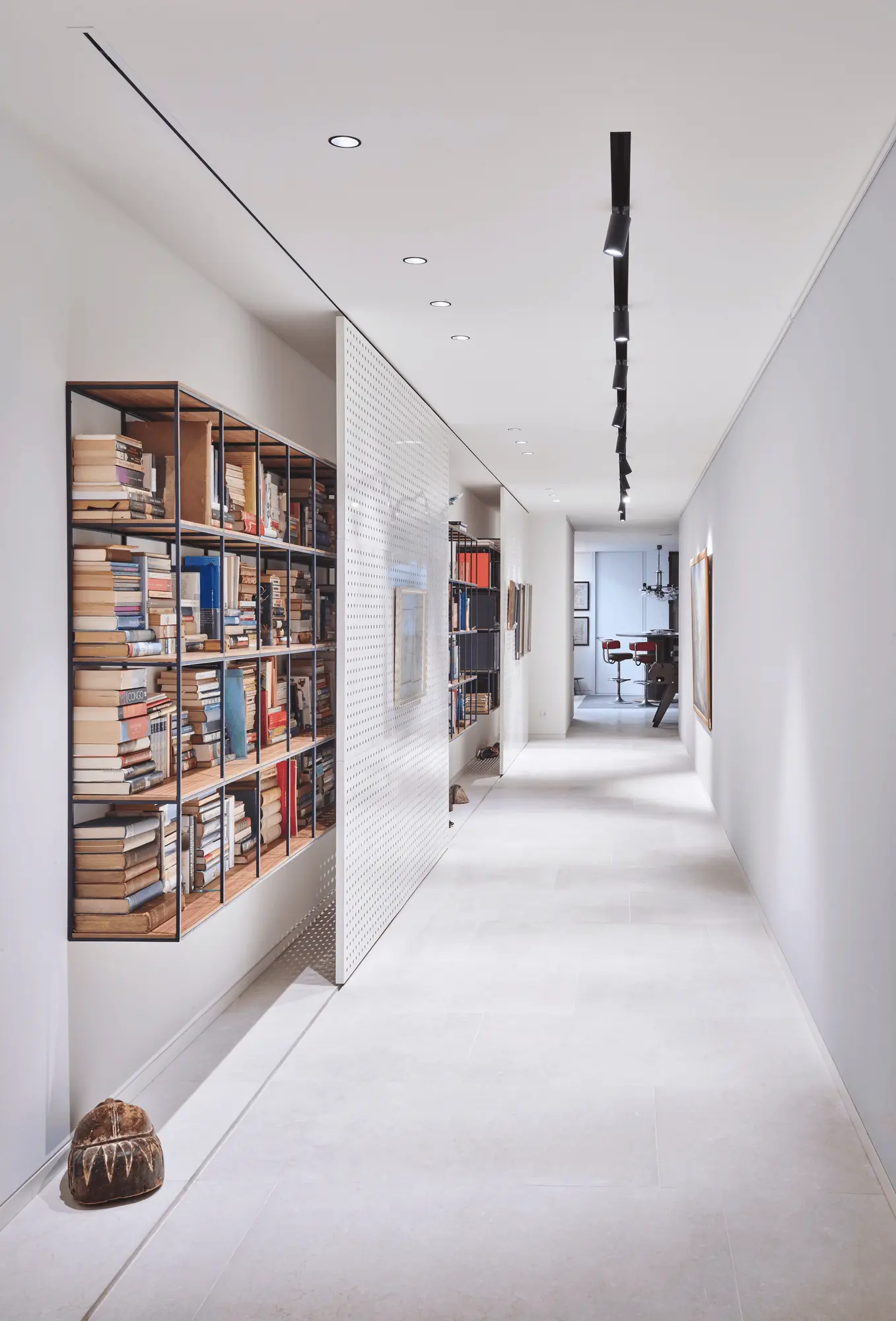
Inside, the transparency of the walls and the thoughtful alignment of the floors promote circulation and clarity. The result is a welcoming atmosphere that encourages visual exploration, strengthening the link between users and the surrounding urban life.
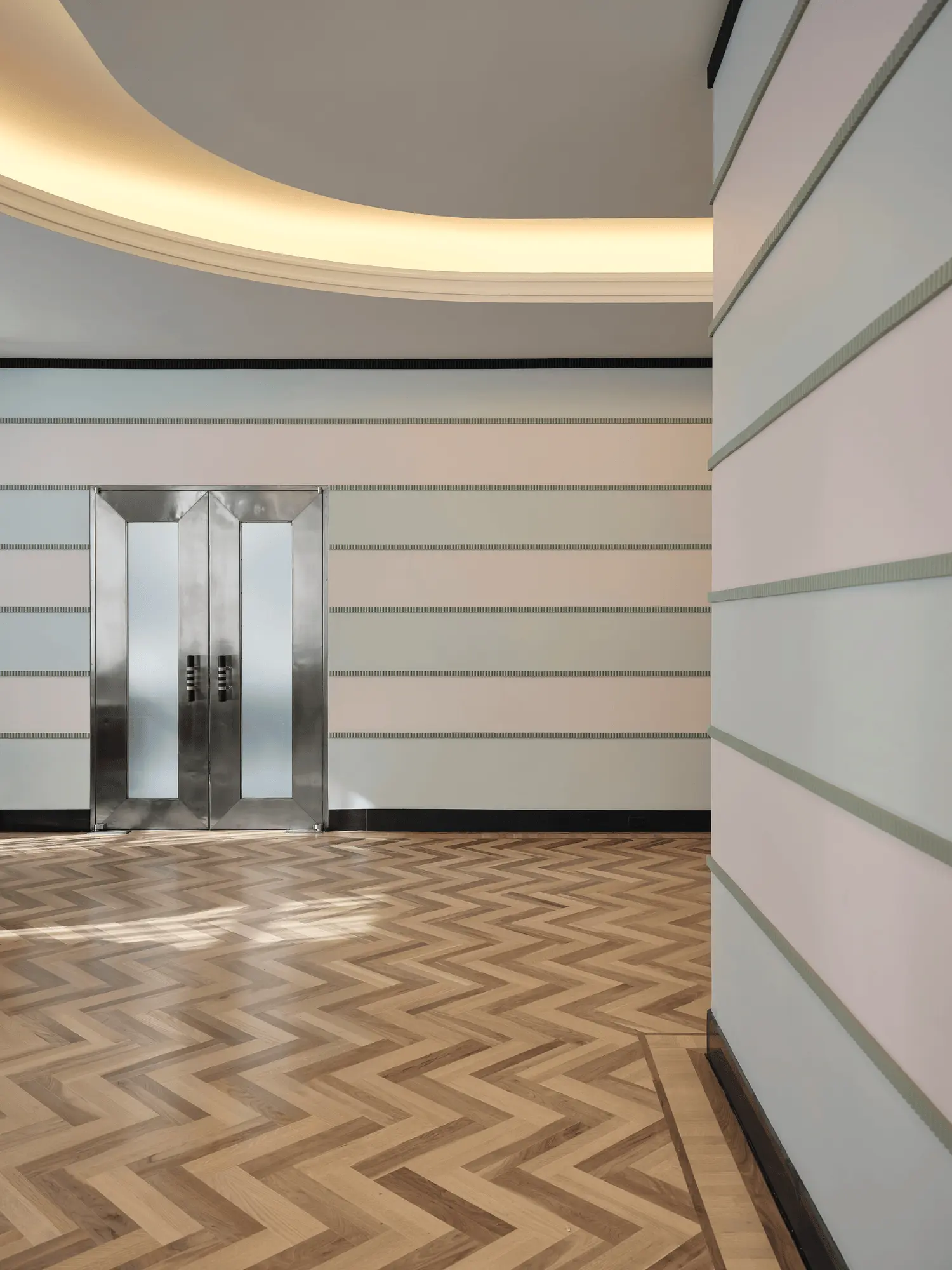
Also inspired by the unique design of Montreal’s emblematic metro stations, a chevron-grooved concrete treatment accompanies the station’s staircase as it descends into the tunnel and crosses the tracks, creating a geometric interplay enhanced by a suspended installation by local artist Philippe Allard. An elevator, integrated into the central shaft, ensures universal access to the building and its tunnel. This design treatment enriches the space with a distinct visual identity without overshadowing the zinc roof, which remains visible from the inside.
Rather uncommon for railway stations, this meticulous approach to detail constitutes a simple yet thoughtful architectural proposal for the public transit system to ultimately encourage its use.
About Sid Lee Architecture
Sid Lee Architecture is an affiliate of Sid Lee creative agency. The firm was founded by architects and urban designers Jean Pelland and Martin Leblanc, business partners since 1999. Today, the pair leads a multidisciplinary team of 70 professionals from the fields of urban planning, architecture, and interior design. Since 2015, Sid Lee Architecture has been a member of kyu, a collective of creative companies established by Hakuhodo DY Holdings.
Project Information:
Architect: Sid Lee Architecture, Location: Montreal, Canada, Year: 2024


